
UXpin's Blog, page 21
June 24, 2024
Design Consistency Guide UI and UX Best Practices

One of the key design principles, no matter if your designing a mobile app or a desktop one, is to keep your UI consistent. But what does it mean? How do you achieve consistent user interface? Which design decisions you need to make to achieve that? It’s time to explore that.
Good UX design doesn’t come from following UX design best practices. You need to test your product to tell if it offers great UX and fulfills user needs. That’s where prototyping tools come in. With a tool like UXPin, design teams can prototype their product, and then optimize their design through series of iterations and usability testing with real users.
No need to switch between tools. Try UXPin and see how fast you can prototype web apps, mobile apps, and websites. Sign up for free UXPin trial.
Build advanced prototypesDesign better products with States, Variables, Auto Layout and more.
Try UXPin .try-uxpin-banner { margin: 40px 0px;}.try-uxpin__container { display: flex; max-width: 689px; height: 210px; padding: 20px; padding-left: 24px; border: 2px solid black; border-radius: 4px; align-items: center; justify-content: space-between; background-color: white; box-shadow: 10px 10px black;}.try-uxpin__left { width: 54%;}.try-uxpin__left p { margin: 10px 0px !important; color: black !important;}.try-uxpin__heading { font-size: 28px !important; font-weight: bold;}.try-uxpin__text { margin: 0 !important; font-size: 18px !important; line-height: 22px !important;}.try-uxpin__button { width: 135px; height: 44px; background: black; margin: 10px 0px; padding: 10px 20px; border: none; border-radius: 2px; color: white; font-size: 16px; text-align: center;}.try-uxpin__button:hover { cursor: pointer;}.try-uxpin__image { max-width: 320px !important; height: 200px; margin-right: -21px; margin-bottom: -6px;}@media (max-width: 760px) { .try-uxpin__container { height: auto; margin: 10px; align-items: left; }}@media (max-width: 500px) { .try-uxpin__container { flex-direction: column; } .try-uxpin__left { width: 100%; align-items: normal; }}What Exactly is Design Consistency?
Design consistency is what ties UI elements together with distinguishable and predictable actions, which is key for great product experience and an important thing to consider for UX designers. A way to simplify things is to think of it as a commitment that you make to your users (“whenever you see the light grey button in the pop-up on a homepage, you can assume that it will cancel and the pop-up will close”) so that they can easily interact with your product.
As they become more acquainted and become regular users, they begin to trust the product more and more, which is a reflection of the consistent design. To provide users with a consistent UI, here are UI and UX best practices I’ve found useful for product design.
What are 4 Types of Design Consistency?There are four types of design consistency that comprise visual, functional, internal, and external consistency.
Visual ConsistencyColor Palette: Using a uniform set of colors across the entire design.Typography: Keeping font choices consistent in terms of style, size, and weight.Spacing and Layout: Maintaining uniform margins, padding, and grid systems.Functional ConsistencyInteractions: Ensuring that similar actions (like clicking buttons or navigating menus) yield similar outcomes.Controls and Components: Using the same design for similar controls and UI components (e.g., buttons, forms) across different sections.Internal ConsistencyWithin a Product: Ensuring all parts of a single product or system look and behave consistently, even across platforms.External ConsistencyAcross Products: Aligning design elements and interactions with other products in the same ecosystem or brand family.What are the Benefits of Design Consistency?Design consistency enhances usability by making elements predictable, and it also shortens the learning curve, improves aesthetics, reduces user errors, and strengthens brand recognition by using uniform visual and functional elements.
Improved Usability – users can predict how elements behave, leading to a smoother and more intuitive experience.Faster Learning Curve – users familiar with one part of the system can easily navigate others, reducing the need for extensive learning.Enhanced Aesthetics – a cohesive look enhances the visual appeal and professionalism of the design.Reduced Errors – predictable interactions minimize user errors and enhance reliability.Brand Recognition – consistent use of visual and functional elements strengthens brand identity.How to Achieve Design ConsistencyDesign Systems and Style Guides – develop and adhere to comprehensive design systems or style guides that outline standards for visual and functional elements.Component Libraries – use component libraries to maintain consistent design elements and interactions.User Testing – Conduct regular user testing to ensure consistency meets user expectations and needs.Documentation and Training – provide documentation and onboarding for new designers and developers to maintain consistency.9 UI and UX Best Practices for Consistent DesignStart with researchNothing is more important for a consistent experience than quality research.
This should not be underestimated or hurried. Time and budget are always a necessary consideration in product design. Without either of these, a product would never ship. Although they are important to the process, we can’t lose sight of who actually uses the product, what their customer journey looks like, whether they are desktop or mobile users.
Keep your users top of mind and don’t overlook UX research in the beginning stages of product design planning.
Define user goalsGet into the mindset of a new user. What do they want to accomplish? How will the application help them? List our goals and refer back to these throughout the UI or UX design process.
For example, let’s assume we’re building a travel app. This travel application allows users to select a vacation timeframe and find deals on flights and hotels within their budget. But it’s not just the standard travel site. It connects to your Facebook account, works its magic, and plans the top five vacations based on the content that you’ve shared. The user selects the vacation plan that they like best and all the details are taken care of.
Here are some of the user goals:
View vacation options within a specified timeframeCompare different vacation optionsSelect a vacation based on users interestsKeep within vacation budgetNow that we know the breakdown of goals, we can design to meet user expectations.
Familiarize yourself with common UI patternsDon’t reinvent the wheel when it comes to established UI patterns. Recurring patterns solve common UX and UI design problems.
Of course, UX designers shouldn’t just “copy” the entire layout of another similar web or mobile app. They need to filter and modify the patterns based on specific user goals.
A typical pattern in eCommerce is a product grid. With this pattern users can easily browse and see product information.
It’s safe to say that patterns have been evolving and users become aware of standard locations for elements. Most users would agree that when they want to search for something, they look for the search bar in the upper center or right since this is a common placement.
Establish design patterns for product UI and UX design consistencyOne of the keys to a successful — and consistent — UI is the user performing tasks with the minimum number of actions is. If a task that takes four steps can easily be completed in two, the UI should always be modified for the shorter task flow. UI patterns can help with this… after all, this efficiency is why they became patterns in the first place.
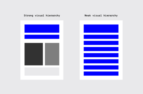
Design hierarchyAlong with design patterns, having an established visual hierarchy of UI design elements does wonders for UI consistency. Whether users are aware of it or not, they instinctively pay attention to the order and priority of the elements they interact with.
When it comes to visuals and the human eye, some elements take precedence over others (bigger sizes, bright colors, etc.), depending on how “noticeable” they are. Think about your screen visuals in terms of what people will see first, second, third, and so on.
This allows UX designers to ensure users find primary functions faster than others, but they can also present secondary and tertiary functions with the appropriate amount of attention.
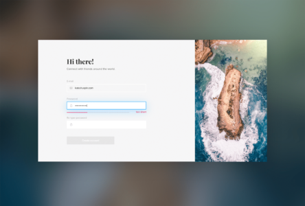
 UI elements
There is a multitude of design elements that go into an application’s UI, and each makes up the building blocks that form UI patterns. Keep an organized inventory and check that elements are used properly to maintain a consistent experience.
Branding elementsStay consistent with the overall brand. Typography, logo, correct image styles, brand color schemes, etc. should be reflected in the application, just like the rest of the brand’s properties.
Is the correct logo used? Are branding colors consistent? Does the typeface match the others? Brand consistency helps new projects feel like part of the brand’s family, rather than a black sheep. Style guides usually provide all the information you’ll need.


Making sure colors and typography are on brand gives each of the company’s products a consistent look and feel.
TypographyElements with the most visual impact like typography should always be “on brand.”
This visual element is especially important, not just for hierarchy, but for the entire UX as well. Changing the sizes, fonts, and arrangement of the text can improve scanability, legibility, readability, and even navigation.
UI componentsDuring user research, become familiar with UI patterns and their components. Knowing how each component behaves, within the pattern and outside it, lets UX designers properly prioritize all elements on the screen without anything slipping through the cracks.
“Components” can refer to any number of elements that make up a pattern, such as:
ButtonsCardsFormsListsPanelsProgress barsLet’s say you’re considering adding pagination to long lists so the user doesn’t have to scroll far with long lists.
As you examine the wireframes, you notice that one list has pagination with 20 or more items, while in another part of the application, a list only has pagination with 40 or more items. Which is correct? This example illustrates how making definitive decisions about guidelines is the backbone of UI and UX design consistency.
TemplatesIf you’re having difficulty standardizing your site or app, try using templates.
Most applications allow them, and because the layout and elements look the same, they streamline UI features across the products. Plus, you can reuse the same UI templates over and over, even years down the line.
 Pattern library and design system
It may not be user-facing, but it is one of the keys to consistency. Today, many teams have a pattern library or design system as a point of reference to keep everyone on the same page. Pattern libraries and design systems are the rulebooks that anyone on the team can reference at any time. For team-wide consistency, they are essential.
A pattern library may not be as robust as a design system since it’s limited to design patterns specifically. A design system has more information all around, including helpful documentation about all the UI patterns and various components. A pattern library can also be a subsection of a design system.
Make actions consistentEveryone loves when an application is user-friendly. It saves time, avoids headaches, and helps users accomplish their goals by eliminating confusion — all requirements for creating satisfied customers.
Consistent actions remove the need for user discovery and therefore make their task flow run more smoothly. If a user knows how to use the functionality in one section, they know how to use it in all sections (as long as it’s consistent).
Users inherently transfer past knowledge to new contexts as they explore new parts of the application. Consistent actions become second nature and eventually, the user can use the application without even thinking. Furthermore, users bring these expectations into new features or aspects of the product that they haven’t explored yet, minimizing the learning curve.
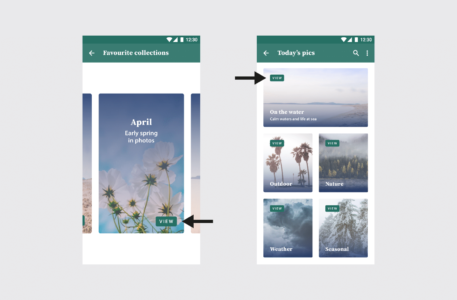
“View” placement is not consistent. On most of the cards, it’s toward the top, but on the collection card, it’s at the bottom. This inconsistency might cause the user to pause for a moment to search for the “View” option, not to mention it undermines their own natural habit-forming processes.
So what, specifically, should you consider when designing your interface? Ask yourself these questions during the entire process:
Do all parts of the application behave the same way?How do interactions work? Are they predictable and consistent?How much discovery is needed for a user to understand this interaction?
The example on the left has inconsistent sorting; not all columns have the option to sort. Users may want to sort data in other columns. The example on the right has consistent sorting on all columns.
Review your contentIt’s not just about the visual elements, but also the text throughout the application.
Consistent copy — especially consistent terminology — in each place in the application is another key. Using two different words for the same function makes them seem like different functions, causing a momentary pause in the workflow while the user sorts out the discrepancy.
Consistent copy avoids this confusion.
Content structureContent plays a crucial role in UI elements, whether something as simple as navigation listings or as complex as product documentation. It’s not just the words themselves, but how to copy text is presented visually, such as body copy, list items, table content, etc.
In particular, pay attention to how content is handled in these areas:
NavigationDropdownsForm fieldsValidation messagesTooltipsChartsImage captionsError messagesLoading screensConfirmation pagesProduct support documentationBrand consistency in contentYou know that feeling when a certain part of an application feels “off.” A lot of times the reason is an inconsistency in the content’s language, for example, if one button says “Logout” and another says “Sign out.”
Even less noticeable inconsistencies can create that “off” feeling.
For the Oxford comma fans out there, something as “minor” as comma usage is picked up subconsciously. After enough of these subconscious flags, the user’s conscious brain starts to notice.
Other writing guidelines such as title case and voice/tone also influence the user’s experience. While title typography is more empirical, voice and tone are a little harder to pin down. The trouble escalates if most content uses a casual style that clashes with a more formal “brand language.”
Appropriate user defaultsBy considering user goals upfront, you can set realistic defaults to reduce the burden on the user.
If the defaults are set to the most popular preferences, the user may not have to make any adjustments at all. Take the date picker on an airline or car rental site. Often the starting default date is sometime in the near future, the most likely choice according to past statistics.
Pay close attention to forms, too; they’re a great opportunity for defaults to reduce the amount of user effort.
 Consistent communication
Search results, form submit messages, error windows — every interaction with your user is communication. For an app to be successful, it must speak to the user and keep them informed on what’s happening. And, as with everything else, the way you communicate should be consistent.
Changes in state and helpful informationUsers appreciate feedback: a toggle that changes color to indicate “on” or “off,” for example, or a sound effect to verify a completed action.
Your user should never waste time wondering whether an action took place or not. Form field submissions are notorious for this, but it happens in other areas as well. In situations where it may not be clear, a quick success (or error) message is all you need.

Play it safe. Even when it’s apparent that the action was successful, a lot of users still prefer a quick confirmation.
Reduce user frustrationThe most common cause of user frustration happens when it’s not clear what to do next. Some tasks are not so self-explanatory, but UI and UX designers are often too close to it to notice. Luckily, some instructional text — even just a line or two — can solve the problem.

For the same reason, error messages are useful too. While users may not like seeing them, they still need to know what happened and how it can be corrected.
 Which Design Tools Help in Maintaining Consistency?
There are several tools on the market that help designers and developers keep consistency. We will discuss three of them. If you want to learn about more tools, you can see our article with Design System Management Tools.
UXPin MergeUXPin with Merge technology allows design teams to build interfaces with production-ready UI components that can be further used to build the end-product. It ensures that the user interface that you design stays consistent and functional with the end-product that gets developed.
This means that design and development teams can be on the same page throughout the full product development process, from early-stage prototyping to creating fully interactive prototypes, eliminating discrepancies and reducing rework by maintaining a single source of truth.
Merge also allows designers to create fully functional prototypes using actual, interactive UI components, leading to more accurate user testing and a seamless handoff to development. Overall, it speeds up the design process by enabling real-time updates and feedback using the latest components, making it easier to maintain consistency and quickly adapt to changes.
Read about dotSource case of using UXPin Merge in their process.
FigmaFigma is a collaborative design tool that allows teams to create, share, and maintain consistent UI design and style guides in real-time. Designers use it to design interfaces of websites, apps, and other digital products that are consistent and easily shareable with other designers.
Read how Porsche uses Figma and UXPin together to create consistent interfaces at scale: Code or Design – Which is a Better Source of Truth?
StorybookStorybook is a tool for developers that use it to create and maintain UI components, enabling designers and developers to ensure consistency and proper integration of design elements. UXPin integrates with Storybook, so designers and developers can share coded components as a single source of truth.
The integration works by allowing designers and developers to use real UI components from Storybook directly within UXPin. Here’s how:
Component Sync: UXPin imports Storybook’s components, enabling designers to drag and drop them into UXPin prototypes.Live Preview: Design changes in UXPin reflect in real-time, using the actual code components from Storybook.Shared Libraries: Both tools use the same source of truth, ensuring that design and development stay aligned and consistent with the latest UI components.Read more about the integration: Storybook and UXPin integration.
Level up Design Consistency with UXPinConsistency in UI is a huge undertaking, and it’s easy for some parts to slip through the cracks. The end goal is, of course, a perfectly consistent and in-sync interface, but that’s not always possible right out of the gate.
For startups, you can try an MVP (minimum viable product). Even if the product starts out with some inconsistencies, your team can iron them out one by one over time once you start receiving feedback.
If you’re making updates to an existing product, it can be more difficult to remain consistent. This is where the right prototyping software comes in handy. UXPin allows you to build interactive prototypes fast and keep them in line with your design system. Try building your prototype with UXPin today.
Try UXPin for freeThe post Design Consistency Guide UI and UX Best Practices appeared first on Studio by UXPin.


Paper Prototyping: The 10-Minute Practical Guide

In the high-tech digital UX design world, pen and paper can still be the preferred choices for fast low-fidelity prototyping. Contrary to assumptions, UX teams spend a lot of time away from the computer, writing on sticky notes, whiteboards, notepads, and adding annotations to paper prototypes.
The more planning and preparation designers can do before sitting down at the computer, the quicker they can design wireframes, mockups, and prototypes. Paper prototyping is a crucial part of the early UX design thinking process because it fosters collaboration, allowing designers to explore lots of ideas at a minimal cost.
With UXPin, design and development teams can jump straight from paper prototypes to high-fidelity prototyping, significantly accelerating the design process. Build consistent, high-quality digital experiences. Sign up for a free trial and explore UXPin’s prototyping features today!
Build advanced prototypesDesign better products with States, Variables, Auto Layout and more.
Try UXPin .try-uxpin-banner { margin: 40px 0px;}.try-uxpin__container { display: flex; max-width: 689px; height: 210px; padding: 20px; padding-left: 24px; border: 2px solid black; border-radius: 4px; align-items: center; justify-content: space-between; background-color: white; box-shadow: 10px 10px black;}.try-uxpin__left { width: 54%;}.try-uxpin__left p { margin: 10px 0px !important; color: black !important;}.try-uxpin__heading { font-size: 28px !important; font-weight: bold;}.try-uxpin__text { margin: 0 !important; font-size: 18px !important; line-height: 22px !important;}.try-uxpin__button { width: 135px; height: 44px; background: black; margin: 10px 0px; padding: 10px 20px; border: none; border-radius: 2px; color: white; font-size: 16px; text-align: center;}.try-uxpin__button:hover { cursor: pointer;}.try-uxpin__image { max-width: 320px !important; height: 200px; margin-right: -21px; margin-bottom: -6px;}@media (max-width: 760px) { .try-uxpin__container { height: auto; margin: 10px; align-items: left; }}@media (max-width: 500px) { .try-uxpin__container { flex-direction: column; } .try-uxpin__left { width: 100%; align-items: normal; }}What is Paper Prototyping?Paper prototyping is the process of developing ideas and designing user flows using hand-sketched “screens” that represent a digital product. Paper prototypes test on a high-level user experience rather than interaction design.

Paper prototypes are low-fidelity because they don’t have any functionality. For this reason, paper prototypes designers rarely share paper prototypes outside of the department.
The primary goal of paper prototyping is to map our information architecture and visualize user flows.
Design teams often lay paper screens on a desk or flow and imagine how real users would navigate to reach an end goal. The designs are rudimentary and usually sketched in black and white. Content is limited, with only headlines and call to action links displaying any legible text.
Sometimes, teams will build a mock iPhone or Android device using a piece of cardboard to simulate swipes, scrolls, and other basic functionality. These mock devices also allow designers to see how their designs might look within the confines of a mobile phone—especially useful if you’re designing a mobile app.
While the main benefit of paper prototyping is speed, some designers use tools like UI Stencils to design accurate, aesthetically pleasing screen layouts—vital if you plan to present paper prototypes to stakeholders or testing participants.
UXPin’s journey started with a similar paper prototyping product called Web Kit. A paper pad paired with a design tool that automatically turns paper prototypes into wireframes. UXPin has evolved into an end-to-end prototyping solution, allowing you to create prototypes that are production-ready from the start. Try UXPin for free.
Paper Prototyping DigitallyWith tools like reMarkable and Apple Pencil, teams can collaborate remotely while enjoying the speed and versatility of the physical paper experience.
Using digital sketch tools can accelerate the paper prototyping process. Designers can make changes faster (without needing to redraw a screen), attach detailed notes, and upload finished prototypes instantly to design tools like UXPin to build high-fidelity prototypes or go with wireframing.
Paper prototyping digitally also reduces paper and plastic waste, which is better for the environment :)
Advantages and Disadvantages of Paper Prototyping
Aside from speed and flexibility, there are several advantages and disadvantages to paper prototyping.
Here are some of the pros and cons of paper prototyping from our free eBook: The Ultimate Guide to Prototyping.
Advantages:
Rapid iteration — It’s easier to discard a paper design that took 5 minutes vs. a digital mockup that you spent more than an hour perfecting. Low cost — Paper is cheap, and even additional tools and kits won’t break the bank. Increased creativity — The freedom of pencil and paper fosters experimentation and new ideas. Design tools have their place in the design process but can stifle creativity in the early design stages.Team-building — Paper prototyping is a rare opportunity where teams get together in a creative environment. Working with pen and paper brings out child-like energy, which can help form bonds and strengthen coworker relationships. Minimal learning curve — Everyone can sketch ideas, making paper prototyping a great way to involve other departments like marketing, development, and stakeholders.Documentation — Paper prototypes serve as excellent documentation. Designers can make notes and outline ideas to reference throughout the project. They’re excellent UX artifacts.Disadvantages:
No user reactions — With no user feedback, it’s difficult to know whether or not your ideas will work. Even if you test your paper prototypes with participants, the feedback will be limited.Inaccurate feedback — Outside of UX teams, paper prototypes might be challenging to interpret, limiting any accurate or meaningful feedback. Potentially unnecessary — With rapid prototyping tools like UXPin, paper prototyping might add additional, unnecessary steps to the design process. UXPin comes with pre-made design systems, so designers can quickly drag-and-drop high-fidelity elements to design and edit working prototypes quickly.Sign up for a 14-day trial and see how quickly you can turn paper design concepts into high-fidelity prototypes that function like the final product using UXPin.
When to Paper PrototypeJake Knapp of Google says that “paper prototyping is a waste of time“—but admits that paper prototyping is useful for early-stage conceptualizing.
Once you move from paper to digital, there’s no reason to return. Some designers might return to paper prototyping for new features or a product redesign. But even then, returning to paper prototyping might be unnecessary.

That said, paper prototyping is perfect for early-stage conceptualizing. Its speed, ease, and simplicity make it accessible to all teams (including non-designers) while fostering experimentation and creativity—something you can’t achieve with a digital canvas.
Paper prototypes are ideal for:
Brainstorming meetings and sessionsBasic internal user testing early onHow to Paper PrototypePaper prototyping is the fun part of product design. It’s an opportunity for team members to brainstorm and sketch ideas.
Don’t worry about how beautiful your sketches look. Even the best UX designers aren’t brilliant sketch artists! The goal is to visualize your ideas and get the creative juices flowing.
Creating a paper prototype involves three main steps:
1. Prepare MaterialsGather materials like paper, pens, markers, sticky notes, and scissors. You may also use a whiteboard or large sheets of paper to sketch user interfaces.
2. Sketch InterfacesDraw basic screens, user interfaces, and key components of the design on separate pieces of paper. Represent user flows by arranging these sketches in sequence.
3. Simulate InteractionLay out the sketches in the order of user interaction. Simulate the user experience by manually switching between sketches based on user actions, gathering feedback to refine the design.
For a detailed guide, check out UXPin’s article on prototyping.
6 Tips to Building Paper Prototypes Use printer paper and cheap pencils/pens. Ruled or line pads often stifle creativity as designers get side-tracked drawing between the lines rather than developing lots of ideas.Start with a warm-up! Sometimes it takes a few sketches to loosen up and get into the flow. Crazy eights is a fantastic paper prototyping method to design many versions of the same screen fast. After a couple of crazy eights rounds, you’ll have many ideas to expand on.Prototype mobile-first or progressive enhancement. Start with the smallest screen and adjust the layout as you scale the viewport (this applies to mobile and web design. Scaling up is much easier than scaling down because you prioritize content and avoid elaborate desktop layouts that don’t translate to mobile. Side note: UXPin’s
Auto Layout
lets you automatically resize, fit, and fill your designs. A handy feature for mobile-first design. Stick to one sketch per screen (a piece of paper). Paper prototyping requires you to create user flows by placing pieces of paper in sequences. You’ll also switch these around or add new screens. If you have more than one screen on a piece of paper, you lose this speed and flexibility.Iterate as the ideas come to mind. The goal is quantity, not quality. When you create lots of paper prototype ideas, you often end up taking bits from each to get the final result—like a Lego set, but with paper.Planning is crucial for a successful paper prototyping session! Ensure you have enough pens (black fine-tipped markers work best), paper, scissors, glue, post-it notes, index cards, tape, cardboard, and anything else you think your specific project might need. A whiteboard and marker are also great for outlining user flows collaboratively. Pro tip—assign the job of preparing your paper prototyping to an arts & crafts enthusiast! Every team has at least one, and they always make sure you have more than enough of everything you need!Testing & Presenting Paper Prototypes
Use printer paper and cheap pencils/pens. Ruled or line pads often stifle creativity as designers get side-tracked drawing between the lines rather than developing lots of ideas.Start with a warm-up! Sometimes it takes a few sketches to loosen up and get into the flow. Crazy eights is a fantastic paper prototyping method to design many versions of the same screen fast. After a couple of crazy eights rounds, you’ll have many ideas to expand on.Prototype mobile-first or progressive enhancement. Start with the smallest screen and adjust the layout as you scale the viewport (this applies to mobile and web design. Scaling up is much easier than scaling down because you prioritize content and avoid elaborate desktop layouts that don’t translate to mobile. Side note: UXPin’s
Auto Layout
lets you automatically resize, fit, and fill your designs. A handy feature for mobile-first design. Stick to one sketch per screen (a piece of paper). Paper prototyping requires you to create user flows by placing pieces of paper in sequences. You’ll also switch these around or add new screens. If you have more than one screen on a piece of paper, you lose this speed and flexibility.Iterate as the ideas come to mind. The goal is quantity, not quality. When you create lots of paper prototype ideas, you often end up taking bits from each to get the final result—like a Lego set, but with paper.Planning is crucial for a successful paper prototyping session! Ensure you have enough pens (black fine-tipped markers work best), paper, scissors, glue, post-it notes, index cards, tape, cardboard, and anything else you think your specific project might need. A whiteboard and marker are also great for outlining user flows collaboratively. Pro tip—assign the job of preparing your paper prototyping to an arts & crafts enthusiast! Every team has at least one, and they always make sure you have more than enough of everything you need!Testing & Presenting Paper PrototypesTesting & presenting paper prototypes outside of the UX department is always tricky. The stakeholders or usability participants have to “imagine” what will happen, which can confuse or divert focus from what you’re trying to present. Nevertheless, a study by Jakob Nielsen found that 75% of usability issues can be identified with simple, low-fidelity prototypes like paper ones.
Here are some tips for presenting and testing paper prototypes:
Designate one person other than the presenter as play the “human computer” or product simulator – The person playing the human-computer will simulate scrolling, swiping, navigating to different screens, and other functionality.Rehearse – Rehearsing is essential so that the presenter and simulator are in sync. The presenter can work out a good cadence for the simulator to keep up with the presentation.Follow standard usability test best practices – Standards like using a minimum of 5 users and recording the tests still apply. You can download our free Guide to Usability Testing for more understanding of usability standards and practices.If you’re giving users a paper prototype to inspect, ensure you provide guidance and annotations, so they know where to focus and what they’re supposed to test.Prototyping in UXPinWhether you’re building a mobile application or a new website, UXPin provides designers with tools to build advanced prototypes; most leading design tools simply can’t!
Don’t take our word for it! Sign up for a free 14-day trial and test UXPin’s powerful prototyping features for your next project.
Try UXPin for freeThe post Paper Prototyping: The 10-Minute Practical Guide appeared first on Studio by UXPin.
June 21, 2024
Best Backend for React — Top Picks for React Developers

React is a powerful frontend library designed for building dynamic and interactive user interfaces, making it a popular choice for web development. It excels at managing the view layer of web applications, rendering components, handling user inputs, and updating the UI in real-time.
However, to unlock its full potential, React needs to be paired with a robust backend technology. This backend is crucial for handling server-side logic, data processing, authentication, and providing API endpoints. It effectively manages the React application’s data and business logic behind the scenes, ensuring a seamless user experience.
Choosing the right backend for your React app involves careful consideration of factors like development speed, project requirements, performance, security, scalability, and popularity. In this article, we’ll explore the best backend technologies that complement React, helping you select the one that best fits your project requirements. Whether you’re aiming for rapid development, scalability, or high performance, we’ve got you covered. Let’s dive into the top backend services and find the perfect match for your next React.js project.
Build React UI fast. Use UXPin Merge, a drag-and-drop UI builder that helps you create interactive interfaces with fully customizable React components. Use MUI, Ant design or your own javascript library and design web app, mobile app or desktop app UI that is fully coded. Try UXPin Merge for free.
Create beautiful layouts without designersDesign production-ready prototypes 8.6x faster. No pixels. pure code.
Try UXPin Merge .discover-merge { margin: 40px 8px;}.discover-merge__container { display: flex; max-width: 690px; height: 200px; padding: 20px; padding-left: 24px; border-radius: 4px; background-color: black; box-shadow: 10px 10px #9999ff; align-items: center; justify-content: space-between;}.discover-merge__left { width: 50%;}.discover-merge__left p { margin: 10px 0px !important; color: white !important; font-size: 18px !important;}.discover-merge__heading { font-weight: bold !important; color: white !important; font-size: 18px !important;}.discover-merge__text { margin: 0 !important; line-height: 22px !important;}.discover-merge__button { width: 174px; height: 44px; margin: 10px 0px; border: none; border-radius: 2px; background: white; color: black; font-size: 16px; text-align: center;}.discover-merge__button:hover { cursor: pointer;}.discover-merge__image { max-width: 320px !important; height: 200px; margin-right: -19px;}@media (max-width: 760px) { .discover-merge__container { height: auto; margin: 10px; align-items: left; }}@media (max-width: 500px) { .discover-merge__container { flex-direction: column; } .discover-merge__left { width: 100%; align-items: normal; }}Laravel
Laravel is an open-source PHP framework designed to simplify and accelerate the development of web applications. It provides a range of tools and features that help developers build robust, scalable, and maintainable applications.
Why Laravel is Great for ReactElegant Syntax: Laravel’s expressive and elegant syntax simplifies common tasks like routing, authentication, and caching, making it easier to set up a backend for React applications.MVC Architecture: Supports a clear separation of concerns with its Model-View-Controller architecture or MVC, complementing React’s component-based approach.Robust API Development: Built-in support for RESTful APIs and easy integration with GraphQL via packages like Lighthouse.Authentication & Security: Laravel provides built-in solutions for authentication, authorization, and security, reducing the overhead for developers.Community and Ecosystem: A rich ecosystem of tools and packages (e.g., Laravel Echo for real-time events) that enhance the capabilities of a React frontend.When to Use Laravel with ReactLaravel and React pairing is ideal for applications requiring complex data relationships, extensive backend logic, and robust security.
React with Laravel as backend is also well-suited for building dynamic, data-driven web applications, such as content management systems, e-commerce platforms, and social networks.
It’s suitable for developers familiar with PHP (a programming language with server-side rendering) and those looking to leverage Laravel’s built-in features for rapid development.
Ruby on RailsRuby on Rails is an open-source web application framework written in the Ruby programming language. It is designed to make web development faster and easier by providing a structured, efficient, and easy-to-use environment.
Why Ruby on Rails is Great for ReactConvention over Configuration: Rails’ emphasis on convention over configuration speeds up development, enabling rapid prototyping and deployment.Scaffolding: Rails’ scaffolding can quickly generate RESTful APIs and resources, which can be easily consumed by a React frontend.Scalability: Rails is well-suited for scalable applications, particularly with its support for modular architecture and microservices.Asset Pipeline: Integrates well with modern JavaScript tools, allowing you to use React directly within Rails views or as a separate frontend.Ecosystem: Rich Ruby ecosystem with a large collection of gems (libraries) and tools, managed by Bundler.Hosting and Deployment: Ruby applications often deployed on platforms like Heroku or cloud services, with a strong emphasis on modern deployment practices.Popularity: Ruby on Rails has a strong following and is known for its elegant and readable code, which can be a significant advantage for long-term maintenance.Mature Community: A large and active community offers extensive plugins, gems, and resources that enhance development with React.When to Use Ruby on Rails with ReactRuby on Rails is perfect for projects that benefit from Rails’s rapid development features and need strong conventions and a mature ecosystem.
Similarly to Laravel, it is used in web apps where the backend requires robust data management and business logic. With a backend as Ruby on Rails, you can build community forums, rental services, financial applications, medical record systems, and more.
Node.jsNode.js provides a minimalistic environment for running JavaScript on the server, allowing for high concurrency and real-time applications. It doesn’t offer the structured MVC pattern as Rails or Laravel did or extensive built-in features. Instead, it relies on frameworks like Express.js to build web applications.
Express.js adds a layer of abstraction on top of Node.js, offering a streamlined framework for building web applications and APIs with features like routing, middleware support, and easier HTTP handling.
Why Node.js is Great for ReactFull-Stack JavaScript: Allows for a consistent JavaScript codebase across both frontend (React) and backend, simplifying development and knowledge sharing.Non-Blocking I/O: Its asynchronous, event-driven architecture makes it ideal for real-time applications, such as chat apps or live feeds.Rich Ecosystem: NPM (Node Package Manager) provides a vast collection of libraries and modules, accelerating development and integration.Microservices Architecture: Well-suited for building scalable microservices that can be consumed by React applications.Express Compatibility: Node.js works seamlessly with frameworks like Express.js, providing a robust and flexible environment for API development.When to Use Node.js with ReactNode.js focuses on server-side operations, such as handling HTTP requests, interacting with the file system, and managing databases.
It’s ideal for real-time applications, microservices architectures, and scenarios where a unified JavaScript stack is advantageous. It’s best for those of you who want to leverage the extensive JavaScript ecosystem and non-blocking I/O for high-performance applications.
Many high-profile applications use Node.js for their backend due to its performance and scalability. The ones that pair Node.js with React for app development are Netflix, Uber, LinkedIn, Walmart, and Medium.
DjangoDjango is a high-level, open-source web framework written in Python that is primarily used for backend development. It follows the MVC architectural pattern (often referred to as Model-View-Template in Django) and provides tools and features to simplify the development of complex web applications.
Why Django is Great for ReactComprehensive Framework: Django’s “batteries-included” approach offers built-in features like ORM, authentication, and admin interface, which simplify backend development.REST and GraphQL Support: With Django REST Framework or Graphene-Django, you can easily set up robust RESTful or GraphQL APIs for your React frontend.Security: Provides robust security features out of the box, including protection against common vulnerabilities and strong user authentication.Django Shell: Provides an interactive shell for testing code and interacting with the application environment.Hosting: Compatible with various hosting solutions, including traditional servers, cloud platforms, and platform-as-a-service (PaaS) providers like Heroku.Scalability: Well-suited for building large-scale applications, with tools for managing database migrations, caching, and deployment.Integration with Other Python Libraries: Django integrates seamlessly with other Python libraries and frameworks, making it easier to add functionality related to data processing, scientific computation, or machine learning.Community Support: A large and active community provides extensive documentation, plugins, and third-party packages to enhance development.When to Use Django with ReactDjango is a robust choice for a backend when paired with React, especially if you prefer Python, need extensive built-in features, and value security and data management capabilities. It excels in providing a comprehensive set of tools out of the box, supports rapid development, and integrates well with modern frontend frameworks.
Is Django a great backend framework? Mozilla’s Firefox Accounts system uses Django to manage user authentication, account data, and security. The frontend, built with React, provides a dynamic and responsive user interface for logging in, managing account settings, and synchronizing browser data.
Another example is Udemy. This major online learning platform uses Django for backend services such as course management, user authentication, and payment processing. React is used on the frontend to deliver an interactive user interface for course browsing, enrollment, and video playback.
GoGo is an open-source programming language developed by Google. It is designed for systems programming with an emphasis on simplicity, concurrency, and performance.
Why Go is Great for ReactReal-Time Applications: Ideal for applications that require handling a large number of simultaneous connections or real-time data, such as chat applications, live feeds, or multiplayer games.RESTful APIs: Go’s standard library and frameworks (e.g., Gin, Echo) make it straightforward to build RESTful APIs that serve data to React applications.Concurrency: Go’s support for concurrency through goroutines allows it to handle high loads and multiple connections efficiently, which is beneficial for scalable web applications and APIs used by React frontends.Service-Oriented Design: When adopting a microservices architecture, Go is excellent for developing individual services that need to be performant and scalable, with React handling the frontend.When to Use Go with ReactIf you’re building a real-time applications like chat apps or live collaboration tools, you may find Go useful. Go supports handling multiple real-time updates and notifications, and React enables real-time updates on the client side without full page reloads.
Similarly, streaming platforms like Twitch use Go for backend services like video processing and real-time analytics, with React used for the frontend interface. In that case, Go’s performance capabilities handle high-volume streaming data and concurrent user interactions, while React provides a seamless viewing experience.
Build React frontend with UXPin MergeDifferent languages have strengths in various areas. For example, Django excels in data-rich software development, Go is great for high-performance networking tasks, and Node.js or Go might be used by startups that invest in microservices architecture.
Now, it’s time to build a front-end of your app. Bring your React components through Git integration or use pre-built libraries like MUI and use UXPin Merge to create fully functional interface that’s ready for further development. Try UXPin Merge for free.
Try UXPin MergeThe post Best Backend for React — Top Picks for React Developers appeared first on Studio by UXPin.
June 13, 2024
5 Art Portfolio Examples that Will Leave you Awestruck

An art portfolio is a curated collection of an artist’s best work. It promotes the artist’s work and attracts potential employers, clients, galleries, or educational institutions. Most professional artists present their portfolio in form of an artist website and today we’re going to go through a couple of artist portfolios to help you build one.
Website builders feel stifling? Create a custom web design with UXPin, a prototyping tool that doesn’t limit your imagination. Add UI elements that you need, test your prototype with users, and easily build cross-platform, user-friendly digital products you feel proud of. To design even faster, use our Tailwind UI library and copy and paste fully coded web design sections that can be customized. Try UXPin Merge for free.
Create beautiful layouts without designersDesign production-ready prototypes 8.6x faster. No pixels. pure code.
Try UXPin Merge .discover-merge { margin: 40px 8px;}.discover-merge__container { display: flex; max-width: 690px; height: 200px; padding: 20px; padding-left: 24px; border-radius: 4px; background-color: black; box-shadow: 10px 10px #9999ff; align-items: center; justify-content: space-between;}.discover-merge__left { width: 50%;}.discover-merge__left p { margin: 10px 0px !important; color: white !important; font-size: 18px !important;}.discover-merge__heading { font-weight: bold !important; color: white !important; font-size: 18px !important;}.discover-merge__text { margin: 0 !important; line-height: 22px !important;}.discover-merge__button { width: 174px; height: 44px; margin: 10px 0px; border: none; border-radius: 2px; background: white; color: black; font-size: 16px; text-align: center;}.discover-merge__button:hover { cursor: pointer;}.discover-merge__image { max-width: 320px !important; height: 200px; margin-right: -19px;}@media (max-width: 760px) { .discover-merge__container { height: auto; margin: 10px; align-items: left; }}@media (max-width: 500px) { .discover-merge__container { flex-direction: column; } .discover-merge__left { width: 100%; align-items: normal; }}What is an art portfolio?An art portfolio is a collection of an artist’s work that showcases their skills and style. It serves as a professional curation, often used for presenting their work to potential clients, applying for jobs or academic programs, and presenting at exhibitions or galleries.
An art portfolio can be physical or digital, but in the modern context, online art portfolios are more prevalent. Most artists have their own websites that they use to post their work, stay in touch with the art world or even run an online store where people can buy their work.
5 Art Portfolio Website ExamplesJulia Plath
Julia Plath’s online art portfolio website effectively showcases her work with a minimalist design that emphasizes the artwork. The site excels in visual presentation and simplicity, making it easy for users to focus on the illustrations, admire the artist’s technical skills, and find contact information.
The website is visually appealing, using a minimalist and clean design. It focuses on the artwork with a white background that highlights the images without distraction. When it comes to typography, simple, sans-serif fonts are used, consistent with the minimalist approach. The text is legible and complements the visual elements without overshadowing the artwork.
A predominantly black-and-white color scheme ensures the artwork stands out. Colors used are minimal and primarily come from the art pieces themselves, drawing attention to them.

The website has intuitive navigation. The menu is clear and accessible at the top of the page, leading to sections like Home, Portfolio, About, and Contact.
While the design is visually appealing, the site could improve on accessibility aspects. For instance, adding more descriptive alt text for images and ensuring text contrast is high enough for readability.
The website has limited interactivity, focusing mainly on viewing the artwork. There is a subtle hover effect on images, enhancing the user interaction without overwhelming the design.
Bonnie White
Bonnie White’s portfolio site showcases a distinct approache to digital portfolio design and brings to mind traditional fine art websites. It’s well-made in terms of SEO, featuring a blog that adds dynamic content to the site, engaging visitors with updates and insights into the visual artist’s process and activities.
Her design portfolio embraces a warm, vibrant aesthetic with a soft color palette that complements her folk art, creating an inviting and personal atmosphere. Artwork is well-organized and displayed with ample spacing. Each piece is accompanied by titles and descriptions, offering context to viewers. The portfolio is accessible directly from the main menu, making it easy to browse.

Fonts are clean and readable, with a mix of serif and sans-serif. The titles use a decorative serif font that adds a personal touch, while body text is in a simple sans-serif, balancing readability with style.
The use of earthy and pastel colors aligns well with the folk art theme. The colors are not overwhelming and help create a cohesive look that reflects the artist’s personality.
The site is fairly accessible with reasonable text contrast and alt text for images. However, some improvements could be made, such as ensuring all text is large enough for readability and enhancing keyboard navigation.
Camille Walala
The art portfolio of Camille Walala has a dynamic and vibrant design that mirrors the artist distinctive graphic design-like style. It uses bold colors and geometric shapes throughout, effectively capturing the essence of her work.
The homepage features full-screen images of her most striking projects, giving a dramatic presentation that immerses the visitor in her world of art. This approach effectively showcases the scale and impact of her installations.
The top navigation menu is straightforward, with clear labels like Work, About, and Contact. This simplicity ensures that users can quickly find what they’re looking for without distraction.
The website design incorporates a vivid color palette, primarily consisting of bright blues, reds, yellows, and blacks. These colors are consistent with Walala’s artistic style and create a cohesive visual experience.
The typography is playful yet clean, featuring bold fonts for headings and simple, sans-serif fonts for body text. This balance maintains readability while adding to the site’s energetic feel.

High-quality images of Walala’s work are prominently displayed. The website effectively uses full-screen images and slideshows to showcase her projects in various settings, making her portfolio visually impactful.
While the site is well-optimized for performance and user experience, there are areas for potential improvement, particularly in accessibility and SEO, which could further enhance its effectiveness and reach.
Timothy Goodman
Timothy Goodman is another visual artists whose online art portfolio is a great example of good web design and a great presentation of visual arts. Based in New York City, Goodman is known for his distinctive graphic style and has created numerous public art installations, illustrations, and typographic works throughout New York and beyond.
Timothy Goodman’s own portfolio successfully captures the essence of his artistic style through its bold, vibrant, and playful design. The intuitive navigation, responsive layout, and engaging visual elements create a positive user experience. The site effectively showcases his diverse body of work while providing clear paths for exploration and interaction.

Hovering over project thumbnails in the Work section triggers visual feedback, such as color changes, zoom effects, or brief overlays with project titles. This interaction invites users to explore and signals that the images are clickable.
Navigation buttons and links change color or style upon hovering, providing a clear indication of their interactivity.
Each project thumbnail is clickable, leading to a dedicated page with detailed images, descriptions, and context for the project. This interaction makes it easy for users to delve deeper into specific works that interest them. Clicking on project links dynamically loads the new content without refreshing the entire page, ensuring a seamless user experience.
Lily Clementine Orset
Lily Clementine Orset uses a unique and unconventional approach to present her art. The web design of this online art portfolio reflects an experimental and DIY aesthetic, aligning with her artistic vision and providing a different experience compared to traditional portfolio websites.
The interface allows users to click and drag elements, enhancing the interactive and hands-on feel of the site.
The use of textured backgrounds and layered images gives the site a tactile, handmade quality that complements the DIY ethos of her work.
The website employs a mix of hand-drawn and digital fonts, contributing to its quirky and artistic vibe. The variety in font styles adds to the visual interest but might affect readability in some areas. Font sizes vary across the site, which adds to the eclectic feel but can create challenges in maintaining a clear visual hierarchy and readability.

The site is designed primarily for desktop use, with the interactive elements best experienced on larger screens. On mobile devices, the navigation and interactions may be less effective or more cumbersome. Elements might not scale well on different screen sizes, potentially affecting the browsing experience on tablets and smaller screens. Having said that, the interactive design invites exploration and encourages users to spend more time on the site, though it may also create some usability challenges.
10 UX and UI tips based on those art portfoliosEffective UX and UI design is crucial for art portfolio websites to showcase the artist’s work, engage visitors, and create a memorable browsing experience. Here are some tips to follow when creating your art portfolio website:
Align with Art Style: Ensure the website’s design reflects the artist’s style. Use colors, fonts, and layouts that complement the artwork.Showcase Artwork Effectively: Use high-resolution images that capture the details and colors of the artwork. Include full-screen images, close-ups, and various views to give a comprehensive presentation.Use Neutral Backgrounds: Opt for neutral backgrounds to make artwork stand out. A simple color scheme (e.g., white, black, or gray) ensures the focus remains on the art.Apply Readable Fonts: Use clean and readable fonts. Ensure font sizes and colors provide good readability against the background.Clear Menu Structure: Provide a simple and intuitive navigation menu with clear labels such as Home, Gallery, About, Blog, and Contact. Make sure the menu is accessible from all pages.Breadcrumbs: Use breadcrumbs or a similar mechanism to help users understand their location within the site and easily navigate back to previous pages.Responsive Design: Ensure the website is fully responsive. Design layouts that adjust smoothly across different devices and screen sizes, including desktops, tablets, and smartphones.Interactive Elements: Incorporate subtle hover effects and clickable images to enhance interactivity. Ensure that interactions are intuitive and provide visual feedback, such as highlighting clickable elements or changing colors on hover.Categorize Work: Organize artwork into categories or series. This helps visitors find specific types of work quickly and provides a structured browsing experience.Optimize Performance: Optimize images and code to reduce loading times. Fast performance is crucial for keeping visitors engaged and reducing bounce rates.Design your own website todayWe’ve seen five totally different art portfolios today and what would you say about creating your own with UXPin? Drag and drop interactive UI elements that have code behind them, arrange the perfect layout of your website and then, copy the code to build your own site. Try UXPin Merge for free.
Try UXPin MergeThe post 5 Art Portfolio Examples that Will Leave you Awestruck appeared first on Studio by UXPin.
June 5, 2024
How to Create an App out of a Website
Turning a website into an application involves adapting and extending the functionalities and design of the website to fit the framework and user expectations of a mobile, desktop or web app. Let’s see how to make website an app, when is the right time to do so, and which websites became apps.
Design on-brand and responsive UI with UXPin Merge, a drag-and-drop UI builder for creating production-ready interfaces with React components. Build mobile, web or desktop apps, cross-platform experiences, and other digital products with the same components. Try UXPin Merge for free.
Create beautiful layouts without designersDesign production-ready prototypes 8.6x faster. No pixels. pure code.
Try UXPin Merge .discover-merge { margin: 40px 8px;}.discover-merge__container { display: flex; max-width: 690px; height: 200px; padding: 20px; padding-left: 24px; border-radius: 4px; background-color: black; box-shadow: 10px 10px #9999ff; align-items: center; justify-content: space-between;}.discover-merge__left { width: 50%;}.discover-merge__left p { margin: 10px 0px !important; color: white !important; font-size: 18px !important;}.discover-merge__heading { font-weight: bold !important; color: white !important; font-size: 18px !important;}.discover-merge__text { margin: 0 !important; line-height: 22px !important;}.discover-merge__button { width: 174px; height: 44px; margin: 10px 0px; border: none; border-radius: 2px; background: white; color: black; font-size: 16px; text-align: center;}.discover-merge__button:hover { cursor: pointer;}.discover-merge__image { max-width: 320px !important; height: 200px; margin-right: -19px;}@media (max-width: 760px) { .discover-merge__container { height: auto; margin: 10px; align-items: left; }}@media (max-width: 500px) { .discover-merge__container { flex-direction: column; } .discover-merge__left { width: 100%; align-items: normal; }}What does it mean to create an app out of a website?An app created on top of an existing, popular website is a software application designed for desktop, web or mobile devices (such as smartphones and iPads) that extends and enhances the functionalities, user experience, and accessibility of the original website.
This type of app leverages the established user base and features of the website, offering a more optimized, intuitive, and interactive interface.
It typically includes capabilities like offline access, push notifications, and seamless integration with device-specific features (e.g., GPS, camera, biometrics), providing users with a more engaging and convenient way to access the same services and content available on the website.
7 examples of turning a website into an appOnline Newspaper: A native app can offer push notifications for breaking news, offline reading capabilities, and a more personalized user experience.E-Commerce Site: An app can provide a more streamlined shopping experience, with features like notifications for deals, easier access to purchase history, and better integration with mobile payment systems.Recipe website: An app can provide instant access to recipes. The app can offer personalized recommendations, AI support, and a vibrant community where app users can share their culinary creations and exchange tips.Event Management and Ticketing: An app can enhance user experience by offering easy access to event schedules, ticket purchases, and real-time updates. Users can receive notifications about upcoming events, access their tickets offline, and get personalized recommendations for future events.Social Network: Transforming a social networking site into an app can enhance user engagement through push notifications, real-time messaging, and better integration with device features like the camera and contacts.Educational Platform: An app can facilitate better learning experiences with offline access to content, interactive quizzes, and real-time collaboration tools. Features like push notifications can remind users about upcoming classes or assignments.Travel and Hospitality: A travel app can offer real-time updates on bookings, flight statuses, and itineraries. It can also provide offline access to essential travel information, personalized recommendations, and integration with maps for navigation.Why should you convert a website into an app?The decision to transform a website into an app should be based on several key factors and the specific goals of your business and users.
High Mobile TrafficIf your website attracts a significant portion of its traffic from mobile devices, it might be the right time to develop an app. Mobile apps can offer a superior user experience compared to mobile websites by providing improved performance, more intuitive navigation, and better accessibility.
As users increasingly rely on their smartphones for online activities, having an iOS or Android app ensures that your content and services are optimized for mobile usage, leading to higher user satisfaction and retention.
User Engagement and Retention NeedsIncreasing user engagement and retention rates is crucial for the success of any online app. Apps can significantly boost these metrics by offering personalized experiences and direct communication through push notifications.
Additionally, apps can provide offline access to content, ensuring that users can engage with your services even without an internet connection. This consistent and personalized interaction helps build a loyal app user base.
Enhanced User Experience RequirementsSome features and functionalities are more seamlessly integrated into mobile platforms than web environments. If your website relies on device-specific capabilities such as GPS, camera access, or offline functionality, transitioning to a mobile app can be beneficial.
Apps can utilize these features more effectively, resulting in a more intuitive and seamless user experience that leverages the full potential of mobile devices.
Frequent User InteractionFor websites where users frequently interact for updates, transactions, or communications, an app can provide a more streamlined and efficient experience.
Whether it’s a social media platform, e-commerce site, or news outlet, apps offer faster access and real-time updates through push notifications. This immediate and smooth interaction can significantly enhance user satisfaction and convenience.
Improved Performance and SpeedIf your website suffers from performance issues or slow load times on mobile devices, developing an app can be a viable solution. Desktop or mobile apps generally offer better performance due to local storage, caching, and optimized code, which leads to quicker load times and a smoother user experience. This performance boost can be crucial in retaining users who might otherwise be frustrated by slow website interactions.
Competitive AdvantageIn a competitive market, having a mobile app can give you an edge over competitors who do not offer one. If your competitors have apps and it provides them with a competitive advantage, developing your own app becomes essential to stay relevant. An app can help attract more users, meet market expectations, and offer a modern, convenient way for users to engage with your brand.
Advanced FeaturesWebsites that offer or plan to offer advanced features such as augmented reality, complex animations, or real-time functionalities can benefit from being transformed into mobile or website apps.
Apps are better suited to handle these advanced features and can deliver a more engaging and interactive user experience. This capability can be particularly important for businesses looking to innovate and provide cutting-edge services.
User FeedbackListening to user feedback is vital for any business. If users are requesting a web, desktop or mobile app or expressing dissatisfaction with the current web experience, it’s a clear indicator that developing an app should be a priority.
Addressing user feedback by offering a new app can significantly improve user satisfaction and loyalty, demonstrating that you value and respond to their needs.
Brand Loyalty and MarketingMobile apps can strengthen brand loyalty and provide a direct marketing channel to your users. Through push notifications, apps allow you to communicate directly with users, informing them about updates, offers, and important events. This direct line of communication that a webpage can’t compete with helps keep your brand top-of-mind and enhances customer loyalty by providing timely and relevant information.
Monetization OpportunitiesIf there are potential monetization opportunities through in-app purchases, subscriptions, or ads, developing an app can be a strategic move. Apps can offer more effective and varied monetization strategies compared to websites, allowing you to tap into new revenue streams. This can be particularly beneficial for businesses looking to diversify their income sources and maximize profitability.
How can you make a website into an app?Initial Analysis and PlanningTo begin transforming your website into an app, start by defining clear objectives. Determine the primary goals, such as improving user engagement, offering offline access, or enhancing the overall user experience. Next, analyze your existing website to evaluate its core functionalities, user interface, and user experience.
Don’t forget to devote some time to understanding app users. Conduct user research through surveys, interviews, and analytics to gather insights into what users expect from the app and identify any pain points in the current web experience.
Remember that apps require additional design, such as creating an app icon, home screen or a nav bar placed on the bottom or the top of the app.
Choosing the Type of AppDecide on the type of app that best suits your needs. If you opt for a native app, you’ll be developing specifically for iOS (using Swift or Objective-C) or Android (using Java or Kotlin), which offers the best performance and access to all device features but requires separate codebases and higher development costs.
Alternatively, a cross-platform app, developed with frameworks like React Native, Flutter, or Xamarin, allows for a single codebase for both platforms, reducing development costs. Although cross-platform apps may have slightly less performance compared to native apps, they are a cost-effective solution.
Another option is a Progressive Web App (PWA), which enhances your website to provide app-like experiences without the need for app store distribution and can work offline, though with limited access to device features.
Design PhaseIn the design phase, create prototypes to visualize the app’s user interface and user experience. The best tool to do that is UXPin Merge which allows you to build UI fast using pre-made React or Tailwind UI components. With this, you can create an app’s interface super fast and without having to waste time on translating design to code — your design is code by default. Just check out our responsive dashboard tutorial to see how UXPin Merge speeds up design.
Validate your design decisions by conducting usability testing, gather feedback, and then, iterate on the design to ensure that you’re providing a good user experience.
App Development PhaseSet up your development environment by installing the necessary development tools and frameworks based on your chosen app type. Ensure version control with tools like Git. Begin frontend development by implementing the UI using appropriate frameworks, such as React Native or Flutter, ensuring the app is responsive and works well on various screen sizes.
For backend development, connect the app to your existing website’s backend API or create new API endpoints if needed. Implement core features by translating essential website functionalities to the app and adding mobile-specific functionalities like push notifications, offline access, and device integration (e.g., camera, GPS).
Testing PhaseConduct thorough testing to ensure the app functions correctly and provides a seamless user experience. Perform functional testing to check that all features work as intended, using tools like Appium, XCTest, or Espresso.
Conduct usability testing to ensure the app is intuitive and user-friendly. Optimize for speed and responsiveness through performance testing on multiple devices and operating systems. Ensure data security and privacy by conducting security testing, including penetration testing and vulnerability assessments.
Deployment PhasePrepare for the app launch by setting up app store accounts on the Apple App Store and Google Play Store. Create app store listings with compelling descriptions, screenshots, and promotional materials.
Conduct beta testing by releasing the app to a group of beta testers for final feedback, using platforms like TestFlight for iOS and Google Play Console for Android. Once ready, submit the app to the iOS App store for iPhones or Google Store for Android devices and plan a marketing campaign to promote the app.
Post-Launch PhaseAfter launching, monitor the app’s performance using analytics tools to track user behavior and app metrics. Keep an eye on app store reviews and ratings to gather user feedback. Regularly update the app to fix bugs, improve performance, and add new features.
Transform your website into an app fastDesign is crucial in transforming a website into an app because it directly impacts user experience and engagement. A well-designed app reduce user frustration and increase overall satisfaction and makes the transition from website to an app seamless and risk-free.
Create app designs with UXPin Merge. Drag and drop coded components to build stunning UI without compromising on quality. Bring your coded design system elements or use pre-built ones and design experiences that make your design shine. Try UXPin Merge for free.
Try UXPin MergeThe post How to Create an App out of a Website appeared first on Studio by UXPin.
May 29, 2024
9 Best Design System Examples in 2024

Design system is a set of components, rules, style guides, and documentation used to build a coherent and on-brand interface of a product. Most brands create their own design system and we prepared a list of nine most popular design systems that you can learn a lot from. Those and other design systems can be found in our design system repository called Adele.
Boost design system adoption and governance with UXPin Merge. Bring all interactive components from your design system to the editor, build fully interactive prototypes, and keep your designs consistent. Read more about UXPin Merge.
Reach a new level of prototypingDesign with interactive components coming from your team’s design system.
Discover UXPin Merge .discover-merge { margin: 40px 8px;}.discover-merge__container { display: flex; max-width: 690px; height: 200px; padding: 20px; padding-left: 24px; border-radius: 4px; background-color: black; box-shadow: 10px 10px #9999ff; align-items: center; justify-content: space-between;}.discover-merge__left { width: 50%;}.discover-merge__left p { margin: 10px 0px !important; color: white !important; font-size: 18px !important;}.discover-merge__heading { font-weight: bold !important; color: white !important; font-size: 18px !important;}.discover-merge__text { margin: 0 !important; line-height: 22px !important;}.discover-merge__button { width: 174px; height: 44px; margin: 10px 0px; border: none; border-radius: 2px; background: white; color: black; font-size: 16px; text-align: center;}.discover-merge__button:hover { cursor: pointer;}.discover-merge__image { max-width: 320px !important; height: 200px; margin-right: -19px;}@media (max-width: 760px) { .discover-merge__container { height: auto; margin: 10px; align-items: left; }}@media (max-width: 500px) { .discover-merge__container { flex-direction: column; } .discover-merge__left { width: 100%; align-items: normal; }}What is a Design System?A design system is a collection of all design resources that a product team may use to build user interface of their app, website, eCommerce store or any other UI design they need to develop.
Design systems aren’t only for designers. They are also for developers, as they contain all code snippets and development resources with necessary front-end code together with documentation as well as design guidelines, relevant plugins, design patterns, style guides, reusable components, rules plus guidelines, and all other building blocks useful for web design and development workflow.

These design systems are then hosted as websites online and can be publicly available (they are open-source design systems) or internal, whatever the brand decides.
We can think of a design system as a vast data library that acts as a valuable document with applicable instructions and examples, product design and coding guidelines, and a part of the UI kit all at the same time.
As you can see, there are many product design concepts related to design systems. If you want to learn to differentiate design systems from pattern libraries, component libraries, and UI kits, read our previous article on the topic: The difference between design system, pattern libraries, style guides, and component libraries.
Why Are Companies Building Unique Design Systems?Companies like Shopify, Google, AirBnB, and other are building their own unique design systems because they want:
Consistency – design systems act as a single source of truth for design and development.Transparency – developers can use the design system components directly, without needing to interpret design decisions.Scale – designers are able to build prototypes faster and streamline developer handoff.Reusability – design systems facilitate the creation of prototypes with consistent components that can be shared within the organization.Clarity – design systems help ensure that design decisions are based on shared knowledge, making it easier for team members to understand and contribute effectively.What is There to Learn from Design Systems?The majority of design systems follow rather general setup patterns.
The system often features its top navigation with the main categories: Design, Code, Language, Components, etc.
Each of these main categories has its subcategories that discuss things in more detail, making the most out of the atomic design structure. For instance, these subcategories could be something like Typography, Color, Forms, Banners, etc.
Following this intuitive navigation can get you valuable information about best practices in terms of design.
The Benefits of Creating a Design SystemWith a well-built design system in place, businesses can considerably improve their teamwork and streamline decision-making process, but that’s not all that you can get from creating a design system.
Such collection of guidelines, elements, and data minimizes communication issues between designers and developers and minimizes the room for potential UX design bugs or acquiring UX debt.
What’s more, having such a reference-rich library significantly reduces the necessary time to go from a prototype to an actual product.
For example, PayPal uses Fluent UI together with Merge technology. This allows them to incorporate the interactive components to the UXPin library. That way, both designers and product team members alike can easily access these components and design with them over and over again. 
Design systems are a great way to minimize the disconnect between designers and developers but are still not the ideal solution on their own. Thanks to the Merge technology revolution, product team members can easily use the same tools and improve their DesignOps workflow processes. This means that both developers and designers can access and use the same UI elements from one single source.
 Design System Challenges and Solution
Even when companies try to create their design system, specific issues and consistency disconnects can still happen, especially when maintaining all the elements, documentation and code.
Learn more about design system challenges and solutions from one of the top design leaders – Johnson & Johnson. During our webinar, the J&J team shared all their best practices.
Porsche Design System
The Porsche Design System is an exemplary model due to its comprehensive, well-documented, and high-standard approach to design and implementation, making it a valuable reference for anyone looking to create top-tier web applications.
The Porsche Design System stands out because it provides the essential design fundamentals and elements required for creating visually appealing and high-quality web applications. One of its key strengths lies in its pixel-based libraries for Figma and then coded ones in UXPin, which streamline the design process for digital creators. Additionally, it includes coded Web Components and detailed usage guidelines, ensuring that the implementation is as smooth and consistent as the design.
What truly sets this system apart is its adherence to the rigorous Porsche quality standards and corporate design principles. Every component is meticulously built and tested, guaranteeing not only aesthetic excellence but also functional reliability. This holistic approach ensures that the final products are both beautiful and robust, reflecting the esteemed Porsche brand.
Google Material Design System
One of the most popular design system is Google’s Material Design. Google created and publicly shared their Material Design System that goes into the tiniest details regarding everything there is to know about the design and design principles. Every UXPin user can easily use the Material Design components as they are one of the UXPin libraries.
Thanks to this system, users can get valuable information that perfectly unifies UI and UX across different devices, platforms and input methods.
Material Design allows other brands and individuals to have a strong foundation for building upon when it comes to their own approach to atomic design, industry innovation and unique brand expression.
The main features of the Google Material Design System include:
Starter KitsDesign Source FilesMaterial ThemingLayoutTypographyColorComponentsMobile GuidelinesGoogle’s Material Design System looks very mature. It has a lot of design guidelines, but it also contains documentation about UI components that are used in development. Did you know that such components can be used in design? Bring your developers’ components to design with UXPin’s Merge technology. Request access to UXPin Merge.
Apple Human Interface Guidelines
Apple has one of the top design system. It is called Apple Human Interface Guidelines and it presents a vast and rather valuable design system resource for the web design essentials and pattern libraries but downloadable templates. The iOS UI kit library is also available with a UXPin account.
The system follows Steve Job’s design principles:
Craft with great precision and attention to detailEmphasize user experience and connection with the usersFocus on what’s truly important on a larger scaleGenerate wanted user reactions thanks to the specific design language and practicesUtilize the friendly aspect of high tech for both novice and advanced usersSimplify everythingFeatures of Apple Design SystemApple Human Interface Guidelines consist of practical resources, visual guidelines and style guides for both designers and developers for iOS, macOS, vOS and watchOS.
Its includes design system documentation about using:
MenusButtonsIcons and ImagesFields and LabelsWindow and ViewTouch BarIndicatorsSelectorsExtensionsVisual DesignVisual IndexApp ArchitectureSystem CapabilitiesUser InteractionThemesAtlassian Design System
Atlassian Design System is one of the best out there. Atlassian Design System focuses on providing valuable assistance to teams from all over the world by making their collaboration seamless and easy. Atlassian Design Guidelines are also a part of UXPin’s library collection.
Atlassian design philosophy is all about utilizing the digital experience to improve the productivity and overall potential of teams and individual team members, perfectly reflected in their globally used collaboration tools Trello and Jira.
That said, Atlassian Design System features agile practices and efficient tracking of every single step within a project that ultimately yields valuable results in terms of product delivery and development.
Features of Atlassian’s design systemAtlassian’s design system includes
UI componentsbrand valuesUI kitUI patternsdesign tokensillustration librarycontent guidelinesUber Design System
According to Uber, movement ignites opportunity and that’s how they structured their design system.
After all, Uber service bases on movement with ride-hailing, peer-to-peer ridesharing, food delivery and micro-mobility involving scooters and electric bikes.
For this type of service to work impeccably, from sub-brands to internal ones and products to programs, Uber requires an effective design system that the company shares with the rest of the world.
Features of Uber Design SystemMain features of Uber Design System:
Brand ArchitectureCompositionTone of VoiceMotionIllustrationPhotographyIconographyColorLogoTypographyShopify Design System Polaris
Shopify is a global eCommerce platform that provides everything a brand may need to run and grow its business in one place.
It’s no wonder that their design principles focus on creating a better and more accessible commerce experience.
Shopify’s public design system called Polaris encompasses the company’s core values:
Be caring and considerate to the usersProvide people with the right tools to accomplish whatever they set out to doEnjoy the top level of craftsmanship that matches the brand imageMinimize the hustle by providing accurate and quick solutionsAlways build upon users’ trustMake the users feel comfortable with using the productsPolaris Design System provides an easy-to-follow and practical style guide for designing for the Shopify platform. It offers a vast knowledge base on utilizing UI components, visual elements, content, and design language for creating a better user experience and product in general.
Features of Shopify’s Design SystemShopify Design System Polaris includes main features that follow the practices mentioned above to a tee:
Data VisualizationAccessibilityInteraction StatesColorsTypographyIconsIllustrationsSpacingSoundsResourcesIBM Carbon Design System
IBM operates on a global scale by meeting large enterprise IT needs.
Their services range from business consulting and financing, software development and IT hosting/management to software-to-hardware products.
IBM’s core belief revolves around making constant progress, be that human condition, society or a brand, by utilizing science, reason and intelligence.
According to IBM, a good design is not only a mere requirement but an actual responsibility to the users.
Features of IBM’s Design SystemThis is where their Carbon Design System shines with its main features, offering plenty of tools and visual resources for Adobe, Axure and Sketch designers as well as developers:
Data VisualizationPatternsComponentsGuidelinesTutorialsUXPin users can conveniently find everything they need from Carbon in their account as well.
Mailchimp Design System
Mailchimp has come a long way from being a renowned email marketing leader to providing an all-in-one marketing platform that goes beyond email only.
Mailchimp has one clear goal: to help small businesses grow while remaining true to their brand identity and image.
Features of Mailchimpr’s Design SystemThat is also one of the many reasons behind creating the Mailchimp Design System and its main features that focus on creative expression, better user experience and top quality:
Data VisualizationGrid SystemColorTypographyComponentsSalesforce Lightning Design System
Salesforce goes above and beyond to deliver a personalized experience to its users through the integrated cloud-based CRM software.
The purpose of the Salesforce CRM is to improve marketing, commerce, IT, service and sales efforts – and allows their users to do the same with their users.
Their design philosophy is reflected in the Hawaiian word for intentional family, Ohana, with four core values that drive their company actions and overall culture:
InnovationEqualityTrustCustomer SuccessFeatures of Salesforce Design SystemSalesforce has put out their own Lightning Design System that allows everyone working with content management systems to learn and benefit from its main features:
Design GuidelinesPlatformsAccessibilityComponents (and a lot of them)Lightning components are a part of the UXPin account libraries as well.
Make the Most of Design System: the UXPin Merge WayMerge tech is created as an adequate solution to common challenges that often happen when there’s a communication gap between design and development teams. So, various UI components, coding and documentation inconsistencies can arise, affecting the product’s efficiency and maintenance.
With the design system that organizes all of the necessary components as a first step in the right direction, Merge will then take all those UI elements right to the design editor.
You’ll save time and money by avoiding inconsistencies, not to mention the joy of seeing an end product that’s exactly the same as what you originally envisioned!
Merge tech focuses on design with code components, that is converting a code component into the design. In that respect, designers don’t simply create prototypes based solely on the visual aspect of the final product (while only faking the necessary interactions); instead, designers use already coded components to design the prototype image.
There’s no need to go back and forth between the design and dev team since the design team can take the already existing coded components, synchronize them with UXPin’s editor, and drag and drop the components they need to create new designs.
Essentially, designers don’t have to create fake interactions, add them or search for the right colors.

On the other end, developers get the prototype preview and continue to work with the available production-ready elements.
Which Design System Example is Your Favorite?Design systems consist of tons of UI components and guidelines that are meant to optimize and improve the design efforts and promote consistency among the teams.
However, if the design system is poorly maintained and implemented, the said system can turn into nothing more than many clunky and confusing code snippets, libraries and components.
A design system can quickly help team members to promote consistency while also allowing designers to deal with more complex UX issues. And when you add revolutionary Merge tech to the mix, you can truly take your design system organization to the next level. Learn more about UXPin Merge.
Discover MergeThe post 9 Best Design System Examples in 2024 appeared first on Studio by UXPin.
May 28, 2024
7 Best Code Editors for Your Development Needs

Technology is advancing at a rapid pace, and with it comes the need for skilled developers who can efficiently write and manage code. A significant aspect of coding is having the right tools to maximize productivity and streamline the development process. This is where code editors come in.
In the vast and ever-evolving world of software development, the choice of a code editor can significantly influence productivity, code quality, and overall development experience.
With numerous options available, ranging from lightweight text editors to comprehensive integrated development environments (IDEs), selecting the right tool can be daunting. In this article, we’ll explore various code editors, their features, strengths, and weaknesses, to help you make an informed decision.
Open your UI design directly in a code editor. Use UXPin Merge, one of the few UI design tools that allow you to create UI design using code. Pick your building blocks (MUI, Ant design, Bootstrap or other React library), arrange them on the canvas, and open the ready UI in your dev environment. Try it for free.
Create beautiful layouts without designersDesign production-ready prototypes 8.6x faster. No pixels. pure code.
Try UXPin Merge .discover-merge { margin: 40px 8px;}.discover-merge__container { display: flex; max-width: 690px; height: 200px; padding: 20px; padding-left: 24px; border-radius: 4px; background-color: black; box-shadow: 10px 10px #9999ff; align-items: center; justify-content: space-between;}.discover-merge__left { width: 50%;}.discover-merge__left p { margin: 10px 0px !important; color: white !important; font-size: 18px !important;}.discover-merge__heading { font-weight: bold !important; color: white !important; font-size: 18px !important;}.discover-merge__text { margin: 0 !important; line-height: 22px !important;}.discover-merge__button { width: 174px; height: 44px; margin: 10px 0px; border: none; border-radius: 2px; background: white; color: black; font-size: 16px; text-align: center;}.discover-merge__button:hover { cursor: pointer;}.discover-merge__image { max-width: 320px !important; height: 200px; margin-right: -19px;}@media (max-width: 760px) { .discover-merge__container { height: auto; margin: 10px; align-items: left; }}@media (max-width: 500px) { .discover-merge__container { flex-direction: column; } .discover-merge__left { width: 100%; align-items: normal; }}What is a Code Editor?A code editor is a software application that allows developers to write, edit, and manage source code for various programming languages.
It is a fundamental tool for developers, providing a user-friendly interface for writing and editing code. Unlike standard text editors, code editors offer features specifically designed for programming, such as syntax highlighting, code completion, and debugging tools.
It provides an interface for developers to write their code without any distractions or unnecessary features. With the abundance of options available, choosing the right code editor can be overwhelming. In this section, we will introduce you to some fundamental concepts of code editors to help you make an informed decision.
3 Types of code editorsCode editors are broadly classified into text editors and Integrated Development Environments (IDEs).
Text EditorsText editors are lightweight applications that solely focus on writing and editing code. They are simple to use, fast and have minimal interface elements that cater only to writing and editing text. Some popular examples include Notepad, Notepad++, etc.
IDEsIDEs are comprehensive software packages designed for software development. They offer features such as debugging tools, project management systems, built-in compilers/interpreters, version control integration, etc., in addition to basic text editing capabilities. Popular IDEs include Visual Studio Code, Atom, and NetBeans.
Online IDEsThose are browser-based IDE for web developers such as StackBlitz. They offer the same capabilities as regular IDEs but they are cloud-based.
7 Features of the best code editorBefore choosing a code editor for your needs, it’s essential to understand what makes a good one stand out from the rest.
UI/UX: The user interface should be intuitive with customizable themes and layouts that enhance productivity by reducing eye strain.Code Completion/Auto Suggest: Code editors come equipped with auto-completion features that suggest possible keywords or functions as you type your code. This not only saves time but also reduces typos and helps maintain consistency in naming conventions throughout your project.Syntax Highlighting: One of the significant advantages of using a code editor is its ability to highlight different elements of your code with distinct colors. This feature makes it easier to read and understand the code, thereby reducing the chances of making syntax errors. It also allows you to quickly identify any missing or incorrect characters in your code.Integration with Version Control Systems: Most modern code editors have built-in support for version control systems like Git, allowing developers to collaborate on projects easily. These integrations allow for seamless branching, merging, and commit processes, ensuring efficient collaboration between team members.Preview and Debugging: Many popular code editors have debugging capabilities built into them, which helps developers identify and fix any errors in their scripts quickly. Without a debugger, finding bugs can be time-consuming and often requires external tools or plugins.Plugin/Extension Support: Code editors offer a wide range of third-party plugins or extensions that can enhance your coding experience. These plugins can add additional features such as code linting, project management, and more, making your workflow more efficient and productive.Customization: Code editors come with extensive customization options that allow developers to personalize their coding experience according to their preferences and needs. You can choose from various themes, fonts, color schemes, keyboard shortcuts, etc., making it easier to work for extended periods without straining your eyes or hands.Top 8 code editors for developers1. Stackblitz
StackBlitz is a powerful online IDE (Integrated Development Environment) that has revolutionized the way developers work. It is a browser-based code editor that allows users to write, test, and debug their code in real-time without the need for any additional software or installations. With its user-friendly interface and robust features, StackBlitz has become a popular choice among developers of all levels.
One of the main advantages of using StackBlitz is its accessibility. As it is entirely web-based, users can access it from any device with an internet connection. This eliminates the need for expensive hardware or software and allows developers to work on their projects from anywhere at any time. Moreover, StackBlitz supports multiple programming languages including JavaScript, TypeScript, HTML/CSS, Angular, React, Vue.js and many more.
Launched a few years back, Stackblitz quickly gained popularity in the developer community for its convenience and robust feature set. You can think of it as a portable code editor that doesn’t require lengthy installations or configurations. This convenience makes it incredibly handy for both seasoned developers and beginners alike.
StackBlitz is a popular online integrated development environment (IDE) that allows developers to code, debug, and collaborate on projects in real-time. It offers a seamless and efficient coding experience with its powerful features like live preview, automatic updates, and built-in version control. However, one of the limitations of StackBlitz is its lack of design capabilities. This is where integration with UXPin comes into play.
UXPin is a design tool with a drag-and-drop interface that allows you to build high-fidelity prototypes with coded components. With the integration of UXPin and StackBlitz, developers can now easily bridge the gap between design and development.
With this integration, developers can now work alongside designers without any hiccups or delays. The real-time collaboration feature allows them to exchange feedback and make necessary changes instantly. This reduces communication barriers between teams ensuring faster delivery times.
Key FeaturesInstant Dev EnvironmentWith Stackblitz, setting up a development environment is as simple as opening a web page. There’s no need for complex configurations or installations, which can save developers a considerable amount of time. You can start coding immediately with zero setup required.
Real-time CollaborationFrequent updates and real-time collaboration features ensure that you can work alongside teammates or seek help from others effortlessly. It’s like Google Docs for developers—collaborative editing makes it easier to pair program or get feedback instantly.
Live PreviewThe live preview feature is what sets Stackblitz apart from traditional offline editors. As you type, you can see the result instantly. This immediate feedback loop helps catch bugs early and speeds up the development process.
GitHub IntegrationStackblitz seamlessly integrates with GitHub, allowing you to pull projects directly from repos or push changes back up. This makes it easier to manage code versions and work on collaborative projects.
Offline SupportEven though Stackblitz is a browser-based tool, it offers robust offline support. You can continue working on your projects even when you’re not connected to the internet. Once you’re back online, your changes will sync automatically.
Pros and ConsProsAccessibility: No need for installations or plugins. Just open your browser and start coding.User-Friendly: The interface is clean and intuitive, making it easier for beginners to dive into web development.Collaboration: Real-time editing and sharing features make teamwork seamless.Live Feedback: Instant previews of your code as you type speeds up debugging and increases development efficiency.Full-Stack Development: Supports a variety of languages and frameworks including Angular, React, Vue, and more.ConsInternet Dependency: Though it has offline capabilities, its full potential is best utilized with an active internet connection.Overall, Stackblitz shines as an accessible, user-friendly, and collaborative tool that simplifies web development. Give it a try and see how it fits into your workflow!
2. Visual Studio Code (VSCode)
Visual Studio Code, commonly known as VS Code, is a versatile and free code editor developed by Microsoft. Ideal for web development and other programming needs, it offers an integrated environment for writing, debugging, and handling version control. It’s cross-platform, meaning it runs smoothly on Windows, macOS, and Linux.
Key FeaturesExtensibility: VSCode’s extensive marketplace offers plugins for nearly every programming language and tool you might need.Integrated Terminal: An integrated terminal allows you to run code directly from the editor, streamlining your workflow.IntelliSense: Advanced code completion and refactoring features that improve coding efficiency.Quote: “VSCode’s customization capabilities make it an unmatched tool for developers working in variegated environments.” — Developer Insight
Pros and ConsProsFree and Open-Source: No fees or licensing issues.Performance: Lightweight and fast.Cross-Platform: Seamless performance across multiple operating systems.Extensibility: Loads of extensions to cater to all kinds of developer needs.Community Support: A vast community creating and sharing resources, making problem-solving easier.ConsLearning Curve: The multitude of features can be overwhelming for newbies.Resource Usage: While lightweight, multiple extensions can slow it down.Limited to Code Editing: Not a full-fledged IDE for complex project management.3. Sublime Text
Sublime Text is a lightweight, yet powerful text editor preferred by many developers and writers for its simplicity and speed. With a clean interface and support for countless programming languages, it makes coding and writing a breeze. Whether you are jotting down notes or diving into complex code, Sublime Text is designed to keep distractions at bay and productivity at its peak. Perfect for both casual users and professionals, its versatility and efficiency set it apart.
Key FeaturesMultiple Selections: Allows users to make several changes at once, saving time.Command Palette: Aids in accessing functions quickly without navigating through menus.Goto Anything: This feature lets you jump to files, symbols, or lines in just a few keystrokes.Split Editing: Effortlessly manage and edit multiple files side-by-side.Customizability: Fine-tune the editor with custom themes and settings to suit your preferences.Extensibility: An extensive library of plugins to extend functionality.Pros and ConsProsSpeed: Fast start-up and file opening times.User-Friendly: Intuitive interface and easy to navigate.Custom Plugins: Tailor your environment with the plethora of available plugins.Cross-Platform Support: Runs seamlessly on Windows, macOS, and Linux.ConsPrice: The free version has an occasional nag screen, while the licensed version can be a bit pricey for some users.Learning Curve: New users might take some time to fully grasp all features.4. JetBrains PyCharm
JetBrains PyCharm is a popular Integrated Development Environment (IDE) used for programming in Python. It’s developed by JetBrains, a company renowned for its range of intelligent tools that boost developer productivity. Whether you’re a beginner diving into Python or an experienced developer, PyCharm has a lot to offer. Think of it as a Army knife for Python developers that streamlines coding, debugging, and testing, providing everything in a single, user-friendly interface.
Key FeaturesIntelligent Code EditorPyCharm’s code editor is smart. It understands and predicts what you need as you type. This feature reduces errors, saves time, and makes your code cleaner. For example, it can autocomplete your code, suggest corrections, and highlight errors even before you run your program.
Integrated Debugging and TestingWith PyCharm, you can debug your code without ever leaving the IDE. The integrated debugger comes with powerful tools like breakpoints and watches, making it easier to find and fix bugs. The testing framework supports running various tests simultaneously and reporting the results in real-time, which is super handy.
Version Control IntegrationIf you use Git or other version control systems, PyCharm has you covered. It allows you to manage your repositories, commit changes, and review history directly from the IDE.
Database ToolsNeed to work with databases? PyCharm helps you with that, too. It supports SQL and can connect to a wide range of databases, allowing you to run queries, explore schemas, and manage data without putting the IDE away.
Customizable InterfaceEveryone has their own style of working, and PyCharm acknowledges that. The interface is highly customizable, letting you modify it according to your preferences. You can change themes, adjust fonts, and even rearrange tool windows.
Pros and ConsProsPowerful Features: From intelligent code completion to integrated debugging, PyCharm has a broad range of features that can handle the needs of both novice and professional developers.User-Friendly: Despite its power, the interface is intuitive and easy to navigate, making it accessible for beginners.Extensive Plugin Library: You can extend PyCharm’s functionality by using plugins, hence if there’s a missing feature, there’s probably a plugin for it.Cross-Platform: PyCharm is available on Windows, macOS, and Linux, providing flexibility regardless of your operating system.ConsPerformance: PyCharm can be a bit resource-heavy and might slow down on older or less powerful machines.Cost: While there is a free Community Edition, the Professional Edition, which includes more advanced features, comes at a cost.Learning Curve: Though it’s user-friendly, the sheer number of features might be overwhelming for absolute beginners.5. Notepad++
Notepad++ is a free, open-source text editor that has charmed developers, writers, and coders alike with its simplicity and wide array of features. Initially developed by Don Ho in 2003, this lightweight editor has grown into a powerful tool that stands out for its versatility and ease of use. If you’re searching for an alternative to the default Notepad application on Windows, Notepad++ might just be the perfect fit.
Notepad++ uses the Scintilla editing component and is written in C++. This gives it an edge in terms of execution speed and smaller program size. Supporting a multitude of programming languages, Notepad++ can be your go-to for everyday text editing as well as serious coding projects.
Key FeaturesSyntax Highlighting and FoldingNotepad++ supports syntax highlighting for a wide range of programming languages like HTML, CSS, JavaScript, Python, and many more. This feature makes code easier to read and debug. Additionally, syntax folding allows users to collapse sections of code to focus on the active portion.
Multi-Document and Multi-ViewOne of the best parts about Notepad++ is its ability to handle multiple documents simultaneously. With the tabbed interface, you can switch between files quickly without losing your place. The multi-view feature allows splitting the window to view two documents side by side.
Search and ReplaceThe powerful search and replace functionality is a standout feature. It supports regular expressions, incremental search, and find-in-files, making it super easy to locate and modify specific portions of text even across multiple documents.
Auto-Completion and IntelliSenseTo make coding faster and reduce errors, Notepad++ includes an auto-completion feature for function names, parameters, and even keywords. Though not as advanced as some Integrated Development Environments (IDEs), this feature can be a great help for casual coding tasks.
Lightweight and FastBecause it’s written in C++ and makes use of the Win32 API for its native Windows interface, Notepad++ is exceptionally fast and consumes very little system resources. This makes it a favorite for users seeking quick and efficient text editing.
Pros and ConsProsFree and Open-Source: Notepad++ is entirely free to download and use. Being open-source, its community-driven nature constantly improves its capabilities.User-Friendly: The interface is straightforward and easy to navigate, making it accessible for both beginners and experienced users.Highly Customizable: With numerous plugins and themes, you can adjust Notepad++ to fit your personal or professional needs.Wide Language Support: The editor supports a substantial number of programming languages out of the box, with more available via plugins.Performance: Its lightweight nature ensures it runs smoothly even on older hardware.ConsWindows-Only: Notepad++ is specifically designed for Windows, limiting its use for users on macOS or Linux. However, some workarounds and alternatives exist for non-Windows environments.Basic Design: While functional, the interface might appear too plain or simple for some users accustomed to modern, sleek designs.Limited Advanced Features: For highly complex projects, Notepad++ might lack some of the advanced features found in full-fledged Integrated Development Environments (IDEs).6. PhpStorm
PhpStorm is a highly efficient integrated development environment (IDE) specifically tailored for PHP developers. Developed by JetBrains, it supports PHP along with front-end technologies like HTML, CSS, JavaScript, and more. This IDE is highly popular in the coding community for its smart code analysis, quick navigation, and embedded debugging tools. Whether you’re just starting out or you’re a seasoned developer PhpStorm helps streamline your coding process.
Key FeaturesIntelligent Coding Assistance: PhpStorm highlights errors in real-time, suggests fixes, and completes your code as you type.Code Navigation: Easily jump to declarations, uses, and overrides with a simple click.Built-in Tools: Debugging and testing are integrated, so no need to switch between applications.Version Control: Supports Git, GitHub, SVN, and more, making collaboration seamless.Database Tools: Manage your databases directly within PhpStorm.ProsEfficiency: Greatly speeds up coding with auto-completion and real-time error detection.Versatility: Supports multiple languages and debugging tools.User Interface: Intuitive and customizable UI.ConsCost: It’s not free. Subscription fees may be a hurdle for some developers.Resource Intensive: Can be heavy on system resources, slowing down older machines.7. NetBeans
NetBeans is a popular integrated development environment (IDE) primarily used for Java development, but it also supports multiple languages like PHP, HTML5, and C++. Originating from a student project in 1996, it’s now an open-source project under the Apache Software Foundation. Many developers love it for its simplicity and rich set of tools which streamline the coding experience.
Key FeaturesCode Editor: NetBeans offers a robust code editor with syntax highlighting, code templates, and auto-completion.Project Management: It simplifies project management with built-in tools for version control and bug tracking.Extensible Plugins: You can enhance its functionalities with a wide range of plugins.Debugging Tools: Advanced debugging options like breakpoints and watches to easily identify and fix errors.Cross-Platform: Works on Windows, macOS, and Linux, so you can code from practically any machine.Profiler and Analytics: Get insights into your app’s performance with its built-in profiler.ProsEasy to Use: User-friendly interface that is great for beginners.Community Support: Strong community offering extensive tutorials and support.Customizable: With various plugins, you can tailor it to fit your specific needs.ConsPerformance: Can be sluggish compared to other IDEs, especially with large projects.Complexity: Some find it overwhelming when first diving into its diverse features.Updates: Sometimes lag behind in supporting the latest versions of languages.9 Factors to consider when choosing the best code editorChoosing the right code editor is crucial for any programmer or developer, as it can greatly impact productivity and overall development experience. With so many options available in the market, it can be overwhelming to make a decision. However, by considering some key factors, you can narrow down your choices and find the perfect code editor that meets your specific needs.
Platform Compatibility: Before choosing a code editor, it is important to consider which platforms you will be developing on. Some code editors are designed specifically for certain operating systems, while others are cross-platform compatible. This means they can run on multiple operating systems such as Windows, Mac OS, and Linux. It is essential to choose an editor that works seamlessly with your platform of choice.Supported Languages: Different code editors specialize in different languages. While some may be suitable for web development languages like HTML, CSS, and JavaScript, others may have better support for programming languages like Java or Python. Make sure to carefully review the list of supported languages before making a decision.User Interface: A cluttered or complicated user interface can significantly hinder productivity while coding. Look for a clean and user-friendly interface that makes navigation easy and allows you to focus on writing quality code without distractions.Features: The features offered by a code editor play an important role in determining its effectiveness for your development needs. Some of the essential features include syntax highlighting (which colors different parts of the code to improve readability), auto-completion (which suggests words or phrases based on what you are typing), split-screen view (to work on multiple files simultaneously), debugging tools (for identifying and fixing errors), and integration with version control systems like Git.Customization Options: Every developer has their own preferences, and a good code editor should provide customization options to cater to those preferences. Look for an editor that allows you to customize font styles and sizes, color themes, keyboard shortcuts, and other settings according to your liking.Extension/Plugin Availability: Extensions or plugins can expand the functionality of a code editor and make it more powerful. Some editors may come with built-in extensions while others may allow you to install them from a marketplace. Make sure the code editor you choose has a vibrant community that regularly develops and maintains useful extensions.Performance: Speed is crucial when writing code. A slow or clunky code editor can hinder productivity and cause frustration. Look for an editor that can handle large projects efficiently without slowing down.Support: Technical support is essential in case you run into any issues with your code editor. Some editors have extensive documentation, user forums, or customer support services available to help users troubleshoot problems.Price: While there are many free code editors available, some offer advanced features only in paid versions. Consider your budget and determine if paying for a license is worth the additional features.Which code editor is the best for you?In today’s ever-evolving technological landscape, choosing the right code editor can significantly impact your productivity and coding experience. By considering these key factors – features, ease of use, customization options, support for different languages and platforms – you can find a code editor that best suits your development needs.
Code editors isn’t the only thing that can enhance your coding process. The design tool also can help you do that. Use UXPin Merge and share code as a single source of truth between design and code. UXPin Merge is a UI builder that makes it easy to design with real React components that you can simply copy to your workflow. Try it for free.
Try UXPin MergeThe post 7 Best Code Editors for Your Development Needs appeared first on Studio by UXPin.
May 23, 2024
How to Deploy a React App: Step-by-Step Guide

If you are looking to make your web application available to the public, then this article is for you. Today, Aneeqa will guide you through the detailed steps for deploying your ReactJS App created using UXPin Merge.
UXPin Merge is an invaluable tool for crafting stunning web applications effortlessly, sans any coding. By leveraging its array of built-in components, you can generate functional code, eliminating the necessity for a dedicated designer within your team.
While this plugin is predominantly accessible through paid plans tailored to various requirements, it’s also available for a 14-day trial period, allowing users to explore its capabilities firsthand. Try it for free.
Create beautiful layouts without designersDesign production-ready prototypes 8.6x faster. No pixels. pure code.
Try UXPin Merge .discover-merge { margin: 40px 8px;}.discover-merge__container { display: flex; max-width: 690px; height: 200px; padding: 20px; padding-left: 24px; border-radius: 4px; background-color: black; box-shadow: 10px 10px #9999ff; align-items: center; justify-content: space-between;}.discover-merge__left { width: 50%;}.discover-merge__left p { margin: 10px 0px !important; color: white !important; font-size: 18px !important;}.discover-merge__heading { font-weight: bold !important; color: white !important; font-size: 18px !important;}.discover-merge__text { margin: 0 !important; line-height: 22px !important;}.discover-merge__button { width: 174px; height: 44px; margin: 10px 0px; border: none; border-radius: 2px; background: white; color: black; font-size: 16px; text-align: center;}.discover-merge__button:hover { cursor: pointer;}.discover-merge__image { max-width: 320px !important; height: 200px; margin-right: -19px;}@media (max-width: 760px) { .discover-merge__container { height: auto; margin: 10px; align-items: left; }}@media (max-width: 500px) { .discover-merge__container { flex-direction: column; } .discover-merge__left { width: 100%; align-items: normal; }}What is React app deployment?React app deployment is the process of making your React web application available online for users to access.
To deploy your app, first, ensure that your code is optimized and ready for production. Then, choose a hosting service like GitHub Pages, Heroku, Netlify, or AWS Amplify where you’ll upload your app files.
GitHub Pages allows you to host static websites directly from your GitHub repositories. Heroku provides a platform-as-a-service (PaaS) that enables developers to deploy, manage, and scale web applications effortlessly. Netlify offers a hosting platform with features like continuous deployment, and built-in CDN. AWS Amplify is a cloud platform that offers a comprehensive set of tools and services for building and deploying full-stack serverless and cloud-based web applications.
After deployment, thoroughly test your app across different devices and browsers to ensure it functions correctly. Monitor its performance, and optimize resources as needed.
Finally, streamline future updates by implementing version control and automation techniques.
By following these steps, you can effectively deploy and maintain your React app for users to enjoy.
Step 1: Create a React appFirstly, let’s create a dashboard application to monitor analytics, order history, and sales.
Go to the UXPin Merge website and start the trial.It’ll take you to the register account page. Enter your details and create your free account.After your registration, it’ll take you to the dashboard screen which contains some trial kits with Ant Design, MUI and Bootstrap. I selected the MUI Trial Kit. It has some design examples available like a Store example, a Dashboard example, and a Blog example. You can also create your prototype by the bottom left button click.
 I selected the dashboard prototype and clicked preview. You can also edit the design by clicking on the “Edit Design” button on mouse hover.
 After you are satisfied with your application, you can get the code easily by switching to the “>Spec” tab from the top menu bar.
 Here you can copy the code, open it in StackBlitz, or download the application. I selected the download option. Open your app in StackBlitz and copy the package.json file code. You’ll need it later for running it on the local environment.Once your application code is downloaded. Unzip it and add the package.json file to it. Now paste the downloaded package.json file code.Run the following command to download the node modules and plugins and run the app on the local environment.npm i && npm start
You’ve created the dashboard application in just 2 minutes.
Step 2: Prepare the app for deploymentWe’ll do the following steps to prepare the app for the deployment process:
Optimise the code: Check for all the unnecessary code and dependencies and remove it. It’ll help you minimise the size of your application. For instance, by installing and activating the ESLint extension in your VS Code editor, you can receive warnings about unused code and unnecessary dependencies.Update Dependencies: Make sure that all the dependencies are up-to-date. Run the following command in the terminal to update packages to the latest version.npm updateEnable Production Mode: Generate optimised production build by running the following command in the terminal.npm run buildIt’ll create a build file in the build/static/js folder of your app.
Step 3: Choose a hosting serviceChoosing the right hosting service for your React application is crucial for its performance, scalability, and security.
It all starts with identifying your needs and considering factors such as expected traffic volume, scalability needs, budget constraints, technical expertise, and specific features required for your app.
Some popular hosting options are AWS Amplify, Netlify, Vercel, Heroku, Firebase, and traditional web hosting providers like Bluehost and DigitalOcean.
But today I want to focus only on Vercel (formerly Zeit Now), which provides a free tier for hosting static and server-rendered applications, including React apps. It offers features like automatic deployments from Git, custom domains, SSL encryption, and serverless functions.
You can also view real-time performance metrics such as response time, latency, and error rates for your deployed applications from the Vercel dashboard.
Step 4: Deploy the React appTo deploy the app on Vercel, we first need to make our code available on GitHub.
Simply create an account on GitHub and create a new repository. Type the name for your repo and make sure to make it public for deployment purposes. After creating the repo, it will take you to the repo creation screen. You can select to commit the files or you can directly upload it in the repo.
 Make sure to commit/upload all folders and files except the “node_modules” folder.Create a README.md file in the root directory to give the description of the project and instructions to run or build the application.
 # Dashboard
React MUI dashboard web app created using UXPin Merge tool
To run the app in the local environment
npm startTo create a build
npm run buildNow go to the Vercel website and log in with your GitHub account. It will take you to the Vercel dashboard.Go to the Overview tab, click the “Add New” button from the right-hand side and select the “Project” from the dropdown. It will take you to another screen to select the repo from your GitHub account. I selected my dashboard repo and clicked import.
 After import is done, click the “Deploy” button at the bottom of the screen to deploy your web app.
 Vercel will start the deployment process.
 After the deployment is done (usually takes a few seconds), it will take you to another screen to display that the application is deployed. It also shows you the next steps you can take such as “Add Domain”, “Enable Speed Insights” etc.
 Now click on the deployed app image from the above screen or go to the dashboard by clicking the “Continue to Dashboard” button from the top.
  Here you can either click the “Visit” button or the link mentioned below the “Domains”. It will take you to the deployed web application.Now you can add this deployed app link in your README.md file in GitHub.Live [Demo](https://dashboard-uxpin.vercel.app/)Step 5: Test the React app
Testing an app after deployment is crucial to ensure that it functions correctly and delivers a seamless user experience in the production environment.
Cross-Browser Testing: Test your app across different web browsers (e.g., Chrome, Firefox, Safari, Edge) to ensure compatibility and consistent behaviour.Mobile Responsiveness Testing: Test your React app on various mobile devices and screen sizes to ensure it’s responsive and displays correctly on smartphones and tablets.Here is an example of using the browser developer tool by toggling the device toolbar.
 Integration Testing: If your React app integrates with external services or APIs, perform integration testing to verify that data is being exchanged correctly and that integrations are functioning as expected. But our dashboard app doesn’t have any API integration yet so we do not need it.Step 6: Monitor performance
Monitoring the performance of your web application is crucial to ensure its reliability and optimal user experience.
Here’s how you can monitor the performance of your web app in Vercel:
Deployment LogsCheck the deployment logs for your app in Vercel to monitor the deployment process and identify any issues or errors that may occur during deployment.
You can see it on the Vercel dashboard by selecting the “Logs” tab.
 Enable Speed Insights
Vercel Speed Insights provides a detailed view of your website’s performance metrics, facilitating informed decisions for its optimization.
You can enable this feature by following these simple steps.
Go to the “Speed Insights” tab from the top toolbar in the Vercel dashboard. Install the package by running this commandnpm i @vercel/speed-insightsAdd the component in the main file i.e., index.js import React from "react";...import { SpeedInsights } from "@vercel/speed-insights/react";...root.render( , document.getElementById("root"));Push the code to the GitHub. Vercel will automatically start the build process.You should start seeing the speed insights after some deployment. You can learn more about this here.Enable Web Analytics
You can enable the web analytics on the Vercel dashboard to get valuable insights on user behaviour and site performance.
Go to the Web Analytics tab from the top toolbar and click the Enable button. Select the paid or free option according to your project needs.
 Next install the package by running this command.npm i @vercel/analyticsAdd the component in the main file i.e., index.jsimport React from "react";...import { Analytics } from '@vercel/analytics/react';...root.render( , document.getElementById("root"));Deploy the application again and you can start seeing the analytics on the dashboard after some time.Learn more about Web Analytics from the Vercel Docs.Step 7: Streamline future updates
Streamlining future updates in a Web app is essential for maintaining its relevance, fixing bugs, and adding new features efficiently.
Implement version controlTake advantage of version control systems like Git to manage changes to your React app’s codebase. By using branches, commits, and pull requests, you can track changes, collaborate with team members, and safely experiment with new features without risking the stability of your main codebase.
Adopt Continuous Integration/Continuous Deployment (CI/CD)Set up CI/CD pipelines to automate the process of building, testing, and deploying your React app. CI/CD allows you to automatically run tests, verify code quality, and deploy updates to production environments with minimal manual intervention. This not only reduces the time and effort required for deployments but also ensures a consistent and reliable release process.
Implement feature flagsIntroduce feature flags to control the release of new features in your React app. By toggling feature flags on and off, you can gradually roll out new features to specific user segments, gather feedback, and monitor performance before fully releasing them to all users. Feature flags also provide the flexibility to roll back changes quickly if any issues arise during deployment.
Invest in Automated TestingPrioritize automated testing to ensure the stability and reliability of your React app. Write unit tests, integration tests, and end-to-end tests to verify the functionality of individual components and the app as a whole. Integrate testing frameworks like Jest and Cypress into your CI/CD pipeline to automatically run tests on every code change, catching bugs early in the development process.
Stay Up-to-Date with DependenciesRegularly update dependencies, including React, React Router, and other third-party libraries used in your app. Stay informed about new releases, security patches, and deprecations to keep your app up-to-date and secure. Tools like npm audit can help identify and address security vulnerabilities in your dependencies, ensuring the reliability and integrity of your app.
ConclusionIn wrapping up, deploying a React app involves more than just putting it online; it’s about guaranteeing its functionality, speed, and adaptability as it grows. By adhering to the steps outlined in this guide, you can deploy your React app confidently and position yourself for success in the long haul.
Starting from the creation phase using tools like UXPin Merge and moving through the optimisation of code and updates of dependencies, each step is vital in the deployment process. Selecting an appropriate hosting service, such as Vercel, and conducting thorough testing across various browsers and devices will ensure a seamless experience for your users.
Furthermore, monitoring performance metrics and collecting user feedback will help you pinpoint areas for enhancement and guide your decisions for future updates.
In essence, deploying a React app isn’t a one-and-done deal; it’s an ongoing journey of refinement and creativity. By embracing these best practices and maintaining a proactive stance, you can ensure that your React app continues to meet the evolving needs of your users and remains a valuable asset for your endeavours.
Build React app in minutes. Streamline design and front-end development workflows by using code-first design tool. With UXPin Merge AI product, you can create React app interfaces without having to learn React. Try UXPin Merge for free.
Try UXPin MergeThe post How to Deploy a React App: Step-by-Step Guide appeared first on Studio by UXPin.
May 20, 2024
How to Run React App Locally – A Step-by-Step Guide

Are you ready to dive into the world of React but not sure how to get your local application up and running? Well, you’ve clicked on the right article! Whether you’re a budding frontend developer eager to showcase your newly acquired React skills or simply someone curious about what it takes to launch a local React application, this step-by-step guide is tailored just for you.
In this comprehensive walkthrough, we’ll start from the very basics and work our way up to launching your first React application on your local machine. By the end of this guide, you’ll have a solid understanding and hands-on experience with React. So, let’s get the ball rolling.
Need to build a React UI? You’re in the right place! UXPin Merge is a UI builder that allows you to drag and drop functional React components from MUI, Ant design, and any other library you want, adjust the properties and copy the code to your development environment. Try UXPin Merge for free.
Create beautiful layouts without designersDesign production-ready prototypes 8.6x faster. No pixels. pure code.
Try UXPin Merge .discover-merge { margin: 40px 8px;}.discover-merge__container { display: flex; max-width: 690px; height: 200px; padding: 20px; padding-left: 24px; border-radius: 4px; background-color: black; box-shadow: 10px 10px #9999ff; align-items: center; justify-content: space-between;}.discover-merge__left { width: 50%;}.discover-merge__left p { margin: 10px 0px !important; color: white !important; font-size: 18px !important;}.discover-merge__heading { font-weight: bold !important; color: white !important; font-size: 18px !important;}.discover-merge__text { margin: 0 !important; line-height: 22px !important;}.discover-merge__button { width: 174px; height: 44px; margin: 10px 0px; border: none; border-radius: 2px; background: white; color: black; font-size: 16px; text-align: center;}.discover-merge__button:hover { cursor: pointer;}.discover-merge__image { max-width: 320px !important; height: 200px; margin-right: -19px;}@media (max-width: 760px) { .discover-merge__container { height: auto; margin: 10px; align-items: left; }}@media (max-width: 500px) { .discover-merge__container { flex-direction: column; } .discover-merge__left { width: 100%; align-items: normal; }}A quick note about React for beginnersLearning to code might feel like trekking through a jungle if you’re new to it. React, a wildly popular JavaScript library for building user interfaces, is one of the clearings in this jungle. It lets developers create large web applications that can change data without reloading the page.
Why does this matter? React’s efficiency and flexibility make building interactive and dynamic web applications a smoother process. This guide requires a basic understanding of HTML, CSS, and JavaScript. If you’re not there yet, no worries—consider this an opportunity to dip your toes in!
What are local environments?In web development, “local environments” refer to the setup and configuration of software and tools on a developer’s local computer to mimic a production server or hosting environment. This allows developers to build, test, and debug their applications in a controlled setting before deploying them to a live server.
Why would frontend developers run React apps locally?By taking advantage of local environments, developers can ensure that their applications are robust, performant, and ready for deployment.
During initial development – when starting a new project or feature, running locally allows you to quickly iterate and refine your code. Alternatively, you can use UXPin Merge to create a React app UI for this purpose.While testing new features – before merging new features or changes into the main codebase, you should test them locally to ensure they work as expected.For debugging issues – when bugs are identified, debugging locally allows you to use sophisticated tools and techniques to diagnose and fix issues efficiently.When learning and experimenting – if you’re learning React or trying out new libraries, doing so locally provides a safe and controlled environment to experiment without affecting existing projects.During code reviews and pair programming – running the app locally can facilitate code reviews and pair programming sessions, allowing for immediate feedback and collaborative problem-solving.For performance testing – you can perform performance tests locally to optimize your app before deploying it to a staging or production environment.Setting Up Your Development EnvironmentInstalling Node.js and npmLet’s start with the basics: ensuring Node.js and npm are on your computer. These package managers are the bread and butter of modern web development, allowing you to run JavaScript outside a web browser.
Run node -v and npm -v in your terminal to check. If not, head over to the Node.js website for a straightforward installation process. Don’t forget to double-check the installation by running those commands again.
Visual Studio Code (VS Code)Why do so many developers stick with VS Code? It’s like having a Swiss Army knife for coding. It’s free, lightweight, and supports a plethora of extensions to make your coding life much easier. To get it, download from the official site and install it. Boot it up and explore extensions like ‘ESLint’, ‘Prettier’, and ‘Reactjs code snippets’ to turbocharge your React development process.
Understanding the TerminalA terminal allows you to interact with your computer through commands. macOS and Linux typically come with a terminal application already installed. Windows users can use Command Prompt, PowerShell, or Windows Subsystem for Linux (WSL).
The terminal, a text-based interface for typing commands, can be daunting at first glance. But don’t worry, you only need a few commands to start. Learn how to cd (change directories), mkdir (create directories), and rm (remove files and directories). Think of it as learning the basic spells before diving into wizardry!
Your First Steps into React projectNow that you have the pre-requisites set up, let’s start with the creation of your first React application.
Setting up your React appCreating a React app from scratch is simplified thanks to create-react-app, a bootstrapping tool provided by Facebook. To create your app, open your terminal, navigate to the directory where you want your project to live, and run the following command:
npx create-react-app my-react-appReplace my-react-app with whatever name you wish to give your new project. This command sets up a new React project with a good default configuration. After the installation is complete, navigate into your project folder:
cd my-react-appUnderstanding your React project structureUpon navigating into your project folder, you’ll see several files and directories. Here’s a quick rundown of the most important ones:
node_modules/: This directory contains all the packages and their dependencies that your project needs, as installed by npm.public/: This folder holds assets such as images, the index.html file, and the favicon.src/: The source directory where you’ll spend most of your time coding. It contains the JavaScript, CSS, and images that make up your web app.package.json: This file lists the packages your project depends on and includes other metadata relevant to your project.Running your React app locallyTo see your React application in action, run the following command in your terminal:
npm startThis command starts a development server and opens up your default web browser to http://localhost:3000, where you can see your new React app running. If everything is set up correctly, you should see the default React welcome page.
Seeing your React app live for the first time is like watching your code take its first breath—it’s exhilarating! To stop the server, a simple Ctrl + C in your terminal will do the trick.
Customizing your React appNow that your app is up and running let’s make some minor adjustments to personalize it.
Modifying the React ComponentOpen the src/App.js file in your code editor. You’ll see a function App() that returns a piece of JSX code. JSX is a syntax extension for JavaScript, commonly used with React to describe what the UI should look like.
Replace the content of App.js with the following code to create a simple greeting message:
jsxfunction App() { return (Hello, React Developers!
);}export default App;Save the file, and you should see the text “Hello, React Developers!” replace the React logo on the page served at http://localhost:3000.
Managing Dependencies and Packagesnpm and package.jsonnpm plays a pivotal role in the React ecosystem, managing the packages your project depends on. The package.json file is the heart of your project, listing these dependencies and other configurations. Adding a package is as simple as npm install package-name, and removing one is just npm uninstall package-name.
Dependencies vs DevDependenciesUnderstanding the distinction here is crucial. Dependencies are packages your app needs to run, like React itself. DevDependencies are tools you use during development, like code formatters or testing libraries. Choosing correctly keeps your app lean and mean.
Using .env for Environment VariablesEnvironment variables let you manage sensitive information and configurations outside your codebase, making your project more secure and adaptable. Setting up a .env file at your project root and accessing these variables in your React app is straightforward and keeps your secrets safe.
Making Your React Application Ready for DeploymentOptimizing the BuildBefore your app can fly on the internet, creating a production build is essential. This optimizes your app for performance, making it faster and more efficient. Run npm run build, and React will bundle up your app, ready for the digital world.
Pre-deployment ChecklistEnsure your app looks and works great on all devices, check all functionalities, and hunt down any pesky broken links or errors. This is your last line of defense before showing your creation to the world.
Deploying to a Web ServerWhen you’re ready, it’s time to choose a home for your app. Platforms like Netlify, Vercel, and GitHub Pages offer straightforward deployment processes, often just a few clicks away. Follow their guides, and before you know it, your app will be live for anyone to visit!
Prototyping in React is like creating a mini-version of your app before building the real thing. Imagine you want to build a Lego castle. Instead of just starting without a plan, you first sketch out how you want it to look, and maybe you even make a tiny model of it. UXPin Merge is a React prototyping tool that will help you build an interface of your React app just as you would build a Lego project.
Where to go from this tutorial?You’ve just learned about launching local React applicatiosn. While this is merely the tip of the iceberg, there are limitless possibilities ahead as you delve deeper into React. Here are some suggestions on where to go from here:
Learn about React state and lifecycle methods: Understanding how to manage state, React best practices and the lifecycle of components is crucial in React development.Dive into routing with React Router: For applications with multiple views, you’ll want to learn about routing.Explore external APIs: Fetch data from external APIs to make your application dynamic and interactive.Build a React app prototype: Experiment with creating prototypes of React application that use coded components.FAQsDo I need any prior programming knowledge to follow this guide? A basic understanding of HTML, CSS, and JavaScript is helpful but not mandatory. There’s no time like the present to start learning!
How can I update my React application to the latest version?Keeping your app up-to-date is crucial. Run npm outdated to check for updates and npm update to apply them. Don’t forget to check the official React documentation for any breaking changes.
What should I do if npm start does not work?First, don’t panic. Check your terminal for error messages—they’re usually very informative. If you’re stuck, a quick online search or asking for help in a React community can work wonders.
Are there alternatives to VS Code for React development?Absolutely! While VS Code is popular, other code editors like Sublime Text, Atom, and WebStorm are equally capable. It’s all about personal preference.
Can I use this guide to configure a React app in a different operating system?Yes, this guide is designed to be OS-agnostic. Whether you’re on Windows, macOS, or Linux, you can follow these steps to run your local React application.
Build React UI with UXPin MergeLaunching a local React application is just the beginning of your journey into React development. With its component-based architecture, React opens the door to building interactive, stateful web applications with ease.
Remember, the key to mastering React or any new technology is consistency and practice. So, keep experimenting, keep building, and don’t be afraid to break things. That’s all part of the learning process. If you want to practice building your app UI, use UXPin Merge. It’s a drag-and-drop UI builder that allows you to design apps and websites with React components. Design, copy the code, and create React projects faster than ever. Try UXPin Merge.
Try UXPin MergeThe post How to Run React App Locally – A Step-by-Step Guide appeared first on Studio by UXPin.
May 14, 2024
Join our Free Webinar: “Removing Friction from Design System Workflows”

Collaboration doesn’t end at the design handoff stage, right? Yet, seldomly is it discussed what happens next. We’re inviting you to a webinar that will show you how enterprise teams like Porsche, IBM, and Salesforce collaborate to boost their design system adoption and scale consistency.
Spoiler alert! You can replicate those strategies to amplify collaboration at your organization. Join us on Wednesday, May 29th, for a free webinar: “Removing Friction from Design System Workflows.”
What will we cover during the webinar?Wanna ship products faster? Then, you need to master processes and tools that will get you there. This webinar will give you first-hand experience on what you can do to keep the speed of action in a multi-disciplinary team of engineers, designers, and stakeholders.
You’ll learn:
How to empower developers and designers to communicate using live examplesHow to increase the adoption of your design system with interactive documentationHow to streamline efficient bug reporting and updating the design system libraryAbout the expertWe invited Tomek Sułkowski to host this webinar. He’s a DevRel and a founding engineer of StackBlitz – an in-browser dev environment for building web apps. He helps teams optimize the browser development environment by utilizing a variety of built-in, open-source, and commercial tools.
Prototyping, working with design systems, AI-generated Tailwind components, opening in StackBlitz…
— StackBlitz (@stackblitz) March 6, 2024
this Product Hunt launch from UXPin has it all 🤌 pic.twitter.com/yq38x6i5oe
During the webinar, he will explain how to enhance collaboration between designers and developers, as well as, stay in control of design system adoption with dev environments, version control systems, and design tools.
Sign up to discover the secrets of real-time collaboration and boost quality of output.
The post Join our Free Webinar: “Removing Friction from Design System Workflows” appeared first on Studio by UXPin.
UXpin's Blog

- UXpin's profile
- 68 followers

