
UXpin's Blog, page 22
May 10, 2024
Laravel and Tailwind CSS — A Quick Integration Guide
If you’re developing a web application that requires both robust backend functionalities and a flexible, stylish frontend, Laravel and Tailwind CSS make a perfect combination.
There are several other popular CSS frameworks and libraries you can use with Laravel. Tailwind CSS stands out from other CSS frameworks due to several distinctive features that cater to modern web development practices, such as utility-first approach, high customizability, and more.
Let’s see how to make Laravel and Tailwind CSS work together.
Generate code-backed Tailwind UI components with UXPin Merge. Its Merge AI plan allows you to generate complex Tailwind components with a prompt. Do you need a table, navigational menu or user profile card? Our AI component generator have your back! Use this feature and our built-in library to design UI that you can copy the code off. Try UXPin Merge for free.
Create beautiful layouts without designersDesign production-ready prototypes 8.6x faster. No pixels. pure code.
Try UXPin Merge .discover-merge { margin: 40px 8px;}.discover-merge__container { display: flex; max-width: 690px; height: 200px; padding: 20px; padding-left: 24px; border-radius: 4px; background-color: black; box-shadow: 10px 10px #9999ff; align-items: center; justify-content: space-between;}.discover-merge__left { width: 50%;}.discover-merge__left p { margin: 10px 0px !important; color: white !important; font-size: 18px !important;}.discover-merge__heading { font-weight: bold !important; color: white !important; font-size: 18px !important;}.discover-merge__text { margin: 0 !important; line-height: 22px !important;}.discover-merge__button { width: 174px; height: 44px; margin: 10px 0px; border: none; border-radius: 2px; background: white; color: black; font-size: 16px; text-align: center;}.discover-merge__button:hover { cursor: pointer;}.discover-merge__image { max-width: 320px !important; height: 200px; margin-right: -19px;}@media (max-width: 760px) { .discover-merge__container { height: auto; margin: 10px; align-items: left; }}@media (max-width: 500px) { .discover-merge__container { flex-direction: column; } .discover-merge__left { width: 100%; align-items: normal; }}Why Tailwind CSS works great with new Laravel projects
Tailwind CSS stands out from other CSS frameworks due to several distinctive features that cater to modern web development practices. Here are some reasons why Tailwind CSS might be a better choice than other frameworks depending on your specific project requirements:
Utility-First Approach: Tailwind CSS is built around the concept of utility-first, meaning it provides low-level utility classes that you apply directly in your HTML. This approach encourages you to think about styling in terms of constraints and systems rather than traditional semantic CSS, which can lead to more consistent and maintainable codebases.High Customizability: Unlike frameworks like Bootstrap or Foundation, which come with predefined component styles, Tailwind allows developers to create custom designs without fighting against the default styles that need to be overridden. You can design unique UIs that don’t look like they come from the same template.Responsive Design Made Simple: Tailwind makes it extremely easy to build responsive designs with its mobile-first philosophy. You can control every style of your application on different screen sizes using simple modifiers appended to your utility classes, such as md:, lg:, and so on.No JavaScript Dependency: Tailwind doesn’t include any JavaScript by default, which makes it purely focused on styling. This can be a significant advantage if you want to control exactly what JavaScript runs on your site or if you prefer to use other libraries for interactivity.PurgeCSS Integration: Tailwind integrates seamlessly with tools like PurgeCSS, which strips out unused CSS when building for production. This means that despite having thousands of utility classes, the final CSS bundle that goes to the client can be extremely small and fast-loading.Rapid Prototyping: The utility-first approach lets you quickly see changes and iterate on design directly in the markup. This can speed up the process of experimenting with different designs and layouts without the overhead of going back and forth between CSS files and HTML.Developer Experience: Tailwind provides a consistent and easy-to-remember set of utility classes that can reduce the cognitive load when styling elements. This can lead to faster development times and less context switching between HTML and CSS.Growing Community and Ecosystem: Tailwind CSS has a rapidly growing community and an increasing number of plugins and integrations that extend its functionality, such as Tailwind UI for complete design patterns and components.While Tailwind CSS offers numerous benefits, it’s important to consider that it does have a learning curve, especially for those accustomed to traditional CSS or more semantic frameworks. The choice between Tailwind and other frameworks should depend on your project needs, team familiarity, and specific preferences in web development workflows.
What are typical Laravel and Tailwind CSS use cases?Tailwind CSS can be a fantastic choice for a wide range of Laravel projects due to its flexibility, customizability, and utility-first approach. Here are some types of Laravel projects where Tailwind CSS particularly shines:
Single Page Applications (SPAs)For projects where Laravel serves as a backend API and the frontend may be handled by Vue.js, React, or another JavaScript framework, Tailwind CSS provides a quick and efficient way to style responsive layouts and components. Its utility-first approach allows developers to rapidly prototype and iterate on the UI design.
Dashboards and Admin PanelsTailwind’s utility classes make it easy to create custom and responsive dashboards or admin panels. The framework’s responsiveness and component-driven structure are ideal for building complex UIs that require a high level of customization.
E-commerce PlatformsTailwind can help create visually appealing and highly customized interfaces for e-commerce platforms built with Laravel. It supports diverse product displays, complex form inputs, and varied layouts that are common in e-commerce sites.
Blogs and Content Management SystemsTailwind can be used to style blogs and CMS platforms, providing the flexibility to customize themes and layouts easily. Its utility classes help in quickly adjusting typography, spacing, and other elements crucial for content-driven sites.
Educational WebsitesFor websites that feature online learning or courses, Tailwind CSS can help design clear, readable, and engaging interfaces. It’s particularly useful for creating layout grids, text utilities, and responsive designs that enhance the user experience on educational platforms.
SaaS ProductsStartups and businesses building SaaS products with Laravel as the backend can benefit from Tailwind’s scalable and maintainable styling approach. Tailwind facilitates the creation of a cohesive look and feel across the entire application, which is vital for brand consistency.
Marketing WebsitesWhen using Laravel to build a marketing or portfolio website, Tailwind CSS’s design flexibility enables developers to implement creative, modern designs that stand out, without heavy reliance on custom CSS.
Social NetworksFor social networking platforms with complex user interfaces, Tailwind CSS helps manage various UI components such as modals, dropdowns, timelines, and feed layouts effectively and responsively.
How to integrate Tailwind CSS with LaravelYou could go traditional route of setting up a Laravel project and instaling Tailwind CSS. Yet, we have a tool that will help you streamline front-end development — UXPin Merge. This is a UI builder for creating interfaces with Tailwind UI components. Thus, the first step of integrating Tailwind with Laravel is to do UI exploration in UXPin.
Step 1: Create UI design in UXPinGo to UXPin and start a new project. Open a Tailwind UI library (an official Tailwind CSS library of reusable components) that’s available on Merge AI plan (or on free trial.) Choose components that your project requires and set up their properties. Can’t see a relevant component? Use AI Component Creator to generate a component you need.
https://t.co/Zilv5dpsVY 👀 Get a peek inside our AI Component Creator. Generate a Tailwind UI component based on a prompt and save it to your library for future reuse. 🤩 pic.twitter.com/yeItzgUISu
— UXPin (@uxpin) March 8, 2024
Let’s say we’re building a marketing website. What’s cool about UXPin Merge is that you can copy the code from Tailwind UI library and paste it to UXPin’s editor, using an extra component in Tailwind UI library called Custom Component.
Prototyping, working with design systems, AI-generated Tailwind components, opening in StackBlitz…
— StackBlitz (@stackblitz) March 6, 2024
this Product Hunt launch from UXPin has it all 🤌 pic.twitter.com/yq38x6i5oe
Here’s how:
Go to Tailwind UI > Hero SectionCopy the code by clicking the Copy icon in the top right corner.Open UXPin’s prototype.Copy the code in the Custom Component.Pick another section and repeat the steps above.This is the fastest way of building a code-based UI. If you need a custom section that you can’t find in the Tailwind UI resources, use AI Component Creator to generate one based on your prompt. We cover how to use it in this article: ChatGPT in UI Design.
Then, you can use Global Theming for Tailwind UI library in UXPin to make your design consistent.
Step 2: Set up a Laravel projectThe next step is to set up a new Laravel project or open your existing one.
Install prerequisites such as PHP, Composer (dependency manager), and Node.js with npm.Install Laravel using Composer if you’re starting a new project.Open your Laravel project in Visual Studio Code or StackBlitz.Install recommended VS Code extensions for Laravel development, such as PHP Intelephense and the Laravel Extension Pack.Configure your environment by adjusting settings in the .env file.Step 3: Install Tailwind CSSInstall Tailwind CSS via npm, setting up your tailwind.config.js, and configuring your CSS files to include Tailwind’s directives. You’ll also need to adjust your Webpack configuration through Laravel Mix to ensure that Tailwind’s build process is integrated into your asset compilation pipeline.
What you want to do is incorporate the UI design that you’ve created in UXPin into your project. You can copy the code off the component and incorporate it into the thing you’re building. You just need to use a code editor like Visual Studio Code or StackBlitz.
Just open the Preview mode in UXPin and switch to an Inspect tab. Click on the component and you will see that you get the code behind it. Copy it and paste it to your Laravel project.
We covered this step in this webinar:
Step 4: Serve your application“Serving your application” refers to the process of running your web application on a local development server so that it can be accessed through a web browser. This is a crucial step during development because it allows you to view and interact with your application as it would appear and function on a live web server, albeit in a local and controlled environment.
When you serve a Laravel application, you typically use Laravel’s built-in development server, which can be started with the Artisan command-line tool.
Use Tailwind CSS with LaravelFor developers working on web applications that demand both strong backend capabilities and a stylish, adaptable frontend, Laravel paired with Tailwind CSS is an excellent choice. Unlike other CSS frameworks, Tailwind CSS offers unique advantages for modern web development, including a utility-first approach and extensive customizability. This article also explores how to integrate Laravel with Tailwind CSS effectively.
Quickly build code-backed UIs with UXPin Merge – a powerful UI builder that integrates the power of design and code, so you can create UI designs of your app with pre-built components, AI generation and quick code copy features. Try UXPin Merge for free.
Try UXPin for freeThe post Laravel and Tailwind CSS — A Quick Integration Guide appeared first on Studio by UXPin.


May 8, 2024
Node JS vs React JS – A Quick Comparison of Two JavaScript Frameworks
Node.js and React.js are two popular technologies in web development, but they serve different purposes within the development stack. Node.js is a runtime environment used for backend services, while React is a front-end library focused on building user interfaces of web applications (frontend development).
Node.js and React.js are often used together in full-stack JavaScript applications to handle both server and client-side tasks effectively. Let’s examine them up close and decide if this pairing is fit for your project.
No designers to help you create a UI of your app? No problem! Design it on your own with a developer-friendly UI builder. Build user-friendly, responsive interfaces that are scalable. Try UXPin Merge.
Create beautiful layouts without designersDesign production-ready prototypes 8.6x faster. No pixels. pure code.
Try UXPin Merge .discover-merge { margin: 40px 8px;}.discover-merge__container { display: flex; max-width: 690px; height: 200px; padding: 20px; padding-left: 24px; border-radius: 4px; background-color: black; box-shadow: 10px 10px #9999ff; align-items: center; justify-content: space-between;}.discover-merge__left { width: 50%;}.discover-merge__left p { margin: 10px 0px !important; color: white !important; font-size: 18px !important;}.discover-merge__heading { font-weight: bold !important; color: white !important; font-size: 18px !important;}.discover-merge__text { margin: 0 !important; line-height: 22px !important;}.discover-merge__button { width: 174px; height: 44px; margin: 10px 0px; border: none; border-radius: 2px; background: white; color: black; font-size: 16px; text-align: center;}.discover-merge__button:hover { cursor: pointer;}.discover-merge__image { max-width: 320px !important; height: 200px; margin-right: -19px;}@media (max-width: 760px) { .discover-merge__container { height: auto; margin: 10px; align-items: left; }}@media (max-width: 500px) { .discover-merge__container { flex-direction: column; } .discover-merge__left { width: 100%; align-items: normal; }}What is Node JS?Node.js is an open-source, cross-platform runtime environment for executing JavaScript code outside of a browser. Historically, JavaScript was primarily used for client-side scripting, where scripts written in JavaScript would run on the client’s browser and make web pages interactive.
However, Node.js allows developers to use JavaScript for server-side scripting—running scripts server-side to produce dynamic web page content before the page is sent to the user’s web browser. Thus, Node.js represents a “JavaScript everywhere” paradigm, unifying web application development around a single programming language, rather than different languages for server side and client side scripts.
Node.js operates on the V8 JavaScript engine—the same runtime used by Google Chrome—which compiles JavaScript directly into native machine code. This execution model provides high performance and low latency, making Node.js particularly well-suited for data-intensive real-time applications that run across distributed devices.
Moreover, Node.js uses an event-driven, non-blocking I/O model, which makes it lightweight and efficient, ideal for environments with high data throughput but low computational power requirements, such as web servers.
The ecosystem around Node.js is vast, with a thriving and active community. It uses npm (Node Package Manager), the largest ecosystem of open source libraries that can be easily installed and added to any project, thus enhancing functionality and reducing development time.
Who uses Node JSOver the years, Node.js has become a foundational element for many web technologies, fostering innovative platforms and tools such as the MEAN (MongoDB, Express.js, AngularJS, and Node.js) stack, which simplifies the development of full-stack applications entirely in JavaScript. This extensive use and support have cemented Node.js as a pivotal technology in modern web development.
Several high-profile companies have adopted Node.js for various parts of their applications due to its efficiency and scalability.
Netflix — The streaming platform uses Node.js to handle its server-side operations for its streaming service, which demands low latency and high concurrency. This shift has significantly reduced startup time and improved the overall performance of their application.PayPal — It has transitioned from Java to Node.js for its web applications, which resulted in faster response times and quicker development cycles. The company reported that using Node.js allowed them to handle double the requests per second at a fraction of the response time compared to their previous Java application.LinkedIn — Other notable examples include LinkedIn, which utilizes Node.js for its mobile app backend, vastly improving the app’s performance and load times.Uber — It employs Node.js in its massive matching system, valuing the platform’s ability to handle a huge volume of network requests efficiently and effectively.These companies’ use of Node.js not only highlights its capabilities in handling web-scale applications but also illustrates the growing trend of JavaScript usage across the full stack of technology development, confirming Node.js’s role as a key component in modern web architectures.
Pros and cons of Node JSAdvantages of Node JSNode.js offers numerous advantages that make it a preferred platform for developers working on various types of projects, especially web-based applications. Here are some of the key advantages:
Speed and Efficiency: Node.js leverages the V8 JavaScript Engine from Google, which compiles JavaScript directly into native machine code. This allows for faster execution of applications. Its event-driven architecture and non-blocking I/O operations further enhance its speed and efficiency, making it suitable for handling data-intensive real-time applications.Scalability: One of the core strengths of Node.js is its scalability. The event loop, as opposed to traditional threading, allows Node.js to perform non-blocking I/O operations. This means Node.js can handle numerous connections simultaneously, making it ideal for high-load applications like live chat apps, online gaming, and collaboration tools.Unified Programming Language: Node.js uses JavaScript, which is traditionally a client-side programming language. This allows developers to use a single language for both server-side and client-side scripts. This unification helps streamline the development process, as the same team can manage the entire code base, reducing context switching and redundancy.Robust Technology Stack: Node.js is a key component of various stacks, such as the MEAN stack (MongoDB, Express.js, AngularJS, and Node.js), which allows developers to build powerful and dynamic web applications using end-to-end JavaScript. This integration simplifies the development process and accelerates the delivery of applications.Strong Community Support: With a vast and active community, Node.js developers have access to countless modules and tools available through npm (Node Package Manager). This extensive ecosystem ensures that developers can find libraries and tools for nearly any functionality they need to implement, significantly speeding up the development process.Cross-Platform Development: Node.js supports cross-platform development and can be deployed on various operating systems including Windows, macOS, and Linux. This makes it easier for developers to write code that runs seamlessly across different platforms.Ideal for Microservices Architecture: Node.js fits well with microservices architecture due to its lightweight and modular nature. Companies looking to break down their applications into smaller, interconnected services find Node.js a suitable choice due to its ability to handle asynchronous calls and its efficiency with I/O operations.Corporate Backing: Node.js has robust corporate support from major tech giants like Microsoft, Google, and IBM, which helps in ensuring continuous development and reliability. This backing also reassures businesses adopting Node.js of its capabilities and long-term viability.These advantages make Node.js a compelling option for both startups and large enterprises looking to develop efficient, scalable, and innovative web applications.
Weak spots of Node JSWhile Node.js offers numerous advantages and is a popular choice for many development scenarios, there are some drawbacks that should be considered when deciding whether it’s the right tool for your project. Here are some of the cons of using Node.js:
Performance Limitations with CPU-Intensive Tasks: Node.js is not suitable for heavy computational tasks. Its single-threaded nature can become a bottleneck when handling CPU-intensive operations. Such tasks can block the event loop, leading to delays in processing other concurrent activities. This makes Node.js less ideal for applications that require complex calculations, image processing, or large data transformations on the server-side.Callback Hell: Node.js heavily relies on asynchronous code which can lead to what is known as “callback hell” or “pyramid of doom,” where there are multiple nested callbacks. This can make the code hard to read and maintain. Although this issue can be mitigated with modern features such as Promises and async/await, it remains a challenge for beginners or in legacy codebases.API Stability: In the past, Node.js has faced issues with API stability, where frequent changes have led to backwards-incompatible updates. Although this has improved significantly with the establishment of a stable LTS (Long Term Support) version, rapid changes can still pose a challenge for maintaining and upgrading applications.Understanding Asynchronous Programming: Asynchronous programming is a core concept in Node.js, and it requires a different mindset compared to traditional linear programming approaches. Developers new to asynchronous programming may find it difficult to understand and implement effectively, which can lead to errors and inefficient code.NPM Ecosystem Quality: While npm provides a vast number of packages, the quality of these packages can vary significantly. Some packages may be poorly maintained, lack proper documentation, or have security vulnerabilities. The open nature of the npm repository requires developers to be meticulous in choosing reliable and secure packages.Heavy Reliance on Outside Libraries: Due to JavaScript’s historically limited functionality on the server-side, Node.js applications often rely heavily on middleware and external libraries to handle basic functionalities like routing, security, and interacting with databases. This can sometimes increase complexity and the risk of dependency issues.Divergence from Conventional Server-Side Programming: Developers familiar with more traditional, multi-threaded server environments (such as Java EE or .NET) might find Node.js’s single-threaded, event-driven architecture challenging. This can require a significant shift in design paradigm and adjustment in development practices.Developer Expertise and Resources: While JavaScript is widely known among developers, Node.js’s particular style of server-side development may require additional learning or expertise. Companies might face challenges finding developers who are proficient in the nuances of full-stack JavaScript development.What is React JSReact.js, unlike Node.js, is a client-side JavaScript library developed by Facebook, designed for building user interfaces, particularly for single-page applications where a dynamic interaction model is necessary.
It is used primarily for handling the view layer of web applications, enabling developers to describe their interfaces in terms of a state that changes over time.
React uses a declarative paradigm that makes it easier to reason about your application and aims to be both efficient and flexible. It designs simple views for each state in your application, and when your data changes, React efficiently updates and renders just the right components.
Comparing Node JS vs React JSExecution EnvironmentNode.js: Runs scripts on the server-side, enabling JavaScript to execute outside the browser. It is used mainly for back-end services like APIs, server logic, database operations, and handling asynchronous operations across a network.React.js: Operates on the client-side, within the user’s browser, to enhance the interface interaction. It can also be rendered server-side using Node.js to improve performance and SEO.ArchitectureNode.js: Utilizes an event-driven, non-blocking I/O model that makes it lightweight and efficient, suitable for data-intensive environments that require real-time operations across distributed devices.React.js: Employs a virtual DOM (Document Object Model) that optimizes interactions and updates by re-rendering only parts of the page that have changed, rather than reloading entire views.Use CaseNode.js: Ideal for developing server-side applications where scalability and high concurrency are necessary, such as web servers and RESTful APIs that interact with client applications.React.js: Best suited for developing highly interactive user interfaces and web applications where state management and responsive, real-time updates are crucial.Development ModelNode.js: Encourages modular, asynchronous programming and is heavily reliant on its vast ecosystem, including npm for managing packages.React.js: Promotes component-based architecture, allowing developers to build reusable UI components that manage their state, then compose them to make complex user interfaces.Integrating Node JS and React JSWhile Node.js and React.js can function independently, they are often used together in full-stack JavaScript applications. Node.js can serve as the back-end, handling API requests, interacting with databases, and serving files and React applications, while React runs in the browser, presenting the user interface and making asynchronous calls to the server.
This synergy allows developers to use JavaScript consistently across both client side and server side, streamlining the web development process and reducing the complexity of using different languages for different environments.
In summary, React.js is focused on building user interfaces and improving the interaction experience on the client-side, complementing Node.js’s capabilities on the server-side. Together, they offer a comprehensive approach to developing modern web applications.
Build a React app UI with UXPin MergeUXPin Merge allows you to use real, production-ready React components to build responsive and highly interactive interfaces. What you design is precisely what gets built, the tool ensures full consistency between UI design and the final product and faster deployments of high-quality products. Try UXPin Merge for free.
The post Node JS vs React JS – A Quick Comparison of Two JavaScript Frameworks appeared first on Studio by UXPin.
May 2, 2024
5 Amazing Blog Layouts for a Beautiful Blog Design
A blog layout refers to the structure and organization of content on a blog — a webpage that features various types of content, from paragraphs of text to high-quality images or eye catching graphics. Blog content can be about company updates, how-to manuals, personal stories, and more.
From a design perspective, a blog is often optimized for readability and navigation, with features such as categories, tags, archives, and search functionality to help users find content of interest. Additionally, blogs often incorporate images, videos, and animations to make user experience more enjoyable and unique.
In this article, we will go through the most important elements of the blog layout and we will show you a list of best blog designs that you can copy.
Create a well-optimized and user-friendly blog layout with UXPin Merge – drag-and-drop UI builder that makes web design extremely easy. Choose components, arrange them on the canvas, and then, change their properties to create a unique UI that reflects your brand. Try UXPin Merge for free.
Create beautiful layouts without designersDesign production-ready prototypes 8.6x faster. No pixels. pure code.
Try UXPin Merge .discover-merge { margin: 40px 8px;}.discover-merge__container { display: flex; max-width: 690px; height: 200px; padding: 20px; padding-left: 24px; border-radius: 4px; background-color: black; box-shadow: 10px 10px #9999ff; align-items: center; justify-content: space-between;}.discover-merge__left { width: 50%;}.discover-merge__left p { margin: 10px 0px !important; color: white !important; font-size: 18px !important;}.discover-merge__heading { font-weight: bold !important; color: white !important; font-size: 18px !important;}.discover-merge__text { margin: 0 !important; line-height: 22px !important;}.discover-merge__button { width: 174px; height: 44px; margin: 10px 0px; border: none; border-radius: 2px; background: white; color: black; font-size: 16px; text-align: center;}.discover-merge__button:hover { cursor: pointer;}.discover-merge__image { max-width: 320px !important; height: 200px; margin-right: -19px;}@media (max-width: 760px) { .discover-merge__container { height: auto; margin: 10px; align-items: left; }}@media (max-width: 500px) { .discover-merge__container { flex-direction: column; } .discover-merge__left { width: 100%; align-items: normal; }}What is a blog?A blog is a type of website or section of a website that is regularly updated with new content, typically in the form of articles, posts, or entries. These entries are often displayed in reverse chronological order, with the newest content appearing first.
Blogs can cover a wide range of topics and purposes, including personal journals, professional insights, news updates, tutorials, reviews, and more. They often provide a platform for individuals or organizations to share their thoughts, expertise, or experiences with an audience.
Overall, blogs play a significant role in web design as they provide a dynamic and engaging way for creators to connect with their audience and share content online.
What to include in a blog layout?A blog layout can have various design elements that influence navigation and user experience. Le’s go through some of them.
HeaderThe header is situated on the top of the page. It usually contains the blog title or logo, along with navigation menu that features links to other pages of the blog, such as blog homepage, about page, contact page, and blog categories.
By appearing at the top of the page, the header provides a consistent visual element throughout the blog. This consistency helps users orient themselves and reinforces the blog’s brand identity across all pages.
Additionally, the header is often the first thing visitors see when they land on the blog. A well-designed header creates a positive first impression, drawing visitors in and encouraging them to explore further.
Blog content areaThis is where the blog articles are displayed. Each post typically includes a title, the author’s name, publication date, content (text, images, videos), and social sharing buttons.
A well-designed content area enhances the overall user experience by making it easy for visitors to read and engage with the blog posts. Clear typography, appropriate use of white space, and sufficient contrast between text and background contribute to readability.
Moreover, content areas are important for boosting search engine optimization. Including relevant keywords in the content areas, such as in the body text, subheadings, and meta descriptions, helps search engines understand the topic of the blog post. This increases the likelihood of the blog post appearing in search engine results pages (SERPs) when users search for those keywords.
Search engines prioritize content that provides value to users and is well-organized. Content areas that offer insightful, informative, and well-structured content are more likely to rank higher in search results. Additionally, well-organized content makes it easier for search engine crawlers to index and understand the content, which can positively impact SEO.
SidebarThe sidebar is located either on the left or right side of the main content area and often contains additional elements such as:
Search bar — Allows users to search for specific content within the blog.Blog categories and tags — Help users navigate and filter content based on topics or themes.Recent articles — Lists links to the most recent blog posts.Featured articles — Highlights links to the blog’s most popular or trending content.Call to action links — Allows users to perform an action that’s desired by the blog owner, such as subscribe to the blog’s RSS feed or email newsletter, located here to maximize conversions.Social media links — Links to the blog’s social media profiles for users to follow or share content.FooterThe footer typically contains links to important pages, such as the privacy policy, terms of service, copyright information, and contact details. It may also include additional navigation links or widgets.
Footers contribute to the overall design consistency of the blog by providing a uniform layout and visual style across all pages. Consistent placement of elements such as navigation links, copyright information, and links to other pages reinforces the blog’s brand identity and professionalism.
5 Examples of blog layoutsWe gathered a collection of successful blog designs to show you how to create your own blog design.
Animalz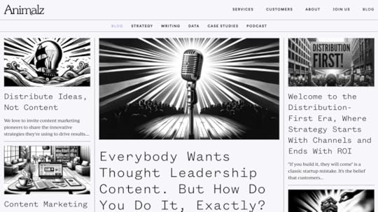
A perfect example of a minimalist design a business blog of content marketing agency — Animalz. With a black and white color scheme, this blog is structured like an online newspaper (matrix web structure). It has a prominent blog post with a featured image at the center of the page, and the rest of the articles are positioned as cards.
You can use MUI components that are built-in UXPin if you want to create a similar blog. Take a menu component and put it on the canvas, then arrange a couple of cards in responsive layout structure.
Zen habits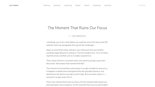
This is a lifestyle blog example that knows well its target audience — individuals interested in personal development, mindfulness, simplicity, productivity, and minimalism. Zen Habits, founded by Leo Babauta, focuses on helping people cultivate habits and lifestyles that promote mindfulness, and overall well-being.
The blog structure reflects those values. With an ample use of white space, elegant typography, and minimalist color scheme, the website design evokes the feelings of serenity, focus, and peace.
Our trial kit contains a similar blog card template that you may use as a landing page of your blog. Like in Zen habits, it features the most recent article. You can quickly add a button with a call to action at the end that makes readers see more articles from the author.
Huberman Lab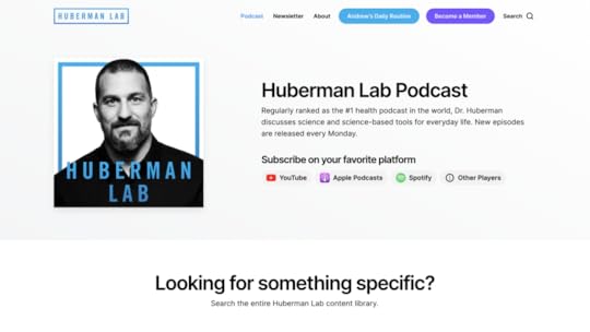
A blog can also feature a list of podcasts and Huberman’s Lab is a great example of that. Andrew Huberman is a neuroscientist and professor at Stanford University who is known for his work on brain plasticity, neuroscience, and optimizing human performance.
Besides its minimalistic color palette, you should note an excellent search option on this blog. It’s very user-friendly and helps you find the right information without scrolling through the entire archive. The blog has also well-thought-out categories to make the target audience focus on the topics they’re interested in.
Travelfloss
People write travel blogs for various reasons, often driven by personal passion, professional interests, or a combination of both. That’s why we included a well-known travel blog in this article. Travelfloss is a blog with travel tips and gear reviews. It’s a great blog for anyone who wants to learn about real travel experience.
They have a well-made navigation menu that features their social media accounts and a great footer with the best links that make the site easy to consume. Every blog entry has lots of eye-catching photographs that make reading more enjoyable.
What also stands out as a design element are tags that also aid navigation. Travelfloss is easy to replicate if you’re looking for a user-friendly blog template.
Sixteen Ventures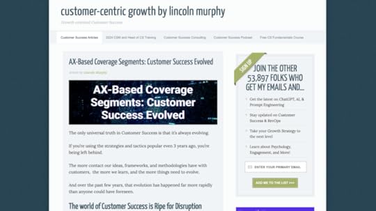
Here’s another example of a business blog. Lincoln Murphy, the author behind Sixteen Ventures is a Customer Success expert who consults the teams wanting to improve their customer experience. At first, his blog looks like any other WordPress theme, but it a well-designed sidebar that we haven’t seen so far.
If you want to advertise other ventures to your audience, a sidebar is a great solution. You can promote your newsletter there, invite people to listen to a podcast or sign up for your course.
Blog layout best practicesHere are seven best practices for blog layout design:
Clear and intuitive navigation: Make sure that visitors can easily find their way around your blog. Use a clear and intuitive navigation menu that prominently displays categories, tags, and other important sections.Mobile responsiveness: With an increasing number of users accessing websites from mobile devices, it’s crucial to ensure that your blog layout is responsive and looks good on smartphones and tablets. Opt for a responsive design that adjusts seamlessly to different screen sizes and orientations.Readable typography: Choose a legible font for your blog posts, headings, and navigation elements. Pay attention to font size, line spacing, and contrast to ensure optimal readability, especially on smaller screens. Aim for a font size of at least 16 pixels for body text.Visual hierarchy: Use visual cues such as headings, subheadings, bold text, and bullet points to create a clear hierarchy of information. This helps readers scan your content quickly and find the most important points. Employ whitespace generously to enhance readability and create a sense of balance.Engaging multimedia content: Incorporate multimedia elements such as images, videos, infographics, and interactive widgets to enhance your blog posts and make them more engaging. Visual content can break up long blocks of text, illustrate concepts, and capture readers’ attention.Consistent branding: Maintain a consistent visual identity across your blog, including colors, typography, imagery, and logo placement. Consistent branding helps reinforce your blog’s identity and makes it easier for visitors to recognize and remember your brand.Optimized loading speed: Optimize your blog layout for fast loading times to provide a smooth user experience. Minimize unnecessary elements, use efficient coding practices, and optimize images and multimedia files to reduce page load times. A fast-loading blog not only improves user satisfaction but also contributes to better search engine rankings.By following these best practices, you can create a blog layout that not only looks appealing but also provides a user-friendly experience, encourages engagement, and supports your blogging goals.
Create a blog layout in UXPinA well-designed blog prioritizes readability and navigation, offering features like categories, tags, and search functionality to guide users seamlessly through the content. By incorporating multimedia elements such as images, videos, and animations, blogs enhance the overall user experience, making it both enjoyable and engaging.
For those looking to streamline the design process, tools like UXPin Merge offer intuitive drag-and-drop functionality, allowing you to create custom UI designs with ease. With the ability to select components, arrange them on the canvas, and customize their properties, UXPin Merge empowers you to bring your vision to life effortlessly.
Begin your journey towards a well-optimized and user-friendly blog layout today with UXPin Merge. Try it for free.
Try UXPin MergeThe post 5 Amazing Blog Layouts for a Beautiful Blog Design appeared first on Studio by UXPin.
April 24, 2024
Unity in Design – Basic Design Concepts Revisted

Unity in UI design is the cohesive arrangement of different elements within a user interface to create a visually harmonious and coherent experience for the end user. It involves organizing interface components such as buttons, icons, text, images, and other graphical elements in a way that they appear to belong together and form a unified whole.
This unity plays a crucial role in enhancing usability, aesthetics, and user satisfaction by creating a cohesive and well-integrated interface that communicates the intended message and facilitates user interactions.
In 2024, unity still remains to be an important principle of design. The evolution of design software and tools has given designers more flexibility and capabilities to achieve unity in innovative ways. For example, advanced software features allow for more precise control over layout, typography, and color palette, making it easier to maintain unity across various platforms.
Build a unified user interfaces and keep them so between design and development. UXPin is a prototyping tool that’s committed to making user interfaces unified. Use its functionalities to achieve a sense of unity that’s easy to replicate in code. Try UXPin for free.
Build advanced prototypesDesign better products with States, Variables, Auto Layout and more.
Try UXPin .try-uxpin-banner { margin: 40px 0px;}.try-uxpin__container { display: flex; max-width: 689px; height: 210px; padding: 20px; padding-left: 24px; border: 2px solid black; border-radius: 4px; align-items: center; justify-content: space-between; background-color: white; box-shadow: 10px 10px black;}.try-uxpin__left { width: 54%;}.try-uxpin__left p { margin: 10px 0px !important; color: black !important;}.try-uxpin__heading { font-size: 28px !important; font-weight: bold;}.try-uxpin__text { margin: 0 !important; font-size: 18px !important; line-height: 22px !important;}.try-uxpin__button { width: 135px; height: 44px; background: black; margin: 10px 0px; padding: 10px 20px; border: none; border-radius: 2px; color: white; font-size: 16px; text-align: center;}.try-uxpin__button:hover { cursor: pointer;}.try-uxpin__image { max-width: 320px !important; height: 200px; margin-right: -21px; margin-bottom: -6px;}@media (max-width: 760px) { .try-uxpin__container { height: auto; margin: 10px; align-items: left; }}@media (max-width: 500px) { .try-uxpin__container { flex-direction: column; } .try-uxpin__left { width: 100%; align-items: normal; }}What is unity principle of design ?
The unity principle of design is a fundamental concept in graphic and UI design as well as art. It refers to the idea of creating visual harmony and cohesion within the web design or app design. It involves organizing elements of design in a way that they appear to belong together and form a cohesive whole.
By applying the unity principle of design, designers can get a clear message across while keeping the design is visually appealing and easy to understand.
How does unity in design enhance user experience?
A unified interface enhances the overall user experience by making it easier for users to understand and navigate the interface. When elements are cohesive and consistent, users can more intuitively interact with the interface, leading to a smoother and more enjoyable experience.
Think of a webpage that doesn’t follow unity as the principle of design. Its header probably contains a mixture of different fonts, sizes, and colors for the logo, navigation menu, and contact information. The logo design clashes with the rest of the page. The navigation menu items are scattered randomly, with no consistent spacing or alignment. Text blocks vary in font size, color, and alignment, making it difficult for users to follow the content flow.
The website lacks a cohesive visual identity and appears haphazardly thrown together. It overwhelms users with conflicting visual elements, making it difficult to navigate and engage with the content. Users may feel disoriented and frustrated due to the lack of unity in design, ultimately leading to a negative user experience and high bounce rates.
Now, imagine a web design that that effectively follows the principle of unity. The heading features a clean and elegant logo that reflects the brand’s identity, using a simple and cohesive color scheme. A minimalist navigation menu is prominently displayed, with clear and consistent typography and use of white space.
The website embodies a sense of unity and coherence throughout its design, creating a tranquil and inviting user experience. The consistent use of color, typography, imagery, and layout reinforces the website’s theme and brand identity. Users feel immersed in a harmonious environment, enhancing their engagement and enjoyment of the website.
This kind of unity can be achieved through visual unity and conceptual unity. Let’s differentiate between the two.
Conceptual unity vs visual unity
Conceptual unity and visual unity are two aspects of design that play critical roles in creating cohesive and effective compositions, whether in art, graphic design, product design, or digital interfaces. Understanding the differences between these two types of unity can help designers better execute their projects according to the intended message or function.
Conceptual UnityConceptual unity refers to the coherence of the ideas behind a design. It focuses on the underlying theme or narrative that ties all elements of the work together. This type of unity is achieved when all parts of the design support a common message or concept, making the overall purpose of the design clear to the viewer.
Characteristics of Conceptual Unity:
Theme Consistency: All elements support a central theme or idea.Message Cohesion: Every part of the design contributes to a unified message, enhancing the communication of a specific concept or story.Emotional or Psychological Impact: The design evokes a consistent emotional response or intellectual engagement from the audience, aligned with the intended concept.For example, in a marketing campaign, conceptual unity might be achieved through consistent messaging that aligns with the brand’s values across different media and platforms, even if the visual presentation varies.
Visual UnityVisual unity, on the other hand, refers to the visual cohesiveness of elements within a design. It involves arranging the visual components in a way that they all feel part of a whole, usually by using consistent colors, shapes, sizes, or repeating patterns. Visual unity is crucial in guiding the viewer’s eye across the design and creating a sense of harmony and balance.
Characteristics of Visual Unity:
Repetition: Repeating visual elements like colors, shapes, or textures throughout the design.Alignment: Arranging elements in a way that lines up along common axes or follows a specific grid structure.Proximity: Grouping related items close together to emphasize their relationship.Continuation: Creating a visual flow that leads the viewer’s eye through the design in a deliberate path.Visual unity can be achieved through the consistent use of color schemes, typography, and layout structures across different pages, ensuring the site feels cohesive and navigable.
How to create unified design
Creating a unified design involves a thoughtful process that combines both conceptual and visual elements to produce a cohesive result.
Step 1: Fill out a design brief.Detail the purpose, goals, and target audience of your design project. Include any specific messages or emotions you want to convey. Then, specify any necessary elements or constraints, such as branding guidelines, budget limits, or timelines. Remember to address potential challenges upfront to streamline the design process.
Step 2: Conduct a design workshop.Get all relevant stakeholders involved in a design workshop, a dedicated time to brainstorm ideas and ensure that the expectations are aligned. Use the workshop to generate creative ideas and explore different approaches to the design. The workshop should end with a clear, agreed-upon direction for the visual and conceptual development of the project.
Step 3: Establish a visual style.Decide on colors, typography, imagery, and overall aesthetic that align with the design brief. This style should visually communicate the intended message and appeal to the target audience. Then, create a style guide that will document these choices to maintain consistency throughout the design process.
Step 4: Gather content.Before designing a mockup, start with content. Content-first design will help you determine how to create visual hierarchy and visual interest on the webpage or app page. It will also help you decide which elements should have more visual weight than others.
Step 5: Create a mockup.Create detailed mockups of your design, which may include digital sketches or prototypes. Refine these mockups by continuously applying design principles to enhance visual and conceptual unity. For example, use balance and alignment to create a structured, aesthetically pleasing layout, arrange content to guide the viewer’s attention effectively, using contrast to highlight key areas, and more.
Step 6: Get feedback.Have team members and stakeholders review the mockups, focusing on how well they meet the design brief and convey the intended message. If possible, gather feedback from potential users or members of your target audience to get insights into the effectiveness and appeal of your design.
Step 7: Hand the design to development.Share with devs a prototype that contains specifications such as dimensions, behavior, and interactions. Provide comprehensive documentation to support the developers, including style guides and interaction descriptions. Maintain communication throughout the implementation phase to address any issues that may arise and ensure the design integrity is maintained.
Practice using unity in designUnity in UI design is about organizing interface elements such as buttons, icons, text, and images in a cohesive manner, ultimately leading to improved usability and user satisfaction.
In 2024, unity remains a vital aspect of design, with advancements in design software providing designers with more tools to achieve it creatively. For instance, advanced features in software like precise layout control and color palette management contribute to maintaining unity across various platforms.
Tools like UXPin facilitate the creation of unified user interfaces by offering functionalities that streamline the design-to-development process. By leveraging such tools, designers can ensure that the unity achieved in design translates seamlessly into the final product. Create user interface designs that have a sense of unity. Try UXPin for free.
Try UXPin for freeThe post Unity in Design – Basic Design Concepts Revisted appeared first on Studio by UXPin.
April 23, 2024
15 Timeless Prototyping Articles for UX Practitioners

Prototyping is one of the most useful UX practices available. Rather than showing your static design, prototypes are the living design.
Luckily, there’s no shortage of advice online, so if you’re looking for some quick reads on prototyping, check out our favorites below.
Still reading articles without practicing prototyping? Start creating with one of the best tools for interactive prototyping. Unlock 14 days of free trial and get a taste of variables, interactctions, and states that transform the way you build a prototype. Try UXPin for free.
Build advanced prototypesDesign better products with States, Variables, Auto Layout and more.
Try UXPin .try-uxpin-banner { margin: 40px 0px;}.try-uxpin__container { display: flex; max-width: 689px; height: 210px; padding: 20px; padding-left: 24px; border: 2px solid black; border-radius: 4px; align-items: center; justify-content: space-between; background-color: white; box-shadow: 10px 10px black;}.try-uxpin__left { width: 54%;}.try-uxpin__left p { margin: 10px 0px !important; color: black !important;}.try-uxpin__heading { font-size: 28px !important; font-weight: bold;}.try-uxpin__text { margin: 0 !important; font-size: 18px !important; line-height: 22px !important;}.try-uxpin__button { width: 135px; height: 44px; background: black; margin: 10px 0px; padding: 10px 20px; border: none; border-radius: 2px; color: white; font-size: 16px; text-align: center;}.try-uxpin__button:hover { cursor: pointer;}.try-uxpin__image { max-width: 320px !important; height: 200px; margin-right: -21px; margin-bottom: -6px;}@media (max-width: 760px) { .try-uxpin__container { height: auto; margin: 10px; align-items: left; }}@media (max-width: 500px) { .try-uxpin__container { flex-direction: column; } .try-uxpin__left { width: 100%; align-items: normal; }}1. Three Metaphors for PrototypingThis clever and thought-provoking piece better explains the heart of prototyping through three novel metaphors. A great read for UX practitioners of any level of experience, Matt Yurdana’s article helps understand the point of prototyping by seeing it from a new light.
2. Why Designers Should Never Skip PrototypingOur own Ben Gremillion explains straightforward why prototyping is not just helpful, it’s practically necessary. If you’re not quite sold on the idea, or new to designing in general, this is a good piece to start
3. Prototyping Your AppIn this helpful piece, Javier Cuello gives an overview of a basic prototyping process, exclusively for apps. Because app prototyping has different goals, even prototyping veterans would find this article helpful in translating the process to this new format.
4. How to Build Functional Prototype FastMany designers ignore prototyping because they view them as wasteful. This is a misconception, as, with the right tools, prototypes can be built from existing documents and later progressed into new documents. We explain how to build interactive, testable prototypes in UXPin.
5. Paper PrototypingShawn Medero discusses everything a UX practitioner needs to know about paper prototyping. While this style has its obvious limitations, for certain purposes nothing is better. This all-inclusive guide explains how, when, and why to use paper over digital mediums.
6. Hi-Fi Prototypes: Design is Our Muse, Code is Our MediumHeather Daggett’s perspective on prototypes is something all UX practitioner’s can learn from. Her article gives a good examination of the theory of prototypes, and why she prefers high fidelity. While she suggests coding, even designers who aren’t familiar with this can still learn from topics like “The Prototyping Mindset.”
7. Exploring the Problem Space Through PrototypingOne of the most reliable voices in UX design, Jared Spool pens an article that lives up to his reputation. His calculated analysis of prototyping reveals how to use it to explore the three dimensions of the problem spaces (technology, business, and users), plus breaks up prototype design into four phases.
8. Creating Perfect User Flows for Smooth UXMarek Bowers wrote an excellent piece for our blog all about user flows, including how to make them and why they’re important. The article also goes into detail about creating user flows for prototyping, and if implemented can increase low-fidelity prototypes.
9. How Prototyping is Replacing DocumentationGetting philosophical about prototyping, Ian Schoen not only gives a concise description of the prototyping practice, he also analyzes its role in the future of design, and how modern prototypes are making more traditional deliverables obsolete.
10. Rapid Front-end Prototyping with WordPressDaniel Pataki explains a very specific process of prototyping, using WordPress templates. While this process isn’t for everyone, he makes a few good points to support his favorite method, as long as you’re familiar with WordPress templates and emphasize the rapidity of prototyping.
11. 3 Top Ways to Build a Website PrototypeAnother piece from our team, this practical article by Jerry Cao dissects the 3 best methods for the common website prototype. This clear-cut article lists out the theory, process, and pros & cons of the most effective ways to build website prototypes, with real-life examples.
12. 10 Tips for Prototyping Your DesignsThis article gives ten standalone pieces of advice for prototyping in general. Almost common sense in their simplicity, and yet neglected enough to warrant reminding, these tips range from “make user interactions as simple as possible” to how to design for a prototype for a specific audience.
13. Sketching in Code: The Magic of PrototypingFor designers that know code, building coded prototypes can save a lot of time and manpower when it comes time for development. David Verba explains what to pay attention to when building a prototype in code.
14. Best React Prototyping ToolsIf designers don’t know how to code but they want to enjoy the benefits of coded prototypes, they can use visual design tools to build their design with React components. Check out what tools make it possible.
15. Design Better and Faster with Rapid PrototypingIn the age of Agile and Lean UX, designers are making more prototypes, and faster. Lyndon Cerejo’s classic article explains the rapid prototyping process: why making and testing more prototypes will ultimately have a better effect on the final product, and how to reduce waste at the same time.
More Comprehensive GuidesWhile these articles are nice for quick tips and refresher lessons, to fully understand all the nuances of prototyping, as well as the other documentations like wireframing and mockups, a more complete guidebook works better.
If you’d like to know the finer details, download our UX Design Builder’s Bundle. This package offers 3 of our most popular design ebooks, the complete guides to Wireframes, Mockups, and Prototypes. Over 350 pages and notable real-life examples like Google Ventures and Apple are available in this single free bundle. Download it now.
Ready to practice prototyping? UXPin is a prototyping tool that makes design and development teams collaboration easy. What you can design, you can put in code. Try UXPin for free.
Try UXPin for freeThe post 15 Timeless Prototyping Articles for UX Practitioners appeared first on Studio by UXPin.
April 19, 2024
10 UX UI Design Trends that Dominate 2024

AI in design, animated icons, cross platform UX are some of the most exciting 2024 UX and UI design trends. Our research has also noticed an interesting UX UI trend toward larger screens, with Instagram improving its desktop experience to accommodate the growing demand.
Create high-quality, fully functioning prototypes to test your UI design ideas with UXPin. Sign up for a free trial to explore UXPin’s advanced features today!
Build advanced prototypesDesign better products with States, Variables, Auto Layout and more.
Try UXPin .try-uxpin-banner { margin: 40px 0px;}.try-uxpin__container { display: flex; max-width: 689px; height: 210px; padding: 20px; padding-left: 24px; border: 2px solid black; border-radius: 4px; align-items: center; justify-content: space-between; background-color: white; box-shadow: 10px 10px black;}.try-uxpin__left { width: 54%;}.try-uxpin__left p { margin: 10px 0px !important; color: black !important;}.try-uxpin__heading { font-size: 28px !important; font-weight: bold;}.try-uxpin__text { margin: 0 !important; font-size: 18px !important; line-height: 22px !important;}.try-uxpin__button { width: 135px; height: 44px; background: black; margin: 10px 0px; padding: 10px 20px; border: none; border-radius: 2px; color: white; font-size: 16px; text-align: center;}.try-uxpin__button:hover { cursor: pointer;}.try-uxpin__image { max-width: 320px !important; height: 200px; margin-right: -21px; margin-bottom: -6px;}@media (max-width: 760px) { .try-uxpin__container { height: auto; margin: 10px; align-items: left; }}@media (max-width: 500px) { .try-uxpin__container { flex-direction: column; } .try-uxpin__left { width: 100%; align-items: normal; }}Top UX UI Trends in 2024Trend #1: AI-integrated DesignFrom brainstorming design solutions, constructing research plan to complex UX design decisions, artificial intelligence is becoming integrated into the design process. ChatGPT took most industries by the storm and design is no different.
In 2023, designers shared prompts left and right and design tools like Framer and other integrated AI processes to help users come up with initial UI to iterate on. We believe that AI-integrated design will be a thing that will help put most repetitive tasks on autopilot. Let’s put our energy into solving complex problems, right?
UXPin is another tool that added AI to its arsenal. Our Merge technology for code-first design has an AI Component Creator built into it. The creator generates a fully-coded Tailwind UI component based on the prompt you write. Check out this to see how it works: ChatGPT in UI design.
Trend #2: Cross-Platform UXWhile cross-platform UX isn’t new to most of you, it will be taken to another level in 2024. Last year we reported that apps like Instagram have upgraded their desktop versions to take advantage of large-screen monitors. YouTube, on the other hand, embraced TikTok-like stories format, making it better suited for hand-held devices.
An approaching trend is personalization within cross-platform experience. Apps want to stay relevant and give the users content that they may enjoy to make them stay longer.
Trend #3: Location-Based UXThe buzz around location-based experiences is growing. The apps that offer it will be the epitome of user-centric design next year, as users are starting to value experiences that are both personalized and effortlessly convenient. Picture this: having public transport recommendations more suitable to your lifestyle.
AI takes center stage in shaping the future of location-based experiences. It helps predict user movements and behaviors. Product teams may use AI to anticipate user preferences, intuitively suggesting relevant places, events, or services—often before users actively seek them out.
Trend #4: Animated IconsAnimated icons have officially made their grand entrance into iOS17, injecting life into your Apple apps. Whether you prefer solid icons or lean towards the elegance of outline icons, now is the time to infuse movement into your visual elements.
Get ready to breathe new life into your interface with animated icons that resonate seamlessly with the dynamic spirit of iOS17.
Trend #5: 3D Visual ElementsAre you trying to visualize complex data, building a UX of a VR app or trying to enhance brand recognition? Include 3D elements in your work! Such interfaces are going to be big in 2024.
3D elements help designers draw the user’s eye and add depth and realism that draws users in. We can’t say what originated the trend but some of the designs look like something that was created using Midjourney – another AI tool.
Trend #6: Emotionally Intelligent DesignEmotionally Intelligent Design means creating products, services, or experiences that take into account users’ emotions. It acknowledges and addresses the emotional aspects of human interaction with technology. Examples of emotionally intelligent design might include features like empathetic error messages or interfaces that adapt to users’ moods.
Key aspects of emotionally intelligent design include:
Empathy: Understanding and empathizing with users’ needs, desires, and emotions. This involves considering the user’s perspective, emotions, and potential pain points throughout the design process.Anticipation: Predicting and responding to users’ emotions and needs before they explicitly express them. This can involve using data, user research, and intuitive design to anticipate user reactions and proactively address potential issues.Feedback and Communication: Providing clear and supportive feedback to users, acknowledging their actions, and communicating effectively. This includes using language, visuals, and interactions that resonate emotionally with the user.Adaptability: Designing interfaces that can adapt to users’ emotional states or changing needs. This might involve customization options, personalization features, or dynamic content that responds to user behavior.Inclusivity: Recognizing and accommodating a diverse range of users with different emotional responses, cultural backgrounds, and preferences. Inclusive design ensures that products and experiences are emotionally resonant for a broad audience.Ethical Considerations: Ensuring that design decisions consider the ethical implications of the product or service, including potential emotional impact. This involves avoiding manipulative practices and prioritizing the well-being of users.Trend #7: Focus on TypographyThe latest trend in typography for 2024 can be summarized in three words: big, bold, and capitalized. It’s fantastic strategy for UI designers looking to grab users’ attention. Even the global web trends website, Awwwards, uses capitalized bold typography for its homepage H1 and header callout.

UI designers also mix typefaces and styles to emphasize words or draw users’ attention. For example, this hero from Lacoste’s Draw it Yourself campaign uses bold capital styling combined with solid and outlined text for its H1.

Tennis star Venus Williams also uses big, bold, capitalized typography throughout her website design. The font helps reinforce Venus’ status as a strong, dominant world number one.

If you want to stand out and position your brand as a dominant market leader, big, bold, capital typography can help achieve that in 2024! For a softer, calmer approach, you can use thin, condensed, and capitalized lettering–like this example from the Aussi-based creative initiative Hip Opera.

Take your UI design to the next level with UXPin–the world’s most advanced design and prototyping tool.
Improve user testing and get meaningful stakeholder feedback with fully interactive prototypes that look and feel like the final product. Sign up for a free trial to explore UXPin’s advanced prototyping features.
Try UXPin for freeThe post 10 UX UI Design Trends that Dominate 2024 appeared first on Studio by UXPin.
April 18, 2024
8 Best Design System Examples in 2024

Design system is a set of components, rules, style guides, and documentation used to build a coherent and on-brand interface of a product. Most brands create their own design system and we prepared a list of eight most popular design systems that you can learn a lot from. Those and other design systems can be found in our design system repository called Adele.
Boost design system adoption and governance with UXPin Merge. Bring all interactive components from your design system to the editor, build fully interactive prototypes, and keep your designs consistent. Read more about UXPin Merge.
Reach a new level of prototypingDesign with interactive components coming from your team’s design system.
Discover UXPin Merge .discover-merge { margin: 40px 8px;}.discover-merge__container { display: flex; max-width: 690px; height: 200px; padding: 20px; padding-left: 24px; border-radius: 4px; background-color: black; box-shadow: 10px 10px #9999ff; align-items: center; justify-content: space-between;}.discover-merge__left { width: 50%;}.discover-merge__left p { margin: 10px 0px !important; color: white !important; font-size: 18px !important;}.discover-merge__heading { font-weight: bold !important; color: white !important; font-size: 18px !important;}.discover-merge__text { margin: 0 !important; line-height: 22px !important;}.discover-merge__button { width: 174px; height: 44px; margin: 10px 0px; border: none; border-radius: 2px; background: white; color: black; font-size: 16px; text-align: center;}.discover-merge__button:hover { cursor: pointer;}.discover-merge__image { max-width: 320px !important; height: 200px; margin-right: -19px;}@media (max-width: 760px) { .discover-merge__container { height: auto; margin: 10px; align-items: left; }}@media (max-width: 500px) { .discover-merge__container { flex-direction: column; } .discover-merge__left { width: 100%; align-items: normal; }}What is a Design System?A design system is a collection of all design resources that a product team may use to build user interface of their app, website, eCommerce store or any other UI design they need to develop.
Design systems aren’t only for designers. They are also for developers, as they contain all code snippets and development resources with necessary front-end code together with documentation as well as design guidelines, relevant plugins, design patterns, style guides, reusable components, rules plus guidelines, and all other building blocks useful for web design and development workflow.

These design systems are then hosted as websites online and can be publicly available (they are open-source design systems) or internal, whatever the brand decides.
We can think of a design system as a vast data library that acts as a valuable document with applicable instructions and examples, product design and coding guidelines, and a part of the UI kit all at the same time.
As you can see, there are many product design concepts related to design systems. If you want to learn to differentiate design systems from pattern libraries, component libraries, and UI kits, read our previous article on the topic: The difference between design system, pattern libraries, style guides, and component libraries.
Why Are Companies Building Unique Design Systems?Companies like Shopify, Google, AirBnB, and other are building their own unique design systems because they want:
Consistency – design systems act as a single source of truth for design and development.Transparency – developers can use the design system components directly, without needing to interpret design decisions.Scale – designers are able to build prototypes faster and streamline developer handoff.Reusability – design systems facilitate the creation of prototypes with consistent components that can be shared within the organization.Clarity – design systems help ensure that design decisions are based on shared knowledge, making it easier for team members to understand and contribute effectively.What is There to Learn from Design Systems?The majority of design systems follow rather general setup patterns.
The system often features its top navigation with the main categories: Design, Code, Language, Components, etc.
Each of these main categories has its subcategories that discuss things in more detail, making the most out of the atomic design structure. For instance, these subcategories could be something like Typography, Color, Forms, Banners, etc.
Following this intuitive navigation can get you valuable information about best practices in terms of design.
The Benefits of Creating a Design SystemWith a well-built design system in place, businesses can considerably improve their teamwork and streamline decision-making process, but that’s not all that you can get from creating a design system.
Such collection of guidelines, elements, and data minimizes communication issues between designers and developers and minimizes the room for potential UX design bugs or acquiring UX debt.
What’s more, having such a reference-rich library significantly reduces the necessary time to go from a prototype to an actual product.
For example, PayPal uses Fluent UI together with Merge technology. This allows them to incorporate the interactive components to the UXPin library. That way, both designers and product team members alike can easily access these components and design with them over and over again. 
Design systems are a great way to minimize the disconnect between designers and developers but are still not the ideal solution on their own. Thanks to the Merge technology revolution, product team members can easily use the same tools and improve their DesignOps workflow processes. This means that both developers and designers can access and use the same UI elements from one single source.
 Design System Challenges and Solution
Even when companies try to create their design system, specific issues and consistency disconnects can still happen, especially when maintaining all the elements, documentation and code.
Learn more about design system challenges and solutions from one of the top design leaders – Johnson & Johnson. During our webinar, the J&J team shared all their best practices.
Google Material Design System
One of the most popular design system is Google’s Material Design. Google created and publicly shared their Material Design System that goes into the tiniest details regarding everything there is to know about the design and design principles. Every UXPin user can easily use the Material Design components as they are one of the UXPin libraries.
Thanks to this system, users can get valuable information that perfectly unifies UI and UX across different devices, platforms and input methods.
Material Design allows other brands and individuals to have a strong foundation for building upon when it comes to their own approach to atomic design, industry innovation and unique brand expression.
The main features of the Google Material Design System include:
Starter KitsDesign Source FilesMaterial ThemingLayoutTypographyColorComponentsMobile GuidelinesGoogle’s Material Design System looks very mature. It has a lot of design guidelines, but it also contains documentation about UI components that are used in development. Did you know that such components can be used in design? Bring your developers’ components to design with UXPin’s Merge technology. Request access to UXPin Merge.
Apple Human Interface Guidelines
Apple has one of the top design system. It is called Apple Human Interface Guidelines and it presents a vast and rather valuable design system resource for the web design essentials and pattern libraries but downloadable templates. The iOS UI kit library is also available with a UXPin account.
The system follows Steve Job’s design principles:
Craft with great precision and attention to detailEmphasize user experience and connection with the usersFocus on what’s truly important on a larger scaleGenerate wanted user reactions thanks to the specific design language and practicesUtilize the friendly aspect of high tech for both novice and advanced usersSimplify everythingFeatures of Apple Design SystemApple Human Interface Guidelines consist of practical resources, visual guidelines and style guides for both designers and developers for iOS, macOS, vOS and watchOS.
Its includes design system documentation about using:
MenusButtonsIcons and ImagesFields and LabelsWindow and ViewTouch BarIndicatorsSelectorsExtensionsVisual DesignVisual IndexApp ArchitectureSystem CapabilitiesUser InteractionThemesAtlassian Design System
Atlassian Design System is one of the best out there. Atlassian Design System focuses on providing valuable assistance to teams from all over the world by making their collaboration seamless and easy. Atlassian Design Guidelines are also a part of UXPin’s library collection.
Atlassian design philosophy is all about utilizing the digital experience to improve the productivity and overall potential of teams and individual team members, perfectly reflected in their globally used collaboration tools Trello and Jira.
That said, Atlassian Design System features agile practices and efficient tracking of every single step within a project that ultimately yields valuable results in terms of product delivery and development.
Features of Atlassian’s design systemAtlassian’s design system includes
UI componentsbrand valuesUI kitUI patternsdesign tokensillustration librarycontent guidelinesUber Design System
According to Uber, movement ignites opportunity and that’s how they structured their design system.
After all, Uber service bases on movement with ride-hailing, peer-to-peer ridesharing, food delivery and micro-mobility involving scooters and electric bikes.
For this type of service to work impeccably, from sub-brands to internal ones and products to programs, Uber requires an effective design system that the company shares with the rest of the world.
Features of Uber Design SystemMain features of Uber Design System:
Brand ArchitectureCompositionTone of VoiceMotionIllustrationPhotographyIconographyColorLogoTypographyShopify Design System Polaris
Shopify is a global eCommerce platform that provides everything a brand may need to run and grow its business in one place.
It’s no wonder that their design principles focus on creating a better and more accessible commerce experience.
Shopify’s public design system called Polaris encompasses the company’s core values:
Be caring and considerate to the usersProvide people with the right tools to accomplish whatever they set out to doEnjoy the top level of craftsmanship that matches the brand imageMinimize the hustle by providing accurate and quick solutionsAlways build upon users’ trustMake the users feel comfortable with using the productsPolaris Design System provides an easy-to-follow and practical style guide for designing for the Shopify platform. It offers a vast knowledge base on utilizing UI components, visual elements, content, and design language for creating a better user experience and product in general.
Features of Shopify’s Design SystemShopify Design System Polaris includes main features that follow the practices mentioned above to a tee:
Data VisualizationAccessibilityInteraction StatesColorsTypographyIconsIllustrationsSpacingSoundsResourcesIBM Carbon Design System
IBM operates on a global scale by meeting large enterprise IT needs.
Their services range from business consulting and financing, software development and IT hosting/management to software-to-hardware products.
IBM’s core belief revolves around making constant progress, be that human condition, society or a brand, by utilizing science, reason and intelligence.
According to IBM, a good design is not only a mere requirement but an actual responsibility to the users.
Features of IBM’s Design SystemThis is where their Carbon Design System shines with its main features, offering plenty of tools and visual resources for Adobe, Axure and Sketch designers as well as developers:
Data VisualizationPatternsComponentsGuidelinesTutorialsUXPin users can conveniently find everything they need from Carbon in their account as well.
Mailchimp Design System
Mailchimp has come a long way from being a renowned email marketing leader to providing an all-in-one marketing platform that goes beyond email only.
Mailchimp has one clear goal: to help small businesses grow while remaining true to their brand identity and image.
Features of Mailchimpr’s Design SystemThat is also one of the many reasons behind creating the Mailchimp Design System and its main features that focus on creative expression, better user experience and top quality:
Data VisualizationGrid SystemColorTypographyComponentsSalesforce Lightning Design System
Salesforce goes above and beyond to deliver a personalized experience to its users through the integrated cloud-based CRM software.
The purpose of the Salesforce CRM is to improve marketing, commerce, IT, service and sales efforts – and allows their users to do the same with their users.
Their design philosophy is reflected in the Hawaiian word for intentional family, Ohana, with four core values that drive their company actions and overall culture:
InnovationEqualityTrustCustomer SuccessFeatures of Salesforce Design SystemSalesforce has put out their own Lightning Design System that allows everyone working with content management systems to learn and benefit from its main features:
Design GuidelinesPlatformsAccessibilityComponents (and a lot of them)Lightning components are a part of the UXPin account libraries as well.
Make the Most of Design System: the UXPin Merge WayMerge tech is created as an adequate solution to common challenges that often happen when there’s a communication gap between design and development teams. So, various UI components, coding and documentation inconsistencies can arise, affecting the product’s efficiency and maintenance.
With the design system that organizes all of the necessary components as a first step in the right direction, Merge will then take all those UI elements right to the design editor.
You’ll save time and money by avoiding inconsistencies, not to mention the joy of seeing an end product that’s exactly the same as what you originally envisioned!
Merge tech focuses on design with code components, that is converting a code component into the design. In that respect, designers don’t simply create prototypes based solely on the visual aspect of the final product (while only faking the necessary interactions); instead, designers use already coded components to design the prototype image.
There’s no need to go back and forth between the design and dev team since the design team can take the already existing coded components, synchronize them with UXPin’s editor, and drag and drop the components they need to create new designs.
Essentially, designers don’t have to create fake interactions, add them or search for the right colors.

On the other end, developers get the prototype preview and continue to work with the available production-ready elements.
Which Design System Example is Your Favorite?Design systems consist of tons of UI components and guidelines that are meant to optimize and improve the design efforts and promote consistency among the teams.
However, if the design system is poorly maintained and implemented, the said system can turn into nothing more than many clunky and confusing code snippets, libraries and components.
A design system can quickly help team members to promote consistency while also allowing designers to deal with more complex UX issues. And when you add revolutionary Merge tech to the mix, you can truly take your design system organization to the next level. Learn more about UXPin Merge.
Discover MergeThe post 8 Best Design System Examples in 2024 appeared first on Studio by UXPin.
April 17, 2024
What is a Front-End Engineer?
Front-end engineers play a crucial role in shaping the visual and interactive aspects of software applications, contributing to the overall success of the product. They are the ones who develop the user interface and user experience of websites and web applications, ensuring they are visually appealing, interactive, and optimized for performance across various devices and browsers.
As a front-end engineer, you don’t need to use pixels to build a stunning user interface. Use code-based tools instead! UXPin Merge allows you to assemble a web design or app design with UI components that are fully functional and ready for production. Try UXPin Merge for free.
Create beautiful layouts without designersDesign production-ready prototypes 8.6x faster. No pixels. pure code.
Try UXPin Merge .discover-merge { margin: 40px 8px;}.discover-merge__container { display: flex; max-width: 690px; height: 200px; padding: 20px; padding-left: 24px; border-radius: 4px; background-color: black; box-shadow: 10px 10px #9999ff; align-items: center; justify-content: space-between;}.discover-merge__left { width: 50%;}.discover-merge__left p { margin: 10px 0px !important; color: white !important; font-size: 18px !important;}.discover-merge__heading { font-weight: bold !important; color: white !important; font-size: 18px !important;}.discover-merge__text { margin: 0 !important; line-height: 22px !important;}.discover-merge__button { width: 174px; height: 44px; margin: 10px 0px; border: none; border-radius: 2px; background: white; color: black; font-size: 16px; text-align: center;}.discover-merge__button:hover { cursor: pointer;}.discover-merge__image { max-width: 320px !important; height: 200px; margin-right: -19px;}@media (max-width: 760px) { .discover-merge__container { height: auto; margin: 10px; align-items: left; }}@media (max-width: 500px) { .discover-merge__container { flex-direction: column; } .discover-merge__left { width: 100%; align-items: normal; }}What is a front-end engineer?A front-end engineer is a professional who specializes in developing the UI and UX design of websites, mobile and web applications. Their primary focus is on creating visually appealing, interactive, and responsive interfaces that end users interact with.
Front-end engineers are responsible for translating design prototypes into functional user interfaces. They ensure that user interfaces are optimized for performance, accessibility, and compatibility across different browsers and devices.
That’s why they often collaborate closely with designers, back-end developers, and stakeholders to understand project requirements and integrate front-end components with back-end systems. They may also be involved in tasks such as prototyping, testing, and maintaining code quality to ensure a seamless user experience.
Front-end engineer vs front-end developerWhile both front-end engineers and front-end developers work on web development, a front-end engineer may be expected to have a deeper understanding of the technical aspects and may take on more responsibilities beyond just implementing user interfaces. However, the exact distinction between the two roles can vary depending on the specific requirements of the job and the organization.
A front-end developer typically focuses on implementing the user interface and the user experience of a website or web application. They primarily work with HTML, CSS, and JavaScript to create the visual and interactive elements that users interact with directly in their browsers. Front-end web developers are concerned with ensuring that the website or application looks good, functions correctly, and provides a smooth user experience across different devices and browsers.
A front-end engineer may have a broader skill set and a deeper understanding of the underlying technologies and principles involved in front-end development. They might also be involved in more complex tasks such as optimizing performance, architecting scalable solutions, integrating with back-end systems, and collaborating closely with designers, product managers, and other team members. Front-end engineers may also be responsible for setting up development workflows, maintaining code quality, and ensuring adherence to best practices and standards.
Front-end engineer vs software engineerWhile a front-end engineer focuses specifically on developing the user interface and user experience of applications, a software engineer may work on various aspects of software development across different layers of the technology stack. The distinction between the two roles lies in their specific focus and responsibilities within the broader field of software engineering.
A software engineer is a broader term that encompasses professionals who design, develop, test, and maintain software systems. While some software engineers may specialize in front-end development, others work on back-end systems, databases, infrastructure, or even specialize in areas like machine learning, data science, or embedded systems. Software engineers typically have a strong foundation in computer science principles and may work with a variety of programming languages and technologies depending on the requirements of their projects.
What is a front-end engineer job description?A front-end engineer job description typically includes responsibilities such as developing user interfaces, as well as implementing interactive features and functionality using HTML, CSS, and JavaScript. They are asked to ensure the technical feasibility of UI and UX designs and optimize them for maximum performance and responsiveness.
Front-end engineers may be required to conduct usability testing and gather feedback to continuously improve how user-friendly the end product is. And sometimes, they need to design user interfaces by themselves instead of collaborating with designers.
It’s a great career path for those of you who are proficient in front-end web development technologies, including HTML, CSS, and JavaScript, and experienced in front-end frameworks and UI libraries such as React, Angular, or Vue.js.
What is a front-end engineer skill set?To create visually appealing, interactive, and user-friendly interfaces for websites and web applications, front-end engineers use a combination of soft and hard skills.
Soft skillsCommunication: Front-end engineers need strong communication skills to effectively collaborate with designers, back-end developers, and other team members. Clear communication ensures that everyone is on the same page regarding project requirements, timelines, and expectations.Problem-solving: Front-end engineers encounter various challenges while designing and developing user interfaces. They should have excellent problem-solving skills to troubleshoot issues, debug code, and find creative solutions to technical problems.Attention to Detail: User interfaces require pixel-perfect precision and attention to detail. Front-end engineers should have a keen eye for design and be meticulous in ensuring that UI elements are accurately implemented according to design specifications.Adaptability: The front-end landscape is constantly evolving, with new frameworks, libraries, and best practices emerging regularly. Front-end engineers should be adaptable and open to learning new technologies to stay up-to-date with industry trends.Time Management: Front-end development projects often have tight deadlines and shifting priorities. Effective time management skills are essential for front-end engineers to prioritize tasks, meet deadlines, and deliver high-quality work under pressure.Hard skillsHTML: Proficiency in Hypertext Markup Language (HTML) is fundamental for front-end engineers to structure the content of web pages and applications.CSS: Strong skills in Cascading Style Sheets (CSS) are necessary for styling and formatting HTML elements, creating layouts, and implementing visual designs.JavaScript: In-depth knowledge of JavaScript is essential for adding interactivity and dynamic behavior to web pages, handling user input, and manipulating the Document Object Model.Front-end Frameworks: Experience with popular front-end frameworks and libraries such as React, Angular, or Vue.js is often required for building scalable and maintainable user interfaces.Responsive Design: Understanding of responsive design principles and techniques is crucial for creating interfaces that adapt and perform well on different devices and screen sizes.Cross-browser Compatibility: Knowledge of cross-browser compatibility issues and techniques for addressing them ensures that web applications function consistently across various web browsers.Version Control: Familiarity with version control systems like Git is important for collaborating with team members, tracking changes, and managing code repositories effectively.Testing and Debugging: Proficiency in testing frameworks and debugging tools is necessary for identifying and fixing bugs, ensuring code quality, and optimizing performance.User Experience Design: Basic understanding of UX design principles and usability best practices helps front-end engineers create intuitive and user-friendly interfaces that enhance the overall user experience.Performance Optimization: Knowledge of performance optimization techniques, such as minimizing page load times and reducing render-blocking resources, is valuable for optimizing the performance of web applications.Senior front-end engineer vs juniorJunior front-end engineers are still developing their skills and gaining experience by learning coding standards, user experience requirements, architectural design principles, and honing their project management skills.
Senior front-end engineers bring a wealth of expertise, leadership, and problem-solving abilities to the table, making significant contributions to their teams and projects.
Less experienced front-end engineers may lack technical depth, problem-solving skills, and opportunities to collaborate with back-end engineering colleagues.
Having said that, you may still find a lot of entry-level front-end engineering positions that don’t look for programmers with years of experience. Look for startup jobs on LinkedIn or Glassdoor.
Do front-end engineers code?Yes, front-end engineers do code. In fact, coding is a fundamental aspect of their role. They use languages such as HTML, CSS, and JavaScript to create the structure, style, and interactivity of web pages.
They write HTML to define the content and structure of a webpage, CSS to style and format the elements on the page, and JavaScript to add interactivity and dynamic behavior.
In addition to coding with these core languages, front-end engineers often work with various frameworks, libraries, and tools to streamline development and enhance the functionality of web applications. They write code to implement features such as animations, form validation, client-side routing, and data manipulation, using frameworks like React, Angular, or Vue.js.
What are front-end engineer languages?Front-end engineers primarily work with a combination of languages and technologies to develop products, such as web apps, mobile apps, and more.
HTMLHTML (short for Hypertext Markup Language) is the standard markup language used to create the structure and content of web pages. It defines the elements and layout of a webpage, such as headings, paragraphs, links, images, and forms.
CSSCSS (Cascading Style Sheets) is a styling language used to control the presentation and appearance of HTML elements on a web page. It defines styles such as colors, fonts, layout, and positioning, allowing front-end engineers to create visually appealing and responsive designs.
JavaScriptJavaScript is a programming language used to add interactivity and dynamic behavior to web pages. It enables front-end engineers to create interactive features such as animations, form validation, and content updates without needing to reload the entire page.
Build front-end design 8.6x fasterFront-end engineers are pivotal in crafting the visual and interactive essence of software applications, contributing significantly to their overall success. They spearhead the development of user interfaces, ensuring they are not only visually captivating but also seamlessly functional and optimized for performance across diverse devices and browsers.
Build stunning user interfaces without the pain of translating pixels into code. With UXPin Merge, creating UI for web or app becomes a streamlined process – you can copy the code off the design to use in your front-end development environment. Try UXPin Merge for free today.
Try UXPin MergeThe post What is a Front-End Engineer? appeared first on Studio by UXPin.
April 15, 2024
Engineering KPIs — Key Performance Indicators for Your Engineering Team
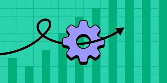
Key Performance Indicators, or KPIs, in engineering are essential metrics used to evaluate the performance and effectiveness of development processes, projects, and teams. By paying close attention to those indicators, engineering teams can assess their performance, identify areas for improvement, and deliver robust, scalable, and secure products that meet user needs and business objectives.
Meet your KPIs connected to design and frontend engineering with UXPin Merge, a design technology that helps you build beautiful and functional layouts 8.6x faster and keep consistency between design and development. Try UXPin Merge for free.
Create beautiful layouts without designersDesign production-ready prototypes 8.6x faster. No pixels. pure code.
Try UXPin Merge .discover-merge { margin: 40px 8px;}.discover-merge__container { display: flex; max-width: 690px; height: 200px; padding: 20px; padding-left: 24px; border-radius: 4px; background-color: black; box-shadow: 10px 10px #9999ff; align-items: center; justify-content: space-between;}.discover-merge__left { width: 50%;}.discover-merge__left p { margin: 10px 0px !important; color: white !important; font-size: 18px !important;}.discover-merge__heading { font-weight: bold !important; color: white !important; font-size: 18px !important;}.discover-merge__text { margin: 0 !important; line-height: 22px !important;}.discover-merge__button { width: 174px; height: 44px; margin: 10px 0px; border: none; border-radius: 2px; background: white; color: black; font-size: 16px; text-align: center;}.discover-merge__button:hover { cursor: pointer;}.discover-merge__image { max-width: 320px !important; height: 200px; margin-right: -19px;}@media (max-width: 760px) { .discover-merge__container { height: auto; margin: 10px; align-items: left; }}@media (max-width: 500px) { .discover-merge__container { flex-direction: column; } .discover-merge__left { width: 100%; align-items: normal; }}What are engineering KPIs?Key Performance Indicators in engineering are specific metrics used to measure the effectiveness, efficiency, and performance of engineering processes, projects, teams, or organizations.
Software engineering KPIs provide valuable insights into various aspects of engineering operations and help in assessing progress towards goals, identifying bottlenecks, streamlining decision-making and making data-driven decisions. Those KPIs can vary depending on the specific business goals and software development objectives.
Why should you track performance metrics?Tracking engineering metrics is crucial for assessing progress, identifying areas for improvement, making informed decisions, driving accountability, optimizing resource allocation, setting goals, demonstrating value, and promoting continuous improvement within organizations.
Measuring Progress: Performance metrics provide quantitative data that allows you to measure progress towards specific goals and objectives. Without tracking metrics, it’s challenging to assess whether you’re moving in the right direction or if adjustments are necessary.Identifying Areas for Improvement: By regularly monitoring performance metrics, you can identify areas of inefficiency, bottlenecks, or underperformance within processes, projects, or teams. This insight enables you to take corrective actions and implement improvements to enhance overall performance.Making Informed Decisions: Performance metrics serve as a basis for making data-driven decisions. When you have accurate and up-to-date information about various aspects of your operations, you can make informed choices about resource allocation, process optimization, and strategic planning.Driving Accountability: Tracking performance metrics creates accountability within teams and organizations. When individuals know that their performance is being measured and evaluated against specific benchmarks, they are more likely to strive for excellence and take ownership of their responsibilities.Optimizing Resource Allocation: Performance metrics help you allocate resources—such as manpower, time, and budget—more effectively. By identifying areas of high performance and areas needing improvement, you can reallocate resources to where they are most needed, maximizing efficiency and productivity.Setting and Adjusting Goals: Performance metrics provide feedback that informs the setting of realistic and achievable goals. By analyzing historical data and current performance trends, you can establish targets that are challenging yet attainable. Additionally, tracking metrics allows you to adjust goals as circumstances change or new priorities emerge.Demonstrating Value and ROI: Performance metrics enable you to demonstrate the value and return on investment (ROI) of your initiatives, projects, or processes. Whether it’s showing cost savings, productivity gains, or improvements in quality, having measurable results strengthens your case when seeking support or funding for future endeavors.Promoting Continuous Improvement: Tracking performance metrics fosters a culture of continuous improvement within organizations (something DevOps processes are known for.) By regularly reviewing and analyzing data, teams can identify opportunities for innovation, experimentation, and optimization, driving ongoing enhancements in performance and competitiveness.Who is responsible for setting engineering KPIs?Setting engineering Key Performance Indicators typically involves collaboration between various stakeholders within an organization. While the exact responsibility for setting KPIs may vary depending on the organization’s structure and culture, some key roles that are often involved are engineering leaders, engineering managers, project management team or any other team members in leadership positions.
Engineering Manager or Director: Engineering managers or directors are often responsible for setting overarching engineering KPIs aligned with the organization’s strategic objectives. They have a comprehensive understanding of the engineering department’s goals, resources, and capabilities, making them well-positioned to establish KPIs that drive performance and support overall business objectives.Project Managers: Project managers play a crucial role in setting project-specific KPIs tailored to individual engineering projects. They collaborate with stakeholders to define project goals, scope, and success criteria, and they translate these into measurable KPIs that track project progress and performance. Project managers ensure that KPIs are realistic, achievable, and aligned with project timelines and budgets.Engineering Leaders: Engineering team leaders are responsible for setting KPIs at the team level. They work closely with their teams to identify key areas of focus, performance metrics, and targets that contribute to overall departmental and project goals. Team leaders ensure that KPIs are relevant to their team’s responsibilities, skillsets, and priorities.Operations Managers: Operations managers play a key role in setting KPIs related to operational efficiency, resource utilization, and process optimization within engineering operations. They identify opportunities to streamline workflows, reduce costs, and improve productivity by establishing KPIs that track performance metrics such as cycle times, throughput, and resource efficiency.Executive Leadership or Management Team: Executive leadership, including CEOs, COOs, and other senior managers, play a supervisory role in setting high-level strategic KPIs for the organization as a whole. They provide guidance, direction, and oversight to ensure that engineering KPIs align with broader business objectives and contribute to the company’s long-term success.Where should you track engineering KPIs?Tracking engineering Key Performance Indicators (KPIs) requires an effective system that allows for the monitoring, analysis, and visualization of relevant metrics.
Two common tools used for tracking KPIs in engineering are KPI dashboards and scoreboards.
KPI DashboardA KPI dashboard is a visual representation of key performance indicators. It provides real-time or near-real-time insights into various aspects of engineering performance, allowing stakeholders to monitor progress, identify trends, and make data-driven decisions.
Benefits of KPI dashboardsCentralized Monitoring: KPI dashboards centralize performance data in one accessible location, enabling stakeholders to monitor engineering KPIs efficiently.Data-Driven Decision Making: Dashboards facilitate data-driven decision-making by providing real-time insights and actionable information.Transparency and Accountability: By making KPI data visible to relevant stakeholders, dashboards promote transparency and accountability within engineering teams and organizations.Performance Tracking: Dashboards allow for continuous tracking and analysis of engineering performance metrics, enabling timely interventions and improvements.Communication and Collaboration: Dashboards serve as a communication tool, facilitating collaboration and alignment across different departments and teams.ScorecardScoreboards are physical or digital displays that present a limited set of key metrics in a prominent and easily accessible format. They are often used to track performance in real time.
Benefits of scorecardImmediate Feedback: Scorecards provide immediate feedback on performance, enabling rapid response to deviations from targets or standards.Motivation and Engagement: Visible scorecards create a sense of urgency and motivation among employees to meet or exceed performance targets.Operational Awareness: Scorecards enhance operational awareness by keeping employees informed about current performance levels and priorities.Alignment with Goals: Scorecards align frontline employees with organizational goals and objectives by emphasizing key metrics that drive success.Continuous Improvement: Scorecards support a culture of continuous improvement by fostering transparency, accountability, and focus on performance outcomes.Both KPI dashboards and scorecards play important roles in tracking engineering KPIs, providing valuable insights and facilitating decision-making at different levels of the organization. The choice between the two depends on factors such as the nature of the data, the preferences of stakeholders, and the specific requirements of the monitoring environment.
Examples of engineering KPIsThese KPIs provide insights into the performance and effectiveness of software engineering team and processes, guiding product development teams in optimizing features, functionalities, and overall user experience.
Time to MarketTime from ideation to product launch: Measures the duration taken to develop and launch a new feature.
Product Performance and ReliabilityUptime and Availability: Measures the percentage of time the digital product is operational and accessible to users.Load Time: Tracks the time it takes for the product or its components to load, ensuring optimal user experience.Error Rate: Monitors the frequency of errors encountered by users during interactions with the product.Error Resolution Time: Measures the time taken to identify and resolve errors reported by monitoring tools or users.Scalability and ReliabilitySystem Downtime: Tracks the amount of time back-end systems are unavailable or non-operational, aiming for high availability and reliability.Load Testing Results: Evaluates the performance and scalability of back-end systems under simulated load conditions.Capacity Planning: Anticipates future resource allocation and capacity needs based on usage patterns and growth projections.Product Development EfficiencyAgile Metrics (e.g., sprint burndown): Tracks the progress and efficiency of development teams using Agile methodologies.Change Failure Rate: Assesses the success of changes implemented within a system, process, or product. It measures the percentage of changes that result in an unsuccessful outcome, such as causing incidents, defects, or disruptions to operations.Time to Resolve Bugs or Issues: Measures the time taken to identify and resolvea number of bugs or issues reported by users or detected through testing.Feature Implementation Time: Measures the time taken to implement new front-end features or user interface enhancements.Sprint Velocity: Tracks the amount of work completed by the front-end development team within each sprint or iteration.Release Burndown: A chart tool used to track the progress of completing tasks or user stories within a release or sprint. It helps visualize how much work is remaining to be done over time and whether the team is on track to meet the release or sprint goals.Bug Fixing Time: Measures the time taken to identify and resolve front-end bugs reported by QA or users.Deployment Frequency: Tracks the frequency of front-end deployments to production or staging environments, indicating development and release cadence.Customer SatisfactionNet Promoter Score (NPS): Measures user satisfaction and likelihood to recommend the product to others through surveys.Customer Satisfaction (CSAT) Score: Tracks user satisfaction levels based on feedback collected through customer support interactions or post-interaction surveys.Design Consistency ScoreAssesses the degree of consistency in design elements, styles, and patterns maintained across different products or features.Can be evaluated through automated tools or manual reviews to identify deviations from established design system standards.Components Reuse RateTracks the percentage of design system components reused in multiple projects or features.Indicates the efficiency of the design system in promoting component reuse and reducing redundant design efforts.Code QualityCode Review Feedback Time: Measures the time taken to provide feedback on pull requests or code reviews.Code Coverage: Tracks the percentage of code covered by automated tests, ensuring comprehensive testing of front-end functionality.Code Maintainability: Assess the maintainability of front-end codebase using metrics such as cyclomatic complexity or Maintainability Index.Static Code Analysis Violations: Monitors the number of violations identified by static code analysis tools, indicating potential code quality issues.Technical Debt: Monitors the accumulation of technical debt in the back-end codebase, which may impact maintainability and scalability.Performance OptimizationPage Load Time: Measures the time taken for web pages to load in users’ browsers, optimizing for faster loading times.Time to Interactive (TTI): Tracks the time it takes for web pages to become interactive and responsive to user input.Performance Budget Adherence: Ensures compliance with predefined performance budgets for front-end assets such as JavaScript file size, image compression, and network requests.Service response Time: Measures the time taken for back-end services to respond to requests, optimizing for faster response times.Throughput: Tracks the number of requests processed by back-end services per unit of time, ensuring scalability and performance.Accessibility ComplianceAccessibility Audit Results: Evaluates the adherence of front-end code and user interfaces to accessibility standards (e.g., WCAG).Keyboard Navigation Support: Ensures that front-end interfaces are fully navigable using keyboard inputs, enhancing accessibility for users with disabilities.Stakeholder SatisfactionStakeholder Feedback: Collects feedback from product owners, designers, and other stakeholders regarding the quality, usability, and performance of front-end deliverables.Alignment with Requirements: Ensures that back-end implementations align closely with functional and non-functional requirements specified by stakeholders.Security and ComplianceVulnerability Patching Time: Measures the time taken to patch security vulnerabilities in back-end systems and libraries.Compliance Adherence: Ensures compliance with industry standards and regulations (e.g., GDPR, HIPAA) regarding data privacy and security.Security Audit Results: Evaluates the results of security audits and penetration testing conducted on back-end systems.FAQWhat are KPIs for engineering leads?Engineering leads play a critical role in overseeing engineering teams, managing projects, and driving technical innovation within organizations. Key Performance Indicators (KPIs) for engineering leads are typically focused on measuring their effectiveness in leading teams, delivering projects, and achieving technical objectives. Here are some common KPIs for engineering leads:
Team Performance:Team Productivity: Measure the output or throughput of the engineering team, such as the number of features developed, lines of code written, or tasks completed within a given time frame.Team Efficiency: Assess the efficiency of the engineering team’s processes and workflows, including metrics like cycle time, lead time, and throughput efficiency.Team Satisfaction: Gauge the satisfaction and engagement levels of team members through surveys, feedback sessions, or retention rates.Project Delivery:Project Timelines: Track the adherence to project timelines and milestones, including on-time delivery of features, releases, or project phases.Project Budget Management: Monitor project budget utilization and cost control measures to ensure projects are delivered within budget constraints.Quality of Deliverables: Measure the quality of engineering deliverables, such as the number of defects or bugs reported post-release, customer-reported issues, or adherence to quality standards.Technical Leadership:Innovation and Technical Contributions: Evaluate the engineering lead’s contributions to technical innovation, such as the introduction of new technologies, development methodologies, or process improvements.Technical Mentorship and Development: Assess the effectiveness of the engineering lead in providing mentorship and guidance to team members, fostering their technical growth and skill development.Knowledge Sharing and Collaboration: Measure the extent to which the engineering lead promotes knowledge sharing, collaboration, and cross-functional communication within the engineering team and with other departments.Stakeholder Satisfaction:Customer Satisfaction: Evaluate customer satisfaction with engineering deliverables, products, or services through surveys, feedback channels, or Net Promoter Score (NPS).Internal Stakeholder Satisfaction: Assess the satisfaction levels of internal stakeholders, such as product managers, marketing teams, or executive leadership, with the engineering lead’s performance and contributions.Risk Management:Risk Mitigation: Track the identification, assessment, and mitigation of risks associated with engineering projects, including technical risks, resource constraints, and dependencies.Issue Resolution: Measure the effectiveness and timeliness of issue resolution by the engineering lead, including the handling of escalations, critical incidents, or project roadblocks.Leadership Effectiveness:Employee Engagement: Monitor employee engagement levels, job satisfaction, and retention rates within the engineering team.Leadership Development: Assess the engineering lead’s investment in leadership development initiatives, such as training programs, coaching, or succession planning.Operational Excellence:Process Improvement: Measure the implementation of process improvements and best practices within the engineering organization, leading to increased efficiency, quality, and innovation.Resource Utilization: Evaluate the optimal utilization of engineering resources, including manpower, tools, and infrastructure, to maximize productivity and minimize waste.Business Impact:Alignment with Business Goals: Assess the extent to which engineering initiatives and projects align with broader business objectives and contribute to the organization’s strategic priorities.Return on Investment (ROI): Measure the ROI of engineering projects and initiatives in terms of revenue generation, profitability, cost savings, market share growth, or competitive advantage.Cost Savings from Engineering Initiatives: Cost savings resulting from engineering initiatives, such as process improvements, efficiency gains, or resource optimization, contribute to overall profitability.These KPIs provide a comprehensive framework for evaluating the performance of engineering leads and ensuring alignment with organizational goals, technical excellence, and effective leadership practices.
What is KPI for engineering director?Key Performance Indicators (KPIs) for an Engineering Director are focused on assessing their effectiveness in leading the engineering department, driving strategic initiatives, and achieving organizational objectives.
Team Performance and ProductivityOverall Team Productivity: Measure the overall output and efficiency of the engineering department in terms of projects completed, features developed, or products delivered within a specified timeframe.Resource Utilization: Assess the optimal utilization of engineering resources, including manpower, equipment, and budget allocations, to maximize productivity and efficiency.Employee Satisfaction and Retention: Monitor employee satisfaction levels, engagement, and retention rates within the engineering department as indicators of leadership effectiveness and team morale.Project Delivery and ExecutionProject Timelines and Milestones: Track the on-time delivery of engineering projects, adherence to project timelines, and achievement of project milestones.Budget Management: Evaluate the management of project budgets, including cost control measures, budget utilization, and adherence to financial targets.Quality of Deliverables: Measure the quality of engineering deliverables, products, or services through metrics such as defect rates, customer satisfaction scores, or adherence to quality standards.Strategic Leadership and Innovation:Technical Innovation and Thought Leadership: Assess the Engineering Director’s contributions to technical innovation, adoption of new technologies, and thought leadership within the industry.Strategic Planning and Execution: Evaluate the development and execution of strategic plans, initiatives, and roadmaps to drive the long-term growth and competitiveness of the engineering department and the organization as a whole.R&D Investment and Impact: Measure the investment in research and development (R&D) activities and the impact of R&D initiatives on product innovation, differentiation, and market leadership.Stakeholder Engagement and SatisfactionCustomer Satisfaction: Evaluate customer satisfaction with engineering deliverables, products, or services through surveys, feedback channels, or Net Promoter Score (NPS).Internal Stakeholder Satisfaction: Assess the satisfaction levels of internal stakeholders, such as executive leadership, product management, sales, and marketing teams, with the engineering department’s performance and contributions.Operational ExcellenceProcess Optimization and Efficiency: Measure the implementation of process improvements, best practices, and operational efficiencies within the engineering department to increase productivity, reduce costs, and streamline workflows.Risk Management and Mitigation: Track the identification, assessment, and mitigation of risks associated with engineering projects, operations, and strategic initiatives.Talent Development and Leadership EffectivenessLeadership Development and Succession Planning: Assess the effectiveness of leadership development programs, mentorship initiatives, and succession planning efforts within the engineering department.Employee Growth and Development: Monitor the professional growth, skill development, and career progression of engineering team members under the Director’s leadership.Business ImpactAlignment with Business Goals: Evaluate the alignment of engineering initiatives, projects, and strategies with broader business objectives and key performance metrics.Return on Investment (ROI): Measure the ROI of engineering investments, projects, and initiatives in terms of revenue generation, cost savings, market share growth, or competitive advantage.These KPIs provide a comprehensive framework for assessing the performance of an Engineering Director in leading the engineering department, driving strategic initiatives, fostering innovation, and delivering business results.
KPI for engineering design departmentKey Performance Indicators for an engineering design department typically revolve around efficiency, quality, innovation, and customer satisfaction. Some specific KPIs are included in this article: Design Team Goals.
What is KPI in data engineering?Key Performance Indicators in data engineering measure the effectiveness and efficiency of data-related processes, systems, and infrastructure. These KPIs help organizations assess the performance of their data engineering efforts and ensure that they are meeting business objectives.
Key Performance Indicators (KPIs) serve as vital metrics for assessing the efficiency and efficacy of development processes, projects, and teams. By diligently monitoring these indicators, engineering teams can gauge their performance, pinpoint areas for enhancement, and deliver resilient, scalable, and user-centric products aligned with business goals.
To streamline KPIs related to design and frontend engineering, UXPin Merge offers a revolutionary design technology. With UXPin Merge, teams can expedite the creation of stunning and functional layouts by a factor of 8.6, while maintaining coherence between design and development. Experience the power of UXPin Merge firsthand. Try UXPin Merge for free.
Try UXPin MergeThe post Engineering KPIs — Key Performance Indicators for Your Engineering Team appeared first on Studio by UXPin.
April 11, 2024
NextJS vs React — Which One is Better for Web Development?

Next.js and React are related but serve different purposes and have distinct features. React in the context of Next.js is the foundational library used to build the user interface components, while Next.js provides a framework with added features and conventions for building React-based web applications.
Design interactive interfaces without pushing pixels. Bring your coded components from a React library or Storybook and assemble a production-ready prototype 8.6x faster than with vector-based tools. Copy the code off your prototype and use it in your app. Try UXPin Merge for free.
Create beautiful layouts without designersDesign production-ready prototypes 8.6x faster. No pixels. pure code.
Try UXPin Merge .discover-merge { margin: 40px 8px;}.discover-merge__container { display: flex; max-width: 690px; height: 200px; padding: 20px; padding-left: 24px; border-radius: 4px; background-color: black; box-shadow: 10px 10px #9999ff; align-items: center; justify-content: space-between;}.discover-merge__left { width: 50%;}.discover-merge__left p { margin: 10px 0px !important; color: white !important; font-size: 18px !important;}.discover-merge__heading { font-weight: bold !important; color: white !important; font-size: 18px !important;}.discover-merge__text { margin: 0 !important; line-height: 22px !important;}.discover-merge__button { width: 174px; height: 44px; margin: 10px 0px; border: none; border-radius: 2px; background: white; color: black; font-size: 16px; text-align: center;}.discover-merge__button:hover { cursor: pointer;}.discover-merge__image { max-width: 320px !important; height: 200px; margin-right: -19px;}@media (max-width: 760px) { .discover-merge__container { height: auto; margin: 10px; align-items: left; }}@media (max-width: 500px) { .discover-merge__container { flex-direction: column; } .discover-merge__left { width: 100%; align-items: normal; }}What is NextJS?
Next.js is a popular open-source React framework that is used for building modern web applications. It is designed to make the process of developing React applications easier by providing built-in features like server-side rendering (SSR), static site generation (SSG), automatic code splitting, and routing.
Next.js builds on top of React and is particularly well-suited for building production-ready web applications with improved performance and SEO. In the context of Next.js, React serves as the underlying library for building user interfaces.
NextJS featuresSome key features of Next.js include:
Server-side rendering (SSR for short) – Next.js allows you to render React components on the server-side before sending them to the client, which can improve performance and SEO. Client-side rendering shifts more of the rendering process to the client’s browser.Static site generation (or SSG) – Next.js can generate static HTML files at build time, which can be served to the client without the need for a server. This is useful for content-heavy websites or pages that don’t need to be dynamically generated.Automatic code splitting – Next.js automatically splits your code into smaller bundles, which are loaded as needed. This helps reduce the initial load time of your application.Routing – Next.js provides a file-based routing system, where each React component corresponds to a route. This makes it easy to create and manage complex routing configurations.API routes – Next.js allows you to create API routes as serverless functions, which can be used to fetch data or perform server-side operations.Built-in CSS and Sass support – Next.js provides built-in support for styling your applications using CSS or Sass, making it easy to integrate with popular styling solutions.When is it worth using NextJS?There are specific scenarios where choosing Next.js over plain React might be advantageous.
If your application needs to render content on the server-side for better performance, SEO, or faster initial page load times, Next.js offers built-in support for Server-Side Rendering and Static Site Generator. This is particularly useful for content-heavy websites, blogs, or e-commerce platforms where SEO is crucial.
Next.js can help improve the performance of your application by pre-rendering pages at build time or on the server-side, reducing the amount of JavaScript that needs to be downloaded and executed by the client. This can lead to faster load times and a better user experience, especially on slower devices or networks.
Next.js comes with many built-in features, such as automatic code splitting, CSS and Sass support, API routes, and more. If you need these features in your application and prefer not to set them up manually, Next.js can save you time and effort.
What is Next.js not good for?Next.js is worth considering over plain React when you need server-side rendering, static site generation, simplified routing, improved performance, or built-in features for your web application. However, if your application requires high customization, sticking with React alone might be more appropriate.
Consider other framework if you are building following projects:
Microservices or backend-heavy applications – Next.js is primarily focused on building frontend applications, so if your project involves heavy backend logic, microservices architecture, or complex server-side processing, you might be better off with frameworks or libraries designed specifically for backend development, such as Express.js, Nest.js, or Spring Boot.Real-time applications – If your application relies heavily on real-time updates, like a chat application or a multiplayer game, Next.js might not be the best choice. While Next.js can handle real-time updates using client-side JavaScript, it’s not optimized for managing real-time connections or handling high volumes of concurrent requests.Highly customized user interface – If your project requires intricate animations, interactions, or complex layouts, you might find Next.js limiting. While React provides a flexible foundation for building custom UI components, Next.js imposes certain conventions and abstractions that could hinder your ability to implement highly customized designs. In such cases, using React with a lightweight bundler like Webpack or a UI library might be more appropriate.What is React?
React is the core library used to create the UI components and manage the application’s state and behavior. Developed by Facebook for building user interfaces, it was first released in 2013 and has since become one of the most widely used libraries for building web applications.
React provides a way to create reusable UI components that encapsulate their own logic and state. This allows developers to build complex UIs by composing smaller, more manageable components
Next.js builds upon React by providing additional features and conventions for building web applications, such as server-side rendering (SSR), static site generation (SSG), routing, and more.
React featuresReact provides a powerful and flexible foundation for building modern user interfaces, with a focus on simplicity, performance, and reusability. Its component-based architecture, virtual DOM, and declarative syntax have made it a popular choice for developers building web applications of all sizes and complexities.
React features include:
Component-Based Architecture: React follows a component-based architecture, where UIs are broken down into reusable components. Components encapsulate their own logic, state, and UI, making it easier to build and maintain complex user interfaces.Declarative Syntax: React uses a declarative programming paradigm, allowing developers to describe how the UI should look at any given point in time, rather than imperatively manipulating the DOM. This makes code easier to understand and maintain.Virtual DOM: React utilizes a virtual DOM to efficiently update the UI. Instead of directly manipulating the browser’s DOM, React creates a virtual representation of the DOM in memory and compares it with the actual DOM. This allows React to minimize DOM manipulation and improve performance.Unidirectional Data Flow: React follows a unidirectional data flow, where data flows down from parent components to child components via props. This ensures predictable behavior and makes it easier to understand how data changes propagate through the application.JSX: React uses JSX (JavaScript XML) syntax, which allows developers to write HTML-like code directly within JavaScript. JSX makes it easier to write and visualize UI components, as well as to incorporate JavaScript logic directly into the markup.Hooks: React introduced Hooks in version 16.8, which provide a way to use state and other React features without writing class components. Hooks allow developers to reuse logic between components and write more concise and readable code.Community and Ecosystem: React has a large and active community of developers, and it has a vast ecosystem of libraries, tools, and frameworks that extend its functionality. This includes tools for state management (e.g., Redux, MobX), routing (e.g., React Router), and UI components (e.g., Material-UI, Ant Design).Cross-Platform: While React is primarily used for building web applications, it can also be used to build mobile applications using React Native. React Native allows developers to write mobile apps using React and JavaScript, which can then be compiled into native code for iOS and Android platforms.Best use cases of ReactLearning React opens up a wide range of possibilities for building dynamic and interactive web applications.
Here are some common use cases and projects you can build with React:
Single Page Applications (SPAs)Progressive Web Apps (PWAs)Content Management Systems (CMS)Data visualization dashboards (example)Real-time collaboration toolsInteractive maps and geospatial applicationsE-learning platformsSocial networking platformsE-commerce websitesEmployee portalsTask management appsHead over here to see examples of React.js websites, such as Netflix and more.
When not to use React?React relies heavily on JavaScript for rendering and interactivity. If your target audience includes users with limited JavaScript support, such as users with disabilities using screen readers or environments where JavaScript execution is restricted, you may need to consider alternative approaches or fallback solutions for accessibility and graceful degradation.
React is better for static websites. Real-time applications, such as chat applications or multiplayer games, may not be suited for React alone. While React can handle real-time updates using client-side JavaScript, it may not be optimized for managing real-time connections or handling high volumes of concurrent requests. In such cases, frameworks like Socket.io or platforms like Firebase might offer more suitable solutions.
Read this article about How to use React to find out more.
NextJS vs React — Comparison
Next.js provides a file-based routing system, making it easier to manage routing configurations compared to React, where you might need to use additional libraries like React Router. If your application has complex routing requirements, Next.js can simplify the process and reduce the amount of boilerplate code.
Let’s consider how React features align with Next.js features:
Server-side rendering (SSR):React itself doesn’t provide built-in server-side rendering capabilities. However, React components are rendered on both the client and server sides. React’s virtual DOM allows components to be rendered on the server-side using libraries like ReactDOMServer.With React, you can render components on the server side, but you’ll need to set up server-side rendering manually or use libraries like Next.js that abstract away the complexities of SSR.Static site generation (SSG):React itself doesn’t offer native support for static site generation. However, you can use tools like Gatsby.js, which is built on top of React, to generate static sites from React components.Next.js extends React to provide built-in support for static site generation, allowing developers to generate static HTML files at build time and serve them without the need for a server.Automatic code splitting:React itself doesn’t include automatic code splitting out of the box. However, you can achieve code splitting using tools like Webpack or dynamic import() statements.Next.js integrates automatic code splitting seamlessly, breaking down your code into smaller bundles that are loaded as needed, thus reducing the initial load time of your application.Routing:React doesn’t come with built-in routing capabilities. Developers typically use third-party libraries like React Router to handle routing in React applications.Next.js provides a file-based routing system, where each React component corresponds to a route. This simplifies routing configuration and management, making it easier to create and organize routes in your application.API routes:React itself doesn’t offer built-in support for creating API routes or serverless functions.Next.js extends React by allowing developers to create API routes as serverless functions, enabling them to fetch data or perform server-side operations seamlessly within their Next.js application.Built-in CSS and Sass support:React doesn’t provide built-in support for styling applications using CSS or Sass. Developers typically use CSS modules, styled-components, or other styling solutions alongside React.Next.js includes built-in support for styling applications using CSS or Sass, making it easy to integrate with popular styling solutions and providing a more cohesive development experience.In summary, while React provides the foundation for building user interfaces, Next.js extends React’s capabilities by offering features such as server-side rendering, static site generation, automatic code splitting, routing, API routes, and built-in CSS and Sass support.
These features enhance React development, making it easier to build high-performance, SEO-friendly, and maintainable web applications.
Is Nextjs better than Reactjs?Next.js extends React with additional features like server-side rendering, static site generation, file-based routing, API routes, and built-in CSS and Sass support. These features make it easier to build high-performance, SEO-friendly web applications.
However, Next.js and React.js are not directly comparable as one being “better” than the other. It all depends on your project and its goals.
Can you use Nextjs with React?You can absolutely use Next.js with React. To use Next.js with React, you follow a similar process to creating a React application, but you’ll use Next.js-specific features for server-side rendering (SSR), static site generation (SSG), routing, and more.
Should you learn React or Nextjs first?The decision of whether to learn React or Next.js first depends on your goals, background, and learning preferences. Learning React first allows you to understand its core concepts, such as components, state management, and JSX syntax. Plus, you will understand the abstractions and conventions used in frontend development, which can provide valuable context when learning Next.js later.
However, if you’re interested in server-side rendering, static site generation, or building production-ready applications, learning Next.js first may be a more direct path to achieving those goals.
Speed up creating your product by 8.6 times with UXPin Merge, a drag-and-drop UI builder for designing interactive prototypes that are backed with code. Create employee portals, eCommerce sites, and more in a truly agile way. Try UXPin Merge for free.
Try UXPin MergeThe post NextJS vs React — Which One is Better for Web Development? appeared first on Studio by UXPin.
UXpin's Blog

- UXpin's profile
- 68 followers

