
UXpin's Blog, page 20
July 31, 2024
Django vs Laravel – Which is the Best Backend in 2024?

Django and Laravel are two popular web frameworks used for building web applications, each with its own set of features, benefits, and trade-offs.
Django is built using Python while Laravel is created with PHP. Python is known for its readability and simplicity, which often makes Django easier to learn for beginners. Laravel, on the other hand, is more flexible and expressive, allowing developers to structure their applications as they see fit. Let’s compare both of them.
Build UI for your Laravel or Django application with React components. Design fully customizable, code-backed prototypes in UXPin Merge and copy the code off your design with one click. Try UXPin Merge for free.
Create beautiful layouts without designersDesign production-ready prototypes 8.6x faster. No pixels. pure code.
Try UXPin Merge .discover-merge { margin: 40px 8px;}.discover-merge__container { display: flex; max-width: 690px; height: 200px; padding: 20px; padding-left: 24px; border-radius: 4px; background-color: black; box-shadow: 10px 10px #9999ff; align-items: center; justify-content: space-between;}.discover-merge__left { width: 50%;}.discover-merge__left p { margin: 10px 0px !important; color: white !important; font-size: 18px !important;}.discover-merge__heading { font-weight: bold !important; color: white !important; font-size: 18px !important;}.discover-merge__text { margin: 0 !important; line-height: 22px !important;}.discover-merge__button { width: 174px; height: 44px; margin: 10px 0px; border: none; border-radius: 2px; background: white; color: black; font-size: 16px; text-align: center;}.discover-merge__button:hover { cursor: pointer;}.discover-merge__image { max-width: 320px !important; height: 200px; margin-right: -19px;}@media (max-width: 760px) { .discover-merge__container { height: auto; margin: 10px; align-items: left; }}@media (max-width: 500px) { .discover-merge__container { flex-direction: column; } .discover-merge__left { width: 100%; align-items: normal; }}Django vs Laravel – DefinitionWhat is Django?
Django is a powerful web framework that accelerates web development while maintaining a clean and pragmatic design. It empowers developers to build robust and scalable web applications efficiently, with a rich set of tools and features that promote best practices in code organization and security.
Django is widely adopted by various companies, organizations, and developers for building a range of web applications, from simple websites to complex, data-driven platforms. Notable users include NASA, Spotify, Pinterest, and more.
Django was created in 2003 by Adrian Holovaty and Simon Willison while they were working at the Lawrence Journal-World newspaper in Lawrence, Kansas. The framework was initially developed to meet the fast-paced requirements of a newsroom, where the need for rapid web development was paramount.
The main objectives behind Django’s creation were to:
Speed Up Development: Provide a high-level framework that allows developers to build web applications quickly without compromising on quality.Ensure Reusability: Create reusable components to avoid repetitive code and promote best practices.Maintain Security: Integrate security features to protect applications from common vulnerabilities.Django was released publicly under an open-source license in July 2005, making it available for developers worldwide to use, contribute to, and improve. Since then, it has grown into a powerful and widely-used web framework supported by a large and active community. The Django Software Foundation (DSF) was established to support the development and maintenance of Django, ensuring its continued growth and adherence to its founding principles.
What is Laravel?Laravel is a robust web framework designed to streamline web development with elegant syntax and comprehensive features. It provides developers with the tools needed to build modern web applications efficiently, promoting best practices in code organization, maintainability, and security. Laravel’s modular architecture and extensive ecosystem make it a preferred choice for developing dynamic and scalable web applications.
Laravel is widely adopted by numerous companies, organizations, and developers for various web applications, ranging from small websites to large-scale enterprise solutions. Notable users include BBC, About You (eCommerce store), 9GAG.
Laravel was created by Taylor Otwell in 2011 as an attempt to provide a more advanced alternative to the CodeIgniter framework. Otwell aimed to create a framework that included built-in support for user authentication and authorization, features that were lacking in other PHP frameworks at the time.
The main objectives behind Laravel’s creation were to:
Enhance Development Speed: Offer a framework that allows developers to build web applications quickly and efficiently with less boilerplate code.Promote Elegance and Readability: Ensure that the codebase remains clean, readable, and expressive.Ensure Modular Architecture: Provide a modular structure that makes it easy to extend and customize the framework.Improve Security: Integrate robust security features to protect web applications from common vulnerabilities.Laravel was released under an open-source license, encouraging developers from around the world to use, contribute to, and enhance the framework. Since its inception, Laravel has grown rapidly in popularity, supported by a dedicated community and a rich ecosystem of packages and tools. The Laravel ecosystem includes a range of products such as Laravel Forge, Laravel Vapor, and Laravel Nova, all designed to improve the developer experience and facilitate the creation of high-quality web applications.
Differences between Django and LaravelLanguage and SyntaxOne of the primary differences between Django and Laravel lies in the programming languages they use. Django is built on Python, known for its readability and simplicity, making it an excellent choice for beginners and those who appreciate clean and concise code.
On the other hand, Laravel is based on PHP, which has a vast history and is widely used for web development. PHP has a more complex syntax compared to Python, but Laravel’s elegant syntax and expressive code help streamline the development process.
Development Speed and FeaturesDjango adopts a “batteries-included” philosophy, providing a comprehensive set of built-in features such as an admin interface, authentication system, ORM, and more. This approach accelerates development by reducing the need for third-party packages and integrations.
In contrast, Laravel also offers a rich set of features out of the box, including Eloquent ORM, Blade templating engine, and built-in authentication. However, Laravel’s modular nature allows developers more flexibility in choosing and integrating packages as needed.
Performance and ScalabilityPerformance and scalability are crucial considerations for any web framework. Django, with its efficient ORM and Python’s execution speed, is well-suited for handling high-traffic applications and complex data operations. It is designed to scale efficiently and manage large workloads.
While Laravel performs well for many applications, it may require more optimization efforts to achieve the same level of performance as Django, especially for very high-traffic sites. Proper use of caching, database optimization, and other performance-enhancing techniques can mitigate these differences.
Ecosystem and CommunityBoth Django and Laravel have strong ecosystems and active communities, but they differ in their focus and resources. Django benefits from the broader Python ecosystem, which includes powerful libraries for data science, machine learning, and scientific computing. This makes Django a versatile choice for applications that might extend beyond web development.
Laravel, supported by a vibrant PHP community, offers a rich ecosystem with tools like Laravel Forge, Vapor, and Nova, which simplify development and deployment. Both frameworks have extensive documentation and community support, making it easier for developers to find help and resources.
Security and Best PracticesSecurity is a key consideration in web development, and both Django and Laravel emphasize best practices.
Django has built-in protections against common security vulnerabilities like SQL injection, XSS, and CSRF, with a strong focus on providing secure defaults. Laravel also offers robust security features and built-in protections, along with tools to facilitate secure coding practices.
The choice between Django and Laravel may come down to the specific security needs of the project and the developer’s familiarity with implementing security measures in Python or PHP.
Is Django better than Laravel?Choose Django if you prioritize scalability, security, and rapid development, and if you are comfortable with Python or willing to learn it. Choose Laravel if you prefer PHP, value elegant and expressive syntax, and want to leverage Laravel’s rich ecosystem and tools.
Ultimately, both frameworks are capable of building a robust, scalable web application. The best choice depends on your specific needs and existing expertise.
Django AdvantagesRapid Development: Django’s “batteries-included” approach offers many built-in features, such as an admin panel, authentication, and ORM, which speed up development.Security: Django emphasizes security, with protections against common web vulnerabilities built into the framework.Scalability: Designed to handle high-traffic sites efficiently, making it a good choice for large-scale applications.Readable Code: Python’s readability and Django’s clean architecture make maintaining and scaling your application easier.Community and Documentation: Django has extensive documentation and a large, active community, which can be very helpful for new developers.Laravel AdvantagesElegant Syntax: Laravel offers a clean and expressive syntax, making it easy to write and maintain code.Rich Ecosystem: Includes a wide range of packages and tools (e.g., Laravel Nova, Laravel Forge, Laravel Vapor) to streamline development and deployment.Blade Templating Engine: Laravel’s Blade templating engine is powerful and easy to use for creating dynamic web pages.Authentication and Authorization: Built-in support for authentication and authorization, making it easier to manage user access.Eloquent Object-Relational Mapping: Simplifies database interactions with an intuitive and powerful Object-Relational Mapping system.Django’s Weak SpotsOpinionated Structure: Django’s opinionated nature might limit flexibility if you want to deviate from its conventions.Templating Engine: Django’s templating engine is powerful but might not be as flexible as Blade for some developers.Laravel’s Weak SpotsPerformance: Laravel comes with a lot of features out of the box, which can add overhead. While these features enhance development speed and ease, they can impact performance if not managed properly.Learning Curve: PHP and Laravel’s conventions might have a steeper learning curve for those unfamiliar with the language.Should I Learn Laravel or Django in 2024?Deciding whether to learn Laravel or Django in 2024 depends on the type of projects you aim to work on. PHP that Laravel is built on remains one of the most widely used programming languages, and Laravel is one of the most popular PHP frameworks. This can translate into good job opportunities, especially for web development roles.
Django is used in a variety of applications beyond web development, including automation scripts, data analysis tools, and more, making Python skills broadly applicable.
Ultimately, both frameworks are powerful and capable. If possible, gaining some familiarity with both can make you a more versatile and in-demand developer.
Build a Layout for your Django or Laravel AppBoth Django and Laravel are capable of serving as excellent backends for a React application which you can quickly build with UXPin Merge. Drag and drop React components and create fully functional layout that you can open in StackBlitz or copy to any other IDE. Try UXPin Merge for free.
Try UXPin MergeThe post Django vs Laravel – Which is the Best Backend in 2024? appeared first on Studio by UXPin.


July 25, 2024
Color Tokens in Open Beta – Simplify Color Management
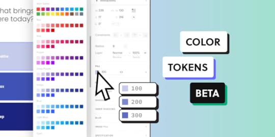
As part of our commitment to help you create consistent user interfaces, we’re excited to introduce Color Tokens — a powerful tool that brings a new level of precision and organization to your design workflow.
In open beta, you can set up a color token library, easily update your design system and control colors of your components. In the future, you will be able to facilitate the full design process with colors. Follow along the advice posted in this article. Set up a UXPin account. Try UXPin for free.
Build advanced prototypesDesign better products with States, Variables, Auto Layout and more.
Try UXPin .try-uxpin-banner { margin: 40px 0px;}.try-uxpin__container { display: flex; max-width: 689px; height: 210px; padding: 20px; padding-left: 24px; border: 2px solid black; border-radius: 4px; align-items: center; justify-content: space-between; background-color: white; box-shadow: 10px 10px black;}.try-uxpin__left { width: 54%;}.try-uxpin__left p { margin: 10px 0px !important; color: black !important;}.try-uxpin__heading { font-size: 28px !important; font-weight: bold;}.try-uxpin__text { margin: 0 !important; font-size: 18px !important; line-height: 22px !important;}.try-uxpin__button { width: 135px; height: 44px; background: black; margin: 10px 0px; padding: 10px 20px; border: none; border-radius: 2px; color: white; font-size: 16px; text-align: center;}.try-uxpin__button:hover { cursor: pointer;}.try-uxpin__image { max-width: 320px !important; height: 200px; margin-right: -21px; margin-bottom: -6px;}@media (max-width: 760px) { .try-uxpin__container { height: auto; margin: 10px; align-items: left; }}@media (max-width: 500px) { .try-uxpin__container { flex-direction: column; } .try-uxpin__left { width: 100%; align-items: normal; }}What are Color Tokens?
Color tokens are a set of predefined, reusable variables representing colors used in a design system.
Instead of manually applying hex codes or RGB values across different elements, designers can now use these tokens to ensure uniformity, consistency, as well as simplify updates and maintenance of colors in their design system.
Learn more about design tokens: What are design tokens?
Why Are Color Tokens Important?Color Tokens help keep designs consistent by using the same colors across projects. They make updates easy, reducing manual work. They also help teams use a common set of colors, so everything looks cohesive and in line with company standards.
Consistency: By using Color Tokens, teams can ensure that the same color values are applied consistently across all design assets, eliminating discrepancies and maintaining brand integrity.Efficiency: Tokens streamline the design process by reducing the need for repetitive tasks. When a color change is required, tokens can help designers and engineers do it quickly, saving time and reducing errors.Collaboration: Color tokens facilitate better collaboration between designers and developers. With a shared language and defined color standards, design handoffs are smoother, and the implementation is more accurate.How to Access Color Tokens in UXPin[image error]Before you can access Color Tokens, you need to set them up. You can do that manually or convert an existing library into a Color Token library. See UXPin’s documentation for detailed instructions: Color Design Tokens.
Convert an existing libraryIf you created a Color library in UXPin before July 17th, 2024, you can convert it to a token library and use the saved colors as token colors.
Open the existing library, click Library Settings and Click ‘convert library to use colors as tokens’. Save changes and you’re good to use those colors as tokens.
Set up a new libraryTo create a Color Token library, you need to navigate to Design System Library in UXPin. Open Design System Libraries (or press “cmd” + “2” to get there faster).
Then, at the bottom of the panel, click “+ New library”. Navigate to the colors section and get ready to add Color Tokens.
You can set up Color Tokens in two ways:
Copy colors from selected elements – select one or more elements on the canvas and click “+Add” in the library panel to add the colors as tokens.Type in a color HEX code – enter the HEX codes to set up Color Tokens automatically.The colors from your library will also appear in the Color Picker, so you can quickly apply them to elements on the canvas. Select the element that you want to switch a color of and choose an appropriate color from the library.
This trick works for setting up the colors for properties like fill, border, and shadow.
What Can You Do with Color Tokens in UXPin?Change colors of elements that you have on the canvas – Pick an element and add a color to it from the saved Color Tokens.Update colors in your design system – If you use a design system, you can now try new colors and change your design system library for a more modern look.Maintain a uniform look within a project – Access the same Color Tokens in every new prototype that you and your teammates create within a project.Share Color Tokens across your organization – Share your design system library with tokens across your organizations, so everyone can use the same Color Tokens.Manage Color Tokens as you like – Set up new Color Tokens, update existing ones, share them with your team, and more. A Step Towards Comprehensive Design TokensIntroducing Color Tokens is just the beginning. At UXPin, we understand that Design Tokens extend far beyond color. As part of our commitment to creating a robust design system, we are actively working on expanding our token offerings to include typography, spacing, and other design elements.
This comprehensive approach will further enhance consistency, improve scalability, and streamline the entire design-to-development workflow.
Use code-backed components in both design and development. Build advanced prototypes effortlessly and generate production-ready code directly from the design. Try UXPin for free.
Try UXPin for freeThe post Color Tokens in Open Beta – Simplify Color Management appeared first on Studio by UXPin.
July 22, 2024
Best UI Design Tools in 2024
UI design tools are apps used by designers to create, prototype, and refine user interface design for digital products such as websites, mobile apps, and web apps. These tools facilitate various aspects of the design process, from wireframing and prototyping to creating high-fidelity mockups and interactive designs.
These tools are essential for UI designers as they provide the capabilities needed to create user-friendly and visually appealing interfaces. The choice of tool often depends on the specific needs of the project, team preferences, and workflow integration. Let’s go over the most popular UI design tools.
Build interactive prototypes and streamline your design handoff with UXPin, an end-to-end UI design tool. Use drag-and-drop building blocks that come from your design system and streamline design operations. Try UXPin for free.
Build advanced prototypesDesign better products with States, Variables, Auto Layout and more.
Try UXPin .try-uxpin-banner { margin: 40px 0px;}.try-uxpin__container { display: flex; max-width: 689px; height: 210px; padding: 20px; padding-left: 24px; border: 2px solid black; border-radius: 4px; align-items: center; justify-content: space-between; background-color: white; box-shadow: 10px 10px black;}.try-uxpin__left { width: 54%;}.try-uxpin__left p { margin: 10px 0px !important; color: black !important;}.try-uxpin__heading { font-size: 28px !important; font-weight: bold;}.try-uxpin__text { margin: 0 !important; font-size: 18px !important; line-height: 22px !important;}.try-uxpin__button { width: 135px; height: 44px; background: black; margin: 10px 0px; padding: 10px 20px; border: none; border-radius: 2px; color: white; font-size: 16px; text-align: center;}.try-uxpin__button:hover { cursor: pointer;}.try-uxpin__image { max-width: 320px !important; height: 200px; margin-right: -21px; margin-bottom: -6px;}@media (max-width: 760px) { .try-uxpin__container { height: auto; margin: 10px; align-items: left; }}@media (max-width: 500px) { .try-uxpin__container { flex-direction: column; } .try-uxpin__left { width: 100%; align-items: normal; }}UXPinUXPin is a comprehensive design tool known for its robust real-time collaboration capabilities, allowing multiple users to work simultaneously on the same project.
It excels in supporting design systems, enabling designers to create and manage reusable components and styles efficiently. UXPin’s advanced interactivity features allow for the creation of high-fidelity prototypes using conditional logic and variables.
Despite its powerful capabilities, UXPin has a steeper learning curve, though it provides extensive resources and templates to help users get started.
The tool also facilitates the design handoff process with detailed specifications with HTML and CSS code to copy, and includes functionalities for collecting user feedback through usability testing as well as integrations (like the one with testing tool – Fullstory.)
The tool has a Mac app, Windows app, but it also works in the cloud.
UXPin MergeIf you need a single source of truth, UXPin has also another solution — UXPin Merge.
UXPin Merge is a powerful extension of UXPin that allows designers and developers to work with the same components, ensuring consistency and accuracy throughout the design process. This feature is particularly beneficial for collaboration and responsive design.
UXPin Merge excels in supporting design systems by allowing teams to sync components directly from a Git repository, such as those using React. This ensures that the design components used in UXPin are the exact same ones used in the final product, maintaining consistency and reducing the risk of discrepancies.
FigmaFigma is a web-based product design tool, highly regarded for its exceptional collaboration features, allowing real-time multi-user editing and commenting.
It offers strong design system support with shared libraries, UI kits and design tokens that can be easily updated across projects.
While Figma’s interactivity features are sufficient for most UI/UX design needs, they are not as advanced as some other tools. The tool is intuitive and easy for beginners, offering a user-friendly interface and a variety of templates for layouts, user journeys, and more.
Figma supports design handoff through detailed specs and code snippets accessible to developers, and facilitates user feedback collection directly on designs. Although it has limited native support for real data, you can easily find various plugins for this.
Figma also offers a digital whiteboard tool called FigJam that’s perfect for brainstorming, uniting team members and stakeholders with a mutual vision of their design before project kickoff.
AxureAxure is a powerful prototyping tool known for its advanced prototyping capabilities, supporting detailed interactions and conditional logic. It allows for collaborative work, though it may not be as seamless as tools like Figma.
Axure supports design systems with reusable widgets and styles, but its primary strength lies in its detailed prototyping features. The tool includes features for data-driven prototypes, using variables and datasets, and provides comprehensive design handoff documentation.
Axure has a steeper learning curve but offers robust capabilities for creating complex and interactive prototypes. It also supports user feedback collection through shared prototypes and annotations, making it a versatile UI/UX tool for highly interactive design work.
SketchSketch is a favorite UI design software among Mac users, offering a powerful set of vector editing tools tailored for UI/UX design. It supports real-time collaboration through Sketch for Teams, although it is limited to macOS users.
Sketch excels in design systems, providing reusable UI kits and shared libraries that can be easily updated. Its prototyping capabilities are basic but can be enhanced with plugins. Sketch integrates well with tools like Zeplin for detailed design handoff processes.
The tool is user-friendly and offers many templates and resources, making it easy to start designing quickly. Sketch supports adding real data through various plugins and facilitates user feedback collection using third-party tools.
Sketch is one of the most cost-effective choice, with prices starting from $10 per month.
UIzardUIzard is distinguished by its AI-driven design capabilities which streamlines the design process for low-fidelity and high-fidelity designs.
It provides collaborative features but might lack the depth found in more established tools like Figma. UIzard focuses on AI-driven design systems, which can be useful for quick prototyping but may not offer the same level of customization as the leaders on the market of UI design.
Its reusability features are primarily driven by AI, which can streamline the design process but may require further refinement for more complex UI/UX design projects.
UIzard offers basic feedback features and integrates AI to create interactive elements, although it may not provide the same level of manual control as other tools mentioned here.
MarvelMarvel is known for its simplicity and ease of use, making it an ideal choice for quick design iterations. It offers real-time collaboration and commenting, allowing teams to work together seamlessly.
Marvel supports basic design systems with reusable components and style guides, making it suitable for straightforward projects. The tool provides interactive prototyping features that are good for simple interactions but may lack the depth required for more complex designs.
Marvel facilitates design handoff with specifications and integrates with development tools. It supports basic integration of real data and includes user testing and feedback collection capabilities, making it a well-rounded tool for rapid design and prototyping.
JustinmindJustinmind is a versatile prototyping tool that supports advanced interactivity with conditions and events. It allows for collaborative work with version control and commenting, making it suitable for app or web design projects. Justinmind offers design system capabilities with reusable UI elements and templates, enhancing the efficiency of the design process.
The tool provides detailed specifications for design handoff and integrates with tools like JIRA. Justinmind supports real data integration for dynamic interactions, allowing for more realistic user experience design.
It also facilitates user feedback collection through shared prototypes and annotations, making it a comprehensive tool for detailed and interactive design work.
About InVision and AdobeXDWhile both InVision and Adobe XD have been popular tools in the UI/UX design community, they faced significant competition from other tools that offer more advanced features and better integration with modern design workflows.
InVision has been a significant player in the design collaboration space, offering tools that were integral to many design workflows. However, as of 2024, InVision has announced the discontinuation of its design collaboration services, including prototyping and its Design System Manager (DSM), effective by the end of the year.
This decision marks a significant shift in the industry, as InVision was once a frontrunner in providing tools that bridged the gap between designers and developers. The shutdown is attributed to increased competition from other tools like Figma, which have surpassed InVision in terms of functionality and user adoption. As a result, InVision’s focus will shift away from these services, leading to its exclusion from the list of recommended tools for 2024.
Adobe XD, another major tool in the UI/UX design field, is also being discontinued in 2024. Adobe has decided to phase out Adobe XD in favor of focusing on other products within their Creative Cloud suite.
Despite its strong integration with other Adobe products and a comprehensive set of features, Adobe XD has struggled to keep pace with the innovative features and real-time collaboration capabilities offered by its competitors. Consequently, Adobe XD will no longer be available, prompting designers to migrate to other tools that continue to receive support and development.
Which UI design tool will you try?Among the tools reviewed, Marvel and Sketch are the cheapest options for 2024, with Marvel being particularly accessible due to its free pricing tier. Sketch remains a strong contender for macOS users looking for an affordable, professional-grade tool. Adobe XD and InVision offer competitive pricing but face discontinuation, which may impact their adoption moving forward.
For enterprise teams, UXPin and Figma are the strongest contenders due to their robust collaboration, design system support, and ease of integration with real data and feedback mechanisms. Axure excels in advanced interactivity and detailed prototyping but may have a steeper learning curve and less seamless collaboration compared to the other two UI design tools.
Build UI design that not only look well, but they’re fully coded. Try UXPin, an end-to-end design tool that’s code-backed for easier designer-developer collaboration. Try UXPin for free.
Try UXPin for freeThe post Best UI Design Tools in 2024 appeared first on Studio by UXPin.
July 15, 2024
Top 6 Figma Competitors that Product Teams Use
Figma is a powerful web-based design tool that has become designer’s favorite as it allows to create, collaborate on, and share user interface designs in real-time. Founded in 2012 by Dylan Field and Evan Wallace, Figma has grown to become one of the leading tools in the design industry due to its unique features and capabilities.
Although it offers a great collaborative design experience, Figma is not the best when it comes to interactive prototyping, design handoff, and code-based design. Let’s analyze Figma competitors and analyze what makes this design tool so popular.
Design fully functional prototypes with UXPin Merge. Use the same components in design as you do in development, and create prototypes that can be interacted with and tested with real users. See how. Try UXPin Merge for free.
Create beautiful layouts without designersDesign production-ready prototypes 8.6x faster. No pixels. pure code.
Try UXPin Merge .discover-merge { margin: 40px 8px;}.discover-merge__container { display: flex; max-width: 690px; height: 200px; padding: 20px; padding-left: 24px; border-radius: 4px; background-color: black; box-shadow: 10px 10px #9999ff; align-items: center; justify-content: space-between;}.discover-merge__left { width: 50%;}.discover-merge__left p { margin: 10px 0px !important; color: white !important; font-size: 18px !important;}.discover-merge__heading { font-weight: bold !important; color: white !important; font-size: 18px !important;}.discover-merge__text { margin: 0 !important; line-height: 22px !important;}.discover-merge__button { width: 174px; height: 44px; margin: 10px 0px; border: none; border-radius: 2px; background: white; color: black; font-size: 16px; text-align: center;}.discover-merge__button:hover { cursor: pointer;}.discover-merge__image { max-width: 320px !important; height: 200px; margin-right: -19px;}@media (max-width: 760px) { .discover-merge__container { height: auto; margin: 10px; align-items: left; }}@media (max-width: 500px) { .discover-merge__container { flex-direction: column; } .discover-merge__left { width: 100%; align-items: normal; }}What is Figma?Figma is a web-based design tool that simplifies teamwork and UI design.
Figma’s focus on accessibility, powerful features, and collaborative capabilities has made it a preferred choice for designers and teams worldwide, transforming how digital products are designed and developed.
What is Figma used for?Figma is best suited for designers with UI and UX design projects that require detailed, UI designs and robust collaboration features.
It is used for:
Brainstorming — Figma is a great tool for idea generation; it released a complimentary tool FigJam, where team members can create artboards and flowcharts during brainstorming sessions. An alternative to Figma for brainstorming is Miro.Prototyping — Figma Figma enables designers to create high-fidelity, interactive prototypes with various transitions and animations. Figma’s alternative for prototyping are UXPin or Axure.UI design — Figma is praised for its design capabilities and it’s used to design the graphical user interfaces of websites, mobile apps, and other digital products. It provides design functionalities to create detailed, high-fidelity mockups. An alternative to Figma in UI design was InVision or Adobe XD. Now, it’s the tools that we will cover in this article.Design system — Figma supports the creation and management of design systems, which are collections of design elements and guidelines that ensure consistency across a UI design. It also helps with version control. Figma’s alternative for design systems is Sketch or UXPin.Graphic design — Figma provides robust vector editing tools that allow designers to create intricate illustrations and detailed vector graphics. Figma’s alternative for graphic design is Canva.Wireframing — Figma is also used for creating wireframes, which are low-fidelity representations of a design’s structure and layout. Wireframes help designers plan the basic structure and flow of a user interface. An alternative for Figma for wireframing is UXPin, Balsamiq, and Axure.How Figma came to be?Figma’s backstory is rooted in the vision of its founders, Dylan Field and Evan Wallace, who sought to transform the design industry by creating a more collaborative and accessible tool. Founded in 2012, the idea for Figma emerged from their desire to overcome the limitations of traditional design software, which was often platform-specific and lacked real-time collaboration features. Field’s Thiel Fellowship provided the initial funding and mentorship necessary to bring their idea to life.
The official launch of Figma in 2016 marked a significant shift in the design landscape. As a browser-based tool, it allowed designers to work on any device with internet access, facilitating seamless collaboration akin to Google Docs. This innovation quickly garnered attention, leading to substantial venture capital investments and a growing user base. By 2021, Figma had reached a valuation of $10 billion, reflecting its widespread adoption and impact on the design community.
Figma’s success is also attributed to its focus on community and extensibility. The platform introduced features like plugins, FigJam for whiteboarding, and a vibrant community for sharing resources and ideas. Despite an attempted acquisition by Adobe in 2023, which was ultimately abandoned, Figma has remained independent and continues to innovate, aiming to democratize design and make powerful tools accessible to all designers.
Figma in numbersHere are the key numbers associated with Figma.
User Base: As of March 2024, Figma has over 4 million users, including designers from major companies like Microsoft, Google, and Uber.Market Share: The number of designers using Figma as their primary tool rose from 20% in 2018 to 77% in 2021, highlighting its rapid adoption and popularity in the design community.Valuation: Figma’s valuation grew significantly over the years. It reached $2 billion by April 2020 and $10 billion by mid-2021. Despite an acquisition attempt by Adobe that valued Figma at $20 billion falling through, the company remains highly valued at approximately $8.3-9 billion as of late 2023.Funding: Figma has raised substantial funding across several rounds, including $25 million in Series B (2018), $40 million in Series C (2019), $50 million in Series D (2020), and $200 million in Series E (2021).Collaborative Files: Over 3 million Figma files are shared within teams every month, underscoring its collaborative nature and widespread use among design teams.Why is Figma so popular?Figma is a user-friendly design platforms that designers love because of at least 5 features.
Real-Time Collaboration: Multiple users can work on a single design file simultaneously, providing live feedback and making collaborative design seamless. All it requires to work is an internet connection, as Figma is a web app.Design Systems and Reusable Components: It supports the creation and management of design systems, ensuring consistency and efficiency in large-scale projects.Comprehensive Toolset: Figma offers a wide array of design tools, from vector graphics and typography to layout and composition, all within an intuitive interface.Community: Figma boasts a vibrant community where users can share templates, tips and plugins for streamlining the design process and reducing the learning curve.Plugin Ecosystem: Figma has an extensive plugin ecosystem for integrating Figma with other tools, simplifying workflow and enhancing its functionality.Top Figma competitorsUXPinMoqupsFramerSketchMarvelAxureUXPinUXPin is a Figma alternative for advanced prototyping. While Figma is a vector-based design tool, UXPin is code-based, meaning that you can set up the most advanced interactions on the components level and then copy the code behind it to use in development. With UXPin, you can create clickable menus, data-rich tables, interactive forms, dynamic content, and more.
It’s an end-to-end design tool, so you don’t need plugins or extra seats to test or hand over the final prototype to development. The specs are available without extra seats. UXPin also helps teams set up code-based design system, keep version control, and collaborate by sharing the design with others for commenting or annotating.
UXPin is also known for its Merge technology. It’s a drag-and-drop technology for using fully coded React or Storybook components to design an interface. It’s perfect for teams with matured design systems (like Porsche) or engineer-driven companies who don’t have enough designers on their team.
Check out other articles that compare UXPin and Figma:
Figma vs UXPin – Storybook integrationFigma vs UXPin – PrototypingFigma vs UXPin – Design SystemFigma vs UXPin – ComponentsFigma vs UXPin – React code exportMoqupsMoqups is a wireframing tool for designing basic wireframes that look like paper prototypes, user flows and basic mockups – three essential steps in the design process. This is a well-loved alternative to Figma’s FigJam, their whiteboarding solution with amazing integrations with Jira and Confluence.
It’s a great collaboration tool that makes project management easy. With enterprise clients on board, such as Microsoft, Sony, Amazon, Moqups seem to be a perfect choice for teams who need a common workspace for brainstorming sessions. The tool is also great for working with freelancers on app or web design.
The tool also allows you to create templates for reuse and share across the team. It has an affordable pricing and works offline.
FramerFramer is a compelling Figma competitor for web design. It helps create and publish websites without having to write code. It works in a drag-and-drop for creating a layout of blogs, landing pages, forms, and more.
It’s a great Figma alternative if you want to create a website that needs to be live fast. Framer is more than just a design tool. It helps you with SEO, performance, localization, and any other thing that’s in a web master’s scope of expertise.
It’s recently added AI feature that works like this — write a prompt, telling AI what kind of a website you’re building, and in return, get a ready-to-go site. It works like magic!
Framer isn’t great at prototyping because it’s main job is creating websites. It makes collaboration between designers, engineers, and product managers easy, yet if you need to create a high-fidelity prototype for user testing, try a tool like UXPin, Axure or Marvel.
SketchSketch is a Figma competitor for teams that work on Macs — it’s a Mac app. It’s recently revamped it’s product to support interactions, design token export, and more things that make designer-developer handoff frictionless.
Sketch has been around since 2010 when designers used Photoshop to create mockups or wireframes. It’s a real dinosaur but it doesn’t seem like it. It’s a user-friendly prototyping tool that speeds up product development and a great Figma alternative. It has a version control, design system management and history that makes design process easier.
MarvelMarvel advertises itself as a design tool that even non-designers can use. This might be appealing to small startups who look for a wireframing and mockup solution that everyone on the team can use. It’s used in finance and consulting markets as well as by companies such as BlaBlaCar or Stripe.
The prototyping tool doesn’t compare itself to Figma, but from its Marvel vs Invision landing page, we can learn that it’s a tool for advanced prototyping and design handoff that allows teams to build and handover their designs to the engineering team.
Marvel is praised for having a small learning curve and easy user interface, but the users complain that it is too basic to create advanced prototypes.
Like Figma, it works in artboard mode and it has vector editing tools that help you mimic user interactions to an extent. We recommend you to try Marvel as it has a free version that you may enjoy for creating basic screens.
AxureAxure is an old-school prototyping tool that’s a great competitor to Figma when it comes to advanced prototyping. It supports interactions, such as conditions, triggers, and actions for creating a prototype that tests user experience. Those interactions can be tricky to set up as the learing curve is rather steep, but it’s all worth it.
Axure works in the cloud now, but it also has a MacOS and Windows apps for those of you who prefer work offline. It’s well loved by user experience designers, product managers, and business analysts at enterprise corporations, and design teams who require robust user feedback before implementing the design.
Which Figma competitor do you want to try?There are many more Figma competitors on the market, but we decided to outline six of them that you may consider when looking for a Figma alternative or another tool to speed up your design process.
Some of well-loved tools have been sunsetted or they stopped getting new clients, such as Adobe XD (which was a part of Creative Cloud) or InVision that was great for design systems.
Framer is best for web design, Sketch is great for Mac users, Moqups and Marvel come in handy for smaller teams, while Axure and UXPin are great for robust prototyping when you need to use live data. Pick the one that fits your purpose.
If you want to use a prototyping tool that connects design and development, try UXPin Merge. Design production-ready prototypes that don’t need translation from design to code, because you work with coded components from the start. Try UXPin Merge.
Try UXPin MergeThe post Top 6 Figma Competitors that Product Teams Use appeared first on Studio by UXPin.
July 11, 2024
UXPin Merge Course Review – What People Think

Code-to-design tech seems daunting to you? Don’t worry. We created a mini-series in which Rachel, a skilled teacher of frontend courses, shows you how to design an interface with our code-to-design technology – UXPin Merge. This blog post will provide you with an exhaustive review of this tutorial series, breaking down its strengths and key takeaways.
Follow along the tutorial. UXPin Merge is a technology for designing with code-backed components to ensure fast handoff, product development, and more accurate user testing results. Build your first prototype today. Try UXPin Merge for free.
Create beautiful layouts without designersDesign production-ready prototypes 8.6x faster. No pixels. pure code.
Try UXPin Merge .discover-merge { margin: 40px 8px;}.discover-merge__container { display: flex; max-width: 690px; height: 200px; padding: 20px; padding-left: 24px; border-radius: 4px; background-color: black; box-shadow: 10px 10px #9999ff; align-items: center; justify-content: space-between;}.discover-merge__left { width: 50%;}.discover-merge__left p { margin: 10px 0px !important; color: white !important; font-size: 18px !important;}.discover-merge__heading { font-weight: bold !important; color: white !important; font-size: 18px !important;}.discover-merge__text { margin: 0 !important; line-height: 22px !important;}.discover-merge__button { width: 174px; height: 44px; margin: 10px 0px; border: none; border-radius: 2px; background: white; color: black; font-size: 16px; text-align: center;}.discover-merge__button:hover { cursor: pointer;}.discover-merge__image { max-width: 320px !important; height: 200px; margin-right: -19px;}@media (max-width: 760px) { .discover-merge__container { height: auto; margin: 10px; align-items: left; }}@media (max-width: 500px) { .discover-merge__container { flex-direction: column; } .discover-merge__left { width: 100%; align-items: normal; }}Where Can I Find UXPin Merge Tutorial?The full mini-course is available to you on YouTube. Here’s the full playlist that contains five videos.
The videos cover the following topics:
Exploring the Power of UXPin Merge: Introduction (Video 1)Exploring the Power of UXPin: A Deep Dive into UI Design (Video 2)The Magic of UXPin Merge with MUI Components (Video 3)Designing an Employee Portal Using MUI Components (Video 4)How to Seamlessly Transition from Design to Development (Video 5)What is UXPin Merge Tutorial about?The UXPin Merge Tutorial mini-course on YouTube is specifically created for developers and designers eager to get a grasp on using UXPin Merge effectively. Over a series of short, concise videos, the course aims to cover the essential aspects of setting up your React component library, integrating it into UXPin, and leveraging its full potential for both design and development.
Course OverviewThe UXPin Merge Tutorial Mini-Course on YouTube promises to be a concise yet informative guide tailored towards developers. The course is segmented into bite-sized videos, making it easier to digest each concept. Let’s break down what each segment covers.
The course begins with a comprehensive guide on setting up your environment. This is a crucial step, especially for those who are new to UXPin Merge. The tutorial walks you through installing the necessary software, setting up your UXPin account, and integrating it with your Git repository.
What stands out in this segment is the instructor’s detailed, step-by-step approach, ensuring that no one is left behind.
The instructor takes care to explain not just the “how” but also the “why,” setting a solid groundwork for the course.
Understanding the Basics of UXPin MergeThe course delves into the basics of UXPin Merge. This segment begins with a brief introduction of what Merge is and why it’s beneficial for React developers. It then transitions into a hands-on tutorial about using code-backed components, based on built-in MUI components that UXPin offers on trial.
Using Design EditorRachel goes through the ins-and-outs of UXPin’s editor to help you understand how to use the tool. She describes all the panels, tools, and features that are available to you at first glance. It’s a perfect introduction to those of you who are unfamiliar with design tools.
She explains how to change the canvas size, how to access documentation, and prep your workspace.
Using React ComponentsThe tutorial shows you how to use built-in MUI components within UXPin. Unlike other prototyping tools, UXPin uploaded fully functional components from MUI library, so you can be sure that what you put on the canvas, you get in development.
Some functionalities that Rachel went through:
Dragging and Dropping – placing components onto the design canvas.Nesting Components – creating more complex components out of those available.State Management – changing component states such as hover, active, and disabled.Accessing Documentation – the course help you move between MUI docs and UXPin.What about Advanced Integration Techniques?There are also more advanced integration techniques that the course didn’t touch upon. This is where many developers will find the real value, as it explores how to leverage UXPin Merge for complex projects. UXPin Merge also allows you to bring React components from Git repository or via npm, and even importing Storybook components if that’s what you use in development.
What about Collaboration Features?One of UXPin Merge’s standout features is its collaboration capability. Thie course fails to discuss:
Shared Workspaces: Setting up shared workspaces for team collaboration.Version Control: Tracking changes and reverting to previous versions if needed.Feedback Loop: Commenting and providing feedback directly within the UXPin interface.This would be useful for teams, as it expounds on how UXPin Merge can streamline the collaborative aspect of design and development.
Practical Examples and Hands-On SegmentsTheory is crucial, but nothing beats hands-on practice. The mini-course includes several practical examples and hands-on segments where you can apply what you’ve learned. You’ll be guided on how to:
Visualize Components – Leverage UXPin’s interface to see MUI components in action.Interactive Prototyping – Create interactive prototypes using drag-and-drop functionality in UXPin.Handoff process – Taking design to code (or code to design to code in UXPin’s case.)These examples are extremely beneficial, especially for those who learn best by doing.
Creating an Employee Portal UI DesignOne of the mini-course sections walks you through creating an employee portal using your React components in UXPin. This is an excellent exercise, showcasing the power of combining functional components with UXPin’s prototyping capabilities.
5 Tips for Maximizing Your LearningTo get the most out of the UXPin Merge Tutorial Mini-Course, here are some tips and tricks compiled from the experiences of past learners.
Take NotesAs you go through each segment of the course, make it a habit to take notes. This will help you retain the information better and serve as a handy reference when you start implementing what you’ve learned.
Practice AlongsideWhile it might be tempting to binge-watch the entire series, it’s advisable to practice alongside the instructor. Set up your environment as you go, import your components, and try to build your prototypes. This hands-on approach will solidify your understanding. Try UXPin Merge for free.
Ask QuestionsIf you find yourself stuck at any point, don’t hesitate to ask questions. The YouTube comments section is a great place to engage with the instructor and other learners.
Revisit Difficult SectionsIf you find certain sections particularly challenging, don’t hesitate to revisit them. The beauty of online tutorials is that you can go over difficult concepts as many times as you need until they click.
ExperimentOnce you’re comfortable with the basics, don’t be afraid to experiment. Try building different types of prototypes, customize your components, and explore the advanced features of UXPin Merge. The more you experiment, the more confident you’ll become in using the tool.
Is the UXPin Merge Tutorial Mini-Course Worth It?After going through the UXPin Merge Tutorial mini-course, it’s clear that UXPin Merge is a powerful tool for bridging the gap between design and development. The tutorial is well-structured, informative, and provides hands-on experience that can significantly benefit any React developer looking to streamline their workflows.
Key TakeawaysStreamlined Workflow – The course shows how to integrate design and development effortlessly, reducing the friction typically involved in the handoff process.Hands-On Learning – Practical examples and hands-on exercises make the learning experience highly engaging and effective.Real-World Application – The skills you gain from this course are immediately applicable to real-world projects, enhancing both your productivity and collaboration capabilities.Troubleshooting Help – The course’s in-depth coverage of common issues and troubleshooting tips ensures that you’re well-prepared to tackle any challenges that come your way.If you’re a developer looking to make your design and development processes more seamless, the UXPin Merge Tutorial mini-course on YouTube is not just an introduction to a new tool; it’s a comprehensive guide that will reshape how you think about design and development collaboration.
Dive into the mini-course, experience the integration of design and development for yourself, and elevate your workflow to new heights. Try UXPin Merge for free.
Try UXPin MergeThe post UXPin Merge Course Review – What People Think appeared first on Studio by UXPin.
July 9, 2024
Bootstrap vs React Bootstrap — A Quick Overview

Bootstrap is a popular open-source front-end framework for developing responsive and mobile-first websites. It was developed by Mark Otto and Jacob Thornton at Twitter and released in 2011. Bootstrap itself does not use React, but there are integrations like React-Bootstrap that provide Bootstrap components as React components. This library eliminates jQuery dependency and are more suitable for React projects. Let’s discuss the differences between the two.
Build fully functional user interfaces with React components 10x faster. Use UXPin Merge, a UI builder for React apps to plan the layout, test user experience, and start React development super fast. Try UXPin Merge for free.
Create beautiful layouts without designersDesign production-ready prototypes 8.6x faster. No pixels. pure code.
Try UXPin Merge .discover-merge { margin: 40px 8px;}.discover-merge__container { display: flex; max-width: 690px; height: 200px; padding: 20px; padding-left: 24px; border-radius: 4px; background-color: black; box-shadow: 10px 10px #9999ff; align-items: center; justify-content: space-between;}.discover-merge__left { width: 50%;}.discover-merge__left p { margin: 10px 0px !important; color: white !important; font-size: 18px !important;}.discover-merge__heading { font-weight: bold !important; color: white !important; font-size: 18px !important;}.discover-merge__text { margin: 0 !important; line-height: 22px !important;}.discover-merge__button { width: 174px; height: 44px; margin: 10px 0px; border: none; border-radius: 2px; background: white; color: black; font-size: 16px; text-align: center;}.discover-merge__button:hover { cursor: pointer;}.discover-merge__image { max-width: 320px !important; height: 200px; margin-right: -19px;}@media (max-width: 760px) { .discover-merge__container { height: auto; margin: 10px; align-items: left; }}@media (max-width: 500px) { .discover-merge__container { flex-direction: column; } .discover-merge__left { width: 100%; align-items: normal; }}What is Bootstrap?Bootstrap is a popular open-source front-end framework used for developing responsive websites. Developed by Mark Otto and Jacob Thornton at Twitter, it was initially released in 2011.
Bootstrap was created to address the challenges of developing consistent, responsive, and user-friendly web applications across different browsers and devices. Before Bootstrap, web developers often faced issues with cross-browser compatibility and had to create custom styles and UI components from scratch, which was time-consuming and often led to inconsistencies.
Before launching Bootstrap, developers mostly wrote their own custom CSS to style their web applications (which involved a steep learning curve) or used boilerplates like HTML5 Boilerplate. They also used JavaScript and jQuery plugins to add interactivity and dynamic elements to their websites. This included custom scripts for modals, carousels, and other interactive components.
Bootstrap’s introduction provided a comprehensive, all-in-one solution that simplified the development process, leading to its rapid adoption and popularity among web developers.
The newest version of Bootstrap is Bootstrap 5 which was released to bring modern updates, improved features, and better performance (such as the removal of jQuery, enhanced grid and form systems, a new utilities API, etc.)
When to Use BootstrapQuick Setup: Bootstrap allows for rapid development of prototypes and MVPs. Its pre-styled components and responsive grid system make it easy to get a project up and running quickly.Reusable Components: Use ready-made Bootstrap CSS’s components like buttons, forms, modals, and navigation bars without having to design them from scratch.Built-In Responsiveness: Bootstrap’s grid system and responsive utilities make it easier to create layouts that work well on various devices and screen sizes without extensive custom CSS.Mobile-First Approach: Designed with a mobile-first philosophy, ensuring good performance on mobile devices, and making front-end development easier.Community Support: Extensive community resources, themes, and plugins are available, making it easier to find solutions and enhancements.Consider other frameworks or custom solutions when:
Your project demands highly customized user interface.Performance is a top priority and you need a lighter framework.You’re building a single-page application and need a full-featured JavaScript framework with integrated UI components.Examples of Projects Ideal for BootstrapBootstrap is heavily involved in the View Layer of MVC model. It provides a wide range of CSS styles and components to create responsive, visually appealing, and consistent user interfaces. It’s a versatile and powerful development framework for responsive design, and consistent UI.
Here are some examples of Bootstrap use cases:
Corporate Websites: For company websites where a professional and consistent design is important, Bootstrap provides the necessary tools to create a polished user interface.Landing Pages: Quick and responsive landing pages for marketing campaigns can be efficiently built using Bootstrap’s grid system and pre-styled components.Personal Blogs and Portfolios: For personal projects like blogs or portfolios, Bootstrap’s ease of use and customization options make it a great choice to get started quickly.Admin Dashboards: Many admin dashboard templates are built with Bootstrap due to its comprehensive component library, which makes it easy to create complex user interfaces.Educational Projects: If you’re working on a school project or learning web development, Bootstrap can help you implement web designs quickly and understand fundamental web development concepts.Several well-known companies use Bootstrap for their web development needs due to its flexibility, ease of use, and responsive design capabilities. Most notable examples are Twitter (the birthplace of Bootstrap), Spotify, and LinkedIn.
Does Bootstrap uses React?Bootstrap itself does not use React; it is primarily a CSS framework with optional JavaScript components that are built using vanilla JavaScript and jQuery. However, there are integrations and libraries that combine Bootstrap with React.js to leverage the strengths of both.
The most popular Bootstrap and React integration is React Bootstrap, which comes in handy when you are creating single-page applications.
What is React Bootstrap?React Bootstrap is a Javascript library that integrates the popular Bootstrap framework with React, providing Bootstrap components as React components. This integration allows developers to use Bootstrap’s styles and components in a way that is idiomatic to React, avoiding the need for jQuery and ensuring compatibility with React’s component-based architecture.
Key Features of React BootstrapBootstrap Components as React Components: React Bootstrap provides a comprehensive set of Bootstrap components that have been converted to React components. This includes buttons, forms, modals, tooltips, carousels, and more.Reusability: Components can be reused across different parts of the application or even in different projects.Scalability: Each component encapsulates its own structure, style, and behavior, making it easier to manage and scale individual parts of the application.No jQuery Dependency: React Bootstrap eliminates the need for jQuery, which is required by the original Bootstrap’s JavaScript components. This makes it more suitable for modern React applications.Customizable and Extensible: Just like Bootstrap, React Bootstrap components are highly customizable. You can override default styles and behaviors to fit your application’s needs.Declarative Syntax: React’s declarative syntax improves code readability and maintainability. Developers can easily understand the structure and flow of the UI by looking at the component tree.Virtual DOM: React uses a virtual DOM to efficiently update and render only the parts of the UI that have changed. This results in better performance, especially for large and dynamic applications.Consistent API: React Bootstrap components are designed to have a consistent API, making them easy to use and integrate into your React application.Responsive Design: The library retains Bootstrap’s responsive design capabilities, allowing you to create layouts that work well on various devices and screen sizes.Built with React Principles: Components are built following React best practices, ensuring compatibility with React’s lifecycle methods, hooks, and state management.Can Bootstrap Replace React?No, Bootstrap cannot replace React. Bootstrap and React serve different purposes in web development, and they are often used together rather than one replacing the other.
Bootstrap is a front-end CSS framework. It is primarily used for styling and layout. React, on the other hand, is a JavaScript library for building user interfaces. It is primarily used for managing UI logic and state. Bootstrap and React have two different roles and use cases.
They are often used together to leverage the strengths of both. For example, you can use React to manage the dynamic and interactive aspects of your web app, while Bootstrap provides the styling and responsive design. Libraries like React-Bootstrap make it easier to use Bootstrap components within React applications, providing pre-styled Bootstrap components as React components.
There are other JavaScript frameworks and libraries that can serve as alternatives or replacements for React, such as Vue, Angular or Svelte.
For native mobile applications using JavaScript and React, use React Native. It’s a framework developed and maintained by Facebook, React Native uses the same design principles and component-based architecture as React but is tailored for mobile app development.
What is better — Bootstrap or React Bootstrap?FeatureBootstrapReact-BootstrapPrimary UseCSS and JS frameworkReact component libraryIntegrationCan be used with any projectSpecifically for ReactJavaScript DependencyRequires jQuery for JS componentsNo jQuery dependencyComponent-BasedNoYesCustomizationCustom CSS or SASSReact props and stateLearning CurveEasier for non-React projectsEasier for React developersDynamic BehaviorCustom JS or jQueryHandled through ReactChoose Bootstrap if:You are not using React or are using a different front-end framework or library.You need a quick and easy way to style a static or server-rendered site.You are comfortable managing JavaScript behavior separately or with jQuery.Choose React-Bootstrap if:You are building or planning to build a React application.You want to follow React best practices and patterns.You prefer managing your UI components as React components, taking advantage of React’s state management and lifecycle methods.Ultimately, the choice depends on your project’s requirements and your web development environment. For React projects, React-Bootstrap offers a more seamless and integrated user experience, while for non-React projects, Bootstrap provides a robust and versatile styling solution.
What is React Bootstrap used for?React-Bootstrap is a great choice for beginners. The ability to quickly prototype and build applications helps beginners grasp core concepts without being overwhelmed by the intricacies of CSS, web page design and JSX, which is a syntax extension for JavaScript that allows you to write HTML-like code within your JavaScript files.
Corporate WebsitesBuild professional websites for businesses with responsive layouts and consistent design that fit the ecosystem of digital products.
BlogsDevelop a blog or CMS with features like post creation, editing, and displaying content.
E-commerce PlatformsBuild online stores with product listings, shopping carts, and checkout processes.
Admin DashboardsCreate powerful and interactive admin dashboards for managing data and analytics.
Social Media PlatformsDevelop social networking sites with user profiles, posts, and messaging features.
Educational PlatformsCreate online learning platforms with course listings, user profiles, and interactive content.
Landing PagesCheck out this React-Bootstrap example of a pricing page that you can build in UXPin.
Use React Bootstrap to Build your App’s UIBoostrap and React Bootstrap are both frontend toolkits — they simplify front-end development workflow. If you are building a React-based web app, React-Bootstrap is the better choice. Bootstrap relies on jQuery for its JavaScript components, which can be unnecessary overhead in a React project. React-Bootstrap eliminates the need for jQuery, aligning with modern JavaScript practices and ensuring a lighter, more efficient application.
If your project does not use React or if you need a quick, static site, standard Bootstrap might be more straightforward and quicker to implement. However, for dynamic, interactive applications, React-Bootstrap’s component-based approach offers greater flexibility and scalability.
To build React app with React Bootstrap components, choose UXPin Merge. It’s a powerful builder and the only prototyping tool that allows you to use real React Bootstrap components to build your app. Try UXPin Merge for free.
Try UXPin MergeThe post Bootstrap vs React Bootstrap — A Quick Overview appeared first on Studio by UXPin.
July 4, 2024
10 React SEO Techniques You Can Apply Today

Creating a great website isn’t just about design – it’s also about getting seen by the right people. This is where SEO comes in. Search Engine Optimization involves optimizing your website so that search engines like Google can easily find and rank your site higher in search results.
By combining React with effective SEO techniques, you can ensure that your website not only looks great but also reaches a wider audience online. So whether you’re a seasoned developer or just starting out, mastering both React and SEO will help take your web projects to the next level.
Build a user interface of your React app faster than ever. With UXPin Merge, you can use React components and drag and drop them around to assemble a React layout. Test it with users, ask your teammates for feedback, and then copy the code off the design to start the development phase. Try UXPin Merge for free.
Create beautiful layouts without designersDesign production-ready prototypes 8.6x faster. No pixels. pure code.
Try UXPin Merge .discover-merge { margin: 40px 8px;}.discover-merge__container { display: flex; max-width: 690px; height: 200px; padding: 20px; padding-left: 24px; border-radius: 4px; background-color: black; box-shadow: 10px 10px #9999ff; align-items: center; justify-content: space-between;}.discover-merge__left { width: 50%;}.discover-merge__left p { margin: 10px 0px !important; color: white !important; font-size: 18px !important;}.discover-merge__heading { font-weight: bold !important; color: white !important; font-size: 18px !important;}.discover-merge__text { margin: 0 !important; line-height: 22px !important;}.discover-merge__button { width: 174px; height: 44px; margin: 10px 0px; border: none; border-radius: 2px; background: white; color: black; font-size: 16px; text-align: center;}.discover-merge__button:hover { cursor: pointer;}.discover-merge__image { max-width: 320px !important; height: 200px; margin-right: -19px;}@media (max-width: 760px) { .discover-merge__container { height: auto; margin: 10px; align-items: left; }}@media (max-width: 500px) { .discover-merge__container { flex-direction: column; } .discover-merge__left { width: 100%; align-items: normal; }}Why is React SEO Challenging?One of the biggest challenges faced by React UI developers in terms of SEO is ensuring that search engines can properly crawl and index their dynamic single-page applications. With traditional websites, content is easily discoverable through HTML pages that are generated server-side. However, with React apps, the content is rendered on the client side using JavaScript.
This poses a problem for search engine crawlers as they may struggle to fully understand and index this dynamically generated content. Additionally, if proper precautions are not taken, important elements such as meta tags, titles, and structured data may be missing or incomplete.
Another challenge is optimizing performance without sacrificing user experience. As React relies heavily on JavaScript for rendering components and interactivity, developers must find a balance between providing a rich user experience and ensuring fast loading times for better SEO rankings.
Overall, overcoming these challenges requires careful planning and implementation of proper SEO techniques specifically tailored for React applications.
10 React SEO Tips You Can ApplyServer-side renderingWhen it comes to discussing how React’s single-page application (SPA) architecture can affect SEO, it is essential to consider the implications of dynamic content rendering. SPAs rely heavily on client-side JavaScript to load content dynamically as users navigate between pages, which can make traditional search engine crawlers struggle to index and rank these pages effectively.
This is where server-side rendering (SSR) plays a crucial role in improving React SEO. By pre-rendering content on the server before sending it to the client, SSR ensures that search engines can easily crawl and index all of your website’s pages, leading to better visibility in search engine results.
In essence, understanding the impact of React on SEO requires implementing strategies such as SSR to optimize your website’s performance and ensure that search engines can properly interpret your content. By striking a balance between SPA architecture and SEO requirements, you can create a seamless user experience while also maximizing your website’s potential for organic traffic growth.
Virtual DOMReact’s virtual DOM is a game-changer when it comes to improving SEO performance. By utilizing a lightweight representation of the actual DOM, React allows for faster rendering and updates on web pages. This means that search engine crawlers can easily navigate through the content of a website, leading to quicker indexing and better search visibility.One major benefit of React’s virtual DOM is its ability to reduce server load and improve website loading speed.
This not only enhances user experience but also plays a crucial role in boosting SEO rankings.
Additionally, by efficiently managing updates and changes in the virtual DOM, React ensures that only necessary components are re-rendered, further optimizing performance.
In today’s competitive online landscape, having an SEO-friendly website is essential for driving organic traffic and increasing visibility. With React’s virtual DOM capabilities, businesses can stay ahead of the curve by delivering fast-loading websites that are easily accessible to both users and search engines alike.
Adding Semantic HTML tagsWhen it comes to optimizing your website for search engines, using semantic HTML tags is crucial. These tags provide structure and context to your content, making it easier for search engine crawlers to understand the purpose of each element on your page. By utilizing heading tags (h1, h2, h3), article tags, list items (ul, ol), and more, you are not only improving accessibility but also helping search engines index and rank your site more effectively.
List of semantic HTML tagsTaking care of URL StructureIn addition to semantic HTML tags, proper URL structure plays a significant role in SEO. In React applications, optimizing URLs involves creating user-friendly and descriptive paths that accurately reflect the content of each page.
Avoid long strings of random characters or numbers in your URLs and instead use keywords related to the topic of the page. This not only enhances user experience but also increases the likelihood of your pages ranking higher in search results.
Adding Meta TagsMeta tags play a crucial role in optimizing a website for search engines. These snippets of code provide important information to search engines about the content of a webpage, helping them understand and index it accurately.
Title tags, meta descriptions, and meta keywords are some of the key elements that should be optimized for better React SEO. The title tag is what appears as the headline in search engine results pages (SERPs) and should be concise, descriptive, and include relevant keywords.

The meta description is a brief summary of the webpage’s content that appears below the title tag in SERPs. It should be compelling, informative, and also contain relevant keywords to entice users to click through.
While Google no longer uses meta keywords for ranking purposes, they can still be useful for organizing content within your website.
By paying attention to these details and ensuring that your meta tags are optimized correctly with relevant keywords and engaging copywriting, you can improve your website’s visibility on search engines and attract more organic traffic.
Leveraging React Router for SEOReact Router is a helpful tool that lets you build single-page applications with React much more easily. Imagine you have a website with different pages, like a home page, about page, and contact page.
React Router helps your website show the right page when someone clicks a link or types a URL. It makes sure the right content is displayed without needing the whole page to reload. This makes the website faster and smoother.
Plus, it keeps the URL in the address bar updated, so users can bookmark or share links to specific pages. Overall, React Router makes navigating your website feel like a breeze.
When it comes to optimizing your React application for search engines, utilizing React Router is crucial. By carefully structuring your URLs with React Router, you can create SEO-friendly paths that improve the visibility of your content on search engine results pages.
Dynamic routing is a powerful feature of React Router that allows you to generate routes based on data variables or parameters. This means you can dynamically create URLs for different pages or content within your application, making it easier for search engines to crawl and index your site effectively.
By leveraging dynamic routing in conjunction with React Router, you can enhance the overall SEO performance of your application by ensuring that relevant keywords and content are reflected in each URL. This not only improves the user experience but also increases the likelihood of ranking higher in search engine results.
When it comes to optimizing React Router for better search engine visibility, there are a few key tips to keep in mind. Firstly, make sure that each page on your website has a unique URL and title tag, as this will help search engines properly index and rank your content. Additionally, consider using descriptive meta tags and keywords in your URLs to further enhance SEO performance.
Another important tip is to use dynamic routing with React Router to create SEO-friendly URLs that are easily accessible by both users and search engines. This not only improves the user experience but also helps improve your website’s overall search engine visibility.
Lastly, regularly monitor and analyze your website’s performance using tools like Google Analytics or other SEO monitoring platforms. By keeping track of key metrics such as organic traffic, bounce rates, and keyword rankings, you can continuously optimize your React Router setup for better search engine optimization results.
Optimizing Content for SEO in ReactWhen it comes to optimizing content within React components for better search engine rankings, there are a few key strategies to keep in mind. First and foremost, ensure that your content is well-organized and easy to navigate within your React application. This includes using clear headings, subheadings, and bullet points to break up large blocks of text.
Additionally, incorporating relevant keywords into your content is crucial for improving visibility on search engine results pages. Conduct keyword research using tools like SEMrush or Ahrefs to identify popular search terms within your industry and strategically place them throughout your React components.
By focusing on creating high-quality, relevant content optimized for SEO within React components, you can improve your website’s rankings and attract more organic traffic from potential customers.
Strategically using keywords throughout your content is also crucial for improving SEO rankings. By incorporating relevant keywords naturally into your writing, you can make it easier for search engines to understand the focus of your page and rank it accordingly. However, be cautious of keyword stuffing, as this practice can have a negative impact on your site’s credibility and may result in penalties from search engines.
Ultimately, creating high-quality content that incorporates strategic keyword usage will not only drive more traffic to your site but also improve user experience. By prioritizing quality over quantity and avoiding spammy practices like keyword stuffing, you can effectively optimize your content for better SEO results.
Handling Asynchronous Data Fetching for SEOAsynchronous data fetching in React applications can present challenges for SEO due to its potential impact on website performance and the ability of search engines to crawl and index content efficiently. When data is fetched asynchronously, it can lead to slower page loading times, which may affect user experience and ultimately harm SEO rankings.
To address this issue, techniques like server-side rendering (SSR) and pre-rendering can be used to improve SEO. SSR allows the server to render the initial HTML markup for a webpage before sending it to the client, ensuring that search engines can quickly access and index the content. Pre-rendering involves generating static pages at build time, reducing the need for dynamic data fetching during runtime.
By implementing these techniques effectively in React applications, developers can optimize their content for SEO while still leveraging the benefits of asynchronous data fetching. Ultimately, striking a balance between performance optimization and SEO considerations is crucial for maximizing visibility and engagement online.
Example Code for Handling Asynchronous FetchingStep 1 : Set up a Basic HTML Structure
SEO-Friendly Data Fetching Loading user data...Step 2 : Fetch Data Asynchronously in JavaScript
Fetch API to get user data from an API endpoint.
// app.jsdocument.addEventListener('DOMContentLoaded', () => { fetchUserData();});async function fetchUserData() { const response = await fetch('https://jsonplaceholder.typicode.com/... const userData = await response.json(); if (response.ok) { document.getElementById('user-data').innerText = `User: ${userData.name}`; } else { document.getElementById('user-data').innerText = 'Failed to load user data.'; }}Step 3 : Set Up a Basic Node.js Server
To make sure search engines can see the fetched content, one approach is to use server-side rendering (SSR) or static site generation. In this example, I’ll show you how to pre-render the HTML using a simple Node.js setup.
Install Express.js by running “npm install express”
// server.jsconst express = require('express');const fetch = require('node-fetch');const app = express();app.get('/', async (req, res) => { const response = await fetch('https://jsonplaceholder.typicode.com/... const userData = await response.json(); const content = ` SEO-Friendly Data Fetching User: ${userData.name} `; res.send(content);});app.listen(3000, () => { console.log('Server is running on http://localhost:3000');});This way, the initial HTML response already contains the user’s data. Therefore, search engine bots can easily index this content.
Mobile Optimization for React ApplicationsWhen it comes to optimizing content for SEO, mobile optimization plays a crucial role in improving search engine rankings. With the increasing use of smartphones and tablets, having a responsive and mobile-friendly website is essential for ensuring a seamless user experience across all devices.
React, a popular JavaScript library, offers powerful tools for creating dynamic and interactive websites that are optimized for both desktop and mobile platforms. By utilizing React components such as media queries and flexbox layouts, developers can design websites that automatically adjust to different screen sizes, ensuring that they look great on any device.
Incorporating React into your website development process not only enhances user engagement but also boosts SEO performance by making your site more accessible and user-friendly. By embracing mobile optimization techniques with React, you can stay ahead of the competition and drive more organic traffic to your website.

When it comes to optimizing React applications for better mobile SEO performance, there are a few key tips to keep in mind. First and foremost, make sure your website is responsive and mobile-friendly. This means ensuring that your site looks good and functions well on all devices, including smartphones and tablets.
Next, pay attention to page load speed. Google places a high emphasis on fast-loading websites, so optimize your images and code to decrease loading times. Additionally, consider implementing lazy loading techniques to improve user experience while also boosting SEO performance.
Another important aspect of mobile SEO optimization is optimizing your content for keywords. Make sure you’re using relevant keywords throughout your content in a natural way that enhances the user experience.
By following these tips and staying up-to-date with best practices for mobile SEO optimization, you can ensure that your React application performs well in search engine results pages on mobile devices.
Monitoring and Analyzing SEO Performance in ReactMonitoring and analyzing SEO performance is crucial for ensuring that your React applications are being properly optimized for search engines. By tracking key metrics such as keyword rankings, organic traffic, bounce rate, and conversion rates, you can gain valuable insights into how well your content is performing in search results.
There are several tools and techniques available to help track SEO metrics in React applications. Google Analytics is a powerful tool that allows you to monitor website traffic, user engagement, and other important metrics. Additionally, tools like Moz Pro and SEMrush provide in-depth keyword research and competitor analysis capabilities to help improve your React SEO.
Implementing schema markup on your site can also help search engines better understand the content of your pages and improve your chances of ranking higher in search results. By regularly monitoring these metrics and making data-driven decisions based on the insights gathered, you can continuously optimize your content for maximum visibility and success in the SERPs.

Interpreting SEO data can be overwhelming for many, but with the right tips and strategies in place, it becomes a powerful tool to improve your content’s visibility online. Start by analyzing key metrics such as organic traffic, click-through rates, and keyword rankings to identify areas of improvement. Look for patterns and trends in the data that could indicate strengths or weaknesses in your React SEO strategy.
Once you have identified areas needing improvement, take action by making necessary adjustments to your content. This may involve updating meta tags, optimizing images and videos, improving internal linking structure, or creating new keyword-rich content. Regularly monitoring and evaluating your efforts is crucial to ensure progress towards your goals.
By consistently interpreting SEO data and making informed improvements to your content, you can increase your website’s overall visibility on search engines and drive more organic traffic over time.
Stay Updated with React SEO Best PracticesStaying updated with the latest SEO techniques for React is crucial for ensuring your website remains visible and competitive in search engine results. As React continues to evolve, it’s important to stay informed about best practices and trends in order to optimize your site effectively.
One reliable source for staying updated on React SEO best practices is the official React documentation, which is constantly being updated with new information and guidelines. Additionally, joining online communities such as the Reactiflux Discord server or Reddit’s r/reactjs can provide valuable insights from fellow developers and experts in the field.
By actively engaging with these resources and staying informed about the latest developments in React SEO, you can ensure that your website is optimized for search engines and positioned for success in an ever-evolving digital landscape.
Useful React Packages for SEOReact packages are like extra tools or pieces of code that help make building websites with React easier and more fun. They can help you add features like forms, manage state, and handle animation without writing everything from scratch.
This way, you can save time and focus more on the design and functionality of your website. With React packages, building a cool website becomes quicker and simpler.
1. React Helmet
React Helmet is a powerful tool for managing changes to the document head. This includes common meta tags, title tags, and links that are essential for SEO. If you’ve ever tried to manually set these tags in a React app, you’ll know it can be a bit of a hassle. That’s where React Helmet comes in to make our lives easier!
2. Next SEO
Next SEO is an SEO plugin specifically designed for Next.js, a popular React framework. It’s packed with features that cater to complex SEO requirements. Essentially, it’s like having an SEO expert built into your framework.
3. React Router
React Router might not be an SEO tool at first glance, but it plays a significant role in how users (and search engines) navigate your site. Efficient routing ensures that your meta tags and content are properly updated as users explore your app.
4. React SnapReact Snap is a pre-rendering tool that can improve your app’s SEO by creating static HTML files. This is particularly useful for React applications that are traditionally single-page apps.
Improve React SEO with our TipsAs marketers and developers, our ability to adapt and evolve is key to staying ahead in the ever-changing world of SEO. One way we can do this is by continuously learning and experimenting with new strategies to improve our SEO performance.
When it comes to React SEO best practices, there are always new techniques and optimizations being discovered. By staying curious and open-minded, we can uncover hidden opportunities that may have a significant impact on our search rankings.
Experimentation is crucial when it comes to SEO. Testing different methods allows us to identify what works best for our specific website and audience. It’s important not only to try out new ideas but also to track their success or failure so we can make informed decisions moving forward.
Think about SEO when planning a layout of your React web app. Build a UI of your app with React components that come from MUI, Ant design or your own React library that you can import to UXPin. UXPin Merge is a UI builder for busy developers who need to design a React app fast. Try UXPin Merge for free.
Try UXPin for freeThe post 10 React SEO Techniques You Can Apply Today appeared first on Studio by UXPin.
July 2, 2024
DesignOps at Uber – Who Are Design Program Managers?

At UXPin’s Design Value Conference in March 2022, we hosted five design industry leaders to understand Design and DesignOps at some of the world’s biggest organizations.
One of those speakers was Maggie Dieringer, Senior Design Program Manager at Uber. Maggie has worked as a DPM at Uber since 2016 on the Rides and Eats products and has gained valuable experience working alongside some of the world’s best tech talent.
In her 30-minute talk at Design Value Conference 2022, Maggie shared insights about how she helped build Uber’s DesignOps from the ground up. Maggie talks about her practical approach to DesignOps, including three key “framing factors” DPMs must consider when working with design teams and stakeholders.
Enable your designers and engineers to use a single source of truth in design and code. Use UXPin’s revolutionary Merge technology to solve some of the biggest DesignOps challenges. Explore what UXPin Merge is about.
What is Design Program Manager?Design Program Managers are professionals responsible for overseeing and coordinating the design processes within an organization.
They ensure that design projects are executed efficiently, align with business objectives, and meet quality standards. DPMs act as a bridge between design teams and other departments, facilitating communication and collaboration to achieve the desired outcomes.
What are Key Responsibilities of Design Program Managers?Design Program Managers play a crucial role in bridging the gap between design teams and other departments, ensuring that design projects are completed on time, within budget, and to the highest quality standards. They manage resources, mitigate risks, and continuously seek ways to improve design processes and outcomes.
Project Management:Plan, organize, and manage design projects from inception to completion.Develop project timelines, milestones, and deliverables.Monitor project progress and adjust plans as needed to meet deadlines.Team Coordination:Coordinate activities of cross-functional teams, including designers, developers, and marketing professionals.Facilitate effective communication among team members to ensure alignment and collaboration.Assign tasks and responsibilities to team members based on their skills and expertise.Stakeholder Management:Serve as the primary point of contact for stakeholders, including clients, executives, and other departments.Communicate project status, risks, and issues to stakeholders.Gather and incorporate stakeholder feedback into the design process.Resource Allocation:Allocate resources, including personnel, budget, and tools, to ensure project success.Manage resource constraints and identify potential solutions to resource-related challenges.Quality Assurance:Ensure that design outputs meet quality standards and align with the organization’s brand and goals.Conduct regular reviews and critiques of design work to maintain high standards.Implement processes for continuous improvement in design quality.Risk Management:Identify potential risks and issues that could impact project success.Develop and implement mitigation strategies to address risks.Monitor and adjust risk management plans as necessary.Process Development:Develop and refine design processes and workflows to improve efficiency and effectiveness.Implement best practices and standards in design project management.Train team members on new processes and tools.Budget Management:Develop and manage project budgets.Monitor expenditures and ensure projects stay within budget.Provide financial reports and updates to stakeholders.Performance Tracking:Track and report on key performance indicators (KPIs) related to design projects.Use data and metrics to evaluate project success and identify areas for improvement.Implement performance improvement initiatives based on data insights.Innovation and Trends:Stay updated on industry trends, tools, and technologies in design and project management.Introduce new ideas and innovations to improve design processes and outputs.Foster a culture of creativity and innovation within the design team.DPMS is short for Design Program Manager. It’s Maggie’s role at Uber.
DesignOps at UberWhen Maggie started at Uber, two people were on the DesignOps team, including herself. The team’s scope covered seven categories:
DesignOps: tooling, facility management, org management, DPM brand, etc.Portfolio Planning: annual and six-month planning, scaling practices across teams, MTR, headcount comms, etc.Roadmap Management: prioritization, managing cutlines, stack ranking with leadership, scoping, sequencing, QA, advocates for quality, etc.Comms & Events: external brand, recruiting experience, office culture, team/internal/industry events, team meetings, celebration and recognition, team health, etc.Modeling, Tracking, Reporting: Resourcing & allocation, negotiation of work, dependency tracking, intake of work, UX allocation reporting, kickoffs, crit management, design review templatization, etc.Finance & Growth: budget/T&E/morale tracking, headcount allocation, growth narrative, playbooks and toolkits, etc.Learning & Development: training, internal/external skill shares, external design events, onboarding, talent reviews/promo management, career paths, competencies, inspiring teams, external speakers, etc.As of March 2022, Uber’s DesignOps team has grown to 16 team members, supporting six offices (in US/CAN, EMEA, and LATAM), with an additional four team members who work cross teams at strategic DesignOps positions.
TeamOps & ResearchOps x 6 team membersProduct DPMs x 12 team membersDirector & Strategic x 4 team membersUber’s Approach to Framing & Scaling the DPM RoleMaggie shared her team’s strategy for increasing the DPM’s influence at various levels. She talked about three things.
Framing and scaling DPM (around your needs depending on your organization’s current priorities)Increasing DPM impactSupporting DPM trajectoryFraming and Scaling DPMAsk yourself, “where is your time best spent?” and “how do you ensure that you’re having the most impact with that time?”
Maggie believes there is no right or wrong way to do something, but instead, we should frame our work to focus on impact. This approach aligns with one of Uber’s DesignOps principles, which reads: “Our success is based on the impact our work has on product, business, design, and customer experiences. This impact may be organizational, strategic, or executional.”
Maggie identifies the three framing factors that have the most impact in her day-to-day:
What’s the size of the design team and the state of the organization?What type of resourcing and allocation environment are we operating in?What level is my primary design partner?Framing Factor One: Size & State of the Design Org
The state and size of your organization have a significant impact on what level you’re managing and supporting teams.
“Regardless of the state of the organization or the team’s size, we meet the teams where they are at.” Maggie Dieringer, Senior Design Program Manager at Uber
State:
How long has the team been around?What is the organization’s level of maturity?Size:
How big is the design team, area, sub-area, or portfolio you’re supporting?State of the Design OrgMaggie defines the team’s state and maturity on a spectrum from nascent to established. This definition is important because a DPM’s approach is very different at opposite ends of the spectrum.
For example, a DPM will focus on implementing processes and frameworks to facilitate growth and development in a nascent organization. Conversely, for established teams, a DPM focuses on evolution, iteration, evangelizing, and improving existing processes and frameworks to accommodate growth.
Size of the Design OrgSize is another component of the first framing factor. Maggie uses a similar spectrum with 10-15 team members on the low end and 30-50 on the high end.
The industry standard is one DPM for every 10-15 designers, but this ratio isn’t the reality for many DesignOps experts.
For a 15:1 ratio, DPMs are able to integrate with the design team to offer granular support, including tasks like:
Meeting with IC designers dailyManaging and running team meetingsAttending and running design reviewsProject managementOptimizing collaboration on a micro levelAs the ratio increases, DPMs lean more towards a high-level approach:
Meeting with IC designers monthlyMeeting with managers dailyGoing to crits every few monthsAttending design reviews to help connect the dotsCollaboration at a macro levelVision exercisesFraming Factor Two: Design Team Resourcing
The way you set up your engagement and staffing model, as well as the allocation and organizational strategy, can have an immense impact on how DesignOps can and will lean in.
Engagement Model:
What type of staffing engagement does the team operate in?Allocation:
Is the team you support well-staffed or operating lean?Engagement ModelMaggie uses a spectrum to identify the organization’s staffing model with “flexible” on one end and “fully dedicated” on the opposite. Like size in Framing Factor One, the staffing model can help determine on what level DPMs can engage with teams.
In a flexible model, DPMs may need to go deep into one area, whereas in a fully dedicated model they may zoom out and focus more holistically across many areas.
AllocationAnother consideration for resourcing is whether the company is constrained on resourcing, in growth mode (actively hiring), or somewhere between. In a constrained staffing model, DPMs must be creative, working with all available resources.
In growth mode, DPMs have more freedom to look at high-level vision and what the organizational growth strategy could look like.
Framing Factor Three: Level of Partnership
Level:
Are you partnering mainly with the ICs (individual contributors), Leads, Manager, or a Director?Exposure:
Has your partner worked with a DPM before?LevelWhen working with Design Managers and middle management, Maggie has found that she focuses more on a single area and activities like load balancing, team health, education on how to work with design, and other supporting roles.
On the other end of the spectrum, at the director level, DPMs work on organizing the leadership team who reports through the director, organizational strategy, looking at cross-team dependencies, scaling programs, and broader, more team-wide activities.
ExposureThe second consideration for factor three is your partner’s exposure to DesignOps, and have they worked with a DPM before? If your partner is unfamiliar with DesignOps, it’s crucial to educate them about the DPM role and set expectations.
Maggie says it’s important for DPMs to outline their roles and responsibilities at the beginning of a partnership, including what they don’t work on, to set clear boundaries and expectations.
Increase DPM’s Impact
Increasing your impact as a DPM depends on the desired level of engagement for you and your team. Again Maggie uses a spectrum to assess the activities.
DPMs are more hands-on when zoomed in, working with teams on day-to-day tasks. When zoomed out, DPMs focus more on advocating, strategy, and planning.
The team’s size and designer/DPM ratio have a significant influence on whether DPMs can operate at a zoomed-in or zoomed-out level of engagement.
“We use our size to help drive the desired DPM engagement.” Maggie Dieringer, Senior Design Program Manager at Uber
Support DPM Trajectory
Maggie asks these five crucial questions often when considering DPM’s long-term goals:
Which activities and environments bring me job fulfillment day-to-day?Which activities will have the most impact and influence right NOW on the team I support?How can I leverage my partner to work on the things that are important to my career?How can I use my team size to influence the desired behavior and engagement?Do I thrive doing tactical or strategic activities (or both)?Maggie recommends that DPMs complete a framing exercise using the three factors above to plot where they think they can have the most impact.
Based on the activities mentioned in the three framing factors:
Where are you today?Where do you want to be?Where does your team want to be?Watch Maggie’s full 30-minute DesignOps Layers of Impact webinar on YouTube. If you prefer reading, head onto the blog post that recaps the full conference.
Increase DPM Impact With UXPin MergeUXPin Merge helps you enhance design consistency and collaboration between design and development teams. It’s one of the tools that every DPM should have in their arsenal to optimize design process and create impact faster. Check out UXPin Merge and see how it can help you mature design at your org.
The post DesignOps at Uber – Who Are Design Program Managers? appeared first on Studio by UXPin.
React Hooks – Examples, Definitions, and Best Practices

A React Hook is a special function in React that lets developers use state and other React features without writing a class. It makes code simpler and easier to manage by allowing functionality to be added directly within components.
React Hooks makes the code easier to read and write. It simplifies state management, enhances performance, and helps reuse logic across multiple components, making behavior consistent and easy to predict.
Building a React app? Simplify designing user interface with UXPin Merge. Arrange React components on the design canvas, manage their properties, and copy the code behind them to the dev environment. Try UXPin Merge for free.
Create beautiful layouts without designersDesign production-ready prototypes 8.6x faster. No pixels. pure code.
Try UXPin Merge .discover-merge { margin: 40px 8px;}.discover-merge__container { display: flex; max-width: 690px; height: 200px; padding: 20px; padding-left: 24px; border-radius: 4px; background-color: black; box-shadow: 10px 10px #9999ff; align-items: center; justify-content: space-between;}.discover-merge__left { width: 50%;}.discover-merge__left p { margin: 10px 0px !important; color: white !important; font-size: 18px !important;}.discover-merge__heading { font-weight: bold !important; color: white !important; font-size: 18px !important;}.discover-merge__text { margin: 0 !important; line-height: 22px !important;}.discover-merge__button { width: 174px; height: 44px; margin: 10px 0px; border: none; border-radius: 2px; background: white; color: black; font-size: 16px; text-align: center;}.discover-merge__button:hover { cursor: pointer;}.discover-merge__image { max-width: 320px !important; height: 200px; margin-right: -19px;}@media (max-width: 760px) { .discover-merge__container { height: auto; margin: 10px; align-items: left; }}@media (max-width: 500px) { .discover-merge__container { flex-direction: column; } .discover-merge__left { width: 100%; align-items: normal; }}What is a React Hook?A React Hook is a special function provided by the React library that allows developers to use state and other React features in functional components.
Before the introduction of hooks, functional components were stateless and lacked lifecycle methods, limiting their capabilities compared to class components. Hooks solve this by enabling state management and access to lifecycle features within functional components, making them more powerful and versatile.
What does a Hook do?A React Hook is a special function that allows you to “hook into” React features and lifecycle methods within functional components. Hooks enable you to use state, manage side effects, access context, and perform other tasks that were previously only possible with class components.
Why Hooks were introduced?Hooks were introduced in React 16.8 to address several key issues and enhance the functionality of functional components.
Before Hooks, functional components were stateless and could not directly handle side effects, which limited their utility. Developers often had to convert functional components to class components to incorporate state or lifecycle methods. Hooks resolved this limitation by enabling functional components to be stateful and manage side effects, making them more powerful and flexible.
Additionally, sharing stateful logic between class components could be cumbersome and repetitive, often relying on patterns like render props and higher-order components (HOCs) that led to complex and less readable code.
Hooks improve code reusability and composition by allowing stateful logic to be extracted into reusable functions. They also simplify and clean up the code, eliminating the verbosity and complexity associated with class components and using this keyword.
By encapsulating and isolating related logic within custom hooks, Hooks enhances the codebase’s maintainability, making it easier to understand and manage. Furthermore, Hooks are backwards-compatible, allowing for gradual adoption. This means existing class components can remain unchanged while new components can be developed using Hooks, facilitating a smoother project transition.
How many Hooks are in React?In the latest version of React, v18.3.1, a total of 15 React Hooks are available.
Let’s begin by stating some of the most widely used ones.
Two new hooks on the horizon are currently in an experimental state and outside the scope of this article.
useActionStateuseOptimisticTypes of React Hooks with ExamplesLet’s delve into the functionality of each hook through individual examples.
1. useStateuseState allows functional components to have state variables.
import React, { useState } from 'react';function Counter() { const [count, setCount] = useState(0); return (You clicked {count} times
setCount(count + 1)}> Click me );}Inside the Counter function, the useState Hook creates a state variable called count, initialized to 0. The setCount function is used to update this state.
When rendered, this component displays the number of times the button has been clicked. Each click updates the count state, causing the component to re-render and display the updated count.
2. useEffectuseEffect performs side effects in functional components, such as data fetching, subscriptions, or manually changing the DOM.
import React, { useEffect, useState } from 'react';function DataFetcher() { const [data, setData] = useState(null); useEffect(() => { fetch('https://api.example.com/data') .then(response => response.json()) .then(data => setData(data)); }, []); // Empty array ensures the effect runs only once return ( {data ? {JSON.stringify(data, null, 2)} : 'Loading...'} );}The useEffect Hook performs a side effect when the component mounts. The empty dependency array [] ensures this effect runs only once when the component mounts.
When rendered, this component fetches data from the specified API once, updates the state with the fetched data, and displays it. While the data is being fetched, it shows a loading message.
3. useContextuseContext allows functional components to subscribe to context changes.
import React, { useContext } from 'react';import { ThemeContext } from './ThemeContext';function ThemedButton() { const theme = useContext(ThemeContext); return ( I am styled by theme context! );}Inside the ThemedButton function, the useContext Hook is used to access the current value of ThemeContext. The useContext Hook returns the context value, which is stored in the theme variable.
When rendered, this component displays a button styled according to the theme provided by ThemeContext.
4. useReduceruseReducer manages state with a reducer, an alternative to useState for more complex state logic.
import React, { useReducer } from 'react';const initialState = { count: 0 };function reducer(state, action) { switch (action.type) { case 'increment': return { count: state.count + 1 }; case 'decrement': return { count: state.count - 1 }; default: throw new Error(); }}function Counter() { const [state, dispatch] = useReducer(reducer, initialState); return (Count: {state.count}
dispatch({ type: 'increment' })}>+ dispatch({ type: 'decrement' })}>- );}Inside the Counter function, the useReducer Hook is used to manage the component’s state. useReducer takes the reducer function and initialState as arguments. It returns the current state (state) and a dispatch function to send actions to the reducer.
When rendered, this component displays the current count and provides buttons to increment and decrement the count, updating the state accordingly.
5. useMemouseMemo optimizes performance by memoizing a calculated value, preventing expensive recalculations on every render.
import React, { useState, useMemo } from 'react';// An example function that simulates an expensive calculationfunction expensiveCalculation(num) { console.log('Calculating...'); for (let i = 0; i < 1000000000; i++) {} // Simulate a heavy calculation return num * 2;}function MemoExample() { const [count, setCount] = useState(0); const [input, setInput] = useState(''); // useMemo to memoize the result of the expensive calculation const calculatedValue = useMemo(() => { return expensiveCalculation(count); }, [count]); // Only re-calculate if 'count' changes return ( useMemo Example setCount(count + 1)}>Increment CountCount: {count}
Calculated Value: {calculatedValue}
setInput(e.target.value)} placeholder="Type something..." />Input: {input}
);}export default MemoExample;The useMemo hook is used to memoize the result of expensiveCalculation(count). The function is only called again if the count changes, thus optimizing performance by skipping unnecessary recalculations.
The dependency array [count] ensures that the memoized value is only recalculated when count changes, not when other state variables like input change.
The component includes buttons to increment the count and an input field to show that changes to other state variables do not trigger the expensive calculation.
6. useRefuseRef provides a way to access and persist a mutable value across renders, often used to directly interact with DOM elements.
import React, { useRef, useEffect } from 'react';function FocusInput() { const inputRef = useRef(null); useEffect(() => { // Automatically focus the input element when the component mounts inputRef.current.focus(); }, []); return ( useRef Example );}export default FocusInput;The useRef hook creates a reference object (inputRef) that is used to directly access the DOM element. Inside the FocusInput component, the useEffect hook is used to automatically focus the input element when the component mounts.
7. useCallbackThis hook memoizes a function, ensuring that the same instance is used across renders unless its dependencies change, which helps optimize performance by preventing unnecessary re-renders or re-executions of effects.
import React, { useState, useCallback } from 'react';function ChildComponent({ onClick }) { return ( Click me );}function ParentComponent() { const [count, setCount] = useState(0); const [text, setText] = useState(''); // useCallback to memoize the increment function const increment = useCallback(() => { setCount(prevCount => prevCount + 1); }, []); // Empty array ensures the function is memoized only once return ( useCallback ExampleCount: {count}
setText(e.target.value)} placeholder="Type something..." /> );}export default ParentComponent;The useCallback hook memoizes the increment function, which increments the count state. This memoization ensures that the increment function maintains the same reference across renders, preventing unnecessary re-renders of the ChildComponent which receives it as a prop.
The useCallback hook takes the function to be memoized as its first argument and an array of dependencies as the second argument. Here, the empty array [] ensures the function is created only once.
This setup optimizes performance by reducing the number of times ChildComponent re-renders, which is especially beneficial in larger applications.
The useId hook generates unique IDs that can be used to associate form inputs with their corresponding labels. Inside the Form component, useId is called to create a unique id which is then used to construct id attributes for the form elements.
import React, { useId } from 'react';function Form() { // Generate unique IDs const id = useId(); return ( useId Example Name: Email: );}export default Form;The label elements use the htmlFor attribute to reference these unique IDs, ensuring proper accessibility and form behaviour.
This approach is particularly useful when creating multiple-form fields that need unique identifiers, avoiding potential conflicts or duplications in the DOM.
9. useDebugValueThis hook provides a way to display custom labels for custom hooks in React DevTools, helping with debugging and understanding the hook’s behaviour.
import React, { useState, useEffect, useDebugValue } from 'react';// Custom hook that uses useDebugValuefunction useFriendStatus(friendID) { const [isOnline, setIsOnline] = useState(null); useEffect(() => { function handleStatusChange(status) { setIsOnline(status.isOnline); } // Simulate subscribing to a friend's status const mockAPI = { subscribe: (id, callback) => { callback({ isOnline: Math.random() > 0.5 }); }, unsubscribe: (id, callback) => {}, }; mockAPI.subscribe(friendID, handleStatusChange); return () => { mockAPI.unsubscribe(friendID, handleStatusChange); }; }, [friendID]); // Use useDebugValue to display a label in React DevTools useDebugValue(isOnline ? 'Online' : 'Offline'); return isOnline;}function FriendListItem({ friend }) { const isOnline = useFriendStatus(friend.id); return ( {friend.name} {isOnline ? 'Online' : 'Offline'} );}function FriendList() { const friends = [ { id: 1, name: 'Alice' }, { id: 2, name: 'Bob' }, ]; return ( useDebugValue Example {friends.map(friend => ( ))} );}export default FriendList;The useFriendStatus custom hook manages the online status of a friend by subscribing to and unsubscribing from a simulated API based on the friendID.
Inside useFriendStatus, useDebugValue is used to provide a custom label (‘Online’ or ‘Offline’) for the hook’s value. This label is displayed in React DevTools, making it easier to debug and understand the hook’s behaviour.
The FriendListItem component uses the useFriendStatus hook to get the online status of a friend and styles the friend’s name accordingly. The FriendList component renders a list of friends, demonstrating how useDebugValue can help with debugging custom hooks in a real-world scenario.
 Figure 1: Displaying hooks and state in React Developer Tools.
Here is how it will show on the React Developer Tools.
10. useDeferredValueThis hook defers the re-rendering of a value to avoid blocking the main thread, useful for improving performance when updating the state with expensive computations or rendering.
import React, { useState, useDeferredValue, useMemo } from 'react';function List({ items }) { const deferredItems = useDeferredValue(items); const renderedItems = useMemo(() => { return deferredItems.map((item, index) => ( {item} )); }, [deferredItems]); return {renderedItems};}function App() { const [input, setInput] = useState(''); const [list, setList] = useState([]); const handleChange = (e) => { setInput(e.target.value); const newList = Array.from({ length: 10000 }, (_, index) => `${e.target.value} ${index}`); setList(newList); }; return ( useDeferredValue Example );}export default App;In this example, the useDeferredValue hook is used to defer the re-rendering of the list state, which contains a large number of items.
The List component receives the list as a prop and uses useDeferredValue to defer the rendering of the items. The deferred value (deferredItems) ensures that the main thread is not blocked by expensive rendering operations, improving performance. The useMemo hook is used to memoize the list of rendered items, preventing unnecessary re-renders.
11. useImperativeHandleCustomizes the instance value that is exposed when using ref with a component. This is useful for controlling what is accessible to parent components, particularly when dealing with complex child component APIs.
import React, { useRef, useImperativeHandle, forwardRef } from 'react';// Child component that exposes a custom instance value using useImperativeHandleconst CustomInput = forwardRef((props, ref) => { const inputRef = useRef(); useImperativeHandle(ref, () => ({ focus: () => { inputRef.current.focus(); }, clear: () => { inputRef.current.value = ''; }, })); return ;});function ParentComponent() { const inputRef = useRef(); return ( useImperativeHandle Example inputRef.current.focus()}>Focus Input inputRef.current.clear()}>Clear Input );}export default ParentComponent;This example defines a React functional component called ParentComponent that demonstrates the use of the useImperativeHandle hook within a child component named CustomInput. The useImperativeHandle hook is used to expose custom methods (focus and clear) to the parent component through a ref.
Inside the CustomInput component, a local ref (inputRef) is created using useRef to reference the actual input element. The useImperativeHandle hook takes the parent ref and a function that returns an object containing the methods you want to expose. In this case, the focus method sets focus on the input, and the clear method clears the input value.
The ParentComponent uses a ref (inputRef) to interact with the CustomInput component. By clicking the “Focus Input” button, the input field gains focus, and by clicking the “Clear Input” button, the input field is cleared. These interactions are made possible by the custom instance methods defined using useImperativeHandle.
12. useInsertionEffectIt runs a function synchronously before all DOM mutations, ideal for injecting styles or manipulating the DOM in a way that needs to happen before browser painting.
A pitfall of using this: useInsertionEffect is for CSS-in-JS library authors. Unless you are working on a CSS-in-JS library and need a place to inject the styles, you probably want useEffect or useLayoutEffect instead.
import React, { useState, useInsertionEffect } from 'react';function StyledComponent() { const [color, setColor] = useState('blue'); useInsertionEffect(() => { // Inject a style directly into the document head before DOM mutations const style = document.createElement('style'); style.textContent = ` .dynamic-color { color: ${color}; } `; document.head.appendChild(style); // Clean up the injected style on component unmount return () => { document.head.removeChild(style); }; }, [color]); return ( useInsertionEffect Example setColor('red')}>Change to Red setColor('green')}>Change to Green );}export default StyledComponent;This example defines a React functional component called StyledComponent that demonstrates the use of the useInsertionEffect hook. The useInsertionEffect hook is used to inject a style into the document head synchronously before any DOM mutations occur.
Inside the StyledComponent component, the colour state is used to track the colour of the text. The useInsertionEffect hook is triggered whenever the colour state changes. It creates a new element with the updated colour and appends it to the document head. This ensures that the styles are applied before the browser paints the changes.</p><p>The component also includes buttons to change the colour of the text, update the colour state and trigger the useInsertionEffect hook to update the styles accordingly. This setup is particularly useful for scenarios where styles need to be injected or manipulated before the DOM is painted, ensuring a smooth and flicker-free user experience.</p><div style="height:20px" aria-hidden="true" class="wp-block-spacer"></div><h3 class="wp-block-heading">13. useLayoutEffect</h3><p>Runs synchronously after all DOM mutations but before the browser paints, useful for reading layout and synchronously re-rendering.</p><p><em>A pitfall of using this: useLayoutEffect can hurt performance. Prefer useEffect when possible</em>.</p><div class="wp-block-syntaxhighlighter-code "><pre class="brush: jscript; title: ; notranslate">import React, { useState, useLayoutEffect, useRef } from 'react';function ResizableBox() { const [size, setSize] = useState({ width: 100, height: 100 }); const boxRef = useRef(); useLayoutEffect(() => { const handleResize = () => { const { offsetWidth, offsetHeight } = boxRef.current; setSize({ width: offsetWidth, height: offsetHeight }); }; window.addEventListener('resize', handleResize); handleResize(); // Initial size update return () => window.removeEventListener('resize', handleResize); }, []); return ( <div> <h1>useLayoutEffect Example</h1> <div ref={boxRef} style={{ width: '50%', height: '50%', backgroundColor: 'lightblue', resize: 'both', overflow: 'auto', }} > Resize me! </div> <p> Width: {size.width}px, Height: {size.height}px </p> </div> );}export default ResizableBox;</pre></div><p>This example defines a React functional component called ResizableBox that demonstrates the use of the <strong>useLayoutEffect</strong> hook. The useLayoutEffect hook is used to measure and update the size of a resizable box synchronously after DOM mutations but before the browser paints.</p><p>Inside the ResizableBox component, the size state is used to track the width and height of the box. The boxRef is a reference to the box element. The useLayoutEffect hook sets up a resize event listener that updates the size state with the current dimensions of the box. It also triggers an initial size update.</p><p>The box element is styled to be resizable, and its dimensions are displayed below it. Using useLayoutEffect ensures that the size measurements are accurate and up-to-date before the browser paints, providing a smooth and flicker-free resizing experience.</p><div style="height:20px" aria-hidden="true" class="wp-block-spacer"></div><h3 class="wp-block-heading">14. useSyncExternalStore</h3><p>useSyncExternalStore is used for subscribing to an external store that is not managed by React, ensuring that the component synchronously re-renders with the latest store state.</p><div class="wp-block-syntaxhighlighter-code "><pre class="brush: jscript; title: ; notranslate">import React, { useState, useEffect, useSyncExternalStore } from 'react';// Simulated external storeconst store = { state: 0, listeners: new Set(), subscribe(listener) { store.listeners.add(listener); return () => store.listeners.delete(listener); }, increment() { store.state += 1; store.listeners.forEach((listener) => listener()); }, getState() { return store.state; },};function useStoreState() { return useSyncExternalStore( (callback) => store.subscribe(callback), () => store.getState() );}function Counter() { const state = useStoreState(); return ( <div> <h1>useSyncExternalStore Example</h1> <p>Count: {state}</p> <button onClick={() => store.increment()}>Increment</button> </div> );}export default Counter;</pre></div><p>In this example, a simulated external store is created with a state, a set of listeners, and methods to subscribe to the store, increment the state and get the current state. The useStoreState custom hook uses <strong>useSyncExternalStore</strong> to subscribe to the store and return to the current state.</p><p>Inside the Counter component, the state variable holds the current state from the external store. The component displays the state and includes a button to increment the state. When the button is clicked, the store increment method updates the store state and notifies all subscribed listeners, causing the Counter component to re-render with the new state.</p><div style="height:20px" aria-hidden="true" class="wp-block-spacer"></div><h2 class="wp-block-heading"><strong>15. useTransition</strong></h2><p>useTransition allows you to mark state updates as non-urgent, which can help improve UI responsiveness by deferring non-essential updates until more urgent updates have been processed.</p><div class="wp-block-syntaxhighlighter-code "><pre class="brush: jscript; title: ; notranslate">import React, { useState, useTransition } from 'react';function SlowList({ items }) { return ( <ul> {items.map((item, index) => ( <li key={index}>{item}</li> ))} </ul> );}function App() { const [input, setInput] = useState(''); const [list, setList] = useState([]); const [isPending, startTransition] = useTransition(); const handleChange = (e) => { setInput(e.target.value); startTransition(() => { const newList = Array.from({ length: 20000 }, (_, index) => `${e.target.value} ${index}`); setList(newList); }); }; return ( <div> <h1>useTransition Example</h1> <input type="text" value={input} onChange={handleChange} placeholder="Type something..." /> {isPending ? <p>Loading...</p> : <SlowList items={list} />} </div> );}export default App;</pre></div><p>This example defines a React functional component called App that demonstrates the use of the <strong>useTransition</strong> hook. </p><p>Inside the App component, the input state tracks the value of a text input, and the list state holds a large array of items. The isPending state indicates whether a transition is pending, and the startTransition function is used to start the transition.</p><p>The handleChange function updates the input state immediately when the user types in the input field. It then uses startTransition to defer the update of the list state, creating a new array of items based on the input value. This defers the expensive operation of generating a large list, improving the responsiveness of the input field.</p><p>The SlowList component renders the list of items. While the transition is pending, a loading message is displayed.</p><div style="height:20px" aria-hidden="true" class="wp-block-spacer"></div><h2 class="wp-block-heading">Should you learn all React Hooks?</h2><p>Whether you should learn all React Hooks depends on your specific needs and goals. While it’s beneficial to have a good understanding of the commonly used React Hooks like useState, useEffect, and useContext, you may not necessarily need to learn every single hook in detail, especially if some are more specialized and less commonly used in your projects.</p><p>Focus on learning the hooks that are relevant to your current or planned projects. As you gain more experience with React, you can explore additional hooks as needed. It’s also important to stay updated with the React documentation and community to understand new hooks and best practices as they emerge.</p><h2 class="wp-block-heading">React Hooks Best Practices</h2><p>Here are some best practices for using React Hooks. First, let’s start with the rules for using React Hooks:</p><h3 class="wp-block-heading">1. Only call Hooks at the top level</h3><p>Do not call Hooks within loops, conditions, nested functions, or try/catch/finally blocks. Instead, ensure that Hooks are always used at the top level of your React function, preceding any early returns. You can learn more about it in detail <a href="https://react.dev/reference/rules/rul..." target="_blank" rel="noreferrer noopener nofollow">here</a>.</p><h3 class="wp-block-heading">2. Only call Hooks from React functions</h3><p>Avoid using Hooks within regular JavaScript functions; instead, utilize them within React function components or custom Hooks. Learn in detail <a href="https://react.dev/reference/rules/rul..." target="_blank" rel="noreferrer noopener nofollow">here</a>.</p><h3 class="wp-block-heading">3. Components and Hooks must be pure</h3><p>Components should be idempotent, returning consistent output based on their inputs (props, state, and context), while side effects are best executed outside the render phase to prevent multiple renders and maintain user experience integrity. React official <a href="https://react.dev/reference/rules/com..." target="_blank" rel="noreferrer noopener nofollow">docs</a> wrote about it in more detail.</p><h3 class="wp-block-heading">4. React calls Components and Hooks</h3><p>Avoid directly calling component functions outside JSX; instead, use them within JSX elements. Similarly, refrain from passing hooks as regular values; use them exclusively within components to maintain proper functionality. Learn in detail <a href="https://react.dev/reference/rules/rea..." target="_blank" rel="noreferrer noopener nofollow">here</a>.</p><h3 class="wp-block-heading">5. Avoid Unnecessary Dependencies in useEffect</h3><p>Be cautious when adding dependencies to the dependency array of useEffect. Ensure that all dependencies are necessary for the effect to run correctly and avoid unnecessary re-renders.</p><h3 class="wp-block-heading">6. Use Descriptive Names</h3><p>Choose descriptive names for your custom hooks to make their purpose clear. This improves code readability and helps other developers understand the intent of the hook.</p><h3 class="wp-block-heading">7. Separation of Concerns</h3><p>Break down complex logic into smaller, reusable hooks. This promotes code modularity and makes it easier to test and maintain your codebase.</p><h3 class="wp-block-heading">8. Keep Hooks Simple</h3><p>Aim to keep individual hooks focused on a single concern. Avoid creating overly complex hooks that handle multiple unrelated tasks.</p><h3 class="wp-block-heading">9. Document Your Hooks</h3><p>Provide clear documentation and examples for your custom hooks to help other developers understand how to use them effectively. Include information about parameters, return values, and usage guidelines.</p><h3 class="wp-block-heading">10. Test Your Hooks</h3><p>Write unit tests for your custom hooks to ensure they behave as expected under different scenarios. Use testing libraries like React Testing Library or Jest to test hooks in isolation.</p><h2 class="wp-block-heading">Build React apps faster</h2><p>React Hooks have revolutionized the way developers build and manage state in functional components, making React development more efficient and code more maintainable.</p><p>If you’re creating a React app, start with planning! Use UXPin Merge to create a layout of your app’s interface, test it with users, and then, copy the production-ready code to develop the app. Try UXPin Merge for free and design portals, dashboards, and more apps with coded React components. <a href="https://www.uxpin.com/merge/developers" target="_blank" rel="noreferrer noopener">Try UXPin Merge</a>.</p><div class="wp-block-button is-style-fill"><center><a class="btn btn-flat btn-large btn-content-width" href="https://www.uxpin.com/merge/developers" target="_blank" rel="noopener">Try UXPin Merge</a></center></div><p>The post <a href="https://www.uxpin.com/studio/blog/rea... Hooks – Examples, Definitions, and Best Practices</a> appeared first on <a href="https://www.uxpin.com/studio">... by UXPin</a>.</p>
June 27, 2024
Code to Design Complete Guide for 2024

Design-to-code is a familiar workflow. Designers create a prototype using a design tool, and developers convert it to code–a simplified version of the standard product development process.
UXPin Merge turns this process upside down with a revolutionary code-to-design workflow. This article explains code to design and how it enhances the product development process with four case studies, including FinTech giant PayPal. Learn more about UXPin Merge.
Create beautiful layouts without designersDesign production-ready prototypes 8.6x faster. No pixels. pure code.
Try UXPin Merge .discover-merge { margin: 40px 8px;}.discover-merge__container { display: flex; max-width: 690px; height: 200px; padding: 20px; padding-left: 24px; border-radius: 4px; background-color: black; box-shadow: 10px 10px #9999ff; align-items: center; justify-content: space-between;}.discover-merge__left { width: 50%;}.discover-merge__left p { margin: 10px 0px !important; color: white !important; font-size: 18px !important;}.discover-merge__heading { font-weight: bold !important; color: white !important; font-size: 18px !important;}.discover-merge__text { margin: 0 !important; line-height: 22px !important;}.discover-merge__button { width: 174px; height: 44px; margin: 10px 0px; border: none; border-radius: 2px; background: white; color: black; font-size: 16px; text-align: center;}.discover-merge__button:hover { cursor: pointer;}.discover-merge__image { max-width: 320px !important; height: 200px; margin-right: -19px;}@media (max-width: 760px) { .discover-merge__container { height: auto; margin: 10px; align-items: left; }}@media (max-width: 500px) { .discover-merge__container { flex-direction: column; } .discover-merge__left { width: 100%; align-items: normal; }}What is Code to Design?
Code to design is a UX workflow developed by UXPin using Merge technology. With UXPin Merge, you can use coded UI components to build fully interactive interfaces, and once you’re done with your design, export production code. The components aren’t translated from design to code. They are code.
The code-to-design workflow offers several benefits for designers, stakeholders, and engineers:
Designers build fully interactive prototypes, increasing testing scope during the design process.Designers don’t design from scratch, thus reducing time to market.Stakeholders can grasp design’s vision because prototypes behave like an end-product.Design handoffs are smoother because designers and engineers use the same source of truth.Teams share a design system which adoption is no longer an issue.The drag-and-drop workflow makes product design more accessible to non-designers, and developers, stakeholders, researchers, and more can create a prototype on their own.Design to Code vs. Code to Design Design to code results in misalignment
Design to code is the traditional UX workflow. Design teams create mockups and prototypes using standard image-based design tools, which developers convert to code.
The biggest challenge with a design-to-code workflow is that it creates a gap between designers and engineers. To bridge that gap, designers must use external tools, write detailed documentation, and meet with devs to explain how prototypes and interactions must function.
Even with all this extra work and explanation, the final product often doesn’t meet the designer’s specifications and expectations. Designers and engineers argue over who is to blame, but the real issue is a language barrier. Designers work with vector graphics tools, while engineers work with code.
Code to design boosts collaborationA code-to-design workflow bridges the gap between designers and engineers. They still speak different languages, but a technology like Merge facilitates the translation between design and development.
Design teams work with visual UI elements, while engineers work with the code powering them–the same component from two perspectives.
Teams working with a design system benefit most from this code-to-design workflow.
With design-to-code workflow, teams work with two versions of the design system:
Image-based UI kit for design toolsUI component library for programmingCode to design eliminates this separation because design teams and engineers use the same component library from the same repository–creating a true single source of truth.
Code to Design Use Cases
You’re probably thinking, “this code-to-design thing sounds great, but how does it translate to real-world product development?” Glad you asked. Here are four use cases where companies use code-to-design for product development.
PayPalIn 2019, PayPal completely redesigned its internal product development process using UXPin Merge. PayPal’s internal UX team had a unique challenge–they had five designers to over one thousand engineers managing 60+ products. No two products looked the same, and each had usability and design inconsistency issues.
Erica Rider, UX Lead EPX at PayPal, was tasked with solving this problem. To add a layer of complexity, Erica had to create a workflow that enabled PayPal’s product team to design, test, and deliver products. They lacked design skills and had little design tool experience.
After trying several solutions using traditional image-based tools, Erica discovered Merge. PayPal’s UX team used Merge to sync a customized Fluent UI design system to UXPin.
PayPal’s stakeholders wanted to test the effectiveness of this new code-to-design investment. Erica’s experiment involved creating two versions of a one-page prototype: one using an image-based tool and the other using the UXPin Merge. The results were better than expected:
Image-based tool: over one hourUXPin Merge: 8 minutesThe Merge prototype had far superior fidelity and functionality. And, with some coaching, PayPal’s product teams achieved the same results.
Read PayPal’s full case study.
IressSoftware developer Iress was on a four-stage process to design system maturity.
 Stage one: PDF style guidesStage two: HTML pattern library with CSSStage three: UI kit and component libraryStage four: a fully integrated single source of truth with no design or code required for releases
Iress was stuck on stage three, unsure how they would bridge the gap between design and development to reach the final goal–until the team discovered code-to-design approach.
This workflow ticked all the boxes for Iress at that moment:
A single repository serving designers and engineers the components they need to build and release products.Better alignment between designers and engineers, with seamless design handoffs.No designing or front-end programming from scratch.No design drift or inconsistencies across the organization.Realistic, interactive prototypes give testing participants and stakeholders an accurate representation of the final product.The opportunity to experiment with theme switching for dark mode or multi-brand design systems.TeamPasswordThe first two use cases were enterprise products. But what can code-to-design do for startups and small teams? TeamPassword operates in the highly competitive password management market. The startup’s biggest challenge is that they don’t have any UX designers.
For a startup entrusted with people’s passwords and sensitive data, usability issues and design inconsistencies erode trust, ruining TeamPassword’s reputation and resulting in churn.
TeamPassword’s engineers did all the design and user testing using code prototypes. While these prototypes accurately represented the product’s functionality and user experience, building and iterating on ideas was time-consuming.
In 2022, TeamPassword switched to the MUI design system, which they synced to UXPin using Merge. Instead of developing prototypes, engineers used their custom MUI React library in UXPin. This code-to-design workflow significantly reduced time-to-market while eliminating usability issues and design drift.
When TeamPassword’s developers update the design system repository, the change automatically sync to UXPin, so they always have the latest version. Merge’s Version Control allows the team to track changes and switch between versions during testing.
Read TeamPassword’s full case study.
Reach a new level of prototypingDesign with interactive components coming from your team’s design system.
Discover UXPin Merge .discover-merge { margin: 40px 8px;}.discover-merge__container { display: flex; max-width: 690px; height: 200px; padding: 20px; padding-left: 24px; border-radius: 4px; background-color: black; box-shadow: 10px 10px #9999ff; align-items: center; justify-content: space-between;}.discover-merge__left { width: 50%;}.discover-merge__left p { margin: 10px 0px !important; color: white !important; font-size: 18px !important;}.discover-merge__heading { font-weight: bold !important; color: white !important; font-size: 18px !important;}.discover-merge__text { margin: 0 !important; line-height: 22px !important;}.discover-merge__button { width: 174px; height: 44px; margin: 10px 0px; border: none; border-radius: 2px; background: white; color: black; font-size: 16px; text-align: center;}.discover-merge__button:hover { cursor: pointer;}.discover-merge__image { max-width: 320px !important; height: 200px; margin-right: -19px;}@media (max-width: 760px) { .discover-merge__container { height: auto; margin: 10px; align-items: left; }}@media (max-width: 500px) { .discover-merge__container { flex-direction: column; } .discover-merge__left { width: 100%; align-items: normal; }}dotSourcedotSource is a German-based digital product consulting and development agency. The company uses multiple design systems to deliver products and solutions to clients.
dotSource’s biggest problem in delivering these products was redundant processes and duplicate work with two design systems–a UI kit for design and a component library for development. The design system’s documentation created a third piece the team had to maintain.
dotSource’s “single source of truth” was actually three sources, not one–a problem many organizations encounter with design systems.
dotSource knew they had to make their single source of truth code-based but didn’t know how to achieve this workflow using traditional image-based design tools–until they discovered UXPin Merge.
dotSource uses Merge’s Storybook Integration to sync its design system to UXPin. Storybook allows dotSource to update the design system’s repository, documentation, and UXPin’s components with every release.
“Switching to a code-based design workflow is the only way around these image-based limitations. A code-based prototyping tool like UXPin with Merge technology enables this workflow by rendering code (instead of vector graphics), just like a browser. In UXPin, UI components look and behave exactly as they do for developers, effectively bridging the gap between design and development–a real single source of truth.” – dotSource
Read dotSource’s full article.
How Does Code to Design Work in UXPin?Product teams have two options when importing code components into UXPin:
Import a product design systemImport an open-source UI libraryUse built-in libraries available on trialThere are three ways to bring these libraries into UXPin:
Git Integration: syncs React component libraries from a repository to UXPin.Storybook Integration: allows teams to sync many front-end frameworks, including React, Vue, Angular, Web Components, and Ember, to name a few (find the complete list in Storybook’s docs).npm Integration: designers can import UI components from open-source libraries from the npm registry using the Merge Component Manager (MCM).We have three tutorials for using the npm Integration and Component Manager:
React-BootstrapAnt DesignMUIThe Git and Storybook integrations are a little more complex, requiring technical skills to complete the Merge setup with UXPin’s Technical Support Team.
Ready to get started with code to design? Set up a trial and see how it speeds up your product development process and keeps your team on the same page. Try UXPin Merge for free.
Try UXPin MergeThe post Code to Design Complete Guide for 2024 appeared first on Studio by UXPin.
UXpin's Blog

- UXpin's profile
- 68 followers

