
UXpin's Blog, page 17
October 8, 2024
UXPin Tutorial for Beginners in 10 Steps
UXPin is a versatile design and prototyping tool built to bridge the gap between design and development. With features that support high-fidelity prototyping, interactive components, and seamless developer handoffs, UXPin helps designers create prototypes that closely mimic the final product.
In this tutorial, we will cover the essential steps to get started with UXPin, including basic navigation, creating interactive prototypes, and leveraging advanced features like Auto Layout and Merge. Sign up for free to follow along.
Build advanced prototypes
Design better products with States, Variables, Auto Layout and more.
Try UXPin .try-uxpin-banner { margin: 40px 0px;}.try-uxpin__container { display: flex; max-width: 689px; height: 210px; padding: 20px; padding-left: 24px; border: 2px solid black; border-radius: 4px; align-items: center; justify-content: space-between; background-color: white; box-shadow: 10px 10px black;}.try-uxpin__left { width: 54%;}.try-uxpin__heading { font-size: 28px !important; font-weight: bold;}.try-uxpin__left p { margin: 10px 0px !important; color: black !important;}.try-uxpin__text { margin: 0 !important; font-size: 18px !important; line-height: 22px !important;}.try-uxpin__button { width: 135px; height: 44px; background: black; margin: 10px 0px; padding: 10px 20px; border: none; border-radius: 2px; color: white; font-size: 16px; text-align: center;}.try-uxpin__button:hover { cursor: pointer;}.try-uxpin__image { max-width: 320px !important; height: 200px; margin-right: -21px; margin-bottom: -6px;}@media (max-width: 760px) { .try-uxpin__container { height: auto; margin: 10px; align-items: left; }}@media (max-width: 500px) { .try-uxpin__container { flex-direction: column; } .try-uxpin__left { width: 100%; align-items: normal; }}About UXPin
To give you a little background, UXPin has been in the design space for over 10 years. It was co-founded by designers, so a lot of time and effort has gone into making a tool that truly bridges the gap between design and development.
The key differentiator between UXPin and other prototyping tools like Figma, Sketch, InVision, and Adobe XD is that those tools come from a print paradigm. You’re still working with vector or raster-based graphics and building static or flat designs using artboards. While they’re great for visual design, they often require creating multiple screens for different states and interactions.
This often leads to a disconnect between designers and developers, resulting in miscommunication, more feedback loops, and time spent aligning on what’s intended in design versus what’s built.
In contrast, UXPin is a code-based tool, meaning you can create dynamic interactions that allow prototypes to feel like real products. This enables better feedback and collaboration, whether it’s from stakeholders or user testing.
Step 1: Set up a UXPin accountUXPin can be used either through the web or desktop application. While the web version provides the same experience as the desktop version, downloading the desktop app allows offline work and helps mitigate any connectivity issues.
Set up a trial account or choose your paid plan.Download the desktop application for Mac or Windows.Step 2: Navigating UXPin’s DashboardWhen you first open UXPin, you’ll see a dashboard with three tabs:
 Projects
: View and manage all UXPin projects.
Design Systems
: Access your design systems or those shared with you.Import your library: Allows you to import code-backed components (See: UXPin Merge).
Projects
: View and manage all UXPin projects.
Design Systems
: Access your design systems or those shared with you.Import your library: Allows you to import code-backed components (See: UXPin Merge).Focus primarily on the Projects and Design Systems tabs as you begin working on your projects.
Step 3: Getting Started in UXPinTo start a project:
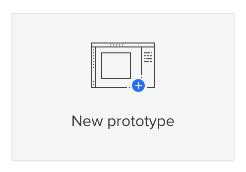
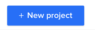 From the Project’s dashboard, click the + New Project button in the top left corner.Name your project and click Create New Project.Choose what you want to start with:New Prototype: Open the UXPin design editor to create a new project from scratch.Import Sketch, images, or documents: Upload files such as Sketch, PNG, JPG, PDF, or UXPin’s UXP files.Design with Merge Components: Use a predefined Merge library to start your project.
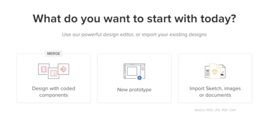
Select the middle option – New Prototype to access the design editor and build your first prototype.
Step 4: Exploring UXPin’s Design EditorThe design editor is divided into three main sections:
Pages & Layers: Displayed on the left sidebar, this shows all layers and pages in your project. You can switch between layers, group elements, and view or add new pages. Design Canvas : The central area where you build your designs. This displays the width and height of your canvas, as set in the properties panel. Properties Panel : Located on the right, it allows you to adjust properties for selected elements and manage global canvas settings.Our documentation provides a deeper dive into the design editor and its features.
1. Pages & Layers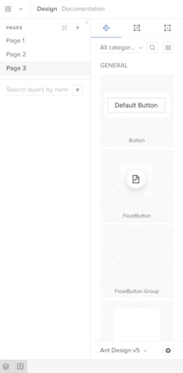
Once you add elements to the canvas, they’ll appear in the Layers sidebar, allowing you to select, group, and rearrange them here. You can view Pages at the top of this sidebar or click the + icon to add more.
The Pages workflow is different from other design tools. In Sketch and Figma, you have all your screens for user flows on a single canvas; in UXPin, you have a separate Page per screen. You can click the Overview icon (OPTION+O) to view all your screens in one interface.
Design System Libraries displays the components and assets for each design system. You can drag these onto the canvas to start prototyping or switch between libraries at the bottom of the sidebar.
3. Design canvas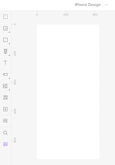
The design canvas displays your screen’s width and height set in the properties panel. This is where you build your prototypes.
4. Properties Panel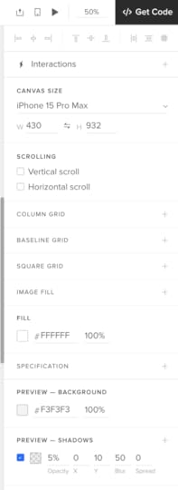
The Properties Panel is where you control properties and interactions for components on the canvas. You can also set the grids, change the background color, and other global canvas settings.
Step 5: Building Your First PrototypeTo get started with a basic prototype:
 Use the toolbar to add elements to the canvas, such as text boxes, buttons, images, or shapes.Arrange and group these elements using the Layers panel.Set up interactions and states using the Properties Panel.
For an in-depth tutorial, follow: How to Build a Dashboard in 15 Minutes.
Step 6: Adding InteractivityInteractive prototyping is what sets UXPin apart from other design tools. Here’s how to get started:
Creating States: Define different visual states for a component, such as a button that changes color when hovered over or clicked.Adding Interactions: Set up actions based on triggers like clicks or hover events. Choose from various options, including navigation to another page, changing component properties, or triggering an animation.Using Variables: Store and manipulate data within your prototype. For example, capture a user’s input and display it on another page.Conditional Logic: Create complex interactions with if-then or if-else conditions, enabling different outcomes based on user actions.1. StatesUXPin’s States allow you to create component states comparable to code. For example, you can program a button to have a default, active, disabled, and hover state, each one triggered by a separate user or system action.
You can also use States to create complex UI components, like Carousels, Accordion Menus, and Multilevel Dropdown Navigation.
2. InteractionsUXPin’s Interactions allow you to define what happens when users engage with your prototype. Triggers, including desktop and mobile, enable you to create realistic, intuitive prototypes.
Actions determine what happens after the trigger. UXPin provides 20+ actions, including API requests, changing states, navigation, component property adjustments, playing video/audio content, and more.
UXPin also has Conditional Interactions which allow you to set if-then and if-else conditions, similar to Javascript. These conditions set the rules to trigger different scenarios based on user and system actions.
For example, you can set up multiple form conditions to trigger error messages for incomplete required fields or incorrect data, like an invalid email address. If all this data is correct, only then will the prototype allow the user to submit the form successfully.
4. VariablesUnlike image-based tools, UXPin’s forms are fully functional out of the box. You can use Variables to capture data from these forms and use them elsewhere in the prototype. For example, capturing a user’s information during a checkout process and displaying it on a confirmation screen for them to verify.
5. ExpressionsUXPin’s Expressions are the closest you’ll get to Javascript without writing any code. With Expressions, you can add another layer of complexity, including validating forms, checking password criteria, or building computational components for shopping carts.
When combined, these four advanced prototyping features allow you to create realistic, dynamic prototyping experiences indistinguishable from the final product.
Check out UXPin’s example apps and patterns to see what’s possible using States, Interactions, Variables, and Expressions. You can download these and import them to a UXPin project to look under the hood and see how these features work.
Step 7: Advanced Features – Auto Layout & MergeAuto Layout
Auto Layout helps organize elements dynamically. Select your components and use the Auto Layout feature to maintain consistent spacing, alignment, and sizing.How to use Auto Layout:
Select a group of elements.Click Auto Layout in the Properties Panel.Adjust spacing, alignment, and padding as needed.Merge Technology
Merge brings real, coded components into UXPin’s design environment. This helps reduce drift between design and development and allows designers to build with the same components used in production.How to use Merge
Import components from your Git repo or bring ones from Storybook.Drag and drop these components onto the canvas.Modify properties using the same interface developers use in code.If you’re using UXPin’s free trial, you can access three built-in Merge components:
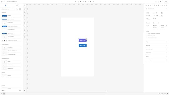
MUIAnt DesignFluent UIWhile these look like regular design elements from a UI kit, they’re actually React components pulled from a repository. We’ll use two seemingly identical buttons to illustrate the difference between Merge and a UI kit.
Both are Material Design buttons. The purple one is from Google’s Material Design UI kit, and the bottom one is from the MUI Design System–which uses Material Design as a foundation.
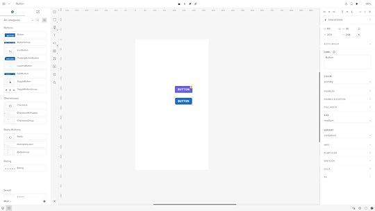
When we click the purple Material Design button, it displays UXPin’s standard Properties Panel, where you can create the component’s styling and interactions.
When we click the blue MUI button, the Properties Panel changes to the Merge variation. Instead of creating properties, you select them based on the React component’s available props–or Args if you’re working with the Storybook Integration.
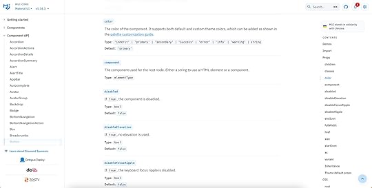
For example, opening the color dropdown displays the MUI button’s color properties which match MUI’s documentation.
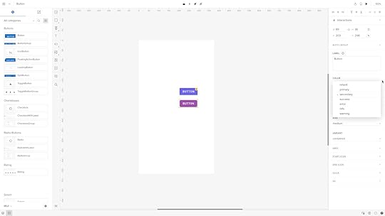
These properties give product teams the necessary constraints to build prototypes with minimal drift or inconsistencies.
Step 8: Using Figma IntegrationIf you’re already working in Figma, you can import your designs directly into UXPin.
How to import Figma designs:
In Figma, right-click on a frame and go to Plugins > Development > Export to UXPin.Copy and paste the Figma frame into UXPin.All your Figma layers and assets will be imported, allowing you to add UXPin’s interactivity and advanced features.Note: While UXPin will import layers and assets from Figma, it won’t transfer Figma’s native interactions. You’ll need to recreate these using UXPin’s interaction tools.
Step 9: Collaborating & Sharing PrototypesCollaboration is seamless in UXPin.
 Preview Links: Share a preview link with stakeholders. They don’t need a UXPin account to view the prototype.Comments: Collect feedback using public or team comments. Public comments are visible to anyone with the link, while team comments are internal.Get Code Mode: Use Spec Mode for developer handoff, giving developers access to component details like spacing, color, and CSS properties.Step 10: Finalizing Your Prototype and Handoff
Once you’ve completed your prototype, you can prepare it for handoff:
Use Get Code Mode: Developers can see the properties and specifications of each component.Merge & Handoff: If you’re using Merge, developers can copy JSX code directly from the prototype.Get Started with UXPinWe hope you’ve enjoyed this UXPin beginner tutorial. If you haven’t got an account, sign up for a free trial. Build prototypes that can be easily translated to code. Enjoy a better design workflow. Get started here.
Try UXPin for freeThe post UXPin Tutorial for Beginners in 10 Steps appeared first on Studio by UXPin.


October 3, 2024
15 AI Tools for Designers in 2024

AI tools are software applications powered by machine learning algorithms that automate tasks, analyze data, and simulate human-like thinking. For designers and developers, AI tools have become essential for streamlining workflows, enhancing creativity, and delivering personalized user experiences.
From design automation and code generation to user research and content creation, AI enables professionals to work more efficiently and make data-informed decisions. By integrating AI into your workflow, you can amplify your capabilities and create better, more innovative products—faster and with fewer resources.
Looking for a tool that combines the power of AI with the speed of building functional user interfaces? Try UXPin Merge. It enables designers and developers to work seamlessly together by integrating live, code-based components directly into your design environment. With the addition of the AI Component Creator, UXPin takes your interface-building capabilities to the next level, allowing you to create and iterate faster than ever. Request access to UXPin Merge.
Reach a new level of prototyping
Design with interactive components coming from your team’s design system.
Discover UXPin Merge .discover-merge { margin: 40px 8px;}.discover-merge__container { display: flex; max-width: 690px; height: 200px; padding: 20px; padding-left: 24px; border-radius: 4px; background-color: black; box-shadow: 10px 10px #9999ff; align-items: center; justify-content: space-between;}.discover-merge__left { width: 50%;}.discover-merge__left p { margin: 10px 0px !important; color: white !important; font-size: 18px !important;}.discover-merge__heading { font-weight: bold !important; color: white !important; font-size: 18px !important;}.discover-merge__text { margin: 0 !important; line-height: 22px !important;}.discover-merge__button { width: 174px; height: 44px; margin: 10px 0px; border: none; border-radius: 2px; background: white; color: black; font-size: 16px; text-align: center;}.discover-merge__button:hover { cursor: pointer;}.discover-merge__image { max-width: 320px !important; height: 200px; margin-right: -19px;}@media (max-width: 760px) { .discover-merge__container { height: auto; margin: 10px; align-items: left; }}@media (max-width: 500px) { .discover-merge__container { flex-direction: column; } .discover-merge__left { width: 100%; align-items: normal; }}What Are AI Tools?
AI tools are software applications powered by advanced machine learning algorithms. These tools can analyze vast amounts of data, automate repetitive tasks, and even simulate human-like thinking processes. For designers and developers, AI tools have become indispensable for boosting creativity, speeding up workflows, and enhancing user experiences.
In the context of UX design and development, AI tools can assist in various ways.
Design AutomationTools powered by Artificial Intelligence can automate mundane design tasks, such as layout adjustments or color recommendations, allowing designers to focus on more strategic aspects of their work.
Code GenerationDevelopers can leverage AI-powered coding assistants (like GitHub Copilot) to suggest code snippets, auto-complete complex functions, or even generate boilerplate code based on natural language descriptions. This can be useful when building a code-backed design system.
User Research & AnalyticsArtificial Intelligence tools can analyze user interactions to identify patterns, predict user behavior, and provide insights into usability issues. These insights can drive data-informed design decisions.
Content GenerationAI-driven content tools can create compelling copy, generate blog ideas, or assist with technical documentation—saving time and resources.
PersonalizationAI can personalize user experiences based on behavioral data. For instance, recommendation engines (think of those used by Amazon or Netflix) can be integrated into websites to offer personalized content or product suggestions.
Why AI Tools Matter for DesignersThe integration of AI into design and development workflows isn’t just about automation—it’s about amplification. AI tools allow designers to explore more possibilities faster and help developers write cleaner code by automating tedious debugging processes. Ultimately, these tools enable teams to create better products in less time.
In the fast-evolving landscape of technology, staying ahead means embracing tools that enhance your capabilities. AI is not here to replace designers or developers but to empower them, making it easier to deliver innovative, user-centered products.
How to Measure the Usefulness of an AI Tool as a DesignerTo determine whether an AI tool is beneficial in your design workflow, consider evaluating it based on the following criteria:
Time Saved: Measure how much time the tool saves compared to manual processes. Does it automate repetitive tasks like resizing elements, adjusting layouts, or generating variations faster than you would do it yourself? Use time-tracking tools to quantify these savings.Quality of Output: Assess the quality of the AI-generated designs or suggestions. Are the results consistent with your design standards, or do you often need to make additional tweaks? The best AI tools should minimize rework and help you achieve high-quality outcomes faster.Ease of Integration: Evaluate how easily the AI tool integrates into your existing design workflow. Does it seamlessly fit with your preferred prototyping tool or require cumbersome adjustments? The more frictionless the integration, the more useful the tool.User Experience Improvements: Measure how the AI tool impacts the final user experience. Tools like heatmap analyzers or AI-powered user testing platforms can reveal if the tool’s insights lead to better usability, increased engagement, or reduced friction for end-users.Feedback from Team Members: Gather feedback from your team members (other designers, developers, or project managers) on how the AI tool affects collaboration and productivity. A useful AI tool should enhance team collaboration rather than create bottlenecks or confusion.ROI and Cost-Benefit Analysis: Consider the financial impact of the AI tool. Compare the cost of the tool with the value it provides in terms of time saved, higher quality designs, or reduced need for additional tools or resources. Tools that offer a high return on investment are more likely to be valuable additions to your toolkit.Creativity Enhancement: Finally, evaluate whether the tool enhances or restricts your creativity. Useful AI tools should free up cognitive space by handling mundane tasks, allowing you to focus on strategic ideation and experimentation.By systematically evaluating an AI tool against these criteria, you can determine its effectiveness and suitability for your design needs.
15 Best AI Tools for DesignersAI Component Creator by UXPin
The AI Component Creator is a built-in feature of UXPin Merge. It leverages artificial intelligence to automate the creation of UI components, significantly accelerating the design and development process.
This feature enables designers and developers to generate fully functional components with just a few inputs. Here’s how it works and why it’s useful:
Speeds Up Design Work: It automates creating buttons, forms, and other elements by generating components that match your design system and code, saving you a lot of time.Ready for Developers: The components it makes aren’t just for show—they’re functional and ready for developers to use immediately. This means less back-and-forth between designers and developers.Easier Collaboration: With real-time updates and changes, everyone on the team can see the latest designs without needing to manually share files.The tool has received positive reviews on Product Hunt, with users appreciating its ability to generate real UI components. Many designers find it to be a valuable addition to their toolkit, enhancing both productivity and the overall quality of the design process.
Read this article that outlines the process of using AI Component Creator.
Lummi AI
Lummi AI is a design assistant that generates design concepts, provides layout suggestions, and offers creative prompts to kickstart the design process. It uses AI to analyze your inputs and produce multiple iterations based on design principles.
Lummi AI helps overcome creative blocks and allows designers to quickly visualize various design directions without starting from scratch, making the ideation process faster and more efficient.
According to reviews on Product Hunt, users highlight the tool’s efficient filters and wide variety of categories that make it easy to find the perfect image for different needs. Patrizia Slongo, a UI/UX designer, mentions that Lummi is an “exceptional resource for web design” with its professional-grade images, while another user, Gilbert Anka, notes that it’s a “must-have for small businesses” due to its usability and variety of images available (Source).
If you’re a designer looking for an AI-powered solution to quickly access high-quality images without the typical hassle of searching through traditional stock photo libraries, Lummi AI could be an excellent tool to explore.
PNG Maker AI
PNG Maker AI specializes in removing backgrounds from images, creating transparent PNGs with a high degree of accuracy. It uses AI to differentiate between foreground and background elements, providing clean extractions.
Many users appreciate the accessibility and free core features, which make PNG Maker AI a go-to option for basic image creation needs. Some have pointed out that while the tool is highly functional, advanced features are gated behind a premium subscription (Source).
Background removal is a time-consuming task. PNG Maker AI’s precision and speed can save hours, making it ideal for creating assets for UI designs, marketing materials, or any context requiring isolated image elements.
Color Magic App
Color Magic uses AI to generate harmonious color palettes based on specific themes or emotions. You can upload images or enter keywords, and the app will suggest color combinations that align with your brand or design goals.
Users can view real-time previews of their palettes and receive suggestions based on different themes like “Winter” or “Sunset,” ensuring the tool provides highly relevant and visually appealing results for diverse design needs (Source).
Overall, Color Magic is a well-regarded tool for generating unique and thematic color palettes, but it might not meet the needs of those requiring extensive editing capabilities or offline use.
Octopus AIOctopus AI is a research assistant that automates user research by analyzing large sets of qualitative and quantitative data, generating insights, and creating visual reports.
If user research feels overwhelming, this tool can help by organizing and analyzing feedback quickly, allowing you to make data-driven design decisions without the usual time investment.
Board of Innovation AIThis AI tool generates innovative ideas and concepts by using prompts related to business challenges, design thinking principles, and industry trends. It’s built to support strategic brainstorming sessions.
This tool is great when you need inspiration for out-of-the-box solutions or want to explore new design and business opportunities within your projects.
Chart AI
Chart AI generates data visualizations based on raw data or even natural language descriptions. It offers a wide range of charts, from basic bar graphs to complex scatter plots.
Chart AI supports a wide range of chart types, such as flowcharts, Gantt charts, pie charts, sequence diagrams, ER diagrams, mind maps, and class diagrams. This variety makes it versatile for different use cases, whether you’re mapping out complex systems or creating simple visual summaries.
Users can customize the appearance of charts with different styling options, helping them create visuals that align with their branding or specific design preferences.
Data visualization is crucial in UX design, especially for user research and presentations. Chart AI simplifies the process, making it easy to communicate insights visually. Its ability to interpret natural language inputs, support for a wide array of chart types, and real-time data integration make it a powerful tool for creating visually appealing and informative diagrams.
Miro AssistAre you using Miro for brainstorming and design sprints? Great! Here’s something for you. Miro Assist is an AI-powered feature within Miro’s collaborative whiteboard platform. It automates the organization of sticky notes, mind maps, and project plans, suggesting logical groupings and connections.
Miro Assist enhances real-time collaboration by reducing time spent on structuring information, so your team can focus on generating and refining ideas.
DescriptDescript is an audio and video editing tool that uses AI for transcribing, editing, and producing multimedia content. It can convert spoken words into text, making editing as simple as revising a text document.
If your design process includes creating video tutorials, presentations, or voiceovers, Descript’s powerful AI tools make content editing faster and more accessible. The same goes for those of you who include videos in your web design. Descript can help you make the videos more engaging and user-friendly.
Prompt Board
Prompt Board is an AI-powered brainstorming tool that generates creative prompts for design projects. It’s built to stimulate creative thinking and encourage exploration of unconventional ideas.
The tool offers access to over 2,000 curated AI prompts, making it easy for designers to get inspired and generate creative ideas quickly. The prompts cover a wide range of topics and can be customized for different creative projects.
Prompts can be shared across multiple AI models like ChatGPT, Gemini, and Claude, enabling designers to use the same prompts for various generative tasks, from image generation to brainstorming content ideas.
Designers often need inspiration to get started. Prompt Board’s diverse prompts can help you explore new directions and keep the creative juices flowing.
Headlime
Headlime is an AI copywriting tool that generates headlines, descriptions, and microcopy tailored for various design contexts. It offers templates for landing pages, ads, and more.
The AI tool excels at understanding context, tone, and audience preferences, making it ideal for creating user-focused copy that aligns with the brand voice. This is useful for UX designers who need to craft messages that resonate with users and enhance the overall experience.
This AI copywriting tool supports multiple languages, making it a good choice for UX teams targeting a global audience. Designers can generate and test copy in different languages to ensure consistency and effectiveness across regions.
Good copy is integral to effective design. Headlime can help you craft compelling text that complements your visuals, saving time and ensuring a cohesive message.
Vance AI
Vance AI is a suite of image enhancement tools that use AI to upscale images, reduce noise, and sharpen visuals without losing quality.
Use Vance AI to improve the quality of low-resolution assets and maintain high standards in your designs.
Fontjoy
Fontjoy is an AI-powered tool that helps designers find balanced font pairings. It suggests typeface combinations based on contrast, similarity, or user preference.
Users can adjust the contrast between fonts—ranging from very similar to highly contrasting—allowing for flexibility in how the fonts are paired based on project requirements. Designers can lock specific fonts they like and let Fontjoy generate complementary fonts for a cohesive design.
Designers can replace sample text with their own copy to see how the font combinations work in real-world scenarios, such as for headings, subheadings, or body text. This feature is particularly useful for UI projects where consistency and legibility are critical.
Font selection can be challenging. Fontjoy simplifies this process, ensuring that your typography choices are visually appealing and complement each other.
Designs.AI
Designs.AI is an all-in-one creative suite that offers tools for logo design, video creation, banner generation, and more. It uses AI to automate creative processes, making it easier to produce high-quality designs quickly.
While Designs.ai provides a good range of features and tools for its price point, it may not be the best option for users seeking high-level customization or complex design projects. It’s better suited for those looking to quickly create content with minimal manual input, making it a practical tool for early-stage branding or content creation.
Adobe Sensei and FireflyAdobe has introduced two powerful AI tools fully integrated into its Creative Cloud applications: Adobe Sensei and Adobe Firefly. Each tool serves a distinct purpose, making them indispensable assets for creative professionals.
Adobe Sensei focuses on productivity by automating repetitive and time-consuming tasks. It handles actions like background removal, content-aware fills, and smart tagging in Photoshop and Lightroom. These features streamline workflows, allowing users to spend less time on technical manipulations and more on the creative aspects of their projects.
Adobe Firefly, on the other hand, is Adobe’s generative AI tool designed for content creation. It specializes in generating new content such as images, illustrations, and text effects based on detailed text prompts.
Firefly’s capabilities extend to generating realistic or abstract visuals, recoloring vectors, and even creating 3D graphics, all through simple text commands. This tool is integrated across Adobe’s applications like Photoshop, Illustrator, and Adobe Express, making it easy to create and edit graphics in real-time.
Both Sensei and Firefly work in harmony to enhance creativity and productivity, offering a balanced approach for both automation and innovation. While Sensei simplifies complex processes, Firefly pushes creative boundaries by enabling unique, AI-driven content generation. Together, they provide substantial benefits for Adobe Creative Cloud users looking to streamline their workflows and elevate their creative projects to new levels.
Use the Power of AI Tools in DesignAI tools are transforming the way designers and developers work by automating repetitive tasks, enhancing creativity, and enabling data-driven decisions. From design automation and code generation to user research and content creation, these tools allow professionals to streamline their workflows and produce high-quality results with greater efficiency.
Whether you’re a designer looking to explore new creative possibilities or a developer wanting to optimize your code, integrating AI into your process amplifies your capabilities. The key is to find the right tools that fit your workflow and enhance your productivity without compromising quality.
AI isn’t here to replace creativity—it’s here to amplify it. Embrace these tools, and you’ll find yourself delivering better, more innovative products in less time, making a lasting impact on your projects and your team. Keep experimenting, keep creating, and let AI help you take your work to the next level!
UXPin Merge combines the power of AI and code-based components to help designers and developers build user interfaces more efficiently. The AI Component Creator automates the creation of functional UI elements, allowing teams to create production-ready components with just a few inputs. Request access to UXPin Merge.
Discover MergeThe post 15 AI Tools for Designers in 2024 appeared first on Studio by UXPin.
October 1, 2024
Web Design Process – A Step-by-Step Guide from Planning to Post-Launch
A well-structured web design process is essential for creating user-friendly, engaging websites that effectively communicate your brand’s message. Whether you’re a designer, developer, or business owner, understanding the website development process can save time, reduce costs, and ensure a seamless collaboration between teams.
To streamline this process, UXPin offers a powerful solution: UXPin Merge. With Merge, you can use a drag-and-drop interface to build fully functional prototypes using actual code components. This unique approach bridges the gap between design and development, reducing inconsistencies and accelerating project timelines. Request access to UXPin Merge.
Reach a new level of prototyping
Design with interactive components coming from your team’s design system.
Discover UXPin Merge .discover-merge { margin: 40px 8px;}.discover-merge__container { display: flex; max-width: 690px; height: 200px; padding: 20px; padding-left: 24px; border-radius: 4px; background-color: black; box-shadow: 10px 10px #9999ff; align-items: center; justify-content: space-between;}.discover-merge__left { width: 50%;}.discover-merge__left p { margin: 10px 0px !important; color: white !important; font-size: 18px !important;}.discover-merge__heading { font-weight: bold !important; color: white !important; font-size: 18px !important;}.discover-merge__text { margin: 0 !important; line-height: 22px !important;}.discover-merge__button { width: 174px; height: 44px; margin: 10px 0px; border: none; border-radius: 2px; background: white; color: black; font-size: 16px; text-align: center;}.discover-merge__button:hover { cursor: pointer;}.discover-merge__image { max-width: 320px !important; height: 200px; margin-right: -19px;}@media (max-width: 760px) { .discover-merge__container { height: auto; margin: 10px; align-items: left; }}@media (max-width: 500px) { .discover-merge__container { flex-direction: column; } .discover-merge__left { width: 100%; align-items: normal; }}Step 1: Ideation & Goal SettingThe ideation and goal-setting phase establishes a solid foundation for your web design project. This is where teams come together to define the purpose of the website and set clear, measurable goals. Here are some critical questions to guide this stage:
What problems is the website solving for its users?What specific actions do we want users to take (e.g., sign-up, purchase, explore content)?What are the key messages or value propositions to highlight?What platforms or devices will users access the website on?How will success be measured (KPIs like conversion rates, time on site, etc.)?With these questions answered, it’s important to establish a timeline and budget. Setting realistic expectations early on can help avoid potential project delays or cost overruns. During this phase, engage all stakeholders to ensure alignment on priorities, deliverables, and constraints.
Tools for BrainstormingBrainstorming is an essential part of ideation. Leverage tools like Miro, FigJam, and Affinity Board for real-time collaboration and visual organization of ideas. Affinity Board, for instance, is particularly useful for grouping related concepts, making connections, and prioritizing features.
Other tools to consider:
MindMeister: Create mind maps to explore and organize design ideas.Stormboard: Capture brainstorming sessions with sticky notes, images, and documents.Lucidspark: A virtual whiteboard for diagramming workflows and gathering team input.Combining these tools enables teams to turn abstract concepts into concrete plans, providing a solid base for the next steps in the web design process. After brainstorming, consider documenting the insights in a project brief to outline objectives, scope, and key milestones—setting the stage for a streamlined, efficient design process.
See also: Best Design Collaboration Tools.
Tools for Goal SettingFor goal setting, web designers and their teams often use a combination of strategic frameworks and digital tools:
Frameworks to Organize GoalsSMART Goals: Goals should be Specific, Measurable, Achievable, Relevant, and Time-bound.OKRs (Objectives and Key Results): Define high-level objectives and identify specific, measurable outcomes.Goal Tracking Tools:Trello or Asana: Manage tasks, deadlines, and goals in a visual format.Google Sheets: Track goals, timelines, and progress collaboratively.Notion: Combine note-taking, planning, and goal-setting in one platform.Miro: Visualize project goals and workflows with diagrams and mind maps.These frameworks and tools help teams align on goals, prioritize tasks, and track progress throughout the project.
Step 2: Research & StrategyResearch and strategy lay the groundwork for informed design decisions, helping you create a website that resonates with your target audience and stands out from competitors.
Competitor Analysis and Inspiration SourcesStart by evaluating competitor websites to identify strengths, weaknesses, and industry trends. Look for design patterns, content structure, and user experience elements. Tools like SimilarWeb, SEMrush, and Ahrefs provide insights into competitor traffic, user behavior, and content performance.
For web design inspiration, platforms like Awwwards, Dribbble, and Behance are excellent sources to gather visual ideas and emerging trends in web design.
User Persona Creation and Understanding the AudienceCreating detailed user personas is crucial for aligning the website’s design with user needs and preferences. A persona should include:
Demographics: Age, location, professionPsychographics: Interests, behaviors, and pain pointsUser Goals: What users want to achieve on the websiteTools like Xtensio and HubSpot’s Persona Creator help document personas, while Google Analytics provides data on user demographics and behaviors.
Defining Scope, Content Strategy, and Functionality RequirementsDefining the project scope sets boundaries for design and development. Use a scope statement to clarify the deliverables, timeline, and resource allocation. Content strategy, meanwhile, should address:
Messaging: Key topics and tone of voiceContent Types: Blog posts, case studies, product descriptionsSEO Requirements: Keywords, meta descriptions, and internal linkingLastly, document the functional requirements, such as interactive elements (forms, calculators) and integrations (CRM, e-commerce platform). Tools like Jira, Confluence, and Notion are ideal for tracking scope and feature requirements, ensuring that everyone is aligned and the project stays on track.
This comprehensive approach to research and strategy will ensure your web design project is both user-centered and strategically sound.
Step 3: Sitemap & WireframingOnce research and strategy are established, it’s time to create a blueprint for the website. The sitemap and wireframing phase outlines the structure and visual layout, ensuring that the site is easy to navigate and meets user needs.
Creating a SitemapA sitemap is a visual representation of the website’s structure. It outlines the pages, hierarchy, and navigation, making it easier to visualize user flows and ensure that all essential pages are included.
When building a sitemap, consider:
Logical Structure: Organize pages based on user journeys.Content Hierarchy: Prioritize important pages and define categories (e.g., Home, About, Services, Blog).Internal Linking: Plan for how pages will connect to each other to enhance navigation and SEO.Designing WireframesWireframes are low-fidelity sketches that define the placement of elements on each page, such as headers, navigation, content areas, and footers. Wireframes help you focus on layout and functionality before diving into visual design.
When creating wireframes, consider:
Content Placement: Ensure key elements like CTAs, headlines, and visuals are strategically positioned.Usability: Design for intuitive navigation and logical flow of information.Breakpoints: Plan for responsive layouts that work on different screen sizes.Tools for Wireframing and SitemapWith UXPin, you can streamline the entire process of creating sitemaps and wireframes, making collaboration and iteration much more efficient.
Creating a Sitemap in UXPinUse UXPin’s Pages Panel: Begin by creating new pages in the Pages panel, which allows you to structure your sitemap hierarchically.Organize Pages: Drag and drop pages to establish parent-child relationships, visually representing the structure and navigation paths of your site.Linking and Navigation: Create interactions between pages to simulate internal linking and user flows.Designing Wireframes in UXPinStart with a Blank Canvas: Choose the appropriate canvas size for your project. UXPin’s flexible canvas allows you to design for different devices and screen sizes.Add Elements from the Component Library: Use drag-and-drop elements like buttons, forms, and text fields from the built-in UI library to quickly build your wireframe.Create Reusable Components: If certain elements, like headers or footers, will be used on multiple pages, create them as reusable components to maintain consistency across your wireframes.Establish Layouts and Grids: Use guides and grids to structure your layout and ensure alignment of elements, which is crucial for creating visually balanced designs.Collaboration and FeedbackUXPin allows for real-time collaboration and feedback, making it easy for your team to leave comments directly on specific elements within the wireframes. Use the commenting features to manage feedback and iterate quickly, ensuring everyone is on the same page before moving to the next step.
This integrated approach in UXPin allows you to manage sitemaps and wireframes seamlessly within a single tool, enhancing efficiency and collaboration while maintaining alignment across all project stages.
Step 4: Visual Design & PrototypingIn this phase, it’s time to turn your wireframes into interactive prototypes using UXPin’s robust design tools. Consistency in branding, testing, and iterating designs are key components of this step.
Importance of Consistent BrandingIn UXPin, you can create a design system that includes your brand’s colors, typography, and components. By using the Design System Manager (DSM), you ensure that all elements—buttons, icons, forms—are consistently styled across your prototype, eliminating discrepancies during design handoffs.
Define Branding Elements: Set up your brand’s primary and secondary color palettes, typography styles, and reusable UI elements in UXPin. This ensures that all elements reflect your brand guidelines.Utilize Design Tokens: Create tokens for consistent spacing, border radii, and shadows, ensuring uniformity across all screens.Designing High-Fidelity Mockups and PrototypesHigh-fidelity prototypes in UXPin allow you to create pixel-perfect designs with interactive components that closely simulate the final product. Here’s how you can build them:
Drag-and-Drop Components: Use UXPin’s library or import your custom components to create layouts quickly. With UXPin Merge, you can build screens using code-backed components, providing a seamless integration between design and development.Create Interactions and Animations: Use UXPin’s interactive states to show different component behaviors like hover, click, or disabled states. Add microinteractions to enhance user experience, such as smooth transitions or animations.User Testing on Prototypes for Early FeedbackTesting high-fidelity prototypes early on helps identify usability issues and design flaws before development. UXPin integrates with tools like FullStory to record user interactions and collect insights, making it easier to validate designs with real-world users.
Share Prototypes for Usability Testing: Share a link to your interactive prototype, and use the commenting feature to gather feedback.Integrate with FullStory: Analyze how users interact with your prototype to understand pain points, drop-offs, and successful flows. Iterate based on these findings to optimize the design.By leveraging UXPin’s high-fidelity prototyping and testing capabilities, you can create a cohesive visual design and validate it before development, ensuring a smoother project workflow and fewer revisions.
Step 5: Content Creation & SEO OptimizationCreating compelling content is essential for engaging users, while SEO optimization ensures that your content reaches the right audience. Here’s how you can use UXPin to manage and optimize content effectively.
Best Practices for Writing Website ContentCreate Clear and Concise Content: Make sure that every piece of content serves a purpose. Use headers and bullet points to break up text, making it easy to scan.User-Focused Language: Write content that addresses user pain points and needs, and use a consistent tone that matches your brand.Accessibility Considerations: Make text readable by choosing the right contrast and font size, and add alt text for images to support screen readers.SEO Tips for Better Visibility and PerformanceKeyword Integration: Use primary and secondary keywords naturally throughout the content, and include them in headings, subheadings, and meta descriptions.Optimize for Core Web Vitals: Use UXPin to design responsive layouts and reduce layout shifts, improving page load speed and user experience, both of which are critical for SEO rankings.Internal Linking: Use UXPin’s prototyping to map out and link between key content pages, ensuring clear navigation and site structure that search engines can easily crawl.Integrating Multimedia ElementsUXPin allows you to easily integrate and position multimedia elements like images and videos within your prototypes. Using multimedia effectively can boost engagement and SEO:
Optimize Images: Compress images and use descriptive file names and alt text to help search engines understand the context.Utilize Video Content: Embedding videos in your designs? Use UXPin to add video and test different placement options. Videos can significantly increase time-on-page and reduce bounce rates, enhancing user experience.By applying these best practices, you can ensure that your content is both user-friendly and optimized for search engines, giving it the best chance to rank highly and attract organic traffic.
Step 6: Development & ImplementationAfter finalizing the visual design, the next step is converting these designs into functional code. With UXPin’s integrated features, you can streamline the development process and ensure consistency between design and implementation.
Converting Designs into CodeUsing UXPin Merge, you can build prototypes with live React components, making your designs as close to code as possible. This feature allows developers to extract production-ready React code directly from the prototype, reducing handoff errors and speeding up implementation.
Export Production-Ready Code: Use UXPin Merge to seamlessly transition designs into code. This process reduces the gap between design and development, minimizing discrepancies.Live Preview: Use UXPin’s live preview mode to see how your design will render in a browser, ensuring all elements are coded correctly before final export.Responsive Design Principles and TestingResponsive design is crucial for delivering a consistent user experience across all devices. With UXPin, you can test responsive layouts and interactions directly within the platform:
Responsive Breakpoints: Use UXPin’s responsive design features to adjust layouts for different screen sizes (mobile, tablet, desktop) and preview them in real-time.Testing Across Devices: Run interactive tests to ensure designs adapt correctly to different breakpoints, helping you catch layout issues before they reach development.Collaboration Tips Between Designers and DevelopersUXPin simplifies the collaboration between designers and developers through its robust commenting and handoff features:
Design Handoff: UXPin’s Design Specs feature allows designers to share specs, assets, CSS styles, and dependencies with developers. Developers can easily inspect and download the necessary assets and styles, making it easier to implement designs accurately.Real-Time Collaboration: Designers and developers can leave comments, resolve issues, and track changes in real-time, ensuring continuous alignment throughout the project.By leveraging UXPin’s development and collaboration tools, you can significantly reduce design inconsistencies and speed up the development cycle, ensuring a smooth transition from design to implementation.
Step 7: Testing & Quality AssuranceTesting and quality assurance (QA) are critical steps in the web design process to ensure that the website functions correctly, provides a positive user experience, and meets the expected standards of quality. Here’s how to execute a thorough QA process using a step-by-step approach:
Types of TestingUsability Testing: focuses on evaluating how easily users can navigate and interact with the website. This type of testing helps identify areas of friction or confusion in the user journey. QA teams conduct usability testing by observing real users as they complete tasks and noting any difficulties they encounter. The goal is to enhance overall user satisfaction by ensuring an intuitive and seamless experience.Functionality Testing: ensures that all interactive elements, such as buttons, forms, and navigation menus, are working as intended. This includes verifying links, form submissions, and interactive UI components. Functional tests can be done manually or automated to ensure that there are no broken elements that could hinder user interaction.Performance Testing: evaluates the website’s responsiveness and speed under different conditions. It includes checking page load times, server response, and resource usage. Performance testing tools can simulate heavy user loads to test how well the website performs under stress.Cross-Browser and Cross-Device TestingTo ensure a consistent user experience across different devices and browsers, it’s crucial to conduct cross-browser and cross-device testing. Tools like BrowserStack can help by simulating different environments, allowing you to test the website’s compatibility and performance on multiple devices (e.g., smartphones, tablets) and browsers (e.g., Chrome, Firefox, Safari).
Create a Testing Plan: Define which browsers and devices are most relevant for your audience, based on user analytics data.Execute Cross-Browser Testing: Use tools to check visual appearance, layout consistency, and interactive elements across different browsers.Test for Responsive Design: Validate that the website adapts well to various screen sizes and resolutions.Creating a QA ChecklistA comprehensive QA checklist ensures that all aspects of the website are tested and verified before launch. A well-structured QA process includes the following steps:
Test Planning and Design:Define test cases based on the project requirements, such as form validation, navigation flow, and media functionality. Outline expected outcomes and set up the staging environment to replicate production conditions.Test Execution:Execute the planned tests, including both manual and automated testing, as needed. Record all identified defects in a defect-tracking system for efficient management and follow-up.Defect Management and Reporting:Report bugs to the development team for resolution, and re-test to validate fixes. Conduct regression testing to ensure that bug fixes do not introduce new issues.Configuration Management:Maintain version control and change management throughout the testing process. This ensures consistency and integrity in the testing environment, minimizing risks of unapproved changes or unauthorized access.Final Release Testing:Perform final release tests such as smoke tests and performance tests to validate the stability and readiness of the website for launch. If the tests pass, generate a QA report summarizing test results and findings.By following this structured QA process and using appropriate tools, you can ensure a smooth, error-free launch that provides a high-quality user experience and meets all functional requirements.
Step 8: Launch & Post-Launch ActivitiesThe final step of the web design process is launching the website and planning for its ongoing maintenance and improvement. A successful launch involves more than just pushing the site live; it requires a robust strategy to ensure a smooth rollout, promote the website, and monitor its performance post-launch.
Final Review and Checklist Before LaunchBefore going live, ensure the website is thoroughly tested and optimized. Conduct a comprehensive pre-launch checklist, which should include:
Cross-Browser Testing: Verify that the website looks and functions correctly across different browsers and devices.Performance Testing: Check page load times and server response under various conditions.SEO Optimization: Confirm that all on-page SEO elements—title tags, meta descriptions, and alt text—are correctly implemented.Accessibility Compliance: Ensure the site adheres to accessibility guidelines such as WCAG, making it usable for all visitors.Launch StrategiesEffectively launching a website involves more than just hitting the publish button. A well-coordinated launch strategy will help you maximize visibility and traffic:
Pre-Launch Marketing: Generate buzz by sharing sneak peeks or teasers on social media and through email campaigns.Launch Day Announcements: Use various channels like newsletters, press releases, and social media platforms to announce the website’s launch. Platforms like Product Hunt can be particularly effective for promoting new products or services.Partnerships and Influencer Outreach: Collaborate with influencers or partners to expand your reach and create excitement around the launch.Post-Launch Maintenance and Continuous ImprovementLaunching the website is just the beginning. Post-launch, you need a structured plan to gather insights, make improvements, and keep the content fresh.
Gathering User Feedback: Tools like surveys, heatmaps, and FullStory integration can help you analyze user behavior and gather feedback. Use these insights to identify pain points, drop-off areas, and usability issues that need to be addressed.Surveys: Use tools like Google Forms or Typeform to ask visitors about their experience.Heatmaps: Tools like Hotjar or Crazy Egg can show you where users are clicking and scrolling, helping you optimize layouts and CTAs.FullStory Integration: Analyze user sessions to see how they navigate your site, where they struggle, and what features they find most useful. This data helps you make informed decisions on what to improve.Regular Updates and Content Refreshes:Plan for periodic content updates, including new blog posts, case studies, or product information, to keep the site relevant and engaging.Schedule regular SEO audits to identify opportunities for optimization, such as updating meta tags, improving page speed, and addressing broken links.Implement new features or design enhancements based on user feedback and technological advancements.Tracking and Monitoring:Use tools like Google Analytics and Google Search Console to monitor website performance, track key metrics like traffic, bounce rates, and conversion rates, and identify areas for improvement.Set up alerts for site errors, performance drops, or other issues that may arise, ensuring that you can act quickly to resolve them.This structured approach to post-launch maintenance and continuous improvement will help you maintain a high-quality website that evolves with user needs and market trends, setting it apart from competitors and ensuring long-term success.
Design Your Website NowCreating a successful website requires a structured approach to the web design process, covering everything from initial ideation and research to design, development, and post-launch activities. By following these steps, designers and teams can produce user-centric, high-performing websites that meet business goals and provide a positive user experience.
By leveraging UXPin’s all-in-one platform, especially with UXPin Merge, you can streamline the web design process, reduce rework, and ensure a cohesive, high-quality product that meets user needs and business objectives. This comprehensive approach sets you up for success and helps your website stand out from the competition. Request access to UXPin Merge.
Discover MergeThe post Web Design Process – A Step-by-Step Guide from Planning to Post-Launch appeared first on Studio by UXPin.
September 24, 2024
Design System Tips from Developer’s Point of View
Today we’re sharing a guest post by Nick Moore that originated from collaboration with StackBlitz. Build code-backed prototypes and open them in StackBlitz in one click. Request access to UXPin Merge.
If you know how to ride a bike now and wait five years to ride one again, you’ll likely do just fine once you get back on. Bicycles are intuitive once you’ve learned how to ride them, and the basic design is unlikely to change over time and across bicycles. Reaching this level of usability in software is a little more difficult.
Developers and designers often have to iterate too rapidly to reach bicycle-level reliability, but the intuitive experience of a user logging onto your app as if they were hopping on a bicycle is still something we should aim for—and design systems are the best way to do so.
Even though it’s a high bar, this level of usability pays dividends. Users will adopt your app more readily (reducing churn), use it to greater effect (and feel the benefits), and strengthen your marketing efforts as engaged users recommend and amplify your app.
Building and using a design system is one of the best ways to clear this high bar because design systems allow development and design teams to build and ship quickly while relying on standardized components that reduce friction and confusion.
If you’ve ever encountered a bad design system, then you know the issue: A great one can lift you up, but a bad one can hold you back.
The key is to treat your design system like a fully-fledged product that must remain effective and dependable over time. Without enough investment, design systems will only offer marginal help; with enough investment, design systems can provide consistency and stability while improving the pace of development.
Build responsive layouts fast! Try UXPin Merge, a technology that helps designers and developers create prototypes that are production-ready from the start. With our integration, open UXPin Merge prototypes in StackBlitz with one click. Request access to UXPin Merge.
Reach a new level of prototyping
Design with interactive components coming from your team’s design system.
Discover UXPin Merge .discover-merge { margin: 40px 8px;}.discover-merge__container { display: flex; max-width: 690px; height: 200px; padding: 20px; padding-left: 24px; border-radius: 4px; background-color: black; box-shadow: 10px 10px #9999ff; align-items: center; justify-content: space-between;}.discover-merge__left { width: 50%;}.discover-merge__left p { margin: 10px 0px !important; color: white !important; font-size: 18px !important;}.discover-merge__heading { font-weight: bold !important; color: white !important; font-size: 18px !important;}.discover-merge__text { margin: 0 !important; line-height: 22px !important;}.discover-merge__button { width: 174px; height: 44px; margin: 10px 0px; border: none; border-radius: 2px; background: white; color: black; font-size: 16px; text-align: center;}.discover-merge__button:hover { cursor: pointer;}.discover-merge__image { max-width: 320px !important; height: 200px; margin-right: -19px;}@media (max-width: 760px) { .discover-merge__container { height: auto; margin: 10px; align-items: left; }}@media (max-width: 500px) { .discover-merge__container { flex-direction: column; } .discover-merge__left { width: 100%; align-items: normal; }}Build design systems via iteration, not waterfallFor developers, design systems often feel like intrusions from the outside in. The design systems team might have their best interests at heart, but developers know that a bad process with good intentions will still likely lead to a bad product.
After all, developers are well-versed in building a product and iterating over time, with user feedback informing every iteration. Any whiff of a waterfall or waterfall-esque process – where teams build a product in a silo and release it all at once – will make them justifiably skeptical.
The solution is to focus on simplicity over comprehensiveness—at least at first—and build design systems bit by bit over time. By breaking the problem down, platform teams can build simple but essential features, prove the concept’s value, and get feedback that will inform the rest of the work.
Slack provides a good example of this methodology. Back in 2016, millions of people were using Slack, and the company’s codebase was, according to Zack Sultan, Lead Product Designer at Slack, “built in a way that favored time-to-market over maintainability, consistency, or reusability.”
Like many young companies, Slack prioritized finding and pursuing product/market fit before building a codebase suited for scalability and reliability. Some companies encounter breaking issues first and decide to reassess potential tech debt issues, but Slack kept ahead of itself.
“We never encountered a single breaking point in our user interface,” Sultan writes, “but rather a slowly cascading series of inconsistencies, quirks, and discrepancies.” The momentum of the business was growing, and as Slack added more product teams (and more products and features), components started to drift.
(Source)
Questions soon abounded, Sultan writes. “What does a button look like in Slack? How do you build it? What words do you put in it? It was up to individual teams to make these decisions.”
Many companies correctly notice the problem and then build a mediocre solution by asking a group of developers to cook up a new design system in isolation. Some slowing down is to be expected as companies grow, but a design system developed this way can cause development to come to a screeching halt.
Slack was wary of this potential and focused on finding ways to rebuild and standardize its components without slowing down overall development. “It was a bit like taking a car engine apart piece by piece, and cleaning, repairing, and replacing each part while it accelerated down the highway,” Sultan writes.
(Source)
Like building a minimum viable product (MVP), design systems need to have core features built well and not many features built poorly. Early on, you’re looking to demonstrate value–not comprehensiveness–even if it means building one single component really well.
“Just one component, thoroughly documented, was immediately valuable,” Sultan writes. By building components one at a time and ensuring each was complete and well done, they were able to create a “virtuous cycle for the system.”
The value of each component, as simple and small as each isolated chunk was, demonstrated the value of the work as a whole. Developers remained invested throughout, and Slack eventually launched its design system, Slack Kit.
Maintain design systems or lose them to tech debtLet’s imagine, for a moment, that the platform team and design team have worked together – alongside developer feedback – to build the perfect design system. Every developer takes a look and gives it a thumbs up.
Why, then, could you take any one of those developers aside and hear some wariness in their voice when they talk about actually using the design system?
The issue is that developers are very familiar with what happens when a product doesn’t have a maintenance plan. They’ve built products that have fallen by the wayside and created beloved internal tools that managers deprioritized until they died. Eventually, even a great product will fall prey to tech debt if there’s no plan to keep it alive.
For teams building design systems, the solution is to build a flexible design system that they can iterate, maintain, and update over time.
Design systems, by their nature, tend to offer some level of standardization, but over-focusing on standardization can lead to an overly rigid system. If the design system is good, people might not complain at first, but if even a good system is hard to keep up to date and hard to use in non-standard scenarios, people will eventually stop using it.
Instead, platform teams need to build design systems with maintenance as a first principle and map each component across a spectrum of flexibility.
To make this a little less abstract, let’s look at an example from Spotify.
The team behind Encore, Spotify’s design system, faced the same issue we’ve talked about here. As the product changes and the development team grows, writes Charlie Backus, design systems engineer at Spotify, “it can sometimes seem like the team is outgrowing the current set of components and styles.”
(Source)
As you can see in the selection above, there was a dire need for consistency, despite an equal need for teams to remain creative and driven.
To find a balance, Backus recommends teams develop “an abstract shared vocabulary around component properties” or ensure that the “base properties remain accessible for modification by end consumers.”
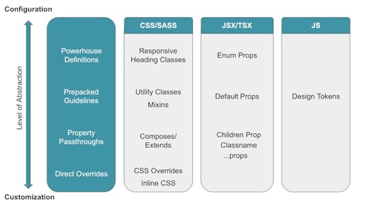
The best way to think about this strategy is to imagine a spectrum between configuration (high-abstraction components that developers pass additional parameters to in order to add varied behaviors) and customization (low-abstraction components that developers just add custom styles to).
(Source)
This spectrum-based approach is useful because it forces teams to think about tradeoffs ahead of time.
On the one hand, as Backus writes, “A more abstract configuration approach can increase consistency and maintainability but at the risk of the system being a bottleneck for outgoing features.” By increasing abstraction, a design system can make development more consistent but potentially slow down development.
On the other hand, Backus continues, “The less abstract customization approach enables quicker feature development; however, the overall consistency of the product can suffer as a result.” Speed increases, in this case, but the likelihood of inconsistencies increases, too.
Backus recommends thinking about maturity to find your spot on the spectrum for any given component. “The more mature a product or feature is, the more beneficial and feasible a configuration approach is. However, the iterative and low-level nature of customization makes it more suitable for prototyping and features which are bespoke, or are still subject to change.”
Like in the Slack example, we’re incorporating concerns that lie outside the immediate purview of the design system. With Slack, they were thinking about the growth of the company, and with Spotify, they were thinking about the growth of features. Mature, well-tested, well-known features can be standardized, but new, still-growing, and one-off features require more flexibility.
Avoid rework by aligning developers and designersDevelopers and designers alike often decry meetings, wishing they had more time and space to work. Don’t get us wrong – too many meetings can be a huge drag on focus – but a good meeting can also save you a lot of work. An aligned team, delayed by a meeting, will always be more effective than an unaligned team working hard on the wrong things.
This dynamic is true within teams and departments, but alignment issues can be much more severe between different departments. A development team and design team working on different things, for example, can end up negating each other’s work if the designs are for a feature that isn’t built yet and the feature is built for a design that hasn’t been sketched yet.
Design systems magnify this issue. If a design system isn’t well thought out, all the effort toward building one can be wasted if developers and designers don’t start out using it in an aligned way and maintain alignment over time.
As we said in the first section, the design system can’t feel like a third party designed from the outside in. In the same way, it can’t be a tool that developers and designers only call on occasionally or when absolutely necessary. Instead, a design system should be a language for the design and development teams—both a result of alignment and an anchor that continuously shows how well the teams are aligned.
To see what we mean when we refer to design systems as language, look at Airbnb. Back in 2016, Airbnb was growing rapidly and adding feature after feature. Karri Saarinen, then Principal Designer at Airbnb, writes, “One-off solutions aren’t inherently bad, but if they aren’t built upon a solid foundation, we eventually find ourselves having to pay back accrued technical and design debts.”
To reset these efforts and ensure ongoing sustainability, the Airbnb team looked toward language as a guiding metaphor. “Visual language is like any other language,” Saarinen writes. “Misunderstandings arise if the language is not shared and understood by everyone using it. As a product or team grows, the challenges within these modalities compound.”
Airbnb built a new language via a new design system by looking at where their old designs failed. “We started by auditing and printing out many of our designs, both old and new,” Saarinen writes. “Laying the flows side by side on a board, we could see where and how the experiences were breaking and where we needed to start making changes.”
By focusing on the miscommunications first, Airbnb was able to build a language that used a consensus understanding of shared components as its foundation.
(Source)
“We felt that we were all working together towards the same idea,” Saarinen writes. “Reviewing our collective work at the end of each day, we began to see patterns emerge. We course-corrected when necessary and started defining our standardized components.”
The team knew they were onto something when, even before the design system was finalized, productivity and consistency sped up in tandem. “One day,” Saarinen remembers, “While putting together a last-minute prototype, our team was able to create nearly 50 screens within just a few hours by using the framework our library provided.”
The early and ongoing boosts to productivity and standardization were a result of building a design system like a shared language. By thinking of the design system first and foremost as a way for developers, designers, and others to communicate and understand each other, the entire company benefited.
Treat your design system like a basecampOne of the biggest worries developers can feel when a platform team or engineering leader proposes a design system is the tension between the freedom to do new work and the restraints standardization can impose.
Developers often fear that design systems, even when they introduce welcome consistency, can inhibit experimental and exploratory work. Ultimately, developers want to code, and design systems can sometimes feel like a way of reducing coding to boilerplate work.
With this fear and its real risks in mind, companies have to take a different approach to making design systems work for developers: Design systems should be like basecamps for developers and designers on the frontiers of exploration.
The base camp is more stable than the frontier, and the work done there is more routine. In this metaphor, the ultimate purpose of the design system is to give designers and developers resources so that they can explore further with every trek. The design system acts as a dependable foundation, but it doesn’t replace all the work that needs to be done.
With the lessons we’ve outlined here—iterating over time, thinking carefully about flexibility and maintenance, and aligning developers and designers—you can create a design system that developers trust, one they will gladly return to before exploring further.
Create fully functional, production-ready prototypes from the start. With UXPin Merge, what you design is exactly what gets built—eliminating handoff issues and speeding up development. Plus, with our seamless integration, you can open your UXPin Merge prototypes in StackBlitz with a single click for an even smoother workflow. Ready to elevate your design and development process? Request access to UXPin Merge today.
Discover MergeThe post Design System Tips from Developer’s Point of View appeared first on Studio by UXPin.
September 19, 2024
Responsive Design for UXPin Merge – What is Frames?
 Frames by UXPin Merge: Change layout sizes without extra work.
We’ve just launched a new feature that brings full responsiveness to UXPin Merge. With it, you can seamlessly switch between different layouts such as desktop, mobile, and other devices and your design stays responsive. The feature keeps your projects visually consistent, fully functional, and looking great on any device.
What is Frames?Frames is a versatile capability that allows designers to assign code-backed components to specific presets, making it effortless to transition between different layouts like desktop and mobile.
With this feature, you can preview how your designs behave across various devices directly in the Editor and Preview modes. This capability ensures that your designs are not only visually consistent but also functional across all screen sizes.
Frames come equipped with a full set of interactions — such as Resize, Scroll, Load, Click, and Hover — allowing for dynamic and engaging user experiences. This feature mirrors the flexibility and interactivity you already have enjoyed when working in UXPin’s Editor, now enhanced to support fully responsive design.
What Do You Get with Frames?Besides being a much-needed tool for creating truly responsive designs with minimal effort, Frames comes with a host of benefits:
Responsive Design – Frames makes it easy to design layouts that adapt seamlessly to different devices. Whether you’re designing for desktop, mobile, or any other screen size, Frames ensures that your designs are fully responsive, providing a great user experience across all platforms.Seamless Transitions – Easily switch between layouts such as desktop and mobile, ensuring that your design looks great on every device. With Frames, what you see in the Editor is what users will experience, reducing guesswork and revisions.Real-Time Previews – Designers can see how their layouts respond to different presets without leaving the Editor. This feature enables you to make adjustments on the fly, ensuring that every element of your design is optimized for various screen sizes.Consistency Across Projects: By using Frames to manage responsive components, you ensure a consistent look and feel across all your projects. This is particularly valuable for maintaining brand identity and user familiarity.Support for Media Queries: Frames support dynamic resizing and styling through media queries, including those from design systems pushed to UXPin via merge-cli.Isolate Components from the UXPin Interface: Placed in frames, code-backed components are isolated from the rest of the canvas. This prevents components with overlay properties from interfering with the design, ensuring a smoother workflow.Artboard-Like Experience in UXPin: For those of you who don’t use code-backed components, Frames is a useful feature that will make your design feel like a set of artboards, just like in vector-based design tools. Instead of clicking between pages, you can see your designs side by side.Why Responsive Design Matters?Responsive design is a crucial consideration at every stage of the design process, particularly during prototyping and the handoff to development.
Accurate representation of the end productDuring the prototyping stage, responsive design ensures that the prototype fully imitates how the end product will behave across different devices and screen sizes.
By using Frames, designers can see exactly how the layout, content, and interactive elements will behave across devices, which helps you keep total control over the design look and feel.
Enhanced user testingPrototyping with responsive frames helps you evaluate how your users interact with the design on different screens. It ensures that your design is user-friendly regardless of the device used.
Streamlined collaboration across the organizationA responsive prototype provides a clear, unified vision of how the design should function across all devices, reducing ambiguity and aligning everyone involved in the project.
It also facilitates more productive feedback and discussions, ensuring that all team members have a shared understanding of the design goals.
Smoother design handoffWhen handing off the design to developers, a responsive prototype is invaluable. It provides developers with a comprehensive guide that includes all necessary breakpoints, layout adjustments, and interactive behaviors for different screen sizes.
This detailed information helps developers implement the design accurately and efficiently, reducing the likelihood of misunderstandings or misinterpretations that could lead to delays or additional work.
Design consistencyBy integrating responsive design into your design process, you can ensure consistency across all devices from the outset. This consistency is crucial for maintaining brand identity and providing a uniform user experience.
How to Use FramesYou can change the frame’s dimension, change its properties, add actions and triggers. Let’s see how or read about it in our documentation.
Creating framesThere are a couple of ways of creating frames. Let’s see them:
Click “F” on your keyboard: select components that you want to put in one frame and press “F” on your keyboard.Use a shortcut in Top Bar: select components or layers and go to Top Bar. Click on the Icon named “Turn into Frame”. Switching dimensions
We can adjust the dimensions of our frame. A default frame is set to be 300 X 100 pixels, but we can easily change its size by dragging the frame’s corners, or typing in a specific width (W) and height (H) values in the right panel.
Enable “Responsive Width” to ensure your components automatically adjust to 100% of the frame width. See below:
 Naming frames
WIth size adjusted, let’s change our frame’s name. We can rename our frame from either the Layers panel or the Top bar. The frame’s name will be reflected in the Layers panel, Top bar, and on the canvas.
Other propertiesBesides changing the name, we can also adjust the look of our frame. We can add:
Scrolling: To view components inside the frame that are outside the visible area, we can add vertical or horizontal scrolling.Fill: This one’s for adding a solid color, gradient, or image to the frame.Border: We can add a stroke to any frame that we have on the canvas.Shadows: Use it to apply outer or inner shadows to the selected frame.Blur: It works on the entire frame or its background.Adding interactionsThere are specific triggers and actions that are set just to Frames.
Frame triggersScroll: Triggers when the Frame Preview is scrolled to a specified height.Frame Load: Triggers when the Frame is fully loaded.Frame Resize: Triggers when the Frame’s window preview is resized, either manually or by changing the Frame preset in the Top bar.Frame actionsGo to Frame: Use this action to link to other Frames within your canvas.Preview and Share Frames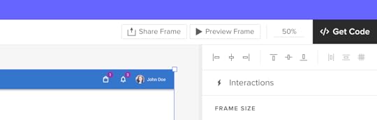
To see how your frames behave, you can preview individual Frames or the entire canvas, and share previews of specific frames (or the entire canvas) with others, just like you can when sharing a regular prototype.
We added a “Preview frame” button in the Top bar of a Preview mode to help you view and share a specific frame. You can also use a keyboard shortcut “Cmd” (or “Ctrl”) + “I” to preview a frame you clicked on.
To share a preview of the selected Frame, press “Cmd” + “Shift” + “P” or click the “Share frame” button. You’ll see the Share modal. Copy the URL or QR code of the frame or share it via email.
Note: Frames do not support comments. To add comments, you will need to do so outside of the Frame.
Start using Frames in UXPinBy using Frames, you’ll ensure that your designs are optimized for any device, reduce guesswork, and streamline your workflow. It allows you to assign code-backed components to specific presets, seamlessly transitioning between layouts like desktop and mobile. With Frames, you can preview how your designs will look across various devices directly in the Editor and Preview modes, ensuring visual consistency and functionality across all screen sizes.
Frames also come equipped with a full set of interactions—such as Resize, Scroll, Load, Click, and Hover—making it easy to create dynamic and engaging user experiences. Whether you’re working with code-backed components or not, Frames enhances your design process by supporting responsive design, providing seamless transitions, and offering real-time previews to make adjustments quickly. It also helps maintain consistency across projects, isolates components from the canvas, and offers an artboard-like experience for organizing designs side by side, much like in vector-based tools.
Frames are available for all UXPin’s users, sign up here. Those of you who don’t use code-backed components can use this feature like an artboard on the canvas and set some interactions to it. Merge users can truly benefit from full responsiveness and total control. If you’re curious about designing with code-backed design, see how it fits into your design process. Request access to UXPin Merge.
The post Responsive Design for UXPin Merge – What is Frames? appeared first on Studio by UXPin.
September 18, 2024
7 Pillars of Web Design – A Beginner’s Guide
So you wanna be a Web Designer huh?
I mean why not? After all, everything is on the web …
As of writing this article 100 Million+ companies have an online presence through their websites.
But AI is here! Does that mean Web Design is dead?
Not at all! AI is changing the game, yes. AI can assist with the heavy lifting, no doubt. But creativity and empathy? Those are things it’s still catching up on. We need to be realistic about what AI can do and separate the hype from practical applications.
In this beginner’s guide, we’ll cover the fundamentals of web design to get you started on your path to becoming the next Mark Wheeler.
I’ll also show you a case study without overwhelming you so you get a sense of what you’ll actually be doing as a Web designer. Hopefully, this will give you a practical understanding of what it’s like to work as a web designer and inspire you to learn more.
Let’s go.
Looking for a tool for web design? Try UXPin, an end-to-end prototyping tool that for creating interactive app and web designs that can be developed within minutes. Try UXPin for free.
Build advanced prototypes
Design better products with States, Variables, Auto Layout and more.
Try UXPin .try-uxpin-banner { margin: 40px 0px;}.try-uxpin__container { display: flex; max-width: 689px; height: 210px; padding: 20px; padding-left: 24px; border: 2px solid black; border-radius: 4px; align-items: center; justify-content: space-between; background-color: white; box-shadow: 10px 10px black;}.try-uxpin__left { width: 54%;}.try-uxpin__heading { font-size: 28px !important; font-weight: bold;}.try-uxpin__left p { margin: 10px 0px !important; color: black !important;}.try-uxpin__text { margin: 0 !important; font-size: 18px !important; line-height: 22px !important;}.try-uxpin__button { width: 135px; height: 44px; background: black; margin: 10px 0px; padding: 10px 20px; border: none; border-radius: 2px; color: white; font-size: 16px; text-align: center;}.try-uxpin__button:hover { cursor: pointer;}.try-uxpin__image { max-width: 320px !important; height: 200px; margin-right: -21px; margin-bottom: -6px;}@media (max-width: 760px) { .try-uxpin__container { height: auto; margin: 10px; align-items: left; }}@media (max-width: 500px) { .try-uxpin__container { flex-direction: column; } .try-uxpin__left { width: 100%; align-items: normal; }}What Is Web Design?Web design is the creation of visually appealing and functional websites. It involves planning, and designing (not coding) the structure and layout of a website and its content.
Wait, “and its content”?
Yes, more often than not, a company will not hire a separate content planner which can sometimes mean the designer takes on that responsibility. We’ll come back to that later.
Just like other design disciplines, web design also has humble beginnings. In the early 90s, websites were primarily text-based, focusing on information. As the web evolved, visual elements like images and graphics added engagement. Today a website can have hundreds of web elements. Buttons, text, fields, dropdowns, icons, video, sliders, gifs, checkmarks … you name it.
In web design, like many other fields, we face a common challenge: balancing form (how it looks) and function (how it works). This is why we have two specialties – UX for user experience and UI for user interface.
Many experts will categorize the web design process into many parts or phases.
But here is the industry standard:
Discovery Phase > IA and Wireframing > Visual Design > Prototyping > Testing
While these are important, they’re not what this post is about. This post is focused on the fundamental/core principles of web design. Let’s take a look:
The 7 Pillars of Web DesignNot to be mistaken with Principles of Web Design, These are one the first concepts every web designer must be familiar with. These pillars are the foundational elements that ensure a website is effective, engaging, and functional.
Pillar #1: Usability (UX)Frustration doesn’t have to be vocalized! Usability in UX Design measures how effectively users can interact with and navigate a website to achieve their goals. Oh, and one of the most ubiquitous terms you’ll get used to as a web designer is actually “User Goals”.
What are User Goals? Let’s look at an example:
Sarah, a busy working mother, is looking for a birthday gift for her 7-year-old son. During her lunch hour at work, she uses her iPad to surf internet stores. Sarah’s primary goal is to buy a gift that her kid would enjoy, and her secondary goal is to make the transaction swiftly and effectively.
So, as a Designer, you want to LISTEN to these queues. If you’re designing an eCommerce store in this example, you’d wanna make sure that there are filters. Filters for gifts for example, and maybe you can go down to specifics of what kind of gifts and for what age.
Amazon has a collection of Gift Ideas for example. With sub-optimal filters … take a look:
On this page, Shara could filter by product category, but it’s hard for her to find filters for age range or toy color. And since she’s browsing on a tablet with weak eyesight, the font used in the filter section can be difficult to read – these are the kinds of usability issues that you try to solve.
So, To solve them you have to KNOW the user. There is a simple three-step process approach to getting to know the user:
Define Pain Points > Create Journey Maps > User Personas
We’ll use MOLDO: a sample case study project I was involved in as an example. “Moldo” is an online shopping app for furniture and interior ware.
To understand our users’ needs, my team conducted research through surveys. We analyzed the results, prioritized the feedback, and identified the most common pain points that users were experiencing:
Then, we analyzed the major phases the user will have to go through on the App, and for each phase, we mapped user emotions, actions, and opportunities.
And finally, we have our personas …
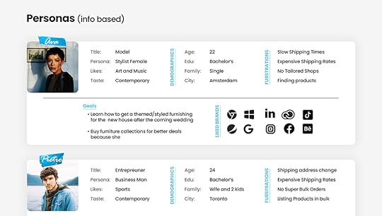
Great UX design should consider the following factors:
User’s Goals. As we already saw above: these are User Needs.User’s Emotions. How does the user feel when using the product?User’s Behavior and Actions. How does the user behave when using the product? Are they able to complete their tasks efficiently?User’s Context. Where and how is the user using the product? Are there any environmental factors that affect the user’s experience?You will need to put yourself in the user’s shoes so that ultimately you can be able to create an intuitive design.
What is intuitive design? A design that is easy to use and understand, even for first-time users. This means that the product should be developed to align with the user’s expectations and mental models.
Here is another example …
Our home page has a clear and prominent call to action – a form that explicitly tells users what they need to do next.
The text clearly states the purpose of the product, which is to design UI with code-backed components. It is concise and free of distractions, making it easy for the user to focus on the main message and CTA.
The initial CTA is “Try for free”, which guides the user to take action and try the product. And even tells the user that we prefer their work email.
Again, this is why UX always comes before UI. UX is the why, and UI is the how.
Make it functional, then make it pretty.
We’ve written extensively on this topic in our blog – like Heuristic Evaluation, and UX Requirements feel free to browse around after you finish reading this one.
We even have a free ebook: Guide to Usability Testing.
Pillar #2: Design (UI)UI Design focuses on the visual elements of a product, based on UX research findings. Visual elements are the ones a user directly interacts with, such as buttons, menus, and typography.
Its primary objective is to ensure that these interfaces are not only visually appealing but also user-friendly, enhancing overall satisfaction and efficiency in task completion.
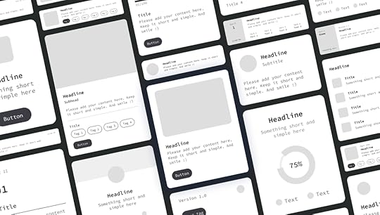
I’ve been a UI Designer for half of my career, and let me tell ya, it’s fun. We worry about design movements, hierarchy, layout, interactions, and so on …
To start with, There are three types of UI Elements, Input, Output, and Helper elements, we cover them broadly in an article about UI elements, but let’s look at them quickly:
Input elements. These elements allow users to enter data into the interface. Examples include text fields, checkboxes, radio buttons, drop-down menus, and sliders.Output elements. These elements display information to the user. Examples include labels, text, images, and icons.Navigation elements. These elements allow users to move around. Examples include buttons, links, menus, and breadcrumbs.The UI Design ProcessAs I mentioned before, UI Design mainly involves the visual design and prototyping (and testing phase shared between UX and UI) part of the design process.
Depending on who you ask, Wireframing is part of UI design. Wireframes are the blueprints for your interface. So it goes like this:
Wireframing > Sketching > Lo-fi Prototype > Hi Fidelity Prototype > Mockup
But for brevity, we’ll stick to:
Wireframing > Sketching > Prototyping
Usually, the UX Designer would provide the IA (Information Architecture) of the app/website, and based on that we can start sketching out the project design scope.
IA is just a fancy term meaning a graph or map of how the content and pages should be structured, and it usually looks something like this:
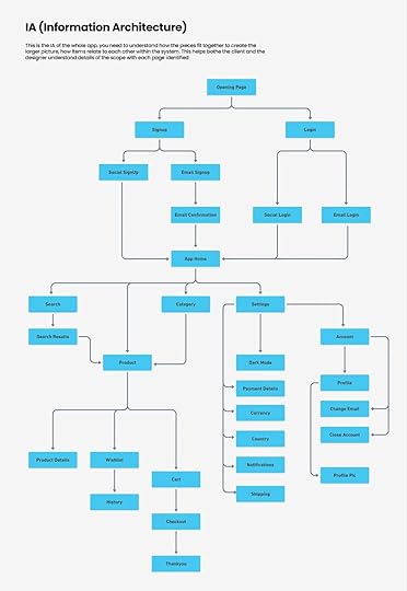
But it’s the foundation of Wireframing which is the next step.
We use wireframes to define page elements (buttons, forms, images), Arrange content (headers, sidebars, main content areas), and Show basic interactions (click paths, transitions).
You can create wireframes by hand (on paper) or digitally using tools like UXPin or Figma.
Getting back to the MOLDO example, here is what the wireframe looked like:
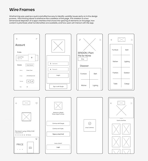
For most ecommerce products we found that the navigation was visually not inviting or was bulky. So we wanted to make sure that we have our UI balanced between obvious but not lame …
Beyond the optimized design itself, We also adjusted the size of buttons to be particularly bigger than what’s usually a standard in mobile apps.
The point of having a wireframe is to change and iterate to your heart’s content. As you progress through the design process there will naturally be less wiggle room so this is your way of telling your clients, “hey … here is what I’m thinking” and gathering feedback.
As you can see the wireframe stage makes it easy to know what goes where.
Next, you flesh out the Lo-fi and Hi-fi versions. Lo-fi usually is the flat but colored version of the wireframes. And Hi-fi almost looks like the real product. Sometimes we simply use a prototype and then a mockup.
You can see what a visual design prototype might look like in a design tool, with all the visual elements and layout finalized.
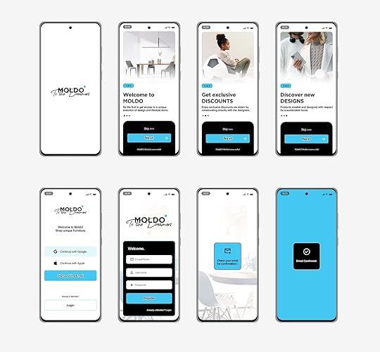
And then finally the polished Mockups … yay!
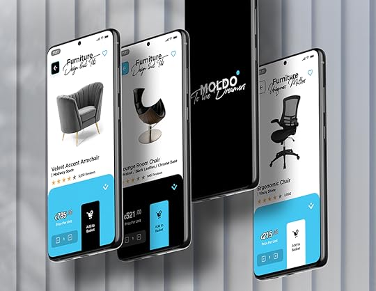
As UI Designers, we don’t only design how elements look but also how they behave during interactions. AKA animations.
And I’m not necessarily talking about transitions or motion animation.
Animations that guide and interact with the user in a way that feels natural, but consistent. That gives users feedback about their actions, so they know what’s happening.
We call these micro-interactions. are small, purposeful animations triggered by specific user actions (clicking a button, hovering over an icon … so on).
For example: When you click a button, it slightly depresses/shrinks to give visual feedback that your action has been registered.
UI Motion PrinciplesConsistency. As a user, I should experience familiar motion patterns across different parts of an application. I should be able to predict how interactions will unfold. If a button slides in from the right on one screen, it should do the same elsewhere.Hierarchy. Primary actions (like submitting a form) deserve more attention than secondary ones (like canceling an operation). That’s just an example, but prioritize animations based on their importance within the user flow and website structure.Realism. UI animations should mimic real-world physics to feel natural. Depending on what you’re going for Objects should accelerate when they start moving (ease-in) and decelerate when they stop (ease-out).Context. Animations should align with the context and purpose of the interaction. A loading spinner during data retrieval makes sense. A playful bounce effect on a serious error message might not.Pillar #3: AccessibilityAccessibility in UI design goes beyond just color. Color can not be used as the only way to convey information. Surely, many other disabilities are not related to the human eye.
According to a survey, more than 1 in 4 adults in the United States have some type of disability. That’s a population of more than 83.5M!
Accessibility refers to whether a product or service can be used by everyone, regardless of their abilities or disabilities.
Read: Web Content Accessibility Guidelines (WCAG)
Check out the full list of tools curated by W3.Org.
According to the WCAG, a website should do the following to be accessible:
Perceivable. Content should be presented in ways that users can perceive (e.g., through text, images, or sound).Operable. Users should be able to navigate and interact with content (e.g., using keyboard shortcuts or voice commands).Understandable. Content should be clear and easy to comprehend (avoid jargon, provide instructions, etc.).Robust. Content should work reliably across different technologies and devices.WCAG also has Levels of Conformance ranging from A to AA and AAA.
At UXPin we are very serious about accessibility. With UXPin’s accessibility features, you can design for all users, both disabled and nondisabled.
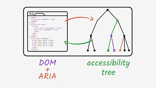
Image Source: Web.Dev
Accessibility Ground Rules:
Color Contrast and Text Legibility. Poor color contrast can make text difficult to read, especially for people with limited vision or color blindness. The solution is to use high-contrast combinations (e.g., dark text on a light background or vice versa). Avoid relying solely on color to convey information. Use additional cues like icons or patterns.Alternative Text (ALT Text) for Images. People who use screen readers rely on ALT text to understand images. ALT text Describe the image’s purpose or content concisely.Keyboard Navigation and Focus States. Some users rely on keyboard navigation (e.g., screen reader users or those with motor impairments). All interactive elements (buttons, links, form fields) should be keyboard-navigable.Semantic HTML and ARIA Roles. Proper HTML structure aids screen readers and other assistive technologies. Learn more about ARIA attributes (Accessible Rich Internet Applications).Captions and Transcripts for Multimedia. Deaf or hard-of-hearing users rely on captions for videos and audio content.Forms and Error Handling. Forms are critical for user interaction, but poorly designed forms can be frustrating. Label form fields clearly and provide error messages in a perceivable way.Test with Real Users. Real-world feedback is invaluable. Conduct usability testing with diverse users, including those with disabilities.Pillar #4: LayoutLayout refers to the arrangement of visual elements within a given space. It is part of UI primarily but decided by factors in UX. A well-designed layout enhances user experience by making content easy to find and understand. Here are some common types of website layouts:
Grid Systems. In a grid-based website layout, elements like margins, flowlines, rows, columns, gutters, and modules work together to create a structured and visually appealing design. Margins define the edges, flowlines guide reading, rows and columns organize content, gutters provide spacing, and modules combine elements into organized groups.
Box Model. The box model represents how elements are rendered on a web page. It includes four components: margin, border, padding, and content.
Image Source: W3
Flexbox. A powerful layout mode that allows flexible and responsive designs.
Key properties include display: flex, flex-direction, and justify-content.
Using a flexbox system is perhaps the best choice for managing responsive layouts.
Here are the primary types of website layouts, that provide a solid foundation for understanding web design principles:
Fixed Width Layout. The content area has a fixed width, regardless of the screen size.Fluid Layout. The content area expands or contracts to fit the width of the browser window.Responsive Layout. A combination of fluid and fixed layouts, using CSS media queries or clamp functions to adjust the layout based on the screen size.Adaptive Layout. Similar to a responsive layout except it’s specifically arranged in the most suitable way for each device. (Separate layout for each).Grid Layout. A flexible layout that uses a grid system to organize content into columns and rows.Learn more about website layouts and how they affect user psychology.
A fundamental principle that greatly impacts layout is balance, which web design relies on. Balance is all about distributing visual elements in a way that creates a sense of harmony.
There are two main types:
Symmetrical Balance: Mirror-like fashion, creating a sense of formality and stability. This is often used in traditional designs and logos.Asymmetrical Balance: Arranged in a way that is not symmetrical but still feels visually balanced. This can create a more dynamic and interesting composition.Another thing to keep in mind when working with layouts is Negative Space. This is an overlooked design element that differentiates between a noob and a pro.
Did I say “design element”? Yes!
In fact, thinking about negative space as an active element in web design will help you understand how layout works. It’s obvious that when a webpage is cluttered with too many elements, it becomes overwhelming for users.
But what is the point where it stops becoming clutter?
For example, look at this:
Unless you’re intentionally aiming for a busy, maximalist aesthetic and it makes sense for your audience, this approach can be detrimental to focus.
Modern WebUI is almost always incorporated with negative space like this:
 Pillar #5: Typography
Typography is the art and technique of arranging type/letters, numbers, and symbols to make written language legible, readable, and visually appealing when displayed.
It’s an entire field of its own.
But in our context of web design, it involves choosing fonts, adjusting the spacing between characters (kerning), the space between lines (leading), and the overall layout of the text. Good typography guides your eye across the page smoothly without making you think too much about it.
It’s a big deal because it’s directly connected to clients’ ROI. So let’s take a look at some typography basics:
Font FamiliesA font family is a group of fonts that share a common design style. Think of a typeface as a broad category of fonts that share a unified look and feel. Within a typeface, you’ll find individual fonts that vary in size, weight, and style.
Font families are classified into types: Serif, Sans-Serif, Monospace, Display and Handwriting.
Let’s focus on the first three:
Serif Fonts. Have small strokes (called serifs) at the edges of each letter. They exude formality and elegance. Think Times New Roman, Georgia, and Baskerville.Sans-Serif Fonts. Mostly used on UI and are sleek and modern. They don’t have those little serifs just clean lines. Arial, Helvetica, and Open Sans.Monospace fonts. Give every letter the same fixed width. Fonts like: Courier New, Consolas, and Inconsolata.I once designed my own custom font, although I loved Proxima Nova. It took two months and gave me an insight into what works well on the web. It might even be one of the factors that I was nominated for Awwwards.
And from that experience, here are some tips that I’ve learned:
UseWeb-safe fonts, also known as system fonts, are pre-installed on most operating systems. These fonts are readily available to users without requiring any additional downloads.
These should only be used as either a fallback font or if your client only wants raw performance and doesn’t give a dime about custom fonts. Or if other overarching elements on the site compensate for it.
Google FontsGoogle fonts are hosted by Google, making them easy to incorporate into your web projects. You can use the API or directly download them and include them in your projects.
HTML Example:
body { font-family: "Inter", sans-serif;}Typeface AnatomyI think while we’re at it it’s good for you to familiarize yourself with some common terms. Like “Glyphs”. So here is a quick rundown:
Each letter, number, punctuation mark, or symbol is a glyph. X-Height is the height of lowercase letters (excluding ascenders and descenders).
Ascenders and Descenders? They are upward-bound strokes of lowercase letters that extend beyond the x-height. The baseline is the invisible tightrope where letters stand. It’s their foundation the ground level.
Kerning is the space between individual characters. And tracking controls the overall spacing across a block of text.
Here is a better look:
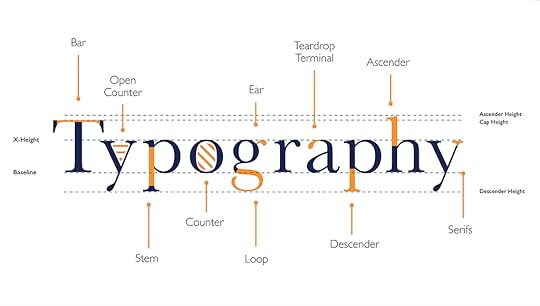
Image Source: Yesiamadesigner
And again you can learn in more detail about typeface anatomy.
Pillar #6: ResponsivenessResponsive Design (not to be mistaken with Adaptive Design) is a web design approach that ensures a website adapts seamlessly to various screen sizes and devices
Responsiveness is the ability of a website to adapt its layout and content to different screen sizes and devices, such as smartphones, tablets, and desktops.
Design for mobile first!
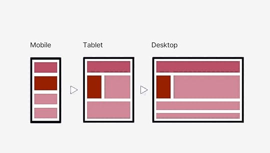
It’s often easier to adapt a mobile design to a desktop than the other way around. Since larger screens can accommodate more content, it’s best to start by designing for mobile and prioritizing the most important elements.
Media QueriesSimple but if the user drags the window size they step towards the next set size.
Here is an example:
/* Tablets and smaller */
@media (max-width: 768px) {
.container {
width: 100%;
}
}
/* Mobile devices */
@media (max-width: 480px) {
.container {
width: 100%;
padding: 0 10px;
}
}
Clamp FunctionThe clamp() function in CSS lets you set a value that’s dynamic between a minimum and maximum. It adjusts based on the screen size or viewport width. So, instead of using media queries, you can have a property (like font size) scale naturally between limits.
Formula: clamp(minimum, preferred, maximum);
Example: Responsive Font Size with clamp()
h1 {
font-size: clamp(1.5rem, 5vw, 3rem); /* Between 24px and 48px */
}
With clamp(), you don’t need to set up media queries for every screen size. The text grows naturally between your set limits, and you don’t even have to calculate it by hand there are great free clamp() generators out there.
Responsive ImagesImages can be a big hurdle when it comes to making a website responsive. They can slow down your site if not optimized, or worse, they might look distorted or too large on smaller screens. But, don’t worry, you’ve got a few tricks up your sleeve.
Srcset. The srcset attribute is for delivering different image sizes based on the device. You’re telling the browser “Hey, use this image for mobile, this one for tablet, and this one for desktop.” Vector Images. SVGs (Scalable Vector Graphics) are amazing because they scale infinitely without losing quality. This makes them perfect for logos, icons, or any simple illustrations. Image Optimization. Beyond just choosing the right size, you can optimize images to load faster using lazy loading. You can use Webp or any other modern web image format. Read more about what matters for web performance.Flexible Grid SystemsWhile responsive images handle the visual content, flexible grids manage layouts across different devices. These grids allow your design to flow naturally, adjusting based on the screen size.
1. CSS Grid
CSS Grid allows you to define rows and columns that automatically adapt to the size of the screen.
Here’s a basic example:
.container {
display: grid;
grid-template-columns: repeat(auto-fill, minmax(200px, 1fr));
gap: 10px;
}
2. Flexbox
While CSS Grid is perfect for two-dimensional layouts, Flexbox is awesome for one-dimensional layouts … think rows or columns.
Here’s how you can use Flexbox to build a simple responsive layout:
.container {
display: flex;
flex-wrap: wrap;
gap: 10px;
}
.item {
flex: 1 1 200px;
}
You can even combine both! For instance, use Flexbox to lay out different sections of your site, and then use Grid inside those sections for more complex layouts.
Now you need to think backwards FROM CSS towards your UI Design tool.
Pillar #7: HTML & PerformanceUltimately, your design will be brought to life in HTML, so having a basic understanding of HTML and CSS can be a huge advantage. It’s not a must for designers to know about this, but it sure helps a lot!
Browsers read HTML like a book, from top to bottom. They create a DOM (Document Object Model) as they go. The simpler this book, the faster it can be built. Believe it or not, it all starts with the designer.
Image Source: Mozilla
If you’re a designer who understands this, you can start making decisions that not only look great but make life easier for the developer. For example, knowing how HTML is structured (with headers, paragraphs, images, and links) allows you to visualize how content will flow and stack across different devices. It also means you can avoid suggesting IMPOSSIBLE LAYOUTS that would take hours of unnecessary coding.
Benefits of Knowing Code as a DesignerIdentify and troubleshoot design issues more efficiently.Achieve precise control over the layout, typography, and styling of their designs, resulting in a more polished and professional final product.Experiment with more advanced techniques and create innovative designs that might not be possible for designers who rely solely on visual tools.Utilize a tool like UXPin much better because they can understand the code behind the elements.The Handoff: Collaborating with DevelopersThe designer-developer handoff is often where dreams go to die, but it doesn’t have to be that way. Handoff is transferring a completed web design from the designer to the developer for implementation.
When you understand the basics of HTML and CSS, you’ll know what’s possible, what’s tricky, and how to meet halfway to create something that both looks great and works smoothly.
Developers will appreciate it, too, because you’ll be speaking their language or at least enough of it to avoid miscommunication.
Key Components of Handoff:
Design Files: These typically include:
PSD, Sketch, or Figma files: Contain the visual elements, layers, and styles of the design.Style guides: Document the typography, colors, and other design elements used in the project.Wireframes: Provide a basic structure and layout of the pages.Specifications:
Measurements: Dimensions of elements, spacing, and padding.Typography: Font families, sizes, weights, and line heights.Colors: Hex codes or color names for all colors used in the design.Interactions: Descriptions of how elements should behave when clicked, hovered over, or focused.Annotations:
Notes and comments: Additional information or instructions for developers.Placeholders: Indicate where content will be added dynamically.Design with Implementation in Mind
When designing a responsive navigation bar, knowing that developers can use CSS Grid or Flexbox to make it dynamic can inform your design decisions. You’ll create a flexible layout that adapts to different screen sizes, rather than specifying rigid pixel values for each breakpoint.
This approach streamlines the design-to-development process, reducing the need for back-and-forth revisions. By showing that you’ve considered the build process, you’re more likely to earn the development team’s respect and ensure that your design is implemented as intended.”
Suggest Solutions, Not Just Problems
We’ve all been there – pouring our hearts into a design, only to have it rejected due to technical limitations. But what if you could turn those limitations into opportunities? By having a basic understanding of HTML and CSS, you can collaborate with developers to find alternative solutions that achieve the same visual effect.
For instance, if an animation is deemed too complex, you can suggest using CSS transitions or animations that are easier to implement. This way, you’re not just handing off your design and hoping for the best – you’re actively working with the development team to bring your vision to life.
My favorite places to start learning CSS are: Kevin Powell, and Bro Code.
Web Designer Career opportunitiesThere are different ways web design can be added as a skill set of other professions like a web developer, freelancer digital marketer and so on but here are the major roles you can embody as a web designer:
UI or UX DesignerWeb Design ConsultantUX ResearcherProduct DesignerUI/UX Designers and Product Designers are the most common. I’ve personally worked in these exact roles myself.
I just did a search on LinkedIn for “UI/UX Designer” and just today there are 1000+ offers available. And this is just in the United States.
Taking a peek at Indeed shows another 1000+ results:
The best platforms for finding web design jobs are:
Company WebsitesDribbble and BehanceToptalLinkedin and UpworkTraditional Job BoardsWeb-designers anywhere between $62K – $112K/yr according to GlassDoor.
You’d also be well-positioned to explore a wide range of entrepreneurial opportunities. Like freelancing, starting a web design agency, selling products, taking web design courses and workshops, and so on.
Resources and ToolsResourcesThe Guide to UX Design Process & DocumentationDesign Trends CollectionDesignOps 101: Guide to Design OperationsCoursesGoogle UX Design Professional CertificateWeb Design for Everybody by the University of MichiganUltimate Web Design Course by WebflowFundamentals of UXPin on UdemyBooksDon’t Make Me Think by Steve KrugHTML and CSS by Jon DuckettThe Elements of User Experience by Jesse James GarrettLaws of UX by Jon YablonskiConclusionEven if you’re focused purely on the visual side of things, web design isn’t just about making things pretty. A site has to work in real-world conditions: it needs to load fast, be responsive, and be accessible. Knowing the pillars helps you think beyond the surface and consider what makes a site functional. That also makes working with developers smoother you’re speaking the same language, and you’re both aiming for a seamless user experience.
The perfect website balances purpose and functionality with beauty and simplicity. It’s easy to navigate, works on any device, loads quickly, and is accessible to all users.
At the end of the day, web design isn’t about you, it’s about the people using your product.
UXPin empowers teams to create seamless, interactive prototypes of websites and apps with realistic, fully functional components. Try UXPin for free.
Try UXPin for freeThe post 7 Pillars of Web Design – A Beginner’s Guide appeared first on Studio by UXPin.
September 10, 2024
13 UI Examples to Get Inspired by in 2024
User interface design plays a crucial role in shaping how users interact with digital products. A well-designed UI not only enhances usability but also creates a seamless experience that keeps users engaged. Whether you’re working on a SaaS platform, an eCommerce site, or a mobile app, understanding the best UI practices can elevate your design process.
In this article, we’ll explore UI examples from top brands like Slack, Airbnb, and Spotify. These examples will highlight key design elements, interactive features, and responsive layouts to inspire your next project.
With UXPin Merge, you can design using real, code-based components to ensure that your UI matches development from the start, creating a consistent, production-ready user experience across your projects. Request access to UXPin Merge.
Reach a new level of prototyping
Design with interactive components coming from your team’s design system.
Discover UXPin Merge .discover-merge { margin: 40px 8px;}.discover-merge__container { display: flex; max-width: 690px; height: 200px; padding: 20px; padding-left: 24px; border-radius: 4px; background-color: black; box-shadow: 10px 10px #9999ff; align-items: center; justify-content: space-between;}.discover-merge__left { width: 50%;}.discover-merge__left p { margin: 10px 0px !important; color: white !important; font-size: 18px !important;}.discover-merge__heading { font-weight: bold !important; color: white !important; font-size: 18px !important;}.discover-merge__text { margin: 0 !important; line-height: 22px !important;}.discover-merge__button { width: 174px; height: 44px; margin: 10px 0px; border: none; border-radius: 2px; background: white; color: black; font-size: 16px; text-align: center;}.discover-merge__button:hover { cursor: pointer;}.discover-merge__image { max-width: 320px !important; height: 200px; margin-right: -19px;}@media (max-width: 760px) { .discover-merge__container { height: auto; margin: 10px; align-items: left; }}@media (max-width: 500px) { .discover-merge__container { flex-direction: column; } .discover-merge__left { width: 100%; align-items: normal; }}UI Examples by IndustryDifferent industries have unique challenges and requirements when it comes to UI design. A well-executed user interface must not only look good but also align with the specific needs of users in that sector.
In this section, we’ll explore UI examples from key industries like SaaS platforms, eCommerce, and marketplaces. By analyzing successful interfaces from each, we can uncover design principles that can be applied across projects, helping designers create more intuitive, engaging experiences tailored to each industry’s unique demands.
SaaS UI ExamplesSlack: Excellent Navigation and Intuitive Messaging SystemSlack is a great example of UI design in the SaaS industry, particularly for its clear navigation and intuitive messaging interface. The platform excels at organizing a large amount of content into manageable, easy-to-access sections. Its left-hand navigation provides quick access to channels, direct messages, and threads, allowing users to efficiently manage their communications.
Icons in Slack are clear and minimalistic, reducing cognitive load while enhancing navigation. The use of subtle animations and microinteractions, such as hover states and status indicators, improve usability without overwhelming the user. Slack’s messaging system integrates clean, responsive layouts that adapt smoothly across devices, offering a consistent experience.
Slack’s emphasis on simplicity, functionality, and visual clarity makes it a strong UI example for SaaS platforms, especially when dealing with complex communication systems.
Notion: A Flexible Workspace with Customizable UI ComponentsNotion stands out in the SaaS industry for its flexible, modular workspace design that adapts to different user needs. Its clean and minimalistic UI ensures a clutter-free experience while allowing users to organize information in various ways. With drag-and-drop functionality, users can easily customize pages by adding blocks for text, images, databases, and more.
The UI is designed to be highly adaptable, offering a customizable structure that makes it easy for users to create dashboards, wikis, or task managers based on their preferences. This flexibility makes Notion a versatile tool for individuals and teams, offering a streamlined interface without sacrificing functionality.
Dropbox: Easy-to-Use File Management with Minimalistic UIDropbox exemplifies simplicity in its file management system, offering a clean, minimalistic UI that prioritizes ease of use. The interface is intuitively designed, allowing users to quickly navigate through folders, upload files, and manage documents with minimal distractions. The straightforward navigation, combined with recognizable icons and well-structured menus, creates a frictionless experience for users managing files across devices.
The UI’s minimalism, combined with responsive design, ensures that Dropbox delivers a consistent, user-friendly experience across web, mobile, and desktop platforms.
eCommerce UI ExamplesAmazon: Well-Organized Product Pages and Seamless Checkout FlowAmazon’s UI exemplifies efficiency and clarity in the eCommerce world. Its product pages are highly structured, with key information—like pricing, reviews, and delivery options—presented upfront, making decision-making easy for users. The use of clear calls to action, such as “Add to Cart” and “Buy Now,” simplifies the purchasing process.
The checkout flow is designed to be frictionless, guiding users through a quick, intuitive sequence that reduces cart abandonment. Amazon’s seamless UI ensures that users can move from product discovery to purchase with minimal effort, enhancing user experience and increasing conversion rates.
Apple: A Visually Stunning Product Showcase with Responsive, Interactive ElementsApple’s UI is a masterclass in visual storytelling, offering users an immersive product showcase. Each product page features high-quality images and videos that respond to user interactions, allowing users to explore every detail of the product. With its signature clean, minimalist design, Apple’s interface focuses on elevating the product by keeping distractions to a minimum.
Additionally, the UI is fully responsive, ensuring a seamless experience across devices. Interactive elements like smooth scrolling and animations further engage users, creating an intuitive and visually striking journey from product discovery to purchase.
Marketplace UI ExamplesAirbnb: User-Friendly Navigation and Intuitive Search FiltersAirbnb offers one of the most intuitive UIs in the marketplace industry, making it easy for users to browse and book accommodations. The clean navigation allows users to search and filter results with minimal effort, thanks to visually prominent filters and well-organized layouts.
Each listing is presented with high-quality images, clear pricing, and reviews, helping users make informed decisions. The UI remains responsive and easy to navigate, whether users are browsing on desktop or mobile, enhancing the overall booking experience.
Booking.com: Data-Driven Design for Optimized User ChoicesBooking.com’s UI stands out because of its data-driven design approach. Unlike many other marketplaces, Booking.com prioritizes visual clarity, but the UI is heavily optimized to influence user behavior. The use of urgency cues, such as “Only 2 rooms left” or “Booked 5 times today,” creates a sense of immediacy, driving users to make decisions quickly.
The interface is clean and functional but focuses on leveraging data to increase conversions, from its prominent filters to its organized listing layouts, designed to help users compare options efficiently.
UI Examples by PlatformDifferent platforms present unique challenges and opportunities for UI design. Whether you’re designing for the web, mobile, or creating cross-platform experiences, it’s essential to adapt to the specific needs of each medium.
In this section, we’ll explore web-based UI examples from websites that prioritize innovation and usability, highlight mobile UIs that excel in user engagement, and showcase cross-platform UIs that maintain consistency across web and mobile interfaces, providing a seamless experience for users on any device.
Mobile UI ExamplesGoogle Maps: Intuitive Interaction and Real-Time FeedbackGoogle Maps is a prime example of a mobile UI that excels in user engagement and ease of use. The app’s clean and minimalistic interface ensures users can focus on navigating and finding locations without unnecessary distractions. Its responsive map UI allows for smooth zooming and panning, and real-time updates enhance usability.
Google Maps integrates intuitive gestures for mobile, such as pinch-to-zoom and swipe actions, while offering detailed information layers (e.g., traffic, terrain). Its combination of real-time data and smooth interactions ensures a highly engaging, user-friendly experience across devices.
Duolingo: Clean and Engaging UI for Gamified LearningDuolingo’s mobile UI is designed to provide a fun and visually appealing learning experience. The interface leverages a clean layout with simple, colorful icons and minimal text, ensuring that users can navigate through lessons easily. The progress indicators are clear and visually engaging, with bars and icons that motivate users to keep advancing.
The use of whitespace and clear sections ensures that users aren’t overwhelmed by too much information at once, creating a structured and easy-to-follow experience.
Desktop UI ExamplesBBC: An Accessibility-First UI ApproachBBC’s desktop UI exemplifies an accessibility-first approach, ensuring a wide range of users can easily navigate and interact with the website. The UI includes a high-contrast mode for users with visual impairments, enhancing readability and reducing strain.
Additionally, the interface supports full keyboard navigation, making it accessible to users who cannot use a mouse, and is screen reader compatible, ensuring visually impaired users can navigate content effectively.
Asana: Clear Hierarchical Layout for Efficient Task ManagementAsana’s desktop UI is designed for efficiency and clarity, offering a clean, hierarchical layout that allows users to easily navigate between projects, tasks, and subtasks. The interface uses clear, visually distinct sections to help users prioritize their tasks and stay organized.
The minimalist design avoids clutter, while icons and color coding are strategically used to highlight important actions and deadlines.
Cross-Platform UI ExamplesGmail: Consistent and Intuitive UI Across PlatformsGmail provides a consistent user interface across web, mobile, and desktop platforms, offering users a seamless experience when managing emails. The design maintains familiar navigation with its sidebar, action buttons, and labels, ensuring users can switch between devices without any disruption.
The responsive layout adapts efficiently to various screen sizes, ensuring email management remains intuitive on both mobile and desktop devices. Gmail’s clear use of icons, colors, and spacing keeps the interface simple yet powerful for both personal and professional use.
Trello: Unified UI for Task ManagementTrello’s UI is designed for simplicity and consistency across web, desktop, and mobile platforms. The drag-and-drop interface allows users to easily organize tasks, cards, and boards with intuitive controls, making task management effortless. Trello’s UI uses a clean, visual structure, with boards and lists that are flexible and easy to customize.
Whether on a desktop or mobile device, Trello ensures a seamless user experience, maintaining the same functionality, layout, and interaction model, enabling users to work fluidly across multiple devices.
UI Design Best Practices from the UI Examples AboveUse clear, intuitive navigation UI to enhance usability.Offer flexible, customizable UI components for personalized experiences.Prioritize minimalism and easy navigation across platforms.Structure product pages for fast decision-making with clear CTAs.Utilize responsive, interactive elements to create engaging visual experiences.Implement intuitive filtering systems for better user journeys.Use urgency cues to influence user decisions.Integrate real-time feedback for interactive elements.Keep layouts clean and progress indicators prominent.Ensure accessibility with features like high-contrast modes and keyboard navigation.Organize content with clear hierarchies and visual cues.Maintain consistent design across platforms for seamless user experience.Tools for UI DesignCreating impactful UIs requires the right tools that support design, prototyping, and development workflows. Here are some essential UI design tools:
UXPin: A powerful tool for designing with real, code-based components, ensuring seamless collaboration between designers and developers.Figma: A collaborative design platform for real-time interface design, wireframing, and prototyping, perfect for team collaboration.Sketch: A popular vector-based design tool used for UI design, offering a wide array of plugins for enhanced functionality.Framer: A prototyping tool that blends design and code to create highly interactive UIs and animations.These tools enhance efficiency and collaboration, helping teams create polished, user-friendly interfaces.
SummaryEffective UI design is crucial for usability and engagement across digital products. Whether for SaaS platforms, eCommerce, or marketplaces, understanding industry-specific UI principles can elevate your design process.
This article explores UI examples from top brands like Slack, Notion, Airbnb, and Trello, highlighting how clear navigation, customization, and responsiveness improve user experience across web, mobile, and desktop platforms. With UXPin Merge, designers can create consistent, production-ready UIs using real, code-based components. Request access to UXPin Merge.
Discover MergeThe post 13 UI Examples to Get Inspired by in 2024 appeared first on Studio by UXPin.
September 9, 2024
The Practical Guide to Empathy Maps: 10-Minute User Personas
Where does the empathy map come in?
UX designers know better than anyone — it’s what’s inside that counts. As in, the user’s thoughts and feelings, and how those affect what they say and do.
When created correctly, empathy maps serve as the perfect lean user persona:
They quickly visualize user needs (especially to non-designers)They fit perfectly into a Lean UX workflow as a starting point for user knowledge (you’ll build more as you prototype and test)Because they’re quick to create, they’re easy to iterate as you revise assumptions based on real dataThey prime stakeholders for your design ideas since they’ve thought beyond their own experiences
Photo credit: “ How to Use Persona Empathy Mapping .” Nikki Knox (UX Magazine).
That’s what this article is about: a clear-cut, all-inclusive guide on empathy maps, answering why, when, and how to use them.
Let’s get started.
UXPin as a comprehensive design tool that facilitates empathetic design decisions by enabling real-time collaboration and feedback. With UXPin, teams can seamlessly integrate empathy maps into their design process, ensuring that user insights are effectively translated into actionable design solutions. Try UXPin for free.
Build advanced prototypes
Design better products with States, Variables, Auto Layout and more.
Try UXPin .try-uxpin-banner { margin: 40px 0px;}.try-uxpin__container { display: flex; max-width: 689px; height: 210px; padding: 20px; padding-left: 24px; border: 2px solid black; border-radius: 4px; align-items: center; justify-content: space-between; background-color: white; box-shadow: 10px 10px black;}.try-uxpin__left { width: 54%;}.try-uxpin__heading { font-size: 28px !important; font-weight: bold;}.try-uxpin__left p { margin: 10px 0px !important; color: black !important;}.try-uxpin__text { margin: 0 !important; font-size: 18px !important; line-height: 22px !important;}.try-uxpin__button { width: 135px; height: 44px; background: black; margin: 10px 0px; padding: 10px 20px; border: none; border-radius: 2px; color: white; font-size: 16px; text-align: center;}.try-uxpin__button:hover { cursor: pointer;}.try-uxpin__image { max-width: 320px !important; height: 200px; margin-right: -21px; margin-bottom: -6px;}@media (max-width: 760px) { .try-uxpin__container { height: auto; margin: 10px; align-items: left; }}@media (max-width: 500px) { .try-uxpin__container { flex-direction: column; } .try-uxpin__left { width: 100%; align-items: normal; }}What Are Empathy Maps?An empathy map in UX design is a collaborative tool that helps teams better understand and visualize the user’s perspective. It typically consists of four quadrants that explore what a user thinks, feels, says, and does. By filling out these sections, designers can develop a deeper understanding of user motivations, pain points, and behaviors, which helps guide more user-centered product decisions.
Empathy maps are especially useful during the early stages of the design process to align teams on user insights and drive empathetic design solutions.
When to Use Empathy MapsEmpathy maps are most useful at the beginning of the design process.
Try to complete empathy maps before the product requirements, but after the initial user research. Product strategy is about solving problems, and empathy maps shed light on which problems to solve, and how. This also makes them a great tool for redesigns as well.
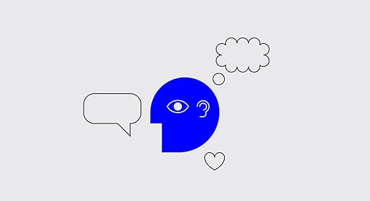
When done well, empathy maps create a “UX domino effect” that affects the entire project. Empathy maps affect the product requirements, which affect the product strategy, which affects the wireframes, mockups, prototypes, etc.
However, empathy maps work better if they’re drawn from real data, so they should be made after user research like user interviews. But in a pinch, empathy maps can still be built on your existing knowledge and stakeholder feedback. Quick basic empathy maps offer valuable insight in any meeting — hence the “10-minute persona” nickname.
Empathy Map FormatA common UX empathy map is divided into four quadrants, outlining notes on four different aspects of the user’s internal experience. The quadrants can vary based on needs and preferences, but almost always contain:
Thoughts — Quotes of what the user is thinking, i.e., “I wonder if there’s an example?” or “I hope this doesn’t take long.”Feelings — The user’s emotional state, i.e. “is confused by the navigation and blames themselves.”Actions — The user’s behaviors, whether in general or in response to a specific instigator, i.e., “returns to the home page every time they don’t know where to go.”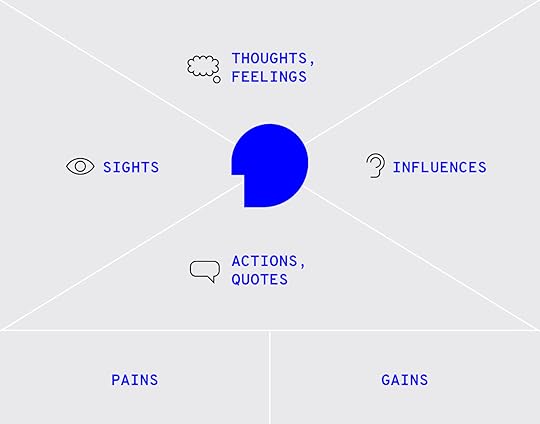
Photo credit: “ Adapting empathy maps for UX design .” Paul Boag (boagworld).
Some common variants include:
Sights — Where the user’s eyes go, i.e., “loves the colorful mascot.”Quotes — Things the user says, similar to thoughts. Can be pulled word-for-word from user interviews, or based on existing knowledge.Influences — What the user has heard from third parties that might influence how they act, i.e., “They say this is easier to use than Photoshop.”In addition, at the bottom in some empty space, it’s always a good idea to include:
Problems (“Pains”) — Any obstacles worth considering, i.e., an unfamiliarity with technology, or a short attention span.Goals (“Gains”) — What the user hopes to accomplish, i.e., complete the task within 5 minutes.Alternatively, you can summarize the above two areas by filling in the simple statement, “The user needs a way to ________________ because ________________.” Pay attention to the second blank, since user motivation is the real raw material for feature ideas.
Last, you may want to leave a space for general notes, such as the type of device the user is accessing your product from.
Optionally, it may help to include a picture of the user to make the document feel more real.
Empathy Map – The Creation ProcessIt’s important to note that empathy maps can be created for a general understanding, or for specific tasks and situations. Broad empathy maps are more useful as quick user personas because they are not based on a single user scenario. If you can spare the time, you could create several task-based empathy maps to feed into more detailed personas.
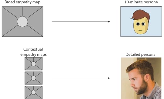
For example, if you’re working on a web app redesign and notice users having difficulty logging in, you can center around the user’s mind as they complete (or ignore) this task. But this information is most relevant to this particular context (logging in). You won’t understand why a user would want to use your web app in the first place.
Let’s examine how to create a broad empathy map as a 10-minute user persona. Before you start the exercise, you will need at least basic understanding of your user segments (e.g. Sally the College Student, Sean the Young Professional).
1. Find a whiteboard, a large flip chart, or print out this free template.
2. Set aside 30 minutes to 1 hour for the session.
3. Invite the core product team members: product manager, developers, marketers, and of course other designers.
4. Ask a broad question to help unpack everyone’s thoughts and assumptions, e.g. “Why would somebody buy a new iPhone?”
5. Set aside sheets of paper or space on the whiteboard according to the user segments (e.g. one for Sally, one for Sean).
6. Hand out sticky notes and encourage everyone to write down their thoughts regarding each of the empathy map’s four quadrants.
7. Review the completed empathy map and discuss any patterns and outliers.
As you might expect, sometimes it’s difficult to get the creative juices flowing and/or really pinpoint the issues at hand. If your team is stuck, Demian Farnworth of the Copyblogger recommends a moderator posing questions like these to help team members better visualize their users:
What environment are the users in when using your product?Are they having fun, or do they want to get it over with?What’s their life like outside of using the product?What kind of day are they having?If all else fails, try a bit of role-playing, where one person “plays” the user, and ask them questions or play the role of the product, eliciting responses.
At the end of the session, wrap up what was learned. Did anyone’s opinions change? Is there a better direction to go with the product design? Were any of the responses based on data, or pure assumption? These answers are partly why you made an empathy map in the first place.
Remember that the benefit of empathy maps are their convenience. They’re designed to be a quick collaborative exercise rather than exhaustively thorough. You’ll gather more important insights once you’ve started prototyping and testing your designs with at least 5 users.
What to Do With Finished Empathy MapsWhile a large part of empathy maps’ utility are the process of making them, they are still quite useful as documentation.
Share the results of the empathy map with anyone on the product team who wasn’t able to join the exercise. Executive stakeholders, too, might be interested in the more actionable takeaways from the exercise — although you should explain the bottom line upfront, and the reasoning afterward.
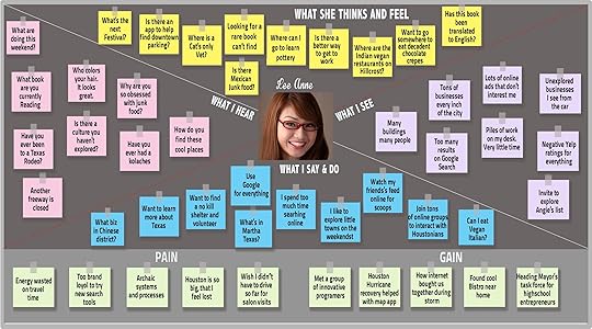
If you happen to be using UXPin, you can also upload a picture of the empathy map into your UX project so that others can comment on it as needed.
Next StepsWhile broad empathy maps aren’t the most thorough personas, they certainly help everyone think more like a user while checking their own assumptions. Certainly not a bad result for a single 30-60 minute workshop.
If you’re looking for a way to integrate empathy maps into your UX design process seamlessly, consider using UXPin. It offers powerful collaboration tools that allow teams to work together in real-time, making it easier to incorporate user insights into your designs. With UXPin’s interactive prototyping and design system features, you can bring empathy-driven design to life while maintaining consistency and functionality. Try UXPin for free.
Try UXPin for freeThe post The Practical Guide to Empathy Maps: 10-Minute User Personas appeared first on Studio by UXPin.
Aspect Ratios in UX/UI Design – Best Practices for Perfect Proportions.
Image-rich content drives website engagement, and making sure those images display properly is a crucial part of good UX design. Whether you’re working with photographs, illustrations, or video, an image that’s stretched, squashed, or poorly cropped makes a poor impression for on-site visitors and affects their overall experience on the site.
Determining aspect ratios for optimal viewing on all kinds of devices can be both a chore and a challenge for designers, but today’s responsive design tools and an array of free aspect ratio calculators can make sure that images and video files are displayed in the best light everywhere.
Designing a website or app full of images? Create prototypes of it with UXPin! It’s an end-to-end solution that will cover your full design process and it doesn’t require any plugins for design handoff. See how easy it is. Sign up for a free trial.
Build advanced prototypes
Design better products with States, Variables, Auto Layout and more.
Try UXPin .try-uxpin-banner { margin: 40px 0px;}.try-uxpin__container { display: flex; max-width: 689px; height: 210px; padding: 20px; padding-left: 24px; border: 2px solid black; border-radius: 4px; align-items: center; justify-content: space-between; background-color: white; box-shadow: 10px 10px black;}.try-uxpin__left { width: 54%;}.try-uxpin__heading { font-size: 28px !important; font-weight: bold;}.try-uxpin__left p { margin: 10px 0px !important; color: black !important;}.try-uxpin__text { margin: 0 !important; font-size: 18px !important; line-height: 22px !important;}.try-uxpin__button { width: 135px; height: 44px; background: black; margin: 10px 0px; padding: 10px 20px; border: none; border-radius: 2px; color: white; font-size: 16px; text-align: center;}.try-uxpin__button:hover { cursor: pointer;}.try-uxpin__image { max-width: 320px !important; height: 200px; margin-right: -21px; margin-bottom: -6px;}@media (max-width: 760px) { .try-uxpin__container { height: auto; margin: 10px; align-items: left; }}@media (max-width: 500px) { .try-uxpin__container { flex-direction: column; } .try-uxpin__left { width: 100%; align-items: normal; }}What is Aspect Ratio?In the most basic way, aspect ratio is the relationship between an image’s width and height. Because aspect ratio reflects an image’s proportions, not its size, the aspect ratio remains the same regardless of size. For example, a square image has an aspect ratio of 1:1, since its height and width are the same. That ratio will hold no matter how large the image is. An image that’s 320x320px will have the same aspect ratio as one that’s 1080x1080px – 1:1.

For images that are not square- that is, horizontal or vertical rectangles of various sizes… Aspect ratio can vary. Common aspect ratios used in photography, video, and other image-based design work include 4:3, 3:2 or 16:9, the basic ratio for many widescreen devices such as televisions and desktop computers.
Although the aspect ratio of an image comes from the relationship of its height and width, multiple subsets of this ratio also help to define image proportions.
Pixel aspect ratioPixel aspect ratio (PAR) refers to the proportion of the individual pixels that make up an image. Pixels are typically square, which results in a pixel aspect ratio of 1:1. But images that are optimized for certain types of displays can also have rectangular pixels with an aspect ratio of 4:3 or similar.
Display aspect ratioDisplay aspect ratio (DAR) is the most relevant kind of aspect ratio for designers, and it’s the one that’s most commonly associated with the general term. As the name suggests, display aspect ratio refers to the proportions of an image as it appears on screens of various kinds.

Some devices, such as cameras and televisions, have a fixed DAR, so for images to display well on these devices, they need to be optimized for their particular aspect ratio. For example, a typical display aspect ratio for widescreen video to be displayed on a monitor or television screen is 16:9. When images with a different aspect ratio are displayed on these devices, they appear distorted. Digital SLR camera sensors also have a fixed display aspect ratio, which controls how images captured by the camera will be saved and displayed.
Storage aspect ratioStorage aspect ratio (SAR) is an aspect ratio formula that pertains specifically to encoded digital video files. SAR refers to the width and height relationship in video frame size, and it needs to be consistent across all individual frames in order for the complete video to display properly. In a commonly used formula, SAR x PAR = DAR for most widescreen videos.
Aspect Ratios Affect UI/UX DesignAspect ratios play an important part in any kind of project that involves capturing and displaying photographs, videos, or other kinds of image-based files in the correct way. For photographers, the camera’s fixed aspect ratio can have a considerable impact on composing a photograph as well as displaying it later on other devices. And for videographers and anyone working with slideshows, animations, and other motion projects, aspect ratio is a key factor for correct display on widescreen and mobile devices.
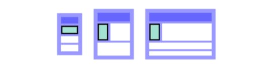
The shift to responsive web design, which ensures that content displays properly across all devices, helps to resolve a number of problems with setting aspect ratios for individual images. But even in these environments, problems can arise, such as when an image can’t be adjusted for display without compromising either its content or its quality. A simple example is when a square image with a 1:1 aspect ratio needs to fit into a rectangular box on a website page. To accommodate varying image size requirements, proportions, as well as size, may have to be adjusted.
In an increasingly image-driven digital world, videos and images that look even slightly out of proportion contribute to a visitor’s negative impression of a website – and those that are clearly forced into the wrong configurations can even interfere with a site’s usability.
Poorly proportioned product images or a user guide video that’s too stretched to see clearly can affect both a visitor’s willingness and their ability to use the site. Designers, developers and anyone working with images will need to know how aspect ratios work and how to manipulate them for the best visual effect. To streamline the process, a number of aspect ratio calculators, both free and paid, have popped up on the web.
Aspect Ratio Best Practices for Responsive DesignIn responsive design, maintaining the correct aspect ratio for images, videos, and UI elements is critical to ensure that your content looks clean and professional across different screen sizes. A well-maintained aspect ratio not only preserves the integrity of your visuals but also enhances the user experience by preventing distortion and awkward cropping on various devices. Here are the best practices to follow when dealing with aspect ratios in responsive design:
1. Use CSS for Maintaining Aspect RatioCSS provides tools that make it easy to ensure consistent aspect ratios across different viewports. For instance, the aspect-ratio property (introduced in CSS Level 4) allows you to define the aspect ratio for containers, images, or videos, helping you maintain the correct proportions regardless of screen size. Before this property was widely supported, developers often used the padding-top trick (where padding percentage is based on the width) to preserve the ratio of containers or media elements.
2. Maintain Aspect Ratio for Key Media ElementsImages, videos, and interactive elements are key to a user’s experience, so it’s essential that they are not distorted or cropped when viewed on different devices. Stretching or squishing images can lead to unprofessional-looking designs and frustrate users, especially if the distortion impacts how users interact with visual content.
By preserving the correct aspect ratio, your images and videos will maintain their intended dimensions and scale properly with the screen size. To achieve this, make sure that media queries in your CSS accommodate different viewports while keeping the aspect ratio intact.
3. Use Responsive Images for Performance OptimizationPerformance plays a significant role in responsive design, especially on mobile devices where slower connections are common. Using responsive images is key to balancing performance with visual quality. You can use the srcset attribute in your HTML, which provides different image resolutions based on the user’s screen size.
4. Test Across DevicesOne of the core principles of responsive design is thorough testing across different devices. What looks great on a desktop might be misaligned on a mobile phone if the aspect ratio isn’t preserved. Use tools like Chrome Developer Tools or online responsive design testers to emulate different devices and screen sizes.
For images and videos with fixed aspect ratios (like 16:9 or 4:3), ensure that the design adapts well across all screen sizes without distortion. Ensure that all dynamic resizing respects the original proportions.
5. Handle Aspect Ratios in Fluid LayoutsResponsive design often involves fluid layouts, where elements resize dynamically based on the screen width. In these cases, setting the aspect ratio is essential to prevent issues like images and containers becoming too narrow or tall. By using percentage-based widths and heights, you can ensure that your content scales properly without disrupting its aspect ratio.
For example, a 16:9 video container might be scaled down to fit a mobile screen, but it should always retain the 16:9 ratio, no matter how much the overall layout changes. Fluid layouts combined with flexible aspect ratios ensure that your design remains consistent and visually appealing on all devices.
Aspect Ratio CalculatorsIt’s certainly possible to calculate an image’s aspect ratio and resize it manually with the help of some simple mathematics. But that becomes tedious when dealing with many images from multiple sources. With the help of one of the many online aspect ratio calculators, though, you can determine the optimal aspect ratio for any image in a number of different formats, allowing designers to fully optimize each image for optimal viewing.
To use a basic aspect ratio calculator, you’ll need to know the image resolution in pixels and select the type of environment where the image will appear, such as HDTV. The calculator then returns the result as an optimal aspect ratio. This can be especially helpful for video editing, where the video might include slides or images of varying sizes from different sources.
Tools for Aspect Ratios in UX/UIOther image management tools can also help with getting the aspect ratio right. Image editors such as Photoshop and Canva provide templates designed with optimal aspect ratios in mind, suitable for use in typical situations such as designing website banners, headlines, or social media profiles. Most standard video editing software also allows users to determine and adjust aspect ratios of images to be included as individual frames in the video.
Correctly proportioned images that display well and perform properly are a powerful tool for businesses of all kinds. Getting aspect ratios right makes images look good wherever they’re displayed. Whether you’re selling a product, offering a service, creating an online course or something else, photographs, illustrations or video can attract visitors and keep them engaged.
UXPin’s features make it easy to make sure images are sized and proportioned correctly. With Image Fill, you can choose from a variety of settings that allow you to adjust image size or crop the image while preserving its aspect ratio for perfect positioning.
UXPin can help bring designers and developers together for faster, better product development. Sign up for for a free trial today.
Try UXPin for freeThe post Aspect Ratios in UX/UI Design – Best Practices for Perfect Proportions. appeared first on Studio by UXPin.
React vs Web Components – Which Is Best for Your Project?
As web development increasingly moves toward component-based architecture, two powerful technologies often dominate the conversation: React and Web Components. But when it comes to deciding between React vs Web Components, how do you know which is the best fit for your project?
React is widely used for building dynamic, interactive user interfaces, thanks to its extensive ecosystem and developer-friendly tools. Meanwhile, Web Components offer a framework-agnostic, native approach to creating reusable UI elements that work seamlessly across various platforms.
Supercharge your design and development process with UXPin Merge—an advanced drag-and-drop React UI builder that allows you to design with fully interactive React components, straight from the codebase. Enable live, functional prototypes and closing the gap between design and development. Request access to UXPin Merge.
Reach a new level of prototyping
Design with interactive components coming from your team’s design system.
Discover UXPin Merge .discover-merge { margin: 40px 8px;}.discover-merge__container { display: flex; max-width: 690px; height: 200px; padding: 20px; padding-left: 24px; border-radius: 4px; background-color: black; box-shadow: 10px 10px #9999ff; align-items: center; justify-content: space-between;}.discover-merge__left { width: 50%;}.discover-merge__left p { margin: 10px 0px !important; color: white !important; font-size: 18px !important;}.discover-merge__heading { font-weight: bold !important; color: white !important; font-size: 18px !important;}.discover-merge__text { margin: 0 !important; line-height: 22px !important;}.discover-merge__button { width: 174px; height: 44px; margin: 10px 0px; border: none; border-radius: 2px; background: white; color: black; font-size: 16px; text-align: center;}.discover-merge__button:hover { cursor: pointer;}.discover-merge__image { max-width: 320px !important; height: 200px; margin-right: -19px;}@media (max-width: 760px) { .discover-merge__container { height: auto; margin: 10px; align-items: left; }}@media (max-width: 500px) { .discover-merge__container { flex-direction: column; } .discover-merge__left { width: 100%; align-items: normal; }}What are Web Components?Web Components are a set of standardized web platform APIs that enable developers to create reusable, encapsulated, and self-contained custom elements. These elements can be integrated across various frameworks or even in standalone projects, making them highly versatile.
At their core, Web Components rely on three main technologies:
Custom Elements: Allow you to define new HTML tags with their own behavior.Shadow DOM: Provides strict encapsulation of styles and content, ensuring components don’t interfere with other elements on the page.HTML Templates: Allow developers to pre-define reusable content structures, rendered only when activated by JavaScript.Native Browser SupportOne of Web Components’ greatest advantages is their native support in modern browsers like Chrome, Firefox, Edge, and Safari. Because they are part of the web standard, Web Components don’t require additional frameworks or libraries to function. They are ideal for projects that require cross-browser compatibility and reusable components across different environments.
Key Benefits of Web ComponentsReusability: Create once, reuse anywhere. Custom elements are perfect for building consistent UI components across multiple projects or teams.Encapsulation: Thanks to the Shadow DOM, Web Components ensure that styles and scripts are self-contained and don’t interfere with the broader application.Framework-Agnostic: Web Components work in any framework or even standalone projects, making them a flexible choice for long-term scalability.What is React?React is a popular JavaScript library developed by Facebook in 2013. It is used to build dynamic user interfaces, especially for single-page applications (SPAs). React’s component-based structure, combined with its Virtual DOM, makes it an excellent choice for applications where the user interface frequently changes.
React allows developers to create reusable components that manage their own state, making UI development simpler and more efficient.
Virtual DOM and Component-Based ArchitectureReact’s Virtual DOM optimizes UI performance by only re-rendering parts of the DOM that have changed, making it highly efficient in dynamic environments. React’s component-based architecture allows developers to create self-contained UI elements that can be easily reused and scaled across large projects.
Key Benefits of ReactVast Ecosystem: With a huge range of libraries and tools, React’s ecosystem offers solutions for routing, state management, and more.Developer Tools: React comes with powerful debugging tools like React DevTools, making it easier to inspect components and track state changes.Community Support: React’s large community ensures a wealth of resources, plugins, and tutorials, keeping it on the cutting edge of front-end development.Key Differences Between React vs Web ComponentsWhen comparing React vs Web Components, several factors come into play, such as how each technology functions, their architecture, and ease of use.
Native vs Library-DrivenWeb Components are built into the browser as native APIs, meaning they work out of the box without requiring third-party libraries. In contrast, React is a JavaScript library that needs to be installed and imported into the project. While React offers more control and features, Web Components provide a more lightweight, framework-independent solution.
EncapsulationWeb Components leverage the Shadow DOM for strict encapsulation, ensuring that styles and content remain isolated from the rest of the application. In contrast, React uses CSS-in-JS or scoped CSS for styling, offering flexibility but sometimes leading to more complex styling systems in large applications.
Learning CurveWeb Components have a lower learning curve for developers familiar with standard web technologies like HTML, CSS, and JavaScript. React, however, requires developers to learn new concepts such as JSX, component lifecycle methods, and state management libraries, making its learning curve steeper, especially for newcomers.
PerformanceReact uses the Virtual DOM, which improves performance by optimizing UI updates. This makes it ideal for applications that require frequent interface changes. Web Components, by contrast, interact directly with the native DOM, which can be slower for dynamic updates but is excellent for reusable, self-contained elements.
Ecosystem and SupportReact’s extensive ecosystem and large community make it easy to find solutions for common development challenges. While Web Components have a smaller, growing community, React currently offers more resources, libraries, and plugins, making it a better choice for larger-scale projects.
When to Use Web Components vs ReactBest for Web ComponentsWeb Components are perfect for reusable elements that need to work across multiple projects and frameworks. For instance, if you’re building a design system or want to create UI elements that can be reused in different environments (React, Angular, or plain JavaScript), Web Components are the ideal solution.
They are also a great choice when you want to minimize dependencies and avoid locking into a specific framework.
Best for ReactReact excels in dynamic, data-driven applications like social media platforms, dashboards, and e-commerce sites. Its Virtual DOM ensures optimal performance for applications with frequent updates. Additionally, React’s vast ecosystem provides out-of-the-box solutions for tasks like state management (Redux) and routing (React Router).
Can You Use Web Components and React Together?Yes! Web Components can be seamlessly integrated into React applications. Since Web Components are framework-agnostic, they can be treated like native HTML elements in a React project. This allows you to leverage the power of Web Components within a React-based UI, creating reusable, consistent elements across different platforms.
Conversely, while using React components inside Web Components is less common, it can be done with extra configuration.
Leverage Both React and Web Components with UXPin MergeWhether you’re working with React or Web Components, UXPin Merge allows you to integrate real, functional components directly into your design environment. Designers can use a drag-and-drop interface to work with fully interactive React components, bridging the gap between design and development.
UXPin Merge ensures that your design system, whether built with Web Components or React, remains in sync with the codebase, making collaboration smoother and more efficient.
FAQs: React vs Web ComponentsCan Web Components be used with React?Yes, Web Components are framework-agnostic and can be easily used in React applications as custom HTML elements.
What is the key difference between React and Web Components?The key difference is that React is a JavaScript library requiring installation, while Web Components are native browser technologies.
Which is better for performance: React or Web Components?React’s Virtual DOM optimizes performance for dynamic interfaces, while Web Components offer native browser interaction, making them better for reusable UI elements.
Choosing Between React vs Web ComponentsIn the battle of React vs Web Components, the right choice depends on your project’s needs. Web Components are ideal for framework-agnostic, reusable elements, while React excels in dynamic, single-page applications with frequent updates.
However, combining both technologies is also possible, giving you the flexibility to build scalable, maintainable applications. To further streamline your process, try UXPin Merge, where you can design using real, interactive components from React or Web Components—supercharging collaboration between designers and developers. Request access to UXPin Merge.
Discover MergeThe post React vs Web Components – Which Is Best for Your Project? appeared first on Studio by UXPin.
UXpin's Blog

- UXpin's profile
- 68 followers

