
UXpin's Blog, page 19
August 14, 2024
Website Best Practices – Basic Tips for Better Web

Crafting websites that are visually appealing and user-friendly is essential for business’ success.This guide will cover essential web design best practices, focusing on accessibility, grid design, consistency, and design systems. Whether you’re a seasoned professional or just starting in the field, these tips will help you leverage UXPin to create outstanding website prototypes.
With UXPin, a powerful prototyping tool, you can efficiently implement these best practices from the earliest stages of design, ensuring that your final product is both effective and inclusive. Try UXPin for free.
Build advanced prototypes
Design better products with States, Variables, Auto Layout and more.
Try UXPin .try-uxpin-banner { margin: 40px 0px;}.try-uxpin__container { display: flex; max-width: 689px; height: 210px; padding: 20px; padding-left: 24px; border: 2px solid black; border-radius: 4px; align-items: center; justify-content: space-between; background-color: white; box-shadow: 10px 10px black;}.try-uxpin__left { width: 54%;}.try-uxpin__heading { font-size: 28px !important; font-weight: bold;}.try-uxpin__left p { margin: 10px 0px !important; color: black !important;}.try-uxpin__text { margin: 0 !important; font-size: 18px !important; line-height: 22px !important;}.try-uxpin__button { width: 135px; height: 44px; background: black; margin: 10px 0px; padding: 10px 20px; border: none; border-radius: 2px; color: white; font-size: 16px; text-align: center;}.try-uxpin__button:hover { cursor: pointer;}.try-uxpin__image { max-width: 320px !important; height: 200px; margin-right: -21px; margin-bottom: -6px;}@media (max-width: 760px) { .try-uxpin__container { height: auto; margin: 10px; align-items: left; }}@media (max-width: 500px) { .try-uxpin__container { flex-direction: column; } .try-uxpin__left { width: 100%; align-items: normal; }}Accessibility Tips
Accessibility in web design ensures that your website is usable by everyone, including people with disabilities. This is not just a moral and legal obligation but also a practical one—an accessible website reaches a broader audience and can improve SEO rankings. Familiarize yourself with the Web Content Accessibility Guidelines (WCAG) to understand the standards you should aim for.
Incorporating Accessibility into PrototypesUsing UXPin, you can integrate accessibility features directly into your prototypes. Here’s how:
Text Readability: Ensure that text on your website meets WCAG guidelines for contrast ratios. UXPin allows you to experiment with different font sizes, colors, and typographic choices to find the perfect balance.Keyboard Navigation: Test your prototype for keyboard accessibility by simulating how users navigate through your site without a mouse. Ensure that all interactive elements are easily accessible.ARIA Roles and Labels: Add ARIA (Accessible Rich Internet Applications) roles and labels in UXPin to make sure assistive technologies can interpret your site’s elements correctly.Testing for Accessibility EarlyTesting for accessibility should not be an afterthought. Use UXPin’s built-in features to simulate screen readers and test your design with different assistive technologies. Conduct usability testing with diverse user groups to gather feedback and make necessary adjustments early in the design process.
Grid Design TipsGrids are the backbone of any well-structured website, providing a framework that guides the placement of elements in a consistent and aesthetically pleasing way. Understanding the types of grids—fixed, fluid, and responsive—will help you decide which is best for your project.
Implementing Grids in UXPinSetting up a grid system in UXPin is straightforward:
Responsive Grids: Create and save grid layouts to adjust your design to different screen sizes.Visual Harmony: Maintain visual balance by aligning text, images, and other elements to your grid, ensuring a clean and organized layout.Best Practices for Grid UsageConsistency is key when applying grids. Ensure that your grid system is uniformly applied across all pages. This not only helps in maintaining a cohesive design but also makes the site more intuitive for users.
Consistency TipsConsistency in design builds trust and reduces cognitive load for users. When elements behave predictably, users can navigate your site with ease, leading to a better overall experience.
Ensuring Visual and Functional ConsistencyUXPin’s components and design libraries are invaluable for maintaining consistency:
Color Schemes and Typography: Develop a consistent color scheme and typographic hierarchy that is applied across all pages.Code-Backed Components: Try React or other code-backed UI components like buttons, forms, and navigation bars to ensure a uniform look and feel.Maintaining Consistency Across TeamsCollaboration is easier when everyone is on the same page. UXPin allows teams to share libraries and components, ensuring that everyone follows the same design guidelines. Version control features in UXPin help keep track of changes and ensure consistency throughout the design process.
Content Design TipsContent design is the practice of planning, creating, and organizing content to ensure it effectively communicates with users and supports their needs. It involves crafting clear, concise, and accessible text, visuals, and multimedia elements that guide users toward completing specific tasks or finding necessary information.
Incorporating Content Design in UXPin’s PrototypesUXPin allows you to seamlessly integrate content design into your prototypes, ensuring that your content is user-focused from the early stages of development. Here’s how to incorporate content design in UXPin:
Content Structure: Use UXPin to prototype various content layouts, experimenting with different text structures, such as short paragraphs, bullet points, and subheadings. This helps you find the most readable and user-friendly format.Visual Hierarchy: Implement visual hierarchy by adjusting font sizes, weights, and colors to emphasize important content. UXPin’s design tools let you create prototypes that prioritize content based on user needs.Interactive Elements: Incorporate interactive content elements like buttons, forms, and links directly into your prototypes. UXPin allows you to test how these elements interact with content, ensuring a cohesive user experience.Content Accessibility: Use UXPin to prototype accessible content by ensuring proper color contrast, adding alt text for images, and designing layouts that work well with screen readers. This ensures that your content is accessible to all users.Best Practices for Content DesignTo create effective content that resonates with users, follow these best practices:
Clarity and Conciseness: Keep content clear and to the point. Avoid jargon and complex language. Users should be able to understand the message quickly and easily.User-Centered Content: Always design content with the user in mind. Consider what information users need at each stage of their journey and how they prefer to consume it.Consistency: Maintain a consistent tone, style, and format across all content. This not only builds trust but also ensures that users can easily navigate and understand your site.Engaging Visuals: Complement text with relevant visuals that enhance understanding. Use images, infographics, and videos that are directly related to the content to maintain user engagement.Responsive Design: Ensure content is optimized for all devices, especially mobile. Test your content on various screen sizes in UXPin to ensure it is readable and visually appealing across platforms.Continuous Testing and Iteration: Regularly test your content with real users and iterate based on feedback. UXPin’s prototyping features make it easy to update content and test different versions to find what works best.By integrating these practices into your design process, you can create content that is not only informative but also engaging and accessible, providing a superior user experience across all platforms.
Performance TipsTaking care of website’s performance is one of the most important website best practices these days. A slow-loading website can lead to high bounce rates and poor user experience, which ultimately affects your site’s success. As a designer using UXPin, you can take several steps to ensure your website prototypes are optimized for speed from the ground up.
Optimizing Image Sizes and FormatsImages are often the largest files on a webpage, making them a primary target for optimization:
Choose the Right Format: Use the appropriate image format based on the content. For instance, use JPEGs for photographs, PNGs for images with transparency, and SVGs for icons and logos. WebP is also an excellent option for smaller file sizes with good quality.Compress Images: Before uploading images to UXPin, use tools like TinyPNG or ImageOptim to reduce file sizes without sacrificing quality.Responsive Images: Use UXPin to design responsive images that adjust based on the user’s screen size. Implementing srcset attributes ensures that the browser loads the correct image size for each device, reducing unnecessary data load.Reducing File Sizes with Efficient Use of AssetsEvery asset on a page—whether it’s CSS, JavaScript, or images—contributes to the load time:
Minimize and Combine Files: Use tools that combine and minify CSS and JavaScript files to reduce the number of HTTP requests and overall file sizes.Reuse Components: Design reusable components in UXPin to avoid creating multiple versions of the same element, which can bloat file sizes. A single well-designed component can be reused across different pages, keeping your design lean.Lazy Loading: Implement lazy loading for images and videos, where media is only loaded when it comes into view. This technique helps reduce initial load time and saves bandwidth for users who may not scroll through the entire page.Optimizing Typography and FontsFonts can significantly impact website performance if not handled properly:
Choose System Fonts: Whenever possible, use system fonts that don’t require additional downloads. This ensures faster rendering and better performance.Limit Web Fonts: If you’re using custom web fonts, limit the number of font families and weights to reduce the amount of data that needs to be downloaded. Use font-display: swap; to improve perceived performance by showing fallback fonts until the custom fonts are fully loaded.Font File Compression: Ensure that font files are compressed (e.g., using WOFF2 format) to reduce their size.Design System TipsAnother website best practices is designing a website based on a design system. A design system is a collection of reusable components and guidelines that standardize your design process. It helps scale your design efforts across different projects, ensuring consistency and efficiency.
Building a Design System in UXPinUXPin is an excellent tool for creating and managing design systems:
Component Libraries: Create and maintain a library of reusable components that can be easily updated and shared across projects.Integration with Git or Storybook: UXPin’s integration with Git or Storybook allows for seamless updates and management of your design system.Scaling and Evolving Your Design SystemAs your design needs evolve, so should your design system. Regularly review and update your design system to incorporate new trends, technologies, and feedback from users. This ensures that your design system remains relevant and effective.
Implement Website Best Practices NowBy following these best practices for accessibility, grid design, consistency, performance, and design systems, you can create websites that are not only visually appealing but also user-friendly and inclusive. UXPin provides all the tools you need to implement these practices efficiently, from the earliest stages of prototyping to the final product.
Remember, the key to a successful website is not just in how it looks but in how it works for all users. Start applying these best practices in your next UXPin project and take your web design to the next level. Try UXPin for free.
Try UXPin for freeThe post Website Best Practices – Basic Tips for Better Web appeared first on Studio by UXPin.


August 13, 2024
User Flows – How to Create Perfect User Flows for Smooth UX
User flows are integral to the UX design process. These valuable UX artifacts help product teams visualize flows and processes from users’ perspectives to reduce errors and enhance the user experience.
This article takes a deep dive into user flows, their importance, the principles that guide them, the visual representations, and the various types of flows.
Create user flows and design advanced prototypes with UXPin, an all-in-one design tool that covers every part of your design process, from ideation to design handoff. Build your first prototype today. Sign up for a free trial.
Build advanced prototypes
Design better products with States, Variables, Auto Layout and more.
Try UXPin .try-uxpin-banner { margin: 40px 0px;}.try-uxpin__container { display: flex; max-width: 689px; height: 210px; padding: 20px; padding-left: 24px; border: 2px solid black; border-radius: 4px; align-items: center; justify-content: space-between; background-color: white; box-shadow: 10px 10px black;}.try-uxpin__left { width: 54%;}.try-uxpin__heading { font-size: 28px !important; font-weight: bold;}.try-uxpin__left p { margin: 10px 0px !important; color: black !important;}.try-uxpin__text { margin: 0 !important; font-size: 18px !important; line-height: 22px !important;}.try-uxpin__button { width: 135px; height: 44px; background: black; margin: 10px 0px; padding: 10px 20px; border: none; border-radius: 2px; color: white; font-size: 16px; text-align: center;}.try-uxpin__button:hover { cursor: pointer;}.try-uxpin__image { max-width: 320px !important; height: 200px; margin-right: -21px; margin-bottom: -6px;}@media (max-width: 760px) { .try-uxpin__container { height: auto; margin: 10px; align-items: left; }}@media (max-width: 500px) { .try-uxpin__container { flex-direction: column; } .try-uxpin__left { width: 100%; align-items: normal; }}What is User Flow in UX?A user flow is a graphic visualization representing the sequence of steps, decisions, and actions users perform while navigating a digital product, app, or website.
Product teams typically focus on one task or goal at a time, such as an onboarding sequence or eCommerce checkout. Designers build prototypes of these user flows to test the user experience with usability participants and stakeholders, iterating on feedback until they have a product ready for development.
Importance of User Flows in UX DesignUser flows help product teams visualize the paths users take through an application or website to complete a specific task or achieve a goal. This visualization enables teams to identify friction points and opportunities within user flows and design solutions to fix them.
Additionally, designers can look at optimizing flows to create more efficient and satisfying user experiences.
 Benefits of a well-designed UX flows
A well-designed user flow offers many important benefits for users and the organization:
Improves usability: optimized user flows feel intuitive, simplifying decision-making while reducing cognitive load, resulting in a user-friendly experience where users don’t get lost or frustrated. Better retention: when a digital product meets user needs, allowing them to complete tasks and achieve goals, they’re more likely to keep using it and share their positive experience.Higher conversions: streamlining user flows removes roadblocks and obstacles for tasks that generate revenue for the business, like signups, purchases, subscriptions, etc.Reduce costs: optimized user flows remove redundant screens and features, resulting in many cost-savings, including design, development, maintenance, server requests, API usage, etc.Improved accessibility: design teams can visualize and optimize user flows to meet accessibility requirements, making user interfaces more inclusive while increasing the product’s user base.Data-driven design decisions: analyzing user flows provides valuable insights into user behavior and preferences, allowing designers to make informed decisions based on actual data rather than assumptions. Data-driven design decisions deliver products and experiences that meet user needs, making them more intuitive, enjoyable, and user-friendly.UX Principles of Effective User Flows
Successful user flows incorporate UX principles that guide design concepts and decision-making. Here are some fundamental UX principles to consider when designing user flows:
Clarity and simplicityYour user flows must be easy to understand and navigate. Avoid complex designs or features that people must learn before using them. Navigation and interaction elements must be consistent, predictable, and straightforward. When you force people to overthink a process or interaction, they’ll abandon it for an easier option, even at a higher cost.
ConsistencyMaintain a consistent design language, layout, patterns, and interaction design throughout your product and user flows. Design consistency increases familiarity resulting in a more intuitive, user-friendly experience.
FlexibilityDesign flows that cater to different needs, preferences, and abilities by offering multiple ways to complete tasks–for example, providing alternate paths, shortcuts, or input methods.
Feedback and communicationUI feedback guides users and manages expectations as they navigate user flows–for example, progress indicators, visual cues, status information, messages (success, error, etc.), and alerts. This communication informs users of the system status, whether their action was successful, and what to do next.
Anticipate user needsDesigners can utilize user research to predict and address user needs to prevent obstacles and roadblocks. Adding helpful tips and error prevention features enables users to solve problems faster for more efficient and streamlined flows.
Minimize stepsDesigners can streamline user flows by eliminating unnecessary steps, actions, and decision points. Minimizing these points of friction increases efficiency while reducing errors and drop-offs.
Focus on user goalsWould you rather use a product that helps you achieve your objectives efficiently or one inundating you with business value proposals and other irrelevant content? Design user flows that prioritize the user’s goals and desired outcomes with features that enhance efficiency and success.
Accessibility and inclusivityEnsure that users with diverse abilities, preferences, and devices can use your products, navigate flows, and complete tasks. Designers must consider how factors like font size, color contrasts, keyboard navigation, language, and screen-reader compatibility impact user experiences. Read more about accessibility here: Web Design Accessibility Checklist.
Types of User Flow VisualizationsBefore we explore the user flow types, it’s important to explain the visualizations design teams use to map these journeys.
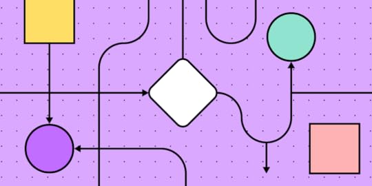
FlowchartsUser flowcharts (user flow diagrams) are a diagramming technique used across many industries to represent the information flow, decision points, and user actions. These visualizations use symbols, arrows, and other shapes to depict elements, processes, decisions, and data input/output.
WireflowsWireflows combine wireframes and flowcharts to provide a detailed view of a user’s journey through an interface. These visualizations describe each screen’s layout as well as how users and information flow between them.
Wireflows help visualize user interactions with specific elements and understand the context of these interactions. Designers and engineers can use these wireflows to visualize information architecture and navigation in greater detail.
Screen-flowsScreen-flows are annotated screenshots or mockups illustrating a user’s path through a product. These high-fidelity versions of wire-flows allow designers and stakeholders to visualize user flows in greater detail with screens that accurately represent the final product.
StoryboardingDesigners use storyboarding similarly to the film industry, using a series of illustrations, images, or screens to show a user’s journey. Storyboarding is helpful as it allows design teams to zoom out from the user flow and visualize a user’s environment and circumstances.
For example, if you’re designing an app for food delivery drivers, you’ll need to visualize the user flow from multiple perspectives:
WalkingCyclingScooter/motorbikeCarVanStoryboard combined with user flows helps design teams empathize with users better to deliver more relevant solutions.
Types of User FlowsHere are seven common user flow categories. Design teams can use the techniques and mediums above to visualize these user flows.
Task flowsTask flows represent the steps users must follow to complete a specific task. These flows focus on sequential user actions and decision points, often visualized using a flowchart. Task flows are particularly helpful for identifying pain points and optimizing user journeys.
Onboarding flowsOnboarding flows allow product teams to visualize and design the product’s initial setup and introduction. These flows incorporate account creation, tutorials, feature highlights, and personalization options to familiarize users and get them started quickly.
Conversion flowsConversion flows are crucial for generating revenue and growth. These flows represent the steps toward a desired action or outcome–for example, newsletter signups, purchases, plan upgrades, etc. Designers typically aim to minimize friction and distractions for these flows to maximize conversion rates, upsells, and other revenue-generating activities.
Navigation flowsNavigation flows outline the structure and architecture of a digital product. These visualizations help design teams understand how users move between screens, sections, and features. They can use these insights to prioritize features and content so users can find things faster and complete tasks more efficiently.
Account management flowsUsers often need to update account information like addresses, passwords, billing details, app preferences, subscriptions, etc. Account management flows allow designers to simplify these administrative experiences so users can return to more important tasks.
Error flowsError flows allow design teams to simulate issues and design solutions to fix them. They can use these insights to improve the user flow and eliminate errors from occurring or create appropriate feedback for users to correct problems.
Offboarding flowsOffboarding flows guide users through discontinuing a product or service, like canceling a subscription or deleting their account. These flows must be as efficient as onboarding to minimize frustration, increasing the chances of winning back customers.
How to Create a User Flow in 8 StepsHere is a step-by-step framework for creating user flows.
Define the goal and entry pointsIdentify the task or goal you want to analyze–this could be one of the above user flows or something specific to your product. This goal will help determine the scope and focus of your user flow and which visualization is most appropriate.
If you are designing a website user experience, another good practice before creating your flows is to determine and map out where your users are coming from. Based on Morgan Brown’s advice in Stop Designing Pages and Start Designing Flows, we’d recommend you consider the following sources for your web or mobile prototype:
Direct trafficOrganic searchPaid advertisingSocial mediaReferral sitesEmailIdentify personasYour product may have many user personas. Determine which of these is most relevant to the user flow. You may assess the user flow for multiple personas to ensure it meets everyone’s needs and expectations.

For templates and helpful tips on creating personas, check out the chapter “Analyzing Users Before Diving Into Design” in the free ebook The Guide to UX Design Process & Documentation.
List user actions and decision pointsBreak down the user journey into a list of individual actions and decision points. Consider each step a user must take to achieve goals and their choices. For example, a signup screen might have several options, including email signup and multiple social logins. Each option will have a different path to completing the signup process.
Map the flowStart by sketching your flows on paper or in a digital tool to iterate on many ideas fast. This should be a collaborative effort where team members share ideas and suggestions.
Once you have a basic outline, you can create your user flow in a design tool. UXPin offers five built-in design libraries, one of which is aptly named User Flows. UXPin’s User Flows library includes everything teams need to create and share user journeys, including:
Flow lines for every conceivable directionAction blocksIcon blocksLabelsDevices (mobile, tablet, desktop)GesturesHere are a couple techniques for outlining your flow.
Writing-first Approach to Outlining a FlowYou can use the writing-first approach, which Jessica Downey writes about in her article Jumpstarting Your App Conception Without Sketching UI. This outlining method helps flesh out ideas and build a “common understanding” of each page of your app or site.
Let’s create one for, say, a banking app. The scenario: someone wants to turn on auto deposit. Note in the outline below, content in [brackets] represents action buttons/links.
Step 1: Would you like to set up auto deposit?
[Set auto-deposit]
Step 2: Select Deposit Frequency
[Once per month][Twice per month]
[Every other week][Every week]
Step 3: Deposit Once per Month
[Select calendar day]
Step 4: Set Amount
Display amount field
[Set auto-deposit]
Shorthand Approach to Outlining a FlowYou can also try a shorthand approach used by Ryan Singer at Basecamp. Ryan’s approach treats flows as ongoing conversations.
For our banking app example above, we can create a shorthand for Steps 2 and 3 that looks something like this:

To see how Singer demonstrates shorthand for Basecamp and how he can illustrates complex flows with this outlining process, check out A Shorthand for Designing UI Flows.
Add screensIf you’re designing a wireflow or screen-flow, you can add relevant wireframes, mockups, and screenshots depending on the level of fidelity you need for your user flow.
Include system feedbackAdd system feedback and responses such as error messages, success notifications, or loading indicators. This detail will help designers and engineers create the appropriate UI components and content to guide users.
Review and iterateAnalyze the user flow for potential improvements, pain points, or friction. Share the visualizations with team members and stakeholders for feedback and iterate until you have a flow ready for prototyping.
Prototype and testCreate a prototype of your user flow in a design tool. UXPin’s built-in design libraries (iOS, Material Design, Bootstrap, and Foundation) provide designers with UI components and patterns for web and native applications. Drag and drop UI elements from the Design Libraries panel to create high-fidelity mockups you can test in the browser or use UXPin Mirror for mobile app testing.
Create fully interactive prototypes using advanced UXPin features to achieve results that accurately replicate the final product:
States : allow designers to create multiple states for a single UI element and design complex interactive components like accordions, carousels, steppers, and more. Variables : capture data from user inputs and create personalized, dynamic user experiences–like a welcome message using data from the name field in a signup form. Expressions : Javascript-like functions to create complex components and advanced functionality–no code required! Conditional Interactions : create if-then and if-else conditions based on user interactions to create dynamic prototypes with multiple outcomes to accurately replicate the final product experience.Enhance your user flows with high-quality prototyping and testing from UXPin. Start designing the user experiences your customers deserve with the world’s most advanced design tool. Sign up for a free trial.
Try UXPin for freeThe post User Flows – How to Create Perfect User Flows for Smooth UX appeared first on Studio by UXPin.
August 12, 2024
Bootstrap Alternatives in 2024

Bootstrap has long been a go-to framework for many front-end developers. It offers a solid foundation for building responsive, mobile-first projects with ease. However, as your skills evolve, you might find yourself seeking alternatives that provide more flexibility, performance, or simply a different approach to building web interfaces. In this article, we’ll explore some of the best alternatives to Bootstrap that cater to the needs of senior front-end developers.
Build responsive user interfaces without the need of learning another framework. Use our visual UI builder and assemble ready-to-develop UIs in a flash. With a drag-and-drop editor, design system tool, and code export, you’re all set to create UI for your apps. Try UXPin Merge for free.
Tailwind CSSTailwind CSS has gained significant traction in the development community due to its utility-first approach. Unlike Bootstrap, which provides predefined components with specific styles, Tailwind offers low-level utility classes that you can combine to build custom designs directly in your markup.
Pros:Highly customizable without the need to override default styles.Encourages reusability and consistency across your codebase.Reduces CSS bloat by purging unused styles in production builds.Cons:Steeper learning curve if you’re accustomed to component-based frameworks like Bootstrap.Potential for messy HTML if not carefully managed.Tailwind is ideal for developers who want full control over their design system and prefer a more granular approach to styling.
For those of you who build React apps, we’re recommending the official React library for Tailwind – Tailwind UI. It’s fully synced with UXPin and you can test it on trial. You can use ready-made components, generate full sections with AI Component Creator or paste the code off the Tailwind UI website to have it in UXPin. Try UXPin Merge for free.
BulmaBulma is a modern CSS framework based on Flexbox, making it a powerful alternative to Bootstrap for building responsive layouts. It emphasizes simplicity and ease of use, with a focus on clean, readable code.
Pros:Built on Flexbox, providing a modern approach to layout design.Simple syntax and easy to learn.No JavaScript dependencies, making it lightweight and easy to integrate with any JS framework.Cons:Fewer components compared to Bootstrap.Limited customization options out of the box.Bulma is an excellent choice for developers who prefer a lightweight, modern framework with a focus on simplicity and Flexbox-based layouts.
Kendo UIKendo UI is a comprehensive UI toolkit designed for building sophisticated and feature-rich web applications, making it a powerful alternative to Bootstrap, especially for enterprise-level projects. It offers an extensive collection of UI components, with a focus on functionality, customization, and seamless integration with popular JavaScript frameworks.
Pros:
Provides a vast library of advanced components, including grids, charts, and schedulers.Highly customizable with built-in features like data binding, templates, and localization.Cross-platform support ensures responsive and consistent performance across devices.Dedicated libraries for Angular, React, Vue.js, and jQuery for tight framework integration.Enterprise-level support with professional documentation and regular updates.Cons:
Steeper learning curve compared to Bootstrap, especially for more advanced features.Commercial product with licensing costs, which may not suit all project budgets.Smaller community compared to Bootstrap, though offset by professional support.Kendo UI is an excellent choice for developers working on complex, enterprise-level applications that require a wide range of advanced components and robust support, particularly when integrating with popular JavaScript frameworks.
If you want to connect UXPin Merge with Kendo UI, reach out to us.
Material UIMaterial UI is a popular React component library that implements Google’s Material Design principles, making it a powerful alternative to Bootstrap for building modern, visually consistent web applications. It offers a wide range of ready-to-use components that adhere to Material Design, with a focus on usability and a polished, cohesive look.
Pros:
Comprehensive implementation of Material Design, providing a sleek and modern user interface.Extensive library of components designed specifically for React, making development faster and easier.Strong theming capabilities, allowing for customization while maintaining Material Design consistency.Active community and strong ecosystem with numerous third-party extensions and tools.Excellent documentation and resources to support developers at all levels.Cons:
Heavily dependent on React, which limits its use to React-based projects.The design can feel restrictive if you need a custom look outside of Material Design.Some components can be complex to configure, requiring a deeper understanding of React.Material UI is an excellent choice for developers working within the React ecosystem who want to build modern, responsive applications with a cohesive and polished design, especially when adhering to Material Design principles.
Test Material UI components in UXPin and build fully responsive interfaces without any coding. Try UXPin Merge for free.
Ant DesignAnt Design is a comprehensive design system and React UI library, originally developed by Alibaba, that offers a powerful alternative to Bootstrap for building enterprise-level web applications. It emphasizes a consistent and elegant design language, with a focus on providing a wide range of components and tools to streamline the development process.
Pros:
Extensive library of high-quality components designed for enterprise applications.Provides a consistent design system that promotes a unified user experience across applications.Strong support for complex data-driven applications, with components like tables, forms, and charts.Built-in internationalization support for multi-language applications.Robust documentation and active community, especially popular in Asia.Cons:
Primarily designed for React, which may limit its applicability to non-React projects.The design system can be prescriptive, making it harder to implement highly custom interfaces.Larger bundle size compared to lighter frameworks, which might affect performance in some cases.Ant Design is an excellent choice for developers working on enterprise-level projects, particularly those using React, who need a comprehensive and consistent design system with a wide array of components to support complex, data-rich applications.
Build your first UI with Ant Design components. AntD components are available on UXPin’s trial. Try designing with them and check out how to copy the code behind the elements with UXPin. Try UXPin Merge for free.
Semantic UISemantic UI is a unique front-end framework that uses natural language principles to create a human-friendly syntax. It’s designed to make the code more readable and intuitive, which can be a significant advantage for collaboration and maintenance.
Pros:Human-readable class names, making the code easier to understand.Extensive theming options for complete control over the design.Rich set of components and UI elements.Cons:Heavier framework with a steeper learning curve.Potential for conflicts with other libraries due to the use of common class names.Semantic UI is perfect for teams that value readability and maintainability, especially in large projects where collaboration is key.
FoundationFoundation is a responsive front-end framework developed by Zurb, known for its flexibility, modularity, and emphasis on creating accessible, mobile-first web projects. It offers a robust set of tools and components that are highly customizable, making it a strong alternative to Bootstrap for developers who need more control over their design and functionality.
Pros:
Modularity: Foundation is highly modular, allowing developers to include only the components they need, which can help reduce bloat and improve performance.Advanced Customization: Offers extensive customization options, enabling developers to tailor components and styles to their exact needs.Accessibility Focus: Designed with accessibility in mind, ensuring that web projects are usable by a wider audience, including those with disabilities.Flexibility: Provides a flexible grid system and a variety of responsive utilities, making it easy to create layouts that adapt to different screen sizes.Professional Support: As a product of Zurb, Foundation comes with the option of professional support and training, which can be valuable for larger or enterprise projects.Cons:
Steeper Learning Curve: Foundation’s advanced features and customization options can result in a steeper learning curve, especially for developers new to the framework.Smaller Community: While Foundation has a loyal user base, its community is smaller than Bootstrap’s, which means fewer third-party resources and plugins.Complexity: The framework’s flexibility and modularity can introduce complexity, making it more challenging to manage in large projects without proper planning.Foundation is an excellent choice for developers and teams that need a highly customizable and modular front-end framework. It is well-suited for complex, large-scale projects where control over design and functionality is crucial.
UIkitUIkit is a lightweight and modular front-end framework that offers a clean, modern design and extensive customization options. It’s a strong alternative to Bootstrap for developers seeking more control over their web projects, with a focus on performance and flexibility.
Pros:
Modular Structure: Allows inclusion of only necessary components, reducing file size and improving performance.Clean Design: Provides a polished, modern aesthetic out-of-the-box.High Customizability: Offers extensive customization through LESS and Sass variables.Advanced Features: Includes components like animations and parallax scrolling for dynamic user experiences.Responsive Grid System: A flexible grid system for creating responsive layouts.Cons:
Smaller Community: Less widespread use means fewer third-party resources and community support.Learning Curve: More complex to learn compared to Bootstrap’s straightforward approach.Less Popularity: Not as commonly recognized in the job market or industry standards.UIkit is an excellent choice for developers who want a customizable, modern framework with a focus on performance and advanced UI features.
Which Bootstrap Alternative Is Right For You?Choosing the right Bootstrap alternative depends on your specific project needs, desired flexibility, and the development approach you prefer. Here’s a quick guide to help you decide which framework might be best for you:
1. Tailwind CSSWhen to Use: If you want full control over your design system and prefer a utility-first approach to styling.Pros: Highly customizable, reduces CSS bloat, encourages code consistency.Cons: Steeper learning curve, potential for messy HTML.2. BulmaWhen to Use: If you need a lightweight, modern framework with a focus on simplicity and Flexbox-based layouts.Pros: Simple syntax, easy to learn, no JavaScript dependencies.Cons: Fewer components, limited customization out-of-the-box.3. Kendo UIWhen to Use: For enterprise-level applications that require advanced components and robust support, particularly with Angular, React, or Vue.js.Pros: Extensive component library, highly customizable, enterprise-level support.Cons: Steeper learning curve, licensing costs, smaller community.4. Material UIWhen to Use: For React projects where you want to implement Material Design with a polished, cohesive UI.Pros: Comprehensive Material Design implementation, strong theming, active community.Cons: Limited to React, restrictive design system, complex configuration for some components.5. Ant DesignWhen to Use: For enterprise-level React applications requiring a consistent design system with a wide array of components.Pros: High-quality components, consistent design, internationalization support.Cons: React-specific, prescriptive design, larger bundle size.6. Semantic UIWhen to Use: If you value readability and maintainability, particularly in large projects where collaboration is key.Pros: Human-readable syntax, extensive theming, rich component set.Cons: Heavier framework, steeper learning curve, potential for conflicts with other libraries.7. FoundationWhen to Use: For large-scale projects that require high customizability, modularity, and accessibility.Pros: Highly modular, advanced customization, strong accessibility focus.Cons: Steeper learning curve, smaller community, can be complex to manage.8. UIkitWhen to Use: If you want a customizable, modern framework with a focus on performance and advanced UI features.Pros: Modular structure, clean design, high customizability.Cons: Smaller community, more complex to learn, less industry recognition.The choice of framework should align with your project’s technical requirements, your preferred development approach, and the overall goals for the user experience. Whether you’re seeking unique designs, better performance, or greater flexibility, there’s a Bootstrap alternative that can help you achieve your objectives.
ConclusionWhile Bootstrap remains a powerful and widely-used framework, developers choose to abandon it in favor of alternatives for a variety of reasons, including the desire for unique designs, better performance, more flexibility and control, alignment with modern development practices, and specific project needs. The choice of framework often reflects a balance between the project’s technical requirements, the developer’s preferred workflow, and the overall goals for the user experience.
Streamline your UI development process and bring design and development closer together. Use UXPin Merge to build, test, and iterate on fully functional user interfaces using the same components you would use in production. With its powerful drag-and-drop editor, design system integration, and seamless code export, UXPin Merge helps you create responsive, production-ready UIs faster than ever.
Whether you’re working with Tailwind, Material UI, or any other framework, UXPin Merge syncs your design and development, enabling you to design with real components and maintain consistency across your entire application. Try UXPin Merge for free.
Try UXPin MergeThe post Bootstrap Alternatives in 2024 appeared first on Studio by UXPin.
August 9, 2024
Tailwind CSS vs Bootstrap – A Comprehensive Comparison

When it comes to choosing a CSS framework for your web development project, two popular options often stand out: Tailwind CSS and Bootstrap. Both have unique strengths and cater to different developer needs. Here’s a detailed comparison to help you decide which one is the best fit for your project.
Build UI with React components that come from Tailwind UI or React-Bootstrap libraries. Push your UI as code with one click and keep consistency between design and code. Try UXPin Merge fro free.
Create beautiful layouts without designersDesign production-ready prototypes 8.6x faster. No pixels. pure code.
Try UXPin Merge .discover-merge { margin: 40px 8px;}.discover-merge__container { display: flex; max-width: 690px; height: 200px; padding: 20px; padding-left: 24px; border-radius: 4px; background-color: black; box-shadow: 10px 10px #9999ff; align-items: center; justify-content: space-between;}.discover-merge__left { width: 50%;}.discover-merge__left p { margin: 10px 0px !important; color: white !important; font-size: 18px !important;}.discover-merge__heading { font-weight: bold !important; color: white !important; font-size: 18px !important;}.discover-merge__text { margin: 0 !important; line-height: 22px !important;}.discover-merge__button { width: 174px; height: 44px; margin: 10px 0px; border: none; border-radius: 2px; background: white; color: black; font-size: 16px; text-align: center;}.discover-merge__button:hover { cursor: pointer;}.discover-merge__image { max-width: 320px !important; height: 200px; margin-right: -19px;}@media (max-width: 760px) { .discover-merge__container { height: auto; margin: 10px; align-items: left; }}@media (max-width: 500px) { .discover-merge__container { flex-direction: column; } .discover-merge__left { width: 100%; align-items: normal; }}Tailwind CSS
Tailwind CSS is a utility-first CSS framework that allows developers to design custom interfaces directly within their HTML. Instead of providing pre-designed components, Tailwind offers low-level utility classes that enable granular control over the design.
Key FeaturesUtility-First: Provides utility classes like flex, pt-4, text-center, and mt-2 that can be composed to build any design, directly in your markup.Customization: Highly customizable through a configuration file, allowing you to tailor the framework to your project’s specific needs.Responsive Design: Offers responsive utilities to manage how your application looks on different devices easily.Performance: Uses PurgeCSS to remove unused CSS, keeping your file sizes small and improving load times.Companies Using Tailwind CSSGitHub: Utilizes Tailwind for certain interface elements, particularly in its documentation and internal tools.Laravel: The PHP framework’s ecosystem integrates Tailwind in several official and community projects.Dev.to: The developer community platform uses Tailwind for its clean and responsive UI.BootstrapBootstrap is a comprehensive CSS framework developed by Twitter. It provides a collection of pre-styled components and a powerful grid system, making it easier to create responsive, mobile-first web applications quickly.
Key FeaturesPre-Designed Components: Comes with a wide range of components like navbars, buttons, forms, modals, and more.Utility Classes: Includes utility classes for spacing, alignment, and other styling needs.Customization: Can be customized via SASS variables to modify its default styles.Companies Using BootstrapTwitter: Bootstrap was initially developed by Twitter for internal use and continues to be used in various projects.LinkedIn: Uses Bootstrap for certain UI elements and internal tools.Spotify: Utilizes Bootstrap for parts of its marketing website.NASA: Uses Bootstrap for several public-facing websites and internal projects.Coursera: The online education platform incorporates Bootstrap in its design for consistency and responsiveness.Tailwind vs Bootstrap ComparisonPerformancePerformance in web development refers to how efficiently a website or web application loads and runs, which directly impacts the user experience. When comparing Tailwind CSS and Bootstrap, several performance-related factors need to be considered: CSS file size, loading speed, rendering efficiency, and the ability to optimize and manage unused styles.
Tailwind CSSSmaller CSS Bundle: With PurgeCSS, unused styles are removed, resulting in a smaller CSS bundle.Customizable: Highly customizable, allowing for the inclusion of only the styles needed.BootstrapComprehensive but Heavy: Includes a wide range of components and utilities, which can lead to larger file sizes if not optimized.Custom Builds: Allows for custom builds using SASS to exclude unused components.Verdict: Tailwind generally results in smaller, more optimized CSS bundles out of the box, while Bootstrap requires careful management to avoid bloat.
Rapid DevelopmentRapid development refers to the ability to quickly build and iterate on web applications, enabling faster time-to-market and more efficient project workflows. In comparing Tailwind CSS and Bootstrap, several factors contribute to rapid development, including pre-designed components, ease of use, integration capabilities, and customization options.
Tailwind CSSUtility-First Approach: Enables rapid prototyping by composing utility classes directly in the markup.Learning Curve: May have a steeper learning curve initially but allows for fast, flexible design once mastered.BootstrapPre-Designed Components: Offers a vast library of ready-to-use components, speeding up the development process.Ease of Use: Easy to get started with, making it ideal for quick prototyping and development.Verdict: Bootstrap is excellent for rapid development due to its pre-designed components, while Tailwind allows for more flexible and detailed custom designs.
FlexibilityFlexibility in web development frameworks refers to the ability to adapt, customize, and extend the framework to meet specific project needs. When comparing Tailwind CSS and Bootstrap, flexibility encompasses how easily developers can modify styles, create unique designs, and integrate the framework with other tools or technologies.
Tailwind CSSHighly Customizable: Tailwind’s utility classes provide unparalleled flexibility, allowing for intricate and unique designs.Configurable: The configuration file allows extensive customization to fit project-specific needs.BootstrapStructured Components: Offers flexibility through SASS variables and custom builds, but components are more structured and opinionated.Utility Classes: Includes utility classes for quick adjustments, but not as extensive as Tailwind.Verdict: Tailwind offers more flexibility for creating unique designs, while Bootstrap provides a balance of flexibility and structure.
Ease of UseEase of use refers to how quickly and efficiently a developer can learn, implement, and work with a CSS framework. It encompasses factors like the learning curve, documentation, community support, and the intuitiveness of the framework’s design and structure.
Tailwind CSSUtility Classes: Requires familiarity with utility classes and the utility-first approach.Documentation: Comprehensive documentation, but the approach might be different for those used to traditional CSS frameworks.BootstrapComponent-Based: Easy to use with well-documented components and examples.Wide Adoption: Extensive community support and resources available.Verdict: Bootstrap is generally easier for beginners due to its component-based approach and extensive documentation, while Tailwind’s utility-first approach offers a unique but rewarding learning curve.
Conclusion: When to Use Tailwind CSS or BootstrapUse Tailwind CSS if:
You need a highly customizable and flexible design system.You prefer a utility-first approach for granular control over styles.You want to ensure minimal CSS file size with tools like PurgeCSS.Your project requires unique and intricate designs that go beyond standard components.Use Bootstrap if:
You need a quick, out-of-the-box solution for responsive design.You prefer a component-based framework with pre-designed elements.You are working on projects with a tight deadline and need to speed up the development process.Your team values consistency and prefers a well-documented, widely-adopted framework.Both Tailwind CSS and Bootstrap have their strengths and are suited for different types of projects. By understanding your project’s specific needs and the advantages each framework offers, you can make an informed decision that best supports your development goals.
Speed up your product development process, starting with design. Drag and drop Tailwind UI or React Bootstrap components and create a stunning layout that can be quickly exported as code. Try UXPin Merge for free.
Try UXPin MergeThe post Tailwind CSS vs Bootstrap – A Comprehensive Comparison appeared first on Studio by UXPin.
August 7, 2024
Material UI vs Bootstrap – What to Use?

When it comes to building responsive, aesthetically pleasing web applications, two frameworks often come into the spotlight: Material UI and Bootstrap. Both are powerful tools in a developer’s arsenal, each with unique strengths and philosophies. Let’s dive into a comparative analysis of these two front-end giants to help you decide which one aligns best with your project needs.
Build your React app’s interface with code-backed MUI or React-Bootstrap components. Drag and drop coded components on the canvas and design an interface that’s interactive and production-ready by default. Save your time on translating design to code. Try UXPin Merge.
Create beautiful layouts without designersDesign production-ready prototypes 8.6x faster. No pixels. pure code.
Try UXPin Merge .discover-merge { margin: 40px 8px;}.discover-merge__container { display: flex; max-width: 690px; height: 200px; padding: 20px; padding-left: 24px; border-radius: 4px; background-color: black; box-shadow: 10px 10px #9999ff; align-items: center; justify-content: space-between;}.discover-merge__left { width: 50%;}.discover-merge__left p { margin: 10px 0px !important; color: white !important; font-size: 18px !important;}.discover-merge__heading { font-weight: bold !important; color: white !important; font-size: 18px !important;}.discover-merge__text { margin: 0 !important; line-height: 22px !important;}.discover-merge__button { width: 174px; height: 44px; margin: 10px 0px; border: none; border-radius: 2px; background: white; color: black; font-size: 16px; text-align: center;}.discover-merge__button:hover { cursor: pointer;}.discover-merge__image { max-width: 320px !important; height: 200px; margin-right: -19px;}@media (max-width: 760px) { .discover-merge__container { height: auto; margin: 10px; align-items: left; }}@media (max-width: 500px) { .discover-merge__container { flex-direction: column; } .discover-merge__left { width: 100%; align-items: normal; }}Material UIMaterial UI (known as MUI) is a React component library that implements Google’s Material Design rules. It is renowned for its clean, modern aesthetics and comprehensive component set, making it a favorite among developers who value design consistency and user experience.
Key Features of MUIDesign Philosophy: Material UI adheres strictly to Material Design principles, offering a cohesive and visually appealing design language that promotes user familiarity and intuitiveness.Component Library: MUI boasts a rich library of pre-built, customizable components designed to work seamlessly out of the box, reducing the need for extensive custom styling.Customization: MUI provides robust theming capabilities, allowing developers to tweak and personalize the appearance to align with their brand’s identity.React Integration: As a React-specific library, MUI leverages the power of React’s component-based architecture, making it ideal for developers working within the React ecosystem.Accessibility: Material UI components are built with accessibility in mind, ensuring that web applications are usable by everyone, including those with disabilities.Ideal Projects for Material UIReact-Based Applications: Material UI is specifically designed for React, providing seamless integration and development experience.Projects Requiring Consistent Design Language: Ensures a consistent and cohesive user interface across different parts of the application.Applications with Complex UI Components: Offers a comprehensive set of pre-built components such as tables, forms, buttons, modals, and navigation elements.Projects Prioritizing Accessibility: Follows best practices to ensure usability by people with disabilities.Applications Needing Custom Theming: Provides robust theming capabilities for easily modifying and extending default themes.Projects with Agile Development Processes: Suitable for agile development, where requirements may change frequently, and iterative improvements are common.BootstrapBootstrap is one of the most popular CSS frameworks, widely adopted for its simplicity and flexibility. It provides a solid foundation for building responsive web designs and is known for its extensive grid system and pre-designed components.
Key Features of BootstrapDesign Philosophy: Focuses on utility and ease of use, providing a straightforward, grid-based approach that simplifies responsive web design.Component Library: Offers a comprehensive set of components ranging from navigation bars and forms to modals and carousels.Customization: Highly customizable with CSS overrides or built-in SASS variables to tailor the design.Flexibility: Utility classes make it easy to apply consistent styling and responsive behaviors across different elements.Community and Documentation: Extensive documentation and a large community provide abundant resources for troubleshooting, learning, and enhancing development processes.Ideal Projects for BootstrapResponsive Web Design: Bootstrap’s grid system and responsive utilities make it easy to create layouts that adapt to different screen sizes and devices. MVP or PoC Projects : Enables developers to quickly build and iterate on designs with a wide range of pre-designed components and utility classes. Admin UI Panels : Ideal for building feature-rich admin interfaces with its comprehensive set of components.Landing Pages: Popular choice for creating attractive and responsive landing pages with easy-to-use components and extensive customization options. Educational and Non-Profit Websites : Allows educational institutions and non-profits to create functional and appealing websites without extensive development resources.Documentation and Resource Sites: Components such as alerts, badges, and panels make it easy to create well-structured and readable documentation sites.Comparative Analysis: Material UI vs BootstrapResponsive DesignBootstrap:
Renowned for its 12-column grid system, which is highly flexible and easy to use.Offers numerous utility classes to control visibility and layout on different devices.Material UI:
Supports responsive design through its Grid component, based on CSS Flexbox, for dynamic and flexible layouts.Provides customizable breakpoints for different screen sizes.Verdict: Both frameworks excel in responsive design, but Bootstrap’s grid system is often considered more straightforward for beginners due to its extensive documentation.
PerformanceBootstrap:
Can be heavier due to extensive use of CSS and JavaScript, but optimization (like using PurgeCSS) can significantly improve performance.Load times can be affected by unused components if not optimized properly.Material UI:
Designed with performance in mind, leveraging React’s efficient rendering.Supports tree shaking to remove unused code, improving load times and performance.Verdict: Material UI tends to have an edge in performance due to its React-based architecture and tree shaking capabilities, although Bootstrap can perform well with proper optimization.
Rapid DevelopmentBootstrap:
Comes with a vast library of pre-designed components, speeding up the development process.Simple to integrate with any web project, ideal for quick prototyping and development.Material UI:
Provides a rich set of pre-built components following Material Design guidelines for rapid development of modern interfaces.Seamlessly integrates with React, leveraging React’s powerful features for faster development.Verdict: Both frameworks support rapid development, but Material UI’s React integration can make it faster for React-based projects, while Bootstrap’s simplicity and wide usage make it great for quick setups.
FlexibilityBootstrap:
Highly customizable with SASS variables, allowing extensive tweaking of styles and components.Offers numerous utility classes for flexible styling and layout adjustments.Material UI:
Offers robust theming capabilities for creating custom themes across the application.Provides flexibility in customizing components through props, themes, and custom styling.Verdict: Material UI offers more advanced theming and customization options, especially beneficial for React projects, while Bootstrap provides straightforward customization through utility classes and SASS variables.
Ease of UseBootstrap:
Known for its gentle learning curve and extensive documentation, making it accessible for beginners and experienced developers alike.Wide adoption means numerous resources, tutorials, and community support are available.Material UI:
Requires knowledge of React, which can be a barrier for developers not familiar with React.Offers detailed documentation and a strong community, but the initial learning curve can be steeper for those new to React or Material Design.Verdict: Bootstrap is generally easier to pick up for beginners due to its simplicity and extensive documentation, while Material UI might have a steeper learning curve but offers greater rewards for those familiar with React.
Conclusion: Which One to Choose?Bootstrap is an excellent choice for projects that need quick, responsive design solutions with a low learning curve. It’s particularly useful for rapid prototyping and projects that need to be framework-agnostic.
Material UI, on the other hand, shines in React-based projects where a consistent design language and performance optimization are crucial. Its advanced theming and component customization capabilities make it ideal for projects requiring a modern, cohesive UI.
Choosing between Material UI and Bootstrap depends on your project’s specific needs, your familiarity with React, and your preference for customization versus simplicity. Both frameworks offer robust solutions for building responsive, high-quality web applications.
Build your app with code-backed MUI or React-Bootstrap components using UXPin Merge. Drag and drop these coded components directly onto the canvas to design an interface that’s interactive and production-ready from the start. No more time wasted translating design into code—UXPin Merge ensures your designs are ready for development right away. Try UXPin Merge for free.
Try UXPin MergeThe post Material UI vs Bootstrap – What to Use? appeared first on Studio by UXPin.
August 6, 2024
Tailwind vs Material UI – Full Comparison

Most front-end developers are aware that a front-end framework can make or break your project. In this article, we’ll compare two of the most popular styling and UI component libraries – Tailwind CSS and Material UI. Both offer unique strengths and cater to different developer needs, but how do you decide which one is right for you? Let’s dive into a side-by-side comparison that will help you make an informed decision.
Do you want to quickly test which is better for you – Tailwind vs Material UI? UXPin Merge’s trial comes with imported Tailwind UI and MUI libraries that you can prototype with. Start your trial, pick one of the libraries in UXPin’s editor, build your design, and copy the ready code to see which one fits you better.
UXPin Merge is a prototyping tool that renders components as code, not pixels, so you can quickly move from design to development with no hurdles. Try UXPin Merge for free.
Create beautiful layouts without designersDesign production-ready prototypes 8.6x faster. No pixels. pure code.
Try UXPin Merge .discover-merge { margin: 40px 8px;}.discover-merge__container { display: flex; max-width: 690px; height: 200px; padding: 20px; padding-left: 24px; border-radius: 4px; background-color: black; box-shadow: 10px 10px #9999ff; align-items: center; justify-content: space-between;}.discover-merge__left { width: 50%;}.discover-merge__left p { margin: 10px 0px !important; color: white !important; font-size: 18px !important;}.discover-merge__heading { font-weight: bold !important; color: white !important; font-size: 18px !important;}.discover-merge__text { margin: 0 !important; line-height: 22px !important;}.discover-merge__button { width: 174px; height: 44px; margin: 10px 0px; border: none; border-radius: 2px; background: white; color: black; font-size: 16px; text-align: center;}.discover-merge__button:hover { cursor: pointer;}.discover-merge__image { max-width: 320px !important; height: 200px; margin-right: -19px;}@media (max-width: 760px) { .discover-merge__container { height: auto; margin: 10px; align-items: left; }}@media (max-width: 500px) { .discover-merge__container { flex-direction: column; } .discover-merge__left { width: 100%; align-items: normal; }}Tailwind CSSTailwind CSS has taken the web development world by storm with its utility-first approach. Rather than providing predefined components, Tailwind offers a set of low-level utility classes that let you build custom designs without leaving your HTML. This methodology promotes rapid development and exceptional flexibility, allowing developers to create highly bespoke interfaces.
Customization at its Core: Tailwind allows you to style your components directly within your HTML, offering unparalleled control and customization.Speedy Development: By using utility classes, you can prototype and build faster, eliminating the need to write custom CSS from scratch.Responsive Design Made Easy: Tailwind’s responsive utility classes enable you to design for multiple screen sizes effortlessly.Community and Ecosystem: With a growing community and a rich ecosystem of plugins, Tailwind ensures you have the tools and support you need.Who uses Tailwind?Tailwind CSS is used by a diverse range of companies and developers across various industries. Some notable organizations and platforms that use Tailwind CSS include:
GitHub: GitHub uses Tailwind CSS for several of its interfaces, leveraging its utility-first approach for rapid and flexible development.Laravel: The Laravel framework has integrated Tailwind CSS into its ecosystem, making it a popular choice among developers within the Laravel community.Dev.to: The popular developer community and blogging platform Dev.to utilizes Tailwind CSS for its frontend design, benefiting from its customizable utility classes.Statamic: Statamic, a CMS for static site generation, uses Tailwind CSS to provide a sleek and efficient user interface.Algolia: Algolia, a powerful search-as-a-service platform, incorporates Tailwind CSS in its documentation and various web interfaces.Vercel: Vercel, a platform for frontend frameworks and static sites, uses Tailwind CSS for its documentation and marketing pages.Superhuman: The email client Superhuman uses Tailwind CSS for its sleek and fast user interface, highlighting its efficiency and customizability.These examples illustrate the versatility and popularity of Tailwind CSS across various sectors, from large tech companies to individual developers and small startups.
Material UIMaterial UI (called MUI by front-end devs) is a React component library that implements Google’s Material Design philosophy. It provides a comprehensive set of pre-styled components that follow best practices in user experience design, making it a go-to choice for developers seeking consistency and modern aesthetics.
Ready-to-Use Components: Material UI comes with a vast array of pre-built components that adhere to Material Design guidelines, ensuring a cohesive look and feel across your application.Theming and Customization: While the components are pre-styled, Material UI offers robust theming capabilities, allowing you to tweak and customize the look to match your brand.Accessibility and Performance: Built with accessibility in mind, Material UI components are optimized for performance, providing a seamless user experience.React library: Material UI leverages the power of React’s component-based architecture, making it a natural fit for React projects.Who uses MUI?MUI is widely used by various companies and organizations, ranging from startups to large enterprises, due to its comprehensive set of pre-styled components and adherence to Material Design guidelines.
Here are some notable examples of organizations and platforms that use Material UI:
Netflix: The streaming giant utilizes Material UI for certain internal tools and applications, benefiting from its component-driven architecture and consistent design.Spotify: The popular music streaming service leverages Material UI for some of its web applications, ensuring a cohesive and modern user experience.Nasa: NASA uses Material UI in some of their data visualization and internal tools, taking advantage of its robust and accessible components.Amazon: Parts of Amazon’s internal dashboards and tools are built using Material UI, providing a streamlined and efficient development process.Shutterstock: The stock photography company incorporates Material UI in their web applications, ensuring a clean and professional look across their platform.Blue Origin: Jeff Bezos’s aerospace manufacturer and sub-orbital spaceflight services company uses Material UI for some of their internal tools and applications.Hootsuite: The social media management platform uses Material UI to provide a consistent and user-friendly interface for its customers.The framework’s versatility and adherence to Material Design principles make it a popular choice for companies looking to build modern, responsive, and accessible web applications.
How to Choose Between Tailwind CSS and Material UIChoosing between Tailwind CSS and Material UI ultimately boils down to your project requirements and personal preference.
If you thrive on granular control and customization, Tailwind’s utility-first approach will be your best friend. On the other hand, if you prefer a structured, component-driven framework with a focus on consistency and rapid development, Material UI might be the way to go.
Design Approach and PhilosophyTailwind CSS:Utility-First: Tailwind CSS is a utility-first CSS framework, providing low-level utility classes that enable developers to build custom designs directly in their HTML. This approach promotes rapid prototyping and high flexibility.Customization: Tailwind offers extensive customization options, allowing developers to configure their styles and create a unique design system.Material UI:Component-First: Material UI is a React component library based on Google’s Material Design guidelines. It provides pre-built, styled components that ensure a consistent and cohesive user experience.Design Consistency: Material UI focuses on maintaining consistency across applications by adhering to Material Design principles.Development Speed and WorkflowTailwind CSS:Rapid Prototyping: The utility-first approach allows for quick styling changes directly in the markup, making it easier to iterate on designs.Learning Curve: Developers might need to adjust to using utility classes instead of traditional CSS methods.Material UI:Out-of-the-Box Components: Material UI provides ready-to-use components, which can speed up the development process by reducing the need to build and style components from scratch.React Integration: Seamlessly integrates with React, leveraging React’s component-based architecture for building complex UIs.Customization and FlexibilityTailwind CSS:Highly Customizable: Tailwind’s configuration file allows developers to define their styles, color schemes, and spacing scales, offering extensive customization.Component Libraries: While Tailwind is primarily utility-based, developers can create or use component libraries that fit within the Tailwind ecosystem.Material UI:Theming and Styling: Material UI offers theming capabilities, allowing developers to customize the appearance of components to match their brand’s design language.Limited by Design Guidelines: Customization is possible, but components are designed to follow Material Design guidelines, which might limit flexibility for highly unique designs.Community and EcosystemTailwind CSS:Growing Ecosystem: Tailwind CSS has a rapidly growing ecosystem with plugins, themes, and tools that enhance its functionality.Community Support: A vibrant community and extensive documentation provide support and resources for developers.Material UI:Mature Library: Material UI is a well-established library with a strong community, extensive documentation, and numerous examples and tutorials.Comprehensive Component Set: Provides a wide range of components, from basic UI elements to more complex features like data tables and charts.Performance ConsiderationsTailwind CSS:Smaller CSS Bundle: By using PurgeCSS, Tailwind can significantly reduce the size of the final CSS bundle by removing unused styles, leading to better performance.Custom Builds: Tailwind’s configuration allows for creating custom builds tailored to the specific needs of a project.Material UI:Optimized Components: Material UI components are optimized for performance, but the library’s size can be a consideration for highly performance-sensitive applications.Tree Shaking: Supports tree shaking to remove unused components and reduce bundle size.Use CasesTailwind CSS:Custom Designs: Ideal for projects that require highly custom, bespoke designs and where developers want full control over the styling.Rapid Prototyping: Useful for quickly prototyping and iterating on UI designs.Material UI:Consistent UI: Perfect for applications that benefit from a consistent, polished look and adhere to Material Design principles.React Projects: Best suited for React-based projects where ready-to-use, styled components can significantly speed up development.Can you use Tailwind and MUI together?Yes, you can use Material UI (MUI) with Tailwind CSS in a project. Integrating these two can allow you to leverage the utility-first approach of Tailwind CSS for rapid styling while also using MUI’s pre-built, highly customizable React components.
While specific examples of companies or high-profile projects that publicly acknowledge using both Tailwind CSS and Material UI together might not be as readily available, the combination is certainly popular among individual developers and smaller projects. It gives developers flexibility, rapid development capabilities, and ability to maintain a consistent and polished UI.
Better option: Tailwind CSS with Tailwind UITailwind UI is a premium component library created by the makers of Tailwind CSS. It provides a collection of professionally designed, fully responsive UI components built using Tailwind CSS. These components help developers quickly build beautiful and consistent user interfaces without having to start from scratch.
How Tailwind UI Fits into Tailwind CSSComplementary Tool: Tailwind UI is a natural extension of Tailwind CSS. While Tailwind CSS provides the utility-first framework for creating custom designs, Tailwind UI offers a collection of pre-built components that can be directly used in projects.Efficiency and Speed: Tailwind UI enhances the efficiency of Tailwind CSS by allowing developers to quickly assemble UIs from a library of components. This is especially useful for prototyping and MVP development.Consistent Design Language: Using Tailwind UI ensures a consistent design language across the application since all components follow the same design principles and are built using Tailwind CSS.Educational Resource: Tailwind UI also serves as an educational resource, demonstrating how to use Tailwind CSS effectively. Developers can learn best practices and advanced techniques by examining how Tailwind UI components are constructed.Integration: Integrating Tailwind UI components into a Tailwind CSS project is straightforward. Developers can copy the HTML structure and corresponding utility classes from Tailwind UI and paste them into their Tailwind CSS-based project. From there, they can further customize the components as needed.Using Tailwind UI in UXPinUXPin Merge has a built-in Tailwind UI library. You can take the CSS components and build fully functional prototypes with them.
Nest components together to create complex elements or use “Custom Component” tile to paste in pre-built sections that are posted at Tailwind UI website.
Can’t find a section you like? Use AI Component Creator to generate one based on your prompt. See a full tutorial of using component creator here.
Using MUI in UXPinIf you want to build a React app, use the MUI library in UXPin. We integrated UI components that allow you to build fully functional and responsive React interfaces.
You can style them anyway you like and even bring more components if you like to. Follow this tutorial to see how to build your prototype: Dashboard Example.
What Do We Recommend – Tailwind vs Material UI?Both Tailwind CSS and Material UI are powerful tools in a developer’s arsenal. Your choice will depend on your need for customization versus convenience, and how closely you want your project to adhere to Material Design standards. Whatever you choose, both frameworks promise to enhance your development workflow and help you build beautiful, responsive web applications.
UXPin Merge is a powerful tool that transforms the way design and development teams collaborate, offering a unified platform where designs are directly linked to the production code. This innovation not only speeds up the workflow but also ensures a high level of accuracy and consistency, making it an indispensable tool for modern design teams aiming to create high-quality digital products efficiently. Try UXPin Merge for free.
Try UXPin MergeThe post Tailwind vs Material UI – Full Comparison appeared first on Studio by UXPin.
August 2, 2024
How to Choose the Best UX Tool

Are you searching for the best UX tool? If so, then you might have noticed that the tools out there vary greatly in terms of the features they offer. Because of that, it can be hard to assess if the user experience software you’re considering genuinely has all you need. Or, even, if you’ll need to get multiple design tools just to create a prototype from start to finish.
Luckily, all hope is not lost, as there is a way to find the perfect design software for your upcoming project. We’ll show you what key features you should be looking for and why they are necessary for the design process that makes product development fast and easy.
Looking for a tool that will support your development and design collaboration? Try UXPin for free.
Build advanced prototypesDesign better products with States, Variables, Auto Layout and more.
Try UXPin .try-uxpin-banner { margin: 40px 0px;}.try-uxpin__container { display: flex; max-width: 689px; height: 210px; padding: 20px; padding-left: 24px; border: 2px solid black; border-radius: 4px; align-items: center; justify-content: space-between; background-color: white; box-shadow: 10px 10px black;}.try-uxpin__left { width: 54%;}.try-uxpin__left p { margin: 10px 0px !important; color: black !important;}.try-uxpin__heading { font-size: 28px !important; font-weight: bold;}.try-uxpin__text { margin: 0 !important; font-size: 18px !important; line-height: 22px !important;}.try-uxpin__button { width: 135px; height: 44px; background: black; margin: 10px 0px; padding: 10px 20px; border: none; border-radius: 2px; color: white; font-size: 16px; text-align: center;}.try-uxpin__button:hover { cursor: pointer;}.try-uxpin__image { max-width: 320px !important; height: 200px; margin-right: -21px; margin-bottom: -6px;}@media (max-width: 760px) { .try-uxpin__container { height: auto; margin: 10px; align-items: left; }}@media (max-width: 500px) { .try-uxpin__container { flex-direction: column; } .try-uxpin__left { width: 100%; align-items: normal; }}How should your UX tool help you in the design process?There are seven key features that you should check off your list while searching for the right UX design platform. You’ll want to look for design software that:
It has real-time collaborationReal-time collaboration will allow you to work together with your team on the same project whether team members are in the same room or not. This increases productivity and enables those who are working remotely to interact with other team members in real time. UXPin, for example, features advanced collaboration abilities that allow you to get feedback on projects, leave comments, and even share prototypes.

You can also save your project and flip through previously saved versions on command. For an enhanced collaboration environment, you can also integrate Slack and Jira. You can also see any edits made by team members, which helps keep everyone on the same page.
It has convenient design handoffsAs you know, once the prototype process is complete, the next step is to hand the prototype off to developers so that they can create the finished product. Unfortunately, this process isn’t as simple as it seems. Most high-end tools like Adobe XD allow the user to share design documents with other team members. While this is a simple process, the problem is that your designs are typically going to be rendered in vectors. On the other hand, UXPin will render your designs in code.
Since the design documents will be rendered in code instead of vectors, developers will have a clear understanding of each component in your design. On top of that, when creating the final product, developers can refer to your coded designs, which results in a faster and more convenient development process. When it comes down to it, coded designs help ensure that there is no misunderstanding or complications while the team works on bringing the product to life.
It’s equipped with interactive prototypingInteractive prototyping is becoming more and more popular because it allows you to explore different design ideas by creating an interactive environment that lets you put your idea to the test. It is also great when you want to explain a design or pitch an idea, as others will be able to better understand the value that your design offers. UXPin is equipped with interactive prototyping features, and with it, you can:
Give engineers or stakeholders an interactive experience of your design so that they can fully understand and experience what your product will look like.Test your products with real-life users to gather more accurate feedback and data on how users will go about using your design.Design prototypes that function like the finished product by using features such as states, variables, advanced interactions, and more.Add details to make your prototypes look closer to the finished product by using the “auto-generate” feature that will add names, images, and more to your design.Create interactive components such as button hovers and conditional navigation flows so as to best show off your design.With UXPin, your prototypes don’t have to be static and non-clickable designs. Instead, you can create dynamic prototypes that accurately reflect the look, user experience, and functionality of the finished product.
It helps stakeholders understand your designAs you know, when it comes to designing a product, it is critical to make sure that stakeholders and other interested parties are on the same page. That is why it is important to keep them involved throughout the design process, from brainstorming new ideas to testing out your design.
So, you’ll want to make sure you have a UX tool that:
Allows stakeholders to experience and test out prototypes and design components via an interactive experience. This will help them understand your design and how it will play out when it is finished.Gives stakeholders the ability to leave feedback on your designs throughout the design process. Tools like UXPin allow others to add comments and questions on designs. You can then easily reply to their feedback all without ever having to be in the same room as them.It helps designers communicate with developersDesigners are not only responsible for creating the design, but also for showing developers how to create the finished product. And so, communication is critical—especially in this day and age where remote work is becoming more of the norm. Because of that, having the right communication tools have become an essential part of the design process.

So, using tools such as UXPin, you can ensure that there is better communication and understanding between you and the developers. With UXPin’s Merge technology, you can also use the Git repository and Storybook integrations which let designers use the same technology as developers so as to produce consistency between the two teams. Plus, there is no need for designers to compromise on their own design process. UXPin’s Merge technology ensures that there is no extra work that the designer needs to perform to achieve that level of consistency between the teams.
Lastly, because Merge is a tool that both developers and designers use, both will be able to work on projects together without complications.
It’s a tool that doesn’t require you to buy pluginsIf you’re like me, then you may find it annoying whenever you buy a product only to find that many of its features are locked behind a paywall. Unfortunately, that can be the case with many design tools on the market.
A lot of design software out there is lacking needed features. So, it is not uncommon for designers to find themselves having to purchase plugins to complete their product.
Thankfully, you don’t have to buy any plugins when using UXPin as all the necessary features are built-in and come at no additional costs. In other words, UXPin comes with everything you need to carry out your design from start to finish.
It’s available on both Mac and Windows, and is cloud-basedDesign tools like Figma are only web-based. Because of that, designers can run into compatibility issues when using different devices as well as various limitations. So, it is important to find design software that is compatible and available on multiple systems including Mac, Windows, and cloud-based systems.
UXPin works across systems and can be used through desktop apps as well as on the web. On top of that, you can even import your Figma design to UXPin so that you have access to more features and increase usability across systems.
You’ll also be able to download UXPin to your computer or simply use the web-based version. By using the downloaded software, you will have the additional ability to work on projects when offline.
What’s more, UXPin also has a mobile app view. This allows you to create and test prototypes for mobile devices, which greatly helps assess the user experience of an app.
Try UX Design with UXPinAll in all, UXPin is really a one-stop solution for all designers. It comes with all the features you could need such as being able to scale a design on command or engage in interactive prototyping.
UXPin also comes with some of the best collaboration features, which will allow you to cooperate seamlessly with your team—regardless of whether you’re all working remotely or not. Plus, it is available across devices and systems which will ensure that there are no compatibility issues among team members.
So, whether you’re building out a simple design or a complex system, UXPin has all the features you need to complete a project from start to finish. Try UXPin for free here.
Try UXPin for freeThe post How to Choose the Best UX Tool appeared first on Studio by UXPin.
Healthcare App Design in 9 Steps

Healthcare apps are transforming the patient-care paradigm, offering multifaceted benefits for patients and medical professionals. These apps provide real-time health monitoring, instant communication channels, and many functionalities tailored to individual needs. From secure symptom checkers to instant appointment bookings, these apps elevate the healthcare experience, combining technology with wellness.
Build UI design with a single source of truth that can be shared between designers and developers. Close communication gap and move quicker while preserving top-notch quality. Discover UXPin Merge.
Reach a new level of prototypingDesign with interactive components coming from your team’s design system.
Discover UXPin Merge .discover-merge { margin: 40px 8px;}.discover-merge__container { display: flex; max-width: 690px; height: 200px; padding: 20px; padding-left: 24px; border-radius: 4px; background-color: black; box-shadow: 10px 10px #9999ff; align-items: center; justify-content: space-between;}.discover-merge__left { width: 50%;}.discover-merge__left p { margin: 10px 0px !important; color: white !important; font-size: 18px !important;}.discover-merge__heading { font-weight: bold !important; color: white !important; font-size: 18px !important;}.discover-merge__text { margin: 0 !important; line-height: 22px !important;}.discover-merge__button { width: 174px; height: 44px; margin: 10px 0px; border: none; border-radius: 2px; background: white; color: black; font-size: 16px; text-align: center;}.discover-merge__button:hover { cursor: pointer;}.discover-merge__image { max-width: 320px !important; height: 200px; margin-right: -19px;}@media (max-width: 760px) { .discover-merge__container { height: auto; margin: 10px; align-items: left; }}@media (max-width: 500px) { .discover-merge__container { flex-direction: column; } .discover-merge__left { width: 100%; align-items: normal; }}What is a Healthcare App?A healthcare app is a digital tool designed to address health-related needs, from wearables to mobile and web apps. This mobile app technology is especially significant for on-the-go healthcare solutions. From booking doctor’s appointments to monitoring vital signs, these apps streamline health management processes for patients and healthcare professionals.
Medical applications are crucial in bridging the gap between patients and health services. They provide real-time health monitoring, data-driven insights, and efficient communication channels to improve patient outcomes and enhance healthcare efficiency.
Types of healthcare appsThere are at least 8 types of healthcare apps. All those apps have common goals such as improve health outcomes, streamline healthcare delivery, and granting users remote access to services.
Telemedicine AppsMental Health and Wellness AppsMedication Management AppsChronic Disease Management AppsWomen’s Health Tracking AppsEmergency and First Aid AppsMedical Reference AppsHospital and Practice Management AppsExamples of healthcare appsGlucose Buddy: Helps diabetics log and track blood glucose levels, medication, and diet.Teladoc: Connects users with board-certified doctors through video or phone calls for non-emergency medical issues.Doctor on Demand: Offers virtual consultations with physicians, psychiatrists, and psychologists.PlushCare: Connects users with top doctors via video or phone for a variety of medical issues, including primary care, urgent care, and ongoing chronic disease management. Also offers mental health services.DrChrono: a comprehensive healthcare platform designed to streamline practice management for medical professionalsWhat are the Benefits of a Healthcare App?
Healthcare apps have revolutionized the way patients and medical professionals interact, bringing forth a range of benefits that cater to modern-day healthcare demands:
Benefits for patients:Immediate Access: No more waiting in queues; patients can book or reschedule appointments in seconds.Health Tracking: Seamlessly track vitals, medication schedules, etc.Personalized Insights: Get tailored health advice based on real-time data.Secure Communication: Safely discuss health concerns with healthcare professionals.Digital Records: Access medical histories, prescriptions, and test results anytime, anywhere.Benefits for providers:Efficient Scheduling: Automate appointments, reducing administrative tasks.Real-time Monitoring: Oversee patient health metrics as they come in.Data-driven Decisions: Use gathered data for more accurate diagnoses and treatments.Improved Outreach: Connect with patients, send reminders, or share health information easily.Cost-effective: Reduce overhead costs through automated processes and streamlined workflows.What are Some Features That a Healthcare App Should Have?
Designing a healthcare mobile app is a delicate process, considering the importance of the data it manages. Beyond medical interventions, these apps also promote overall wellness by providing resources for preventive care.
Appointment and procedure bookingsInstant Bookings: Allow patients to schedule, reschedule, or cancel appointments within moments.Smart Calendars: Integrate doctor schedules so patients view real-time availability.Notification Alerts: Send reminders for upcoming appointments or procedures to reduce no-shows.History Tracking: Record past appointments and procedures for easy reference.Remote consultationsVideo Consultations: Enable face-to-face consultations without physical constraints.Secure Messaging: Offer encrypted chat options for patients to discuss health matters privately.File Sharing: Facilitate the secure exchange of medical records, lab results, or images.Billing Integration: Process payments for online consultations.Medication Tracking and RemindersDigital Prescription Lists: List down medications prescribed with their timings and dosages.Timely Alerts: Notify patients when it’s time to take their medications.Refill Reminders: Alert patients when they need to refill a prescription.Dosage Information: Provide details about each drug, its side effects, and interactions.Symptom checkers:Interactive Questionnaires: Guide patients through questions to evaluate their symptoms.Immediate Triage: Based on symptoms, suggest if a user should seek immediate care, consult remotely, or book an in-person visit.Integration with Professionals: Facilitate a quick consultation booking if a symptom indicates urgency.Educative Content: Provide relevant information about the identified symptoms, potential causes, and preliminary care steps.What are the Challenges of Designing a Healthcare App?
Healthcare apps offer design teams more challenges for patient and provider-facing interfaces than the average digital product. Designers must navigate the regulatory constraints and complex system integrations. Here are some key challenges to consider and plan for.
Regulatory and Compliance ConsiderationsHealthcare app design offers many challenges and complexities in processing and storing user data–the most sensitive and protected information globally. Here are some things designers must consider to stay compliant.
HIPAA and Data Privacy:
Strategy: Prioritize user data safety from day one. Design the app structure so sensitive patient information remains encrypted in transit and at rest.Consideration: Understand HIPAA’s guidelines and make the app infrastructure compliant, ensuring that third-party integrations adhere to these standards.FDA and Medical App Classifications:
Strategy: Clarify the app’s medical classification, as it sets the foundation for regulatory compliance.Consideration: Is the app intended for diagnosis or treatment? Does it influence medication? Answers dictate FDA requirements and oversight.Global Considerations:
Strategy: Adopt a globally-aware design stance. Familiarize yourself with varying healthcare rules in targeted regions.Consideration: Countries differ in healthcare regulations. An app successful in the U.S. might require modifications for the EU due to the GDPR.Integrating with existing systemsHealthcare product developers must deal with complex integrations and systems, each with rigid security and restrictions. Here are some of the systems designers must consider and research.
Electronic Health Records (EHR):
Strategy: Seamless data flow is vital. Ensure the app can effortlessly pull and push data from and to EHRs.Consideration: Beyond integration, think about data accuracy and real-time updates. Mobile app users shouldn’t experience information lag.Pharmacy systems:
Strategy: Create an intuitive bridge between the app and pharmacy databases, ensuring quick medication data access.Consideration: Can users easily order or refill prescriptions? The smoother this process, the more value the app offers.Insurance and billing platforms:
Strategy: Financial elements in healthcare can be intricate. Simplify the design to allow straightforward navigation of insurance claims and billing details.Consideration: Offer summarized views, detailed breakdowns, and instant support options for financial queries.Ensuring security and trustHealthcare apps must have security features and protocols comparable, sometimes stricter, than banking or finance apps. Designers must incorporate features that secure app access while reassuring users their information is safe. Here are some considerations for designing robust healthcare applications.
End-to-end encryption:
Strategy: Design the app with a security-first mindset. Use robust encryption methods to safeguard patient data.Consideration: Every piece of patient information, no matter how trivial, needs protection. Never compromise on encryption.Multi-factor authentication (MFA):
Strategy: Incorporate MFA to provide an additional security shield, deterring unauthorized access.Consideration: While MFA enhances security, ensure the process remains user-friendly and not overly complex.Transparent data practices:
Strategy: Be upfront about how the app uses, stores, and shares data. Design a clear, concise privacy policy and make it easily accessible.Consideration: Trust is hard to gain and easy to lose. Be open about data practices; users will be more inclined to trust the app.Accessibility and inclusivityAccessibility and inclusivity are paramount for healthcare app development because their purpose is to serve everyone. Understanding user needs and limitations is crucial to ensure user interfaces accommodate all user groups.
Implement WCAG (Web Content Accessibility Guidelines) Standards:
Strategy: Aim to comply with WCAG 2.1 AA standards as a minimum benchmark.Consideration: Utilize accessibility tools like axe or WAVE to evaluate the app’s accessibility levels. Rectify identified shortcomings.Voice command integration:
Strategy: Enhance usability by incorporating voice command functionalities, beneficial for visually impaired users and those with motor disabilities.Consideration: Integrate with voice recognition platforms like Google’s Speech-to-Text or Apple’s Speech framework.Captioning and transcripts:
Strategy: Provide captions and transcripts if your app uses audio or video.Consideration: Collaborate with transcription services like Rev or use automated tools like Otter.ai. Ensure accuracy and clarity.Provide Keyboard Navigation:
Strategy: Ensure the app is navigable via keyboards for users with motor disabilities.Consideration: During development, enforce tab order and keyboard focus rules.Language and localization:
Strategy: Consider non-native speakers. Offer multiple language support and ensure clarity in translations.Action: Collaborate with localization services. Avoid direct translations–context is crucial.How to Improve Healthcare Product Design With UXPin MergeJared Spool is quoted saying, “Designing for healthcare is designing for the most critical moments in people’s lives. The stakes are high, and the impact of good design can be profound.” Let’s see how to design a healthcare app.
Step 1: UX Research and gathering requirementsStart by understanding the healthcare domain and your target audience. Conduct surveys, interviews, and field studies with end-users and healthcare providers to gather insights. Engage with experts from the healthcare industry for deeper insights. This research will guide the design process, ensuring the app meets user needs and regulatory requirements.
Step 2: Sketching and paper prototypingMap user journeys, sketch UIs, and create paper prototypes of user flows to develop ideas and insights to guide the digital design process.
Step 3: Digital wireframing in UXPinUse UXPin’s built-in User Flows library to design the app’s information architecture. Draft a wireframe version of the app’s interface. Map user flows and layouts using UXPin’s Forms and Shapes to identify structure and navigation.
Step 4: Choose a design system that meets your needsImport React or other JavaScript framework components directly into UXPin using Merge. You can also use one of UXPin’s built-in Merge libraries to begin prototyping immediately, including Fluent UI, Ant Design, MUI, and Material UI.
Using code components during the design process helps maintain UI consistency while streamlining designer/development collaboration.
Step 5: Create high-fidelity mockupsThis phase emphasizes refining the app UI to make it intuitive and visually appealing. Transition from wireframes to high-fidelity interactive Merge components.
Merge creates a drag-and-drop environment with styling (fonts, colors, sizing, etc.) and interactivity (states, APIs, etc.) programmed into UI elements–far better than any UI kit in Figma or other image-based UI design tools. These Merge components mirror those in the final product and ensure your designs align with what’s feasible in development.
Step 6: Interactive prototypingImplement screen transitions, navigation, animations, and interactivity using UXPin’s Interactions. Set component-level states, styling, and interactivity via UXPin’s Properties Panel. Merge pulls these properties from the component’s props defined in the design system’s repository, so designers and engineers work within the same constraints.
Step 7: Gather stakeholder feedbackShare interactive prototypes with stakeholders to gather feedback. Stakeholders can view and interact with prototypes and annotate feedback using UXPin’s Comments. They can assign comments to specific team members who mark them resolved after appropriate action.
“Our stakeholders can provide feedback pretty quickly using UXPin. We can send them a link to play with the prototype in their own time, and UXPin allows them to comment directly on the prototypes. UXPin’s comments functionality is great because we can follow along and mark comments as resolved once we address them.” Erica Rider, Product, UX, and DesignOps thought leader.
Step 8: User testing:Using Merge’s interactive components for testing means users and stakeholders can interact with prototypes like they would the final product. These realistic user experiences give design teams valuable, actionable insights to iterate and improve, allowing them to solve more usability issues during the design process.
Share the interactive designs with a varied group of testers. Capture their feedback to pinpoint areas of improvement, ensuring the healthcare app’s user experience is intuitive and caters to the needs identified during your initial research.
With UXPin’s Mirror app, you can test prototypes on iOS and Android devices to ensure designs meet platform-specific needs and requirements.
Step 9: Design handoff to developersDocument your component usage, design guidelines, and best practices for developers and future projects. Using React components in the design process means devs require less documentation and explanation. UXPin produces production-ready JSX so engineers can copy/paste to start development. This streamlined process paves the way for smoother app development.
UXPin is a full-stack UI/UX design tool with everything design teams need to execute complex projects like healthcare apps. Merge technology enables designers to prototype with code components and get meaningful insights to iterate and improve while enhancing collaboration with engineering teams.
Bridge the gap between design and development to simplify complex interactive digital products with UXPin and Merge technology. Visit our Merge page for more details and how to request access.
Discover MergeThe post Healthcare App Design in 9 Steps appeared first on Studio by UXPin.
Product Updates August 2024
Here are product updates that were released in UXPin in the last two months. They include new features, such as Paste & Replace, Flexbox for UXPin Merge, and a couple of usability and user management updates.
Paste & Replace
This feature allows you to copy an element to your clipboard, and then, swap it for an element that you have on the canvas with a key combination. Instead of deleting an element to paste another one in its place, use “Ctrl (Command) + C” to copy a component, image, shapes, etc. and paste it in the place of another element with a “Ctrl (Command) + V” key combination. It works for coded components, too.
Use New Canvas Sizes
Our users works with canvases instead of artboards as in Figma. When starting a new project, you need to adjust the canvas to your design purpose, be it a desktop application. You can do that in Properties Panel on the right.
We want to let you know that we’ve added new canvas presets, each corresponding to a device frame (like iPhone 15 Max). There’s also a corresponding device frame available for each new canvas size.
Set up Grid Styles
Grids in UI design and design systems are structural frameworks used to organize content on a page, ensuring consistency and alignment across different devices and screen sizes.
They serve as a foundational element in the layout of user interfaces, aiding designers in creating balanced, organized, and aesthetically pleasing designs.
UXPin now allows you to set up a predefined grid and add it to your design system library. You can set up a standard grid style and reuse it in every project.
Access specs with “Get Code” button
You might have noticed that we added a new button in the right corner of the editor – “Get code.” This button redirects you to Spec Mode, where you can find all the specifications needed to build the interface of your product with a single click, faster than ever.
In UXPin, you get all sorts of specifications (read about in in our docs):
redlininggridsstyle guidecanvas sizecolorstypographyassetsCSS codeJSX code with dependenciesUser management for project groups
Now, Account Owners and Admins can see all the project groups created in the account including private ones. When a member who owned a private group is removed from the team, the ownership automatically transfers to Account Owner or Admin.
This feature is available on demand for Advanced, Enterprise, and Merge users.
Flexbox for Merge components
Flexbox is a layout model in CSS that provides an efficient way to lay out, align, and distribute space among items in a container. It is particularly useful for creating responsive and dynamic layouts.
We added Flexbox for coded components that works like Auto-Layout. You’ll find it on the right panel and the context menu. It’s an easy way to align, distribute, set gaps between elements, and adjust components responsively.
Usability improvementsWe also added a couple of usability tweaks:
Panel management in the Editor – to give you more flexibility, we tweaked the way you can use Panels. You can open “Pages & Layers” and “Design System Library” panels at the same time.Select nested components – in “Get Code” mode, hold “Command/Control” key and click on the nested component that you want to inspect. This is a faster way of inspecting individual components compared to the old way of selecting them through the Layers Panel.Suggest new features to add to our roadmapAt UXPin, we’re always looking to improve and make your experience even better. If you have a brilliant idea or a feature you wish to see in our product, we’d love to hear from you.
Your feedback is incredibly important to us. Drop us an email at hello@uxpin.com with your suggestions and ideas for new features. Whether it’s a small tweak or a big addition, your input can help shape the future of UXPin. Haven’t used UXPin in a while? Start a free trial.
Try UXPin for freeThe post Product Updates August 2024 appeared first on Studio by UXPin.
Prompt Engineering Guide for UX/UI Designers

Prompt engineering involves designing and refining prompts to elicit desired responses from artificial intelligence models. It entails crafting specific inputs to guide the AI’s output towards useful, relevant, and accurate results, aiming to maximize effectiveness and reliability.
With the development and widespread use of advanced language models like GPT-3 and GPT-4 from OpenAI, prompt engineering has become a critical skill. To be successful in it, It requires an understanding of both the AI’s capabilities and the nuances of natural language. Despite its challenges, effective prompt engineering can significantly enhance the performance and usefulness of AI systems.
Ship products faster by designing layouts that are production-ready from the start. Drag and drop code-backed components to build an interface of your product and get front-end code to build your app with. Try UXPin Merge.
Create beautiful layouts without designersDesign production-ready prototypes 8.6x faster. No pixels. pure code.
Try UXPin Merge .discover-merge { margin: 40px 8px;}.discover-merge__container { display: flex; max-width: 690px; height: 200px; padding: 20px; padding-left: 24px; border-radius: 4px; background-color: black; box-shadow: 10px 10px #9999ff; align-items: center; justify-content: space-between;}.discover-merge__left { width: 50%;}.discover-merge__left p { margin: 10px 0px !important; color: white !important; font-size: 18px !important;}.discover-merge__heading { font-weight: bold !important; color: white !important; font-size: 18px !important;}.discover-merge__text { margin: 0 !important; line-height: 22px !important;}.discover-merge__button { width: 174px; height: 44px; margin: 10px 0px; border: none; border-radius: 2px; background: white; color: black; font-size: 16px; text-align: center;}.discover-merge__button:hover { cursor: pointer;}.discover-merge__image { max-width: 320px !important; height: 200px; margin-right: -19px;}@media (max-width: 760px) { .discover-merge__container { height: auto; margin: 10px; align-items: left; }}@media (max-width: 500px) { .discover-merge__container { flex-direction: column; } .discover-merge__left { width: 100%; align-items: normal; }}What is Prompt Engineering?Prompt engineering is the art of crafting specific inputs, called “prompts,” to guide AI models to produce desired and useful outputs. Think of it as giving clear instructions to a very smart assistant so that it understands exactly what you need.
While the general idea of crafting inputs for desired outputs in computing has been around for much longer, the specific practice of prompt engineering tailored to large language models is only a few years old. The rapid advancement in AI technology has made this a critical area of focus for maximizing the utility and accuracy of AI-generated responses.
5 Components of Prompt EngineeringHere are key components of prompt engineering that come in handy when you as a designer write prompts. Use them as quality checks everytime you write a prompt. This may come in handy when using UXPin’s AI Component Creator, a feature that creates code-backed UI components for you. There are 5 key components of engineering prompts.
Clarity: Ensuring the prompt is clear and unambiguous so the AI understands the request accurately. Instead of requesting, “Design a car interface,” say, “Design a minimalistic electric car interface, focusing on sustainability aspects.”Context: Providing sufficient context to help the AI generate relevant responses. Instead of writing, “Design a website,” say, “Design a modern, user-friendly e-commerce website for a fashion brand, featuring a clean layout, easy navigation, and vibrant colors.”Specificity: Being specific about the information or format needed. First prompt: “Create a MedTech logo.” Refined prompt: “Create a minimalist logo for a MedTech startup, using blue and white colors and incorporating a geometric shape.”Iterative Refinement: Continuously testing and refining prompts to improve results. Instead of saying, “Suggest some fonts,” say, “Suggest some modern, sans-serif fonts suitable for a tech company’s website.”Constraints: Adding constraints or guidelines to narrow down the AI’s responses. Instead of saying, “Design a poster,” say, “Design a poster for a music festival, featuring vibrant colors, bold typography, and a central image of a guitar, but feel free to add other musical elements.”What are the Challenges of Prompt Engineering in 2024?Ambiguity in Language: Natural language is often ambiguous, and crafting prompts that remove this ambiguity can be difficult.Model Limitations: AI models have limitations and biases, which can affect the quality of the response regardless of how well the prompt is designed.Context Management: Ensuring the AI understands and maintains the context throughout the conversation or task can be challenging.Unexpected Outputs: Even well-crafted prompts can sometimes produce unexpected or irrelevant responses.Balancing Specificity and Flexibility: Creating prompts that are specific enough to get useful responses but flexible enough to handle a variety of inputs is a delicate balance.Complexity of Requests: For more complex tasks, it can be challenging to break down the request into a prompt that the AI can handle effectively.Evaluating Responses: Determining the quality and accuracy of AI responses can be subjective and context-dependent, making it difficult to measure the success of a prompt.How Can Designers Write Prompts?Andrej Karpathy, Former Director of AI at Tesla and a key figure in the AI community, is quoted saying, “The hottest programming language is English.” For prompt engineering, you don’t need much but inquisitiveness, imagination, and refinements. Let’s see how to write a good prompt as a designer.
Anthropomorphize your promptsAnother notable figure in the AI community, Gwern Branwen, has shared insights on what constitutes a good prompt in the context of prompt engineering. According to Gwern, a well-crafted prompt is essential for eliciting the best possible responses from AI models.
Gwern suggests that a good strategy is to make prompts more relatable by framing them in a human-like manner. This involves testing various prompts to see how the AI interprets them and adjusting accordingly to align with the intended output. For instance, if a prompt leads to an irrelevant or off-topic response, it may need rephrasing or additional context.
Start simple and refine your promptsGwern also emphasizes the importance of iteratively refining prompts. This involves experimenting with different wordings and structures to see which ones produce the desired output. For example, converting a problem into a dialogue format or breaking down a task into smaller steps can significantly improve the AI’s performance.
Break down complex tasksWhen working with AI models, it’s beneficial to break down complex tasks into simpler, manageable subtasks. This approach is similar to how designers tackle intricate projects by dividing them into modular components.
Complex tasks can lead to higher error rates, so redefining them as a series of simpler steps can improve accuracy and efficiency. Each subtask’s output can serve as the input for the next, creating a smooth workflow that ensures better results from the AI.
This method not only simplifies the process but also helps in maintaining the quality and consistency of the final output.
Provide references and examplesAccording to Rachel Thomas, a leader in AI education, giving clear and structured prompts, along with examples, is crucial. This involves specifying the steps required for a task, using delimiters to demarcate sections of text, and providing examples to guide the AI in following a specific style or format. By doing so, prompt engineers can enhance the accuracy and relevance of AI-generated outputs.
Ask ChatGPT to adopt a personaAsking the AI model to adopt a persona is a powerful strategy in prompt engineering that enhances relevance and accuracy, making the AI’s responses more effective and aligned with user expectations.
Plus, when an AI model adopts a specific persona, it maintains a consistent tone and style throughout its responses. This is especially important for tasks requiring a particular voice or character, such as customer service interactions, educational content, or UX writing.
Ask ChatGPT if it missed anythingThis tactic involves prompting the AI model to review its previous responses to identify any potential gaps or missing information. Essentially, it acts as a form of quality control, encouraging the model to self-check and ensure that all relevant aspects of a task or question have been addressed.
After generating initial design suggestions or critiques, a designer can prompt the model with, “Have you missed any important design principles or best practices in your previous feedback?” This can help catch any overlooked elements, ensuring that the feedback is thorough and complete.
This ensures that all critical aspects of a design are considered, leading to more robust and well-rounded design solutions.
Practice Prompt Engineering as a UX/UI DesignerBy understanding and applying prompt engineering, designers can harness the power of AI to enhance their creativity, streamline their workflow, and produce high-quality, relevant designs more efficiently.
Quickly assemble fully functional prototypes with the help of AI, code-backed components, and templates. Move from design to production 10x faster. Try UXPin Merge for free.
Try UXPin MergeThe post Prompt Engineering Guide for UX/UI Designers appeared first on Studio by UXPin.
UXpin's Blog

- UXpin's profile
- 68 followers

