
UXpin's Blog, page 16
October 18, 2024
13 Best Design System Examples in 2024

Design system is a set of components, rules, style guides, and documentation used to build a coherent and on-brand interface of a product. Most brands create their own design system and we prepared a list of thirteen most popular design systems that you can learn a lot from. Those and other design system examples can be found in our design system repository called Adele.
Boost design system adoption and governance with UXPin Merge. Bring all interactive components from your design system to the editor, build fully interactive prototypes, and keep your designs consistent. Read more about UXPin Merge.
Reach a new level of prototyping
Design with interactive components coming from your team’s design system.
Discover UXPin Merge .discover-merge { margin: 40px 8px;}.discover-merge__container { display: flex; max-width: 690px; height: 200px; padding: 20px; padding-left: 24px; border-radius: 4px; background-color: black; box-shadow: 10px 10px #9999ff; align-items: center; justify-content: space-between;}.discover-merge__left { width: 50%;}.discover-merge__left p { margin: 10px 0px !important; color: white !important; font-size: 18px !important;}.discover-merge__heading { font-weight: bold !important; color: white !important; font-size: 18px !important;}.discover-merge__text { margin: 0 !important; line-height: 22px !important;}.discover-merge__button { width: 174px; height: 44px; margin: 10px 0px; border: none; border-radius: 2px; background: white; color: black; font-size: 16px; text-align: center;}.discover-merge__button:hover { cursor: pointer;}.discover-merge__image { max-width: 320px !important; height: 200px; margin-right: -19px;}@media (max-width: 760px) { .discover-merge__container { height: auto; margin: 10px; align-items: left; }}@media (max-width: 500px) { .discover-merge__container { flex-direction: column; } .discover-merge__left { width: 100%; align-items: normal; }}What is a Design System?
A design system is a collection of all design resources that a product team may use to build user interface of their app, website, eCommerce store or any other UI design they need to develop.
Design systems aren’t only for designers. They are also for developers, as they contain all code snippets and development resources with necessary front-end code together with documentation as well as design guidelines, relevant plugins, design patterns, style guides, reusable components, rules plus guidelines, and all other building blocks useful for web design and development workflow.

These design systems are then hosted as websites online and can be publicly available (they are open-source design systems) or internal, whatever the brand decides.
We can think of a design system as a vast data library that acts as a valuable document with applicable instructions and examples, product design and coding guidelines, and a part of the UI kit all at the same time.
As you can see, there are many product design concepts related to design systems. If you want to learn to differentiate design systems from pattern libraries, component libraries, and UI kits, read our previous article on the topic: The difference between design system, pattern libraries, style guides, and component libraries.
Why Are Companies Building Unique Design Systems?Companies like Shopify, Google, AirBnB, and other are building their own unique design systems because they want:
Consistency – design systems act as a single source of truth for design and development.Transparency – developers can use the design system components directly, without needing to interpret design decisions.Scale – designers are able to build prototypes faster and streamline developer handoff.Reusability – design systems facilitate the creation of prototypes with consistent components that can be shared within the organization.Clarity – design systems help ensure that design decisions are based on shared knowledge, making it easier for team members to understand and contribute effectively.What is There to Learn from Design Systems?The majority of design systems follow rather general setup patterns.
The system often features its top navigation with the main categories: Design, Code, Language, Components, etc.
Each of these main categories has its subcategories that discuss things in more detail, making the most out of the atomic design structure. For instance, these subcategories could be something like Typography, Color, Forms, Banners, etc.
Following this intuitive navigation can get you valuable information about best practices in terms of design.
The Benefits of Creating a Design SystemWith a well-built design system in place, businesses can considerably improve their teamwork and streamline decision-making process, but that’s not all that you can get from creating a design system.
Such collection of guidelines, elements, and data minimizes communication issues between designers and developers and minimizes the room for potential UX design bugs or acquiring UX debt.
What’s more, having such a reference-rich library significantly reduces the necessary time to go from a prototype to an actual product.
For example, PayPal uses Fluent UI together with Merge technology. This allows them to incorporate the interactive components to the UXPin library. That way, both designers and product team members alike can easily access these components and design with them over and over again. 
Design systems are a great way to minimize the disconnect between designers and developers but are still not the ideal solution on their own. Thanks to the Merge technology revolution, product team members can easily use the same tools and improve their DesignOps workflow processes. This means that both developers and designers can access and use the same UI elements from one single source.
 Design System Challenges and Solution
Even when companies try to create their design system, specific issues and consistency disconnects can still happen, especially when maintaining all the elements, documentation and code.
Learn more about design system challenges and solutions from one of the top design leaders – Johnson & Johnson. During our webinar, the J&J team shared all their best practices.
Example 1: Porsche Design System
The Porsche Design System is an exemplary model due to its comprehensive, well-documented, and high-standard approach to design and implementation, making it a valuable reference for anyone looking to create top-tier web applications.
The Porsche Design System stands out because it provides the essential design fundamentals and elements required for creating visually appealing and high-quality web applications. One of its key strengths lies in its pixel-based libraries for Figma and then coded ones in UXPin, which streamline the design process for digital creators. Additionally, it includes coded Web Components and detailed usage guidelines, ensuring that the implementation is as smooth and consistent as the design.
What truly sets this system apart is its adherence to the rigorous Porsche quality standards and corporate design principles. Every component is meticulously built and tested, guaranteeing not only aesthetic excellence but also functional reliability. This holistic approach ensures that the final products are both beautiful and robust, reflecting the esteemed Porsche brand.
Example 2: Google Material Design System
One of the most popular design system is Google’s Material Design. Google created and publicly shared their Material Design System that goes into the tiniest details regarding everything there is to know about the design and design principles. Every UXPin user can easily use the Material Design components as they are one of the UXPin libraries.
Thanks to this system, users can get valuable information that perfectly unifies UI and UX across different devices, platforms and input methods.
Material Design allows other brands and individuals to have a strong foundation for building upon when it comes to their own approach to atomic design, industry innovation and unique brand expression.
The main features of the Google Material Design System include:
Starter KitsDesign Source FilesMaterial ThemingLayoutTypographyColorComponentsMobile GuidelinesGoogle’s Material Design System looks very mature. It has a lot of design guidelines, but it also contains documentation about UI components that are used in development. Did you know that such components can be used in design? Bring your developers’ components to design with UXPin’s Merge technology. Request access to UXPin Merge.
Example 3: Apple Human Interface Guidelines
Apple has one of the top design system. It is called Apple Human Interface Guidelines and it presents a vast and rather valuable design system resource for the web design essentials and pattern libraries but downloadable templates. The iOS UI kit library is also available with a UXPin account.
The system follows Steve Job’s design principles:
Craft with great precision and attention to detailEmphasize user experience and connection with the usersFocus on what’s truly important on a larger scaleGenerate wanted user reactions thanks to the specific design language and practicesUtilize the friendly aspect of high tech for both novice and advanced usersSimplify everythingFeatures of Apple Design SystemApple Human Interface Guidelines consist of practical resources, visual guidelines and style guides for both designers and developers for iOS, macOS, vOS and watchOS.
Its includes design system documentation about using:
MenusButtonsIcons and ImagesFields and LabelsWindow and ViewTouch BarIndicatorsSelectorsExtensionsVisual DesignVisual IndexApp ArchitectureSystem CapabilitiesUser InteractionThemesExample 4: Atlassian Design System
Atlassian Design System is one of the best out there. Atlassian Design System focuses on providing valuable assistance to teams from all over the world by making their collaboration seamless and easy. Atlassian Design Guidelines are also a part of UXPin’s library collection.
Atlassian design philosophy is all about utilizing the digital experience to improve the productivity and overall potential of teams and individual team members, perfectly reflected in their globally used collaboration tools Trello and Jira.
That said, Atlassian Design System features agile practices and efficient tracking of every single step within a project that ultimately yields valuable results in terms of product delivery and development.
Features of Atlassian’s design systemAtlassian’s design system includes
UI componentsbrand valuesUI kitUI patternsdesign tokensillustration librarycontent guidelinesExample 5: Uber Design System
According to Uber, movement ignites opportunity and that’s how they structured their design system.
After all, Uber service bases on movement with ride-hailing, peer-to-peer ridesharing, food delivery and micro-mobility involving scooters and electric bikes.
For this type of service to work impeccably, from sub-brands to internal ones and products to programs, Uber requires an effective design system that the company shares with the rest of the world.
Features of Uber Design SystemMain features of Uber Design System to copy to your design system example:
Brand ArchitectureCompositionTone of VoiceMotionIllustrationPhotographyIconographyColorLogoTypographyExample 6: Shopify Design System Polaris
Shopify is a global eCommerce platform that provides everything a brand may need to run and grow its business in one place.
It’s no wonder that their design principles focus on creating a better and more accessible commerce experience.
Shopify’s public design system called Polaris encompasses the company’s core values:
Be caring and considerate to the usersProvide people with the right tools to accomplish whatever they set out to doEnjoy the top level of craftsmanship that matches the brand imageMinimize the hustle by providing accurate and quick solutionsAlways build upon users’ trustMake the users feel comfortable with using the productsPolaris Design System provides an easy-to-follow and practical style guide for designing for the Shopify platform. It offers a vast knowledge base on utilizing UI components, visual elements, content, and design language for creating a better user experience and product in general.
Features of Shopify’s Design SystemShopify’s design system example includes main features that follow the practices mentioned above to a tee:
Data VisualizationAccessibilityInteraction StatesColorsTypographyIconsIllustrationsSpacingSoundsResourcesExample 7: Carbon IBM Design System
IBM operates on a global scale by meeting large enterprise IT needs.
Their services range from business consulting and financing, software development and IT hosting/management to software-to-hardware products.
IBM’s core belief revolves around making constant progress, be that human condition, society or a brand, by utilizing science, reason and intelligence.
According to IBM, a good design is not only a mere requirement but an actual responsibility to the users.
Features of IBM’s Design SystemThis is where their Carbon Design System shines with its main features, offering plenty of tools and visual resources for Adobe, Axure and Sketch designers as well as developers:
Data VisualizationPatternsComponentsGuidelinesTutorialsUXPin users can conveniently find everything they need from Carbon in their account as well.
Example 8: Mailchimp Design System
Mailchimp has come a long way from being a renowned email marketing leader to providing an all-in-one marketing platform that goes beyond email only.
Mailchimp has one clear goal: to help small businesses grow while remaining true to their brand identity and image.
Features of Mailchimpr’s Design SystemThat is also one of the many reasons behind creating the Mailchimp Design System and its main features that focus on creative expression, better user experience and top quality:
Data VisualizationGrid SystemColorTypographyComponentsExample 9: Salesforce Lightning Design System
Salesforce goes above and beyond to deliver a personalized experience to its users through the integrated cloud-based CRM software.
The purpose of the Salesforce CRM is to improve marketing, commerce, IT, service and sales efforts – and allows their users to do the same with their users.
Their design philosophy is reflected in the Hawaiian word for intentional family, Ohana, with four core values that drive their company actions and overall culture:
InnovationEqualityTrustCustomer SuccessFeatures of Salesforce Design SystemSalesforce has put out their own Lightning Design System that allows everyone working with content management systems to learn and benefit from its main features:
Design GuidelinesPlatformsAccessibilityComponents (and a lot of them)Lightning components are a part of the UXPin account libraries as well.
Example 10: Pinterest Design System
Pinterest created a design system that they named Gestalt. The company goes above and beyond to create a visually rich and personalized experience for its users, enabling them to discover, collect, and curate ideas from across the web. Through its intuitive platform, Pinterest empowers users to explore a vast array of topics, from home decor to recipes, and beyond, making it a leading destination for creative inspiration.
The purpose of Pinterest’s design system is to enhance every aspect of the user experience by promoting consistency, scalability, and accessibility across its platform. By leveraging the design system, Pinterest ensures that both internal teams and external partners can create cohesive, user-friendly interfaces that align with its core visual discovery mission.
Pinterest’s Design Philosophy: Pinners FirstPinterest’s design philosophy is driven by a commitment to empowering users (“Pinners”) with a seamless and delightful experience, anchored by these core values:
Inspiration: Encouraging creativity and helping users discover ideas that fuel their passions.Simplicity: Delivering an intuitive, easy-to-navigate interface that puts the user experience at the forefront.Empathy: Designing with the understanding of users’ diverse needs and backgrounds.Scalability: Creating a system that can grow and adapt as Pinterest evolves, while maintaining consistency across all platforms.Features of the Pinterest Design SystemPinterest has developed its own design system to ensure that designers and developers can create unified, visually consistent experiences.
Design GuidelinesResponsivenessAccessibilityReusabilityExample 11: Capital One Design SystemCapital One goes above and beyond to deliver a user-centric and personalized experience across its digital financial services. Through its intuitive platform, Capital One empowers users to manage their banking, credit cards, and personal finance with ease, offering tools and resources that cater to diverse financial needs.
The purpose of Capital One’s design system is to ensure consistency, scalability, and accessibility across its products, enabling designers and developers to create seamless, secure, and engaging experiences for millions of customers. This system drives the creation of unified interfaces and interactions that align with Capital One’s mission to make banking smarter, faster, and easier.
Capital One’s Design Philosophy: Customers FirstCapital One’s design philosophy is anchored in a commitment to providing customer-centric, intuitive digital experiences. It reflects the company’s dedication to putting customers at the heart of every design decision. The core values that guide their design efforts are:
Innovation: Constantly exploring new technologies and design patterns to stay ahead in the digital financial space.Simplicity: Prioritizing easy-to-use interfaces that streamline financial tasks for users.Trust: Building secure, reliable digital products that foster customer confidence in managing their finances.Accessibility: Ensuring inclusive designs that accommodate all users, regardless of their abilities or backgrounds.Features of the Capital One Design SystemCapital One’s design system offers a robust framework that enables designers and developers to create cohesive, scalable digital experiences. It is built with the flexibility to support a wide range of financial products while maintaining a consistent look and feel across platforms.
Through its thoughtfully crafted design system, Capital One ensures that its digital products provide a cohesive, intuitive, and accessible experience for its users. The system empowers teams to create financial tools that are not only functional but also user-friendly and secure, driving customer satisfaction and trust across every touchpoint.
Example 12: Intuit Design System
Intuit goes above and beyond to deliver intuitive, user-friendly experiences that simplify financial management for individuals and businesses alike. From TurboTax to QuickBooks, Intuit’s suite of products is designed to make complex financial tasks easier, helping users manage their taxes, accounting, and personal finances with confidence.
The Intuit design system serves as the backbone for creating consistent, scalable, and efficient experiences across its wide range of financial products. By using a unified design framework, Intuit ensures that its customers can seamlessly navigate their financial journey, whether they’re filing taxes or managing business finances.
Intuit’s Design Philosophy: Design for DelightIntuit’s design philosophy is centered around delivering delightful user experiences that simplify complex financial processes. The company is guided by key principles that ensure every interaction is crafted with care, empathy, and innovation. These principles include:
Empathy: Designing with a deep understanding of users’ financial challenges and needs.Craftsmanship: Striving for the highest quality in both design and functionality to make financial management easier.Speed: Ensuring that users can complete tasks quickly and efficiently, reducing the time spent on financial work.Trust: Building experiences that foster trust through transparency and reliability in financial data.Features of the Intuit Design SystemIntuit’s design system provides a robust framework for designers and developers to create seamless, consistent, and scalable experiences across its products. It equips teams with the tools and guidelines needed to deliver intuitive and delightful user interfaces.
Example 13: Adobe Design System
Adobe has long been at the forefront of delivering innovative tools that empower creatives, designers, and businesses to bring their visions to life. From Photoshop to Illustrator and beyond, Adobe’s suite of products is known for its powerful functionality and user-centric design. To ensure a consistent and seamless user experience across its diverse portfolio, Adobe developed a robust design system that harmonizes its visual language, components, and interactions.
The Adobe design system, called Spectrum, acts as a foundational framework that enables designers and developers to build cohesive, scalable, and accessible experiences across Adobe’s extensive product lineup. This system helps unify the creative tools while allowing for flexibility and innovation in how products evolve.
Adobe’s Design Philosophy: Create for AllAdobe’s design philosophy is centered around empowering users to unlock their creativity, whether they are professionals, hobbyists, or businesses. The company is guided by core principles that inform every design decision, ensuring its products are accessible, powerful, and inspiring. These principles include:
Creativity: Enabling every user to express themselves through intuitive and powerful tools.Consistency: Providing a unified experience across Adobe’s products, so users can seamlessly switch between them.Inclusivity: Designing for all users, regardless of their abilities or backgrounds, ensuring that creativity is accessible to everyone.Scalability: Building a design system that grows with Adobe’s expansive product suite, ensuring future-proofed design decisions.Features of the Adobe Design SystemThe Adobe design system is a comprehensive toolkit that supports designers and developers in creating consistent, scalable, and user-friendly experiences across all Adobe products. It combines design guidelines, reusable components, and accessibility features to create a seamless experience for users.
Make the Most of Design System: the UXPin Merge WayBuilding and maintaining a design system can be challenging when there’s a communication gap between design and development teams. UXPin Merge eliminates these issues by enabling designers to work with the exact same components developers use in production. This means no more inconsistencies between your designs and the final product.
With UXPin Merge, your design system becomes more than just a static library of assets. It evolves into a dynamic, code-powered toolkit where each component is linked directly to the source code. Every UI element in your design matches production code perfectly, reducing the need for handoffs and extensive reviews.
Why UXPin Merge?
Create with Production-Ready Components: Drag-and-drop coded components directly into your designs. Forget about “faking” interactions or aligning to colors—your prototypes now use the exact same code components developers will use in the final build.Effortless Consistency: When your design system components are updated in the codebase, they’re automatically updated in UXPin. This ensures that every change is reflected across the entire design, reducing time spent on maintenance.Real-Time Collaboration: No more back-and-forth between teams. Designers can leverage Merge to build and test fully functional, high-fidelity prototypes without waiting on developers. This accelerates the design process and shortens project timelines.Scalable and Reliable: Easily manage complex design systems with Merge’s seamless integration with code repositories like Git or Storybook. As your design system scales, Merge helps maintain a single source of truth, ensuring all teams have access to the latest components and documentation.See Your Vision Come to Life—Exactly as You ImaginedWith UXPin Merge, you’re not just designing the look and feel—you’re building the final product’s foundation. Avoid costly inconsistencies, improve collaboration, and watch as your design system evolves into a powerful bridge between design and development.
Ready to build the perfect design system with UXPin Merge? Start your journey today and experience the efficiency, consistency, and satisfaction of turning your design vision into reality. Request access to UXPin Merge.

On the other end, developers get the prototype preview and continue to work with the available production-ready elements.
Which Design System Example is Your Favorite?Design systems consist of tons of UI components and guidelines that are meant to optimize and improve the design efforts and promote consistency among the teams.
However, if the design system is poorly maintained and implemented, the said system can turn into nothing more than many clunky and confusing code snippets, libraries and components.
A design system can quickly help team members to promote consistency while also allowing designers to deal with more complex UX issues. And when you add revolutionary Merge tech to the mix, you can truly take your design system organization to the next level. Learn more about UXPin Merge.
Discover MergeThe post 13 Best Design System Examples in 2024 appeared first on Studio by UXPin.


Design System Checklist for 2024

A well-structured design system checklist guides your team through each essential step of creating a design system, ensuring that nothing gets overlooked—from auditing current design patterns to standardizing elements like typography, color palettes, and spacing. It serves as a roadmap that helps you prioritize what’s most important, streamline collaboration between designers and developers, and ensure that the design system evolves as your product grows.
By following a checklist, you can avoid common pitfalls, maintain consistency across your UI, and create a system that is scalable and adaptable to new challenges. A design system checklist is not just a to-do list—it’s a strategic tool that helps you build a robust, sustainable design system that empowers your team to work more efficiently and deliver high-quality user experiences every time.
Manage your design system with UXPin’s code-to-design solution. Share your design system easily, document on the fly, and create advanced prototypes with interactive components. Discover UXPin Merge.
Reach a new level of prototyping
Design with interactive components coming from your team’s design system.
Discover UXPin Merge .discover-merge { margin: 40px 8px;}.discover-merge__container { display: flex; max-width: 690px; height: 200px; padding: 20px; padding-left: 24px; border-radius: 4px; background-color: black; box-shadow: 10px 10px #9999ff; align-items: center; justify-content: space-between;}.discover-merge__left { width: 50%;}.discover-merge__left p { margin: 10px 0px !important; color: white !important; font-size: 18px !important;}.discover-merge__heading { font-weight: bold !important; color: white !important; font-size: 18px !important;}.discover-merge__text { margin: 0 !important; line-height: 22px !important;}.discover-merge__button { width: 174px; height: 44px; margin: 10px 0px; border: none; border-radius: 2px; background: white; color: black; font-size: 16px; text-align: center;}.discover-merge__button:hover { cursor: pointer;}.discover-merge__image { max-width: 320px !important; height: 200px; margin-right: -19px;}@media (max-width: 760px) { .discover-merge__container { height: auto; margin: 10px; align-items: left; }}@media (max-width: 500px) { .discover-merge__container { flex-direction: column; } .discover-merge__left { width: 100%; align-items: normal; }}Checklist for Building an Effective Design SystemHere’s a structured 14-step checklist that ensures you build an efficient, consistent, and scalable design system.
1. Create the Patterns InventoryA patterns inventory in a design system is essentially a collection of all the design patterns or UI elements used across a product or set of products. It’s like a catalog or checklist that helps teams identify, organize, and evaluate the consistency of the various components within the interface. These patterns can include things like buttons, form fields, navigation elements, typography, colors, icons, and more.
The goal of this process is to create a foundation for building or refining the design system, ensuring that every component is accounted for, standardized, and reusable. It also serves as a reference point for designers and developers to maintain consistency across the product as it evolves.
Here’s a design system checklist for running patterns inventory:
Collect Design Patterns: Take screenshots of design patterns or collect them directly from design project files.Organize Patterns: Categorize patterns based on your frontend architecture, if available. Common categories include elements, modules, and components.Consult Developers: Check if the frontend architecture is modular, and use it to organize patterns into categories.Categorize Without Modular Architecture: If there’s no modular architecture, manually categorize patterns (e.g., buttons, form fields, etc.) to identify inconsistencies.2. Create the Colors InventoryA color inventory in a design system is a comprehensive audit of all the colors used across a product or set of products. It involves identifying and cataloging every color used in the user interface, including variations in shades, tints, tones, and any color variables defined in the code (like in CSS or design tokens).
Here’s a design system checklist for color inventory:
List All Colors: Traverse code files and list all the color variables or colors used in CSS.Organize by Common Denominators: Group colors by hue, shades, tones, or similarity (e.g., grays, reds, greens).Identify Anomalies: Take note of anomalies, like too many shades of gray, and streamline the palette.3. Create the Typography InventoryA typography inventory is an essential step in ensuring that your design system maintains a consistent, scalable approach to text styles across your product or projects.
Here’s a design system checklist for typography inventory:
Review Text Styles: Walk through the UI, checking all text styles through the browser console.Form a Typographic Scale: Organize text styles by their importance (e.g., from H1 to small text). Create multiple scales if necessary.Match Code with Styles: If CSS preprocessors (e.g., Sass) are used, note mixins and variables used to generate text styles.4. Create the Icons InventoryAn icons inventory in a design system is a comprehensive audit and cataloging of all the icons used across a product. It is designed to assess the consistency, quality, and relevance of the icons in the UI and to ensure that the icons adhere to the brand’s visual guidelines.
Here’s a design system checklist for icons inventory:
Inventory Icons: Identify all icon libraries used across the product.Mark Inconsistencies: Look for mismatches (e.g., different icons for the same action or mismatched icon families).Review Implementation Methods: Understand how icons are implemented (e.g., inline SVG, icon fonts) and note inconsistencies.5. Create the Space InventoryA space inventory helps standardize and streamline how space is used in the UI, making designs more consistent, scalable, and easier to maintain. It creates a solid foundation for your design system’s layout, ensuring that spacing remains predictable and intentional throughout the product.
Here’s a design system checklist for space inventory:
Document Grid Systems: List and document grid systems used across the product portfolio.Check Padding and Spacing: Analyze container padding to spot inconsistencies.6. Get the Support of the OrganizationTeam Presentation: Explain the inventory process, highlight key inconsistencies, and present the design system as the solution.Stakeholder Presentation: Focus on how inconsistencies affect costs and development speed. Highlight measurable data (e.g., 62 shades of gray) to demonstrate the need for a design system.7. Build a Multidisciplinary Systems TeamList Skills Needed: Identify the necessary skills for fixing inconsistencies and managing the design system long-term.Allocate Time Realistically: Ensure that team members can allocate time to work on the design system, even if part-time.Clarify Roles and Sprints: Define roles, decision-making processes, and the length of sprints (e.g., one or two weeks).8. Make Key Decisions and Establish RulesDecide on System Foundation: Choose whether to build the system from scratch or use an existing product as the foundation.Technology Stack: Decide whether to use the existing tech stack or introduce new technology.Define KPIs: Set measurable goals for the design system, such as improving consistency or speed of implementation.Formulate Design Principles: Define shared values for the design system, such as consistency, craftsmanship, or accessibility.9. Build the Color PaletteUnify Colors: Use the color inventory to create a consistent color palette, ensuring no redundant or unused colors.Naming Conventions: Choose between abstract, actual, or functional names for colors (e.g., pigeon-gray, silver-base).Test the Palette: Ensure the palette works well across the UI and follows accessibility standards (WCAG).Implement and Present: Implement the palette in CSS, test the changes, and present it to designers for feedback.10. Build the Typographic ScaleCreate a Consistent Typescale: Build a typographic scale that includes font size, weight, line-height, etc.Test and Implement: Test the new scale across the UI, then implement it in CSS. Involve designers in the feedback process.Finalize and Document: Finalize the scale, document it, and make it available in design tools (e.g., UXPin, Sketch).11. Implement the Icons LibraryFinalize the Icons: Decide which icons to include and how they’ll be implemented.Test and Review: Thoroughly test icons on a test server and ensure consistency across the product.Document and Deliver: Add icons to design system documentation and make them accessible in design tools.12. Standardize Other Style PropertiesStandardize Grid, Space, and Styles: Apply the same standardization process used for color, typography, and icons to grid systems, spacing, and other style properties.Test and Implement: Ensure everything is tested and reviewed before finalizing and communicating to the company.13. Build the First Design System PatternDecide on Pattern Architecture: Choose an architecture for your patterns (e.g., Atomic Design, modular components).Build and Test: Implement one pattern (e.g., buttons), test it with developers and designers, and iterate based on feedback.Finalize and Document: Add the pattern to the design system documentation and make it available in design tools.14. Run a Sprint RetrospectiveIn the context of a design system, the retrospective focuses on assessing how the team handled the specific tasks related to the system’s development, such as creating new components, documenting guidelines, testing implementations, or aligning design with code.
Review the Sprint: Summarize the outcomes and KPIs from the sprint and reflect on improvements for future sprints.What if You Need a Design System Fast?If you need to create a design system fast and can’t afford to create a design system team, here’s what you can do.
Take advantage of the pre-built component libraries in UXPin, like the MUI kit, Ant Design kit, or Tailwind kit. These libraries are integrated directly into UXPin and offer a great way to get started. They’re fully coded, so you can share them with your devs. They are well-documented, so you don’t need a design system documentation right away. And they’re fully customizable, so you can match them with your style guide.
Your team will be able to share the same components and they will be able to use components right away, and you can focus on making sure everything fits your brand’s style, like colors and typography. UXPin also allows you to apply themes to these components (with the use of AI), which means your designs can start looking like they belong to your product without a lot of heavy lifting.
If time’s a factor, you don’t have to redo everything at once. You can instruct developers to use existing components with specific properties, and since UXPin keeps everything dynamic, any changes you make later will automatically update across the system. This saves a ton of time down the line.
I’d also recommend focusing your energy on the style guide—getting your colors, typography, and visual feel in order. These are the foundations that will tie your system together. Plus, understanding how these libraries work will help you ensure everything fits nicely with how your product is built.
In the end, design systems can be tricky, but using UXPin’s pre-built libraries makes the whole process a lot more manageable. It’ll give you more room to focus on the fun part—actually designing great products.
Empower Your Team with a Robust Design SystemCreating a design system might seem like a daunting task, but with the right approach, it becomes a strategic investment that will enhance collaboration, ensure consistency, and improve scalability across your product. By following the checklist outlined above—from building a patterns inventory to standardizing spacing, typography, and iconography—you can ensure that your design system is well-organized, effective, and aligned with both design and development needs.
One of the key elements to making this process smoother is using a powerful tool like UXPin Merge. With UXPin’s built-in code libraries (MUI, Ant Design, React-Bootstrap or Tailwind kits), seamless integration with design and development workflows, and dynamic components, your team can create a design system that’s not only cohesive but also adaptable to future growth.
By taking incremental steps, focusing on key priorities like style guides and component libraries, and leveraging UXPin to align your design and development teams, you can build a system that ensures long-term success. So, don’t wait—start building your design system with UXPin today, and empower your team to create scalable, efficient, and beautifully cohesive products! Request access to UXPin Merge.
Discover MergeThe post Design System Checklist for 2024 appeared first on Studio by UXPin.
Product Design Guide – How to Create a Product Design?

Ever wondered why some digital products feel intuitive, while others leave you lost and frustrated? The key is effective digital product design.
In this comprehensive guide, we’ll demystify the process of designing digital products, emphasizing the importance of user experience, prototyping, and iterative development. We’ll also highlight common pitfalls to avoid in product design.
Key takeaways:
Product design is a process of creating an interactive interface of a digital product that aligns with user needs, business requirements, and technical constraints.Product designers are people in charge of creating the design of a product. To do this job, they can get a degree, attend courses and/or read books about product design.Product design has 5 distinctive steps, but it’s not a linear process; product designers may go back to certain steps if they uncover new insights.One of the step is prototyping – creating an interactive mockup of a product that shows behaviors and user journey prior to building the product in code.Successful product design puts emphasis on UX writing, manages errors, keep users in the center, and takes iterations seriously. An example of successful product design is Apple.Our goal is to provide a definitive resource for anyone passionate about creating digital products that truly enhance people’s lives.
Design products 10x faster with our revolutionary Merge technology. Drag and drop interactive components to build a fully functional prototype that behaves like an end-product and follows your design system. Discover UXPin Merge.
Reach a new level of prototyping
Design with interactive components coming from your team’s design system.
Discover UXPin Merge .discover-merge { margin: 40px 8px;}.discover-merge__container { display: flex; max-width: 690px; height: 200px; padding: 20px; padding-left: 24px; border-radius: 4px; background-color: black; box-shadow: 10px 10px #9999ff; align-items: center; justify-content: space-between;}.discover-merge__left { width: 50%;}.discover-merge__left p { margin: 10px 0px !important; color: white !important; font-size: 18px !important;}.discover-merge__heading { font-weight: bold !important; color: white !important; font-size: 18px !important;}.discover-merge__text { margin: 0 !important; line-height: 22px !important;}.discover-merge__button { width: 174px; height: 44px; margin: 10px 0px; border: none; border-radius: 2px; background: white; color: black; font-size: 16px; text-align: center;}.discover-merge__button:hover { cursor: pointer;}.discover-merge__image { max-width: 320px !important; height: 200px; margin-right: -19px;}@media (max-width: 760px) { .discover-merge__container { height: auto; margin: 10px; align-items: left; }}@media (max-width: 500px) { .discover-merge__container { flex-direction: column; } .discover-merge__left { width: 100%; align-items: normal; }}What is Product Design?Designing digital products is all about creating a solution that addresses a particular need or problem that people have. To do this, designers should follow this product design process:
Learn about target users – who are they? How do they behave? What do they like and dislike?Identify challenges that users face.Brainstorm potential solutions to these challenges.Figure out how your product might fit into the audiences’ lives.Test your design, gathering feedback from people who might end up using it.To gain a deeper understanding of product design and discover the steps involved, read our dedicated article: What is Product Design?
Product Designer vs UX DesignerProduct designers and UX designers both have important roles in the development of a digital product, but while they share some common interests they’re quite separate functions.
A UX designer is mainly focused on how the product feels to the user. In the early stages of a design project, they study users’ behavior and try to understand their needs and motivations.
A UX designer’s goal is to create a seamless and intuitive user journey, so they think carefully about how each step flows into the next. They want to ensure the user can accomplish their goals in the easiest way possible. They even incorporate principles of cognitive psychology into their designs to make digital products more usable.
On the other hand, a product designer has a broader role that includes not only the user experience but also the business goals and technical constraints.
They are involved in all aspects of product development, from the initial idea to the final implementation. They look at the bigger picture, thinking about how all the pieces fit together to create a coherent whole. This includes how the product looks (user interface), how it works (interaction design), and how it fits into the larger market.
In short, while UX designers focus on the user’s journey and experience, product designers consider the entire product from a holistic perspective, including the business and technical aspects. They both aim to create products that users love, but their approach and focus areas are slightly different.
To learn more, read our comparative piece on the specificity of a UX designer’s and product designer’s work. if you are interested in a role of product designer, check out how to become a product designer.
How Do You Create a Product Design?Here are five steps you can take to create your product design.
Step 1: Empathize with your usersThis is arguably the most important step in product design. Understanding your users goes beyond knowing their demographics; it’s about empathizing with them. This means finding out about their needs, habits, frustrations, and desires as these all relate to your product.
To do this, conduct interviews, surveys, or observe users in their natural environment. The more you know about your users, the better equipped you are to design a product that fits seamlessly into their lives.
 Step 2: Identify the problem
Once you understand your users, the next step is to identify the problems they face, which your product could help solve.
This is where you convert the insights you gained from empathizing with your users into a clear problem statement that captures the main issues your users are experiencing.
While the statement needs to be clear and specific enough to provide guidance, it shouldn’t be overly prescriptive – it’s essential to allow room for flexibility and creative thought.
Step 3: IdeationThis product design step is all about brainstorming as many ideas as possible. No idea is too wild or too mundane. Let your creativity flow, and try to think of every possible way to solve the problem you identified.

Tools like mind maps, sketches, or storyboards can help visualize these ideas. And don’t worry about practicality or feasibility – the goal is quantity, not quality. The more ideas you have, the more raw material you have for the next step.
Step 4: PrototypingNow it’s time to turn some of those ideas into tangible, testable, mini-versions of your product – also known as prototypes.
Start with paper prototypes such as rough sketches. These let you quickly see how your product might work without investing too much time or resources.
Once you’re satisfied with the basic function, you can progress to high-fidelity prototypes. These are more detailed and interactive, and they give a better representation of the final product.
 Step 5: Testing
The final step is where you’ll see if your product actually solves the problem it was designed for.
Give your prototypes to actual users, watch them interact with your product, and listen to their feedback.
Remember, this step is about learning and improving, not about proving that you’re right. Don’t be discouraged if there are issues; instead, see them as opportunities to refine your product.
Check out our “How to Design a Product in 5 Steps” article to learn more about this topic.
Best Tips on Product UX DesignThese pointers should help to enhance the user experience of your product.
Don’t ignore UX writingUX writing creates clear, useful text for digital products. It helps to reduce confusion and enhance navigation. Here are five essential UX writing tips:
Keep copy short and simple: the aim is to convey the necessary information in as few words as possible.Prioritize accessibility: make sure your text is easy to understand for all users – avoid jargon or colloquialisms. Use visuals and formatting for clarity: If images can explain your ideas better than words, use them instead. Also, break up large chunks of copy into shorter and more scannable lists. Use an active voice: it makes your writing easier to understand. Play it straight: try not to be too clever or humorous.Test your designs – alwaysIt’s essential to always test your designs. This ensures your product not only looks good but performs well and meets user expectations.
You can use a variety of testing methods. Gather feedback from users representing your target audience, use online platforms to gain access to lots of remote users, or conduct in-person panels for detailed insights.
Early testing catches issues when they’re still easy and cost-effective to fix. Just as importantly, it helps you stay laser-focused on delivering an excellent user experience, ultimately leading to a product that users will appreciate and love.
Regularly observe user behaviorAs a designer, it can be tempting to assume users will intuitively understand your product. To avoid making this mistake, observe their behavior consistently. Monitoring users’ interactions can uncover unexpected behaviors or misunderstandings, which act as a reality check.
Tests don’t have to be extensive. You can run sessions with as few as 5 users to spot 75% of issues. But ultimately, testing will improve your product’s intuitiveness and user-friendliness.
Deal with user errorsProduct design involves two key steps in addressing user errors:
Helping users when they make a mistake.Analyzing these errors to fine-tune the user experience – For instance, if a user misses a required field when completing a form, a clear error message should guide them. But if many users can’t recover from a given mistake, the design needs revisiting.Remember, users have varying tech skills and devices, so a minor hiccup for one might be a major obstacle for another. The designer’s role is to minimize these barriers, ensuring a seamless experience for everyone.
 Introduce changes gradually
When you have several changes or improvements to make to a product, it’s best not to introduce them all at the same time.
This is because if you make too many alterations at once, it can be hard to determine which changes are successful and which ones may need further tweaking.
To put it another way, if you adjust just one or two things, you can observe whether these changes fix the issues they were intended to resolve and if users understand and find them beneficial. This approach gives you a clear picture of each change’s effectiveness.
We’re discussing more tips on product UX design in our dedicated article. Give it a read: Best Tips on Product UX Design.
Best Tips on Prototyping for Product DesignA prototype is a simple model of your product that shows its basic functions and can help turn your product ideas into reality. Here are some tips to make the most of this important design stage.
Decide what to show with your prototypeBefore you start designing your prototype, follow these important steps:
1. Agree on what features your prototype needs to have.
2. Get a clear understanding of what the key stakeholders expect to see from your prototype.
3. Discuss the product features with developers and identify any potential technical issues.
4. Think about whether the prototype can realistically be made into a full product and if it could be a real business opportunity.
Gathering this information upfront can give clarity to your prototype designs, saving time and resources.
Turn to rapid collaborative prototyping if you’re under time pressureIf you’re working to tight deadlines, rapid prototyping can help you get to the testing stage much quicker.
The idea is to create a workable model of the product in as little as a day. While the resulting prototypes are usually simpler and less polished, the emphasis is very much on iterative design – the cycle of building, testing, refining, and repeating.

It helps if team members work together using a digital whiteboard and a collaborative product design tool like UXPin with its Merge technology, which lets you prototype with reusable components. This makes it easier to bounce ideas off each other and come up with a workable design much quicker. Discover UXPin Merge.
Select your fidelityWhen deciding how detailed and close to the final version your prototype should be – a characteristic known as ‘fidelity‘ – you need to consider who you’re showing the prototype to and what stage of the design process you’re at.
Low-fidelity prototypes, like simple sketches or basic wireframes, are sufficient for an internal design team review. They’re usually enough to help your colleagues visualize ideas and spark discussion.
High-fidelity prototypes are more polished – how they look and behave is closer to the final product. These are more suitable for gathering feedback from your target users.
Mid-level fidelity prototypes can be shown to stakeholders or team members who are neither part of your design team, nor target users. The level of detail these prototypes contain is somewhere between low and high fidelity.
 Test your prototypes with actual users
Testing functional designs with your colleagues can be helpful, but there’s a real chance they might miss issues that actual users would face.
That’s why it’s essential to test your prototypes with the people who’ll end up using the finished product.
As we mentioned in the previous section, before testing, you need to decide whether you’re using a basic, low-fidelity prototype or one that’s more detailed and closer to the final product. This decision influences what kind of feedback you’re looking for and what you want to learn from the test.
It’s also helpful to identify your end users’ personas and the scenarios in which they might use your product. This helps you understand the context of use and plan your tests accordingly.
You can test in person, which allows for more detailed feedback as you can observe users’ reactions and ask questions. Or you can use online platforms that allow you to reach a larger number of potential users.
To learn 5 more prototype product design tips, check out this article: Prototype Product Design – 9 Tips.
Best Examples of Digital Product Design AppleApple stands out as a shining example of a company that designs with diverse user needs at heart, constantly refining its products for increased accessibility and usability.
For people who have vision problems, Apple provides features like voiceover, zoom, and Braille support. These help users understand what’s on the screen or in the environment around them.Subtitles are made available for those with hearing impairments, covering everything from videos to conversations. Apple also produces bespoke devices aimed at helping these users hear better.Apple has features like voice navigation and devices that can be controlled with eye movements to help individuals with limited mobility. This means users can navigate their devices without touching them.Cognitive challenges are met with thoughtful designs that help filter out distracting background noise and visuals. Image source: AppleDiscord
The communication platform Discord was initially designed to make it easy for gamers to interact. It’s since expanded and now allows users to discuss a range of topics, helped by a design that’s simple enough to use without distraction, while also offering enough depth to cater to specific user needs. Features include:
The ability to join or create ‘servers’ or chat rooms. These can be large, public groups, or smaller, private ones.The creation of ‘channels’ within servers. This helps keep discussions on different topics separate and organized.Direct messaging and ‘pinging’ (notifying) individual users for quick, private communication.Users can choose to communicate via voice or text.The customizable user interface allows you to personalize text, emojis, usernames, and icons to reflect your preferences.TikTokThe hugely popular social media app has revolutionized the user experience with its unique design.
This includes a full-screen feed for immersive viewing, clear interactive features, an endless stream of short, personalized content, and features that support diverse user needs.
These design elements, combined with added accessibility options like auto-captions and photosensitivity warnings, have made TikTok a globally popular and user-friendly app. And its success underlines the importance of thoughtful product design.
We’ve only discussed 3 out of 5 best product design examples, you can find the remaining ones here.
Reasons for Bad Product Design with ExamplesAggressive popupsPopups that appear immediately on a website can be a big turn-off for users. Before they’ve even had a chance to explore what’s on offer, they’re being asked to sign up for a newsletter or download something, which can be disruptive and off-putting.
It’s important to remember that people visit your site seeking answers, often with limited time and attention. Being bombarded with popups can quickly ruin their experience and lead them to seek alternatives.
Of course, that’s not to say all pop-ups are bad – just that timing is crucial. It’s better to let users engage with your content first before trying to persuade them to sign up for additional services or promotions.
An overly complex navigationAmazon Web Services (AWS) is a popular platform that provides a wide range of cloud computing services, but it’s really difficult to navigate.
When you click on their products tab, you’re hit with a ton of choices which can feel overwhelming, especially on a mobile where you have to keep scrolling. This can frustrate users, making it hard to find what they need.
Even though AWS’s design is aesthetically pleasing, the tricky navigation could be improved to enhance the user experience. This would stop visitors from leaving the site in a huff because they can’t find what they’re looking for.
 Source: AWSStigmatizing certain user groups
Product design can unintentionally stigmatize certain user groups, particularly older people.
Take walking canes for example. Once upon a time, these were carefully crafted to look like fashionable accessories – as well as being sturdy and functional. But today, devices for seniors often look unattractive, signifying frailty. This can discourage people from using them.
Large-button phones for visually impaired people feel similarly outdated. Rather than designing ‘special’ products like these that make particular groups feel ostracized, we should make all products more inclusive, allowing for customizations like adjustable font sizes. That way, everyone will feel comfortable using them.
We share more bad product design examples in a dedicated article: Bad Product Design.
Product Design Degrees that Help you Land a JobThere are three main avenues that lead to a career in design, including product and UX design roles:
Bachelor’s Degree at a UniversityStudying for a design degree at a university can give you an advantage over others in this competitive field.
Universities offer comprehensive courses on all sorts of specialisms, including color, typography, layout, and idea communication. They also foster skills in giving and receiving feedback, which are highly valued in the professional world.
You could also consider degrees in programming as they allow you to understand the technical constraints that could influence product design.
One of the main benefits of a design degree is that it can potentially lead to higher pay.
But it’s worth saying that to get on a course you’ll need to have built a solid portfolio of work. Other potential obstacles include the fact that design degrees are expensive and take a long time to complete – often between two to four years.
Do-it-yourselfSelf-learning can be a viable and flexible route – as long as you have plenty of discipline!
Books like Don Norman’s ‘The Design of Everyday Things’ provide essential insights into human-centered design. But product design is complex, and involves more than just reading; learning from industry experts through mentorship, internships, or online courses can be invaluable.
Networking is also key. Be sure to maintain connections with classmates and industry contacts, as they might prove helpful in the future.
Some helpful resources include:
Nielsen Norman GroupCenterCentreCodecademyThe Shape Of DesignThe UX Design Process Book BundleBootcamp CoursesDesign bootcamps offer a fast-tracked learning experience in your chosen field.
These programs can be undertaken in-person, online, or through blended learning, and some even offer scholarships or deferred payment options.
Whether you’re a recent graduate or a professional seeking a career shift, bootcamp courses can effectively introduce you to the field and bridge knowledge gaps.
Here are some courses you can look into:
Become a UX Designer from ScratchDesign Thinking: The Beginner’s GuideUser Research – Methods and Best PracticesAccessibility: How to Design for AllMobile User Experience (UX) DesignConducting Usability TestingUI Design Patterns for Successful SoftwareUX Management: Strategy and TacticsFor more detailed guidance on product design careers, read our article on product design programs.
Top Books about Product DesignThese four titles are essential reading for anyone interested in the field of product design.
‘Hooked: How to Build Habit-Forming Products’ by Nir EyalEyal’s book offers valuable insights into creating products that attract and retain users, focusing on his four-step Hook Model used in many successful products.
‘Lean Startup’ by Eric RiesRies’ guide to creating value-driven products is a must-read for designers, teaching them to rapidly prototype, test, and iterate designs for optimal alignment with business strategy and user needs.
 ‘Laws of UX: Using Psychology to Design Better Products & Services’ by Jon Yablonski
Yablonski’s book stresses the role of human psychology in UX design, offering a practical guide on applying psychological principles to build intuitive products, illustrated with examples from popular apps.
‘Continuous Discovery Habits: Discover Products That Create Customer Value and Business’ by Teresa TorresTorres’s book highlights the importance of ongoing innovation in design to ensure that products and services remain relevant and valuable to users.
Read detailed review of those books and others here: Product Design Books that Will Push Your Skills Forward.
Master the Art of Designing Digital ProductsDesigning digital products balances functionality, aesthetics, and user needs, making it a diverse and complex field.
In today’s digital era, the importance of designing intuitive, engaging products can’t be overstated. As a designer, every detail of your work could impact someone’s life.
Hopefully, this guide has given you plenty of insight into digital product design, empowering you to create digital products that aren’t just useful and nice to look at, but lead to truly enriching experiences.
Use UXPin with its Merge technology to build a realistic and clickable prototype of your product. UXPin Merge allows you to use a single source of truth for designers and devs, so it makes product design collaborative from the start. Release products faster with Merge. Discover UXPin Merge.
Discover MergeThe post Product Design Guide – How to Create a Product Design? appeared first on Studio by UXPin.
October 17, 2024
Retool vs Bubble vs UXPin Merge Comparison

Teams compare UXPin Merge, Retool vs Bubble because they all serve similar high-level goals: enabling teams or individuals to build functional, interactive applications or tools without the need for extensive front-end development. However, they approach this goal from different angles and are tailored to different types of users. Let’s explore that!
Build unique React interfaces with UXPin Merge. Pull UI components from Git repositories, npm packages or Storybook and use them to create production-ready prototypes. Increase alignment between designers and developers and launch products faster. Request access to UXPin Merge.
Reach a new level of prototyping
Design with interactive components coming from your team’s design system.
Discover UXPin Merge .discover-merge { margin: 40px 8px;}.discover-merge__container { display: flex; max-width: 690px; height: 200px; padding: 20px; padding-left: 24px; border-radius: 4px; background-color: black; box-shadow: 10px 10px #9999ff; align-items: center; justify-content: space-between;}.discover-merge__left { width: 50%;}.discover-merge__left p { margin: 10px 0px !important; color: white !important; font-size: 18px !important;}.discover-merge__heading { font-weight: bold !important; color: white !important; font-size: 18px !important;}.discover-merge__text { margin: 0 !important; line-height: 22px !important;}.discover-merge__button { width: 174px; height: 44px; margin: 10px 0px; border: none; border-radius: 2px; background: white; color: black; font-size: 16px; text-align: center;}.discover-merge__button:hover { cursor: pointer;}.discover-merge__image { max-width: 320px !important; height: 200px; margin-right: -19px;}@media (max-width: 760px) { .discover-merge__container { height: auto; margin: 10px; align-items: left; }}@media (max-width: 500px) { .discover-merge__container { flex-direction: column; } .discover-merge__left { width: 100%; align-items: normal; }}RetoolRetool is a platform for building internal tools quickly, allowing developers to connect to databases and APIs to create dashboards, admin panels, and other internal applications with drag-and-drop ease.
Who uses Retool?Developers and teams who need to build and maintain internal tools (e.g., dashboards, CRMs, admin panels) quickly and efficiently.
What is Retool best for?Retool is best for building internal tools to manage data, track metrics, or run operations efficiently. That’s why startups, small businesses, or enterprise teams love it.
Key FeaturesPre-built Components: Retool offers a library of pre-built UI components like tables, buttons, and forms that can be dragged and dropped into apps.Integrations: Easily integrates with APIs, databases, and third-party services (Postgres, REST APIs, Firebase, etc.).Custom Scripting: Developers can add custom JavaScript to enhance logic, making Retool highly flexible for custom use cases.Data Management: Retool excels at building tools that need to interact with various data sources, pulling and pushing data to manage workflows.What are Pros and Cons?Pros:Quick prototyping of internal tools without needing a dedicated front-end team.Powerful integrations with third-party services.Flexible, developer-friendly environment that balances drag-and-drop ease with coding flexibility.Cons:Primarily focused on internal tools rather than public-facing applications.Limited in creating more complex or highly customized UIs compared to full development environments.BubbleBubble is a no-code platform that allows users to build fully functional web applications, from simple landing pages to complex SaaS platforms, without writing code.
Who uses Bubble?Entrepreneurs, startups, and non-technical founders who want to build and launch web applications without needing a development team.
What is Bubble best for?Bubble’s best for entrepreneurs or startups looking to quickly launch web applications without relying on a developer. It’s perfect for building MVPs, SaaS platforms, or customer-facing applications.
Key FeaturesVisual Development: Bubble allows users to build both the front-end and back-end of applications with a visual editor.Database Management: Bubble includes a built-in database, allowing users to manage data without external services.Workflows: Users can create complex logic and automate workflows without writing code.Plugin Marketplace: A robust plugin ecosystem provides additional functionality (e.g., payment gateways, social logins).What are Pros and Cons?Pros:True no-code solution—perfect for non-developers.Allows for building both front-end and back-end without writing a single line of code.Scalable for creating MVPs, launching products, or testing ideas.Cons:More limited in terms of performance and customization compared to fully coded solutions.Can become complex for advanced functionality, despite being no-code.Scaling a Bubble app for high performance in production environments can be challenging.UXPin MergeUXPin Merge is a design and prototyping tool that allows teams to build fully interactive prototypes using real production components. With Merge, designers and developers collaborate more effectively by working with the same code components in both design and development environments.
Who uses UXPin Merge?Primarily designers and developers working in close collaboration. Merge is ideal for teams using a design system who want to reduce handoff friction between design and development.
What is UXPin Merge best for?The tool is ideal for product teams focusing on high-fidelity prototyping with code components, or large enterprises wanting to leverage design systems for consistency across products.
Key FeaturesDesign with Code Components: Merge allows you to import React components directly into UXPin, enabling designers to create fully functional prototypes using production-ready elements.Real-Time Collaboration: Teams can work in sync using the same components, minimizing the gap between design and development.Scalability: Merge is perfect for large organizations with established design systems that need to maintain consistency across multiple products.Component Libraries: Seamlessly integrates with design systems like Material UI or custom React components.What are Pros and Cons?Pros:Ensures design consistency with production code.Reduces the gap between design and development, improving collaboration.Allows for highly interactive, realistic prototypes.Cons:Requires some knowledge of coding (React) to experience full features.Best suited for teams using React; may not be ideal for non-React projects.Are all those tools drag and drop?Yes, all of those tools incorporate drag-and-drop functionality. When compared, UXPin Merge is more advanced in terms of integrating code components, Retool combines drag-and-drop with coding for internal tools, and Bubble focuses on enabling non-developers to build apps entirely visually.
UXPin MergeDrag-and-Drop: Yes, UXPin offers a drag-and-drop interface for designing prototypes. However, UXPin Merge goes beyond basic drag-and-drop functionality by allowing designers to use production-ready components (such as React components) within the design interface. So, while you can drag-and-drop components, setting up and managing these components may require some development knowledge, especially when importing code components from design systems.Advanced Features: The drag-and-drop interaction is enhanced by the integration of real code, making it more powerful for high-fidelity prototyping.RetoolDrag-and-Drop: Yes, Retool has a drag-and-drop interface for building internal tools. You can place pre-built UI components like buttons, forms, and tables on a canvas, and configure their properties via an interface.Advanced Features: Retool also requires some coding for more complex logic and data management. Developers can write custom JavaScript to handle workflows, but the core UI elements are easily manipulated through drag-and-drop.BubbleDrag-and-Drop: Yes, Bubble is a fully drag-and-drop no-code platform for building web applications. You can visually construct both the front-end and back-end of your application by placing elements like text, buttons, and forms on the page, then linking them to workflows.Advanced Features: Despite its drag-and-drop simplicity, Bubble allows for a lot of customization via its visual interface for creating workflows, data structures, and more advanced behaviors without coding.Summary of Drag-and-Drop Functionality:UXPin Merge: Drag-and-drop design with real code components for high-fidelity prototyping.Retool: Drag-and-drop internal tool building, with custom logic via JavaScript for advanced functionality.Bubble: Full drag-and-drop interface for building entire web applications, without any coding needed.Why Would You Compare UXPin Merge vs Retool vs Bubble?UXPin Merge, Retool, and Bubble serve similar high-level goals: enabling teams or individuals to build functional, interactive applications or tools without the need for extensive front-end development. However, they approach this goal from different angles and are tailored to different types of users.
No-Code/Low-Code Movement
All three tools are part of the broader no-code/low-code movement, which aims to make application development more accessible by reducing or eliminating the need to write code. People comparing these tools are likely exploring solutions to reduce development time, improve collaboration, or empower non-developers to participate in building digital products.
Bubble is a pure no-code platform for building entire web applications.Retool allows teams to quickly build internal tools with minimal front-end development.UXPin Merge enables designers to prototype with actual code components, reducing the time spent on handoff between design and development.Rapid Prototyping and Development
Users interested in quickly going from idea to functional product may compare these tools because each supports rapid prototyping and development in different ways.
UXPin Merge offers high-fidelity prototyping with real UI components, which can be quickly transformed into production-ready products.Retool helps teams quickly create functional internal tools, like dashboards, without needing to build everything from scratch.Bubble allows non-developers to build fully functioning web applications, making it ideal for rapid MVP development or testing ideas.Collaboration and Workflow Integration
All three tools aim to improve collaboration and workflow efficiency, particularly for teams where design, development, and data management must come together:
UXPin Merge is great for design/development collaboration, as designers work with real components from the codebase.Retool makes it easy for developers to integrate with APIs, databases, and services for internal applications without needing a full front-end development effort.Bubble allows non-developers to collaborate on application creation, enabling teams with diverse skill sets to work together on building an application.Which is Best – Retool vs Bubble vs UXPin Merge?While UXPin Merge, Retool, and Bubble serve different specific purposes, people compare them because they all enable faster, more accessible digital product development. They differ in their focus—Bubble on fully no-code applications, Retool on internal tool creation, and UXPin Merge on bridging design and development workflows with production-ready code—but all reduce the complexity of creating functional applications. This makes them relevant for product teams, startups, and organizations looking to streamline app or tool creation processes.
Bubble and Retool simplify app-building, but both lack the power to connect your designs directly to production code. UXPin Merge lets you import actual React components from your design system, meaning your prototypes are 100% production-ready from the start. Request access to UXPin Merge.
Discover MergeThe post Retool vs Bubble vs UXPin Merge Comparison appeared first on Studio by UXPin.
October 16, 2024
What is a Design Problem? How to Avoid Bad Ones

“The first step in solving a problem is to recognize that it does exist.” – Zig Ziglar
Product definition is the cornerstone of our entire product and sets the stage for the success of our product. Every solution we design builds upon the framework of this initial problem.
That means we need to start with a problem that we work to understand and define–carefully. Otherwise, we risk clinging to the first problem that feels right. And we all know how that ends.

UXPin Merge is an ideal solution for tackling design problems by bridging the gap between designers and developers. It allows teams to use live, code-based components from a design system to create fully interactive prototypes that look and function like the final product. This drastically reduces the discrepancies between design and development, eliminates handoff issues, and ensures design consistency across the project.
With UXPin Merge, you can test real-world scenarios early in the process, quickly iterate, and validate if the design solves the original problem, all within a single platform. Request access to UXPin Merge.
Reach a new level of prototyping
Design with interactive components coming from your team’s design system.
Discover UXPin Merge .discover-merge { margin: 40px 8px;}.discover-merge__container { display: flex; max-width: 690px; height: 200px; padding: 20px; padding-left: 24px; border-radius: 4px; background-color: black; box-shadow: 10px 10px #9999ff; align-items: center; justify-content: space-between;}.discover-merge__left { width: 50%;}.discover-merge__left p { margin: 10px 0px !important; color: white !important; font-size: 18px !important;}.discover-merge__heading { font-weight: bold !important; color: white !important; font-size: 18px !important;}.discover-merge__text { margin: 0 !important; line-height: 22px !important;}.discover-merge__button { width: 174px; height: 44px; margin: 10px 0px; border: none; border-radius: 2px; background: white; color: black; font-size: 16px; text-align: center;}.discover-merge__button:hover { cursor: pointer;}.discover-merge__image { max-width: 320px !important; height: 200px; margin-right: -19px;}@media (max-width: 760px) { .discover-merge__container { height: auto; margin: 10px; align-items: left; }}@media (max-width: 500px) { .discover-merge__container { flex-direction: column; } .discover-merge__left { width: 100%; align-items: normal; }}What is a Design Problem?A design problem is an obstacle or challenge that arises during the creation of a product, service, or system that affects the user experience. It typically involves a mismatch between user needs or goals and the current design solution.
Design problems can range from usability issues (e.g., confusing navigation) to more complex challenges, like ensuring accessibility or aligning business objectives with user satisfaction. Identifying and solving these problems is at the heart of UX design, as it focuses on improving the experience for users and achieving desired outcomes.
Imagine you’re designing a website, and users are struggling to find the information they need. That’s a design problem. It happens when the design of a product or system doesn’t meet user needs or expectations. This could be anything from hard-to-use navigation, a confusing checkout process, or even a mismatch between the design and business goals.
In UX, solving design problems is all about understanding what users need, why they struggle, and creating solutions that make their experience smoother, faster, and more enjoyable.
How to Design an App Around a Problem?Let’s go through the process of designing an app around a problem. Since it’s always fun to be a designer on a project that deals with a problem you can relate to, I’ll choose a problem experienced by myself and the majority of people I know.
The problem of having too much stress.
I did some quick and dirty research by calling up a dozen friends and asking if it was a problem they felt they also had. 9 out of the 12 people said they experience the same problem. I suspect 3 of those 12 people are super-secret Zen monks.
Of course, I didn’t have to call them up. I could’ve just sent this 5 minute survey (which you can feel free to take too) to get a sense of the problem.
Now that we have perceived a problem to design an app around we can define it in a problem statement, or definition — a statement that captures the scope of the problem we are trying to solve.
In this piece, I’ll dive deep into how to write a well-crafted statement that communicates the right problem to the team. The next time you come up with a great product idea (or get feedback), follow the steps below to make sure your heart and mind are in the right place.
How to Identify a Design Problem
Adapted from: Danielle Elder, Creative Commons 2.0
As a designer fortunate enough to get to work with some incredible teams building mobile apps, I get to hear a lot about what other people think about the way many apps are designed and function. There are so many great examples of well designed apps available, it makes finding inspiration easy and enjoyable. Not every app is a pillar of stellar design though, every now and then I hear about one that got everything wrong.
Recently my wife was telling me about an app she was trying to use to assist her with some of the fun things associated with newborn humans, and said:
“This is a bad app.”
My designer’s ears pricked up at the sound of a problem.
“What’s that dear? You have a problem that needs solving?”
“No, I’m trying to tell you a story. Can’t you just empathize with me and let me finish?” she probably implored.
“Of course I’ll help you!” I exclaimed. “First we need to understand your perceived problem at a deeper level.”
An audible sigh came from somewhere in the room.
Many people don’t know how to begin solving their user’s problem because they don’t take the time to listen and really consider their problem. This is usually true not because the person is lazy, rather they just don’t know how to go about thinking about the problem on a deeper level in an effort to understand what is causing it. The design process has to start somewhere though, and that starting point is usually our perceived problem. The perceived problem my wife was having (apart from my listening and empathizing skills) was that the app she was trying to use was a bad app.
To recap, here is what we need to do when a problem is perceived:
Acknowledge the problem. First things first, we must understand that there is a problem. You can’t solve it without saying that it exists. Brushing it under the rug does nothing for you or for your users.Listen and consider. Don’t just jump to wanting to solve the problem. You have to listen to your users — think about my interaction with my wife — to really understand what’s going on. Asking follow up questions is fine, but don’t just try to suggest a solution before you really understand what’s going on.Let’s go back to our original problem as an example: I have too much stress.
Well, the problem of having too much stress is probably too general to design a solution around. As is the problem of an app being bad. This is where you need to probe deeper, asking more questions: How many ways can you fix a bad app? All the ways probably. How many different ways can you think of to manage stress? Are overall app design and amounts of stress our real problems, or are they symptoms of deeper problems?
Learn more: The Skeptical Designer’s UX Process.
What Are the Symptoms of Bad Design Problems?A symptom is a subjective departure from normal function or feeling which is noticed by a user.
For example, the feeling (feelings are subjective, not objective) of being tired (departure from the normal of being awake during the day) is a symptom (a subjective departure from the norm) of not getting enough sleep.

Adapted from: Eamon Curry, Creative Commons 2.0
Our feeling of too much stress is a subjective departure from our normal function of not being too stressed. It also has many different ways we could deal with it, such as having a glass of wine at night, or a bottle, or listening to music, or watching TV.
Maybe you know someone who has huge meltdowns and throws tantrums as a way of letting off steam.
Maybe you sit in a quiet place and breathe deeply and try to figure out what is causing you to feel stressed.
Many people don’t even recognize that they are stressed, which means it’s not easy to recognize what is causing it.
Is having too much stress really our problem? It seems like it is just a symptom of a much deeper problem. In order to solve the perceived problem of having too much stress, we need to think about the problem to determine if it is a root cause or merely a symptom of something deeper.
What is the Root Cause of the Design Problem?Why is it important to find the root cause of the problem? It’s important because solving a symptom isn’t a permanent solution.
For example, if your leg hurts you could take aspirin to dull the pain, but you will not be fixing the root cause of the pain. You will continue to experience the pain which is a symptom of the real problem.
If you went to the doctor complaining about the pain and she determined that your leg hurt because you broke a bone, you could address the broken bone, which is the root cause of the pain problem.
So how do we determine the root cause of our perceived problem of too much stress? We can use something developed at Toyota during the design of its manufacturing methodologies known as the Five Whys Technique.
The Five Whys Technique
Adapted from: Jeffrey Pioquinto, Creative Commons 2.0
The Five Whys Technique is an iterative question-asking technique we will use to explore the cause and effect relationships underlying our perceived problems. This will enable us to find the root cause of our perceived problem. What was my wife confused about again? Something about an app she was trying to use, I think.
“This is a bad app. Also you could do a better job at listening to me when I’m trying to tal..”
..oh yeah that’s right. She couldn’t figure out how to use a productivity app to help her manage some of the fun things that are associated with having a newborn. Things like the amount of poopy diapers, ounces of milk consumed, etc.
In an effort to identify the deeper problem with the app I suggested we go through the Five Whys process.
Why is it a bad app?…because it doesn’t work the right way. (refined problem) Why doesn’t it work the right way?
…because I don’t understand where to go. (refined problem) Why don’t you understand where to go?
…because none of these icons make sense. (refined problem) Why don’t the icons make sense?
…because they don’t take me where I think they should. (refined problem) Why don’t they take you where you think they should?
…because some of them that I think are icons, actually aren’t, and the ones that are icons aren’t ones I’ve ever seen before. (alterable behaviors identified)

Created in UXPin
The root cause of my wife’s problem has been identified very quickly, which I can send to the app’s design team as actionable feedback.
How can we be sure we have identified a root cause? The key to understanding the root cause of the problem (it isn’t always answered with the 5th why) is in identifying a broken process or an alterable behavior. Sometimes there are more than one you will identify, like in the app we are going to design to help with the problem of too much stress.
Why do I have too much stress?…because I have too many stressful thoughts. (refined problem) Why do I have so many stressful thoughts?
…because I can not calm my thoughts. (refined problem) Why am I unable to calm my mind?
…because I don’t practice calming my mind. (refined problem and alterable behavior) Why am I unable to practice calming my mind?
…because I don’t have a process to calm my mind. (broken process identified) Why do I not have a process to calm my mind?
…because I’m not aware of myself enough to know I need one. (deeper broken process identified)

Created in UXPin
The root cause of the perceived problem of too much stress is a lack of process to calming and focusing our mind. In this example, calming my thoughts would lead to less stress, which solves the original problem. We can evolve our problem definition now.
Learn more: Free e-book UX Design Process Best Practices.
Redefining the Design Problem
New Problem Definition:
To enable users to calm their mind in an effort to reduce their stress.
What about the deeper problem of not being more aware of our true self? Sometimes a product will benefit from attempts to solve a deeper broken processes than may be necessary. By designing a solution with a deeper and more abstract problem definition we should still be solving the original symptom with the benefit of solving additional symptoms.
Throughout the design process we will continue to evolve the problem definition, so if we find we have gone too deep we can abstract back up one level. Let’s go ahead and redefine our problem definition:
Redefined Problem Definition:
to enable users to become more aware of themselves in an effort to reduce their stress.

Photo Credit: Kevin Dooley, Creative Commons 2.0
Here are a couple of ways you can probe deeper into design problems with your team, as discussed in the e-book The Guide to UX Design Process and Documentation:
Brainstorm on the problem. Get your team together on the perceived problem, having everyone on the team — from designers to developers to marketers to business analysts to sales — participate. Now while it’ll be up to the designer ultimately to solve the design problems, teammates from other departments can provide other insights that will help frame your work. After all, sales may be closer to users and have a deeper understanding of their problems while a business analyst may have insights into the market.Researching the problem. You can conduct a competitive marketing analysis to determine if this problem is being faced elsewhere. You can also conduct a customer survey (like the one we did earlier on stress). If it’s an existing product, dig through your analytics, heuristics, content, or conduct users tests.Doing these things will go a long way to getting to what’s causing your problem, its root cause and how to solve it.
3 Examples of Design Problems1. Enlight
According to Stav Tishler from Enlight, their mobile app’s problem definition is:
“To empower the mobile photographer with creative tools, that until now, were reserved only for professionals and only on desktop.”
Enlight solves this problem through the careful design and technology. Lightricks’ proprietary image processing engine powers the tools that are tied together with a consistent UI that allow the users to transfer the knowledge they acquire by learning one tool, to other tools.
2. PureChat
According to Hamid Shojaee, Pure Chat CEO, their mobile app’s problem definition is:
“To enable small business owners who are on the move to be able to communicate with visitors on their websites.”
Maintaining 4.5 stars on the Apple and Google mobile app stores is a pretty good indicator that they have designed a great solution for the problem they set out to solve.
3. Crowd Mics
According to Tim Holladay, Crowd Mics CEO, their mobile app’s problem definition is:
“To enable users who have a voice to be heard in the conference, meeting or any live event in which they are attending.”
Crowd Mics turns the users’ smartphones into wireless microphones for use in live events.
ConclusionBy dedicating some time to thinking about the problem your product aims to solve, you will define a strong foundation for all your future design decisions.
Start by making a list of the problems you perceive that you plan on solving with your product and combine them into a problem definition.Next take some time to think deeper about the problem definition with the 5 Whys.Finally discuss the problem with any of the product’s stakeholders and re-evaluate the problem, iterating on the problem definition if it needs further clarification.Once you write a really strong problem statement, don’t feel like you’re married to it.
As you go along the design process, you may have to redefine your problem. That’s because you’ll discover things that weren’t apparent in the early discovery stage of the process.
For more UX advice, get the free guide UX Design Process Best Practices.
Let’s say you’re building a design, and developers need to turn it into a real product. Often, things get lost in translation. UXPin Merge solves this by allowing designers to work with actual, code-based components from a design system. This means the prototype isn’t just a mockup—it works like the real product.
UXPin Merge eliminates the usual back-and-forth between designers and developers, ensuring everything looks and behaves exactly as intended. Plus, you can test and iterate faster to fix problems before going live. Request access to UXPin Merge here.
Discover MergeThe post What is a Design Problem? How to Avoid Bad Ones appeared first on Studio by UXPin.
Problem Statement – How to Write One? [+Template]

A problem statement is a critical component of UX design that defines the user’s key challenges and helps guide the design process. Crafted early in the project, it ensures that the team is aligned and focused on solving the right problem. Without a clear problem statement, design solutions can become scattered or misaligned with user needs and business goals.
In this post, we’ll explore what a problem statement is, when it should be formulated, and why it’s essential for successful user-centered design. Build interactive prototypes that help you inspect your problem statements and find the perfect solutions through user tests. Try UXPin for free.
Build advanced prototypes
Design better products with States, Variables, Auto Layout and more.
Try UXPin .try-uxpin-banner { margin: 40px 0px;}.try-uxpin__container { display: flex; max-width: 689px; height: 210px; padding: 20px; padding-left: 24px; border: 2px solid black; border-radius: 4px; align-items: center; justify-content: space-between; background-color: white; box-shadow: 10px 10px black;}.try-uxpin__left { width: 54%;}.try-uxpin__heading { font-size: 28px !important; font-weight: bold;}.try-uxpin__left p { margin: 10px 0px !important; color: black !important;}.try-uxpin__text { margin: 0 !important; font-size: 18px !important; line-height: 22px !important;}.try-uxpin__button { width: 135px; height: 44px; background: black; margin: 10px 0px; padding: 10px 20px; border: none; border-radius: 2px; color: white; font-size: 16px; text-align: center;}.try-uxpin__button:hover { cursor: pointer;}.try-uxpin__image { max-width: 320px !important; height: 200px; margin-right: -21px; margin-bottom: -6px;}@media (max-width: 760px) { .try-uxpin__container { height: auto; margin: 10px; align-items: left; }}@media (max-width: 500px) { .try-uxpin__container { flex-direction: column; } .try-uxpin__left { width: 100%; align-items: normal; }}What is a Problem Statement?
A problem statement is a clear, concise description of the issue or challenge that needs to be addressed. It defines the gap between the current situation and the desired outcome.
In UX, a problem statement explains what’s preventing users from achieving their goals and highlights the significance of solving the problem for both users and the business. It serves as a foundation for the design process, ensuring the team remains focused on addressing the user’s needs and business objectives.
When to Formulate a Problem StatementProblem statements are typically formulated early in the design process, often after conducting initial user research. During this phase, UX designers gather insights from methods such as user interviews, surveys, or usability testing to understand user pain points.
Once the research reveals a clear challenge or unmet need, the problem statement is crafted to define this issue clearly. It serves as a guide throughout the design process, ensuring the team’s solutions are focused on solving a specific, well-defined user problem.
Why Do We Need Problem Statements in UX?We need problem statements in UX design because they provide a clear and focused definition of the user’s challenges. They help:
Align the team: Ensures everyone on the project understands the core issue being addressed.Guide the design process: Keeps the team focused on solving the right problem.Support decision-making: Helps prioritize design solutions and features that directly address user needs.Measure success: Establishes a clear outcome to evaluate whether the solution solves the problem effectively.This clarity ensures efficient, user-centered design solutions.
What is a Good Problem Statement vs Bad One?Here are good and bad problem statements side by side. Take a look at them before moving further:
Good Problem Statement: “Users are abandoning the checkout process because it’s too complex, resulting in lost sales.”Bad Problem Statement: “We need a better website.”A good problem statement is clear, specific, and focused on the user’s challenge. It directly identifies the problem, its impact on users, and why solving it is important. It should guide the design process and align with business goals.
A bad problem statement is vague, lacks focus, and doesn’t address a clear user need or business outcome.
Problem Statement ExamplesHere are problem statement examples based on popular products. Each statement in the “Good” examples is specific, user-focused, and highlights the problem’s impact on both users and the business:
AppleBad: “Our operating system needs improvement.”Good: “Users find it difficult to navigate privacy settings on iOS, leading to confusion about data-sharing permissions.”SpotifyBad: “We need better playlists.”Good: “Users struggle to discover new music aligned with their preferences, resulting in lower engagement with personalized playlists.”AirbnbBad: “We need more bookings.”Good: “Hosts find it challenging to communicate with guests effectively, leading to cancellations and reduced bookings.”AmazonBad: “The checkout process is too slow.”Good: “Customers are abandoning their carts during checkout due to a lengthy and complex payment process, causing lost sales.”What is the Structure of a Problem Statement?The structure of a problem statement typically includes:
Current Situation: Describes the current state or context where the problem occurs.Problem: Clearly identifies the specific issue or challenge users face.Impact: Explains the consequences of the problem for users and the business.Goal/Desired Outcome: Defines what success looks like and what the ideal outcome would be after solving the problem.This structure ensures the problem is well-defined, actionable, and aligned with user and business needs.
How to Write a Problem StatementA well-crafted problem statement ensures your design process stays focused on solving the right problem. Here’s how to write one:
Step 1: Identify the ProblemThe first step is to clearly define the issue that users are facing. Be specific about what’s preventing users from achieving their goals. This can come from various sources, such as user research, usability testing, or feedback. Focus on what frustrates users and where they encounter obstacles in completing tasks.
Example: “Users are abandoning the product discovery process because the search function is not returning relevant results.”
Here, you’ve zeroed in on a specific problem—irrelevant search results. Avoid general or vague descriptions like “The search function needs improvement.”
Step 2: Explain the ImpactNext, describe how the problem is affecting users. How does this issue create frustration, inefficiency, or lost opportunities for the users? Explain the emotional or practical toll the problem takes on them. This helps illustrate the severity of the problem.
Example: “As a result, users are spending excessive time filtering through unrelated products, causing frustration and a drop in conversion rates.”
Explaining the problem’s impact on both users and the business highlights why the issue is important to resolve.
Step 3: Contextualize the Business GoalAlign the problem with the company’s goals or broader business objectives. It’s important to show why solving this problem is critical for both the user experience and the business. Whether it’s increasing conversions, reducing churn, or improving engagement, tying the problem to a tangible business metric strengthens its importance.
Example: “Improving the relevance of search results could reduce abandonment rates and drive up sales, aligning with our business objective to boost product discovery efficiency.”
This part of the statement highlights the potential business benefits of solving the problem, showing that it’s not just a user issue but also affects the company’s success.
Step 4: Keep it Concise and ActionableA good problem statement is focused and concise, avoiding unnecessary details or jargon. Aim for a short, clear statement that captures the essence of the problem. You want it to be easy for everyone—designers, developers, and stakeholders—to understand. Don’t overload it with too much information. The purpose is to lay out the problem in a way that sets the stage for ideation and solution-finding.
Example: “Users are abandoning the checkout process because it requires too many steps, leading to lost sales.”
This statement is concise, specific, and actionable, giving a clear problem that the team can work to solve.
Tips on Writing Problem StatementsTo improve a problem statement, follow these steps to go from a bad one to a good one:
Be Specific: Instead of vague goals like “We need a better website,” specify the actual issue. For example, identify a user pain point: “Users struggle to find product details, leading to high drop-off rates.”Focus on the User: Center the statement around the user’s challenges, not just the company’s goals.Clarify the Impact: Highlight the consequences of the problem for users and the business.Add Context: Include details from user research to support the problem statement.By incorporating these elements, your problem statement will become clearer and more actionable.
Problem Statement Template to CopyWe’re giving you a template that ensures that problem statements are specific, user-focused, and aligned with business objectives.
Current Situation:Describe the current state or context of the issue (e.g., a product, feature, or process).Problem:
Clearly define the specific issue users are facing. Be user-centric and focus on what’s preventing them from achieving their goals.Impact:
Explain how this problem affects users (e.g., frustration, inefficiency) and its business impact (e.g., drop in conversions, increased churn).Goal/Desired Outcome:
Describe the ideal solution or what success looks like after solving the problem.What Your Problem Statement Will Look Like with this Template?Current Situation: Mobile users have difficulty completing the checkout process.Problem: Users are abandoning their carts due to too many steps in the mobile checkout flow.Impact: This has resulted in a 15% drop in mobile conversions and increased frustration for users.Goal: Streamline the checkout process to reduce abandonment and improve conversion rates.Test your UX or UI Problems with UXPin
Problem statements are crucial because they define the issue that users face and give direction to the design process. By clarifying user challenges and their impact on the business, problem statements keep the team focused on solving the right problem. They are especially helpful in the early stages of a project, after user research, to ensure the solution is user-centered.
In the bigger picture of UX, problem statements are part of a larger effort to understand user needs. They allow designers to prioritize solutions that address real issues, leading to more effective and impactful designs.
UXPin prototypes allow you to test problem statements by creating interactive, high-fidelity prototypes that simulate real user interactions. This enables you to validate whether the design addresses the problem effectively. By testing prototypes with users, you can observe how they interact with the design, gather feedback on usability, and identify if the solution solves the stated problem. Try UXPin for free.
Try UXPin for freeThe post Problem Statement – How to Write One? [+Template] appeared first on Studio by UXPin.
UX Case Study – Step-by-Step Guide [+Template]
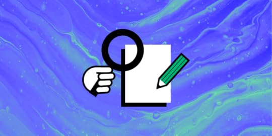
Would you believe that a good user experience case study has the potential to get your job application noticed in the eyes of recruiters in case you get that job interview? If you are all set to share your portfolio with the hiring managers, why not take the final plunge and include the element that can transform your overall impression as a candidate entirely?
Case studies lay out a quick roadmap in front of your recruiters that lets them get a sneak peek into your analytical and creative mind. Reading a UX case study is like your hiring manager taking a walk with you through the design problem at hand. You get to explain the process that you followed to curb the user pain points with your unique design thinking process, which also captures the essence of what is a user-centered design.
Try UXPin. One of the best prototyping tools that allow users to create high-fidelity prototypes with real HTML, CSS, and JavaScript, making designs highly interactive and closer to the final product. Build prototype that you can share in your UX portfolio as a case study to hiring managers. Try UXPin for free.
Build advanced prototypes
Design better products with States, Variables, Auto Layout and more.
Try UXPin .try-uxpin-banner { margin: 40px 0px;}.try-uxpin__container { display: flex; max-width: 689px; height: 210px; padding: 20px; padding-left: 24px; border: 2px solid black; border-radius: 4px; align-items: center; justify-content: space-between; background-color: white; box-shadow: 10px 10px black;}.try-uxpin__left { width: 54%;}.try-uxpin__heading { font-size: 28px !important; font-weight: bold;}.try-uxpin__left p { margin: 10px 0px !important; color: black !important;}.try-uxpin__text { margin: 0 !important; font-size: 18px !important; line-height: 22px !important;}.try-uxpin__button { width: 135px; height: 44px; background: black; margin: 10px 0px; padding: 10px 20px; border: none; border-radius: 2px; color: white; font-size: 16px; text-align: center;}.try-uxpin__button:hover { cursor: pointer;}.try-uxpin__image { max-width: 320px !important; height: 200px; margin-right: -21px; margin-bottom: -6px;}@media (max-width: 760px) { .try-uxpin__container { height: auto; margin: 10px; align-items: left; }}@media (max-width: 500px) { .try-uxpin__container { flex-direction: column; } .try-uxpin__left { width: 100%; align-items: normal; }}What Are UX Case Studies?A UX case study is a story that explains how you solved a design problem. It shows your design process step-by-step—from understanding user needs to creating solutions.
n a case study, you’ll typically explain the problem you faced, the research you did, the ideas you explored, how you tested your designs, and the final outcome. It’s a way to show your problem-solving skills and thinking as a UX designer, often used in portfolios to land jobs or impress clients.
Why Case Studies Should Be in Your Portfolio?Case studies should reflect a curious and creative thinker within you. They should also let you demonstrate your ability to turn research and relevant insights into something concrete for design.
When you’re interviewing for an analytical position such as a UX role, you’re showing off your problem-solving skills because UX is problem-solving first and design second. Your case study should demonstrate not just your process but also your ability to tackle complex problems.
 The Anatomy Of a Great UX Case Study
A memorable UX case study explains in graphic detail the design process you follow throughout every stage of the design project. It pens out not only your research but also the reasoning for your ultimate design decisions while accentuating your design skills.
Let’s begin with the structure you should follow to capture everything chronologically:-
Step-1: Start with “An Introduction”
Step-2: Familiarise with the “Process Followed”
Step-3: Lead with “The Research”
Step-4: Engage with “Design Iterations”
Step-5: Conclude with “Final Observations/Result”
The key here is to keep the content of the case study short, crisp and to the point for hiring managers and recruiters. No one’s going to sit there and sift through your case study for an hour. Reviewing case studies by experienced professionals means scanning them in mere minutes and knowing whether you have what it takes or not.
Also, make it a point to give each section an equal amount of attention when crafting your case study. You never know when recruiters and hiring managers might take notice of something you avoided.
How to Write a UX Case Study for Portfolio
UX Case Studies highlight challenges, research, ideation, prototyping, testing, and the final outcome. There are 5 steps that will help you write the best case study that you can include in your design portfolio.
Step-1: IntroductionIf you don’t capture your reader’s attention in the introduction, they probably won’t continue reading. Make the introduction an engaging, concise way to set the stage for your article. Also, don’t forget to articulate the primary problem that you are aiming to solve.
Here are a few elements to include in the introduction that will make your content crisp and self-explanatory:-
i) Overview of the company: What is this company’s identity? What do they do, and what are their goals and mission statement?
ii) Challenge the company was facing: What was the pain point you decided to tackle? What was the ultimate question you were trying to answer? What difficulties do you encounter while addressing the problem at hand?
iii) How do you fit in the picture: What was your role in the project? What were the timelines? Were there any constraints that affected the project?
iv) Your Take: A methodology is a specified, systematic approach to solving problems or performing tasks. What methods did you use to comprehensively analyze your user data? What methods did you use to test your idea?
v) Conclusion: Elaborate on the conclusion for the end product and wrap up with a fully defined objective which you’ve completed and deliverables.
Reminder- Don’t go overboard with details in this section, we will get to it later.
When highlighting your process, make sure to be explicit about which UX research methods you used and how they helped influence your design decisions.
You should:
i) identify the UX design problems that you faced with a problem statement,
ii) show how you approached the project in terms of information architecture,
iii) show how you interacted with your users in order to gather relevant metrics and understand their needs through good ux
iv) show what research methods did you implement etc.
Explaining the methodology you used to accomplish a specific task is crucial for recruiters and hiring managers to know.
 Step-3: User Research
Now is the time to walk everyone through your UX design case study process. It works like a hypothesis that can get approved or rejected based on your findings. So there’s no right or wrong answer to it. This gives you an opportunity to elaborate on the methods you came up with the former stage and bring action-oriented improvements to the process.
The way to go about it is to briefly explain the design research techniques you used (card sorting, user persona, usability testing, etc.), why you chose these specific techniques, and what outcome you hoped to achieve. Ultimately, your research ends with how effective your UX design solution proved for the users.
When creating a UX case study, you’ll need to gather data to understand your users and the problem you’re solving. Here are a few research methods:
User Interviews: Talk to real users to understand their needs, pain points, and goals.Surveys: Collect data from a larger group of users to spot trends.Usability Testing: Watch users interact with your design to identify areas for improvement.Competitor Analysis: Study competitors’ products to find strengths and weaknesses.Each method helps you gather insights to create better user-centered designs.
Step-4: UX Design DecisionsWhen you start the design phase, you look back at your research and start thinking about how you could design to accommodate your findings. Use the results of your research to inform your design decisions. This is an important part of user-centered design. Take the findings from your user research and apply them to your designs.
If your project is to build a new website or landing page, make sure each iteration includes visual design mockups. You can include steps such as:
Sitemaps: A visual representation of a website’s structure, showing how pages are organized and linked together.User Flows: Diagrams that map out the steps a user takes to complete a task on a website or app.User Journeys: Visuals that tell the story of a user’s experience with a product, from start to finish.Paper Wireframes: Simple sketches of a layout, often used to brainstorm ideas quickly.Medium/High-Fidelity Wireframes: Detailed digital versions of wireframes, showing more precise layouts and design elements.Prototypes: Interactive models of a design that simulate how the final product will work, allowing for user testing.
 Step-5: Result
Employers should be able to quickly and easily find the content that’s most relevant to what they want to know about. To show your final UX design, you can use any tool that suits your needs. It can be a wireframe, high-fidelity mockup, or even something more sophisticated like an interactive prototype. Don’t forget to link to the source and voila! You’re done! If you want to show off your skills and use an intuitive tool for that, try out UXPin. Take your interactive prototyping to a higher level.
How to Pick up a Topic for UX Case StudyThese points will help ensure the chosen project showcases your strengths and thought process effectively:
Choose a project that highlights your skills: Pick a project where you played a key role and can show the depth of your design thinking.Focus on challenges and solutions: Select a project that had clear problems and how your design process solved them.User impact: Choose a case where your design made a measurable difference for users.Relevance: Select a topic relevant to the type of job or client you’re targeting.Complexity: Choose a project that had multiple stages (research, ideation, testing) to show your full range of skills.Collaboration: Highlight projects where you worked closely with other team members (e.g., developers, stakeholders), demonstrating teamwork and communication.Personal Growth: Pick a project that challenged you and helped you learn new skills or tools.Scalability: Consider projects that evolved over time or could be expanded, showing your ability to think long-term.UX Case Study TemplateHere’s a UX Case Study Template to help guide your readers:
1. Project OverviewBrief description of the projectYour role and responsibilitiesTools and methods used2. Problem StatementWhat problem were you solving?Why was it important?3. ResearchResearch methods (e.g., user interviews, surveys)Key insights gathered4. Design ProcessIdeation and brainstormingWireframes (low/medium/high fidelity)Prototypes5. Testing and IterationUsability tests and feedbackChanges made based on insights6. Final DesignOverview of the final solutionScreenshots or mockups7. Results and ImpactMeasurable outcomesHow the design improved the user experience8. Key LearningsChallenges facedWhat you learned from the projectSummaryBy following these steps, you can turn a good case study into a relevant design portfolio piece that showcases your problem-solving skills while bringing your creative side to the table to achieve maximum harmony between functionality and aesthetically fine design work. At the end of the day, the whole point behind a case study is to establish expertise in the area of UX research and design and be perceived as a UX professional in the eyes of potential prospects. Use an intuitive design tool that will help you show your skills – sign up for a 14-day trial.
The post UX Case Study – Step-by-Step Guide [+Template] appeared first on Studio by UXPin.
October 14, 2024
AI Design System – Are We There?

AI is set to revolutionize the way design systems are created, managed, and scaled. According to industry experts, AI’s efficiency in automating repetitive tasks like code generation, component resizing, and documentation can significantly reduce the time required to build and maintain design systems. Let’s see if we’re ready to implement Design Systems created and managed by AI.
Design systems powered by AI need to be flexible, data-driven, and scalable. UXPin Merge complements these requirements by providing a unified platform where AI-first design systems can be backed with real code, enhancing both design speed and accuracy. As design systems become increasingly complex, UXPin Merge bridges the gap between designers and developers. Request access to UXPin Merge.
Design UI with code-backed components.Use the same components in design as in development. Keep UI consistency at scale.
Try UXPin Merge .discover-merge { margin: 40px 8px;}.discover-merge__container { display: flex; max-width: 690px; height: 200px; padding: 20px; padding-left: 24px; border-radius: 4px; background-color: black; box-shadow: 10px 10px #9999ff; align-items: center; justify-content: space-between;}.discover-merge__left { width: 50%;}.discover-merge__left p { margin: 10px 0px !important; color: white !important; font-size: 18px !important;}.discover-merge__heading { font-weight: bold !important; color: white !important; font-size: 18px !important;}.discover-merge__text { margin: 0 !important; line-height: 22px !important;}.discover-merge__button { width: 174px; height: 44px; margin: 10px 0px; border: none; border-radius: 2px; background: white; color: black; font-size: 16px; text-align: center;}.discover-merge__button:hover { cursor: pointer;}.discover-merge__image { max-width: 320px !important; height: 200px; margin-right: -19px;}@media (max-width: 760px) { .discover-merge__container { height: auto; margin: 10px; align-items: left; }}@media (max-width: 500px) { .discover-merge__container { flex-direction: column; } .discover-merge__left { width: 100%; align-items: normal; }}What is an AI Design System?An AI Design System is a type of design system built with artificial intelligence. Unlike traditional design systems that rely solely on designers to build and maintain consistency, AI design systems utilize machine learning algorithms and data-driven insights to automate repetitive tasks, create UI design elements, and ensure coherence across digital products.
Real-World Examples of AI Design SystemsSeveral companies are already leveraging AI to build and optimize their design systems, focusing on automating repetitive tasks, enhancing scalability, and improving overall efficiency. Here are some notable examples:
GitHub: Diana Mounter, Head of Design at GitHub, mentioned that AI significantly accelerates building and developing design systems, making it easier to generate new layouts and ensure consistency across components. AI enables GitHub to automate tedious design tasks and focus on more strategic, creative work.Airbnb: Airbnb integrates AI into its design system by using machine learning algorithms to classify and understand its 150+ design components. This allows AI to automate the creation of prototypes based on user behavior and preferences, which reduces the manual effort needed to create and maintain their design system.Spotify: Spotify uses AI-driven predictive analytics to refine its design system and personalize user experiences. The company’s AI-powered DJ uses algorithms to analyze user data and generate design decisions that align with user preferences and expectations, making their design systems highly adaptive and personalized.IKEA: Through the IKEA Place app, the company utilizes AI to visualize furniture placements in users’ homes. This application not only helps customers see how items fit in their space but also automates the layout generation process, contributing to IKEA’s internal design system efficiency.Autodesk’s Spacemaker AI: Spacemaker AI, acquired by Autodesk, uses AI to optimize site planning and urban layouts. The tool automates the creation of complex design models, providing architects and planners with AI-generated suggestions for building layouts based on environmental data such as sunlight and noise levels. This AI-driven approach is integrated into Autodesk’s larger design system strategy, enhancing the scalability and accuracy of design decisions.These companies showcase how AI can be integrated into design systems to automate repetitive tasks, provide real-time insights, and personalize the user experience—all while maintaining consistency and scalability. As more organizations explore AI-driven design systems, we’re likely to see increased adoption and innovation in this area.
Key Benefits of Including AI in Design SystemsAutomation of Repetitive TasksAI can handle mundane tasks like resizing components, generating layouts, and maintaining style consistency, freeing up designers to focus on strategic, creative work. This enables faster iteration and reduces the time spent on manual adjustments.
Scaling Existing Design SystemsAI can generate code-backed components that adhere to design system guidelines, making it easier to maintain design consistency across products. This ensures that AI-generated designs are aligned with existing design standards and development practices.
Building Multi-Brand Design Systems FastAI can analyze design systems to create UI components and design elements that adapt to specific brands. This capability allows designers to deliver unique experiences without compromising on quality or coherence.
Analysis and PredictionsWho has the time to measure design system effectiveness? This task can be delegated to artificial intelligence tools. AI can monitor user interactions in real-time, providing insights into usability issues and predicting how users will respond to different design elements. This helps designers make informed decisions and iterate faster, ensuring optimal user experiences.
Using Text Prompts to Generate UI ElementsAI can now generate foundational elements of a design system, such as spacing and typography scales, from basic text prompts. This significantly reduces the time needed for initial setup and helps teams maintain a structured and well-documented design system from the get-go.
Read about using ChatGPT in UI Design.
Challenges of AI in Design SystemsAccessibility and Ethical AIEnsuring that AI-powered design tools are accessible to all users, including those with disabilities, remains a significant challenge. According to Google Design, AI must be trained carefully to avoid reinforcing biases and to ensure inclusivity for all users.
Designers need to consider how their AI-generated components interact with diverse user groups and test for accessibility from the outset.
Maintaining Human-Centered DesignWhile AI is adept at handling routine tasks, it cannot replace human intuition, empathy, and emotional intelligence.
Dan Mall, founder of Design System University, emphasizes that AI “has not reached the point where it can judge what’s good and what’s not, what might be emotionally resonant with a human audience, and what might just be junk” (as in Webflow’s article about AI.) Therefore, designers must use AI as a complementary tool that supports their creativity rather than as a replacement for human decision-making.
Privacy and Data SecurityAI systems often rely on large amounts of user data to generate insights and predict behaviors. Designers need to ensure that this data is collected, stored, and used responsibly to protect user privacy and build trust. AI-driven design systems should prioritize data security and maintain transparency around how user data is leveraged for design decisions, as stated by Adam Fard’s Design Studio.
Top 5 Tips to Address AI-Driven Design System ChallengesInclusive Training Data – Train AI models with diverse datasets that reflect various demographics, abilities, and cultural contexts. This reduces bias and ensures that generated components cater to a broad range of users, supporting the creation of accessible and inclusive design systems.Bias Audits and Continuous Monitoring – Regularly audit AI models for bias and ethical fairness. Implement continuous monitoring to detect and address any biased behaviors, ensuring your AI tools remain neutral and inclusive throughout their usage lifecycle.Iterative Design with Human Oversight – Adopt an iterative design process where AI provides initial suggestions or generates components, but human designers review and refine these outputs. This approach helps maintain human-centered design principles and ensures AI-generated elements resonate with users on an emotional level.Minimize Data Collection and Enhance Privacy – Limit data collection to what’s necessary for AI training and improvement. Apply anonymization techniques and encryption to protect user data, and clearly communicate data usage policies to maintain transparency and build user trust.Transparent Documentation and Communication – Document how AI models are trained, the data used, and the ethical steps taken to ensure inclusivity and security. Transparent documentation fosters trust and promotes responsible use of AI in design systems.How to Build an AI Design System with UXPinMany design tools on the market today, like Uizard or Framer, offer AI-powered features for prototyping and automating components, but they lack a unified platform that seamlessly integrates with development. While these tools are effective for quick iterations and ideation, they often fall short when it comes to maintaining design consistency and creating development-ready components at scale.
That’s where UXPin Merge stands out. Unlike other tools, UXPin Merge is an end-to-end design platform that enables designers and developers to work with real React or Web components within the design environment. The addition of the AI Component Creator further enhances this capability by automating the generation of code-backed components from text prompts or images, bridging the gap between design and development.
With UXPin, you’re not just designing in isolation—you’re creating a complete, scalable, and consistent design system that is in sync with your development codebase. Let’s explore how you can leverage these powerful features to build an AI-driven design system from scratch.
Step 1: Setting Up Your Design System in UXPinOld but great explanation of how design systems work in UXPin.Create a New Design SystemOpen UXPin and navigate to the Design Systems tab at the top of your dashboard.Click the Create Design System button. Choose the option to “Create from Scratch” to start with a clean slate.Name your design system and define its purpose. For example, “AI-Powered Design System for Web Applications.”Define Core ElementsIn the design system interface, set up the core elements such as colors, typography, and spacing.Colors: Add your primary, secondary, and neutral colors. You can type in HEX codes or import colors directly from a website URL.Typography: Define text styles like headings, paragraphs, and captions by adding font families, weights, and sizes.Spacing and Grid: Set spacing values and grid structures to ensure design consistency.Create Design TokensDesign tokens are style values that represent the design decisions needed to build a UI—such as colors, typography, and spacing. Use design tokens in your design system to maintain consistency and scale your system across different platforms.Step 2: Generating UI Components with AI Component Creator
 Enable AI Component CreatorIf you are on the Merge AI plan or have Merge enabled, go to the AI Component Creator in UXPin’s Editor.Enter your OpenAI API key in the Settings tab to enable the AI functionality.Generate Components from Text PromptsOpen the Prompt tab in the AI Component Creator.Write a prompt describing the component you want to create. For example:
“Create a primary button component with rounded corners, a blue background, and white text. The button should use the MUI library.”Select the React library you want to use, such as MUI or Ant Design, and click Generate.Review the generated component. If needed, make adjustments to its properties or styles directly in UXPin.Create Components from Uploaded ImagesIf you have a visual design that you want to turn into a code-backed component, use the Upload Image option in the AI Component Creator.Upload the image, and the AI will analyze it to generate a fully coded component using your selected React library (MUI, Ant Design, or React-Bootstrap).Review the generated code and structure, and integrate it into your design system’s component library.Transform Existing UXPin ComponentsIf you already have existing static elements in UXPin, right-click on the component and choose the AI transformation option to convert it into a code-backed component.The AI will apply the appropriate library (e.g., MUI) and generate code, making the component development-ready.Step 3: Organizing Your AI-Driven Design SystemCreate and Document UI PatternsIn the Design System interface, go to the UI Patterns section.Group similar components (e.g., buttons, forms, modals) together and add descriptions to document usage guidelines, props, and variations.Use the AI Component Creator to generate variations of these components based on text prompts. For example, creating variations of a button with different colors or icon placements.Add Accessibility GuidelinesDefine accessibility standards for your components by adding descriptions and guidelines. For example, set minimum color contrast ratios and ensure keyboard navigation for interactive elements.Use AI to test components against accessibility standards, such as checking for WCAG compliance or generating accessible labels and alt text.Set Up Component VariantsIn UXPin, create component variants (e.g., primary, secondary, and disabled states for buttons) to cover various use cases.Define responsive behaviors for components using UXPin’s interactions and breakpoint settings.Step 4: Create Live Code Integration Using UXPin MergeImport Code Components with UXPin MergeImport live code components from your repository using UXPin Merge. Merge allows you to sync your design system with code components, ensuring that the design system reflects the latest codebase.Document and Share Code-backed ComponentsDocument your code-backed components directly in the design system, adding links to code repositories and usage guidelines for developers.Use UXPin’s Spec Mode to allow developers to inspect code, view component props, and access documentation—all within UXPin.Step 5: Maintaining and Scaling Your AI-Driven Design SystemUpdate Components with AI AssistanceAs your design system evolves, use the AI Component Creator to update components or generate new ones. AI can help you maintain consistency by adhering to design system rules and standards.Use AI to Analyze and Optimize the Design SystemImplement AI tools like UXPin’s AI Component Creator to analyze your design system for redundancies, inconsistencies, or gaps.Use these insights to refine and optimize your design system, ensuring it remains scalable and relevant.Collaborate and Iterate with StakeholdersShare the AI-driven design system with stakeholders for feedback and collaboration.Use UXPin’s collaboration features to receive comments and iterate on the design system components quickly.Ready to Use an AI-Driven Design System?
AI is poised to become a co-pilot in design systems, augmenting the abilities of designers and creating new opportunities for innovation. As AI continues to advance, it will enable more predictive design, personalized user experiences, and greater efficiency in managing and scaling design systems. Designers who embrace AI as a complementary tool will be better equipped to create the next generation of digital experiences that are both intuitive and scalable.
Creating an AI-driven design system in UXPin not only accelerates the design process but also ensures that your components are development-ready and aligned with best practices. By leveraging the AI Component Creator, you can automate repetitive tasks, maintain consistency, and create a scalable design system that bridges the gap between design and development.
Ready to build your own AI-powered design system? Request access to UXPin Merge and start transforming your design process today.
Discover MergeThe post AI Design System – Are We There? appeared first on Studio by UXPin.
October 11, 2024
What is UX Writing and Why You Need a UX Writer?
Nowadays, pretty much everyone knows what content writing is. But the same can’t be said about UX writing. And yet this new role within the product design team has become ever so important. So, what is UX writing, how does it fit into the design and product teams and what are the key principles of good UX writing? Read on to find out.
Boost your UX team’s efficiency with UXPin. This cloud-based prototyping tool enables seamless collaboration between UX writers and designers through real-time editing and design sharing. With support for importing real data into your prototypes, UXPin helps bridge the gap between design and development.
Experience UXPin’s capabilities firsthand with a free 14-day trial—no commitments required. Sign up for free.
Build advanced prototypes
Design better products with States, Variables, Auto Layout and more.
Try UXPin .try-uxpin-banner { margin: 40px 0px;}.try-uxpin__container { display: flex; max-width: 689px; height: 210px; padding: 20px; padding-left: 24px; border: 2px solid black; border-radius: 4px; align-items: center; justify-content: space-between; background-color: white; box-shadow: 10px 10px black;}.try-uxpin__left { width: 54%;}.try-uxpin__heading { font-size: 28px !important; font-weight: bold;}.try-uxpin__left p { margin: 10px 0px !important; color: black !important;}.try-uxpin__text { margin: 0 !important; font-size: 18px !important; line-height: 22px !important;}.try-uxpin__button { width: 135px; height: 44px; background: black; margin: 10px 0px; padding: 10px 20px; border: none; border-radius: 2px; color: white; font-size: 16px; text-align: center;}.try-uxpin__button:hover { cursor: pointer;}.try-uxpin__image { max-width: 320px !important; height: 200px; margin-right: -21px; margin-bottom: -6px;}@media (max-width: 760px) { .try-uxpin__container { height: auto; margin: 10px; align-items: left; }}@media (max-width: 500px) { .try-uxpin__container { flex-direction: column; } .try-uxpin__left { width: 100%; align-items: normal; }}What is UX Writing?UX writing – or user experience writing – is the process of creating user-friendly copy for all user-facing touchpoints, including user interface. And this is not just a decorative text. UX copy informs, guides, urges and helps users take action – and this only works effectively when it is created as a part of a formal product design process.
As great copy within an interactive UX design helps to create a great user experience – one of the keys for a successful product – no wonder it has become an important role on its own.
What Does a UX Writer Do?UX writers write microcopy used throughout digital products – whether it is a piece of software, a web application, or a mobile app. These pieces of copy are menu labels, buttons, calls-to-action, confirmation and error messages, security notes, etc. UX writers create a copy in such a way that users understand what and why they should do in order to achieve a certain result.
To create a great UX copy, UX writers not only need to create consistent, error- and typos-free copy but also have a thorough understanding of the end-user experience of the product they’re writing for. They need to make it easy for users to take the path that leads towards a particular outcome in a logical, intuitive manner.
For a very long time, it was software developers and graphic designers who would write the microcopy for digital products. Back then UX writing was underestimated and considered a luxury. As a result, the microcopy within the product was often inconsistent and confusing for the user, not to mention that it was sometimes filled with grammar errors and spelling mistakes.
And that’s understandable – nobody can excel at everything, and software developers or designers aren’t an exception to this rule. Especially that they know the product inside out and it’s hard for them to empathize with users.
…and what does UX writer not do
The role of UX writer should not be confused with that of:
technical writer – who does the technical writing and focuses on clarity and accuracy, not on user experience, content strategist – who plans content strategy, i.e. content on a bigger scale, and doesn’t necessarily write copy, information architect – who works on, well, information architecture, meaning that (s)he builds sustainable information structures and taxonomies,content marketing copywriter – who writes marketing copy that attracts leads, converts them into customers and helps to retain them); check the difference between copywriter and UX writer.UX Writing in a Design and Product TeamUX writers are members of UX teams, and as such they’re expected to conduct or collaborate on conducting the UX research. UX copy and UX design teams work together to discover options that improve the functionality, usability, and accessibility of the final product. As a result, they’re able to both streamline the design process and develop better digital experiences that attract more users.
UX writers also work closely with product developers, focusing on missing logic or a confusing interface, thus influencing the final product that is being developed. UX writers also collaborate with other teams within the organization, such as marketing, legal, and business development, in order to ensure that copy is aligned to brand voice, strengthens product’s UVP, and doesn’t get the company in trouble.
Types of UX ContentThe specific types of UX content vary depending on the digital product, but generally speaking the most common types of UX content include:
First-time users onboardingMenu labels, form field labels and listsButtons and call-to-actions (CTAs)Settings labelsContextual help and tooltipsConfirmation messagesError messagesSecurity notesIn-product marketing (e.g. pop-up ads)Chatbot conversation scenariosLegal notices and disclaimersUX Copywriting PrinciplesGreat UX writing is all about clean, purposeful lines, making each word count. Superfluity and redundancy are its enemies. That’s why some people compare UX writing to… writing poetry! But great UX writers must also:
Know not only what the product does but also how it improves the end user’s life and makes it easier. Having empathy for the end user and his or her needs and wants is the key to successful UX writing. Inform about what the product is capable of doing and guide users on how to do it in a logical, easy-to-follow manner.Look critically at the product flows, anticipate user questions, preempt their frustrations with proactive help and guide them through tasks.Be clear, concise, unambiguous, and – whenever necessary – break down complicated processes into easy to do steps. UX copy should only give the necessary or requested information at any given time.Use brand voice and, whenever possible, reinforce the product’s Unique Value Proposition (UVP) to help it stand out from the competition.Incorporate best content design principles based on research and always create copy in context, directly in a wireframing tool, that shows it with all the fonts, images, buttons etc. UX writers shouldn’t use Word documents or Excel sheets for their copywriting.How to Use UXPin for UX Writing?Create Design Context: Use UXPin to design wireframes or prototypes, providing context for your content.Collaborate in Real-Time: UX writers can work directly within the design file, adding or modifying text while designers see updates instantly.Define Content Hierarchy: Utilize UXPin’s component system to create consistent content patterns for headers, buttons, and body text.Use Comments & Annotations: Leave comments to discuss content changes or ideas directly on the prototype.Prototype with Real Content: Import realistic data to simulate actual user scenarios, making the designs and content more aligned.
This approach enhances collaboration between UX writers and designers, leading to more cohesive and user-focused designs.
SummaryAs you can see, having an experienced UX writer on board is the key to improve the overall quality of your product design. Remember that your user interface microcopy is there to help users accomplish their goals. And this is what ultimately will bring more customers to your digital product.

If you’re looking for ways to improve work within your UX team, consider giving UXPin a try. It’s a cloud-based design tool that makes it easy for UX writers and UX designers to collaborate in real-time. It even allows you to import real data into your designs!
See how it works with a free 14-day trial – with no commitment to buy!
Try UXPin for freeThe post What is UX Writing and Why You Need a UX Writer? appeared first on Studio by UXPin.
October 9, 2024
Generate UI with AI – Introducing AI Component Creator
We’re thrilled to announce exciting updates to UXPin’s AI Component Creator. After experimenting with generating HTML-based Tailwind UI components, our Merge AI tool now supports MUI, Ant Design, and React-Bootstrap—unlocking more possibilities for designers and developers. But that’s not all!
You can now turn static images into fully coded UI components or transform classic UXPin elements into code-backed designs with just a few clicks, paste an image of UI that will get transformed into code-backed design or automate theming.
Say goodbye to tedious coding and hello to a streamlined design-to-development workflow. It’s time to supercharge your creativity with AI. Try AI Component Creator by yourself. Sign up for a demo.
Reach a new level of prototyping
Design with interactive components coming from your team’s design system.
Discover UXPin Merge .discover-merge { margin: 40px 8px;}.discover-merge__container { display: flex; max-width: 690px; height: 200px; padding: 20px; padding-left: 24px; border-radius: 4px; background-color: black; box-shadow: 10px 10px #9999ff; align-items: center; justify-content: space-between;}.discover-merge__left { width: 50%;}.discover-merge__left p { margin: 10px 0px !important; color: white !important; font-size: 18px !important;}.discover-merge__heading { font-weight: bold !important; color: white !important; font-size: 18px !important;}.discover-merge__text { margin: 0 !important; line-height: 22px !important;}.discover-merge__button { width: 174px; height: 44px; margin: 10px 0px; border: none; border-radius: 2px; background: white; color: black; font-size: 16px; text-align: center;}.discover-merge__button:hover { cursor: pointer;}.discover-merge__image { max-width: 320px !important; height: 200px; margin-right: -19px;}@media (max-width: 760px) { .discover-merge__container { height: auto; margin: 10px; align-items: left; }}@media (max-width: 500px) { .discover-merge__container { flex-direction: column; } .discover-merge__left { width: 100%; align-items: normal; }}What is UXPin’s AI Component Creator?UXPin’s AI Component Creator revolutionizes the way designers and developers work by bridging the gap between design and code.
Imagine a world where you can go from an idea to a fully functional UI component in minutes. That’s the power of UXPin’s AI Component Creator.
This tool now lets you harness the capabilities of React-based libraries like MUI, Ant Design, and React-Bootstrap. Whether you’re working with a static design or a code component, the AI Component Creator transforms text prompts, images, or existing elements into production-ready, code-backed components.
No more handoffs, no more inconsistencies—just seamless design-to-code integration.
Supercharge your Design-to-Development WorkflowLet’s say you’ve sketched out a UI wireframe or stumbled across a beautiful UI design. Recreating that design and translating it into code would take ages. Thankfully, there’s an easier way of going about it – AI Component Creator.
With UXPin’s AI tool, you can upload the image or write a prompt and—voilà— you get a React component that’s fully consistent with your chosen library: MUI, Ant Design or React-Bootstrap. Have a static element in your UXPin prototype? Transform it into a code-backed component with a right-click. Then, download the code behind the UI elements and speed up React web app development.
This streamlined process ensures consistency, reduces errors, and speeds up the overall workflow, making AI an indispensable ally in the design process. With less manual work and more time for innovation, AI Component Creator empowers you to turn your vision into reality—faster than ever.
Turn Images into Code-Backed Components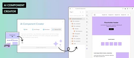
With AI Component Creator, transforming static design images into fully functional UI components has never been easier. Simply upload an image of your UI design, and the AI analyzes it to generate code-backed components that are compatible with MUI, Ant Design, React-Bootstrap or Tailwind.
This means you can go from concept to code in seconds, skipping the manual coding process entirely. It’s a powerful feature that bridges the gap between static visuals and interactive, coded designs—perfect for speeding up prototyping and development.
Transform UXPin Components into Coded OnesThe new AI-powered feature in UXPin allows you to transform existing UXPin components into fully functional, code-backed elements in seconds. No need to start from scratch! Simply right-click on any UXPin component and choose the AI transformation option.
AI Component Creator will convert the static UI into a coded element using your preferred library, such as MUI, Ant Design, or React-Bootstrap. This powerful addition ensures that your designs are development-ready, maintaining consistency and speeding up the prototyping process.
Expanded Support for Code-Backed Libraries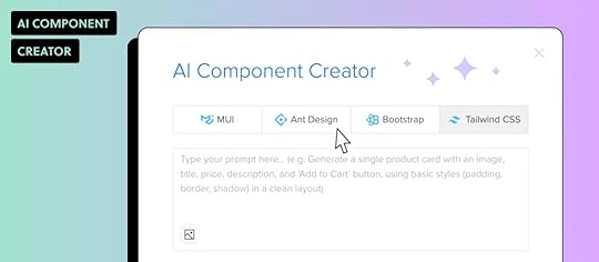
We’re excited to announce that UXPin’s AI Component Creator now supports a wider range of open-source libraries that teams based their design systems on, including:
MUI,Ant Design,React-Bootstrap,Tailwind UI.This update allows designers to generate production-ready components using their preferred library, ensuring design consistency and seamless integration with development standards. Choose the desired library, write a prompt or upload an image, and watch as AI creates fully coded components that match your design system.
Enhanced Theming Options for MUI Components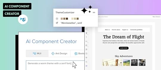
UXPin’s AI Component Creator supports theming for MUI components, allowing users to generate elements that follow a theme rather than relying on inline CSS styles. This enhancement ensures design consistency across projects while simplifying maintenance and scaling.
By applying themes to AI-generated components, designers can maintain a unified look and feel without manually adjusting styles, making it easier to update and refine designs as requirements evolve. This update empowers teams to create cohesive, production-ready components effortlessly.
AI Use Cases and Benefits for Designers & DevelopersGenerate UI from Visuals – Upload images of UI designs and generate fully coded components in seconds. Speed up the transition from concept to interactive prototypes.Transform Static Elements into Coded Components – Convert existing UXPin components into code-backed UI elements. Reduce handoffs and keep designs consistent with development standards.Generate Components Using Most-Documented Libraries – Choose from MUI, Ant Design, React-Bootstrap, or Tailwind UI to create production-ready components. Maintain design system integrity and facilitate collaboration between design and dev teams.Apply Consistent Theming to MUI Components – Create components with MUI themes instead of inline CSS styles. Improve scalability, maintain design consistency, and simplify updates.Bridge the Design-to-Development Gap – By converting design elements into code-backed components, AI Component Creator minimizes friction between design and engineering. Streamline collaboration, reduce errors, and accelerate development.How to Access AI Component CreatorThe AI Component Creator is available exclusively to users on the Merge AI plan. Additionally, those with Merge enabled in their UXPin account can contact UXPin support to get this feature.
How to start using AI Component Creator
Get an OpenAI API Key: Obtain your key from the OpenAI website.Open AI Component Creator: Go to the Editor and access it from the Quick Tools panel.Paste Your API Key: Open the Settings tab and enter the key in the “OpenAI API Key” field.Use AI Component Creator: Start using the feature.For more details, visit the documentation.
Watch what Merge AI plan is all about.
Further reading on Generating UI with AIHere are our guides for using AI for design and development, as well as using AI Component Creator:
AI Tools for Designers – this article outlines the most popular tools that designers use.Prompt Engineering for Designers – write effective text prompts to get the best UI.ChatGPT in UI Design – explore how other designers use ChatGPT.AI Component Creator documentation – our official documentation for this tool.Generate UI with AI with a Single ClickUXPin’s AI Component Creator generates code-backed UI from images, text prompts, or existing elements to accelerate prototyping and maintain design consistency.
It supports React libraries that are much-loved by UXPin’s users – MUI, Ant Design, React-Bootstrap – enabling designers and developers to create production-ready components within UXPin. The feature helps teams reduce errors and frees up time for creativity and innovation. The tool has an immense impact on improving the design-to-development workflow. Try AI Component Creator by yourself. Sign up for a demo.
Discover MergeThe post Generate UI with AI – Introducing AI Component Creator appeared first on Studio by UXPin.
UXpin's Blog

- UXpin's profile
- 68 followers

