
UXpin's Blog, page 23
April 10, 2024
Coding Languages to Know in 2024

In the constantly evolving, technology-driven world we live in, it’s vital to stay on top of the most updated programs and applications out there. In order to have your site, app, game, etc. on the forefront, you have to stay updated with the best coding for your needs.
There are tons of new coding languages that are taking the benefits of old languages and leaving the disadvantages behind. Developers are improving productivity and performance while reducing bug issues. Of course, newer doesn’t always mean better and some older languages still reign.
If you’re hesitant to get involved in coding, see Why it’s Time for Designers to Switch from Image-Based to Code-Based Design and Coding is Designing.
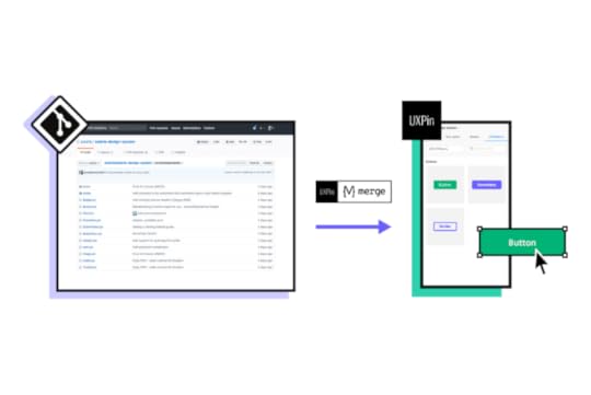
Create code-based interfaces without touching code. Try our UI builder that allows you to drag and drop functional components to arrange the layout that can be easily copied to a dev’s environment. Speed up product design process and ship products way faster. Discover UXPin Merge.
Reach a new level of prototypingDesign with interactive components coming from your team’s design system.
Discover UXPin Merge .discover-merge { margin: 40px 8px;}.discover-merge__container { display: flex; max-width: 690px; height: 200px; padding: 20px; padding-left: 24px; border-radius: 4px; background-color: black; box-shadow: 10px 10px #9999ff; align-items: center; justify-content: space-between;}.discover-merge__left { width: 50%;}.discover-merge__left p { margin: 10px 0px !important; color: white !important; font-size: 18px !important;}.discover-merge__heading { font-weight: bold !important; color: white !important; font-size: 18px !important;}.discover-merge__text { margin: 0 !important; line-height: 22px !important;}.discover-merge__button { width: 174px; height: 44px; margin: 10px 0px; border: none; border-radius: 2px; background: white; color: black; font-size: 16px; text-align: center;}.discover-merge__button:hover { cursor: pointer;}.discover-merge__image { max-width: 320px !important; height: 200px; margin-right: -19px;}@media (max-width: 760px) { .discover-merge__container { height: auto; margin: 10px; align-items: left; }}@media (max-width: 500px) { .discover-merge__container { flex-direction: column; } .discover-merge__left { width: 100%; align-items: normal; }}Coding vs UX Design
Coding and UX design are two distinct disciplines within software development that serve different purposes and require different skill sets.
Coding involves writing instructions (code) that tell computers how to perform specific tasks or functions. It focuses on implementing the logic and functionality of software applications.
UX designing, on the other hand, focuses on creating a positive and seamless experience for users when they interact with a product or system. It involves understanding user needs, behaviors, and preferences to design intuitive and user-friendly interfaces.
Coders use various programming languages (such as JavaScript, Python, Java, etc.), frameworks, libraries, and development tools to write code and build software applications.
UX designers use design tools like UXPin, Figma, or other to create wireframes, prototypes, and visual designs. They also use user research tools, usability testing platforms, and collaboration software to gather feedback and iterate on designs.
Why Coding Matters to DesignIf you found it a little odd that there are articles on coding nestled in this design platform, you aren’t alone! It can often be one of the most overlooked elements of design on the surface, yet it is also massively important.
Firstly, it makes sense that there is a notable overlap between coders and designers. After all, both areas are heavily reliant on creativity, problem-solving, and logic. This means that aside from coding’s importance to design, it is also a skill that many designers are actually able to pick up rather quickly.
In terms of necessity, we can look at two significant ways that coding is critical to technology. The first is creating modular code in order to increase efficiency. This is when designers can make use of CSS, one of the most core languages to start with.
The second is through creating a flexible code that is optimal for scalability. With so many small changes throughout the design process, it’s important to know how to create product suites that won’t need complete code rewrites every time a slight adjustment is made.
There are of course design tools, like UXPin, which can make the handoff and docummentation painless. Test it for 14 days for free to see!
Regardless, it’s good to at least keep your ear to the ground. So without further ado, let’s dive into the languages that can really help build upon your coding languages as you apply the skillset to your design!
1. KotlinKotlin is a programming language used for JVM. It was created as an alternative to Java and, similarly to Java, can be used practically anywhere. Android app (also see UXPin’s Material Design libraries) development is the primary usage of Kotlin, but the code also has iOS capabilities. Although Kotlin is not as popular as Java, it is hugely embraced by companies like Netflix, Uber, Pinterest, and many more.
There are a few reasons why developers are using Kotlin over Java. The first reason is simply convenience. Due to the wide range of usage with the code, it’s productivity makes it the clear choice over Java to experienced coders. This efficiency shortens the time required to finish the project as well as reduces the cost of delivering a project.
For app creators specifically, Kotlin’s imbedded programs make life a lot easier. While you’re working, Kotlin searches and prevents bugs in the background. It also includes an algorithm that prevents common coding mistakes from occurring. Finished projects are also much more accessible making apps not only easier to update, but safer to use for consumers.
An additional bonus to being part of the Kotlin community is the communication available to you. There is a Slack channel dedicated to Kotlin developers so questions, support, and even partnerships can have a space to exist. In addition to that, the Kotlin team tries to put out weekly/monthly letters and videos to continuously explain their work.
2. ElmElm was designed for creative web-browser based graphic interactions so it’s perfect for those who are more into artistic creating. This is a great program for you to see how Coding is Designing. There is a primary focus on front-hand development with Elm. This means that back-end editing is a bit more difficult, but if you aren’t too concerned with that, then it’s perfect for you.
As a functional language, Elm supports anonymous functions, functions as arguments, and partial application by default, giving you a wide variety. It also has built in controls the predict issues in the program, or the code, and provides hints that are incredibly user friendly.
In fact, Elm is known for being one of the easier codes to work with. It doesn’t require too much background knowledge, and thanks to all the help you get while coding, it’s a breeze to use. This is best for someone who doesn’t have much coding experience! Elm is so user friendly that even kids are coding with it. Tynker is a site listed in the Top Coding Websites For Kids and it utilizes the Elm language. Some find it shocking that young kids are using this kind of technological language.
David Dodge, CEO of Codakid says,
3. Crystal“With technology being as predominant as it is in our world today, there’s no reason kids shouldn’t be learning how to code.”
Crystal was developed as a new and improved Ruby. For those not familiar with the programming language, Ruby is used to write most web apps. Although it is a very simple code, it isn’t very easy to learn and can be very time consuming due to slow processing.
By maintaining the simple code used, Crystal was able to bring the convenience of Ruby with more productivity and quicker processing. In fact, when tested, Crystal has 20x more performance and was 30x faster than Ruby. This makes the language a clear choice when focusing on web applications.
Crystal also doesn’t require a specific language to be used. The language is type-checked, but specific variables or method arguments don’t have to be specified. There’s also a great feature called crystal play. This allows you to experiment and then quickly get feedback on your work.
4. SwiftSwift is a new language used to develop iOS and MacOS applications. It acts as an alternative to Objective-C. Swift, however, is much faster and maintains a higher performance ability.
Although the language doesn’t cover the Android domain, it is still incredibly useful if you look at the grand scheme of things. Apple’s market is already widespread, and is still growing. It’s also beneficial to focus on this type of production if you think of the variety of products available through Apple. iPhones and MacBooks are not the only items that can support apps nowadays, AppleTVs, Apple Watches, and so many more have the possibility for creation.
Apple’s large consumer base isn’t the only benefit of choosing this language, however. Swift has a clean syntax that makes it easier to both read and write. This saves coders tons of time and frustration in the development process. Perhaps the biggest benefit in choosing Swift over Objective-C is it’s independence. Objective-C can’t evolve if C doesn’t involve, but Swift doesn’t face this problem.
5. JavaThe phrase, “oldie but goodie” couldn’t be more correct in this case. Java has been around for ages, but still remains at the top of the list for functional language. Everyone knows about it and almost everyone has used it.
The biggest benefit of choosing Java is that it has infinite usage. It can be used to develop mobile apps, server-side apps, video games, and so much more. Even more important than that though, is that it can run on anything. Java maintains a pretty tight hold on language domain because of its flexibility and easy usage.
Every main web browser supports Java, without having to use a plugin. This allows for much less upkeep with previously created apps. Not to mention, while working it provides multimedia support and is, for the most part, user-friendly. To top it off, Java is free to access and easy to use. It was even listed as a top coding language for kids.
Try Design with CodeWhether coding is something you’ve been doing for years or are just picking up, there are tons of languages out there and there has to be one that fits your needs perfectly. Some are more advanced than others and require some background knowledge, but there are plenty of resources available to you.
Build code-based interfaces in a familiar design environment. Use UXPin Merge and create consistent and user-friendly interfaces with reusable components from best UI libraries out there. Discover UXPin Merge.
Discover MergeThe post Coding Languages to Know in 2024 appeared first on Studio by UXPin.


Which Programming Languages and Frameworks Will You Hear About as a UX Designer?

With hundreds of programming languages, it can be overwhelming for UX and product designers to comprehend or decide which one is worth learning. While learning code isn’t essential for a UX designer’s job, it can help them understand technical constraints and improve collaboration with development teams.
This article explores six programming languages for UI/UX designers and why coders use one over the other. We also explain the difference between programming languages, front-end frameworks, and component libraries and how they influence design projects.
Our proprietary Merge technology will take your design projects to the next level with component-driven prototyping in UXPin. Visit our Merge page for more details and how to access this revolutionary UX technology.
Reach a new level of prototypingDesign with interactive components coming from your team’s design system.
Discover UXPin Merge .discover-merge { margin: 40px 8px;}.discover-merge__container { display: flex; max-width: 690px; height: 200px; padding: 20px; padding-left: 24px; border-radius: 4px; background-color: black; box-shadow: 10px 10px #9999ff; align-items: center; justify-content: space-between;}.discover-merge__left { width: 50%;}.discover-merge__left p { margin: 10px 0px !important; color: white !important; font-size: 18px !important;}.discover-merge__heading { font-weight: bold !important; color: white !important; font-size: 18px !important;}.discover-merge__text { margin: 0 !important; line-height: 22px !important;}.discover-merge__button { width: 174px; height: 44px; margin: 10px 0px; border: none; border-radius: 2px; background: white; color: black; font-size: 16px; text-align: center;}.discover-merge__button:hover { cursor: pointer;}.discover-merge__image { max-width: 320px !important; height: 200px; margin-right: -19px;}@media (max-width: 760px) { .discover-merge__container { height: auto; margin: 10px; align-items: left; }}@media (max-width: 500px) { .discover-merge__container { flex-direction: column; } .discover-merge__left { width: 100%; align-items: normal; }}What are Programming Languages?
Programming languages are the code developers use to write websites, algorithms, and digital products. Each programming language has its own markup, rules, structure, package manager, etc.
There are hundreds of programming languages, most of which product teams will never encounter. We’ve narrowed down a list of essential coding languages, so you know where to start if you wish to research these further.
How do Programming Languages Impact the Product Development Process?A programming language dictates the product’s technical constraints, significantly impacting product development, including the user experience design process.
Design teams must understand these limitations or risk wasting time designing solutions and features that programmers can’t build.
The programming language also influences other product development decisions which ultimately impact UX, for example:
Time-to-marketBack-end technical infrastructure (impacts budgets and performance)Engineering talent (human resource availability and cost)Functionality/scalability through APIs and integrationsProgramming Languages vs. Front-End FrameworksIt’s important to distinguish a programming language from a front-end framework. For example, Javascript is a programming language, while React, Angular, and Vue are all Javascript frameworks.
Frameworks are built using programming languages, offering software engineers automation, tools, libraries, functionality, templates, session management, etc., to develop websites and applications more efficiently than coding from scratch.
What is a Component Library?Component libraries add another layer of confusion for people with a limited code skill set.
Component libraries are code components of a design system featuring ready-made UI elements engineers use to build user interfaces. A popular example is MUI, a React component library built on Google’s Material Design UI.
The designer’s equivalent of a component library is a UI kit that features vector-based graphic elements used in design tools. If you’re still confused, this article explains the difference between design systems, pattern libraries, style guides, and component libraries.
Which Programming Languages Will UX Designers Encounter?This is a tricky question to answer because designers are more likely to encounter front-end frameworks (usually Javascript-based) and component libraries rather than the individual programming languages behind them–which, as we have learned, are entirely different things.
For this reason, we’ve created two categories:
Programming languagesFront-end frameworksProgramming LanguagesHere are six programming languages UX designers will most likely encounter during their careers.
1. HTMLHTML stands for HyperText Markup Language and is the markup used in web browsers. It’s the foundational language every engineer must learn to build websites and web apps. Whether you use a front-end framework or not, a web browser will always render HTML, along with some CSS and Javascript for styling and interactivity.
Learning basic HTML as a UX designer is never a bad idea, as this will give you a foundational understanding of front-end coding.
2. CSSCSS (Cascading Style Sheets) is a style sheet language used to style content with color, layouts, fonts, etc. Without CSS, every website would look identical, featuring the basic styling properties rendered by HTML.
CSS is another essential language for user interface designers because it’s relatively simple to comprehend and significantly impacts UI design.
3. JavascriptJavascript is another core internet language for websites and web applications. Its primary role in web development is providing interactivity and functionality alongside HTML and CSS.
Javascript is also widely used for many front-end frameworks, including React, Vue, Ember, and Angular, to name a few. Companies use these frameworks to build many of the web and mobile apps we use every day.
4. JavaNot to be confused with Javascript, Java is a programming language maintained by software giant Oracle, primarily used to build enterprise applications. Java also powers many hardware devices like smartwatches, fridges, SmartTVs, and wearables, to name a few.
5. PHPPHP is most well known as the programming language behind the popular content management system, WordPress. It was also the original language behind early Facebook before the social media giant developed React, which now powers most of Meta.
6. PythonPython is another popular front-end programming language used by Meta for Instagram. The language is also popular for artificial intelligence and machine learning applications due to its lean code and pre-built algorithm libraries.
What are Front-End Frameworks?For this article, we’ll focus on four Javascript frameworks commonly used for web and mobile applications.
These frameworks are also compatible with UXPin Merge–a technology that enables designers to use ready-made UI components from a design system to build fully functioning prototypes. Check out our Merge page for more details.
1. ReactReact is a popular Javascript framework for developing web and mobile applications (iOS and Android)–although organizations typically use React Native for the latter. The component-based markup and flexibility to create cross-platform applications make React a popular choice for product development worldwide.
2. EmberEmber is a Javascript framework for building web applications. Many popular apps use Ember, including Netflix, Square, LinkedIn, and Twitch, to name a few.
3. AngularDeveloped and maintained by Google, Angular is a popular framework for building cross-platform applications. PayPal, GMail, Upwork, and the Forbes website are just a few platforms that use the front-end framework. Angular’s out-of-the-box interactivity and functionality make this framework popular for complex applications.
4. VueVue is a Javascript framework for building single-page web applications. Vue allows you to encompass HTML, making it an easy framework to learn for people with HTML, CSS, and Javascript coding skills. The framework also offers excellent performance and a comprehensive ecosystem to scale applications.
What are the Benefits of Using Programming Languages?Using programming languages during the design and prototyping process is not uncommon. Designers can create live-data prototypes with code, accurately replicating the final product user experience.
These code prototypes allow designers to test features with the same fidelity and functionality as the final product, thus delivering better quality results and feedback.
The problem with using code for prototyping and testing is it adds time to the design process and requires the skills of a front-end developer or UX engineer–valuable resources that increase the project’s costs.
For this reason, organizations reserve code prototyping for solving complex usability issues and typically build a single screen or user flow to save resources.
UXPin Merge – A Design Tool That Renders CodeWith a code-based design tool like UXPin Merge, designers can achieve the same results without writing a single line of code. Merge allows design teams to sync a design system from a repository to UXPin’s editor, so designers and engineers use the same UI elements during the design and development process.
Merge works with many popular front-end frameworks, including React, Vue, Ember, Angular, and more. Designers use these components in any other design tool, but they come ready-made with states, animations, and properties defined by the design system.
Faster Prototyping, Better CollaborationComponent-driven prototyping is significantly faster than image-based design because designers only focus on building UIs rather than designing UI elements from scratch.
This single source of truth improves designer/developer collaboration because everyone speaks the same language and works within the same constraints. Design handoffs in Merge are seamless, almost non-existent because engineers have the same component library–it’s just a matter of matching the designs from UXPin.
ScalableMerge makes it easy to scale and mature a component library with Patterns. Designers can combine multiple elements to build new UI components and patterns. If their design system doesn’t have what they need, designers can use UXPin’s npm integration to import components from open-source libraries to build new patterns.
Enhanced TestingMerge allows design teams to create immersive, dynamic prototypes that accurately replicate the final product experience, resulting in meaningful feedback from user testing and stakeholders.
Design teams can send stakeholders a link to the prototype and receive actionable feedback via UXPin’s Comments feature. Stakeholders can even assign comments to specific team members.
“Our stakeholders are able to provide feedback pretty quickly using UXPin. We can send them a link to play with the prototype in their own time, and UXPin allows them to provide comments directly on the prototypes.” Erica Rider, Senior Manager for UX – Developer tools and platform experience at PayPal.
With UXPin Merge, design teams don’t need to learn a programming language or collaborate with engineers during prototyping to achieve the benefits of code. Visit the UXPin Merge page to learn more about this revolutionary technology and how it can improve your end-to-end product development process.
Discover MergeThe post Which Programming Languages and Frameworks Will You Hear About as a UX Designer? appeared first on Studio by UXPin.
Why Use React in 2024

React is a JavaScript library developed by Facebook, designed to create interactive user interfaces for web apps. In this article, we’re unpacking the magic of React, emphasizing its impact on user interface design, user experience (UX), and team collaboration.
Key takeaways:
React uses a declarative syntax, which means developers describe what they want the UI to look like, and React takes care of updating the DOM to match that description.React has a large and active community, which means there are plenty of resources, libraries, and tools available to help developers build applications more efficiently. This includes libraries like Redux for state management, React Router for routing, and many more.React is a great code-based design system foundation, because it follows a component-based architecture, where UIs are broken down into reusable components. This makes it easier to manage complex UIs and promotes code reusability.Build prototypes of React apps fast. Use UXPin Merge and import React components to UXPin’s design editor. Drag and drop real components on the canvas and build a production-ready app design without design skills. Discover UXPin Merge.
Create beautiful layouts without designersDesign production-ready prototypes 8.6x faster. No pixels. pure code.
Try UXPin Merge .discover-merge { margin: 40px 8px;}.discover-merge__container { display: flex; max-width: 690px; height: 200px; padding: 20px; padding-left: 24px; border-radius: 4px; background-color: black; box-shadow: 10px 10px #9999ff; align-items: center; justify-content: space-between;}.discover-merge__left { width: 50%;}.discover-merge__left p { margin: 10px 0px !important; color: white !important; font-size: 18px !important;}.discover-merge__heading { font-weight: bold !important; color: white !important; font-size: 18px !important;}.discover-merge__text { margin: 0 !important; line-height: 22px !important;}.discover-merge__button { width: 174px; height: 44px; margin: 10px 0px; border: none; border-radius: 2px; background: white; color: black; font-size: 16px; text-align: center;}.discover-merge__button:hover { cursor: pointer;}.discover-merge__image { max-width: 320px !important; height: 200px; margin-right: -19px;}@media (max-width: 760px) { .discover-merge__container { height: auto; margin: 10px; align-items: left; }}@media (max-width: 500px) { .discover-merge__container { flex-direction: column; } .discover-merge__left { width: 100%; align-items: normal; }}What is React used for?React is a JavaScript framework and library created by Facebook.
Its main purpose is to help developers build apps or websites, especially those with interactive user interfaces — features like real-time search results that pop up as you type, for example. Or dynamic photo galleries that adjust based on user preferences.
One of the standout qualities of React js website development is that it allows you to build these intricate components faster and with less code compared to using plain JavaScript.
This efficiency makes React a go-to tool for developers. It also means you’ll be able to see your ideas come to life on a website or React app more quickly and smoothly.
Why use React?It’s helpful to understand what React is used for compared to others like Vue, Flutter, or Angular. Knowing the differences between these tools means you’ll be able to have more informed conversations with your developers.
But there’s more to React than simply making teamwork a little easier. A design tool, UXPin, syncs React elements with their design editor, allowing prototypes to be more interactive and closer to a final product. Check out its Merge technology.
Here’s more on how React’s key features can help bring your design concepts to life.
Building rich user interfacesThe importance of your product’s user interface (UI) goes way beyond aesthetics.
In the digital world, first impressions are everything; a clunky or uninspiring design can quickly turn users away, no matter how functional your product is. On the flip side, a captivating and intuitive UI encourages prolonged interaction and can make your app a hit with users.
React is a tool that helps to consistently create engaging interfaces. Its declarative components are like the building blocks of design, allowing you to piece together intuitive and visually stunning UIs. Every interaction, button, and visual element can be finely crafted and customized, ensuring that users enjoy the experience of using your app.
Components and librariesIn React, components are ready-made, customizable elements. Imagine creating a button with a specific look and behavior. Once crafted, you can place this button anywhere in your app without needing to recreate it from scratch. Each component operates as a self-contained unit, with its distinct appearance and functionality.
When building larger sections of a React app, these individual components come together, forming more extensive and interconnected structures. But each component retains its independence, ensuring the overall system remains organized and consistent.

These components aren’t just static visuals or mock-ups. With the right tools, you can integrate and prototype using these actual coded components. This means that what you design is not only a visual representation but also closely mirrors the final interactive product.
Take, for instance, UXPin Merge. It allows you to design using real components from different component libraries such as MUI, a library based on Google’s Material Design principles.
This means you’re not just sketching out ideas; you’re working with the same building blocks that developers will use. Instead of passing a static image or design idea to a developer, you’re providing a functional piece that’s closer to the end-product.
It’s flexibleAnother answer to the question. ‘why use React?’ is that it’s incredibly flexible. It can be used with a number of different tools and can create anything from static websites and desktop applications to iOS or Android mobile apps.
This flexibility partly stems from the fact that React has been around for a while, and over time its active community has developed a plethora of tools, libraries, and extensions to enhance its capabilities.
The key thing to note is that React is capable of adapting to a variety of project requirements. It can easily integrate with a number of different technologies, making it quicker and easier to test and refine user interfaces.
Instant updates without reloading the pageMany websites or apps require the entire page to reload to reflect changes or new inputs. However, with React js website development, only the specific element changed needs an update.
Think of Facebook: when you ‘like’ a post or comment, your actions instantly appear, without a full page refresh. This creates a much smoother and faster user experience, allowing for real-time updates and a more responsive interaction.
 It’s used in both UX and UI
React components make life easier. On the UI side of things, it ensures visual consistency with reusable and interactive design elements. When it comes to UX, it fosters a seamless user experience with instant feedback and reduced load times.
What’s more, tools built around React bridge the gap between designers and developers, allowing for rapid prototyping, iterative improvements, and real-time collaboration. This ultimately leads to more polished and user-centric products.
Community sizeNo tech platform can match the size and activity of React’s vast active networks of developers, designers, and enthusiasts who collaborate, share resources, and provide support.
To give you an idea of the size of this community, more than 460,000 questions were asked on the ‘React.js’ thread on Stack Overflow by late 2023 — it’s one of the most-followed tags on the platform.
It’s also worth noting that the React framework runs on Javascript, which has more than 2.5 million questions and is by far and away the hottest topic in the dev community.
What this boils down to is, if you’ve got a question about React, the chances are someone, somewhere has already provided an answer.
Used by well-known tech companiesBecause of its efficiency, scalability, and knack for helping facilitate dynamic user experiences, React has been adopted by a number of Fortune 500 companies, including Facebook — who developed and maintains its library — as well as Airbnb, Amazon, Dropbox, and Netflix.
Paypal also uses React in its product development, covering both design and software aspects.
Erica Rider, PayPal’s UX Lead, began using UXPin’s React component design features in 2019 to enhance the efficiency of her small UX team that manages over 60 products.
They’ve developed a design system called React Fluent UI, filled with ready-made components that simplifies design choices, allowing teams to concentrate on addressing user needs.
As a result, they can create one-page prototypes eight times quicker than before using traditional tools.
See examples of React-based websites.
Is React good for UI design?React is well-suited for UI design, and it’s widely used for building user interfaces for web applications. It all boils down to its component-based architecture. When using React in design, you can divide your UI elements into the smallest building blocks and combine them to create complex layouts – just as in atomic design methodology by Adam Frost.
Both React and atomic design advocate for a component-based approach. React’s component-based architecture aligns perfectly with the principles of atomic design, which encourages breaking down UIs into smaller, reusable components. This makes it easier to manage complexity, promote reusability, and maintain consistency across the UI.
Atomic design emphasizes creating UI components at different levels of abstraction, ranging from atoms (e.g., buttons, inputs) to molecules (e.g., form fields, card components) to organisms (e.g., navigation bars, product listings) and beyond. React’s component model naturally facilitates this modular approach, allowing developers to create encapsulated UI components that can be easily reused and composed to build more complex structures.
Use React components in prototypingReact is a powerful tool, as it helps turn prototypes into dynamic, interactive previews of the final product. Here’s more:
It’s componentizedReact is all about components — self-contained units of UI. This approach means you can craft one component, such as a button or a slider, and reuse it throughout a prototype. This guarantees consistency, speeds up the product development process, and allows for easy tweaks or changes without starting from scratch.
 It’s stateful
We talk about ‘state’ in React in relation to a component’s memory. It remembers things. So, when building a prototype of a React app, React can remember and show changes based on user actions.
For example, when you design an on-off switch, React can remember whether the switch is currently ‘on’ or ‘off’. This means you can demonstrate what happens when someone flips the switch without needing to create two separate designs for each position.
It handles dataReact is based on Javascript, which has the ability to manage, swap, and dynamically render data. This means designers can easily mimic real-world scenarios, which is particularly useful when creating interactive prototypes.
UXPin Merge is technology that makes React prototyping even easier, allowing you to use React components from your Git repo, Storybook or bring them via npm. Then, you can drag and drop UI components to build slick user interfaces. Learn more about it. Discover UXPin Merge.
Try UXPin MergeThe post Why Use React in 2024 appeared first on Studio by UXPin.
Responsive Images – The Definitive Guide
Web design isn’t always cheap. But of all web design costs to the designer, we should first consider the user’s costs.
Mobile users often pay for every byte they download (and upload) away from wifi. HTML and CSS files, while getting larger every year, aren’t as large as hefty JPG, PNGs and animated GIFs. Conscientious designers know that best practice includes making websites and apps that download as quickly as possible. It’s like trimming out extra adverbs from copy, or extra div elements from markup.
If users don’t need pixels, don’t send them.
As we’ve seen, thinking “responsive” is more than slapping media queries into our code. Responsive images have their own set of challenges that designers must overcome. To make sites that work well and look great on a variety of screens, they need a smart strategy for images from the beginning.
Difficult? Perhaps. Worth the effort? Yes. A picture may be worth a thousand words, but if it weighs a million bytes, then users may give up before the picture downloads.
Build prototypes fast with UXPin, a code-first prototyping solution that makes staying consistent easy across all teams, not just design. Let your developers access specs and share a code-based design system with them. Try UXPin for free.
Build advanced prototypesDesign better products with States, Variables, Auto Layout and more.
Try UXPin .try-uxpin-banner { margin: 40px 0px;}.try-uxpin__container { display: flex; max-width: 689px; height: 210px; padding: 20px; padding-left: 24px; border: 2px solid black; border-radius: 4px; align-items: center; justify-content: space-between; background-color: white; box-shadow: 10px 10px black;}.try-uxpin__left { width: 54%;}.try-uxpin__left p { margin: 10px 0px !important; color: black !important;}.try-uxpin__heading { font-size: 28px !important; font-weight: bold;}.try-uxpin__text { margin: 0 !important; font-size: 18px !important; line-height: 22px !important;}.try-uxpin__button { width: 135px; height: 44px; background: black; margin: 10px 0px; padding: 10px 20px; border: none; border-radius: 2px; color: white; font-size: 16px; text-align: center;}.try-uxpin__button:hover { cursor: pointer;}.try-uxpin__image { max-width: 320px !important; height: 200px; margin-right: -21px; margin-bottom: -6px;}@media (max-width: 760px) { .try-uxpin__container { height: auto; margin: 10px; align-items: left; }}@media (max-width: 500px) { .try-uxpin__container { flex-direction: column; } .try-uxpin__left { width: 100%; align-items: normal; }}Choosing the right format for UI
JPG, SVG, GIF and PNG (and PNG-24) — anyone new to web design may confuse the three. That’s not surprising when even seasoned veterans opt for JPG when a SVG would do, or default for PNG-24 instead of PNG-8.
JPGOr JPEG, short for Joint Photographic Experts Group, was developed in 1991 and published in 1992 as a means to standardize pictures transmitted over the internet. Bandwidth was at a premium, so users prefered files that showed more picture for fewer bytes.
The JPG format uses lossy compression, meaning that once applied, an image can never be fully decompressed back to the original quality. It trades smaller files for reduced quality on a scale of 0 – 100. Oddly, files with 100% JPG compression have the highest quality and the worst file size. 0% compression yields the smallest files with the worst quality.
Artifacts are parts of an image that JPG compression changes for the sake of file size. They resemble blocks of homogenous color, when visible, as if herding colors into areas about 20 pixels square. Hard edges in images are the first victims of artifacts. That, and because JPG compression can look natural on complex images, means that this format is ideal for photos.
Bottom line: JPG compression works well for complicated images with lots of detail, like photos.
Unlike JPG, Portable Network Graphics files use lossless compression that doesn’t compound as the file is opened and resaved. Instead, PNG-8 files include a list of every unique color they use.
And by unique, I mean unique as in #FFFFFF is not #FFFFFE, although to the unaided human eye they’re indistinguishable. Each pixel is assigned to a color in the file’s list, reducing the need for identical pixels to waste precious bytes reproducing what’s already been said.
If the first hundred pixels use RGB(255,255,255), there’s no need to say so — just state that pixels 1–500 belong to color #1. For this reason the PNG format is great at compressing images with perfectly flat colors.
Bottom line: The PNG-8 format can hold up to 256 unique colors in its list, called a color table. It can also make pixels fully transparent. These facts make PNG-8 ideal for today’s trendy “flat color” look.
PNG (24-bit)Files that use PNG’s other variety, PNG-24, look great because they use no compression. Nor do they use a color table. Every detail is preserved when saving PNG-24 files … and that’s the problem.
Opacity is another problem. While pixels in PNG-8’s images can be transparent, it’s all or nothing. Either you see them or you don’t.

Bottom line: Pixels in PNG-24 files can have partial opacity, meaning they tint elements behind them. Again, at the expense of file size.
GIFGraphical Interchange Format, or GIF, resembles PNG-8 in many ways.
It’s universally accepted by every browser. It’s established, having been around since 1987 (somewhat younger, PNG debuted in 1996). GIF uses color tables. It’s compression is slightly less efficient, on average, than PNG. And it can make its pixels completely transparent.
Where GIFs shine is their ability to hold more than one “image” per file, and show them sequentially. That is, GIF supports animation. Animated GIF files usually find their way into content more than design, as their animations can’t be started and stopped — they’re not truly interactive. That and their slightly-higher file sizes mean that designers often prefer PNG over GIF for flat-color images.
Bottom line: If you need simple animations, GIF is the way to go. Otherwise you’re probably better off with PNG-8’s slightly more efficient compression scheme for simple images (like flat-color illustrations) or JPEG for complicated images (like photos).
Squeezing Every ByteCompressing image files — the act of reducing file size by eliminating redundant data or altering the image for easier downloads — is crucial to making websites load quickly. Fast websites, in turn, earn more users.
Most image editors like Photoshop, Sketch and Pixelmator export compressed, web-friendly files without fuss. But they’re not always ideal. Other tools can help compress images even further.
Compression ServicesAs the name implies, this free, online service takes extra bytes out of any JPG file without sacrificing quality.

Compress JPG slimmed down the above image, saved in Photoshop at 70%, from 217KB to a svelte 160KB. Quality remains untouched.
2. TinyPNG
Another free service squeezes 8-bit and 24-bit PNG files for faster load times.

TinyPNG reduced the above image from 16KB to 12KB by eliminating nearly redundant colors in its color table — without affecting its quality.
How much is too much … or too little?Although it varies per image, our goal is to get the best quality image in as few bytes as possible. At some point, we trim too much out.
But how much? Is there a sweet spot for compression?
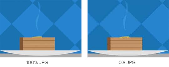
For JPGsTo find out, we saved the crowd photo above with increments of JPG compression. Results ranged from 45KB at 0% compression to 479KB at 100%. Contrary to what the term suggests, remember that the highest compressed JPGs have the highest quality (and largest file size).
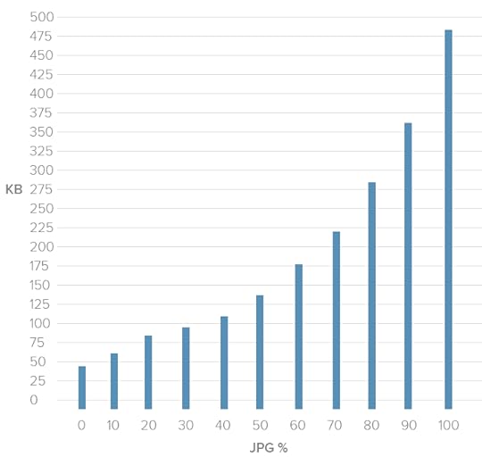
This chart shows a dramatic decrease in the higher compression ranges. Just dropping the quality from 100% to 70% reduced the file size by almost half — a real bargain. The lower compression percentages, though, didn’t see as much of a difference. Although bytes fell from 0 – 20%, we saw quality drop too quickly to be worth the savings.

The image was 45KB at 0% compression (left) and 94KB at 30% compression (right). Although it halved the file size, the increase in artifacts, or blocky areas where JPG compression takes effect, wasn’t worth the savings.
Best practice: Don’t compress JPG files higher than 70%, or lower than 20%. This is a guideline rather than a hard rule, but we’ve found it the 20–70 range covers most cases.
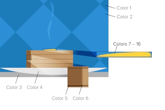
For PNGsThe story gets more complicated when we look at PNG files. We ran the same experiment on this graphic:
Notice that these colors aren’t strictly flat. There’s a fine gradient over the entire composition. To account for that, we need dithering: a pattern of dots that simulate subtle gradients.
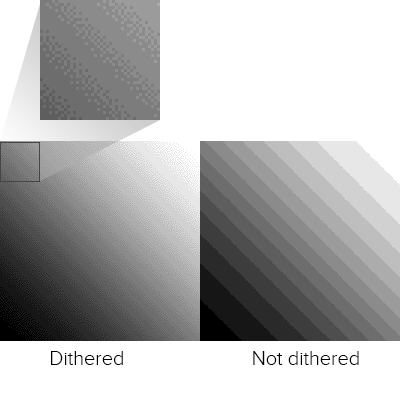
Unlike JPG, the PNG format doesn’t use percentages. The number of colors in its color table determine its quality and, to an extent, its file size. With 88% dithering, the results were, well …
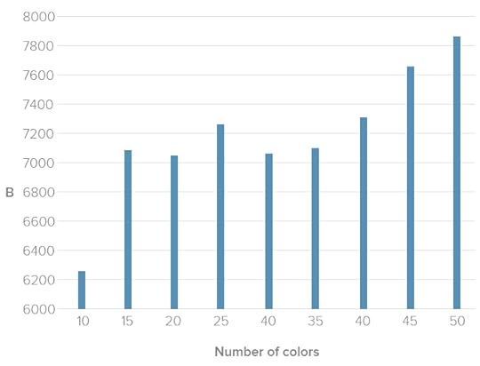
In general we saw a relationship between the number of colors and file size. But not much. Photoshop struggled to find the best patterns with limited color tables. In fact, 40 colors had about the same number of bytes as 25, meaning the same file size but with much higher quality.
Best practice: For best results when squeezing every byte out of a PNG, the best approach is to experiment with different color tables. Unfortunately the right amount is a subjective matter that varies per image. When it looks “right” is up to you.
SVGScalable Vector Graphics, or SVG, use lines instead of pixels — vectors instead of raster images — to display line art. SVGs are actually a form of XML, easily created in programs like Inkscape and Adobe Illustrator.
SVG files can generate gradients without dithering, and scale up to fit containers of any size from older smartphones to widescreen TVs. They don’t lose resolution because, as vectors, browsers connect the dots on the fly. They can be animated with JavaScript. And instead of files that must be downloaded separately, which ties up time and server power, SVG can be embedded right in HTML documents.
Above: vector art (left) scales up well. On the other hand, raster art (right) looks blocky and pixelated.
But like PNGs and GIFs, SVGs suffer as images become more complex. They’re terrible for photos and grow quickly in file size as they gain points and curves.
Best practice: If you’re looking for the flat 2.0 look, with its sharp lines and gentle gradients, and aim for recent browsers (IE8 is out of luck), SVGs are the way to go.
Code ConsiderationsAside from image files themselves, we can do lots with code to make pixels respond well to different situations.
Essential CSS PropertiesOne of the most common — and most reliable — solutions is to set a bit of CSS:
img { max-width: 100%; }
This selector and property makes most images fit into their containers. For example, if a media query sets a wrapper to 300 pixels in width, then no image inside that wrapper will exceed 300 pixels. This technique has excellent support across modern browsers, which is why you’ll find it in many responsive websites today.
Future HTML Image ElementsToday we’re limited to background images with CSS and the [image error] element. But when (and if) implemented, a new technology will go a long way to making images as responsive as page layouts in responsive web design.
The experimental element contains one or more child element that uses media queries to declare when they should load. Browsers replace the src attribute of an [image error] element within with the relevant source, if any.
For example:
[image error]
The code above would replace sample-default.png with either a large or small variation, depending on the image’s container’s width.
As a bonus, browsers that don’t support will still read the default [image error] element as normal. That’s good news because, at the time of this writing, these elements are not universally accepted — in fact, few modern browsers support them today. But support for and is growing, and smart designers will keep an eye out for their usage in the future.
Browser renderingSometimes the best image is none at all. Modern browsers are capable of rendering their own graphics, including gradients, animations, bezier vectors, shadows and geometric shapes. With a little creativity, we can even make stripes.
Creating images in browsers puts the burden of visuals on the user’s end. It doesn’t require downloading any image files, which saves bandwidth and time. But it does require the browser to have certain capabilities.
Best practice: Use browser rendering for aesthetics, like background colors and fancy borders, but don’t rely on it for content. Always test your designs for readability without fancy CSS3 tricks, or even without CSS at all, to see how gracefully it degrades on less-capable browsers.
Implications for UI DesignFrom icons to backgrounds to content, there’s no doubt that images are crucial for good user interfaces. But responsive images face many challenges including bandwidth concerns and sizing issues.
In a perfect world we’d have the ability to either crop an image for smaller viewports, focusing on the most important parts, or the ability to upload different images for different breakpoints. It is possible to do so. Workarounds exist, and we look forward to and srcset. Until then the best-practice approach is to test your images at various sizes to make sure they’re readable on various devices and browsers.
Designers concerned with responsive web design must consider images in their work. Using the right file format, optimizing compression (but not too much) and watching future technologies go a long way to making websites load quickly and look great on screens of any size, resolution or orientation.
It all comes down to one question: what serves the user best. Create UIs with images, videos, and GIFs that come from your design library. Try UXPin, all-in-one design solution for code-first UI design. Build UIs 8.6x faster and copy production-ready code without translating vectors to code. Try UXPin for free.
Try UXPin for freeThe post Responsive Images – The Definitive Guide appeared first on Studio by UXPin.
April 4, 2024
Examples of Prototypes – From Low-Fidelity to High-Fidelity Prototypes
Mastering the art of prototyping is akin to wielding a powerful toolset that empowers designers and developers to iterate, refine, and ultimately deliver products that resonate deeply with their audience.
In this article, we embark on a journey through the spectrum of prototype fidelity, from low-fi sketches to high-fi interactive simulations. Each step of the way, we’ll unravel prototype examples that illuminate the nuances and possibilities inherent in each approach. Whether you’re a seasoned UX designer seeking inspiration or a newcomer eager to grasp the fundamentals, this exploration promises insights aplenty.
But before we dive in, allow me to introduce you to UXPin—a comprehensive prototyping platform that empowers designers to bring their visions to life with unparalleled ease and efficiency. By seamlessly integrating design and prototyping capabilities, UXPin streamlines your workflow, enabling you to iterate rapidly and collaborate seamlessly. Ready to elevate your prototyping game? Sign up for a trial today.
Build advanced prototypesDesign better products with States, Variables, Auto Layout and more.
Try UXPin .try-uxpin-banner { margin: 40px 0px;}.try-uxpin__container { display: flex; max-width: 689px; height: 210px; padding: 20px; padding-left: 24px; border: 2px solid black; border-radius: 4px; align-items: center; justify-content: space-between; background-color: white; box-shadow: 10px 10px black;}.try-uxpin__left { width: 54%;}.try-uxpin__left p { margin: 10px 0px !important; color: black !important;}.try-uxpin__heading { font-size: 28px !important; font-weight: bold;}.try-uxpin__text { margin: 0 !important; font-size: 18px !important; line-height: 22px !important;}.try-uxpin__button { width: 135px; height: 44px; background: black; margin: 10px 0px; padding: 10px 20px; border: none; border-radius: 2px; color: white; font-size: 16px; text-align: center;}.try-uxpin__button:hover { cursor: pointer;}.try-uxpin__image { max-width: 320px !important; height: 200px; margin-right: -21px; margin-bottom: -6px;}@media (max-width: 760px) { .try-uxpin__container { height: auto; margin: 10px; align-items: left; }}@media (max-width: 500px) { .try-uxpin__container { flex-direction: column; } .try-uxpin__left { width: 100%; align-items: normal; }}What is a prototype?A prototype is a preliminary version or model of a new product, system, or design that is developed to test and validate concepts, features, or functionality before proceeding with full-scale production or implementation.
Prototypes are used in various industries, including product design, software development, engineering, and manufacturing, to gather feedback, identify potential issues, and refine designs early in the development process.

Prototypes are created for several reasons, all aimed at improving the final product or system. Here are some key reasons why prototypes are created:
To Validate Product Idea: Prototypes allow designers and developers to validate concepts and ideas early in the development process. By creating a prototype, they can test assumptions, explore different design options, and gather feedback from stakeholders before investing time and resources into full-scale development.To Clarify Requirements: Prototypes help clarify requirements by providing a tangible representation of the product or system. They enable stakeholders to visualize and interact with the user interface design, facilitating discussions and ensuring that everyone has a shared understanding of the project goals and expectations.To Identify Issues: Prototypes help identify potential issues and challenges before they become more costly to address later in the development process. By testing prototypes with users or stakeholders, designers can uncover usability problems, technical limitations, and design flaws early on and make necessary adjustments.To Explore Solutions: Prototypes allow designers to explore different solutions and design alternatives. By creating multiple prototypes, designers can compare different approaches, evaluate trade-offs, and determine the most effective design direction for the final product.To Gather Feedback: Prototypes serve as a tool for gathering feedback from real users, customers, and other stakeholders. By testing prototypes with target users, designers can gather valuable insights, preferences, and suggestions for improvement, which can inform subsequent iterations of the design.To Reduce Risk: Prototyping helps mitigate risks associated with the development process by allowing designers to experiment with ideas in a low-risk environment. By identifying and addressing potential issues early on, prototypes help reduce the likelihood of costly mistakes and delays during later stages of development.To Improve Communication: Prototypes serve as a communication tool for conveying ideas, concepts, and design decisions to potential investors. They provide a common visual reference point for discussions and facilitate collaboration among team members, ensuring that everyone is aligned and working towards the same goals.Read about prototype definition and types in this article: What is a Prototype?
Types of prototypesTypes of prototypes include:
Paper Prototypes: These are low-fidelity prototypes created using paper, sketches, or mockups to visualize the layout, structure, and flow of a design. Paper prototypes are inexpensive and quick to create, making them ideal for early-stage concept testing and brainstorming sessions.Wireframes: They are basic, skeletal representations of a design or interface, typically created using wireframing tools. They focus on layout and functionality, omitting detailed design elements such as colors and graphics. Wireframes help designers and stakeholders visualize the structure and interaction flow of a design.Digital Prototypes: They are interactive representations of a design or product created using prototyping tools. These prototypes can range from low-fidelity mockups to high-fidelity simulations, depending on the level of detail and realism required. Digital prototypes allow for user testing, usability evaluation, and iteration before product development.Functional Prototypes: Functional prototypes are fully or partially functional versions of a product or system that demonstrate key features and capabilities. These prototypes often involve interactivity to replicate the behavior of the final product. Functional prototypes are used to validate technical feasibility, performance, and user experience.Proof-of-Concept Prototypes: Those are experimental models created to demonstrate the feasibility of a new idea, technology, or approach. These prototypes focus on validating core concepts and principles, often with limited functionality or polish. Proof-of-concept prototypes are used to assess the viability of an idea before investing further resources in development.Throwaway Prototypes: Throwaway prototypes, also known as disposable or rapid prototypes, are quick and rough prototypes created with the intention of being discarded after use. These prototypes are often built using tools and are not intended to represent the final product accurately. Instead, they are used to explore ideas, experiment with design concepts, and gather feedback early in the development process. Throwaway prototypes are valuable for generating new ideas, iterating rapidly, and validating design decisions without investing significant time or resources.Workable Prototypes: Those prototypes are working models of a user interface. Unlike throwaway prototypes, workable prototypes are more polished and refined, aiming to closely resemble the final product in terms of functionality and performance. These prototypes may involve the use of actual components, hardware, or software code to simulate the behavior of the final product accurately. Workable prototypes are used to validate technical feasibility, test usability, and gather user feedback in real-world scenarios. They serve as a crucial step in the product development process, helping to identify and address potential issues before proceeding to full-scale production or implementation.Prototype examples you need to seeExample 1: Paper prototypePaper prototypes are are low-fidelity representations of user interfaces created using pen and paper. They are simple sketches of user interfaces that include rough sketches of UI elements such as buttons and tabs while every new paper piece shows a simulation of next steps of a user flow. They are great communication devices during brainstorming or talking with stakeholders.
Here is an example of a mobile app paper prototype by Aaron Barko found on Medium.

Notice that the prototype has a cut-out an iPhone and the designer can move it to indicate next step. Its kept in a black-and-white color scheme and all UX writing is written by hand. The designer prepared a smaller pieces of paper to indicate different options in a drop-down menu.
To create a paper prototype, prepare sketching materials such as pens or pencils for drawing your interface elements. Your pens may be of different thicknesses to represent different types of UI elements (e.g., thick lines for buttons, thin lines for text). You may want to have different sizes of paper depending on the complexity of your prototype and the level of detail you want to include.
Your paper prototype doesn’t have to be black and white. You can use markers or highlighters for adding emphasis to certain elements or highlighting important areas of your prototype.
Example 2: WireframeA wireframe is a simplified visual representation of a digital interface or product. It outlines the basic structure, layout, and functionality of the interface without getting into detailed design elements like colors, images, or typography. Wireframes are typically created using basic shapes, lines, and text to convey the placement of elements and the flow of information.
The focus is on capturing the overall layout and structure of the interface, as well as the interactions and navigation paths that users will follow. Designers usually use digital tools to make wireframes, such as UXPin, Figma or Balsamiq.
Here’s an example of a website wireframe in Balsamiq.

You can see that its a low-fidelity representation of a real-life website. There’s a frame for asset, some placeholder text, but overall, details don’t matter. It’s still early in the design process to be able to tell how the UI will look like beside the structure and layout.
Before diving into this type of prototyping, it’s helpful to have a clear understanding of the user flows and basic layout of your user interface. User flows map out the paths that users will take through the interface, while wireframes provide a simplified visual representation of the interface structure.
Example 3: MockupA mockup is a higher-fidelity representation of a digital interface or product compared to a wireframe or a paper prototype. While wireframes and paper prototypes focus on the basic structure and layout of the interface, mockups add more visual detail, including colors, typography, images, and other design elements.
Here is a design mockup found on Dribbble, a website where digital designers share static mockups, video prototypes, and graphic designs to showcase their understanding of design or prototyping process.
 Source: Tran Mau Tri Tam
Notice that this mockup provides a more detailed representation of the final look and feel of the interface. They incorporate colors, typography, images, and other visual elements to showcase the visual style and branding of the project. They include realistic visual elements and often simulate the appearance of the final product as closely as possible.
Mockups still focus on visual design rather than functionality what makes them great for gathering feedback on the visual design and aesthetics of the interface. They are often shared with stakeholders, clients, or team members for review and approval before moving on to the prototype development phase.
Example 4: High-fidelity prototypeHigh-fidelity prototype can be in the form of a static mockup or functional prototype. What matters here is the level of detail. They serve as powerful communication and validation tools in the design process, allowing designers to convey their design concepts effectively and gather feedback on the user experience before moving into the product development phase.
High-fidelity prototypes closely mimic the visual appearance of the final product, including detailed graphics, typography, colors, and branding elements. They often use actual assets such as images, icons, and logos to provide a realistic representation of the interface.
One example of a high-fidelity prototype is this website made by UXPin.
 uxpin prototype example
You can see that it has a well-defined color palette, carefully picked font pairing, great use of whitespace and clickable form. You can use this prototype as a template for practicing UX design, add a FAQ section, new sites, and more. Try it now by signing up for UXPin trial.
Example 5: Functional prototypeA functional prototype is a type of prototype that not only demonstrates the visual design of an interface but also simulates its functionality and behavior. Unlike static prototypes, which focus solely on the appearance of the design, functional prototypes provide a tangible representation of how the final product will work and behave.
Functional prototypes help validate the technical feasibility of the design by demonstrating how different components and features work together in a functioning system. They can identify technical issues, bottlenecks, or limitations early in the development process.
Similarly, startups may build functional prototypes to get buy-in from investors. It works similarly to a 3D model of a physical product as other people can get a feeling of what you want to build and how it will behave like. Some people need physical models to spark their imagination.
Those prototypes include interactive elements that simulate user interactions and behaviors. This may include clickable buttons, input fields, dropdown menus, and other interactive components that allow users to navigate through the prototype and perform tasks.
In some cases, functional prototypes may include real data or content to provide a more realistic user experience. This could involve integrating dynamic content feeds, sample data sets, or actual text and imagery that would be used in the final product.
Here is an example of a functional prototype by UXPin. It’s an auction app.
It’s fully clickable and it looks like a final product that has been developed by engineers. But it’s not. It’s a functional prototype. You can use it as if you use a regular app that’s on your phone. It’s responsive to user action and it transfers data from one step to the other. Such an app is possible to build in UXPin.
Example 6: Coded prototypeThe final prototype example we want to show you is coded prototype. This prototype isn’t build in code by a developer. It’s build in a designer’s environment with coded components – a small building blocks of most apps. UXPin, unlike most design tools, renders real code, so there is always code in the background that you can hand over to development.
The example here is a sign-up flow build with UXPin. Here’s a full tutorial on how to build a sign-up form like this one.

If you want to learn coded prototyping, follow our mini-course on using UXPin Merge.
Create code-first prototype with UXPinThose prototype examples demonstrate versatility and applicability across various design contexts, including paper prototypes, wireframes, mockups, and functional prototypes. Each type of prototype serves a specific purpose in the design process, helping designers to effectively communicate ideas, test functionality, and refine designs before final implementation.
With UXPin, you can turn your ideas into reality quickly. It’s like having your design and prototype tools all in one place, saving you time and hassle. Plus, it makes teamwork a breeze, allowing you to collaborate smoothly with others. Ready to take your prototyping skills to the next level? Try UXPin for free today.
Try UXPin for freeThe post Examples of Prototypes – From Low-Fidelity to High-Fidelity Prototypes appeared first on Studio by UXPin.
April 2, 2024
Software Engineer vs Web Developer – What is the Difference?

Comparing software engineers and web developers can provide valuable insights into the nuances of each role, helping you make informed decisions about your career path, skill development, and professional growth.
Build user interfaces with the best user experience with UXPin Merge, a code-first UI builder. Drag and drop UI components from top open-source libraries and create layouts without designer’s help. Design websites, web apps and copy HTML, CSS or React code off your design. Try it for free.
Create beautiful layouts without designersDesign production-ready prototypes 8.6x faster. No pixels. pure code.
Try UXPin Merge .discover-merge { margin: 40px 8px;}.discover-merge__container { display: flex; max-width: 690px; height: 200px; padding: 20px; padding-left: 24px; border-radius: 4px; background-color: black; box-shadow: 10px 10px #9999ff; align-items: center; justify-content: space-between;}.discover-merge__left { width: 50%;}.discover-merge__left p { margin: 10px 0px !important; color: white !important; font-size: 18px !important;}.discover-merge__heading { font-weight: bold !important; color: white !important; font-size: 18px !important;}.discover-merge__text { margin: 0 !important; line-height: 22px !important;}.discover-merge__button { width: 174px; height: 44px; margin: 10px 0px; border: none; border-radius: 2px; background: white; color: black; font-size: 16px; text-align: center;}.discover-merge__button:hover { cursor: pointer;}.discover-merge__image { max-width: 320px !important; height: 200px; margin-right: -19px;}@media (max-width: 760px) { .discover-merge__container { height: auto; margin: 10px; align-items: left; }}@media (max-width: 500px) { .discover-merge__container { flex-direction: column; } .discover-merge__left { width: 100%; align-items: normal; }}Who is a software engineer?A software engineer is a professional who applies engineering principles to the design, development, testing, and maintenance of software systems. They are responsible for creating software solutions that meet specific requirements, solve problems, and deliver value to users or organizations.
What do software engineers do?
Software engineers are involved in the following areas of app design and development.
Design: Software engineers are involved in designing software systems, including determining system architecture, data structures, algorithms, and user interfaces. They work closely with stakeholders to understand requirements and translate them into technical specifications.Development: Software engineers write code to implement the design of software systems. They use programming languages, frameworks, and tools to develop applications, modules, or components that perform various functions and tasks.Testing: Software engineers are responsible for testing software to ensure its quality, reliability, and performance. This includes writing and executing test cases, debugging and fixing defects, and conducting performance optimization of software products.Maintenance: After deploying software, engineers are involved in its ongoing maintenance and support. This may include troubleshooting issues, applying updates or patches, and making enhancements or improvements based on user feedback or changing requirements.Collaboration: Software engineers often work as part of a multidisciplinary team, collaborating with other engineers, designers, product managers, and stakeholders. Effective communication and teamwork are essential for delivering successful software projects.Continuous Learning: The field of software engineering is constantly evolving with new technologies, tools, and methodologies. Software engineers engage in continuous learning to stay updated with the latest trends and best practices in the industry.They can specialize in various domains such as web development, mobile app development, embedded systems, data science, artificial intelligence, and more. They may work in diverse industries including technology, finance, healthcare, e-commerce, entertainment, and government.
Who is a web developer?A web developer is a specialized type of software developer who focuses specifically on building websites and web applications that run on the internet. Web developers use technologies such as HTML, CSS, and JavaScript to create the visual and interactive components of websites.
They also work with backend technologies like server-side scripting coding languages (e.g., PHP, Python, Ruby) and databases to manage data and server-side logic.
Web developers may specialize in frontend development, focusing on the user interface and client-side scripting, or backend development, focusing on server-side logic and database management. They can also become full-stack web developers who create both, frontend and backend of application development.
They collaborate with designers, content designers, and other developers to create websites that meet client requirements and user needs.
What is a web developer job?
The job of a web developer primarily involves designing, building, and maintaining websites and web applications. Here’s a breakdown of the key aspects of a web developer’s job:
Web Design: Web developers collaborate with designers or utilize their design skills to create the visual layout and user interface of websites. This involves using technologies like HTML (Hypertext Markup Language) for structuring content, CSS (Cascading Style Sheets) for styling elements, and possibly JavaScript for interactive features.Frontend Development: Frontend development refers to implementing the visual and interactive elements of a website that users see and interact with directly in their web browsers. Web developers use frontend technologies such as HTML, CSS, and JavaScript frameworks like React.js, Angular, or Vue.js to create responsive, user-friendly interfaces.Backend Development: Backend development involves building the server-side logic and database management functionalities that power websites and web applications. Web developers use server-side programming languages such as Python, PHP, Ruby, or Node.js to handle requests from the frontend, interact with databases (e.g., MySQL, MongoDB), and perform various computations or data manipulations.Web Application Development: In addition to static websites, web developers often work on dynamic web applications that require more complex functionality, such as user authentication, data processing, and real-time updates. This may involve implementing RESTful APIs (Application Programming Interfaces) to enable communication between the frontend and backend components of the application.Testing and Debugging: Web developers are responsible for testing their code to ensure it functions as intended and is free of errors or bugs. This may involve manual testing, automated testing, or using debugging tools to identify and resolve issues.Optimization and Performance Tuning: Web developers optimize websites and web applications to improve performance, loading times, and user experience. This may include optimizing code, images, and other resources, implementing caching mechanisms, and following best practices for web development.Maintenance and Updates: After launching a website or web application, web developers are responsible for ongoing maintenance, updates, and troubleshooting. This includes fixing bugs, applying security patches, adding new features, and ensuring compatibility with different web browsers and devices.Overall, the job of a web developer encompasses a wide range of tasks related to designing, building, and maintaining websites and web applications to meet client requirements and user needs.
What software engineer and web developer have in common?Both software engineers and web developers share several commonalities despite their distinct roles and focuses within the field of software development. Here are some key similarities.
Technical SkillsBoth roles require proficiency in programming languages and technologies. While the specific languages and frameworks may vary, both software engineers and web developers need to write code to create functional and efficient software solutions.
Problem-Solving AbilitiesBoth roles involve solving complex problems and implementing solutions that meet user needs and project requirements. Whether it’s designing a software architecture or troubleshooting a bug in a web application, problem-solving skills are essential for success in both roles.
Understanding of Software Development LifecycleBoth software engineers and web developers typically follow similar processes and methodologies for software development, such as Agile or Waterfall. They understand concepts like requirements gathering, design, development, testing, deployment, and maintenance.
Focus on User ExperienceBoth roles emphasize the importance of creating user-friendly and intuitive software products. Whether developing a desktop application or a web interface, software engineers and web developers prioritize usability and strive to deliver a positive user experience.
Quality Assurance and TestingBoth software engineers and web developers are responsible for ensuring the quality and reliability of their software products. They perform various testing activities, such as unit testing, integration testing, and user acceptance testing, to identify and address issues before deployment.
While software engineers and web developers may specialize in different areas and technologies, they share a common foundation of skills, methodologies, and principles essential for developing high-quality software solutions.
Project managementProject management is a valuable skill for both job titles. While their primary focus is on technical aspects of development, both roles often require collaboration with other team members, adherence to project timelines, and effective communication with stakeholders.
Collaboration and CommunicationBoth roles involve collaborating with cross-functional teams, including designers, product managers, quality assurance engineers, and stakeholders. Effective communication skills are essential for conveying ideas, discussing requirements, and coordinating efforts to deliver successful projects.
Evolving skill setsTechnology in both software engineering and web development is constantly evolving, so professionals in both fields must stay updated with the latest trends, tools, and best practices. Continuous learning and skill development are crucial for staying competitive and advancing in both careers.
Key differences between software engineer and web developer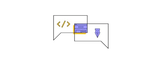
While there are overlaps in skills and responsibilities, these differences highlight the distinct roles and focuses of software engineers and web developers within the broader field of software development.
Scope of WorkSoftware engineers work on a wide range of software applications, systems, and platforms, which can include desktop software, mobile apps, embedded systems, and more. They may be involved in developing complex software solutions that are not necessarily web-based.
Web developers specialize in building websites and web applications that run on the internet. Their focus is primarily on the development of web-based interfaces, functionalities, and interactions.
Technologies and ToolsSoftware engineers may work with a diverse set of programming languages, frameworks, and tools, depending on the specific requirements of the project. They might use languages like Java, C++, Python, or Swift and frameworks like .NET, Spring, or Django.
Web developers primarily work with web technologies such as HTML, CSS, and JavaScript for frontend development. They may also use frontend frameworks/libraries like React.js, Angular, or Vue.js, as well as backend technologies like Node.js, PHP, Ruby on Rails, or Django.
Development EnvironmentSoftware engineers often work in various development environments, including IDEs (Integrated Development Environments) and text editors, depending on their language and platform preferences. They may also need to set up development environments for different operating systems and environments.
Web developers typically work with web development tools and environments tailored for frontend and backend development. These may include code editors like Visual Studio Code, Atom, or Sublime Text, as well as web development frameworks and libraries specific to web development.
Types of ProjectsSoftware engineers can work on diverse projects, including standalone applications, enterprise systems, embedded software for devices, operating systems, and more. Their projects may involve a wide range of complexities and functionalities.
Web developers primarily work on projects related to websites and web applications. This can include e-commerce sites, content management systems, web portals, social media platforms, and various web-based tools and services.
Career Paths and SpecializationsSoftware engineers have diverse career paths and can specialize in areas such as software architecture, systems development, machine learning, cybersecurity, and more. They may also advance into roles like technical leads, engineering managers, or software architects.
While web developers can also specialize in frontend or backend development, their career paths may be more focused within the realm of web development agencies, e-commerce companies, digital marketing firms, or as freelance developers specializing in web projects.
Which tech career is better?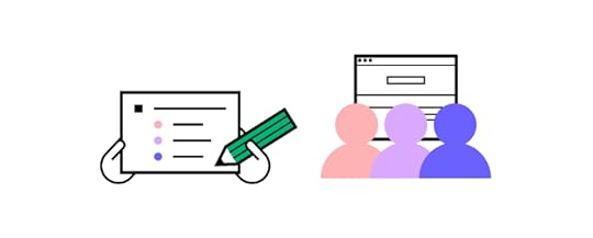
Both software engineering and web development offer rewarding career opportunities with their own unique challenges and advantages.
The tech industry and job market demand for both web developers and software engineers fluctuates over time and can vary depending on industry trends and technological advancements. Web developers may be in high demand in industries such as e-commerce, digital marketing, and online services.
Software programmers may be highly sought after in industries that require complex software systems, such as finance, healthcare, and technology.
As a beginner, consider which field aligns more with your interests, aptitude, and long-term career goals. If you’re passionate about building complex software systems, working with different programming languages, and solving challenging problems, software engineering might be a better fit. Then, find engineering bootcamps or get a computer science bachelor’s degree to learn fundamentals of computer programming.
On the other hand, if you’re drawn to creating visually appealing websites, working with web technologies, and seeing immediate results, web development could be more suitable. An average salary for web developer is lower than for software engineer but this career may be much more rewarding for those of you who appreciate working on visually appealing and interactive projects.
What is frontend engineer?A frontend engineer is a subset of web developers who focus specifically on building the client-side of web applications. They are responsible for creating the user-facing portion of websites or web applications, including layout, design, and interactivity.
Frontend engineers work closely with designers to implement visual elements and user experience (UX) designers to ensure a smooth and intuitive user interface. They primarily work with HTML, CSS, and JavaScript frameworks like React, Angular, or Vue.js to build responsive and interactive web interfaces.
While software engineers have a broader scope and can work on various types of software projects, web developers and frontend engineers specialize in building web applications and focus on different aspects of the development process. Web developers may work on both frontend and backend components, while frontend engineers specifically focus on the client-side of web development.
Build UI with UXPin MergeCreate top-notch user interfaces effortlessly with UXPin Merge, the ultimate code-first UI builder. Simply drag and drop UI components from leading open-source libraries, crafting layouts without needing a designer’s assistance. Whether it’s websites or web apps, UXPin Merge lets you design with ease, allowing you to copy HTML, CSS, or React code directly from your designs. Try it for free.
Try UXPin MergeThe post Software Engineer vs Web Developer – What is the Difference? appeared first on Studio by UXPin.
March 28, 2024
User-Friendly — What Does it Mean and How to Apply it?

User-friendly design is a fundamental aspect of UI and UX design, driven by a desire to make technology more accessible and usable for everyone.
Over the years, designers have developed methodologies, best practices, and design principles to create interfaces that prioritize user needs and enhance usability. As technology continues to evolve, user-friendly design remains a critical consideration in creating successful digital experiences.
How to tell that your interface is user-friendly? You need to test it! You can’t test a static prototype. That’s where UXPin comes in. It’s an easy-to-use tool for functional prototyping that increase the quality and impact of user testing. See how fast it is to build interfaces with UXPin. Try UXPin for free.
Build advanced prototypesDesign better products with States, Variables, Auto Layout and more.
Try UXPin .try-uxpin-banner { margin: 40px 0px;}.try-uxpin__container { display: flex; max-width: 689px; height: 210px; padding: 20px; padding-left: 24px; border: 2px solid black; border-radius: 4px; align-items: center; justify-content: space-between; background-color: white; box-shadow: 10px 10px black;}.try-uxpin__left { width: 54%;}.try-uxpin__left p { margin: 10px 0px !important; color: black !important;}.try-uxpin__heading { font-size: 28px !important; font-weight: bold;}.try-uxpin__text { margin: 0 !important; font-size: 18px !important; line-height: 22px !important;}.try-uxpin__button { width: 135px; height: 44px; background: black; margin: 10px 0px; padding: 10px 20px; border: none; border-radius: 2px; color: white; font-size: 16px; text-align: center;}.try-uxpin__button:hover { cursor: pointer;}.try-uxpin__image { max-width: 320px !important; height: 200px; margin-right: -21px; margin-bottom: -6px;}@media (max-width: 760px) { .try-uxpin__container { height: auto; margin: 10px; align-items: left; }}@media (max-width: 500px) { .try-uxpin__container { flex-direction: column; } .try-uxpin__left { width: 100%; align-items: normal; }}What is the definition of user-friendly?User-friendly is a term that describes products, interfaces, or systems designed with the user’s ease of use and convenience in mind. It signifies that the item in question is intuitive, easy to understand, and navigate, enabling users to accomplish tasks with minimal effort and frustration.
In an English dictionary, “user-friendly” is typically defined as an adjective that describes something (such as a product, system, or interface) that is easy to use or understand, especially for the end user. It suggests that the item or system is designed for the user’s convenience and ease of interaction.
The term “user-friendly” originated in the field of human-computer interaction (HCI) and user interface (UI) design, referring to systems or interfaces that are easy for users to understand and interact with.

Looking at the history, there are some “eras” of user-friendliness.
Early Computing (1960s-1970s): In the early days of computing, interfaces were primarily text-based and designed for technical users. User-friendliness was not a significant consideration, as the user base was limited to professionals and researchers familiar with computer systems.Graphical User Interfaces (1980s-1990s): The introduction of graphical user interfaces (GUIs), popularized by systems like the Xerox Star, Apple Macintosh, and Microsoft Windows, marked a significant shift in UI design. GUIs utilized icons, windows, menus, and pointing devices (e.g., mice) to make computing more accessible to non-technical users.Human-Computer Interaction (HCI) Research (1980s-Present): HCI emerged as a field of study focusing on the interaction between humans and computers. Researchers investigated cognitive psychology, usability engineering, and user-centered design methods to improve the user-friendliness of interfaces.Web and Mobile Interfaces (1990s-Present): The proliferation of the internet and mobile devices led to new challenges and opportunities in UI design. Designers had to adapt interfaces for various screen sizes, input methods, and browsing contexts, leading to the development of responsive design principles and mobile-friendly practices.User-Centered Design (UCD) and Usability Testing (1990s-Present): User-centered design (UCD) became a dominant approach in UI design, emphasizing the importance of involving users throughout the design process. Usability testing methods, such as interviews, surveys, and usability studies, helped designers identify usability issues and iterate on designs to improve user-friendliness.Accessibility and Inclusive Design (2000s-Present): With a growing awareness of accessibility issues, designers began incorporating inclusive design principles to ensure that interfaces are usable by individuals with disabilities. This includes considerations such as screen reader compatibility, keyboard navigation, and color contrast.Emergence of User Experience (UX) Design (2000s-Present): User experience (UX) design expanded the focus beyond usability to encompass the holistic experience of using a product or service. UX designers consider emotional engagement, brand perception, and user satisfaction alongside usability principles to create user-friendly experiences.What is a user-friendly system?A user-friendly system is intuitive, efficient, and accessible, allowing users to accomplish tasks or goals with minimal effort and frustration.
User-friendliness often involves clear communication, intuitive design, logical workflows, and consideration for the diverse needs and abilities of users. It aims to provide a positive and satisfying user experience by prioritizing usability and ease of use.
Whether it’s software, websites, appliances, or any other product, user-friendly design prioritizes the needs and expectations of its users, aiming to provide a positive and efficient interaction experience.
What are the characteristics of user-friendliness?From a design perspective, user-friendliness encompasses several principles and considerations aimed at creating interfaces that are intuitive, efficient, and enjoyable to use, as well as prioritize usability and accessibility.
Intuitiveness: Users can easily understand how to navigate and interact with the interface without the need for extensive instructions or prior knowledge.Clarity: The interface communicates information clearly and concisely, using language and visual elements that are easily comprehensible to the target audience.Consistency: Elements such as layout, color scheme, typography, and navigation patterns remain consistent throughout the interface, providing a cohesive and familiar experience.Feedback: The interface provides users with clear feedback on their actions, informing them of any errors, progress, or changes in state.Efficiency: Users can accomplish tasks efficiently and with minimal effort, thanks to logical workflows, well-organized content, and streamlined interactions.Accessibility: The interface is designed to accommodate users with various disabilities and needs, ensuring that everyone can access and use the system effectively.Flexibility: The interface allows users to customize their experience to some extent, adapting to individual preferences or requirements.Error Handling: Error messages are presented in a helpful and non-threatening manner, guiding users toward resolving issues without causing frustration or confusion.Visual Appeal: While functionality is paramount, a visually appealing app or web design can enhance the user experience, making the interface more inviting and engaging.Responsive Design: Interfaces that adapt seamlessly to different devices and screen sizes ensure that users can access and use the system across a range of platforms without sacrificing usability.Examples of user-friendly interfacesSpotify Source: Reddit
Spotify’s user-friendly design prioritizes simplicity, personalization, and convenience, providing users with a seamless and enjoyable music streaming experience.
Here’s why Spotify’s interface is considered user-friendly:
Intuitive Navigation: Spotify features a simple and intuitive interface that allows users to easily navigate through the app. The main navigation menu, located at the bottom of the screen, provides quick access to essential sections such as Home, Search, Library, and Your Library.Personalized Recommendations: Spotify utilizes sophisticated algorithms to offer personalized music recommendations based on users’ listening history, preferences, and behavior. The “Discover Weekly” playlist and personalized daily mixes provide users with fresh music tailored to their tastes, enhancing the overall listening experience.Search Functionality: Spotify’s search functionality is robust, allowing users to quickly find artists, albums, songs, playlists, and podcasts. The search results are displayed in a clear and organized manner, making it easy for users to locate the content they’re looking for.Playlist Creation and Organization: Spotify makes it easy for users to create and organize playlists according to their preferences. Users can easily add songs to playlists, reorder tracks, and rename playlists, providing a seamless music curation experience.Offline Listening: Spotify allows users to download songs, albums, playlists, and podcasts for offline listening. This feature is especially useful for users who want to listen to music without an internet connection, such as during travel or in areas with limited connectivity.Cross-Platform Syncing: Spotify offers seamless synchronization across multiple devices, including smartphones, tablets, computers, smart speakers, and gaming consoles. Users can start listening to music on one device and continue seamlessly on another, without interruption.Accessibility Features: Spotify’s interface is designed to be accessible to users with disabilities. It includes features such as voice commands, text-to-speech support, and customizable font sizes and color schemes, ensuring that all users can enjoy the platform regardless of their abilities.Gmail Source: edu.gcfglobal.or
Google’s email service, is renowned for its user-friendly design, which has evolved over the years to prioritize simplicity, efficiency, and organization. Here’s how Gmail achieves its user-friendly interface:
Clean and Intuitive Layout: Gmail’s interface features a clean and minimalist design, with intuitive navigation elements that make it easy for users to access their emails, compose new messages, and manage their inbox.Tabbed Inbox: Gmail’s tabbed inbox automatically categorizes incoming emails into different tabs such as Primary, Social, Promotions, Updates, and Forums. This helps users prioritize and manage their emails more effectively, reducing clutter and improving organization.Powerful Search Functionality: Gmail’s search functionality is robust, allowing users to quickly find emails using keywords, sender names, subject lines, and other criteria. Advanced search operators further enhance the search experience, enabling users to narrow down their search results with precision.Conversation View: Gmail’s conversation view groups related emails into threaded conversations, making it easier for users to follow the flow of communication. This feature reduces inbox clutter and streamlines the email reading experience, particularly for lengthy email chains.Customizable Settings: Gmail offers a wide range of customizable settings and preferences, allowing users to tailor their email experience to suit their needs and preferences. Users can adjust settings related to inbox layout, email forwarding, filters, signatures, and more.Integration with Google Services: Gmail seamlessly integrates with other Google services such as Google Drive, Google Calendar, and Google Meet. This integration allows users to access and share files, schedule events, and join video meetings directly from their inbox, enhancing productivity and collaboration.Responsive Design: Gmail’s mobile apps for iOS and Android devices feature a responsive design optimized for smaller screens. The mobile apps offer a user-friendly interface that retains key functionalities from the desktop version, allowing users to access their emails on the go.Sence of security: Gmail prioritizes user security with built-in features such as spam filtering, phishing protection, two-factor authentication, and confidential mode. These features help safeguard users’ email accounts and sensitive information from unauthorized access and malicious attacks.Amazon
While Amazon’s interface may not be aesthetically pleasing to everyone, its user-friendliness lies in its functional design, intuitive navigation, personalized recommendations, and convenient features that prioritize the needs and preferences of its diverse user base.
Clear Navigation: Despite its busy appearance, Amazon’s interface is logically organized, with clear navigation menus and search functionalities prominently displayed. Users can easily find what they’re looking for without getting lost in the clutter.Comprehensive Search: Amazon’s powerful search engine allows users to quickly locate products by name, category, brand, or even specific features. The autocomplete feature and advanced filtering options help users narrow down their search results efficiently.Detailed Product Information: Each product listing on Amazon includes comprehensive details, specifications, images, and customer reviews. This wealth of information empowers users to make informed purchasing decisions without needing to visit multiple sources.Personalization: Amazon employs sophisticated algorithms to personalize the user experience. It recommends products based on past purchases, browsing history, and preferences, making it easier for users to discover relevant items.Convenient Checkout Process: Amazon streamlines the checkout process by offering various payment options, saved shipping addresses, and one-click purchasing. This reduces friction and enhances the overall user experience.Prime Benefits: Amazon Prime membership offers additional perks, such as free two-day shipping, exclusive deals, streaming services, and more. These benefits incentivize users to engage with the platform regularly and contribute to its user-friendly reputation.Customer Service: Amazon’s commitment to customer service is a key factor in its user-friendliness. It provides robust customer support channels, including live chat, email, and phone support, as well as a hassle-free returns policy, instilling trust and confidence in users.TikTok Source: Medium
TikTok, a widely popular social media platform, also boasts a user-friendly interface tailored to mobile devices. Here are some key aspects of TikTok’s user-friendly interface:
Feed: The main feed of TikTok displays a continuous stream of short video clips, tailored to the user’s interests based on their interactions with the app. This algorithmic feed ensures that users are constantly presented with engaging content without having to search for it manually.Discoverability: TikTok’s interface makes it easy for users to discover new content and creators. The “For You” page provides personalized recommendations, while the “Discover” tab allows users to explore trending challenges, hashtags, and categories.Video Creation Tools: TikTok offers a wide range of intuitive video creation tools, including filters, effects, soundtracks, and editing features. The interface is designed to be user-friendly, allowing users to quickly record, edit, and share creative videos directly from their smartphones.Engagement Features: TikTok encourages user engagement through features like likes, comments, shares, and duets (where users can create split-screen videos with other users). These interaction options are easily accessible within the interface, fostering a sense of community and collaboration among users.Accessibility: TikTok’s interface is designed to be accessible and easy to navigate for users of all ages and backgrounds. The layout is clean and intuitive, with prominent buttons and icons guiding users through the app’s various features and functions.Overall, TikTok’s user-friendly interface plays a significant role in its widespread adoption and popularity among users worldwide, enabling seamless content consumption, creation, and engagement within the platform.
How to make your interface user-friendlyHere’s how to make your interface user-friendly:
Simplicity: Keep the interface clean and uncluttered, prioritizing essential elements and minimizing distractions.Intuitiveness: Design the interface so that users can easily understand how to navigate and interact with it without the need for extensive instructions.Organization: Group related elements together logically and provide clear visual cues to help users understand the structure of the interface.Personalization: Offer personalized recommendations or customization options to cater to the individual preferences and needs of users.Efficiency: Streamline workflows and interactions to allow users to accomplish tasks quickly and with minimal effort.Feedback: Provide users with clear feedback on their actions, such as confirmation messages, error notifications, or progress indicators.Accessibility: Ensure that the interface is accessible to users of all abilities, with features such as keyboard shortcuts, screen reader compatibility, and adjustable font sizes.Consistency: Maintain consistency in design elements, layout, terminology, and interaction patterns throughout the interface to provide a cohesive and familiar experience.Integration: Integrate with other relevant services or platforms to provide users with a seamless experience across different tools and devices.Security: Implement security features to protect users’ data and privacy, such as encryption, secure authentication methods, and proactive threat detection.What is another word for user-friendly?Another word for “user-friendly” is “intuitive” when you open a thesaurus. Both terms can be regarded as synonyms that describe interface designs that are easy for users to understand, navigate, and interact with, often requiring minimal instruction or prior knowledge.
Conversely, an unfriendly user interface may be called unintuitive, confusing, frustrating, or cumbersome. These terms describe interfaces that are difficult to navigate, lack clear organization, provide little feedback, and overall hinder the user’s ability to accomplish tasks efficiently.
Such interfaces may also be described as counterintuitive, unfocused, overwhelming, or inaccessible, as they fail to prioritize user needs and preferences. Ultimately, an unfriendly user interface detracts from the user experience, leading to frustration and dissatisfaction.
Software applications that are overly complex, difficult to navigate, and require specialized knowledge to use effectively can be considered not user-friendly, as they may frustrate users and impede their productivity.
Does user-friendly and ease of use mean the same thing?While “user-friendly” and “easy to use” are related concepts, they are not exactly the same.
“User-friendly” generally refers to products, interfaces, or systems that are designed with the user’s ease of use and convenience in mind. A user-friendly product or interface is intuitive, efficient, and accessible, allowing users to accomplish tasks or goals with minimal effort and frustration. It encompasses various aspects such as intuitiveness, clarity, efficiency, feedback, accessibility, and flexibility, all aimed at providing a positive and satisfying user experience.
On the other hand, “easy to use” specifically emphasizes the simplicity and straightforwardness of interacting with a product or interface. A product that is easy to use is one where users can quickly understand how to navigate, operate, and accomplish tasks without encountering unnecessary complexity or confusion.
In essence, user-friendliness contributes to ease of use, but it also encompasses additional factors such as accessibility, feedback mechanisms, and flexibility that enhance the overall user experience. Therefore, while user-friendly products are often easy to use, not all easy-to-use products may necessarily be considered fully user-friendly.
Create user-friendly interfaces with UXPinTo craft a user-friendly interface, prioritize simplicity and clarity to prevent overwhelming users. Ensure intuitive navigation, organizing features logically, and offer personalization options for user customization.
Streamline workflows for efficiency and provide clear feedback to enhance user understanding. Design with accessibility in mind and maintain consistency throughout the interface. Seamless integration with relevant services and a focus on security and privacy round out the approach. By following these principles, you can create an interface that fosters user satisfaction and engagement.
Build user-friendly interfaces in UXPin, a prototyping tool that will make your design highly interactive and collaborative. Streamline UI design, design handoff, and keep your design consistent between design and development. Try UXPin for free.
Try UXPin for freeThe post User-Friendly — What Does it Mean and How to Apply it? appeared first on Studio by UXPin.
Design with Code – UXPin Merge Tutorial
Are you ready to elevate your design workflow to the next level? In this comprehensive tutorial, we’ll delve into the world of UXPin Merge, empowering you to seamlessly integrate your React app components into the UXPin editor for high-fidelity prototypes.
Gone are the days of static designs. With UXPin Merge, you can dynamically link your React components, ensuring that your prototypes are always in sync with the latest developments in your codebase.
Get ready to unlock the full potential of UXPin Merge – let’s dive in!
Create beautiful layouts without designersDesign production-ready prototypes 8.6x faster. No pixels. pure code.
Try UXPin Merge .discover-merge { margin: 40px 8px;}.discover-merge__container { display: flex; max-width: 690px; height: 200px; padding: 20px; padding-left: 24px; border-radius: 4px; background-color: black; box-shadow: 10px 10px #9999ff; align-items: center; justify-content: space-between;}.discover-merge__left { width: 50%;}.discover-merge__left p { margin: 10px 0px !important; color: white !important; font-size: 18px !important;}.discover-merge__heading { font-weight: bold !important; color: white !important; font-size: 18px !important;}.discover-merge__text { margin: 0 !important; line-height: 22px !important;}.discover-merge__button { width: 174px; height: 44px; margin: 10px 0px; border: none; border-radius: 2px; background: white; color: black; font-size: 16px; text-align: center;}.discover-merge__button:hover { cursor: pointer;}.discover-merge__image { max-width: 320px !important; height: 200px; margin-right: -19px;}@media (max-width: 760px) { .discover-merge__container { height: auto; margin: 10px; align-items: left; }}@media (max-width: 500px) { .discover-merge__container { flex-direction: column; } .discover-merge__left { width: 100%; align-items: normal; }}What is UXPin Merge?UXPin Merge is a technology for designing with coded UI components that are backed with production-ready code. It’s part of UXPin – a code-based design tool for highly realistic and accurate prototyping. With this tech, you can grab all the specs, JSX code, and any other asset and hand them over for developer to make the entire product development workflow 8.6x faster.
UXPin Merge tutorial – How to use this technology?UXPin Merge technology works like a drag-and-drop UI builder. You take a component out of the design library in UXPin and put it on the canvas. Then, after you’ve done arranging the layout and setting up components props, you can copy a ready React code (or CSS code for Tailwind library) to your development environment or open it in StackBlitz.
You can build anything you like. From simple dashboards that automate your team operations to more complex, e-commerce stores which front-end is decoupled from the back-end. UXPin has a few templates and patterns to get you started.
We highly recommend you watch a video tutorial of how to use UXPin Merge presented by a real-life web developer, Rachel. She did a wonderful job of walking you through all the panels, functionalities, and features of Merge technology, and she also shows you how to do a design handoff with UXPin Merge.
Watch it on Youtube. Here’s the full playlist of UXPin Merge tutorial.
How to integrate your own components, step by stepUXPin Merge supports Storybook components and React components from open-source libraries, such as MUI, Ant design or Bootstrap.
We want to give more details and show you how easy it is to integrate a React-based library into Merge to design with code on a day-to-day basis. All that without learning how to code! 
UXPin Merge allows users to import their existing custom React components in a seamless fashion to create interactive prototypes using real code, which is unlike anything else traditional design tools offer.
This eliminates the need for designers to manually maintain a “second” design system within their design tool and instead provides the entire team with a single source of truth. The result? The disconnect between designers and developers is gone when building digital products.
We want to save you time so we’ve designed this tutorial to integrate Mozilla’s React Todo App example with Merge. After the integration, you’ll be able to use the app’s components to design an interactive Todo list prototype within UXPin!

Remember to start by requesting access to Merge – you can do it here. After the verification process and the setup, you’ll be ready to design with code! Also, don’t worry about integrating with GitHub – we don’t have any requirement of where the codebase should be located, so you can use whatever you want!
The componentsThe Todo app has three React components:
1. Form – create a todo item.
2. FilterButton – filter todos by their current state.
3. Todo – a todo list item.
These components are in the `src/components` directory and are outlined in the screenshot below:
When this tutorial is completed, a designer will be able to create a prototype with these components. Your real-world custom design system (DS) likely has many more than three components. However, the concepts we’ll illustrate in this tutorial should apply to your DS as well.
Set up UXPin Merge
To begin, fork then clones the following link https://github.com/mdn/todo-react. Then install our UXPin Merge NodeJS package, which includes our CLI.
Navigate into your project folder cd todo-reactInstall UXPin Merge and It’s CLI NodeJS bundle with: yarn add @uxpin/merge-cli–devIgnore the UXPin Merge build directory with: echo ‘/.uxpin-merge’ >> .gitignoreA custom design system requires two additional config files:
uxpin.webpack.config.jsuxpin.config.jsUXPin typically doesn’t need to use your entire existing Webpack build process. We’ll use a more minimal and default build for UXPin. Create a uxpin.webpack.config.js file and paste the following code into it:
const path = require("path");const webpack = require("webpack"); module.exports = { output: { path: path.resolve(__dirname, "build"), filename: "bundle.js", publicPath: "/" }, resolve: { modules: [__dirname, "node_modules"], extensions: ["*", ".js", ".jsx"] }, devtool: "source-map", module: { rules: [ { test: /\.(s*)css$/, use: [ { loader: 'style-loader' }, { loader: 'css-loader', options: { importLoaders: 2 } }, ] }, { loader: "babel-loader", test: /\.js?$/, exclude: /node_modules/, options: { presets: ['@babel/preset-env', '@babel/preset-react'], } }, ] }}For components you want to use in UXPin Merge, you must specify their file directory in the uxpin.config.js file at the top of the directory of the repo. As you can see in the code snippet below, we’ve only added the ‘Form’ component src/components/Form.js for now and will add the other components later in the tutorial.
Create a uxpin.config.js and paste the following content into the file:
module.exports = { components: { categories: [ { name: 'General', include: [ 'src/components/Form.js', ] } ], webpackConfig: 'uxpin.webpack.config.js', }, name: 'Learn UXPin Merge - React Todo list tutorial'};Lastly, Babel-loader will be used by Webpack to create the app bundle. To install babel use the following commands: yarn add babel-loader –dev then yarn install .
CONGRATULATIONS👏 You’re all good to go and have the minimum configuration required to view the Form component.
Experimental ModeUsing the settings provided in `uxpin.webpack.config.js`, Experimental mode bundles your components and opens a browser window. You can lay out components in a similar fashion as the UXPin Editor. After Experimental Mode loads, drag and drop the Form component from the sidebar onto the project canvas:

We have the Form component but it lacks styling. For that, we’ll create a Global Wrapper Component.
Using a Global Wrapper Component to apply CSS stylesJust like your custom design system, this Todo app contains global styles. These are specified in the `src/index.css` file. All of our components need the styles specified in this file. We can load this file via a Global Wrapper Component. This component will wrap around every component we drag onto the UXPin canvas.
Create a wrapper file:
Copy and paste the following into `UXPinWrapper.js`:
import React from "react";import '../index.css';export default function UXPinWrapper({ children }) { return children;}The `import ‘../index.css’;` line ensures our CSS styles are loaded prior to rendering each component.
We need to tell UXPin to use this wrapper file. Add the following to uxpin.config.js:
wrapper: 'src/wrapper/UXPinWrapper.js',Experimental mode should open a new browser window with a styled Form component:
 Adding the FilterButton with a customizable name
Now we’ll work on adding the FilterButton to UXPin Merge. These buttons are displayed below the Form component:
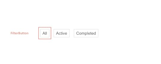
Adding this component will be similar to the Form component. However, I’d also like to give designers the ability to specify the text that is displayed within the button. We’ll do that via the `prop-types` package.
Component propTypes are mapped to the UXPin properties panel when editing a component. The existing FilterButton component doesn’t use prop-types so let’s add this to `FilterButton.js`:
import React from "react";+ import PropTypes from 'prop-types';function FilterButton(props) { return (@@ -15,4 +16,9 @@ function FilterButton(props) { );}+ FilterButton.propTypes = {+ name: PropTypes.string+ }+FilterButton.defaultProps = {+ name: 'Button Name'+};export default FilterButton;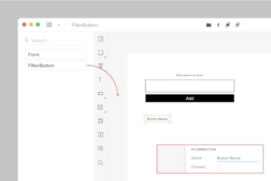
Two of our three components are now working with UXPin Merge. We have one component remaining: the Todo component.
Adding the Todo component with a wrapperWe’re moving on to our final component: the Todo. These are displayed within the list of todo items in the UI:

When adding the FilterButton, we edited the FilterButton.js file to add propTypes. What if you want to isolate your Merge-specific changes and don’t want to modify the source code of your components? We can create a wrapper that is specific to the Todo component for this. It’s similar in concept to the Global wrapper component we used to apply CSS styles but will be specific to the Todo component.
Type the following:
mkdir -p src/components/merge/todo
touch src/components/merge/todo/Todo.js
Copy and paste the following code into Todo.js.
import React from 'react';import PropTypes from 'prop-types';// Import the original componentimport TodoM from '../../Todo';function Todo(props) { return }Todo.propTypes = { /** * If `true`, the todo will be marked as completed. */ completed: PropTypes.bool, /** * The name of the todo. */ name: PropTypes.string, toggleTaskCompleted: PropTypes.func,}Todo.defaultProps = { name: 'Do Laundry'};export default Todo;We’re importing the original Todo component as `TodoM` and returning this component in our newly defined `Todo` function. We specify propTypes just like we did with the FilterButton component on our newly defined `Todo` wrapper function.
Add ‘src/components/merge/todo/Todo.js’ to uxpin.config.js and restart using ./node_modules/@uxpin/merge-cli/bin/uxpin-merge –disable-tunneling. After Experimental launches a new window, click-and-drag the Todo component onto the canvas:

You’ll see the Todo component along with the default “Do Laundry” todo name. This default name is only applied when using Merge.
Pushing to UXPinUntil you push your design system to UXPin the components are only visible to you. To let your design team use these components we need to push the component bundle to UXPin. Creating and pushing a Merge design library requires two steps:
1. Create the library within the UXPin UI1. Go to your UXPin account
2. Enter the UXPin Editor
3. Create a new library
4. Select the option import React components
5. Copy the Auth token (don’t share it with anyone and do not place it in any files checked into git repository. This token provides direct access to the library on your account.) The process looks like this:
 2. Push the library via the uxpin-merge CLI
Using the token created from the previous stop, run the following from within the project repo:
./node_modules/@uxpin/merge-cli/bin/uxpin-merge push –token YOUR TOKEN
Your design team can now access the Merge library.
Using the Merge library within UXPinNow that the Merge design library has been pushed its time to test it out within the UXPin editor:
Reload the UXPin Editor in your browser.Select the “Learn UXPin Merge” design system in the bottom left corner of the editor.Click and drag the components from the sidebar to the canvas.You should have a solid looking prototype:

How does a designer hand off a prototype back to a developer?
Previewing and ExportingNow that we’ve built a quick prototype in UXPin we’re ready to export it back to our app. We can preview the output and then use Spec mode to copy and paste the JSX code for our components.
Click the play button in the upper right corner of the editor. Once the preview loads click the “Spec” link at the top. You can now click on the components and view the JSX code to generate them in the right panel:

It’s great to push an initial version of our design system. However, you’ll likely need to push out quite a few updates over time.
Pushing an UpdateThe FilterButton has a “pressed” state to indicate the currently active filter. Looking at the live React app, here’s the difference between the pressed and not-pressed state:

Let’s add support for this state. Make the following change to `src/components/FilterButton.js`:
FilterButton.propTypes = {- name: PropTypes.string+ name: PropTypes.string,+ isPressed: PropTypes.bool}Commit the change to git and push to UXPin:
Merge components are automatically synced to the most recently pushed code. To show the latest, reload the tab showing the UXPin editor. Select a FilterButton. In the right panel of the editor you should see a new “isPressed” property.
Select it to activate this state:

Follow this same flow (git commit + uxpin-push) when you make future changes. Prototypes will automatically use the latest pushed version of components.
Speed up building your product by 8.6xYou’ve taken a React app and pushed its components to UXPin Merge. You’ve also learned how to push updates when you modify components or add new ones. Now your design team can use these components to create high-fidelity prototypes within the UXPin editor.
You can browse the source code for this project on GitHub. To learn more advanced Merge techniques see our Merge docs or reach out to us at hello@uxpin.com.
Don’t have UXPin Merge yet? First, remember to go through the process of requesting access to make the most of designing with code! Try UXPin Merge for free.
The post Design with Code – UXPin Merge Tutorial appeared first on Studio by UXPin.
March 22, 2024
How To Run A Successful Design Thinking Workshop

Running a design thinking workshop is one of the best ways to spark creativity and nurture a user-centric mindset within your design team. As a designer, you will encounter situations where you need to run design thinking workshops either with your team, your stakeholders, or other departments in your organization.
UXPin is an end-to-end design tool that will support you throughout the full human-centered design process, from creating basic user flows, through prototyping, and up to design handoff. Create a strong, transparent, and quality design process with UXPin. Enjoy a free trial.
Build advanced prototypesDesign better products with States, Variables, Auto Layout and more.
Try UXPin .try-uxpin-banner { margin: 40px 0px;}.try-uxpin__container { display: flex; max-width: 689px; height: 210px; padding: 20px; padding-left: 24px; border: 2px solid black; border-radius: 4px; align-items: center; justify-content: space-between; background-color: white; box-shadow: 10px 10px black;}.try-uxpin__left { width: 54%;}.try-uxpin__left p { margin: 10px 0px !important; color: black !important;}.try-uxpin__heading { font-size: 28px !important; font-weight: bold;}.try-uxpin__text { margin: 0 !important; font-size: 18px !important; line-height: 22px !important;}.try-uxpin__button { width: 135px; height: 44px; background: black; margin: 10px 0px; padding: 10px 20px; border: none; border-radius: 2px; color: white; font-size: 16px; text-align: center;}.try-uxpin__button:hover { cursor: pointer;}.try-uxpin__image { max-width: 320px !important; height: 200px; margin-right: -21px; margin-bottom: -6px;}@media (max-width: 760px) { .try-uxpin__container { height: auto; margin: 10px; align-items: left; }}@media (max-width: 500px) { .try-uxpin__container { flex-direction: column; } .try-uxpin__left { width: 100%; align-items: normal; }}What is a Design Thinking Workshop? A design thinking workshop is a creative problem-solving session that is based on the principles of design thinking. These workshops are activity-based and they involve real-time collaboration. For that, they are often done in person but they can also be done remotely.
The activities of a design thinking workshop are organized according to the three phases of the design thinking process: empathy, ideation, and prototyping.
Empathy: Developing a deep understanding of the problem that end-users face and empathizing with them.Ideation: Coming up with many ideas on how the user problem can be solved. Prototyping: Creating a prototype of potential solutions and then testing it with real users.
A workshop can last for a few hours long, a whole day, or even a week.
What are the goals of a Design Thinking Workshop?Design thinking workshops help design teams to create feasible and user-focused solutions to complex problems in design. This helps the team to design better products faster, reduce costs, and increase profits.
Design Thinking Workshops typically have several key goals:
Problem Understanding: The primary goal of a Design Thinking Workshop is to deeply understand the problem or challenge at hand. This involves empathizing with the users or stakeholders, defining the problem from their perspective, and gaining insights into their needs, desires, and pain points.Creative Ideation: Another key goal is to generate a wide range of creative ideas and solutions to address the identified problem. Through brainstorming sessions and other ideation techniques, participants are encouraged to think outside the box and explore unconventional approaches.Collaboration and Team Building: Design Thinking Workshops often involve interdisciplinary teams working together collaboratively. A goal is to foster teamwork, encourage diverse perspectives, and leverage the collective intelligence of the group to generate innovative solutions.Prototyping and Iteration: Participants in a Design Thinking Workshop create prototypes or mock-ups of their ideas to quickly test and iterate upon them. The goal is to rapidly learn from feedback, refine ideas, and improve upon them iteratively.User-Centric Solutions: Design Thinking emphasizes a human-centered approach to problem-solving. Therefore, a key goal of the workshop is to develop solutions that are deeply rooted in the needs and experiences of the end-users.Actionable Insights: By the end of the workshop, participants should have gained actionable insights into the problem space and potential solutions. These insights can inform future decision-making and guide further development efforts.Empowerment and Ownership: Design Thinking Workshops aim to empower participants to take ownership of the problem-solving process and feel confident in their ability to innovate. This can lead to a culture of creativity and innovation within an organizationWho should run a Design Thinking Workshop?
A design thinking workshop should be run by a facilitator, that is a person who understands the design thinking process and guides the participants throughout the workshop. The facilitator should have presentation skills and the ability to keep the group engaged. It would also be great if facilitator had a hands-on experience with running workshops.
If you need tips on facilitation, see our other article: How to be a facilitator.
How many people should be in a design thinking workshop?The ideal number of participants for a Design Thinking Workshop can vary depending on factors such as the complexity of the problem, the scope of the workshop, and the resources available. However, a common range is typically between 6 to 12 participants.
Here are some considerations to help determine the appropriate number of participants:
Diversity of Perspectives: It’s essential to have a diverse group of participants representing different backgrounds, expertise, and perspectives. This diversity fosters creativity and ensures that various viewpoints are considered during the workshop.Effective Collaboration: A smaller group size facilitates more effective collaboration and communication among participants. Larger groups may become unwieldy and make it challenging for everyone to actively contribute and engage in the process.Resource Constraints: Consider the resources available, such as facilitators, materials, and space. Ensure that the workshop can be adequately managed and supported with the available resources.Time Constraints: The duration of the workshop can influence the number of participants. With a larger group, it may take more time to ensure everyone’s voice is heard and to reach consensus on ideas and solutions.Scalability: If the workshop is part of a larger innovation initiative or project, consider whether the outcomes need to be scalable across different teams or departments. A manageable group size makes it easier to replicate the workshop format if needed.Ultimately, the goal is to strike a balance between having enough participants to generate diverse ideas and perspectives while maintaining a manageable group size for effective collaboration and decision-making. Flexibility is key, and adjustments may be necessary based on the specific context and objectives of the workshop.
How to run a Design Thinking WorkshopThe design thinking process is made up of activities that are done before the workshop and during the workshop. Here is a step-by-step plan of a design thinking workshop.
Step 1: Plan your workshopBefore you can run a design thinking workshop, there are some things that need to be in place first, they include:
Workshop objectives: This is a clear definition of the goals that the workshop should achieve. Is it to generate new ideas or to improve on an existing design product? This is also a good time to define the challenge or question that the workshop will answer. It might be “how can we improve the user experience of our website users?”Workshop location: Choose a suitable location for your design thinking workshop. If the workshop is happening physically, choose a location that has enough space for your design team. If the workshop is happening online, decide on the meeting and presentation tools that you are going to use. Workshop agenda: This is a plan of how and when the different activities are going to happen. Do not make the workshop too long and be sure to include a lot of activities in your design thinking workshop agenda. Workshop toolkit: Ensure that all the necessary design thinking workshop materials such as paper, marker pens, post-it notes, whiteboards, and props are in place.After making all the necessary preparations as outlined above, the next steps will be the execution of your workshop agenda.
Step 2: Introduce participants to the ideaWelcome all the participants to the workshop and brief them on what they should expect during the workshop. Share the following information:
The main objective of the workshop and the problem that it is going to solve.A schedule of the workshop activities. Step 3: Kick off the meeting using an icebreakerUse fun icebreaker activities to help your team warm up before the workshop begins. This will make it easy for them to collaborate and share their ideas with team members.
Step 4: Begin design thinking sessionMake a brief presentation on what design thinking is, the phases of design thinking, and its benefits. This presentation is useful even for designers who are already familiar with the design thinking philosophy because it brings everyone up to speed and ensures that you are all on the same page.
Step 5: Empathize with the userThis is the first step in the design thinking process where you encourage the workshop participants to put themselves in the shoes of the user. This will help them to start generating ideas on what the user needs from the product.
What can help you empathize with the end-user? You can use activities such as role-playing and creating an empathy map to help the participants really understand the needs, wants, feelings, and language of the user. After these activities, give the participants a chance to share their findings and ask questions, if any.
The output of this step could be creating user personas. Read more about it here: Personas in UX.
Step 6: Get more specific on the problemAfter the empathy exercise, participants are better placed to really narrow down on the problem that the user faces. Ask your team to create a problem statement that will guide the rest of the design thinking workshop.
Step 7: Come up with ideas and possible solutionsThe next design thinking step is ideation where your team suggests possible solutions to the problem that they identified in step 6. Use techniques such as brainstorming to come up with a list of potential solutions.
Give the participants a chance to discuss their solutions and then come up with one refined solution.
Step 8: Create a user journey mapAfter settling on one solution, get your team to map out the steps that users will take so that they can solve the problem. These steps can be downloading an application, setting up an account, adding their bank details, and then sending money. Give them enough space and sticky notes to create a step by step representation of the user journey.
Step 9: Create prototype and test itThis is the final step in the design thinking process where participants will create low fidelity prototypes of their solution. Ask the users to create screens for each step of the user journey and then ask them to add functionality to their screens in the form of buttons.
Once again, give your team some time to compare their prototypes and then ask them to vote for the best prototype.
Step 10: Describe the next steps and close the workshopClose the workshop by explaining to your team the next steps such as turning their prototypes into wireframes, high fidelity prototypes, and actual user testing.
This is also a good time to ask your design team what they learned from the design thinking workshop. Don’t forget to ask for feedback so that you can improve your design thinking workshop facilitation skills.
Solve design challenges with the best design toolsDesign thinking workshops help your design team to come up with innovative and user-centered solutions to design problems. Use UXPin to design, wireframe, and prototype the innovative ideas that you come up with during your design thinking workshop. Sign up for a free trial of UXPin and turn your ideas into wonderful designs.
Try UXPin for freeThe post How To Run A Successful Design Thinking Workshop appeared first on Studio by UXPin.
March 20, 2024
Laravel with React — How to Build a Web App Fast

Building a web app using Laravel with React offers a winning combination of robustness, efficiency, flexibility, and user experience. By leveraging the strengths of these technologies and their respective ecosystems, we can create a modern, scalable, and competitive web app that meets the needs and expectations of our users and stakeholders.
Learn how to build a Laravel app with React. Join our webinar on March 26th and discover the key to building products 8.6x faster. Save your free spot here: Webinar for Busy Devs — How to speed up building your product 8.6x.
What is Laravel?Laravel is an open-source PHP web framework designed for building modern web applications following the Model-View-Controller architectural pattern. Developed by Taylor Otwell, Laravel provides developers with a streamlined and expressive syntax, along with a comprehensive set of tools and libraries, to simplify and accelerate web development.
As a PHP framework, Laravel provides a structured and organized approach to PHP web development. It offers features such as routing, database management, templating, authentication, and more, all of which are optimized for PHP developers. By using Laravel, PHP developers can build robust and scalable web applications more efficiently, without having to reinvent the wheel or deal with low-level implementation details.
There are several alternatives to Laravel such as Symfony, Codelgniter, and more. Laravel is great for building simple, single-page web applications or enterprise-grade solutions.
Why would you use Laravel back-end?Laravel provides a rich set of features out-of-the-box, including a powerful Object-Relational Mapping called Eloquent, an expressive query builder, routing, middleware, authentication, and authorization systems. These features allow you to focus on building your application logic rather than reinventing the wheel for common web development tasks.
The PHP framework is optimized for performance and scalability, with features such as built-in caching, queuing, and database optimization. Additionally, Laravel’s modular architecture and support for microservices and distributed systems make it suitable for building scalable and high-performance applications that can handle increased traffic and user load.
Laravel is great as a back-end for:
Content Management Systems – Laravel provides the necessary tools for managing and presenting content efficiently.E-commerce platforms – developers can leverage Laravel’s integrations with popular payment gateways, such as Stripe and PayPal, to create secure shopping experiences.Social networking sites – Laravel provides the foundation for implementing user profiles, news feeds, messaging systems, and more.CRM and ERP systems – Laravel has features to manage customer data, track sales, automate business processes, and integrate with third-party services.API-driven applications – Laravel’s built-in support for API development, including RESTful API and JSON API resources, makes it well-suited for building API-driven applications.Job boards and platforms: Laravel is a great framework for managing job listings, handling user registrations and profiles, and automating notifications and reminders.Portals: Engineers can leverage Laravel’s authentication and authorization systems to manage user access, track performance, and deliver personalized experiences.Why would you pair Laravel with React?Pairing Laravel with React offers a powerful combination of robust back-end functionality and dynamic front-end interactivity. React’s component-based approach allows for modular and reusable UI development, seamlessly integrating with Laravel’s backend logic. In that vein, there are a few reasons why developers opt for Laravel React combination:
Enhanced User ExperienceReact’s component-based architecture and virtual DOM enable the creation of interactive and dynamic user interfaces. By integrating React with Laravel, you can build a modern and responsive frontend that enhances the user experience, providing seamless navigation, real-time updates, and rich interactive features.
Optimized PerformanceReact’s efficient rendering and virtual DOM reconciliation algorithm result in faster rendering and improved performance, especially for complex and data-intensive applications. By offloading the UI rendering to the client-side with React, you can reduce server load and enhance overall application responsiveness.
Decoupled Frontend and BackendPairing Laravel with React enables you to adopt a decoupled architecture, where the frontend and backend are separate and communicate via Laravel API. This separation of concerns allows for greater flexibility, scalability, and maintainability, as changes to one part of the application do not affect the other. It also facilitates parallel development, allowing frontend and backend teams to work independently and focus on their respective areas of expertise.
Scalability and PerformanceSeparating the frontend and backend allows you to scale each part of the application independently based on demand. You can deploy additional frontend servers or leverage content delivery networks (CDNs) to distribute static assets efficiently. This scalability ensures that your application can handle increased traffic and user load without sacrificing performance or responsiveness.
Code ReusabilityReact’s component-based architecture promotes code reusability, allowing you to create reusable UI components that can be shared across different parts of your application. By building reusable components with React, you can reduce development time, minimize code duplication, and maintain consistency across your application’s UI.
Rich Ecosystem and ToolingReact’s extensive ecosystem and tooling provide a wealth of libraries, frameworks, and development tools to streamline frontend development. You can leverage tools like Create React App, React Router, and Redux to scaffold projects, manage routing, and handle state management efficiently. Additionally, React’s vibrant community and ecosystem ensure long-term support, stability, and compatibility for your frontend development needs.
Single Page ApplicationsReact is well-suited for building single-page applications that provide a seamless and immersive user experience. By pairing Laravel with React, you can create SPAs that load dynamically and handle navigation and state changes gracefully, without requiring full-page reloads. This results in a more fluid and responsive user experience, similar to that of a native desktop or mobile application.
How to pair Laravel with React QuicklyIf you want to start a new Laravel project, you need to start by brainstorming what kind of features and functionalities you want your Laravel application to have. Then, begin by creating layouts. You can use UXPin Merge for that part.
UXPin Merge is a powerful UI builder that allows you to drag and drop coded React components to build interactive, production-ready React interfaces. You can use one of the built-in libraries such as Material UI, Bootstrap or Ant design or bring your own Javascript library to the tool.
You can use ready React components such as data tables, buttons, menus, footers, and build an app 8.6x faster than with other tools.
This eliminates the need of setting up a project step-by-step, as your UI project comes preconfigured when copying it from UXPin Merge. To learn about the full process, come to our webinar next week and watch two experts creating a web app from scratch.
Save your spot here: Webinar for Busy Devs — How to speed up building your product 8.6x.
The post Laravel with React — How to Build a Web App Fast appeared first on Studio by UXPin.
UXpin's Blog

- UXpin's profile
- 68 followers

