
UXpin's Blog, page 18
September 6, 2024
What is npm?
npm is a package manager for JavaScript that helps developers install, share, and manage libraries or pieces of code that are commonly used in applications. These packages can range from small utility functions to full-fledged UI components like buttons, form elements, or even complex layouts.
npm is also a key enabler of the design-development collaboration that UXPin Merge facilitates. By packaging React components through npm, developers can hand off real, functioning UI components to designers, who can then integrate them into their designs effortlessly. This results in a more consistent and efficient workflow, ensuring that your design system and the final product are perfectly aligned.. Discover UXPin Merge.
Design UI with code-backed components.Use the same components in design as in development. Keep UI consistency at scale.
Try UXPin Merge .discover-merge { margin: 40px 8px;}.discover-merge__container { display: flex; max-width: 690px; height: 200px; padding: 20px; padding-left: 24px; border-radius: 4px; background-color: black; box-shadow: 10px 10px #9999ff; align-items: center; justify-content: space-between;}.discover-merge__left { width: 50%;}.discover-merge__left p { margin: 10px 0px !important; color: white !important; font-size: 18px !important;}.discover-merge__heading { font-weight: bold !important; color: white !important; font-size: 18px !important;}.discover-merge__text { margin: 0 !important; line-height: 22px !important;}.discover-merge__button { width: 174px; height: 44px; margin: 10px 0px; border: none; border-radius: 2px; background: white; color: black; font-size: 16px; text-align: center;}.discover-merge__button:hover { cursor: pointer;}.discover-merge__image { max-width: 320px !important; height: 200px; margin-right: -19px;}@media (max-width: 760px) { .discover-merge__container { height: auto; margin: 10px; align-items: left; }}@media (max-width: 500px) { .discover-merge__container { flex-direction: column; } .discover-merge__left { width: 100%; align-items: normal; }}What is NPM (Node Package Manager)?
npm or Node Package Manager is an open-source repository of tools engineers use to develop applications and websites.
npm is two things:
A repository for publishing open-source projects.Simplified version: a digital storage and retrieval facility.A command-line interface (CLI) for interacting with the repository.
Simplified version: a tool to communicate with the storage facility.What is a Package Manager?
Before we can explain what npm package is, it’s essential to understand the idea of a package manager. Think of a package manager as a toolkit for developers.
Let’s say you’re building an application that uses Stripe for payments. A package manager installs all the code your product will need to communicate with Stripe and process payments.
Instead of writing all that code or copy/pasting it from Stripe’s docs, engineers simply enter a command, and the package manager installs the code dependencies they need from Stripe.
There are millions of these packages for everything you can think of to develop an application–like different types of search functionality, APIs, payments, authentication tools, maps, icons, hosting, and more.
You get public open-source repositories (like npm) where anyone can upload and install packages, as well as private package repositories with restricted access.
What is a Command Line Interface?A command-line interface (CLI) is a text interface developers use to interact with computer programs. This CLI allows you to execute commands to run background operations necessary for software development.
In the case of npm, the CLI allows you to interact with the package registry. For example, engineers can use commands like npm install followed by the package name to install a specific package.
The npm RegistryThe npm website is where engineers can search and learn about packages. This website is just a registry and doesn’t host the packages. Instead, engineers use platforms like GitHub, Packagecloud, AWS CodeArtifact, and others to host and distribute packages.
For example, if we look at the UXPin Merge CLI on NPM, it has displays GitHub as the repository and relevant link. Above that is the command to install the UXPin Merge CLI and its dependencies: npm i @uxpin/merge-cli. The “i” after npm is an abbreviation for “install.” So, typing npm install @uxpin/merge-cli would render the same result.
 What are Dependencies?
Packages consist of other packages that engineers call dependencies–we know, confusing, right! These dependencies are packages of code that perform different tasks within the project.
For example, the UXPin Merge CLI uses Typescript and therefore requires the typescript package as a dependency. Typescript is just one of the 41 dependencies UXPin Merge CLI requires.
What are Devdependencies?Looking at the UXPin Merge CLI’s dependencies, you’ll notice 41 Dependencies and 41 Dev Dependencies (also referred to as devDependencies–one word).
Dependencies: The packages required to run a piece of softwareDev Dependencies: The packages needed during the development phase onlyDependencies and devDependencies reside in a separate folder called node_modules, so your packages.json file and project code know where to find them.
What is the package.json File?There’s a package.json file that provides its metadata and dependencies. When installing the project on your computer, npm will reference the package.json file to install the dependencies and devDependencies.
Instead of installing each dependency individually, you simply type npm install in the command line.
Hosting providers also use the package.json file to install the dependencies (excluding devDependencies) needed to run the project on its servers.
What is package-lock.json?The package-lock.json specifies the exact version of the package used to build the project. This file locks the dependencies so that when the project is installed, it references the versions used during development rather than the latest release.
Engineers update packages regularly, often changing the way the package works. So, locking your dependencies ensures the project operates as intended.
How to use npmHere are some common npm commands and what they do:
npm init: Creates a package.json file for your project. If you’re building an application from scratch, npm init will be one of the first commands you use to include key project information. NPM will automatically update your package.json file whenever you install or remove packages.npm install: Installs all of the project dependencies in a package.json file.npm install : Installs a specific package from the NPM registry and saves it to your node_modules folder. For example, npm install @uxpin/merge-cli will install the Merge CLI.npm install –save: Installs an NPM package and adds it to the dependencies in your package.json file.npm install –save-dev: installs an NPM package and adds it to the devDependencies npm uninstall : Uninstalls a specific package from your project.npm doctor: Runs diagnostics on your npm installation to check if it has everything it needs to manage your packages.npm update : Updates a specific package to the latest version.These are just a few of the most common npm commands. You can find the complete list in the npm documentation.
Understanding npm as a Designernpm is simply a toolkit comparable to plugins or app extensions for design tools. You don’t need to know the ins-and-outs of how packages are created, but it may be useful to know a thing or two about it.
First of all, some of code component libraries are shared as npm packages, such as MUI, Ant Design, etc.
How to find component libraries that are distributed as npm packages? Let’s say you search through Adele, UXPin’s library of publicly available Design Systems, for a component library that you can bring in to UXPin. You pick Shopify’s Polaris and notice that it is distributed via npm.
So, you go to the NPM site, look for Shopify’s Polaris, and find it.
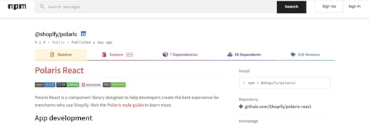
UXPin with Merge technology allows you to import UI elements from component libraries via NPM packages. Then, you can use those elements to put together fully-functional prototypes.
UXPin Merge is usually being set up by a developer. But if you lack the development support, you can use our new tool – Merge Component Manager and manage UI components by yourself.
However, if you want to enhance your programming knowledge to collaborate with devs better, then learning about basic code principles (HTML, CSS, Javascript) and component libraries is far more valuable for designers.
What Can You Do with npm Integration?Even though npm is typically a tool developers use, it plays a crucial role in enabling powerful design workflows—like bringing React components into UXPin for seamless drag-and-drop UI building.
Here’s why npm is important for technical designers working with tools like UXPin Merge:
Access to React Components: If your design system is built using React, npm allows you to package these components and make them accessible for use in other applications or tools—like UXPin Merge. React components that are available as npm packages can be directly imported into UXPin, giving designers the ability to drag and drop real code components into their designs without writing code.Easily Manage Updates: npm simplifies version control. When a developer updates a package (such as a new version of a button component), npm can automatically manage this update in UXPin Merge, ensuring that designers always work with the latest components from the development team. This ensures consistency between design and development without the need for manual updates.Collaborate Seamlessly with Developers: npm helps technical designers and developers work from the same source of truth. Developers use npm to publish the components they create, while designers can easily import those components into UXPin using Merge. This ensures that the components designers use for prototyping are exactly the same as the ones developers will implement in the final product.Improve Collaboration With UXPin MergeMerge enhances collaboration between design and development because designers and engineers work with the same component library.
Instead of having a UI kit for designers and code for devs, Merge syncs a repository to UXPin’s editor so design teams can build fully functioning prototypes using code components.
You can sync your company’s design system or a component library like MUI so that you only have to drag and drop UI elements to build interfaces. Request access to Merge.
Try UXPin MergeThe post What is npm? appeared first on Studio by UXPin.


September 5, 2024
Design System Naming Conventions – How to Set Them
Design system naming conventions are the standardized rules and guidelines used to name elements within a design system. This includes naming design tokens, components, patterns, styles, and any other elements that are part of the design system. A well-defined naming convention is crucial for maintaining clarity, consistency, and ease of use across both design and development teams.
If you’re looking to elevate your design system and create a more consistent, efficient workflow, UXPin Merge is the solution for you. By integrating design and development into a unified process, Merge helps you build a robust design system that scales with your organization and meets the highest standards of quality and consistency. Request access to UXPin Merge.
Reach a new level of prototyping
Design with interactive components coming from your team’s design system.
Discover UXPin Merge .discover-merge { margin: 40px 8px;}.discover-merge__container { display: flex; max-width: 690px; height: 200px; padding: 20px; padding-left: 24px; border-radius: 4px; background-color: black; box-shadow: 10px 10px #9999ff; align-items: center; justify-content: space-between;}.discover-merge__left { width: 50%;}.discover-merge__left p { margin: 10px 0px !important; color: white !important; font-size: 18px !important;}.discover-merge__heading { font-weight: bold !important; color: white !important; font-size: 18px !important;}.discover-merge__text { margin: 0 !important; line-height: 22px !important;}.discover-merge__button { width: 174px; height: 44px; margin: 10px 0px; border: none; border-radius: 2px; background: white; color: black; font-size: 16px; text-align: center;}.discover-merge__button:hover { cursor: pointer;}.discover-merge__image { max-width: 320px !important; height: 200px; margin-right: -19px;}@media (max-width: 760px) { .discover-merge__container { height: auto; margin: 10px; align-items: left; }}@media (max-width: 500px) { .discover-merge__container { flex-direction: column; } .discover-merge__left { width: 100%; align-items: normal; }}What is the Naming Convention for Design Systems?Design system naming conventions are a set of rules for naming the different parts of a design system, like colors, fonts, buttons, and other components. These rules help keep names clear and consistent, making it easy for everyone on the team to understand and use the design system.
Design system naming conventions are typically set by the team responsible for creating and maintaining the design system. It can be governed by a dedicated group of designers and developers who focus on building and managing the design system or design leaders at a company. They establish naming conventions to ensure consistency and ease of use across the system.
Why Are Naming Conventions Important in a Design System?By following these naming conventions, teams can work together more smoothly and keep the design system organized and easy to update. Design system naming systems help in:
Clarity and Readability: A good naming convention helps team members easily understand what each element is and how it should be used. This is especially important as the design system grows and more people across different teams start using it.Consistency: Consistent naming reduces confusion and helps ensure that everyone on the team uses the design system in the same way. This is essential for maintaining a cohesive and unified user experience across all products and platforms.Scalability: As your design system expands to include more components and tokens, a well-structured naming convention makes it easier to organize and manage these elements. It provides a scalable framework that can accommodate new additions without causing confusion or requiring significant restructuring.Collaboration: Clear and consistent naming conventions improve collaboration between designers and developers by reducing miscommunication. When both teams use the same language and terms, it’s easier to maintain alignment throughout the development process.9 Key Elements of Design System Naming ConventionsDesign TokensDesign tokens are the core variables that define a design system’s visual properties, such as colors, typography, spacing, and shadows. Naming conventions for tokens should reflect their purpose and usage rather than specific values, ensuring flexibility and scalability. Examples include color-primary, font-size-heading, or spacing-small.
ComponentsComponents are the building blocks of a design system, representing reusable UI elements like buttons, forms, cards, and navigation bars. Consistent naming for components ensures they are easily identifiable and logically grouped, enhancing usability and collaboration. Examples include ButtonPrimary, FormInputText, or CardWithImage.
PatternsPatterns are reusable combinations of components that address specific design problems or create common UI layouts. Naming conventions for patterns should describe their function clearly, such as LoginForm, NavbarSticky, or ErrorMessageModal.
ModifiersModifiers represent variations or states of a base component or token, such as different sizes, colors, or behaviors. Consistent naming for modifiers typically indicates the relationship between the base element and the variation, using a pattern like BaseComponent–Modifier. Examples include ButtonPrimary–Large, ColorPrimary–Dark, or Card–WithShadow.
UtilitiesUtility classes or styles are often used for quick, specific adjustments that apply common design tokens, such as margin or padding. Naming conventions for utilities are typically short and descriptive, indicating the property they affect. Examples include u-margin-small, u-padding-large, or u-text-center.
StatesStates define different conditions of a component, such as active, disabled, focused, or error states. Clear naming for states helps communicate these conditions within the design system. Examples include Button–Disabled, Input–Error, or Link–Active.
Responsive VariantsThese are variations of components or styles that adjust based on screen size or device type. Naming conventions for responsive variants typically follow a pattern that indicates the screen size they target. Examples include Button–SmallScreen, Grid–Desktop, or Image–Responsive.
Accessibility FeaturesElements or tokens that enhance accessibility might have specific naming conventions to denote their purpose. For example, Button–AriaLabel or Text–HighContrast indicate elements tailored for accessibility.
Brand-Specific ElementsIn some design systems, elements may be specific to different brands or themes. Naming conventions for these elements should clearly indicate their association. Examples include Button–BrandA, Navbar–BrandB, or Typography–Corporate.
Top 10 Best Practices for Naming Conventions in Design SystemsA well-organized design system is the backbone of consistent and scalable design work. Naming conventions play a crucial role in this organization by making your design system intuitive and easy to use. Here are ten essential best practices to help you establish effective naming conventions for your design system:
1. Be Descriptive but ConciseWhy It Matters: Clear and concise names help everyone on your team quickly understand what each element is for. Long or vague names can lead to confusion and mistakes, slowing down the design and development process.
How to Implement: Choose names that clearly describe the element’s purpose or function without being overly detailed. For example, instead of naming a primary action button btnSubmitActionPrimary, use ButtonPrimary. This name is direct, easy to remember, and effectively communicates the button’s role.
2. Use Consistent Patterns Across the SystemWhy It Matters: Consistency in naming makes your design system predictable and easy to navigate. When team members know what to expect from the naming structure, they can find and use elements more efficiently.
How to Implement: Establish a naming pattern like [Category]-[Modifier] for design tokens (color-primary, spacing-small) and ComponentName–Modifier for components (Button–Large, Card–WithShadow). Stick to these patterns throughout your design system to maintain consistency.
3. Avoid Specific Values in NamesWhy It Matters: Naming tokens with specific values like 16px or #FFFFFF limits flexibility. If the values change, you would need to rename tokens throughout the system, which is time-consuming and error-prone.
How to Implement: Focus on naming tokens based on their function rather than specific values. For instance, use font-size-base instead of font-size-16px. This approach allows you to adjust the value without changing the name, making your system more adaptable.
4. Reflect the Design Intent, Not Just ImplementationWhy It Matters: Names should convey how and when an element should be used, rather than just describing what it is. This helps designers and developers understand the intent behind each element, promoting consistent usage across different contexts.
How to Implement: Use names that indicate the purpose of the element. For example, instead of a generic name like color-red, use color-error to specify that the color is intended for error messages. This provides clarity and reduces the risk of misapplication.
5. Document Your Naming Conventions ClearlyWhy It Matters: Clear documentation ensures that everyone on your team understands and follows the naming conventions. This is particularly important as new team members join or as the design system evolves.
How to Implement: Create a comprehensive section in your design system documentation dedicated to naming conventions. Include the reasoning behind each rule, along with examples of correct and incorrect naming. Update this documentation regularly to reflect any changes or additions.
6. Use Readable Naming Formats like Camel Case or Kebab CaseWhy It Matters: Readable formats such as camel case (ButtonPrimary) or kebab case (button-primary) make it easy to distinguish different parts of a name at a glance, improving clarity and reducing errors.
How to Implement: Decide on a naming format that aligns with your team’s coding standards or design practices. For instance, use camel case for component names (ButtonPrimary, CardWithImage) and kebab case for CSS class names (button-primary, card-with-image). Apply this format consistently.
7. Include Context in Names When NecessaryWhy It Matters: Elements that could be used in multiple contexts should have names that specify their intended use. This prevents confusion and ensures elements are applied correctly across different parts of the design.
How to Implement: When naming tokens or components that serve specific functions, include contextual information in the name. For example, use spacing-card-small instead of just spacing-small to indicate that the spacing value is intended for card components.
8. Plan for Scalability from the StartWhy It Matters: A scalable naming convention allows your design system to grow without needing significant changes to existing names. This is crucial as your system evolves to include more components, tokens, and patterns.
How to Implement: Anticipate future needs by choosing flexible naming conventions. For example, if you might add different button types, start with names like ButtonPrimary, ButtonSecondary, and ButtonTertiary. This approach leaves room for expansion without causing confusion.
9. Minimize the Use of AbbreviationsWhy It Matters: Abbreviations can make names shorter, but they also risk making them unclear, especially for new team members or collaborators. Only use abbreviations that are universally understood within your team.
How to Implement: Stick to full words unless an abbreviation is commonly accepted and widely recognized. For instance, btn for button is standard, but using fs for font-size might not be immediately clear to everyone.
10. Regularly Review and Update Naming ConventionsWhy It Matters: As your design system grows and changes, your naming conventions might need to evolve. Regular reviews help ensure your system remains intuitive and efficient for all users.
How to Implement: Set up periodic reviews of your naming conventions with key stakeholders. Gather feedback from designers and developers to identify any issues or areas for improvement. Be open to making changes that enhance clarity, consistency, or scalability.
Build Prototypes that Are in Line with Your Design SystemEstablishing effective naming conventions is crucial for any design system’s success. By being descriptive but concise, maintaining consistent patterns, and regularly reviewing your conventions, you can ensure that your design system remains organized, scalable, and easy to use.
Consistency is key to any successful design system. It ensures that your UI components are cohesive, scalable, and easy to maintain across different teams and projects. But achieving this level of consistency can be challenging, especially when it comes to bridging the gap between design and development. That’s where UXPin Merge comes in.
UXPin Merge is a powerful design technology that allows you to integrate real, production-ready code components from your React-based design system directly into your design tool. This integration creates a unified source of truth for both designers and developers, ensuring that everyone is working with the exact same components and styles. Request access to UXPin Merge.
Discover MergeThe post Design System Naming Conventions – How to Set Them appeared first on Studio by UXPin.
5 Best React Component Libraries of 2024
Modern websites and apps rely on front-end frameworks to develop, maintain, and scale user interfaces. React’s Javascript library is arguably the most popular front-end framework with many component libraries to build digital products.
We’re going to explore the top React UI libraries and how to choose the right one for your next project.
With UXPin Merge, you can sync any React component library and assemble production-ready layouts super fast. Check out the build-in MUI, Ant design, and React Bootstrap components that are available for free in UXPin’s editor. Drag and drop them on the canvas and simplify React UI design. Try UXPin Merge.
Design UI with code-backed components.Use the same components in design as in development. Keep UI consistency at scale.
Try UXPin Merge .discover-merge { margin: 40px 8px;}.discover-merge__container { display: flex; max-width: 690px; height: 200px; padding: 20px; padding-left: 24px; border-radius: 4px; background-color: black; box-shadow: 10px 10px #9999ff; align-items: center; justify-content: space-between;}.discover-merge__left { width: 50%;}.discover-merge__left p { margin: 10px 0px !important; color: white !important; font-size: 18px !important;}.discover-merge__heading { font-weight: bold !important; color: white !important; font-size: 18px !important;}.discover-merge__text { margin: 0 !important; line-height: 22px !important;}.discover-merge__button { width: 174px; height: 44px; margin: 10px 0px; border: none; border-radius: 2px; background: white; color: black; font-size: 16px; text-align: center;}.discover-merge__button:hover { cursor: pointer;}.discover-merge__image { max-width: 320px !important; height: 200px; margin-right: -19px;}@media (max-width: 760px) { .discover-merge__container { height: auto; margin: 10px; align-items: left; }}@media (max-width: 500px) { .discover-merge__container { flex-direction: column; } .discover-merge__left { width: 100%; align-items: normal; }}What is React Component library?A React component library is a collection of pre-built UI components specifically designed for use with React applications. These libraries contain reusable components that cover a wide range of UI elements, such as buttons, forms, modals, navigation bars, cards, and more.
React component libraries aim to streamline the development process by providing ready-made components that adhere to best practices in terms of design, accessibility, and functionality.
What to consider when choosing a React component libraryBelow are six things to consider when choosing a React library for your next project. This is by no means an exhaustive list, and some of these factors may not apply to the product you’re building.
1. PopularityGitHub’s star rating allows you to quickly compare each React UI library’s popularity. The weekly downloads on npm also show how many people use the component library. Generally speaking, a React library’s popularity means it’s well established and serves its purpose.
2. IssuesLike star rating, a library’s GitHub issues can tell you a lot about its popularity and how well it’s maintained. Even if the library has minimal issues, do any of these affect the product you’re trying to build?
3. Documentation & SupportDocumentation is an important consideration when choosing a React UI library. You want to avoid running to Stack Overflow every time you run into trouble or want to know how to use specific components. Good documentation is updated regularly and gives you a comprehensive understanding of the library.
You also want to know if the React library has support directly from the creators or via a dedicated community forum. There are times when you need expert advice to overcome challenges. The ability to reach out for help (even if that means paying) is crucial to get issues sorted quickly and keep the project moving.
4. CustomizationOne of the downsides to using a component library is its constraints and lack of customization. For some projects, customization isn’t a factor, but if you’re looking to develop a unique UI, the ability to build your own design system is vital.
Explore the library’s documentation to see if they offer instructions for customizing the components and how easily you can achieve your desired results.
 5. Browser or Device Compatibility
Depending on the app you’re designing, you’ll want to know the component library’s browser and mobile compatibility. The quickest way to research browser/device compatibility is by searching GitHub’s issues or Stack Overflow.
6. AccessibilityAccessibility is a time-consuming but necessary consideration for digital product design. If a React library hasn’t considered accessibility when designing components, then it’s something you’re going to have to do yourself, which takes us back to points 3 and 4–documentation and customization.
Which is the best React component library?The best React component library for your project depends on your specific needs and preferences. It’s recommended to evaluate each library based on factors such as documentation quality, community support, active development, and alignment with your project requirements before making a decision.
Comparing the libraries involves assessing various aspects such as design philosophy, component offerings, theming capabilities, documentation, community support, and ecosystem. Take Material-UI (MUI) and Ant Design as examples.
Material-UI provides a comprehensive set of React components following the Material Design system. It includes components like buttons, cards, forms, navigation, and more, with a wide range of customization options.
Ant Design offers a rich collection of components tailored for enterprise applications, including layouts, forms, navigation, data display, and more. It provides components specific to data visualization and business logic.
5 React Component LibrariesThese are our five best React UI libraries for 2024.
Note: Information regarding GitHub stars and NPM downloads are accurate as of March 2024.
MUI (Material-UI) GitHub Stars: 91.3kWeekly NPM Downloads: 3.4MOfficial website: mui.com
MUI is one of the most comprehensive and widely used React component libraries. The library is built on Google’s Material Design UI, one of the most extensive UI kits in the world.
MUI – ComponentsMUI has a massive component library for designers to build everything from mobile and web applications, websites, and even wearable apps.
MUI Core features fundamental UI components you see in everyday digital products, while MUI X offers a list of advanced React components for building complex user interfaces, like data tables, data pickers, charts, and more.
For those of you who would like to try design with MUI code components, sign up for a UXPin trial and get 14-day access to UXPin. Read more about MUI 5 Kit in UXPin.
MUI – Theming & CustomizationOne of MUI’s biggest appeals is the ability to theme and customize components. Designers can use MUI as a foundation to scale designs fast but also adapt the library to build a custom design system for their product or organization.
Designers can also take advantage of Material Design and MUI’s comprehensive guidelines to avoid usability issues when customizing components.
MUI also has a template marketplace to purchase React theme templates for dashboards, eCommerce websites, landing pages, and more.
MUI – DocumentationMUI’s documentation is as detailed and comprehensive as its component library. Its curators have taken great care to provide designers and developers with step-by-step instructions and guidelines for installation, usage, customization, accessibility, and more.
There are also tons of videos on YouTube from MUI’s large community of users and contributors offering best practices, tutorials, tips and tricks, how-to guides, and more.
React-Bootstrap GitHub Stars: 22.2kWeekly NPM Downloads: 1.3MOfficial website: react-bootstrap.github.io
Founded in 2011, Bootstrap is one of the oldest and most popular open-source CSS frameworks for websites and web applications. Bootstrap was one of the first CSS frameworks to prioritize mobile-first web development, allowing designers to build and scale responsive websites quickly.
React-Bootstrap replaced Bootstrap Javascript while ditching resource-heavy dependencies like JQuery to build a comprehensive but simplistic React component library.
React-Bootstrap – ComponentsIf you’re familiar with Bootstrap, then you’ll instantly recognize React-Bootstrap’s generic-looking component library. Like its CSS predecessor, React-Bootstrap features UI components that favor web design rather than mobile applications.
React-Bootstrap – Theming & CustomizationReact-Bootstrap is very generic with minimal styling, making it easy for designers to tweak and customize. Bootstrap’s defined classes and variants make it easy to select and customize components using CSS.
Due to Bootstrap’s long history and wide usage, you can find tons of free and premium React-Bootstrap themes and templates for everything from admin dashboards to multiple purpose websites, eCommerce, landing pages, and more.
React-Bootstrap – DocumentationReact-Bootstrap has excellent documentation, albeit not as detailed and comprehensive as MUI. React-Bootstrap’s simplicity and naming convention make it one of the easiest React libraries to understand, use, and customize.
Bootstrap is also featured extensively on Stack Overflow, so you’ll likely find answers to most issues. There are also loads of blogs and YouTube videos offering advice, tutorials, design projects, and more.
Semantic UI React GitHub Stars: 13.2kWeekly NPM Downloads: 253kOfficial website: react.semantic-ui.com
Semantic UI React is a popular alternative to React-Bootstrap. Like React-Bootstrap, Semantic UI started as an open-source CSS framework that its contributors used to build React components.
Semantic UI React – ComponentsSemantic UI React offers an extensive range of UI components for websites and web applications. The components provide cleaner, more modern styling than Bootstrap while remaining minimalist and simplistic.
Semantic UI React uses the FontAwesome icon set, including over 1,600 free icons and 7,864 Pro (paid).
Semantic UI React – Theming & CustomizationSemantic UI uses an intuitive, straightforward naming convention that makes it easy to customize components. The documentation also provides a step-by-step guide for theming with Semantic UI React. Unlike MUI and React-Bootstrap, Semantic has very few template options.
Semantic UI React – DocumentationSemantic UI React’s interactive documentation provides you with CodeSandbox examples to inspect the code and play around with components.
The docs also allow you to switch between an example, code, and props to visualize the component from multiple angles.
Ant Design (AntD) GitHub Stars: 89.9kWeekly NPM Downloads: 1.2MOfficial website: ant.design/docs/react/introduce
Ant Design (AntD) is another popular, widely used React component library developed by Ant Group–parent company to Alibaba, China’s biggest online marketplace. Like MUI, AntD offers a vast component library for both web and mobile applications.
AntD is the only React library featured in this article that uses TypeScript – a form of Javascript.
Ant Design – ComponentsAntD has a massive component library for desktop and mobile, including UI patterns like infinite scroll and pull-to-refresh for mobile devices. Ant Design ProComponents offers a range of advanced React UI elements ( similar to MUI X) for building complex interfaces.
You can also find a vast library of pre-made templates and scaffolds to kick start your project and build UIs much faster.
Ant Design – Theming & CustomizationAntD uses design tokens or variables for devs to customize and theme components. The UI library uses Less and provides a complete list of all AntD variables in GitHub.
Ant Design – DocumentationAntD’s comprehensive documentation provides step-by-step instructions for using and customizing. You can also inspect each component in CodeSandBox, CodePen, or StackBlitz.
Chakra UI GitHub Stars: 36.4kWeekly NPM Downloads: 523KOfficial website: chakra-ui.com
Chakra UI is a Nigerian-based React component library founded by Segun Adebayo. You can choose between Chakra’s free component library or Chakra UI Pro, which offers pre-made complex UI components to build interfaces faster.
Chakra UI – ComponentsChakra UI’s component library caters to web-based applications and websites. The library offers the choice between TypeScript or Javascript React components, depending on your preference. Chakra’s designers follow WAI-ARIA standards, so every element is accessible.
The stylish UI components look similar to Semantic UI, with dark and light options available.
Chakra UI – Theming & CustomizationChakra’s designers created the UI library to be fully customized using variables to meet product and brand requirements. Charka also integrates with Create React App, Framer Motion, React Hook Form, and React Table to extend the library’s usage and customization.
Chakra UI – DocumentationChakra UI has excellent documentation with guides, video tutorials, examples, FAQs, links to connect with core team members, and an active Discord community.
Chakra’s users are extremely passionate and enthusiastic about the React library, and there’s always someone to connect with to ask questions.
Design Using React Components With UXPin MergeOne of the challenges of using a React library is that only few tools allow you to design UIs with real components. UXPin Merge allows you to assemble layouts with React components from Git repo, Storybook, or npm. See how it works. Discover UXPin Merge.
Try UXPin MergeThe post 5 Best React Component Libraries of 2024 appeared first on Studio by UXPin.
September 3, 2024
How to Design a Product Page – A Quick Tutorial
Designing an effective product page is essential for any eCommerce site or online store. It’s where customers make their purchasing decisions, so every element needs to be thoughtfully crafted to ensure a seamless user experience. A well-designed product page can significantly impact conversion rates, helping turn casual browsers into loyal buyers.
In this quick tutorial, we’ll guide you through the process of designing a compelling product page using UXPin’s built-in MUIv5 library components. With the power of UXPin and the versatility of MUIv5, you can create intuitive and visually appealing product pages that provide all the necessary information while maintaining a clean, user-friendly layout. Discover UXPin Merge.
Reach a new level of prototyping
Design with interactive components coming from your team’s design system.
Discover UXPin Merge .discover-merge { margin: 40px 8px;}.discover-merge__container { display: flex; max-width: 690px; height: 200px; padding: 20px; padding-left: 24px; border-radius: 4px; background-color: black; box-shadow: 10px 10px #9999ff; align-items: center; justify-content: space-between;}.discover-merge__left { width: 50%;}.discover-merge__left p { margin: 10px 0px !important; color: white !important; font-size: 18px !important;}.discover-merge__heading { font-weight: bold !important; color: white !important; font-size: 18px !important;}.discover-merge__text { margin: 0 !important; line-height: 22px !important;}.discover-merge__button { width: 174px; height: 44px; margin: 10px 0px; border: none; border-radius: 2px; background: white; color: black; font-size: 16px; text-align: center;}.discover-merge__button:hover { cursor: pointer;}.discover-merge__image { max-width: 320px !important; height: 200px; margin-right: -19px;}@media (max-width: 760px) { .discover-merge__container { height: auto; margin: 10px; align-items: left; }}@media (max-width: 500px) { .discover-merge__container { flex-direction: column; } .discover-merge__left { width: 100%; align-items: normal; }}What is a Product Page?A product page is a specific webpage on an eCommerce or company website dedicated to a single product. Its primary purpose is to provide detailed information about the product to help potential customers make an informed purchasing decision. Product pages are a crucial step in the online shopping customer journey, as they aim to convert visitors into buyers by highlighting the benefits and features of the product.
Key Elements of a Product PageProduct Title: Clearly states the name of the product, often including key attributes like brand, model, or size.Product Images and Videos: High-quality images from various angles, sometimes accompanied by videos, to give a clear visual representation of the product.Product Description: Detailed text that provides information about the product’s features, specifications, usage, benefits, and any other relevant details.Pricing Information: Displays the price of the product, including any discounts, sales, or promotional offers.Call to Action: A prominent button or link, such as “Add to Cart” or “Buy Now,” that encourages the customer to take the next step towards purchasing the product.Customer Reviews and Ratings: User-generated reviews and ratings that provide social proof and help potential buyers understand others’ experiences with the product.Availability and Stock Information: Indicates whether the product is in stock or if there are any shipping delays or limitations.Additional Details: This may include information about shipping, returns, warranties, and customer support.Related Products or Recommendations: Suggests other products that might be of interest to the customer based on the product they are viewing.What is the Purpose of a Product Page?The main goal of a product page is to provide all the necessary information a customer might need to decide whether or not to purchase the product.
It serves as a virtual salesperson, guiding the customer through the features, benefits, and purchasing process. Effective product pages are designed to be user-friendly, informative, and persuasive, aiming to convert site visitors into paying customers.
How to Design a Product Page in UXPinIn this tutorial, we’ll walk you through the process of designing a product page using UXPin’s built-in MUIv5 library components. With these powerful design elements, you’ll be able to create a professional and conversion-focused product page in under 15 minutes.
Step 1: Start a New Project in UXPin
Begin by logging into your UXPin account and starting a new project. Once you’re in the editor, select a Page 1 and name it “Product Page.”
 Step 2: Set Up Your Layout
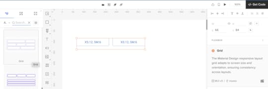
To establish a strong visual hierarchy and ensure your product page is user-friendly, start by setting up a grid layout. You can easily do this by selecting the “Layout” tool from the top menu and choosing a grid that suits your design needs—typically, a 12-column grid is ideal for most eCommerce layouts.
Step 3: Add a Product Image Component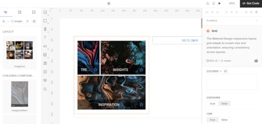
A high-quality product image is essential for any product page. To add an image component:
Go to the MUIv5 library in UXPin.Drag and drop the ImageList component onto your canvas.Adjust the size and placement to make the image a prominent feature of the page.Make sure to use high-resolution images and include multiple angles or variations if available. You can customize the ImageList component to display a gallery of product images, allowing users to swipe through different views.
Step 4: Insert Product Details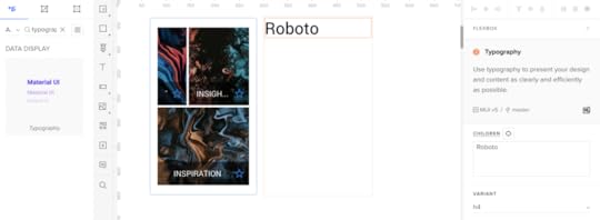
Next, you’ll want to add the product title, description, and price. Here’s how you can do it:
Product Title: Drag a Typography component from the MUIv5 library. Set the variant to “h5” for a prominent headline, and type in your product name.Product Description: Below the title, drag another Typography component and set the variant to “body1.” Here, you can provide a detailed description of the product, highlighting its features, benefits, and specifications.Price: Finally, use another Typography component for the price. Set it to a slightly larger variant like “h6” to make it stand out. You can also use a different color to draw attention.Step 5: Add a Call to Action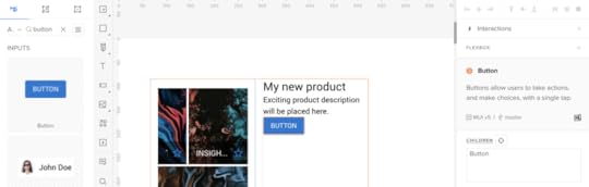
Your product page needs a clear and compelling call to action. For most e-commerce sites, this is the “Add to Cart” or “Buy Now” button. To add this:
Drag the Button component from the MUIv5 library onto the canvas.Place it below the product details and adjust its size and position.Set the button’s variant to “contained” for a solid, noticeable look. You can customize the color to match your brand’s theme.Make sure your CTA is prominent and easy to find—this is key to driving conversions.
Step 6: Include Customer Reviews and Ratings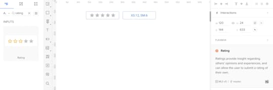
Customer reviews and ratings build trust and provide social proof. To add a review section:
Use the Grid component from MUIv5 to create a structured layout.Inside the grid, use the Rating component for displaying stars and Typography components for review text.You can also add an IconButton with a “thumbs up” icon to allow users to like reviews, enhancing engagement.Step 7: Add Related Products or Recommendations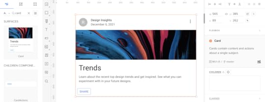
To encourage cross-selling, add a section for related products or recommendations:
Use a Card component from the MUIv5 library.Add an image, title, and price to each card, mimicking your primary product layout but on a smaller scale.Arrange these cards horizontally or in a grid layout below the main product information.Step 8: Finalize and PreviewOnce all components are in place, fine-tune the alignment, spacing, and visual hierarchy to ensure a cohesive and polished design. Use UXPin’s Preview Mode to test your design and make any necessary adjustments.
Check out UXPin’s example page to see how Preview mode works at UXPin.
 Step 9: Share and Collaborate
After finalizing your product page design, share it with your team or stakeholders for feedback. UXPin allows for easy collaboration, so you can quickly iterate on the design based on their input.
Create Your Own Product Page Design in UXPinAnd there you have it—a fully functional and visually appealing product page designed in under 15 minutes using MUI components. With these steps, you’ve created a user-friendly product page that not only looks great but is also optimized for conversions.
Give it a try and see how quickly you can design a product page that will impress your customers and drive sales. Discover UXPin Merge.
Discover MergeThe post How to Design a Product Page – A Quick Tutorial appeared first on Studio by UXPin.
What are Design Specifications?

In the world of digital product design, a seamless design handoff is crucial for ensuring that the vision crafted by designers is accurately brought to life by developers. Yet, this phase can often be fraught with miscommunication, inconsistencies, and inefficiencies.
UXPin provides a unique platform that integrates design and development like no other. Whether you’re a designer looking to streamline your workflow or a developer wanting to minimize guesswork, understanding the power of UXPin can revolutionize the way you work. Try UXPin for free.
Build advanced prototypes
Design better products with States, Variables, Auto Layout and more.
Try UXPin .try-uxpin-banner { margin: 40px 0px;}.try-uxpin__container { display: flex; max-width: 689px; height: 210px; padding: 20px; padding-left: 24px; border: 2px solid black; border-radius: 4px; align-items: center; justify-content: space-between; background-color: white; box-shadow: 10px 10px black;}.try-uxpin__left { width: 54%;}.try-uxpin__heading { font-size: 28px !important; font-weight: bold;}.try-uxpin__left p { margin: 10px 0px !important; color: black !important;}.try-uxpin__text { margin: 0 !important; font-size: 18px !important; line-height: 22px !important;}.try-uxpin__button { width: 135px; height: 44px; background: black; margin: 10px 0px; padding: 10px 20px; border: none; border-radius: 2px; color: white; font-size: 16px; text-align: center;}.try-uxpin__button:hover { cursor: pointer;}.try-uxpin__image { max-width: 320px !important; height: 200px; margin-right: -21px; margin-bottom: -6px;}@media (max-width: 760px) { .try-uxpin__container { height: auto; margin: 10px; align-items: left; }}@media (max-width: 500px) { .try-uxpin__container { flex-direction: column; } .try-uxpin__left { width: 100%; align-items: normal; }}Definition of Design Specifications
Design specifications are detailed documents that provide comprehensive information about the functionality, appearance, and behavior of a product.
These specifications serve as a bridge between designers, developers, and stakeholders, outlining all necessary details that help developers translate the design into an end product.
They typically include information such as dimensions, colors, typography, spacing, interactions, and various other elements that are crucial for maintaining consistency and alignment throughout the development process.
Purpose of Design Specifications
The primary purpose of design specifications is to ensure that the vision of a design team is accurately translated into the final product. By providing clear and detailed guidelines, design specifications help reduce ambiguity and misinterpretation during the development phase.
This also serves as a documentation that designers use when a product has been developed to remind everyone, including developers, product managers, and stakeholders how the product was designed, ensuring everyone involved has a shared understanding of the product’s goals and requirements.
Moreover, design specifications serve as a reference point throughout the product lifecycle. They can be revisited and updated as necessary, ensuring that any changes or enhancements to the product align with the original design intent. This consistency is vital in maintaining a cohesive user experience and brand identity across different platforms and updates.
How to Create Design SpecificationsCreating design specifications involves several steps, each aimed at capturing the essential aspects of a design in a way that is both comprehensive and easy to understand. Here are the key steps to develop effective design specifications:
Understand the Product Requirements: Start by gathering all necessary information about the product’s goals, user goals, technical constraints, and business objectives. This foundational knowledge helps in creating a design specification that aligns with the overall project vision.Leave Comments on Your Design: As you develop the design, meticulously leave notes on your design outlining all design decisions, including the reasoning behind them. This includes detailing the visual design (colors, fonts, iconography), interaction patterns, and user flows. Providing context for these decisions helps other team members understand the rationale and ensures consistency.Automate Design Specifications with Tools: Leverage design tools and platforms like UXPin to create and manage design specifications efficiently. UXPin, for instance, creates the design specs automatically based on the prototype.Maintain Clarity and Detail: The design specifications should be detailed enough to prevent any misinterpretations but clear enough to be quickly understood. Use clear language, lots of comments, and annotations to enhance comprehension. Including examples of edge cases and describing the behavior of interactive elements can also be particularly helpful.By following these steps, teams can create robust design specifications that streamline the development process, enhance communication, and ensure a high-quality final product.
How UXPin Simplifies Design SpecificationsUXPin offers a robust set of tools for reviewing designs, collaborating with team members, and preparing for developer handoff.
The tool has four modes that help designers create and share design specifications. Each mode serves a unique purpose to enhance every part of design process, from collaboration and feedback to developer handoff.
Simulate mode allows you to bring your interactions and animations to life and see how they work on different devices.Comment mode is perfect for gathering feedback and collaborating with your team and stakeholders.Spec mode provides detailed technical information, making it ideal for developer handoff.Documentation mode ensures that all additional details and explanations are available for a smooth development process.By effectively utilizing these modes, you can streamline your design workflow, enhance collaboration, and ensure a high-quality final product.
Navigating UXPinBefore we dive into the specific modes, let’s start with the basics of navigating the UXPin Preview interface.
Menu OptionsOn the left side of the preview window, you will find several options. These allow you to:
Edit Your Prototype: Return to the editor where you can make changes to your design.Go Back to Your Dashboard: Navigate to your projects dashboard.Start a Live Presentation: Launch a live presentation to showcase your prototype.Logout: Sign out of your UXPin account.Getting to a Site MapJust to the right of the menu, you’ll see the site map, which displays all the pages in your prototype. You can navigate through these pages here and search for a specific page using the search bar. Additionally, an icon next to a page indicates that documentation has been added to that page.
UXPin PreviewNow, let’s go through each mode in UXPin Preview and understand their functionalities.
Simulate Mode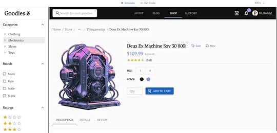
The Simulate mode brings your interactions and animations to life. Here’s what you can do in Simulate mode:
Preview Interactions and Animations: This mode allows you to see how the interactions and animations designed in the editor behave in a real-time environment.Device View: You can preview your design on different devices, which is great for ensuring responsiveness and usability across various platforms.Share Preview Links: Share the preview link of your prototype with stakeholders. They can view and interact with the design directly in Simulate mode, providing an interactive experience without needing access to UXPin.Zoom and Highlight Interactions: On the right side, there are options to zoom in and out of your design and highlight interactions to see which elements are interactive. This is particularly helpful for reviewing complex designs.Comment Mode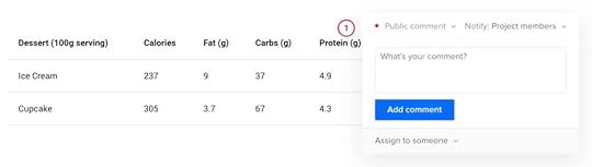
The Comment mode is all about collaboration and feedback. Here’s how to use it effectively:
View CommentsWhen you switch to Comment mode, you’ll see pins or icons indicating comments on the design. The color coding of the pins represents the status and type of the comment:
Green: Resolved comments.Purple: Team comments, visible only to team members.Red: Public comments, visible to everyone who has access to the preview.Add CommentsTo add a comment, click anywhere on the design. A comment box will appear where you can type your feedback or suggestions. You can also specify if the comment is public or for the team only.
Notify and Assign Comments: You can notify specific team members or assign comments directly to them, making it easier to manage feedback and action items.Review and Filter Comments: In the top right, there’s an option to review all comments. You can search and filter comments by visibility (team or public) or status (resolved or unresolved). This helps in managing feedback effectively and ensuring nothing is missed.Spec Mode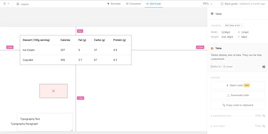
Spec mode is the technical side of your design, ideal for developer handoff. Here’s what you can do in Spec mode:
Overview of Page Elements: On the right side, you’ll find a summary of the entire page, including general information like canvas size, grid usage, colors, and typography.Detailed Element Information: Clicking on any specific element provides automated redlining, which shows the distance between elements, ensuring precise alignment and spacing. You can also view details like size, color, typography, and CSS code. UXPin automatically generates the CSS code for each element, making the handoff to developers seamless.Style Guide: The style guide section gives an overview of all the design elements used, including colors, typography, and assets. This comprehensive summary helps developers understand the design system and implement it consistently across the product.Documentation ModeDocumentation mode provides additional details about your design, which are added by designers in the editor. This mode is crucial for sharing context and explanations with developers and stakeholders. Here’s what it includes:
Detailed Annotations: Designers can add notes and explanations for different design elements, providing extra context that might not be immediately obvious. This helps developers understand the intended functionality and behavior of elements.Comprehensive Documentation: Documentation mode ensures that everyone involved in the project has access to all the necessary information, reducing the chances of miscommunication and errors during development.Why Use UXPin Merge for Design Specifications?UXPin Merge offers a transformative approach to managing design specifications by integrating design and development in a way that no other tool does.
For teams looking to improve collaboration, reduce errors, and ensure that designs are implemented exactly as intended, UXPin Merge is an invaluable asset. By providing a single source of truth, automating specifications, and fostering a more integrated workflow, Merge helps teams build better products, faster.
Accessing Design Specifications in UXPin Merge is intuitive and streamlined, providing both designers and developers with immediate access to everything they need:
Real-Time Component Specs: With UXPin Merge, specifications are automatically tied to the code components used in your designs. This means you can access up-to-date specs directly from the design canvas at any time. By clicking on a component, designers and developers can view all relevant specifications—such as color, typography, spacing, states, and interactions—without needing to switch tools or manually document anything.Interactive Previews and Live Code: Merge provides an interactive environment where you can see live code and real-time previews of your components. This makes it easy to understand how changes in code affect the design. By allowing developers to inspect the code directly from UXPin, you eliminate guesswork and ensure that every aspect of the design aligns with the production environment.Centralized Documentation and Style Guides: All specifications and documentation are centralized within UXPin, making them easily accessible to everyone on the team. This includes detailed component documentation, usage guidelines, and style guides. By having a single, centralized repository for all specs and guidelines, UXPin Merge simplifies the process of maintaining design consistency across the entire product.Simplified Handoff with Downloadable Assets and Code: When it’s time for developer handoff, UXPin Merge allows for easy downloading of assets and export of CSS, ensuring developers have all the resources they need to implement the design accurately. This feature greatly reduces the back-and-forth typically required during the handoff process and ensures that the final product matches the design specifications perfectly.If you’re ready to streamline your design and development process, reduce the friction of handoffs, and maintain consistency across your product, UXPin Merge is the tool you’ve been looking for.
With its powerful combination of design specs, code to copy, and centralized documentation, UXPin Merge ensures that your design and development teams are always in sync. Experience the power of design and development in harmony with UXPin Merge and elevate your product design workflow to new heights.
Put Design Specifications on AutopilotDesign specifications are a vital part of the design process, ensuring that every detail of a design is clearly communicated to developers and stakeholders. They serve as a blueprint that guides the implementation of your design, helping to maintain consistency and alignment across your product.
With features like automated redlining, interactive simulations, and built-in style guides, UXPin makes the complex task of managing design specifications simple and efficient. If you’re looking to enhance your design workflow, reduce errors, and create a more cohesive product, give UXPin a try. Its powerful tools and user-friendly interface make it an invaluable asset for any design team. Try UXPin for free.
Try UXPin for freeThe post What are Design Specifications? appeared first on Studio by UXPin.
August 27, 2024
A Practical Approach to Functional Specifications Documents
If the product requirements document is the heart of your product, then the functional specs make up your product’s brain — it explains how everything works together in greater detail.
Since all companies follow different processes (Lean, Agile, Kanban, etc.), we’ll look at just the most relevant parts of a functional requirements document.
Maintaining accurate and up-to-date functional documentation can be a daunting task for design and development teams. Often, documentation falls behind due to rapid iterations, leaving teams to rely on outdated or incomplete specs. UXPin Merge is a design tool that helps you design with real functional components, thus making the maintenance of documentation and artifacts easier. Check it out. Request access to UXPin Merge.
Reach a new level of prototyping
Design with interactive components coming from your team’s design system.
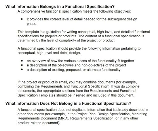
Discover UXPin Merge .discover-merge { margin: 40px 8px;}.discover-merge__container { display: flex; max-width: 690px; height: 200px; padding: 20px; padding-left: 24px; border-radius: 4px; background-color: black; box-shadow: 10px 10px #9999ff; align-items: center; justify-content: space-between;}.discover-merge__left { width: 50%;}.discover-merge__left p { margin: 10px 0px !important; color: white !important; font-size: 18px !important;}.discover-merge__heading { font-weight: bold !important; color: white !important; font-size: 18px !important;}.discover-merge__text { margin: 0 !important; line-height: 22px !important;}.discover-merge__button { width: 174px; height: 44px; margin: 10px 0px; border: none; border-radius: 2px; background: white; color: black; font-size: 16px; text-align: center;}.discover-merge__button:hover { cursor: pointer;}.discover-merge__image { max-width: 320px !important; height: 200px; margin-right: -19px;}@media (max-width: 760px) { .discover-merge__container { height: auto; margin: 10px; align-items: left; }}@media (max-width: 500px) { .discover-merge__container { flex-direction: column; } .discover-merge__left { width: 100%; align-items: normal; }}What is a Functional Specifications Document?In the world of software development, a functional specifications document is a set of guidelines that detail how a particular component of a software should function. It is different from a product requirements document (PRD) in that a PRD lists the features of a software.
For example, a product requirements document might list “user registration” as a feature of a social app. The functional requirements document will give a high-level detail of the user registration process, such as the necessary form fields and any age restrictions. It will also list any error messages or success messages the end-user should see, depending on different use cases.
A functional specifications document is meant for all the stakeholders involved in product development. This includes designers, developers, testers, and the client. A well-written FSD is useful for formalising expected user experience from a software product. This, in turn, allows better understanding between the development team and the client, which can make the entire design process a lot faster.
What Should be Included in a Functional Specifications DocumentIn an Agile environment, the FSD is kept as concise as possible due to the fast pace of sprints. Regardless of length, the FSD should convey detail regarding any externally visible behavior of the product such as:
Text of error messagesSupported web browsers, operating systems, screen sizesPixel sizes of buttons and color shadesSize and allowable contents of data input fieldsIn Agile companies, a brief FSD can also be accompanied by using JIRA (or any other development/bug tracking program) to manage development against the specs of the FSD. As you can see below, dashboards included in most development tracking software makes it easy to see who is doing what technical task.
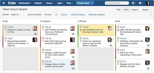
Source: Atlassian JIRA
Unlike the product requirements document, which is completed by the product manager, the functional specifications document can also be completed by business analysts or technical leads. Regardless of who completes the document, it’s still important to understand its implications. As discussed in the free Guide to UX Design Process & Documentation, the functional specifications document picks up where the PRD left off by architecting the systems and specifications to achieve the features.
As you’ll see below, the FSD is all about exploring the feasibility of a product. UX designers are mostly concerned with desirability, while product managers look to maximize viability. All three elements are required for a well-design product.

Source: Desirability Feasibility Viability Venn Diagram
For simplicity’s sake, design philosophies should be kept out of the functional specification document so that the document stays true to its technical audience. While smaller companies may combine the FSD and PRD into one document, the two should be treated separately.
Former head of product development for the Coldfusion project at Adobe, Jason Delmore provides a fleshed-out functional specification document template including information on what does and doesn’t belong in an FSD. You can also check out former Microsoft Excel product manager Joel Spolsky’s complete FSD for his startup Fog Creek Software.
Since a technical lead will usually take ownership of the functional specs, we’ll only look at what’s relevant from a product management point of view. In a nutshell, the FSD is what’s given to developers so they know what to build, what’s given to testers so they know what to test, and what’s given to stakeholders so they know exactly what’s being created.
While your PRD might say something like “The app should include a product listing”, the FSD would say “The system will register a product using the following fields: Name (30 characters), Details (200 characters), Price (currency), Category (pick list).”
The technical direction of an FSD can also be embodied in a project Wiki.
Functional Specification Document ExamplesProject Fedora, an open-source operating system created by Linux maker Redhat,provides an excellent example of collaboration on functionality requirements. Although a Wiki is ideal for editing and version control (no need to tell people to delete outdated specifications documents), it can just as easily turn into a mess of tangled links. Either the technical lead or the product manager should help moderate the Wiki.
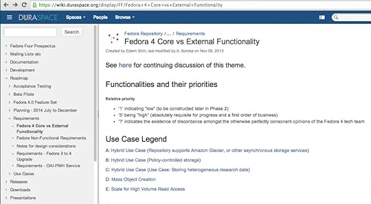
Source: Core vs. External Functionality in Fedora
Once you’ve chosen a method to outline the technical requirements, you can use any variety of spreadsheet program (MS Project is great if you’re getting detailed) to outline timing.
Unlike the PRD which included rough timing, you now have a much better idea of sprint lengths and delivery dates since the technical work is clearer. The ranking of features done in the PRD can also be included to keep scope in check.
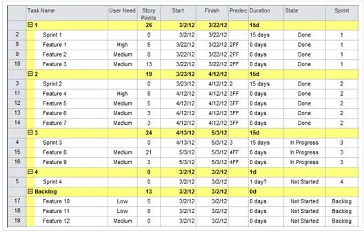
Source: Creating an Agile Project Schedule in MS Project
Whether you choose lightweight or page-heavy methods, documenting your product development improves transparency and can help prevent last-minute stakeholder changes.
An FSD Doesn’t Have to Be BoringWhile it sounds fairly dry, the functional specifications document doesn’t need to be on paper. We’ve already looked at project Wikis as a way of introducing more collaboration, but there’s a few other alternatives that might work better (especially if you’re going Lean or Agile)
Use cases, scenarios, and technical specs described in a spreadsheet combined with an accompanying prototypeJob stories (popularized by Intercom) and acceptance criteria written down on Post-Its and tacked on a wallA graphical format using a tool like Keynote or UXPin (we’ll start wireframing or prototyping and include use cases and any technical specs in a separate page within the project)To get more practical tips on product and UX design process and documentation, check out the free e-book. Expert advice is featured from Aarron Walter, Laura Klein, Ian McAllister, and dozens others. Visual examples are also shown from companies like Vurb, MailChimp, Apple, Google, and many more.
Functional documentation often serves as a communication bridge between designers, developers, and other stakeholders. UXPin Merge enhances this communication by providing a common language and platform where design decisions are transparent and directly tied to the actual components being used in the product. This clarity helps teams collaborate more effectively, reducing back-and-forth discussions and ensuring everyone is on the same page. Request access to UXPin Merge.
Discover MergeThe post A Practical Approach to Functional Specifications Documents appeared first on Studio by UXPin.
Chakra UI vs Material UI – Detailed Comparison for 2024
When building modern web applications, selecting the right UI library can make a significant difference in both development speed and user experience. For developers working with React, two of the most popular UI frameworks are Chakra UI and Material UI. Both offer extensive component libraries, robust customization options, and active community support, but they cater to different needs and design philosophies.
In this article, we’ll dive deep into a side-by-side comparison of Chakra UI and Material-UI to help you determine which framework best suits your project’s requirements in 2024. Whether you’re seeking a more flexible and minimalistic design approach or a framework that adheres strictly to material design guidelines, understanding the strengths and weaknesses of each can empower you to make an informed decision.
Build advanced prototypes with code-backed components. UXPin Merge is a design technology that allows teams to build UI with their apps’ building blocks. It seamlessly integrates with React libraries, making it easier to bring your ideas to life while maintaining consistency and efficiency across your projects. Request access to UXPin Merge.
Design UI with code-backed components.Use the same components in design as in development. Keep UI consistency at scale.
Try UXPin Merge .discover-merge { margin: 40px 8px;}.discover-merge__container { display: flex; max-width: 690px; height: 200px; padding: 20px; padding-left: 24px; border-radius: 4px; background-color: black; box-shadow: 10px 10px #9999ff; align-items: center; justify-content: space-between;}.discover-merge__left { width: 50%;}.discover-merge__left p { margin: 10px 0px !important; color: white !important; font-size: 18px !important;}.discover-merge__heading { font-weight: bold !important; color: white !important; font-size: 18px !important;}.discover-merge__text { margin: 0 !important; line-height: 22px !important;}.discover-merge__button { width: 174px; height: 44px; margin: 10px 0px; border: none; border-radius: 2px; background: white; color: black; font-size: 16px; text-align: center;}.discover-merge__button:hover { cursor: pointer;}.discover-merge__image { max-width: 320px !important; height: 200px; margin-right: -19px;}@media (max-width: 760px) { .discover-merge__container { height: auto; margin: 10px; align-items: left; }}@media (max-width: 500px) { .discover-merge__container { flex-direction: column; } .discover-merge__left { width: 100%; align-items: normal; }}Chakra UI vs Material UI – Feature ComparisonWhen selecting a UI library for your React projects, it’s essential to understand how each option can align with your design and development goals. Below, we break down the key features of Chakra UI and Material UI to help you decide which framework is the best fit for your needs.
Chakra UI and Material UI as Design SystemsA solid design system is the backbone of a cohesive user experience, and both Chakra UI and MUI (which Material UI is often called) offer robust theming capabilities. Chakra UI focuses on simplicity and flexibility, using design tokens to create a consistent look and feel across your application. Its theming system is intuitive, allowing for easy customization with built-in support for light and dark modes, as well as fine-grained control over typography, colors, and spacing.
Material UI, on the other hand, is built around Google’s Material Design guidelines, providing a more structured approach to design systems. It offers a comprehensive set of design tokens that help maintain visual consistency and coherence, especially for projects that adhere strictly to Material Design principles. The theming capabilities are powerful, allowing you to override almost any style or create custom themes tailored to your brand.
Quality of UI ComponentsA comprehensive component library is crucial for rapid development and design consistency. Chakra UI provides a wide array of accessible, lightweight components designed with flexibility in mind. Each component is fully customizable, ensuring that you can adapt the look and feel to match your project’s unique style. The library is continuously growing, with a strong focus on community feedback and contributions, making it ideal for developers who value versatility and simplicity.
Material UI offers one of the most extensive component libraries available for React. It provides a rich set of pre-designed components that align with Material Design specifications, ensuring a polished, professional look straight out of the box. MUI is particularly well-suited for projects that require a consistent, standardized design language, making it a great choice for enterprise applications or teams looking for a reliable, well-documented library.
Ease of CustomizationCustomization is key to creating a unique and engaging user experience, and both libraries excel in this area but with different approaches. Chakra UI is designed with developer experience in mind, offering an easy-to-use API and extensive documentation that make customizing components and themes a breeze. The library provides straightforward mechanisms for altering component styles through props, theme overrides, and style objects, allowing for rapid iterations and adjustments.
MUI also excels in customization, particularly for those familiar with CSS-in-JS. Its styling solution, based on Emotion or styled-components, gives you full control over component appearance, enabling deep customization through theme overrides and CSS variables. This flexibility allows developers to create highly personalized and responsive designs, although the learning curve may be steeper for those new to these styling methods.
PerformancePerformance is a critical factor, especially for applications that need to deliver a seamless user experience. Chakra UI is known for its lightweight components and minimalistic approach, which can lead to faster load times and improved performance. The library emphasizes simplicity, which often results in smaller bundle sizes and more efficient rendering, making it an excellent choice for projects where performance is a top priority.
Material UI, while offering a richer set of components, may introduce a slightly larger bundle size due to its comprehensive features and dependencies. However, with careful tree-shaking and optimization, MUI can still deliver performant applications. It’s essential to consider the trade-offs between the out-of-the-box functionality and the potential impact on performance when choosing Material UI.
AccessibilityAccessibility should never be an afterthought, and both Chakra UI and Material UI prioritize building accessible applications. Chakra UI takes accessibility seriously by default, with components designed to be fully accessible and compliant with WAI-ARIA standards. The library’s commitment to accessibility ensures that developers can create inclusive experiences without additional overhead.
MUI also places a strong emphasis on accessibility, with many components built to support keyboard navigation, screen readers, and other assistive technologies. However, achieving full compliance may require additional configuration and testing, especially when deviating from the standard Material Design patterns. Both libraries offer a solid foundation for building accessible applications, but the choice may depend on how much customization and additional accessibility work you are willing to undertake.
By understanding these key features and how they align with your project’s goals, you can make an informed decision on whether Chakra UI or Material UI is the right choice for your next React application.
Chakra UI vs Material UI – Use Case ScenariosChoosing between Chakra UI and Material UI depends on the specific needs of your project. Here’s when each library might be the better choice:
Use Chakra UI for:Custom Design Flexibility: Ideal for projects that need a unique, highly customizable design. Great for startups or applications with distinct branding.Performance: Perfect for performance-focused applications like dashboards and SPAs, where lightweight components and fast load times are crucial.Rapid Prototyping: Best for quick development cycles and MVPs, where simple APIs and easy customization allow for fast iteration.Use Material UI for:Material Design Compliance: The go-to choice for projects that need to strictly follow Google’s Material Design guidelines, such as enterprise apps or internal tools.Rich Component Library: Excellent for applications requiring a wide range of pre-built components with extensive functionality, like CMS or CRM tools.Cross-Platform Consistency: Ideal for projects needing a consistent look and feel across different devices and platforms, ensuring brand uniformity.These scenarios will help you decide whether Chakra UI or Material UI is the best fit for your project, based on your specific requirements and goals.
Community and Ecosystem of Chakra UI vs MUIChoosing the right UI library often depends on the community support and ecosystem surrounding it.
Popularity and Community SupportChakra UIChakra UI has quickly gained popularity in the React community, with over 37.3k stars on GitHub. It has an active user base, with many developers contributing to its growth through plugins and extensions.
The community is very supportive, often engaging on platforms like Discord and GitHub, where developers can share ideas, seek help, and contribute to the library’s ongoing development. This vibrant community ensures that Chakra UI remains well-maintained and up-to-date, with frequent updates and improvements.
Material UIMUI is one of the most established and widely used React UI libraries, with over 92.5k stars on GitHub. It has a large and active community, reflected in its extensive documentation, numerous plugins, and strong presence on forums like Stack Overflow.
Material UI’s long-standing presence has helped it build a robust ecosystem, making it a highly supported option for developers looking for reliable community backing.
Availability of Plugins and ExtensionsChakra UIChakra UI has a growing ecosystem with various third-party plugins and extensions that enhance its functionality. While it is relatively newer compared to Material-UI, its modular design encourages developers to create and share plugins, expanding the core library’s capabilities. This community-driven approach ensures that Chakra UI continually evolves with new features and improvements.
Material UIMaterial UI boasts a well-established ecosystem of third-party plugins and extensions due to its long-standing presence in the React community. With a wide range of additional component libraries, themes, and utility packages available, developers have access to a broad array of tools to enhance their applications. This extensive ecosystem allows for easy customization and expansion, making Material UI suitable for projects of all sizes.
Documentation and Community SupportChakra UIChakra UI is known for its well-organized and comprehensive documentation, which includes detailed guides, API references, and examples for both beginners and advanced users. The community support is also very responsive, especially on platforms like GitHub and Discord, where maintainers and contributors actively help resolve issues and answer questions.
Material UIMUI offers extensive documentation that is regularly updated to reflect new features and changes. The documentation includes thorough API references, guides, and examples, making it easy for developers to learn and use the library effectively. The community support is robust, with active participation across various forums, ensuring that developers can find answers and troubleshoot issues quickly.
Real-World Benchmarks: Chakra UI vs. Material-UIWhen choosing a UI library, understanding real-world performance and practical applications is key. Here’s how Chakra UI and Material-UI stack up based on performance benchmarks and case studies:
Performance BenchmarksChakra UIBundle Size: Chakra UI is known for its lightweight bundle, which is around 279.6 kB minified and 89.0 kB when compressed using GZIP. This compact size makes Chakra UI a great choice for smaller projects or applications where loading speed is a priority. Its minimalistic design ensures that applications built with Chakra UI load quickly and efficiently.Performance: Designed with a CSS-in-JS approach, Chakra UI allows for dynamic styling but may introduce some performance overhead in applications that handle a large amount of data or require extensive real-time updates. However, for most small to medium-sized projects, Chakra UI performs exceptionally well, providing a balance between performance and customization.Material UIBundle Size: Material-UI’s bundle is slightly larger, coming in at around 335.3 kB minified and 93.7 kB when compressed with GZIP. While this size is larger than Chakra UI, Material-UI employs several optimization techniques like tree-shaking and lazy loading to minimize its impact on performance. These techniques help manage the library’s size effectively, making it a viable choice even for large-scale projects.Performance: Material-UI is known for its efficiency in handling large, complex applications. It excels in scenarios that demand a robust UI framework capable of managing numerous components and styles, thanks to its efficient runtime performance. This makes it particularly suitable for enterprise-level applications where a comprehensive set of components and consistent design are crucial.Case Studies and TestimonialsChakra UIAdopted by companies like Coinbase and Brex, Chakra UI is praised for its simplicity and flexibility. These companies use Chakra UI to create user interfaces that are highly customizable and easy to iterate upon, highlighting its suitability for projects that require quick development and frequent design changes. Developers often commend Chakra UI for its intuitive API and ease of use, which facilitate the creation of accessible, performant user interfaces.
Material UITrusted by major companies such as Spotify, NASA, and Netflix, Material-UI is celebrated for its reliability and ability to handle large-scale, complex applications. These organizations rely on Material-UI for its extensive component library, which adheres strictly to Material Design principles, ensuring a cohesive and polished look across various platforms. Material-UI’s robust community support and detailed documentation further enhance its appeal for developers working on enterprise-level projects.
Final words – Chakra UI vs Material UIChakra UI is ideal for small to medium-sized projects that require a lightweight and highly customizable UI library with an intuitive API. It offers a smaller bundle size, which improves loading times, and built-in support for responsive design, making it a strong choice for performance-focused applications.
However, it may struggle with performance in data-heavy applications due to its CSS-in-JS approach and has fewer pre-styled components compared to MUI.
On the other hand, Material UI is better suited for larger, enterprise-level projects that require a robust, feature-rich UI framework. It provides a comprehensive set of pre-styled components that follow Material Design principles, ensuring consistency and a polished look.
While Material UI has a larger bundle size, it employs optimization techniques to enhance performance in complex applications. It also has a steeper learning curve and offers less flexibility for creating unique designs that deviate from Material Design guidelines. Choosing between these libraries depends on your project’s size, performance needs, and customization requirements.
UXPin Merge is a powerful technology that bridges the gap between design and development by allowing both teams to use the exact same components in their workflows. With Merge, designers can create high-fidelity prototypes using real React components directly from the developer’s codebase, ensuring a true-to-life representation of the final product. This approach eliminates the discrepancies often found between design and development, leading to a more streamlined process and faster iterations. Request access to UXPin Merge.
Discover MergeThe post Chakra UI vs Material UI – Detailed Comparison for 2024 appeared first on Studio by UXPin.
August 26, 2024
HTML vs CSS – Web Development Foundations in 2024
HTML and CSS are the core technologies behind every website, each serving a unique purpose. HTML, or Hypertext Markup Language, provides the structure and content, laying out the framework for a webpage. CSS, or Cascading Style Sheets, is responsible for styling and layout, bringing your HTML to life with colors, fonts, and layouts.
Understanding the differences between HTML and CSS is crucial for any web designer or developer. In this article, we’ll break down these two essential languages and explore how they work together to create beautiful, functional websites.
UXPin is a prototyping tool that leverages both HTML and CSS to help designers create interactive, code-based prototypes. Try UXPin for free.
Build advanced prototypes
Design better products with States, Variables, Auto Layout and more.
Try UXPin .try-uxpin-banner { margin: 40px 0px;}.try-uxpin__container { display: flex; max-width: 689px; height: 210px; padding: 20px; padding-left: 24px; border: 2px solid black; border-radius: 4px; align-items: center; justify-content: space-between; background-color: white; box-shadow: 10px 10px black;}.try-uxpin__left { width: 54%;}.try-uxpin__heading { font-size: 28px !important; font-weight: bold;}.try-uxpin__left p { margin: 10px 0px !important; color: black !important;}.try-uxpin__text { margin: 0 !important; font-size: 18px !important; line-height: 22px !important;}.try-uxpin__button { width: 135px; height: 44px; background: black; margin: 10px 0px; padding: 10px 20px; border: none; border-radius: 2px; color: white; font-size: 16px; text-align: center;}.try-uxpin__button:hover { cursor: pointer;}.try-uxpin__image { max-width: 320px !important; height: 200px; margin-right: -21px; margin-bottom: -6px;}@media (max-width: 760px) { .try-uxpin__container { height: auto; margin: 10px; align-items: left; }}@media (max-width: 500px) { .try-uxpin__container { flex-direction: column; } .try-uxpin__left { width: 100%; align-items: normal; }}What is HTML?HTML, or Hypertext Markup Language, is the standard markup language used to create and structure content on the web. It acts as the backbone of all web pages, providing a framework that defines the layout and organization of a website. HTML uses a series of elements or tags to specify different parts of a webpage, such as headings, paragraphs, links, images, and lists. Each element tells the browser how to display the content on the page.
Developed in the early 1990s, HTML has evolved significantly, with the latest version being HTML5. This version introduced a range of new features and capabilities, such as improved support for multimedia, better semantic elements, and more powerful forms, enhancing both user experience and website functionality.
At its core, HTML is all about structure. For example, an HTML file starts with a declaration, followed by the tag, which encompasses the entire document. Inside the tag, you’ll find the
and tags. The contains meta-information like the title and links to stylesheets, while the includes all the visible content on the page.Example of HTML code My First Web Page Hello, World!This is my first web page using HTML.
In this example, the
tag is used to create a heading, while thetag creates a paragraph. These HTML elements are the basic building blocks of web pages, and they form the structure that CSS and JavaScript can later style and enhance.
Understanding HTML is crucial for anyone involved in web design or development. It’s not just about creating content but also about ensuring that content is well-structured and accessible to all users, including those using screen readers or other assistive technologies. Additionally, well-structured HTML helps search engines understand and index your content effectively, which is vital for SEO.
In summary, HTML lays the foundation for all web content, providing the essential structure that defines how information is organized and displayed. Whether you’re creating a simple webpage or a complex web application, mastering HTML is a fundamental step in building a successful online presence.
What is CSS?CSS, or Cascading Style Sheets, is the language used to describe the presentation and design of a webpage. While HTML provides the structure and content of a webpage, CSS is responsible for its visual style, including layout, colors, fonts, and spacing. In essence, CSS brings HTML to life, transforming plain text into visually engaging content that enhances the user experience.
CSS was first introduced in the mid-1990s to address the limitations of HTML when it came to styling and design.
Before CSS, all styling had to be done directly within HTML, leading to repetitive and cumbersome code. CSS revolutionized web design by allowing designers to separate content from presentation, making it easier to maintain and update websites. The latest version, CSS3, has introduced advanced features like animations, gradients, transitions, and flexible layouts, enabling more dynamic and responsive web designs.
The core concept of CSS is its cascading nature, where styles are applied based on a hierarchy of rules and priorities. A simple CSS rule consists of a selector, which targets an HTML element, and a declaration block, which contains one or more declarations specifying the styling properties for that element.
Example of CSS codebody { font-family: Arial, sans-serif; background-color: #f0f0f0;}h1 { color: #333333; text-align: center;}In this example, the body selector applies a default font and background color to the entire webpage, while the h1 selector styles all
headings with a specific text color and alignment. This approach allows for consistent styling across a site and makes it easier to change the look and feel by simply modifying the CSS code.CSS also supports different ways to apply styles: inline, internal, and external. Inline styles are applied directly within HTML elements, internal styles are defined within a tag in the <head> section of an HTML document, and external styles are linked through a separate CSS file. External stylesheets are the most efficient way to manage styles across multiple pages, promoting cleaner code and easier updates.</p><p>By separating content from design, CSS empowers designers to create visually appealing and user-friendly websites without altering the underlying HTML structure. It also plays a crucial role in responsive web design, allowing pages to adapt to various screen sizes and devices. With media queries and flexible grid layouts, CSS makes it possible to design sites that look great on desktops, tablets, and smartphones alike.</p><p>In conclusion, CSS is an essential tool for web designers and developers, providing the means to control the visual presentation of a website. By mastering CSS, you can create more dynamic, responsive, and aesthetically pleasing web experiences that engage users and enhance the overall effectiveness of your site.</p><h2 class="wp-block-heading">HTML vs CSS – 5 Key Differences</h2><p>HTML (Hypertext Markup Language) and CSS (Cascading Style Sheets) are two fundamental technologies that work together to create and style web pages, but they serve distinct purposes and have different roles in web development. Understanding their differences is essential for anyone looking to build or design websites.</p><h3 class="wp-block-heading">Purpose and Function</h3><p>The primary difference between HTML and CSS lies in their purpose. HTML is a markup language used to structure and organize content on the web. It defines the elements of a webpage, such as headings, paragraphs, images, links, and lists, and establishes the framework for how the content is displayed in a browser.</p><p>In contrast, CSS is a style sheet language used to control the presentation and layout of HTML elements. CSS defines the visual aspects of a webpage, such as colors, fonts, spacing, and positioning, allowing designers to separate content from design.</p><h3 class="wp-block-heading">Syntax and Structure</h3><p>HTML and CSS also differ in their syntax and structure. HTML uses a tag-based syntax, where elements are enclosed in angle brackets (e.g., <h1>, <p>, <div>), and often come in pairs with opening and closing tags (e.g., <p>…</p>).</p><p>These tags provide the instructions for browsers on how to display content. CSS, on the other hand, uses a rule-based syntax. Each rule consists of a selector (e.g., p, .class, #id) that targets HTML elements, and a declaration block that contains one or more declarations defining the styling properties (e.g., color: blue; font-size: 16px;). This separation allows CSS to be more flexible and reusable, as a single style sheet can be applied to multiple HTML documents.</p><h3 class="wp-block-heading">Dependency and Relationship</h3><p>HTML and CSS have a complementary yet interdependent relationship. HTML can exist without CSS, but a webpage created solely with HTML would be plain and lack visual appeal. Conversely, CSS needs HTML to function, as it relies on HTML elements to apply styles.</p><p>Together, they create a complete and cohesive web page: HTML provides the structure and content, while CSS adds the style and visual enhancement. This separation of concerns is a key principle in web development, promoting clean, maintainable, and scalable code.</p><h3 class="wp-block-heading">Implementation and Maintenance</h3><p>Another key difference is how HTML and CSS are implemented and maintained. HTML is written directly within the HTML file of a webpage, making it integral to the content. CSS can be implemented in three ways: inline (within HTML elements), internal (within a <style> tag in the HTML document), or external (in a separate CSS file linked to the HTML document).</p><p>External CSS files are the most efficient way to manage styles across multiple pages, as they allow for centralized control over the design. This approach makes it easier to update and maintain the website’s appearance, as changes to a single CSS file can instantly affect the entire site.</p><h3 class="wp-block-heading">Impact on User Experience and SEO</h3><p>HTML and CSS also differ in their impact on user experience and search engine optimization (SEO). Well-structured HTML is crucial for accessibility and SEO, as it helps search engines understand and index the content of a webpage. Proper use of semantic HTML tags (e.g., <header>, <article>, <footer>) improves the <a href="https://www.uxpin.com/studio/blog/web..." target="_blank" rel="noreferrer noopener">accessibility of a webpage</a> for screen readers and enhances SEO by giving search engines more context about the content.</p><p>CSS, while not directly affecting SEO, plays a vital role in user experience. It ensures that a webpage is visually appealing and responsive, adapting to different screen sizes and devices, which can reduce bounce rates and improve overall engagement.</p><h2 class="wp-block-heading">How HTML and CSS Work Together</h2><p>HTML and CSS are designed to work in tandem to create visually appealing and well-structured web pages. While HTML provides the foundational structure and content of a webpage, CSS enhances the visual appearance by applying styles to the HTML elements. This combination of structure and style is what brings a webpage to life, offering both functionality and aesthetics.</p><h3 class="wp-block-heading">Separation of Content and Presentation</h3><p>One of the core principles of modern web development is the separation of content and presentation, which is achieved through the use of HTML and CSS together. HTML focuses on defining the content and structure of a webpage using tags and elements. These elements outline where different pieces of content, such as text, images, and links, should appear.</p><p>CSS, on the other hand, is used to style these HTML elements, specifying how they should look and behave on the page. By keeping HTML and CSS separate, developers can maintain cleaner, more organized code, making it easier to update and modify either the content or the styling without affecting the other.</p><h3 class="wp-block-heading">Applying CSS to HTML</h3><p>CSS can be applied to HTML in several ways: inline, internal, and external. Inline CSS is added directly within the HTML element using the style attribute, allowing for quick and specific styling. Internal CSS is defined within a <style> tag in the <head> section of an HTML document, which applies styles to that specific page. External CSS involves linking an HTML document to a separate CSS file using the <link> tag.</p><p>External stylesheets are the most efficient method, especially for larger websites, as they allow for consistent styling across multiple pages and easier maintenance. For example, with an external CSS file, a single change in the CSS can be reflected on every page that uses that stylesheet.</p><h3 class="wp-block-heading">Cascading and Inheritance</h3><p>The “Cascading” in Cascading Style Sheets refers to how CSS rules are applied to HTML elements based on a hierarchy of rules and priorities. When multiple CSS rules could apply to an element, the browser determines which rules take precedence based on specificity, importance, and source order. This cascading nature allows for flexible and precise control over styling.</p><p>CSS also supports inheritance, where certain properties defined for a parent element are automatically passed down to its child elements, reducing the need for redundant code and making it easier to maintain a consistent design throughout a webpage.</p><h3 class="wp-block-heading">Example of HTML and CSS Working Together</h3><p>To illustrate how HTML and CSS work together, consider a simple example of a webpage with a header and a paragraph:</p><p><strong>HTML:</strong></p><div class="wp-block-syntaxhighlighter-code "><pre class="brush: xml; title: ; notranslate"><!DOCTYPE html><html> <head> <link rel="stylesheet" href="https://www.uxpin.com/studio/blog/htm... </head> <body> <h1>Welcome to My Website</h1> <p>This is a simple example of HTML and CSS working together.</p> </body></html></pre></div><h4 class="wp-block-heading">CSS (styles.css)</h4><div class="wp-block-syntaxhighlighter-code "><pre class="brush: css; title: ; notranslate">body { font-family: Arial, sans-serif; background-color: #f0f0f0; color: #333; margin: 0; padding: 20px;}h1 { color: #005f99; text-align: center;}p { font-size: 16px; line-height: 1.5;}</pre></div><p>In this example, the HTML file structures the content using <h1> for the header and <p> for the paragraph. The CSS file (styles.css) then styles these elements, setting the background color of the page, the font family, and the specific styles for the <h1> and <p> elements.</p><p>The HTML and CSS files work together seamlessly, with HTML providing the content and CSS enhancing the presentation.</p><h3 class="wp-block-heading">Enhancing User Experience with HTML and CSS</h3><p>By working together, HTML and CSS allow developers to create web pages that are both functional and visually engaging. HTML provides the semantic structure that search engines and assistive technologies rely on, improving <a href="https://www.uxpin.com/studio/blog/web..." target="_blank" rel="noreferrer noopener">accessibility</a> and <a href="https://www.uxpin.com/studio/blog/ux-..." target="_blank" rel="noreferrer noopener">SEO</a>. CSS enhances this structure with styling that makes the content more appealing and <a href="https://www.uxpin.com/studio/blog/nav..." target="_blank" rel="noreferrer noopener">easier to navigate</a>. Together, they ensure that <a href="https://www.uxpin.com/studio/blog/goo..." target="_blank" rel="noreferrer noopener">web pages look good</a> and perform well <a href="https://www.uxpin.com/studio/blog/cro..." target="_blank" rel="noreferrer noopener">across a variety of devices and screen sizes</a>, enhancing the overall user experience.</p><p>In summary, HTML and CSS are two complementary technologies that work together to build the modern web. HTML defines the content and structure of a webpage, while CSS provides the styling and layout, making the web visually appealing. By understanding how they interact, web designers and developers can create efficient, maintainable, and beautiful websites that <a href="https://www.uxpin.com/studio/blog/aes..." target="_blank" rel="noreferrer noopener">meet both functional and aesthetic needs</a>.</p><h2 class="wp-block-heading">HTML vs CSS – Still Relevant in 2024?</h2><p>Despite the rapid evolution of web development, HTML and CSS remain fundamental technologies in 2024. As the building blocks of the web, HTML structures content, while CSS handles styling and layout, making them essential for creating all websites and web applications. They have adapted well to new demands, with HTML5 and CSS3 introducing features like responsive design, advanced layouts, and multimedia support, ensuring compatibility with modern web standards.</p><p>HTML and CSS are also crucial for SEO and accessibility. HTML provides the semantic structure that search engines and assistive technologies rely on, while CSS allows for visual adjustments that enhance usability. Their universal compatibility across browsers ensures that websites reach a wide audience, making them indispensable tools in any developer’s toolkit.</p><p>Learning HTML and CSS is still a fundamental skill for <a href="https://www.uxpin.com/studio/blog/sof..." target="_blank" rel="noreferrer noopener">web developers</a>, as they form the foundation for more advanced technologies. As web development continues to evolve, HTML and CSS remain relevant, adaptable, and essential for creating interactive, <a href="https://www.uxpin.com/studio/blog/use..." target="_blank" rel="noreferrer noopener">user-friendly</a> websites.</p><h2 class="wp-block-heading">Build Code-Backed Prototypes with UXPin</h2><p>In summary, while HTML and CSS are both essential for building and designing websites, they have distinct roles and functions. HTML provides the structure and content of a webpage, while CSS controls its presentation and style. Understanding these key differences allows web designers and developers to use both technologies effectively, creating web pages that are not only functional and accessible but also visually engaging and responsive.</p><p>UXPin uses real HTML, CSS, and JavaScript to create interactive prototypes. When you design in UXPin, you’re not just creating visual representations of your interface; you’re actually building it with code. This means the elements you design in UXPin behave as they would in a real web environment, offering a true-to-life user experience. For instance, buttons created in UXPin will have actual HTML and CSS properties that you can inspect and modify. <a href="https://www.uxpin.com/sign-up" target="_blank" rel="noreferrer noopener">Try UXPin for free</a>.</p><div class="wp-block-button is-style-fill"><center><a class="btn btn-flat btn-large btn-content-width" href="https://www.uxpin.com/sign-up" target="_blank" rel="noopener">Try UXPin for free</a></center></div><p>The post <a href="https://www.uxpin.com/studio/blog/htm... vs CSS – Web Development Foundations in 2024</a> appeared first on <a href="https://www.uxpin.com/studio">... by UXPin</a>.</p>
August 21, 2024
MVP Software Development – How to Build an MVP

When it comes to building a Minimum Viable Product (MVP), the goal is simple: deliver value to users as quickly and efficiently as possible. As a technical designer with coding skills, I’ve seen firsthand how the right approach can turn an idea into a market-ready product. With the increasing complexity of digital products, it’s more important than ever to build MVPs that are not only functional but also user-centric. Let’s dive into the best practices for creating an MVP.
Ready to take your MVP from concept to reality? Try prototyping in UXPin! With UXPin, you can create fully interactive prototypes that look and feel like the final product, enabling you to validate ideas before any code is written. Designers, developers, and stakeholders can work together in real-time, making it easy to iterate and refine your MVP quickly. Try UXPin for free.
Build advanced prototypes
Design better products with States, Variables, Auto Layout and more.
Try UXPin .try-uxpin-banner { margin: 40px 0px;}.try-uxpin__container { display: flex; max-width: 689px; height: 210px; padding: 20px; padding-left: 24px; border: 2px solid black; border-radius: 4px; align-items: center; justify-content: space-between; background-color: white; box-shadow: 10px 10px black;}.try-uxpin__left { width: 54%;}.try-uxpin__heading { font-size: 28px !important; font-weight: bold;}.try-uxpin__left p { margin: 10px 0px !important; color: black !important;}.try-uxpin__text { margin: 0 !important; font-size: 18px !important; line-height: 22px !important;}.try-uxpin__button { width: 135px; height: 44px; background: black; margin: 10px 0px; padding: 10px 20px; border: none; border-radius: 2px; color: white; font-size: 16px; text-align: center;}.try-uxpin__button:hover { cursor: pointer;}.try-uxpin__image { max-width: 320px !important; height: 200px; margin-right: -21px; margin-bottom: -6px;}@media (max-width: 760px) { .try-uxpin__container { height: auto; margin: 10px; align-items: left; }}@media (max-width: 500px) { .try-uxpin__container { flex-direction: column; } .try-uxpin__left { width: 100%; align-items: normal; }}What is an MVP?An MVP stands for Minimum Viable Product. It’s the most basic version of a product that can still deliver value to users. Eric Ries, the author of The Lean Startup, describes an MVP as a version of a new product that allows a team to collect the maximum amount of validated learning about customers with the least effort. The essence of an MVP is to start small, focus on core functionalities, and then iterate based on user feedback.
Why Build an MVP?Building an MVP allows you to test your product idea with real users before investing significant time and resources into full-scale development. The benefits include:
Validating Market Demand: Ensure there’s a demand for your product before committing to a full launch.Minimizing Development Costs: Avoid wasting resources on features that users don’t want or need.Faster Time to Market: Launch your product quickly and gain a competitive edge.Attracting Early Adopters: Build a loyal user base from the beginning.Gathering User Feedback: Use real-world feedback to guide future development.As Steve Jobs famously said, “You’ve got to start with the customer experience and work backward to the technology.”
What is the Best Approach to Building an MVP?1. Lean Startup MethodologyThe Lean Startup methodology, popularized by Eric Ries, emphasizes building a simple version of your product and improving it based on feedback. This approach aligns perfectly with MVP development because it focuses on efficiency and learning from users.
2. Agile Development PracticesAgile development practices advocate for incremental and iterative progress. This method is ideal for MVPs as it allows you to adapt quickly to changes and incorporate feedback throughout the development process.
3. Customer-Centric ApproachA successful MVP should always keep the end-user in mind. In the words of David Kelley, founder of IDEO, “Fail faster to succeed sooner.” This mindset encourages experimentation and quick iteration based on user feedback, ensuring that the final product resonates with your audience.
How to Design a Software MVPStep #1: Identify the Core ProblemStart by understanding the key pain point your software addresses. Ask yourself, “What problem is my product solving?” The answer to this question will guide the entire MVP development process.
Step #2: Focus on Core FeaturesOnce the core problem is identified, prioritize the features that solve it. This focus ensures that your MVP remains lean and efficient, delivering only what’s necessary to address user needs.
Step #3: Create Wireframes and PrototypesBefore diving into development, visualize your MVP with prototypes. Tools like UXPin Merge allow you to create fully functional prototypes that look and feel like the final product. This approach is faster and more efficient than traditional design methods, enabling you to test and iterate quickly.
Step #4: User Experience (UX) ConsiderationsEven an MVP should prioritize user experience. A well-designed interface can make a significant difference in how users perceive and interact with your product. Remember, “Design is not just what it looks like and feels like. Design is how it works,” as Steve Jobs highlighted.
Step #5: Choosing the Right Technology StackSelect a technology stack that supports rapid development and scalability. Whether you opt for web-based technologies, mobile platforms, or a combination of both, the key is to choose tools that allow for quick iterations and easy updates.
Steps to Build an MVP1. Market ResearchIdentify Target Audience: Conduct surveys, interviews, and analyze demographics to understand who will use your product.Analyze Competitors: Study existing solutions, their strengths, and weaknesses. Tools like SWOT analysis can be useful here.Assess Market Needs: Identify gaps in the market where your product can offer a unique value proposition. Use data analytics to predict trends and customer behavior.2. Define the Problem StatementClarify the Core Problem: Use insights from your research to pinpoint the exact problem your users face.Create a Problem Statement: This should be a clear, concise statement that guides the entire team. For example, “Our product aims to reduce the time it takes for freelancers to invoice clients by 50%.”3. Outline Core FeaturesPrioritize Features: List features that directly solve the core problem. Use techniques like MoSCoW (Must have, Should have, Could have, Won’t have) to prioritize.Map Features to User Needs: Ensure each feature addresses a specific user need identified during market research. Avoid feature bloat by keeping the initial MVP simple and focused.4. Create User StoriesDevelop User Personas: Create detailed personas representing your target users.Write User Stories: User stories should describe how users will interact with each feature, e.g., “As a freelancer, I want to quickly generate an invoice so I can save time on administrative tasks.”Define Acceptance Criteria: Set clear criteria for when a user story is considered complete, ensuring it meets the needs and expectations of users.5. Choose the Right Technology StackEvaluate Technology Options: Consider the scalability, speed of development, and future needs when choosing tools and frameworks.Integrate UXPin Merge: Use UXPin Merge to bridge the gap between design and development. This tool allows you to create a prototype that is nearly identical to the final product, which can drastically reduce redesigns and speed up the development process.Ensure Compatibility: MakReady to take your MVP from concept to reality? Try prototyping in UXPin! With UXPin, you can create fully interactive prototypes that look and feel like the final product, enabling you to validate ideas before any code is written. Collaboration is seamless—designers, developers, and stakeholders can work together in real-time, ensuring that everyone is on the same page. Plus, the built-in feedback loops make it easy to iterate and refine your MVP quickly.e sure that the chosen stack is compatible with your existing infrastructure and future product goals.6. Develop the MVPSet Development Milestones: Break down the development process into manageable sprints with clear goals for each.Build Core Features First: Focus on developing the essential features outlined earlier, ensuring they are fully functional and meet the problem statement.Continuous Integration: Implement continuous integration (CI) practices to streamline development and catch issues early.7. Test the MVPConduct Unit and Integration Testing: Ensure that individual components and their integrations work flawlessly.User Testing: Involve real users to test the MVP in scenarios that reflect actual usage. Collect feedback on usability, performance, and functionality.Iterate Based on Feedback: Use the feedback to make necessary adjustments before the final launch.8. Launch and Gather FeedbackPlan a Soft Launch: Consider launching your MVP to a limited audience to gather initial feedback without overwhelming your team.Collect and Analyze Feedback: Use surveys, interviews, and analytics to understand how users interact with your MVP.Refine and Iterate: Based on the feedback, refine your product, prioritize new features, and plan the next iterations.How Long Should an MVP Take to Build?Typical TimeframesOn average, an MVP can take anywhere from 4 to 12 weeks to develop, depending on the complexity of the product and the size of the team.
Factors Influencing Development TimeFactors such as the complexity of the problem, the scope of features, the technology stack, and the team’s expertise all influence the time it takes to build an MVP.
Tips for Speeding Up the ProcessTo accelerate development:
Focus on essential features.Use no-code/low-code tools for rapid prototyping.Maintain a tight feedback loop with users.As Reid Hoffman, co-founder of LinkedIn, wisely put it, “If you are not embarrassed by the first version of your product, you’ve launched too late.”
MVP Development Best Practices1. Continuous User InvolvementInvolve users throughout the development process. Their feedback is crucial for ensuring that the MVP meets their needs and provides real value.
2. Emphasizing UX/UI DesignEven an MVP should have a polished user interface. A good UX/UI design can make the difference between a product that users love and one they abandon.
3. Leveraging Agile MethodologyAgile practices allow for quick iterations and continuous improvement. This methodology is perfect for MVP development, where adaptability and responsiveness are key.
4. Data-Driven Decision MakingUse analytics and user feedback to guide your decisions. This approach ensures that your product evolves based on real user needs, not assumptions.
What are Successful MVPs?1. DropboxDropbox started as a simple MVP with a basic file-sharing feature. By focusing on solving a specific problem, Dropbox was able to attract early adopters and iterate quickly based on feedback.
2. AirbnbAirbnb’s MVP was a simple website that allowed users to book short-term lodging in their area. The focus was on solving the problem of finding affordable accommodation, and the company rapidly iterated based on user feedback.
3. SpotifySpotify’s MVP was a desktop application that allowed users to stream music. By focusing on delivering a seamless user experience, Spotify quickly gained traction and expanded its feature set based on user feedback.
Common Pitfalls to Avoid1. Overloading with FeaturesAvoid the temptation to add too many features to your MVP. Focus on solving the core problem, and leave additional features for later iterations.
2. Ignoring User FeedbackUser feedback is invaluable for guiding the development process. Ignoring it can lead to a product that doesn’t meet user needs.
3. Misjudging Market NeedsThorough market research is essential. Misjudging market needs can result in an MVP that fails to gain traction.
FAQs1. What is the best approach to building an MVP?The best approach is a combination of Lean Startup methodology, Agile practices, and a customer-centric focus.
2. How do you design a software MVP?Focus on solving the core problem, prioritize essential features, create prototypes using tools like UXPin Merge, and involve users throughout the process.
3. How long should an MVP take to build?Typically, 4-12 weeks, depending on complexity and team size.
Build your MVP todayBuilding an MVP is about starting small, staying focused, and iterating quickly based on user feedback. By following the steps outlined above, you can create a product that not only meets user needs but also lays the foundation for future growth.
Remember, the goal of an MVP is not to create a perfect product but to learn as much as possible with the least amount of effort. As you embark on your MVP journey, consider using tools like UXPin Merge to streamline the process and build prototypes that are closer to the final product. This approach can save you time and resources, allowing you to bring your product to market faster. Try UXPin for free.
Try UXPin for freeThe post MVP Software Development – How to Build an MVP appeared first on Studio by UXPin.
August 20, 2024
Tailwind Best Practices to Follow in 2024

Most front-end developers constantly seek ways to streamline our workflows and craft responsive, aesthetically pleasing websites. Tailwind CSS, with its utility-first approach, has emerged as a powerful tool to do just that – build website interfaces. If you’re looking to optimize your use of Tailwind, you’ve come to the right place. In this article, we’ll explore Tailwind best practices to help you harness the full potential of this utility-first CSS framework.
Bridge the gap between design and development by using fully coded Tailwind components in design. Use UXPin Merge with a built-in Tailwind UI library and empower your team to create consistent, high-quality user interfaces faster than ever before. Make it easier to collaborate, iterate, and innovate. Try UXPin Merge today and see how it can transform your Tailwind development process. Request access now.
Design UI with code-backed components.Use the same components in design as in development. Keep UI consistency at scale.
Try UXPin Merge .discover-merge { margin: 40px 8px;}.discover-merge__container { display: flex; max-width: 690px; height: 200px; padding: 20px; padding-left: 24px; border-radius: 4px; background-color: black; box-shadow: 10px 10px #9999ff; align-items: center; justify-content: space-between;}.discover-merge__left { width: 50%;}.discover-merge__left p { margin: 10px 0px !important; color: white !important; font-size: 18px !important;}.discover-merge__heading { font-weight: bold !important; color: white !important; font-size: 18px !important;}.discover-merge__text { margin: 0 !important; line-height: 22px !important;}.discover-merge__button { width: 174px; height: 44px; margin: 10px 0px; border: none; border-radius: 2px; background: white; color: black; font-size: 16px; text-align: center;}.discover-merge__button:hover { cursor: pointer;}.discover-merge__image { max-width: 320px !important; height: 200px; margin-right: -19px;}@media (max-width: 760px) { .discover-merge__container { height: auto; margin: 10px; align-items: left; }}@media (max-width: 500px) { .discover-merge__container { flex-direction: column; } .discover-merge__left { width: 100%; align-items: normal; }}What is Tailwind CSS?Before diving into the best practices, let’s briefly discuss what Tailwind CSS is. Tailwind is a utility-first CSS framework that allows you to design directly in your markup by using classes. Unlike traditional CSS frameworks, which provide pre-designed components, Tailwind gives you low-level utility classes, such as flex, pt-4, text-center, and grid, enabling you to build custom designs without writing any CSS.
Why Tailwind CSS?1. Flexibility and CustomizationTailwind offers unparalleled flexibility. You aren’t constrained by predefined styles and can customize your user interface to match the design specifications of your project.
2. Rapid DevelopmentWith Tailwind, you can build UIs faster. The framework’s utility classes allow for quick iterations and tweaks, enabling you to see changes in real-time as you code.
3. Maintainable CodebaseUsing Tailwind leads to a more maintainable codebase. With a consistent set of utility classes, your styles remain clear and predictable, which is especially useful in large projects with multiple contributors.
Best Practices for Using Tailwind CSS1. Leverage Tailwind’s PurgeCSSOne of the most common concerns with Tailwind is the potential for bloat due to the large number of utility classes. However, by configuring PurgeCSS, you can automatically remove unused CSS, reducing the final file size and improving performance. Tailwind makes it easy to integrate PurgeCSS into your build process:
module.exports = { purge: ['./src/**/*.html', './src/**/*.js'], // other configurations...};By specifying the files where your classes are used, PurgeCSS will strip out any unused styles, ensuring your CSS is as lean as possible.
2. Use Tailwind’s Configuration FileTailwind’s configuration file (tailwind.config.js) is your best friend when it comes to customizing your design system. This file allows you to extend the default theme, add new utility classes, and even define custom screens and breakpoints.
For example, you can add custom colors to your theme:
module.exports = { theme: { extend: { colors: { brand: { light: '#3fbaeb', DEFAULT: '#0fa9e6', dark: '#0c87b8', }, }, }, },};This not only keeps your code DRY (Don’t Repeat Yourself) but also ensures consistency across your project.
3. Adopt a Mobile-First ApproachTailwind encourages a mobile-first design methodology, which is an industry standard in modern web development. By default, Tailwind’s breakpoints are designed with mobile-first in mind:
In this example, the text is centered by default, left-aligned on small screens (sm), and right-aligned on medium screens (md). This approach ensures that your design adapts gracefully to different screen sizes.
4. Utilize Tailwind UITo save even more time, consider integrating Tailwind UI, a library of pre-designed components built with Tailwind CSS. Tailwind UI provides a robust set of components, from navigation bars to form elements, which you can easily integrate into your project.
Tailwind UI not only accelerates development but also ensures that your designs adhere to best practices in accessibility and responsiveness.
Try a built-in Tailwind UI library in UXPin Merge, a drag-and-drop design tool that helps you visualize UI with code-backed components that engineers use in production. If you can’t see a component in UXPin, you can use Custom Component and paste in the code from the Tailwind UI website or generate one with AI Component Creator. Try it for free.
5. Optimize for PerformanceEven with PurgeCSS, it’s essential to keep an eye on performance. Tailwind CSS can lead to an excessive number of classes in your markup. While this is generally not an issue, it’s good practice to use reusable components and minimize redundancy.
Moreover, consider using the @apply directive to create reusable styles within your CSS:
.btn-blue { @apply bg-blue-500 text-white font-bold py-2 px-4 rounded;}This approach reduces repetition in your HTML and keeps your codebase cleaner.
6. Stay Organized with ComponentsAs your project grows, it’s crucial to maintain an organized codebase. Tailwind’s utility classes can lead to cluttered HTML if not managed properly. Grouping related classes together and using semantic class names can make your code more readable:
Click meIn this example, btn and btn-blue are reusable classes that encapsulate specific styles. This method enhances readability and simplifies future updates.
7. Integrate with a Design SystemTo get the most out of Tailwind CSS, integrate it with a design system. Tailwind’s utility-first approach aligns well with modern design systems, allowing you to create a consistent and scalable UI. This integration helps bridge the gap between designers and developers, ensuring that both are on the same page.
Common Pitfalls and How to Avoid Them1. Overuse of Utility ClassesWhile utility classes are powerful, overusing them can lead to verbose and cluttered HTML. Strive for balance by using Tailwind’s @apply directive in your CSS to avoid repetitive code.
2. Ignoring AccessibilityAccessibility should never be an afterthought. Tailwind’s documentation provides guidance on how to build accessible UIs, but it’s your responsibility to implement these practices. Use appropriate ARIA attributes, and always consider users with disabilities.
3. Not Taking Advantage of the Full EcosystemTailwind CSS is part of a larger ecosystem that includes Tailwind UI, Headless UI, and third-party plugins. Ignoring these resources can slow down your development process. Explore and integrate these tools to maximize your efficiency.
ConclusionTailwind CSS is a powerful framework that, when used correctly, can significantly enhance your front-end development workflow. By following the best practices outlined in this article—such as leveraging PurgeCSS, customizing the configuration file, and adopting a mobile-first approach—you can build responsive, maintainable, and scalable websites with ease.
Don’t forget to explore Tailwind UI for pre-built components that can save you time and ensure that your designs are both beautiful and functional. Tailwind’s utility-first approach might require a shift in mindset, but once mastered, it will become an indispensable part of your development toolkit.
As you refine your Tailwind CSS skills, why not take your front-end development to the next level with UXPin Merge? UXPin Merge allows you to use Tailwind UI components and create a unified design environment where design and development are perfectly aligned.
Imagine designing with real Tailwind components, complete with all the responsiveness and interactivity built in. No more static mockups or handoffs—just a seamless workflow where your designs are as close to the final product as possible. UXPin Merge ensures that what you design is exactly what you’ll get in production, saving time and reducing errors. Request access to UXPin Merge.
Try UXPin MergeThe post Tailwind Best Practices to Follow in 2024 appeared first on Studio by UXPin.
UXpin's Blog

- UXpin's profile
- 68 followers

