
UXpin's Blog, page 29
October 11, 2023
What is Design-Driven Development?
Prioritizing user experience and functionality has reshaped how we approach software creation, leading to the rise of design-driven development (DDD). This approach isn’t about aesthetics–it’s about understanding, empathizing, and delivering solutions that resonate with end users.
Key takeaways:
Design-driven development prioritizes user experience, transforming design from an afterthought to a guiding force in product creation.A DDD approach ensures products resonate with end-users, reducing revisions and accelerating time-to-market.Product design and functionality address real-world user needs rather than assumed wants.Challenges in DDD arise from balancing aesthetics with utility, managing designer-developer handoffs, and navigating organizational silos.UXPin’s Merge technology bridges the design-development gap, enhancing collaboration and facilitating realistic, user-centric prototyping. Deliver design-driven products that resonate with your users with UXPin’s Merge technology. Discover UXPin Merge.
Reach a new level of prototypingDesign with interactive components coming from your team’s design system.
Discover UXPin Merge .discover-merge { margin: 40px 8px;}.discover-merge__container { display: flex; max-width: 690px; height: 200px; padding: 20px; padding-left: 24px; border-radius: 4px; background-color: black; box-shadow: 10px 10px #9999ff; align-items: center; justify-content: space-between;}.discover-merge__left { width: 50%;}.discover-merge__left p { margin: 10px 0px !important; color: white !important; font-size: 18px !important;}.discover-merge__heading { font-weight: bold !important; color: white !important; font-size: 18px !important;}.discover-merge__text { margin: 0 !important; line-height: 22px !important;}.discover-merge__button { width: 174px; height: 44px; margin: 10px 0px; border: none; border-radius: 2px; background: white; color: black; font-size: 16px; text-align: center;}.discover-merge__button:hover { cursor: pointer;}.discover-merge__image { max-width: 320px !important; height: 200px; margin-right: -19px;}@media (max-width: 760px) { .discover-merge__container { height: auto; margin: 10px; align-items: left; }}@media (max-width: 500px) { .discover-merge__container { flex-direction: column; } .discover-merge__left { width: 100%; align-items: normal; }}What is Design-Driven Development?
Design-driven development (DDD) places design at the forefront of product creation. Rather than treating design as a mere aesthetic afterthought, DDD emphasizes its pivotal role in dictating the direction and functionality of software.
The industry’s shift from the rigid Waterfall model to the adaptive Agile project management framework highlighted the need for rapid iterations and user-centric solutions. DDD harnesses the power of design to guide these iterations, ensuring products function and resonate with end users.
Understanding DDD requires recognizing its impact on the software development lifecycle. Developers receive a clear roadmap from design teams early on. It informs new features, architecture, and even the code itself. The result? Products that your target audience loves, fewer revisions, quicker time to market, and a more streamlined development process.
What is an Example of Design-Driven Development?
Consider the rise of a fictional startup, “FitStride,” aiming to revolutionize fitness tracking for urban walkers.
The traditional approach might begin with developers creating an algorithm to track steps and then building a basic user interface around this. The problem with this approach is that it makes many assumptions about the end product and its features–which FitStride may end up undoing or redesigning.
FitStride’s team opts for a design-driven development approach to understand users’ needs and design appropriate solutions.
They start with user research. Urban walkers express frustrations over apps that don’t distinguish between leisurely strolls and brisk commutes. With this insight, UX designers craft an interface that lets users tag walking type and mood. They also include a feature suggesting optimal routes based on the user’s walking pace and intended mood, like ‘relaxed’ or ‘hurried.’
With a design in hand, developers now have a clear blueprint. They create an algorithm to differentiate between walking types and another to suggest routes. They ensure smooth integration of these functions with the interface.
Upon launch, FitStride garnered praise for its intuitive design and unique features, affirming the efficacy of a design-driven approach.
While this is a short fictional example, it demonstrates how the product development team used UX research and design insights to fulfill an actual human need.
How Does Design-Driven Development Work?
Understanding Design-Driven Development requires a dive into its step-by-step procedure. Each phase is instrumental in ensuring the user stays at the center of the development cycle. Here’s how it unfolds:
Step 1: User ResearchThe cornerstone of DDD is understanding the user primarily through:
Surveys and Interviews: Gather essential insights by engaging users in direct conversations (in-person or remote) and questionnaires. It’s not about asking what they want but understanding their pain points, needs, and aspirations. This information serves as raw data for decision-making.User Personas: Synthesize data into representative user profiles after collecting it. These personas aren’t merely fictional characters but are informed by real feedback. Personas help teams visualize who they’re designing for, ensuring a clear, user-focused direction.Journey Maps: Designers use personas to map user journeys. Mapping every user interaction allows you to pinpoint areas of friction and moments of delight. This exercise offers a holistic view of the user experience.Step 2: Requirement GatheringClarity is crucial. This phase narrows the broad insights collected during the research phase, sorts, and prioritizes to guide next steps and design decisions.
Collaboration Between Stakeholders: A product’s success depends on aligning everyone’s vision. Regular touchpoints between developers, designers, and business stakeholders are imperative to ensure everyone is on the same page regarding user needs and business objectives.Creating a Feature List: List potential features, always rooted in user needs. The aim isn’t to add as many features as possible but to select those that genuinely enhance the user experience.Step 3: Design and ideation phaseSketching and ideation: A cross-functional team collaborates to ideate on solutions. Input from team members with diverse skill sets and organizational goals ensures designers develop designs that serve users and the company.Creating a design: Designers switch to a design tool to create wireframes and mockups. Wireframes decide navigation and architecture, while mockups refine UI design elements like buttons, menus, but also colors and fonts.Step 4: Prototyping and user testing designsTools and Platforms for Prototyping: Leveraging the right prototyping tool is vital for accurate user feedback. UXPin’s Merge technology enables designers to import React components into the design editor to build interactive prototypes that look and feel like the end product.Gathering User Feedback: Using interactive prototypes, engage users to interact with the design. Their feedback reveals usability issues, business opportunities, and areas for improvement.Step 5: Design handoff and developmentHandoff Between Designers and Developers: Effective communication ensures the developers understand the design’s intent so that the final product aligns with user needs.Design Systems and Component Libraries: Establishing a common design system ensures uniformity across the product, enhancing usability.Step 6: Iterative feedback loop User Acceptance Testing (UAT) : Real users interact with the developed product in real-world environments. Their feedback verifies if earlier design decisions resonate in the real world.A/B Testing: Design is often about choices. You can discern which design elements perform best by presenting users with different versions, making changes, and iterating. Step 7: Launch and iterateThe journey doesn’t end at launch. Product teams must evaluate the design’s impact on the end product and real-world experience.
Release Strategies: Whether you opt for a phased rollout or a complete release, the strategy depends on user feedback and business goals.Continuous Feedback and Iterative Development: Post-launch, the product evolves. Maintaining a feedback loop ensures the product continually aligns with user needs and market demands, refining and improving with every iteration.What are Some Design-Driven Development Challenges?
Embracing design-driven development promises user-centric products, but the journey isn’t without challenges.
Striking a balance between form and functionChallenge: Aesthetics matter, but an overly elaborate design can overshadow functionality, leaving users with a beautiful product that doesn’t serve their needs effectively.Solution: Prioritize functionality as the foundation. Set a functional foundational layer and design elements that enhance user experience without compromising usability. Regularly testing designs with users can also highlight when form hinders function.Ensuring seamless designer-developer handoffChallenge: Miscommunication between designers and developers can lead to a product deviating from its intended design, wasting time and resources.Solution: Implement regular touchpoints and reviews between designers and developers throughout the development cycle. UXPin’s Merge technology is an excellent tool for bridging the gap between design and development for smoother, seamless design handoffs.Avoiding scope creep while meeting user needsChallenge: As projects progress, it’s tempting to add features or make changes that weren’t initially scoped, potentially jeopardizing project timelines and budgets.Solution: Maintain a laser focus on the defined user personas and their core needs. While feedback is invaluable, weigh each proposed change against its impact on the primary user goals. If a suggested feature doesn’t align with these goals, consider tabling it for future iterations or conducting further research.Overcoming organizational silosChallenge: In many organizations, departments work in isolation, creating disjointed processes that can stifle the collaborative nature of DDD.Solution: Foster a culture of cross-functional collaboration. Regular workshops and joint sessions can encourage departments to understand and appreciate each other’s roles. Shared objectives and KPIs can also ensure everyone works towards a unified goal.How to Enhance Your Design-Driven Development Process With UXPin MergeRobust designer/developer and cross-functional collaboration is vital for a successful design-driven development strategy. Traditional image-based tools open rather than close this gap with a divide between static designs and interactive code products.
Bridging the design-development divideIn traditional DDD workflows, designers craft mockups that developers translate into code–a process prone to discrepancies. UXPin’s Merge technology switches this workflow by creating a code-to-design workflow where designers import code components into the design process, eliminating static image-based tools and successfully bridging the gap between design and development.
Facilitating rapid, informed iterationUsing Merge’s code components means designers can craft prototypes that accurately resemble the final product. This authenticity ensures accurate user testing and meaningful feedback based on realistic interactions and dynamic user experiences that are impossible to create with traditional design tools.
Ensuring cohesive stakeholder communicationUXPin Merge doesn’t just bridge the gap between designers and developers; it also offers a unified platform where stakeholders can review and comment. Product teams reduce miscommunication and overlooked suggestions by centralizing feedback using UXPin’s Comments and Slack integration.
Create a design-driven development workflow rooted in reality with UXPin’s Merge technology. Discover UXPin Merge.
Discover MergeThe post What is Design-Driven Development? appeared first on Studio by UXPin.


October 10, 2023
UXPin Tutorial for Beginners
UXPin is your all-in-one prototyping tool that helps designers collaborate seamlessly with devs, build production-ready prototypes, and streamline design systems’ scale and maintenance. Let’s see how you can use the tool to build a prototype. Let’s get you started.
Key takeaways:
UXPin offers advanced interactive prototyping features like States, Interactions, Variables, and Expressions, allowing designers to create prototypes that are almost indistinguishable from the final product.UXPin’s design technology, Merge, merges design and development by bringing code components into the design process, increasing prototyping quality and scope.UXPin allows you to test advanced prototyping features and Merge technology while still on trial.Follow this tutorial step by step. Get a trial of UXPin and tests its every feature, from prototyping to design handoff. Sign up for free.
Build advanced prototypesDesign better products with States, Variables, Auto Layout and more.
Try UXPin .try-uxpin-banner { margin: 40px 0px;}.try-uxpin__container { display: flex; max-width: 689px; height: 210px; padding: 20px; padding-left: 24px; border: 2px solid black; border-radius: 4px; align-items: center; justify-content: space-between; background-color: white; box-shadow: 10px 10px black;}.try-uxpin__left { width: 54%;}.try-uxpin__left p { margin: 10px 0px !important; color: black !important;}.try-uxpin__heading { font-size: 28px !important; font-weight: bold;}.try-uxpin__text { margin: 0 !important; font-size: 18px !important; line-height: 22px !important;}.try-uxpin__button { width: 135px; height: 44px; background: black; margin: 10px 0px; padding: 10px 20px; border: none; border-radius: 2px; color: white; font-size: 16px; text-align: center;}.try-uxpin__button:hover { cursor: pointer;}.try-uxpin__image { max-width: 320px !important; height: 200px; margin-right: -21px; margin-bottom: -6px;}@media (max-width: 760px) { .try-uxpin__container { height: auto; margin: 10px; align-items: left; }}@media (max-width: 500px) { .try-uxpin__container { flex-direction: column; } .try-uxpin__left { width: 100%; align-items: normal; }}Downloading UXPin for Desktop
Firstly, we recommend downloading UXPin’s desktop app. UXPin works in the browser, or you can download the desktop application for Mac or Windows.
While the experience is indistinguishable between the web and desktop environments, the desktop application allows you to work offline. It also mitigates any internet issues–your browser requires a stable internet connection, whereas the desktop app does not.
Navigating UXPin’s DashboardWhen you first open UXPin, you’ll see an empty dashboard with four tabs at the top of the screen:
Projects: This screen displays all your UXPin projects and files.
Design Systems: Displays any design systems you have created or people have shared with you.
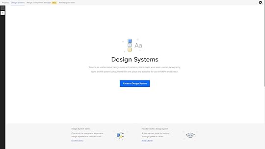
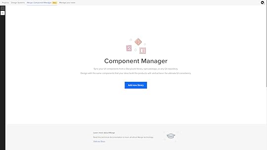
Merge Component Manager: Shows your open-source npm imports.
Manage your team: View and manage team members you share projects with.
For this tutorial, we’ll focus on Projects and touch on Design Systems.
Learn about Merge Component Manager and the npm integration here .
Getting Started in UXPinFrom your Project’s dashboard, click the + New project in the top left to create a project. Name your project and click Create New Project.
What do you want to start with today?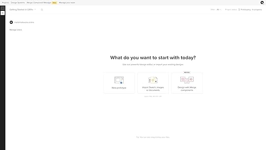
The next screen will ask you, “What do you want to start with today?” with three options:
New prototype: opens UXPin’s design editor to start working from scratch.Import Sketch, images, or documents: opens a window on your computer to upload Sketch files, JPGs, PDFs, PNGs, or UXPin’s file format, UXP.Design with Merge components: opens UXPin’s design canvas with the selected Merge library, or you can +Add a new library–learn more about this later in the article when we cover UXPin’s Merge technology :)Click New prototype to open the design editor.
Exploring UXPin’s Design EditorWe’ll give a quick overview of the design editor for this tutorial. Our documentation provides a deeper dive into the design editor and its features.
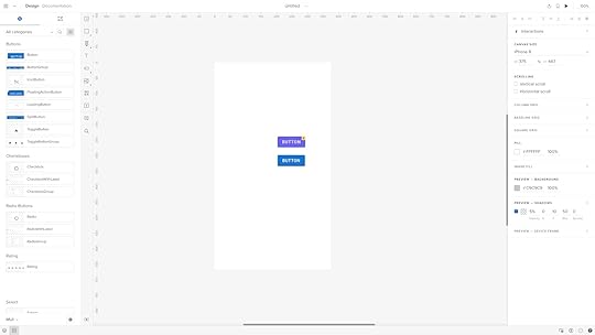
There are three primary workspaces in UXPin’s design editor:
Pages & Layers and Design System Libraries on the leftDesign canvas centerProperties Panel on the rightPages & LayersOnce you add elements to the canvas, they’ll appear in the Layers sidebar, allowing you to select, group, and rearrange them here. You can view Pages at the top of this sidebar or click the + icon to add more.
The Pages workflow is different from other design tools. In Sketch and Figma, you have all your screens for user flows on a single canvas; in UXPin, you have a separate Page per screen. You can click the Overview icon (OPTION+O) to view all your screens in one interface.
Design System LibrariesDesign System Libraries displays the components and assets for each design system. You can drag these onto the canvas to start prototyping or switch between libraries at the bottom of the sidebar.
Design canvasThe design canvas displays your screen’s width and height set in the properties panel. This is where you build your prototypes.
Properties PanelThe Properties Panel is where you control properties and interactions for components on the canvas. You can also set the grids, change the background color, and other global canvas settings.
UXPin’s Interactive Prototyping FeaturesInteractive prototyping sets UXPin apart from its competitors, allowing you to accurately replicate a final product experience. UXPin has four unique features for prototyping that you won’t find in other design tools:
StatesInteractionsVariablesExpressionsStatesUXPin’s States allow you to create component states comparable to code. For example, you can program a button to have a default, active, disabled, and hover state, each one triggered by a separate user or system action.
You can also use States to create complex UI components, like Carousels, Accordion Menus, and Multilevel Dropdown Navigation.
InteractionsUXPin’s Interactions allow you to define what happens when users engage with your prototype. Triggers, including desktop and mobile, enable you to create realistic, intuitive prototypes.
Actions determine what happens after the trigger. UXPin provides 20+ actions, including API requests, changing states, navigation, component property adjustments, playing video/audio content, and more.
Conditional InteractionsConditional Interactions let you set if-then and if-else conditions, similar to Javascript. These conditions set the rules to trigger different scenarios based on user and system actions.
For example, you can set up multiple form conditions to trigger error messages for incomplete required fields or incorrect data, like an invalid email address. If all this data is correct, only then will the prototype allow the user to submit the form successfully.
VariablesUnlike image-based tools, UXPin’s forms are fully functional out of the box. You can use Variables to capture data from these forms and use them elsewhere in the prototype. For example, capturing a user’s information during a checkout process and displaying it on a confirmation screen for them to verify.
ExpressionsUXPin’s Expressions are the closest you’ll get to Javascript without writing any code. With Expressions, you can add another layer of complexity, including validating forms, checking password criteria, or building computational components for shopping carts.
When combined, these four advanced prototyping features allow you to create realistic, dynamic prototyping experiences indistinguishable from the final product.
Check out UXPin’s example apps and patterns to see what’s possible using States, Interactions, Variables, and Expressions. You can download these and import them to a UXPin project to look under the hood and see how these features work.
Component-Driven Prototyping With Merge TechnologyNow we move on to UXPin’s Merge technology. Aptly named because it merges design and development by bringing code components into the design process.
If you’re using UXPin’s free trial, you can access three built-in Merge design systems in your Design System Libraries:
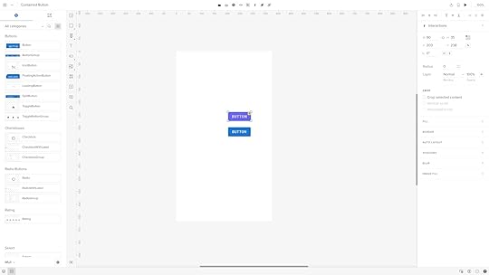
MUIAnt DesignFluent UIWhile these look like regular design elements from a UI kit, they’re actually React components pulled from a repository. We’ll use two seemingly identical buttons to illustrate the difference between Merge and a UI kit.
Both are Material Design buttons. The purple one is from Google’s Material Design UI kit, and the bottom one is from the MUI Design System–which uses Material Design as a foundation.
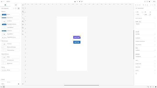
When we click the purple Material Design button, it displays UXPin’s standard Properties Panel, where you can create the component’s styling and interactions.
When we click the blue MUI button, the Properties Panel changes to the Merge variation. Instead of creating properties, you select them based on the React component’s available props–or Args if you’re working with the Storybook Integration.
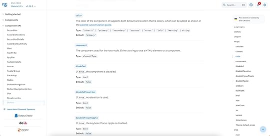
For example, opening the color dropdown displays the MUI button’s color properties which match MUI’s documentation.
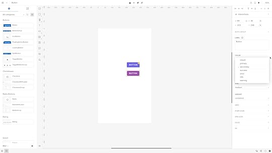
These properties give product teams the necessary constraints to build prototypes with minimal drift or inconsistencies.
Who is Merge for?Merge is ideal for anyone–from startups to enterprises–who builds digital products using a design system. You can use one of UXPin’s built-in UI libraries or import your product’s design system for prototyping and testing.
If you have a design system, it must have code components for Merge to import from a repository. Learn more about design system maturity here.
Why use Merge?Using code components in the design process enables designers to build prototypes that accurately replicate the final product. These code-based prototypes give stakeholders and users a realistic user experience, resulting in meaningful feedback for designers to iterate and improve.
Prototyping with Merge is also much faster than using traditional design tools. In one experiment, a client was able to build a one-page prototype in under 10 minutes vs. over an hour using an image-based design tool–and the Merge prototype had significantly more functionality and interactivity.
Bridging the gap between design and developmentWith traditional product development workflows, there’s a definitive handoff process from design to engineering. Engineers must convert prototypes and mockups into code.
With Merge, design handoffs are more seamless because devs already have the exact same components pulled from the exact same repository. Merge produces production-ready JSX so engineers can simply copy/paste to replicate the prototypes.
Get Started with UXPinWe hope you’ve enjoyed this UXPin beginner tutorial. If you haven’t got an account, sign up for a free trial. Build prototypes that can be easily translated to code. Enjoy a better design workflow. Get started here.
Try UXPin for freeThe post UXPin Tutorial for Beginners appeared first on Studio by UXPin.
October 9, 2023
Design System Contribution Model – How to Set it Up
Navigating design system contribution can be challenging, often demanding coordinated efforts from multiple stakeholders. This article serves as a comprehensive guide, laying down the structured roadmap of a design system contribution model to standardize practices and ensure quality. From identifying key stakeholders to creating an agile workflow for contributions, it covers every aspect, including how tools can boost your contribution process.
Key takeaways:
A Design System Contribution Model standardizes how new elements are added to a design system, ensuring quality and consistency.Governance, versioning, and documentation are essential elements in controlling and tracking the evolution of a design system.UXPin’s Patterns feature accelerates the contribution process, allowing quick iterations and real-world testing of new design system components.Streamline your design system contribution process while bridging the gap between design and development with UXPin’s Merge technology. Visit our Merge page for more details and how to request access.
Reach a new level of prototypingDesign with interactive components coming from your team’s design system.
Discover UXPin Merge .discover-merge { margin: 40px 8px;}.discover-merge__container { display: flex; max-width: 690px; height: 200px; padding: 20px; padding-left: 24px; border-radius: 4px; background-color: black; box-shadow: 10px 10px #9999ff; align-items: center; justify-content: space-between;}.discover-merge__left { width: 50%;}.discover-merge__left p { margin: 10px 0px !important; color: white !important; font-size: 18px !important;}.discover-merge__heading { font-weight: bold !important; color: white !important; font-size: 18px !important;}.discover-merge__text { margin: 0 !important; line-height: 22px !important;}.discover-merge__button { width: 174px; height: 44px; margin: 10px 0px; border: none; border-radius: 2px; background: white; color: black; font-size: 16px; text-align: center;}.discover-merge__button:hover { cursor: pointer;}.discover-merge__image { max-width: 320px !important; height: 200px; margin-right: -19px;}@media (max-width: 760px) { .discover-merge__container { height: auto; margin: 10px; align-items: left; }}@media (max-width: 500px) { .discover-merge__container { flex-direction: column; } .discover-merge__left { width: 100%; align-items: normal; }}What is a Design System Contribution Model?A design system contribution model is a structured roadmap for adding or modifying new elements in a design system. It outlines:
Who can contributeWhat qualifies for a contributionHow to go from proposal to implementationThis model standardizes practices, ensuring that the design system evolves in a consistent and controlled manner.
Why Do You Need a Design System Contribution Model?
Organizations use contribution models to overcome the challenges of decentralized digital product development using distributed teams. Design systems often span multiple teams and departments, from designers to developers to product managers. Without a structured approach to contributions, you risk inconsistencies, duplicated efforts, and the dilution of the design system’s quality.
How a Contribution Model Helps Evolve a Design SystemThe contribution model safeguards a design system’s integrity. It acts as a quality filter, ensuring that every addition aligns with the system’s goals and standards. Setting clear rules and processes helps coordinate multiple stakeholders, thus streamlining efforts and fostering collaboration. This model keeps the evolving design system coherent and efficient.
Who are the Stakeholders in a Design System Contribution Model?
Here are five typical stakeholders for a design system contribution model:
DesignersDevelopersProduct ManagersQuality Assurance EngineersStakeholdersDesignersDesigners are the primary creators and curators of the design system. They contribute graphic elements, UI components, and layout templates. Their expertise ensures the design system aligns with user needs, style guide, and design language.
DevelopersDevelopers implement the designs into reusable code. They ensure the design system remains technically feasible and efficient, turning design assets into functional components. Their contributions often include code samples, technical documentation, and updates on platform limitations.
Product ManagersProduct Managers are the bridge between business objectives and design goals. They prioritize contributions based on project needs, timelines, and strategic alignment. By defining the scope and setting priorities, they control the rate and direction at which the design system evolves.
Quality Assurance EngineersQA Engineers ensure that both the design and code meet quality benchmarks. They validate that contributions adhere to defined guidelines and don’t introduce errors or inconsistencies. Their role is critical for maintaining the design system’s reliability and integrity.
StakeholdersManagement includes executives and decision-makers who provide the resources and support for the design system. They may not contribute directly, but their approval often dictates the scope and scale of contributions. The design system team must inform and align management to ensure long-term investment in the system.
Examples of Design System Contribution ModelsExample #1: PluralsightPluralsight’s design system contribution model employs a structured approach, facilitating bug reporting through GitHub issues and feature proposals via bi-weekly meetups or GitHub.
Contributing code follows a specific guide and demands adherence to coding conventions, thorough testing, and the use of the design system itself in new components.
Submissions go through Pull Requests (PRs), which require review by the Design System team, often involving multiple rounds of feedback. The Design System team prioritizes the review of submitted PRs within a 7-day window and updates affected packages after merging. The process encourages teams to contribute regularly and real-world testing of the newly implemented features.
Example #2: AtlassianAtlassian’s design system contribution model emphasizes participation and contribution. Participation includes open communication via Slack channels and bi-weekly Design System sparring sessions for robust feedback.
The design system team only accepts specific contributions: code bug fixes, Figma library corrections, and documentation updates. It does not accept small enhancements or major changes.
The restriction on larger contributions is due to the time needed to consider the system-wide impact, but the company encourages engagement through participation channels for ongoing collaboration and support.
Example #3: GOV.UKGOV.UK’s Design System has a strict contribution model that ensures high-quality components and patterns. Contributions begin with a proposal demonstrating a new component or pattern’s usefulness and uniqueness. Proposals meeting these criteria undergo a review by the Design System working group.
Before publication, the Design System working group scrutinizes the implementation to ensure it is usable, consistent, and versatile based on defined criteria, including user research, coding standards, and versatility across services.
For community resources or tools linked to the Design System, a set of checks ensures it has a clear owner, aligns with the system’s standards, and meets other requirements, including documentation and support.
Example #4: ZalandoZalando’s design system relies on a contribution model that balances centralized governance with decentralized contributions.
A central team called ZDS mainly maintains the design system and provides standard components and styles to feature teams.
When these feature teams, which focus on different segments of the customer journey, identify a need for a new component or modification, they reach out to the ZDS team. Teams submit contributions, ranging from light (minor tweaks) to heavy (new components), through a Google Form that updates a GitHub board for tracking.
The contribution process is structured and involves multiple steps, including proposal, kick-off, collaboration, and review. ZDS hosts weekly meetings to review contribution tickets and provides “Open House” sessions for in-depth discussions. Communication and collaboration are essential, with contributors encouraged to document everything on GitHub and involve the right stakeholders for effective decision-making.
After ZDS finalizes a contribution, several steps ensure the update is well-communicated and integrated before merging the Pull Request. These include:
Updating the design system documentation and design files,Showcasing changes in a weekly demoSending out email newsletters to keep both designers and developers in the loop.This holistic approach ensures that Zalando’s design system is consistent yet flexible to the needs of a large organization.
Example #5: Nord HealthNord’s contribution model balances centralized governance and community input. Product teams can propose new features or design tweaks that fit their needs, while a central design system team oversees the overall direction, ensuring quality and consistency.
The design system team categorizes contributions into light, medium, and heavy. Teams submit their ideas through a contribution ticket that syncs to an issue tracker backlog for review every Monday.
The contribution process involves multiple steps, starting with an initial conversation to understand the requirement and avoid rework. The design system team schedules a kick-off meeting for medium and heavy contributions to finalize the scope and timelines. Nord values collaboration and often pairs its team members with the contributing product team to focus on specific requirements.
Nord provides a comprehensive set of tools and guidelines for contributors, from a Figma Design file and GitHub repository to Slack channels and various design guidelines. These supporting resources facilitate a smooth contribution process and ensure all new additions align with Nord’s high standards for accessibility, usability, and design consistency.
What do you Need to Create a Design System Contribution Model? Governance: Who owns the design system?
Ownership determines control and accountability. Designate a core team to govern the design system. This team sets guidelines, approves contributions, and ensures the system meets user needs and business goals. Without clear ownership, you risk creating a fragmented system.
Versioning: How to manage updates?Control design system updates through a robust versioning strategy by implementing semantic versioning to differentiate between minor tweaks, feature additions, and breaking changes. This approach minimizes disruption while allowing the system to evolve and adapt.
Version control prevents conflicts and keeps everyone on the same page.
Documentation standards: What should be included?Each component or guideline should have documentation detailing its purpose, usage scenarios, and limitations. A well-documented system accelerates onboarding and encourages consistent implementation across projects.
Read this article to learn more about documenting design systems.
How to Create a Design System Contribution Process
The design system contribution process is a structured workflow that guides how team members propose, develop, review, and integrate new features (components, patterns, guidelines, etc.) into the existing design system.
This process involves initial evaluation based on set criteria, an internal review of proposals, a collaborative phase of design and development, and a final review and approval by designated stakeholders.
Here are five key steps of a typical contribution process or workflow.
Perform initial evaluationDecide what you aim to contribute–a new UI component, design pattern, or a set of guidelines. Clearly defining the type of contribution filters out irrelevant or redundant inputs right from the start.Set rigid criteria for what makes a valid contribution. Criteria could range from code quality to relevance and usability.Create a checklist to evaluate contributions quickly. If a contribution fails the checklist, it doesn’t proceed to the next stage. This step saves time and ensures quality.Make a planOutline the submission process. Use templates to standardize proposal submissions, ensuring contributors provide all necessary information.Describe your internal review process, including automated checks, peer reviews, and reviews from governing teams.Pitch it in a presentationInvite stakeholders for a feedback round. This step ensures the proposal aligns with both user needs and business goals.Design the contribution modelClarify the collaboration process between designers and developers. Pinpoint which tools facilitate effective communication and design handoffs.Specify the tools and platforms teams must use in the development and design stages. Uniform tools enhance collaboration and reduce friction.Seek approvalDetermine how many review cycles a contribution goes through and what each process entails. Multiple rounds can ensure rigor but avoid needless complexity.State who decides whether a contribution gets accepted or rejected–typically the governance team or a lead stakeholder, maintaining the system’s integrity.Streamlining Design System Contribution with UXPinUXPin’s Patterns streamlines contribution by empowering designers to prototype and test code components in the design process. It eliminates the need to develop new patterns and components before testing, letting designers instantly create, test, and share new patterns by combining existing Merge UI elements.
For example, a team working on an eCommerce platform can quickly assemble a new product card for the homepage with updated micro-interactions, use Patterns to save it, and pass it to developers and other designers for immediate feedback and implementation.
This agile workflow accelerates the contribution process, allowing quick iterations and real-world testing. UXPin’s Patterns feature ensures that all contributions are not just theoretical but immediately usable, bridging the gap between design and development teams. By using Patterns, you’re not just contributing to a design system–you’re making it more dynamic, collaborative, and aligned with the needs of your evolving product.
Evolve your design system with the world’s most advanced UX design tool. Visit our Merge page for more details and how to request access.
Discover MergeThe post Design System Contribution Model – How to Set it Up appeared first on Studio by UXPin.
October 6, 2023
React for Designers – A Designer’s Guide to React
Learning React for designers–is it necessary? Can you build code prototypes without learning to code? These are common questions among product development teams and designers.
Most designers don’t want to learn to code. Learning React or even the basics of HTML, CSS, and Javascript takes a lot of time. A designer’s time is better spent investing in user experience and solving design challenges.
It’s a bit of a catch-22 because to improve usability testing and user experiences, you need high-quality prototypes that look and feel like the final product–something image-based tools don’t facilitate. For most designers, better prototyping capabilities drive the motivation to learn React.
What if you could get all the benefits of React for prototyping and testing without relying on engineers or writing code yourself? A solution already exists with UXPin Merge!
Key takeaways:
React is a framework that helps devs build interfaces with reusable components which makes apps scalable and easy to maintain.Designers can learn React to better understand development; there’s even a movement “React for designers” that advocate for this.Designers don’t need to learn React if they use UXPin Merge–a powerful design technology that lets them create prototypes with coded React components just as if they would use pixel-based UI components.UXPin Merge allows you to sync UI coded components from a Git repository, npm or Storybook into UXPin’s design editor so designers can use the same UI elements (React, Vue, Angular, etc.) that engineers use for development. Learn how to request access to this revolutionary technology. Visit our Merge page.
Reach a new level of prototypingDesign with interactive components coming from your team’s design system.
Discover UXPin Merge .discover-merge { margin: 40px 8px;}.discover-merge__container { display: flex; max-width: 690px; height: 200px; padding: 20px; padding-left: 24px; border-radius: 4px; background-color: black; box-shadow: 10px 10px #9999ff; align-items: center; justify-content: space-between;}.discover-merge__left { width: 50%;}.discover-merge__left p { margin: 10px 0px !important; color: white !important; font-size: 18px !important;}.discover-merge__heading { font-weight: bold !important; color: white !important; font-size: 18px !important;}.discover-merge__text { margin: 0 !important; line-height: 22px !important;}.discover-merge__button { width: 174px; height: 44px; margin: 10px 0px; border: none; border-radius: 2px; background: white; color: black; font-size: 16px; text-align: center;}.discover-merge__button:hover { cursor: pointer;}.discover-merge__image { max-width: 320px !important; height: 200px; margin-right: -19px;}@media (max-width: 760px) { .discover-merge__container { height: auto; margin: 10px; align-items: left; }}@media (max-width: 500px) { .discover-merge__container { flex-direction: column; } .discover-merge__left { width: 100%; align-items: normal; }}What is React?React is an open-source front-end Javascript library developed by Facebook. According to an August 2022 survey, React is still the most widely-used front-end framework–a position React has held for several years.
React’s component-based workflow enables engineers to create reusable components they can call anywhere in a user interface by writing a single line of code. This component-based approach makes React an excellent framework for component libraries and design systems.
What is React for Designers?
React for designers is a movement to educate designers about React and other front-end frameworks. The idea is that learning React will empower designers to build interactive prototypes or, at the very least, better understand technical constraints and the development process.
Should Designers Learn React?Designers don’t need to learn React, but if they take an introductory course, they can gain many attractive benefits.
Here are four common reasons why designers learn React:
#1: Career development: programming expertise is advantageous if you plan to climb the corporate ladder–even within Design. The higher you climb, the more important it is to learn the technical aspects of product development for communication, collaboration, and decision-making.
#2: Higher paying jobs: a natural transition for a UX designer who codes is to a front-end developer or UX engineer. According to Glassdoor, the average UX designer makes under $100k in the United States, while the average UX engineer earns over $120k. On average, engineers earn more than designers. Design and development expertise increases your value to an organization and earning potential.
#3: Skills development: understanding the engineering aspects of digital product development can improve cross-functional collaboration. Learning React can also help designers understand technical impacts on user experience and how to solve these problems during the design process.
#4: Better prototyping: unfortunately, image-based design tools limit what designers can test during the design process. To improve prototyping capabilities, designers must rely on engineers to build code-based prototypes–a time-consuming and expensive process. Designers who code can make these prototypes themselves to enhance usability testing.
UXPin Merge – The Fastest Way to Design with ReactUXPin Merge allows designers to import React (and other frameworks) component libraries into UXPin to build fully functioning React prototypes–without writing a single line of code!
Designers use these React components in UXPin like any other design tool, dragging and dropping UI components to build user interfaces. The only difference is that Merge components are fully interactive and include colors, spacing, typography, sizing, and other properties defined by the component library or design system.
What do React components look like in UXPin?This text field from MUI’s component library demonstrates how designers see and edit React components in UXPin. The text field is fully functional and ready to prototype out of the box.
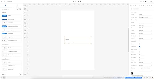
The properties displayed in UXPin’s Properties Panel relate to React props from the component library’s repository. Designers can switch modes and view the component’s React props in JSX.
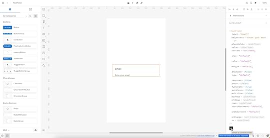
This JSX also makes design handoffs much easier because engineers simply copy/paste the code for front-end development.
Code-based vs. image-based design toolsImage-based design tools use plugins and extensions to bring React to design, but the generated code is rarely usable for engineers. Why? Because these plugins scan UIs and “guess” what the code should be. There are many ways to develop React components, so this code is usually redundant, meaning it’s faster for the engineers to code from scratch than restructure plugin-generated code.
Read more: Design to Code or Code to Design?
UXPin is a code-based technology, meaning it renders code as it’s written in the repository instead of vector graphics. Engineers already have exact versions of the components in their repo, so it’s a matter of adding the component library as a project dependency and copying the JSX from UXPin to develop the final product.
UXPin Merge technology gives designers all the benefits of prototyping a React app or website without learning React!
Examples of Companies Prototyping with React ComponentsFrom startups to agencies, and enterprise design teams, here are examples of companies prototyping with React components during the design process.
PayPalPayPal’s internal product development team switched to UXPin Merge in 2019. Erica Rider, UX Lead EPX at PayPal, discovered Merge while looking for tools and systems to scale her 5-person UX team, which serviced 60+ products and supported 1,000+ engineers!
PayPal uses a React Fluent UI design system with custom components, patterns, and templates. Erica and her team have built the library to minimize design decisions, so product teams only focus on creating products to solve user problems.
The system works so well that PayPal’s product teams build one-page prototypes 8X faster than experienced UX designers using image-based tools could previously.
“Before, with our limited resources and designers, a one-page product would take two or three months just to design mockups. Now product teams can design and deliver a product within the same time frame.” – Erica Rider – UX Lead EPX at PayPal.
TeamPasswordTeamPassword uses UXPin Merge slightly differently. With no UX team, TeamPassword’s engineers must do all the prototyping and testing. The two-person team used to do this with code, but it took a lot of time to test, edit, and iterate.
TeamPassword’s engineering team now uses UXPin Merge for developing and testing new products using a custom MUI component library. With production-ready React code, TeamPassword’s engineering team saves significant resources by not writing front-end code to deliver new products and UI updates.
dotSourceGerman-based digital product consulting and development agency dotSource uses UXPin’s Storybook Integration to import libraries for multiple frameworks, including React, Vue, Angular, Ember, etc. This flexibility means dotSource’s design team can use UXPin Merge with almost every client and product the company collaborates on.
One of the most significant benefits of using UXPin Merge is that design system properties are “baked in” to every component. As an agency collaborating with various organizations and their internal teams, these baked-in React properties create constraints that guarantee ultimate UI consistency.
Using code components in the design process also makes cross-functional collaboration easier for dotSource’s teams while facilitating smooth, effortless design handoffs–which are usually more challenging when working with external contractors.
IressFinancial services software developer Iress uses UXPin Merge to create a single source of truth for the organization’s design system. With designers and engineers using the same component library, there’s better cross-functional alignment and understanding of technical constraints.
“UXPin Merge will help us create more interactive and realistic prototypes. People can tab around or see the same interactions – hover styles, animations, etc. – as they would expect in a real app. We can do more insightful user testing and discover usability issues much earlier in the process.” Nick Elliott – Design System Product Owner and Regional Head of Product Design at Iress.
Like PayPal, Nick sees the benefit of UXPin Merge for non-designers “It will give non-designers access to a tool, whereby they can also experiment and have exposure to the same design considerations.”
Try React Prototyping ToolThere are three ways designers can get started designing with React components using UXPin Merge:
npm Integration : import open-source React component libraries available as npm packages into UXPin using the Merge Component Manager (the quickest and easiest way to get started as a designer). Git Integration : sync a React repository directly to UXPin. Requires engineering collaboration to set up. Storybook Integration : supports more front-end frameworks via Storybook, including Vue, Angular, React, Ember, and more.Designers can also take advantage of UXPin’s MUI integration which comes standard with all Merge plans.
Ready to get started? Visit our Merge page for more details and how to request access.
Discover MergeThe post React for Designers – A Designer’s Guide to React appeared first on Studio by UXPin.
October 4, 2023
Re-Imagining Iress Design Tools – Iress Case Study
This article was written by Nick Elliott who works as a Design System Product Owner and Regional Head of Product Design at Iress.
As with many design systems teams, at Iress, we want our design system (which we call the IDS) to be more than simply a set of components. We want our design system to be a framework that our colleagues love to use and something that helps anyone at Iress create great experiences for the people using our product and services.
As a technology company providing software to the financial services industry, the design team at Iress has always looked to remove inefficiencies that can form in the handover between design and engineering, as well as how we can continue empowering our teams to create awesome experiences together.
Over the last few years, design tools have adapted and our design team has been on a journey to review our own design tools – one of which is UXPin Merge.
Build prototypes using your dev’s design library components. Bring React, npm or Storybook components to UXPin and create prototypes that look and behave like the end product. Discover UXPin Merge.
Reach a new level of prototypingDesign with interactive components coming from your team’s design system.
Discover UXPin Merge .discover-merge { margin: 40px 8px;}.discover-merge__container { display: flex; max-width: 690px; height: 200px; padding: 20px; padding-left: 24px; border-radius: 4px; background-color: black; box-shadow: 10px 10px #9999ff; align-items: center; justify-content: space-between;}.discover-merge__left { width: 50%;}.discover-merge__left p { margin: 10px 0px !important; color: white !important; font-size: 18px !important;}.discover-merge__heading { font-weight: bold !important; color: white !important; font-size: 18px !important;}.discover-merge__text { margin: 0 !important; line-height: 22px !important;}.discover-merge__button { width: 174px; height: 44px; margin: 10px 0px; border: none; border-radius: 2px; background: white; color: black; font-size: 16px; text-align: center;}.discover-merge__button:hover { cursor: pointer;}.discover-merge__image { max-width: 320px !important; height: 200px; margin-right: -19px;}@media (max-width: 760px) { .discover-merge__container { height: auto; margin: 10px; align-items: left; }}@media (max-width: 500px) { .discover-merge__container { flex-direction: column; } .discover-merge__left { width: 100%; align-items: normal; }}Days gone byLet me spin a story – one that may resonate with you…
Danielle is a designer. Through a discovery session, she gets to understand a user’s problem. This may be based on previous research, data, direct feedback or a combination of all of these. There may be a team ideation session. But at the end of the day, as the designer, Danielle is asked to make a prototype. She uses a design tool that creates a load of linked, clickable images. She may go and test this to confirm that she is solving the problem in the right way. She then gets agreement with stakeholders that this is what they are going to build.
Daaruk, an engineer, then takes this prototype and recreates it in his software development tool of choice. Daaruk quickly realises that what Danielle has designed is really hard to build, and has some issues. There is a bit of to and froing and compromises are made. Then Daaruk finishes the work and presents it back in a UX review. Danielle isn’t happy – she doesn’t really like what she’s seeing – the typography and vertical rhythm are off, the tab order isn’t right causing accessibility issues and some of Danielle’s expectations of how the screen would work didn’t come through from the prototype. Daaruk makes some changes, but is also unhappy as he has to spend time unpicking a lot of work to make what looks like minor tweaks.
And now we’ve run out of time. We promised this would be delivered by a date and we have so many other projects in the backlog. We ship the feature with compromises. And then when it ships, we get a load of feedback from our users. The experience hasn’t quite hit the mark and there are loads of usability issues. This then comes back to Danielle and Daaruk again, stopping them and the rest of the team from working on other projects that will make further impact.
Does this sound familiar? If so, keep reading.
The inefficiencies of the design to delivery handoverSo the above is hugely inefficient. Why?
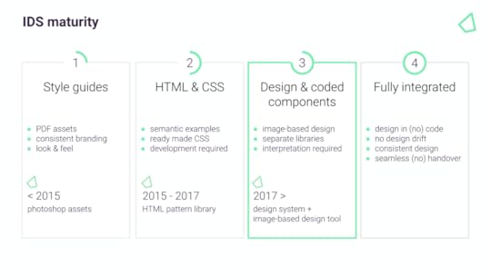
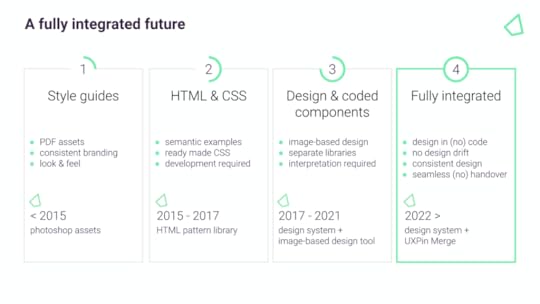
Danielle is prototyping on her own, rather than as a part of a team. She has to present this back and spend time with other members of the team until they are all happy.Danielle is testing something unrealistic with end users – because users can’t interact with the image-based prototype as they would a normal application, usability issues are found out way too late.Danielle is creating something that is thrown away. Daaruk has to restart from scratch. ‘Design drift’ occurs.There are lots of reviews between Danielle and Daaruk that create rework.Danielle and Daaruk are working on different tools that are not connected – there is no centralised way to refer to the same typography, spacing, components and patterns.The Support and Product Teams need to spend time understanding the issues that users are finding, once the new feature is released.Danielle and Daaruk have to do rework to fix the experience and usability issues that have been found.In extreme cases, users are so put off by the experience, they lose trust and it takes a lot of the client-facing team’s time to convince them that we’ve fixed the issues and that it’s worth using again. Design system maturity scaleEarlier this year TJ Harrop, Design System Product Manager at the NSW Government introduced Global DesignOps conference attendees to a design system maturity scale.
I’m paraphrasing TJ’s concept, but he talked about 4 levels of design system maturity (TJ’s concept talked about ‘Full Stack UX’, which I won’t go into here)…
 1st stage: Design system assets are created in tools such as Photoshop or Illustrator.2nd stage: We have CSS & HTML style guides – used for guidance only.3rd stage: We have two sets of components that are meant to look alike – one for designers and one for engineers.4th stage: We have a single source of truth where designers and engineers are using the same design system components.
In terms of our journey at Iress, we are currently at stage 3.
But stage 3 can still be hugely inefficient because two sets of people maintain two separate sets of components – one in the design tool, and one the engineers use in production. In addition, every time there is an IDS update, we have to mimic this in the design tool. It can get out of sync really quickly.
Also, because the design tool components aren’t as sophisticated or don’t have the same constraints as the ones used by engineering, it can cause inconsistency – even within the same design team.
And finally, we have to theme our design system. Being able to prototype and test the same components with a client’s brand, means another set of components that again can get out of sync quickly.
Our goal at Iress is to get to the final stage of design system maturity.
How Do I Mature a Design System?Over the last 12 months, we’ve been reviewing the design tools on the market. While some design tools are great for design agencies working on lots of small projects and many brands, they are not effective for designing at scale with an enterprise design system. And this is why we are excited by Merge.
We are at the beginning of our journey, but it is our hope that:
With Merge integrating directly with the code repository, designers and engineers will be using the exact same components. Maintained centrally, with one set of components, this will free up our designers’ time.And because we are using the same components and settings (props), we hope our designers and engineers will be better aligned. Designers will better understand the constraints of using the design system. If there is reasonable evidence to do something different or bespoke, this can be done within the team, or escalated to the IDS Team to discuss an enhancement.It will help us create more interactive and realistic prototypes. People can tab around, or see the same interactions – hover styles, animations, etc – as they would expect in a real app. We can do more insightful user testing and discover usability issues much earlier in the process.The markup required to render the prototype can be taken directly from Merge and handed over to the engineer, who can place it in their software development tool of choice. This should hopefully speed up development. The engineer no longer needs to start from scratch and already knows what components and settings to use. It will help us avoid the ‘design drift’ we so often see. Things like spacing and typography should all be aligned, as it is all driven from one place.It will give us the opportunity to experiment with theme/brand switchers, as well as test responsive prototypes mimicking different devices.It will give non-designers access to a tool, whereby they can also experiment and have exposure to the same design considerations.It will allow more collaboration, allowing designers to be facilitators of the design process, not the owners of design. Final thoughtsIn conclusion, we are excited about Merge. It’s not to say that there won’t be any bumps on the way – it’s a different way of working. Some people will love it, others maybe less so. But if Merge can help us scale, empowering our many teams at Iress to use our design system consistently and efficiently, then it’s a massive step forward from where we are today.
Streamline your design and development processes. Bring your own components to UXPin via npm, Storybook or Git integrations. Leverage a single source of truth and build prototypes that developers can quickly translate into code. Discover UXPin Merge.
Discover MergeThe post Re-Imagining Iress Design Tools – Iress Case Study appeared first on Studio by UXPin.
How to Become a Product Designer
Are you navigating the journey to becoming a product designer? This guide reveals the product design essentials you’ll need to master, from skills and qualifications to networking and career progression. Discover how to align business goals with user needs, craft compelling products, and grow in the ever-evolving product design landscape.
Key takeaways:
Mastering a mix of hard and soft skills, from wireframing to effective communication, is crucial for a successful career in product design.Formal education in design or computer science can provide a strong foundation, but alternative paths like online courses and self-study are also viable.Networking through industry events and communities and finding a mentor can fast-track your professional growth.Career progression in product design often moves from junior roles to specialized or managerial positions, with each stage demanding different levels of expertise.A well-crafted resume and interactive portfolio can make you stand out in job applications, so focus on tailoring your experience and showcasing quantifiable achievements.Stand out from the crowd with interactive prototypes using the world’s most advanced product design tool. Sign up for a free trial to explore UXPin’s features and further your design skillset.
Build advanced prototypesDesign better products with States, Variables, Auto Layout and more.
Try UXPin .try-uxpin-banner { margin: 40px 0px;}.try-uxpin__container { display: flex; max-width: 689px; height: 210px; padding: 20px; padding-left: 24px; border: 2px solid black; border-radius: 4px; align-items: center; justify-content: space-between; background-color: white; box-shadow: 10px 10px black;}.try-uxpin__left { width: 54%;}.try-uxpin__left p { margin: 10px 0px !important; color: black !important;}.try-uxpin__heading { font-size: 28px !important; font-weight: bold;}.try-uxpin__text { margin: 0 !important; font-size: 18px !important; line-height: 22px !important;}.try-uxpin__button { width: 135px; height: 44px; background: black; margin: 10px 0px; padding: 10px 20px; border: none; border-radius: 2px; color: white; font-size: 16px; text-align: center;}.try-uxpin__button:hover { cursor: pointer;}.try-uxpin__image { max-width: 320px !important; height: 200px; margin-right: -21px; margin-bottom: -6px;}@media (max-width: 760px) { .try-uxpin__container { height: auto; margin: 10px; align-items: left; }}@media (max-width: 500px) { .try-uxpin__container { flex-direction: column; } .try-uxpin__left { width: 100%; align-items: normal; }}What do Product Designers do?A product designer strategizes, conceptualizes, and delivers solutions that solve user problems. They align business goals with user needs, navigating the product lifecycle from market research to final execution.
Product designers map user flows, create wireframes and craft high-fidelity prototypes. Beyond visuals, they often work with cross-functional teams, including developers, UX designers, and product managers, to bring a product from idea to market.
Is product design the same as a UX designer?Unlike UX designers, who focus mainly on the usability and functionality of a product, product designers own the entire design process. This ownership goes beyond user experience to include user interface design and often front-end development.
Where UX designers focus on the user experience, product designers look broader on the entire customer experience. They must understand how customers enter and exit the customer lifecycle to optimize usability and profitability.
What is the role of a Product Designer?These core responsibilities reflect the full-spectrum ownership that a product designer has over the design process:
Market Research: Identifies user needs and market gaps to inform design strategy.Wireframing: Creates basic layout structures to guide the project’s visual and content elements.Prototyping: Develops high-fidelity prototypes to visualize the end product and conduct usability tests.User Testing: Executes user interviews, usability tests, and surveys to gather insights for design iteration.Design Handoff: Coordinates with developers, supplying all visual assets and design specifications for coding.Quality Assurance: Reviews implemented designs in the development environment to ensure they meet design specifications.Cross-Functional Collaboration: Works with product managers, UX designers, and developers to align goals and deliver a unified user experience.Documentation: Creates and updates design specifications and libraries, ensuring team members implement designs consistently.Performance Metrics: Monitors KPIs like user engagement and conversion rates to measure the design’s impact.What Skills Do You Need to Be a Product Designer?Hard SkillsSketching & Wireframing: Mastery of sketching techniques to visualize design ideas rapidly.Prototyping Tools: Proficiency in design tools (UXPin, Figma, Adobe XD, Sketch, etc.) for high-fidelity prototyping.Coding: Basic knowledge of HTML, CSS, and JavaScript helps create interactive prototypes and enhances communication with developers.Design Systems: Understand how to build and maintain a scalable design system.User Research: Able to conduct user interviews, surveys, and usability tests.Data Analysis: Skills in interpreting analytics data to make informed design decisions.Responsive Design: Expertise designing user interfaces that adapt to various screen sizes.Visual Design: Command over UI design elements like typography, color theory, and grid systems.Soft SkillsCommunication: Clear articulation of design choices and the ability to persuade stakeholders.Problem-Solving: Exceptional analytical skills to identify problems and conceive practical solutions.Collaboration: Works seamlessly in cross-functional teams and understands the value of collective input.Time Management: Balances multiple projects and deadlines without sacrificing quality.Empathy: Tuned into user needs, motivations, and pain points for user-centric design.Adaptability: Open to change and quick to adopt new tools or processes as needed.Attention to Detail: Ensures no design element is overlooked, contributing to a polished end product.What Qualifications do I need to Become a Product Designer?There are many pathways to becoming a product designer. You can go the formal education route and get a degree or use online resources and courses to educate yourself.
Formal educationBachelor of Fine Arts (BFA) in Graphic Design: Provides a strong foundation in design principles and visual communication.Bachelor’s Degree in Interaction Design: Focuses on designing interactive digital products.Master of Fine Arts (MFA) in Design: For those looking to specialize further and gain a competitive edge.Bachelor’s in Computer Science: Gives you a foundational understanding of programming and development, which can make you more effective in designing digital products.Online design courses and workshopsCoursera: Offers courses from universities and colleges on product design.Udemy: Specializes in shorter, practical courses on specific design tools or techniques.General Assembly: Provides intensive bootcamps focused on UX and product design.Interaction Design Foundation: Membership-based platform for more academic courses.IDEO: A leading design thinking organization with various product and design-related courses.Self-studyHere are some books to help sharpen your product design skillset:
“ Don’t Make Me Think ” by Steve Krug: A primer on usability in web design.“ Design of Everyday Things ” by Don Norman: Covers fundamental principles of good design.“ Lean Analytics: Use Data to Build a Better Startup Faster ” by Ben Yoskovitz and Alistair Croll: Offers insight into product-market fit and data-driven design.“ Hooked: How to Build Habit-Forming Products “ by Nir Eyal: Teaches you how to design products that create habitual engagement, blending psychology and design principles.What is the Career Progression of a Product Designer? What is a typical product design career path?Junior Product Designer: Generally, a starting point for those fresh out of school or with less than two years of experience. Focuses mainly on executing design tasks under supervision.Mid-Level Product Designer: With around 3-5 years of experience, mid-level designers take on more complex projects and may begin to specialize.Senior Product Designer: After 5-8 years in the field, expect to lead design projects, mentor junior staff, and often have a say in strategic decisions.Lead Product Designer: Requires at least 8-10 years of experience. Leads large-scale projects and often oversees a design team.What are the possible product design specializations?UX Specialist: Delves deep into user research and experience design. Requires a strong grasp of analytics and user behavior.UI Specialist: Focuses on the visual elements of a product, including color schemes, typography, and overall aesthetics. A background in graphic design can be beneficial.Front-End Development: Some product designers specialize in the technical aspects, including writing code. Requires proficient skills in HTML, CSS, and JavaScript. Modern product development includes front-end framework skills like React, Vue, Angular, etc.Interaction Designer: Specializes in creating engaging interfaces with well-thought-out behaviors. Requires a keen understanding of human psychology and behavior.What are some product design leadership and management roles?Design Manager: Manages a team of designers, oversees projects and reports to higher management. Often requires a blend of design skills and managerial expertise.Director of Design: Responsible for setting and executing the design strategy for the entire organization. Often part of the executive team.VP of Product Design: One of the top-level executives focused on design. Requires extensive experience and a proven track record in leadership and various product design roles.Consultant/Advisor: With years of expertise, some product designers work as consultants for companies or startups, helping shape their product design strategy.How to Build a Network and Find a Mentor as a Product DesignerNetworking opportunitiesIndustry Conferences and Meetups: Attend design-focused events to meet industry professionals and gather insights. Choose conferences that align with your interests and career goals for maximum impact.Online Forums and Groups: Join specialized online communities on professional platforms like LinkedIn or industry-specific Slack channels. Engage in meaningful discussions to gain knowledge and make connections.Finding a product design mentor
A mentor offers industry insights, practical advice, and invaluable feedback you won’t find in textbooks. They accelerate your growth by guiding you through real-world challenges.
Search within your existing network, alumni associations, or LinkedIn. ADPList is another helpful resource for finding mentors. Don’t hesitate to reach out with a well-crafted message that shows your respect for their work and clearly outlines what you seek from the mentorship.
How to Land Product Design Jobs
We borrowed this product designer resume strategy from Dribbble:
Review the job description to identify gaps: Tailoring your resume to meet the job description’s requirements will help you stand out. You may identify specific skills or experience you have but haven’t included in your resume template.Choose a format ( chronological or functional resume format ): Recruiters favor a chronological resume to display career growth. If you’re targeting entry-level positions, focus on education and skills using a functional layout.Don’t be boring–show off your design skills: The standard PDF or Word doc isn’t sufficient to stand out as a product designer. Many product designers use a professional web-based portfolio to showcase their skills and experience. Use metrics: showcase projects where you’ve led or significantly contributed to the design process. Use quantifiable metrics to demonstrate impact.How to Stand Out With Interactive Prototypes from UXPinStand out from the crowd and show off your product design skills with interactive prototypes from UXPin. Most product designers choose popular image-based tools like Figma or Sketch, but these platforms lack the features and functionality to go beyond basic prototyping.
UXPin is a code-based design tool with features to build fully interactive prototypes that look and feel like the final product. You can include links to your interactive prototypes with your resume to impress recruiters and stand out.
Get a step ahead and enhance your product design skills with UXPin’s sophisticated tools and features. Sign up for a free trial to build your first interactive prototype.
Try UXPin for freeThe post How to Become a Product Designer appeared first on Studio by UXPin.
October 3, 2023
Functional Prototype – A Short Guide for Digital Product Designers
A functional prototype is a working model of a product that demonstrates its core functionalities. Through UXPin’s Merge technology, designers can seamlessly convey their designs to developers.
Key Takeaways:
A functional prototype is a practical representation of a product, showcasing its main functions.UXPin’s Merge technology integrates interactive React components into design editors, allowing designers to communicate seamlessly with developers, test prototypes, and transition designs to development.Functional prototypes offer insights into user behavior, validate designs, and drive improvements.Crafting a functional prototype involves designing with interactions, conducting tests, and embracing a learning process.By leveraging Merge technology, designers bridge the gap between prototype creation and development through shared, interactive React components.Merge technology integrates React components into a design editor, allowing designers to create prototypes. These interactive React components are utilized by developers in the final product. After designers construct and test prototypes with users, the design is prepared for development. Discover how UXPin Merge works.
Reach a new level of prototypingDesign with interactive components coming from your team’s design system.
Discover UXPin Merge .discover-merge { margin: 40px 8px;}.discover-merge__container { display: flex; max-width: 690px; height: 200px; padding: 20px; padding-left: 24px; border-radius: 4px; background-color: black; box-shadow: 10px 10px #9999ff; align-items: center; justify-content: space-between;}.discover-merge__left { width: 50%;}.discover-merge__left p { margin: 10px 0px !important; color: white !important; font-size: 18px !important;}.discover-merge__heading { font-weight: bold !important; color: white !important; font-size: 18px !important;}.discover-merge__text { margin: 0 !important; line-height: 22px !important;}.discover-merge__button { width: 174px; height: 44px; margin: 10px 0px; border: none; border-radius: 2px; background: white; color: black; font-size: 16px; text-align: center;}.discover-merge__button:hover { cursor: pointer;}.discover-merge__image { max-width: 320px !important; height: 200px; margin-right: -19px;}@media (max-width: 760px) { .discover-merge__container { height: auto; margin: 10px; align-items: left; }}@media (max-width: 500px) { .discover-merge__container { flex-direction: column; } .discover-merge__left { width: 100%; align-items: normal; }}What is a functional prototype?A functional prototype is a dynamic representation of how a product design works. It lets you interact with the product to understand its features and flaws, helping you refine your design for a better user experience.
While traditional prototypes might simulate the appearance or layout of a product, they often fall short in depicting its actual behavior. Functional prototypes, on the other hand, introduce the invaluable element of interactivity. Every click, swipe, or scroll is more than a predefined animation—it’s a glimpse into the user’s journey, offering insights into the product’s usability and efficiency.
Functional vs non-functional prototype?Functional and non-functional prototypes primarily differ in the depth of interactivity they offer. Functional prototypes go beyond appearances, letting you experience a product’s behavior, while non-functional prototypes offer a visual preview without being able to interact with the prototype.
Functional Prototype:A functional prototype thrives on its ability to mimic the actual functionality of a product design. It’s not just about appearances—it’s about actions, interactions, and user experiences. When you interact with a functional prototype, you’re navigating through a scenario that closely mirrors what a user will do in the product. The features work, the buttons click, and the user flow replicates the real product.
Functional Prototype Example:Imagine you’re designing a mobile app for a fitness tracker. A functional prototype would allow users to navigate through the interface, tap on buttons to simulate exercise tracking, and even experience the app’s real-time feedback as if they were logging an actual workout. This prototype showcases not only the design but also the real-world usability of the app.
Non-Functional Prototype:A non-functional prototype predominantly emphasizes the visual aspect of a product. It may look like the final product, sporting its design system components and layout, but it’s devoid of the dynamic interplay that defines user interactions. A non-functional prototype is like a static snapshot—a mere preview of how the product might appear, rather than how it truly functions.
Non-Functional Prototype Example:Continuing with the fitness tracker app, a non-functional prototype would capture the visual essence of the app—the layout of screens, the arrangement of buttons, and the overall aesthetic. However, it would lack the ability to simulate interactions. Users wouldn’t be able to tap on buttons or simulate workout tracking; they would merely be able view the app’s static visual representation.
What are the benefits of functional prototyping?Performing functional prototyping offers several advantages:
Understand how users will interact with your product, avoiding UX design mistakes.Validate user experience design concepts through user testing and feedback.Refine UX designs iteratively, improving user experience and functionality.Enhance collaboration by presenting interactive prototypes to stakeholders.Efficiently iterate and innovate, saving time and resources in the design process.How do you create a functional prototype?For this process, we will create a functional prototype of a signup form to check if the email and password inputs are filled out and validate the email format as well as the password length for a truly real user experience. This is how your hypothetical functional prototype of a signup form will look like:
1. Set up your canvasAfter selecting the blank document from the dashboard, the artboard will open up, and there you can create your signup form.
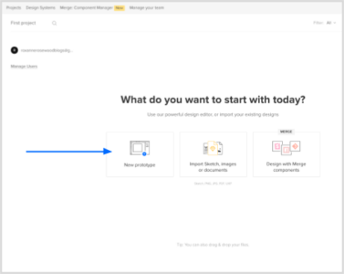
Identify the screen size of the platform on which your sign-up form will work on:
Scroll to Canvas sizeSelect your canvas size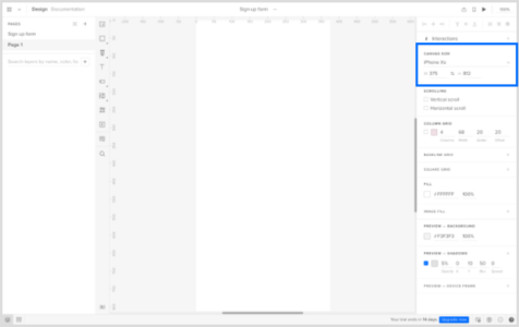 2. Begin by designing your layout with UXPin Libraries
Once the blank document is open, you’ll see the canvas:
Go to Design System LibrariesSelect UXPin Libraries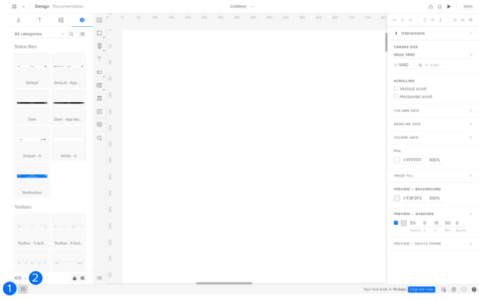 Select a library to add components to your canvas. You can create your own library of components to easily drag and drop elements into your canvas, in this scenario, let’s use the iOS library.
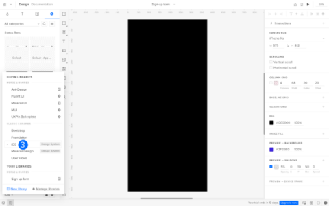
Design the layout of your sign-up form by adding elements like email and password inputs, along with labels and buttons.
 3. Make the email and password input an interactive elementSelect the email input fieldGo to Interactions
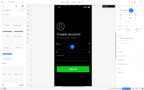 Go to TriggerSet the trigger to Focus
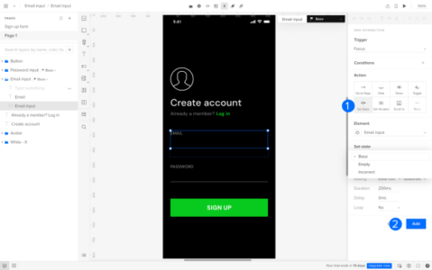 Scroll to Action and select Set StateGo to Element and select Email input
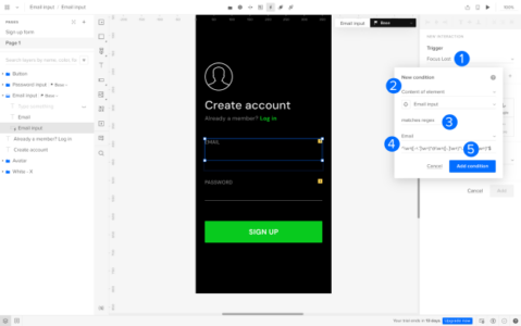
Next, we will set the state and add the interaction:
Go to Set State and select BaseClick on ‘Add’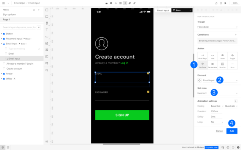
Repeat this prototyping process for the password input field.
3. Add a validation logicSet up logic to check if the email and password fields are filled out. Display error messages if not. Add a new interaction:
Select the email inputGo to InteractionsGo to New Interaction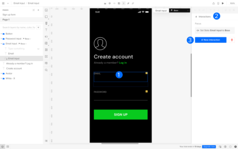
Next, set up the condition to detect if the email input field is empty:
Change the trigger to Focus LostGo to Conditions and select Content of element in the first fieldSelect Email input (it should be auto selected)Select the condition is emptyClick on Add condition to finish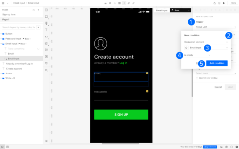
Next, we will confirm the new interaction:
Under Action, select Set stateChange the Element to ‘Email input’Set state to ‘Empty’Go to Add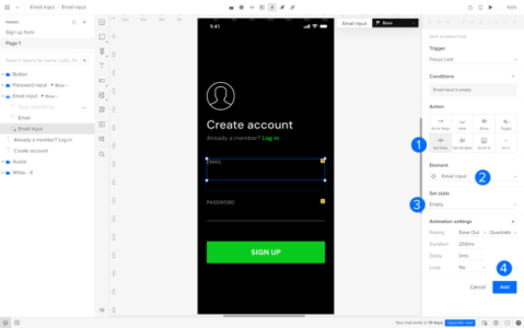
Repeat this prototyping process for the password input field.
4. Set up an Email Format ValidationNext, we will add a condition to ensure the email input follows a valid email format. Follow the steps above to create a new interaction on the email input field.
Set the trigger to Focus LostSelect Content of element as ‘email input’Set the condition to matches regexSelect EmailClick on Add condition
Next, we will confirm the new interaction:
Under Action, select Set stateChange the Element to ‘Email input’Set state to ‘Incorrect’Go to Add 5. Set up a Password Length Validation
Add logic to verify the length of the password input meets the required criteria.
Follow the steps above to create a new interaction on the password input field.
Set the Trigger to Focus LostSelect Content of element as ‘password input’Set the condition to doesn’t match regexSelect Custom and enter criteria for the password inputClick on Add condition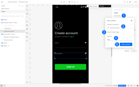
Next, we will confirm the new interaction:
Under Action, select Set stateChange the Element to ‘Password input’Set state to ‘Incorrect’Go to Add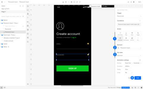 7. Test the Prototype
Interact with the prototype to experience the flow and test the validations. Ensure it provides an accurate representation of the final product’s behavior.
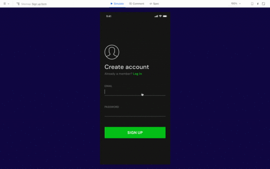
By following these steps, you’ll create a functional prototype of a sign-up form that showcases the validation of email and password inputs using UXPin.
Design Functional Prototypes with UXPin MergeFunctional prototypes are a vital link between design and development, as demonstrated by our exploration of UXPin’s Merge technology. Merge seamlessly combines design and development by integrating dynamic React components.
This real-time collaboration lets designers test interactive models and streamlines the design-to-production process. Discover UXPin Merge.
Discover MergeThe post Functional Prototype – A Short Guide for Digital Product Designers appeared first on Studio by UXPin.
September 21, 2023
Why Use React in 2023

React is a JavaScript library developed by Facebook, designed to create interactive user interfaces for web apps. At this point, you might be thinking, “I’m a designer. Why use React if I’m not delving into lines of code every day?”.
Well, in this article, we’re unpacking the magic of React from a designer’s perspective, emphasizing its impact on user interface design, user experience (UX), and team collaboration.
Key takeaways:
React offers a number of benefits for the end user, ensures efficiency in development, and fosters seamless collaboration between design and dev teams. React continues to be a valuable asset by being flexible, scalable, and popular.React handles data and states which makes it perfect as a single source of truth between designers and developers.Build prototypes of React apps fast. Use UXPin Merge and import React components to UXPin’s design editor. Drag and drop real components on the canvas and build a test-ready prototype that will validate your app idea. Discover UXPin Merge.
Reach a new level of prototypingDesign with interactive components coming from your team’s design system.
Discover UXPin Merge .discover-merge { margin: 40px 8px;}.discover-merge__container { display: flex; max-width: 690px; height: 200px; padding: 20px; padding-left: 24px; border-radius: 4px; background-color: black; box-shadow: 10px 10px #9999ff; align-items: center; justify-content: space-between;}.discover-merge__left { width: 50%;}.discover-merge__left p { margin: 10px 0px !important; color: white !important; font-size: 18px !important;}.discover-merge__heading { font-weight: bold !important; color: white !important; font-size: 18px !important;}.discover-merge__text { margin: 0 !important; line-height: 22px !important;}.discover-merge__button { width: 174px; height: 44px; margin: 10px 0px; border: none; border-radius: 2px; background: white; color: black; font-size: 16px; text-align: center;}.discover-merge__button:hover { cursor: pointer;}.discover-merge__image { max-width: 320px !important; height: 200px; margin-right: -19px;}@media (max-width: 760px) { .discover-merge__container { height: auto; margin: 10px; align-items: left; }}@media (max-width: 500px) { .discover-merge__container { flex-direction: column; } .discover-merge__left { width: 100%; align-items: normal; }}What is React used for?React, also known as React.js, is a JavaScript framework and library created by Facebook.
Its main purpose is to help developers build apps or websites, especially those with interactive user interfaces — features like real-time search results that pop up as you type, for example. Or dynamic photo galleries that adjust based on user preferences.
One of the standout qualities of React js website development is that it allows you to build these intricate components faster and with less code compared to using plain JavaScript.
This efficiency makes React a go-to tool for designers and developers alike. It also means you’ll be able to see your ideas come to life on a website or React app more quickly and smoothly.
Why use React?For designers working on web products, it’s helpful to understand what React is used for compared to others like Vue, Flutter, or Angular. Knowing the differences between these tools means you’ll be able to have more informed conversations with your developers.
But there’s more to React than simply making teamwork a little easier. A design tool, UXPin, syncs React elements with their design editor, allowing prototypes to be more interactive and closer to a final product. Check out its Merge technology.
Here’s more on how React’s key features can help bring your design concepts to life.
Building rich user interfacesThe importance of your product’s user interface (UI) goes way beyond aesthetics.
In the digital world, first impressions are everything; a clunky or uninspiring design can quickly turn users away, no matter how functional your product is. On the flip side, a captivating and intuitive UI encourages prolonged interaction and can make your app a hit with users.
React is a tool that helps to consistently create engaging interfaces. Its declarative components are like the building blocks of design, allowing you to piece together intuitive and visually stunning UIs. Every interaction, button, and visual element can be finely crafted and customized, ensuring that users enjoy the experience of using your app.
Components and librariesIn React, components are ready-made, customizable elements. Imagine creating a button with a specific look and behavior. Once crafted, you can place this button anywhere in your app without needing to recreate it from scratch. Each component operates as a self-contained unit, with its distinct appearance and functionality.
When building larger sections of a React app, these individual components come together, forming more extensive and interconnected structures. But each component retains its independence, ensuring the overall system remains organized and consistent.

Here’s the exciting part for designers: these components aren’t just static visuals or mock-ups. With the right tools, you can integrate and prototype using these actual coded components. This means that what you design is not only a visual representation but also closely mirrors the final interactive product.
Take, for instance, UXPin Merge. It allows you to design using real components from different component libraries such as MUI, a library based on Google’s Material Design principles.
This means you’re not just sketching out ideas; you’re working with the same building blocks that developers will use. Instead of passing a static image or design idea to a developer, you’re providing a functional piece that’s closer to the end-product.
It’s flexibleAnother answer to the question. ‘why use React?’ is that it’s incredibly flexible. It can be used with a number of different tools and can create anything from static websites and desktop applications to iOS or Android mobile apps.
This flexibility partly stems from the fact that React has been around for a while, and over time its active community has developed a plethora of tools, libraries, and extensions to enhance its capabilities.
For a UX designer, the key thing to note is that React is capable of adapting to a variety of project requirements. It can easily integrate with a number of different technologies, making it quicker and easier to test and refine user interfaces.
Instant updates without reloading the pageMany websites or apps require the entire page to reload to reflect changes or new inputs. However, with React js website development, only the specific element changed needs an update.
Think of Facebook: when you ‘like’ a post or comment, your actions instantly appear, without a full page refresh. This creates a much smoother and faster user experience, allowing for real-time updates and a more responsive interaction.
 It’s used in both UX and UI
React components make life easier for both UI and UX designers. On the UI side of things, it ensures visual consistency with reusable and interactive design elements. When it comes to UX, it fosters a seamless user experience with instant feedback and reduced load times.
What’s more, tools built around React bridge the gap between designers and developers, allowing for rapid prototyping, iterative improvements, and real-time collaboration. This ultimately leads to more polished and user-centric products.
Community sizeNo tech platform can match the size and activity of React’s vast active networks of developers, designers, and enthusiasts who collaborate, share resources, and provide support.
To give you an idea of the size of this community, more than 460,000 questions were asked on the ‘React.js’ thread on Stack Overflow by late 2023 — it’s one of the most-followed tags on the platform.
It’s also worth noting that the React framework runs on Javascript, which has more than 2.5 million questions and is by far and away the hottest topic in the dev community.
What this boils down to is, if you’ve got a question about React, the chances are someone, somewhere has already provided an answer.
Used by well-known tech companiesBecause of its efficiency, scalability, and knack for helping facilitate dynamic user experiences, React has been adopted by a number of Fortune 500 companies, including Facebook — who developed and maintains its library — as well as Airbnb, Amazon, Dropbox, and Netflix.
Paypal also uses React in its product development, covering both design and software aspects.
Erica Rider, PayPal’s UX Lead, began using UXPin’s React component design features in 2019 to enhance the efficiency of her small UX team that manages over 60 products.
They’ve developed a design system called React Fluent UI, filled with ready-made components that simplifies design choices, allowing teams to concentrate on addressing user needs.
As a result, they can create one-page prototypes eight times quicker than before using traditional tools.
You can use React components in prototypingReact is a powerful tool in a designer’s arsenal, as it helps turn prototypes into dynamic, interactive previews of the final product. Here’s more:
It’s componentizedAt its heart, React is all about components — self-contained units of UI. This approach means designers can craft one component, such as a button or a slider, and reuse it throughout a prototype. This guarantees consistency, speeds up the design process, and allows for easy tweaks or changes without starting from scratch.
 It’s stateful
We talk about ‘state’ in React in relation to a component’s memory. It remembers things. So, when designing a prototype, React can remember and show changes based on user actions.
For example, when you design an on-off switch, React can remember whether the switch is currently ‘on’ or ‘off’. This means you can demonstrate what happens when someone flips the switch without needing to create two separate designs for each position.
It handles dataReact is based on Javascript, which has the ability to manage, swap, and dynamically render data. This means designers can easily mimic real-world scenarios, which is particularly useful when creating interactive prototypes.
UXPin Merge is technology that makes prototyping even easier, allowing designers to build fully-functioning prototypes using React components — without writing a single line of code.
It works like any other design tool — you can drag and drop UI components to build slick user interfaces. The only difference is that UXPin components are fully interactive, retaining properties like color, spacing, and typography as set by the original design system or library. Discover UXPin Merge.
Discover MergeThe post Why Use React in 2023 appeared first on Studio by UXPin.
Figma Component Library vs UXPin Component Library – Which is Better?

Figma Component Libraries are a great way to create and share reusable UI elements with team members. Designers can use Figma components to build user interfaces and prototypes, and they help to maintain consistency across projects.
However, Figma Component Libraries have some limitations, such as the inability to create interactive prototypes. UXPin Merge is a better alternative to Figma Component Libraries, as it allows you to create fully interactive prototypes that look and feel like the final product.
Key takeaways:
Figma Component Libraries are a great way to create and share reusable UI elements.UXPin Merge is a better alternative to Figma Component Libraries, allowing you to create fully interactive prototypes.Figma Component Libraries have limitations, such as the inability to create interactive prototypes.Merge imports UI components into the design process from a repository, creating a single source of truth between design and development.Merge lets you create fully interactive prototypes using code components in the design process to improve testing.Switch from basic prototyping in Figma to advanced prototyping in UXPin. End the screen spaghetti now. Discover UXPin Merge.
Reach a new level of prototypingDesign with interactive components coming from your team’s design system.
Discover UXPin Merge .discover-merge { margin: 40px 8px;}.discover-merge__container { display: flex; max-width: 690px; height: 200px; padding: 20px; padding-left: 24px; border-radius: 4px; background-color: black; box-shadow: 10px 10px #9999ff; align-items: center; justify-content: space-between;}.discover-merge__left { width: 50%;}.discover-merge__left p { margin: 10px 0px !important; color: white !important; font-size: 18px !important;}.discover-merge__heading { font-weight: bold !important; color: white !important; font-size: 18px !important;}.discover-merge__text { margin: 0 !important; line-height: 22px !important;}.discover-merge__button { width: 174px; height: 44px; margin: 10px 0px; border: none; border-radius: 2px; background: white; color: black; font-size: 16px; text-align: center;}.discover-merge__button:hover { cursor: pointer;}.discover-merge__image { max-width: 320px !important; height: 200px; margin-right: -19px;}@media (max-width: 760px) { .discover-merge__container { height: auto; margin: 10px; align-items: left; }}@media (max-width: 500px) { .discover-merge__container { flex-direction: column; } .discover-merge__left { width: 100%; align-items: normal; }}What is a Figma Component Library?A Figma component library lets you create and share Figma Components and Styles with team members by publishing the file. Team members can access this shared file and use the components and styles as a design system.
Your design team can change these components and styles and push them to the library. You can create permissions, so only authorized team members can modify the component library.
What are Figma Components and Component Instances?A Figma Component is a single reusable UI element that forms part of a component library. According to Figma’s documentation, you can save many things to the Component Library, including:
UI componentsCompany logos and brand assetsIconsDevice mockupsPlatform OS components (Android, iOS, Linux, OSX, etc.)CursorsRedlining and annotation componentsPost-it notes and voting “stickers” for running collaborative design sprintsDiagramming “helpers” like flow arrows and flowchart shapesYou can view these master components in your primary component file or under the assets tab in the left sidebar.
Component Instances are copies of the library component used to create user interfaces and prototypes. For example, you might have an app bar component in your library that appears on 20 screens. Those 20 app bars are instances of the library component.
Whenever you update the library component, all its instances will change, too. Figma will notify designers whenever a component is updated, and they can choose when to accept the latest version.
What are Figma Styles?Styles allow you to maintain consistency across teams and projects so everyone uses the same properties and values.
Figma lets you save reusable style properties, like colors, typography, sizing, spacing, border radius, etc. The equivalent of variables in CSS. Instead of entering a HEX code or font size value, you choose a predefined style–i.e., Primary Blue or Headline 1.
How do I Find the Component Library in Figma?There are a couple of ways to locate your Figma component library:
If you’re working inside the design library file, right-click on the component and select Go to main component. You can also click the Figma Component icon in the right sidebar next to the component’s name. If you don’t have access to the main file, you won’t be able to access the Figma component library, but you can view all the components under the Assets tab in the left sidebar.How do I use Components From the Figma Component Library?Click the Assets tab in the left sidebar.Search for an asset using the search field or select a library from the dropdown below.Click or drag a component from the Assets tab onto the canvas.Adjust the component’s properties and variants under the Design tab in the left sidebar.You can redesign components by detaching any instance. Any edits you make to a detached instance won’t impact its former component or instances. Once you complete the changes, you can save this as a new component, which will appear in your Assets folder.
What are the Limitations and Challenges of Figma’s Component Library?While Figma’s component library makes it easy to reuse and share UI elements, there are some limitations to what you can do with them:
Figma components create aesthetically pleasing UI designs but lack the functionality to build interactive prototypes, limiting the scope of what designers can achieve.Design teams require additional tools and plugins to make Figma components more interactive, increasing costs and workflow complexity.Components help design teams build user interfaces and basic prototypes in Figma, but they’re not developer-friendly and might misalign with code UI components.Detaching instances is convenient for creating new components but means design teams can edit and manipulate UI elements without authorization.If you’re using Figma’s Component Library for a design system, the DS team must maintain two versions–one for Figma and the other in code.Do you want to stay static or get better results with interactive prototyping? Enter Merge–the world’s most advanced UX design technology.
UXPin Merge – The Best Alternative to Figma LibrariesUXPin’s Merge technology imports UI components into the design process from a repository (Github, Bitbucket, GitLab, etc.). Design teams can use these fully interactive code components to build prototypes that look and feel like the final product.
Built-in styling and interactivityMerge components have properties like styling and interactivity “baked-in,” so design teams never worry about entering the correct values or copying animations from a code component library.
The design system team uses React props or Storybook Args to define these properties, which appear in UXPin’s Properties Panel. For example, a button’s states, text styles, colors, sizes, icons, and interactions are available for designers to select via dropdowns.
Merge eliminates design drift and prevents unauthorized modifications to UI elements. Designers cannot detach Merge components and modify them. Only the design system team can change code components in the repository that syncs to UXPin and notify designers of the update.
A single source of truthMany design tools claim to offer a single source of truth. But the reality is these image-based solutions require updating in multiple areas, including design tools, prototyping tools, documentation, and the code UI library.
As German-based software development agency dotSouce points out:
“Promoting new patterns and components to a design system is chaotic, with many redundant processes. Most design system releases require updating in at least three places: the design system’s codebase (component library), the design team’s UI kit (design tool), and the design system’s documentation. Instead of a “single source of truth” that gives “three single sources of truth” for every UI component–this seems counterintuitive and increases errors.”
With Merge, the entire product development team–UX designers, product teams, and engineers–pull components from the same repository. Any changes to the repo automatically sync to UXPin, notifying designers of the update–a real single source of truth.
Instead of updating a UI kit, code components, and relevant documentation, the design system team pushes one release to everyone simultaneously.
How to use a Merge Component Library in UXPinOnce the design system team completes the setup, the component library is available in UXPin. Here’s a step-by-step tutorial on how to use a Merge component library:
Step 1. Open Design System LibrariesAll your design systems will appear under Design System Libraries in UXPin’s left sidebar.
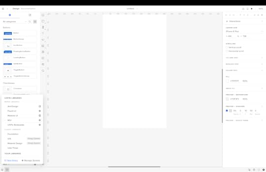
There are two categories:
Merge Libraries: Code component libraries from a repositoryClassic Libraries: Regular UXPin componentsStep 2. Select your design systemSelect the design system you want to work with, and UXPin will open the component library in the left sidebar.
Above the library, you have a Components and Patterns tab (more on Patterns shortly…). Components contain your component library, and a dropdown displays the available categories–i.e., buttons, switches, cards, icons, etc.
Step 3. Using the component libraryClick a component to add it to the canvas.
View the component’s properties and make adjustments via the right-hand Properties Panel.
Repeat this process to build user interfaces and prototypes.
Step 4. How to use UXPin’s PatternsPatterns allow you to create new components and templates by combining multiple UI elements from a design system. You can use components from more than one component library to test new patterns before promoting them to the design system.
Patterns are also helpful in creating multiple states or variants of a component. For example, you may want a light and dark mode version for a user interface, but your design system only has the light variant. You can create this dark mode variant in UXPin, save it to Patterns, and even share it with team members.
Step 5. Prototyping and testing using interactive componentsYou have two options for testing prototypes in UXPin:
Preview and Share: Launches the prototype in a browserUXPin Mirror: An app for testing on iOS and Android devicesMerge prototypes enable design teams to create complex prototypes using the same components engineers use for development. Stakeholders and users can interact with Merge prototypes like they would the final product, giving design teams meaningful feedback to iterate and improve.
Using high-quality interactive prototypes means designers can solve more usability issues and identify better business opportunities during the design process.
Step 6. Design handoffThe transition from design to development is seamless with Merge because developers and engineers use the same UI library. UXPin generates production-ready JSX so developers can copy/paste the code to their IDE for development.
Bridge the gap between design and development with the world’s most advanced product design tool. Visit our Merge page for details on how to get started.
Discover MergeThe post Figma Component Library vs UXPin Component Library – Which is Better? appeared first on Studio by UXPin.
September 20, 2023
Is MUI for Figma the Best Solution for Designers? [+ Alternative Inside]

MUI (Material-UI) is a widely-used React UI framework built on Google’s Material Design principles, empowering organizations with customizable components and styles to align with brand standards.
This article delves deep into its MUI for Figma’s capabilities and limitations. We also explore the alternative approach of integrating MUI with UXPin’s Merge technology, including a real-world example of how a startup redesigned its product using MUI React components in the design process.
Key takeaways:
MUI (Material-UI) is a React UI framework based on Google’s Material Design, allowing customization to match brand guidelines.While MUI for Figma provides a design kit, it lacks the interactive features of MUI’s React library, potentially leading to design inconsistencies.It also can lead to performance issues due to its size and dependency on plugins like Token Studio.UXPin’s Merge technology offers an alternative, allowing designers to prototype using actual React components, bridging the gap between design and development.TeamPassword successfully utilized UXPin Merge with MUI to enhance its product development workflow, demonstrating the efficiency of a code-to-design approach.Prototype and testing using MUI’s React library within the familiarity of a design tool using UXPin’s Merge technology. Visit our Merge page for more details and how to request access.
Reach a new level of prototypingDesign with interactive components coming from your team’s design system.
Discover UXPin Merge .discover-merge { margin: 40px 8px;}.discover-merge__container { display: flex; max-width: 690px; height: 200px; padding: 20px; padding-left: 24px; border-radius: 4px; background-color: black; box-shadow: 10px 10px #9999ff; align-items: center; justify-content: space-between;}.discover-merge__left { width: 50%;}.discover-merge__left p { margin: 10px 0px !important; color: white !important; font-size: 18px !important;}.discover-merge__heading { font-weight: bold !important; color: white !important; font-size: 18px !important;}.discover-merge__text { margin: 0 !important; line-height: 22px !important;}.discover-merge__button { width: 174px; height: 44px; margin: 10px 0px; border: none; border-radius: 2px; background: white; color: black; font-size: 16px; text-align: center;}.discover-merge__button:hover { cursor: pointer;}.discover-merge__image { max-width: 320px !important; height: 200px; margin-right: -19px;}@media (max-width: 760px) { .discover-merge__container { height: auto; margin: 10px; align-items: left; }}@media (max-width: 500px) { .discover-merge__container { flex-direction: column; } .discover-merge__left { width: 100%; align-items: normal; }}What is MUI?
MUI (Material-UI) is a popular React UI framework that provides a set of components and styles based on Google’s Material Design. Organizations can use MUI’s theming features to customize the UI library to meet product and brand specifications.
Why would you use MUI?MUI gives organizations a comprehensive design system to build products without designing from scratch. The product team can create a custom design system by making a few tweaks and adjustments, potentially saving years of R&D.
MUI is also useful for developing new products. A product team or startup can use the Material UI library without making any theme changes to build an MVP for testing. Utilizing the design system enables the team to design products quickly, with a comprehensive library optimized for user experience and accessibility.
How Much Does MUI for Figma Cost?There is a free community MUI for Figma library, but it offers limited components and no support. If you want the entire UI library, you must purchase an MUI for Figma license on MUI’s website. As of August 2023, a license for one editor is $79. If you have a large team, this can add up quickly, and you must update the license annually.
MUI’s official documentation states, “The number of licenses purchased must correspond to the maximum number of editors working concurrently in a 24-hour period. An editor is somebody contributing changes to the designed screens that use the UI kits. No licenses are required for viewing the designs.”
You can avoid these extra fees and prototype using fully functioning MUI React components in UXPin. MUI is one of UXPin’s built-in design libraries, which comes standard with all Merge plans. Read more about designing with MUI in UXPin using Merge technology.
How do You Integrate Material UI in Figma?You can open the file from the community page to use the free Figma MUI library. Click the Open in Figma button to start using MUI in a new project.
If you are using the full library, you’ll need to follow these instructions.
How to Import MUI for FigmaNavigate to your drafts or organization in Figma.Click on the “Import” button to import the MUI file.How to use MUI in FigmaThere are two methods for working with the MUI library in Figma:
Design directly in the MUI file: This method is fine for the free version, but MUI doesn’t recommend this for the full library due to the file’s size.
Use the MUI file as a library: This is the preferred method for using MUI in Figma. To do this:
Go to the assets panel in Figma.Click on the library icon.Publish the MUI file as a library.How to customize the MUI library in FigmaThere are two ways to customize the colors in the MUI library:
Token Studio Plugin: This method is faster and allows for composition, meaning you can use one color to generate another.Figma’s Native Tokens: If you prefer not to use third-party plugins, you can utilize Figma’s native tokens to make color changes.How to change global settings with Token StudioThe Token Studio plugin lets you quickly change global settings across all components, such as border-radius or font family. For example:
To change the global border radius, open the plugin, navigate to the “Border radius” group, and edit the value.To change the font family, navigate to the “Typography” group in the plugin and adjust the font settings.How do you enable Figma MUI Dark Mode?To enable dark mode for the entire MUI library using Token Studio:
Open the Token Studio plugin.Check the box for the group you want to enable (e.g., “Dark Mode”).Optionally, change Figma’s color mode to dark mode to see the changes.What are the Challenges and Limitations of Figma MUI?MUI’s Figma library is excellent for UI design and static prototypes but lacks interactivity for accurate testing. Here are some key challenges designers experience when using Figma’s MUI library.
MUI for Figma is a UI design kit–not an interactive design systemWhile the Figma MUI library will save you many hours of designing from scratch, it doesn’t provide MUI’s interactions. Designers must still set these up in Figma for every project.
Creating interactivity for Figma components will never align with MUI’s React library devs use. The components will look similar, but designers must follow MUI’s documentation closely to ensure they implement the correct actions, states, and animations.
Editable componentsThe design system team can manage MUI components from the main library file to prevent unauthorized changes; however, designers can detach instances and adjust UI elements, resulting in design drift and inconsistencies.
Dependency on pluginsMUI for Figma requires plugins like Token Studio to function correctly. Plugins can introduce another layer of complexity and potential compatibility issues, and Token Studio is a premium feature, adding to monthly costs.
In a “Getting Started” tutorial, MUI notes there may be syncing issues between the Token Studio plugin and Figma’s native tokens, potentially leading to inconsistencies if not managed properly.
Performance issuesDue to MUI’s large Figma file size, design teams might experience performance issues, especially when working directly inside the library file.
What is the Alternative to Using MUI in Figma?A better way of designing with the MUI library is to use UXPin’s Merge technology to build prototypes using React components inside the design editor.
There are two ways you can use MUI in UXPin:
Using the built-in MUI libraryConnecting your custom MUI libraryHow to use UXPin’s built-in MUI libraryUXPin offers several built-in Merge libraries, including MUI, Fluent UI, Ant Design, MUI, Material UI, or UXPin Boilerplate. These are all React libraries featuring interactive components from a GitHub repository.
The benefit of using UXPin’s MUI library is that styling and interactivity are “baked in” to each component, so designers never have to set these up. They also can’t detach components from a master instance and make changes, meaning they must use the design system as defined in the repository.
They simply drag UI elements from the Design Libraries sidebar onto the canvas and adjust redefined React props via the Properties Panel.
These built-in libraries are excellent for prototyping because designers only have to focus on building user interfaces and adjusting predefined MUI properties–i.e., styling, variants, states, navigation, etc.
If you want to use a custom MUI design system with your brand colors and styling, it’s better to use one of Merge’s other integrations.
How to sync a custom MUI library to UXPinUXPin’s Merge technology allows you to import any design system, including a themed MUI library, via two integrations:
Git Integration (React only): Connect any React library, giving you access to all Merge features, including Patterns, Version Control, and JSX presets.Storybook Integration: Works with any Storybook, including React, Vue, Angular, Ember, and other front-end technologies.These two integrations require technical input to set up, but once complete, Merge will automatically sync updates to UXPin, so designers and engineers always use the same component library–creating a single source of truth across the organization.
How to use MUI components in UXPinWhether you use UXPin’s built-in library or a custom MUI design system, the workflow is the same. You can find the library under Design System Libraries to the left of the canvas.
Select the Merge design system, and the library’s components, colors, typography, and assets appear in the left sidebar. Click or drag UI elements onto the canvas to build user interfaces.
“UXPin Merge enabled us to perform this “snap-together” type design. We provide product teams with components they can drag and drop to build user interfaces.” – Erica Rider, Product, UX, and DesignOps thought leader.
Merge makes design more accessible to non-designersDesign tools are challenging for non-designers. There’s a learning curve that many developers don’t have the time to master. They typically revert to what’s familiar, writing code.
While code prototypes are excellent for testing, they’re time-consuming and costly. Developers end up releasing products and features with usability issues and other inconsistencies.
How TeamPassword Used Merge and MUI to Redesign and Scale fastSecurity startup TeamPassword experienced this challenge before switching to UXPin. The two-person developer team didn’t have any design skills, and to move fast pushed updates with minimal testing. They also used an outdated tech stack but, with limited resources, couldn’t simply rebuild the product from scratch.
TeamPassword doesn’t have a UX designer, so the engineers must design, prototype, test, program, QA, and ship everything themselves.
The startup decided to switch to MUI and React for the product’s redesign. They wanted a solution to prototype and test using React components without writing or editing code every time. Without any design skills, they needed a tool that provided a simple design workflow.
UXPin’s Merge technology stood out as the obvious choice. TeamPassword’s developers synced their custom React MUI library, including product-specific patterns, templates, and user interfaces, to UXPin using the Git Integration so they could test new products using interactive prototypes.
Using Merge and MUI revolutionized TeamPasswords product development workflow, making the two-person developer team highly effective and efficient from design to final product.
Why Code to Design is Better for Prototyping With MUIFigma design systems are great for UI design and basic prototyping, but designers must rely on external tools and plugins to build interactive prototypes for accurate testing. This outdated design-to-code workflow is time-consuming, costly, and inefficient.
UXPin’s code-to-design workflow brings MUI’s React components into the design process, offering many benefits for product teams:
Bridging the gap between design and development with a single source of truth defined by code.Seamless handoffs with less documentation and explanation.Defining properties in the design system repository eliminates drift and inconsistencies.No designing or programming from scratch results in faster time to market, making organizations more competitive.Centralized design system management requires fewer resources and removes many operational burdens, making Ops teams more effective.Ready to build your first interactive prototype with Merge technology? Visit our Merge page for more details and how to request access.
Discover MergeThe post Is MUI for Figma the Best Solution for Designers? [+ Alternative Inside] appeared first on Studio by UXPin.
UXpin's Blog

- UXpin's profile
- 68 followers

