
 Must be a group member before inviting friends
UXpin's Blog, page 30
September 19, 2023
What’s the Difference Between Figma vs AdobeXD vs UXPin?

Figma, AdobeXD, and UXPin are three leading user experience design tools for designing digital products. We compared these three platforms and how they stack up regarding UI design, mockups, prototyping, and collaboration. Read on to discover which design tool is best for your project demands and team needs.
Key takeaways:
By integrating seamlessly with the Creative Cloud suite, AdobeXD facilitates a smooth design workflow with tools like Photoshop and Illustrator.Figma is a platform best for real-time collaboration, enabling simultaneous design by multiple users.UXPin stands out as a code-based design tool, allowing for complex prototypes and bridging the gap between design and coding with its Merge technology.Choosing the right design tool hinges on project complexity, collaboration needs, integration preferences, and prototyping capabilities.Solve hidden usability issues and identify more business opportunities during the design process with the world’s most advanced user experience design tool. Create a single source of truth across design and development. Discover UXPin Merge.
Reach a new level of prototypingDesign with interactive components coming from your team’s design system.
Discover UXPin Merge .discover-merge { margin: 40px 8px;}.discover-merge__container { display: flex; max-width: 690px; height: 200px; padding: 20px; padding-left: 24px; border-radius: 4px; background-color: black; box-shadow: 10px 10px #9999ff; align-items: center; justify-content: space-between;}.discover-merge__left { width: 50%;}.discover-merge__left p { margin: 10px 0px !important; color: white !important; font-size: 18px !important;}.discover-merge__heading { font-weight: bold !important; color: white !important; font-size: 18px !important;}.discover-merge__text { margin: 0 !important; line-height: 22px !important;}.discover-merge__button { width: 174px; height: 44px; margin: 10px 0px; border: none; border-radius: 2px; background: white; color: black; font-size: 16px; text-align: center;}.discover-merge__button:hover { cursor: pointer;}.discover-merge__image { max-width: 320px !important; height: 200px; margin-right: -19px;}@media (max-width: 760px) { .discover-merge__container { height: auto; margin: 10px; align-items: left; }}@media (max-width: 500px) { .discover-merge__container { flex-direction: column; } .discover-merge__left { width: 100%; align-items: normal; }}What is AdobeXD?
 Price: $82.49 for Creative Cloud (includes 20+ creative desktop and mobile apps including Photoshop, Illustrator, InDesign, Premiere Pro, and Acrobat)Best for: Adobe users, UI designFeature overview:Seamless integration with Creative Cloud, including Photoshop and Illustrator.Auto-Animate enables smooth micro-interactions and transitions, enriching prototype realism.Voice prototype integration helps designers test voice user interfaces.Repeat Grid facilitates rapid duplication of design elements, optimizing repetitive tasks and ensuring design consistency.
AdobeXD is a user experience and user interface design tool from Adobe’s extensive Creative Cloud suite. AdobeXD is a platform for designing, prototyping and sharing interactive designs. Its integration within the Adobe ecosystem allows designers to effortlessly transition between tools like Photoshop or Illustrator, streamlining their design process.
What is Figma? Price: $12 – $75Best for: UI design, collaborationFeature overview:Real-time collaboration enables multiple users to design simultaneously, fostering teamwork and instant feedback.Integration capabilities offer many plugins and third-party apps, enhancing the platform’s functionality.Browser and desktop applications.Dev mode makes it easy for engineers to analyze designs and convert them to code with starter CSS.With Variables, designers can change component properties based on user interactions.
Figma is a vector-based design platform built for real-time collaboration. As a browser-based tool, it eliminates barriers to access, ensuring teams can work synchronously regardless of location or device. Figma’s intuitive interface and powerful prototyping capabilities make it a favored choice for UX professionals.
The tool’s emphasis on collaboration, with features allowing multiple designers to edit a project simultaneously, has redefined teamwork in the design space, cementing Figma’s position among top-tier design tools.
Does Adobe own Figma?Adobe announced its planned acquisition of Figma in September 2022. However, the deal still hasn’t gone through and must pass regulatory scrutiny, including an August 2023 European Commission investigation. The regulator’s primary concern is Adobe’s acquisition, which “may reduce competition in the global markets for the supply of interactive product design software and for digital asset creation tools.”
If this deal goes through, it’s rumored that Adobe will discontinue AdobeXD and bundle Figma into Creative Cloud as its user experience design tool.
What is UXPin? Price: $39-$149Best for: UI design, interaction design, design systemsFeature overview:Browser and desktop applications.Advanced
interactive prototyping
allows designers to solve more usability issues and identify better business opportunities during the design process.Real-time collaboration and communication using UXPin’s Comments.
States
allow designers to create multiple states for a single UI element and design complex interactive components like dropdown menus, tab menus, navigational drawers, and more.
Variables
capture data from user inputs and create personalized, dynamic user experiences–like their name and profile image in the app bar.
Expressions
Javascript-like functions to create complex components and advanced functionality–no code required!
Conditional Interactions
create if-then and if-else conditions based on user interactions to create dynamic prototypes with multiple outcomes to accurately replicate the final product experience.Design with code components (React, Vue, Angular, etc.) using UXPin’s
Merge technology
.Connect APIs and other digital products using UXPin’s IFTTT integration.Create and share a component library with UXPin’s
Design Systems
, including assets, documentation, UI elements, colors, and typography.Cross-platform prototype testing with UXPin Mirror for native applications (iOS and Android).
Price: $39-$149Best for: UI design, interaction design, design systemsFeature overview:Browser and desktop applications.Advanced
interactive prototyping
allows designers to solve more usability issues and identify better business opportunities during the design process.Real-time collaboration and communication using UXPin’s Comments.
States
allow designers to create multiple states for a single UI element and design complex interactive components like dropdown menus, tab menus, navigational drawers, and more.
Variables
capture data from user inputs and create personalized, dynamic user experiences–like their name and profile image in the app bar.
Expressions
Javascript-like functions to create complex components and advanced functionality–no code required!
Conditional Interactions
create if-then and if-else conditions based on user interactions to create dynamic prototypes with multiple outcomes to accurately replicate the final product experience.Design with code components (React, Vue, Angular, etc.) using UXPin’s
Merge technology
.Connect APIs and other digital products using UXPin’s IFTTT integration.Create and share a component library with UXPin’s
Design Systems
, including assets, documentation, UI elements, colors, and typography.Cross-platform prototype testing with UXPin Mirror for native applications (iOS and Android).UXPin is a code-based design tool enabling designers to create realistic prototypes effortlessly. The tools Forms and built-in design libraries allow designers to build mockups and prototypes, test, and iterate faster than traditional image-based design tools like Figma and AdobeXD.
UXPin’s USP is its ability to render code rather than vector graphics. This code-based approach increases prototyping scope and enhances testing for better feedback from stakeholders and users.
Take digital product design to the next level with UXPin’s Merge technology. Designers can import UI components from a repository and build fully functioning prototypes that look and feel like the final product.
What is the Difference Between UXPin and Figma?At first glance, UXPin and Figma appear similar. Designers will find component libraries and layers to the left and properties and interactions to the right with the design canvas center for both tools. This familiarity makes switching tools easy, especially for UX designers who like to design in Figma and prototype in UXPin.
Here are some of the key differences between UXPin and Figma:
UXPin is code-based, while Figma is image-based. UXPin’s code-based approach means designers can create code-like functionality and interactions that are impossible to replicate in Figma or AdobeXD.UXPin has functioning form fields, including text inputs. Conversely, Figma’s input fields are unusable, non-interactive graphical representations.Code-to-design vs. design-to-code. Figma is a design-to-code tool, meaning developers must convert static designs into code. While UXPin offers a design-to-code workflow, it also provides a code-to-design solution, allowing designers to import code components into the design process using Merge.Figma uses artboards and frames, while UXPin separates screens into Pages.Which Design Tool is Best for Prototyping?Image-based design tools like Figma and AdobeXD are great for wireframing, mockups, and basic low-fidelity prototyping but cannot compete with UXPin’s interactive prototyping capabilities.
For example, you can create aesthetically pleasing forms and user flows in Figma and AdobeXD, but the inputs aren’t interactive, so designers can’t get meaningful insights during testing. They must use external tools or work with engineers to build working prototypes.
Conversely, with UXPin’s interactive features, including States, Interactions, Variables, and Expressions, designers can design interactions, user flows, and functionality that mirrors a code-based prototype. These advanced features significantly increase prototyping scope, eliminating the need to include developers–even for complex prototype functionality and API integrations.
How to Choose a Design Tool?Below are pivotal decision-making criteria to help steer you toward Figma, AdobeXD, or UXPin:
Project scope and complexity: Any three tools offer comparable experiences and outcomes for straightforward designs. However, if you want to build interactive prototypes or sync design and development, then UXPin is the best option.Collaboration needs: Figma’s simultaneous multi-user functionality becomes indispensable if real-time collaboration sits high on your list. UXPin offers a similar solution via its Comments feature, which integrates with Slack.Platform accessibility: Figma and UXPin’s browser-based applications are essential for prioritizing access anywhere. Conversely, if you’re an Adobe Suite loyalist, AdobeXD better fits your ecosystem.Integration and extensions: Figma’s rich integration ecosystem stands out if your workflow thrives on third-party plugins. However, seamless sync with tools like Photoshop would point you to AdobeXD. UXPin and Merge technology is best if you prioritize syncing design and development.Feedback loop: A streamlined feedback process can be pivotal for modern asynchronous product development. UXPin’s Comments on Preview allows stakeholders and other teams–even if they don’t have a UXPin account–to annotate feedback on prototypes, including assigning comments to specific team members.Advanced prototyping: UXPin offers the most sophisticated prototyping capabilities, but AdobeXD’s voice prototyping is a unique and helpful feature for VUI designers.Single source of truth: UXPin is the only one of these three tools to offer a code-to-design solution via Merge technology. Merge bridges the gap between designers and engineers with a single UI library for design and development, creating a seamless product development workflow and frictionless handoffs.Learning curve: While AdobeXD, Figma, and UXPin offer comparable learning curves, UXPin’s advanced features will take slightly more time to master. The payoff? Rapid design iterations and a faster time to market.“I liked Figma a lot. It’s a huge improvement over my previous go-to design tool, Balsamiq. But now that I’ve learned how to leverage the powerful scripting capabilities of UXPin and design interactive UIs with the same live HTML UI controls that my engineering colleagues will use in the finished product, there’s no way I could go back.” Anthony Hand, Senior UX Designer.
Why UXPin’s Code-to-Design Outshines Figma and AdobeXDWhile Figma and AdobeXD deliver on visual design, UXPin’s code-to-design approach sets it apart by bridging the gap between design and development. By rendering actual code instead of vector graphics, UXPin ensures a prototype’s authenticity, sidestepping the common pitfalls of misinterpreted vector-based prototypes and interactivity.
UXPin’s Merge technology integrates UI components from repositories, enabling fully-functional high-fidelity prototypes that accurately reflect the end product. Figma and AdobeXD rely more on visual representations, often requiring additional tools or developers to bring designs to life. This streamlined efficiency positions UXPin at the forefront of a seamless, accurate, and rapid design-to-development process.
Join the code-to-design revolution to create better designs, improve designer/developer collaboration, and deliver better user experiences for your customers with UXPin and Merge technology. Visit our Merge page for more details and how to request access.
Discover MergeThe post What’s the Difference Between Figma vs AdobeXD vs UXPin? appeared first on Studio by UXPin.


September 7, 2023
What is Storybook and Why Your Product Team Needs it?

Building a UI component library makes it so much easier for your team to create designs that work well, conform to your brand’s style guide, and pass their work on to the developers who ultimately code products and release them to the world.
In the long run, a UI component library saves more time and energy than you can calculate. That’s easy to forget when you’re in the middle of creating a UI component library. Depending on the size of your organization and the types of products it makes, the project could last weeks or months.
Given the difficulty of building a unique library full of reusable components, it makes sense to find an enjoyable tool for building and testing ideas.
At this point, you’re probably thinking something like, “Here comes that call to action to start using UXPin.” Obviously, Merge is a fabulous way to make code-based components. That isn’t the topic of this article, though. Let’s talk about Storybook.
Also, let’s talk about how Storybook and UXPin now integrate so your product team can finally start exploring ideas in the best code-based, atomic environment. Yes, you were correct about expecting a gentle nudge toward UXPin. You were just a few sentences early.
Build advanced prototypesDesign better products with States, Variables, Auto Layout and more.
Try UXPin .try-uxpin-banner { margin: 40px 0px;}.try-uxpin__container { display: flex; max-width: 689px; height: 210px; padding: 20px; padding-left: 24px; border: 2px solid black; border-radius: 4px; align-items: center; justify-content: space-between; background-color: white; box-shadow: 10px 10px black;}.try-uxpin__left { width: 54%;}.try-uxpin__left p { margin: 10px 0px !important; color: black !important;}.try-uxpin__heading { font-size: 28px !important; font-weight: bold;}.try-uxpin__text { margin: 0 !important; font-size: 18px !important; line-height: 22px !important;}.try-uxpin__button { width: 135px; height: 44px; background: black; margin: 10px 0px; padding: 10px 20px; border: none; border-radius: 2px; color: white; font-size: 16px; text-align: center;}.try-uxpin__button:hover { cursor: pointer;}.try-uxpin__image { max-width: 320px !important; height: 200px; margin-right: -21px; margin-bottom: -6px;}@media (max-width: 760px) { .try-uxpin__container { height: auto; margin: 10px; align-items: left; }}@media (max-width: 500px) { .try-uxpin__container { flex-direction: column; } .try-uxpin__left { width: 100%; align-items: normal; }}Test radical ideas in isolated sandboxes
When you create components, you undoubtedly go through several versions before you decide which one to use. Even if you’re just making the shape of a button, the designer in you insists that you try it with blocky edges, rounded edges, slightly more rounded edges, and ridiculously rounded edges. You cannot move on to the next task until you have seen what your component looks like on the screen,
Storybook understands this, so it lets you test all of your ideas—no matter how wild they might seem—in isolated sandboxes.
You’ll discover how much time this ultimately saves you when you start working with interactive components. What happens when you click the button with ridiculously rounded edges to submit text to a website? Turns out, the edges are way too round and the button is nearly impossible for someone with accessibility challenges to use. Now, throw that one out and test the others until you find the one that works best. You can play as much as you want without influencing anything outside of the sandbox.
Related tip: Storybook now has an add-on that will help you test components to make sure they meet accessibility standards.
Your designers have pre-approved components, so they can build freely!Atomic UI components break down the design into small pieces. Your new designer doesn’t have to stare at your style guide for an hour before feeling confident enough to make a password-retrieval request form.

Instead of working from scratch, they open your UI component library to find all of your approved components. If they can integrate Storybook with their design tool, it gives a whole new level of flexibility as well. From this point, the work becomes about as straightforward as possible. They:
Choose an empty text field from the component library.Adjust the field’s size just to make sure it looks attractive on the page.Add a “submit” button from—no surprise here—the component library.Adjust the button’s position.Add some text so users know what information to provide.That’s it. They don’t have to knock on your door, send you a Slack message, or try to reach you on Teams. The components in the UI library are already approved, so there’s no reason to seek permission.
This aspect alone is going to save your designers tons of time because they simply adjust components instead of creating them from nothing. Perhaps more importantly, you will have more time and fewer headaches because you get to concentrate on your work without getting interrupted millions of times a day (slight exaggeration, but it feels like that many on some days).
Designers hate code and coders hate design: Storybook is their peace treatyHow many visual designers do you know who have enough coding experience to work as developers? The answer is: very few.
How many sighs do you hear pour from your development team when your designers send over new visuals? The answer is pretty close to infinite.
Everyone knows why the disconnect between visual design and development teams exists. They don’t have a common language that makes them effective communicators. Of course, your developers are frustrated! The designers keep sending over ideas that will take too much time to figure out or they ask for tweaks in components that already exist!
Storybook erases this problem by giving designers and developers an interpreter that makes communication easier.
In Storybook, designers can combine and adjust components without knowing how to code. They just access the Controls function and make changes. It literally takes seconds to alter designs.
Just as importantly, Storybook will interpret the changes and update the design’s code. When it reaches your developers, they already have code that makes sense.
Yes, they should review and test UIs to make sure they function as intended. Yes, they should test the entire product in case some stray character ruins everything. For the most part, though, your developers become gatekeepers who can focus on other aspects of their jobs… like actually building behind-the-scenes functionality that will process payments, recommend products, and perform other tasks that help your company generate more revenue.
UXPin + Storybook = ❤️Now that UXPin and Storybook integrate, you can move your UI component library from Storybook and use it directly in your product design and prototyping application.
You get the best of both worlds. And you get it really, really fast without any complications.
Storybook is an open-source tool, so go get it and reap the benefits.
Don’t miss out on the other side of the equation! Sign up for a free UXPin trial so you can experience the benefits of prototyping and testing products quickly instead of sending them over to your overworked development team. Play with an integrated Storybook library on trial – get started now.
Try UXPin for freeThe post What is Storybook and Why Your Product Team Needs it? appeared first on Studio by UXPin.
What is New at UXPin? We’re Back with Another Product Update

It’s about time you log into UXPin app, build a new prototype and discover all those changes we’ll be talking about it here. Join us for a new product update.
Take a look on our design technology for designing with UI coded components that are interactive by default. Discover UXPin Merge.
Reach a new level of prototypingDesign with interactive components coming from your team’s design system.
Discover UXPin Merge .discover-merge { margin: 40px 8px;}.discover-merge__container { display: flex; max-width: 690px; height: 200px; padding: 20px; padding-left: 24px; border-radius: 4px; background-color: black; box-shadow: 10px 10px #9999ff; align-items: center; justify-content: space-between;}.discover-merge__left { width: 50%;}.discover-merge__left p { margin: 10px 0px !important; color: white !important; font-size: 18px !important;}.discover-merge__heading { font-weight: bold !important; color: white !important; font-size: 18px !important;}.discover-merge__text { margin: 0 !important; line-height: 22px !important;}.discover-merge__button { width: 174px; height: 44px; margin: 10px 0px; border: none; border-radius: 2px; background: white; color: black; font-size: 16px; text-align: center;}.discover-merge__button:hover { cursor: pointer;}.discover-merge__image { max-width: 320px !important; height: 200px; margin-right: -19px;}@media (max-width: 760px) { .discover-merge__container { height: auto; margin: 10px; align-items: left; }}@media (max-width: 500px) { .discover-merge__container { flex-direction: column; } .discover-merge__left { width: 100%; align-items: normal; }}Mobile prototype QR code on Preview
A new convenient way of previewing a prototype is here. Share your mobile version of design using a QR code on preview. Open the UXPin Mirror app, scan a QR code on preview, and enjoy testing the design as if it were a final app.
Search comments by authors & assignees
Search for comments left by a specific author or assignee – it works for email domains, too. So if someone from @uxpin.com left you a bunch of comments, you can find them much quicker than before, with no additional scrolling.
Search & replace color or fonts
Zoom into UXPin’s layers panel to discover a new search for specific fonts or colors within a page. You’ll get a list of matching components that you can then adjust or replace.
Font Awesome Update
Font Awesome is one of the most popular icon libraries. We upgraded it to the newest version 6.
Export selected pages
Instead of bulk export, select pages of your prototype that you want to save or send.
Blur the background of your prototype
Be it functional or aesthetic, gain full control over what should “pop” by applying background blur to elements. Provide a visual hierarchy to your design, take ownership of directing user’s attention, and use it to identify inactive or inaccessible elements.
Ready to revolutionize your design process?All of the updates that we shared will make design work smoother for you, but they won’t tackle all design dilemmas like smooth design handoff or better process. For that, you need UXPin Merge. Discover what UXPin Merge is all about.
Discover MergeThe post What is New at UXPin? We’re Back with Another Product Update appeared first on Studio by UXPin.
September 6, 2023
Design Strategy — Definition, Scope, and Value

A design strategy’s importance lies in bridging the gap between business aspirations and user needs. Creating alignment across all design decision-making enables more effective and efficient product development. Its strategic approach ensures organizations don’t just design for design’s sake; instead, design teams generate value for both the business and its users.
Key takeaways:
Design strategy is a plan that indicates how design is supposed to meet business and user goals.Design strategy contains various analyses, design objectives, and a plan of implementation to accomplish goals set by UX and UI designers.Design strategy is a valuable deliverable that helps team focus, define goals, and scope of their work.Execute your design strategy with a single tool to align cross-functional product development teams. Visit our Merge page to learn more and request access.
Reach a new level of prototypingDesign with interactive components coming from your team’s design system.
Discover UXPin Merge .discover-merge { margin: 40px 8px;}.discover-merge__container { display: flex; max-width: 690px; height: 200px; padding: 20px; padding-left: 24px; border-radius: 4px; background-color: black; box-shadow: 10px 10px #9999ff; align-items: center; justify-content: space-between;}.discover-merge__left { width: 50%;}.discover-merge__left p { margin: 10px 0px !important; color: white !important; font-size: 18px !important;}.discover-merge__heading { font-weight: bold !important; color: white !important; font-size: 18px !important;}.discover-merge__text { margin: 0 !important; line-height: 22px !important;}.discover-merge__button { width: 174px; height: 44px; margin: 10px 0px; border: none; border-radius: 2px; background: white; color: black; font-size: 16px; text-align: center;}.discover-merge__button:hover { cursor: pointer;}.discover-merge__image { max-width: 320px !important; height: 200px; margin-right: -19px;}@media (max-width: 760px) { .discover-merge__container { height: auto; margin: 10px; align-items: left; }}@media (max-width: 500px) { .discover-merge__container { flex-direction: column; } .discover-merge__left { width: 100%; align-items: normal; }}What is a Design Strategy?A design strategy is a comprehensive plan outlining how UX design can help accomplish business needs and user goals. It actively integrates business objectives with creative solutions to solve user problems, fostering better products, services, and experiences.
What’s Included in a Design Strategy?A design or DesignOps leader typically delivers the design strategy as a written document, either as a PDF or via the organization’s intranet, project management software, or knowledge-sharing repository.
A comprehensive design strategy encapsulates several elements to guide design efforts toward achieving business objectives and meeting user needs. It often includes:
Business Objectives: Clearly outline the business goals the design aims to support, such as revenue growth, market expansion, or customer retention.User Needs: Detail the target users’ needs, preferences, and expectations based on thorough user research.Market Analysis: Provide an overview of the market environment, including industry trends and competitor offerings.Design Objectives: Specify what the design aims to achieve regarding user experience and interface aesthetics.Implementation Plan: Include a roadmap outlining implementation, including key tasks, timelines, and resource allocation.Performance Metrics: Identify the KPIs to measure the effectiveness of the design strategy.How the Business Strategy & Design Strategy Work TogetherWhile distinct, business and design strategies work harmoniously to propel an organization forward. The business strategy centers on market analysis, competitive advantage, and financial planning. It lays the groundwork for an organization’s overarching goals, including market expansion, revenue growth, and customer retention.
Conversely, design strategy concentrates on applying design to achieve these business goals. It merges creative problem-solving with business objectives, focusing on customer experiences and interface aesthetics. It shapes how products, services, and user experiences align with customer needs and business aspirations.
Despite their differences, true innovation occurs at the intersection of business and design strategies. Organizations can deliver superior products and services that fulfill user needs and drive business success by syncing business vision with user-centric design.
The Scope of a Design StrategyThe scope of a design strategy extends far beyond aesthetics into various aspects of an organization, guiding the creation and development of products, services, and brand identity to ensure alignment with both business and user goals.
Areas of influenceProduct: The design strategy shapes the creation of products, ensuring they meet user needs and deliver a compelling user experience, thus driving engagement and loyalty.Service: In service design, the strategy ensures the service aligns with user expectations and business objectives, promoting consistency and quality.Branding: It guides brand development, ensuring brand consistency in messaging and visuals across all platforms to enhance brand recognition and trust.Marketing: Design strategy also influences marketing materials and campaigns, assuring they communicate effectively with the target audience, support brand identity, and drive conversions.User experience (UX) and user interface (UI)Design strategy plays a vital role in UX and UI development. It’s the blueprint UX/UI designers follow to create engaging, intuitive, and user-friendly interfaces. By putting the user at the center of the design process, a well-defined design strategy ensures that the end product or service meets the user’s needs and aligns with the business’s strategic goals.
Understanding a Design Strategy’s ValueA design strategy offers value to both the organization and its designers. It serves as a framework guiding product development, branding, and service design, keeping user needs and business goals in harmony. For designers, it provides clear direction and aligns their creative efforts with strategic objectives, increasing the efficacy and relevance of their work.
Contributes to business successROI: A robust design strategy can drive ROI by creating products or services that resonate with users, leading to higher engagement and revenue.User Satisfaction: The strategy ensures products align with the organization’s design principles to create intuitive and practical experiences that drive user satisfaction and loyalty.Efficiency: The design strategy streamlines the product development process, saving time and resources by providing a clear direction.Brand Perception: Consistent and meaningful design enhances brand perception and trust, contributing to a strong brand reputation.An example of how a design strategy delivers valueNetflix is one of the most famous examples of employing design thinking and an effective design strategy to drive business growth. Using a design strategy centered on user behavior and preferences, Netflix successfully developed features such as personalized recommendations and an intuitive interface.
This user-centered approach not only retains existing users by providing an engaging experience but also attracts new users through positive word-of-mouth. This design strategy aligns with their business goal of growing and retaining a healthy user base, ultimately leading to increased ROI and market share.
What to track to prove the value of a design strategy?Tracking these UX metrics and key performance indicators (KPIs) can provide quantitative evidence of a design strategy’s value, aligning it with business goals and user satisfaction.
User Engagement: Measures like session length, page views, and active users can indicate how engaging your design is.User Satisfaction: Surveys or user feedback can reveal how satisfied users are with the design. Net Promoter Score (NPS) is a standard metric used.Conversion Rates: This indicates the percentage of users performing a desired action, such as purchasing or signing up for a newsletter. A higher conversion rate often signals a successful design.User Retention: The number of users who return to use your product or service over a specific period can highlight the long-term appeal of your design.Revenue Growth: An increase in sales or revenue can directly link the design strategy’s impact on business objectives.Time on Task: How long it takes users to complete a task using your design can indicate its usability and efficiency.Error Rate: The frequency of user errors when interacting with the product or service can reveal areas of the design that need improvement.A design strategy must also assess internal operational value, including workflows, tools, time-to-market, efficiency, etc., to get a holistic view of design investments and ROI.
For example, a new design may not necessarily impact the end user, but the new process or tool introduced to deliver it reduces the project cost, ultimately increasing profitability.
Tracking DesignOps’ value in a design strategyDesignOps practitioners can also track efficacy and efficiency metrics within design teams to quantify the value of workflow investments relating to the strategy.
Efficacy is about behavior – doing the right things. It produces qualitative results that are often subjective. Some efficacy example metrics include:
Empathy and ongoing user engagementIdeation and experimentation cycle timesComposition of teams’ skills (skill matrix)Design skills’ distributionPerceived value of design by cross-functional partnersDesigner satisfaction and retentionEfficiency is measurable and quantifiable using numbers, percentages, and ratios. It’s about the processes and doing things correctly. You can set a baseline or status quo marker and measure DesignOps’ impact against that metric.
Some examples of measuring efficiency include:
Tools’ ROI (cost/engagement/adoption)Testing and prototyping lead time (time)Number and type of quality reviewsTeam productivity (resources utilization)End-to-end delivery time (time)How to Create a Design StrategyCreating a design strategy requires thorough preparation before delving into actual strategy development. It involves understanding the organization’s business model, the target audience, and the market environment. It’s crucial to clearly understand business goals, user needs, and the organization’s expectations for design’s ROI.
Understanding business goals and user needsStart by understanding the business goals and user needs. Business requirements might include expanding market share, enhancing customer retention, or driving revenue growth.
Conversely, user needs focus on the functionality, accessibility, and usability of the product or service. The aim is to create a design that aligns with these parameters, creating a symbiosis between business goals and user satisfaction.
Here are four common ways to understand business goals and user needs:
Conduct stakeholder interviews with executives, managers, and team members. Their insights can reveal the organization’s strategic goals, pain points, and expectations for design.User interviews and surveys provide invaluable insights into user needs, expectations, preferences, and pain points. This primary research can help understand what users want from a product or service.Analyzing user behavior data can provide insights into what users like or dislike about the current design.Market Research helps understand industry trends and competitor offerings to determine what users might want or expect.Implementing Design Strategy in DesignOpsDesignOps is instrumental in implementing and managing design strategy. It’s their responsibility to operationalize the strategy, bridging the gap between the design team and other business functions.
DesignOps ensures the alignment of design work with strategic goals, optimizes processes, and fosters collaboration for the seamless execution of the design strategy.
Incorporating the design strategyAlignment: Ensure everyone involved, including stakeholders, designers, and developers, understands the design strategy and its objectives.Roadmap Development: Create a detailed roadmap outlining the actions necessary to implement the design strategy.Workflow Optimization: Streamline design workflows to execute the strategy, reducing bottlenecks and encouraging productivity efficiently.Resource Allocation: Assign the right resources, including people and tools, to the right tasks in the strategy execution.Measurement: Define and track KPIs that reflect the effectiveness of the design strategy, enabling continuous improvement.Challenges and how to overcome themMisalignment: Discrepancies between design efforts and strategic objectives can hinder progress. Regular alignment meetings and open communication can help tackle this issue.Resource constraints: Limited resources can slow down strategy execution. Efficient resource allocation and prioritization can help manage this challenge.Resistance to change: Implementing a new strategy often comes with resistance. Change management techniques, including training and support, can aid in overcoming this resistance.Inconsistent measurement: Assessing the design strategy’s effectiveness is challenging without the right metrics. Identifying and tracking relevant KPIs can address this challenge.Collaboration issues: Without smooth collaboration between teams, strategy implementation can fail. Encouraging a collaborative culture and using collaborative tools can mitigate this issue.Enhance Product Design With UXPin MergeDoes your current design tool stack support seamless cross-functional product development?
UXPin’s Merge technology bridges the gap between design and development, allowing DesignOps to focus on strategic design initiatives that create value for the organization.
Optimize design workflows while enhancing designer/developer collaboration to deliver higher-quality products more efficiently. Discover UXPin Merge.
Discover MergeThe post Design Strategy — Definition, Scope, and Value appeared first on Studio by UXPin.
September 5, 2023
Figma Design System vs UXPin Design System – A Deep Comparison

Design systems streamline the product design process, ensuring consistency and scalability across teams. Figma and UXPin, offer robust solutions, each with unique features tailored to different needs. This article explores Figma’s Team Library, its benefits, and potential drawbacks. We also present an alternative to Team Library with UXPin’s Design Systems and Merge technology.
Key takeaways:
Figma’s Team Library facilitates creating and sharing design systems, ensuring consistency.Figma’s Design Systems, while advanced, still present challenges in bridging the gap between designers and developers.UXPin’s Merge surpasses Figma’s Team Library in centralized management, ultimate consistency, and supporting multiple front-end technologies for a unified design-to-development process.Create a single source of truth across your organization and simplify your product development process with UXPin’s Merge technology. Discover UXPin Merge.
Reach a new level of prototypingDesign with interactive components coming from your team’s design system.
Discover UXPin Merge .discover-merge { margin: 40px 8px;}.discover-merge__container { display: flex; max-width: 690px; height: 200px; padding: 20px; padding-left: 24px; border-radius: 4px; background-color: black; box-shadow: 10px 10px #9999ff; align-items: center; justify-content: space-between;}.discover-merge__left { width: 50%;}.discover-merge__left p { margin: 10px 0px !important; color: white !important; font-size: 18px !important;}.discover-merge__heading { font-weight: bold !important; color: white !important; font-size: 18px !important;}.discover-merge__text { margin: 0 !important; line-height: 22px !important;}.discover-merge__button { width: 174px; height: 44px; margin: 10px 0px; border: none; border-radius: 2px; background: white; color: black; font-size: 16px; text-align: center;}.discover-merge__button:hover { cursor: pointer;}.discover-merge__image { max-width: 320px !important; height: 200px; margin-right: -19px;}@media (max-width: 760px) { .discover-merge__container { height: auto; margin: 10px; align-items: left; }}@media (max-width: 500px) { .discover-merge__container { flex-direction: column; } .discover-merge__left { width: 100%; align-items: normal; }}Can you Create a Design System in Figma?The Team Library feature allows designers to create design systems in Figma. They can publish and share UI components and styles across different files and projects. When design elements are updated, every design file using them remains consistent and up-to-date, keeping the entire organization in sync with the latest release.
What is Atomic Design–And How Does it Apply to a Figma Design System?Figma has designed its Team Library around Brad Frost’s Atomic Design principles. Atomic Design breaks user interfaces down as follows:
Atoms: These are the fundamental building blocks of a webpage, such as color styles, labels, text styles, and spacing.Molecules: When you combine several atoms, like colors, with a label and a shape, you get molecules. Examples include buttons, form inputs, and checkboxes.Organisms: Joining multiple molecules results in organisms. These can be more complex UI elements like sidebars or headers.Templates: When you combine various organisms, you create templates that form a page’s overall layout.Figma’s atomic units: components and stylesComponents and styles are the atomic units of Figma’s design system:
Components: Reusable design elements, such as buttons or icons.Styles: Design specifications, such as colors or typography.These elements reside in the original files where the design system team created them. To make them accessible across different files, the file owner can publish them to the Team Library.
How do you Access Figma’s Team Library?Once you publish components and styles, you can find them in Figma’s Team Library:
Create or open a design file.Open the Team Library from the Assets tab.Search or browse for the desired team library.Enable the library to make its components available in the assets panel.With the Team Library enabled, designers can easily drag and drop instances of these components into their design files, ensuring design consistency.
Key features of Figma’s Design SystemStyles: Define component colors, text, effects, and layout grids.Variables (beta): Store reusable values like color values, numbers, and text to make components semi-interactive or switch between light and dark modes. Variants: Create variants and states for components and patterns.Design tokens: Dynamic styles the design system team can share across multiple design files to centralize changes and updates.Storybook: Designers can embed Figma designs with Storybook components and import stories alongside relevant Figma components for reference.Library Analytics: Allows the Design System Team to monitor usage and adoption of patterns and components.Version History: View a Figma file’s version history and restore old versions.What are the Disadvantages of Using Figma’s Team Library?While Figma’s Design Systems have evolved to simplify designing, the tool still doesn’t bridge the gap between designers and engineers. The design system team must manage two libraries, one for Figma and another for code.
UXPin co-published with Whitespace in 2023, where we interviewed 19 globally recognized companies about design system challenges and how to overcome them in our insightful report. These companies used image-based tools like Figma and Sketch.
We learned that a single source of truth is the primary goal for every organization. Companies rely on plugins or custom solutions to achieve this goal, increasing costs and creating workflow complications.
Here are some of the key challenges with using image-based tools for design systems:
Organizations never achieve a single source of truth because designers and developers use separate libraries–a UI kit for Figma and code components for developers.Updates require changes in multiple places, including the design system repository, Figma, prototyping tool, and relevant documentation.Without centralized control over a single UI library, errors occur with teams using different versions.Design handoffs require lengthy documentation to explain interactions. Even with Figma’s 2023 releases, designers can’t achieve interactivity comparable to code.Designers must use additional tools and plugins for prototyping and testing, increasing costs, operational burdens, and the likelihood of mistakes.How does UXPin’s Design Systems Compare to Figma’s Team Library?UXPin offers two solutions for design systems, depending on your maturity:
Design Systems feature: Create a design system, including components, assets, typography, and docs. Merge technology : Import a code component library from a repository into UXPin for prototyping and testing.UXPin Design SystemsUXPin Design Systems works similarly to Figma’s Team Library. Organizations can create design systems and share these with team members. The design system team can set permissions to prevent unauthorized changes and ensure the system’s integrity.
Leveraging UXPin’s built-in design librariesOrganizations can use one of UXPin’s built-in design libraries as a foundation to build and scale a design system faster, including iOS, Material Design, Bootstrap, and Foundation.
Better interactivityFigma and Sketch are image-based design tools, meaning designers can only create static prototypes with minimal functionality. UXPin is powered by code. Instead of generating vector graphics, the canvas renders HTML, CSS, and Javascript behind the scenes.
Using a code-based platform like UXPin means designers can achieve interactivity that closely mimics components in the final product, including fully functional input elements, state management, and complex UI patterns.
Four features that separate UXPin from other design tools:
States: allow designers to create multiple states for a single UI element and design complex interactive components like dropdown menus, tab menus, navigational drawers, and more.Variables (very different from Figma’s Variables): capture data from user inputs and create personalized, dynamic user experiences–like their name and profile image in the app bar.Expressions: Javascript-like functions to create complex components and advanced functionality–no code required!Conditional Interactions: create if-then and if-else conditions based on user interactions to create dynamic prototypes with multiple outcomes to accurately replicate the final product experience.With UXPin’s advanced code-based features, organizations don’t need external tools or plugins for prototyping and testing, reducing costs, redundant workflows, and operational tasks.
UXPin’s Design Systems helps with the early and middle stages of design system maturity. With Merge technology, organizations can achieve the final stage, a fully integrated single source of truth.
How to Achieve a Single Source of Truth With Merge TechnologyMerge technology allows organizations to reach ultimate maturity–where designers and developers work with the exact same component library. A single update syncs changes to Design and Engineering, including documentation.
A real single source of truthWith Merge, organizations can import a UI library from a repository into UXPin so designers can use the same design system components during the design process as engineers use to develop the final product. Any changes to the repository automatically sync to UXPin and notify teams of the latest version.
“With this new UXPin Merge approach, we see a more collaborative, integrative design process. Rather than separating design, prototyping, and development, UXPin allows us to create an integrated flow where we engage engineering and product teams throughout the process. As a result, the product’s final quality has improved dramatically.” Erica Rider, Product, UX, and DesignOps thought leader.
Version Control keeps teams in syncDesigners can use UXPin’s Version Control to choose when to switch to the latest release or revert to older versions when needed. With designers and engineers in sync with the same versioning, there’s never any confusion or miscommunication–one changelog for the entire design system.
What Makes Merge Better Than Figma’s Team Library?Using Figma’s Team Library requires organizations to maintain two versions of a design system (sometimes more if they use different tools for prototyping and testing). With Merge, they only need to maintain one–the design system’s repository.
Centralized managementThe design system team manages a centralized repository that serves design and engineering teams. This centralized management gives the team complete control over the component library, updates, governance, documentation, and promoting patterns.
Ultimate consistencyManaging a design system from one place prevents unauthorized changes to the component library. Properties, including interactivity and styling, are “baked-in” to components and patterns.
Unlike Figma, where designers can detach and adjust components, Merge elements, and their properties are fixed. Designers can only work with the properties defined in the design system’s repository, which appear in UXPin’s Properties Panel.
The design system team can define component properties using React props or Storybook Args, which designers can view and adjust via the properties panel.
These constraints mean designers and engineers always work within the same parameters and limitations, resulting in pixel-perfect consistency with every release. Merge eliminates drift while significantly reducing UX debt and technical debt.
Supports multiple front-end technologiesOrganizations can sync most Javascript front-end technologies to UXPin using two integrations:
Git Integration: Connect directly to a React repositoryStorybook Integration: Sync any Storybook library, including React, Vue, Ember, Angular, and more.Figma’s Storybook plugin only lets designers visualize components and Stories, whereas UXPin’s Storybook Integration imports the component library to build fully interactive prototypes inside the design editor.
One tool for design, prototyping, and testingDue to Figma’s interactive limitations, many companies must utilize different tools for design and prototyping–for example, Zeplin for prototyping. With Merge technology, design teams never have to leave UXPin, simplifying workflows and reducing costs.
Using code components in the design process means designers can build prototypes that look and feel like the final product, increasing prototyping scope and improving feedback from stakeholders and user testing.
Using open-source component libraries to prototype and evolveUXPin has several built-in Merge libraries, including Fluent UI, Ant Design, MUI, and UXPin Boilerplate. Designers can use these Merge libraries to build fully functioning prototypes or MVPs for testing.
Organizations using Merge’s Git Integration can combine components from these libraries to build and test new patterns, facilitating the design system’s evolution without engineering assistance.
Ready to take your product design to the next level with a code-based solution from UXPin? Sync design and development with a single source of truth using Merge technology. Visit our Merge page for more details and how to request access.
Discover MergeThe post Figma Design System vs UXPin Design System – A Deep Comparison appeared first on Studio by UXPin.
September 4, 2023
Figma to React — Best Plugins and Alternatives

The transition from design to code is a challenge for many product teams. Figma is the cornerstone of many design processes, but translating its visual elements into interactive React components is a complex and often tense task for designers and developers.
Let’s explore the Figma-to-React conversion process, evaluate top plugins, and unveil an alternative to revolutionize your product development workflow.
Key takeaways:
Transitioning from Figma designs to React code requires multiple painstaking steps.Figma and React present many challenges in direct code conversion.Figma-to-React plugins typically need refining before getting to production-ready design.Despite the allure of plugins, developers sometimes find manual coding quicker.UXPin’s code-to-design approach offers a promising alternative with its Merge technology.Have you considered using code components in the design process to eliminate the time-consuming design-to-code workflow? Create a single source of truth between design and development with UXPin’s Merge technology. Discover UXPin Merge.
Reach a new level of prototypingDesign with interactive components coming from your team’s design system.
Discover UXPin Merge .discover-merge { margin: 40px 8px;}.discover-merge__container { display: flex; max-width: 690px; height: 200px; padding: 20px; padding-left: 24px; border-radius: 4px; background-color: black; box-shadow: 10px 10px #9999ff; align-items: center; justify-content: space-between;}.discover-merge__left { width: 50%;}.discover-merge__left p { margin: 10px 0px !important; color: white !important; font-size: 18px !important;}.discover-merge__heading { font-weight: bold !important; color: white !important; font-size: 18px !important;}.discover-merge__text { margin: 0 !important; line-height: 22px !important;}.discover-merge__button { width: 174px; height: 44px; margin: 10px 0px; border: none; border-radius: 2px; background: white; color: black; font-size: 16px; text-align: center;}.discover-merge__button:hover { cursor: pointer;}.discover-merge__image { max-width: 320px !important; height: 200px; margin-right: -19px;}@media (max-width: 760px) { .discover-merge__container { height: auto; margin: 10px; align-items: left; }}@media (max-width: 500px) { .discover-merge__container { flex-direction: column; } .discover-merge__left { width: 100%; align-items: normal; }}How Do You Convert Figma to React?Every product team wishes they could transition from design to code with the press of a button. Unfortunately, going from Figma to React is a meticulous process that demands precision and coordination between design and development.
A typical Figma-to-React workflow looks something like this:
Design Phase in Figma: Designers user interfaces, focusing on aesthetics, user experience, and interactivity.Layer Optimization: Before the transition, designers ensure each layer in Figma is aptly named and organized. This clarity aids the eventual conversion process.Design Handoff: Designers share the Figma file and documentation with developers, highlighting key interactive elements and specific design nuances.Manual Code Conversion: Developers start the time-consuming task of translating Figma designs into React components. To ensure fidelity, they reference design properties from Figma, such as dimensions, colors, and fonts.Integrating Interactivity: Beyond static components, developers implement interactivity like button clicks, hover effects, and transitions, often necessitating iterative feedback with designers.Testing and Iteration: Once coded, the design undergoes rigorous QA testing. This UX audit ensures that the React components mirror the Figma design in look and behavior.The challenge? Designs in Figma are image-based representations. React, on the other hand, is interactive by default. Converting visual designs directly to code isn’t straightforward because design tools handle layouts, spacing, and interactivity differently than coding frameworks.
While Figma might show a button with a specific style and hover effect, translating this into functional React code requires manual interpretation. This complex process often results in friction between designers and developers because they speak different languages and work within different constraints.
Is it Possible to Convert Figma to React using Plugins?You can convert Figma designs into React code, but there are limitations and challenges. Firstly, most plugins use a specific structure and syntax that might not align with your product or developer’s best practices.
React code from plugins is what developers call “starter code.” Starter code isn’t production ready and almost always requires tweaking and refining to make it functional. If you don’t structure your layers or nest components correctly, the plugin might not produce the correct output.
So, if you expect to produce a React app using Figma plugins, you will be very disappointed. Figma-to-React plugins require technical expertise to turn the code into a functional end product. In some instances, devs may prefer to program the React components from scratch as it’s quicker than fixing plugin code.
What are the Alternatives to Using a Figma-to-React Plugin?Figma-to-React (or any code, for that matter) follows the traditional design-to-code workflow. While this workflow is familiar, it still leaves a significant gap between design and development. Even with plugins and the latest AI tools, converting design files to code never turns out as expected, but there is a better way.
Enter UXPin’s code-to-design approach to digital product development. Instead of converting design files into code, designers import code components into the design process using Merge technology. Designers never see or write code; instead, they use visual elements like building blocks to build user interfaces.
Merge components come from a repository engineers use to develop the final product, effectively bridging the gap between design and development. Design handoffs are seamless because devs already have the same React components designers use during the design process.
Which Plugins Export Figma to React?We’ve explored the four best Figma-to-React plugins, evaluating their features, pros, and cons. Make sure you check out our alternative to Figma plugins at the end of this article.
1. AnimaAnima is Figma’s most popular code exporter, used by almost 600k people. The plugin streamlines the design-to-development process by allowing users to convert Figma designs into interactive HTML, CSS, React, or Vue code.
Designers can build prototypes with features such as live text inputs, animations, and Google Maps while sharing these prototypes through live URLs for feedback and user testing. Ensuring design consistency, Anima’s CLI syncs with Figma in real-time, translating various code components into Figma elements. The platform produces developer-friendly, reusable code with automatic flex-box layouts and no dependencies, optimizing design and engineering efforts.
Features and Capabilities:
Allows designers to create responsive and interactive designs directly in Figma.Exports Figma designs into React code designers can handoff to developers.Offers advanced interactions, such as hover, click, and scroll events, without writing code.Pros:
Facilitates the creation of prototypes that feel real.Exports code, reducing the handoff gap.Integrates seamlessly with Figma.Cons:
The exported code might need optimization for complex projects.Some learning curve for designers unfamiliar with interactive design principles.2. LocofyLocofy is another popular Figma to React plugin. The plugin converts Figma designs to front-end code, supporting React, React Native, HTML/CSS, Next.js, Gatsby, and Vue. Using the Locofy plugin, designers can optimize their designs with Figma best practices, tag interactive layers, integrate with various UI libraries, and even drag and drop pre-built components.
The Locofy Builder writes starter code, saving developers time, and includes features like creating reusable components, customizing code preferences, and exporting or syncing directly with platforms like GitHub. Users can also deploy projects directly with Netlify, Vercel, or GitHub Pages.
Features and Capabilities:
Converts Figma designs to functional React components.Maintains design properties, including colors, typography, and spacings.Supports CSS-in-JS libraries, such as Styled Components.Pros:
Intuitive interface; minimal learning required.Streamlines developer handoff with clean, organized code output.Direct integration with Figma simplifies design-to-code workflow.Cons:
Doesn’t support advanced animations or transitions.May not handle intricate design nuances effectively, requiring manual refinements.3. QuestAIQuestAI offers a simple solution to transform Figma designs into ReactJS components using AI, ensuring pixel-perfect and responsive results. The platform supports Figma features like responsiveness and auto layout, integrates with MUI or Chakra UI component libraries, and allows designers to set up properties and triggers without manual coding.
With QuestAI, users can export clean code, clearly distinguish between design and business logic, and use natural language prompts to write functionalities. The plugin supports exports in both Javascript and Typescript.
Features and Capabilities:
Provides a simple right-click option in Figma to generate React components.Maintains vector graphics, ensuring scalable React components.Offers support for TypeScript.Pros:
Simplifies the conversion process with its no-frills approach.Maintains a high level of design fidelity during conversion.TypeScript support aligns with modern development best practices.Cons:
Lacks advanced interactivity features; more suitable for static components.Users might need external tools or manual intervention for complex designs.FigActFigAct converts Figma designs into responsive ReactJS source code, achieving a self-proclaimed 80% to 90% accuracy rate. The plugin translates design components to code components, supports React Router for frame navigations, and implements React Hooks for state management.
Automated features include asset management, where images, fonts, and SOLID fills are integrated seamlessly. FigAct offers Airtable integration for dynamic data visualization, allowing designs to dynamically showcase data from APIs or Airtable databases.
Features and Capabilities:
Installation of the plugin leads to the generation of a complete ReactJS project structure zipped for user download.React Router integrates Figma’s navigate-to interactions, enabling frame navigation similar to Figma’s experience.Airtable integration provides dynamic visualization of data.Pros:
Streamlines asset management, including automated image downloads and font integration from Google Fonts.Enables interactive frame navigation using React Router based on Figma interactions.Supports state management using React Hooks and offers feature-rich component generation, including recyclable components.Cons:
Adhering to guidelines is essential for accurate code generation.Only a subset of CSS properties are fully supported.Limited to onClick action for page navigation.Unsupported media types include audio and video.Try UXPin Merge for designing with React code componentsDepending on your needs and circumstances, you have a few options to set up Merge. There are two integrations for importing a complete design system–either yours or an open-source library:
Git Integration (React component libraries only): connects directly to a Git repo giving you access to all Merge features, including Version Control, Patterns, and JSX management.Storybook Integration: syncs any Storybook to UXPin, including React, Vue, Angular, and other front-end technologies.These two integrations require technical assistance and expertise to set up with the help of UXPin’s onboarding team. Merge’s npm integration allows designers to import and manage components without technical assistance via the Merge Component Manager. Designers can bypass any setup and use UXPin’s built-in Merge libraries, including MUI, Ant Design, Fluent UI, and Material UI.
Building interactive prototypesWhether you import UI components via Merge or use one of UXPin’s built-in libraries, it’s a matter of drag and drop to build interactive prototypes. Each component’s props (or Args from Storybook) appear in UXPin’s Properties Panel so that designers can change properties, states, interactions, and other features.
Enhanced testingPrototyping with code components gives participants and stakeholders an immersive, realistic user experience.
“It’s been so helpful for us to have these high-fidelity prototypes built with UXPin. We build high-fidelity prototypes much quicker and get immediate feedback after the session. If there’s something we can fix immediately, we make that change before the next participant and get feedback much faster than before.” Erica Rider, Product, UX, and DesignOps thought leader.
Are you still using an outdated, cumbersome design to code workflow?
Switch to UXPin and use Merge technology to bridge the gap between design and development. Visit our Merge page for more details and how to get started.
Discover MergeThe post Figma to React — Best Plugins and Alternatives appeared first on Studio by UXPin.
September 1, 2023
How to Design a Date Picker that Makes Your UI Shine

Date pickers are some of the most familiar UI patterns in digital product design. UX designers use date pickers on websites, applications, games, enterprise software, operating systems, and more.
Designers must understand how these date pickers will work across screen sizes, operating systems, devices, etc., to test the impact on the product’s aesthetics, functionality, and overall user experience.
UX designers can’t build date pickers using traditional image-based design tools…but they can with UXPin Merge! This technology allows you to import a fully functional date picker from Git repository or npm package, as well as bring one from Storybook.
The date picker that you will sync to UXPin will behave like a date picker in the end product. No need to link static artboards to create interactions! Request access to Merge.
Reach a new level of prototypingDesign with interactive components coming from your team’s design system.
Discover UXPin Merge .discover-merge { margin: 40px 8px;}.discover-merge__container { display: flex; max-width: 690px; height: 200px; padding: 20px; padding-left: 24px; border-radius: 4px; background-color: black; box-shadow: 10px 10px #9999ff; align-items: center; justify-content: space-between;}.discover-merge__left { width: 50%;}.discover-merge__left p { margin: 10px 0px !important; color: white !important; font-size: 18px !important;}.discover-merge__heading { font-weight: bold !important; color: white !important; font-size: 18px !important;}.discover-merge__text { margin: 0 !important; line-height: 22px !important;}.discover-merge__button { width: 174px; height: 44px; margin: 10px 0px; border: none; border-radius: 2px; background: white; color: black; font-size: 16px; text-align: center;}.discover-merge__button:hover { cursor: pointer;}.discover-merge__image { max-width: 320px !important; height: 200px; margin-right: -19px;}@media (max-width: 760px) { .discover-merge__container { height: auto; margin: 10px; align-items: left; }}@media (max-width: 500px) { .discover-merge__container { flex-direction: column; } .discover-merge__left { width: 100%; align-items: normal; }}What is a Date Picker?Date pickers are UI patterns that allow users to choose a specific date, time, or combination of both–for example, selecting a date of birth. The purpose of these date pickers is to streamline date capture while ensuring format consistency.
Why are Date Pickers Necessary?People worldwide use different date formats. For example, the United States places the month before the day (mm/dd/yyyy), whereas the UK uses the day, month, year format.
Although these differences seem subtle, a database cannot distinguish whether the user uses the US or UK format. It can only decipher a date correctly in one or the other format. Let’s look at October 1, 2022, numerically:
US: 10/01/2022 (10 January 2022 in the UK)UK: 01/10/2022 (January 10, 2022, in the US)In this example, the database would interpret each entry as January rather than October.
Users can also enter this same date multiple ways and use different separators. Here are a few examples:
Oct 1, 2022 Oct 1, 221 Oct 20221 Oct 2210-01-22 / 01.01.2022 / 10/01/22 22/10/01 / 2022/10/01Date pickers eliminate ambiguity and ensure systems receive a consistent, accurate format by users selecting the day, month, and year individually.
Date Picker UI Design for Mobile vs. DesktopMobile Date PickerIt’s important for designers to recognize how mobile operating systems like iOS and Android display date pickers to users. The native iOS picker uses an infinite scroll UI, while Android applications use a calendar view displaying the entire month.
A mobile date picker aims to make it accessible to a user’s thumb reach. iOS allows users to scroll using their thumb, while Android’s UI is optimized for thumb taps.
While you can use a custom date picker from your design system, using the native options creates familiarity and reduces the product’s learning curve. If you decide to use native date pickers for mobile apps, make sure you’re not creating usability issues, as we pointed out with iOS.
Desktop Date PickerMost desktop websites and applications use calendar date pickers. The extra space and mouse make it easy for users to choose a date with just a few clicks. Many products also provide an input field for users to enter a date manually.
Numerical date input fields work well on desktops too. UX designers must include a placeholder and helpful error messages to guide users toward the correct format.
5 Types of Date Picker UI DesignNumerical Input FieldThe most basic date picker is a numerical input or text input field. These fields might include a modal popup with a date picker, or users must type out the date with separators.
Some products offer users the option to type the date or use a modal, like this example from US Web Design Systems.

Placeholders must show users how to format the date, i.e., MM/DD/YYYY. UX designers can take this further by applying an auto-format for the date where separators appear as users complete the month and day. Designers can also add helper text below, so users know how to complete the form. See the example.
Dropdown Date SelectorDesigners commonly use dropdown date-selectors for websites and desktop applications. These date pickers work well with a mouse, but with little space between options, they might be challenging for mobile device users, especially those with large fingers and thumbs.
Dropdown selectors take up more space than a single input field with a calendar modal. And they’re more time-consuming to complete because users have to select the day, month, and year individually.
Dropdown selectors are best for desktop applications and websites but might create bottlenecks for onboarding forms.
Scrolling Date PickersScrolling date pickers work similarly to dropdowns as users choose a day, month, and year separately. These scrollers are most useful on mobile devices where users can use their thumbs to scroll to a day, month, and year.
Many users complain that scrolling date pickers are not suitable for dates far in the future or past. Scrolling through decades takes time and can be challenging for users, especially those with hand or finger disabilities.
The iOS default date picker is the most common example of a scrolling date picker; however, Apple often uses a calendar picker for dates far in the past or future.
Calendar Date PickerCalendar UIs are the most commonly used date pickers. These calendar date pickers work well across operating systems, devices, and screen sizes.
As people are used to seeing calendars in physical and digital formats, these date pickers create familiarity for users, reducing cognitive load and the product’s learning curve.
Calendar UIs are especially helpful for date range pickers, allowing users to visualize their choice and make quick adjustments.
Timeline PickersTimeline pickers work well for selecting a short date range (up to a week) or timeframe (a few hours). Timeline UIs are especially useful on mobile devices because users can drag indicators to choose a start and end date.
While you can use timeline pickers for dates, they’re best suited for selecting a time window.
Date Picker UI and UX Best PracticesDate Picker AccessibilityPoorly designed date pickers can be frustrating for users with disabilities and screen readers. Keeping things simple is crucial to ensure date selection is accessible to all users.
Here are some recommendations for making date pickers accessible:
Use explicit labels for your date fields. For example, if someone is booking an appointment, label the field Appointment Date or Choose an Appointment Date so screen readers and users with cognitive disabilities know what date you need.Include format hints in the placeholder and above or below the input field. This validation makes date pickets more accessible while benefiting all users with clear instructions.Users must be able to use a date picker using touch, a mouse, screen readers, and a keyboard. UX designers must test date pickers to ensure all users and devices can interact with the UI and choose a date effortlessly.Separating day, month, and year fields make it easy for screen readers and keyboard users to enter dates. UX designers can also include a button or calendar icon for users to complete their selection using a calendar, a win-win for all users. (See this date picker example from USWDS).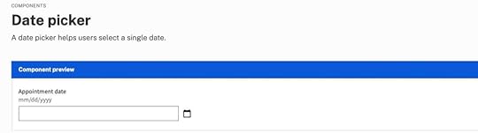
Date picker accessibility resources:
Collecting dates in an accessible way by Hassell InclusionDate picker by US Web Design SystemGeneral accessibility guidance for forms by US Web Design SystemShow Current DateIt is important to show users the current date and their selection on calendar pickers. Highlighting the current date gives users a reference for their choice, which is especially important for booking travel and appointments.
Differentiating between the current date and the user’s selection is crucial to avoid confusion. Material UI clarifies this distinction with an outline for the current date and a shaded background for the selected date.
 Block Unavailable Dates
Choosing a date only to find it’s unavailable is one of the most frustrating user experiences. Users have to start their selection over and try until they find availability. Blocking out unavailable dates allows users to choose without returning to the calendar.
Provide Additional Critical Decision-Making DataMany travel booking apps, including Booking.com and Airbnb, show the price per night below each date so users can find the best rates. This information creates a positive user experience because the product helps users save money.
 Reduce Unnecessary Data
Calendar user interfaces can be busy and overwhelming. Designers must reduce as many UI elements, lines, and other content to make the calendar easier to read and complete tasks. For example, users don’t need to see the days of the week when choosing their date of birth.
UX designers must also use solid backgrounds for modal overlays to block out content behind the calendar, which may confuse users.
How to design a date picker in UXPinUXPin is an advanced prototyping tool used to create interactive, dynamic, high-fidelity prototypes. Where most prototyping tools require designers to create multiple artboards to prototype just one interaction, UXPin enables designers to use States, Variables, and Conditions to create fully-functioning pages.
To insert a date picker in UXPin, start by clicking on the “Search All Assets” search icon (command + F / Ctrl + F) in the vertical toolbar.

Next, search for “date” or “calendar” using the input field.
Several options will be available under the “Components” heading, some of which are best for touch users and others for keyboard users. “Input calendar”, however, provides a calendar for touch users and an input field for keyboard users, offering the best of both worlds and is perhaps the simplest solution overall.
 Styling the date picker Component
UXPin Components are already designed to offer great user experiences, but you’ll probably want to style them to match your brand’s visual identity and app/website’s aesthetic. To do this, use the Properties panel on the right.

If you’re using UXPin Design System Libraries (especially Text Styles and Color Styles), you can utilize the Styles that you’ve already established to help maintain some degree of visual consistency between the date picker Component and the rest of your design.
To customize your component, select the Layer that you’d like to style, navigate to your UXPin Design System Library after clicking on the “Design System Libraries” icon (⌥ + 2 / alt + 2), and then select the Style that you’d like to apply to the Layer.
 Using real Components instead
Rather than reinventing the wheel by inserting and styling the same Component over and over again, designers can use production-ready Components that’ve already been built by developers. You can pull them from Git, Storybook, or NPM (no coding required) and they’ll look and work just like the real thing (because they are). Learn about UXPin’s technology that makes this happen. Request access today.
The post How to Design a Date Picker that Makes Your UI Shine appeared first on Studio by UXPin.
August 31, 2023
Does Storybook Work With Figma? [+ What to Use Instead]

Storybook Connect for Figma aims to link Storybook stories to Figma designs to streamline UI review and design handoff. Storybook Connect has its limitations. As you’ll learn in this article, UXPin Merge’s Storybook integration is a better alternative to Figma Storybook plugins.
Key takeaways:
Storybook Connect for Figma allows you to link Storybook stories to their corresponding Figma designs but doesn’t import the components directly into Figma for manipulation.The plugin depends on manual URL linking, making it vulnerable to broken links and requiring additional effort for setup.UXPin Merge offers a more comprehensive solution by importing an entire Storybook library for prototyping, creating a single source of truth between design and development.Bring Storybook components into the design process with UXPin’s Merge technology. Visit our Merge page for more details and how to request access.
Reach a new level of prototypingDesign with interactive components coming from your team’s design system.
Discover UXPin Merge .discover-merge { margin: 40px 8px;}.discover-merge__container { display: flex; max-width: 690px; height: 200px; padding: 20px; padding-left: 24px; border-radius: 4px; background-color: black; box-shadow: 10px 10px #9999ff; align-items: center; justify-content: space-between;}.discover-merge__left { width: 50%;}.discover-merge__left p { margin: 10px 0px !important; color: white !important; font-size: 18px !important;}.discover-merge__heading { font-weight: bold !important; color: white !important; font-size: 18px !important;}.discover-merge__text { margin: 0 !important; line-height: 22px !important;}.discover-merge__button { width: 174px; height: 44px; margin: 10px 0px; border: none; border-radius: 2px; background: white; color: black; font-size: 16px; text-align: center;}.discover-merge__button:hover { cursor: pointer;}.discover-merge__image { max-width: 320px !important; height: 200px; margin-right: -19px;}@media (max-width: 760px) { .discover-merge__container { height: auto; margin: 10px; align-items: left; }}@media (max-width: 500px) { .discover-merge__container { flex-direction: column; } .discover-merge__left { width: 100%; align-items: normal; }}Does Storybook Work With Figma?Storybook Connect is the official Storybook Figma plugin made by Chromatic–a cloud service for Storybook that automates workflows for UI feedback, visual regression testing, and documentation.
What is Storybook Connect for Figma?Storybook Connect links Storybook stories to their corresponding Figma designs. This plugin enables teams to compare the live implementation with design specs, accelerating the design handoff and UI review processes.
Key Storybook Connect’s features include:
Connecting Storybook stories and Figma design components or variants to keep design and implementation in sync.Designers can interact with the Storybook component in Figma, giving them a real-time understanding of how a component functions.Identifying reusable components, helping to maintain consistency across projects.Evaluating how closely the implemented UI matches the design specifications.Setting up private projects and control who can access them.Alternative beta plugin: story.to.designAt the time of writing this article, story.to.design is a beta plugin that claims to generate a Figma UI kit of Storybook stories. It’s also important to note that story.to.design does not support private GitHub repositories.
While story.to.design looks promising, developers must use a specific syntax and layout to import and update the stories in Figma–which might not align with your development workflow.
The story.to.design plugin will require technical expertise to set up, and you might have to set up a separate repository to ensure the library aligns with story.to.design’s code requirements.
How do you use Figma With Storybook?Once you have installed Storybook Connect, there are three steps to connecting your stories to Figma components:
Select a Figma component or variant.Run the Storybook Connect plugin.A window opens, allowing you to paste a link to a specific story.A Storybook logo appears below the components properties on the right.Click View Story to open a new window within Figma displaying a live implementation of the Storybook component.And that’s it! Designers can interact with the Storybook component to understand how it works and copy the interactions into Figma.
What are the Limitations of Figma Storybook Integration?Here are some of the limitations and challenges with using Storybook Connect.
Does not import Storybook components into FigmaOne of the most notable limitations is that the plugin does not import Storybook components directly into Figma. Instead, it links Storybook stories to their corresponding Figma designs. While you can interact with the live implementation within Figma, you can’t manipulate the Storybook components as native Figma elements or use them for prototyping.
Dependent on URL linkingStorybook Connect relies heavily on URL linking between Storybook and Figma. After running the plugin, you must find the correct story and copy/paste the link in Figma–a lot of manual work for each component!
If the URL structure changes or there are connectivity disruptions, the links may break, requiring manual intervention to restore them.
Limited to specific addons for UI reviewWhile the plugin does offer some Storybook addons for UI review, such as the Measure and Outline addons, it may not support all the addons your devs use in Storybook.
Storybook Connect does not bridge the gapStorybook Connect fails to bridge the gap between design and development. Designers still work with image-based tools and components, while devs build with code.
The plugin marginally streamlines the design and design handoff by removing the need to switch between Figma and Storybook to reference design and code component libraries.
How to Solve Figma Storybook Limitations With UXPinWith UXPin’s Merge technology, you can import an entire Storybook library into UXPin and use the components to build and test prototypes. Unlike Storybook Connect, designers and engineers don’t use separate libraries.
Instead, the integration creates a single source of truth between design and development where designers use the same UI elements for prototyping as engineers use to develop the final product.
What is UXPin Merge, and how does it work?Merge syncs code components from a repository to UXPin’s design editor. Designers can use these components in the design process to build interactive prototypes indistinguishable from the final product. There are three ways to import code components using Merge:
Git Integration (React only): Direct connection to any GitHub repository, giving full access to Merge features, including Patterns, Version Control, and JSX authoring. Storybook Integration : Connect any Storybook library, including React, Vue, Ember, Angular, and more. npm Integration : Import components from open-source libraries on the npm registry using the Merge Component Manager.How Merge solves Figma’s Storybook limitationsDoes import Storybook components into FigmaStorybook Connect doesn’t import code components into Figma, and designers can’t use these for prototyping. Merge’s Storybook Integration does import Storybook components into UXPin, and design teams can use them for prototyping.
Is not dependent on URL linkingMerge does not use URLs or other manual methods to import components. Instead, Merge imports the actual UI elements, templates, and patterns from your Storybook repository into UXPin. Once the initial setup and connection are complete, Merge automatically syncs repo updates to UXPin and notifies design teams of the change.
Is not limited to specific addons for UI reviewMerge does not require addons or plugins to function. It connects directly to the repository, meaning any plugins or addons won’t impact syncing. This connection won’t interfere with engineering workflows or best practices, making it easy for product development teams to adopt.
Successfully bridges the gap between design and developmentMerge bridges the gap between design and development by syncing teams through a single component repository. Designers and developers use the exact same components from the exact same repository.
“In UXPin, UI components look and behave exactly as they do for developers, effectively bridging the gap between design and development–a real single source of truth.” dotSource – a German-based digital product consulting and development agency.
More reasons to use Merge’s Storybook IntegrationEnhanced user testing: Designers can build prototypes that accurately represent the final product, allowing them to test complex interactions and even API integrations without engineering assistance.Meaningful feedback: Stakeholders can interact with Merge prototypes like they would the final product, giving designers meaningful, actionable insights to iterate and improve.Streamlined handoffs: Merge handoffs are smoother than a typical design-to-code workflow because there is no way to modify Merge components in UXPin other than the Storybook Args available in the Properties Panel. Zero drift: Storybook Connect gives designers a reference for designing components, which they can interpret in many ways or completely ignore. Merge components give design teams the same limitations and constraints as developers, eliminating design drift and inconsistencies.How do you use UXPin With Storybook?Merge’s Storybook Integration lets you connect any public or private Storybook, enabling you to keep your components secure with token-based verification and manage library access in your team.
Setting upMerge’s Storybook Integration connects directly to a repository, so you will need technical assistance from your engineers to set this up properly. Check out UXPin’s docs for more details, including contacts for UXPin’s technical support team, who will assist you in getting started.
How to find Storybook components in UXPinOnce the setup is complete, your new Storybook library will appear in the left sidebar under UXPin’s Design System Libraries tab.
Storybook libraries will display the Storybook logo to the left of the library name, like in the Material UI example below.
How to use the Storybook components in UXPinClick or drag Storybook components from UXPin’s Design System Libraries onto the canvas.
The component’s properties, defined by Storybook Args, will appear in the Properties Panel. You can adjust these to get the desired variant, state, interactivity, etc.
Add UI elements to create user interfaces and build prototypes. You can add page transitions and other interactivity using the Interactions feature at the top of the Properties Panel.
Design handoffShare designs and prototypes with developers using Preview and Share. Developers can analyze UIs and inspect individual components using Spec Mode. UXPin automatically links to the component’s story, so there is no confusion about which pattern or UI element devs are viewing.

And that’s it! You’ve learned how to set up a Storybook library in UXPin and build prototypes using code components.
How a Code to Design Workflow Streamlines Product DevelopmentStorybook Connect embeds components into Figma for designers to reference. This plugin solves a minor problem for design teams–switching between Figma and Storybook. The manual process of linking each component is time-consuming and prone to error. Connecting the wrong story in Figma can cause confusion and create friction between designers and engineers.
A code-to-design workflow eliminates manual processes and updates. DesignOps can focus on creating impact rather than spending time and resources manually updating and maintaining UI kits to meet repo releases.
UXPin’s Merge technology automates redundant tasks and successfully bridges the gap between designers and engineers. The transition from design to development is seamless, and developers require less documentation to build the final product.
“With this UXPin Merge workflow, we have overcome redundant processes and eliminated UX debt from design system updates. UX consistency is no longer an issue, and we have no design drift.” dotSource – a German-based digital product consulting and development agency.
Sync design and development with one tool and powerful Merge automation. Visit our Merge page for more details and how to get started.
Discover MergeThe post Does Storybook Work With Figma? [+ What to Use Instead] appeared first on Studio by UXPin.
August 30, 2023
Prototyping in Figma vs UXPin – Possibilities & Limitations

Figma prototypes are great for visualization of what the end-product can look like, explaining design decisions, and planning user flow. They fall short when it comes to testing your prototype. This is where UXPin prototypes shine. UXPin helps designers create interactive prototypes that bring quality test results. Let’s analyze both tools.
Key takeaways:
Figma offers real-time collaboration in a vector-based design environment, while UXPin provides advanced interactive prototyping through a code-based approach.Due to advanced features like Merge, complex interfaces can be built significantly faster in UXPin than Figma.A comparison test revealed that prototyping in UXPin was 8X quicker and more interactive than in Figma.While Figma excels at creating static UI mockups, low-fidelity prototypes, and collaborative design, it lacks interactive prototyping capabilities.UXPin’s Merge technology allows design teams to build code-based prototypes streamlining the design-to-development transition, offering cost and time savings.
Bridge the gap between design and development and build advanced interactive prototypes using UXPin’s Merge technology. Visit our Merge page to learn more and how to request access.
Reach a new level of prototypingDesign with interactive components coming from your team’s design system.
Discover UXPin Merge .discover-merge { margin: 40px 8px;}.discover-merge__container { display: flex; max-width: 690px; height: 200px; padding: 20px; padding-left: 24px; border-radius: 4px; background-color: black; box-shadow: 10px 10px #9999ff; align-items: center; justify-content: space-between;}.discover-merge__left { width: 50%;}.discover-merge__left p { margin: 10px 0px !important; color: white !important; font-size: 18px !important;}.discover-merge__heading { font-weight: bold !important; color: white !important; font-size: 18px !important;}.discover-merge__text { margin: 0 !important; line-height: 22px !important;}.discover-merge__button { width: 174px; height: 44px; margin: 10px 0px; border: none; border-radius: 2px; background: white; color: black; font-size: 16px; text-align: center;}.discover-merge__button:hover { cursor: pointer;}.discover-merge__image { max-width: 320px !important; height: 200px; margin-right: -19px;}@media (max-width: 760px) { .discover-merge__container { height: auto; margin: 10px; align-items: left; }}@media (max-width: 500px) { .discover-merge__container { flex-direction: column; } .discover-merge__left { width: 100%; align-items: normal; }}What is Figma?Figma is a vector-based design tool that enables real-time collaboration. Designers can use Figma to create various design assets, from wireframes to mockups to prototypes and information architecture.
Figma was founded in 2016 as a browser-based vector graphics editing tool, making it an interesting alternative to Adobe products which dominated the market at that time. Many UX/UI design teams fell in love with the simplicity of Figma and started to use the tool in their job – designing user interfaces.
Figma prototypes are great for explaining to other teams what design should look like. The tool is amazing at making creative prototypes, design explorations, and powerful drawings. Figma prototypes lack advanced interactivity that stays within dev’s environment constraints. It’s what UXPin is great at.
What is UXPin?UXPin is a code-based full-stack design tool for cross-functional collaboration. UXPin’s biggest benefit is its interactive prototyping capabilities. Designers can build fully functional prototypes that look and feel like the final product. The platform also makes creating wireframes, mockups, map user flows, and information architecture effortless with built-in libraries and forms.
UXPin prototypes can behave like a real product, because designers can put real interactions in their prototypes, store user input while testing, and use real data.
The design tool incorporates all the benefits of an easy-to-use interface with powerful code-backed features allowing designers to:
Build robust interactive prototypes.Get high-quality, meaningful feedback from users and stakeholders.Streamline design handoffs.What is the Difference Between Prototyping in Figma vs UXPin?While Figma offers a reliable solution for prototyping with its collaborative capabilities and component-based approach, UXPin goes further with advanced interactions and a seamless transition from design to development with its Merge technology.
“With UXPin Merge, you can build complex interfaces in half an hour to one hour. In Figma, those interactions would take a week.” Larry Page, UX Lead Designer at Optum.
Figma falls into the “legacy design tool” category. While it’s easy to use, and designers can achieve beautiful Figma designs, the platform hasn’t evolved to meet modern UX design standards.
Here is a quick comparison of UXPin and Figma’s prototyping capabilities.
Figma:
Basic interactions and transitions: Figma allows designers to add basic clickable transitions, making the mockups more engaging.Component creation and design systems: Designers can create shareable, reusable components to maintain UI consistency. Collaborative design capabilities: Multiple designers can simultaneously work on the same design, streamlining the design process and promoting collective creativity.UXPin:
Advanced interactive prototyping: UXPin goes a step further with its sophisticated prototyping abilities. Features such as States, Interactions, Variables, and Expressions facilitate a more realistic prototype closer to the final product.Code-to-design with Merge: Designers can import React components into the design process, allowing them to build prototypes indistinguishable from the final product. Merge helps bridge the gap between design and development, aligning both processes for seamless product delivery.Real-time collaboration and user feedback: UXPin’s Comments facilitate cross-functional collaboration with team members and stakeholders. Yet, its edge lies in capturing user feedback directly on the prototype, enabling iterative design refinements based on tangible user insights and stakeholder feedback.How Figma and UXPin Compare–a Real-World Case StudySenior UX Designer, Anthony Hand, wrote a Medium article comparing UXPin and Figma’s prototyping capabilities. The team created a custom Microsoft Fluent web library, including relevant brand colors and third-party icons.
Anthony used a Fluent UI kit in Figma and imported a React UI library GitHub repository into UXPin using Merge technology. The React components included styling and interactive properties defined in the repo and necessary controls and APIs.
Conversely, the Figma UI kit was a static version of the Fluent Design System, requiring designers to set up relevant variants and interactions–albeit with significantly less fidelity and functionality than the React components in UXPin.
The experimentAnthony created the same single-page reporting prototype on both platforms to compare UXPin and Figma’s prototyping efficiency. It took him an hour to design the page in Figma and just eight minutes in UXPin.
“The UXPin prototype had live dropdowns, calendar buttons, a sortable data table, and even an interactive Highcharts pie chart!” Anthony Hand, Senior UX Designer.
The prototype Anthony created with UXPin was better quality, had fewer errors, and featured interactive elements thanks to its use of live Microsoft Fluent controls. Conversely, the Figma prototype lacked these interactive qualities, relying on rasterized images that reduce real-time interaction–even though it took more than 8X as long to create.
Anthony’s conclusionWhile Figma serves as a web-based evolution of familiar graphic design platforms and is an advancement over older tools, it still has limitations. UXPin stands out with its focus on “interactive prototypes” through a code-based design approach, allowing designers to create designs that feature live code elements, enhancing the interactivity and realism of the prototypes. Additionally, UXPin offers capabilities for complex interactions on a single page with minimal learning requirements.
“I liked Figma a lot. It’s a huge improvement over my previous go-to design tool, Balsamiq. But now that I’ve learned how to leverage the powerful scripting capabilities of UXPin and design interactive UIs with the same live HTML UI controls that my engineering colleagues will use in the finished product, there’s no way I could go back.” Anthony Hand, Senior UX Designer.
Is Figma Good for Prototyping?Figma is undoubtedly a fantastic UI design tool but lacks the features necessary to create realistic interactive prototypes. Designers can still do some prototyping in Figma. Here are some examples of where the platform is most useful during the design process:
Static UI mockups: Figma’s intuitive user interface and features make designing mockups effortless.Low-fidelity prototypes: Figma is great for low-fidelity wireframe prototypes since these only require basic transitions between screens.Information architecture: Designers can organize screens on a single artboard to map and visualize a product’s architecture and user flows.Collaborative design: Figma makes real-time collaboration easy, allowing teams to leave comments, run design critiques, access version history, and more.What are Figma prototyping limitations?Here’s where you might want to consider UXPin instead:
Interactive prototyping: Figma offers simple click/tap interactions. Capturing user data and creating complex components like dropdown menus, carousels, accordions, and date pickers aren’t possible in Figma–limiting what designers can test.Live data and APIs: Unlike UXPin, you can’t import live data with Figma. These complex integrations require engineering input, increasing time and resources, making them unfeasible for most projects.Code-to-design: Figma works on a design-to-code approach, meaning developers must convert designs into code–a time-consuming and complex task. With the help of Merge, UXPin’s code-to-design workflow means designers can build code-based prototypes with the same building blocks developers use, significantly reducing development time while creating a seamless product development workflow.Why is it Better to Prototype in UXPin?The common theme throughout this article is interactivity. Modern digital products require designers to test ideas using interactive prototypes. Why?
Development is time-consuming and expensive. Solving issues during the design process can save organizations countless time and resources, reducing wasteful expenditure.User experience is crucial for product adoption, engagement, and retention. Interactive prototyping allows designers to solve usability issues during the design process and enhance the product’s user experience.When designers use image-based tools for prototyping and user testing, they miss usability issues and business opportunities during the design process. They must add these changes to the product’s UX and technical backlog, increasing debt and avoidable costs.
How interactive prototyping reduces UX debtMerge reduces wasteful and avoidable UX and technical debt with better testing and smoother design handoffs. The design team can import interactive components from a design system repository for prototyping. This fully interactive component library increases prototyping scope, allowing designers to build exact replicas of the final product–impossible to do with image-based tools like Figma.
Users and stakeholders can interact with Merge prototypes like they would the final product, giving design teams accurate, meaningful insights to iterate and improve.
Design handoffs require less documentation and explanation because designers and engineers use exactly the same components. Devs can import the same UI library from the same repository, apply JSX changes from UXPin, and deliver the end product.
“UXPin Merge reduced our engineering time by around 50%. Imagine how much money that saves across an enterprise-level organization with dozens of designers and hundreds of engineers.” Larry Page, UX Lead Designer.
Faster prototyping and iterationsMerge effectively creates a no-code, drag-and-drop prototyping environment for designers. As we learned from Anthony’s case study, switching to Merge allowed him to build a prototype 8X faster in UXPin than Figma using the same UI library.
Making changes to components and prototypes is quick and efficient using UXPin’s Properties Panel. Still, designers can increase efficiency by creating multiple variations and states for a single UI element and saving these in UXPin’s Patterns. Instead of making adjustments in the Properties Panel, designers simply swap components to get instant feedback during testing.
“It’s been so helpful for us to have these high-fidelity prototypes built with UXPin. We build high-fidelity prototypes much quicker and get immediate feedback after the session. If there’s something we can fix immediately, we make that change before the next participant and get feedback much faster than before.” Erica Rider, Product, UX, and DesignOps thought leader.
Take your prototyping to the next level with interactive components using UXPin’s Merge technology. Visit our Merge page for more details and how to request access.
Discover MergeThe post Prototyping in Figma vs UXPin – Possibilities & Limitations appeared first on Studio by UXPin.
August 28, 2023
8 Fullproof Methods of Collecting In-App Feedback [+Tools]
In-app feedback is a user review or rating of their experience with an app that’s collected while the user performs a task in the app. Designers or product managers place a widget or a pop-up in the app to learn what a user thinks and feels about the app. It helps to streamline app UX and prevent user churn.
In this article, we will discuss best practices, tools, and techniques for collecting in-app feedback. Let’s start.
Key takeaways:
In-app feedback refers to user feedback collected from real users in the exacvt moment they’re using an app.It helps designers stay close with users, get immediate feedback on a working app, and improve its experience.In-app feedback techniques include surveys, questionnaires, widgets, screenshot and annotations tools, bug reports, and user reviews.To collect user feedback, remember to keep it non-invasive, quick, and compelling.Solve more problems during the design process with high-quality, interactive prototypes from UXPin. Start building better product experiences for your users. Sign up for a free trial.
Build advanced prototypesDesign better products with States, Variables, Auto Layout and more.
Try UXPin .try-uxpin-banner { margin: 40px 0px;}.try-uxpin__container { display: flex; max-width: 689px; height: 210px; padding: 20px; padding-left: 24px; border: 2px solid black; border-radius: 4px; align-items: center; justify-content: space-between; background-color: white; box-shadow: 10px 10px black;}.try-uxpin__left { width: 54%;}.try-uxpin__left p { margin: 10px 0px !important; color: black !important;}.try-uxpin__heading { font-size: 28px !important; font-weight: bold;}.try-uxpin__text { margin: 0 !important; font-size: 18px !important; line-height: 22px !important;}.try-uxpin__button { width: 135px; height: 44px; background: black; margin: 10px 0px; padding: 10px 20px; border: none; border-radius: 2px; color: white; font-size: 16px; text-align: center;}.try-uxpin__button:hover { cursor: pointer;}.try-uxpin__image { max-width: 320px !important; height: 200px; margin-right: -21px; margin-bottom: -6px;}@media (max-width: 760px) { .try-uxpin__container { height: auto; margin: 10px; align-items: left; }}@media (max-width: 500px) { .try-uxpin__container { flex-direction: column; } .try-uxpin__left { width: 100%; align-items: normal; }}What is an In-App Feedback?In-app feedback is a user opinion collected within an application that sheds light on user experiences, preferences, and potential pain points. Unlike external surveys, social media, or app ratings, this feedback captures real-time reactions and user insights, giving product teams a contextual understanding of how people interact with specific app features.
Organizations leverage in-app feedback to find opportunities for improving UX, ensuring their solutions align seamlessly with user expectations and enhance the overall customer experience.
Why Does In-App Feedback Matter?Prioritizing in-app feedback means valuing genuine user experiences over assumptions and ensuring product managers implement changes based on user needs. These user-centric improvements increase customer satisfaction leading to increased retention while reducing churn.
Reason 1: Staying in touch with usersIn-app feedback provides an unfiltered channel into the user’s thoughts and feelings. This first-party data is invaluable as it allows product teams to capture app users’ sentiments directly where interactions occur, fostering a clearer understanding of user satisfaction and areas of friction.
Reason 2: Fast insightsReal-time in-app feedback offers immediacy other collection methods can’t. Users can instantly communicate issues, delights, or confusion, allowing product teams to address concerns without delay, ensuring an agile response to user needs.
Reason 3: Real-time understanding of usersContextual feedback is highly valuable for UX research and understanding the user experience “in the moment.” We humans tend to forget. So interviewing someone a few days or weeks after their experience may differ from when it’s actually happening.
In-product feedback gives teams a contextual perspective on how users navigate, interact, and react to specific features, shedding light on potential improvements and innovations.
In-App Feedback Tools and TechniquesIn-app surveys and questionnairesBest time to use: After major interactions or task completions.Tools: Typeform.In-app surveys and questionnaires let you pose targeted questions to users as they navigate, extracting specific insights. For example, after a user completes a new feature or flow, a quick survey can assess their experience.
Pros:
Direct insights about specific app features or processesStructured data that are easy to quantify and analyzeCons:
Risk of interrupting user experience if not timed correctlyOverusing feedback surveys can lead to fatigueFeedback widgets and buttonsBest time to use: After micro-interactions or content consumption.Tools: Wootric.These embedded tools within your app interface offer users a quick way to provide feedback, including net promoter score (NPS) and customer satisfaction score (CSAT). For example, post-onboarding, a thumbs up/down button can gauge whether users feel confident about using the product.
Pros:
Simplifies the feedback process for usersCan lead to higher response ratesCons:
Limited depth of insights due to simplicityCan clutter the interface if not integrated seamlesslyScreenshot and annotation toolsBest time to use: When reporting visual or layout-related issues.Tools: FullStory.These tools allow users to capture specific app screens and highlight issues or areas of interest, offering visual context. For example, a user encountering a display glitch can screenshot the error and instantly report it.
Pros:
Provides visual context for more accurate issue identificationEmpowers users to pinpoint exact problemsCons:
Might have compatibility or stability issuesNeeds user proficiency for effective utilizationSession recordingsBest time to use: Continuous monitoring, especially during new releases.Tools: FullStory.Recording user sessions captures real-time interactions, providing a step-by-step view of a customer journey. This data is valuable when diagnosing unexpected user drop-offs.
Pros:
Offers a holistic view of user interactionsHelps identify unintuitive app flowsCons:
Privacy concerns if not handled with transparencyCan demand significant storage and analysis timeHeatmapsBest time to use: When analyzing user interaction patterns with UI elements.Tools: HotJar, Microsoft ClarityHeatmaps visualize where users tap, swipe, or linger on your app screens, indicating areas of interest or confusion. For example, a hotspot might reveal an unintentional focal point.
Pros:
Offers a visual representation of user activityHighlights design elements that draw attentionCons:
May not provide the ‘why’ behind observed patternsNeeds sufficient data points for accuracyChatbots and AI-driven feedback collectionBest time to use: Post interactions or during help/support queries.Tools: Built-in in your chatbot app like Intercom or LiveChat.Product teams can leverage AI chatbots to gather feedback by conversationally interacting with users.
For example, post-interaction, a chatbot might ask, “Was this solution helpful?”
In time, these AI chatbots will get more advanced and notice patterns where users struggle. For example, “I noticed you spent a long time completing the form; was everything ok?”
Pros:
Enables real-time, interactive feedback collectionAI can adapt to user responses for deeper insightsCons:
Can feel impersonal or roboticRequires sophisticated setup and maintenanceBug reportsBest time to use: Continuous monitoring, especially during new releases.Tools: Instabug.In-app bug reporting tools allow users to immediately report issues they encounter, streamlining the feedback-to-fix journey. If an app crashes, a prompt might appear asking for feedback.
Pros:
Facilitates quick identification of technical problemsDirect channel from problem discovery to reportCons:
Relies on the user’s willingness to provide feedback post-disruptionCan lead to redundant reports if many users face the same issueCustomer support emailsBest Time to Use: Immediately after technical issues or crashes.Tools: Intercom or Helpscout.Channels like feedback forms, in-app messaging, and customer support allow product teams to learn about users and their pain points. Beyond troubleshooting, these mobile app feedback channels enable users to voice concerns, provide suggestions, or seek clarity on app functionalities.
Pros:
Real-time feedback allows users can share their thoughts or report issues instantlyDirect interaction assures users that there’s a team ready to assist and value their input, building trustDetailed conversations dive deeper into user challenges and perspectivesCons:
Users want immediate feedback. Delays in support responses can lead to user dissatisfactionMaintaining a responsive customer support system demands a dedicated team and other valuable resourcesCustomer support representatives must manage expectations. Unresolved issues can lead to unfavorable user reviews or public complaintsHow to Encourage Users to Give In-App FeedbackReact quicklyPosition feedback prompts where they’re most relevant, ensuring they resonate with users’ in-app experiences. Avoid disrupting users during crucial tasks to increase the likelihood of participation.
For example, after completing a checkout process, a brief survey asking about the experience feels timely and relevant, maximizing the chance of user engagement. Conversely, asking the shopper while entering their payment details is poor timing, adversely impacts the user experience, and may increase abandoned carts.
Offer incentives or rewardsUsers are more inclined to provide feedback if they see a tangible benefit. Product teams can offer rewards or incentives to acknowledge the value of the user’s time and insights.
For example, offering in-game currency or power-ups in exchange for feedback on a game’s new level or feature. This incentive entices players and ensures more comprehensive feedback.
Craft compelling Call-to-ActionA well-crafted call-to-action (CTA) motivates users without overwhelming them. Keep CTAs clear, concise, and direct, emphasizing the ease and benefit of providing feedback.
For example, instead of a generic “Give Feedback” button, use “Help Us Improve in 30 Seconds!” This CTA offers a clear timeframe, making users more likely to engage. Content designers can help you find the best CTA for your case.
Best Practices for In-App Feedback CollectionRespect users’ timeWhen collecting feedback, value the user’s time. Ensure that prompts, questions, and surveys are clear, concise, and easy to navigate. A user who encounters a straightforward and brief survey is more likely to complete it, ensuring you get the insights you need without frustrating them.
Be transparent with usersClearly communicate the purpose of collecting feedback and how the organization uses this data. Users are more inclined to share insights when they know their data is secure and won’t be misused.
For example, a simple statement, “We value your privacy. We use your feedback to make app improvements and never share this information with third parties,” builds trust.
Test your approach oftenFeedback tools aren’t a set-and-forget; they require ongoing refinement. Regularly test these tools to ensure they function correctly and resonate with users. A continuous iteration of analyzing, modifying, and retesting ensures your feedback mechanisms remain effective and user-friendly.
Prioritize gathering feedbackEvaluate user responses based on relevance, frequency, and potential impact on user experience. Designers must also consider the product roadmap and objectives when prioritizing what to tackle first.
Addressing the most pressing issues first ensures you tackle users’ most significant pain points and enhance the overall user experience.
Tools and techniques to understand feedbackFeedback aggregation platforms make it easier to sift through and identify trends.Sentiment analysis tools gauge the general mood or sentiment behind customer feedback, helping prioritize areas for improvement.Data visualization tools offer a clear visual representation of feedback trends and patterns, making analysis more intuitive.Closing the feedback loop: informing users of changesAfter acting on feedback, inform respondents about the changes made. This follow-up shows appreciation for their input and reinforces trust in your commitment to improvement–they know your messaging about improving the app is sincere, and they’re more likely to give feedback again.
For example, when releasing an app update, highlight “Improvements made based on your feedback!” in the release notes. This simple acknowledgment fosters a stronger relationship between users and product teams.
Design Solutions to In-App Feedback Easier With UXPinUXPin’s advanced features allow product teams to build prototypes that accurately replicate the final product experience. They can use customer feedback to simulate problems or usability issues and develop effective solutions. Designers can preview prototypes in the browser or via UXPin Mirror (available for iOS and Android) for mobile app testing.
Some of UXPin’s advanced features you won’t find in traditional image-based design tools:
States : design complex interactive components like dropdown menus, tab menus, navigational drawers, and more. Variables : capture data from user inputs and create personalized, dynamic user experiences–like their name and profile image in the app bar. Expressions : create complex components and advanced functionality–no code required! Conditional Interactions : create if-then and if-else conditions based on user interactions to design dynamic prototypes with multiple outcomes to accurately replicate the final product experience.UXPin’s IFTTT integration allows design teams to connect APIs and simulate real-world product experiences, workflows, and use cases–like sending a notification email or adding an event to a user’s calendar.
Use these and many other features to build your first fully interactive prototype with UXPin. Sign up for a free trial.
Try UXPin for freeThe post 8 Fullproof Methods of Collecting In-App Feedback [+Tools] appeared first on Studio by UXPin.
UXpin's Blog

- UXpin's profile
- 68 followers

