
Aperture's Blog, page 162
April 10, 2015
Readings on Photography
Editors and staff at Aperture Foundation share what we’ve been reading recently.

“What I Talk about When I Talk about Photography” by Melanie Bühler for Still Searching, the Fotomuseum Winterthur blog: “If one thinks about photography in medium-specific terms, digitization actually hasn’t introduced any significant challenges to the essence of the photographic moment. Cameras and iPhones that produce digital photographs still contain optical lenses that record light from which an image is generated. What has changed, however, is the process of image creation that directly follows from this moment.”
–Michael Famighetti, editor of Aperture magazine
I unearthed The Love of Indoor Plants (Octopus Books, 1973), by Lovell Benjamin, in an outer-borough junk store. It’s an ostensibly practical guide to houseplant care illustrated by what seems to be half stock photos, half images shot for the purpose of the book. (The same lace background pops up again and again.) The layout is clunky and the badly cropped photographs might as well have been culled from a Google image search, but I love its little nods to style: a flash of satin, a glossy pink ribbon, woodgrain, ceramics, decorative rocks. You can, however, have too much of a good thing. In his introduction, Benjamin cautions against plant-hoarding: “So dense are they in some windows that one cannot help wondering whether the rooms inside are equally cluttered up with these beautiful plants. This very thought prompts a warning. If there are too many present, house plants lose one of their most valuable qualities that of giving accent to decor.” Proceed with caution.
–Madeline Coleman, copy editor/proofreader, books, and coordinating editor, The PhotoBook Review
I have not yet gotten my hands on a copy of Charles Simic’s new book of prose, The Life of Images, which contains many writings on photography, but its release this week reminds me of this essay he once wrote for the New York Review of Books website, on the occasion of Aperture’s 60th anniversary. Simic worked at Aperture magazine from 1967 to 1970 doing various odd jobs around the office as its “business manager.” But mostly, he remembers looking at photographs: “I recall rainy afternoons with nothing to occupy me in the office but some photograph by Dorothea Lange, Paul Caponigro, Jerry Uelsmann, or by a complete unknown that I couldn’t stop looking at, because it seemed to grow more beautiful and more mysterious the longer I kept looking. Then, abruptly, a phone would ring with some irate subscriber shouting that his issue arrived damaged in the mail, and the spell would be broken.”
–Alexandra Pechman, online editor
I reread Paul Graham’s essay for the 2009 Yale MFA book [“Photography is Easy, Photography is Difficult”] frequently, when I hate photography and need to be reminded to lighten up and just do it.
–Sarah Goldberg
The post Readings on Photography appeared first on Aperture Foundation NY.


April 9, 2015
My Last Day at Seventeen: Illustrations by Patrick Lynch
Only 3 days left to make a pledge and reserve your copy of My Last Day at Seventeen
Doug DuBois and Irish Illustrator Patrick Lynch talk about their collaboration and the resulting comic that helps tell the story of the community in My Last Day at Seventeen. Lynch created an illustrated comic based on the photographs and experiences DuBois had during his five summers visiting the Russell Heights housing estate in Cobh, Ireland. Royalties from the sale of the upcoming book benefit the Sirius Arts Centre–whose artist residency program allowed DuBois to return to Ireland year after year.
Thank you to all who helped us reach our Kickstarter goal! There’s still three days left to make a pledge and reserve your copy of the photobook.
The post My Last Day at Seventeen: Illustrations by Patrick Lynch appeared first on Aperture Foundation NY.
April 6, 2015
Anne Prentnieks on Laurie Simmons at the Jewish Museum
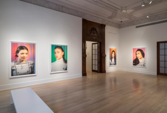
Installation view of Laurie Simmons: How We See © The Jewish Museum, NY. Photograph by: David Heald.
Laurie Simmons has long used photography as a tool for documentation, capturing cagey scenes punctuated with surprise. Unlike her Pictures Generation peers, whose imagery commented on various cultural zeitgeists, Simmons’s pictures summon uncanniness reminiscent of surrealist imagery. From cinematically staged dollhouse scenes featuring the ominously unsettled housewife to the portrait series of a life-sized Japanese sex doll sweetly tucked into bed or inside a bubble bath, her photographs conjure the feeling of a faux déjà vu.

How We See/Tatiana (Pink), 2015
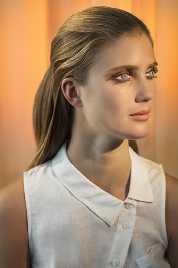
Today, our impressions of strangers and acquaintances alike are as often based on actual encounters as on the optimistic Tinder profile, Facebook account, Instagram upload—a virtual myth that amounts to a sprawling, self-curated, two-dimensional gallery. How We See (all works 2015), Simmons’s most recent series of large-format close-up portraits, suggests that the process of modern identity shaping can be as willfully blind as it is untrue. Here, her lens fixates on the pristinely made-up faces of models whose eyelids are meticulously painted over to create the illusion of larger eyes (and a sexualized, doll-like countenance) à la cosplay (costume play) tradition.
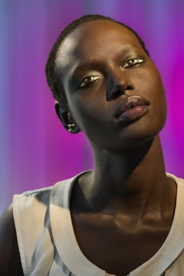
How We See/Ajak (Violet), 2015
The title of each picture—Lindsay (Gold); Ajak (Violet), etc.—references the model by name as well as the vibrant color of her school-picture-day-like backdrop. Edie (Green) shows the transgender model Edie Charles, with her hair in a neat ponytail. (Charles, along with Peche Di, of Peche (Pink), is one of two transgender models included in the series.) A small sketch is embroidered onto the pocket of her white turtleneck: it is a head sprouting a ponytail, a tiny cartoon-detail of the model herself. Simmons worked with fashion designer Rachel Antonoff on the costumes for her models, and these unexpected details (an embroidered cigarette, for instance) subtly adorn the images’ edges, suggesting layers of identity with a humored wink.
How We See/Lindsay (Gold) , 2015
With their actual eyes closed, the models in each picture appear serenely in possession of their redefined personas. The lightly fuzzed texture of their foundation-shellacked faces curiously contrasts with the soft-wilted tissue of painted-over eyelid skin, a stand-in for the glossy surface of an eyeball. Hauntingly, the gaze of the painted pupils is always a bit askew, appearing to follow something invisible beyond the picture plane with an almost ecclesiastical focus. These painted-on eyes focus on a mysterious subject while the models in fact see darkness. In the earlier Kigurumi series (2014), featuring figures dressed up in full-bodysuits inspired by the eponymous Japanese cosplay subculture, Simmons began to explore such situational blindness. The pictures in How We See, also expose two opposing sensibilities: a childlike vulnerability, and a bold embodiment of an alter-ego mentally accessed when one physically exits the real world by darkening their sightline.

Laurie Simmons, How We See/Edie (Green), 2015 © Laurie Simmons, courtesy the artist and Salon 94.
The current exhibition presents a small grouping of the closed-eyed portraits in the stately neo-classical architecture of the Jewish Museum. With its decorated ceilings and French doors, the gallery itself both codifies a natural comparison to traditional portraiture and highlights the images’ temporal reality: they are at once richly photographed paintings as well as relics of a performance. By obliterating scale, Simmons’s camera enhances the dreamlike quality of her subjects; dolls are animated while humans register as dolls. For decades Simmons’s work has variously questioned definitions of place, gender, and role—in the home, inside one’s head, or onstage—but identity is the deeper theme that drives her work. Role-playing reveals internal yearnings, and the works in How We See channel introspection; each portrait shows a unique persona that emerges as the model adopts a foreign façade. In every instance, they mimic an intensely modern phenomenon, of generating identity from a composite of fact and fantasy.
Anne Prentnieks is a writer and critic living in New York.
Laurie Simmons: How We See is on view at the Jewish Museum through August 9.
The post Anne Prentnieks on Laurie Simmons at the Jewish Museum appeared first on Aperture Foundation NY.
April 3, 2015
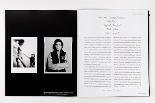
On Robert Mapplethorpe’s Polaroids
In 2001, art critic and philosopher Arthur C. Danto (d. 2013) wrote “Instant Gratification: Robert Mapplethorpe’s Polaroids 1970-1976″ for Aperture magazine #163. In these early Polaroids, Mapplethorpe already begins to experiment with representations of his own body and those of others as well as erotic and bondage-based imagery. Danto recognizes this period as the moment when Mapplethorpe became a pure photographer rather than, as Danto calls it, a photographist, who uses photographs to achieve another artistic end. To coincide with the release of Aperture magazine #218, “Queer,” we republish an excerpt of Danto’s article on this brief but fascinating period in Mapplethorpe’s career.
There is a useful distinction to be drawn between photographers, whose end products are photographs, and what I have termed photographists—artists who incorporate photographs into works that have a more complex artistic identity. It is not at all necessary that photographists be photographers in their own right—they can cut photographs out of newspapers or magazines, and combine them in montages or collages or installations. It is central to the meaning of certain of Christian Boltanski’s installations, to use one example, that the photographs he uses in them were found, and made by some anonymous journeyman photographer of persons whose actual identities have become unknown. Part of the aesthetics of post-Modernist art derives from the myriad roles played in daily life by vernacular photographs, or from qualities that certain vernacular photographs possess. The criteria of photographic art are not usually applicable to photographist works.
Robert Mapplethorpe’s career was unusual in that he began as a photographist, and evolved into a photographer, whose works are paradigms of high photographic art. These mature images were produced in a cultural atmosphere defined in part by photographism– an atmosphere in which swank and elegance were mistrusted, and artistic authenticity sough in the snapshot, in the blemishes, accidentalities, and disfigurements of uninflected picture-taking, felt to testify to a kind of honesty. There can be no doubt that Mapplethorpe’s portraits, for example, often reflected the glamour and celebrity of his subjects, which did not always sit well with his critics when the politics of anti-elitism found aesthetic reassurance in scruffiness and grunge. A photographer I knew, at the time working with pinhole cameras, wrote Mapplethorpe off as a pompier—a French pejorative connoting artifice and academicism. But even when Mapplethorpe was a photographist, working with Polaroids, the elements of his refined photographic style were already present in his work, as if he had a kind of perfect visual pitch, whatever means he used.
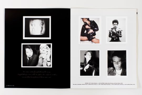
The transformation took place in the early 1970s, and its narrative can be told with reference to three mentors and four cameras. Mapplethorpe was already a photographist of sorts when, in 1970, he was given the use of a Polaroid camera by the artist Sandy Daley, herself a photographer and a fellow resident in the Chelsea Hotel. He was already a photographer when his patron and lover, the curator and connoisseur Sam Wagstaff, gave him a Hasselblad in 1976. He began to accept his identity as a photographer when John McKendry, Curator of Prints and Photographs at the Metropolitan Museum of Art, gave him a Polaroid camera in 1971 as a Christmas gift. He declared a commitment to his calling in 1974 by buying himself a 4-by-5 Graflex with a Polaroid back. Initially, Mapplethorpe rejected the idea of a being a photographer at all, since he did not consider photography a legitimate art. By the time he acquired his Graflex, he not only endorsed its legitimacy, but the concept of photography permeated his vision.
Before meeting Daley, Mapplethorpe had shown no interest in photography whatsoever. Like his companion, Patti Smith, he was driven by extreme and, in terms of his youthful work, a somewhat unrealistic artistic ambition He had left Pratt, in part because he felt that the artistic philosophy of the New York School of painting, which continued to be taught there, had no relevance to being a young artist in the late 1960s. One can get a feeling for Mapplethorpe’s overall aesthetic at the time from the fetish necklaces he put together and sold, made of dice and death-heads, rabbit-feet and feathers, ribbons and claws. But he hoped to win success by means of his mixed-media collages, inspired by the work of Joseph Cornell and Marcel Duchamp, but using a symbolism derived from Roman Catholicism and black magic.
When he first used Daley’s Polaroid, he had begun to incorporate into his collages pictures of young men with attractive bodies, clipped out of magazines addressed primarily to a gay readership. His first thought was that he would use the camera to make his own pictures instead, which he considered more “honest somehow.” Either way, he was practicing photographism, since the pictures were used as collage material. But since the pictures they were to replace carried a sexual charge, his own photographs were also to have a sexual edge, though considerably sharper, as it turned out, than anything he had used before. The Polaroid process enabled him to show himself and others in situations he could photograph with impunity, since there was no need to send film out for development and printing. Mapplethorpe experimented sexually with his own body in front of the lens, to show the way he looked when he trussed his penis, or put it through rings, or mortified other parts of his flesh in accordance with his erotic curiosity. He photographed others in postures of bondage and sexual submission. These early self-images go well beyond what he might have encountered in the magazines sold behind counters in specialty shops in Times Square. But they also have a depth and power considerably in excess of the somewhat vapid images those magazines contained. It is not surprising that he should find his own photographs compelling, whatever his views on photography as such.
Arthur C. Danto was an American art critic and philosopher. He authored about 30 books, including Beyond the Brillo Box and After the End of Art. From 1984 to 2009 he was art critic for The Nation magazine and was a longtime philosophy professor at Columbia University.
Click here to learn more about the Aperture Magazine Digital Archive.
The post On Robert Mapplethorpe’s Polaroids appeared first on Aperture Foundation NY.
Archive: On Robert Mapplethorpe’s Polaroids
In 2001, art critic and philosopher Arthur C. Danto (d. 2013) wrote “Instant Gratification: Robert Mapplethorpe’s Polaroids 1970-1976″ for Aperture magazine #163. In these early Polaroids, Mapplethorpe already begins to experiment with representations of his own body and those of others as well as erotic and bondage-based imagery. Danto recognizes this period as the moment when Mapplethorpe became a pure photographer rather than, as Danto calls it, a photographist, who uses photographs to achieve another artistic end. To coincide with the release of Aperture magazine #218, “Queer,” we republish an excerpt of Danto’s article on this brief but fascinating period in Mapplethorpe’s career.
There is a useful distinction to be drawn between photographers, whose end products are photographs, and what I have termed photographists—artists who incorporate photographs into works that have a more complex artistic identity. It is not at all necessary that photographists be photographers in their own right—they can cut photographs out of newspapers or magazines, and combine them in montages or collages or installations. It is central to the meaning of certain of Christian Boltanski’s installations, to use one example, that the photographs he uses in them were found, and made by some anonymous journeyman photographer of persons whose actual identities have become unknown. Part of the aesthetics of post-Modernist art derives from the myriad roles played in daily life by vernacular photographs, or from qualities that certain vernacular photographs possess. The criteria of photographic art are not usually applicable to photographist works.
Robert Mapplethorpe’s career was unusual in that he began as a photographist, and evolved into a photographer, whose works are paradigms of high photographic art. These mature images were produced in a cultural atmosphere defined in part by photographism– an atmosphere in which swank and elegance were mistrusted, and artistic authenticity sough in the snapshot, in the blemishes, accidentalities, and disfigurements of uninflected picture-taking, felt to testify to a kind of honesty. There can be no doubt that Mapplethorpe’s portraits, for example, often reflected the glamour and celebrity of his subjects, which did not always sit well with his critics when the politics of anti-elitism found aesthetic reassurance in scruffiness and grunge. A photographer I knew, at the time working with pinhole cameras, wrote Mapplethorpe off as a pompier—a French pejorative connoting artifice and academicism. But even when Mapplethorpe was a photographist, working with Polaroids, the elements of his refined photographic style were already present in his work, as if he had a kind of perfect visual pitch, whatever means he used.
The transformation took place in the early 1970s, and its narrative can be told with reference to three mentors and four cameras. Mapplethorpe was already a photographist of sorts when, in 1970, he was given the use of a Polaroid camera by the artist Sandy Daley, herself a photographer and a fellow resident in the Chelsea Hotel. He was already a photographer when his patron and lover, the curator and connoisseur Sam Wagstaff, gave him a Hasselblad in 1976. He began to accept his identity as a photographer when John McKendry, Curator of Prints and Photographs at the Metropolitan Museum of Art, gave him a Polaroid camera in 1971 as a Christmas gift. He declared a commitment to his calling in 1974 by buying himself a 4-by-5 Graflex with a Polaroid back. Initially, Mapplethorpe rejected the idea of a being a photographer at all, since he did not consider photography a legitimate art. By the time he acquired his Graflex, he not only endorsed its legitimacy, but the concept of photography permeated his vision.
Before meeting Daley, Mapplethorpe had shown no interest in photography whatsoever. Like his companion, Patti Smith, he was driven by extreme and, in terms of his youthful work, a somewhat unrealistic artistic ambition He had left Pratt, in part because he felt that the artistic philosophy of the New York School of painting, which continued to be taught there, had no relevance to being a young artist in the late 1960s. One can get a feeling for Mapplethorpe’s overall aesthetic at the time from the fetish necklaces he put together and sold, made of dice and death-heads, rabbit-feet and feathers, ribbons and claws. But he hoped to win success by means of his mixed-media collages, inspired by the work of Joseph Cornell and Marcel Duchamp, but using a symbolism derived from Roman Catholicism and black magic.
When he first used Daley’s Polaroid, he had begun to incorporate into his collages pictures of young men with attractive bodies, clipped out of magazines addressed primarily to a gay readership. His first thought was that he would use the camera to make his own pictures instead, which he considered more “honest somehow.” Either way, he was practicing photographism, since the pictures were used as collage material. But since the pictures they were to replace carried a sexual charge, his own photographs were also to have a sexual edge, though considerably sharper, as it turned out, than anything he had used before. The Polaroid process enabled him to show himself and others in situations he could photograph with impunity, since there was no need to send film out for development and printing. Mapplethorpe experimented sexually with his own body in front of the lens, to show the way he looked when he trussed his penis, or put it through rings, or mortified other parts of his flesh in accordance with his erotic curiosity. He photographed others in postures of bondage and sexual submission. These early self-images go well beyond what he might have encountered in the magazines sold behind counters in specialty shops in Times Square. But they also have a depth and power considerably in excess of the somewhat vapid images those magazines contained. It is not surprising that he should find his own photographs compelling, whatever his views on photography as such.
Arthur C. Danto was an American art critic and philosopher. He authored about 30 books, including Beyond the Brillo Box and After the End of Art. From 1984 to 2009 he was art critic for The Nation magazine and was a longtime philosophy professor at Columbia University.
Click here to learn more about the Aperture Magazine Digital Archive.
The post Archive: On Robert Mapplethorpe’s Polaroids appeared first on Aperture Foundation NY.
April 1, 2015
Sophie Hackett on Queer Looking
Three decades ago Joan E. Biren, an American photographer, crisscrossed the country presenting a continually changing slide show that told an alternative history of photography, one with lesbians as central protagonists, called Lesbian Images in Photography: 1850–the present (also known as the “Dyke Show.”) Sophie Hackett, associate curator of photography at the Art Gallery of Ontario, Toronto, wrote about Biren’s groundbreaking, if under-the-radar, project for Aperture magazine #218, Spring, “Queer.” This article first appeared in Issue 4 of the Aperture Photography App: click here to read more and download the app.
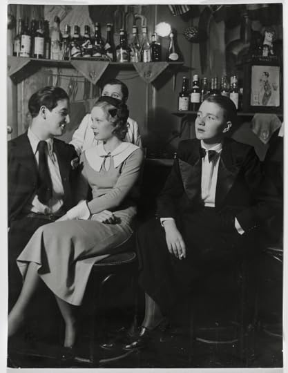
Brassaï, Lulu at the bar, ca. 1930 © Estate Brassaï – RMN and courtesy Art Gallery of Ontario, Toronto
From 1979 to 1985, American photographer and activist Joan E. Biren (JEB) traveled across the United States and Canada delivering an ever-evolving slide show, Lesbian Images in Photography: 1850–the present, more affectionately known as the “Dyke Show.” Over the course of two and a half hours, JEB narrated and presented more than three hundred images to women who gathered in church basements, community centers, women’s bookstores, and coffeehouses, eager for, as Carol Seajay, cofounder of San Francisco’s Old Wives Tales feminist bookstore and publisher of Feminist Bookstore News, put it in an early review, “Images I had never seen before, images I had seen and not perceived. Images on which to build a future.” The slide show was designed to grow over the years, as JEB added new pictures by contemporary photographers and participants in the photography workshops that she led wherever she appeared with the show. It eventually included 420 images. What began as a way to distribute and give context to JEB’s self-published monograph, Eye to Eye: Portraits of Lesbians (1979), became a vocation. She ultimately presented the slide show at least eighty times in more than sixty places.

Berenice Abbott, Princess Eugene Murat, 1929 © Berenice Abbott/Commerce Graphics/Getty Images and courtesy Howard Greenberg Gallery, New York
JEB structured the Dyke Show in six sections that presented historical photographs by figures such as Lady Clementina Hawarden, Frances Benjamin Johnston, Alice Austen, and Berenice Abbott, alongside a range of contemporary portraits, erotica, and documentary photographs of the early gay liberation movement, her own work, and that of her peers, including Cathy Cade, Tee Corinne, Diana Davies, and Kay Tobin. She laid out for her audiences a new visual history, one with lesbians at its center. In line with lesbian and feminist consciousness-raising sessions of the 1960s and 1970s, JEB used the slide shows as a collective exercise in reading photographs to highlight the paucity of the visual record for lesbians and to impart a new way of looking, a queer way of looking.
She did this in two ways. First, she identified historical photographers who, in her view, rebelled against social norms and narrow expectations for women and, in their work and in their lives, embodied a sense of strength, freedom, autonomy. Hawarden, Johnston, Austen, and Abbott formed the focus here. In a recent email, JEB wrote, “Because relatives and others destroyed the evidence of lesbian lives, and because many photographers had to stay closeted in order to survive or make a living in prior times, there wasn’t a lot of overt evidence. That’s why I felt it was necessary to ‘read between the lines’ of the existing biographies to interpret the images myself given my own experience and instincts.” JEB suggested that there is something in the photographs by these women that can be “read” against biographies that may have suppressed or omitted details about their relationships and sexuality. The photographs supplied a different kind of evidence, discernible perhaps only to those who knew what they were looking for.
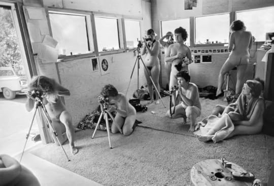
Joan E. Biren, Photographers at the Ovular, a feminist photography workshop at Rootworks, Wolf Creek, Oregon, 1980 © 2014 JEB (Joan E. Biren)
Frances Benjamin Johnston’s 1896 cigarette-smoking, beer stein–toting, ankle-revealing self-portrait is a strong case in point: Johnston’s playful self-presentation in this photograph defied the more demure, ladylike norms of her time. Offering information about Johnston’s life as a successful photographer—she is described in the 1974 monograph A Talent for Detail as an “eccentric,” “bohemian” woman who never married—JEB hinted during her slide show that Johnston may have been a lesbian. Though not able to offer clear evidence of Johnston’s sexuality, JEB nonetheless felt that assuming Johnston was heterosexual was equally tenuous.
Second, JEB sought to forge what she now describes as a “lesbian semiotics” (though she admits she learned the term much later and was not aware of Hal Fischer’s 1977 book Gay Semiotics). She detailed what she calls the “triangle” of interactions between the photographer, the muse (subject), and the viewer. (She elaborates on this further in her article “Lesbian Photography—Seeing Through Our Own Eyes,” published in Studies in Visual Communication in 1982.) She contrasted photographs made by straight photographers and those made by lesbians. And, in a section called “The Look, the Stance, the Clothes,” JEB attempted to identify more concretely the visual elements that might characterize a lesbian photograph.

Frances Benjamin Johnston, Self Portrait, 1896 Library of Congress, Prints and Photographs Division, Washington, D.C.
For example, she identified a direct look as the product of a certain rapport between photographer and subject, as in Berenice Abbott’s portraits of Eugene Murat, Jane Heap, or Janet Flanner. “There’s a look here that’s passing between a lesbian muse . . . and a lesbian photographer, something direct about it, without being confrontative [sic], it’s open in a certain kind of way, there’s a presence there behind the eyes,” she stated during a 1982 slide show at the Women’s Building in San Francisco. JEB found this directness lacking in other portraits of these women, indicating that they didn’t “look as powerful.” Or she characterized certain postures (slouchy) or clothing (pants, creatively fashionable garb) as more lesbian than others.
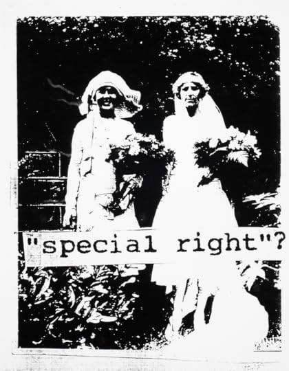
fierce pussy, “Special Right?” 1991–95 © fierce pussy and courtesy the International Center of Photography (ICP), New York
Such a project may feel quaintly essentialist today when queer images are so much easier to find. Audience comment cards reveal that not everyone embraced JEB’s approach even then—some felt she was replacing one set of stereotypes with another. Queer looking was just evolving. However, it is important to note how radical it was to even publicly contemplate a question like Is there a lesbian aesthetic? at the time, as that generation of queers fought for basic civil rights, built communities, and embraced their distinctiveness. JEB proposed a new relationship to photography to her audiences, one that would empower them as creators and interpreters of their own image. “Understanding you have a place in history and in the present day with others like yourself is what gave people the courage to take the risks that coming out in those years demanded,” she explained in a recent email.
Shawna Dempsey and Lorri Millan, In the Life, 1995 (cover) Courtesy the artists and Special Collections, E.P. Taylor Library & Archives, Art Gallery of Ontario, Toronto
JEB’s grassroots campaign is best understood as one of the projects that developed alongside the LGBTQ rights movement from the 1960s on, whose larger aim was greater visibility as a path to greater acceptance: the production of a visual record. In a 2004 interview as part of Smith College’s Voices of Feminism Oral History project, she declared, “I dredged up all these images, which may or may not have been lesbian images. I decided to talk about why I thought they were lesbian images from history. Because this void, this emptiness, this blank of history drove me crazy.”
Sophie Hackett is associate curator of photography at the Art Gallery of Ontario, Toronto.
Click here to subscribe to Aperture magazine and read more of Issue #218, Spring 2015, “Queer.”
The post Sophie Hackett on Queer Looking appeared first on Aperture Foundation NY.
March 31, 2015
Ruben Lundgren / WassinkLundgren, on The Chinese Photobook
The Chinese Photobook, Coming Soon
An interview with Ruben Lundgren of the photography team WassinkLundgren, cocurators of the exhibition The Chinese Photobook, which is currently on display at Aperture Gallery in New York through April 2. Also curated by Martin Parr, this exhibition is based on a collection Parr compiled with the Beijing- and London-based Dutch photographers. The selection of books includes key volumes published as early as 1900, as well as contemporary volumes by emerging Chinese photographers. Each and every featured photobook offers a new perspective on the complicated history of China, from the beginning of the twentieth century onward.
See the exhibition at Aperture Gallery, New York, through April 2
Ullens Center for Contemporary Art, Beijing
April 3–May 31, 2015
The Photographers’ Gallery, London
April 17–July 5, 2015
The post Ruben Lundgren / WassinkLundgren, on The Chinese Photobook appeared first on Aperture Foundation NY.
On Aperture Magazine Collector’s Subscription Series
Starting with issue #218, Spring, “Queer,” Aperture magazine will launch its Collector’s Subscription Series, an exclusive opportunity for photography collectors to own work published in the pages of the magazine. Subscribers to the Collector’s Series will receive four signed and numbered limited-edition prints, one from each issue of the magazine published in 2015. The prints will be limited to an edition of 30. From issue #218, we offer Time Past and Time Future,
Utah (2014) by David Benjamin Sherry, a Los Angeles-based photographer who has garnered significant acclaim for his vibrantly colored images of the American West that often reference canonical figures of modern American photography, from Minor White to Edward Weston. Aperture magazine editor Michael Famighetti spoke to Sherry about how his work plays with historical references as well as his interest in process and vibrant color. This article first appeared in Issue 4 of the Aperture Photography App: click here to read more and download the app.

Time Past and Time Future, Utah, 2014
Michael Famighetti: The exaggerated, almost psychedelic, color of your prints is very distinctive. Could you tell us a little bit about how you think about color in relationship to your subject, the landscape of the American West?
David Benjamin Sherry: I am interested in our rapidly deteriorating environment, primarily that of the American West, as it coincides with the end of film-based photography. Also, as a gay man, I’m compelled to “queer” this historical genre of landscape photography that has been tied up to this point so closely with the straight white male perspective, by virtue of its most celebrated practitioners.
I use deep and saturated color (or no color at all) as a way to imbue the image with intense or even sexualized feeling about a place. I’m interested in the way photography and memory are inextricable and permeable. The darkroom is as important to my process as is taking the picture, and I use the darkroom time to experiment with analog techniques, color relationships, print size, and other manipulation. My exploration in darkroom printing is born out of a pure fascination with light, image, and chemistry. As the medium crosses over into a digital realm, I’m interested in exploring the uncharted analog areas and creating something new within this process.

Geothermal Antisocial Network Earth Explosion, Utah, 2014
MF: Each of your prints are made using an analog color darkroom. How do you achieve these wild colors? Can you give readers a sense of how they are made?
DBS: My photographs are exclusively analog, meaning they are made completely without the use of digital technology. I use a large-format camera loaded with 8×10 film and, as I’m printing my photographs in the darkroom, I push the photographs color to its tipping point (just before it begins to lose shadow detail and exposure), which overwhelms the other colors and creates a monochrome. In color darkroom photography, there are three colors that make up the spectrum– cyan, magenta, yellow– and you add or subtract these three colors in varying degrees of 0–200 to reach your desired color. When studying color darkroom photography we are taught to print natural and real color, which I did for many years. After feeling frustrated with the limitations this element of real or natural imposes, I began to experiment. I found there are countless combinations depending on the film exposure and amount of time the light exposes the paper.

Wilderness of Mirrors, Idaho, 2014
MF: Your images are usually absent of humans, as if we’re back in the days when Carleton Watkins lugged his big camera into the remote wilderness. But some of your photo-locations are in places, like Yosemite, that aren’t devoid of people. Do you work to ensure that people don’t enter the images?
DBS: Its funny you mention this. I am very conscious of it and work hard to ensure that people don’t enter the pictures, yet most of my landscape work is often about human impact on the environment – so one would think that I may embrace human presence– but I don’t. Sometimes I find myself waiting for hours to let hikers pass or other photographers enter and leave my frame while also waiting for the right light or clouds. I find myself waiting most often for people taking selfies; I hate that word and the idea of it– too many humans obsessed with themselves and their lives. But, it’s not always about selfies. For instance, I was photographing El Capitan in Yosemite to find later when I was printing that there were rock climbers holding on to the rock– they are extremely small but if you look close they are there. I enjoy this element. So I guess it depends on what it is, but I do like to control the human presence in my work.

Waves of Ocean Acidification, Capital Reefe, Utah (For Minor White), 2014
MF: Let’s go back to your comment about the environment: the color here does feel reminiscent of science fiction—or like we’ve entered a moment after some kind of collapse has been experienced. There’s a hint of post-disaster?
DBS: The color does hint at a kind of collapse. I use color as a vehicle. It allows me to lay down more content within the subject of landscape. At times, the landscape acts as the background and I think of the color as an emotive force, I try to capture a feeling that is romantic yet tragic. I’m interested in tragedy and often feel that as a photographer, I am a direct witness to the collapse of our society and planet. The landscape in my photographs is a metaphor yet it is what it is – it’s the once-pure land that we have destroyed and now have to re-evaluate how to live on it. The color can be transformative and it is a reaction.

Spirit Infinity, Death Valley, California, 2014
MF: I’ve contacted you with these questions while you’re in the midst of shooting, in what I gather is a remote location. Where are you now? What’s next for you?
DBS: Yes! I don’t usually go on email while I’m out on the road. I like to feel pretty disconnected and focused on what I’m encountering on daily basis while traveling and shooting. I’m just ending a three-week trip shooting throughout California, Nevada, and Utah. I’m ending now in Death Valley, California and headed home to Los Angeles to start printing all this new work. I’ll be doing a solo booth of pictures at Paris Photo LA in early May and then I’ll begin work for my next solo show at Ohwow gallery in Los Angeles, which opens in October.

David Benjamin Sherry, Deep Blue Sea Rising, Oregon, 2014 Courtesy the artist and Salon 94, New York
Tap here to learn more about the Aperture Magazine Collector’s Subscription Series.
The post On Aperture Magazine Collector’s Subscription Series appeared first on Aperture Foundation NY.
March 20, 2015
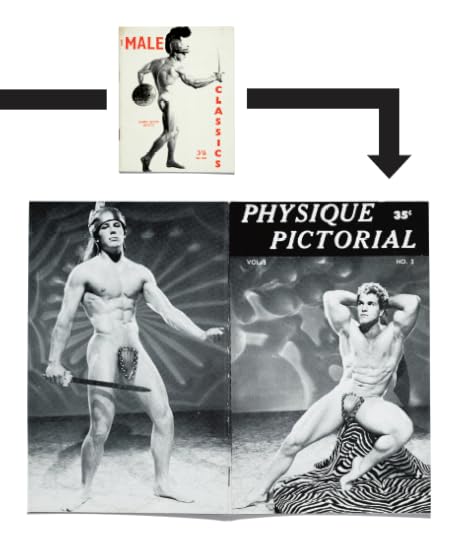
Archive: On Physique Magazine Photography
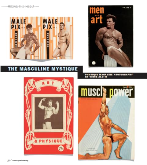
In Aperture magazine #187, from 2007, writer Vince Aletti reflected on early twentieth-century physique magazines, a genre of men’s fitness publications that became a de-facto source of gay erotic photography as early as the early 1900s. During a time when homosexuality was considered scandalous and American obscenity laws prevented the publication of provocative photographs, physique magazines served as a veiled source of homoerotic imagery, serving a largely closeted audience. To coincide with the release of Aperture magazine #218, “Queer,” we republish an excerpt of Aletti’s look at this overlooked, and in some cases, purposefully obscured, area of photographic history. This article first appeared in Issue 3 of the Aperture Photography App: click here to read more and download the app.
The magazines on these pages were produced for an audience that their publishers never named and rarely acknowledged; in a sense, they were as closeted as many of their gay readers and even more vulnerable to discrimination and attack. Muscle magazines like Vim, Superman, Strength & Health, and La Culture Physique, some of which date back to the early 1900s, were the first to feature photographs of nearly naked men, but they were all professional and amateur bodybuilders, and their display was intended to inspire sportsman-like admiration and emulation, not prurient interest. Although the physique magazines that began appearing in the mid 1950s—including Art & Physique, Physique Artistry, Men and Art, Body Beautiful, and Adonis—also printed photographs of Mr. America contestants, the emphasis shifted, ever so subtly, from sport to sex. But if these new, pocket-sized magazines were more frankly erotic than their muscle-builder peers, they weren’t about to admit it.

Most of them covered their metaphoric asses with statements announcing their high-minded intentions. A note in a 1954 issue of Physique Pictorial claimed its collection of preening male nudes was “planned primarily as an art reference book and is widely used in colleges and private schools throughout the country. . . . Several psychologists and psychiatrists have told us that books such as Pictorial often have a highly beneficial effect on negative, withdrawn patients who become inspired by the extrovert enthusiasm and exuberance of healthy, happy athletes.” Other publications prided themselves on combining self-improvement and art appreciation: articles titled “Are Bodybuilders Oversexed?” and “Sex Fears Probed!” and rudimentary exercise instruction appeared alongside photographs of Greek and Roman statuary and “art studies” of handsome young men wearing the polyester equivalent of the classic fig leaf. Still, it’s hard to believe these magazines ever passed for straight; they certainly didn’t fool their queer readers.
To be fair, physique publishers weren’t being cowardly, merely circumspect. Despite an incipient movement for gay liberation and visibility (the Mattachine Society’s magazine, One, began publishing in 1953), homosexuality was still a scandal in the 1950s, and American obscenity laws tended to keep its photographic representation either furtively underground or heavily coded. Photographers and publishers could be arrested if a model’s pubic hair was not sufficiently airbrushed out of the picture or the bulge in a posing strap was too clearly defined, and any hint of affectionate contact between men was strictly policed.
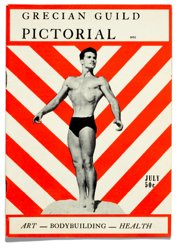
The look of physique work from this period wasn’t entirely a matter of wary self-censorship, however. Many photographers in the field (some of whom had begun their careers in muscle mags) had a keen eye, a refined sense of their craft, and strikingly individual styles. Surely most of them were aware of the artistic precedents set by Thomas Eakins, Eadweard Muybridge, and F. Holland Day, and more contemporary examples of male nudes by Edward Weston, Herbert List, Minor White, Imogen Cunningham, and George Platt Lynes would not have been hard to come by. (Lynes’s most frankly homoerotic work wasn’t published until after his death, and it springs from the same hothouse atmosphere of repression and rebellion that inspired the headiest physique photographs.) Much more obvious precedents were the turn-of-the-century photographs of Wilhelm von Gloeden, Guglielmo Pluschow, and Vincenzo Galdi, whose sepia-toned pictures of Italian peasant boys posing with panpipes and classical drapery were widely circulated in the gay underground. The American studios tended to cling to an equally mannered, obviously commercial tradition as much from an impulse to idealize and romanticize the nude as from a need to redeem it.
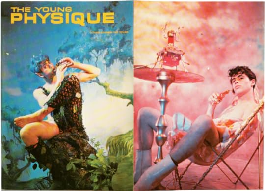
Physique photographers used props that evoke the classic nude—fluted columns, elegant drapery, “marble” pedestals—in order to nudge their teenage bodybuilders, amateur athletes, and tattooed Marines into the realm of Art even as they hovered on the brink of pornography. To update the classical ideal, they drew on the conventions of Hollywood glamour photography (the dramatic lighting, the prominent prop, the “thoughtful” stare into space), the standard muscleman posing repertoire (including the requisite gloss of body oil), a butched-up version of the vocabulary of gesture and attitude found in fashion magazines, and pieces of the hyper-masculine wardrobe fetishized in the same period by Tom of Finland: denim jeans, motorcycle boots, leather jackets, jockstraps, hard hats. The resulting images were at once stylized and subversive, way over the top and just under the radar.
Click here to learn more about the Aperture Magazine Digital Archive is coming soon.
The post Archive: On Physique Magazine Photography appeared first on Aperture Foundation NY.
March 18, 2015
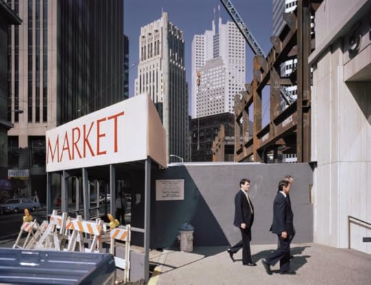
Seth Curcio on Janet Delaney: South of Market
Second at Market Street, 1986.
Janet Delaney: South of Market gives a glimpse of a bygone San Francisco, before Silicon Valley and soaring rents defined the small metropolis, and now-chic neighborhoods such as South of Market were made up of working-class families, the city’s gay community, and young artists such as Janet Delaney herself. At the de Young Museum in San Francisco, a group of forty-five photographs by the Bay Area–based photographer depict scenes from the late 1970s and early 1980s, documenting her friends and neighbors, city life, and the changes taking place on the SOMA streets. Seth Curcio, associate director of Pier 24 Photography in San Francisco, looks at how such urban renewal began to change the diverse community around Delaney before her eyes.

Russ Street Apartments, 1981.
For a city that has grown alongside the development of the camera, San Francisco’s lineage of change is widely documented. Photography has played a pivotal role in capturing the city’s evolution, recording the influx of pioneers in the mid-to-late nineteenth century, the aftermath of the 1906 earthquake, the building of its bridges and port, and the rise of various counterculture movements.

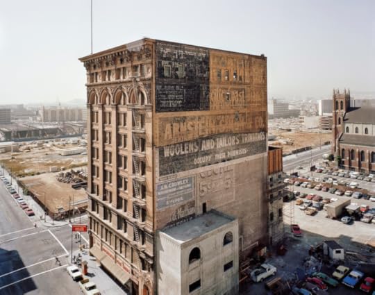
View of the Financial District from South of Market Street, 1980.
As San Francisco is amid yet another period of rapid physical, cultural, and economic transformation, the photographs in Janet Delaney: South of Market, an exhibition on view at the de Young Museum in San Francisco, provide a unique opportunity to revisit the city’s transitional past. The selection of forty-five works, all made between the late 1970s and mid-1980s, focus on an area of slightly less than one square mile just south of Market Street, San Francisco’s main dividing thoroughfare.
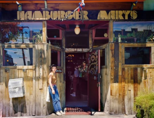
Hamburger Mary’s, 1582 Folsom at 12th Street, 1980.
When Delaney was a resident of South of Market (SOMA), thirty-something years ago, the area featured countless warehouses alongside hotels and old Victorian houses. The neighborhood was home to blue-collar workers and immigrant families, as well as the city’s burgeoning gay community. It was also a period of drastic renewal: the city was in the process of constructing a large convention center, which resulted in the displacement of nearly five thousand residents and seven hundred businesses. Bearing witness to the rapid cultural shift caused by this redevelopment, Delaney took to the streets, nearby apartments, and local businesses with her large-format camera and color film, engaging in a process of documentation that was slow and deliberate, an act that afforded her the opportunity to further connect with her community.

Artist in Her Studio, Project One, 10th at Howard Street, 1980.
While traces of the past that Delaney captured can still be found throughout the area, new high-rise condos, office buildings, and restaurants have replaced many of the district’s former structures and residents. Delaney’s photograph Saturday Afternoon, Howard Street between 3rd and 4th (1981), serves as a stark reminder of this transformation, depicting a portion of the city that completely changed. The photograph shows a single figure walking down the middle of the road in a desolate streetscape. A crane in the distance, on the right side of the frame, echoes the loneliness of the silhouette on the street, and serves as evidence of change on the horizon.

Bulk Natural Foods, Russ at Howard Street, 1980.
The leading image in the exhibition, 10th at Folsom (1982), bears a different tone. It presents a view down a dense street, with only the tops of the buildings visible and a succession of auto body repair signs dominating the façades. A large billboard in the foreground pictures an eager young couple in business attire alongside the slogan “We’re changing.” While the message is direct, this large photograph foreshadows the irreversible transformation of the neighborhood, setting a disquieting mood for the additional works in the show.
Mercantile Building, Mission at Third Street, 1980.
Installed rather traditionally on warm gray walls, the arrangement of the pictures highlights the range of Delaney’s subjects. Oscillating seamlessly between street scenes, interiors, and environmental portraits, the viewer is confronted with images of a community on the brink of change, and reminded of the consequences and complexities of gentrification. Photographs like Mercantile Building, Mission and 3rd Streets (1980) provide an eagle-eye view of the neighborhood, showing what appears to be the last remaining housing structure amidst a sea of freshly bulldozed lots. Meanwhile, Helen and her husband at the Helen Café, 480 6th Street (1980) offers a sense of intimacy, placing the viewer directly at the restaurant’s counter. The warm expressions of Helen and her husband are open and honest and the location inviting, creating a sense of closeness with the subjects and the place. Delaney’s choice to photograph in color––a process that was rarely employed by fine art photographers of the time––creates a profound and celebratory connection to the time, place, and people.

Helen and her Husband at the Helen Café, 486 Sixth Street, 1980. All images courtesy the artist. © 2014 Janet Delaney
Delaney is no stranger to photographing in urban areas; over the past several decades the artist has made bodies of work in Delhi, Beijing, Zhengzhou, and New York City. However, for this Bay Area–based photographer and educator, the images created in San Francisco are full of intimacy and careful consideration that make evident her deeply personal engagement with this place. The exhibition generates lingering questions about the pursuit of progress and its effect on community. The photographs on view, along with a large vitrine full of activist ephemera relating to the series and neighborhood, remind us that while the gentrification plaguing so many American cities is often cyclical in nature, an active engagement with community is key if we are to maintain a rich sense of diversity and culture as our cities progress. While nearly forty years have passed since Delaney first photographed South of Market, the pictures continue to be a powerful reminder of the social responsibility that we all maintain in creating the history, and future, of our neighborhoods.
The exhibition Janet Delaney: South of Market is on view at the de Young Museum in San Francisco through July 19.
The post Seth Curcio on Janet Delaney: South of Market appeared first on Aperture Foundation NY.
Aperture's Blog

- Aperture's profile
- 21 followers

