
Aperture's Blog, page 145
January 27, 2016
9 Instagram Accounts You Really Should Be Following
This winter, Aperture Foundation staff members offer up their favorite photography-related handles on Instagram. Ranging from online collectives to museum publicists, here are nine accounts well worth your scrolling time.
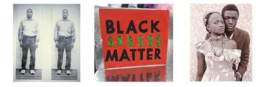
Kimberly Drew works as online community producer for the Metropolitan Museum of Art, but her personal Instagram account is the one worth following. In a world where the art historical canon is dominated by whiteness and the institutional effacement of black experiences is the status quo, Drew has created a space where black artists are given the recognition they deserve. Her feed is a mixture of personal experiences, works by contemporary black artists, and historical photographs with thoughtful captions. —Becca Imrich, Education Work Scholar

Inspired by the “overview effect,” a sensation that astronauts have when viewing the Earth as a whole, Benjamin Grant founded The Daily Overview, so that “people can fully appreciate the beauty and intricacy of the things we’ve constructed, the sheer complexity of the systems we’ve developed, or the devastating impact that we’ve had on our planet.” In the individualized, selfie-centric environment of Instagram, The Daily Overview provides a much-needed step back through its stunning geometric images. — Annika Klein, Editorial Work Scholar

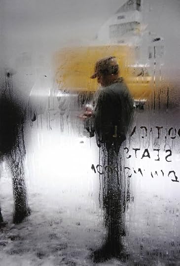
Daniel Featherstone is a New York street photographer who focuses on the characters inhabiting the intersection of 57th Street and 5th Avenue. His photos are lit using the surrounding reflective architecture, and his Instagram feed is full of just-glimpsed, poignant, and wryly funny moments of people alone in a crowded city. — Mark O’Neil, Web Manager
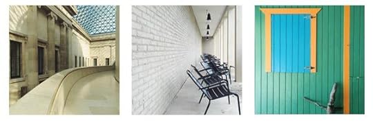
Londoner Dolly Brown’s Instagram stream investigates art exhibitions, the architecture of the spaces they inhabit, and the audiences who frequent them. Accompanying her minimalist shots are thoughtful captions detailing Brown’s interpretation of the artworks and where to find them. Ranging from the St. Giles Cripplegate Church to a private viewing of the British Museum, Brown offers fresh insight to these highly documented locations. — Sita Fidler, Digital Media Work Scholar
No format is more perfect for LA-based photographer Mike Slack, who co-runs the indie publishing house the Ice Plant with Tricia Gabriel. His photobooks Ok Ok Ok, Scorpio, and Pyramids are each a sequence of Polaroids; with Polaroid film increasing in price, Instagram is the new Polaroid. Snap it, post it, like it. Caption-less, highly saturated, geometric meditations on everyday life leave me looking at the world around us differently. —Nicole Maturo, Aperture Magazine Work Scholar

LagosPhoto, the first and only international photography festival in Nigeria, has grown significantly in the past few years, attracting attention from curators and artists all over the world. The most recent edition, presented in fall 2015, was curated by the artist Cristina de Middel. LagosPhoto’s Instagram feed is a great way to keep up to date with exciting images by numerous contemporary photographers working in Africa. —Giada De Agostinis, Circulation & Advertising Work Scholar

It’s a self-explanatory premise—photographers photographing their loved ones—but founder Lindley Warren curates the project’s Instagram posts in a way that pushes the boundaries of a timeless and seemingly simple subject. The images range from traditional notions of domestic documentation to photographs by artists such as Natalie Krick, which fall more into the category of a “vajazzled” Lynchian nightmare. Anyone is welcome to submit. — Madison Carroll, Library and Archive Work Scholar

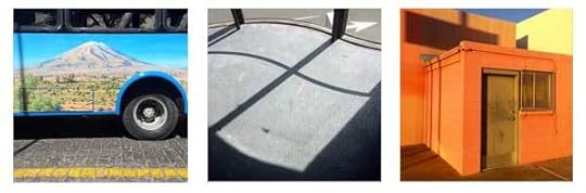
Photographer Pat O’Rourke’s Instagram feed is a mixture of candid and cleverly crafted scenes of everyday life. Posts are often non-sequiturs, and there isn’t one specific aesthetic maintained throughout. The result is a consistently surprising stream of images that stand out from all the Insta-noise. — Max Mikulecky, Digital Marketing Assistant
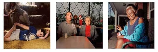
One of my favorite photographers, Chris Verene, is finally on Instagram! His signature, colorful medium-format images of generations of his family and friends in small town Illinois, taken over the past thirty years, are a refreshing addition to my feed. While most photographers post current projects and moments on Instagram, I like that Verene has been using the site to share an archive of his work. — Elena Tarchi, Publicity and Events Associate
The post 9 Instagram Accounts You Really Should Be Following appeared first on Aperture Foundation NY.


Exhibition Review: Huffington Post
A review of the 2015 Aperture Summer Open exhibition by Pricilla Frank on Huffington Post.
The post Exhibition Review: Huffington Post appeared first on Aperture Foundation NY.
Exhibition Review: 2015 Aperture Summer Open, Huffington Post
A review by Pricilla Frank of the 2015 Aperture Summer Open exhibition Huffington Post.
The post Exhibition Review: 2015 Aperture Summer Open, Huffington Post appeared first on Aperture Foundation NY.
Lisa Elmaleh on CNN.com
Lisa Elmaleh, 2015 Portfolio Prize runner-up, featured on CNN.com.
The post Lisa Elmaleh on CNN.com appeared first on Aperture Foundation NY.
January 22, 2016
Gus Powell: The Lonely Ones
On view this month at Sasha Wolf Gallery in New York, Gus Powell’s poetic text-and-image series was featured in the Lit issue of Aperture magazine, which explored the relationship between pictures and words. Here’s a look back.
By Heidi Julavits

Gus Powell, The Lonely Ones, 2014 © Gus Powell. (Scroll right to see selections from the series.)


The Lonely Ones is not alone—it is the second of its kind. Photographer Gus Powell’s photobook The Lonely Ones is, in his own words, a “cover album” of the original, written and illustrated by William Steig in the early 1940s. Steig was a regular New Yorker illustrator and author of beloved children’s books like Sylvester and the Magic Pebble and Spinky Sulks and Shrek (to name the ones still on my bookshelf). In The Lonely Ones, Steig paired a single sentence—“I’m no good”—with a single character of Steigian tragicomic proportions—in this case, a character wearing only his underwear and tied upside down by his ankles to a rope. Perhaps Steig’s refusal to fill to the margins his available white space (his characters float in a void on the right-hand page; the sentence settles to the bottom on the left), in addition to the inexplicability of the connections between his words and images, led Wolcott Gibbs, in the book’s foreword, to proclaim, “this book, obviously, is not for everyone. A good many people will find it obscure and, consequently, exasperating.”
But what is the value of the book that is “for” everyone? Some books are powerful because they make you believe they were written expressly for you to find. Powell’s The Lonely Ones made me believe this; his work feels like intercepting a series of mysteriously encoded communiqués. Instead of illustrations, Powell pairs his photographs with “captions” that more resemble confessions to the self, or stern fortunes yielded by a cookie of cosmic provenance. They are messages for sure—perhaps even warnings. (“Let’s not ruin it by talking.”) Powell’s photographs are yearningly voyeuristic, as in, I want to see and understand what’s happening here. I look at his pictures and think genial aliens are spying on us and this is how, to the best of their deep-space abilities, they make sense of what they perceive. I sense a heartbreaking desire to connect with, and maybe warn against, a situation gone slightly or wildly wrong. But the desire to unambiguously communicate seems doomed to productively fail; that failure is communicated by the vast amount of white space in which Powell’s words, like Steig’s characters, float. But in this white space is where the true connection happens; this is where the viewer fills in the literal distance between the words and the image. We connect with both the visible and the implied people in these photographs by investing in them our imaginative energies. Obscurity or exasperation—of the sort Gibbs carefully cautioned against—here yields to inspiration, also a form of companionship. We befriend the lonely ones. We write their stories in the gaps.
Heidi Julavits is the founding editor of the Believer and the author, most recently, of The Folded Clock: A Diary.
This article was originally published in Aperture issue 212, Fall 2013, available for purchase or in the Aperture Digital Archive.
The post Gus Powell: The Lonely Ones appeared first on Aperture Foundation NY.
January 21, 2016
5 Exhibitions to See in January
With the new season in full swing, Aperture’s editors select five must-see photography exhibitions on view or opening soon in New York City.

Juno Calypso, Massage Mask, 2015. Courtesy the artist and Flowers, New York
Flowers, 529 West 20th Street, New York
January 28—February 27, 2016
Sexuality and gender roles are the focus of this group show featuring four artists who question the construction of identity. Melanie Willhide’s faux-antique portraiture weaves a tale of love, loss, and the absurdity of using “aide-memoires” in place of real romance. Juno Calypso’s staged self-portraits portray a fictional character named Joyce, whose lonely scenes of would-be seduction in opulent hotel rooms reflect the intensive labor of manufacturing femininity. Pixy Liao inverts a traditional ideal that the best partner for a woman is an older, more mature man, taking possession of her younger lover in various domestic scenes. Natasha Caruana, in her clandestine snapshots of encounters with married men, arranged through an online matchmaking service, diverts viewers to the clues hinting at temptation and desire.
Bevan Davies, 480 Broadway, New York, 1975. Courtesy Deborah Bell Photographs, New York
Bevan Davies / Lower Manhattan: Vintage Photographs 1975–77
Deborah Bell Photographs, 16 East 71st Street, New York
Through February 27, 2016
Without the Landmarks Preservation Commission of 1973, which protected the SoHo-Cast Iron Historic District from destruction, Bevan Davies’s mid-’70s photographs of the fabled neighborhood would be like the images of Atget’s Paris: relics of a lost time. Still, while the distinctive layered arcades and soaring warehouse windows of Lower Manhattan are largely in tact, the once-vacant streetscapes of West Broadway, Mercer, and Grand have today been replaced by the stylish bustle of luxury boutiques. Davies studied photography with Bruce Davidson at his studio, where he met legends such as Mary Ellen Mark, Danny Lyon, and Ernest Cole. As he swept through SoHo with tripod-mounted view cameras, Davies produced a methodical architectural survey, anticipating the sober “New Topographics” style that would define American landscape photography for a generation.

Jo Ractliffe, Donkey, Pomfret Asbestos Mine, from the series Borderlands, 2011 © Jo Ractliffe. Courtesy Stevenson, Cape Town and Johannesburg
The Aftermath of Conflict: Jo Ractliffe’s Photographs of Angola and South Africa
The Metropolitan Museum of Art, 1000 Fifth Avenue, New York
Through March 6, 2016
Looking to the landscape as an archive of memory, Jo Ractliffe’s photographs from Angola, Namibia, and her native South Africa are remarkable for their subtle accumulation of historical evidence. Vacant plots, scrubby grassland, and vast deserts are revealed through Ractliffe’s documentary captions as former battlefields, mass graves, and sites of trauma associated with Angola’s decades-long civil war. In one lunar landscape in the Namibe desert, an enigmatic memorial is the only sign of human touch; near a roadside stall, jumpsuits hang from trees like ghosts. Ractliffe’s most recent series concerns the collateral effects in South Africa of the “border wars,” bringing into her frame veteran soldiers and a decommissioned military outpost. In Ractliffe’s photography, the past is never distant.

Penelope Umbrico, Everyone’s Photos Any License (654 of 1,146,034 Full Moons on Flickr, November 2015), 2015. Installation view courtesy Bruce Silverstein Gallery, New York
Penelope Umbrico: Silvery Light
Bruce Silverstein Gallery, 535 West 24th Street, New York
Through February 20, 2016
Penelope Umbrico’s wry sampling of iconic imagery is on display in new works describing the reflection and projection of light. Borrowing multiple iterations of a famous picture of Grand Central Station, in which sunbeams are manifest as klieg lights or portals to the heavens, Umbrico plays with issues of attribution by including watermarks or embellishments from the original source. For Everyone’s Photos Any License (654 of 1,146,034 Full Moons on Flickr, November 2015), a monumental, mural-sized collage of screenshots from Flickr tagged “full moon,” she provides the credits to each image, including the names, titles, and licensing terms. Like her grids of Flickr-derived sunsets, ongoing since 2006, Umbrico’s typologies of natural light in this exhibition are filtered through the screens and manipulations of the Internet, generating a composite imagery of collective witness.

Peter Hujar, Susan Sontag, 1975 © The Peter Hujar Archive LLC
Paul Kasmin Gallery, 297 Tenth Avenue, New York
January 28–February 27, 2016
The mythology surrounding New York’s downtown art scene of the late 1970s and early ’80s grows in sync with the unyielding force of gentrification that continues to gild the neighborhood. Peter Hujar captured the artistic and intellectual luminaries of this moment in a series of deft, black-and-white portraits that will be on view at Paul Kasmin Gallery. The show includes a portrait of a youthful John Waters, donning his signature pencil moustache, looking more elegant than louche, and a well-known portrait of Susan Sontag reclining in a turtleneck, the embodiment of brainy chic. Indeed, Hujar cut his teeth in fashion photography, and last year the fashion label Patrik Ervell ran vintage Hujar portraits as a somewhat cryptic branding campaign, a testament to the cult appeal of his work. Hujar is also the subject of a simultaneous show at San Francisco’s Fraenkel Gallery, and a major retrospective is scheduled for next year at Mapfre, Barcelona, and the Morgan Library & Museum, New York. The sharp-witted cultural observer Fran Leibovitz, the subject of one portrait here, famously observed that the AIDS crisis wiped out not only a generation of artists—including Hujar—but also the audience for the culture those artists produced. Thankfully, Hujar’s prodigious output is finding more and more eager viewers today.
The post 5 Exhibitions to See in January appeared first on Aperture Foundation NY.
January 20, 2016
From the Archive: A Visit with Saul Leiter
A pioneer of color photography, Saul Leiter is now the subject of a retrospective at London’s Photographers’ Gallery. In 2013, shortly before he passed away, we sent a writer to visit Leiter’s East Village studio, a time capsule of photographs, paintings, and unopened letters.
By Eric Banks
Saul Leiter, Snow, 1960 © Saul Leiter. Courtesy Howard Greenberg Gallery, New York
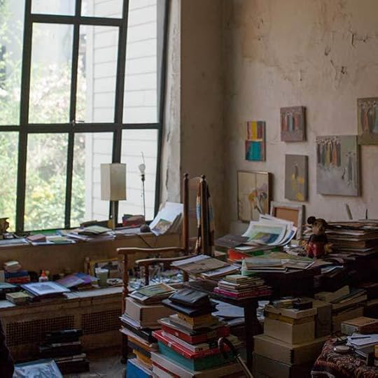
The East Village block where Saul Leiter lives and works is a short walk from any number of reminders of what the neighborhood used to look like—the Strand Bookstore, the pierogi emporium Veselka. In mythic times this was a landscape hopping with artists who frequented the Cedar Tavern and the Club, among them Richard Pousette-Dart, who early on encouraged Leiter to continue his explorations with a camera. That is a distant memory in this stretch of the East Village, along the streets that Leiter famously photographed during that Ab-Ex decade, today in the shadow of the gleaming new towers that are monuments to Michael Bloomberg’s Gotham.
Once you’ve crossed the threshold of Leiter’s floor-through apartment, the dislocation between the now and the then is intensified. It’s a solidly New York space that gets a muted dose of sunlight on either end, but of a type that’s rarely so well preserved. It’s filled with a life’s work—paintings, stacks of books, knickknacks, odds and ends—but it seems more robustly lived in than cluttered. The hearsay about Leiter’s studio leads you to expect a hovel that would make the Collyer Brothers envious. Instead, there’s a kind of graceful accumulation that feels more like a painter’s garret than a packrat’s digs. Leiter does most of his work in the large room framed by a wall-size bay of windows overlooking a lovely little courtyard filled with cherry trees, yellow jonquils, and a gurgling fountain. If you forgot for the moment that you were in New York, you might believe you’d been transported to Paris.
Saul Leiter’s studio, New York, April 2013. Photograph by Jason Fulford

Saul Leiter’s studio, New York, April 2013. Photograph by Jason Fulford
Leiter has had ample time to accumulate. He moved into the building in 1952, six years after he arrived in New York via Cleveland from Pittsburgh, the son of a rabbi who didn’t approve of his ambition to be an artist. He took over the second-floor space in 2002, after the death of his longtime friend and partner, Soames Bantry, who had been there since 1960. (He now uses his original upstairs apartment as a second and more private studio as well as a storage space.) A number of Bantry’s quiet figurative canvases hang on the wall alongside a couple of Leiter’s own small-scale painted abstractions. His photographs, which belatedly won him recognition as a colorist far ahead of his time, are notably absent from the wall.
“Sometimes I think I love painting more than I do photography. But I love photography,” Leiter says, as we look through a small pile of brightly painted slabs of cardboard at his feet. “I wonder sometimes if I would have been a better painter if I had just been a painter. Would I have explored certain areas of painting? But what’s the point of thinking about it—if you do both, you do both. And sometimes I think you’re lucky if you do both.”
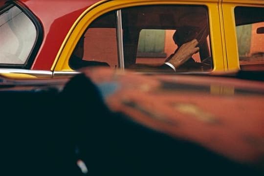
Saul Leiter, Taxi, ca. 1957 © Saul Leiter. Courtesy Howard Greenberg Gallery, New York
Painting remains Leiter’s touchstone, and our talk is filled with anecdotes about two of his great loves, Pierre Bonnard and Édouard Vuillard, as much as with stories of the New York School photographers he knew. A self-deprecating figure at eighty-nine, he is impatient with the story that has long been told about him: how the printing of the astonishing, lyrical color street scenes he shot mostly in the 1950s and early ’60s led to his rediscovery over the past two decades as a landmark figure in the history of New York photography. Leiter seems more bemused than angry over the opportunities he let pass by and ends most anecdotes with a rolling laugh that oddly reminds me of Buddy Hackett’s at the end of his jokes. His work was included in a group show at the Museum of Modern Art in 1953, but when he was invited to show in Edward Steichen’s 1955 Family of Man exhibition, he skipped it. He famously let other invitations pass by. “Some people have said to me: ‘I’ve never known anyone who has taken less advantage of so many opportunities.’ Someone wrote a letter to me in the ’70s inviting me to show in some exhibition in France, but I never opened the letter until this year. That’s not good. That’s not the way to advance a career.”

Saul Leiter, Harlem, 1960 © Saul Leiter. Courtesy Howard Greenberg Gallery, New York
Eric Banks, the former editor in chief of Bookforum, is the director of the New York Institute for the Humanities at New York University.
This article was originally published in Aperture issue 212, Fall 2013, available for purchase or in the Aperture Digital Archive.
The post From the Archive: A Visit with Saul Leiter appeared first on Aperture Foundation NY.
January 17, 2016
Mark Seliger: Portraiture

Mark Seliger, Barack Obama, The White House, Washington, D.C., 2010
Join photographer Mark Seliger for a two-day workshop, intended exclusively for photographers who are fluent with their camera systems and are able to work with studio lighting. During the workshop, participants will receive a portfolio review, execute two portrait assignments with specific lighting combinations, and participate in a final group critique. The goal of this workshop is for participants to develop their own voices within the genre of portraiture.
On the first day, Seliger will lead a conversation about the history of photographic portraiture as it relates to the work of the participants, and discuss process, subtext, and the creation and execution of concepts for environmental portraiture. Seliger will also address technical issues and talk about problem-solving while shooting in the field. If time permits, the afternoon is reserved for group portfolio reviews.
On the second day, the participants will create teams and work together to develop a concept for portraiture. The teams will then split into two groups to create a shoot. A final critique of the assignments will follow. Light refreshments and lunch will be provided on both days. Please contact education@aperture.org with any dietary restrictions at least one week before the workshop begins.
Mark Seliger (born in Amarillo, Texas, 1959) was raised in Houston. Seliger moved to New York City in 1984, and three years later, in 1987, he began shooting for Rolling Stone. Seliger was signed as their chief photographer in 1992, and has shot over 150 covers for the magazine since. In 2001, Seliger moved to Condé Nast. He shoots frequently for Vanity Fair, Details, Italian Vogue, L’Uomo Vogue, and German Vogue. His photographs have been exhibited in museums and galleries, and he has published numerous books, including Listen (2010), In My Stairwell (2005), and Physiognomy (1999). Seliger is the recipient of the Alfred Eisenstaedt Award, the Lucie Award for Outstanding Achievement in Portraiture, and a Clio Grand Prix.
Tuition: $500 ($450 for currently enrolled photography students and Aperture Members at the $250 level and above)
This workshop is sold out. If you would like to be added to the waiting list, please contact education@aperture.org.
Explore More Workshops
General Terms and Conditions
Please refer to all information provided regarding individual workshop details and requirements. Registration in any workshop will constitute your agreement to the terms and conditions outlined.
Aperture workshops are intended for adults 18 years or older.
If the workshop includes lunch, attendees are asked to notify Aperture at the time of registration regarding any special dietary requirements.
Release and Waiver of Liability
Aperture reserves the right to take photographs or videos during the operation of any educational course or part thereof, and to use the resulting photographs and videos for promotional purposes.
By booking a workshop with Aperture Foundation, participants agree to allow their likenesses to be used for promotional purposes and in media; participants who prefer that their likenesses not be used are asked to identify themselves to Aperture staff.
Refund/Cancellation Policy for Aperture Workshops
Aperture workshops must be paid for in advance by credit card, cash, or debit card. All fees are non-refundable if you should choose to withdraw from a workshop less than one month prior to its start date, unless we are able to fill your seat. In the event of a medical emergency, please provide a physician’s note stating the nature of the emergency, and Aperture will issue you a credit that can be applied to future workshops. Aperture reserves the right to cancel any workshop up to one week prior to the start date, in which case a full refund will be issued. A minimum of eight students is required to run a workshop.
Lost, Stolen, or Damaged Equipment, Books, Prints Etc.
Please act responsibly when using any equipment provided by Aperture or when in the presence of books, prints etc. belonging to other participants or the instructor(s). We recommend that refreshments be kept at a safe distance from all such objects.
The post Mark Seliger: Portraiture appeared first on Aperture Foundation NY.
January 15, 2016
Expanded Geographies
At the LianzhouFoto Festival, photographers remap the world with images from near and far.
By Amelia Lang

Billboard for Expanded Geographies, Lianzhou, China, 2015
To travel through China for the first time and attempt to focus on anything other than being in China for the first time is a thrilling challenge. I discovered this in November when I had the opportunity to attend the 2015 LianzhouFoto Festival. Lianzhou is a rapidly growing city in the northwest province of Guangdong, accessible only by a four-hour bus ride northwest of Guangzhou. In the weeks before leaving, I sat in my apartment in New York Googling images of the area. The results yielded both tourist attractions like the illuminated, jewel-toned underground river located just outside the city limits and iconic images by leading international photographers—Martin Parr’s tourists basking on the beach in Benidorm, Spain; Ren Hang’s seductive, tangled nudes; or Arno Rafael Minkkinen’s hand, staged as a bird floating over mountains. The latter images were associated with Lianzhou, which since 2005 has become a destination for its internationally recognized photography festival.
The theme and title for LianzhouFoto 2015, curated by Christopher Phillips of the International Center of Photography in New York, was Expanded Geographies. Meant to explore “the emerging connections between different parts of the globe,” as Phillips wrote in his curatorial statement, the festival was mounted in three main venues across Lianzhou—a former candy factory, granary, and shoe factory. Because of the international scope of the work, the most striking thread to pull from the curated exhibitions was, as Phillips intended, the similarities between seemingly disparate bodies of work from around the world. At the festival, this was acutely evident in the parallels between images in an exhibition called The Chinese Photobook and an installation of Kodak Coloramas.
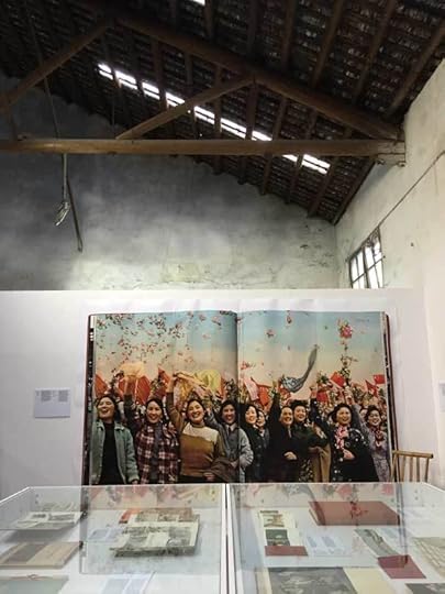
The Chinese Photobook, Installation view at LianzhouFoto Festival, 2015
Released by Aperture in the spring of 2015, The Chinese Photobook: From the 1900s to the Present explores China’s history through the publication of photobooks from the 1900s to the present. At the candy factory in Lianzhou, selected content from the book was exhibited in the form of large posters displaying covers and interior pages, along with physical books in glass vitrines. One of the most captivating sections was Happy Youth of China, published in 1955 by China Youth Press Beijing, showcasing staged, joyful kids playing at the beach, on the farm, or posing as they ride horses. In the pages of Guizhou, published by Guizhou People’s Publishing House, a fit young man plays the accordion on the shore of a beach as a group of women swim and gossip in the background. Gu Zheng, a contributing writer for The Chinese Photobook, explains that the relationship between China’s sociopolitical climate and the design and content of the “propagandistic” photobooks during this period: “Since the books emphasize nation building and the prosperous lives of ordinary citizens, their editorial style tends to be clean and legible, with carefully managed compositions and placements of human subjects.”
These staged images of everyday, happy Chinese citizens stayed with me as I left the candy factory and walked through the market to the next venue, where I visited the exhibition organized by Musée Nicéphore Niépce. The museum’s expansive collection of Kodak Coloramas—staged panoramic photographs from the U.S. taken between 1950 and 1990—filled the walls of a former shoe factory. Image after image reflected Kodak’s theatrical and highly polished vision of the post-war American dream: panoramas of largely white, middle class, young families or couples in pastoral landscapes, smiling and posed almost as if they were wax figurines. Viewing Coloramas in China, in a setting curated to encourage the comparison of geographies and ideologies, it became disarmingly clear that the nationalist propaganda by Mao-era photobooks was nearly identical to the American Colorama campaign of the 1950s and ’60s.

Happy Youth of China, China Youth Press Beijing, 1955

Herbert Archer, Lobsters bake, Acadia National Park, Maine, 1963 © Eastman Kodak Co.
On display in the same room as the Kodak Colorama, Catherine Leutenegger’s series Kodak City (2014), which profiles the collapse of the Kodak empire in Rochester, New York, exposed the other—perhaps more accurate—view of an American reality: the remains of a city once home to a prosperous and iconic industry. In the granary, Guy Tillim’s Avenue Patrice Lumumba (2007–8) offered a disquieting vision of postcolonial African architecture, built in the optimistic era of independence, but now in varying states of decay. Pablo Lopez Luz, concerned with overpopulation and the speed of development, captured a swiftly changing and entirely new topography of Mexico City in his series Terrazo (2011–15). His photographs of infrastructure and development—whether collapsed or collapsing, abandoned or booming, frozen in time, or newly developed—prove that modernization holds the spotlight as a globally pervasive and timely photographic subject.
Other photographic themes in the LianzhouFoto festival highlighted environmental disaster, as seen in the photographs of flood survivors in Gideon Mendel’s ongoing Drowning World project. Lisa Barnard’s series Hyenas in the Battlefield (2014) powerfully emphasizes the complexity of modern-day conflict, memory, and trauma. Dru Donovan, in her exploration of identity and self-image, presented black-and-white photographs of teenagers, young adults, and individuals altering their bodies.
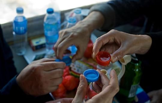
Despite the riveting overlaps to be found in the internationally oriented selections, I gravitated toward work documenting contemporary China. For this reason, I was pleased to come across an exhibition by Qian Haifeng in the shoe factory. Brought to Lianzhou by curator Tang Wuhao, Haifeng works as an electrician at the Wuxi Grand Hotel. For over seven years, on weekends and in his time off, Haifeng has taken over 150,000 photographs while riding the national train system. His series documents families with babies, sleeping workers, solitary teenagers, and travelers who temporarily set up camp and makeshift living rooms as they travel throughout China.
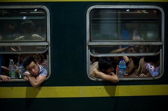
Qian Heifeng, The Green Train, 2007–15 © the artist
Focusing within this specific, fixed environment—the train cars are green, with a mustard-yellow stripe along the sides—Haifeng’s images capture poverty, humor, conflict, and unstaged daily life on the road. The exhibition included a map drawn on the wall to outline the expansive network of train routes crossing all corners of the country; alongside each photograph was the ticket purchased for that given ride. During the festival, Mr. Haifeng received the Punctum Prize. In his acceptance speech, he poignantly described his connection to the project: “I belong to the same group as those people on the train and, though I am not a professional, I just want to preserve each moment that reflects our daily life.”
Qian Heifeng, The Green Train, 2007–15 © the artist
To accompany such contemporary views of China, Swiss photographer Walter Bosshard’s photographs of China from 1933 and 1939 provided a fascinating visual history. In May 1938, Bosshard traveled with the American journalist Archibald T. Steele to the mountains of the Shensi Province to visit Mao Zedong. They were the first foreign correspondents to interview Mao in the remote area, and, in addition to the photographs, they produced a silent film capturing their journey. Included in the film was footage of the Chinese countryside from their travels to the mountains in the west. After the festival, as I thought about those images on the bus returning to Guangzhou, I looked out the window at a landscape transformed—and I wondered if Bossard would recognize the country today.
Amelia Lang is the Executive Managing Editor, Aperture Books.
The post Expanded Geographies appeared first on Aperture Foundation NY.
January 14, 2016
For the Camera
Posing, role-playing, or staging a tableau: the impulse to perform has long been a fixture of photography. Beginning in February, a new exhibition at Tate Modern explores how performance artists use photography – and how photography is a performance itself.
By Simon Baker

Erwin Wurm, Untitled (Claudia Schiffer), 2009. Courtesy Galerie Thaddaeus Ropac
From the first days of the first photographs, those taking the pictures and those being pictured were fully aware of the performative potential of the new enterprise. Consider the strangely stilted tableaux that William Henry Fox Talbot arranged on the grounds of his home, Lacock Abbey, in the 1840s: his friends and family posing as, well, friends and family, but nevertheless acting their own roles as best they could in bright sunlight under the cold eye of the camera. These, surely, were some of the first people ever to “pose” as themselves, as countless others have done for the camera ever since. But as well as performances aimed at the representation of some kind of natural life, there are also, in the earliest photographic experiments, something that we can recognize today as truly performative works.

Hippolyte Bayard, Le Noyé (Self-portrait as a drowned man), 1840 © SFP
Perhaps the earliest of these coincided with the 1839 advent of the medium: Hippolyte Bayard produced Le Noyé (Self-portrait as a drowned man) in October 1840. A direct positive print on paper (and therefore an easier and cheaper alternative to the metal daguerreotype), Bayard’s self-portrait is not only a technical masterpiece but a conceptual one. It shows the inventor of the process, slumped as though sleeping, naked from the waist up, like Jacques-Louis David’s 1793 painting of the assassinated Marat; Bayard’s strangely dark hands a testament to both chemistry and hard work, crossed in peaceful resignation on his lap. But it is the title that completes the work, referring the viewer (whomever Bayard imagined that might have been) to the hopeless plight of the sitter: Bayard claimed to have invented photography before Daguerre, who received all the credit for the invention. In the photograph, he appears rejected, ignored, sinking without a trace below the high watermark of Daguerre’s fame and fortune. Bayard’s silent protest is probably the earliest, and certainly the greatest, of the first real performances made purely for the camera, and existing only as a photographic print.

Eikoh Hosoe, Kamaitachi #19, 1965 © Eikoh Hosoe
There is, however, an umbilical cord of radical creativity linking this early moment in photographic history with all that followed, in which the self-portrait tends toward fantasy. Think, for example, of F. Holland Day’s incredible serial self-portrait The Seven Words (1898), in which the artist presents himself not simply as martyred (like Bayard) but as Jesus Christ, crowned with thorns and enduring the agony of the crucifixion to illustrate the final words spoken from the cross. Part of a truly epic project to photograph the life of Christ in which Day took the title role (starving himself in order to do so), Day’s Seven Words can be seen as both spiritual and blasphemous in equal measure. For although Day and his more enlightened critics, Edward Steichen included, saw this work, and indeed the project from which it was drawn, as a sacred enterprise, it was (and remains) a controversial photographic performance, decades ahead of the better-known role-playing conceptual practice that it appears to anticipate.
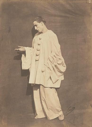
Félix Nadar, Pierrot pleading, 1854 © RMN-Grand Palais/Art Resource, New York
The ways in which the performative nature of photography and the photographic nature of performance are interrelated and intertwined is the subject of Performing for the Camera, an exhibition at Tate Modern opening in February 2016. This article, then, constitutes an initial attempt to walk (and blur) the line between the photography of performance and performative photography, circling around the question of when a photograph records a performance versus when a performance depends entirely on the photographic act, aiming not to present a hierarchy but instead to raise questions about the symbiosis at the heart of an apparent opposition that runs through the medium from its inception to the present day.

Shunk-Kender, Niki de Saint Phalle shooting, unidentified location, 1960s © J. Paul Getty Trust, Getty Research Institute, Los Angeles
Consider performances at which a photographer happened to be present: there is much to be learned about the photographic potential in what only appears to be the subordinate role of the photographer. Harry Shunk and János Kender, or Shunk-Kender, as they are known, started out as photographers in the conventional sense (on the streets of Paris and Berlin) but then went on to become perhaps the most important official witnesses of a broad range of artistic practices, from Yves Klein’s Anthropometries in 1950s Paris to the myriad performances of a generation of artists working in New York in the ’60s and ’70s. There are many examples of the straightforward documentation of performances by figures like Eleanor Antin, Yayoi Kusama, and Marta Minujín (to name just three) but also more complex situations in which Shunk-Kender either become active participants in the events, eliciting poses or demonstrative acts, or even making the works themselves, as is the case with Klein’s 1960 Leap into the Void, which was collaged together from two negatives to produce the artist’s legendary (and illusory) dive off the side of a house. Elsewhere there are dramatically posed portraits, like those showing the artist Niki de Saint Phalle in 1961, gun in hand, both facing the lens and in profile, but not actually, as it happens, making one of her Feu à Volonté (Shot canvases), which resulted from that particular performative process.
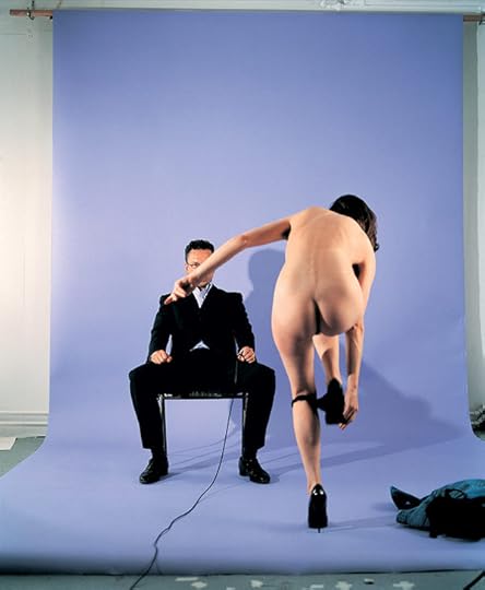
Jemima Stehli, Strip No. 5 Dealer (shot 2 of 6), 1999. Courtesy the artist
More fascinating still are those moments in Shunk-Kender’s work when they begin with a “document” of an act (a live performance by Yves Klein or Merce Cunningham), then transpose this material, in the darkroom, into something else entirely. Such photographs have a relationship to performance that is like that of an amplified echo to an original sound: related, for sure, but absolutely distinct and different in tone and resonance. In one of the most dramatic examples of their practice, Shunk-Kender solarized the forms of Cunningham’s dancers (performing Nocturnes in Paris in 1964) almost to the point of abstraction, until the precisely choreographed figures from a real performance became merely glowing bodies of light; entangled, entwined, and yet perfectly balanced as photographic compositions.
Simon Baker is Senior Curator, International Art (Photography) at Tate, London. The upcoming exhibition exhibition Performing for the Camera will be on view at Tate Modern from February 18–June 12, 2016.
To read the full article, buy Issue #221, Winter 2015, “Performance” or subscribe to the digital archive.
The post For the Camera appeared first on Aperture Foundation NY.
Aperture's Blog

- Aperture's profile
- 21 followers

