
Aperture's Blog, page 147
December 10, 2015
Aperture Awarded $25,000 NEA Grant for Aperture On Sight Program
National Endowment for the Arts (NEA) announces over $27 million in grant awards, including a $25,000 Art Works grant to Aperture Foundation for its educational outreach program Aperture On Sight: Teaching Visual Literacy Through Photography (AOS).
In its first fifty years, the NEA has awarded more than $5 billion in grants to recipients in every state and U.S. jurisdiction—the only arts funder in the nation to do so. To inaugurate the beginning of its next fifty years, today the NEA announced more than $27 million in grants, mostly through its Art Works program, which focuses on the creation of work and presentation of both new and existing work, lifelong learning in the arts, and public engagement with the arts through thirteen arts disciplines or fields. A total of seventy-eight grants were awarded for arts-education programs, with nineteen going to organizations in New York State.
“These projects, from all over the nation, will make a difference in their communities,” said National Endowment for the Arts chairman Jane Chu. “We know from experience as well as through hard evidence that the arts matter, and these projects will provide more opportunities for people to learn, create, and experience the value of the arts in so many different ways.”
The AOS program was initiated as part of two after-school programs three years ago, and is currently part of an afterschool Beacon program through Grand St. Settlement, as well as after-school programming or daytime arts education curriculums at six middle and high schools in New York City. The grant from the NEA will fortify the AOS program, which allows students to explore storytelling and visual literacy through digital photography and photobook creation.
“This is an important grant,” said Aperture executive director Chris Boot. “With it, we at Aperture can bring our knowledge of photography and book making to young people at school, in diverse communities around New York, building enthusiasm for and knowledge of our medium. In our rapidly evolving visual culture, this in turn expands our institutional knowledge, and understanding of young people’s interests, helping us build publishing programs to meet their needs.”
For a link to the full grant announcement, click here.

The post Aperture Awarded $25,000 NEA Grant for Aperture On Sight Program appeared first on Aperture Foundation NY.


December 9, 2015
Lecture as Performance
Lebanese artists Walid Raad, Joana Hadjithomas and Khalil Joreige, and Rabih Mroué and Lina Saneh have all embraced the artist’s talk to unpack history and the limitations of the photograph. In this excerpt, writer Kaelen Wilson-Goldie looks at Raad’s work.
By Kaelen Wilson-Goldie

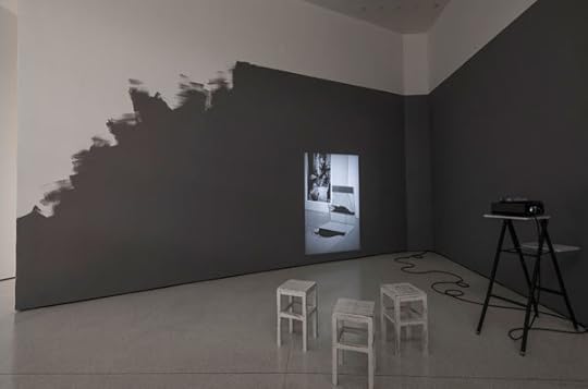
Walid Raad, from Scratching on Things I Could Disavow: Translator’s Introduction: Pension Arts in Dubai, 2010. Two-channel projection on wall with paper cutouts
© Walid Raad and courtesy Paula Cooper Gallery, New York
In the last twenty years, the Lebanese artist Walid Raad has produced two major, long-term, multifaceted bodies of work. The first, known as the Atlas Group, delves into the mechanisms of history and memory that have been used to convey the experience of Lebanon’s civil war, a conflict that lasted roughly fifteen years, from 1975 through 1990. The second, titled Scratching on Things I Could Disavow, considers how the construction of institutions and infrastructures for contemporary art is changing the cultural landscape of the modern Middle East. Although one followed the other and they remain fairly distinct, the Atlas Group and Scratching are linked by several lines of inquiry and the strands of Raad’s practice. Taken together, his projects involve an ever-expanding constellation of prints, photographs, Polaroids, drawings, cutouts, collages, sculptures, videos, Super 8 films, a white Fiat, plaster casts of a bomb crater, miniature exhibition models, monochromes, trompe l’oeil murals, a maze of fake doorways, and a dazzling cast of imagined characters, including a gambling historian, a melancholy intelligence agent, a sorrowful police inspector, a long-suffering photographer, a forgotten curator, and a pioneering performance artist who made gorgeous ink-on-paper abstractions in her youth.
The two projects meet at several important points of intersection, primary among them the formal precision of the lecture-performance, which extends through both bodies of work and is unique to the context from which Raad’s practice first emerged. In the period after the civil war ended, the Lebanese capital Beirut proved itself a strange and powerful incubator for new thinking about art and photography, as a tight-knit group of colleagues took the setup and structure of an artist’s talk to start an open-ended conversation about the behavior of images in proximity to wars and other forms of political violence. That conversation persists to this day. Raad is now one of the leading practitioners of the lecture-performance internationally, but his works continue to unfold in close dialogue with those of his Beirut-based peers, most notably the joint efforts of Rabih Mroué and Lina Saneh, who are rooted in theater, and Joana Hadjithomas and Khalil Joreige, who come from the world of film. The Atlas Group earned Raad a reputation as something of a trickster. When he first began showing his work in exhibitions, lecture programs, and film festivals in the late 1990s, he presented himself not as the author per se but rather as a spokesperson for a foundation that had been established to research the recent history of Lebanon. The Atlas Group, according to Raad, was based in Beirut, where its founding members were gathering a wealth of documentary materials, including the photographs, films, and notebooks filled with heavily annotated newspaper clippings that Raad was sharing on their behalf. Within a few years, the Atlas Group was revealed to be a clever fiction. The colorful donors who had given the foundation their effects were all, in fact, figments of the artist’s imagination. Their photographs were either found in the archives of Lebanon’s daily newspapers, borrowed from albums belonging to Raad’s father, or taken by Raad himself, when he was a teenager messing around with his first camera on the eve of the Israeli invasion of Lebanon in 1982.

Walid Raad, from Scratching on Things I Could Disavow: Translator’s Introduction: Pension Arts in Dubai, 2010.
However true or false, the Atlas Group was emblematic of Lebanon’s postwar era, a time for sifting through the wreckage of the past to find the materials for building a better future, not least through the creation of new institutions. By the time the project came to an end, in the mid-2000s, the regional landscape had shifted and another kind of institution-building took hold of the artist’s imagination—the creation of massive new museum projects in the Persian Gulf. With no shortage of ambition, the new cities of Dubai, Abu Dhabi, and Doha hoped to surpass the old cities of Beirut, Cairo, and Baghdad as the Arab world’s preeminent centers of artistic production. Raad’s second project, organized in parts corresponding to the sections of a book (preface, plates, appendices), has so far created (or imaginatively recomposed) genealogies of Arab artists, bibliographies of Middle Eastern modernism, and the oddly anachronistic architectural details of future museums. Whole series in Scratching on Things I Could Disavow sketch out a fictional prehistory and forecast the opening scenarios for the branches of the Guggenheim and the Louvre that Abu Dhabi is building on a spit of reclaimed land known as Saadiyat Island.
To encounter Raad’s work has thus become an exercise in entertaining doubts, skepticisms, and suspicions. The artist initiates viewers in a game of second-guessing, but at the same time, on a subtler level, he also engages them in a serious critique of photography, image making, and the status of art. Lavish in their materials and details, extensive in their background stories and accompanying texts, his works tend to be as accumulative and dense as they are conceptually succinct. How interesting, then, that the centerpiece of Raad’s first major museum survey in the United States, currently on view at the Museum of Modern Art in New York, is neither a sequence of photographic prints purporting to show the engines that have been ejected from car bomb blasts (a hundred of them appear in the series My Neck Is Thinner than a Hair: Engines [1996–2001]), nor the videotaped eyewitness testimony of the only Arab hostage held with Americans such as Terry Anderson for a decade during the civil war (as conveyed in the sixteen-minute video Hostage: The Bachar Tapes [2001]), nor a collection of color-saturated still lifes capturing objects from the Louvre that will be inexplicably altered by their transfer from Paris to Abu Dhabi in 2026 (as imagined in the series Preface to the Third Edition [2013]), although all of these works are included in the show. Rather, the heart of the exhibition is an hour-long performance piece, which the artist is presenting more than seventy times in total—once a day, five days a week, for an audience of forty to fifty people each time.

Walid Raad, from I Feel a Great Desire to Meet the Masses Once Again, 2005. Performance with slide show produced by the Atlas Group © Walid Raad and courtesy Paula Cooper Gallery, New York
Almost all of the works associated with the Atlas Group and Scratching exist in multiple formats. The dates, details, sometimes even the titles of individual pieces exist in a constant state of flux, changing from one context to another. But from their earliest iterations, both projects have always come across as the most seamless and conceptually airtight in the live performances that test the durability of Raad’s materials, setting them down in a crosscurrent of politics, theory, and old-fashioned storytelling. The Loudest Muttering Is Over: Documents from the Atlas Group Archive (2003) established the setup, with the artist always seated at a table, a lamp, a bottle of water, a script, and a laptop before him, and a screen for the projection of images behind. I Feel a Great Desire to Meet the Masses Once Again (2005), about security panic and the war on terrorism in post-9/11 America and Raad’s first work authored under his own name, was in many ways the hinge between the Atlas Group and Scratching. The same style of lecture performance carries into the second project. Scratching on Things I Could Disavow: Walkthrough (2013), the core of the MoMA show, is the apotheosis of that project, and Raad’s most theatrical work to date. It begins with an exposé of the Artist Pension Trust, an investment fund for artists; tunnels into the Israeli high-tech industry, data mining, and the algorithms turning seemingly irreducible works of art into tradable financial assets; and then jumps headlong into the future, to the opening of the Guggenheim Abu Dhabi, vaguely a decade from now, when an unnamed Arab artist will find himself mysteriously, inexplicably stricken, felled at the doorway, unable to enter.
The post Lecture as Performance appeared first on Aperture Foundation NY.
December 8, 2015
Five Book Design Trends Spotted in the PhotoBook Awards Shortlist
Coordinating editor of The PhotoBook Review, Madeline Coleman, highlights design trends found in this year’s PhotoBook Awards shortlist.
By Madeline Coleman
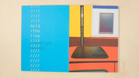
Siegfried Hansen, Hold the Line (Verlag Kettler)
Every summer, the entries to the Paris Photo–Aperture Foundation PhotoBook Awards come pouring in: from the U.S., the U.K., Brazil, Japan, Germany, China, Russia, Australia, Israel, and beyond. This year, the Awards received more than a thousand entries, from over sixty different countries. Amazingly, despite the entries’ incredible diversity, patterns do begin to emerge: not only in subject matter, but also in the books’ design.
This year’s shortlist includes thirty-five books (and one special jurors’ mention) that run the gamut from self-published tomes to high-budget museum catalogues, and even print objects that could only barely be considered “books” in the traditional sense. But designers working everywhere from São Paulo to Paris sometimes end up reaching for the same unorthodox materials, or setting type in just the same way—thanks to the increasing popularity of international book fairs, mobility on the part of young photographers and designers, the internet, and maybe even pure coincidence. Whether these photographers and designers are setting trends, following them, or flipping and subverting them altogether, the Awards offer a unique opportunity to track the evolution of the photobook. Here are five design trends we noticed in this year’s shortlist.
1. Transparent plastic jackets
Protection from ungentle hands and shipping containers, or just a fun way to add gloss or texture to a cover? Either way, several books on this year’s shortlist came enveloped in slick plastic jackets—whether colorless and transparent, as for the exhibition catalogue William Eggleston: A Cor Americana and Sophie Bramly’s hip-hop album Walk This Way; or in a matte red, as for PhotoBook of the Year winner Thomas Mailaender’s Illustrated People.

Sophie Bramly, Walk This Way (Galerie 213)

Thyago Nogueira, ed., William Eggleston: A Cor Americana (Instituto Moreira Salles)
2. Pages of all shapes and sizes
Continuing an increasingly popular trend, many books submitted to this year’s Awards played with pages’ trim lengths, calling attention to different sections and changing up the frame. Sometimes shorter pages act almost as built-in bookmarks to demarcate sections or chapters, as in Dominic Forde’s reimagined skateboarding archive Ramps, Pools, Ponds and Pipes. In Hiroshi Takizawa’s Mass, though, the artist and designer went for broke: every single page is a different size, and often a different kind of paper, too, highlighting the sculptural bent of the images.
Hiroshi Takizawa, Mass (Newfave)
Dominic Forde, Ramps, Pools, Ponds and Pipes (self-published)
3. The rise of the paperback
With all due respect to the beautifully bound hardcover, softcover books—formerly considered less durable and less valuable than hardcovers—are on the rise. Nearly half the shortlist books this year were softcovers. From the exhibition catalogue Beastly/Tierisch, with its fuzzy orange title and back cover, to the richly printed, black-and-silver cover of Dana Lixenberg’s Imperial Courts 1993–2015, the paperback proves to be a versatile and tactile form.

Duncan Forbes, Matthias Gabi, and Daniela Janser, eds., Beastly/Tierisch (Spector Books/Fotomuseum Winterthur)

Dana Lixenberg, Imperial Courts 1993–2015 (Roma Publications)
4. Book blocks, roaming free
2015 is the year of the free-floating book block; as in, the pages are bound to each other, but not to the cover. This does make the books that employ this design more delicate—the pages are liable to fall out anytime—but it also gives designers space to play. Sjoerd Knibbeler’s Paper Planes, for example, features one long, double-sided accordion of pages, and is meant to be flipped and swiveled.
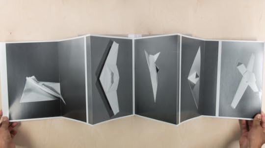
Sjoerd Knibbeler, Paper Planes (Fw:Books)
5. Monospace type, reclaimed
Monospace typefaces—in which each letter or character is the same width—were first created for typewriters, although these days they’re more likely to be associated with computer code than they are with actual ink. Nonetheless, they’ve begun popping up in new photobook design, taken back from programming. A monospace type feels fresh when contrasted with the color-saturated street scenes in Siegfried Hansen’s Hold the Line, or when juxtaposed against serifs to call out pieces of information. In Lucy Helton’s Transmission, the typeface alludes to the dispatches from outer space; in the essay component of Antony Cairns’s hacked Kindle book LDN EI, the type seems to align the images it accompanies with futuristic dystopia.

Lucy Helton, Transmission (Silas Finch)

Antony Cairns, LDN EI (self-published)
The Paris Photo–Aperture Foundation PhotoBook Awards Shortlist exhibition will be on view at Aperture Foundation from December 12, 2015, to February 8, 2016. Click here for a list of other venues where you can see the exhibition.
The post Five Book Design Trends Spotted in the PhotoBook Awards Shortlist appeared first on Aperture Foundation NY.
December 7, 2015
A Conversation with David Shields

From David Shields, War Is Beautiful (powerHouse Books, 2015) © Ozier Muhammad and courtesy the New York Times and Redux
In David Shields’s Reality Hunger: A Manifesto, a textual collage published in 2010 that is the most well-known of his twenty books, he argues for a more fluid form of literary expression as an antidote to the stagnation of traditional narratives. Shields’s latest project, a selection of New York Times war photography titled War Is Beautiful: The New York Times Pictorial Guide to the Glamour of Armed Conflict*—subtitled *(in which the author explains why he no longer reads The New York Times)—occupies an adjacent intellectual space to his previous work, arguing that the heightened aesthetic sensibilities of the depiction of military conflict sanctify the experience of war. It is a testament to the Times’s long-held position as one of America’s main arbiters of cultural opinion—as well as its carefully cultivated perception of unbiased reportage—that Shields felt it necessary to indict the newspaper as a main culprit in what he considers an unseemly descent into the “beautiful,” an easily consumed banalization of combat’s horrific actualities.
War Is Beautiful is made up of sixty-four photographs that ran on the front page of the Times between 1997 and 2013, and is divided into ten thematic sections (Beauty, God, Love, etc.), each framed with epigraphs eclectically culled from sources such as Cormac McCarthy’s Blood Meridian, an interview with Gerhard Richter, and a Gore Vidal quip (“The New York Times, the Typhoid Mary of American journalism”); also included is a brief introduction by Shields and an afterword by the art critic Dave Hickey. Though these spare parts may not coalesce into a whole, Shields does convincingly present a complex investigation that, at the very least, explicates a host of relevant questions for the digitized age. “Behind these sublime, destructive, illuminated images are hundreds of thousands of unobserved, anonymous war deaths,” he writes of his selected photographs in the introduction. “This book is witness to a graveyard of horrendous beauty.” I spoke with Shields by telephone last month, during the eastern leg of his promotional tour.
—Cody Wiewandt
CW: Do you think you are being unfair to the New York Times?
DS: Fairness to me is not exactly the point. I’m not a political scientist; I’m not a reporter; I’m not a photographer; I’m not even a photo critic—I’m someone who tries to come up with what strikes me as proactive metaphors. I looked at nine thousand photographs, and then I narrowed it down to 4,500 color pictures. I found one thousand war photographs on page A1, and of those thousand, seven hundred fit my criterion of glamorizing combat. Of the other three hundred, almost none contradicted my thesis. I was always looking for a course correction—it’s not generally thought to be a brilliant career move to publish a book-length criticism of the New York Times. So no, I don’t think I’m being unfair.

From David Shields, War Is Beautiful (powerHouse Books, 2015) © John Moore and courtesy Associated Press
CW: Yet it’s difficult to think of an alternative. What do you consider “good” war photography? What would be the antithesis of the images in the book?
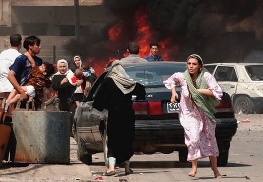
DS: I think the Times pointed it out in a photo-essay they ran in 2013 of important images from the Vietnam War—photographs, according to the headline, that “made a difference.” It was implicitly saying: “Here are pictures that may have had an effect on the Vietnam War.” And during Vietnam, the Times published Pulitzer Prize–winning photographs that conveyed the raw, naked, visceral act of war, including an Eddie Adams photograph of an execution-style assassination of a South Vietnamese captain. There is a noble and great and impressive and rigorous tradition of war photography, from Mathew Brady to Robert Capa, Edward Steichen, and some of the people I mention in Vietnam: Eddie Adams, David Hume Kennerly. What I’m trying to do with the book is ask: “Where are such pictures for Iraq and Afghanistan?” They are definitely not in the New York Times.
I’m interested in pictures that are less stylized, less romantic, that have less of a tendency to mythologize and beautify. Picasso said “Good taste is the enemy of great art,” and so many of these pictures, almost without exception, seem to me exquisitely and problematically tasteful. Where is the war here? Many of these pictures are hugely under the sway of Abstract Expressionism and other modernist masterpiece paintings, so photo after photo feels like a direct rip-off or pale echo of Jasper Johns, Rauschenberg, Pollock, Rothko, etc. The effect is that these pictures feel beholden to a kind of swooning beauty. I’m arguing that the Times has abandoned trying to faithfully document some actually observed reality and is instead now producing a kind of empty, plastic beauty: war as screensaver, or war as wallpaper.
Look at the pictures that the Times ran of the Paris attacks. On Monday, November 16, there was a very bellicose, war-inclined headline from France, and underneath that headline was a photograph of hundreds of thousands of fallen bouquets of flowers, and then underneath that was the very embodiment of French beauty, a beautiful blonde French woman standing and mourning. I’m urging my fellow readers to ask, not necessarily if the Times is evilly and gleefully rubbing its hands together, thinking of how to disseminate state propaganda—it’s not Pravda, after all—but I’m urging us to think figuratively about what cultural messages are getting sent.
One of the photographs I’ve included is an image of spent gun cartridges [on page 58 of the book]. You could say that it is just a pretty picture, but it is an exact echo of a particular Jasper Johns painting. The picture was cropped from a much larger photograph by the Times, and the larger image was much less abstractly gorgeous, much less perfectly composed. That is a really interesting picture to put on A1. It could be an advertisement for cuff links or for a new retrospective of Jasper Johns, but it’s not. It’s spent gun cartridges from the war.
CW: There has been a somewhat logical critical response to your project that claims you may be overstating the negative effects of these types of photographs. What is the harm of that particular photo of the gun cartridges? Why is the cropping, or the way it might reflect a modern art aesthetic, problematic?
DS: That’s valid, and some people have pointed out that there are all kinds of aspects of war. Part of war is incredibly beautiful. It does adrenalize the senses. I looked at one thousand color pictures of combat from October 1997, when the Times started running color photography, until 2013, and if those images were balanced often, or even occasionally, by images that convey a more naked fidelity to observed experience, and less of a fidelity toward modernist paintings, I’d be a lot happier. In On Photography, Susan Sontag discussed how at an early age she saw a photograph of Holocaust survivors, and the photograph “lacerated” her. For me, very few of these pictures attempt in any way to lacerate the viewer with some sense of the human cost of war. This is how consent gets manufactured. And because the Times’s brand is pseudo-neutrality, I think they escape a lot of media criticism in general.
The Times recently ran a picture of post-attack Paris, and on the upper left corner there was a wine glass next to a bullet hole in a restaurant window. It was a powerful message to choose this picture to represent the Paris bombing. On the one hand, you have the bourgeois beauty of an untouched wine glass, and on the other you have a bullet hole through a glass window, which represents a clash of civilizations: do we want a civilization of beautiful wine goblets, or a civilization of bullet holes through restaurant windows? And if we want the civilization of a beautiful wine goblet, then war is necessary.

From David Shields, War Is Beautiful (powerHouse Books, 2015) © Joao Silva and courtesy the New York Times and Redux
CW: You quoted Susan Sontag, whose work critiquing war photography and aesthetics is among the most influential. Do you think that we still have that capacity to be “lacerated” by the horrors of a photograph, after having already been exposed to a long tradition of graphic depictions of war?
DS: If we are that completely benumbed and desensitized, then why bother being alive? I disagree with a huge amount of Sontag’s writing on photography, which to me throws out the camera with the bathwater. So it’s not as if I’m a huge Sontag acolyte and in no way do I want to take beauty out of the equation. Instead, I’m asking for a more hard-won beauty—a photography with a greater consciousness being brought out of an aestheticization of horror. A fully-considered production of beauty, more purposeful and intentional. I’m writing a kind of lover’s-quarrel letter to the Times. I’m saying, “You’ve got to be thinking about this a little bit more.”
Recently, there were images of a boy named Aylan Kurdi who drowned fleeing Syria and whose body was found dead on a Turkish beach. I’m not a huge fan of the photographs; there are all kinds of problems with them. There are some elements of kitsch and a fetishization of children in war photography—but, in any case, those pictures did apparently move people.
CW: You could argue that such images move people because they come from an iconographic tradition of suffering that we’ve become accustomed to—which is certainly an argument central to your book. That image of a child dying is certainly not reassuring, but naturally fits the way we think about pain and loss and suffering and war. Haven’t we seen images like this before?
DS: In a way the Times has a kind of show bible for their war photography. Soldiers as fathers, soldiers as God, war as a fashion shoot, war photos as outtakes from a movie, theater of war as playground—so in a way it does feel that the Times has a similarly limited repertoire of photographs. There are fifteen things on their playlist, and they just sort of seemingly shuffle between these fifteen tropes. I think your point from earlier—just because something is stylized, that doesn’t preclude the possibility to move us—is fair enough. But what I’m arguing is that these pictures have seemingly stopped trying, in any way, to faithfully document some kind of reality.

From David Shields, War Is Beautiful (powerHouse Books, 2015) © Mohammed Abed and courtesy Agence France-Presse and Getty Images
CW: One of the book’s sections is “War as Movie,” and is comprised of photographs that look as though they could be stills from a movie. This aspect of your project seems similar to Cindy Sherman’s early work of reappropriating Hollywood’s visions of femininity through the traditional female pose in American cinema. Do you feel that your aims are related?
I don’t want to compare this work to hers, since she took the actual pictures, but I think that by decontextualizing and recontextualizing and showing a cultural ideology that is getting disseminated and promoted—which for Sherman was an image of femininity that was being promulgated by American movies—I would say that my project is relatively similar. And like Sherman, I put these photographs into new categories to show how tropes occur over and over again. It wasn’t on her part to say that she was never going to watch a movie again, and it’s not on my part to say that we are never going to fight a war again. I rather ask: can we be somewhat more self-aware and self-critical and reflexive in our absorption and consumption of these images?
CW: A recreation of some of these images in the mode of Sherman could underscore the absurd or banal aspects of it.
DS: I would love to see someone do that. I would argue the underscoring isn’t totally necessary, in my view, probably because I’ve lived with these pictures for too long. The absurdity of it, the comedy of it, the tragi-comedy of it—“gross” might be a little strong, but gross ideological work is getting done here.
CW: In the current cultural climate, photography might have to become more aesthetically exaggerated in an incendiary sort of way to have an explicit impact.
DS: It almost has to break the frame first, and then it might actually move you.
From David Shields, War Is Beautiful (powerHouse Books, 2015) © Wathiq Khuzaie and courtesy Getty Images
CW: This argument has rapidly expanded—when Sontag began writing about this, it was a completely different thing.
DS: Yes, I was going to say that her book Regarding the Pain of Others, which came out in 2002, already seems very dated given the rapid decline of print journalism and the rise of the web. Things are very weird now. Images can get uploaded and consumed instantaneously around the world. In a way, the Times plays it down the middle so that their pictures are quasi-unobjectionable: Here’s a wine glass and a bullet hole, we’re not taking sides. Or here’s a beautiful French woman and here are rose petals. But those pictures do take a side by not taking sides. That is a form of cheerleading and flag-waving—and can we please talk about it?
Cody Wiewandt lives in Brooklyn.
The post A Conversation with David Shields appeared first on Aperture Foundation NY.
December 4, 2015
Issue 21 of the Aperture Photography App is Now Available

The new issue of the Aperture Photography App is now available to download on your iOS device. Here’s a look inside Issue 21:
● An excerpted essay by Kaelen Wilson-Goldie from the “Performance Issue” of Aperture magazine
● A preview of images from the newly remastered edition of Joel Meyerowitz’s Cape Light
● An Aperture Beat on the design trends noticed in this year’s PhotoBook Awards
● A round up of design books to know from the latest issue of the The PhotoBook Review
● A review of the Guggenheim’s new exhibition, Photo-Poetics: An Anthology
Every issue of the Aperture Photography App is free– subscribers have new issues delivered to their device automatically. Select articles later appear here, on the Aperture blog. Click here to download the app today!
The post Issue 21 of the Aperture Photography App is Now Available appeared first on Aperture Foundation NY.
Photo-Poetics: An Anthology at the Guggenheim
In a new exhibition at the Guggenheim, ten contemporary artists investigate photography on the verge of transformation.
By Will Heinrich
 Aperture Foundation NY.
December 3, 2015
The PhotoBook Review’s Publisher Profile
Willem van Zoetendaal did not become a photobook publisher out of a sense of vocation. Many of the activities that form an integral part of publishing are anathema to him. Cost balancing? Zoetendaal shrugs. If he feels the urge to bring out a book under his imprint, Van Zoetendaal Publishers, then that’s exactly what he does, even if the financing is not yet in place. Van Zoetendaal selected five books from his collection that, together, as told to Arjen Ribbens, tell the story of his publishing house. This excerpt comes from the latest issue of The Photobook Review.
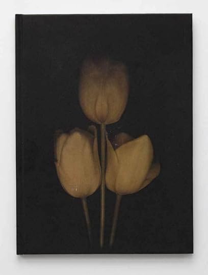
Tulipa, L. Blok and Jasper Wiedeman, Basalt, Amsterdam, 1994
Tulipa
L. Blok and Jasper Wiedeman
Basalt • Amsterdam, 1994
This was the first book that I published myself. I set up a foundation, Basalt, for this purpose, together with the art historian Frido Troost (1960–2013), so that we could apply for grants. Why the name Basalt? Because I was born at The Hague’s breakwater. This is the first in a series of books in which I juxtaposed historical and contemporary photography. In this case, it was autochromes from the 1920s by Leendert Blok, a photographer who worked for flower bulb cultivators in the Netherlands’ Bollenstreek region, and photographs by Jasper Wiedeman, who had just graduated from the Gerrit Rietveld Academie, where I was teaching at the time. By contrasting the two, you get differing perspectives. Contemporary photography can open a new window on history. I had the good fortune that there were a lot of students at the academy back then who felt connected to traditional photography. Many of them went on to achieve international renown, including Céline van Balen, Rineke Dijkstra, Hellen van Meene, Paul Kooiker, and Koos Breukel.
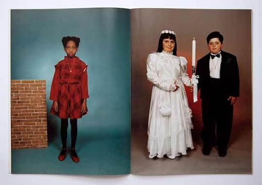
To Sang Fotostudio, Lee To Sang, Basalt, Amsterdam, 1995
To Sang Fotostudio
Lee To Sang
Basalt • Amsterdam, 1995
One day in the early 1990s, I passed a photography studio called To Sang Fotostudio in Albert Cuypstraat, Amsterdam. In the window, I saw a photograph of a fellow journalist with his daughter on his lap. The photographs in the window provided such a beautiful record of this colorful, largely immigrant neighborhood, that I gave my first- and second-year students money to go and get their portraits taken here. In 1995, I published a large-format folder of twenty-three portraits by the studio’s photographer, Lee To Sang. The design is entirely subordinate to the image. But the book works. Frido Troost and I put a lot of work into the picture editing. This publication made quite a stir: an exhibition about To Sang Fotostudio traveled to various photography festivals, Tate Modern acquired a number of the photographs, and Johan van der Keuken made a documentary about To Sang. His photography studio became a cult success. Martin Parr is one of many significant figures who went there to have their portraits taken. After he retired, Lee To Sang gifted me his archive—some seventy thousand negatives. So it is still a resource for publications to this day.

Quatorze Juillet, Johan van der Keuken, Van Zoetendaal Publishers, Amsterdam, 2010
Quatorze Juillet
Johan van der Keuken
Van Zoetendaal Publishers • Amsterdam, 2010
In Johan van der Keuken’s archives, I found thirty-three photographs of people partying in the streets of Paris. They were all made on July 14, 1958, the country’s national holiday. I arranged the photographs in such a way that they also form a dance. I love slim editions, so I use the negative format less and less—4-by-5 inches, for example, leads to a bulky format for a book. Over the years, I’ve moved away from using stiff paper. This book is printed on paper from Gmund, a German manufacturer whose products I love. It’s fine, uncoated paper: if you don’t want the pictures to show through it, you can only print on one side. So the pages have Japanese folds and are bonded with cold adhesive. There aren’t many pages, but the folded leaves give it a good volume. The cold adhesive binding allows the book to be unfolded easily.

Arthropoda, Harold Strak, Van Zoetendaal Publishers, Amsterdam, 2011
Arthropoda
Harold Strak
Van Zoetendaal Publishers • Amsterdam, 2011
Harold Strak is a photographer who has an almost scientific approach to his work. This book contains eighty photographs of the remains of insects that were ejected from spider webs after they were eaten. I chose a rectangular format so that I could show four photographs side by side on each double page spread. The lithography and printing technique were inspired by Fraenkel Gallery in San Francisco. Their publication Seeing Things (1995), about the history of photography, is one of the most beautifully produced books I know: superior printing in eighty-eight colors, with each print run dried for twenty-four hours. I went to the same lithographer, Robert J. Hennessey, who also lithographs all the catalogues for the Metropolitan Museum of Art, New York. Massimo Tonolli, a top Italian printer from Verona, printed it beautifully in tritone.

Mädchen, Diana Scherer, Van Zoetendaal Publishers, Amsterdam, 2014
Mädchen
Diana Scherer
Van Zoetendaal Publishers • Amsterdam, 2014
I’m always present when a book is printed. It was especially important in this case. I like black to be really black, and printers don’t often print it to my liking. I had the cover of this book run through the press one more time in order to achieve the deep black. I made it this big (9 ½ by 15 inches) so that it would become a physical experience. I used two types of paper for the inside; the Japanese paper feels a little bit like the dresses in the photographs. No, there is no text in this book. An introduction would undermine the mystery. In my books, you never find texts about the photographs themselves. You can’t explain photographs. The magic of photography is precisely that you study images yourself and give them your own meaning.
Willem van Zoetendaal is the designer and editor of seventy photography books to date, many of which he published under his own imprint, Van Zoetendaal Publishers. Van Zoetendaal has also curated numerous photography exhibitions in Italy, France, Spain, the Netherlands, South Korea, and Japan, and ran a contemporary photography gallery under his own name from 2000 to 2014.
Arjen Ribbens is an art editor for NRC Handelsblad, the leading Dutch evening newspaper. He is also a part-time publisher specializing in art editions and books on stupidity (De encyclopedie van de Domheid, or The Encyclopedia of Stupidity, 1999).
Translated from Dutch by Heidi Steffes.
The post The PhotoBook Review’s Publisher Profile appeared first on Aperture Foundation NY.
The PhotoBook Review‘s Publisher Profile
Willem van Zoetendaal did not become a photobook publisher out of a sense of vocation. Many of the activities that form an integral part of publishing are anathema to him. Cost balancing? Zoetendaal shrugs. If he feels the urge to bring out a book under his imprint, Van Zoetendaal Publishers, then that’s exactly what he does, even if the financing is not yet in place. Van Zoetendaal selected five books from his collection that, together, as told to Arjen Ribbens, tell the story of his publishing house. This excerpt comes from the latest issue of The Photobook Review.
Tulipa, L. Blok and Jasper Wiedeman, Basalt, Amsterdam, 1994
Tulipa
L. Blok and Jasper Wiedeman
Basalt • Amsterdam, 1994
This was the first book that I published myself. I set up a foundation, Basalt, for this purpose, together with the art historian Frido Troost (1960–2013), so that we could apply for grants. Why the name Basalt? Because I was born at The Hague’s breakwater. This is the first in a series of books in which I juxtaposed historical and contemporary photography. In this case, it was autochromes from the 1920s by Leendert Blok, a photographer who worked for flower bulb cultivators in the Netherlands’ Bollenstreek region, and photographs by Jasper Wiedeman, who had just graduated from the Gerrit Rietveld Academie, where I was teaching at the time. By contrasting the two, you get differing perspectives. Contemporary photography can open a new window on history. I had the good fortune that there were a lot of students at the academy back then who felt connected to traditional photography. Many of them went on to achieve international renown, including Céline van Balen, Rineke Dijkstra, Hellen van Meene, Paul Kooiker, and Koos Breukel.
To Sang Fotostudio, Lee To Sang, Basalt, Amsterdam, 1995
To Sang Fotostudio
Lee To Sang
Basalt • Amsterdam, 1995
One day in the early 1990s, I passed a photography studio called To Sang Fotostudio in Albert Cuypstraat, Amsterdam. In the window, I saw a photograph of a fellow journalist with his daughter on his lap. The photographs in the window provided such a beautiful record of this colorful, largely immigrant neighborhood, that I gave my first- and second-year students money to go and get their portraits taken here. In 1995, I published a large-format folder of twenty-three portraits by the studio’s photographer, Lee To Sang. The design is entirely subordinate to the image. But the book works. Frido Troost and I put a lot of work into the picture editing. This publication made quite a stir: an exhibition about To Sang Fotostudio traveled to various photography festivals, Tate Modern acquired a number of the photographs, and Johan van der Keuken made a documentary about To Sang. His photography studio became a cult success. Martin Parr is one of many significant figures who went there to have their portraits taken. After he retired, Lee To Sang gifted me his archive—some seventy thousand negatives. So it is still a resource for publications to this day.
Quatorze Juillet, Johan van der Keuken, Van Zoetendaal Publishers, Amsterdam, 2010
Quatorze Juillet
Johan van der Keuken
Van Zoetendaal Publishers • Amsterdam, 2010
In Johan van der Keuken’s archives, I found thirty-three photographs of people partying in the streets of Paris. They were all made on July 14, 1958, the country’s national holiday. I arranged the photographs in such a way that they also form a dance. I love slim editions, so I use the negative format less and less—4-by-5 inches, for example, leads to a bulky format for a book. Over the years, I’ve moved away from using stiff paper. This book is printed on paper from Gmund, a German manufacturer whose products I love. It’s fine, uncoated paper: if you don’t want the pictures to show through it, you can only print on one side. So the pages have Japanese folds and are bonded with cold adhesive. There aren’t many pages, but the folded leaves give it a good volume. The cold adhesive binding allows the book to be unfolded easily.
Arthropoda, Harold Strak, Van Zoetendaal Publishers, Amsterdam, 2011
Arthropoda
Harold Strak
Van Zoetendaal Publishers • Amsterdam, 2011
Harold Strak is a photographer who has an almost scientific approach to his work. This book contains eighty photographs of the remains of insects that were ejected from spider webs after they were eaten. I chose a rectangular format so that I could show four photographs side by side on each double page spread. The lithography and printing technique were inspired by Fraenkel Gallery in San Francisco. Their publication Seeing Things (1995), about the history of photography, is one of the most beautifully produced books I know: superior printing in eighty-eight colors, with each print run dried for twenty-four hours. I went to the same lithographer, Robert J. Hennessey, who also lithographs all the catalogues for the Metropolitan Museum of Art, New York. Massimo Tonolli, a top Italian printer from Verona, printed it beautifully in tritone.
Mädchen, Diana Scherer, Van Zoetendaal Publishers, Amsterdam, 2014
Mädchen
Diana Scherer
Van Zoetendaal Publishers • Amsterdam, 2014
I’m always present when a book is printed. It was especially important in this case. I like black to be really black, and printers don’t often print it to my liking. I had the cover of this book run through the press one more time in order to achieve the deep black. I made it this big (9 ½ by 15 inches) so that it would become a physical experience. I used two types of paper for the inside; the Japanese paper feels a little bit like the dresses in the photographs. No, there is no text in this book. An introduction would undermine the mystery. In my books, you never find texts about the photographs themselves. You can’t explain photographs. The magic of photography is precisely that you study images yourself and give them your own meaning.
Willem van Zoetendaal is the designer and editor of seventy photography books to date, many of which he published under his own imprint, Van Zoetendaal Publishers. Van Zoetendaal has also curated numerous photography exhibitions in Italy, France, Spain, the Netherlands, South Korea, and Japan, and ran a contemporary photography gallery under his own name from 2000 to 2014.
Arjen Ribbens is an art editor for NRC Handelsblad, the leading Dutch evening newspaper. He is also a part-time publisher specializing in art editions and books on stupidity (De encyclopedie van de Domheid, or The Encyclopedia of Stupidity, 1999).
Translated from Dutch by Heidi Steffes.
The post The PhotoBook Review‘s Publisher Profile appeared first on Aperture Foundation NY.
Telling Time in Bamako
A report from the tenth edition of Rencontres de Bamako, West Africa’s venerable photography festival.
By Joseph Gergel
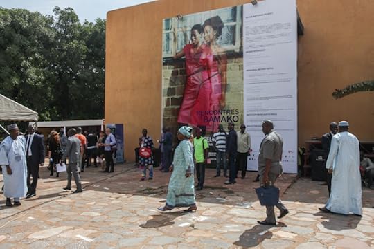
Rencontres de Bamako, Mali, 2015. Photograph by Joseph Gergel
How does one tell time? Telling time can be an action that points to a precise moment, a split second of a minute of an hour of a day. It can also refer to a grammatical tense, signaling now, before, or the future. Time is central to photography, inherently capturing the tension between the past and the present. And in relation to Africa, “telling time” might question the continent’s dynamic history and an imagining of what is to come in an increasingly globalized age.
Installation view of Nassim Rouchiche’s series Ça va waka (2015) at Rencontres de Bamako, 2015. Photograph by Joseph Gergel
In the tenth edition of Rencontres de Bamako (Bamako Encounters), the biannual festival of photography in Bamako, Mali, the thematic spectrum of “telling time” calls to the forefront photography’s symbiotic relationship with temporality and opens dialogues that transcend eras, geographies, and philosophical plateaus. Featuring thirty-eight artists working in photography and video, and spanning the African continent and the diaspora, the biennale explores the social, political, and ideological landscape of Africa today. Directed by Bisi Silva, a Nigerian independent curator and founder of the Centre for Contemporary Art, Lagos, together with associate curators Antawan I. Byrd and Yves Chatap, the biennale presents a diverse selection of lens-based artists that mixed documentary, performative, and conceptual practices. As Silva explained, Telling Time “allows us to chart a new beginning that takes cognizance of today’s realities.”
Georges Senga, from the series Une vie après la mort, 2012 © and courtesy the artist
In fact, the timing of the biennale speaks to Mali’s continued struggles in the present. In the wake of the festival’s three-year sabbatical and the cancelation of the 2013 edition due to political conflicts, this edition acted as a vehicle for interrogation and reconciliation at a pressing and urgent moment. No one could have imagined exactly how urgent this moment actually was. Only three weeks after the biennale’s official opening, Islamic extremists attacked one of Bamako’s luxury hotels, killing twenty people in a hostage siege that lasted over seven hours. Following the attacks in Paris and Beirut a week prior, such a catastrophe is not one that pertains to Mali alone but that extends as a global crisis.
This edition of the festival also marked its twenty-year presence as a leading photography festival in Africa, setting a precedent for artistic innovation that has cemented the careers of some of Africa’s preeminent photographers, including Seydou Keïta, Malick Sidibé, Samuel Fosso, and Santu Mofokeng, among others. Rencontres de Bamako is supported by Institut Français and the government of Mali, a rare arrangement given the dearth of regional state support for the arts.
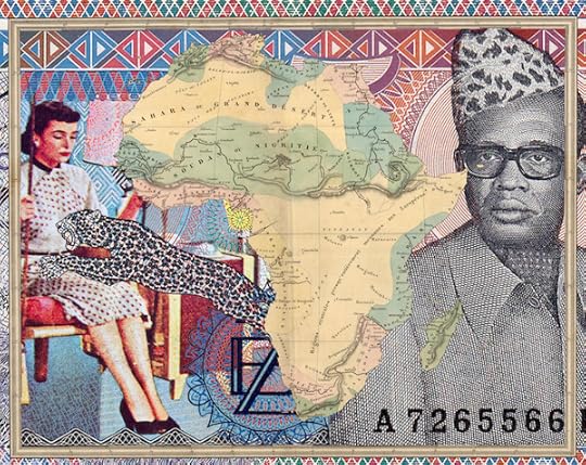
Malala Andrialavidrazana, from the series Figures, 2015 © and courtesy the artist
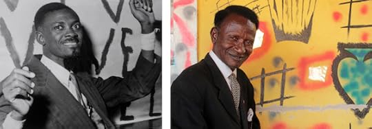
A concurrent thread throughout the central exhibition focused on the reinterpretation of photographic archives, with artists blending personal and cultural histories to question their relationship to the past. In her series Heir-Story, South African artist Lebohang Kganye posed amid life-size cardboard cut outs of black-and white-photographs. Reimagining episodes of her grandfather’s life in South Africa under Apartheid (based on oral recollections from her grandmother’s stories), Kganye wears her grandfather’s clothes as she interacts with the figures and objects in the images that surround her. Congolese artist Georges Senga created diptychs that juxtapose archival images of a young Patrice Lumumba, the first democratically elected prime minister of the Democratic Republic of the Congo, with the artist’s own photographs of an aging professor who bears a striking similarity to Lumumba. While there are visual similarities between the two representations, the newer images clash against the visible decay of the historical prints. Imagining an older Lumumba if he had not been abruptly assassinated in 1961, Senga’s series plays with photography’s ability to create fictions and form alternative narratives, circumventing the Congo’s history of political instability after independence.
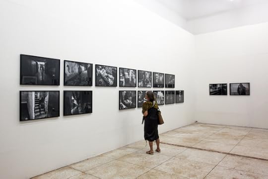
Other artists embraced the physicality of the photographic archive as a tangible object. Malian photographer Seydou Camara photographed figures sifting through the torn and faded sheaves of the Timbuktu manuscripts, which date back to the twelfth century and document African and Islamic history. Héla Ammar embroidered vernacular images of Tunisia, using both aged documents and artificially tinted contemporary images, to create a recurring design element in red silk that recalls the color of the Tunisian flag. Madagascan artist Malala Andrialavidrazana appropriated old maps, currency, and album covers to form overlapping collages, and Ibrahima Thiam created an installation of aged portraits, from the 1940s to 1960s, originating from Senegalese photo studios. These artists don’t approach the archive as a factual and static entity but rather one that is malleable and open to interpretation and reinvention.

Aboubacar Traoré, from the series Inchallah, 2015 © and courtesy the artist
Photographic performance also featured prominently in the central exhibition. Nigerian artist Uche Okpa-Iroha, who won the festival’s Seydou Keïta Prize for his series The Plantation Boy, reimagined Francis Ford Coppola’s 1972 film The Godfather, by digitally inserting himself into stills, thereby questioning the dynamics of race in Western cinema. Addressing the subject of religious fanaticism in Mali, Aboubacar Traoré won the Young Francophone Photographer Prize for Inchallah, a series of staged scenes in which figures dressed in religious attire wear black circular helmets to shield their identities.
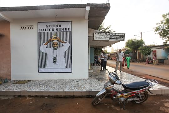
Studio Malick Sidibé, Bamako, Mali, 2015. Photograph by Joseph Gergel
As an international photography festival, Rencontres de Bamako remains rooted in the local culture and included many of its artists and art spaces. The festival launched an ambitious project that involved one hundred schools and ten thousand students through workshops and exhibition visits hosted by Malian photographers. A satellite project, Studio Mali, brought together local photographers to exhibit images in their studios. The Focus Mali section shed light on the younger generation of emerging local photographers. By inviting a diverse group of participants from throughout Africa and the diaspora, as well as garnering a significant international audience and incorporating the local community as an integral part of its programs, Rencontres de Bamako set the stage for the encounters, dialogues, and exchanges that make this festival so important.
The biennale has also created a standard for art festivals in Africa to push for a deeper reading of contemporary African photography, in particular through the accompanying catalogue, which includes an indispensible appendix of essays and an illustrated chronology reflecting upon the biennale’s tenth anniversary. As contemporary art from the continent commands a renewed focus on the global stage, Telling Time attests to the festival’s rigorous engagement with new ways of approaching photography’s complex relationship to Africa.
Rencontres de Bamako is on view through December 31, 2015.
Joseph Gergel is an independent curator and writer based in Lagos, Nigeria.
The post Telling Time in Bamako appeared first on Aperture Foundation NY.
November 25, 2015
On Paper Airplanes: The Collections of Harry Smith
By Sophie Butcher
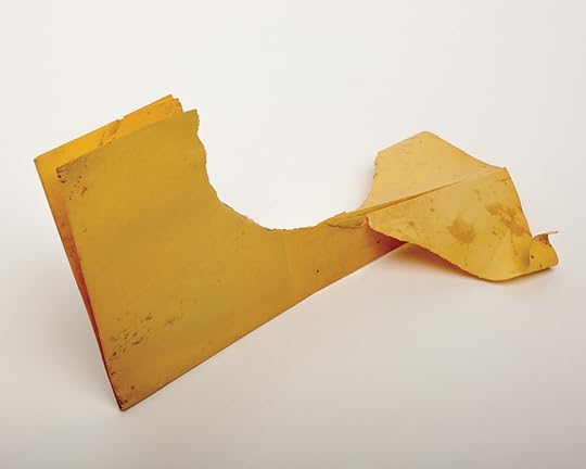
All photographs paper airplanes from the book Paper Airplanes: The Collections of Harry Smith, Catalogue Raisonné, Volume I edited by John Klacsmann and Andrew Lampert and published by Anthology Film Archives and J&L Books


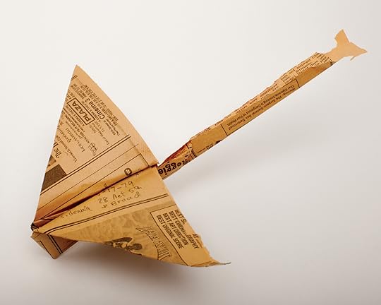
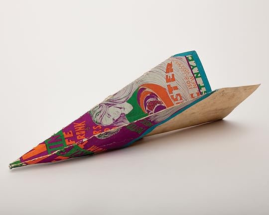


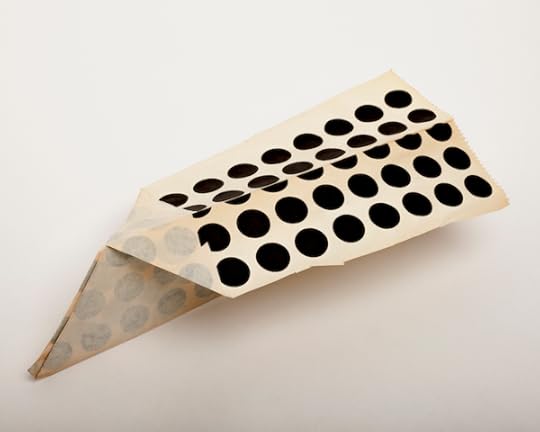


For more than twenty years, Harry Smith (1923–1991) collected paper planes that he found on the streets of New York. Now 251 planes have been documented in Paper Airplanes: The Collections of Harry Smith Catalogue Raisonné, Volume I, a book showcasing Smith’s collection. Jason Fulford, co-founder and publisher of J&L Books, photographed the planes before Anthology Film Archives donated them to the Getty Research Institute, in California. Fulford, who did not know Harry Smith during his lifetime, was taken by the planes and their whimsical nature. As the photographic process unravelled, the idea of sharing the photographs to a wider audience became inevitable.
According to various sources there are countless more planes waiting to be found. When Smith’s “spiritual wife,” the Beat muse Rosebud Feliu Pettet was interviewed by Andrew Lampert, an editor of the book and Curator of Collections at Anthology Film Archives, she said that there were “multiple” boxes full of planes, “meaning more than two, less than 50.” According to a 2003 article in Frieze, Smith catalogued and filed planes away in five large cardboard boxes, and in 1984, donated his collection to the National Air and Space Museum in Washington D.C: “Then, as if lost in a pulp-hungry Bermuda triangle, they disappeared.” In 1994, when Anthology Film Archives requested the planes, only one box appeared. Despite that, when Andrew Lampert and John Klacsmann, both editors of the book, spoke to paper aeroplane experts they reassured them that there has never been such a thorough collection.
Each of the planes tells a different story, through different materials — yellow telephone book pages, notebook paper, colored construction paper, a menu for the nightclub Max’s Kansas City. The planes carry New York’s unique history, having survived the dirty, busy streets before being salvaged from an uncertain fate by Smith. Smith’s core interest in collecting was always anthropological: on his planes, he logged the location and time of each discovery, sometimes including detailed descriptions such as which side of the street the plane was found. Another note accompanying the paper planes included a classification system to denote the number of folds used to make the paper planes. In addition to collecting paper planes, Smith avidly sought after other obscure objects, including Ukrainian easter eggs, Seminole textiles and tarot cards. Showing the paper planes is simply discovering “the tip of an iceberg,” says Lampert. Indeed, after photographing the planes, Fulford continued to explore and document Smith’s massive collection of string figures, which led to String Figures: The Collections of Harry Smith Catalogue Raisonné, Volume II.
Defining Harry Smith is no easy feat: he was an artist, filmmaker, musicologist, anthropologist, and occultist — and was therefore known and respected in a variety of different artistic communities. He was, “an underground superstar whose fame rests in the ability to not pin him down as one thing or another,” according to Lampert. The photographs in these two volumes continue to piece together Smith’s vast, mysterious, and impressively creative character.
The post On Paper Airplanes: The Collections of Harry Smith appeared first on Aperture Foundation NY.
Aperture's Blog

- Aperture's profile
- 21 followers

