
Aperture's Blog, page 14
November 12, 2024
For Sohrab Hura, Photography Is a Way of Feeling Visible
For a period of about three years during his mid-twenties, Sohrab Hura strived to be what he called an anti-photographer. Doubt had begun seeping into his work. In particular, he felt conflicted about the ways in which documentary photography generates images from other people’s oppression. Regarding his own role, he quotes Arundhati Roy, who writes: “The trouble is that once you see it, you can’t unsee it. And once you’ve seen it, keeping quiet, saying nothing, becomes as political an act as speaking out. There’s no innocence. Either way, you’re accountable.”
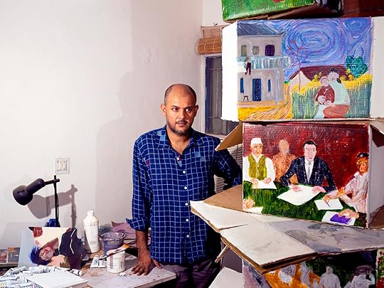
In his first-ever US survey, Sohrab Hura: Mother, at MoMA PS1, the artist, who was born in Chinsurah, India, in 1981, reconsiders the possibilities of images. His body of work, spanning two decades, includes photography and film as well as drawing, painting, and writing—an astonishing range for someone who is self-taught. While the exhibition features experimentations with different media, Hura insists all of his work remains image driven.
 Sohrab Hura, Self-portrait, 2024
“The moment when I think of it as a survey show, suddenly I become the center of it, and then it becomes about my journey,” he told me recently. “But for me, really, it’s about the multiple lives of images, and that also allows me to look at any of these older works as being no different, in terms of there not being any kind of hierarchy compared to some of the new works.”
The curator Ruba Katrib had been following Hura’s career when he began shifting from a primarily lens-based practice to other forms of art making. She sees a continuity to his approach, saying, “For him, it’s all about what an image can do and the stories it can tell.”
When Hura first picked up a camera as a teenager, like so many aspiring photographers before him, he saw the power in making something seen. “I’d been feeling invisible,” Hura, now forty-three, recalled of his younger self. “And so, photography became a way to feel visible, to feel like I could touch someone, which I felt I wasn’t able to for a long time.”
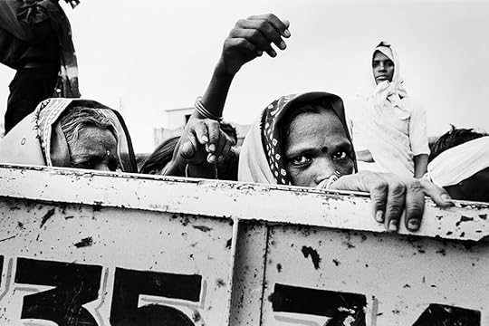
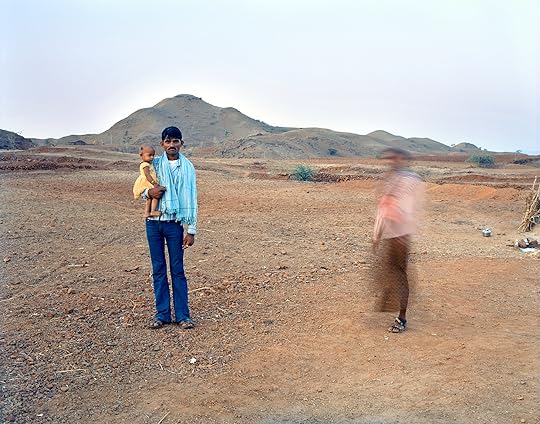
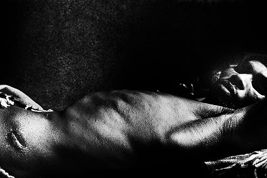 Sohrab Hura, Details from the series Land of a Thousand Struggles, 2005–6
Initially, photography promised immediate transmission of the stories he felt were most urgent. “I started photography at a time when I believed that photography could change the world,” he said. Youthful idealism combined with a desire to travel led him to document what he was witnessing for local press. One of his earliest series, Land of a Thousand Struggles (2005–6), exposes the grim reality of impoverished rural communities in central India. Black-and-white photographs capture women, children, and older people swinging pickaxes, breaking rocks, and engaging in other physical labor. Candid and wide shots show workers gathering at a rally. The portrait of an injured man lying down, a wound healing into a scar on his bare left hip, reveals the brutal aftermath of police violence that targeted protestors. These encounters provided Hura, then a recent graduate student with a master’s degree in economics, his first introduction to grassroots politics.
Hura’s handwritten captions contextualize the images in the series, as if to acknowledge the link between the lives of the people he was recording and his own. It was an entanglement he understood from the beginning. “Right from the start,” he said, “I felt a bit of a dichotomy where, on the one hand, I wanted to do photography that would nourish my heart, and at the same time there was a voice in my head that would tell me that I had the responsibility to carry people’s stories forward.”
 Sohrab Hura, Still from Bittersweet, 2019. Video, color, sound, 13 minutes, 48 seconds
Turning to video allowed Hura to expand upon the realist mode of storytelling. In Pati (2010/20), he narrates his experience revisiting the region he had photographed years earlier over still images from his previous series. Near the end of the eleven-plus-minute film, he keeps the camera rolling on a figure standing in front of a stark, barren landscape. There’s no sound except for the wind. A boy gradually comes into focus. The fifteen seconds of footage offers a glimpse of something more truthful, perhaps.
“This question of honesty was really important to me,” Hura said about what was troubling his work. As he became more technically skilled, he found himself growing increasingly cynical. “I knew exactly what photograph to make, to make someone feel what way, you know? So it started to feel performative,” he said.
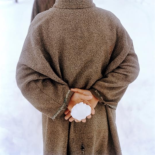 Sohrab Hura, Untitled, from the series Snow, 2015–ongoing
A series he made later in his career, Snow (2015–ongoing), pushes the visual language of documentary photography even further. The photographs allude to the conflict in Kashmir without showing explicit violence or trauma. Only a distant shot of uniformed soldiers hints at the heavy military presence. Instead, Hura observes the region through its phases of winter, directing the viewer’s gaze to the back of a person in a frayed coat holding a snowball, bright orange fruit floating in a thawing puddle, a pair of hands uprooting dandelions from the grass. These details subvert the exploitation and voyeurism often associated with photojournalists who parachute into places of conflict.
Paired with Snow, a four-channel video plays television footage from the 1980s and ’90s that includes news clips representing Kashmir as a place of “terrorism” and Bollywood movies romanticizing it as a backdrop—stereotypes Hura would have been exposed to while growing up in India. The work speaks not only to problems of representation, but also to the artist’s feelings of complicity.
 Sohrab Hura, The Coast, 2013–19
Hura has long wrestled with his role as a photographer and confessed to becoming “a bit jaded” about what he was doing. “People would be really generous to me,” he said. “They would open up their lives, their stories. They would have this expectation that I would change their life by taking the stories back, and every time I had to tell them that that wasn’t the case.” Eventually, he concluded, “photography had its limitations.”
His project The Coast (2013–19), a collection of pigment prints, a single-channel video, and an artist’s book, arose as a critique of image-making. Hura describes the images as “a little intrusive, a little violent” in feeling. Indeed, an ominous mood pervades the scenes from a religious festival taking place along India’s southernmost coast. Accompanying the photographs, the seventeen-and-a-half-minute film slows down footage of people running and jumping into the surf at night, which plays over tense, droning audio that radiates into the other galleries of the exhibition. The images also appear in the book, interspersed among twelve fictional short stories by the artist. On a practical level, the photobook serves as a method for easily transporting and presenting the work. Its curation also manifests as a kind of logic. In The Coast, the photographs sometimes repeat, or “glitch”—a term Hura applies to resisting the so-called perfect image.
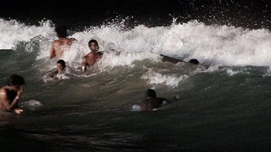 Sohrab Hura, Still from The Coast, 2020. Video, color, sound, 17 minutes, 27 seconds
The Lost Head and the Bird (2019) rescrambles many of the same images in a ten-minute-long split-screen video. Katrib characterizes Hura’s practice as being “quite iterative,” whereby images will reappear in different bodies of work. “It’s a practice that builds upon itself,” she said. Additionally, the film, which was previously screened at the Museum of Modern Art in 2021, incorporates “appropriated material” from pop culture, current events, and media circulating on WhatsApp. The sequencing mirrors how people in India—and globally—are inundated with manipulated images and propaganda disguised as news. In conversation, Hura said he isn’t afraid of technology such as AI. He’s more concerned with structures of power and how they influence our perceptions of reality. He frequently compares the image to a “mask.”
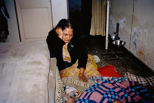
If image-making itself is a kind of obfuscation, then Hura realized he needed to confront his truth. When he was seventeen years old, his mother was diagnosed with acute paranoid schizophrenia. As he was taking pictures of other people in their most vulnerable states, a thought stayed with him: that it was “easy for me to photograph someone else’s mother.” He continued, “But somehow I wasn’t able to photograph my own mother.” He worried that made him a hypocrite. And so, as difficult as it was, he decided to photograph his mother.
 Sohrab Hura, Untitled, from the series The Songs of Sparrows in a Hundred Days of Summer, 2013–ongoing
All works courtesy the artist and Experimenter, Kolkata and Mumbai
She smokes a cigarette in bed in a black-and-white photograph published in the book Life Is Elsewhere (2015), one of three that Hura made about her. In Bittersweet (2019), a video that rotates through images like a slideshow, she’s kissing her dog Elsa. Again, she’s shown smoking in a pastel drawing from the book Things Felt but Not Quite Expressed (2022–24). Along the gallery wall, dozens of drawings hang like family portraits. Hura, who began drawing and painting only recently, said he was searching for “softness” within the image.
In the installation Timelines (Delhi, Mother, Sheila, The Bus, The School, The Olive Tree, Bees, Protest, and Mail) (2024–ongoing), he asks, Where do our stories begin? Painting with acrylics on cardboard boxes, he illustrates various memories of his mother’s life, including her sleeping in bed with Elsa, as well as moments from history. “Depending on how the box is folded, you see a different combination of stories, a different combination of points of time,” he said. “In this timeline we see many different points of time, and we make our stories based on that.”
Sohrab Hura: Mother is on view at MoMA PS1, Long Island City, New York, through February 17, 2025.


November 8, 2024
Announcing the Winners of the 2024 PhotoBook Awards
Paris Photo and Aperture are pleased to announce the winners of the 2024 Paris Photo–Aperture PhotoBook Awards—an annual celebration of the photobook’s enduring role within the narrative of photography. The awards recognize excellence in three major categories of photobook publishing: First PhotoBook, PhotoBook of the Year, and Photography Catalog of the Year. A final jury met in Paris on November 7, 2024, to select this year’s winners. The jury included Kim Bourus, founder and director, Higher Pictures; Azu Nwagbogu, curator; Lisa Sutcliffe, curator, Department of Photographs, Metropolitan Museum of Art; Jean-Baptiste Talbourdet-Napoleone, creative director, M le magazine du Monde; and Mame-Diarra Niang, artist.
This year, Paris Photo–Aperture PhotoBook Awards received 940 books from fifty-nine countries around the world, including standout entries from Argentina, Japan, Indonesia, New Zealand, and elsewhere. On September 18–20, the shortlist jury met in New York for three concentrated days of review and deliberation, narrowing the entries down to a shortlist of thirty-five titles. The shortlist jury consisted of the following international team: Negar Azimi, editor in chief, Bidoun; Jacqueline Bates, photography director, Opinion, New York Times; Michael Famighetti, editor in chief, Aperture; Nontsikelelo Mutiti, director of graduate studies in graphic design, Yale School of Art; and Anna Planas, artistic director, Paris Photo.
Related Stories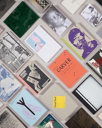 PhotoBook Awards A Look Inside the Titles Shortlisted for the 2024 PhotoBook Awards
 A presentation of the thirty-five books shortlisted for the 2024 PhotoBook Awards is currently on view at Paris Photo through November 10 and will be on view at Printed Matter in New York, January through February 2025, and then to the Leipzig Photobook Festival, in Germany, in March, with additional venues to be announced.
Below, read about this year’s winning titles.
Photography Catalog of the Year

Shining Lights: Black Women Photographers in 1980s–90s Britain
Joy Gregory, editor, and Taous Dahmani, associate editor
Autograph and MACK, London, Design by Morgan Crowcroft-Brown
Shining Lights, edited by artist Joy Gregory and Taous Dahmani, is a restorative anthology that charts Black women’s essential but often overlooked contributions to Britain’s photography scene in the late twentieth century. Extensively researched and vividly illustrated, the book showcases a tremendous range of visual materials, including photographs from over fifty artists, archival images, documents, and more. This constellation of visual resources is carefully organized by theme—self-portraiture, family, and community activism—and includes scholarly essays, personal reflection, a roundtable discussion, and a detailed timeline. “I love the use of the materials; there’s a friendliness to the cardstock cover, and beautiful neon spine that carries through in how certain elements get highlighted within the running text,” remarks juror Nontsikelelo Mutiti. “For a project so comprehensive, it feels very generous and inviting. I’m so glad that this project exists.”
 Maxine Walker, from the series Untitled, 1987
Courtesy the artist
 Joy Gregory, Autoportrait, 1990
Commissioned by Autograph. Courtesy the artist
First PhotoBook Award
Born from the Same Root by Tsai Ting Bang
Self-published, Taipei, Design by Tsai Ting Bang and Shū Hé Zhì
Tsai Ting Bang’s Born from the Same Root forms a moving portrait of the artist’s older brother Hsien and reflects upon their shared family trauma. The boys grew up in separate homes, and as a young adult, Hsien began suffering from mental health issues and cut contact with the family for three years. Tsai uses the book to explore the estrangement, misrecognitions, and mystery at the heart of their bond, interweaving archival family photographs and his own tender portraits of Hsien and his day-to-day life. “The book tells a simple but powerful story and is full of lovely, unguarded moments,” says juror Anna Planas. The intimately sized volume involves a clever bipartite structure, forcing the reader to turn the pages of the book in opposition, as one might open a gatefold. Per Planas, “we loved how the design thoughtfully reflects both the distance and closeness of the brothers’ relationship.”
 Tsai Ting Bang, from Born from the Same Root, 2024
Advertisement
googletag.cmd.push(function () {
googletag.display('div-gpt-ad-1343857479665-0');
});
PhotoBook of the Year
Disruptions by Taysir Batniji
Loose Joints Publishing, Marseille, France / London, Design by Loose Joints Studio
Opaque, yet frighteningly urgent, Taysir Batniji’s Disruptions compiles pixelated screenshots from WhatsApp video calls to his family in Gaza, taken between April 2015 and June 2017. The fragmentary aesthetic of fragile phone connections offers a metaphor for the breakdown of the psyche in the midst of daily life compromised by conflict. This compact softcover houses about seventy images, which are accompanied by a poignant text from photo-historian Taous R. Dahmani. Amid warped portraits and pixelated landscapes, the viewer is confronted with bursts of vibrant color signaling failed communication, broken only by solid pages of green that display the date of each call. Disruptions is an oblique but essential reflection on life under occupation. “As Gaza is obliterated in real time, Batniji’s Disruptions is a timely reminder of the precarious nature of human life,” remarks juror Negar Azimi.
 Taysir Batniji, from Disruptions, 2024
Jurors’ Special Mention
i am (not) your mother by Hady Barry
Self-published, Penumbra Foundation, New York, Design by Hady Barry
In 2002, amid a civil war, Hady Barry and her family fled Côte d’Ivoire to resettle in Senegal. As her mother left for the United States to seek asylum, and her father was mostly absent, traveling for work, Barry, age thirteen, found herself taking care of three younger siblings. Her self-published photobook i am (not) your mother interlaces portraits and documentary photographs, archival imagery, journal entries, and transcribed conversations, unpacking the trauma of an adolescence cut short by the tremendous responsibilities of parenting. The book’s imagery alternates between the vivid, nostalgic palette of rediscovered family photographs and the black-and-white of Barry’s own austere pictures of nature, people, and interiors. “There’s this parallel with her personal story and the personal way she made the publication,” says juror Anna Planas. The book’s smaller 6 ½-by-9 inch format and use of one-of-a-kind Risograph printing, befit the intimacy and rawness of Barry’s painful subject matter.
 Hady Barry, from i am (not) your mother, 2024
An exhibition of 2024 PhotoBook Awards Shortlist will be on view at Paris Photo through November 10, and will travel to Printed Matter in New York City in January 2025.
October 31, 2024
Rafael Goldchain’s Portraits of Grief and Piety in Latin America
Over the last decade, the Art Gallery of Ontario embarked on an initiative to incorporate twentieth-century photography detailing life in Argentina, Chile, Nicaragua, Honduras, Guatemala, El Salvador, and Mexico into its collections. Beyond poetic images created by Graciela Iturbide and Manuel Álvarez Bravo, the Toronto museum also houses photographs of protests and coups. Such grim subjects might be expected in a Latin American collection: during the latter half of the century, the region was convulsed by civil wars, a genocide, dictatorship, and murderous US intervention.
One recent acquisition provides an unexpected twist: lushly colored images by Rafael Goldchain, a Chilean-born photographer of Polish Jewish heritage, who settled in Toronto in the 1970s and in the mid-1980s traveled on a grant to Mexico and Central America. There, he took pictures of residents who struggled on the sidelines of the Guatemalan civil war, CIA interference in Honduras, and Nicaragua’s revolution. Yet instead of focusing on conflict’s “decisive moments,” Goldchain showed lyrical glimpses of people’s desire, grief, repose, and piety.
 Rafael Goldchain, A Young Man’s Grave, Nicaragua, 1986
Such is the case in A Young Man’s Grave, Nicaragua (1986), which reveals a collage adorning a final resting place. The artwork frames a studio portrait of the deceased, a wide-eyed, thinly mustachioed stripling surrounded by dried flowers, clouds, and angels. The offering is saturated with intense blues. “I was in a cemetery in Matagalpa,” Goldchain told me recently, mentioning the city in west-central Nicaragua involved in the Iran–Contra conflict. “Had this young man fallen as part of that? I didn’t know. I had heard that there was a tradition where children who pass away automatically become angels. This boy was of the age that he could be both, a soldier and an angel.”
Goldchain’s ability to freeze tender, ambiguous moments against the backdrop of political violence constitutes a distinct kind of conflict photography. The 1980s “were the era of Susan Sontag and the whole Goya perception of pain,” AGO curator Marina Dumont-Gauthier explained. She referenced Sontag’s On Photography (1977), which inveighs against the power of war images to anesthetize viewers to suffering. “What Rafael is offering is so different,” she said. According to Dumont-Gauthier, back when Goldchain photographed his images, people were not ready to view complex and polysemous images of war “because it somehow felt disingenuous.” She thinks the time is now ripe for Goldchain’s approach. “The pain is still there. Once the war is over, these stories continue.”
 Rafael Goldchain, Easter Procession, Santiago Atitlán, Guatemala, 1986
Goldchain presents the continuing story in works such as Easter Procession, Santiago Atitlán, Guatemala (1986). Depicting ten men carrying a tinseled casket that appears to contain a statue of Jesus Christ in the tradition of Santa Semana, the picture achieves a forward propulsion amplified by the undulating line created by the heads and shoulders of the pallbearers. The image’s mingling of beauty and mourning is complicated by the fact that four years after it was taken, army soldiers would open fire on an unarmed crowd of Tz’utujil Mayans in Santiago Atitlán as part of the atrocities that punctuated the country’s civil war.
“I wasn’t a war photographer,” Goldchain told me. “I sometimes took photos of bullets in walls, semi-destroyed ruins, but those pictures didn’t have any of the complexity that I was after. And I didn’t want a bullet in the heart either. My work is more elliptical.”
Related Items
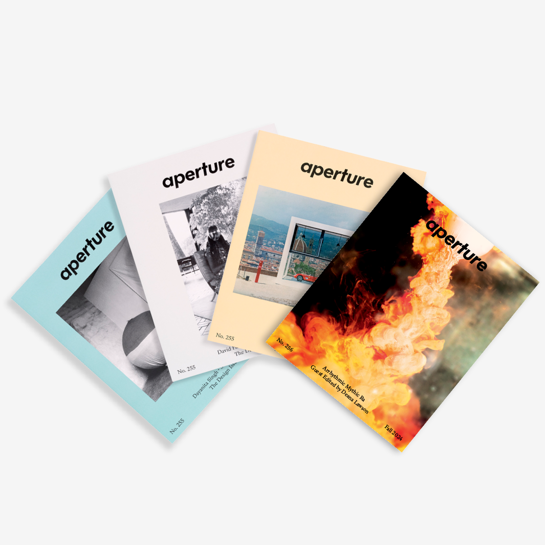
Aperture No. 256
Shop Now[image error]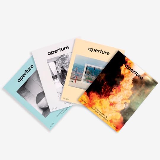
Aperture Magazine Subscription
Shop Now[image error]Goldchain’s allusive impulses led to Nocturnal Encounter, Comayagua, Honduras (1987), which initially reads like a snapshot of carefree lovers. A man wearing a striped blue shirt smiles down at a dark-haired woman who sways her hips. The innocent-looking assignation takes place in a turquoise-and-cerulean alleyway. But knowledge of the political context introduces menacing undertones of male dominance to the photograph. “During the Iran–Contra affair, there was a very large air base in Honduras called Palmerola. There were a lot of bars where American soldiers met lovely Honduran girls. This is a red-light district, a meat market.”
“Rafael’s work allows people to engage with photography that tells a fuller story,” Dumont-Gauthier said, an affirmation of Goldchain’s Mexican and Central American images that resonates with the recent institutional validation of Latinx photographers, such as Louis Carlos Bernal and Paz Errázuriz, who breathed new life into the documentary tradition in the 1970s and 1980s. The curator also noted Goldchain’s deliberate use of color, suggesting that “Blue is associated with nostalgia. The colors help us process our own emotions. If the photo were against a red backdrop, it would have a completely different meaning.”
 Rafael Goldchain, A Tehuantepec Maiden, Juchitán, Oaxaca, México, 1986
All images courtesy the artist
Goldchain’s associative palette perhaps finds its deepest expression in A Tehuantepec Maiden, Juchitán, Oaxaca, México (1986), where a girl wearing a huipil stitched with crimson-and-pink florals stands against a mural of the Virgin of Guadalupe. As in A Young Man’s Grave, Nicaragua, a painted sky forms the backdrop. The jaunty artificial flowers in the girl’s hair contrast with her stoic expression. Does her steadfast look telegraph the larger struggle of armed forces disappearing and murdering Oaxacan dissidents during this era? The girl’s gaze seems almost unnervingly grave in light of that history.
“She was fifteen years old,” Goldchain recalled, nodding his head contemplatively. “When I first showed these photos, people said I was noncommittal and too artistic and aesthetic. But I could only be who I could be.”
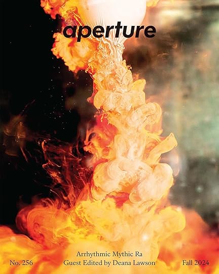
This article originally appeared in Aperture no. 256, “Arrhythmic Mythic Ra,” guest edited by Deana Lawson.
October 26, 2024
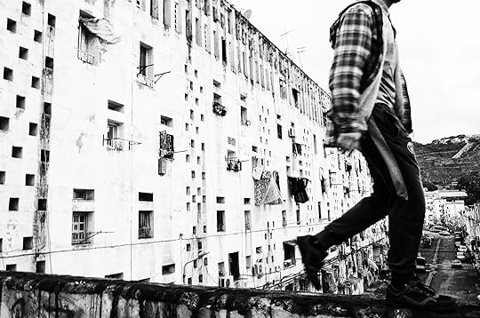
What Is Street Photography Today?
The street and the camera were destined to collide. In retrospect, it seems obvious that the first photographs that managed to freeze objects in motion would be taken on the bustling streets of newly industrialized nineteenth-century cities. That era belonged to the crowd, and to the savvy navigators of the endlessly renewable theater of sidewalks and boulevards the world over, those flaneurs whom the poet Charles Baudelaire, in his essay “The Painter of Modern Life,” pegged as one of the nineteenth century’s most fertile archetypes. Baudelaire called for an art that would dive headfirst into the bracing water of the everyday. Impressionism followed, with its gauzy tableaux of bourgeois life, but in time it became clear that it was not the likes of Baudelaire’s titular, now-forgotten painter who were best suited to document the upheavals of the modern era. The pace of everything was quickening, and the newfangled camera was the perfect tool to slow things down, trapping the chaos in amber. Photographers became the ultimate flaneurs, shaping our collective vision as they wandered through the world.
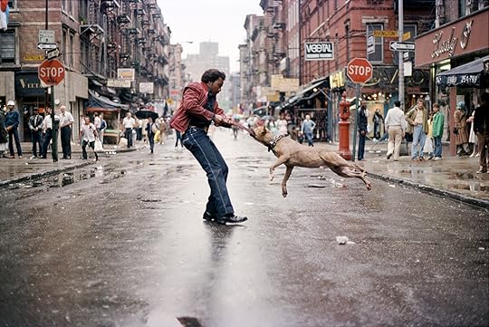 Jamel Shabazz, Man & Dog on the Lower East Side, 1980
Courtesy the artist
Street pictures soon became practically synonymous with serious photography. The introduction of the fast, handheld 35mm Leica, in 1925, disencumbered roving shutterbugs from their bulky gear, allowing artists like Alexander Rodchenko to make a new kind of image that was as dynamic and spontaneous as the streets themselves. After that, it was off to the races. In 1952, inspired by the Surrealists’ obsession with chance encounters and striking juxtapositions, Henri Cartier-Bresson coined the indelible phrase “the decisive moment.” There followed Robert Frank’s Beatnik-era, dirge-like book The Americans; the epochal exhibition New Documents, featuring Diane Arbus, Lee Friedlander, and Garry Winogrand, at MoMA, in 1967; the Pop art–adjacent work of William Eggelston carved out space for previously déclassé color photography in hallowed museum halls; and, finally, the postmodern turn in the late 1970s, which laid the groundwork for the innovative scenes by Philip-Lorca diCorcia and Jeff Wall, deploying what were by then well-worn street photography tropes in the service of creating cinematic images that blended fact and fiction or were wholly fabricated for the camera.
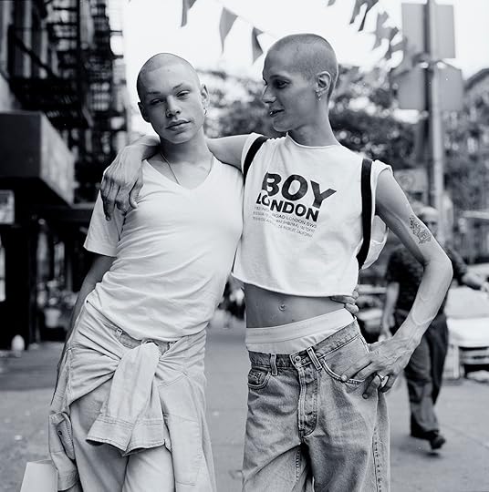 Janette Beckman, Jean and Chris, East Village, New York City, 1995
Courtesy the artist
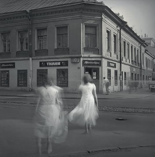 Alexey Titarenko, White Dresses, St. Petersburg, 1995
© the artist and courtesy Nailya Alexander Gallery, New York
 Daidō Moriyama, Pretty Woman, 2017
© Daidō Moriyama Photo Foundation
Or anyway, that’s the usual history of street photography, made up of mostly white male Westerners. While I could have mentioned the work of photographic giants like Helen Levitt, Manuel Álvarez Bravo, Vivian Maier, Gordon Parks, Daidō Moriyama, Mohamed Bourouissa, or others who have a rightful place in the street photography canon, this was pretty much how the story was relayed to me, as I studied photography in college. Clearly, that blinkered history needed to make room for some heterodox voices.
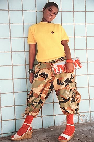
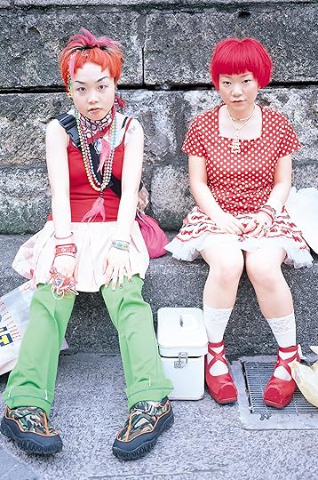
A sprawling new exhibition, We Are Here: Scenes from the Streets, currently on view at the International Center of Photography (ICP), in New York, has this aim. The show, curated by Isolde Brielmaier, with the assistance of Noa Wynn, features thirty-four artists working in twenty-two different countries. Some of the work stretches back as far as the 1970s (in a show-within-a-show that the curators have dubbed “On the Shoulders of Giants,” which focuses on New York street photography), but the lion’s share of the pictures on view are from the last ten years or so. Arranged in four broad categories—street style, neighborhood and community, protest and advocacy, and urban landscapes—We Are Here strives to provide a picture of the state of street photography now(ish), and to tell us something about the state of our world as a result.
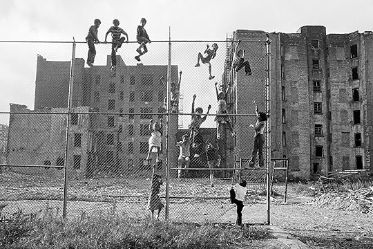 Martha Cooper, Kids climbing a fence in an abandoned lot, Lower East Side, NYC, from the series Street Play, 1978
Courtesy the artist
We Are Here is admirably diverse, and many of the pictures are great. Highlights include the lush, wacky, fashion-forward work that Feng Li has been making on the streets of Chengdu, China; Romuald Hazoumè’s cheeky sculptural typologies of laden bike riders in Benin; the oneiric pictures of 1990s Saint Petersburg by Alexey Titarenko; a collection of era-defining 1990s Japanese street-style pictures that Shoichi Aoki shot for his magazine FRUiTS; and exuberant pictures of children’s play in gritty 1970s New York by graffiti documentarian Martha Cooper, which elaborate on earlier projects by Helen Levitt and Arthur Leipzig. Yet the exhibition is also dogged by a nagging question: Is twenty-first-century street photography hopelessly outmoded?
Street photographers fall into essentially three sometimes overlapping camps. First are the descendants of Cartier-Bresson, who stalk the sidewalks in the hope of catching some serendipitous urban gestalt, which is either compositionally gorgeous, weirdly poignant, funny, freighted with sociopolitical import, or some combination thereof. Second are those engaged in a long-term project of social stock-taking, like Walker Evans or Robert Frank, who use the street to a weave semi-personal narrative about the character of a time and place. (This place, historically, has been America, though there are notable exceptions to be found in projects like Paul Graham’s New Europe.) Third are those photographers who inflect their street photographs with their personal presence, whether formal or emotional, such that the line between the inner and outer world becomes hopelessly blurry: the photographic equivalent of New Journalism, with Diane Arbus and Lee Friedlander at the helm rather than Joan Didion and Tom Wolfe.
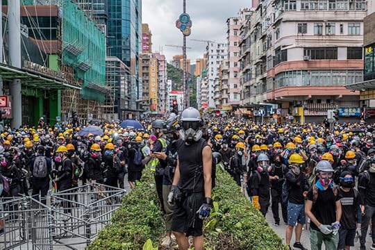 Lam Yik Fei, Riot police officers fire teargas during clash with protestors outside Shum Shui Po police station in Hong Kong on 11 August, 2019
Courtesy the artist
 Grace Ekpu, Protesters at the Lekki-Ikoyi tollgate calling for an end to the rogue police unit, Special Anti-robbery Squad, Lagos, Nigeria, October 2020
Courtesy the artist
Aside from the work in We Are Here that is best described as reportage—namely the pictures of protest movements grouped together under the “protest and advocacy” subheading—much of the exhibition consists of pictures that rehash previously extant styles of street photography, but in an era that can no longer be called modern. I’ll leave it to others to tell what our era could be rightly called—“postmodern” is entirely too retro—but we can be certain that the space that most exemplifies it is no longer the street. Perhaps, as the anthropologist Marc Augé argued in his 1995 book Non-Places: Introduction to an Anthropology of Supermodernity, it is instead one of the featureless spatial products of globalization—airports, supermarkets, shopping malls, chain hotels—that form a fractured, yet uncannily contiguous purgatory, scattered across the earth. More likely it is the space right under your nose, where you are reading this text: cyberspace.
Given the pull that the Internet has over our daily lives, it is almost shocking how little technology shows up in the pictures on view at ICP. By my count, there are only five pictures in which smartphones even appear, and just two of these show people gazing into them, perhaps the most commonplace sight in any city anywhere. Beyond that, almost none of the images contain technological tells that they were taken anytime this century. On the production end, only Michael Wolf, who made a collection of found street photographs using Google Maps, has utilized technology that would be unfamiliar to the modernists. A feeling of anachronism prevails.
 Nontsikelelo Veleko, Nonkululeko, 2003–4
Courtesy the artist
 Shoichi Aoki, from the series FRUiTS, 1998
Courtesy the artist
Even people’s manner of dress, which Baudelaire insisted was key to taking the temperature of any age, looks temporally fuzzy in the exhibition. Save for some bold, funky takes on traditional African garb captured by Trevor Stuurman in Dakar, Senegal, a few cutting-edge looks found in Feng Li’s pictures, and the presciently chic fashions captured in South African cities by Nontsikelelo Veleko twenty years ago, the clothes people wear are mostly a drab parade of generic causal wear, the fast fashion and sportswear slop that sloshes out of the globalized garment industry trough. The most futuristic looks in the bunch hail, paradoxically, from the past—Aoki’s pictures of Japanese youth taken nearly thirty years ago.
Perhaps the former sense of technological anachronism is an indication that contemporary street photographers are averse to depicting the banalizing aspects of our technological society, which have steadily made the world uglier, and the public sphere less vibrant. (Even back in the 1990s, an aging Helen Levitt lamented: “Children used to be outside. Now the streets are empty. People are indoors looking at television or something.”) Maybe, similarly, street photographers avoid photographing excessively trendy fashionistas because they fear their pictures will be defined by the clothes they capture. Or the feeling that time is out of joint in this exhibition is a telling sign of the kind of cultural stagnation that Mark Fisher, citing the Italian philosopher Franco Berardi, called the “slow cancellation of the future.” Likely all of the above. But it is also the case that as we exited the modern age and migrated the dynamos of capital and social life online, the world has begun to mostly transform off stage, becoming governed not by the life of the street, but through subtle shifts in the digital pleroma.
 Farnaz Damnabi, Untitled, Birjand, Iran, 2017
Courtesy Farnaz Damnabi and 29 Arts In Progress gallery
 Anthony Hernandez, Screened Pictures X #90, 2018–19
Courtesy the artist and Yancey Richardson
In some ways, this is an extension of an old problem. Walter Benjamin, in his 1931 text “A Little History of Photography,” complained that the photograph “can endow any soup can with cosmic significance but cannot grasp a single one of the human connections in which it exists.” To elaborate on this, he quotes Bertolt Brecht, who observed that “less than ever does the mere reflection of reality reveal anything about reality. A photograph of the Krupp works or the AEG tells us next to nothing about these institutions. . . . The reification of human relations—the factory, say—means that they are no longer explicit.” But, in ways that Benjamin and Brecht could scarcely have imagined, our situation has become even more abstract. If a photograph could reveal “next to nothing” about a world run by the factory system, consider how much less it must reveal about a world run by algorithms.
 Youcef Krache, Climat de France, Algiers, 2016
Courtesy the artist and Collective 220
We now live in the era of the so-called black box, ruled by systems whose internal workings are opaque even to their creators. Our sociopolitical world is increasingly governed by social media algorithms which have sowed division and ignited civil unrest, either as the result of an unhappy accident of their flawed designs or through the malicious machinations of state actors and shady billionaires. (Even street protest movements, which We Are Here puts forward as triumphant engines of social change, have become social media–engineered phenomena, which rarely achieve their stated goals, and, conversely, give political ammunition to forces that oppose them. As the filmmaker Adam Curtis, in his BBC documentary Hypernormalisation, and the journalist Vincent Bevins, in his book If We Burn: The Mass Protest Decade and the Missing Revolution, have both pointed out, the Internet age makes it easy to get people to the streets, but has not made it easier to figure out what to do after they get there, which is the tricky part). The strings of our economy are pulled by supercomputers running high-frequency trading algorithms like BlackRock’s Aladdin, which now manages in excess of twenty-one trillion dollars in assets, likely more than the GDP of any country on earth. The truth value of images themselves, and their impact, have never been more questionable, as we are fed a constant slurry of algorithmically optimized and increasingly artificially generated “content,” managed by vast server farms that are quietly sucking our aquifers dry and rudely shoving aside the pesky carbon emissions targets that stand in the way of promised progress. Soon, it seems, the whole of our reality might be shaped by our encounter with a fundamentally alien, super powerful AI. How can we possibly hope to capture this world from street level, using as blunt and as literal a tool as a camera? Perhaps we must return to Baudelaire’s plea for the creation of a contemporary vision of contemporary times, and try to chart a new way forward.
We Are Here: Scenes from the Street is on view at the International Center of Photography, New York, through January 6, 2025.
October 18, 2024
Aperture Celebrates 2024 Gala
How Emmet Gowin Defines Intimacy in Photography
October 11, 2024
Behind the Scenes of Aperture Magazine’s Design Refresh
This summer, Aperture enjoyed a subtle transformation. Working closely with the magazine’s editors, the London-based studio A2/SW/HK—Scott Williams and Henrik Kubel—drew inspiration from Aperture’s rich seven-decade design history to devise a format that better reflects what readers want in a photography magazine today. We unveiled the results in June with an issue titled—what else?—“The Design Issue,” which explores photography’s relationship to design, from fashion to architecture to the printed page. Our fall issue—released in September and titled “Arrhythmic Mythic Ra”—finds guest editor Deana Lawson reimagining the magazine’s format in her own way. Here, Williams talks to designer Rob Giampietro about the details that went into perfecting Aperture’s new look. —The Editors
 Details of Aperture, Summer 2024, “The Design Issue”
Rob Giampietro: How did this project begin? What was the brief?
Scott Williams: Early last year, Aperture asked how we felt about working on a design refresh of the magazine. It had been so long since we were brought on to redesign the magazine, in 2012, and it felt like time for a review. Typically, our process is to start every project afresh and to work from the ground up, exploring everything from formats to grids to printing techniques to designing typefaces. But the challenge here was to design with assets we’ve already created, with renewed criteria.
The key elements of the brief were to explore a new, smaller format, to develop a new approach to the front cover design, to explore a more prominent Aperture nameplate on the cover, and to rethink the table of contents. That said, a small change such as adjusting the format will have a knock-on effect on almost every part of the magazine.
Another early suggestion from Aperture, a brilliant one, I think, was the idea of using a single weight of the Aperture Serif font family as the primary typeface for the entire magazine. The ramifications of this are quite dramatic—previously, we were working with a palette of twenty to thirty fonts from the Aperture Sans and Serif type families. Suddenly, it’s one font with a supporting typeface.
 Aperture Magazine Subscription 0.00 Get a full year of Aperture—the essential source for photography since 1952. Subscribe today and save 25% off the cover price.
[image error]
[image error]
Aperture Magazine Subscription 0.00 Get a full year of Aperture—the essential source for photography since 1952. Subscribe today and save 25% off the cover price.
[image error]
[image error] In stock
Aperture Magazine Subscription $ 0.00 –1+ View cart DescriptionSubscribe now and get the collectible print edition and the digital edition four times a year, plus unlimited access to Aperture’s online archive.
Giampietro: It’s rare for a print redesign to have a strong focus on usability, but that seems to have been an important element of this one—and it’s a welcome change. I certainly feel the difference of the smaller trim size in handling the magazine.
Williams: Usability is absolutely key in all design. Yes, a new design should be bold, ingenious, playful, inspiring, or be able to pique a user’s curiosity, but surely not at the expense of functionality. The refresh was largely prompted by Aperture’s desire to explore a new format, one that felt more comfortable in the hand and more convenient to carry and read on the go. Ever since the original redesign, we had been very conscious of the size and proportion of the art that features in the magazine, so we decided to build around the proportions based on the traditional 8-by-10 photograph format. The rationale behind adhering to the ratio of 8-by-10 is that full-bleed images will sit perfectly within the format with minimal cropping. Interestingly, even though we’re in a fluid, digital age when it comes to image-making, many contemporary photographers featured in Aperture are using traditional formats.
The new format has an aesthetic quality, yet it was born out of very practical considerations, which I like. It’s based on a photographic format, and there’s minimal waste on the printed sheet. It’s also more economical and responsible from a sustainability point of view.
 Covers of Aperture: Summer 1952, Fall 1957, and Summer 1967
Giampietro: Everywhere in this design, I feel typography from the past—the column lines, the historical serif, the justified text, gestures like “No. 255.” How do you think about these details in the context of the present? How do they set a different stage for us to view and learn about photography?
Williams: Some of the gestures you refer to were established for the magazine when we redesigned it in 2012. We’re certainly not trying to replicate layouts from magazines past but reacting to what a reader wants from a photography magazine today. We’re using design cues from Aperture’s rich history to help identify a design DNA, if you will, from which we can build upon.
Luckily, Aperture had recently digitized their entire archive—stretching all the way back to the first issue, in 1952. I spent a few days reviewing every issue published over their seven-decade history. It does sound a little overwhelming, but it was a fascinating journey through Aperture’s rich history and print design more generally. For example, early issues of the magazine are clearly put together by hand using primitive paste-up techniques, and then there is the transition from black-and-white to color printing, then the advent of early desktop publishing, then, finally, the era we are familiar with today.
 Covers of Aperture: Spring 2013, “Hello, Photography;” Spring 2015, “Queer;” and Winter 2015, “Performance”
A key design element that’s been present since the launch of Aperture is the use of a modernist sans serif in a bold weight, variations of which have been used for the magazine’s logotype and as a magazine text font at various times. In 2012, we created a bold sans serif font, one we now use for captions, running footers, and page numbers—all the supporting architecture of the page.
Ultimately, magazines should evolve and react to the present. I do hope the refresh feels modern and contemporary and not too reminiscent of a bygone era.

Interior spreads from Aperture, Summer 2024, “The Design Issue”
var container = ''; jQuery('#fl-main-content').find('.fl-row').each(function () { if (jQuery(this).find('.gutenberg-full-width-image-container').length) { container = jQuery(this); } }); if (container.length) { const fullWidthImageContainer = jQuery('.gutenberg-full-width-image-container'); const fullWidthImage = jQuery('.gutenberg-full-width-image img'); const watchFullWidthImage = _.throttle(function() { const containerWidth = Math.abs(jQuery(container).css('width').replace('px', '')); const containerPaddingLeft = Math.abs(jQuery(container).css('padding-left').replace('px', '')); const bodyWidth = Math.abs(jQuery('body').css('width').replace('px', '')); const marginLeft = ((bodyWidth - containerWidth) / 2) + containerPaddingLeft; jQuery(fullWidthImageContainer).css('position', 'relative'); jQuery(fullWidthImageContainer).css('marginLeft', -marginLeft + 'px'); jQuery(fullWidthImageContainer).css('width', bodyWidth + 'px'); jQuery(fullWidthImage).css('width', bodyWidth + 'px'); }, 100); jQuery(window).on('load resize', function() { watchFullWidthImage(); }); const observer = new MutationObserver(function(mutationsList, observer) { for(var mutation of mutationsList) { if (mutation.type == 'childList') { watchFullWidthImage();//necessary because images dont load all at once } } }); const observerConfig = { childList: true, subtree: true }; observer.observe(document, observerConfig); }Giampietro: Some of these gestures also feel quite “newsy,” and I know it’s been an ambition of yours to do a newspaper. Did some of that desire creep in here, in the more journal-like format of the new design?
Williams: The “newsy” feel you mention is not something we intentionally set out to achieve—though I would love to design a newspaper!—but, I think, more of a byproduct of using a classical serif-style font, set in neat justified columns. This is a common device favored by most newspapers and many magazines too. We were very aware that making the magazine smaller would have a big impact on word counts, and a simple way to mitigate this is to use a justified setting for body copy.
Giampietro: You have to be quite intentional about building the grid in these projects, since the images and type are so closely interlocked. Does that start with your own typefaces in this case?
Williams: It’s been very much an iterative process of refinement with the team at Aperture. And as we started to review early sketches and to assess how the Aperture fonts performed at the smaller trim size, we had a discussion in the studio about the font weights in the Aperture Serif font family. More specifically, we felt the Light weight was too light, and the Regular weight was slightly too heavy, so we created a new cut of the serif to work on this new scale.
Advertisement
googletag.cmd.push(function () {
googletag.display('div-gpt-ad-1343857479665-0');
});
 Luigi Ghirri, from the series Ferrari, 1985–90, in “The Design Issue”
Giampietro: One of the things I enjoy about all your work is the way that typographic gestures really have space to be seen and felt. And yet when they get the limelight, they often bring a kind of quiet confidence and understated elegance that I feel particularly in this format.
Williams: That’s very kind of you to say. I do believe those attributes you mention, including the quiet confidence, come with experience and with the time we’ve dedicated to our craft. Typography and typographic design have been a linchpin of our design approach since we founded our studio almost twenty-five years ago. Typography is a seamless and truly integrated aspect of how we work, from creating unique fonts for clients to working with type on a daily basis. It’s an aspect of design we continue to feel passionate about—so much so that we developed this strand of our practice and launched our type foundry in 2010 to include the full library of fonts.
Giampietro: Do you feel any particular connection to one of the features in this issue?
Williams: I’m immediately drawn to Luigi Ghirri’s photographs taken at the Ferrari factory. At first glance, it’s Ghirri’s unique eye and its rich visual vocabulary that appeals to me, but it is also the subject matter I find inspiring—a celebration of craftspeople working apart and together in the pursuit of excellence and with an incredible attention to detail. A true labor of love.
 Cover and interior of Aperture, Fall 2024, “Arrhythmic Mythic Ra”
Giampietro: What was issue one of the design refresh like versus issue two? How does having an artist like Deana Lawson as guest editor start to stretch and refine the design gestures from the initial redesign issue on a more applied level? Are there aspects of the initial redesign that have come more fully into focus from this collaboration?
Williams: In typical fashion, having just established a set of rules for the new-look issue No. 255, we immediately set about dismantling it with issue No. 256.
Going from the rather slow-paced first issue to the fast-paced second issue, guest edited by Deana Lawson and titled “Arrhythmic Mythic Ra,” was definitely a bit of a gear shift. Also, structurally, the issues are notably different. The customary arrangement of long- and short-form reads, including articles, interviews, and artist portfolios, was, unexpectedly, replaced with a striking series of works selected by Deana, along with a few shorter texts and poems.
Again, returning to your point about usability, poetry is unlikely to sit very well, or read or scan as it should, set justified in a narrow column. As a result, several of the original design guidelines were swiftly abandoned in service to the art. As with each issue of Aperture, some of the key design considerations are to do with flow, rhythm, use of white space, juxtaposition of images, and sequencing—this is very much front and center with “Arrhythmic Mythic Ra.”
Click here to subscribe to Aperture.
Wendy Red Star on the Power of Indigenous Art
In her dynamic photographs, the influential artist Wendy Red Star recasts historical narratives with wit, candor, and a feminist, Indigenous perspective. Red Star, who was awarded a MacArthur Fellowship in October 2024, centers Native American life and material culture through her imaginative self-portraiture, vivid collages, archival interventions, and site-specific installations. Whether referencing nineteenth-century Crow leaders or 1980s pulp fiction, museum collections or family pictures, she constantly questions the role of the photographer in shaping Indigenous representation. In the following interview with Josh T. Franco from her book Delegation (Aperture/Documentary Arts, 2022), Red Star speaks about her family history, what it was like to collaborate with her daughter, and how her multifaceted practice gleans from elements of Native American culture to evoke a vision of today’s world.
 Wendy Red Star, To Have Good Vision, from the series Picture Day, 2021
Josh T. Franco: When and where were you born?
Wendy Red Star: I was born in 1981 in Billings, Montana.
Franco: What were your parents doing at the time?
Red Star: My mom is of Irish descent, and she grew up in Colorado. She went into nursing through the army and that took her to Korea, and she was stationed there for a while. She adopted my sister there, and then came back to the States and continued her nursing career, and decided that she wanted to work on a Native American reservation. She looked into the Crow Reservation and Pine Ridge, a Lakota reservation in South Dakota, and I think one other one, and she chose to go to the Indian Health Service in Crow Agency, which is where my reservation is.
Franco: She adopted your sister before she met your father?
Red Star: Yes. She was young. I would describe my mom as being really adventurous. I could not imagine myself at that age being in a foreign country and deciding to adopt a child. Also, her decision to work on a Native American reservation and at the Indian Health Service was very progressive.
My father is from the Crow Indian Reservation, and at that time he was working for the tribe as a game warden. And they met just because everybody ends up going to the Indian Health Service at some point. I think one of his cousins was working with my mom and then introduced them.
Franco: So was it love at first sight?
Red Star: I have no idea [laughs]. My parents never got married. And I have four half-siblings from my father—he was forty when I was born, and my mom, I think, was twenty-nine.
I have a very special bond with my father. He was able to get my grandfather’s land out of a non-Indian lease. It was leased by this white family for over fifty years. I would go with him on the weekends, all summer, while he ranched that land.
 Wendy Red Star, Indian Woman Standing, from the series Indian Woman, 2005
  Wendy Red Star, Amnía (Echo), 2021
 Franco: What does it mean to be a Red Star?
Red Star: There’s a lot of pride in it. My sister and a lot of my cousins have Red Star tattoos. The name itself has a very interesting history, and it ties into all the Crows on the reservation. Red Star is my great-grandfather. When they were allotting the land, he was of that generation where he was a head of household. All his family members in his household were then given his name as a last name. That’s how I got my last name. There’s a lot of beautiful Apsáalooke names—and it can all be traced to one individual around the allotment of the Crow reservation.
Franco: Do you have memories of making art in childhood?
Red Star: I daydreamed and I had a very vivid imagination. I was able to entertain and occupy myself, and spent a lot of time alone as a kid. I was having to fill that space with creation, or creative ideas, or fantasies. And so, now, it’s really important for me to walk out in the woods. That’s where all my ideas either come to me or, if I’m stuck, I find solutions, and it’s just so important to have that time and headspace. And when I think about it, I’ve just been doing that since I was a little kid.
I went to school in Hardin, Montana, which is just off the reservation. The reason why the white folks wanted to remove Hardin from the reservation and incorporate the town is because they wanted to sell alcohol to Crows, and that was a big profit for them. I found that to be fascinating, because my dad remembers going to Hardin. Hardin is super racist. And there would be “No Indians allowed” or “No Indians allowed in the bar” or whatever signage, and actual segregated places for them to use the bathroom and stuff. It’s just crazy to talk to somebody, you know, actually talk to my dad, who has had that experience.
Franco: Did your high school give you space for making art?
My high school art teacher focused on realistic drawing, and I just didn’t excel in that at all. This is when in the art dynamic—which you continue to see—the people who are able to realistic-draw in the art class are the art stars. I was like, I’m not a good artist. I think I took one semester, and then I was out. I never took an art class after that in high school.
Franco: What did you do the rest of high school?
Red Star: I found this other teacher who was totally wacky. She ran the computer class, and the thing she focused on was video editing. I was having a blast. And she called this whole process “graphic design.” I was like, That’s what I’m doing. I’m going to be a graphic designer. I graduated in 2000, and I ended up going to Montana State University in Bozeman, which is about a three-hour drive from the reservation, and enrolled in graphic design as my major. And that was a very rude awakening [laughs].
 Wendy Red Star, iilaalée = car (goes by itself) + ii = by means of which + dáanniili = we parade, 2016
  Wendy Red Star, Catalogue Number 1949.73, 2019
 Franco: Was that more like poster design?
Red Star: Exactly. And working with different fonts and kerning. I was like, What the hell is this? I soon realized that my high school teacher was totally misusing the term graphic design.
Franco: While you were still in school in Hardin, you spent your summers in Pryor with your dad ranching?
Red Star: Yes. My dad would get me on the weekends. What bonded me and my dad was horses. I was going out to the land, and I would just ride horses all day long while my dad would be on a tractor for like eight to ten hours. I was alone, but I didn’t care, because I had my imagination, and I had my horses and bologna sandwiches. Our horses roamed free like wild horses. I would do everything that they did, and I knew when they took their nap, and I knew when they went and got their water, and then they would follow me and I would take them and say, “We’re going to eat over here.” I learned the language of the horse.
Franco: When you went to college, what did you major in?
Red Star: Well, I started out in graphic design, and then I went into a minor in Native American studies. That was super important, sort of a revelation, to take Native studies classes. At first, I thought it was a joke. It’s kind of like when somebody takes a language course and they already know how to speak the language.
Franco: You thought you were going to get an A.
Red Star: Yeah. What I soon found out was I knew nothing. I didn’t even question why there was a reservation. It was just where I grew up. You know? Then I started learning, and it just blew my mind, because that was not taught at all in my history classes. We never touched on anything near what I was learning in Native studies classes.
 Wendy Red Star, Interference, 2004
Franco: Do you remember any things you made then?
Red Star: An important series I made then is called Interference [2004]. It’s a piece that is foundational for the way that I work today, in that I learned about an important chief of ours called Sits In The Middle Of The Land. He’s the one who told the US government where our territory was, basically, and he’s the one that said we had over thirty million acres. But he used this beautiful metaphor of the foundational way that we set up our tipis, which is with the four poles. And he said, “My home is where my tipi sits” and then he placed each of those four poles on the major seasonal migration stops that we would camp at. To me, that was kind of the first time of really thinking about a Crow perspective, and how beautiful that was, and how much that takes me out of Western thinking. Like, the home is where the tipi sits, and the tipi actually is a woman. The interior is the womb, and you’re being hugged by your mother, and to think the Earth is your mother.
So it’s really interesting to have him illustrate that in this way, and then to have the US government be like, Okay, let’s draw a line around thirty million acres. You know, reduce it down. That inspired me, because when I looked within that land base, Bozeman was actually Crow territory. I was shocked. My reservation was about 2.25 million acres, three hours away. I harvested lodge poles, and my dad and mom came and helped me set up tipis around campus. This research project was inspired by a photo—I saw a photo of him, and I was like, Who’s this guy? Then from that, I found out about his speeches and from there, produced a work.
Franco: How was it received on campus?
Red Star: The tipis didn’t have the canvas on them. A lot of them were just the four-pole structure. I would scout pieces of prime real estate that students used to cut across, and see if they would go through it or go around it. But what ended up happening was the tipis were being knocked down. I thought, Well, maybe it was the wind. Then I realized that somebody was knocking them down. Which then prompted me to put them on the fifty-yard line in the football field, and that was the end of the project. They’re all documented through photo. But to me, it was very much a sculpture in addition to a performance and a photo. But I was really minimizing photo. That’s just the documentation of it.
There was a visiting professor teaching sculpture at the time, and he said, “Wow, you really like to make political work.” That was our home. There was nothing political about it. It’s the truth. People tend to think a lot of my work is political, and I’m not offended by that. But really, it’s just a fact. And if that fact is political to you, then that’s interesting.
Franco: You went to UCLA for grad school and studied with Nancy Rubins. What did you learn from Nancy?
Red Star: Nancy had this solid belief in me. I was really a fish out of water because, in my undergrad, we didn’t learn anything about contemporary art. Contemporary art was Salvador Dalí [laughs]. Some of my grad peers had full-on art-monograph libraries. And I was like, I don’t know any of these artists. I was severely lacking. And going to UCLA was a very steep learning curve. One of the professors I took a seminar with was Ron Athey, and I did not know who he was or about his work. The first day of class, he said, “I’m going to show you my work.” I went from Salvador Dalí to pearls coming out of an anus with the sun tattooed around it.
After Nancy left, she invited me to be in a group show at the Cartier Foundation in Paris, France, which invited their past exhibiting artists to select a young artist who they had mentored to show in a group exhibition. The summer after my first year of grad school, I ended up flying to Paris with the photos of the tipi series. All these young students were so excited to be showing in this amazing institution. The opening was a big party, and I remember Takashi Murakami was there, and he had this entourage of young people. Nan Goldin was there. And we got to go up on the roof of the Cartier, and the Eiffel Tower was sparkling.
Franco: Magic.
Red Star: I remember sitting there with my friends, who came to support me from UCLA. Like, this is part of being an artist. You can do shit like this. I thought, I will never attain this level ever again. This is it for me. This is so incredible.

Wendy Red Star, Hawate (One), from the series A Float for the Future, 2021
var container = ''; jQuery('#fl-main-content').find('.fl-row').each(function () { if (jQuery(this).find('.gutenberg-full-width-image-container').length) { container = jQuery(this); } }); if (container.length) { const fullWidthImageContainer = jQuery('.gutenberg-full-width-image-container'); const fullWidthImage = jQuery('.gutenberg-full-width-image img'); const watchFullWidthImage = _.throttle(function() { const containerWidth = Math.abs(jQuery(container).css('width').replace('px', '')); const containerPaddingLeft = Math.abs(jQuery(container).css('padding-left').replace('px', '')); const bodyWidth = Math.abs(jQuery('body').css('width').replace('px', '')); const marginLeft = ((bodyWidth - containerWidth) / 2) + containerPaddingLeft; jQuery(fullWidthImageContainer).css('position', 'relative'); jQuery(fullWidthImageContainer).css('marginLeft', -marginLeft + 'px'); jQuery(fullWidthImageContainer).css('width', bodyWidth + 'px'); jQuery(fullWidthImage).css('width', bodyWidth + 'px'); }, 100); jQuery(window).on('load resize', function() { watchFullWidthImage(); }); const observer = new MutationObserver(function(mutationsList, observer) { for(var mutation of mutationsList) { if (mutation.type == 'childList') { watchFullWidthImage();//necessary because images dont load all at once } } }); const observerConfig = { childList: true, subtree: true }; observer.observe(document, observerConfig); }Franco: Did your time at UCLA give you any names or bodies of work that became touch-points?
Red Star: The thing that really turned me on were people doing identity-based artwork, like Fred Wilson and Adrian Piper and Kara Walker. Because there were maybe two other artists in the program focused on identity-based work. I was the only Native student. There were other artists of color there, which was awesome. But we were the only ones that were doing work based on identity. And we were, I felt, very ridiculed for it and always told that we need to just get over it, like we were being didactic. And especially the work that I made and the content I made, I think, intimidated people. Now, what I realize is that the work just made people uncomfortable, because it pointed to the missing spaces in their knowledge. I talk to other Native students who are in art programs now, and they’re still feeling the same feelings that I felt. It would be really hard to hear, you know, a studio visit in the next studio going so well with somebody who is doing abstract painting—a white student—and then to have that same professor come in and say, “Uh . . . can you, like, fill me in, give me a little history lesson?”
Franco: Was feminism part of the conversation in grad school?
Red Star: Not at all. It was even about being genderless, more like not being a woman, was kind of the goal. I had a professor, a visiting professor, who was Korean. And she said that was her goal—that when people looked at her work, they would not know her gender or her identity. So that’s kind of where I was at. Me doing work about my culture and being a Crow woman was so not the deal.
 Wendy Red Star, Indian Summer, from the series Four Seasons, 2006
  Wendy Red Star, Fall, from the series Four Seasons, 2006
 Franco: Are things different now?
Red Star: Early this year, I got to be a visiting artist and do a lecture and studio visits virtually with UCLA grad students. They’re having such a different experience than I did.
I made one of the most important works of my career, Four Seasons [2006] in graduate school. And that was everything. I had a studio visit with Cathy Opie and Robert Gober, which was a dream. They talked about Four Seasons, and that’s the first time I heard the word tableau.
Franco: Is it fair to say that Four Seasons is a little tongue-in-cheek?
Red Star: Oh, yeah. I was watching a lot of John Waters’s movies.
 Wendy Red Star: Delegation 65.00 Delegation is the first comprehensive monograph by Apsáalooke/Crow artist Wendy Red Star, whose photography recasts historical narratives with wit, candor, and a feminist, Indigenous perspective.
$65.00Add to cart
[image error] [image error]
In stock
Wendy Red Star: DelegationArtworks by Wendy Red Star. Contributions by Jordan Amirkhani, Julia Bryan-Wilson, Josh T. Franco, Annika K. Johnson, Layli Long Soldier, and Tiffany Midge.
$ 65.00 –1+$65.00Add to cart
View cart Description Delegation is the first comprehensive monograph by Apsáalooke/Crow artist Wendy Red Star, whose photography recasts historical narratives with wit, candor, and a feminist, Indigenous perspective.Red Star centers Native American life and material culture through imaginative self-portraiture, vivid collages, archival interventions, and site-specific installations. Whether referencing nineteenth-century Crow leaders or 1980s pulp fiction, museum collections or family pictures, she constantly questions the role of the photographer in shaping Indigenous representation. Including a dynamic array of Red Star’s lens-based works from 2006 to the present, and a range of essays, stories, and poems, Delegation is a spirited testament to an influential artist’s singular vision.
Copublished by Aperture and Documentary Arts Details
Format: Hardback
Number of pages: 272
Number of images: 280
Publication date: 2022-06-14
Measurements: 8 x 10.25 x 1.13 inches
ISBN: 9781597115193
Wendy Red Star (born in Billings, Montana, 1981) is an Apsáalooke artist based in Portland, Oregon. Her work has been included in numerous solo and group exhibitions and is in the collections of the Metropolitan Museum of Art and Museum of Modern Art, New York; Brooklyn Museum; Saint Louis Art Museum; and IAIA Museum of Contemporary Native Arts, Santa Fe. Red Star guest edited Aperture magazine’s Fall 2020 issue, “Native America.”
Jordan Amirkhani is an art historian, educator, and critic based in Washington, DC.
Julia Bryan-Wilson is the Doris and Clarence Malo Professor of Modern and Contemporary Art at the University of California, Berkeley, and the author, most recently, of Fray: Art and Textile Politics (2017).
Josh T. Franco is an artist and art historian from West Texas. He is national collector at the Archives of American Art, Smithsonian Institution, Washington, DC.
Annika K. Johnson is associate curator of Native American art at the Joslyn Art Museum, Omaha.
Layli Long Soldier is an Oglala Lakota poet, writer, artist, and activist. She is author of the chapbook Chromosomory (2010) and the poetry collection Whereas (2017), which won a National Book Critics Circle award and was a finalist for the 2017 National Book Awards.
Tiffany Midge is a poet, writer, and editor. She is author of several books, including the poetry collection The Woman Who Married a Bear (2016) and the memoir Bury My Heart at Chuck E. Cheese’s (2019). She is a Hunkpapa Lakota enrolled member of the Standing Rock Sioux.
Franco: That makes total sense.
Red Star: I was interested in sets, and I found out that I could rent objects—that’s the way that it worked for movie sets. And then there was the influence of other grad students, especially one who had these seventies photomural backdrops, and he showed me where you get them. I was actually told by the sculpture tech, “If you can’t make it, someone in LA can.”
Franco: Did you go to Skowhegan immediately after grad school?
Red Star: I went to Skowhegan in the summer of 2006. And it was like an oasis in the sense that it was the first time that I’d been around so many artists of color who were working on identity-based artwork. And that gave me real faith that there were other artists like me out there. There was a community from all different backgrounds and cultures. And I met my ex-husband at Skowhegan. An extremely important and amazing thing is that my daughter came from that union.
I found out I was pregnant when I was at the Fine Arts Work Center in Provincetown, so I didn’t get to do the full round. I came to Portland because he is a professor at Portland State University. And that was the very first time that I’d ever been to Portland, spent time in Oregon. I had no clue what a weird little town this is. At first, I just really did not know what to make of Portland, but I’ve grown to love it for the access to quick hiking and amazing food, of being able to do a waterfall hike and eat fancy donuts. The textile community here is super strong. I love to sew. I started sewing here.
 Wendy Red Star, Alaxchiiaahush / Many War, from the series 1880 Crow Peace Delegation, 2014
  Wendy Red Star, Peelatchiwaaxpáash / Medicine Crow (Raven), from the series 1880 Crow Peace Delegation, 2014
 Franco: What were the significant bodies of work you made during this period?
Red Star: In 2014, I made 1880 Crow Peace Delegation [2014], and I also made a series called White Squaw [2014]. 1880 Crow Peace Delegation is a set of ten portraits that were taken of Crow chiefs in 1880 by Charles Milton Bell. They are delegation portraits from a trip that they took to Washington, DC, to meet with the president, and they went there because the US government was going to put a train through a large tract of our hunting territory. That was the first time that I investigated this very popular image of this one chief, Medicine Crow. Because his image had been used commercially a lot, like on Honest Tea. It was the first time that I actually was like, What is going on with this photo? And that body of work introduced me to archives and to museum collections, and actually looking at the Portland Art Museum’s collection of Crow objects, which then got me into the Smithsonian Artist Research Fellowship program.
Franco: What did you do to the photograph?
Red Star: I was just asking that question: What’s going on in this photo? What happened that day when he sat down to take that photo? I did a quick Google search, and information came pouring out. And then, I would follow the leads. They would take me to different archives, like at Montana State University in Billings—they have all these amazing drawings of circus animals that Medicine Crow drew in relation to that trip.
When I looked into who took the photo, then all the other Crow chiefs that went on that same trip and sat down during that same photo session popped up. I had no idea that they went and were photographed and had the same experience. So I started researching each of those chiefs. And through that, I was like, I want people, when they look at this photo, to actually have a sense of what is trying to be conveyed from my culture in this image. And so, I started outlining their outfits. Partly for myself to really look at all the tiny details. I started to realize that they all wore brass rings on their fingers. I started to notice the details, like the conch shells, and that one of them has an eagle-claw bracelet. And all of that was just stuff that I wasn’t picking up from looking.
I’m also marking on history. And red—I always think about school and failing papers and getting that red mark on your paper. I wanted that red mark on history.
Franco: Literally outlining in red ink on the image.
Red Star: In red ink. And then through that, I would start telling people, “Oh, this is ermine” and “This is an eagle feather that is part of a coup that he had to acquire chief status.” I would look into census records and learn more about them and try to pinpoint their age. Then, if I could find their name written in the Crow language, I would write that on there. And if they had any descendants, I would try to include interesting facts about them and, more importantly, gossip that I heard about them as well from the community. it’s the kind of document that results from an art history student studying in their textbook and writing on it. there’s something spectacular about seeing that very intimate act of study elevated to the scale and status of artwork on the wall.
That’s so great to hear. I really want to humanize, and part of that is getting to see my terrible handwriting [laughs] and my spelling errors, and relating physically to these people in the portraits. It was important to me. But I’m also marking on history. And red—I always think about school and failing papers and getting that red mark on your paper. I wanted that red mark on history.

Wendy Red Star, from the series White Squaw, 2014. From left to right: Bareback Beauty #20, Twin Peaks—Or Bust #9, Horn of Plenty #8, Virgin Territory #3
var container = ''; jQuery('#fl-main-content').find('.fl-row').each(function () { if (jQuery(this).find('.gutenberg-full-width-image-container').length) { container = jQuery(this); } }); if (container.length) { const fullWidthImageContainer = jQuery('.gutenberg-full-width-image-container'); const fullWidthImage = jQuery('.gutenberg-full-width-image img'); const watchFullWidthImage = _.throttle(function() { const containerWidth = Math.abs(jQuery(container).css('width').replace('px', '')); const containerPaddingLeft = Math.abs(jQuery(container).css('padding-left').replace('px', '')); const bodyWidth = Math.abs(jQuery('body').css('width').replace('px', '')); const marginLeft = ((bodyWidth - containerWidth) / 2) + containerPaddingLeft; jQuery(fullWidthImageContainer).css('position', 'relative'); jQuery(fullWidthImageContainer).css('marginLeft', -marginLeft + 'px'); jQuery(fullWidthImageContainer).css('width', bodyWidth + 'px'); jQuery(fullWidthImage).css('width', bodyWidth + 'px'); }, 100); jQuery(window).on('load resize', function() { watchFullWidthImage(); }); const observer = new MutationObserver(function(mutationsList, observer) { for(var mutation of mutationsList) { if (mutation.type == 'childList') { watchFullWidthImage();//necessary because images dont load all at once } } }); const observerConfig = { childList: true, subtree: true }; observer.observe(document, observerConfig); }Franco: Did you make White Squaw around the same time?
Red Star: Yes. That was an important body of work. I have so many complicated feelings around it, and I think those feelings still linger today. It came about because I was wanting to understand the origin of the word squaw, because I had heard that it was an Indigenous word that then was turned into a derogatory word. I was hunting that down on Google, and then all of a sudden, “white squaw” popped up, and I was like, What’s a white squaw? It was a movie that was made in 1950. The posters for that movie are incredible. They’re completely stereotypical and racist. The premise is a Native woman, who’s half-white and half-Native, sort of works with the cowboys to get the Native people in line. As I was looking into that movie, I found a book series called White Squaw. They are these trashy 1980s romance, pulp fiction–style books, and there were twenty-four of them. They have outrageous subtitles and taglines (“Buckskin Bombshell” or “Virgin Territory”) and salacious illustrations that combine a portrait of Rebecca—the heroine—with over-the-top narrative scenes. I just could not look away. I thought, I cannot not do something. So I ended up purchasing all the books on eBay. Then I scanned the covers, and I went to Target and got an “Indian Princess” costume. I wore the costume. There’s a choker in there, but I put the choker on as a headband. I bought fake turkey feathers that were different colors. Then I acted out the title. And I replaced her character with my image. I remember I shared one on Facebook, and this Native guy was like, “You know, that’s a choker, and it belongs on your neck.” I was like, “That’s what you’re picking up?”
Franco: Around this time, you also began to collaborate with your daughter, Beatrice.
Red Star: Yes. That happened during my solo show at the Portland Art Museum in 2014. I had all these photocopies of the delegation portraits, and she made a body of work where she colored over the top of them, and I included those in the exhibition. When we went to the opening, on the way there, she asked if she could talk about her work. She was seven at the time.
Franco: Amazing.
Red Star: Beatrice really surprised me, because she can speak publicly very well. I realized with that exhibition that we could work together, and I could learn a lot from her. We collaborated up until 2018. We did some incredible works where we went to museums and gave tours of their collections that started with me saying, “Hey, I’m going to collaborate with my child, you have to be okay with it” to institutions contacting me to come and do a project with them.
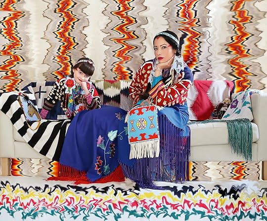 Wendy Red Star, Apsáalooke Feminist #4, 2016
  Wendy Red Star, Apsáalooke Roses, 2016
 Franco: What did it change for your audiences? And did your daughter end up building her own audience?
Red Star: I think what it was really important for, more so, was the institution, and the institutions recognizing that a collaboration of this nature can work. And not only can it work, it can be powerful and successful. Beatrice can take the public aspect very well. She has no problem gathering people to come and do activities. At the Denver Art Museum, she gave three tours to children of the Native galleries and the Western art galleries, and they were blown away. Because they had never seen little children pay so much attention to a tour. I think they were like, This is how we connect with the future generations, it would have to be through that generation’s perspective. That was something that was really important for an institution to be open to, and to see the power and the potential.
Franco: You sewed her outfit for that, right?
Red Star: I did. She really got into the whole tour-guide aspect and persona, and she would draw up outfits that I would sew. We even did a lecture outfit, so when we did dual lectures together, she would have one.
There’s one other thing that Beatrice and I made together, which is Apsáalooke Feminist [2016], self-portraits of us in our living room on our IKEA couch, in our elk-tooth dresses, that we did with a self-timer, jumping back and forth. That’s an important work for us. Beatrice will be getting the artist proofs for all of my work, whether she likes it or not.
Advertisement
googletag.cmd.push(function () {
googletag.display('div-gpt-ad-1343857479665-0');
});
Franco: And then she retired?
Red Star: Yeah, she retired at age eleven. Like I said, we were on a roll, and then she said she wanted to have the tours at the Pulitzer Art Foundation to be her last thing. And I was okay with it, because it was intense for me as well. Not only did we have to do a project and have it be successful, but I also had to shelter her from the business side of things so that she could be a child, which she is, and just enjoy the moment and the time together.
Franco: The Smithsonian Artist Research Fellowship invites artists to spend one or two months researching in collections across the Smithsonian. it’s kind of a byzantine process to apply and select an adviser. Do you recall?
Red Star: I do. I remember Shan Goshorn. She was dying of cancer. And I saw her in Tulsa, Oklahoma. She had this sense of urgency. She was like, “I want you to apply.” It’s so important what she did—when artists show up for other artists. Anyway, I got in. And wow. It’s so monumental, every aspect of the Smithsonian. It’s not at all what I was expecting. I thought I was going to be at the National Museum of the American Indian [NMAI], on the Mall, not realizing that all the material objects and photographs that I wanted to see are in a suburb in what looks like a Costco warehouse.
 Wendy Red Star, Medicine Rock Child, from the series Thunder Up Above, 2011
  Wendy Red Star, The Indian Congress (detail), 2021
 Franco: Who was your adviser?
Red Star: Emily Moazami. I worked with the photo archive. I worked with the American Museum of Natural History, and I worked with the National Anthropological Archives, with the archivists there. You have to state in the application what you’re focusing on, and it was going to be about Crow delegations. But when I got there, I was like, “Actually, I just need to see every single thing you have.” [laughs] I had this amazing experience in the natural history museum of looking at Crow objects, just having a really great time looking through everything. Seeing things that were in the photos, things that I thought would be a certain way, I found in reality were totally different.
Something so important that’s come out of that is that I connected with ancestors I never knew I had. I found out that my fourth great-grandfather’s name is Green Skin, and that NMAI has eight of his medicine bundles, and one of those bundles happens to be a horse-getting bundle. I got to hold my great-great-grandfather Bear Tail’s necklace. I got to hold my fourth great-grandfather Green Skin’s deer-ear charms that he would wear into battle. I mean, how crazy is that? Oftentimes, we’ll go to these museum collections that have Crow things, and I’m like, Maybe I’m related to somebody in here, I don’t know. But to actually go to a collection and have ancestors … and touch something that was so important to them, was beyond.
Franco: Do you have any Apsáalooke figures you identify with?
Red Star: I do. I really identify with Alexander Upshaw. He was the interpreter for Edward S. Curtis when he came and photographed the Crow community in the early 1900s. The reason why I relate to him is he was in the first generation of Crow children who left the reservation and got an education. Granted, he had no choice. He went to the Carlisle Indian School. I just read some of his letters to the Carlisle newspaper. There’s a ton of self- hatred in his letters about his identity during his time away from the reservation. And then he went through this transformation, where he came back to his culture and the reservation, and the local newspaper wrote about him—like, he went back to the blanket, which is what they would say about Native people who went back to their culture, back to being Apsáalooke. They went back to the blanket. That would be a great show title.
Franco: You could sew a lot for a show like that.
Red Star: Yeah, exactly, sewing and textiles are so much part of my practice. But, with Alexander Upshaw and the idea of going “back,” I feel like I know what he felt. He married a white woman and got a lot of ridicule for that. I just feel like, Wow, to be that first generation, being educated, coming back, being ridiculed by the Crow community for “you’re not Apsáalooke anymore,” and being told by the white people that you’re going back to the blanket. A lot of the historical chronology wouldn’t have happened or been documented in the way that it was if it wasn’t for him. He just resonates with me, as this nerdy archivist. I don’t even think he was a nerd [laughs]. If I met him, I would probably not even like him. But right now, I think he’s a kindred spirit. I think he was murdered. He ended up dying in a jail cell, because he had a hemorrhage. They found him in a jail cell, dead, with blood everywhere. And he died in his thirties, like young thirties. But he had such an accomplished life. Actually, the way that my ears are pierced is the way that his father’s ears were pierced. His dad’s name was Crazy Pend d’Oreille, which means in French, like, an ear pendant. So, yeah, I felt a connection with Alexander.
 Wendy Red Star, The Maniacs, 2011
All photographs courtesy the artist
Franco: You’re pointing at your right ear, and there are four studs, evenly spaced.
Red Star: It’s basically these three studs up here that are pierced like his dad’s. I’d say I really resonate with him, and then I resonate with my great-great-grandma, Julia Bad Boy, her Apsáalooke name. The literal translation of it is Her Dreams Are True. I found her in the archives at NMAI. I was just like, This name is the best name ever. She is the mom of William Dust, who’s my great-grandpa—and he would be my grandma’s dad. Bill Dust. His Crow name was Sings In The Camp. Then he gave my dad his Crow name, which is Kind To Everybody. I love him for that, because my dad is very kind to everybody, and everybody in the community knows they can come to him, and he will do what he can for you. So “Báakoosh Kawiiléete” is how you say “kind to everybody.” And Bill’s son is named Clive Dust, and I have his Crow name. I asked to have his Crow name, which is Always Creative.
Franco: What does that mean, to ask for a name, and when did you do that?
Red Star: Usually you’re given a name when you’re a kid. Your parents go and ask someone that they respect in the community to come up with a name. And that name usually comes from a variety of places. So my first name is Shiny Shell, which means basically “abalone necklace shell.” The woman who gave it to me, her name is Emma Coffey Smells, and she wore abalone necklaces when she would do the ceremony called a Sun Dance, which is a super intense, three-day thing where you don’t eat or drink water, and you dance all day long. She did, I don’t know, over twenty different Sun Dances. So that is a very powerful name.
But when I got older, I wanted to have a second name. Sometimes men would get a different name if they did something super badass, or if they did something that was notorious. The women or girls didn’t really get a second name. I said to my dad, “I want Clive’s name. How can we do this?” He said, “Well, we’ll ask his son, Clive Junior.” In Crow culture, when you do something ceremonial, you give four items to the person: a blanket; a piece of material big enough to make a shirt, like two or three yards; money; and tobacco. We gave that to him, and then I said, “Can I please have Clive’s name?” We were in the parking lot, in Crow Agency. And Clive Junior replied, “Yeah.” So, now I have his name, Baahinnaachísh, and I’m happy about that. The literal translation is Does Things Well—or “does things in a good way.”
This interview originally appeared in Wendy Red Star: Delegation (Aperture/Documentary Arts, 2022), and was adapted from an oral history conducted for the Archives of American Art, Smithsonian Institution.
October 3, 2024
Announcing the 2024 PhotoBook Awards Shortlist
Paris Photo and Aperture are pleased to announce the shortlist for the 2024 Paris Photo–Aperture PhotoBook Awards—an annual celebration of the photobook’s enduring role within the evolving narrative of photography. Now in its twelfth year, the awards recognize excellence in three major categories of photobook publishing: First PhotoBook, PhotoBook of the Year, and Photography Catalog of the Year.
This year, Paris Photo–Aperture PhotoBook Awards received 940 books from fifty-nine countries around the world, including standout entries from Argentina, Japan, Indonesia, New Zealand, and elsewhere. On September 18–20, the 2024 shortlist jury met in New York for three concentrated days of review and deliberation by an international team: Negar Azimi, editor in chief, Bidoun; Jacqueline Bates, photography director, Opinion, New York Times; Michael Famighetti, editor in chief, Aperture; Nontsikelelo Mutiti, director of graduate studies in graphic design, Yale School of Art; and Anna Planas, artistic director, Paris Photo.
The shortlist represents more than just the most highly produced, classically beautiful books—it is also an expression of the possibilities of bookmaking across a broad spectrum of resources, intentions, and storytelling techniques. As jury member Michael Famighetti stated, “It was exciting to see such a range of ideas, topics, processes, and forms explored through the photobook. I’m grateful to the jury for dedicating so much time and care to reviewing the submissions, and to our community of dedicated bookmakers, photographers, and scholars for producing and submitting such a powerful selection of work.”
“Serving on the jury offered an intensive and rewarding view into the past year’s publications,” juror Jacqueline Bates observed. “Reviewing books from fifty-nine countries was an extraordinary task. Even among shared themes, each project took a different approach. Of the 940 entries, every single book was unique.”
Anna Planas, artistic director of Paris Photo, and Florence Bourgeois, director of Paris Photo, commented: “The presentation of the shortlisted books at Paris Photo is one of the highlights of the event. The selections chosen for the PhotoBook Awards share an international vision of the production of photography books, and with the pulse of contemporary creativity, they embody the vitality of publishing today.”
A final jury will meet at Paris Photo this November to select the winners for all three prizes, which will be revealed on Friday, November 8. From there, the shortlisted books will be exhibited in Paris, followed by an international tour, including New York at Printed Matter, in January 2025, among other venues to be announced.
Below, see the thirty-five selected titles for the 2024 PhotoBook Awards shortlist.
Advertisement
googletag.cmd.push(function () {
googletag.display('div-gpt-ad-1343857479665-0');
});
First PhotoBook

Hady Barry, i am (not) your mother, Self-published, Penumbra Foundation, New York, Design by Hady Barry

Ciro Battiloro, Silence Is a Gift, Chose Commune, Marseille, France, Design by Cécile Poimbœuf-Koizumi and Perrine Serre

Angeniet Berkers, Lebensborn: Birth Politics in the Third Reich, The Eriskay Connection, Breda, Netherlands, Design by Rob van Hoesel

Claire Cocano, Rue Désiré Chevalier, Self-published, Paris, Design by Claire Cocano

Barbara Debeuckelaere, ’Om (Mother), The Eriskay Connection, Breda, Netherlands, Design by Carel Fransen

Simone Engelen, 27 Drafts, Fw:Books, Amsterdam, Design by Hans Gremmen

Janick Entremont, If Time Does Not End, Self-published, Berlin, Design by Janick Entremont

Ismail Ferdous, Sea Beach, Imageless, Shanghai, Design by RELATED DEPARTMENT

Toma Gerzha, Control Refresh, The Eriskay Connection, Breda, Netherlands, Design by Rob van Hoesel

Virginia Hanusik, Into the Quiet and the Light: Water, Life, and Land Loss in South Louisiana, Columbia Books on Architecture and the City, New York, Design by New Information, Dave Yun, and Inyeong Cho

Abdulhamid Kircher, Rotting from Within, Loose Joints Publishing, Marseille, France / London, Design by Loose Joints Studio

Hassan Kurbanbaev, One Head and Thousand Years, Art Paper Editions, Ghent, Belgium, Design by Jurgen Maelfeyt

Srinivas Kuruganti, Pictures in My Hand of a Boy I Still Resemble, Self-published / Marigold Books, Delhi, India, Design by Srinivas Kuruganti

Nicola Moscelli, Dead End, Penisola Edizioni and Antiga Edizioni, Crocetta del Montello, Italy, Design by Roberto Vito D’Amico

RaMell Ross, Spell, Time, Practice, American, Body, MACK, London, Design by Morgan Crowcroft-Brown

Melissa Shook, Daily Self-Portraits 1972–1973, TBW Books, Oakland, California, Design by Paul Schiek

Ngadi Smart, Wata Na Life, Loose Joints Publishing, Marseille, France / London, Design by Loose Joints Studio

Tsai Ting Bang, Born from the Same Root, Self-published, Taipei, Design by Tsai Ting Bang

Rawsht Twana, Twana’s Box: The Photographic Life of Twana Abdullah, Kurdistan Region of Iraq, 1974–1992, Fraglich Publishing, Bregenz, Austria, Design by Stefano Carini and Lukas Birk

Róisín White, Lay Her Down Upon Her Back, Witty Books, Turin, Italy, Landskrona Foto, Sweden, and Breadfield Press, Malmö, Sweden, Design by Tommaso Tanini
Previous NextHady Barry
i am (not) your mother
Self-published, Penumbra Foundation, New York
Design by Hady Barry
Ciro Battiloro
Silence Is a Gift
Chose Commune, Marseille, France
Design by Cécile Poimbœuf-Koizumi and Perrine Serre
Angeniet Berkers
Lebensborn: Birth Politics in the Third Reich
The Eriskay Connection, Breda, Netherlands
Design by Rob van Hoesel
Claire Cocano
Rue Désiré Chevalier
Self-published, Paris
Design by Claire Cocano
Barbara Debeuckelaere
’Om (Mother)
The Eriskay Connection, Breda, Netherlands
Design by Carel Fransen
Simone Engelen
27 Drafts
Fw:Books, Amsterdam
Design by Hans Gremmen
Janick Entremont
If Time Does Not End
Self-published, Berlin
Design by Janick Entremont
Ismail Ferdous
Sea Beach
Imageless, Shanghai
Design by RELATED DEPARTMENT
Toma Gerzha
Control Refresh
The Eriskay Connection, Breda, Netherlands
Design by Rob van Hoesel
Virginia Hanusik
Into the Quiet and the Light: Water, Life, and Land Loss in South Louisiana
Columbia Books on Architecture and the City, New York
Design by New Information, Dave Yun, and Inyeong Cho
Abdulhamid Kircher
Rotting from Within
Loose Joints Publishing, Marseille, France / London
Design by Loose Joints Studio
Hassan Kurbanbaev
One Head and Thousand Years
Art Paper Editions, Ghent, Belgium
Design by Jurgen Maelfeyt
Srinivas Kuruganti
Pictures in My Hand of a Boy I Still Resemble
Self-published / Marigold Books, Delhi, India
Design by Srinivas Kuruganti
Nicola Moscelli
Dead End
Penisola Edizioni and Antiga Edizioni, Crocetta del Montello, Italy
Design by Roberto Vito D’Amico
RaMell Ross
Spell, Time, Practice, American, Body
MACK, London
Design by Morgan Crowcroft-Brown
Melissa Shook
Daily Self-Portraits 1972–1973
TBW Books, Oakland, California
Design by Paul Schiek
Ngadi Smart
Wata Na Life
Loose Joints Publishing, Marseille, France / London
Design by Loose Joints Studio
Tsai Ting Bang
Born from the Same Root
Self-published, Taipei
Design by Tsai Ting Bang
Rawsht Twana
Twana’s Box: The Photographic Life of Twana Abdullah, Kurdistan Region of Iraq, 1974–1992
Fraglich Publishing, Bregenz, Austria
Design by Stefano Carini and Lukas Birk
Róisín White
Lay Her Down Upon Her Back
Witty Books, Turin, Italy, Landskrona Foto, Sweden, and Breadfield Press, Malmö, Sweden
Design by Tommaso Tanini
PhotoBook of the Year

Taysir Batniji, Disruptions, Loose Joints Publishing, Marseille, France / London, Design by Loose Joints Studio

Cai Dongdong, Passing By Beijing, Cai Dongdong Studio, Beijing, Design by Wang Lisha

Lia Darjes, Plates I–XXXI, Chose Commune, Marseille, France, Design by Cécile Poimbœuf-Koizumi and Perrine Serre

Jessica Ingram, We Are Carver, Self-published, Dallenwil, Switzerland, Design by Michael Schmelling / 40 Worth

Akihiko Okamura, Les souvenirs des autres (The Memories of Others), Atelier EXB, Paris, Design by François Dezafit

César Rodríguez, Hoja Dorada, KWY, Lima, Peru, Design by Vera Lucía Jiménez

Rosalind Fox Solomon, A Woman I Once Knew, MACK, London, Design by Morgan Crowcroft-Brown

Peter van Agtmael, Look at the U.S.A.: A Diary of War and Home, Thames & Hudson, London, Design by Bonnie Briant Design

Awoiska van der Molen, The Humanness of Our Lonely Selves, Fw:Books, Amsterdam, Design by Hans Gremmen

Carmen Winant, The Last Safe Abortion, SPBH Editions, London, Design by Brian Paul Lamotte
Previous NextTaysir Batniji
Disruptions
Loose Joints Publishing, Marseille, France / London
Design by Loose Joints Studio
Cai Dongdong
Passing By Beijing
Cai Dongdong Studio, Beijing
Design by Wang Lisha
Lia Darjes
Plates I–XXXI
Chose Commune, Marseille, France
Design by Cécile Poimbœuf-Koizumi and Perrine Serre
Jessica Ingram
We Are Carver
Self-published, Dallenwil, Switzerland
Design by Michael Schmelling / 40 Worth
Akihiko Okamura
Les souvenirs des autres (The Memories of Others)
Atelier EXB, Paris
Design by François Dezafit
César Rodríguez
Hoja Dorada
KWY, Lima, Peru
Design by Vera Lucía Jiménez
Rosalind Fox Solomon
A Woman I Once Knew
MACK, London
Design by Morgan Crowcroft-Brown
Peter van Agtmael
Look at the U.S.A.: A Diary of War and Home
Thames & Hudson, London
Design by Bonnie Briant Design
Awoiska van der Molen
The Humanness of Our Lonely Selves
Fw:Books, Amsterdam
Design by Hans Gremmen
Carmen Winant
The Last Safe Abortion
SPBH Editions, London
Design by Brian Paul Lamotte
Photography Catalog of the Year

Akinbode Akinbiyi: Being, Seeing, Wandering, Katia Reich, Spector Books, Leipzig, Germany, Design by Helmut Völter

Flashpoint! Protest Photography in Print, 1950–Present, Russet Lederman and Olga Yatskevich, 10×10 Photobooks, New York, Design by Huber / Sterzinger and Miloš Gavrić

Grace Wales Bonner: Dream in the Rhythm—Visions of Sound and Spirit in the MoMA Collection, Grace Wales Bonner, Museum of Modern Art, New York, Design by Peter Miles

Shining Lights: Black Women Photographers in 1980s–90s Britain, Joy Gregory, editor, and Taous Dahmani, associate editor, Autograph and MACK, London, Design by Morgan Crowcroft-Brown

Yasuhiro Ishimoto: Lines and Bodies, Diane Dufour and Mei Asakura, Atelier EXB and LE BAL, Paris, Design by Coline Aguettaz
Previous NextAkinbode Akinbiyi: Being, Seeing, Wandering
Katia Reich
Spector Books, Leipzig, Germany
Design by Helmut Völter
Flashpoint! Protest Photography in Print, 1950–Present
Russet Lederman and Olga Yatskevich
10×10 Photobooks, New York
Design by Huber / Sterzinger and Miloš Gavrić
Grace Wales Bonner: Dream in the Rhythm—Visions of Sound and Spirit in the MoMA Collection
Grace Wales Bonner
Museum of Modern Art, New York
Design by Peter Miles
Shining Lights: Black Women Photographers in 1980s–90s Britain
Joy Gregory, editor, and Taous Dahmani, associate editor
Autograph and MACK, London
Design by Morgan Crowcroft-Brown
Yasuhiro Ishimoto: Lines and Bodies
Diane Dufour and Mei Asakura
Atelier EXB and LE BAL, Paris
Design by Coline Aguettaz
The 2024 PhotoBook Award winners will be announced during Paris Photo on Friday, November 8, at 3:00 p.m. (CET).
October 2, 2024
How Arielle Bobb-Willis Keeps Her Inner Kid Alive
Arielle Bobb-Willis’s first book, Keep the Kid Alive, invites audiences into a brightly imaginative world, filled with dynamic colors, gestures, and unusual poses of the artist’s own creation. Transforming the streets of New Orleans, New York, and Los Angeles into lush backdrops for her wonderfully surreal tableaus, Bobb-Willis makes unforgettable images that expand the genres of fashion and art photography. “I love the idea of seeing Black people represented in an abstract way,” Bobb-Willis says. “It’s important to me to continue to reject the notion that Black expression is limited—or limiting.”
Here, Nicole Acheampong speaks with Bobb-Willis about her entry into photography, her unconventional approaches to styling, and how she keeps her inner kid alive.
 Arielle Bobb-Willis, New Orleans, 2022
  Arielle Bobb-Willis, New Jersey, 2019
 Nicole Acheampong: To start, can you tell me about your family?
Arielle Bobb-Willis: I grew up the youngest, with two older brothers. Me being the only girl and the youngest, I definitely kept to myself.
My mom and my dad divorced when I was five years old, so I’ve always been in between houses. I grew up in downtown Manhattan and then also in Suffern, in upstate New York. I’ve always been traveling back and forth in cars, with a night or weekend bag. I recently figured out that I love being in transit—on a train or in cars, there’s so much I can see out the window. If you’re in a car with me, I’m going to take a picture of something that we’re driving by.
After my parents divorced, my dad and stepmom had a girl named Ava, and my mom and stepdad had a girl and a boy, Dakota and Cameron. Becoming an older sibling at age fourteen was one of the biggest blessings in my life, creatively and emotionally. To have younger siblings who were so confident in their expression and were just silly, running around and dancing, made me get into that zone as well. It was such a lighthearted time. It kept me grounded in what actually mattered to me. And when I was fourteen, I found photography, and I started taking pictures of my siblings.
Acheampong: What would you photograph them doing in those days? Would you capture them candidly playing, or would you pose them for the camera?
Bobb-Willis: It was a bit of everything. We would do fashion shoots. I’d also just document them throughout the day. I would take pictures of them running, in motion. I would take pictures of them at night, with flash. I was very scared at the time to ask other people to do a photoshoot. So my siblings were my first subjects. They just let me do my thing. They always knew me as a photographer, since they were born, so they never questioned it.
 Arielle Bobb-Willis, New Orleans, 2021
  Arielle Bobb-Willis, New Jersey, 2018
 Acheampong: Did the fear and shyness you felt when you were younger push you into creating your own world in your art, or was it something you had to overcome in order to really feel confident in yourself as an artist?
Bobb-Willis: It was definitely something I had to overcome, but the shyness still shows up in my work. It’s a part of who I am. I still pretty much keep to myself. When I’m shooting, I can either show parts of myself that are loud or I can hide in my work. When I first started photographing, I asked myself, How can I take a picture of myself without being in the photo? And also: How can I show all the parts of myself? That was the premise. Photography showed up in my life at the right time, for sure.
Acheampong: How were you first introduced to photography?
Bobb-Willis: I moved to South Carolina when I was fourteen. My mom got remarried, and I was just thrown off course. I didn’t have the right resources at the time to go through a big change like that. And I didn’t feel very comfortable in the school I was in. It was a private college-prep school. I’m exaggerating, but I was one of four Black kids, if you know what I mean.
 Arielle Bobb-Willis: Keep the Kid Alive 60.00 The first monograph by the New Black Vanguard’s Arielle Bobb-Willis is a vivid statement about color, gesture, and style.
 $60.00Add to cart
[image error] [image error]
In stock
Arielle Bobb-Willis: Keep the Kid AlivePhotographs by Arielle Bobb-Willis. Text by Tiana Reid. Interviewer Nicole Acheampong. Contributions by Micaiah Carter, Esther Faciane, Phyllis Galembo, Kezia Harrell, Howardena Pindell, Alex Webb, Aweng Chuol, Gabriella Karefa-Johnson, Isabella Lalonde, Leonardo Scotti, Tschabalala Self, Synchrodogs, Hannah Traore, and Spencer Tunick. Designed by Rush Jackson.
$ 60.00 –1+$60.00Add to cart
View cart Description The first monograph by the New Black Vanguard’s Arielle Bobb-Willis is a vivid statement about color, gesture, and style.Keep the Kid Alive, Arielle Bobb-Willis’s first book, invites audiences into a brightly imaginative world, filled with dynamic colors, gestures, and unusual poses of the artist’s own creation. Transforming the streets of New Orleans, New York, and Los Angeles into lush backdrops for her wonderfully surreal tableaus, Bobb-Willis makes unforgettable images that expand the genres of fashion and art photography. “I love the idea of seeing Black people represented in an abstract way,” Bobb-Willis says. “It’s important to me to continue to reject the notion that Black expression is limited—or limiting.” With a conversation between Bobb-Willis and a dynamic range of artists, stylists, and creatives who speak about keeping their “inner kid” alive, this book captures a definitive young artist’s unconventional worldbuilding. Details
Format: Hardback
Number of pages: 172
Number of images: 90
Publication date: 2024-10-08
Measurements: 8.25 x 10.5 inches
ISBN: 9781597115704
“Bobb-Willis’s first monograph, Keep the Kid Alive, makes a statement about beauty, exuberance and cathartic expression—while not taking itself too seriously—with vibrant colour and conceptual image building.”—Guardian
ContributorsArielle Bobb-Willis (born in New York, 1994) has published her photography in the New Yorker, I-D, W Magazine, British Journal of Photography, L’uomo Vogue, New York magazine’s The Cut, and the New York Times Magazine. Her work is featured in The New Black Vanguard: Photography between Art and Fashion (Aperture, 2019) and an accompanying exhibition, which traveled to the Museum of the African Diaspora, Rencontres d’Arles, Fotografiska Sweden, and other venues. She is currently based in Los Angeles.
Tiana Reid is an assistant professor of English at York University. Her research and teaching interests include black literature, gender, and labor. Her writing has appeared in American Quarterly, Art in America, Bookforum, Frieze, The Nation, The New York Review of Books, The New York Times, and The Paris Review, among other places. She is a former editor at The New Inquiry and Pinko. In 2021, she received her PhD in English and Comparative Literature from Columbia University.
Nicole Acheampong is the digital editor at T Magazine. A former editor at Aperture and the Atlantic, her writing has appeared in Art in America and the New York Review of Books.
Acheampong: I believe it.
Bobb-Willis: I lived in Aiken, South Carolina, which is a horse town and a retirement community. There’s not a lot going on. I felt really isolated from a New York experience that I could have had. I developed anxiety and a really deep depression, and it lasted for about five years until I got professional help.
During the first week of school, I had to enroll in an elective, and I was a new kid, so they just threw me into this digital-imaging course. I had a little black point-and-shoot, one of the square ones, nothing with a lens or anything. I learned about the basics of photography in that elective and was introduced to Photoshop. I became obsessed. I loved that class because for that part of the day, it was like I was in a trance. We got to restore old photographs. If you’ve ever used Photoshop, you know that editing can sometimes be a slow process, and that kept me very present with what I was doing and what was in front of me, and not thinking about what I did in first period or what
I had to do next week. I think depression robs you of being present and seeing the beauty around you.
I was working with a digital camera for the course, but my history teacher said his wife didn’t want her camera anymore and gave it to me. It was a film camera, a Nikon N80. I went home, and I took my first roll of film.

Arielle Bobb-Willis, Portland, Oregon, 2023
var container = ''; jQuery('#fl-main-content').find('.fl-row').each(function () { if (jQuery(this).find('.gutenberg-full-width-image-container').length) { container = jQuery(this); } }); if (container.length) { const fullWidthImageContainer = jQuery('.gutenberg-full-width-image-container'); const fullWidthImage = jQuery('.gutenberg-full-width-image img'); const watchFullWidthImage = _.throttle(function() { const containerWidth = Math.abs(jQuery(container).css('width').replace('px', '')); const containerPaddingLeft = Math.abs(jQuery(container).css('padding-left').replace('px', '')); const bodyWidth = Math.abs(jQuery('body').css('width').replace('px', '')); const marginLeft = ((bodyWidth - containerWidth) / 2) + containerPaddingLeft; jQuery(fullWidthImageContainer).css('position', 'relative'); jQuery(fullWidthImageContainer).css('marginLeft', -marginLeft + 'px'); jQuery(fullWidthImageContainer).css('width', bodyWidth + 'px'); jQuery(fullWidthImage).css('width', bodyWidth + 'px'); }, 100); jQuery(window).on('load resize', function() { watchFullWidthImage(); }); const observer = new MutationObserver(function(mutationsList, observer) { for(var mutation of mutationsList) { if (mutation.type == 'childList') { watchFullWidthImage();//necessary because images dont load all at once } } }); const observerConfig = { childList: true, subtree: true }; observer.observe(document, observerConfig); }Acheampong: What did you photograph?
Bobb-Willis: It was at sunset, so my bedroom had a golden-hour vibe. I lifted one of my shoes up in the air, and I took a picture of it. I had a mannequin in my room, and I took a picture of that too. I remember going to CVS and being really excited to get the developed film back.
There had been an orange tint in my room. The orange became more orangey with film. I had black shoes on, and on the film, the edges around my black shoe were soft and melted into the orange. That was the moment where I was like, Oh my God, oh my God. This is so cool. This is so sick. This is what I want to do forever.
At the time, I was always in my room, and there was usually a very gray, dreary kind of feeling in my room. But seeing those photos of these bright oranges and reds and yellows and blacks made my room into something better. I realized that photography can make a whole world—your own world. It turned my room into something that it wasn’t, and it looked like a place of peace, brighter and better than what I was feeling at that time.
Acheampong: That feels so connected to your current work: it’s not easy to geographically place a lot of your images, because the subjects almost seem like they could be existing in a fantasy world that you’ve created for yourself. How do you choose locations for these shoots?
Bobb-Willis: I told you about how I’ve been traveling in cars from my mom to my dad my whole life, and how I’m always looking out of car windows, and just observing all the time.
I think that constantly observing is just in my DNA in a way, and it shapes the way I pick locations. I’m not really looking to shoot in front of the Empire State Building, or the Golden Gate Bridge, or other landmarks that show that I’m in a specific place. Instead I might say, Oh, the light is shining on this pink wall at 2 p.m. I’m going to go shoot there at 2 p.m. Or, There’s a shadow from a tree right here on this red building. The paint is being chipped off and has an interesting texture. Oh, I’ll shoot there.
 Arielle Bobb-Willis, Austin, 2020
  Arielle Bobb-Willis, London, 2018
 Acheampong: The fact that you spend much of your time looking out of car windows makes sense, because I feel like so many of the background details are ones that you would see when you’re passing through a place—like a nondescript alleyway that you would glance down, and then briefly wonder what it might hold. And in the same way that your locations are fairly nondescript, the clothes that your models wear tend to look unbranded and anonymous, or not quite like something you would find in a store.
I love styling but not styling in the sense of “I need designer clothes to do this shoot.” I’ve changed shirts into skirts and cut out holes into the shirt. Or I’ll stretch a shirt out so that I can put two people in it. I put a lot of people in shirts backward and inside out. A skirt doesn’t have to be a skirt just because it’s presented that way. It could be whatever you want it to be. I love styling in that sense, where it’s play, it’s fun, it’s exploration.
Photography is, and will always be, a daily practice of falling in love with as many things as I can.
Acheampong: That definitely stood out to me about your work—you’re not precious about the clothes. As you said, sometimes you’ll stretch a fabric to its limits, or the fabrics will be wrinkled or bunched up. Or, simply, a bra strap will hang off a model’s shoulder. At the same time though, the bright colors and flamboyance of the outfits seem to contradict the casualness with which they’re being worn. Could you speak to how you see luxury and fashion coexisting in your photography? Is the malleability of a piece of clothing what you find most luxurious about it?
Bobb-Willis: Oh, that’s a good question. The luxury for me is to be able to create the clothing myself, create the clothing that I want to see or need in the moment. It started out with me having twenty dollars and being like, Okay. What can I do with twenty dollars? I think that as an artist, having limitations can make you more creative. With designer things, I feel like sometimes I can’t do as much. It comes already finished in a sense, you know?
Acheampong: Mm-hmm, mm-hmm.
Which is fun. It’s fun to work with people and to shoot beautiful things that someone else has created and took the time to cut into. But it’s also fun and luxurious to create things that I want on the spot and improvise.
 Arielle Bobb-Willis, Los Angeles, 2020
  Arielle Bobb-Willis, New Orleans, 2023
 Acheampong: After New York and Aiken, where did you live next?
Bobb-Willis: From eighteen to twenty-three, I was in New Orleans. I was still heavily depressed at that time, but New Orleans was the place where I found community. And I felt like I was in a place where I could create things. It was where I got my depression under control, actually.
I had a freedom there that I didn’t have when I was in South Carolina. I was free to be with my own thoughts and not the thoughts of my peers, or my family, or anything like that. I was mostly by myself, which felt really nice and different than in South Carolina. It was isolating, I guess. But being alone can feel good in certain places, you know? It helps you see clearly about what you need for yourself and what kind of people you want to be around.
Acheampong: New Orleans, I think, is a city where even when you are alone, you’re surrounded by so much vibrancy and life on the streets. I imagine you were always in a community with others even if you were in your own thoughts?
Bobb-Willis: Yeah. Totally. I love the duality of New Orleans. There’s a duality to the entire city: The houses are very colorful, but they’re also kind of falling apart. There’s a tension in the air, and the air is very heavy.
I was working at a retail store and just shooting for retail here and there. Then, I found a group of people who I started to create zines and other things with. Then, one day, on my way home from my retail job, I got hit by a car. This was in 2016. I was riding my bike on St. Charles Avenue, and . . . the car just came. It was a hit-and-run. I tore their side-view mirror off with my left shoulder and left arm. Moments before the impact, I thought to myself, Oh, I get twenty-one years. I was like, Okay. That’s fine . . . I’m okay with that—and then I got hit. There was nothing I could do at that point, and I felt this calming acceptance come over me.
 Arielle Bobb-Willis, Chicago, 2017
  Arielle Bobb-Willis, New Orleans, 2017
 Acheampong: I’m amazed that your thoughts even cohered in that moment.
Bobb-Willis: Me too. I didn’t know that happened. You know, in movies, how they say that things slow down a bit? It’s weird, but they actually did slow down. Then I got hit, and when I opened my eyes, I thought, Oh, I’m still here. Okay.
Acheampong: How long did it take you to recover from that?
Bobb-Willis: I tore a ligament in my shoulder, and it’s still a problem. The left side of my body is still a problem in some ways.
A couple months before getting hit, the first love of my life had suddenly broken up with me, which was also debilitating to me. I was also bedridden for six weeks, and I couldn’t work my retail job. I was just able to really sit with myself during that time. I started to think, You don’t have a job. You don’t have a boyfriend. You don’t have any responsibilities, really. So, what do you want? And I saw her—older Arielle—very clearly, and I thought, I’m going to take pictures, and I’m not going to hold back. Once I got a little bit better, I quit my job, and then I started to shoot the things that are in the book.
Advertisement
googletag.cmd.push(function () {
googletag.display('div-gpt-ad-1343857479665-0');
});
Acheampong: So the origin story for this work began on the heels of a near-death experience.
Bobb-Willis: Yes. The car accident, the breakup . . . It’s the best thing that’s ever happened to me.
Acheampong: Wow. After that series of events, what differences did you notice in the type of work you most wanted to make?
Bobb-Willis: It made me more of a brave person. I feel like I create like a child because I do not give a fuck. I mean, I don’t care what anyone thinks of me while I’m creating. I do it in the streets and outside, and people are honking and pointing or screaming out of their cars.
New Orleans is a city that’s dense with culture, and so, living there as I recovered, there was so much for me to work with. And I told myself, I’m just going to do what I want to do because it can all be gone tomorrow.
 Arielle Bobb-Willis, New Orleans, 2016
  Arielle Bobb-Willis, New Jersey, 2021
 Acheampong: You spoke earlier about New Orleans being a place that juxtaposes its colors and brightness and all of the partying with a darker tinge that can be found in a lot of corners of the city. And you yourself had a very contradictory experience in which your worst, near-death moments were paired with a real moment of joyful discovery. I want to talk about how a similar tension appears in your photos. I think that one of the hallmarks of your images is the fact that there’s a playfulness in some of your subjects’ poses and clothing, but there is definitely also a cloudiness. I noticed that, in almost every image, people’s faces are somehow obscured—either covered in shadow or covered in paint or a mask or just turned away, to the side. Could you say a little bit about that gesture and why it recurs in so much of your work?
Bobb-Willis: My reasons for that change over time. But I think it’s partially inspired by the paintings that I love. Like in Milton Avery’s work: I feel like that world is where I want to live. I wish we all looked like that. I wish we all didn’t have to have our faces determine if we’re valuable or not. Like why are some people considered more “photographable” than others? In the grand scheme of the photo/fashion industry, who gets to determine that?
I’m more inspired by painters than artists of any other medium, and I think about the painters whose work surrounded me growing up: Jacob Lawrence, Basquiat, and William H. Johnson, and, from New Orleans, Sister Gertrude Morgan. When you’re painting, you can make someone’s head a foot. You can have someone’s leg go around their body, like, six times. Do you know what I mean?
Acheampong: Mm-hmm.
Bobb-Willis: You could have someone floating in midair in a painting. There are unlimited things you could do with the body in paintings, and I love that freedom. I’m trying to put that freedom into my photos, and I’m trying to gently push my subjects to do things that are maybe a little bit out of their comfort zone. I don’t want to do it too far, but just gently push people to maybe try things that are not a pose you would do on the regular day-to-day.
 Arielle Bobb-Willis, New Jersey, 2018
  Arielle Bobb-Willis, New Jersey, 2019
All photographs courtesy the artist
Acheampong: I think that relates to the playfulness that is so core to your work in general as well as to your first foray into making photographs: with your very first subjects, your younger siblings, you began by capturing them at play. And I’d like to ask you the same question that you’ve been asking the other artists who have contributed to this book: How do you keep your inner child alive—in your photography and in your day-to-day life?
Bobb-Willis: Photography is how I keep my inner child alive. Photography has taught me to fall in love with life. I love finding unexpected rainbows, and sunshine and a beautiful green park and kids’ chalk drawings on the sidewalk and melted ice cream and butterflies and flowers and Black girls with bright-blue braids and sweet graffiti poetry! I keep my inner child alive by taking pictures of my every day. I’m always finding things that I’m so in love with. Some you’ll see collected in the booklet in this book. I’m so grateful that photography has given me that. It’s given me that gift to always see beauty wherever I go. It’s made me a lighter, brighter individual.
Since I was a child, and even when I was in my teens, I never really spoke up. Photography has taught me how to communicate what I need from the people around me. It’s taught me that there’s so much power in my imagination. It taught me how to trust in my taste, my opinions, and myself. It’s given me true self-love, and that I can stand firm in who I am. My journey with photography has been a very emotional, world-expanding experience. There’s just so much all the time to see, and take pictures of, and fall in love with. Photography is, and will always be, a daily practice of falling in love with as many things as I can.
This interview originally appeared in Arielle Bobb-Willis: Keep the Kid Alive (Aperture, 2024).
Aperture's Blog

- Aperture's profile
- 21 followers

