
Gordon Rugg's Blog, page 18
June 3, 2014
Parallel processing and “natural” learning: Inside the black box
By Gordon Rugg
There’s a widespread idea that before entering formal education, people learn via “natural” learning.
It’s a warm, cosy concept; “natural” evokes thoughts of wildflowers and meadows and beauty and fluffy kittens. There’s even a certain amount of truth in it; formal education does generally involve something different from non-formal education. However, when you start looking for clear, practical, explanations of how “natural” learning actually works, you encounter a sudden silence.
There are plenty of descriptions of what “natural learning” looks like, but there’s very little discussion of how it might work, in terms of plausible cognitive or neurophysiological mechanisms. This absence makes a sceptical reader start to wonder whether there actually is such a thing as “natural learning” and whether this strand of education theory is chasing something that doesn’t exist.
In fact, there is a well-understood mechanism that accounts for the phenomena being lumped together as “natural learning” and “formal learning” (or whatever term is being used in juxtaposition to “natural learning”). However, when you look in detail at this mechanism, it soon becomes apparent that using a two-way distinction between “natural” and “non-natural” is simplistic and misleading. This is one reason that the “natural/non-natural” debate in education theory is still rumbling on, after more than two thousand years of fruitless and inconclusive argument.
In this article, I’ll discuss the mechanisms of parallel processing and serial processing, and I’ll outline some implications for education theory and practice.
The joys of nature and of fluffy kittens – not always quite the same thing…

Original images from Wikimedia
Thinking, fast and slow: Some background
There’s a concept similar to “natural learning” in other fields. The title of Daniel Kahneman’s book Thinking, Fast and Slow derives from that concept. Daniel Willingham uses similar phrasing within his book Why don’t students like school?
Both authors are well aware of the literature within cognitive psychology about how the human brain can use two different tracks for information processing. One track is fast but error-prone; the other is slow, but better at handling formal reasoning. Both are useful, for tackling different types of problem.
Neither author, though, goes into the underlying computational formalisms that are the topic of this article.
To show why this is an important point, I’ll dissect a quote that I’ve seen variously attributed to Herb Simon and to Roger Schank:
“People only use logical rational thought as a last resort.”
At first glance, this appears to be just another claim that intuition is more “natural” than reasoning. If we look at the background context, though, something very different is going on.
This quote is most often used by researchers working at the interface between computing and other disciplines (usually psychology). In this area, the quote will normally be understood to be shorthand for something along the following lines.
People only use formal classical logic and formally rational reasoning if there’s no other choice.
That’s a significant rephrasing. In the “natural versus artificial” framing, there are only two options. In the quote above, there are a lot of options, with very different implications.
“Formal classical” logic is just one type of logic. Logicians today use numerous types of logic – for instance, fuzzy logic is very different from the type of logic that Aristotle used.
Similarly, “formally rational reasoning” is very different from modern analyses of decision-making, such as the concept of bounded rationality introduced by Herb Simon, which fundamentally changed the way that economists and decision theorists view human decision-making.
The quote above is therefore very different from using the word “logical” as a label for a single type of thinking that is cool and impassive and controlled.
Instead, it’s located in a much richer and more powerful body of knowledge, grounded in a detailed understanding of the mechanisms involved in analysing and solving formal and real-world problems.
As soon as you start looking at those mechanisms, one issue jumps into centre stage. It’s taken for granted as a core distinction in computer science, but it’s little known elsewhere, even though it has major implications for a wide range of fields.
Parallel processing versus serial processing
Parallel processing involves processing two or more things at once (“in parallel”). Serial processing involves processing things one after the other (“in series”).
Here’s an example.
Suppose that you’re a builder who wants to build five houses. One approach is to work on all five of them simultaneously, as shown in the diagram below. The first red circle is the starting point; the second red circle is the finishing point. In between those two points, each house is being worked on simultaneously.
This is an example of parallel processing.

Image copyleft Hyde & Rugg, 2014, incorporating house icon from Wikimedia
This is the fastest way of getting the job done, but it comes at a price; for instance, you need to have enough staff and resources to work on all five houses at the same time, and you need to manage all those staff and resources.
A simpler and cheaper, but much slower, approach is to work on one house at a time, as in the diagram below. This is an example of serial processing.

Image copyleft Hyde & Rugg, 2014, incorporating house icon from Wikimedia
This topic has received a lot of attention in computing. The vast majority of computers use serial processing. It’s slow, in computing terms, but for most purposes the slowness isn’t a major issue – “slow” for a computer is extremely fast by human standards. Its two main advantages are that it’s much simpler and much cheaper than developing dedicated parallel processing hardware and software.
The human brain, like all animal brains, generally uses parallel processing, whose speed offers a lot of advantages in terms of selection pressures in the biological world.
Pattern matching
Speed of processing is a big advantage. Parallel processing, however, also offers another advantage which has major implications. With parallel processing, it’s easy to handle pattern matching, which is prohibitively difficult in serial processing.
Here’s an example.

Image copyleft Hyde & Rugg, 2014
The line of coloured squares above has regularities in its colouring, but those regularities don’t make a lot of sense if we process the line serially, one square at a time, going from left to right.
However, if we arrange the same squares as a grid, then we can see that there’s another pattern within them. The pattern is only easily visible if we view all the squares at once, in relation to each other, using parallel processing.

Image copyleft Hyde & Rugg, 2014
The human visual system is extremely good at pattern matching. Pattern matching is what we use to identify objects and people; it’s a key part of recognising faces. Computers, in contrast, are very bad indeed at pattern matching.
Choosing the right level of analysis: Activities and sub-activities
Although the distinction between parallel and serial processing is a clear binary distinction, in reality most non-trivial tasks involve several sub-tasks, some of which require serial processing and others of which require parallel processing. I’ll examine this in more detail in another article. It’s an important point, because when you work at the level of the lowest-level sub-tasks, then the distinction between serial and parallel processing starts to give its most powerful, practical insights.
Simply trying to categorise an entire complex task (e.g. reading) as either parallel or serial is not a good idea; it’s analogous to trying to categorise an entire machine as either metal or plastic, rather than categorising each component in terms of its material. The latter approach (i.e. looking at each individual component) works well; the former “whole task” approach just leads you into endless fruitless arguments, like the natural/non-natural distinction.
Cases where you can use either parallel or serial processing
It’s also important to note that some tasks and sub-tasks can be handled using either serial processing or parallel processing. This has significant implications for categorisations of “learning styles”.
Here’s an example of a task that can be handled either serially or in parallel. How many beads are shown in the image?

Image copyleft Hyde & Rugg, 2014
One way to find out is to use serial processing and to count them, one at a time.
Another way is to use parallel processing, and count them all in one go; this is known as subitising. Subitising can handle up to about seven items; beyond that, humans have to use serial processing and counting.
So, in summary:
Serial processing is very good at handling formal logic, and at handling numerical processing. Language involves a lot of serial processing, particularly in the case of spoken language, where the nature of speech means that words have to be spoken and heard serially, one at a time. Written language involves both serial and parallel processing, as discussed below. Humans are usually very bad at serial processing except for very limited tasks.
Parallel processing is very good at handling anything involving visual information. It’s also good at handling incomplete, imperfect, uncertain information. Humans are usually very good at parallel processing; when things go wrong with parallel processing, it’s often because of the inherent limitations of parallel processing itself, rather than the limitations of the human involved.
Some tasks can be handled using either serial processing or parallel processing.
Implications for education theory and practice
Parallel processing and serial processing are key issues in several areas that have significant implications for education theory and practice. I’ve listed some examples below; for brevity, I’ve only given very short descriptions. All of these are areas that have been researched in considerable depth, and where there is plenty of easily accessible material for any readers who want to find out more.
Implicit learning is a form of learning that does not involve any conscious awareness of the principles being learned; instead, the student learns how to do something without ever knowing just how they are doing it. A classic (though slightly surreal-sounding) example is commercial chicken sexers, who learned how to tell the sex of a young chick accurately, without ever knowing how they were able to make the distinction. Implicit learning uses parallel processing and pattern matching; it usually requires a very large number of examples, normally accompanied by immediate feedback about which category each example fits into; it usually requires a great deal of learning time.
Incidental learning is another form of learning that does not involve any conscious awareness of the principles being learned. The key difference from implicit learning is that incidental learning can occur after the student has been exposed to only one or a few examples. A classic example in the literature is the “swinging cord” experiment, where participants had to find a way of tying together two cords that were dangling from the ceiling. In one experimental condition, the experimenter “accidentally” bumped into one of the cords and set it swinging. The research participants in this condition were much more likely to spot the solution (setting both cords swinging), but typically didn’t realise that they had been inspired by the experimenter bumping into the cord.
A common form of incidental learning involves learning ways of working while in the workplace without consciously noticing all the work practices that are being learnt. This was often deliberately used as a feature of apprenticeships, where new apprentices would be given tasks such as sweeping the floor, which would give them ample exposure to the routine working practices of the experts in the workplace.
Artificial Neural Nets (ANNs) are a form of computation explicitly modelled on the neural networks in the brain. There is an extensive and sophisticated literature on this topic, which has produced numerous significant insights into the processes involved in using this computational approach, and into the implications for human cognition. An example is that this approach can have difficulties when learning some types of association, such as logical “OR” conditions.

https://en.wikipedia.org/wiki/File:Colored_neural_network.svg
This literature can appear dauntingly technical to someone encountering it for the first time. Here’s a screenshot from Wikipedia’s basic introduction to the topic.

https://en.wikipedia.org/wiki/Artificial_neural_network
The fact that it is so technical is a sign that this literature has a rich, deep, powerful understanding of the phenomenon, and that it is therefore a rich source of insights and information. It’s a world away from rehashing Rousseau’s ideas about unspoilt nature.
The level of granularity is a key issue. Attempting to shoehorn an entire complex skill such as reading into either a category of “parallel” or a category of “serial” is worse than pointless; it’s actively misleading. The distinction between parallel and serial processing only makes sense at the appropriate level of granularity. In order to find that level of granularity, you need to perform a task decomposition. Again, this is very well understood in some other disciplines. In computing, for instance, there are numerous analytical methods and corresponding notations that enable you to take a task down to the appropriate level of sub-task, and then to show which of these can or should be performed serially or in parallel.
Some examples of UML diagrams, from computing

https://en.wikipedia.org/wiki/File:UML_Diagrams.jpg
Skill compilation is a phenomenon that overlaps with pattern matching and implicit learning. It involves highly practised skills becoming so well habitualised that they can be performed without conscious thought. A classic example is a skilled driver being able to change gear while engaged in a non-trivial conversation. Compiled skills are typically performed significantly faster than non-compiled skills; they come at a price, which usually takes the form of significant amounts of practice (usually at least a fortnight, and often much longer).
Sensory issues have significant implications for whether an individual performs a task using parallel processing or serial processing. If a student has visual problems, for instance, then they might find it difficult or impossible to perform pattern matching (for example, if they have tunnel vision, and are physically unable to see the whole of the pattern simultaneously). There’s a plausible argument that this is a significant issue for people with Asperger’s, who often find it easier to learn skills via explicit serial verbal explanation than via implicit learning.
Conclusion and further thoughts
The distinction between “natural” and “non-natural” learning is not very helpful. A much more powerful approach is to draw on concepts and literatures that give more fruitful insights – in particular, the concepts of parallel and serial processing, and the literatures with which these concepts are most deeply connected.
Another key issue is the need to go to the right level of granularity when analysing a task, particularly in the case of complex tasks that consist of numerous sub-tasks and sub-sub tasks. Usually, trying to categorise an entire task as “parallel” or “serial” just doesn’t make any sense; it’s only at the appropriate level of granularity that the categorisation suddenly becomes fruitful.
The literatures on applications of these mechanisms bring home another point, namely that “natural” isn’t always the same as “easy”. For most young children, implicit learning is the “natural” form of learning; however, young children spend years acquiring skills such as language via this route. Often, information can be learned much more swiftly and efficiently via serial, explicit, verbal explanation. The situation is different again with regard to compiled skills, which are typically much faster and more efficient than performing the same task using explicit serial reasoning.
For brevity, I’ve only skimmed the surface of most of the topics mentioned in this article. However, this should give an idea of the key points involved, and of what they offer to education.
Notes
You’re welcome to use Hyde & Rugg copyleft images for any non-commercial purpose, including lectures, provided that you state that they’re copyleft Hyde & Rugg.
There’s more about the background theory for this article in my latest book:
Blind Spot, by Gordon Rugg with Joseph D’Agnese
http://www.amazon.co.uk/Blind-Spot-Gordon-Rugg/dp/0062097903
References, sources and links
I’ve blogged in more detail about concepts of nature and the natural here:
http://hydeandrugg.wordpress.com/2014/05/27/education-and-nature-part-1/
Daniel Kahneman: Thinking, Fast and Slow
http://www.amazon.com/Thinking-Fast-Slow-Daniel-Kahneman/dp/0374533555
Daniel Willingham: Why don’t students like school?
http://www.amazon.com/Why-Dont-Students-Like-School/dp/047059196X
Attributions:
The images used in the header picture:
https://commons.wikimedia.org/wiki/File:Snarling_lion.jpg
https://commons.wikimedia.org/wiki/File:Kittens_-_by_S._Mortellaro.jpg
The house in the parallel processing diagram:
https://commons.wikimedia.org/wiki/File:House.svg


June 1, 2014
Cherry picking and dodgy reasoning for beginners
By Gordon Rugg
Why do professional researchers take such a dim view of cherry picking and dodgy reasoning (and what is cherry picking anyway?)
Time for some cartoons…
Confirmation bias and cherry picking 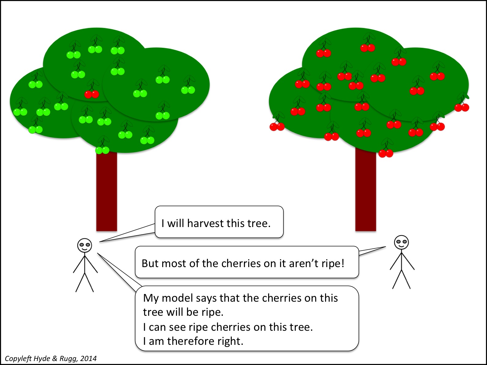
There are more below.
Argument by caring a lot

Using an incomplete toolkit (1) 
Using an incomplete toolkit (2) 
Naïve postmodernism

Argument by authority

Argument by sexism

Argument by Internet

Argument by faith and feelings 
Notes, links and sources
The mention of nightlock berries is indeed an allusion to Hunger Games, if you’re wondering.
The “has a beard” line is a tribute to this brilliant clip: A Mom Talks with the Director of Special Education.
http://www.youtube.com/watch?v=A6fcIqUHz8Q&feature=sharecontrol
The phrase “naïve postmodernism” is to make the implicit point that postmodernism can give useful insights, if used appropriately.
You’re welcome to use the Hyde & Rugg cartoons above for any non-commercial purpose, including lectures, provided that you retain the “copyleft Hyde & Rugg” attribution within the cartoon. I’ve deliberately not included titles within the cartoons, so that anyone re-using the cartoons can use their own titles for them.
There’s more about reasoning and research methods in The Unwritten Rules of PhD Research, by myself and Marian Petre.
The Unwritten Rules of PhD Research, 2nd edition (Marian Petre & Gordon Rugg)
http://www.amazon.co.uk/Unwritten-Rules-Research-Study-Skills/dp/0335237029/ref=dp_ob_image_bk
There’s more about the theory behind this article in my latest book:
Blind Spot, by Gordon Rugg with Joseph D’Agnese
http://www.amazon.co.uk/Blind-Spot-Gordon-Rugg/dp/0062097903


May 31, 2014
The studied subtexts of academic insults
By Gordon Rugg
The academic insult at its best is a highly sophisticated art form with a long, rich history.
A classic example comes from one of my heroes, Thucydides the Athenian, in his History of the Peloponnesian War. That war between Sparta and Athens took place two and a half thousand years ago. He fought in it, and he wrote its history. He was brilliant by anyone’s standards, and the studied impartiality of his writing is remarkable even by the most rigorous modern standards. Here’s what he had to say about what people’s knowledge of contemporary history.
There are many other unfounded ideas current among the rest of the Hellenes, even on matters of contemporary history, which have not been obscured by time. For instance, there is the notion that the Lacedaemonian kings have two votes each, the fact being that they have only one; and that there is a company of Pitane, there being simply no such thing. So little pains do the vulgar take in the investigation of truth, accepting readily the first story that comes to hand.
It looks like a rant from a grumpy old man just before he yells at some kids to get off his lawn. In fact, it’s an elegant, cutting, multi-level take-down that’s on a par with what the best modern academics can offer.
This article is about the serious, constructive subtexts beneath academic insults, and about what those subtexts say about the nature of research.
Long after the war: Scenes from Sparta and Athens today

Images from Wikipedia
Much of proper academic research comes down to a variation on “show and tell”. Professionals show something; amateurs claim something. In any halfway sensible environment, showing wins over telling every time. That’s one of the things that’s going on in this insult. It shows that the target person has done something bad. That’s a much stronger attack than simply claiming it. So, just what is going on here?
Who’s the target?
Thucydides isn’t just ranting at random in the paragraph above. In fact, he’s aiming at a specific target, namely the earlier historian, Herodotus.
When you read Herodotus’ work, he comes across as a delightful person, with an endless supply of fascinating stories, and a deep interest in the world around him. He’s not exactly the most rigorous scholar in history, but he’s careful to distinguish consistently between what he saw himself (invariably accurate, even the bit about flying snakes, if you look carefully), and what he hard from other people (weird and wonderful). It’s as a result of this care that most modern scholars believe what he said about the ancient Phoenecians having circumnavigated Africa, and about the Greeks knowing what the cause was of the annual flooding of the Nile, among other things.
How do we know that Herodotus was the target? Because the two specific errors that Thucydides cites are both from Herodotus’ Histories. They’re such obscure points that Thucydides almost certainly had Herodotus in mind.
That’s one of the elegant features of this art form; when you’re really good at it, you don’t even need to mention the name of the target.
What does it mean? The surface problem
Thucydides is showing that Herodotus didn’t do his homework properly, and is making incorrect statements in his history.
What does it mean? The deeper problem
The implication is that if Herodotus was careless about these two points, he might well have been equally careless about others, and that therefore his work isn’t to be trusted. That’s a serious problem in a historian.
There’s a further implication that the truth should come before everything else, including comfort. If finding out the truth is difficult and extremely hard work, then that’s the price that you pay, without hesitation.
That might seem obvious to modern researchers, but it was very different from the view taken by Thucydides’ contemporaries, who thought that histories should be used to demonstrate morally improving and praiseworthy concepts, even if that meant bending the truth a bit to produce the desired outcome.
It’s also very different from the viewpoint of many present-day denizens of the Internet, as demonstrated in most online comments sections…
The typo on p173
You might be wondering whether Herodotus’ supporters could have retorted along the lines of “No, you got it wrong yourself” (Herodotus himself was dead long before Thucydides wrote the paragraph above). However, Thucydides was using a strategy that’s still routinely used by PhD examiners and journal reviewers today. If you’re one of these fine people, you make a point of checking particularly carefully for obscure errors about three quarters of the way through the text. (Note: “particularly” carefully. You read the rest of the text carefully; you don’t skim it.)
Why focus on that place in the text? Because it’s the point where most PhD candidates and new researchers have started to get weary and make mistakes, and it’s also the point where they might innocently think that critical professional readers might have resorted to skim reading. So what the professionals do is to look long and hard for errors there. The subtext is: “I’ve picked up this obscure error on page 173. If I’ve picked that up, it may just have been luck, but it may be that I’ve read the whole damned thing in equally minute detail and can take you apart effortlessly if you test my patience. Now, do you feel lucky, punk?”
The two points that Thucydides picks out, in case you’re wondering, are from the second half of Herodotus’ book, straddling the 75% line.
It’s a very, very different subtext from having the same two errors pointed out by some hobbyist crank who has picked on minor details because they can’t find anything else that’s wrong. Professional researchers are well aware of the surrounding context for the “typo on page 173” type of criticism; amateurs tend to be blissfully unaware of it.
Another point about these two errors is the ground that Thucydides was choosing to make his criticism. Ancient Greek readers of Thucydides would be well aware that he spent years in exile in Sparta, so if he made some specific statements about obscure points of Spartan law or history, there’s a very good chance that he would be right about them, and that he had chosen those points precisely because he had checked them very carefully indeed. Again, professional researchers would almost certainly spot the significance of this point, and would know better than to get into argument about it.
The invisible compliment
The bottom line is that Thucydides has shown that Herodotus was wrong on two specific factual points of contemporary law that would have been easy to check. That’s a serious shortcoming in a historian.
However, after making that point, Thucydides goes on to start the main body of his own history at the point where Herodotus’ history ends. The implicit point is that Thucydides is treating Herodotus as being good enough on the main points to mean that Thucydides doesn’t need to re-write the material that Herodotus covered. That’s a high professional compliment. Like the target of the insult, it’s a compliment that’s invisible to people outside the discipline – he doesn’t actually say something positive about Herodotus, but instead he does something very generous. Again, it’s show versus tell.
A modern example
The academic insult is still very much alive as an art form, with new forms of insult being continually invented.
One widely cited example is the description of a piece of work as “Not even wrong”. There’s a deep subtext there about the nature of scientific investigation, and about the target being so ignorant of scientific methods that their work is nothing more meaningless noise.
Another that’s not so well known outside professional research is: “There’s a literature on that”. This can be a helpful statement of information. It can also, however, be an insult with the following subtext: “This topic has been exensively researched for years, and the fact that you don’t know about the literature on it shows that you’ve got a massive, embarrassing gap in your knowledge, so you’ve failed dismally to do your homework, and anyone who knows the field properly could dismantle your naïve and amateurish arguments in twenty minutes flat, if they thought that you were worth bothering with in the first place”.
Closing thoughts
Academia is like an ancient jungle; a rich, complex eco-system with numerous hidden threats lurking in the undergrowth, ready for the unwary. When you know the environment, then you start recognising the signs of potential trouble – the equivalent of the slide marks where a big croc has come ashore, or the type of cover where a leopard might be waiting in ambush.
That’s a scary thought. A more positive way of viewing this environment, if you’re now feeling depressed, is that what appear to be insults in this world often aren’t insults in the usual sense of annoying personal attacks. Instead, they often fill the role of preliminary warning signals – the threatening growl of a predator whose territory you have invaded, or the sound of a snake slithering through the foliage when you disturb it. If you want to engage in debate about research with professionals, then it’s a wise idea to learn what the warning signals are, so that your expeditions into the jungle are safe and fruitful.
On which encouraging note I’ll stop. I hope you’ve found this useful.
Notes
There’s more about academic writing, insults and subtexts in The Unwritten Rules of PhD Research, by myself and Marian Petre.
The Unwritten Rules of PhD Research, 2nd edition (Marian Petre & Gordon Rugg)
http://www.amazon.co.uk/Unwritten-Rules-Research-Study-Skills/dp/0335237029/ref=dp_ob_image_bk
There’s more about the background theory for this article in my latest book:
Blind Spot, by Gordon Rugg with Joseph D’Agnese
http://www.amazon.co.uk/Blind-Spot-Gordon-Rugg/dp/0062097903
References, sources and links
https://en.wikipedia.org/wiki/File:Eurotas.JPG
The Thucydides quote is from The History of the Peloponnesian War, by Thucydides; translated by Richard Crawley.
http://classics.mit.edu//Thucydides/pelopwar.html


May 27, 2014
Education and nature, part 1
By Gordon Rugg
There’s a debate going on in education theory about “natural” learning versus what happens in formal education. It’s not likely to end any time soon, because it’s framed in the wrong terms. This article is about how the framing relates to a more widespread set of intertangled issues involving beliefs about nature and the natural. It’s a broad overview; I’ll deal with some of the issues separately in later articles.
As is often the case, one key relevant phenomenon was first noticed a long time ago. The ancient Greeks were well aware of it; there’s a fair chance that earlier civilisations had also spotted it.
As is also often the case, the ancient Greeks proceeded to invent an explanation for the phenomenon which was very plausible, and which was also not just wrong, but actually worse than wrong, because it lured everyone off in the wrong direction for the next couple of thousand years.
The phenomenon is that there are often two different ways of tackling a given problem.
Some people will tackle the problem “intuitively” – they are unable to express their methods in words, and they often refer to visual or other sensory issues in relation to their solution. This is arguably related to how children learn before they start formal education.
Other people will tackle the same problem “logically” – a key feature of their approach is that they use explicit, systematised notations and processes, very much like the methods that are used to instruct children in school.
So far, so good.
The ancient Greeks also spotted something that has been widely agreed ever since. The first approach is common among artists and in the humanities; the second is common in engineering and the sciences.
Again, so far, so good. After this, though, things quickly began to go subtly but deeply wrong.
The natural and the unnatural
The ancient Greeks had two words for it.
The “intuitive” approach became known as the Dionysian, after the god of revelry and fun.
The “logical” approach became known as the Apollonian, after the god who handled reason.
The image below shows a couple of fairly modern depictions. (Note for classically educated pedants: Yes, the first image shows Silenus, not Dionysos, for reasons that become clear towards the end of the article.)

(Images from wikimedia; attributions and links at the end of this article)
The Dionysian approach was associated with intuition, the senses, freedom, lack of restraint, the wild, and the natural.
The Apollonian approach was associated with logic, the intellect, control, restraint, the rule-based and the artificial.
It’s a distinction that’s been in use ever since, under various names. It crops up in education, in the debate about “natural” learning versus “school” learning. One interesting implication is that because “school” learning is being set in opposition to “natural” learning, “school” learning is therefore in some way “artificial” at best, and at worst unnatural.
I’ll leave aside for now the idea that “It happens in nature so therefore it’s morally right”. I’ll remain instead with the time-hallowed concepts of natural/intuitive versus artificial/logical.
When the same concept has been in use since ancient Greek times, it’s usually for one of two reasons.
One possible reason is that the ancient Greeks got it pretty much right. That’s what happened with Euclid’s work on geometry, which is still in use today.
The second common reason is that the ancient Greeks got it partially right, and then went off into wibble space with some plausible-looking but misleading idea that people have been arguing about fruitlessly ever since.
So how does the distinction between “the intuitive/natural” and “the logical/artificial” stand up to that test?
It’s a very plausible distinction, and it can easily be mapped onto everyday experience, but that doesn’t actually prove very much. Just because something has high descriptive power, that doesn’t mean that it’s true or useful.
An everyday example of the problems with descriptive power involves a pair of proverbs.
Look before you leap.
He who hesitates is lost.
Anything that goes wrong can be accounted for by one or other of those two proverbs. Between them, they can describe every mishap. They have high descriptive power.
However, in terms of predictive power, and analytic power, they are completely useless. They give no guidelines on how to assess a particular case in advance, so you can decide whether the right strategy is to spend more time looking before leaping or to move quickly before the opportunity is lost. They can only be applied in hindsight, at which point they give the impression of wisdom, but are utterly useless in practical terms.
The distinction between “intuitive” and “logical” doesn’t stand up well to this test. Intuition in particular is usually treated as a black box, and viewed as something quasi-mystical that can’t be explained in words. This isn’t very helpful.
In a later article, I’ll look at a more productive way of analysing this distinction, in terms of parallel processing versus serial processing. Here, though, I’ll look at the wider context of our view of “natural”.
The concept of “natural”
Attitudes towards nature and the “natural” have changed very significantly in Europe across the centuries, and are often very different across cultures. A classic examination of this topic is Man and the Natural World: Changing Attitudes in England 1500-1800, by Keith Thomas.
http://www.amazon.com/Man-Natural-World-Attitudes-1500-1800/dp/0195111222
It’s a fascinating read.
The image below shows a pair of scenes that illustrate a common modern view of the “natural” world in opposition to the “artificial” world.
 (Images from wikimedia; attributions and links at the end of this article)
On the left, we see a beautiful soft landscape, with sunlight falling on the contented peasants and on distant classical ruins. On the right, we see a model of the Parthenon, where every line has been carefully designed to show an aesthetic principle in the mathematics of its proportions. It’s clean and pure, and also impersonal, and on the edge of boring in its stylised perfection.
Nature and the artificial, however, haven’t always been viewed in this way.
The current western view of nature as something good and pure is quite a recent development, in historical terms. For much of history, nature has been viewed as threatening and wasteful. Nature tends to be viewed as benevolent by societies that feel in control of it, and that can afford to be nostalgic. It’s no accident that the Romantic movement, which celebrated nature, began in the same era as the Industrial Revolution.
This issue has recently started to re-surface in response to suggestions that Europe should be substantially re-wilded – in other words, that we should re-introduce as many species as possible to their pre-modern range. That idea started off well, but soon ran into serious opposition. Here are two reasons for the opposition.

(Images from wikimedia; attributions and links at the end of this article)
Even though wolves and bears live wild in several European countries, there’s substantial opposition to the idea of re-introducing them to countries where they have gone extinct in historical times, such as Britain. A very common reason is fear: fear that these animals would kill people. The statistics of human deaths from wolf attacks and bear attacks don’t have much effect on this fear; it’s visceral, not statistical. Nature, in this context, is no longer a cosy view of idyllic landscapes; instead, it’s much closer to the old concept of nature as something untamed that might maim or kill you.
When you look at ancient Greek images of Dionysos and Apollo, as opposed to the modern-era images at the start of this article, you realise that the ancient Greek world view was very different from our modern view of the same concept.

(Images from wikimedia; attributions and links at the end of this article)
In the image above, Dionysos is very different from his companion Silenus, the kindly old man on a donkey in the first image in this article. Instead, Dionysos is shown riding on a panther, hinting at the savagery of the wild revels with which his worshippers were associated. Apollo isn’t an austere white marble statue; instead, he is represented in gold and in ivory, with facial proportions very different from the usual stylised busts that we see in museums, and in colours very different from our usual stereotype of white marble. The relationship between the two deities was complex, and was not a simple pair of mirror-image opposites. It was a very different world back then from what we usually imagine.
So, where does that leave us?
One theme that emerges is the widespread assumption that natural implies good, and that one of its opposites, artificial, has undertones of unnatural.
This assumption is widespread, but that doesn’t make it true. When we look at concepts of nature across time, we see that this view of nature as good is usually a product of societies where nature is perceived as having been tamed.
The issues above crop up in a wide variety of debates and in various forms. The debate about “natural” learning and “artificial” learning is one example, to which I’ll return in a later article.
Another issue is the belief that intuition is natural and that therefore it is better than “artificial” approaches such as using science, evidence and systematic reasoning. This has big implications for public policy debate. I’ll be looking at the use of evidence within different rhetorical styles in another later article.
Just in case this discussion of nature has dashed some of your illusions, here’s a closing image that’s more positive, showing the good side of nature. I hope it brightens your day…

(Image from wikimedia; attribution and link at the end of this article)
Notes
There’s more about the background theory for this article in my latest book:
Blind Spot, by Gordon Rugg with Joseph D’Agnese
http://www.amazon.co.uk/Blind-Spot-Gordon-Rugg/dp/0062097903
References, sources and links
The first image is a composite of details from the original images below:
Second image:
https://commons.wikimedia.org/wiki/File:Ujh%C3%A1zy_Romantic_Landscape_with_Figures.jpg
Rewilding image:
https://commons.wikimedia.org/wiki/Brown_bear#mediaviewer/File:Brown-bear-in-spring.jpg
Classical images of Dionysos and Apollo:
https://commons.wikimedia.org/wiki/File:Dionysos_panther_Louvre_K240.jpg
https://commons.wikimedia.org/wiki/Category:Apollo#mediaviewer/File:Chryselephantine_Delphi_ver2.jpg
The final picture is a cropped version of this image:
https://commons.wikimedia.org/wiki/File:Cute_Cat_Sleeping_with_Kitten.jpg


May 23, 2014
STROBE: STRuctured OBservation of the Environment
By Gordon Rugg
STROBE has been around for decades. The world has moved on since STROBE was first developed, but the underlying principles of the technique are still useful.
In this article, I’ll briefly describe the core concepts of STROBE, and then describe the modified version that I use, with some comments about what’s still useful from the original technique, and about how it can complement other approaches such as flight path analysis.
As its name says, STROBE is a framework for conducting a STRuctured OBservation of the Environment. In its original form, it was designed for analysis of a decision-maker’s office. The decision-maker was usually, but not necessarily, a manager.
STROBE was structured around the metaphor of a movie set. The method involved looking at some key features of the office, such as:
Location of the office
Location of the decision-maker’s desk
Décor
Hard-to-move contents of the office (akin to props in a movie set)
Light, easily movable, contents of the office (akin to props in a movie set)
External versus internal sources of information
Each of these features was used to make inferences about the decision-maker and the organisation.
This should become clearer via a worked example. Here’s what happens when you apply a version of STROBE to my office.
Location
The diagram below shows the location of my office. It’s near a turn in a corridor. There are some frequently used locations in both directions (the male and female toilets, and the kitchen containing the tea/coffee making equipment).
 Image copyleft Hyde & Rugg, 2014
Traditional STROBE implicitly recognised the concept of “flight path” but didn’t have an explicit term for it. Because my office is on three heavily used flight paths, I usually keep my door closed, to minimise distracting noise, and to maintain confidentiality from people outside if I’m discussing a sensitive topic with someone in my office or on the phone.
This can give the impression that the office occupant is aloof and unapproachable. In my department, we’ve tackled that problem by having an “about me” page on each door, with a friendly photo of the office occupant and some information about them.
Location of the decision-maker’s desk
In the original version of STROBE, this observation was used to make inferences about the personality and management style of the office occupant. If the desk is placed facing the door, between the occupant and the person entering the office, this implies a confrontational, authoritarian style. If the desk is placed in a side-on configuration, this implies a more egalitarian style.
Here’s a photo of what you see when you open my office door. My desk is side-on to the door.
 Image copyleft Hyde & Rugg, 2014
Does this mean that I’m egalitarian and approachable? Maybe. However, if you superimpose a flight path between my chair and the door, it’s a straight line. Maybe I just didn’t want to have to walk round my desk every time I entered or left the office.
This uncertainty is one key limitation of STROBE if you use it on its own; you’re making inferences which may be seriously mistaken. Sometimes you’re able to use other information from STROBE to resolve these uncertainties – for instance, STROBE analysis of the easily moved contents of my office strongly suggest that the desk layout is motivated by my approach to information sharing, not simply a direct flight path to the door. In general, it’s wise to use STROBE in combination with other techniques that are good at eliciting the reasons for a particular feature or layout, such as laddering and scenarios.
Décor
In the original version of STROBE, you would look at the colours of the wall, carpet, ceiling, etc, and make inferences about whether this was a welcoming environment.
There was an implicit assumption that the office occupant chose those features. In reality, most office occupants have to live with what they’re given. You might be able to make some inferences about the organisation, as opposed to the office occupant, from the colour scheme etc. However, you might just be looking at a colour scheme that reflects which paints were cheap when the office was last decorated.
What’s more likely to be informative is the easily movable décor – pictures, posters, etc. I’ll discuss those below, in the section on light, easily movable office contents.
Hard-to-move contents of the office (akin to props in a movie set)
In both the traditional version of STROBE and the version I use, you look at the large fixtures and furniture. My office has three filing cabinets, all of them four drawer cabinets. That’s an unusually large number. There’s a reason for it (relating to my journal editorship). That’s precisely the sort of thing that STROBE was designed to spot, so that you know where to start focusing your attention.
Another unusual feature of my office is the pair of chairs beside the coffee table. They’re identical chairs, and they’re armchairs. This implies, correctly, that the office occupant has a significant number of informal meetings that are important enough to merit setting up this feature.
The coffee table is a low-cost modern replica of a traditional design, strong enough to stand up to the knocks and accidents of a working office environment. Functionality is the prime concern, not trying to impress the visitor with expensive antiques.
Light, easily movable, contents of the office (akin to props in a movie set)
Here’s a view of my office from the armchair area.
 Image copyleft Hyde & Rugg, 2014
There are a lot of small, easily movable items, such as the figurine, the clock and the glass jug.
What do those items tell you?
The clock is midway between my chair and the chair for visitors. Is that so that we can easily keep track of the time without needing to glance awkwardly at our watches? If so, that implies that the office occupant is often constrained by time. That assumption is right; the clock is there for just that reason, and is a couple of minutes fast, to allow for the human tendency to leave everything till the last moment. The figurine and jug are there to make the clock look more like a decorative feature, and less like a pointed hint.
That doesn’t explain why the clock is flanked by a replica Cycladic figurine and a replica Roman glass jug, rather than by something more obviously related to my job in computer science. The reasons partly involve personal aesthetic preferences, and partly making the point to visitors that a lot of my work is multidisciplinary. This can be very useful for heading off misconceptions before they arise, and can also be very useful as an introductory topic of ice-breaking conversation.
External versus internal sources of information
In the original version of STROBE, you looked around the office to see how many sources of information were in-house, and how many were external. This gave you an idea of how inward-looking or outward-looking the office occupant and/or the organisation might be.
That was before the Internet. Now, office occupants usually access information via their computer, and you have no way of knowing what types and sources of information they’re using.
However, you can still tell a lot about how the office occupant uses information, and make inferences from that, if you look at some other indicators.
For example, the computer on my desk is positioned so that it’s easily visible both by me and by visitors. That’s deliberate. I routinely show documents to visitors, including students, and discuss those documents with them. However, if I want to check something confidential, I can easily swivel the computer so that the information isn’t visible to the visitor.
Similarly, there’s a whiteboard prominently located on the wall, where it’s easily visible from all the chairs in the office.

Image copyleft Hyde & Rugg, 2014
It’s clean, ready to be used immediately. There’s a basket below it, on the right, that contains whiteboard pens and a chunk of kitchen roll for wiping the board clean. This suggests, correctly, that the office occupant uses the whiteboard a lot. It also suggests that visitors also use the whiteboard a lot – the whiteboard is located where everyone in the office has easy access to it, rather than behind the decision-maker’s desk. The basket contains a lot of pens in different colours, implying (correctly) that the whiteboard is often used for complex diagrams, not just to list ideas or to write equations.
Some quick questioning would uncover more layers of design rationale. For instance, one reason for the whiteboard being wiped clean is that I quite often discuss commercially sensitive ideas with students and other visitors. If we use the whiteboard to work something out, I make sure to wipe it off the board once we’re finished. The reason for that relates to patent laws, and their requirements about confidentiality.
Links with other approaches
STROBE works well when combined with other techniques. I’ve mentioned flight paths as something that fits neatly with STROBE; we’ve blogged about flight paths in an earlier article. Design rationale is another neatly complementary approach. There are also significant overlaps with sociotechnical approaches.
http://hydeandrugg.wordpress.com/2013/12/12/how-people-use-space-pedestrian-traffic-flows/
http://hydeandrugg.wordpress.com/2013/08/27/decision-rationale-the-why-and-the-wherefore/
http://hydeandrugg.wordpress.com/2014/05/10/sociotechnical-analysis-room-layout-and-education/
STROBE also combines well with techniques for eliciting reasons for designs and actions, such as laddering, critical incident technique and scenarios.
http://www.hydeandrugg.com/resources/laddering.pdf
Conclusion
STROBE is useful as a way of giving structure to how you observe an office and how you decide where to focus your attention.
Some parts of the original STROBE are now a bit outdated, but the core concept is still helpful.
Notes
You’re welcome to use Hyde & Rugg copyleft images for any non-commercial purpose, including lectures, provided that you state that they’re copyleft Hyde & Rugg.
There’s more about the background theory in my latest book.
Blind Spot, by Gordon Rugg with Joseph D’Agnese
http://www.amazon.co.uk/Blind-Spot-Gordon-Rugg/dp/0062097903


Why don’t they…?
By Gordon Rugg
Robert Heinlein, the science fiction writer, once observed that the answer to any question beginning “Why don’t they—“ is almost always “money”.
It’s a great line, and rewriting it feels faintly like vandalism. However, as often happens with humour, it contains a lot of truth, but subtly misses a more important point. To avoid spoiling a great line for Heinlein fans, I’ve put my dissection of this line beneath the fold.
If you ask a researcher why they don’t do something, the answer usually isn’t “money”. It’s usually “time”. The underlying principle is the same; the reason is lack of resources. Resources take various forms – sometimes money, sometimes time, sometimes raw materials.
One thing that’s seldom listed under “resources” is “knowledge”. However, it’s often a key missing resource. Problems often happen because the people involved didn’t have the key knowledge or skills.
So how can you know which knowledge and skills are needed for a particular situation? That raises the concept of a knowledge audit.
Why haven’t I blogged about that yet? The humorous answer to that is “Time”…
I’ll be returning to this theme when I’ve finished blogging about the conceptual toolkit that’s needed to describe a knowledge audit. Next on the stack is an article about STROBE, a technique for systematically observing an environment.


May 19, 2014
How long is an education good for?
By Gordon Rugg
There has been a lot of debate over the centuries about the purpose of education. The fact that the debate is still active suggests that either the question is unanswerable, or that it needs to be rephrased.
One way of looking at the problem is graphically. If we represent a lifespan as a timeline, then what insights does that give us about the possible purpose, or purposes, of education?

That’s the topic of this article.
In this article, I’ve described some popular models of education, and taken each of them to its logical extreme, to make its implications more starkly outlined.
The “getting a job” model
One common argument is that education leads to employability – that, in essence, the purpose of education is to provide the qualifications that a student needs when applying for a job. I’m taking this to include the student needing to show factual knowledge from the course as a necessary part of the job interview.
If we take this view literally, then the education has achieved its purpose as soon as the student finds a job. Supposing that it takes a student a year to find a job after graduation, then the useful duration of the education, as opposed to the qualification, would be represented by the thin red rectangle between education and work in the diagram below. (I’ve shown all the other blocks in white, for clarity.)

The “knowledge for doing a job” model
Another widespread view is that education provides students with the knowledge needed to perform a job. This is different from the “getting a job” model because many employers use qualifications as a way of assessing a candidate’s ability, with the actual work often being very different from anything on the student’s course. The “knowledge for doing the job” model is often used as an argument for training, rather than educating, students.
We’ve discussed this distinction in an earlier article:
One issue here is that knowledge within any field will change over time. This is particularly obvious in high-tech areas such as computing. There has been some interesting research into how long knowledge lasts within a particular field before becoming outdated. One widely used approach is to see how long it takes before half of the knowledge in a field is obsolete, for instance by looking at the contents of standard textbooks in successive years. This is referred to as the half-life of knowledge, by analogy with the concept of half-life in atomic physics.
The results are sobering. In psychology, for instance, the half-life of knowledge has been estimated at about five years. A common pattern is that some parts of a field stabilise and stay constant for decades or centuries (e.g. Euclidean geometry in mathematics) while other parts – usually the hottest topics – are unstable.
The diagram below shows a five year half-life as a chunk of a life line.

The “taster” model
Another view of education is that it provides students with an overview of what is available, whether in terms of academic subjects to specialise in, or types of employment, or both. So, for example, a student might discover a love of a subject that they had never previously heard of, as a result of being introduced to that subject during education.
Taking this model to its logical extreme, education helps the student decide which type of career they want to pursue. At the point where the student enters employment, the education has completed its job.

The “well-rounded citizen” model
This is a long-established model, of the citizen as a well-rounded individual who is able to make informed choices as a voter, and as a member of society. In this model, education is explicitly intended to be relevant to the whole of a student’s adult life.

Discussion and conclusion
The diagrams above show the very different timescales of the different models. They also help make the point, via reduction to the absurd, that these models are not necessarily mutually exclusive.
They also raise another, bigger question. What evidence does each model require in order to function properly?
The “getting a job” model, for instance, requires that education choices should be based on a thorough set of evidence about types of employment available, and about what is required to enter each of those types. That’s a challenge, but it’s not impossible. The US Bureau of Labor Statistics, for instance, classifies jobs into 23 major groups, which it then breaks down into 840 detailed types.
When you look in detail at what each type of job involves, you realise that the entry requirements can be diametrically different, even within a single sector. A low-level computing job in one organisation might require specific programming skills so that the student can start doing useful work on their first day; in contrast, applicants for a creative or managerial-track job in a major software house will often be selected in terms of general ability and aptitude, rather than specific skills.
A “one size fits all” approach to what employers want simply doesn’t work; one size doesn’t fit all. It also ignores the issue of employers being only one group of stakeholders in society. There’s more to life than employment – there are also issues such as interpersonal relationships, and life skills, and citizenship, which are outside the remit of employment but which are essential for a society to function properly.
When you look at the evidence being used in popular debate about education, you soon realise that there are plenty of cherry-picked statistics, but there’s a noticeable absence of systematic data collection relating to the central assumptions of each model (for instance, just what are the requirements of the “well rounded citizen” model?)
These questions can be answered; we’ve blogged extensively about methods that can be used to tackle them systematically and efficiently. However, the methods that have so far been used are typically either applied unsystematically, or applied crudely – for instance, simply asking employers what skills they want candidates to have, and then treating those replies as gospel, rather than doing a more thorough analysis of what is needed as opposed to what is wanted. Again, we’ve blogged in detail about ways of doing this, in our articles on finding client requirements. The overview in our “one hundred articles published” post contains links to those articles:
There’s also a significant absence in the diagrams above. I’ve omitted any discussion of adult education. That’s an important issue, both from a social point of view, and in terms of the internal logic of the “getting a job” and the “knowledge for doing a job” models. Anyone proposing either of those models for school education should also have a proposal for how adult education would fit into the educational system.
This article isn’t intended to provide answers to the questions above. However, it should clarify some of the issues involved in those questions, and should identify some better ways of finding answers.
Notes
You’re welcome to use Hyde & Rugg copyleft images for any non-commercial purpose, including lectures, provided that you state that they’re copyleft Hyde & Rugg.
There’s more about the theory behind this article in Gordon’s latest book:
Blind Spot, by Gordon Rugg with Joseph D’Agnese
http://www.amazon.co.uk/Blind-Spot-Gordon-Rugg/dp/0062097903
Related articles:
https://en.wikipedia.org/wiki/Half-life_of_knowledge
http://hydeandrugg.wordpress.com/2014/04/25/how-complex-should-education-theories-be/
http://hydeandrugg.wordpress.com/2014/04/13/an-education-framework-based-on-knowledge-modelling/
http://hydeandrugg.wordpress.com/2014/04/21/compiled-skills-and-education-theory/
http://hydeandrugg.wordpress.com/2014/04/01/teaching-the-facts/
http://hydeandrugg.wordpress.com/2014/03/30/just-the-facts/
http://hydeandrugg.wordpress.com/2014/03/23/false-dichotomies-in-education-theory/
http://hydeandrugg.wordpress.com/2013/05/27/the-verifier-approach-part1/
http://hydeandrugg.wordpress.com/2014/03/19/visions-of-course-structure/
http://hydeandrugg.wordpress.com/2014/02/27/what-are-craft-skills-a-brief-overview/


May 12, 2014
From boilerplate to pixy dust: Useful writing tips for stressed students
By Gordon Rugg
There’s plenty of guidance and advice available if you’re a professional who is wrestling with writer’s block, or who wants to know which sections a psychology journal paper should contain, or who is idly wondering whether the colon they’ve just typed should be followed by uppercase or lowercase.
It’s harder to find guidance if you’re an ordinary mortal facing problems like:
I’m trying to finish this essay but it’s 4 am and my brain’s frazzled and I want to cry
Why do I keep getting low marks even though I write lots of relevant stuff?
Is this good enough to get a decent mark?
Is this good enough to even scrape a pass?
Will I manage to finish this wretched thing by the deadline?
This article provides some help for stressed-out human beings in those situations.
Most people try to write something by starting at the beginning and then keeping going till the end. That’s logical, but it often goes astray.
You might find it more helpful to view writing as a set of different activities that you do at different times and in different ways. So, for example, one activity involves writing boilerplate text, which is solid and worthy and true and doesn’t need much inspiration or brainpower. Another, very different activity, is adding clever things and pixy dust, which usually involves a few minutes of work at a time, at times when your brain is bright and fresh and on form. With this approach, you can tackle different activities at different times, to match the state that you’re in and the time that you have available. It’s flexible, it’s practical, and it’s good for reducing stress levels and for raising the quality of your work.
The writing activies and concepts described in this article are:
Bullet pointing
Boilerplate – true but dull text
Bridging text – joining the bits together
Clever things and pixy dust that get you better marks
Topping and tailing – writing a good beginning and end
Flagging and snagging – attention to detail that brings better marks
I’ll go through them one by one, with a diagram for each one. The diagrams will make the article look long, but the actual text is pretty short, so you should be able to read it in a few minutes.
I’ll use this standard layout for each diagram. It maps fairly neatly onto widely used formats for essays and for academic papers, which begin with front material, then have the main material in the middle, and then end with references, appendices, etc.
 Copyleft Hyde & Rugg 2014
I’ll also use colour/greyscale to make it easier to keep track of what’s going on.
Bullet pointing
It’s what it sounds like:
Decide what the key points are that you want to make in each section
Write them down as bullet points
Keep the number low, so you focus on the essentials
Go through later and unpack each bullet point into connected text
Here’s what that looks like schematically.
 Copyleft Hyde & Rugg 2014
Brutal tip: If you run out of time, submitting something with bullet points in one section is a lot better than submitting something without any text at all in that section.
If you ask questions in one section, then answer them systematically in another section – remember to include bullet points for each question and for each answer
Boilerplate text
This is text that tells the story and gives the information the reader needs. It’s true and it’s necessary, but it’s not something that shows brilliance. For instance, if you’re writing about the use of social media, then you’ll need to write boilerplate text saying what social media are, and describing some examples.
A lot of the text in a typical piece of writing is boilerplate, as shown by the grey sections in the diagram below.
 Copyleft Hyde & Rugg 2014
Writing boilerplate text takes time, but doesn’t need brilliance.
Bridging text – joining the bits together
Bridging text smooths the transition between sections, so the reader can see more easily where the story is going.
 Copyleft Hyde & Rugg 2014
Bridging text doesn’t take long to write, but you do need a clear head, and you need to know exactly what the key points are that you’re trying to make. It’s easier to write bridging text once you’ve finished at least one of the pieces of boilerplate that you’re joining.
Clever things and pixy dust
These are chunks of sparkingly brilliant stuff worthy of good marks and praise.
It’s a good idea to go through your text systematically looking for places where you can sprinkle pixy dust; you should have at least one fleck of pixy dust in each section, and preferably as many as you can cram in.
Some examples:
References to the advanced literature
Concepts and technical terms from the advanced literature
Sophisticated overview statements about the field
Shibboleths and other indicators of quality (e.g. correct use of a technical term that students usually get wrong)
 Copyleft Hyde & Rugg 2014
If you’re not sure what counts as pixy dust, then it’s a good idea to ask a wise and approachable member of staff for guidance. (Remember to do this professionally, by booking an appointment and so forth, and by showing due appreciation; it will probably be one of the best investments of time that you make in your student life.)
Topping and tailing
This is like bridging text, except that it’s at the beginning and at the end.
 Copyleft Hyde & Rugg 2014
It’s usually a good idea to write the conclusion before you write the final version of the introductory page. This is because you’ll probably realise things while you’re writing the conclusion that you’ll want to mention in the introduction.
The first page of the introduction should prepare the reader for what’s going to follow, which is why it’s a good idea to write the final draft of this page last of all. (Also, remember to include plenty of pixy dust on this page, to create a good early impression on the reader.)
Flagging and snagging
Flagging involves preparing the reader for something that comes up later. For instance, if you’re going to bring in some unusual concept half-way through your essay, it’s a good idea to flag it early in the introduction, so it doesn’t come as a total surprise to the reader.
 Copyleft Hyde & Rugg 2014
Snagging lists are intended for yourself, to help you keep track of things you need to remember. They include lists of things to check, information to find, things to fix, and so on. They’re useful because if you spot a problem while you’re writing, you can just add it to the snagging list to fix later, rather than trying to fix it immediately because you’re worried about forgetting it.
If you have a few minutes free and you want a small manageable task, then tackling an item from the snagging list will probably give you a feeling of progress without needing too much brainpower or effort.
On which encouraging note, this article ends.
Notes
You’re welcome to use Hyde & Rugg copyleft images for any non-commercial purpose, including lectures, provided that you state that they’re copyleft Hyde & Rugg.
There’s more about the theory behind this article in Gordon’s latest book:
Blind Spot, by Gordon Rugg with Joseph D’Agnese
http://www.amazon.co.uk/Blind-Spot-Gordon-Rugg/dp/0062097903
There’s more about academic writing in The Unwritten Rules of PhD Research, by myself and Marian Petre.
Although it’s mainly intended for PhD students, there are chapters on academic writing which are highly relevant to undergraduate and taught postgraduate students. It’s written in the same style as this article, if that’s any encouragement…
The Unwritten Rules of PhD Research, 2nd edition (Marian Petre & Gordon Rugg)
http://www.amazon.co.uk/Unwritten-Rules-Research-Study-Skills/dp/0335237029/ref=dp_ob_image_bk
Related articles:
http://hydeandrugg.wordpress.com/2014/03/21/academic-writing-and-fairy-tales/


May 10, 2014
Sociotechnical analysis, room layout, and education
By Gordon Rugg
The core ideas behind sociotechnical theory look very simple:
Technology influences society
Society influences technology
Although they look very simple, they have surprisingly far-reaching implications, usually in conjunction with the Law of Unintended Consequences and with systems theory. Often, a trivial-looking decision has consequences that are unwelcome and unexpected. Early sociotechnical work by researchers at the Tavistock Institute included a classic study showing why introducing a new and apparently more efficient technology into coal mining had serious negative effects on the social structures involved in how the miners worked. This had huge practical implications, which was why the Tavistock Institute became involved.
A more recent example, examined in this article, is that the form of technology being used in education has major sociotechnical implications. These implications are easily missed, because they are so familiar that they are usually taken for granted as being inevitable parts of the education process.
I’ll start with a classic example. The image below shows two technologies whose social consequences were far reaching and unexpected.

Images from wikimedia and wikipedia
If you were an educated woman in early nineteenth century Europe or North America, your career options were extremely limited. You could do poorly paid manual work, or you could be a teacher or governess; for anything else, in an age before equal opportunities legislation, your chances of getting into a respectable profession were negligible.
That changed with the invention of the typewriter. Mechanical typewriters had commercial advantages over pens, and were rapidly adopted by businesses. This led to a demand for large numbers of literate staff to operate the typewriters. Businesses could pay women less than men for doing the same work, so the female typist soon became a familiar figure in offices.
This meant that an educated woman could become financially independent doing a respectable job, as a result of the invention of the typewriter.
This change coincided with another technical innovation, namely the development of bicycles. A woman could use a bicycle as a way of getting to and from work, which opened more opportunities – for instance, being able to work somewhere that didn’t have good public transport connections, while living away from the workplace in a place of her choice, rather than having to live in workplace acccommodation or with her parents.
The combination of these two technological developments paved the way for women’s emancipation, and a wide range of other social changes that were probably neither expected nor intended by the inventors.
A third major technological factor with dramatic implications for women’s emancipation arose from the opposite direction, in sociotechnical terms.
 Image from wikipedia
The oral contraceptive pill was invented as a result of planned research, when the society involved was favourable to the idea. It was an example of social pressures driving technology, rather than vice versa.
An educational example
Once you’re aware of sociotechnical issues, you realise that they occur in a huge number of places, and that their effects often reach surprisingly far reaching.
Here’s an example. It’s a diagram showing the layout of a classic university lecture theatre.
It’s a rectangular room, with a presentation screen at one end, and three banks of seats, rising toward the back. There’s an aisle down the middle of the seats. There are three windows. The students sit in the seats; the lecturer stands at the front.

So where does sociotechnological analysis come in?
For a start, there’s the layout of the room. The seating all faces front, towards the lecturer and the screen. The students have no control over the location of the seats or over the direction in which the seats face. That makes small group work difficult, and biases the room towards traditional lectures. Other implications become clearer when we look at the same room layout schematically, in terms of where things are happening.
At the start of the lecture, there are people coming through the door, and there are people taking seats, and there are people visible through the windows. I’ve shown this in red in the image below. The seats’ layout means that the audience can’t see each other very well – they can usually only see profiles or the backs of heads. I’ve shown the seats in light red, to correspond with this restriction in information. I’ve used dark red for the more interesting places, where the audience can see people moving about – the door, the windows, and the lecturer. Most of the room is either light or dark red, with something happening.

Here, as a contrast, is a schematic image of the same room during a typical lecture, when the window blinds are closed, the lights are down, and there’s a PowerPoint presentation on the screen.

The audience can dimly see each other, and they can see the lecturer, and they can see the screen, which will typically have about seven bullet points on it, each consisting of a few words. It’s an exercise in sustained sensory deprivation, where the only significant sensory input is completely under the control of the lecturer.
In social terms, there are a lot of issues about social power and constraint built into the layout of this room.
There are also a lot of sensory input issues that are just asking for trouble, even with university students. With younger school pupils, particularly any who have issues about sensory loading, such as children with ADHD, this layout is going to generate significant problems, and will almost certainly lead to discipline issues when those children start trying to redress the sensory underload by fidgeting or moving about.
Here, in contrast, is a thought experiment showing how a different technology would have very different implications. 3D hologram technology isn’t far away from being feasible. Imagine that 3D hologram projectors are a practical, affordable, everyday technology. What effect would they have on the layout of a lecture theatre and on the power relationships built into it?
The room would probably be centred around the place where the hologram appeared – the green circle with an “H” in the middle of the image below.

Because the image is three dimensional, the best arrangement for the students would be to have a walkway around the green hologram screen in the centre. This would let students walk around the image at a speed of their choice.
The seating would then need to surround the walkway (the blue quadrants in the image). For most efficient use of space, the room would be circular, which raises interesting architectural challenges about use of space; one possible alternative would be to have hexagonal rooms rather than circular, but that’s another story for another article.
This is a very, very different layout from the previous one. There’s also an unanswered question about the power relationships implicit in the layout. Where does the lecturer fit in this schema? In the previous layout, the lecturer stood next to the screen, sharing the privileged position with the screen, facing the audience. In this new circular layout, the lecturer can’t face everyone at once. It’s an issue familiar to the world of live theatre and live music performance, but less familiar to the world of education. This layout biases the power relationship towards the lecturer being a facilitator and helper for the students, rather than the lecturer as someone who controls the students. That’s very different from the usual power relationship in taught education, but quite similar to the power relationship in a research degree – one of the many places where universities are different from other places of education.
There are similar sociotechnical issues about the use of new technology, where the layout of the room, and the layout of the screens and keyboards and other equipment, all have significant implications for power relationships and social interactions and sensory load. This in turn has economic and political implications about the feasibility of education delivery via a significant IT component, and about attempts to standardise qualifications across international boundaries.
We’ll examine some of these issues in later articles. I’ll also blog soon about STROBE, a technique for analysing use of space systematically with regard to these issues.
Notes
You’re welcome to use Hyde & Rugg copyleft images for any non-commercial purpose, including lectures, provided that you state that they’re copyleft Hyde & Rugg.
There’s more about the theory behind this article in Gordon’s latest book:
Blind Spot, by Gordon Rugg with Joseph D’Agnese
http://www.amazon.co.uk/Blind-Spot-Gordon-Rugg/dp/0062097903
Related articles and links:
Images used in this article:
https://commons.wikimedia.org/wiki/File:Ladies_safety_bicycles1889.gif
https://en.wikipedia.org/wiki/File:Sholes_typewriter.jpg
https://en.wikipedia.org/wiki/File:Pilule_contraceptive.jpg


May 9, 2014
Friday funny warning signs
By Gordon Rugg
I’m interested in nonverbal signage. Sometimes I’m also interested in verbal signage. What’s the story behind the sign below? I have no idea, and I’m not sure I want to know.

This is from a feature about improbable signs, on Distractify:
I hope it brightens your weekend.


Gordon Rugg's Blog

- Gordon Rugg's profile
- 12 followers

