Gordon Rugg's Blog, page 17
June 20, 2014
Are writing skills transferable?
By Gordon Rugg
The short answer is: “Not really”.
The reasons for this answer take us through the literature on expertise, and through some little-known byways of history, including Caesar shouting “Squirrel!” and the strange case of the mesmerised trees.
Those byways should be a lot better known, because they have deep implications for education policy in theory and practice. This article unpacks the issues involved, and some of the implications.
Caesar, a squirrel, a tree, and Mesmer
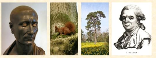 Images from Wikipedia and Wikimedia – details at the end of this article
Transferable skills are one of the flavours of the month in education theory. At first glance, this looks sensible. If you ask experts in a wide range of academic fields about key skills in their field, they’ll usually mention writing as one of those key skills. So far, so good.
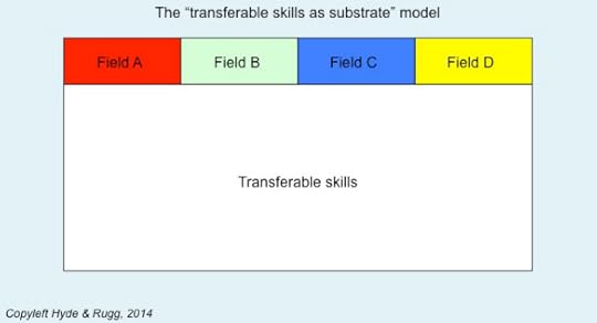
At this point, though, things usually start to go wrong. Here’s a diagram showing a common belief about how writing works across different fields.
In this model, there’s a deep shared substrate of skills, shown in white, that are shared by all of the specialist fields represented by the coloured boxes at the top of the diagram. The implication is that the early stages of education can teach those transferable, shared skills, and that the more advanced stages of education can teach the field-specific skills which sit on top of that substrate.
It looks sensible and plausible. That, however, isn’t the same as being true.
So what happens when you look at the evidence about specialist writing? The answer is that specialist writing isn’t a few extra features stuck on top of generic “good writing”.
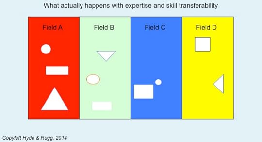
The key features of specialist writing in different fields run deep, and often in contradictory directions across different fields. This applies even to principles that might appear essential for any type of writing, such as making a piece of writing interesting or persuasive. The reality looks more like the diagram below, where each field is different all the way down, with occasional fragments that are similar, but not identical, across different fields.
In the following sections, I’ll look at some common beliefs about “generic good writing” and see how well or badly they map on to reality.
Common belief: Writing should be interesting
One of the opening lines that external examiners in the sciences quite often use in PhD vivas is: “This was an interesting read”.
It’s a line with a lot of sub-text, and you can tell a lot from a candidate’s response when they hear it. A strong candidate will immediately look wary, but not frightened. A weak candidate will look frightened. A clueless candidate will completely miss the sub-text, and look pleased.
So what’s going on there?
The sciences are very, very twitchy about interesting writing. The case of Franz Anton Mesmer highlights the reasons for this twitchiness.
This is the same Mesmer who invented mesmerism. His underlying idea was that a form of natural magnetism ran through everything in the world; he believed that the flow of the magnetism could be blocked, and that this could lead to illness. He further believed that blockages could be cleared by using the correct form of magnetism.
He was immensely popular and fashionable in the late 1700s, and his approaches appeared to produce some dramatic results. He was a great showman, which helped him considerably. He was also generous and public-spirited; for instance, he “magnetised” trees so that people unable to afford his full treatments could hug the trees (yes, literally) as a cheap way of clearing at least some of their blockages.
Then, in 1784, Louis XVI commissioned an inquiry into Mesmer’s claims. The inquiry included some of the best and brightest minds of the time, including Benjamin Franklin. The result was a devastating take-down of Mesmer’s claims, using some classic experimental techniques, which showed clearly that those claims didn’t stand up to rigorous testing. In one particularly striking example, the commission offered some “magnetised water” to one of Mesmer’s patients, who immediately went into the convulsions common in those circumstances; when she came out of the convulsions, she gratefully accepted the drink of water they offered her. Except, of course, that the committee had initially offered her ordinary water, and had offered her “magnetised water” afterwards.
As a result of experiences such as this, science researchers are very wary of plausible, charismatic characters; we’re equally wary of plausible, charismatic writing. We’ve seen too many cases of this type of writing being used to distract the reader’s attention from deep flaws somewhere else in a document.
So science writing that’s written for fellow-scientists is deliberately dry and understated in its style. That’s good for the field. It’s also good for the researcher; if you use this approach, then you’re much less likely to encounter problems when some of your work turns out to be wrong.
There’s a very different issue about interesting results, as opposed to interesting writing style. Interesting results are a very good thing indeed. However, they come out of factors such as research design, not out of writing.
A classic example is the closing section of the paper in which Crick and Watson first described DNA. They were very well aware that this was one of the most important discoveries in the history of biology. Here’s the last sentence before the footnotes.
“It has not escaped our notice that the specific pairing we have postulated immediately suggests a possible copying mechanism for the genetic material.”
That’s one of the biggest findings in biology, and also one of the most deliberately understated pieces of style that you’re ever likely to encounter. Which is precisely why I use it as an example of best practice in my lectures on academic science writing.
So, interestingness in writing style hasn’t fared too well as a transferable skill. What about some other common beliefs?
Common belief: Writing should be persuasive
As you might have guessed after reading the previous section, the idea that writing should be persuasive isn’t popular in academic science writing. In science, the evidence and the methodology should be persuasive, not the writing. When you see persuasive writing in science, you immediately wonder what weaknesses in evidence and/or methodology the writer is trying to distract you away from.
Another problem with persuasive writing is cherry picking. I’ve blogged about that before; I’ll use a cartoon from that article to illustrate the main problem with cherry picking, i.e. misleadingly selective use of only evidence that supports the writer’s claims, without any mention of counter-evidence that may be devastating to the writer’s claims.
http://hydeandrugg.wordpress.com/2014/06/01/cherry-picking-and-dodgy-reasoning-for-beginners/
Common belief: Writing should be informative
A closely related issue involves writing being informative. Being informative is generally agreed to be a Good Thing. That’s not a problem. The problem is deciding what to be informative about.
That takes us into concepts such as framing and agenda setting and, again, cherry-picking. It also takes us into the concept of writing between the lines, the counterpoint to reading between the lines.
The three classical authors that I’ve been writing about recently – Thucydides, Herodotus and Caesar – show three very different framings.
Thucydides attempts to give as accurate and impartial an account as he can of a major war, with the explicit reason that he believes the same basic issues will underpin future wars, so his account might help us better understand what’s going on. It’s a bleak, austere framing of trying to make sense of a cold, impartial universe. He focuses on being informative about the causes of the war, and the causes of the events in the war, and on being as even-handed as possible in his descriptions of the participants, even though he fought on the Athenian side, and lived for years in exile in Sparta.
Herodotus, in contrast, is telling a big story about ancient Greek exceptionalism. The implicit framing of his story is about exotic foreigners as a counterpart to the glories of Greece. He’s happy to describe some foreign customs that he thinks better than the ones back home, but the overall agenda behind his writing is demonstrating how good Greece is.
Caesar has a very different agenda. It’s about self-promotion. When you start looking carefully at his writing, then you start seeing patterns in how the bad news is presented. Often, it’s in terms of “So-and-so disobeyed orders, and was massacred by the enemy”. The between-the-lines implicit message is that if only they had done what Caesar said, everything would have been fine.
Sometimes Caesar uses another strategy to deflect criticism. Instead of blaming someone else, he diverts the reader’s attention by being informative about something else, such as colourful stories about unicorns, or about elks that don’t have knee joints. It’s the upmarket equivalent of shouting “Squirrel!” and pointing at something distracting.
What was he distracting the reader from? Among other things, the war that he waged in Gaul and Germany was a vastly destructive war, effectively genocide, that he carried out with weak justification, if any, to build up his own fortune and power. He had much to divert attention from, but the reader can easily lose sight of that in the excitement of the story he tells.
This is an issue that historians know all too well: history often involves very different possible framings for the same episode, and the choice between those framings, even for wars millennia ago, can cast a long shadow into present-day political debates.
Common belief: Writing should avoid vagueness
Our next example of a counter-intuitive principle also comes from politics and warfare. It involves the English Civil War, which wiped out a high proportion of the men of military age in the countries involved (it wasn’t just an English affair). When the war was over, and Cromwell had died, and the Protectorate was replaced by the Restoration monarchy, a lot of constitutional issues relating to the fine details of parliament’s relationship with the monarchy were unclear.
Charles II was no fool, and nobody felt much in the mood for re-fighting the Civil War, which would quite likely have been the outcome if anyone had tried to spell out explicitly what those fine details should be. So, in a fine example of practical politics, many of those issues were carefully obscured with vague phrasing, and left for someone else to sort out if that ever turned out to be absolutely necessary.
So, vagueness in writing can sometimes have its uses. Those occasions are rare, but when they do occur, they are often important.
Common belief: Writing should avoid ambiguity
Again, this is usually true. Ambiguity is usually much more dangerous than vagueness, because vagueness is usually easy to spot, but ambiguity is very easy to miss. You see one clear interpretation, and you miss another, very different, clear interpretation.
There are, however, some exceptions. One field that makes extensive use of ambiguity is entertainment in the broad sense – scriptwriting, fiction, and related fields. Often a key feature of the plot is an ambiguity. You see this in Macbeth, with the ambiguously worded prophesy about “No man of woman born” and you see it in every comedy of errors, and you see it in horror movies when the dark second meaning of an apparently innocuous phrase becomes apparent.
In consequence, being able to craft a plausible and powerful ambiguity is an important skill for writers of fiction.
Common belief: Writing should avoid jargon
This idea sounds fine, up till the point where you try to decide what counts as jargon and what counts as a necessary, precise, technical term.
This comes through very clearly if you try to describe in plain English something like how a piece of software works, or the components of an engine, or the blood vessels of the heart. There simply aren’t “plain English” terms for most of the things that experts need to talk about. Instead, there are specialist technical terms that are very tightly defined, so that all the experts involved can understand one another properly. (Would you feel encouraged if you heard a heart surgeon talking about “that twiddly bit there” before your heart operation?)
Usually, when someone complains about “jargon” it’s another way of saying that they don’t understand the complexities involved in a topic, and that they don’t want to be told that the topic really is more complex than they think.
So what’s left as a fully transferable writing skill?
In brief: Not much.
Expert writing is like any other branch of expertise. There’s a substantial literature on expertise, and a consistent finding is that expertise is brittle and subject-specific. This applies to expert writing. The skills and knowledge required for expert writing are subject-specific; some fields may share some writing skills and knowledge with others, but there isn’t a vanilla-flavoured generic substrate of “general good writing”.
Having said that, some skills are transferable across a surprising range of fields. They’re not transferable across every field, though, and they’re often not the sort of skill that people usually think of in this context. This is something I’ve been investigating as part of my interest in craft skills in the broad sense.
Here’s an example of a low-level craft skill that occurs in a wide range of apparently unrelated fields. If you want to know whether an object is internally flawed, you ping it, i.e. you hit it, and listen to the noise it makes. If it makes a clear ringing noise, it’s unflawed; if it makes a dull flat noise, then it’s flawed.
Things to ping: A flint handaxe and a bronze sword  Copyleft Hyde & Rugg, 2014
I encountered this in archaeology, when learning how to make flint artefacts; you ping the flint to find out if it’s good quality. I met it again in bronze working, as a way of assessing scrap metal. In traditional railways, the same method was used to check for flaws in metal wheels. Dentists use it to check for cracks in teeth and fillings. It’s surprisingly transferable, but this particular skill isn’t likely to feature prominently in any major education initiatives in the near future.
So, in summary, the idea of transferable writing skills looks attractive at first sight, but when you look at the details of the writing skills required in different disciplines, you soon realise that there are profound differences between the writing styles in those disciplines, and that schemes to teach transferable writing skills are at best a waste of resource, and at worse counter-productive.
This is an issue that’s already causing needless trouble. I’ve spent more time than I care to think about explaining to students why they need to set aside writing principles they learnt at school, and why computing uses some profoundly different key principles in writing, such as deliberately not being interesting or persuasive.
I’ve also had to spend more time than I care to think about explaining to students that no, this doesn’t mean that what their schools taught them was wrong; instead it’s more like the difference between a boiler suit and an interview suit, where each one is designed for a completely different purpose. If you try to clean a gunky engine in an interview suit, or go to a job interview in a boiler suit, then you’ll probably get what you deserve. It’s an important principle, but it’s not as widely known as it should be.
That’s probably not the most encouraging of closing notes, so as a happier ending, here’s a link to a brilliantly funny example of how not to transfer skills across domains, namely the Actors in Blackadder III. (If anyone deserves an uppercase initial letter, it’s the Actors…)
The actors roaring:
https://www.youtube.com/watch?v=42WFxAtoM-g
Notes
You’re welcome to use Hyde & Rugg copyleft images for any non-commercial purpose, including lectures, provided that you state that they’re copyleft Hyde & Rugg.
There’s more about the theory behind this article in my latest book:
Blind Spot, by Gordon Rugg with Joseph D’Agnese
http://www.amazon.co.uk/Blind-Spot-Gordon-Rugg/dp/0062097903
For more about Mesmer:
https://en.wikipedia.org/wiki/Franz_Mesmer
The Crick & Watson DNA paper is available online here:
http://www.nature.com/nature/dna50/archive.html
I’m aware of the debate about Franklin’s role in the discovery of DNA. The full story is complicated and messy, which is why I haven’t gone into it.
Sources for images (the wikimedia and wikipedia images in this article have all been cropped to fit)
https://en.wikipedia.org/wiki/Franz_Mesmer#mediaviewer/File:Franz_Anton_Mesmer.jpg
https://commons.wikimedia.org/wiki/Julius_Caesar#mediaviewer/File:Caesar_altes_Museum.jpg
https://commons.wikimedia.org/wiki/Red_Squirrel#mediaviewer/File:Eichh%C3%B6rnchen23.Febr.08.jpg


June 18, 2014
Herodotus on the phoenix, on the horned serpent, and on winged snakes
By Gordon Rugg
Just in case the earlier article about Caesar on the unicorn and Roosevelt on the moose left you hungry for more, here’s Herodotus demonstrating that his mastery of colourful travel writing is on a level that can only be matched by Jennifer Lawrence’s mastery of photobombing. And of tripping over at award ceremonies. And of devastating one-liners…
Anyway, here’s Herodotus, writing about Egyptian wildlife.
https://en.wikipedia.org/wiki/Phoenix_%28mythology%29#mediaviewer/File:Phoenix-Fabelwesen.jpg
73. There is also another sacred bird called the phoenix which I did not myself see except in painting, for in truth he comes to them very rarely, at intervals, as the people of Heliopolis say, of five hundred years; and these say that he comes regularly when his father dies; and if he be like the painting, he is of this size and nature, that is to say, some of his feathers are of gold colour and others red, and in outline and size he is as nearly as possible like an eagle. This bird they say (but I cannot believe the story) contrives as follows:setting forth from Arabia he conveys his father, they say, to the temple of the Sun (Helios) plastered up in myrrh, and buries him in the temple of the Sun; and he conveys him thus:he forms first an egg of myrrh as large as he is able to carry, and then he makes trial of carrying it, and when he has made trial sufficiently, then he hollows out the egg and places his father within it and plasters over with other myrrh that part of the egg where he hollowed it out to put his father in, and when his father is laid in it, it proves (they say) to be of the same weight as it was; and after he has plastered it up, he conveys the whole to Egypt to the temple of the Sun. Thus they say that this bird does.
74. There are also about Thebes sacred serpents, not at all harmful to men, which are small in size and have two horns growing from the top of the head: these they bury when they die in the temple of Zeus, for to this god they say that they are sacred.
75. There is a region moreover in Arabia, situated nearly over against the city of Buto, to which place I came to inquire about the winged serpents: and when I came thither I saw bones of serpents and spines in quantity so great that it is impossible to make report of the number, and there were heaps of spines, some heaps large and others less large and others smaller still than these, and these heaps were many in number. This region in which the spines are scattered upon the ground is of the nature of an entrance from a narrow mountain pass to a great plain, which plain adjoins the plain of Egypt; and the story goes that at the beginning of spring winged serpents from Arabia fly towards Egypt, and the birds called ibises meet them at the entrance to this country and do not suffer the serpents to go by but kill them. On account of this deed it is (say the Arabians) that the ibis has come to be greatly honoured by the Egyptians, and the Egyptians also agree that it is for this reason that they honour these birds.
Discussion
So what’s going on here?
Herodotus starts with the phoenix, where he makes his opinions very clear; he’s just reporting what he’s been told, even though he thinks that the story is as plausible as a front page story in The Onion.
Then he gives a very matter-of-fact description of a horned snake, treating it as no big deal. In case you’re wondering, there are indeed horned snakes; here’s a photo of the sort that’s found in the deserts of North Africa, which is almost certainly what he was describing.
 https://en.wikipedia.org/wiki/File:Hornviper_Cerastes_cerastes.jpg
He’s absolutely right about the horns and the size. He’s slightly optimistic about its harmlessness; the font of all knowledge encouragingly describes its venom as “not very toxic” and lists the not-very-toxic symptoms as “swelling, haemorrhage, necrosis, nausea, vomiting and haematuria”.
(https://en.wikipedia.org/wiki/Cerastes_cerastes)
So, overall, his accuracy is looking pretty good at this point.
Which brings us to the flying snakes.
What does he actually say about them? He opens by reporting what he saw when he went to find out about winged serpents. He says that he saw “bones of serpents and spines in quantity…” He then goes on to say “and the story goes that at the beginning of spring winged serpents from Arabia fly towards Egypt”.
As with the phoenix and the horned serpents, he’s distinguishing carefully between reporting other people’s stories and reporting what he himself saw. In the case of the winged snakes, he carefully doesn’t say that he’s seen bodies of winged snakes; instead, he says that he’s seen skeletons and spines. You get the impression that he doesn’t place much faith in the story, but that seeing the piles of bones has planted a seed of doubt in his mind.
I’ll re-examine this issue of careful wording in a future article. For the moment, it’s hard to top flying snakes as subject matter, so I’ll draw this article to a close.
By way of an inspirational closing note, here’s a link to some genuine gliding snakes. They’re not from Egypt, but they’re genuinely aerodynamic – they flatten their undersides to generate lift – and they’re snakes that don’t need a plane…
https://www.youtube.com/watch?v=RLbkVanjHVU
Notes
I’ve used the Project Gutenberg edition of Herodotus:
Title: The History Of Herodotus. Author: Herodotus. Translator: G. C. Macaulay
(Originally published in 1890, by MacMillan and Co., London and New York)


June 17, 2014
Caesar on the aurochs
By C.J. Caesar, with Gordon Rugg
Here’s Caesar writing about wildlife again. By way of a change, this description isn’t particularly weird – there are no elks without knee joints, and no unicorns. It’s about the aurochs, a now-extinct form of wild ox
XXVIII.-There is a third kind, consisting of those animals which are called uri. These are a little below the elephant in size, and of the appearance, colour, and shape of a bull. Their strength and speed are extraordinary; they spare neither man nor wild beast which they have espied. These the Germans take with much pains in pits and kill them. The young men harden themselves with this exercise, and practice themselves in this kind of hunting, and those who have slain the greatest number of them, having produced the horns in public, to serve as evidence, receive great praise. But not even when taken very young can they be rendered familiar to men and tamed. The size, shape, and appearance of their horns differ much from the horns of our oxen. These they anxiously seek after, and bind at the tips with silver, and use as cups at their most sumptuous entertainments.
You might be wondering about the description of this animal as being “a little below the elephant in size”. This time, Caesar is being pretty accurate. He was probably thinking of the now-extinct North African elephant, which was significantly smaller than the African elephant and the now-extinct Syrian elephant. Here’s a composite image showing an aurochs to scale against a photo of a forest elephant (similar in size and shape to the North African elephant) and a human adult male.
(Original images from wikimedia and wikipedia; details below)
A bull aurochs could be huge – up to about 6 feet high. I’ve scaled the image accordingly. Bull North African elephants could reach about 8 feet high. The image above assumes a big aurochs and an average-sized North African elephant, to make the point that Caesar wasn’t significantly exaggerating the size of the aurochs.
What Caesar said about the drinking horns is also true. Here’s the drinking horn of Sigismund III of Poland, made from the horn of the last aurochs bull.
https://en.wikipedia.org/wiki/Aurochs#mediaviewer/File:Hunting_horn_of_Sigismund_III_of_Poland.jpg
Here’s another example, which shows more clearly how attractive the horns could be. The horns were huge – they could reach nearly three feet in length.
https://en.wikipedia.org/wiki/Drinking_horn#mediaviewer/File:Drinkhoorn_roordahuizum.JPG
What he says about the speed and ferocity of the bulls is corroborated by numerous other sources, up till 1627, when the last aurochs died.
So, where does that leave Caesar?
We’ve had the story about hunting elk by taking advantage of elk (according to Caesar) having no knee joints, and sawing partway through the trees that the elk sleep leaning against, so the trees fall over when the elk lean on them. Not exactly high in credibility.
We’ve had the story of the unicorn, which sounds like a garbled description of a reindeer – maybe based on a sighting of a reindeer that had shed one antler but still had the second antler. That’s plausible.
We’ve also had his account of the aurochs, which tallies pretty well with the other sources of evidence, and is an accurate description even where it initially looks suspicious to a modern reader (in particular, the size relative to an elephant).
So, overall, it’s a bit of a mixture, as regards accuracy and distinguishing personal observation from reports of what the locals told him.
In the next set of posts about odd animal stories, I’ll be looking at three stories from Herodotus. I’ll then look at deeper issues about historical records, reliability, and rhetorical devices, using these animal stories as examples.
Notes and links
The image showing relative sizes of North African elephants, aurochs and humans was assembled from parts of the images below.
https://commons.wikimedia.org/wiki/Category:Heck_cattle#mediaviewer/File:Aurochs_heck_comparison.jpg
https://commons.wikimedia.org/wiki/File:Forest_elephant_group_8_%286841413452%29.jpg
The Caesar quote is from Caesar, C.J. De Bello Gallico. Project Gutenberg; Everyman’s Library version, 1915 edition, translated by W.A. MacDevitt.


The Perils of Premature Pigeonholing (or, What Shape is the Internet?)
By Gordon Rugg
This is a picture of my scroll boxes.
I use them to keep my scrolls in.
They’re a good example of the problems that arise when someone tries to cram a new idea into an old pigeonhole. A lot of the problems in current debates, such as the debate about the future of education, arise from that type of problem.
Some background: In case you’re wondering, I have scrolls because of my work on visualisation. Among other things, I was wondering about the possibilities that might open up if you escaped from the “one side of A4” format that has quietly taken over much of the current world.
My scroll boxes in context; note scrolls hanging above the coffee table
The scroll boxes used to be wine boxes. They’re a good size for keeping scrolls in. The separate compartments prevent the scrolls from getting tangled up with each other. They’re not exactly the same in shape and layout as traditional scroll boxes, but they get the job done neatly and efficiently. If I was using the scrolls frequently, I’d adopt the traditional approach of giving each scroll a label, attached by a length of thread, which would hang down the front of the scroll box. It’s all very sensible and practical.
That’s how information used to be stored, back in classical times.
So what happened when the first books were produced?
It’s pretty obvious that the scroll compartments aren’t a good size or shape for holding a book. For book storage, you need bigger compartments. Also, because books have flat faces, they can easily be stored either on top of each other, or stood vertically right next to each other. It’s so familiar to us now that it’s hard to imagine this being a new idea at some point in the past.
Books stored horizontally and vertically, on my bookshelves
Copyleft Hyde & Rugg, 2014
So, when books came along, the storage infrastructure had to change. When you’re dealing with a tangible object like a big heavy book, you can’t use dodgy definitions to claim that in some sense the book fits into the scroll box. It’s pretty clear that something like the Gutenberg Bible is never going to fit into a compartment that’s only just big enough to hold a standard wine bottle. That sounds trivially obvious, but it has far-reaching implications, as we’ll see later.
If we fast-forward a few centuries, we see numerous changes in information storage media – the gramophone record, the audio cylinder, the audio tape, the CD, for example. All of these could be conveniently stored in some variation either of the pigeonhole or of the shelf – they were all either basically cylinders or basically flat boxes.
And then the Internet came along. It’s not something that you store in a pigeonhole or on a shelf – those concepts are meaningless in relation to the Internet. Instead, you need to use a completely different set of concepts to handle it; the old concepts simply can’t be applied to it. In technical terminology, the Internet doesn’t fit within the range of convenience of the old concepts.
Mental pigeonholes
So far, I’ve looked at physical pigeonholes. They demonstrate clearly that you can’t simply shove every new thing that comes along into one or two structures that you already have available.
You encounter exactly the same problem with mental pigeonholes. The trouble with mental pigeonholes, though, is that they make it much easier to tell yourself that something is a fit, even when it isn’t.
This happens a lot with public policy discussions. It’s common for people to try to cram different arguments into pre-existing pigeonholes that are the wrong size and shape. Because ideas are intangible, it’s much harder to show that this cramming is a gross distortion.
One common form of pigeonholing involves trying to force ideas into one or other of two categories, with no other possibilities allowed – for instance, “traditional” versus “modern”. I’ve blogged about that in earlier articles.
http://hydeandrugg.wordpress.com/2014/03/23/false-dichotomies-in-education-theory/
Another common problem with premature pigeonholing is that it’s often combined with a smugly complacent belief that the new idea is just another reinventing of the wheel by some new kid who doesn’t have the pigeonholer’s experience and wisdom. One common manifestation is along the lines of “Oh, that was covered by Plato” as if all subsequent research is either fine-tuning of Plato’s core idea, or is wrong because it disagrees with Plato. This belief is irritating enough when it’s held by an arrogant student. When it’s held by someone who can influence public policy, then it’s a serious problem.
The traditional way of tackling the premature pigeonholing problem involves lengthy discussions about definitions. It hasn’t exactly been a brilliant success, largely because it involves verbal arguments about invisible, intangible concepts.
That’s one reason that we’ve been working on ways of mapping concepts systematically and rigorously onto diagrammatic representations, so that there’s an unambiguous physical representation of what each person means. This makes it much easier to see whether the new idea does fit into the old pigeonhole or not.
My previous article about concepts of illiteracy is one example of this approach. Another is my article about visualisations of concepts of gender, which I exhibited as art.
http://hydeandrugg.wordpress.com/2014/06/14/the-limits-to-literacy/
http://hydeandrugg.wordpress.com/2013/10/24/gordons-art-exhibition-part-2/
There’s also a chapter about this in my book Blind Spot (details below), which applies systematic visualisations to forensic statistical information, among other areas.
With luck, this approach should reduce the pigeonholing problem. There are, however, plenty of other problems associated with policy debates. We’ll be tackling some of those in later articles.
Notes
You’re welcome to use Hyde & Rugg copyleft images for any non-commercial purpose, including lectures, provided that you state that they’re copyleft Hyde & Rugg.
There’s more about the theory behind this article in my latest book:
Blind Spot, by Gordon Rugg with Joseph D’Agnese
http://www.amazon.co.uk/Blind-Spot-Gordon-Rugg/dp/0062097903
In case you’re wondering about the model gorilla head on the filing cabinet, the background story is that it was a Christmas present of a forensic reconstruction kit containing a plastic model gorilla skull and black modelling clay. Quite why anyone would decide that a forensic reconstruction kit for a plastic gorilla skull was a good idea is another question…


June 16, 2014
How complex should models of education be?
By Gordon Rugg
There’s an old joke in the physical sciences, often attributed to Einstein, that a model should be as simple as possible but no simpler. The converse is that a model should be as complex as necessary, but no more complex.
In this article, I’ll discuss what the most useful level of complexity might be for education theories.
 Clarity emerging from the fog: Cropped image from wikimedia
Some models of education attempt to divide issues into two or three sharply divided categories, such as “progressive education” versus “traditional education”. There’s an opposing view which claims that the whole topic is intractably complex, and that the best we can hope for is some areas of general agreement within a fog of personal opinions.
The diagram below shows humorously what these viewpoints would look like if applied to models of timekeeping. One is a binary, either/or viewpoint, with time sharply divided into the two categories of “day” and “night”. The other is an extreme subjectivist haze, where there are no absolutes or certainties.
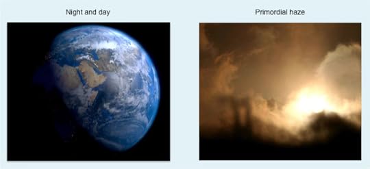 Original images from wikipedia and wikimedia – details at the end of this article
Beneath the humour, there’s a serious point. Is it possible to identify an optimal level of complexity for models of education, and if so, how could we set about doing it?
How other fields have tackled this problem
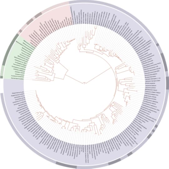
The field of zoology provides some instructive insights into how we can make sense of a very large problem area. There were numerous false starts, but eventually Linnaean classification provided a framework that was simple in its underlying principles and yet powerful enough to handle millions of different species. One core concept is the tree of life. The illustration below shows this concept.
https://en.wikipedia.org/wiki/Tree_of_life
This diagram might look horribly complex, but it isn’t. It’s big – it has to be, to handle several million species – but the underlying structure consists of a very few, very simple concepts.
Here’s how it works. One core concept is that a higher-level category, such as X below, can be divided into lower-level categories, such as Y and Z below. In classic Linnaean taxonomy, there are about seven levels; more recent taxonomies have more, but not enormously more, as in the example above, which goes to about ten levels.
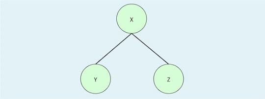 Image copyleft Hyde & Rugg 2014
The next core concept is that at each level, each category has one or more defining attributes unique to it, such as “has feathers”. Each category also inherits the defining attributes of its parents, so the category of “bird” will inherit categories such as “is warm blooded” and “has a bony skeleton” from the higher-level categories from which it is derived. The illustration below shows the principle.
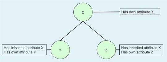 Image copyleft Hyde & Rugg 2014
The subdividing stops at the level of “species”. This is the last core concept.
I’ve laboured this point to show that an enormous problem space can be reduced to a very small number of core components that have enormous explanatory and predictive power.
Conversely, an apparently simple problem, such as telling the precise time, can require a model with a large number of components, such as a mechanical clock.
 https://commons.wikimedia.org/wiki/File:Vienna_-_Vintage_Franz_Zajizek_Astronomical_Clock_machinery_-_0537.jpg
The image above shows part of an astronomical clock. It looks complex, and it is complex. However, there are three features of the clock that are easy to overlook, but that have profound implications.
One is that although the clock mechanism is complex, it isn’t vague. Each part is precisely machined and is in precisely the right place; otherwise the clock wouldn’t work. Similarly, just because a theoretical model of something such as education might be complex, that doesn’t mean that the component parts of that model need to be vague. On the contrary, the more accurately defined the component parts are, the better the model is likely to work.
The second key feature is that although there are many parts, they can be classified into a much smaller number of discrete categories, such as gear and spring. As with the zoological taxonomy example, good categorisation can make a problem much simpler.
The third key feature is that mechanical clocks are accurate because they are complex. They need to be as complex as they are in order to do their job. It’s the same with models of how the kidneys work or of how the brain processes information. Sometimes there just isn’t a simple way of modelling something; you need to accept the complexity, and get on with modelling it.
The diagram below shows this as a third way between the “night and day” simple binary model, and the “vague subjective haze” model with no fixed points.
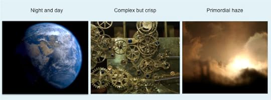 Images from wikimedia – details at the end of this article
So what are the components that are required for a working model of education?
Issues that a model of education needs to handle
If we look at what happens during an individual chunk of education, such as learning some small set of information about the Vikings in history, then that gives us an insight into which issues are involved.
We can divide what happens in a chunk of education into three main parts:
What goes in
How it goes in
What happens to it along the way
What goes in consists of information in the broadest sense.
There’s a well-established pyramid of knowledge classification, which involves slicing the information into four levels, as in the diagram below.
This was the topic of one of our previous articles:
Another way of slicing up information in the broadest sense is the division into future/explicit/semi-tacit/tacit knowledge, from requirements engineering. This involves about fifteen bottom-level categories, as in the diagram below.
Image copyleft Hyde & Rugg 2014
This was the topic of another of our previous articles:
http://hydeandrugg.wordpress.com/2014/04/13/an-education-framework-based-on-knowledge-modelling/
That gives us a total of about twenty concepts for the “input” part of the process, grouped into about eight categories. That’s not an enormous number, and it’s composed of clearly defined components.
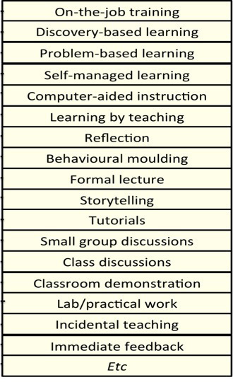
How it goes in involves the delivery mechanism – in other words, the learning and/or teaching method being used for a particular piece of information.
The delivery mechanism can be divided into different methods of teaching, training and learning. Although there are large numbers of different named methods, the number of underlying concepts is smaller. In the diagram below, we’ve listed just under twenty approaches as examples. We’re working on a unifying framework for delivery mechanisms, and it looks likely to end up with about as many components as the knowledge framework, i.e. about twenty, organised into a handful of categories.
Image copyleft Hyde & Rugg 2014
Our previous article on compiled skills shows an example of how the matching between a particular knowledge type and appropriate delivery mechanisms can be handled.
http://hydeandrugg.wordpress.com/2014/04/21/compiled-skills-and-education-theory/
What happens to it along the way is that the information is interpreted and assimilated, with varying degrees of fidelity. Things often go wrong.
What goes wrong can be divided into physical problems, mental misunderstandings, and a combination of both.
Physical problems contain sensory problems and information processing problems. Humans have around twenty different senses, with the precise number depending on the definition you use, which can be divided into a handful of categories. The category of “touch,” for instance, contains separate sensory systems that handle kinaesthesia (knowing where each part of the body is), heat reception, light touch and deep touch, among others. Again, these categories can be clearly differentiated, at the anatomical level, and have very practical implications.
Misunderstandings have been researched in some depth in fields such as naïve physics and the psychology of programming, as well as in the broader field of mental models. Again, the number of key categories is tractably small, although the number of specific low-level examples is large. There are various formal taxonomies of error, and they typically contain a few dozen categories at most.
So how complex does an education theory need to be?
Adding together the rough figures above, we get the answer that an education theory needs to include about a hundred concepts relating to knowledge types, delivery types, and processing issues. (An education theory should also cover issues such as curriculum, syllabus, etc, but in this article I’m focusing specifically on knowledge, delivery and processing.)
The figure of about a hundred concepts might look forbiddingly high, but to put it in context, that’s fewer than the number of parts in a good quality mechanical clock.
The numbers are approximate, but they’re likely to be in the right order of magnitude. We’re talking about one or two hundred parts, rather than one or two thousand. It’s a tractable number. It’s well within the number of categories that a professional in other fields would be expected to know well – for instance, an ornithologist would easily be able to distinguish hundreds of different types of bird, and an interpreter would be expected to have a vocabulary of tens of thousands of words in each language that they speak. The literature on expertise has consistently found across different fields that experts know at least tens of thousands of chunks of information about their area of expertise, so we should expect the same from experts on education.
This gives us a starting point for constructing a model of education; we know roughly how complex it needs to be, and we know some of the key items that it needs to include.
This doesn’t, however, tell us how the parts should fit together, or whether there might be other parts that we’ve missed.
Those issues are addressed in two of our earlier articles, namely the article about the “compass rose” method of gathering requirements, and the article about the purposes of education.
http://hydeandrugg.wordpress.com/2014/05/03/the-compass-rose-model-for-requirements-gathering/
http://hydeandrugg.wordpress.com/2014/05/19/how-long-is-an-education-good-for/
So, in conclusion: There are some order-of-magnitude figures for how complex a model of education needs to be, and there are well-established methods for identifying what needs to go into such a model. We’ll be addressing these issues again in later articles.
Notes
You’re welcome to use Hyde & Rugg copyleft images for any non-commercial purpose, including lectures, provided that you state that they’re copyleft Hyde & Rugg.
There’s more about the theory behind this article in my latest book:
Blind Spot, by Gordon Rugg with Joseph D’Agnese
http://www.amazon.co.uk/Blind-Spot-Gordon-Rugg/dp/0062097903
Related articles:
http://hydeandrugg.wordpress.com/2014/04/13/an-education-framework-based-on-knowledge-modelling/
http://hydeandrugg.wordpress.com/2014/03/23/false-dichotomies-in-education-theory/
http://hydeandrugg.wordpress.com/2013/05/27/the-verifier-approach-part1/
Rugg, G. & Gerrard, S. (2009). Choosing appropriate teaching and training techniques. International Journal of Information and Operations Management Education 3(1) pp. 1-11.
Rugg, G., D’Cruz, B., Foreman-Peck, L., Grimshaw, E., Guilford, S., Roberts, S. & Tonglet, M. (2008). Selection and use of elicitation techniques for education research. International Journal of Information and Operations Management Education 2(3) pp. 235-254.
Image sources
Cropped opening image:
Composite image:
https://commons.wikimedia.org/wiki/File:EarthRender_%28square%29.png
https://commons.wikimedia.org/wiki/File:Fog_shadow_of_GGB.jpg


June 14, 2014
The limits to literacy
By Gordon Rugg
There’s widespread agreement that rates of illiteracy are high, and that something should be done about it.
And at that point, the agreement ends.
In this article, I’ll examine some widespread models of literacy and some of the main proposed solutions.
Reading ability shown as a greyscale, based on statistical figures. Darker shading represents greater problems with reading.

The image above shows what the statistics look like for literacy in the English-speaking world. About 20% of children in school have some form of reading problem, ranging from mild (light grey) to severe (black). The precise figure depends on definitions, which will be discussed below.
I’ve deliberately used grey/black in this figure, to reflect the dual assumptions that illiteracy is a bad thing and that it that needs to be eradicated. I’ll argue below that this assumption is subtly but significantly mis-framed; illiteracy does indeed cause problems, but this does not mean that attempting to eradicate it completely is the best response.
So, what are some of the current models of what illiteracy is, and of what should be done about it?
The “one more push” model
This model implicitly assumes that current methods have succeeded in making 80% of children literate, and that the remaining 20% can be made literate by just using more of the same methods – for instance, by simply scheduling more of the same type of reading lessons.
The image below shows the literacy rate as a red vertical line, with the implicit message that the line can be moved in the desired direction by just doing more of the same. There’s no greyscale in the horizontal bar; the implicit message here is that all children are much of a muchness as regards their potential ability to read.
The “sliding scale” model
This model assumes that not all reading problems are the same, and that some problems are more easily resolved than others. The image below shows this using a gradient from light (easily resolved) to dark (difficult to resolve). I’ve used green rather than grey to make the point that illiteracy can be viewed non-judgmentally; for instance, illiteracy might be due to a medical problem which is nobody’s fault.
In practical terms, this model predicts that there won’t be a straightforward relationship between the resources spent on combatting illiteracy and the results from that spend. Some causes of illiteracy will be fairly easy to tackle; others will be much harder and much more costly.
The “levels of difficulty” model
This model is similar to the sliding scale model, but it assumes the existence of separate levels of difficulty that can be distinguished from each other in some way. For instance, there’s a widespread distinction between functional illiteracy and illiteracy in the strictest sense, where “functional illiteracy” means that the child can read the individual words in a sentence, but can’t work out the overall meaning of the sentence.
In practical terms, this model makes it easier to identify specific targets for improvement.
The “thing called dyslexia” model
This model assumes that there is a condition, called dyslexia, which makes some children qualitatively different from others with regard to reading. The implicit assumed corollary is that this single condition could be treated if only we could find the (single) cure.
In practical terms, this means that children with dyslexia will need to be taught using methods tailored to suit the nature of dyslexia. There won’t be any significant improvement if children with dyslexia are given more lessons using the same methods that worked with other children; there’s actually a chance that this strategy would backfire, by making the children feel inadequate and stupid.
The “many things called dyslexia” model
This model assumes that there are multiple separate causes for reading difficulties, and that these diverse causes have often been lumped together in the literature under the umbrella category of “dyslexia”.
In practical terms, this model predicts that each cause of problems will need to be tackled using different methods. What works for one cause will not necessarily work for others, or may make the situation worse for others. If these different causes and solutions are lumped together as “dyslexia” then the results will be mixed together into an apparently incoherent mess, where some treatments appear to improve some cases of “dyslexia” but not others, and where the search for a single silver bullet goes on and on. If, however, we examine each cause separately, then we have a much better chance of being able to find and apply solutions.
Discussion
When you look at the numbers, you start to see some interesting regularities.
In England and Wales, the rate of functional illiteracy has stayed pretty much constant at about 17 % to 20% since 1948, when consistently applicable records begin. It’s stayed the same across massive social changes, and wide changes in education theory and practice. That implies that there is something qualitatively different happening within functional illiteracy from within “normal reading,” something that isn’t being tackled by the standard methods used in schools for teaching reading.
There’s a large, sophisticated set of literatures on dyslexia and on the neurophysiology of reading. These show clearly that reading isn’t a simple, single skill that can always be acquired simply through practice. Similarly, they make it clear that there isn’t a single unitary condition called “dyslexia” – instead, there are numerous separate issues that can cause reading difficulties either individually or in combination with each other.
I won’t attempt to re-cover ground that these literatures have already covered well and in depth. Instead, I’ll look at some specific causes of reading problems that particularly interest me, and that arguably should be more widely discussed.
Interactions between impairments
An obvious cause of reading problems is visual impairment. This issue has been examined in some depth; the report below is a good example.
http://pediatrics.aappublications.org/content/127/3/e818.full.html
This report clearly differentiates between visual problems causing difficulties with reading (obvious, and well attested), and the claim that dyslexia is caused by subtle visual problems that can be corrected by e.g. coloured filters (where the evidence is weak and looks contradictory, if we view dyslexia as a single unitary causal condition, as discussed later in this article).
A less obvious, but potentially more serious, cause of problems is interaction between separate impairments. It’s possible for a child to have two or more impairments which are individually only minor problems, but which in combination cause major problems. For instance, a minor visual problem and a minor auditory problem could each have little or no impact on a child’s reading ability, but those same problems in combination could have a devastating effect because of interactions between visual input and the phonological loop in reading.
Although medical professionals are generally aware of the interactions problem, the implications for reading are easy to miss, for instance when a child has separate assessments for vision and for hearing, and is categorised as having only minor problems in each.
Phonology and orthography
One obvious but often overlooked source of problems is the match between spoken and written language. In some languages, there’s a good match between the spoken speech sound (phoneme) and corresponding written letter (grapheme).
English isn’t one of those languages.
English has over forty phonemes (the precise number depends on the categorisation you use) and only twenty-six graphemes. This means that in many cases, a single phoneme has to be represented by two or more graphemes (for example, the single phoneme represented by “th”). This in turn means that the spelling system imposes an extra cognitive load in reading English, compared to languages which have a closer mapping between phoneme and grapheme.
In addition, the shape of the writing system has implications for reading. The Roman alphabet contains numerous letters that are potential pitfalls for anyone who has difficulty in distinguishing left from right (a surprisingly high proportion of the population). In sans serif font, the four letters shown below are differentiated only by orientation. This is just asking for trouble. If each letter in the alphabet had a unique shape, and wasn’t a rotated form of any other letter in the alphabet, then this particular source of problems would be removed.
There’s a separate issue about commonalities in dyslexia across languages and orthographies, as in the article below. For brevity, I’ll leave that issue to one side.
http://www1.up.univ-mrs.fr/gsite/Local/lpc/dir/ziegler/article/2003.JECP.Ziegler.pdf
The politics of spelling and favoured dialects
Another obvious way of reducing mismatches between spelling and pronunciation is via spelling reform. It’s a nice idea, but it soon runs into deep problems with dialectal differences.
In some dialects of English, for instance, the words “whet” and “wet” sound identical, and are clear candidates for spelling reform. In other dialects of English, however, these two words sound like clearly distinct words, and require different spellings.
Comprehensive spelling reform would only work in English if it was mapped onto one dialect, which then raises major political questions about marginalisation of children who don’t speak that dialect.
Closing thoughts
So, what are the limits to literacy?
The idea that we just need to pour more resources into doing more of the same is a non-starter. It may help some children, and it may look good politically, but it’s based on a mistaken assumption. The methods that teach 80% of children to read won’t also work for the remaining 20%. The reason that those 20% haven’t learnt to read is that those methods didn’t work for them, and so different methods are needed.
Searching for a single “cure for dyslexia” is also a non-starter. In political and humanitarian terms, the concept of “dyslexia” has been invaluable; it helped massively in reducing the stigma attached to non-literacy, and in raising awareness that non-literate children are not lazy or stupid. However, there’s a huge difference between viewing dyslexia as an outcome – that the person has difficulty reading, for whatever reason – and viewing dyslexia as a cause – the idea that there is a single poorly-understood medical condition called “dyslexia” that leads to difficulty in reading. The neurophysiological literature makes it clear that there are multiple causes for reading difficulties, each with different origins and with different implications for treatment and/or cure.
The most promising approach is to treat reading difficulties as a number of diverse conditions, each of which needs to be handled separately.
There’s also an underlying assumption in this debate that needs to be questioned. It’s the assumption that we should aim to eradicate illiteracy completely. I’m well aware of the problems that reading difficulties can cause. However, the best solution in some cases may not involve helping the individual to read. To take an extreme example that illustrates the point: Nobody would try to teach a completely blind student to read text. Instead, we would turn to technologies such as text-to-speech software. What happens if we extend this approach to children who for whatever reason are making no progress with “conventional” reading? This would probably be significantly more cost-effective, and would reduce stress and stigma on the child.
I’ll blog again about this at some point. One closely related topic I’m planning to address is the concept of learning language as being “natural” and of reading as “artificial”.
Notes and links
You’re welcome to use the Hyde & Rugg copyleft images above for any non-commercial purpose, including lectures, provided that you retain the Hyde & Rugg copyleft statement in them.
The linked article below looks at literacy and numeracy between 1948 and 2009. I’ve taken the 17% figure from here. There are several strands of evidence suggesting comparable literacy rates from the mid 19th century onwards, but the evidence is partial, so I’ve focused on the modern data.
http://www.nrdc.org.uk/publications_details.asp?ID=181
A comprehensive, deep, overview of reading is Snowling & Hulme’s The Science of Reading: A Handbook (2007).
http://www.amazon.com/The-Science-Reading-A-Handbook/dp/1405168110
There’s more about the theory behind this article in my latest book: Blind Spot, by Gordon Rugg with Joseph D’Agnese.
http://www.amazon.co.uk/Blind-Spot-Gordon-Rugg/dp/0062097903


June 10, 2014
Weekday funny: Caesar on the unicorn, and Roosevelt on the moose
By Julius Caesar (with Gordon Rugg)
First, the bad news: This is Caesar writing on the subject of the unicorn, rather than Caesar riding on a unicorn.
XXVI.–There is an ox of the shape of a stag, between whose ears a horn rises from the middle of the forehead, higher and straighter than those horns which are known to us. From the top of this, branches, like palms, stretch out a considerable distance. The shape of the female and of the male is the same; the appearance and the size of the horns is the same.
(From De Bello Gallico.)
Quite what he was describing, if anything, is anyone’s guess.
What with that and his stories about elk hunting, you start to wonder how much trust you can put in his accounts of subduing the Gauls…
http://hydeandrugg.wordpress.com/2014/05/02/friday-funny-elk-hunting-101/
So that was Caesar on the unicorn. Not quite as exciting as you might have hoped.
By way of consolation, here’s Theodore Roosevelt on the moose. As far as I know, it’s real, not Photoshopped; it presumably relates to his connection with the Bull Moose Party, in American politics.
I hope this image lives up to your wildest expectations, and brightens your day.
http://www.pinterest.com/pin/356347389235275615/
Notes
The Caesar quote is from Caesar, C.J. De Bello Gallico. Project Gutenberg; Everyman’s Library version, 1915 edition, translated by W.A. MacDevitt.
I’ve corrected one minor typo in the original.
I’m using the Roosevelt photo under “fair use” terms, since it’s being used here non-commercially, and is a low-resolution copy of an image that has already been widely circulated on the Internet.


June 8, 2014
Gendered language in Shakespeare
By Gordon Rugg
To what extent does the language of Shakespeare’s plays indicate a male-dominated world? One way to see is by looking at the distribution of gendered words within the texts.
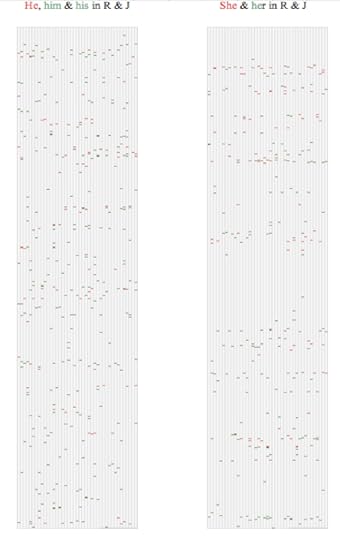
The figure below shows the location of the words he, him, his, she and her in Midsummer Night’s Dream. Each of the tiny rectangles represents a word in the text; the coloured words represent the keywords, and the blank rectangles represent the other words. This representation ignores linebreaks in the original text. The images are roughly equivalent to a miniaturised image of the text laid out as a scroll, with the keywords marked with coloured highlighter.
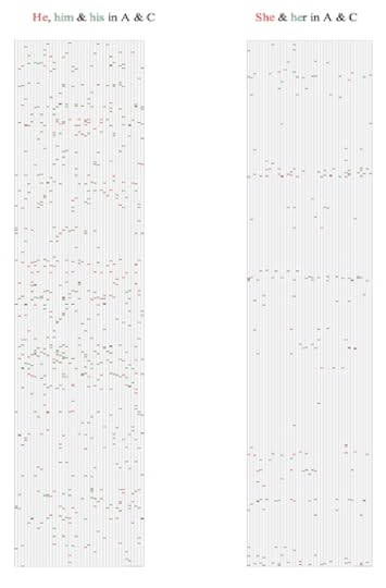
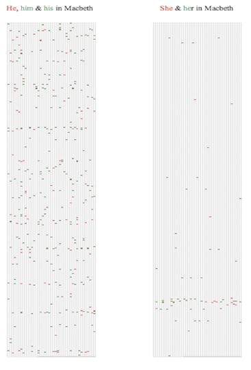
In each pair of images below, the nominative forms of the keywords are in red, and the other forms such as accusatives are in green, to show whether one gender appears more often in an active role.
(Apologies to any readers who are red/green colour blind; the Search Visualizer software itself takes account of colour blindness in its options, but shrinking the images down to fit into blog format loses the contrast.)
The column on the left shows the distribution of the words he/him/his in Midsummer Night’s Dream. The column on the right shows the distribution of the words she/her in the same play.
There are more male pronouns, but the difference is not huge; both male and female pronouns occur frequently throughout the play.
Here, for comparison, is the corresponding figure for Romeo and Juliet.
Again, there are more male pronouns, but the difference is more marked, and there’s one section of the play which contains no female pronouns. This isn’t a simple artefact of the plot device of Juliet’s death. A comparison with another Shakespeare love story makes the point clearly.
The figure below shows the distribution of male and female pronouns in Antony and Cleopatra.
In Antony and Cleopatra, there are many more male pronouns than female, and there are several stretches of the play which contain no female pronouns. Antony and Cleopatra is about power politics, as well as a love story. The next two figures show results from two Shakespeare tragedies about power politics, both with strong female characters, but where love is not a central theme.
The following figure shows the results from Hamlet.
This play shows the same trend as Antony and Cleopatra, but taken further. Another play goes further still.
The next figure shows results from Macbeth.
Although Lady Macbeth is one of the most famous female characters in drama, the play contains hardly any female pronouns, and most of those are clustered toward the end.
How does that compare with modern patterns of gendered language?
Here, as a closing comparison, is a screenshot of the first two records that came up when I searched the Scientific American blog site (http://blogs.scientificamerican.com/) using the “single site” option, for the same gendered words. This time, he/him/his appear in red, and she/her appear in green.
In terms of gendered language, these are much more balanced than any of the Shakespeare texts.
They’re also an interesting comparison because they show two different ways of reaching the same end point. One has a clearly defined structure, with a stratum of she/her and then a stratum of he/him/his in a way that implies a deliberate attempt to achieve balance. The other has the two sets of terms intermingled throughout the text. Not all blogs achieve this level of balance, but these two articles show that it can happen, and show ways that it can be done.
Conclusion
Displaying where key terms occur within a text can give swift and powerful new insights into a text and into a body of texts.
This approach has the advantage of showing relative frequencies etc swiftly and easily. It also has the advantage of showing distributions of words within a text, making it easier for the researcher to examine how vocabulary reflects thematic structure.
We’re working on other analyses of texts, ranging from great literature to popular fiction and blogs. We’d be glad to hear from anyone working in this area who has suggestions, questions or experiences involving insights that this approach can offer.
(Note: This article is reblogged from the Search Visualizer blog site.)
Links, further information and technical notes
I’ve blogged about gender and categorisation in some earlier articles. Two were about an art exhibition based around visualisations of gender:
http://hydeandrugg.wordpress.com/2013/10/24/gordons-art-exhibition-part-2/
http://hydeandrugg.wordpress.com/2013/10/12/gordons-art-exhibition-part-1/
Another is about anthropological categorisation and gender:
The images above were produced using the Search Visualizer. This software is available for free at:
The “classic texts” section of the site contains the five Shakespeare plays above, plus other texts, and articles about using the Search Visualizer.
There’s more information about the software on the Search Visualizer blog:
www.searchvisualizer.wordpress.com
Technical note for inquisitive readers: The searches above all used the “whole word” option, as opposed to the “partial match” option, to avoid false positives from words such as “the” which contain “he”.
About these ads


Visualising themes in the Plowden Report
By Gordon Rugg
I’ve recently started looking at the Plowden Report, mainly because of my interest in sociotechnical issues. The method I was using may be interesting and useful to readers, so this article is a quick overview of the method.
I’ve been using the Search Visualizer software, which is available free online. (Declaration of interest: I’m co-inventor of the software.)
http://www.searchvisualizer.com
The software shows you where your chosen keywords occur within a text, representing each keyword as a colour-coded square, as if you’d gone through the document highlighting every occurrence of your keywords, and then miniaturised the document so you could see large sections of it at a time.
This is particularly useful when you’re dealing with very large texts, since it allows you to see patterns of distributions. It turns out, for instance, that there’s a fair amount in Plowden about furniture, and that most of those mentions are in one section of the report.
The image below shows where the word “classroom” appears (green dots) at the start of Volume 2 of Plowden.
 Image copyleft Search Visualizer, 2014
So, what did I find?
I’ve blogged previously about how technology, including the built environment, interacts with human behaviour (the core concept of sociotechnical analysis).
http://hydeandrugg.wordpress.com/2014/05/10/sociotechnical-analysis-room-layout-and-education/
I was wondering whether this issue featured in Plowden.
The Plowden Report did indeed take sociotechnical issues into consideration, though not from an explicitly sociotechnical viewpoint; instead, it took a sociological view, looking at issues such as the number of bedrooms in the children’s homes as a proxy for affluence and deprivation, and looking at the quality of furniture in the school. Here are some images for the relevant searches.
The first shows the results for a search on classroom and bedroom in Volume 2 of Plowden. It’s a closeup view of the relevant part of the report.
Classroom (green squares) and bedroom (red squares)
 Image copyleft Search Visualizer, 2014
At the top, near the beginning of the report, we see half a dozen green squares, each representing one mention of the word classroom. Further down, we see numerous red squares, each representing one mention of the word bedroom. Within this part of the report (about the first 15% of the volume) mentions of bedrooms significantly outnumber mentions of classrooms, and are tightly clustered, implying that the report contains a section dedicated to something such as the home environment of the children.
This suggested that the authors of the Plowden Report were well aware of practical issues that could affect the well-being and behaviour of the children.
Did they discuss the practical issue of furniture design and/or layout in relation to discipline? Furniture was indeed mentioned, but not in conjunction with discipline. Here’s a detailed view of the relevant part of the report, showing discipline (green squares) and furniture (red squares).
 Image copyleft Search Visualizer, 2014
Discipline is mentioned at the top of this image; furniture is mentioned at the bottom. They’re separated by a lot of text on other topics. So, although furniture was something that the report mentions about as frequently as discipline in this part of the report, it wasn’t something that the authors associated with discipline.
Here’s a mention of discipline, using the pop-up function that shows the text surrounding a keyword to give context. The red squares are for “traditional” and the green squares are for “discipline”.
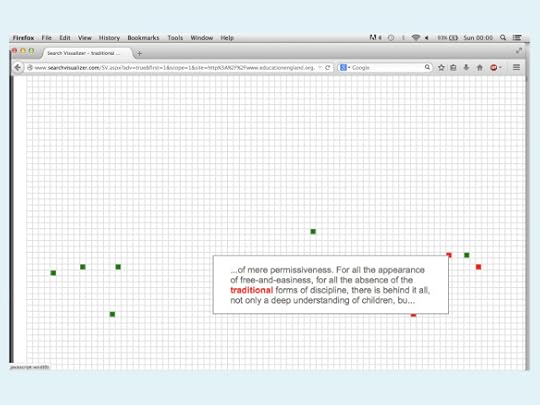 Image copyleft Search Visualizer, 2014
This raises the final point that I’ll cover in this article. How often is “frequently” in this context?
One advantage of this visualisation format is that it can give you a very swift overview of how common or rare a given term is within a text.
The first image below shows the opening part of the report, with mentions of child represented by red squares.
 Image copyleft Search Visualizer, 2014
It’s clear that the child is a topic of central importance in this report.
The next image, in contrast, shows mentions of the phrase “bowel control” in the one part of the report where there is a cluster of mentions of this term.
 Image copyleft Search Visualizer, 2014
It’s something that the authors included – it’s a thorough report – but we can see at a glance that it receives very few mentions. There are two mentions near the top of the image, and seven in the main cluster. It’s clearly a topic that the authors viewed as worth mentioning, but only as a minor detail.
Closing thoughts
For anyone working with very long texts, or with large numbers of texts, this method provides a swift way of getting an overview of which themes are occurring, and of how often they occur, and of how they cluster (or don’t cluster) with each other. It’s well worth trying out. I’ve included some more detailed information in the notes section below.
I hope you’ll find this useful.
Notes and links
The Search Visualizer software is available free online here: http://www.searchvisualizer.com
Our blog about ways of using it is here:
http://searchvisualizer.wordpress.com/
(The blog also contains a fair amount about my work on the Voynich Manuscript, much of which used Search Visualizer.)
To search the Plowden Report with Search Visualizer, you need to go to the Search Visualizer site, then select the “Single site” option shown on the left of the screenshot, and then enter the url below into the Search Visualizer menu box for urls.
http://www.educationengland.org.uk/documents/plowden/
It’s a good idea to set the options either to “1 result per screen” or to “smaller squares” and “2 results per screen” because the Plowden Report is very long, and the other settings won’t display it properly, for technical reasons.
The screenshot at the start of this article should make sense of anything that’s not immediately clear, and there are tutorial articles about getting the best out of the software’s options on the Search Visualizer blog site.
You’re welcome to use these copyleft images for any non-commercial purpose, including lectures, provided that you state that they’re copyleft Search Visualizer.
There’s more about the background theory for this article in my latest book:
Blind Spot, by Gordon Rugg with Joseph D’Agnese
http://www.amazon.co.uk/Blind-Spot-Gordon-Rugg/dp/0062097903


June 5, 2014
Assessment methods and the knowledge pyramid
By Gordon Rugg
In an earlier article, we looked at how knowledge in the generic sense can be modelled as a triangle or pyramid, starting with data and information at the bottom, and then moving up to knowledge and wisdom.
It’s a neat, systematic model that’s widely used within computer science and IT.
The same model also provides a neat, systematic framework for choice of assessment methods.
That’s the topic of this article.
First, some scope and context: This article deals only with verbal and numeric assessment. Assessment of physical skills is a separate issue, which we’ll discuss in a later article.
Data and information
At the bottom of the pyramid we have data and information, where information is defined as structured data.
An example is the information that the Battle of Edgehill took place in 1642.
For assessment purposes, this level involves closed sets, where all the possible acceptable answers can be listed.
This level lends itself well to classic tests, including most forms of multiple choice tests and computerised testing.
Knowledge
Knowledge is defined here as information about information.
Knowledge usually has a broader scope than information does, and is often imprecise by its very nature.
An example is the knowledge that the Battle of Edgehill was inconclusive.
For assessment purposes, this level involves semi-closed sets, where there is a core set of definitely acceptable answers, but where other acceptable answers are also possible.
Because there can be correct answers that aren’t in the approved list, marking has to be performed by a human being, using their professional judgment; it can’t be handled properly by multiple choice tests or computerised assessment.
Wisdom
Wisdom is defined here as knowledge about knowledge.
An example is knowing that in most civil wars, the first battle is inconclusive.
By its nature, wisdom usually involves synthesising a broad set of knowledge, much of which is incomplete, imperfect and debatable.
For assessment purposes, this level involves open sets, where there is a potentially infinite number of answers that are arguably correct.
The written thesis is a classic product of this level. The thesis contains an argument consisting of connected assertions and evidence. Usually a thesis is required to be an original piece of work, so its contents cannot be predicted in advance by the assessor. In extreme cases, a thesis might take a radically different approach from all previous work, focusing on a different set of causal factors and evidence, and might produce a compelling new explanation which becomes accepted as standard in the field.
Summary and conclusion
The end point of this analysis is much the same as current standard practice in educational assessment.
However, what’s different is that the route to this end point is based on a systematic model, and a key point about this model is that it identifies clear limits to growth for computerised assessment. For higher levels of educational concepts – knowledge and wisdom – we are dealing with semi-closed and with open sets, which by their nature require assessment by a human being with professional knowledge and judgment.
Notes and links
You’re welcome to use Hyde & Rugg copyleft images for any non-commercial purpose, including lectures, provided that you state that they’re copyleft Hyde & Rugg.
There’s more about the background theory for this article in my latest book:
Blind Spot, by Gordon Rugg with Joseph D’Agnese
http://www.amazon.co.uk/Blind-Spot-Gordon-Rugg/dp/0062097903


Gordon Rugg's Blog
- Gordon Rugg's profile
- 12 followers


