Gordon Rugg's Blog, page 16
July 11, 2014
Representing argumentation via systematic diagrams, part 1
By Gordon Rugg
This article is a short introduction to some basic principles involved in representing argumentation, evidence and/or chains of reasoning using systematic diagrams.
This approach can be very useful for clarifying chains of reasoning, and for identifying gaps in the evidence or in the literature.
As usual, there’s an approach that looks very similar, but that is actually subtly and profoundly different, namely mind maps. That’s where we’ll begin.
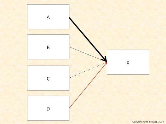
Mind maps are widely used, and are a simple way of showing links between concepts. In the mind map above, item X is linked to items A, B, C and D.
How are they linked? The mind map doesn’t say.
How strongly are they linked? The mind map doesn’t say.
This mind map is useful for showing what is connected to what, and for giving you an idea of how many things you’re dealing with, but that’s as far most mind maps go. If you want to do something more powerful, then you need a representation that does more, like the one below.
Ways of showing more information in the links
The diagram below shows four ways of adding more information:
Arrows (as opposed to ordinary lines)
Line thickness
Colour
Line type (continuous or dashed)
Arrows are useful for showing the directions of association. For instance, “A causes X” is very different from “X causes A”.
Line thickness is useful for showing the strength of associations. Strength can take various forms. For instance, it might mean the likelihood of an association, or the number of peer reviewed journal articles about the association.
Line colour and line type are both useful for showing the nature of associations. For instance, red lines might be used to show associations that have medical implications, or dashed lines might be used to show postulated associations for which there is currently no evidence.
The key principle is that whichever of these you use, you need to use it completely consistently within the diagram. That may sound obvious, but a surprising number of people don’t pay much attention to consistency in their diagrams, producing a rich crop of confusion for everyone involved. It’s a good idea to include a key with the diagram saying explicitly which notations have which meaning.
In this article, I’ll use the worked example of a diagram to show how much research has been done into the various possible causes of a condition. This keeps the issues fairly simple. In a later article, I’ll look at ways of showing more complex issues, such as the strength of evidence for and against competing ideas.
One issue that you very soon encounter with this example is the problem of showing the numbers involved with reasonable accuracy. For instance, if there’s only one article about one of the possible causes, but there are several hundred articles about another possible cause, then using line thickness to show the weight of evidence isn’t going to work well. You’d either need infeasibly thick lines for the heavily-researched causes, or you’d need to use a set of conventions for line thickness that would be misleading.
I’ll unpack that last point, since it’s an important one. As far as the human visual system is concerned, a line that’s three times thicker means that the strength of association is about three times larger. If you’re using a convention that a line thickness of 3 means that there are hundreds of articles, and a line thickness of 4 means that there are thousands of articles, then yes, you’re using a convention that is internally consistent, but that doesn’t mean that it’s consistent with what the human visual system will be trying to tell the person viewing the diagram.
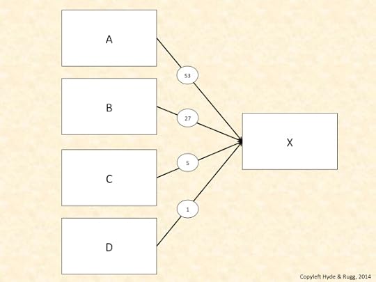
An obvious solution is to add numbers to the lines joining the boxes, like this.
That may look very sensible and logical, but again, it runs into problems with the human visual system. One problem is that the visual system will stubbornly perceive a two digit number as being twice as big as a one digit number; yes, that will be over-ridden further on, but it’s still a complication. Another, related issue is that by asking the viewer to read the numbers, you’re asking them to switch from fast, efficient parallel processing into slow, inefficient serial processing; you’re also requiring the viewer to use their limited-capacity working memory to store and compare the numbers.
A more efficient and elegant solution is to present the same information in a format that fits with the strengths and weaknesses of the human visual system, such as this format.
In this example, the numbers are still visible, but the circles containing the numbers each have a colour intensity that corresponds directly to the number shown within the circle. The circle between D and X, for instance, contains the number 1, and has an intensity of 1; the circle between A and X contains the number 53, and has a colour intensity of 53. (Technical note: For this example, I’ve used the PowerPoint graphics transparency function, which comes on a percentage scale.)
Causes of causes
This approach is useful for simple representations like the ones above. It’s even more useful when dealing with more complex representations, such as tracing chains of causation across multiple links and across multiple disciplines.
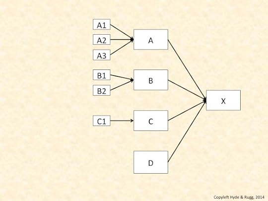
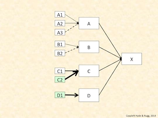
Here’s an example. The diagram below shows proposed causes of X, and the proposed causes of those causes. It deliberately doesn’t show the proposed strength of association, or weight of evidence; instead, it’s focusing on the pattern of evidence.
In this diagram, X has four proposed causes.
There are three proposed causes for A; there are two proposed causes for B; there is one proposed cause for C; and there is no proposed cause for D. It looks as if the evidence on this topic is lopsided, with A and B being better understood than C and D.
What often happens, however, is that the chain of causality takes you out of one discipline and into another. Quite often, something that looks like a dead end within one literature joins up with a rich and well understood network of knowledge in another literature.
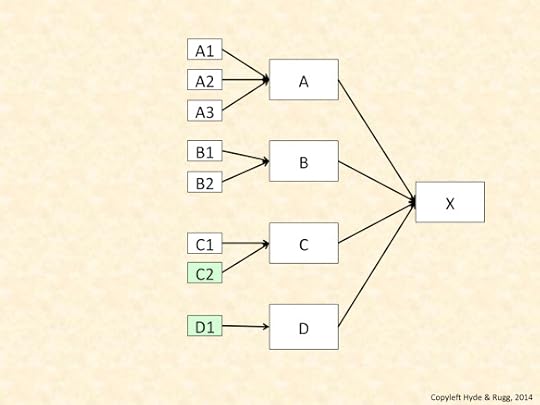
We can represent that by colouring the boxes to show the literature where each box originates, as in the diagram below.
In this diagram, another literature contains another cause for C, and a cause for D, which was previously a dead end. Both these new causes are shown in light green.
The next diagram shows why this new evidence can be disproportionately useful. I’ve made the simplifying assumption that causes A, B, C and D are all equally important with regard to X.
In this diagram, I’m using line thickness to show the importance of a causal association, and broken lines to show speculative associations. In this hypothetical example, the two new causes shown in light green boxes are much more important than any of the other causes shown. (I’ve deliberately not unpacked “important,” for simplicity.)
Discussion and closing thoughts
Formal diagrams are used in numerous disciplines.
One constant theme across those disciplines is the need to be completely consistent within a diagram, with regard to what each element in the diagram means. If you don’t do this, it’s a recipe for chaos.
Another constant theme is the tension between the diagram as a functional tool and the diagram as an illustration. If diagrams are re-worked by professional illustrators for publication, for instance, this often leads to problems when the illustrator changes something in the diagram for purely aesthetic reasons, not realising that it changes the meaning of the diagram.
A deeper recurrent theme is the purpose of the diagram. In computing, for instance, there’s a long-running debate about whether a formal diagram is more useful as a product, where you produce the diagram, and then keep using it at key points, or as a process, where you use the process of creating the diagram to identify and clarify the key issues, and then discard it, because it’s done its job.
One theme that’s received less attention is the role of the human visual system in designing diagrams consistently. I’ve touched on this topic above, with regard to how the human visual system perceives line thickness. It’s an important topic, with significant implications for problems such as explaining technical concepts to the general public, or communicating across research disciplines. The underlying principles are well understood in relevant fields – for instance, some of the key concepts were mapped out by Fechner and by Weber over a century ago. However, these principles haven’t yet become part of standard practice in formal diagrams and notations in all fields.
In a later article, I’ll look at ways of using formal diagrams to represent more complex forms of argumentation, and to represent the quality and nature of evidence.
Notes
You’re welcome to use Hyde & Rugg copyleft images for any non-commercial purpose, including lectures, provided that you state that they’re copyleft Hyde & Rugg.
There’s more about the theory behind this article in my latest book, Blind Spot, by Gordon Rugg with Joseph D’Agnese
http://www.amazon.co.uk/Blind-Spot-Gordon-Rugg/dp/0062097903
Related articles:
The diagrams in this article are based on graph theory, and in particular on graph colouring and graph labelling:
http://hydeandrugg.wordpress.com/2013/05/30/an-introduction-to-graph-theory/
https://en.wikipedia.org/wiki/Graph_theory
https://en.wikipedia.org/wiki/Graph_coloring
https://en.wikipedia.org/wiki/Graph_labeling
Parallel processing and serial processing:
Assessing evidence and reasoning:
http://hydeandrugg.wordpress.com/2014/07/05/logic-evidence-and-evidence-based-approaches/


July 8, 2014
Chunking, schemata and prototypes
By Gordon Rugg and Sue Gerrard
What are chunking, schemata and prototypes, and why should anybody care?
The second question has a short answer. These are three core concepts in how people process and use information, so they’re centrally important to fields as varied as education and customer requirements gathering.
The first question needs a long answer, because although these concepts are all fairly simple in principle, they have a lot of overlap with each other. This has frequently led to them being confused with each other in the popular literature, which has in turn led to widespread conceptual chaos.
This article goes through the key features of these concepts, with particular attention to potential misunderstandings. It takes us through the nature of information processing, and through a range of the usual suspects for spreading needless confusion.
 Original images from Wikipedia; details at the end of this article
Sensory-level chunking
The core principles of sensory-level chunking are widely known. Human working memory has a very limited capacity, identified by Miller in the 1950s as “seven plus or minus two”. It’s very different from human long term memory, which has a huge capacity, and which works in a different way.
We can think of human working memory as being like a set of pegs on which you can hang things, as in the image below.
In this image, there are seven yellow pegs. To keep the analogy with human working memory, we’ll use the constraints that each peg is only able to have one ring hanging from it, and that the tags have to be hung up in the correct sequence. In the example above, for the digits 0,6,1,6, there are four dog tags, each with a number on it, each attached to a ring. This arrangement means that we’ll need to use four pegs to hang up all four of the dog tags.
Now let’s suppose that we’re allowed to attach several dog tags to each other via a linking rod, and then attach that rod to a ring. This means that we would only need one peg for this set of four dog tags.
That’s what goes on in sensory-level chunking. In chunking, the human sensory system spots a link between two or more items, and does the equivalent of joining them together.
The image below shows how this in operation for a different sequence involving the same digits. Imagine that instead of the sequence above (0,6,1,6), we instead have to handle the sequence 1,0,6,6. To most British readers, these digits form the date for the Battle of Hastings, so the four digits would be automatically chunked into a single group.
The advantage of this type of chunking is that it frees up a lot of processing space; when you only have about seven pegs to hang things off, then freeing up three pegs, as in the example above, is extremely useful.
This type of chunking is a common feature in human information processing, and is one of the key features of expertise; experts have chunked huge numbers of pieces of information about their domain of expertise, so they can both see huge numbers of associations that novices can’t, and can also process much more information more efficiently than novices can.
So far, so good.
Key features, and what this isn’t
What we’ve described above is “proper” chunking, in the way that chunking is normally understood in cognitive psychology and related fields.
Unfortunately, novices sometimes confuse this concept with various forms of hierarchical information organisation that are completely different from chunking.
“Proper” chunking occurs at a very early stage of information processing, which is why we’ve used the phrase “sensory-level chunking” in the description above. It’s an involuntary, automatic process that takes place before any verbal or conscious processing begins.
Another key feature of chunking is that it’s “flat”. Your sensory system perceives a chunk in the incoming information stream from your senses, and automatically treats it as a chunk. The chunk doesn’t contain sub-chunks. Using the analogy of the pegs and dog tags, you only get to use one linking rod, and one layer of dog tags hanging off the rod.
This is completely different from what goes on with hierarchical organisation of information. This difference has major implications for learning and education, which is why understanding the difference is critically important.
Not the same as chunking: The knowledge pyramid, and a taxonomy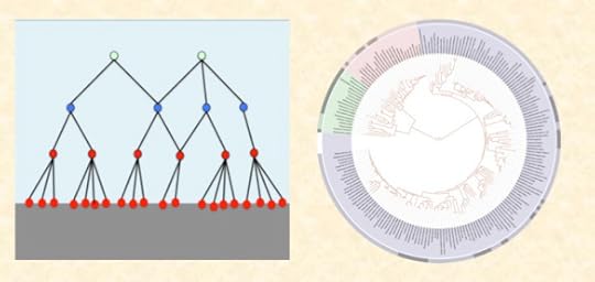 The Tree of Life diagram is from Wikipedia; details at the end of this article
Chunking is closely associated with implicit learning, about which there is a solid body of research evidence in the psychology literature. Implicit learning involves seeing large numbers of examples, and having some way of knowing which examples are associated with which outcome. The learner then induces rules and underlying principles from those examples.
Implicit learning is a tacit process in the strict sense; i.e. the learner has no valid introspection into what is going on within their brain while they are learning.
This is very different from learning other forms of association between pieces of information, many of which can easily be handled via verbal, explicit knowledge. Implicit learning can be slow and inefficient, so it’s often not the best way to learn something.
This has obvious and serious implications for the debate about the role of “facts” in education, where novice-level misunderstandings of key concepts are ubiquitous. For example, misunderstanding the nature of chunking could easily lead a novice to the completely erroneous conclusion that showing large numbers of “facts” to children will be a “natural” and efficient way for the children to learn the underlying principles. The reality is very different.
Schema theory, schemata and scripts
A schema is a sort of mental template for something. We’ve deliberately started with a broad and vague description, since the term has been used in a range of ways since its popularisation by Bartlett in the 1930s. There are two standard plural forms, namely schemas and schemata. We use schemata because it’s less likely to be misunderstood as schemers in spoken discussion with non-specialists.
There’s a very similar related concept, namely the script in the psychological or computational sense, as opposed to the sense of film script. Broadly speaking, scripts are a subset of schemata that deal with sequences of actions. Schemata can apply both to static knowledge and to knowledge about sequences of actions. For brevity, we won’t go into scripts and script theory in this article.
The schema is an extremely useful concept as long as it isn’t pushed outside its range of convenience, i.e. the range of contexts in which it can be meaningfully applied. That’s one reason that we’ve been deliberately loose in our terminology so far. As long as people treat the definition of “schema” with suitable caution, it’s a very useful concept.
At the heart of this concept is the mental template. There’s been a lot of debate about what form this template might take, and how the template is formed, etc. We’ll deliberately not get into these questions, for brevity.
Instead, we’ll go straight into an example, which should make the principle clearer. Our example is a lay person’s schema for a bird, which might include the key features that a bird is an animal, which has wings, has feathers, lays eggs, and can fly.
This core concept is as simple as it looks. However, because it looks superficially similar to various other concepts, it’s liable to being misunderstood and misinterpreted. Here are some examples, to clear the ground before we get into detail with this example.
The schema for bird above is an example of folk taxonomy, as opposed to formal scientific taxonomic theory or other systematic, formalised classifications. Folk taxonomies are generally based on surface features rather than deep structure, and are often internally inconsistent.
The schema above is different from sensory-level chunking in various ways. For instance:
It involves explicit knowledge , which can be explained in words via valid introspection, whereas chunking doesn’t
It can be learnt explicitly, whereas chunking is learnt via implicit learning
It can be passed on purely verbally, whereas chunking can’t (i.e. you can verbally tell someone the schema for a bird, but you can’t teach someone how to chunk something just by telling them the key features in words)
It involves hierarchically organised information, such as including the concept of wing, whose definition involves further layers of explanation; this isn’t the case for chunking
Experts differ from novices in having much more sophisticated organisation for their knowledge, typically involving multiple hierarchical structures for it, multiple facets for it, and multiple schemata for it. All of these are completely different from chunking in the proper sense of the term, and all of these have different implications for learning and teaching.
A common problem with schemata involves someone mistakenly believing that a schema with which they are already familiar can be applied without modification to a different field.
A classic example is the belief that the schema of managing a business can be applied without modification to managing a public sector organisation such as a school or a government department. Similarly, there’s a common belief that there’s a single schema for good writing, as opposed to various different schemata for good writing in different disciplines, usually with detailed rationales for how the writing style needs to fit with key issues specific to that discipline.
One of the main findings of the substantial body of research into expertise is that expertise is tightly bounded to the domain in which the expert specialises, and that it is highly dependent on huge numbers of facts about that domain, rather than being based on general transferable principles.
This is another finding with major implications for government policy and for education in particular, but it has so far received less attention than it should have.
Prototype theory
The term prototype is yet another term that has completely distinct meanings in different fields.
To add further confusion, the Ancient Greeks have contributed their usual mixture of interesting observations combined with plausible but horribly warped conclusions. To add yet more confusion, the Ancient Greeks were aided and abetted centuries later by Jung, who introduced yet another plausible-looking but profoundly wrong speculation. We’ll return to them later.
Returning to the first ambiguity: in this article, we’re not talking about the prototype in the sense of “an early version of a product”.
Instead, we’re talking about the prototype in the sense of “a classic, typical member of a category” as described by Rosch. This is very different from Plato’s idea of abstract essences, and from Jung’s concept of archetypes, for reasons that we’ll explain below.
Here’s an example. We’ll return to the lay person’s schema we used above for a bird. This schema includes the key features that a bird is an animal, which has wings, has feathers, lays eggs, and can fly.
In prototype theory, the more of these key features a bird has, the more prototypical it is.
In the picture below, the column on the left contains prototypical birds – the American robin and the European robin. Both of them have all the key features in the list.
Prototypicality and category membership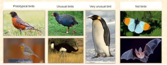 Original images from Wikipedia; details at the end of this article
The next column contains birds that are unusual, namely a takahe and an ostrich; both these birds are flightless, so they’re missing one of the key features in the lay person’s schema. They’re still definitely birds, though.
The next column along contains a bird that is flightless, and whose feathers are quite different from “normal” feathers, and whose wings are quite different from “normal” wings.
The last column contains two examples that are not birds, even though they can both fly.
In more formal language, the folk category of “bird” is a fuzzy set, i.e. a set which doesn’t have clear-cut either/or boundaries. Membership of the “bird” category is defined by the fuzzy criterion of having most or all of several criteria, all of which are themselves fuzzy.
This is a classic recipe for confusion, and when you look at early classification systems and folk classification systems, you find exactly the sort of oddities that you might expect – for instance, some types of aquatic bird being categorised as fish for the purposes of Catholic Friday observances.
There are also various more surprising findings that emerged from work on prototype theory. For instance, humans can learn what the prototypical example of a category would be like, even if they have never encountered that prototypical example.
The image below shows how this can happen. Someone who sees the almost-complete shape can infer what a “proper” example would look like.
Example of shapes, and a learned prototype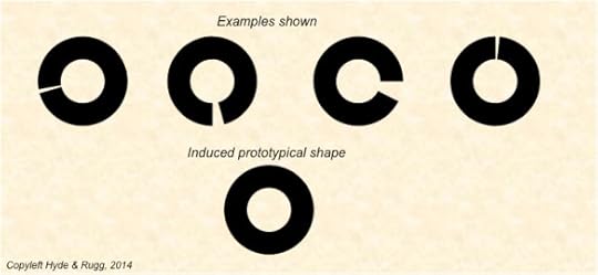
This looks superficially very similar to Plato’s idea of the abstract essence, and to Jung’s idea of the archetype. The difference is that prototype theory provides an explanation for the phenomenon using observable cognitive mechanisms, without needing to invoke speculative concepts such as Plato’s imaginings about a mystical other world, or Jung’s guesses about a racial subconscious.
Some issues arising from folk taxonomies have significant implications with regard to value and belief systems. Traditional value and belief systems tend to favour crisp, binary, either/or categorisations, such as ritually clean versus ritually unclean, or male versus female, or human versus animal. They usually have a strong dislike for anything that doesn’t fit unequivocally into one or other of the pigeonholes within the belief system.
Folk taxonomies often include similar undertones of moral judgement, with the prototypical cases being viewed as “proper” and the least prototypical cases being treated as somehow wrong or abnormal. Gordon has blogged about this topic in an earlier article:
http://hydeandrugg.wordpress.com/2013/10/24/gordons-art-exhibition-part-2/
The bigger picture
From the issues identified above, it’s clear that the way in which people learn, aggregate and organise their knowledge has major implications for education and related fields.
Precisely because these implications are so important and far-reaching, anyone who wants to build them into a proposed education policy should have a very thorough understanding of what the relevant processes are and of how they work.
For instance, any attempt to present information to children in the way best suited to help them learn should be based on a detailed understanding of the difference between chunking, implicit learning, schema theory and prototype theory. As a specific example, any model of teaching children to read needs to be based on a thorough knowledge of the relevant literature, down to the level of how the human visual system does or doesn’t use chunking when it processes graphemes. The key principles in this example were identified by Hubel and Wiesel long before the current crop of graduates were born, and there is a considerable body of sophisticated research into reading that dates back even further, so the information is available for anyone who needs it.
We hope that this article will help clarify some of the issues involved in the current education debate. We also hope that it will help steer that debate towards solidly established specialist literature, and away from popular misconceptions that suit the political preferences of the government of the day.
Notes, related articles and links
You’re welcome to use Hyde & Rugg copyleft images for any non-commercial purpose, including lectures, provided that you state that they’re copyleft Hyde & Rugg.
There’s more about the theory behind this article in my latest book, Blind Spot, by Gordon Rugg with Joseph D’Agnese
http://www.amazon.co.uk/Blind-Spot-Gordon-Rugg/dp/0062097903
Related articles
http://hydeandrugg.wordpress.com/2013/05/30/an-introduction-to-facet-theory/
Hierarchies:
http://hydeandrugg.wordpress.com/2013/05/30/an-introduction-to-graph-theory/
Categorisation and morality
http://hydeandrugg.wordpress.com/2013/10/24/gordons-art-exhibition-part-2/
Sources for the images above
https://en.wikipedia.org/wiki/Turdus_migratorius#mediaviewer/File:Turdus-migratorius-002.jpg
https://en.wikipedia.org/wiki/Ostrich#mediaviewer/File:Somali_ostrich.jpg
https://en.wikipedia.org/wiki/Tree_of_life


July 6, 2014
It was a dark and stormy night: Dark humour for a Monday morning
By Edward Bulwer-Lytton, with Gordon Rugg
Just in case there isn’t enough eldritch horror in your life, I’m blogging a short series inspired by legends of literature that are usually only known by reputation, not by first hand experience.
There’s usually a good reason for those legends being known only by reputation, so to spare sensitive sensibilities, I’ve put the text in question below the fold.
Today’s text is the first paragraph of the novel that opens with the legendary “dark and stormy night”.
If you feel ready to face it, then an indescribable new experience awaits you…
It was a dark and stormy night; the rain fell in torrents, except at occasional intervals, when it was checked by a violent gust of wind which swept up the streets (for it is in London that our scene lies), rattling along the house-tops, and fiercely agitating the scanty flame of the lamps that struggled against the darkness. Through one of the obscurest quarters of London, and among haunts little loved by the gentlemen of the police, a man, evidently of the lowest orders, was wending his solitary way. He stopped twice or thrice at different shops and houses of a description correspondent with the appearance of the quartier in which they were situated, and tended inquiry for some article or another which did not seem easily to be met with. All the answers he received were couched in the negative; and as he turned from each door he muttered to himself, in no very elegant phraseology, his disappointment and discontent. At length, at one house, the landlord, a sturdy butcher, after rendering the same reply the inquirer had hitherto received, added, “But if this vill do as vell, Dummie, it is quite at your sarvice!” Pausing reflectively for a moment, Dummie responded that he thought the thing proffered might do as well; and thrusting it into his ample pocket, he strode away with as rapid a motion as the wind and the rain would allow. He soon came to a nest of low and dingy buildings, at the entrance to which, in half-effaced characters, was written “Thames Court.” Halting at the most conspicuous of these buildings, an inn or alehouse, through the half-closed windows of which blazed out in ruddy comfort the beams of the hospitable hearth, he knocked hastily at the door. He was admitted by a lady of a certain age, and endowed with a comely rotundity of face and person.
In case you’re wondering, the rest of the book, all several hundred pages of it, is equal in quality to the opening…
Notes
This extract is from the Project Gutenberg edition:
Title: Paul Clifford, Complete
Author: Edward Bulwer-Lytton
Release Date: March 16, 2009 [EBook #7735]


July 4, 2014
Logic, evidence, and evidence-based approaches
By Gordon Rugg
So what is “evidence-based” anyway, and why do so many people make such a fuss about it?
In this article, I’ll look at the context of “evidence-based” and at some common misconceptions and mistakes about it.
It’s a journey through the limitations of logic, through the legacy of theology on modern debate, and through the nature of evidence.
It starts with a paradox that took over two thousand years to solve, involving pointy sticks and tortoises.
The arrow of logic and the chain of evidence, plus a tortoise and a charm bracelet Images adapted from Wikipedia and Wikimedia; details at end of article
Zeno’s paradox, and the limits of logic
The Ancient Greeks were very keen on logic. They viewed it as a way of getting past messy surface details, and into the underlying principles of how the universe worked.
It’s a nice idea. However, reality has a habit of throwing up awkward surprises. One of them is a paradox that undermined the whole body of Ancient Greek assumptions about logic. It’s named Zeno’s paradox, after the Ancient Greek philosopher who invented it. It involves a chain of reasoning that is clearly completely wrong; however, it took well over two thousand years before anyone was able to explain why it was wrong. It’s still highly relevant today, because it points out the dangers in trusting plausible logical arguments that aren’t checked against reality at each step.
There are several versions of the paradox. One involves an archer and a target; another famous version involves Achilles and a tortoise. I’ll use the archer and target version.
It begins with an archer shooting at a target. What happens when we look in detail at the stages involved? One key stage is that the arrow needs to cover the distance between the bow and the target. Before it can reach the target, it needs to travel part way to it, like this.
So far, so good; there’s no obvious flaw in this reasoning.
However, before it can travel for that part of the distance, it needs to travel for a shorter part of the distance, like this.
You can probably see where this is going. Before it can travel that shorter part of the distance, it needs to travel an even smaller distance, like this.
Now comes the sting in the tail, and it’s a big sting.
You can infinitely repeat this process of reducing the distance it has to travel. So if the reduction process can go on for ever, how can the arrow even start to move, let alone cover the whole distance?
The conclusion is clearly wrong; that’s not in question. The problem is working out why it’s wrong.
It’s a very important problem, because if we can’t work out the flaw in a chain of reasoning that has such an obviously wrong conclusion, what hope do we have of spotting flaws in other chains of reasoning that come up with plausible-looking conclusions?
If you’re still unconvinced about whether this matters, here’s an example that might make the implications clearer. Imagine that you’re about to travel on an aircraft that’s had a very dodgy-looking repair to one wing. You ask the flight attendant if the repair is safe, and they reply that it ought to be safe. Would that reassure you? Probably not; most people would prefer to know that someone had actually tested the repair, and confirmed that it really was safe.
In the specific case of Zeno’s paradox, mathematicians eventually found the flaw in the chain of reasoning. It took them into some territory that was very strange indeed, involving the nature of infinity and infinitesimals. If you’d like a small taste, I’ve written about it here.
However, the more general point remains as valid as it was on the day when Zeno first made it. We can’t trust a chain of logical reasoning on its own merits; it might contain a hidden flaw as subtle and as profound as the one in Zeno’s paradox. Instead, we have to test each link in the chain of reasoning against reality, to make sure that each link is sound. That’s a key part of evidence-based approaches.
So far, so good.
Unfortunately, some interpretations of “testing each link” are as subtly but profoundly flawed as Zeno’s paradox. I’ll concentrate on a particularly widespread misinterpretation, which has much in common with one form of religious argument (and which probably started off in religious argument, as a way of demonstrating that the argument was consistent with accepted religious tenets).
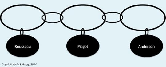
It involves treating a chain of reasoning as if it were a charm bracelet, with reassuring talismans hanging off the links in the chain at frequent intervals. Instead of physical talismans, this approach usually invokes the names of Great Thinkers From The Past plus a recent authority, using quotations that look as if those prestigious people agree with the assertions in question.
The charm bracelet model
In this model of reasoning, the key principle is to have a supporting reference for each link in the chain of logic, preferably from a high-status name.
At first glance, this looks a lot like scientific writing, which consists of a series of assertions, each followed by references to the literature. In reality, though, the charm bracelet model is a weak, dark imitation of a scientific chain of reasoning; hence the thin links and the choice of colour in the image above.
So where’s the difference?
The difference is that the charm bracelet model is selectively looking for references that agree with the assertion in question. It’s not looking at the overall pattern of evidence relating to that assertion, to see how well the argument is corresponding with reality.
Why does that matter? Imagine that we’re testing a real, physical anchor chain, like the one in the image below, for the person who manufactured that chain.
Isambard Kingdom Brunel in front of a
really
solid chain Image from Wikimedia; details at the end of this article
If it breaks, people might die, so we would want to check each link as thoroughly as possible, using a range of tests, because different tests will pick up different types of flaw. A link might have a type of flaw that is missed by one type of test, but that is detected by a different type of test.
In that context, would we only report the result from the test that gives the “it’s all fine” result, and ignore the other results? If we did, and the chain failed, we’d be looking at some serious liabilities for negligence. We would have obvious moral and legal responsibilities to report the full set of results, including the ones that said the chain was flawed.
The moral and practical advantages are obvious. So why doesn’t everyone use the “full testing” model?
One simple reason is that the world is often messy and untidy. There’s usually a large number of tests that could be applied to a given problem, ranging from ultra high tech and highly respectable tests down to more questionable ones such as Dr Omura’s bi-digital O ring technique (and no, I’m not making that one up, and yes, it is just as bizarre as it sounds).
https://en.wikipedia.org/wiki/BDORT
We have to make judgment calls about what’s worth considering and what isn’t. Different people make different calls. In science, there’s usually fairly close agreement between researchers about what should definitely be included and about what should definitely be excluded, but there’s usually a grey, uncertain area in between.
Another reason that people don’t use the “full testing” model is that they’ve simply not grasped the difference between it and the charm bracelet model. The charm bracelet model has been around for a long time, and most people are familiar with it. When they see something that looks superficially similar, in the form of the scientific “assertion plus relevant references” format, they will probably think it’s just another version of what they already know, rather than realising that it’s profoundly different beneath the surface.
The charm bracelet model is also less effort. You just have to find one supporting reference for a link, and then you can move on to the next link. That’s much easier than looking at the whole body of literature relevant to each link, and deciding which references are most appropriate for each link, which can take a very long time indeed if you’re dealing with a complex issue.
Mis-quoting Terry Pratchett: a half-truth can be halfway round the world before truth has even got its boots on. Half-truths are in many ways worse than lies, because a half-truth contains enough truth to be plausible, which means that it can mislead people for a very long time before the truth finally displaces it. If you’re dealing with a topic like finding causes or treatments or cures for major health problems, then misleading half-truths can cause a lot of damage, including suffering and death. That’s why getting it right is more than an academic search for understanding; it’s an issue with major implications for people’s lives.
Evidence-based approaches, in medicine and elsewhere
The sections above looked at the way that evidence is deployed within arguments. This section looks at a slightly different issue, namely evidence-based approaches to policy decisions.
When the medical community started looking systematically at the evidence relating to assorted medical issues, they found quite a few completely unexpected results, where the evidence showed the opposite of what had previously been universally assumed to be true. Usually this was because something had appeared so logical and self-evident that it had never been seriously tested before. Those unexpected discoveries were a major wake-up call.
Other disciplines have spotted the implications, and are keen to use evidence-based approaches to tackle their own problems.
One common way of attempting this is to use methods that have been worked well in medicine, in particular the randomised controlled trial (RCT) and the Systematic Literature Review (SLR).
Both of these have been very effective in medicine, but there’s a major difference between medicine and many other disciplines that needs to be considered before deploying these approaches in other disciplines.
In medicine, the treatments being used, and the populations on which they are being used, are usually crisp sets that are homogeneous in relation to the variable being measured. These are key features of randomised controlled trials and systematic literature reviews. In most disciplines, the situation is different; either the treatments or the populations or both are fuzzy sets. In principle, it’s possible to work round this with sophisticated statistics and research designs, but in practice, this issue severely limits the applicability of RCTs and SLRs in fields other than medicine.
Here’s an example. In medicine, you might be testing the effectiveness of a drug versus a placebo. There will be extremely tight quality control on the drug and on the placebo. The “drug” patients will all receive essentially identical doses of exactly the same drug as each other; the “placebo” patients will all receive essentially identical doses of exactly the same placebo as each other. Similarly, if the drug is being tested on patients diagnosed as having a particular condition, there will usually be a diagnostic test that clearly identifies whether or not the patient has that condition. There may be different levels of severity of the condition, but the key point is that the test divides people crisply into those who definitely have the condition versus those who definitely don’t.
This makes it comparatively easy to combine the results from different studies of the same drug on patients with the same clearly defined condition. In all those studies, the drug will be chemically identical, and the patients will all have an unequivocal objective diagnosis as having the same condition. You’re comparing like with like.
The situation is different in many other fields, and also in some areas of medicine. In the case of medicine, RCTs and SLRs run into problems when you move away from drug-based interventions into interventions that can’t be so tightly constrained, such as testing massage as an intervention for back pain. Similarly, if you’re dealing with conditions such as dyslexia that don’t have a single objective diagnostic test, the populations involved in the tests probably won’t be homogeneous. You’re no longer comparing like with like. Yes, you can do statistical manipulations to address the variation, but you’re dealing with a much more complex problem area, and there’s the risk that you’re missing some key variable and in consequence producing results that look very impressive but that are fatally flawed.
So what can you do if you’re in a field like education, where the interventions and the populations are usually both very far from homogeneous?
For researchers, the answers are well known. You need to make sure that you’re using research methods properly. You take due care about the choice of intervention, and the choice of metrics and measures, and about operationalisation, and choice of research design, and choice of statistical tests, and all the other things that are part of proper research.
For people who aren’t professional researchers, one take-home message is that doing proper evidence-based research requires heavy-duty expertise in research methods.
That doesn’t mean that the rest of the world needs to stand aside and let the experts slug it out. There are a lot of approaches that anyone can use to clarify the key issues, and to conduct a well-informed discussion about key issues of policy and practice.
One particularly clean, simple and powerful approach is systematic visual representation of evidence using methods such as formal argumentation. With this, you can show a chain of reasoning and evidence using clear, consistent diagrams. It’s a good way of spotting trends in evidence, and also gaps in evidence. I’ll discuss argumentation in more detail in a future article. Here’s one example of how you can get a quick, powerful overview of the evidence by using visualisation systematically.
Strength of claimed effect plotted against quality control of publication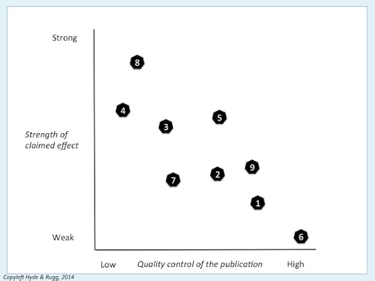
In this hypothetical example, the vertical axis shows how strong the claimed effect of an intervention is, and the horizontal axis shows the strength of quality assurance in the publications involved. The numbers in the black shapes are identification numbers for the different publications, so you can keep track of which publication is where on the diagram.
What this diagram shows is that the publications with the loosest level of quality assurance (publications 4 and 8) are claiming that the intervention is a wonder cure, but as you move towards the publications with tighter quality control, the reported strength of effects grows progressively weaker, until it’s nearly zero in the publication with tightest quality control (publication 6).
This is a common pattern, where the tabloids and the blogosphere make huge claims about some new idea, but those claims rapidly fall apart when they’re looked at more closely and more rigorously. The diagram is simple, but it shows what’s happening systematically and clearly.
So, in conclusion:
Argument from logic and “it stands to reason” doesn’t stand up well to reality
You need to test each link in your chain of reasoning against the evidence
You need to look at the big picture of the evidence, not just the bits of evidence that agree with your pet theory
Assessing the evidence properly isn’t easy
Assessing the evidence properly is possible; we can make progress.
I’ll end on that positive note.
Notes, links and sources
For fellow pedants:
Yes, the archer is a Mongolian woman, not an ancient Greek. I’ve used this image because Mongolian archery isn’t as widely known as it should be.
Yes, the tortoise is a respectable Greek-type tortoise like the ones that Zeno would have known.
Yes, I know about anchor cables versus anchor chains; unfortunately, not everyone in the world appreciates such precise distinctions, so I’ve gone for simplicity this time.
I’ve indicated specialist terms from other fields in bold italic. All of the specialist terms I’ve used in this article are well covered in easily accessible sources such as Wikipedia, if you’d like to read about them in more detail.
You’re welcome to use Hyde & Rugg copyleft images for any non-commercial purpose, including lectures, provided that you state that they’re copyleft Hyde & Rugg.
There’s more about the theory behind this article in my latest book:
Blind Spot, by Gordon Rugg with Joseph D’Agnese
http://www.amazon.co.uk/Blind-Spot-Gordon-Rugg/dp/0062097903
Related articles:
http://hydeandrugg.wordpress.com/2014/06/01/cherry-picking-and-dodgy-reasoning-for-beginners/
http://hydeandrugg.wordpress.com/2013/12/26/why-is-scientific-writing-so-boring/
Sources for images
https://commons.wikimedia.org/wiki/File:Naadam_women_archery.jpg
https://en.wikipedia.org/wiki/Spur-thighed_tortoise#mediaviewer/File:Graeca_005.jpg
https://commons.wikimedia.org/wiki/File:A_9ct_gold_charm_bracelet._Fellows-1439-1301-1.jpg
https://commons.wikimedia.org/wiki/Category:Anchor_chains#mediaviewer/File:IKBrunelChains.jpg


July 1, 2014
The ones that don’t fit in the pigeonholes
By Gordon Rugg
One of the favourite activities of bureaucrats and of bigots down the ages is fitting people into pigeonholes. This has caused a lot of misery down the ages.
In the case of bureaucrats, the misery is usually nothing personal. The bureaucrats are using pigeonholes designed either by someone higher up the food chain, or by the bureaucrats themselves to make their own lives easier. Any pain caused to the people being forced into those pigeonholes is a side-effect of the pigeonholes they’re using, not of sadism on the bureaucrats’ part.
It’s still pain, though, just as much as the pain caused by categorising people into in-groups and out-groups, which was the topic of an earlier article. To add insult to injury, it can also feed into a vicious cycle where problems with pigeonholes and problems from prejudice can each exacerbate the other.
In this article, I’ll be looking at pigeonholing, and people who don’t fit in, and how this issue maps onto the bigger question of how humans make sense of their world and of each other.
As a positive closing note, I’ll also be looking at some examples of bureaucrats using pigeonholes in the cause of good. It can happen…
For every messy, complex problem in the world, there’s at least one person with a clear, simple proposed solution whose only major drawback is that it’s wrong.
Some people have those clear, simple, wrong ideas as a result of bigotry, which is keen on clear, simple dividing lines.
Some people have those ideas because of being novices; novices often have endearingly simplistic beliefs about how the world works.
Whatever the cause, if a simple, clear, wrong idea becomes enshrined in official policy and legislation, then the rest of us have to deal with the consequences. Sooner or later, those consequences will lead to a new set of pigeonholes that human beings have to be crammed into one way or another.
The image below shows the problem schematically. The System expects you to fit into one or other of two pigeonholes: the square white pigeonhole or the square black pigeonhole. That’s not going to be an enjoyable process if you’re a red oval.
There are plenty of examples of binary either/or pigeonholes, and of people who don’t fit neatly into those pigeonholes, or who honestly don’t know which they are supposed to fit into.
For instance, if you’re at the decree nisi stage of a divorce, do you fit into the “unmarried” or the “unmarried” category in an official form? Most bureaucracies will have a policy on this, and you’ll probably find that policy buried deep in the “guidance on filling in this form” notes that accompany most official forms. They tend to be long, detailed notes, because the world is a weird, untidy place, and is full of cases that don’t fit neatly into binary boxes.
One of my favourite factoids is that a survey in the 1990s found that 0.5% of people in the UK did not know whether or not they owned a motorbike. Another of my favourite examples is the man listed in the Domesday Book as owning one and a half ponds.
When you stop and think about these examples, you can soon find perfectly sensible reasons for them. For instance, suppose that you’re in the process of buying a motorbike on hire purchase but haven’t made the last payment yet, or that you’ve bought a scooter; would either of those count as “owning a motorbike”? Similarly, the 0.5 of a pond might be because of joint ownership with someone else. However, they’re not cases that the average person designing a form or a questionnaire would think about.
So how do systems and people handle cases that don’t fit?
Strategy 1: Pretend they don’t exist
The Victorian middle and upper classes were keen on this strategy. It didn’t work out too well, as Oscar Wilde could testify. More recently, this was at the heart of the “Don’t ask, don’t tell” policy in the US military. That also wasn’t exactly a resounding success.
As in the image below, you might be able to conceal a lot of the cases that don’t fit, but there will always be some that you can’t conceal; for instance, the activists who stand up and ask why they should be forced to fit into categories derived from someone else’s bigotry.
Strategy 2: Force them in arbitrarily
One way of handling the “red oval” problem is to ignore it, and arbitrarily allocate people into one box or the other, as shown in the diagram below.
For example, a lot of forms expect you to fit your name into two boxes, one for your first name, and the other for your family name. That’s fine for many Europeans and Americans, but there are plenty of people whose names don’t follow that pattern.
The usual example is Icelandic names, where the surname for a male consists of his father’s first name with the suffix meaning “son” added, and the surname for a female consists of her mother’s first name with the suffix meaning “daughter” added. This means that in a family of two parents plus a son and a daughter, each family member can have a different surname.
One way of forcing this into the “first name and family name” framework is to use the father’s surname as the family name for all four family members. Another way is to treat each family member’s surname as a family name, so that the family consists of people with four different family names.
I once witnessed the consequences when medical staff had used arbitrary allocations of family names in a similar case. The confusion was on an epic scale…
At one level, you can usually work round these problems via some minor creative thinking and some major notes on how to fill in the forms; it’s no accident that bureaucracies are big on systematic procedures.
At another level, though, this can rankle; the implicit message is that the person’s culture is subservient to the culture that produced the form, or is being treated as not worth making provision for within the form. It’s the sort of small, galling, but ubiquitous symbolic issue that can fuel a smouldering larger resentment that eventually bursts into a flame of revolt.
Something that’s often overlooked is that these problems are also annoying to the bureaucrats who have to resolve them. Even when the people being crammed into the pigeonholes are genuinely trying to help, they’re still causing problems for the bureaucrats, and many bureaucrats resent this. This resentment can easily morph into blaming the victim, and into wondering why Those People are so insistent on their silly conventions, as opposed to our fine, sensible, natural way of doing things (that last part was ironic, just in case any readers miss the point…)
This leads us on to another common strategy, whose name was inspired by a line in the St Trinian’s school song. (Yes, this is more grim humour, in case you’re wondering.)
http://www.youtube.com/watch?v=5FMrXW82YMI
Trampling on the weakest
One strategy often used by dominant groups is simply to ignore the cases that don’t fit in the pigeonholes.
This is different from pretending that they don’t exist; instead, it involves being perfectly well aware that they exist, but making no provision for them. Anyone who chooses to conform can do so; anyone else is excluded from the dominant society, and the privileges and opportunities that go with it.
It’s a brutally simple piece of Realpolitik in the short term, and a recipe for social unrest and revolution in the long term.
One frequently-noted feature in the Roman Empire’s longevity is that the Romans were generally very good at accommodating the most culturally sensitive topics among conquered nations. The Romans didn’t care which gods you worshipped or how you dressed or what language you spoke at home, provided that you were willing to pay your taxes, obey the laws, and use Latin as a practical working language for official business.
The Romans were very far from perfect, but this is one area where their shrewd pragmatism avoided some of the problems that could have arisen for a more ideologically-driven culture.
A more heartening closing note
The previous sections don’t portray bureaucrats in a very flattering light. However, as with any other group, bureaucrats aren’t a homogenous mass, and there are some noteworthy examples of bureaucrats using their powers to help people, up to and including saving human life.
One example is the introduction of shell shock as a diagnostic category in World War I. This was widely used as a diagnosis for psychologically traumatised soldiers. Because it was framed as a physical condition, it was much more socially acceptable at the time than a psychological condition would be. It also saved lives, by diagnosing behaviour as due to a physical condition rather than as cowardice, which could have led to a firing squad.
A more individual example from World War II was Giorgio Perlasca, who saved thousands of Jews from the Holocaust. In one of those stories that would be unbelievable if it weren’t true, he ended up posing as a Spanish embassy official in Hungary, despite being Italian, and used assorted bureaucratic devices and legal loopholes to hide Jews from the Axis forces.
https://en.wikipedia.org/wiki/Giorgio_Perlasca
My final example brings us full circle. Wise bureaucrats are well aware of the advantages of having room for manoeuvre, rather than being forced into constrictive categorisations that will probably lead to long-term problems for them and their systems.
One way that they give themselves manoeuvring space is by adding another category. Used badly, it leads back to the problems in the previous article about out-groups. Used well, though, it can let everyone involved find a mutually agreeable solution.
It’s the category of “other”…
Notes and links
I’ve indicated specialist terms from other fields in bold italic. All of the specialist terms I’ve used in this article are well covered in easily accessible sources such as Wikipedia, if you’d like to read about them in more detail.
You’re welcome to use Hyde & Rugg copyleft images for any non-commercial purpose, including lectures, provided that you state that they’re copyleft Hyde & Rugg.
There’s more about the theory behind this article in my latest book:
Blind Spot, by Gordon Rugg with Joseph D’Agnese
http://www.amazon.co.uk/Blind-Spot-Gordon-Rugg/dp/0062097903
The obligatory Life of Brian link about what the Romans ever did for us…
https://www.youtube.com/watch?v=9foi342LXQE
There’s been a lot of research into bureaucracies and bureaucratic behaviour; the seminal work was by Max Weber:
https://en.wikipedia.org/wiki/Max_Weber
I’ll be writing more about this at some point.
Related articles:
http://hydeandrugg.wordpress.com/2014/06/27/in-groups-out-groups-and-the-other/
http://hydeandrugg.wordpress.com/2014/06/22/natural-and-artificial-learning/
http://hydeandrugg.wordpress.com/2014/03/23/false-dichotomies-in-education-theory/
http://hydeandrugg.wordpress.com/2013/10/24/gordons-art-exhibition-part-2/


June 29, 2014
A cheering thought for a Monday morning
By Gordon Rugg
Just in case you were wondering whether traditional education and traditional values are still alive, here’s something that might set your mind at rest.
Opera vita aeterna?
Anyone who would mix the neuter plural and feminine singular like that should be whipped down the street by a man dressed as Petrarch.
http://freethoughtblogs.com/pharyngula/2014/04/28/but-silence-is-political/#comments


June 27, 2014
In-groups, out-groups and the Other
By Gordon Rugg
This article is a quick overview of some long-established and useful concepts from sociology and related fields.
It’s mainly intended as background for another article that I’ll be posting soon, about how most systems treat people who don’t fit neatly into pre-established pigeonholes.
If you already know about in-groups, out-groups etc you might still find this article interesting, because I’ve included some thoughts about cognitive load as a factor in group dynamics.
In-groups and out-groups.
A core concept in sociology, anthropology and related fields is the group. One widespread distinction is between the in-group (me, us, my people) and out-groups (not me, not us, not my people).
There’s a useful further distinction between near out-groups and distant out-groups. Near in-groups have direct contact with the in-group; distant out-groups have little or no direct contact with the in-group.
The illustration above illustrates the principle. I’ve only shown two near out-groups and two distant out-groups, for clarity.
The in-group is shown as a central white circle, alluding to the way that people usually perceive their in-group as the centre of the world, and to the way that the in-group is usually perceived as good and right (more on this later).
The two near out-groups are shown as red and black, using the conventional symbolism of these colours as representing menace and evil. The two distant out-groups are shown as a pale brown and a pale blue. The paleness picks up on the tendency for in-groups to know little about distant out-groups, and for in-groups usually to perceive distant out-groups as quaintly exotic groups who present little or no threat.
I’ll return to the issue of threat later in this article.
The Other
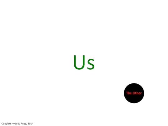
Another widely-used concept is the Other. The uppercase “O” is deliberate. Again, this involves an “us and them” world view, but this time the “them” group is treated as one undifferentiated threatening dark entity.
One version of this concept involves “us” being the majority, and being sensible, normal and right, with the Other being a small minority that is different and/or deviant.
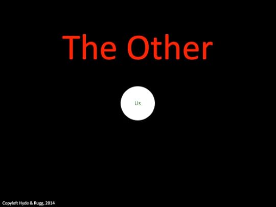
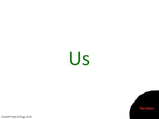
Another version involves the in-group as an embattled minority surrounded by the dark, threatening Other, like this.
Why should anyone want to view themselves this way? Sometimes because it’s true; quite often, because it’s an effective way of encouraging stronger social bonds within the group, even though it risks becoming a self-fulfilling prophesy if this strategy antagonises the Other.
Groups and threat
When groups feel threatened, they tend to react in predictable ways.
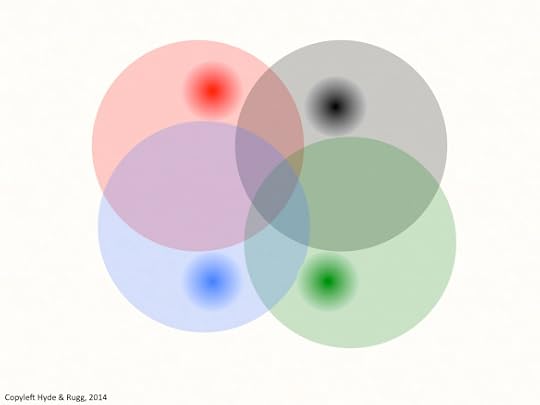
Here’s an image showing four groups in a non-threatening environment, getting on with their lives. The groups overlap; they’re shown as circles whose colours are different, but not strikingly different.
When groups feel threatened, one common response is for some group members to emphasise what are perceived as core features of group identity that differentiate the in-group from the others.
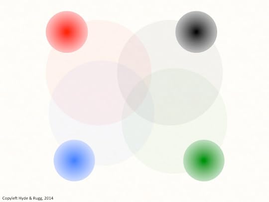
In the image above, we see four darker circles within the original group circles, representing the emergence of extremist factions within the groups. Each of these darker circles is fuzzy-edged, to make the point that this is a matter of degree, not of absolutes. Also, each of the darker circles is within an area that has no overlap with the other groups. The group “heartland” is not located in the original centre of the group; instead, it’s being located in terms of separateness from other groups.
If the perceived threat continues, then this dynamic moves further, as shown below.
Now, the darker circles are larger – more people are starting to move into the more extreme group factions – and the darker circles have moved further from the central point; each group is now taking up increasingly extreme positions to differentiate itself more clearly from the others, outside many of the original group values. There aren’t many people remaining in the old, overlapping areas.
This is a familiar pattern from history, commonly described in contemporary politics as “political purity battles” within political movements, or more colourfully as candidates trying to out-crazy each other to avoid being primaried. The underlying dynamics are well understood within systems theory and within games theory, altough comparatively few people appear to be aware of this. I’ve blogged about this topic previously.
http://hydeandrugg.wordpress.com/2013/05/07/subsystem-optimisation-and-system-optimisation/
Groups and uncertainty
In the previous sections, I’ve implicitly assumed that the stresses are clearly known and that the groups are identifiable. What happens when you add uncertainty to the mix?
In the image below, the Other is shown as a marginal group lurking on the edges of the in-group’s world.
In this version, we can’t be sure how far the Other extends; we can only see part of it. There’s no way of knowing whether the unseen part is tiny (and therefore probably unthreatening) or enormous (and therefore potentially dangerous, if the Other turns against the in-group).
The combination of uncertainty and very different outcomes is something I’ve blogged about before, in an article on why humour is funny and horror is scary.
When a situation is ambiguous, but is disambiguated as being non-threatening, then it’s funny; if it’s disambiguated as being threatening, then it’s horror, of the “sudden horrible realisation” variety.
Most human beings are very uncomfortable about ambiguous situations that include possible threat.
One way of reducing ambiguity is to show very clear externally visible signals of group membership, for example in choice of clothing or hair style. It doesn’t remove all the ambiguity, but it helps members of a group to identify members of their own group, as potential allies in difficult times. This overlaps with the concept from biology of costly honest signals, where an animal sends out a signal that is expensive in some way, but that is hard to fake. Among humans in stressful times, this can take forms such as regular visible participation in group events (e.g. communal prayer, or attending party rallies).
When we look at group affiliation signals in this way, another concept from a different field offers further useful insights. Young males are particularly prone to extreme displays of group affiliation. This is usually explained in terms of their frontal lobes not yet being fully developed, and/or in terms of culture and/or genetic “hard wiring”. The frontal lobes issue is probably a significant component, but there’s another factor which also probably contributes significantly to this behaviour.
Young males, like young people generally, are inexperienced; in terms of the literature on expertise, they’re novices in many forms of social interaction. Novices in any field tend to be poor at subtlety, and tend towards simplistic categorisation and simplistic behaviour patterns. So, young males might over-simplify group identifications and might go in for exaggerated group affiliation signals simply because of being novices, rather than because of any sociobiological imperative.
Moving back to the topic of visible affiliation, one of the classic themes in horror is the unseen. This theme appears in inter-group perceptions when stresses are high, in the form of fears of the Other being invisibly present. The classic manifestation of this is the conspiracy theory, which often involves claims of far-reaching and threatening unseen preparations by the Other for some atrocity against the in-group. Demagogues frequently use this strategy as part of an argument for a pre-emptive strike against the Other; it’s a common feature of history, often as a precursor to genocide.
A recurrent theme in this article has been cognition: the human cognitive system trying to identify dependable signals in a stressful, uncertain world. I’ll close with another thought about cognition, and its links to inter-group relations.
When you look at how people try to make sense of the world, you keep seeing attempts to divide the world neatly into binary, either/or categories – male versus female, natural versus artificial, traditional versus progressive. This has obvious parallels with the concept of the authoritarian personality, where a major characteristic of the authoritarian personality is strong dislike of ambiguity. I’ve blogged about this topic repeatedly, because it’s so ubiquitous, so important, and so often overlooked.
http://hydeandrugg.wordpress.com/2014/06/22/natural-and-artificial-learning/
http://hydeandrugg.wordpress.com/2014/03/23/false-dichotomies-in-education-theory/
http://hydeandrugg.wordpress.com/2013/10/24/gordons-art-exhibition-part-2/
This issue can cause far-reaching problems when political and bureaucratic systems collide with human beings who are unwilling or unable to fit into the neatly defined predetermined pigeonholes of The System. Reality often isn’t neat and tidy, and one of the tests of a society is how well it treats those people who don’t fit into that society’s preferred categorisation.
That will be the topic of my next article.
Notes and links
I’ve indicated specialist terms from other fields in bold italic. All of the specialist terms I’ve used in this article are well covered in easily accessible sources such as Wikipedia, if you’d like to read about them in more detail.
You’re welcome to use Hyde & Rugg copyleft images for any non-commercial purpose, including lectures, provided that you state that they’re copyleft Hyde & Rugg.
There’s more about the theory behind this article in my latest book: Blind Spot, by Gordon Rugg with Joseph D’Agnese
http://www.amazon.co.uk/Blind-Spot-Gordon-Rugg/dp/0062097903


June 25, 2014
The quick and dirty approach to meta-analysis
By Gordon Rugg
In an ideal world, everyone would always do everything perfectly. However, it’s not an ideal world.
So what can you do when you’re trying to make sense of a problem where there’s conflicting evidence, and you don’t have time to work through all the relevant information?
One approach is simply to decide what your conclusion is going to be, and then to ignore any evidence that doesn’t fit. This is not terribly moral or advisable.
Another is to do a meta-analysis, to assess the quality of the evidence as a whole. This sounds impressive; it also sounds like hard work, which it is, if you do a full-scale proper meta-analysis. Most academic researchers therefore use two types of meta-analysis.
The first is the quick and dirty type, which normally gives you a pretty good idea of whether the topic is worth spending your time on.
The second is the proper type, which is time-consuming, and requires sophisticated knowledge of research methods, including statistics.
This article, as the title subtly implies, is about the quick and dirty approach. It’s a flawed, imperfect approach, but it’s a good starting point in a flawed, imperfect world.
If you’re a normal human being or an academic researcher, then you simply don’t have the time to read everything that might be relevant to the topic that you’re interested in. However, you will want to get a reasonably accurate overview of the quality of evidence in relation to the key issues that interest you.
Most academic researchers use a quick and dirty approach that involves matching the claims being made against the credibility of the venue where those claims are being made. What does that mean? Here’s an illustration.
First, credibility.
The more credible the place where a claim appears, the greater the chance that there really is something going on that’s worth looking at. (I’ll look at the underlying principles later in this article; the credibility rating isn’t just about academic snobbery.)
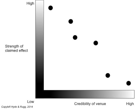
What you can now do is to plot the credibility of the venue against the strength of the effect being claimed (e.g. a claim that treatment X significantly improves problem Y). Here’s what you often see.
What often happens is that the low-credibility sources say there is a strong effect (e.g. that treatment X helps a lot with problem Y), but the medium-credibility sources say a weaker effect (e.g. that treatment X helps a fair amount in most cases of problem Y), and the high-credibility sources say that there’s only very weak effect, or no evidence at all, of an effect.
Yes, it’s an imperfect rule of thumb, and yes, the high-credibility sources can make mistakes, but as a quick way of assessing what’s going on, it’s a pretty good starting point. From here, you can decide whether you want to go on to a focused study, or to a full-scale proper meta-analysis that gets into the statistical and methodological issues of the articles involved.
Where does credibility come from?
In brief: quality control.
Quality control in publications takes two main forms:
quality control for form: e.g. spelling, punctuation, grammar, etc.
quality control for content: e.g. the methods and for the evidence.
All print publications perform quality control for spelling, punctuation, grammar, etc. So do many web sites. This type of quality control isn’t just about pedantry and appearance. Typos in particular can have huge practical implications. The classic example is when someone puts the decimal point in the wrong place, and offers a product for sale at a tenth or a hundredth of the intended price. Some companies have lost very large amounts of money through that mistake. Similarly, a mis-placed comma can sometimes have major legal implications.
The more prestigious venues also do quality control for what’s being claimed in an article. The prestige pecking order in academic publications is based largely on how rigorous that quality control is. The more rigorous the quality control, the greater the prestige.
It’s important to note that this latter type of quality control is about the methods and the evidence being used, not about the conclusions. In academia, your reputation is actually enhanced if you find something solid that contradicts conventional wisdom in your field. You don’t get a Nobel prize for agreeing with everyone else in your field; you get it for new findings and new insights that change your field forever.
This is a major difference between most published academic research and most commercial research, such as think-tank research.
If you’re an academic researcher, you can research pretty much whatever you like, and your funding and career prospects won’t be affected by the conclusions you reach. Instead, they’ll be affected by the quality of the research that you used to reach those conclusions. The people who fund your research don’t usually care what your conclusions are, as long as they’re solidly based.
This is an important point, because it helps academic researchers to stay free of vested interests that might pressure them towards claiming particular conclusions, even though those conclusions are wrong. This happened on a disastrous scale under Stalin, where agricultural researchers were pressured to agree with the conclusions of Stalin’s favoured researcher Trofim Lysenko. This did not end well.
https://en.wikipedia.org/wiki/Lysenkoism
This doesn’t mean that academic researchers are impartial, or that there is such a thing as pure objectivity. However, it does mean that academic researchers are under no significant pressure to come to any particular conclusion about a research question. The situation is probably different, however, for researchers who are working for a political think-tank, or for a company that produces a controversial product…
Advanced issues
This article until here has been about a quick and dirty approach to getting an overview of a research topic. If you’re going to do a proper, thorough process of critically evaluating the evidence about a topic, then that’s a whole different beast.
A proper meta-analysis requires a sophisticated understanding of statistics, of research design, of research methods, and of methods of conducting meta-analysis. You need those to perform a proper critical assessment of the quality of the work being reported in each article. Often, articles have fatal flaws that are only identifiable via some very sophisticated understanding of how the work in them should have been carried out.
This level of knowledge typically requires years of postdoctoral-level work to acquire, and would take several books to explain properly. I’m not going to even try to describe the full process.
This may sound depressing, if you aren’t in a position to acquire the level of experience and skill needed to do full-on meta-analysis.
However, there are some other useful concepts that can help you better understand what’s going on within a body of research, and that don’t require huge investment of time and effort. They can be very useful for identifying potential problems within an article, or a research field.
In no particular order, these are:
The Courtier’s Reply
The Courtier’s Reply says, in essence, “You need to waste several months or years of your life reading this selection of pseudo-scholarly garbage before you can really understand what we’re actually saying”.
It’s much favoured by cranks, though other groups also use it on occasion. It’s a quick and easy way for them to smear opponents with claims that the opponents haven’t bothered to find out what they’re arguing about.
If you’re wondering how this relates to the academic line of “There’s a literature on that” then you’re right to wonder. There’s a judgment call about where real scholarship ends and where pseudo-science and charlatanism begin. I don’t plan to stick my head into that particular hornet’s nest just yet, so I’ll move on swiftly to the next topic.
Publication bias toward positive findings
Most publications favour articles that claim to have found something new, as opposed to articles that claim to have looked for something and not found it (for instance, a claim that treatment X improves recovery rates for condition Y, as opposed to a claim that treatment X had no effect on recovery rates for condition Y). This is a problem because it biases the literature towards evidence for a given claim, and away from evidence against it.
This problem is well-recognised in fields relating to health and medicine. Researchers in such fields usually take it explicitly into account when assessing evidence.
This is one reason why it’s not a good idea to try assessing the evidence for and against something by simply counting the published articles that argue in favour of it and against it; there’s an inbuilt tendency for the articles in favour of a claim to be over-represented.
Citation rings
Sometimes a number of researchers will cite each other’s work as often as possible, thereby inflating the visibility of everyone within that ring of mutual publicity, regardless of the quality of their work. This can skew the relative visibility of different approaches within a field – citation rings tend to look as if their approach is more influential than is really the case. Journal editors, and journal reviewers, know about this practice and generally take a dim view of it. However, the practice isn’t likely to end in the foreseeable future, so you need to keep an eye open for it.
Systematic Literature Reviews
Done properly, a Systematic Literature Review (SLR) can give an invaluable overview of research on a given topic.
However, doing it right involves an advanced understanding of the usual suspects – statistics, research design, research methods, etc. If you don’t understand these at a sophisticated level, there’s a high risk that you’ll be misled by impressive-looking garbage in a paper produced by a snake oil merchant or by someone who’s better at presentation than research design.
It’s horribly easy for well-intentioned novices to produce something which mimics the surface appearance of an SLR, but which contains fatal mistakes in the judgment calls at the heart of the SLR approach. These mistakes aren’t usually visible in the final write-up. Badly conducted SLRs can look very systematic and objective, but they can also be worse than useless, since the mistakes in their findings can mislead researchers for a long time.
I’ll blog about this in a separate article; it’s another of those topics where explaining the mistakes takes much longer than it takes the perpetrator to commit them.
Discovery curves
I’ll close with an encouraging neat idea. In some disciplines, notably zoology, discovery curves are used to plot the number of new discoveries made over time. For instance, an ornithologist might plot the number of new species of bird that were discovered each year since records began. Usually the curve starts off as a steep upward climb, and then levels off as a plateau when there aren’t many new species left to find.
What’s neat about this approach is that if you use it correctly, it can give you a surprisingly accurate idea of how many new discoveries are waiting to be made. (“Correctly” involves things like making allowance for whether someone has just discovered a new island, or whether a new method for defining “species” was introduced during one the years involved.)
There are some entertaining examples of this on the excellent Tetrapod Zoology blog – the sea monsters article is a classic.
http://blogs.scientificamerican.com/tetrapod-zoology/
http://scienceblogs.com/tetrapodzoology/2009/03/24/statistics-seals-sea-monsters/
On which inspiring note, I’ll end.
Notes
You’re welcome to use Hyde & Rugg copyleft images for any non-commercial purpose, including lectures, provided that you state that they’re copyleft Hyde & Rugg.
There’s more about the theory behind this article in my latest book:
Blind Spot, by Gordon Rugg with Joseph D’Agnese
http://www.amazon.co.uk/Blind-Spot-Gordon-Rugg/dp/0062097903


June 24, 2014
Hunting stuffed moose in Norway
By Gordon Rugg
Today’s post shows a little-known Norwegian activity: Hunting the stuffed moose.
Yes, it’s a real, old, photo. Yes, that really is what the caption for the photo said. No, I don’t know the background story. Sometimes, Lovecraft was right about there being things that human minds were never meant to know…
I hope this image brightens your life.
 https://en.wikipedia.org/wiki/File:Jakt_p%C3%A5_utstoppet_elg.jpg


June 22, 2014
“Natural” and “artificial” learning
By Gordon Rugg
There’s a widespread belief that there’s a useful distinction between “natural” learning and “artificial” learning.
There’s also a widespread belief that Elvis is still alive.
In this article, I’ll explain why the natural/artificial distinction is worse than useless in the context of education, and I’ll describe a more useful, solidly-grounded set of categorisations.
Natural and unnatural skills: The handaxe and the razor
Anyone with an armchair and an opinion can argue forever about definitions of “natural”. The Internet shows that a lot of people have armchairs, and opinions, and a disturbing amount of free time.
If you were trying to work out the meaning of the word “natural” from the surrounding context in which it was used in Internet discussions, you’d probably conclude either that it had something to do with holistic vibrations and healing, or that it had something to do with tradition and a dislike of new-fangled innovations. Either way, it tends to be tangled up very tightly with the writer’s ideology and beliefs, and to mean almost exactly the same as “what I approve of”.
The situation is slightly different with the concept of “natural learning”. Slightly, not hugely. The framing of “natural versus artificial” looks superficially plausible, but the way that arguments about this have been going on for years without much visible progress are a strong hint that starting from here isn’t the best way forward.
I’ll resist the temptation to wade into the swamp of arguments about what “artificial” or “natural” should mean, since they’re a classic example of what goes wrong when people try to force the world into two either/or pigeonholes. The two-pigeonhole approach is usually a recipe for decades of fruitless argument about definitions.
http://hydeandrugg.wordpress.com/2014/03/23/false-dichotomies-in-education-theory/
Instead, I’ll look at some other, richer, categorisations, which demonstrate how a different way of looking at the topic can be much more productive.
First, though, a brief disambiguation: The term “artificial learning” is also used in the computational field of Artificial Intelligence, where it refers to computers “learning” for themselves. This is a completely different concept from “artificial learning” in the sense used in this article, namely a term often used to describe formal school-based human learning with human-made artefacts.
Nonverbal versus verbal instruction
A useful, cleanly-delineated way of categorising learning is whether the learning involves verbal instruction or not. Yes, this distinction is binary, but the categorising principle lets you make much clearer distinctions than is the case with “artificial” versus “natural”.
Some learning involves no verbal component; an example is learning by preverbal babies. There’s been a lot of work on what preverbal babies learn, and how they learn it, with fascinating results. It’s a fine, rich literature.
It’s clearly also possible for older children, and adults, to learn non-verbally. If you’re sceptical about this, then try watching some tutorial film clips on topics such as making pottery, with the sound turned off. You can learn a surprising amount just by watching. I’ll return to this issue in a moment.
It’s easy to learn some things non-verbally, but there are other things that are prohibitively difficult to learn without words.
The examples of making flint handaxes and of shaving with a straight razor bring the relevant issues into stark relief. In both cases, you’re dealing with extremely sharp edges in close proximity to major blood vessels. The flakes that you produce when working flint are often sharper than the best straight razors. Both these activities concentrate the mind to a remarkable extent.
So how do people use language in the context of learning these skills? The answer is that they tend to use it for two major purposes.
The first is rationale, i.e. explaining and asking about the reasons for doing something in a particular way. These reasons can be about making the task easier, but they’re often about avoiding a dangerous outcome, such as having the flint shatter in your hand, or nicking a blood vessel when shaving your throat.
The second is teaching heuristics, i.e. useful rules of thumb for structuring what you do. For instance, a useful heuristic about shaving with a straight razor is that the first shave with one is much the worst. This gives the novice a useful set of calibrating expectations, so the novice is much less likely to give up too early.
Since rationales and heuristics often involve outcomes that are rare and/or dangerous, there are a lot of advantages in explaining them verbally, as opposed to showing the learner real examples of something going drastically wrong.
This may be the reason for handaxes being an extremely conservative technology. They were used in much the same form for hundreds of thousands of years, across changes in species. Then, about thirty or forty thousand years ago, modern humans started producing a much broader and faster-changing toolkit. The reasons are hotly debated, but one plausible explanation is that handaxes were produced using only non-verbal learning. This would heavily bias the learners towards close imitation of what they were seeing, without a mechanism for safely investigating what would happen if they diverged from that template.
Implicit and incidental learning
Nonverbal learning isn’t a single homogeneous category. There are various separate types of learning that can occur without a verbal component.
Implicit learning is one type of nonverbal learning that has been extensively studied. In implicit learning, the student learns something by a form of nonverbal induction through seeing examples and being told the category to which each example belongs. (There are other forms of implicit learning, but for brevity I’ll focus on this form.) The classic example is learning how to tell the sex of a newly-hatched chick, by seeing chicks and being told whether each one is male or female.
In implicit learning, the student typically learns the skill without ever being able to put it in words. Typically, this type of learning requires huge numbers of training examples, and a lot of time (in the order of thousands of examples and weeks of learning).
Incidental learning is also nonverbal, but is otherwise very different from implicit learning. Incidental learning occurs, as the name suggests, incidentally, i.e. while the student is focused on something else. A classic example of this method being incorporated into training is when an apprentice is given the job of sweeping the workshop floor, thereby giving the apprentice an opportunity to observe incidentally how the experts work, how they use their equipment, etc.
Incidental learning can occur after just one example – for instance, the apprentice learning to check whether a worked surface is straight by sighting along it. This is very different from implicit learning, which typically requires a lot more resources and time. Also, the student may be able to put their incidental learning into words, even if it is something that they learnt non-verbally – again, very different from implicit learning.
So where does that leave us?
In summary: Arguing about what’s “natural” and what’s “artificial” isn’t very productive.
Looking at the literatures on nonverbal versus verbal learning, or on implicit learning as opposed to incidental learning, or on rationales and heuristics, is a much more productive approach, that gives teachers specific, practical, evidence-based categorisations which they can use to select the best combination of methods for their needs.
That’s a good, positive note on which to end, so I’ll quit while I’m ahead.
I hope you’ve found this useful.
Notes
You’re welcome to use Hyde & Rugg copyleft images for any non-commercial purpose, including lectures, provided that you state that they’re copyleft Hyde & Rugg.
There’s more about the theory behind this article in my latest book, Blind Spot, by Gordon Rugg with Joseph D’Agnese
http://www.amazon.co.uk/Blind-Spot-Gordon-Rugg/dp/0062097903
Related articles:
Binary categorisation in general:
Categorisation and gender:
http://hydeandrugg.wordpress.com/2013/10/24/gordons-art-exhibition-part-2/


Gordon Rugg's Blog
- Gordon Rugg's profile
- 12 followers


