Gordon Rugg's Blog, page 12
December 18, 2014
Seasonal humour: Getting that special paper published
By Gordon Rugg
Every paper is special to its proud author. Some papers, though, are more special than others, and those papers can be hard to get published. Suppose, for instance, that you want to gift the world with your explanation for how the Egyptian pyramids were built using genetically engineered dinosaurs created by the Nephilim and controlled by implanted microchips. Traditional academic publishing can be very narrow-minded about such bold new ideas. This makes publication difficult. Difficult, however, is not the same as impossible.
This article presents a few modest proposals for ways of overcoming those difficulties, and achieving publication for that special paper.
Choice of venue is a major issue, where the right choice of journal, conference or publisher can dramatically increase your paper���s chances of acceptance. A few minutes of homework are an investment well worth making.
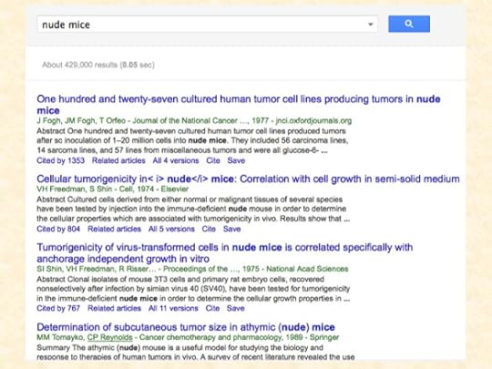
Suppose, for instance, a friend tells you that there are journals that publish articles about nude mice. You might think that those journals would be refreshingly open to radical new ideas, but a quick search on Google Scholar will rapidly disabuse you of that hopeful idea.
The image below shows a typical result. It���s a long list of traditional papers using the old, hidebound frameworks of formal experimental design and impersonal evaluation of conventional evidence.
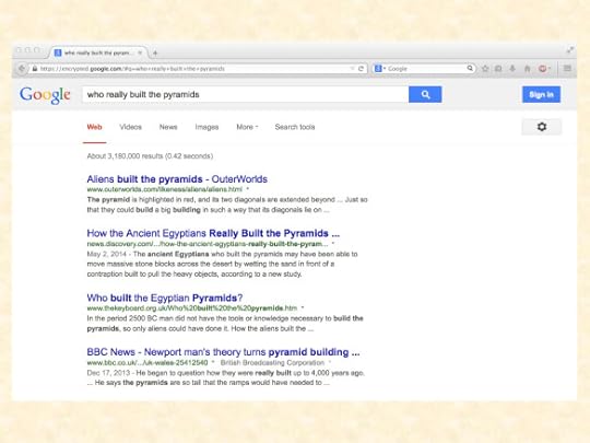
Google Scholar favours the traditional, restrictive, reality-based paradigm. If you search instead on the more open-minded Google, you have a better chance of finding a suitable journal. Good keywords are journal plus controversial or bogus. These terms are often used by mainstream scientists to disparage open-minded publications.
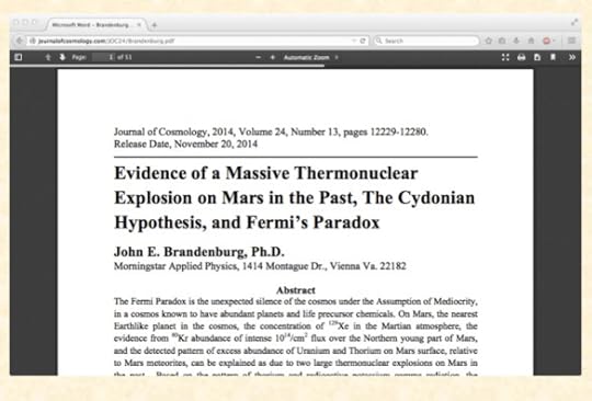
Here���s an example of a paper from an open-minded journal.
http://journalofcosmology.com/JOC24/Brandenburg.pdf
This is a good example of how careful homework can help you find that special journal that���s right for your special paper.
Once you���ve chosen the journal, you need to think carefully about the presentation of your paper. I���ll go through the main points one by one.
Title
A good title can make a huge difference to the plausibility and the profile of your paper.
A boring, jargon-laden title will probably only interest a handful of specialists. Who would want to read a paper with a title like ���”Molecular Structure of Nucleic Acids: A Structure for Deoxyribose Nucleic Acid” in preference to a title that starts with ���Evidence of a Massive Thermonuclear Explosion on Mars in the Past���?
Your name and qualifications
Most people are more impressed by papers written by someone with a PhD, and with an impressive-sounding name, especially if the author appears to be male. You can solve the name problem easily by legally changing your name. A name such as Otto Chriek sounds a lot more scientific than, for instance, Ada Augusta Lovelace. As for PhDs, they don���t need to be as much work as people often believe. Some institutions are notably open-minded about accepting unconventional approaches to scholarship. For example, one famous PhD thesis includes the following lines:
As I was thinking on this subject, I wrote a poem to try to explain this, comparing blind men and atheists.
Two blind men argued well into the night
about the great question, “Is there really sight?”
Said one to the other (and quite fervently)
“There cannot be colors or else we could see!”
http://rationalwiki.org/wiki/Kent_Hovind%27s_doctoral_dissertations
The Abstract
The abstract to your paper needs to give the reader a concise and compelling understanding of what they will find in your paper. Here���s a good example from a recent paper which was accepted for journal publication, and which received a great deal of favourable attention.
The Introduction
This is where you show that you know what you are talking about, and where you explain why your opponents are all wrong. You need to do that, because unless you can show that they���re wrong, your own case doesn���t look so strong.
An efficient way of doing this is to focus on the key points where your argument is stronger than your opponents��� arguments. Hidebound traditionalists sometimes try to smear this approach by calling it cherry picking, but a good maxim to help you get past these insults is to remember that cherries taste better than rawhide.
The Method section
Method sections in most disciplines use a highly standardised format, so you can save a lot of time by just copying and pasting your method section from a published paper that used the same method. This also makes life easier for your chosen journal’s copy-editors, since the copy-editing has already been done for that section. It���s a good idea to remember to tweak the text so it matches the actual numbers of participants that you used, etc, but realistically, if you forget to do this, only a few pedants are likely to notice, so it���s not a major issue.
The Results section
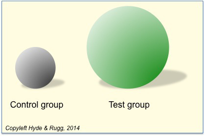
This should display your findings clearly. For example, if you found that your test group score was twice as high as the control group score, you should consider using a 3D representation like the one below, since this emphasises the difference between the two groups. The key point is that there is a difference; the precise details about the size of the difference will only interest a few specialist readers. You can put those details in the appendices, so as not to break the narrative flow of the main text.
A good source for ideas about ways of showing information in a striking visual way is Huff’s book How to Lie with Statistics (1993). However, it’s important to be aware that Huff wasn���t a professional statistician; he was actually a journalist, so his claims about best practice in statistics need to be treated with appropriate caution.
The Discussion section
This needs to emphasise the positive findings from your work, since there���s no point in telling the reader at length about something which didn���t happen, such as not finding the main effect you were looking for. Readers are busy people, so you shouldn���t waste their time by telling them about things that you didn���t find.
The Conclusions and Further Work section
This needs to further emphasise the positive findings in a clear, emphatic way that will catch the reader���s attention, and make your paper as memorable as possible.
Traditional academic writing is very bad at this. Here���s a typical example of an instantly forgettable closing line.
���It has not escaped our notice that the specific pairing we have postulated immediately suggests a possible copying mechanism for the genetic material.���
Fortunately, the growth of open access publishing has encouraged authors to learn a more lively, accessible style that will increase public engagement with research.
The “further work” subsection should explain clearly why you have priority over your rivals with regard to ideas about future research, so that they need to cite you in their future publications. It should also establish your credentials for any follow-up research grant applications that you might want to make as a result of the work described in your paper.
The References
You need to include references which are relevant (to show your knowledge) and prestigious (to show that the topic you���re working on is significant). If you spend a few minutes on Google Scholar looking at the reference sections of already published articles on your topic, you���ll see which references keep being quoted. Copying and pasting these references, rather than typing them in from scratch, has the advantage of saving the copy-editor���s time on your own paper.
From the viewpoint of best practice, there���s a debate about whether the references in a typical paper are anything more than a ritual activity with no practical use. It���s well established that a high proportion of the findings in published papers are actually not replicable, which raises ethical questions about whether citing non-replicated papers is actively misleading. Since most papers don���t contain replicated findings, this is a strong argument for keeping references down to a sensible number, rather than the large numbers typically found in a traditional paper.
The Appendices
This section is a convenient place for putting original data that you haven���t yet analysed, to establish your priority, and for mentioning inconvenient facts, to show your impartiality.
This is the last section of a typical paper, so as soon as you’ve reached this point, you just need to find some suitably striking keywords to bring your article to the reader’s attention, and you’re ready to send it off. Good luck!
Closing thoughts
This article was satire, and is emphatically not intended to be treated as a serious guide. Anyone who is tempted towards the dark side by some of the ideas above should take into account that serious reviewers, editors and colleagues are well aware of such shady approaches, and take a dim view of them.
All citations etc above are on a ���fair use��� basis, since I���m using them to make valid academic points in a humorous way.
The quoted text in the sections about titles and conclusions is from the Crick & Watson 1953 paper that first described the structure of DNA. All the other quoted text is also real, however improbable this may appear.
Also by way of clearing up any possible confusion: I think that research definitely should consider unorthodox possibilities. However, there���s a big difference between considering the unorthodox, and treating all ideas and evidence as being equally worthy of time and effort.
If you���re interested in what I actually think about best practice in academic writing and research, there���s a fair amount about these topics in the articles on this blog site, and in my books with Marian Petre (links below).
I hope that this article has brightened your day.
Notes and links
You���re welcome to use Hyde & Rugg copyleft images for any non-commercial purpose, including lectures, provided that you state that they���re copyleft Hyde & Rugg.
Cherry picking:
https://hydeandrugg.wordpress.com/2014/06/01/cherry-picking-and-dodgy-reasoning-for-beginners/
Why academic writing is deliberately not interesting:
https://hydeandrugg.wordpress.com/2013/12/26/why-is-scientific-writing-so-boring/
https://hydeandrugg.wordpress.com/2014/06/20/are-writing-skills-transferable/
Some of my own research into unusual topics (e.g. the Voynich Manuscript) is described in my book, Blind Spot, by Gordon Rugg with Joseph D���Agnese:
http://www.amazon.co.uk/Blind-Spot-Gordon-Rugg/dp/0062097903
My books with Marian Petre:
A Gentle Guide to Research Methods:
http://www.amazon.com/A-Gentle-Guide-Research-Methods/dp/0335219276
The Unwritten Rules of PhD Research:
http://www.amazon.co.uk/Unwritten-Rules-Research-Study-Skills/dp/0335237029/ref=dp_ob_image_bk
��Links to cited articles:
The Crick & Watson DNA paper (downloadable PDF of the original paper):
http://www.nature.com/nature/dna50/archive.html
Huff, D. How to lie with statistics (1993 edition)
http://www.amazon.com/How-Lie-Statistics-Darrell-Huff/dp/0393310728
The statement about most published findings not being replicated is actually true:
https://en.wikipedia.org/wiki/John_P._A._Ioannidis
The full story is, as you might suspect, more complex, which is why I’ve linked to the Wikipedia article about Ioannidis rather than to his 2005 paper.
Overviews of the articles on this blog:
https://hydeandrugg.wordpress.com/2014/09/19/150-posts-and-counting/

December 11, 2014
Misperceptions of failure
By Gordon Rugg
One of the most useful pieces of advice I every encountered in relation to life planning is that you should aim to be rejected in about 75% of your job applications.
It���s one of those profoundly counter-intuitive concepts that make you re-think a lot of things that you had previously taken for granted, and that give you a much more powerful (and also much more forgiving) set of insights as a result.
Why is it good advice, and what are the implications?
The core concept behind the ���75% rejection��� advice is that if you���re being offered 100% of the jobs that you���re applying for, then you���re aiming too low.
Once you start thinking this way, then a lot of implications rapidly become obvious. One obvious implication is that you can view rejection rates as calibration, rather than as assessment. That makes a huge difference to your morale, which is a big issue when you���re job hunting, and when the world appears bleak and hopeless. It also helps you to view yourself as having some control over the process, rather than being powerless. That���s another huge advantage.
In case you���re wondering, the figure of 75% isn���t fixed in stone, but it���s a useful place to start. It makes the point that you, and everyone else, can expect the majority of sensible applications to end in rejection. It also makes the point that this is a normal part of reaching your goal, so you shouldn���t view it as a reflection on your self-worth.
The same principle applies in a lot of other fields. Even for the best researchers in the world, for instance, most of their funding applications will be rejected. The best journals in the world routinely reject 90% or more of the papers submitted to them, even though those papers will routinely be from the best researchers in the world.
Figures like these will probably start you thinking about just what ���failure��� actually is. It���s an interesting question. The obvious way of viewing failure is that you start off with a goal, and that if you don���t achieve it, then that is failure. The reality, though, is more complex.
The obvious view, that failure means not achieving your goal, contains the implicit assumption that your goal is achievable in the first place. In many cases, that assumption is wrong. Sometimes there is no way of knowing whether or not your goal is achievable until you get deep into the attempt. In other cases, it���s already known that the goal isn���t achievable, but someone decides to try anyway, often with substantial knock-on effects. In yet other cases, there���s an implicit assumption that success rates ought to be 100%, and that anything else is itself a failure.
Here are some examples.
Could they have known in advance?
The first human landing on the moon arose from Kennedy���s goal of getting a human to the moon, and safely back, by the end of the decade. It worked. It was widely cited in management books thereafter as an exemplary case of clearly stated objectives leading to a successful project.
What���s less often cited is Nixon���s attempt to do the same for cancer research. That had equally clear objectives, but it failed to achieve them. With hindsight, the problem was much more complex and difficult than Nixon���s advisors had believed. However, there���s a good case for arguing that the attempt to achieve those objectives led to much more profound insights into the true nature of the problem, which were very useful to subsequent researchers.
Was it already known to be unachievable?
Another example, about which I���ve blogged previously, is the assumption that it���s possible to teach everyone to read. The evidence suggests pretty strongly that this assumption is simply wrong. The statistics for literacy rates across time, across cultures, and across teaching methods, strongly suggest that there���s a significant percentage (somewhere in the area of 5% to 10%, depending on definitions etc) of people who for whatever reasons will not become functionally literate.
This has far-reaching implications for education theory, for education practice, and for provision of information to the public.
Similarly, in a wide range of fields, there is an implicit or explicit goal of completely eradicating some risk. If you look into the literatures on risk and on disasters, you soon realise that this goal is based on a profound misunderstanding of how things actually go wrong. What���s much more realistic and productive is to frame the issue differently; for instance, in terms of getting the number of cases below some realistic figure.
Should we assume that failure is always bad?
The problems above would be bad enough in isolation. What often happens, though, is that they become footballs in policy and legislation arguments, leading to an infinite cycle of churn. What does that mean? A common pattern is as follows.
There is a problem
Method A is introduced, and fixes 99% of cases
One of the remaining 1% of failures is given a high media profile
Method B is introduced to prevent similar failures from happening again
Method B fixes 99% of cases
One of the remaining 1% of failures is given a high media profile
Method C is introduced to prevent similar failures from happening again
Rinse, lather and repeat
The result is constant change in procedures and laws, usually at high financial cost, and usually bringing huge stress to the people affected, without actually changing the overall picture. Why does this happen?
A major reason is that no manager or politician in their senses will say, ���Okay, so there was one disastrous case, but we���re not going to change anything���. If they did that, they���d be accused of not caring, and their career prospects would nosedive. There���s a huge incentive for them to be seen to be actively doing something about the problem, even if they know, and everyone who understands the topic knows, that the new system will simply change the problem rather than removing it. (This isn���t an argument for never changing systems; on the contrary, most systems do have room for improvement. What I���m saying here is that knee-jerk political reactions to emotive cases aren���t the best way of assessing and fixing a problem.)
Another issue is people���s perception of justice. There���s a strong temptation to want every injustice to be set right, whether the case involves perceived misuse of the benefits system or a child���s death. That���s understandable, but it shouldn���t be the sole basis for laws and for systems design in areas such as healthcare or child protection. It���s extremely unlikely that anyone or any method can prevent all bad things from happening all of the time; trying to achieve that impossible goal may feel good to the person making the effort, but it usually makes things actually worse for the people on the ground who have to cope with the constant changes, all the while knowing that the changes won���t bring any real overall improvement anyway.
A further issue is the assumption that not achieving a goal is always a bad thing. This is a familiar issue to the academic world in relation to PhDs, where there���s been increasing pressure for years from the funding bodies to aim for a 100% pass rate on PhDs. Again, this is understandable, but it makes no allowance for cases where the student discovers that a PhD is not what they really want to do, so they stop early, rather than slogging on for years on something that isn���t for them. Often, those students report afterwards that their time on the PhD was a hugely positive experience, even though they���re still sure that abandoning the PhD was the correct decision.
The 100% pass rate assumption also makes no allowance for ���risky��� PhDs, where you take on a student who���s extreme in some way. Sometimes, those are the best students, and their work changes the world precisely because it���s gained huge new insights from taking a very unusual approach. Sometimes, conversely, those are the worst students, and you go through some very character-forming experiences before parting company with them. Most traditional academics take the view that every department should have one or two risky PhDs at any given point, because those are the students most likely to push back the frontiers.
Closing thoughts
So, ���failure��� isn���t always a clearly defined bad thing. Also, the search for a 100% success rate is often a wild goose chase that comes at significant cost to the people that it���s intended to help. Usually, setting realistic goals is better for everyone concerned, rather than being a sell-out to the forces of darkness.
This has been a quick skim over a deep, complex topic. I���ve blogged before about related issues; there are some links below to relevant articles and concepts. I hope you���ve found this useful.
The disaster literature: A good place to start is Perrow���s concept of the ���normal accident���. This is about how many accidents are pretty much inevitable as a result of how systems work. Many accidents happen when two or more situations co-occur; each situation may be harmless or even beneficial on its own, but the combination is disastrous.
http://www.amazon.com/Normal-Accidents-Living-High-Risk-Technologies/dp/0691004129
Sub-system optimisation: There���s a widespread, but wrong, belief that if you improve all the parts of a system, then the system as a whole will be improved. In reality, you can often make the system significantly worse by improving the individual parts without taking account of the system as a whole.
https://hydeandrugg.wordpress.com/2013/05/07/subsystem-optimisation-and-system-optimisation/
Systems theory and emergent properties: You can���t reliably extrapolate from a simple system to a more complex one. The reason is that complex systems behave in ways that simpler systems don���t. So, for example, a national economy behaves in different ways from a commercial company���s budget, and a commercial company���s budget behaves differently from a household budget. This is one reason that you need to be very wary when someone tries to improve a complex system in one area (e.g. education policy) based on their previous experience in a simpler area (e.g. teaching at a school).
https://hydeandrugg.wordpress.com/2014/08/15/systems-theory/
Notes and links:
There���s more about the underlying theory in my latest book, Blind Spot, by Gordon Rugg with Joseph D���Agnese
http://www.amazon.co.uk/Blind-Spot-Gordon-Rugg/dp/0062097903
Overviews of the articles on this blog:
https://hydeandrugg.wordpress.com/2014/09/19/150-posts-and-counting/

December 4, 2014
Heroism, hagiography, and management theory
By Gordon Rugg
Popular management texts can be wonderful if you���re having a bad day. You simply dip into an accessibly-written text, and soon you encounter uplifting, edifying stories about real people who went through experiences much more traumatic than your bad day, and who then went on to accomplish amazing things. Stories like those can lift the spirits wonderfully, and fill you with new resolve and hope, at least until the next email or phone call comes along to plunge you back into the here and now.
Or, if you���re of a cynical nature, stories like those can leave you wondering whether you might be able to sell some gold bricks to anyone who believes the aforesaid tales.
So where does the truth lie? That���s the topic of this article, which takes us from management theory into the lives of saints, and into good old schema theory and cherry picking.
Images from Wikipedia; details at the end of this article
If you explore enough of the nooks and crannies of academia, you start spotting similarities between areas that didn���t initially appear to have much in common. One of those similarities is between management textbook stories and stories of the lives of saints. There���s an entire field of scholarship, called hagiography, which deals with stories about saints, and it���s fascinating.
There are some common patterns in the saintly stories.
One pattern involves the saint abandoning their previous faith, and then choosing to die under horrible torture rather than renounce their faith.
You don���t see that storyline very often in management textbooks, for some reason. However, you do often see another common saintly storyline, which is shown below, alongside its management equivalent.
This looks like a classic case of the same underlying schema (i.e. mental template) being used in two different areas. That, in itself, isn���t necessarily a problem. The potential problem is the bit about the protagonist doing something wonderful.
In the case of the saints, some of the reported wonders were pretty impressive by anyone���s standards. Saint Columba, for instance, who is the man with the crozier outside the castle in the rightmost image at the start of this article, is reported to have scared away a monster at Loch Ness after it had killed a man. He also reportedly raised at least one man from the dead (though not the man killed by the monster; that might have been considered a miracle too many for one story).
Some people might wonder whether those miracles all happened exactly as reported. Some people might likewise wonder whether all the wonderful achievements in the management theory stories also happened exactly as reported. They might in addition wonder whether everyone who tried the new management theory also accomplished wonders, or whether the reports only mentioned the handful of cases where the theory worked, and carefully omitted a much larger number of cases where it didn���t.
To quote a classic line from British television: I couldn���t possibly comment.
Returning to the question of where the truth lies in the stories: Truth is a slippery concept.
In some fields, such as education and training, new methods often do initially work better than the old methods, because of issues such as the placebo effect, and self-selection among the people who use the new methods. Usually the early adopters are bright and keen, so they can get more or less anything to work. In addition, there���s a sporting chance that they���ll actually use the method correctly, rather than using a distorted, misunderstood, cheap version of it; doing things correctly is usually a good idea.
In other fields, there���s a cycle where a theory���s drawbacks lead to it being abandoned in favour of a new theory without those drawbacks; however, the new theory will itself have drawbacks, so it will in turn be abandoned, often in favour of a dusted-off version of the old theory, usually with a new name, a flashy new set of attached buzzwords, and some go-faster stripes.
So how can you tell where a particular new idea falls on the spectrum from glittering truth to glittering fool���s gold? Numbers are a good touchstone. If the story has lots of colourful detail about just one case, then you may be right to be suspicious. If the story has a solid set of numbers and statistics behind it, particularly if they���re boring ones rather than flashy ones, then it may be worth further investigation.
On which inspiring note, I���ll end.
Notes and links:
You���re welcome to use Hyde & Rugg copyleft images for any non-commercial purpose, including lectures, provided that you state that they���re copyleft Hyde & Rugg.
There���s more about the underlying theory in my latest book, Blind Spot, by Gordon Rugg with Joseph D���Agnese
http://www.amazon.co.uk/Blind-Spot-Gordon-Rugg/dp/0062097903
Related articles:
Why scientific writing is deliberately boring:
https://hydeandrugg.wordpress.com/2013/12/26/why-is-scientific-writing-so-boring/
Cherry picking, i.e. selecting unrepresentative examples and pretending that they���re representative:
https://hydeandrugg.wordpress.com/2014/06/01/cherry-picking-and-dodgy-reasoning-for-beginners/
Schema theory and mental templates:
https://hydeandrugg.wordpress.com/2014/07/08/chunking-schemata-and-prototypes/
Overviews of the articles on this blog:
https://hydeandrugg.wordpress.com/2014/09/19/150-posts-and-counting/
Sources of images in the banner:
https://en.wikipedia.org/wiki/Saint#mediaviewer/File:Cimabue_Saint_Francis_Fragment.jpg
https://en.wikipedia.org/wiki/Columba#mediaviewer/File:Columba_at_Bridei%27s_fort.jpg

November 26, 2014
Signage, literacy and wayfinding, part 2: Indoor signage and wayfinding
By Gordon Rugg
The words were at first indistinguishable, and then–with a tremendous start–I recognized something about them which filled me with icy fear���
From The Shunned House, by H.P. Lovecraft
In a previous article, I looked at nonverbal signage and wayfinding outdoors. Today���s article looks at the same topic, but focusing on indoors wayfinding.
I���ll begin this article with a discussion of a signage issue that���s a significant problem in most hospitals. I���ll then move on to look at different wayfinding strategies that people use, and at some ways of working with those strategies in indoors wayfinding and signage.
A classic problem, and some solutions
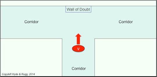
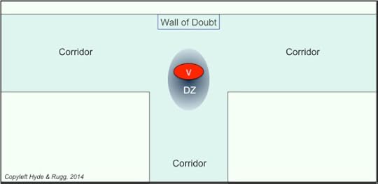
A standard feature of hospital signage is the Wall of Doubt. Here���s how it works. The visitor (the red oval marked ���V��� in the diagram below) has entered the hospital via the main entrance, en route to an appointment in the Wilson Ward, and is walking along the corridor in the direction indicated by the red arrow. So far, so good.
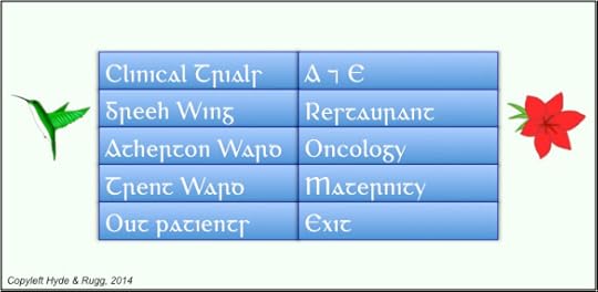
Now the visitor meets a T junction, and sees something that for many visitors looks something like this: the dreaded Wall of Doubt. Which of these signs, if any, might be the one for Wilson Ward?
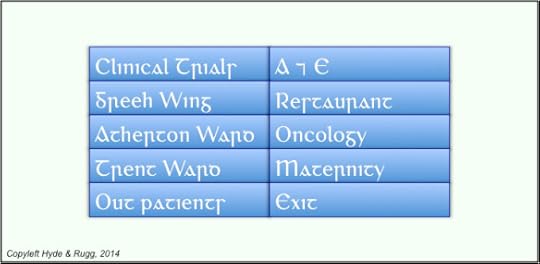 At this point, things start to go steadily but unnecessarily downhill. Why? That���s the topic of this article.
About 10% of the population have serious reading difficulties; many people have visual difficulties. That’s why I’ve used a font in the image above that will be unfamiliar to most readers, to give an impression of what the signage looks like to people with those difficulties. When they encounter a wall full of signage, they will probably need time to read through the signs and work out which direction they need to go in. So they have to stop in front of the signage and read it.
The more places a junction connects, the more traffic it will have, and the more signs there are likely to be. The more signs there are, the longer it will take a visitor to read them, and the longer the visitor spends reading, the more of an obstruction the visitor becomes.
The amount of space the visitor takes up is more than just their physical size; each passer-by needs to allow some spare space in case the reading visitor suddenly starts to move again. The result is a disturbance zone, marked ���DZ��� on the diagram below. It���s a lot of space, even for just one person. If you���ve got more than one person ��� for instance, a carer with a patient in a wheelchair, or other visitors waiting for their turn to read the signs ��� then they become a major obstruction, which isn���t much fun for anyone involved, including them.
So, within seconds of entering the building, many visitors are likely to be flustered and stressed as a result of the signage. It���s not a great start.
There���s also a sporting chance that the wording on the signs isn���t the same as the wording on the appointment letter, or the wording used by the receptionist; for instance, ���Wilson Ward��� might be a new name for a ward that���s been signposted using the old name, or it might be an informal name among the staff.
So what can you do about it?
At the T junction, the visitor doesn���t actually need to know the names of all the possible destinations. All the visitor needs to know is whether to turn left or right.
Simply telling visitors to turn left or to turn right isn���t as helpful as you might think, because a surprisingly high proportion of people can���t reliably tell left from right, and because a lot of people will forget whether the directions said ���left��� or ���right���.
A better strategy is to give visitors directions that are easier to remember. Here���s one simple way of doing this.
The verbal signage is still there, but it���s supplemented by a symbol on each side. On the left, there���s a green hummingbird; on the right, there���s a red flower. Now, you can tell a visitor to go in the direction of the hummingbird or the direction of the flower.
This strategy means that any visitors who have reading difficulties but who don���t have visual problems will be able to make the correct choice swiftly and easily at the T junction; so will visitors who have trouble telling left from right. A fair proportion of the visitors with visual problems will also be able to make the right choice, depending on the nature of their visual problems, and the visibility of the two symbols.
It���s not a perfect solution, but it���s a reasonable start.
There���s another way of tackling this particular problem, but it doesn���t seem to be part of standard architectural craft skills yet.
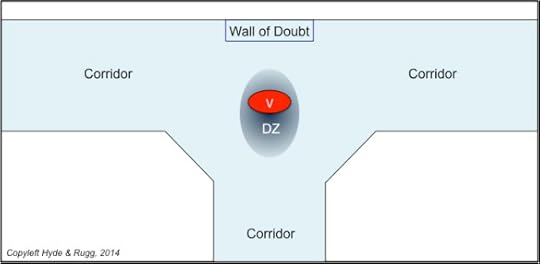
If you know that a particular T junction is going to be a major intersection where visitors will regularly be forced to stop and read signage, then you can design that junction so that it has room for regular users to fast-track past them, like this.
Using angled edges to the junction in this way gives a clear route for regular users who know where they���re going, and thereby improves the traffic flow. Again, it���s not a perfect or complete solution by itself, but it helps with one part of the bigger problem.
Which takes us back to the bigger picture of wayfinding and signage.
General wayfinding principles, and indoor signage
A high proportion of people tend to read signage as a last resort, when other approaches fail. There are four main methods that people use for non-signage-based wayfinding:
General sense of location and direction
Landmarks
Lists of directions
Maps
I���ll discuss the first three of those strategies; I won���t discuss maps, because those are very different from the first three, and are a substantial topic in their own right.
Both outdoor and indoor wayfinding aids can be complemented via the design of appointment letters and of online information, which I���ll discuss in a future article.
General sense of location and direction
One common issue in indoor wayfinding is keeping track of which floor you���re on, since usually they look much the same.
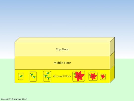
One solution is to vary some aspect of the d��cor systematically from the lowest floor to the top floor. The colour of paint on the walls is one way of doing this. In the schematic diagram below, the ground floor has the most intense colour, the middle floor is intermediate in intensity, and the top floor has the least intense colour.
For a typical hospital or school, this approach should be able to handle the comparatively small number of floors involved. (Skyscrapers are a different proposition���)
The same principle of systematic variation can also be used horizontally across an entire level of a building, to help visitors know roughly where they are within that level.
One way of doing this, for instance, is to vary picture size or picture composition systematically for the pictures on the walls within a level of a building. In the schematic image below, this has been done by using bigger pictures near the centre of the building, and smaller pictures towards the ends of the building. (I���ve only shown this applied to the ground floor, for clarity; the same principle would also be applied with the corresponding pictures on the other floors.)
A key point is that the variation has to be systematic ��� for instance, corresponding to the distance from the main doors. This is very different from using a particular theme for an area, but not having any organising principles within that theme.
There are plenty of other potential wayfinding cues that can be used in this way, such as plants, subject to the usual health and safety issues. Staff will probably have useful ideas about this; it���s a particularly good way of giving people some control over their working environment, and of making it more attractive for them.
Some points to remember when using this approach, in no particular order:
Watch out for phobia triggers ��� for instance, quite a few people have cat phobia, and won���t thank you for multiple pictures of kittens on the walls.
A lot of people are colour blind, so if you���re using colour as a wayfinding cue, it���s a good idea to co-vary the shade with the colour.
The cues need to be visible from a wheelchair if possible.
The cues need to be visible from as far away as possible.
Landmarks
The principles for indoor landmarks are similar, but not identical, to those for outdoor landmarks.
Accidental and deliberate landmarks
The interiors of large buildings tend to be short of deliberate landmarks (as distinct from verbal signage). As a result, people often use ���corridor furniture��� (e.g. vending machines), architectural features, and decorations on the walls as landmarks.
It���s often possible to turn these accidental landmarks into deliberate landmarks. Where I work, for instance, we���ve deliberately had one door painted a distinctive red, and installed a large picture of daffodils in woodland, as deliberate landmarks (���You go through the red door just outside, and follow the corridor till you come to the stairs with the picture of the yellow flowers halfway up���). The reason that this works is that we���ve taken account of some key principles of landmark design, described below.
It���s worth thinking creatively about the ways that staff customise their workplaces, in relation to this issue. Receptionists often like to have features such as plants or decorative objects where they work; it usually wouldn���t cost much to liaise with those staff and to choose a striking customised feature for key points such as reception areas, that can serve both as a landmark and as a decoration.
Uniqueness
If there are two or more landmarks on the site which can be confused with each other, then they will be confused with each other. A common result is visitors turning up late for appointments because they were led astray by the wrong landmark. This applies both to deliberate, planned landmarks and to ���accidental landmarks��� where visitors treat a feature of the site, such as an unusual window, as a landmark even though it wasn���t intended to be one. It���s a good idea to check for this, and to pay attention to any cases where visitors report having been misled by a confusing landmark.
Describability
This issue is important when giving directions to visitors. If there are several large abstract paintings in the building, then it will be difficult to tell a visitor exactly which of those paintings is the landmark that they need to use. In the case of our daffodil picture, however, there���s only one picture of daffodils on a wall in the building, and it���s very easy to describe to visitors.
Lists of directions
Lists of directions may be written, or remembered, or spoken (e.g. in response to someone asking the way to somewhere) or a combination of written, remembered and/or spoken. For all of these, clearly describable and clearly identifiable landmarks are extremely useful.
There are various well-known problems with lists of directions, such as what happens if the list is lost, or if one of the landmarks isn���t there any more, or what happens when the helpful person giving directions gets to the third ���then you take the first right��� and the visitor���s memory gives up.
Here are a couple of ways of tackling some of these problems that aren���t as widely used as they should be.
Incorporating directions into landmarks
A surprisingly high proportion of people (about 20%) have trouble telling left from right.
This has obvious implications for giving directions.
One solution is to make sure that there are landmarks visible from each decision point (e.g. junctions in corridors) so you can tell the visitor which landmark to go towards, as opposed to telling the visitor to turn left or right (which is hard for everyone to keep track of in a long list of directions.
Another solution is to use landmarks which point in commonly used directions (as in the case of the hummingbird picture, which points in the direction of the wards for which it is a landmark).
Incorporating identification into landmarks
It���s often possible to use an image to tell visitors that they���ve arrived at their destination. Sometimes this can be done via direct figurative images. For instance, where I work, we have computing-related pictures on the walls. In other situations, though, this is inadvisable (many hospital departments, for instance, would not want to use this approach for their particular speciality). This is where the much-maligned concept of the logo can be useful. If each ward has its own distinctive logo, then this can be incorporated into signage and into headed paper as a wayfinding aid.
Further thoughts
Like the previous article about external signage, this article is a first skim over a broad topic. It���s intended to give an idea of a general approach, rather than to be a detailed manual.
I hope you���ve found it useful.
Notes and links
You���re welcome to use Hyde & Rugg copyleft images for any non-commercial purpose, including lectures, provided that you state that they���re copyleft Hyde & Rugg.
There���s more about the theory behind this article in my latest book, Blind Spot, by Gordon Rugg with Joseph D���Agnese:
http://www.amazon.co.uk/Blind-Spot-Gordon-Rugg/dp/0062097903
Previous related articles on this blog:
https://hydeandrugg.wordpress.com/2014/11/20/signage-literacy-and-wayfinding-part-1/
https://hydeandrugg.wordpress.com/2013/12/12/how-people-use-space-pedestrian-traffic-flows/
https://hydeandrugg.wordpress.com/2014/05/10/sociotechnical-analysis-room-layout-and-education/
The clip art icons used in this article are from the site below:

November 19, 2014
Signage, literacy and wayfinding, part 1
By Gordon Rugg
Here’s what a typical piece of signage looks like to about 10% of the people visiting a public place such as a hospital or a school.
About 10% of the population have significant reading difficulties. They might be able to figure out what a sign says, given enough time. They might not.
Here’s what a typical piece of signage looks like to another significant proportion of visitors.
A lot of people have visual problems; this is particularly likely to be an issue in places like hospitals, which people with visual problems attend for treatment. Signage can also look like this to people with good eyesight if the lighting is poor or the weather is bad.
So what can you do about this problem? There are some simple, cheap solutions which aren’t as widely known as they should be. That’s the topic of this article.
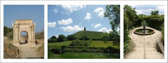 Some classic types of landmark: Images from Wikimedia Commons
Reading signage is like reading manuals. People tend to do it as a last resort, when other approaches fail. That raises the question of which other approaches people prefer to use. The answer is that there are four main methods that people use for nonverbal wayfinding:
General sense of location and direction
Landmarks
Lists of directions
Maps
I’ll discuss the first three of those strategies below, with examples of how each strategy can be supported by nonverbal signage. I won’t discuss maps, because those are very different from the first three, and are a substantial topic in their own right.
I’ll focus on outdoor wayfinding, for brevity; most of the same general principles apply to indoor wayfinding, which I’ll discuss in a separate article. Both outdoor and indoor wayfinding aids can be complemented via the design of appointment letters and of online information, which I’ll discuss in a future article. First, though, I’ll discuss a feature of human memory which has useful implications for wayfinding.
Recognition versus recall of places
People usually have a much better passive memory (recognition) than active memory (recall). For instance, if you ask someone to name the countries of the world (using recall), their performance is likely to be poor; however, if you ask the same person to look at a list containing real and fictitious country names, their performance in identifying the real names (using recognition) will usually be much better.
This effect applies particularly strongly to memory for images. Most people have remarkably good recognition memory for scenes that they have seen before. The article below is a fairly typical example. The authors showed each of their participants 2,560 photographs at a rate of 10 seconds per photo; the participants successfully identified over 90% of those photos up to 3 days later.
http://link.springer.com/article/10.3758/BF03337426
This skill can be very useful for nonverbal wayfinding. If you show prospective visitors images of their destination and/or of landmarks along the way before they arrive on site, then there is a very good chance that they will recognise those points when they are on site, and will be able to use them to find their way. The sections below describe ways of incorporating this principle into site design.
General sense of location and direction
One way of helping people to know where they are within a site is to vary some features within the site systematically across the site. Even if people aren’t consciously aware of this, there’s a good chance that it will help them subconsciously assess where they are, and whether they’re heading in the right direction.
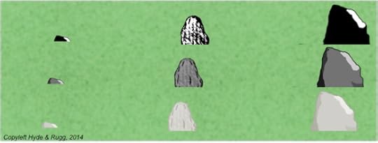
The schematic diagram below shows how this can be incorporated within landscaping across a site. The landscaped rocks get systematically bigger from left to right across the site, and the plants are of systematically taller types from bottom to top of the site. For clarity, I’ve only shown this along two edges of the diagram; in practice, this principle would be applied across the whole of the site, not just the edges of it.
Here’s another way of achieving the same effect, by varying two aspects of the same landscaping feature, namely size and colour of rocks. This time, I’ve shown this principle operating across the entire site.
In the example above, the rocks used as landscaping features are systematically larger from left to right across the site, and are systematically darker from bottom to top of the site.
A significant advantage of this approach is that it can be incorporated at minimal cost into existing site features such as flower beds and other decorative features. It can also be done gradually, as part of routine maintenance.
This approach helps people to orient themselves, and to recognise whether the general look and feel matches images that they have seen before visiting the site. It is also helpful for the next main wayfinding strategy, namely use of landmarks.
Landmarks
A commonly used type of landmark is the dramatic work of abstract art, like the one below.
As a statue, it’s a fine example of its type. As a landmark, this particular example has disadvantages. Landmarks are most helpful when they have the following features.
Visibility
The site should ideally have at least one landmark which is visible from anywhere on the site, as an orientation feature. In practice, this often isn’t possible because of buildings blocking the line of sight, but it’s usually possible for different sections of the site each to have their own visible landmark.
People often use landmarks as a convenient way of getting close to their destination without having to spend time and effort reading signs. This is useful in situations such as trying to find your way from a car park to a building some distance away, which may not be signposted from the car park. This strategy is also useful when there is a dauntingly large number of signs for other destinations along the route.
Asymmetry in appearance and/or location
If the landmark looks the same from all sides, this will probably cause problems for visitors trying to orient themselves. If, however, the landmark looks different from each side, and/or the landmark is placed at a non-central location on the site, then visitors can use this asymmetry to help orient themselves.
Intervisibility
In principle, a visitor should be able to see at least one landmark from any point on the site. It’s possible to check this systematically with a combination of graph theory, map colouring, and trudging around the site; I’ll write this up formally at some point. The quick and dirty way of doing this is to go to the key points of the site, look round for landmarks, and note any points where no landmarks are visible.
Multi-sensory features
It’s a good idea to include non-visual features within a landmark, particularly to help visitors with visual impairments, but also as a supplementary navigation aid to all visitors. Examples of non-visual features include the sound of splashing water from a fountain, or the smell of lavender from a flower bed in summer (with the usual caveat about not having lavender too close to paths because of bees).
Uniqueness
If there are two or more landmarks on the site which can be confused with each other, then they will be confused with each other. A common result is visitors turning up late for appointments because they were led astray by the wrong landmark. This applies both to deliberate, planned landmarks and to “accidental landmarks” where visitors treat a feature of the site, such as an unusual window, as a landmark even though it wasn’t intended to be one. It’s a good idea to check for this, and to pay attention to any cases where visitors report having been misled by a confusing landmark.
Describability
This issue is important when giving directions to visitors. If there are several large abstract bronze statues on the site, then it will be difficult to tell a visitor exactly which of those statues is the landmark that they need to use. If, however, there is only one statue being used as a landmark, and it is figurative (e.g. Athena holding a spear in the air) then there isn’t much risk of confusion; an added advantage is that it’s fairly easy to mime this to an overseas visitor who doesn’t speak your language.
Lists of directions
Lists of directions may be written, or remembered, or spoken (e.g. in response to someone asking the way to somewhere) or a combination of written, remembered and/or spoken. For all of these, clearly describable and clearly identifiable landmarks are extremely useful.
There are various well-known problems with lists of directions, such as what happens if the list is lost, or if one of the landmarks isn’t there any more, or what happens when the helpful person giving directions gets to the third “then you take the first right” and the visitor’s memory gives up.
There are a couple of ways of tackling some of these problems that aren’t as widely used as they should be.
Showing landmark images
As described above, human beings are usually very good at recognising things that they have seen previously. You can turn this to advantage by incorporating wayfinding images into documents that the visitor sees before coming onto the site. For instance, you can include an image of the building they will be visiting as a watermark in the appointment letter that you send them.
Building directions into landmarks
A surprisingly high proportion of people (about 20%) have trouble telling left from right.
This has obvious implications for giving directions.
One solution is to have landmarks at each decision point (e.g. crossroads) so you can tell the visitor which landmark to go towards, as opposed to telling the visitor to turn left or right (which is also hard for anyone to keep track of in a long list of directions).
Another solution is to use landmarks which point in commonly used directions (as in the case of the Athena statue, where the spear could point towards a frequent destination).
Further thoughts
This article is a first skim over a big, fascinating topic. It’s one of those topics where there’s a lot of relevant theory available, and a lot of cheap, easy ways of improving the situation, but for some reason the theory and the improvements aren’t as widely known as they should be.
This topic has numerous links with issues such as user-centred design, which I’ve discussed in previous articles, and to which I’ll return in later articles.
I hope you’ve found this article useful.
Notes and links
Previous related articles on this blog:
http://hydeandrugg.wordpress.com/2013/12/12/how-people-use-space-pedestrian-traffic-flows/
http://hydeandrugg.wordpress.com/2014/05/10/sociotechnical-analysis-room-layout-and-education/
Links for Wikimedia images:
https://commons.wikimedia.org/wiki/File:Leptis_Magna_Kamiox.jpg
https://commons.wikimedia.org/wiki/File:Glastonbury_Tor_-_geograph.org.uk_-_1322639.jpg
The clip art icons used in this article are from the site below:


November 13, 2014
Doing online searches
By Gordon Rugg
So how do you actually do an online search?
The most common approach is to type 2.4 words into Google, with 14% of those words spelled wrong, and 6% of those words being about sex. That isn’t exactly the most inspiringly professional or efficient way of operating.
A more professional and efficient way of operating is as follows:
Read the manual and learn how to get the most out of the software you’re using (e.g. by using the “advanced search” features)
Read some articles about best practice in online search
Ask your friendly librarian for help and advice
When online search is involved, I do all of those things myself, and very useful they are too.
Many of my previous articles have been about the unwritten craft skills involved in some aspect of research. With online search, for a change, there’s plenty of readily available information about the craft skills, so I’m not planning to re-cover ground that’s already been covered well by other people. Instead, I’ll give some examples of what those craft skills and of how they can help make your online searches easier and better. I’ve also included some keywords that should help you find useful tutorial articles quickly and easily.
Using rare words as keywords
The precise details of how commercial search engines work are often closely guarded secrets. However, one common feature is that search engines use an inverse frequency weighting approach to decide what to show you first. In brief, this means that rare words are given a higher weighting than common words. This knowledge can help you get a better proportion of relevant hits when you do a search.
Here’s an example. Suppose that your lecturer has advised you to read up on Goffman’s dramaturgical metaphor for how people behave; suppose also that your notes mention front and back versions.
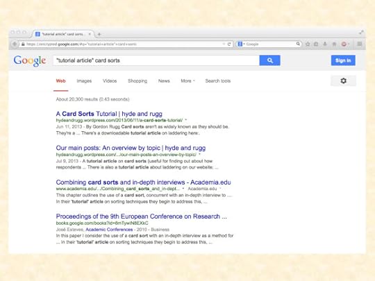
If you search with Google for front and back versions because they’re more familiar terms, you’ll get a lot of hits, but none of the hits on the first five pages will be relevant articles about Goffman. As you might imagine, there are a lot of other contexts where those words appear, because they’re very common words.
If you search instead for dramaturgical metaphor you’ll start getting relevant hits on the first page. Rare, relevant words, and technical terms, are your friend in this context.
Using authors’ names as keywords
A variant on the theme above is to include the name of a relevant researcher among your keywords. If you add Goffman to front and back versions then you get lots of highly relevant hits right from the start.
This is why lecturers will usually use a schema for mentioning relevant concepts which consists of the name of the relevant key researcher, the technical term for the concept, and a plain English explanation of the concept so you understand what it’s about, and have a better chance of remembering it. With those pieces of information, you will usually be able to track down the relevant literature pretty quickly.
Using inverted commas
Most search engines give you different results if you surround two or more words with inverted commas. For instance, if you’re looking for articles about systems analysis within computing, then:
“systems analysis” with inverts gets you just under 2,000,000 hits on Google
systems analysis gets you just under 72,000,000 hits on Google
Why the difference of 70 million? Because the inverts tell the search engine to look for those two words together as a pair. Without the inverts, the search engine will count anything as a hit that contains one or both of those words, regardless of whether they’re anywhere near each other; most of those hits will be irrelevant.
Using inverted commas around a technical term is usually a good way of finding relevant documents swiftly and efficiently.
Where do you go from here?
I’ve described three simple, easy methods that can make online searches a lot easier and more efficient. There are plenty more tips like those, and there are plenty of user-friendly articles listing them.
It’s well worth reading some of those articles, because online search is an increasingly important skill in a world where finding what you need is very much like searching for a needle in a haystack.
Search terms such as tips for online search produce more than enough relevant hits to bring tears of joy to the eyes of most librarians, and to save you from hours of unproductive search, or, worse, from getting tatty, second-rate results that will make you look like an amateur. Learning this tool of your trade is a very, very good investment of time.
On which inspiring note, I’ll end.
Notes and previous related articles
If you’re wondering about the statistics at the start of this article about wrongly spelled search terms and searches relating to sex, then yes, you’re right to wonder. Those figures are from memory, from when I worked in information retrieval, so they might be inaccurate, but they’re not far from the truth.
This article explains how to identify the core references that you need, and explains the concept and function of core references.
This article is about how to find references that will give you a quick and efficient overview of the topic that you’re researching.
http://hydeandrugg.wordpress.com/2014/10/16/finding-the-right-references-part-1/
This article looks at the big picture of publications and references, with particular attention to which topics appear in formal academic publications, and which topics don’t. I’ll be returning to this theme in a future article on the realities of academic publication. This is an important theme, because formal academic publications only deal with a subset of the relevant knowledge for a given topic. This issue has been receiving increasing attention in the research community over recent decades, and is likely to receive much more attention in the near future. It has big practical implications, which are also receiving increasing attention, particularly in education and in public policy.


November 6, 2014
Life at Uni: Cookery concepts 101
By Gordon Rugg
If you’re cooking for yourself for the first time, you might find this article amusing. (Maybe not very helpful, but there’s a fair chance it will be amusing…)
I know someone who used to be an army cook. The principles below are based on what he told me about his cookery training in the Army.
I suspect that his stories didn’t do justice to that fine institution, and that they contain some adjustments of the truth for greater dramatic effect, so please treat the information below with due caution.
The four food groups:
There are four food groups, namely:
Vegetables
Meat
Pastry
Chocolate
Basic cookery:
Boil vegetables till they go soft.
Fry meat it till it stops bleeding in the middle.
Bake pastry till it goes hard.
Eat chocolate before anyone else can get it.
Intermediate cookery:
Eggs come out of chickens, which are meat, so eggs are meat, and should be fried.
Mushrooms are not vegetables, pastry or chocolate, so they are meat, and should be fried.
Onions are honorary meat, and should be fried.
Advanced cookery:
If meat is hard after you fry it, then treat it as an honorary vegetable, and boil it with vegetables until they all go soft. That gives you stew.
If you put stew in pastry, then you get pie.
Legal disclaimer: We accept no responsibility for anyone basing their food preparation on third-hand stories from former army cooks with a track record of telling tall tales, about how things may or may not have been done half a century ago.


October 30, 2014
Finding the right references, part 3: Breadth, depth and the T model
By Gordon Rugg
In the previous article in this series, I looked at ways of getting a mental overview of the key concepts in an area.
In today’s article, I’ll look at how to decide which are the core articles that you need, in a way that should be swift, simple and manageable.
A key concept to hold on to is that everything in academic writing is done for a reason. If you know what the reasons are, then the whole process makes sense. If you don’t, then it looks like a huge, impenetrable swamp.
Academic writing uses references for several reasons. One particularly important reason is to show that the writer is aware of the key issues that need to be considered. Being aware of the key issues is important because it reduces the risk of re-inventing the wheel, or of going down the wrong road because of a mistaken initial assumption.
So how do you show that you know what the key issues are?
Options and choices
One way is to think in terms of what you’re doing as a series of options and choices. For instance, you’ve got an initial set of options as regards what topic to investigate; what are the other topics that you could have looked at instead? Here, you have a range of options, and you choose just one of those options.
Then there’s a choice about the overall framework that you use for your investigation into the topic you choose. In the social sciences, you have options such as case study versus action research versus field experiment versus formal experiment etc; in software development, you have options such as the waterfall methodology versus the spiral model versus various types of prototyping, and so on. Again, you choose just one of the options.
Each time you choose an option, you then need to show that you know the key issues involved in that option, so that you won’t be re-inventing the wheel or going down the wrong road.
This process is clearer if we visualise it in terms of showing breadth of knowledge (with regard to the range of options available) and then depth of knowledge about the option you choose. An important point to note here is that you’re only showing depth of knowledge about the option that you’ve chosen; you don’t need to show the same depth of knowledge about the ones that you haven’t chosen. That makes a big difference to how much you need to know (and, in consequence, to how much you need to read, and to what you need to read).
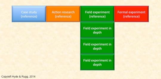
Here’s a diagram to illustrate this concept.
Across the top of the T are your options – case study versus action research versus field experiment versus formal experiment.
Down the vertical stem of the T are the in-depth details of your choice.
You repeat this process for every choice that you make – breadth and depth for the framework, breadth and depth for the method(s) that you use within that framework, breadth and depth for the analysis method(s) you use, and so on.
How does that translate into references and the literature? Like this.
When you’re writing your coursework or dissertation or whatever it is, when you reach the decision about which research framework to choose, you list the options available to you, and you include a reference for each of those options.
This shows the reader:
Which options you know about
That you’ve done some reading about each one
That’s a good start. (I’ll return later to the question of how to choose a suitable reference for each option.)
You can fit all of this into one sentence. It won’t be the most beautiful or readable sentence ever written, but that doesn’t matter. (I’ve blogged here about why academic writing is usually deliberately boring; there are very good reasons for it.)
Here’s what the resulting sentence might look like. I’ve used cliché names like Smith and Jones to reduce the risk of sinful copy-and-paste from this article into coursework…
Possible methodological frameworks for this study include a case study approach (Smith, 1996), action research (Jones, 2001), field experiments (Singh, 1989) and formal experiments (Baum, 1900).
Here’s another version of that sentence which sends out a different acceptable signal to the informed reader:
Possible methodological frameworks for this study include a case study approach (e.g. Smith, 1996), action research (e.g. Jones, 2001), field experiments (e.g. Singh, 1989) and formal experiments (e.g. Baum, 1900).
I’ll return to the different signals after the next section; I’ve mentioned the issue here to reassure any knowledgeable readers that I will be discussing the differences.
What you’ve done with this sentence is to demonstrate your breadth of relevant knowledge, backed up by relevant references, using a handful of relevant references and in a very few words (which is very useful when you’re up against a tight word limit).
Depth of knowledge
The next step is to show your depth of knowledge about your chosen option.
Again, there are reasons that guide the choice of the core set of references to demonstrate this knowledge. The diagram below shows the key principles.
For your in-depth description of your chosen option, there are three different types of core reference that you’ll need to include.
The first is the seminal reference. This is the reference that first introduced the relevant concept to the world, such as the journal article where Zadeh first described fuzzy logic. Sometimes it’s a journal article, sometimes it’s a book, sometimes it’s something else. The seminal reference is often old; for instance, the seminal reference for graph theory is from the 1740s. That’s fine; there’s no problem with the seminal reference being old.
When you’re using a particular method, you should if at all possible read the seminal reference yourself, rather than relying on second-hand descriptions of it. Sometimes that’s not a realistic option (for instance, the seminal reference for graph theory was written in Latin, which most people don’t speak). Sometimes there isn’t a single seminal reference; for instance, some methods have evolved out of undocumented craft skills. If you’re dealing with one of those situations, then you can get brownie points and more marks by explaining the situation, and by explaining what you’ve done about it (e.g. reading a translation, or citing some of the earliest articles where the concept emerged in the formal literature, respectively).
The next is the milestone reference. This is where the original concept was significantly changed in a later publication, usually by being improved in some way. There may be several significant milestone references within a method; if so, you should read and cite them all. Sometimes there aren’t any; if so, you can get extra brownie points and marks by remarking on how little change there has been to the original concept.
The third is the foundational reference. This is the one that you are going to use as your starting point.
A classic example is to take a good recent journal article, and to do a study that extends the work in that article in some way. For instance, the original article might be about working practices in one professional group, and you might apply the same approach to a different professional group, as a comparison with the original article. At a sordidly practical level, this means that you don’t need to re-invent the research design, etc; you simply use exactly the same research design as the original article, but apply it to a different group. You can also justify that research design because it was good enough to get through peer review for the foundational article.
Foundational articles need to be:
reasonably recent (because otherwise there’s the risk that the field might have moved on since the article was published)
reasonably reputable (because otherwise you’ll look as disreputable as the article you chose)
very specific and detailed in their method section, so that you know exactly what they did and how they did it.
You’ll need to repeat this process for each option that you choose in your research design. It’s the same process each time, like a series of “T”s one after the other. If that doesn’t make sense, please let me know via the comments section, and I’ll go into more detail.
How to find what you need as efficiently as possible
There’s a difference between doing something efficiently and doing it well. This section is about finding the right references efficiently. I’ll look at how to do literature searches well in a later article. It’s a big topic, which needs at least one article of its own.
The quick, dirty and efficient way of finding the right references is to find some reasonable quality journal articles on the relevant topic, and to look through their “introduction” sections. Because they’re reasonable quality journal articles, their introductions will cite the seminal articles and milestone articles (otherwise they wouldn’t have got through the review process).
How can you tell which of the articles in those introductions are the ones you want?
Sometimes the introductions will describe the seminal articles as “seminal” – that’s about as broad a hint as you could ask for. Often, they’ll phrase it in terms of mentioning when the relevant concept was introduced, with a reference at the end of that sentence. Milestone articles are often described in terms of developing the original concept, or extending it.
You’ll soon spot the same references being cited across all or most of the introduction sections, particularly the earliest references. It’s a good bet that most or all of those references will be ones that you’ll need to read and cite too.
Where do you go to find good journal articles on the topic you’re working on?
This where specialist bibliographic databases, containing articles about a particular field, are handy; for instance, a key resource for medical research is the MEDLINE bibliographic database. The Inspec bibliographic database is a major resource for technical and scientific articles; there are similar databases for most disciplines. Your friendly librarians will usually be very pleased to help you with bibliographic databases; they’re usually glad to see students doing it right, rather than just using Google on the Internet.
This is also where specialist search engines come in, such as Google Scholar for most topics, or PubMed for medical topics. These search engines are usually linked to specialist bibliographic databases, and usually offer sophisticated search mechanisms to help users find relevant records more swiftly and efficiently. Again, librarians are usually more than happy to help, if you show an interest in this.
A few minutes with a suitable search engine and/or a suitable bibliographic database should rapidly turn up some suitable journal articles that you can use to identify the “breadth and depth” references that you need; there’s a fair chance that the database where you find those first journal articles will also contain the seminal and milestone articles.
Turning problems to advantage
In this article and in the previous ones in this series I’ve talked about using some references as a means to an end – for instance, using Wikipedia articles to get a quick overview of a topic before getting into the academic literature about it, or using the first journal articles you find to identify the references that you really need.
You might not be able to cite those “means to an end” references as solid evidence, but there are other ways that you can use them in your write-up.
In the case of non-specialist references such as Wikipedia articles, you can often cite what one of those references says, and then contrast it with the more sophisticated version of the same topic that you get from one of the journal articles on the same topic. This can make you look like a sophisticated heavyweight who knows why the non-specialist literature needs to be treated with care.
The “means to an end” journal articles can also be useful, in a different way. They are often useful as illustrative example references. Suppose, for instance, that you’re writing about fuzzy logic, and you used “means to an end” articles by Fletcher about washing machine control and by Bowyer about car engine optimisation. Neither of these topics is directly relevant to your own project on fuzzy logic and central heating systems.
What you can do in this situation is to write something roughly along the following lines.
Fuzzy logic has been successfully applied to various topics, such as washing machine control (Fletcher, 2002) and car engine optimisation (Bowyer, 2005).
This demonstrates that the method you’re using has been successfully used elsewhere (so you’ve got supporting evidence to back up your idea of applying it a real world problem). It also gives the impression that you’ve been doing wider reading beyond the bare-bones minimum of the seminal, milestone and foundational papers.
Closing thoughts
This article has described a quick and dirty, bare-bones, way of identifying the key references that you need. There’s a lot more to know about referencing, evidence, online search, academic writing and related topics.
As a starting point, though, this approach provides a simple framework that helps make sense of what you’re doing with references, and helps you to find the most important ones swiftly and efficiently.
In later articles, I’ll look at the topics above in more depth.
Links:
Some previous articles on this site cover related topics that you might find useful.
For an overview of where references fit into the academic world:
http://hydeandrugg.wordpress.com/2014/10/16/finding-the-right-references-part-1/#more-1339
For references and use of evidence:
http://hydeandrugg.wordpress.com/2014/07/05/logic-evidence-and-evidence-based-approaches/
For use and misuse of evidence and references:
http://hydeandrugg.wordpress.com/2014/06/01/cherry-picking-and-dodgy-reasoning-for-beginners/


October 22, 2014
Guest Post: Representing lesson structure graphically
By Gavin Taylor
Lesson structure can be seen as a core aspect of teaching; the method in which lessons are planned can influence the whole learning process. Most teachers plan the structure of their lessons using a few well established techniques. One is a three level approach commonly known as a traffic light sequence, as shown below.
This traffic light system can be used for assessing pupil progress and for differentiation of tasks, as well as clearly showing the lesson structure. This system however has various limitations. For example, this system implies that unless a pupil “moves” from one colour to another, progress has not been made, even though the pupil’s understanding may have been deepened. The criteria for progress also have to be correct; a pupil could, for example, achieve the red objective in the figure above without completing the amber, as these may not be progressive objectives.
Variations of this include but are not limited to: Bronze, Silver, and Gold gradings; any sort of official assessment (i.e. Grade E, D, C etc..); All, Most, Some gradings.
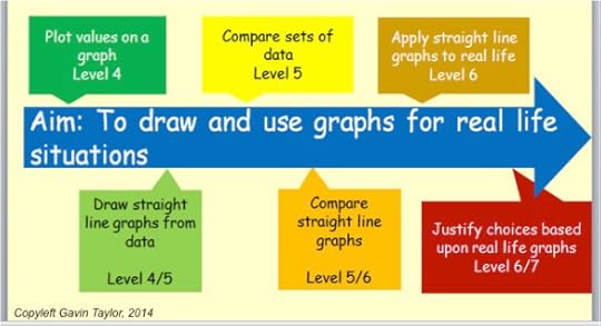
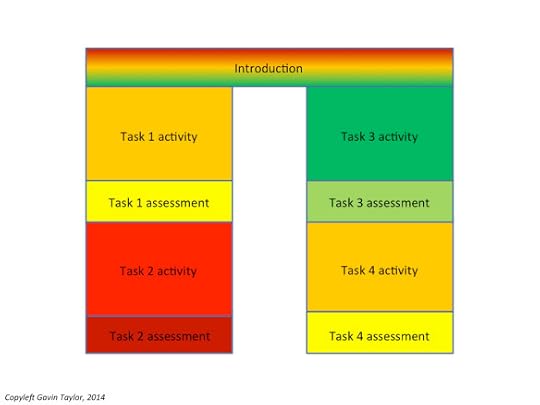
Other versions exist, of which two are of particular interest. One is the use of a learning arrow (figure immediately below), which uses differentiated colours to extend the basic three level system into 5 or 7 criteria of progress. The second version could be described as the trouser method ( lower figure below), which is task differentiated based upon criteria.
The learning arrow
The trouser method
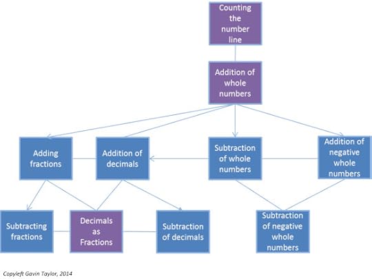
A previous article on this site demonstrated how graph theory can map connections and links between concepts, for educational planning. Two formats are trees, where branches never re-join, and nets, where branches can re-join (see below).
This mapping functionality is a powerful tool, as it has been shown to have a wide variety of semantic uses. Learning has been described using the semantic metaphor of a journey; the learning arrow incorporates this idea, and to some extent so does the trouser method. This however can be better represented using graph theory, as each node in graph theory could represent a task or objective with relevant links shown between each node, like different routes on a map.
A tree representation of teaching objectives
Each coloured node is a task or objective, and the diagram above shows progress from one task or objective to another
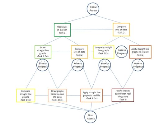
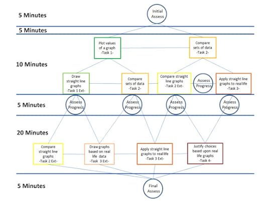
A net representation has various advantages over other methods. These advantages include teachers being able to demonstrate differentiation in their planning, and pupils being able to track progress either throughout a topic or throughout a lesson.
The net representation allows differentiated planning, because various different links between tasks or objectives can be created, to allow the teaching practitioner to tailor the lesson map to the class. As a wider implication, this also allows teachers to plan the path of learning for a subject, and how each topic fits into the scheme of learning, where links can be seen by teachers and pupils (shown below).
A net representation of teaching objectives
The figure below shows how this may look for a simple Maths example of understanding how to add and subtract whole numbers, decimals and fractions. The purple boxes show core concepts that act as “gates” to the next area. However, a pupil can decide what route to take to cover all the items shown, rather than having to take a single prescribed route, giving the pupil more control. Also, the student can see precisely how the different topics are connected to each other.
Lesson planning using graph theory
Within the lesson, tasks could be differentiated based upon selected criteria and then a pupil could navigate a route that started and finished at a set destination but gave them freedom to define their own learning journey, with input and feedback from the teacher. This would give pupils more control over their learning, within a focused area of the topic. Also, the pupil and teacher would be jointly accountable for progress, which would allow for a more in-depth discussion of areas of weakness.
Assessment control points could be implemented within the tasks, to allow for self-assessment and teacher assessment, and this again develops a tailored lesson for every pupil, without too much more work for the teacher.
A task-based progress map
The example shows how differentiated criteria or objectives determine a “task” and “extension task”. From these a path can be made from the top to the bottom, allowing progress to be made in some aspect, and allowing for independent learning, particularly if this diagram is printed and given to a pupil at the start of the lesson.
This could be developed further to include teaching slots or even a timescale to show how long each task should take. This approach can be developed and adapted, since graph theory has a strong underlying body of theory, as well as being easy to learn at the level needed for this application. The example below shows how teaching slots and time frames could be implemented into the system.
A progress map with time boundaries
The use of a timescale as an extension of this net representation allows for progress to be measured against time, as well as measuring understanding. This has two implications. Firstly, pupils have no excuse for spending 40 minutes on a task just to waste time, where no or little progress is being made, and secondly, this allows target setting of how much work needs to be done within the lesson, where pupils can decide this pace with some freedom, but within controlled boundaries.
You’re welcome to use and adapt the diagrams above; I hope you find them useful.
Notes
All figures used are copyleft Gavin Taylor, unless otherwise stated either in text or on the image itself.
You are welcome to use Gavin Taylor copyleft images for any non-commercial purpose, including lectures, provided that you state that they’re copyleft Gavin Taylor.
You are welcome to use Hyde & Rugg copyleft images for any non-commercial purpose, including lectures, provided that you state that they’re copyleft Hyde & Rugg.
Information on assessing pupil progress:


October 20, 2014
Finding the right references, part 2: Getting a first overview
By Gordon Rugg
In a previous article, I looked at some issues that affect how and why finding the right academic references can be difficult. In today’s article, I’ll look at how to set about finding those references, beginning with the familiar problem of reading lists.
Some lecturers supply reading lists; others don’t.
Reading lists can be very comforting, because someone else has already done the thinking for you, and has told you what you need to know. There’s also the nice implicit message that you only need to know what’s on that list, so there’s a limit to the work ahead.
It’s a comforting feeling while it lasts, but there’s usually a small voice at the back of your mind asking what will happen when you leave university and enter a world where nobody is likely to give you a reassuring list of the things that you need to know.
Which brings us back to the lecturers who don’t supply reading lists, and who expect you to find information for yourself, with only a few words of guidance, such as “Weber’s work on bureaucracies is the place to start” or “Good question; that’s a classic sociotechnical problem”.
Where do you go from that sort of start? Your friendly librarians will usually be very happy to give you good advice about how to locate information online, and often, that advice will find you exactly what you want. However, there are some other quick and dirty methods that you might find useful. They’re what this article is about.
Getting an initial overview
One thing you need to do right at the start is to get an overview of the key concepts that the topic involves – for instance, the key points about Weber’s work. You’ll need to discover things such as who he was, what he did, why he mattered, and what significance his work has today.
Just searching on Google and trusting to luck isn’t a wise strategy. Here’s why.
If you search on Google for who really built the pyramids? about half the hits on the first page will tell you it was aliens. That answer wouldn’t get you far on an archaeology assessment.
So how can you find a trustworthy overview of the key concepts in reasonably accessible language?
The lectures
The lectures themselves are often a good source of key concepts in reasonably accessible language. That’s one advantage of going to lectures; the lecturer will usually explain the key concepts described briefly on the slides. You’ll miss those explanations if you skip the lectures and read the lecture notes when they go online.
The lectures won’t cover everything – there are just too many relevant related topics – but they’re a good start.
Wikipedia
Wikipedia is often a good place to start, but a bad place to stop. Some Wikipedia introductions are excellent and trustworthy. Others are excellent but not completely trustworthy, as a result of hit-and-run wikivandals; I once read a Wikipedia article about an ancient Roman senator which claimed that he was married to Marilyn Manson. Another problem is that some Wikipedia articles are far too advanced to be much use to a beginner. So, you need more strategies.
Your friends, 101 and .edu
Another useful starting place is introductory lectures. The traditional code for the introductory lecture on a topic at universities in the USA is 101, as in Business 101. The usual domain name for universities in the USA is .edu.
Here’s an example of that approach applied to statistics.
It’s picked up the introductory stats courses at Harvard and Yale, which are as respectable as most people could ask for.
So, if you search for your chosen topic plus 101, and then look at the .edu sites in particular, you’ve got a sporting chance of finding a clear introduction to the key points in reasonably accessible language. The part about .edu is important, because the 101 part has now become part of everyday language in the USA, and is often used humorously or as a term for any introductory article, whether in a university or not. Here’s an example that probably won’t feature in many university courses.
So, the 101 tip is well worth a try, but won’t always work.
Book chapters
Trying to read an introductory book on a topic isn’t always the best place to start; books are long, and will often drown you in detail, even if they’re relevant and trustworthy.
More often, a single chapter in a book is a better place to start. For instance, if you find a book about organisational theory that contains a chapter about Weber and bureaucracies, that’s probably going to be much more manageable in terms of length and amount of detail than an entire book about Weber and bureaucracies.
Tutorial articles
If you’re trying to find out the essentials about how to do something, such as using a particular method, then it’s worth trying a search for “tutorial article” in inverted commas, plus your chosen topic. Tutorial articles typically appear in academic journals, where they’ll go through a review process that means they’ll probably be of reasonable quality.
Here’s an example.
Another option is to search for introduction plus your chosen topic. This has the disadvantage that what it finds will vary considerably in trustworthiness and quality, but if you use reasonable judgment, you have a fair chance of finding something good.
As with the previous approaches, these won’t always work, but they’re well worth a try.
Closing thoughts
This article is about getting a quick overview of key concepts. The methods I’ve described are quick and dirty, and useful for a swift initial overview. For getting properly into a detailed understanding of a topic, however, you’ll need a bigger toolkit.
In the next article, I’ll look at how to get a quick overview of the key publications and key findings in an area, so that you can do your literature review more swiftly, efficiently and well. If you’re wondering where Google Scholar and bibliographic databases and so forth fit into the story, the answer is that they will appear in the next instalment of this series.


Gordon Rugg's Blog
- Gordon Rugg's profile
- 12 followers


