
Gordon Rugg's Blog, page 24
September 5, 2013
Client requirements: The shape of the elephant, part 1
By Gordon Rugg
It’s a little-known fact that Dante’s Inferno contains a circle of Hell that’s reserved for people who come along when you’re wrestling with a horribly complex problem, make some utterly unhelpful suggestion, and then stroll off, convinced that they’ve just given you a profound insight that contains all the answers you need. For example, they tell you that your problem is like the five blind men trying to work out the shape of the elephant, which you already know, and then they leave without giving any practical ideas about how to actually solve the problem.
This article is about the shape of the elephant, applied to the very real problem of identifying and clarifying client requirements. It’s in two parts. Today’s article is humorous, and looks at some classic bad solutions to the problem of providing the client with the image of an elephant that they have asked for. The follow-up article will look at why those solutions are bad, and describe some better ways of finding good solutions.

Bad solution 1: Sod it, this will do, they don’t know any better.

Client’s response: You’re wrong about that, and you’re fired.
Bad solution 2: Red is the new black

Client’s response: Then go work for Prada. You’re fired.
Bad solution 3: Here’s one I found on the Internet.

Client’s response: You can find a new client there while you’re about it.
Bad solution 4: My design is in a witty dialogue with its environment

Client’s response: Very funny, go get a job at the circus.
Bad solution 5: Sex sells.

Client’s response: Not to this client.
Bad solution 6: I found some clip art that’s a pretty close match.

Client’s response: Would any jury convict me?
Bad solution 7: Cartoons always amuse people.

Client’s response: Whoever told you that was a clown.
Bad solution 8: I’m an Artist; here’s what you should have.

Client’s response: I’m a client; here’s what you should have, if we were in Texas.
Bad solution 9: I need to bear witness to my beliefs.

Client’s response: So do I, and I sincerely believe you need to be fired.
Concluding thoughts
The examples above are a bit unkind to designers; I know how frustrating it can be when you’re dealing with clients who are unable to articulate what they want. The key point, though, is that just because a client can’t articulate their requirements, that doesn’t mean that they don’t know their requirements. That’s a big, important difference. I’ve already looked at this issue a couple of time in previous posts; it’s an important issue, and we’ll return to it repeatedly.
Notes
Related previous posts:
The elephant images above are from wikimedia or Wikipedia, and are used here under the creative commons licence.


September 3, 2013
Hoaxing the Voynich Manuscript, part 6: Planning the word structure
By Gordon Rugg
In this series of articles, we’re imagining that you’ve gone back in time, and that you want to produce the Voynich Manuscript as a hoax to make money. We’re looking at the problems and decisions you’d face, and at the implications of various possible solutions.
The first article looked at why a mysterious manuscript would be a good choice of item to hoax. The second article looked at some of the problems involved in hoaxing a text that looked like an unknown language, from the linguistic viewpoint. The third examined the same subject in more depth, and the fourth discussed the choice of materials, going into some detail about the choice between using freshly-made or already-old vellum. The fifth was about the layout, structure and contents of the book.
This article is about how to create a plausible-looking structure for the individual words in the text that you’re going to produce. We’ll look at the choice of script, and how to combine the words, in later articles.
A key word in the paragraph above is “plausible”. If you’re a hoaxer focused on getting the end product out as quickly as possible, then you don’t need to produce a perfect imitation of a language; you just need to produce something that’s good enough to be plausible, even if it’s not perfect.
Codebreakers have known since the tenth century that there are regularities in how frequent particular letters are within a given language. That’s a standard way of cracking the simplest codes, where each letter of the plaintext is systematically swapped for a different letter.
Codebreakers were also aware by the fifteenth century that within a given language, the lengths of words will vary, and that within a given language, some syllables and some words will be more common than others. So, if you were a hoaxer in the past, trying to produce something that looked like a language, you’d want some way of producing syllables and words of different lengths.
Any educated hoaxer in the past would almost certainly be familiar with Latin and with traditional grammar, where there’s a standard way of dividing words into three parts, namely a prefix, root and suffix. In this system, a root can stand alone as a word in its own right, like the word do in English, or it can have just a prefix, such as un, giving us undo, or a suffix such as ing, so we get doing, or both a prefix and a suffix, so we get undoing.
You could use this approach to produce words that looked superficially like English, by putting together a “pick and mix” table along the following lines.

This table includes short, medium and long examples of each type of syllable (prefix, root and suffix).
By combining different syllables from the table, we can produce gibberish English-looking words ranging in length from 6 letters (redoer) to 12 letters (omnisingable).
That example used already-existing English syllables. If you’re generating gibberish syllables from scratch, then it’s easy to slip into the trap of generating them by systematically adding a letter at a time. It’s plausible on a small scale – in English, for instance, there are the prefixes a, an and ana, all relating to an absence of something. However, if you do it on a large scale, and too systematically, then there’s a risk of looking too mechanical.
In Voynichese, there are hints of this effect. Here are some Voynichese prefixes: o, ol, olo, o, or, oro. Some Voynichese roots: k, ke, kee, t, te, and tee. Some Voynichese suffixes: y, dy and ldy.
Here’s an example, using the normal alphabet, of what a small Voynichese table produced in this way would look like.

As with the pseudo-English example, this would give you words of varying length, depending on which combination of prefix, root and suffix you chose.
One interesting side-effect of this method is that there’s a regularity in the distribution of word lengths that you’d see in words produced using this method. There is only one combination that will give you the shortest word, oky. There’s only one combination that will give you the longest word, olokeeldy. There are various combinations that will give you the intermediate-length words. If you plot those combinations out as a table, you see this pattern. The numbers in the bottom row show the word lengths; each column shows all the combinations that will produce that word length.

If that shape looks familiar, that’s because it is. It’s the start of a common statistical distribution. If we added more words to the sample, we would end up with a binomial distribution, very similar to the distribution that you see if you plot the lengths of Voynichese words. However, it’s a rare pattern if you plot the lengths of words from real languages. They’re usually skewed to one side.
It was widely argued in the past that this distinctive distribution of Voynichese word lengths would be beyond the knowledge of hoaxers in the fifteenth or sixteenth century. However, the illustrations above show how this distribution could easily arise as a completely unintended side-effect of one low-tech way of generating words of different lengths. It’s not the only case where statistical regularities emerge as unintended side-effects; we’ll encounter more in the article on using the table and grille technique.
Other issues
This gives you a quick and easy way of producing text that looks superficially like a real language. The text has a syllable structure, like a real language, with prefixes, roots and suffixes. There are syllables of different lengths, as in a real language. The syllables combine to produce words of different lengths, as in a real language.
So far, so good.
If you want to produce something that looks a lot like a language, though, you need to add some refinements. For instance, a real language will typically have a lot more roots than either prefixes or suffixes, so you’d want to incorporate a way of imitating that feature. An easy way would be simply to invent a lot of root syllables.
There are various other features that aren’t essential, but that would make the text look a lot more like a real language. For instance, you could easily mimic the feature of vowel harmony, which occurs in various languages; in these languages, there are restrictions on which vowels can occur within the same word. You could imitate this by using a table like the one below, where syllables containing an “o” are written in red, and syllables containing an “a” are written in blue.

With this table, you can use a rule of only allowing two colours within a word, so that oky or okedor would be fine, and ykedar would also be fine, but you’d never get okedar or olkdar. That would look a lot like a sophisticated complex regularity, but it would actually just require swapping ink colours a couple of times when you filled in your table.
But you don’t see either of these features in Voynichese.
For a start, the number of different root syllables in Voynichese is very low – in the order of a couple of dozen common roots, after which their frequency drops off rapidly. That’s a very low number compared to a real language.
The absence of vowel harmony is understandable – it only occurs in some languages, and most people haven’t heard of it. However, it would be easy to hoax various other features that are more widely known, such as the type of agreement between adjective and noun that you get in Latin, that would make the text look that bit more plausible as a language. You could do that with a variation on the method we’ve just seen, by using the rule that if one word ends in a red suffix, then the next word you generate after it can’t end in a blue suffix. That wouldn’t need much extra effort, but we don’t see that, or anything like it, in Voynichese.
It’s because of significant absences such as these that most serious researchers agree that Voynichese isn’t simply an unknown human language. However, if it’s easy to include them in a hoax, and thereby make the output text more plausible, then why didn’t our hypothetical hoaxer do this with the Voynich Manuscript?
I think there are two main explanations, assuming for the moment that the Voynich Manuscript is a meaningless hoax. One is that the hoaxer deliberately made a sophisticated choice not to include them. That looks like an odd decision, but actually it makes a lot of sense. By not including these features, the hoaxer gives less for any critical examiners to get hold of. The presence of features such as vowel harmony and adjective/noun agreement would narrow down the possibility space, and would thereby increase the likelihood of the manuscript being judged a hoax because there wouldn’t be enough alternative explanations for any oddities. The absence of such features leaves more possibilities open. It has the further advantage of requiring less work.
Another explanation is that the hoaxer simply didn’t bother. This is consistent with other features of the manuscript, such as the low attention to quality when the illustrations were coloured in, and the absence of corrections in the manuscript. Those point towards someone slapping together a quick and dirty hoax, in a way that ironically produced the same effect as a sophisticated decision.
Summary
It’s easy to produce plausible-looking words using a three syllable structure, with tables of syllables of varying lengths. Although this approach is very simple, it produces some surprisingly complex unintended side-effects, in terms of statistical features in the output.
It would be easy to add refinements to this method to make the result look more realistic, but the text of the Voynich Manuscript doesn’t show these refinements. These absences are also strong arguments against the manuscript simply containing an unidentified language. One possible explanation is that they are deliberate absences used by a hoaxer to conceal a hoax; another is that they are simply the side-effects of a quick and dirty hoax.
In the next articles, we’ll look at the choice of script, and at the illustrations, the combinations of words into lines of text, and at the logistics of the hypothetical hoax.
Notes
In some of my earlier work, I tried using the term “midfix” for the middle syllable in Voynichese, on the grounds that “root” implied that the “words” in Voynichese were from a real language, rather than just meaningless combinations of meaningless syllables. I’ve gone back to using “root” because it means that I don’t need to go through a discussion about what “midfix” means.
Some languages don’t use the prefix/root/suffix structure, or don’t use it in all their words. For example, in English, there are numerous verbs and a few nouns that are modified by changes in the vowel within the root syllable, as in English sing/sang/sung or woman/women.
Some languages also use multiple prefixes and/or suffixes within a single word, sometimes to such an extent that the distinction between word, phrase and even sentence becomes blurred. That’s where the meme about “Eskimos have 50 words for snow” originates.
I’ve discussed these issues and others in my book Blind Spot:
http://www.amazon.com/Blind-Spot-Solution-Right-Front/dp/0062097903
I’m posting this series of articles as a way of bringing together the various pieces of information about the hoax hypothesis, which are currently scattered across several sites.
Quick reassurance for readers with ethical qualms, about whether this will be a tutorial for fraudsters: I’ll only be talking about ways to tackle authenticity tests that were available before 1912, when the Voynich Manuscript appeared. Modern tests are much more difficult to beat, and I won’t be saying anything about them.
All images above are copyleft Hyde & Rugg, unless otherwise stated. You’re welcome to use the copyleft images for any non-commercial purpose, including lectures, provided that you state that they’re copyleft Hyde & Rugg.


September 2, 2013
Update and future attractions
By Gordon Rugg
The current state of play is as follows:
Verifier: We’ve posted articles covering about a quarter of one of the four “virtual toolboxes” in Verifier. Something tells me this will be a long haul…
The D’Agapeyeff Cipher: We’re taking a short break from posting on this topic, while Gavin tries out his newly-acquired decoding software; we’ll post the results.
Hoaxing the Voynich Manuscript: I’m over halfway through the series and aiming to finish it this month.
Future attractions:
A set of articles about design, requirements and evaluation
A set of articles about the mathematics of desire – what people want, how to find out what they want and what they need, and how to design for desire
Articles on the deep structure of society and culture, including media and ideology
There will also be an update on the raccoon flap saga, for anyone wondering how that’s turned out. Also, I’ve solved the mystery of Vitruvius Mattress, the little-known Brookside character; that should be good for a short article some time. What I haven’t solved is the new mystery of why the WordPress tagging software helpfully suggested Brookside characters as a tag for this post, even before I’d mentioned Vitruvius…


August 31, 2013
Hoaxing the Voynich Manuscript, part 5: Planning the book structure
By Gordon Rugg
In this series of articles, we’re imagining that you’ve gone back in time, and that you want to produce the Voynich Manuscript as a hoax to make money. We’re looking at the problems and decisions you’d face, and at the implications of various possible solutions.
The first article looked at why a mysterious manuscript would be a good choice of item to hoax. The second article looked at some of the problems involved in hoaxing a text that looked like an unknown language, from the linguistic viewpoint. The third examined the same subject in more depth, and the fourth discussed the choice of materials, going into some detail about the choice between using freshly-made or already-old vellum.
In this article, I’ll look at issues involved in planning the layout, structure and contents of the book.

Not as exotic as the interior: the outside of the Voynich Manuscript. (Image courtesy of the Beinecke Library)
A traditional book is made as follows.
Suppose you want to make a book of 240 pages. You start by taking 60 sheets of vellum, and folding each sheet in half. Then you gather the folded sheets together into batches of four, with each batch looking something like this. (I’ve coloured each sheet slightly differently for clarity.) Each batch is known as a quire or a gather. Each quire of four sheets will become sixteen pages of the book.

A quire or gather of four sheets
Once you’ve created the quires, you then sew each quire onto a backing strip of strong material, usually cloth, which goes on to become the spine of the book.
One feature of this approach often causes problems for beginners trying to plan a book. This arrangement of sheets means that only one sheet per quire has pages that are numbered consecutively. Here’s an illustration of how that works.

Page numbering in the first quire of a book
The darkest coloured sheet in this illustration gives us Page 1 and Page 2. Then the other sheets give us pages 3 through to 14. We then return to the darkest coloured sheet for Page 15 and Page 16.
This can make it hard for novices to work out which sheets need to contain which text, if you’ve already decided what text the book will contain (as opposed to e.g. writing a journal, where the book is already bound before you start writing in it).
Suppose, for instance, that Page 2 ends with “Take a pinch of” and that you want to run on the sentence to the next page, so that the next page begins with “salt”. You don’t write the word “salt” on the same sheet – if you did, it would appear on Page 15. Instead, you need to write it on the next sheet, which will give you pages 3, 4, 13 and 14.
Why do bookbinders use such a complicated arrangement? One reason is that this reduces the amount of stitching to a quarter of what it would be otherwise, making the book cheaper and also thinner. Another is that it’s easier to write the text and do the artwork on the sheets while the sheets are flat and separate – you don’t have problems from trying to write on a page that’s curving round in a fold where it joins the middle of the book.
So far, this is just traditional book binding. There are variations on this approach, particularly after paper is introduced, but the one described above is the usual one.
So how do you plan what to put in the book and where to put it?
If you’re a novice at this process, one simple approach is to decide which sections you want in the book – for instance, a section on plants, a section on astrological diagrams, etc – and then decide how many quires you will allocate to each section. This means that each individual quire fits neatly within one section, so you don’t need to worry about getting the pagination right for e.g. the transition between the plant section and the astrological section.
The length of each section will then be a multiple of 16 pages (the number of pages in a quire). If your book is going to be 240 pages long, this gives you 15 quires to allocate to the different sections.
This is a manageably small number to handle mentally. You might decide, for instance, that you’ll allocate 8 quires to plant images, 2 to astrological images, 2 to text, and 3 to miscellaneous strange images. If you’re using an established type of book such as an alchemical herbal as your model to imitate, then you can simply base the section themes in your book on the themes in that model.
So far, so good. This works neatly if you’re using freshly made vellum. But what if you’re using an already-old book with some used pages at the start, as a source for already-old vellum to make your hoax look more ancient and authentic? This is where things start to get interesting.
Suppose that you’re using an old book which has writing on pages 1 to 6 inclusive, so the first unused page is page 7, as shown below. The written-on pages are shown as dark reddish-brown.

One possible solution is simply to remove the whole of the first quire. However, that would mean losing almost half a quire of unused vellum.
A more economical solution would be to cut out the used pages, far enough away from the centre stitching to let you re-use every sheet in the quire, and still within the un-written-on margins of those first pages. The diagram below shows what this would look like, with the removed material shown in a darker shade.

If you re-used this mutilated quire without changes, as the first few pages of your book, that would look suspicious; a sceptical viewer would start wondering whether you’d simply cut out the first few pages of an already-used old book. So, if you used this approach, it would be wiser to unpick some of the unused quires of the old book, and distribute the mutilated sheets among them, swapping each mutilated sheet for a complete sheet from another quire. The mutilated sheets would now be spread throughout the book, and it would look as if some vandal had previously gone through and cut out particularly interesting pages, as quite often happens with illustrated books.
If you did this, it could have one irritating side-effect. If the old book had already had its quires labeled for when it was bound, your new arrangement might mess up that original labeling, and cause complications when you came to do the new labels for the quires in your new arrangement.
Interestingly, the Voynich Manuscript shows both these features – some pages have been cut out, and there are signs of the manuscript having been re-bound into a different quire structure at some point in its history.
Is this a sign of hoaxing? The previous interpretation in the Voynich research community has been that the missing pages are simply due to theft, and that the rebinding probably happened because the old binding was falling apart. These are both perfectly plausible explanations, but it would be odd for rebinding to change the quire structure, since rebinders normally try to keep a book together in its original structure when they rebind it. However, a hoax would make more sense as an explanation for these features, since they would be likely side-effects of the method of production.
The planning of the individual pages
One simple way to plan the individual pages is to take some sheets of old parchment (this is for rough sketches, you don’t need anything high quality) and to draw lines on each sheet so it’s divided into subsections. Each side of each sheet gives you eight reasonable-sized subsections. You can then draw a rough sketch of the image for each page and give each page a unique label if required, as shown below.

At about one minute per label for about 120 plants, it would take a couple of hours to give each plant page a unique label at the start, looking as if it was the name of the plant. That’s just the sort of bone that you’d throw to prospective code-breakers; it would look tantalisingly like a real text where each plant page began with a plant name, and codebreakers love names because they’re usually a good way of getting into a code. However, these names are likely to be unlike the rest of the text, partly because proper nouns tend to be linguistically conservative, and partly because herbalists and alchemists often invented their own fanciful secret names for plants, so a codebreaker wouldn’t be surprised if these words turned out to be a dead-end in codebreaking terms.
That’s what we see in the Voynich Manuscript; each plant page begins with a unique word. That’s an easy thing for a hoaxer to do.
However, there’s something that we don’t see in the Voynich Manuscript, which has always been a problem for the code theory and the real language theory. We don’t see anything that looks like cross-referencing, where the first word of one plant page appears in the body text of another plant page. That would be odd, if the manuscript contains meaningful text; you’d expect some pages about plants to refer to other plants mentioned in the same book.
Hoaxing this type of cross-referencing would be easy; you can do it by just adding some cross-referenced terms to the page notes, as a reminder to yourself that you need to add that word among the gibberish on that page. This is shown in the notes for Page 4, in the diagram below.

However, as noted above, we don’t see this in the Voynich Manuscript. That might mean that our hypothetical hoaxer didn’t think of it, but another explanation is that they simply didn’t bother. That’s a theme we’ll encounter more than once in later articles.
A related thing that we don’t see in the Voynich Manuscript involves vocabulary specific to specific sections. If a book has numerous pages which each contain a picture of a different plant, then you’d expect to see repeated mentions of some themes in the accompanying text, such as leaves and flowers and stems. In Culpeper’s Complete Herbal, from 1652, you see all of these terms frequently, as well as mentions of the sign of the zodiac that they’re associated with, and of what each plant can be used for. This is a significant problem for the code theory and the unknown language theory, since it’s a surprising absence; either you need to postulate a code which can hide these terms in some way, or you need to postulate that the textual content doesn’t map directly onto the same themes as the illustrations.
It would be easy to hoax this sort of topic-specific vocabulary, by inventing a set of words and then sprinkling in an arbitrary selection of them onto each page, but this wasn’t done in the Voynich Manuscript. One possible explanation is that we’re seeing a sophisticated hoax, where this was deliberately not done because it would give sceptical examiners too much to work with. Another possibility is that we’re seeing a minimalist hoax that simply didn’t bother.
Text first or image first?
The usual assumption in the Voynich research community is that the images were produced first, and the text was written round them. That’s clearly what happened with the diagrams of the zodiac, where the illustrations contain text within them. With the plant images, however, I found that it was actually slightly easier to produce the text first, and to draw the plants to fit the text.
Here are some examples of different text layouts that I produced, including a couple that were designed to incorporate plants later.

They were easy to produce – it’s surprisingly simple to leave systematic gaps within the text, and the process produces just the same sort of bunching-up near a margin that you get with the image-first process.
There’s one practical advantage in producing the text first. If you’re concerned that something will go wrong in the text production process, then text-first means that if something goes wrong, you only lose the effort involved in the text production, whereas image-first would mean that you would also lose the effort involved in the image production.
It’s long been agreed that the text in the Voynich Manuscript was written by at least two people. The text-first scenario for the plant pages would make sense if one of the people producing the text was something of an unknown quantity, in terms of reliability and likely quality of output. That means less risk of wasted effort than the image-first scenario, if the images were all being produced by the same person.
There’s some evidence within the Voynich Manuscript that’s more consistent with text-first than image-first production of at least some pages. If you look closely at the bottom right of the text in the page below, you see a stalk emerging from the plant stem that suddenly stops just before it hits the text. It looks as if someone was drawing the plant with already-done text on the page, started on the stalk, and then realised that the stalk was going to hit the text. The illustrator would probably be working with the page turned or inverted, so their hand didn’t smudge the wet ink on the previously drawn parts of the plant, so the text might have been temporarily out of sight below their non-drawing hand, if they were using that hand to steady the page.

(Image courtesy of the Beinecke Library)
The same image shows another feature of the manuscript: the technical quality of the images is fairly low. This doesn’t look like a labour of love that lasted for years; it looks like something put together quickly, without much attention to detail. That’s hard to reconcile with the absence of corrections in the manuscript, if the manuscript contains a code, but it’s very easy to reconcile with a hoax where the text contains no corrections because the person producing it knew that it was meaningless gibberish.
Summary
The overall planning of a book the size of the Voynich Manuscript can be quite simple, if you’re a hoaxer. Detailed planning of which pages will correspond to which sheets is a more complex problem, if you’re not accustomed to book production.
If you’re using vellum from an already-old book that has old writing in its first few pages, then you’ll need to remove those pages, and this is likely to disrupt the page arrangements, in ways that might explain some features of the Voynich Manuscript.
In the next article, we’ll look at a more low-level issue but more important issue, which is how to produce large quantities of meaningless, complex gibberish text quickly and easily.
Notes
The plant clip-art images in this article are from Wikimedia.
There’s more about my Voynich Manuscript work here:
http://www.scientificamerican.com/article.cfm?id=the-mystery-of-the-voynic-2004-07
and here:
http://www.tabletmag.com/jewish-arts-and-culture/books/129131/cracking-the-voynich-code
and here:
http://www.wired.com/wired/archive/12.09/rugg.html
There’s a lot of useful information about already-old vellum and about other fieldwork on Rich SantaColoma’s site:
I’ve also discussed these issues and others in my book Blind Spot:
http://www.amazon.com/Blind-Spot-Solution-Right-Front/dp/0062097903
I’m posting this series of articles as a way of bringing together the various pieces of information about the hoax hypothesis, which are currently scattered across several sites.
Quick reassurance for readers with ethical qualms, about whether this will be a tutorial for fraudsters: I’ll only be talking about ways to tackle authenticity tests that were available before 1912, when the Voynich Manuscript appeared. Modern tests are much more difficult to beat, and I won’t be saying anything about them.
All images above are copyleft Hyde & Rugg, unless otherwise stated. You’re welcome to use the copyleft images for any non-commercial purpose, including lectures, provided that you state that they’re copyleft Hyde & Rugg.


Shock, horror, jokes and Necker cubes: Why humour is funny and scary things are scary
By Gordon Rugg
Complex things often have simple causes. Here’s a classic example. It’s a fractal.

(From wikimedia)
Fractal images are so complex that there’s an entire area of mathematics specialising in them. However, the complex fractal image above comes from a single, simple equation.
Humour and sudden shocks are also complex, since they both depend on substantial knowledge about the world and about human behaviour, but, like fractals, the key to them comes from a very simple underlying mechanism. Here’s what it looks like. It’s called the Necker cube.

So what’s the Necker cube, and how is it involved with such emotive areas as humour and horror?
The Necker cube is a visual illusion named after Louis Necker, who published it in an illustration in 1832. The key feature is that it can be perceived in either of two ways, but not as anything in between; the human visual system treats it as an either/or choice, and will switch suddenly from one to the other, with no intermediate states. Here are the two ways of interpreting that central cube.

There’s been a lot of very interesting work on visual illusions, and on what they tell us about the workings of the human visual system and the human brain. The Necker cube would have earned its place in history just for its part in that work. However, researchers in other, very different, fields spotted some very practical ways in which the Necker cube gave important insights into otherwise puzzling phenomena.
Humour is a classic example of something that looks very complex. Humour draws on detailed knowledge about the world and about human behaviour, and it often involves complex mental models of what one person thinks that another person is thinking (known in some fields as Theory of Mind).
However, science has a habit of turning up very simple underlying explanations for phenomena that look very complex on the surface. Humour is one of those cases.
A key insight came when humour researchers realised that a lot of humour depends on the concept of script oppositeness. This involves having a situation that can be interpreted in one way, but that can also be interpreted in a very different, non-threatening, way. The punch line in a joke is where the listener suddenly realises what the alternative interpretation is; the greater the difference between the two interpretations, the funnier the joke is. This is why some people like practical jokes, which often begin with an apparently scary situation, but then resolve into a non-threatening one.
The same principle also works in the other direction. If you’ve been interpreting a set of events in one way that is unthreatening, and then you realise that there’s a different interpretation that is very threatening, you get a shock. Again, the bigger the difference between the two interpretations, the bigger the shock.
If you like evolutionary psychology, then there’s a neat parallel with this elsewhere in the animal world. Vervet monkeys have different alarm calls for different types of potential threat; they also have a call that means, in effect “Everything’s okay”. When they hear the “Everything’s okay” call after an alarm, they relax visibly. It’s plausible that human humour is just a more elaborate version of this process, and that laughter is just a more elaborate version of the sigh of relief.
You can represent this principle applied to the classic “1-2-3” joke visually with a set of Necker cube diagrams. That may sound like massive overkill for a simple joke, but it actually gives some deep, powerful insights into much further-reaching issues. Here’s how it works. I’ll do the joke first, in what will probably feel like mind-numbing detail, and then look at the bigger picture.
First you have the introduction that sets the scene. It only gives you part of the information, and it points you in one direction – in this case, the direction of assuming that the cube will have a yellow front.

Next, you get another piece of information that’s consistent with the first, and that moves you further towards expecting a cube with a yellow front.
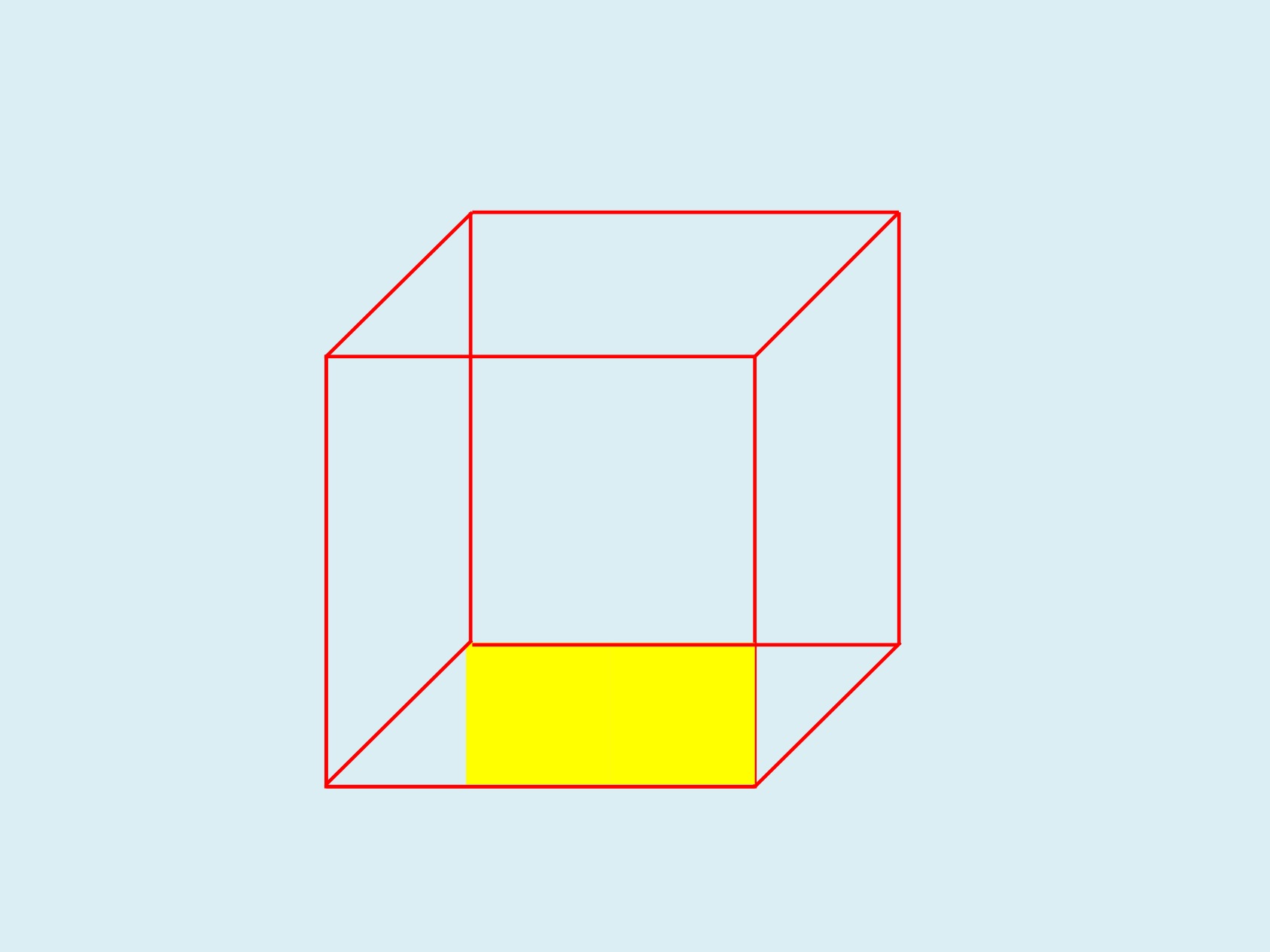
The next step in this pattern would be another square of yellow, in the bottom left corner, covering the red diagonal, and then another batch of yellows further up, taking you towards a final yellow front, like this.

Instead, you get the punch line. You’re given another piece of information that suddenly tells you that your first interpretation was plausible, but wrong.

That one small area of black tells you that your first interpretation was wrong, and points you towards a very different interpretation, namely this one.

So what?
You see exactly the same sequence in a lot of real-world cases, both funny cases and scary, and many that are both funny and scary at the same time.
A classic ancient example that I used in my book Blind Spot is the battle of Cannae, where Hannibal was fighting a larger Roman army. The first two stages of the battle went exactly as the Romans were expecting. First, Hannibal’s cavalry wiped out the Roman cavalry, which was what usually happened. Second, and much more important from the viewpoint of Roman expectations, the Roman army pushed back the centre of Hannibal’s army until it was bowed deeply back in the centre, near to breaking point. Once Hannibal’s line broke, the Romans would be able to wipe out the pieces one by one.
Then came the punch line. Hannibal’s cavalry suddenly reappeared behind the Romans. The Romans suddenly had the Necker shift experience of realising that they had just got themselves surrounded on three sides, by pushing Hannibal’s line far back in the centre, and that Hannibal’s cavalry had now surrounded them on the last remaining side. By pushing forward so far, they had actually fought their way into a trap. A few Romans managed to fight their way out before the trap fully closed; the rest were slaughtered to the last man. About 60,000 were killed – more than the US death toll for the entire Vietnam War, killed in a single day.
A lot of disasters follow that pattern. First there’s the evidence pointing towards everything being normal. Then there’s the first sign that something’s not right, followed by the Necker shift and that sinking feeling in the gut, from the sudden realisation that events have just taken a very unpleasant turn for the worse.
One of my favourite examples is a classic in the disaster literature, for numerous reasons. It’s called the Gimli Glider. It’s an airliner that ran out of fuel in mid air, because the flight crew thought the fuel figures were in kilos, when actually they were in pounds. The pilot then treated the airliner as a glider, and brought it to a safe but eventful landing at the disused Gimli airfield. The pilot and first officer were first punished for the mistake with the fuel, and then given medals for saving everyone via some classic great flying.
That case illustrates a lot of points where Necker shifts are key features.
Does your mistake look sensible?
The first point was the mistake with the fuel. It wasn’t a simple case of oversight. The flight crew checked the fuel numbers and then double-checked them, following procedures correctly. However, for a long and tangled chain of reasons, they had been given faulty information, so they ended up with results that looked plausible and that had come out of the correct procedures, but that were still wrong.
That’s a common feature of bad design. There are numerous ways in which a design can be bad. One of the most serious is ambiguity. If an indicator can be plausibly misinterpreted, then sooner or later it will be, and because it’s plausible, the misinterpretation probably won’t be caught immediately.
In the Gimli case, the instrumentation showed a figure of 22,300 for the fuel weight, which would look perfectly sensible for their intended flight, if that figure was in kilos, which was what they were expecting. Instead, they had loaded with 22,300 pounds, which was nowhere near enough. Ironically, if the instrumentation had been completely wrong, with a figure such as 2,230, then that would probably have been spotted immediately; however, an ambiguous and plausible mistake wasn’t spotted. (For readers familiar with the full details of this story, yes, the full story is indeed more complicated, but this is the take-home message from it as regards good design.)
Knowing whether to laugh or cry
There are numerous points in the Gimli story where the situation is simultaneously funny and potentially tragic. This is a common feature in real disasters. For instance, when the Gimli glider was coming down to land, there was a social event on the disused runway. Some children were riding their bicycles on the runway, right in the path of the incoming airliner. When they realised that the plane was coming toward them, they started frantically pedalling as hard as they could, in the worst possible direction. With hindsight, it’s funny; at the time, though, the outcome could have been very different.
One common coping strategy among people who work with death, disaster and tragedy is to develop a sardonic sense of humour. In the film Falling from the Sky: Flight 174, which was based on the Gimli Glider, the pilot and first officer decide not to use one possible route because it would risk a crash landing in the city of Winnipeg; one of them comments to the other that this would look bad on their resumes. It’s a great line at several levels, and humour like this helps keep the cool, level head that’s needed in such situations, but it can easily be mistaken by outsiders for callousness. Various cultures value a type of understated humour very similar to this, and there’s an interesting literature on the role of societal cultures in views of risk and safety.
What are we looking at here?
A central theme in the discussion above is having more than one possible interpretation for the situation. That raises the question of where we get those interpretations from, which in turn takes us to schema theory and script theory, which were the topic of my previous article. A schema is a mental template for organising and categorising information; a script in this context is a mental template for a standard series of actions.
The first set of information that you see when you meet something new is disproportionately important, because at the start, it’s the only information you have. That sounds fairly obvious, which it is. However, the problem is that your brain will be looking for the appropriate schema to use, and once it’s chosen a schema, it’s reluctant to change to a different schema unless there’s a very visible need to change.
This is why first impressions are disproportionately important, and why the way that a problem is first presented will have a long-lasting effect on how it will be tackled. It’s how we decide things like which type of movie we’re seeing, usually within the first few seconds of viewing.
This is also why people often persist with an incorrect idea of what’s happening long after it’s clear to an outsider that there’s a better option available. The human brain is very good at finding evidence consistent with that first choice of schema, and very good at ignoring inconvenient evidence that doesn’t fit. This tendency is known as confirmation bias, and it’s so widespread that I’m now surprised when I don’t find it when I start looking at the previous literature on a problem.
The uncanny valley revisited
The first impression is disproportionately important. What happens, though, when that first impression is equally balanced between two very different interpretations, rather than pointing you towards a single, wrong, interpretation?
That situation would look something like this on our Necker cube visualisation.

It’s not quite the same as our initial wireframe Necker cube, since we have some information about which colours are involved. However, there are equal amounts of information pointing in opposite directions.
In an unthreatening situation like viewing a diagram on a page, this is a mildly interesting or mildly irritating uncertainty, depending on your mood or viewpoint. In real life situations, though, this type of uncertainty can be profoundly unsettling, and potentially dangerous (as in the classic uncomfortable question of whether the person walking towards you in a lonely street is a harmless pedestrian or a criminal who sees you as their next victim).
One milder but still unsettling example of this is the uncanny valley, a concept first popularised by the Japanese robotics researcher Mori. He found that up to a certain point, the more human-like a robot was, the more it was liked by people. However, there was a point where suddenly people started to find a robot very disconcerting because it was neither clearly a robot nor clearly a human. That feeling reduced once the robot passed another threshold, and could pass visually for a human. Mori termed this discomfort zone the uncanny valley.
This concept has been adopted by researchers in a wide range of other fields, since it offers a plausible explanation for the role of humanoid monsters in movies, folklore and popular culture – an uncanny valley marking the edges of the human landscape, and the start of the non-human landscape.
It also provides a plausible explanation for why some completely human phenomena are profoundly unsettling. An example of this is the discomfort that many people feel when they see images of child beauty pageant contestants, where the schema for “child” (small, “natural” and asexual) comes into sharp contrast with the schema for “beauty queen” (tall, with sophisticated makeup, dress and hair style, and highly sexualised). Most viewers don’t have a well-established mental pigeonhole specifically for “child beauty pageant contestant”, so they end up in a rapid and uncomfortable Necker shift alternation between the “child” schema and the “beauty queen” schema.
Conclusion
The Necker shift is a concept that we’ve found extremely useful in our work. It gives powerful insights into assorted types of error and misunderstanding, and into a wide range of other phenomena, ranging from comedy to horror.
In this article, I’ve looked at how this concept relates to schema theory and script theory. There are numerous other interesting questions, such as which features are the classic indicators of different types of schema and script, but those will need to wait for another article…
Notes and links
The fractal image in this article is a close-up of the one here:
http://upload.wikimedia.org/wikipedia/commons/1/17/Julia_set_%28highres_01%29.jpg
There’s an interesting recent post by Mano Singham on what visual illusions tell us about how the brain works, over on Freethought Blogs:
http://freethoughtblogs.com/singham/2013/08/30/seeing-our-own-brains-at-work/
There’s a collection of edited highlights from a documentary about the Gimli Glider here on YouTube:
https://www.youtube.com/watch?v=4yvUi7OAOL4
My previous article about schema theory and script theory is here:
Blind Spot is available on Amazon:
AAll images above are copyleft Hyde & Rugg, unless otherwise stated. You’re welcome to use the copyleft images for any non-commercial purpose, including lectures, provided that you state that they’re copyleft Hyde & Rugg.


August 30, 2013
Schema theory, scripts, and mental templates: An introduction
By Gordon Rugg
Why should anyone care about schema theory? Well, among other things, it’s at the heart of how society functions, and if you make good use of it, you can become rich, famous and socially successful. That’s a persuasive pair of reasons. This article describes the core concepts in schema theory, discusses some examples of how it gives powerful insights, and relates it to various concepts that complement it.
First, some background. Schema theory was introduced in the 1930s by Sir Fred Bartlett. It’s pronounced like “schemer” which is a frequent cause of confusion if people first encounter the term by hearing it rather than reading it. The core idea is that a schema is a sort of mental template that describes the key features of something. For instance, the schema for a typical car includes having four wheels, a chassis, a body, doors, seats and a steering wheel.
There’s a closely related approach known as script theory. Scripts in this context are a sub-type of schema that describe the key features of an activity – a verb as opposed to a noun. For instance, the script for a pre-arranged dinner at a French-style restaurant includes the actions of booking a table, arriving at the agreed time, being greeted by a member of staff, being shown to your table, etc. We’ll be covering script theory in a later article.
So far, this may sound tidy but not particularly powerful or interesting. When you dig deeper, though, schema theory and script theory turn out to have a lot of uses and implications that aren’t as widely known as they should be. These take us into fields as varied as designing game-changing new products, the law, and measuring novelty in film scripts, as well as the eternal question of why the general public appears collectively unable to have consistent, clear ideas about what it wants. First, we’ll work through the basic concepts.
A simple example: How schema theory makes sense of apparently inconsistent results in market research and surveys
Let’s suppose that you do a survey where you ask a hundred people to describe their dream car, and you find that half of them say it should sit high off the road, while the other half say that it should be as low as possible. That looks like complete disagreement. However, suppose that you instead ask them to describe their dream SUV and then to describe their dream sports car. What sort of responses would you expect to get now?
You’d probably now get a high level of agreement within each description; for instance, the sports car would be consistently expected to be low to the ground, with little passenger space or luggage space.
However, you’d get wide differences between the sports car schema responses and the SUV schema responses. The SUV would be expected to be high off the ground (the opposite of the value for the sports car), with a lot of passenger space (again, opposite to the sports car schema) and luggage space (yet again, the opposite to the sports car).
These two would also be very different from the schema for a small urban car, or the schema for a family saloon.
This is pretty obvious when you’re dealing with vehicles, where the schema for each type is widely and explicitly known. What would happen, however, if you were doing a survey about what people wanted in their ideal house, or their ideal job? Unless you were very careful, there’s a high risk that you’d run into this same problem about having more than one schema involved, and having very different ideals for each schema, which all end up in a confusing tangle if you haven’t kept them separate right from the start.
So, schema theory has very practical implications, especially when you’re trying to gather information from human beings. Before moving on to some applications of schema theory, there are some underpinning concepts that need to be covered.
Concepts and terminology
The plural of schema is either schemata or schemas, depending on personal preference. I usually prefer schemata, mainly because schemas sounds like schemers and therefore risks producing surreal misunderstandings about people scheming and plotting.
Schemata are similar to numerous other concepts, such as categories and genres. However, they’re not the same.
Categories are usually defined by a small set of key features – typically, as small a set as possible, so that the definition is as efficient as possible. Schemata, on the other hand, can vary from very simple to very elaborate. A military designer’s schema for an aircraft carrier, for instance, might be very complex indeed.
Genres are a good example of a concept that works well at an informal level, but which rapidly degenerates into inconsistency and chaos when you try to formalise it, as any music lover will probably tell you. For the purposes of this article, I’ll treat genre as simply another form of category, and not deal with it further here.
The idea of different schemata each corresponding to a different sub-category within a classification has a long history in zoology, where it’s at the heart of formal taxonomy. Each genus, for instance, has its own set of key characteristics, and then each species within that genus will in turn have its own further set of key characteristics that distinguish it from the others in that genus.
There’s a sophisticated and extensive literature on this topic, which overlaps heavily with a similar literature in the field of knowledge representation within Artificial Intelligence (AI). These literatures deal in detail with questions such as whether each species always shares the key characteristics of the higher-level categories to which it belongs (e.g. phylum, class or order). The classic example is whether the higher-level category of bird should have the attribute of being able to fly, since some species of bird can’t fly.
If you’re a new researcher, or an established researcher wanting to bring some new and more powerful tools into your chosen field, then the literature just described may be useful to you – the Artificial Intelligence literature in particular gives you a very rigorous, powerful set of methods and concepts for taxonomy and categorisation. A surprisingly large proportion of researchers in a wide range of fields invent classifications and ontologies without first reading up on the basics of category theory or taxonomic theory. The results are often elaborate and impressive, but also elaborately and impressively wrong, because of not taking into account some key issue that’s well known in the literature on classifications and taxonomies.
Some practical applications
By this stage some readers may be wondering what’s new about schema theory; it looks on the surface like the sort of thing that’s been discussed in philosophy and traditional logic for the last couple of millennia.
The short answer is that it does share a lot of foundations with that work, but schema theory and related concepts such as formal knowledge representation in AI go much further.
For instance, traditional classification had major problems with categories that didn’t have neat, crisp boundaries, such as “old” or “big”. Modern work, in contrast, can bring in approaches such as fuzzy logic and rough set theory, which were developed specifically to deal with such cases, and which enable researchers and developers to handle a wide range of real-world problems in an elegant, powerful way.
Fuzzy logic in particular has become ubiquitous since its invention by Zadeh in the 1960s. In brief, it involves assigning a numeric value to how strongly something belongs in a set – for instance, how strongly an air temperature of 20 degrees Celcius belongs in the set of “hot weather” – on a scale from 0 (not at all) to 1 (completely). It’s simple, but it’s extremely powerful in its ramifications. It’s particularly useful for handling rules such as “if the weather is hot, then change the fuel to air ratio in the engine in this way”. A lot of modern engines have fuzzy logic built into them, to improve their performance, in products as diverse as cars and washing machines.
There’s more about this in our article on categorisation here:
Legal applications
Categorisation and schema theory are an important feature of the law. A lot of legal argument is about the schema to which something belongs, with some schemata being legal, and others being illegal.
A classic example is pictures of naked people. Until recently in the West, pictures of naked people were treated very differently by the law, depending on the schema to which they were assigned. One schema was medical images; another was naturist or nudist images; another was art; another was erotica; another was pornography. Each of these was treated differently by law and by society. Pornography was outlawed until recently in most countries, and even in those countries where it is legal, there are still restrictions on which schemata within pornography are legal. So, a decision about schema membership could make the difference between freedom and gaol.
Fortune and glory
Schemata are also important for product design. An example that’s so familiar we seldom notice it is the desktop metaphor on computer interfaces.
In olden times, people interacted with computers via command lines, with the human and the computer taking it in turns to write text onto the screen. That text wasn’t usually very user-friendly – for instance, it’s not immediately clear to a non-specialist what is meant by the Unix comand rm –r *.* even though its consequences could be very unwelcome (it’s the command to remove all of the files in all of your directories).
Most current software doesn’t work like that. Instead, what you see on the screen is designed to look as much like possible for the schema of an office workplace, with folders containing documents sitting on a desktop, and a waste basket at one side.
The beauty of this approach is twofold. One attraction is that it’s nonverbal, which makes it much easier to use across languages, and easier for people with dyslexia etc to use. Another is that doesn’t require much training, since the user can draw on their existing knowledge of the schema for an office desktop, rather than having to learn a new schema.
That’s a principle that we used for our Search Visualizer software, which draws on the user’s existing knowledge of how documents are structured, and how words are distributed within documents (for instance, key terms are mentioned in the introduction at the start, then often have a section of their own in the main text, where a particular term is used frequently, and then are mentioned again in the conclusion at the end).
The change of schema from the schema of writing text to the schema of the desktop was one that changed the face of computing, and made many people very rich. It has also changed public expectations; people now expect products to be usable without having to read a manual, so having the right schema for the product design can be a major factor in the success or failure of the product.
Closing thoughts
Drawing on well-established schemata has a lot of advantages. It reduces learning load and cognitive load for the humans involved, and it also makes their knowledge more internally consistent. Social schemata are also useful for smoothing interactions between people, by providing a shared set of norms about behaviour.
However, the fact that a particular schema is well-established doesn’t necessarily mean that the schema is a good thing. A lot of social schemata owe more to history than to logic or evidence or free choice – for instance, the schemata that specify the types of food and clothing and hairstyle that are permissible or forbidden within a society.
The issue of social schemata leads into the concept of the uncanny valley. This concept was first described by Mori, a researcher developing human-like robots. His description of the uncanny valley involves cases where something that looks nearly human, but not quite human, evokes feelings of unease. His description was in the context of robots; other researchers have wondered whether this also explains the unease people feel about other entities in the uncanny valley around humanity – for instance, the legends that many cultures have about half-human, half-animal wild men, and the almost-human monsters in horror movies, such as vampires and zombies and werewolves.
In my book Blind Spot, there’s a discussion of whether this is actually part of a wider phenomenon, in which people feel uneasy about anything that doesn’t fit neatly into one category or another. This unease is at the heart of humour (where we suddenly re-perceive something in a totally different but non-threatening way) and of horror (where some forms of horror involve suddenly re-perceiving something in a totally different and very threatening way). It’s a fascinating topic, to which we’ll return in a later article.
A lot of human activity involves trying to reduce cognitive load by fitting a complicated, untidy world into simple, tidy and familiar schemata. There’s a passage from Buffy the Vampire Slayer in the episode called “Lie to me” which shows the attraction of this approach. The context is that Buffy has just been dealing with a complex, morally difficult challenge that has left her emotionally harrowed and uncertain; she asks her friend and mentor Giles for support. He tells her that life is complex and morally difficult; she tells him that she doesn’t want to hear that. Giles tries a different tack.
Giles: It’s terribly simple. The good guys are stalwart and true. The bad guys are easily distinguished by their pointy horns or black hats and we always defeat them and save the day. Nobody ever dies… and everyone lives happily ever after.”
Buffy: (with weary affection) “Liar.”
Sometimes, when reality is hard going, a simpler version has many attractions. There’s a lot more to be said about schema theory, and about script theory, but that can wait till another day.
Notes and links
The Search Visualizer blog is here:
searchvisualizer.wordpress.com
There’s a free online version of the Search Visualizer software here:
Blind Spot is available on Amazon:

August 27, 2013
Decision rationale: The why and the wherefore
By Gordon Rugg
People are usually able to give you reasons for the things that they do. Sometimes those reasons make perfect sense; sometimes they make sense once you understand the background; other times, you’re left wondering what one earth is going on in the person’s head. There’s also the issue of whether those reasons bear any relation to reality, but that’s another story.
This article is about how one apparently pointless superstition can be traced back to a perfectly sensible piece of evidence-based reasoning that subsequently spiralled off into a very different direction. It involves the ancient Roman practice of examining the livers of sacrificed sheep and poultry as a way of predicting the future.
So what does this practice have to tell us about how people make decisions today? Actually, quite a lot. It’s a good illustration of some fundamental points that are as important now as they were over two thousand years ago, when this bronze model of a liver was created to help Roman fortune tellers assess the omens before a major decision.

http://en.wikipedia.org/wiki/File:Piacenza_Bronzeleber.jpg
At first sight, trying to predict the future by examining the entrails of sacrificed animals doesn’t exactly look like the most rational of ideas. However, when you dig into classical Roman literature, you discover something that casts a whole new light on the subject. It’s in Vitruvius, The Ten Books On Architecture, which was written during the reign of Augustus, about 15 BC. The text below is from the Morgan translation, on Project Gutenberg. Here’s what Vitruvius has to say about animal livers, in Chapter IV: The site of a city.
9. I cannot too strongly insist upon the need of a return to the method of old times. Our ancestors, when about to build a town or an army post, sacrificed some of the cattle that were wont to feed on the site proposed and examined their livers. If the livers of the first victims were dark-coloured or abnormal, they sacrificed others, to see whether the fault was due to disease or their food. They never began to build defensive works in a place until after they had made many such trials and satisfied themselves that good water and food had made the liver sound and firm. If they continued to find it abnormal, they argued from this that the food and water supply found in such a place would be just as unhealthy for man, and so they moved away and changed to another neighbourhood, healthfulness being their chief object.
That’s about as hard-headed and practical as it gets. So how did this spin off into fortune telling? There are several issues involved. I’ve picked out a few that are still as relevant today as they were back in ancient Rome.
Wonky causal models
Sometimes people end up with weird conclusions because the assumptions or the reasoning that they’re working with have gone wrong somewhere along the way. In the case of the Romans, the initial reasoning (it’s a bad idea to build a town in an unhealthy environment) is fine. However, if you argue that the particular environment is unhealthy because the gods are angry, that’s a more dubious assumption. It’s even more dubious to argue that diseased animal livers are a sign of divine anger in general, not just of an unhealthy environment.
Human beings in general are bad at logical reasoning; that’s a central theme of my book Blind Spot, and the reasons for this weakness are complex enough to fill numerous books. In consequence of this, there are plenty of cases of people reaching conclusions that now look odd, but that appeared at the time to make perfect sense. The essays of the late Stephen Jay Gould contain some beautiful examples of this.
Hiding in the herd: Twenty million lemmings can’t all be wrong
At a more cynical level, it often makes sense to play along with widespread behaviours even if you think they’re pointless and irrational, simply because that’s a lower-risk strategy than drawing attention to yourself by asking critical questions. There’s a substantial empirical literature on this, much of it using concepts from game theory, decision theory and/or evolutionary ecology to test hypotheses about the viability of different strategies.
Covering your back
Hiding in the herd is a passive strategy that reduces the risk of encountering trouble, but doesn’t offer much help if trouble does arise. Pointing out that everyone else was breaking the speed limit on a particular stretch of road, for instance, isn’t the strongest of cases if you’ve been pulled over for speeding.
A more effective strategy for handling trouble is to have a scapegoat ready to hand. In the modern business world, that’s a common reason for hiring consultants. If things go well, the manager takes the credit; if things go badly, they fire the consultant.
This is one reason that a lot of businesses used to hire consultants to advise on recruitment, using methods that had been repeatedly shown to have little or no predictive value, such as graphology. At a practical level, this didn’t look like a sensible business decision. At the level of organisational politics, however, this was a very sensible decision, that insulated the manager doing the hiring from the risk of being blamed for a bad appointment.
Forgetting the original reason
Finally, some behaviours start off with a reason that everybody knows at the time, but that gets forgotten as the years go by. That’s a fine, rich topic, although many of the widely-quoted examples are actually urban legends…
Conclusion
That’s a quick skim through some of the issues behind decision rationale. It’s a topic to which we’ll return repeatedly in future articles. A closely related issue is the difference between official and unofficial versions of reality, the topic of some fascinating work by researchers such as Goffman and Argyris, which will also be the topic of future articles.
Notes and links
An overview of Vitruvius’ Ten Books On Architecture:
http://en.wikipedia.org/wiki/De_architectura
The Project Gutenberg page for Vitruvius’ Ten Books On Architecture:
http://www.gutenberg.org/ebooks/20239
Blind Spot is available on Amazon here:
August 24, 2013
Client requirements: Are they really infinite and unknowable?
A tale of Dostoyevsky, deserts, Wile. E. Coyote and Road Runner
By Gordon Rugg
“We always imagine eternity as something beyond our conception, something vast, vast! But why must it be vast? Instead of all that, what if it’s one little room, like a bath house in the country, black and grimy and spiders in every corner, and that’s all eternity is? I sometimes fancy it like that.”
“Can it be you can imagine nothing juster and more comforting than that?” Raskolnikov cried, with a feeling of anguish.
Fyodor Dostoyevsky, Crime and Punishment
If you’ve ever had to deal with a demanding set of client requirements, and you were offered the alternative of spending eternity in a black, grimy spider-infested country bath house, then you’d probably hesitate about which choice to go for.
At one level, client requirements actually are infinite and unknowable. At another level, though, there’s a more positive message. Yes, the complete set of client requirements is ultimately infinite and unknowable, but that isn’t the real point. The real point is that you don’t need the complete set. You just need enough for the task in hand, and that’s a much more tractable problem.
This article is about ways of getting your head round the concepts involved.
They’re important concepts, because they have far-reaching implications for how we approach the whole issue of requirements and what people want, not just for product design, but also for bigger issues like architecture and what people really want out of life, and how to design the human world to meet those wants and needs. Fortunately, the concepts required are actually fairly straightforward, if you have the right tools for thought. The tools for thought that we’ll be using in this article are a desert highway and a large number of scattered boxes.
Here’s an image of infinity. It’s a desert that stretches on forever. There’s a highway running through it, and a cactus to one side of the highway for artistic relief. Readers of a humorous disposition can imagine that Wile. E. Coyote and/or the Road Runner are hiding behind the cactus.

Now let’s imagine that this infinite desert contains an infinite number of red boxes. It’s tempting to think that the desert would now look like this.

(I haven’t tried showing every individual box, but you get the general idea.)
That is indeed one way of having an infinite number of red boxes in the infinite desert. However, it’s not the only way. Here’s another.

This version of the desert also contains an infinite number of boxes. They’re just much more sparsely scattered across it than in the first version. There are only two of them visible in this image, but because the desert stretches on forever, even if there’s only one box every ten square miles, there’s still an infinite number of them eventually.
Here’s an intermediate version, where the desert again contains an infinite number of boxes, but they’re not so sparsely packed.

There’s something else that’s different about this image compared to the previous ones. In this image, the boxes are showing a tendency to be more common near the road. There’s still an infinite number of them, but that doesn’t stop them from clustering in places.
Here’s yet another version. In this one, the boxes are strongly clustered near to the road, and also near to the viewing point at the front of the picture.

So what does this have to do with client requirements?
To start with, the set of possibly relevant client requirements is infinite, and therefore unknowable, like the potentially infinite number of boxes in the desert.
However, in reality, you don’t need to know all of the possibly relevant requirements. You just need to know a subset of the requirements, using a criterion such as “criteria that have a greater than one-in-a-million likelihood of cropping up during the lifetime of this product”.
That’s a completely different game, involving a much smaller set of requirements. Now, the requirements you’re dealing with are a lot more tractable. In terms of the diagram, it’s the equivalent of only having to deal with a set of boxes that are close to one particular finite stretch of the road, not every box across the whole of the infinite desert.
A second issue is that the product you’re designing fits within our present-day world. That also cuts down the number of potential requirements issues. There’s a lot of shared knowledge that you and the client can take for granted, such as what modern Western houses are like, and legal manufacturing standards, and standard grades of materials and components, and so on. That’s what I’m getting at in the illustration by having a lot of the boxes near the viewing point; a lot of the key requirements, options and constraints are going to be fairly close to what you already know.
There’s another factor that makes the problem even more tractable. Often there are numerous potential solutions, and you just need to know the requirements for the solution that the client prefers. That reduces the number of requirements still further. The problem now looks more like the diagram below, where the requirements for the client’s preferred solution are represented by the red boxes with yellow edges. There are only a few of them, and most of them are fairly near to the viewing position (there’s one beside the cactus that would be easy to miss, that I’ve included to make the point that just because the number of requirements might be tractable, that doesn’t mean that they’ll always be easy to find).

Conclusion
So, in terms of heavy meta-theory, we’ve seen that the landscape of infinity can vary from densely packed to sparsely packed, and that the contents of that landscape can be clustered close to your starting point – they don’t have to be scattered evenly across infinity.
Rephrasing that in practical terms of client requirements, we’ve seen that the number of possibly relevant requirements is infinite, but that in practice the number of relevant requirements can be much smaller and more accessible.
Looking forward from that conclusion, there’s a further set of issues about how best to find out which solutions appeal most to the client, and how to find out the requirements for the favoured solution or solutions.
I’ve already addressed some of those issues in a previous post about why users usually can’t initially know all their requirements, and how this problem can be fixed. I’ll return to this theme repeatedly in later posts.
Notes
Crime and Punishment is available on Project Gutenberg here for free download:
http://www.gutenberg.org/ebooks/2554
The cactus in the images is from Wikimedia:
http://commons.wikimedia.org/wiki/File:Cactus_chandelle.svg
For why clients don’t know what they want:


August 21, 2013
Why heavy things are heavy: Brought to you by classical logic
By Gordon Rugg
Here’s Vitruvius again, trying to explain something using the four elements theory again, and ending up with a distinctly dodgy chain of reasoning again. You get the feeling that his heart isn’t really in it, and that he knows he’s working with tools that just aren’t up to the job.
6. To begin with fir: it contains a great deal of air and fire with very little moisture and the earthy, so that, as its natural properties are of the lighter class, it is not heavy.
I know how he must have felt. When I started to add tags to this post, the software helpfully suggested adding the tags Brookside characters and mattress. Is there a Brookside character named Vitruvius Mattress? I really don’t want to know.


August 20, 2013
Hoaxing the Voynich Manuscript, part 4: The materials
By Gordon Rugg
In this series of articles, we’re imagining that you’ve gone back in time, and that you want to produce the Voynich Manuscript as a hoax to make money.
The first article looked at why a mysterious manuscript would be a good choice of item to hoax. The second article looked at some of the problems involved in hoaxing a text that looked like an unknown language, from the linguistic viewpoint. The third examined the same subject in more depth.
In this article, I’ll look at the materials that would be needed for the hypothetical hoax. Some of them are straightforward, but one is the subject of much argument.

If you’ve decided to produce a hoax that looks like a fifteenth century European book in either an unknown language or an unknown code, then choosing almost all the materials is pretty simple. I’ll start with the easiest.
Ink
Oak gall ink was a standard widely used type of ink from right through the Middle Ages. It’s still readily available today; I have a couple of bottles of the stuff in my calligraphy set.
Throughout the centuries, it’s been made using the same ingredients and the same procedures. It’s an obvious, sensible choice for a hoaxer; it’s the type of ink used in a huge variety of mediaeval documents, and it’s been almost identical in composition throughout that time. Another important consideration for a hoaxer is that it doesn’t show obvious signs of age if it’s kept away from sunlight (for instance, in a closed book). That’s a mixed blessing, in terms of making the hoax look the right age. We’ll return to that issue later.
Pigments
The pigments for the illustrations would be another easy choice. The pigments that artists used through the Middle Ages were based on a fairly limited set of ingredients. A few ingredients of that period, such as lapis lazuli, were luxury imports – that’s one reason that top quality illuminated mediaeval manuscripts feature dark blues so prominently, to flaunt the wealth of the person who commissioned the manuscript. For the Voynich Manuscript, however, the pigments used were standard ones whose ingredients and recipes remained more or less unchanged for centuries. As with the oak gall ink, the pigments wouldn’t show obvious signs of age if kept away from sunlight in a closed book.
Pen
Quill pens were the standard writing implements throughout the mediaeval period. They’re not a lot of fun to write with; they need to be re-sharpened, which is a nontrivial skill, and they aren’t always consistent in the quality of writing they produce if you’re not skilled in sharpening them. They can also make a squeaking sound that’s almost as unpleasant as fingernails on a blackboard. Steel-nibbed pens became widespread during the Victorian period, and are a lot more pleasant to use.
When you use a quill pen or an old-fashioned steel-nibbed pen, you have to dip it into the ink at intervals, when the pen starts to dry up. It’s often possible to see where this happens in a manuscript because the ink suddenly changes from light to dark in colour. Here’s an example. At the end of the fourth line down the ink is getting faint, and then suddenly goes dark for the characters that look like an “n” and an “r”.

You also sometimes get an odd effect from oak gall ink, which is that the ink can be transparent for a few seconds after you write something; it darkens to black over a few seconds. This may be the reason that a couple of words in the Voynich Manuscript have been overwritten with other words – the writer may have been distracted, lost their place on the line, and started again at the beginning because the words they’d just written were still transparent.
Vellum or parchment
If you’re producing a hoax intended to look like a mediaeval European book, then the obvious choice of writing material is vellum or parchment. The two terms overlap; in brief, parchment is animal skin, and vellum is high quality parchment. The high quality was achieved in several ways, some involving the method of preparation, and some involving the choice of animal – vellum was usually produced from the skins of calves or goats.
The vast majority of mediaeval documents were written on vellum or parchment, although some were written on other materials. Papyrus was still in use in the Byzantine empire until well into the middle ages, though it had stopped being used in western Europe by about 1000 AD. Paper was increasingly widely produced as the middle ages progressed, becoming significantly more common during the fifteenth and sixteenth centuries. A few documents were produced on materials such as leather (also made from animal skin, but put through a tanning process, unlike parchment and vellum).
The choice of vellum as a writing material is perfectly understandable, from a hoaxer’s point of view. It was a readily available material that had been used in old documents across Europe for centuries. However, if you’re a hoaxer, then there’s a further decision that you need to make. It’s also a decision that might occur if you were producing a document that wasn’t a hoax. It’s whether to use newly-made vellum or old vellum. That’s an issue that’s provoked much discussion in the Voynich research world recently. I’ll cover that in some detail after clearing a couple of other issues about vellum out of the way.
Cost
One topic of argument has been the cost of vellum in the historical past. As I’ve pointed out in an earlier post in this series, the cost of materials is a secondary consideration to a hoaxer; some of the most successful hoaxes have involved very substantial initial costs. The key issue for a commercial hoaxer is the likely return on investment.
Vellum prices in antiquity, as nowadays, varied by region and across time, but they weren’t prohibitively high; merchant houses would buy enough vellum to produce ledger books, for instance, as a routine business expense.
What about the foldouts?
One good question about the hypothetical hoax involves the foldouts. These are pages in the Voynich Manuscript which unfold to several times the usual size of pages in the manuscript. How would a hoaxer manage to find enough already-old vellum to produce these?
A possible answer is that the hoaxer didn’t start out with that intention, but instead acquired a book or set of already-old vellum which happened to contain several larger sheets, and decided to incorporate them into the manuscript.
This is a feasible scenario because of the way that vellum and parchment are produced. They’re produced initially as an entire skin, which is then cut into sheets of the correct size. In the case of calf and goat skins, there’s something of an art in cutting the skin in such a way as to get the maximum amount of usable area out of the skin, since these skins are small, and variable in shape around the edges. This cutting wouldn’t necessarily be directly into page-sized pieces; some of the pieces might start off the size of several pages, and then be cut down to size from there.
One possibility for the foldouts is that the person producing the Voynich Manuscript had bought a batch of vellum where some pieces had been cut to the right height to use as pages, but hadn’t yet been cut to the right width. Another is that the person had bought a batch of skins that hadn’t yet been cut into pages.

A foldout page from the Voynich Manuscript: Image courtesy of the Beinecke Library
There’s no obvious reason why the manuscript needs to use foldouts – it doesn’t include maps or large diagrams of a complex mechanism, for instance, where foldouts would be very useful – so this speculative explanation of making use of some large blank sheets that happened to be available would make sense of what is otherwise a puzzling anomaly in the manuscript’s format.
Vellum: New or old?
One of the challenges that hoaxers spend a lot of time on is making things look the right age. Usually that means making them look older than they really are. Sometimes it doesn’t. Sometimes, hoaxers and forgers produce copies of modern documents, where it’s important to use modern materials and also to make the document look crisp and fresh. More often, though, the hoaxer has to make the item look older than it is, and that’s a nontrivial problem in most cases.
We’ve already seen that oak gall ink and mediaeval pigments tend to retain their colours well if they’re not exposed to sunlight and fresh air. That’s a problem if you’re a hoaxer, because it means that you don’t have a plausible way of making them look old within a book. If you’re hoaxing a document that consists of a single sheet of vellum, then that’s a different story, because the single sheet would probably get exposed to light and air, and the ink and pigments would weather, so you can fake ageing. If you’re hoaxing a book, however, that’s a different story, since pages within a book tend to remain closed within the book most of the time, so the ink and pigment will look fresh, and you won’t be able to use them to make the document look old.
So that leaves you with the vellum as the remaining way of making the book look aged. Unfortunately, vellum also tends to remain fresh-looking if it’s shut within a book. If you look at the closeup illustration above, you wouldn’t be able to tell whether it’s of a document written four hours ago or four centuries ago.
There is one way, though, that vellum shows signs of ageing, and that’s wear and tear around the edges and in pages that get heavier use, such as the first page of a book, or pages that people frequently turn to. Here’s another illustration from the Voynich Manuscript, showing wear and tear, and faded ink for good measure; it’s the first page of the manuscript.

The first page of the Voynich Manuscript: Image courtesy of the Beinecke Library
That’s a page that looks old. It looks like it’s seen a lot of use. Which is exactly how you’d want it to look, if you were a hoaxer producing an alleged book of ancient secrets, as opposed to current secrets.
There are lots of ways of making a page look old; that’s one of the key skills that a good forger of documents needs to have. The best way, though, is also the simplest: you simply start with a page that really is old, by using already-old vellum. And that’s where the debate really gets started.
A key question is whether the ink went onto the vellum of the Voynich Manuscript when that vellum was freshly made (in which case, the radiocarbon date tells us when the manuscript was produced) or when the vellum was already old.
We can’t tell the answer chemically. Carbon testing the ink would require a prohibitive amount of the ink, and there’s no realistic prospect of that happening. So that route is a dead end for the foreseeable future.
Everyone agrees that most documents in the past were written on fairly fresh vellum or parchment (i.e. at most a year or two old). That, however, doesn’t mean that all of them were – Rich SantaColoma has found evidence of quite a few genuine ordinary mediaeval documents being written on vellum that was probably a few decades old at the time when the document was written. That makes sense, especially if the document was being produced by an organisation that routinely produced documentation, such as a law firm or a merchant house or monastery; the sensible thing for such organisations to do would be to maintain a reasonable stock of spare vellum and parchment.
It would also make sense for them to buy in bulk whenever prices happened to be low, rather than buying a fresh sheet of vellum for every new piece of work. When you put those two factors together, you have a very practical set of reasons for many mediaeval documents being written on vellum or parchment that was already several years old, and sometimes substantially older (if some of the vellum and parchment had been left on an obscure bottom shelf at the back of the store-room, for instance).
Forgers and hoaxers are well aware of how to find already-old materials. One favourite method of finding already-old paper or vellum is to acquire an unfinished book – for instance, a ledger book or journal that was abandoned, for reasons such as the company going bankrupt or the journal’s author’s death. In the case of single-page hoaxes, it’s sometimes been possible to find the original book from which the single page was taken, by matching the positions of wormholes in the two documents.
Rich SantaColoma has done a fair amount of fieldwork on this topic, and has found numerous examples of substantial amounts of already-old vellum being available through antiquity and into modern times.
It wouldn’t need to be easy for a hoaxer to find an already-old unfinished book. It would only need to be possible, and Rich’s work has shown that this was very much a possibility.
So, it’s plausible that the ink went onto vellum that was recently made, but also plausible that it went onto vellum that was a few years old, or a few decades old, regardless of whether the manuscript was produced as a hoax or not. That’s useful from the viewpoint of a hoaxer, but not so useful from the viewpoint of a present-day researcher trying to get insights into the nature of the Voynich Manuscript.
Why 1430?
One big, puzzling question involves the carbon date for the vellum. The unofficial reports from the team that did the carbon testing of the vellum put the date at around 1420 to 1430. (There hasn’t yet been an official report.) I’ve been deliberately fuzzy in my phrasing for this date because radiocarbon dates are probability estimates, not exact figures with crisp cut-off points. You can calculate the exact likelihood of the samples coming from any given date such as 1442, using the probability curves. Much the most likely date is around 1420 to 1430.
I don’t see any reason to argue about the validity of the carbon dates; the technique is well established, and its limitations are well understood by experts in the field, so if they say that the most likely date is around 1420 to 1430, then I’m happy to accept that.
However, that date came as a surprise to most Voynich researchers when it was first announced, because there had previously been fairly solid agreement that the manuscript dated from the 1460s or 1470s on a variety of grounds, including the style of the manuscript, and there had been an implicit assumption that the manuscript would have been written onto freshly made vellum.
I’m usually wary of putting much trust in stylistic dating, but if used with caution, it can be pretty effective. Suppose, for instance, that you’re shown a photo of a man wearing peace beads and loon flares and a psychedelic tee-shirt, standing next to a woman in a black and white mini-dress. When would that photo date from? With those clothing styles, the best bet would be the 1960s or 1970s, or maybe some later retro event. If someone tried to tell you that it dated from the 1920s or 1930s you’d be pretty sceptical, and rightly so.
The styles involved in assessing the age of the Voynich Manuscript aren’t primarily about clothing. Instead, they’re principally about the handwriting style (handwriting fashions come and go, just like clothing fashions) and the style of the book itself (genres of books came and went in the past, just as they do today) and the style of the illustrations (art styles also come and go).
Before the carbon dates came in, it was generally agreed that those different strands of evidence all pointed towards the same date – the 1460s or 1470s, and perhaps later (there were some claims that some of the clothing and hair styles in the illustrations were a better fit with the early 1500s).
Then the carbon dates arrived. For the non-hoax hypothesis, the carbon dates didn’t fit well with the previous stylistic estimates for the date. For the hoax hypothesis, this was less of an issue.
I’ve listed the main issues in the table below. It shows three significant dates, with notes about the implications if the manuscript was written at each of those dates. The first is around 1430 (the carbon date). The second is around 1470 (the stylistic date). The third is around 1580 (when the manuscript appears at the court of Rudolph II).
In each cell of the table, I’ve listed a possible explanation for the manuscript, a note on the implications of the carbon date, and a note on the implications of the stylistic date.

The next sections discuss each of these possible dates in more detail.
Around 1430
If the manuscript was produced around 1430, this would fit the carbon dates, but the style would be anachronistic, regardless of whether the manuscript was being produced as a hoax or not.
There’s a possibility that the stylistic dating was mistaken, but that’s a big claim to make on the strength of one set of unexpectedly early carbon dates for this one manuscript, when the stylistic dating was derived from a well established body of work based on numerous other documents.
In terms of the sales pitch for a hoax, a hoaxed document produced around 1430 could be presented as a book of mysterious current wisdom (such as an alchemist’s notebook) without needing to look old.
The 1470s
If the manuscript was produced around 1470 as a “non-hoax” document, then the stylistic dating would fit, but the carbon date wouldn’t; to reconcile the two, the manuscript would have to be written on vellum that was already several decades old. That’s perfectly feasible, but it hasn’t so far been a favoured scenario by most of the researchers who believe that the manuscript is not a hoax.
If the manuscript was produced around 1470 as a hoax of a recent document, then the stylistic dating would fit, but the carbon dating wouldn’t. At one level, this wouldn’t be a problem for the hoax hypothesis; the manuscript would just need to look as if it was the right age, regardless of what age the vellum actually was. At another level, though, there’s the question of why a hoaxer in the 1470s would bother to use already-old vellum if they were producing a hoax intended to look like a book of recent wisdom.
The 1580s
One explanation that tidies up the loose ends is the hypothesis that the manuscript was produced much later than 1470, by someone who wanted to make it appear to date from around 1470.
Why would anyone want to do that? One possible reason is that the 1470s were the golden age of Italian codes, when the wars between the city-states sparked a flourishing set of innovations in code-making. It would be a good choice of date for anyone producing a manuscript that looked like an old coded text.
That person wouldn’t need to be producing a hoax. They might be producing a non-hoax document in a deliberately archaic style, much like the Chittenden Manuscript described on Rich SantaColoma’s website.
However, if they were producing a hoax, then a book apparently from that golden age of codes would probably have more market value than one appearing to be from the 1500s.
It would also have the advantage that this particular type of book – an alchemical herbal – would not look too heretical or satanic. That would be a big issue in the 1580s, a time of major religious wars. The Spanish priests had burnt all but a handful of the Mayan books they found because they considered those books the work of the devil. Two of the leading intellectuals of the time, Dr John Dee and Trithemius, were accused of witchcraft because of mysterious-looking documents that they produced.
So, if you were producing a book in the 1500s that appeared to be from around 1470, whether as a hoaxer or not, then you’d probably want to use already-old vellum.
One simple explanation for the mismatch between stylistic date and carbon date is that someone in the 1500s bought a batch of old vellum, dating from around 1430 (probably as a partly-used book). They probably neither knew nor cared that the vellum dated from several decades earlier than the 1470s; any age of vellum would do, as long as that vellum was already old.
They would then use that vellum to produce a manuscript in an imitation of 1470s style, maybe basing some of the illustrations on images from authentic manuscripts from the 1470s. That would explain the carbon date and the stylistic date.
There’s a further advantage in this hypothesis. There have been occasional claims that some of the details in the illustrations within the Voynich date from the 1500s; these have previously been dismissed as coincidental, but if the manuscript actually was produced in the 1500s, then we would expect to see a few slips of exactly this type.
Summary and conclusion
This has been a long post, that comes to a short set of conclusions.
If you were a hoaxer trying to produce the Voynich Manuscript as a hoax to make money, then you’d probably want to use a quill pen, oak gall ink and standard pigments of the time.
If you were producing the manuscript as a hoax around 1430 you’d not be bothered about whether you used already-old vellum or newly-made vellum.
If you were producing the manuscript as a hoax around 1470 then you’d not be bothered about whether you used already-old vellum or newly-made vellum.
If you were producing the manuscript as a hoax in the 1580s, then you’d want to use already-old vellum, but you wouldn’t be bothered about its precise age.
These issues don’t throw much light on the comparative likelihood of the hoax hypothesis and the non-hoax hypothesis. When we move on to the issue of how to produce plausible hoaxed text, though, then the situation is very different. That will be the topic of the next post in this series.
Notes
There’s a lot of useful information about already-old vellum and about other fieldwork on Rich SantaColoma’s site:
The Chittenden Manuscript is discussed on Rich’s site here:
http://proto57.wordpress.com/tag/chittenden/
I’ve also discussed these issues and others in my book Blind Spot:
http://www.amazon.com/Blind-Spot-Solution-Right-Front/dp/0062097903
I’m posting this series of articles as a way of bringing together the various pieces of information about the hoax hypothesis, which are currently scattered across several sites.
Quick reassurance for readers with ethical qualms, about whether this will be a tutorial for fraudsters: I’ll only be talking about ways to tackle authenticity tests that were available before 1912, when the Voynich Manuscript appeared. Modern tests are much more difficult to beat, and I won’t be saying anything about them.


Gordon Rugg's Blog

- Gordon Rugg's profile
- 12 followers

