
Gordon Rugg's Blog, page 2
June 10, 2020
The persistence of old inventions
By Gordon Rugg
Old inventions seldom die; usually, they fade into the background, and then hang around there for a surprisingly long time.
In this article, I’ll look at how this happens with physical inventions; how it happens with innovative ideas; at what is going on underneath the regularities; and at what the implications are. A lot of those implications are important, and counter-intuitive.
I’ll start with pointy sticks.
Image credits are at the end of this article.
Pointy sticks were invented long before modern humans arrived on the scene. One of the images above shows the Clacton spear, which is about 400,000 years old. It’s a sophisticated artefact, which required a fair amount of planning, and a fair amount of skill in manufacture. There’s an excellent article by Haidle about the complexity of ancient spear manufacture: Haidle, M.N. (2009) How to think a simple spear, in de Beaune, S.A, Coolidge, F.L, & Wynn T. (eds): Cognitive Archaeology and Human Evolution. Cambridge University Press, Cambridge, UK, pp 57–73.
So what happened after spears were invented? The answer is that they remained in widespread use for a very, very, long time.
Cavalry were still using lances (spears by another name) in European warfare within living memory, for the simple reason that they worked. The urban legend about Polish lancers charging German tanks in World War II is a serious misrepresentation of what was actually a successful charge by Polish cavalry within a battle involving a mixture of cavalry, tanks, anti-tank artillery and infantry.
Infantry still use spears, for similar reasons, but in a different form; now, they take the form of a bayonet on the end of a rifle. In addition, spears are still carried for protection against wildlife in many parts of the world. In fact, if we count bayonets as spears, there are probably more spears in existence today than at any given time in human prehistory up to about ten thousand years ago.
When you start looking closely at inventions, you start seeing the same pattern over and over. A new invention might become much more common than the old invention that it supplants, but it rarely drives the old invention to complete extinction. What happens much more often is that the old invention remains in use in a smaller niche than before.
Often, the old invention remains in use because it retains prestige (e.g. social cachet associated with owning a horse and carriage even today, when cars are have largely supplanted carriages for practical transport).
Often, though, the old invention remains in use for practical reasons, because it is better for particular niches than the new invention. For example, metal has largely supplanted clay as the material of choice for cooking vessels, but clay is still the material of choice for e.g. slow cookers, where the thermal properties of clay are better than those of metal. Another common dynamic is where the old invention is more cost-effective or practical on a small scale, such as the garden spade versus the tractor. The image below on the right shows a reconstructed ancient Roman kitchen; it consists almost entirely of items that are easily recognisable today; shelves, storage vessels, worksurface, cooking vessels, cooking implements, etc.
Image credits are at the end of this article.
There are a few examples of an invention going completely extinct. An example is Roman dodecahedrons, on the left in the image above. Nobody knows what they were used for, but they were widespread in the Roman Empire. They’re very much the exception; most Roman artefacts are immediately recognisable today, even if they might now take a different form, as with the reconstructed Roman kitchen.
Plateau effects
Another common pattern is that an invention begins with a period of experimentation, trying out different designs and materials, and then stabilises in a form that changes very little over very long periods. With weaponry, for example, the basic form of the spear stabilised over three thousand years ago, and remained almost unchanged well into living memory. The same is true of artefacts as diverse as cups and chisels.
It’s a classic S shaped curve, where a (usually) slow initial stage is followed by a (usually) brief period of experimentation and development, and then a (usually) long plateau of little change, once an optimal design has been achieved, in terms of ergonomics and efficiency and cost-effectiveness. Usually, minor changes occur when a new material or process etc changes the game; for example, a new type of alloy, or of manufacturing. Otherwise, though, the core design tends to remain stable.
Innovative ideas
If that’s the case for physical inventions, is it the case for abstract inventions, in the form of ideas that offer explanations, or guidance on how to handle situations?
The short answer is that I don’t know, but I suspect that it is the case. Ideas can have a very long life, in the order of thousands of years. To some extent, the full story is obscured by the existence of writing, which can preserve an idea for as long as the writing can be read and understood.
I’ll start with the concept of revenge. This concept is widespread across cultures, including cultures without writing. It’s at the heart of a cycle of plays more than two thousand years old, the Oresteia.
These three plays examine the dynamics and the consequences of revenge, following the protagonist Orestes as he tries to handle conflicting moral imperatives. They end with Orestes breaking the endless cycle of revenge and counter-revenge by submitting his case for trial by jury. This is portrayed as an innovation that offers new hope to humankind.
Over two thousand years later, trial by jury is still in widespread use, often with the same number of jurors (twelve) as in the Oresteia.
A less edifying example of persistence is jokes involving play on words. In the Odyssey, Odysseus tells the giant Polyphemus that his name is Nobody. Then, after Odysseus and his crew have blinded Polyphemus, Polyphemus tells his fellow giants that Nobody has hurt him, so the giants assume that his blindness came from the gods, not from humans, and so the crew manage to escape. More than two thousand years later, plays on words about people’s names are still a standard feature of popular culture, as in one of the running jokes in The Simpsons.
So what’s going on here, to explain the persistence of ideas across so much time? With the concept of trial by jury, one simple and plausible explanation is that this concept has reached the plateau; it’s an invention that can’t be significantly improved within current constraints, like the ceramic cup or the hammer. We can to some extent measure the efficiency and effectiveness of this concept via approaches such as game theory, which allow us to model the outcomes from strategies such as “Tit for tat” (revenge and counter-revenge).
Persistence in jokes and stories
A similar effect appears to hold for jokes, and for folk tales/urban legends. In all these cases, there is continuity over centuries or millennia.
There’s a temptation is to ascribe this persistence to a vague concept called “human nature”.
However, if we look at the deep structure of these apparently unrelated topics, a very different insight emerges. I’ll focus on jokes, which are easier to explain cleanly, but a very similar dynamic applies to folk tales and urban legends.
There are deep structures in jokes, typically involving a sudden switch from one possible explanation of events into a very different explanation. I’ve blogged about this here. A similar dynamic applies with folk tales and urban legends, where there’s a set-up part of the story, followed by a punchline.
From this point of view, we can assess jokes in terms of their efficiency in handling the switch, and degree of difference between explanations. An example is the 1-2-3 joke structure, where the first two examples establish the pattern underlying the first explanation, and the third example is the punchline that reveals the second explanation. The smallest number that can appear to show a pattern is two, so this structure is about as efficient as it can be.
Plays on words are based on a similar deep structure, but instead of establishing a pattern implicitly by showing it, they instead use a statement to say explicitly what the first explanation is (e.g. the statement “My name is Nobody”). The second explanation then does the Necker shift that makes the joke work.
So, there’s a good case that jokes and stories have an underlying structure that does a job (setting up one set of expectations, and then showing an outcome) and that tends to converge on the most efficient structure (e.g. the 1-2-3 implicit “show” structure or the declarative explicit “tell” structure) and then stay unchanged for long periods.
Closing thoughts
In conclusion:
Physical inventions often reach a plateau, and then stay largely unchanged for a very long time. Even after a new invention supplants them in most of their previous territory, they often remain the best solution for some parts of their previous territory, often for a very long time.
It appears likely that conceptual inventions (ideas that offer explanations, or guidance on how to handle situations) follow the same pattern of reaching a plateau, then staying largely unchanged for very long periods of time, and of clinging on in some areas even if they are supplanted by a new idea in most of their original core territory.
This is an important issue because there’s a widespread tendency to assume that a new invention is better than the previous one in all respects. This can cause problems when people start basing policies on that assumption. For example, smartphones are better than old-style mobile phones in many respects, but there are still some contexts in which old-style mobile phones have advantages. When commercial organisations and governments start basing policies on the assumption that everyone has a smartphone, this will lead to problems for the small but significant number of people who don’t; these problems can be big enough to make a policy unworkable. On a more positive note, knowing about an old technology or concept can let you solve problems that are difficult for new approaches. So, old inventions are often persistent for good reasons, and knowing about these can be very helpful.
Notes and links
Image credits for pointy sticks images:
Modern javelin image: By Ragnar Singsaas – Exxon Mobil ÅF Golden League Bislett Games 2008, CC BY-SA 2.0, https://commons.wikimedia.org/w/index.php?curid=5288850
Rifle and bayonet image: By Unknown author – This is photograph Q 70901 from the collections of the Imperial War Museums., Public Domain, https://commons.wikimedia.org/w/index.php?curid=76381212
Clacton spear image: By Geni – Photo by user:geni, CC BY-SA 4.0, https://commons.wikimedia.org/w/index.php?curid=71073798
Image credits for dodecahedron and kitchen images:
Roman kitchen reconstruction:
By Lazar Pejović – PDF – Published by Ministry of Culture, Sport and Media, Republic of Montenegro, Podgorica, Montenegro- 2007 http://www.docstoc.com/docs/49947403/Museums-of-Montenegro, Public Domain, https://commons.wikimedia.org/w/index.php?curid=30496101
Dodecahedrons: By Kleon3 – Own work, CC BY-SA 4.0, https://commons.wikimedia.org/w/index.php?curid=69058046
You’re welcome to use Hyde & Rugg copyleft images for any non-commercial purpose, including lectures, provided that you state that they’re copyleft Hyde & Rugg.
You might find our website useful for related resources:
There’s more about the theory behind this article in my book Blind Spot, by Gordon Rugg with Joseph D’Agnese.
You might also find our website useful: https://www.hydeandrugg.com/


April 6, 2020
Reflective reports 101
By Gordon Rugg
There’s a widespread belief in education that getting students to reflect on their learning is a Good Thing. Whether this is actually true or not is another question, for another time. The key point is that if you’re a student, you might well end up having to write a reflective report.
This experience can be challenging, especially if you’re in a discipline like computing, where you might not have expected anything quite so introspective. It’s particularly challenging if the reflection is about a piece of groupwork, as numerous memes about “What I learned from groupwork” will testify.
Many students under-perform when doing a reflective report. However, if you follow a couple of simple principles, then writing the reflective report becomes a lot easier. As an added bonus, there’s a good chance that you’ll get better marks, and even learn something genuinely useful from the experience.
So, what are these principles, and how do you apply them? They involve systematically describing choices. Here, by way of moral support, is a picture of someone making a choice. You may be reassured to know that the choices you’ll be working with are a lot more encouraging…
By Viktor Mikhailovich Vasnetsov – The knight at the crossroads
https://commons.wikimedia.org/w/index.php?curid=800287
First, what not to do.
When you’re writing a reflective report, you’ll be strongly tempted to express emotions. One common emotion is searing hatred of the other members of your group. Another is misery. Both emotions are understandable, but you won’t get marks or a happy life as a result of telling the marker just how dreadful you group members were, or how bad you feel about screwing up totally in the task you have just attempted, or how unfair the world is. If you’re feeling that way, that’s what chocolate, cat pictures, and cathartic movies/games are for.
What you need to do is to show knowledge from the task, the module and the course. A simple way of structuring this is to use the T model that is described in more detail in this article.
The basic T model works like this.
Every time you have to make a decision when planning a task, you treat that decision as a chance to show the breadth of options you know about at that point (the top of the “T”). You then choose one of those options, and you tell the reader in more depth about that particular option (the upright of the “T”).
So, for example, if you’re deciding how to collect your data, you tell the reader about the different data collection methods you could use (the top of the “T”) and then go in to more detail about the method that you have chosen (the upright of the “T”). The linked article explains how to do this swiftly and efficiently, and how to combine it with efficient use of references.
That’s the basic T model. One simple way to structure a reflective report is to use the T model twice, combined with some pixy dust from the literature, as follows:
The T model, looking forward with what you knew at the time
The T model, looking back with hindsight
What the literature says about this situation.
Here’s how you do that.
Using the example of choosing a data collection method, here are the steps.
You first briefly describe the T model you used, and the choice that you actually made. When you made that choice, you were looking forward, with expectations about how it would work out.
Having done that, you now describe what actually happened.
You now go back to the T model and say which of the options from the T model you would choose if you could go back in time.
You also say why you would make that choice now, knowing what you know now.
You say what you found in the literature that relates to your experiences and to what actually happened.
So, for example:
Your initial list of possible data collection methods might consist of interviews, questionnaires , focus groups and observation . You write about these, and the arguments for and against using each of them.
Let’s say that you chose questionnaires; you now write about the reasons for this choice. That gives you the “looking forward with what you knew at the time” part for this section of your reflective report.
Now, let’s assume that the questionnaires were a nightmare experience, as they often are, and you realise with hindsight that you’d have been far better off using observation. You write about what happened, and why they were a nightmare. This gives you the description of what actually happened, and the “looking back with hindsight” part,.
You now write about the option that you would now choose instead.
Finally, you do a quick search of the literature to find whether other people had the same experiences that you did with the method you chose, and to find what they recommended as a better choice.
You repeat this process for every significant decision you had to make in the work that you’re reflecting on.
You can also use the “what the literature says” part of the model to handle common problems such as difficulty getting access to participants, misunderstandings between group members, handling unexpected emergencies, etc; there’s plenty of literature on all these topics that you can draw on to show yourself as someone who has now learned how to deal with those problems.
It’s a simple model, but effective. Here’s what it might look like (with fictitious references to avoid endless wrangles about what the best real references would be). I’ve written the example in the first person (“we” and “I”) rather than the third person passive. If you’re doing group work, this can be very helpful for clarifying who did what.
The text below is at the level you might use for a first draft; for the final draft, something more polished would be needed, with better referencing. There are several articles about how to do this elsewhere on this blog.
As usual, it’s important to remember that conventions and values can vary widely between disciplines. In some disciplines, cool and dispassionate reflections are the ideal; other disciplines, or individual markers, may prefer something much more emotional. As usual, you need to find out what the expectations are for the work that you’re doing, so that you can adjust your style accordingly.
So, here’s a rough first draft outline for the method part of a reflective report, written for a discipline that values cool, dispassionate writing.
“The data collection methods we initially considered were interviews (e.g. Parkinson, 1986), questionnaires (e.g. Norman, 2010), focus groups (e.g. Young & Black, 1972) and observation (e.g. Cassius, 1996). (Top of the “T” looking forward)
“We decided to use questionnaires for consistency in phrasing (Martinet, 2018). (Upright of the “T” looking forward)
“The open text responses to the questionnaires turned out to be extremely difficult to analyse because of the widely varied phrasing used by the participants. (What actually happened)
“If we had instead used observation, this would not have been an issue, because the data would not have consisted of open text responses. (Top of the “T” looking back with hindsight)
“Variable phrasing in open text questionnaire responses has been reported as a problem by previous researchers (e.g. Drang, 2001).” (What the literature says)
The chunk of text is unlikely to win a Nobel Prize for literature, but it shows plenty of knowledge, and it shows that you’ve learned a positive lesson from the experience, and that you won’t make that mistake again. It also makes you look like a mature, capable adult who can handle problems competently, which is usually a good thing, unless management are looking for someone to take on a particularly unpleasant job. That, though, is the topic for another article…
Notes and links
For structuring form and content in your writing, and for showing excellence, the links below should give you a useful start.
https://hydeandrugg.wordpress.com/2019/03/10/what-academic-writing-looks-like/
https://hydeandrugg.wordpress.com/2020/02/17/academic-writing-versus-magazine-writing/
https://hydeandrugg.wordpress.com/2014/03/21/academic-writing-and-fairy-tales/
For data collection, there are a lot of methods that offer advantages over interviews, questionnaires and focus groups. There are numerous links on this topic here, where there is a brief overview of the issue. There are also numerous articles about this topic elsewhere in this blog.
You’re welcome to use Hyde & Rugg copyleft images for any non-commercial purpose, including lectures, provided that you state that they’re copyleft Hyde & Rugg.
There’s more about content analysis in my book with Marian Petre on research methods:
Rugg & Petre, A Gentle Guide to Research Methods:
http://www.amazon.com/A-Gentle-Guide-Research-Methods/dp/0335219276
There’s more about the theory behind this article in my book Blind Spot, by Gordon Rugg with Joseph D’Agnese.
http://www.amazon.co.uk/Blind-Spot-Gordon-Rugg/dp/0062097903
You might also find our website useful: https://www.hydeandrugg.com/
March 25, 2020
Presentations 101
By Gordon Rugg
Sooner or later, most students end up having to give a presentation. Most students hate giving presentations, with good reason.
The usual process goes something like this. Well before the date for the presentations, there is a lecture on how to do presentations. This lecture is usually worthy and well meaning, and consists largely of things that you knew already, plus advice like Make the presentation interesting, without telling you just how to do that. The lecture is usually accompanied by links to some of the many resources for doing presentations.
A lot of those resources are excellent in what they cover. However, they’re usually not so great in terms of what they don’t cover, whether because of space and time, or because they assume you already know it, or whatever.
In this article, I’m going to look at those absences. I’ll start with the big picture, then look at how to handle structure and content, and end with the practical stuff that makes the difference between doing it well and doing it not so well. Before I do that, here’s a picture of some hats.
The big picture: Guiding principles
Presentations are like hats, like cabinets, and like show and tell sessions at school.
Hats take very different forms depending on their purpose. If you want to look dashingly elegant in an upmarket beach resort, you might wear a jaunty Panama hat, like the one I keep on the back of my door in case I ever feel the need to look dashingly elegant in an upmarket beach resort. If you want to inspect something on an industrial site, you’ll need to wear something like the hard hat that I keep on the phrenology bust next to my door. And if you ever need to pacify the Dacians for the emperor Trajan, you’ll need a helmet like the one I keep on my filing cabinet, just in case the day comes…
With talks and presentations, some are intended to be primarily entertaining rather than functional, like fashionable hats. Others are intended to be primarily for the transfer of factual information; for example, briefings, which are the equivalent of the hard hat. Others again are intended to do both; for example, if you’re giving a presentation as part of a job interview, where you need to show that you can both convey information and be interesting, just as a Roman helmet is intended to be intensely practical, and also to convey some heavy-duty signals about what sort of person is wearing it. (Okay, so maybe that analogy got a bit thin by the end, but it should make the point.)
Many of the guidelines on giving presentations don’t say much about this. They’ll almost certainly tell you that you need to know who your audience will be, and to tailor the talk for them, but they’re less likely to tell you what your audience’s expectations will be. Some audiences will want lots of flashy graphics; other audiences will hate flashy graphics. It’s very similar to the way that most academic writing is intentionally unemotional and unexciting on the surface.
So, if you don’t know what your audience will consider good or bad, then it’s wise to find out. A metaphorical cup of coffee (i.e. off the record informal chat) with a friendly and knowledgeable member of staff can make a huge difference here. It’s no accident that Marian Petre and I used an image of a cup of coffee on the front cover of our book about the unwritten rules of PhD research; that cup of coffee is often the most useful few minutes of your professional life.
Cabinet making is another valuable guiding principle. Back in the past, if you were an apprentice cabinet maker wanting to become a proper professional cabinet maker, you produced a piece of work to show that you had mastered the relevant skills; literally your “master piece”. If you had any sense at all, that cabinet would contain evidence of every skill you had ever learned.
It’s the same with presentations. You need to show your excellence throughout.
One simple but efficient way of doing this is to apply the highlighter test to every slide. You highlight everything on the slide that could not have been produced by anyone on the street who has PowerPoint and an Internet connection. Clip art, clichés, jokes, etc don’t get highlighter; evidence of skill, knowledge, and experience do get highlighter. The more highlighter, the better. It’s very similar to concepts in academic writing, such as adding visible indicators of quality.
You also need to apply this test to the group members during a group presentation; how will you signal competence and professionalism via how you look, how you behave while another member is speaking, etc? If you have a plan, any plan, then you’ll look a lot more professional than if you haven’t thought this through.
This brings us on to the next topic, which is about balancing images, text and content.
Show and tell is a useful guiding principle because your presentation will consist of showing the audience things and telling them things. The problem is showing them what you want to show, rather than unintentionally showing yourself badly.
A good guiding principle for showing and telling is that if one is boring, you need to make the other interesting. If what you’re showing them is boring, such as the typical title slide, then tell them something interesting while they’re seeing it; if what you’re telling them is boring, show them something interesting.
Remember that “interesting” means “interesting to this particular audience” rather than “stock photo showing something exotic”. An audience of technical specialists might find it very interesting indeed that your data formed a bimodal distribution; a different audience might find that result boring beyond belief.
Structure and content
Your talk needs to be structured, in several different ways:
Topping and tailing
Primacy, peak and recency
Plot
Within these overall structures, there are other smaller-scale structures that you can include, such as the aha effect.
Topping and tailing is a classic structure for a talk. First, you tell the audience what you’re going to say (the top). Then, you say it. Then you tell them what you’ve just said (the tail). It’s a classic for good reasons. The top part tells the audience what to expect; the tail part gives them a summary, in case they got lost in the detail in the middle.
Primacy, peak and recency effects are closely related, but are not the same as topping and tailing. They are important for leaving the audience with the type of impressions and memories that you want.
Primacy effects are in essence first impressions; recency effects are last impressions; peak effects are the most striking things in the middle. An important point from this structure is that you’re deliberately not aiming to make all of the talk equally striking; instead, you’re making about three parts of it particularly striking. You don’t have much choice about primacy and recency, since by definition they always come at the start and end respectively, but you do have a choice about what to use as your peak effect (or effects, if you choose to have more than one).
Your primacy and recency effects won’t only come from the content of your talk; they’ll also come from how you look and act while you’re waiting for the talk to start, and when you’re ending it. You need to look and act professional at these points; it’s worth looking at talks online, and taking note of how the speakers behave while they’re being introduced, etc.
Plot is also important; if your talk has a plot, then it’s much easier for the audience to keep track, to stay interested, and to remember you and the talk afterwards.
A simple but effective plot is the fairy tale. This starts with a problem (the dragon laying waste the land, in the fairy tale) and then describes how the obvious approaches have failed to fix it (the background story in your talk). It then describes the magic solution (the method you applied) and the results during the encounter with the problem (your results) followed by the ending where you get half the kingdom, or you work out what to do next, or whatever.
The aha effect is one way of putting in smaller-scale structures in your talk. The banner picture of the hats near the start of this article is an example. It initially looks unrelated to the topic, but then the readers/audience realise why it’s relevant, and have the “aha” moment when it all makes sense.
This can also be an effective way of introducing some interest into parts of a talk that would otherwise be dull, such as your title slide. The audience won’t be interested or impressed either by your name or by stock images or clip art. They will be interested by an intriguing title, or by an intriguing image, and will react well if the title or image suddenly makes sense a slide or two later.
Practicalia
Hardware breaks, software crashes, and people let you down, usually at the worst possible moments. You can’t completely prevent practical problems, but you can prepare for them in ways that let you handle them, or in a worst case, to impress the audience by how prepared you were.
I’ll focus on three key principles:
Reconnaissance and rehearsal
Fallback, and second fallback
Making sure everything has crossed the gulf of instantiation in your planning
Reconnaissance and rehearsal
Every room is different, usually in a way so weird that you don’t believe it. There’s usually some odd practical feature that has serious implications for how you’re planning to give the presentation. So, if you possibly can, do a reconnaissance of the room well before you give the talk, so that in a worst case you can re-plan the talk to fit with the constraints of the room.
It’s also highly advisable to rehearse your talk before you give it, even if the rehearsal is to an empty room. This will help you work out your timing, so that you can give the talk within the target time at a natural pace. If possible, get someone to act as your audience, preferably sitting in the worst seat available (usually at the back, in a corner) in a room about the same size as the one where you’ll be presenting. If they can hear you and read your slides from there, then you’ve got those parts right.
Fallback, and second fallback
You need a fallback plan in case the technology fails. If you’re using lots of advanced features, then there’s a good chance that one of them will fail to work, even though it worked fine when you tested it five minutes previously. One simple fallback plan is to have a backup version that uses less advanced features. Another simple fallback plan is to prepare what you’ll say if that feature doesn’t work.
Sometimes the technology doesn’t work at all. Many speakers would give up at this point, and few people would blame them. However, if you have a good story to tell, you can often just tell it in words, without needing slides. Sometimes, you can use media other than slides to illustrate your point vividly and memorably (though indoor boomerangs, for instance, would be a bad choice of media, just speaking hypothetically…)
Crossing the gulf of instantiation
A key point that brings together many of the concepts above is the gulf of instantiation. This is the space between an abstract concept (e.g. “The other group members will stand near the person leading the presentation”) and physical reality (e.g. “I’ll stand here and you’ll stand there”).
Rehearsals bring this point home forcefully. They force you to think through issues like whether the group members will stand in a line, or in a huddle, and where each person will stand when you swap from one group member presenting to a different group member presenting. They force you to think through issues like which button you have to press to make the next slide appear.
Other points
So, that’s a swift overview of presentations. It won’t make you a legendary public speaker, but it should help you do a competent job.
If you’re interested in some of the concepts above, you might find the links below useful.
Primacy, peak and recency effects are well established in psychology, but not widely known elsewhere. There are some fascinating and counter-intuitive research findings into these effects, such as this classic example by Redelmeier and Kahneman.
For structuring form and content in your writing, and for showing excellence, the links below should give you a useful start.
https://hydeandrugg.wordpress.com/2019/03/10/what-academic-writing-looks-like/
https://hydeandrugg.wordpress.com/2020/02/17/academic-writing-versus-magazine-writing/
https://hydeandrugg.wordpress.com/2014/03/21/academic-writing-and-fairy-tales/
There’s plenty more about writing elsewhere on this blog.
For the aha effect, the links below discuss how this phenomenon works.
https://hydeandrugg.wordpress.com/2014/02/18/parsing-landscapes-and-art-some-speculations/
https://hydeandrugg.wordpress.com/2014/02/11/parsing-designs-and-making-designs-interesting/
Notes and links
You’re welcome to use Hyde & Rugg copyleft images for any non-commercial purpose, including lectures, provided that you state that they’re copyleft Hyde & Rugg.
There’s more about content analysis in my book with Marian Petre on research methods:
Rugg & Petre, A Gentle Guide to Research Methods:
http://www.amazon.com/A-Gentle-Guide-Research-Methods/dp/0335219276
There’s more about the theory behind this article in my book Blind Spot, by Gordon Rugg with Joseph D’Agnese.
http://www.amazon.co.uk/Blind-Spot-Gordon-Rugg/dp/0062097903
You might also find our website useful: https://www.hydeandrugg.com/
March 23, 2020
Content analysis, part 2
By Gordon Rugg
Other types of content analysis
In a previous post, I gave a brief overview of a widely used, vanilla flavour type of content analysis. It’s far from the only type.
There are methodological debates about most things relating to content analysis, which have been running for the best part of a century, and which don’t look likely to end any time soon. There are, in consequence, numerous different types of content analysis, and many approaches to content analysis. The following sections give a very brief description of some of those other types. I’m planning to write in more detail about them at some point, when there’s nothing more exciting to do…
Grounded theory is an approach which involves trying to have full traceability from each level of categorisation back to the original data.
This has similarities to laddering, which I prefer for a variety of reasons. If there’s a choice, I prefer to gather information directly via laddering, rather than indirectly via grounded theory analysis of texts.
Laddering is cleaner than grounded theory, with a simple but powerful underlying structure that maps well onto graph theory. Laddering can be used to find out people’s mental categorisation, including how a person’s subjective definitions map on to physical reality.
Cognitive causal maps involve using a subset of graph theory to produce diagrams of the networks of reasoning and evidence used within a text. A classic book by Axelrod and his colleagues contains some excellent examples of how this can be applied to significant areas such as reasoning about international politics by politicians, and of how the results from this approach can be used to predict the future actions of individual decision-makers.
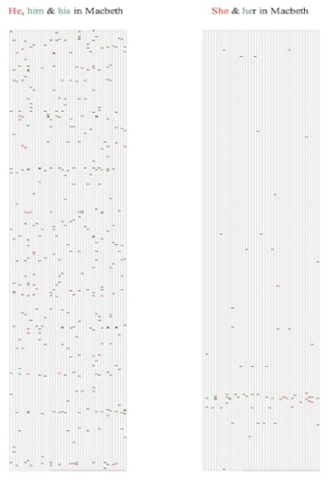
Search Visualiser lets you see thematic structures within a text, such as where and how often women are mentioned as opposed to men, or where hesitation words on an aircraft flight recorder are an indication of a problem arising.
This article uses Search Visualiser to look at gendered language in Shakespeare. The image below shows the results for distribution of gender pronouns in Macbeth.
This article looks at hesitation words on black box recorders.
Discourse analysis involves looking at the dynamic aspects of two or more people verbally interacting (whether in a conversation, or a group meeting, or in an email exchange, or in some other medium). This approach can give useful insights into e.g. power structures among the people involved, such as who interrupts whom, and who is able to change the subject being discussed.
Maps, graphs and trees is the title of a fascinating book by Moretti. This brings together a variety of ways of analysing texts, such as showing the spatial distribution of the places mentioned within a novel, or the number of books published within a particular genre over time.
Statistical approaches, including lexicostatistics are useful for fine-grained analysis, and for answering questions such as who might be the author of a particular anonymous work. As with the analysis of black box recordings mentioned above, it’s often the small, insignificant-looking words such as prepositions that give surprisingly powerful insights. For example, in the Iliad, the word “forty” clusters in one section of the story, known as the Catalogue of Ships, which has long been suspected of being a much earlier story fragment that was incorporated into the Iliad; it occurs in a formulaic phrasing. In the Odyssey, in contrast, the word “forty” occurs just once, with no indication of any deep significance. The image on the left below shows where mentions of “forty”occur in the Iliad, in a tight cluster near the start; the image on the right below shows the enlarged detail of the distributions.
Story grammars are powerful formalisms for analysing the plot structures of stories, including books and film scripts. The classic early work was done by Vladimir Propp; his approach is still highly relevant today. This approach involves stripping away the surface features, such as the characters’ names, and focusing on the deep structure underneath.
Closing thoughts
Content analysis is about categorisation and representation. Categorisations and representations have power; not only do they show where balances and imbalances occur, but they can also provide new ways of thinking about a topic (as in our recent articles about treating concepts as separate axes rather than opposites). In addition, they can be invaluable for spotting significant absences.
With the appropriate choice of categorisation and representation, content analysis has a lot to offer. I hope you’ve found this article useful.
Notes and links
You’re welcome to use Hyde & Rugg copyleft images for any non-commercial purpose, including lectures, provided that you state that they’re copyleft Hyde & Rugg.
There’s more about content analysis in my book with Marian Petre on research methods:
Rugg & Petre, A Gentle Guide to Research Methods:
http://www.amazon.com/A-Gentle-Guide-Research-Methods/dp/0335219276
There’s more about the theory behind this article in my book Blind Spot, by Gordon Rugg with Joseph D’Agnese.
http://www.amazon.co.uk/Blind-Spot-Gordon-Rugg/dp/0062097903
You might also find our website useful: https://www.hydeandrugg.com/
March 4, 2020
Liking, disliking, and averaging: Why average things are attractive but very attractive things are not average
By Gordon Rugg and Amy Martin
There are regularities in human desire. Often, though, the actual regularities are subtly but profoundly different from the apparent regularities.
In this article, we’ll look at one of these regularities. It starts with a significant insight from an article whose title neatly sums up a key finding, and implicitly raises a key question.
The article is a 1996 paper by Rhodes and Tremewan in Psychological Science. The title is: “Average faces are attractive, but very attractive faces are not average.” The implicit question is: “Why?”
There’s been a lot of work in this area. In this article, we’ll examine how a simple change in the way you represent the data can give powerful new insights into what’s actually going on, and into what you can do about it.
Historical background
In this article, we’ll mainly use faces as the subject matter for perceptions of attractiveness, because of the amount of good work in this area.
The technique of averaging faces by superimposing photographs of different faces has been around for a long time. The first examples date from the 1870s.
It was swiftly noticed that averaged faces are usually perceived as attractive; in fact, they’re often perceived as more attractive than any of the individual faces that went into the average. Similarly, individual faces which are similar to the photographically averaged faces (“average” or “prototypical” as opposed to “averaged” faces) are also typically perceived as attractive.
There has been considerable research into this, broadly dividing into two strands, namely the evolutionary strand, which emphasises symmetry and prototypicality as an honest signal of reproductive fitness, and the cognitive strand, which emphasises the lower cognitive processing load associated with symmetrical and prototypical stimuli. There’s a reasonable overview on Wikipedia.
Representations of attractiveness and unattractiveness
One point which has been repeatedly raised about photographically averaged faces is that the averaging process produces a face which doesn’t have facial blemishes. This explains some of the apparent paradox in the Rhodes and Tremewan title, but doesn’t really address the part about very attractive faces.
The apparent paradox makes more sense if you tackle the question from a different direction, by treating attractiveness and unattractiveness as two separate dimensions, rather than as opposite ends of a single scale.
Here’s a hypothetical example, where the black circles represent faces, the vertical (light green) axis represents attractiveness, and the horizontal (red) axis shows unattractiveness. The circles are loosely clustered around the centre of the plot. One circle towards the top left has been rated as above average in attractiveness, and low in unattractiveness; another, towards the top right, has been rated as fairly high both in attractiveness and unattractiveness.
Suppose that we now remove facial blemishes from the photos, and have them re-rated. The removal of blemishes reduces the bad points of the photos, but doesn’t add any significant new attractive features. This shifts the values to the left (reduced unattractiveness, but no increase in attractiveness).
This is exactly what happens in software interface design when you remove the bugs from an early design; the “dislike” ratings decrease, but you need to add something new to make the “like” ratings increase. Removing bad features isn’t the same as adding good features.
In the context of product design, you can add good features by using input from the previous evaluation sessions, or by using idea generation methods. You aim for an end point like the one below, where the ratings are all high on liking and low on disliking.
This raises some interesting questions about whether attractiveness is in some way different from the average. We’ll return to these questions near the end of this article.
High attractiveness
So what makes something very attractive? We argue that there are two important issues. One involves perceived threat; the other involves novelty. In brief, non-threatening novelty is good; threat is bad; non-novelty is bad. However, deciding whether or not something is threatening can be difficult, and this issue has its own role in attractiveness.
Threat, and the uncanny valley
One key issue is whether something is perceived as potentially threatening or not. As soon as a real threat is involved, there’s a separate dynamic, and attractiveness ceases to be a significant issue.
The word “perceived” is important. An obvious issue is that what would be threatening to one person would not be threatening to another. Less obviously, uncertainty about whether or not there is a real threat has far-reaching regularities in terms of human behaviour.
The phenomenon of the uncanny valley is widely known. It occurs when something or someone is neither clearly human nor clearly non-human. Many classic monsters are of this type, and not just because they’re easy to handle in special effects; werewolves and vampires were in the uncanny valley long before films began. Similarly, there’s a well-recognised risk that attempting to improve an image of a face by filtering out the blemishes may backfire by turning the image into something doll-like in the uncanny valley.
The literature on the uncanny valley tends to assume that this effect only applies to uncertainty about whether or not something is human. Gordon has previously argued here and here that the uncanny valley is just one example of a broader phenomenon, involving uncertainty about potential threat.
In brief, a situation can unfold in four main ways, in terms of threat. If it begins looking harmless, and then flips to being scary, that produces horror. Conversely, if it begins looking scary, and then flips to being harmless, that produces humour.
This model has the advantage of bringing together humour and horror into a single framework. It also makes sense of phenomena such as trompe-l’oeil images, which begin by looking like one type of harmless image, and then flip into a different harmless image. We’ll return to this issue later, in regard to novelty.
Reducing perceived threat
There are various ways of reducing threat, with regard to perceived human attractiveness.
One route which has received a lot of attention is infantilisation of women; a related route is impractical clothing and footwear for women. An underlying assumption here is that males are threatening. A related issue is that many people use a rigid binary categorisation into male and female, and feel threatened when that categorisation is challenged by e.g. clothing that doesn’t fit neatly into the two categories of “male clothing” and “female clothing”. This is a fascinating topic, but would take us outside the scope of this article.
Another variable which affects perceived threat and perceived attractiveness involves features which are associated with group membership. In the everyday world, this can involve choice of hairstyle, cosmetics, etc, but can also involve features which are more difficult to modify, such as hair colour, eye colour and skin colour.
Researchers into facial attractiveness usually eliminate this variable as far as possible by using photos of faces without cosmetics, jewellery, visible hair, etc, and by using photos which standardise as far as possible for skin colour, eye colour, etc. However, it’s not possible to eliminate completely all the potential signals of group membership which might affect perceptions of attractiveness. We’ll return to group membership later in this article.
So, potential threat is an issue in attractiveness; in the next section we’ll look at how this interacts with the issue of novelty.
Novelty and desire
It’s trivially obvious that people enjoy non-threatening novelty. It’s less obvious how much novelty someone will want, or when they will want it, and what form it should take. In the next sections, we’ll look at ways of answering these and other questions about novelty.
Novelty, and sensory diet
There are various ways of measuring novelty. They usually involve treating novelty as the inverse of frequency. For instance, if you’ve heard ten thousand tunes which feature guitars, and only ten tunes which feature mandolins, then the novelty value of a new tune featuring mandolins will be a thousand times higher than the novelty value of a new tune featuring guitars.
One tempting conclusion to draw is that people each have their own preferred “sweet spot” for novelty. The reality is almost certainly more complicated. If you investigate how people use music, for example, there’s a strong tendency to use different types of music for different purposes, such as low-novelty music as “wallpaper” when concentrating on a difficult task, and high-novelty music as a “foreground” when listening to music for pleasure.
If you look at novelty across different sensory channels, you also get a strong impression that people’s preferences for novelty make more sense across an extended timescale of days or weeks or longer. What seems to be going on involves periods of moderate novelty interspersed with episodes of higher novelty. There appears to be a similar pattern for arousal levels.
Gordon has previously blogged here about how this can be viewed in terms of sensory diet and sensory self-regulation. The figure below shows a hypothetical plot for one sense across time, with ten time points, varying around a central average.
A hypothetical sensory diet, showing sensory load versus time for one sense
This raises obvious questions about which senses are involved. Human beings have significantly more than the five traditionally recognised senses (sight, hearing, taste, smell and touch). They also have senses such as proprioception, which tells you where each part of your body is even when you can’t see it. Depending on the definition you use, there are somewhere between a dozen and twenty senses (for instance, there seem to be different sensory pathways involved in light touch and in firm touch).
When you start looking at the full sensory package in terms of sensory diet, you start to see the sport/recreation/entertainment industry in a very different way.
Also, interestingly, you start to see relationships to social issues that are usually viewed as belonging to completely different categories. For instance, if you use the same framework of full sensory package and sensory diet, you start perceiving antisocial and marginalised activities in a very different light. You start asking questions about the role of sensory self-regulation in joyriding or drug use or graffiti, and whether this framework might provide a constructive way of tackling these issues. It’s a fascinating topic, but it goes beyond the scope of this article, so we won’t explore it further here.
Information content and novelty; the beauty 2 SDs from the mean
There’s been a fair amount of research into the mathematical regularities that underly perceptions of beauty. An excellent paper by Ramachandran & Hirstein outlined a radically new model of art based on this approach. Unsurprisingly, it was not exactly welcomed with open arms by the established art community, but its content has stood up well to the test of time.
One particularly robust regularity is the mathematical location of aesthetic sweet spots. A simple example in lay language is that being tall or petite is generally perceived as attractive, but being very tall or very petite is not.
More rigorously stated, the sweet spot typically occurs about 1.5 to 2 standard deviations from the mean. Below this point, things are perceived as ordinary; above it, they’re perceived as freakish.
Our phrasing about “generally and “typically” reflects the way that individuals vary in their preferences; the figure of 1.5 to 2 standard deviations is a typical figure, not an invariant law. Gordon has previously blogged here and here about situations where this tendency can be over-ridden by other factors, such as competitiveness for most extreme values. On the whole, though, it’s a solid principle, which hasn’t received the attention that it deserves.
Non-threatening puzzle solving and parsing
Returning briefly to non-threatening puzzle solving, passtimes such as crosswords and Sudoku make sense as a source of non-threatening novelty.
They also make sense in terms of a concept from the humour literature, which is the sense of pleasant relief when an ambiguous situation is disambiguated in a non-threatening way. This is a standard part of the cognitive model of humour. It probably also applies in a milder form to puzzles where there are multiple candidate solutions, and where the solution identifies the correct solution.
Some situations are non-threatening, but don’t have single unambiguous solutions. Gordon has blogged here about non-threatening Necker shifts in design, such as trompe-l’oeil designs, and here about how some types of abstract art can be viewed as part of the same phenomenon.
In summary, then:
Threat and novelty are two important variables in human desire
Novelty can be measured in various ways, giving more rigorous insights into the underlying regularities in human desire.
Conclusion and implications
Beauty, ugliness, and Cara Delevingne’s eyebrows
An approach that we often use is to take a pair of concepts that are usually viewed as opposite ends of a single scale, and then see what happens if we treat them as two separate scales.
If we do this with attractiveness and ugliness, the result makes sense of already existing concepts in aesthetics. The figure below shows how existing concepts fit onto this space.
The concept of “belle laide” (also known as “jolie laide”) in the top right corner involves someone being unconventionally attractive. A striking example is Cara Delevingne’s much-admired eyebrows, which were very different from the previously prevalent view that female eyebrows should be slim. There’s an excellent example of her eyebrows in action here.
The beautiful people, the ugly people, and the others
The issue of distance from the mean raises some interesting questions about group identity and beautiful people. People who are very far from the mean are typically perceived as freakish and/or in the uncanny valley. What, though, about people in the sweet spot of about 2 standard deviations from the mean? Are they perceived as belonging to a group of beautiful people different from ordinary people?
The short answer is that we don’t know. It’s plausible, and there’s anecdotal evidence that supports this idea, but we don’t know.
So, in summary:
The finding that average faces are attractive, but very attractive faces are not average, is not a paradox if you treat attractiveness and ugliness as two separate dimensions.
Removing blemishes will make a face less unattractive.
A very attractive face is likely to be about two standard deviations from the mean in some key variable.
What is true of facial attractiveness is also true of many other areas of human desire. Many, but not all…
We’ll explore related concepts in later articles.
Notes and links
Original article reference:
Rhodes, G., & Tremewan, T. (1996). Average faces are attractive, but very attractive faces are not average. Psychological Science, 7, 105-110.
Previous articles on this blog about the mathematics of desire
https://hydeandrugg.wordpress.com/2014/08/28/the-mathematics-of-desire/
You’re welcome to use Hyde & Rugg copyleft images for any non-commercial purpose, including lectures, provided that you state that they’re copyleft Hyde & Rugg.
There’s more about the theory behind this article in my book Blind Spot, by Gordon Rugg with Joseph D’Agnese:
http://www.amazon.co.uk/Blind-Spot-Gordon-Rugg/dp/0062097903
You might also find our website useful:
Related articles:
Overviews of the articles on this blog:
https://hydeandrugg.wordpress.com/2015/01/12/the-knowledge-modelling-book/
https://hydeandrugg.wordpress.com/2015/07/24/200-posts-and-counting/
https://hydeandrugg.wordpress.com/2014/09/19/150-posts-and-counting/
February 17, 2020
Academic writing versus magazine writing
By Gordon Rugg
Academic writing is very different from most other types of writing. There are sensible reasons for this.
Unfortunately, not many students have been taught about those reasons. The result, predictably and understandably, is that most students, and most members of the general public, think that academic writing is dull and heavy because academics either don’t know how to write in an interesting, accessible way, or because they don’t care.
So, why is academic writing deliberately dull and heavy, and what are the implications, and how can you use academic writing style to your advantage? That’s what this article is about.
First, the reasons for academic writing being the way it is. I’ve written about this in some detail here and here.
The short version is that academia has had its fingers badly burnt by charlatans, crooks, well-meaning but hopelessly wrong researchers, and by shameless self-publicists. Most of those people were very good at writing extremely interesting, persuasive, colourful, engaging prose. All of them set back honest research by years or decades, because they persuaded a lot of people to waste time trying approaches that were hopelessly flawed from the outset.
Researchers want to find out what the truth is, and they don’t want to waste time digging through layers of juicy half-truths in exciting articles intended more to entertain than to inform. As a result, academic writing style deliberately takes a form that makes it very hard for anyone to mislead the writer by colourful, persuasive writing. This usually makes academic writing look dull and fact-heavy to outsiders, but that’s a price worth paying. If you’re trying to solve a problem like finding a cure for a currently-incurable disease, you want to get to the facts in an article swiftly and efficiently, without wasting time reading colourful misleading claims.
So, academic writing aims to be brutally functional and efficient, as a way of getting a job done. In that respect, it’s like legal writing, or technical writing, for the same reasons. The detailed forms that academic writing takes are slightly different across disciplines; the humanities don’t use exactly the same style as the sciences, for example. However, core features, such as the way they use referencing and the way they use technical terms, are pretty much the same wherever you are.
That’s the background. What about the actual features of academic writing?
I’ve listed some key features below, with explanations for why they are the way they are, and with a contrasting description of what general-readership magazines do instead.
I’ve then listed some key features of general-readership magazine writing, in a similar format. That table isn’t quite the mirror image of the previous one, since magazines have various features that academic writing doesn’t have.
What academic writing does, and why
Magazines, in contrast
Written almost entirely in third person passive (“It was observed that…”) so the reader can maintain emotional distance and assess what’s being said more impartially
Written almost entirely in first, second or third person active (“I saw…” or “you saw…” or “he/she/they saw…”)
Deliberately avoids colourful, exciting language, so the reader can focus on the facts and the argument
Uses colourful, exciting language, to entertain the reader
Deliberately avoids slang and references to current fashions, so that the article can be easily understood by readers from other countries, and by readers years in the future
Uses slang and references to current fashions, to make the article relate to the target readers right now
Uses a lot of journal article references, as reasonably trustworthy peer-reviewed sources of information
Uses no, or very few, journal article references (the usual exception is when they are writing about a recent scientific discovery, and they cite the relevant article)
Uses a lot of conference article references, as reasonably trustworthy peer-reviewed sources of information
Uses no, or very few, conference article references (the usual exception is when they are writing about a recent scientific discovery, and they cite the relevant article)
Usually has an explicit structure that is standard within its field (e.g. Abstract, Introduction, Method, Results, Discussion, Conclusion and Further Work, References, Appendices)
Usually does not have an explicit standard structure
Attempts to survey previous work on the topic across time, from the earliest work to the present, so that the reader knows what has been tried before
Gives little or no account of previous work; usually, just a few colourful past examples
Attempts to survey previous work on the topic across schools of thought, covering the main ideas about the topic, even when the author disagrees with them, so that the reader knows what the contender ideas are
Gives little or no account of other schools of thought; the usual exceptions involve portraying two schools of thought as adversaries, e.g. the “maverick genius versus the establishment” trope
Attempts to analyse the evidence fairly and impartially, to eliminate ideas that don’t fit with the evidence
Usually advocates one viewpoint, and presents mainly evidence supporting that viewpoint
That’s academic writing. There are plenty of other features that you’ll find in guidelines online and in textbooks; if you’re lucky, there will be explanations for them. Some of those features are applicable in a broad range of settings; others are much more specific, such as the use of the abbreviation “c.f.” to send out a shorthand signal to the reader about how to treat the reference that will follow it.
Magazine writing also has features that writers use deliberately, though for very different reasons. The list below contains widely used features of magazine writing for a general readership; specialist magazines are often in a style much more like academic writing. Again, you’ll find plenty of other features online and in books.
What magazine writing does, and why
Academic writing, in contrast
Written almost entirely in first, second or third person active (“I saw…” or “you saw…” or “he/she/they saw…”) to engage the reader
Written almost entirely in the third person passive, to help the reader assess the evidence impartially
Uses colourful, exciting language, to entertain the reader
Uses deliberately unexciting language, to help the reader assess the evidence impartially
Uses slang and references to current fashions, to make the article relate to the target readers right now
Avoids slang and references to current fashions, so the article can be understood by readers from other cultures, and in the future
Uses easily accessible sources such as Wikipedia and websites so readers can easily follow up points from the article
Deliberately doesn’t use sources such as Wikipedia and websites, since these don’t usually have quality control; Wikipedia’s content is written for a general audience, so it’s often simplified, and it is also prone to hacks in its entries
Typically uses a striking, vivid opening story to grab the reader’s attention
Deliberately doesn’t use striking, vivid stories, to help the reader assess the evidence impartially
Gives vivid everyday examples to illustrate and explain key points in simple language
May use everyday examples to illustrate key points, but with deliberately impersonal language; will usually explain key points using technical terms, for accuracy and precision
Often has well-established underlying structures such as key message, juicy example, factoid/statistic, but seldom uses these as explicit section headings
Has well-established standard structures for articles, that are used explicitly
Uses deliberate hooks to get the reader’s attention, such as eye-catching titles and opening sentences (clickbait is when this goes too far)
Uses hooks, but with deliberately understated language (e.g. “A long-standing problem in computing is…”)
Aims to entertain and inform
Aims to inform
Is often about advocacy, trying to persuade or encourage people towards a particular position
Is about finding out the truth, by working impartially through the evidence
So, in summary, academic writing deliberately uses an unemotional style as part of its focus on handling the facts swiftly and precisely and efficiently; magazine writing deliberately uses an exciting, emotional style because it wants to sell stories, and to entertain and persuade the reader. Very different styles, for very different purposes.
This doesn’t mean that academic language has to be unclear. On the contrary, academic writing tries (though with varying degrees of success, depending on the skill of the writer) to be clear and accurate and precise.
I’ve blogged here about how you can combine clear, accessible language with heavy use of facts and references, by having a topic sentence in each paragraph that gives the key point of that paragraph in clear, simple words; the rest of the paragraph then unpacks that key point with facts, technical terms and references, that the reader can then go through in more detail if they wish.
There’s more about academic writing elsewhere on this blog, and also a variety of articles about how to make sense and make use of the previous literature on the topic you’re grappling with. You might find these articles useful as a starting point:
Academic writing:
Different writing styles for different purposes
Useful writing tips for stressed students
The underlying structure of scientific writing
The three golden rules of scientific writing
Humour: Getting that “special” paper published
Making sense and making use of the literature
Finding the right references, part 1
Finding the right references, part 2
Finding the right references, part 3
Making the most of bad references
The purpose of literature reviews
A quick and dirty approach to reviewing the literature
Using review articles to get an overview of the literature
Doing meta-analysis, and Systematic Literature Reviews
I hope you find this article useful.
Notes, references and links
You’re welcome to use Hyde & Rugg copyleft images for any non-commercial purpose, including lectures, provided that you state that they’re copyleft Hyde & Rugg.
There’s more about the theory behind this article in my book Blind Spot, by Gordon Rugg with Joseph D’Agnese.
http://www.amazon.co.uk/Blind-Spot-Gordon-Rugg/dp/0062097903
You might also find our website useful: http://www.hydeandrugg.com/
February 7, 2020
Poster design 101
By Gordon Rugg
Every year, students in assorted non-artistic disciplines have to produce a poster. Every year, students who don’t view themselves as artistic complain bitterly about having to do this.
In this article, I’ll look at some of the issues involved in practical poster design at taught degree level, and at how they can be tackled systematically, without needing any artistic skills. The results aren’t likely to win any design prizes, but they should look competent enough to be presentable, and should save non-artistic students from a lot of grief.
In case you’re wondering why I’ve specified taught degrees, the answer is that in research degrees, students often have to produce posters for conferences. The guidelines for these are very different from those for taught course posters, and from publicity posters in the commercial world. This article is just about taught degree posters, and even for those, it comes with the disclaimer that your department may have very different ideas about how to do things, in which case, go with what they want, since they’ll be doing the marking…
I’ll also look at some broader issues in user-centred design, such as the concept of functional distance, which takes us into the origins of the classic command: “Don’t shoot until you see the whites of their eyes”.
Part 1: Distances
Distances, like most things, can be divided into categories, with different categories being used for different purposes in different disciplines. You can do different things at different distances, hence the concept of “functional” distance.
From the viewpoint of infantry soldiers, the categories of distance include “out of range” and “a long shot” and so on. How can you tell which category you’re dealing with, so you can adjust your rifle sights accordingly? Rough rules of thumb include “when you can see individual soldiers” and “when you can see individual faces”. The legendary “you can see the whites of their eyes” was a close functional distance, roughly equivalent to pistol range.
In more peaceful contexts involving information, such as poster design or signage for buildings, there are three particularly useful functional distances.
Extreme functional distance
The first distance is the point where someone first sees your poster, or sign, or whatever, and can only see it as a whole, not the component parts within it.
Whatever you’re designing, your design needs to handle a worst case. In the case of a poster, the worst case is someone seeing your poster from the far side of the room. In the case of a building or a sign, the worst case is someone seeing it from the far side of the site. What can you show them at that distance which might encourage them to come closer?
At extreme distances, the viewer will typically won’t be able to read any words, so they’ll have to rely on pattern matching, which involves colours, shapes, etc. There are various ways in which you can work with this.
The simplest one is to use a distinctive colour; for instance, having a striking red poster. This can work well if you’re the only person using a red poster. However, if anyone else has made the same decision, then you immediately lose your distinctiveness. Similarly, if you’re doing signage, you’ll be constrained by the conventions of your signage system, which will probably use different colours systematically for different purposes.
A more robust solution is to use shape; for example, by having a distinctive picture as a prominent part of your poster, as in the schematised poster on the left below. This also lets you show the viewer what your poster is about.
One drawback of this obvious solution is that you’re using a lot of space just for an illustration. Sometimes this doesn’t matter; for example, if you’re designing a poster with a brief of not overwhelming the reader with too much text. Other times, though, you’re trying to fit as much content as possible into a limited space, so you need to do something subtler.
A subtler solution is to use the picture as a background for the entire poster, and to make it nearly transparent, as in the image on the right below. This means that the image is visible as a whole from a distance, but then fuzzes gently out when the viewer is close up, so it doesn’t distract from the text, or cause legibility problems.
An equivalent pattern-matching solution for nonverbal signage would be deliberate creation of unique landmarks that are visible from key points on the site.
Intermediate functional distance
At this distance, the viewer can both read some text (e.g. section headers) and do pattern matching on components (e.g. on medium sized illustrations within the poster). You need to think about what sort of text will encourage viewers to come closer. This doesn’t mean turning all your headers into click bait; just one or two tempting titles should do the trick (for example, “Glazed memories” in the image below). Similarly, you should think about what signals your illustrations are sending, both individually and as a set of images.
Closest functional distance
At this distance, the viewer is close enough to read small print on the poster (about 10 point) and to read graphs etc in detail. Because posters are large, the viewer will have trouble keeping track of the overall structure of what you’re saying, and may physically step back to remind themselves of that structure.
This leads us on to the next part of this article, which is about structure.
Part 2: Structure, content and space
A key point to remember about the content of your poster is that every discipline has its own idea of what a good poster should contain. In some disciplines, posters are expected to be information-rich to an extreme, with huge amounts of highly technical text, and complex graphs. In other disciplines, persuasive phrasing and elegant artwork are preferred. If you’re unsure of the conventions in your discipline, it’s a good idea to find them out.
If you’re in a fairly rigorous discipline, you might find the following principle useful for planning the structure and content of your poster:
Each topic has its own space; each topic has its own sub-space.
What does this mean? It means that if you’re going to have eight sections (e.g. Introduction, Literature Review, Method, etc) then you give each section its own space in the poster. Each sub-section gets its own sub-space, as in the image on the left below. For clarity, I’ve just shown the Introduction, which contains three subsections.
It’s a good idea to include somewhere within the poster an example of work that you’ve produced, with arrows and notes to explain key features of the work to the viewer; this reassures cynical viewers that you’ve actually done something. The image on the right below shows schematically how this works, with each arrow leading to explanatory text.
This may not be great art, but it lets you fit everything neatly into a space where it belongs sensibly, and it makes life easier for the viewer, in terms of making sense of what you’ve written.
So, that’s practical poster design 101: Three functional distances; giving each topic its own space on the poster, and each sub-topic its own sub-space; and finding out what the conventions are in your field about level of detail etc. That should be enough to get you started.
The same underlying concepts are useful in other contexts. Functional distance in particular is very useful, but isn’t as widely known as it should be.
If you’re interested in nonverbal signage and related topics, you might find this article useful for external signage, and this one useful for signage within a building.
Notes, references and links
You’re welcome to use Hyde & Rugg copyleft images for any non-commercial purpose, including lectures, provided that you state that they’re copyleft Hyde & Rugg.
There’s more about the theory behind this article in my latest book: Blind Spot, by Gordon Rugg with Joseph D’Agnese
http://www.amazon.co.uk/Blind-Spot-Gordon-Rugg/dp/0062097903
You might also find our website useful: http://www.hydeandrugg.com/
December 7, 2019
Modeling misunderstandings
By Gordon Rugg
Many problems in life are caused by misunderstandings. Misunderstandings take various forms. These forms themselves are, ironically, often misunderstood.
In this article, I’ll look at ways of representing misunderstandings visually, to clarify what is going wrong, and how to fix it.
I’ll use a positive/negative plot to show the different forms of misunderstanding. This lets you locate a given statement in terms of how positive it is, and how negative it is, as in the image below. This format is particularly useful for representing mixed messages, which are an important feature of many misunderstandings. There’s more about versions of this format here and here.
I’ll start with a statement which is moderately positive in some ways, and moderately negative in others. It’s shown in the middle of the plot as a white circle, numbered 1, to show that it’s the first statement. For example, this might represent someone starting to give feedback about a piece of work that has both good points and bad points.
I’m deliberately not showing a particular wording for the statement, to avoid raising questions about whether everyone would agree with that statement really being moderately positive and negative; I’ll discuss the issue of different possible interpretations later in this article.
How can the other person respond to this opening? There are nine main forms of response; eight involve movement, and one involves staying at the same place. These are shown in the diagram below, with arrows for the eight directions.
For example, the other person might react with a statement that is more positive and less negative (moving toward the top left) to send constructive friendly signals, such as expressing gratefulness for the feedback.
Conversely, they might react with a statement that is less positive, and more negative (moving toward the bottom right) in an angry response. In the example below, the second person has gone in this direction, shown by a circle coloured green to show that this is the second person, and numbered 2 to show that this is the second statement in the sequence.
The first person can now respond, either with movement in any of the eight directions, or by staying in the same place as the second statement. For example, in reaction to the second person’s angry negative response, the first person might try to move the conversation back in a positive direction toward the top left, or they might react in an angry negative way that moves further toward the bottom right.
The image below shows some common patterns. The first pattern shows both people moving in an increasingly constructive positive direction. The second shows the second person reacting negatively, followed by the first person sending out a strongly mixed signal, in effect offering a carrot and a stick. The third shows both people moving in an increasingly negative direction; a classic angry escalation.
This format lets us see how interactions can move in different directions. It ties in neatly with concepts such as feedback loops from systems theory and game theory, where a particular action may be amplified or deadened by features of a system (e.g. escalation or de-escalation in politics).
This format also makes it easy to show various forms of misunderstanding.
One classic form of misunderstanding involves ambiguity and polysemy. (I’m using the pair of definitions in which ambiguity involves two separate different interpretations, and polysemy involves more than two; some fields define these terms differently.) These concepts are different from vagueness, which I’ll discuss after ambiguity and polysemy.
A famous example of ambiguity attributed to various wits is: “Thank you for your book; I’ll waste no time reading it”. This has two possible meanings, both of which are clear, but which send completely different signals. One meaning is: “I shall read your book as soon as possible” (implying that reading it is something to anticipate with pleasure). The other meaning is: “Reading your book would be a waste of time”.
We can show these two meanings as two positions in the diagram below. The initial gift of the book is statement 1; the two different intepretations of the response are shown with question marks in the two green circles, to represent the uncertainty about which meaning was actually intended. For polysemy, we would use several such positions, one for each of the possible meanings.
Each of the two meanings above is represented by a single small circle in the diagram, implying that there’s not much doubt about the nature of the signal being sent within each meaning. The positive possible intepretation is clearly positive; the negative one is clearly negative. The key question is about which interpretation is the correct one.
What happens if there’s significant uncertainty about just what a given signal is? This is what vagueness is about. We can show the degree of uncertainty about it via features of the representation, such as the size or shape or colouring of the symbol for the signal.
The image above uses shading to give nuance, and shows possible interpretations on a range from most likely interpretation(darkest) to least likely (lightest). The range of possible interpretations for signal 2 is much broader, and therefore more vague, than for signal 1. Signal 2 is definitely sending out a more positive than signal 1, but how much of a negative signal it’s simultaneously sending out is much less definite.
The key difference between vagueness and ambiguity is brought out by the two images above. With vagueness, you know that the intended meaning is somewhere within a single broad area. With ambiguity, the intended meaning is within one of two separate areas.
In real life situations, ambiguity is usually more dangerous than vagueness, in terms of potential misunderstandings, because ambiguity is very easy to miss; you see an interpretation that makes sense, and immediately proceed in terms of that interpretation, without noticing that there was also a completely different interpretation that also makes sense, but in a very different way. With vagueness, you usually know that a statement is vague, so you’re aware from the outset that there’s the potential for misunderstandings.
Conversely, in some real world situations, vagueness can be a good thing; for example, by offering the other party space for a face-saving way to de-escalate a situation.
Implications
This representation makes it easier to see patterns in communication, and to identify where different people are interpreting the same signal in different ways. This can be invaluable for good faith attempts to sort out misunderstandings, where the parties involved turn out to have very different interpretations of the same signal. For example, the phrase “quite good” can be interpreted as damning with faint praise (the bottom left quadrant of the plot) or as flattering understatement (the top left quadrant of the plot).
This ties in with concepts such as shock and humour, where the nature of a misunderstanding can be modeled in terms of Necker shifts; the greater the distance between the two possible intepretations, the more horrifying or funny the outcome is.
This representation is also useful for teaching communication. For example, it can be used in assertiveness training to help people learn phrasings that will let them move a conversation more efficiently in the direction that they want (e.g. sending out a signal that is positive, but not too positive). It can also be used to teach patterns of interaction, such as how to de-escalate a situation.
This approach can also be extended to model multiple layers of communication; for example, showing what each participant thinks that the other participant really means, in conversations where neither party believes that the other is acting in good faith.
So, in summary, this visualisation is simple, but can give powerful insights into communication.
Notes, references and links
You’re welcome to use Hyde & Rugg copyleft images for any non-commercial purpose, including lectures, provided that you state that they’re copyleft Hyde & Rugg.
There’s more about the theory behind this article in my latest book: Blind Spot, by Gordon Rugg with Joseph D’Agnese
http://www.amazon.co.uk/Blind-Spot-Gordon-Rugg/dp/0062097903
You might also find our website useful: http://www.hydeandrugg.com/
September 22, 2019
Premature closure and authoritarian worldviews
By Gordon Rugg
In a previous article, I looked at the belief structures of the archetypal “crazy uncle” worldview. It’s a worldview with a strong tendency towards whichever option requires the minimum short-term cognitive load; for example, binary yes/no categorisations rather than greyscales or multiple categories.
One theme I didn’t explore in that article, for reasons of space, was premature closure. This article picks up that theme.
Premature closure is closely related to pre-emptive categorisation, which I’ll also discuss in this article. Both these concepts have significant implications, and both involve minimising short-term cognitive load, usually leading to problems further down the road. Both tend to be strongly associated with the authoritarian worldview, for reasons that I’ll unpack later.
So, what is premature closure? In brief, it’s when you make a decision too early, closing down prematurely the process of search and evaluation and decision-making. This takes various forms; knowing these forms improves your chances of stopping at the right point. For clarity, I’ll use examples within the context of common “crazy uncle” arguments.
One common form involves a binary, yes/no decision based on whether there is any evidence supporting your pet belief, as shown below. The usual format is to present this as proving that the pet belief is right. In the examples below, I’ve shown unsound reasoning in italic, and more solid reasoning in bold.
What happens when someone produces evidence against your pet belief? A common “crazy uncle” response is to claim that this shows there’s equal evidence on both sides, therefore it’s just a matter of opinion, and therefore their opinion is just as valid as the other person’s.
So far, we’ve been looking at binary options; whether there’s evidence for your opinion (yes/no) and whether there’s evidence against your opinion (also yes/no). What happens when there’s clearly more than one piece of evidence?
One common form of dodgy argument is to treat all the pieces of evidence as having the same weight. This is a key feature of formal debates, where tactics such as the Gish gallop involve playing on the debate scoring system by making large numbers of claims that the other side won’t be able to refute within the time available. It’s also a common tactic in online debates, where a commenter puts up lengthy posts with huge numbers of anecdotal claims and factoids, then claims victory because their opponents haven’t refuted all of those claims and factoids.
This problem can be reduced by using some form of weighting for evidence, and acknowledging that some evidence is much more weighty than other evidence. In the case of continental drift, for example, there were many pieces of evidence suggesting that Africa and the Americas had once been joined, but there was a single, massive, show-stopping counter-argument; nobody could work out how vast continents of solid rock could move thousands of miles.
However, weighting the evidence doesn’t guarantee sound conclusions. For many problems, a lot of the necessary evidence hasn’t been gathered yet. A common bad faith tactic is to present only the weight of existing evidence, framed as if it is the whole story, and ignoring the issue of whether more evidence needs to be gathered. Fixing this problem takes you into questions of research design; there isn’t an easy answer. Still, even if you can’t guarantee getting a right answer, you can reduce your chances of getting a wrong answer, which is a good start.
Satisficing and optimising
The issue of premature closure overlaps with other issues. One involves decision-making via satisficing versus decision-making via optimising. Satisficing is about making a good-enough choice; optimising is about making the best choice possible. For example, if you need a pencil to write down a phone number, any pencil will do; however, if you need a pencil because you’re a professional artist about to do a commissioned drawing, then choosing the right pencil for the job is important.
When you’re satisficing, the sensible tactic is to stop searching as soon as you’ve found a solution that’s good enough; any further searching would just be a waste of time and effort. When you’re optimising, in contrast, you need to factor in the prospects of finding a significantly better solution, versus the cost of the search, which takes you into some heavy issues of statistics and of decision theory.
Pre-emptive categorisation
Pre-emptive categorisation is related to premature closure, but isn’t identical. It involves assigning someone or something to a category and then stopping at that point, without considering whether they might also belong to other categories, as shown below.
This is an issue in everyday life for anyone who belongs to more than one minority; for instance, being left handed and belonging to an ethnic minority. Many systems implicitly assume that people only belong to one category, and don’t consider what happens when categories overlap, or when someone might belong to more than one category.
This issue is well recognised in politics and sociology, via concepts such as intersectionality, but it also occurs in a wide range of other settings, as a by-product of limitations in human cognition. For instance, pre-emptive categorisation can occur with regard to attributes of products or services or of objects in the natural world.
There are ways of reducing this risk; for example, by using a visual representation that explicitly includes all the relevant identified categories, as shown below. A further refinement is to include in this representation at least one blank “other” category, to nudge users towards checking whether there is anything else that needs to be considered in the context where they’re working. The reason for having more than one “other” box is to reduce the risk of premature closure in searching for “other” categories.
In this example, the first two standard categories apply, but the third standard category doesn’t; searching for “other” categories has produced one such category, but the search did not find any others; this is a significant absence, as opposed to a simple absence.
This leads in to the concluding topic for this article.
Rethinking the “authoritarian worldview“
There’s been a lot of excellent research in the “authoritarian personality” tradition, as regards what that cluster of beliefs consists of. However, there’s also the question about where those beliefs come from. The usual answers involve cultural transmission, and social dynamics, and memeplexes of ideas that interlink with each other.
All of those are valid points, but as this article and the previous one showed, there’s a strong argument for reframing this issue to separate the sociopolitical issues from the neurocognitive ones. Most of the characteristics associated with the “authoritarian personality” or the “authoritarian worldview” can be simply explained as outcomes of a “minimal short term cognitive load” approach to beliefs and decision making.
This has significant implications. For instance, it implies that the mechanisms described above will apply across human behaviour, not just in politics and religion. It also implies that any attempt to improve the situation needs to factor in these cognitive limiting factors into discussions and explanations.
This is where two concepts are particularly promising.
One is simplicity beyond complexity. Often, there’s a simple obvious answer, but the full story is more complex; however, beyond that complexity, there’s often an elegantly simple explanation that handles the complexity, and that is easy for anyone to understand.
The other concept involves using the appropriate representation to show the simplicity beyond complexity in a way that is clear and easy to understand. We have blogged about various ways of doing this; for example, here and here.
So, pulling all this together:
The “authoritarian worldview” looks like one form of a broader phenomenon, namely the “minimal short term cognitive load” approach to beliefs and decision making.
There are simple and effective ways of reducing errors, misunderstandings and conflict caused by that approach.
That’s a positive note on which to end, so I’ll end here.
Notes and links
You’re welcome to use Hyde & Rugg copyleft images for any non-commercial purpose, including lectures, provided that you state that they’re copyleft Hyde & Rugg.
There’s more about the theory behind this article in my latest book:
Blind Spot, by Gordon Rugg with Joseph D’Agnese
http://www.amazon.co.uk/Blind-Spot-Gordon-Rugg/dp/0062097903
You might also find our website useful:
Overviews of the articles on this blog:
https://hydeandrugg.wordpress.com/2015/01/12/the-knowledge-modelling-book/
https://hydeandrugg.wordpress.com/2015/07/24/200-posts-and-counting/
https://hydeandrugg.wordpress.com/2014/09/19/150-posts-and-counting/
May 12, 2019
User Centred Design and Person Centred Design
By Gordon Rugg
There are often problems when a concept has a name which looks self-evident, but which is actually being used with a specific technical meaning.
This is the case with the terms User Centred Design (UCD) and Person Centred Design (PCD).
So what are these approaches, and why are they so different from other approaches to design, and why do these names lead to confusion?
In brief, User Centred Design and Person Centred Design with uppercase are names for methodologies containing specific methods and concepts. They’re terms of art, used with specific non-obvious meanings, hence the common confusions relating to them. So, what are the reasons for these approaches having arisen, and what is in them?
The vast majority of designers believe that their designs are centred around the person who will use their product (the user, in software design, or the person, in educational or medical design). They therefore make the understandable assumption that their design is a user-centred or person-centred design.
However, there are numerous sensible, but very different, interpretations of who that user/person is, and of how to centre the design around them. (For brevity and clarity, I’ll refer only to users from here on unless there’s a need to distinguish between UCD and PCD).
Examples of user include:
The person buying the product
The person using the product
The person maintaining the product
Examples of how to centre the design around them include:
Cost at point of sale
Lifetime cost of the product before it needs replacing
Reliability
Ease of cleaning
Ease of use
These are common, and perfectly reasonable, key features in design decisions.
They are very different from design features which are important from the viewpoint of the producer, but which may go against the interests of the user/person, such as:
Profitability
Increasing market share
Winning design awards
UCD and PCD
So, designing for the user can be very different from designing for the manufacturer or designing for the company that commissions the design.
Traditional design for the user tended to be either market research driven (People say they want X, and will pay money for it) or product driven (We can produce X, and we’ll market it to people).
If you try to design things based on traditional market research, you run into a batch of issues that feature repeatedly in this blog, because what people tell you that they want is only part of the picture. In brief, the full picture includes:
Do: What people do tell you (traditional market research methods)
Don’t: What they don’t tell you, but would be happy to if they remembered it, or thought it was relevant (where you need methods such as think-aloud and laddering)
Can’t: What they genuinely can’t put into words even if they want to (where you need methods such as observation)
Won’t: What they won’t tell you for various reasons (where you need methods such as projective approaches)
User Centred Design and Person Centred design are very much aware of these issues. They tend to focus on two themes arising from these issues.
One theme which is highly visible is the usability of the product, particularly with regard to ease of learning to use the product, and to ease of routine use. A major driving force for this development was market competition. Companies such as Apple and Google demonstrated very clearly that better usability meant better sales.
A second theme which is prominent within UCD process relates to the “Can’t” issue. Users often can’t say exactly what they want, but can immediately recognise something as exactly what they want once they see it. This relates strongly to the concept of affordances within UCD, where an affordance is something that a product enables you to do. Often, affordances are unexpected, and are discovered rather than planned. However, methods such as upward laddering enable designers to elicit a description of what users want to be able to do; methods such as downward laddering, and idea generation techniques, then help designers to create products that do what the users want.
The description above mainly focuses on products, but exactly the same issues apply to services, which are more salient in the world of healthcare.
UCD and PCD have developed into rich suites of methods and concepts for designing products and services centred around usability and around what users/people want and need, with particular emphasis on identifying and using affordances. These methods and concepts are very different from those used in traditional design.
So, that’s why UCD and PCD have developed the way they have, and that’s why the terms “user centred” and “person centred” can mean very different things to different designers.
Notes and links
There’s a good overview of this topic on Wikipedia.
This page of our website links to a set of articles about the issues involved in eliciting client requirements.
There’s more about the theory behind this article in my latest book: Blind Spot, by Gordon Rugg with Joseph D’Agnese
http://www.amazon.co.uk/Blind-Spot-Gordon-Rugg/dp/0062097903
You might also find our website useful: http://www.hydeandrugg.com/
Gordon Rugg's Blog

- Gordon Rugg's profile
- 12 followers


![[image error]](https://hydeandrugg.files.wordpress.com/2020/05/pointy-sticks.jpg)
![[image error]](https://hydeandrugg.files.wordpress.com/2020/05/unknown-and-known.jpg)
![[image error]](https://hydeandrugg.files.wordpress.com/2020/04/reflection-banner.jpg)
![[image error]](https://hydeandrugg.files.wordpress.com/2020/03/helmets-banner-v2.jpg)
![[image error]](https://hydeandrugg.files.wordpress.com/2020/02/iliad-forty-v2-1.png)
![[image error]](https://hydeandrugg.files.wordpress.com/2020/02/attractive-and-average1-v1.jpg)
![[image error]](https://hydeandrugg.files.wordpress.com/2020/02/attractive-and-average2-v1.jpg)
![[image error]](https://hydeandrugg.files.wordpress.com/2020/02/attractive-and-average3-v1.jpg)
![[image error]](https://hydeandrugg.files.wordpress.com/2020/02/necker-outcomes.png)
![[image error]](https://hydeandrugg.files.wordpress.com/2020/02/control-chart-v1.png)
![[image error]](https://hydeandrugg.files.wordpress.com/2020/02/ugly-beautiful-v3.png)
![[image error]](https://hydeandrugg.files.wordpress.com/2020/02/posters-101-1v1.png)
![[image error]](https://hydeandrugg.files.wordpress.com/2020/02/posters-101-2v1.png)
![[image error]](https://hydeandrugg.files.wordpress.com/2019/12/image1-v1.png)
![[image error]](https://hydeandrugg.files.wordpress.com/2019/12/image2-v1.png)
![[image error]](https://hydeandrugg.files.wordpress.com/2019/12/image3-v1.png)
![[image error]](https://hydeandrugg.files.wordpress.com/2019/12/image5-v1.png)
![[image error]](https://hydeandrugg.files.wordpress.com/2019/12/image4-v1.png)
![[image error]](https://hydeandrugg.files.wordpress.com/2019/12/image6-v2.png)
![[image error]](https://hydeandrugg.files.wordpress.com/2019/09/closure1-v2.png)
![[image error]](https://hydeandrugg.files.wordpress.com/2019/09/closure2-v2.png)
![[image error]](https://hydeandrugg.files.wordpress.com/2019/09/closure-3-v2.png)
![[image error]](https://hydeandrugg.files.wordpress.com/2019/09/closure-4-v2.png)
![[image error]](https://hydeandrugg.files.wordpress.com/2019/09/closure-5-v1.png)
![[image error]](https://hydeandrugg.files.wordpress.com/2019/09/closure-6-v1.png)