
Gordon Rugg's Blog, page 21
February 22, 2014
Is the Voynich Manuscript in an unidentified language? Part 2
By Gordon Rugg
In the first part of this pair of articles, I looked at the general principles that linguists use when trying to identify a previously unknown language.
In this article, I’ll look at what happens when you apply those principles to the Voynich Manuscript.
In brief, it doesn’t end well for the idea that the manuscript is written in an unidentified language. That idea was tried and rejected by the specialists decades ago, for very good reasons. Anyone trying to resurrect the “unidentified language” theory needs to show that they’ve found a convincing set of counter-arguments to those reasons for rejection. So far, nobody’s come close; instead, the recent theories simply ignore the show-stopping problems.
Here are some of those reasons.

(Image courtesy of the Beinecke Library.)
Looking for names
One obvious place to begin is the illustrations. It looks reasonable to assume that if the manuscript is a notebook in an unknown language, then the text on each page will relate to the illustration on that page. It’s also a fairly reasonable-looking assumption that on the pages showing a plant, then the name of that plant will be at the start of the page.
It’s an obvious approach, and it was tried half a century ago by the earliest Voynich Manuscript researchers. They soon abandoned it. Here’s why.
The two images below are close-ups of the first few words of two often-reproduced pages.

(Images courtesy of the Beinecke Library.)
In both cases, the first letter on the page is a tall, distinctive letter, though the letters are different between the two pages. They’re known among Voynich researchers as gallows letters.
If you look at the first words of the pages with pictures of plants on them, then you notice something odd, that Voynich researchers spotted decades ago. In half of the pages with plant illustrations, the first word on the page begins with one or other of those two gallows letters.
This means that either half of the plant names in the manuscript begin with one of just two letters, or that the first word on a plant page often isn’t the name of the plan, or some combination of those two features.
Even if we accept that sometimes a plant page won’t begin with a plant page, there’s still the question of why so many of the first words on those pages begin with one of those two letters. It isn’t because they begin with something equivalent to “The…” in English, because the opening words are different on each page. We’re seeing different words starting each page, but half of those words begin with one of two letters. This is something that recent claims of decipherment fail to mention or explain.
In summary, the “first words are names” idea has some major problems.
Leaves and roots
Another reasonable idea is to assume that pages with pictures of plants will contain descriptions of plants, and of what those plants can be used for. You’d expect those pages to contain descriptions of leaves and flowers and roots and seeds; you’d expect to find the names of illnesses that the plants were supposed to cure. You’d expect to find those words repeatedly on the pages about plants, but nowhere near so frequently on the pages with other pictures, such as pictures of zodiacs or stars.
It’s a reasonable idea, but again, the early Voynich researchers tried it, and again, they abandoned it.
There just wasn’t any pattern of particular words showing up mainly within particular sections of the manuscript, in the way that you’d expect if the plant pages really were about plants, and so forth. Again, this is something that recent claims of decipherment don’t mention, other than as future work, even though it’s been done repeatedly years ago, and come up empty.
Unwelcome patterns
Many of the early Voynich researchers were world-class code breakers, and one of the things they were very good at was finding statistical regularities in texts. That’s a classic way of breaking a code. Within any given language, some letters occur more often than others in written text, so if you know those frequency patterns, you have a good chance of getting through a code.
When those researchers looked at the statistics in the Voynich Manuscript’s text, they soon found some very odd regularities.
We can see some of those regularities in the opening lines we looked at earlier.
(Images courtesy of the Beinecke Library.)
In the upper image, four of the five lines begin with a gallows letter, but none of the following words within the image start with a gallows letter. There’s a similar pattern in the lower image, where none of the second words start with a gallows letter. You might wonder whether the gallows letters were simply the equivalent of capital letters, but then you see that there are a lot of words with a gallows character in the middle.
It soon became clear to the early researchers that within the Voynich Manuscript, the line breaks weren’t just arbitrary points where the writer ran out of space and started a new line. Instead, each line was a separate unit, and there were noticeable regularities in what happened within each line.
For example, some letters are very rare at the start of a line, but very common elsewhere within a line. There are some features of poetry that look superficially like that, such as alliteration in Old English poetry, but those resemblances are only superficial, for reasons that become very clear once you start looking at the detailed facts.
There’s a good description of this in a paper by Currier, reproduced on René Zandbergen’s site. Currier was Director of Research, Naval Security Group, within the US military.
Currier described the significance of this line effect as follows.
“The Line Is a Functional Entity.
“In addition to my findings about ‘‘languages’’ and hands, there are two other points that I’d like to touch on very briefly. Neither of these has, I think, been discussed by anyone else before. The first point is that the line is a functional entity in the manuscript on all those pages where the text is presented linearly. There are three things about the lines that make me believe the line itself is a functional unit. The frequency counts of the beginnings and endings of lines are markedly different from the counts of the same char-acters internally. There are, for instance, some characters that may not occur initially in a line. There are others whose occurrence as the initial syllable of the first ‘‘word’’ of a line is about one hundredth of the expected. This by the way, is based on large samples (the biggest sample is 15,000 ‘‘words’’), so that I consider the sample to be big enough so that these statistics are significant. “
(Currier, 1976/1992, on René Zandbergen’s voynich.nu site)
http://www.voynich.nu/extra/curr_main.html
He went on to say the following:
“These Findings Should be Considered by Anyone Who Studies the Manuscript.
“These findings are definite enough, I think, to warrant much further study by anyone who is going to be involved in seriously attacking the text of the Voynich manuscript. I have no interpretations of them, by the way; I have no solutions. All I know is that they are significant — and damn significant. Anyone who attempts to work on the text without considering these, ignores them at his own peril. “
(Currier, ibid.)
There are a lot of other odd statistical regularities within the text of the Voynich Manuscript. This is a subject that has been studied in depth for decades. Those regularities are so complex that it’s hard to imagine any human managing to produce them deliberately in a written text. Many of them involve aspects of statistics that weren’t invented until centuries after the manuscript’s likely date of origin.
In other words, experts in cracking mysterious texts tried the straightforward “unidentified language” out in depth forty years ago, and found fatal flaws in it.
Once again, recent claims of decipherment simply don’t address this in anywhere near the depth that they need to.
Other routes
There are other ways to tackle an unidentified language, and the obvious ones were tried on the Voynich Manuscript long ago, and they also produced odd findings that are inconsistent with any known language.
Word clusters
One example is looking for groups or patterns of words. For instance, in English the phrase “on top” is usually followed either by the word “of” or by the end of the sentence. On a larger scale, English prefers to have adjectives before nouns, as in “black cat” whereas many other languages prefer to have adjecties after nouns. All known languages have rules about word order. Sometimes a writer will break one of those rules for literary effect, but only for the occasional sentence. However, the text in the Voynich Manuscript doesn’t appear to have any rules about word order.
Syllable frequencies
There are also oddities about syllable distributions across the different sections of the Voynich Manuscript.
If you plot the distribution of frequently occurring syllables within a normal human language text, those syllables remain constant in frequency throughout it.

However, if you plot the distributions of four frequently occurring Voynich Manuscript syllables, their frequency varies dramatically across sections of the manuscript, often with very abrupt transitions.

It’s long been recognised that the Voynich Manuscript is written in at least two different “dialects”. These dialects are more different from each other in syllable distributions than English is from German. The illustration below shows the distributions of the syllables “er” and “de” within a German-language book that has endnotes in English. There’s a slight change in frequencies near the bottom of the image that marks the transition between languages. It’s much less of a transition than the transitions within the Voynich Manuscript.

This feature is very difficult to reconcile with the idea that the Voynich Manuscript is simply written in an unidentified language.
The lack of corrections
Another oddity is that the Voynich Manuscript does not appear to contain any corrections in the form of erasures, strikings-out or insertions. There are a couple of over-writings, but those might well be accidental side effects from the oak gall ink used to write the manuscript. Oak gall ink can be transparent when first applied to a page, so if you lose your place when writing, it’s possible to over-write what you’ve just written before it darkens and becomes visible.
For a book of over two hundred pages to have no corrections is unusual, to say the least.
Conclusion
The idea that the Voynich Manuscript is written in an unidentified language just doesn’t hold up to the evidence. That idea was tried decades ago, and it was abandoned because it failed to provide any explanation for numerous features of the manuscript.
Anyone claiming that the Voynich Manuscript is simply written in a previously unidentified language, without any encoding, has to produce good explanations for the odd linguistic features listed above, and for all the other odd features described in the Voynich literature, particularly the statistics, if they want to be taken seriously. Simply ignoring those oddities, and focusing only on the evidence that agrees with a pet theory, is like a tourist in Africa claiming that a fast-approaching animal is a cow rather than an elephant because the animal has four legs and a tail, just like a cow does, while ignoring the contrary evidence of the large tusks and the fact that the animal is ten feet high. In both cases, ignoring unwelcome facts is unlikely to end well…
Notes
To keep this article short and (I hope) clear, I’ve not gone into detail about the statistical oddities of the text in the Voynich Manuscript. There’s plenty of further material in the Voynich Manuscript literature. Most of that literature is online, but some key articles are behind paywalls, as is often unfortunately the case in academic research.
For further reading, René Zandbergen’s site is a good place to start. It contains links to the sites of the other main Voynich Manuscript researchers.
Currier, 1976/1992: Here are the details from the voynich.nu site. Because the document went through various forms, I’ve included the full opening rubric from the paper for clarity, rather than just giving a Harvard-style reference.
“Papers on the Voynich Manuscript
“Captain Prescott H. Currier
“These papers and statistical tabulations by Prescott Currier originally appeared in New Research on the Voynich Manuscript: Proceedings of a Seminar. This privately circulated typewritten manuscript, dated 30 November 1976, Washington, D.C., was edited by M. E. D’Imperio, who served as moderator at the seminar. Jacques Guy and Jim Reeds transcribed Currier’s work into its present form in January 1992.”
http://www.voynich.nu/extra/curr_main.html


February 21, 2014
Is the Voynich Manuscript written in an unidentified language? Part 1
By Gordon Rugg
The short answer to the question in the title: Almost certainly not.
Linguists have been identifying previously-undeciphered languages for a long time, and they’re pretty good at it now. This section looks at some methods that let you take an unidentified language and work out what it’s likely to be. When you apply those methods to the Voynich Manuscript, the results are very, very odd. In this article, I’ll give a brief overview of the methods. In the next article, I’ll look at what happens when you apply them to the Voynich Manuscript.
A simple example
Let’s imagine that a linguist in the far future is trying to make sense of the text below, recovered from the ruins of a long-abandoned city. Where would they start? I’ll work through the steps in some detail, since they involve some important points; if you’re already familiar with the principles, you might prefer to skip to the end of this section.

One quick and dirty place to start is what’s shown in the picture. Pictures aren’t always directly related to the text next to them, but they’re well worth trying as a starting place. In this example, the linguist gets off to a promising start.
The picture looks like a wolf, and the second word of the text beneath the picture is “wolf”. However, the rest of that text clearly isn’t in English, so we’re not dealing with an English text.
There’s also the problem that a lot of names for objects are borrowed across different and unrelated languages, so just because you can identify one or two words as being from language A, that doesn’t mean that the rest of the text is in that same language.
So what could the linguist do next? One useful rule of thumb is that small words in a language are often the most frequently used words, like “a” and “the” in English. Another useful principle is that languages can be grouped into families, where a lot of the vocabulary is pretty similar across languages within a family.
If we try the idea that the unidentified language is from the same language family as English, and that “is” in that language means the same as “is” in English, then we get the following sentence (original language in italics, English in normal face).
De wolf is de voorvader van de hond.
That looks plausible so far. For the next step, we can look at words that are similar to English, but not identical. Could “de” be the equivalent of English “the”? If our future linguist has a German dictionary, then they would find that German has several words corresponding to “the”. All of those German words start with “d” and one of them is “der”. So it’s plausible that our unidentified language has “de” for “the”.
That gives us “The wolf is the voorvader van the hond”.
The word “hond” looks like the English “hound” and there’s a German word “Hund” that means “dog”. That means that the similarity is unlikely to be a coincidence; more likely, we’re dealing with a language related to English and German, and the word really does mean something like “dog”.
If we plug in that provisional translation, we get: The wolf is the voorvader van the dog”.
Another check with the German dictionary gives us “von” for English “of” and “Vater” for English “father”, so we now have: “The wolf is the voorfather of the dog” and from that, we can get: “The wolf is the forefather of the dog”. That is a reasonable translation, and the language involved actually is related to English and German; it’s Dutch, and the image above is from the Dutch Wikipedia site.
http://nl.wikipedia.org/wiki/Hond
I’ve laboured the point in this example deliberately, because it’s important, but easy to overlook. Each of the steps above involves cross-checking the provisional translations against a related language, to see whether we’re likely to be dealing with more than just accidental coincidences. Linguists are very wary of individual words in one language that resemble words in another language, because coincidences and borrowings are very common, and can lead the amateur horribly astray.
As an example of coincidences within related languages, there’s a German word “Mist” that looks identical to the English word “mist” but that actually means “manure”. As an example of borrowings, English has the word “taboo” and German has the equivalent “Tabu”. In both cases, the word is a borrowing from Polynesian, but that doesn’t mean that either German or English is a Polynesian language.
So, linguists are a lot more comfortable with language identifications that involve widespread patterns of similarities between languages than when they only find isolated words in common. In the case of English and German, for instance, there’s a widespread pattern of English “th” matching a German “t” or “d” as in “father” and Vater” – it’s not just something that occurs once or twice.
A harder example
Here’s another example, that will be a lot harder for anyone who only speaks English.
This is a short explanation; if you’d like to know more about the principles, I’ve blogged earlier and in more detail about how a linguist can identify features within this text that narrow down the range of likely languages involved.

In this particular case, the text appears to show a feature called vowel harmony, that occurs in a comparatively small number of languages, where there are restrictions on which vowels can occur within the same word. Another feature is that several of the words share the same final syllable (e.g. “ata” and “oinen”), which suggests that this is a language which uses the ends of words for grammatical purposes. When you put these two features together, the list of likely languages becomes even smaller, and one of the languages in that list is Finnish, which is in fact the language of this text.
http://en.wikipedia.org/wiki/Kalevala
Another harder example
To someone who only speaks English, it might appear obvious that languages use the ends of words for grammatical purposes (e.g. “walks” versus “walked” or “walking” in English). In fact, although that’s what happens in many languages, there are also a lot of languages which don’t do that. Here’s an example.

https://en.wikipedia.org/wiki/Swahili_language
Here, the start of the word is being used for grammatical purposes – in this case, to show whether the word is singular or plural, as well as showing the grammatical class of the nouns. Other Bantu languages use a similar approach to this Swahili example.
Conclusion
Identifying a language is a well-understood task, and you can narrow down the possibilities pretty swiftly if you know what to look for. For instance, if the language shows vowel harmony, that gives you one shortlist of likely candidates; if it shows systematic patterns in the initial sylables of words, then that gives you another shortlist of likely candidates; if a lot of its vocabulary shows systematic correspondences with the vocabulary of a known language, then that gives you yet another shortlist, and so forth.
Even if you can’t get an exact match, you’ll probably be able to identify the likely language family, and you’ll also probably be able to rule out a whole batch of languages and language families.
When you use this approach on the Voynich Manuscript, the results quickly start to look odd. That’s the topic of my next article.


February 20, 2014
The Bax article on a proposed Voynich Manuscript decipherment
By Gordon Rugg
There’s a new claimed decipherment of the Voynich Manuscript, by Stephen Bax. In this blog article, I’ll report what the proposed decipherment claims, as far as possible in Bax’s own words, using screenshots to ensure as much accuracy as possible.
Here’s how it’s described in the press release from his university. I’ve trimmed detail from the middle, for brevity.

(snip)

(Update: Some users have had problems with the link above; you might find it easier to use a search engine and follow the most recent link to the story.)
First, the extent of this claimed partial decipherment. Here’s how many words Bax claims to have provisionally deciphered (detail from the complete abstract of his online article, available at his http://www.stephenbax.net website). The italics are in the original Bax article.

If I’ve understood the abstract correctly, the article claims a provisional decipherment of ten words.
Here’s the entire abstract, to make the context clear.

To put the ten words in context, here’s the length of the Voynich Manuscript given in the introduction to his article. 
So that’s ten words possibly identified out of 240 pages.
Next, the methodology used in the paper.

He also used another method as a double-check. Readers interested in the technical details of research may be interested in his footnote 11.

The result claimed in the article was provisional decipherments of the names of seven plants, and of the name of the constellation Taurus, with ten words claimed to be deciphered in total.
As for the language involved, here’s what the article has to say about the language in which the Voynich Manuscript might be written.

In other words, it might be a language from one of the language families he mentions, or it might be a language from another language family. That appears to make every language, known or unknown, a possibility.
The next steps for future research that the article proposes in its closing section are as follows.

In summary, I do not find this a convincing decipherment, but others may have different opinions.
Notes
I have used screenshots from the press release and the Bax article under fair use principles, since both documents are already in the public domain, and this blog article is an academic commentary on the work described.


February 18, 2014
Parsing, landscapes and art: Some speculations
By Gordon Rugg
In previous articles, I discussed how humans parse what they see, so as to make sense of it, in just the same way that they parse the words that they hear. In both types of parsing, ambiguities can arise; in both types of parsing, those ambiguities can act as a source of interest to the person doing the parsing.
This article looks at ambiguities in parsing landscapes, and at some speculative overlaps with art. In a later article, I’ll discuss how people parse landscapes, with particular regard to the practical implications for site design and for urban planning.

Image from wikimedia: 800px-Salar_de_Uyuni,_Bolivia_2.jpg
Human vision is an active process, where the brain and the visual system actively try to make sense of what is being seen. If the scene is non-threatening, then ambiguity and/or vagueness in possible interpretations of the scene can be a source of enjoyable interest, in much the same way that doing a crossword or a Sudoku puzzle can be a source of interest.
Here’s an example of a landscape that’s easy to parse.

https://commons.wikimedia.org/wiki/File:Bali_Khila_Rajgad_Maharashtra.jpg
There’s a large hill in the foreground, and a second hill behind it toward the left of the picture, and then a greyish hazy band in the distance that might just be more hills, but is probably just clouds.
The next landscape, below, is more difficult to parse.

Image from wikimedia: Etosha
The foreground is easy – it’s dry grassland, with a solitary tree. The white band in the middle, however, might be water, or might be a salt pan, or might be cloud, as in the image below of a cloud-filled valley. Similarly, the dark grey band above the white band might be cloud, or might be distant land (again, as in the image below).
So, although the image above is simple in terms of the number of elements within it, there are multiple possible interpretations of the image, making it much more interesting than it might otherwise have been.

https://commons.wikimedia.org/wiki/File:Vallee-brouillard.jpg
The images above are in landscape format. If we take the image that we’ve just discussed, and crop off the half that contains the tree, then we get an image that looks like some types of abstract art – in particular, some of Rothko’s images.
 https://commons.wikimedia.org/wiki/File:Dry_Etosha_Pan.jpg
(cropped)
https://commons.wikimedia.org/wiki/File:Dry_Etosha_Pan.jpg
(cropped)
http://www.wikipaintings.org/en/mark-rothko/untitled-gray-and-mauve-1969
The resemblance between Rothko paintings and landscapes has been noted before, as in the original file name for the landscape photo below.

Image from wikimedia: 600px-Rothko_meets_Kincaid_kind_of_morning.jpg
If we juxtapose a cropped, portrait version of that image with a Rosko image, then the similarities are easy to see, in terms of the strong horizontal bandings of colour.

Image from wikimedia: 600px-Rothko_meets_Kincaid_kind_of_morning.jpg (cropped)
http://www.wikipaintings.org/en/mark-rothko/no-6-yellow-white-blue-over-yellow-on-gray-1954
In terms of parsing, there are more interesting, deeper similarities between the photo and a different Rothko painting that at first sight looks very different from the photo, as shown below.
 https://commons.wikimedia.org/wiki/File:Rothko_meets_Kincaid_kind_of_morning.jpg
http://www.wikipaintings.org/en/mark-rothko/aubade
In both cases, we have strong horizontal banding, that looks a lot like the familiar bandings of land and water and sky. The colours of the two images are very different, but in terms of parsing, they both have a second level of interpretation. In both cases, the horizontal banding is crossed by vertical elements that are harder to parse. Both images also contain small objects that are hard to parse (in both cases, looking like boats, about a quarter of the way up each image).
Some clarification may be useful here, since this topic is prone to misunderstandings. I’m not suggesting that abstract art is really about landscapes, or that landscapes are abstract art, or that all human beings are hardwired to like particular types of landscape. That clearly isn’t the case.
What I’m suggesting is that the underlying process of finding more than one non-threatening parsing for an image is inherently interesting and usually pleasurable, regardless of whether the image is a landscape, or an abstract painting, or something else.
On a broader scale, I’m wondering whether the same phenomenon of parsing is one of the reasons for the experience of aesthetic pleasure in a wide range of media and activities that are usually treated as only marginally related to each other.
The next sections examine this theme in more detail.
Parsing vague or enigmatic images
In the cases above, the landscapes were difficult to parse because there were two or more distinctly different interpretations of elements in the landscape. In that respect, they’re similar to the classic example of an ambiguous image, namely the vase illusion.

https://commons.wikimedia.org/wiki/File:Facevase.png
This image can be perceived either as two black faces in profile looking at each other, or as a white vase on a black background. Both interpretations are clear and simple.
Some images, however, are hard to parse either because there isn’t enough information within the image to let us parse it, or because the image is of something so unfamiliar that we don’t know how to parse it.
Here’s an example of an image that’s hard to parse because we don’t have enough information.

It could be almost anything. We have no way of telling the scale, or the materials, or the context.
If, however, we have the title of the file, then the image is much easier to parse.
https://commons.wikimedia.org/wiki/File:Mars_Avalanche_Hirise.jpg
Knowing that it’s an image of an avalanche on Mars, we can parse the cloudy area in the middle right as a dust cloud, and from that parsing we can work out that the crisp red area in the mid left will be a cliff, and tha the grey/pink area on the left is probably the top of the cliff, perhaps with frost layers.
With the image below, in contrast, knowing the title of the file does not help to make sense of the scene.

Image from wikimedia: 800px-Mars_forest.jpg
Again, it’s an image of the surface of Mars. We know that it’s not a real forest, and that the name is figurative. We can see enough ripples in the surface to know that we’re looking at sand dunes, and to get a rough idea of scale. But what are the reddish-brown vertical streaks that look like clusters of trees, and what are the grey-blue areas? It’s a very alien scene, that we can’t parse because we don’t have any experience of the phenomena that we’re seeing here for the first time. This is a very different type of parsing from the one in the image of the Martian avalanche, where we had ready-made relevant pigeonholes for the elements in the scene. In the “Martian forest” image, the problem is that we don’t have the pigeonholes. Not having pigeonholes is something that many people find uncomfortable; others, however, find it a fascinating new experience.
Parsing the activities in an image
The images we’ve looked at so far have mainly been of static scenes. The next two images involve parsing the activities within a scene.

http://uploads7.wikipaintings.org/images/mykola-pymonenko/a-ford-1901.jpg
The image above is a familiar scene. Two barefoot children are crossing a stream, with ducks and cattle in the stream, and a thatched cottage in the background. There’s a familiar parsing for everything in the scene. The children are driving the cattle to a field or a farm; they probably live in the cottage; their family probably owns the cattle and the ducks. It’s a scene that has been repeated untold times over the millennia.
The scene below also shows a ford. In terms of parsing, however, it’s a very different proposition.

At first glance, it looks like a familiar parsing, with a knight in armour on his horse, and a young woman clasped romantically in his arms. Then we realise that the knight is much older than usual, and the young woman is much younger than usual, and that there’s a young child behind him, clasping him round the waist.
We now have to re-parse the scene away from the familiar pigeonhole of “young knight rescuing a fair maiden” into something different – perhaps “father rescuing his children” or “knight rescuing children”? We need more information to help us find a parsing that works, so we look further into the painting, and see that the younger child has a bundle of branches strapped to his back, and that both children are barefoot. These pieces of information suggest that the children are poor, so they’re probably not the children of the richly-equipped knight; maybe he’s helping them across the ford as an act of chivalry? Or maybe he’s rescued them from some tragedy? Do the two people in the background have any relationship to the story, or are they just bystanders? The questions, and the possible parsings, ripple outward and onward.
Summary and conclusions
Parsing images is something so familiar that we seldom bother to think about it. Parsing non-threatening images that are difficult to interpret can be a source of pleasure, probably for the same reasons that solving crosswords or Sudoku puzzles can be pleasurable.
This principle can be used to make images and buildings more attractive. It can also be used to make buildings and places more easy for people to understand and to navigate. That will be the topic of another article.
Notes
The images in this article are in the public domain, and/or are being used within fair use criteria (i.e. they are low resolution versions of images that are already widely circulated on the Internet, and that are being used within an academic article).
The full link for the Etosha image:
https://commons.wikimedia.org/wiki/File:Dry_Etosha_Pan.jpg
If you found this article interesting, you might enjoy an excellent article by Ramachandran & Hirstein on the underlying neurology of aesthetic appreciation of art.
http://www.imprint.co.uk/rama/art.pdf
There’s more about the underlying principles of aesthetics in my book Blind Spot:
http://hydeandrugg.wordpress.com/2013/04/28/new-book-blind-spot/
http://www.amazon.com/Blind-Spot-Solution-Right-Front/dp/0062097903


February 15, 2014
This week’s Voynich Manuscript decipherment
By Gordon Rugg
I’d never realised how easy it was to decipher the Voynich Manuscript. There have been at least two solutions in the last two weeks (and those are just the ones with press releases).
It’s getting difficult for journalists, researchers, and the public to keep up with decipherments, so I’ll add the latest ones to a list when I hear about them. If I miss any, please drop me a line in the comments section, and I’ll add them. (Please only mention the ones that have had a journal publication and/or a press release, otherwise there will be no chance of keeping the list reasonably up to date.)
Yes, in case you’re wondering, this post is basically humorous. But seriously, anyone who puts out a press release claiming a new solution really ought to check whether their approach contains anything new. Two classic re-inventings of the wheel are:
“Some words of the Manuscript look like words in this real language.” If you’re claiming that, you should be aware that the “unidentified language” approach was shot down years ago – the text of the manuscript is very different structurally from any known language.
“The text of the Manuscript is non-random.” Yes, we’ve known that for at least ten years. If you’re going on to claim that therefore it can’t be a meaningless hoax, then you should consider that my proposed hoax solution specifically involves non -random combinations of text.
Here’s the list, helpfully annotated. I hope that it’s useful to readers.


http://www.plosone.org/article/info%3Adoi%2F10.1371%2Fjournal.pone.0067310

http://www.plosone.org/article/info%3Adoi%2F10.1371%2Fjournal.pone.0066344


February 11, 2014
Parsing designs, and making designs interesting
By Gordon Rugg
Making a design interesting can be a significant challenge for designers, particularly when working in a well-established field where most of the obvious approaches have already been tried.
Two simple but effective ways of making a design interesting are:
making the design novel, in terms of deep structure and/or surface structure
making the design difficult or impossible to parse.
The companion article to this one examines ways of making a design novel. This article looks at ways of making a design interesting by making it difficult or impossible to parse.

https://commons.wikimedia.org/wiki/File:Delos_cubic_floor_mosaic.jpg
Background theory: Parsing and ambiguity
I’ll start with some concepts from everyday language that will make more sense of what is meant by parsing a design.
Ambiguity is something that occurs commonly in everyday life. Usually it occurs as verbal ambiguity, when a phrase or sentence can be understood in two different ways. An example is the phrase “old men and women” which can be understood either as “old men and old women” or as “women, and old men”.
In that example, it’s clear what the two meanings are, and why they’re different. This is what makes ambiguity different from vagueness, where there isn’t any clear meaning. On a related note, the term “ambiguity” is technically used for cases where there are two (and only two) possible interpretations. When there are more than two possible interpretations, this is technically known as “polysemy”. For simplicity, I’ll focus on ambiguity in this article, but the same principles apply to polysemy.
The term “parsing” is used in traditional grammar to describe the process that we use to identify the underlying structure(s) of a particular phrase or sentence. In the example above, we can parse “old men and women” into either “old men and old women” or into “women, and old men”.
We do a very similar type of parsing when we look at a scene. Objects and scenes can be ambiguous, just as sentences and phrases can be ambiguous, and we need to parse a scene to make sense of it. Here’s a classic example.
The picture below can be parsed in either of two ways.
https://commons.wikimedia.org/wiki/File:Facevase.png
This image can be parsed either as two black faces in profile looking at each other, or as a white vase. Both parsings make complete sense of all the information in the picture, but they are very different interpretations.
A famous example of ambiguous images is the Necker cube; I blogged about this in an earlier article.
The Necker cube can be parsed in either of two ways. The image below shows a wire mesh Necker cube in the centre, flanked by the two ways in which the wire mesh cube can be parsed.

Image copyleft Hyde & Rugg
When we parse a scene or image such as the wire mesh cube above, the parsing goes through two main stages. The first stage is risk assessment; the second is working out the detail of what we’re seeing. I’ll unpack the first stage, since it has implications that reach further than might be expected.
Risk assessment and ambiguity
The risk assessment process is swift and automatic. Usually the result is unambiguous – either there is a visible risk, or there isn’t. Sometimes, however, the scene is ambiguous, and may be either threatening or safe. Sometimes, we only see the ambiguity belatedly, when we realise that there’s a second parsing that we’d failed to spot earlier.
This process is deeply involved in humour and in mental shock. In humour, we suddenly see that the correct parsing of a scene is completely different from the parsing that we were previously using, and we see that the correct parsing is non-threatening. Our usual response is to laugh in relief. In mental shock, the opposite occurs; we suddenly see that the correct parsing of a scene is very different, and that it’s threatening. The usual response at this point is somewhere between a gasp and a scream.
The implications are far-reaching. When human beings encounter ambiguity, there’s subconscious cognitive pressure to find the correct parsing for the ambiguity; when human beings find a correct and non-threatening parsing, they get a pleasurable feeling of relief and completion.
This is exactly what a lot of popular games involve. Games such as Sudoku and crosswords involve finding solutions to problems that have multiple possible interpretations, all of which we know in advance to be non-threatening. Similarly, scriptwriters often use ambiguity as an explicit plot device to heighten tension, where they set up a situation with two very different, but equally plausible, ways of parsing the facts. A classic example involves the protagonist in a thriller having to decide whose version of events is the truth.
Although this concept is well known in some fields, it’s received less attention in others. In this article, I’ll focus on the implications for design of visual products, including art and buildings.
How parsing works
When humans see something, their brain automatically tries to make sense of it. Making sense of a scene is a complex, multi-layered process, much of which occurs subconsciously. It’s a process that draws heavily on memory and on knowledge of the world. It uses a lot of rules of thumb – heuristics – to work out what is probably happening. Because heuristics aren’t guaranteed to find the correct answer, as opposed to a fast and likely answer, the process sometimes goes wrong, usually in the direction of what’s most familiar.
Here are a couple of examples, relating to the pair of images below.

The image on the left – the Necker cube – could potentially be parsed as a drawing of several polygons and triangles on a flat surface. However, because most people are familiar with how artists and designers draw three dimensional objects, and because the cube is a familiar shape, most people will automatically parse the image as a drawing of a cube. That’s when the problem starts, because there are two different acceptable ways of parsing the cube, and those two ways are mutually exclusive, and there’s no definitive way of telling which one should be treated as correct. The result is that the human visual system keeps niggling away at the problem, trying to resolve something that can’t be resolved.
The image on the right is a very different proposition. It’s an impossible cube – in other words, at first glance it looks like a cube, but when the human visual system tries to work out which components go where within the cube, it very quickly hits problems. There’s simply no way that those components can fit together in that configuration unless one of our core assumptions about the world is somehow wrong. So, the Necker cube causes problems for the visual system because there are two solutions with no way of choosing definitively between them, whereas the impossible cube causes problems for the visual system because there’s no solution unless we significantly re-work our assumptions about the world.
How does this discussion of parsing relate to designers and architects, writers and artists? It relates to them for two reasons:
First, it provides a way of adding life to a design
Second, if it’s not taken into account, it can cause unintended problems to people who have to interact with a design.
Here’s how that works.
Practical implications
Architects and artists have long been familiar with the concept of trompe l’oeil, which translates roughly as “deceiving the eye”. Sometimes this takes the form of an image that can be mistaken for something else – for instance, a fresco painting that looks like a window with a view over a landscape. Sometimes, though, the design isn’t really about deception, but is instead about ambiguous or impossible parsings.
The image at the start of this article shows a widely used floor design that looks like a series of cubes, although the floor is actually flat. Even with all the visual cues from the surroundings, and from the plant growing on the floor, the parsing of the image as a series of three dimensional cubes is still compelling.
https://commons.wikimedia.org/wiki/File:Delos_cubic_floor_mosaic.jpg
Why should anyone bother to do this? Well, for one thing, it’s not a design that people encounter frequently, so it adds novelty and therefore interest to a design. That’s useful with regard to people who don’t meet this design often. However, it has the further bonus that because it’s visually ambiguous and impossible to parse, it will continue to be interesting even to people who meet it frequently, such as people who live or work in the building.
Although this is a useful design concept, it needs to be used with care. There are two main reasons.
One reason is that this type of visual ambiguity works in a very similar way to jokes, where a key point is the switch from one interpretation to another. Having to encounter the same visual ambiguity day after day can easily become as irritating as having to hear the same joke day after day.
Another reason is the risk that the design will confuse users. At best, this will cause irritation; at worst, it can have serious practical implications for cost, for health and safety, and potentially for human life.
That’s the end of this article. Another article in this series discusses a widely-used way of making a design ambiguous in terms of parsing. It’s about skeuomorphs – in other words, products that are deliberately designed to look like something else. These can cause significant problems in terms of confusing users, and of causing structural problems for the design.
At some point, I’ll also put up an article about designs that are deliberately vague, in relation to parsing, with particular regard to art.
Notes
If you’re interested in impossible shapes, then you might like these sites.
The official M.C. Escher website:
Some three dimensional recreations of Escher images:
http://www.cs.technion.ac.il/~gershon/EscherForReal/


February 9, 2014
Making designs interesting with skeuomorphs: What’s in a shape?
By Gordon Rugg
In another post, I discussed ways of making a design interesting by making it difficult or impossible to parse.
This article looks at one way of achieving this, by using skeuomorphs – in other words, deliberately making part of the design look like something else. It’s a long-established design concept, though with variable results…
 https://commons.wikimedia.org/wiki/File:Teapot_Dome_Service_Station.JPG
Background theory: Parsing and ambiguity
I’ll start with a very brief overview of what is meant by parsing a design.
The term “parsing” is used in traditional grammar to describe the process that we use to identify the underlying meaning(s) of a particular phrase or sentence. For example, we can parse “old men and women” into either “old men and old women” or into “women, and old men”.
We do a very similar type of parsing when we look at a scene. Objects and scenes can be ambiguous, just as sentences and phrases can be ambiguous, and we need to parse what we see in order to make sense of it. Here’s a classic example.
The picture below can be parsed in either of two ways.
https://commons.wikimedia.org/wiki/File:Facevase.png
This image can be parsed either as two black faces in profile looking at each other, or as a white vase. Both parsings make complete sense of all the information in the picture, but they are very different interpretations from each other. Because both of them are completely consistent with all the information available, the brain is unable to choose one of them as the unequivocally correct solution, so the brain will keep switching between the two parsings as long as the image is visible.
How does this discussion of parsing relate to designers and architects, writers and artists? It relates to them for two reasons:
First, on a positive note, it provides a way of adding life to a design. A deliberately ambiguous design usually involves novelty, and because it’s impossible to parse into a single solution, it will continue to be interesting even to people who meet it frequently, such as people who live or work in the building.
Second, on a less positive note, ambiguous designs can cause unintended problems to people who have to interact with the result, whether it’s a domestic product or an entire building.
One undesirable side-effect is that visual ambiguity works in a very similar way to jokes, where a key point is the switch from one interpretation to another. Having to encounter the same visual ambiguity day after day can easily become as irritating as having to hear the same joke day after day.
Another reason is the risk that the design will confuse users. At best, this will cause irritation; at worst, it can have serious practical implications for cost, for health and safety, and potentially for human life.
One way of creating ambiguous parsing in a design is by making the design skeuomorphic, so that the end product looks like something else. That’s the topic of this article.
Skeuomorphs
Skeuomorphism is a concept popularised by Don Norman, the author of various insightful and highly readable books on design. It involves something constructed in one medium (e.g. clay) that copies a feature from another medium (e.g. metal). In the strict sense, a skeuomorph involves copying a feature that was functional in the original medium, but that has no functional role in the medium of the copy. This is often encountered in archaeology, where a new, expensive product is copied in an older, cheaper medium, and where the copy faithfully reproduces features from the new technology, such as a clay pot that mimics a new metal pot, right down to having bumps in the clay to mimic the rivets that held the pot together.
For example, there’s a plausible argument that one unusual feature of early Minoan architecture, namely stone pillars that become broader towards the top, is a skeuomorph from when pillars were made from wooden tree trunks. The argument goes that the tree trunks, which were broader at the base than at the top, were deliberately used upside-down, so that the trees couldn’t start growing again because of their bases making contact with the earth (which is a real risk with some types of wood).
 https://commons.wikimedia.org/wiki/File:Knossos_Palace.jpg
There are several common reasons for the use of skeuomorphic designs.
Old habits
Skeuomorphism is sometimes a semi-accidental carry-over of old habits from a previous medium, as in the case of the Minoan pillars. This can have various advantages; there’s a sporting chance that the old design will work just as well in the new medium, and the old design may also be viewed as the right and proper design for the purpose, especially in conservative contexts such as design of religious sites.
Making transitions easier
Skeuomorphism can also be used deliberately, as a way of making a new product easier to use.
Digital cameras, for instance, usually mimic the sound of a mechanical shutter when the user takes a photo, as an auditory signal that the photo has been taken. For a lot of digital cameras, autofocus involves a stage where you partially depress the shutter switch, and it’s easy to depress the shutter fully by accident and to take a picture before you’re ready. A visual signal would be distracting, since you’re concentrating on the image that you’re trying to photograph, so an auditory signal has advantages. If you’re going to use an auditory signal, then you might as well use one that’s already familiar to photographers, namely the sound of a mechanical shutter.
This deliberate use of a skeuomorph made it easier for users to switch from mechanical to digital cameras, by keeping that design feature constant, and thereby reducing the cognitive load involved in learning how to use the new medium.
Visual jokes
A third form of skeuomorphism is the visual joke, where the shape of a building imitates the shape of something that relates to the building. For instance, an architect might design a naval museum so that it looks like a boat, picking up on the naval theme, regardless of whether that shape has any relationship to how the building will be used.
This is quite popular in architecture for some reason, with varying degrees of subtlety. The example at the start of this article is from the less subtle end of the scale.
https://commons.wikimedia.org/wiki/File:Teapot_Dome_Service_Station.JPG
Note how the spout and the handle of the “teapot” have wire braces to support them in place. This is a common side-effect of skeuomorphs; the change from one medium to a different medium, or a change in scale, introduce new practical issues that can have significant implications for safety and for structural integrity.
The next image illustrates this point on a grand scale. It really does show a hotel built on top of a hill, in the shape of an ocean liner. The word “Why?” comes to mind.

https://commons.wikimedia.org/wiki/File:Korea-Gangneung-Jeongdongjin-Sun_Cruise_Hotel-01.jpg
Potential problems
Although skeuomorphs can be interesting, and can make for a smoother transition to a new technology or medium, they can also have disadvantages.
Some of the disadvantages appear at first sight to be minor. One common problem with skeuomorphic buildings is that the designer has to juggle two different underlying sets of design principles.
One set of principles involves the outward appearance of whatever the building is trying to imitate – in the case above, the outward appearance of a ship.
The second set of principles involves how people parse a building for purposes like finding the entrance.
The usual conventions for finding an entrance in a traditional building include the following:
The main entrance is in the centre of the façade
The main entrance is at the end of a visually distinct path
The main entrance is flanked by visual decorations
The main entrance has a distinctive colour
The main entrance is bigger than any other nearby entrances.
Here’s an example; it’s Vigan Cathedral.

https://commons.wikimedia.org/wiki/File:Vigan_Cathedral_facade.JPG
The main entrance to this cathedral is in the centre of a symmetrical façade, flanked by two pillars, within a pattern of vertical features that get larger towards the main entrance, with potted palms outside it, it has a distinctive black door juxtaposed with white masonry, the central door is larger than the doors on either side, and it has a couple of street lamps flanking the approach route directly in front of it. It’s a main entrance that would be hard to miss.
However, if you’re working with a building that looks like a ship, then you have a reduced number of visual cues available that you can use to identify the main entrance, because of the risk of spoiling the appearance of the ship look.
That’s an obvious problem when dealing with a skeuomorph as striking as the ship hotel. A subtler, but more pervasive, problem involves buildings that are skeuomorphs of geometric shapes, such as ovals and cubes. Here are some examples.

https://commons.wikimedia.org/wiki/File:Black_glass_-_geograph.org.uk_-_800118.jpg
Where are the doors? There’s no obvious answer. There are a couple of large grey opaque panels near the centre of the building that might be doors, but they look much too big to be doors. The building is glass fronted, so one possible parsing of the grey panels is that they are temporary replacements for broken glass panes. There’s what looks like a white door frame near the left edge of the building, but it might be a reflection of a vehicle.
The next example is equally hard to parse.

https://commons.wikimedia.org/wiki/File:586-Recinto_ferial_%28Coru%C3%B1a%29.jpg
There are multiple conflicting cues about where the possible doors are in the picture above. Some of the glass panels have white horizontal strips at their base. These strips might be intended as a visual cue that those panels are part of the wall; on the other hand, they might be kick panels, like the metal panels at the bottom of many wooden doors, and therefore be intended as a visual cue that those panels are doors. Two panels look as if they have white frames, and might therefore be doors, but the white frames might be part of the interior of the building rather than part of the glass panels – it’s hard to tell visually.
The next example has an obvious entrance, but the entrance design involves a change in the overall pattern of the building.

https://commons.wikimedia.org/wiki/File:Premier_building_PTA_Malaga_%28Medium%29.jpg
There is a visually distinctive break in the rectangular outline that is highly likely to be the entrance. The designer has used a distinctive cue that maintains the underlying geometric theme of the building, and that identifies a possible entrance, but at the cost of breaking the lines of the overall design.
So what?
At one level, problems identifying the entrance to a building aren’t usually a huge issue. You might experience some minor annoyance and delay the first time you encounter the building, but after that, you know the way in.
At another level, though, if you add up all the people who experience those minor hassles, it’s a pretty big number, and it’s a large quantity of minor annoyances that could have been avoided. Large numbers of people are being made to suffer inconvenience and irritation because of a designer’s focus on visual appearance at the expense of usability.
A more serious issue is when finding the correct entrance easily is a non-trivial requirement. This can be a significant problem for hospitals, where patients need to find their destination easily and swiftly. A surprisingly high proportion of late or missed appointments are due to patients not being able to find the correct part of the hospital, or of the building. Many patients have poor eyesight, and/or poor health, so finding the correct entrance easily is a much bigger issue for them than for healthy users of a building. It’s a problem that’s easily fixable, if you take a user-centred approach to the design, but if you’re focused on the shape rather than the purpose of the design, it’s easy to miss this.
One extreme case of a geometric skeuomorph causing a different sort of problem is The Case of the Walkie-Talkie Tower. This is a glass-fronted building designed with elegant geometric curves. The curves were primarily decorative. Not only were they not functional, they were actively dysfunctional, as nearby residents discovered the first time the building encountered a hot, sunny day.

https://en.wikipedia.org/wiki/Walkie_talkie_tower
The elegant concave glass surface focused the sunshine into reflected hotspots in the surrounding streets, generating temperatures high enough to cook eggs. On the other hand, it did look striking, and had a chance of winning a design award, so perhaps that was some consolation to people who lived in the hot zone…
Summary and conclusions
Skeuomorphism is a fascinating phenomenon in design, that is more widespread than is generally recognised. It’s a good servant, but it can easily become a bad master, and is arguably to blame for many user-hostile designs, when usability is made subservient to surface appearance. Used properly, though, it can be a very elegant way of easing transitions between old and new techologies, and of improving usability.


February 6, 2014
Hoaxing the Voynich Manuscript, part 8: The illustrations and script
By Gordon Rugg
In this series of articles, we’re imagining that you’ve gone back in time, and that you want to produce the Voynich Manuscript as a hoax to make money. We’re looking at the problems and decisions you’d face, and at the implications of various possible solutions.
This article is about how issues involved in producing illustrations and a script for the hoax.
When you produce images and a script with the intention of hoaxing, you have three human weaknesses working strongly in your favour. Two of them are fairly well known, but the third isn’t, and it shows up over and again in research carried out by people who think that the Voynich Manuscript is actually a simple problem. Those things are:
Pareidolia
Confirmation bias
The birthday problem
All of these problems are on show in a recent paper by Tucker & Talbert that featured in New Scientist and elsewhere this month. I’ll discuss it in brief within this article.

(Images courtesy of the Beinecke Library)
Patterns and pareidolia
Human beings are extremely good at spotting patterns. In fact, we’re so good at it that we can spot patterns even when they’re not really there. The classic example is the face of Jesus allegedly appearing in improbable places, such as tacos or slices of toast. We’re particularly good at spotting resemblances to human faces, and there are numerous rock formations around the world with names such as “The Head of the Emperor”. Here’s an example; one of the several Elephant Rocks.

This tendency to perceive significant patterns where in reality there are only chance resemblances is known as pareidolia. It’s a favourite element of conspiracy theories, such as this famous example, the so-called Face on Mars.

https://en.wikipedia.org/wiki/File:Martian_face_viking_cropped.jpg
Confirmation bias
A second favourite element of conspiracy theories in particular, and of dubious reasoning in general, is the human tendency to favour evidence that’s consistent with our pet theory, and to ignore evidence that’s inconsistent with it. That tendency is known as confirmation bias. It crops up everywhere.
A significant proportion of articles about the Voynich Manuscript show this tendency. Typically, the author finds some pieces of evidence that are consistent with their theory that the manuscript was written in Bulgarian, or Basque, or Nahuatl, or whatever, and emphasises those consistencies, while saying nothing about the much larger body of evidence that’s completely inconsistent with their pet theory.
To anyone with some knowledge of linguistics, this is a reliable source of entertainment, though often combined with professional exasperation, as in this example:
In brief, the odd qualitative and quantitative textual features of the Voynich Manuscript are extremely different from anything that occurs in any known language, and I don’t know of any serious Voynich researcher who believes that the manuscript is likely to be written in an unidentified language as plaintext (i.e. without being encoded). A lot of would-be researchers, however, don’t appear to be very interested in finding out what’s already been discussed and discovered, so the list of languages claimed as candidates for the manuscript gets longer decade by decade.
The birthday problem
The biases above are a fertile source of dodgy research on their own, but they’re aided and supported by a less well known phenomenon. The birthday problem in its original form involves calculating how likely it is that two people in a room have the same birthday, given a particular number of people in the room.
On the surface, it looks like a harmless piece of statistical trivia. However, it has far-reaching implications, because it crops up in a wide range of non-trivial real world problems, such as calculating the likelihood of any two unrelated components happening to fail at the same time within an aircraft.
Human intuition is very bad at guesstimating the answer for this problem, and even people with a basic grasp of probability theory tend to get it wrong. If you ask someone how many people would need to be in a room before there was a better than 50% chance of two of those people having the same birthday, the answer you get tends to be a very large number. In fact, the correct answer is 23 people in the room. It’s much more likely than most people would expect.
Why does this have any bearing on the Voynich Manuscript? It’s highly relevant, because the Voynich Manuscript contains a large number of illustrations – several hundred – and a very large number of words.
By sheer chance, and by the birthday principle, it’s highly likely that if you select any language at random, you’ll be able to find quite a few matches between words in that language and words in the Voynich Manuscript. On the same principle, if you select a region of the world at random, there’s a high likelihood that you’ll be able to find quite a few matches between plants in that region and plants depicted in the Voynich Manuscript.
This is a classic amateur mistake with languages, and it’s something that has cropped up repeatedly with the illustrations in the Voynich Manuscript. It’s unfortunate that Tucker & Talbert appear unaware of this problem.
Anyway, that’s some background theory. In brief, if you produce plenty of illustrations and a script with plenty of odd features for your hoaxed manuscript, then there’s a good chance that the reader will fall prey to one or more of the biases above, and start selectively interpreting what they see as confirmation that there are meaningful patterns in there, even when they’re just seeing the equivalent of Jesus’ face in a taco. The next section goes into more detail about practical issues. They’re fairly simple, so the section is fairly short.
Choosing the illustrations
One very practical issue that a hoaxer would need to consider is how long it would take to produce the images. A decent quality page of an illuminated manuscript would take about a day to produce, depending on quality, intricacy, etc. A typical image from the Voynich Manuscript takes about an hour to produce. That’s a significant difference, so if you can get away with doing quick and dirty images like those in the Voynich Manuscript, then you can make a significant difference in your production times.
That doesn’t mean that hoaxes involving high-quality images aren’t economically viable – as I discussed in an earlier article in this series, the key issue is return on investment, and there are some cases where a commercially viable hoax involved very large investment in time and materials.
In the case of hoaxing a document like the Voynich Manuscript, however, there’s a type of document where low quality images would fit perfectly well, namely the notebook of a researcher such as an alchemist. That explains scruffy writing (the lines in the Voynich Manuscript aren’t neatly aligned, unlike most professionally produced handwritten documents of the time) and also explains the amateurish images. In addition, it would add to the potential market value of the book, since an alchemist’s notebook is more marketable than, say, a set of merchant’s accounts.
One thing that would drive the market value even higher would be mysterious images. The Voynich Manuscript has an interesting combination of very mundane images, such as a plant that’s almost certainly intended to be a water lily, and of very strange images.
If you have the biases listed above working in your favour, then you can probably get away with a very wide range of images; mundane images will be perceived as evidence that the document is real, and unusual images will be perceived as evidence that the document is about something unusual. You win either way.
Here are some images I created a while back, in my Ricardus Manuscript.

Image copyleft Hyde & Rugg
They probably look like real plants that occur somewhere, but I didn’t model them on any specific real plants; instead, I used a “pick and mix” approach based on a few leaf shapes, a few root shapes, a few flower shapes, and so on. The plants look plausible, so there’s a strong temptation to interpret the two other images as also being plant-related – maybe seed heads? Even when you know that they’re all fictitious, they still have a pareidoliac effect.
It’s a similar story with creating a script.
Choosing a script
As before, the safest strategy is a mixture of the plausible and the novel. If you create your hoax using a single real script, such as Byzantine uncial, then you’ll have a hard learning curve before you become fluent in it, and you’ll also have the problem that any mistakes you make will probably be perceived by experts as mistakes made by a forger.
If, on the other hand, you use a script on your own invention, containing enough real characters to look plausible, and enough invented ones to make it clearly unlike anything else in existence, then you’re on much safer ground. Because of pareidolia and confirmation bias and the birthday problem, there’s a pretty good chance that any oddities in the script will be explained away by true believers, and/or that someone will discover an obscure real script which contains a character looking like one of your invented characters. That’s what happened with the Kensington Runestone and the James Ossuary and numerous other cases.
At a logistical level, if you have any sense, you’ll make the script easy to write. Some scripts are easier to write than others. A classic example of a cool-looking script is Enochian, invented by Edward Kelley, the Elizabethan con man.
Here’s a sample of what Enochian looks like. (It sounds as good as it looks – there’s a grainy audio floating around the Internet of Enochian being read by Aleister Crowley, the legendary occultist described by the press as the Wickedest Man in the World; well worth listening to if you ever get the chance.)

https://en.wikipedia.org/wiki/File:Enochian_alphabet.png
Note all the serifs (twiddly, sticking-out bits). It’s a striking and distinctive script, but it’s also a pig to write if you’re in a hurry.
Compare that with Voynichese. Yes, some of the rarer letters are twiddly and awkward, but the most commonly used ones can be written swiftly and easily. I can write Voynichese faster than I can write English.

Image courtesy of the Beinecke Library
Here’s the script I used in my Ricardus Manuscript. All of the characters are easy to write, and most of them are similar to Voynichese.

Image copyleft Hyde & Rugg
So, inventing a new script, and using it consistently throughout a long document, isn’t particularly difficult.
Summary
Hoaxing illustrations and a script for a document like the Voynich Manuscript can be surprisingly easy, provided that you keep clear of any unambiguously anachronistic details, and that you use the right types of ink and paint. In the case of the Voynich Manuscript, the same ink type was used for hundreds of years across Europe, and the paint types were similarly widespread across time and space, so the job of a would-be hoaxer is comparatively easy.
Illustrations make good commercial senses to a hoaxer; they can hint at tantalising secrets hidden in the unreadable text, and can, in the immortal words of W.S. Gilbert, add verisimilitude to an otherwise bald and unconvincing narrative. Or, in the case of the Voynich Manuscript, add verisimilitude to something that might not even be a narrative…
Notes
The Tucker & Talbert paper is available online here:
More about pareidolia:
https://en.wikipedia.org/wiki/Pareidolia
More about the birthday problem:
https://en.wikipedia.org/wiki/Birthday_problem
Confirmation bias, and human bias in general:
The classic place to start is in the work of Daniel Kahneman and colleagues:
https://en.wikipedia.org/wiki/Daniel_Kahneman
Over recent years, though, there has been considerable debate about human cognitive biases. Probably the best-known researcher arguing for a different perspective is Gerd Gigerenzer:
https://en.wikipedia.org/wiki/Gigerenzer
The Ricardus Manuscript is a ciphertext that I produced; it’s still undeciphered.
http://www.hydeandrugg.com/codes/RM/r_background.htm
The James Ossuary is a stone box bearing an inscription that translates into “James, son of Joseph, brother of Jesus”. It’s generally believed to be a modern hoax, but this is disputed by many.
https://en.wikipedia.org/wiki/James_Ossuary
The Kensington Runestone is a stone found in Minnesota, USA, that bears an inscription in runic characters. It’s generally believed to be a modern hoax, but this is disputed by many.
https://en.wikipedia.org/wiki/Kensington_Rune
Other points:
I’ve discussed these issues and others in my book Blind Spot:
http://www.amazon.com/Blind-Spot-Solution-Right-Front/dp/0062097903
I’m posting this series of articles as a way of bringing together the various pieces of information about the hoax hypothesis, which are currently scattered across several sites.
Quick reassurance for readers with ethical qualms, about whether this will be a tutorial for fraudsters: I’ll only be talking about ways to tackle authenticity tests that were available before 1912, when the Voynich Manuscript appeared. Modern tests are much more difficult to beat, and I won’t be saying anything about them.
All images above are copyleft Hyde & Rugg, unless otherwise stated. You’re welcome to use the copyleft images for any non-commercial purpose, including lectures, provided that you state that they’re copyleft Hyde & Rugg.


February 4, 2014
Tucker and Talbert and the Voynich Manuscript
By Gordon Rugg
There’s a new paper about the Voynich Manuscript. It’s been published in HerbalGram, The Journal of the American Herbal Council, by Tucker & Talbert, and it’s been featured in New Scientist. It will probably also be featured by all the usual suspects.
Rather than go through it in detail, I’ll put up this resource, which readers might find useful. It can be easily adapted for other purposes. You get a point for every “no” that goes into a box on the right. I’ve tested it on the Tucker & Talbert paper, which contains some fascinating speculations about extinct Mexican languages that might feature in the Voynich Manuscript.
I hope you’ll find this useful.

The Tucker & Talbert paper is available online here:


February 1, 2014
Making designs interesting
By Gordon Rugg
Making a design interesting can be a significant challenge for designers, particularly when working in a well-established field.
Two simple but effective ways of making a design interesting are:
making the design novel, in terms of deep structure and/or surface structure
making the design difficult or impossible to parse.
Both these approaches have a long history in applied design, though usually without much explicit reference to the underlying principles.
This article discusses the underlying principles, and then looks at practical implications for making a design novel. I’ll look at the issue of parsing a design in a separate article, for reasons of space.
Novelty has long been recognised as an important issue in design. However, it’s traditionally been viewed as something subjective and vague, in terms of practical definitions and guidelines.
That situation has changed in recent years, with the introduction of concepts from information theory and knowledge representation. The underlying theory in both those fields is powerful and elegant. I’ll start by looking at this way of measuring novelty, and then go on to the practical implications.
Background theory: Measuring novelty
One key concept is that you can measure novelty by counting how often a particular thing has already occurred. The less often it has occurred, the more novel it is. This simple principle is widely used in online search engines, in the form of inverse document frequency weighting. Here’s how it works.
If I search for the word “cat” on Google, I get about 456,000,000 results. If I search for the word “civet” on Google, I get about 788,000 results. What the search engine now does is to transform those numbers by inverting them, for technical reasons, into 1/456,000,000 and into 1/788,000 respectively. What this means is that:
at a practical level, we have a simple, objective method of measuring novelty
the numbers from this method show the word “civet” to have a novelty value very much higher than the novelty value for the word “cat”.
So far, so good. This approach has been invaluable in online search, and we’ll return to it in later articles. However, when you apply it to design, you hit the issue of deep structure versus surface structure as complicating variables. These concepts are viewed as very familiar in some design-related fields, but not in others, so I’ll now unpack what they are, and what their implications are for design.
Background theory: Deep structure and surface structure
These concepts crop up in various disciplines under different names, such as classes and instances. As is often the case, the ancient Greeks spotted this issue early on, and, as is also often the case, the ancient Greeks then proceeded to invent plausible but profoundly misleading explanations and categorisations that caused needless confusion for centuries afterwards. Later philosophers such as Jung helpfully added to the confusion by introducing concepts such as archetypes. I’m not planning to go into detail about topics such as Plato’s concept of essences, but any readers who have an interest in classical philosophy might like to try comparing the classical approaches with the approaches that are described below.
I’ll start with a picture of a cat. It’s a grainy low-res picture, but it will be immediately familiar to most readers.

https://upload.wikimedia.org/wikipedia/commons/b/b4/Grumpy_Cat_SXSW_2013_cropped.jpg
Grumpy Cat is a specific, individual cat. In technical terms, Grumpy Cat is an instance of the class of cat. The class of cat is in turn a member of the class of pet.
There are different ways of slicing up the same concept for different purposes. For instance, we might want to treat the instance of a particular cat as belonging to the class of tabby cat, which then in turn belongs to the class of cat. Another option would be to treat the instance of a particular cat as belonging to the class of cat, which then in turn belongs to the class of carnivores.
If you’d like to know more, there are systematic, formal ways of handling the concept of using different classifications for different purposes; facet theory in particular is highly relevant, and is described in one of our other posts.
http://hydeandrugg.wordpress.com/2013/05/30/an-introduction-to-facet-theory/
That’s a very brief overview of the theoretical foundations; the next section is about the practical implications.
Practical implications: Surface structure and deep structure
If you want to make a design novel, then you have a choice. You can make it novel at the level of surface structure, or at the level of deep structure, or both.
Surface structure is about instances, as opposed to classes, which is why we had to cover that topic before tackling this one. Deep structure, conversely, is about the underlying structure – usually classes, but often actions. Here’s an example that should make the distinction clearer. I’ve shown the surface structure in italics.
Han Solo has a crew member who is a Wookie.
One deep structure for this sentence is as follows (deep structure in bold):
The progagonist has an associate who is part-human and part-animal.
So what? So, if we now look for other examples of the same deep structure, we get these, among numerous others:
Gilgamesh has a companion who is a beast -man.
Lyra has a familiar who is a daemon.

So, you can produce novelty at the level of surface structure (Gilgamesh and Han Solo and Lyra are very different from each other at the surface level) while keeping the same deep structure. This is very well known territory in literature; the classic example of this work, Propp’s Morphology of the Folktale, dates from the early part of the twentieth century. It’s also well known in media research, sometimes under the name of TV tropes.
It’s less well known, though, in other fields, so in this article I’ll describe the underlying principles, and look at how they can be applied to a broader range of design fields.
Mapping out the permutations
The table below shows the permutations of familiar and novel, and of deep surface and surface structure.

Each of these can be used for different purposes.
Familiar surface structure, familiar deep structure
One everyday example of this combination is a TV soap opera, with the same cast across numerous episodes, and with a familiar set of plots. Another example is a faithful remake of an old film or TV show. There is a substantial market for this category of production, usually because it’s comfortably familiar in an often unpredictable world. This is well recognised in the media industries, where it’s often described in terms of finding a best-selling formula or recipe. Barbara Cartland’s oeuvre is one widely-cited example of this principle carried to a logical conclusion.
Novel surface structure, familiar deep structure
Novices tend to be poor at spotting deep structure, and tend to focus on the surface structure.
In practical terms, this means that you can often create a new product by re-using a well-established deep structure, such as a layout for a house, or a design for a car, or a plot for a story, and changing the surface structure. This is usually cheap and simple, since the key structural elements are unchanged, and since surface structures are usually easy to change. Examples include as a new type of surface for the exterior walls of the house, or a new shape for the lights on the car, or characters with new quirks within the well-established plot.
This has the advantages of being easy to do, and of having a deep structure that is comfortingly familiar to the target audience. There is, however, the risk that the audience will eventually start to spot the deep structure regularities, and become bored with them. This is a well known phenomenon in the world of TV tropes.
For some niches this isn’t a problem. A classic example is material for children, such as children’s novels or children’s TV, where the same deep structures can be re-used year after year, because the children will probably move on to other interests before they spot the deep structure regularities. For longer-term audiences though, such as audiences for crime series or thrillers or horror, it’s more likely to be an issue.
Novel deep structure, familiar surface structure
For experienced, jaded audiences, one way of introducing novelty is to use the same surface elements, but to change the deep structure. This can produce a new, and often unsettling, way of seeing familiar scenes.
The first Terminator movie did a brilliant job of this by taking familiar elements (e.g. the heroine is menaced by an assailant) and then giving a twist to what happens next. In most horror movies, for instance, the deep structure convention is that when the heroine is menaced by an assailant, there’s some plot contrivance that prevents her from going to the cops for protection. In Terminator, however, the heroine is menaced by the Terminator (familiar plot element) and then goes to the cops. The step of going to the cops is familiar from other genres, so what’s novel is the sequence of familiar elements.
Similarly, in those genres where going to the cops is a familiar story element, it’s usually followed by the element of the cops tell the heroine to go home because there’s no evidence for her story, whereas in Terminator it’s followed instead by the element of shoot-out with the cops – again, a familiar element, but in an unfamiliar juxtaposition.
When new technologies are marketed, as in the early days of cars and aircraft, a common way of making them more acceptable to the target market is to obscure much of the new deep structure by using a familiar, reassuring surface structure to lessen the perceived transition. In the case of cars, airships, and passenger aircraft, the initial market was rich early adopters, so the products included interior design features that were familiar and luxurious, regardless of whether they were functionally optimal.
This made it possible to keep the perceived novelty within comfortable bounds, and also made it easy to vary the perceived novelty at the level of surface structure, to conform with feedback from the users.
Novel deep structure, novel surface structure
It’s possible to introduce novelty in both surface and deep structure at the same time, but the risk is that this will put too much novelty into the mix, and will overwhelm the audience. An example of this was the initial negative reaction of many critics to Stravinsky’s The Rites of Spring, which had a lot of novelty both in deep structure and surface structure.
If you get this combination right, though, you may manage to establish an entire new genre or market, with all the associated opportunities and rewards. An example is the mobile phone, which has been massively successful and popular as a technology.
Closing thoughts
Usually, novices in a given area focus on the surface structure, whereas experts tend to focus on the deep structure. This is well known to script writers and to writers of student examinations; in both cases, you can recycle the same deep structure year after year by just changing the surface structure above it. However, once an audience has seen enough cases to become familiar with the deep structure, then you need to use other methods to make the product interesting.
One is to change the deep structure, as described above.
Another method is to make use of another aspect of how people process information, namely parsing. That is the topic of the companion article to this one.
Notes
TV tropes:
There’s a whole world of TV tropes, which is fascinating, but can be addictive. A good place to start is on the TV tropes site.
http://tvtropes.org/pmwiki/pmwiki.php/Main/HomePage
Barbara Cartland:
In case you’ve always wondered about Barbara Cartland but been afraid to ask, here’s the opening sentence of one of her books, as a small taster.
The Lioness and the Lily.
Chapter 1: 1841.
“As the Earl of Rockbrook drove down the drive of the enormous Georgian mansion which had been in his family since the days of Charles II, he felt no pride of possession.”


Gordon Rugg's Blog

- Gordon Rugg's profile
- 12 followers


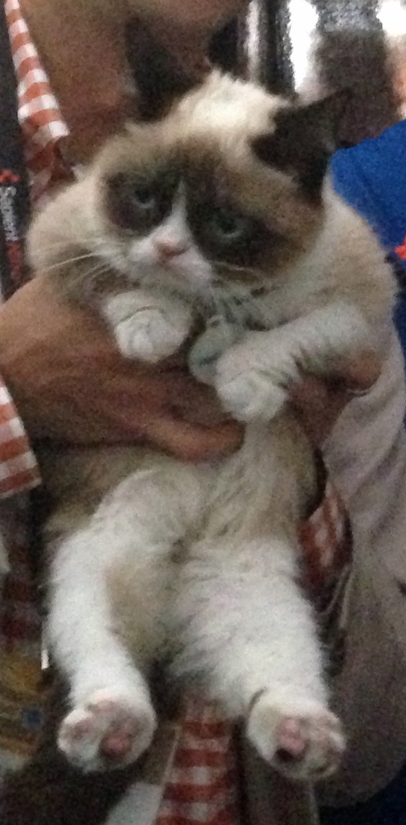