
Gordon Rugg's Blog, page 22
January 15, 2014
When small words mean a lot: Transcripts, black boxes and evaluation
By Gordon Rugg
You can get a fair amount of information out of what people tell you in interviews and questionnaires and focus groups. However, you can’t get at all the information in a person’s head using those methods. The result is that you often have to use different methods, and/or that you have to glean more information out of what you got with the interviews or questionnaires or focus groups.
One very rich source of information is small, apparently insignificant words that people use; words that often get left out of transcripts because they’re not “real words” or because they’re swearwords or whatever.
This article is about how you can use these words to get an extra dimension of information about real-world problems.
Two of my interests are product requirements/evaluation and human error, particularly in safety-critical systems. In both these areas, careful attention to the apparently insignificant words can be extremely useful.
If you’re trying to find out the requirements for a product, or you’re trying to find out users’ reactions to a product, then a very useful technique is think-aloud. It’s what it sounds like; you ask the user to think aloud as they see the product and try it out. It’s a technique that’s very simple to use, and it gives a lot of very useful information very quickly.
Some of the information that you get with think-aloud technique is easy to handle – for instance, if the response is along the lines of “I really love this feature” or “I hate that feature”. Because you’re getting this information in real time, without distortions due to memory, you easily can get at issues that would be missed or distorted in interviews, questionnaires and focus groups, which typically happen after the event.
Other important information, though, is easily missed if you don’t know what to look out for. A classic case is when a user hesitates while trying to use the product, because they’re confused. If that’s happening, then the design needs to be improved, so that users won’t be confused in future. So, it’s important to find out where the users are getting confused.
There are similar issues in human error, where accident investigators often need to find out where things started to go wrong. Again, what often happens is that there’s a key point where the participants in the accident suddenly realise that they don’t know what’s happening.
The image below shows an example of how you can spot that key moment by looking at one particular small word. I’ve used the Search Visualizer software to look at some transcripts of cockpit dialogue, from the voice recorders in black boxes after air crashes. In brief, the red dots show where that word appears in each transcript. The word is “um”.
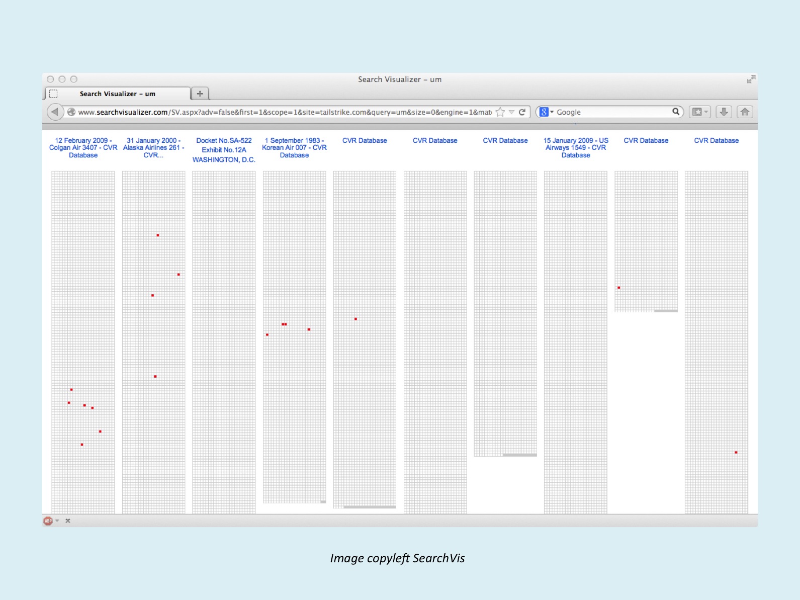
In some of the transcripts, such as the third from the left, and the sixth, seventh and eighth, the word doesn’t appear in the section shown on screen. In the second from the left, it occurs in four places on screen, scattered throughout the transcript. In the fifth, ninth and tenth transcripts, it only occurs once.
The interesting cases are the first and the fourth transcripts. I’ll focus on the fourth, because it’s such a clear example of the principle. The image shows the complete transcript, and it shows that there’s a sudden cluster of occurrences of the hesitation utterance “um” about halfway through. What’s happening there?
The image below shows the area of transcript immediately surrounding those four instances of “um”.

Before this section, the dialogue is very calm and mundane, with a lot of discussion of customs procedures. Then at 10.45 there’s the sudden “Um Um We are now having an unexpected strong tailwind”. For the next few minutes there’s a lot of questions and uncertainty, and then after this chunk of transcript, everything calms down again.
So, in summary, small words can tell you a lot, if you know what to look for, and if you have an exact record of what is being said. This is one reason that professionals in this general area tend to take a hard line about the quality of transcripts. If you’re using a transcript made by someone else, you soon discover that a surprisingly high percentage of would-be transcribers will mangle the transcript by leaving out occurrences of “um” and “er” and similar utterances. Another common mistake is leaving out swearwords. Swearwords are a valuable source of information, particularly when they only occur a few times in a transcript; they tell you that something is triggering a strong reaction, and if there’s a strong reaction, then you need to know what that something is. Yet another common mistake is attempting to tidy up the grammar. You need to know if the speaker is suddenly becoming less coherent, because that can be a key piece of information.
There are other things that you can tell from small words – there are entire disciplines, such as identifying who wrote a particular document, that rely heavily on what those small words can tell you. That, though, is a topic for another article.
Notes and links:
The Search Visualizer software is available free, online, here:
http://www.searchvisualizer.com/
For the example in this article, I used the Search Visualizer “match whole word” option, combined with the “Single site” option, on the tailstrike.com site.
The Search Visualizer blog contains more information about ways of using the software:
http://searchvisualizer.wordpress.com/


January 5, 2014
Scientific writing and humour
By Gordon Rugg
There are three humorous golden rules that are invaluable in public speaking and in writing for public consumption.
Rule 1: Don’t lie.
Rule 2: Don’t try to be funny.
Rule 3: Above all, don’t panic and blurt out the truth…
When you understand why the third rule doesn’t necessarily break the first rule, then you’re ready to face an unkind world.
There’s a humorous post on Distractify about how the third rule operates in scientific writing. Even if you’re not a scientist, you might find it entertaining and inspirational.
http://distractify.com/geek/science/scientists-get-honest-about-their-methods/


December 26, 2013
Why is scientific writing so boring?
By Gordon Rugg
Scientific writing isn’t boring because scientists don’t know anything better. There are solid, sensible, positive reasons for scientific writing being so boring. Unfortunately, those reasons are seldom explained to unfortunate non-scientists about to encounter the scientific writing style for the first time. This article gives a brief overview of a couple of the main reasons.
Reason 1: Word counts
If you’re a working scientist, you need to publish your findings somewhere respectable. “Respectable” normally involves peer review, where experts in your field will review your article for errors as part of the production process. Peer reviewed journals and conferences have tight word count limits.
So there you are, trying to cram a detailed description of a complex problem and your complex methods and your lengthy results into six thousand words (including the lengthy references that show you’ve done your background reading and that you aren’t some clueless newbie re-inventing the wheel). You very soon discover just how short a six thousand word limit is.
What do you delete when your first draft is over eight thousand words long? Adjectives are a prime target: all those persuasive, colourful words that don’t actually contain much information. Examples and anecdotes are also in the firing line; they’re just re-iterating points that you’ve already made. Rhetorical questions framed from the reader’s perspective don’t last long either. When you take all of those out, you end up with something a lot less exciting, but a lot nearer to the word limit and the prospect of peer-reviewed publication.
Reason 2: Weary cynicism
Word counts are a good reason for taking exciting, colourful words out of a piece of writing. What students usually don’t realise is that scientists actively dislike putting exciting, colourful words into scientific writing in the first place.
The reason for this dislike is the same reason that lawyers view emotive, colourful language with distrust. There’s an old saying in law about the relative values of different types of argument, and about which type to emphasise when you’re making your case. It goes as follows.
If the law is on your side, pound on the law.
If the facts are on your side, pound on the facts.
If neither is on your side, pound on the table.
http://www.quotationspage.com/quote/21621.html
It’s a similar story with science. If you’ve got some interesting theory, write about the theory; if you’ve got interesting data, write about the data; if you’ve got neither interesting theory nor interesting data, then go away and find something that’s actually worth publishing.
When scientists see colourful, exciting words in a piece of writing, they react the same way that cynical car-buyers react when a stereotypical car salesman starts talking about the paint job on a car; they assume that this is an attempt to distract their attention from a major problem somewhere else, such as a major flaw in the research design, so they start looking hard for major problems. If the writer has been clueless enough to use that sort of language when writing for a science audience, then there will probably be plenty of major problems for a cynical, knowledgeable reader to find.
A classic, cautionary example of this is the work of Mesmer, back in the eighteenth century. He’s the Mesmer that mesmerism is named after. Back in the 1770s and 1780s, he produced some dramatic results via his work on what he called animal magnetism. In brief, he believed that electromagnetic flows ran through all living things, and that blockages in these flows could produce health problems. He publicised himself a lot, using colourful, exciting language. He got a lot of attention as a result, and made a lot of money. A couple of things worth noting are that he appears to have genuinely believed that he was right, and that he was generous with his findings, providing free “treatment” to people who couldn’t afford the real thing.
He was soon debunked by a committee that included Lavoisier (the same Lavoisier who more or less invented chemistry), Guillotin (as in the guillotine) and Benjamin Franklin (it would be hard to make this stuff up…) The full story is tragicomic, larger than life, and very entertaining reading. There’s a summary of it on Wikipedia, and there are numerous published accounts, including an excellent one by Stephen Jay Gould.
https://en.wikipedia.org/wiki/Franz_Mesmer
http://www.amazon.com/Bully-Brontosaurus-STEPHEN-JAY-GOULD/dp/0091747627
Implications
So, there are good reasons for scientific writing being deliberately unexciting. Does this mean that scientific writing is just ordinary “good writing” with the exciting bits taken out?
As you may have guessed, the answer is an emphatic “no”. Scientific writing has its own indicators of quality, most of which exist for very clear, practical reasons. Most of those indicators are completely missed by standard guides to generic “good writing”.
This has major implications for the concept of writing as a “transferable skill”. It isn’t. Different disciplines and fields have different norms for what constitutes “good writing” because they are using it for different purposes. That’s a fine, rich topic that should be good for quite a few blog articles in the future…
In the meantime, if you’re interested in the indicators of quality in scientific writing, and the reasons for those things being indicators of quality, Marian Petre and I have discussed these in some detail in our book on the realities of research, The Unwritten Rules of PhD Research.
http://www.amazon.com/Unwritten-Rules-Research-Study-Skills/dp/0335237029
On that note, I’ll draw this article to a gentle close, in the hope that you’ve found it informative and enjoyable.


December 12, 2013
How people use space: Pedestrian traffic flows
By Gordon Rugg
There are a lot of regularities in how human beings use space. If you know what those regularities are, then you can make it much easier and more pleasant for people to use a space, whether it’s a shop or a workplace or a public building.
This article describes some useful concepts relating to this topic.
The image below shows a schematic plan of the entrance to a shopping mall. The street outside is grey; the main entrance is broad enough for two people to pass through at the same time; there’s a shop at the bottom of the image, shown in pale green, and another shop at the top of the image, shown in pale yellow. The entrances to the two shops are not directly opposite each other.
 Image copyleft Hyde & Rugg
So what happens when people use this space?
The next image shows something so commonplace that most people don’t think about it as a predictable feature of a design. It’s what Paco Underhill calls the landing zone. When you enter a building, particularly one where you’re coming in from the open air, you’ll often want to pause and sort yourself out before going further inside. “Sort yourself out” includes things like folding your umbrella or taking off your hat, if it’s been raining outside, and things like getting out your shopping list.
 Image copyleft Hyde & Rugg
If other things are equal, the landing zone will be just inside the entrance. The problem is that this location results in some people moving slowly, or not moving at all, in a space that other people want to walk through because it’s on the flight path to somewhere else. That’s a recipe for collisions, delays and hassles, which don’t help the customer’s attitude towards the mall.
The image below shows the flight path from the main entrance to the first shop. The normal landing zone for the main entrance almost completely covers this flight path. However, there’s a side-effect of this flight path which means that there is no longer a problem with a landing zone just inside the main entrance.
 Image copyleft Hyde & Rugg
The flight path to the first shop goes from the main mall entrance to the shop entrance. It’s not perfectly straight – people are likely to aim for the centre of the shop entrance initially, and then some of them on the right side of the flightpath will dogleg slightly at the last moment towards the right.
Because the shop entrance is some way inside the mall, there’s a triangular area of space that’s off the flight path. The image below shows this space in green.
 Image copyleft Hyde & Rugg
This type of space can be described in various ways. I’ve called it a still zone. It’s an area which is not crossed by any direct flight paths between destinations. As a result, it’s usually a quiet place, in terms of traffic.
In this example, the still zone is in a good location for acting as a landing zone – it’s adjacent to the entrance, and it’s big enough to accommodate a wet shopper comfortably. The blue oval labelled “S” shows a shopper is moving from the flight path to the still zone, which they’re going to use as a landing zone.
Once you spot regularities like this, you can start factoring them into your design. For instance, you might decide to design in a still zone that’s big enough to accommodate a parent with a pushchair, in which case you need to check how big that space needs to be. It’s not rocket science, but it can remove a lot of hassles, not only for the parent, but also for anyone who would otherwise have been held up behind them, waiting to get properly inside out of the rain.
Human behaviour
Once you start looking for regularities in how people use space, you start seeing a lot of things that most people look right past without noticing. Here’s an example. It’s the Lurking Partner, shown by the red oval labelled “LP”. A common type is the male partner, waiting outside the female clothes shop, while the female partner shops inside.
 Image copyleft Hyde & Rugg
Note how the LP is on the flight path for the blue customer, if they want to move from the still zone to Shop1. They are also disrupting the main flight path into the first shop.
There are ways of reducing this problem, such as putting a couple of large potted plants outside the shop entrances, so that there’s a still zone beside each plant where the LP can wait. As is often the case, the solution isn’t particularly difficult when you have the mental tools for structuring the problem.
The next illustration shows the other still zone, on the far side of the mall entrance, and shows how the main mall walkway is full of overlapping flight paths, which are a recipe for hassles and collisions.
 Image copyleft Hyde & Rugg
What happens if there’s an obstacle, such as a big rectangular planter in the middle of the main walkway? Answer: you get a still zone each side of it, like this. The obstacle is the brown rectangle labelled “O”. For clarity, I’ve only shown foot traffic coming inward from the main mall entrance; we see a more realistic image later.
 Image copyleft Hyde & Rugg
These still zones are a different type of still zone. They aren’t as still or as sharply edged as the first two we saw, because they’re in the way of varying amounts of traffic from various directions. In formal terms, they’re fuzzy, rather than crisp. Some parts of each still zone will quite often be crossed by pedestrian traffic; other parts will only rarely be crossed by pedestrian traffic.
The figure below shows how the traffic between the two shops cuts across still zone 3, but doesn’t cut across still zone 4, so the two zones won’t be the same size and shape; still zone 3 will be smaller and flatter and less still than still zone 4.
 Image copyleft Hyde & Rugg
A real-life example
The image below shows the American Airlines Admirals Club lounge. It’s a good example of how you can create still spaces by skilful use of flight paths and blocking features, which are features that make it difficult or impossible for users to do some activity that the designer wants to prevent.

https://commons.wikimedia.org/wiki/File:American_Airlines.Admirals_Club.2007.jpg
In this example, the seating is to the side of the flight path to the far end of the room, and all the seating is arranged so that the customer’s feet don’t protrude into the flight path. The edited version of the image shown below indicates some key features of this design, in terms of pedestrian traffic.

The partition is an example of a blocking feature that makes it difficult for customers to do something, but doesn’t prevent them completely. In this case, the blocking feature makes it inconvenient for customers to take any route other than the intended flight path from one end of the room to the other, but doesn’t make it completely impossible. The pillar, on the other hand, makes it impossible for anyone to use a route going through that particular point.
This is often a useful distinction when you’re dealing with safety-related issues. If there was a fire, for instance, a blocking feature that makes a route impossible might be a death trap, whereas a blocking feature that could be easily climbed over or pushed aside might mean lives saved.
That’s a brief overview of some useful concepts relating to how people use space. In a later article, I’ll discuss some ways of finding out how people actually behave in assorted spaces and situations.


December 8, 2013
Designing for efficient use of space: A user-centred approach
By Gordon Rugg
Often, simple examples illustrate important principles. This article is about one of those examples. It involves a real café, near a major university in London, which did a brilliant job of designing the layout for fast, efficient and low-hassle use. The key concepts behind this apply just as much to design of huge buildings as to tiny cafés. I’ve used the café as a worked example of how simple task analysis, hassle analysis and design rationale can make produce an outcome that is good for everyone involved.
The café is tiny. It has a service counter on the right as you go in. There’s a door to the kitchen and toilets beyond the service counter, and there are a couple of small tables at the back. That’s about all there is. A lot of the trade is university staff and students who want take-away coffee and sandwiches, and who want fast service. So why is the design so good?
Here’s a schematic plan of the interior.

Image copyleft Hyde & Rugg
The first thing to note is the layout of the three staff behind the counter.
There’s the sandwich guy (red oval labelled “S”) nearest the door.
Next is the drinks woman (“R”).
Furthest from the door is the woman who takes the orders and the money (“O”).
That’s a counter-intuitive layout. The person who takes the orders is the furthest away from you when you come through the door, whereas you might expect her to be the nearest. There’s a good reason.
This is an example of what’s called a blocking function in Human-Computer Interaction (HCI) design language. A blocking function is there to stop you from doing something. Blocking functions can be used in various ways.
Sometimes they’re only intended to stop you for a few seconds, while something else happens, as in this example.
Sometimes they’re intended to make you stop and think about whether you really want to do something; for example the glass over fire alarms.
Sometimes they’re intended to stop you completely from doing something really inadvisable, like opening a passenger aircraft door at high altitude.
In the case of the café, it makes a lot of sense to put in a blocking function. The sequence of actions is as follows.
The customer goes into the café. We’ll assume that there is another customer already at the counter being served.
The woman who takes the orders makes eye contact with the newly-arrived customer, and asks what they would like, then tells them the cost. Because the café is so small, it’s feasible to do this without having to shout.
The woman who takes the orders then tells the sandwich guy and the drinks woman what to prepare. This lets them focus on the sandwiches and drinks, without also having to deal with the customers.
The previous customer is being served while this happens.
The new customer gets out their purse/wallet while the previous customer is being served, and has the money ready by the time they reach the till.
The new customer pays the bill, accepts any change, and puts their wallet/purse away.
They wait while the sandwich and the drink arrive.
They pick up the sandwich and drink, and either go to a table or to the exit.
This is a neat sequence because it lets the customer do all the tasks one at a time, without hurries or hassles. The elegance only emerges when you stop and think about it. In this arrangement, you get time to take out your money before you reach the till. You get your change, put it away, and then have both hands free when the sandwich and coffee arrive. That’s much easier than being given your change and the sandwich and the coffee all at the same time, which most people find flustering.
Foot traffic flows
Another neat feature of this design is that it automatically produces an elegant flow of traffic within the space. Here’s how that works.
Your goal when you go into the café is to get the sandwich and coffee. The most direct route is to enter via the side of the door nearer to the service counter. You then have to proceed along the service counter, behind any previous customers, and with more customers coming in after you. That means that there’s a one-way flight path for customers, like this. (The customer is the blue oval labelled “C” at the end of the counter.)

Image copyleft Hyde & Rugg
When you’ve been served, you usually can’t double back, because there are customers behind you, acting as a natural blocking function. So you’re at a decision point.

Image copyleft Hyde & Rugg
Nobody is likely to be pushing past you for a few seconds, because it will take at least that long to serve the person behind you. If you want to exit, the route is obvious. You go out along the far wall from the counter, like this.

Image copyleft Hyde & Rugg
If you decide that you want a table, you go forward. If someone is leaving a table, there’s just enough space for them to get past you onto the exit flight path, without a collision. If someone is emerging from the toilets, they can wait behind you, next to the counter, while you move to your destination.
This design produces a nice, clean flow of traffic, because of the inbuilt system constraints. There’s just enough space for the incoming flight path and the outward flight path to pass each other without collisions. There will often be people standing still at the decision point, which gives traffic from other directions a chance to join the flow easily. The tables are at the end of the room, so anyone leaving the tables will naturally be funnelled towards the slow spot at the decision point. This means that they can join the exit flight path at a comfortable pace, rather than having to squeeze into a moving queue.
This is also an efficient overall use of space. If you map out the flight paths for the tables and the exit to the kitchen and toilets, you get something like this. (Flight paths are shown in light blue-grey; other floor surface is shown in white.)

Image copyleft Hyde & Rugg
Overall, it’s a beautifully efficient design that channels customers into a route that minimises hassles, produces a smooth flow of traffic, and makes excellent use of a very small space.
The bigger picture
There are a lot of regularities in how people use space, and how they do small everyday tasks like getting their money out to pay a bill.
If you factor these into a building design or an interior layout, then you can make the space much easier and more pleasant to use. This is very different from a building-centred design approach, where the starting point is the building itself, rather than the ways in which the human beings will use it.
A good place to start reading about these regularities is a book by Paco Underhill called Why We Buy. It’s highly readable, as well as deeply insightful. Underhill is an anthropologist who studies people’s behaviour when shopping. He spotted regularities such as what he calls the landing zone in a building. Usually, when a person goes into a building, they slow down over the next few paces, and do perfectly reasonable things such as opening their coat, or checking their bag, or getting out a shopping list.
You can make life easier for people using a building by incorporating a landing zone off to one side of the main flight path into the building. This lets people take a couple of steps to the side, sort themselves out, and then rejoin the flight path, rather than slowing down and causing delays and obstructions to people behind them. There are numerous other examples of how attention to human behaviour can make a design much more easy and pleasant to use.
Although user-centred design is simple, and grounded solidly in detailed observation of what people actually do, it’s not as widely known as it should be. We’ll return to this approach in later articles.


November 30, 2013
Requirements, evaluation and measurement: How to tell if you’ve met a client’s goals
By Gordon Rugg
This article is part of a series about the problem of identifying and clarifying client requirements. In this article, we’ll look at the issues involved in measuring and evaluating a product, both qualitatively and quantitatively.

https://upload.wikimedia.org/wikipedia/commons/5/54/Elephantidae-scale.svg
A key point to establish at the outset is whether a well-defined schema is involved. This can make a dramatic difference in terms of the desirable attributes and values. A schema is a mental template of key features for something, which can be an activity such as buying a train ticket, or a physical entity such as a type of house or car.
For example, the schema of mansion (large, imposing building, made with costly materials) is very different from the schema of traditional cottage (small, modest building, made with low-cost materials) . Similarly, the schema of sports car is very different from the schema of SUV. Knowing the schema won’t give you all the information that you need, but it’s a very good start. Once you know the schema, then you can make a good guess at what the client will want, and after that, you’ll probably just have to fine-tune the details.
So far, so good. However, there are cases that don’t involve a well-defined schema, such as designing a one-off building.
Also, “fine-tuning the details” can involve non-trivial issues such as translating subjective terms like “easy to use” into specific, tangible design features.
So how do you set about this?
Form and function
The form and the function of an artefact are closely intertwined. The usual perception is that function is the goal, and that the form should follow it. In reality, often the form nudges the ways in which an artefact functions, by making some actions easier than others.
You can find out the intended function of an artefact by verbal methods such as think-aloud technique, or content analysis, or upward laddering. For example, the client might give you feedback on a draft design, and say that it needs to let the user do X, or you might read comments in a thread about design where people mention things that they want to be able to do, or you can ask the client what they would like to be able to do. Showing the client draft designs can be useful for getting at functions so obvious to the client that the client completely fails to mention them. Upward laddering can be useful for getting directly to the higher-level goals that are really important, rather than the lower-level goals that are often a misleading distraction, as discussed in our previous article about why clients often appear to change their minds radically about requirements.
Once you know what the intended function of the artefact is, you can then start identifying ways of measuring how well a particular design meets the requirements that go with the function or functions.
Requirements for functions
A key step is finding out what the functions of an artefact actually are. These can usefully be divided into two main categories:
Typical functions
Boundary cases
The typical functions are what they sound like: Typical, everyday functions. In a bathroom, for instance, typical functions are taking a bath and brushing your teeth.
Because typical functions are so common, it’s important to get them right. The more common the function, the more you can gain in the long term by making the artefact as fit as possible for its function; all those little gains in usability will add up over time. A useful concept here is the Pareto distribution, also known as the 80:20 distribution; 80% of one thing typically comes from 20% of another thing. So, 80% of the time you’ll only be using 20% of the available functions of an artefact. A classic example is software, where most users most of the time only use a small subset of the features of the software. Because those common cases are common, they’re pretty easy to identify. We’ll look in a later section at just how to make an artefact as easy as possible to use for those functions.
Boundary cases are important, even though rare, because they involve the extreme cases that the artefact needs to handle. Safety requirements are a classic case. Most products are designed to handle specified boundary cases involving safety. Modern cars, for instance, are designed to protect their occupants from head-on collisions at a specified speed, and from side collisions at another specified speed. Boundary cases don’t always involve safety. Often, they involve the most adverse circumstances in which the product is likely to be used, such as in bad weather, or poor light.
Two common and effective ways of tackling typical functions and boundary cases are scenarios and use cases. A scenario is a “what-if?” situation; a use case in the technical sense is a more tightly constrained method where you work out systematically which actions the user performs and which actions the product performs. As usual, it’s highly advisable to use observation and/or think-aloud as reality checks, to catch Taken For Granted knowledge and Not Worth Mentioning knowledge, which can make a huge difference; people often don’t mention key points, because of one of those issues. For brevity, we won’t go into this in detail here; we’ve covered all these topics in other articles on this site.
In a scenario, you ask the user to perform a specified task, such as finding a particular piece of information on a newly-designed website. You then observe what happens, and measure how easy the user finds the task.
A classic way of measuring ease of use with regard to software is to count the number of mouse clicks and/or keystrokes and/or scrolls that are needed in order to do a given task. Usually, user-centred software designers concentrate on making the most common and the most important tasks as easy as possible (i.e. they require an absolute minimum of clicks and keystrokes and scrolls).
For our Search Visualizer software for instance, the default setting (for the most common typical case) means that the user only has to type in their key words and then hit the Search button or press the Return key. That’s just one click in addition to typing in the keywords.
There are other ways of measuring ease of use. Some common measures are:
Time taken to perform a given task
Number of separate actions required to perform a task
Number of times a user makes a mistake when performing a given task
Number of times a user hesitates or goes to the help pages
Number of times a user mutters or swears
Number of times a user smiles or says something positive
It can be useful to have a tally sheet for recording how often each of these things happen. Other useful aids include a timeline sheet and Therblig-style notations.
A tally sheet is for recording how often each thing happens. It can take various forms – we advise using whatever works best for you.
Here’s an example.

Image copyleft Hyde & Rugg
A timeline sheet is different in that it records the sequence in which actions occur. There are various forms; for instance, each column might just represent the next activity, regardless of how long each activity lasts, or each column might instead represent a specified length of time, such as five seconds. Timeline sheets can be useful for spotting patterns and sequences of activities.
Here’s an example.

Image copyleft Hyde & Rugg
This timeline tells a story that would be missed by a tally sheet.
The user has begun by reading the screen, but they’ve then hesitated, which tells you that the on-screen text isn’t easy enough to understand.
Next, they click on an option and input text, followed by swearing, which suggests that the software didn’t do what they were expecting. They hesitate, read what’s on the screen, and then go to the Help option. This tells you that the text on screen didn’t give them the information they needed; you’ll need to fix that. After reading the Help option, they swear again. This is telling you a clear, vivid story about what’s going wrong, and what needs to be fixed in the next version.
Therbligs were originally a pictographic notation for recording sequences of physical actions in manual tasks, such as assembly-line work in factories. There’s a core set of commonly used notations for activities such as “pick up” and “visually inspect”. There’s an explicit expectation that you’ll need to add some new notations to fit whatever topic you’re working on, such as a notation for “press Return key” or “press back arrow” if you’re using this approach to record what people do when using some new software.

https://en.wikipedia.org/wiki/File:Therblig_%28English%29.svg
They’ve been around for a long time, and they’re still useful today.
Subjective feedback
The measures above are useful for objective, observable activities. They aren’t designed to handle subjective, internal opinions about an artefact. A common and effective way of investigating those subjective opinions is by using Likert-style scales, named after the American researcher Rensis Likert, who invented them in the 1930s. Purist note: The original forms are known as Likert scales; later developments of the original forms are usually described by purists as Likert-style scales.

https://en.wikipedia.org/wiki/Likert_Scale
Likert-style scales are useful, but often used badly, because they look a lot simpler physically than they are conceptually. The full story is too long to cover in this article, but in brief, we prefer to use visual analogue Likert-style scales, which give finer-grained measurements than the usual numeric scales, and which aren’t constrained by the limitations of human working memory, unlike numeric scales, which are effectively limited to a maximum of about nine points.
A visual analogue Likert-style scale looks like this.

Image copyleft Hyde & Rugg
It’s a line, typically 100mm long, with a question above it and an anchor term at each end. The question is usually open-ended, such as “how easy did you find it to use this software?” and the anchor terms are usually along the lines of “not at all” at one end and “completely” at the other. There’s a lot of debate in the literature about when to use a negative value at the end and when to use a zero value (e.g. “very difficult” as a negative on one end, paired with “very easy” at the other, as opposed to “not at all easy” at one end and “completely easy” at the other). If you’re going to use Likert-style scales as part of a university project, then you really need to know about this literature.
With visual analogue Likert-style scales, the user answers each question by making a vertical mark through the horizontal scale at whichever point they want. For instance, if they think that the software is very easy to use, but not perfect, then they make a vertical mark near the right hand end of the scale.

Image copyleft Hyde & Rugg
It’s very quick and easy to use. Once the form is completed and the participant has left, you measure how far along the line the mark is for each question, and write that figure beside the question. This is where using a 100mm line is useful, since you can measure the distance in millimetres, and the line is long enough to give good resolution on the measurements.

Image copyleft Hyde & Rugg
Where do you get the questions from?
The questions on the Likert-style scales should derive from the requirements acquisition stage of product design. In that stage, as described in some of our previous articles on this blog, you identify what the key attributes are for the product, using methods such as think-aloud technique and downward laddering, where you ask the user questions along the lines of “How can you tell that something is a good X?”
What next?
If you’re using an iterative design approach, then you’ll use the results from this evaluation to refine your design, and you’ll then evaluate the new design in exactly the same way, to check whether it’s more usable than the previous version, measured against the same criteria. What usually happens is that there’s a sharp improvement in the second version compared to the first, followed by smaller improvements in subsequent versions.
This is where using fast, cheap mockups can be very effective; they allow you to catch any major changes in the requirements and the design very early on, with minimal cost in time, effort and money.
That concludes this series on requirements. There will be more articles about various aspects of requirements and design in later posts.
Notes
As usual, I’ve used bold italic for technical terms where it’s easy to find further reading. I’ve listed some specialist links below.
There’s a Wikipedia article about Therbligs here:
https://en.wikipedia.org/wiki/Therblig
There’s a Wikipedia article about Likert here:
https://en.wikipedia.org/wiki/Rensis_Likert
There’s a Wikipedia article about Likert scales here:
https://en.wikipedia.org/wiki/Likert_Scale
There’s a tutorial article about laddering on the main Hyde & Rugg site here:
http://www.hydeandrugg.com/resources/laddering.pdf
The Search Visualizer site is here:
http://www.searchvisualizer.com/


November 10, 2013
Definitions of “good” design: User-centred design in three layers
By Gordon Rugg
Design is a subject that tends to provoke strong emotions.
It’s also a subject where people tend to have opinions that appear deeply conflicting.
This article looks at why this situation arises, and at how we can move beyond it.

https://commons.wikimedia.org/wiki/File:Bambouseraie_de_Prafrance_20100904_110.jpg
The concept of “good design” means different things to different people. That doesn’t mean, however, that it has an infinite number of meanings. This article looks at four different meanings, and at their implications for developing a good product. The first defines “good” in terms of how easily an item can be produced; the other three define “good” in relation to the end user.
Product centred design: “Good” design from the producer’s perspective
One of the most ambivalent compliments we’ve received about the Search Visualizer software was from a female colleague who had just started to use it. She looked up from the screen with an expression of surprise, and asked: “Was this really designed by a man?”
The phrases “designed by a man” and “designed by an engineer” are usually shorthand for “designed for the convenience of the person who will be building the product, not for the convenience of the person who will be using the product”.
It would be nice to think that this is a completely unfounded slur, and that the reality is much more inspiring. Unfortunately, there’s an amount of truth in it. Here’s a common engineer’s/programmer’s view of how to do product development.

Image copyleft Hyde & Rugg
In this worldview, a good design is one where the workings inside the black box are elegant and solid and efficient. After that’s done, there’s a regrettable (in this worldview) further stage where somebody artistic applies some irrelevant pretty stuff to the outside that will appeal to users who have no appreciation of the beautiful engineering or programming within the black box.
There’s an internal logic to this view, but it doesn’t go down well with the people who end up using the product, which is often difficult to use, and which often requires users to read a lengthy manual before they can get started. Those users’ view is usually that the product should be designed to suit their needs, not the needs of the person making the product.
User-centred design
There’s a very different view of product design which is centred around the user’s wants and needs. User-centred design is implicitly based on a three-layer model of design, where each layer involves a different aspect of “good” design. Usually, these are closely entwined with each other during product design using this approach. In this article, though, I’ll look at each one separately so that we can see their implications.
Layer 1: What does it do for the user?
In user-centred design, a key concept is affordances. This is a concept from the work of Don Norman, who has written various classic, thought-provoking and highly readable books about design. An affordance is something that a design allows the user to do. That affordance may be intended by the designer, but often it’s unintended, and quite often it’s something very different from what the designer intended or wanted.
A classic example of an affordance is the size and shape of a smartphone. A typical smartphone offers the intended affordance of being a size that fits comfortably within a human palm. However, it also offers other affordances.

Image copyleft Hyde & Rugg; incorporating hand image from Wikimedia
So far, so good. Also, up till this point the concept of affordances is very similar to the traditional engineering concepts of specifications and requirements.
With user-centred design, however, the designer will also be thinking about unintended affordances, both desired and undesired, as an integral part of the design process. That’s different from the traditional engineering approach, which often in practice views undesired affordances as someone else’s problem (usually the user’s, and usually handled in this worldview via instructions manuals and disclaimers rather than via the design of the product).
How do you find out about unintended affordances? You can get a pretty good idea from showing mockups to prospective users and getting them to think aloud about their reactions to the mockup. You can get an even better idea by asking prospective users to think aloud about the mockup projectively, i.e. as if they were someone else, such as a mischievous teenager. I once heard a talk from someone who was working on a design for a hospital bed which could drive itself to a chosen destination selected on a built-in computer. The designer hadn’t given much thought to undesired affordances, but the audience soon spotted enough of them to provoke a continuous ripple of barely-suppressed giggles around the lecture theatre.
Affordances aren’t always about enabling users to do things, nor are they always a clear-cut case of “the user can do X” versus “the user can’t do X”. Sometimes, affordances nudge people. Here’s an example.
For most people, the Zen garden means something like this.

https://commons.wikimedia.org/wiki/File:Ryoanji_rock_garden_close_up.jpg
When you think in terms of positive and negative affordances and of nudges, you start to see a lot going on in this image.
For example, the rocks are surrounded by raked gravel. That has the inbuilt nudge of discouraging people from walking on the gravel, which would spoil the aesthetics. So, this garden doesn’t offer any affordances about walking or playing; it’s just a garden for looking at.
Similarly, it doesn’t offer many affordances for pets unless the garden owner is okay with the prospect of the garden becoming an animal toilet. That has another inbuilt nudge, towards keeping animals out of the garden.
There’s another inbuilt nudge about making it difficult for gardeners to water or weed the area around the rocks; this seriously reduces the affordances about which types of plants can grow there.
When you look at a more panoramic view of a classic raked gravel Zen garden, the implications hit home.

https://commons.wikimedia.org/wiki/File:Kyoto-Ryoan-Ji_MG_4512.jpg
The garden is in a courtyard with a high wall, that will keep animals out. The garden abuts against two sides of the courtyard, so there’s no destination on the other side that might tempt people to walk across the garden. The only plants are mosses, and those look short of water. These aren’t criticisms of gravel gardens; they’re an illustration of how a design can have inbuilt implications for affordances and for behavioural nudges.
Once you start thinking this way, it’s a lot easier to spot potential opportunities, as well as potential problems. This offers you the affordances of being able to make the most of the opportunities, and of designing out the problems, either partly or completely. For instance, if you were concerned about the problem of access to the green areas in a raked gravel garden, then one design solution would be to include some stepping stones in the garden so gardeners could get to the green areas without disturbing the gravel.
Layer 2: How easy is it to use?
When you know what the desired affordances of a design are, then you can measure how easy or difficult it is for people to use those affordances.
A classic way of measuring ease of use with regard to software is to count the number of mouse clicks and/or keystrokes that are needed in order to do a given task. Usually, user-centred software designers concentrate on making the most common and the most important tasks as easy as possible (i.e. they require an absolute minimum of clicks and keystrokes).
There are other ways of measuring ease of use. Some common measures are:
· Time taken to perform a given task
· Number of separate actions required to perform a task
· Number of times a user makes a mistake when performing a given task
· Number of times a user hesitates or goes to the help pages
· Number of times a user mutters or swears
· Number of times a user smiles or says something positive
· Scores on subjective rating scales (usually Likert-style scales)
Layer 3: How attractive is it?
The two layers above tend to produce designs which are minimalist and elegant. That isn’t an accident. Both layers focus on identifying just what the product is intended to do, and on finding design solutions that help the user to achieve those goals with the absolute minimum of mental or physical effort.
Because the human cognitive system has some tight limits in capacity and processing power, those design solutions tend to have features in common, such as a minimum of distracting physical and visual clutter, and a systematically structured layout. These features fit well with the aesthetic of minimalist design, as in classic Apple products. They also fit well with other types of design ethos, such as form following function, and often with green design.
As a closing example, I’ll return to the image at the start of this article. It’s of a water transport system, and it shows how a design which is good in terms of user-centred design can also be good in terms of the production process.
https://commons.wikimedia.org/wiki/File:Bambouseraie_de_Prafrance_20100904_110.jpg
The water runs along a length of split-open bamboo. When that length comes to an end, the water drops into another length of split-open bamboo. The image shows how that transition between lengths is handled. There’s an upright post, again of bamboo, with two holes drilled through it. Each length of split-open bamboo slots into one of those holes, and is held in place by a small peg, probably also of bamboo.
It’s an absolutely minimalist design, making brilliant use of the key features of a plentiful local material, and requiring minimal modification of the materials. It’s also subtly unique, since no two lengths of bamboo are completely identical. Followers of Zen or of the Arts and Crafts movement would approve. Fans of the baroque, however, might have different opinions…
Closing thoughts
The design approach that I’ve just described is very different from the view that the visual design is the last thing to be added. It’s an approach that can be applied to a wide range of fields, ranging from architecture to smartphones to Web pages. It usually comes as part of a methodological package that includes an overall design process (generally iterative, with mockups early on and prototypes later) plus techniques for capturing and clarifying user requirements, as well as techniques for evaluating usability and user opinions of the product. It’s an approach that’s particularly well suited to designing one-off products, such as a unique building, and to novel types of products, or novel designs for an existing type of product.
Returning to the ambivalent compliment about the Search Visualizer software at the start of this article, just in case you’re wondering: Yes, we did design Search Visualizer using the approach I’ve just described. And yes, we still use the same design approach. It’s clean, simple, and efficient, and once you learn it, you start to wonder why anyone would use any other approach.
We’ll be blogging about related design concepts, such as ego-free design, in future articles. I’ll also be returning soon to my regular series of articles about design and requirements, with an article about measurement and evaluation.
Notes
The hand in the schematic smartphone image is from Wikimedia:
https://upload.wikimedia.org/wikipedia/commons/3/32/Human-Hands-Front-Back.jpg
The Search Visualizer software is available free, online, here:
Our blog about Search Visualizer is here:
http://searchvisualizer.wordpress.com/
Don Norman’s books, on Amazon:


October 28, 2013
Occam’s razor: The weaknesses of simple-looking explanations
By Gordon Rugg
So what is Occam’s razor anyway, and why should anyone care?
The core concept is brief: Other things being equal, we should choose the simplest valid explanation whenever possible.
Amateurs often view this concept as a clean blade of truth, cutting straight to the heart of the matter. It’s widespread in politics, often phrased as “common sense” analysis.
That’s a nice idea, but reality is more complex, and Occam’s razor often causes more problems than it solves. Like the damaged, time-worn razor in the picture below, it’s far from being a flawless blade.

This article is about why simple-looking explanations often turn out to be complicated in reality, and why apparently complicated explanations often turn out to be simple.
Occam’s razor is a concept named after its originator, William of Occam (also spelled “Ockham”). He was a mediaeval scholar who wrote something to the effect of “entia non sunt multiplicanda praeter necessitatem”. There’s debate about his exact original wording. The meaning is approximately “Don’t bring more things into an explanation than you really have to”.
That idea was taken up and rephrased in various ways by numerous scholars over the centuries. Some of them were well aware of the pitfalls surrounding it; others weren’t. That’s where the trouble begins.
The razor of ancient wisdom
Something worth remembering about William of Occam was that he lived and died a long time ago. At the time of his death in 1347, the discovery of America was over a century in the future; the idea that the Earth was in orbit round the Sun would have been viewed as heresy if anyone had thought of it; concepts such as the scientific method or electricity or the internal combustion engine were five centuries away. It was taken for granted that everything in the material universe was composed of four elements in various proportions. I’ve blogged previously about where that particular approach took the Roman writer Vitruvius:
“6. To begin with fir: it contains a great deal of air and fire with very little moisture and the earthy, so that, as its natural properties are of the lighter class, it is not heavy.”
That doesn’t exactly inspire confidence. If we’re using the analogy of a razor cutting to the heart of the matter, then the four elements model would probably look like the razor below: good in its day, but not something that you’d want to use now.

However, there are plenty of people who try to simplify present-day debates by invoking old concepts, like someone trying to shave with a corroded ancient blade.
One common version of this approach is argument by authority. Its limitations are clear if we phrase it in terms of razors: “This person was much more significant than you, therefore their razor is better than yours”.
The razor in the picture below once belonged to King Frederick I of Württemberg. He may have been powerful and famous once, but his razor isn’t something you’d want to use now. It’s much the same with the ideas of ancient philosophers. Those philosophers may have been great in their day, and they may have been brilliant, and they may have made great innovations in their field, but their ideas are showing their age. Even Euclid’s geometry, which has arguably stood the test of time better than anything else from ancient Greek times, is now recognised as only a subset of geometry – there’s an entire field of non-Euclidean geometry, for instance.

The second common version of this approach is that there’s nothing new under the sun. This version argues that a modern concept is no more than a rephrasing of some ancient concept. “Particle physics? That’s just a version of the atomic theory that Democritus developed around 400BC.”
You don’t very often see this approach applied to the hard sciences, which know how to bite back (“So, just what did Democritus have to say about the Higgs boson?”) but you do often see it in the humanities. It works best when there are a lot of ancient texts that say something vague about the topic under discussion. It doesn’t work well when the ancient texts are specific, because then it’s usually clear that they’re factually wrong, but if the texts are vague, they can be re-interpreted to fit whatever argument their proponent is making, creating the superficial appearance of wisdom, without needing to get bogged down in sordid reality, such as actually fixing a problem.
The safety razor of scientific method

Early philosophers and theologians were pretty enthusiastic about applying logic and argument to almost anything, regardless of whether there was any tangible proof of that the topic of debate actually existed in the first place.
A key feature of the scientific method, which began a couple of centuries after the death of William of Occam, was that its scope was solidly grounded in phenomena that could be observed. This gave it less scope than the old philosophy, but, like the safety razor, it had built-in features that made it less likely than its predecessor to go significantly wrong before being stopped.
Armchair scientists are often very keen on the scientific method, and will readily criticise publishing researchers for departing from the proper Scientific Method™ as half-learned by those armchair pundits. Occam’s razor is quite often mentioned in those criticisms.
The reality, however, is that usually the key question isn’t how to make an explanation simpler; usually, the key question is just how simple the explanation needs to be. There’s a famous quotation usually ascribed to Einstein, to the effect that a scientific model should be made as simple as necessary, but no simpler. (Various phrasings occur; this one is arguably the most accurate with regard to how science works.) That’s why I phrased the opening description of Occam’s razor as: “Other things being equal, we should choose the simplest valid explanation whenever possible.”
Often, paradoxically, you get a much cleaner and more powerful explanation by using a more complicated model, because the universe happens to be more complicated than expected in that particular area.
The multi-blade razor of reality
Modern razors are usually multi-blade, because that gives a safer, closer shave. The one below has three blades.

It’s a similar story with much of modern science. The examples below involve three different reasons for apparently more complex explanations being better than simpler ones.
When reality is more complex than expected.
One common finding in research is that there are two or more varieties of something that was once thought to be a simple, single category.
Blood is a classic example. Until Victorian times, it was taken for granted that blood was simply blood. The discovery that there were numerous different blood groups, and that there were complicated interactions about which types could be safely transfused, was a complete surprise to everyone involved.
A less well-known example is that human beings have two very different types of memory, namely long term memory (LTM) and short term memory (STM). They’re different in the physical processes involved, and in capacity, and duration – LTM has enormous capacity and lasts for decades, whereas STM has a capacity of about seven items, and a duration of a few seconds. That’s why car registration numbers and computer passwords and the individual part of a phone number after the area code are all about seven characters long, so that they’re easier for people to hold in STM for a few seconds. Again, there was no a priori reason to expect this, but any attempt to model how the brain works has to include this distinction.
In both these cases, reality consists of two or more categories for something that was once thought to be a single, unitary item. In other cases, the advantages of using an apparently more complex explanation come from being able to represent reality in a more powerful way, rather than coming directly from reality itself.
When more complex representations are better
An example of advantages from more complex representations is modelling human handedness. The model that most people take for granted is a single line going from “completely left handed” at one end to “completely right handed” at the other end. In this model, ambidextrous people are usually placed in the middle of the scale.
In reality, however, many alleged ambidexters are in fact equally clumsy with each hand, whereas others are dextrous with both hands. We can represent this more accurately with a diagram like the one below.

The real added bonus from this representation is that you can use the same idea to make more sense of a lot of other issues as well.
Gender is an example – that’s where I first encountered this representation, in Bem’s work on androgyny. You can use the same representation to describe a person in terms of how “masculine” they are, and also to describe the same person in terms of how “feminine” they are (for simplicity, I won’t get into the issue of what, if anything, is meant by traditional views of masculinity and femininity).
In an increasing number of movies, there are female main characters who are high both in traditional feminine characteristics and also in traditional masculine characteristics – for instance, Sigourney Weaver in the Alien franchise, Linda Hamilton in Terminator II, Milla Jovovich in the Resident Evil franchise. There hasn’t been such a marked effect with regard to male main characters; an advantage of this representation is that you can easily show that significant absence visually, as a gap in the image.
So, although a solution may be more complicated in relation to a single problem, the same solution may also solve other problems as an added bonus.
The next subsection is about a very different type of complexity.
Systems and complexity
In systems theory it’s usually the interactions that are complex, not the components. Systems theory has been around for a long time, but it’s not as widely known as it should be, even though it’s invaluable for providing rigorous models of real-world situations where things often happen in ways that surprise people.
In systems theory, a system is usually defined in terms of a set of interconnected and interacting components. The schematic images below shows how a system is different from a simple collection of parts.
The first image shows several items that are not joined into a system – a battery, a bulb, and two lengths of wire.

These items, as a simple collection of things, won’t do anything except slowly age.
If, however, the same items are joined together in the right configuration, then they become a system, and they behave very differently as a system from how they behaved as individual entities.

Now, they do something completely new. When they’re combined like this, the bulb lights up. That’s a new property arising from the interconnections and interactions between the components. It’s an example of what’s called an emergent property.
This isn’t the only interesting thing that systems do. A common feature of systems is feedback loops. These are completely different from concepts like “positive verbal feedback” where you say something pleasant to someone; instead, positive feedback loops and negative feedback loops are key concepts in making systems safe.
In a feedback loop, one component of a system alters a second component in some way, and the second component in turn alters the first component. A classic example is a domestic heating system, where the heater makes the thermostat become more warm; when the thermostat reaches a critical temperature, it switches off the heater, as a negative feedback loop.
A positive feedback loop is similar, except that instead of the second component counteracting the effect of the first component, the second component increases the effect of the first component. A vivid example is forest fires, where the heat of the fire makes the air above the forest rise, creating winds that suck in colder air from ground level, which in turn make the fire burn more fiercely, and so on.
Usually negative feedback loops help to keep situations stable, and positive feedback loops tend to make situations become increasingly unstable.
Because systems have emergent properties that would be hard to predict from the properties of their individual components, and because the interactions between system components often produce large numbers of positive and negative feedback loops, it’s often difficult to predict their behaviour in advance.
This is a common issue in politics. Economies and societies are very large, very complex systems; they have emergent properties and feedback loops that are very different from those in smaller systems, or in individual components within a system. One common mistake in populist politics/economics, for instance, is to assume that national and international economies are just the same as a household budget, only on a larger scale. They’re not. The larger systems behave very differently from the smaller systems, in ways that often look very odd. That’s a common side-effect of feedback loops, which frequently lead to systems behaving in the opposite way to what you might expect at the start.
Unexpected outcomes are the topic of the next section of this article:
The electric razor of the totally unexpected

Another characteristic of apparently simple explanations is that they usually draw on familiar, everyday phenomena such as water flowing through a hose. That’s fine if you’re dealing with a problem which involves familiar, everyday mechanisms like the water in the hose. However, a lot of natural phenomena simply don’t behave like the everyday ones that we’re used to. Many people find this very unsettling.
Electricity is a prime example. It doesn’t behave the same way as water flowing along a pipe. It behaves like electricity, which is sometimes similar to water in a pipe, but more often different. When electricity was first installed in homes, a lot of people had trouble with the idea that electricity wouldn’t just flow to waste through any outlets that weren’t filled with something such as a plug or a light bulb. A lot of people still have trouble grasping how it really behaves, because there isn’t a good physical analogy that we can compare it to.
Quantum physics is another example of something that simply behaves on its own terms, and that most people find very hard to grasp.
There’s a neat idea from Kelly’s Personal Construct Theory that describes this conceptual problem. It’s called the range of convenience. Every descriptive term has its own range of contexts within which it can be meaningfully applied (the range of convenience). Outside that range, the term is meaningless.
Concepts from everyday experience such as “causality” are extremely useful within their range of convenience (everyday experience). However, that doesn’t mean that their range of convenience is infinite. Often, terms that are very useful for describing a system are meaningless if you try to apply them to the component parts of that same system. For instance, it’s perfectly sensible to apply the concept of “miles per gallon” to a car, as an entire system, but meaningless to try applying that same concept to individual parts of a car, such as the chassis or suspension.
Which takes us back to one of the quotes from the start of this article. A scientific model should be made as simple as necessary, but no simpler. Sometimes, that takes you into strange territory.
As a closing thought, here’s a new version of an old engineering adage, adapted to explanations.
You can have your explanation simple, accurate, or comfortingly like everyday life. Choose any two.
On which inspiring note, this article ends.


October 24, 2013
Gordon’s art exhibition: Part 2
By Gordon Rugg
I have an art exhibition at Keele University until October 25th. The exhibition consists of twelve canvases.
The first six examine depictions of women in epic texts, described in my previous article.
Canvases seven to twelve examine ways of categorising gender, which will be the topic of this article. 
The first canvas of this second set shows a way of categorising gender that is widely used across cultures.
 Canvas 7: Binary crisp sets. Image copyleft Hyde & Rugg.
It’s an either/or division into two genders, sharply divided, with no other options available.
It’s often subsumed in a broader system, which bundles together biology, societal gender roles and sexual orientation, into a “male package” and a “female package”.

This method of categorisation occurs across many times and cultures. It’s often combined with a three-level model of the universe that includes the divine, the human, and the animal, like this.

Dividing the universe by gender and divinity. Image copyleft Hyde & Rugg.
That’s neat and tidy, but it doesn’t correspond with reality. There are a lot of borderline cases that don’t fit neatly into any of the categories above.
Texts such as the biblical book of Leviticus go into great detail about how to categorise borderline cases, not just in relation to gender, but in relation to the world generally. There’s a strong case for arguing that the stance of Leviticus on homosexuality is more to do with category separation than with gender or sex
A recurrent major theme in Leviticus is keeping categories and category packages clearly separate from each other. This occurs in numerous forms, such as a prohibition on mixing different fabrics within one cloth, and a prohibition on sowing different crops in the same field. The prohibitions about clean and unclean foods are an interesting example of this, where the two elements of the package are explicitly stated. One element is about chewing the cud; the other is about being cloven hoofed. We can represent the possible permutations as a table, like this.

Category permutations in Leviticus. Image copyleft Hyde & Rugg.
If an animal chews the cud and is cloven hoofed, then it’s clean; if it neither chews the cud nor is cloven hoofed, then it’s also clean. Animals that don’t fall into either of those packages are unclean. Pigs are unclean because they’re cloven hoofed but don’t chew the cud. Camels and rabbits are unclean because they chew the cud but aren’t cloven hoofed.
The phrasing of Leviticus on homosexuality in this context is interesting; it’s phrased in terms of a man lying with another man as with womankind (King James Version) – i.e. it’s being phrased in terms of mixing of categories, rather than as about sexuality in itself.
We’ll return to the issue of “package” categories later. First, we’ll look more closely at reasons for particular cases not fitting neatly into an either/or categorisation.
Some cases don’t fit because of a clearly-defined issue. For instance, most people are chromosomally either XY male or XX female. However, some people are chromosomally XYY or XXY. Both XYY and XXY are clearly defined, but neither of them fits into either the XY or the XX category. We can represent such cases like this.

Canvas 8: Three crisp sets. Image copyleft Hyde & Rugg.
In reality, the other category tends to be treated as a “dustbin” category, both in terms of using it to hold anything that doesn’t fit in the two “proper” categories, and in terms of how cultures usually stigmatise people in the “other” category.
Another problem for the two-box model involves cases that don’t fit into two crisply-separated categories because they fall on a greyscale, without any clear dividing points along the scale.

Canvas 9: Greyscale. Image copyleft Hyde & Rugg.
Greyscales may look innocuous, but they’ve produced some acrimonious controversies over the years. One pivotal case was the work of the American researcher Kinsey, when he studied human sexual behaviour in the 1940s. When he asked respondents to describe their sexual orientation, he used a greyscale, rather than a crisp divide into heterosexual or homosexual. This was at a time when homosexuality was illegal in the USA, and viewed as a mental illness by many psychiatrists, so the greyscale’s implicit assumption that there wasn’t a clear-cut distinction between “normal” and “pathological” sexuality sparked widespread outrage among traditional moralists.
Even within mathematics and logic, the concept of fuzzy logic, which is closely linked to greyscales, provoked heated debate when invented by Zadeh in the 1960s.
Greyscales can be used to represent “other” gender categories, as in the example below, where a greyscale occurs between traditional male and female crisp sets.

Canvas 10: Binary crisp sets plus greyscale. Image copyleft Hyde & Rugg.
One particularly interesting extension of greyscales to gender research is Bem’s work on androgyny theory. Previous approaches viewed “masculinity” and “femininity” as opposite poles of a single spectrum. (There’s a whole other debate about what, if anything, is meant by “masculinity” and “femininity” but I’m leaving that to one side for the moment, so as to focus on the representational issues of gender.)
Bem’s approach instead treats “masculinity” and “femininity” as two separate scales, so that an individual can be described both in terms of how “masculine” they are and how “feminine” they are. This can be shown diagramatically, as in the next image.

A two-axis representation of gender roles. Image copyleft Hyde & Rugg.
Within this representation of gender roles, Maeve of Connaught would probably score highly both in traditional masculinity (the “warrior” part of “warrior queen”) and in traditional femininity (she had numerous male lovers, had several children, and was married more than once). Helen of Troy would score high on traditional femininity and low on traditional masculinity. Helen’s husband Menelaus would score high on traditional masculinity and low on traditional femininity.
The same type of two-scale plot can also be used for sexual orientation, with the strength of sexual orientation towards men on one axis, and towards women on the other.
This is a powerful and flexible approach, but it doesn’t include a space for the types of crisp set issues described above, such as people who are genetically XXY. One way of handling the range of issues involved is to use a multiple representation such as the one below. For simplicity, it only shows one “other” crisp set and one fuzzy set, but in practice it would be easy to include more.

Canvas 11: Three crisp sets plus greyscale. Image copyleft Hyde & Rugg.
This representation handles a wide range of cases, but it still contains an implicit assumption that male and female are the two “real” anchoring values, with the others as in-between cases that don’t fit into the two main “proper” boxes.
The representation below is one way of avoiding this problem, by using a two-dimensional mosaic-style representation, with no obvious scalar values on either axis, and including a mixture of crisp sets and greyscales. This could be extended indefinitely to accommodate a wide range of gender categories.
Canvas 12: Multiple types of categorisation. Image copyleft Hyde & Rugg.
In principle, this approach could be used to map all the logically possible combinations of biological gender, social gender and sexual orientation recognised within a given culture. From a legal perspective, this would make it much easier to check whether any gender-related legislation included provision for all of the categories that the legislation would need to cover, or whether any categories had been omitted. We’ll be blogging about this, and related, applications for formal category visualisations in a later article. For now, though, we’ll conclude with some thoughts about wider issues involving gender.
Conclusion
Gender is clearly a more complex issue than a simple male/female dichotomy, as has long been realised by many communities. The mosaic model above, though fairly complex, is still a simplified version of reality.
Representations offer insights into the nature of gender as it is construed in different cultures. However, there is an underlying question that isn’t addressed by the representations above, namely: Why bother? Why do societies treat gender as such a big issue, rather than a private matter like musical preferences? Why do most cultures exhibit widespread prejudice and social marginalisation on the basis of gender?
It’s a good question. Much of the prejudice and marginalisation is couched in terms of values (traditional, or religious, or political) rather than practical factors. Whether this is more than just a rationalisation for some deeper issue is an open question.
The most commonly cited practical factors affecting gender involve providing privacy and safe spaces for women and girls, such as toilets, and changing rooms at swimming pools. Safety with regard to sexual violence is a very real issue, but there are simpler ways of improving the situation than by imposing normative gender roles on the entire community; for instance, by having attendants in public toilets, which is a well-established tradition in many countries, and by having individual rather than communal showers and changing cubicles at swimming pools.
There’s still a lot to be discovered about how cultures treat categorisations of gender. I hope that the approaches described above will help researchers to untangle what’s really going on, and will help us move towards a more tolerant world.
Notes
The Bem approach to modelling androgyny can also be used for other, very different topics. In my book Blind Spot, for instance, I used the same two-dimension approach to show how handedness can be modelled more realistically this way than by using the traditional one-dimensional scale from left-handed to right-handed.
This article has been about categorisations of gender, but, interestingly, almost exactly the same points could be made about how cultures categorise mental health, from a binary crisp set model of “sane” and “insane” to something more complex and more closely corresponding to reality. These similarities are probably no accident. More likely, they’re the result of people using the same underlying approach to categorisation across different issues, whether as part of a general strategy of minimising mental load, or as part of an ideological position, or a mixture of both.
With regard to visualisations, I’ll be blogging in a later article about how systematically structured visualisations can be used to map out all the logically possible combinations for a given case, with a view to ensuring that any regulations, legislation etc in that field will include provision for all the possibilities. Historically, this approach has been viewed with suspicion in some fields, such as mathematics and the law, but viewed in other fields such as computer science as the most rigorous and systematic way of handling complex problems. There’s probably a moral in that somewhere…
We’ve blogged previously about categorisation here:
We’ve blogged about gendered language in Shakespeare here:
http://searchvisualizer.wordpress.com/2012/07/13/gendered-language-in-shakespeare/
Blind Spot is available on Amazon:
http://www.amazon.com/Blind-Spot-Solution-Right-Front/dp/0062097903
The canvases in the exhibition have a vellum patterned background. I’ve used a light granite pattern in the images for this article since that worked better visually on the smaller scale of a computer screen. I’ve also made some changes to the colours in the final mosaic image, to fit better with the content of this article; the original canvas had to be simpler, since it was accompanied only by a short explanatory text.
As usual, the images in this article are copyleft Hyde & Rugg; you’re welcome to use them for any non-commercial purpose, including lectures, provided that you state that they’re copyleft Hyde & Rugg.


October 12, 2013
Gordon’s art exhibition: Part 1
By Gordon Rugg
My art exhibition consists of twelve canvases.
The first six examine depictions of women in epic texts.
The second six examine ways of categorising gender.
One unifying theme of the exhibition is gender; another is the way that outputs from technology and from formal representations can be artworks in their own right.

This article unpacks those concepts, and goes through the first six canvases.
One of the main practical problems when examining epic texts is that they are typically large. My copy of the Iliad, for example, is well over four hundred pages long. Trying to see patterns in such huge texts just by reading them is difficult.
For the exhibition, I used the Search Visualizer software to show where mentions of the female protagonists’ names occurred in different texts. Here’s how Search Visualizer works, if you’re unfamiliar with it.
Identifying where words occur by eye is difficult. For instance, I was looking for occurrences of the name Medb in one text, the Irish equivalent of the Iliad. Here’s what the opening paragraph looks like.

Spotting names is difficult enough in a familiar language. It’s more difficult if you’re dealing with a language that you don’t speak fluently. In the image below, I’ve simulated this by showing the same paragraph in an Irish font. However, spotting where names occur is easier if they’re picked out in highlighter. This image shows the names of Medb and her husband Ailill in red and green highlighter respectively. Her name occurs between two mentions of his name.

When you look at text in this way, you soon notice that the other words, without highlighter, are often just a distraction. What happens if you blank them out, and only show the locations of the words that are in coloured highlighter? The answer is that you get an image like this. It’s the same pattern as in the previous image – a red between two greens – but the pattern is much easier to see without distracting clutter.

That’s the principle on which Search Visualizer works. It also lets you shrink the size of the rectangles down substantially, so you can fit the schematic image of an entire book onto a single screen.
Here’s what happened when I looked at occurrences of the name Helen in the Iliad, Homer’s epic story of the Trojan War, sparked by Helen’s eloping with her Trojan lover, Prince Paris of Troy. It’s a long file, so I’ve split it into three parts for easier viewing.


Although Helen is one of the most famous women in legend, she appears only rarely in the Iliad. She’s mentioned a modest number of times at the start, and a few times in the middle third of the text, but hardly at all in the last third.
We see a very similar pattern with mentions of the word woman (red squares) in the Old Testament book of Genesis.

Again, there are a few mentions in the first part of the text, but hardly any after that.
That isn’t an invariable pattern, however, in ancient texts. Here’s what happens when you look for occurrences of the word Medb in the Tain, the Irish national epic of an Iron Age war a thousand years after the Trojan War. Medb of Connaught is a proud warrior queen, a central figure in the story. Unlike Helen, Medb features prominently in the story right till the end.

We see a similar pattern in a much later classic, Shakespeare’s Antony and Cleopatra, when we look at occurrences of Cleopatra’s name.

So does this mean that there has been progress in women’s roles in epics across time?
Here’s what happens when you search for Helen (in red) and her lover Paris (in green) in the script of the 2004 movie Troy.

Even though the movie script dramatically changes the original storyline, Helen is still a marginal feature in comparison to Paris. Little has changed since the original version, three thousand years ago.
One possible objection is that genre is playing a role, and that the minor role of women is simply a feature of the epic genre. That raises the question of what exactly we mean by genre. This leads into categorisation, which is the subject of the second half of the exhibition.
Notes
There’s a free online version of the Search Visualizer software here:
http://www.searchvisualizer.com/
Our blog about Search Visualizer is here:
http://searchvisualizer.wordpress.com/
Our article about gendered language in Shakespeare is here:
http://searchvisualizer.wordpress.com/2012/07/13/gendered-language-in-shakespeare/
Our article about the Tain and its characters is here:
http://searchvisualizer.wordpress.com/2013/03/13/st-patricks-day-special-the-irish-iliad/


Gordon Rugg's Blog

- Gordon Rugg's profile
- 12 followers


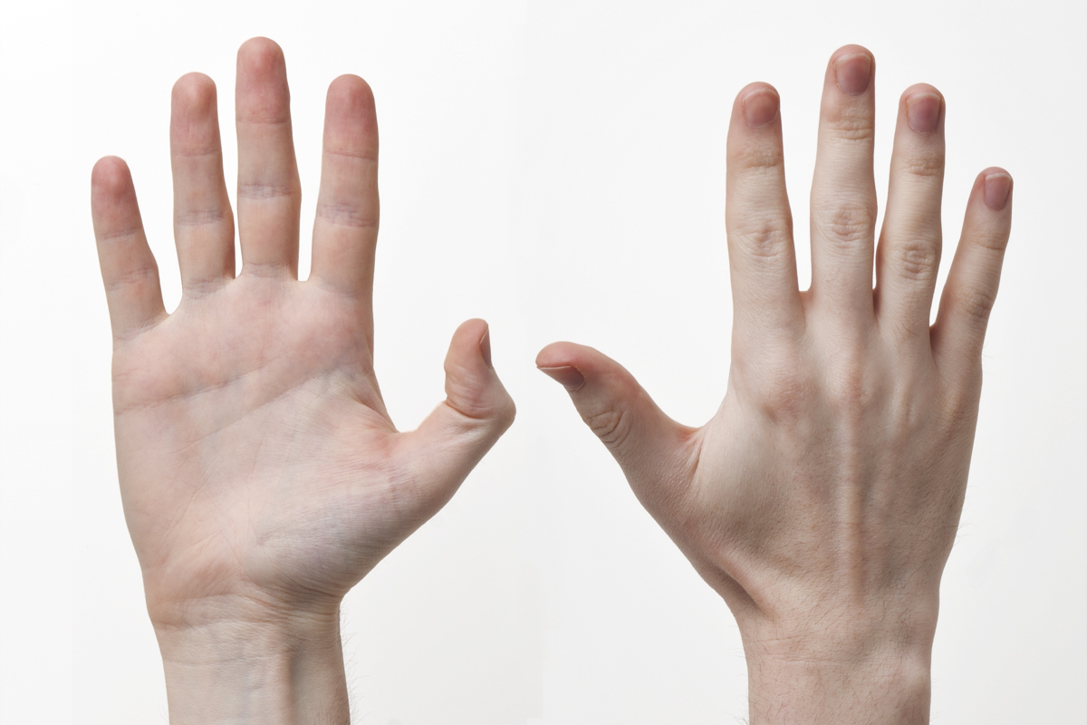