
Gordon Rugg's Blog, page 15
August 8, 2014
Passive ignorance, active ignorance, and why students don’t learn
By Gordon Rugg
Why don’t students learn?
It looks like a simple question, which ought to have a simple answer. In reality, understanding why students don’t learn takes us into concepts such as passive ignorance, active ignorance, systems theory, belief systems, naïve physics and cognitive biases. In this article, I’ll skim through some key concepts, to set the scene for a series of later articles that go into more depth about those concepts and about their implications both for education and for other fields.
 Bucket image copyleft Hyde & Rugg, 2014; other images from Wikimedia (details at the end of this article)
Some people view education as a process like filling a bucket of ignorance from the tap of knowledge; knowledge goes in and the bucket fills up. As anyone who has worked in education can attest from painful experience, this isn’t the full story. Often, education is more like trying to fit an angry small child into clean clothes (if you haven’t had that particular experience, you can imagine trying to fit a lively octopus into a string-mesh bag). Students often actively resist knowledge, or wilfully misinterpret it in ways so bizarre that you start seriously wondering what’s gone wrong inside their heads.
(A quick note about terminology: I’ll be using the terms “information” and “knowledge” fairly interchangeably throughout this article, for simplicity; for most of the issues described below, the same principles apply both to information in the strict sense and to knowledge in the strict sense.)
Passive ignorance and active ignorance
For some topics, in some ways, students appear very much like empty buckets into which knowledge can be poured. An obvious example is foreign language vocabulary, particularly when that language is not related to a language that the student already knows. Students in this situation can be described as being passively ignorant.
Often, though, you’re dealing with a situation that’s more like fitting pieces into a jigsaw puzzle than like filling a bucket. The students are actively trying to connect the new information with the existing knowledge structures in their heads. The students aren’t actively resisting what they’re being told, but neither are they passively receptacles.
This process of knowledge-fitting often encounters problems where the new knowledge doesn’t appear to fit with the old knowledge, and the student then has to work out whether they have misunderstood the new knowledge, or whether their own previous knowledge was mistaken. That’s hard work, and it takes time, and if the student is trying to do this while also taking notes on a flow of further information, then it’s a recipe for trouble, especially when the student’s model is very different from what the educator intended.
A third situation that can arise involves active ignorance. This is where the student assesses the new information, and makes an active decision to reject it as incorrect.
Here’s an example.
I was lecturing to a group of first year computing undergraduates about assessing software requirements and interface design. I went into some detail about the strengths of techniques such as think-aloud and laddering, which let you get at information that’s difficult or impossible to access via interviews and questionnaires.
At the end of the lecture, a couple of students came up to me and told me that the industry standard was to use interviews and questionnaires, so that’s what they would use for assessing requirements and designs.
In other words, they’d completely rejected everything that I’d just told them, and were proposing to use techniques that were unsuitable because of reasons that I’d explained in depth. What was going on there?
What was probably happening was this. The students were first years, and had probably had some work experience over the summer before starting university. From subsequent conversations, it appears that their relevant beliefs were as follows.
Lecturers are the university equivalent of teachers.
Teachers don’t have first-hand experience of the real world.
We have first-hand experience of the real world via our summer work.
What we’re being told is different from what we experienced.
The simplest explanation is that the lecturer is unfamiliar with what’s happening in the real world.
We will politely update the lecturer in private so as not to embarrass him in front of the class.
Phrased this way, it makes a lot more sense. It’s still wrong, but it makes a twisted kind of sense.
I’ve changed some parts of my lecturing repertoire to handle this issue, since it’s an important one in a discipline that has significant interactions with the practical world. Some points that I make explicitly in lectures are:
Here’s how university lecturers are different from teachers.
Here are some illustrative stories from my experience in industry.
Here’s an overview of different industry sectors, and of how they look for different things in graduate job applicants.
Here are some things about real-world software development that you won’t see in the textbooks.
Here’s how the specialist techniques that I’m lecturing about will put you in a better position in the job market.
I’m careful to phrase these points in a way that can fit comfortably into most students’ belief systems, to minimise the risk of setting up an adversarial situation; this is a theme that I’ll explore in more detail below and in later articles.
Modelling the process
So, learning is an active process, and involves a constant process of the learner testing new information against their existing information structures, to see how well the new information fits. In this section, I’ll look at what insights we can gain from modelling this process more formally.
The jigsaw analogy of information-fitting is a familiar one, but it doesn’t capture some aspects of the process. A better way to model the process is to use a network diagram like the one below. I’ve deliberately made it as small as possible for simplicity and clarity.

In this network, there are green three circles in the centre, each of which is joined to both the other green circles. The green circle with the red border is joined to the black circle with the red border at the top of the network. The green circle with the blue border is joined to the yellow circle with the blue border at the bottom left of the network.
The rule here is that a circle can be joined to another circle if the centre or the border of both circles is of the same colour. I’ve included this rule to demonstrate how the information-fitting process involves decision-making on more than one criterion at a time.
Now, suppose that we want to add a new circle to the network.

Where would this circle go?
We could join it to the green circle with the black border (on the basis of border colour) or to the yellow circle with the blue border (on the basis of centre colour), or we could join it to both those circles, as in the diagram below. We don’t have to join it to both, but most people would probably do so, for reasons that they might have trouble putting into words, such as an idea that this would be a more tidy solution.

This is very similar to the process that actually happens in the neural network of the human brain, when new information is being assimilated, often using a different criterion for each connecting branch. The more connections that a new piece of information has with the existing network, the better its chances of becoming an established part of that network.
At a practical level, this is something that we can easily build into our education practices. If you present the students with multiple pieces of information relating to a key concept, then this improves the chances of that concept becoming solidly embedded in the students’ memories.
Similarly, you can use the known biases of human memory to help make a key concept easier to remember. For instance, you can use vividness bias (i.e. that we’re disproportionately more likely to remember something vivid than something dull) by adding vivid details when you describe that concept. Similarly, you can make use of episodic memory (i.e. memory for specific events that were experienced personally) by doing something unusual when explaining a key concept, so that students remember the episode. Sue Gerrard and I discuss this in more detail in one of our papers (details at the end of this article).
There are clear practical advantages for educators in having an accurate model of how memory associations work in the human brain. This also helps us to understand student resistance to learning, whether of specific topics or more generally, as discussed below.
Removal and change
So far, we’ve looked at addition to, and elaboration of, mental knowledge structures. In the case of the first year students’ misconceptions, my response was to provide them with a richer, deeper model of what happens at university, which didn’t directly challenge any of their beliefs. The nearest I came to a challenge was in explaining the difference between teachers and lecturers. This wasn’t a major issue, because the students were using analogical reasoning to extrapolate what lecturers might be like, as opposed to having firm beliefs about what lecturers actually are like.
The situation is very different when you have to remove or substantially change the contents of a well-established set of beliefs.
A classic example is the field of naïve physics. There’s been a fair amount of research on this over the years, much of it involving study of Wile. E. Coyote and the Road Runner (yes, seriously). Non-physicists have informal, unsystematic beliefs about how physical objects behave; these beliefs are often internally fairly consistent, but simply wrong. A classic example is whether a dense object dropped from a moving vehicle will fall straight down, or will follow a curving path. A student beginning formal instruction in real physics will have to unlearn their mistaken naïve physics beliefs. Unlearning is non-trivial.
That’s a significant problem when you’re just dealing with beliefs about what happens when you drop an object out of a moving train. It’s a much more profound problem when you’re dealing with beliefs that are part of a person’s core identity.
A classic example in computing is teaching the principles of good design.
A lot of these principles involve systematic, unglamorous concepts such as counting the number of keystrokes or mouse clicks needed for the most important tasks, and then looking for ways to reduce that number.
This can be profoundly threatening to a student whose self-perception is centred around being artistic and good at design. Such students often view themselves as having artistic talents that are rare, complex gifts. If you describe design to one of these students as something composed of simple principles that everyone can master, then you’re challenging a major source of their self-esteem.
This situation can easily escalate into a serious problem, if the student tries to maintain self-esteem by, for instance, arguing that good design involves more complex issues than the ones identified in the lecture. Some educators will spot the potential for escalation, and defuse the situation at this point with a response that saves face on both sides. Others, however, will treat this as a challenge to their authority, or as wilful ignorance on the student’s part, and will reiterate their initial point more forcibly. The potential for conflict is now horribly high.
So what can be done about such situations?
This type of escalation is a familiar concept in systems theory and in game theory, both of which provide simple, powerful explanations for a wide range of significant problems involving conflicts and misunderstandings, and both of which are nowhere near as widely known as they should be.
In two of my next articles, I’ll explore these concepts and their implications for education and for human systems more generally.
Notes
You’re welcome to use Hyde & Rugg copyleft images for any non-commercial purpose, including lectures, provided that you state that they’re copyleft Hyde & Rugg.
There’s more about the theory behind this article in my latest book:
Blind Spot, by Gordon Rugg with Joseph D’Agnese
http://www.amazon.co.uk/Blind-Spot-Gordon-Rugg/dp/0062097903
Article reference:
Rugg, G. & Gerrard, S. (2009). Choosing appropriate teaching and training techniques. International Journal of Information and Operations Management Education 3(1) pp. 1-11.
Sources for images:
https://commons.wikimedia.org/wiki/Category:SVG_helices#mediaviewer/File:Roscado06.svg
https://commons.wikimedia.org/wiki/Category:Jigsaw_puzzle_icons#mediaviewer/File:Jigsaw_red_10.svg
https://commons.wikimedia.org/wiki/Category:Jigsaw_puzzle_icons#mediaviewer/File:Lillawiki.svg


August 4, 2014
Monday mood lifter – The Japanese have a word for this too…
By Gordon Rugg

Image from Wikimedia
Yes, it’s a picture of a man with his head in a basket, playing a very large bamboo flute.
Yes, the Japanese do have a word for it. Three words, in fact, because there’s a story behind why people went round with baskets on their heads, playing flutes. It’s a story of Zen and espionage and pentatonic scales.
The word for the man is komuso. The word for the basket is tengai.
Here’s what Wikipedia has to say on the subject.
The komusō (虚無僧 komusō?, Hiragana こむそう; also romanized komusou or komuso) were a group of Japanese mendicant monks of the Fuke school of Zen Buddhism who flourished during the Edo period of 1600-1868.[1] Komusō were characterized by a straw basket (a sedge or reed hood named a tengai or tengui) worn on the head, manifesting the absence of specific ego.
https://en.wikipedia.org/wiki/Komus%C5%8D
The word for the flute is shakuhachi.
It has a distinctive sound, and a keen following. If you ever wondered about the background music in the tiger scene in Manhunter, it’s Shriekback’s Coelocanth, featuring a shakuhachi as the opening instrument. The shakuhachi also features in the music of Tangerine Dream, Echo and the Bunnymen, Vangelis, and Sade, to name a few. If you like new musical experiences, it’s well worth investigating.
The full story of the Fuke monks and the shakuhachi includes some twists that would be hard to make up as fiction. Here’s one example, from the shakuhachi page on Wikipedia.
Travel around Japan was restricted by the shogunate at this time, but the Fuke sect managed to wrangle an exemption from the Shogun, since their spiritual practice required them to move from place to place playing the shakuhachi and begging for alms (one famous song reflects this mendicant tradition, “Hi fu mi, hachi gaeshi”, “One two three, pass the alms bowl”). They persuaded the Shogun to give them “exclusive rights” to play the instrument. In return, some were required to spy for the shogunate, and the Shogun sent several of his own spies out in the guise of Fuke monks as well. This was made easier by the wicker baskets that the Fuke wore over their heads, a symbol of their detachment from the world.
In response to these developments, several particularly difficult honkyoku pieces, e.g., Shika no tone, became well known as “tests”: if you could play them, you were a real Fuke. If you couldn’t, you were probably a spy and might very well be killed if you were in unfriendly territory.
I hope that this knowledge has brought pleasure to your Monday.
Source
The featured image is from Wikimedia:


August 2, 2014
Barbara Cartland meets H.P. Lovecraft, Episode 2
By Gordon Rugg
In last week’s thrilling episode, the Earl of Rockbrook arrived at the enormous Georgian mansion which had been in his family since the days of Charles II. He was in a dark mood. But why would a man who had inherited the mansion that he fondly called Rock be feeling a taint of calamity?
In this week’s episode, the anonymous narrator begins to uncover the first hints of that which is unutterably hideous…

The Shunned Lioness and the Lily House
Episode 2: The Earl’s dark past
Ever since he had been a child he had stayed frequently with his mother and father at Rock and had thought it the most beautiful place in the world. In my childhood the shunned house was vacant, with barren, gnarled and terrible old trees, long, queerly pale grass and nightmarishly misshapen weeds in the high terraced yard where birds never lingered.
He remembered games of “Hide-and-Seek” along the corridors and in the attics that were filled with forgotten relics of the past, and of how the old Butler had taken him down into the cellars, and he had thought the cold stone floors and the heavy doors with their huge locks made it seem like a tomb. It was plainly unhealthy, perhaps because of the dampness and fungous growths in the cellar, the general sickish smell, the drafts of the hallways, or the quality of the well and pump water.
Then unexpectedly and completely out of the blue, when he had never anticipated for one moment that such a thing might happen, he had inherited Rock. What was really beyond dispute is that a frightful proportion of persons died there; or more accurately, _had_ died there, since after some peculiar happenings over sixty years ago the building had become deserted through the sheer impossibility of renting it.
When he had first learned of the death of his uncle and of his cousin he had felt as if someone had dealt him a blow on the head. These persons were not all cut off suddenly by any one cause; rather did it seem that their vitality was insidiously sapped, so that each one died the sooner from whatever tendency to weakness he may have naturally had.
Even now after lying awake all night thinking about it he could hardly credit that a pit of destruction had opened at his very feet and he could think of no way that he could prevent himself from falling into it. His own view, postulating simply a building and location of markedly unsanitary qualities, had nothing to do with abnormality; but he realized that the very picturesqueness which aroused his own interest would in a boy’s fanciful mind take on all manner of gruesome imaginative associations.
He had just finished reading one of the newspapers and was about to blow out the candles beside his bed when to his astonishment Lady Louise Welwyn appeared. Separate events fitted together uncannily, and seemingly irrelevant details held mines of hideous possibilities.
Then as she advanced toward the bed with a sensuous smile on her lips and an unmistakable glint in her dark eyes, the Earl knew that everything he had heard about her was true. The first revelation led to an exhaustive research, and finally to that shuddering quest which proved so disastrous to myself and mine.
She was extremely pretty and the Earl would not have been human if he had not accepted this “gift from the gods” or rather what Lady Louise offered him. From even the greatest of horrors irony is seldom absent.
In next week’s episode: Love and marriage…
Notes
In this series, I’ve used an even mix of sentences from Dame Barbara Cartland’s The Lioness and the Lily and H.P. Lovecraft’s The Shunned House. The sentences from The Lioness and the Lily are not consecutive, but they are in chronological order. The sentences from The Shunned House are not in chronological order. I’ve used pink for the Dame Barbara sentences and eldritch green for the Lovecrat sentences, in case it’s unclear which is which at any point. The plot, such as it is, is a mixture of both stories.
I’ve used the Project Gutenberg edition of The Shunned House.
http://gutenberg.org/ebooks/31469
I’m using both texts under fair-use terms, as limited quotations for humorous purposes.
The photo of The Lioness and the Lily is one that I took, of my own copy of the book. I’m using it under fair use policy (humour, and it’s an image of a time-worn cover).
The other photos come from the locations below. I’ve slightly cropped them to fit, and given a faint pink wash to the pictures of Lovecraft and Cthulhu to make them more in keeping with the Cartland ethos.
https://en.wikipedia.org/wiki/Cthulhu#mediaviewer/File:Cthulhu_sketch_by_Lovecraft.jpg
https://en.wikipedia.org/wiki/H._P._Lovecraft#mediaviewer/File:Lovecraft1934.jpg


August 1, 2014
The Torsten Timm Voynich article
By Gordon Rugg
There’s a new article about the Voynich Manuscript. It’s by Torsten Timm, and it’s on arXiv:
http://arxiv.org/abs/1407.6639
It’s 70 pages long; the abstract claims that: “As main result, the text generation method used will be disclosed”.
That’s a big claim.
In brief, the mechanism proposed in this article looks fairly sensible at first sight – it basically consists of a way of generating new words from a particular word, using a set of rules about what can be substituted for what. It’s low tech and simple, and it can produce something that looks like Voynichese.
However, as usual, the devil is in the detail, and I’m not convinced that this method provides a good explanation for the odd statistical details of the Voynich Manuscript. For instance, it doesn’t provide a compelling argument for why words in the first half of a line tend to be different in length from words in the second half of a line. I was also unconvinced by the explanation on page 18 for the “dialects” and the handwriting differences in the Voynich Manuscript: ‘The difference between both “languages” may only be that the scribe changed his preferences while writing the manuscript.’
This article also sits awkwardly on the fence with regard to whether the Voynich Manuscript contains only meaningless gibberish, or whether it contains meaningful material. That’s a significant issue with regard to how the text of the manuscript was actually generated, and this doesn’t fit comfortably with the claim that the article shows how the text was generated.
There’s no mention of significant previous work by previous researchers relating to the idea that the Manuscript might contain coded material concealed among gibberish padding text. In addition to my own discussion of this idea (and the problems with it) in Cryptologia, this has also been discussed and investigated in some depth by other Voynich Manuscript researchers who aren’t mentioned in Timms’ article.
So, in summary, it’s an interesting idea, and there are some sensible, interesting suggestions, but there are some major gaps in its references to previous work, and I don’t think it provides a compelling explanation for the statistical oddities that are a key feature of the Voynich Manuscript.


July 30, 2014
Connectionism and neural networks
By Gordon Rugg
There have been a lot of major changes in cognitive psychology over the last thirty-odd years. One of the biggest involves the growth of connectionist approaches, which occur at the overlap between neurophysiology and Artificial Intelligence (AI), particularly Artificial Neural Networks (ANNs).
Research in these areas has brought about a much clearer understanding of the mechanisms by which the brain operates. Many of those mechanisms are profoundly counter-intuitive, and tend to be either misunderstood or completely ignored by novices, which is why I’m writing about them now, in an attempt to clarify some key points.
There are plenty of readily available texts describing how connectionist approaches work, usually involving graph theory diagrams showing weighted connections. In my experience, novices tend to find these explanations hard to follow, so in this article, I’ll use a simple but fairly solid analogy to show the underlying principles of connectionism, and of how the brain can handle tasks without that handling being located at any single point in the brain.
 Original images from Pinterest and from Wikipedia; details at the end of the article.
The old view was that the brain is physically divided into different parts (which is true) and that each of these parts does something different from the others (which is sort-of true). This looked consistent with evidence from what happens in brain trauma, where injury to one particular region of the brain typically causes damage to the victim’s language abilities, for instance.
The full story is more complex.
One obvious but profoundly misleading analogy is to view the brain as being like an office, as in the old illustration below.
 http://www.pinterest.com/pin/86905467784447779/
It’s a wonderful example of its type, featuring roles such as “Superintendent of head movements” and a classic set of gender stereotypes.
It’s also an excellent example of infinite regress and of dodging a key question. This model doesn’t say anything about how the different departments of the brain make their decisions; instead, it shows homunculi, miniature humans, who presumably themselves have brains organised like an office, staffed by miniature homunculi, and so on ad infinitum.
So what would be a better analogy?
Most modern introductions to connectionism use graph-theoretic illustrations like the one below.

https://en.wikipedia.org/wiki/Artificial_neural_network#mediaviewer/File:Colored_neural_network.svg
This is an accurate representation of how an Artificial Neural Network handles input, but most people find it hard to follow.
In this article, I’ll use an extended analogy.
The analogy in this article involves a classroom of students, to show how a simple voting system can identify animals by using a similar mechanism to that used by the brain. A key feature of this analogy is that the knowledge of animal identification is distributed across the classroom in such a way that no single student is tasked with identifying any single animal.
I’m focusing primarily on showing how processing can be distributed across different places. I’ve deliberately downplayed issues about how the brain and Artificial Neural Networks actually handle distributed processing, for clarity and brevity – this is already a long article.
In this analogy, we’ll assume that the students are shown photos of animals, and that the photographs are reasonable quality and full colour, for reasons which should become apparent later.
We’ll keep the task small and simple, namely learning to identify a single type of animal. This is comparable to real-world cases where an artificial neural network (ANN) is used to identify a single category, such as a traffic light management system that identified oncoming buses and, where possible, turned the lights to green for them to give them a faster journey.
Voting for zebras
For this analogy, we’ll give the students the task of deciding whether the animal shown in a photo is a zebra. We can make a reasonable start by using just one student.
This student is given two votes, and is given the job of saying whether the animal in each photo:
definitely has stripes (two votes)
sort-of has stripes (one vote)
doesn’t have stripes (no vote)
If the image gets all the possible votes (i.e. two votes), the animal is a zebra. In the image gets no votes, the animal is not a zebra. We’ll look at the situation with intermediate numbers of votes later. So, the rule so far is “If it definitely has stripes, it’s a zebra; if it doesn’t have stripes, it’s not a zebra”.
Let’s suppose that the student sees the set of animal photos below.
 Original images from Wikipedia and Wikimedia; details at the end of this article
For this set of images, the voting system has worked perfectly. The zebra has received two votes; the other animals have received no votes.
Adding complexity, and distributing processing
Now let’s make the task more complicated, by including a photo of a tiger. What happens when the student votes for each photo?
 Original images from Wikipedia and Wikimedia; details at the end of this article
The zebra photo gets two votes. The tiger photo also gets two votes, because it definitely has stripes. However, that photo is not of a zebra, so our system hasn’t been discriminating enough. We need to make the system a bit smarter.
We can do this by adding a second student, who has the job of identifying each animal’s colour as:
definitely only black and white (two votes)
sort-of black and white (one vote)
not only black and white (no votes)
Here’s the voting pattern that we now see for the set of animals that includes a zebra and a tiger.
 Original images from Wikipedia and Wikimedia; details at the end of this article
The zebra gets four votes; the tiger gets two votes; the other animals get no votes. The voting system is now identifying zebras correctly again, and is also correct when it says that an animal is definitely not a zebra. However, the tiger is now in an in-between category. It’s not a definite zebra, but neither is it definitely not a zebra. We’ll return to this point later.
The voting system is working properly again, but it’s now very different from the previous system in a crucial way. In the previous system, the zebra identification was happening in one specific place, i.e. within the head of the one student involved. In the new system, the zebra identification is no longer localised in a single specific place. Instead, the identification requires two students, who are sitting in two different places. It doesn’t particularly matter whether the students are sitting near each other or far away from each other, as long as they’re able to communicate their votes. We now have a distributed system.
The next problem
So what happens if we show this system the photos below?
 Original images from Wikipedia and Wikimedia; details at the end of this article
The second tiger in this photo is definitely black and white, and definitely has stripes, so our voting system would categorise it as a zebra. That’s clearly wrong, so we need to bring in another student. This third student’s job is to look for hooves, with the following voting system:
definitely has hooves (two votes)
sort-of has hooves (one vote)
doesn’t have hooves (no votes)
Here’s how the updated system responds to the same set of images.
 Original images from Wikipedia and Wikimedia; details at the end of this article
With this improvement, the voting system can now correctly distinguish zebras from white tigers. It will also perform pretty well with a wide range of other animals, such as the Belted Galloway cow and the zebra/donkey hybrid in the images below. It’s particularly good at handling in-between categories like the Galloway cow (not truly striped, and with a different type of hooves from the zebra) and the zebra/donkey hybrid (off-white stripes), where it provides a figure for how similar to a zebra these other categories are.
 Original images from Wikipedia and Wikimedia; details at the end of this article
Points to note
This simulation may look very simple, and in some ways it is. However, in other ways it shows deep and unexpected properties.
Location
One key property of this system is that the zebra identification knowledge isn’t being handled by any single student. The identification process is being handled by several students, each doing a single simple sub-task, and with their knowledge being integrated by a simple voting system. The knowledge of what constitutes a zebra isn’t localised in any single student, or in any single location in the classroom; there isn’t a “zebra identification” area of the room or a “tiger identification” location.
This is very similar to the way that the brain doesn’t have knowledge located in a single location in the way implied by the old “brain as an office” diagram. Each piece of knowledge is distributed across multiple locations, and can potentially be re-distributed across a different set of locations after events such as some types of brain trauma.
It’s important to note that this doesn’t contradict the well-established findings of brain injury to particular parts of the brain being associated with damage to particular activities such as speech.
Imagine, for instance, that the students are using a whiteboard to record votes, and that the whiteboard is suddenly damaged. The voting system would now have problems, caused by damage to one specific place, but that place wouldn’t be the “zebra identification place”. Instead, that place is just one critical part of a broader system.
Another type of localised damage could occur if the students involved in this system were sitting near each other for easier communication, and that something happened to the section of the room where they were sitting. If all three students were affected, then the system would fail completely. If one or two students were affected, then the system would be able to work to some extent. This is what happens in many cases of brain trauma.
Graceful degradation
The partial breakdown described above, and the “not quite a zebra” votes described above, both relate to a concept known in Artificial Intelligence as graceful degradation. When the system meets a case that it can’t handle perfectly, the system doesn’t break down completely and catastrophically, or refuse to do anything; instead, it will give an answer which in essence means: “I don’t know exactly what this case is, but here’s how similar it is to a zebra” (or whatever the system is supposed to identify).
This type of response is usually a lot more useful than the “insufficient data” reply used by computers in vintage science fiction. For instance, it can be used to prioritise cases on a spectrum from “definitely needs urgent attention” to “may need attention some time”. In the real world, this has obvious advantages over a simple “yes/no” response.
Weighting votes
So far, we’ve given equal weighting to all of the features used above (stripes, black/white coloration, and hooves). That’s just a simplifying assumption, and we can give some of the features more weighting (i.e. more votes) than others if we want to. Most implementations of Artificial Neural Networks adjust the relative weightings of features so as to fine-tune the network’s performance.
Practical issues
One of the fascinating results from connectionist research is the way that practical issues now make much more sense than they did previously.
Looking inside black boxes; it’s no longer turtles all the way down
A problem with early models of the brain was that the earliest models contained a lot of black boxes, where the mechanisms of how things happened within each black box were unspecified. In reality, the details of a mechanism can have very far-reaching consequences.
One question that might have occurred to some readers involves how the students know that an image contains stripes or hooves. If we wanted to elaborate the analogy, we could handle this by giving each of the three students their own sub-committee of more students, where each sub-committee assesses whether stripes (or whatever) are present, using exactly the same type of task subdivision that the original three students used for the top-level task of zebra identification. So, for instance, the “stripes” sub-committee might have one member whose task was to count colour changes in a horizontal slice near the top of the image, and another member who did the same for a horizontal slice near the middle of the image, and a third who handled the lowest part of the image. A cynical reader might wonder whether this leads to an infinite regress of sub-committees, but the answer is that it doesn’t, for reasons outlined below.
As readers familiar with neurophysiology have probably already guessed, there was a reason for the choice of zebras as the animal to identify in this worked example.
The first identifying feature, namely stripes, is a deliberate reference to the work of Hubel & Wiesel, who won a Nobel Prize in 1981 for their work on the mechanisms that the visual system uses to recognise patterns such as lines and stripes.
This work meant that theoretical models of visual processing no longer consisted of a series of black boxes. Instead, those models bottomed out in clearly identified biological processes.
The second feature used in the worked example, namely colour, is in a similar state. The neurophysiology of colour perception by individual cells is now well understood down to the molecular level.
The third feature, namely identifying hooves, is in an interesting state of transition from black box to being thoroughly understood. A lot is now known about how visual information can be processed to identify specified types of object, such as hooves.
Some of the sub-processes, such as edge recognition algorithms, are well enough understood to be routinely incorporated into widely used software, such as the “remove image background” function in PowerPoint. This function works by identifying where an image might contain an edge between two objects, by assessing how abrupt the change is in e.g. colour or darkness between adjacent pixels in the image.
Other sub-processes, though, are still being unpacked by research. For instance, edge detection algorithms often have trouble handling hidden edges, where part of an object is obscured by another object in the foreground (as in the case of a zebra’s hooves being partially obscured by grass or stones).
Some technical points
Practical issues with ANNs – training sets, cleaning up images, etc
Readers who already know about ANNs will have noticed that I haven’t referred above to issues such as the size of training sets, or supervised versus unsupervised learning. This was deliberate, for simplicity and brevity.
You need large numbers of examples to train an ANN; it’s not as simple as telling it “look for stripes”. It has to learn how to do this. “Large” in this context can mean tens of thousands or hundreds of thousands. The implications for human learning via the connectionist route are clear; you may need to show large numbers of cases to a learner before they grasp the underlying principles. This is precisely what was found by research into humans using this approach in implicit learning.
There are a lot of low-level practical issues that need to be sorted out if you’re using an ANN. One is that you usually have to clean up the data before it goes into the ANN. In the example above, I’ve provided “clean” images by choosing photographs that show the animals fairly clearly, with no complications such as parts of the animal being obscured by rocks or trees.
Limitations
Connectionist approaches are very good at handling some types of problem, but are not so good at other types. They’re also inscrutable; it’s often difficult or impossible to work out just how they are solving a problem, or, worse, appearing to solve a problem.
There’s a widely-circulated story of an ANN that appeared to be excellent at distinguishing images of Russian tanks from photos of American tanks. What it was actually doing, however, was distinguishing between photos taken in gloomy lighting (the Russian tanks) and photos taken in bright sunshine (the American tanks).
Connectionist approaches, whether electronic or biological, often find solutions that are as simple and effective and as potentially error-prone as the tanks example. This has close links with the literature on human error, particularly with regard to heuristics and biases, where the distinction between “error” and “best guess” can become blurred or meaningless.
At a more formal level, some types of logical association are difficult for ANNs to learn; again, that ties in closely with the literature on error and reasoning. For brevity, I won’t go into those issues here, but the whole issue of differentiating “right” from “wrong” in real-world risk and error management is an important one, which we’ll revisit in later articles.
Closing thoughts
Fuzzy logic, parallel processing and serial processing
We’ve frequently mentioned fuzzy logic, parallel processing and serial processing in previous articles. These concepts are extremely important for handling real-world problems. Problems that are easy to solve using fuzzy logic and/or parallel processing are usually difficult to solve using serial processing, and vice versa. The human brain is built on a connectionist architecture, which makes it good at parallel processing and fuzzy logic; its handling of serial processing is very much a jury-rigged extension to its original architecture. This is one reason why humans are not very good at logical rational thought, even in cases where logical rational thought is the appropriate mechanism to use.
Implications for education and other purposes
There’s been a lot of recent interest in using cognitive psychology in education theory and policy. That’s sensible and commendable, but it needs to be handled with caution.
Cognitive psychology is complex, and easily misunderstood. Unfortunately, some popular writers are starting to rush in where angels are wary of treading.
Some areas of cognitive psychology, such as memory, look fairly easy to understand. That can give a false sense of confidence. For a solid understanding of cognitive psychology, you also need to have a solid grasp of other, less accessible concepts. As an example of what that involves, here’s the abstract from an arbitrarily chosen article from the 1990s about Artificial Neural Networks. By the standards of the ANN literature, it’s pretty accessible reading.
This paper introduces a hybrid system termed cascade adaptive resonance theory mapping (ARTMAP) that incorporates symbolic knowledge into neural-network learning and recognition. Cascade ARTMAP, a generalization of fuzzy ARTMAP, represents intermediate attributes and rule cascades of rule-based knowledge explicitly and performs multistep inferencing. A rule insertion algorithm translates if-then symbolic rules into cascade ARTMAP architecture. Besides that initializing networks with prior knowledge can improve predictive accuracy and learning efficiency, the inserted symbolic knowledge can be refined and enhanced by the cascade ARTMAP learning algorithm. By preserving symbolic rule form during learning, the rules extracted from cascade ARTMAP can be compared directly with the originally inserted rules. Simulations on an animal identification problem indicate that a priori symbolic knowledge always improves system performance, especially with a small training set. Benchmark study on a DNA promoter recognition problem shows that with the added advantage of fast learning, cascade ARTMAP rule insertion and refinement algorithms produce performance superior to those of other machine learning systems and an alternative hybrid system known as knowledge-based artificial neural network (KBANN). Also, the rules extracted from cascade ARTMAP are more accurate and much cleaner than the NofM rules extracted from KBANN.
Tan, Ah-Hwee (1997). Cascade ARTMAP: integrating neural computation and symbolic knowledge processing. IEEE Transactions on Neural Networks (8)2.
That’s accessible language, by connectionist standards. Specialist technical connectionist language is a lot harder, and so are the concepts that go with the language. The literature on connectionist approaches is huge, and sophisticated, and well-grounded in theory and in practice.
That literature and those approaches have far-reaching implications for a wide range of fields. They also make it clear from that the way the brain operates, and the way that connectionist software operates, is often very different from what we might expect. The brain is in many ways unsettlingly alien.
In particular, research about connectionism demonstrates that the best way of handling complex, uncertain and/or incomplete information is very different from the rigid categorisation favoured by bureaucracies and naïve models of “facts”.
Concepts from cognitive psychology should be included in debates about education practice and policy. However, this area is complex, and the waters have been muddied by well-intentioned amateurs publishing popular texts that advocate education policy based on limited and garbled misunderstandings of the cognitive psychology literature.
If you’re wondering which sources to trust, the usual principles apply. Popular texts by non-specialists are at the bottom of the stack; some may be good, but many will be inaccurate, and some will be grossly misleading. Textbooks are usually okay, but they’re usually constrained by word counts, and have to simplify complex issues as a result. In some situations, the simplification isn’t a problem; in other situations, the simplification is a serious problem. Peer reviewed journal articles are the most trustworthy source of information, but they’re usually difficult for non-specialists to understand.
For non-specialists, the best place to start is usually introductory material written by good specialists. “Introductory material” isn’t necessarily the same thing as textbooks; textbooks are usually intended to be used in conjunction with lectures, so textbooks are often terse and short of relevant detail, on the assumption that the relevant extra information will be supplied in the lecture. (There are a lot of other problems with textbooks, which I’ll discuss in another article.)
How do you decide whether a writer is a “good specialist” rather than a garbling amateur? It’s a good idea to look at the usual indicators of expertise – for instance, whether the author has relevant qualifications, or has published a significant number of peer-reviewed articles in good-quality journals in the relevant area. There are good cognitive psychologists publishing in education theory, and their work needs to be more widely known.
We’ll return to the themes above in more detail in later articles. In the meantime, I hope you’ve found this article useful.
Notes, sources and links
I’m using the Pinterest picture of the brain-as-office under fair use terms, since it’s a low quality image which has already been widely circulated on the Internet, and is being used here in an academic research context.
The other images are listed below in the order in which they appear in this article.
https://en.wikipedia.org/wiki/Brain#mediaviewer/File:Vertebrate-brain-regions_small.png
https://commons.wikimedia.org/wiki/Zebra#mediaviewer/File:Hartmann_zebra_hobatere_S.jpg
https://commons.wikimedia.org/wiki/Dog#mediaviewer/File:Irish_Wolfhound_Sam.jpg
https://commons.wikimedia.org/wiki/Moose#mediaviewer/File:Moose_crossing_a_road.jpg
https://commons.wikimedia.org/wiki/Bear#mediaviewer/File:Ours_brun_parcanimalierpyrenees_1.jpg
https://commons.wikimedia.org/wiki/File:White_tiger_jungle.jpg
https://commons.wikimedia.org/wiki/Zebra#mediaviewer/File:A_zonky.jpg


July 26, 2014
Sunday Silliness: Barbara Cartland meets H.P. Lovecraft
By Gordon Rugg
Some ideas are better than others. This one probably belongs in the “others” category…
Have you ever wondered what would have resulted if only Dame Barbara Cartland had shared her talents with H.P. Lovecraft in a collaborative work of literature?
If so, wonder no more. This is the first in a set of articles that interweave text from one of Dame Barbara’s works with a little-known tale from Lovecraft. It’s written as if the two authors had taken it in turns to add a new sentence to the unfolding story. Between those lines, you can see the dynamic tensions of two unique talents striving to deploy their distinctive visions to best effect.
The story is told by an anonymous narrator.
I hope that this work will bring a unique new sensation to readers.
The Shunned Lioness and the Lily House
Episode 1: The House
As the Earl of Rockbrook drove down the drive of the enormous Georgian mansion which had been in his family since the days of Charles II, he felt no pride of possession. The history of the house, opening amidst a maze of dates, revealed no trace of the sinister either about its construction or about the prosperous and honorable family who built it. In fact, he hardly saw it as deep in this thoughts he drove his horses between the ancient oak trees to draw up in front of the steps leading to the front door with its high Corinthian pillars. Yet from the first a taint of calamity, soon increased to boding significance, was apparent.
One look at their new master’s face told the servants wearing the Rockbrook crested buttons that he was in a dark mood. Later I heard that a similar notion entered into some of the wild ancient tales of the common folk–a notion likewise alluding to ghoulish, wolfish shapes taken by smoke from the great chimney, and queer contours assumed by certain of the sinuous tree-roots that thrust their way into the cellar through the loose foundation-stones.
They were all a little nervous of him as he was an unknown quantity. This much I knew before my insistent questioning led my uncle to show me the notes which finally embarked us both on our hideous investigation.
In next week’s episode: The Earl’s dark past…
Notes
In this series, I’ve used an even mix of sentences from Dame Barbara Cartland’s The Lioness and the Lily and H.P. Lovecraft’s The Shunned House. The sentences from The Lioness and the Lily are not consecutive, but they are in chronological order. The sentences from The Shunned House are not in chronological order. The plot, such as it is, is a mixture of both stories.
I’ve used the Project Gutenberg edition of The Shunned House.
http://gutenberg.org/ebooks/31469
I’m using both texts under fair-use terms, as limited quotations for humorous purposes.


July 25, 2014
Literature reviews
By Gordon Rugg
Almost every academic article begins with a literature review. As is often the case in academia, this is a rich, sophisticated art form, whose complexities are often invisible to novices. As is also often the case in academia, there are usually solid, sensible reasons for those complexities. As you may already have guessed, these reasons are usually not explained to students and other novices, which often leads to massive and long-lasting misunderstandings.
This article looks at the nature and purpose of literature reviews. It also looks at some forms of literature review which are not as widely known as they should be.
It’s quite a long article, so here’s a picture of a couple of cats as a gentle start.

First, I’ll look at a distinction which looks like a nit-picking piece of pedantry, but which actually goes to the heart of what literature reviews are about.
Literature reports versus literature reviews
One frequent piece of feedback to students from markers at university level is along the lines of “This is a literature report, rather than a literature review”.
What’s the difference, and why does it matter?
A literature report is what it sounds like. It tries to report what’s in the literature, without any explicit attempt to comment on or critically assess that literature.
This might sound like praiseworthy objectivity. The reality is different. Most academic literatures are huge; for some disciplines, it’s physically impossible to read all the relevant publications within a human lifetime. So you have to make judgment calls about what to include and what to exclude. This, by definition, means that you can’t report impartially; you have to make judgments about what matters and what doesn’t. So, literature reports are often the result of naiveté or of disingenuousness.
A classic example of this going wrong is “he said/she said” journalism, which often results in false equivalences, where the journalist gives equal weight to one argument based on a massive amount of well-established research and to another argument based on the gibberings of someone in a tinfoil hat.
There’s a second problem with the literature report, if you’re a student or new researcher. Researchers need to make critical assessments of previous research into a problem, and to identify errors and omissions in the previous research. You can’t do this simply by reporting what’s been written previously. Instead, you need to review the literature. That’s a big difference.
This often causes cross-cultural problems. In many cultures, it’s the height of presumptuousness for a student to criticise the work of the Great Masters in the field. This involves disciplinary cultures as well as national cultures; for instance, in popular debate about the humanities in the UK and the USA, there’s a tendency for people to invoke the names of Great Thinkers like Plato as if those ancient opinions were revealed truths that will stand for all time. I’ve written about this as the “charm bracelet” model of referencing in an earlier article.
The traditional literature review
So what does a literature review look like?
In most disciplines, it involves a historical overview of how the relevant field has developed up to the present day.
For instance, if you’re writing about the impact of biology research on education theory, your literature review would start with the earliest writers on education theory who drew on biology. You would then move forwards through time, identifying key developments, key researchers and key publications, with a critical evaluation of each one in turn, until you reach the present day.
The core concept is that simple. However, you rapidly run into potential pitfalls and dead ends.
Cherry picking
One classic pitfall is cherry picking. This involves selecting only evidence that supports your argument, and ignoring evidence that undercuts or demolishes your argument.
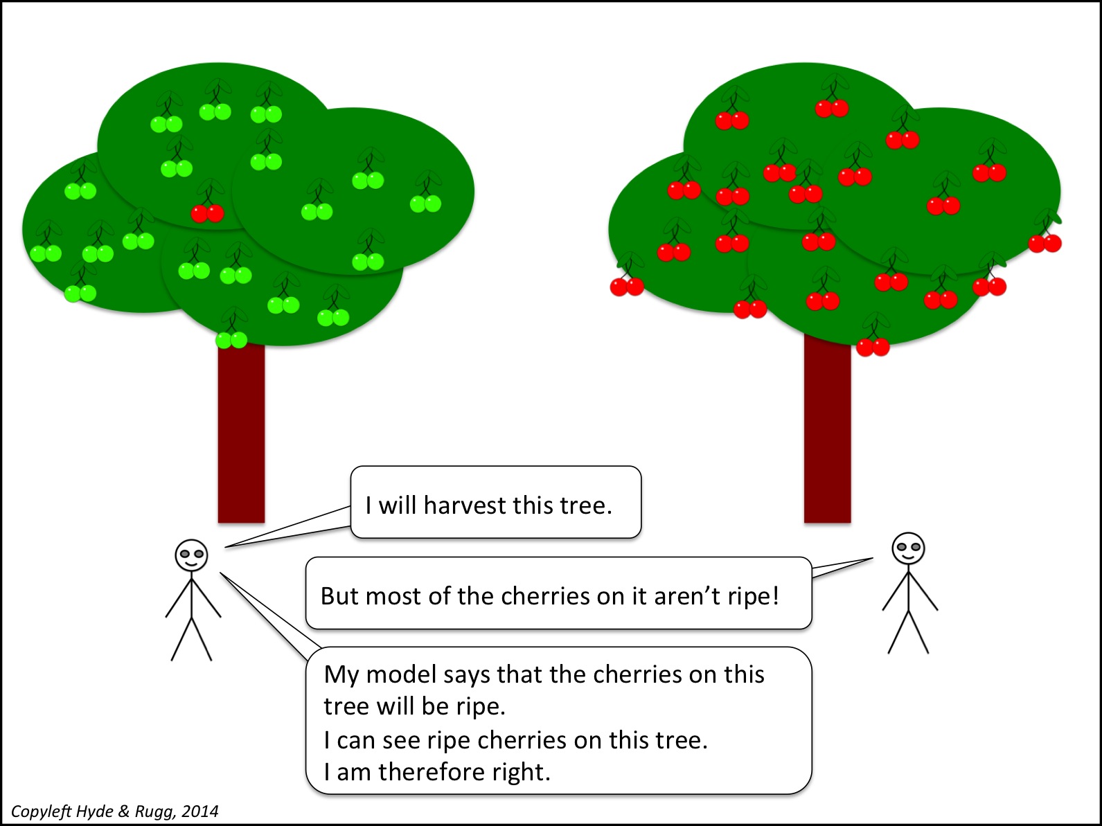
Cherry picking is common. That doesn’t make it any less bad.
A proper literature review will give a fair, balanced overview of the weight of evidence for the key relevant arguments about each of the points covered in the literature review.
A cynical view is that this is impossible, since “fair and balanced” involves subjective value judgments. A common cynical follow-up argument is that since “fair and balanced” is impossible, then anything goes, so we might as well openly cherry pick. This sounds superficially plausible, but as with Zeno’s paradox, the reality is different. As in the example above, you can reach some level of objective agreement that the second tree has a higher number of ripe cherries than the first, even if you don’t know the exact number. I’ll return to this issue repeatedly through the remainder of this article.
Doing a “good” literature review: Subtexts and reasons
So far, I’ve mainly focused on problems that can arise when doing literature reviews. In this section, I’ll look at current best practice, and I’ll unpack some of the subtexts and rationales involved.
Arguably the most extreme and demanding form of the literature review occurs in a PhD. Some quick clarification: I’ll sometimes distinguish between the dissertation, which is the written document, and to the thesis, which is the theoretical argument being described in the dissertation.
When you write up your PhD, you don’t have much room for evasion in your literature review. You can’t hide behind the excuse of a tight word count, as you can when writing a journal article; PhD dissertations do have length limits, but those limits still give you more than enough space for a thorough literature review. You can’t hide behind the excuse that you’re writing a simplified version for a specific readership; the whole point of the PhD is that you’re writing the full-strength version for professionals who are leading experts in your chosen field. You have to do it so well that it will stand up to sustained hard, well-informed questions from the external examiners.
What will the external examiners be looking for? Various things.
One thing that they won’t be particularly concerned about is whether you disagree with orthodoxy. The conspiracy theory that academics silence dissent from academic orthodoxy is a caricature of reality. A classic way of making your reputation in academia is to find a point where orthodoxy is wrong. If you do that for a point where orthodoxy is very wrong, you can get a Nobel Prize.
One thing that the examiners will be looking for, however, is how well your literature review summarises the previous literature on your chosen topic. “Well” in this context means things such as:
Completeness of coverage – have you identified all the key findings, issues, researchers and publications?
Currency – is your review completely up to date, or have you missed any significant recent findings?
Accuracy – does your review accurately reflect what is being said in the previous literature?
If you know what you’re doing when writing up your PhD, then you make sure that your literature review is exhaustive in its coverage, and that you include at least one reference to a publication from within the last twelve months, and that you include at least one detailed discussion of wording within a key publication to show that you’ve read the literature thoroughly, rather than relying on second-hand descriptions from Wikipedia. All these things send out the right signals to the examiners.
Conversely, if you’ve failed to mention key publications etc relating to your thesis, then the examiners will view this as a major problem, and will start asking some very hard questions. For instance, if your thesis is based on a model of how memory operates when learning material in a classroom environment, and you haven’t mentioned key figures such as Baddeley, then this raises serious questions about your competence. It’s your job to show that you’ve read the relevant literature; the examiners’ default assumption is that if you haven’t mentioned a relevant concept, it’s because you’ve failed to learn about it. If you demonstrate in the viva that you have in fact read about Baddeley (for instance) but didn’t think that his work was relevant to your thesis, you’re still in deep trouble, because this is an incredibly amateurish way to handle the issue. What you should do in such circumstances is to explain why Baddeley (or whoever) appears at first sight to be relevant, but actually isn’t relevant.
Framing, arguments and theses
The discussion above raises a deep question. How do examiners, or other researchers, decide what the key issues and concepts etc are within a field? There isn’t a single perfect answer. There are various answers, none of which is perfect, but which together at least manage to reduce or eliminate a lot of potential problems.
One criterion for assessing what to include is professional consensus within the field. It’s far from perfect, but it’s a good start. You should get a fair idea of professional consensus from reading the literature; you’ll soon start seeing the same names occurring over and over again in the literature reviews within the articles that you read.
This is one of many places where peer review plays an important role. Although peer review is far from perfect, it’s still an invaluable criterion for deciding what’s worth considering seriously, and what isn’t. The popular literature can be, and often is, written by amateur idiots who think that they know more about a topic than people who study it for a living. The peer reviewed literature, on the other hand, has to pass at least some quality control before it appears in print, so it’s a good place to start.
You should also get useful information about professional consensus from review articles, whose purpose is to give an overview of key research developments in a field over recent years (usually about the last ten to twenty years). These are an invaluable resource for new researchers, since they give a synoptic overview of the field, and they’re usually written by major figures within the field. You may not agree with the opinions of the person writing the review article, but you can usually be fairly confident that they will have identified the most significant concepts, findings and publications.
One problem with the traditional literature review, as described above, is that it can easily nudge a field towards a particular framing or agenda, which can take the field off in a plausible but wrong direction.
This is one reason that I have mixed feelings about invocations of Great Names such as Plato and Rousseau in literature reviews. On the one hand, yes, they might have prefigured some current debates. On the other hand, they were operating in a world very different from ours, long before modern science got going, so their opinions will probably be only of historical interest. If we let Plato’s views influence the agenda for a research question, then we’re accepting the agenda of someone writing before the discovery of gunpowder, of America, of chemistry, of electricity and of modern mathematics, to name an arbitrary handful of issues.
This is one of the points raised by some early postmodernists. They asked questions about why some topics are heavily researched, but not others. The answer often comes down to social choices and social status; topic A is viewed as prestigious and proper, and topic B is viewed as low-status and trivial. For instance, researching Jane Austen’s work is viewed as completely acceptable; researching Barbara Cartland’s work is viewed as “junk research” or trendy nonsense.
Systematic Literature Reviews
There have been various attempts to approach literature reviews more systematically.
At the level of academic disciplines, fields such as sociology and linguistics and media studies have a long and honourable tradition of tackling head-on the role of social status and social values within research framing. Studying French from within linguistics, for example, is a world away from studying it from within French Studies.
At the level of specific research methods, one approach that has recently received increasing attention is the Systematic Literature Review (SLR). This is a method which produced some very useful results in medicine, where researchers used it to gain an overview of the pattern of research findings about a particular topic – typically how well or badly a particular intervention performed for a particular medical condition.
This approach involves careful, detailed documentation of the process used in the search, including the choice of keywords and of bibliographic database. It looks very scientific. However, it has some serious limitations, which I’ve discussed in another article. It works well if you’re dealing with crisp sets, i.e. entities that can be clearly and unambiguously defined, such as a particular medication and a particular illness that can be diagnosed via an objective test. It doesn’t work well with fuzzy sets, where the entities are not clearly defined or objectively measurable.
Another drawback of SLRs is that they only give one type of insight into the literature. They don’t, for instance, show what happens when you plot the strength of a claimed effect against the quality of the publication where it’s described.

Similarly, SLRs don’t give any insights into developments across time within a field. They can tell you how many articles appeared on a particular topic in successive years, but they can’t by themselves explain why the number of articles on a topic changed or remained constant.
Argumentation and literature reviews
Some of my recent work with various colleagues has involved using visual representation of argumentation within literature reviews. This provides a clean, systematic framework for a chain of reasoning, and for choosing topics to include within a literature review.
For example, the image below shows what might happen if you trace the successive causes of a condition across two different literatures that don’t normally interact much with each other (e.g. the literature on Ehlers-Danlos Syndrome and the literature on podiatry). The hypothetical example below shows in white boxes the causes of condition X that have been identified within one field, and shows in green the contributory causes that have been identified within a different field.

This can be particularly useful for identifying weaknesses in one literature that might be fixed by importing concepts from another literature. This is a well established approach within research; I’ve written about it in an earlier article, using the semi-humorous analogy of the magic weapon that the protagonist uses to tackle the problematic dragon.
Closing thoughts
That’s a brief overview of some key concepts relating to literature reviews. Literature reviews are an extremely important part of research, and there’s a lot more that can be said about them.
If you’re interested in this topic, you might like the links below. They’re not an exhaustive collection; they’re just a taster, but they’re interesting tasters.
With regard to topics that aren’t addressed within a research literature, a recurrent problem is the significant absence, i.e. something whose absence isn’t an accident. The difficulty is deciding what is significant and what isn’t, since in principle anything could be viewed as a significant absence, depending on the opinion of the individual.
A classic example is the way that protagonists in action stories often don’t have a mother. There’s an insightful article about this topic here:
http://www.theatlantic.com/magazine/archive/2014/07/why-are-all-the-cartoon-mothers-dead/372270/
If you find that article interesting, then you’ll probably love the TV tropes site:
http://tvtropes.org/pmwiki/pmwiki.php/Main/HomePage
It can, however, become horribly addictive, and can transform your experience of TV viewing…
Returning to the old school: The field of literary criticism is traditionally very text-based, with comparatively little use of graphical or quantitative approaches (apart from stylometrics, which is arguably a separate field).
One exception is the work of Moretti, who used a variety of methods to examine texts graphically and quantitatively.
http://www.amazon.com/Graphs-Maps-Trees-Abstract-Literary/dp/1844670260
A great deal more could be said about literature reviews, and has been said in numerous other places by numerous other people, but it’s a hot July day and my admin stack is calling, so I’ll end here.
Notes
As usual, I’ve used bold italics for useful concepts that are covered well in easily accessible sources such as Wikipedia.
You’re welcome to use Hyde & Rugg copyleft images for any non-commercial purpose, including lectures, provided that you state that they’re copyleft Hyde & Rugg.
There’s more about the theory behind this article in my latest book, Blind Spot, by Gordon Rugg with Joseph D’Agnese:
http://www.amazon.co.uk/Blind-Spot-Gordon-Rugg/dp/0062097903
There’s a lot more about academic writing, including literature reviews, in my books with Marian Petre, in particular The Unwritten Rules of PhD Research:

The Unwritten Rules of PhD Research (Open Up Study Skills)

July 20, 2014
Monday mood lifter: The Japanese have a word for it
By Gordon Rugg
In case your Monday morning needs some brightening, here’s a concept that might lift your day out of the rut.
It’s a Japanese art form called gyotaku. Literally translated, that means “fish rubbing”. It involves rubbing dead fish, but the Japanese name doesn’t bother to specify the deadness component.
The full explanation isn’t as surreal as the literal translation implies. Not quite.
Gyotaku involves coating a dead fish in calligraphic ink, and then pressing paper on it to make a life-sized print of the fish.
Here’s an example.
 https://en.wikipedia.org/wiki/Gyotaku#mediaviewer/File:Yuta.jpg
Done well, it produces striking, understated images, usually monochrome, every one unique. If you find fossils evocative, you might like gyotaku; it’s something you can try for yourself at home. It doesn’t have to involve fish; it also works well with molluscs, including cephalopods. It’s now catching on around the world.
I hope that this knowledge has helped your week get off to a better start.
Disclaimer: Hyde & Rugg bear no responsibility for what happens to anyone who tries using this approach on anything other than dead fish, dead arthropods and dead molluscs. Trying it on live sharks is particularly inadvisable…


July 18, 2014
Trees, nets and teaching
By Gordon Rugg
Much of the debate on education uses diagrams to illustrate points being discussed.
Many of those diagrams are based on informal semantics.
The result is often chaos.
In this article, I’ll use the knowledge pyramid as an example of how informal semantics can produce confusion rather than clarity.
The knowledge triangle is widely used as a way of representing levels of abstraction in information (using “information” here in the broadest sense, for reasons that will soon become apparent).

https://en.wikipedia.org/wiki/DIKW_Pyramid
At the bottom of the triangle is the concept of data – raw, unstructured pieces of “information” in the broad sense. Above this comes information in the strict sense, usually defined as “structured data” or something similar. Above information comes knowledge, usually defined along the lines of “information about information”. At the top of the pyramid is wisdom, with a definition such as “knowledge about knowledge” or “structured knowledge”.
It’s a useful starting point, as long as you don’t treat it as the full story.
This diagram implies that these four concepts form discrete levels, and gives no indication of just what each level actually contains.
That’s a significant omission, since it allows people to imagine whatever they want about those contents, and about how the levels relate to each other, and about what the implications are for teaching and learning.
There have been claims, for example, that if we simply present students with enough examples of the contents of a particular level, then the students will somehow manage to work out how to aggregate those examples, and will infer what the contents of the next level up will be via some form of “natural learning”.
That’s the approach that Copernicus used in astronomy to work out the principles of planetary motion. Darwin used it to work out the principles of evolution.
However, Copernicus and Darwin spent most of their working lives trying to discover those underlying principles. A lot of other researchers without their genius spend all their working lives on these topics without ever finding the answers. The idea that this approach could be routinely used in school-level education is somewhat reality-challenged, to say the least.
Another problem with the pyramid model is that it’s often combined with an implicit assumption that the higher levels of the pyramid are in some sense more pure and noble than the lower levels. The implicit subtext is that the lower levels of the pyramid contain the basic material that the lower levels of society need to know, whereas the higher levels contain the sophisticated abstract concepts that only the educated elite can properly comprehend. Those assumptions are neither a recipe for producing good plumbers or for producing good academics, but that’s another story for another article.
So what, if anything, is inside the knowledge pyramid, and why should anyone care?
An IT view
The knowledge pyramid is widely used in Information Technology (IT), which is part of the reason for its popularity. From an IT perspective, a hierarchical organisation of information makes a lot of practical sense. For instance, a customer record might include the customer’s name and the customer’s address; the customer’s address might include the house number and the street name and the town and the postcode.
Boxes can contain sub-boxes, and everything is neatly defined.

So far, so good.
When computer scientists tried to take on more complex problems, however, they discovered that the nature of the issues they were dealing with was very different. There’s a deep, fascinating story about how researchers came to realise that the way human beings handle information is not “illogical”. The messy, imperfect rules of thumb that we use are actually the least bad option available for handling a world which is itself messy, and which is very different from the clean, simple problems favoured by formal logicians.
One of the results from this realisation was the growth of knowledge representation as a field within Artificial Intelligence. I’ll draw heavily on knowledge representation in this article; in particular, I’ll draw on graph theory, which is an important tool within knowledge representation. I’ll then look at the implications for education theory, practice and policy.
Levels of knowledge
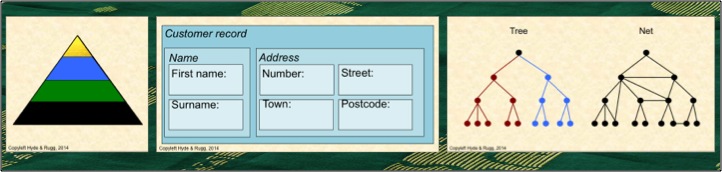
When you’re trying to explain the concept of levels of abstraction to a non-specialist, diagrams like the one below are a useful place to start.

This representation is known within graph theory as a tree. A key feature of a tree is that as you move away from the starting point at the top, your path can only divide; it can never join another branch. In the image above, I’ve shown this via the red branch on the left and the blue branch on the right; the descendants from this initial pair of branches never re-join.
The tree is a classic type of hierarchy; you meet it in zoological classification and numerous other places.
It’s clean and it’s simple, and it’s widely used as a way of showing pyramid-like information structures schematically. If you’re tidy-minded, you can draw the tree with the branch points at the same level as each other, and you can use the number of levels as a measure of complexity. The example above has four levels, including the level of the starting point.
However, when I drew a diagram of the knowledge pyramid in my previous article on the topic, I deliberately didn’t draw it as a tree. I drew it with two branches joining, at the “information” level, in the middle of the diagram. There was a reason for this.

When you start studying human expertise, you rapidly discover that the experts’ knowledge doesn’t consist of simple, tidy trees. The world that they deal with is more complex than that, and the way they organise their knowledge is correspondingly complex. For instance, a key part in an expert medical diagnosis might be a particular very low-level piece of data, such as a patient’s temperature, which is being used within very high-level categorisation and decision-making. Expert reasoning often involves this type of mixture of levels.
Also, experts typically use more than one classification system for their knowledge. An expert ornithologist might, for instance, classify birds for some purposes using a cladistic classification system, and classify the same birds for other purposes using a habitat classification system. Some of these might be trees, but others might not; for instance, some classifications systems such as the periodic table are based on a matrix layout.
A further point worth spelling out explicitly is that many of the classification systems that experts use are significantly more than four layers deep – you can’t simply map the levels of a tree-style classification system onto levels of the knowledge pyramid.
In summary, if you’re trying to represent expert knowledge accurately, the knowledge pyramid isn’t a good representation; it’s too simple.
The same goes for using a graph-theory tree as a representation. The experts’ knowledge often isn’t a tree.
In graph theory terms, the experts’ knowledge is often a net. That’s significantly different from a tree. It’s more complex, and it’s less neatly structured.

In a net, branches can re-join, as in the example above. This has a huge range of implications both practically and in terms of formal theory. The bottom line is that the knowledge pyramid rapidly stops being useful when you start getting involved with the detail of how human knowledge actually works in real, nontrivial cases.
It’s no accident that a lot of the popular claims about learning and knowledge use examples from tightly bounded artificial fields, such as chess, where the principles and issues are simple and clear-cut. Unfortunately, the world is rarely simple and clear-cut, so modelling it properly requires something more powerful than pretty simplifications.
Conclusion
So, where does that leave us?
The knowledge pyramid is a useful concept, provided that it’s used within its range of convenience (i.e. the range of contexts within which it can be meaningfully applied). It’s a neat, simple way of representing some important principles, such as the principle that there are differences in scope and nature between data, information, knowledge and wisdom. It’s useful for conveying the concept that “knowledge” in the broad sense can be structured and categorised.
It is, however, very much a simplification. If you want to structure and categorise knowledge in the broad sense for any practical purposes, whether those purposes are in education or in software design or any of the other fields where this structuring is applicable, then you need to go beyond the simplified version, and use the proper specialist concepts.
We’ve already seen several of the specialist concepts in this article, in the form of trees, levels and nets. They’re simple concepts, but extremely powerful; there’s an extensive, sophisticated body of graph theory that can be drawn on for more power, as in the example of showing formal chains of reasoning in our earlier article on argumentation.
Another set of useful concepts comes from the literature on expertise, which we’ve mentioned in passing in numerous articles. That literature has produced a clear and usually surprising set of findings about the nature of expertise, and about how experts are different from novices. Again, these concepts are simple but powerful – for instance, the finding that experts’ organisation of their knowledge is different from novices’ organisation of their knowledge.
The last set of specialist concepts I’ll mention in this article relate to how people learn about data, information, knowledge and wisdom.
One subset of these concepts relates to types of learning – in particular, implicit learning, which appears to have been misinterpreted by some in the popular literature as “natural learning”. There’s an extensive literature on learning, based on painstaking empirical research, that goes back well over a century, and anyone writing about teaching and learning should really be familiar with the key concepts from this literature, such as the role of variable reinforcement.
The second subset of these concepts relates to the nature of the “knowledge” involved – for instance, knowing that knowledge often involves heuristics, which are required for dealing with incomplete and/or unreliable information.
In short, the knowledge pyramid is a simplification, and shouldn’t be used as a basis for any theory or policy development.
However, for anyone wanting to develop theory or policy, there’s a well-established set of powerful methods and concepts available that provide much more solidly grounded support and frameworks. We’ve already blogged about most of these, and we’ll be blogging about the others in future articles.
Notes
You’re welcome to use Hyde & Rugg copyleft images for any non-commercial purpose, including lectures, provided that you state that they’re copyleft Hyde & Rugg.
There’s more about the theory behind this article in my latest book:
Blind Spot, by Gordon Rugg with Joseph D’Agnese
http://www.amazon.co.uk/Blind-Spot-Gordon-Rugg/dp/0062097903
Related articles on this site:
Graph theory:
http://hydeandrugg.wordpress.com/2013/05/30/an-introduction-to-graph-theory/
The knowledge pyramid:
http://hydeandrugg.wordpress.com/2014/06/05/assessment-methods-and-the-knowledge-pyramid/
Argumentation:
Pigeonholes and names:
Range of convenience:
The idea that there are simple facts:
http://hydeandrugg.wordpress.com/2014/03/30/just-the-facts/


July 14, 2014
Monday humour: The Barbara Cartland experience
By Gordon Rugg
Have you ever wondered what a Barbara Cartland novel is like, but never quite got round to finding out?
If so, you no longer need to wonder; I’ve put a representative small sample below the fold.

(Original photo, plus images from wikipedia: details at the end of this article.)
The extract below is the opening sentence of Dame Barbara Cartland’s The Lioness and the Lily.
As the Earl of Rockbrook drove down the drive of the enormous Georgian mansion which had been in his family since the days of Charles II, he felt no pride of possession.
The rest, in case you’re wondering, is remarkably consistent in terms of quality and historical accuracy.
After reading it, I felt that no other Cartland novel could surpass it, so I’ve read no other Cartland novels since then.
In case you’re wondering how I managed to readjust to everyday life after that life-changing literary experience, the answer is that I read the complete works of Lovecraft.
Which sparked the thought: If only Dame Barbara had turned her unique writing style to stories of the Elder Gods, how different might the world of horror have been…
Notes
The photo of The Lioness and the Lily is one that I took, of my own copy of the book. I’m using it under fair use policy (humour, and it’s an image of a time-worn cover).
The other photos come from the locations below. I’ve slightly cropped them to fit, and given a faint pink wash to the pictures of Lovecraft and Cthulhu to make them more in keeping with the Cartland ethos.
https://en.wikipedia.org/wiki/Cthulhu#mediaviewer/File:Cthulhu_sketch_by_Lovecraft.jpg
https://en.wikipedia.org/wiki/H._P._Lovecraft#mediaviewer/File:Lovecraft1934.jpg


Gordon Rugg's Blog

- Gordon Rugg's profile
- 12 followers

