
UXpin's Blog, page 56
August 9, 2022
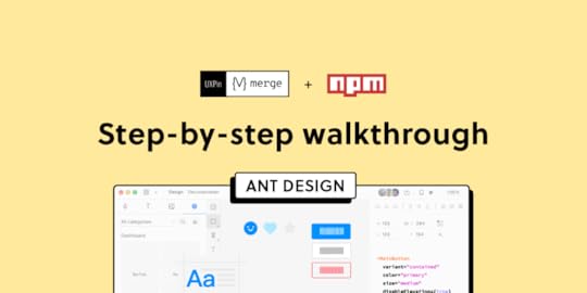
How to Import Ant Design to UXPin? An NPM Integration Guide
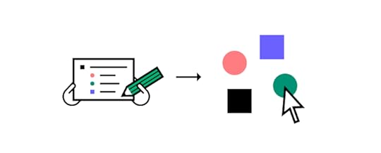
Component-driven prototyping significantly improves user testing while providing stakeholders with realistic product design expectations. UXPin’s NPM integration enables design teams to use open-source component libraries to design fully functioning, high-fidelity prototypes.
Get on board the code-based design revolution with UXPin’s Merge technology and NPM Integration. Discover more about component-driven prototyping that maximizes the use of design systems, improves design handoffs, and scales design significantly.
Bring UI components via Git repo, Storybook, or through our newest NPM integration. Learn more about the last option here: Merge NPM integration.
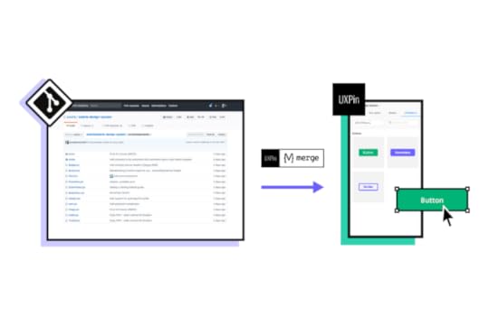
What is UXPin Merge?UXPin Merge is a code-based technology allowing you to sync a component library hosted in a repository, Storybook or as an npm package to UXPin’s design editor. Designers can use these UI components to build prototypes that look and function like the final product.
Any changes engineers (or the design system team) make to functional components in the repository automatically sync to UXPin, notifying design teams of the update. Merge includes version control, allowing team members to switch to an older design system version if needed.
This single source of truth enhances collaboration while reducing the burden on DesignOps and the DS team to manage two design systems–one for design tools and the other for code.
What is UXPin’s NPM Integration?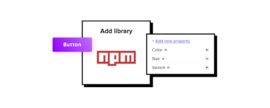
UXPin Merge required engineering expertise to set everything up until now. Not every team has valuable engineering resources for the setup, so we came up with a way of integrating NPM components to UXPin.
Merge’s NPM Integration gives designers complete control over installing and managing open-source component libraries available as npm packages. Designers can import and customize components to meet their prototyping needs using an intuitive interface. It requires zero coding skills to set everything up.
If you want to learn about npm for designer, read our introductory guide: What is npm package?
The Benefits of Working With Ant DesignAnt Design is the product of the Ant Group–a Chinese-based conglomerate of several tech/finance organizations, including Alipay, Huabei, and Yu’ebao, to name a few.

Organizations have used Ant Design to build a multitude of applications, including B2B, B2C, and enterprise products. The comprehensive design system includes React, Angular, and Vue component libraries, with a complementary icon set. You also get Ant Design Mobile for building native applications.
Ant Design NPM Integration With UXPin MergeAnt Design’s React component library is available as an NPM package (antd). Designers can import Ant React components using UXPin’s NPM Integration and customize properties in the Merge Component Manager.
If design teams want to use Ant Design with other design tools, they must use one of Ant Design’s static vector-based UI kits, but with UXPin’s NPM Integration, designers have access to the same components engineers use.
Component-driven prototyping with Ant Design creates a single source of truth between designers and engineers while ensuring the highest consistency between UX and product teams.
With UXPin’s NPM Integration, you can choose which Ant Design React props you want to import–color, size, icons, states, etc.
Assigning Properties in Merge Component ManagerOur NPM Integration includes Merge Component Manager–your central control for importing and managing each Ant Design’s component properties.
UXPin’s NPM Integration works with React components, so you can follow Ant Design’s React documentation to reference which props you want to import. Once you set these up in Merge Component Manager, the component’s properties appear in UXPin’s Properties Panel.
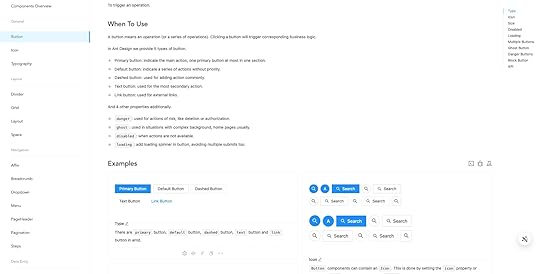
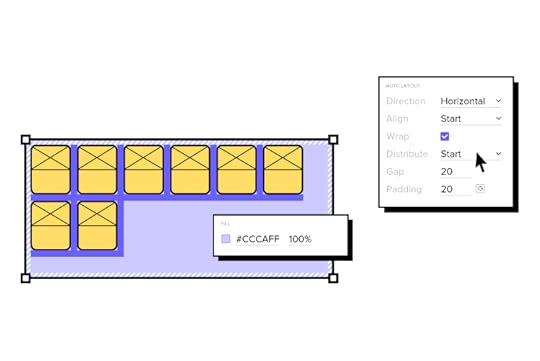
For example, there are six types or variants of an Ant Design button:
PrimaryGhostDashedLinkTextDefaultThese button types (and all other properties) appear as a dropdown in the Properties Panel for designers to choose. Props can appear as text fields, checkboxes, code editors, etc., depending on the component.
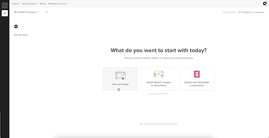
Connecting UXPin to the Ant Design NPM PackageStep 1Navigate to your UXPin dashboard and click “New Project.”
 Step 2
Name your project and click “Create New Project.”
 Step 3
Click “New prototype” to open the project in UXPin’s design canvas.
 Step 4
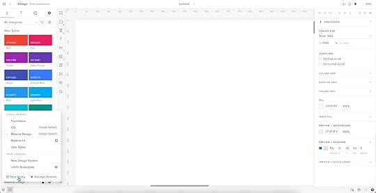
Click the dropdown at the bottom of the Design System Libraries tab in the lefthand sidebar, and click “New library.”
Your sidebar and available libraries may differ from the example.
Step 5Select “Import React Components” and click “Next.”
 Step 6
Name your library. This name is purely for your reference and won’t impact the import.
You also need to grab the NPM package repository name, which you find under Install on Ant Design’s NPM page. Copy and paste the Install contents from NPM into the “Library package name” field (delete everything preceding antd).
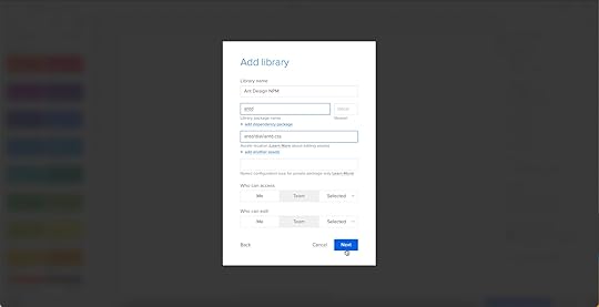
To import component styling properties, Merge requires the path to Ant Design’s CSS (antd/dist/antd.css). You can find this under Usage in Ant Design’s React installation instructions.
 Importing Ant Design Components
UXPin will automatically redirect you to the canvas once you complete the NPM integration. Now it’s time to select the Ant Design components you want to import.
Step 1From the lefthand sidebar, click “Open Merge Component Manager.”
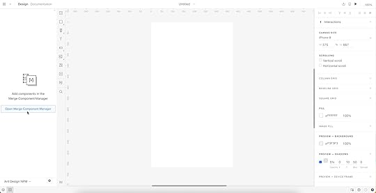
Merge Component Manager will open in a new tab.
Step 2Click “Add new component.”
 Step 3
Enter the name of the component you want to import.
You’ll find the correct naming convention in the Ant Design docs under Component API. Ant Design’s components use CamelCase with no spaces. Always capitalize the first letter. For example, Date Picker would be DatePicker.
For this tutorial, we will import an Ant Design Button as our first component and add it to a new category called General. We recommend using the same categories as Ant Design’s docs, so designers and engineers have the same reference point.
You can add multiple components to a single import, saving you time repeating steps two and three.
Click “Import Components.”
 Step 4
Click “Publish Changes” in the top right to initialize the import process.
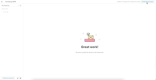
The first time you do this for a new component, it might take a minute or two.
 Step 5
Once the import is complete, click “Refresh Library” to update the changes in your project library.
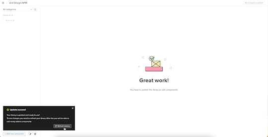
If you follow these instructions step-by-step, you’ll notice you have a category (General) and your first component (Button) in the left sidebar.
Step 6Click on the Button to begin adding properties. You can find these React props in Ant Design’s documentation under API in Components > General > Button.
 Adding Component Properties with Merge Component Manager
Let’s add a few Ant Design button properties using the React props from the documentation.
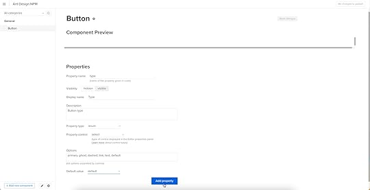
 Button Type: Step 1
The React button type prop imports the six Ant Design button styles.
Property name: enter “type” (always use lowercase for props)Display name: This is for your reference, but something descriptive that both designers and engineers use–we’ve gone with “Type” to keep things uniformDescription: Add a short description or instructions for designers–we’ve used “Type of button”Property type: “enum”–allows you to create a dropdown display the six stylesProperty control: “select”Options: Add the options from Ant Design’s API docs–primary, ghost, dashed, link, text, defaultDefault value: Your preference–we’ve gone with “default” as per Ant Design’s docsAs you complete the component’s properties, you’ll notice a component preview will appear and change according to your preferences.
Button Type: Step 2Once you have completed all the fields, click “Add property.”
Then “Save changes.”
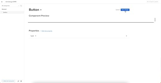
Lastly, “Publish library changes.”
 Component-Driven Prototyping in UXPin
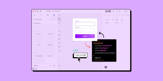
Once you import the Ant Design components and properties you need, prototyping in UXPin is as simple as drag-and-drop to build layouts. We created this simple email sign-up form using three Ant Design components in less than a minute.
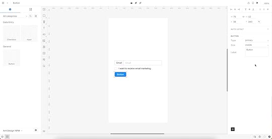
When you select an Ant Design component, the properties you created in Merge Component Manager appear in the righthand Properties Panel.
Try building an Ant Design prototype with UXPin’s NPM integration. Discover how component-driven prototyping can revolutionize your product development workflows to deliver better user experiences to your customers.
Try npm integrationThe post How to Import Ant Design to UXPin? An NPM Integration Guide appeared first on Studio by UXPin.


Bring MUI Components to UXPin – npm Integration Walkthrough

With UXPin’s npm Integration, designers can import npm component libraries to build fully functioning prototypes. These high-fidelity prototypes enable designers to test features, interactions, and functionality impossible to achieve with traditional vector-based design tools.
What is UXPin’s npm Integration?Firstly, it’s important to understand UXPin Merge because our npm Integration is the latest iteration of this game-changing technology.
Merge allows you to sync a design system’s component library from a Git repository or Storybook) to UXPin’s design editor so designers can prototype using fully interactive components that come from their design system.
This component-driven prototyping creates a single source of truth where designers and engineers work with the same design system. Any changes to the repository automatically sync to UXPin, so teams always use the latest version.
***
Join us TODAY for our live demo of integrating npm components to UXPin. Save your spot here.
***
Enter npm IntegrationPreviously, designers needed an engineer’s help to connect and sync Merge. But, with UXPin’s npm Integration, designers (or DesignOps if you have one) can complete the integration using an intuitive user interface without writing any code.
If the component library exists as an npm package, you can connect it to UXPin through Merge and import the UI elements needed to start prototyping. Open-source design libraries like MUI work best with the npm Integration because they have a consistent naming convention, file structure, and documentation.
The Benefits of Working With MUIMUI is a React component library based on Google’s Material Design UI. The comprehensive design system is excellent for prototyping because it has everything you need to build UIs fast.
The MUI team has done fantastic work to ensure components solve foundational usability and accessibility issues, giving you a ready-to-go product development solution.
MUI is themeable, so you can use it as a foundation to build your design system or take advantage of the comprehensive library to test UI elements when trying to find new patterns for your product’s component library.
MUI npm Integration With UXPin MergeMUI has design kits for a few image-based design tools, but with UXPin, you can import its fully functioning component library–the same foundational components engineers use for development.
MUI components in UXPin look exactly like any other static component but have the same fidelity and functionality as code–UXPin renders HTML, CSS, and Javascript in the backend rather than vector graphics.
When you import UI elements into UXPin, you also get MUI’s component states out of the box. If you’ve ever set these up in an image-based design tool, you’ll know how time-consuming and complicated it can be to add basic states and assign them to the properties panel. With UXPin’s npm Integration, you can import these states with a few clicks!
Assigning Properties in Merge Component ManagerThe Merge Component Manager allows you to set up properties for each MUI component.
You can use MUI’s docs to choose which React props you want to import for each component. Once imported, these React props appear in UXPin’s righthand Properties Panel, allowing you to customize individual UI elements.
For example, an MUI button has several color properties:
PrimarySecondarySuccessErrorInfoWarningWhen you import these props via the Merge Component Manager, a dropdown appears in the Properties Panel, allowing you to select the desired color. The same applies to variant (contained, outlined, text), size (small, medium, large), and other multi-option props.
There are several property types, including boolean, function, string, array, and enum, to name a few. You can import any MUI React props found in the documentation according to your prototyping needs.
Connecting UXPin to the MUI npm PackageStep 1Navigate to your UXPin dashboard and click “New Project.”
 Step 2
Name your project and click “Create New Project.”
 Step 3
Click “New prototype” to open the project in UXPin’s design canvas.
 Step 4
Click the dropdown at the bottom of the Design System Libraries tab in the lefthand sidebar, and click “New library.”

Your sidebar and available libraries may differ from the example.
Step 5Select “Import React Components” and click “Next.”
Step 6Name your library. This name is purely for your reference and won’t impact the import.

You also need to grab the npm package repository name, which you find under Install on MUI Material’s npm page. Copy and paste the Install contents from npm into the “Library package name” field.

Delete everything preceding the @ symbol (so you only have @mui/material), leave everything else as default, and click “Next.”
 Importing MUI Components
UXPin will automatically redirect you to the canvas once you complete the npm integration. Now it’s time to select the MUI components you want to import.
Step 1From the lefthand sidebar, click “Open Merge Component Manager.”

Merge Component Manager will open in a new tab.
Step 2Click “Add new component.”
 Step 3
Enter the name of the component you want to import.
You’ll find the correct naming convention in the MUI docs under Component API. MUI’s components use CamelCase with no spaces. Always capitalize the first letter. For example, bottom navigation would be BottomNavigation.

Let’s import an MUI Button as our first component and add it to a new category called Inputs. We recommend using the same categories as MUI’s docs, so designers and engineers have the same reference point.

You can add multiple components to a single import, saving you time repeating steps two and three.
Click “Import Components.”
 Step 4
Click “Publish Changes” in the top right to initialize the import process.

The first time you do this for a new component, it might take a minute or two.
 Step 5
Once the import is complete, click “Refresh Library” to update the changes in your project library.

If you follow these instructions step-by-step, you’ll notice you have a category (Inputs) and your first component (Button) in the left sidebar.
Step 6Click on the Button to begin adding properties. You can find these React props in MUI’s documentation under Component API > Button.
 Adding Component Properties with Merge Component Manager
Let’s add a few MUI button properties using the React props from the documentation.
 Button Label: Step 1
A button label (or content) in MUI uses the “children” React prop.
Property name: enter “children” (always use lowercase for props)Display name: This is for your reference, but something descriptive that both designers and engineers use–we’ve gone with “Label”Description: Add a short description or instructions for designers–we’ve used “Button’s label or CTA”Property type: “node” as per MUI’s docsProperty control: “textfield” (note: this field will only appear once you select a property type and will differ depending on your selection)Default value: Your preference–we’ve gone with “Button” (note: MUI capitalizes button labels)As you complete the component’s properties, you’ll notice a component preview will appear and change according to your preferences.
Button Label: Step 2Once you have completed all the fields, click “Add property.”

Then “Save changes.”

Lastly, “Publish library changes.”
 Component-Driven Prototyping in UXPin
Once you import the MUI components you need, prototyping in UXPin is as simple as drag-and-drop to build layouts. We created this simple email sign-up form using three MUI components in less than a minute.

When you select an MUI component, the properties you created in Merge Component Manager appear in the righthand Properties Panel.
Ready to discover the possibilities of component-driven prototyping in UXPin? Try the MUI npm Integration (or other open-source component libraries available on npm).
Try npm integrationThe post Bring MUI Components to UXPin – npm Integration Walkthrough appeared first on Studio by UXPin.
Bring MUI Components to UXPin – NPM Integration Walkthrough
With UXPin’s NPM Integration, designers can import NPM component libraries to build fully functioning prototypes. These high-fidelity prototypes enable designers to test features, interactions, and functionality impossible to achieve with traditional vector-based design tools.
Enhance your prototyping and testing with UXPin’s code-based design technology. Sign up for a free trial to discover how component-driven prototyping with UXPin’s NPM Integration can revolutionize your product development workflows.
What is UXPin’s NPM Integration?Firstly, it’s important to understand UXPin Merge because our NPM Integration is the latest iteration of this game-changing technology.
Merge allows you to sync a design system’s component library from a Git repository or Storybook) to UXPin’s design editor so designers can prototype using fully interactive components that come from their design system.
This component-driven prototyping creates a single source of truth where designers and engineers work with the same design system. Any changes to the repository automatically sync to UXPin, so teams always use the latest version.
Enter NPM IntegrationPreviously, designers needed an engineer’s help to connect and sync Merge. But, with UXPin’s NPM Integration, designers (or DesignOps if you have one) can complete the integration using an intuitive user interface without writing any code.
If the component library exists as an NPM package, you can connect it to UXPin through Merge and import the UI elements needed to start prototyping. Open-source design libraries like MUI work best with the NPM Integration because they have a consistent naming convention, file structure, and documentation.
The Benefits of Working With MUIMUI is a React component library based on Google’s Material Design UI. The comprehensive design system is excellent for prototyping because it has everything you need to build UIs fast.
The MUI team has done fantastic work to ensure components solve foundational usability and accessibility issues, giving you a ready-to-go product development solution.
MUI is themeable, so you can use it as a foundation to build your design system or take advantage of the comprehensive library to test UI elements when trying to find new patterns for your product’s component library.
MUI NPM Integration With UXPin MergeMUI has design kits for a few image-based design tools, but with UXPin, you can import its fully functioning component library–the same foundational components engineers use for development.
MUI components in UXPin look exactly like any other static component but have the same fidelity and functionality as code–UXPin renders HTML, CSS, and Javascript in the backend rather than vector graphics.
When you import UI elements into UXPin, you also get MUI’s component states out of the box. If you’ve ever set these up in an image-based design tool, you’ll know how time-consuming and complicated it can be to add basic states and assign them to the properties panel. With UXPin’s NPM Integration, you can import these states with a few clicks!
Assigning Properties in Merge Component ManagerThe Merge Component Manager allows you to set up properties for each MUI component.
You can use MUI’s docs to choose which React props you want to import for each component. Once imported, these React props appear in UXPin’s righthand Properties Panel, allowing you to customize individual UI elements.
For example, an MUI button has several color properties:
PrimarySecondarySuccessErrorInfoWarningWhen you import these props via the Merge Component Manager, a dropdown appears in the Properties Panel, allowing you to select the desired color. The same applies to variant (contained, outlined, text), size (small, medium, large), and other multi-option props.
There are several property types, including boolean, function, string, array, and enum, to name a few. You can import any MUI React props found in the documentation according to your prototyping needs.
Connecting UXPin to the MUI NPM PackageStep 1Navigate to your UXPin dashboard and click “New Project.”
Step 2Name your project and click “Create New Project.”
Step 3Click “New prototype” to open the project in UXPin’s design canvas.
Step 4Click the dropdown at the bottom of the Design System Libraries tab in the lefthand sidebar, and click “New library.”
Your sidebar and available libraries may differ from the example.
Step 5Select “Import React Components” and click “Next.”
Step 6Name your library. This name is purely for your reference and won’t impact the import.
You also need to grab the NPM package repository name, which you find under Install on MUI Material’s NPM page. Copy and paste the Install contents from NPM into the “Library package name” field.
Delete everything preceding the @ symbol (so you only have @mui/material), leave everything else as default, and click “Next.”
Importing MUI ComponentsUXPin will automatically redirect you to the canvas once you complete the NPM integration. Now it’s time to select the MUI components you want to import.
Step 1From the lefthand sidebar, click “Open Merge Component Manager.”
Merge Component Manager will open in a new tab.
Step 2Click “Add new component.”
Step 3Enter the name of the component you want to import.
You’ll find the correct naming convention in the MUI docs under Component API. MUI’s components use CamelCase with no spaces. Always capitalize the first letter. For example, bottom navigation would be BottomNavigation.
Let’s import an MUI Button as our first component and add it to a new category called Inputs. We recommend using the same categories as MUI’s docs, so designers and engineers have the same reference point.
You can add multiple components to a single import, saving you time repeating steps two and three.
Click “Import Components.”
Step 4Click “Publish Changes” in the top right to initialize the import process.
The first time you do this for a new component, it might take a minute or two.
Step 5Once the import is complete, click “Refresh Library” to update the changes in your project library.
If you follow these instructions step-by-step, you’ll notice you have a category (Inputs) and your first component (Button) in the left sidebar.
Step 6Click on the Button to begin adding properties. You can find these React props in MUI’s documentation under Component API > Button.
Adding Component Properties with Merge Component ManagerLet’s add a few MUI button properties using the React props from the documentation.
Button Label: Step 1A button label (or content) in MUI uses the “children” React prop.
Property name: enter “children” (always use lowercase for props)Display name: This is for your reference, but something descriptive that both designers and engineers use–we’ve gone with “Label”Description: Add a short description or instructions for designers–we’ve used “Button’s label or CTA”Property type: “node” as per MUI’s docsProperty control: “textfield” (note: this field will only appear once you select a property type and will differ depending on your selection)Default value: Your preference–we’ve gone with “Button” (note: MUI capitalizes button labels)As you complete the component’s properties, you’ll notice a component preview will appear and change according to your preferences.
Button Label: Step 2Once you have completed all the fields, click “Add property.”
Then “Save changes.”
Lastly, “Publish library changes.”
Component-Driven Prototyping in UXPinOnce you import the MUI components you need, prototyping in UXPin is as simple as drag-and-drop to build layouts. We created this simple email sign-up form using three MUI components in less than a minute.
When you select an MUI component, the properties you created in Merge Component Manager appear in the righthand Properties Panel.
Ready to discover the possibilities of component-driven prototyping in UXPin? Try the MUI NPM Integration (or other open-source component libraries available on NPM).
Try npm integrationThe post Bring MUI Components to UXPin – NPM Integration Walkthrough appeared first on Studio by UXPin.
August 8, 2022
What is Component-Driven Prototyping?
Component-driven prototyping is the next iteration of user experience design. Designers no longer design from scratch, and engineers write less code.
The result? Better cross-functional collaboration, faster time-to-market, superior consistency, fewer errors, better testing, meaningful stakeholder feedback, and smoother design handoffs.
Sound too good to be true? All of these benefits are possible and more with UXPin Merge. Visit our Merge page for more details and to request access.
Table of contentsWhat is Component-Driven Prototyping?Component-Driven Prototyping Methodology8 Benefits of Component-Driven Prototyping1. A Single Source of Truth2. Design Consistency3. Shareable4. Smoother Design Handoffs5. Meaningful Feedback6. Faster Iterations7. Built-in Responsive Design8. Scaling DesignCompanies Using Component-Driven Prototyping WorkflowsPayPalTeamPasswordWhat is Component-Driven Prototyping?Component-driven prototyping is a product design methodology where designers use ready-made UI elements to build user interfaces (UIs). Instead of designing from scratch, design teams drag and drop interactive components to build prototypes.
This design methodology originates from component-driven development, where front-end engineers build UIs using an existing component library rather than coding from scratch.
Storybook is a popular tool for this development strategy, allowing engineers to build and manage components in isolation.
Component-driven prototyping works similarly. Instead of designing from scratch, design teams focus on building UIs with ready-made components using an open-source UI library or the product’s design system.
The components are usually fully interactive with defined properties, like color, typography, size, style, etc., allowing designers to prototype, test, iterate, and deliver design projects much faster with greater accuracy.
Component-Driven Prototyping MethodologyWhile component-driven development was the inspiration behind component-driven prototyping, Brad Front’s Atomic Design principles are the foundation for the design methodology.
Atomic Design uses a progressive approach to building UIs, starting with the smallest UI elements and scaling. Instead of designing from scratch, designers combine these elements to create larger components, templates, and complete user interfaces (pages).
Atomic Design’s five elements include:
Atoms: Foundational UI elements like HTML tags, fonts, animations, and color palettes. Designers cannot break these elements down.Molecules: Atoms combine to create small, interactive components like form labels or input fields.Organisms: These complex UI components offer greater interactivity designers use to solve usability and accessibility problems. Examples include logos, search fields, and primary navigation.Templates: Define the structure for different website/application sections, like a blog feed, carousels, testimonials section, or footer. Templates include a grouping of atoms, molecules, and organisms to create these larger structures.Pages: A complete screen using a collection of templates to create a cohesive user interface that aligns user needs with business goals.8 Benefits of Component-Driven Prototyping1. A Single Source of TruthThe most significant benefit of component-driven prototyping is enhanced collaboration between design and development. Designers and engineers work with the same component library hosted in a repository or in an npm package or Storybook.
A tool like UXPin Merge facilitates this connection between design and development, giving departments access to a single component library. Design teams use visual UI components, whereas engineers see the code behind them–the same elements from different perspectives.
2. Design ConsistencyThis single source of truth is excellent for maintaining consistency across design and development. With built-in interactivity and styling, designers only have to worry about combining UI components to create user interfaces, eliminating common issues like variations in color, typography, sizing, border radius, correct iconography usage, etc.
Design consistency also benefits engineers who receive approved, uniform components and user interfaces–crucial when multiple teams work on the same product.
3. ShareableSharing components across design teams helps to maintain design consistency while streamlining UX workflows and designer collaboration.
While static UI kits allow designers to share UI elements, these kits lack fidelity and functionality. Designers must set these up themselves, leading to interaction design inconsistencies and drift.
Sharing a component library gives designers visual elements, interactions, styling, and any other constraints the design system sets.
4. Smoother Design HandoffsThe design handoff is traditionally a stressful, fiction-filled process for designers and engineers. Designers use tools, videos, documentation, and static designs to demonstrate what a prototype is “supposed to do.”
Design handoffs in a tool like UXPin Merge eliminate uncertainty and reduce documentation because engineers have the same components. Each component’s interaction and styling properties help designers stay within technical constraints, so engineers rarely see designs they can’t replicate.
5. Meaningful FeedbackUsability participants and stakeholders also benefit from component-driven prototyping. Fully interactive prototypes give everyone realistic expectations of the final product and its capabilities. The higher fidelity and functionality mean design teams get meaningful, actionable feedback from stakeholders and end users.
 6. Faster Iterations
Designers can iterate on feedback from testing and stakeholders much faster using a component-driven prototyping workflow. The drag-and-drop design process and easy access to properties enable designers to make changes on the fly. PayPal experienced this increased efficiency after switching to UXPin Merge:
“We build high-fidelity prototypes much quicker, and we get immediate feedback after the session. If there’s something we can fix immediately, we make that change before the next participant and get feedback much faster than before.” Erica Rider, Senior Manager for UX – Developer tools and platform experience at PayPal.
UXPin Merge users benefit from a tool like Patterns, allowing design teams to save multiple versions of a single component in a shared pattern library. Instead of using UXPin’s Properties Panel, designers switch out UI elements and patterns to iterate faster.
7. Built-in Responsive DesignResponsive design is a time-consuming task for designers. They must create multiple layouts for a single screen, adding significant time to design projects. A better solution is to develop responsive components, so designers only have to build one prototype for all layouts.
With Merge’s component-driven prototyping solution, the design system team can wrap components in an iFrame to make them responsive to multiple viewports. Designers can switch between these layouts using a dropdown when previewing designs.
8. Scaling DesignThe drag-and-drop nature of component-driven prototyping means non-designers can build prototypes at higher fidelity and functionality than highly skilled UX designers using image-based design tools.
When PayPal switched to UXPin Merge in 2019, they were able to train product teams to complete 90% of design projects. UX designers mentored product teams and helped with complex usability issues–reducing the need for more UX professionals while allowing them to focus on high-level user experience initiatives.
A component-driven workflow significantly reduces the learning curve and speeds up prototyping, making the design process more accessible to non-designers.
Companies Using Component-Driven Prototyping WorkflowsPayPal and TeamPassword both use component-driven prototyping to eliminate inconsistencies and provide positive user experiences for their customers.
We chose these examples because PayPal is a massive multi-national organization, while TeamPassword operates with a small team.
Both companies have experienced significant benefits from switching to UXPin Merge and adopting a component-driven prototyping workflow.
PayPalPayPal is a fantastic component-driven prototyping success story. After switching to UXPin Merge, the organization delivers design projects 8X faster than they were previously using image-based design tools.
“We did a one-page vector-based design with another design tool we use at PayPal. And then the exact same prototype in UXPin using our Merge component library. Using Merge, our designer took around eight minutes, while using the other design tool, the same prototype took over an hour!” Erica Rider, PayPal
PayPal’s component-driven workflow makes everyone involved in product development responsible for user experience. Most importantly, component-driven prototyping empowers PayPal’s product teams to take on more design responsibilities.
“A common internal issue is that product teams often see UX design as a bottleneck. So, our strategy was to start with removing that bottleneck and enabling the product teams to do the design on their own.” Erica Rider, PayPal
TeamPasswordPassword management is a highly competitive industry where organizations must win trust to secure and retain customers. Design plays a significant role in strengthening the brand and creating consistent user experiences that earn customer trust and loyalty.
“Customers entrust us with sensitive information in their login records. Inconsistencies or an outdated design can cause some customers to question whether we are technologically up to date enough to keep that information secure. Front-end development builds trust and confidence in the backend performance.” Tony Caccavo, Director of Operations at TeamPassword
TeamPassword uses open-source component libraries instead of designing from scratch and doesn’t have a design team for prototyping and testing. Instead, TeamPassword’s front-end developers use UXPin Merge to prototype and test new UIs and features.
This component-driven workflow allows TeamPassword to design, test, and ship products quickly with high consistency–vital for operating in such a competitive landscape.
How to Start Component-Driven Prototyping?Creating a single source of truth between design and development is easier than ever. UXPin Merge allows organizations to import a component library, so designers and engineers use the same UI elements.
Importing ComponentsDesigners can import an open-source component library using UXPin’s NPM Integration or, with help from engineers, sync a product’s design system using Merge’s Git or Storybook integration.
 Prototyping
The design process is the same whichever method you choose to sync components with UXPin.
Drag Merge UI elements onto the canvas and make changes via the Properties Panel. You can also combine elements using UXPin Patterns to create larger, more complex components.Connect components to build prototypes for usability testing or present to stakeholders.Test and iterate until you find the perfect solution. UXPin allows you to test in the browser with Preview and Share or use UXPin Mirror for mobile testing.Add documentation to your project and collaborate with engineers using UXPin Comments during the design handoff.Merge’s Single Source of TruthUXPin Merge serves as a single source of truth across the organization, helping to manage and scale your product’s design system. Any changes to the component library’s repository automatically sync to UXPin’s design editor, notifying teams of the update.
UXPin Merge’s Version Control keeps track of releases and allows designers to switch to an earlier version, giving complete control over updates.
Ready to give component-driven prototyping with UXPin Merge a try? Visit our Merge page for more details and how to request access to this revolutionary technology.
Discover MergeThe post What is Component-Driven Prototyping? appeared first on Studio by UXPin.
August 4, 2022
Checklist to Track DesignOps Maturity
Maturing and scaling DesignOps is crucial for long-term success. But where do you start, what do you track, and how do you measure the right metrics?
We took inspiration from the NN Group’s DesignOps Framework and questions from our UXPin Community to create a checklist template DesignOps practitioners can use to track and measure maturity.
Table of contentsUsing Metrics to Track DesignOpsPicking the Right MetricUsing a DesignOps Framework as a “Maturity Checklist”How We Work TogetherOrganize: team structureCollaborate: effective communicationHumanize: Enable development and growthAwareness of DesignOps servicesHow We Get Work DoneStandardize: Use consistent tools and processesHarmonize: Share resources and insightsPrioritize: Decide what to focus on and whyUsefulness of DesignOps ServicesHow our Work Creates ImpactMeasure: Define and track design qualitySocialize: Educate others about design’s role and valueEnable: Cultivate organization-wide use of design activitiesAdoption of DesignOps servicesScale Design With UXPin MergeSync your component library to UXPin’s editor to create a single source of truth and increase adoption with UXPin Merge. Check out Git for React libraries or our Storybook integration for other popular front-end frameworks.
Using Metrics to Track DesignOpsWithout tracking DesignOps efforts, it’s impossible to know whether changes are successful or the organization’s maturity level. These metrics are also crucial for reporting success to stakeholders, getting buy-in, and scaling Ops.
Picking the Right MetricOur December 2021 webinar with Patrizia Bertini looked at the ROI of DesignOps and picking the right metric. Patrizia framed DesignOps metrics in two categories, efficacy vs. efficiency.
Efficacy is about behavior and doing the right things. It can be subjective and challenging to measure.Efficiency is measurable and quantifiable using numbers, percentages, and ratios.Stakeholders like seeing efficiencies because it clearly shows cause and effect. But efficacy is just as significant because behavioral and subjective improvements help to increase efficiencies, thus helping to scale and mature DesignOps.
Watch the webinar again on our YouTube channel and learn how Patrizia approaches efficacy and efficiency. Subscribe for upcoming webinars on DesignOps, design leadership, and design systems.
Using a DesignOps Framework as a “Maturity Checklist”The NN Group’s DesignOps framework is an excellent template for understanding the “DesignOps landscape.” DesignOps leaders can use this framework as a checklist for tracking maturity and identifying areas for improvement.
A 2020 survey of 557 design and UX practitioners from the NN Group found that DesignOps was “low in most organizations.”
The survey reported that “organizations only did 22% of recommended DesignOps efforts, did not have DesignOps-dedicated roles, and had low DesignOps maturity overall.”
Using this framework as a guide, DesignOps practitioners can create a checklist to track progress and maturity.
According to the framework, there are three primary DesignOps areas:
How we work togetherHow we get work doneHow our work creates impactHow We Work Together“How we work together” scored the lowest in NN Group’s DesignOps maturity survey with an 18% average. The category “Humanize: Enable development and growth” was the poorest performer in this area.
Executives and Design/DesignOps leaders must be particularly concerned with poor performance in this area because it correlates to collaboration, communication, teamwork, hiring, and skills development–metrics related to UX output.
Organize: team structureBuilding the “right team” is crucial for a project’s success. The NN Group’s survey identified three critical areas for improving DesignOps maturity:
Shared design team organizational structureBalanced design teams with complementary roles and skillsDesign leaders are peers with leaders from other departmentsCollaborate: effective communicationDesign’s role is understood and agreed by design team members and stakeholdersCommunication channels for designers to share UX knowledge and insightsWork environments encourage internal and cross-functional collaborationFormal channels for team members to share interests and passionsHumanize: Enable development and growthConsistent hiring and interviewing practices that encourage objective candidate assessmentDefined onboarding milestones and goals with regular check-ins for new team membersClearly defined paths for designer career developmentExisting processes for regular skills evaluation to identify growth opportunitiesAwareness of DesignOps servicesAnother way to frame “How we work together” is awareness–socializing work to build awareness and engagement across the organization. Some examples include:
Awareness of skills – essential for building the right teamsAwareness of skill gaps – crucial for long-term growth and scaling UXAwareness of career status and opportunities – inspiring individual development and growth to retain talent and keep employees motivatedBrand and culture recognition – keeps UX in touch with the organization’s broader visionWant to get better in the “How We Work Together” area? Get our free eBook about the first pillar of DesignOps and learn about this important aspect of DesignOps. Get it here: DesignOps Pillar: How We Work Together.
How We Get Work DoneHow we get work done relates to project workflows, tools, processes, and protocols. This area is usually a primary focus for DesignOps because it influences productivity, project delivery, and consistency.

The NN Group’s DesignOps maturity survey showed a 20% average across all metrics.
Standardize: Use consistent tools and processesStandardized, documented design process shared with stakeholders and used by internal design teamsDesign is adequately incorporated in the development processDesigners work with standardized UX principles that guide work for consistent project deliveryDesigners use a consistent toolset for creating UX artifactsDesign tools integrate with external partners, primarily product and engineeringHarmonize: Share resources and insightsShared design system or style guideCentralized, searchable, shared research artifacts and insightsShared, easy access to design artifactsPrioritize: Decide what to focus on and whyDesign teams operate at a realistic capacity–i.e., there is enough time for proper research, design, prototyping, testing, documentation, and deliveryRealistic timeframes and budgets for design projectsUsefulness of DesignOps ServicesWe add one more component to the NN Group’s framework, the “usefulness of DesignOps services.”
Design leadership and stakeholder’s awareness of design projects’ statusDesign team healthSuccessfully completed design programsDesign system impact–productivity, efficiency, time-to-market, consistency, etc.How our Work Creates ImpactImpact is the final DesignOps area of focus. While Impact scored highest on the NN Group survey at a 30% average, many metrics were below or near single digits!

Design advocacy plays a crucial role in scaling and maturing this DesignOps component.
Measure: Define and track design qualityConsistent tracking of design metrics for accountabilityUX metrics tracked per project and towards a broader vision and roadmapObjective, consistent measuring of design qualitySocialize: Educate others about design’s role and valueDesign successes and case studies shared with partners and stakeholdersUnified messaging and sharing of design role and value to partners and stakeholdersRecognizing non-designers when they apply user-centered design principlesThe organization understands design’s valueEnable: Cultivate organization-wide use of design activitiesDesign activities and methods are available to external partners to useDesign skills training for non-designers–i.e., design thinking for problem-solvingEmployees outside of design participate in design processes–i.e., ideation, prototype testing, design sprints, UX research, etc.Adoption of DesignOps servicesWe add another layer to the Impact component: Adoption. Adoption and completion are crucial for Impact because it gives DesignOps case studies and success stories to share with the organization and stakeholders.
Adoption of tools, processes, and systems–encouraging changeAttendance for design events, design team members, external partners, and stakeholdersProjects that follow standardized design processesProjects that follow the design review processNumber of design programs managedNumber of successfully completed programsScale Design With UXPin MergeYou don’t have to hire more designers to scale design output. After adopting UXPin Merge in 2019, PayPal delivers projects 8X faster–and they didn’t have to hire more designers!
With a fully integrated design system syncing design, product, and development, teams spend more time focused on building amazing products with little or no designing and coding from scratch. Iress created a “fully integrated design system“ with UXPin Merge, giving them:
Design in (no) codeNo design driftConsistent designSeamless (no) handoffEliminate many DesignOps challenges with a single code-based design solution from UXPin Merge. Request access to this revolutionary technology and start building better product experiences for your customers.
Discover MergeThe post Checklist to Track DesignOps Maturity appeared first on Studio by UXPin.
August 3, 2022
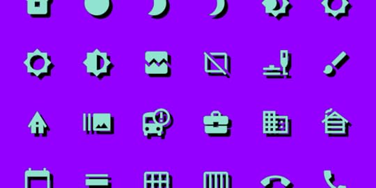
Material Design Icons – Building Blocks of Web and App Design
Material Design is one of the most popular design systems. If you own an Android device, you use Material Design daily. Many companies use the Material Design System as a foundation for building mobile and web applications.
The system’s comprehensive component library and resources, including Material Icons (now Material Symbols), give organizations and startups the building blocks to scale products infinitely without designing from scratch.
This article explores Material Symbols and other Material resources you can use for your next product development project.
Table of contentsWhat is Material Design?Material Symbols LaunchMaterial Icons SetMaterial Symbols – What’s New?Three StylesBuild Your Own Material IconsHow to Use Google’s Material Icons & SymbolsDownloading SVG or PNGCSS/CDNOperating Systems & FrameworksDesigner UsageUsing Material Icons and Symbols With TypographyWeightsSizing & AlignmentMaterial Icons AccessibilityDesigning with Material Design’s Icons in UXPinStep One – Click the icon elementStep Two – Draw an icon on the canvasStep Three – Icon properties panelStep Four – Select an iconStep Five – Adjust icon propertiesStep 6 – Add interactionsImprove Prototyping and Testing With UXPinMaterial Design UI and Icons come standard with every UXPin plan. Sign up for a free trial to build beautiful apps with UXPin and Material Design today!
What is Material Design?Material Design is a design library developed by Google, including UI components, icons, typography, and more. Every Material component includes guidelines for implementation, usage, anatomy, behavior, and more to help designers and engineers achieve the best results while delivering high-quality user experiences.
Google launched the first version of Material Design at the 2014 Google I/O Conference. In May 2021, Google released Material Design 3, including notable features like Dynamic Color, foldable device components, and design tokens.
Material Symbols LaunchOne of Material Design’s most exciting recent updates was the launch of Material Symbols–a customizable icon set with over 2,000 open-source icons in five styles. You can still find all your favorite Material Icons, but now you have more flexibility and customization to meet your product and brand’s requirements.
Material Icons are still available but don’t offer the same customization as Symbols. You can only adjust the size and density versus the four variable options with symbols.
Material Icons SetGoogle has kept the old Material Icons, albeit fewer than the Symbols catalog. Icons are available in five styles, Outlined, Filled, Founded, Sharp, and Two-tone.
Material Symbols – What’s New?Material Icons has moved under Google Fonts, offering a variable icon set in three styles, Outlined, Rounded, and Sharp. Designers also have the option to customize the icon set with four variables or axes:
Fill: Fill or unfilled appearanceWeight: Defines the symbol’s stroke from 100 to 700 weightGrade: Granular adjustments to the symbol’s thickness to convey emphasisOptical size: Size icons to 20, 24, 40, or 48 pixelsThe variable methodology allows engineers to store multiple variations in a single font (or icon) rather than several files. By reducing the file size and number of files, engineers enjoy better performance and fewer assets to manage.
Three StylesGoogle also introduced three new styles to match a brand’s identity and UI design.
Outlined: Clean and light. Designers can adjust the icon weight to complement the product’s fonts.Rounded: The curved aesthetic works well with rounded logos and heavier fonts.Sharp: Designed to match UIs with straight edges and 90-degree corner styling. Build Your Own Material Icons
If you can’t find the icon you need in Material Symbols’ vast catalog, Google includes guidelines for designing custom icons, including:
Design principles: best practices to create clear iconography that’s meaningful and helpful to users.Icon sizes and layout: how to set up the grid size and layout for designing icons using a design tool.Grid and keyline shapes: techniques for creating consistent a consistent icon set.Icon metrics: icon design anatomy including corners, weight, stroke, and complexity.Following these helpful guidelines, you can utilize Material’s comprehensive icon set while including a few relevant to your brand.
How to Use Google’s Material Icons & SymbolsThere are several ways designers and engineers can use Material Icons and Symbols.
Downloading SVG or PNGYou can download Icons and Symbols in SVG or PNG format. We recommend using SVG for its performance and customization benefits. PNG files are much larger and more complicated for designers and engineers to edit and resize.
Google allows you to customize your Icons and Symbols before downloading, so you have a finalized asset to use in your project.
CSS/CDNMaterial Symbols provides a CSS file for website installations similar to what you use for Google Fonts. The problem with this method is that it requires your website to make additional requests, which can severely affect performance.
If you’re planning to use more than one Material Symbol, it’s better to use another method for installation.
Operating Systems & FrameworksMaterial Icons and Symbols offer downloads for Android and iOS to install as project assets, with code snippets for implementation. Material Design includes instructions for Flutter (a Google-developed programming language) and Angular. React instructions are available in MUI’s documentation.
Designer UsageMost design tools offer plugins or extensions for Material Icons. If you’re using UXPin, the complete Material Icons set comes standard with every plan.
You can also import your own SVG icons, edit them in UXPin and save them to your Design System to share with other team members.
Using Material Icons and Symbols With TypographyGoogle’s Material 3 documentation offers tips and best practices for pairing icons with typography.
WeightsNever use different weights for your icons and text. Google makes it easy to pair these assets with Material Symbols’ Weight customization variable. Ensure you always match the font weight with the icon weight to achieve a clean and consistent aesthetic.
Correct font weight.
Incorrect font weight.
Sizing & AlignmentAlways match the icon size and alignment with the text. Users must be able to read both and recognize they’re related. Google recommends designers “shift down the baseline of symbols to approximately 11.5% of the type size.” This technique will keep icons and text uniform and aligned.
 Material Icons Accessibility
Google provides brief but helpful advice to designers about icon accessibility. Designers must always use meaningful, descriptive labels with icons, especially for navigation. Icons without text labels can appear ambiguous and confusing to users. Designers must also include alt text for screen readers and other assistive technologies.
Target size is also a crucial factor for icons. People with large fingers or hand disabilities might accidentally hit the wrong icon button, causing confusion and frustration.
Google recommends designers use a minimum target size of 48 pixels. If you’re using a 20-pixel icon, provide enough padding to make the total target area 48 pixels.
 Designing with Material Design’s Icons in UXPin
With several icon sets, including Material Icons, preinstalled with UXPin, designers don’t have to install plugins or upload external files. Here’s how easy it is to add icons to your project.
Step One – Click the icon elementClick the icon element in the Quick Tools panel to the left of the canvas. Alternatively, you can use the keyboard shortcut OPTION+I (on Mac) or ALT+I (on PC).
 Step Two – Draw an icon on the canvas
Click and drag a square where you’d like the icon to appear on the canvas. Hold down SHIFT to maintain an equal width and height.
 Step Three – Icon properties panel
Once you draw an icon, an icon properties panel will appear on the right Properties Panel. You can select Material Icons or one of the other sets, including Fonts Awesome, Retina Icons, and a UXPin set, to name a few.
 Step Four – Select an icon
Scroll through the available Material Icons to find what you need. Click on any icon in the properties panel (while you have the icon selected on the canvas) to make your selection.
 Step Five – Adjust icon properties
Once you have chosen an icon, you can style it using the Properties Panel above the Icon section. Below the Color Picker is a dropdown with available design systems, including Material Design, so designers don’t have to copy/paste HEX codes from elsewhere.
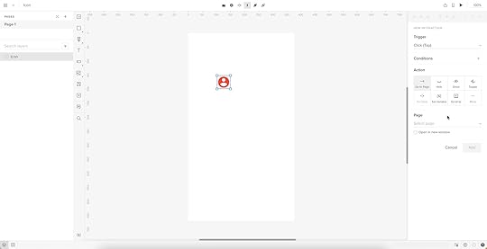
 Step 6 – Add interactions
At the top of the Properties Panel, you’ll find Interactions. Add interactions, animations, transitions, etc., to make your icons interactive. For example, we might want this user icon to open a personalized profile page.
Check out UXPin’s Interactive UI Patterns and App Examples to see how UXPin’s features work and what’s possible with code-based design.
Improve Prototyping and Testing With UXPinMaterial Icons are just one convenience of working in UXPin. Our goal is to help designers build prototypes quicker and with greater functionality and fidelity as image-based design tools.
Using one of UXPin’s built-in design libraries, designers can drag and drop elements to build interactive prototypes in minutes. We’ve included five popular design libraries to accommodate every type of project, from websites to web and mobile applications for enterprise and B2C products.
Every UXPin plan includes Material Design, iOS, Bootstrap, Foundation, and User Flows, with each library’s interactive elements, colors, text styles, and icons.
UXPin’s Design Systems feature allows designers to build a design system from scratch, automatically categorizing the library into Colors, Assets, Typography, and Components. You can also set up permissions and include documentation for designers and engineers to follow.
Build better prototypes that accurately replicate the final product experience using UXPin’s code-based design tool. Sign up for a free trial to discover the possibilities of designing with UXPin.
The post Material Design Icons – Building Blocks of Web and App Design appeared first on Studio by UXPin.
August 1, 2022
9 Experts Share Examples of Great App Design
When you look at the apps that have hit thousands, if not millions of downloads (and boast thousands of happy reviews!), you might wonder: is there an ‘it’ factor they all share? Among others, whether an app has a high download and retention rate comes down to great app design. Namely, there are certain UI/UX design principles that can keep users coming back for more.
Use UXPin and design a prototype that will surely become the next great app! Sign up for a free trial and use its incredible component-driven prototyping approach to build your app’s user interface. Leverage the tool’s power to create a design using a single art board that you can add interactivity to instead of linking multiple art boards to simulate interactions.
9 App Design Examples – What Makes for a Great App DesignWe’ve reached out to a group of product and design experts to learn about their favorite app design examples and what exactly makes them love their favorite mobile apps. Here’s what they told us.
1. Wolt App – putting great user experience firstUladzislau Luchkouski, Head of Design at Orangesoft
 Source: Sky News
The Wolt app is a prominent example of great app design that’s user-friendly. Wolt is a food delivery app that prioritizes superior UX design by offering unmatched categorization, search, and content display, no matter whether you download its iOS app for Iphones or access it on Android devices.
But what makes Wolt a standout in the niche is the overall flow of order placement and wait time in their user interface. Every single step is thought out and aims to address all possible customer needs.
Delivery Settings – an in-built translator, customization tools, and the ‘Order Together’ feature drive maximum personalization for the app user, thus improving the user experience.Search – an intuitive search user interface with easily discoverable food items, meal categories, and dynamic pricing leaves no place for uncertainty and displays accurate pricing for each option.Checkout – the app implements an innovative ‘Slide to Confirm’ form instead of the usual ‘Tap Yes’ feature. This nice touch ensures that there is no accidental touch and the customer is fully aware of placing an order.Wait time and delivery – the Wolt app turns the hangry wait times into a quirky tapping game. Thus, the ‘In Delivery’ interface displays a timer with a big tappable button where the user needs to tap as many times as possible. If the user beats the target number, the delivery fee is completely free.2. Google Maps – function over form
Can Burak, Executive Creative Director at 2fresh.com
When it comes to app design, form follows function. Being able to deliver the promise you give to users is far beyond having a cool user interface design. In that regard, Google Maps delivers great value, and it’s one of the best app designs.
The app brings the world onto your screen and is an example of responsive app design done well. It’s available both as a web and native mobile application. While I opt for a web app on my laptop or desktop, I use it as a native app on my mobile device. I use the offline maps functionality particularly often.
I like the integration of the target destination in the form of text, photos, and comments. And I find great value in its core functionalities. As demonstrated, product design is all about the value and experience.
The app’s UI design is decent to deliver this promise. Nothing fancy or nothing to show off in here. When it comes down to functionality, subtle UI design is the best, which goes for any app, be it a banking app, a fitness app, and more.
If I were to name a downside of Google Maps from a user perspective, I’d say that I’m disappointed by the fact that resolution is crippled over time and that high-resolution satellite images are reserved for Google Earth.
3. Pocket – example of app redesign powered by usersJay Soni, Marketing Director at Yorkshire Fabric Shop.
Another app design example worth looking at is Pocket. This amazing software allows you to save articles or movies to watch later, even if you don’t have access to the Internet, which is an awesome design concept. Pocket, in fact, recently received a Webby Award for user experience design. The app was reworked in large part thanks to Google Ventures.
They enlisted the help of five users from their target audience who had never used the app before, and they used their feedback to design the app’s simple interface. The end outcome is visible to all with improved usability and a better experience.
4. Pinterest – simplicity of useSharon van Donkelaar, CMO and Head of Growth at Expandi
I really love Pinterest’s mobile app, not only because of its minimalist and visually appealing display but also because of how simple it is to use it and find what you’re looking for.
The app certainly has a clear and comprehensive UI design that, without taking much space on the screen and taking the focus away from all the beautiful visuals, allows users to move from one place to the next in the smoothest fashion.
Besides, the fact that with the mobile app you can do everything you’d do on the Pinterest website is the cherry on top of one of the most neatly designed mobile app UI designs I’ve recently used on my smartphone.
5. Viber – super fun to useAdam Moore, Founder of SocialPlus
 Source: Google Play
I love that you can video chat with high-quality resolution, and also text people anywhere in the world. It is perfect for work as you can also communicate with this app through your computer. This multi-platform application is also highly protected, and you will feel secure that only you are seeing your own content between other people.
You can also join groups of people with similar interests to you, not unlike Facebook. This all-in-one app can also nurture your creative side as you can create your own stickers to send to others. This app is fun, simple to use, and overall is a really pleasing app to look at.
6. Uber – simplicity and user-friendlinessDaniel Florido, Chief Web Development & Designer, Director of Pixelstorm
As a website and app designer, I’m always looking for inspiration in the form of well-designed UIs and clever UX. One great mobile app design example is the Uber app.
Uber is a popular ridesharing app that makes it easy to get around town quickly and conveniently. I love Uber’s design because of its simplicity and user-friendliness. The interface is intuitive, with large buttons that are easy to tap and clear information displayed uncluttered.
One of the standout features of the Uber app is its map view, which makes it easy to see exactly where your driver is in your current location. Another feature that I love is easily splitting fares with other riders, which can be a real lifesaver when traveling in a group or with friends.
So those are just a few of the things that make the Uber app’s design great. If you’re ever looking for inspiration for your web or app design projects, I highly recommend checking out Uber and seeing what makes it such a great user experience.
7. Etsy – great app design doesn’t overwhelm youGranger McCollough, CEO & Founder, Elite Patio Direct
As someone who works in eCommerce, I really love the design of the Etsy app purely due to its simplicity and the fact that it doesn’t overwhelm you with products from the start. A lot of eCommerce apps can really throw products in your face with sales and featured products. Etsy simply gives you a search bar and some suggestions for the type of product you may be looking for.
The homepage of the app doesn’t give any prices or product names and is very visual, using only images and headings to narrow down your search. Because of this image-based design, it makes scrolling through the different headings feel very smooth.
8. Airbnb – setting a new standard for easy searchTrevor Larson, CEO and Founder of Nectar
I have always loved and tried to base a lot of what I do at my business off of the app design and UX of the greats. One great app design example is the Airbnb app. The overall experience is fantastic, irrespective of the device you use thanks to the responsive app design. But one particular feature that stands out to me is the search – the way that users can easily search for and find exactly what they are looking for.
 Source: Google Play
Whether it’s a room in a specific location, or an entire apartment to rent, the app makes it quick and easy to find exactly what you need. Overall, the Airbnb app has set the bar high for other apps in terms of great design and UX, and I believe that it truly exemplifies what great app design and UX should look like.
9. TripAdvisor – great app design for various user goalsPatricio Paucar, Co-founder of Navi
I’m awed by Tripadvisor’s app. Intuitive? Check. Great graphics? Definitely. Consistent branding? Yes. Tripadvisor’s overall user experience is the promise of the digital revolution bringing the world to your hand, realized.
The app’s unique differentiator is versatility. It caters to people looking for guided experiences in trip planning as well as users looking for a restaurant recommendation nearby. That’s a rarity in travel apps but not surprising from a company that’s been in the travel business for over two decades.
What’s Your Example of Great App Design?What makes an app great goes beyond responsive app design. Among others, it involves simplicity of use, which allows users to quickly meet their goals, minimalistic design that isn’t overwhelming and prioritizing function over form. Feel free to inspire yourself with our list while designing your own mobile app.
It’s your turn now. Use the powerful lessons you’ve just discovered and design a fully interactive prototype using UXPin’s best features. There’s no limits to what you can build if you put your mind to it. Sign up for a free UXPin’s trial.
The post 9 Experts Share Examples of Great App Design appeared first on Studio by UXPin.
What is Interaction Design?

Interaction design is one of the most critical facets of user experience design. It captivates and surprises users, promising them experiences uniquely responsive to their decisions and actions.
Interaction design also allows designers to communicate with end-users, guiding them through a digital product as efficiently as possible to achieve the user’s goals.
Go to SectionWhat’s Interaction Design?What is the Difference Between Interaction Design and UI Design?Interaction Design vs. UX DesignInteraction Design PrinciplesVisibilityFeedbackConstraintsMappingConsistencyAffordanceCognitionInteraction Design ChecklistInteraction Design ResourcesUXPin–The Ultimate Interaction Design ToolStatesInteractionsVariablesExpressionsInteraction design is one of the most challenging stages of ideation. UXPin’s code-based design tool reduces those challenges by allowing designers to build functional prototypes with extreme fidelity and interactivity. Sign up for a free trial to discover how designing in UXPin can streamline your prototyping and testing to deliver better customer experiences.
What’s Interaction Design?Interaction design–often shortened to IxD–is a field dedicated to making human-to-computer interfaces (HCI) feel human-like. Interactive digital products that create this “human” connection successfully lead to positive user experiences, including:
Greater product satisfactionDeeper usability comprehensionFaster learnabilityA deeper personal connectionIncreased likelihood of repeated useCentral to the IxD practice is the concept of increasing the sense of human connection by selecting the appropriate interactive elements.
Experienced interaction designers know how animation, transitions, microinteractions, copy, color, visuals, timing, and layout impact users’ feeling and behavior–allowing them to design interactions strategically to elicit the appropriate response.
What is the Difference Between Interaction Design and UI Design?Interaction design focuses on human-computer interaction, including animations, microinteractions, transitions, search, and other motion-based designs. They decide what happens when a user taps an element.
User interface design focuses on visual design and aesthetics, including color, fonts, iconography, layouts, etc. They decide what a user interface must look like.
To summarize:
Interaction design is about Interactions and movementUI design is about visual design and aestheticsIn smaller companies and startups, a UI designer is often responsible for both tasks, while the roles are separate in larger organizations. Like anything in digital product design, the roles and responsibilities can synergize. It all depends on the company, product, and organizational structure.
Interaction Design vs. UX DesignInteraction design is a specialized discipline within UX design. Where UX looks at the entire user experience and how everything ties together, interaction designers focus on user interactions and motion.
Interaction designers apply UX fundamentals like design thinking, human-centered design, and user research (personas, case studies, etc.) to make decisions. They’re specifically concerned with a user’s tasks, actions, and environment, while UX designers focus on usability and how someone experiences a digital product.
Interaction Design PrinciplesWe’ve chosen our favorite IxD principles from Don Norman’s (co-founder of the Nielsen Norman Group) book, The Design of Everyday Things.
VisibilityWith many features and limited space, prioritizing visibility is a significant design challenge. Don Norman’s theory is that the more visible something is, the more likely a user sees and interacts with it. Interaction designers must balance visibility prioritization based on user needs and business goals.
A typical example of visibility is prioritizing navigation links on mobile devices. What links are visible via the app bar, and what do designers place in the navigation drawer behind a hamburger menu?
FeedbackFeedback is how a digital product or system communicates with users. Interaction designers have several ways to express this feedback, including motion/animation, tactile, audio, copy, etc.
They must also consider accessibility and how products relay feedback to all types of users and assistive technologies.
ConstraintsCluttered UIs with too many possibilities confuse users and create usability issues. Good interaction design limits (or constrains) user actions to guide them through the product more efficiently.
We see these constraints most commonly with landing pages. Designers strip away navigation, links, and anything else that might tempt users to leave the page, leaving only a prominent CTA or form. Constraining users to a single action allows them to focus on the content that leads to a conversion.
MappingInteraction designers must create a clear relationship between controls and their effect on a digital product. The idea is to map these relationships to feel natural to users.
For example, the top button on an iPhone increases the volume while the lower one decreases. This intuitive layout means users don’t have to think about which button performs which action.
The more intuitive and obvious a product is to use, the easier and more enjoyable the experience.
ConsistencyConsistency is vital for interaction and UI design. Inconsistency can confuse users and create usability issues. Designers not only have to design consistent UIs and interactions but also consider consistency across multiple screen sizes and devices.
Many organizations build a design system or adopt an open-source component library to increase consistency with approved UI patterns and interactions. When designers don’t have to think about these choices, they can focus on the user experience and apply the appropriate pattern to help users achieve the desired result.
AffordanceAffordance tells users how to use something or perform an action. It’s an interaction designer’s job to ensure that it’s obvious to users how to complete tasks using UI elements.

For example, a submit button’s disabled state tells users to complete a form’s required fields before submitting. Using a different color and underline for links tells users which text they can click.
CognitionInteraction designers must have a basic understanding of cognitive psychology in UX design–attention and perception, memory, problem-solving, and creative thinking. The aim is to design products and experiences that don’t overload these mental processes.
Cognition deals with several design psychology principles, including:
Gestalt principles: how the human brain perceives visuals to create familiar structures.Von Restorff effect: predicts that in a group of objects, the one that differs stands out or is most likely to be remembered.Hick’s Law: the more choices you give someone, the longer it’ll take them to make a decision.The Principle of Least Effort: users will make choices or take action requiring the least amount of energy.The Serial Positioning Effect: humans are most likely to remember the first (primacy effect) and last (recency effect) items in a list, sentence, or piece of content.The Principle of Perpetual Habit: people rely on familiar routines and habits–which is why it’s crucial to use universal design patterns.The Principle of Emotional Contagion: humans will mimic or empathize with the emotions and behaviors of others, including animals and animations–which is why designers use faces (even emojis) to emphasize feeling and emotion. Fitts’s Law : the time required to move to a target area is a function between the distance and the target’s size.Dive deeper into cognition in this article: UX Design Psychology Tricks for Design Excellence and this one: A UX Designer’s Guide to Improving Speed of Use. These principles apply to all UX disciplines.
Interaction Design ChecklistWe found this helpful interaction design checklist from the US Government’s Technology Transformation Services website, usability.gov. The checklist includes several questions to consider when designing interactions.
 Define how users interact with the interface – click/tap, push, swipe, drag & drop, keyboard controls, etc.Give users clues about behavior before they take action – correct labeling, different colors for links, using consistency for clickable UI elements, etc.Anticipate and mitigate errors – how do you prevent errors while providing helpful messages to correct problems?Consider system feedback and response time – what happens after users complete an action, and how soon does that feedback appear?Strategically think about each element – have you chosen the appropriate element/pattern? Is there enough space between clickable elements to avoid errors? Have you followed design psychology principles (mentioned above)? Scrutinize every decision from a user’s perspective.Simplify for learnability – make user interfaces and tasks as simple as possible, use familiar patterns, and minimize cognitive-draining tasks and features to simplify the user experience.
Also, check out the IxD Checklist from Aaron Legaspi and Amit Jakhu.
Interaction Design ResourcesInteraction Design AssociationInteraction Design Foundation50 Best Interaction Design ProgramsUXPin–The Ultimate Interaction Design ToolA lack of fidelity and functionality is a significant problem for interaction designers when prototyping and testing using traditional image-based design tools.
Interaction designers must create multiple frames to replicate basic code functionality, which takes considerable time and effort. With UXPin’s code-based design tool, designers can achieve significantly better results with less effort. Here’s how:
StatesUXPin enables designers to create multiple States for a single component. For example, you can build a button with default, hover, active and disabled states, each with separate properties and triggers.
UXPin’s States also allows designers to create more complex UI patterns like carousels, accordions, dropdown menus, and more using a single frame. These UI patterns behave like code, giving interaction designers accurate results and feedback during testing.
InteractionsWith UXPin Interactions, designers can build immersive, code-like experiences far beyond the capabilities of image-based design tools. UXPin offers a wide range of triggers, actions, and animations to create fully functional, animated prototypes.
Conditional Interactions allow designers to take prototypes a step further with Javascript-like “if-then” and “if-else” conditions to create dynamic user experiences.
VariablesIn UXPin, form fields look and function like the final product. Variables allow designers to capture user inputs and use that data elsewhere in the prototype–like a personalized welcome message after completing an onboarding form.
ExpressionsUXPin Expressions take prototyping to another level with code-like functionality, including form validation and computational components (updating a shopping cart). When combined with States, Interactions, and Variables, Expressions allow designers to build prototypes that function like the final product.
These powerful features mean interaction designers don’t have to learn code or rely on engineers to build fully functioning prototypes for accurate testing. With UXPin, designers can build, test, and iterate faster and achieve significantly better results.
Tired of asking usability participants and stakeholders to “imagine” something happening? Switch to UXPin and start prototyping with the world’s most advanced code-based design tool. Sign up for a free trial today.
Try UXPin for freeThe post What is Interaction Design? appeared first on Studio by UXPin.
July 28, 2022
16 Timeless Web Navigation UI Patterns
Navigation UI design plays a significant role in a website’s aesthetics, functionality, and user experience. Designers must design a navigation UI experience that benefits business and user needs.
This article explores 16 web navigation patterns, with tips on applying these and when to use them. We also provide examples so you can model the success of the world’s leading websites and brands.
UXPin’s advanced code-based design tool gives you the features to build fully functioning navigation prototypes for websites, mobile apps, games, and other digital products. It’s revolutionary Merge technology allows you to import ready-made components, such as navigation to the design editor and preserve its interactivity from prototype to production. Request access to Merge.
3 Navigation UI Tips for Website DesignTip #1: Mobile-First ApproachMobile-first design has a significant impact on a website’s navigation user interface. Smaller screens force UX designers to prioritize the navigation menu and reduce unnecessary UI elements or place them elsewhere–like in the footer navigation.
Tip #2: Use Trusted PatternsUX designers must use standardized design patterns to avoid usability issues. For example, the hamburger menu is the universally recognized icon for opening the navigation on websites and mobile apps. Using a different icon will likely confuse users.
Tip #3: Keep it SimpleDesigners can use user research, product analytics, and usability testing to determine what matters most to users and how to prioritize navigation accordingly.
Keeping navigation designs clean and simple is crucial for user experience and providing users only with what they need.
16 Web Navigation UI Patterns That Stand the Test of Time1) SearchSearch allows users to find specific content. While they might get there via a website’s navigation, search provides a quicker, more direct route. For a content-heavy website like Wikipedia, search is the primary navigation because it’s impossible to place links to every piece of content in a navigational menu.
On websites where users use search often, UX designers must make the search bar or icon to open it visible at all times. A great example is how the online learning platform Coursera makes search visible across all screen sizes.
Coursera’s search bar is the most prominent header component on desktop.

On mobile devices, a search icon is visible opposite the hamburger icon.

Coursera’s header design tells us that most visitors use the website’s search to find courses. Coursera displays links to relevant courses and related “Popular Searches” to help users find what they need faster.
 2) Notifications
Websites with user profiles must have a way to inform users of messages and engagement. The industry-standard notification icon is the bell, usually illuminated with a number indicator when the user has unread notifications.
Notifications are crucial for social media products because they inform users and increase engagement, so we often see the notification icon prominent in header navigation across all screen sizes.
3) Table of ContentsA table of contents (TOC) helps users “jump” to the content they value most. TOC is also good for SEO (search engine optimization) because it enables users to navigate a webpage faster, reduces scrolling (especially for mobile users), and increases page engagement.

Make sure to include a “back to top” button so users can jump back to the TOC and navigate to another section.
4) “Sticky” or Fixed NavigationSticky or fixed navigation keeps the header menu visible at the top of the screen. A sticky nav takes up valuable screen real estate, so designers often shrink the navigation bar’s width to minimize its footprint. Some websites use an “invisible sticky header,” which only appears when the user begins scrolling up, thus maximizing the available screen space.
Fixed headers allow users to navigate the website without returning to the top of the screen. Many eCommerce websites use sticky navs to reduce bounce rates and increase conversions. Users are more likely to navigate multiple pages–another critical SEO factor.
5) Vertical NavigationVertical navigation is particularly helpful for navigating single-page applications like social media platforms, email inboxes, CRMs, maps, etc.
Many products use vertical navigation for documentation so that users can jump to different topics quickly. We use a sticky sidebar vertical navigation for UXPin’s documentation so that users can navigate between topics without scrolling.
6) Navigation DrawersWe often see navigation drawers (accessed via a hamburger menu icon) used for responsive mobile web designs. Designers also use them for desktops when there are many menu items or to preserve as much screen space as possible.
7) PopoversPopovers indirectly aid navigation by providing additional context to a menu item before a user clicks. This functionality prevents users from navigating forward and backward as they try to find what they need.
If users have a lot of content to explore, popovers can help them preview menu items before deciding, ultimately saving time.
We also see popovers used for virtual tours during the onboarding of new users, where instructions appear over specific UI elements to explain functionality. These popovers are usually accompanied by next, back, or close/end tour buttons so users can read and absorb content in their time.
8) ModalsModals are similar to popovers, but they’re user or system-activated instead of hovering. We often see modals on eCommerce websites displaying promotional material or additional product information before navigating to a product page.
Netflix uses modals to display supporting content for its videos. If you hover over a Netflix menu item and click the down icon, a modal appears with additional info like the description, genre, episodes, cast, etc.
Modals are useful for displaying content to users before navigating to another page. Like popovers, modals provide helpful context to menu items before users decide to navigate away from the current screen.
9) Call to Action Button (CTA)A call to action is designed to attract a user’s attention to a specific task or action, i.e., “Buy Now,” “Sign Up,” “Login,” etc. We often see these CTAs on landing pages or in website hero sections above the fold.
Placing CTAs in navigation bars increases clicks due to the prime location and the high likelihood it’ll be the first thing someone sees.
UX designers often place CTAs in navigation bars to entice users to sign up or create an account. CTAs generally take up space, so designers must ensure they offer value to users and not only the business.
Returning to our Coursera example, the header navigation UI’s primary CTA asks users to “Join for Free.”
10) Mega MenuMega menus are popular for eCommerce because they allow designers to create complex navigation UIs with product categories, images, videos, featured products, etc.
A mega menu aims to display high-value products and content to increase clicks. As these menu items sit above the fold in the header navigation, it’s more likely that users will see them.
This example from ASOS allows customers to shop by best sellers or top brands with two image cards (likely featuring collections of the store’s most popular products).
 11) Featured Content
Long-form content websites like blogs, news publications, etc., place featured content in navigation UIs (usually in a mega menu) to highlight their best stories.
Featured content can make navigation busy, so UX designers must practice caution and only include critical information, such as the image and headline.
12) Related ContentMany websites and web apps suggest related or recommend content based on what someone is consuming. We often see these navigation blocks at the end of an article or connected to a video on a streaming service.
Related content aims to keep users engaged on a website or platform, ultimately increasing business value.
13) Footer NavigationFooter navigation (also called secondary navigation for websites) is where designers place secondary links and content. Websites often place sign-up forms, social links, latest blog posts, contact info, policies, etc.
This footer content is important to users, but it’s not critical for completing tasks and would take up valuable real estate in the header nav.
14) Bottom Bar NavigationBottom bars are common in mobile apps, but many websites and web applications use these navigation UIs to enhance the mobile experience. A bottom navigation bar works best for websites with fewer than five primary menu items, with three to four optimal.
These bottom bars provide a few business and user benefits, including:
Reduces tapping and scrolling for mobile usersReplicates the desktop experience with the main navigation always visibleStreamlines user flows, helping users navigate fasterIncreases business value as users are more likely to explore the websiteThe downside to bottom navigation is that it can be intrusive, especially when reading articles. This bottom bar UI pattern is best for eCommerce, web apps, forums, and other websites where users need to navigate quickly between products and features.
15) BreadcrumbsNews sites, blogs, and eCommerce websites often use breadcrumbs to show users where they are on a website and the category tree for the page they’re currently on.
eCommerce giant ASOS uses breadcrumbs so users can find similar products based on multiple categories. In this example, ASOS uses breadcrumbs to show the path from the product to the home page:
Home > Women > Festival > ASOS DESIGN babydoll mini skater dress in animal print.

Shoppers can click on any of these breadcrumbs to view related products in that category.
16) Dropdown MenusDropdown menus allow designers to include multiple links in the header navigation. For example, at UXPin, we have six primary nav links, four of which are dropdowns with additional menu items.

UX designers must design dropdown menus carefully as they can create usability and accessibility issues. Users must use these dropdowns on screen readers and their keyboard instead of only a mouse or tapping. The links should also have enough margin and padding so users don’t accidentally click the wrong menu item, which can be frustrating.
Prototyping Navigation UIs in UXPinUXPin enables designers to build complex prototypes with code-like fidelity and functionality. Our Multilevel Dropdown Navigation demonstrates several core UXPin features designers can use to create navigation UI prototypes.
Syncing Code Components With MergeMerge is UXPin’s proprietory code-based technology that allows you to sync a component library or design system with UXPin’s design editor. You can sync basic UI elements, like a functioning toggle switch, to complex components, including a fully functioning navigation bar complete with states and interactions.
Instead of redesigning a product’s navigation UI for every project, designers simply drag and drop components to build prototypes and begin testing.
Enhance your prototyping and testing to deliver better products to your customers. try Merge and sync your design system with a design tool using Git, Storybook or npm integration.
Discover MergeThe post 16 Timeless Web Navigation UI Patterns appeared first on Studio by UXPin.
July 27, 2022
Switching Design Toolstack to Design at Scale

Scaling UX is a challenge many design leaders encounter. With limited resources, it’s often impossible to hire more designers. But even if you do have the resources, is hiring to scale a viable and sustainable strategy?
This article looks at how organizations can scale design simply by switching their tool stack. We also provide an example of how this strategy was successfully implemented at the enterprise level–meaning it can work for anyone, especially cash-strapped startups.
Scale design with the world’s most advanced component-driven prototyping tool.
Scaling Design – More People or Better Tools?When scaling design, we often think of hiring more people. Organizations consider increasing their designer-to-developer ratio, thinking that adding more designers and researchers is the best way to scale.
There are two problems with this approach:
It’s expensive and increases monthly overheadsIt doesn’t scale inefficient processes and workflowsHow PayPal Scaled Design by Switching ToolsIn 2019, Erica Rider, Senior Manager for UX – Developer tools and platform experience at PayPal, was stuck with the challenge of scaling design without hiring new people.
At the time, Erica had five designers (including herself), +-100 products, and over a thousand engineers working on PayPal’s internal product development projects.
They had many usability and consistency issues. As Erica says in her interview with UXPin, “no two products looked the same!”
Erica’s idea was to empower product teams to build and deliver projects. The problem was most product team members had little or no experience with design tools. Teaching them UX practices and new tools would be time-consuming and more expensive than hiring new designers!
Eventually, Erica came across UXPin Merge–a technology that syncs a component library from a repository to UXPin’s design editor. This technology meant PayPal’s product teams could drag and drop approved components to build new user interfaces. Erica could also set constraints via the React component’s props to ensure product deliveries met a high standard of cohesion and consistency.
By switching tools, Erica scaled design itself rather than her department. PayPal’s product teams complete 90% of their projects, with UX designers acting as mentors and helping when a challenging usability issue arises.
Switching to Merge has also significantly reduced time-to-market. Product teams can create a one-page UI 8X faster (with substantially higher fidelity) with Merge than experienced UX designers could using an image-based design tool.
You can read more about PayPal’s story here. And watch Erica’s Design Value Conference talk from May 2022, where she talks about educating the organization about user experience to hold everyone accountable for delivering user-friendly products.
The Landscape of Design ToolsThe Evolution of Design ToolsWireframing and prototyping for web design and usability testing began in the 1980s. In 1990, Adobe released Photoshop 1.0, the UX design industry standard for many years.
In the 2000s, we saw a greater emphasis on user experience design and the importance of prototyping and testing. While a wide range of design and prototyping tools were available, they were all iterations of Photoshop 1.0 that rendered raster graphics.
The tools revolutionized UX workflows but matured very little to meet the fidelity and functionality of code. UX designers had to rely on engineers (and still do at many organizations) to build prototypes for solving complex usability issues.
Nowadays, we have tools for every stage of the design process, including design system tools for managing and scaling design systems.
The Code-Based Design RevolutionWe also have a new breed of design tool–code-based design tools capable of building prototypes that accurately replicate code fidelity and functionality.

Code-based design allows designers to test user actions and functionality they could previously only achieve using code prototypes. Or, if they could build them in an image-based tool, it would take many hours (even days) and countless frames to achieve the desired result.
For example, with UXPin, designers can build prototypes that capture user inputs, perform form validation, verify a username and password, build a functional checkout flow with computational components, and more.
In 2019, UXPin released Merge, revolutionizing the prototyping and testing process. Merge allows designers to build prototypes using the same component library as engineers. You can sync React components via Git or Storybook for other front-end technologies, including Angular, Vue, Ember, and more.
This single source of truth eliminates drift, enhances user testing, improves cross-functional collaboration, and streamlines the handoff and development process.
As we saw in the PayPal case study above, Merge empowers non-designers to build, test, and deliver design projects. Organizations can scale design and its operations without hiring more designers.
Request access to UXPin Merge and see how powerful it is.
How to Introduce a New Tool to the Team in 6 Simple StepseSignature giant HelloSign created this six-step strategy for introducing a new digital tool to your team.
Step 1: Keep the initial introduction simpleDon’t overwhelm team members with an information overload about your new tool and how it works. Instead, design a strategy to educate and implement the tool slowly.
If you’re introducing a design tool like UXPin, perhaps you only get designers to use it for prototyping at first–since this is UXPin’s strongest advantage over image-based tools.
Step 2: Hear out your challengers (and find your champions)Change is hard for many people. Even if you can demonstrate that your new tool will solve their problems, the overwhelming thought of change and learning a new system makes them reluctant.
We’ve seen this reluctance with organizations implementing design systems and new tools. Finding advocates and supporters who will help you convince others to adopt your new solution is crucial.
In How to Evangelize a Design System? we outline some strategies for getting stakeholder buy-in and promoting adoption. Also, check out What is Design Advocacy? for techniques on engaging with and educating team members.
Step 3: Practice answering the hard questionsSit with your implementation team to prepare answers for skeptics. Reluctant stakeholders and team members will always look for holes in your plan, so preempt and prepare for the hard questions.
If you come across a question you haven’t thought of, avoid arguing your point and instead answer with, “Great question. I’ll have to research that more and get back to you.”
Step 4: Don’t just share features; share specific examplesDemonstrating what something can do is far more effective than listing the tool’s features. When PayPal switched to UXPin Merge, they used an experiment to demonstrate the tool’s capability to reduce a single page prototype design time from over an hour to under ten minutes.
Results like that are hard to argue against. Find examples to demonstrate a new tool’s effectiveness, and frame those benefits to your audience.
Step 5: Give team members the autonomy and resources to exploreSome people learn by reading documentation; others prefer to watch tutorial videos, and then you get people who what to learn by playing with the new tool.
Give team members the options to learn and discover through a medium that works best for them. Host demos and Q&As so people can learn first-hand and ask questions.
Step 6: Listen to (and use) feedbackBe open to feedback and be willing to try ideas and suggestions. People will be more inclined to reciprocate when you show that you’re flexible and open to ideas. It also gives team members ownership, thus increasing the likelihood of adoption.
You can set up a Slack channel, create a feedback form, organize Q&As, workshops, etc., to engage with team members and encourage feedback.
Get a taste of Merge technology. See how much more consistent and scalable your prototyping gets once you switch to using UXPin with Merge. Request access and start using it.
Discover MergeThe post Switching Design Toolstack to Design at Scale appeared first on Studio by UXPin.
UXpin's Blog

- UXpin's profile
- 68 followers

