
UXpin's Blog, page 60
June 1, 2022
Competitive Analysis for UX – Top 6 Research Methods
A UX competitive analysis is a crucial part of UX research. It’s an opportunity for designers to leverage what works, avoid what doesn’t, and identify gaps to gain a competitive advantage.
A UX competitor analysis can also help designers understand their users better. By looking at the competition through customers’ eyes, UX researchers can empathize better to discover what excites and frustrates them.
Table of contentsWhat is a UX Competitive Analysis?Why Should You Do a UX Competitive Analysis?What’s the Purpose of a UX Competitive Analysis?Building a new Product or FeatureIdentify Market GapsSupport ResearchWhen to do a UX Competitive AnalysisTypes of Competitors6 UX Competitive Analysis Research Methods1. SWOT Analysis2. Using a Competitor’s Product3. Reading Competitors’ Reviews4. Comparison Chart5. User Journey Comparison6. Usability Test on a Competitor’s PrototypePrototyping and Testing in UXPinGet better results from user testing with UXPin’s advanced prototyping and testing tool. Design high-fidelity prototypes with code-like functionality that mimic your product’s user experience. Sign up for a free trial to explore all of UXPin’s advanced features.
What is a UX Competitive Analysis?
A UX competitive analysis is a technique UX researchers use to understand the competition, identify opportunities, and find an edge. This analysis provides UX design teams with valuable insights to develop a UX strategy to enhance a product’s user experience and business value.
A UX competitive analysis focuses primarily on design and interaction, but researchers also consider how business and other facets impact the overall user experience.
Why Should You Do a UX Competitive Analysis?There are several reasons why you want to conduct a UX competitive analysis. Some examples include:
Understand your market position and shareDevelop a UX strategy and prioritize the design processDiscover how competitors solve similar usability issuesLearn about failures and how to avoid themDetermine competition strengths and weaknessesLearn about trends and innovationSupport user and market researchWhat’s the Purpose of a UX Competitive Analysis?A UX competitive analysis aims to complement other UX research to get a comprehensive picture of the market, competitors, products, and users. Here are several scenarios where designers conduct competitive analysis:
Building a new Product or FeatureUX competitor analysis is a crucial part of discovery-phase research. UX teams use this competitive analysis to understand the competitive landscape and find opportunities.
Identify Market GapsUX researchers can use competitive analysis to identify gaps and opportunities. These gaps could be product innovation or simply a better pricing structure.
Finding a gap in the market gives a company an edge over the competition, making their product more desirable.
Companies don’t always look for gaps; they often improve on (or steal) innovative competitor ideas. Facebook is renowned for copying the competition, while Twitter ended Clubhouse’s reign as the social audio platform with Spaces.
Support ResearchDesign teams also use a UX competitive analysis to confirm a hypothesis or support user research.
When to do a UX Competitive Analysis
UX teams conduct a UX competitive analysis at the start of a new project during the early stages of the design process. As the competitive landscape and market change regularly, designers keep informed by conducting periodic competitor research.
Types of CompetitorsCompetition falls into two categories:
Direct competitorsIndirect competitorsDirect competitors offer the same goods and services to the same or overlapping target market. These competitors generally compete on price because their offerings are so similar.
Instagram, TikTok, and Snapchat are direct competitors offering similar products to a similar target market.
Indirect competitors operate in the same market space but offer different products. While these are different products, they usually fulfill the same need, so the customer chooses one over another.
Instagram and LinkedIn are indirect competitors. While these platforms fulfill different needs, they both compete for user attention.
Understanding direct competitors can help improve your product and pricing to make your brand more desirable, while indirect competition could expose new opportunities.
For example, many couples go out for dinner and a movie. A cinema with a restaurant in the foyer competes with other local cinemas (direct competitors) and restaurants (indirect competitors).
In tech, we often see indirect competitors with product overlaps. For example, Twitter and YouTube are indirect competitors, but the former offers video hosting for Tweets to keep users on the platform.
Before Twitter offered video hosting, users had to upload video content to their YouTube account and share the link in a Tweet. Nowadays, Twitter users don’t need a YouTube account to share video content, and you can embed Tweet videos in blog posts, resulting in less traffic for YouTube.
6 UX Competitive Analysis Research MethodsHere are six methods for analyzing the competition.
1. SWOT AnalysisSWOT (strengths, weaknesses, opportunities, and threats) is an analysis technique companies can use internally or against the competition. Companies can conduct a SWOT analysis on an entire industry, market, competitor, product range, or a single product.
A SWOT assesses four key areas:
Strengths: Where is a competitor strongest? Areas where the competition makes it most difficult to compete.Weaknesses: Where is your competition weakest? What don’t they offer or do poorly? Pro tip: You can usually find this answer in your competitor’s 1-star reviews.Opportunities: What opportunities are open to your competition that they’re currently not exploiting? This opportunity could be a simple feature like one-click checkouts for an eCommerce brand to increase conversions.Threats: What could potentially harm your competitor’s business? These threats are usually external, like competition, legislation, politics, technology, etc.This article from Investopedia provides a step-by-step guide to conducting a SWOT analysis.
2. Using a Competitor’s ProductOne of the easiest ways to “spy” on your competition and gather data is using their products. For example:
Firstly, what are your competitor’s touchpoints? What happens when you land on their website, download the app, read a blog article, etc.? How does the competition turn traffic into users and then paying customers?How does your competitor present its products and pricing to customers?What happens when you sign up for a free trial?How easy is it to upgrade? And more importantly, do they make it easy to cancel–what’s that process like?Analyze the overall UI design, including layout, microinteractions, colors, typography, etc. Use the product as a customer to complete tasks. Were there any pain points? What does your competitor do well and poorly?Treat yourself as a usability participant by using an empathy map to record your feelings and emotions using your competitor’s product. Maybe you were confused and frustrated by an unclear pricing structure, or the intuitive UI and microinteractions made it fun to use the product.
3. Reading Competitors’ ReviewsReviews from mobile app stores, social media (Facebook pages, Twitter mentions), marketplaces, and websites like TrustPilot are excellent resources for analyzing competitors. These customer reviews allow you to find out what customers love and hate about your competition.
Spend time analyzing reviews to find positive and negative patterns, and compare these patterns with your other research. Customers often leave comments like, “I wish the product could…” These types of reviews allow designers to identify gaps competitors aren’t filling.
4. Comparison ChartComparison charts are best for direct competitors that offer similar product features. For example, you might want to compare a paid plan to your competitors to determine which company offers customers the most value.
This article from EdrawMax provides a breakdown of the five kinds of comparison charts and how to conduct one.
5. User Journey ComparisonUser journeys map how customers complete tasks from start to end. Optimizing this end-to-end process can enhance the user experience and increase conversions.
Comparing your user journeys to successful competitors could uncover the keys to their secret to their success. For example, you might discover your competitors use fewer steps or strategic CTA placement to convert more customers.
6. Usability Test on a Competitor’s PrototypeOne way to compare the competition is by building a prototype replica of their product or flow to see how users interact and engage with it. Designers can use these insights to revise their designs and make improvements.
The aim isn’t to copy your competition. Instead, you’re studying participants’ reactions and asking questions about which prototype they find more intuitive, attractive, and engaging.
Prototyping and Testing in UXPinUXPin’s code-based design tool allows designers to build intuitive and engaging prototypes with user interfaces that look and function like the final product.
UXPin prototypes get actionable feedback from stakeholders and meaningful results from usability studies to improve the product and create the best user experience.
UXPin also enhances collaboration between design teams and engineers, resulting in less rework and smoother design handoffs. This enhanced workflow reduces time-to-market–an crucial metric in today’s competitive market.
Design systems are another way companies get an edge over the competition with better quality, consistency, and a faster time-to-market. UXPin allows startups and small businesses to build, manage, and scale a design system from scratch.
Designers can also use built-in design systems like Material Design, Bootstrap, iOS, and Foundation to prototype ideas fast!
Enhance your end-to-end design process and get an edge over the competition with the world’s most advanced code-based design tool. Sign up for a free trial and start designing better user experiences for your customers with UXPin.
The post Competitive Analysis for UX – Top 6 Research Methods appeared first on Studio by UXPin.


May 31, 2022
How to Prototype a Dashboard?
We often associate dashboard design with enterprise products. But dashboards are everywhere, including social media applications, games, and even our mobile devices. These dashboards show users critical information in a succinct visualization that’s easy to digest.
Let’s explore dashboard design and prototyping plus some best practices to ensure you create amazing dashboard experiences for your customers.
Table of contentsWhat is a Dashboard?Dashboard TypesType 1. Analytical Dashboard DesignType 2. Operational Dashboard DesignType 3. Strategic Dashboard DesignType 4. Tactical Dashboard DesignDashboard Design ElementsData TablesBar ChartsPie ChartsGraphsGaugesMetrics or NumbersDashboard Design ProcessStep 1. ReviewStep 2. SketchStep 3. FeedbackStep 4. PrototypeStep 5. TestStep 6. HandoffDashboard Design Best PracticesPrioritize ContentLess is MoreMobile-First DesignBe ConsistentDouble MarginsDon’t Scroll!Be FlexibleDesign and Prototype Dashboards Using UXPin MergeUXPin is an advanced code-based design tool allowing you to create accurate dashboard prototypes for meaningful, actionable feedback from usability participants and stakeholders. Sign up for a free trial to start prototyping dashboards with UXPin today!
What is a Dashboard?A dashboard is a user interface that allows users to visualize important information (like analytics, status, statistics, reports, etc.), complete administrative tasks, and tweak settings.
The user interfaces for your mobile phone or desktop settings are dashboards. If you’ve ever used WordPress, Shopify, or another CMS (content management system), the admin UI is a dashboard. Your online banking user interface is a dashboard.
Dashboard TypesChoosing a dashboard design depends on the functionality and information you want to give users. There are four types of dashboard UI designs:
Analytical: Displays data visualizationsOperational: Shows real-time or short-term dataStrategic: Visualizes long-term goals with KPIs and statusTactical: Displays high-level performance monitoring Type 1. Analytical Dashboard DesignProduct designers use analytical dashboards to simplify and display vast amounts of data. These dashboards show a high-level overview of data in single numbers or graphical representations.
Analytical dashboards generally look at historical data so users can identify trends to make predictions or decisions. For example, a marketer will use an analytical dashboard to analyze key demographics, user locations, and traffic sources to create a marketing strategy.
Type 2. Operational Dashboard DesignOperational dashboards show real-time or short timeframe data so users can monitor a system or operations. The data on operational dashboards changes regularly, often in real-time, relating to data-source changes.
Operational dashboards usually display operation-critical information near the top–where most users’ eyes focus on first. For example, a logistics manager will use an operational dashboard to monitor real-time warehouse activities and respond to potential issues.
Type 3. Strategic Dashboard DesignA strategic dashboard allows users to track performance against KPIs towards long-term goals. These dashboards summarize complex data so users can identify strengths and weaknesses.
Strategic dashboards usually display a goal, current status, and the projections required to meet the target. Strategic data might also include previous periods or years. For example, a sales manager will use a strategic dashboard to view performance on sales targets and compare the previous year, quarter, month, week, and day to track progress.
Type 4. Tactical Dashboard DesignA tactical dashboard is a strategic/operational hybrid, allowing users to monitor performance towards an objective–like completing a project.
Tactical dashboards allow users to visualize overall and segmented performance to guide strategies and decision-making. For example, a project dashboard shows overall progress and which tasks the team must still complete. The tactical dashboard will also flag potential issues, like missed or upcoming deadlines, for a project manager to follow up.
Check out this article from Datapine for more information and examples on dashboard UI types.
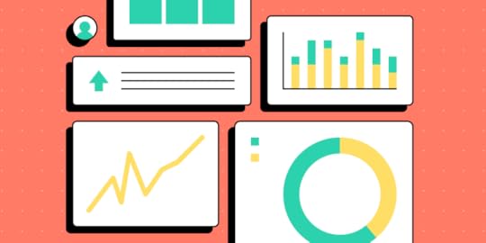
Dashboard Design ElementsUI Designers use several key elements to display different types of data. These graphical representations make it easy for users to visualize and compare information.
Data TablesData tables (similar to an Excel sheet) are important in dashboard design because we can use them to create other UI elements like charts, gauges, pies, and graphs. Tables usually take up a lot of space, so designers place these on secondary pages where users can analyze the data behind a visualization.
Bar ChartsBar charts are fantastic for comparing data on a timeline–like monthly revenue. The visualization of varying heights means users can instantly compare different data points.
Pie ChartsPie charts visualize data distribution across multiple points that make up a whole. We often see pie charts in expense tracking applications because they allow users to visualize their expenses and see where they spend the most.
GraphsGraphs are most helpful in tracking performance or trends over a specific period. The lines make it easy to see which way a trend is moving and changes at various key intervals (like months of a year).
GaugesDesigners can use gauges to display progress or status. A progress gauge can include a numerical value/s, giving the user two visualizations for better clarity.
Designers can also use gauges to indicate status when monitoring a specific system. For example, a warehouse management system might use a gauge to display the packer’s current performance towards meeting a daily target with poor, below average, acceptable, and optimal. If the indicator drops below acceptable, the manager can investigate and attend to any performance issues.
Metrics or NumbersDesigners can use metrics to show a key value or support a visualization–for example, a number representing the current revenue.
Metrics are most effective when they stand alone, making it easy for users to digest the information and reducing cognitive load.
Dashboard Design ProcessThe Data School’s eBook, Dashboard Prototyping and Feedback, outlines a four-step dashboard design and prototyping strategy. We’ve modified this slightly to include a comprehensive six-step end-to-end dashboard design process:
ReviewSketchFeedbackPrototypeTestHandoffStep 1. ReviewThe first step is to review the research to define your dashboard’s goals and requirements. Designers must align the user’s needs with the available data to determine how to structure and prioritize the design.
Make a list of the UIs and elements you’ll need to start sketching. Arranging these elements by importance will help prioritize your dashboard UI.
Step 2. SketchDesigning dashboards is complex and time-consuming. It’s crucial that designers sketch and refine ideas before committing to high-fidelity mockups and prototyping.
Designers use sketches to determine how best to represent the data. If you have multiple graphics on a single UI, sketch them in isolation before combining them on a single paper screen.
The Data School’s eBook recommends asking two questions as you sketch:
What decisions does the user need to make?What does the user need to know to make those decisions?Dashboards are busier than most other UI layouts, so keep data to a minimum. If you have lots of critical data, consider categorizing the information and splitting them over two or more pages.
Step 3. FeedbackFeedback from team members and stakeholders is essential before designers commit to digital mockups and prototypes. This input can help improve designs and iron out issues before the time-consuming digital process.
Keep in mind that there might be a few rounds of iteration before proceeding to the next step.
Step 4. PrototypeUse paper prototypes and notes, create your wireframes, digital mockups, and prototypes. We recommend using a component library or UI kit, so you don’t have to start from scratch.
UXPin features built-in design libraries, including Material Design UI, Bootstrap, and Foundation–excellent libraries for dashboard prototypes.
You can also sync your design system or a component library to UXPin using Merge. UXPin powered by its Merge technology is an excellent choice for prototyping dashboards because it allows designers to build fully functioning graphs and charts–an impossible task with image-based design tools.
Step 5. TestPrototyping and testing is an iterative process. UX designers must test prototypes comprehensively to ensure usability issues don’t affect the final product.
It’s important to get feedback from end-users and key stakeholders to ensure designs meet users’ needs while maximizing business value.
Step 6. HandoffDashboard design handoffs are complex and tricky. We recommend following this design handoff checklist to streamline the process and improve collaboration between designers and engineers.
Dashboard Design Best PracticesPrioritize ContentIt’s important to ask users what data matters most during the research phase to guide the design process. Try to separate data between “mission-critical” and secondary, so you know how to prioritize and arrange content.
Less is MoreAlways look to reduce your dashboard layout as much as possible. Dashboards UIs are busy, which can severely impact cognitive load and usability.
Mobile-First DesignIt’s easy to make a dashboard look great on a desktop. The real challenge is creating a mobile-friendly dashboard. Adopting a mobile-first dashboard design strategy can help solve two problems:
Making your dashboard accessible for mobile usersReducing UI elementsBe ConsistentConsistency is essential for any UI, but for complex dashboard designs, it’s vital! A design system can help keep typography, colors, spacing, layouts, and other UI elements consistent throughout your design.
Double MarginsIn 10 Rules for Better Dashboard Design, designer Taras Bakusevych recommends using double margins and white space to separate content. It’s difficult to read when content touches the margins or is too close together.
Don’t Scroll!Taras also says one of the biggest design mistakes is making dashboards scrollable. Summarize as much as possible, move it to a new screen or create tabs so users can switch between content.
Be FlexibleIt’s impossible to create a one-size-fits-all dashboard layout. Users will have different needs and priorities even within an organization or individual project.
Providing the functionality for users to arrange their dashboards to meet their needs creates a positive user experience while solving the one-size-fits-all challenge.
Design and Prototype Dashboards Using UXPin MergeUXPin Merge is the only design tool capable of prototyping and testing dashboards accurately. Instead of using static designs, designers can build dashboard prototypes using code components that look and function like the final product.
Build your first Merge dashboard using React components from our MUI library integration–without writing a single line of code! Simply drag and drop MUI components to build fully functioning dashboards and other user interfaces.
Sign up for a free trial to explore UXPin’s advanced code-based design features today!
The post How to Prototype a Dashboard? appeared first on Studio by UXPin.
May 30, 2022
Web Design Tools for Fast and Efficient Design
Building a website is more accessible than ever. There are tons of web design tools catering to everyone, from newbies to professional designers and developers.
We’ve put together a list of the best website design tools and we organized it into three categories (feel free to jump to the section that best describes your web design tool needs):
Beginners: No experience with design or web development. You rely on templates and drag-and-drop tools to build and host your website without coding or design.Intermediate: You have some design or development experience, but you’re looking for the best content management system, tools, plugins, and integrations to complement your skills.Expert: You have a product team, UX/UI designers, and engineers, but you’re looking for tools to optimize collaboration and streamline workflows.UXPin is an end-to-end code-based design tool for wireframes, mockups, prototypes, testing, design systems, documentation, and more. Sign up for a free trial and discover how code-based design can enhance your UX workflows to deliver superior user experiences for your customers.
Web Design Software for Beginners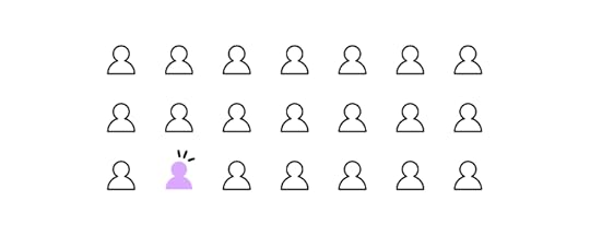
These beginner web design tools will allow you to build a professional website or minimum viable product without any design or coding experience.
Squarespace for WebsitesSquarespace is a popular no-code website builder and content management system for people with little or no web design experience. Many freelancers, including professional designers, also use Squarespace because the platform is so user-friendly.
Squarespace is a better option than popular no-code web builders like Wix or Weebly because it offers more functionality and the ability to scale.
You can choose from a wide range of professionally designed templates to customize to meet your needs, like changing colors, fonts, layouts, and assets. Squarespace features one-click hosting, so your website is live as soon as you’re ready. You can also purchase a custom domain or use an existing one from another platform, like GoDaddy or Google Domains.
GetResponseGetResponse is an all-in-one business solution with a website builder, landing pages, email marketing, conversion funnels and automation, signup forms, webinars, and much more! If you’re looking for an affordable, comprehensive web design tool, it doesn’t get better than GetResponse.
GetResponse also has a Free-Forever Plan, including one website, one landing page, forms, and email marketing for fewer than 500 subscribers. The platform features a drag-and-drop editor for websites, email templates, and forms, so people with no design or coding experience can manage the technical aspects of their business.
Bubble for Web AppsBubble is a fantastic no-code platform for building web applications. You can’t deploy Bubble apps to mobile app stores like Apple App Store or Google Play, but users can access them through desktop and mobile browsers.
You can build a Bubble app from scratch or choose from hundreds of templates for apps, including chat/forums, social media, project management, accounting, property listings, holiday listings, and more.
Bubble also has many plugins and integrations to extend your app’s functionality or integrate with other digital products.
Glide for Web AppsGlide is similar to Bubble but uses Google Sheets or Glide’s Data Editor for content management and database hosting. Like Bubble, Glide apps are only accessible through the browser, but users can download the application directly to their device, bypassing device app stores.
Intermediate Web Design Software
Here are four tools for designers, product managers, or developers to enhance their web design projects.
Strapi for Content ManagementStrapi is an open-source headless Node.js content management system you can use with almost any tech stack, website, web, or mobile application. This versatile CMS integrates with many programming languages and front-end technologies, including, React, Vue, Gatsby, Next.js, Flutter, and others.
Strapi is an excellent alternative to popular content management systems like WordPress, Drupel, and others because you’re not confined to a specific programming language, like PHP or Javascript. You can use any tech stack with Strapi for eCommerce sites, static web pages, blogs, and applications.
Contentful offers similar features to Strapi, but it’s not open-source with high monthly subs.
Ghost for PublishingGhost is an open-source content management system that also offers hosting plans. Ghost is designed specifically for publishers–like bloggers, magazines, subscription sites, etc.
With a focus on publishing, Ghost doesn’t have the same complex dashboard layout as WordPress and other content management systems. The headless CMS is far more lightweight, with a beautiful user interface that’s easy to navigate. Ghost comes with SEO features built-in, so you don’t need extra plugins or integrations.
Some major tech companies use Ghost, including Unsplash, DuckDuckGo, Airtable, freeCodeCamp, CloudFlare, and many others.
UXPin for UX DesignersUXPin is a code-based end-to-end UX design and prototyping tool with advanced features allowing you to create UI mockups and prototypes with higher fidelity and functionality.
You can work with UXPin in the cloud or download the software to your Windows or Apple desktop.
Some of UXPin’s advanced features include:
Auto Layout : Allows designers to distribute, size, and align elements fast. UXPin’s Auto Layout works on Flexbox principles, making it easy for engineers to understand at design handoff. Components : Reusable UI elements designers can use to build consistent digital products. You can also share Components through UXPin’s design system feature. Design Systems : UXPin’s Design System feature lets you build, manage, share, and scale a custom design system with a style guide and documentation. Several built-in design libraries, including Material Design UI, iOS, and Bootstrap, allow you to start prototyping immediately. States : Create multiple States for a single component with different properties to replicate CSS and Javascript interactions like hover, tap, active, disabled, etc. Variables : Capture data from user inputs to take actions or use the information in other parts of your prototype–like a personalized welcome message or populating a user’s profile page. Expressions : Take Interactions to the next level with Javascript-like functions that allow you to create code-like dynamic prototypes. With UXPin’s Expressions, you can update a shopping cart, validate forms, or check passwords meet specific criteria–functionality that’s impossible to achieve with traditional image-based prototypes.Check out how UXPin stacks up to traditional image-based tools like Adobe XD, Figma, InVision Studio, Framer, and Sketch.
Sign up for a free trial to explore all of UXPin’s advanced design, prototyping, and testing features.
Google Web DesignerGoogle Web Designer (GWD) is a free graphic design tool for creating HMTL5-based videos, animations, and motion graphics. Designers can use GWD to create engaging HTML5 content and assets for their website projects.
GWD is a fantastic tool for creating custom ad banners or eye-catching CTAs with motion or video. You can even set an exit URL if someone clicks the content, taking them to a product or promotion.
If you’re using a code-based tool like UXPin, these HTML videos will have full functionality for prototyping and testing.
Web Design Software for Teams & Experts
These advanced web design tools are perfect for cross-functional product development teams to optimize processes and workflows.
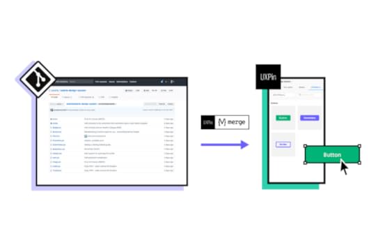
UXPin Merge for Design & Web Development CollaborationMerge is a powerful UXPin add-on that allows you to sync a component library hosted in a repository to UXPin’s design editor for designers to build fully functioning high-fidelity prototypes.
These code components have the same fidelity and functionality as those hosted in the repository, so your prototypes look and work exactly like the final product or website.
Design handoffs are much smoother because engineers already have copies of the components in the repository. UXPin renders any component changes in JSX, so engineers simply copy/paste to start the development process.

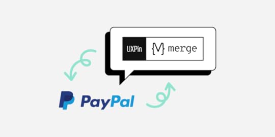
If developers update components in the repository, the changes automatically sync to UXPin, notifying design teams of the new release. This single source of truth enables you to ship consistently with a quicker time-to-market, even for enterprise products–discover how PayPal scaled its design process with Merge.
Storybook for UI ComponentsStorybook is an open-source tool for front-end developers to host, review, edit, and share individual UI components. Storybook also works with Merge, allowing you to sync React, Vue, Angular, Ember, and other front-end components to UXPin.
Engineers can share Storybook components with leads and stakeholders for review and feedback before publishing. You can also embed Storybook components in your design system documentation to provide context and examples for team members.
GitLab for DevOpsGitLab is a DevOps platform encompassing multiple tools for an end-to-end development process. With GitLab, your team has a simplified development workflow to ship products faster with enhanced consistency and cohesion.
GitLab allows leads and stakeholders to visualize and monitor the development process to track projects and identify bottlenecks. Whether you’re a startup looking to scale or build enterprise products, GitLab has a solution to meet your development workflow.
LambdaTest for Product TestingOne of the challenges with building websites, web, and mobile applications is testing across multiple browsers and devices. LambdaTest is a cloud-based tool that automates your product testing across 3000+ browsers and operating systems.
You also get geolocation testing to ensure your customers enjoy a consistent user experience, no matter where they are in the world.
LambdaTest’s integrated debugging tool flags issues for developers to fix. You can integrate LambdaTest with many tools and platforms to optimize workflows and collaboration, including GitLab, Asana, GitHub, Bitbucket, and others.
Design for the Web with UXPinWeb design can become much faster if you use the right tools. One of the best tools is UXPin. It’s great for high-fidelity prototyping with advanced interactions at scale. Try it for free for 14 days.
Companies that lack designers on their team also use UXPin because its revolutionary Merge technology helps them prototype with UI code components. TeamPassword is one of such teams. Read about their story.
The post Web Design Tools for Fast and Efficient Design appeared first on Studio by UXPin.
May 26, 2022
How to Create an Effective App Design Process
Without the right app design steps in place, it’s like rolling a dice and wishing for a six. Sure, the app you unleash into the marketplace may be a hit. More likely, it risks sinking without a trace because it didn’t appeal to the target audience and didn’t work the way it should.
Effective mobile app design processes are laser-focused on testing, from that exciting initial concept, and continuously post- launch. Testing functionality and usability. Testing user demands. Testing the boundaries of what your design and dev team can achieve.
Design your first app with UXPin. An end-to-end design tool for building interactive prototypes that behave like a fully developed app. Sign up for a free trial and see how fast you can design your app and share it with your stakeholders.
3 Major Benefits of Creating an Effective App Design ProcessIf you’re creating a new mobile application, an effective app design process brings three major benefits. You’ll get your product to market faster. You’ll build a successful app that really hits your users’ spot. And you’ll stop wasting unnecessary time and money on an app that doesn’t work (or, at least, doesn’t work for your users).
The app design steps aren’t set in stone – every business is different, after all – but we’ve mapped out the general process every successful design and development team follows to reach a successful launch, and well beyond. Along the way, you’ll learn more about your users, your market, and your business.
Explore how to get from that first spark of inspiration to a fully-fledged and fleshed-out app.
3 Steps that You Should Follow in the Mobile App Design ProcessTo build a successful product, your process needs three core app design steps:
Plan & researchDesign & app developmentLaunch & continuous testingLet’s look at what you’ll need to apply at each stage of the mobile app design process.
1. Plan & ResearchWhat are your business goals?Your app design process starts with a solid foundation: what do you (and your end-users) want?
Start broad. Write down every goal. Every problem and every solution. Then step back and assess. Now you’ll be able to see a path towards your true goal – tangled and overgrown and only just visible, but it’s there.
It’s really important, here, to have a single vision. One that can be easily communicated to all stakeholders including the C-suite.
‘Create a mobile app’ doesn’t tell anyone anything.
‘Create a mobile app for stockbrokers’ offers the team direction.
‘Create a mobile app that lets stockbrokers share professional advice’ gives everyone a clear objective, and how their work will make that vision a digitally tangible product.
With your business goals and specification in place, you can then work up a design team’s to-do list and define the delivery time frame.
Who will the user be?Next, it’s time to dig deeper into who your user is and the broader market. That “sharing app for stockbrokers” only tells half the story. It doesn’t contain any detail about the target audience, demographics or how their use computers or mobile devices. These are the sort of factors that now need to be built up.
Don’t let assumptions run the mobile app design process. Run user research. Assess your initial ideas through:
Focus groupsSurveysPhone and face-to-face interviewsThis feedback will tell you what your users really want, what are their pain points, and what they like. So, you don’t spend months building an app that doesn’t meet their expectations.
When you run the user research, turn it into personas that will guide you throughout the full application design process and refine your app idea.
Who are your competitors?You know the user and their needs. But how much does the team know about the market you want to operate in? The most successful app design processes include a heavy dose of competitor analysis. It’s like a CEO of a retail company ordering products from a competing store online or browsing around their brick-and-mortar store, aiming to understand the way they operate (and, ultimately, defeat them). What’s working, what isn’t? What do they do well, what don’t they do at all? What makes top competitors popular, what misses the mark completely?
Ideally, you should analyze only a few companies – especially when developing an MVP. It will keep your research hyper-focused (and won’t overwhelm you as you refine your vision).
Try out existing android, iOs, and web apps on the market. You might spot an opportunity straight away by reviewing the existing use cases and checking what the real users think about one app or the other.
To see what users make of the same product, head to review sites like G2Crowd, Capterra, and Serchen. The findings can be revealing. Don’t neglect social media, either. Undertake a deep dive of competitor profiles using social listening tools to make the research phase more efficient.
2. Come up With a Design & App Development Process Engage in wireframing
Wireframing is a 2D mock-up of a product. It’s typically simple, lacking color and styling, and it won’t feature any functionality. Wireframes help visualize your app information architecture without wasting tons of precious resources on a product that isn’t viable, doesn’t meet business goals, or just doesn’t work at all. During the wireframing stage, remember to make sure that your app design layout is in line with the Apple and Google app store guidelines. Otherwise, your app could be rejected.
Hopefully your wireframes are bang-on target. All that user and competitor research has paid off. Which means you can begin scraping feedback from real users, or even colleagues, and key stakeholders across different departments.
It’s really easy to collect and collate this feedback using UXPin for wireframing. Just to make it easier, those serving up their views don’t even need a UXPin account to leave feedback. They can just add comments in the Editor and on Preview screens. The tool lets you add two kinds of comments in UXPin:
Team comments.Team comments are internal – only those added as team members via Team Management can leave and see them. Public comments. Public comments are visible to everyone – even if they don’t have a UXPin account. You can explore more about how to ask the right questions in our guide Tips on Asking for Feedback. Use that feedback to refine the vision, direction, and scope of your app design layout. Start thinking about the design system
After you’ve started working on your wireframes and collected feedback, it’s a good time to also start considering your design system. It entails a style guide with visual elements such as:
Color & typographySizing and spacingImagery and animationsUI componentsHaving a design system in place will help you speed up your work as you engage in the next steps and ensure that your design is consistent as you bring your app to the market. A step-by-step guide on design systems is here: Creating a Design System: The 100-Point Process Checklist.
In UXPin, you can create and maintain your own Design System or use one of the available design system library that are already in the app. Sign up for UXPin’s trial and see how easy prototyping is when you have a design system in place.
Proceed with high-fidelity prototypesLow-fidelity prototypes like wireframes give you a good idea of how the app will look. But it doesn’t tell you how it works. For that, you’ll need to work up a high-fidelity prototype.
There’s more to this than just an app design layout. Hi-fi prototyping blends user interface (UI) considerations like how the app looks with user experience (UX) factors like how the app behaves and how users interact with it.

UXPin is tailor-made for this prototyping phase of the app design process. Your team can build clickable prototypes that are fully interactive. That’s because UXPin’s powerful advanced features, such as variables, expressions, and states. Elevate your prototyping to be more life-like than vector-based prototypes. Sign up for a trial.
The aim is to create a functional product fit for usability testing. It’s a way to let potential users (and your testers) try out the app to see how well it meets their needs – and pick up on any possible problems to be addressed before you start product development.
Develop the appIt’s time to see how well the groundwork was laid. Or, to put it in Star Wars terms, ‘this is where the fun begins…’ by handing off the app UI design to front-end and backend developers who will code it into reality. There’s that flurry of emotions welling inside. Excitement. Tension. Joy. Frustration as designs go back and forth between the teams until they finally do what you need them to do.
Efficiency is critical. It’s not an effective app design process without it, and the endless back and forths can really put the brakes on your momentum, or worse, stall a project seemingly indefinitely. To harmonize the workflow, UXPin lets designers build clickable prototypes with the same code used by front-end developers. So, design team knows what’s possible and devs know precisely how to recreate the UI design in fully functional code.
3. Launch & Continuous TestingTest the app with real users (and launch a beta version)You now have an app. Or something that looks and works a lot like the finished product should. So, it’s time to test it among your target market to see what they make of it. Just as you did when you were determining the end-user all that time ago, organize focus groups to assess the product. Throw in remote usability tests, as you did during the prototyping stage, to assess navigation and interactions.
Don’t just seek praise. Seek feedback to make your app even better (and iron out any annoying bugs).
Here’s the step way too many mobile app developers miss: the beta phase.
A beta version of your app is a great way to observe user behavior. It opens up your user base. More users means more feedback that can translate into meaningful design tips – and who doesn’t love exclusive access to an app, anyway?
Then there’s the financial factor. If you jump straight to launch, and find you need to make changes, it costs a lot more to make those tweaks to the ‘finished’ product. UXPin simplifies testing, since you can observe the user truly interacting with the app and design elements, such as signup forms, data tables, etc.
Test your app with a robust prototype before you expend time, money, and all those other far-too-precious resources on developing the final iteration of your mobile app.
Launch the appOf all the app design steps, this is arguably the most thrilling. The launch. The moment when the hard work of your whole team is delivered into the world for all to see (and download and love and use on a daily basis).
Ok, let’s not get carried away. Before you launch, give your app one final check: does your app still meet the Google and Apple app store guidelines? A lot may have changed from the last time you checked. You’ve come too far to have your app rejected at the final hurdle. You need to make sure your product is 100% ready.
All right, after that check, it’s time to launch.
Collect user feedback & refine the mobile app experienceBut the launch doesn’t mean the story’s over. In user experience and visual design as well as app development, the product launch is really the beginning of the journey. Everything that came before was just a prologue. UI/UX design is all about refining and reiterating on the initial idea. It’s the reason why Facebook initiated so many UI and UX changes, particularly in the years when usage exploded. The core idea remained – how users accessed the platform’s options evolved.
Your users know what they want.
Their feedback tells you how you can give it to them.
You should still continue running focus groups and usability tests. Alongside these, monitor social media platforms, app store reviews, and customer satisfaction and UX design surveys. Make use of all the feedback collection methods you can. Just like during the app testing stage, the more data you can collect, the more on-point your innovations will be.
If you have access to a tool that helps you filter feedback by user sentiment, then that’s going to be invaluable. Congratulations – someone left a positive review. That’s ripe for the marketing team to help build social proof. Oh no – several users said they found menu navigation slow and clunky. Now, you’ve identified an area where you can make your app even better.
Continuous product refinement ensures you’re always meeting market and user needs.
Build High-Fidelity Prototypes in UXPinApp design process is pretty easy to follow once you understand its distinctive phases. Yet, you can be almost certain that you will hit a lot of bumps, especially when doing the testing part.
Spending a lot of time on testing with real users, letting them interact with a prototype and experience it can help you save loads of money and ensure your success. Use the prototyping tool that helps you design real interactions, not simulate them. Try UXPin and check how much you can gain.
The post How to Create an Effective App Design Process appeared first on Studio by UXPin.
May 24, 2022
How to Do a Service Safari in 5 Easy Steps
A service safari allows design teams better to understand competitors, users, and their own product. This service experience offers valuable insights for very little investment, making it an essential tool during the early stages of the design thinking process.
This article looks at the pros and cons of a service safari, how to plan and run one, and what you can expect from the results.
Table of contentsWhat is a Service Safari?Who Does a Service Safari?When to do a Service Safari?The Purpose of a Service SafariPros and Cons of a Service Safari5 Steps for Conducting a Service SafariStep 1. Meet With Team Members & StakeholdersStep 2. Set Clear ObjectivesStep 3. Define the Documentation Process and DeliverablesStep 4. Conduct the Service SafariStep 5. Synthesizing the ResultsUsing Service Safaris to Prototype in UXPinEnhanced CollaborationAdding Stakeholders and CollaboratorsStreamlined Design HandoffsDesign, prototype, test, and iterate with the world’s most advanced code-based design tool. Sign up for a free trial to discover how UXPin can revolutionize your UX projects.
What is a Service Safari?A service safari is a real-world research method where designers experience a product as a user–like mystery shopping. You can conduct a service safari on your product, competitors’, or both. The process works for physical products, services, and digital products.
During a service safari, team members complete various tasks to gain insights into the product’s customer experience.
A service safari is a valuable UX design research method because it’s inexpensive (for most digital products), and teams can complete the process without users.
Who Does a Service Safari?Usually, various team members from a design project participate in a service safari. Participating in a service safari gives team members valuable insights into the competition, but the process also provides an opportunity to empathize with users from a product-usage perspective.
When to do a Service Safari?UX designers complete service safaris during the discovery phase of a design project when researching competitors or evaluating an existing product for a redesign. They use the results to identify opportunities and pain points that help guide the design process.
The Purpose of a Service SafariHere are some common reasons design teams conduct service safaris:
Understand the competition and their servicesDetermine the quality of service (competitors and internally)Identify new business opportunitiesIdentify user pain points and areas for improvementGain a user’s perspective to empathize betterPros and Cons of a Service SafariPro: Great for improving empathy for customersPro: Gain a first-hand understanding of the competitionPro: Helps validate or understand other researchCon: Risk of bias from team members too familiar with the productCon: Getting into the customer’s mindset is difficult when you can anticipate what will happen nextCon: Without clear objectives, results can be ambiguous5 Steps for Conducting a Service Safari
The level of planning for a service safari will depend on the product or service you’re evaluating. For example, a travel booking app will require taking a flight, while a productivity app you can experience from the office.
Step 1. Meet With Team Members & StakeholdersMeeting with stakeholders before a service safari is essential to agree on the approach, budget, business goals, timeline, and deliverables.
Next, you want to meet with the team taking part in the safari, create a plan, define the methods, outcomes, and assign tasks. Your team will also need to gather the necessary tools and materials like stationery, devices, tools, etc.
Step 2. Set Clear ObjectivesSetting clear and actionable objectives is crucial in planning a service safari. These objectives will ensure team members understand each task and its outputs/deliverables.
Design Principal at ustwo in the UK, Hollie Lubbock, recommends pairing a research question with a goal to create a clear objective mission statement–objective = research question + goal.
For example:
Question: “How do we open a new bank account using a competitor’s app? What are the current options, hacks, and issues with achieving this goal?”Goal: “Understand the highs, lows, and friction points in this experience.”Step 3. Define the Documentation Process and DeliverablesHow do you want team members to document their service safari experience? Some examples include:
Notes (written, voice, etc.)Screenshots/screen recordingsPhotos and videosHollie Lubbock recommends you outline “key areas to document.”
The experience over time: Pre/during/postWhat or who you encounter: People/processes/objects/ environments/places/communicationsHollie also gets team members to gather their general impression of the experience, like:
How much time does it take to complete the task?Is it easy to complete?Are there clear instructions or options?Did you hit any dead ends? Or experience any errors?Answering these questions provides valuable insights about the product and enables team members to empathize better when developing a solution later in the design process.
Step 4. Conduct the Service SafariDepending on the product, a service safari could take a few hours or several weeks. Kate Greenstock’s service safari of Jelf Insurance Brokers’ UK offices took eight weeks to complete.
The most important part of running a service safari is documenting the process according to your objectives. We recommend taking lots of notes, screenshots, recordings, etc., so you don’t miss anything.
Hollie Lubbock created this free Google Doc for documenting your service safari.
We also recommend checking out Preety Naveen’s Service Safari With Skycash–a Polish-based payment service. Preety created a three-step process for each step of her Skycash service safari:
Actions: The actions she took in each stepProblems: The problems resulting from each actionRecommendations: Suggestings to improve each stepA service safari aims to experience every touchpoint from a user’s perspective. Sutherland Labs’ service safari gives an example of exploring touchpoints for a train booking service:
Booking website/appVisiting the station, getting on the train, etc.What happens at the turnstiles?What’s the physical ticket office like?Physical artifacts (tickets, maps, etc.)The team from Sutherland Labs also takes the opportunity to speak to people, including staff and customers, to get different perspectives. For example, if you’re designing a train booking app, how do people with disabilities experience the service? What are their pain points?
While a service safari is primarily about you experiencing the service, it’s ultimately about finding a solution for customers, so take the opportunity to speak to other users and ask questions. This inquisitive approach could provide valuable usability and accessibility insights.
Step 5. Synthesizing the ResultsAn affinity map works best when analyzing notes from a service safari. You’ll need a whiteboard (or digital alternative for remote collaboration) and sticky notes.
Create headings for each step in your service safari–i.e., open the app, create an account, etc. If you’re analyzing products from several competitors, these steps might differ.Write your raw notes for each step onto sticky notes and paste them under the relevant heading.As a group, identify patterns, key issues, and opportunities.Create a journey map to visualize your results and guide your next decisions.It’s important to note that you must never use a service safari as a standalone piece of research. Design teams must cross-reference the results with other data or use it to guide and validate further user research.
Using Service Safaris to Prototype in UXPin
Building prototypes is an excellent way to test recommendations and hypotheses after a service safari. UXPin’s built-in design libraries, like Google’s comprehensive Material Design UI, enable designers to build prototypes, test ideas, and iterate fast!
Instead of presenting just a customer journey map or report to stakeholders, designers can build a quick prototype in UXPin, and use it to get buy-in for their solution.
Enhanced CollaborationWhether you’re working in the office or part of a remote team, UXPin’s Comments enhance collaboration between design teams. Multiple designers can simultaneously work on the same project to design wireframes, mockups, and prototypes.
Adding Stakeholders and CollaboratorsDid you know you can share your UXPin projects with stakeholders, experts, consultants, and other collaborators who don’t have a UXPin account?
These stakeholders can view your designs and prototypes, leave comments, and approve from anywhere–perfect for today’s remote work environments. You can even include a message with your approval, so stakeholders know what they’re reviewing for approval. UXPin also integrates with Slack and Jira, allowing you to discuss projects in one place.
Streamlined Design HandoffsDesign handoffs are a stressful time for designers and engineers. Miscommunication, lack of documentation, and poor-quality prototypes cause friction between teams.
Because UXPin is a code-based design tool, designers can replicate code-like functionality and fidelity, while Spec Mode gives engineers context and documentation to begin the development process, including:
Inspecting Properties : Inspect the properties of any element or component, including its size, grid, colors, and typography. Distance Measurement : Measure distances between elements or the canvas edges. Style Guide : Details about the project’s styles, including colors, typography, and assets.Designers can also create documentation with labels for each element to provide engineers with context and explanations–no more external PDFs or attachments!
If you’re still using outdated image-based design tools to design, prototype, and test, it’s time to switch to UXPin–the world’s leading code-based design solution. Sign up for a free trial and start designing better user experiences for your customers today!
The post How to Do a Service Safari in 5 Easy Steps appeared first on Studio by UXPin.
May 23, 2022
New Ways of Revolutionizing Design Process – Insights from Design Value Conference 2022
During the Design Value Conference, our CEO, Yuga Koda, spoke on UXPin’s latest way of improving the design process for teams that would like to bring the single source of truth to design workflow, without developers’ help – Merge Component Manager.
Yuga explained the “why” behind Merge Component Manager and showcased how it works. If you want to be one of the first people who tried it, request access to Merge Component Manager.
Design Value Springs From Solid Foundations“Empowering designers, developers, product managers, and really anyone and everyone involved in the product development cycle,” said Yuga “is key to any team or organization because people are the secret sauce.”
People, “the secret sauce”, need strong foundations to produce great work. As Yuga says, “over the years, we’ve seen many improvements in the design process. These improvements (…) now have built on top of each other to form the foundations of design best practices.”
Build a Pyramid, not a Jenga TowerWhen you ignore building the strong base of the foundations, “the more you try to build on top of it, the shakier the structure gets” which may “lead to inconsistencies in the UI that would bleed into the hand off process, and ultimately to the end users’ experience.” Yuga made an analogy that “it becomes a little like playing Jenga.” It will fall apart sooner or later.
“The benefits of having the solid foundations in place are twofold – first, you are able to immediately impact the inefficiencies with structure and standardization. Second, with less firefighting, you’re enabling teammates to focus on more value-add work, which will make a significant impact in the future.”
DesignOps is KeyDesignOps forms such foundations. It takes care of every piece of the puzzle, from creating a consistent design process to smoothing handoffs and eliminating the so-called tribal knowledge.
UXPin aims to support building foundations for a great design culture, which is clear when you look at the product roadmap, starting with UXPin Merge, a tool for smoother handoffs and better design-developer collaboration.
UXPin Merge Contributes to Creating Strong FoundationsWe released UXPin Merge technology that helps designers and developers build products together and finally reach an understanding between what gets designed and what gets coded.
“The drift between what’s being designed and what gets coded remains to be an issue that is still being addressed today. Some aim to solve it by trying to translate the design into code. Our approach is to have code and the coded components be the single source of truth.”
With UXPin Merge, product teams can bring their coded components into the UXPin editor. The component libraries serve as a single source of truth that the whole team can understand and use to create their chunk of work. As Yuga said, designers and developers have a “common language of interactive coded components for building the product together.”
It means that organizational silos can finally be broken down and designers can finally scale their work without sacrificing design and product quality.
“With this approach everyone, even non-designers, are able to build advanced prototypes without the need of understanding how to add intricate interactions in the design tool. Since they are all baked into the component anyone can build high fidelity prototypes.”
UXPin Merge contributes greatly to building strong design foundations. It helps DesignOps teams create efficiencies, strengthen design culture, and bring the team closer together.
Introducing Merge Component ManagerUXPin Merge integrates with Git repo and Storybook – you can bring coded components to the design editor to maintain the component consistency in both design and development. With both of those solutions, you may want to include your developers in the integration process.
https://t.co/xjbbZAOt95 🔥 Introducing Merge Component Manager, a designer-friendly way of managing UI components!
— UXPin (@uxpin) April 28, 2022
📚 Import UI component library to UXPin
⚙️ Manage properties of code components
💥 Create prototypes based on a single source of truth
Without dev's help! ⚡️ pic.twitter.com/iH5zrwFkA8
To make coded components even more designer-friendly, we are introducing Merge Component Manager. An easy, code-free way of bringing code components to the UXPin editor, or as Yuga said, “a new, less technical way of obtaining a single source of truth and breaking down the walls between design and development.”
Increase the Value of Design with Component ManagerWith the upcoming release of Merge Component Manager, we aim to make the code-base design paradigm more accessible by making it as code-free as possible.
Create fully-interactive prototypes as fast as never before – import UI components and see how designing with them simplifies interactivity and increases design velocity.Simplify handoff with functional prototypes – since you have a quick and easy way of designing with UI components, you can be sure that your product gets developed the way you designed it.Test UI components before bringing them to your component library – import components to UXPin and test them before committing to using them. It’s a great way to find out whether you should expand the UI component library or not.During the Design Value Conference, we presented how Component Manager works. It’s very easy. You just need to follow a few steps until you can use code components in UXPin.
How Does It Work?Component Manager allows you to bring components via NPM package (Yuga demoed bringing Ant Design library), configure its properties, and build prototypes with the code-based UI elements you’ve just set up.
Try Merge Component ManagerMerge Component Manager enables you to include coded UI components in your design process and obtain a single source of truth.
Request access to Merge Component Manager.
Discover Component ManagerThe post New Ways of Revolutionizing Design Process – Insights from Design Value Conference 2022 appeared first on Studio by UXPin.
May 19, 2022
Guide to Responsive Design – 8 Easy Steps
 Table of contentsWhat is Responsive Design?Step 1: Understand Responsive DesignResponsive Grid vs. Fluid GridStep 2: Define Your BreakpointsStep 3: Content-First ApproachStep 4: Mobile-First DesignStep 5: Prioritize ContentStep 6: Responsive Images & VideosStep 7: Responsive TypographyStep 8: Responsive Design Performance OptimizationUse System FontsAnimationsSummaryResponsive Design with UXPin MergeWhat is UXPin Merge?Creating Responsive Components Using MergeEnhance TestingStreamlining the Design Handoff
In a world filled with an extensive range of devices and different screen sizes, it’s safe to say that responsive design is design. Organizations cannot afford to build any website or application for a single device or screen size because they’ll lose out to a competing product that’s more accommodating to more users.
This step-by-step responsive website design guide walks designers through the process of designing for multiple viewport widths. Incorporating these processes into your UX workflow will ensure that design teams consider various screen widths when designing user interfaces.
Choose from a range of web, iOS, Android, and custom canvas sizes when designing in UXPin. Sign up for a free trial to discover how easy it is to design for different devices using UXPin.
What is Responsive Design?Responsive design is the process of designing user interfaces to accommodate multiple viewports. The aim is to provide a consistent user experience no matter what device someone uses.
Traditionally, responsive web design considered three primary screens, mobile phones, tablets, and desktops. Nowadays, designers have more screens and devices, including smartwatches, TVs, vehicle dashboards, and fridges, to name a few. Some products also include voice, meaning design teams must also incorporate VUI (voice user interface).
Step 1: Understand Responsive DesignBefore designers start designing responsive UIs, they must understand responsive design and the techniques developers use for their products.
For example, engineers can use CSS to serve users different-sized images based on their screen size or use an optimization tool that does this automatically. If engineers use the former, designers must supply assets for multiple screen sizes, whereas the latter only requires one.

So, before designers start a project, they must consult with engineers to understand the technical requirements and constraints. Some questions designers need to ask include:
Does the product use a responsive grid or a fluid grid?What are the product’s breakpoints?Does the operating system (Apple iOS, Android, Windows) impact the product’s layout?How do engineers scale and serve images?What formats do engineers use for videos, images, icons, and other media?What grid system does the product use?Does the product use Flexbox or regular CSS?Responsive Grid vs. Fluid GridA responsive grid uses a standard 12-column grid system with pixels for sizing. Using pixels means engineers set the size of a component or container that only changes with CSS media queries. A fluid grid uses percentages, allowing UI elements to resize according to the available space.
Step 2: Define Your BreakpointsListing the breakpoints allows designers to plan information architecture, layouts, and features for each device. For example, some complex features limit what you can do on mobile vs. desktop application versions.
The most common breakpoints include:
Desktops – max-width: 1200pxLaptops – max-width: 991pxTablets – min-width: 768px and max-width: 990pxSmartphones – max-width: 500pxDesigners must also consider screen orientation and how designs adjust to a landscape layout. For example, the iPhone 13 is 390 pixels × 844 pixels, more than double the width in landscape vs. portrait.
Step 3: Content-First ApproachDesigning layouts around content enables designers to build intuitive, easy-to-navigate UIs. Defining your content hierarchy allows designers to organize layouts according to breakpoints.
Designers must consider hierarchy relating to the action they want users to take. For example, a blog feed’s purpose is to show users a list of articles and get them to click on something of interest. The blog feed’s most essential elements are the featured image and headline that entice users to click on an article.
On a desktop feed, designers have space to include more information, like the article’s excerpt, published date, author, and category tags. User research and interviews can guide responsive design according to what matters most to users.
Step 4: Mobile-First DesignMobile-first design is a process of starting with the smallest screen size and scaling up. This design strategy offers two primary benefits:
 The constraints of small screens force designers to include only the most critical features and UI components. Reducing unnecessary features reduces costs and time to market.It’s easier and faster to convert a mobile layout to larger screens than the other way around. Designing desktop-first often leads to compromises and redesigns to scale down to a mobile version.
A mobile-first approach also makes business sense for web design. Google prioritizes mobile-friendly content, which means a responsive design could benefit SEO to rank higher and generate more clicks.
Step 5: Prioritize ContentPart of a mobile-first and content-first approach is prioritizing content that is always visible on smaller devices and what to hide behind navigational drawers, dropdown menus, or accordions.
For example, on a desktop layout, designers often show the questions and answers to users for an FAQ section. This layout would mean users would have to scroll over every Q&A to find what they want on mobile devices. Instead, designers can show users the question on smaller screens with the answer hidden behind an accordion, reducing scrolling for mobile users.
Step 6: Responsive Images & VideosDeciding on media formats at the start of the project could save designers rework later. For example, designers might use PNG for icons, but engineers use SVG because they adapt better to responsive layouts and deliver better performance.
Engineers might require several sizes and formats to serve different media depending on the device or viewport for complex responsive designs. Agreeing on these formats from the beginning ensures designers test prototypes correctly while preparing assets for a smoother design handoff.
Step 7: Responsive TypographyTypography is a crucial design component impacting brand/identity, readability, voice, and readability. Selecting a typeface that translates across multiple devices is something designers spend hours, days, or even weeks deliberating.
In A guide to responsive typography, UX designer Augustine Thomas talks about what designers must consider for responsive typography, including:
Choosing the right typefaceSelecting a typography scaleAlignment and spacingYour project’s content, like images, video, graphics, etc., has a significant impact on all three of these elements. So, always test your typeface pairings with real content and avoid dummy text to get accurate results.
Step 8: Responsive Design Performance OptimizationWhile performance is often a developer’s job, there are some things designers can do to make their job easier:
Use System FontsEvery operating system has a font stack. iOS uses San Francisco, Android Roboto, and Windows Segoe UI, to name a few. Using these default fonts means the responsive website or application doesn’t have to make additional requests, improving performance.
If your product prioritizes performance over aesthetics, consider using system fonts instead of a custom one. Make sure you test your product with each font to get consistent results across all operating systems.
AnimationsCSS and Javascript animations impact performance and could adversely affect the user experience. Conversely, designers can use animations when engineers need a few seconds to load a feature. Finding the right balance between these two takes collaboration and testing with designers and engineers.
SummaryResponsive web design (RWD) and optimization rely heavily on collaboration between designers and engineers. Using image-based design tools makes it impossible for designers to test responsiveness accurately.
Designers must consider several responsive factors and how content, layouts, typography, and other UI elements interact across multiple viewports.
Responsive Design with UXPin Merge
One of the challenges with responsive design is that the static nature of image-based design tools doesn’t allow designers to test UIs and components across multiple viewports accurately.
The only way to test a web page accurately is by using HTML, CSS, and Javascript–languages most designers don’t speak.
UXPin Merge is a code-based design tool allowing designers to prototype and test using the same components engineers use. Engineers can also program responsive properties, so UI elements function in prototypes as they do in the final product.
What is UXPin Merge?UXPin Merge allows you to sync your product’s component library to UXPin’s design editor so designers can prototype using fully functioning code components.
You can connect a React component library direct to Merge using Git or our Storybook integration for Angular, Ember, Vue, and other front-end frameworks.
Creating Responsive Components Using MergeUsing a React component library, engineers can program an IFrame component to respond to responsive properties, media queries, and styling, providing the same responsive functionality as components in the final product.
Check out this step-by-step tutorial for building responsive components with UXPin Merge.
Enhance TestingInstead of using multiple frames, designers can achieve the same responsive functionality as code using a single frame and component. These UI elements also have the same fidelity and functionality as the final product providing designers with meaningful feedback from usability testing and stakeholders.
With Merge, designers can prototype and test using fully functioning, responsive UI elements from a component library without writing code or relying on engineers to build it.
Streamlining the Design HandoffThese responsive Merge prototypes also streamline design handoffs, reducing time to market. Engineers no longer have to inspect multiple mockups and documentation to convert designs into responsive code; they simply copy/paste components from the repository plus any JSX changes from UXPin to start the web development process.
Improve your responsive prototyping and testing with the world’s most advanced design tool. Sign up for a free trial to explore UXPin Merge through our MUI integration.
The post Guide to Responsive Design – 8 Easy Steps appeared first on Studio by UXPin.
May 18, 2022
Parsing Props for UXPin Merge Controls
Our friend from PayPal, Anthony Hand, decided to share how to make designers’ lives easier using parsing props with UXPin Merge.
Merge is UXPin’s revolutionary technology that helps you import and sync your dev’s UI components from the component library in the design tool. You can bring the components via Storybook integration or Git repository. If you lack development resources, you can use Merge Component Manager for importing and managing components without engineer’s help. you don’t need to worry about trading off between time and robust prototypes – you can have both.
It’s possible to design fully interactive prototypes extremely fast because the UI elements you use during the design process are live code. Request access to UXPin Merge and build a better design process.
You can optimize your experience in UXPin Merge to fit your team’s needs. This is exactly what Anthony Hand writes about. See how he used smart parsing to adjust the experience of Merge for his team.
 Prop Parsers for UXPin Merge Controls
As any UI developer knows, parsing and validating user inputs is as much of an art as a science. While most of the users most of the time may enter the expected values, we must always be prepared to do a little graceful massaging and tweaking, as well as error handling.
I’m a Sr. UX Designer on a DevOps team at PayPal and all of my projects are internal web-based tools. Two years ago, after we settled on the Microsoft Fluent UI library for our next generation of web apps, we embarked on the process of importing the UI library into UXPin using their Merge technology. The process was straightforward enough, though it did have a little learning curve.
One of our first learnings with UXPin Merge was that standard parsing and validation needs applied. The Properties Panel in UXPin is, after all, just a fancy user input form. We developed a few standard parsing utilities for basic user inputs like colors and dates, for example.
As we got deeper into the UXPin Merge preparation, we soon realized that more complex UI controls would need complex JSON in the underlying control. However, surfacing raw JSON to non-technical people in UXPin would quickly kill user adoption.
JSON is a complex data model expressed as a string, created for computers, not humans. As a result, one of our most important innovations was to create an advanced multi-use parser that allowed us to gather plain text user inputs to configure complex UI controls like dropdowns, navigation lists, and data tables.
Basic ParsingWe created a few basic parser functions in JavaScript to handle the validation for common user inputs around colors, dates, and numbers, for example. Although these were primarily created to make it easier to configure UI controls in UXPin, some of these utilities have found wider use internally.
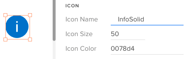
Parsers converted the string “50” to an integer and validated the hex color, adding back in the required # mark. Our Merge wrapper also trimmed leading and trailing whitespace from the icon name. (UXPin Editor and Props Panel view)
Deep Dive: Color Parsing & FormattingThe Microsoft Fluent UI controls want hex values, such as “#0078d4” (a lovely shade of blue), but we wanted to allow users to use both hex values and easier to remember theme tokens (such as “themePrimary”). Plus, we wanted to support semantic tokens (e.g., “success”) and a handful of basic colors (e.g., “white”, “transparent”). As for gracefully handling errors, we trimmed input text of whitespace and accepted valid hex values, even if they didn’t start with a # mark.
Our custom color parser gives a huge range of freedom to users and accepts all of those types of values, returning either a validated hex value for use by the UI control, or “undefined” as an error flag.
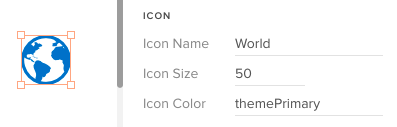
The color parser checked to see whether “themePrimary” was a color token in the theme, then retrieved its hex value for use by the icon object.
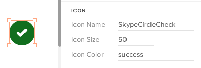
Similarly, the color parser looked up the special semantic color token, “success,” and converted it to a hex, as well. “Success” is easier to remember than an arbitrary hex value.
Complex ParsingAs mentioned previously, many of the underlying UI controls use complex JSON for configurations, like menus, navs, and dropdowns. However, JSON is hard to read for humans, and easy to break. So instead of JSON, we invented an innovative syntax that’s much easier for regular humans to use. In addition to plain text, the syntax tokens we developed include:
icon(Icon_Name | color): Any icon in Microsoft’s icon librarylink(Display Text | URL)Divider or —-: To display a divider in a list* : To mark a child in a section, like in a nav or menuCSV Parsing: For table rows or when commas are needed in plain text in certain controlsNote: In most cases, this special syntax is only for use within UXPin to help designers and (typically) non-technical people easily build prototypes. To build the actual web apps, developers would set up these UI controls in the standard way with JSON, event handling, etc.
Case Study: Icons & Text in MenusLet’s look at how a user would add popup menu items to a CommandButton control in UXPin. In this example, the user clicks on the button with the text “New” to display a popup list of the types of objects the user could add, such as various file types, a folder, a user, etc.
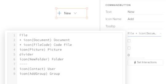
In the UXPin Editor, the user clicks on the Menu Items prop to view a large text editor. Our improved parser now looks ahead to determine whether a string like “File” is a regular menu item or a section heading. The star ( * ) indicates that “Document” is a child, so “File” must be a section heading . Note the usage of the icon() token , and two intuitive ways to indicate a divider .
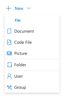
This is the view of the same CommandButton as rendered in the UXPin Prototype Preview mode.
This powerful, innovative syntax was reused across nearly a dozen other UI controls that supported a list-style view: Dropdown, Combobox, Pivot (tab strip), Nav, ChoiceGroup (radio buttons), GroupButton, SplitButton, Breadcrumb, and more.
Although support for icons, dividers and groups varied between controls, once UXPin users became familiar with this basic approach, they are able to easily apply the same approach across a ton of controls to create rich, interactive prototypes without knowing a lick of JSON.
Case Study: Data TablesAs you might imagine, internal web apps are data intensive and data tables are extremely common. So, one of the main drivers for developing this advanced parsing engine was to help us easily create realistic — and modestly functional — data tables in our prototypes.
To create rich prototypes with reasonably advanced functionality, our workflow starts off with Excel. We first develop a model of the view in Excel, using the link() and icon() syntax mentioned above within each cell. Then we export that worksheet as a CSV file. Using any text editor, we can open the CSV file and copy just the headers, or the row data, into the Headers and Rows props in UXPin, respectively. Compare this streamlined workflow to what we used to do to create tables in other prototyping tools!
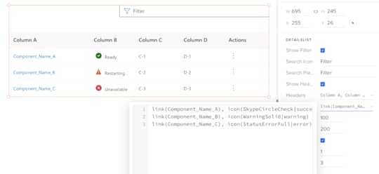
The UXPin Editor view for the DetailsList’s Rows prop showing the comma-delimited cells (CSV format) with our innovative link() and icon() syntax.
Designer’s Perspective on ParsingAs you look through the source code for our parsers, you may have some opinions on some of the design decisions in the code, and how (relatively) inefficient or verbose the code is. You may even notice some errors. I accept responsibility for these decisions.
Keep in mind that I’m a UX designer, not a professional programmer. More importantly, I explicitly decided to optimize for readability, modularity and ease of maintenance over efficiency, per se, given my limited knowledge of JavaScript. This is open source code, so you’re welcome to borrow some or all of the code, make modifications, or offer updates and bug fixes.
On Optimizing UXPin MergeUXPin’s Merge technology lets any company import the exact same UI component library that they use for development into UXPin so that anyone on the team can create rich, interactive prototypes. It’s a powerful technology that can dramatically increase the velocity of design for user feedback and stakeholder reviews, and can improve developer handoff.
However, as our team learned, there needs to be a modest investment in setting up the end user experience for success in UXPin. We made an explicit decision to optimize the UXPin user experience with smart parsing that brings maximum power while minimizing errors.
We recently ported our proprietary Microsoft Fluent UI library to an open source library which your team are welcome to experiment with and gain inspiration from. And feel free to liberally modify and/or borrow any of our parsers for your own UXPin Merge projects!
Discover MergeThe post Parsing Props for UXPin Merge Controls appeared first on Studio by UXPin.
May 17, 2022
Top Frameworks of DesignOps – Lessons from Salome Mortazavi

At UXPin’s Design Value Conference in March 2022, we hosted five design industry leaders to understand Design and DesignOps at some of the world’s biggest organizations.
We were honored to have Salomé Mortazavi share her insights and experience from working with multiple Fortune 500 organizations helping to “break down silos to align teams around customer outcomes rather than outputs.”
Salomé currently works as Director of DesignOps at SiriusXM. Her Design Value Conference talk covered proving DesignOps and business impact–a crucial factor for getting buy-in for maintaining and scaling design operations within an organization.
Advice for DesignOps BeginnersSalomé begins her talk with advice for DesignOps beginners–which could also apply to experienced practitioners who find themselves playing “whack-a-mole” instead of focusing on tactical and strategic initiatives.
The first piece of advice is to refrain from being a “yes person.” In their quest to make an impact, many DesignOps practitioners make the mistake of saying yes to everything early on. This approach pulls DesignOps in several directions, adversely affecting the team’s focus and value.
Finding Value“At the core of everything we do, regardless of your background, everything comes down to being value-driven–delivering value and business impact.” Salomé Mortazavi, Director of DesignOps at SiriusXM
According to Salomé, everything in business value manifests itself in two ways:
Reducing costsIncreasing revenueDesignOps practitioners must use the right metric to measure DesignOps’ impact. Patrizia Bertini simplifies this DesignOps framework by defining the metric in terms of efficacy vs. efficiency.
Efficiency vs. EfficacyEfficacy: Qualitative metrics based on behavior and doing work the “right” wayEfficiency: Measurable and quantifiable using numbers, percentages, and ratiosWe recommend reading ROI of DesignOps: All You Need to Know About Quantifying DesignOps’ Impact to go deeper into Patrizia Bertini’s framework.
Even with Patrizia’s simplified framework, there is much work DesignOps practitioners must do to measure efficacy and efficiency and find focus. As Salomé points out, 70% of DesignOps departments are a team of one–making it challenging to find direction and decide where to start.
Listen and Take NotesInstead of jumping in and taking action, Salomé recommends that DesignOps practitioners take a step back and listen to design teams, including one-on-one interviews to understand the organization’s problems and identify patterns.
Take a few weeks or months to understand the bigger picture, the space, the org’s baseline practices, and people, as this will expose the company’s organizational and systemic problems.
Understanding and articulating these issues will help DesignOps practitioners build immediate trust with leaders, team members, and stakeholders–creating a positive foundation for DesignOps to grow.
Salomé says this approach works for DesignOps beginners and experts looking for a fresh start or new direction.
DesignOps Framework: Design Maturity IndexOne of Salomé’s favorite DesignOps frameworks is the Design Maturity Index, specifically the New Design Frontier model, which looks at the nine dimensions of maturity:
Design TeamKey PartnersExecutives & EmployeesDesign OperationsDesign SystemsDesign StrategyUser ResearchTesting & LearningUI DesignThe report looks at the most important impact design can have on an organization, including:
Product usabilityCustomer satisfactionRevenueProject-specific metricsCost savingsTime to marketConversions/funnel metricsEmployee productivityBrand equityEntry into new marketsDesign patents/IPValuation/share priceA Design Maturity Index produces a lot of themes and problems. Some of these the DesignOps must solve, while others will fall on design leadership.
Salomé says it’s crucial to assign these problems correctly into two or more buckets depending on your organization’s structure:
DesignOps (Design Org Ops)Design Leadership/Design Team/Product (Design Practice Ops)Operational Menu ToolOne way to organize your buckets is by using an operational menu tool to assign activities into several categories and subcategories. Salomé likes to create two menus:
Design Org Ops: DesignOps activitiesDesign Practice Ops: Design team, leadership, and product activitiesWe recommend watching Salome’s Design Value Conference talk around 12:48 for an explanation of this operational menu tool and a graphic with the various buckets.
Once you have filled your buckets, it’s time to find focus by planning your DesignOps roadmap.
Creating a DesignOps Roadmap
Salomé uses an outcomes-based tool to build her DesignOps roadmap into three generalized time horizons:
NowNextLaterThese time horizons allow DesignOps practitioners to avoid arbitrary deadlines. This flexibility enables DesignOps to experiment with solutions you’re piloting with different teams.
The roadmap must include five categories:
Goals/OKRsTime horizonsThemes/problems to solveMeasure of success/KRSParking lotThe parking lot is for keeping track of the tasks and activities that aren’t on your roadmap but require action at a future date.
Build, Measure, LearnTo implement her DesignOps roadmap, Salomé uses the popular Build, Measure, Learn (BML) design thinking methodology applied to operational practices.
Salomé likes to emphasize the importance of learning in BML for DesignOps practitioners to make educated decisions as they evolve a process or solution.
You can watch Salomé’s presentation at 18:00 for an example of her DesignOps framework in action.
Salomé’s DesignOps Resources Book: Liftoff: Practical Design Leadership to Elevate Your Team, Your Organization, and YouBook: Lean UXBook: Outcomes over OutputsReport: The New Design FrontierCommunity: DesignOps Assembly
Bonus resource: FREE eBook – DesignOps 101: Guide to Design Operations written by six industry experts from IBM, Salesforce, and Delivery Hero.
DesignOps With UXPin MergeFinding tools to streamline design processes and workflows is crucial for implementing a successful DesignOps strategy. Design drift, collaboration, consistency, and cohesion are problems practitioners often have to overcome.

UXPin Merge enables DesignOps to solve these core problems with a single code-based design solution. Merge allows you to sync a component library from a repository to UXPin’s editor so designers can build fully functioning high-fidelity prototypes using the same UI elements as engineers.
This single source of truth means every design team works with the same component library, maximizing consistency and cohesion while eliminating design drift and reducing rework.
Design handoffs run smoother with UXPin Merge because designers and engineers speak the same language, thus reducing time-to-market and creating a positive ROI for DesignOps.
The post Top Frameworks of DesignOps – Lessons from Salome Mortazavi appeared first on Studio by UXPin.
May 16, 2022
What is the Difference Between UX Engineer and UX Designer?
As technology and product design workflows evolve, new tech roles open. UX engineers are one of those emerging niche positions, helping to facilitate collaboration between design and development.
We’ll explore the difference between a UX designer vs. UX engineer, their responsibilities, and how these team members work together.
UXPin is a code-based design tool bridging the gap between design and development. Sign up for a free trial to discover how UXPin can enhance your product’s user experience and improve collaboration between UX designers and UX engineers.
Who is a UX Designer?A UX designer (user experience designer) works throughout the design process to develop solutions to user problems. In startups and small businesses, a UX designer will work on every aspect of the design process. In contrast, UX experts specialize in a specific role in large organizations and big projects.
Some examples of UX expert roles include:
UX Researcher: Responsible for research and user testing UI Designer : Designs user interfaces and componentsInteraction Designer: Designs microinteractions for user interfaces and componentsDesignOps Manager/Leader: Oversees an organization’s design operationsAll of these people are UX designers. They just specialize in a specific UX field.
Who is a UX Engineer?UX engineers (user experience engineers) are front-end developers who take care of feasibility of prototypes. People in the tech industry often refer to UX engineers as “unicorns” due to their skill set in both UX and engineering.
A UX engineer’s role is to bridge the gap between designers and developers by collaborating with both teams.
UX engineers work closely with UX designers throughout the design process, collaborating on solutions and providing technical guidance for design ideas.
Do UX Engineers Code?UX engineers are front-end engineers first, so they’re highly competent in core front-end programming languages like HTML, CSS, and Javascript.
Depending on the company or project, a UX engineer must know at least one front-end framework, like React or Angular, as they are responsible for developing layouts and UI components.
Are UX Engineers also UX designers?In most cases, UX engineers have a software engineer or product background. They generally study computer science or human computer interaction (HCI). They’re not necessarily UX designers, but they understand the end-to-end design process and apply design thinking and UX principles to their work.
UX engineers don’t actively participate in most UX design activities. Their primary focus is to turn a designer’s prototypes into functional code.
Why are UX Engineers in Demand?Design handoffs are notoriously challenging in many organizations. Designers and engineers speak different languages, creating a bottleneck from design to development.
Streamlining this bottleneck can reduce time to market, saving companies money while increasing their competitiveness. That’s where UX engineers come in and why they’re in demand.
UX engineers also play an essential role in managing and scaling design systems. The last decade has seen a rise in companies developing their design systems, increasing the demand for UX engineers.
Do you need a UX Engineer and a UX Designer?Most startups and small companies don’t need a UX engineer. In these smaller teams, designers and developers work closely, reducing the need for a dedicated UX engineer.
UX engineers are most impactful in large organizations where collaboration between designers and engineers is challenging. These engineer/designer hybrids help bridge the gap by working with designers to convert designs into code and then collaborate with engineering teams to deliver the final product while maintaining the designer’s vision.
UX engineers are also an essential part of a design system team, helping designers convert static prototypes into fully functional code components.
How do UX Engineers and UX Designers Work Together? UX Design-Intensive Tasks
UX designers are responsible for user research, design, and usability tasks. Their work primarily focuses on:
UX researchLow-fidelity prototyping and wireframingVisual design and static mockupsDesign-based prototypesDesigning assetsUsability testingAccessibilityWhile UX engineers don’t actively participate in these tasks, they provide technical input when required.
UX Designer/Engineer CollaborationUX engineers and designers work closest during ideation. The UX engineer’s role is to help develop ideas through a technical lens so that designers don’t go off track during wireframing and low-fidelity prototyping.
UX engineers also work with UX designers during testing. Rather than actively participating in testing, UX engineers help designers develop solutions based on the results.
UX Engineering-Intensive TasksUX engineers lead the high-fidelity prototyping phase of the design process. They build prototypes using code (HTML, CSS, Javascript) or a front-end framework like React. These code-based prototypes take a lot of time to develop, so UX designers usually reserve these for testing complex problems.
UX designers use these code-based prototypes for usability testing and presenting ideas to stakeholders. The benefit of code-based prototypes is that usability participants and stakeholders can interact with them like they would the final product, giving designers meaningful, actionable feedback.
A Typical UX Designer and UX Engineer WorkflowHere is a typical UX designer and UX engineer workflow relating to the design thinking process.
EmpathizeDefineIdeatePrototypeTestEmpathize PhaseUX designers (or dedicated UX researchers) complete most work during the empathize phase. They are primarily responsible for gathering and analyzing UX research (user, market, competitor, etc.).
UX engineers don’t take part in this early research, but they may reference it at a later stage to understand users better.
Define PhaseThe define phase is also a UX designer’s responsibility. They must use research to identify user problems the product must solve.
Ideate PhaseIdeation is the first phase of the design thinking process where UX engineers take an active role. UX engineers collaborate with UX designers to develop solutions to the problems.
UX engineers also participate in design sprints, workshops, and other ideation activities.
Prototype PhaseUX engineers and UX designers build prototypes. UX designers use design tools for prototyping while UX engineers write code.
Testing PhaseUX designers are responsible for usability testing of all prototypes. They share results with UX engineers to collaborate on redesigns and changes.
How UX Engineers & UX Designers Collaborate at Design Handoff
A UX engineer’s most important function is converting designs into code. Traditionally, developers would collaborate very little during the design process, only meeting at the handoff.
Designers would have to create a lot of documentation for engineers, and there would be much back and forth communication to convert designs into the final product. Engineers often misinterpret designs, leading to friction between teams.
Embedding UX engineers into the design process allows them to start development long before the handoff. They can also help designers produce documentation and instructions in a language that developers understand–essentially working as translators.
When UX engineers convert designs into code, they work closely with designers, iterating until the component or layout is right. Next, UX engineers present their code to their fellow developers for review.
With a UX engineer completing most of the front-end UI development, the development team only needs to connect everything to the backend and optimize front-end performance. The development team no longer has to interpret designs and prototypes because the UX engineer is working in the middle to translate everything.
How UX Engineers and UX Designers Collaborate using UXPin Merge
UXPin Merge allows you to sync a component library from a Git repository or Storybook to UXPin’s design editor. Merge works with multiple front-end technologies, including React, Angular, Vue, Ember, Web Components, and more.
Designers can use these code components exactly like any other design asset (meaning they don’t have to learn to code), except they have much higher fidelity and functionality. Designers can drag and drop these components to build fully functioning prototypes–identical to those a UX engineer would develop.
UX designers no longer have to rely on UX engineers to build code-based prototypes, allowing them to test with higher fidelity and design’s functionality more often.
Merge is the perfect collaborative tool for UX designers and UX engineers because they can both build code-based prototypes using the same platform significantly faster than writing code.
When prototyping is complete, UX engineers can use components from the repository and copy changes from UXPin to start development. Because the engineering team has already approved the repository’s components, the review process is quicker, allowing products to ship much faster.
Collaborating With Engineering Teams Through Storybook
Storybook is a fantastic tool for UX engineers to collaborate with development teams. Storybook integrates with UXPin Merge, thus creating an end-to-end software development component ecosystem.
When UX engineers develop a new component, development teams can review, approve, and request edits through Storybook. Once approved, Merge automatically syncs the new component to UXPin’s design editor, notifying design teams of the latest release–creating a single source of truth across projects and the organization.
Enhancing User Testing and Stakeholder FeedbackMerge prototypes enhance user testing with higher fidelity and functionality and attract better feedback from stakeholders. UX designers and stakeholders can use UXPin’s Comments feature to include UX engineers in feedback and changes, making it easier to collaborate on redesigns.
Improve collaboration with UX designers, product teams, engineers, and stakeholders with the world’s most advanced code-based design tool. Sign up for a free trial to and give a UXPin Merge a go via our MUI library integration.
The post What is the Difference Between UX Engineer and UX Designer? appeared first on Studio by UXPin.
UXpin's Blog

- UXpin's profile
- 68 followers

