
UXpin's Blog, page 53
September 13, 2022
Accessibility UX Best Practices – 8 Tactics for Web Design

Designing for accessibility is a crucial part of modern web and app design. Designers must combine UX and accessibility best practices to build inclusive user experiences.
This article explores web accessibility, why it’s important, and eight essential best practices designers can apply to their workflows.
Table of contentsWhat is Web Accessibility?Types of Accessibility ChallengesWhy does accessibility matter?Usability and Accessibility – Creating Experiences for All Users8 Website Accessibility Best Practices to Improve UX1. Execute the fundamentals flawlessly2. Enable keyboard navigation for web design3. Prioritize text clarity4. Don’t rely on color exclusively5. Order HTML content properly6. Explicit link text7. Use a 40×40 pixel target area for touch controls8. Make media content accessibleBonus Tip: Use an Accessibility ChecklistInteractive Prototyping for Accessibility in UXPinBuilt-in accessibility means designers don’t need additional tools to test for color blindness and contrast in UXPin. Increase productivity while meeting WC3 guidelines for A, AA, or AAA on the fly without leaving UXPin. Sign up for a free trial today.
What is Web Accessibility?Web accessibility is a set of guidelines designers and engineers use to build experiences that accommodate users with disabilities, including low vision, color blindness, blindness, cognitive disabilities, hearing impairments, and mobility issues.
The World Wide Web Consortium (W3C) compiles the web accessibility policies in collaboration with government bodies worldwide. Some countries treat these as guidelines, while others, including the US, Israel, Canada, and the United Kingdom, to name a few, require specific accessibility policies by law.
Types of Accessibility ChallengesHere is a list of accessibility challenges designers must consider when designing for usability and accessibility. Accessibility doesn’t always refer to a physical or mental challenge.

W3C’s guidelines also consider situational and environmental challenges that exclude certain users or groups–like slow internet or a parent with only one free hand.
Visual impairmentsAuditory impairmentsEnvironmental challengesMobility impairmentsSeizure risksCognitive and learning disabilitiesIncidental or situational circumstancesWhy does accessibility matter?When we think of accessibility, we tend to think about disability, which isn’t always the case. The list above outlines a massive part of the global population left out when designers and engineers don’t adequately account for accessibility.
When we design for accessibility, we make websites and digital products easier to use for everyone. For example, captions on a video help deaf users follow a narrative, but it also allows users to absorb video content without sound.
Accessible design matters most for making everyone feel included. Designers must empathize with many types of users to understand how websites and products exclude them.
For example, you’re a blind student wanting to research a school assignment, but nearly every website, including Wikipedia, doesn’t accommodate assistive devices, and there are multiple “roadblocks” preventing you from navigating a web page.
Imagine the frustration of not being able to access information like everyone else. Information that could help change your life!
Usability and Accessibility – Creating Experiences for All UsersWe love this Venn diagram from System Soft that shows how usability and accessibility intersect to create “enhanced user experiences for all users.”

To achieve this balance, designers must go beyond UX principles to create more inclusive user experiences, including:
Apply W3C standards: Use an accessibility checklist to verify that designs meet relevant guidelines for Level A, AA, or AAA, depending on the product or website.Design for assistive tech: Does your website or product provide a comparable user experience for keyboard navigation and assistive technologies?Access to content: Can anyone, including assistive technologies, access and digest your content? And, is the user experience comparable?Applying these three principles to a project enables designers to think beyond usability and accommodate a broader userbase.
8 Website Accessibility Best Practices to Improve UXBelow are eight best practices from our 109-page free eBook, The Essential Elements of Successful UX Design.
1. Execute the fundamentals flawlesslyMost accessibility practices are executing UX principles and UI design fundamentals. Clear, logical designs, navigation, and architecture benefit everyone.

Designers who ignore these basics create usability and accessibility issues, causing significant obstacles for users with disabilities.
2. Enable keyboard navigation for web designMany users, including those with disabilities, prefer keyboard navigation. Providing shortcuts and logical keyboard navigation allows more users to experience your website.
Keyboard navigation is far more than allowing users to “tab” their way through a web page. Wikipedia’s Table of keyboard shortcuts offers a comprehensive list to make websites keyboard navigable.
3. Prioritize text clarityReadability is one of the biggest challenges for impaired users and screen readers. If someone can’t absorb your content, they’re at a disadvantage to other users–especially for crucial community, support, and government information.
Designers must ensure to increase legibility (letter clarity) and readability (text block clarity), so everyone can read and understand text content. Here are four simple design techniques for text clarity:
The W3C cites a minimum contrast ratio between text and background as 4.5:1. A 3:1 ratio is acceptable for large and bold fonts.Use a minimum of 16 pixels for body text.Line spacing must be at least 1.5 times or 150% of the font size.Use adaptive/responsive font sizing in CSS (em, rem, %, etc.) rather than fixed pixels.4. Don’t rely on color exclusivelyColor blindness affects approximately 4.5% (350 million) of the global population. It’s significantly more prevalent among men, with 1 in 12 (8%) affected.
If designers use color, they must include a second indicator to allow color-blind users to differentiate content. For example, many message states use icons and colors for different types, like error, warning, success, etc.

Contrast is another color issue affecting users. Many people, particularly the elderly and visually impaired, battle with color contrast making it difficult to read text. For example, black text on a blue background is nearly impossible to read for these people.
Designers must always use accessibility tools to check these color issues. UXPin features built-in accessibility with a color blindness simulator and contrast checker so designers can check their work on the fly without leaving the canvas. Sign up for a free trial to try UXPin’s built-in accessibility and other advanced features.
5. Order HTML content properlyMost users can scan a web page to find what they need, while screen readers must read every element. Poor HTML practices, lack of labeling, etc., lead to poor screen reader experiences.
Designers must work with engineers to structure content properly and provide bypasses for “roadblocks.” For example, providing mechanisms to skip over repeated links and content (i.e., header navigation), separating content under header tags, and including a table of contents can help screen readers to read and navigate web pages faster.
6. Explicit link textScreen reader users can list every link on a page to decide where they want to navigate next. However, this feature is meaningless if the text says “click here” or “learn more.” Out of context, it’s impossible to know where these links go.
Designers must also avoid using the complete URL as a link as screen readers have to read or spell the entire string, which can be especially problematic for long, ambiguous URLs with letters and numbers.
For example, Medium articles use randomly generated letters and numbers at the end of URLs to avoid duplication. Pasting this UXPin article URL would be a nightmare for screen readers: https://medium.com/@uxpin/have-you-tr....
A better option would be to hyperlink the article’s title: Have You Tried Designing with Code? Introducing MUI 5 kit in UXPin.
This article from PluralSight provides more examples on how to make your web links screen-reader friendly.
7. Use a 40×40 pixel target area for touch controlsHave you ever tried to tap a link with your thumb and hit the one closest to it by mistake? It’s incredibly annoying and frustrating! Using a 40×40 pixel target area for touch controls makes sense for all users, but it’s especially helpful for users with disabilities.
8. Make media content accessibleMedia, including images, video, and audio, adds a different dimension to a web page because it allows users to digest content in their preferred medium.

But media can also exclude many users. For example, deaf people can’t listen to audio or video content. Blind users can’t see images or videos. Here are some essential tips to make media content more accessible:
Always use descriptive, relevant alt text for images, icons, and other still media.Include a transcript for audio and captions for video content.Caption every image in a carousel (and remember to allow keyboard navigation).Disable autoplay which may harm users with cognitive disabilities or seizure disorders.Don’t use any media with strobe or flashing effects as these could trigger seizures.Bonus Tip: Use an Accessibility ChecklistThere are loads of resources to help designers and engineers build accessible websites and digital products. UXPin has this web accessibility checklist for designers, but we also recommend following W3C’s official documentation.
Interactive Prototyping for Accessibility in UXPinDesigners must use accurate prototype models for accessibility testing. The prototype must look, function, and respond like the final product during testing so designers know whether their solution meets W3C requirements correctly.
With code-based design from UXPin, designers can build fully interactive websites and products that resemble code-like fidelity and functionality.
For example, this UXPin sign-up form features fully functional input fields allowing designers to test conditional logic, error messages, component states, and more to replicate a typical sign-up flow.
An interactive prototype like this sign-up form provides usability participants with an authentic user experience, so designers get meaningful, actionable results from testing with all users.
Sign up for a free trial to prototype, test, and iterate at greater speed and accuracy to deliver a superior user experience for your customers.
Try UXPin for freeThe post Accessibility UX Best Practices – 8 Tactics for Web Design appeared first on Studio by UXPin.


September 12, 2022
5 Design Team Rituals that Will Bring The Team Together [+ How to Create Your Own]

Design team rituals help build company culture and community. They’re also excellent tools for fixing common corporate issues like silos, big egos, poor communication, etc. In cross-functional teams, a design team ritual brings designers together to strengthen bonds and collaboration toward successful project deliveries.
This article explores five popular design team rituals, how to create one, and best practices to maximize engagement and long-term success.
Table of contentsWhat are Design Team Rituals?5 Popular Design Team Rituals1. Design Critiques2. Coffee Rituals3. Weekly 1:1s4. Daily Stand-ups5. Check-in/Check-outHow to Create a Ritual?Step 1: Identify the problemStep 2: Reframe the problem into a challengeStep 3: Brainstorm team ritualsStep 4: Create the narrativeRituals Best PracticesBoost communication and engagement with UXPin–a collaborative design tool. Sign up for a free trial to discover how UXPin can enhance UX workflows to deliver better user experiences for your customers.
What are Design Team Rituals?The purpose of any team ritual is to bring people together to strengthen bonds and develop a shared company culture. A ritual involves repeating conscious and deliberate action(s) on a specific day, date, or time.
For something to be a ritual, people must repeat it regularly and consistently. The ritual could be as simple as Friday morning coffee with the team, or something bigger, like an annual retreat.
Rituals tend to be light-hearted and informal; however, people are encouraged to take the process seriously and abide by any rules or conditions. The aim is to align values and behaviors towards a shared goal or purpose.
Design team rituals are specific to designers, excluding other teams and departments–which can be especially valuable when working in cross-functional teams. The aim is to encourage collaboration, growth, and culture among designers while providing a space to discuss design-related topics and challenges.
5 Popular Design Team RitualsHere are five popular design team rituals, whether you work at the office, remotely, or in a hybrid environment.
1. Design CritiquesEnvironment: In-office or Zoom
Benefits: Good for solving design problems and encouraging collaboration
Design critiques are an excellent way for designers to present ideas for group feedback. For many, combining public speaking and a critique of their work can be an anxiety-inducing experience, so you’ll want to make sure there are rules to keep things light-hearted and respectful.

It’s good to use a semi-formal setting where presenters can use a projector to show their design(s) to the entire team. Time will likely be an issue, so create 15-20 minute slots team members can book in advance.
Design leader Jared Zimmerman recommends designers prepare a single slide with three points:
The problem the designer is trying to solveWhere they are in the processWhat feedback is most useful for them todayThis format makes these design critique rituals purposeful and encourages team members to make the most of their short time.
Jared emphasizes the importance of presenters telling the group exactly what they need in terms of help–“I’m really having trouble with X; what do you think would solve this?”
2. Coffee RitualsEnvironment: In-office or Zoom
Benefits: Good for breaking silos, team bonding, and developing the organization’s culture
Coffee rituals are a fantastic opportunity for design team members to discuss topics freely. Design lead at Atlassian, Alastair Simpson, has a simple daily morning coffee ritual format. He asks team members what they did over the weekend and what work challenges they’re experiencing.
In these informal settings, team members often think more freely and openly, resulting in solutions and ideas to solve big challenges.
3. Weekly 1:1sEnvironment: In-office or Zoom
Benefits: Good for leaders to connect with individual team members
Rituals don’t only apply to group activities. Design managers and leaders can create weekly 1:1s with team members to discuss their challenges, work in progress, career path, etc.

Trello (Atlassian) Design Manager, Marc Jenkinson, has created this 1:1 agenda template. Marc says in a remote environment, managers can use these sessions to get to know employees on a more personal level–maybe get introduced to the kids/pets, learn about a hobby, etc.
4. Daily Stand-upsEnvironment: In-office or Zoom
Benefits: Excellent for quickly communicating daily progress and issues
Stand-ups are an agile exercise where team members share their daily progress and any blockers/challenges. The format is simple. Each person stands up and briefly answers three questions:
What did I work on yesterday?What am I working on today?What issues are blocking me?There are various stand-up adaptations, like a weekly version or an additional question, “What am I planning to do tomorrow/next week?”
A morning stand-up ritual is an excellent way to align designers, develop daily communication, and keep everyone on the same page.
Atlassian’s “Stand-ups for agile teams” goes into greater detail with best practices and running virtual stand-ups for remote teams.
5. Check-in/Check-outEnvironment: In-office or Zoom
Benefits: Great for keeping teams connected
Morning check-in and afternoon check-out rituals are excellent for keeping teams connected. These check-ins work especially well for remote teams where some members never see each other.
Check-in rituals are informal and can be fun. Keep things light-hearted, so team members enjoy these brief times together. Joël van Bodegraven, a Product Designer at Miro, has a four-step check-in format:
Step 1: Gather in a circle or huddle.Step 2: The lead or facilitator drops a question–“Ok, team, how are you feeling this morning?” Team members can answer in one or two sentences about how they feel that morning/afternoon.Step 3: Allow everyone to have their say.Step 4: End with a team clap, something funny or energizing to lift everyone’s spirits before heading into their next task.
One way Joël makes his check-ins fun is by creating random themes, for example:
Check-in as a superheroCheck-in as an animalCheck-in as an actorCheck-in as another team memberYou get the idea.
How to Create a Ritual?Rituals work best when they have a purpose or fix a problem–like improving communication or boosting morale. Fearless Culture has an excellent five-step plan for creating a team ritual.
Step 1: Identify the problemWhat is the cultural problem you’re trying to solve?
Does your team feel fragmented by poor communication?
Is there tension among team members?
Set up 1:1s with team members to get their perspectives. Fearless Culture recommends asking team members to list five problems, identify a top five, and get everyone to vote. Involving team members increases the likelihood of getting team buy-in.
Step 2: Reframe the problem into a challengeUse the “How might we…?” format to turn the problem into a challenge. Ask your team to share what people do, say, and think when the problem arises.
For example, you might find team members don’t feel appreciated for their work. Reframing the problem, “How might we design a ritual to start celebrating small victories?”
Step 3: Brainstorm team ritualsBrainstorm ideas and rituals with your team to find a solution for your problem.
Where will your ritual take place (onsite, offsite, virtual)?If you meet in-office, do you want to avoid tech?If you have a big team, do you need to split up?How much time do you need?What is the frequency–daily, weekly, etc.?How do time zones and remote employees impact your ritual?
Answering these questions will help narrow down what’s possible with the time and resources available.
Step 4: Create the narrativeAccording to Fearless Culture, creating a narrative is the best way to design a team ritual. There are five components to this narrative:
Ritual trigger: What triggers your ritual? Is it a specific time of day, completing a project or milestone? How do team members know to gather for the ritual?Beginning: How does the start? Joël van Bodegraven’s check-in starts with, “Ok, team, how are you feeling this morning?”Middle: How do you know when the ritual is complete? In Joël’s example, everyone has checked in. End: What happens to close the ritual? Joël’s check-in ends with a team clap to energize everyone.Reward: What is your collective accomplishment? For example, once everyone has checked in and clapped together, they feel a sense of community with an energized excitement to begin the day.It’s important to test and iterate on your ritual process until you find the right solution for your team and purpose.
Rituals Best PracticesHere are some design ritual tips and best practices. We borrowed most of these from Arki Sudito’s article, Co-founder and CEO of di Growth Center.
Use any ritual you find as a template–customize it to meet your team’s needs.Create a safe space for employees to speak and express themselves openly.Involve team members in the process to increase buy-in and engagement.Find advocates to help evolve the ritual and will encourage others to participate.Create a Slack channel to discuss and develop your team ritual–crucial for remote team rituals.Don’t force people to take part in your rituals. Create an enjoyable experience team members are excited to partake.Arki Sudito recommends you don’t call your ritual a ritual. Many people are skeptical of ritualistic or culture-building practices.Keep it cheap and “lightweight.” Anything that costs money risks scrutiny from stakeholders, prematurely ending your ritual.Ensure your ritual takes place at a convenient time. You don’t want to interrupt important workflows and processes.Make sure your ritual offers underlying value, intention, and purpose for team members. Don’t choose something that may exclude people–like getting drunk after work or intense physical activity.Don’t be afraid to ditch a ritual if it’s no longer useful.Make delivering high-quality user experiences your team’s daily ritual with UXPin–the world’s most advanced design, prototyping, and testing tool. Sign up for a free trial to discover how UXPin can revolutionize your UX design process.
Try UXPin for freeThe post 5 Design Team Rituals that Will Bring The Team Together [+ How to Create Your Own] appeared first on Studio by UXPin.
September 8, 2022
Single-Page vs. Multi-Page Web Design – Pros & Cons

Single-page vs. multi-page website design is one of the first decisions designers weigh for a new website project. Sometimes the answer is obvious–like if the project needs a blog or an eCommerce store with more than one product.
But with many projects, the answer isn’t that simple. Designers must evaluate business goals, and user needs to determine whether a single-page or multi-page design will work better.
Table of contentsSingle-Page WebsitesWhat is a Single-Page Website?Typical Use Cases for a Single-Page WebsiteWhat are the Benefits of a Single-Page Website?What are the Disadvantages of a Single-Page Website?Multi-Page WebsitesWhat is a Multi-Page Website?Use Cases for a Multi-Page Website?What are the Benefits of a Multi-Page Website?What are the Disadvantages of a Multi-Page Website?When to use a Single-Page vs. Multi-Page WebsiteBusiness GoalsContentSearch Engine Optimization (SEO)7 Tips about Deciding Between Single-Page and Multi-Page DesignWeb Design With UXPinDesign, prototype, and test your web design ideas with UXPin–the world’s most advanced code-based design tool. Sign up for a free trial to discover how UXPin can revolutionize your design workflows to create better user experiences for your customers.
Single-Page Websites What is a Single-Page Website?
A single-page website (also called a one-page website) has all its content, including any forms, on a single page (the homepage). If there are navigational links, they jump to different homepage sections rather than loading new pages.
This UX portfolio website from Australian freelance UX designer Petar Ceklic demonstrates a typical single-page design with navigation and a footer contact form. Petar uses a large image carousel to display his portfolio, which includes website and app projects.
Typical Use Cases for a Single-Page WebsiteDesigners commonly use single-page designs for landing pages. Keeping users on a single page eliminates distractions while increasing leads and sales.
Single-page designs are also an excellent option for websites with minimal content like portfolios, small businesses, single-product eCommerce sites, and brick-and-mortar businesses, to name a few.
What are the Benefits of a Single-Page Website?Single-page designs allow users to digest the entire website simply by scrolling. This functionality is beneficial for mobile users where the primary navigation is typically hidden.Single-page websites are often easier to design because designers don’t have to worry about the information architecture and other characteristics of multi-page sites.It’s easier for engineers to program a single-page website without using front-end frameworks and other development tools. They can use basic HTML, CSS, and Javascript, thus reducing the website’s size and increasing performance.Single-page websites are excellent for getting users to take a specific action, like contacting a business, newsletter signups, buying a product/service, etc.A single entry point (the homepage) allows designers and marketers to control the user experience and present a consistent narrative to visitors.What are the Disadvantages of a Single-Page Website?It’s important to note that single-page websites aren’t easy! It can be challenging for designers to prioritize and structure content to serve users and business goals.While single-page websites can deliver better performance, if designers use a lot of media (images and video), it can increase page load times–engineers can fix this issue with lazy loading and other performance-enhancing techniques.Single-page websites limit SEO and keyword strategies. While a well-optimized single-page site can rank as high or higher than a multi-page competitor, it’s limited to a primary keyword and a collection of related terms.Single-page designs restrict your ability to expand your website or scale your brand without a redesign.Multi-Page Websites What is a Multi-Page Website?
Multi-page websites have more than one page with navigation for users to move around the site. Most businesses use multi-page designs because it allows them to separate content, products, topics, etc.
Multiple pages mean users have numerous entry points to discover your website via search engines, social media, and other websites. For example, a news publisher like the BBC has tens, if not hundreds of thousands of pages where users can enter the site.
Use Cases for a Multi-Page Website?Most websites use a multi-page layout, especially eCommerce stores with multiple products, blogs, and news sites, which use different pages to separate categories and content.
The New York Times is an excellent example of a multi-page layout. The header navigation provides users quick access to popular news topics, with the homepage dedicated to the world’s biggest stories of the day. NY Times’ footer includes additional links to news categories, policies, contacts, and other helpful information.
What are the Benefits of a Multi-Page Website?Multi-page sites allow users to navigate to the content they value most rather than scrolling down a single page to find what they need.Multi-page websites provide many SEO benefits and opportunities for marketers to target different keywords and topics–especially if the website has a blog.Designers can add new pages to scale a multi-page website.What are the Disadvantages of a Multi-Page Website?Large websites require careful consideration for information architecture and making content discoverable. This process increases costs and time-to-market.Multi-page websites have bigger file sizes and process more server requests, increasing hosting costs.It takes longer to update the design and content for a multi-page website, especially for responsive design.With the ability to enter a website from multiple pages, designers and marketers must create CTAs site-wide to funnel users to products and services. For example, UXPin uses CTAs to encourage visitors to try UXPin in all our blog posts.It’s important to note that there are tools and techniques designers and engineers can use to overcome these multi-page website challenges. Still, they must address them to prevent causing usability issues.
When to use a Single-Page vs. Multi-Page Website
Several factors dictate whether your project needs a single-page vs. multi-page website. We’ve identified three primary factors that influence most projects when deciding:
Business goals: what do you want to achieve?Content: how much content do you want to display?SEO: what are your content digital marketing goals?Business GoalsMost people and businesses create websites with an intent or purpose. Single-page web design is excellent if you have a focused business goal like acquiring leads, promoting app downloads, or selling a single product.
Creating separate pages is best if you have more than one CTA or promote multiple products/services. This separation allows you to create different campaigns for targeted audiences and funnel them to a single call to action. Multiple actions on a single page can cause confusion and impact conversions.
ContentThe amount and type of content you need to display can impact your decision significantly. For example, multiple videos increase a page’s file size, adversely affecting performance–even YouTube videos add additional requests when loading a page.
Images also decrease page performance, particularly on mobile devices and users with poor internet connection. Designers must consider how content will impact the user experience and accessibility.
Search Engine Optimization (SEO)SEO is another crucial deciding factor for single-page vs. multi-page web design. A single-page design is adequate if you only need to target one primary keyword, but a multi-page design is the better option for a diversified SEO strategy.
7 Tips about Deciding Between Single-Page and Multi-Page Design Take a content-first approach. Figure out what content users care about, then design your interface accordingly. Include only as many pages (and content) as you need.Ensure your site is appropriate for a single-page experience. If you struggle to fit everything into a single page, consider a multi-page design instead.If SEO is a priority for your marketing strategy, then a multi-page design is often a better option.Single-page sites or landing pages perform better for paid ad campaigns. Eliminating distractions and navigation prevents users from leaving a page, thus increasing conversions.Make web pages easy to navigate and digest. Create a definitive visual hierarchy for every web page and plan information architecture to solve user needs for multi-page websites.Follow web accessibility guidelines to ensure your website is digestible and navigable for
all
users.Use a single CTA per page to eliminate confusion and provide users with a clear goal. If you need multiple CTAs, consider a multi-page website over a single page.Web Design With UXPin
Take a content-first approach. Figure out what content users care about, then design your interface accordingly. Include only as many pages (and content) as you need.Ensure your site is appropriate for a single-page experience. If you struggle to fit everything into a single page, consider a multi-page design instead.If SEO is a priority for your marketing strategy, then a multi-page design is often a better option.Single-page sites or landing pages perform better for paid ad campaigns. Eliminating distractions and navigation prevents users from leaving a page, thus increasing conversions.Make web pages easy to navigate and digest. Create a definitive visual hierarchy for every web page and plan information architecture to solve user needs for multi-page websites.Follow web accessibility guidelines to ensure your website is digestible and navigable for
all
users.Use a single CTA per page to eliminate confusion and provide users with a clear goal. If you need multiple CTAs, consider a multi-page website over a single page.Web Design With UXPinUXPin’s code-based design tool enables designers to create fully functioning responsive website prototypes to improve user testing, stakeholder feedback, and design handoffs.
Designers can start by creating multiple layouts for each viewport with UXPin’s ready-to-go mobile, tablet, and desktop frames. UXPin also offers wearable and TV frames for app design.

With Content and Data, designers can populate UI elements with real data using JSON, CSV, or Google Sheets. The lets you populate fields with dummy data in just a few clicks. Designers can also fill media elements with Unsplash images without leaving UXPin’s design canvas.
The result–beautiful-looking user interfaces populated with real data using minimal effort!
Unlike image-based design tools, UXPin allows designers to use a single frame to create interactive prototypes. Designers also enjoy superior functionality, like conditional interactions, form validation, user input validation, and component states, to name a few.
Check out this example website project we created using UXPin’s advanced prototyping features. You can download this project and inspect it in UXPin to see how we built this interactive prototype.
Enhance your web design projects with the world’s most advanced code-based design tool. Sign up for a free trial to discover how UXPin revolutionizes UX workflows to deliver better user experiences for your customers.
Try UXPin for freeThe post Single-Page vs. Multi-Page Web Design – Pros & Cons appeared first on Studio by UXPin.
September 7, 2022
Design & Consultancy – How Internal Consulting Can Benefit Your Team

Design consultants have been around for some time, with companies using external services firms and agencies to take care of their design consulting needs for many years.
But as design change management evolves, and with contemporary design thinking transforming how design teams are integrating their efforts with other departments, design industry roles like these are delivering a range of exciting possibilities and benefits.
In this article, we shed some light on the growing role that internal design consultants are playing in the industry. We discuss how they’re positively influencing design quality and design team performances.
We explore how internal design consultants are integrating with these teams, unpack the benefits they’re bringing to design quality, and look at the steps involved in setting up an effective internal design consultancy.
Table of contentsWhat is an internal design consultancy? Internal versus external design consultantsWhat are the advantages of internal design consultants?1. Ensuring consistency and clarity2. Increasing intellectual capital & problem-solving skills3. Promotes design across the organisation4. Bridges the communication gap between design and other departmentsHow to set up an internal design consultancy?Step 1: CommunicateStep 2: Define objectivesStep 3: Start consultingStep 4: Measure and learnCreate top design consultancy with our tipsHow to gain the time necessary to set up and run a design consultancy? Improve your current workflow. One of the ways of doing that is trying out tech that helps you speed up prototyping and design handoff process. UXPin Merge is exactly what you need. Read more about how it helps companies fight front-end debt and develop products that are based on your design system. Explore UXPin Merge.
What is an internal design consultancy?Before diving in, let’s explore the design consultancy concept and how these consultants function as in-house organizational problem-solvers whose role is to identify and implement workable digital design solutions.
An internal design consultancy can be defined as a function within a design company which suggests ideas, makes recommendations or audits, and then advises on an existing design system.
From offering observations about the form or functionality of a digital product’s design to the aesthetics and even the marketability of something, an internal design consultancy understands how these features and elements integrate with one another.
These consultants play several important roles within a design team and offer their expertise, adding value by:
Helping design team members consider and make the best decisions availableKeeping the team informed and up to date about potential solutions and alternativesAssisting in streamlining work processes and tasks using design frameworksMonitoring and then improving a team’s overall performance and output by developing an effective design strategy.
A design consultant’s day-to-day actions may include:
Arranging and hosting design workshopsSupervising the creation of an organizational design systemAdding experience and input to design ideation and executionInternal versus external design consultantsInternal design consultants are almost identical to their external counterparts, though with a much better insight into the design company’s operations and team dynamics. The difference between internal design consultants and external ones lies in their relationship with the client organization.
Internal design consultants – are hired full-time or on a contract basis by the client organization, reporting directly to them. They work continually for their employer, focusing exclusively on the organization’s in-house product design efforts and forging long-term relationships with the company’s executive and design teams. External design consultants – come from design consulting firms and are hired for a short period of time to complete a specified design-related project or task. They are often employed by external consulting and design services, work on projects for different organizations simultaneously, and bring ideas based on their own experience and a broader business perspective. Ideo is a famous innovation consulting firms you might have heard about. This company that’s based in Palo Alto helped many startups with design initiatives.
To sum up, internal design consultants are dedicated solely to your company and usually, participate in long-term projects. While their external counterparts are leased out from agencies and support you in shorter assignments.
What are the advantages of internal design consultants?1. Ensuring consistency and clarityRather than disrupting your product design team’s workflow efforts every time you rope in an external consultant, investing in having an internal design consultancy capacity functioning within your product design efforts means consistency and clarity for everyone.
This may involve having your team follow a design thinking process built around the core pillars of empathizing, defining, ideating, prototyping, and testing. Crucially, internal design consultants are effective at governing change management in design.
Internal design consultants are the perfect candidates for supervising and managing this massively important, though time-consuming, process. By organizing and streamlining efforts to ensure consistency and clarity across the team, change management in design can permeate throughout the organization.
2. Increasing intellectual capital & problem-solving skillsA design company boasting internal consulting groups within their product design teams can drive cost reduction, enable better design services talent acquisition, accelerate the product development, coming up with strategic design solutions or even brand strategy. This, in turn, promotes the growth and retention of intellectual capital – which can only be earned through internal consulting – allowing employees to gain a better understanding of the company itself.
As full-time, committed employees working on the front lines, internal design consultants accumulate extensive experience and knowledge of the company’s design architecture. These in-depth insights help other employees improve their problem-solving skills as they interact with the internal design consultants or shift into different line management positions.
3. Promotes design across the organisationMost design teams struggle to promote design thinking across an organization. An internal design consultant on your payroll means having a design advocate on your team, too.
Internal design consultants live and breathe design thinking, ensuring that your strategic design ambitions constantly receive the visibility and attention they deserve. They also function as design ambassadors, helping other business stakeholders understand the importance of product design and usability in digital products, for example.
4. Bridges the communication gap between design and other departmentsMany design industry players note how difficult it can be to deconstruct silos within an organization. Design change management demands clear, unambiguous communication, not only between design team members but between different departments as well.
Internal design consultants who constantly advocate for design change management and design thinking are adept at helping other departments and role players understand how the system can make their work and lives easier. They are skilled at explaining a system’s complexities by filling the gap in communicating a system’s functionality and role in branding strategies to, for example, software developers, who can then better align with design teams.

These updated processes, however, need more than good communication. They also require the right tools to work. Tech stack like UXPin Merge allow design teams to bridge the gap between UI and UX designers and developers by aligning them with a single source of truth, leading to a more connected working environment and fewer isolated, obstructive silos.
A great example of how such a tool can help comes from none else but influential design operations guru Dave Malouf’s. In a webinar, he discusses how much such software can help internal design consultants break down organizational silos by leveraging a single source of truth and closing the divide between design teams and departments.
How to set up an internal design consultancy?So, you’re looking at adding an internal design consultancy to your design operations? Great. But you’ll need a plan before getting started, and it all begins with adopting and communicating a design thinking philosophy before kicking off your internal design consultancy.
Step 1: CommunicateInternal design consultancies are still gaining traction in the design industry, and teams are often likely to either be used to having external design consultants reviewing and updating their design systems or have learned to take care of consultancy work themselves.
Remember, the objective of setting up an in-house design consultancy is to improve team performance, so be sure to communicate and engage with the team beforehand. Make sure they understand why you want to bring an internal consultant into the mix and how having a dedicated consultant will take the design burden off their shoulders, help to solve problems and ensure design thinking consistency.
Step 2: Define objectivesWithout goals, your consultant and team will be shooting in the dark, unsure of the deliverables they’re striving for. The next step involves clearly defining the internal design consultancy objectives early on.
Some of these consultant objectives may include:
Helping the marketing team to improve the customer experience via a revised email flow that would bring new business inAssisting the customer success team with improving user experience of the account cancellation processPutting design mechanisms in place which boost collaboration and communication between design teams and developers, centered around a single source of truthWorking with the sales department to design a more efficient leads conversion processEngaging with employer branding team to schedule more engaging media releases about company updates or helping them revise their social media strategy to showcase good design of their productStep 3: Start consultingNext, start doing the work. Once you’ve engaged with your design team, clearly defined and communicated the internal design consultancy objectives and found your consultant, start pursuing your mandate.

Engage with different departments. Confer, observe, and test. Brainstorm with the team, audit and update processes, secure feedback, and report on whether you reached your objectives or not.
Step 4: Measure and learnOnce you’ve had time to put your efforts in motion, you’ll need to measure, analyze the outcomes, and tweak your efforts. Solicit feedback from your team, look at the data and identify any shortfalls in the process you can look to improve. If you spot any mistakes, use them to learn and adapt your design strategy.
Once completed, you’ll need to take your measured results and compare them to your stated objectives established at the outset. If you’ve reached them, continue to consult and refine. If not, go back and start again.
Create top design consultancy with our tipsAs the needs of design teams evolve and become more complex, design companies and organisations are finding that the benefits and possibilities of hiring, training and developing in-house design consultants outweigh the need to bring in external ones.
Think of internal design consultants as sports team captains roped in for a new season to steady the ship and guide the team to new heights. Their job is to improve performance and to get the most out of their “players”.
Internal design consultants are already showing how important they are to design services and will soon become key drivers of design thinking in workplaces everywhere. They ensure consistency in the product design process and help close the gap between what designers are aiming for and how developers understand the need for design systems.
Improve your productivityInternal design consultants are the perfect design thinking advocates and, armed with design tools like UXPin, can now get the most out of their design teams and increase their productivity.
UXPin offers a technology called Merge, which helps to build prototypes with the exact building blocks of your digital product – functional UI components. In effect, the design handoff is much smoother. Devs know exactly what they need to build. They can copy the code behind the design elements and use it in their process. The outcome? A greater transparency between design and development and more clarity across the company.
Discover MergeThe post Design & Consultancy – How Internal Consulting Can Benefit Your Team appeared first on Studio by UXPin.
September 6, 2022
Learn How to Bring Bootstrap Components to UXPin – npm Integration Walkthrough
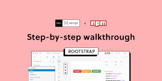
UXPin’s npm Integration empowers design teams to prototype at a higher fidelity and with code-like functionality. Component-driven prototyping in UXPin allows designers to create prototypes that previously required engineers to code.
With npm Integration, teams can bring component libraries to UXPin’s design tool and leverage full interactivity of shared components without complicated technical setup. Let’s see the tutorial to learn how fast it is to integrate components and use Merge.
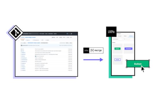
Bring UI components to UXPin from Git repo, Storybook, or through our newest npm integration. Learn more about the last option here: Merge npm integration.
Table of contentsWhat is UXPin Merge?What is UXPin’s npm Integration?The Benefits of Working With BootstrapBootstrap npm Integration With UXPin MergeAssigning Properties in Merge Component ManagerConnecting UXPin to the React Bootstrap npm PackageStep 1Step 2Step 3Step 4Step 5Importing React Bootstrap ComponentsStep 1Step 2Step 3Step 4Step 5Step 6Adding Component Properties with Merge Component ManagerButton LabelStep 1Step 2Try Component-Driven Prototyping in UXPinWhat is UXPin Merge?UXPin Merge is a code-based technology that enables component-driven prototyping for design teams. Instead of designing from scratch, designers use production-ready UI elements from a repository to build high-fidelity, fully functioning prototypes.
Designers work with visual elements, and engineers the code behind them, creating a single source of truth for the entire product development team. Teams like PayPal or TeamPassword improved the quality, speed, and consistency of their design with UXPin.
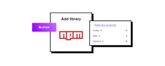
What is UXPin’s npm Integration?Using UXPin Merge for a private design system requires some engineering knowledge to set up the repository for syncing. But, to use an open-source component library, design teams can complete the npm Integration using an intuitive dashboard.

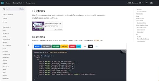
Designers can manage component imports and properties using Merge Component Manager. For example, you can import a button from Bootstrap’s component library and its nine variants:
PrimarySecondarySuccessDangerWarningInfoLightDarkLinkThese variants appear in UXPin’s Properties Panel as a dropdown. Merge also includes basic hover states for most components, so designers don’t have to worry about these minor details and can begin prototyping immediately.
Design teams can find component properties to import via the React Bootstrap docs. They can import every property or only those relevant to the project.
The Benefits of Working With BootstrapBootstrap is one of the oldest and most comprehensive mobile-first front-end frameworks available for React, Vue, and Angular. UXPin’s npm integration uses the React Bootstrap component library, but you can import the Vue or Angular versions using our Storybook Integration.
Bootstrap is best for building responsive websites and web applications, but you could use the React library for mobile app design projects. Bootstrap’s extensive collection of form elements, responsive tables, and other relevant components makes it an excellent option for web-based enterprise products.
We recommend checking Bootstrap’s Examples page to see what’s possible with this comprehensive front-end framework.
Bootstrap npm Integration With UXPin MergeYou can import Bootstrap components into UXPin’s design editor using the npm package (react-bootstrap). Merge Component Manager allows you to import each UI element and its available properties.
With component-driven prototyping in UXPin, design teams get the same fidelity and functionality as engineers because the elements come from the same repository. Designers can replicate whatever engineers can do with repository components in UXPin via the Properties Panel.
You can assign these properties using Bootstrap’s React props found in the framework’s documentation.
Assigning Properties in Merge Component ManagerMerge Component Manager is a central hub for importing and managing your npm components. You can import as many of these as you need to complete your project.
You also have control over how many properties you import. For example, if you’re only going to use the Bootstrap button’s primary and secondary variants, you only need to import two instead of all nine.
Connecting UXPin to the React Bootstrap npm PackageStep 1Navigate to your UXPin dashboard and click “New Project.”
 Step 2
Name your project and click “Create New Project.”
 Step 3
Click “Design with Merge components” and “+ Add new Library.”
 Step 4
Select “Import React Components with npm integration” and click “Next.”
 Step 5
Name your library. This name is purely for your reference and won’t impact the import.
Merge requires two Bootstrap packages for the npm Integration to work. You’ll need React Bootstrap (react-bootstrap) and Boostrap (bootstrap).
Lastly, you must include a path to Bootstrap’s CSS file for component properties to work in UXPin. You can find this path under CSS in React-Bootstrap’s documentation.
bootstrap/dist/css/bootstrap.min.css Importing React Bootstrap Components
Once you complete the steps above, UXPin will redirect you to Merge Component Manager. You can also get there from the canvas following Step 1.
Step 1From the lefthand sidebar, click “Open Merge Component Manager.”
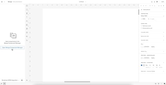
Merge Component Manager will open in a new tab.
Step 2Click “Add new component.”
 Step 3
Enter the name of the component you want to import.
You’ll find the correct naming convention in React Bootstrap’s documentation.
We’ll import a Bootstrap button for this tutorial and create a new category called “Components.” We recommend using the same categories as React Bootstrap’s docs so designers and engineers have the same reference point.
You can add multiple components to a single import, saving you time repeating steps two and three.
Click “Import Components.”
 Step 4
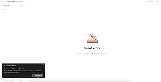
Click “Publish Changes” in the top right to initialize the import process.
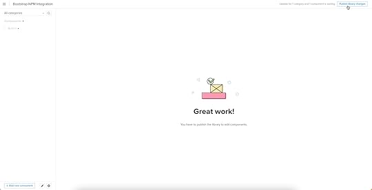
The first time you do this for a new component, it might take a minute.
Step 5Once the import is complete, click “Refresh Library” to update the changes in your project library.
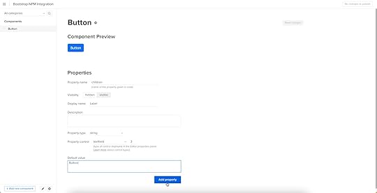
If you follow these instructions step-by-step, you’ll notice you have a category (Components) and your first component (Button) in the left sidebar.
Step 6Click on the Button to begin adding properties. You can find these React props in React Bootstrap’s documentation under API in Components > Button.
 Adding Component Properties with Merge Component Manager
We’ll add a couple of button properties using React Bootstrap’s documentation.
Button LabelStep 1You set a React Bootstrap button label using the children property as follows:
Property name: enter “children” (always use lowercase for props)Display name: This is for your reference, but something descriptive that both designers and engineers use–we’ve gone with “Label” to keep things uniformDescription: Add a short description or instructions for designersProperty type: “string”Property control: “textfield”Default value: Your preference–we’ve gone with “Button”As you complete the component’s properties, you’ll notice a component preview will appear and change according to your preferences.
Step 2Once you have completed all the fields, click “Add property.”
Then “Save Changes.”
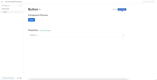
Lastly, “Publish library changes.”
 Try Component-Driven Prototyping in UXPin
Once you import the React Bootstrap components and properties you need, prototyping in UXPin is as simple as drag-and-drop to build layouts. We created this simple email sign-up form using three Bootstrap components in less than a minute.
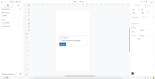
When you select a Bootstrap component, the properties you created in Merge Component Manager appear in the righthand Properties Panel.
Try component-driven prototyping with UXPin’s npm Integration today. Bring Bootstrap’s npm components and discover how quickly your product gets from ideation to development. Release features much faster.
Try npm integrationThe post Learn How to Bring Bootstrap Components to UXPin – npm Integration Walkthrough appeared first on Studio by UXPin.
September 5, 2022
UX Benchmarking Guide – Where Should You Take the Data From?

UX benchmarking is crucial for identifying areas for improvement and achieving product goals. Benchmarks give design teams a baseline from industry standards, competitors, or previous performance to improve a digital product’s user experience.
This article provides a high-level overview of UX benchmarking, how to find relevant benchmarks, and a three-step process for conducting successful benchmark studies.
Table of contentsWhat is UX Benchmarking? Types of UX BenchmarksWhen is UX Benchmarking Useful?UX Benchmarking for DesignOpsWhere Does UX Benchmark Data Come From?1. UX Benchmarks From Product Data2. UX Benchmarks From Competitive Analysis3. Stakeholder UX Benchmarks4. Industry-Standard BenchmarksHow to Conduct UX Benchmarking Studies1. Set up a Plan2. Write a Script3. Choose Your Usability ParticipantsAccurate Usability Testing With UXPinExceed UX benchmarks with actionable test results using advanced code-based prototypes. Sign up for a free trial to improve prototyping and testing with UXPin’s code-based product design solution.
What is UX Benchmarking?UX benchmarketing is a comparative performance evaluation measured against a standard–i.e., competitor, industry, or past performance. The aim is to identify a baseline or benchmark from which to set goals and measure performance.
Benchmarking helps answer the question, “is this better or worse?”
Types of UX BenchmarksBenchmarks are tied to UX metrics, of which there are two categories:
Qualitative data: Sentiment, loyalty, usability, user satisfaction, user experience, and other subjective dataQuantitative data: Numbers, ratios, and other measurable dataThere are different methods for tracking UX metrics and presenting the data. For example, a Net Promotor Score (NPS) works on a scale of 0-10, whereas task time uses seconds, minutes, and hours.
NPS is a qualitative metric because it measures user sentiment and satisfaction.Time-on-task is a quantitative metric because you can measure it using time.A typical method for collecting qualitative data is asking questions through questionnaires and surveys. Conversely, teams can use tracking and analytics tools to determine quantitative data–i.e., it generally doesn’t require someone’s feedback to measure it.
When is UX Benchmarking Useful?UX benchmarking is essential whenever the design team wants to measure success or failure. This measurement could be for an entire project or when choosing a suitable component for a specific user interface.

These are a few scenarios where UX benchmarking is most used:
Evaluating the results of a UX auditAt the beginning and end of a redesignBefore and after usability testingCompetitive benchmarking–measuring UX KPIs against competitorsSetting goals to beat industry standardsAs part of early research for a new productDefining a project’s business goals–conversion rate, completion rate, user engagement, eCommerce metrics, etc.UX Benchmarking for DesignOpsThe above examples relate to user and product benchmarking metrics. You can also apply UX benchmarks to the department’s performance–an important focus for DesignOps practitioners.
In ROI of DesignOps, Patrizia Bertini outlines several key metrics for measuring efficiencies:
Tools’ ROI (cost/engagement/adoption)Testing and prototyping lead time (time)Number and type of quality reviewsTeam productivity (resources utilization)End-to-end delivery time (time)To measure these metrics, DesignOps practitioners must have a baseline (benchmark) for tracking performance. These performance metrics are vital for design advocacy and acquiring valuable resources.
Where Does UX Benchmark Data Come From?Design/team leaders and stakeholders often use benchmark studies (summative evaluations) to identify metrics and set UX goals. We’ve identified four key sources for UX benchmarks:
Product dataCompetitive analysisStakeholdersIndustry standards 1. UX Benchmarks From Product Data
Product data produces a wealth of insights and metrics for creating UX benchmarks. There are many tools for collecting product data; some of the more popular methods include:
Product analytics (Google Analytics) collects significant data and metrics, including conversions, sales, leads, time-based tasksHeatmaps (Hotjar, Crazy Egg) tell design teams how users digest and engage with contentUsability testing is excellent for gathering user insights like task completion rates, time-on-task, etc. Designers can also ask questions to collect qualitative data.User research includes questionnaires and surveys to derive UX metrics like NPS, Customer Satisfaction Score (CSAT), System Usability Scale (SUS), etc.2. UX Benchmarks From Competitive AnalysisUX teams can use competitive analysis to create competition benchmarks. Measuring against the competition allows teams to understand where competitors have an edge and the areas they need to improve.
For example, a tool like Similarweb allows you to analyze and compare websites and applications. UX teams can look at metrics from top competitors like bounce rate, average time on site, and pages per visit to determine the competition’s average, use these as benchmarks, and ask:
What are the best competitors doing right?What design features are creating engagement?What are our competitors’ traffic sources?What are their demographics? Do we share a similar audience?UX professionals can take this one step further and conduct competitive usability testing. The best method is to build a prototype replica of your competition’s website and conduct tests. The results will provide helpful insights for improvement and allow you to set competitor usability benchmarks to stay ahead of the competition.
3. Stakeholder UX BenchmarksStakeholders often set UX benchmarks that align with business goals–for example, establishing a baseline for conversion rates. Design teams must balance these business goals with user needs to ensure the product still serves its customers.
Ultimately, stakeholders want to see a return on investment for UX and its projects. Some metrics stakeholders care about and want to see improvement include:
Increase sales/conversionsReduced tech support callsCustomer loyaltyCustomer satisfactionCustomer retentionReduced time-to-marketReduced rework or errorsEmployee retentionLabor cost savings4. Industry-Standard BenchmarksIndustry-standard benchmarks are KPIs organizations want to follow and exceed! Companies must use these industry standards as the bare minimum for performance. Anything less indicates your product is performing below average, and you’re likely not meeting your customers’ expectations.
Organizations can obtain these benchmarks through various sources, like research agencies, industry reports, or commission a benchmark study.
Baymard Institute’s SaaS UX Benchmark: 5 Pitfalls to Avoid is an excellent example of a research agency benchmark study for the SaaS industry. The study analyzed 10 B2B and 10 B2C SaaS companies to determine 255 UX performance metrics in multiple categories (which companies can use as KPI benchmarks):
Overall UX performanceDesktop WebHomepage & navigationPage types & designPlan matrixCheckoutSign-up & account managementSite-wide features & navigationMobile WebHomepage & navigationPage types & designCheckoutSign-up & account managementSite-wide design & interactionHow to Conduct UX Benchmarking StudiesWe’ve borrowed this three-step benchmarking study template from Nikki Anderson, founder of the User Research Academy. Nikki’s three steps include:
Set up a planWrite an interview scriptPick your participants1. Set up a PlanA benchmark study plan helps UX teams understand goals and objectives to answer three vital questions:
Frequency of benchmark studies–things change constantly, so follow-up studies are necessary to ensure your benchmarks are always accurate.What do you want to learn? Clear objectives help researchers apply the correct UX research methods and formulate a final report.What do you want to measure? Be specific about the features and KPIs. For example, “we want to know the task completion rate for our desktop and mobile applications.”2. Write a ScriptScripts align user testing questions with desired outcomes. What tasks or actions do you want usability participants to complete? For example, buy a product, complete the product’s onboarding sequence, use a specific feature, etc.
Like any usability test, UX moderators must use open-ended questions so they don’t influence or bias the outcomes. For example:
Example of a poor usability question: “can you search for a mother’s day gift in our store?”Example of an objective, open-ended usability question: “how would you find a mother’s day gift in our store?”Asking the first question might suggest users use the search functionality, whereas the second example is less likely to influence users’ process and outcome.
3. Choose Your Usability ParticipantsRegular usability testing test fewer than ten participants, whereas benchmark studies require more data. Nikki recommends 25+, but studies from Baymard and MeasuringU tested 4,750 and 600 users, respectively.
The number of participants will depend on the studies researchers conduct and your budget. For example, interviews are time-consuming and expensive, making Nikki’s 25 far more viable than Baymard’s 4,750! Surveys and questionnaires are far better for testing high user volumes.
Nikki’s two tips for selecting usability participants for regular benchmark studies:
Be consistent with the types of users you testYou don’t have to use the same participants every time; a mix of new and previous test subjects can help provide fresh insightsAccurate Usability Testing With UXPinBenchmark studies often require prototyping and testing. To get reliable, actionable benchmarks, designers must have high-fidelity prototypes that accurately replicate the final product’s user experience.
Code-based prototyping in UXPin allows designers to build prototypes that look and feel like the final product. Designers can create fully functional, dynamic user experiences to test sign-up flows, eCommerce checkouts, form validation, component states, accessibility, and more!
Here are four code-based features to take prototyping to the next level in UXPin:
States : Apply multiple states to a single element or component, each with different properties, interactions, and animations. Interactions : Create complex interactions with advanced animations and conditional formatting. Variables : Capture and store user inputs and use that information to take actions or personalize a user experience. Expressions : Create fully functioning forms, validate passwords, update shopping carts, and more with Javascript-like functions.Conduct quality usability tests to achieve actionable results to meet UX benchmarks and product goals. Sign up for a free trial to discover how UXPin can enhance UX design processes to deliver better user experiences to your customers.
Try UXPin for freeThe post UX Benchmarking Guide – Where Should You Take the Data From? appeared first on Studio by UXPin.
August 31, 2022
Improve Your Team’s Roadmap and Build Better Products

Whether an early-stage startup or a multi-national organization, a product roadmap is essential for aligning teams toward achieving the company’s goals and objectives.
This article includes valuable tips from product experts about creating and maintaining a successful product roadmap. We’ve also included a list of tools to simplify the process of building one.
Jump to sectionWhat is a Product Roadmap?What Should you Include in a Product Roadmap?What Are the Benefits of a Product Roadmap?Who is Responsible for a Product Roadmap?Product Roadmap vs. Product StrategyWhat Makes a Successful Product Roadmap?1. Product Vision2. Timelines3. Product Features8 Tips to Improve Your Product Roadmap1. Keep Your Product Roadmap Simple2. Set Realistic Goals3. Collaborate With a GO Roadmap4. Rate Features to Prioritize Them5. Learn to say “No”6. Know Your Audience7. Simplify Roadmapping With Product Roadmap Tools8. Encourage InputImproving Product Delivery With UXPin MergeA Single Source of TruthPrototyping and TestingMeaningful FeedbackSmooth HandoffsStreamline product development workflows, enhance cross-functional collaboration, and achieve your goals faster with UXPin Merge–the world’s most advanced component-driven prototyping tool. Request access via our Merge page to get started today!
What is a Product Roadmap?A product roadmap is a high-level guide for your product’s goals and milestones, allowing teams to plan and strategize accordingly. It tells team members and stakeholders what you are building and why to align everyone towards the same goals and objectives.
What Should you Include in a Product Roadmap?There are several key product roadmap elements:
Product vision: the ultimate goal that drives your productTimeline: a visual representation of the entire roadmapGoals or milestones: time-bound objectives toward your visionFeatures: what you must buildReleases: deliveries for one or more product featuresEpics: large initiatives or projects encompassing multiple featuresKPIs: progress tracking metricsWhat Are the Benefits of a Product Roadmap?A product roadmap is essential because it defines a vision and how to get there. It tells team members and stakeholders where you are and what comes next.
Product roadmaps keep teams focused on a common goal and ensure managers prioritize tasks, projects, and new features accordingly. It’s also vital to communicate product progress and timelines to the entire organization–especially for stakeholder buy-in and resource allocation planning.
Who is Responsible for a Product Roadmap?Product managers are typically responsible for compiling and managing a product roadmap. They must collaborate with team leaders and stakeholders to ensure the product roadmap is relevant and realistic while aligning with the company’s business goals.
Product Roadmap vs. Product StrategyA product strategy defines how the organization will achieve its vision and objectives. In contrast, the product roadmap outlines the steps and timeline toward achieving those goals.
Product strategy: how we do thingsProduct roadmap: what we must doBoth are essential for achieving the product’s vision.
What Makes a Successful Product Roadmap?There are three vital components for a successful product roadmap.
Product visionTimelineFeatures (releases)While several other elements go into a product roadmap (as outlined above in “what to include”), it won’t be effective if one of these is missing.
1. Product VisionA good roadmap must have a vision or north star that guides team members and creates a purpose for their work. Mural has an excellent article about creating a product vision and vision statement, which must be:
PurposefulAspirationalAchievableCustomer-focusedConciseWell-documented2. TimelinesEvery product roadmap must have timelines for features, projects, goals, milestones, etc. These can be timeframes (monthly, quarterly, annually, etc.) rather than specific start and end dates. What’s most important is that your team commits to delivering on time!
3. Product FeaturesFeatures tell team members what they must build to reach goals and milestones according to the timeline. Features are usually high-level goals rather than individual tasks.
8 Tips to Improve Your Product RoadmapThese tips will help you avoid common pitfalls and optimize your product roadmap for success.
1. Keep Your Product Roadmap SimpleA product roadmap must be easy to read and digest. The aim is to provide high-level goals and objectives without granular details. Each feature should include:
A brief descriptionStatusPrioritizationTimeframe/deadlineTeam/department responsibleLeadPro tip: Whether working with a spreadsheet or productivity tool, keeping your roadmap within a desktop screen’s width will make it easier to scan and navigate. Similar to this example from Asana.
 2. Set Realistic Goals
While it’s important to set high expectations to motivate employees, your product roadmap must be realistic and align with your human resource capacity.
3. Collaborate With a GO RoadmapA successful product roadmap requires collaboration from multiple teams, departments, and key stakeholders. Product management instructor, writer, and consultant Roman Pichler recommends gathering these people for a workshop to create a Goal-Orientated (GO) roadmap.
GO roadmaps are outcomes-based, which helps PMs identify and prioritize goals accordingly. As shown in Pichler’s free template, GO roadmaps illustrate:
Date – When will the product ship? Name – What are we calling it? Goal – What problem are we trying to solve? Features – What core functionality is required? Metrics – How will we know we accomplished our goal?4. Rate Features to Prioritize ThemEntrepreneur and head UX designer Clémence Debaig uses a rating system to prioritize features:
Pain — Painful, Confusing, OpportunityEffort — Small (1), Medium (2), Big (3)Business Value — $, $$, $$$Clémence charts the features using scalable circles, so it’s easy to visualize the hierarchy of importance and prioritize and assign resources accordingly.
5. Learn to say “No”Product roadmaps must also define where you don’t want to go. Brian de Haaff, CEO of the product road mapping software Aha!, warns if you don’t say “no,” to features and ideas that don’t align with your product strategy, your roadmap will become diluted and unrealistic.
PMs must support roadmap decisions with user research, including quantitative data (in-app data, site metrics, etc.) and qualitative data (user interviews).
Brian also recommends separating primary personas from secondary ones to prioritize features for your main audience before trying to accommodate everyone else.
6. Know Your AudienceThe challenge with product roadmaps is that multiple teams, departments, customers, and stakeholders (internal & external) need to read them. Think of these groups as all speaking different languages–you must translate your roadmap into a language they understand.
Having a single roadmap won’t accommodate everyone. You can create a master roadmap for your product development team and produce different versions that speak to your various audiences. For example, you might want to talk about exciting feature releases to customers while the business team is more interested in projected growth and revenue.
7. Simplify Roadmapping With Product Roadmap ToolsCreating and managing a product roadmap is time-consuming. Tools can help automate tasks and eliminate the hassle of building and maintaining a product roadmap from scratch–ultimately saving you valuable time!
Here are some popular project management tools we recommend for building and managing your product roadmap:
AsanaMonday.comJiraAha!Craft.ioClickUpNotionThese tools include successful product roadmap templates to get you started. Many also integrate with other apps like Slack, Teams, G-Suite, Google Drive, etc., to streamline productivity and collaboration.
8. Encourage InputProduct management must set up channels for internal teams, stakeholders, and customers to submit ideas. A tool like Feature Upvote allows PMs to collect feature ideas and have teams and customers upvote those they value most.
These tools can help product teams align the product strategy with customer demand to prioritize features that deliver the highest ROI while satisfying customer needs.
Improving Product Delivery With UXPin MergeCreating a product roadmap is one thing. Delivering successful projects on time requires a talented team and the right toolset. UXPin Merge syncs design and development to enhance collaboration while eliminating drift and inconsistencies. The result? Faster time-to-market with fewer errors and smoother design handoffs.
A Single Source of TruthMerge allows you to sync a component library from a repository to UXPin’s editor, so designers and engineers use the same UI elements. You can connect a React library using our Git Integration or Storybook for other front-end frameworks like Vue, Ember, Angular, etc.
Any changes to the repository automatically sync to UXPin’s editor, notifying design teams of the update. Designers can use UXPin’s Version Control to switch between design system versions, giving complete control and flexibility.
Prototyping and TestingDesign teams can drag and drop ready-made, interactive components to build user interfaces. Interactivity, states, colors, typography, and other component properties dictated by the design system are built-in, so designers can focus on prototyping rather than designing from scratch.
Prototyping with Merge makes the design process more accessible to non-designers, like product teams and engineers, allowing organizations to scale design with fewer resources.
After switching to UXPin Merge, PayPal’s product teams (with limited UX or design tool skills) build UIs 8X faster than experienced designers were able to do previously with image-based design tools.
TeamPassword’s small engineering team (who don’t have any designers) uses UXPin Merge to prototype and test their password manager tool to improve usability and user experience.
Both companies have experienced significant workflow efficiency and reduced time-to-market, making them more competitive using UXPin Merge. Component-driven prototyping helps PayPal and TeamPassword meet project deadlines to achieve product roadmap goals and objectives.
Meaningful FeedbackUXPin Merge enables designers to replicate the final product accurately with immersive, dynamic, personalized user experiences. Better prototypes mean better feedback from user testing and stakeholders.
These high-fidelity prototypes mean designers can identify more usability issues and opportunities for improvement during the design process, resulting in higher quality releases with fewer errors.
Smooth HandoffsHandoffs are notoriously challenging and often a source of friction between designers and engineers. With UXPin Merge, handoffs are seamless, almost non-existent, because designers and engineers work with the same components and constraints.
Engineers simply copy components from the repository and any changes from UXPin to begin the development process. Designers can also include annotations with prototypes to provide context and documentation.
Discover how component-driven prototyping with UXPin Merge can help achieve your product roadmap goals faster while enhancing your product’s user experience. Visit our Merge page for more details and how to request access.
Discover MergeThe post Improve Your Team’s Roadmap and Build Better Products appeared first on Studio by UXPin.
Software Development Tools 101 – A Quick Guide for Designers

As a designer, learning about software development tools can help improve design projects and find ways to enhance collaboration with engineers. Such proactive approach can also help design projects increase buy-in for initiatives.
A great example is how Delivery Hero’s product team leveraged front-end debt to get buy-in for their Marshmallow Design System. By understanding how engineers develop components and the errors that add to front-end debt, Delivery Hero’s product team presented a business case that stakeholders couldn’t refuse.
We’ve put together a list of 11 software development tools that can help designers collaborate with engineers better–and some of these can improve design processes too!
Table of contentsCommon Use Cases for Software Development Tools11 Common Software Development Tools1. GitHub2. Storybook3. Jira4. BitBucket5. Docker6. Visual Studio Code7. Microsoft Azure8. GitLab9. Bootstrap10. Chrome DevTools11. AWSUXPin Merge – The Best Software Development Tool for Designers and EngineersStreamline product development workflows and enhance prototyping with the world’s most advanced collaborative design tool. Visit our Merge page for more details and how to request access to this revolutionary component-driven prototyping technology.
Common Use Cases for Software Development ToolsThere are tons of tools available for engineers. These tools vary depending on the tech stack, workflows, product, organization size, etc. There are several common reasons why engineers use programming tools:
IDE (Integrated Development Environment) – for writing codeDevelopment frameworks – React, Bootstrap, Angular, etc.Testing – tools to evaluate and correct code errorsRepository hosting – project hosting, package managers, development tools, etc.Automation – task and workflow automationPrototyping – UI and component prototypingUnderstanding these tools and what they do can help design teams collaborate to find solutions.
11 Common Software Development Tools1. GitHubGitHub is a software development management platform allowing engineers to build, host, share, document, scale, and collaborate on development projects. While there are several similar platforms, GitHub is by far the largest and most widely used.

GitHub offers private and public (open-source) hosting for every type of developer, from beginners and hobbyists to experts and multinational enterprise organizations.
While most designers will never use GitHub, it can offer significant benefits to the design process, like component-driven prototyping with UXPin Merge.
Merge syncs a React component library from a repository (like GitHub) to UXPin so designers can use ready-made UI components (the same ones engineers use for development) for prototyping and testing. Visit our Merge page for more details and how to request access.
2. StorybookStorybook allows software development teams to build UI components and interfaces in isolation. They can also collaborate with other programmers and invite leads and stakeholders to review UI elements before release.

Storybook is an excellent tool for designer/engineer collaboration because it allows developers to share components based on design files.
For example, let’s say your design team builds a new button with multiple states, and you want to know how these will translate to code. Engineers can create the component in Storybook and share a link for designers to preview the button in isolation.
Another significant benefit for design teams is that Storybook integrates with UXPin Merge, allowing designers to import a Storybook component library for prototyping and testing. Where UXPin’s Git integration only works with React, Storybook allows for more front-end technologies, like Vue, Ember, Angular, and more.
3. JiraJira is a widely-used project management tool for software development, particularly for agile teams. This crucial DevOps tool streamlines engineering workflows while enhancing collaboration and productivity.

Jira is part of the Atlassian product suite, allowing engineering teams to integrate multiple tools to scale and optimize workflows. It also integrates with the productivity tool Trello to enable organization-wide task and project alignment.
4. BitBucketBitBucket is another Atlassian product and offers similar features to GitHub, but companies primarily use it for private repositories. The platform is built for enterprise software development, with tools and features to optimize workflows, issue tracking, testing, pipeline management, integrations, etc.
 Bitbucket software tools that you hear about
BitBucket syncs with Jira through Jira issue IDs, automating many operational tasks, like updating tickets and notifying cross-functional teams connected via Trello–simplifying DevOps and DesignOps responsibilities.
5. DockerDocker is a software development tool for developing and deploying web and mobile apps through virtual container environments. Using Docker ensures your application runs the same across multiple operating systems and environments, including iOS, Windows, Android, Linux, etc. If engineers need to change a specific container (like iOS), it won’t impact the other environments.
This cross-platform management solution means the software is system agnostic reducing code while making it easy to deploy and maintain.
The concept of containers can appear complicated for those with limited technical knowledge, so we highly recommend checking out this video from Kyle at TechSquidTV for a foundational understanding of Docker.
6. Visual Studio CodeVisual Studio Code (VS Code) is a popular free IDE (Integrated Development Environment) or code editor from Microsoft. The IDE’s built-in Git (a version control system) allows engineers to connect to source code management (SCM) tools and platforms like GitHub or BitBucket.

VS Code offers an extensive library of extensions to integrate with other software development tools for many programming languages, including Javascript, Python, Java, PHP, HTML, and TypeScript, to name a few.
7. Microsoft AzureMicrosoft Azure is a cloud software development platform with the tools, resources, and services to build, manage, scale, and run applications.

Azure integrates with Microsoft 365, enabling organization-wide collaboration for startups and enterprises alike.
8. GitLabGitLab is a comprehensive end-to-end product development workspace with tools and services for every stage of the DevOps lifecycle. It also features Design Management–a tool for product, UX, and engineering team members to collaborate on wireframes, mockups, prototypes, and other design artifacts.

Designers using UXPin Merge will also benefit from better GitLab’s Storybook integration. Engineers can add components to the product’s Storybook, which syncs to UXPin via Merge, streamlining design system component releases and updates.
9. BootstrapBootstrap is a responsive front-end framework engineers often use when prototyping websites and web applications. The framework offers a comprehensive CSS grid system and Javascript plugins for out-of-the-box styling and functionality.

Bootstrap is available as a plugin for many design tools and comes standard with every UXPin plan. UXPin Merge users can take prototyping to another level by importing React Bootstrap components using UXPin’s npm Integration.
These ready-made Bootstrap components allow designers to prototype faster and focus on solving problems rather than designing from scratch. They can hand off designs to engineers who can import the same React Bootstrap npm package and copy JSX changes from UXPin to begin front-end development.
10. Chrome DevToolsChrome DevTools is a debugging and web page inspection tool for Google Chrome. Engineers can debug Javascript and edit CSS in real time to visualize changes before and after writing code.
Chrome DevTools is relatively easy to use, meaning designers can collaborate with engineers and recommend changes, especially during quality assurance for websites and web apps.

Another helpful feature for designers is the ability to test page load performance, including assets. Designers can identify problematic assets (images, video, etc.) and iterate on alternatives to help engineers optimize performance.
Apple’s Safari browser offers a similar tool called Web Inspector.
11. AWSAmazon Web Services (AWS) is a comprehensive data storage, content delivery, and developer services platform for websites and digital products. One of AWS’s best features is its vast server network spanning 84 zones across 26 geographic locations–enabling companies to deliver products closest to their customers anywhere worldwide.

AWS also offers DevOps services and the powerful web-based text editor, Cloud9 IDE, for writing, running, and debugging code. The platform’s pricing plans include the AWS Free Tier for building prototypes while providing startups with an affordable entry to market.
UXPin Merge – The Best Software Development Tool for Designers and EngineersHigh-fidelity prototyping is a challenge for designers and engineers.
Designers: don’t get sufficient fidelity or functionality using design toolsEngineers: takes too long to build prototypes, limiting what they can testUXPin Merge allows product development teams to sync a design system from a repository to UXPin’s design editor so design teams can prototype using ready-made components–the same ones engineers use to build the final product.
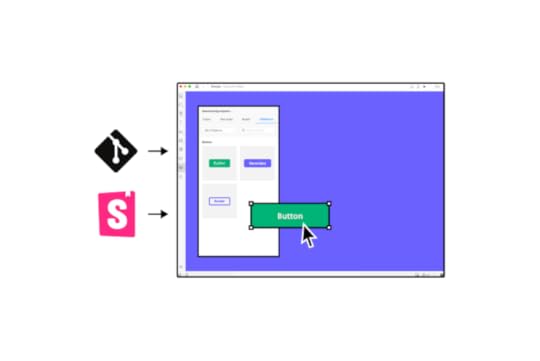
Design teams drag and drop Merge components to build new UIs–allowing them to focus on products and features rather than building from scratch. Merge components are fully interactive with properties defined by the design system, ensuring “baked-in” cohesion and consistency for every prototype.
This drag-and-drop solution is also great for engineers and product teams with limited UX skills and design tool experience. We’ve seen this work for a small startup at TeamPassword and the enterprise level at PayPal.
TeamPassword, a small password manager with no design team, uses UXPin Merge to prototype and test user interfaces before committing to the software development process.
PayPal’s internal product development teams use Merge to prototype and test new products. The UX team has built a design system using Microsoft Fluent, including UI templates to give product teams approved components.
The switch to UXPin Merge was so successful that PayPal’s product teams now build one-page prototypes 8X faster than experienced UX designers could do previously using image-based tools.
Bridge the gap between design and development and design better user experiences for your customers with one of the world’s best software development tools. Visit our Merge page for more details and how to request access.
Discover MergeThe post Software Development Tools 101 – A Quick Guide for Designers appeared first on Studio by UXPin.
August 30, 2022
BASIC UX Framework – Definition, Benefits, and Application

The BASIC UX framework is as simple as its name suggests. Designers measure a product against a set of UX principles to identify usability issues. These principles apply to web design, mobile apps, and other digital products.
What makes BASIC UX great is it’s a checklist template design teams can adopt and adapt to meet their product requirements and user needs. It’s a holistic product development approach that accounts for usability and accessibility.
Table of contentsWhat is the BASIC UX Framework?The BASIC UX Framework’s 5 UX PrinciplesBeautyAccessibleSimplicityIntuitivenessConsistencyHow to use the BASIC UX FrameworkEnhance BASIC UX Principles With UXPinDesign products your customers will love with the world’s most advanced interactive design and prototyping tool. Sign up for a free trial and start designing better user experiences for your customers with UXPin.
What is the BASIC UX Framework?BASIC UX is an acronym describing five essential user experience design principles for building “usable products.” It’s unclear who developed the framework, but it surfaced around 2016.
There is a BASIC UX website, but there is no mention of any person or affiliations. It’s a bit like bitcoin and Satoshi Nakamoto. Still, BASIC UX works as a checklist for evaluating user experience in digital products.
“BASIC UX is a set of common principles that test something’s overall user experience. The problem that this framework is attempting to address is the need for common UX language and understanding in teams and organizations.” – BASIC UX website.
The purpose of BASIC UX is for product design teams to ask themselves a series of questions related to each principle–similar to the 5 Whys problem-solving framework. If designers can answer yes, they move on; if no, they must find a solution.
The BASIC UX Framework’s 5 UX PrinciplesThe BASIC UX framework uses five UX principles.
B = BeautyA = AccessibleS = SimplicityI = IntuitivenessC = ConsistencyWithin each principle are a series of questions. These are questions from the BASIC UX framework, but design teams can add questions or create a checklist relevant to their product.
BeautyBeauty represents aesthetically-pleasing design. Human beings are drawn to beauty in all facets of life, including the websites and applications we use.
Visual design is not the only consideration for beauty in BASIC UX; it includes interaction design, animations, information architecture, and other elements that deliver a holistic user experience.
Questions to ask for beauty:
Is it aesthetically pleasing?Does it follow the style guide?Does the design use high-quality media (images, graphics, video, etc.)?Is it properly aligned with the layout?AccessibleAccessibility is a vital UX design component. Designs must meet Web Content Accessibility Guidelines (WCAG) to ensure a digital product or website is accessible to all users, including those with disabilities.
Products built to accommodate people with disabilities and assistive technologies are often easier to use, which ultimately benefits everyone.
BASIC UX asks four fundamental questions, but an accessibility checklist can guide design teams in evaluating a product comprehensively.
Questions to ask for accessible:
Does it conform to (WCAG) standards?Is it cross-browser and cross-device compatible?Is it responsive?Does it use language everyone can understand?SimplicityWe design products to make people’s lives easier. Simplicity is key to delivering that promise to users. Providing users with clean, minimal user interfaces with only the content needed to complete the desired task is critical for good UX.
Cluttered UI design, with multiple CTAs, poor instructions, and too much copy, increase cognitive load, making it difficult for users to make choices or complete tasks. Simplicity eliminates unnecessary design elements and only provides users with what they need.
Designers must conduct thorough UX research and user testing to identify these needs and build features and experiences accordingly.
Questions to ask for simplicity:
Does it reduce the user’s workload?Is it free of clutter and repetition?Is it necessary?IntuitivenessUsers expect an intuitive user experience. It’s why designers use internationally recognized design patterns for solving core usability issues and prioritize content to meet user needs.
Designers must reduce learning and ensure the user never has to relearn a product after new releases and upgrades. Documentation must help users understand a product and how to complete tasks.
Questions to ask for intuitiveness:
Is the functionality clear?Is the navigation obvious?Can the user achieve their goal with little or no initial instructions?Is this the fastest way for the user to complete this task?Can a user predict the outcome?ConsistencyConsistency is the foundation for usability and good design. The more consistent a product, the easier it is to predict and use. In a Medium article on BASIC UX, Dan Smith writes:
“Consistency is the thread that holds BASIC UX together. A beautiful product is consistent. An accessible product is consistent. A simple product is consistent. An intuitive product is consistent.”
Designers must always try to reuse components and UI elements wherever possible. Copy, CTA labels, and other text must also use consistent language, fonts, spacing, and sizing.

Building a design system is essential for eliminating inconsistencies, reducing UX debt, improving user experience, reducing time-to-market, and other common product development issues.
Questions to ask for consistency:
Does it use existing UI patterns?Does it appear in the correct place at the right time?Are the language, media, and branding consistent with the system?Does it perform tasks and functionings consistently every time?How to use the BASIC UX FrameworkBASIC UX is an excellent framework for evaluating existing rather than new products. Designers can use BASIC as a user experience checklist to check if features, UI components, interactions, etc., meet a company’s UX requirements.
BASIC UX is also beneficial as a before and after comparison for projects. Design teams can use the checklist to check they deliver a project that improves upon any issues identified in the initial BASIC evaluation.
Enhance BASIC UX Principles With UXPinUXPin is an advanced code-based design tool enabling designers to go beyond basic prototyping and testing. With code-based design, you can build fully functioning forms, validate passwords, create personalized, dynamic user experiences, and acquire meaningful feedback from usability testing and stakeholders.
UXPin also features built-in accessibility, including a color blindness simulator and contrast checker so designers can check their user interfaces on the fly without leaving the canvas.
Maintain consistency with UXPin’s Design Systems. Save your product’s components to a centralized design system that every team member can access from the canvas. Add descriptions for documentation and set permissions to prevent unauthorized changes.
Discover how UXPin can revolutionize your UX design process to deliver products that meet BASIC UX requirements while satisfying business goals. Sign up for a free trial to explore all of UXPin’s advanced features.
Try UXPin for freeThe post BASIC UX Framework – Definition, Benefits, and Application appeared first on Studio by UXPin.
August 29, 2022
Creating Engaging Mobile App Design – All You Need to Know

It’s predicted that by 2023, the mobile apps market will reach $935 billion in sales. Pretty impressive, right? However, to get a piece of that cake, you need to make sure that your app design is not only pleasing to the eye but also easy to use. Only then you’ll be able to generate high user engagement.
Let us walk you through a few things that your entire team, and especially your mobile app designer should keep in mind while building the best app.
Go to section:3 Steps of an effective design processStep one: Plan & researchStep two: Design & developmentStep three: Launch & testHow to create the best app design strategy?1. Define the idea2. Calculate the budget3. Establish the KPIsCreating great user experiences3 great practices for great app design1. Simple navigation2. Built for mobile3. True design tools3 great app design examplesExample One: Google MapsExample Two: PocketExample Three: EtsyHow to avoid common app design mistakes Don’t add too many features at onceMaintain a regular updates scheduleTest with diverse user personasChoosing the right app design tool1. Simple design-dev handoffs2. Real-world data3. Collaboration and sharing featuresApp design trends to watch out for in 2022 and beyond1. Multidirectional navigation2. Inclusive designs3. Dark modeBuild App Design in UXPinReady to create an app prototype? Use UXPin and simplify hi-fi prototyping. Build an interface that looks and behaves like a real app, even though it’s yet to be developed by your software engineers. Get better feedback from tests, show stakeholders what the app will be like, and make it easy for developers to see what you want them to build. Try UXPin for free.
3 Steps of an effective design processThere are three app design steps you’ll need to map out and follow to launch a successful product. This is your design process. It’s how you and your team ‘keep your eye on the prize.’:
Plan and researchDesign and developmentLaunch and testLet’s look at them below.
Step one: Plan & researchDuring the initial phase, you’re going to define exactly what your product is, how it helps, who it helps, and what your app does that rivals don’t. These are the foundations for building a popular app with a clear user base.

Start by clearly outlining what you want to achieve – in broad strokes. Detail the problems users face, how you think you’ve solved those issues. This is mobile designing at its most innovative and creative.
Focus on your users. The most successful app designs are centred around the user – from who they are to what they want. Call on focus groups, surveys, and phone & face-to-face interviews to uncover what users really want from your app design. They will challenge your assumptions. This is a good thing.
At the same time, analyze your competitors. Even the smallest playing fields have big players. What do they do well (and not so well)? How can you best them?
With all this data, you can then assess, pare back, and refine your goal into a single, shareable vision.
Step two: Design & developmentThe next step in the process sees you visualize your app design. You’ll start with wireframes – basic mockups that are just useful enough to gather reflexive feedback from users, stakeholders, and your team.

As you progress, you can start building up a consistent design system for color, typography, sizing, and other visual elements. These UI and UX designs will follow through to your high-fidelity prototypes. Such functional mobile designing mock-ups let you continue testing and optimizing the app throughout the design process.
You can then hand over designs to the development team who will build the app. It’s important to prevent bottlenecks during this stage. Designs can so easily tumble back and forth between design and development teams, threatening to derail entire projects as one side asks for X and the other side delivers Y.
When developing your app, you can speed up interactive prototyping and harmonize the design-development hand-off by using software like UXPin. It’s a design tool that lets designers create a prototype that looks, feels, and behaves like the final product. Try it for free.
Step three: Launch & testOk, one final test and it’s all systems go. Finally, all your app designing experience comes together for the product launch. That might strike the end of the design process, but the journey is only just beginning.

As you follow the design process, you’ll be assessing the product at various stages. And it doesn’t stop there. To ensure your app remains relevant, popular, usable, and used, continue to collect user feedback that offers new directions for refining.
To find out more, read our guide on How to create an effective app design process.
How to create the best app design strategy?1. Define the ideaAs a mobile app designer, you need to keep everything aligned to the same objective. It’s all too easy for team members to lose focus, not understand their role, or give in the mission or project creep. Your communication matters.
Offer clarity with a well-defined concept. Before you start app design work, you should be able to articulate:
The purpose – what is your app for?The audience – who is it for?The use-case – how will it be used?The benefits – why choose you over a competitor?Required resources – what’s needed to develop the app?Success metrics – how will you measure success? 2. Calculate the budgetCalculate a realistic budget as part of your strategy. It’s crucial for keeping the project on track, as it’ll help prevent mission creep – which sees design and development teams add extra features, leading to spiraling costs and hours of wasted time.

In other words, it actively harms the product design and development (and it’s even more costly if users turn off from these untested features).
This will also help you allocate resources most effectively. A budget should help detail what’s being designed in terms of UI design and UX design, as well as how it’s being developed.
3. Establish the KPIsWhat does success look like? As you build a detailed app design strategy, focus on the metrics that really matter to you. There’s no single yardstick against which success should be measured. It’s up to the mobile app designing team to determine a few of the most relevant metrics to your app and your objective.
Common product and design KPIs include:
Number of downloads. Download figures show you whether users like your product enough to install it. If the figure’s too low, you know you’ll need to test ways to increase installs. Churn rate. Churn shows how many users are uninstalling your app, or not opening it. Use this data to explore what it is that’s driving away users. Session counts. Session counts and times show the number of users who open your app and how long they stay active within it. It’s a good base to start if you want to figure out why people stay (or go).These three stages form the basis for a successful 7-step app design strategy. Explore the other four in our dedicated article How to create an app design strategy.
Creating great user experiencesThe 5 principles for outstanding user experiences are:
1. UsabilityMobile device screens are small – and that limited space means adjusting your designs accordingly. Actions should be easy to tap, swipe, scroll, and hold with one hand. Avoid forcing users into performing fiddly actions (think of those annoying pop-ups with minuscule X buttons that are difficult to press). It should be obvious to users what to do and how to do it.
2. FamiliarityFamiliarity of user interface creates a more engaging and intuitive user experience. There’s no need to reinvent the wheel (or redesign the app). Search bars go at the top, options lurk behind hamburger menus, settings are under the cog icon.
When you use familiar mobile design patterns in your mobile app UI, the onboarding process of new users won’t be difficult.
3. ConsistencyYou don’t really want users to even think about their actions – it should ‘just work.’ Consistent design principles are really important for making it happen. A good example is always using the same button that indicates adding an item to a shopping cart in your eCommerce app, so users act on instinct.
Another great one is sticking to one or two fonts, so that you increase readability, as well as make your design consistent. At a broader level, every screen in your app should be consistently you to better brand yourselves and immerse the user.
Use UI kit or even better, a component library with a pre-made interactive UI elements such as Material Design, to stay consistent.
4. AccessibilityApp designing for accessibility means considering the broad range of mobile devices on the market – and an even broader range of users. Does your app demand a high-speed internet connection? Can users with physical limitations still use your app?
5. AppealAt the end of the day, a mobile app designer wants users to love their product. When building your own app, factor in audience appeal. Focus on how you can design experiences that are
Interested in learning more? Explore all the secrets behind memorable app design UX.
3 great practices for great app design1. Simple navigationSimplicity is about making key actions easy to find on-screen. The best way to do this is to limit each screen to one or two core actions. Through an engaging design hierarchy, you can then focus a user’s attention to the right places.
Look at the Amazon app as an example. It offers a masterclass in simple app navigation. Users aren’t overwhelmed with choices. The interface is clean, clear, consistent, leaving users in no doubt what steps to take, whether it’s searching for products or hitting the buy button.
2. Built for mobileDesign your app for mobile devices. It might sound obvious, but all too often mobile app designers effectively ‘port’ a website. While HTML-based apps give you a bit more freedom to update across platforms, the experience is less desirable. You’ll typically find web-like Android and iOS apps laggy, underpowered, and poorly optimized for mobile devices.

Great app design means respecting the user (and how they engage with your product). Ultimately, app designing in this way, in a highly competitive, user-focused marketplace, is a major risk.
3. True design toolsTo create truly seamless experiences for all your users, you need the right tools for the job. This gives you the flexibility to build app designs in an efficient workflow, with tools dedicated to your craft.
Design and prototyping tools like UXPin help you realize your ideas precisely as envisioned. The mobile app designing software helps designers and developers build creative, consistent products from wireframes to ready-to-launch apps. And by giving designers access to the same real-world code components used by your developers, you can ensure expectations match reality, no coding skills required. To find out the must-have features in your software, see the section Choosing the right app design tool.
Explore more top tips on creating good app design in our dedicated article: How to choose app design software.
3 great app design examplesSo much for theory – let’s now look at some examples of great app design below.
Example One: Google MapsGoogle Maps is a prime example of the app design mantra ‘form follows function.’ It’s perfectly built to fulfill its objective – helping users navigate the entire world from their desktop or mobile device.
The map app makes it simple for users to find specific locations, search by category, and get directions to just about any destination. Better still, it delivers incredible value to its users through imagery, reviews, street views, business information, and sat-nav capabilities.
Despite being loaded with functionality (and stuffed with the whole world), the Google Maps interface is delightfully subtle, never threatening to overwhelm the user. Even if you’ve never used an app before, you’ll know how to get around Google Maps, and how to get around using it.
Example Two: PocketPocket is a clever app that lets you save articles and media to read or watch later.
The app’s interface is fresh and modern. Navigation is smart and intuitive. The experience centers the user, from easy-to-use actions to distraction-free options for concentrated reading. It even works without an internet connection, so you’ll always have something to read on-the-go.
In keeping with all successful apps, user testing was critical to improving today’s iteration of Pocket. Thanks to Google Ventures, developers were able to gather feedback from five users unfamiliar with the app. That feedback was used to create its classically simple interface.
Little wonder Pocket recently won a Webby award for its UX design. But what else would you expect from developers Mozilla, the firm behind the Firefox browser?
Example Three: EtsyEtsy is the beating ‘art’ of the ecommerce apps, where creators and shoppers meet. The Etsy app is a notable example of simple, effective web and mobile app design – but perhaps that’s to be expected from the arts and crafts supremo.
Crack open Etsy and, unlike so many eCommerce apps, you’re not immediately bombarded with sales messages, deals, star products, and other irritations that clutter user interface. All users need to do is search for what they want or try Etsy’s suggestions.

It’s a strongly visual experience. Images take center-stage, alongside simple product headings. No prices or product names to distract you as you browse. It makes the user experience much more gentle and serene no matter if you use Etsy on Apple or Android devices.
Discover more real-world examples like Airbnb, TripAdvisor, and Uber in our dedicated article on great app designs.
How to avoid common app design mistakes Don’t add too many features at onceThere’s nothing wrong with a feature-rich mobile app. But one of the most common mistakes is when mobile app designers throw all those features into the app at once. Even the most highly functional apps add features over time. This allows them to see what works, what doesn’t, what users want, what they don’t. And it means the app delivers on its singular objective first.
When you begin the app designing process, start off with the core purpose of your mobile application. Make it guide your mobile app development process. You can then add additional features as your app grows in popularity. Be sure to test these features individually. Otherwise, the risk is that you’ll overwhelm users, clutter up your app, and waste precious resources on something that has no real viability.
Maintain a regular updates scheduleThe development process starts when your product launches – and it doesn’t stop. Don’t let your app fester after launch. Maintain a regular schedule for updates. It’s a great way to attract and retain users, keeping your app feeling fresh and innovative.
After each update, check out reviews (or, better yet, conduct in-depth testing) to understand where improvements can be made in future.
Test with diverse user personasUser testing offers insights into how your app performs. And the best way to get the most valuable feedback is by drawing on the broadest possible range of users. When building a test group, choose different types of users – think gender, age, and background. All of them will be attracted to your app for varied reasons, and those reasons may surprise you.
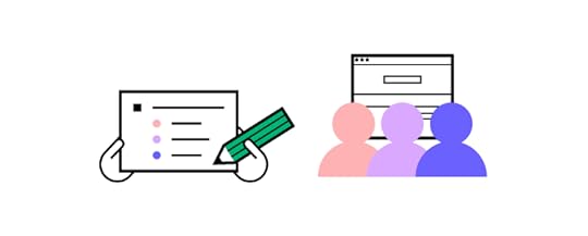
By calling on a broad range of user personas, you’re better placed to identify specific and general behaviors that help improve the product. Without a diverse user group, you risk getting locked in a feedback loop, appealing only to a selected few. This can lead to poor app design, which can be expensive to fix post-launch. It’s better to get it right during the design-development phase, and lots of different user types will help.
Read more about the mistakes you should avoid in new app design in our article about bad app design.
Choosing the right app design toolWhat should you be looking for when selecting the best design tool for your job? Here are a few characteristics you should keep an eye out for.
1. Simple design-dev handoffsThe moment the design team passes over their concept to development is one fraught with anticipation. It’s a stage in the process where bottlenecks are common, and projects have been known to come to a total standstill as some team members might debate over what the app needs to do versus what’s actually possible.

For this reason, you’ll want to choose a mobile app designing tool that simplifies the passing of design to development. UXPin gives designers the opportunity to design highly realistic prototypes. When devs see the prototype, they can use UXPin to generate CSS automatically.
This leads to easier design handoffs, since user experience and interface design as well as app development processes are connected. They all can meet in one tool. Try it for free.
2. Real-world dataOne of the biggest issues with prototypes is just how artificial they feel. All that lorem ipsum and knocked-up design elements break immersion in test groups and fails to showcase the true flavor of your concept. It simply doesn’t look believable, or even look how it should at all.
The best design tools let you populate your prototypes with real-world data. Names, locations, text, and images can all be inserted into designs to better reflect what users will actually see when the product launches. Real-life data like this also gives your team and other key stakeholders a greater impression of what’s being built long before you invest resources into design and development.
3. Collaboration and sharing featuresCollaboration is an essential part of the design process – from chewing over product concepts and strategizing your next steps to communicating core functions to other teams. With so many ideas bouncing around, it’s sometimes difficult to log everything and keep everyone fully informed. And that harms the perfecting of your app.
So, choose an app design tool that makes it simple and easy to share ideas and collect & collate feedback. UXPin features support for PDF, PNG, and HTML exports so everyone on your team can check out the latest designs.
To further enhance collaboration and sharing between teams, the UXPin Mirror app offers authorized users the ability to live-preview mock-ups on mobile devices. It’s the ideal way to understand how your app design looks, feels, and acts on other devices, be it Android or iOs. And with edits displayed in real-time, you’ll be able to compare before-and-after shots.
Be sure to discover more characteristics of great app design software in our dedicated article on choosing the right tool to design your app in.
App design trends to watch out for in 2022 and beyond1. Multidirectional navigationScrolling remains the primary way users experience apps today. Up and down and the occasional tap or input. It’s a functional means of navigation, but it’s not fulfilling – even if everything else on the screen is.
Multidirectional navigation introduces a more engaging experience than traditional and limited scrolling. Modern apps are deploying horizontal and vertical sliders that let users swipe and scroll through the app, to evoke more instinctive, natural interactions.
You’ll find this type of design heavily featured in multimedia and dating apps that let you swipe left and right to find everything from stunning shots and radio stations to potential life-partners.
2. Inclusive designsMobile devices are for everyone – and your app should be, too. They’re in the pockets and hands of youngsters, pensioners, and everyone in between. Unless you’re targeting a very niche market, a modern app needs to feature inclusive design.
You’re not just appealing to a broad user-base. You’re designing an app that’s accessible and usable by that audience. Whether they’re on a phone or a tablet, have physical disabilities or other accessibility issues.
Subtitles are one of the most common trends in inclusive design. Other examples include using buttons that are big and bold, reaching younger children and those with visual impairments. The same goes for sizing options and adding alt text to images for users with screen readers.
Color blind mode is another accessible feature worth including for those who need it. To make sure you’re creating fully inclusive app designs, UXPin hosts a ton of accessibility features, including a color-blind simulator and contrast checker, making it simple to build experiences for all.
3. Dark modeDark mode isn’t a new trend in app design. But it is an ongoing one. Users today want apps to be easy on the eye – even, or especially, when we roll over at 3 in the morning to check our inbox. Generally speaking, good UX is not blinding users with a bright white screen if dark mode is available.
Dark mode fits comfortably in mobile app design, as both an accessibility feature, and a user-focused enhancement. A classic case of ‘If they don’t need it, they want it.’ By switching to darker colors, users experience less eye strain, so they’re more comfortable using your app at all hours of the day.
For bonus UX points, let users set a dark mode schedule that turns on at specific times.
Lead the way by looking at all the top app design trends we’ve gathered for you.
Build App Design in UXPinThe road towards creating a successful, user-friendly mobile app can be lengthy and
time-consuming. The good news is, however, it does not have to be an arduous one!
If you follow a well-thought-out strategy, you’ll be boosting your chances of market success. For starters, it’s important that you divide your app design process into three phases – planning & research, design & development, and launch & continuous testing. Make sure to have a clear understanding of your budget and KPIs. It’s also equally important to use the right mobile app design tools.
If you’re just about to embark on your mobile app designing journey, we recommend taking UXPin for a spin. You’ll be using the absolute-best solution for team collaboration, leverage real data in your prototypes, and make design handoffs as easy as can be.
Try UXPin for freeThe post Creating Engaging Mobile App Design – All You Need to Know appeared first on Studio by UXPin.
UXpin's Blog

- UXpin's profile
- 68 followers

