
UXpin's Blog, page 57
July 25, 2022
Brand Consistency – Check How You Can Boost it with Design
UX design has a significant impact on brand consistency. A product’s visual aesthetic and usability are often the first thing people notice and, therefore, must relate to the brand and create a strong first impression.
Brand consistency in UX design goes beyond using a brand logo, correct colors, and fonts. Designers must create an experience that mirror’s the company’s image, makes sense for the product, and appeal to the target audience. This article explores the importance of brand consistency in UX design and how designers can create on-brand product experiences.
Design consistent user experiences with UXPin’s revolutionary Merge technology. Request access and discover how a single source of truth can ensure your organization delivers consistent, on-brand product experiences with every release.
What is Brand Consistency?Brand consistency refers to how a company delivers consistent messaging and stays true to its core brand values across every touchpoint. This consistency relates to everything from visual design and copywriting to how employees engage with customers or solve problems.
Brand Consistency in UX DesignDesign and UX are vital for brand consistency because these are components customers see and experience when engaging with a product or service. A company can have an excellent name, slogan, logo, brand messaging, etc., destroyed by a poor user experience.
Why Does Brand Consistency Matter?A brand gives a company human-like characteristics, making it easier for customers to relate and engage. Here are several reasons why design leads and stakeholders must prioritize brand consistency in UX.
Reason #1: Building TrustIf you meet someone and they tell you they stand for one thing, but their actions contradict this, you might become suspicious. If you notice more of these inconsistencies, you stop believing them and lose trust.
The same is true for brands, probably more so. People want to see consistency, even down to a product’s typography, colors, and microinteractions.
In a case study from the password manager, TeamPassword, Tony Caccavo, Director of Operations, stated, “Brand is essential in this market. Customers entrust us with sensitive information in their login records. Inconsistencies or an outdated design can cause some customers to question whether we are technologically up to date enough to keep that information secure. Front-end development builds trust and confidence in the backend performance.”
Reason #2: Strengthens Brand RecognitionBrand consistency enables customers to find your business and other products in app stores, social media, and physical locations. A great example is the global mega-brand Virgin.
Virgin competes successfully in multiple industries worldwide, including services, experiences, and physical and digital products. Loyal customers immediately recognize Virgin’s signature red and white branding–associated with its high-quality service delivery, playful nature, and friendly customer service.
Reason #3: Boosts Sales and Marketing EffortsStrong brand consistency can have a significant impact on revenue, according to a Lucidpress study. The latest State of Brand Consistency Report found consistent branding can increase revenue by 33%–a trend that appears to be growing, as indicated by a 10% increase since Lucidpress’ 2016 report.
Reason #4: Design and Development EfficiencyBranding, or any design inconsistencies, result in design drift, bugs, rework, technical debt, project delays, etc. These inconsistencies lead to poor customer experiences, but they also create workflow and delivery inefficiencies that cost organizations valuable resources.
To overcome these design and development inefficiencies, companies build design systems, including brand guidelines, to ensure teams deliver a consistent user experience across all touchpoints.
How to Increase Brand Consistency Through UX DesignMuch of brand consistency is about building trust. If your company’s actions contradict messaging, people lose confidence in the brand. Here are six tips to ensure products deliver a consistent brand message.
Build a Design System with a Brand Style GuideDesign systems solve several big problems for companies implementing them, most notably cohesion and consistency–for the product and workflows.
A comprehensive design system includes brand guidelines that help reinforce the organization’s messaging and brand identity. Design systems ensure every project delivers the same design language, using the same principles and component library, creating a consistent brand experience for users.
Universal Design PatternsDesign patterns create familiarity, reducing a product’s learning curve and human cognitive load. These universally recognizable patterns give products a foundational consistency to strengthen the brand.
Furthermore, when a product is easy to use, customers are more likely to use and recommend it, thus increasing brand trust and affinity.
Showcase Your Brand’s Voice & Tone Using DesignLike a product’s messaging and copy, the color palette and visual elements must represent the brand’s voice and tone. The best way to define these UI elements is by testing designs with potential customers.
UX design agency Divami does this by developing a brand’s personality based on UX research. When Divami designed Celes Care, “a specialized healthcare platform – For Women, By Women,” they wanted to create a feminine UI without using the stereotypical “all pink.” By testing the color scheme, the agency found a “soft, mellow” palette that, most importantly, end-users associated with the brand’s personality.
 Internal vs. External Brand Consistency
Internal consistency refers to the user experience within a product, while external consistency includes a suite of products. While each product might differ slightly, designers must meet a high level of consistency between products.
Apple has a wide range of hardware and software, but the brand’s physical and digital design features leave no ambiguity about who made it. Apple’s design consistency across products strengthens its brand and customer loyalty.
This consistency is easier to manage when the organization designs, develops, and manufactures every product, but what happens with third-party marketplaces?
Products like Shopify, Salesforce, Atlassian, and others, rely on third-party apps to complement their core product(s). While every app offers different features and functionality, the product’s design system ensures each matches the core product.
For example, app developers must follow Shopify Polaris to ensure that every app in its marketplace meets Shopify’s guidelines (including branding) for content, design, components, and patterns. Even if someone uses multiple apps from different suppliers, it feels like one Shopify product.
Visual Design ConsistencyMinor UI design details like spacing, sizing, layouts, colors, etc., can impact brand consistency. When these UI elements are consistent across all UIs, users can focus on completing tasks rather than thinking and searching for content and features.
Furthermore, designers must use consistent microinteractions, page transitions, and notifications that align with the brand’s voice and tone. Again, a design system can solve many of these issues, so user interfaces are always on-brand and consistent.
Be TransparentTransparency is a significant factor in building trust and brand affinity. Designers must make features simple and transparent so users can complete any task, even those that adversely impact the business, like unsubscribing or canceling a paid plan.
A product must always inform users of a financial incentive, like affiliate referrals, sponsors, third-party data sharing, etc. Designers must also avoid clickbait or deceptive links that ultimately damage trust and brand.
Increase Brand Consistency With UXPin MergeMerge enables you to sync a component library from a repository to UXPin’s design editor, so designers use the same UI elements as engineers. Any changes to the repository automatically sync to UXPin, creating a single source of truth across the organization.
The design system team can give designers the freedom to change components via React props (or Args for our Storybook integration). They can also hardcode and restrict specific properties teams aren’t allowed to change, like brand assets, colors, typography, microinteractions, etc.–maintaining brand consistency across the organization for every product release.
Programing brand elements and core values into the design system mean product teams can focus on developing new products rather than worrying about small (yet critical) design decisions.
Merge also streamlines the design handoff process because engineers already have copies of the components in a repository. Furthermore, UXPin renders JSX code for each component’s props. Engineers simply copy/paste components from the library and any changes from UXPin to start front-end development.
Discover MergeThe post Brand Consistency – Check How You Can Boost it with Design appeared first on Studio by UXPin.


July 21, 2022
UX Design Frameworks – What Are The Most Useful Ones?
Many organizations and startups adopt one or more UX design frameworks to deliver successful projects. Design teams use these frameworks to guide decision-making and solve problems.
Design frameworks can help with project delivery, like Lean UX or Double Diamond, or achieve outcomes for a specific feature by applying the Fogg Behavior Model or Hooked Model.
Solve design challenges throughout the product development process with UXPin–the world’s most advanced code-based design and prototyping tool. Sign up for a free trial to explore all of UXPin’s features.
What is a Design Framework?A design framework is a set of tools, workflows, protocols, and processes for design projects. Design frameworks provide teams with a systematic approach to solving problems and delivering projects.
Design frameworks help with onboarding new hires or handing over responsibilities. By following a familiar, structured process, new team members know where they are in the design process and how to carry the project to completion.
In large organizations, with multiple cross-functional teams working on the same product, a design framework ensures teams communicate and collaborate to maintain the highest quality and consistency in workflow and delivery.
Design frameworks guide teams rather than force everyone into a specific way of thinking and working. Instead of telling team members what to do, the framework provides a systematic path to finding a solution.
Why do we Need Design Frameworks?Some of the core benefits of design frameworks include:
Teams deliver projects methodically and consistentlyUX designers, product teams, and engineers communicate and collaborate throughout the product development processFewer errors and design driftReduce bottlenecks and maximize efficiencyProvide teams with approved tools and techniques to solve design and development challenges8 UX Design FrameworksUX design frameworks provide structure to the design process and product development. There are several frameworks design teams use, depending on the outcome they want to achieve.
These are the eight UX design frameworks we cover in this article:
Design thinking processDouble diamondHooked modelLean UXAgile UXBASIC FrameworkThe UX HoneycombThe Fogg Behavior Model1. Design Thinking Process
The design thinking process is the basis for most UX frameworks and workflows. It’s the framework every UX designer learns when studying UX design worldwide.
The design thinking process is an iterative user-centered framework with five stages:
Empathize: Discover what your users needDefine: Determine the problem you want to solveIdeate: Develop possible solutions to users’ problemsPrototype: Create prototypesTest: Test your prototypes with users & stakeholdersRead more about those five stages of the design thinking process.
2. Double DiamondThe double diamond is an outcomes-based framework favored for design innovation. The framework encourages collaboration and creative thinking where team members develop and iterate on ideas.
There are two stages (diamonds) and four steps to the double diamond framework:
Stage One – Preparation:
Discover: UX teams conduct UX research to understand user needs and problems. Researchers must engage with end-users through interviews and usability studies to empathize and find issues.Define: Teams use insights from discovery to define and prioritize the problems their project must solve.Stage Two – Prototyping & Testing:
Develop: UX teams use various ideation and prototyping methods to develop ideas and solutions to users’ problems.Deliver: Teams must test their solutions with end-users and stakeholders. They reject solutions that don’t work and iterate to improve those that do.3. Hooked ModelNir Eyal developed the Hooked Model as a framework to “build habit-forming products.” The framework encourages designers to approach these projects ethically while delivering value to customers.
The Hooked Model is a four-stage process, including:
Trigger: Understand what external or internal triggers users to take a specific actionsAction: Define the action you want users to takeVariable reward: An unexpected, positive reward users get for completing an actionInvestment: Provide users with an incentive to invest more time in the product, thus repeating the cycleFurther reading:
Hooked: How to Build Habit-Forming ProductsUX Design Psychology Tricks for Design Excellence4. Lean UXLean UX is a collaborative design framework that prioritizes outcomes over deliverables. Designers must use data rather than assumptions to drive decisions. This methodology delivers leaner, problem-solving products because it eliminates features where there is no need.
There are three stages to the Lean UX framework:
Think: Outcomes, assumptions, user research, ideate, mental models, sketches, storyboardsMake: Wireframes, UI design, mockups, prototypes (minimum viable products), value propositions, hypothesesCheck: Analyze data & analytics, usability testing, stakeholder and user feedbackFurther reading:
Lean UX: Expert Tips to Maximize Efficiency in UXLean UX vs. Agile UX – is there a difference?5. Agile UXAgile UX is a framework designed to align with agile software development. Like agile software development, agile UX has 12 guiding principles.
Customer experience (CX)Harnessing technological and social changeDevelopment timelines that make good use of resourcesAdaptive collaborationBuilding projects around motivated individualsEffective communication across team channelsWorking applications and high-quality UX as success benchmarksSustainable developmentTechnical excellence is relativeSimplicityCross-functional teamsAdaptable, flexible teamsFurther reading:
How Agile Environments Revolutionize a Design Team’s Workflow?The 12 Realistic Principles of Agile UXAgile vs. Scrum vs. Kanban: Which Project Management Methodology is Right For Your Team?6. BASIC Framework
BASIC UX is “a framework for usable products.” The relatively new framework provides interaction design guidelines for modern product development.
The BASIC acronym follows five principles:
B = BeautyA = AccessibilityS = SimplicityI = IntuitivenessC = ConsistencyWithin each principle are a series of questions designers must ask themselves to achieve a successful outcome.
Beauty:
Is the visual design aesthetically pleasing?Does it follow the style guide?Are high-quality visuals used?Is it properly aligned?Accessibility:
Can ‘everyone’ use it?Does it comply with standards?Is it cross-platform compatible?Simplicity:
Does it reduce the user’s workload?Is it free of clutter and repetitive text?Is its functionality necessary?Intuitiveness:
Is the functionality clear?Can the user achieve their goal with little or no initial instructions?Can the user easily repeat the task without further instruction?Can the user predict the outcome/output?Consistency:
Does the product reuse existing UI patterns?Are the design language, images, and branding consistent with the design system?Does it appear in the right place at the right time?Does the product perform consistently every time?Organizations can adapt these questions or add their own to ensure they’re relevant to the product and its users.
Further reading: BASIC UX – A Framework for Usable Products.
7. The UX HoneycombPeter Morville’s UX Honeycomb is a holistic design framework listing seven principles. These seven principles guide each design decision to deliver high-quality products and user experiences.
The UX Honeycomb’s seven principles include:
Useful: Products must serve users and solve their problemsUsable: Designs must be intuitive and easy to useDesirable: The user interface design must be aesthetically pleasing and deliver a positive user experienceFindable: Search, and navigation must be clear and obviousAccessible: Designs must be accessible to all users, including those with disabilitiesCredible: Users must be able to trust the product and its contentValuable: The final product must deliver value to users and the business8. The Fogg Behavior ModelThe Fogg Behavior Model, developed by B J Fogg from Standford University, suggests behavior or action is the result of three elements converging:
MotivationAbilityTriggerLike the Hooked Model, the Fogg Behavior Model helps designers build products that increase usage and engagement over time. Fogg emphasizes that “baby steps” are the best way to develop long-term behaviors.
A fantastic example many of us have experienced is any digital game. The first level is easy, giving players a sense of accomplishment, thus triggering further engagement. The game gets incrementally more challenging as players spend more time engaging with the product.
Further reading:
Fogg Behavior ModelTiny Habits by B J FoggEnd-to-End Product Design With UXPin
UXPin is an end-to-end design solution with the tools and features to deliver high-quality products. UX designers can leverage UXPin’s code-based design tool to create high-fidelity prototypes that look and function like the final product.
Prototyping and testing are crucial components of any design framework. UXPin’s built-in design libraries enable design teams to build high-fidelity prototypes to test ideas throughout the design process.
Meaningful Testing FeedbackCode-based prototypes look and function like the final product, producing meaningful, actionable results from usability testing and stakeholders. UX designers can make quick changes and iterate on ideas to find a solution that meets both user needs and business goals.
Streamlined Design HandoffsWith higher fidelity and functionality, UXPin’s code-based prototypes play a crucial role in streamlining the design handoff process so that engineers can deliver the final product with greater accuracy and efficiency.
Enhance your end-to-end design process with UXPin’s code-based design tool. Sign up for a free trial to explore all of UXPin’s advanced features and start creating better user experiences for your customers.
The post UX Design Frameworks – What Are The Most Useful Ones? appeared first on Studio by UXPin.
July 20, 2022
11 Powerful Lessons on Building and Scaling an Enterprise Design System
In May 2022, UXPin had the pleasure of hosting the lovely Amber Jabeen, DesignOps Director at Delivery Hero MENA (talabat), for a webinar titled: Enterprise Design System – How to Build and Scale.
This article summarizes part of Amber’s talk where she discusses her team’s challenges with getting design system buy-in and what she would have done differently.
Amber is a co-author of UXPin’s free eBook DesignOps 101: Guide to Design Operations. The book covers six chapters and provides an introduction to DesignOps and how to implement the practice.
Build, scale, share, and mature your design system in UXPin.
What Most Teams do to Win Design System Buy-InIn 2019, Delivery Hero was undergoing the all too familiar growing pains that many startups experience. Delivery Hero had nine teams working on the product with no UI library or design system. The startup had developed silos, and there was lots of duplication, making it difficult to scale, resulting in a “highly fragmented user experience.”
Amber and her team decided a design system was the best solution to their problems. So, they set about creating a case to get buy-in from stakeholders.
Run a Design AuditDelivery Hero’s product team started with a design audit. The audit report revealed many user interface inconsistencies, including:
Several different CTAsNo typography styling standardsMultiple icon stylesAmber notes in her talk, “…our design language was all over the place. This was a big moment of realization.”
The team used the audit report to build a business case and presented it to Delivery Hero’s leadership, resulting in buy-in to redesign the app.
The product team started by redesigning key screens and user flows. The new design was more consistent, cleaner, better aligned with the brand, and improved the user experience.
Build a UI Library With UI patternsThe product team used the redesign to create a UI kit and style guide, including colors, typography, elevation, UI patterns, and components.
Delivery Hero’s product department scaled, onboarding new designers. Amber notes that even with this growth, consistency improved across Delivery Hero’s design projects, and they were able to scale design.
First Attempts at Building a Component LibraryHaving successfully designed a source of truth for designers, Delivery Hero’s product team wanted to do the same for engineering. Amber and her team put together another business case for a component library.
The business case outlined the core benefits of a Delivery Hero design system:
A single source of truth between design and developmentBetter user experienceStrengthened brand affinityFaster experimentation, prototyping, and testingDelivery Hero’s leadership liked the presentation and saw value in the product team’s proposal, but the answer to building a code component library was no! There was no money or resources for a design system.
Rethinking the ApproachAmber’s team went back to the drawing board. They decided to ship their new designs using the style guide to the entire app. The project took three months and was a huge success for the product development team.
Over the next six months, Delivery Hero shipped lots of new features and experiments. The product team’s new designs were fresh and consistent. The problem was, without a source of truth for engineers, Delivery Hero’s final releases lacked cohesion and consistency.
The product team decided to do another series of audits. They took screenshots of design handoff vs. production, which revealed many inconsistencies, including missing content and UI elements. These audits showed that Delivery Hero was collecting debt with every release.
Building a Convincing Case for Delivery Hero’s Design SystemDelivery Hero’s design system team didn’t have any engineers, so they had to partner with a developer to build and test a component for their new pitch to leadership.

Amber’s team built a component for Delivery Hero’s ‘No results’ screen and experimented with vs. without a design system:
Building without a design system – total time: 7.5 hoursBuilding as a reusable component – total time: 3.25 hoursThe product team only recorded front-end development time. The experiment demonstrated a 57% time reduction in front-end effort and zero percent debt with a reusable component.
Amber’s team used this new data to present another case for building a component library. Delivery Hero’s leadership was impressed by the results and gave the go-ahead to develop a design system.
Today, Delivery Hero’s design system, Marshmallow, has 30+ components in its UI kit and code UI library managed by a dedicated design system team–unifying design and development with a single source of truth.
Marshmallow includes:
A design system websiteA dedicated Slack channelGuidelines (brand, code, design, copy, etc.)Design languageProtocols for working and communicatingA code component libraryAn icon templateA UI kitUI examplesDesign system governance proceduresLearn how to create a design system from scratch here: Design Systems: Step-by-Step Guide to Creating Your Own .
Getting Buy-In and Scaling for Building an Enterprise Design System
Reflecting on lessons learned, Amber offers six pieces of advice for getting buy-in for an enterprise design system.
Start with a real pain pointIdentifying a pain point that’s adversely impacting the product, users, and business is a crucial first step. Amber and her team used an auditing system to identify a significant drift between design and development.
Build the value propositionUse the pain point(s) to build a value proposition for your business case. Your solution must solve the problem and deliver a return on investment for stakeholders.
Identify your biggest supporters and sponsorAmber recommends finding support from other departments to back your design system pitch. These advocates will support your claim that 1, “this is a real problem for the company,” and 2, “this is the best solution.”
Show before you tellAmber says the mistake she made in her first pitch was telling a story without proof. When the team showed stakeholders what a component library could do, their story became more compelling, and the business case was convincing.
Talk business metrics“If we don’t tie the business case of the narrative with KPIs or the metrics that impact business, then the story is not complete.” Amber Jabeen
Amber says your business case must include design system metrics to demonstrate how the problem costs the company resources and what the solution will do to help.
Don’t go alone – build your networkPitch your business case as a network of cross-functional partners, including tech, design, product, marketing, customer services, etc., to demonstrate that your design system is a solution for the organization and not just something to make the design team’s life easier.
Watch Amber’s entire one-hour webinar on YouTube.
Code-Based Design Systems With UXPinSync your design system’s component library with UXPin’s editor to create a single source of truth between design and development using our proprietary Merge technology.
The post 11 Powerful Lessons on Building and Scaling an Enterprise Design System appeared first on Studio by UXPin.
July 18, 2022
How to Design a Date Picker that Makes Your UI Design Shine

Date pickers are some of the most familiar UI patterns in digital product design. UX designers use date pickers on websites, applications, games, enterprise software, operating systems, and more.
Designers must understand how these date pickers will work across screen sizes, operating systems, devices, etc., to test the impact on the product’s aesthetics, functionality, and overall user experience.
What You Should Know About Date Pickers:What is a Date Picker?Why are Date Pickers Necessary?Date Picker UI Design for Mobile vs. Desktop1. Mobile Date Picker2. Desktop Date Picker5 Types of Date Picker Design1. Numerical Input Field2. Dropdown Date Selector3. Scrolling Date Pickers4. Calendar Date Picker5. Timeline PickersDate Picker Best PracticesDate Picker AccessibilityShow Current DateBlock Unavailable DatesProvide Additional Critical Decision-Making DataReduce Unnecessary DataBuilding Date Picker Prototypes With UXPin MergeUX designers can’t build date pickers using traditional image-based design tools…but they can with UXPin Merge!
Build fully functioning date pickers and other complex UI components with the world’s most advanced code-based design technology. Sign up for a free trial to try Merge and other advanced UXPin features.
What is a Date Picker?Date pickers are UI patterns that allow users to choose a specific date, time, or combination of both–for example, selecting a date of birth. The purpose of these date pickers is to streamline date capture while ensuring format consistency.
Why are Date Pickers Necessary?People worldwide use different date formats. For example, the United States places the month before the day (mm/dd/yyyy), whereas the UK uses the day, month, year format.
Although these differences seem subtle, a database cannot distinguish whether the user uses the US or UK format. It can only decipher a date correctly in one or the other format. Let’s look at October 1, 2022, numerically:
US: 10/01/2022 (10 January 2022 in the UK)UK: 01/10/2022 (January 10, 2022, in the US)In this example, the database would interpret each entry as January rather than October.
Users can also enter this same date multiple ways and use different separators. Here are a few examples:
Oct 1, 2022 Oct 1, 221 Oct 20221 Oct 2210-01-22 / 01.01.2022 / 10/01/22 22/10/01 / 2022/10/01Date pickers eliminate ambiguity and ensure systems receive a consistent, accurate format by users selecting the day, month, and year individually.
Date Picker UI Design for Mobile vs. Desktop1. Mobile Date PickerIt’s important for designers to recognize how mobile operating systems like iOS and Android display date pickers to users. The native iOS picker uses an infinite scroll UI, while Android applications use a calendar view displaying the entire month.
A mobile date picker aims to make it accessible to a user’s thumb reach. iOS allows users to scroll using their thumb, while Android’s UI is optimized for thumb taps.
While you can use a custom date picker from your design system, using the native options creates familiarity and reduces the product’s learning curve. If you decide to use native date pickers for mobile apps, make sure you’re not creating usability issues, as we pointed out with iOS.
2. Desktop Date PickerMost desktop websites and applications use calendar date pickers. The extra space and mouse make it easy for users to choose a date with just a few clicks. Many products also provide an input field for users to enter a date manually.
Numerical date input fields work well on desktops too. UX designers must include a placeholder and helpful error messages to guide users toward the correct format.
5 Types of Date Picker Design1. Numerical Input FieldThe most basic date picker is a numerical input or text input field. These fields might include a modal popup with a date picker, or users must type out the date with separators.
Some products offer users the option to type the date or use a modal, like this example from US Web Design Systems.

Placeholders must show users how to format the date, i.e., MM/DD/YYYY. UX designers can take this further by applying an auto-format for the date where separators appear as users complete the month and day. Designers can also add helper text below, so users know how to complete the form. See the example.
2. Dropdown Date SelectorDesigners commonly use dropdown date-selectors for websites and desktop applications. These date pickers work well with a mouse, but with little space between options, they might be challenging for mobile device users, especially those with large fingers and thumbs.
Dropdown selectors take up more space than a single input field with a calendar modal. And they’re more time-consuming to complete because users have to select the day, month, and year individually.
Dropdown selectors are best for desktop applications and websites but might create bottlenecks for onboarding forms.
3. Scrolling Date PickersScrolling date pickers work similarly to dropdowns as users choose a day, month, and year separately. These scrollers are most useful on mobile devices where users can use their thumbs to scroll to a day, month, and year.
Many users complain that scrolling date pickers are not suitable for dates far in the future or past. Scrolling through decades takes time and can be challenging for users, especially those with hand or finger disabilities.
The iOS default date picker is the most common example of a scrolling date picker; however, Apple often uses a calendar picker for dates far in the past or future.
4. Calendar Date PickerCalendar UIs are the most commonly used date pickers. These calendar date pickers work well across operating systems, devices, and screen sizes.
As people are used to seeing calendars in physical and digital formats, these date pickers create familiarity for users, reducing cognitive load and the product’s learning curve.
Calendar UIs are especially helpful for date range pickers, allowing users to visualize their choice and make quick adjustments.
5. Timeline PickersTimeline pickers work well for selecting a short date range (up to a week) or timeframe (a few hours). Timeline UIs are especially useful on mobile devices because users can drag indicators to choose a start and end date.
While you can use timeline pickers for dates, they’re best suited for selecting a time window.
Date Picker Best PracticesDate Picker AccessibilityPoorly designed date pickers can be frustrating for users with disabilities and screen readers. Keeping things simple is crucial to ensure date selection is accessible to all users.
Here are some recommendations for making date pickers accessible:
Use explicit labels for your date fields. For example, if someone is booking an appointment, label the field Appointment Date or Choose an Appointment Date so screen readers and users with cognitive disabilities know what date you need.Include format hints in the placeholder and above or below the input field. This validation makes date pickets more accessible while benefiting all users with clear instructions.Users must be able to use a date picker using touch, a mouse, screen readers, and a keyboard. UX designers must test date pickers to ensure all users and devices can interact with the UI and choose a date effortlessly.Separating day, month, and year fields make it easy for screen readers and keyboard users to enter dates. UX designers can also include a button or calendar icon for users to complete their selection using a calendar, a win-win for all users. (See this date picker example from USWDS).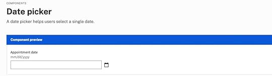
Date picker accessibility resources:
Collecting dates in an accessible way by Hassell InclusionDate picker by US Web Design SystemGeneral accessibility guidance for forms by US Web Design SystemShow Current DateIt is important to show users the current date and their selection on calendar pickers. Highlighting the current date gives users a reference for their choice, which is especially important for booking travel and appointments.
Differentiating between the current date and the user’s selection is crucial to avoid confusion. Material UI clarifies this distinction with an outline for the current date and a shaded background for the selected date.
 Block Unavailable Dates
Choosing a date only to find it’s unavailable is one of the most frustrating user experiences. Users have to start their selection over and try until they find availability. Blocking out unavailable dates allows users to choose without returning to the calendar.
Provide Additional Critical Decision-Making DataMany travel booking apps, including Booking.com and Airbnb, show the price per night below each date so users can find the best rates. This information creates a positive user experience because the product helps users save money.
 Reduce Unnecessary Data
Calendar user interfaces can be busy and overwhelming. Designers must reduce as many UI elements, lines, and other content to make the calendar easier to read and complete tasks. For example, users don’t need to see the days of the week when choosing their date of birth.
UX designers must also use solid backgrounds for modal overlays to block out content behind the calendar, which may confuse users.
Building Date Picker Prototypes With UXPin MergeUXPin Merge allows you to sync a design system or component library with UXPin’s design editor so designers can use the same components as engineers to build fully functioning prototypes.
One of the most significant benefits of using Merge’s code-based technology is the ability for designers to build prototypes that are impossible to do using popular image-based design tools.
No image-based tool is capable of building a functioning date picker without a multitude of frames and lots of imagination. No matter how advanced your design skills are, these static pickers don’t accurately replicate code’s fidelity and functionality.
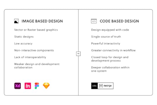
With Merge, UX designers can use a date picker component from a design system to build a fully functioning prototype. Users no longer have to imagine picking a date because code components have the same functionality in UXPin as they do in the repository.
Merge is also great for other complex components you can’t recreate in image-based design tools, like tables, graphs, data grids, charts, etc.
Design, prototype, test, and release amazing product experiences your customers will love with UXPin Merge. Request access today.
Discover MergeThe post How to Design a Date Picker that Makes Your UI Design Shine appeared first on Studio by UXPin.
Website Design for Higher Conversions – A Quick How-To Guide
It takes 50 milliseconds for visitors to form an opinion about your business from your website’s design. A poor user experience creates a negative sentiment resulting in high bounce rates and conversion loss.
Understanding UX design’s impact on a website’s conversion rate is key to removing potential roadblocks, creating business value, and delivering a higher ROI for design projects. This article explores how website design impacts conversions and how design teams can improve marketing campaigns.
Learn about Conversion Optimization:What is Website Conversion Optimization?Why is Design Important for Conversion Rates?Setting the First ImpressionEnhances SEOAccessibilityPromotes TrustDesign ROIDesign Tips and UI Patterns That Boost Conversions1. Call to Action (CTA)2. Landing pages3. Testimonials4. Value Proposition5. Contact Information6. Pricing7. Human Faces8. Negative Space9. Case Studies10. Loading SpeedConversion Rate OptimizationA/B testingMultivariate TestingHeatmapsGoogle Analytics for DesignersImprove Prototyping and Testing to Enhance Website Conversions in UXPinDesign better user experiences using meaningful insights from prototyping and testing your conversion rate optimization ideas in UXPin. Sign up for a free trial to discover how code-based design can enhance UX workflows, increase website conversions, and create better experiences for your customers.
What is Website Conversion Optimization?
Website conversions include successful sales, leads, form completions, and other tasks you want visitors to complete. Website conversion optimization is a practice of increasing opportunities for visitors to complete these tasks.
Much of this conversion optimization comes down to web design and user experience–a task for UX designers. Designing for optimization means UX teams must understand what users need and how the user interface can guide them to that goal quickest.
Why is Design Important for Conversion Rates?Web design plays a crucial role in conversion rates. Here are some stats to support this case:
38% of the website visitors will stop engaging with a website if it has unattractive content or layout.48% of visitors consider a website’s design the number one factor in determining a business’s credibility.68% of companies with mobile-first web design reported increased sales.Most visitors leave a website after eight seconds, so designers must prioritize user interfaces and content to meet users’ needs.Setting the First ImpressionA website’s design is often the first customer touchpoint and how people perceive your brand. Impressing customers with an aesthetically-pleasing user interface, experience, and content is the first step toward converting website traffic to revenue-generating customers.
Enhances SEOSearch engine optimization (SEO) is vital for websites because it delivers free organic traffic. UX designers must understand how search engines crawl and index web pages to optimize content, layouts, and hierarchy.
Accessibility
Web accessibility is another SEO factor, but it’s also critical for creating inclusive website experiences. UX designers must factor in disabilities like low vision, color blindness, blindness, cognitive disabilities, deafness or hearing impairment, and mobility impairments to ensure websites meet Web Content Accessibility Guidelines (WCAG)–a legal requirement in many jurisdictions.
Promotes TrustTrust is a significant factor in converting visitors. Customers want to know they can trust your company and website before handing over money or personal information. Good web design tells customers you care about your brand, value their business, and want to give them a good user experience–like welcoming people into a physical store.
Design ROIAside from user experience, designers must also recognize the importance of increasing conversions for design’s return on investment. Increasing opportunities and conversions establishes design’s value within the organization.
Design Tips and UI Patterns That Boost Conversions 1. Call to Action (CTA)
CTAs are crucial for conversion optimization. They grab users’ attention with an offer with a UI element to take the desired action–like call-to-action buttons or an email form. CTA buttons are usually colorful and larger than other content to signify their importance and encourage engagement.
2. Landing pagesAccording to HubSpot research, “more landing pages a business has on its website, the more leads it generates.” Designers and marketers can collaborate to design high-quality, lead-generating landing pages.
Unlike regular web pages, landing pages remove all navigation and links to eliminate distractions and focus users on a single product or CTA.
3. TestimonialsTestimonials or reviews are vital for displaying social proof, especially if they’re from prominent figures or brands. Testimonials tell website visitors that others are using your product and are happy with what they received.
According to marketing software giant HubSpot, “People consult reviews and testimonials to determine whether or not they trust a product, service, and even a seller.”
4. Value PropositionYour value proposition tells customers what problem your product solves. For example, if you’re selling high-speed internet, your value proposition is that customers can “stream Netflix and YouTube videos with no buffering or interruptions.” Nowhere do you mention high speed or internet; you’re selling the solution.
Marketers generally put value propositions above the fold, next to the CTA. Customers see the solution (value proposition) to their problem and follow the link to sign up.
5. Contact InformationPeople often visit business websites to find contact information like email addresses and phone numbers. Many websites include these contact details in a header bar above the main navigation, so users don’t have to scroll or navigate to another page to find them.
Designers must instruct engineers include a “tel:” or “mailto:” HTML link attributes so users can click to email or call.
6. PricingPricing is another reason people visit company websites, particularly SaaS and other service-based businesses. A pricing table UI pattern comparing your product’s plans is helpful for users, and the transparency builds trust. Designers must always include CTAs for users to sign up for their preferred option and begin the onboarding process.
7. Human Faces
Using relevant human faces for product images is crucial for creating a human connection while making the content relatable. Your about page must also include profile images of team members to give your brand a personal touch.
Onextrapixel has an interesting article, “On How To Use Human Face To Improve User Experience,” with examples from some of the biggest brands’ websites.
8. Negative SpaceNegative space or whitespace is an excellent web design technique for drawing attention to specific content, like a CTA, important elements, or copy. Designers must also use appropriate negative space for text and UI elements to enhance readability and separate content.
9. Case StudiesCase studies are essential for B2B websites to demonstrate how your product solves problems and delivers results.
For example, our UXPin blog features a case study about “How PayPal scaled How PayPal Scaled Their Design Process with UXPin Merge.” Adoption from one of the biggest tech companies in the world gives Merge significant credibility and demonstrates that the product works.
10. Loading SpeedWhile loading speed optimization is typically the engineering team’s responsibility, designers can do a lot to reduce the page load time, including:
Use responsive design best practices and optimize layouts and content for desktop, tablet, and mobile devices.Eliminate unnecessary “nice-to-have” features and functionality that don’t get users to their goals faster.Find ways to reuse components and microinteractions to minimize CSS and Javascript file sizes.Use JPG rather than PNG and scale and optimize images according to placement and web layout.Use SVG for logos, icons, and other graphics.Conversion Rate OptimizationHere are some tips design teams can use to analyze and optimize a website’s conversion rate. Designers can use these tests for existing websites or test new ideas.
A/B testingA/B testing (split testing) is a technique for comparing two designs to determine which performs better. It’s an iterative process where UX designers make small changes to optimize websites and landing pages.
The secret to successful A/B testing is to compare minor changes, like color, copy phrasing, fonts, images, etc. Comparing two completely different designs makes it difficult to tell what specifically increased conversions.
Multivariate TestingMultivariate testing is similar to A/B testing, but design teams test multiple designs instead of only two variations. Designers can test multiple layouts simultaneously to arrive at the best option faster.
These tests only work for high-traffic websites where designers can split visitors into multiple groups and still have a large enough sample size to achieve accurate results.
Heatmaps
Heatmaps provide insights into how website visitors engage with a webpage and content, notably hover, scroll, and click/tap interactions. Design teams use this data to determine:
Are CTAs and user journeys obvious?What navigational links are most important?How far do users scroll?Are there any UI elements distracting visitors from desired actions?Is there a link or content further down the page that users find more valuable than what’s above the fold? i.e., does the visual hierarchy match user behavior?Google Analytics for DesignersGoogle Analytics (GA) can tell designers a lot about demographics, user flows, traffic sources (organic, social media, referrals, etc.), and behavior. It’s a fantastic tool for identifying the best and worst-performing pages and where users often exit funnels. Designers can use GA data to identify issues and run tests and interviews with end-users to pinpoint the problem.
We recommend reading Alice Walker’s “The ultimate guide to Google Analytics for UX designers“ to understand the tool and its capabilities better.
Improve Prototyping and Testing to Enhance Website Conversions in UXPinOne of the challenges UX teams have when prototyping and testing website designs are that image-based design tools lack fidelity and functionality.
Without replicating a user flow or code’s fidelity and functionality, UX designers cannot get accurate feedback and insights. They must rely on front-end developers to program code-based prototypes.
With UXPin’s code-based design tool, designers can achieve the same fidelity and functionality without writing a single line of code. UXPin prototypes deliver accurate, actionable results during testing, allowing designers to solve more usability issues before the design handoff.
Designers can build exact replicas of website user flows, landing pages, eCommerce checkouts, and more to test, iterate, and optimize prototypes with real end-users.
Get a clearer picture of your website’s user experience with accurate prototyping and testing in UXPin. Sign up for a free trial to discover how code-based design can optimize your website design for higher conversion rates.
The post Website Design for Higher Conversions – A Quick How-To Guide appeared first on Studio by UXPin.
July 14, 2022
UX Team Structure — How to Plan Your Career in Product Design?
User experience design projects often require multiple UX professionals, each with a different function and responsibilities. Understanding a UX team structure and each individual’s responsibility helps organizations hire the right people, and UX designers develop the necessary skillset for their desired career path.
This article explores the different UX roles, skillsets, and team structures organizations and startups use for product development. We also look at how UX teams work together throughout the design process to deliver products successfully.
Table of contentsUnderstanding UX Roles and Their SkillsetsUX DesignerUI DesignerUX ResearcherUX ArchitectUX WriterContent StrategistUX EngineerDesignOps PractitionerProduct DesignerWhat is the Best UX Team Structure?Centralized Design Team StructureEmbedded/Decentralized Design Team StructureFlexible design team structureHow UX Teams Collaborate using UXPinEarly StageIdeation & Low-Fidelity PrototypingMockups and High-Fidelity PrototypingUser TestingDesign HandoffUXPin is a collaborative design tool with features for every UX role and task. From simple wireframes to complex high-fidelity prototypes, UXPin’s code-based design tool empowers UX teams to deliver exceptional user experiences to their customers. Sign up for a free trial to explore all of UXPin’s advanced features.
Understanding UX Roles and Their SkillsetsModern product development teams include many UX specialists, each responsible for different elements of the design process. Here are nine UX roles and their skillsets:
UX designerUI designerUX researcherUX architectUX writerContent strategistUX engineerDesignOps practitionerProduct designerUX DesignerMost UX experts start as UX designers. UX designers are responsible for the end-to-end UX process in small companies, including research, UI design, prototyping, testing, documentation, and handoff.
In large organizations and enterprise product development, the UX designer role is more focused on user experience, usability, and accessibility.
UX designers spend a lot of time understanding behavior, pain points, emotions, and other human factors to deliver products that meet user needs.
UI DesignerUI designers focus on a product’s visual design and interaction design. It’s their job to ensure a product looks aesthetically pleasing while remaining functional and cohesive–essentially balancing form and function.
UI designers work with visual elements like buttons, color, icons, typography, images, forms, components, UI patterns, etc., to design user interfaces. They must rely on UX research to create interfaces that meet users’ needs.
UI designers often collaborate with front-end developers or UX engineers to understand technical constraints and provide adequate documentation for development.
UX Researcher
UX researchers are responsible for collecting and analyzing user, competitor, and market research. They use qualitative and quantitative research methods to create a holistic understanding of these three segments.
UI designers also conduct face-to-face interviews and usability testing on prototypes with end-users. They may also do field research to understand a specific industry and its target demographics.
UI designers must compile this data into various UX artifacts, including user personas, customer journey maps, empathy maps, etc., for the rest of the team to understand users and guide design decisions. They’re also responsible for managing and updating research, so UX teams always have the latest insights to make decisions.
UX ArchitectUX architects are responsible for a digital product’s structure, information architecture, and navigation. They must understand every user flow to prioritize links, screens, and navigation accordingly.
UX architects spend a lot of time analyzing heat maps, analytics, screen recordings, eye tracking, and other data related to navigation to design a product’s architecture that meets business goals and user needs.
A UX architect’s primary deliverables are wireframes that UI designers and content strategists use as the foundation for their work.
UX WriterUX writers focus on language and phrasing for user interfaces. This crucial role ensures that UIs, form labels, components, navigation, CTAs, and other user-facing touchpoints, have consistent and coherent language.
UX writers also ensure system messages (error, success, informational, etc.) and emails have clear, actionable language for users.
UX writing extends to product documentation, policies, disclaimers, and other long-form content. UX writers don’t always create this content, but they will collaborate with legal, technical writers, etc., to ensure language is uniform and consistent across all touchpoints.
Content StrategistIt’s a content strategist’s job to ensure a product’s content (text, images, video, etc.) meets user needs and business goals. They’re also responsible for managing and updating content so that it’s always relevant.
Like any UX professional, content strategists rely on user research. They must understand users and their needs to ensure a product’s content is relevant to the target demographic.
Content strategists are not confined to UX. They work closely with several departments, including marketing, customer support, business, and product teams, to source, edit, and publish content.
UX EngineerUX engineers are front-end developers who understand user experience design and design thinking principles. This hybrid role works in both the UX design process and front-end development.
UX engineers collaborate with design teams throughout the design process, providing technical advice and assistance. They also help designers develop high-fidelity code prototypes using HTML, CSS, and Javascript to test complex functionality.
UX engineers work with UI designers to convert designs into functioning code. They also act as a bridge between designers and engineers to ensure the final product meets design specifications.
DesignOps PractitionerDesignOps practitioners work on the operational side of UX design. It’s their job to optimize UX workflows by removing inefficiencies and bottlenecks. They also help motivate teams and reinforce company culture to keep everyone working as a cohesive unit.
There are three primary DesignOps roles:
DesignOps Leader: A high-level position focused on creating the operational vision and roadmapDesign Program Manager (DPM): Responsible for executing the DesignOps Leader’s strategy and roadmapDesign Producer: Works directly with team members at the project level to manage daily administrative and operational tasksGet our free eBook: DesignOps 101: Guide to Design Operations.
Product DesignerProduct designers have a similar function to UX/UI designers, but they work with existing products rather than designing from scratch. It’s their job to manage the product’s user experience for the remainder of its life cycle.
Product designers focus on designing new product experiences and typically use an existing design system or component library to build user interfaces.
While product designers remain focused on user experience, they’re also responsible for increasing business value and ROI on new product releases.
What is the Best UX Team Structure?
There are three primary UX design team structures:
Centralized design team structureEmbedded/decentralized design team structureFlexible design team structure Centralized Design Team StructureIn the centralized design team structure, the UX team works from a single location under a UX leader and UX managers. This UX team structure works best for medium-sized organizations where it’s relatively easy for designers to share knowledge and give each other feedback.
Embedded/Decentralized Design Team StructureThe embedded or decentralized design team is a cross-functional structure best for small businesses, agencies, and startups. This cross-functional team model includes UX experts, developers, marketers, a product manager/owner, and a project leader.
Flexible design team structureThe flexible design team structure is a hybrid centralized/decentralized model. The UX team report to a design leader for high-level UX strategy and a team leader for day-to-day tasks. The flexible design team structure works best for enterprise organizations or companies with high design maturity.
How UX Teams Collaborate using UXPinUXPin’s end-to-end design tool allows UX teams to collaborate with each other, stakeholders, and other departments throughout the design process.
Early StageDuring the early stages of the design process, UX researchers can build quick prototypes using UXPin’s built-in design libraries or the product’s design system to demonstrate user pain points to the rest of the team.
Ideation & Low-Fidelity PrototypingOnce the UX team has defined users’ problems, they can ideate and build prototypes to test ideas. The UX architect will create the prototype’s screens and build wireframes to link them.
The UX researchers and UX designers can use UXPin’s Preview and Share feature to conduct tests on user flows and navigation to ensure they meet user needs. They can leave comments and insights via UXPin’s Comments feature and assign them to relevant team members–like UX writers and UI designers.
Mockups and High-Fidelity PrototypingUI designers can use assigned comments and other documentation to build high-fidelity mockups complete with color, typography, and other visual elements. They can use UXPin’s Content and Data feature to fill components with dummy data while they focus on designing the user interface.
UI Designers can use UXPin’s code-based features like Interactions, States, Variables, Expressions, Animations, and more to accurately represent the final product experience.
UX writers will ensure the UI’s language aligns with product guidelines and meets users’ needs. At the same time, content strategists can replace dummy data with real content to give users an accurate user experience during testing.
User TestingUsing Preview and Share, UX researchers can test prototype iterations and share insights with the rest of the UX team to make tweaks and adjustments. They can pinpoint usability issues and assign these to relevant team members via UXPin’s Comments.
The team can also present high-fidelity prototypes to stakeholders via the Preview and Share link. Stakeholders can review the designs and assign comments to relevant team members.
Design HandoffUX engineers can work with the UX team to prepare for the final design handoff. They’ll convert UI elements to code or grab snippets from the design system for front-end development.
DesignOps assists the UX team with operational issues and onboarding new team members during this entire design process. They’re checking UXPin’s comments to add these to the backlog and ensuring team members complete each task.
Try UXPin and Prototype 10x FasterReady to discover how code-based design can enhance your UX team’s productivity and deliver better user experiences to your customers? Sign up for a free trial to explore UXPin’s advanced features today!
The post UX Team Structure — How to Plan Your Career in Product Design? appeared first on Studio by UXPin.
July 13, 2022
How to Help Fight Front-end Debt as a Designer?
Designers and engineers must understand each other’s challenges and work together to solve them. Designers want the entire product development team to understand user experience and design thinking, while engineers need team members to help fight front-end debt.
This article explores front-end debt, common solutions to the problem, and how design teams can assist engineers in reducing it. We also demonstrate how Delivery Hero used front-end debt as a business case for developing their design system–thus enhancing the product development process for designers and engineers.
Table of contentsWhat is Front-End Debt?Front-End Debt vs. Design DebtHow do Devs Prevent & Manage Front-End Debt?Educate TeamsSet Engineering StandardsTrack & Document EverythingAdhere to Project DeadlinesAutomate TestingImplement a Design SystemHow Designers Can Help Prevent Front-End DebtUnderstand Front-End LimitationsCollaborate Early & OftenUse Code-Based vs. Vector-Based Design ToolsAdvocate for a Fully Integrated Design SystemBuilding a Business Case for a Design SystemReduce technical debt with a single source of truth between design and development using UXPin Merge. Explore Merge how it can keep unity across the organization, fight front-end debt, and speed up your product development process. Request access to UXPin’s Merge technology.
What is Front-End Debt?Front-end or technical debt is the accumulated development work due to workarounds and shortcuts to meet project deadlines. These short-term solutions allow engineers to ship products faster, but the fixes collect in a backlog as “debt.”
Like financial debt, if engineering teams don’t manage technical debt properly, it can have devastating consequences for the product, user experience, and organization.
Front-End Debt vs. Design DebtDesign debt is the required UX practices (research, design, testing, etc.) designers skip meeting project deadlines. For example, the design team implements a new UI pattern but doesn’t have time to test it adequately, not knowing its impact on usability, accessibility, etc.
If your product doesn’t have a design system, design debt results in many UI inconsistencies, like color, typography, UI patterns, layouts, etc. Design inconsistencies (no matter how small) create a negative user experience and damage the brand.
These small design debts compound to create significant usability issues. When paired with technical debt, it can be challenging to pinpoint the root cause, impacting workflows, releases, users, and revenue.
How do Devs Prevent & Manage Front-End Debt?
It’s important to note that technical debt is a product of programming, and some debt is unavoidable. The secret is not to eliminate debt but to prevent unnecessary backlogs.
Established companies and enterprise organizations have the staff and resources to employ a dedicated technical debt team. For cash-strapped startups and smaller companies, prevention is always better than cure. Here are some tips to prevent and manage front-end debt.
Educate TeamsThe first step to minimizing front-end debt is to educate teams about its impact. Engineers, product teams, and UX designers must understand front-end debt, how it compounds, its adverse effects, and how each department can do its part.
Set Engineering StandardsEvery organization (including startups) must implement programming standards and best practices. Engineers must write uniform code and follow company protocols for workflows, documentation, and releases.
These standards will prevent sloppy work and reduce accidental debt from accumulating.
Track & Document EverythingWhen engineers incur front-end debt, they must track and document it thoroughly, including:
Add a job to the backlog (Jira, Trello, etc.)Describe the reason(s) for incurring debtOutline what the team should have doneProvide a roadmap to fix the problemThis documentation will streamline fixes and save time. Like debt, these small time savings compound to minimize costs.
Adhere to Project DeadlinesTeam members and stakeholders must adhere to project deadlines and avoid schedule changes that force engineers into unrealistic timelines. These changes often shift resources, creating a domino effect of backlog debt.
Automate TestingTaking time to write automated tests for your product’s common programming errors is an excellent debt prevention strategy. Engineers must get into the habit of writing tests when they find bugs to eliminate future recurring debt.
Implement a Design SystemDesign systems are highly effective for reducing front-end debt while enhancing consistency and collaboration between designers and engineers.
An approved, standardized component library gives engineers a foundation to write less front-end code, thus reducing errors and increasing productivity.
How Designers Can Help Prevent Front-End Debt
Design and product teams also have a responsibility to reduce front-end debt. Here are some tips to minimize front-end debt during the design process.
Understand Front-End LimitationsIt’s crucial for design and product teams to understand their product’s technical limitations and constraints. Working within these constraints streamlines design handoffs and reduces any new code engineers must write to complete projects.
Collaborate Early & OftenDesigner/engineer collaboration must start early in the design process rather than only at handoffs. This communication helps designers and engineers understand each other’s challenges, allowing them to offer appropriate solutions.
For example, engineers might have a solution to a usability issue that’s better for designers and reduces development time for engineers.
Use Code-Based vs. Vector-Based Design ToolsOne of the biggest challenges between design and development is that designers and engineers speak different languages and work within different constraints.
Code-based design tools like UXPin enable designers to build fully functioning, high-fidelity prototypes. Instead of using GIFs, animated videos, and other workarounds to replicate code, UXPin prototypes look and function like the final product.
Moreover, its Merge technology allows you to import UI components from Git, Storybook, and npm repository, so that you use the exact building blocks of your product. Read more about it: What is UXPin Merge and how does it work?
Advocate for a Fully Integrated Design SystemIn his article Re-Imagining Iress Design Tools, Design System Product Owner at Iress, Nick Elliott describes the four stages of design system maturity and how his team used UXPin Merge to develop a fully integrated design system.
A fully integrated design system uses a single component library for design and development. Designers drag and drop to build prototypes, and engineers copy/paste code to develop the final product. There’s no designing from scratch and no writing front-end code.
While this scenario might seem hard to believe, enterprise organizations like Iress and PayPal use UXPin Merge to ship products with minimal new design or code. Sign up for a free trial and explore how Merge works with our MUI integration.
Building a Business Case for a Design SystemUXPin recently hosted a webinar with Amber Jabeen, DesignOps Director at Delivery Hero (talabat). During her talk, Amber discussed how her team collaborated with an engineer to build a business case for a design system.
Amber’s team started by auditing releases over a few months, comparing designs to the final release. Their research showed that every Delivery Hero project release incurred front-end debt, costing the company significant time and resources.
Amber’s team found that most of this debt was due to design drift. They ran an experiment to create a UI with vs. without a design system. The results showed a 57% saving on time-to-market with zero debt. Amber used this data for her business case and got the go-ahead to build Delivery Hero’s Marshmallow design system.
Fight Front-End Debt with UXPin MergeHow can you ensure that you don’t acquire front-end debt in the future? One of the ways is using the design tools that enhance the collaboration between designers and engineers. UXPin powered with Merge technology allows you to use the exact UI elements that your devs use to build products at the prototyping stage.
Since you are designing with the building blocks of your app or website, your engineers have an easier job with developing your designs and not recreating the same components over and over again. They can release products faster while staying consistent with the design. Request access to Merge to explore its powerful features.
Discover MergeThe post How to Help Fight Front-end Debt as a Designer? appeared first on Studio by UXPin.
July 12, 2022
The Beginner’s Guide to Capturing UX Requirements
Capturing UX requirements is an essential process before teams can begin working on a project. These requirements are vital in guiding a project on its path to success.
There are three components to capturing UX requirements: business, user, and technical. Understanding each and how to capture the relevant data is crucial for designers to comprehend the project’s scope and objectives correctly.
Enhance your product development process with the world’s most advanced code-based design tool. Design, prototype, and test faster with higher fidelity and functionality. Sign up for a free trial to discover how code-based design can enhance your organization’s design projects.
What are UX Design Requirements?Gathering UX design requirements (also called UX requirements) is a discovery process including conducting interviews, discussions, and document gathering for designers to understand what they need for a project and why.
These UX requirements form part of the project’s requirements which the entire team (product, UX, engineering, business, etc.) uses to guide the product development process.
What is the Purpose of UX Gathering?This gathering process occurs before designers begin working on a project to guide early research and set goals and expectations. They must understand user needs, business goals, technical specifications/limitations before starting the project.
For example, how do UX researchers begin researching users if they don’t know who they are? The UX gathering process tells designers where to start and what metrics determine a successful project completion.
These are some reasons for Gathering UX requirements:
Most importantly, to understand users and their needs. This user research is not as thorough as the empathize or research stage of the design thinking process. It’s simply a foundational understanding of the product’s user experience, so UX designers know where to begin.To set project goals and objectivesUnderstand business goals from a stakeholder’s point of view and align these goals with usersLearn about technical constraints and how they impact the projectEliminate ambiguity and misunderstandingTypes of UX Design RequirementsUX gathering falls into three primary categories:
BusinessUserTechnicalBusiness RequirementsUX designers must answer the question, “What does the business want to achieve from this project?” An example of a business requirement might be, “Increase new user sales conversion by 20% without affecting retention.”
Team members use stakeholder interviews and other documentation to gather and understand these business requirements.
Business requirements include:
Project timelineProject scopeBranding rulesVarious departmental goals–business, marketing, sales, customer services, etc.CompetitorsStakeholder expectationsUser RequirementsWho are the users, and what do they need from this project? Are there any specific usability or accessibility issues designers must solve? UX designers use several methods to gather these user requirements:
User interviewsSurveysDairy studiesTechnical RequirementsTechnical requirements fall into two categories:
Functional: Outlines the product’s specifications, technical capabilities, and limitationsNon-functional: Describes the product’s performance, such as usability, performance, data integrity, and maintenanceThe requirements will answer key technical questions for design teams:
What is the product’s operating system (iOS, Android, Windows, etc.)?What devices will the product operate on (mobile, tablet, web, smart devices, etc.)?What front-end framework does the product use (React, Vue, Angular, etc.)?What are the product’s technical limitations?Who is Responsible for Gathering These Requirements?A representative from each department within the project is responsible for gathering the relevant requirements. For example:
Business: Business analyst or consultantUser: UX Lead, researcher, or designerTechnical: Tech Lead, data analystThe above is an example of a typical project. These responsibilities will vary depending on the company, project, etc.
How to Capture UX Design RequirementsThere is no standardized step-by-step process for gathering UX requirements. The process, steps, methods, and responsibilities will differ depending on the organization and project.
There are several methods for capturing UX design requirements. The aim is to gather data relevant to your project and compile them into a single document for everyone on the project.
In some cases, the document might link out to other documentation, like the branding guidelines of a design system. For example, Stack Overflow’s design system Stacks has a comprehensive brand principles section for teams to reference.
The first step is gathering the relevant business, user, and technical requirements. There might be some overlap in the activities team members perform to get this data. For example, surveys and interviews are relevant to business and user requirements.
Business Requirements1:1 Interviews – meeting with individual stakeholders and experts allows you to discuss specific topics in detailWorkshops – an opportunity to discuss issues with multiple stakeholders and team membersDocumentation – reviewing various business guidelines, manuals, and other documentation relevant to the projectCompetitor researchSurveysStoryboardsMoodboardsUser RequirementsUser interviewsUsability testing existing productsExisting user experience research–user personas, journeysSurveysDiary studiesFocus groupsStoryboardsTechnical RequirementsTechnical stakeholder interviewsSystems reviewsTechnical documentation and specificationsData analysisCreate a Low-Fidelity PrototypeDesign teams often create a basic paper prototype for stakeholder and expert interviews. These low-fidelity prototypes help reference product features or provide context for explanations.
Design teams can also use these prototypes as part of the UX requirements documentation to demonstrate basic functionality, constraints, add context, etc.
With UXPin’s built-in design libraries, UX designers can build high-fidelity mockups and prototypes in minutes. These UXPin prototypes provide better clarity, and designers can share them with stakeholders via URL–perfect for today’s modern remote work environments. Sign up for a free trial to experience faster prototyping at higher fidelity with UXPin.
Document UX RequirementsDocumenting the relevant business, user, and technical requirements is crucial. This documentation will provide UX designers with a starting point and reference for the project.
We recommend keeping your UX requirements document concise so that it’s easy for team members to digest.
Categorizing your UX requirements document will help team members find the information they need. Here are some recommendations for UX requirement categories:
User stories & personas: Generated from user requirement gathering.Task flows: Generated from the user and business data detailing possible user decisions and outcomes.Style guides: Various guides for visual design elements like color palettes, typography, components, media content, etc. (Read our guide to creating a style guide).Specifications: Definitions for technical and functional aspects like states, modes, interactions, product parameters, frameworks, operating systems, security requirements, etc. (Read our guide to writing a product specifications document).Manuals: Any standard operating procedures, policies, guides, principles, or manuals relating to the product or organization.Competitor research: Generated from business requirements.Best Practices for Gathering UX Requirements Learning From Stakeholders & Experts
Stakeholder interviews are crucial for understanding business needs and high-level strategies. These are some considerations for getting the most out of these interviews:
Set goals relating to what you want to know from each stakeholderResearch your stakeholders beforehand to understand their role and what they want to achieveAvoid assumptions and bias by pretending you know nothing–ask questions even if you think you know their answerPractice active listening, giving stakeholders and experts time to answer thoughtfully, leaving gaps to allow for elaborationDocument the interview with notes and video/audio recordings (with their permission, of course)For further reading, Adam Fard offers excellent interview advice in his article, The ultimate guide to stakeholder interviews: understand your clients.
Getting the Best Results From SurveysSurveys are excellent, inexpensive research tools for acquiring quick feedback and sentiment. These recommendations apply to user and stakeholder interviews:
Short surveys reduce dropoffs and increase the likelihood of completionFive questions are optimal, eight maximumPrioritize questions with the most important firstKeep questions brief, preferably one sentenceClosed questions (yes/no, multiple choice) are easy for participants to answer and researchers to analyzeConduct Meaningful User InterviewsDuring the UX requirements gathering process, user interviews can help validate existing research or learn about changes. These guidelines will help you get meaningful feedback from users:
Ask open-ended questions so as not to bias answers.Always leave an appropriate amount of silence at the end of an answer in case the interviewee wants to add or elaborate.Record interviews (with the participant’s signed consent) for future reference and analysis.Humans tend to withhold information or misinterpret facts. Don’t rely on interviews as a single source of truth. Compare with data and analytics to get an accurate picture.Faster Prototyping With UXPinTime is one of the biggest barriers to building high-fidelity prototypes. UX designers rely on paper or wireframes because they’re quick to create and iterate.
With UXPin’s built-in design libraries, UX designers can drag and drop components to build high-fidelity mockups and prototypes to present to stakeholders, users, and experts during the UX requirements gathering process.
The ability to create high-fidelity prototypes at any stage of the UX design process or even when gathering UX requirements means designers get meaningful, actionable feedback from users and stakeholders.
Revolutionize your product development process with the world’s most advanced prototyping and testing tool. Sign up for a free trial to discover how UXPin’s code-based design solution can enhance your end-to-end design process and deliver better product experiences for your customers.
The post The Beginner’s Guide to Capturing UX Requirements appeared first on Studio by UXPin.
July 11, 2022
Table UX Best Practices – What Makes a Good Data Table?

Data tables are essential components for many enterprise UX projects. UX designers must find the best UX table design solution to visualize and sort data according to user needs.
This article explores table UI design best practices with examples to solve common content and usability issues. We also provide links to resources to help research specific topics further.
Data table UX design and prototyping are challenging for designers using image-based design tools. These tools lack features to create basic table functionality like sorting, search, scrolling, actions, etc.
With UXPin Merge, designers can sync a fully functioning data table or use a component library like MUI to design, prototype, and test table UX. Sign up for a free trial and start designing better UX table prototypes with UXPin today!
Data Table DesignFirst, let’s break down the data table anatomy and how these elements fit together so users can visualize information.
Table Header: The labels for each column in the data tableRows: Each entry from the databaseToolbar: Tools to work with the data (search, edit, delete, settings, etc.)Pagination: A UI pattern for displaying multiple pages of dataRow checkbox: Used to select one or more rows to complete tasks, i.e., delete, copy, process, etc.Sorting: Allows users to sort a specific column, i.e., ascending or descendingHorizontal rule: A horizontal line (the HTML element) separating each rowWhat Makes a Good Data Table?There are four primary ingredients to designing good data tables:
Use the correct data table UI for the content you want to displayPrioritize table layout and content correctlyMake content legibleThe data table provides users with the functionality to complete tasksFirst and foremost, your table must be sufficient to display all the data users need. UX designers must also prioritize data correctly, with the most crucial information starting from the left.
A good data table has a clear header and description, so users know what they’re viewing. Designers must also use legible typography and adequate spacing between columns and rows to make it easy for users to read and absorb content.
Lastly (and most importantly), your data table must be user-friendly. It must solve users’ needs and be intuitive to use. There should be little or no learning curve, so users can focus on analyzing data rather than learning how to use the data table.
How to Design User-Friendly Data Tables?
Here are some best practices for designing user-friendly data tables.
Data Table ReadabilityReadability is crucial for data table UX. Designers must assess several elements to make data tables readable, including:
Reduce visual noise: Only display content and UI elements necessary for users to read and manipulate data.Use legible fonts: The data table’s typeface, sizing, white space, and letter spacing must be adequate for users to read content–even if this means using a different font from the rest of your application.Create separation: Padding, spacing, alignment, and lines can help create separation so users can differentiate and absorb data easily.Consistency: Using fonts, spacing, sizing, etc., creates consistency and familiarity so users can scan tables faster to find what they need.Fixed headers: Keeps headers visible even when users scroll so they always have context.Create Visual HierarchyLinked to readability is creating a visual hierarchy–where designers use typography, sizing, spacing, and other elements to differentiate data and make tables scannable.
Use bold and slightly larger font sizes for column and row headersUse shading to differentiate between headers and table content“Zebra stripes” help create divisions between rows, making them easier to readUse a contrasting color for links, so users know what content is clickableData Tables Must be ResponsiveUX designers must understand how users use these tables while completing day-to-day tasks to create a consistent and cohesive user experience across the organization.
Data tables must be responsive so users can analyze data anywhere in the business. The sales team might want to access the data from their mobile device on the go, while warehouse employees primarily use tablets.
Order Columns According to Data RelevanceAn article from the NN Group recommends, “The default order of the columns should reflect the importance of the data to the user and related columns should be adjacent.”
UX designers must arrange and group columns according to their relevance. For example, location details like address, city, country, and zip code must be together. Placing these apart would create more work for users as they scroll or scan the table to compare columns.
Data Table AccessibilityWebAIM offers several tips for Creating Accessible Tables, including:
Table Captions: An HTML element placed after the opening table element provides context for screen readers. While HTML falls on engineers, UX designers must provide the appropriate caption description based on user research and testing.Identify Row and Column Headers: UX designers must use appropriate row and column headers so screen readers can identify content correctly.Associate the Data Cells with the Appropriate Headers: The scope attribute tells screen readers whether a header belongs to a row or column. For example, scope=”col”>Name and scope=”row”>Jackie. The scope attribute makes it easy for screen readers to jump around the table like a user would scanning it visually.Use Proportional Sizing, Rather than Absolute Sizing: Using percentages rather than fixed pixel cell sizing allows tables to automatically adjust to a screen’s dimensions, making it easier to read for visually impaired users.More resources for data table accessibility:
Creating Accessible Tables by WebAIMAccessible Tables by the University of MinnesotaTables Tutorial by Web Accessibility InitiativeAtomic Design for Complex Data TablesSmashing Magazine outlines an atomic design approach to designing complex data tables. Atomic design is a technique for designing from the smallest UI element and progressively building to create more complex components, patterns, and entire user interfaces.
Smashing Magazine breaks down data tables using this methodology as follows:
Atoms: Fonts, colors, iconsMolecules: Cells, headers, and accessoriesOrganisms: Rows, columns, pagination, toolbarTemplates: The entire table6 Great UX Tables ExamplesHere are six examples of UX tables and the problems they solve for users.
Horizontal Scrolling for Large Datasets
Large datasets require horizontal scrolling to accommodate many columns. UX designers must decide which content is most important to users to prioritize what is always visible and what users must scroll to view.
This preference may change across an organization, so allowing users to personalize what’s visible by rearranging the columns is crucial for creating a good user experience.
It’s advisable to place identifiers in the first column and fix it so users always have a reference as they scroll. Allowing users to fix multiple columns can help when comparing different data.
Expandable Rows and Columns
Expandable or resizable columns serve two purposes for users:
Allow users to view cells with exessive contentAllow users to minimize cell widths for the content they deem less importantUX designers might also consider making rows and columns “hideable” to reduce visual noise and make it easier to read the content that matters most for the task at hand.
Expandable rows allow UX designers to include detailed information only visible when users need it. This example from CodePen shows a series of job cards with a brief description and status. Users can open the accordion to display additional notes and job costs.
Row Focus Data Table
This hover effect allows users to focus on a single row at a time. If you have multiple columns and data points, this effect enables users to highlight a row, making it easier to read.
UX designers could also blur the other rows, making picking out a single row easier.
In a similar example, this data table highlights a specific cell with a raised hover effect.
Infinite Scroll Data Table
Infinite scroll is helpful for tables with lots of data. It’s an excellent alternative to pagination, where instead of having to click, users only have to scroll to see more content.
Column Sorting
Column sorting is essential for users to reorder data according to their preferences. For example, a warehouse manager can sort orders from the earliest first to monitor progress and address issues early. They can also sort by shipping preference and ensure that same-day orders are on track to leave before the deadline.
Inline Filters
Data table filters help users narrow their preferences to only display relevant entries. This data table example allows users to apply multiple filters to find exactly what they need. These inline filters are especially helpful for large datasets where users can eliminate irrelevant content.
Design Better Data Tables With UXPin MergeUXPin Merge allows you to sync your company’s design system or an open-source component library so designers can use code components to build prototypes that look and function like the final product.
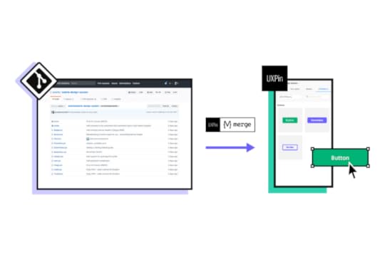
Traditionally, UX designers would need programming skills or have to rely on engineers using HTML, CSS, and Javascript to build functioning data tables. Merge puts UX designers in control, and they don’t need to write a single line of code to use components. They can also make changes and iterate without input from engineering teams.
Discover MergeThe post Table UX Best Practices – What Makes a Good Data Table? appeared first on Studio by UXPin.
July 7, 2022
List Design 101 – A Short Guide for Beginners
We see lists in just about every application we use daily. The contacts in your phone, CRMs, email inbox, tasks apps, and social media apps all contain lists.
List design is a crucial part of mobile app and web design projects, where designers must research and test the best ways to display content to users.
Design list prototypes with code-like interactions using UXPin’s code-based design tool. Sign up for a free trial to discover how code-based design can enhance your prototyping and testing process.
What is List Design?List design is the process of designing, prototyping, and testing lists to display multiple items of similar content. These list items could include a single line of text or a card component with an image thumbnail, text, and icon.
Designers must decide on the best list item design based on the content they want to display.
UX designers have three primary ways to structure content lists: horizontally, vertically, and grid layouts. An excellent example of these lists in action is Instagram:
Main feed = vertical listStory feed = horizontal listSearch feed = masonry grid listUX designers have seemingly endless options and variations within these three list structures.
What is the Difference Between a List and a Table?Designers use tables to display a dataset to users. Tables have a specific structure, including a header, rows, and columns with sorting and filters to find and manipulate data.
Lists don’t have a fixed structure. Each list item is independent rather than part of a structured dataset with rows and columns. The list item could feature a single line of text in a menu dropdown or a complex card component with lots of data.
In summary, the most significant difference between lists and tables is the data structure. Tables have a specific design, while lists can exist in many formats.
Anatomy of a List Design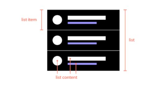
There are three components to a list design:
The list: All list items togetherList item: An individual item in the listList content: The content that makes a list item–image, text, metadata, title, subtitles, and other user interface elements
It’s helpful to use an atomic design approach when deciding how to put these pieces together.
Atoms: The content within each list item–individual images and textMolecules: The components within each item–a profile image componentOrganisms: Each list itemTemplates: The entire list with a search field, filters, etc.What Makes a Great List UI Design?Good list UI design follows design thinking and user-centered design principles. The list design must match user needs while providing appropriate fields for the content. UX designers must pay attention to responsiveness and how the list will look across multiple devices and screen sizes.
Material Design UI’s Principles of List DesignGoogle’s Material Design UI defines three principles for designing lists:
Logical: Lists should be sorted in logical ways that make content easy to scan, such as alphabetical, numerical, chronological, or by user preference.Actionable: Lists present content in a way that makes it easy to identify a specific item in a collection and act on it.Consistent: Lists should present icons, text, and actions in a consistent format.Make Lists ScannableOne of the keys to designing a great list UI is making it easy for users to scan content to find what they need. The quicker someone can find what they need, the better the user experience and the more likely they are to use and recommend your product.
HierarchyHierarchy plays a vital role in making lists scannable and easier to read. UX designers have several ways to create this visual hierarchy, including typography, color, spacing, images, etc.
For example, this eCommerce list uses color, size, and typography to separate content and create a visual hierarchy:
Product name: bold black and white typography top centerProduct description: smaller grey textPrice: Large dark textReviews: Small text with bright star iconsImage: Large circular product imageThis product list is an excellent example of a visual hierarchy that makes it easy for customers to scan products by the content that matters most to them–i.e., by product name, description, price, etc.
In a more simplified example, Spotify uses font size and color to create a visual hierarchy between the song title and the artist. The different size and color make it easy for users to scan a playlist accordingly.
 Accessibility
Lists can cause problems for screen readers, creating a poor user experience for visually impaired users. For example, screen readers can’t decipher nested lists correctly. So, designers should use a heading with an unordered or ordered list instead.
Further reading on list accessibility:
Lists in HTML from Penn StateLists from NC StateLists Accessibility from Oregon State UniversityTypes of List DesignsThere are three types of list designs:
Text listsImage listsCard listsText List DesignThere are three types of text lists. These lists typically include text and an image, icon, and other UI elements like a checkbox or radio.
Single-line listsTwo-line listsThree-line listsImage ListsDesigners use image lists when visuals are the primary content–like an image or video gallery. Sometimes a single line of text will accompany the image to provide detail or context.
Where image lists don’t include text, designers must ensure to use descriptive alt attributes so screen readers can navigate the content accordingly.
Card ListsCard lists typically include visual content and text and may also include a CTA. We often see these card lists in eCommerce store product lists that feature an image, title, short description, category tags, price, and “Add to cart” button.
List Design Patterns and Interactions
Here are some common list design patterns and interactions that you can apply to website and mobile app design projects.
Checkboxes & RadiobuttonsCheckboxes and radiobuttons are essential UI elements to allow users to make selections and actions on list items. As a general rule, designers use checkboxes for selecting multiple list items and radios for a single selection.
Scrolling & SwipingScrolling and swiping allow users to perform multiple actions. For example, many apps allow users to swipe list items left or right–one way to delete the other to archive.
Designers must also create scrolling interactions and lazy loading to optimize performance.
Select ListsSelect lists or dropdown menus allow users to select from several options–like choosing which shipping method they want at checkout. UX designers might also include a search feature for long dropdown menus, a feature we often see for state/province or country lists.
Collapsing & ExpandingDesigners can use collapsable lists to hide and show details. Reducing the amount of content that’s always visible is crucial for usability and minimizing cognitive load. Collapsable interactions are also useful for nested lists or submenus.
Reordering & SortingReordering list items gives users control over how they prioritize and experience data. Depending on their preference, they can move items manually up or down the list, usually by dragging and dropping. This customization creates a positive user experience because users can arrange content to suit their needs.
Sorting works similar to reordering, except users choose from predefined categories rather than reorder list items manually. For example, Spotify allows users to sort a playlist by title, artist, album, or recently added.
FilteringFiltering helps users find what they need much faster. Accommodation booking platforms like Airbnb and Booking.com allow users to apply multiple filters to list properties that suit their needs and preferences.
DividersDividers help create separation between content; however, they can add unnecessary “visual noise.” If your lists get too busy, try testing white space as an alternative content separator.
List Design in UXPin
With UXPin’s code-based design tool, UX designers can build list prototypes that accurately resemble the final product. Our Multilevel Dropdown Navigation example demonstrates how designers can use States and Interactions to build a functioning dropdown list–using only a single frame.
Increase Fidelity and Functionality with UXPin MergeTake your prototypes to the next level using UXPin’s proprietary Merge technology. Sync your product’s design system or an open-source component library from a repository to UXPin’s editor so designers can build prototypes using fully functioning code components.
You can see Merge in action with our MUI library integration. Using MUI’s React library, designers can build fully functioning list prototypes. MUI’s React components come complete with states and interactions, so designers only have to focus on product design rather than building everything from scratch. Everything you see in MUI’s documentation, designers can replicate in UXPin without writing a single line of code.
Discover MergeThe post List Design 101 – A Short Guide for Beginners appeared first on Studio by UXPin.
UXpin's Blog

- UXpin's profile
- 68 followers

