
UXpin's Blog, page 58
July 6, 2022
Adopting Design System with Delivery Hero (talabat)
In May 2022, UXPin hosted the lovely Amber Jabeen, DesignOps Director at Delivery Hero MENA (talabat), for a webinar titled: Enterprise Design System – How to Build and Scale. This article covers the second half of Amber’s talk, which focuses on Delivery Hero’s design system adoption strategy. You can find a summary on our blog.
“The success of a design system hinges on its adoption. Until you have users using your product, it’s not successful.” – Amber Jabeen.
Achieve greater design system adoption, consistency, and cohesion with UXPin Merge. Sync your design system’s component library to UXPin’s design editor to create a single source of truth across the organization. Sign up for a free trial to experience Merge through our MUI library integration.
Delivery Hero’s Three-Component Adoption StrategyAfter trying many initiatives, Amber and her team developed a three-component design system adoption strategy for Delivery Hero:
GamifySocializeCelebrateA “Consistently Delightful” VisionAmber’s team recognized that they had to treat their design system like any other product to increase adoption. The first step was defining a vision–a Northstar to guide their strategies.
Using input from stakeholders and team members, the team came up with: “Deliver a consistently delightful user experience across all platforms.”
The design system team emphasized consistently delightful to highlight the vision’s motto and principles.
Consistently (motto):
“Always…without exceptions. Don’t make me think.” The idea is that design consistency creates a more intuitive user experience where users don’t need to learn the UI or its features.
Delightful (principles):
talabat cares: Product experiences must show we care about our users–both design system users and the product’s end-usersMade for me: A personalized experienceFast: As a delivery company, they want to deliver fastSimple: Intuitive user interfacesFun: An enjoyable user experienceWith a clear vision, Delivery Hero’s design system team developed its three-component adoption strategy.
Component One – GamifyOne of the team’s successful strategies was gamification. They realized to adopt the new design system; many team members would have to abandon their existing templates and start from scratch. So, Delivery Hero’s gamification strategy made switching to the design system fun and competitive.
Adoption TiersThe design system team designed gamified adoption tiers aligned with the system’s vision. The aim was to get team members to start small and scale their usage. Once they completed a “level,” the DS team encouraged users to pursue the next target–as you would in a video game.
Bronze: Foundations (design tokens)Silver: Consistent and cohesive (components)Gold: Delightful experience (voice & tone, microinteractions, haptics, transitions)Platinum: Premium experience (motion, dark theme, voice UI)The team created a poster of the design system’s tiers and associated UI patterns and posted them around workspaces to remind people of the “game” and its “levels.”
Design System DashboardIt was important for team members to visualize their progress to know what they had to do to progress. The DS team created a Discovery Squad dashboard to visualize the user’s adoption and progress towards the next tier.
Component Two – Socialize
The second component of the design system’s strategy was “socializing the design system with community-driven initiatives to keep people invested and interested.”
You’ll notice a consistent theme of fun and inclusion with Delivery Hero’s socialize initiatives, which aligns with the design system’s vision.
Design system naming competitionAmber’s team invited everyone to take part in naming Delivery Hero’s design system. They sent out a company-wide mailer asking team members to submit names.
They narrowed the options down to two and voted for the “Marshmallow Design System.” Delivery Hero employees feel a sense of ownership for Marshmallow because they were part of the naming process.
The strategy was a success for the design system team because they immediately had team members invested and engaged.
Marshmallow’s avatar, hashtag, and emojiTo solidify Marshmallow’s identity and raise further awareness, the DS team created an avatar, hashtag, and emoji, which they use across internal communications.
Open design system showcase eventThe team hosted events to engage with users and asked questions to encourage live feedback and discussions:
How are we [design system team] doing?How do you find working with the design system?The aim was to gather new insights and ideas from users to improve the design system. When people feel they’re being heard and see their contributions added to the design system, they take ownership and become advocates, ultimately leading to further adoption.
They even served marshmallows to team members to keep events lighthearted and fun.
Feedback surveysThe DS team used surveys to engage further and gather feedback about different parts of the design system.
Design system guildThe Marshmallow Design System Guild included team members across Delivery Hero’s brands to discuss challenges and share ideas. The aim is to learn from each other and grow the Marshmallow community.
NewsletterA Marshmallow email newsletter helped the design system team share updates and information with users while keeping stakeholders informed and part of the conversation.
Component Three – CelebrateIn her talk, Amber says celebrating process is the most important adoption strategy component. The Marshmallow team acknowledges and celebrates every small win as a symbol of progress towards 100% adoption.
“We celebrated our small wins, which led us to really big wins.” – Amber Jabeen.
The team was “very good at celebrating,” as Amber puts it. When they reached an important milestone, like completing 70% of Marshmallow’s design language, they celebrated. They gave acknowledgments for various achievements across company channels. They used photos and videos to share celebratory moments across the organization.
Amber notes in her presentation:
We celebrated adoption tiers for each of our squads in monthly newsletters, All Hands, Slack channels, etc.Celebrating adoption tiers motivated teams to keep making progress towards bigger goals and encouraged contribution.The next step is to start rewarding contributions to the design system. For example, making it part of the organization’s performance reviews would encourage adoption and contributions.“You can build a design system, but you can’t scale it without a healthy dose of organic contributions. A great way to do that is by rewarding people who contribute to the system.” – Amber Jabeen.
Showing Impact
Marshmallow’s team measured growth and used graphs to present the results to team members and stakeholders. Some of the DS team’s key wins include:
Marshmallow reduced design debt by approx. 20% month over month. The DS team was able to measure this impact from their initial experiments. Read about getting buy-in for Delivery Hero’s design system here.By designing 80% of the product’s component library, the DS team left room for creativity and new components. Marshmallow’s component library reduced front-end effort by approx. 40% in new features.Component adoption = consistent and coherent experience. Developers reach out to the Marshmallow team when they notice a component not in the library, asking for advice, which drives conversations around scaling the design system.Marshmallow’s Successful StrategiesIt takes a tribe to build and run a design system. Build cross-functional partnerships. Even with a dedicated design system team, you can only achieve success with help and advocacy from stakeholders, leaders, and team members.A sustainable adoption strategy is community-driven. When you want to scale a design system, find ways to include the organization by designing strategies that rally everyone around its growth and success. Always be available. Reach out to team members. Deliver five-star service to your design system users.Give recognition and celebrate small wins. As we outline in “Component Three,” celebrating small wins leads to bigger wins and wider adoption. People like to be recognized, so celebrate and encourage progress.Quantify success and communicate 360. Base success on your value proposition and what you set out to achieve. Use metrics to showcase progress towards achieving your design system’s goals. Communicate this progress 360 degrees to everyone in the organization, including stakeholders, partners, sponsors, team members, etc.Rinse and repeat! Amber says it’s crucial to find what works and repeat this strategy to scale adoption across the organization.Watch Amber Jabeen’s talk, “Enterprise Design System – How to Build and Scale,” for the complete story about Delivery Hero’s journey to creating the Marshmallow Design System.
Scaling a Design System With UXPin MergeAs we’ve learned from Delivery Hero’s story, scaling a design system and achieving organization-wide adoption is a challenge.
The DS team must encourage designers to use a UI kit and engineers to use a component library. No matter how good your design system is, designers and engineers still speak different languages.
With UXPin Merge, designers and engineers use the exact same component library. Merge syncs components from a repository to UXPin’s editor, giving design teams the same interactive code components to build prototypes as engineers use for the final product.
The design system team can program each component’s props (or Args for our Storybook integration), including interactions, so designers only have to focus on building products. An easier workflow and less work mean greater enjoyment and wider adoption.
Find out how to scale your design system while enhancing cross-functional collaboration with the world’s most advanced code-based design tool. Sign up for a free trial to experience designing with Merge and other cutting-edge UXPin features.
The post Adopting Design System with Delivery Hero (talabat) appeared first on Studio by UXPin.


July 5, 2022
DesignOps Resources – A Collection of Top Links
Researching DesignOps can take you down a rabbit hole of blog posts, whitepapers, webinars, talks, communities, and more! What if you had everything bookmarked in a single resource with links to all the best DesignOps resources? Well, here it is!
This comprehensive list of DesignOps resources includes everything from articles to tools and networking communities.
Table of contentsWhat does DesignOps do?DesignOps ToolsDesignOps Websites & BlogsSingle ArticlesDesignOps TalksDesignOps Books and eBooksBookseBooksDesignOps Podcasts & InterviewsInterviewsPodcastsDesignOps CommunitiesDesignOps EventsStreamline DesignOps with UXPin MergeThese DesignOps resources are brought to you by UXPin Merge–the world’s most advanced code-based design tool built to overcome many DesignOps challenges. Request access to Merge and improve the UX design process and streamline product development.
What does DesignOps do?DesignOps (short for Design Operations) refers to optimizing design processes, people, and technologies to improve the design organization and deliver business value for stakeholders.
The DesignOps role looks at several core areas:
Operations management: Developing a Design roadmap and setting long-term goalsProcess design: Identifying frameworks, templates, methodologies, and tools to optimize operational processesProject management: Optimizing design workflows, assigning projects, setting timelines, and removing any bottlenecksCommunication & Collaboration: A point of contact between Design and the rest of the organization while eliminating silosOnboarding: Orienting and training new team membersDesign team culture: Creating and implementing team building and culture initiativesBudgeting: Managing Design budget allocation and justifying costsLegal: Creating any legal documentation for designers and user testingProcurement: Managing procurement processes for DesignIT and Security: Working with IT to integrate tools with other software and ensure everything is security compliantDesignOps ToolsUXPin Merge – A code-based design tool to sync a component library to UXPin’s design editorAdele – A repository of publicly available design systems and pattern librariesStorybook – An open-source tool for building UI components and pages in isolation (more for DevOps but can use to display component examples in design systems. Also syncs with UXPin Merge)Pattern Lab – A Brad Frost project for creating Atomic Design SystemsMechanic – an open-source framework that helps design teams to create web-based design toolsDesignOps Websites & BlogsStudio by UXPinre:Work by GoogleAmplify Design by Dave MaloufDesOps.ioNielsen Norman Group on DesignOpsPatrizia Bertini on MediumSingle ArticlesA collection of articles from design leaders and DesignOps managers.
Building DesignOps at REA Group by Cha’an ArmstrongDesignOps at Airbnb: How we manage effective design at scale by Adrian CleaveUnderstanding DesignOps and Its Role in Design Teams by UXPinUnderstanding the Value of DesignOps by Red DolanDialling Up the Joy, Turning Down the Pain: Design Ops at Spotify by Cliona O’SullivanThe Way We Build: How rethinking the Airbnb app changed the way we approach design by Alex SchleiferScale your speed-to-innovation with Design Systems by Ryan MulloyDesignOps – How to Improve Your Design Workflow and Operations by UXPinDesignOps: Unleashing the potential of our design studio by Mark ArgyleDistilling How We Think About Design Systems by Sarah FedermanA Design System isn’t a Project. It’s a Product, Serving Products. by Nathan CurtisResearch the Problem: How to Get Started with DesignOps by UXPinDesign Ops for all of us by Fabian FabianHow DesignOps Work – The Mindset of Design Operations by UXPinGE’s Predix Design System by Jeff CrossmanA Pocket Guide to Design Operations by Rachel PosmanTools for DesignOps Specialists by UXPinA Field Guide to DesignOps by Micah BowersHow to Write a Mission Statement for a UX Team: A Case Study in Design Operations by Kate Kaplan (Nielsen Norman Group)DesignOps Talks Scale design efficiently with DesignOps 2.0 – Erica Rider, Developer Tools UX Design Lead at PayPalDesignOps 2.0 – Scaling Design (A different perspective to Erica’s first talk) – Erica Rider, Developer Tools UX Design Lead at PayPalMeasuring DesignOps’ Impact – Patrizia Bertini, Associate Director of Design OperationsHolistic Design Operations – Dave Malouf, Director of Design OperationsHow To Design a Plane While Flying It – Omkar Chandgadkar, Sr UX Designer at AmazonA Path to Proving DesignOps and Business Impact – Salomé Mortazavi, Director of DesignOps at SiriusXMDesignOps Layers of Impact (from a design program management perspective) – Maggie Dieringer, Design Operations Lead at Uber EatsThe rise of the DEO (TEDx) – Maria GiudiceLiving Design Systems – Jina BoltonBuilding a Strong and Resilient Design Community – Henry Stewart Amplifying Design Value (DesignX Community) – Dave MaloufOperationalizing Design from the Ground Up (DesignX Community) – Anne PurvesThe Impact of DesignOps at ServiceNow – Peter BoersmaScaling Design with Peter Merholz (Adaptive Path), Anne Purves (Pinterest), Anne Thibodeau (Shopify)Designing for Growth – Netflix Case Study – Chetana DeorahKim Fellman @ Design Leadership Summit 2018 (DesignX Community)Airbnb Design Talks: Negotiating Chaos featuring Crisis Negotiator Rudy GranadosDesignOps Books and eBooksBooksRise of the DEO by Maria Giudice & Christopher IrelandWork Rules! Insights from Inside Google That Will Transform How You Live and Lead by Laszlo BockThinking in Systems: A Primer by Donella H. Meadows & Diana WrightDesignOps Handbook by Kate Battles, Meredith Black, Dave Malouf, Colin Whitehead & Gregg BernsteinOrg Design for Design Orgs: Building and Managing In-House Design Teams by Peter Merholz & Kristin SkinnerMake Space: How to Set the Stage for Creative Collaboration by Scott Doorley & Scott WitthoftThinking, Fast and Slow by Daniel KahnemaneBooksDesignOps 101: Guide to Design OperationsThe Guide to UX LeadershipDesignOps Podcasts & Interviews
 InterviewsDriving Digital Transformation at Scale: A Chat with GE’s David CroninDesignOps in a Post-Industrial World: Crash-Coursing Complex SystemsHow Designers Can Get a Seat at the TableThe Business Impact of Design – with Jose Coronado, Fabricio Dore and Patrizia BertiniDesigning Org Structures – Open Panel DiscussionPodcastsxOps TodayAirbnb DesignDesignOps with Patrizia Bertini and Leo MartiOrganizing DesignOps with Patrizia BertiniDesignOps from UX Like UsReimagine Digital Transformation with DesignOps & Atomic DesignOperate – Design Operations & WorkflowsHuman, the designer by Joint FrontiersNCOMMON: Jacqui Frey and Alison RandDesignOps Communities
 Rosenfeld – DesignOps CommunityDesignOps.lol CommunityDesignOps AssemblyDesignX CommunityDesignOps PortlandDesignOps EventsUXPin’s Design Value Conference – VirtualRosenfeld DesignOps Summit – Virtual & live in San Francisco, USADesignOps Global Conference – VirtualJoint Futures: A holistic design conference – Live in Helsinki, FinlandDesign It. Build It. – Live in Edinburgh, ScotlandUXistanbul – VirtualQRCA 2022 Annual Conference – Virtual & live in San Diego, USAUXDX – Multiple virtual & live eventsFluxible – Virtual & live in CanadaUX Australia conferences – Multiple virtual & live events in AustraliaUX STRAT – Virtual & live in Boulder, USAUX & Product Design Week – Live in London, UKStreamline DesignOps with UXPin Merge
One of the biggest DesignOps headaches is design system operations and finding ways to enhance collaboration between design and development. The DS team works hard to sync UI kits with component libraries, a time-consuming manual process prone to error.
UXPin Merge allows you to sync a component library from a repository to UXPin’s design editor, so designers and engineers use the same components.
Any changes to the repository automatically sync to UXPin, so designers and engineers always work with the most up-to-date components–a single source of truth across the organization.
Discover MergeThe post DesignOps Resources – A Collection of Top Links appeared first on Studio by UXPin.
July 4, 2022
Top 8 Design Podcasts that You Should Listen to

There are podcasts for everything now nowadays, including UX design. These design podcasts provide incredible insights from leading UX experts from some of the biggest and most innovative companies. One problem–where do you find them, and which are the best design podcasts?
Here are UXPin’s best design podcasts featuring many UX experts and innovators. While many of these podcasts focus on design topics, some episodes feature product, business, tech, engineering, career advice, and entrepreneurship.
Change how you and your team design, prototype, test, and release products with UXPin, the world’s most advanced code-based design tool. Sign up for a free trial to explore all of UXPin’s exciting features.
1. Design Details
Topics: design process, culture, career, product, tech
Hosts:
Brian Lovin: Product designer at GitHub. Previously at Meta (Facebook), BufferMarshall Bock: Design Lead at YouTube Gaming. Previously at GoogleNotable episode: Twitter’s Follow Button
Listen on:
Apple PodcastsSpotifyGoogle PodcastsLaunched in 2014 and featuring over 400 episodes, Design Details is one of the oldest and most popular design podcasts. Hosts Brian Lovin and Marshall Bock have extensive experience working at the world’s biggest tech companies, which makes for fascinating listening.
Design Details offers insightful and humorous takes on the latest UX, product, and engineering trends, including deep dives into random components, like our favorite episode on Twitter’s Follow Button.
2. Re:Considering Podcast
Topics: career, workplace, wellness
Hosts:
Meredith Black: Founder of DesignOps AssemblyBob Baxley: SVP Design at Thoughtspot. Previously at Apple, Pinterest, Yahoo!Aarron Walter: Director of Product, US COVID ResponseNotable episode: Resilience and career change with Maria Giudice
Listen on:
Apple PodcastsSpotifyGoogle PodcastsReconsidering’s hosts are well-known design industry advocates and leaders with extensive knowledge and experience. The podcast goes beyond design to offer career, relationship, and workplace advice to become a better designer and human.
3. The Rosenfeld Review
Topics: career, design process, state of design
Host Louis Rosenfeld: Publisher and Founder at Rosenfeld Media
Notable episode: Amplify, Not Optimize with Dave Malouf
Listen on:
Apple PodcastsSpotifySoundcloudLou Rosenfeld talks with many brilliant, interesting changemakers in the UX world and beyond. The podcast focuses on current UX and business trends, how these influence companies, and strategies for scaling design and processes.
Rosenfeld also features four popular UX communities:
DesignOps CommunityEnterprise Experience CommunityAdvancing Research CommunityCivic Design Community4. Brave UX with Brendan Jarvis
Topics: career, design process, user research, building design culture
Host Brendan Jarvis: Managing Founder of The Space InBetween agency
Notable episode: The importance of executive leadership staying connected to customers with Janelle Estes
Listen on:
Apple PodcastsSpotifyYouTubeA passion project of New Zealand-based agency Space InBetween. The Brave UX podcast “Unpacks the stories, learnings, and expert advice of world-class UX, design, and product management professionals; Brendan Jarvis is on a mission to help you create better products.”
5. UX Pathways
Topics: career, workplace
Host Marc Majers: Author and lead user experience researcher at Progressive Insurance.
Notable episode: Jeff Sauro, Principal at MeasuringU
Listen on:
Apple PodcastsSpotifyGoogle PodcastsUX Pathways offers advice to aspiring UX designers from industry leaders. These bite-sized episodes range from a few minutes to just under a half-hour featuring experts in UX, user research, web design, product design, and design leadership.
6. UI Breakfast
Topics: design, product, marketing
Host Jane Portman: Founder of Userlist
Notable episode: Object-Oriented UX with Sophia Prater
Listen on:
Apple PodcastsSpotifyGoogle PodcastsBehind Design Details, UI Breakfast is one of the most consistent and long-running design podcasts, with more than 200 episodes. Host Jane Portman releases a new episode every week featuring industry experts in UX, design, product, sales, marketing, customer service, entrepreneurship, business, and more.
7. UX Podcast
Topics: design, product, marketing, tech
Hosts:
James Royal-Lawson: Designer, digital analyst, and economistPer Axbom: Designer, coach, and visual explainerNotable episode: Creating a better society with Don Norman Part 1 & Part 2
Listen on:
Apple PodcastsSpotifyGoogle PodcastsSweden-based designers James Royal-Lawson and Per Axbom have been hosting the UX Podcast twice a month since 2011 with over 280 episodes. The duo chats to design experts from around the world, including a two-part episode featuring the legend Don Norman, NN Group Co-Founder, and Principal.
8. UX Like Us
Topics: design, research, engineering, product, DesignOps
Hosts:
Roman Bercot: Product Innovation & Design LeaderLarry King (no, not that Larry King!): Product Design LeaderNotable episode: Designers in Space
Listen on:
Apple PodcastsSpotifyGoogle PodcastsUX Like Us covers a range of UX, product, and engineering topics with global industry experts. Hosts Roman Bercot and Larry King look at thought-provoking topics many UX experts aren’t thinking about, like UX design for space products and the unique challenges facing designers in space!
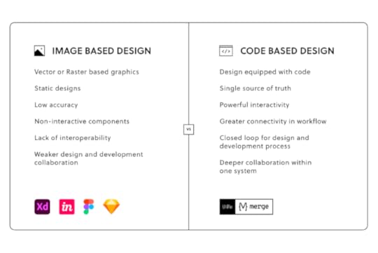
Code-Based Design With UXPinUXPin’s code-based design tool empowers UX designers to build prototypes that accurately represent the final product. Instead of “imagining” that a UI element does something, UXPin prototypes do it!
One of the challenges UX designers face is replicating a code experience using image-based design tools. We’re still using visual design tools and techniques to design for user experience and coded products.
UXPin is the next generation of user experience design tools–taking the familiar design tool UI and adapting it to render HTML, CSS, and Javascript instead of vector graphics.
The result? A sophisticated design tool capable of creating prototypes that look, feel, and function like the final product. Designers can build and test:
Fully functioning forms capable of capturing data to create dynamic user experiencesBuild a fully functioning end-to-end checkout experience capturing customer information, credit card details, and shipping informationValidate email and password fields with helpful, actional error messages to test with usability participantsCreate multiple states for a single component for buttons, dropdowns, accordions, and more, all in a single frameUse Conditional Interactions to add javascript-like functionality to prototypes, allowing you to replicate code-like experiencesConnect APIs to test integrations and triggers with external productsWith UXPin, the possibilities are endless, empowering design teams with high-fidelity prototypes that deliver meaningful results from usability testing and stakeholders.
Join the code-based design revolution. Sign up for a free trial to explore all of UXPin’s advanced features today!
The post Top 8 Design Podcasts that You Should Listen to appeared first on Studio by UXPin.
June 30, 2022
User Analysis – Best Methods to Get Quality Insights

A user analysis provides the foundational research for a project. Design teams use this research to guide design decisions, identify opportunities, get stakeholder buy-in, practice empathy, and prioritize the project roadmap.
Understanding the components of user analysis and how to combine the results to create actionable insights is crucial for designing a successful product that aligns user needs with business goals.
Get accurate, actionable usability testing results with the world’s most advanced end-to-end design and prototyping tool. Sign up for a free trial to discover how code-based design can revolutionize your product development to deliver better experiences for your users.
What is a User Analysis?A user analysis studies the human behavioral impact on product design. UX designers use quantitative and qualitative data to understand user behavior and guide design decisions.
Research teams create personas and use cases based on user flows to understand how users will use a digital product. For example, UX designers want to know customers’ demographics, circumstances, environment, process, and devices they use to order a beverage when designing a coffee ordering app.
This analysis will help designers design the appropriate features for customers to order coffee through an application.
Who is Responsible for Conducting a User Analysis?The person or team responsible for conducting a user analysis will depend on the organization and the product’s maturity. UX designers/researchers are usually responsible for early-stage user analysis or product redesigns.
Product managers/designers/owners often take over user research for established products, bringing UX designers in to collaborate or solve complex usability issues.
Further reading: Check out this article for more details about product designers vs. UX designers and how their roles differ.
When Should You Conduct a User Analysis?There are three primary situations where teams conduct a user analysis:
Designing a new productRedesigning an existing productDesigning a new feature for an existing productNo matter the circumstance, a user analysis most often occurs early in the UX design process. Design teams use the results to set project goals, guide ideation, and design decisions.
Why is User Analysis Important?User analysis answers questions about end users’ tasks and goals to guide design and development decisions.
Through this analysis, teams can identify roles and characteristics that aren’t always possible through market research, such as state of mind, use cases, environment, frequency of use, and how users engage with competing products.
Reason #1: User Analysis Eliminates Assumptions and BiasA comprehensive user analysis gives customers a seat at the table. Instead of determinations based on stakeholder direction, bias, assumptions, internal politics, and other factors, teams let user research guide the decision-making process.
Reason #2: User Analysis Identifies OpportunitiesUser analysis helps teams align customer needs with business goals. Researchers also use a user analysis to look for improvements, competitive edges, market gaps, and other opportunities.
User Analysis MethodsUser analysis methods fall into two categories:
Quantitative data: Measurable, but it doesn’t show the cause of actionQualitative data: Subjective, but you get a chance to uncover the “why”In UX design, no data set is more valuable than the other. Using one data set only tells part of the story. UX researchers combine quantitative and qualitative data to understand users, competitors, and the market.
Quantitative Data
Quantitative research produces numbers, time, ratios, and other measurable data. This quantifiable data is relatively easy to analyze because analysts can identify a baseline and measure whether something goes up or down.
Quantitative data also tells designers and researchers about user demographics, which they combine with qualitative data to create personas–a vital UX research tool.
Qualitative Data
User experience design places a high value on qualitative data. While measurable data is important, it often can’t explain “the why.” UX researchers use qualitative data to understand the root of issues and opportunities.
For example, quantitive data from Google Analytics will show a high drop-off rate for an eCommerce checkout flow. When UX designers conduct interviews, users express feeling frustrated and overwhelmed completing the checkout’s lengthy form.
Without this qualitative data, the team might assume the problem lay in pricing, payment methods, or shipping charges rather than simply fixing the checkout form.
5 User Analysis ArtifactsThere are several UX artifacts researchers and analysts use to conduct a user analysis, including:
User personasUser storiesUser journey mapsUser content matrixUser task matrixTask analysis1. User PersonasUser personas are the foundation of UX research and analysis. This UX artifact aggregates user demographics, goals, behaviors, and beliefs into a one-page document with a fictional name and profile image to represent a user group.
Design and product teams use personas to help create a human connection, making it easier to empathize. Personas also create a foundation for developing other UX artifacts like empathy maps, user journeys, storyboards, flows, etc.
2. User StoriesPersonas provide designers with a clear idea of who the product is for, and a user story outlines how they might use it. These stories help designers understand the environment, motivation, circumstance, and mindset of a user as they complete various tasks.
Agile Coach and Senior Consultant at Industrial Logic, Bill Wake, created a simple guideline to follow when developing user stories. Bill’s user-story methodology provides value to the business and users in a single iteration using the acronym “INVEST.”
Independent: The user story should be self-contained, so it doesn’t depend on other storiesNegotiable: Avoid too much detail, so user stories are flexible and adaptableValuable: User stories must deliver value to the end-userEstimable: You should be able to estimate the resources needed for a user storyScalable: Keep the user stories lightweight so they can be tasked and prioritized with a certain level of certaintyTestable: Explain the acceptance criteria, so the team knows when a story is completeAnother user story methodology is Intercom’s job stories–a framework designed to remove user persona ambiguity by focusing on causality instead. According to Intercom, job stories are more actionable because they focus on motivation rather than implementation.
3. User Journey Maps
Also referred to as user experience maps or customer journey maps .
Where the user story provides motivation and context, the user journey map creates a step-by-step visualization of a persona completing a task. Journey mapping uncovers the critical customer moments that designers can optimize to create a more valuable user experience.
Here are four tips for creating valuable, actionable user journey maps:
Uncover the truth: Scour your user research for quantitative and qualitative data on the experiences you’re mapping. Consider various sources like web analytics, call center logs, and customer surveys and interviews. Triangulate user data to fill knowledge gaps.Chart the course: Experience maps should contain the lens (persona through which teams view the journey), the journey model (touchpoints across all channels), and takeaways (design principles and insights from the mapping process). Tell the story: Map a beginning, middle, and end for user needs. Identify what insights are essential to the narrative and what are “nice to have.” Your map must have a user needs hierarchy (what stands out immediately versus what sinks in later).Circulate the map: Present it in meetings, post it on the wall, and print it, so team members and stakeholders see it. The aim is for everyone to use your map as a lens to see the world as customers do.4. Task AnalysisDesigners, engineers, product managers, and stakeholders often build products they don’t necessarily use or industries they’re unfamiliar with. A task analysis seeks to solve that issue by providing insights and context.
A task analysis looks at how users complete tasks, including details like:
MindsetUsers’ environmentActions (in physical and digital environments)Duration or time-on-taskFrequency of useTask difficultyUnlike user stories and journeys that focus on users, a task analysis dissects the activities users must complete.
5. User Task MatrixWhen analyzing multiple personas, researchers can use a user task matrix to compare various tasks and metrics. This matrix can help rank tasks in order of importance so designers can identify key audiences, validate value propositions, and prioritize the product roadmap accordingly.
The example from Paper Protos below displays seven tasks and three personas for booking an airline ticket.

By comparing these personas, it’s clear that “searching travel routes” is the most important task all for users, while “refer travel guide (luggage restrictions) before booking the ticket” only matters to one group.
Stephanie Troeth, UX Consultant at MailChimp, takes a more connective approach to user task matrices. Stephanie’s matrix technique below provides a broader snapshot of personas and the experience map by looking through the lens of contexts for behaviors and motivations.
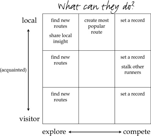
Stephanie’s user matrix is more visual, making it easier for teams to identify patterns and prioritize accordingly.
6. User Content MatrixA content matrix helps teams visualize existing content, how it satisfies user needs, identify improvements, and prioritize content updates. Analyzing your product’s content matrix helps eliminate redundant, outdated, or trivial content.
Here are four primary benefits of a content matrix:
Acute awareness of priorities: Knowing what content is present in your product (and why) helps shape questions about its relevance and value to users and the product.Addressing operational constraints: As you fill out the matrix, you may discover new constraints to solutions. For example, users may need a frequently updated home screen on your app, but you might find that you don’t have the technical resources to do so. A content matrix prompts evaluations to help you discover “second-best” options, so you don’t move forward under false assumptions.Developing a uniform language: A content matrix helps maintain consistency in tone and terminology while avoiding jargon, slang, and other confusing terms.An accurate sense of scale: The better you understand the scale of content for your product, the better your design decisions. A matrix lets you visualize your product’s matrix and prioritize resources accordingly–i.e., evaluating 100 vs. 1,000 screens of content.How to Prioritize your Findings?Once you have completed your user research and analysis, you will have a comprehensive picture of your users, the problems your team must solve, and their priority level.
A prioritization matrix allows the team to visualize design features to separate “nice-to-haves” from “must-haves.” Often teams end up with overwhelmingly long feature lists that are difficult to narrow down.
Here are some tips for prioritizing your design objectives:
Top Task Analysis : Give qualified users a randomized list of easy-to-accomplish tasks and ask them to pick their top five so you can identify what’s most important to them. Gap Analysis : Ask customers to rate prioritized features in order of importance and satisfaction. Next, use the formula: Importance + (Importance – Satisfaction) to determine feature priorities. Kano Modeling : Ask users to rate which features they would miss most when removed from a product. This satisfaction gap shows “must-have” versus “nice-to-have” features. Quality Function Deployment : Start with a prioritized list of tasks or features (from top-tasks analysis) and combine this with a list of functions (from the company). A QFD ranks the features that best meet user needs. Pareto Analysis (the 80/20 rule): This method can quickly differentiate “must-have” features from “nice-to-haves.” Sort your features from highest to lowest (e.g., most votes in a top task, most revenue, etc.), add up the total, then compute the percentage for each item. The features that score highest are your most important. Cause & Effect Diagrams : Since UX issues can be complex, this analysis can expose multiple causes for each problem, letting you troubleshoot effectively. Create a set of cause-and-effect diagrams by asking “why?” to uncover the root causes rather than the symptoms. Failure Mode Effect Analysis: This helps you understand the adverse effects of specific actions. It can highlight cases where you can improve the product by fixing what’s broken rather than adding features. An FMEA generates a Risk Priority Number based on commonality, severity, and difficulty of problems.Recommended reading: The Guide to UX Design Process & Documentation.
Get Meaningful Analysis Results from UXPin PrototypesUXPin’s code-based design tools enable design teams to build fully functioning prototypes that look and feel like the final product. Create code-like user interfaces and interactions for actionable usability testing results and meaningful feedback from stakeholders.
Sign up for a free trial to enhance your end-to-end design process and deliver high-quality user experiences for your customers with UXPin.
The post User Analysis – Best Methods to Get Quality Insights appeared first on Studio by UXPin.
June 29, 2022
9 Tips to Design Faster and Tricks in UXPin

Our goal at UXPin is for designers to spend less time designing and building and more time testing and iterating on ideas. We have a ton of shortcuts and features to help designers prototype faster and get more meaningful results during testing.
Jump to Section:One-Page Design vs. Multiple ArtboardsRefresh DataScrollable ContentCopy and Paste StylesCopy and Paste InteractionsHide a Page from PreviewAdvanced AnimationsAccessibility FeaturesBuilt-in Library of Icons and FormsWe’ve compiled a list of our top 9 tips and tricks to design faster in UXPin. If you’re new to code-based design, sign up for a free trial and follow the tips in this article to discover how UXPin makes prototyping quicker and more enjoyable.
One-Page Design vs. Multiple ArtboardsImage-based design tools require designers to duplicate multiple artboards to create basic functionality and interactions. The transitions often look “unnatural” and don’t provide an authentic user experience.
With UXPin, you can create multiple interactions for a single screen without switching artboards, just like you would using the final product. UXPin’s Calming App is an excellent example of you can create interactions and animations on a single screen.
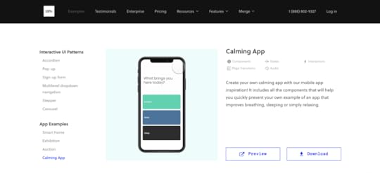
The Calming App has four screens, each with microinteractions and animations triggered by a user tapping a button. When you click “Start” on the app’s “Breathe” section, the screen completely transforms with a pulsing animation–all of which we designed using a single frame in UXPin.
Feel free to download and install our Calming App to see how UXPin’s designers built this immersive prototype. If you don’t have a UXPin account, sign up for a free trial and follow the instructions in the download attachment to install the app.
Refresh DataFinding and adding dummy data to your prototypes can feel like a waste of time. Even if you have a well-organized content library, you still have to copy/paste and upload it accordingly.

In UXPin, you can add dummy data to your project with just a few clicks or use our feature to populate fields automatically.
UXPin also allows you to refresh dummy content instantly using our Refresh Data shortcut CMD+SHIFT+D on Mac or CTRL+SHIFT+D on Windows.
Scrollable ContentDepending on the design tool you use, creating scrollable content can be a time-consuming exercise. With UXPin’s Crop and Scroll feature, you can add vertical or horizontal scrolling in just two clicks.
Step One – Add your content to the prototype so that everything is visible (even if this means your content overflows off the artboard. See example.)Step Two – Make sure you have the content selected and check the box “Crop selected content,” and choose whether you want it to scroll vertically or horizontally.Step Three – Crop your content to the edge of the prototype, so the excess is hidden.When you preview your prototype, the content will scroll according to your settings.
Copy and Paste StylesCopy and Paste styles from one component to another without impacting the second’s content in just two shortcut commands.
Copy: CMD+OPTION+C on Mac or CTRL+ALT+C on WindowsPaste: CMD+OPTION+V on Mac or CTRL+ALT+V on WindowsThis shortcut will only copy/paste styles, not interactions–but we have a shortcut for that too :)
Copy and Paste InteractionsIf you also want to copy and paste a component’s interactions, you can use this UXPin shortcut:
Copy: CMD+SHIFT+C on Mac or CTRL+SHIFT+C on WindowsPaste: CMD+SHIFT+V on Mac or CTRL+SHIFT+V on Windows Hide a Page from Preview
You have to present a prototype you’re working on to stakeholders, but you don’t want to show them parts you still haven’t completed. You can duplicate the prototype, delete the extra screens, and present what you’ve completed.
There are several issues with this approach:
Wastes timeLeads to multiple project files, each with different screens missingIncreases the likelihood of errorsAny notes you or stakeholders make on the second prototype must be copied to the originalCauses confusion with others working on the same projectA more straightforward solution would be to hide the screens you don’t want people to see and share the prototype link–which is what UXPin’s Hide a Page from Preview does. You can hide any screens you don’t want to appear in the prototype and reveal them again with a single click.
Advanced AnimationsUXPin renders HTML, CSS, and Javascript, allowing designers to create code-like interactions and animations. Using UXPin’s properties panel, designers can choose the type of animation and tweak its settings to achieve the desired result.
Designers can take interactions to the next level with Conditional Interactions. Create a set of “if-then” and “if-else” rules to trigger dynamic user experiences that accurately represent a coded product.
With UXPin’s advanced animations, designers can create immersive, intuitive prototypes that make sense to the user experience.
Accessibility FeaturesWhile we all know the importance of creating inclusive products, accessibility can sometimes feel like a chore because designers have to use plugins or external tools to test UIs.
With built-in accessibility features, designers don’t have to leave UXPin to test their color choices. UXPin provides two tools for testing on the fly:
Contrast Checker: Check your prototypes against WCAG standards with an indicator for levels AA and AAA.Color Blindness Simulator: Test how color blind users will see your prototypes by switching through the eight types of color blindness.Built-in Library of Icons and FormsBuilding forms and icons from scratch take up significant time when you want to build a quick prototype. Most design tools have third-party libraries, but you still have to search through these to find what you need.
UXPin comes with a vast library of icons built-in, including Google’s Material UI, Font Awesome, Pixel, and Retina icon sets. You can also import your own SVGs and make edits inside UXPin.
UXPin also includes basic form elements designers can use as-is or customize to meet their needs.
Try Advanced Prototyping in UXPinReady to try these tips and tricks for yourself? We have several example projects that showcase UXPin’s advanced design and prototyping features. Sign up for a free trial and discover how code-based design can revolutionize your prototypes to create better user experiences for your customers.
The post 9 Tips to Design Faster and Tricks in UXPin appeared first on Studio by UXPin.
June 28, 2022
Discover Patterns – Quickly Build and Keep New Components in Your Merge Library

Improve the speed and consistency of your design process with the new Merge feature – Patterns, which makes building and reusing new components or their variants a breeze. Experiment with new UI elements while staying in line with what’s feasible, expand your design system, or save time on setting the same properties over and over again.
What’s new in UXPin Merge?UXPin Merge is a powerful technology for bringing code components into UXPin’s design editor. Design teams can use fully functional elements and build interactive prototypes with them. The teams that use UXPin Merge have found that it helped them achieve a higher maturity of their design system as well as scale design even if their designers were seriously outnumbered by developers.
We’re constantly evolving Merge, working on the ways designers can bring components to UXPin or use them in the editor. We’ve just launched Patterns – a feature that allows you to build and keep complex components inside UXPin.
Build a robust design library at speedAside from importing a code component library to UXPin via Storybook, Git or NPM package, you can have a design library in UXPin with predefined UI components that you quickly reuse in your prototypes.
The new Merge feature makes you a way more productive designer, helps you scale your design system, and allows you to try out new components that are not yet coded. Now it’s way easier to:
Save and reuse variants and properties of your components.Combine your Merge components into bigger, more advanced elements.Create and share new components with predefined presets that are not yet in code.Patterns acts as a standard UXPin library, but it allows you to go beyond atoms and basic components into more complex ones. You can also mix Merge with Classic components and try out new elements without asking developers to code them first.
How can you use Patterns?Patterns is exclusive for Merge users and it works with all Merge integrations, that is Git, Storybook, and NPM package.
See UXPin’s docs and read the instructions on how to use Patterns.
Patterns is available on trial with the Storybook integration. Experience the speed and swiftness of using code components in your design process, try UXPin for free.
The post Discover Patterns – Quickly Build and Keep New Components in Your Merge Library appeared first on Studio by UXPin.
June 26, 2022
Which UX Metrics Should You Be Tracking?

User experience is often ambiguous, making it challenging to identify the right UX metrics and KPIs. Design and product teams want to know whether their solutions work while stakeholders are interested in various projects’ ROI.
Choosing the right user experience metrics and KPIs is crucial for organizations to evaluate UX successes and measure themselves against the competition. This article looks at these indicators and which ones to use for measuring various facets of the customer experience.
Table of contentsWhy Track UX Metrics and KPIs?Types of UX MetricsNet Promoter Score (NPS)System Usability Scale (SUS)Customer Satisfaction Score (CSAT)Time-on-TaskCustomer Effort Score (CES)Error RateCompletion RateEngagementConversion RatesHow to Track UX Metrics and KPIsStep One – Defining BenchmarksStep Two – Set Goals and Key Performance IndicatorsStep Three – Measuring PerformanceStep Four – Reporting UX MetricsStep Five – Acting on UX MetricsImproving Product Performance With UXPinIncrease UX value and deliver better quality digital products with the world’s most advanced user experience design tool. Sign up for a free trial to discover how UXPin’s code-based design tool can enhance your product design workflows and deliver better product experiences for your customers.
Why Track UX Metrics and KPIs?Tracking UX metrics tell design teams and stakeholders whether the org’s UX strategy is working and the success of each design project.
User experience and usability are vital for a successful product because these metrics tell companies how satisfied people are using their products and whether design solutions fulfill their needs correctly.
Customer satisfaction is important for retention, conversions, and other marketing and sales metrics that ultimately impact the organization’s bottom line.
UX KPIs benchmark performance and track progress over time to ensure companies meet various UX goals and objectives.
Types of UX MetricsLike any measurement framework, there are two types of UX metrics:
Qualitative data: Sentiment, loyalty, usability, user satisfaction, and other subjective dataQuantitative data: Numbers, ratios, and other measurable dataThe challenge with measuring user experience is that many metrics are qualitative. Quantitative is relatively simple to analyze; numbers either go up or down. Analysts and stakeholders must treat qualitative data with greater scrutiny, as it’s easier to misinterpret or bias data (purposely or incorrectly).
Net Promoter Score (NPS)The Net Promoter Score (NPS) is a crucial UX metric because it measures how likely customers are to recommend your product. A high NPS indicates that your product solves users’ problems and that they’re inclined to share that experience with others.
NPS is determined by asking whether customers are satisfied with a product or feature on a scale of one to ten (one lowest, ten highest). Companies categorize the results into three groups:
Promoters (scores of 9 or 10): Your most loyal customersPassives (scores of 7 or 8): Satisfied customers unlikely to recommend your productDetractors (scores of 0 to 6): Unhappy customers who may stop using your product and possibly discourage othersSystem Usability Scale (SUS)The system usability scale (SUS) is a 10-question questionnaire that provides UX designers with a digital product’s overall usability score. SUS dates back to the 80s and is still considered a good UX metric for measuring usability.
We recommend reading this HubSpot article for a deeper understanding of SUS and how to use this important UX metric.
Customer Satisfaction Score (CSAT)A customer satisfaction score (CSAT) measures how happy or satisfied customers are with a product or feature. You measure CSAT in a couple of ways:
Yes/No questions: “Did this product help you complete task X?” Produces a percentage score.Scale (i.e., 1-10): “How satisfied are you with your experience today?” (including a scale from 1-10 with unsatisfied on one end and satisfied on the other). Produces an aggregate score based on the scale. Time-on-Task
Time-on-task determines the average time it takes users to complete a specific task. It’s a fantastic indicator of a product’s efficiency, especially for enterprise products designed to increase productivity and performance.
Unlike CSAT, time-on-task requires no input from users. Instead, designers use analytics tools that measure and aggregate results.
Customer Effort Score (CES)Organizations use a customer effort score (CES) to measure how easy it is for a customer to complete a task. You measure CES by asking users about their experience with a scale for their answer.
For example:
Question: “How easy was it to use feature X?”Scale 1-10: 1 = Very difficult, 10 = Very easyError RateError rates indicate how often a product or feature prevents someone from completing a task. System error rates are critical UX metrics because they can deter customers from using or recommending a product.
We represent error rates as a percentage with the goal of keeping them as low as possible. A high error rate indicates a significant usability issue designers must investigate and fix immediately.
Completion RateA completion rate (or task success rate) tells you how many times people complete a task. Completion rates are excellent indicators of a broader problem, like bugs or usability issues. If the completion rate suddenly drops, there may be a system error or usability issue resulting from a new release.
Many factors impact completion rates, so product teams can monitor this metric as an indicator that something has gone wrong.
EngagementEngagement is another indicator of customer satisfaction and enjoyment. It tells organizations how often customers use and interact with a product. UX designers must combine several metrics to determine user engagement. For example (these will differ depending on the product):
How long do users use the product?The number of pageviews.How much scrolling do they do?Do they engage with content and other users?The number of tasks they complete while using the product.Each product and organization will have different methodologies and metrics for measuring engagement.
Conversion RatesConversion rates are crucial as they determine the percentage of conversions for completing forms, sales, signups, transactions, and other business metrics.
Designers must pay careful attention to this business metric because design decisions can have positive and negative outcomes for conversions.
How to Track UX Metrics and KPIsThere are several tools and techniques for tracking UX metrics and KPIs. This step-by-step process provides a brief outline of how to track and measure performance.
Step One – Defining BenchmarksBenchmarks are a point of reference, usually a starting point for organizations to measure performance for both qualitative and quantitative metrics. Defining benchmarks is crucial for measuring UX metrics because they determine whether something has improved or deteriorated.
For example, time-on-task is a common quantitative UX metric used to determine how long it takes users to complete a specific goal, like purchasing a product. UX designers would have to benchmark how long it takes to buy a product at the start of a project to determine whether they’ve improved on that metric or not after release.
Step Two – Set Goals and Key Performance IndicatorsGoals: What the organization what’s to achieveKPIs (Key Performance Indicators): The milestones organizations use to track performance toward goalsSetting goals gives design teams a target for improvement. Organizations typically set a big long-term goal with multiple KPIs to measure performance.

For example, the Net Promoter Score (NPS) measures how likely customers are to recommend your product, usually measured from 0-10, with ten being the most likely. The product’s current NPS is six, and stakeholders want a 50% increase to nine or higher in 12 months with a 12.5% increase every quarter.
Benchmark: 6Goal: 9Four Quarterly KPIs: 0.75-point increase each quarterStep Three – Measuring PerformanceWith goals and KPIs in place, teams must use various analytical software and techniques to measure performance. Some examples of this software include:
Hotjar : Hotjar is a fantastic qualitative measurement tool with screen recorders and heatmaps to monitor user behavior. Hotjar also includes a quick survey tool for websites and mobile apps to measure various UX metrics. Baremetrics : Baremetrics measures more quantitative data like churn rates, conversions, revenue, and other numerical data. Google Analytics : Google’s free analytics tool for tracking users, including flows, time-on-task, conversions, etc. Optimizely : An A/B testing tool to compare performance between two designs.Step Four – Reporting UX MetricsReporting UX metrics allows design teams and stakeholders to track performance toward long-term goals and measure the success of each design project.
A UX metric report generally displays four key data points (usually on a graph or graphic):
Benchmark or starting referenceTarget KPIPerformance against KPIDesired goalUX reporting must be succinct and transparent. UX designers must include references for gathering and analyzing the data so that team members and stakeholders can check their findings.
Step Five – Acting on UX MetricsDesign teams must have actionable plans to respond to KPIs. For example, what happens if performance deteriorates or you don’t meet a specific KPI?
UX metrics aren’t a framework for collecting data; they’re supposed to provide UX designers with indicators to iterate and improve–for users and the organization.
Improving Product Performance With UXPinCreating a helpful, enjoyable, and engaging user experience that fulfills customers’ needs is a goal every UX designer strives to achieve. Designing a great user experience starts with using the right tools.
UXPin’s code-based design tool empowers UX teams to build accurate prototypes to test and identify usability and accessibility issues. Solving these issues before release is crucial for meeting an organization’s UX strategy and goals.

Unlike image-based prototypes that render vector graphics, UXPin generates HTML, CSS, and Javascript, enabling designers to replicate a coded product’s functionality and fidelity accurately.
UXPin also empowers UX designers to address usability and accessibility issues with fast prototyping to find a solution. Whether you use your own design system or a built-in design library, UX designers simply drag and drop components to build quick prototypes for usability testing.
Not only is it faster to prototype using UXPin, but UX designers also enjoy higher fidelity and functionality, providing meaningful, actionable results from usability participants and stakeholders.
Improve your product’s user experience and streamline UX workflows with the world’s most advanced design, prototyping, and testing tool. Sign up for a free trial to experience UXPin’s code-based design features.
The post Which UX Metrics Should You Be Tracking? appeared first on Studio by UXPin.
June 23, 2022
DesignOps Strategy – How to Grow the Design Operations Team?

DesignOps has become a crucial operational function for many organizations. Some companies still operate without a dedicated DesignOps practitioner or team, working around bottlenecks and inefficiencies.
According to a 2020 NN Group survey of 557 UX practitioners, “organizations only did 22% of recommended DesignOps efforts, did not have DesignOps-dedicated roles, and had low DesignOps maturity overall.”
This article explores four stages of DesignOps maturity and the goals you should set at each stage to scale and grow your team.
Are you still using outdated image-based design tools? Join UXPin’s code-based design revolution with advanced Merge technology syncing design and development. Sign up for a free trial to explore Merge and other UXPin features.
Stage 0: Nobody is Responsible for DesignOpsFor products with small-cross functional teams working together, the motivation for DesignOps is low. Something the NN group calls a “Scattered Team Structure.”
Product managers, design leads, and managers are responsible for various operational activities–hence the Ops work is “scattered” among team members. At his Design Value Conference 2022 talk, Omkar Chandgadkar, Senior UX Designer at Amazon, called this stage “Designing a plane while flying it“ because UX teams operate reactively or tactically rather than strategically.
This was true during the early days of Airbnb, where product teams consisting of designers and engineers worked closely in the same office, interacting and engaging throughout the day. They worked closely and solved operational challenges together, an “all hands on deck” growth strategy.
But Airbnb’s success and growth meant teams separated, and silos emerged–a common problem among fast-growing startups and enterprise organizations.
“…we reached a tipping point where things suddenly became harder. Teams could no longer all fit on the same floor… Access to information, design standards, workstream collisions, and quality issues all became very real problems.” Excerpt from Adrian Cleave’s DesignOps at Airbnb article.
At this stage, Airbnb developed its Design Language System, and DesignOps was born.
Key DesignOps Stage Zero ResourcesHow DesignOps Work – The Mindset of Design OperationsUnderstanding DesignOps and Its Role in Design TeamsStage 1: DesignOps team of OneThe first stage of DesignOps is what the NN Group calls the “Solitary Team Structure.” DesignOps becomes a team of one dedicated full-time to the role. As Salomé Mortazavi, Director of DesignOps at SiriusXM, points out in her Design Value Conference 2022 talk, “70% of DesignOps departments are a team of one.”
When starting as a DesignOps team of one, Salomé recommends practitioners begin by listening and taking notes. Get to know the people, space, processes, etc.,–in group and one-on-one environments.
This listening approach will expose the company’s organizational and systemic problems. The DesignOps practitioner also builds trust with teams and stakeholders because they can identify and articulate the organization’s issues.
The goal for DesignOps stage one is to identify bottlenecks and issues and prioritize fixes accordingly. Salomé uses a Design Maturity Index to identify issues and themes. Some of these DesignOps must be solved, while others will fall on design leadership.
Key DesignOps Stage One ResourcesDesignOps 101: Guide to Design OperationsTransitioning from a Product Designer Role into DesignOpsResearch the Problem: How to Get Started with DesignOpsDesignOps Stage 2: Hiring DPMsOnce a practitioner has a few successes and the organization sees value in scaling DesignOps, it’s time to start building your team. NN Group defines this as the “Specialized” DesignOps stage because the practitioner identifies the need for a dedicated team member in specialized areas.
Design program managers (DPMs) are often the first hires when building a DesignOps team. These DPMs might work alongside teams to streamline day-to-day workflows or focus on specific areas like onboarding, tool curation, licensing, etc.
While DesignOps has an impact and solves problems, stage two is still very tactical rather than strategic. The DesignOps team is effective for solving problems and developing short-term solutions, but they don’t have a roadmap or spend little time on long-term goals.
Key DesignOps Stage Two resources:
Tools for DesignOps SpecialistsROI of DesignOps: All You Need to Know About Quantifying DesignOps’ ImpactStage 3: Scaling DesignOpsA mature DesignOps team operates under a “Distributed” or “Elevated” structure according to the NN Group’s DesignOps Team Structures. DesignOps leans towards strategic operations with roadmaps, long-term goals, and monitoring project trajectories in these mature structures.
There’s a dedicated DesignOps leader who is inward-looking and process-oriented. In Measuring DesignOps Impact, Associate Design Operations Director at Babylon, Patrizia Bertini summarizes the DesignOps Leader role in five bullet points:
Mission: the How / the performanceFocus: End-to-end design process & teamsKPIs: Team health, spending, & performance metricsDeliverables: Ops roadmap & strategySkills: Change managementAnd the Design Program Manager’s using the same five points:
Mission: Execute Ops roadmapFocus: Align processes to executeKPIs: Program metricsDeliverables: Blueprints, project statusSkills: Process & project managementPatrizia Bertini defines three DesignOps areas for intervention:
Business operations: Managing budgets, resources, and other business-related design functions.Workflow and design operations: A holistic view of the end-to-end design process. How do designers get from concept to final product?People operations: Considers the human aspect of design teams, like skills development, communication, and culture.You can watch the webinar about measuring DesignOps on UXPin’s YouTube channel.
Scaling DPMs in a Mature DesignOps EnvironmentDPMs use frameworks to apply either tactical or strategic strategies for projects. In DesignOps Layers of Impact, Maggie Dieringer uses a “framing and scaling” methodology to determine:
Where is your time best spent?How do you ensure that you’re having the most impact with that time?Rather than looking for the “right” to do something, Maggie’s framework identifies where DPMs can have the most impact through three framing factors:
What’s the size of the design team and the state of the organization?What type of resourcing and allocation environment are we operating in?What level is my primary design partner?Once Maggie has the answer to these framing factors, she looks at increasing her impact depending on a spectrum of engagement with zoomed-in on one end and zoomed-out on the other:
Zoomed-in: Working with teams on day-to-day tasksZoomed-out: Advocating, strategy, and planningMaggie outlines a support DPM trajectory based on her framing factors and level of impact by answering five questions:
Which activities and environments bring me job fulfillment day-to-day?Which activities will have the most impact and influence right NOW on the team I support?How can I leverage my partner to work on the things that are important to my career?How can I use my team size to influence the desired behavior and engagement?Do I thrive doing tactical or strategic activities (or both)?She also considers:
Where are you today?Where do you want to be?Where does your team want to be?Key DesignOps Stage Three ResourcesInside DesignOps at Uber: Who Are DPMs and How Do They Create Impact?DesignOps vs. Design LeaderPatrizia Bertini on Mediumre:Work by GoogleAmplify Design by Dave MaloufDesOps.ioNielsen Norman Group on DesignOpsScaling and Maturing DesignOps With UXPin MergeAs a DesignOps team of one, your time and resources are limited. As you mature, you want to focus on high-level strategies and long-term goals. Ensuring design teams have the tools to grow and scale is crucial for every DesignOps team.
UXPin Merge solves many DesignOps challenges, giving practitioners and DPMs the time to focus on strategic initiatives and creating value. Merge creates a single source of truth, eliminating time-consuming manual tasks and activities.
Sign up for a free trial to discover how code-based design can improve UX workflows, enhance collaboration (between design teams and developers), reduce errors and rework, and deliver value for DesignOps.
The post DesignOps Strategy – How to Grow the Design Operations Team? appeared first on Studio by UXPin.
June 22, 2022
Mobile Design Systems – Tips and Examples

Many digital products only exist on mobile, but they often adapt web component libraries for native mobile apps. According to a Clarity 2020 talk, “less than 10% of public design systems support platforms other than the web?”
Unlike web-based design systems, mobile design systems must adapt to native operating systems and platform-specific UI patterns.
Maintaining a mobile design system is more work for UX designers and engineers as they adapt to regular system updates, new devices, regulations, app store policies, and other constraints.
Whether you’re building a design system from scratch or maintaining an established component library hosted in a repository, UXPin has a solution for your business. Sign up for a free trial to explore UXPin’s design system solutions for every stage of maturity.
The Importance of a Mobile Design SystemMany design systems include responsive components, which are great for web app usage but might not be suitable for native mobile applications. For example, UI elements like alerts, snackbars, date pickers, etc., render differently on iOS vs. Android native applications.
It’s not unusual for an Android app to use a floating action button (FOB), whereas this component doesn’t exist on iOS, which may confuse Apple users.
So, a responsive design system alone isn’t enough when designing a native user experience. UX designers must create a mobile design system that adheres to platform-specific policies, guidelines, UI patterns, best practices, and constraints.
Maintaining Cohesion and ConsistencyOne of the most significant benefits of a design system is cohesion and consistency. Teams deliver projects with minimal design drift and errors when everyone uses the same component library.
Native applications can disrupt this cohesion and consistency by rendering shapes, sizes, colors, and other UI elements differently to the design system’s guidelines.
A great example of this inconsistency is how Trade Me’s component library changed after implementing a mobile design system. You will notice that the app’s buttons looked more like native buttons before implementation. The redesign helped align these components with the web component library to deliver a more consistent and cohesive cross-platform user experience.
 SourceTips for Creating a Mobile Design SystemIdentifying Mobile Design System Components
Building a mobile design system starts with listing your product’s components. It’s good to screenshot user interfaces from iOS and Android versions of your product to visualize your product’s aesthetics across platforms.
The aim is to identify each UI element while looking for inconsistencies. For example, you might find you have different button styles for iOS and Android, which may differ from your web component library.
Leveraging Native UI Design PatternsGoogle’s Material Design and iOS Human Interface Guidelines provide comprehensive libraries of components and documentation for building respective native applications.
UX designers can use this documentation as a foundation to guide design decisions to deliver a familiar user experience. For example, how can designers leverage a feature like Android’s FOB to enhance the product and user experience? And how will that component look in the product’s design system?
Component Library ThemingIf you’re building a mobile design system from scratch, adapting an open-source component library is an excellent strategy for developing and scaling fast.
UX designers can leverage expertly designed component libraries thoroughly tested for usability and accessibility to focus on building and scaling their products instead of creating everything from scratch.
Open-source mobile React libraries like MUI, Ant Design Mobile, NativeBase, and UI Kitten provide themeable components UX designers can adapt to meet brand and product specifications.
Bottom-Up Designing With Atomic DesignUsing Brad Frost’s Atomic Design principles gives designers a bottom-up approach to designing elements, components, and UI patterns. The idea is to start from the smallest elements, or atoms, and scale your designs to complete pages.
Applying Atomic Design practices enables designers to create a solid foundation of reusable components to develop and scale a design system. This Atomic approach also encourages the DS team to reuse the same building blocks (“atoms,” “molecules,” and “organisms”) for designing new UIs rather than creating new parts from scratch–thus keeping the design system lean and efficient.
5 Great Examples of Mobile Design SystemsThese five high-quality open-source mobile design systems offer comprehensive libraries of themeable components for developing native and cross-platform applications.
We’ve chosen these five because they provide clear design language, UI kits, and component libraries, so designers and engineers can collaborate using the same UI elements. These examples offer dark/light themes, accessibility features, and adaptive designs for multi-platform product development.
You can customize these mobile design systems to meet brand and product requirements or use the component libraries as inspiration for building your design system from scratch.
1) NativeBase
NativeBase is a cross-platform React toolkit for developing iOS, Android, and web applications. The themeable component library makes it easy to change the global color palette, type scale, font stacks, breakpoints, spacing, border-radius values, and more.
NativeBase is fully accessible using React Native Aria, “React Hooks to build accessible React Native design systems,” giving design and engineering teams a solid foundation for building accessible products.
NativeBase includes a component library for engineers and a matching UI kit for designers. The library provides comprehensive documentation for usage, best practices, theming, and templates for building mobile applications.
2) UI Kitten
UI Kitten is a React Native UI library version of the Eva Design System. Designers can use UI Kitten and Eva to develop multi-platform applications for any device. The comprehensive UI ecosystem includes Eva Icons with over 480 commonly-used icons to complement its UI components.
Eva and UI Kitten are highly customizable, with features designed specifically for enterprise design. UI Kitten provides documentation for implementing the design system for new and existing products, with comprehensive step-by-step getting started guides.
3) Material Design System
Google’s Material Design System is one of the largest and most comprehensive design systems in the world. In 2022, Google released Material Design 3, which includes important native updates for foldable devices and Android 12.
Even though Material is a Google/Android product, the design system includes a library of iOS-specific native components, so designers can easily build cross-platform applications.
Material Design is highly customizable with theming for color, typography, dark/light mode, shapes, spacing, and more. Designers also have over 2,500 Material Symbols (icons) in three styles to complement their designs accordingly.
UXPin includes Material Design’s UI kit and MUI’s React component library built-in–no additional plugins, extensions, or uploads are required. Sign up for a free trial to use these component libraries to develop your mobile design system today.
4) Ant Design Mobile
Ant Design Mobile is an open-source design system used by many Chinese-based organizations, including Alipay, Koubei, and Taobao, to name a few.
The comprehensive design system includes native mobile and web component libraries to build multi-platform digital products. Ant provides platform-specific UI patterns for Android and iOS, so designers simply drag and drop to start prototyping and testing.
Ant Mobile Design offers UI kits for popular design tools and component libraries for React, Vue, and Angular, making it one of the most versatile design systems worldwide.
5) REI Cedar
REI’s Cedar is a cross-platform design system with platform-specific (Android, iOS, web, etc.) components and patterns. Cedar’s excellent documentation includes resources for designers and developers with CodeSandbox examples of every element.
Cedar includes guidelines, behavior, best practices, dos and don’ts, and accessibility recommendations below every component and UI pattern. The UI kit and component library use design tokens to customize color, sizing, spacing, motion, forms, breakpoints, typography, and more.
Bonus – More Cross-Platform Design SystemsWe highly recommend checking out these design systems for inspiration and guidance when developing your own design system.
These design systems are for creating products on the respective platforms rather than building standalone applications, but it’s helpful to see how these organizations use components, write documentation, etc.
Shopify PolarisAtlassian Design SystemMicrosoft Fluent UISalesforce Lightning Design SystemGitHub PrimerBuilding, Managing, Scaling, and Sharing Mobile Design Systems in UXPinUXPin offers a solution no matter where you are in design system maturity. You can create your own design system from scratch or import an established code-based component library using our Merge technology.
Building a Design System From ScratchDesigners can use UXPin’s built-in design system feature to build a design system from scratch. UXPin automatically segments the system into Colors, Typography, Assets, and Components, with the option to add descriptions for documentation.
The design system team can set permissions for the design system and its components to prevent unauthorized changes. They can also share the design system with team members, external collaborators, and stakeholders–even if they don’t have an active UXPin account.
Engineers can use the design system’s style guide to create theme tokens for development to streamline future design handoffs.
Merge Design and DevelopmentTake your design system to the next level and create a single source of truth with UXPin Merge. Merge syncs code components from a repository to UXPin’s editor, so designers and engineers use the same design system.
Using the same component library means designers and engineers work within the same constraints, thus streamlining design handoffs and product development workflows.
With standardized, approved components, engineers no longer have to interpret design files, prototypes, and documentation; they simply copy/paste from the repository and any UXPin changes to begin the development process.
Designers can use code components to build fully functioning prototypes that enhance usability testing with meaningful, actionable results from end-users. Merge also improves feedback from stakeholders who can use and interact with prototypes as they would using the final product.
Ready to build, scale, and mature your design system with UXPin? Sign up for a free trial to explore design systems, Merge, and other advanced code-based UXPin features.
The post Mobile Design Systems – Tips and Examples appeared first on Studio by UXPin.
June 21, 2022
Button Design – Get Site Visitors to Actually Click Your Buttons

Buttons are essential components in any digital product. While there are many ways to design a button, designers must follow principles and best practices to create familiar and intuitive user experiences.
Button design is more than choosing a shape and color. Designers must consider a button’s states, placement, size, responsiveness, consistency, icon usage, suitable text/labels, and more.
Design beautiful UI elements that look and function like code components using UXPin. Sign up for a free trial to explore the world’s most advanced design, prototyping, and testing tool.
What is the Purpose of a Button in UI Design?While this might seem like an obvious question to experienced UI designers, many digital products still misuse buttons. Buttons convey a specific call to action (CTA), like “Submit” or “Pay.”
Buttons tell users, “if you click me, something will happen.” Designers also use buttons to communicate with users through states, color, and text. For example, a disabled button state (unclickable) remains until the user completes a form’s required fields.
Buttons vs. LinksMany digital products and websites use buttons and links incorrectly. There is a simple rule to follow when deciding between a button or link: Links are for navigation, and buttons are for performing actions.
4 Types of Button DesignThere are four types of buttons designs, and each button conveys a different message to users:
 Outlined Button: Also referred to as a secondary or ghost button, and often placed next to a primary button as an alternative action, like “Cancel” instead of “Submit.” Outlined buttons use a transparent background with a contrasting border and text.
 Text Button: Also called a flat button and often used for low important actions, like date pickers. Text buttons have no background or border, with only the label colored and visible.
 Toggle Button: Designers use toggle buttons for two or more related actions–like switching dark/light mode on an app or bold, italic, and underline in word processors. Designers use states to indicate which option is active.
Modern mobile apps also use a floating action button (FAB) for important actions. Designers often place FABs at the bottom of the screen so that it’s a thumb’s reach from the user.
UI Button AnatomyDesigners and engineers can modify several button properties:
 Source: UXDesign.ccBackgroundLabelIconPaddingMarginBorderBorder radiusDrop shadow6 UI Button States
Designers use states to provide context and communicate with users. There are six types of button states:
Default: How a button looks without any state. A default button could be contained, outlined, or flat, depending on your UI design and design systemActive: Tells the user they have pressed the buttonHover: Activated when a mouse cursor hovers over a button. Hover tells the user this is a clickable elementFocus: Used to indicate selection when using the keyboard or assistive technologiesDisabled: Indicates the user can’t click the button until completing another taskLoading: Communicates the system is processing the user’s actionBest Practices for Using & Designing ButtonsDesigners must follow certain principles for designing buttons and user interfaces. Use these button design best practices to guide your next project.
Button Hierarchy and PlacementDesigners must consider button hierarchy and placement to provide users with clarity and highlight the most important action. Google’s Material Design recommends designers must create emphasis through color:
High emphasis (Primary): Use a bright color, preferably a contained button, to show this button is most important. Avoid using more than one high-emphasis button on a single screen.Medium emphasis (Secondary): Use a lighter shade of your high-emphasis color to signify this button is less important. Low emphasis (Tertiary): Use a text button or outlined button with a transparent background to show users its low importance.By applying button hierarchy principles, users can complete important actions without much thought. If you use a single button for every action, users will have to examine each to determine which one they must press.
Correct button placement is also essential to guide users through a digital product. If you place two buttons side-by-side, always use a contained button as the primary action and outlined or text button for the secondary action.
For example, if you have “Save” and “Cancel” at the bottom of a form, “Save” would be the primary action with the higher emphasis.
Button ConsistencyDesigners must use buttons consistently throughout a digital product. If you use a contained button for a primary action on one screen, repeat this choice throughout.
Designers must also be consistent with button sizes, fonts, icons, colors, border radius, whitespace, and other properties to create a familiar user experience that’s easy to navigate.
Button Sizing & SpacingSize matters when it comes to buttons, especially on mobile applications where users use their fingers. Designers must use appropriate button size and spacing to ensure users don’t accidentally hit another element.
Designer Taras Bakusevych recommends making UI elements a minimum of 48×48 pixels to avoid touch target errors.
Button LabelsLabels should be as short and meaningful as possible. Designers must also keep labels on a single line for legibility.
Button text language is also critical for conveying the correct message and action to users. For example, if you’re removing a song from a playlist, the correct phrasing would be “Remove” instead of “Delete.” Delete might confuse the user into thinking they’re deleting the song from their device or application.
Capitalization is also a critical factor designers must consider. Google Material Design recommends using uppercase for languages that allow it, while UX Movement says to use sentence-style capitalization.
The argument for sentence-style capitalization is better for users with reading disabilities like dyslexia. Google reasons that uppercase “is to distinguish the text label from surrounding text.”
The best option is to test your product with users. Color, contrast, size, UI layout, and many factors impact legibility, so there is no one-size-fits-all for capitalization.
Button AccessibilityAccessibility is a critical factor in modern UX design and product development. Designers must test UIs using tools and diverse usability participants to ensure buttons and other UI elements meet accessibility standards.
The color contrast between the label and background is one of the biggest considerations for button accessibility. With UXPin’s built-in accessibility features, designers can test color blindness and contrast on the fly–keeping them focused in UXPin rather than turning to external tools.
Label size, spacing, and padding can also impact accessibility. These properties are harder to test using tools, so designers must use usability testing to get meaningful results.
Devices & Screen SizesRecognizing how buttons look across different devices and screen sizes is crucial for designers. For example, dialog boxes look completely different on Apple devices compared to Android. The floating action button also looks different on iOS vs. Android.
Designers also need to consider how buttons will appear across multiple screen widths. For example, a button with a long label might not look the same on mobile vs. desktop.
Designing Buttons in UXPinDesigning buttons using an image-based design tool can be challenging. The static nature of image-based tools means buttons lack interactivity, functionality, and fidelity.
With UXPin’s code-based design tool, designers can create authentic user experiences with components that look and function like code. Here are some of UXPin’s advanced features to enhance your button design.
ComponentsDesigners can build buttons from scratch and save them as Components to reuse throughout the design. Designers can also share these components through a shared design system to maintain consistency throughout the team.
StatesUXPin States allow designers to create multiple states for a single UI component, like a button. For example, you can design the six-button states mentioned above, each with different properties that change according to user and system actions.
Designers can also use UXPin’s States for other components like carousels, dropdown navigation, accordions, and more.
InteractionsCreate code-like interactivity using UXPin’s Interactions. Designers can choose from an extensive list of triggers and actions for desktop and mobile interactions.
UXPin takes interactivity one step further with Conditional Interactions, allowing you to create dynamic, unique experiences based on user and system actions.
Variables & ExpressionsWith Variables and Expressions, designers can build high-fidelity prototypes with interactivity mirroring code.
For example, using UXPin Variables, designers can create a dynamic pay button that displays a variable total from a shopping cart, “Pay $25.”
 Source: Stripe
You can also use Variables to create a personalized user experience during testing, like a welcome message with the name from user input or populating a profile page.
With Expressions, designers can validate form fields, like emails and passwords, and even disable a button until the user completes a form’s required fields.
With UXPin’s advanced prototyping features, the possibilities are endless. Designers can design prototypes that look and function like code, saving countless hours developing an identical prototype simply for testing purposes.
Sign up for a free trial and start building your first UXPin prototype immediately. You can also install one of UXPin’s free example apps to see how to create working buttons and other UI components.
The post Button Design – Get Site Visitors to Actually Click Your Buttons appeared first on Studio by UXPin.
UXpin's Blog

- UXpin's profile
- 68 followers

