
UXpin's Blog, page 55
August 24, 2022
Bad App Design – What Mistakes Should You Avoid in a New App Design?
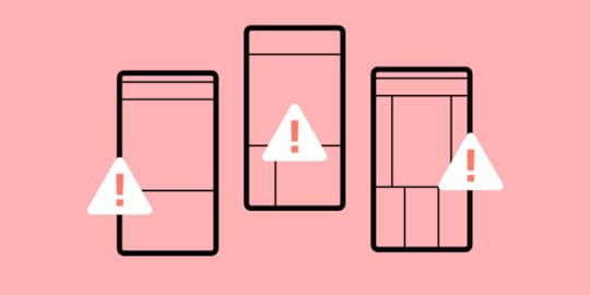
Irrespective whether you’re creating android or iOS app design there are a number of mistakes which you should avoid at all costs if you don’t want to design a bad UI. Among others, these are:
Including too many features which clutter the designIgnoring updatesSkipping MVPsHaving a poor Information Architecture.Table of contents9 new app design mistakes worth avoiding#1 Overdoing it with features #2 Poor Information Architecture (IA)#3 Not paying attention to updates#4 Not displaying key information in a quick and prominent manner#5 User testing with a low range of personas#6 Not launching an MVP version of your mobile app#7 Ignoring preferences of current users #8 Not including CTAs that would encourage users to share data#9 Using hamburger menus Use UXPin for Good App DesignDid you know that there are about 2.8 million apps on the Google Play store and another 1.96 million on Apple App Store? This means that we don’t have to grind our teeth and tolerate bad app design. For anything we need, we can simply turn to one of the tens, if not hundreds of competing mobile apps.
So, the million-dollar question is – how to avoid user dropout in your app product design? Among others, it’s essential to spot and avoid the most common mistakes in iOS and Android app designs.
Most product design teams build a prototype to test their app design idea and avoid mistakes. If you want to design a prototype, try UXPin, it’s a design tool that allows you to build highly interactive prototypes that are ready for tests. Try UXPin for free.
9 new app design mistakes worth avoidingHere are a few mistakes that you should avoid while creating android app designs and iOS app designs.
#1 Overdoing it with featuresJosh Wright Title, CEO of CellPhoneDeal Website
A big mistake that a lot of people make when designing a mobile app is incorporating too many features into the app straight off the bat. While you may want your app to cover a wide range of tasks, including too many features might end up taking away from the app’s core purpose.
In the first place, cover the core purpose, and only when the app becomes more popular and people become used to using it should you start to integrate new features slowly. This will avoid confusion, and it will allow your users to adjust to your user interface as the app evolves.
With that being said, you still need to know when to stop. If you bring in too many features, your app might end up with an information overload, that is your app becoming too cluttered and confusing, despite bringing in the features gradually.
#2 Poor Information Architecture (IA)DaBina Donley, Digital Marketing Lead at Techna Digital

Poor information architecture results in bad app design as the layout and structure of your app’s information aren’t easy to understand or use. As a result, users will be confused about navigating your app and will likely end up abandoning it.
Common problems with poor IA in mobile apps include:
Having too many screens or pages, which can be overwhelming for users and make it challenging to find the information they needNot using clear and concise labels for buttons and other interface elements.Having navigation that is not intuitive or easy to useUsing complex or unfamiliar terms instead of plain languagePlacing important information in unexpected or hard-to-reach placesIt is essential to consider your users’ needs and ensure that your app’s ease of use. By following some basic principles of good UX, you can help make your app more successful among your target audience.
#3 Not paying attention to updatesLaura Jimenez, Owner at Ishine365

The mobile app development process does not end with its launch. It begins there. So, regular app updates are critical for attracting new users and retaining the existing ones. Although it’s not related to your design process, be sure to gather user feedback once you release the app and try to implement new functionalities.
You can do this by keeping a check on reviews. It will help you get a clear view of the shortcomings and make app improvements as and when needed.
#4 Not displaying key information in a quick and prominent mannerSally Stevens, Marketing Manager & Co-Founder of FastPeopleSearch.io

An app’s first appearance and appeal are crucial in enticing a target audience. The first time they use the app, a user forms an opinion about its user interface and functionality. A user may not give an app a second chance if it appears to be complicated or boring, i.e., offers bad UX design and poor user interface design.
The importance of displaying useful information on the initial screen cannot be overstated. All relevant icons, such as login, logout, home page, search bar, contact information, and any other key features, should be on the initial screen.
On top of the above, the loading speed of the app should also be taken into account as a key aspect. Hence, the need for designing light-weight experiences – otherwise, users become bored and lose interest if it takes too long to start the app or load any critical feature. Finally, an app’s color palette should correspond to its function.
An app for professional usage, for example, should not have a quirky colour scheme, while leisure applications should not be dreary or monotonous. Users may become bored and have a bad first experience if the colors aren’t vibrant and solid.
#5 User testing with a low range of personasDavid Stellini, Co-Founder at All Front

User testing allows you to gather insights about usability, functionality, speed performance, and user experience by letting real people test out your mobile app.
It’s important to test across different types of users – from different gender, ages, and background as they might have different reasons for using your product displaying different behavior patterns.
This way, you can get an idea of the diversity in your users and identify unique behavior or what can be generalized to improve your design. So the takeaway here is to do user research prior to UX design! That’s not all, though.
Test your design with every user set. Show them different design examples, do other types of user testing, and check if you really have the right answer to a problem AKA good design.
If you test with just one user type, you risk being misled by actions that might be accidental or in a spur of the moment. This can lead to bad app design, and – as a result – low conversion rates and usability issues further down the line. It can be significantly more expensive to fix these once your mobile app has launched rather than performing user testing on multiple personas beforehand.
#6 Not launching an MVP version of your mobile appDaving Stellini of All Front brings up another common mistake among app creators – launching a full-blown app based on assumptions, instead of going with a minimum viable product.
The idea behind an MVP is to identify one critical problem your users have and how you are going to solve it. This way you can focus on your main value proposition and prioritize core features that your users need the most. Instead, businesses add too many non-critical functionalities to impress stakeholders.
The result is a clustered design that can overwhelm visitors and lead to poor user experience. You also create more work for your developers which can result in slow development and delayed launch. All of this can have a negative impact on your business including discouraging people from using your mobile app, low perceived value and low-profit margins.
#7 Ignoring preferences of current usersPavel Tahil, Senior UX Designer at EPAM Systems

I had a chance to work on iOS and android app designs for one of the popular airlines. Our company had an extensive website with more than 3000 pages and an old iOS app.
Our job was to build new iOS and android apps that would keep the website functionality, including booking, offers, travel documents, and many other pages. My team and I designed apps from scratch. All the decisions were based on our deep research, interviews with users, and business. We knew all the customers’ problems, and new apps worked perfectly for new users.
When we analyzed the stats, we found out that new users had a better conversion rate than users who already had an account. So all user testing and interviews were based on the behaviors of new users. And we didn’t focus on the current web audience.
The problem was that existing users already had preferences and behaviors that didn’t match the new app structure. That’s why we had many drop-offs and found later users closed an app to continue the flow on the web.
The problem was solved by educational screens and tips for existing users. Also, the structure and IA of the web were updated later based on the mobile experience.
#8 Not including CTAs that would encourage users to share dataAshley Regan-Scherf, Content Marketing Executive at RGC Advertising

Two of the most important key performance indicators (KPIs) for mobile apps are user downloads and logins. One of the most common mistakes web designers experience is not including enticing enough calls to actions or content to ensure their users hand over personal details, create logins, and interact further with the app.
However, it’s one thing to encourage app users to register, but it’s quite another to make them do so without annoying them enough that they delete the app. For example, some people are cautious of apps that collect too much data, so it’s a good idea to make it optional for users to sign up or register to use your app.
To avoid this common mobile app design mistake, UX design team should offer a good user experience to entice customers to sign up for the app without expecting anything in return. This could mean exploring products before urging them to subscribe, for example, if you’re developing a mobile application.
#9 Using hamburger menusRyan Vice, Co-founder and CEO of Vice Software

In iOS and android app designs, avoid hamburger menus unless you have a really compelling reason to use them. All too often, we see these menus being used when in all honesty, they shouldn’t be. Hamburger menus are the very design elements that hide features, reducing their value, and they are hard to reach with one hand when located in the top left corner.
There are many alternatives you can use instead, but we favor having core features visible to users as much as possible to improve user engagement and only reverting to a hamburger for secondary features if the app is complex.
Use UXPin for Good App DesignWant to avoid costly design mistakes? UXPin lets you design prototypes that behave like the final product. This way, you can test the real user experience and observe how your users interact with an app, not what they think they would click on, choose or go to. Start UXPin free trial.
Try UXPin for freeThe post Bad App Design – What Mistakes Should You Avoid in a New App Design? appeared first on Studio by UXPin.


August 23, 2022
App Design UX – How to Ensure Great User Experience

4.2 hours a day.
If recent studies are to be believed, that’s how long users spend in apps on their mobile phone every day. It’s a massive 30% jump over the last two years – propelled by tech innovations, better understanding of app design UI UX, and, of course, the pandemic.
And 4.2 hours is just the global average. In certain territories, the average time mobile users are on their apps is more than five hours!
App usage is up. Screen time is up. iPhone and other smartphones sales are up. The digital space grows more competitive by the day. With so many companies vying for an audience’s undivided attention, it’s critical to create the best mobile app design possible. The one that grabs their attention, meets their needs, and, most importantly, keeps them coming back for more. And that’s what we will cover in this article.
Table of contentsWhat is mobile app UX design? 5 principles of mobile app design1. Usability2. Familiarity3. Consistency4. Accessibility5. AppealHow to achieve the best mobile app design1. Create an easy learning experience2. Use push notifications wisely3. Put familiarity at the center4. Remember that your users are on the move5. Don’t clutter your design6. Use autocomplete and one-click actions where possible7. Remember about voice UIUse Those Tips in Your Next App Design UXWant to prototype a mobile app? Try UXPin to design your app’s prototype that looks and feels like a finished product. Add life to your prototype by using variables, states, and conditions that transform your prototype into a design that can be interacted with. Try UXPin for free.
What is mobile app UX design?Putting the end user first. In a nutshell, that’s what the mobile app design user experience is all about. It emphasizes creating seamless, user-friendly, and intuitive experiences that chime with what the target audience wants, how they want it, whether it’s about an Apple or Android phone, tablet, or even a wearable device.

The best mobile app design takes into account the function of the app. The look. The feel. The need it fulfills in a user’s life.
Take the Twitter app as an example. Like most big tech companies, it offers a masterclass in getting app UX design right (if we ignore the constant tinkering and updates that seem to annoy half the user-base, of course). Almost anyone, anywhere in the world – whoever they are, whatever device they’re on – can pick up the Twitter app and use it efficiently.
To help you nail app design UX that really excites your users, let’s look at the best mobile app design practices.
5 principles of mobile app design1. UsabilityYou have limited space on a mobile screen. Don’t waste it. We’ve all come across apps that fill the screen with clutter, or make X’s on pop-ups too small to press (rendering the whole app unusable – and a candidate for uninstallation). The trick is to find the balance between what your users need to see, and what you need to show to help them achieve their goal.
2. FamiliarityUsers like what they know. Whether they realize it or not, they’ll carry that over even when an app design changes with future updates. Maybe it’s muscle memory. Maybe it’s just subconscious. A really good example of this is the ‘search’ icon. Instinctively, we look for this in the top-right corner of the screen. Because that’s where it’s found on almost every app and website. Use data to see what works. Build out from there. There’s no need to reinvent the wheel if it’s clear that users are familiar with the existing design (you can just make it smarter).
3. ConsistencyConsistency is important to create seamless user experiences. Design consistency is all about making sure your app follows a single principle throughout. The colors for a particular action, for example, are always the same or feature the same words. A green tick for ‘approve’. A red ‘X’ for no. It allows users to navigate an app without even thinking about it, or worrying they’re on the wrong screen entirely.
4. AccessibilityModern apps need to appeal to a seriously broad range of users – so that means taking into account the physical limitations of certain users, but also the many different devices that are being used (and where they’re being used – not everyone has access to super-fast internet speeds). You should also consider how your users are accessing functions. For instance, 51% of those over 55 rely on voice functions to access services within an app. An accessible app should reach as many users as possible.
5. AppealYou want your users to enjoy their time with your app. So, ‘appeal’ should feature high on your mobile app design needs. The app shouldn’t just be a means to an end. You’ll want to deliver an experience that they want to use again and again – whether your aim is to get them to spend more money, or simply spend more time with you.
How to achieve the best mobile app design1. Create an easy learning experienceUsers like an experience that does what they need it to do, in the way they need it, without them even having to really think about it. Building an easy learning experience is the way to ‘train’ users to use your site.
Think of it as a video game. In Super Mario Bros., players are ‘trained’ to achieve their goals – press A lets them jump. Jumping on an enemy eliminates the threat. Eliminating an enemy rewards them with a coin (success!). By the time they face the final boss, players have learned all the necessary mechanics that allow them to win the game.
 Source: Prima Games
 The same can be true of a good UX of an app.
Steep learning curves will, inevitably, frustrate and discourage people from using an app. For this reason, you’ll want to apply minimalist app design principles that keep things really clear and streamlined. So, for instance, making key functions like a search bar or a link to the home page easy to reach and highly visible.
You don’t want to make users trawl through multiple menu options to reach these, and other popular actions. At the same time, you can add necessary but less popular functions within a collapsible menu, to reduce on-screen clutter.
2. Use push notifications wiselyPush notifications might not be a core part of your mobile app, but they play a major part in the overall app design UX since they help increase user engagement.
However, it’s really important to make sure you’re not just spamming app users with push notifications all the time. Deploy them only when relevant, and when users will consider them valuable. A great example of this is through Uber, which pushes through notifications to a user’s phone when they’re offering a specific deal, usually on a specific day. Or Duolingo, which sends practice reminders when a user hasn’t logged on after a specific number of days.
 Source: Google Play
 If you have access to the right data, you might try the same thing – sending push notifications on days when they’re more likely to place an order, or when offering sales on items in a range they’ve previously purchased from before.
Where possible, give your app users control over when and why they receive push notifications.
3. Put familiarity at the centerBase your beautiful app design on what works and what users are comfortable using. It’s easy to want to create all-new experiences that do things in new ways. But the truth is, when it comes to the best mobile app design concepts, building on what’s come before is often best.
That’s because users won’t even need to think about how to use your app. They’ve already done it before, on a thousand apps and websites. The trick is to make it feel new and engaging and on-brand, without disrupting the user journey.
Head to any eCommerce app and you’ll find an experience that’s very similar to the one provided by Amazon. The basket icon at the top-right of the screen. The product images, followed by a description, then the option to ‘Buy now’. And that’s because Amazon has ‘trained’ app users in how to purchase products. So, it makes sense for others to follow Amazon’s lead, to help increase conversions and build an experience that’s familiar to users across the globe.
4. Remember that your users are on the moveMobile app design means you’re not just building experiences for the small screen. You’re building experiences that fit the user’s environment. You can’t blame (or stop) users from using mobile devices on the go, right? But you can craft minimalist app design experiences that ‘fit’ into that portable landscape.
Sure, they may be on your app. But then a sharp dress catches their eye in a shop window. A friend calls them over. That may break the user’s concentration. If you make it simple for them to dive straight back in where they were, it doesn’t have to break the user flow. Look at how users are using your mobile app, too. Are they looking to be entertained for endless hours or want a two-minute distraction between real-world tasks?
On the design side, remember users who are on the move will lack precision motor control, so don’t make buttons and actions fiddly. Think touch and gyro to help them navigate. And consider what users see. Whether you’re building a website or an app, designs should always be simple to parse at a single glance. This becomes even more important for users on the go, bobbing their heads as they walk and getting distracted by the world around them.
5. Don’t clutter your designPrioritize simplicity in mobile UX design. That’s all users really want from a mobile application. Just look at the top downloads in any app store.
To bring this to life in your own beautiful app design, avoid clutter at all costs. It risks confusing and frustrating users.
Let’s say you’ve developed a smart translation app. There are loads of elements you could squeeze onto the page. Dictionaries, ‘word of the day’, options to translate voice and text, take a test… But decide what’s the core action you want on any single screen.
A clear focus means you won’t be tempted to clutter up the screen. Build this minimalist app design around one-handed navigation. Whether it’s a text field or a call-to-action button, it needs to be easy to see, read, and reach with one thumb.
Keep visual hierarchy top of mind. Use images, colors, different fonts, and sizes to direct users to the right place. Instead of using loads of text, display information visually wherever possible – a really great example of this is Google Calendar’s Schedule View. Graphic design is still important in UI design.
6. Use autocomplete and one-click actions where possibleAs part of your ‘simple’ design look for other ways to remove friction.
Auto-completing forms, offering auto-sign-in, and one-click actions are good examples, especially if you’re deploying an eCommerce app.
For instance, everyone knows how hard it is to correctly input an address on a mobile screen. And, even if it isn’t, they may still need to look elsewhere (the contacts app, a wallet, even a little black book) to make sure they get it right. Autocomplete forms remove this. As do quick actions like ‘order again?’. In one tap, users have completed the user journey.
7. Remember about voice UIWhen you’re focusing on beautiful app design, it’s easy to build around touch. Beauty is in the eye of the beholder. So, we consider the visual elements of the design first. We ask ‘does it look nice?’ and ‘is it a minimalist app design?’ and wonder what buttons a user needs to press to achieve their objectives. But don’t neglect voice user interface.
Voice UI – present in every smart speaker and almost every modern smartphone – lets your users interact verbally. VUI may become as much important as visual design in the coming years.
No need to touch or even look at the screen. It makes your app instantly more accessible, increasing your user base to include those with motor disabilities (or just those who want to use your app while driving their car).
The design process for planning Voice UI can take a long time to plan and execute when it comes to the app development process. Such user interface design requires a lot of ux research, testing and an extensive prototyping stage. Yet, it’s worth doing, especially if you want to make your user interface design accessible.
Use Those Tips in Your Next App Design UXNothing is more important than your users. They’re the ones downloading your app, coming back each day. In the competitive digital space, designers and developers can’t afford to create unfulfilling user experiences. The kind that overwhelms or leaves them lost, forcing them to hit ‘Uninstall’ faster than The Flash can sprint.
Good mobile app design UX has trained us all to expect the app to serve our needs, not the other way around. User-centric designs need to be intuitive to navigate and simple to use. As natural as opening the mail or closing a door. But a million times more fun for them.
Try UXPin for Mobile App DesignReady to apply mobile app design tips? Sign up for UXPin’s trial and start prototyping your mobile app. UXPin is a powerful design tool that makes interactive prototyping fast and easy. Use variables, states, and conditions to breathe life into your design, share it with your stakeholders and see how they move around your app instead of just admiring its looks.
Try UXPin for freeThe post App Design UX – How to Ensure Great User Experience appeared first on Studio by UXPin.
August 21, 2022
How to Hook Users With Habit-Forming UX Design
Apple. Facebook. Twitter. Google. Pinterest. These companies all have one thing in common–they create habits among their users. People use these products habitually on a daily basis, and they’re so compelling that many of us struggle to imagine life before they existed.
But creating habits is easier said than done. Even though I’ve written extensively about behavior engineering and the importance of habits, there are few resources to give designers the tools they need to design and measure customer habits. That’s why I wrote “Hooked: How to Build Habit-Forming Products,” which explains the four-step Hook Model that can help form habits among your users.
Key Takeaways:Following tips are based on Nir Eyal’s Hooked Model, which is a process that businesses use to hook users and form new habits among them. The model has four parts: trigger, action, investment, and variable reward.The Hook Model helps with Habit Testing which makes you find out if your design will trigger habitual behavior.Habit Testing is an ongoing process that applies to every new release. Continually comparing new user activity to devotee usages can guide you on how to evolve and further foster habits.Products fail when they don’t adequately create user habits. And if a product doesn’t create a habit, it’ll get left behind in the ever-increasing distractions we all face.Table of contentsWho is Nir Eyal?What is Behavioral Design?The Hooked ModelTriggerActionVariable RewardInvestmentAn Introduction to Habit TestingStep One – IdentifyStep Two – CodifyStep 3 – ModifyDesign Habit-Forming Products With UXPinDesign habit-forming digital products your customers will love with UXPin’s design tool. Prototype at higher fidelities with real-like functionality for improved testing and results. Sign up for a free trial to discover all UXPin’s advanced features.
Who is Nir Eyal?
Before Nir describes the Hooked Model in his own words, we thought we’d give him a quick introduction. Nir Eyal is a Wall Street Journal bestselling author of Hooked: How to Build Habit-Forming Products and “Indistractable: How to Control Your Attention and Choose Your Life.”
Nir taught as a Lecturer in Marketing at the Stanford Graduate School of Business and Design School and has worked in the video gaming and advertising industries, where he learned and applied behavioral strategies and techniques for influencing users.
Nir is an active investor, backing habit-forming products and startups. His most notable investments include Eventbrite, Kahoot!, Anchor.fm (acquired by Spotify), Canva, Refresh.io (acquired by LinkedIn), Product Hunt (acquired by Angelist), and Wise App, to name a few.
Check out Nir’s blog, nirandfar.com, about behavioral design–the intersection of psychology, technology, and business. We also recommend watching Nir’s 2015 Ted Institute talk about habit-forming technology.
What is Behavioral Design?Nir Eyal’s Hooked Model is based on behavioral design–how to influence user behavior through product design.
Human beings are creatures of habit. If you can design a habit-forming product, you essentially have someone “hooked,” thus increasing usage, user engagement, customer life cycle, growth, and other crucial business metrics for long-term success.
The hooked model is one of the most effective behavioral design frameworks because it identifies patterns that keep users habitually engaged. Most importantly, Nir’s Hooked methodology aims to apply these methods ethically so that companies deliver habit-forming products customers love.
Here is more about the Hooked Model from the creator himself, Nir Eyal.
The Hooked ModelBefore we take a look at Habit Testing, it’s important that we familiarize ourselves with the Hook Model–aka the Hooked Model.
As described in my book, the Hook Model is a four-step process businesses use to hook users and form new habits among them. The four parts of the model include trigger, action, investment, and variable reward.
TriggerThe trigger is the spark for a behavior that gets someone into a system. There are two types of triggers:
External TriggersInternal TriggersThe external trigger alerts users with something like an email, link, or icon. Internal triggers happen within the system and are formed as users cycle through successive hooks while using the product.
ActionAction is the behavior taken when a user anticipates a reward–for instance, the action of clicking on an image on your Facebook feed.

When you click that image, you anticipate that you’ll be taken somewhere interesting, such as the latest listicle on Buzzfeed. This anticipation is essential to the model because it draws upon usability design to drive users to take action.
Variable RewardThe variable reward is the part of the model that allows you to create a craving in users. Rather than using a conventional feedback loop, you can serve a multitude of potential rewards to hold a user’s interest.
For example, Pinterest does this by showing you images that are relevant to your interests along with other things that might catch your eye.
InvestmentThe investment phase is the part where the user now has to do some work. Think of it as giving back to the product, which can take time, data, effort, social capital, or money.
But this isn’t solely about swiping their credit cards. Investment is an action that will improve the product, such as inviting new people into the system, giving feedback on features, etc.
The Hook Model is a great way to start considering how you bring users into a system, hook them and keep them there through variable rewards and internal triggers. In the end, you’ll be able to build habits among your users that will have them coming back for more.
An Introduction to Habit TestingHabit Testing fits perfectly into the Hook Model.
With Habit Testing, you’re better able to answer three vital questions:
Who are your devotees?What part of your product forms habits?Why do those parts of your product form habits?
A prerequisite to Habit Testing is having some kind of product up and running. Of course, completing your business model hypotheses and exploring how your product will create user desire before launching a minimum viable product is a good idea.
Once you’ve released your site or app into the wild, you must start reviewing data. Don’t track everything: focus on when users interact with your website, including the path of their visit.
Let’s go through the three steps of Habit Testing.
Step One – IdentifyThe first step is where we look at the first question of Habit Testing: “Who are the habitual users?”
Here are some tips for doing that:
Define the characteristics of a devoted user. Ask yourself how frequently someone should use the site, assuming that you will resolve most bugs and the product is nice and polished.Be real with yourself. If you’re working on a social network app like Instagram, you’d expect habitual users to be on the app many times a day. But if you’re building a movie recommendation site, you might not expect people to visit more than three times per week. Crunch the numbers. Once you know how often someone should use your site, check the data to see how they stack up against expectations. Create a cohort analysis as a baseline for measuring upcoming iterations.When defining the frequency of use, don’t be overly optimistic by thinking only of super users. Aim for a reasonable guess. For example, you could average the product use between yourself and your coworkers.

The more frequently someone uses a product, the more likely they’ll form a habit.
An excellent way to measure whether someone will actually use your product is to see whether your team is using it. Take, for example, Twitter. The social media giant was born within Odeo–the original company Biz Stone and Jack Dorsey founded. They knew they were on to something with Twitter because the engineers couldn’t stop playing with it.
In any case, you’ll hopefully have at least a few users who interact frequently enough with your product for you to call them devotees.
Editor’s note: To learn more about how to influence customer behavior with design, check out the free e-book Interaction Design Best Practices .
Step Two – CodifyThe next step is to codify the steps devotees took using your product so you can understand what hooked them.
First, how do you know you have enough devotees? A safe guideline is roughly 5%.
Keep in mind, however, that your rate of active users will need to be much higher to sustain your business. If at least 5% don’t find your product useful, you have a problem. If you have that 5%, it’s time to find the Habit Path, a series of similar behaviors shared among your most loyal users.
Not every user will interact with your product in the same way. Each one will have a unique data fingerprint, which will reveal usage patterns that will help you discover the Habit Path.
Let’s go back to Twitter. The social media app discovered that once new users followed enough other members to odds of more people using their site increased.
Here’s how you determine which of the steps in the Habit Path were critical for creating devoted users:
Create a hypothesis. Where was the turn that turned passers-by into devotees? This hypothesis could feel like assuming causation from correlations–but it’s the best you’ll have in the murkiness of launching a new product. Talk to users: Learn how they use the product and why they use it. For instance, you can walk them through the actual steps that got them hooked.Step 3 – ModifyNow that we have a hypothesis, it’s time to return to the build. We need to measure, learn and take new users down the Habit Path we’ve discovered.
For example, leveraging their Habit Path, Twitter’s onboarding process suggests accounts for new users to follow. You’ll want to do something similar once you’ve identified the path that turns onlookers into devoted users of your product.
Design Habit-Forming Products With UXPinUXPin is a design tool that enables designers to prototype and test at higher fidelity with real-like functionality. Usability participants and stakeholders no longer have to “imagine” what a feature does with UXPin’s fully functioning interactive prototypes.
This higher fidelity and functionality means design teams get meaningful feedback and accurate results during testing with end-users. The limitations of a design tool no longer constrain designers. Instead, they can focus on building products and features customers will love.
Discover how code-based design can revolutionize your product development and deliver high-quality user experiences to your customers. Sign up for a free trial to explore UXPin’s advanced code-based features.
Try UXPin for freeThe post How to Hook Users With Habit-Forming UX Design appeared first on Studio by UXPin.
August 18, 2022
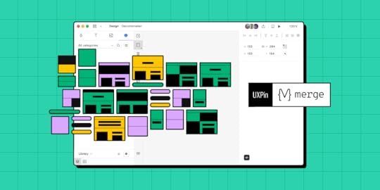
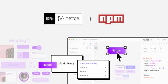
How to Use UXPin Merge Patterns? A Quick Tutorial
A product and its design system are ever-evolving projects. As the product scales, designers must create new UI patterns and components to meet business goals and user needs while solving usability challenges.
Before designers can promote new patterns, they must create them! Furthermore, most organizations follow design system governance procedures, which could take time before the new pattern is available in the library.
UXPin’s Patterns allow design teams to combine existing Merge components with standard UI elements to create new UI patterns and save them to a UXPin library.
We’ll dive deeper into UXPin’s Pattern’s feature and how it can help promote new patterns to scale your product and design system.
Table of contentsWhat is UXPin Merge, and how can it help you?What is the UXPin Patterns?3 Benefits of UXPin Patterns1. Nesting UI Elements to Build Complex Components2. Reusing Properties for the Same Component3. Promoting & Testing new Design System UI ElementsHow to use UXPin Merge Patterns?Step 1Step 2Step 3Step 4Step 5Deleting a PatternCreating Different StatesCreate a fully-integrated design system and deliver a single source of truth to your product development teams with UXPin Merge. Head over to our Merge page for more details and how to request access to this revolutionary code-based design technology.
What is UXPin Merge, and how can it help you?Merge allows you to import a component library‘s elements hosted in a Git repository, Storybook or npm package to UXPin’s design editor, so the entire team uses the same design system. Then, designers can use those elements and build prototypes that are fully consistent with end product.
Traditionally, most design systems feature two UI libraries:
Design teams use a static UI kitEngineers use a coded component libraryAlthough many organizations claim this dual system is a single source of truth, achieving it takes a lot of time and resources.
UXPin Merge is genuinely a single source of truth because there is only one component library. Designers and engineers use the same UI elements and patterns from the same repository.
You can sync React components using Merge for Git or UXPin’s Storybook Integration for other popular front-end technologies like Vue, Ember, Web Components, Angular, and more.
Designers can also import the npm packages of open-source component libraries like MUI, Bootstrap, Ant Design, Lightning, etc., through Merge’s npmIntegration to build fully-functioning prototypes or a minimum viable product (MVP).
What is the UXPin Patterns?Patterns is a Merge-exclusive feature enabling design teams to combine Merge components and standard UXPin UI elements to build more complex UI patterns.
In the context of Brad Frost’s Atomic Design, Patterns allows designers to take atoms and molecules (foundational UI elements and components) to build larger, more complex designs like organisms and templates (cards, forms, navigation, headers, footers, etc.)
Some of the most common use cases for UXPin Patterns include:
Creating advanced components not available in your current librarySave properties for your most commonly used component variantsGrouping and saving Merge elements into bigger UI patternsSharing new UI patterns with design teams to enhance consistencyPromoting new patterns for engineers to add to the component libraryDesigners can combine UI elements from multiple component libraries or UXPin Classic components to create new patterns. This flexibility is beneficial if your design system doesn’t have the parts required for a new UI pattern.
For example, let’s say you want to build a header navigation with dropdown menus, but your current design system doesn’t have them. You can use UXPin’s npm Integration to import a dropdown menu from MUI (or another open-source library) and use it to build the new navigational pattern. Engineers can read MUI’s docs and view the JSX code to understand how to code your new pattern and add it to the design system.
3 Benefits of UXPin PatternsPatterns offer three primary benefits to product development and design system teams. The common thread among these three benefits is that Patterns provides a comparable alternative when your Merge repository doesn’t have what you need.
1. Nesting UI Elements to Build Complex ComponentsEven with a comprehensive design system, designers often have to create new components and patterns as the product evolves. Often, these patterns don’t exist in the design system, so designers must build them from scratch every time.
Designing from scratch can add valuable time to your project, especially if you’re building something like a graph or data table. Instead, you can create these complex patterns once and save them to your UXPin Pattern library. You can also share these with other designers so teams aren’t doing duplicate work or creating inconsistencies.
While many design tools offer this functionality, none allow you to manipulate and combine code components. With Patterns, designers take on a hybrid designer/engineer role capable of building fully functioning, complex UIs without writing a single line of code.
2. Reusing Properties for the Same ComponentEven though Merge allows designers to build prototypes significantly faster than image-based design tools, there’s always room to create greater efficiency.
For example, you might want to save patterns for various Merge form input or button states, like default, error, warning, and success. With Patterns, you can set these up once and save them to your pattern library, ready to drag and drop for the next user interface.
These pre-built patterns are especially useful for design sprints or making quick changes during stakeholder meetings and user testing. Instead of fiddling with properties in UXPin’s Properties Panel, you simply drag the desired pattern onto the canvas, ready to go!
3. Promoting & Testing new Design System UI ElementsNew UI elements don’t magically appear in your design system. The DS team must build and test these patterns before release. With UXPin Patterns, the DS team can combine existing components with UXPin Classic or open-source libraries to test and iterate at higher fidelity and functionality.
Component-driven prototyping with UXPin Merge and Patterns allows designers to test and iterate with less input from engineers, who are free to focus on developing the final component and working through any design system technical backlogs.

With Patterns, design teams don’t have to wait for engineers to develop the new component. They can use the prototype pattern created by the DS team to continue the design and testing process without compromising fidelity and functionality.
UXPin Patterns is a fantastic tool for creating one-off or rarely-used UI components. These patterns aren’t used enough for promotion to the design system, but design teams still need access to them.
Storing these in your UXPin Patterns Library provides the benefits of fully functional Merge components without adding them to the design system’s repository. Engineers can store the component in a separate repository and use it when needed.
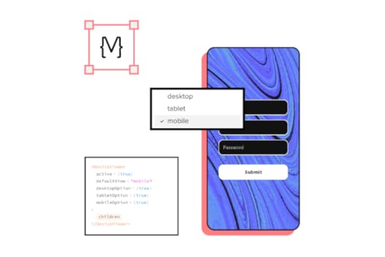
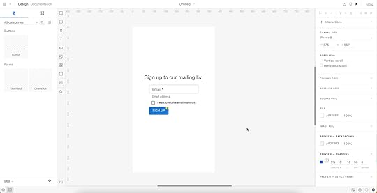
How to use UXPin Merge Patterns?This quick demo shows how easy it is to create a new Merge Pattern in UXPin. We’re using the same components we imported for our MUI npm Tutorial, which you can check out here.
The pattern below features three MUI components imported using Merge’s npm Integration and two UXPin Classic text elements–not going to win any design awards, we know!
But even a simple pattern like this takes some setting up, so it would be nice to eliminate that repetitive task by creating a reusable pattern.
Step 1Add and arrange the components you want for your pattern. Remember, you can combine multiple component libraries and UXPin Classic elements.
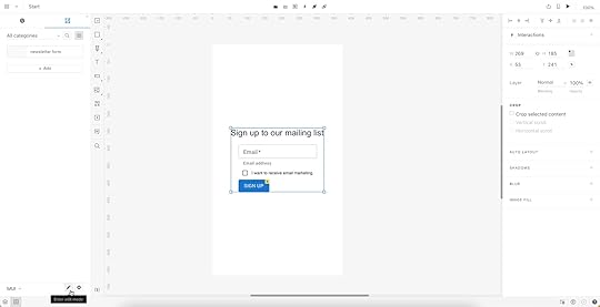
Step 2Set the properties for the Merge components.
We’ve created an email input field with a placeholder and some help text for accessibility. We’ve also made this field required so users know they must complete it.Next, we’ve added an MUI checkbox that users must check to accept marketing from us.Lastly, we’ve chosen an MUI button and set it to primary so it’s obvious where users must click once they complete the email field and checkbox.Here is an example of the email component’s Properties Panel.
 Step 3
Switch to the Patterns tab on the left sidebar above your component library.
 Step 4
Select the group of UI elements or a single component you want to save as a pattern. Click the large white + Add button in the left sidebar, and your new pattern will appear.
 Step 5
Click on the pattern’s name to change it to something more descriptive or to align with your design system’s naming convention. Once you have multiple patterns, you can use UXPin’s search feature to filter what you need.
 Deleting a Pattern
You can also delete any old patterns by clicking the pencil icon (“Enter edit mode”) below.
Select the patterns you want to remove and click Delete.
 Creating Different States
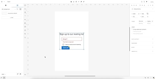
Now that we have a default pattern, we might want to create additional states to optimize our workflow further.
For example, we can set up an error state pattern triggered when the user doesn’t enter an email address.
We could also create a disabled state for the button that’s only active once the user enters a valid email address and checks the marketing terms.
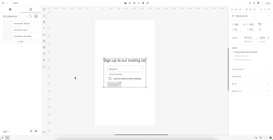
Now we have three newsletter patterns ready to start prototyping. Designers can drag and drop to make quick changes without worrying about setting properties or switching individual components from the pattern.
Ready to streamline your workflows with UXPin Merge and Patterns? Request access to Merge and let’s get going.
Discover MergeThe post How to Use UXPin Merge Patterns? A Quick Tutorial appeared first on Studio by UXPin.
August 17, 2022
UX Business Case – How to Build a Strong Case for Investing in Design
With limited resources and competition from other departments, creating a compelling business case for UI/UX design initiatives is crucial to secure buy-in. You must prove you have the best solution and can execute your initiative successfully.
This article discusses how user experience design professionals can create a convincing UX business case, including an example from the UAE-based home delivery service, Delivery Hero.
Use UXPin to create a fully functioning prototype to support your business case. Stakeholders and usability participants can engage with prototypes like they would the final digital product. Sign up for a free trial to discover how code-based design can revolutionize your UX workflows and usability testing to improve product development.
What is a Business Case?A business case outlines the benefits of a project, initiative, or strategy and why the company or department needs it. A UX business case relates specifically to design-related projects–for example, building a design system, purchasing a design tool, or investing in a big UX research project.

Through a business case, the UX team must:
Demonstrate a need (or problem) for the expense(s)Offer a design solutionThe solution is often more effective when paired with a value proposition. How will this project deliver an ROI for design and the organization?
Why do you need a Business Case for UX?Getting buy-in from stakeholders can be challenging, particularly for UX projects. Many non-designers don’t understand user-centered design principles or design thinking and are reluctant to make design investments.
Your UX business case must show stakeholders how improving a product’s customer experience is good for the bottom line. For example, a design system is a significant investment. Stakeholders often can’t see how a library of reusable components will deliver business value, so designers must demonstrate this value through a business case.
Delivery Hero’s Business Case Value PropositionDelivery Hero is an excellent example of using a value proposition in a business case for a design system. After several attempts at pitching their design system to stakeholders, Delivery Hero’s product design team realized they had to make a more convincing case, including a real-world case study and value proposition.
Delivery Hero’s product design team used a single screen to compare building a user interface with and without a design system. The results were staggering:
Building without a design system – total time: 7.5 hoursBuilding as a reusable component – total time: 3.25 hoursThe experiment demonstrated a 57% time reduction in front-end effort and zero percent front-end debt with a reusable component.
Front-end debt had become a compounding issue for Delivery Hero, so eliminating this problem and reducing delivery time by almost 60% demonstrated a significant return on investment for stakeholders.
Delivery Hero’s stakeholders were impressed with the results and gave the go-ahead for the company’s design system, Marshmallow–read more about Delivery Hero’s story here.
What should you include in a UX Business Case?Now that you understand a business case’s purpose and importance let’s explore the points to include.
Executive SummaryMission StatementMarketProblem StatementProposed Solution & Value PropositionRisksRoadmapRequired ResourcesTeamIt’s important to note that you won’t always use all these points, only those relevant to your business case and project. The goal is to keep your business case thorough but concise. If stakeholders want to see the research, you can present that separately.
 Executive Summary
An executive summary summarizes your business case and its sections. Essential elements to include in a business case executive summary are:
The problemYour solutionMission StatementThe mission statement summarizes the project’s purpose and goal. It’s usually a few sentences and can appear on the same slide as your executive summary. The mission statement guides the design process while uniting team members and stakeholders on a common idea and purpose.
Check out ProjectManager’s article, “How to Write a Mission Statement.”
The Market (or Users)If your UX business case is for an internal initiative, you can replace this section with The Users and identify who your project aims to serve. For example, a design system helps product, UX, and engineering teams, but it also positively impacts end-users. You can represent your end-users with personas so stakeholders can empathize with real people.
Problem StatementYour problem statement outlines a key issue, who it impacts, and its effect on the business. Laura van Doore, a Design Manager at Atlassian, says, “there are two parts to executing a good problem statement.”
Problem Selection:
“Select and emphasize problems that will appeal to your audience.”
When pitching to stakeholders, demonstrate how the problem impacts the business, rather than only focusing on the design team.
In Delivery Hero’s case, the product team showed that their current project workflow accumulated front-end debt, inconsistencies, and slow time-to-market, ultimately costing the business time and resources.
If you’re presenting a problem that directly impacts users, you may want to include UX artifacts like a customer journey, user research, and other UX insights to give stakeholders a clear understanding of the issue.
Framing the Problem:
Laura’s next step is to frame the problem around your target audience:
Identify the core problemOutline who the problem impacts and howDescribe the adverse effects on your audience and the businessProposed Solution & Value PropositionDescribe how your solution solves the company’s problem and its value proposition. The value proposition is critical for your business case. It describes the value and return on investment (ROI).
Stakeholders are less concerned about solving workflow issues than business-related impacts. How does your solution deliver an ROI?
Amber Jabeen from Delivery Hero’s design system team says your solution must use business metrics and KPIs to describe the positive benefits for the organization. How will you reduce costs, increase revenue, improve time-to-market, or make the product more competitive?
RisksA thorough business case also considers the risks and how you plan to tackle them. Stakeholders like to see that you’ve looked at your solution from multiple angles and prepared for potential issues.
In her article, Laura van Doore from Atlassian says, “Be realistic, rather than utopian…If you sell the dream too much and present a utopian story of success-only, your case will seem too biased and might get chucked to the bottom of the pile.”
RoadmapAnother critical element to your business case is a timeline or roadmap. How long will it take to deliver the project, and when can the company expect to see the value you outline in your solution. What are your KPIs so stakeholders can monitor progress?
Again, it’s important to use relevant business metrics. For example, when discussing human resources, estimate the total hours per department, i.e., design, product, engineering, etc. This breakdown allows stakeholders to see how the project affects the company’s human resources and other projects.
Required ResourcesWhat resources will your project need?–human, financial, technical, design, etc. If possible, include multiple scenarios to give stakeholders options based on available resources.
Think about what resources you’ll need before, during, and after the project delivery. For example, a design system requires a design audit before you start, people to build and deliver it, and a team to manage and scale it. As a design system matures, it requires more resources.
TeamDescribe your core team behind the business case and the people you’ll need to deliver and scale the project, most notably:
UX DesignersEngineersProduct managersAnalystsStakeholdersBest Practices for a Strong UX Business CaseWe’ve borrowed some of these best practices from our May 2022 webinar, Enterprise Design System – How to Build and Scale, with Amber Jabeen, DesignOps Director at Delivery Hero MENA (talabat).
1. Start with a real pain pointYour business case must include a pain point that adversely impacts the product, its users, and the business. Stakeholders are less likely to take action if you only show how a problem affects team members.
Suppose you can prove that problem creates rework (extra cost), usability issues (losing users and producing costly support tickets), technical debt (extra cost), and slow time-to-market (less competitive and revenue loss). In that case, you have a real pain point to grab stakeholders’ attention.
2. Build a value propositionBuild a value proposition around your pain point. Your solution must solve the issue and deliver a return on investment. Remember to be realistic and show stakeholders you have weighed the risks.
3. Identify your biggest supporters and sponsorFinding leaders and stakeholders outside of UX to support your business case will give it more weight. They will advocate that:
The problem you identify is real.Your solution and value proposition are the best option.Include these advocates in your business case and possibly a quote from your most influential stakeholder.
4. Show before you tellPeople outside of UX have trouble understanding user experience and design thinking principles. Explaining the problem isn’t enough; you must show them what’s wrong and how it impacts the business.

As we saw from Delivery Hero, Amber’s team presented an experiment showing the inefficiencies and problems costing the company time and money. They proved their solution could solve the problem and deliver value to the organization.
If you present a theory to stakeholders, they’ll send you back for proof. Take the time to conduct tests and experiments to prove you can execute your solution, and it works!
5. Talk business metricsYour problem and solution must include numbers to support your business case. Stakeholders want to see metrics and KPIs to assess:
The state and scale of the issueHow your solution improves these numbers6. Don’t go alone – build your networkTalk to cross-functional team members, leaders, managers, and everyone impacted by the problem to get their support and buy-in for your solution before presenting a business case to stakeholders. When you have the organization behind your project, it’s more likely to get approval from decision-makers.
Support Your Business Case With a UXPin PrototypeUXPin’s code-based design tool allows designers to build fully functioning prototypes with code-like fidelity and functionality. Instead of imagining how a feature will work, UX designers can accurately replicate the final product experience–creating a more convincing business case for stakeholders.
Sign up for a free trial to build better quality prototypes for stakeholders and user testing.
Try UXPin for freeThe post UX Business Case – How to Build a Strong Case for Investing in Design appeared first on Studio by UXPin.
August 16, 2022
How to Choose the Right Mobile App Design Software?
App design tools help craft smoother design processes – breathing life into concepts and bringing teams closer together.
However, mobile app development processes are often fraught with frustrations. Especially at the design handoff stage, which can derail the entire project through an endless volley of back-and-forths.
If you’re struggling to foster cross-departmental collaboration, if your user interface designs aren’t coming out like the prototyping tool promised, or the workflow feels inefficient, then looking for a better alternative to your current mobile app design tool is a must.
But what key features should you look for when choosing your app design software? Let’s see what are your options if you want to build a prototype of your next mobile app, gather feedback, and pass your product design to developers for their app building process.
Table of contentsApp Design Software – 7 Must-Have Features1. Creating lifelike, interactive prototypes2. Easy design handoffs3. Designed for fast iterations4. Ability to manage the design system within your app design tool5. Using real data inside the project6. Advanced collaboration features7. Sharing your designs with the teamHigh-fidelity Prototyping with UXPinApp Design Software – 7 Must-Have Features1. Creating lifelike, interactive prototypesAny app design software needs to let you build prototypes for various stages of your design process. You may want the start with creating wireframes – basic, non-functional templates used to communicate a broad outline of your UI design, so this is the feature you may focus on.
But you’ll also need to design fully functional mock-ups that look, work, and feel exactly like the finished mobile application. These are essential when conducting user testing and gathering feedback (which helps to make your app user-friendly.)
A top app design tool like UXPin makes it simple to innovate designs at every stageof a mobile app design.
UXPin will let you build an interactive prototype that’s high-fidelity by default. By setting up custom triggers and conditional interactions, which only activate after a user performs a specific set of actions, you can effectively breathe life into previously non-interactive prototypes – whether it’s a simple click-through or advanced animations.
The app design software makes it really simple to create more than one default state for these elements. You can create a single button with default behavior depending on a user’s action. To help tailor the experience further, variables offer a way to store inputs and take actions based on that data.
Ideally, you want your prototypes to mirror the final product as closely as possible. It’s vital, getting buy-in from stakeholders in the company, gathering user feedback, keeping everyone working on the project on track, and nailing that awesome vision for eCommerce store, Android application, or an Apple plugin.
But one of the biggest obstacles to keeping that vision ‘pure’ is the back-and-forth between design and development. An exasperated ‘I want it to X’ met with an equally exasperated ‘It doesn’t work like that, the transitions are completely off.’
That’s why you need a design tool that doesn’t have a huge learning curve for your developers to get it. Tools like UXPin has a Spec mode in which your engineers can inspect the design, be it for a web app or mobile one, and clearly see what should be built and how it should behave before they start implementing the prototype in their development platform.
2. Easy design handoffsDesign handoffs are a tricky part of the process. Design proudly hands over their brilliant ideas – only to be met with stone-code reality. Bottlenecks are pretty common, irritations become frustrations, projects feel like they grind to a halt as the teams go back and forth with fresh ideas to make it all work as imagined.
Any UX app design tool worth its weight in gold needs to make these handoffs smoother. For the good of the design process and everyone involved in it.
Because UXPin is a high-fidelity app design tool, developers will be immediately familiar with the components laid out by designers (and design projects automatically generate CSS details for devs). Just to keep everyone on the same path, all project-specific specs and documentation are a few clicks away.
The result is a smoother design handoff. Designers know what’s possible and developers know how it all works. Some designers are using Zeplin or Marvel to pass on their designs from Figma or Proto.io to developers, but with UXPin you can design interactive prototypes of MacOs, Android or web apps, and hand them over to developers without switching to another tool.
Other people skip prototyping phase and they go straight to no-code app builders. It’s okay to use them when you’re a beginner who learns their craft or if you are making an MVP, yet complex, comercial apps may find no-code solutions hinder their ability to scale.
3. Designed for fast iterationsA robust design process goes big on iterations. They’re a snapshot of the project at various stages. Instead of sharing an actual work in progress, you can link to previous iterations to help you assess design ideas (and assumptions, thoughts, and hunches).
Ideally, your mobile app design tool needs to be able to quickly create iterations of a project – and just as quickly let you pull up an older iteration if user testing reveals a flaw in the latest design. In UXPin, you’re easily able to grab past iterations.
UXPin Merge extends that level of control to all your different versions. At best, using different design system versions for different prototypes can be frustrating. At worst, they can derail the workflow. UXPin Merge makes it quick and easy to manage and move between each project’s library.
4. Ability to manage the design system within your app design toolA design system is a set of standards and standard components used by everyone on the project to design and develop a product. Think of it as a bible for your mobile app design that says, ‘This is the way.’
Teams that build without a design system in place don’t just risk the odd bit of inconsistency for users looking for intuitive, frictionless experiences. They risk hitting the brakes on the design process, as time and resources are thrown away creating and recreating components.
When you’re looking for the best app design tool, Design System management is a necessity.

In UXPin, the Design System lets you create and maintain a comprehensive library of interactive components to ensure consistency from design to development and beyond.
Your Design System is a way of ensuring consistency across your brand with a clear style guide, component library and what not that set you apart from the competition. If you want a tutorial on building a design system, go to our open web eBook where we outline the steps of creating a design system.
5. Using real data inside the projectPrototypes don’t always need to feel like prototypes. When they’re two steps up from a sketch on a napkin, that’s fine. However, as your project begins to take form, you’ll want to start populating the prototypes with real-life data that replicates what users might actually see, like names, cities, and text, and images.
That doesn’t have to mean hours spent downloading stock images and copy-pasting lorem ipsum. UXPin lets you insert and sync real data into prototypes, giving designs a detailed polish. Teams can see how the finished article should look.
But a bigger benefit comes during user testing. If your app design tool can more accurately recreate the real-life UX design, then user feedback becomes much more valuable and actionable (and they won’t be distracted by immersion-breaking walls of lorem ipsum).
6. Advanced collaboration featuresCollaboration is the backbone of the creative industry. You only have to look at how a vague but genius flash of inspiration in one mind grows into a fully realized app to see that. And with the rise in hybrid working, choosing a mobile app design tool means choosing advanced collaboration features that bring teams together, remotely and in real-time.
UXPin makes live collaboration as easy as possible. With Slack and Jira integration, in a few clicks you can transform communications and project management, and improve visibility over any design edits made by team members.
Whether you’re working in real-time on a design, sharing project status with the team via email or Slack, or waiting for stakeholder approval, UXPin’s collaboration tools keep colleagues on the same page.
7. Sharing your designs with the teamSharing isn’t just caring. It plays a strategic and tactical role in successful collaboration. Designers bounce ideas around with each other. When the thoughts start flowing, it can be hard to keep track of all the brilliant concepts. It means the right mobile app design tool needs to be equipped with friction-free sharing options to effortlessly communicate ideas that might make the design an even bigger success.
Let’s start with the basics. UXPin supports the popular PDF, PNG, and HTML exports – so as long as your colleague can turn on a computer, they can probably view your designs.
The UXPin Mirror app, meanwhile, lets authorized users live-preview prototypes on mobile devices. It’s a great way to see how your app looks and feels, with edits updated in real-time to make before-and-after comparisons a breeze.
These app design tools make it easier to collect feedback from the rest of your team to refine a product into its best possible iteration.
High-fidelity Prototyping with UXPinNot all app design tools are equal, though. And not every tool packs features that seamlessly drive you from initial idea to final iteration. It’s critical to assess where your current processes are lacking and how a tool like UXPin can improve them. This can be done through real-time collaboration and smooth design handoff that let design and development teams work seamlessly.
Try UXPin for freeThe post How to Choose the Right Mobile App Design Software? appeared first on Studio by UXPin.
August 15, 2022
8 App Design Trends for 2022 & Beyond
If you’re just about to launch an app (or update your existing one), then it’s essential to be aware of the latest app design trends. Here is a list of the top eight evolvements that you should be aware of in the coming years.
8 Mobile and Desktop App Design Trends Worth Knowing About1. No password loginSimplicity has always been critical to app design. Great designers build innovations that draw the eye. The details easily parsed by the user – without them even needing to think about it – create a seamless, free-flowing user experience.
And nothing is simpler than ‘nothing’.
That’s why no password logins are one of the latest user experience app design trends to consider. No forgetting passwords. No resetting passwords. No trial and error as users guess their way through or rely on password managers.
Facial recognition is one option, if you want passwordless solutions in your app. Apple’s FaceID and Windows Hello for Android have familiarized users with simply looking at the camera to unlock the system, so you’re building on existing foundations.
Fingerprint sensors are already in place on most modern phones. In the smartphones’ sphere, most banking apps already feature this because a fingerprint is a lot less guessable than a password you can write down.
Voice recognition, popularized by Alexa and Google Home, offers another login method. Still, it’s worth considering whether, in a world where most phones are switched to silent or vibrate, your users will be comfortable using this outside the house.
So long as you offer the traditional alternative (it’s also a good backup when you’re not looking your best), ease the user journey with no password logins.
2. Designing for inclusivityEveryone’s using mobile devices these days. Phones and tablets aren’t just for youngsters, oldsters, and the somewhere-in-between stars.
Kids today learn how to crack find videos on YouTube before they learn the alphabet. Elderly users have grown up during the technological revolution of the last thirty years. Folks with physical and mental disabilities rely on phones and tablets to keep them connected.
That informs one of 2022’s biggest trends in app development: inclusivity.
Your mobile app design needs to consider everyone who’s using your app. Accessibility is key to creating experiences that are appealing to everyone and usable by anyone. After all, it makes no sense to cut off potential audiences when you can be inclusive of all.
There are tons of ways to create an inclusive experience and earn points for UX design trends.
You might want to make tappable buttons big and bold – helping those with visual impairments or younger children. Or bump up the font size, adjust typography and add alt text to imagery, for the benefit of those using screen readers. Popping subtitles on videos is one of the most common ways to increase accessibility for those that need it (and those that just like to watch videos without the sound up). Adding a colorblind mode for those that need it. Really simple solutions that open up your app to a broader user base.
Want to make sure you’re creating accessible, inclusive designs? Use a tool like UXPin, which offers a whole range of accessibility features like a color blind simulator and a contrast checking feature, so you can be confident you’re building app experiences that work for everybody.
3. The use of augmented realityEveryone’s talking about the metaverse. Augmented reality is a step towards that future – where the digital and the real are indistinguishable.
AR is one of several app design trends that takes advantage of device features to create a more interactive experience, inserting itself into a user’s life in fresh, new ways (so, users aren’t just mindlessly scrolling as they stare at the screen).
Let’s say you’ve developed an app to increase geography knowledge among students. The easiest angle would be a series of Wiki-style pages, maybe a quiz or three. But imagine if users could scan a code and view a virtual globe right on their mobile’s screen. And as they dive in for a closer look at the world, the app displayed location-based information, supplemented by artificial intelligence.
That’s a lot more powerful than boring walls of text and a library of videos and images.
That’s essential to the user and your goals.
Smaller design teams may find AR a bit tricky to implement. It’s a pretty technical undertaking, after all. But if you have the power already, you’re ready for the challenge, or you’re ok with outsourcing, augmented reality implementation will put you in a strong position in the years ahead.
4. Incorporating gaming in app designGaming is big business. Globally, the industry is worth more than $138bn – putting it well above the value of even the biggest Hollywood blockbuster machine. Everyone’s got a phone in their pocket, a console under their TV. Gaming, in other words, is accessible in unimaginable ways.
But there’s another good reason gaming is one of the major trends in app design in 2022: interactivity.
Just like augmented reality, whether it’s the principal reason to download your app or an optional extra that keeps users coming back, gaming creates an entertaining space for users. It’s not just screen-based dialogue.
Duolingo is a great example of adding a gaming aspect to an app. Rather than mimicking fusty old textbooks and hard-to-follow listening and translating tests, it makes learning a new language fun. It adds novel ways to challenge users. As a user progresses, they unlock new levels, new challenges to prove themselves. Just like in gaming.
5. Multidirectional navigationUp and down is so last year, right?
Ok, not really. It’s an integral part of the mobile experience. But multidirectional navigation is a mobile app design that means you don’t have to limit yourself to traditional scrolling.
By introducing horizontal as well as vertical sliders, users can scroll and swipe their way around your app in a way that’s intuitive and interactive. It’s fulfilling in a way that simple, overly familiar vertical navigation in web design isn’t.
Multidirectional navigation is a core function in multimedia apps – swipe to see the next radio station, music artist, or video. And social media dating apps are famous for it. ‘Swipe right’ and ‘swipe left’ have already entered popular parlance. No wonder it’s become one of the latest UX design trends to watch out for.
6. Putting illustrations at the forefrontNothing says ‘phony’ faster than a stock image. Our eyes glaze over. Our trust-o-meter starts to ping.
So, expect to see illustrations take center-stage over the coming months. Drawings help build and humanize your brand.
Visuals are important in mobile app design – your testing has probably already shown that users respond better to human faces than inanimate objects, for instance. Illustrations act to signal to users what you’re about, what they need to do, displaying information in a way that, and, in many cases, it’s unique to you and enticing to your target audience.
They also help make otherwise unengaging screens, data visualization, and graphs look more approachable.
Let’s go back to the geography app we’ve mentioned above. A wall of text about the capital city of Canada isn’t going to entice anyone half as much as a series of screens broken up into bite-sized paragraphs and complemented with ‘home-grown’ illustrations.
By putting illustrations to the forefront of your app design, you can effortlessly (and instantly) create a warm, comfortable environment for the user.
All in all, don’t underestimate the power of graphic design, as illustrations are one of the leading UI design trends.
7. Dark mode as one of the latest app design trendsDark mode has been an unbeatable trends in the recent years. An evergreen in the world of app design trends. It’s been around for ages, and it’s just as relevant now as it’s always been. A simple toggle switch and a ‘negative effect’ that makes navigation easier on the eye, especially at night.
Yet, despite its intense popularity among users, there are some brands that still haven’t incorporated dark themes into their desktop and mobile applications. So, for many businesses, it’s a chance to attract users’ attention. To offer something that’s intensely popular among users before anyone else does.
Better still, it’s a chance to. After all, the user experience is critical to successful mobile app design. Dark mode eases eye strain (and can also look really cool), meaning users are comfortable using your app any time of day without getting blasted by rays of white light.
If you want to get super-technical, you could also offer a dark mode schedule. This would let the mode kick in during certain hours of the day (or, more appropriately, night).
8. Transparent elementsYou may have already heard of transparent elements when it comes to the latest app design trends. It’s sometimes known as glassmorphism. And it’s a way to create a lightweight aesthetic by letting on-screen elements ‘float’ on the screen.
The main design characteristics of glassmorphism are:
Layering, placing one element over another rather than directing users to a new screenTransparency – particularly the ‘frosted glass’ effect that overlays an element in the foreground while blurring out the backgroundStand-out colors to help users differentiate actionable elementsBorders around the transparent element, again to help users understand the limits of the transparent element.To create a great glassmorphism user interface, you need to consider the background as much as the foreground. For example, a really bright, vivid background without too much detail highlights the tonally different transparent foreground, making it simple, visible, and super-clear to direct users to their next action in the app.
Which Trend Are You Going to Follow?User Experience and User Interface Design are all about the user. They always were. Always will be.
Little wonder, then, that the biggest trends in app design continue to be focused around how to create simple experiences for users that ‘just work’, exactly as they should, and exactly how they want.
Successful mobile app designs can attract and retain users. You don’t want to expend resources on capturing an audience, only to have them uninstall it because they can’t find their way around the app, or because the experience itself is flawed.
Because, when competition in the mobile app space is so high, companies can’t afford not to follow the trends. The best app experiences are those that users don’t even need to think about. That meet their needs before they even know they need them. And create a comfortable on-screen environment that keeps them coming back for more.
It’s time to put this knowledge into practice. Design user-friendly, highly realistic prototypes in our design tool, UXPin. Learn more about it.
Try UXPin for freeThe post 8 App Design Trends for 2022 & Beyond appeared first on Studio by UXPin.
August 10, 2022
Introducing Merge npm Integration – A New Way of Importing Components
We added a designer-friendly way of bringing UI code components into UXPin’s editor. It’s our new npm integration that makes Merge accessible to teams who lack active engineer’s support.
Revolutionize Your Design Process with UXPin MergeUXPin with Merge technology allows you to create a new level of fidelity and interactivity in prototypes, smoothen design handoff, and unify designers and devs’ work with a single source of truth. It truly streamlines product development process.
Move Away from Static, Change to Fully-interactive DesignGone are the days of static prototypes. Companies, especially the ones that reached a higher design maturity level, look for more efficient ways of prototyping. Linking lifeless artboards, translating design to code with imperfect tools, and documenting nuanced interactions time and time again adds more work and stalls growth.
This is where Merge comes in. With this technology, you can create prototypes with the elements that have true functionality built into them. It scales design like it did for Erica’s team at PayPal.
Streamline Collaboration Between Design and DevelopmentWith Merge, the design and development teams work with the same interactive components throughout the entire production process. Designers use the UI components, whereas developers copy the ready code from the very same design.
The translation of design into code is already there. Getting the most of a single source of truth unites design and engineering and simplifies the design handoff stage. In short: designers are happy, same as developers, and they don’t waste time on back-and-forths.
Use Accurate UI Components that Guarantee Design ConsistencyCoded UI components used in the design process make the prototypes consistent from start to finish. The product is being built according to the designer’s intention. The best part – designers don’t even need to deal with code.
The outcome is that there is no drift between design and the end product’s look and feel which is extremely time and energy consuming without Merge technology.
New way of importing UI components to UXPin MergeBefore you can design with true components, you need to import a component library. Up until this point, there were two ways of bringing coded components to UXPin Merge.
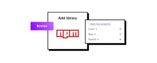 Git integration
– developers use Git to host source code and its history; it requires technical help to import code components into UXPin.
Storybook integration
– Storybook stores public and private component libraries that you can bring to UXPin.
Git integration
– developers use Git to host source code and its history; it requires technical help to import code components into UXPin.
Storybook integration
– Storybook stores public and private component libraries that you can bring to UXPin.We now added the third way of importing UI components – npm integration – that gives designers a lot of autonomy.
Merge npm integration – What Do You Get?Many design teams might struggle with the Merge Git integration if they lack developer’s active support. To make it easy for them to benefit from Merge, we’re releasing a new, designer-friendly way of importing a component library to UXPin.
How to use npm integration?Time to see how you can use npm integration. Let’s start with a written description of how to do it.
Import npm Components to UXPinAn npm is an online registry of packages with ready-made development elements that you can download to use in your project. Some of the most popular open-source design systems are being distributed in this way.
You can use Adele (UXPin’s design system repository) to find which design system is in an npm package. Just scroll to the final column to see the way of distribution.
Alternatively, you can upload your own React-based component library to npm and use it in UXPin.
Here’s how to do the steps of bringing the npm design system into UXPin.
1. Add a New Library to UXPin MergeOnce you know which React-based design system to use, it’s time to sync it with UXPin Merge. Go to the Merge Tab in your UXPin dashboard and add a library via npm package. You need to provide an npm package name and the version you want to use. If your documentation requires it, add styles to the “assets location” field.
2. Configure UI ComponentsOpen Merge Component Manager and specify components you want to import. You can categorize the components the way you want to. After publishing components, manage their properties and define which you want to import. Go to the library documentation to find the names and types of properties.
3. Start Creating Fully Interactive PrototypesTime to create your first design. Go to the design editor and drop components on the canvas. See how easy it is to change the properties of the components you use! To check the components’ interactivity, go to “Preview” mode.
Finished your prototype? Now, you can just pass the project link to your fellow developer so that they can copy the code from your design and check the specs.
Follow our instructions and import interactive components1. Watch a step-by-step video that tells you how to use the integrationWe prepared a video walk-through of the integration. Watch it to learn how you can import an npm design system to UXPin.
2. Import npm components from MUI to UXPin
Would you like to bring MUI to UXPin? Our step-by-step article will guide you through the process.
How to import MUI components to UXPin?
3. Import npm components from Ant Design to UXPin
Ant Design is one of the most popular libraries. When you log in to UXPin, you will see some of the Ant Design components that we’ve imported through npm. They are ready for you to use. Check how we imported them to UXPin in this article.
How to import Ant Design components to UXPin?
Use npm integration + PatternsOnce you import everything you need and save changes, you can build more complex components out of basic ones or save components with properties to avoid repeating the same steps over and over. In other words, create Patterns.
Read all about it: Patterns documentation.
Try Merge npm integrationhttps://t.co/3VOImSeSS5 👈 Eliminate repetitive work with Patterns! See how you can use it in #UXPinMerge 👏 pic.twitter.com/xPuXQeD0rz
— UXPin (@uxpin) July 1, 2022
With npm integration, you don’t need developers’ help to bring coded UI elements to UXPin. The designers can import and manage the UI components by themselves in UXPin. Just the way they want.
Bring UI components through npm integration. Connect the design and development team with a single source of truth and break organizational silos. Sign up for a 14-day trial to test the integration.
Try npm integrationThe post Introducing Merge npm Integration – A New Way of Importing Components appeared first on Studio by UXPin.
August 9, 2022
How to Import Ant Design to UXPin? An npm Integration Guide
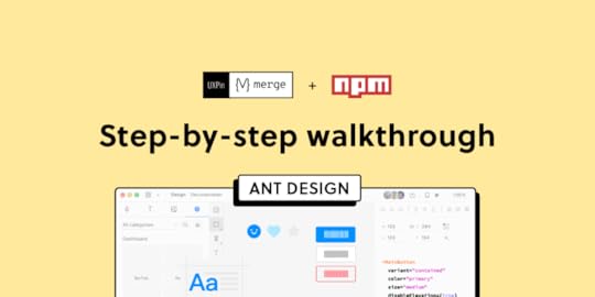
Component-driven prototyping significantly improves user testing while providing stakeholders with realistic product design expectations. UXPin’s npm integration enables design teams to use open-source component libraries to design fully functioning, high-fidelity prototypes.
Get on board the code-based design revolution with UXPin’s Merge technology and npm Integration. Discover more about component-driven prototyping that maximizes the use of design systems, improves design handoffs, and scales design significantly.
Bring UI components via Git repo, Storybook, or through our newest npm integration. Learn more about the last option here: Merge npm integration.
Join us TODAY for our live demo of integrating Ant Design components to UXPin. Save your spot here.
What is UXPin Merge?UXPin Merge is a code-based technology allowing you to sync a component library hosted in a repository, Storybook or as an npm package to UXPin’s design editor. Designers can use these UI components to build prototypes that look and function like the final product.
Any changes engineers (or the design system team) make to functional components in the repository automatically sync to UXPin, notifying design teams of the update. Merge includes version control, allowing team members to switch to an older design system version if needed.
This single source of truth enhances collaboration while reducing the burden on DesignOps and the DS team to manage two design systems–one for design tools and the other for code.
What is UXPin’s npm Integration?UXPin Merge required engineering expertise to set everything up until now. Not every team has valuable engineering resources for the setup, so we came up with a way of integrating npm components to UXPin.
Merge’s npm Integration gives designers complete control over installing and managing open-source component libraries available as npm packages. Designers can import and customize components to meet their prototyping needs using an intuitive interface. It requires zero coding skills to set everything up.
If you want to learn about npm for designer, read our introductory guide: What is npm package?
The Benefits of Working With Ant DesignAnt Design is the product of the Ant Group–a Chinese-based conglomerate of several tech/finance organizations, including Alipay, Huabei, and Yu’ebao, to name a few.
Organizations have used Ant Design to build a multitude of applications, including B2B, B2C, and enterprise products. The comprehensive design system includes React, Angular, and Vue component libraries, with a complementary icon set. You also get Ant Design Mobile for building native applications.
Ant Design npm Integration With UXPin MergeAnt Design’s React component library is available as an npm package (antd). Designers can import Ant React components using UXPin’s npm Integration and customize properties in the Merge Component Manager.

If design teams want to use Ant Design with other design tools, they must use one of Ant Design’s static vector-based UI kits, but with UXPin’s npm Integration, designers have access to the same components engineers use.
Component-driven prototyping with Ant Design creates a single source of truth between designers and engineers while ensuring the highest consistency between UX and product teams.
With UXPin’s npm Integration, you can choose which Ant Design React props you want to import–color, size, icons, states, etc.
Assigning Properties in Merge Component ManagerOur npm Integration includes Merge Component Manager–your central control for importing and managing each Ant Design’s component properties.
UXPin’s npm Integration works with React components, so you can follow Ant Design’s React documentation to reference which props you want to import. Once you set these up in Merge Component Manager, the component’s properties appear in UXPin’s Properties Panel.
For example, there are six types or variants of an Ant Design button:
PrimaryGhostDashedLinkTextDefaultThese button types (and all other properties) appear as a dropdown in the Properties Panel for designers to choose. Props can appear as text fields, checkboxes, code editors, etc., depending on the component.
Connecting UXPin to the Ant Design npm PackageStep 1Navigate to your UXPin dashboard and click “New Project.”
 Step 2
Name your project and click “Create New Project.”
 Step 3
Click “New prototype” to open the project in UXPin’s design canvas.
 Step 4
Click the dropdown at the bottom of the Design System Libraries tab in the lefthand sidebar, and click “New library.”
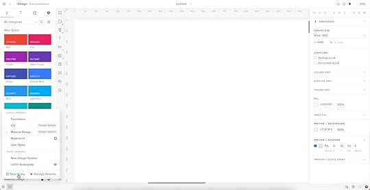
Your sidebar and available libraries may differ from the example.
Step 5Select “Import React Components” and click “Next.”
 Step 6
Name your library. This name is purely for your reference and won’t impact the import.
You also need to grab the npm package repository name, which you find under Install on Ant Design’s npm page. Copy and paste the Install contents from npm into the “Library package name” field (delete everything preceding antd).
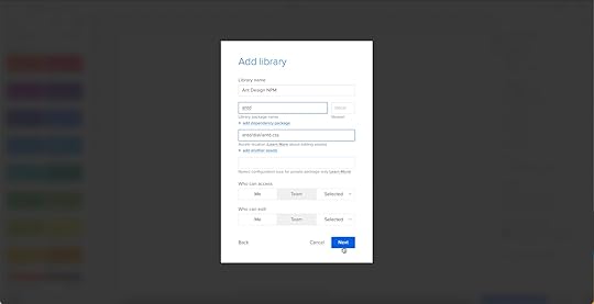
To import component styling properties, Merge requires the path to Ant Design’s CSS (antd/dist/antd.css). You can find this under Usage in Ant Design’s React installation instructions.
 Importing Ant Design Components
UXPin will automatically redirect you to the canvas once you complete the npm integration. Now it’s time to select the Ant Design components you want to import.
Step 1From the lefthand sidebar, click “Open Merge Component Manager.”
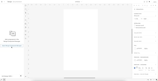
Merge Component Manager will open in a new tab.
Step 2Click “Add new component.”
 Step 3
Enter the name of the component you want to import.
You’ll find the correct naming convention in the Ant Design docs under Component API. Ant Design’s components use CamelCase with no spaces. Always capitalize the first letter. For example, Date Picker would be DatePicker.
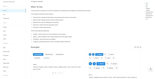
For this tutorial, we will import an Ant Design Button as our first component and add it to a new category called General. We recommend using the same categories as Ant Design’s docs, so designers and engineers have the same reference point.
You can add multiple components to a single import, saving you time repeating steps two and three.
Click “Import Components.”
 Step 4
Click “Publish Changes” in the top right to initialize the import process.
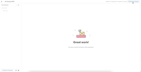
The first time you do this for a new component, it might take a minute or two.
 Step 5
Once the import is complete, click “Refresh Library” to update the changes in your project library.
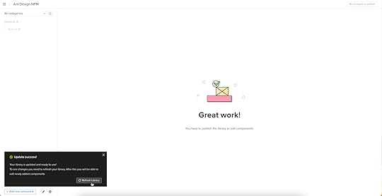
If you follow these instructions step-by-step, you’ll notice you have a category (General) and your first component (Button) in the left sidebar.
Step 6Click on the Button to begin adding properties. You can find these React props in Ant Design’s documentation under API in Components > General > Button.
 Adding Component Properties with Merge Component Manager
Let’s add a few Ant Design button properties using the React props from the documentation.
 Button Type: Step 1
The React button type prop imports the six Ant Design button styles.
Property name: enter “type” (always use lowercase for props)Display name: This is for your reference, but something descriptive that both designers and engineers use–we’ve gone with “Type” to keep things uniformDescription: Add a short description or instructions for designers–we’ve used “Type of button”Property type: “enum”–allows you to create a dropdown display the six stylesProperty control: “select”Options: Add the options from Ant Design’s API docs–primary, ghost, dashed, link, text, defaultDefault value: Your preference–we’ve gone with “default” as per Ant Design’s docsAs you complete the component’s properties, you’ll notice a component preview will appear and change according to your preferences.
Button Type: Step 2Once you have completed all the fields, click “Add property.”
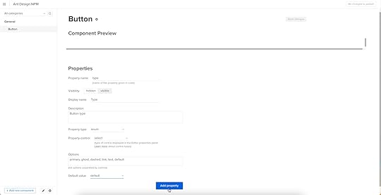
Then “Save changes.”
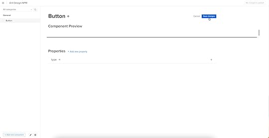
Lastly, “Publish library changes.”
 Component-Driven Prototyping in UXPin
Once you import the Ant Design components and properties you need, prototyping in UXPin is as simple as drag-and-drop to build layouts. We created this simple email sign-up form using three Ant Design components in less than a minute.
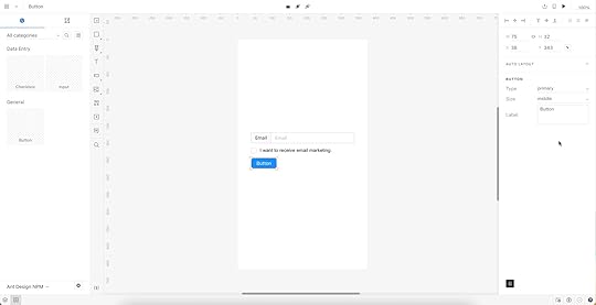
When you select an Ant Design component, the properties you created in Merge Component Manager appear in the righthand Properties Panel.
Try building an Ant Design prototype with UXPin’s npm integration. Discover how component-driven prototyping can revolutionize your product development workflows to deliver better user experiences to your customers.
Try npm integrationThe post How to Import Ant Design to UXPin? An npm Integration Guide appeared first on Studio by UXPin.
How to Import Ant Design to UXPin? An NPM Integration Guide
Component-driven prototyping significantly improves user testing while providing stakeholders with realistic product design expectations. UXPin’s NPM integration enables design teams to use open-source component libraries to design fully functioning, high-fidelity prototypes.
Get on board the code-based design revolution with UXPin’s Merge technology and NPM Integration. Discover more about component-driven prototyping that maximizes the use of design systems, improves design handoffs, and scales design significantly.
Bring UI components via Git repo, Storybook, or through our newest NPM integration. Learn more about the last option here: Merge NPM integration.
What is UXPin Merge?UXPin Merge is a code-based technology allowing you to sync a component library hosted in a repository, Storybook or as an npm package to UXPin’s design editor. Designers can use these UI components to build prototypes that look and function like the final product.
Any changes engineers (or the design system team) make to functional components in the repository automatically sync to UXPin, notifying design teams of the update. Merge includes version control, allowing team members to switch to an older design system version if needed.
This single source of truth enhances collaboration while reducing the burden on DesignOps and the DS team to manage two design systems–one for design tools and the other for code.
What is UXPin’s NPM Integration?UXPin Merge required engineering expertise to set everything up until now. Not every team has valuable engineering resources for the setup, so we came up with a way of integrating NPM components to UXPin.
Merge’s NPM Integration gives designers complete control over installing and managing open-source component libraries available as npm packages. Designers can import and customize components to meet their prototyping needs using an intuitive interface. It requires zero coding skills to set everything up.
If you want to learn about npm for designer, read our introductory guide: What is npm package?
The Benefits of Working With Ant DesignAnt Design is the product of the Ant Group–a Chinese-based conglomerate of several tech/finance organizations, including Alipay, Huabei, and Yu’ebao, to name a few.
Organizations have used Ant Design to build a multitude of applications, including B2B, B2C, and enterprise products. The comprehensive design system includes React, Angular, and Vue component libraries, with a complementary icon set. You also get Ant Design Mobile for building native applications.
Ant Design NPM Integration With UXPin MergeAnt Design’s React component library is available as an NPM package (antd). Designers can import Ant React components using UXPin’s NPM Integration and customize properties in the Merge Component Manager.
If design teams want to use Ant Design with other design tools, they must use one of Ant Design’s static vector-based UI kits, but with UXPin’s NPM Integration, designers have access to the same components engineers use.
Component-driven prototyping with Ant Design creates a single source of truth between designers and engineers while ensuring the highest consistency between UX and product teams.
With UXPin’s NPM Integration, you can choose which Ant Design React props you want to import–color, size, icons, states, etc.
Assigning Properties in Merge Component ManagerOur NPM Integration includes Merge Component Manager–your central control for importing and managing each Ant Design’s component properties.
UXPin’s NPM Integration works with React components, so you can follow Ant Design’s React documentation to reference which props you want to import. Once you set these up in Merge Component Manager, the component’s properties appear in UXPin’s Properties Panel.
For example, there are six types or variants of an Ant Design button:
PrimaryGhostDashedLinkTextDefaultThese button types (and all other properties) appear as a dropdown in the Properties Panel for designers to choose. Props can appear as text fields, checkboxes, code editors, etc., depending on the component.
Connecting UXPin to the Ant Design NPM PackageStep 1Navigate to your UXPin dashboard and click “New Project.”
Step 2Name your project and click “Create New Project.”
Step 3Click “New prototype” to open the project in UXPin’s design canvas.
Step 4Click the dropdown at the bottom of the Design System Libraries tab in the lefthand sidebar, and click “New library.”
Your sidebar and available libraries may differ from the example.
Step 5Select “Import React Components” and click “Next.”
Step 6Name your library. This name is purely for your reference and won’t impact the import.
You also need to grab the NPM package repository name, which you find under Install on Ant Design’s NPM page. Copy and paste the Install contents from NPM into the “Library package name” field (delete everything preceding antd).
To import component styling properties, Merge requires the path to Ant Design’s CSS (antd/dist/antd.css). You can find this under Usage in Ant Design’s React installation instructions.
Importing Ant Design ComponentsUXPin will automatically redirect you to the canvas once you complete the NPM integration. Now it’s time to select the Ant Design components you want to import.
Step 1From the lefthand sidebar, click “Open Merge Component Manager.”
Merge Component Manager will open in a new tab.
Step 2Click “Add new component.”
Step 3Enter the name of the component you want to import.
You’ll find the correct naming convention in the Ant Design docs under Component API. Ant Design’s components use CamelCase with no spaces. Always capitalize the first letter. For example, Date Picker would be DatePicker.
For this tutorial, we will import an Ant Design Button as our first component and add it to a new category called General. We recommend using the same categories as Ant Design’s docs, so designers and engineers have the same reference point.
You can add multiple components to a single import, saving you time repeating steps two and three.
Click “Import Components.”
Step 4Click “Publish Changes” in the top right to initialize the import process.
The first time you do this for a new component, it might take a minute or two.
Step 5Once the import is complete, click “Refresh Library” to update the changes in your project library.
If you follow these instructions step-by-step, you’ll notice you have a category (General) and your first component (Button) in the left sidebar.
Step 6Click on the Button to begin adding properties. You can find these React props in Ant Design’s documentation under API in Components > General > Button.
Adding Component Properties with Merge Component ManagerLet’s add a few Ant Design button properties using the React props from the documentation.
Button Type: Step 1The React button type prop imports the six Ant Design button styles.
Property name: enter “type” (always use lowercase for props)Display name: This is for your reference, but something descriptive that both designers and engineers use–we’ve gone with “Type” to keep things uniformDescription: Add a short description or instructions for designers–we’ve used “Type of button”Property type: “enum”–allows you to create a dropdown display the six stylesProperty control: “select”Options: Add the options from Ant Design’s API docs–primary, ghost, dashed, link, text, defaultDefault value: Your preference–we’ve gone with “default” as per Ant Design’s docsAs you complete the component’s properties, you’ll notice a component preview will appear and change according to your preferences.
Button Type: Step 2Once you have completed all the fields, click “Add property.”
Then “Save changes.”
Lastly, “Publish library changes.”
Component-Driven Prototyping in UXPinOnce you import the Ant Design components and properties you need, prototyping in UXPin is as simple as drag-and-drop to build layouts. We created this simple email sign-up form using three Ant Design components in less than a minute.
When you select an Ant Design component, the properties you created in Merge Component Manager appear in the righthand Properties Panel.
Try building an Ant Design prototype with UXPin’s NPM integration. Discover how component-driven prototyping can revolutionize your product development workflows to deliver better user experiences to your customers.
Try npm integrationThe post How to Import Ant Design to UXPin? An NPM Integration Guide appeared first on Studio by UXPin.
UXpin's Blog

- UXpin's profile
- 68 followers

