
UXpin's Blog, page 52
September 29, 2022
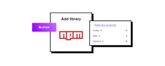
How to Turn Your Design System into an npm Package?

Merge’s npm integration gives design teams more control to import fully functional component libraries from the npm registry. The benefit of designing prototypes with a component library is designers get full functionality and fidelity without writing a single line of code!
If you’re unsure what any of this “npm stuff” means, don’t worry, this article will explain everything you need to know, including how to create an npm package for your design system.
Table of contentsWhat is npm?What is a package?Who can create and publish packages?What is Component-Driven Prototyping?How to Turn Your Design System into a Package for the npm RegistryStep 0. Do you have a component library?Step 1. Create an npm accountStep 2. Check your npm versionStep 3. Create a packageStep 4. Test your packageStep 5. Publish the packageStep 6. Import the package’s components into UXPinUXPin Merge & npm integration ResourcesDeliver projects with minimal design or coding from scratch using UXPin Merge. Visit our Merge page for ways to import your company’s design system and discover the endless possibilities of component-driven prototyping in UXPin.
What is npm?
Node Package Manager (npm) is a software registry for Node.js/JavaScript applications hosting private and open-source packages. npm is “one of the largest developer ecosystems in the world” with over a million packages.
What is a package?If you’re not technically proficient, you’re probably wondering, “what is a package?“
A package contains files and code required to run an application. There are two types of packages:
Dependencies: third-party packages needed for an application to workdevDependencies: packages engineers use during development (tools, automation, testing, etc.)For example, if you want to build an application featuring Google Maps, instead of writing everything from scratch, you install the google-maps package and write a few lines of code to display a map and location.
For this article, we’ll focus on dependencies, more specifically component library packages. Here are some resources if you would like to go deeper into the technical aspects of packages and npm:
What Is npm? A Basic Introduction to Node Package Manager for BeginnersWhat is npm? A Node Package Manager Tutorial for BeginnersWho can create and publish packages?Anyone can create a package and publish it to the npm registry. You will need basic programming skills and an npm account to upload your package.
What is Component-Driven Prototyping?As a designer, you’re probably wondering, “why do I need to know about packages and npm?” One of the things you can store in a package is a design system’s component library.
Engineers can install the design system’s component library in their project’s dependencies and write a couple of lines of code where they want these UI elements to appear. And, with UXPin Merge’s npm integration, design teams can use these components too.
UXPin Merge allows designers to import a design system from a repository for prototyping. Design teams use visual UI elements in UXPin and can move them around the canvas as any other design element created using lines and shapes.
The only difference is Merge components have code behind them, so designers enjoy the same fidelity and functionality as engineers. With designers and engineers using the same component library, design handoffs are seamless with minimal designing or coding from scratch.

Component-driven prototyping in UXPin allows design teams to build accurate replicas of the final product, significantly enhancing usability testing and stakeholder feedback.
There are several ways you can sync a design system to UXPin using Merge, but for this article, we’ll focus on how to publish your component library to the npm registry and import it into UXPin using the npm integration.
How to Turn Your Design System into a Package for the npm RegistryWith UXPin’s new npm integration, designers can import their product’s design system into UXPin via the npm registry. If your design system doesn’t have a package, follow these steps to create one.
Step 0. Do you have a component library?Your design system must have a coded component library to use UXPin’s npm integration–or any Merge integration. We’ve created this step-by-step guide to creating a design system if you don’t have one.
You can also host an open-source component library and edit the code to meet your product’s requirements.
Step 1. Create an npm accountIf you want to keep your design system private (only visible to people you authorize), you’ll need a paid npm account. Alternatively, you can upload a public package that anyone can install and use for their projects.
Step 2. Check your npm versionPrivate packages must use npm version 2.7.0 or greater. You can check which version your system is running by executing the following command in your terminal:
npm -v or npm -version
You can upgrade to the latest npm version by executing the following command:
npm install npm@latest -g
Step 3. Create a packagenpm’s documentation provides an 8-step process for creating and publishing a private package. It’s important to note that you must create an npm user account and create a paid npm organization to share private packages with your team.
Step 4. Test your packageYou must test your package to ensure it’s bug-free by executing the following command:
npm install my-package
(replace my-package with the name of your package)
Step 5. Publish the packageAgain, we recommend following npm’s documentation for publishing private packages. Once you have completed these steps, your package should be visible on the npm registry by visiting its assigned URL (usually ending with your package name):
https://npmjs.com/package/*package-name(replacing *package-name with the name of your package)
Step 6. Import the package’s components into UXPinOnce you have completed the steps above, you can import your component library into UXPin using the npm integration. The process will be similar to importing the MUI open-source library described in this step-by-step tutorial.
Using the Merge Component Manager (MCM), you can import each component and its associated properties (defined as React props in the design system package).
Design teams can scale the design system using UXPin Patterns, allowing you to combine multiple Merge and non-Merge UI elements to create new components and templates. Engineers can convert these patterns into code and add them to the package repository, making them available for designers to import via MCM.
UXPin Merge & npm integration ResourcesHere are some more resources to get you started with component-driven prototyping in UXPin.
How to Use UXPin Merge Patterns? A Quick TutorialHow to Import Ant Design to UXPin?How to Import Bootstrap to UXPin?How to Import MUI to UXPin?Still wondering if Merge and the npm integration are right for your design projects? Check what you need to know about it.
Try npm integrationThe post How to Turn Your Design System into an npm Package? appeared first on Studio by UXPin.


September 28, 2022
Dashboards vs. Data Reports – Which is Better For Your User?

Many designers ask when trying to come up with the best way of presenting data: Are we designing a dashboard or report user interface? As with everything in product development and UX design, it depends on the user’s needs!
Understanding the difference between dashboards vs reports is crucial for presenting the right data visualization to the right people to make data-driven decisions. Some people value granularity, while others want a snapshot of key performance indicators (KPIs).
This article defines dashboards and reports and why UI designers would prioritize one over the other. We also share some examples to demonstrate how these UIs visualize data differently.
Design fully functioning, immersive dashboard and report user interfaces with live data using UXPin Merge. Sync ready-made data visualization components to test interfaces with stakeholders and end users. Visit our Merge page to find out more and how to request access.
What are Dashboards?Dashboards are user interfaces that visualize multiple data sources (or reports) through numbers, graphs, and charts–typically on one screen, but some are scrollable. A dashboard can visualize one data set theme, like users, or summarize multiple data points for a high-level business performance snapshot.
What are the Benefits of Dashboards?The most significant benefit is that dashboards can visualize large amounts of data on a single screen. Users can instantly identify issues or successes to investigate further.
For example, a sales executive notices a 20% revenue increase from the previous month. They can then investigate to uncover the cause of the significant bump in sales:
Which products performed best?Was there a particular promotion responsible?Which sales team generated the most revenue?Real-time dashboards are also crucial for many industries, like manufacturing, logistics, fulfillment, and live sports analysis, to name a few. Users can monitor these real-time dashboards to respond to issues or predict outcomes.
Dashboard ExamplesThis sales dashboard from Barly Vallendito via Dribbble is an excellent example of a specific dataset theme (sales). The dashboard displays multiple data sets for the month, including:
Total salesAverage order valueConversion rateBest performing countriesTop selling productsLine graph plotting daily sales
Datapine’s manufacturing dashboard example displays production stats for an electronics company, aggregating data from many sources. These production dashboards typically feed real-time data so companies can react to issues immediately. The “Quick Stats” section is particularly important because it tells managers about operating capacity vs. order volume.

The manufacturing dashboard also feeds production managers sales and return data, so they can react to what’s happening in other parts of the business. For example, if they suddenly see a spike in Laptop A10 460M sales, they can order additional parts and take precautionary measures to ensure the relevant machines run optimally.
Dashboards also appear in B2C products like this activity tracker example from Outcrowd. The dashboard displays the user’s step count, average heart rate, step comparison chart, calories, and sleep. A second dashboard allows users to see their current progress vs. their daily goals.

These comparison dashboards are common for many digital products, consumer and enterprise, because they allow users to track performance and make adjustments to meet goals and targets.
What are Reports?Reports are comprehensive datasets from a specific time period. They are more granular than dashboards, allowing users to dive deep into the data to pinpoint trends and events.
A report can be a single page or hundreds of pages long, including data tables, graphs, charts, and other visualizations. For example, a sales report might include a chart plotting daily sales for a week with a table displaying every transaction below it. Analysts can use the chart to identify anomalies and the table to drill down into the data for an in-depth analysis.
What are the Benefits of Reports?Reports allow users to get a deeper understanding of data and identify causes. Analysts can run reports on different data points within a set to uncover trends, issues, and opportunities.
For example, a sales report might include data about the transaction (products, prices, total cost, TAX, shipping, etc.) and customers (names, addresses, sales history, etc.). Analysts can filter and sort this sales report to understand:
Sales by product/category/user groupBest-selling products/categoriesAverage order valueBest-performing customer locations (city, state, country)Number of returning customersPopular payment methodsUX teams can use this data to understand customers better, update UX artifacts (user personas, user journey maps, etc.), and ultimately create a better user experience that aligns with the company’s business goals.
Report ExamplesThis report UI from Sharon Kalarikkal on Behance is a fantastic example of marketing efforts relating to revenue. Users can add or remove metrics at the top to generate custom reports.

A small visualization summarizes the data table below. The user can change the date range, filter, and sort the table for data analysis. There are also options to share, save, and export the report.
This report UI from Inflectra displays a software development project’s functional and system requirements. The report shows high-level business intelligence and allows users to drill into individual tasks via a dropdown. They can also filter, sort, and manipulate data using multiple tools.

These reports are common in project management software, allowing users to monitor projects and product roadmaps.
Ismail Hossain’s dairy inventory report is an excellent example of a report that, at first glance, looks like a dashboard. This type of report confuses many people, leading to the use of dashboard and report interchangeably.

Ismail’s UI design is classified as a report because it answers how and why–users have access to the supporting inventory data. If it were a dashboard, you wouldn’t have all the supporting data behind each metric.
Ismail’s mockup is a concept, so not all the data matches up, but it gives you a good idea of how people confuse dashboards and reports. If there were more products, the inventory would be scrollable so users could visualize all the data.
Dashboard vs. ReportDesigners must understand users’ data needs to determine whether the dataset requires a dashboard or report. In most cases, users will probably need both, but understanding their needs will help prioritize the UI and menu options accordingly.
A simple way to start is to think of the key differences between dashboards vs reports is:
Dashboards answer what– what is this month’s sales and revenue?Reports answer how and why– how did we achieve those figures, and why didn’t we meet our target?Dashboards are easy to digest, while reports are more granular, requiring users to spend more time analyzing the data. There is no “better option.” Choosing a dashboard vs. a report boils down to your users and how they want to visualize data.
When to use a Dashboard?Dashboard designs are best for summarizing data, preferably within a single desktop view. C-suite and executive stakeholders prefer dashboards because it gives them a quick snapshot of what’s happening and whether the organization is on track to meet its goals.
Dashboard UIs are also preferable for B2C products, like automotive UIs, activity trackers, banking apps, social media apps, etc. These dashboards provide users with snapshots of their activities which they can analyze further using reports, statements, transactions, and other data lists.
When to use a Report?Reports are best for users who want to research and analyze data. Business analysts, data scientists, marketers, finance teams, and team leaders are all business users who value granularity.
They want to know precisely what’s going on and why so they can present findings to stakeholders, measure performance, recommend strategies, and guide decision-making.
Live Data Visualizations Using UXPin MergePrototyping dashboards and reports in image-based design tools are restrictive, and designers battle to get meaningful, accurate results.
Without functioning graphs, charts, data tables, and other visualizations, usability participants and stakeholders can’t interact with the prototypes as they would in the final product. Designers must rely on UX engineers or front-end devs to build code prototypes–a time-consuming and resource-hungry process!
With UXPin Merge, designers can import fully functioning data components and templates to create prototypes that look and feel like the final product. Design teams can add real data to these data components or use an API via IFTTT for live-data prototyping.
Prototyping dashboards and reports are one thing. Collaboration between designers and engineers with complex data components is another challenge altogether!

UXPin Merge facilitates smooth collaboration between designers and engineers because they work with the same component library hosted in a repository–a single source of truth bridging the gap between design and development.
Merge streamlines the design handoff process because engineers already have the components. It’s as simple as using the component library to copy the design team’s prototypes. Less friction. Faster time-to-market.
PayPal uses Merge to design, prototype, and test its internal products, which primarily feature dashboards and reports. Product teams can build a one-page UI in under ten minutes–8X faster than experienced designers could previously using popular image-based design tools.
If Merge can achieve these results for a multinational giant like PayPal, imagine what it could do to scale your design operations and processes!
Visit our Merge page for more details and how to request access to this revolutionary UX design technology.
Discover MergeThe post Dashboards vs. Data Reports – Which is Better For Your User? appeared first on Studio by UXPin.
September 27, 2022
UX Honeycomb – 7-Factor Design Framework for Great User Experience

Peter Morville’s User Experience Honeycomb has been around since 2004 and is still a highly relevant design framework for modern product development projects. The framework forces design teams to evaluate a product through seven facets of user experience to identify areas for improvement.
This article provides an overview of the UX Honeycomb and the circumstances where it’s most effective. We highly recommend checking out our design frameworks article for more UX models that solve problems and improve project delivery.
Key Takeaways:UX Honeycomb is one of the most popular UX design frameworks to measure user experience against.It was invented by Peter Morville, a prolific author of books about information architecture.User Experience Honeycomb has 7 factors, namely usefulness, usability, desirability, findability, accessibility, credibility, and value that come together to create an outstanding user experience.Use it as a checklist to follow when redesigning your product, measuring UX debt or as an educational tool.Jump to Section:What is the User Experience Honeycomb? Who is Peter Morville, the author of UX Honeycomb?7 Facets of UX Honeycomb1. Useful2. Usable3. Desirable4. Findable5. Accessible6. Credible7. ValuableHow to use the UX Honeycomb?Revolutionize your workflows with the world’s most advanced UX design and prototyping tool. Sign up for a free trial to discover all of UXPin’s code-based design features.
What is the User Experience Honeycomb?The UX Honeycomb is a design framework developed by Peter Morville in 2004. The framework uses seven facets of UX to guide design teams in delivering a good customer experience. The UX Honeycomb is also a fantastic educational tool for educating junior designers about user-centered design and how to design products customers will love.
Who is Peter Morville, the author of UX Honeycomb?Peter Morville is an information architect and user experience designer from Scottsville, Virginia, USA. His bestselling books include Information Architecture for the World Wide Web, Intertwingled, Search Patterns, and Ambient Findability.
Peter has spoken on information architecture and user experience at conferences and workshops worldwide and consulted for many Fortune500 companies through his company Semantic Studios.
Peter Morville has won several awards, including from the University of Michigan, AIIP, Society for Technical Communication, and the National Cancer Institute, to name a few.
You can follow Peter’s blog Intertwingled where he shares his valuable knowledge and insights.
7 Facets of UX HoneycombPeter’s UX Honeycomb identifies seven facets of user experience designers must fulfill to deliver a product that successfully meets user needs:
UsefulUsableDesirableFindableAccessibleCredibleValuableLet’s explore these seven facets in greater detail.
1. UsefulThe useful component asks, “Is this product or feature valuable to users?” “Is there a want or need?” “Does your product solve a problem for users?”

If a product or feature isn’t useful, it has no purpose, and there’s no reason to build it in the first place. Whether something is useful comes from thorough user research and understanding end-users.
2. UsableUsability is a significant part of user experience design. A product might be useful, but if it frustrates users, then it isn’t usable.
Designers must create intuitive user interfaces and information architecture to minimize any learning curve while making it easy to complete tasks or use features.
Prototyping and testing are crucial in identifying pain points and improving the user experience. Designers must also conduct UX audits to ensure new releases meet a project’s requirements while fulfilling user needs.
3. DesirableAesthetics and desirability make digital products enjoyable to use. Designers must consider layouts, visual design, interaction design, and other UI design elements that engage and excite users.
During usability testing and interviews, designers must carefully consider users’ feelings and emotions to determine a product’s desirability. The goal is to delight users with products and features that solve problems effortlessly.
4. FindableFindable is about making content and features easy to find. Information architecture, search, and navigation are vital for making a product “findable.” Designers must prioritize navigation according to user needs and business goals.
For example, when designing a mobile app, designers must decide which menu items live on the tab bar vs. behind a navigational drawer.
Findable also includes alerts and error messages. Designers must guide users to solve problems as quickly as possible–like helpful, actionable error messages for form fields.
5. AccessibleDesigning accessible products is essential for modern product development. Designers and engineers must ensure everyone can navigate a site effectively and digest its content, regardless of physical or mental ability.

Accessibility extends beyond these physical and mental limitations to situational and environmental constraints. For example, a voice user interface (VUI) helps blind users use an application, but it’s also essential for someone driving a vehicle.
Designers must consider who will use their products and what situational and environmental challenges they might encounter. It’s also imperative to think about people with disabilities and how to design comparable experiences for assistive technologies.
6. CredibleTrust and credibility are essential for acquiring and retaining customers. Users expect a consistent product they can rely on to live up to expectations and doesn’t deceive.
For example, how easy is it for someone to downgrade or cancel a paid service? Making these tasks easy creates trust, increasing the likelihood of someone returning as a paying customer. A difficult experience frustrates people, damaging the product and brand’s credibility.
Designers must also ensure CTAs and instructions do what they say. Using ambiguous language or tricking users into completing a task is a quick strategy for losing customers!
7. ValuableUsers must want or need to use your product. A valuable product solves problems and delivers a return on investment. The return doesn’t have to be monetary; it could be time-saving, help achieve something the user can’t do otherwise, a mindless distraction while waiting in a queue, or even bring joy.
For example, food delivery apps became extremely valuable to people in many countries during lockdowns. These products kept many restaurants open while providing customers with meals.
Understanding users and delivering services that satisfy their wants and needs makes a product valuable.
How to use the UX Honeycomb?The UX Honeycomb is an excellent framework for evaluation. It’s most effective for existing products rather than designing from scratch. Here are some scenarios where design teams might use the UX Honeycomb framework:
Erasing design debt : Some design debt is easy to fix, but other usability issues require a systematic approach to identify the core issue(s). The UX Honeycomb lets designers look at problems from multiple angles to pinpoint the root cause.UX checklist: The UX Honeycomb provides designers with a foundational user experience checklist during UX audits and other design evaluations.Educational tool: Designers can use the UX Honeycomb as a framework for educating junior designers, clients, stakeholders, and cross-functional teams about user experience and how usability issues impact users.Redesigns: Designers can use the UX Honeycomb to identify user experience flaws in an existing product before a redesign.Conduct tests and experiments at higher fidelity and code-like functionality with UXPin. Sign up for a free trial and start building better user experiences for your customers with UXPin.
Try UXPin for freeThe post UX Honeycomb – 7-Factor Design Framework for Great User Experience appeared first on Studio by UXPin.
September 26, 2022
Web Accessibility Checklist – 28 Points You Must Comply With

There are loads of web accessibility guidelines designers and engineers must follow when designing a website or application. It can be overwhelming to digest them all or know when to use the different levels.
This article simplifies the official web content accessibility guidelines with a web accessibility checklist for designers. We also explain the difference between WCAG 1.0 and 2.0 and the different levels (A, AA, and AAA).
With built-in accessibility features, designers never have to leave UXPin to test UIs for contrast and color blindness. Sign up for a free trial to discover the ease of accessible websites and apps with UXPin.
What is the Purpose of an Accessibility Checklist?A web accessibility checklist provides designers and engineers with a list of considerations for designing a website for people with disabilities and assistive technology.
Team members can reference the checklist against designs and code to ensure they meet Web Content Accessibility Guidelines (WCAG).
What is the Difference Between WCAG 2.0 and WCAG 1.0?The Web Content Accessibility Guidelines (WCAG) must update and evolve with technology. Each update adds new guidelines that align with new devices.
Aside from the guidelines, there are also two iterations of the WCAG system. The first iteration, WCAG 1.0, used guidelines and checkpoints with priority 1, 2, or 3.
In 2008, WCAG 2.0 changed from checkpoints to level success criteria. The system we currently work with has:
Four design principlesMultiple guidelines within each principleTestable success criteria levels A, AA, or AAA for each guidelineAccording to official documentation, WCAG 2.0 provides several key improvements:
Applies to more varieties of technologies and devicesDesigned to evolve with future technologiesRequirements are easier to test with automated testing methods & human evaluationInput and collaboration from the international communityImproved support material and documentation to make guidelines easier to follow and implementCheck out the official WCAG 2.0 presentations for more details.
3 Success Criteria Levels of Accessibility ComplianceWCAG 2.0 introduced three success criteria levels (or levels of conformance) to evaluate each guideline based on the product’s intended purpose and target audience.
Level A – BasicLevel AA – AcceptableLevel AAA – OptimalWCAG Level ALevel A ensures websites meet the bare minimum accessibility standards. Level A compliance addresses core issues and elements to make websites more accessible, like responsive design, non-text alternatives (icons), keyboard navigation, and video captions, to name a few.
WCAG Level AALevel AA covers a broader range of UI elements and best practices to ensure everyone can use your website. Most government websites worldwide require WCAG Level AA so that everyone in the population can access public content and services.
The idea is that able-bodied users and those with disabilities can digest content and complete tasks with a comparable user experience, functionality, and efficiency.
Some Level AA requirements include:
color contrast ratio (i.e., 4.5:1)Alt text for images and iconsNavigation for all technologiesAccurate form field labelsProperly structured heading tagsVariable text size functionalityAssistive technology-specific requirements.WCAG Level AAALevel AAA is the highest conformance level, ensuring the maximum number of users can navigate your website and digest its content. As the Web Accessibility Initiative (W3C) notes on its website, “It is not recommended that Level AAA conformance be required as a general policy for entire sites because it is not possible to satisfy all Level AAA Success Criteria for some content.”
Designers should use Level AAA if the website or content caters to a specialized audience. The guidelines for Level AAA impact styling significantly (color contrast 7:1) and require sign language interpretation for audio and video.
Website Accessibility Checklist for DesignersWe’ve selected the most important WACG guidelines for designers. These guidelines apply to visual elements, but these often relate to HTML elements, so designers and engineers must collaborate on accessibility. You can find the complete list of Web Content Accessibility Guidelines 2.0 on the official W3C website.
ContentUse descriptive link labels (Level A) – buttons and links must provide users with context. For example, a button that says “Click Here” is meaningless and might be misleading. See Info & Relationships SC 1.3.1.Lower secondary reading level (Level AAA) – text must be in “plain language” free of jargon, idioms, slang, metaphors, sarcasm, and other complicated terms, ideally at an 8th-grade reading level. See Reading Level SC 3.1.5.Text formatting (Level AAA) – text must not be justified (aligned left or right according to the language) with the ability to resize up to 200% without assistive technologies. Users must also have control over the foreground and background colors–i.e., dark/light mode switching. See Visual Presentation SC 1.4.8.Test designs on specialized screens & devices (Level A) – visually impaired users use high contrast or inverted color modes. It’s important to test how content performs under these conditions. See Use of Color SC 1.4.1.Page Titles, Headings, & Labels
See Headings and Labels SC 2.4.6. The following guidelines have a Level AA conformance.
One H1 tag per page – the H1 header tag must describe what the overall webpage or article is about.Structure headings in a logical sequence – nested headings must follow the conventional order of H1, H2, H3, H4, H5, and H6. For example, you would never have an H2 followed by an H4 and then an H3. You should never skip a header tag either, like going from an H2 to H4 instead of H2, H3, and then H4.Headings and labels must describe a topic or purpose – headings and labels help users, and assistive technologies, like screen readers, find and digest content easier.ImagesSee Non-text Content SC 1.1.1. The following guidelines have a Level A conformance.
Non-text content must have a text alternative – images, icons, etc., must have descriptive alt text or a text alternative. Furthermore, if the image has text, this must be included in the alt text.CAPTCHA – websites must provide alternative confirmation methods when using CAPTCHA, like human verification or text-based authentication, for example.Decorative non-text content – alt text for images and media that are purely decorative must use “null” so that assistive technologies ignore this content.Text alternatives for graphical representations – Graphs, charts, and other graphics must include text alternatives so assistive technologies can read them.ListsSee Info and Relationships 1.3.1. The following guidelines have a Level A conformance.
Choose the appropriate HTML markup – lists must use ol, ul, or dl syntax relating to the content and have a list’s appearance (or structure) so as not to confuse users.ControlsControls include all navigable UI elements like links and buttons.
 Opening a new tab or window warning (Level A) – users must know if a button or link opens a new window or tab using text or an icon. People with cognitive disabilities often get disorientated when a new tab/window opens unannounced. See On Focus SC 3.2.1.Focus states (Level A) – controls must have focus (or hover) states, so users (including those with assistive technologies) know when they’ve selected a link or button to activate. See Focus Visible SC 2.4.7.Make links recognizable (Level A) – designers must use a combination of color and underline styling so users can quickly identify links. See Use of Color SC 1.4.1.Use “skip links” (Level A) – skip links allow assistive technologies and keyboard users to bypass navigational menus and other blocks to jump straight to a web page’s content. See Bypass Blocks SC 2.4.1.FormsForm labels (Level A) – designers must label every input for visual reference and use the HTML ‘label’ tag for assistive technologies. See On Input SC 3.2.2.Error messages (Level A) – place error messages above the corresponding input field with clear instructions for users to fix the problem. See Error Identification SC 3.3.1.Message states (Level A) – don’t rely solely on color for error, warning, and success message states. Adding an icon or text can help visually impaired users identify the type of error state. See Use of Color SC 1.4.1.Multimedia
 Disable autoplay by default (Level A) – autoplay can be problematic for users with cognitive disabilities or seizure disorders. See Audio Control SC 1.4.2.Video captions (Level A) – videos must have captions with a notice confirming their presence. See Captions (Prerecorded) SC 1.2.2.Remove seizure triggers (Level A) – strobes or flashing video can induce seizures. W3C’s documentation recommends no more than three flashes on a web page or video. See Three Flashes or Below Threshold SC 2.3.1.Transcripts for Audio (Level A) – including transcripts in the audio description allows hearing-impaired users to digest audio content. See Non-text Content SC 1.1.1.Color ContrastTest color contrast for text (Level AA) – use a contrast checker and color blindness tester to ensure visually impaired users can read body text and UI elements. See Contrast (Minimum) SC 1.4.3, Text contrast for non-text (Level AA) – non-text elements like icons, form inputs, etc., must be distinguishable for visually impaired users. See Non-text Contrast 1.4.11.Mobile and TouchAvoid horizontal scroll on mobile (Level AA) – horizontal scroll can be difficult (or impossible) for users with hand or finger disabilities. W3C provides guidelines for horizontal and vertical scrolling. See Reflow SC 1.4.10.Website orientation (Level AA) – websites must be visible in any orientation for mobile and tablet devices. See Orientation 1.3.4.Ensure adequate target sizing (Level AA) – there’s nothing more frustrating than not being able to activate a link or hitting the wrong one because they’re too close together–test targets with a wide range of hand and stylus sizes. See Target Size SC 2.5.5.Extra Web Accessibility Resources
Web accessibility can seem overwhelming at first, but there are many helpful resources to help find and test your user interfaces.
Official Web Content Accessibility Guidelines WebsiteThe A11Y ProjectEssential AccessibilityUXPin’s Web Accessibility GuideStreamline your web accessibility testing with UXPin’s build accessibility tools, including a contrast checker and color blindness simulator. Sign up for a free trial to discover how code-based design can enhance your prototyping and testing to deliver more inclusive user experiences.
Try UXPin for freeThe post Web Accessibility Checklist – 28 Points You Must Comply With appeared first on Studio by UXPin.
September 22, 2022
Automotive UX UI Basics – Designing Car Interfaces
Automotive UX is one of the most rapidly evolving and exciting user experience disciplines. It requires designers to shift their thinking from keeping users engaged to designing for safety.
This article explores the exciting world of automotive UX and six key challenges designers must overcome to deliver safe yet enjoyable driving experiences.
Table of contentsWhat is Automotive UX? UX UI Design Role in the Driving Experience6 Car UX Design Challenges for Designers1. Car Touchscreen Design2. Infotainment Systems3. Balancing Personalized User Experience With Shared Mobility4. Safety Features5. Driving Assistance6. Designing From ScratchFaster Prototyping With UXPin MergeScale Faster Prototyping With PatternsSmoother Design HandoffsMeaningful FeedbackDesign, prototype, test, and iterate at a higher fidelity with greater functionality for accurate, meaningful results. Visit the UXPin Merge page to discover how component-driven prototyping can enhance your UX projects to deliver better user experiences for your customers.
What is Automotive UX?Automotive UX is user experience design for the automotive industry. As more parts of a vehicle’s interior get digitized with car interfaces for control, so does the demand to make these UIs user-friendly and intuitive.
Touch screens are replacing knobs and dials in most cars, including gas and electric vehicles. Many cars also have voice user interfaces (VUI) which require careful UX design to ensure they’re safe and user-friendly.
UX UI Design Role in the Driving ExperienceAs cars evolve, so do user needs regarding the driving experience. Drivers no longer want to get from A to B; they want features that enhance the journey to make it more enjoyable–especially in cities where people spend hours commuting morning and evening.
Some features that enhance the driving experience include:
Driver assistance systemsSelf-driving/autopilot systemsNavigationTechnical diagnosticsIn-vehicle infotainment systems (audio & video)Climate and comfort control systemsDevice connectivity (integrating phones, tablets, watches, laptops, etc.)As people move away from car ownership to micro rentals (hourly or A-to-B car hire), we’ll likely see dedicated apps installed on the car’s touchscreen so users can start and end rides.
Ultimately, cars will become another Internet of things (IoT) gadget that integrates with a network of devices rather than a stand-alone mode of transport.
6 Car UX Design Challenges for Designers1. Car Touchscreen DesignDashboard touchscreens are likely the first UI that comes to mind when you think about automotive UX. The most famous is Tesla’s large center console touchscreens that control every aspect of the vehicle’s features, infotainment, and diagnostics.

Automakers also mount these in the steering wheel dash for drivers and rear headrests for passengers.

The first challenge UX designers must overcome is the design mindset. Traditional UX design looks for ways to keep users engaged, whereas automotive UX must achieve the opposite and keep drivers focused on the road.
Car user interfaces must be clean and minimal with large text, toggles, and buttons so users can use them with no more than a glance. UX designers must work with interior automotive design teams to match the user experience to the driver’s reach, line of sight, left vs. right-hand drive, etc.–all elements that could impact driver safety.
2. Infotainment SystemsBehind these touchscreens are infotainment systems, providing details about the vehicle and journey as well as entertainment, including music, radio (analog and digital), cameras, device connectivity, audiobooks, video streaming, weather, and more.
In cars with multiple touchscreens, front and back, UX designers must think about the user experience for each differently. It’s essential to display vehicle and journey information for drivers, but backseat passengers have different priorities, like being entertained during their trip.
These differences mean design teams must decide which infotainment features are available to drivers and passengers, what the priorities are, and the impacts on navigation and information architecture. Designers also have to consider safety–should drivers or any front screens have access to video streaming that could distract from the road?
3. Balancing Personalized User Experience With Shared MobilityEvery driver has a preference for seat position, mirror angles, and stereo setup. Car interfaces add another dimension of personalization, which can get complicated with shared mobility.
Getting a seat in the correct position is relatively simple, but what about the screen’s primary view preference, device connectivity, climate control, navigation, and infotainment?–all of which take time to set up.
UX designers must look at ways to personalize the driving experience while building features to accommodate multiple users. Creating user profiles is a good solution, but what about car-sharing services and rentals? Downloading these settings from a smartphone or smartwatch might be a better option, where the car sets everything up as soon as it connects to the driver’s device.
4. Safety FeaturesSafety is the foundation for every automotive UX design decision. Instead of capturing the user’s attention, the goal is to design UIs and present data a driver can consume with a glance.
UX designers must collaborate with automotive design teams to understand safety systems and how to present these to the driver, for example:
Lane assist–changing lanes and alerting drivers when they’re strayingEnvironmental sensors–telling drivers when they’re too close to other cars and objectsSpeed warningsSeatbelt notificationsDesigners must also consider which user interactions promote safety and in which situations. For example, voice commands might be the best option while driving, or the driver can use a swipe gesture to change displays without taking their eyes off the road.
5. Driving AssistanceAdvanced driver assistance systems (ADAS) are standard in most high-end vehicles nowadays, but simplified versions are slowly making their way into midrange and budget cars. These systems can perform simple tasks, like alerting you when you drift out of your lane to full autopilot–as we see with the Tesla range–complete with multiple sensors and cameras.
Paul Schouten, a UX Designer at TomTom, points out, “All these sensors create a lot of contextual data! What can we possibly do with all this data?”
A Telsa can drive itself with all this data, but what if the driver has control and the vehicle’s systems detect a potential accident? While engineers focus on developing AI systems that avert accidents, UX designers must decide how they interact with the driver safely.
To do this successfully, designers must have a deep understanding of the Human-Machine Interface (HMI) and how interaction design impacts the driving experience and safety.
6. Designing From ScratchOne of the biggest automotive UX challenges is that designers must design from scratch for every model. Screens, buttons, features, dials, locations, and even operating systems often change with each release, so designers must rethink their designs from the ground up each year–significantly more challenging than going from iPhone 12 to 13!
Designers must also consider more screen sizes and viewports. Most vehicles use custom-fitted screens but also offer mobile apps that control the car’s system and features. They must prioritize features, layouts, and information architecture differently for in-vehicle and external applications–each with the potential to change annually!
Cars also stay on the road much longer than people keep mobile devices. For example, Apple released the iPhone 5 in 2012, but you’ll be hard-pressed to find someone still using one in 2022. Conversely, many people drive cars 10, 20, or even 50+ years old.
While this isn’t an issue for cars built 50 years ago, newer models with touchscreens and other technology must be maintained and updated. UX designers must constantly innovate for new models while future-proofing designs to maintain older systems.
Faster Prototyping With UXPin MergeKeeping up with the fast-paced automotive industry means designers must prototype, test, and iterate faster and with a higher degree of accuracy. With limited time, they also need better cross-functional collaboration and fewer errors.
UXPin Merge allows you to sync a design system hosted in a repository with UXPin’s design editor, so the entire product development team uses the same components. Any changes to the repository automatically sync to UXPin, notifying designers of the update.
With UXPin’s Version Control, designers can switch to an older version of the design system, perfect for maintaining older products–like the infotainment system for a 2019 car.
Scale Faster Prototyping With PatternsOne of the challenges with maintaining a design system is promoting new patterns and waiting for engineers to code them.
With UXPin Patterns, design teams can omit the development phase and begin prototyping with new patterns immediately. They can also save different component/UI states as patterns, allowing them to make quick changes during testing to iterate faster.
Smoother Design HandoffsDesign handoffs in Merge are smoother and faster because designers and engineers use the exact same component library.
Nick Elliott, Design System Product Owner and Regional Head of Product Design at Iress, describes this as stage 4 design system maturity, featuring:
Design in (no) codeNo design driftConsistent designSeamless (no) handoverThe most significant benefit for organizations–faster time-to-market. A crucial factor for the fast-paced automotive industry.
Meaningful FeedbackBetter prototypes result in meaningful, actionable feedback from usability testing and stakeholders. With a library of ready-made components, designers can make quick changes, test, and iterate faster.
“It’s been so helpful for us to have these high-fidelity prototypes built with UXPin. We build high-fidelity prototypes much quicker, and we get immediate feedback after the session. If there’s something we can fix immediately, we make that change before the next participant and get feedback much faster than before.” Erica Rider, Senior Manager for UX – Developer tools and platform experience at PayPal.
Face-paced automotive UX requires a rapid prototyping solution. UXPin Merge gives product development teams a platform to streamline the design process and deliver projects faster with higher quality and accuracy. Visit the UXPin Merge page to learn more and how to request access to this revolutionary technology.
Discover MergeThe post Automotive UX UI Basics – Designing Car Interfaces appeared first on Studio by UXPin.
September 21, 2022
Turn Figma Designs into Interactive Prototypes

After more than a decade of research and development, UXPin has surpassed design tools like Figma, Sketch, and Adobe XD to create an end-to-end design solution with advanced prototyping, which, traditionally, designers could only achieve if they had an engineering background.
Where these image-based tools have evolved to offer design teams a better user experience, they’ve done little to improve prototyping and testing for end-users. Instead of using one tool for everything, designers must switch between multiple platforms or collaborate with front-end engineers to build prototypes that accurately replicate the final product experience.
The announcement of Adobe’s intent to buy Figma for $20 billion has many designers and organizations questioning whether they want to be a part of the software giant’s product ecosystem. Regardless of your thoughts on this matter, switching design tools should be more user-centric and move beyond the limitations that image-based design presents.
Table of contentsDesign in Figma, Prototype in UXPin (or should you?)Why Does it Make Sense to Prototype in UXPin vs. Figma?StatesInteractionsVariablesExpressions5 Reasons to Turn Your Figma Mockups into Interactive UXPin Prototypes1. High-Fidelity Prototyping2. Bridging the Gap Between UI Design and REAL Prototypes3. Enhanced User Testing4. Faster Iterations5. Smoother Design HandoffsUXPin–An End-to-End Design SolutionDesign information architecture, wireframes, mockups, and high-fidelity prototypes in UXPin. Alternatively, you can import your designs from Figma and prototype in UXPin–a flexible workflow to meet your needs. Test in the browser or via UXPin’s Mirror app (iOS & Android) to get meaningful feedback from stakeholders and end-users. Sign up for a free trial to build your first UXPin prototype today!
Design in Figma, Prototype in UXPin (or should you?)We get it. You love designing in Figma! But, you also prefer the higher fidelity and functionality you get from prototyping in UXPin. If this is you, UXPin’s Figma plugin gives you the best of both worlds–design your mockups in Figma, and copy your screens to UXPin for prototyping.
While this workflow offers the best of both worlds–and we encourage teams to implement solutions that work best for your product and circumstances–designers must use two tools when they can use UXPin for everything. UXPin is effective as a design and prototyping tool and comes packed with features to scale UX beyond what’s possible in any image-based tool.
Why Does it Make Sense to Prototype in UXPin vs. Figma?Figma, Adobe XD, Sketch, and others render static vector graphics, meaning designers can’t replicate code, and when they do, it takes a lot of effort, workarounds, and additional tools.
UXPin is a code-based design tool. This doesn’t mean designers work with code; UXPin renders HTML, CSS, and Javascript behind the scenes to give designers the same fidelity and functionality as code.
These four features powered by code allow designers to create more advanced prototypes in UXPin.
StatesUXPin States allows designers to create multiple states for a single component. For example, a button can have several states, which include different properties triggered by user interactions.
States also allow designers to create complex components like functioning dropdown menus, steppers, carousels, accordions, and more.
InteractionsDesigners can create complex UXPin Interactions constrained by code rather than a design tool’s limitations. UXPin also offers many Triggers, Actions, and Animations to design immersive prototype experiences.
Conditional Interactions with “if-then” and “if-else” conditions allow design teams to create dynamic prototypes that respond to user inputs and triggers. This Javascript-like interactivity lets designers see how design decisions impact the user experience and pinpoint areas for improvement.
With these realistic interactions, stakeholders and engineers need little explanation making the feedback process and design handoffs more productive.
VariablesIt’s impossible to test forms in most design tools, including Figma. Why? Because the fields are images rather than inputs. In UXPin, form fields function as if they were developed by an engineer. UXPin gives designers text inputs, checkboxes, radios, selects/dropdowns, multi-selects, and buttons ready to use out of the box.

With Variables, designers can capture user inputs from prototypes and use that data elsewhere in the application. For example, capturing a user’s information during signup and using the name field to create a personalized welcome message.
ExpressionsUXPin’s Expressions enable designers to take prototyping far beyond the possibilities of any other design tool. Validate passwords and other form fields, design a functioning shopping cart that updates based on user interactions, create dynamic error messages, and more.
When combined with other UXPin features like States, Interactions, and Variables, Expressions enable designers to build prototypes, and user flows indistinguishable from code.
Learn more about these and other advanced UXPin features in this YouTube tutorial from UX design influencer Jesse Showalter.
5 Reasons to Turn Your Figma Mockups into Interactive UXPin Prototypes1. High-Fidelity PrototypingFigma: Beautiful-looking vector mockups that unfortunately don’t replicate real-like functionality or fidelity, making prototypes challenging to interpret for devs and stakeholders.
UXPin: Code-like fidelity and functionality allow designers to create immersive, dynamic prototype experiences indistinguishable from the final product–less documentation, smoother design handoffs, and faster time-to-market.
There is a big difference between a high-fidelity mockup (what Figma, Sketch, Adobe XD, etc. produce) vs. a high-fidelity prototype that looks and feels like the final product. UXPin offers genuine high-fidelity results where prototypes need little or no explanation because they respond to user interactions like code.
2. Bridging the Gap Between UI Design and REAL PrototypesFigma: Design and develop UI design ideas in Figma
UXPin: Push past Figma’s limitations to create advanced prototypes in UXPin
While Figma offers the features to create beautiful designs and mockups, designers hit a brick wall at the prototyping stage. UXPin’s Figma plugin allows design teams to leverage the best qualities of both tools to create high-fidelity prototypes in UXPin.
Make changes and iterate on UI designs in UXPin, or only use it as a prototyping tool using Figma for designing and editing–the choice is yours!
3. Enhanced User TestingFigma: Testing limited to basic click/tap interactions, user flows, and navigation
UXPin: Immersive prototypes that accurately replicate the final product
Figma’s vector-based constraints and limitations prevent accurate testing. Designers must use multiple frames to achieve basic interactivity, and many components are impossible to reproduce.
As a code-based design tool, UXPin enables designers to build prototypes limited only by the feasibility of what devs can build–without writing a single line of code! These complex, dynamic prototypes give design teams valuable insights to improve the user experience and identify business opportunities.
Designers also pinpoint critical usability and accessibility issues when testing with UXPin prototypes, resulting in less UX debt and higher quality design project outcomes.
4. Faster IterationsFigma: Multiple frames and components to mimic end-product’s behavior–changes and redesigns are time-consuming
UXPin: Uses layers and states on a single screen allowing changes in a few clicks
One of the challenges with prototyping in Figma is that designers must create multiple frames and components to mimic code’s interactivity. These interactions feel awkward and non-intuitive. They’re time-consuming to design and make changes.
In UXPin, designers work with pages and layers. Instead of switching between multiple frames and pages, designers work on a single canvas, making changes via the Properties Panel. This workflow is more intuitive and facilitates faster iterations so that designers can solve issues much quicker.
5. Smoother Design HandoffsFigma: Lots of documentation, back and forth comms with devs, videos/GIFs to mimic interactions, and links to other tools
UXPin: Prototypes replicate the end-product experience and interactivity, reducing the need for lengthy documentation and additional tools
Designers often use tools like After Effects and others to replicate motion and interactions. Why? Because design tools lack fidelity and functionality. Designers also create transitions and interactions that engineers can’t reproduce due to technical constraints. Switching between multiple tools and files is also confusing, time-consuming, and increases errors.
With UXPin, designers don’t have to use additional tools because they can design components and interactions that accurately mimic code. No need for videos/GIFs, back-and-forth communication, and long-winded PDFs to explain what the prototype is supposed to do.
Designers can create documentation in UXPin with annotations on prototypes, so engineers and stakeholders don’t have to switch between multiple files–everything is in one place! Devs and stakeholders can use UXPin’s Comments on Preview to ask questions, tag team members, and even assign comments for edits.
With realistic prototypes, supporting documentation, and collaboration in one place, design handoffs are smoother with less friction in UXPin.
UXPin–An End-to-End Design SolutionWhile you can design in Figma and prototype in UXPin, it means using two tools when you only need one! UXPin offers a comparable design experience to Figma, including collaboration, wireframing, information architecture design, mockups, and designing components from scratch!
With UXPin’s end-to-end design solution, designers don’t need to switch between tools because they can do everything inside UXPin, including building, managing, and sharing a design system.
Reducing tools not only streamlines UX workflows but also reduces costs, allowing design leaders to reallocate valuable resources elsewhere.

Stakeholders have little time or patience to decipher image-based prototypes and the accompanying documentation. UXPin prototypes need less explanation, allowing stakeholders to enjoy a final product experience. This immersive experience elicits meaningful stakeholder feedback while increasing buy-in for design solutions.
Say goodbye to the limitations of image-based design, and hello to enhanced prototyping, collaboration, and design outcomes with UXPin. Sign up for a free trial to discover how UXPin can revolutionize your product design workflows and deliver exceptional user experiences to your customers.
Try UXPin for freeThe post Turn Figma Designs into Interactive Prototypes appeared first on Studio by UXPin.
September 20, 2022
Can User Reviews Help You Design Better UI?

User reviews and feedback are essential for product evolution and growth. Organizations can use this feedback to fix product issues and improve the user experience. Teams may also identify new opportunities for growth and revenue.
This article reveals how design teams can use customer feedback to solve problems and improve products. We also provide an example of how a business went from no customers to a billion-dollar unicorn in less than a decade simply by talking to users.
Table of contentsWhy are User Reviews Important?Case Study – Coinbase’s User Review Success StoryWhere Can You Find User Reviews?1. Product or Website Widgets2. Support Tickets and Chats3. Asking Customers Questions4. Questionnaires5. Social Media6. App Stores and Online Reviews7. Forums & CommunitiesHow User Reviews Help You Become Better?Negative vs. Positive Reviews What to Use?Top 8 User Review ToolsUser Experience Optimization With UXPinEnhance your product’s user experience and get meaningful feedback with advanced prototyping from UXPin. Sign up for a free trial to start designing amazing experiences customers want to share!
Why are User Reviews Important?Product analytics are essential for identifying design issues and successes, but they don’t tell you why. This quantitative data is crucial in analyzing users but doesn’t tell you what they think or feel.
You might generate lots of leads or enjoy high conversion rates, but if your customers are unhappy with the user experience, it’ll be hard to retain them–jumping ship to the first competitor with a better offer!
User reviews and feedback help design teams understand customer sentiment and identify issues (or successes) that analytics can’t tell you.
Case Study – Coinbase’s User Review Success StoryIn a podcast aired in July 2022, Coinbase Founder and CEO Brian Armstrong talked about how he used customer feedback to change the then startup’s business model and add functionality to buy Bitcoin through the app.
“In Y-Combinator, they often tell you, ‘talk to your customers, prove your product,’ try to find product/market fit.” On a call with one customer who signed up but never used Coinbase, Brain learned that people who didn’t have Bitcoin had no use for the product. At the time, buying Bitcoin was a challenge, so people didn’t know how to add crypto to their Coinbase Wallet.
Brain asked his customer, “If I put a buy Bitcoin button in there [the app], would you have used it?” The customer answered, “Yeah, maybe.”
After adding a buy Bitcoin button to the Wallet, Coinbase experienced tremendous growth and is now a multi-billion dollar company employing 5,000+ employees globally. The catalyst for this success?–Brain talking to his customers to understand their needs and feelings about the product.
Before chatting to his users, Brain had no paying customers, and Coinbase generated no income. He doubted his product and whether he should continue. Had he relied on analytics to tell him his product didn’t work, Coinbase would not exist!
Engaging with customers and taking action on user reviews and feedback is essential for delivering products and features people want.
Where Can You Find User Reviews?There are many ways product teams can collect customer feedback. Here are some of the most popular methods:
Product or website widgetsSupport tickets and chatsAsking customers questionsQuestionnairesSocial media (reviews, hashtags, etc.)App Stores and Review WebsitesForums & Communities1. Product or Website WidgetsSeveral tools allow you to place widgets on your website or application to collect customer feedback. A great example is Hotjar’s Feedback widget which lets users rate their experience and comment on specific UI elements or content.

These feedback tools offer widgets to gather feedback for multiple UX metrics, including:
Net Promoter Score (NPS): How likely are people to recommend your product on a scale of 1-10.Customer Satisfaction Score (CSAT): Yes or no questions that indicate whether customers are happy with a product or feature.Customer Effort Score (CES): Asking customers how difficult it is to complete tasks–typically on a scale of 1-10.System Usability Scale (SUS): A 10-question questionnaire that provides UX designers with a digital product’s overall usability score.2. Support Tickets and ChatsTracking support tickets and chats are excellent feedback sources for identifying trends–for example, customers can’t find a specific feature or don’t know how to complete a task.
UX designers can use this feedback to test further and pinpoint the issue for fixing. UX benchmarking is crucial for these fixes because it tells the organization if the redesign solves the problem–i.e., reducing support tickets.
3. Asking Customers QuestionsAs we saw in the Coinbase example, asking customers questions is essential for user experience and growth. Asking customers why can help understand what needs or expectations your product doesn’t fulfill.
For example, asking customers why they’re closing their account or downgrading their plan could help improve the product. You can add these customers to a mailing list and try to win them back when you release features they were missing.
4. QuestionnairesQuestionnaires are excellent resources for learning what customers like or dislike. UX designers must look beyond UX research and gather insights from other departments, like sales, marketing, customer support, etc., to understand the customer experience at every touchpoint.
5. Social MediaSocial media is a fantastic place to find user reviews, understand brand sentiment, and engage with customers. Beyond user ratings, social media managers can use Twitter, Facebook, and Instagram to search for branded-related keywords, hashtags, and posts and find out what customers say about the product.
Social media is also an excellent resource for researching customers’ opinions about competitors to identify opportunities and avoid failures.
6. App Stores and Online ReviewsYour product’s app store and review sites (Trustpilot, Yelp, TripAdvisor, etc.) provide feedback from real end-users. You to filter by star-rating and keywords to drill into specific problems or customer sentiment.
Team members can also provide a customer support email address in replies to engage with users and get more details about their experience.
7. Forums & CommunitiesIndustry or product forums and communities are excellent for identifying problems and opportunities. Users often visit these platforms to ask questions or seek help.
Creating a community forum for your brand will allow you to engage with customers and prioritize feature releases through upvoting. Customers can also use the platform to report bugs or request new features.
How User Reviews Help You Become Better?User reviews are only helpful if your team uses them to take action. These are some ways customer reviews can guide UX:
User-centered design : Reviews help UX designers see products from a user’s perspective and help them empathize better.Analyze performance: Organizations can monitor reviews to gauge performance. For example, if negative reviews stop after a feature release, it’s a good sign the new design fixed the problem.Optimize user experience: Feedback and reviews help designers make tweaks and adjustments to optimize a product’s user experience–thus retaining customers and attracting new ones.UX benchmarking: Organizations can use product and competitor reviews to set UX benchmarks and product goals.Reduce churn: Monitoring user reviews and feedback enables design teams to identify and respond to issues before they result in lost business.Increase referrals: Customer referrals are excellent, low-cost leads. Improving NPS and CSAT scores increases the likelihood of customers sharing your product.Negative vs. Positive Reviews What to Use?Teams must pay equal attention to negative and positive reviews, here’s why:
Negative reviews: Tell you why customers are unhappy and how to fix itPositive reviews: Tell you why customers love your product and brandAnalyzing these reviews can also help prioritize features and fixes. For example, if you have overwhelming negative reviews for a specific feature, it’s probably best to focus on fixing that before releasing something new!
Teams can also analyze competitors’ negative and positive reviews to improve features and avoid making similar mistakes.
Top 8 User Review ToolsHere are several popular user review and feedback tools:
Hotjar: Feedback and surveysLucky Orange: Live chat, form analytics, surveysCrazy Egg: Website/product optimization, including surveys and error trackingFullStory: UX optimization with “frustration signals” and journey mappingVWO: Advanced user tracking and A/B testing templatesSurvicate: Customer surveys with multiple integrationsCustomerGauge: User and account level enterprise feedback toolSurveySparrow: Enterprise omnichannel experience management with surveys, NPS software, chatbots, and assessmentsUser Experience Optimization With UXPinOnce you identify issues or opportunities, testing ideas and hypotheses are essential for finding the right solution. With UXPin, design teams can build advanced prototypes that accurately replicate a final product experience.
They can use these prototypes to improve user testing and get meaningful feedback from stakeholders. People can use and engage with UXPin prototypes as they would with a code prototype, eliminating the need to “imagine” what a feature is supposed to do.

Designers then can create dynamic experiences with functioning user signup flows, eCommerce checkouts, password validation, and other experiences impossible to replicate with traditional image-based design tools.
Designers can build prototypes based on user feedback to test UIs and pinpoint issues. They can also create prototypes of competitor products to understand how they compare and identify opportunities for improvement.
Optimize UX workflows and enhance your product’s user experience with a code-based design solution from UXPin. Sign up for a free trial to improve prototyping and testing with UXPin–the world’s most advanced design tool.
Try UXPin for freeThe post Can User Reviews Help You Design Better UI? appeared first on Studio by UXPin.
September 19, 2022
Double Diamond Design Process – The Best Framework for a Successful Product Design

The Double Diamond design process is a widely used methodology for identifying a problem and developing a solution. This outcomes-based framework encourages creativity and innovation while focusing on the core issue and its impact on end-users.
This article describes the Double Diamond framework and how designers can apply the principles to deliver successful design projects.
Key TakeawaysDouble Diamond design process is one of the widely known design framework for developing digital product’s UX and UI design.It is composed of two diamonds that symbolize divergent and convergent thinking.The process involves four stages: discover, define, develop, and deliver; the stages go one after the other, but you can jump between them if needed.Jump to SectionWhat is the Double Diamond?The Origin of the Double Diamond Design ProcessWhat is a Design Framework?The Four Phases of the Double Diamond Design ProcessDiamond One – Discovering and Defining the ProblemDiamond Two – Developing and Delivering the SolutionTry End-to-End UX Design With UXPinDeliver better products to your users with the world’s most advanced prototyping tool. Sign up for a free trial to explore interactive prototyping with UXPin.
What is the Double Diamond?The Double Diamond model is a framework for innovation and design developed by the British Design Council in 2003. The Design Council wanted a simple design process for delivering projects, no matter the methods and tools used.
The design framework features two diamonds, one representing the problem, the other the solution. Designers must iterate within these diamonds to truly understand the problem and thoroughly test their solutions.
Once designers identify a core issue in the first diamond, they create a design brief as a foundation for the second. The second diamond focuses on prototyping and testing a solution until its ready for release.
The Origin of the Double Diamond Design ProcessThe Double Diamond we know as a design framework came from the British Design Council, but the inspiration for this process came from Hungarian-American linguist Béla H. Bánáthy’s divergence-convergence model.
Béla’s model looks very similar to the design framework where he used the first diamond to explore an issue widely and deeply (divergent thinking) and then took an appropriate focused action (convergent thinking).
What is a Design Framework?Design frameworks provide teams with a systematic approach to solving problems and delivering projects. These frameworks include tools, workflows, protocols, and processes that guide designers in delivering a project successfully.
The Four Phases of the Double Diamond Design ProcessThe Double Diamond design process has two diamonds and four phases (also called the four Ds):
DiscoverDefineDevelopDeliverDiamond One – Discovering and Defining the ProblemThe first diamond is about UX research and exploration, often referred to as the “problem space”–similar to the empathize and define stages of the design thinking process.

Designers start by researching the problem and user needs. This phase might include reviewing analytics and UX artifacts, interviewing end-users, conducting a service safari, and other early-phase research methods.
In phase two, designers use discovery phase research to define the problem and how it impacts users. Design teams may iterate over phases one and two a few times until they get to the core issue. Some UX artifacts designers might create include:
User personasCustomer journey mapA problem statementEmpathy mapAt the end of phase two, designers create a design brief to guide the second half of the design process towards finding an appropriate solution.
Diamond Two – Developing and Delivering the SolutionThe second diamond is about ideating, prototyping, and testing to find a suitable solution.
The develop phase is a busy stage of the Double Diamond framework where teams use various tools and methods, including:
Workshops and brainstorming: gathering as a team to ideate, hypothesize, conduct experiments, and discuss possible solutions. Low-fidelity design: sketches, wireframes, paper prototypes, and other lo-fi methods designers use to develop and test many ideas quickly.Cross-functional collaboration: designers meet with engineers, product owners, and other stakeholders to discuss ideas for feedback on possible challenges and constraints.
The development phase is an iterable process of ideation, prototyping, and testing several ideas until designers identify a single solution with the most potential to:
Solve the problemAlign with user needsMeet budget and technical constraintsIn some circumstances, designers choose a single solution or select their best two or three ideas for high-fidelity prototyping and testing in the deliver phase. The first goal is to eliminate those that don’t work until you arrive at a single solution.
Once designers arrive at a single solution, they conduct further testing to refine the final prototype. During this round of testing, designers focus on usability and user experience to ensure the final result satisfies the design brief and stakeholders.
If designers encounter a problem, they return to the develop phase to find a solution, iterating and testing until they find a solution.
Once prototyping and testing are complete, design teams prepare for the design handoff, including documentation, annotations, assets, and other instructions engineers will use to develop the final product for release.

Lastly, design teams must conduct a UX audit and quality assurance to ensure the final release meets the project’s requirements, business goals, and user needs.
Try End-to-End UX Design With UXPinPrototyping and testing are significant in the end-to-end design process, including the Double Diamond framework. Designers must use high-quality prototypes to thoroughly test potential solutions and achieve accurate results.
Unfortunately, high-fidelity prototyping can be slow with certain tools, which isn’t ideal when testing many ideas in the Double Diamond design process.
With fully interactive design from UXPin, designers don’t have to compromise on quality for speed. They can build high-fidelity prototypes that look and function like the final product. Better prototypes yield accurate results during testing, allowing designers to go beyond what’s possible with image-based design tools.
UXPin also comes standard with built-in design libraries, allowing design teams to drag and drop components to build high-fidelity mockups in minutes. In a few clicks, they can add Interactions to create prototypes with code-like functionality, including:
States : create multiple states for any element, each with separate properties and interactions. Variables : capture user inputs and take action based on the data to create dynamic, personalized user experiences during testing. Conditional Interactions : create “if-then” and “if-else” rules to execute different reactions to user actions and inputs. Expressions : design functions to perform complex operations traditionally only available with code, including form validation, computational components, simulate password authentication, and more.No matter the framework, UXPin can enhance your design process to create better user experiences for your customers. Sign up for a free trial and discover the possibilities of code-based design with UXPin.
Try UXPin for freeThe post Double Diamond Design Process – The Best Framework for a Successful Product Design appeared first on Studio by UXPin.
September 15, 2022
How to Manage Design Teams (Effectively)?

The workforce as we previously knew it to be has changed dramatically within the last couple of years. Offices around the globe have shifted their way of working to incorporate virtual and hybrid workspaces. These changes ushered in new ways of thinking and working that have proved beneficial for the success of employees and companies alike.
For many, leaving the office meant more autonomy and a better work-life balance. Happy employees, whether directly or indirectly, tend to lead to a company’s success. A good attitude and positive leadership qualities are a direct bridge to that. So, how does this particular school of thought translate to design leadership?
Key TakeawaysAn integrated and happy team will be able to innovate more, individuals will feel more confident in their design capabilities, and participation will grow. It would be perfect if you could reach a point in which your team is working without micromanaging and telling everyone what needs to be done.An empowered leader will ultimately bring about positive innovation and change in the design space. If you find yourself unsure of the next steps to take, remember that people generally complete their best work when they feel encouraged and engaged. Start with yourself. Look back at your decisions: Did they help your team or hindered they progress?Prepare a plan of action. Determine what needs to be changed and what kind of resources you need to achieve your goals.Introduce changes, but observe if they work the way you wanted them. Iterate if needed.If you’re a current design lead looking for ways to manage your team effectively and help your business thrive, we’ll walk through a few important steps you can take to create a good design team structure. In this article, we’ll explore what design leadership means and how it can be applied appropriately to your business.
If you’re looking for a prototyping tool that will help your team to optimize their workflow and communicate better, we have something for you. Try UXPin Merge, a powerful technology that makes your team achieve a higher level of design maturity in no time. Design hi-fi prototypes with interactive UI elements and see how much more collaborative your design process gets. Read more about UXPin Merge.
Design Team Management – Key Steps to Getting it RightDesign leadership isn’t about micromanaging every little step. Rather, a good design leader is able to provide impactful direction for their team. How exactly does a design leader encourage a positive and meaningful product design work environment?

Let’s start by taking a look at the key steps to take for managing a design team successfully and what to avoid when building a cohesive team.
Step 1: Start with a design department auditJust like you start with auditing UX design, look back at your goals. Having a roadmap in place will help you more clearly see what you need to achieve in regard to design goals at your organization. This roadmap will help you get there with fewer bumps in the road.
Your next step will be to audit your design team structure as a whole. You’ll want to take inventory of who you have on your team and confirm what their strengths and weaknesses are. Taking stock of these things is helpful to see if you have enough team members with the appropriate skills needed to achieve company goals.
Team meetings are an excellent way to gain a deeper understanding of your team as a whole. Furthermore, a design team audit will go a long way in determining how well overall day-to-day operations will go.

Auditing will help crystalize your team structure and will help to specify the role of all team members and the capacities in which they are expected to complete their roles. Clarity helps give everyone a higher sense of purpose and consistently set them to task without confusion or hold-ups.
Step 2: Identify and acknowledge your wrongdoingsAs a design team leader, you’ll need to apply an honest mindset when managing your team. Inherent assumptions and old assumptions are par for the course when working in a leadership role, however, external output is extremely valuable when working in a close team atmosphere.
Don’t be afraid to ask for external input in the form of team member feedback. This could be an anonymous survey or an all-hands call to gather information from those you work with every day.
While it can be tough to hear difficult feedback, taking direct note of such input will only help strengthen your team as a whole. Poor leadership manifests in a variety of different ways. Maybe your team has expressed that you repeatedly fail to set clear goals for the team or perhaps you tend to micromanage employees.
Whatever the shortcoming may be, be willing to identify and acknowledge where you can use a little work as a design lead. No one is perfect, you and your team members included.
Step 3: Write a plan on what needs to be doneEqually as important to a successful team as improving leadership style and making a plan are the factors related to project management. This goes hand-in-hand with design audits. Questions you’ll want to take stock of: Do you need to hire more people? If so, can you tell which skill gaps in your current team structure need to be filled?
An adjacent item would be to run a skills gap assessment. Ask your team members what skills they feel good at. By requesting directly, you’ll likely find skills that weren’t readily apparent or might come in handy for future design projects.
During any one-on-one or group meetings with your team members, you can ask them about the skills they’re determined to develop. This will help you plan out how their desired career path can integrate with the competencies of your design team as a whole. Offer ways for your team members to hone and develop their skills in order to close any skill gaps.
During the planning stage, it’s important to note if you’re successfully building the design team during the recruitment and hiring process. Take note of any areas in which you might be falling behind. Ask yourself:
Are you seeing a high candidate drop-off rate? Do your new team members continue to ask repetitive questions during the onboarding process?Consider these questions and other potential improvement areas such as task distribution, management of workload, and consistent performance.
Step 4: Decide how you will measure the resultsOnce you’ve taken stock of these items and implemented specific changes, you’ll want a solid plan as to how you’ll be evaluating said implementations. You’ll need it to measure whether or not the changes you’ve implemented have been successful.
When assessing the overall success of your results, ask yourself:
Did you solve the problem? – Design isn’t simply graphics and color palettes. At its core, it’s all about facilitating interactions and problem-solving through creative channels. If you identified a real problem (such as poor employee retention) and provided a better solution (more open communication and feedback) then you can count that as a success.Did you improve the process? – Design doesn’t always have to be about supplementation. Rather, you might identify steps that were redundant and unhelpful during your research. Good design leadership might also mean cutting down or taking away what isn’t working. If you made a process more efficient through various channels of development, then congratulations, pat yourself on the back. Another success!Did you open yourself for feedback? – Design success is just about the personal growth of employees and management alike. This can be shown through effective communication. A difficult skill to master, accepting feedback and open communication is one that every good leader should have. Shelve your pride and open yourself up to honest feedback. You and your team will all be better for it.The recommended measurement methods will depend on the specific area you’re planning to improve. For example, if you were hoping to measure your own design leadership qualities, you could run a quantitative survey like an employee Net Promoter Score which is a metric that helps gauge how employees feel about the place at which they work.
Running surveys like this allows you to see how your score has changed over the course of three or six months. This is simply one avenue you can take but it is a common way to look at employee satisfaction.
For example, perhaps you want to improve your team member retention rates and avoid employee turnover. After taking the necessary steps needed for proper employee retention, you can measure how the average tenure has changed since the implementation of certain action items.
Or maybe you’d like to measure the number of tasks your team was able to successfully complete within a 2-week timeframe, you can compare these metrics on a bi-monthly basis. Measurements can be approached through Fibonacci sequence points which provide a realistic way to approach a variety of influencing factors.
Step 5: Start transformation processesNow you’re able to start streamlining how design teams work. Encapsulating the above steps and implementing them might look as follows:
1-on-1 meetings: holding one-on-one meetings are a great way for team lead and team members reports to connect individually on pressing issues and develop strong relationships. They also help ensure that employees feel like they’re valued contributors of product teams and that they are working successfully toward goals as well as improving their skill set. One-on-ones should not be used as status updates, rather, they should serve as a platform to give regular feedback and foster career growth and learning new skills.Daily standups: whether you call them daily stand-ups or team huddles, the idea is the same. You want your entire team to feel informed and connected. This helps measure progress, highlight necessary areas of improvement or outstanding issues, and where the team stands in terms of work completed. Team building activities: a variety of activities exist to help build morale and spark teamwork. They’re helpful exercises for bringing communication to the forefront and allowing a free flow of product team collaboration and an encouraging the best work atmosphere. Team building helps product managers and employees alike learn more about each other outside of a traditional workplace setting. Your activity might be something fun and engaging like an escape room or a day at the golf course.Growth and collaboration are crucial to a team’s success. As outlined in the first pillar of our DesignOps eBook, the well-being of a team of designers should be at the forefront of your management plan. The above steps are simply a few suggestions that can help your team thrive and feel cared for.
Step 6: Don’t miss out on the power of iterationsGrowth isn’t a linear process. Remember to check in with the members of your team on a regular basis. This will help you see what seems to be working and what techniques haven’t quite landed. Allowing you to pivot from there.
Again, ask your team members for honest feedback. This can be done either during face-to-face meetings or in a survey. Fostering an openly communicative environment is ideal for a well-running design process and product development workflows. Employees that feel noticed ultimately feel valued. Remember to focus on clear points of action, rather than generalities. Drill down to specifics and everyone will be better for it.
If you decide to go the survey route, make sure not to overdo the frequency. Firstly, the time frame in which you’ve gathered data might be too short to draw relevant conclusions. Secondly, you don’t want to ask team members to evaluate your decisions on a frequent basis, as it could come across that you’re unsure of your design leadership capabilities. Be sure of the direction you’re taking as a design lead and your team will appreciate it.

Iterate and experiment with improvements to your team collaboration and design team management methods. Remember: proper design team management is a marathon, not a sprint. Cultivating a good team takes trial and error.
Lead your team to successThe first pillar of design operations deals with the core of a good business: people.
If you want to support your people, you need the right tech stack for the job. UXPin Merge is such technology. It allows your team to bring your devs’ interactive components to the design editor and build prototypes that are easily understood by stakeholders, product managers, and above all else, developers. Bridge communication gap and strengthen the workflow in your organization. Read more about UXPin Merge.
Discover MergeThe post How to Manage Design Teams (Effectively)? appeared first on Studio by UXPin.
September 14, 2022
Design System Glossary – 34 Powerful Terms You Should Know

Design systems can be very confusing and complicated if you don’t fully understand the terminology associated with them. It’s important for designers and developers alike to be on the same page for the most effective communication efforts.
For this reason, we have comprised some key terms along with associated applications and examples to provide a clearer understanding of design systems.
List of Design System DefinitionsDesign System Components Design System Principles Single Source of TruthPrototypes Component Library Material Design Usability Typography IconsSpacing GridsStyle Guide UI Kit UI Patterns Properties PilotTokens and Variables Classes Binding Slots Events Framework Reference SiteDesign System Governance Design System Graveyard CSS ModulesStorybookDesign system maturityAtomic designAtomMoleculeOrganismRepositoryNPM PackageUXPin helps you build interactive prototypes and manage design systems like no other prototyping tool in the market. Build consistent interfaces 10x faster and speed up development that stays in line with your designs. Manage a complete library of interactive elements in UXPin Merge. Find out more about it.
Design SystemDefinition: A design system is a set of standards, best practices, components, and rules that define a design project’s approach to creating websites in a certain style or brand identity. A style guide, for example, is often included as part of the design system. A pattern library of samples and the real assets – fonts, images, CSS frameworks, JavaScript libraries, and so on – all components needed to complete the final product.
Application: Front-end developers and designers use these to replicate designs through pre designed components and elements. The elements can be repeated and reused, which saves teams a ton of extra time. By including guidelines within these systems, some entry-level designers may find them as useful educational references.
Examples: Google Material Design, Atlassian Design System, and other design system examples.
Related resources:
Comprehensive guide on Creating a Design SystemeBook on building Design Systems quicklyHow to create a design system roadmap?Design Systems in UXPinComponentsDefinition: Components are the building blocks of a design system. They can be small (e.g., buttons, icons) or large (e.g., navigation systems, carousels). A core aspect of components is that they’re designed to be as simple yet as flexible as possible so that they can be used in multiple instances.
Application: Companies use/reuse components to create patterns within their systems and to improve user experiences. Overall, components improve the quality and effectiveness of workflows. Many design systems will have component libraries that help designers and developers share UI elements that have interactivity and responsiveness build into them.
Examples: buttons, footer, carousel, etc.
Related resources:
What is component-driven prototyping?MUI componentsTop 5 UI Components in Atomic DesignSupercharging UI components in UXPinCreating UI components in UXPinDesign System PrinciplesDefinition: A design system requires a governing model that acts as a set of rules. These are required to manage all components within a project. They might pertain to visual design (e.g., animation, colors, typeface) or refer to a more complicated aspect of a project, like the personality or style of the branding or writing.
Application: These act as guidance for decision-making processes through preset standards to be followed throughout a design system. They help keep design teams on track and moving in a consistent direction. Teams commonly follow them for advice on how to achieve goals. An effective foundation will provide a clear framework for the team’s ideal system.
Related resources:
Design System PrinciplesUSWDS PrinciplesUX Design PrinciplesSingle Source of TruthDefinition: A single source of truth is a reference point between designers and developers that help them make their product consistent. Design systems, or particularly component libraries serve as a great single source of truth that product designers, product managers, and devlopers can use when building products.
Application: Teams that struggle with removing silos, front-end UI debt or misalignment can develop a single source of truth as the first attempt to bring the whole team closer. They start with building coded UI component library that they can share across the whole product development process.
Related resources:
What is a single source of truth?TeamPassword’s struggle to consistencyPrototypesDefinition: A prototype refers to a sample version of a product (or its specific aspect), used by designers to test the solution out before launch. It is used to test or de-risk ideas, simulate the final product, address any assumptions, and eliminate concerns towards any other elements of its conception quickly and inexpensively. This allows the designer/s to work on the project, making modifications or adjustments in direction on the end goal if necessary.
Application: Designers will commonly use prototypes to test their product and gain user feedback during an initial trial period prior to an official launch taking place. This helps them save money by testing the product for inefficiencies, which saves time and resources in the long run.
Examples: high-fidelity prototypes vs. low-fidelity prototypes, mockups
Related resources:
eBook The Ultimate Guide to PrototypingWhat is a prototype? A guide to functional UIWhat can help you create interactive prototypes?Component LibraryDefinition: A component library is a collection of UI components that can be reused across multiple projects. It typically includes code, documentation, and guidelines on how and when to use each component.
Application: Component libraries help ensure effective communication and collaboration between teams. They provide a quick access point for reference guides and stored, reusable components. Front-end developers can use these to help reduce cross-browser and cross-device incompatibility. In addition, component libraries eliminate the need to convert design to code, which lowers code duplication.
Examples: MUI component library, Ant Design component library, Bootstrap component library,
Related resources:
Storybook frameworks you can use to build component librariesReact component libraries to usePayPal’s prototyping process with componentsMaterial DesignDefinition: Material Design is a visual language that Google developed in 2014. It’s based on the principles of how materials exist and interact in the physical world. Many companies have since adopted Material Design as their design system of choice.
The language aids in the development of digital experiences for platforms like Android OS, iOS, Flutter, and websites. The structure makes the technique for creating components such as grid-based layouts, animations and transitions, padding, responsive compositions, dimensional depth effects, and more straightforward.
Application: Material Design is used by designers to optimize the user experience through 3D effects and lighting/animation features in GUIs. The approach helps eliminate confusion among users and provides consistency. For designs, it’s a key feature for animations and getting feedback on graphics.
Related resources:
UXPin’s Material Design UI kitMotion and interactions in Material DesignRules of Material DesignMaterial Design LibraryDesign LanguageDefinition: A design language is a set of rules, guidelines, and best practices that govern the design of a product. A strong design language will make a product more consistent, cohesive, and easy to use. It also defines the overall visual identity of a brand.
Application: Design language helps teams follow a specific set of rules and methodologies. It makes the design process run smoothly without inconsistencies or unnecessary confusion. By creating a set of standards to follow, users can feel more comfortable navigating designs that feel familiar to them.
Example: Apple’s human interface guidelines are a design language that governs the design of all their products.
UsabilityDefinition: Usability measures how easy it is for users to accomplish their goals when using a product. A product with good usability is tested through five criteria – learnability (i.e., a soft learning curve), efficiency, satisfaction (how satisfied users are after interacting with it), memorability, and the number of errors users make.

Application: Usability helps designers and developers measure how well they are adhering to the needs of their users. It is an approach that assesses the effectiveness, efficiency, and appropriateness of a system and helps to identify how easily users will be able to solve any potential problems on their own.
Related terms:
10 usability heuristicsWhat is usability?Basics of usability testsTypographyDefinition: Typography refers to the practice of arranging type (letters and text) to ensure the copy is clear, aesthetically attractive, and supports the content and design. Variables within typography include font size and style, as well as spacing and the length of copy on a line and page.
Good typography should be invisible—the user should be able to focus on the content, not the typeface.
Application: Good typography carries a myriad of benefits for designers and developers. It is perhaps one of the most important elements of a design system and helps communicate things like tone, sentiment, and the overall message. Typography will typically be used to draw a reader in while providing legibility.
Related resources:
The web typography checklistTypography tips for product designersUsing local fonts in UXPinIconsDefinition: Icons are visual symbols that represent a concept, action, or object. They can be used to help users navigate a product or to provide additional information about a particular element on the screen.
Application: Designers use icons to help users quickly navigate through a system with graphical representations. Icons are a great tool because they help free up space for other things since they’re typically quite small. They’re also an ideal tool for marketing efforts to add visual appeal.
Examples: Material Design Icons
Related terms:
Icon design tipsIcon libraries in design systemSpacingDefinition: Spacing is the use of empty space to separate elements on a page. Good spacing can make a product more legible and easier to use. Spacing can be implemented across all aspects of a product, from the margins and gutters to the spacing between lines of text.
Application: Clear and concise spacing helps developers and designers maintain an aesthetically pleasing atmosphere for users. Spacing is typically very deliberate in the way that it is placed throughout a system. It allows for things like optimal readability, consistency, and harmony across a design system.
GridsDefinition: Grids are a system for organizing content on a page. They can be used to create structure and hierarchy or to divide a page into sections. Grids can be implemented in various ways, from simple columns to more complex multi-column layouts.
Application: Grids help designers develop a user-friendly system that’s low-cost and provides consistency across multiple devices. Grids are typically designed in one spot then reproduced in other areas of a design system. Overall, they’re a great tool for designers to use for organizing information and providing precision.
Style GuideDefinition: A style guide is a document that outlines the rules and guidelines for the design of a product. It includes information on typography, color, iconography, and more. A style guide is an essential tool for maintaining consistency across a product. It’s a must-have if you’re working on a design system.
Application: Style guides are generally used for entire teams to work together more cohesively. It allows designers, project managers, and developers to stay on the same page with project expectations. In addition, teams can utilize style guides to quickly transition new hires and get them up to speed with a particular project.
Examples: WIx Style Guide
Related resources
Style guide vs. design system, etc.How to go from style guide to interactive design systemStyle Guides.ioUI KitDefinition: A UI Kit is a collection of graphical user interface (GUI) elements that can be reused in digital products. A UI Kit typically includes buttons, icons, input fields, and other basic elements that can be used to build user interfaces.
UI kits usually come from companies or design teams who want to share their work with others. They can be a great starting point for new projects or a way to speed up the development of an existing project.
Application: Most commonly, UI kits have two primary uses, which include prototyping and mobile and website design. They’re especially useful for rapid prototyping where design functions are shared with developers, stakeholders and designers while a design is still in production. UI kits are especially useful for designers with no coding experience.
Examples: Apple UI Design Kit, Microsoft UWP
Related resources:
Using UI kit in UXPinCreate mockups faster with UI kitUI PatternsDefinition: Patterns are recurring solutions to common problems. They can be used to solve design challenges in a variety of ways, from layout to interaction. Within most design projects, patterns will be used to help with the structure and flow of the product.

Application: Patterns are commonly used for better consistency and for saving time by helping a team run more efficiently. By producing design patterns that are familiar to users, a team’s message and overall goal can be better focused on. Patterns make coming to decisions much easier due to the predictability that they bring.
Examples: color, font, navigation patterns, control patterns, interactions
Related resources:
What is a pattern library?Useful UI PatternsPropertiesDefinition: Properties are the characteristics of an element that define its appearance and behavior. In CSS, for example, properties include things like color, font size, and margin. In HTML, this could be used to make an element bold, italic, or a certain color.
Application: Some designers can find benefits from visual properties such as image-rendering, drop-shadows, border-radius cascading style sheets (CSS), or linear gradient to help improve design tasks. They might also use properties (like bold or italics) to emphasize a set of text, so users can quickly identify keywords.
Related resources:
Component PropertiesHTML Attributes vs. PropertiesPilotDefinition: A pilot is a miniature, self-contained version of a larger project. Pilots are often used to test new ideas or approaches before investing in a full-scale implementation.
They can be a great way to get feedback on a design system before committing to a full rollout and will typically be used by a smaller team or group of users.
Application: A developer might put together a testing group for a new video game that has yet to be released. They will allow the group to offer feedback for the game and offer any helpful suggestions for improvements. Pilot projects are a great way to identify mistakes and mitigate risk prior to an official launch.
Tokens and VariablesDefinition: Tokens and variables are used to store values that can be reused throughout a product. In CSS, for example, variables can be used to store colors, sizes, and spacing values. Tokens and variables can be a great way to maintain consistency across a product.
They can also make it easier to make changes to a product since you can update the values in one place and have those changes propagate throughout the solution.
Application: Tokens and variables are helpful for designers who are looking to make an update to their system or put together an entirely new project. They’re also helpful for maintaining future updates and managing a system that spreads across multiple platforms. For those using Material Design, tokens are optimal for features like dynamic color.
Related terms:
What are design tokens?ClassesDefinition: Classes are used to group elements together. HTML elements, for instance, can be grouped together by their class attribute. Classes can be used to create reusable components or to apply styles to multiple elements.
You could create a class for all of the buttons on your site. This would allow you to style all of the buttons in the same way and make it easy to update the styling if you want to change it in the future.
Application: By classifying certain elements on a site, designers can ensure that similar tasks are simplified in the future. This, in turn, saves time by making future updates quicker. In design software, designers can quickly group elements through a keyboard shortcut to optimize future processes.
BindingDefinition: Binding is the process of connecting an element to data. In HTML elements can be bound to data using the data-* attributes. This allows the element to display the data in a specific way.
Binding is a powerful way to create dynamic and interactive user interfaces. It can be used to build things like data tables, form controls, and charts.
Application: Binding is commonly useful by front-end developers to link components to variables. This can also be done by linking variables to components, which is also referred to as to-way-data-binding. Some developers will use binding techniques to link a user interface and the data that it shows.
Related resources:
How to become a code-based designer?UX designer vs UX engineerSlotsDefinition: Slots are used to insert content into a component. They are a great way to reuse components and to make sure that your content is always up-to-date. Among others, by using slots you could create a slot for your site’s navigation and insert the latest links into it whenever the content is updated.
Application: Slot components help product designers by customizing certain components to save time with their designs. They help reduce the complexity of projects in order to make them more flexible. Many choose customized design system libraries with slot components, for example.
Related resources:
How to use UXPin Merge?EventsDefinition: Events are used to trigger actions in a product. HTML elements, for instance, can be given event attributes that will cause them to respond to user input. They are a powerful way to create interactive user interfaces and be used to trigger things like modals, forms, and navigation.
Application: Events have a variety of applications, such as marking the start and end of a visitor session, obtaining visitor profile data, and changing a visitor audience level. Many applications allow users to access an events summary via a system dashboard. This report can usually be filtered to show most relevant data.
FrameworkDefinition: A framework is a collection of code that can be reused to build software products. They can include aspects of a project like libraries, tools, and best practices.
Frameworks can be a great way to speed up the development of a product. They can also make it easier to maintain a product over time. They are helpful for both small projects and large enterprise applications.
Application: Teams will commonly use frameworks to facilitate an in-depth analysis of certain issues and come up with a plan of how to take prompt action. Frameworks are an important part of any design system because they allow users to identify new insights at any given point in a design process.
Related terms:
Angular, React and Vue frameworksStorybook frameworksCode-based prototyping in UXPinReference SiteDefinition: A reference site is a website that provides information about a specific topic. You can use it to learn about new technologies or to find solutions to common problems.
Reference sites can be a great way to get started with a new technology or to troubleshoot an issue. They can also be an excellent resource for finding more information about a topic.
When designing a product or service, most teams will develop a reference site to ensure that everyone is using the same terminology, components, and processes.
Application: Reference sites are usually the first touchpoint for someone looking for a specific design system. These are posted by teams to make important information accessible in one centralized location. These generally include a component library along with a set of guidelines.
Design System GovernanceDefinition: Design system governance is the process of managing and maintaining a design system. This includes things like setting up standards, creating documentation, and enforcing rules.
Application: Design system governance is important for preparing a system for change. It ensures that everyone is following the same standards. Governance is key to managing requests and keeping track of decisions. For this reason, many teams use it for better collaboration efforts and contributions.
Related resources:
Design system advocacyDesign System GraveyardDefinition: A design system graveyard is a collection of abandoned or outdated design systems. This can be a great resource for learning what not to do when creating a design system. When a design system is no longer being used or maintained, it is said to have been “put to rest” in the design system graveyard. This is usually because the product or service that it was created for has been discontinued or because the team has moved on to a new system.

Application: Designers and Developers can benefit from the design system graveyard by studying it and educating their teams on what not to do if they want to keep their system afloat. Some also find it effective to utilize the graveyard to construct alternative designs from abandoned data.
Examples: Gwern – Design Graveyard, 5 UX Designs That Died
CSS ModulesDefinition: CSS Modules are CSS files which define, by default, animation and class names. By using CSS modules, you ensure that your CSS code is consistent across projects.
They are a great way to manage CSS in large projects. They can also be used to create reusable components that can be applied across multiple projects.
Application: CSS modules are commonly used to build element styles more granularly. They help developers write more legible, maintainable code and are ideal for situations where application styles are expanding. When they expand, the likelihood of two classes ending up with identical or similar names increases, so these modules help developers combat this issue.
Related terms:
Use CSS to Style Elements in UXPinStorybookStorybookDefinition: Storybook is an open-sourced tool that can be used to develop and test UI components. It allows for the creation of isolated environments for each component. The software can be used to generate static documentation for a component library.
Storybook lets designers test out different variations of a component to see what works best. It also offers the ability to generate documentation for a design system.
Application: Storybook helps designers and developers collaborate more cohesively. It’s used to locate inconsistencies through connecting common tools that designers use with the different tools that developers use. For example, Storybook connects components of JavaScript with (e.g., React) with prototyping tools like UXPin. Even more, the platform allows for UI review and feedback to be in one centralized location.
Related terms:
Definition: Also known as a design system maturity model, this refers to the way to measure the progress of a design system. It can be used to track the development of a system and to identify areas that need improvement.
There are four stages of design system maturity: initial, foundational, comprehensive, and integrated. Each stage has its own challenges and characteristics. These include;
Stage one – Style guides.Stage two – HTML & CSS.Stage three – Design & code components.Stage four – Fully integrated.Application: Design system maturity models are commonly used by companies to help them follow a more cohesive, consistent system. Their effectiveness vastly outweighs traditional models; therefore, they reap more promising results. The models help teams handoff a design with ease knowing everyone is on the same page, and, for this reason, it is especially useful for designers and engineers alike.
Examples: Design System Maturity Model
Related resources:
How Iress managed to increase their maturity?Checklist to track design system maturityUXPin Design System MaturityAtomic designDefinition: Atomic Design is a design system methodology, which is based on the idea of modularity and reuse. Atomic Design is made up of five stages – atoms, molecules, organisms, templates, and pages.
Application: One of the best uses for atomic design is gaining the ability to seamlessly switch between abstract to concrete. It allows users to switch and see their interfaces broken down to their atomic elements. Furthermore, atomic design breaks down the process of combining those elements to reach a final experience.
Examples: Atomic Design Methodology, Andela – Atomic Design Principles
Related resources:
Atomic designHow to use atomic design in A/B testing?Atomic design system checklistAtomDefinition: An atom is a design model that refers to the smallest unit of a system. In other words, it is the most basic building block. All atoms have the same structure and cannot be divided into smaller parts. Design-wise, this could refer to a simple component like a button or a form field.
Application: Atoms help designers and developers break down components into their smallest form (e.g., button). They can be matched with other components to form things like molecules or organisms (see below). They’re ideal for combining into molecules to make web pages.
Examples: buttons, inputs, labels
MoleculeDefinition: A molecule is a design model that refers to a group of atoms that are bonded together. Molecules are slightly more complex than atoms but still considered basic building blocks. A step up from atoms, a molecule could be a button with an icon or a group of form fields.
Application: Molecules help teams build more complex structures out of existing atoms. For example, a profile molecule would be comprised of an avatar element and name label elements. Overall, molecules are great for bringing different elements together to form unique groupings.
Related resources:
Build and keep molecules with UXPin Merge PatternsOrganismDefinition: An organism is a design model that refers to a group of molecules that are bonded together. Organisms are more complex than molecules but are still considered to be basic building blocks. An organism could consist of an element like a header, footer, or search form.
Application: The organism stage of atomic design helps take the process one step further from molecular level. It allows designers and developers to utilize it as a component that can be reused across numerous designs (although it is not yet a completed design).
RepositoryDefinition: A repository is a collection of code that is used to manage a design system. This can be used to store and share components, templates, and other assets. A repository can be hosted on a server, or it can be stored locally. Respectively a Design System Repository is a collection of code that can be used to manage a design system. It contains all of the assets needed to create and maintain a system.
Application: Designers use repository hosting services, such as Github, to access and store resources. Programs like Github are helpful because they save code, store it, allow it to be shared with team members. This makes collaboration efforts simple and seamless.
Examples: Bitbucket, Github
Related terms:
Definition: A Git repository is a type of repository that is used to manage code. It is a distributed version control system that allows for collaboration on code. Git repositories can be used to store and share components, templates, and other assets.
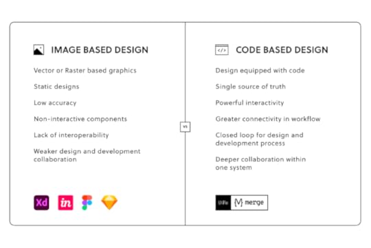
Application: Designers use GIT by identifying versions of their code, which can be accessed at any time. GIT is effective throughout every step in a project’s lifestyle because it keeps track of any changes that take place along the way. They are generally tracked via snapshots or paper trails.
Related terms:
Git for designersMerge Git integrationHow to use Merge?NPM PackageDefinition: Also referred to shortly as NPM, it is a collection of software tools built in the JavaScript programming language. It acts as a type of repository that is used to store and share code. NPM packages are frequently used to share components, templates, and other assets.
Application: While, as a designer, you don’t need to understand the intricacies of how NMPs are built, it’s worth knowing that you can use them in tools like UXPin to facilitate your work on user interface designs. Namely, you can use NPM packages to import UI elements from component libraries and, as a result, design interfaces with ready-to-use elements directly from the code.
Related resources:
What is npmnpm Merge integrationMUI npm integration with UXPinAnt design integration with UXPinBootstrap integration with UXPinBridge communication gap between design and development teams at your organization. Try the most advanced prototyping tool on the market that’s powered with its proprietary Merge technology. Bring interactive, code-based components and build interfaces in minutes instead of hours. Find out more about UXPin Merge.
Discover Merge
The post Design System Glossary – 34 Powerful Terms You Should Know appeared first on Studio by UXPin.
UXpin's Blog

- UXpin's profile
- 68 followers

