
UXpin's Blog, page 15
November 4, 2024
Tailwind Design System – How to Start
To build a Tailwind Design System in UXPin, begin by leveraging the built-in Tailwind UI library, customizing foundational components for brand alignment. Use UXPin’s AI Component Creator for unique elements, set global and local themes for consistent styling, and add icons with Heroicons and patterns with Hero Patterns.
Document each component to maintain accessibility and scale. For handoff, UXPin exports HTML with Tailwind classes, ensuring a streamlined design-to-development process. This approach creates a flexible, consistent, and production-ready design system. Try UXPin and build your design system today.
Reach a new level of prototyping
Design with interactive components coming from your team’s design system.
Discover UXPin Merge .discover-merge { margin: 40px 8px;}.discover-merge__container { display: flex; max-width: 690px; height: 200px; padding: 20px; padding-left: 24px; border-radius: 4px; background-color: black; box-shadow: 10px 10px #9999ff; align-items: center; justify-content: space-between;}.discover-merge__left { width: 50%;}.discover-merge__left p { margin: 10px 0px !important; color: white !important; font-size: 18px !important;}.discover-merge__heading { font-weight: bold !important; color: white !important; font-size: 18px !important;}.discover-merge__text { margin: 0 !important; line-height: 22px !important;}.discover-merge__button { width: 174px; height: 44px; margin: 10px 0px; border: none; border-radius: 2px; background: white; color: black; font-size: 16px; text-align: center;}.discover-merge__button:hover { cursor: pointer;}.discover-merge__image { max-width: 320px !important; height: 200px; margin-right: -19px;}@media (max-width: 760px) { .discover-merge__container { height: auto; margin: 10px; align-items: left; }}@media (max-width: 500px) { .discover-merge__container { flex-direction: column; } .discover-merge__left { width: 100%; align-items: normal; }}What is Tailwind Design System?
Tailwind design system leverages Tailwind CSS’s utility-first approach to create a cohesive and scalable collection of design elements, such as colors, typography, spacing, and components.
By organizing and styling components with Tailwind’s utility classes, a Tailwind design system promotes consistency, flexibility, and rapid development across projects. It simplifies the implementation of UI elements directly in code, ensuring that designers and developers work seamlessly together while maintaining a unified look throughout the product.
Why use Tailwind for a Design System?Using Tailwind for a design system offers several advantages:
Consistency Across UI: Tailwind’s utility classes enable a consistent styling approach, ensuring every component and element follows the same design rules.Scalability and Flexibility: Tailwind’s modular structure allows you to build reusable, adaptable components that scale well across projects.Rapid Development: Utility classes make it easy to create and maintain design elements directly in code, reducing custom CSS and streamlining collaboration between design and development teams.Customization: Tailwind’s configuration options allow for tailored themes and responsive design, supporting brand-specific needs within the design system.Tailwind CSS can be a powerful choice for companies looking to create fast, scalable, and cohesive design systems across their digital products. OpenAI uses Tailwind CSS for its marketing site, leveraging its quick styling capabilities and utility classes for building a cohesive, clean interface.
GitHub Next and Shopify also integrate Tailwind into their marketing and SaaS platforms, benefiting from Tailwind’s modularity, which aids in maintaining a consistent brand aesthetic across a variety of complex pages.
Building a Tailwind Design System in UXPinCreating a design system with Tailwind CSS in UXPin leverages the power of code-backed components and UXPin’s Tailwind UI integration. This guide outlines the process step-by-step, helping you build a robust, responsive design system.
Start with the Tailwind UI Library in UXPinUXPin offers a built-in Tailwind UI library integrated via Merge. Begin by exploring the 18 pre-built components available, including essential UI patterns and layouts. These built-in components are fully customizable, providing a solid foundation for your system.
Create Custom Tailwind Components with UXPin’s AI Component CreatorFor unique elements, UXPin’s AI Component Creator streamlines the process. Describe the component you need in simple language (e.g., “responsive card with hover effects”), and the AI will generate it using Tailwind classes. Once generated, save it to your component library to expand your design system.
Customize Components and PatternsTailwind’s utility-based styling allows for flexible customizations. Tailor colors, sizes, and typography directly within UXPin to align with your brand’s visual guidelines. Use these foundational components as the building blocks for more complex elements in your design system.
Set Up Global and Local ThemesTailwind UI in UXPin supports global and local theme management, allowing you to establish a consistent color palette, typography, and spacing across your design system. For consistent branding, use global themes. For tailored component variations, apply local themes to specific pages or elements.
Add Iconography and Patterns with Heroicons and Hero PatternsEnhance your design with Tailwind’s Heroicons, high-quality SVG icons perfect for interactive elements. Hero Patterns provide seamless SVG background options, adding polish to your UI without heavy custom CSS work. These elements can be added directly within UXPin, making them available across your design system.
Documentation and Testing for ConsistencyEnsure your components align with Tailwind principles and meet accessibility standards. Document each component, its purpose, and usage, using UXPin’s Design System Library. This makes it easy to share and scale the system with your team.
Developer Handoff with Spec Mode and HTML ExportOne of the biggest advantages of Tailwind in UXPin is the streamlined design-to-development process. Once your design is complete, UXPin allows you to export HTML with Tailwind classes or share the design in Spec Mode for detailed, production-ready handoff. This minimizes manual coding and ensures your design matches the final product.
Use Tailwind Design System in UXPinUsing UXPin and Tailwind together empowers your team to create a flexible, scalable design system. From building foundational components to handing off production-ready HTML, this approach brings consistency, speed, and clarity to the design-to-development workflow. Discover UXPin Merge.
Discover MergeThe post Tailwind Design System – How to Start appeared first on Studio by UXPin.


October 30, 2024
Figma Tailwind vs UXPin Tailwind – Best Tailwind Kits
Tailwind CSS has transformed web design by simplifying styling with utility-first classes. Designers are increasingly looking for ways to integrate Tailwind directly into their design tools to streamline workflows. Here, we’ll explore the different ways Figma and UXPin handle Tailwind CSS and how each tool fits into design and development processes.
Bring your Tailwind components to life with UXPin Merge. Sync code-backed components straight from your repo, adding real interactivity, responsive layouts, and dynamic states—all in true Tailwind style. Hand off developer-ready HTML with Tailwind classes intact, minimizing rework and keeping fidelity high from prototype to deployment. Request access to UXPin Merge.
Reach a new level of prototyping
Design with interactive components coming from your team’s design system.
Discover UXPin Merge .discover-merge { margin: 40px 8px;}.discover-merge__container { display: flex; max-width: 690px; height: 200px; padding: 20px; padding-left: 24px; border-radius: 4px; background-color: black; box-shadow: 10px 10px #9999ff; align-items: center; justify-content: space-between;}.discover-merge__left { width: 50%;}.discover-merge__left p { margin: 10px 0px !important; color: white !important; font-size: 18px !important;}.discover-merge__heading { font-weight: bold !important; color: white !important; font-size: 18px !important;}.discover-merge__text { margin: 0 !important; line-height: 22px !important;}.discover-merge__button { width: 174px; height: 44px; margin: 10px 0px; border: none; border-radius: 2px; background: white; color: black; font-size: 16px; text-align: center;}.discover-merge__button:hover { cursor: pointer;}.discover-merge__image { max-width: 320px !important; height: 200px; margin-right: -19px;}@media (max-width: 760px) { .discover-merge__container { height: auto; margin: 10px; align-items: left; }}@media (max-width: 500px) { .discover-merge__container { flex-direction: column; } .discover-merge__left { width: 100%; align-items: normal; }}Tailwind CSS in FigmaFigma’s integration with Tailwind CSS primarily relies on community-made UI kits like TailGrids and Tailwind UI Components for Figma. These kits provide a variety of pre-styled, Tailwind-inspired components, which designers can use to quickly prototype and design consistent UIs.
What are the Advantages of Using Tailwind in Figma?Fast Prototyping: Designers can drag-and-drop pre-designed Tailwind-styled elements, enabling a swift visual representation of a Tailwind-based design system.Customization: While the components are pre-styled, Figma’s design flexibility allows for modification within the platform, enabling customizations to fit specific design requirements.Consistency in Visuals: Since these kits use Tailwind’s design principles, they provide a high level of visual consistency for UI projects that will eventually be styled with Tailwind.What are the Limitations?Static Design: Figma’s Tailwind components are static, lacking interactivity and states. This makes it challenging to represent responsive behaviors or component interactions accurately.Developer Handoff: Unlike UXPin, Figma doesn’t export HTML with Tailwind classes, requiring developers to manually interpret and translate designs into code.How to use Tailwind in FigmaHere’s a step-by-step walkthrough for using Tailwind in Figma:
Install Tailwind UI Kit: Start by importing a Tailwind CSS UI kit, like TailGrids or Tailwind UI, from the Figma Community. This gives you access to pre-designed components that follow Tailwind’s styling principles.Customize Components: Use Figma’s tools to adjust colors, sizes, and layouts within the components, matching your project’s specific needs while maintaining Tailwind’s utility-based approach.Arrange and Prototype: Build screens by arranging these Tailwind-styled components. Use Figma’s prototyping features to link screens, though interactions will remain static without dynamic states.Handoff to Development: When ready, provide annotated designs or style guides to developers. Since Figma lacks HTML export, developers will need to manually translate the designs into Tailwind classes for production.Tailwind CSS in UXPinUXPin integrates Tailwind CSS using UXPin Merge, allowing direct integration of code components. This setup means that the Tailwind components you use in UXPin can match production-ready code exactly, bridging the gap between design and development.
Advantages of Using Tailwind in UXPin:Live, Code-Backed Components: With UXPin Merge, designers work directly with production-ready components that use Tailwind classes, ensuring that prototypes match the final build.Interactive Prototyping: UXPin supports interactive components with states, responsive design features, and conditional logic, allowing designers to test and demonstrate real-world functionality within the prototype.Developer Handoff with Code: UXPin exports HTML with Tailwind classes intact, allowing for a smoother transition from design to development and reducing the potential for misinterpretation of designs.AI Component Creator. This AI tool allows designers to generate components with Tailwind styles directly, bypassing manual coding. By typing prompts, UXPin quickly generates Tailwind UI elements.Disadvantages of UXPin Tailwind Setup:Community size: It isn’t as large or robust as Figma’s. This limits the available resources, plugins, and peer support, making it harder to find ready-made solutions or community-built Tailwind components, unlike Figma’s vast ecosystem.Learning curve: Figma has many tutorials while UXPin offers just a couple of videos on using Tailwind UI to build a full-fledged app.How to use UXPin and TailwindTo use UXPin with Tailwind CSS, follow these steps:
Built-in Tailwind UI Kit: UXPin provides a pre-built Tailwind UI kit, making it easy to start with Tailwind-styled components directly in your design environment.Customization and Prototyping: Customize and arrange these components to build interactive prototypes. UXPin supports full interactivity, allowing you to add component states and responsive behavior, which is especially valuable for Tailwind-based designs.AI Component Creator: Use UXPin’s AI Component Creator to generate new Tailwind components quickly. This feature allows you to prompt the AI to create unique components that follow Tailwind’s styling principles.Code Export for Development Handoff: When your design is complete, UXPin can export HTML code with Tailwind classes intact, allowing developers to seamlessly implement the design into production without extensive manual coding.This streamlined process helps ensure your Tailwind-based designs in UXPin are consistent, interactive, and ready for development handoff. For more details, check UXPin’s documentation.
Choosing the Right Tool for Tailwind CSSFigma uses static Tailwind UI kits, allowing designers to create Tailwind-style visuals quickly but lacking interactivity or component states. UXPin, on the other hand, provides live, code-backed Tailwind components through UXPin Merge, supporting full interactivity, component states, and responsiveness.
While Figma’s Tailwind designs visually match the end product, UXPin achieves exact fidelity with production code, exporting HTML with Tailwind classes for seamless developer handoff. Figma designs require more manual coding interpretation, whereas UXPin directly connects design to development.
When Should You Use Figma’s Tailwind Kits?Figma is ideal if you’re focused on quick, visual prototyping without the need for code-backed components. It’s best suited for teams who need a visual representation of Tailwind styling but will handle coding separately. Figma’s simple drag-and-drop UI can also work well for less complex projects or for creating marketing visuals.
When Should You Use UXPin Tailwind UI Kit?UXPin is the better choice if your project requires interactive prototypes that closely match production code. It’s especially useful for design systems, high-fidelity prototyping, and projects where design and development need to align perfectly. UXPin’s code-backed components make it a powerful tool for complex applications or teams aiming for seamless design-to-development workflows.
ConclusionBoth Figma and UXPin have unique strengths when working with Tailwind CSS. Figma excels in rapid visual prototyping, while UXPin offers a more dynamic, production-aligned approach. Your choice will depend on your project’s complexity, fidelity requirements, and whether your design process demands a high level of interactivity and alignment with final code.
Using UXPin Merge with Tailwind CSS transforms the design process, especially for teams that want production-ready, interactive prototypes. With Merge, you can sync Tailwind-styled components directly from your codebase into UXPin, ensuring that your designs are accurate representations of the final product. Request access to UXPin Merge.
Discover MergeThe post Figma Tailwind vs UXPin Tailwind – Best Tailwind Kits appeared first on Studio by UXPin.
UX Design Principles for 2024

There are many important UX design principles organizations must consider when building products. These UX principles complement the design thinking process, placing the user at the center of all decision-making.
This article looks at 16 UX design principles organizations can use to build better products.
UXPin’s advanced prototyping and testing features allow design teams to minimize usability issues to create better user experiences. Sign up for a 14-day free trial today!
Focus on the UserWhile it might seem obvious to focus on the user, many designers still make decisions based on personal preference or bias rather than fully understanding their users.
Designers also get sidetracked with design and technical innovation that doesn’t always solve users’ problems or add significant value to the product.
The best design decisions come from understanding your users and fulfilling their needs. Why?—because you’re designing products for people!
Many experienced UX professionals believe focusing on users rather than humans creates a disconnect where designers forget they’re dealing with human beings.
Reframing the term to human-centered design helps UX teams shift from solving design and technical issues to helping people.
Building a framework based on design thinking principles will always keep the user front and center:
Empathy—know your humans (end users)Define the problemGenerate ideasPrototypeTest and iterateYou can read more about human-centered design here.
Be ConsistentDesign consistency is a vital ingredient to providing a good user experience. An inconsistent user experience means people will have trouble using parts of a product or might have to relearn how to use it with every feature release or update!
A designer’s goal is to build a product that fulfills users’ needs without worrying about inconsistencies, ultimately building trust and loyal customers.
Creating a design system can help develop consistency, so designers, product teams, and developers always use the same elements, typography, colors, components, assets, etc.
Don’t have a design system? Check out our 7-step process for building a design system from scratch.
Easy to DigestCreate content and experiences that users can easily digest. Designers must recognize that people will always look for the easiest route. If you don’t provide something easy to use in this highly competitive tech landscape, someone else will!
If your product requires onboarding, ensure your documentation is easy to understand with step-by-step instructions.
The UXPin documentation is a perfect example. Firstly, we categorize instructions, so it’s easy to find what you’re looking for. Next, we organize content with subheadings, step-by-step instructions, and explainer videos, making the information easy to follow and digest.
Don’t Make Users ThinkInformation architect and user experience professional Steve Krug states in his book, Don’t Make Me Think, “As a user, I should never have to devote a millisecond of thought to whether things are clickable or not.”
UX designers must follow design standards for product, app, and web design. For example, don’t hide navigation where users wouldn’t expect to find it. Make sure buttons, CTAs, and links are obvious to find and take users to their intended destination.
Creativity and innovation come from solving problems competitors haven’t thought of, not creating experiences where users have to relearn fundamental standards and processes.
How human psychology and cognitive load relate to UX design is something every designer must learn. Optimizing product design to minimize cognitive load will foster better user experiences and trust in the brand.
Understand Visual GrammarFirst defined by the Bauhaus school in the early 1900s, the building blocks of all design comprise of three core elements: points, lines, and planes.
The best UX designers understand how to use these three elements to minimize design complexity, making products easier to navigate thus creating better user experiences.
If you feel your designs are getting too complex and complicated, return to the basics and figure out how to create the same user experience using simple design elements.
Identify the Problem FirstIdentifying problems comes from thorough UX research and testing—not designer intuition.
UX researchers should keep asking why a problem exists to understand the root cause and find the right solution. Testing and iterating prototypes play a crucial role in helping to identify and solve problems.
If you don’t have proper prototyping and testing tools, you might get inaccurate results or even create problems that don’t exist!
UXPin is the world’s most advanced prototyping and testing tool. Designers can use a design system to build high-fidelity prototypes for testing quickly. Share prototypes straight from UXPin to identify problems through testing, make changes, and iterate!
Sign up for a 14-day free trial to discover how UXPin can identify and solve user problems better than any other design tool.
Simple Language Is BestLanguage should be as simple as possible, and designers should avoid using jargon or insider terms that people won’t understand. Alienating people through complicated language is a quick way to lose customers!
Readability can have a significant impact on cognitive load, even for highly educated users. It goes back to point four, Don’t Make Users Think.
According to the widely-used writing aid Grammarly, you should use eighth-grade language (13 years old in the United States) for written content.
Have Empathy for Your AudienceEmpathy is the heart of human-centered design—taking designers beyond understanding to connect with users on a deeper level. Designers use empathy so they can relate with users, their struggles, and their environment.
An empathy map is a UX research tool that helps designers empathize by identifying what users:
SeeHearThinkFeelTeams use empathy maps during initial research and usability testing to identify different feelings and emotions. Understanding users on a deeper level can help identify problems they might not express or verbalize.
Provide FeedbackUse microinteractions and animations to communicate with your users to provide feedback and context for their actions.
For example, if your product needs time to process an action, use a throbber or loading icon to let the users know to wait. Ensure error messages help users correct the problem, like highlighting missed required form inputs.
Use consistent feedback that aligns with brand messaging to ensure you always provide a positive user experience.
Don’t Forget the Business ValueDesigners must satisfy two entities, users and the brand. While focusing on users is vital to building a successful product, designers must also ensure designs create business value.
Business value and human-centered design often overlap. For example, a smoother, faster eCommerce checkout experience will improve the user experience (user-centered) while increasing conversion rates (business value).
Whenever you’re trying to solve user problems, always look for opportunities to create business value simultaneously.
Ewelina Łuszczek from the Polish-based agency, HERODOT, summarizes a designer’s obligation to business value in one concise sentence, “A great UX designer will manage to link user goals with business goals so that both users and the company reap benefits.”
Here are four great examples from a 2014 INFRAGISTICS study, The Business Value of User Experience:
Bank of America
Designer action: user-center redesign of the registration processResult: registration up 45%Anthropologie (clothing company)
Designer action: UX redesign of the checkout processResult: sales up 24%GFK (consulting firm)
Designer action: buy button redesignResult: sales up $500 millionUnited Airlines
Designer action: user researchResult: online ticketing up 200%You can read INFRAGISTICS’ complete 12-page study for more information about creating business value through UX design here.
User testingLike point six, Identify the Problem First, user testing is crucial for designers to understand real user issues rather than making educated guesses.
Usability testing provides UX teams with valuable feedback and user insights, including:
Validating design concepts to solve users’ problemsExposing usability problems to fixDiscovering opportunities for improvementLearn more about the usersIdentifying business value opportunitiesTeams should test from conceptualization to final design handoff—constantly looking for problems to solve and validating their solutions.
Learn more about testing in this article: What is Usability Testing and How to Run It.
Visual HierarchyVisual hierarchy helps organize a product or screen layout so users can identify important elements and quickly scan to find what they need.
Designers create visual hierarchy by using distinct variations in color, contrast, scale, and grouping.
An excellent example of visual hierarchy is how writers use header tags to structure and organize content in an article—as we’ve done with this blog post!
Check out this informative article from the Nielsen Norman Group, Visual Hierarchy in UX: Definition.
AccessibilityAccessibility is an important design consideration to make products inclusive for users with impairments or disabilities. Accessibility should also consider who Google calls the “Next Billion Users” (people using technology for the first time).
Some key accessibility considerations include:
Ensuring screen readers can interpret content and instructionsEnsuring colors and contrast don’t impair readabilityUsing a combination of icons and text so that all users understand links and navigationUsing legible fonts and text sizesUX designers often forget about these considerations because design tools don’t provide accessibility checker functionality.
At UXPin, “We believe no one should feel excluded from digital experiences because of their visual disabilities.” So, we built Accessibility Features into our design editor.
Sign up for a 14-day free trial and start building more inclusive products with UXPin!
Give the User ControlWhere possible, always make it easy for users to change their minds or edit the information they submit. For example, providing a back button on every screen in a checkout flow gives the user control to fix errors or make changes.
Never force people to commit to a decision they’ve made, and always ensure your product does not mislead users—whether it’s intentional or not.
Many organizations intentionally make it difficult for users to cancel a subscription by hiding the option in settings or making them contact support (where they usually try to offer incentives to continue the subscription).
Limiting the controls users have to change their minds or edit information creates distrust in the brand and pushes customers to find other solutions.
Design HandoffAlthough it’s an internal process, a poor design handoff can adversely affect users by causing unnecessary delays or introducing technical errors.

UX teams, product designers, and developers must work together to develop processes and protocols, so design handoffs run smoothly with minimal errors.
UXPin Merge can help bridge the gap between design and development. Firstly, Merge allows designers to sync components with a repository (via Git or Storybook integrations) so design teams can build fully functioning high-fidelity prototypes—improving testing and reducing usability issues.
Secondly, UXPin’s Spec Mode facilitates an easy handoff process where developers can get detailed information about designs.
Inspect properties: grab CSS for elements and components, including sizing, grids, colors, and typographyDistance measurement: hover over elements for the distance between elements and the canvas edgeStyle guide: a summary of the product’s design system with the option to download assets when applicableExplore the power of UXPin Merge and how to connect your preferred technology, either through our Git integration for React or Storybook for other popular front-end libraries.
Reevaluate and ReviseOne of the beautiful things about UX design is that it’s constantly evolving, allowing organizations to improve products and user experiences continuously.
Once you launch a new product or release, the work of analyzing data and reviewing designs begins.
How does the product perform when thousands or millions of people use it? Do users use the product as intended?Do users take shortcuts that you can use to improve their experience?What do heat maps tell you about user behavior?Where do users drop off on signups or checkouts?When analyzing a product’s performance, teams should always look for ways to improve the user experience while exploring avenues to increase business value.
SummaryHopefully, you can use these 16 UX design principles to improve workflows and create better product experiences for your users. This is by no means an exhaustive list, so we recommend you always look for ways to improve your processes.
UXPin is a collaborative design tool that can help foster healthy UX design principles for your company. It’s the only design tool that successfully bridges the gap between designers, product teams, and developers to improve every aspect of the UX design process.
Get started with a 14-day free trial to explore a new world of design with UXPin!
The post UX Design Principles for 2024 appeared first on Studio by UXPin.
October 29, 2024
Design System Adoption – 3-Step Strategy
“The success of a design system hinges on its adoption. Until you have users using your product, it’s not successful.” – Amber Jabeen. A while back, UXPin hosted Amber Jabeen, DesignOps Director at Delivery Hero MENA (talabat), for a webinar titled: Enterprise Design System – How to Build and Scale. This article covers the second half of Amber’s talk, which focuses on Delivery Hero’s design system adoption strategy.
Achieve greater design system adoption, consistency, and cohesion with UXPin Merge. Sync your design system’s component library to UXPin’s design editor to create a single source of truth across the organization. Request access and experience Merge technology today.
Reach a new level of prototyping
Design with interactive components coming from your team’s design system.
Discover UXPin Merge .discover-merge { margin: 40px 8px;}.discover-merge__container { display: flex; max-width: 690px; height: 200px; padding: 20px; padding-left: 24px; border-radius: 4px; background-color: black; box-shadow: 10px 10px #9999ff; align-items: center; justify-content: space-between;}.discover-merge__left { width: 50%;}.discover-merge__left p { margin: 10px 0px !important; color: white !important; font-size: 18px !important;}.discover-merge__heading { font-weight: bold !important; color: white !important; font-size: 18px !important;}.discover-merge__text { margin: 0 !important; line-height: 22px !important;}.discover-merge__button { width: 174px; height: 44px; margin: 10px 0px; border: none; border-radius: 2px; background: white; color: black; font-size: 16px; text-align: center;}.discover-merge__button:hover { cursor: pointer;}.discover-merge__image { max-width: 320px !important; height: 200px; margin-right: -19px;}@media (max-width: 760px) { .discover-merge__container { height: auto; margin: 10px; align-items: left; }}@media (max-width: 500px) { .discover-merge__container { flex-direction: column; } .discover-merge__left { width: 100%; align-items: normal; }}What is Design System Adoption?Design System Adoption is the process by which a design system is accepted, implemented, and actively used by an organization’s design, product, and development teams. A design system is a comprehensive collection of reusable components, guidelines, and standards that ensures consistency and efficiency in product design and development.
Adoption involves making sure that these components, patterns, and guidelines are integrated into daily workflows and are embraced by everyone involved in the product lifecycle.
Delivery Hero’s Design System AdoptionAfter trying many initiatives, Amber and her team developed a three-component design system adoption strategy for Delivery Hero:
GamifySocializeCelebrateA “Consistently Delightful” VisionAmber’s team recognized that they had to treat their design system like any other product to increase adoption. The first step was defining a vision–a Northstar to guide their strategies.
Using input from stakeholders and team members, the team came up with: “Deliver a consistently delightful user experience across all platforms.”
The design system team emphasized consistently delightful to highlight the vision’s motto and principles.
Consistently (motto):
“Always…without exceptions. Don’t make me think.” The idea is that design consistency creates a more intuitive user experience where users don’t need to learn the UI or its features.
Delightful (principles):
talabat cares: Product experiences must show we care about our users–both design system users and the product’s end-usersMade for me: A personalized experienceFast: As a delivery company, they want to deliver fastSimple: Intuitive user interfacesFun: An enjoyable user experienceWith a clear vision, Delivery Hero’s design system team developed its three-component adoption strategy.
Step #1 Gamify DS AdoptionOne of the team’s successful strategies was gamification. They realized to adopt the new design system; many team members would have to abandon their existing templates and start from scratch. So, Delivery Hero’s gamification strategy made switching to the design system fun and competitive.
Adoption TiersThe design system team designed gamified adoption tiers aligned with the system’s vision. The aim was to get team members to start small and scale their usage. Once they completed a “level,” the DS team encouraged users to pursue the next target–as you would in a video game.
Bronze: Foundations (design tokens)Silver: Consistent and cohesive (components)Gold: Delightful experience (voice & tone, microinteractions, haptics, transitions)Platinum: Premium experience (motion, dark theme, voice UI)The team created a poster of the design system’s tiers and associated UI patterns and posted them around workspaces to remind people of the “game” and its “levels.”
Design System DashboardIt was important for team members to visualize their progress to know what they had to do to progress. The DS team created a Discovery Squad dashboard to visualize the user’s adoption and progress towards the next tier.
Step #2: Socialize to Boost Adoption
The second component of the design system’s strategy was “socializing the design system with community-driven initiatives to keep people invested and interested.”
You’ll notice a consistent theme of fun and inclusion with Delivery Hero’s socialize initiatives, which aligns with the design system’s vision.
Design system naming competitionAmber’s team invited everyone to take part in naming Delivery Hero’s design system. They sent out a company-wide mailer asking team members to submit names.
They narrowed the options down to two and voted for the “Marshmallow Design System.” Delivery Hero employees feel a sense of ownership for Marshmallow because they were part of the naming process.
The strategy was a success for the design system team because they immediately had team members invested and engaged.
Marshmallow’s avatar, hashtag, and emojiTo solidify Marshmallow’s identity and raise further awareness, the DS team created an avatar, hashtag, and emoji, which they use across internal communications.
Open design system showcase eventThe team hosted events to engage with users and asked questions to encourage live feedback and discussions:
How are we [design system team] doing?How do you find working with the design system?The aim was to gather new insights and ideas from users to improve the design system. When people feel they’re being heard and see their contributions added to the design system, they take ownership and become advocates, ultimately leading to further adoption.
They even served marshmallows to team members to keep events lighthearted and fun.
Feedback surveysThe DS team used surveys to engage further and gather feedback about different parts of the design system.
Design system guildThe Marshmallow Design System Guild included team members across Delivery Hero’s brands to discuss challenges and share ideas. The aim is to learn from each other and grow the Marshmallow community.
NewsletterA Marshmallow email newsletter helped the design system team share updates and information with users while keeping stakeholders informed and part of the conversation.
Step #3: Celebrate the AdoptionIn her talk, Amber says celebrating process is the most important adoption strategy component. The Marshmallow team acknowledges and celebrates every small win as a symbol of progress towards 100% adoption.
“We celebrated our small wins, which led us to really big wins.” – Amber Jabeen.
The team was “very good at celebrating,” as Amber puts it. When they reached an important milestone, like completing 70% of Marshmallow’s design language, they celebrated. They gave acknowledgments for various achievements across company channels. They used photos and videos to share celebratory moments across the organization.
Amber notes in her presentation:
We celebrated adoption tiers for each of our squads in monthly newsletters, All Hands, Slack channels, etc.Celebrating adoption tiers motivated teams to keep making progress towards bigger goals and encouraged contribution.The next step is to start rewarding contributions to the design system. For example, making it part of the organization’s performance reviews would encourage adoption and contributions.“You can build a design system, but you can’t scale it without a healthy dose of organic contributions. A great way to do that is by rewarding people who contribute to the system.” – Amber Jabeen.
Showing Impact
Marshmallow’s team measured growth and used graphs to present the results to team members and stakeholders. Some of the DS team’s key wins include:
Marshmallow reduced design debt by approx. 20% month over month. The DS team was able to measure this impact from their initial experiments. Read about getting buy-in for Delivery Hero’s design system here.By designing 80% of the product’s component library, the DS team left room for creativity and new components. Marshmallow’s component library reduced front-end effort by approx. 40% in new features.Component adoption = consistent and coherent experience. Developers reach out to the Marshmallow team when they notice a component not in the library, asking for advice, which drives conversations around scaling the design system.Marshmallow’s Successful StrategiesIt takes a tribe to build and run a design system. Build cross-functional partnerships. Even with a dedicated design system team, you can only achieve success with help and advocacy from stakeholders, leaders, and team members.A sustainable adoption strategy is community-driven. When you want to scale a design system, find ways to include the organization by designing strategies that rally everyone around its growth and success. Always be available. Reach out to team members. Deliver five-star service to your design system users.Give recognition and celebrate small wins. As we outline in “Component Three,” celebrating small wins leads to bigger wins and wider adoption. People like to be recognized, so celebrate and encourage progress.Quantify success and communicate 360. Base success on your value proposition and what you set out to achieve. Use metrics to showcase progress towards achieving your design system’s goals. Communicate this progress 360 degrees to everyone in the organization, including stakeholders, partners, sponsors, team members, etc.Rinse and repeat! Amber says it’s crucial to find what works and repeat this strategy to scale adoption across the organization.Watch Amber Jabeen’s talk, “Enterprise Design System – How to Build and Scale,” for the complete story about Delivery Hero’s journey to creating the Marshmallow Design System.
Scaling a Design System With UXPin MergeAs we’ve learned from Delivery Hero’s story, scaling a design system and achieving organization-wide adoption is a challenge.
The DS team must encourage designers to use a UI kit and engineers to use a component library. No matter how good your design system is, designers and engineers still speak different languages.
With UXPin Merge, designers and engineers use the exact same component library. Merge syncs components from a repository to UXPin’s editor, giving design teams the same interactive code components to build prototypes as engineers use for the final product.
The design system team can program each component’s props (or Args for our Storybook integration), including interactions, so designers only have to focus on building products. An easier workflow and less work mean greater enjoyment and wider adoption.
Find out how to scale your design system while enhancing cross-functional collaboration with the world’s most advanced code-based design tool. Request access to Merge.
The post Design System Adoption – 3-Step Strategy appeared first on Studio by UXPin.
How to Build Prototypes That Talk to Your Products
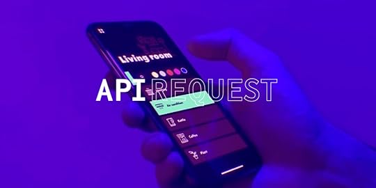
We truly live in the future. One in which we can power our home lights, sound systems or even security with our voices or from a phone app while miles away. Much like the one predicted in the cult classic, Back to the Future:
You’re now able to build such prototypes in UXPin! Until now, it was impossible to do this using prototyping tools or without coding. What is this sorcery?! Or as Doc Brown would say: Jumpin’ Gigawatts!
UXPin’s latest feature, API request, allows you to create app prototypes to “talk” with your products. For e.g. as a car manufacturing company, you could build a prototype that communicates with the car. You can even save data from a prototype to a spreadsheet! Or you’ll be able to simulate changing the colors of your smart lights via a prototype created in UXPin. Just like so:
 Changing the colors of your smart lights via a prototype created in UXPin
Technically speaking, it allows you to send HTTP requests to an external API. This is now part of Interactions as a new type of action called API request.
What Are API Requests?API requests are a way for UXPin to pull in and display dynamic information directly from external sources or databases within a prototype.
An API request is a message sent from UXPin to an Application Programming Interface (that’s what API stands for), asking for specific data or actions. APIs act as intermediaries that allow two systems—like UXPin and a database or web service—to communicate with each other. When UXPin sends an API request, it retrieves real data, such as product details, user profiles, or inventory information, which can then be displayed in the prototype.
Here’s how API requests work in this context:
Connecting to External Data: By using API requests, UXPin prototypes can access live or up-to-date information from systems such as CRM databases, product catalogs, or content management systems.Dynamic Prototyping: This feature enables UXPin prototypes to display real-time data, making the prototype experience closer to the final product. For example, a UXPin prototype of an e-commerce page could use API requests to show current prices, stock levels, and product images.User Testing with Real Data: Since prototypes can pull in actual information, teams can conduct more accurate user tests, observing how users interact with real content instead of placeholder text or images.In UXPin, API requests enhance the power of prototypes by allowing data-driven design, enabling users to experience realistic interactions and ensuring that feedback is based on real-world scenarios.
How Connected Prototypes Enhance User Testing FeedbackConnected prototypes—prototypes integrated with real product data or live APIs—transform the user testing experience by creating a more realistic and dynamic interaction for test participants. This approach not only improves the quality of feedback but also accelerates the validation process, allowing teams to move more confidently from design to development.
Here’s how connected prototypes make a difference in user testing:
Increased Realism for UsersConnected prototypes simulate real-world scenarios by pulling in actual data, content, or user account information. This realism enables users to experience the prototype as they would the final product, providing feedback on interactions, navigation, and design in a way that mirrors real usage. For instance, in an e-commerce prototype connected to live inventory data, users can experience true-to-life shopping flows, offering insights that are far more valuable than hypothetical feedback.
Improved Accuracy in User FeedbackBecause connected prototypes present real or simulated data rather than placeholder content, users can respond to the interface as they would in real situations, leading to more accurate and actionable feedback. This reduces assumptions in the design process, as teams can observe users interacting with actual content and understand their genuine reactions and potential pain points.
Validation of Complex User FlowsPrototypes that connect to backend systems or product databases allow for testing of complex workflows, like signing in, checking account details, or completing multi-step processes. Teams can observe whether users intuitively follow intended paths, providing critical feedback to refine and simplify intricate interactions. Testing these flows with connected data also reduces the chance of errors or confusion when the product is fully developed.
Early Detection of Usability IssuesConnected prototypes can reveal usability issues that might go unnoticed in a static or simplified prototype. Since users engage with real data, interactions, and scenarios, they’re more likely to encounter usability challenges that would only appear in the final product. Catching these issues early allows designers and developers to make adjustments before the costly development phase.
Insight into Data-Driven Design DecisionsWith connected prototypes, teams can assess how well data elements—such as recommendations, custom content, or personalization—fit into the user experience. Observing users interacting with these elements in real time helps teams validate whether data-driven design decisions are effective or need adjustments, ensuring the final product is both functional and user-friendly.
Faster Iterations Based on Authentic FeedbackConnected prototypes streamline the testing and iteration cycle, as feedback from user testing is based on realistic interactions rather than assumptions. Teams can make confident decisions on what to improve or change, knowing that feedback reflects genuine user behavior. This means fewer revisions during the final build and a more efficient design-to-development process overall.
By connecting prototypes to live or simulated product data, UXPin allows teams to create highly interactive, realistic prototypes that bridge the gap between design and development. This approach not only enhances user testing feedback but also leads to a more refined, user-centered final product.
Key Steps for Connecting UXPin Prototypes to ProductsConnecting UXPin prototypes to live product data or APIs enables teams to create realistic, data-driven prototypes that closely resemble the final product. Here’s a step-by-step guide to setting up a UXPin prototype with real data, allowing for more accurate user testing and feedback.
Step 1: Choose a Data Source
Identify the data your prototype needs to access. This could include user data, product details, inventory, or any content that reflects real usage scenarios.
Step 2: Set Up API Integration
If your data is hosted in an external service (such as a CRM, database, or CMS), ensure it has an API that allows UXPin to pull data. Verify that you have access to API keys or tokens required for authentication.
Step 3: Leverage Merge for Code Components
Use UXPin’s Merge feature to bring real code components into your prototype. These components can be connected to product data via API, making them functional and interactive, closely mimicking the final product.
Step 4: Ensure Component Compatibility
Confirm that the components you’re using are compatible with the data structure from your API. This compatibility allows for seamless data binding and interaction within the prototype.
Step 5: Map Data to Components
In UXPin’s editor, link data fields from the API to corresponding components in your prototype. For example, bind a “product name” field from your API to a text component in UXPin.
Step 6: Create Conditional Logic and Interactions
Set up conditional logic within UXPin to enable interactions like filtering, sorting, or dynamic updates based on real-time data. This brings a more authentic, interactive experience to your prototype.
Step 7: Enable Dynamic Interactions
Define triggers and interactions that use live data, such as form submissions, cart updates, or account settings. These interactions allow users to engage with the prototype as if it were the final product, facilitating realistic feedback on usability.
Step 8: Set Up Real-Time Data Refresh
Configure the API connection to refresh data in real time if applicable. This can be particularly useful for user testing in scenarios involving frequently changing information, like inventory status or live content updates.
Step 9: Test with Realistic Scenarios
With live data integration, allow users to engage with the prototype in realistic workflows, such as testing a checkout process or navigating personalized content.
Step 10: Gather Data-Driven Feedback
During testing, observe how users interact with data-bound components, noting any usability challenges or insights that emerge. This helps validate design decisions early, ensuring that the prototype aligns with user needs.
Step 11: Adjust Components or Data Binding as Needed
Based on feedback, refine your data connections or modify component behavior to address issues uncovered during user testing.
Step 12: Validate Final Changes
Before transitioning to full development, confirm that all adjustments align with product requirements and user-approved feedback in the connected prototype.
Learn how to use this feature by reading our official docs about API.
Welcome to the future.
The post How to Build Prototypes That Talk to Your Products appeared first on Studio by UXPin.
Prototype vs Final Product — A Deep-Dive
A prototype is a draft or blueprint to explore and refine ideas, while the final product is the completed, fully functional version ready for release. Prototypes and final products serve distinct roles, helping teams move from ideas to a completed, user-ready solution. ~Let’s explore similarities and differences between prototypes vs final products.
By leveraging real code components, responsive design, accessibility features, and seamless handoff capabilities, UXPin enables teams to create prototypes that are nearly indistinguishable from the final product. This reduces the need for costly iterations, minimizes miscommunication, and results in a more efficient and reliable product development process. Try UXPin for free.
Build advanced prototypes
Design better products with States, Variables, Auto Layout and more.
Try UXPin .try-uxpin-banner { margin: 40px 0px;}.try-uxpin__container { display: flex; max-width: 689px; height: 210px; padding: 20px; padding-left: 24px; border: 2px solid black; border-radius: 4px; align-items: center; justify-content: space-between; background-color: white; box-shadow: 10px 10px black;}.try-uxpin__left { width: 54%;}.try-uxpin__heading { font-size: 28px !important; font-weight: bold;}.try-uxpin__left p { margin: 10px 0px !important; color: black !important;}.try-uxpin__text { margin: 0 !important; font-size: 18px !important; line-height: 22px !important;}.try-uxpin__button { width: 135px; height: 44px; background: black; margin: 10px 0px; padding: 10px 20px; border: none; border-radius: 2px; color: white; font-size: 16px; text-align: center;}.try-uxpin__button:hover { cursor: pointer;}.try-uxpin__image { max-width: 320px !important; height: 200px; margin-right: -21px; margin-bottom: -6px;}@media (max-width: 760px) { .try-uxpin__container { height: auto; margin: 10px; align-items: left; }}@media (max-width: 500px) { .try-uxpin__container { flex-direction: column; } .try-uxpin__left { width: 100%; align-items: normal; }}What is a Prototype vs Final Product?
A prototype is an early model or simulation of a product used to test ideas, designs, and interactions before full development. It often includes basic interactions, layouts, and sometimes simulated data to give a realistic feel, but it’s not fully functional or ready for end-users.
The final product, on the other hand, is the completed version, fully developed and ready for users. It includes all interactions, live data, final visuals, and complete functionality. It’s polished, tested, and built to handle real-world use cases.
In short, a prototype is a draft or blueprint to explore and refine ideas, while the final product is the completed, fully functional version ready for release.
What is their Place in the Design Process?Prototype in the Design ProcessPurpose: Prototypes are essential for testing and validating ideas before full development. They allow designers, stakeholders, and users to see and interact with a product concept, providing feedback early.Stage: Prototyping usually comes after initial research, brainstorming, and wireframing. It’s used to explore layouts, interactions, and functionality in a realistic way without the full cost or time commitment of building a final product.Benefits: Prototyping helps identify issues, refine usability, and ensure that the design meets user needs. It’s a key step in preventing costly changes later.Final Product in the Design ProcessPurpose: The final product is the outcome of all previous design stages. It’s a polished, functional version of the initial concept that has gone through testing, iterations, and feedback.Stage: The final product is produced at the end of the design and development process, after prototyping, usability testing, and stakeholder approval.Benefits: A finalized product is ready for users and meets all design, functionality, and performance criteria established during the design process. It represents the end goal, where ideas are fully realized and ready for release.What is the Goal of a Prototype vs Final Product?The goal of a prototype is to serve as a testing ground for ideas, design concepts, and user interactions before committing to full development. Prototyping allows teams to experiment, gather feedback, and make adjustments to ensure the design aligns with user needs and project goals.
By creating prototypes, designers can validate functionality, interaction flows, and usability in a low-risk environment. This testing phase is critical, as it helps identify potential issues early on, minimizing the chances of costly changes later in the development process. Prototypes focus on essential elements of the user experience rather than technical specifics, enabling teams to iterate quickly and refine ideas.
In contrast, the goal of the final product is to be a fully functional, polished solution, ready for users. The final product includes all technical depth and backend functionality needed for real-world use, such as data handling, performance optimization, and security.
Unlike prototypes, which simulate functionality, the final product delivers a complete experience, optimized for consistent, reliable use by end-users. Every aspect has been carefully tested, validated, and refined to meet the project’s standards and requirements, ensuring that it’s ready for release.
By focusing on interactivity and usability, prototypes don’t need the same level of technical detail as the final product, allowing for flexibility in exploring ideas. The final product, however, must meet rigorous quality standards to support real-world scenarios, bridging the gap from concept to completed, user-ready solution.
Are All Prototypes Exactly like the Final Product?No, not all prototypes are exactly like the final product. Prototypes vary in fidelity and purpose, and they often focus on simulating certain aspects of the final product rather than replicating it entirely. while high-fidelity prototypes or UXPin prototypes can closely resemble the final product, prototypes in general are simplified versions meant to test and validate ideas before committing to full-scale development.
Here’s how prototypes differ from one another:
Fidelity Levels: Prototypes can range from low-fidelity sketches or wireframes that outline structure and flow to high-fidelity prototypes with detailed interactions and visuals that closely resemble the final product. Low-fidelity prototypes are used for early exploration, while high-fidelity prototypes may be created to validate more specific interactions. Functionality and Interactions : Many prototypes include limited functionality. They may mimic certain user flows or interactions but lack complete backend connections or real data. This allows designers to focus on key aspects without building everything from scratch. Design Completeness : Prototypes may not always have the polished look or precise details of the final product. For example, placeholder text or images might be used instead of final content, or the design may be simplified to prioritize testing functionality over aesthetics.Technical Accuracy: Unlike the final product, prototypes aren’t fully developed, so they often don’t include optimized code, data handling, or security features that would be necessary for release.9 Similarities Between UXPin Prototypes and the Final ProductReal Code Components for AuthenticitySimilarity: UXPin prototypes use code-backed components through Merge, meaning the elements designers use in prototypes are the exact components developers will implement in production.Benefit: This approach ensures that all interactions, styles, and functionalities in the prototype are identical to those in the final product, eliminating guesswork during development.Dynamic, Conditional InteractionsSimilarity: UXPin allows designers to build complex, conditional interactions directly into prototypes, mimicking the final user experience. This includes features like conditional navigation, form validation, and dynamic content states.Benefit: By simulating the real logic behind interactions, UXPin prototypes offer a more accurate representation of the user experience, aligning closely with how the final product will behave.Consistent Design Systems and LibrariesSimilarity: UXPin’s integration with design systems means that components, styles, and themes are consistent from the prototype stage to production. This centralized library of components ensures that updates made in the prototype automatically reflect in the production design.Benefit: This results in prototypes that are visually and functionally in sync with the final product, making it easy for teams to scale projects without introducing inconsistencies.Built-in Accessibility StandardsSimilarity: UXPin incorporates accessibility standards within the prototyping process, allowing designers to check for compliance as they create. Accessibility features in prototypes are carried over to the final product.Benefit: Teams can ensure the final product meets accessibility guidelines from the start, saving time and costs associated with post-production fixes.Production-Ready CodeSimilarity: UXPin’s prototypes can export clean, production-ready code, particularly when using Merge. This makes the handoff from design to development seamless, as developers receive components that are essentially ready to integrate into the final product.Benefit: By reducing the need for rework, teams can move from prototyping to production faster, ensuring that what was approved in the prototype phase is accurately translated into the final product.Responsive and Adaptive DesignSimilarity: UXPin supports responsive design directly within the prototype, allowing teams to test how the product will adapt across devices and screen sizes.Benefit: This makes UXPin prototypes functionally close to the final product, as designers can validate responsiveness early and avoid surprises during development.Interactive Data IntegrationSimilarity: UXPin allows teams to integrate real or sample data within prototypes, helping to simulate dynamic content and user-driven changes in real time.Benefit: By seeing how data interacts with the UI, teams can confidently align the prototype with the data-driven features of the final product.Usability Testing IntegrationSimilarity: UXPin prototypes are functional enough to support usability testing, allowing real users to interact with the design and providing feedback that’s directly applicable to the final product.Benefit: This feedback loop ensures that user-centered design decisions made during prototyping are maintained in the final product, minimizing discrepancies post-launch.Full Design-to-Development Workflow in One PlatformSimilarity: UXPin offers a single platform for the entire design-to-development workflow, from initial wireframes to high-fidelity prototypes and handoff.Benefit: By using one platform, UXPin keeps everything aligned, ensuring that each stage reflects the final product as closely as possible.How UXPin Speeds up Prototyping to Final Product Transition?Using UXPin speeds up the translation from prototype to final product by creating a seamless, integrated workflow that connects design and development. Here’s how it accelerates the process:
Real Code Components with Merge: UXPin allows designers to use real code components in their prototypes. With Merge, designers and developers work with the same coded elements, meaning the prototype is already built with production-ready code. This eliminates the need to recreate components from scratch, speeding up the transition from prototype to final product.Dynamic Interactions and Logic: UXPin supports complex interactions and conditional logic directly in prototypes, allowing designers to test and refine real product functionality. This lets teams validate interactive elements early, so developers don’t need to interpret design intentions or manually code interactions, reducing back-and-forth between design and development.Consistent Design Systems: UXPin integrates with design systems to ensure that design elements, styles, and components used in prototypes are the same ones used in the final product. By centralizing libraries and maintaining consistency, UXPin minimizes design-to-code translation errors and ensures that prototypes align with production standards.Built-in Documentation and Accessibility Checks: UXPin includes documentation and accessibility features within the prototyping process, meaning design guidelines and accessibility standards are already embedded when handing off to developers. This minimizes additional work post-prototyping and ensures the final product meets accessibility requirements from the start.Seamless Handoff with Production-Ready Code: Unlike traditional tools where prototypes are static, UXPin’s prototypes can export clean, usable code that developers can implement directly. This significantly cuts down on development time, as the code is ready to use rather than needing to be recreated from scratch.By combining design and development elements in one platform, UXPin bridges the gap between prototype and final product, reducing rework, minimizing translation errors, and accelerating the overall development timeline. Try UXPin for free.
Try UXPin for freeThe post Prototype vs Final Product — A Deep-Dive appeared first on Studio by UXPin.
October 28, 2024
Product Designer vs Product Manager – Key Differences

Successful products aren’t just built—they’re designed and managed with precision and collaboration. Two of the most crucial roles in this process are the product designer and the product manager. While both professionals work toward a common goal of delivering a product that meets user needs and drives business value, their roles, skill sets, and day-to-day responsibilities differ significantly.
Understanding these differences is essential for anyone involved in product development, from designers and developers to stakeholders. For designers looking to move into management or professionals who work closely with design teams, grasping the nuances of each role can enhance collaboration and ultimately contribute to more impactful product outcomes.
To bridge this collaboration gap, many teams turn to UXPin Merge, a technology that enables designers and developers to work seamlessly by using the same code components across the design and development process. With UXPin Merge, product designers and managers can create and test consistent, interactive designs that reflect the final product, simplifying communication and reducing handoff errors. By fostering a shared visual language, UXPin Merge empowers teams to work more efficiently and deliver user-centered products faster. Request access to UXPin Merge.
Reach a new level of prototyping
Design with interactive components coming from your team’s design system.
Discover UXPin Merge .discover-merge { margin: 40px 8px;}.discover-merge__container { display: flex; max-width: 690px; height: 200px; padding: 20px; padding-left: 24px; border-radius: 4px; background-color: black; box-shadow: 10px 10px #9999ff; align-items: center; justify-content: space-between;}.discover-merge__left { width: 50%;}.discover-merge__left p { margin: 10px 0px !important; color: white !important; font-size: 18px !important;}.discover-merge__heading { font-weight: bold !important; color: white !important; font-size: 18px !important;}.discover-merge__text { margin: 0 !important; line-height: 22px !important;}.discover-merge__button { width: 174px; height: 44px; margin: 10px 0px; border: none; border-radius: 2px; background: white; color: black; font-size: 16px; text-align: center;}.discover-merge__button:hover { cursor: pointer;}.discover-merge__image { max-width: 320px !important; height: 200px; margin-right: -19px;}@media (max-width: 760px) { .discover-merge__container { height: auto; margin: 10px; align-items: left; }}@media (max-width: 500px) { .discover-merge__container { flex-direction: column; } .discover-merge__left { width: 100%; align-items: normal; }}What is a Product Designer?A product designer plays a pivotal role in creating the look, feel, and functionality of digital products. They focus on crafting user-centered designs that are both visually engaging and functional, ensuring that every element of the product serves a purpose aligned with user needs and business objectives. Unlike specialized roles like UI or UX designers, a product designer typically wears multiple hats, blending skills across research, visual design, and prototyping to deliver cohesive, end-to-end product experiences.
Key Responsibilities of a Product DesignerThe responsibilities of a product designer cover a broad spectrum of tasks, often extending beyond pure design to include strategic input and collaboration with cross-functional teams. Typical responsibilities include:
User Research: Conducting interviews, surveys, and usability testing to understand user needs and pain points.Ideation and Prototyping: Developing early design concepts, wireframes, and interactive prototypes to test functionality and gather feedback.UI Design: Creating visually engaging interfaces that follow brand guidelines while focusing on usability and accessibility.Interaction Design: Defining how users will interact with various elements in the interface, ensuring smooth transitions, animations, and intuitive flows.Collaboration: Working closely with product managers, developers, and stakeholders to align design with product goals and technical constraints.Ultimately, a product designer’s goal is to create a product that not only looks great but is intuitive and easy to use. This requires balancing user needs, business goals, and technical feasibility to deliver a product that adds value to both the user and the organization.
Key Skills of a Product DesignerTo fulfill these responsibilities, product designers need a wide range of skills that enable them to design, test, and refine their work efficiently. Some of the most critical skills include:
UX/UI Design: Proficiency in user experience and user interface design, including principles of layout, color theory, typography, and accessibility.Prototyping: Ability to create interactive prototypes that demonstrate how users will navigate through the product.User Research: Skills in conducting and analyzing user research to inform design decisions.Communication: Strong communication skills to effectively present design concepts and collaborate with cross-functional teams.Problem-Solving: A strategic approach to solving design challenges that may arise from technical or business constraints.Tools Commonly Used by Product DesignersProduct designers rely on a variety of design and collaboration tools to bring their ideas to life. Here are a few commonly used tools:
UXPin: Known for its end-to-end design capabilities, UXPin enables designers to create interactive prototypes, collaborate with stakeholders, and seamlessly hand off designs to developers. UXPin’s design system features are particularly valuable, as they allow designers to maintain consistency and scalability by using reusable components.Figma: A cloud-based design tool widely used for its real-time collaboration features, making it easy for teams to work together on the same design files.Sketch: A vector-based design tool known for its simplicity and ease of use, particularly for UI and UX design tasks.What is a Product Manager?A product manager (PM) plays a central role in guiding the product’s direction, ensuring it meets both user needs and business objectives. Often referred to as the “CEO of the product,” the product manager takes on a strategic role, overseeing everything from product vision and development to launch and continuous improvement. While product designers focus on the how of the user experience, the product manager focuses on the what and why, aligning the team around a shared vision and clear objectives.
Key Responsibilities of a Product ManagerProduct managers are responsible for bridging the gap between business strategy and execution, which involves coordinating with design, development, marketing, and sales teams. Key responsibilities include:
Product Strategy and Vision: Defining the product’s purpose, setting long-term goals, and shaping a vision that aligns with company objectives and user needs.Prioritization and Roadmapping: Developing and maintaining the product roadmap, prioritizing features, and determining the sequence of work to maximize impact and value.Stakeholder Communication: Acting as the primary point of contact for cross-functional teams, gathering input, sharing updates, and managing expectations across departments.User and Market Research: Conducting research to understand user needs, market trends, and competitive landscapes, ensuring the product’s value and relevance.Metrics and Success Tracking: Defining and tracking key performance indicators (KPIs) to evaluate product success and inform future decisions.The ultimate goal of a product manager is to create a product that aligns with the company’s goals while delivering real value to users. To do this effectively, a PM balances strategic priorities, development constraints, and user feedback.
Key Skills of a Product ManagerThe diverse responsibilities of a product manager require a blend of strategic thinking, communication, and analytical skills. Essential skills for this role include:
Product Strategy: The ability to shape a product’s direction based on company goals, user insights, and market analysis.Prioritization and Decision-Making: A strategic approach to making choices about what goes into the product, often requiring tough calls on feature inclusion, timelines, and budget.User Empathy: A deep understanding of the target audience and their pain points, helping to make user-centered product decisions.Communication and Stakeholder Management: Strong interpersonal skills to align cross-functional teams, manage expectations, and advocate for the product.Analytical Skills: Ability to interpret data, measure success, and apply insights to inform product changes or future direction.Tools Commonly Used by Product ManagersProduct managers rely on various tools to help them plan, prioritize, and communicate effectively with their teams. Some of the most popular tools include:
Jira: A project management tool favored for its ability to track progress, manage sprints, and organize tasks, helping PMs coordinate with development teams.Trello: A visual task management tool useful for maintaining high-level overviews of project status and prioritization.Asana: A collaborative tool that enables product managers to assign tasks, track project milestones, and align team members around a shared plan.Key Differences Between Product Designer and Product ManagerProduct designers and product managers play distinct yet complementary roles in product development. While product designers focus on the usability and aesthetics of the product, product managers concentrate on the overall strategy, roadmap, and alignment with business goals. Understanding their differences in skill sets, tasks, goals, and success metrics can help create a more effective collaboration between the two roles.
Skill Set: Product designers focus heavily on design skills, such as UX/UI design and prototyping, to ensure the product is both visually pleasing and intuitive. Product managers, on the other hand, rely on skills in product strategy, prioritization, and communication to align the product with both business goals and user needs.Primary Focus: Product designers concentrate on the user experience, crafting interfaces and interactions that are easy to navigate and align with brand standards. Product managers focus on the larger product vision, ensuring the product meets company objectives and is developed within time and resource constraints.Day-to-Day Tasks: The day-to-day activities of a product designer typically involve wireframing, prototyping, and iterating based on user feedback, while product managers spend much of their time on strategic planning, coordinating with stakeholders, and prioritizing the development roadmap.Project Goals: For product designers, the primary goal is to create an effective, aesthetically pleasing product that resonates with users. Product managers aim to create a product that aligns with business strategies and delivers measurable outcomes, such as increased engagement or revenue.Success Metrics: Product designers measure success through metrics like usability, visual consistency, and overall user satisfaction. Product managers, however, are often evaluated based on key performance indicators (KPIs), user engagement, and the business impact of the product.Tools Used: Product designers use design tools like UXPin, Figma, and Adobe XD, whereas product managers rely on planning and analytics tools like Jira, Productboard, and Google Analytics to manage the product lifecycle and gather insights.Collaboration Points: Product designers and product managers frequently collaborate to align design with strategy, exchanging insights to refine the product based on user feedback and technical feasibility. This collaboration ensures that user-centered designs are also aligned with broader business objectives.By understanding these distinctions, companies can better leverage the unique strengths of both roles, fostering a balanced approach to product development that combines strategic insight with thoughtful design.
Key Areas of CollaborationIdeation and Concept DevelopmentDuring the early stages of product development, product designers and product managers collaborate closely to define the product’s vision. The product manager brings insights about user needs, market trends, and business objectives, while the product designer contributes ideas for how the product should look and feel to achieve these goals.In brainstorming sessions, designers and PMs exchange ideas, mapping out potential features and user journeys. This collaboration ensures that both strategic and design perspectives shape the product from the outset.Prototyping and ValidationAs ideas solidify, product designers begin developing prototypes to bring the concepts to life. Product managers work alongside them to validate that the prototypes align with the roadmap and priorities, providing feedback based on user requirements and business objectives.Prototyping platforms like UXPin are particularly valuable here. With UXPin’s interactive prototyping capabilities, designers can create high-fidelity, interactive prototypes that PMs can easily review and test. This shared visual model reduces misunderstandings and allows both roles to spot potential issues early on.User Feedback and IterationOnce a prototype is ready, gathering user feedback becomes essential. Product managers and product designers work together to analyze user feedback, which informs iterations and improvements.Product managers interpret feedback through the lens of overall strategy, while designers focus on usability and user satisfaction. This collaborative analysis ensures the product remains user-centered while also meeting broader product goals.Design System Consistency and Development HandoffConsistency is key to delivering a polished, cohesive product experience. Designers use design systems to maintain uniformity across components, layouts, and interactions, which helps reduce inconsistencies during handoff to developers.UXPin Merge bridges this design-development gap by allowing designers to use code-based components directly within the design tool, meaning the components used in design are identical to those in the final product. This not only keeps the design consistent but also reduces friction in handoffs between product design and engineering, as both designers and developers work with the same source of truth.Roadmap Alignment and Continuous CollaborationThroughout the product lifecycle, designers and product managers engage in continuous collaboration to ensure alignment with the roadmap. Product managers keep designers informed about any changes in priorities or timelines, while designers communicate updates on progress and design decisions.Tools like UXPin facilitate ongoing collaboration by centralizing design assets and feedback, enabling both roles to stay in sync even as the product evolves.Challenges in the Product Designer and Product Manager RelationshipWhile collaboration between product designers and product managers is essential for building successful products, it’s not without its challenges.Here are some common pain points in the product designer and product manager relationship, along with tips to overcome them through effective communication and alignment.
Conflicting PrioritiesProduct designers often prioritize user experience, focusing on elements that make the product more intuitive, enjoyable, and visually appealing. Product managers, however, may prioritize features that fulfill business objectives or meet tight deadlines, even if it means making compromises on certain design elements.Example: A designer might push for a more detailed onboarding experience to improve user engagement, while a product manager may want to launch with a simpler flow to meet time constraints.Balancing User Needs with Business GoalsDesigners advocate for the user, striving to address their pain points and create seamless interactions. Meanwhile, product managers must ensure that the product supports business goals, such as revenue targets or cost efficiency. This can lead to tension when a design solution benefits users but doesn’t directly align with immediate business objectives.Example: A product manager may want to add a feature that drives sales, while a designer might feel this addition clutters the user interface, making the product less user-friendly.Communication GapsProduct designers and managers sometimes lack clarity on each other’s constraints and workflows. Designers may not fully understand business pressures, while product managers may be unaware of the time and effort needed to execute certain design elements.Example: A product manager requests a new feature without realizing that the design team needs extra time to ensure it’s consistent with the product’s visual language, leading to frustration on both sides.Scope Creep and Misalignment on Feature PrioritizationScope creep happens when product managers or stakeholders continuously add features or adjustments, often late in the design process. This disrupts designers’ workflow and can compromise the quality of the final product. Misalignment on feature prioritization also arises when designers and PMs have different views on which features should take precedence.Example: A product manager might push for last-minute feature changes to meet a client request, while a designer struggles to adapt the design without compromising usability.Tips for Effective Communication and AlignmentEstablish Clear Goals and Priorities Early OnDuring the planning phase, product designers and product managers should work together to define the project’s goals, priorities, and non-negotiables. Setting these guidelines from the start helps both roles stay focused on a shared vision, even when adjustments are needed later.Tip: Use collaborative project planning tools to create a shared document or roadmap, outlining key milestones, goals, and design expectations.Emphasize Empathy and Understanding for Each Role’s ConstraintsA mutual understanding of each other’s priorities and constraints can improve empathy and reduce friction. Designers should be encouraged to consider the business side of their decisions, while product managers benefit from understanding the design team’s creative process and challenges.Tip: Regular cross-functional meetings and open discussions can foster this understanding. Consider holding “role reversal” sessions where designers and product managers explain the complexities of their roles to one another.Implement Regular Check-ins and Feedback LoopsFrequent check-ins allow both designers and product managers to stay aligned as the project progresses. These can be weekly or biweekly sessions where teams discuss updates, adjust priorities, and resolve any emerging conflicts. A structured feedback loop also ensures that both roles have input before significant changes are made.Tip: Use collaborative tools like UXPin, which allows product designers and managers to review interactive prototypes, making feedback more visual and immediate. UXPin Merge can also reduce back-and-forth by ensuring that design components reflect the latest codebase, minimizing misalignment.Create a Decision-Making Framework for PrioritizationA decision-making framework helps teams assess feature requests and prioritize effectively based on criteria like user impact, business value, and design feasibility. This framework empowers designers and PMs to evaluate requests objectively, minimizing conflicts around prioritization.Tip: Agree on a priority scoring system or criteria checklist that both roles can use to evaluate features, making it easier to reach a consensus on what goes into each release.Document and Communicate Changes PromptlyScope changes and new requirements are inevitable, but they can lead to frustration if not communicated promptly and transparently. Having a process for documenting and communicating changes ensures that designers and product managers are aligned on expectations.Tip: Use a shared tool or document to track changes, providing updates to the entire team so everyone is aware of the latest priorities and requirements.The Role of UXPin in Facilitating CollaborationUXPin supports this collaborative relationship through design tools like UXPin Merge, which allow designers to work with actual code components. This helps maintain visual and functional consistency across designs, ensuring that what’s designed is what’s developed. Additionally, UXPin’s interactive prototypes offer a realistic preview of the product, helping product managers visualize the user experience early and align it with the strategic direction.
In short, the collaboration between product designers and product managers is vital to building products that resonate with users and fulfill business objectives. By blending strategy with user-centered design, and leveraging tools like UXPin to streamline workflows, designers and PMs can achieve a balance that brings their shared vision to life. Request access to UXPin Merge.
Discover MergeThe post Product Designer vs Product Manager – Key Differences appeared first on Studio by UXPin.
October 23, 2024
The Future of Product Design – Top 2025 Predictions

We’ve looked at various trends and technology to make predictions for the future of product design. Rather than put on a tinfoil hat and talk about flying cars, we’ve focused on how current tech will evolve and identified some real opportunities for product designers and developers to innovate.
This article explores six key topics: AI, voice user interfaces, code-to-design innovation, humanity-centered design, and smart cities. The opportunities for product designers are immense, with fully interconnected cross-device and platform systems required for the next decade and beyond.
Code to design is the future of product development–and it’s already here. Bridge the gap between design and development with a single source of truth from UXPin Merge. Visit our Merge page for more details.
Reach a new level of prototyping
Design with interactive components coming from your team’s design system.
Discover UXPin Merge .discover-merge { margin: 40px 8px;}.discover-merge__container { display: flex; max-width: 690px; height: 200px; padding: 20px; padding-left: 24px; border-radius: 4px; background-color: black; box-shadow: 10px 10px #9999ff; align-items: center; justify-content: space-between;}.discover-merge__left { width: 50%;}.discover-merge__left p { margin: 10px 0px !important; color: white !important; font-size: 18px !important;}.discover-merge__heading { font-weight: bold !important; color: white !important; font-size: 18px !important;}.discover-merge__text { margin: 0 !important; line-height: 22px !important;}.discover-merge__button { width: 174px; height: 44px; margin: 10px 0px; border: none; border-radius: 2px; background: white; color: black; font-size: 16px; text-align: center;}.discover-merge__button:hover { cursor: pointer;}.discover-merge__image { max-width: 320px !important; height: 200px; margin-right: -19px;}@media (max-width: 760px) { .discover-merge__container { height: auto; margin: 10px; align-items: left; }}@media (max-width: 500px) { .discover-merge__container { flex-direction: column; } .discover-merge__left { width: 100%; align-items: normal; }}AI-Driven Design SystemsAI will become integral to design systems, allowing teams to automate processes, optimize user flows, and create smarter interfaces. By 2025, design systems will incorporate AI to facilitate dynamic component generation. UXPin’s AI Component Creator, for example, already allows designers to generate custom UI components based on high-level design briefs or even user data, speeding up prototyping while maintaining accuracy and consistency with the system’s code.
AI will assist with generating and managing components, ensuring they adhere to brand guidelines and usability principles. Designers can focus on high-level strategy while AI fills in the details, making processes more efficient.
Multimodal and Voice InterfacesBy 2025, designers will need to focus on multimodal interfaces that seamlessly integrate voice, gestures, and touch. Voice User Interfaces such as those in Google Assistant and Amazon Alexa will become even more advanced, allowing for more complex interactions that go beyond simple commands.
Designers will have to blend traditional visual UIs with voice and gesture-based systems, ensuring smooth user experiences across multiple interaction modes.
VUIs will be particularly important in industries like healthcare and automotive, where hands-free interactions are becoming standard. AI-powered voice interfaces will also offer more personalized user experiences, adapting based on user habits and preferences.
AI-Assisted Prototyping and TestingPrototyping and usability testing will benefit from AI-powered automation. Tools like UXPin Merge and Maze already leverage AI to streamline the design-to-development process, helping with theming, customization, and code-backed component generation.
In addition to automating prototyping, AI will also assist in usability testing. Tools like Maze, which use AI to analyze user interactions, will provide immediate insights and suggest design improvements. Designers will have access to real-time feedback, enabling faster iterations and more user-centered solutions.
Advanced Personalization with AIPersonalization will go beyond tailored content to offer more profound user-specific experiences. Designers will use AI to create custom UI components based on real-time data and user behavior. This will allow product teams to deliver personalized experiences at scale, where interfaces can adjust to individual preferences in real time.
This level of AI-driven personalization will ensure that products feel intuitive and engaging for diverse audiences. Design tools will harness AI to dynamically change layouts, navigation, and other key elements based on how users interact with the product, ensuring a seamless and adaptive experience.
Ethical and Sustainable Design PracticesBy 2025, ethical design and sustainability will be non-negotiable components of product design. Tools like Adobe’s Sustainability Toolkit and platforms promoting ethical AI will guide designers in making responsible choices, from minimizing carbon footprints to ensuring inclusivity. AI tools can assist in flagging design decisions that may lead to ethical concerns, such as bias in algorithms or lack of accessibility in interfaces.
AI will also help teams make sustainability-driven decisions by optimizing design resources and reducing data-heavy interactions. Designers will have the tools to balance innovation with responsibility, ensuring their products contribute positively to both users and the environment.
Immersive Experiences with AR and VRAugmented reality and virtual reality will continue to grow in importance by 2025. Tools like Unity and Blender will be essential for designers looking to create immersive 3D experiences for industries ranging from retail to healthcare. Apple Vision Pro and Meta Quest are pushing the boundaries of what’s possible, and designers will need to adapt by learning new skill sets for creating interactive, multi-dimensional experiences.
AR/VR interfaces will become more intuitive as AI enhances interaction design, making these experiences feel more seamless and natural. These technologies will be integrated into everyday products, from virtual shopping apps to immersive training platforms, creating new avenues for user engagement.
Future Product Design With UXPin
Traditional UX design methods and workflows are slow and cumbersome. The design-to-code process is inefficient and doesn’t facilitate the speed and accuracy required to meet modern technologies and demands.
UXPin Merge and code-to-design are the future of product development. The streamlined design methodology enables anyone from inexperienced solopreneurs to multinational enterprises to prototype and test ideas with code-like fidelity and functionality.
Reasons why code to design enhances product development:
A single source of truth between designers and engineers from a centralized repo reduces the inefficiencies and challenges of design-to-code workflows.Realistic prototypes improve testing so product teams can identify better opportunities and solve more problems during the design process.Realistic, interactive prototypes mean stakeholders can accurately visualize the final product resulting in meaningful feedback and increased confidence in the design process.Code to design results in faster time-to-market with better quality and fewer usability issues, allowing startups to compete with enterprise organizations.Take your product design process into the future with the world’s most advanced end-to-end design tool. Visit our Merge page.
Discover MergeThe post The Future of Product Design – Top 2025 Predictions appeared first on Studio by UXPin.
AI Personas – How to Use ChatGPT to Create Personas

Using AI like ChatGPT to create AI personas for UX design is an emerging practice that can enhance the persona development process, making it faster, more data-driven, and adaptable. Here’s how it works and the potential benefits.
If you’re a fan of AI in design, Merge AI is sure to catch your attention. With UXPin’s design tool with AI features, you can combine the power of code-based design systems with AI-driven component generation for more consistent UI and faster design decisions. This innovative tool bridges the gap between designers and developers, ensuring that what you design is exactly what gets built. Test Merge AI for 14 days on trial. Try UXPin for free.
Build advanced prototypes
Design better products with States, Variables, Auto Layout and more.
Try UXPin .try-uxpin-banner { margin: 40px 0px;}.try-uxpin__container { display: flex; max-width: 689px; height: 210px; padding: 20px; padding-left: 24px; border: 2px solid black; border-radius: 4px; align-items: center; justify-content: space-between; background-color: white; box-shadow: 10px 10px black;}.try-uxpin__left { width: 54%;}.try-uxpin__heading { font-size: 28px !important; font-weight: bold;}.try-uxpin__left p { margin: 10px 0px !important; color: black !important;}.try-uxpin__text { margin: 0 !important; font-size: 18px !important; line-height: 22px !important;}.try-uxpin__button { width: 135px; height: 44px; background: black; margin: 10px 0px; padding: 10px 20px; border: none; border-radius: 2px; color: white; font-size: 16px; text-align: center;}.try-uxpin__button:hover { cursor: pointer;}.try-uxpin__image { max-width: 320px !important; height: 200px; margin-right: -21px; margin-bottom: -6px;}@media (max-width: 760px) { .try-uxpin__container { height: auto; margin: 10px; align-items: left; }}@media (max-width: 500px) { .try-uxpin__container { flex-direction: column; } .try-uxpin__left { width: 100%; align-items: normal; }}What Are AI Personas?AI personas are simulated user profiles created with the help of artificial intelligence. These personas are designed to represent different user segments based on data and insights. Traditionally, personas are crafted through user research, interviews, and surveys. With AI, personas can be generated or enriched by analyzing large sets of user data, behaviors, and preferences, allowing for more dynamic and up-to-date user representations.
How to Create AI Personas with ChatGPTAI personas can transform the traditional UX persona development process by offering dynamic, data-driven profiles that evolve with real user behaviors. ChatGPT can assist UX designers in creating, refining, and updating personas quickly and efficiently. Here’s a comprehensive guide on how to leverage ChatGPT for creating AI personas.
Step 1: Understand Your Target Audience and Gather Initial Data
Before using ChatGPT to generate personas, it’s essential to collect or define the data sources that represent your users. AI personas should be grounded in real information to be truly effective. Some sources include:
User Surveys: Existing data from customer surveys or interviews.Analytics: Data from Google Analytics, heatmaps, and other user behavior tools.Customer Feedback: Information from product reviews, support tickets, and feedback forms.Market Research: Industry reports and competitor analysis.Once you’ve gathered your user data, you can feed relevant details to ChatGPT to help generate more accurate personas.
Step 2: Start with Basic Prompts to Generate Persona OutlinesTo create AI personas with ChatGPT, you’ll need to start by defining the basic traits that make up a persona. You can use ChatGPT to generate these traits by providing a simple prompt. Here’s an example prompt to begin creating an outline:
Prompt Example: “Help me create a UX persona for a young professional who uses mobile apps to manage personal finances. Include details like age, occupation, goals, pain points, and preferred technology.”

ChatGPT will then generate a persona with a specific user profile based on the information provided. You can adjust this as needed by asking more detailed follow-up questions or refining the initial prompt.
Example Output:
Name: Emily JonesAge: 29Occupation: Marketing ManagerGoals: Track monthly spending, build savings, plan for retirement.Pain Points: Struggles with overly complex finance apps; concerned about data privacy.Technology: Uses mobile apps on iPhone, prefers clean, simple UIs, syncs with banking apps.Step 3: Expand Persona Details with Specific Prompts
Once you have a basic persona outline, you can use ChatGPT to enrich it with more specific details, such as motivations, behaviors, or even the type of content they prefer. Here are prompts to expand the persona:
Goals and Motivations: “What are the main motivations for Emily Jones to use a personal finance app?”User Behavior: “Describe how Emily typically interacts with personal finance apps on her mobile device.”Pain Points: “What are the biggest pain points for users like Emily when it comes to managing personal finances through mobile apps?”Daily Routine: “Describe Emily’s daily routine and when she is most likely to interact with financial tools or apps.”This iterative process allows you to build detailed, well-rounded personas by continuously refining the responses ChatGPT provides.
Step 4: Create Multiple Personas for Different User Segments
UX projects often need multiple personas to represent different user segments. You can use ChatGPT to create additional personas by altering the input criteria. For example:
Prompt Example: “Create a persona for an older adult who is less tech-savvy and needs an intuitive mobile app for tracking retirement savings.”
This will generate a persona for a different demographic, and you can repeat the process to capture a variety of user segments (e.g., tech-savvy millennials, older users, or small business owners).
Example Output:
Name: Richard CooperAge: 62Occupation: RetiredGoals: Simplify budgeting for retirement savings.Pain Points: Finds most apps too complex, worried about making financial mistakes.Technology: Uses Android but prefers apps with large text and straightforward navigation.Step 5: Use Data to Refine and Validate PersonasAfter generating initial personas with ChatGPT, you should validate these personas with actual data and feedback. Here’s how you can do it:
Validate with Real User Feedback:Compare AI-generated personas with real user feedback from interviews or surveys to ensure they align with actual behaviors and needs.Refine Personas Using Additional Data:Use analytics data (such as app usage patterns, popular features, or common drop-off points) to refine personas, updating pain points, goals, or behaviors based on real-world insights.Iterate Based on Testing:During usability testing, gather more feedback on how users like “Emily” or “Richard” interact with your product. Use this to fine-tune the personas further.Step 6: Create Scenarios and Journey Maps Using Personas
Once you’ve created your AI personas, you can prompt ChatGPT to create specific user scenarios or journey maps for each persona. This will help you visualize how each persona interacts with your product.
Scenario Prompt Example: “Create a user scenario for Emily Jones using a new feature in a personal finance app that helps her track her spending habits.”
Example Output:
Scenario: Emily opens the personal finance app at the end of the week to review her spending. She navigates to the “Weekly Summary” feature, where she sees a breakdown of her spending by category. Emily uses the feature to spot an increase in dining out expenses and sets a goal to reduce that spending next month.You can also generate full user journey maps for a persona by prompting ChatGPT to outline the steps a user might take during a specific interaction, such as signing up for the app or achieving a specific goal.
Step 7: Use Personas for Cross-Team Collaboration
Share AI-generated personas with your team to ensure everyone is aligned. Personas can help:
Developers understand key features and usability needs.Marketers tailor communication and campaigns based on user motivations.Designers craft user-centered interfaces that address personas’ pain points and goals.By integrating AI personas into the workflow, cross-functional teams have a common understanding of the target users, leading to more cohesive decisions.
Step 8: Continuously Update and Improve Personas
One of the key benefits of using AI-generated personas is their ability to evolve. As you gather more data, continue using ChatGPT to update the personas with new insights. This dynamic approach ensures that your personas stay relevant and reflective of real user needs over time.
Update Example: “Based on recent feedback, Emily’s financial goals have changed. Update her persona to reflect a greater focus on long-term investment planning.”
Best Practices for Using AI in Persona DevelopmentCombine AI with Qualitative Research: While AI like ChatGPT can speed up persona creation, always supplement personas with qualitative user research (interviews, surveys) to ensure depth and accuracy.Validate AI Personas with Real Data: Use analytics and real user interactions to refine and confirm the personas created by ChatGPT.Keep Personas Dynamic: Don’t treat personas as static. Continuously update them with new data and insights as user behavior evolves.Collaborate with the Entire Team: Share the personas across all teams—development, marketing, and design—so everyone works from the same understanding of your target users.Advantages of Using AI PersonasSpeed – AI can dramatically speed up the persona creation process. Instead of weeks of research and manual creation, AI can help you generate personas in a matter of minutes by processing large datasets or using existing insights.Data-Driven Insights – AI personas can be based on actual user behavior and real-time data rather than relying solely on assumptions or limited qualitative research. This makes them more representative of current user needs and trends.Scalability –AI can generate personas for multiple user segments quickly, which is useful for large projects or products that target diverse audiences. You can also create dynamic personas that evolve as new data comes in.Consistency –AI ensures consistency across persona creation, reducing the subjective bias that can occur when different team members manually create personas. ChatGPT can be programmed to follow specific guidelines or criteria, maintaining uniformity.Adaptability – Unlike traditional personas that can become outdated over time, AI personas can be updated easily by feeding new data into the system. This adaptability allows designers to keep pace with changing user needs and market conditions.Challenges and ConsiderationsAccuracy and Depth – While AI like ChatGPT can analyze and generate personas based on available data, it may lack the depth of insights gained from direct user interactions. AI personas should be supplemented with qualitative research to ensure they capture the emotional and psychological nuances of users.Ethical Concerns – AI-generated personas rely on data, which raises ethical considerations about data privacy and bias. Care must be taken to ensure that data used is representative, unbiased, and complies with privacy regulations.Over-Reliance on AI – AI should not replace human intuition and empathy in the persona creation process. While AI can assist, it’s essential for designers to remain engaged with users through interviews and research to fully understand their needs.Are AI Personas Any Good?AI like ChatGPT can be a powerful tool for creating or enhancing UX personas. It speeds up the persona development process, allows for dynamic updates, and provides more data-driven insights. However, it’s important to combine AI-generated personas with traditional user research to ensure depth, empathy, and ethical integrity in your design process. By using AI personas, UX designers can save time, focus on more strategic tasks, and create more accurate and adaptable user profiles.
UXPin’s Merge revolutionized how teams design by allowing them to create fully functional, code-based components directly in the design tool. Now, with the power of AI, UXPin takes your design process to an entirely new level. Imagine the seamless integration of design systems and AI component generation that fits your design system perfectly. Test Merge AI for 14 days on trial. Try UXPin for free.
Try UXPin for freeThe post AI Personas – How to Use ChatGPT to Create Personas appeared first on Studio by UXPin.
October 21, 2024
UX Process Cheat Sheet for Busy Teams

A cheat sheet is a concise reference guide that provides quick, essential information about a particular topic or process. It’s designed to simplify complex information into easy-to-follow steps without having to sift through large amounts of content.
In the context of UX process, a cheat sheet might outline the steps in the design process It acts as a quick, structured tool to guide you through each step, ensuring that important tasks are not overlooked and that the design work remains organized and efficient.
If you’re working in a large team, use UXPin to streamline your entire UX process and improve collaboration across departments. UXPin offers an all-in-one design tool that allows designers, developers, and stakeholders to work seamlessly together. With UXPin, you can create high-fidelity prototypes with real, interactive components—no need for switching between multiple tools or handoffs that lose important details. Try UXPin for free.
Build advanced prototypes
Design better products with States, Variables, Auto Layout and more.
Try UXPin .try-uxpin-banner { margin: 40px 0px;}.try-uxpin__container { display: flex; max-width: 689px; height: 210px; padding: 20px; padding-left: 24px; border: 2px solid black; border-radius: 4px; align-items: center; justify-content: space-between; background-color: white; box-shadow: 10px 10px black;}.try-uxpin__left { width: 54%;}.try-uxpin__heading { font-size: 28px !important; font-weight: bold;}.try-uxpin__left p { margin: 10px 0px !important; color: black !important;}.try-uxpin__text { margin: 0 !important; font-size: 18px !important; line-height: 22px !important;}.try-uxpin__button { width: 135px; height: 44px; background: black; margin: 10px 0px; padding: 10px 20px; border: none; border-radius: 2px; color: white; font-size: 16px; text-align: center;}.try-uxpin__button:hover { cursor: pointer;}.try-uxpin__image { max-width: 320px !important; height: 200px; margin-right: -21px; margin-bottom: -6px;}@media (max-width: 760px) { .try-uxpin__container { height: auto; margin: 10px; align-items: left; }}@media (max-width: 500px) { .try-uxpin__container { flex-direction: column; } .try-uxpin__left { width: 100%; align-items: normal; }}Why Should You Follow This Cheat Sheet?The cheat sheet transforms chaos into clarity, giving your team the tools to succeed from day one. It not only helps you stay on track but also elevates your work, turning good designs into great user experiences. With it, you’re not just completing a project—you’re crafting a product that truly solves problems, delights users, and exceeds expectations.
With this cheat sheet, you know exactly where to start: gathering insights from stakeholders, mapping out user journeys, and conducting solid user research. As you move from ideation to prototyping and testing, the cheat sheet ensures no steps are overlooked. It keeps the team aligned, helps you avoid mistakes, and provides a roadmap for each member to follow.
This cheatlist becomes handy when dealing with stakeholders. They can see the process is professional and methodical, and they trust the final product will meet user needs because you’ve built it around research and continuous iteration. Every decision you make is backed by data and user feedback. Instead of feeling lost, you’re confidently delivering a product that’s been validated at every step.
UX Process Cheat SheetHere’s a UX Process Cheat Sheet that provides an overview of key steps in a typical UX design process. This cheat sheet can help teams streamline their workflow and ensure a user-centered approach.
1. Discovery (Research Phase)Goal: Understand the problem space, users, and business objectives.Action Steps:Conduct stakeholder interviews to define business goals, project scope, and success metrics.Perform user research through interviews, surveys, and contextual inquiries to understand user pain points, behaviors, and motivations.Analyze competitors by identifying market gaps and opportunities.Review user data and performance metrics to uncover trends and identify areas for improvement.Conduct a SWOT analysis to evaluate strengths, weaknesses, opportunities, and threats for the product.Document detailed user personas and user journey maps.Compile a competitive analysis report, highlighting key findings.Draft a preliminary PRD that outlines product goals, constraints, and user requirements.2. Product Definition (Define Phase)Goal: Establish a clear product vision that aligns with user and business needs.Action Steps:Organize a product kickoff meeting to align all stakeholders on the product vision, roles, and responsibilities.Define value propositions, customer segments, and strategic goals.Conduct a technical feasibility assessment to ensure the product concept is achievable.Perform a risk assessment to identify potential roadblocks and how to mitigate them.Create a product vision document that defines the long-term strategic vision.Create a detailed Functional Specification Document (FSD) to outline technical requirements such as supported platforms, input fields, error messages, and system behaviors.3. Ideation (Creative Phase)Goal: Generate creative solutions that address user needs and business objectives.Action Steps:Facilitate brainstorming and design thinking workshops to generate a range of possible solutions.Conduct assumption mapping to identify and validate key assumptions about users, the market, and technical constraints.Create service blueprints to visualize the ecosystem and interactions users have with the product.Organize and prioritize features using card sorting exercises and a user task matrix.Develop rough sketches and low-fidelity wireframes to visualize key concepts.Prioritize the feature list based on technical feasibility, business impact, and user needs.4. Prototyping (Design Phase)Goal: Create interactive prototypes to test ideas and validate user flows.Action Steps:Build low-fidelity prototypes using UXPin to quickly test concepts and user flows.Create prototypes focused on structure, user flow, and content hierarchy, without visual styling.Create a content strategy to plan how messaging, content structure, and hierarchy align with user needs.Implement accessibility guidelines to ensure compliance with WCAG standards (e.g., color contrast, screen reader compatibility).Design microinteractions that offer feedback to users during interactions.Develop high-fidelity prototypes that include branding, visual design, and detailed interaction elements.Establish a design system, if needed, to ensure design consistency and efficiency.5. Testing (Validation Phase)Goal: Validate design decisions through user testing and iteration.Action Steps:Conduct usability testing sessions with real users to gather qualitative feedback on ease of use and task completion.Implement A/B testing to compare different design variations and determine the most effective solution.Perform heuristic evaluations to assess the product against usability principles and best practices.Validate frequent user tasks using the user task matrix to ensure the most critical functions are easy to use.Test for accessibility using automated tools and manual testing methods to ensure compliance with accessibility guidelines.Monitor performance benchmarks to ensure the product runs efficiently across devices.Document usability findings and iterate on the design based on feedback.6. Build (Implementation Phase)Goal: Translate the validated design into a working product through collaboration between design and development teams.Action Steps:Prepare and deliver design specifications and assets to developers using tools.Plan development sprints using an Agile methodology, ensuring continuous feedback loops with stakeholders.Integrate automated testing tools for functionality, performance, and security to ensure code quality during development.Implement design QA processes to ensure the final build matches design specifications and functions as expected.Use bug tracking software (e.g., JIRA) to monitor, document, and resolve issues as they arise.Perform dogfooding (internal testing) by having your own team use the product to find bugs and usability issues.Document technical details for future reference and maintenance.7. Iteration & Continuous ImprovementGoal: Continuously refine and improve the product based on real-world data and user feedback.Action Steps:Set up feedback loops with customer support, sales, and other customer-facing teams to collect real-world issues and suggestions.Monitor analytics and performance metrics using tools like Google Analytics or Hotjar to identify friction points or areas for improvement.Conduct post-launch A/B testing and usability testing to further optimize the product experience.Use feature flagging to release new features incrementally and gather feedback from specific user segments.Update the product roadmap based on feedback, performance data, and business priorities.Iterate on key features based on insights from post-launch analysis.Supplemental Tools and Documentation:Action Steps:Create a Functional Specifications Document (FSD) with precise technical details, including data input fields, validation rules, and interaction behaviors.Develop a Design Specification Document that includes detailed typography, spacing, grids, colors, and reusable components.Draft a QA Test Plan outlining the steps and criteria for testing the product’s functionality, usability, and performance.Implement a Content Strategy Document to plan and manage content structure, governance, and updates.Maintain a Product Roadmap that outlines future features, updates, and iterations based on feedback and performance data.How to use UX Process Checklist?To use this checklist effectively in your UX process, follow these steps:
Set Up at the Start of Your ProjectBegin by reviewing the checklist before you start the project. Identify which phases of the UX process are most relevant to your current project and align them with your goals, team structure, and timeline.
Integrate into Your WorkflowBreak your project into stages that mirror the checklist’s phases: Discovery, Product Definition, Ideation, Prototyping, Testing, Build, and Iteration. Assign team members to each phase and ensure they understand their responsibilities.
Track ProgressUse the checklist as a progress tracker. After each phase is completed, review the corresponding steps in the checklist to ensure nothing has been overlooked. Check off completed tasks and revisit areas where refinement or additional work may be required.
Collaborate with Your TeamShare the checklist with your team so everyone has a clear understanding of the process. Use it as a guide in meetings to set expectations, discuss progress, and resolve any blockers.
Adapt and IterateNot every project will follow the exact same path. Adapt the checklist as needed for specific projects—add tasks for unique requirements or skip phases if they don’t apply. Remember to review and iterate on the checklist itself after each project to improve its relevance for future work.
Maintain AccountabilityUse the checklist as a source of accountability. Keep it visible to track what has been done and what’s next, ensuring that the entire team stays aligned and responsible for delivering on time and meeting the project’s goals.
Use UX Process Checklist to Track Your ProjectsBy using checklists effectively, you can ensure a smooth, structured, and user-focused design process, leading to high-quality products delivered on time.
When it comes to delivering exceptional design and streamlining project workflows, UXPin stands out as the ultimate tool for UX designers and teams. UXPin brings everything you need—design, prototyping, and collaboration—into one platform, making it easy to manage the entire design process from start to finish.
UXPin is your all-in-one solution that saves time, reduces friction, and ensures that every design decision is validated and user-centered. If you’re looking for a tool that makes designing smarter, faster, and more collaborative in real time, UXPin is the best choice for any team. Try UXPin for free.
Try UXPin for freeThe post UX Process Cheat Sheet for Busy Teams appeared first on Studio by UXPin.
UXpin's Blog

- UXpin's profile
- 68 followers

