
UXpin's Blog, page 14
December 5, 2024
Inclusive UX – Testing Designs with Assistive Technologies
This is a guest post by Kelsey – a Content Writer at Zero To Mastery, a company passionate about empowering individuals through high-quality tech education. She is dedicated to creating engaging content that informs and inspires learners on their journey to mastering new skills.
Have you considered how your designs impact users who rely on assistive technologies? In today’s digital landscape, inclusivity isn’t just a buzzword; it’s essential.
Many individuals with disabilities face challenges navigating online spaces, and your design can significantly affect their experience.
Imagine creating user experiences that not only meet accessibility standards but also resonate with all users. By integrating assistive technology testing into your workflow, you can enhance usability for everyone and build a deeper connection with your audience.
Build advanced prototypes
Design better products with States, Variables, Auto Layout and more.
Try UXPin .try-uxpin-banner { margin: 40px 0px;}.try-uxpin__container { display: flex; max-width: 689px; height: 210px; padding: 20px; padding-left: 24px; border: 2px solid black; border-radius: 4px; align-items: center; justify-content: space-between; background-color: white; box-shadow: 10px 10px black;}.try-uxpin__left { width: 54%;}.try-uxpin__heading { font-size: 28px !important; font-weight: bold;}.try-uxpin__left p { margin: 10px 0px !important; color: black !important;}.try-uxpin__text { margin: 0 !important; font-size: 18px !important; line-height: 22px !important;}.try-uxpin__button { width: 135px; height: 44px; background: black; margin: 10px 0px; padding: 10px 20px; border: none; border-radius: 2px; color: white; font-size: 16px; text-align: center;}.try-uxpin__button:hover { cursor: pointer;}.try-uxpin__image { max-width: 320px !important; height: 200px; margin-right: -21px; margin-bottom: -6px;}@media (max-width: 760px) { .try-uxpin__container { height: auto; margin: 10px; align-items: left; }}@media (max-width: 500px) { .try-uxpin__container { flex-direction: column; } .try-uxpin__left { width: 100%; align-items: normal; }}Understanding Assistive Technologies in UX
Assistive technologies (AT) are tools that help individuals with disabilities interact with digital content. As a UX designer, understanding these technologies is crucial for creating inclusive experiences. For instance, screen readers convert text into speech for users who are blind, while voice control software enables hands-free navigation for those with motor impairments.
Individuals using assistive technologies might have visual impairments, motor disabilities, cognitive challenges, or other conditions affecting their interactions with digital interfaces. Each assistive technology plays a unique role, adapting the digital environment to meet the varied needs of users.
For example, a person who is blind relies on a screen reader to navigate a website, while someone with limited mobility might use voice recognition software to control their device. By understanding assistive technologies, you enhance engagement and satisfaction for all users. Prioritizing inclusivity broadens your audience and boosts your product’s reach and impact.
Key Principles for Designing with Inclusivity in MindWhen designing with inclusivity at the forefront, here are some essential principles to keep in mind:
Semantic HTML and ARIA Roles : Use semantic HTML to provide a roadmap for screen readers. Proper heading tags help users navigate efficiently, while ARIA roles offer context for complex web applications, enhancing accessibility.Keyboard Navigation: Ensure that every interactive element is operable via keyboard navigation. Many users with motor impairments depend on keyboard shortcuts. A well-structured tab order allows them to navigate forms, buttons, and links easily.Color Contrast and Visual Design: High color contrast is vital for readability, especially for users with visual impairments. Tools like the WebAIM Contrast Checker help evaluate color choices. Remember, do not rely solely on color to convey information—adding text labels ensures understanding.Flexible Layouts: Design responsive layouts that adapt to different screen sizes and orientations. This benefits users who might use magnification tools or have limited visibility.Clear and Consistent Navigation: A simplified navigation structure enhances usability for all. Consistent menus and clear pathways help users with cognitive challenges better understand your application’s layout.User Testing with Diverse Audiences: Engaging users with disabilities during testing provides invaluable feedback, informing adjustments for a more inclusive final product.By applying these principles, you create a user experience that’s not just accessible but enjoyable for everyone. Embracing inclusivity fosters loyalty among your audience and elevates your product’s overall quality.
When to Integrate Testing with Assistive TechnologiesIntegrating assistive technology testing at key stages in your UX design process is essential for ensuring your product is usable for everyone. Here’s when to incorporate AT testing:
Initial Design Concept: Consider accessibility from the outset. Think about how the layout will interact with assistive technologies, and engage users with disabilities for early feedback.Development Phase: Conduct regular AT testing during development to identify potential usability issues early. Involve developers in these tests to weave accessibility into the coding process.Usability Testing: Once you have a functional prototype, conduct usability tests with real users who rely on assistive technologies. Their interactions reveal insights that automated testing might miss.Accessibility Swarms: Hold collaborative testing sessions where team members assess accessibility together, sharing perspectives to identify issues comprehensively.Post-Launch Evaluation: Continuous monitoring after launch is essential. Gather user feedback and stay informed about updates in assistive technologies to enhance your product continually.Before Major Changes or Updates: Re-evaluate your product with assistive technologies when adding significant features to ensure accessibility is maintained.By integrating testing throughout the design process, you create a more robust, user-friendly experience. Early and continuous testing saves time and resources while demonstrating your commitment to inclusivity.
How to Conduct Effective Testing with Assistive TechnologiesHere’s a step-by-step guide to conducting effective testing with assistive technologies:
Gather Necessary Equipment: Ensure access to various assistive technologies, including screen readers, screen magnifiers, and voice recognition software. Familiarize your team with these tools for effective use during testing.Develop a Testing Plan: Create a structured testing plan outlining your objectives and methods. Focus on specific aspects of the design, such as navigation and interactive elements.Set Up Testing Environments: Simulate real-world scenarios by using different devices and operating systems. Realistic environments enhance the validity of your findings.Component Testing: Assess individual elements like buttons and forms. Ensure each element functions correctly with assistive technologies, documenting any usability issues for future reference.Overall User Experience Testing: Once component testing is complete, evaluate how all components work together. Consider the user’s journey, focusing on flow and emotional responses.Assistive Technology Considerations: Test compatibility with various assistive technologies. Common combinations include JAWS with Chrome, NVDA with Firefox, and VoiceOver on iOS. Ensure compatibility across a broader range to create inclusive experiences.Iterate Based on Feedback: Use insights from testing to make iterative improvements. Address significant usability issues first and continually refine your design.Engage in Ongoing Testing: Regularly revisit your design with assistive technologies, especially after updates. Continuous testing maintains a high standard of accessibility and user satisfaction.Documentation and Analysis: Document findings from testing. Analyzing this data helps identify patterns that indicate systemic issues within your design.By following these steps, you can ensure your designs are thoroughly tested with assistive technologies, leading to a more inclusive user experience. Prioritizing AT testing reflects your commitment to understanding and serving diverse user needs.
Types of Assistive Technologies and Their ImpactUnderstanding various types of assistive technologies is crucial for accommodating diverse user needs. Here’s an overview:
Screen Readers: Essential for users with visual impairments, these tools convert digital text into synthesized speech, helping navigate websites. Popular options like JAWS and NVDA are vital for accessing content.Screen Magnifiers: These enlarge content for users with low vision, allowing them to focus on specific areas. Various screen magnification tools, like SuperNova and WIndows Magnifier, enhance the user experience significantly.Voice Control Software: This technology enables users to control their devices with spoken commands. It empowers individuals with motor impairments to interact hands-free. Tools like Windows Speech Recognition and Apple Dictation aid users by allowing them to make use of their devices through voice control. High Contrast Modes: These adjust color schemes to improve visibility for users with low vision or color blindness. Many operating systems offer built-in high contrast settings, allowing users to customize their visual experience.Alternative Input Devices: Users may rely on adaptive keyboards, mouth sticks, or eye-tracking systems to navigate digital environments. Eye-tracking technology allows users with significant physical limitations to control devices using their gaze.Text-to-Speech Software: TTS software reads text aloud for users who struggle with reading due to dyslexia or other cognitive challenges, enhancing comprehension and engagement. Tools like Apple’s VoiceOver and Dragon turn text into speech for easy comprehension.Understanding these types of assistive technologies helps create inclusive interfaces that cater to all users. The impact of AT is significant; when products consider these tools, they empower users and foster engagement.
Involving Assistive Technology Users in UX ResearchIncorporating assistive technology users into your UX research is vital for creating products that meet diverse needs. Here’s how to include AT users in your research:
Diverse Perspectives: AT users offer insights shaped by their experiences. Involving them helps identify specific challenges crucial for designing inclusive products.User-Centered Testing: Observe AT users interacting with your design to identify usability issues that might go unnoticed in standard testing.Feedback on Functionality: AT users provide immediate feedback on how well your product integrates with assistive technologies, essential for refining features.Inclusive Design Principles: Engaging with AT users reinforces your commitment to accessibility and fosters trust among your audience.Recruiting Participants: Reach out to organizations supporting individuals with disabilities to recruit participants for your research.Conducting Research Sessions: Create a welcoming environment for participants to share their thoughts openly. Encourage dialogue and adapt your approach based on their needs.Iterate Based on Insights: Analyze and integrate feedback from AT users into your design process for continuous improvement.Involving assistive technology users in your UX research enhances your understanding of their needs and creates a more inclusive product. Their insights help shape a design that empowers everyone.
Testing Components vs. Overall User ExperienceUnderstanding the difference between testing individual components and evaluating the overall user experience is crucial for creating an inclusive product. Each approach serves its purpose, and integrating them ensures your design meets all users’ needs.
Component Testing: Focus on ensuring that each element, such as buttons and forms, functions correctly and is accessible.Overall User Experience Testing: Examine how all components work together, considering the user’s journey and emotional responses.Integrating both approaches allows for a thorough evaluation of usability and accessibility. By employing various methods and utilizing accessibility design tools, you can ensure that both individual components and the overall user experience are accessible and user-friendly.
Wrapping up:Incorporating assistive technology testing into your UX design process is a commitment to inclusivity that enhances the user experience for everyone. By understanding the diverse range of assistive technologies and their impact, you can create products that cater to all users, including those with disabilities.
Throughout the design lifecycle, integrating testing with assistive technologies ensures both individual components and the overall user experience are accessible. Engaging with users who rely on these technologies provides invaluable insights for identifying and addressing usability issues effectively.
Remember, accessibility is an ongoing effort. Regularly revisit your products to ensure they evolve alongside advancements in technology and user needs. By prioritizing testing with assistive technologies, you’ll foster loyalty among your audience and elevate the quality of your products, creating a richer experience for everyone.
Try UXPin for freeThe post Inclusive UX – Testing Designs with Assistive Technologies appeared first on Studio by UXPin.


December 3, 2024
Prototyping for Edge Cases – Design for Unlikely but Impactful Scenarios

This is a guest post by Alex Williams. A full-stack developer and technical writer with 14+ years of experience in server/browser programming, interactive UI, and NoSQL.
You’ve just launched a groundbreaking app. It’s sleek and intuitive, and it’s set to revolutionize how people approach a specific task or workflow. But then disaster strikes. A user with an unusually long name tries to sign up, and boom—the entire app crashes. Welcome to the world of edge cases.
Edge cases are rare, often unexpected scenarios that push your product to its limits. They’re the one-in-a-million situations that don’t neatly fit into what neither designers nor developers expect.
While they might seem insignificant at first glance, these quirky little scenarios can have massive repercussions.
That’s why prototyping for edge cases is a crucial part of responsible product design. Below, we explore why edge cases matter, how to identify them, and practical strategies for building them into your prototyping process.
Reach a new level of prototyping
Design with interactive components coming from your team’s design system.
Discover UXPin Merge .discover-merge { margin: 40px 8px;}.discover-merge__container { display: flex; max-width: 690px; height: 200px; padding: 20px; padding-left: 24px; border-radius: 4px; background-color: black; box-shadow: 10px 10px #9999ff; align-items: center; justify-content: space-between;}.discover-merge__left { width: 50%;}.discover-merge__left p { margin: 10px 0px !important; color: white !important; font-size: 18px !important;}.discover-merge__heading { font-weight: bold !important; color: white !important; font-size: 18px !important;}.discover-merge__text { margin: 0 !important; line-height: 22px !important;}.discover-merge__button { width: 174px; height: 44px; margin: 10px 0px; border: none; border-radius: 2px; background: white; color: black; font-size: 16px; text-align: center;}.discover-merge__button:hover { cursor: pointer;}.discover-merge__image { max-width: 320px !important; height: 200px; margin-right: -19px;}@media (max-width: 760px) { .discover-merge__container { height: auto; margin: 10px; align-items: left; }}@media (max-width: 500px) { .discover-merge__container { flex-direction: column; } .discover-merge__left { width: 100%; align-items: normal; }}Understanding Edge Cases
Edge cases are the odd, often overlooked scenarios on the fringes of your product’s intended use.
Think of online games as an example—before releasing new content, devs must push the platform to the limit to see if there are any problematic interactions or bugs. The Q&A team then tries to ‘break’ the game and ensure players won’t be able to do the same.
While edge cases are, by definition, uncommon, their impact can be wildly disproportionate to their frequency.
For instance, a banking app that fails once in a blue moon might not seem like a big deal. Despite 20% of smartphone users losing trust in brands whose apps have bugs, it’s pretty much expected nowadays.
But if that failure affects thousands of users simultaneously due to an unforeseen circumstance, suddenly, that ‘rare’ problem becomes front-page news. And by front-page news, we mean headlines no one wants to be a part of.
The Importance of Designing for Edge CasesNeglecting edge cases in product design can lead to significant risks that go beyond a few unhappy users – it can result in a loss of trust, a sharp decline in user retention, and compromised safety.
In critical sectors, edge case failures can cause irreversible damage to a product’s reputation and even lead to legal and financial repercussions.
Even NASA isn’t immune to such gaffes. In a classic edge case of miscommunication, the Mars Climate Orbiter mission failed due to the use of English units instead of metric units in certain calculations.
This oversight – an edge case in engineering communication – led to the loss of a $125 million mission, a stark reminder of how minor, overlooked scenarios can lead to substantial setbacks in complex systems.
Nevertheless, consequences can be tragic and more severe than just financial losses—a series of Boeing 737 Max crashes were linked to the plane’s MCAS system failing to handle certain edge case scenarios in-flight data. The result? Lives lost, a tarnished reputation, and billions in losses.
Designing for edge cases not only helps avoid costly failures but also strengthens your product’s overall resilience. By anticipating and testing for outlier scenarios, you ensure that your product performs reliably, even in unusual circumstances.
Identifying Edge CasesUncovering potential edge cases is crucial to building resilient products, and it starts with a mix of creative thinking and thorough analysis. One effective strategy is conducting in-depth user research to observe how real users interact with your product in unexpected ways.
The data gathering process must be robust, but also flexible, allowing your team to extract the data efficiently and analyze it accordingly. This analysis of logs and user behavior patterns, potentially revealing edge cases that might not be immediately apparent.
Additionally, brainstorming sessions with your team – where you explore unlikely but possible user behaviors – can help surface scenarios that might otherwise go unnoticed. Input from stakeholders, particularly those with hands-on experience, can also provide valuable insights into edge cases based on past product performance or industry-specific challenges.
Don’t disregard how essential user journey mapping and risk analysis are for effectively mapping out these edge cases:
User journey mapping helps visualize the entire experience, highlighting points where atypical behaviors might arise. You can then zero in on the problematic aspects and refine them further. Meanwhile, risk analysis focuses on identifying the potential consequences of different actions, enabling you to anticipate the impact of rare events.Catching edge cases in the design phase saves time, effort, and development costs down the road. Addressing them proactively reduces the risk of costly patches, redesigns, or worse – product failures that could have been avoided.
Prototyping Strategies for Edge CasesPrototyping for edge cases isn’t just about creating a pretty mock-up of your ideal scenario. It’s about pushing your design to its limits, seeing where it bends, where it breaks, and how it handles the unexpected.
The beauty of rapid prototyping is that it gives you the freedom to explore multiple solutions without the commitment of full development.
Imagine you’re designing software for a retail inventory management system. Using a prototyping tool, you could simulate an unexpected surge in sales or sudden inventory depletion.
Does the system alert store managers effectively? How does it handle the prioritization of restocking across multiple locations? These questions should be answered during the prototyping phase, long before the software is fully implemented in stores.
Prototyping also enables early involvement from key stakeholders, like store managers and supply chain coordinators. With timely and early interactions with the prototype, they can provide insights on edge cases they’ve encountered in real scenarios, strengthening the design and building user confidence in the final product.
Iterating and Refining SolutionsWhen dealing with edge cases, an iterative design approach is essential to ensuring your product remains robust under various conditions. Iteration allows you to continually test, refine, and improve your solutions based on real-world scenarios and feedback. This process is critical because edge cases, by nature, often reveal themselves through multiple rounds of testing.
Prototyping tools like UXPin allow designers to continuously refine their solutions in response to new findings and conduct ongoing tests on edge cases without having to rebuild the product from scratch. Each iteration helps uncover hidden vulnerabilities, ensuring the product performs reliably even in rare scenarios. Once you’ve reached a certain number of iterations, don’t forget to create multiple backups and maintain them regularly.
To streamline this process, it’s vital to efficiently gather feedback from stakeholders and users. Setting up clear channels for communication, conducting usability tests, and reviewing system data are all effective ways to gain insights.
Incorporating this feedback into each iteration ensures that your solutions not only address edge cases but also improve the overall user experience, strengthening your product’s resilience at every step.
Implementing Edge Case SolutionsAlright, you’ve identified your edge cases, prototyped solutions, and refined them through iteration. Now comes the exciting (and slightly nerve-wracking) part: implementing these solutions into your main product.
The first step is integration. It’s important that these solutions don’t feel like afterthoughts or disrupt the overall user experience. Instead, they should blend smoothly with the core design, ensuring that all users – whether experiencing common scenarios or rare edge cases – have a consistent and reliable experience.
To achieve this, it’s crucial to maintain design consistency across all touchpoints. This means ensuring that the solutions developed for edge cases align with the overall design language, functionality, and the product’s user flow. A cohesive experience helps avoid confusion and reinforces user trust, even when the product is responding to an outlier situation.
Wrapping UpEdge cases aren’t just annoying little quirks to be squashed. They’re opportunities to strengthen your product, build trust with your users, and set yourself apart in a crowded market. Neglecting these scenarios leaves the door wide open for potential disasters, disappointed users, and competitors who are more than happy to swoop in and save the day.
Remember, in the end, it’s not about creating a perfect product that handles every conceivable scenario.
It’s about creating a product that’s resilient, adaptable, and trustworthy – a product that can handle the unexpected with grace and keep your users coming back, even when things don’t go exactly as planned.
The post Prototyping for Edge Cases – Design for Unlikely but Impactful Scenarios appeared first on Studio by UXPin.
November 27, 2024
Login Page Design – Guide for SaaS Websites
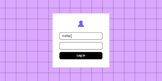
Login page design refers to the user interface and experience of the entry page where users input their credentials to access a platform or app. An effective login page is far more than a basic entry form—it’s often the first interaction a user has with the product, setting the tone for the entire experience. A well-designed login page can streamline user access, enhance security, and boost user retention.
For SaaS websites where branding and security are paramount, UXPin supports brand consistency by integrating design systems and styles that make the login page both polished and trustworthy. Designers can also easily share interactive prototypes with stakeholders and developers, who can view specs and documentation directly from the prototype, ensuring an efficient and accurate handoff. UXPin empowers you to create a professional, accessible, and secure login experience that reflects your brand and sets the right impression for users from their first interaction. Try UXPin for free.
Build advanced prototypes
Design better products with States, Variables, Auto Layout and more.
Try UXPin .try-uxpin-banner { margin: 40px 0px;}.try-uxpin__container { display: flex; max-width: 689px; height: 210px; padding: 20px; padding-left: 24px; border: 2px solid black; border-radius: 4px; align-items: center; justify-content: space-between; background-color: white; box-shadow: 10px 10px black;}.try-uxpin__left { width: 54%;}.try-uxpin__heading { font-size: 28px !important; font-weight: bold;}.try-uxpin__left p { margin: 10px 0px !important; color: black !important;}.try-uxpin__text { margin: 0 !important; font-size: 18px !important; line-height: 22px !important;}.try-uxpin__button { width: 135px; height: 44px; background: black; margin: 10px 0px; padding: 10px 20px; border: none; border-radius: 2px; color: white; font-size: 16px; text-align: center;}.try-uxpin__button:hover { cursor: pointer;}.try-uxpin__image { max-width: 320px !important; height: 200px; margin-right: -21px; margin-bottom: -6px;}@media (max-width: 760px) { .try-uxpin__container { height: auto; margin: 10px; align-items: left; }}@media (max-width: 500px) { .try-uxpin__container { flex-direction: column; } .try-uxpin__left { width: 100%; align-items: normal; }}What is a Login Page?A login page is a web page or screen where users enter their credentials—typically a username or email and password—to access a secure area of a website, app, or platform. It serves as a gateway to restricted content, personal accounts, or subscription-based services, ensuring that only authorized users can enter. So, it’s like a security measure that authenticates users, provides controlled access, and helps protect user data.
Beyond fields for username and password, login pages often feature additional options, like “Forgot Password” links, two-factor authentication (2FA), or single sign-on (SSO) options (e.g., logging in with Google or GitHub).
This small but vital part of user experience design influences users’ trust and perception of the product from their very first interaction. That’s why it’s important to follow best practices when designing it.
How to Design it in UXPin?Designing a login page in UXPin allows you to create an interactive, high-fidelity experience that’s close to the final product. Here’s a step-by-step guide:
Step 1: Start with a New Project or PageCreate a new project in UXPin or add a new page to an existing project if you’re integrating the login page into a larger prototype.
Step 2: Set Up the Login Form LayoutAdd Text Fields
Use UXPin’s input fields to create the username/email and password fields. Customize these with placeholders like “Enter your email” or “Password” to guide the user.
Add Labels and Instructions
Label each input field to ensure accessibility and clarity. If needed, include hints or instructions, such as password requirements or validation info.
Step 3: Design the Action ButtonsAdd a Login Button
Create a button labeled “Login” using UXPin’s button element. Adjust its size, color, and style to match your brand and make it visually prominent.
Add Secondary Actions
Include other essential actions like “Forgot Password?” and “Sign Up.” These can be text links or secondary buttons, positioned below the login button for easy navigation.
Step 4: Customize the Visual DesignApply Brand Colors and Fonts
Customize the login page with your brand’s color scheme and typography, ensuring consistency with the rest of the app or website.
Add Background and Logo
Incorporate the brand logo at the top of the page to reinforce the brand identity. For background options, consider a minimalist look or subtle imagery to keep the design clean and focused.
Step 5: Add Conditional Logic for Error StatesSet Up Error Messages
UXPin allows you to add conditional logic to elements, so you can simulate error messages. For example, if a user leaves the password field blank or enters the wrong credentials, display an error message below the field.
Highlight Errors Visually
Add color indicators (like red outlines or icons) around fields with incorrect input to guide users on how to correct them.
Step 6: Add Interactive ElementsCheckboxes for “Remember Me”
If you want to include a “Remember Me” checkbox, add a checkbox element and place it under the login fields. This can be styled and customized to match the overall look.
Password Visibility Toggle
Use UXPin’s interaction options to add a password visibility toggle (like an eye icon) to the password field. Set up interactions to show or hide the password when the user clicks the icon.
Step 7: Add Security FeaturesSimulate Two-Factor Authentication (2FA)
If your login page includes 2FA, add a new screen or modal that prompts the user to enter a verification code. Set up navigation and interactions to display the 2FA screen after clicking “Login.”
Set Up Success or Error Pages
Design a success message or transition to the main app interface upon successful login. For incorrect login attempts, route users to an error page or display an error state directly on the login page.
Step 8: Test Interactions and UsabilityUse UXPin’s preview mode to test interactions and confirm that all links, buttons, and conditional logic work as expected. Check for smooth navigation and verify that error states appear as intended.
Step 9: Conduct Usability TestingConduct usability testing directly within UXPin by sharing the prototype with users. Collect feedback on user flows, error handling, and general ease of use to identify any improvements before finalizing the design.
Step 10: Share with Stakeholders or DevelopersWhen your login page is complete, share the UXPin prototype link with stakeholders or developers for feedback or handoff. UXPin’s developer mode allows teams to view CSS, measurements, and style guides, streamlining the transition from design to development.
Top Tips for Login Page Design for SaaS WebsitesHere are essential tips for crafting an effective, user-friendly login page that enhances UX and UI for SaaS websites. Let’s cover key areas like accessibility, branding, developer handoff, security, and microcopy to ensure your login page sets the right tone and functions seamlessly.
Minimize Complexity: Keep the login page straightforward and avoid distractions. Focus users’ attention on logging in without overcrowding it with unnecessary links or information.Visual Hierarchy: Direct users’ attention to input fields and the login button. Place secondary options like “Forgot Password?” and “Sign Up” in less prominent, but accessible, areas.Keyboard Navigation: Ensure that users can tab through all interactive elements (input fields, buttons, checkboxes) logically. Test this flow for ease of navigation by keyboard.Labels and Alt Text: Include accessible labels for fields (username, password) and alt text for icons (like the password toggle). This helps screen readers convey information to visually impaired users.Color Contrast: Ensure sufficient contrast between text and backgrounds, especially on buttons and error messages, to improve readability for visually impaired users.Integrate Brand Identity: Use brand colors, fonts, and logo placement to reinforce brand identity. Avoid over-styling—keep it clean and professional.Subtle Animations: Thoughtful animations (e.g., button hover effects) create a polished look. Keep animations quick to avoid distracting from the main action.Friendly Language: Label fields clearly, use placeholders (e.g., “Enter your email”), and add welcome messages like “Welcome back!” for a friendly touch.Helpful Error Messages: Avoid vague messages like “Invalid credentials.” Instead, specify (e.g., “Incorrect password. Please try again.”) and use real-time validation if possible.Password Recovery: Make the “Forgot Password?” option easy to find and use, minimizing friction for users who need to reset their credentials.Two-Factor Authentication (2FA): Offer 2FA as an option for enhanced security, along with simple setup instructions if available.Password Visibility Toggle: Add an eye icon to toggle password visibility, especially helpful for mobile users.SSL and Encryption: Make sure login forms are secure by using HTTPS and encrypting data, crucial for protecting sensitive user information.Define States and Interactions: Document button and field states (default, hover, active, disabled). Developers need this for accurate functionality.Style Guides: Provide exact specifications for colors, fonts, padding, and spacing. UXPin’s developer mode can help by generating specs from the prototype.Interactive Prototyping: Create a clickable prototype in UXPin to show how the page behaves with user inputs, error handling, and API calls, ensuring a clear handoff.Responsive Design: Ensure the design adapts well to both desktop and mobile layouts. Elements should adjust properly on smaller screens to maintain usability.Touch-Friendly Elements: For mobile logins, make sure buttons and input fields are large enough for easy tapping to reduce user frustration.Preempt Common Errors: Guide users to avoid mistakes with placeholder hints (e.g., “example@domain.com”).Clear, Actionable Error States: Use red outlines and clear messages for fields with issues (e.g., “This field is required” for blank fields) to help users correct input easily.Single Sign-On (SSO): For B2B SaaS, consider SSO options (e.g., Google, Microsoft) to streamline login, especially useful for enterprise users.Convenience for Frequent Users: Allow frequent users to save login credentials securely (e.g., a “Remember Me” option) for easier daily access.Usability Testing: Test the login page with real users to uncover usability issues. Use insights to adjust elements like field placement, button size, or error messaging.Gather Analytics: Track metrics like failed login attempts and password reset frequency. High drop-off points may indicate design areas needing improvement.SummaryA well-designed login page is essential for SaaS websites, providing users with a secure, efficient entry point that sets the tone for the overall experience. Effective login design combines simplicity and accessibility, guiding users through the login process without distractions. Accessibility features like clear labels, keyboard navigation, and color contrast ensure usability for all users, while brand consistency and concise microcopy reinforce trust and make the experience welcoming.
Security elements like two-factor authentication, password visibility toggles, and SSL encryption protect user data and build confidence. Testing and iterating based on real user feedback allows for continuous improvements, creating a login page that’s secure, accessible, and user-friendly.
UXPin is the ultimate tool for designing high-quality, interactive login pages that streamline user experience and improve handoff to development. With UXPin, designers can create data-connected, real-code prototypes that mirror the final product, complete with dynamic elements like password toggles, real-time error handling, and conditional logic for seamless user interactions. Try UXPin for free.
Try UXPin for freeThe post Login Page Design – Guide for SaaS Websites appeared first on Studio by UXPin.
November 25, 2024
Corporate Website Design – Examples and Best Practices
Corporate Website Design focuses on creating an online presence that effectively communicates a company’s brand, values, products, and services to its audience, usually in a professional, user-friendly way. A well-designed corporate website builds credibility, supports marketing efforts, and provides users with the information they need to engage with the business.
UXPin Merge revolutionizes corporate website design by bridging design and development, using real code components for seamless, high-fidelity prototypes. With Merge, teams create consistent, responsive designs that match the final product, enabling faster collaboration, efficient scaling, and realistic user testing—all in one platform. Discover UXPin Merge.
Reach a new level of prototyping
Design with interactive components coming from your team’s design system.
Discover UXPin Merge .discover-merge { margin: 40px 8px;}.discover-merge__container { display: flex; max-width: 690px; height: 200px; padding: 20px; padding-left: 24px; border-radius: 4px; background-color: black; box-shadow: 10px 10px #9999ff; align-items: center; justify-content: space-between;}.discover-merge__left { width: 50%;}.discover-merge__left p { margin: 10px 0px !important; color: white !important; font-size: 18px !important;}.discover-merge__heading { font-weight: bold !important; color: white !important; font-size: 18px !important;}.discover-merge__text { margin: 0 !important; line-height: 22px !important;}.discover-merge__button { width: 174px; height: 44px; margin: 10px 0px; border: none; border-radius: 2px; background: white; color: black; font-size: 16px; text-align: center;}.discover-merge__button:hover { cursor: pointer;}.discover-merge__image { max-width: 320px !important; height: 200px; margin-right: -19px;}@media (max-width: 760px) { .discover-merge__container { height: auto; margin: 10px; align-items: left; }}@media (max-width: 500px) { .discover-merge__container { flex-direction: column; } .discover-merge__left { width: 100%; align-items: normal; }}What is a Corporate Website?A corporate website is the official online presence of a company, designed to provide essential information about the business, its products or services, values, and brand identity to its audience.
It serves as a central hub for various stakeholders, including customers, clients, investors, and potential employees, by offering an easily accessible, comprehensive overview of the company. Unlike e-commerce websites focused mainly on transactions, corporate websites emphasize credibility, branding, and communication.
The primary purpose of a corporate website is to communicate the brand’s story and build credibility. It serves as a virtual business card that provides users with a first impression of the company, often guiding their decision-making process. Additionally, corporate websites support marketing efforts, drive brand recognition, and serve as a digital touchpoint for customer support, partnerships, and talent acquisition.
Corporate Website ExamplesUBS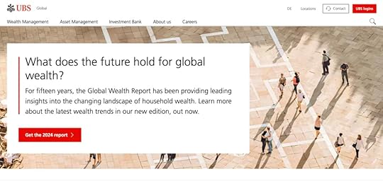
UBS’s website is a solid example of corporate web design that combines usability, professional aesthetics, and brand consistency to create a credible online presence.
Professional and Clean Design: UBS uses a polished, minimalist design that reflects its brand as a leading financial institution. The layout is structured, with ample white space and a clear hierarchy, making it easy to navigate and reinforcing trust.Structured Information Architecture: The website is organized into sections for different stakeholders, including Investors, Clients, and Careers, which allows each audience to quickly find relevant information. This thoughtful structure supports easy access to information and enhances user experience.Interactive and Engaging Elements: UBS incorporates interactive elements such as drop-down menus, video content, and call-to-action buttons, which guide users through key services and offerings without cluttering the experience.Consistent Branding: The design aligns closely with UBS’s brand identity, using its signature colors, fonts, and logos across the site, reinforcing a cohesive look that users will recognize.Responsive and Accessible Design: The site is optimized for mobile and desktop, ensuring accessibility across devices, which is critical for global users.Johnson&Johnson
These elements make Johnson & Johnson’s website a model of corporate web design, demonstrating how an organized, transparent, and brand-aligned site can effectively communicate a company’s values and engage various audiences globally.
Clear Mission and Values: The website effectively communicates Johnson & Johnson’s commitment to health and humanity, which is reflected across sections dedicated to innovation, social impact, and ethical practices. Their “Our Credo” mission statement emphasizes prioritizing user needs, creating an instant sense of trust and purpose.Comprehensive Information Architecture: Johnson & Johnson’s website is structured to serve multiple audiences, with dedicated sections for Investors, Careers, Innovation, Health & Wellness, and Global Health Equity. This organization ensures that each audience finds relevant information easily, making the website user-friendly and informative.Engaging Visual Design and Consistent Branding: The site uses high-quality visuals and a clean, professional layout that matches the company’s healthcare focus. With a muted color palette, ample white space, and thoughtful typography, the design feels both accessible and aligned with the brand’s serious, healthcare-centered mission.Responsiveness and Accessibility: Optimized for both desktop and mobile, the website ensures a consistent and accessible experience across devices. This is crucial for a global audience, making the website functional and visually appealing on any screen size.Commitment to Social Responsibility: Johnson & Johnson includes a section for Environmental, Social, and Governance (ESG) Policies, highlighting their commitments to social impact, diversity, and sustainability. This not only serves as a corporate responsibility showcase but also appeals to stakeholders interested in ethical business practices.Learn about prototyping at Johnson&Johnson.
Meta
Meta’s website is a strong example of how large corporations can use digital design to effectively communicate with varied audiences, support their brand identity, and keep users engaged with rich, interactive content.
Clear Communication of Vision and Mission: Meta’s website emphasizes its mission to connect people, explore virtual and augmented reality, and develop the metaverse. It includes sections like “Who We Are” and “Our Actions,” which highlight Meta’s values, sustainability efforts, and innovations in social technology, providing transparency and building trust with users.User-Centric Navigation: With dedicated sections for various stakeholders—like “Investors,” “Developers,” “Media,” and “Careers”—the site makes it easy for different audiences to access the information relevant to them. This thoughtful structure supports easy navigation and a user-friendly experience.Modern and Consistent Design: The site’s sleek, minimalist design uses Meta’s branding elements, such as its color palette and typography, to maintain a cohesive look. It employs clean lines and interactive visuals to enhance the site’s usability, making it feel both accessible and professional.Interactivity and Engagement: Interactive elements like videos, image galleries, and animations add depth, allowing users to explore Meta’s projects, products, and social impact in a dynamic, engaging way.Accessibility and Global Reach: Meta’s website is designed to be responsive, ensuring optimal viewing on any device. Additionally, it aligns with Meta’s goal of inclusivity, offering global resources in various sections, which supports a diverse audience and makes the brand accessible worldwide.The Volkswagen Group
These design choices position Volkswagen’s corporate website as a robust tool for brand engagement, information dissemination, and customer interaction, making it a model of effective corporate web design for large, internationally-focused businesses.
Clear, User-Centric Structure: Volkswagen’s website is organized to cater to diverse audiences, including investors, media, and sustainability advocates. Key sections like Sustainability, Investors, and Corporate Governance provide easy access to relevant resources, making the user experience straightforward and engaging.Visual and Brand Consistency: The website employs a clean, professional design that aligns with Volkswagen’s brand identity. It balances text with high-quality images and videos of its vehicle concepts and sustainability projects, visually reinforcing its commitment to innovative and eco-friendly automotive solutions.Focus on Innovation and Sustainability: Volkswagen highlights its forward-thinking initiatives with dedicated sections on electric mobility, battery technology, and autonomous driving, as part of its “NEW AUTO – Mobility for Generations to Come” strategy. This transparent presentation of its transformation goals appeals to both environmentally conscious users and tech-focused stakeholders.Interactive, Multimedia Content: The site incorporates engaging content, including video presentations and infographics, which allow users to explore Volkswagen’s product innovations and global impact in an immersive way. This multimedia approach enhances user engagement and conveys complex information more effectively.Accessible and Global-Friendly: Designed with a global audience in mind, the site is multilingual and mobile-responsive, ensuring that users from different regions can access and interact with the content seamlessly, regardless of their device or language.Corporate Website Design Best PracticesCreate a Clean, Professional LayoutUse a minimalist design with clear structure and ample white space to emphasize professionalism and readability. Avoid clutter by organizing content into easily digestible sections.
Example: Look at Volkswagen Group’s website—its structured layout makes it easy to find information, giving the site a polished, credible feel.
Ensure User-Centric NavigationDesign an intuitive navigation bar with clearly labeled sections that cater to various stakeholders like Investors, Careers, Products, and Sustainability. Use a sticky header for easy access and a mega-menu if your site has many categories.
Example: Johnson & Johnson’s navigation is structured by audience type, making information easily accessible to investors, media, job seekers, and healthcare professionals.
Responsive and Mobile-Friendly DesignUse responsive design techniques to ensure your website looks and functions well on all devices. Test on multiple screen sizes and orientations to ensure a seamless experience.
Example: Meta’s corporate site is optimized for both desktop and mobile, maintaining a consistent and accessible experience across devices.
Maintain Strong Visual and Brand ConsistencyUse your brand’s color palette, typography, and logo consistently across all pages. This builds trust and reinforces brand identity.
Example: UBS and Volkswagen effectively reinforce brand identity by using signature colors and logos, giving their sites a cohesive, professional look.
Emphasize Key Information with Visual HierarchyUse size, color contrast, and spacing to highlight important elements like CTAs, headings, and key messages. Design with a clear visual hierarchy so users naturally follow the intended flow.
Example: Meta’s website uses ample white space and strategically placed CTAs to guide users toward important sections without overwhelming them.
Prioritize AccessibilityIncorporate accessibility features like alt text for images, high-contrast colors for readability, and keyboard navigation support. Use accessible, descriptive labels on forms and buttons.
Example: Many corporate sites, including Volkswagen’s, prioritize accessibility to accommodate a global audience, ensuring that all users have an equitable experience.
Highlight the Brand’s Mission and ValuesDedicate sections to the company’s mission, values, and ethical commitments. This might include pages on social responsibility, sustainability, or community engagement.
Example: Johnson & Johnson’s “Our Credo” section reflects the brand’s values and commitment to health and humanity, connecting emotionally with users and building trust.
Include Interactive and Engaging ElementsUse interactive features like hover effects, animations, and videos to make the site more engaging, but keep them subtle to avoid overwhelming users.
Example: Meta’s corporate website uses interactive media effectively to enhance user engagement without compromising the site’s clean, professional appearance.
Use Real Code Components for PrototypingUtilize tools like UXPin Merge to create high-fidelity prototypes with code-based components. This ensures the design closely resembles the final product, making testing and iteration more effective.
Example: Prototypes that behave like the final product allow for accurate usability testing, helping to refine user experience early in the process.
Implement SEO Best PracticesOptimize the site for search engines by using keywords, meta descriptions, and alt tags for images. Structure the site with a logical hierarchy to improve both usability and SEO.
Example: Well-structured corporate sites like Johnson & Johnson’s or UBS’s rank higher and attract organic traffic due to their well-optimized, keyword-rich content.
Feature Social Proof and Trust ElementsIncorporate elements like customer testimonials, case studies, client logos, and compliance badges. This builds credibility and trust with users, showing your brand’s reputation and reliability.
Example: Johnson & Johnson includes awards, partnerships, and impact statements, which reinforce their credibility and dedication to their field.
How Can UXPin Merge Help with Corporate Website Design?UXPin Merge can be a game-changer for designing corporate websites because it bridges the gap between design and development, providing a faster, more collaborative, and consistent approach.
Here’s how Merge can support a corporate website design process.
Real Code Components for High-Fidelity PrototypesWith UXPin Merge, designers can use actual code components in their prototypes. This means that every button, navigation bar, or form you design in UXPin is a real component from the codebase, not a static mockup. This high fidelity allows designers to create prototypes that look and behave like the final product, making it easier to demonstrate interactions, gather stakeholder feedback, and test user flows effectively.
Design Consistency with Reusable ComponentsMerge allows teams to design with reusable components, ensuring that every element on the corporate website—from headers to footers, buttons to modals—stays consistent. Since these components come from a shared design system, all brand styling and interaction rules are pre-applied, maintaining consistency across the website and minimizing discrepancies between design and development.
Efficient Collaboration Between Design and DevelopmentMerge’s code-based components align directly with what developers will use in production, meaning the transition from design to development is seamless. Designers can hand off fully interactive prototypes built with real code, eliminating the need for developers to “recreate” the design from scratch. This reduces back-and-forth adjustments, saving time and ensuring that what was prototyped is what ends up in production.
Responsive, Adaptable Design SystemsCorporate websites need to look great across devices, and Merge’s components can adapt to different screen sizes just like they would in the final product. Since components can be responsive, designers can easily test layouts and adjust designs within UXPin to ensure the site looks polished on mobile, tablet, and desktop, all within the same platform.
Scalability for Large ProjectsFor corporate websites that require complex navigation, extensive product pages, or interactive elements, Merge helps scale the design with reusable, component-based systems. By using Merge, designers can quickly build new pages or sections without starting from scratch—just drag and drop existing components into the prototype and customize as needed.
Streamlined Feedback and IterationMerge prototypes are interactive and code-based, meaning that stakeholders and users can experience the prototype with all intended interactions intact. This makes feedback more specific and actionable, as users can interact with the site as if it’s live. Designers can then make adjustments directly in UXPin, iterate based on real interactions, and keep the prototype up-to-date without repetitive rework.
Realistic User TestingBecause UXPin Merge prototypes are built with real components, they provide a near-final experience for user testing. This allows teams to conduct usability tests with realistic interactions, helping to uncover any usability issues and validate designs before development. User feedback is more relevant since participants interact with the prototype as they would with the final site, making it easy to identify issues early and adjust accordingly.
Using UXPin Merge in corporate website design empowers design and development teams to work faster, produce consistent and scalable designs, and reduce the risk of discrepancies between design and production. This streamlined, code-based approach helps ensure the corporate website aligns with brand standards, functions seamlessly, and delivers a high-quality user experience. Discover UXPin Merge.
Discover MergeThe post Corporate Website Design – Examples and Best Practices appeared first on Studio by UXPin.
November 20, 2024
UI Localization Guide for Multi-Region Designs
UI localization is the process of adapting a user interface to fit the cultural, linguistic, and regional preferences of different user groups. This adaptation involves translating text, adjusting layouts, adapting date and time formats, converting currencies, and modifying graphics or symbols to ensure that the design feels natural to users in specific locales.
UI localization is crucial for global products as it provides a seamless and accessible experience for diverse audiences. It allows users to interact with a product in a way that feels familiar and intuitive, which can increase engagement, satisfaction, and overall usability.
With UXPin, designers can easily build flexible layouts, handle right-to-left and left-to-right language adjustments, and adapt components like currency, date, and time formats to match local expectations. UXPin’s powerful tools make it simple to create globally accessible designs from the start, saving time and ensuring a natural, intuitive experience for users everywhere. Ready to design for the world? Try UXPin for free.
Build advanced prototypes
Design better products with States, Variables, Auto Layout and more.
Try UXPin .try-uxpin-banner { margin: 40px 0px;}.try-uxpin__container { display: flex; max-width: 689px; height: 210px; padding: 20px; padding-left: 24px; border: 2px solid black; border-radius: 4px; align-items: center; justify-content: space-between; background-color: white; box-shadow: 10px 10px black;}.try-uxpin__left { width: 54%;}.try-uxpin__heading { font-size: 28px !important; font-weight: bold;}.try-uxpin__left p { margin: 10px 0px !important; color: black !important;}.try-uxpin__text { margin: 0 !important; font-size: 18px !important; line-height: 22px !important;}.try-uxpin__button { width: 135px; height: 44px; background: black; margin: 10px 0px; padding: 10px 20px; border: none; border-radius: 2px; color: white; font-size: 16px; text-align: center;}.try-uxpin__button:hover { cursor: pointer;}.try-uxpin__image { max-width: 320px !important; height: 200px; margin-right: -21px; margin-bottom: -6px;}@media (max-width: 760px) { .try-uxpin__container { height: auto; margin: 10px; align-items: left; }}@media (max-width: 500px) { .try-uxpin__container { flex-direction: column; } .try-uxpin__left { width: 100%; align-items: normal; }}What is UI Localization?UI Localization is the process of adapting a user interface (UI) to meet the linguistic, cultural, and functional expectations of users in different regions or languages. It’s a critical part of creating globally accessible products, ensuring that users feel comfortable and engaged when interacting with an interface, regardless of their location or cultural background.
Localization goes beyond simple translation, addressing everything from language and layout adjustments to cultural relevance and legal compliance, making the product feel “native” to each audience.
What Does UI Localization Involve?Here are the key components of UI localization:
Language Translation: Translating the UI text into the target language is the most direct form of localization. However, it’s not just about translation; it also involves cultural adaptation to ensure the meaning is contextually appropriate. For example, idioms, phrases, or product names may need to be modified.Layout Adjustments: Different languages vary in text length and direction. For instance, English is generally concise, while languages like German or Russian tend to have longer words, potentially requiring additional space. Right-to-left (RTL) languages like Arabic and Hebrew require UI adjustments to accommodate the reversed layout direction.Date, Time, and Number Formatting: Different regions have distinct date, time, and numerical formats. For example, while the U.S. commonly uses the “MM/DD/YYYY” date format, many European countries prefer “DD/MM/YYYY.” Localizing these elements enhances clarity and usability.Currency and Units of Measure: Users expect prices in their local currency and measurements in familiar units (e.g., kilometers vs. miles). Properly localizing these details improves accuracy and trust in the interface.Culturally Relevant Imagery and Symbols: Imagery, color schemes, and icons often carry cultural meanings, so localization ensures these elements are relevant and appealing in each target region. For example, the color white is associated with purity in some cultures but can signify mourning in others. Similarly, certain gestures, like a thumbs-up, might have positive connotations in one culture but be offensive in another.Consistency with Brand and User Experience: Localization must also maintain a cohesive brand identity across different regions. Localization balances brand consistency with cultural customization, ensuring that while the product feels native in each region, it still aligns with the global brand values and user experience.Where Does UI Localization Fit in the Design Process?UI localization should be integrated early in the design process rather than treated as a final adjustment.
Localization considerations can impact design decisions from layout flexibility to text expansion handling, and anticipating these needs during the wireframing or prototyping stage saves time and resources later. Working alongside localization experts, designers can create adaptable layouts and reusable components that accommodate various languages and cultural needs.
Imagine you’re designing a checkout page for an international e-commerce store. Your goal? Make sure every user, whether in Paris or Tokyo, feels right at home.
Language and Text: In English, your checkout button might say “Buy Now,” but in French, it needs to say “Acheter maintenant,” which is longer. To accommodate this, you design flexible buttons that expand to fit different text lengths.RTL Layouts: For Arabic-speaking users, the entire layout shifts to a right-to-left format. The shopping cart icon moves to the right, and text alignment reverses, creating a familiar experience for these users.Currency and Payment Options: U.S. users see USD, but Europeans see euros and region-specific payment methods like iDEAL. You ensure these currency symbols and payment options are easy to spot.Date and Number Formatting: For credit card expiration dates, you adjust the format based on the locale. U.S. users expect MM/YY, while other countries might prefer DD/MM/YY.Compliance and Privacy Notices: For European customers, you add a GDPR-compliant consent checkbox, while California users see a CCPA notice.Each step creates a seamless experience, making every user feel like the interface was designed just for them—no matter where they are.
How to Handle UI Localization in UXPin?Handling localization in UXPin involves designing with flexibility in mind so that your prototypes can adapt to different languages, formats, and user expectations across regions.
Here’s a step-by-step approach to effectively localize your designs in UXPin.
Use Flexible Layouts for Text ExpansionDifferent languages vary in text length, which can impact UI spacing and layout. When designing in UXPin, use flexible, responsive layouts that allow elements like buttons, text fields, and menus to expand or shrink without breaking the design. For instance, keeping adequate padding around text blocks ensures that longer translated text doesn’t overflow.
Design for Right-to-Left (RTL) and Left-to-Right (LTR) LanguagesIf you’re designing for regions that use RTL languages (like Arabic or Hebrew), UXPin allows you to easily adjust alignment, position, and spacing. You can create two versions of the same screen (one for LTR and one for RTL), or use mirrored layouts. Consistent use of flexible layouts can make this adjustment easier and help maintain alignment.
Prepare for Different Date, Time, and Number FormatsFor international users, date, time, and number formats vary (e.g., “MM/DD/YYYY” vs. “DD/MM/YYYY” for dates). In UXPin, create prototype variations that reflect these differences based on your target regions. You can also add notes for developers to specify how these formats should change depending on user location.
Create Component Variants for Currency and UnitsUXPin allows you to set up component variants, which is useful for adapting elements like prices or units of measurement. For instance, you can create a “Price” component with different currency symbols or formats (e.g., $, €, ¥) so that developers know to adjust the display depending on the locale.
Use Icons and Symbols CarefullyLocalization goes beyond text, so consider how icons and symbols are interpreted in different cultures. UXPin’s library includes various icons that can be swapped out depending on region-specific preferences. Always test for cultural appropriateness, especially for icons or symbols that might not translate universally.
Document Localization NotesIn UXPin, you can annotate designs to provide localization instructions. Adding notes about translation, text length constraints, and any RTL adjustments gives developers clear guidelines, ensuring that the final product aligns with your localized design intent.
Test Prototypes for Regional UsabilityOnce your localized versions are set up, test each prototype to make sure they’re usable for users in different regions. UXPin allows you to create interactive prototypes that reflect the localized experience, which you can then share with users or stakeholders for testing and feedback.
SummaryUI localization is essential for creating a truly user-centered design that resonates with a global audience. By incorporating localization into the design process from the beginning, designers ensure that users worldwide have an intuitive, culturally relevant, and seamless experience with the product, regardless of where they are or what language they speak.
In UXPin, you can create adaptable, region-friendly prototypes that meet the needs of a global audience, allowing for a seamless transition to development with localization built in from the start. Try UXPin for free.
Try UXPin for freeThe post UI Localization Guide for Multi-Region Designs appeared first on Studio by UXPin.
November 18, 2024
UI Inspiration – Where to Get it From?

Collecting UI inspiration is a key part of the creative design process. It helps them stay current with design trends, find innovative solutions to common design challenges, and explore different aesthetics that could improve the user experience. Popular sources for UI inspiration include platforms like Dribbble, Behance, Awwwards, and Pinterest, where designers share and discover creative examples of interface design.
UXPin is the go-to platform for designers seeking UI inspiration that’s both creative and practical. With pre-built design systems and interactive, real-code components, UXPin lets you explore and prototype with production-ready elements. Test animations, user flows, and conditional logic to bring ideas to life, all within one seamless tool. Spark your creativity—try UXPin for free today.
Build advanced prototypes
Design better products with States, Variables, Auto Layout and more.
Try UXPin .try-uxpin-banner { margin: 40px 0px;}.try-uxpin__container { display: flex; max-width: 689px; height: 210px; padding: 20px; padding-left: 24px; border: 2px solid black; border-radius: 4px; align-items: center; justify-content: space-between; background-color: white; box-shadow: 10px 10px black;}.try-uxpin__left { width: 54%;}.try-uxpin__heading { font-size: 28px !important; font-weight: bold;}.try-uxpin__left p { margin: 10px 0px !important; color: black !important;}.try-uxpin__text { margin: 0 !important; font-size: 18px !important; line-height: 22px !important;}.try-uxpin__button { width: 135px; height: 44px; background: black; margin: 10px 0px; padding: 10px 20px; border: none; border-radius: 2px; color: white; font-size: 16px; text-align: center;}.try-uxpin__button:hover { cursor: pointer;}.try-uxpin__image { max-width: 320px !important; height: 200px; margin-right: -21px; margin-bottom: -6px;}@media (max-width: 760px) { .try-uxpin__container { height: auto; margin: 10px; align-items: left; }}@media (max-width: 500px) { .try-uxpin__container { flex-direction: column; } .try-uxpin__left { width: 100%; align-items: normal; }}What is UI Inspiration?UI inspiration refers to sources, ideas, and examples that designers use to spark creativity and inform the look and feel of user interfaces. It’s a way for designers to explore new layouts, color schemes, interactions, typography, and design patterns that can enhance usability and visual appeal. UI inspiration can come from websites, apps, design galleries, or even non-digital sources like art, nature, and architecture.
Why You Should Seek Inspiration as UI DesignerUI design is a blend of science and art: while one part of the process relies on principles like usability, structure, and function, the other part thrives on creativity, emotion, and visual storytelling.
Seeking UI inspiration is essential because it nurtures the artistic side of design, helping designers cultivate a unique, creative flair that resonates with users. By exploring various color palettes, typography choices, layout patterns, and interaction styles, designers can experiment with new visual directions that make their work stand out.
Inspiration serves as a catalyst for creativity, allowing designers to see how others have balanced function with aesthetics. This not only brings fresh ideas but also expands the designer’s toolkit, offering diverse ways to infuse emotion, energy, and personality into their designs.
Studying UI inspiration from different sources helps designers break out of rigid design patterns and develop a more refined, artistic eye. This approach leads to UI designs that are not only scientifically sound in terms of usability and accessibility but also compelling and memorable. In the end, seeking inspiration enriches a designer’s creative palette, allowing them to merge function with artistry, creating experiences that engage users on multiple levels.
How UXPin Helps Get UI InspirationUXPin helps designers gather UI inspiration by providing a platform that combines prototyping, real-code components, and a vast library of interactive elements to experiment with and draw ideas from. Here’s how UXPin supports UI inspiration:
Pre-built Design Systems and Component Libraries: UXPin offers access to libraries like Material Design and Bootstrap, enabling designers to explore established UI patterns and see how various components work together. This helps designers get inspired by standardized elements and speeds up the design process.Merge with Real Code Components: With UXPin’s Merge technology, designers can pull in real, code-based components from existing design systems, enabling them to see how actual, functioning UI elements work within a prototype. By experimenting with these components, designers can find inspiration for how different UI patterns function in a realistic context.Interactive Prototyping: UXPin’s interactive prototyping capabilities allow designers to test out UI ideas in real-time, including micro-interactions and complex animations. This hands-on experimentation with functionality and interactions provides a new layer of inspiration that goes beyond static visuals.Collaboration with Design Systems: UXPin allows designers to create and reuse shared design systems. By centralizing UI components, designers can explore and get inspired by elements used across projects, ensuring consistency while also sparking new ideas for reusable patterns.Inspiration from Accessible and Inclusive Design: With built-in accessibility features, UXPin helps designers get inspired to create a UI that’s visually appealing while also being usable by all audiences. Accessibility tools encourage design choices that are both functional and visually inspiring, balancing creativity with inclusivity.Where to Get UI Inspiration From?These brands and platforms serve as invaluable resources for UI designers, offering a blend of structured design thinking, fresh creative ideas, and exposure to current trends across different industries.
Other Designers’ Work and Design ThinkingPlatforms like Dribbble, Behance, and Awwwards feature designs shared by other professionals. Here, designers showcase their work and often describe the design thinking and process behind it, giving insights into creative approaches and trends.
Dribbble: A popular social platform for designers to share small snippets or “shots” of their work, such as UI elements, branding, and illustrations. It’s known for highly visual inspiration and creative experimentation.Behance: A portfolio platform by Adobe where designers, photographers, and creatives share full projects and case studies. It’s ideal for seeing detailed design workflows and cohesive project presentations.Awwwards: A website awards platform that recognizes outstanding web design from around the world. It’s a go-to resource for cutting-edge trends and examples of innovative design.Networking Meetings for DesignersDesign meetups, networking events, and online communities connect designers to share feedback, insights, and solutions to design challenges.
Meetup: A global platform where designers can join local or virtual groups for networking, workshops, and collaborative sessions. It’s widely used for design meetups around UI/UX.ADPList (Amazing Design People List): A free mentorship platform where designers connect for one-on-one or group sessions, sharing feedback and insights on design projects and career development.ConferencesDesign conferences offer sessions and workshops led by experts, covering the latest tools, techniques, and trends in UI/UX design.
UXDX: A conference focused on the entire product lifecycle, from UX and design to development, with sessions on UI trends, design systems, and user experience strategies.Smashing Conference: A hands-on conference by Smashing Magazine that dives deep into UX/UI design, front-end development, and accessibility.Adobe MAX: Adobe’s annual creative conference, featuring sessions on everything from design tools and UI trends to interactive design, branding, and illustration.Looking for Inspiration Outside of DesignObserving the world beyond screens, such as nature, art, and architecture, reveals patterns, colors, and textures that inspire unique, non-digital elements for UI design.
Architecture: Architectural design, with its emphasis on structure, space, and form, can inspire layouts and spatial relationships in UI.Fine Art and Museums: Museums and galleries, featuring classic and contemporary works, provide ideas for color schemes, contrast, and texture that enhance visual appeal.Reading FictionFictional narratives in books, poetry, and films inspire creativity and emotional depth, which can lead to more engaging, story-driven UI designs.
Books: Novels and short stories can spark ideas for storytelling in user journeys, helping designers create emotionally engaging experiences.Films: Film visuals, narrative pacing, and cinematography offer inspiration for crafting user flows and immersive digital experiences.Inspiration Websites and GalleriesWebsites like Pinterest, Muzli, and SiteInspire offer curated design galleries showcasing UI and UX inspiration from across the web.
Pinterest: A visual search engine where designers save and share inspiration boards, covering everything from color palettes to UI patterns.Muzli: A Chrome extension and website that curates the latest design trends and inspiring work, including UI, UX, branding, and illustration.SiteInspire: A showcase of well-designed websites, categorized by style, type, and industry, helping designers explore UI ideas for specific website themes or industries.Unlock UI Inspiration with UXPinUXPin is more than a prototyping tool—it’s a platform that fuels creativity and brings UI inspiration to life. With access to pre-built design systems like Material Design and Bootstrap, UXPin provides an inspiring foundation of components and patterns ready to use and customize. Designers can explore real, interactive code components with UXPin’s Merge technology, allowing them to prototype with production-ready elements that mimic the final product’s look and feel. This feature enables designers to experiment, innovate, and refine, breaking away from static design and diving into fully interactive ideas.
UXPin also brings together design and development in one place, creating a seamless flow where designers can try out ideas in real time without limits. Advanced prototyping features allow you to test animations, interactions, and conditional logic, providing endless inspiration for user flows and experiences. For designers looking to keep up with the latest in UI, UXPin’s design system integrations, accessible UI patterns, and collaborative tools offer a dynamic space to explore and implement cutting-edge ideas, making it a go-to platform for both creativity and functionality. Try UXPin for free today.
Try UXPin for freeThe post UI Inspiration – Where to Get it From? appeared first on Studio by UXPin.
November 13, 2024
Retool Alternatives for 2025
Retool lets teams build internal tools quickly without extensive coding. It speeds up development and reduces resource costs for companies needing fast, functional internal tools. What if you want another tool that has a drag-and-drop interface, and enough flexibility to create dashboards, CRMs, and admin panels efficiently? Here are top alternatives to Retool that you should consider. Let’s explore them.
UXPin Merge is perfect for creating polished, customer-facing applications with minimal design handoff issues. By bridging design and code, the tool enhances collaboration, speeds up development, and maintains design consistency across all project stages. Try UXPin Merge for free.
Reach a new level of prototyping
Design with interactive components coming from your team’s design system.
Discover UXPin Merge .discover-merge { margin: 40px 8px;}.discover-merge__container { display: flex; max-width: 690px; height: 200px; padding: 20px; padding-left: 24px; border-radius: 4px; background-color: black; box-shadow: 10px 10px #9999ff; align-items: center; justify-content: space-between;}.discover-merge__left { width: 50%;}.discover-merge__left p { margin: 10px 0px !important; color: white !important; font-size: 18px !important;}.discover-merge__heading { font-weight: bold !important; color: white !important; font-size: 18px !important;}.discover-merge__text { margin: 0 !important; line-height: 22px !important;}.discover-merge__button { width: 174px; height: 44px; margin: 10px 0px; border: none; border-radius: 2px; background: white; color: black; font-size: 16px; text-align: center;}.discover-merge__button:hover { cursor: pointer;}.discover-merge__image { max-width: 320px !important; height: 200px; margin-right: -19px;}@media (max-width: 760px) { .discover-merge__container { height: auto; margin: 10px; align-items: left; }}@media (max-width: 500px) { .discover-merge__container { flex-direction: column; } .discover-merge__left { width: 100%; align-items: normal; }}UXPin MergeUXPin Merge allows designers to create high-fidelity, code-based prototypes that feel like the final product, enhancing collaboration with developers and ensuring faster, more accurate releases.
With access to pre-built and custom components, designers can mimic real user interactions, providing an authentic user experience. Once approved, the design’s auto-generated specs and production-ready code streamline the development process, saving time by reducing the need for translating designs into code.
Retool is tailored to data-driven workflows rather than full product design. UXPin Merge’s focus on production-quality prototypes makes it the superior choice for companies needing robust, design-to-development alignment for customer-facing applications.
AppsmithAppsmith is a powerful alternative to Retool for building internal tools, particularly for developers seeking an open-source, highly customizable solution. With Appsmith, users can drag and drop components, connect to various data sources, and apply custom JavaScript, offering flexibility similar to Retool but with more control and adaptability.
Appsmith’s open-source nature allows teams to fully customize and self-host their applications, making it ideal for organizations that need control over deployments and advanced custom features.
BudibaseBudibase enables teams to rapidly create custom internal tools with interactive components and flexible data integrations. By leveraging pre-built templates and UI elements, teams can build high-fidelity prototypes that closely resemble final applications, improving collaboration and accelerating the release cycle.
Budibase connects the finished tool to databases, APIs, and other data sources, reducing the development time by simplifying data handling and minimizing the need for repetitive code—making it an efficient solution for fast, production-ready deployments.
Budibase stands out over Retool for teams looking for an open-source, self-hosted platform with more control over customization and deployment. Unlike Retool, which is more focused on data-driven internal tools, Budibase allows users to build internal apps with more flexibility, including custom workflows, form creation, and even user-facing portals.
Additionally, Budibase’s open-source foundation makes it adaptable and cost-effective, giving organizations greater control over security, scalability, and extended custom features without vendor lock-in.
BubbleBubble empowers non-developers to build interactive, high-fidelity web applications without coding. By using its drag-and-drop editor and extensive library of components, teams can create prototypes and functional applications that mimic the final product experience. Bubble’s seamless data management and workflow automation allow for realistic interactions, speeding up the development process from idea to launch.
Bubble applications are production-ready, offering a smooth path to deployment without needing translation from design to code, making it an ideal tool for quickly launching customer-facing applications.
UI BakeryUI Bakery is a no-code/low-code platform that enables users to create custom internal tools and business applications using a visual interface. With a drag-and-drop editor, pre-built UI components, and integration capabilities for databases and APIs, teams can quickly prototype and build interactive applications that feel like the final product.
UI Bakery simplifies deployment, supporting efficient handoffs and enabling production-ready applications with minimal coding, making it ideal for businesses that need rapid internal tool development without extensive engineering resources.
DronaHQDronaHQ empowers teams to build custom internal tools and applications with a no-code/low-code approach. With its drag-and-drop interface and a library of ready-to-use components, teams can create functional, high-fidelity prototypes that replicate the final user experience.
DronaHQ integrates seamlessly with databases and APIs, allowing teams to connect data sources directly and manage workflows efficiently. This streamlines the transition from design to production, making it ideal for rapidly deploying business tools that are user-ready without extensive back-end development.
PlasmicPlasmic allows teams to create custom, high-quality front ends visually, combining the ease of no-code with full-code flexibility.
With a rich library of components, seamless integrations, and responsive design capabilities, Plasmic enables the rapid creation of pixel-perfect prototypes and applications that can connect directly to APIs and data sources. This approach streamlines collaboration and allows developers to add custom logic, making it ideal for quickly deploying production-ready web experiences or user-facing applications with full design control.
Which Retool alternative is best for collaboration?For collaboration, UXPin Merge stands out as the best option. It allows designers and developers to work with the same production-ready code components, ensuring design consistency and reducing handoff friction. This makes it highly effective for teams that need to stay aligned on complex projects and design systems.
Plasmic also ranks highly for collaborative design, allowing designers and developers to work together on flexible front ends while accommodating custom code.
Retool and DronaHQ support collaboration for internal tools but primarily focus on data integration rather than design-development collaboration.
Which Retool Alternative is Best for UI Exploration?For UI exploration, Plasmic and UXPin Merge are excellent Retool alternatives. Plasmic offers a flexible visual editor that’s ideal for exploring various UI layouts and designs with pixel-perfect control, making it especially useful for front-end designers seeking creative freedom.
UXPin Merge, while not no-code, allows designers to experiment with real production components, so it’s powerful for high-fidelity UI exploration within the constraints of a design system. Both tools enable iterative design, bridging creativity with functionality for more polished UI exploration.
Which is Best for Building Apps Quickly?For building apps quickly, Bubble, and DronaHQ are among the best options.
Bubble is great for non-technical users creating full web applications, including customer-facing ones, without writing code.DronaHQ offers a no-code/low-code environment with drag-and-drop components, making it a solid choice for rapid internal tool and business app development.Each has strengths for specific app types, but all prioritize fast deployment.
Which Retool Competitor is Best for Rapid Prototyping?For rapid prototyping, UXPin Merge, Plasmic, and Bubble are top choices:
UXPin Merge: Ideal for high-fidelity prototypes using real code components, making it perfect for quickly testing realistic UI designs.Plasmic: Offers flexible UI exploration with a visual editor, great for quickly iterating on complex front-end designs.Bubble: Allows non-developers to rapidly build functional prototypes of full web applications, including both front-end and back-end elements, without coding.Each tool supports fast iteration, enabling teams to test ideas and gather feedback quickly.
Why Should You Give UXPin Merge a Chance?Considering tools like Retool, Appsmith, Budibase, or Bubble makes sense if you’re exploring options for building internal tools, dashboards, or simple apps quickly, especially when low-code or no-code functionality is needed.
While these tools can help teams create data-driven internal applications without extensive coding, UXPin uniquely empowers teams focused on high-fidelity, customer-facing product design. UXPin provides a streamlined design-to-development process using production-ready components, ensuring that prototypes match final product quality—ideal for polished, consistent user experiences. Discover UXPin Merge.
Discover MergeThe post Retool Alternatives for 2025 appeared first on Studio by UXPin.
November 11, 2024
Carousel UI – What is a Carousel in Web Design?

Designers use carousels to showcase multiple pieces of content in a compact, engaging way without overwhelming users. Carousels allow them to highlight key content—such as promotions, product images, or featured stories—while saving screen space. Read about carousels in UI design, when not to use them, and how to create them in UXPin.
UXPin makes it easy to create carousels that highlight products, promotions, or content in a sleek, space-saving format. Whether you’re using UXPin’s intuitive design tools, AI Component Creator, or powerful Merge capabilities, you can build fully customizable, responsive carousels that look and feel production-ready. Try UXPin for free.
Build advanced prototypes
Design better products with States, Variables, Auto Layout and more.
Try UXPin .try-uxpin-banner { margin: 40px 0px;}.try-uxpin__container { display: flex; max-width: 689px; height: 210px; padding: 20px; padding-left: 24px; border: 2px solid black; border-radius: 4px; align-items: center; justify-content: space-between; background-color: white; box-shadow: 10px 10px black;}.try-uxpin__left { width: 54%;}.try-uxpin__heading { font-size: 28px !important; font-weight: bold;}.try-uxpin__left p { margin: 10px 0px !important; color: black !important;}.try-uxpin__text { margin: 0 !important; font-size: 18px !important; line-height: 22px !important;}.try-uxpin__button { width: 135px; height: 44px; background: black; margin: 10px 0px; padding: 10px 20px; border: none; border-radius: 2px; color: white; font-size: 16px; text-align: center;}.try-uxpin__button:hover { cursor: pointer;}.try-uxpin__image { max-width: 320px !important; height: 200px; margin-right: -21px; margin-bottom: -6px;}@media (max-width: 760px) { .try-uxpin__container { height: auto; margin: 10px; align-items: left; }}@media (max-width: 500px) { .try-uxpin__container { flex-direction: column; } .try-uxpin__left { width: 100%; align-items: normal; }}What is Carousel UI?A carousel is an interactive component used to display multiple pieces of content within a single section, allowing users to navigate through images, text, or other media one at a time. Typically, carousels are horizontally scrolling panels that users can control by clicking navigation arrows or swiping (on mobile devices).
Key Features of a Carousel in UIMultiple Slides: A carousel can contain several slides, each showcasing a different image, product, or message.Navigation Controls: Carousels include left and right arrows or other controls that allow users to move back and forth between slides.Auto-Rotation (Optional): Some carousels automatically advance to the next slide after a short delay, though this can sometimes be optional or user-controlled.Pagination Indicators: Dots or other indicators often show the number of slides available, helping users understand their position within the carousel.When to Use a Carousel?Carousels are commonly seen on homepages, galleries, product showcases, and promotional sections to save screen space and visually highlight important content.
Instead of stacking multiple images or promotions vertically, carousels allow users to view content in a controlled, engaging way without overwhelming the screen. They’re especially useful for:
Showcasing Products: In e-commerce, carousels display multiple product images or related products.Highlighting Features or Promotions: Carousels often spotlight key promotions or updates on homepages.Creating Visual Flow: Carousels guide users through content sequentially, which can help with storytelling or leading users to the next action step.While carousels can add visual appeal and functionality, they need to be designed thoughtfully to ensure they enhance the user experience rather than distracting from it.
What to Use Instead of a Carousel?While carousels look appealing, they often create usability issues and may not be the best choice for achieving your design goals.
Here’s why and what to use instead:
Why Avoid Carousels?Low User Engagement: Studies show that most users don’t interact with carousels as much as designers expect. Often, they view only the first slide and ignore the rest. This means important information on later slides may go unseen.Distractions and Cognitive Load: Auto-rotating carousels, in particular, can be distracting. They shift content automatically, which can interrupt users and make it harder to focus on the information.Slower Decision-Making: Carousels hide content until the user actively clicks or waits for the next slide. This can make it harder for users to quickly scan available options and make a choice, slowing down decision-making.Accessibility Issues: Carousels can be challenging for users with disabilities, especially those who rely on screen readers or keyboard navigation. Poorly implemented carousels might make navigation frustrating or impossible for these users.What to Pick Instead?Grid or Card Layout – With a grid, users can quickly scan through options without needing to click or wait for slides to change. This format is great for showcasing multiple products, articles, or visual content.Tabs – They are ideal for categorizing content when you have a few distinct options. They provide an instant way for users to switch between sections without extra animations or waiting times.Lists– Lists allow users to control the pace of browsing, which feels more natural and keeps information accessible. It’s especially useful for mobile designs where scrolling is second nature.Accordions – Accordions are perfect for structuring content-heavy pages, like FAQs or product specs, without overwhelming the user. Unlike carousels, they allow users to navigate to specific sections without waiting.Content Block with Supporting Links – This is an ideal solution when you want to spotlight one piece of content but still make additional options available without hiding them behind a carousel. It’s often used for news articles or promotional sections.How to Create Carousel UI in UXPinCreating a carousel UI in UXPin is a great way to display multiple items or images in a single interactive component. Here’s a step-by-step guide to building a basic carousel:
With UXPinWith AI Component CreatorWith UXPin MergeMethod 1: Using UXPinThis setup creates a basic, interactive carousel in UXPin, allowing you to showcase multiple slides in an engaging way. With UXPin’s advanced prototyping features, you can further customize each slide with animations, clickable elements, and interactions.
Step 1: Set Up Your Carousel ContainerCreate a Container: Start by creating a rectangle (or any shape you prefer) to act as the container for your carousel. This container will hold your images or content slides.Set Size: Adjust the container size to fit the area where you want the carousel to appear.Step 2: Add Carousel ContentAdd Images or Content Blocks: Inside the container, place images or content blocks (text, icons, buttons) you want to showcase in the carousel. Position them side-by-side in a horizontal line.Group Content: If each slide has multiple elements (e.g., image and text), group them so each slide remains cohesive.Step 3: Create States for Each SlideAdd States: With the container selected, go to the Properties Panel and select Add State. This feature allows you to create multiple versions of the container, where each state represents a different slide.Duplicate and Adjust: For each new state, adjust the content so that only one slide is fully visible within the container. For example, in State 1, only the first image is centered and visible, while in State 2, the second image is centered, and so on.Step 4: Add Navigation ControlsCreate Navigation Buttons: Add left and right arrows (or other navigation icons) outside the container to allow users to navigate between slides.Set Up Interactions:Select the right arrow, then go to Interactions in the properties panel.Choose On Click as the trigger, and select Set State as the action.Link the right arrow to advance the container to the next state (i.e., State 2 → State 3).Repeat this process for the left arrow to go back to previous states.Step 5: Add Auto-Transition (Optional)Auto-Transition: To make the carousel auto-slide, add a Timer interaction on the container itself.Set Time: Define the time delay (e.g., 3 seconds) and link it to trigger the next state automatically. You can also set it to loop back to the first state when the last slide has displayed.Step 6: Preview and TestPreview: Click Preview to test your carousel and ensure each interaction works smoothly.Adjust as Needed: If the timing or transitions feel too fast or slow, adjust the time in your interactions for the desired effect.Method 2: Using AI Component CreatorThe AI Component Creator in UXPin lets you generate basic components with functionality quickly using ChatGPT. The AI Component Creator is a quick way to prototype, but for more complex or tailored functionality, consider using UXPin Merge. Here’s how to create a carousel:
Open AI Component Creator:In UXPin, open the AI Component Creator and enter a prompt that describes your carousel. For example, “Create a responsive image carousel with left and right navigation arrows that cycles through images automatically.”Define Carousel Specifications:When prompted, specify details like the number of slides, timing for auto-transition, and whether you want looping or manual navigation only.Customize Generated Component:The AI Component Creator will generate a carousel component with the specified features.Customize the component’s styles, size, and transition speed as needed by adjusting the component’s properties in the Properties Panel.Preview and Test:Once generated, preview the carousel in UXPin’s Preview Mode. Test the navigation buttons and ensure the auto-transition and looping work as expected.Method 2: Using UXPin MergeUsing UXPin Merge allows you to work with real code, making it the perfect choice for enterprise teams who need pixel-perfect, production-ready components. It also offers the flexibility to adapt the carousel as your design needs evolve, ensuring consistency between design and development.
With UXPin Merge, you can import ready-made React components (or create new ones) and customize them to behave as a carousel. Here’s how to do it:
Step 1: Prepare or Import a Carousel ComponentOption 1: If you already have a React carousel component, import it into UXPin using Merge. The component should include all necessary props for images, auto-transition, looping, and navigation.Option 2: Use a popular React component library like Material-UI or Swiper.js, which includes pre-built carousels. Customize the component in your code editor (e.g., Visual Studio Code) as needed.Step 2: Configure Props for CustomizationOnce imported, configure the carousel’s props in UXPin Merge to control options like:Image Array: Add a prop to let you easily swap out the carousel images.Auto-Transition: Enable a prop for timing (e.g., 3-second delay).Looping: Set a boolean prop to turn looping on or off.Navigation Controls: Customize left and right arrows or pagination dots.Step 3: Add Carousel to Your UXPin ProjectIn UXPin, drag the imported carousel component from the Merge Library to your canvas.Adjust the component size, styling, and layout within UXPin as needed. Since it’s a coded component, the design will match your production-ready UI exactly.Step 4: Preview and Test in Real TimeGo to Preview Mode in UXPin to test the carousel’s behavior.Verify that the navigation arrows, looping, and timing function as intended. Make any final tweaks in your React code if needed for more precise control.Best Practices for Creating CarouselBy following these best practices, you can create a carousel that not only looks appealing but also delivers a smooth, engaging, and accessible experience for all users:
Use auto-rotation sparingly – While auto-rotation can attract attention, it can also be frustrating if slides change too quickly. Apply a delay of at least 3-5 seconds per slide. Provide users the option to pause or manually navigate if desired.Include strong Calls-to-Action – CTAs guide users to take the next step, whether it’s exploring more content or making a purchase. A clear CTA on each slide ensures the carousel is purposeful and engaging.Optimize for responsiveness – Mobile users often have less patience for interactive elements that are difficult to use. Responsive design ensures the carousel is usable on both desktop and mobile devices.Test the carousel’s usability – Run usability tests to see how users interact with the carousel and gather feedback on navigation and content. It’s an essential step for validating design effectiveness.Use clear navigation controls – Include visible left and right arrows for manual navigation, and consider adding pagination dots or a progress indicator.Make the carousel accessible – Ensure slides are keyboard-navigable and compatible with screen readers. Add descriptive alt text for images and consider using HTML elements for navigation.Create Carousel and Other Interactive Elements in UXPinA carousel is a dynamic UI component used to showcase multiple pieces of content—like images or text—in a limited space. With UXPin, creating an interactive carousel is easier than ever, whether you’re highlighting products, features, or stories. UXPin offers flexibility for building and testing carousels through its standard editor, AI Component Creator, or UXPin Merge, allowing designers to experiment with advanced prototypes that feel like real products. Try UXPin for free.
Try UXPin for freeThe post Carousel UI – What is a Carousel in Web Design? appeared first on Studio by UXPin.
November 6, 2024
What is a Sitemap in UX?
A sitemap in UX is more than just a visual representation of a website’s structure; it’s a foundational tool that helps designers and developers at enterprise-level organizations plan and optimize the user journey from the ground up.
Sitemaps play a critical role in ensuring that complex sites or applications are intuitive, efficient, and aligned with both user and business goals. Enterprise sites often have vast amounts of content, detailed workflows, and layered access levels, making a clear, well-structured sitemap essential to creating a seamless experience for diverse user groups.
UXPin’s interactive capabilities let you create dynamic sitemaps that go beyond static visuals. Simulate real navigation paths and interactions, allowing stakeholders to experience the user flow firsthand, making it easier to identify areas for improvement. Try UXPin for free.
Build advanced prototypes
Design better products with States, Variables, Auto Layout and more.
Try UXPin .try-uxpin-banner { margin: 40px 0px;}.try-uxpin__container { display: flex; max-width: 689px; height: 210px; padding: 20px; padding-left: 24px; border: 2px solid black; border-radius: 4px; align-items: center; justify-content: space-between; background-color: white; box-shadow: 10px 10px black;}.try-uxpin__left { width: 54%;}.try-uxpin__heading { font-size: 28px !important; font-weight: bold;}.try-uxpin__left p { margin: 10px 0px !important; color: black !important;}.try-uxpin__text { margin: 0 !important; font-size: 18px !important; line-height: 22px !important;}.try-uxpin__button { width: 135px; height: 44px; background: black; margin: 10px 0px; padding: 10px 20px; border: none; border-radius: 2px; color: white; font-size: 16px; text-align: center;}.try-uxpin__button:hover { cursor: pointer;}.try-uxpin__image { max-width: 320px !important; height: 200px; margin-right: -21px; margin-bottom: -6px;}@media (max-width: 760px) { .try-uxpin__container { height: auto; margin: 10px; align-items: left; }}@media (max-width: 500px) { .try-uxpin__container { flex-direction: column; } .try-uxpin__left { width: 100%; align-items: normal; }}What is a Sitemap in UX?A sitemap in UX is a visual representation of a website’s structure, outlining how different pages connect and relate to each other. It acts as a blueprint for the content hierarchy, showing how users will navigate through the site to reach various sections. UX sitemaps help designers plan the user flow and organize content in a logical, user-friendly way.
Think of it as the “architect’s blueprint” for a website or app: just as a blueprint maps out each room and pathway in a building, a sitemap shows how different sections and pages connect, guiding users to key information with ease.
A sitemap is often represented as a flowchart or tree diagram, giving stakeholders a big-picture view of the website’s structure, hierarchy, and main navigation paths.
UX Sitemaps vs Information ArchitectureWhile sitemaps and information architecture both play critical roles in organizing content for a website or app, they each serve distinct purposes in the design process.
UX SitemapA sitemap visually maps out the website’s page structure, showing an overview of all primary pages and how they interlink. Sitemaps are primarily focused on the layout and structure:
What pages exist on the site (home, about, products, services, etc.)How these pages are connected to one anotherThe hierarchical levels of content (main sections, sub-sections, etc.)This makes the sitemap a tool for planning the navigation structure and content flow, helping ensure that all essential sections are accounted for and logically organized.
Information Architecture delves deeper into organizing, categorizing, and labeling content in a way that aligns with how users think and interact with information, often based on user research and behavioral insights.
While a sitemap shows what pages exist, Information Architecture, IA for short, defines how content is grouped, labeled, and arranged to support intuitive navigation. It involves:
Understanding user needs and mental models: IA is shaped by research into how users expect to find information, ensuring that the structure aligns with their natural thought processes.Contextual relationships and categorization: IA considers the context and relationships between content items, grouping them in a way that makes sense to users and reflects their goals and expectations.Labeling and taxonomy: Clear, consistent labeling ensures that users can easily recognize where they are and where to find what they need.For example, in an e-commerce site, the sitemap might simply outline main categories like “Men’s Clothing” or “Women’s Shoes” and subpages under each. IA would go further to define whether “Women’s Shoes” should be organized by type (sneakers, heels, boots) or occasion (casual, work, formal), based on user research showing how shoppers think about and search for products.
How They Work TogetherIn short, while sitemaps give a high-level structure, information architecture provides the details that make that structure usable and logical. In complex, enterprise-level websites or applications, IA ensures that content is accessible and intuitive for diverse audiences, with a navigation structure that aligns with how users expect to find information.
Together, sitemaps and IA lay the groundwork for a seamless user experience, balancing the organization of content with the needs and mental models of real users.
What Should be Included in a Sitemap?A comprehensive sitemap is essential for organizing large, complex websites or applications. It provides a clear structure that helps users navigate efficiently, ensuring they find the information they need quickly and without frustration.
Here’s a breakdown of what should be included in an effective sitemap:
1. Main PagesThese are the top-level sections of the website, such as the homepage, main product or service categories, user dashboards, and primary landing pages.Main pages act as starting points for users, providing a broad overview and often linking to more specific areas. For instance, a homepage might direct users to products, services, support, and contact information, making it essential for creating a coherent first impression.In enterprise contexts, main pages often reflect core business goals, such as leading with solutions for B2B audiences or providing quick access to employee resources in an internal portal.2. Subpages and Nested ContentThese pages allow users to drill down into more specific information within each main section. For instance, a “Product” main page may include subpages for each product, detailed features, pricing information, FAQs, or customer testimonials.Nested content may also include role- or department-specific resources in intranet sites, where different levels of detail are required to support the unique needs of various employee groups.By including these subpages in the sitemap, you ensure the organization is clear, allowing users to understand the depth of content available and where to find it.3. User FlowsUser flows are predefined paths that users might take to achieve specific goals. Including these flows in the sitemap highlights how users will move through the site, from start to finish, for key tasks.For example, in a customer-facing e-commerce site, a user flow might outline the steps from the homepage to the checkout page. For an enterprise HR platform, a flow might show how an employee navigates from the dashboard to the benefits page.Mapping out these flows in the sitemap helps designers and developers ensure that users encounter a logical progression, making it easier for them to complete their objectives without unnecessary steps or confusion.4. Hierarchy and RelationshipsThe sitemap should clearly represent the hierarchical relationships between main pages, subpages, and nested content, effectively grouping related pages together.This hierarchy provides an intuitive structure where users can quickly grasp how different sections connect. For instance, within a “Products” category, users should immediately see links to specific product pages, and within each product page, links to supporting resources like guides or FAQs.Visualizing these relationships also helps to avoid redundant pages or overlapping content, creating a streamlined, efficient structure that guides users seamlessly.5. Permissions and Access LevelsIn enterprise environments, access to specific content is often role-based. For instance, certain sections may only be visible to managers or specific departments, such as HR or finance.The sitemap should indicate which content is accessible to different user groups or permission levels to prevent accidental access to sensitive information and to help users know exactly where they can navigate within their permissions.Including access levels in the sitemap is essential for ensuring that users only see content relevant to their roles, creating a more efficient experience and maintaining security in enterprise settings.By incorporating these elements into the sitemap, your team can create a well-organized, logical site structure that addresses the unique needs of your users. A strong sitemap not only enhances usability but also ensures that the site structure aligns with business goals, providing a clear path for each type of user—whether they’re customers, employees, or stakeholders.
Why is site mapping important in navigation design?Site mapping is crucial for defining user paths and ensuring users can easily find information. By mapping the structure, designers ensure that the most important pages are accessible and logically connected.
This process helps identify any redundancies or gaps in the content flow, leading to a more cohesive navigation experience. A well-thought-out sitemap improves usability, supports user goals, and reduces the chances of users feeling lost within the site.
What are the two types of sitemaps?Designers should be aware of two main types of sitemaps, each serving distinct purposes:
HTML Sitemaps: linked pages that help locate sections.XML Sitemaps: back-end sitemaps created for visibility in search results.HTML SitemapsThese are on-site, user-visible pages that list links to primary sections of the site. They’re a fallback tool for users who may struggle to navigate through traditional menus and are also helpful for accessibility.
XML SitemapsXML sitemaps are for search engines rather than users. Submitted to search engines like Google, they ensure all pages, particularly newer or lesser-linked ones, are found and indexed. For large enterprise sites, XML sitemaps are crucial for improving SEO and keeping the site visible in search results.
How to Create an Effective Sitemap?Creating an effective sitemap helps you structure a website in a way that’s easy for users to navigate. Here’s a beginner-friendly guide, complete with tools and tips:
1. Define ObjectivesWhat to Do: Start by understanding the main purpose of the site. Ask yourself, “What are the site’s goals?” For example, is it to sell products, share information, or provide tools for employees? Also, identify the target audience (e.g., customers, employees, or partners) and the primary tasks they’ll need to perform.Why It Matters: This step sets the foundation for your sitemap by helping you focus on content that directly supports user needs and business goals.Tools: You can use a simple document, spreadsheet, or a tool like Notion to list objectives and brainstorm tasks.2. Gather ContentWhat to Do: Make a list of all existing content, like pages, articles, or tools, and decide what to keep, update, or remove. Identify gaps in content that you may need to add to fulfill user needs.Why It Matters: Knowing what content is available and what’s needed helps you plan a comprehensive sitemap.Tools: Airtable or a spreadsheet is useful for organizing content and adding notes about each item’s status.3. Organize HierarchicallyWhat to Do: Group similar content together under main categories. Think about creating sections like “Products,” “About Us,” “Services,” etc., with subcategories beneath them. For example, under “Products,” you might add subcategories like “New Arrivals” or “Top Sellers.”Why It Matters: A clear hierarchy makes it easy for users to understand the layout and find what they’re looking for.Tools: Use a visual tool like Miro, Lucidchart, or UXPin to create a flowchart showing the site’s structure with main categories and subcategories.4. Map User FlowsWhat to Do: Sketch out pathways users would take to complete specific tasks. For example, if a customer wants to buy a product, they’d start at the homepage, go to “Products,” select a product category, and proceed to checkout.Why It Matters: Mapping user flows ensures the sitemap supports easy access to important sections, aligning with the actual ways users will navigate.Tools: Whimsical or UXPin are great for mapping out user flows visually, making it easy to share and gather feedback.5. Test and ReviseWhat to Do: Share the sitemap with team members or a small group of real users and gather feedback on whether the structure makes sense. Are they able to find content easily? Does the flow feel natural?Why It Matters: Testing validates your design, allowing you to make adjustments based on real feedback before the site goes live.Tools: Use UXPin for creating interactive sitemaps or Maze for gathering feedback on navigation flow.What are Sitemap Best Practices?Creating an effective sitemap requires thoughtful planning and a user-centered approach to ensure easy navigation, scalability, and optimal search engine visibility.
Keep Critical Pages Accessible – Ensure important pages are reachable within 2-3 clicks to streamline navigation and improve user experience.Use Descriptive, Clear Labels – Label sections clearly, avoiding jargon, so users can easily understand and navigate the site.Organize for Scalability – Structure the sitemap to allow easy additions as the site grows, ensuring a flexible, future-proof design.Highlight SEO-Relevant Pages – Emphasize high-value content in the sitemap to improve search engine indexing and visibility.Regularly Update the Sitemap – Keep the sitemap current to reflect changes in content and structure, maintaining efficient navigation.Limit Depth and Minimize Navigation Effort – Keep essential pages within 2-3 clicks to reduce navigation complexity and avoid user frustration.Align with SEO Objectives – Structure the sitemap around SEO priorities to boost search visibility and align with user intent.Unlock the power of seamless sitemap and information architecture design with a free UXPin trial! UXPin provides designers and developers with intuitive, powerful tools to create structured, interactive sitemaps that mirror the real user experience. Try UXPin for free.
Try UXPin for freeThe post What is a Sitemap in UX? appeared first on Studio by UXPin.
November 5, 2024
Get our Latest eBook – Interaction Design Patterns
We’re excited to introduce our latest eBook, a comprehensive guide for designers and developers looking to master interaction design patterns in UXPin. This free resource will help you design and reuse essential interaction patterns, with clear guidance on the best practices, tools, and techniques that make these patterns effective.
Here’s a closer look at why interaction design is crucial to user experience, why patterns matter, and what to expect from each chapter of the eBook.
Download the free eBook here →
Why Interaction Design is ImportantInteraction design is at the core of user-centered design. It’s what allows users to navigate, interact, and achieve their goals within an interface, and it determines whether that experience is smooth and intuitive or frustrating and cumbersome. Great interaction design guides users subtly and effectively, using visual cues and feedback to create a dialogue between the user and the interface.
When executed well, interaction design can:
Enhance Usability: Clear, interactive elements help users know where to go, what to do, and how to complete tasks without confusion.Increase Engagement: Well-designed interactions are engaging and satisfying, encouraging users to spend more time with a product and return to it.Reduce Errors: Thoughtful interactions can prevent mistakes by guiding users or offering timely feedback that prompts corrections.Build Trust: Consistent interactions create a sense of reliability. Users trust interfaces that behave predictably and provide clear feedback.Our eBook provides a toolkit of interaction patterns that are effective, reusable, and adaptable to different contexts, helping designers build user experiences that feel effortless and intuitive.
Understanding Interaction Design Patterns: Why They Matter
Design patterns are tried-and-tested solutions for common design problems. They simplify the design process by offering established solutions that are known to work, allowing designers to focus on higher-level design decisions rather than reinventing the wheel
In interaction design, patterns are essential for creating familiarity and consistency. When users encounter familiar elements—like input forms, navigation bars, or alerts—they know what to expect, and the interface becomes easier to use.
What do you get by using patterns?Increases Efficiency: Patterns provide a foundation, allowing designers to move more quickly by reusing proven layouts and interactions.Enhances Consistency: By applying standardized patterns, designers ensure a cohesive experience across screens and components, which is critical for user confidence and ease of navigation.Improves Usability Testing: Because patterns are established solutions, they’re easier to test and optimize, as users are already accustomed to them.Our eBook dives into the specifics of these patterns, covering the context of use, tools to build them, and scalability tips to help you design polished, user-friendly prototypes.
Download the free eBook here →
What’s Inside: Key Benefits and Insights
With this eBook, you’ll gain key insights into:
When and Where to Use Each Pattern: Contextual guidance on each pattern’s best use, helping you select the right interaction style based on user needs.Tools and Techniques: UXPin provides powerful tools to build each pattern accurately, with tips for enhancing realism in your prototypes.Scalability: As your design evolves, learn how to adapt patterns to scale for different contexts, from small screens to complex interfaces.Best Practices: Each chapter includes dos and don’ts on feedback, visual clarity, and interactive flow to ensure a refined, effective user experience.Creating Realistic Prototypes: Build prototypes that look and feel like the end product, using tools and techniques that make your designs production-ready.Download the free eBook here →
What’s Inside the Chapters?
Here’s what each chapter covers:
Chapter 1: User Input PatternsThis chapter explores patterns for capturing user data, such as form fields, rating systems, comments, and buttons. You’ll learn how to design these elements to feel seamless and engaging, guiding users through data entry and interaction smoothly.Chapter 2: Data Display Patterns
Visualizing information is essential for user understanding. This chapter covers data tables, pie charts, graphs, and lists, equipping you with methods to display data clearly and interactively.Chapter 3: Progress Tracking Patterns
Keep users informed of their progress with structured components like wizards, helpboxes, and progress indicators. These patterns are essential for guiding users through multi-step processes without confusion.Chapter 4: Navigation Patterns
Navigation elements are crucial for creating a logical, user-friendly layout. This chapter focuses on icons, breadcrumbs, app bars, and footers, providing tips to make navigation intuitive and accessible.Chapter 5: Account Management Patterns
Protect and manage user access effectively with patterns for permissions, hiding sensitive information, and granting role-based access. These elements enhance user security and privacy without sacrificing usability.Chapter 6: Alerts Patterns
Error messages, popups, modals, and snackbars are used to communicate critical information without disrupting the user experience. This chapter covers best practices for alerting users at the right moments, keeping them engaged and informed.Ready to Build Hyper-Interactive Prototypes?
With this eBook, you’ll have everything you need to design and implement interaction patterns that are realistic, scalable, and ready for production. Master the dos and don’ts of UI and UX design, optimize feedback, and build highly polished prototypes that feel like the real product—all in UXPin.
Get your free eBook now and take the first step towards designing more engaging, interactive, and user-friendly interfaces.
Download the free eBook here →
The post Get our Latest eBook – Interaction Design Patterns appeared first on Studio by UXPin.
UXpin's Blog

- UXpin's profile
- 68 followers

