
UXpin's Blog, page 140
January 12, 2016
The Top 10 Product Design Lessons for 2016
What defines a great product designer?
Is it clarity of vision? The efficiency of iteration? A sixth sense for involving the right people at the right time?
We can speculate endlessly. Instead, we spoke with 10 experienced designers from a variety of backgrounds and industries to collect their thoughts on how to become a better designer in 2016.
We learned about their successes, their failures, and their new perspectives on design. From enterprise UX to travel sites and design agencies, here is their top advice for improving your skills within a larger product team.
1. Kick formalities to the curb
Austin Knight, UX Designer at Hubspot

This year, I paid a guy to get drunk and run a user test of HubSpot.com. Then I toured the country talking about the results.
I had the time of my life. But perhaps more importantly, I was able to change the way that my team (and many teams around the country) approach qualitative user research.
We ran an unorthodox usability test (originally as a joke), ended up gathering surprisingly valuable feedback, applied that feedback to our design, generated measurable results, and ultimately learned something new about how user testing should be conducted. None of this would have been possible without the support of the awesome, forward-thinking company that I work at.
Don’t be afraid to test everything what you know about “the way design is done”. I am realizing how critical it is to work with people that are open-minded, humble, and truly motivated to make something great.
When meeting designers, I pay little attention to education or certifications, and much more attention to experience, passion, and demonstrated ability. This year, I experienced the heightened success and satisfaction that comes from working with people who focus less on formalities and more on creativity, agility, open-mindedness, and ultimately having fun along the way.
In 2016, I urge more companies and product teams to rethink the ways that they work and experiment more with new concepts and ideas.
2. Craft product personality before beauty
Jessica Phan, Founding Designer at Zugata

As the solo and founding designer at an early stage startup, I learned it is crucial to focus more on the brains and personality rather than the face and beauty of the product.
Because speed is a startup’s best friend, we have to execute quickly, sometimes at the expense of few misplaced pixels, icon inconsistencies, and type crimes.
And as much as it’s painful to lower design standards, the sacrifice must be made. We learned that what we are essentially building is still a prototype. But once we discover that product stickiness, we return and focus on the face and beauty of the product.
For new features we launch in 2016, we will continue to iterate scrappily and test quickly. And when we nail the engagement and retention for existing features, we will go back and polish up the aesthetics.
3. Scalable design systems are the future
Drew Thomas, Chief Creative Officer at Brolik

In 2015, I learned that the only way to be future-friendly is to separate everything into its most basic and versatile form.
Things are changing fast– frameworks, networks, devices, even the “Internet of Things”. The things we make today need to do a lot more tomorrow. It’s not too hard to be prepared, though. Content can be separate from front end code and accessed via API. We can create many component-specific stylesheets to be rearranged and used anywhere. UX can be built with UI kits or pattern libraries to be reused in many different places across different applications.
The point is that in 2016 and beyond, it won’t be possible to keep up with all of our digital tasks in a cost efficient way unless we standardize, organize, and see “digital” as a single system with many versatile and reusable parts.
The biggest way it’s going to affect us is we’re pushing content APIs for all of our clients. Basically, we’ll build them a “standalone” CMS that has no specific front end (website, app, whatever). We started doing this already, but we decided to build out our platform this way and make it official.
Other than that, it’s mostly atomic design-like stuff. We don’t go full on atomic and use the same terminology and everything, but we’ve been building more and more that way for each project.
We recently started creating “live” UI kits instead of a full visual design. So we combine UXPin prototypes with the UI kit elements and the design just happens. It’s much faster than creating a high-fidelity mockup from scratch.
4. Evangelize UX through a common language
Justin Mifsud, UX Designer & Founder of UsabilityGeek

While UX evangelization has remained a core aspect of the UX Designer’s role, you need even more skills and knowledge now.
For example, as a UX consultant, I have witnessed many company owners stress the importance of conversions as a result of design changes
If a UX designer is not familiar with conversion and how to implement it in their design (e.g. more prominent CTA, content design that enables the reader to focus) etc. etc. then that is a serious problem. Also, more than ever, the UX designer also needs to communicate with other stakeholders using their jargon and be able to present their ideas using notation that they can understand.
Long story short: the UX designer needs to evangelize through common knowledge. You’re better able to sell the ROI of UX when you’re able to incorporate theories from other fields such as marketing, SEO and general business strategy.
5. Pick your battles patiently
Alina Bochkacheva, Product Designer at Duo Security

In 2015, I joined the best and biggest team I have ever worked with at a 200+ person company.
When working on enterprise products, I had to learn how to make decisions and reach common ground with much bigger groups of people. What do you do when you disagree?
Sometimes you just have to step aside, look at everything as a whole and ask yourself “Is it that important? Will it make a big difference to the user?”. On the other hand, sometimes we feel very strongly about our decisions.
How do we bring our team members to the same page?
My answer is by walking them through, step by step, how we got here. And before you react to any feedback, just give it 5 minutes first.
Grab design ebooks created by best designers
All for free
 Download
 Download
 Download
 DownloadDo you want to know more about UI Design?
Download 'Web Design Book of Trends 2015' FOR FREE!
Download e-book for freeClose6. Show (don’t just tell) the value of UX
Alex Gamble, Product Designer at PwC Digital

Validating business and product decisions with users is still a foreign concept for a lot of people. As product and UX designers, we need to be brave about our values.
It’s easy to become intimidated and conform to a stronger opinion but we need to be brave and stand up for our ourselves. At PwC Digital, we’ve applied human centered design to create websites, apps, parking machines, airplane seating, the flow of traffic and business strategies. We know it works.
My resolution for next year is to continue to be brave, show the value of being user centered, and encourage my peers to do the same.
Firstly, it’s important to not get flustered.
Break down resistance by telling stories using concrete examples. Talk about the benefits of being user centered and what can happen if you aren’t. Make your stories credible – talk about what Google, Apple or IDEO have done and use statistics to back up your points.
If this doesn’t work, offer to give a demonstration. Experiencing a user testing session for the first time can be an eye opener for a lot of people.
Product and UX designers will always encounter resistance. It’s part of the job. But it’s our obligation to be brave and continue to preach our values because, at the end of the day, you will create an excellent product or service if you follow the fundamental process correctly with everyone.
7. Mentoring other designers improves your own skills
Lukasz Lysakowski, Design Director at Peek

2015 was an inspiring year for me. It was a year of collaboration and mentorship. As a designer with 15 years of experience, it was my time to give back.
Right away, I became a member of Designers Guild (founded by entrepreneur, engineer, and former Apple & Yahoo designer Marissa Louie). It’s a space to give broad mentorship by providing answers and feedback to questions. Better still, the group allows me to engage designers outside of my social circle.
I also joined Cascade SF, a designer community that offers one-to-one mentoring sessions called UXNights. As a design mentor, I offer direct feedback, career guidance and general advice. I take this mentorship role with care since conversations involve careers.
The act of giving back creates confidence in my experiences and myself. My confidence builds on itself, driving me to pursue deeper avenues of mentoring.
In 2016, I seek to pursue additional avenues of mentoring such as writing and creation of educational materials. I plan to deepen my mentorship by providing sustained dialogue instead of single interactions. Through multiple paths of mentorship, I hope to improve the quality of the design practice and my own skills as a designer.
8. Identify the smallest solution with the biggest impact
Ghaida Zahran, Product Designer at Change.org

Earlier this year, I joined the awesome design team at Change.org.
I was excited to dig into the product and start identifying opportunities for improvement. Having come from mostly an agency background like ZURB, I began approaching design problems similarly to how I would have done with client projects– through redesign.
While everyone on the team is supportive and encouraging of new ideas, there weren’t a lot of tangible results from experiments involving major changes to the UI.
I then started working with product managers on smaller solutions. We got into the habit of quickly running experiments to test the impact of small changes to the interface and flows. We were able to significantly increase our numbers in key areas of the product through small, focused experiments.
9. Practice Lean & Agile UX simultaneously
Rico Lavender, Product Designer at LifeLock

The biggest lesson was learned while working with a startup company that failed to get off the ground. They just weren’t flexible enough in their design processes.
As designers, we really need to check ourselves when it comes to our processes and mindsets.
Going into 2016, my approach will start with these two questions simultaneously, not one above the other, but both holding equal weight:
Are we making the right thing? (Lean UX)
How will we make it? (Agile UX)
Based on my technical background, I also encourage designers to approach technology differently.
Treat technology like Legos. Embrace the atomic design framework and don’t be afraid of rebuilding existing components in better ways based on the answers to the questions above.
10. Your final design ≠ final product
Ian Schoen, Product Designer at Salesforce

Working on a product team in the enterprise UX space, my #1 lesson in 2015 was that what’s designed doesn’t automatically transfer to what’s built. And that’s a good thing.
Between design and development, we designers are involved in a lot of shepherding, educating, and sometimes, compromising around design. What we consider our “final” iteration isn’t always how the product ships.
UX is a game of putting together a puzzle in which everyone holds a different piece.
For example, developers have offered up new edge cases and product managers have raised arguments around business strategy that I’d never even considered. Based on their input, I could develop upon what I once thought was the “final design”. In the end, the product ended up better for it. You need all the pieces from a product team (not just design) to build something truly good.
We talk a lot about empathizing with users, but we must empathize with other stakeholders too.
The stronger your relationship with developers and product managers, the more likely good design will be realized. This year, I attended more developer meetings, worked with developers side by side and messaged them more, even if it was just to check in to say hello. You wouldn’t think so at first, but it made a huge difference in how design was perceived and treated.
With time you could see developers getting excited about the product vision, feeling more invested in design decisions, and advocating for better UX themselves.
And so I learned final design is not a product of only yourself.
Next Steps
From our discussions with the above designers, it’s quite clear that the future of product design continues to revolve around collaboration.
Scalable designs (e.g. atomic design) empowers developers and designers alike to modify frameworks without risking inconsistency. Mastery of business concepts helps designers better advocate their ideas with other stakeholders. Small measurable iterations quickly add up to more focused feature sets.
Regardless of your title, don’t limit yourself to only crafting products. Don’t be afraid to design better business processes. Remember that great businesses are themselves designed, so the solution sometimes requires a completely new perspective on the business model itself.
Stay lightweight, stay collaborative, and keep questioning the status quo.
To learn more about UX and product design techniques that will prevail in 2016 and beyond, check out the free Definitive 2016 UX Design Trends e-book bundle below. You’ll get 350+ pages of advice and 300+ examples of mobile, web, and UX tactics.

The post The Top 10 Product Design Lessons for 2016 appeared first on Studio by UXPin.


January 11, 2016
Customer Experience vs. User Experience: Why the Difference Matters

User experience is not the same as customer experience.
While most designers directly influence the UX, they also need to understand the larger context of the CX. The customer experience represents every step of the journey from when users are running price comparisons, to when users try the product, to when users may resort to customer service if their needs aren’t met.

Let’s explore the nuances of each field, and how a better understanding of CX makes you a much stronger UX designer.
What is User Experience?
The UX is the customer/user’s experience with a specific product, for our purposes, a website, app, or software. The design of the interface — its usability, information architecture, navigation, comprehension, learnability, visual hierarchy, etc. — all combine to create the UX, whether positive or negative.
The goal of the UX designers, then, is to make sure the brand designs products that solve the right problem in an efficient and enjoyable manner.
What is Customer Experience?
CX has a greater scope: it is the customer’s experiences with all channels of the brand, including a specific product like an app. CX is an umbrella concept encompassing all channels and all products within the same brand, and how the user feels about them.

Photo credit: “ Figure 6: Element 2 – Digital Customer Experience (DCX) .” AltimeterGroup. Creative Commons .
Typically, CX refers to how users perceive:
Customer service
Advertising
Brand reputation
Sales process
Fairness of pricing
Product delivery
Even each individual product’s UX
The goal of a CX consultant is to align business strategies with the actual customer’s overall experience, with the customer’s happiness in mind.
The Differences: UX vs. CX
Let’s illustrate the differences with two examples.
Bad UX & Good CX
First, let’s say you bought an app that edits pictures on your phone.
You bought it because you love programs like Photoshop, and you wanted such detailed features for your phone, especially one in particular. However, when you actually start using the app, you find the interface confusing and you can’t even find the feature you wanted. (UX)
Luckily, they have a help line. You call, and a friendly customer service rep answers quickly and explains, step-by-step, how to access the feature you wanted. Everything seems clear now. In addition, they give you a $25 credit for your trouble. (CX)
This is a good example of a bad UX but a good CX. The app’s interface was confusing and poorly orchestrated which made using it a bad experience. However, your experience with the other aspects of the app’s brand — the customer service and the free credit — were great.
But it can work both ways. Our second example below is all too common.
Good UX & Bad CX
You want to order airline tickets. You think it’s easier to download an airline’s app to browse and buy tickets. You’re right. Even though you’ve never used an airline app before, the self-explanatory interface, clear navigation, and fast loading time allow you to find and book the perfect flight in under 10 minutes. (UX)

Photo credit: Virgin Atlantic Android App
Once you get to the airport, though, it’s a totally different story. The check-in booth is understaffed and the line in unnecessarily long. The attendant is abrasive, and you don’t like the way the staff throws your checked baggage around. On the flight itself, the service isn’t much better. (CX)

Photo credit: “ Airport Line .” Jaysin Trevino. Creative Commons .
While one aspect of the brand, the app, satisfied you, the other areas did not. No matter how good the app’s UX was, it didn’t make up for the other services, which ultimately damaged the overall CX. Bottom line: you’re not happy with the money spent vs. service received.
For satisfied customers, you need consistency between the UX and CX.
Customers interpret all the events as the overall brand experience. They’re either satisfied, or they’re not.
Grab design ebooks created by best designers
All for free
 Download
 Download
 Download
 DownloadDo you want to know more about UI Design?
Download 'Interaction Design Best Practices' FOR FREE!
Download e-book for freeClose4 Ways UX Improves CX
Make no mistake: UX is one of the strongest influences on the overall CX.
Here are 4 UX techniques that improve CX:
1. Easy customer feedback — Don’t bury a customer helpline in a hard-to-find place. You want communication with your user to be as open and easy as possible. Create clear and readily visible calls-to-action, or even elicit feedback with modals (like what we did in our beta testing for the redesigned UXPin) . Customers enjoy being heard, but it’s up to you to open that line of communication. From a UX standpoint, the aggregate feedback will also reveal insights for product improvement.

2. Provide feedback to feedback — Remember what we said about the customer being heard? The integral part of that is giving them feedback that their comments are being implemented, or at least were read. The tone of your product and website should all align to the tone used in customer support responses.
3. Combine channels in the right context — A multi-device experience is always a solid strategy, considering that 90% of users complete a single task on more than one device. Apply this to CX by linking customer service or other relevant services/products at the correct touchpoint. For example, Citibank, like many other sites (like Amazon), allows instant messaging with customer service reps as part of the existing user flow, a huge time-saver for anyone that’s taken advantage of it.
4. Provide context across teams — Customer service or supply chain teams certainly shouldn’t dictate the product design, but they must be involved in the product design process. Designers should seek their input on feasibility and explain how their roles help fulfill the product promise (and how they can salvage it should issues arise). Customer journey maps then help everyone visualize the entire experience.

Takeaway
UX is just one part of the greater CX landscape.
The CX covers the customer’s interactions with every facet of the brand, which naturally includes the digital product, whether it’s a website, app, or software. The UX is limited only to interactions with product entities (the brand’s website delivers one experience and the app another).
To learn more about holistic UX design, check out the free UX Trends e-book bundle below. We’ve included 350+ pages of advice and 300+ examples of the best mobile, web, and UX techniques for modern designers.

The post Customer Experience vs. User Experience: Why the Difference Matters appeared first on Studio by UXPin.
January 8, 2016
The Practical Guide to Empathy Maps: 10-Minute User Personas

UX designers know better than anyone — it’s what’s inside that counts. As in, the user’s thoughts and feelings, and how those affect what they say and do.
That’s where the empathy map comes in. When created correctly, empathy maps serve as the perfect lean user persona:
They quickly visualize user needs (especially to non-designers)
They fit perfectly into a Lean UX workflow as a starting point for user knowledge (you’ll build more as you prototype and test)
Because they’re quick to create, they’re easy to iterate as you revise assumptions based on real data
They prime stakeholders for your design ideas since they’ve thought beyond their own experiences

Photo credit: “ How to Use Persona Empathy Mapping .” Nikki Knox (UX Magazine).
That’s what this article is about: a clear-cut, all-inclusive guide on empathy maps, answering why, when, and how to use them.
Let’s get started.
When to Use Empathy Maps
Empathy maps are most useful at the beginning of the design process.
Try to complete empathy maps before the product requirements, but after the initial user research. Product strategy is about solving problems, and empathy maps shed light on which problems to solve, and how. This also makes them a great tool for redesigns as well.

Photo credit: “ How to Use Persona Empathy Mapping .” Nikki Knox (UX Magazine).
When done well, empathy maps create a “UX domino effect” that affects the entire project. Empathy maps affect the product requirements, which affects the product strategy, which affects the wireframes, mockups, prototypes, etc.
However, empathy maps work better if they’re drawn from real data, so they should be made after user research like user interviews. But in a pinch, empathy maps can still be built on your existing knowledge and stakeholder feedback. Quick basic empathy maps offer valuable insight in any meeting — hence the “10-minute persona” nickname.
Empathy Map Format
A common UX empathy map is divided into four quadrants, outlining notes on four different aspects of the user’s internal experience. The quadrants can vary based on needs and preferences, but almost always contain:
Thoughts — Quotes of what the user is thinking, i.e., “I wonder if there’s an example?” or “I hope this doesn’t take long.”
Feelings — The user’s emotional state, i.e. “is confused by the navigation and blames themselves.”
Actions — The user’s behaviors, whether in general or in response to a specific instigator, i.e., “returns to the home page every time they don’t know where to go.”

Photo credit: “ Adapting empathy maps for UX design .” Paul Boag (boagworld).
Some common variants include:
Sights — Where the user’s eyes go, i.e., “loves the colorful mascot.”
Quotes — Things the user says, similar to thoughts. Can be pulled word-for-word from user interviews, or based on existing knowledge.
Influences — What the user has heard from third parties that might influence how they act, i.e., “They say this is easier to use than Photoshop.”
In addition, at the bottom in some empty space, it’s always a good idea to include:
Problems (“Pains”) — Any obstacles worth considering, i.e., an unfamiliarity with technology, or a short attention span.
Goals (“Gains”) — What the user hopes to accomplish, i.e., complete the task within 5 minutes.
Alternatively, you can summarize the above two areas by filling in the simple statement, “The user needs a way to ________________ because ________________.” Pay attention to the second blank, since user motivation is the real raw material for feature ideas.
Last, you may want to leave a space for general notes, such as the type of device the user is accessing your product from.
Optionally, it may help to include a picture of the user to make the document feel more real.
Grab design ebooks created by best designers
All for free
 Download
 Download
Download
Download
 DownloadDo you want to know more about UI Design?
Download 'The Guide to Usability Testing' FOR FREE!
Download e-book for freeCloseThe Process for Creating Empathy Maps
It’s important to note that empathy maps can be created for a general understanding, or for specific tasks and situations. Broad empathy maps are more useful as quick user personas because they are not based on a single user scenario. If you can spare the time, you could create several task-based empathy maps to feed into more detailed personas.

For example, if you’re working on a web app redesign and notice users having difficulty logging in, you can center around the user’s mind as they complete (or ignore) this task. But this information is most relevant to this particular context (logging in). You won’t understand why a user would want to use your web app in the first place.
Let’s examine how to create a broad empathy map as a 10-minute user persona. Before you start the exercise, you will need at least basic understanding of your user segments (e.g. Sally the College Student, Sean the Young Professional).
1. Find a whiteboard, a large flip chart, or print out this free template.
2. Set aside 30 minutes to 1 hour for the session.
3. Invite the core product team members: product manager, developers, marketers, and of course other designers.
4. Ask a broad question to help unpack everyone’s thoughts and assumptions, e.g. “Why would somebody buy a new iPhone?”
5. Set aside sheets of paper or space on the whiteboard according to the user segments (e.g. one for Sally, one for Sean).
6. Hand out sticky notes and encourage everyone to write down their thoughts regarding each of the empathy map’s four quadrants.
7. Review the completed empathy map and discuss any patterns and outliers.
As you might expect, sometimes it’s difficult to get the creative juices flowing and/or really pinpoint the issues at hand. If your team is stuck, Demian Farnworth of the Copyblogger recommends a moderator posing questions like these to help team members better visualize their users:
What environment are the users in when using your product?
Are they having fun, or do they want to get it over with?
What’s their life like outside of using the product?
What kind of day are they having?
If all else fails, try a bit of role-playing, where one person “plays” the user, and ask them questions or play the role of the product, eliciting responses.
At the end of the session, wrap up what was learned. Did anyone’s opinions change? Is there a better direction to go with the product design? Were any of the responses based on data, or pure assumption? These answers are partly why you made an empathy map in the first place.
Remember that the benefit of empathy maps are their convenience. They’re designed to be a quick collaborative exercise rather than exhaustively thorough. You’ll gather more important insights once you’ve started prototyping and testing your designs with at least 5 users.
What to Do With Finished Empathy Maps
While a large part of empathy maps’ utility are the process of making them, they are still quite useful as documentation.
Share the results of the empathy map with anyone on the product team who wasn’t able to join the exercise. Executive stakeholders, too, might be interested in the more actionable takeaways from the exercise — although you should explain the bottom line upfront, and the reasoning afterwards.

Photo credit: “ Adapting empathy maps for UX design .” Paul Boag (boagworld).
If you happen to be using UXPin, you can also upload a picture of the empathy map into your UX project so that others can comment on it as needed.
Next Steps
While broad empathy maps aren’t the most thorough personas, they certainly help everyone think more like a user while checking their own assumptions. Certainly not a bad result for a single 30-60 minute workshop.
For additional advice, we highly recommend reading these resources on empathy maps and the overall user-centered design process:
How to Use Empathy Maps for User Experience
How to Use Persona Empathy Mapping
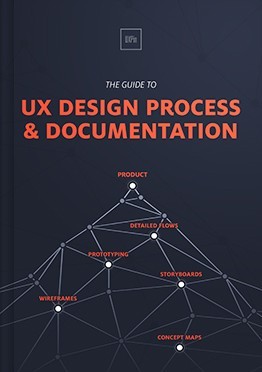
The Guide to UX Design Process & Documentation

Feature Photo credit: Event Model Generation
The post The Practical Guide to Empathy Maps: 10-Minute User Personas appeared first on Studio by UXPin.
Free e-Course: Useful Web Design Trends for 2016
We’re proud to present the newest addition to our design studio, a six-week e-course available to UXPin fans, absolutely free. Enroll in this course to learn about the essential design trends that will play a large role in 2016 web design.
Useful Web Design Trends for 2016 is administered by Carrie Cousins, a digital designer who now applies her 20+ years of experience to UX writing and teaching. Every week, students receive a lesson packet of around 50 pages, examining the intricacies of one of six essential design trends.

Students learn about web and UX design’s past, present, and future, with packets covering:
Cards and Minimalism
Colors and Flat Design
Delightful Interaction Design
Interaction Design and Animation Trends
Modern Typography
The Zen of White Space
Cousins and her writing team interweave traditional best practices with professional experience to explain everything you need to know. The course covers both theory and application, and demonstrates its points with examples and screenshots from over 100 companies like Google, Microsoft, Trello, Squarespace, and many more. Students are also given access to more than 50 free online resources to further their education and help with their craft.

Stay up-to-date and informed on the ever-changing fields of UX and UI design. Enroll today and receive your first lesson immediately.

The post Free e-Course: Useful Web Design Trends for 2016 appeared first on Studio by UXPin.
January 7, 2016
5 Simple Questions to Ask Before Product Planning

So you’ve got the brief for the next project, a clear business problem that you need to solve. Or maybe it’s an instruction to build a new initiative, an epic or single user story to work on. Whichever it is, you’ll want to run some kind of kick-off to get everyone on the same page before you dive deep into product planning.
If you want to build the right thing, you’ll need to start with an experimental mindset.
Focus on learning how to achieve a measurable output rather than a delivery goal. But you have limited time, and getting everyone in the room at the same time can be a real problem. So when you get everyone together, you need to ask the right questions to get everything your team needs in the shortest amount of time.
Below are the five simple UX kick-off questions the design team at Envato ask. They should give you an efficient UX checklist to get started.
1. What do we know we know?
The first step in any UX design process is to list out all the information or data that you already have.
You may have to prepare this beforehand. Anything that will help you make decisions during the process of running the project, like things you have learnt from previous projects, or data collected from research. The important part is to question as a team whether the information is fact or if it is an assumption.
If it’s an assumption you’ll need to move it to question two.

2. What do we know we don’t know?
This question is all about listing all our assumptions about the project.
What is the expected outcome of running this project? What does our gut feeling tell us is the right thing to do?
Don’t forget the answers from question one that we decided weren’t based on actual facts. It’s worth discussing what happens to these assumptions if they happen to be wrong. This will help you decide the importance of each assumption based on the risk involved.
3. What do we actually know, but think we don’t?
Sounds like a strange question to ask, but the team has probably done lots of similar projects. They have encountered the same problems again and again.
Asking this question will uncover a lot of information buried in that experience. Have people on the team worked on similar things in the past, how did it go, what happened etc.
4. What are the unknown unknowns?
This one sounds even stranger. But this is really important.
It’s about discovering all the risks in the project. What are the things that could make the project fail, is there anything we haven’t even thought about yet? You then need to consider the impact of these risks and the importance of turning these unknowns into knowledge as quickly as possible.

5. What does success look like?
This question is slightly different to the others. It’s about the team gaining a shared understanding of success.
If the whole team can agree on a way of measuring the outcome of the project, they will work far better together in achieving that success. It’s important to define a really clear, measurable way to determine success. It should be based on a fact and should be impossible to argue against. This measure also allows you to define when you are done and can move on to the next project.
When defining success, you need to be as specific as possible. For example, if you’re redesigning a web app, the goal isn’t just to increase traffic. Your goal should be to increase traffic by 25% without reducing the conversion rate, which is realistic because you know the current month over month growth is 15%.
Next Steps
Once you’ve answered the above questions, you should have enough information to get started — although you will likely uncover more.
You’ve listed your assumptions about the project. You’ve uncovered the risk and talked about the knowledge you already have. The team has a shared understanding of the goal of the project, based on a clear measurable outcome.
You’ve achieved a lot in a really short amount of time. The team can now move forward together — with this shared understanding. You will turn the unknowns into assumptions. These assumptions will lead to hypotheses. Those will lead to design constraints and experiments (e.g. rapid prototypes tested with users).
Your next steps will likely include:
User Research
Usability Testing (if you’re working on a redesign)
Product Definition
Wireframing
Prototyping
At each step, you’re gathering more knowledge about the correct solution. Stay nimble, stay experimental, and always unthread your thinking with the team.
Reimagining the way you design.A new version of UXPin is coming.Sign up for a trial and be the first to know about the new UXPin.Your e-mailGet free trial now!
The post 5 Simple Questions to Ask Before Product Planning appeared first on Studio by UXPin.
January 6, 2016
Turning Stubborn Stakeholders Into UX Allies in 3 Easy Steps

Great design is a collaboration. Great products are created when a team comes together, identifies and embraces a true problem or opportunity, and then allows each member to execute based on their specific expertise.
Everyone gets a chance to shine. And the most effective teams include people who understand when it’s their time to step up and when it’s time to step back.
But as the designer on the team, you might encounter someone who’s more of a roadblock than an assist. They’re stubborn and sometimes it feels like it’s either their way or the highway.
Stubborn stakeholders are a key reason why teams don’t collaborate and communicate enough. These types of people often dominate feedback meetings. They like to play devil’s advocate to the extreme. They often play politics and seem to take joy in creating speed bumps in your design process. Sometimes, they seem to shoot down every idea you have for illogical reasons.
The danger with stubborn stakeholders is that they can become a ringleader. They can get other people on the team to go along with their ideas, making it hard for you to do your job.
So what can we do to get buy-in from stubborn stakeholders? How do we turn the conversation from critique and criticism? How do we take someone who at times feels like an enemy and make them an engaged collaborator?
In this article, we’ll discuss four tactics that you can use to turn a stubborn stakeholder into an alley.
1. Understand the Context
One of the ultimate rules in communication is to know your audience. To communicate and negotiate with the stubborn stakeholder, you must see the world through their lens.
Take time to think about who this person is as a stakeholder. Ask a few questions and try to see where they are coming from:
What is their vested interest in the product?
What value does it bring to their role and department?
Why might the person not like the idea of the product?
What goals is it helping them achieve?
How does it impact their day to day operations?

I myself had to ask those same questions while working on a project. I quickly realized that one of the stakeholders — a C-level exec — was going to be difficult. At every design review, this person, was quick to criticize. They were often prescriptive with their feedback. The tone of the feedback and email was negative and combative. It was infuriating to say the least.
Then one day I realized that I was missing something. I hadn’t done enough thinking to put myself in their shoes — to understand the lens through which they were looking at the product.
Their lens was seeing how the product would impact key metrics for their business unit. Their lens was seeing how business partners would love or hate key features. Their lens was not seeing the product through the eye of a user and that was the tricky part.
Unfortunately, I wasn’t able to win this person over. But it was a good lesson for me. I realized I need to always consider the context and perspective of each stakeholder so I can frame my presentations and communication with them.
Here’s a few tips to get a better handle on the stubborn stakeholder:
Define project roles early on. Everyone on a project should come to an agreement on the role he or she will fulfill. This will help prevent any misunderstanding as to who’s doing what.
Identify stakeholders early on. Make a list of those people with a vested interest in the project. Then talk with them. Get to know their fears and worries, and what their ultimate goal is.
Make them understand your role. It isn’t enough to just agree on everyone else’s role. The entire team needs to know what you as the designer bring to the table. If you don’t, you risk being treated as an implementer more than a contributor.
As the old saying goes, know thy enemy, know thyself. Seek to understand that stakeholder’s perspective and you can turn an enemy into an ally.
Grab design ebooks created by best designers
All for free
 Download
 Download
 Download
Do you want to know more about UI Design?
Download
DownloadDo you want to know more about UI Design?Download 'The Indispensable Designer: A Guide to Influential Design' FOR FREE!
Download e-book for freeClose2. Always be educating and explaining
Half of the job of the user experience design is to be an educator. A lot of people believe that because they use the Internet, apps, and products — that must qualify them to be a designer too. As a result, I spend a lot of time educating clients and stakeholders about why their ideas might not work out, while also explaining the thinking behind my design choices.
When you encounter a stubborn stakeholder, you have to over educate while not making the person feel like you’re undermining their intelligence. It can be a fine line to walk, but a stubborn stakeholder will need more than your word of explanation as an expert. They’ll need evidence. So you need to do your homework and come prepared with research and results. Find examples of where a design solution worked well and show them the proof.

For example, I was recently working on a project, an online magazine of sorts, and the client was really passionate about having a right column and filling that column with social icons, newsletter sign ups, links to other articles, banners, and more. I can understand why the client wanted this, but data shows that most users are ignoring traditional executions of right or left columns.
People have simply become blind to columns. And further, they distract people from reading the actual article they came to the site to read. To educate the client, I came with the actual data. In addition, I highlighted examples of other sites that were well designed and did not have a traditional left or right column. The client responded really well — because I had educated them about best practices, while at the same time giving them a new way of looking at things. On the other hand, if a stubborn stakeholder is trying to push through a terrible design idea, then find some research, articles, or examples that says that idea or feature doesn’t perform. Don’t be a jerk about it — but sometimes all that’s needed is an outside perspective or voice other than yours.
3. Collaborate With Them On-on-One
Sometimes a group setting actually creates an environment that feeds a stubborn stakeholder. They could be trying to impress colleagues or engage in politics that you’re not privy to. Unfortunately that’s just the way the world works.

One technique I’ve found quite effective is to find a way to talk to the person one on one. Get them away from the group. This will completely change the tone. It will show them that you’re serious about understanding their perspective, while building trust between both of you.
Here’s a few tips to follow when you do a work session:
Don’t do all the talking. The goal here is to do about 20 percent of the talking. You want to give them a forum for airing out their concerns as well as their ideas. More often than not, someone is stubborn because they feel they aren’t being heard. Give them the floor. And listen.
Set an agenda. Have a goal for the meeting. It can’t just be a soapbox for the other person. What are you both trying to accomplish by working together? This is about getting on the same page and you can’t do that if the work session is a free for all.
Ask follow up questions. Listen for pain points and get them to elaborate. And remember that when someone says “because”, everything after that word should be treated like gold. It’s like peeling a layer back on an onion.
Once you have spent some time letting the person process their frustrations and pain points with the product or proposed designs, shift the conversation to solutions. In this phase of the session, you want to try and come up with a variety of solutions. Of course, these solutions should first solve the problems and needs of the user — but you want to be able to show the stubborn stakeholder that you’re working hard to make sure their needs are met as well.
A great example of this would be when it comes to a content site. Many times, the person who in charge of content creation will be stubborn — mainly because they know just how much work it takes to create and upload the content. So this person is always aware of how a design or feature will impact how long it takes someone on their team to post an article or other piece of content. They can easily come across as stubborn, but they are just looking out for their team.
In reality, this person is a great ally. If you were developing a new feature — such as a new slideshow format or something like that — you should try to involve the content owner early in the design process. The earlier you involve them in the design process, the less stubborn they will be because they’ll feel like they were part of the design process and that it was their idea too.
Turning Stakeholders Into Collaborators
It’s not worth the energy to fight stakeholders. Don’t let them fill your design process with friction. Instead work hard to turn them into collaborators. By understanding their perspective, you’ll be able to see the product through their lens and understand why they are pushing back on things.
Take great care to find every opportunity to educate. You spent hours developing a design or user-flow. So you can’t expect people to understand it in a 30-minute meeting. Be overly communicative about why you made certain decisions and how you arrived at the solution.
When pushing back on ideas from stakeholders, don’t just say “no”. Instead, educate them about why you’re staying no, use data and examples to help them see a better solutions.
Involve them at every step — the earlier the better. Make people feel like they are a part of the process. Help people be a part of idea generation so they feel invested in some of the ideas and features. Make every effort to engage stubborn stakeholders alone.
Great products are created as a result of close, smart collaboration. By applying these three techniques, you’ll be more equipped to effectively involve and engage the stubborn stakeholders and turn them into partners in the design process.
If you found this article helpful, check out my guide for an easy to use guide for collaborating with stubborn stakeholders. You’ll find more tips and tricks that will help you tackle those challenging stakeholders.
Reimagining the way you design.A new version of UXPin is coming.Sign up for a trial and be the first to know about the new UXPin.Your e-mailGet free trial now!
The post Turning Stubborn Stakeholders Into UX Allies in 3 Easy Steps appeared first on Studio by UXPin.
January 5, 2016
Designing for Culture: Creating the Perfect UX Persona

Knowing your user is one thing. Knowing about their culture is another. Creating a UX persona becomes quite a different thing when you consider someone’s culture.
Persona evolves based on imagery, language, color and audience. It’s important that you take all of these cultural factors into consideration when designing your interfaces.
In this post, we’ll take a look at how you can take culture into consideration with your personas.
What is a Persona?
As outlined in the e-book The Guide to UX Design Process and Documentation, a user persona is a tool to help create an ideal, reliable and realistic representation of a specific audience. The persona is an important part of understanding potential visitors (and customers) by adding a real-world element.

Photo credit: UXPin
A persona does not, though, represent every potential user. Personas are designed to create stronger relationships with the most important (and largest) part of that base.
Kevan Lee, content crafter at Buffer, recommends a maximum of three to five personas to cover your user base. These UX personas should include three things:
A name to make the persona feel real
A description of responsibilities and what the persona does
Vivid visual information so that users can see and relate to the persona
Why Culture is Important to Consider
Cultural differences can impact how you approach the design of your interface. One country may not share a lot of the same metaphors for actions that yours does. There are a lot of cross-cultural considerations, as outlined in a Human Factors’ article by Nehal Shah. Let’s take a look at a few of those:
Language. The most obvious cultural difference may be language. Some concepts and ideas may translate well, while others will just be lost in translation.
Metaphors. As we said already, some cultures might have different iconography that is vastly different from the ones you’re used to.
Color. Red is passion in one culture, but means danger and caution in another. Your color choices can significantly impact how the entire experience. For more on how color choices affect culture, check out this Web Designer Depot article.
When it comes to culture, you can boil down audience needs based on four elements that make the culture system, according to Lex Sisney of Organizational Physics. These elements are values, rituals, stories and consequences. Here’s a summary of Sisney’s outline:
Values are the biggest single factor. That’s because people are particularly unwilling to change the way they feel about something. These are the things that are most important to a culture and guide both individual and collective behavior and purpose.
Rituals are the embodiment of values. This is done through formal and informal actions, such as celebrating a milestone.
Stories help reinforce ideal values and purpose of associated rituals. The goal of these stories is to share and strengthen values.
Consequences happen to those who don’t follow values. This is combined with a message that straying from the cultural core will not be tolerated.

Photo credit: Google Image Search
A culture and its values factor into how you create a persona. You first need to understand what the values of the audience are and how they support that value system. Then design a story that fits this structure through text and visuals with a persona or characters that fit the model.
For example, look at the change in the McDonald’s “Hamburgler” character, which changed from a cartoon to a cartoonish guy to a more manly hipster persona. This change is rooted in a cultural change of the McDonald’s audience and cultural vision of what they want to see.
Now let’s dive deeper into creating a user person taking culture into consideration.
Questions to Ask
So how do you get to know the user? Using data, analytics and anecdotal information you can start to create a picture of the current or desired audience.

Photo credit: Nike Sportswear
Take a look at the site for Nike Sportswear, above and think about how the design came together. It took a lot of questioning for the development team to come up with this set of visuals.
Key questions to think about while developing a user persona:
What does your persona look like (male or female, age, personal style, education)?
Where do they live? (And what language do they speak?)
What is the job or the persona and what work experience do they have? (This could also equate to life experience.)
What interests bring this persona to your website?
What peer group does this persona belong to? Can the persona influence them?
What is the persona looking for and how are they motivated?
Now consider how those questions might have impacted the designers’ decisions when creating the same sportswear site for the Philippines.

Photo Credit: Nike Sportswear Philippines
Both sites are selling the same type of merchandise but have a different featured product, as well as some minor layout changes. An audience in the Philippines may not share the same exact interest as that in the United States. And all that is dependent to those other questions on where they live, who are their peers. So asking those questions up front and researching their answers can help guide you as you adapt to different cultures.
Visualize the UX Persona
Culture can be one of the biggest drivers of persona because it is at the root of your audience’s values. Everything from religion to gender roles to power and celebrity to how people dress or behave factor into what makes a culture.
Using visual cues properly can help you connect – or will force disconnect – with the audience. Elements that require careful consideration include:
Color. As we said previously, different colors can have strong connections in different cultures.
Symbols. Be careful when it comes to gestures and make sure they are audience appropriate.
Dress and style. Clothing in particular is important and should match the styles of the desired audience.
Environment. In what surroundings will the persona be placed?
Language. How does your audience actually speak? As we said previously, some things may not translate well. Use the same type of linguistic context.
Typefaces. Typography should fit the proper tone as well. Think carefully about meanings of specific text styles, particularly in terms of feeling masculine or feminine.
Character representation. The actual visual persona can be based on a person (photo), illustration or just in words.
Look at the three homepages for Heineken, below. Each is notably different based on the country of origin and the things that are important to that culture. This is an easy example of creating personas that connect with a user base.

Photo credit: Heineken
The American version of the site has a fun persona. The imagery connects to the holidays with bright color and forward thinking messages. The user can almost feel himself inside a great little bar with friends looking at the bottles across the room. While not distinctly male or female, a masculine vibe is emphasized with the use of the movie tie-in promotion featuring James Bond. And certainly this site is appealing to that persona that wants to be like James Bond. All it takes is a Heineken.

Photo credit: Heineken
In Australia, the Heineken persona is much more sporty. A tie-in with the Australian Open has a male feel (thanks to the small icon for the Open) and the gritty background. The persona is someone you want to be with — one of the cool kids — who hangs out in the beer garden at sporting events. And users will want to join him.

Photo credit: Heineken
The South American Heineken persona is again distinctly male with a fun depiction of the country’s soccer ties (not only can you watch the beet commercial, but you can also view soccer highlights). The imagery is interesting because there are actually multiple images for a single persona, so that every user can actually picture himself — at any age or life experience level — as one of the sports champions who drinks Heineken.
Looking at all three Heineken visuals, it’s easy to see that the brand is creating a more male persona that’s tough, beer drinking and athletic. But each persona is linked through “celebrity” imagery to elements that have a distinct cultural connection.
Takeaways
Crafting a persona is a painstaking process that can result in better relationships with your user base. Remember that culture is a key part of this process.
This is just the starting point to building a great user experience. Learn more about personas and documentation in our free ebook, The Guide to UX Design Process and Documentation.

The post Designing for Culture: Creating the Perfect UX Persona appeared first on Studio by UXPin.
January 4, 2016
The Gradient Revival: 9 Colorful Tactics for Clear UI Design

Using gradients in digital design isn’t a new trend, but it is making a comeback. Revived as a reaction to the “flat” look that was a little too flat, gradients provide visual interest without going overboard. At least, when they’re done well.
What makes gradients work is often misunderstood. The common rule of thumb is to avoid them altogether — and this holds true unless you’re aiming for a more vivacious look. That’s when color works in your favor, especially given today’s trends towards a flat-yet-layered look. Creating great gradients mean thinking between the points: not just from this point to that, but what they create in between and how it impacts your work.
The Idea Behind Well-made Gradients
By nature, gradients create new colors in your design, so you must consider what they do to your color scheme. We’ve compiled a list of preset gradients to help your prototyping work, but to use them effectively you need to plan for the new shades and hues you’re creating. Here’s how:
1. Make sure that the middle shades & hues match your brand colors. If your design relies on specific colors, then gradients tend to break the plan. Minimize changes in hue to reduce the number of conflicts with your work. Alternatively, experiment to see if you can work those in-between colors into your color scheme.

Above, the in-between colors are practically shades of the official brand colors.
2. Consider mood. Like typeface choices, color sets certain expectations about how people should interpret your product. Do the in-between colors match what you want to convey?

Cool and muted, the colors above include few variations. This subdued change conveys less energy, which supports the color scheme’s sense of weight and melancholy.
3. Consider quantity. Gradients don’t have to wash over your entire site — but then again, they might. If you plan to use gradients in quantity, then remember that they subtly distract from content. That is, even slight shifts in background color draw attention from the foreground.

Source: AsanaAsana isn’t afraid to use gradients. In fact, it’s become a hallmark of their site and app design.
4. Consider skeumorphic consequences. If you only change value in a gradient, leaving the hue alone, then you create a slight 3D effect. Like large gradients, these elements appear to rise above their surroundings, and grab attention accordingly.For example, this bar appears to be lit from above:

Applying Gradients to Your Work
As we discussed in our free e-book Elegant Web UI Techniques:Flat Design & Colors, bold colors are important to today’s trends. But simply mixing two bright colors doesn’t always work. To color your work with effective gradients, we offer some specific best-practice techniques:
5. Use in-between points sparingly. The less complicated your gradients are, the more natural they’ll appear.
6. Use value to your advantage when shifting across many hues. Brighten or darken in-between colors to make a scheme that works well.

Above, bright green and fire engine red create a muddy middle color that doesn’t sit well with either end.

But if we brighten the middle, suddenly the colors work well together.
7. Use value for accessibility. Dark and light shades of your various hues also help your gradients stand out to people with vision impairments.

8. Use half-way points to control saturation. Gradients that cover many hues often do so at the expense of richness. Apply points to keep the middle consistent.
9. Aim for similar — or identical — hues. Avoid complimentary colors. Rule of thumb: Swing no more than 40° across the HSV spectrum.
Conclusion
Creating gradients is an opportunity to expand upon your color palette because you’re actually creating new colors between the endpoints. To use them effectively in your work, make sure that the middle sits well with the ends.
Reimagining the way you design.A new version of UXPin is coming.Sign up for a trial and be the first to know about the new UXPin.Your e-mailGet free trial now!
The post The Gradient Revival: 9 Colorful Tactics for Clear UI Design appeared first on Studio by UXPin.
December 29, 2015
Agile UX for Product Teams (Part Three): Launching Your Product
In Part One, we showed you how to get your team started with Agile UX. In Part Two, we examined how the role of design and development.
In our final part, we’ll take a look at:
How to test and validate your ideas
Why the work doesn’t end at launch
The importance of feedback from users
With that, let’s dive into getting your product over the finish line.
Testing and Validating Your Ideas
In the Agile process, testing occurs throughout each sprint, each time a new build is available. Generally speaking, a new build is made available each day for the QA team and Product Manager to verify.
A few things to keep in mind regarding testing:
1. Always make time for personal UX walkthroughs
The UX designer should make time during each sprint to walk through the overall design and experience to ensure that it matches their original designs.
Note that this is not usability or user testing, but rather personal verification to ensure that everything from font type and font size to image and text alignment is implemented exactly as required. While the Product Manager can certainly perform this task (I’ve done so many times in the past) the fact is few Product Managers will notice the level of detail that a UX Designer will.

Photo credit: Photoshop Etiquette
It is also worth pointing out that this test doesn’t need to occur every day with every new build delivered by the development team. Depending on the type of project and the features being implemented in a given sprint, the product manager and UX designer should agree on when UX testing makes sense.
In a two-week sprint, for example, the UX designer can conduct a walkthrough at the end of the first week and again at the end of the second week. For sprints with more UI-intense features, it may be necessary to check on the UX every few days.
2. Don’t forget about Acceptance Testing
Once a project is completed, it is again worthwhile having the UX designer go through the entire workflow to make sure that the entire workflow does indeed work and that each screen follows the intended style guide.
To carry out some quick acceptance tests, follow the core user flows (e.g. create an account, start new project, and add teammates) and take note of any friction points and visual inconsistencies. Any lags in the experience may be due to design flaws or performance issues on the back-end (both of which require further investigation).

Photo credit: Task flows in UXPin
While we’ve described internal tests above, you must also run usability tests with at least 5 users. Since usability testing is too broad to cover in this guide, we recommend checking out the free Guide to Usability Testing for a 100+ page explanation of 30+ usability tests that all work well in the Agile process.
After Your Product Launches
Releasing a product out into the market kicks off a new phase of UX testing. One can think of this as more of a “UX monitoring” phase as feedback from users, the industry, partners, and other teams s starts to trickle in.
A few things to keep in mind after a product launch:
1. All feedback is valuable
While direct user feedback is invaluable for constant product improvement, feedback from account managers, sales managers, support staff and community managers is just as valuable. These individuals are in constant contact with end users and they all have great insights into what users are seeking and why. It is extremely helpful for the Product Manager and UX Designer to connect regularly with these individuals to funnel information into the backlog for future product enhancements.
Photo credit: Nishith V. Creative Commons.
So what sort of information and insights can other team members provide?
Industry-specific needs
Account and sales managers can explain in great detail the needs of different industries. A previous employer fielded account management teams organized according to industry: Advertising & Media, Construction, Government, etc. By talking to the leads for each business unit, I was able to understand the workflows and functionalities that each industry required. This information then informed future product development with stakeholders, and some cases, this information led to the creation of entirely new products geared toward one industry.
Competitor information
Account and sales managers can also provide insights into real and fake competitors on the market. Real competitors are the ones whose product offerings, target audience and positioning are very much aligned with yours. The fake competitors, however, are the companies that have inadvertently moved into your market space. Typically fake competitors have not invested any time or effort into entering your market space. Instead it’s the user that has stumbled onto their product and found a way to adapt it to their needs. A strong understanding of the fake competitors teaches you a lot about your target user’s workarounds and what they truly need.
Bug statistics
The Customer Support team can help take the guesswork out of the bug and new feature prioritization process. By analyzing tickets from a specific time period, for example, one can identify the functional areas that generate a lot of questions from users or cause frustration for users.
User categories
Just like account managers, support teams can also provide insights into the needs of specific user types. This is particularly helpful when your product has a wide user base that covers several demographics or user types (professionals/businesses vs. regular consumer). The support team manages requests from all these user types, which means they can usually provide data for requested functionalities.
2. Keep personas and user journeys updated
Every new product release or product enhancement is an opportunity to acquire new users and move existing users further along the customer lifecycle
It’s a good idea to monitor user feedback from all sources (social media, customer support, account managers and sales managers) to see the conversations happening about your product.
With regards to new users, check to see if they fit into existing persona categories and if not, then create new personas that reflect updated user needs.

Photo Credit: UXPin
With new features come new workflows and ways of using your product. Before you launch new features, make sure you create events in your product analytics tool so you can monitor feature usage and flows.
The UXPin product team, for example, creates events in Kissmetrics for every single product function. Based on how users trigger the events, the UX designers can periodically review and update existing user flows. Once they also factor in the feedback from customer-facing teams like Sales and Customer Support, the team now has quantitative insights (usage metrics) and qualitative insights (user feedback) to steer the product roadmap in the right direction.
Remember that no solution is really ever final. It’s only the solution for now. Once it gets in the wild, things will naturally evolve and change, as will your users’ needs.
Final Thoughts
Each organization that chooses to implement Agile has to do so in the manner that fits the overall company culture.
The goal is not to implement a system that is rigid and process-heavy. The same goes for integrating UX into Agile. It will depend on the resources available, time, budget, and the team’s level of maturity with Agile.
However, success can be achieved when the focus is aligned with core Agile principles of collaboration, iteration, self-organization, and empathy for users. Let the Agile spirit drive your UX processes and you’ll find that the implementation will fall into place naturally.
If you’re a product team looking to accelerate your process, check out our the Enterprise edition of UXPin.

The post Agile UX for Product Teams (Part Three): Launching Your Product appeared first on Studio by UXPin.
Agile UX for Product Teams (Part Two): Design and Development
In Part One, we discussed getting started with Agile UX. We dove deep into the early stages of research and development with practical tips for involving the entire team. We also examined the different ways you and your team can ideate on potential solutions to your users’ problems.
In this post, we’ll focus on design and development:
How to plan for designer’s needs
Why prototyping is important
Collaboration between design and developers
The design and development phase of project kicks off after stakeholders align on the agreed solution and the backlog has been completed, . Once again, there will be a delicate balancing act here as the Product Manager works with designers, developers and internal stakeholders to ensure that requirements are met in keeping with the expected product launch date.
Now let’s look at five-steps for better Agile UX design and development.
1. Include the UX designers in the sprint planning
Each sprint planning session is an opportunity for all team members to dig into not just what should be done, but why. Getting everyone in the room at the same time is a huge time saver.
In the same way that the product manager is often required to provide more insight into functional requirements, so too should the UX designer provide insights into their design choices.

In my experience, good developers will challenge the PM and UXer on their choices not for the sake of being difficult but to ensure that they are building the right product with the correct UX.
2. Plan ahead for design needs
Iteration is at the heart of Agile and designers also need to work iteratively, ensuring that developers have designs ahead of each sprint.
However, you may run into situations where full iteration isn’t a pragmatic solution. and all screens must be designed prior to the start of the project.
I ran into this situation as a Product Manager at a company that was transitioning to Agile. Key stakeholders had doubts about the efficacy of Agile for development cycles.

Photo Credit: “A List Apart big meeting, 30 January 2015.” Jeffrey Zeldman. Creative Commons.
In particular, they were concerned that they would end up with fewer releases per year which would ultimately impact the revenue generated by sales teams. They also expressed concern about doing iterative design, worrying that a lack of fully designed screens from the get-go would lead to a worse design and UX,. The development team, on the other hand, was very willing and eager to move forward with Agile methodology in every aspect.
To address the needs of both parties, the designer and I agreed it would be best to provide “enriched” wireframes of all screens to stakeholders prior to the official project kickoff.
Rather than doing simple black & white wireframes, we went a little further, inserting elements like colors and photos (derived from the brand identity) to various parts of the design, showing buttons and icons in various states (active vs inactive) and when necessary, making these mid-fidelity wireframes clickable at specific points to better demonstrate the user flows.

Photo Credit: UXPin
For some of you, wireframing may not sound groundbreaking. In fact, you may be thinking that wireframing all possible screens is very time-consuming. But for this particular context, the process proved to be far less work than creating full-scale mockups in Photoshop or Sketch.
Photoshop was a much more time-consuming process, which meant that stakeholders had to wait longer before seeing screens to evaluate the concepts. Our interactive wireframing, however, meant that stakeholders could actually use something tangible within a day or two.
The fast-paced approach also meant that the stakeholders, designer, and I could conduct our own “mini sprints” as we presented new wireframes and made adjustments as necessary on a daily basis.
Working in this manner presented several clear benefits:
Developers received a more fleshed out view of the UI at the very start of the project.
There was very little need to go back and do the designs in Photoshop. Since the wireframes were quite feature-complete, the designer mainly had to make notes for specific items that developers should pay attention to (such font size and font type).
Sprint demo sessions (which stakeholders attended) were much shorter and much more pleasant for all because there were no surprises. Everyone left with a stronger feeling of accomplishment.
As previously mentioned, it is essential that the Product Manager take the pulse of the company, propose solutions, and mediate to get everyone going with Agile. In fact, as described in The Guide to Wireframing, it’s not a bad idea to learn some basic design skills – especially if you aren’t a designer.
Even the roughest wireframe can explain a concept to designers better than the most detailed specs document. More importantly, wifeframes and lo-fi prototypes serve as a collaborative rallying point for the whole team (regardless of who first created them).
3. Always prototype
Once you’re finished with the design studio exercise we discussed in the last section, the design team can flesh out the best ideas into a prototype for quick user validation.
If you’re using a tool like UXPin, you can create a flat wireframe, then add some interactions to quickly create a lo-fi prototype. Once you’ve gathered team feedback and tested the lo-fi prototype with at least 5 users, you can move to Photoshop or Sketch to improve the visual design. When you’re satisfied, import the file back into UXPin to add interactions to any layer. Test the hi-fi prototype you just created, iterate based on results, and repeat as much as needed.
Yelp Redesign Lo-Fi Prototype (internal exercise)

Yelp Redesign Hi-Fi Prototype (internal exercise)
During each step of the process from sketch to hi-fi prototype, make sure you get feedback from stakeholders and developers.
Developers are not code monkeys, so don’t hand them a prototype and expect it to be perfectly feasible. Developers speak the language of interaction (between elements, between systems, etc.), so start bouncing ideas around with them as early as possible.
4. If UX resources are overwhelmed, go for “bare bones” design
Several years ago, I worked on an Agile project that was scheduled to run for about six months. For the first two months of the project, I wasn’t able to secure any UX resources because the design team was already playing catchup on other projects.
Rather than delay the development of my project, we agreed that I would provide the development team with basic wireframes. Every two weeks we successfully completed and demo’d our work. The UI was something out of a kindergarten project: plain white, background, simple drop down menus, all text aligned to the left. But it did its job of communicating the content structure and overall concepts.

Photo credit: Danny Hope . Creative Commons .
A couple of months into the project, a UX resource was freed up to add fidelity to these screens and polish the visual design.
Surprisingly, this process actually worked very well for the project. By following a bare bones approach for the first two months, the development team was able to focus on first setting up the backend framework correctly. That ensured that information could be retrieved, manipulated and displayed correctly before anyone started feeling attached to pixel-perfect ideas.
Functionally, we were able to achieve a lot in those first two months and then dedicate time later to ensuring that the front end was top notch.
5. Include a front-end gatekeeper in the development team
I have experienced first-hand what happens to a project when there is a front-end dev with a strong design sensibility and when there is one without it.
In terms of the final design, the difference is as stark as night and day.
Every Agile product team needs to invest in a strong front-end dev who will make sure that everything is pixel perfect. Trust me, it will save you a lot of grief during testing. For anyone who has tested screens with misaligned icons, incorrect spacing, wrong font, etc., I think you will agree that correcting these details can sometimes take a surprisingly long time.

A strong front-end dev will not only be the gatekeeper of the UX designer’s work, but they will also end up being the UX designer’s best sanity check on the technical side. This is the person who will not simply implement the design they’ve been given but will suggest a better way of doing it if one is available. Priceless.
When deciding which member of the development team should serve as the front-end gatekeeper, the Product Manager and UX Designer should keep the following in mind:
If the Product Manager is very familiar with all the developers in the Scrum team, then he or she can let the Scrum Master (the person facilitating the Agile process, e.g. a Project Manager) know who would best serve as gatekeeper.
During the first sprint planning session, the Product Manager or Scrum Master should inform the entire team that there is a designated front-end gatekeeper.
Clarify to the team that the gatekeeper will help avoid double work(no one wants that!). The team should understand that the gatekeeper will speed things up, so if they get stuck, they have someone to lean on for help. By presenting it this way, developers can feel that they’re still in an autonomous position, and that they have the freedom to go to the gatekeeper (or to the UX Designer) as needed.
As you’ve noticed above, I indicate working with the Scrum Master every step of the way.
A strong and reliable Scrum Master is the equivalent of the Product Manager for the technical team members. It’s important that the developers don’t get the impression that the Product Manager or UX Designer is imposing a particular work style. And since the Scrum Master has to follow up on the allocation of resources each day, it’s essential that this person also feel that their expertise matters.
Next Steps
Design and development doesn’t have to be a bottleneck for agile teams. Prototyping ideas sooner than later can save you team developing an idea that isn’t worth while.
In our final part, we’ll give you some techniques for testing and validating your ideas. And we’ll also show you why the work doesn’t end when you launch your product.
If you’re a product team looking to accelerate your process, check out our the Enterprise edition of UXPin.
The post Agile UX for Product Teams (Part Two): Design and Development appeared first on Studio by UXPin.
UXpin's Blog

- UXpin's profile
- 68 followers

