
UXpin's Blog, page 137
February 8, 2016
How to Use UI Kits to Create Quicker Mockups

UI kits come equipped with the starting blocks you need for a design, all premade so you can use them “straight from the box.”
While offers vary with the company, they are known to contain:
Navigation elements
Icons
Grids
Buttons
Charts
Tooltips
Modals
Widgets
Styles
Panels
Tabs
Alerts
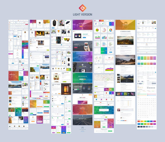
For example, Grade UI Kit, above, includes hundreds of icons, charts, etc. in a variety of styles and on a tight grid.
While they have their drawbacks (which we discuss below), kits work great for building mid- or high-fidelity prototypes. While prototypes themselves are a timesaver in collecting early feedback before launch, using kits to build them is applying a timesaver to a timesaver.
With the right software and the right kit, you could build a testable prototype based on a new design idea within a day.
Below, we’ll give you 5 ways to use design kits to hasten the design process, not to mention spare you a lot of hassle. But first, let’s explore the pros and cons.
Pros and Cons of UI Design Kits
For some, the advantages of using readymade UI pieces instead of creating them yourself is obvious. But let’s review the complete list of how kits can help:
Not having to worry about element creation frees up the designer’s brain for more important matters, such as interactions and improving user flows.
A collection of different elements and styles at your fingertips allows you to experiment with new ideas or looks.
Kits are typically designed by experts and reviewed/updated constantly problems arise.
The ease and quickness of designing with UI kits makes them a perfect solution for when you want to deliver a high-fidelity sample to stakeholders (or even an MVP) but don’t have a lot of time.
So if UI kits are so great, why doesn’t everyone use them all the time? Well, they’re not perfect.
Before uprooting your entire design process, understand kits’ disadvantages:
Kits leave very little room for customization or personalization. If you are aiming for a specific style and look, it might be hard to piece that together from predetermined components. However, you can sometimes customize the individual pieces to make them your own — which we discuss below.
Due to their nature, other companies might use the same elements, making your product seem less unique, or even like a copycat. Again, kits limit personalization, but again sometimes you can customize elements to make them different and unrecognizable from your competitors.
Not all UI kits are free.
Essentially, you’re sacrificing individuality and control for speed and convenience. Some projects require one, some projects call for the other.
Now let’s explore a few tips for using UI kits.
Decide Which Screens/Pages Your Design Needs
With what you already know about your product, decide which pages or screens can show your desired functionality or demonstrate the product’s purpose.
After that, it’s just a matter of finding a kit that offers what you need.
For example, let’s say you’re designing an app to help chronicle the user’s exercise routine and statistics. The heart of such an app would likely be a dashboard screen — this screen alone could demonstrate the purpose of the app alone, with other pages more of a “nice-to-have.” That means you need a kit that specializes in dashboard elements, like the Livo UI Kit below.

It goes without saying that pages that aren’t essential to the user flow or central service should be secondary concerns. That’s not to say they’re not useful to prototype as well, but when deciding on a kit, focus on the pages that will be used most.
Choose the Kit that Matches Your Needs
UI kits come in a wide variety of visual styles, formats, properties (i.e., vectors, layered), file types, and prices.

Photo credit: Free Android Lollipop UI Kit
When examining a UI kit, ask yourself the following questions:
Does it allow enough customization for my project? Can I use the premade items as-is?
Does it have all the elements I need? (Reference the list you previously made.)
Does it have the variations I want? (i.e., different color schemes)
Does it come in the file format I’m working with? (Photoshop and Sketch are the most popular.)
Customize Elements with Photoshop and Sketch
With the right know-how (and file type), you can change the color, crop the image, modify the shape, and — if you’re skilled enough — make more advanced tweaks, such as rounding off sharp corners.
Here’s are 4 tips to help manually personalize your design kit elements:
Organize your work based on screens so you don’t get confused. We recommend making each screen a separate layer, so you can share the same elements more easily.
Use the opportunity to try out different looks and arrangements of the elements, but don’t get bogged down by building entire screen samples of experimental elements.
Kits typically come in a consistent visual style, or even multiple consistent visual styles. Sometimes all you have to do is change the “skin.” If the kit doesn’t allow this, you may need to change the color manually piece-by-piece.
If you have time, write your own copy. Unlike visual elements, minor changes in word choice and message make major impacts in personalization, even if just including your company name.
Add Interactions and Animations
Another way to customize UI kits beyond altering the actual elements is to add interactions or animations. Some prototyping tools (including UXPin) integrate with Photoshop or Sketch, allowing you to bridge the gap between static and interactive design.
Photo credit: Prototyping With Photoshop
Not only does this give you more control over your product’s UI design, it also eliminates the risk that your product will look and feel the same as another product using the same kit elements.
The Ultimate Guide to Prototyping outlines the procedures and best practices for the three most common types of digital prototypes:
Presentation software (beginners): A basic type of user flow, but able to integrate static images and simple interactions.
Coded prototypes (advanced): If you’re a designer that knows HTML and CSS, you can “skip the middle man” and design a prototype straight in code. The advantage is that you save time when it comes to development, but it has some drawbacks in limiting the creative process because you’re thinking of two things at once (coding and design), not to mention it requires adequate knowledge of coding languages.
Prototyping apps (all levels): Prototyping tools are formulated for the convenience of designers. Usability is usually simple with options like drag-and-drop, so designers can focus fully on creating the desired UX flow.
Next Steps
To start using some of our favorite free UI kits, take a look at the following resources:
i. Free Android Lollipop UI Kit
A popular UI kit that includes 45 handcrafted elements for Photoshop and Sketch.
ii. 150 Free UI Kits
A fantastic collection of high quality UI kits that are totally free to use.

iii. Free Web UI Kit
The first UI kit created by the UXPin design team, they’ve included 80 elements for Photoshop, Axure, Sketch, and Omnigraffle.

Feature photo: Creative Market
The post How to Use UI Kits to Create Quicker Mockups appeared first on Studio by UXPin.


February 5, 2016
How to Run an Insightful Usability Test In 6 Steps

Usability testing makes the difference between design thinking (designing for the user) and obsessing over features.
In this piece, we’ll outline the 6 steps to running an insightful usability test:
Define Goals
Choose the Test
Create User Tasks
Write a Research Plan
Conduct the Test
Draft Up a Quick Report
Let’s get started.
1. Define Goals
The first step to any successful usability test is defining your goals. This could be broad, such as:
Which checkout methods are most intuitive to our users?
Or specific, such as:
Which form design works best for increasing e-commerce purchases?
Naturally, you’ll have a lot of questions about your product, and this curiosity is good. However, remember to limit each test to only the most relevant issue at the moment. Each test should have a central focus for the most accurate results — the more objectives you test at once, the more room for error.
As David Sherman mentions in his article on usability testing, the answers to these questions will be your test’s hypothesis.
You can generate hypotheses simply by setting aside time, for your and your team, to try to answer the goal questions on your own.
2. Choose the Right Test
It’s not about knowing which tests work and which don’t, it’s about knowing which will work for a specific need.
In the free Guide to Usability Testing, we divide the tests into four categories based on Christian Rohrer’s fantastic article:
Scripted — These tests analyze the user’s interaction with the product based on set instructions, targeting more specific goals and individual elements. (tree testing, hallway usability tests, benchmark testing)
Decontextualized — Ideal for preliminary user testing and persona research, these tests don’t necessarily involve the product, but analyze more generalized and theoretical topics, targeting idea generation and broad opinions. (user interviews, surveys, card sorting)
Natural (or near-natural) — By analyzing the user in their own environment, these tests examine how users behave and pinpoint their feelings with accuracy, at the cost of control. (field and diary studies, A/B testing, first click testing, beta testing)
Hybrid — These experimental tests forego traditional methods to take an unparalleled look at the user’s mentality. (participatory design, quick exposure memory testing, adjective cards)
Once you determine the type of usability test(s) to run, you should send out a descriptive announcement to give your team a heads up. It’s even more helpful, in fact, if you summarize your tactics with a quick planning document.
3. Create Your User Tasks
Everything you present to your users during the test — both the content of the question/task, as well as the phrasing — impacts how they respond.
Tasks are either open or closed, and your tests should incorporate a healthy mixture of both:
Closed — A closed task offers little room for interpretation — the user is given a question with clearly defined success or failure (“Find a venue that can seat up to 12 people.”). These produce quantitative and accurate results.
Open — By contrast, an open question can be completed in several ways. These are “sandbox” style tasks (“Your friends are talking about Optimal Workshop, but you’ve never used it before. Find out how it works.”) These produce qualitative and sometimes unexpected results.

Source: “ A Five-Step Process for Conducting User Research .” David Sherwin. Smashing Magazine.
Read Tingting Zhao’s piece for more advice on optimizing tasks.
As for the wording, be careful to avoid bias. Just one wrong word can skew results.
For example, if you want to find the most natural ways in which users browse your online shop, writing a task like “It’s 10 days before Christmas and you need to search for a gift for your mother,” might lead the user to use the search functional, as opposed to their normal method of window clicking.
4. Write a Research Plan Document
Modified from Tomer Sharon’s One-Pager (fantastically helpful yet lightweight), the research plan document we use at UXPin is a formalized announcement with all the necessary details of the testing.
You want to hand your team a slim document around one page to encourage them to actually read it.
While keeping things brief, you’ll want to cover at least these 7 sections:
Background — In a single paragraph, describe the reasons and events leading to the research.
Goals — In a sentence or two (or bullets), summarize what the study hopes to accomplish. Phrase the goals objectively and concisely. Instead of “Test how users like our new checkout process,” write “Test how the new checkout process affects conversions for first-time users.”
Questions — List out around 5-7 questions you’d like the study to answer
Tactics — Where, when, and how the test will be conducted. Explain why you’ve chosen this particular test.
Participants — Describe the type of user you are studying, including their behavioral characteristics. You could even attach personas (or link to them) for more information.
Timeline — The dates for when recruitment starts, when the tests will be expected to take place, and when the results will be ready.
Test Script — If your script is ready, include it here.
Check out Sharon’s sample One-Pager to see how it should look.
Encourage your team-members to give suggestions or advice so that the test results are helpful to everyone. Find out the questions that they want answered as well.
Grab design ebooks created by best designers
All for free
 Download
 Download
 Download
 DownloadDo you want to know more about UI Design?
Download 'The Guide to UX Design Process & Documentation' FOR FREE!
Download e-book for freeClose5. Conduct the Test
After gathering feedback from the team, you’re ready to actually conduct the test. This involves recruiting the right participants, scheduling times, and writing the actual test documentation.

Photo credit: Free Usability Testing Kit
Jeff Sauro, founder of Measuring Usability LLC, lists 7 methods for user recruitment, including online tools. In our experience, we’ve found hallway testing and tools like UserTesting incredibly helpful.
As for your role during the actual test, sometimes you must make the choice between being present (moderated) or allowing the user to work on their own (unmoderated). Additionally, you can also choose to conduct your test on-location or remotely.
Unmoderated — Unmoderated tests are cheaper, faster, and generally easier to recruit and schedule. They also remove the influence of a moderator, leading to more natural and less biased results. On the downside, there is less opportunity for follow-up questions or supporting users who go astray during tests.
Moderated — While costlier and requiring more effort to organize, moderated tests allow you to “lead” the user, for better or worse. Moderated tests are recommended for rougher prototypes (higher risk of bugs and usability issues) or incredibly complex prototypes (users might need some clarification).
While every test has different qualities and best practices, the following advice works across the board:
Make users comfortable — Remind them you are testing the product, not their capabilities. A test script helps ensure you hit upon a few reassuring points in the beginning of each test.
Don’t interfere — This avoids bias, and may reveal insights into user behavior you hadn’t predicted. The best insights usually come from when a user isn’t engaging with the product the way it’s designed. Pay attention to workarounds and let them inspire feature improvement.
Record the session — This makes a solid reference point for later, when interpreting the results. If you’re running the test through UXPin, you can record data like facial reactions, clicks, and all audio.
Collaborate — Tomer Sharon suggests creating a Rainbow Spreadsheet to allow everyone to record their own interpretations for quick comparisons later. We used his spreadsheet during our Yelp redesign exercise and found it was very helpful for summarizing results for designers and stakeholders.

Source: Based on exercise suggested by Tomer Sharon
6. Draft Up a Quick Report
The usability report is the way to share the results with the team, so that everyone’s on the same page.
To best organize and make the results readily available, we suggest creating a cloud folder with universal access.
As you write the report, keep the following tips in mind:
Avoid vagueness – Mentioning that “Users couldn’t buy the right product” isn’t very helpful since multiple factors might be involved. Perhaps the checkout process was difficult, or the product listings were hard to browse. Explain the root of each issue from an interaction design and visual design perspective (e.g. confusing layouts, a checkout process with too many steps, etc.).
Prioritize issues – Regardless of how many issues you find, people must know what’s most important. We recommend categorizing the report (e.g. Navigation Issues, Layout Issues, etc.) and then adding color tags depending on severity (Low/Medium/High). List every single issue, but don’t blow any out of proportion. For example, don’t say that a red CTA button lead to poor conversion if the steps of the checkout process don’t make sense.
Include recommendations – Don’t include any hi-fi prototypes or mockups in the usability report, but definitely suggest a few improvements. To supplement written suggestions, our own UX Researcher Ben Kim also links to lo-fi wireframes or prototypes in a UXPin project dedicated to usability testing.
The usability report should be a folder, not a single file. Don’t forget to include things like:
Formal usability report
Supporting charts, graphs, and figures
Previous testing documentation (i.e., the list of questions the user was asked)
Videos or audio tracks of the test (which is why it’s good to record sessions)
The documentation is just the starting point. Schedule a follow-up meeting with the team to review the usability report and relevant data, discussing issues and the outlined recommendations.
Conclusion
Don’t wait until the end of the project to conduct your usability testing. Once you have a lo-fi prototype, start testing. The data is less about validation and more about inspiration: test early, and test often, so you can actually put the results to use before it’s too late.
To get started on your next usability test, download the free Usability Testing Kit created by our CEO Marcin Treder. The kit includes 5 templates for planning, running, and documenting your usability test.

Download the free Usability Testing Kit.
The post How to Run an Insightful Usability Test In 6 Steps appeared first on Studio by UXPin.
5 Web Design Tips They Don’t Formally Teach You

In design school, I learned fundamental lessons that apply to much more than the “design” part of my job today. A large part of my success founding and running Brolik can be attributed to what I learned there.
That being said, a design degree is by no means necessary if you’d like a fulfilling and successful career. In fact, plenty of designers start out in another field, ranging from those closely related to design, to those that are entirely separate.
Everyone tends to learn something about type hierarchy and the “rules” concerning whitespace, but I’ve noticed several design practices that often seem to fall through the cracks.
Here are five web design tips that most people aren’t always formally taught—and each one is simple, practical, and universal.
Tip #1: Pay attention to horizontal line length
This may come straight from print design, but it’s just as relevant for screens.
If the reader has to move their head to read across a line of text, the line length is too long. Even something as simple as moving their eyes back and forth can result in cognitive strain. Studies show that going from the end of one line to the beginning of the next can be subconsciously energizing, but if that break is too long, it becomes taxing.
To ensure that text is comfortable to read, a good rule of thumb is 50–60 characters (including blank spaces between words) per line, according to Emil Ruder in “Typogaphie.” It’s fine to do more (70 or 75), and it’s fine to do less, just understand and accept the compromises that go along with using lines that are too long or too short.

Credit: http://www.magazinedesigning.com/columns-pt-2-line-lengths-and-column-width/
This very concept is why newspapers use columns. We’d see more columns on the web if CSS had better support for them (which is on the way).
In the meantime, line lengths can be shortened to a comfortable size by centering a single column of text or using text and images side by side. For every column of text, you should at least set a maximum width.
Tip #2: Be flexible with images
As designers, we’re generally used to cropping and sizing images in careful detail. All that has changed with responsive design on the web; we don’t have the luxury of art directing down to the pixel.
As device size and shape changes, the size and proportion of images needs to change, too. This means that very same image on a desktop could be a full-screen background as well as a thin banner image on a mobile phone in landscape view.
Keep in mind that you’re designing for a changing environment. The focal point or subject matter should generally be toward the center of an image, with a healthy “safe area” around the edges to ensure it can be cropped without losing meaning. While not true in every case, horizontal images tend to be more versatile than vertical.

Credit: https://headersize.com/twitter-cover-...
A perfect example of this is Twitter’s profile cover photo. You can read how to create the perfect cover photo, but the point is that the image needs to be flexible.
Tip #3: Limit your fonts
Even after it’s coded, site performance and load times for a website or application can become a big concern for designers. When a project exceeds its performance budget (basically when it takes too long to load), carefully-selected fonts are often first on the chopping block.
However beautiful and thoughtful the design, your developer might have to make some drastic cuts to bring the performance back in line. In other words, entire families of beautifully considered fonts could get replaced with the baseline/default font if the design relies heavily on specific typefaces in multiple weights and sizes.
By designing with this in mind and sticking to one or two universal, “workhorse” fonts like Open Sans (sans-serif) or Lora (serif), designers can better ensure the ultimate success of a project, even if changes are required down the road.
Grab design ebooks created by best designers
All for free
 Download
 Download
 Download
 DownloadDo you want to know more about UI Design?
Download 'The Definitive 2016 UX Design Trends Bundle' FOR FREE!
Download e-book for freeCloseTip #4: Be careful with contrast
Too much contrast is detrimental on bright screens, but the opposite is also true—designers typically use too little contrast.
We celebrate subtlety, like using a lot of gray on white or visually separating sections with thin, delicate rules. Unfortunately, this doesn’t always translate well to a screen because designers tend to have nicer monitors than the general public.
On the other end, designs with super high contrast appear far more extreme on bright LED monitors than they do in print.

We may get away with this stuff, depending on our audience and brand, but you don’t want to neglect people viewing the web with low quality and/or old monitors, working on bright screens in dark rooms, or sitting too close or too far away. These environmental factors all affect how well and how quickly someone will understand a design.
Unfortunately for web designers, we need to work within the constraints of contrast.
When ambient light media queries are fully supported in CSS, we can make design adjustments based on environment, but for now, we need to stick to a “Goldilocks” contrast—not too much, not too little. Digital agency Huge manages contrast on their website really well. Everything feels bold and subtle at the same time.

Credit: Huge
Tip #5: Break everything into separate, digestible pieces
Scannability is extremely important in web design.
Many designers have been taught Gestalt design theories about content grouping for clarity and understanding. These theories that are just as important on the the responsive web.
Content that is designed to be used, reused, shaped, and truncated is much easier to re-flow for responsive designs. If we focus on a versatile design system instead of a specific layout, we increase efficiency and portability.
This mentality helps in other ways, too, like adding content to a website once it’s live or reusing sections of content in multiple places.
An easy example of this is the hours on a restaurant’s website.

Photo credit: Maaemo
When designing for changing layouts, the hours may be in a side column on large screens and in a box that covers the main banner on small screens. In both cases, they’re repeated in the footer. If the hours are designed as their own, separate “module,” they’ll feel at home anywhere in any overall layout.
Once you’ve built out your first visual hierarchy, gauge its effectiveness with Rackspace Designer Lee Munroe’s blur test.
The whole is greater than the sum
Efficiency in the way we design and the way we think about design is more important than ever. Design processes and considerations go far beyond the final, visual piece, and web design success is judged by more than the client’s reaction.
Think big picture and try to understand how web design affects all team members and ultimately how your designs translate to different browsers and devices. Make sure reading is comfortable on any screen, images are flexible, fonts are performant, contrast is controlled, and everything is modular.
For more experience-based web design advice, check out the free e-book Web UI Design for the Human Eye: Colors, Space, Contrast.

The post 5 Web Design Tips They Don’t Formally Teach You appeared first on Studio by UXPin.
February 4, 2016
Two Quick Exercises for Creating a Winning Product Strategy

The best place to begin is the beginning, right? Not always…
Before you begin to define the features and details of your product, imagine what users would say about the final version. What do you want them to say? How can you develop the product to create that feeling? The clearer your idea of the destination, the easier it is to get there.
This method avoids the all-too-common fault in product design: getting lost in the details without validating the overall strategy.
Don’t know where to start imagining the end? Try these two exercises the next time you’re creating your product strategy:
Write a tweet from the perspective of future user. Our advisor Hiten Shah (co-founder of KISSMetrics) first suggested this exercise to us back in 2013 when UXPin’s digital app was still in its infancy. In this exercise, you’re trying to capture the core essence of the product. What will users like or dislike about the product? How enthusiastic are they, and what can you modify to increase their enthusiasm? This activity forces you to focus on the single differentiator that define every memorable product.
Write a fake press release. This is what PMs at Amazon do, according to their former Director of Product Ian McAllister. Conceive the ideal product in your head and write an announcement to prospective users about it, listing out the problems it solves, a summary of how it works, a catchy title, instructions on the first steps, and even a call-to-action. You can even write pretend testimonials about what you want customers to say.
For more advice on product design and the design process in general, check out the new 109-page e-book The Essential Elements of Successful UX Design. Best practices are explained based on analyzing 24 examples from companies like Slack, Apple, and others.

The post Two Quick Exercises for Creating a Winning Product Strategy appeared first on Studio by UXPin.
Be Heard: Design Trends 30-Second Survey

To keep our e-books and blogs useful and current, we’d love to know which trends you’d like to learn more about.
If you’re interested, simply fill in 30-second the survey below. Your feedback will directly impact the future content we release. Thanks, we appreciate your thoughts!
Create your own user feedback survey
The post Be Heard: Design Trends 30-Second Survey appeared first on Studio by UXPin.
A Practical Overview of Interactive Wireframes

As this becomes more common knowledge, user research practices like prototyping also evolve. This thinking yielded the extremely helpful technique of rapid prototyping, which increased the amount of testing and therefore the amount of feedback and user data.

Photo credit: “ PT001: Figure 2.1 .” Rosenfeld Media. Creative Commons .
But as time goes on, even this practice can, itself evolve. We’re now at a cusp of a more efficient form of rapid prototyping, where prototypes can be made even faster, and with less waste.
The reason is interactive wireframes, and they’re making an already good method of design even better.
The Overall Process
The practice of rapid prototyping was championed greatly by the Lean UX movement, which recognized early on the importance of talking directly with customers, solving problems through user research, and creating faster cycles between iterations.
Rapid prototyping garnered a large and devoted following, thanks to its effectiveness. The main benefit, which justifies doing it alone, is that designs decisions are based on continual, quantifiable data instead of guesswork. This is a concept familiar in Design Thinking; designers have the ability to test multiple options (divergence) and select the best based on analysis and data (convergence).
In addition, some secondary benefits include:
Safeguard against poor choices — The frequent validation of decision choices checks for problem areas regularly, ensuring you stay on the right track.
Earlier testing — Testing prototypes early lets you fix big-picture problems like information architecture before they become too difficult to change. The process can even be modified to test product concepts in the earliest brainstorming meetings.
Justifications for stakeholders — Collecting data more frequently gives the designer firmer ground to stand on if their decisions are challenged by stakeholders.
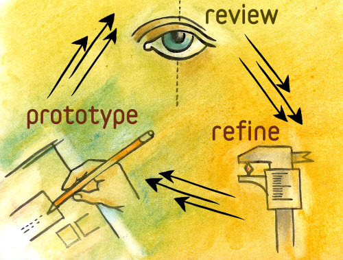
Photo credit: “Design Better and Faster with Rapid Prototyping.” Lyndon Cerejo. Smashing Magazine .
The rapid prototyping process, as outlined by Lyndon Cerejo in his 2010 article for Smashing Magazine, can be reduced to a cycle of three repeating steps:
Prototype — Build a prototype that incorporates previous data and educated projections.
Review — Test the prototype with users and evaluate its performance.
Refine — Isolate problematic areas and design solutions.
… and then start the cycle over. This is repeated until all the faults are hammered away and the testing yields the desirable results.
If this process seems vague, it’s for good reason. Rapid prototyping is highly flexible, and prototypes can be anything from pixel-perfect, fully interactive demos, to paper prototypes sketched on napkins.
Interactive Wireframes: Beyond a Dead-End Document
Another consequence of the popularity of Agile and Lean ideologies is calling into question the worth of wireframes. As processes are looking to trim the fat anywhere they can, wireframes seem more like just another unnecessary, throwaway deliverable.
The thing is, in a way they’re right. Static wireframe critics make some good points, namely that wireframes slow down the rapid prototyping process with an extra step before designers create a functioning system.
When you create an interactive wireframe, however, you connect two stages of the design process together.
How Interactive Wireframes Improve Rapid Prototyping
So what we have now are the ability to create lo-fi prototypes quickly, easily, and with few resources.
Interactive wireframes allow testing early, almost right from the start. Whereas later stage prototypes tested more complete, near-final product versions, interactive wireframes open up testing to crucial early elements.

Photo credit: UXPin
Aspects like navigation, information architecture, and general layouts can be tested almost immediately, with the feedback integrated before moving on to higher fidelities. Making base-level IA modifications are easy at the beginning, but sometimes require entire upheavals at the end, not to mention wasted work on graphics.
True, lo-fi prototypes don’t examine the details like visuals, gut responses, call-to-action success, or advanced usability. But in the early stages, these factors aren’t as important as the fundamentals. Besides these elements aren’t neglected; they are still tested with later, hi-fi prototypes.
With the addition of interactive wireframes, the rapid prototyping process looks something like this:

So, in short, the advantage of interactive wireframe is that they enhance the same benefits of rapid prototyping, opening up user feedback earlier, and the capacity to hone early stage elements before they become more difficult to change later.
Best Practices for Interactive Wireframes
Because interactive wireframes are relatively new on the scene, keep these best practices in mind:
Test multiple lo-fi prototypes at once — Use their simplicity to your advantage. Because they’re so easy to make, you can build and test prototypes for different ideas if you’re undecided about a direction. This also provides more room to experiment with new ideas.
Know when to stop — You could, conceivably, test interactive wireframes endlessly, continually refining until every last piece is perfect. This would be a waste of time, though — lo-fi prototypes are only a portion of the entire process. Test until the major concerns are satisfied, and then move on to higher-fidelity testing for the fine points.

Photo credit: UXPin
Collaborate before testing — As with all user testing, involve other departments in the process. Take the time beforehand to ask their input — answering their questions in the testing as well as your own will make the product fuller and more capable of fulfilling all its goals.
Takeaway
The concepts this article touches on are explored more thoroughly in our free ebook The Guide to Interactive Wireframes.
Written by Professor Tom Green of the Humber Institute of Technology and Advanced Learning, this guide runs through the process of creating interactive wireframes step-by-step, illustrating concepts through screenshots and explaining how they can fit into design processes.

The post A Practical Overview of Interactive Wireframes appeared first on Studio by UXPin.
February 3, 2016
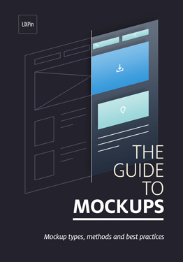
What Is a Mockup: The Final Layer of UI Design

Wireframes are the skeleton. Prototypes demonstrate the behavior. Mockups are the skin.
In this article, we’ll explain why mockups are just as important as wireframes and prototypes, and how to choose the right method.
What is a Mockup?
Typically mid to high fidelity, mockups reflect the design choices for color schemes, layouts, typography, iconography, the visuals of navigation, and the overall atmosphere of the product.
In addition to setting aside time to answer the important visual questions, mockups have several other benefits:
Intuitive to stakeholders — Thanks to their higher fidelity, mockups require less context than lo-fi documents like wireframes. Stakeholders can more easily see the final product.
Realistic perspective — It’s one thing to have all your visual decisions made, but it’s another to see them all working together in a way close to the real thing. Mockups can help reveal problems that aren’t so apparent on paper (for example, color clashes, or smaller type crimes going unnoticed).
Early revisions — It’s easier to make revisions in a mockup than in the later coding stages (as long as the mockup itself isn’t coded).
In the design process, mockups come at the end of the lo-fi phase and the beginning of the hi-fi phase. This could mean different things for different methods — for example, a mockup could be made immediately after wireframing, or could be postponed until after some lo-fi prototype testing.
We also recommend testing when transitioning from lo-fi to hi-fi, however. Big picture concepts like navigation and flow are harder to change in high fidelity, and so should be iterated before you dive into a hi-fi mockup.

Photo credit: Sketch App
As explained in the free Guide to Mockups, keep these tips in mind:
Narrow your concepts — The reason mockups come after wireframing is that you first need to eliminate other big picture options. If you’re unclear about the navigation structure, don’t make mockups for both versions — decide one first.
Examine competitor products — Before deciding your own visuals, take a look at what your competitors are doing. Don’t copy them, though — look for areas that you can improve upon, or UI patterns that users would want on all products of this type. A quick heuristic review can help quantify your observations.
Next, we’ll look at what specific fields the mockup tackles.
Anatomy of a Mockup
In the simplest terms, the anatomy of a UI mockup should be identical to the makeup of the page it represents. That means during the mockup phase, you should consider:
Content Layout — How the content is displayed, such as F-pattern or Z-pattern, cards or text. You should also consider the size of each piece of content, and how many you want to fit on the screen at a time.
Contrast — Use a color contrast tool to test the legibility of your text against your background. You can also use color contrast to increase the visibility of some elements like calls-to-action.
Color Usage — Colors evoke different emotions, and their effects change based on surrounding colors. You can check out the free ebook Web UI Design for the Human Eye (Vol.1) for more detail.
Typography — Mockups let you explore your typography size, font, style, and spacing, not to mention structural usage for consistency, like how to stylize captions. Mark Boulton gives some general typography advice.
Spacing — Negative space is not empty space to be filled — it is a powerful design element. An appropriate amount of emptiness improves user comprehension and legibility, and acts as a powerful tool in visual hierarchy. The more negative space around an element, the more the eye is drawn to it.
Navigation Visuals — By now the information architecture should already be finished, so you just need to consider how it will look. For example, if you have a pull-down menu or drawer, you can now dive into details like color, spacing, typography, and order.
3 Types of Mockups
We can divide mockups tools into three different types — graphic design software, mockup apps, and coded mockups — each with their own advantages and disadvantages.
Graphic Design Software
Because of the emphasis on visuals, some designers prefer to build mockups in the graphic design software they’re most familiar with. Software like Photoshop is built to create pixel-perfect images.
The downside is that these programs don’t allow you to add interactions to your mockups (which is why we decided to integrate with Photoshop and Sketch).

Photo credit: Turning Photoshop Mockups Into Interactive Prototypes
The other downside is that you need to know how to use the software, which is usually complex since it’s designed for more visual manipulation than just creating mockups. Unless your mockups require the highest fidelity possible, graphic design software can be overkill.
Mockup Apps
Tools created specifically for digital product design, like our app UXPin or Sketch, build upon existing experience with classic tools like Photoshop.

Photo credit: Creating Quick Wireframes & Mockups
Code
Coded mockups are an efficient way to save time and resources provided you’re technically confident. There’s also no surprises later on — if a visual element cannot be created in code, it is simply fixed right then and there.
Unless you’re extremely proficient, you’ll likely be able to explore more concepts in a specialized tool than in code.
Grab design ebooks created by best designers
All for free
 Download
Download
Download
 Download
 DownloadDo you want to know more about UI Design?
Download 'Free Ebook: Web Design Trends 2016' FOR FREE!
Download e-book for freeCloseCollaborating with Developers on Mockups
UI mockups are one of the most important documents for developers because it’s where they determine how to create the visuals, or even if they’re possible. Here are some tips to help smooth the collaboration and handoffp rocess:
Explain pieces using atomic design — Brad Frost’s Atomic Design breaks everything into small components, so you can better communicate your ideas.
Point out interactive and animated elements — Because mockups are static, motion and interactivity aren’t always evident at a glance. Specifically point them out so you can know as early as possible if there will be any difficulty in the back-end.
Understand development basics — Web design is not a silo. Knowing the basics of the other departments — not just development, but also marketing, sales, research, etc. — just creates a better project. If you know a bit about what they developers do, you can have more productive conversations about what’s in the mockup.
For more collaboration tips, check out the free pocket guide Building UI Mockups Developers Won’t Hate.
Additional Advice
For a more thorough treatment of mockups — as well as wireframes and prototypes — download the free UX Design Builder’s Bundle.

The bundle contains our popular Guide to Mockups, a complete ebook full of best practices for UI mockups.
You also get the Guide to Wireframing and The Ultimate Guide to Prototypes for a total of 350 pages. The advice draws from real examples from companies like Google Venture, Apple, and others.
The post What Is a Mockup: The Final Layer of UI Design appeared first on Studio by UXPin.
5 Tips from 5 Designers to Improve Your UX Sketches

It’s the beginning of a new project.
You’ve got all these ideas bouncing around your head, but they’re too incomplete to express clearly. What do you do?
Same thing you did in school — grab something to write with and some paper (or a whiteboard, or a cocktail napkin) and sketch out what you’re thinking.
In the early stages of design, sketching helps take our abstract and undefined details and turns them into something real. UX sketches are the earliest foundations we build upon, the bridge between nothing and something.
… but they can always be better, can’t they?
We’ve collected the advice of 5 different UX designers for 5 different techniques guaranteed to improve your UX sketching.
1. First Write Down the User Problem
UX Consultant David Mannheim’s process of structuring sketches starts by writing out the user problem. He then draws on his experience with other interfaces to determine how to solve the problem.
Knowing this, the lo-fi structure starts to fall into place.
Mannheim, a sketching enthusiast in general, likens digital design structure to classic cartooning. You first outline the navigation menu and the main content, the basic outlines of the cartoon’s head and body. Only later comes the secondary content and details, the arms, legs, and facial features.
He also recommends using the age-old golden ratio, 1:1.6, a “gold standard” of aesthetics for over 4,000 years. Try sketching out the golden ratio first, and then drawing your ideas on top of it for guidance.
Following the golden ratio, the main content area might have 640px and the sidebar 400px.
2. Sketch in Layers with Increasingly Darker Pens
Sketches don’t need to be perfect, but they shouldn’t be sloppy either.
Senior UX Specialist at Universal Mind, Peiter Buick recommends sketching in layers using a darker instrument for each successive layer. This is an efficient approach to sketching:
Multiple drafts build on each other instead of starting from scratch
You can outline the structure of your sketch before considering the details
Early mistakes aren’t as noticeable

Photo credit: “ The Messy Art of UX Sketching. ” Peiter Buick. Smashing Magazine .
Buick suggests starting with a light-gray marker, 20-30% gray. Depending on how many layers you intend to create, incrementally increase the hue of the instrument.
When you’re ready for the final details, use a 60% gray marker or comparable instrument.
3. Start with the Smallest Screen and Work Up
This advice isn’t just for sketches, but for all aspects of the design process. The mobile-first approach explained in UX Design Trends 2016 starts with the smallest screen and works upwards, typically something like mobile => tablet => desktop.

Adam Fairhead explains why this approach just makes sense:
You have no choice but to prioritize content right from the start. Whatever you choose to fit into the mobile screen becomes the core content of bigger screens. This makes mobile-first a content-first approach.
Making additions, not subtractions. As you scale up, you add content, which is a lot easier than the alternative. Starting with desktop means taking pieces away as you advance, and could lead to complications and backtracking.
Constraints encourage creativity. Working within the limitations of small screens means coming up with solutions you wouldn’t have thought of.
The goal is for your site to look good on all devices, but designing first in a larger screen tends to make mobile versions seems like a “lesser” version of the “original.”
Grab design ebooks created by best designers
All for free
Download
Download
Download
 DownloadDo you want to know more about UI Design?
Download 'UX Design Process Best Practices' FOR FREE!
Download e-book for freeClose4. Compile Screen Sketches into a Paper Prototype
Even the most realistic sketches of screens still only represent the visual dimension and say nothing of interactivity or flow. To properly set the context of usability — which isn’t easy in this early stage — Marcin Treder advocates building a simple paper prototype.
Cheap, fast, and disposable, paper prototypes are great for early stage concept testing.
Simply sketch each screen and put them in order. You can then test your paper prototype with users as a team member acts as the human computer to switch through screens.
5. Try the 20-minute Whiteboard Design Challenge
UX Designer at Tradecraft, Molly Inglish describes a useful collaborative sketch activity.
The 20-minute Whiteboard Design Challenge is a regular training regime for improving problem-solving skills, building team unity, and even refining sketching abilities.
It works like this:
Designers break into pairs and choose a product challenge at random from a premade list.
One member of the pair is the designer, the other is the host.
The designer is given 20 minutes to work out the problem through sketching on the whiteboard.
The host mostly observes and keeps the designer on track with time. If the designer asks a question (i.e., “Who’s the target user?”), the host can provide the answer.
When time is up, the host spends 10 minutes giving the designer feedback.
The designer and the host swap roles, pick a new challenge, and repeat.
Inglish swears that engaging in this activity once a week drastically improves problem-solving skills.
Further Reading
For more tips and techniques building functional design systems, check out the free Practical Interaction Design Ebook Bundle. The bundle includes 3 ebooks on wireframing, prototyping, and mockups. 350+ pages of advice are included based on analysis of techniques from Apple, IDEO, Zurb, and Google Ventures.

The post 5 Tips from 5 Designers to Improve Your UX Sketches appeared first on Studio by UXPin.
February 2, 2016
3-Minute UX Tips: Actionable Feedback From Your Team

Design feedback can sometimes be as vague as “I just don’t like it.” Here are a couple tactics to use in a design collaboration session to guide more useful critique.
1. The Three-Question Rule
Dustin Curtis had the same problem with vague feedback as the rest of us, so he developed an interesting but helpful system: ask the critic three questions.
The three questions themselves don’t matter, they’re just a vehicle for having the critic dive deeper into their own opinion. It’s also a good method for sifting out ingenuine criticisms from the potentially helpful ones.
2. “Give it Five Minutes”
As Basecamp CEO Jason Fried explains, he used to be a “hothead” until he learned to wait five minutes, in both giving and taking criticism. What it boils down to is having time to think and process the information. Often, our immediate responses are to fight back if we’re attacked, but criticism isn’t always an attack.
It’s best to take a moment to collect your thoughts before going on the defensive. With some thoughtful consideration, you may find the feedback is actually just the advice you needed.
3. Clarify the Context of the Fidelity
You can’t gauge high-end graphics or advanced usability with a lo-fi prototype. It’s your responsibility to ensure stakeholders know this before you show them an in-progress design.
Clarify what participants should be looking out for and what’s not yet ready (but will be built later). Then, ask for feedback related to user goals. Instead of a completely open-ended question like “What do you think?”, try a more focused question like “How well does this prototype help users find apartments based on their needs?
This saves both of you time on irrelevant comments about visual design when you care more about the basic usability and task flow.
Additional Reading
For more practical everyday UX advice, check out The Field Guide to UX Strategy. Written by designer and author Robert Hoekman Jr., the no-BS guide draws from his 15 years of experience with companies like Intuit, Rackspace, Dodge, and others.

Photo credit: Pixel Parlor
The post 3-Minute UX Tips: Actionable Feedback From Your Team appeared first on Studio by UXPin.
3-Minute UX Tips: Tactics for Actionable UX Feedback
Design feedback can sometimes be as vague as “I just don’t like it.” Here are a couple tactics to use in a design collaboration session to guide more useful critique.
1. The Three-Question Rule
Dustin Curtis had the same problem with vague feedback as the rest of us, so he developed an interesting but helpful system: ask the critic three questions.
The three questions themselves don’t matter, they’re just a vehicle for having the critic dive deeper into their own opinion. It’s also a good method for sifting out ingenuine criticisms from the potentially helpful ones.
2. “Give it Five Minutes”
As Basecamp CEO Jason Fried explains, he used to be a “hothead” until he learned to wait five minutes, in both giving and taking criticism. What it boils down to is having time to think and process the information. Often, our immediate responses are to fight back if we’re attacked, but criticism isn’t always an attack.
It’s best to take a moment to collect your thoughts before going on the defensive. With some thoughtful consideration, you may find the feedback is actually just the advice you needed.
3. Clarify the Context of the Fidelity
You can’t gauge high-end graphics or advanced usability with a lo-fi prototype. It’s your responsibility to ensure stakeholders know this before you show them an in-progress design.
Clarify what participants should be looking out for and what’s not yet ready (but will be built later). Then, ask for feedback related to user goals. Instead of a completely open-ended question like “What do you think?”, try a more focused question like “How well does this prototype help users find apartments based on their needs?
This saves both of you time on irrelevant comments about visual design when you care more about the basic usability and task flow.
Additional Reading
For more practical everyday UX advice, check out The Field Guide to UX Strategy. Written by designer and author Robert Hoekman Jr., the no-BS guide draws from his 15 years of experience with companies like Intuit, Rackspace, Dodge, and others.
Photo credit: Pixel Parlor
The post 3-Minute UX Tips: Tactics for Actionable UX Feedback appeared first on Studio by UXPin.
UXpin's Blog

- UXpin's profile
- 68 followers

