
UXpin's Blog, page 136
February 23, 2016
User Experience Design Is Not What You Think

As designers, our job is to build elegant interfaces.
Interfaces that are key components in the user’s experience. Interfaces that allow them to get answers to questions or complete critical tasks. Our job is to help them achieve their goal.
But don’t mistake these interactions as the entirety of the users experience. Great user experiences happen beyond the screen and in the gaps. Gaps between channels, devices and business silos. They happen when organizations pay attention to the nuances of their interaction with customers.
Because user experience design touches so many areas it is often hard to describe. So instead let me give you some examples of interactions that help create a better user experience.
Removing the hassle of telephone support
The Barclays Mobile App is a great example of good user experience design. The app itself has an excellent user interface. But that is not the extent of its user experience.

Barclays have a great mobile app. But the real magic happens when you call them.
If you need to call Barclays you can do so via the app. This allows you to skip the authentication over the phone because you did that when you logged into the app.
This is a great example of outstanding user experience design. I am sure getting the telephone system and mobile application to talk to one another was not easy. Yet no doubt it saves hundreds of users hassle everyday.
Making returns painless
If you have ever had to return a product you have purchased online you know it is not always easy. You have to print a return label, go to the post office and wait days for the funds to appear in your account. On top of which there is always the nagging concern that they won’t refund your money.
In contrast I recently had a different experience returning a purchase. On letting the company know I wanted to return an item, they told me the money would be immediately returned to my account. No waiting for them to receive the return and check it over.

When returning an item there is always a fear they may not refund you. That is an opportunity to improve the user experience.
Next they asked me when I would like the package collected. I didn’t have to pack it, label it or even take it to the post office. Somebody turned up at my door with a box ready to go. I dropped the item in the box and he took it away.
That is an outstanding user experience.
Helping customers feel safe
As a UX consultant, I once worked with a client who sold frozen ready meals to the elderly. It is a group nervous of purchasing online. They do not like the idea of a stranger turning up on their door.
To deal with this problem, when somebody places an order they see who their driver will be. That way they will recognise the person when they come to the door.
But they don’t stop there. They also police check all drivers so the customer can be sure that it is safe.
This was a lot of effort and expense to go to, but it caused a significant increase in sales. It was something that their competitors (like Tescos) did not offer.
Saving the user time
Talking of deliveries, have you ever had anything delivered by the courier company DPD?
I hate having things delivered. Often you have no idea when your package is going to arrive and when you do it is either morning or afternoon.
That means you have to be available and on the look out for the delivery man. Nothing is worse than finding that card on your door mat because you made the mistake of going into the garden at the wrong moment.

DPD allow you to track exactly when your package will arrive.
DPD deals with this. On the day of the delivery they text and email you a one hour slot when your order will arrive. But even better they also allow you to track your delivery in real time. That means you can see where the driver is and judge whether you have 10 minutes to pop to the shops.
Because of that user experience I get excited when I discover my package is going to arrive via DPD.
Reassuring over privacy
Another client I once worked with was LoveHoney, the biggest retailer of adult toys in the UK. Yes, I have a bizarrely wide ranging client list.
People are sensitive about their purchases from LoveHoney. They don’t want others knowing they have bought from there. That is why LoveHoney makes sure all packaging gives no sign of its content. The credit card statement for your product also doesn’t draw attention to where the purchase was made.
Providing inspiration
Finally I want to mention Etsy. Etsy realise there is more to social media than just being a marketing channel.
They know many of their customers are looking for a gift but don’t know what to buy. That is why they built an app that connects to the users Facebook account.

Etsy connect the Facebook experience with their website by offering gift suggestions to users.
By analyzing the interests of the users friends, it makes suggestions about what they should buy. They used digital to take the pain out of the buying experience.
Isn’t this customer service?
You might be thinking this sounds more like customer service design than user experience design. You might be right.
The truth is we have so segmented our job descriptions that they often overlap. I believe user experience design sits at the cross roads of several disciplines. Disciplines including both user interface design and customer service.
Whatever you choose to call it, there is an important lesson to learn. The experience of users isn’t limited to a single channel, device or part of your business.
Originally published on Boagworld.
Editor’s note: For more UX advice and insights, check out the free Definitive 2016 UX Design Trends Bundle. 350 pages of best practices and 200+ examples are included.

The post User Experience Design Is Not What You Think appeared first on Studio by UXPin.


February 22, 2016
The 3-Step Hybrid Process for Prioritizing Product Features

Lost without a product roadmap?
Don’t worry. We’ve collected the advice of successful product managers to create this 3-step approach for methodically prioritizing product features.
We actually practice this hybrid process at UXPin with our own product and UX teams.
In this piece, we’ll explain:
How to first think of features in terms of themes
How to break down themes into projects
How to rank each project collaboratively for maximum impact.
Step 1: Prioritize Goals as Themes
Sometimes the difficulty with prioritizing product features lies in prioritizing your goals first.

Photo credit: “ Design Management .” PARK advanced design management. Creative Commons .
We first learned of this tactic through Ian McAllister, former Product Director at Amazon.
First, determine the most important themes for your company/project at this given stage. Themes could be anything from increasing conversions, increasing time on site, or increasing average spending. For example, a web service that just launched might be more focused on pure trial conversions than revenue.
Once you’ve mapped out your themes, pick just 3 based on pressing pain points.
For example, if your web app is bleeding users on a weekly basis, conversion optimization on your marketing site can wait. Instead, you’d want to focus on “Reduce Churn” and “Acquire Users” so that you can fix your user funnel.
Step 2: Kano Analysis
Created by Noriaki Kano in the 80s, the prioritization technique still remains relevant thirty years later.
Within each of the three themes, create specific projects (e.g. User Onboarding and In-App Messaging would fall under “Reduce Churn”). Next, categorize all projects based on Scott Selhorst’s advice:
Must-haves — The essential features of a product — without these, the user wouldn’t bother with the product.
More is better — Bigger, faster, stronger, etc. Improving existing features by increasing their capacities
Surprise and delight — Features that increase enjoyment more than usability, and commonly distinguish a product from its competitors.

Photo credit: “ Kano Analysis .” 2020 Delivery. Creative Commons .
From there, you should start thinking about the categories accordingly:
Must-haves should generally launch in the first release.
More is better can be prioritized based on ROI. The first version can have a minimum capacity, with the opportunity to increase in later launches.
Surprise and delight have different values depending on the product. They are more important for word-of-mouth marketing and products where the end-users make the purchasing decision.
Once you have the categories of the projects briefly outlined, it’s time to assign formal ranking numbers to each project.
The ranking will help you understand the real value of each project in the different categories.
Grab design ebooks created by best designers
All for free
 Download
 Download
 Download
 DownloadDo you want to know more about UI Design?
Download 'UX Design 2015 & 2016' FOR FREE!
Download e-book for freeCloseStep 3: Collaborative Ranking System
The most methodical part of any endeavor is to assign numerical values to its qualities. For product features, you can score each product feature until the highest priority ones are clear.
Here’s the approach we took at UXPin with our own redesign process (you can see the spreadsheet below):
1. Every project is added to a spreadsheet along with corresponding category.
2. For each project, Product and UX Lead create columns for Cost, Business Value, User Pain.
3. Product and UX Lead assign a value from 1 to 10 for each of the columns.
4. Product and UX Lead add a fourth column, which is a sum of Business Value and User Pain. We label this (S+U). Consider this the overall value of the feature.
5. Either the Product or UX Lead will add two more columns. One column averages the (S+U) between both people, the other column divides (S+U)/ Cost.
6. When the spreadsheet is complete, both leads will discuss similarities and differences in the values. They will align to an understanding of project priorities and start to create a product roadmap from the spreadsheet.
You can see all of these steps in play in the below spreadsheet created by Bartek Debicki (our product lead) and Marcin Treder (our UX lead).

You can scale the process to as many designers and product managers as required, but we recommend only the leads so you don’t slow down the ranking.
Why Each Step Is Necessary
These steps work best together in sequence:
The first step is required for broad organization. You need a firm grip of business goals before you can even hope to prioritize features.
The Kano analysis helps transform goals into projects, so you can separate the must-haves from the nice-to-haves.
Ranking each project makes their value immediately tangible and shareable with just about any stakeholder in the organization.
As a result, you’re left with a highly focused list of items.
Prioritization in its most methodical and logical form.
Next Steps
If you found these tips useful, feel free to check out our free guide UX Design Process Best Practices. Across 111 pages, we explain best practices for requirements gathering, user research, UI design, usability testing, and design sprints.

Feature photo credit: Mind the Product
The post The 3-Step Hybrid Process for Prioritizing Product Features appeared first on Studio by UXPin.
February 19, 2016
4 Bottom-Line Questions for Avoiding Feature Bloat

New feature requests are something we face everyday on a product team.
However, managing those requests doesn’t mean automatically saying “yes” to them. As a product manager or product designer, your responsibility is to ensure the integrity and value of your product—and a harmonized user experience is absolutely essential to that integrity and value.
If you add features to a product at the drop of a hat, the product will eventually suffer from Franken-UX: bits and pieces that individually make sense, but when put together create confusion, waste time, and add zero value for your users.
So what’s the best way to avoid Franken-UX? Ask yourself these 4 questions next time someone insists that you add a new feature.
1. What is the actual functional/business goal we must achieve?
It’s very common for customers or even internal team members to ask for features. By features, I mean “can we have a button that allows me to filter X?” or “can we add field Z to the existing report columns?”

Photo credit: The Next Web
Anyone familiar with an existing application will always think within the limits of that application. And this is not a good thing because we end up trying to find ways to simply “fit” new features into an existing screen.
If someone requests a specific button or menu on the interface, ask them a series of questions so that you can understand what actually trying to achieve. Some general questions that can help you probe more deeply and efficiently are:
Why do you need this functionality?
What do you expect to gain by having this functionality (save time, work faster, increase conversion by X%, etc.)?
Can you explain your business need to me without referencing the current interface?
What percentage of users will this feature positively impact?
Once you’ve collected more information about the actual functional/business need, you should analyze the data to understand if, and how, it can be addressed satisfactorily.
During your analysis you might realize that there’s already a workaround that addresses the need. This can help to temporarily appease customers while you work toward figuring out the overall relevance of the need for your business and for your overall product vision.
Once you understand the actual need, you may find that the current product already has everything required to accomplish this goal, but it just requires users proceed through multiple screens or processes. While an exhaustive multi-step process isn’t great, you can at least articulate a workaround for customers who need a quick fix. This saves you from adding yet one more item to the interface. Most importantly, you buy yourself time to think more clearly about how to simplify the current multi-step process.
2. Is the goal aligned with our short-term and long-term objectives?
When a new feature request pops up, check if it fits into the short or long-term bucket.
Let’s say that as a company, one of your goals is to convert more “free trial” customers into paying customers and ultimately increase the number of new customers by 10% within 1.5 years. You decide that in order to increase the conversion rate in that time period, one of the required actions is to create an engaging onboarding process.

Photo credit: Kiip
The goal of increasing conversion rate would then fall into the “long-term bucket” and the creation of an engaging onboarding process would fall into the “short-term bucket”.
You may have two dev teams running in parallel: one to support existing functionality (so that existing customers don’t feel neglected) and another to build the new educational content library. Any new feature requests would then have to be evaluated to see if it fits into that short-term objective. Anything that doesn’t enhance the success of that that short-term objective must be set aside until it makes sense for the business to tackle the request.
It’s often deadly to try to sneak in something that doesn’t clearly fit into the two buckets mentioned in this section because the feature is often hacked into the interface, without the proper care and attention from product managers and UX designers.
Grab design ebooks created by best designers
All for free
 Download
Download
Download
 Download
Do you want to know more about UI Design?
Download
DownloadDo you want to know more about UI Design?Download 'The Guide to UX Design Process & Documentation' FOR FREE!
Download e-book for freeClose3. Does it fit into our brand experience?
The phrase “our competitors have it” is often repeated as a reason for why a new feature should be implemented. But if a new feature cannot live up to or exceed your brand experience, then it shouldn’t be implemented.
Coherence and consistency of your brand and user experience must go hand-in-hand.
Let’s say Competitor A has a “Minimalist View” that you decide to add into your product. Four months, later you notice that Competitor B has added a new reporting function, so you add it to your report interface. Then 12 later now Competitor C has added an “export to PDF” functionality, so you do the same.

Photo credit: What Does Feature Creep Look Like? by Intercom.io
As you continually try to keep up with your competitor, you enter a reactionary state of mind where it’s simply about “You can do it, so I can do it too”. And this is a surefire way to create a product that will show the tell-tale symptoms of Franken-UX. Over time it will become clear to users that there’s isn’t harmony in terms of the functionality offered, how it’s implemented, and how it fits into the overall brand offering.
Your brand experience is something that needs to sit at the forefront of your mind whenever you’re managing new feature requests. For some brands, their experience is defined by top-of-the-line security. For other brands, their experience centers on file collaboration. For other brands, it’s high-end design editing capabilities.
Whatever you do, each new feature needs to represent that brand experience.
4. Will it help us attract a new market?
For companies looking to attract a new market of users—be it demographically or geographically—a new feature request needs to be analyzed within cultural and social contexts.
If your company is currently considering an expansion to another country, then all new feature requests should be considered for your existing and future markets. Maybe a given feature isn’t relevant for your current market but would be great for users in another region.

Photo credit: Web Designer Depot
If each market will have its own region-specific product, then all you have to do is implement the feature for the relevant market(s) only. However, if all users across geographical zones will be using the same product, then it’s essential to think about how the feature will be accessed. Should the feature be activated by a user setting or as an extra offering in a special subscription plan?
Users in one region should not be penalized with features that are irrelevant for them. Faced with the evidence of your Franken-UX, they could very quickly lose interest in your product
Conclusion
Saying no to new product requests is never easy to do.
And it’s often very tempting to let a few things slide through the cracks because they appear to be “quick wins” (like rewriting the text in an error or confirmation message to make it more user-friendly). Anything outside of that can easily be a small, “manageable” update or a beast that wreaks havoc on your UX.
The culture of “quick wins”, however, can be a slippery slope. When new requests come in it’s best to evaluate them against the 4 questions listed in this article.
You have a responsibility to the business and users to protect the integrity of the product. By taking the time to evaluate each new feature request, you’re ensuring that you, and the product team that relies heavily on you, are building engaging and relevant products for your users.
For more UX and product design advice, check out the free 109-page guide The Elements of Successful UX Design. The book deconstructs 24 examples from today’s top companies.

The post 4 Bottom-Line Questions for Avoiding Feature Bloat appeared first on Studio by UXPin.
February 18, 2016
4 Techniques To Add More Life to Flat UI Design

Google, Starbucks, Microsoft. Big brands are all going flat. Their sites, not their sales.
The influence of big brands making a change like this is enough to push the trend further forward. Adoption from more and bigger brands will only push usage. Mid-size and smaller brands will definitely follow. (Which is a little ironic since “smaller” brands and designers were the first to champion flat design.)
However, what’s equally important to study is how these influencers use flat design. There are a few commonalities:
Flat logos
Dominant use of one brand color
Plenty of simple shapes, particularly squares or circles
Flat user elements paired with big images or video
Simple, bold typography
Flat effects
While most of the common traits are representative of the flat design style altogether, some flat effects can exist individually. These effects can be isolated and transplanted into sites with other, varying aesthetics.
Once shunned by flat design purists, the use of subtle effects is becoming synonymous with flat design. Simple effects fix the biggest problem associated with the design style – that user interface elements and calls to action were often hidden, “lost,” or difficult to find. The addition of small effects have gone a long way to resolve this issue.
Here are 4 flat effects that you can use on their own, to give your site as much or as little of the flat benefits as you want.
1. Tiny Shadows
As explained in Flat Design Trends 2016, subtle drop shadows that most users won’t even see add an element of depth. The shadow should provide a bit of depth that helps “lift” the element off the background, but is not harsh and should not really stand out visually.

Photo credit: Publicis
2. Ghost Buttons
These aren’t buttons that are ghastly.
Quite the opposite, they’re box outlines with instructions inside. This design element has grown in popularity on sites that use hero images, illustrations, or video. These buttons are aptly named because the main part of the element is see-through and allows the background image or color to come through. Ghost buttons provide a great element for a call to action without taking away from the main image on the screen.

Photo Credit: Urban Influence
3. Hover Animations
Small movements that clue users into what actions to take as they move across the screen are a great navigational tool. Animation is often connected to buttons but can stand alone as well. Hover animations such as a bump, spin, color change or swirl help users focus on where an action should take place. For sites with more complicated visuals, designers are extending this animation so that it is continuous and does not just happen with the hover of a mouse to better connect with and direct users as to what actions they should perform.
Photo credit: Humaan
4. Color Gradients
Once taboo in terms of flat, color graduation is making a comeback. The big change this time around is that it is a lot less subtle, changing between two bright colors. This duotone effect, as made popular by Spotify (below) emphasis a gradient as a primary design element. This is in contrast to previous iterations of gradient trends where gradients were most commonly used as part of a background effect.

Photo credit: Spotify
Spotify embraces design trends – and leads the way – almost like no other brand. The image is constantly evolving and the Year in Review page exemplifies this. The design screams flat with a large, bright image, but look closer and there are small effects scattered throughout the design from a neon shadow on the image subject to a ghost button to sliding images with long shadows between movements.

Photo credit: Riiot Labs
Riiot Labs is just as striking with the page for a smart pool tool. From simple sans serif typography to a minimal outline using bold color, the site is distinctly flat. But the design also features a background with a color gradient, animations to draw the eye and a ghost button-filled button pair to encourage click actions.
Takeaway: Flat in Action
Brand names big and small are seeing the advantages of the flat style. Practical and visually stunning, the style saves on loading times, improves comprehension, and looks good while doing it. Let’s look at how some well-known names use flat — pay attention to their usage of the 4 effects above.

Photo credit: Corona
Corona uses a very flat aesthetic for its international presence. (The United States site is still a little less flat.) The design features a large iconic beach image – as the brand is known for – with color-blocked cards for more clickable content. Each page of the scroll and navigation use this flat concept with plenty of trendy touches, including social media integration, ghost buttons and oversized navigation elements.

Photo credit: Adidas Stella Sport
Adidas Stella Sport features a flat layered design that has touches of material design, flat design and an almost 80s vibe. The aesthetic uses plenty of bright colors with geometric shapes and simple sans serif typography. While there is a lot going on from screen to screen, the design still maintains a bit of a minimalist outline with plenty of space and clean lines.

Photo credit: Nike

Photo credit: Jet
In addition to aesthetics, flat design comes with other benefits as well. When done well, a flat framework can increase website conversions. Giles Thomas looked a flat button styles, among other things, and found a 35 percent increase in clicks when a flat design style was used. This factor alone might be why so many big brands are using flat and almost-flat design for their retail websites.
To learn more flat UI techniques, check out the free guide Flat Design Trends 2016. 20 examples are deconstructed into practical design tips.

The post 4 Techniques To Add More Life to Flat UI Design appeared first on Studio by UXPin.
February 17, 2016
The Missing Link Between UX and Copywriting

Empathy. Communication. Storytelling.
Some of the most useful UX skills in are also core writing skills. As a content strategist at UXPin, I’ve learned that great design cannot exist without great copy. In fact, as we explained in Interaction Design Best Practices Vol. 1, text forms the foundation for on-screen interactions.
Let’s explore how writing can improve how you run a design feedback session and how you design interfaces.
Clarity in Communication
Communication is the heart of writing and UX design.
For writing, communication means expressing your thoughts clearly, and if you can, poetically as well. For UX design, it’s actually a bit looser, since there aren’t as many clear-cut grammar rules nor a standard vocabulary.
For the designer, writing helps in two ways: communicating decisions with fellow team members/stakeholders, and communicating with users through interface copy.
i. Communicating with the product team
Formal writing like reports, essays, arguments, etc. rely heavily on structure.
In school, we’re taught the format of presenting the initial argument, rebuttal, and then final argument.

The same skills apply when giving and receiving feedback for your designs. Before a feedback session, try writing a quick cheatsheet that answers these questions:
What goals do my top 3 design decisions accomplish?
Why did I make these decisions?
What specific user research supports those decisions?
Where do we need to add more fidelity?
Spending a little time organizing beforehand helps avoid the “deer in headlights” effect when unexpected questions pop up (and they always do).
ii. Communicating with users
A more direct application is copy as a UI element.
It’s not easy to improve your writing overnight. Copywriting draws from thousands of years of literature the way interface design draws from decades years of art and psychology principles. What we’ll do here, though, is offer 3 simple tips to improve interface copy.
Write verbs first. Thanks to eye tracking studies, we know that most users scan through content before deciding if they want to continue. Verbs immediately catch the user’s attention and indicate that the text or label reflects action. For example, a CTA with “Send money” is more direct and clear than “Give money”.
Be unmistakably clear. On a related note, “Save” doesn’t mean the same as “Submit.” Just like you measure alignment for visual elements, read carefully into each word that you add to an interface.
Omit needless words. Writing advice 101. Delete unnecessary words, leaving only a crisp flow. Consider the difference between:
Text is a lot better without all that unnecessary extra weight.
… and…
Text is better without extra weight.
The Shared Tools of Writing and UX Design
Take a look at this list of common “tools” used by both writing and UX design:
Pacing. The structure of your writing, as we mentioned above, affects the way information is presented to your reader, which then affects how well it’s processed. This same structuring increases the effectiveness of your UX design. Consider what you want your user to see first, second, third, etc., then structure your visual hierarchy to align with this pacing.
Tone. Along the lines of perspective, the tone is how you present your argument. Playful like MailChimp? Logical like Campaign Monitor? There’s no wrong answer, as long as it matches your users. Just make sure the tone of the visual design matches the tone of the copy so you create a unified design personality.
Clarity. Never sacrifice clarity in the design for the sake of being clever. “Cool, let’s roll with it!” is rarely a good substitute for a simple “Send” button.
The link between writing and UX design is a two-way street.
Storytelling
Advanced writing techniques break into the art of storytelling, an area quite prevalent in UX design.
Storytelling in UX design mean establishing emotional connections with the users and hooking them into continual usage of the product. As you can imagine, this isn’t something that can be taught in a single article.

We won’t explain the full art of storytelling here, but if you’re interested, we’ve included these two free resources for further reading:
The Visual Storyteller’s Guide to UI Design — One of our free ebooks explaining how to apply the ancient skill of storytelling to modern product interfaces. 70 pages of advice based on analyzing 29 examples.
30 Compelling Examples of Visual Storytelling on the Web — Digital Telepathy’s list of 30 websites that do storytelling right.
Try It Out: User Flow Exercises
Here’s a practical exercise that directly impacts your UX design: writing out your user flow.
When you write out a user flow, you don’t just create the overall pace of the experience— you also think about the exact copy used for important labels.
You create a user flow by mapping out the steps required to accomplish a goal.
Let’s create one for, say, a banking app. The scenario: someone wants to turn on auto deposit. Note in the outline below, content in [brackets] represents action buttons/links.
Step 1: Would you like to set up auto deposit?
[Set auto-deposit]
Step 2: Select Deposit Frequency
[Once per month][Twice per month]
[Every other week][Every week]
Step 3: Deposit Once per Month
[Select calendar day]
Step 4: Set Amount
Display amount field
[Set auto-deposit]
Writing this out for each step helps you better understand what your users will experience, how they’ll behave, and gives you a chance to hone the microcopy.
To learn more, check out UX Designer Marek Bowers’s popular article on user flows, in which he explains what they are, why they help, and two different methods for creating them.
Additional UX Advice
To learn more UX best practices, check out our new 109-page e-book The Elements of Successful UX Design. We’ve deconstructed examples from 24 companies like Buffer and Slack to explore why their products are so successful.
The post The Missing Link Between UX and Copywriting appeared first on Studio by UXPin.
February 16, 2016
Responsive Web Design Crash Course: The Technical Side

It’s time to delve into the nuts and bolts of responsive web design.
As a technical medium, RWD requires a working knowledge of the code that makes it work. Designers who ignore the basics fail to understand what browsers can and can’t do.
Since I’ve been a web designer and developer for nearly 20 years, I hope to distill the technical side of responsive design into a quick crash course below. The below foundational knowledge certainly helps me improve the feasibility of my own designs when I’m creating responsive prototypes in UXPin.
First, Cascading Stylesheets, or CSS, is the language that makes responsive web design possible. CSS is a series of directives that spell out how browsers should display data depending on certain conditions like browser width. Now, understand that while most modern browsers obey the same rules in the same way, CSS rules are suggestions.
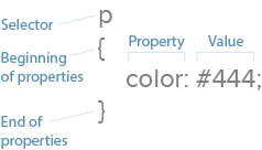
Let’s review the fundamentals. CSS works with selectors and properties.
Selectors: HTML affected by the CSS. Examples: HTML
elements, elements and elements.
Properties: what the CSS will change on a given selector. Examples: Text color, border and padding.
Values: the change itself. Examples: Red, 10px and sans-serif are three values.
Now let’s put this together. “div { color: #333; }” has one selector, one property and one value.
Media Queries Are the Technical Heart of Responsive Web Design
To account for different browsing conditions, responsive web design dictates that different rules must take place under different circumstances, usually the browser’s or device’s screen (the “viewport”) width.
How do we define these rules? Media queries. Media queries are CSS commands that determine under what conditions other CSS selectors take effect.
For example, one media query might tell a browser, “pay attention to rules 1–10 when the screen is up to 320 pixels wide,” while another might say, “pay attention to rules 11–20 when the screen is 321 pixels wide or greater.”
Media queries are easy to identify: they begin with “@media”. Browsers read the CSS rules (e.g. selectors) listed between the media query’s { curly brackets }.

Above, CSS says to make all text red on visual devices, not screen readers.
Media queries can build upon each other. For example:
@media screen and (width: 320px) { body { color: red; } }
Rules take effect on visual devices that display exactly 320 pixels horizontally.
The different minimum and maximum widths that media queries use are called breakpoints. A query that specifies (max-width: 768px) would change layouts when the viewport measures 0–768 pixels wide. Oddly, nothing actually “breaks” at that point. The term simply means that new rules will take effect within a given range, in this case 0–768 pixels, or the width of an average tablet.
There’s no technical limit to the number of conditions a media query can display. This query is perfectly valid:
@media screen and (min-width: 480px) and (orientation: landscape) and (aspect-ratio: 4/3) and (color: true) { … }
It says that any color screen at least 480 pixels wide, held in landscape position, with an aspect ratio of 4 to 3 that’s exactly 320 pixels wide should take on certain properties.
The two most popular conditions are minimum and maximum width, the upper and lower limits a browser window can be to take on the given properties. But we can manipulate other important properties.
Resolution, for instance, suggests at what quality we should create our graphics. Screens capable of high-density graphics, e.g. Apple’s retina screens or high-res Android screens, will show text and vector art with crisp lines that make regular-density images look fuzzy.
“High-density images” are those that use more device pixels (actual dots a browser can display) vs. those defined in CSS. That means for an image to look its best, it needs four times the usual number of pixels. Something displayed at 300×300 pixels on a small screen actually needs 600×600 pixels total — when our media queries detect high-res screens.
If you’re curious, here are additional properties we can control with media queries:
Aspect-ratio: a comparison of a browser window’s width and height.
Color: whether a device has a color screen or not.
Color-index: the number of colors a screen can display.
Device-aspect-ratio: a comparison of the screen’s width and height.
Device-height: the number of pixels a displayed vertically by a device.
Device-width: the number of pixels a displayed horizontally by a device.
Height: the number of pixels displayed vertically by a browser viewport screen.
Monochrome: how many bits that pixels in a grayscale screen uses.
Orientation: whether a user is currently holding the device horizontally or vertically.
Resolution: the number of pixels per inch or centimeter displayed by a screen.
Width: the number of pixels a browser viewport uses horizontally.
As web layouts become more sophisticated with technology like Flexbox, orientation and aspect ratio will help us decide how much to show users at a glance. The “fold” may not be relevant as users scroll, but what they see when they stop scrolling needs to be as self-contained as possible.
For now, though, width and resolution are most useful for responsive web design. Since contemporary site design lets us scroll up and down, width determines the available space a layout can use.
Best Practice According to the Experts
It might not surprise you to learn that Google, whose search engine reads a page’s information and ignores viewports, recommend setting media queries by content, not specific devices. That makes sense as new devices appear every month, meaning device-based CSS would need constant updates.
Here’s where media queries help us most: they allow us to plan for browsers based on content and capability, not expectations. That is, we can tell browsers that our designs look best under ranges of conditions, like 0–300 pixels vs. 301 – 600 pixels, and write our code to suit our needs rather than what the browser requires.
Google also recommends adopting a mobile-first approach which, in addition to focusing on essential content that users want, encourages designers to use the fewest breakpoints possible. That means easier troubleshooting during development and maintenance later on.
If you’d like to learn more techniques for CSS media queries, we recommend the following resources:
How to Use Media Queries in Responsive Web Design
Responsive Layouts Using CSS Media Queries
Create a Responsive Web Design With Media Queries
Introduction to Responsive Web Design: Pseudo-Elements, Media Queries, and More
Quantity Queries for CSS
Grab design ebooks created by best designers
All for free
 Download
 Download
 Download
 DownloadDo you want to know more about UI Design?
Download 'The Complete 2016 Web Design Trends Bundle' FOR FREE!
Download e-book for freeCloseCompressing Resources for Faster Load Times
Like images, we can shrink CSS files to use as few bytes as possible. Smaller files require less time to load, making websites faster and keeping users from wandering away.
Many techniques exist to keep files small, but we recommend starting with a few basics.
1. Minification
With good spacing, CSS and HTML files are easy for designers to develop and maintain. But browsers don’t care about spaces between elements, properties and selectors. Extra spaces mean extra bytes, so we want to minimize those spaces (hence the term).
Before:
body {
background: #fff;
color: #444;
}
p {
padding-bottom: 1rem;
margin: 0;
}
After:
body{background:#fff;color:#444}p{padding-bottom:1rem;margin:0}
Tools like CSS Minifier, CSS Compressor, JS Compress and HTML Minifier by Will Peavy let you quickly strip away excess spaces from production copies of your code, while keeping the original lets you easily edit the original.
Best practice: check your code and always minify copies of your HTML, CSS and JavaScript files before uploading them to the live website.
2. GZIP
Like LZW compression used in PNG and GIF files, GZIP scans files for redundant bytes. This is a deeper compression technique than minification. Google reports that this works best with text-based files like HTML, CSS and JavaScript.
Best practice: zip files after minifying them to make sites load faster, especially on smaller, less-capable devices.
HTTP requests
An often-overlooked means to speed up your sites is to reduce the number of files that a browser must download per page view. Simply put, the fewer files to download, the faster browsers can display a page.
Each request can take from 200 ms (milliseconds) to several seconds. That adds up quickly since (as we explained in the free e-book Interaction Design Best Practices) users start losing their feeling of control after a 1-2 second delay.
Once again, the advantage here is speed, especially for small devices with limited bandwidth or slow connections.
Best practice: whenever possible, save time by combining your minified CSS and JavaScript files. Every few hundred milliseconds counts.
Takeaway
Technical details like these are just as important to responsive web design as the visuals.
Designers who neglect performance and understanding media queries risk delivering poor experiences to their users.
For more responsive design advice, check out the free e-book Responsive Web Design Best Practices. As a co-author, I’ve distilled my own experiences into 100 pages of hands-on advice. We also analyze 35 responsive design case studies from top companies.

The post Responsive Web Design Crash Course: The Technical Side appeared first on Studio by UXPin.
February 11, 2016
11 Top Designers Share Honest Career Advice

Great designers are lifelong learners.
At Springboard, we pair mentors with learners in UX and data science, so it makes a lot of sense for us to counsel listening to your elders.
We compiled a lot of advice from top practitioners in the field for our free Guide to UX Careers.
As a result, we got to interview 11 kickass UX designers to ask them what inspires them–and also what UX advice they’d give to other practitioners.
We collaborated with the team at UXPin to bring you their insights below.
1. Paul Boag
Having worked with the web for over two decades, Paul is a co-founder of web design agency Headscape (which counts Nestle, Macmillan, and several UK universities as clients). He is also a prolific writer and speaker.

Design Inspiration:
My favorite piece of design is the original London Underground Map.
What made this so groundbreaking was that it broke conventions. It rejected the convention of realistically showing distance and location. By letting go of those constraints they were able to create a simple representation of a complex network. For me this is what good design is all about – taking the complex and looking at it from a different angle to simplify it.

Career Advice:
Honestly, I would avoid giving any advice to my younger self because I know I wouldn’t listen to it!
Even if I did, I wouldn’t gain as much value as I did discovering these things myself. The best way to learn anything is through making mistakes and so I would not want to deny my younger self that opportunity. As Winston Churchill once said “success is going from failure to failure with no loss of enthusiasm”.
Don’t listen to anyone, make your own mistakes and then when you fail, get up and try again.
2. Eva Kaniasty
Eva runs her own company (Red Pill UX) based in Boston, is a regular at events of the UXPA, of which she is the President.

Design Inspiration:
I recently discovered Duolingo, an online language learning platform.
I love the UX for so many reasons…it’s a very uncomplicated interface that’s fun and motivating. A lot of apps try to incorporate gamification or community just because it’s the cool thing to do, and it ends up feeling like an afterthought. Duolingo does a great job of using the gaming elements and variation in lessons to keep users engaged.

I also love the language immersion part, where users collaborate on translations. Memorization and repetition are innate parts of beginning language learning that can be quite boring, and it’s clear the folks at Duolingo have been very thoughtful in trying to alleviate this challenge.
I often get the feeling that we’ve reached a bit of a plateau as far as consumer app innovation is concerned, so it’s great to see something that’s fresh and spot on.
Career Advice:
Understand that in a collaborative profession like UX, people are more important than skills. If you have an aptitude for research or design, you’ll master those skills in time, but having the right relationships can make or break your career.
When I made my initial career change into high tech, I knew very few people who did the same thing I did. When I went back to school for Human Factors at Bentley University, it was like a whole new world opened up for me. Of course, a big part of it was the learning, but the network of people I ended up meeting was just as valuable.
Today I stay engaged in that community through my local chapter of the UX Professionals Association, and that community is even more important now that I’m doing independent consulting. So meet as many people as you can who are as excited about UX as you are, and ask them for advice.
3. Mike Kus
Having started out with graphic design and then making the move to web-design, Mike has worked with the likes of Twitter, Microsoft, and Mailchimp to create User Experiences that marry form and function.

Design Inspiration:
Hipopotam Studio. I love this site and UI for it’s pure creativity & fun.

Career Advice:
Learn to separate UI trends from practical/useful UI design conventions. Just because a current trend is widely used, doesn’t necessarily mean it’s the best way.
4. Jack Zerby
Co-founder of Flavors.me and Goodsie, and previously Design Director at Vimeo, Jack says he was hooked onto design the very first time he started up Photoshop while he was in high school and counts his father as one of his primary influences. Nowadays, you can find him at Workshop – a no nonsense entrepreneurship training program for young adults.

Design Inspiration:
My favorite product experience lately has been using the ParkMobile app around town.
Instead of searching around for quarters, getting change from delis, all just to pay a parking meter, I can now just enter in a number found on the meter, set the desired duration and pay the fee. It texts me when my time is almost up, and I can add more money if needed.

Smooth and painless.
Career Advice:
Always consider the final outcome and context for the user/customer. What do they need to accomplish and in which context?
For example, I am trying to install a bike rack on my car and I visit the manufacturers website. The goal is to successfully install my bike rack and get on the road as quickly as possible. The context is, I’m standing outside my car in the hot sun with my kids crying because they want to go to the park now.
Design with those parameters in mind. Know thy user. Just like with successful marketing, understand their pains, problems, frustrations, and use their language to communicate.
Don’t guess and fall prey to designer arrogance (which we all do from time to time).
5. Laura Klein
Laura has spent more than 15 years as an engineer and designer in Silicon Valley. Her goal is to help startups learn about their customers so that they can build better products faster. Her book, and her popular design blog, Users Know, teach product owners what they need to know to do research and design.

Design Inspiration:
I think it is the curse of the UX designer that we only ever notice design that annoys us. Or maybe that’s just me. Whichever it is, I’m always in love with any design that is so simple and integrated into my life that I don’t notice it.
Career Advice:
Get two mentors.
The first one should be somebody older and influential in the field you care about. They will help by giving you perspective and teaching you the sorts of skills you need to get hired by somebody like them.
The second mentor should be somebody a couple years older than you. They will tell you what you really need to know to do the job you’re likely to get. I don’t know what life is like for somebody who is just starting out in tech these days, but somebody who’s only been doing it for a couple of years will have really good insight.
So, find two people: someone to help you get your next job and somebody to help you do your next job.
Grab design ebooks created by best designers
All for free
Download
 Download
Download
Download
 DownloadDo you want to know more about UI Design?
Download 'Free Ebook: Web Design Trends 2016' FOR FREE!
Download e-book for freeClose6. Joshua Garity
Described as a design psychologist and brand strategist, Joshua has worked with companies like Wendy’s and the New York Times to help connect with their customers and increase their revenues. You listen to what he has to say on his blog, Twitter and Candorem, the company he runs.

Design Inspiration:
User Experience surrounds us and extends far beyond the grasp of the digital web. User Experience as a label has to be seen through the perspective of context in designed interaction versus the actual medium or platform.
As an example, let’s take a look at automobiles in general.
It’s assumed that most of the time we spend in our vehicles we would be driving them. When we’re driving the priority, I hope, would be entirely based on the road in front of us. Stay in our lane. Stay under the speed limit. Watch out for other vehicles, pedestrians, or animals. But then we introduced a radio and thermostat. Looking away from the road for even a fraction of a second can lead to a lot of trouble for everyone on the road. So, why don’t the car manufacturers keep that in mind when designing the center consoles? Most have overly robust options, buttons, dials, and even touch screens to change the temperature or radio station.
If User Experience is about the context of interaction, then we need to look at how we can simplify the experience so the user’s primary focus isn’t negatively affected.
Great design guides a user without requiring much thought. Confusion kills.
Career Advice:
Be insatiable. Always be present. Don’t let a label define you or what you look to accomplish in life. Look to everyone and everything for answers even when they don’t seem to relate to the question at hand. You can be anything and everything you want to be.
7. Kevin M. Hoffman
At Seven Heads Design, Kevin ‘solves problems you didn’t know you had’ – which involves not only how humans interact with computers, but also with themselves. His clients include Harvard University, Nintendo, and MTV. You can find him on his website, and on Twitter.

Design Inspiration:
I’m a big fan of the overall user experience of the stock or “Google Play” version of Android, and more recently Android Wear.
I experimented with the possible switch to Android for awhile when the “Kit Kat” version of the software and the Nexus 5 came out, and I haven’t looked back since. There’s a lot of interface choices that I think are great, but my favorite things are anticipatory and in the microinteraction space, such as the different ways you can act with push notifications, or seamless integration with calendaring user needs.

The first time I realized I could let people know I was running late for a meeting with two clicks/touches, I was like “Whoa! That’s useful.” Recently, I’ve been integrating the Android Wear watch, and it only took me about five days for that to become a completely natural part of my life. Now I can fade out of social situations by constantly looking at my watch instead of pulling my phone out of my pocket to check and interact with notifications.
I’m very much looking forward to Android Auto as well. We’ll see what the next iOS is like, but for the time being, I can’t see myself switching back
Career Advice:
“Hey younger self!
You will spend some time idealizing long term goals, and that’s a good exercise. You’ll think about your ideal job, employer, lifestyle, family, and more. But in reality, you’ll get very little satisfaction chasing those things, and you should never wait around for them.
Spend life living.
The most fun is in charting the actual, sometimes smaller (sometimes not) decisions that will confront you whether you want them to or not. Your goal should be getting better at making decisions when they can have the greatest impact on your life, and not any particular ideal.
Also, as much as you can, realize that self-doubt may help you with humility, but not much else. Don’t take yourself too seriously. Exercise more, because dude, what have you done to me? Also, don’t overuse the word ‘also’.”
8. Lis Hubert
Lis has worked with a number of companies, large and small, to create technology products, – like espnw.com and nba.com, that change people’s lives in a meaningful way. She also serves as an Advisory Board Member for Future Insights events.

Design Inspiration:
One of my biggest inspirations lately has been public space design in large cities, like New York City, where I live.
I can’t help but notice not just how well designed the larger spaces like Central Park are, but also how convenient smaller spaces are available to the public wherever I look. I also find myself obsessed with watching people use parks, and the fields and courts within them. The reason I look to this ecosystem for inspiration is because in order to make these spaces successful one has to design for the experience of such a large, varied group of people to enjoy, what can be, such an overwhelming and crowded space.

This, to me, is the aim of architecting for a User’s Experience, allowing them to flow, how they decide, through a space, to get an intended result that is pleasing both to the user, as well as to the product owner or designer.
Career Advice:
Chill out, for starters.
One thing about being in our field is that we know the importance of our work, and we want everyone else to know that importance and “get it”. So, many times we find ourselves fighting tooth and nail to get the message out there.
This, of course, leads to exhaustion and deflation. What I’ve realized is that fighting so very hard to imbue my knowledge on those outside of our field is not the point. I’ve also learned that it really doesn’t matter if the business, or the technology team, or whomever “get” what I do at the deepest level.
All that matters is that you are passionate about what you can control, do what you are responsible for (and more if necessary) to see that passion come to life, and that you enjoy the ride as you go!
9. Matt Hamm
Matt is the co-founder of Supereight Studio in the UK and has been designing on the Web since 1998. You can check out his work here or hear what he has to say on Twitter.

Design Inspiration:
Dropbox continues to rule in UX – the app is very seamless.
Good UX design should appear to be invisible. Dropbox impresses me with the onboarding experience, attention to detail, and thinking differently rather than copying patterns to make it completely intuitive.
Career Advice:
Document everything!
Having an extensive reference of well ordered UX design to browse through helps you learn and also find solutions to problems as your reference builds. Remember to document real-world experiences too, these patterns can be referenced too.
10. Pavel Macek
Currently a Product Designer for Slack, Pavel says that he ‘does give a sh*it about people’, and this translates into his work – designing and building delightful things enjoyed by many. Follow him here.

Design Inspiration:
For me, one great example of UX design is Technics turntable SL-1200, which has been sold for 35 years without major modifications. It’s still the most popular turntable for DJs, producers and musicians.

It demonstrates functional design at its best and the importance of coupling thoughtful design with precise execution. I think that the ensuring the best possible execution is very often forgotten part of a UX designer’s responsibility, but it ultimately defines the success of the product.
Career Advice:
Don’t get lost in all the design methodologies and design patterns. It’s important to learn about design frameworks and have rigid design process, but the start is always very simple: Who am I designing this for? What does he need to achieve? How can I help him to achieve that?
Then it’s just a matter of iteration and learning what works and what doesn’t.
11. Robert Fabricant
Robert specializes in design for health-care and social innovation. He recently led Project Masiluleke, an initiative that harnesses the power of mobile technology to combat HIV/AIDS in South Africa. He has previously held the position of Fellow at the prestigious global agency frog design. He also teaches, gives talks, and writes.

Inspiration:
I am continually inspired, provoked and challenged by the NYC subway system as an amazing, multi-faceted user experience.
I have been a subway rider for (at least) 45 years. You can’t truly know or appreciate the value of an experience unless you have lived with it, and lived with it over an extensive period of time.
Too many of the user experiences we celebrate are transient – apps that will likely not be in our phone in another month much less year. The subways are here to stay, and improvements are measured in pixels, people and steel. This sort of design is slow hard work.

Yet change is constant. As a resident of NYC there are few systems that are more important to “learn” than the subway. But where does the experience begin and end? It is not simply contained in the stations, trains and turnstiles.
In recent years the subway system has become a platform for experimentation, both authorized and improvised. Recently, large touch-screen information displays have started popping up on the Union Square platform. It is fascinating to watch people interact with them for the first time, peeling back one more layer on an experience that connects so many of us together in this great city (yes it is my home town).
As UX designers we should be thinking – and crafting – experiences on a big scale. What better than a city, where data and mobility are beautifully intertwined, and where we can constantly explore (and enjoy) the seams between our own experiences and those around us?
Career Advice:
I love to talk to designers about the first moment that you put your design in front of a person to explore, experience and (hopefully) enjoy.
In that one moment, even before the person actually engages with the artifact, you always see it differently. It is like the old expression about the ‘scales falling from your eyes’. You suddenly see (and know) so many things that were just outside your understanding, planning and intuition.
Those moments are precious – very, very precious – as well as humbling for every designer, no matter how accomplished.
Design is not precious in comparison, so try to make as many of these moments as possible happen on your projects. You don’t need to ask for permission!
Working at frog for 13 years, I had the pleasure of being in those situations over and over again with many different teams – Close Encounters of the Design Kind.
Quality is always, and only, measured in the response the artifact elicits – in how it engages, delights and supports the user.
Behavior is our medium. Never forget it.
Additional UX Advice
For more UX best practices, check out the free Definitive 2016 UX Design Trends e-book bundle below. You’ll get 350+ pages of advice and 300+ examples of mobile, web, and UX tactics.

The post 11 Top Designers Share Honest Career Advice appeared first on Studio by UXPin.
February 10, 2016
3-Minute UX Tips: Wireframe in Content Blocks

Want to get more out of your wireframing?
Using content blocks before more specific layouts helps you organize your thoughts and prioritize important elements.
Even more basic than boxes and arrows, content blocks allow you designate broader screen areas for certain types of content before making more advanced layout decisions.
Content blocks work especially well for responsive design since it helps you visualize space constraints from the start.
In the free Guide to Interactive Wireframing, Professor Tom Green explains the best process for content wireframing:
Create a content inventory of content items
Create a visual hierarchy from those items
Place the items into a content wireframe according to hierarchy.
Content inventories are a handy document in the early design process. They list what content you want/have, organized by page. You can visit Maadmob for a downloadable template.\

Photo credit: Maadmob
Next, use the content inventory to build a visual hierarchy. Which content is most important? Which do you want your users to notice first?
A helpful trick is to color-code types of content in content blocks.
For example, you can assign all navigation menus and icons as red, and mark them as red content blocks in the wireframes. This is useful for responsive design: if you put the wireframes of different viewports together, you can see at a glance how consistent the views will be.

Photo credit: UXPin
Just like all methods of design, content wireframing benefits from a mobile-first approach. Starting with the smallest screen and then working upwards means adding content blocks to an existing “full” experience.

Photo credit: UXPin
Consider content wireframing as an early starter step. As we all know, content is king, and this method of wireframing embodies that. Anything else is building content around secondary designs.
To learn more about content-first wireframing — including step-by-step instructions and expert techniques — get the free Guide to Interactive Wireframing written by design professor Tom Green.

The post 3-Minute UX Tips: Wireframe in Content Blocks appeared first on Studio by UXPin.
February 9, 2016
19 Best Practices for Faster UI Mockups

UI mockups help answer the big visual questions.
The below tips are based on my experience as a web designer and blogger. My goal is to help you create faster UI mockups without sacrificing the quality of your work.
Let’s begin.
1. Sketch Your Ideas First
Sketching is quick, easy, and risk-free.
Before diving head-first into pixels and grid dimensions, sketching out your thoughts can be a helpful first draft to organize your ideas and experiment a little.
After all, it’s easier to test a concept in a sketch than in a digital format. You can even sketch out a few different compositions and decide on the best after seeing them all laid out together — it only costs a little time and some paper.
2. Start with Mobile Screens
It doesn’t matter whether you’re designing mockups, wireframes, or prototypes — always design the smallest screen first. While the mobile-first approach is a general responsive design best practice, it’s no less relevant when designing mockups.
Starting with the smallest version and then scaling up forces designs to consider only the essential first, then add the secondary content in later versions.
The alternative is designing with too much freedom and then removing elements as you scale down, which often leads to complications and backtracking. Mobile-first design solidifies the most troublesome composition first, making it easier to maintain a consistent experience on the larger screen afterwards.
3. Use Compatible Wireframing & Prototyping Tools
Mockups are just one link in the greater design process chain. Their effectiveness depends on both the wireframe beforehand and the prototype afterwards. And all three work best when digitized.
Designers tend to prefer software made for visuals rather than design, software like Photoshop or Sketch. These allow them more options for graphic design, but can cause complications when transferring into prototyping software.
Likewise, wireframes and prototypes have their software with more options for interactivity, UI patterns, customizable libraries, and smart elements.
Some wireframing and prototyping tools allow users to directly integrate Photoshop and Sketch documents, helping designers add interactive elements to these once static documents as simply as dragging and dropping.
This time-saving methods allows designers to create mockups in whichever software they prefer, and reintegrate the documents into the design process without missing a beat.
That means almost instantly turning their impressive visual documents into high-fidelity prototypes.
4. Commit to Your Chosen UI Design Software
In the debate between Sketch and Photoshop, both sides remain deeply entrenched in their own opinions. The thing is, one is not inherently better than the other — it depends on the tastes of the designer.
That’s not to say that Sketch and Photoshop are the same. Sketch offers a lot of design features different from Photoshop, while Photoshop has more advanced visual capabilities.
If you don’t already have a preference, give them both a spin and see which works for you. Chances are you’ll naturally feel more comfortable with one or the other.
5. Review Other Visual Successes
Sometimes the best way to learn is to simply observe.
You can almost intuitively tell which sites and products have “it,” the X factor, but can you tell why? Study other examples of visual successes and see if you can determine what they did right, and how you can use the tactics for your site.
If you need help finding inspiration, check out these galleries, most of which update daily:
awwwards
Dribbble
Site Inspire
CSS Design Awards
6. Remove Unnecessary Elements
Visually speaking, cluttered interfaces aren’t effective. They are distracting, not to mention they negatively affect comprehension, searchability, and legibility. For these reasons, keep the number of elements down to a minimum.
Fewer elements means the ones you chose to keep are stronger. Even if you’re not using a minimalist style, unnecessary elements still dilute the main content, thus undermine your most important goals. If it’s not necessary to the UX, get rid of it.
In The Guide to Interactive Wireframing, design professor Tom Green outlines a user-focused procedure for deciding what stays and what goes:
Build a content inventory of all prospective elements on a page
Prioritize these elements and remove the ones that aren’t necessary
Fit the remaining elements into a visual hierarchy based on importance
Create content blocks based on element categories
Add and subtract blocks into layouts according to priority
“Sculpt” designs at each iteration until they start resembling interface objects
7. Implement a Grid System
Like any other work instrument, grid systems evolved to facilitate the everyday tasks of digital designers. While some still refuse to use them, they are nonetheless beneficial, or else they wouldn’t exist.
An organized grid system lets designs precisely measure out alignments, white space, and content hierarchy to the pixel.
While horizontal grids are the most used, a vertical grid (baseline) can still be useful, especially with typography.
8. Take Advantage of Free UI Elements and Icons
Individually styling each button, icon, and graphic can take as much time, if not more, as the mockup itself. Take advantage of free UI kits and collections, like a free social media icon kit, to save time.
Companies offer free kits for publicity, to build community, or even out of the kindness of their heart. These kits are often layered for easy color or thematic customization, so you can personalize them to your project.
There are plenty such kits for Photoshop and Sketch, and you can also find additional resources for mobile apps — like this Android Lollipop kit — with pre-built foundations.
9. Use Vectors
Raster graphics display images with a fixed set of pixels (such as photos and videos), whereas vectors alter the amount of pixels based on resolution and screen size — they can be scaled without loss of quality. Whenever possible, use vector graphics.
Vector graphics scale quickly, adapting to high-definition, retina screens at two or three times the size. Photoshop and Sketch were designed with this in mind. Photoshop shapes and custom paths are automatically vectors, and Sketch offers vector support by default.
Take a look at these free vector elements to help get you started.
For app developers, read this discussion about working with retina screens.
Grab design ebooks created by best designers
All for free
 Download
Download
Download
 Download
Do you want to know more about UI Design?
Download
DownloadDo you want to know more about UI Design?Download 'The Essential Elements of Successful UX Design' FOR FREE!
Download e-book for freeClose10. Web-safe Typography
To save trouble later on, start with web-safe fonts right at the mockup stage. Not validating whether a font is usable online only causes extra work down the road. 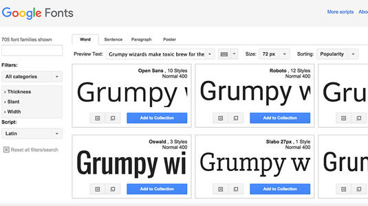
Using default fonts or 3rd party options — like Google Fonts or these 653 free typography resources — cuts out a lot of time in designing mockups.
But don’t limit yourself. If a project requires a unique or personalized font, it’s worth the extra resources. Just make sure it’s web-safe before using it.
11. Color Tools Save Time
Like choosing the right fonts, choosing the right colors can also be a huge time commitment. Using free, online color tools just makes sense.
Unless you’re a color virtuoso or artistic natural, stylizing a color scheme from scratch can be painfully tedious and full of dead ends. Color selection tools expedite the process.
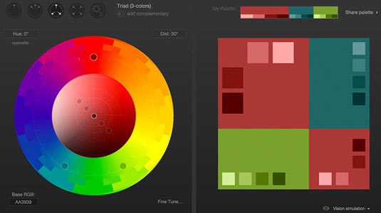
For example, Cohesive Colors, a free GitHub project, finds color schemes based on input colors and distinct variable patterns. Another option is Paletton, a color wheel selector, also free. But those aren’t the only two: check out Creativebloq’s list of 28 color tools to find one that can help you.
12. Duplicate Layers
While this may seem like an obvious tip, it’s worth mentioning in case you aren’t already doing it. Develop a habit of duplicating layers for recreating similar styles in no time.
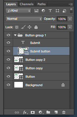
For example, if you use the same button sheet on different pages, if you have repeating text, if you have a graphic that’s only slightly modified, etc. Duplicating the original is an easy shortcut.
13. Use Layer Comps (Photoshop)
Those familiar with Photoshop may already know about the layer comp panel, and how useful it is. Basically, it saves “snapshots” of a PSD file, with certain groups and layers hidden. The advantage is being able to create multiple screens or pages in a same document, using select layers for all.
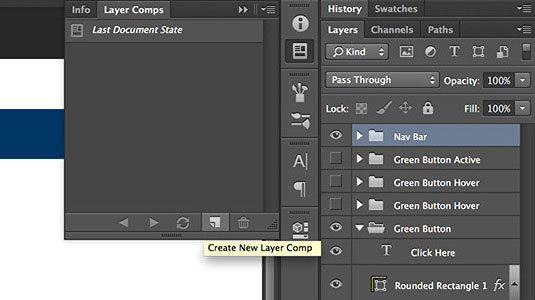
This feature makes organization a breeze. However, it’s only available for Photoshop, Sketch can’t compete in this department yet, though rumors say it has something in the works.
14. Proper Naming of Files and Layers
Layers and files can quickly become a mess, especially if you’re saving individual layer files.
For the sake of organization, properly name files and layers with some kind of convention. Not only does this make mockup building easier for you as you’ll find the elements faster, it’s also helpful to the entire team, who may not know your personal naming system. Remember that developers will need to access your mockups at some point.
What this means, essentially, is abandoning the confusing number-only format. A single descriptive word, though vague, is still better than a nondescript number. Additionally, you want to group layers together by common UI features.
Consider how you name your files to “good hygiene” for working with others. Josh Sears offers further advice on organization in Photoshop.
15. Version Control
While developers already know all about version control management, all designers have not quite caught on to Git yet. It may be tough to get the hang out, but luckily tools like Pixelapse can help.
What you gain from version control is the ability to access/revert back to previous save states, (hence the name, “version control”). This is a lot smoother than amassing a collection of files named v1, v2, v3, etc.
16. Store Files in a Smart Location
With all the elements properly named and organized, you’ll need to store them all some place where team-members can access them easily. The two basic options are:
Intranet
Cloud-based service (i.e., Dropbox)
Even for freelancers, universal file-syncing is important. It makes retrieving files easier not just for colleagues, but you as well.
17. Be Independent
In other words, don’t rely on asking others if you come across a problem. That is, of course, unless the person you’re asking is the Internet.
This mentality of “I need to hear back from X before I start” will only slow down the entire process for everyone. A little online sleuthing can answer your questions 95% of the time, so think carefully if Google can save both you and your team time.
As a starting point, try this list of design blogs. Chances are other designers have come across your problem before, and published the solutions in one of those sites.
18. Preview on Live Devices
It’s one thing to stare at a mockup in a Photoshop or Sketch window, but it’s another altogether to see it live in the intended screen. Live previews give you a glimpse of what your mockup will amount to after coding.
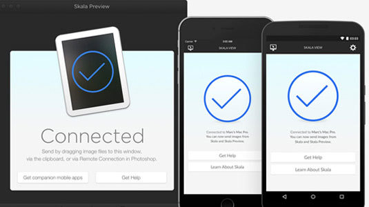
The smartest ways to do this are to export the full images, or else use a tool like Skala Preview, which allows you to test on a vast range of devices.
19. Elicit the Right Feedback
Feedback can be brutal, but it can also be useful if gathered in the right way.
All too often designers get too deep into their projects after weeks or months, and can’t see the forest for the trees. A little outside perspective can reveal the obvious fixes that designers are blind to.
It doesn’t hurt to get a fresh set of eyes on your project before finalizing it. Try to find someone whose opinion you trust, but even calling over the closest person in the room might have surprising results. The important part is that more people than just you have seen it.
And, of course, this extends to user testing. Adding interactivity to your mockup (see tip #3) is the most effective way to test how successful your mockup is in real-world scenarios.
Really, it’s the ultimate form of feedback.
Further UI & UX Advice
If you found these techniques helpful, you can learn more practical UI and UX advice in the following e-books:
The Guide to Mockups

Web Design Trends 2015 & 2016

Web UI Design for the Human Eye (Vol. 1)

Web UI Design Best Practices

This post was originally published on CreativeBloq .
The post 19 Best Practices for Faster UI Mockups appeared first on Studio by UXPin.
Product Manager vs. Project Manager: Why Great UX Demands Both

With the rise of Agile and Lean methodologies, companies are clamoring to redesign their infrastructures in a simpler and more efficient way.
Project managers and product managers are usually tasked with rallying the team behind these new workflows.
In this piece, we’ll clear up any misunderstanding around project managers and product managers. The two roles, while related, handle completely different responsibilities (which means the same person shouldn’t perform double duty).
Let’s start with a crash course.
What is a Product Manager?
The product manager handles the big picture of the product development.
They’re like the “godfathers” of the product. Often the product itself is their brainchild, and their focus is less on the day-to-day endeavors and more on the overall strategies to make the product successful in the market.
A product manager’s skill set lies within understanding the market and the customers. They are typically the advocate of the end user in business discussions — after all, the product’s success hinges on widespread adoption. Consequently, they’re in charge of knowing what the user needs, both in the product’s overall service and in a focused feature set.
The product manager is the one who asks, “What problem does the product solve?” In this role, they deal closely with UX and user flows.
As explained in The Guide to UX Design Process, their main responsibilities include:
Strategic idea creation — Drawing on their knowledge of the market and customer base, they must brainstorm new product ideas to target business goals.
Feature creation — Likewise, they suggest the features to increase the chances of success.
Staying current with market trends — Basic marketing skills.
Direct contact with the customer — Speaking directly with target customer groups to deliver what they want with more precision.
Dictate KPIs — State the performance indicators on which a product’s development and success can be measured.
Prioritize release dates — For products, features, and updates.
Create “blueprint” documentations — i.e., use cases or user flows.
Prioritize bug lists — Determining which bugs needs to be fixed first, and which can wait.
Work with engineering — To make sure their ideas are feasible.
The success of a product manager is the success of the product itself. Success is triangulated through sales volume, user feedback, and technical performance.
What is a Project Manager?
Project managers deal with the logistics: financial concerns, team resourcing, and meeting deadlines and scope. While they keep their distance from the actual design details, project managers look after the project as a whole and keep it on track.
Product managers create the roadmap communicating product strategy. Project managers create the timeline to execute each necessary step.
A project manager’s most important skill set lies within understanding and organizing the team. Good project managers are masters of logistics. Great project managers are masters of relationships.
Main responsibilities include:
Setting schedules and deadlines — With their understanding of their team’s abilities and limitations, they set realistic project milestones.
Monitoring the budget — They keep the teams within financial constraints.
Cross-team organization — They act as liaison between all departments, both as manager and messenger.
Resource management — Determining where resources are needed and allocating them.
Problem resolution — Smoothing over any personal or process issues.
Status updates — Keeping stakeholders, as well as other departments, informed on the the product’s status.
Risk management — Foreseeing and avoiding potential risks or setbacks.
Scope management — Making the tough calls to balance time, cost, and quality.
Their duty is less about the product itself, and more about the procedure. Even if the product is a flop, a project manager is technically successful if the team came through on time, under budget, and met their KPIs.
The product manager, however, will have failed.
Why You Need Both
Of course, the responsibilities overlap between the two positions.
Both require excellent management and organization skills. Both require communication skills, to properly convey their ideas to multiple departments. And both require creating and meeting deadlines, though in different ways: Product managers consider market sensibilities for the timing of releases; project managers consider day-to-day deadlines to keep the entire project on schedule.
Despite the similarities, though, you still should have two different people fill each position.
Why? The short answer is that you can’t set aside enough hours in a day for a single person to fulfill the product strategy and product development process.
Both jobs require different types of thinking as well:
Product managers lean towards the abstract and creative. Their duties involve coming up with new, never-before-seen ideas (although grounded in the realities of the market and user needs). This generally involves a looser, more open mindset.
Project managers, on the other hand, seem to be the exact opposite. They think in concrete and logical terms, taking the abstract ideas handed to them and turning them into realities. While the product managers are asking, “What if…” project managers are asking, “How should…” They act as a reality check on the product manager, internal stakeholders, and the designers themselves.
The two roles complement each other. They examine the project from two different perspectives: one from the view of external success, the other from internal success.
Great product design is the equal result of tension and collaboration. The same person working for both sides may create a conflict of interest that’s hard to detect until revealed in the product .
Product managers and UX teams should push the the boundaries of what an organization can deliver to meet market demand. Project managers, on the other hand, need to then push back on that vision to ensure the team doesn’t burn out.
In the middle of that viability vs. feasibility debate is where true product innovation starts to take shape.
For more UX and product management advice, check out the free Agile UX Survival Guide. The book is written by Germaine Satia, a product manager with nearly a decade of experience.

The post Product Manager vs. Project Manager: Why Great UX Demands Both appeared first on Studio by UXPin.
UXpin's Blog

- UXpin's profile
- 68 followers

