
UXpin's Blog, page 143
December 4, 2015
Influencing Product UX With Colors, Imagery, Typography

It’s said that a picture is worth a thousand words.
When speaking from a product design and branding perspective, the “picture” in question comprises images, colors and fonts. Brands can convey a lot to users using these elements. Users, in turn, can feel and interpret a lot from these three elements.
Let’s break that down — starting with color.
Adding a Little Color to Your UI
As a product manager who’s been schooled by the many product designers I’ve worked with, I have come to understand that color is both an art and a science.
So while red is often associated with danger, such as the “please fill required fields” error messages it’s also a color associated with passion and appetite.
Let’s take a look at a few examples.

Photo Credit: Craftsy
You can see how the online education platform Craftsy — aimed at those who are passionate about their craft and those who are curious to learn a new craft — uses red as one of its key colors. But it’s not used to alarm us and gives us a feeling of warmth, especially when combined with the orange colors. It brings to mind autumn and spending time indoors perfecting one’s craft.

Home shopping service QVC relies on its audience having a strong appetite and passion for shopping. Here also, we see red (in varying shades) used prominently. But red is also used in a different way to alert users — in this case, when a deal is about to expire. The color is calls attention to the countdown.
But what about other colors? What do they convey? Let’s take a look at the color green.
As you’ve probably guessed, green is associated with money and financial wealth. It’s no surprise that the money management software, Mint, uses it as part of their product identity.

Photo Credit: Mint
Although green is often linked with money, there are brands in the financial industry that choose to go with other colors. That’s the case with Dough, an investing platform which uses orange as its main color.

Photo Credit: Dough
At first glance, it may seem like just an attempt at being different. But upon closer inspection, we see that Dough is not just about investing money — it’s about making investing and trading less intimidating for the regular person. Orange is a color associated with confidence and autonomy and as such, it’s a perfect choice for this product
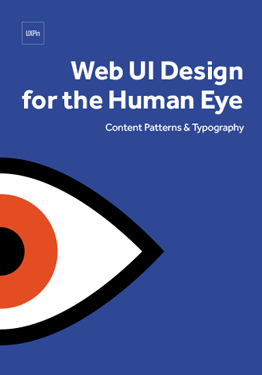
If you want to learn more about the visual nuances of UI design, check out the free e-book Web UI Design for the Human Eye.
Building Emotional Connection With Images
Images remain a classic and incredibly powerful means of communicating and and making memorable first impression. And given that it takes users just a few seconds to evaluate a new site or app, images become even more critical for connecting with users and converting them into dedicated users.

Photo Credit: Kabbage
Business loan provider, Kabbage, uses relatable imagery on its homepage. With warm smiles, heads slightly tilted, and relaxed postures, the two individuals featured on the homepage provide a welcoming vibe for the brand. Something that the small, local businesses that are the brands target will appreciate.

Photo Credit: Bevel
For the luxury shaving system Bevel, the homepage gets straight to the point by featuring an image of all the products that are part of its shaving kit. This brand targets men that not only want a luxurious look and feel, but something a little vintage as well. All of that is immediately conveyed via the homepage picture, which showcases the brand’s products while strategically highlighting the sleek design of its razor. Of course, the razor is the centerpiece, since its design is paramount to the shaving experience.
Grab design ebooks created by best designers
All for free
 Download
 Download
 Download
 DownloadDo you want to know more about UI Design?
Download 'Color Theory in Web UI Design' FOR FREE!
Download e-book for freeCloseUse Typography to Build Character
When it comes to fonts, there are many subtleties that you can get into. What’s important for product managers to know is that typefaces can trigger certain emotions in people. Much like how colors and images change our perceptions.
Take JetSmarter for instance. The site’s goal is to make private air travel as “ubiquitous as a commercial flight.”

Photo Credit: JetSmarter
Given this objective, the font used has to feel accessible and inviting. But since we are talking about private travel, which financially is not within the average person’s reach, the font choice also has to have an element of luxury and exclusivity. This is exactly what we see when we look at the website that uses serif fonts – generally viewed as classic and formal.
Contrast this with the jewelry brand Chloe + Isabel. The brand targets the “modern woman” and combines elements of social retail and eCommerce. The goal is to give young women opportunities to experience entrepreneurship and creativity. It’s no surprise that the logo uses a decorative, sans-serif (often considered as more informal) font. The rest of the site uses a combination of serif and sans-serif fonts, with the informal sans-serif used for top level information (such as main headings) and the more demure serif, used for second tier information.

Photo Credit: Chloe + Isabel
Unlike JetSmarter, which favors serif fonts 100% of the time, Chloe and Isabel opts to mix serif and sans serif, most likely in effort to convey its youthful spirit along with the discipline required for entrepreneurship.
How Does the Product Strategy Fit Into All This?
The items discussed in this section are far from being an exact science. Each designer will play with them in various ways. However, what will help make the designer’s play more fruitful is having as much insight as possible into the target user. Basic information such as the following is critical for designers:
Who is the end user?
What problems are they facing?
What are the brand values and what type of emotions does the brand and its products wish to evoke?
The first two questions are part of the product manager’s domain and strongly influence design and branding decisions. Therefore, it’s important that product managers understand how images, colors and typography shape user experience. This understanding will allow product managers to collect and provide user data that will be most relevant for product designers.

Feature image credit: The Next Web
The post Influencing Product UX With Colors, Imagery, Typography appeared first on Studio by UXPin.


Free Guide: Collaborative Wireframing & Prototyping With Developers

As part of our dedication to helping to bridge the gap between designers and developers, our free pocket guide explains the best approaches for collaborating on wireframing and prototyping.
Designing UX with Developers: Introduction to Collaborative Wireframing & Prototyping concentrates exclusively on the wireframing and prototyping phases. These areas hold extra weight, because developers can spot production problems early on before they’re real problems.

Across 20 pages, this pocket guide dives right into practical advice for bringing developers in on design, communicating with them, and how to navigate potential issues.

This pocket guide covers topics like:
How documents like story boards, personas, and flow charts can help communicate design ideas in a language developers understand
Various approaches to wireframing and prototyping collaboratively, such as paper prototyping and interaction wireframes
How differences in fidelity for wireframes and prototypes lead to different insights from developers
Quickly conducting user research, and sharing the results with developers.
The post Free Guide: Collaborative Wireframing & Prototyping With Developers appeared first on Studio by UXPin.
December 3, 2015
UX for Product Teams: How Tone Affects Design Personality

The words we choose — as well as how and when we use them — are the foundation of all product interactions. While you can argue that touch might be the first sensation users experience with physical products, all users seek meaning and context for the experience through engaging with the text of a product.
Our choice of words not only determines whether or not we have a fluid conversation, but it also defines us and our personality. The same goes for brands and their products.
As explained in the free guide Interaction Design Best Practices, an interface consists of anything a user can see and touch in a product. Because text is part of the interface, product designers and their teams must understand its power as a design element.
Writers are very adept at using style, diction and tone to convey personality in their work. And if you aren’t a writer, let’s break down what each of those are so we’re all on the same page.
Style is how something is written. It encapsulates both diction and tone to create something that doesn’t read like something else.
Diction is word choice. A slight change in diction can alter the entire tone of a piece. For instance, a contracted word indicates a less formal tone and style.
Tone is how something reads. This is the end result of both style and diction. But how you put the words together also contributes to tone (in writing circles this is know as syntax).
Word choice and sentence structure all contributes to the tone of your product design. That, in turn, creates your product’s personality.
Let’s see this in action with some web services and web apps.
Shaping Your Product’s Personality
The photo editing website PicMonkey showcases the extent to which language defines a brand and shapes a user’s experience.
Everything from their tagline (“Photo editing made of win”) to the team members’ job titles (Capital Kahuna i.e. CFO ; Droid Mechanic i.e. Android Engineer) gives PicMonkey a playful, tongue-in-cheek personality.

And it doesn’t stop there.
When a user is editing pictures, the feedback messages and tooltips are also presented in that same playful tone. The icing on the cake comes when the user is saving their edited image. Instead of the standard “Low, Medium, High” options for the image quality, the brand uses the names of 3 actors who’ve portrayed James Bond on the silver screen.


If you’re a Bond geek, you’ll likely appreciate this little inside joke. If you’re not a Bond fan, the nearby tooltip immediately clarifies the labels.
Of course this is a very specific example and it’s not necessary to go to such extremes in order to create a light and fun experience. Online banking service Simple, for example, keeps its feedback messages simple and to the point.

Photo Credit: Simple
Hints given to users, such as during the account creation process are relatable and practical, yet still light and informal.

Photo Credit: Simple
Every brand must decide what their personality is, who they’re talking to and how they will talk to those people.
Once this has been defined, the next step is integrating it into the fabric every product:
What type of person does the product sound like? If you’re designing an online banking service, you might want the product to feel like an intelligent yet friendly bank teller who is available 24/7.
How is the tone reflected visually? Typeface selection, colors, and of course image selection all impact how users interpret the the digital conversation.
In many of my past experiences, I’ve taken on the responsibility of managing the language and voice in web and mobile apps. In other companies, it’s the UX Designer who does this (solo or in collaboration with the PM). And in other cases it’s the technical writer or the UX Writer who takes this on alongside a product designer.
Whatever the case may be, as guarantors of user and business needs, designers must be more involved in their team when it comes to all things related to product voice. This way they can collaborate more efficiently with the copywriters (and marketing folks) in producing content that is in harmony with the design personality.
Practical Tips
1. Design content-first together
Content is the heart of every product.
When you know the type of content you’re delivering to users, you can better ensure the visual treatment remains faithful to the core material. While it’s unrealistic to assume that designers will always work with finalized copy, make sure you involve copywriters in the early stages of design. Rough copy is always better than lorem ipsum since it gives designers a more accurate understanding of true size constraints.
2. Clarity first
Even though MailChimp is cheeky, the design never sacrifices communication for the sake of humor.
On the other hand, the PicMonkey example we examined is right on the edge of balancing tone with usability. If not for the backup labels, the James Bond references would surely confuse users. Regardless of whatever tone you select, remember the design must always feel intelligent.
If it does not first guide users clearly or provide intuitive feedback, you’ve gone overboard.
3. Respect the power of headlines
Whether you’re designing a web app or mobile app, the H1 text on the screen will probably be one of the first items a user interprets. The headline sits right at the top of an interface’s visual hierarchy, so everyone on the team needs to understand its power as a design element.
Focus on the single message you want to imprint on the user for the rest of their interactions.
Conclusion
Two factors influence how a user evaluates their experience with a product:
Feelings
Perception/Interpretation
Both of these are intricately linked and very subjective. The correct tone in your product copy creates the emotional context for your visual design (and vice versa). If you look at some of the most successfully products today, you’ll notice each one represents harmony between text and visual elements.
Design is not a pure visual exercise. Design is a perceptive exercise in which we must carefully craft everything a user may interpret from a product.
If you found this post useful, check out the free guide Interaction Design Best Practices. Based on 33 case studies, you’ll find advice for designing space, visuals, and copy for products.
The post UX for Product Teams: How Tone Affects Design Personality appeared first on Studio by UXPin.
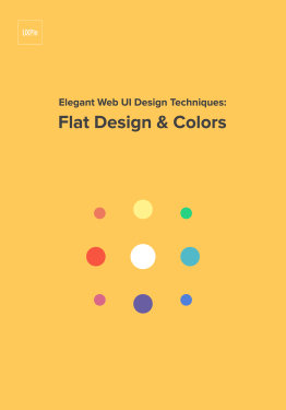
How to Create Emotion With Color In UX Design

Since the Middle Ages, scientists have documented the emotional effects of colors. It should be no surprise that different colors evoke different emotions, seeing how it has seeped into our everyday language (“feeling blue,” “seeing red,” etc.).
To master a naturally visual medium like experience design, you must also master colors. Unfortunately, not everyone has the time to dive into the technicalities of color theory or art.
To get you started, we’ve compiled a quick reference guide that covers the basics of each color’s unique effects, and how they relate to UX design.
Red
Aggression, Importance, Passion
One of the most powerful colors, attributed simultaneously with love and war, red offers the proven physiological effects of increasing blood circulation, quickening breathing, and raising metabolism. Red elements are more noticeable, adding a sense of importance, whether good or bad.
Just think of the red carpet.

Source:
Playtika
Use red carefully, as a little goes a long way. It’s a great highlight for individual elements that need attention, but in excess it will inhibit relaxation. Light red draws out its energy, good for themes like youth and love (see the entry for Pink below), while dark red emphasizes power and durability, like blood or bricks.
Orange
Energy, Playfulness, Affordability
As you might have guessed, colors vary in degrees by the placement on the spectrum, so colors like red, orange, and yellow (“warm” colors) have similar effects but different levels. Orange shares red’s stimulating aspects, but to a lesser degree. This gives it an energetic aura without red’s aggression.

Source: Epic Creative Agency
Orange is a playful, upbeat color, great for casual sites but not always the top choice for enterprise sites. You’ll find many different interpretations of orange: some say it encourages impulsivity, others say it increases appetite (for culinary sites), while still others say it denotes cheapness, for better or worse.
Yellow
Friendliness, Happiness, Attention
Oddly, yellow represents both happiness and anxiety, activating both in the brain.
Like other warm colors it’s generally energetic and upbeat, but brighter shades dial up this effect, making it a color often used for warning signs.

Source: Lunar Gravity
If you use yellow, you can try softening its brightness for a more mellow experience. Light yellow reminds users of sun and happiness, and dark shades (like gold) are more serious and also give the impression of antiquity.
Green
Growth, Nature, Success
The most obvious associations with green are plants (and by extension, nature).
But more than that, green bridges the gap between warm colors and cool colors (blue and purple), making it the most balanced color.

Source: Massis Tea
Green’s balance lends itself to calls-to-action, using the visibility of warm colors by the relaxing qualities of cool colors. Its nature connotations give it a sense of growth and prosperity, moreso in the Western world for its association with money.
Blue
Trust, Comfort, Relaxation
Without a doubt, blue is one of the most important colors in UI design, and one of the most frequent. This is partially thanks to its range, where light blue and dark blue offering different characteristics.
Its associations with water gives it a calming effect, which leads to friendliness that “invites” users into a site.
It’s no coincidence that the two biggest social media outlets Facebook and Twitter both use blue as their core color. This relaxing friendliness also translates into inherent trust, which is why it’s often used by banks — think of the branding for CitiBank, Chase, and Capital One.

Source: Evolve Wealth
Light blue accents the friendly qualities and can even be energizing if bright enough, while dark blue is more somber, emphasizing the security and trust aspects (which is why dark blue suits are popular in the business world).
While blue offers a wealth of benefits, it comes with one distinct limitation: it’s a proven appetite suppressant.
Purple
Luxury, Romance, Mystery
Historically linked to royalty, purple retains this air of luxury today. Purple insinuates that a product or site is high-end, even if it’s not — the opposite effect of orange.

Source: WooView App
Because purple cycles back to red on the spectrum, it shares some of red’s romantic features, especially lighter shades like lavender. Deep purple, on the other hand, brings to mind mystery, and more sensual undertones.
Pink
Femininity, Innocence, Youth
Extending outside of the primary colors, pink is both unique and common enough to make it worth mentioning.
Pink is most known for its associations with femininity, although it has strong ties to youth and the innocence that goes with it. However, lately it’s being used independently of gender-targeting.

Source: No Divide Studio LTD
Pink is often the color of sugary sweets, so the color gives an air of playfulness, almost childishness. As a shade of red, it also can be used for romantic themes, leaning towards “young love” rather than more classic romance. Pink doesn’t always mean feminine.
In fact, overusing pink for its “feminine qualities” can easily irritates users by pandering to traditional gender roles.
Grab design ebooks created by best designers
All for free
Download
 Download
 Download
 DownloadDo you want to know more about UI Design?
Download 'Zen of White Space in Web UI Design' FOR FREE!
Download e-book for freeCloseBrown
Stability, Rustic, Earth
Brown doesn’t work for most sites, but for the ones it does work with, it works perfectly.
With its strong links to dirt and trees, it generates a rustic, old-fashioned feel, perfect for rugged, outdoorsy sites, or even organic products. The connotations with wood also suggest stability and reliability.

Source: Well Storied
With its themes of nature, mud, dirtiness, and earth, brown is similar to green, although more masculine and less aesthetic.
Black
Power, Sophistication, Edgy
Black is the strongest of all colors, and requires some care — that’s why it’s most commonly used only for text and accents. Black attracts attention faster than other colors, even red, so it can make or break your intended visual hierarchy.

Source: Cartelle
When used as a main component in a color scheme, such as a background, black creates its own emotional ties like any color.
It can take a mysterious, even scary tone, but this can be harnessed into edginess. Often, black comes across as mature and sophisticated. Interestingly, black accents the colors used with it, so a colorful flare is more potent against a black background.
On a related note, we’re currently testing a darker version of our collaborative design platform at UXPin. Currently known as “UXPin Dark”, the all-black background is designed to contrast strongly with interface labels and menus.

The original “UXPin Light” is also available, and we’ll be allowing users to toggle between the two according to their preferences.

White
Virtue, Sterility, Health
Like its opposite black, white accents other colors around it, making it a popular choice for a secondary color.
When used in abundance, white gives a “clean” feeling, which can be pushed further to sterility. This makes it a popular choice for hospitals and the medical industry, both online and off. In some cultures, especially Western, white represents virtue and even “holiness.”

Source: ETQ Studios Amsterdam
When white is the dominant color, its sterility can be overwhelming. If your white site seems too stark, try an offshoot of white. Ivory and cream work well in these cases: they are softer, but still give the same advantages.
Gray
Formality, Neutrality, Professionalism
As you can guess, gray represents neutrality.
While it risks coming across as boring, skilled designers recognize it as a powerful tool: by altering its shade, gray can take on the characteristics of either black or white, to whatever degree is most helpful.
For example, if black is too strong, try dark gray.

Source: Galvan Mobili
When used as a primary color, gray gives the impression of formality, which can easily become professionalism or tradition. This can backfire, though: use content and accompanying images to stave off the “gloomy” feel.
Beige
Accentuation of other colors
We’ll close with a special color, beige. It doesn’t have many properties of its own, but it makes the perfect sidekick to accent other dominant colors.

Source: Beige Alain Ducasse
While bland on its own, beige with enhance the characteristics of any color it’s paired with. It’s the perfect supporting color to keep attention on the primary color.
Conclusion
If you’ve found this post helpful, check out the free guide Web UI Design for the Human Eye.
Across 100 pages, we explain techniques for color, visual design, and interface design based on analyzing 33 case studies.

The post How to Create Emotion With Color In UX Design appeared first on Studio by UXPin.
December 2, 2015
Kill Friction Before It Kills Your UX

It’s been about 15 years since Steve Krug first advised us to not make users think.
Friction is anything that prevents users from accomplishing their goals — confusion, distraction, hesitation, or anything else that forces them to think.
Let’s take a refresher course on how to smooth over friction points in your design.
Know Your Enemy: Identifying Friction
What Krug was describing is academically called “cognitive load,” and in UX design refers to taxing the user’s attention and brain. Of course some cognitive load is necessary (we’ll explain later in the post), but you generally want to minimize thinking as much as possible.
The Nielson Norman Group explains cognitive load by dividing it into two types, intrinsic and extraneous.
Intrinsic refers to the thought involved in accomplishing a goal, i.e. “If I click on the ‘Categories’ tab will I find the content I want?” Extraneous is, essentially, everything else, the friction, i.e., “Where is the categories tab? I can’t find it.”
Typically, unwanted friction manifests itself as:
Busy visuals that confuse or distract
Inconsistency (“Why doesn’t the button look like it did on the last page?”)
Unnecessary decisions and actions
Unfamiliar features or functions
Friction slips in accidentally, which is why your designs need to always be externally consistent (in line with user expectations and previous knowledge) and internally consistent (good visual hygiene across pages).
How to Smooth Out Friction
We explain more how to target more specific forms of friction in Interaction Design Best Practices: Volume 2, but here are some general tips that can help any UX project.
1. Reveal redundancies by listing out user flow steps.
List out each individual action needed to accomplish a task.
For example, logging in sometimes requires:
Click to open login window
Click to enter username input field
Enter username
Click or tab to enter password input field
… etc.
In those first five steps, you’ll notice some redundancies.
What if the cursor started in the username input field when the login window opened? What if the login window opened up automatically?

Photo credit: Reddit
Reddit tackles friction in exactly this way: whenever a user tries to complete an action like commenting that requires logging in, the login window opens automatically. Frequent users can even save their information, reducing the login process to only two clicks.
Notice however, that we haven’t just shortened the number of steps. Each step is also effortless, which is just as important.
When it came time for us to design the signup page for UXPin, we applied the same type of thinking. You’ll notice that the form only asks for an email, since you can set your password once you’ve redirected inside the app.

Photo credit: UXPin
2. Use recognizable UI patterns
Every time the user must learn how something new works, it creates friction. For the sake of external consistency, use as many appropriate UI patterns as possible.

Photo credit: Patterns
Recognizable conventions, such as an envelope icon representing email, require no extra thought for the users. For example, the default settings, guided actions, and stepped forms described in Web UI Design Best Practices are especially useful for reducing friction.
Recognition also applies to microcopy, where clear text like “Submit” work better than something clever like “go ahead,” which may cause momentary confusion.
Clarity before cleverness. Always.
Grab design ebooks created by best designers
All for free
 Download
 Download
Download
Download
 DownloadDo you want to know more about UI Design?
Download 'Web Design Book of Trends 2015' FOR FREE!
Download e-book for freeClose3. Build navigation based on user research
A lot can go wrong with navigation, making it a nest of potential friction.
While you can theorize the best navigation for ages, streamline the process by learning from users. The right user testing reveals how they inherently categorize and access information.
Card sorting is extremely effective for creating the site architecture based on natural thought patterns. Once you’ve created the architecture, tree testing then helps you test your information pathways (both are explained more thoroughly in the Guide to Usability Testing).
4. Chunk it out
Chunking is the technique of grouping together visual elements to make their meaning more comprehensible.
Below, Etsy showcases 16 different product images. Under different circumstances, this might overwhelm users, but by chunking them into groups of 4, they undercut the visual friction.

Photo credit: Etsy
Chunking works around the natural limitations of the human brain and memory retention — it’s the same effect as breaking a 10-digit phone number into 3 “chunks.” It allows users to process the information by suggesting how each piece should be interpreted, and lets them skip over entire chunks that don’t interest them.
Good Friction?
Before you wage all-out war on friction, keep in mind that, under the right circumstances, it can help.
1. Some work pays off
“Too good to be true” is a genuine threat to the UX of some products, so sometimes it pays to make your users “work for it.” Look at sites based around browsing for content. Part of the thrill is sifting through the mediocre content to find and repost the gems.
The process of discovery gives the users a sense of accomplishment, deepening their emotional investment.
2. Quality control
Another benefit of friction is filtering out irrelevant users — especially for sites where users generate the content.
A more involved signup process also blocks off those that lack the level of commitment to reap the benefits of the full experience.
Part of Dribbble’s appeal, for instance, is that the site is invite-only. Not only does the scarcity effect increase the perceived value, the additional friction also helps filter out low quality posts and potential spam.

Photo credit: Dribbble
3. Saving users from themselves
Notice how the nuclear button is always protected by a key-activated cover? The same principle applies to UX design.
For actions with severe consequences, some friction is not a bad idea. The “Undo” option is fine for reversing individual mistakes (e.g. unintentionally deleting a single account from your sales pipeline), but the “Confirm” window can offer a reflective pause before a possible cluster of mistakes (e.g. unintentionally deleting your entire sales pipeline).

Photo credit: Salesforce IQ
Conclusion
We’ve said it before, and we’ll say it again: execute the fundamentals flawlessly.
All the classic principles of UX design are naturally anti-friction, so fulfilling the basics already indirectly reduces friction. In particular, pay attention to the best practices for:
Consistency — inconsistency creates confusion
Visual hierarchy — guide users on the right path with visual cues
Navigation — a lost user can’t accomplish anything.
For more help with friction, check out the free guides mentioned above.
Web UI Design Best Practices
Interaction Design Best Practices: Volume 2
The Guide to Usability Testing
The post Kill Friction Before It Kills Your UX appeared first on Studio by UXPin.
Be Heard: Content Survey for 2016

At UXPin, our user-driven approach also applies to the content we produce.
With a design library full of 71 free ebooks (and growing), we want to continue improving the knowledge we provide.
We’re excited to introduce our 3-minute content survey:
Create your own user feedback survey
As we head into the new year, we’d love to hear what you’d like to learn in 2016 and beyond.
Stay tuned for the results in a few weeks!
The post Be Heard: Content Survey for 2016 appeared first on Studio by UXPin.
December 1, 2015
A Better Responsive Web Design Process for 2016

The fixed-width approach to website design may have served you well for years, but the process falters when applied to responsive websites.
If you want to design websites responsively, here are the changes required to bring that workflow up to date as we enter the new year. The advice is based on my 15 years as a web designer, agency Creative Director, and design instructor at The University of Rhode Island.
Rethinking the Design Process
Updating your workflow for responsive web design starts with rethinking your design process.
Creating static desktop-centric comps in Photoshop, dumping in some placeholder Lorem Ipsum text, and then presenting those comps to a client for their review does not work well in responsive environment because those static design do not show interactivity or the way the user experience will change for different screens.

Photo credit: UXPin
As explained in the free guide Responsive Design Best Practices, a better responsive design requires modern processes like:
Thinking Content-First and Mobile-First
Presenting lower-fidelity design options earlier in the process
Showing responsive prototypes instead of static comps
Working with the most extreme cases that your design must accommodate
Content-First Design
When a designer creates packaging for a tangible product, they often have a fully-developed prototype (or even the actual product) to create context for their design.
The shape of a product, the weight, and all the use cases are just a few of the factors that the designer will consider during their design process. Without a definitive idea of what a product is, a designer is hard-pressed to create appropriate packaging, yet web designers have had to do just this for years.
Starting a website design without content is like creating packaging design without the product. You can do your best, but who knows if the end content or product will truly fit into what you create?

Photo credit: SOCIALisbetter. Creative Commons.
A website’s design is more than a template into which clients will dump content. Starting with content allows you to decide how to best present it to users. In a responsive environment, starting with content also allows you to prioritize what is most important. This content hierarchy will become critical to the layout decisions you make for the various breakpoints in your responsive website.
Requiring content at the start of a website design process sounds great, but the reality is that clients rarely have their final content at the start of a project. This is fine. You do not need the final, production-ready copy. You simply need an idea of what the content will be and some actual samples of a first draft. This is similar to the packaging designer working with a prototype.
Talk to your clients about content at the very start of a project and bring in whoever is helping them with content strategy. Whether your agency is providing that service or if it is being handled by another team, make them a part of your process immediately. In lieu of a first draft, you can even use copy from competitor sites to start estimating your space constraints.
Mobile-First Design
With actual, thought-out content in hand (as opposed to some placeholder Lorem Ipsum text), you are now set up to think about how that content should be presented and prioritized. This is best done by using a Mobile-First approach.
Mobile-First is a departure from the traditional web design process where you would begin with a desktop-centric design layout. Because there is only so much screen real estate to work with, starting small forces you to determine what elements and content are most important. It can also show you what content may not be necessary at all and therefore be eliminated from all versions of the design.

As a result, you scale up an experience that feels 100% rather than degrade an experience down to smaller screen sizes.
During your Mobile-First process, start with wireframes of the site’s content. You can then assign a priority to each section/content in the wireframes. A section’s priority will help you determine how and where to present it for different breakpoints.
Grab design ebooks created by best designers
All for free
 Download
Download
Download
 Download
 DownloadDo you want to know more about UI Design?
Download 'Web UI Design for the Human Eye' FOR FREE!
Download e-book for freeCloseUsing Style Tiles
Designers have traditionally used image editors like Photoshop to establish the look and feel of web elements. The problem with this approach is that Photoshop creates very high-fidelity examples of a design when, at the start of a process, you should be focused on bigger-picture decision like typefaces, colors, and interface elements like buttons, menus, and input controls.

Photo: http://styletil.es/
Using Style Tiles is a better way to present and decide on these design elements. Created by Samantha Warren, “Style Tiles establish a direct connection with actual interface elements without defining layout.”
The process of using these tiles is simple:
Listen to what the client’s needs and what their brand identity requirements are
Interpret those needs into decisions you can use in your project
Define a visual language for the website
Iterate on those decisions, which you can do far quicker using Style Tiles than if you worked with a series of high-fidelity Photoshop files.
These high-level design elements help you make more informed art direction and design decisions. You can create style tiles in parallel to wireframing since both processes will feed into your prototype and later hi-fi designs.
Responsive Prototypes
Presenting static design comps does not work for responsive websites. Static comps fail to show a design’s true user experience because they cannot change their layout based on screen size the way an actual website will.
To combat this challenge, many designers create a series of comps showing different possible breakpoints. But this can significantly increase the time they spend in the design process, and it does not show a site’s full responsiveness or interactivity.
For responsive websites, you should present actual, responsive examples for a client’s review. This is where responsive prototypes can be valuable to your process.
Using responsive prototypes is not the same thing as designing in the browser, a practice which many web designers feel stifles their creativity. You can still use your graphics program of choice to establish some visual direction and layout choices, but you should then translate those choices into an interactive presentation.
Let’s examine a workflow that incorporates mobile-first responsive prototyping:
1. Based off whatever rough content exists (as long as it’s not placeholder text), map out your content across the whole site. You can list it out by page, or use this spreadsheet offered by Maadmob.

2. Now that you have your “raw materials”, start prioritizing the content on each page for a mobile viewport. What will your visual hierarchy look like? Consider the 5 common responsive layouts as advocated by Luke Wroblewski.
3. With a content hierarchy in mind, start laying out the design with a content wireframe. If you use UXPin, you’d simply start by selecting the 320 viewport. As shown below, the goal is to map out the blocks of content first. Next, add some more detail (the standard boxes and arrows) to carve it into a lo-fi wireframe.

4. You can now add basic interactions so your responsive prototype reflects the core user flows. Buttons and menus should link to their respective pages. By connecting your pages with basic interactions, you’ve created a lo-fi prototype that you can immediately start testing with at least 5 users.
5. To test the prototype, you can either use the built-in tool offered by UXPin or use an outside service like UserTesting.
6. Repeat steps 1-5 as you scale up to larger viewports. Iterate based on the user feedback.
7. Basing the visual design off your style tiles, you can now refine the visual design with Sketch, Photoshop, or whatever tool of choice.
Working With Extreme Cases
When designing web pages, there is a temptation to work on the easiest pages first so that you have some deliverables to show your stakeholders. This quicker turnaround may be nice, but in your design process you should focus on the most challenging and extreme scenarios.
Take the common example of designing a page that displays articles (blogs, press releases, case studies, etc). That page is sure to have a title near the top. What happens to the design when that title is two or three times longer than what you have designed for?
A title that reads:
“Responsive Web Design Tips”
Is going to display in a layout template much differently than one that reads:
“10 Absolutely Essential Tips and Techniques for More Effective and Successful Responsive Website Designs”
Plan for extreme cases like this across all screen sizes. It is not enough to ensure that the extreme case works well on large-screen displays that have ample space. They must also work appropriately on small screen devices and everything in between.
Next Steps
People today expect websites to work on many devices. Responsive web design has gone from a question of “if” we should to “how” we should, and the process is what sets apart successful sites from the rest.
An important part of this process is looking at the workflow that you have used to create static, fixed-width sites and updating your practices to present project deliverables that are in-line with the needs of a responsive, multi-device Web.
If you found this guide useful, you can start refining your responsive prototyping in UXPin with a free trial.

The post A Better Responsive Web Design Process for 2016 appeared first on Studio by UXPin.
3 Actionable UX Lessons From Hollywood

Is UX and tinsel-town really that different?
Both are visual mediums with motion, both must connect emotionally with an audience, and both only succeed when the user enters a state of total flow.
In film, that flow is a suspension of disbelief and complete emotional investment in the characters and story. In UX, that flow is a state of satisfaction in which every action and task feels as fluid as thought.
While the true superstar of UX is always the user, the practice can still draw a lot of actionable techniques from classic filmmaking.
Here are a couple UX lessons from Hollywood that apply to everyday design.
1. Connect Through Visuals
For communicating ideas, visuals are a language on their own, and are at times more effective than words (“show, don’t tell”). Visual communication shoulders some of the responsibility of the text, which allows you to trim the fat and makes the piece less wordy — whether a site, app, or film.
Drawing from a century of cinematography (and classic photography before that), here are a couple visual communication tips that apply to UX design:
Angles
In film, the camera angle influences how the subject is interpreted: for example, a high angle (bird’s eye) makes the subject seem small or powerless, while a low angle (worm’s eye) makes it seem larger-than-life and authoritative.

Photo credit: Citizen Kane

Photo credit: University of Sydney
Leading Lines
As we explained in Web UI Design for the Human Eye: Book I, one of the most potent Gestalt principles is the continuity of a life — if users see a line, their sight will follow it.
Photographers and filmmakers have known this for years: lines are a direct way to guide the audience to an immediate point of focus.

Photo Credit: Titanic

Photo Credit: Le Mugs
In the above example from Le Mugs, the white line unfolds as users scroll down the page.
The clever parallax effect entices users to continue scrolling downwards to see where the line takes them. From a business standpoint, the tactic can certainly improve on-page engagement and reduce bounce rates.
2. Follow Story Structure
Of course UX design isn’t as linear as a film.
Browsing site pages can feel more like watching random 15-minute intervals of a movie out of order. But the basics of story structure still apply: beginning, middle, and end.
Users — the main character of the site’s story — may enter the site from anywhere, but they still need to arrive at their destination all the same. The UX designer controls the flow of the journey.
The Beginning.
First, you want to establish all the information your user needs to know, such as main characters and plot.
For UX design, these equate to what the site’s about (service or product) and the controls to interact with it. You want to set these up as quickly as possible, so use visual communication to showcase this instantly. UI patterns like a simple horizontal top navigation and metaphorical icons (e.g. mailbox = messages or inbox) are instantly recognizable to most users.
While the obvious place to “set the scene” is the home page, you still need to account for the “shipwrecked survivor” that enters the site from alternative entry points.
Every page must answer:
What does the site do?
Why should I care?
What do I do next to get closer to my goal?

Photo credit: Eye Heart World
For web apps and mobile apps, user onboarding also leaves a strong impression in the beginning phase. Know the four types of onboarding, then apply the correct tactics to balance the business needs (get trial users to pay) and user needs (understand how the product helps me).
For more onboarding best practices, read the free guide UX Design 2015 & 2016.
Grab design ebooks created by best designers
All for free
Download
Download
Download
DownloadDo you want to know more about UI Design?Download 'Web UI Design for the Human Eye' FOR FREE!
Download e-book for freeCloseThe Middle.
Content is king. Always has and always will be.
While the beginning is exciting and ending is gratifying, the middle is what users and movie-watchers are there for. The in-between stages make the difference between repeat users, and those they never come back.
The most important consideration is empowerment. Just like movie-goers want to vicariously experience a more interesting life, users want products to enhance their own lives. Classic story structure can help in two ways:
Progression — Movies almost always involve characters growing or becoming better people over time. This correlates to the UX principle of progressive disclosure: design the product so that increased use unravels more powerful functionalities. Advanced menus are the simplest tactic.
Immersion — Films are a favorite medium for escapism, but the same tacticsapply to websites. Invisible UI — an unassuming interface that doesn’t draw attention to itself — lets the user dive immediately into their tasks. Of course, invisible interfaces must also be forgiving so that users aren’t derailed by common errors. An undo command and helpful error feedback keeps users “in the zone” and feeling like any success is due to their own abilities.
The End.
Does your product’s story have a good ending or does it feel unfinished? Does the design actually make the user better? Was it satisfying enough for a sequel, or repeated use?
It all boils down to how content is delivered through clear user flows with enough emotional design elements for repeated use. To encourage users to return to your content (the “middle” of the story), we highly recommend learning from product expert Nir Eyal’s “Hooked Model”:

Photo credit: Nir Eyal
Once the user has accomplished a goal once, the design must then use external triggers (e.g. emails or notifications) to build more lasting internal triggers (e.g. for Facebook, it’d be fear of losing touch with your friends). With strong triggers in place, your product is better able to engage users for their reward.
3. Speak to the Heart
A powerful script, believable actors, and captivating cinematography transforms a story into an emotionally rewarding cinematic experience.

Photo credit: Frames Collection
As a designer, you should also understand the emotional power behind your interface elements:
Interactions – Films are a one-way experience. UX Design, on the other hand, is a two-way exercise. The design must always react appropriately to the user’s actions. Are your error messages thoughtful and useful? Do the animations pace the content like a carefully edited transition between scenes?
Colors – As explained in the guide Web Design for the Human Eye, every color creates a different mood. For instance, blue feels trustworthy, while red actually increases the heart rate and creates immediacy. Since vision is the strongest human sense, ensure the instant mood created by color matches your other elements.
Copy – Beautiful cinematography is useless without a strong script. Text is one of your strongest design elements. Work closely with the copywriter to ensure that the tone, length, and message matches your visual hierarchy and typographic choices.
Conclusion
These best practices popularized by Hollywood are actually much, much older.
For example, story structure has been developed since before the Ancient Greeks. But just as the art of cinema co-opted the classic traditions of theater, photography, painting, and narrative storytelling, so too can UX design follow the same advice.
The words may change between web design, film, or any other medium — but the conversation remains the same.
The post 3 Actionable UX Lessons From Hollywood appeared first on Studio by UXPin.
Free e-Book: UX Design Trends 2015 & 2016

Over the last year, the industry of UX design has made leaps and strides thanks to new technology and successful new approaches. But which of these new trends will stay relevant next year, and which will just become fads?
Our new e-book UX Design Trends 2015 & 2016 takes a fine comb through the advancements of UX design as we head into 2016.

Microinteractions, personalization, user empowerment, multi-device experiences, the new gamification, and abandoning the design silo — why did these become useful, and how can you build them into your UX projects?
Readers can see these points illustrated through 71 hand-picked examples analyzed from companies like Hulu, Netflix, Spotify, Tinder, Nest, Lookout, Vine, and Waze.

This 164-page guide covers topics such as:
The democratization of design: how to perfect UX by collaborating with other departments
How and when to design microinteractions
Why M-Dot sites are outdated, and how to incorporate adaptive or responsive design for a consistent multi-device experience
How subtlety, user research, and a little creativity can maximize the effects of personalization
What went wrong with gamification versus how to correctly gamify experiences
The UX qualities that makes users feel like better people, and how to apply them to product design.
Download this free e-book now.
The post Free e-Book: UX Design Trends 2015 & 2016 appeared first on Studio by UXPin.
November 30, 2015
Stop Misinterpreting Lean Product Design

I have a confession: I’ve never read Eric Ries’s book, Lean Startup.
I own it, I’ve flipped through it, but I’ve never been one to obsessively track which startups are doing what. I’m usually too busy working in one.
Luckily, a few years ago the startup I was working for actually invited Eric Ries spend a day with us in person, lecturing, answering questions, and giving us actionable advice. We felt like we totally had it down. We were building, and measuring, and then iterating. Totally.
But we weren’t, really. Not the way we should, anyways. We went through the motions without fully committing to the strategy behind Ries’s advice.
A year or so later, half the team was laid off. The spacious office I helped pick out the brand-matching paint colors for, big enough for all the growth we were expecting, was more than half-empty.
This story could be about hundreds of startups. It just keeps happening.
As designers, we have an obligation to prevent business mistakes through better thought processes. Let’s explore the wrong and right way to approach lean product design.
How Humans Want to Design Stuff
Here’s how the innovative process usually goes if we don’t restrain ourselves:
We get an idea, and it’s a good one. So we start thinking about it. A lot.
We get people on our side to help us out, and we plot, and we plan, and we make Powerpoint decks and all sorts of documents, and have meetings.
We draw the whole thing out, and then eventually we build it. And then we put it out in the world — only when we’ve decided it’s good enough — and we hope people like it.
And sometimes they do. Other times they don’t. Most of the time, actually, we miss the mark.

If that weren’t the case, we’d all be bored millionaires, surrounded by all of our masterpieces.
What Are We Doing Wrong?
I’ve never been one to hop on bandwagons, or speak in corporate buzzwords, but I looked around the other day and noticed, without even having read the book, that I was totally a proponent of Lean principles.
Not because it’s the latest trend, or because I’m a fan of any particular author or speaker, but because it just makes sense. I work with many first-time entrepreneurs as a UX consultant and innovation coach now, and I see so many of them with a mindset that Lean practitioners are trying to argue us out of.
Here’s the thing: There’s a reason Lean is a movement, with books and talks and conferences and all those darn diagrams. All that stuff helps us internalize and adopt a mindset and methodology that doesn’t come natural to us.

Photo credit: Stelka Institute for Media . Creative Commons .
I interviewed a product manager candidate the other day who said he supported the Agile and Lean methodologies because “I always made sure my team learned from what we shipped.”
Instead of the lean mantra Build, Measure, Iterate, startups easily fall into the trap of Build, Ship, Build. Therein lies the beginning of the end for many companies
They’re building, shipping, then building the next thing. Maybe there’s some automatic measuring going on, but nobody really transforms that data into insights. If they do, maybe someone files a report or gives a Powerpoint presentation about it internally somewhere, and everyone in the room has some ideas about why this metric went down or this one went up, but it’s hard to say because the team shipped a bunch of stuff around that time anyway.
Speed Does Not Equal Momentum
But wait, it gets worse. Being lean is about moving fast, right?
Let’s say I have this idea for a new product or feature, and because I’m human, I’m going to draw it out, and plan, and build the whole thing. But because I’m lean, I’m just going to do all that much faster.

Photo credit: Henrik Kniberg. Spotify MVP Process.
Instead of building smaller pieces of ideas, getting feedback, then building more onto them once they’ve been validated in our market, we just build our big crazy ideas faster by putting in long hours, nights and weekends, cutting corners (like skipping user research) and calling it an MVP.
The reality is, we need to show our ideas to a lot of people, get multiple perspectives, then shape our idea into something that will appeal to a huge group of people. And the person’s feedback who matters most is usually the user.
That’s what Lean Startup has been trying to tell us to do. All that measuring and iterating is a multi-syllabic way of saying “show stuff to users and experts and get feedback, then make it better based on that feedback.”
You need to fulfill every criteria of an MVP. Not just minimize the effort, unless you want to learn that people don’t like half-hearted products. Form a hypothesis, then build the smallest complete thing required to validate or invalidate your assumptions.
If you’re just building a landing page to validate demand, make sure the copy is concise and the visual design is clean. If it’s a prototype created in a tool like UXPin, make sure the user flow of each task feels effortless before you dive into hi-fi designs.
Completeness matters more than complexity.
Let’s recap a bit from the free guide UX Design for Startups:
The M is for minimum. What’s the smallest thing we can build?
The V is for viable. You won’t know what’s viable if you’re skipping out on feedback.
Finally, the P stands for product. That’s because sometimes you don’t even need to build a physical product to test your hypothesis (just refer to the origin stories of Buffer and Dropbox).
If you’re just building and iterating, your products won’t be minimal or viable.
How Humans Should Design Products
Here is my challenge to you. If you call yourself lean, if you actually want to be lean, stop building big ol’ fully completed products in compressed timelines.
Stop cutting corners and stop working 16-hour days. Stop instrumenting your software and plotting data into a machine somewhere and calling it measuring, and actually get out there and validate your ideas through conversations with real people. If your timeline doesn’t leave room for research, expand your timeline or shrink your product scope until it does.

Photo credit: Lean Blog
If you’re an entrepreneur, create a framework for your team’s experiments and empower them to take ownership of them. Hold them to it — remember you’re fighting against human nature here. Don’t hold them to creating your big drawn out plan in your head, hold them to the commitment to test small pieces of it every step of the way. Course correct when necessary, but give them some leeway to make and learn from their own mistakes.
Watch their innovation and creativity soar.
If you’re a designer or builder on a team, start thinking in smaller bite-sized experiments. Adopt a scientific mindset with useful tools like Alissa Brigg’s Experiment Grid.

Photo credit: Alissa Briggs
Don’t think measuring means shipping the product, then watching every tick of data once it’s live.
Get as much input from customers as you can before you ship it, then implement the insights you’ve gained from that feedback to improve what you want to ship. Remember, your instincts will tell you to keep working on it, keep planning, fleshing it out more.
Great product design is a result of regularly triangulating customer feedback, quantitative data, and your own designer instincts. Fight against the urge to just build so you can learn, iterate, and then build.
Next Steps
If you’d like to learn more techniques for better product design, UXPin offers a free library full of UX e-books. The 3 guides below are particularly relevant.
UX Design for Startups
The Guide to UX Design Process & Documentation
The Guide to Prototyping

Feature image credit: Usability Geek
The post Stop Misinterpreting Lean Product Design appeared first on Studio by UXPin.
UXpin's Blog

- UXpin's profile
- 68 followers

