
UXpin's Blog, page 144
November 25, 2015
A 10-Minute Rapid UX Prototyping Lesson

Regardless of what tool you use to create your prototype, you need to understand what to include and what to leave out.
In this post, we’ll explain the two main components of all lo-fi prototypes, then start practicing.
Interactions
What interactions will you be showcasing in your prototype?
Each interaction includes a trigger (i.e. “What triggers the action?”) and an action (i.e. “What actually happens?”). A trigger can be a tap, click, hover, swipe, key press, page-load, etc; whereas, actions can include show element, hide element, go to page/URL, scroll, disable/enable, check/uncheck, etc.

Photo credit: UXPin
Flow
What are your user flows?
If you have an idea of which personas will be testing the prototype, think about what happens before and after a user is on a particular page. As first described in Interaction Design Best Practices, you can link up your pages and create as many flows as you need to, especially if you have several personas.
For example, for an application that does reporting and analytics, you may have one flow for the Executive who will be reading the reports and an entirely separate flow for the Business Analyst who will be building the reports. The experience is vastly different for those personas, so think about how they will be interacting with your prototype.

Photo credit: UXPin
Practicing the UX Trade
Now let’s dive into my tool of choice to get started.
UXPin offers some excellent tools for building low-fidelity prototypes, including responsive breakpoints that can help you simulate site behavior in different screen resolutions, setting up interactions between UI elements and pages, creating multiple element states, and more.
In this hands-on example, we’ll create a multi-state prototype to simulate the interactions a user has with a tabbed container. Each tab contains a different value proposition, which is a combination of feature benefits and imagery.
If you haven’t already, go ahead and create a free UXPin account so you can follow along. The live preview of the project is available here, so feel free to open the project for quick reference.
Step 1: Create low-fidelity wireframe in UXPin
Using UXPin’s wireframing tools, we created a low-fidelity wireframe with the following elements:
Boxes
Text Elements
Icons
Image Placeholder
Button

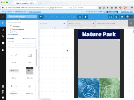
Step 2: Create multiple states for the tab group
To create a prototype that allows us to interact with the tabs on-screen, we need to create multiple states for the tab group. Below, we selected all 6 tabs, right-clicked the selected elements and choose Grouping > Multistate.

Then, we selected the newly formed multistate tab group and clicked the States icon ( ). Here, you will see six states shown: each state represents one of the tabs being selected (and the others de-selected).

The state of the second tab when activated is shown below.

We proceeded to do this for all 6 tabs.
Step 3: Create multiple states for the content inside the container (content and image)
Following the same process as we did for the tab group, we selected all the content inside the container, right-clicked the selected elements, and choose Grouping > Multistate.

Then, we selected the newly formed multistate content group and clicked the States icon (). Again, you will see six states shown: each state represents the content changing when a different tab is selected.

We proceeded to do this for all 6 tabs / content areas.
Step 4: Add the interactions of clicking tabs.
Lastly, we added the interactions of clicking the tabs by selecting a tab and clicking Interactions (). Each tab has two interactions:
On Click action, set the state of the tab to the selected state.
On Click action, set the state of the content container to the content matching the tab.

Not that we’re done with that, we can preview our clickable, low-fidelity prototype by selecting the Simulate Design button in the upper right-hand corner of the screen.

And voila! Our new prototype!
Now that we have our low-fi prototype (i.e. interactive wireframe), we can iterate, iterate, iterate on our prototype to put our best digital MVP out there.
Next Steps
To learn more prototyping techniques and other UX best practices, I recommend checking out the following guides:
The Ultimate Guide to Prototyping
The Guide to UX Design Process & Documentation
Interaction Design Best Practices
You can also practice your prototyping techniques in UXPin with a free trial.

The post A 10-Minute Rapid UX Prototyping Lesson appeared first on Studio by UXPin.


What Mountain Climbing Teaches Us About Prototyping

In this piece, we’ll explain why rapid prototyping leads to better design, what you need to consider when prototyping, and then show you how to get started.
But first, a prototyping success story from the unlikeliest of places: 5.5 miles above sea level.
When Prototyping Is a Life or Death Scenario
In September 2008, outdoor outfitter Eddie Bauer worked with two world-class, high-altitude mountaineers—Ed Viesturs and Peter Whittaker—to develop and test the first prototype of the Katabatic Tent. A rugged expedition tent, six prototypes were iteratively tested on the world’s most grueling peaks and terrain, including Mt. Rainier, Aconcagua, Everest and Antarctica.

Photo Credit: “everest base camp – ebc” by ilkerender is licensed under CC BY 2.0
Each prototype was rigorously tested in the field by Viesturs, Whittaker and their team of guides, and then refined and improved based on their feedback.
As Viesturs and Whittaker put it, “Nothing goes to market until the guys who will be using it are happy with the product.” Eddie Bauer’s stance was the same: “If we’re going to sell it, it has to work.” Hence, after three years of prototyping and countless cold nights, Eddie Bauer finally had an MVP of the Katabatic Tent in 2012.
Now, you might be asking yourself, what does this story have to do with digital UX design?
A lot, actually. Think about it: if Eddie Bauer had simply gotten approval to sell V1 of the Katabatic Tent from a room full of executives based on 2D and 3D renderings that looked pretty cool, without developing iterative prototypes tested by actual users, what could have gone wrong?
Best case scenario: Some weekend warriors have a chilly night car-camping in Yosemite.
Worst case scenario: The product fails to protect its inhabitants at Camp 4 on Everest, which is 26,000 ft above sea level (aka the “Death Zone”) where, from an emergency support perspective, is basically on the moon.
Designing software isn’t typically a life or death situation. However, the implications of a product failing as it is providing a critical need is the same.

Photo Credit: “Climbing through the Yellow Band, Mt. Everest, -May 2007 a” by Lloyd Smith is licensed under CC BY-SA 3.0 via Wikimedia Commons
So, let’s talk about taking the leap from static wireframes to interactive wireframes, or what we’ll refer to as “low-fidelity prototyping” in this article.
Picture this: You followed the Guide to UX Design Process and Documentation and you now have solid, low-fidelity wireframes that represent all the functional features of your product.
Great! Now, how do you ensure those “functional” features are actually functional to your key personas? How do you ensure that you’re going to market with your “guide team’s” buy-in?
Prototyping Your MVP
The answer is… prototype… prototype…. prototype… and keep prototyping, iteratively, until you reach an MVP (minimum viable product).
This is called rapid prototyping, which Smashing Magazine defines as the process of quickly mocking up the future state of a system, be it a website or application, and validating it with a broader team of users, stakeholders, developers and designers.

Photo credit: Wikimedia. Creative Commons. Edited from original.
In an article published on UXmatters, Robert Reimann (Lead Interaction Designer at Sonos, Inc.; Past-President, Interaction Design Association (IxDA)) was quoted as saying:
“I think, without question, that rapid prototyping, when properly employed, can make user experiences better. Getting prototypes in front of colleagues, stakeholders, and target or existing users is a great way to get quick feedback addressing your design direction, business needs, customer needs, and usability.”
While Reimann does admit that feedback from rapid prototypes may not yield the type of results that in-depth, in-context usability testing uncovers, he follows up by stating:
“[Rapid prototyping] can certainly identify gross interaction, navigation, and presentation issues with a design, as well as areas to watch more closely in follow-on testing.”

Using tools that are widely available, you can easily turn your low-fidelity wireframes into low-fidelity prototypes and engage in the rapid prototyping loop of building, reviewing and refining. The goal of your low-fidelity prototype is to accurately simulate your final product’s actual interactions for a group of target users, which is very similar to what Eddie Bauer did with the “First Ascent” team.
A Practitioner’s Prototyping Tale
Now let’s shift to a story from a UX Designer working for a Fortune 500 tech company that’s attempting to break into the healthcare space:
“At [my company], we’ve always been great at consumer tech. But now we’re trying to break into the healthcare space. One of my first projects at [this company] was to build a brand new HIPAA-regulated portal for physicians, nurses and technicians to easily view radiology images in the cloud. My focus group wasn’t responding to my wireframes. They didn’t get it because they didn’t understand the interactions between screens. I decided to build a low-fidelity prototype using my wireframes so that the group could see how clicking a link here would take me to a screen there, or how selecting a drop-down option on this screen would show me an option on that screen. After showing my focus group the prototype, they got it and I received valuable product feedback.”

Photo Credit: “neck check” by woodleywonderworks is licensed under CC BY 2.0
But that wasn’t the final step for this particular UX Designer.
He told me that once the project team saw the low-fidelity prototype in action, they were able to make insightful observations that impacted the future design.
Because the low-fidelity prototypes were so fast and easy to create, the UX Designer was able to crank out a bunch of them with new features and enhancements to test simultaneously. Each prototype yielded valuable usability data from his group’s testing.
Using a Low-Fidelity Prototype to your Advantage
Let’s briefly review some of the key advantages to low-fidelity prototyping:
Get quicker and potentially more feedback: When you give test users a beautiful visual design, the first thing they may assess are the colors, typography, imagery and general visual “feel” of the design. With a low-fidelity prototype, your testers can jump right into the nitty gritty of the functionality, without being distracted by what makes the design pretty.
A/B testing can be done faster/easier/cheaper: When you can crank out 10 low-fidelity prototypes in the time it takes to create 2 high-fidelity prototypes, you can see that testing feature and content variations can be done much faster in low-fidelity. You can pivot much quicker.
Focus on flow: Low-fidelity prototypes allow you to link up multiple wireframes to create flows. In this way, you can test the effectiveness of the order of things, rather than just the elements that the user sees on-screen. You can validate that sequences of interactions / actions make sense for users.
The Power of Low Fidelity Prototyping
What do you think Viesturs and Whittaker asked themselves and their team of guides when testing the Katabatic Tent prototype?
We can only speculate. But the following questions seem reasonable:
How easy was it to set up the product and how long did it take to set up?
What was the experience of actually using the product to meet our immediate needs?
Did the product fail in its usability? Where did it fail?
Is there room for improvement and, if so, where?
These questions not only apply to testing the Katabatic Tent prototype, but also apply to your low-fidelity prototype.
By putting your prototype in the hands of actual users, you can gain critical insight into how the product is performing (or underperforming) against its value proposition.
If you’d like to learn prototyping techniques and other UX best practices, I recommend checking out the following guides:
The Ultimate Guide to Prototyping
The Guide to UX Design Process & Documentation
Web UI Design Best Practices
You can also practice your prototyping techniques in UXPin with a free trial.
The post What Mountain Climbing Teaches Us About Prototyping appeared first on Studio by UXPin.
Free e-Book: UX Design Process Best Practices

UX Design Process Best Practices presents everything you need to know about the UX design process, updated to prepare you 2016.
The design team here at UXPin combines our own Agile design experience with the most useful advice from UX experts across the web.
We explain just the processes and documentation that move design forward. Forget about deliverables for the sake of a paper trail.


In 111 pages, this guidebook explains every step of the UX design process, and all the documentation you need (and what you don’t). Inside, you’ll find:
Ways to improve the efficiency of the design process by eliminating busywork
All the important design steps before the actual designing
The 4 documents you need to truly understand what your users want
Guidelines to take you through every step of the process: planning, research, design, and testing
Comprehensive best practices for UX documents: mockups, prototypes, wireframes, interviews, surveys, personas, user stories & scenarios, journey maps, usability reports, user flows, and more
How to use Google Venture’s 5-day design sprint for effective design and feedback within a single week.
Tips for collaboration to evolve beyond waterfall approach
Download this free e-book now.
The post Free e-Book: UX Design Process Best Practices appeared first on Studio by UXPin.
30 Days of Writing Inspiration … and a Little Perspiration

As I write this, it’s late October. National Novel Writing Month begins in one week. Every first week in October I swear I’m done with trying. But then I watch a Pixar movie, and just before Halloween I discover enough ideas to fill 50,000 words in 30 days. Pixar’s risks and success spur me on.

Photo Credit: Tom Arthur, Creative Commons
Pixar should never have happened. A struggling hardware company looking for a buyer in the 1980s, people saw them as overpriced in a saturated market for graphics computers. Then they struck a deal with Disney, one of their clients, to create something unique.
In the early 1990s, Pixar had no experience making movies. But they made one anyway. Not by playing with graphics or effects, nor by being the first to make computer-generated movies, but by creating believable characters who struggle with real problems.
Audiences are more apt to root for characters who strive to overcome their problems than those who succeed. The more daunting the obstacles are, they more we cheer when they win. Both Pixar and the enduring characters they create continually face long odds that threaten their worlds. Yet they persevere.
If a struggling hardware company can pull heartstrings, then maybe a tech writer can pen a tale or two.
Editor’s note: Ben is now clocking in at 53.8k words (and climbing) with still several days left in the month to go. It’s safe to say that he’s made it, and way ahead of schedule.
Now it’s your turn. Let us know what inspires you. You can tweet @UXPin with the hashtag #youinspire #uxpin. Or post a picture to your Instagram account! We want to know more about what fuels your work.

The post 30 Days of Writing Inspiration … and a Little Perspiration appeared first on Studio by UXPin.
November 24, 2015
4 Things You’ll Never Hear From Successful UX Designers

To succeed as a UX professional, you need to master the UX mindset as much as the skillset.
In this post, we’ll explain four things you will never hear a UX designer say to give you an idea of responsibilities, but more importantly, the appropriate UX mindsets. We’ll also be covering the importance of undertaking user testing and research as part of the UX design process, and discussing the empathy and curiosity needed to succeed in the industry.
1.“That looks fine to me”
As we explained in our career guide, a UX designer will never judge the success of a product or website based on their own opinion or personal set of preferences.
They are first and foremost interested in how the product serves its users, and will not be swayed by their own personal taste alone. By performing extensive research into a product and its field, a UX designer is able to identify the core group of users for a product (either when redesigning or creating a new product).
As explained in the Guide to UX Design Process & Documentation, designers funnel this information into their personas. Personas are fictional characters who embody many of the traits found in a significant number of the real end-users. Target personas give the UX design team the voice of the user when it comes time to make difficult decisions.

Photo credit: GD Steam . Creative Commons .
Much of UX design work revolves around balancing the user needs (reflected in the persona) with business needs (reflected in the product documentation).
Invest in creating rapid proto-personas. As Lean UX expert Jeff Gothelf recommends, the process of understanding users is much more important than creating a polished deliverable. Get your team in a room and start creating a quick outline of the user’s behaviors, goals, and beliefs.
Follow a “problem-first” approach to product design. UX strategies must derive from solving a user problem, not from fulfilling requirements. Requirements grow from the user. The first step of any design project should always involve customer interviews to ensure you’re designing for the right problems before designing the product right.
2. “I’ve got a hunch”
A UX designer will never, ever work on assumption. A hunch is a mistake waiting to happen.
No matter how strong the hunch of the product team, the sales team or the CEO herself, a UX designer will never work off ideas that weren’t validated through usability testing. Although this is similar to not making decisions based on personal preference, working on a hunch is a slightly easier trap to fall into.
Why? Because a lot of the time we think we know what other people want, without actually asking them.
If we can conjure up an image of User A or User B, we think we can imagine what it’s like to be them, slip into their shoes and make decisions on their behalf. Even if we survey or interview users, that qualitative data is only half of the picture.
To see the full view of reality, you need to test your designs. Testing repeatedly proves that what users say they do can differ drastically from what they actually do.

Photo credit: Alissa Briggs via Enterprise UX Conference
However, hunches are not all bad. Keep in mind that a hunch can be a great place to start testing from, but a product decision should never stem from one.
Practice hypothesis-driven UX design. What exactly does your hunch look like, what will you do to test it, and what metrics will validate or invalidate your assumption?
If you’re short on time or money, even quick guerilla usability testing is better than nothing. Recruit 5 users who match your persona, assign some core tasks for them to complete, then record the testing session. Share the recording and insights with the whole team, highlighting which assumptions were validated or proven false.
3. “Users just don’t understand”
Familiarity with technology has become something of an unwritten requirement these days.
But for those with less experience, this can lead to plenty of self-blame by the user when the fault lies with the design. A website should never be designed with only the technologically-minded in mind.

Photo credit: Zak Greant . Creative Commons .
As described in the e-book Interaction Design Best Practices, every design must always fulfill two criteria:
External Consistency – Is the design consistent with the user’s previous experience? Does it follow mental models demonstrated by products in the same category?
Internal Consistency – Is the design consistent with itself? Does the site reflect good visual hygiene?
That’s why UX designers create websites using familiar positions of buttons, clear icons and commonly-used search bars so that important actions are quickly identifiable for both those often online, and those not.
Clarity trumps cleverness every time. Understand how to apply the right UI patterns explained in Web UI Design Best Practices, then add your own creative twist. Otherwise, creativity without consistency only leads to confusion.
Use at least 3 other products that are similar to your own. Learn their onboarding process, complete core tasks, and internalize any similarities in the interface. The knowledge serves as a useful baseline for your own design. You can then draw inspiration from other sources (even offline) to differentiate the product.
Designs can be low fidelity, but they must always be consistent. Is every block of text legible and readable? Does the navigation menu change at all from page to page? Review your work for typographic, color, interaction, and visual consistency before sending to others or testing with users.
4. “I can’t stand these people”
At it’s core, design is about solving human problems with humane solutions.
If you aren’t genuinely curious about how to improve people’s lives, you won’t make it very far in UX.
The majority of a UX designer’s time is spent talking to, questioning, and interacting with users to learn about their problems. The remaining time is then spent designing, testing, and defending the best solution. No easy feat if you’re a misanthropist.

Photo Credit: Quantcast
As we emphasize in our UX Design courses, empathy must work both ways. As a designer, you also need to empathize with internal stakeholders if you want to fulfill user needs. Every organization comes with its own set of politics that stem from people’ self interest. Unless you can understand your coworkers like you understand your users, you’ll never champion your ideas appropriately.
The best designers aren’t just technically skilled. They’re fantastic design facilitators. They know know how to teach design thinking skills so that others also look good.
Instead of running meetings all the time, consider running a workshop. For instance, the design studio exercise helps everyone sketch out rough solutions to a problem based on their own experience. As a designer, you start to see people’s perspectives manifested visually.
Master the art of follow up questions. For instance, Dustin Curtis’ 3-question rule is especially useful for clarifying feedback with users and stakeholders.
Next Steps
Mindset always determines how far you’ll advance in your skillset.
When it comes to succeeding in UX design, you must remain curious, empathetic, and scientific in your approach to problem-solving. Clarify every question, understand who’s asking and why, then validate your proposed solutions.
When you combine the scientific method with a strong understanding of psychology, you start designing sustainable solutions to business and user problems. You become the designer who’s voice matters in the boardroom.
For more best practices in the UX mindset and skillset, check out the free Guide to UX Design Process & Documentation. Downloaded by over 65,000 people to date, the 100+ page e-book explains how to tackle every stage of the UX process based on examples from top companies.

The post 4 Things You’ll Never Hear From Successful UX Designers appeared first on Studio by UXPin.
Are Design Frameworks A Waste of Time?

When it comes to building websites, developers and code-savvy designers are often on tight deadlines. CSS frameworks are sets of code that give you a head start when turning prototypes into working products — or testing hi-fi prototypes in real-world situations.
Today we’re looking at two big players: Bootstrap and ZURB Foundation.
We could argue the pros and cons of each, as many have done. But the more important question is whether any framework is worth the learning curve.
Do they improve the feasibility of our designs? Or are they too cumbersome for production use?
The Advantages
CSS frameworks help get people off to a good start with pre-built, thoroughly-tested code. That means designers and developers don’t have to start writing code from scratch for every new project, saving time and effort.
Faster CSS: Both frameworks use Sass to manage CSS. The ability to use loops, variables and mixins (a.k.a. functions) lets code-savvy designers write more sophisticated CSS with less effort.
Faster layouts: With robust, responsive grid systems, arranging (and rearranging) elements is as easy as changing a few class attributes in HTML. Looking ahead, both frameworks will soon support Flexbox for next-generation layouts.
Easier interactive elements: Both frameworks let designers build widgets and add-ons like modals, navigation drawers, tooltips, and simple animations with customizable, plug-n-play jQuery components.
Plug them in and add instant interactions to your websites or apps. What’s not to love? In truth, frameworks have tradeoffs.
The Issues
But frameworks aren’t perfect, and detractors cite several drawbacks.
Lack of IE8 support. Foundation officially dropped Internet Explorer 8 support in 2014, and the next version of Bootstrap will follow suit. While IE8 usage is generally low, it’s still important for users in certain countries (like China).
Code bloat. In spite of using minifiers and Sass mixins, framework-based projects may still require end users to download more bytes than built-from-scratch sites.
Learning curve. Designers need to learn a framework’s ins and outs before they can use it properly. That means studying their methods in addition to knowing some HTML, CSS and JavaScript.
Platform dependence. Once designers adopt a framework, they often find themselves adhering to its standards no matter what. To an extent, their mindsets influences designers’ work.
The Future
ZURB just released Foundation 6. Bootstrap is alpha testing version 4.

Photo credit: Foundation

Photo credit: Bootstrap
Improvements to both frameworks make them lighter (less code for faster downloads) and more capable (with Flexbox options and nifty animations).
Their well-established grid systems make building and editing responsive web layouts a snap. And the framework-friendly design community has a history of seeking designers who know frameworks’ ins and outs.
It’s a great time for designers to get up and running quickly — provided they have the right ideas to code up.
The Verdict
Both Foundation and Bootstrap are especially known for their layout grids. These flexible systems let designers and developers determine the width of different elements — say, sidebars, and sections of headers and footers — at different breakpoints.
From simple portfolios to complex e-commerce sites, every kind of project can benefit from a framework — when used appropriately. Entire galleries exist to show how framework-based sites don’t have to look the same.
But are they worth the learning curve? If one’s goal is to expedite production, then it depends on:
How well a framework fits one’s workflow, or if the workflow can adapt to a new tool
If one wants to invest the time up-front for potential long-term benefits
If one’s willing to commit to a particular style of JavaScript, HTML, CSS, and/or a preprocessor like Sass or Less.
Personally, as a designer who also codes, I’ve found that frameworks help me scale my designs quickly. Whether it’s ensuring consistent typography or element styles, frameworks like either Foundation or Bootstrap help handle the more tedious aspects of UI design.
The process of learning Foundation or Bootstrap is also valuable. You’re better able to understand design from a modular perspective, which reduces the learning curve for your own custom frameworks later on.
At the very least, frameworks will help you better understand the technical implications of your design. And in today’s Agile world, it’s never a bad idea to understand how the other half lives.
From Rapid to HTML Prototype
Regardless of the framework you choose to build your designs, you need a plan to validate your ideas first. Using prototyping tools to hash out ideas with your team ensures your plans are on the right track before you spend time in code.

UXPin, for example, supports low and high fidelity prototyping with built-in libraries including Foundation and Bootstrap. You can design fully interactive prototypes with the editor, get feedback from the team, then iterate and test with users via the built-in usability tools.
If you’d like to validate ideas before committing yourself to code, get started with a free trial and let us know how you like it.
The post Are Design Frameworks A Waste of Time? appeared first on Studio by UXPin.
The Pen is the Fountain of Inspiration

My desk is full of strange, yet beautiful, objects. Opinel knives, a broken old Honeywell thermostat, Legos, and different kinds of notepads.
A constant interaction with thoughtful, beautifully designed products can inspire our creativity in the most unexpected ways. Surrounding myself with these timeless designs serves as training for my senses.
One “everyday product” in my collection has proven to be especially useful as a source of inspiration. It’s my fountain pen — the Vanishing Point by Pilot, which has a beautiful matte black finish.

Photo Credit: Marcin Treder
I spent quite a lot of time searching for a fountain pen that had outstanding quality and a truly minimalistic design. The moment I saw Pilot’s Vanishing Point pen, I knew I’d found what I was looking for.
A simple, elegant form with precise finish. An innovative retractable, ballpen-like, mechanism that turns this alluring fountain pen into something amazingly useful.
How does such a simple product inspire a complex digital design?
It’s the striving for simplicity. A focus on quality and product innovation in a market where nothing change for ages… that’s something that designers should always keep in mind. That idea is what certainly connects this unique fountain pen and the UXPin redesign that I’ve been recently working on.
Now it’s your turn. Let us know what inspires you. You can tweet @UXPin with the hashtag #youinspire #uxpin. Or post a picture to your Instagram account! We want to know more about what fuels your work.
The post The Pen is the Fountain of Inspiration appeared first on Studio by UXPin.
November 23, 2015
The Designer’s Guide to Prototyping Better With Developers

Although wireframing and prototyping are two different tasks, they both represent a web or mobile interface in its most fundamental stages.
Meant as an explorative exercise and an early visual specs document, wireframes are a natural part of the design process. And as we described in the Ultimate Guide to Prototyping, you can then turn a wireframe into a low-fi prototype by adding interactions or jump directly into a paper prototype.
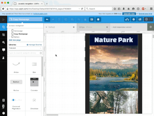
Photo credits: UXPin
Just because the design team creates the wireframes and prototypes doesn’t mean that developers have nothing to offer. In fact, developers can share early opinions while the wireframes are still rough, which helps catch small nuisances and even offer potential improvements for rough layout concepts.
In this piece, we’ll explore some guidelines for wireframing and prototyping so that they communicate the experience as clearly as possible to other designers, developers, and stakeholders.
Wireframing for Developers
The best way to approach a wireframe is as a blueprint for the product team.
Before adding any details, you must first lay out the headers, footers, content areas, and the relationships between these page sections. In our experience, we prefer to first wireframe the homepage (so we can start to think about content flow at the broadest level), then dive into landing pages and finally secondary pages (like About Us or Contact).
If developers are expected to code an HTML prototype straight from wireframes, then it’s important to give them as much information as possible. In this case, you’ll want to lean towards higher fidelity with crisp typography, richer colors, and high-resolution images since the wireframe will serve as the primary visual reference. If you prefer wireframing on paper, we recommend the “sketching in layers” technique since it provides more structure and detail than standard freehand sketching.

Photo credits: UXPin
On the other hand, if you’re going to iterate the wireframe into a rapid prototype using a specialized tool, then the wireframe doesn’t need to be as formal (although annotations are still helpful for later reference). In this situation, your prototype instead serves as a living representation of your technical specs.
Photo credit: UXPin
When wireframing, clear explanations are vital because designers, developers, and non-technical stakeholders should able to review your designs and quickly understand how they work. The best wireframes incorporate notes in the margins expressing which elements should be clickable, animated, or dynamic in any way.

But you can also create similar documents for telegraphing the intent of pages or page elements to developers. Here are a few common supplementary documents (which we first described in The Guide to UX Design Process):
Storyboards – Storyboards focus on the movement of elements and which links direct to which pages, creating a visual narrative for the entire team. Some links may not even load pages, but instead trigger effects like dropdown menus or modal windows. Created through sketchboarding or digital mediums, storyboards give developers a snapshot of the entire experience so they understand why some complex interactions might be necessary.
Flow charts – Flow charts are similar to storyboards except they focus more on content itself. A website flowchart usually resembles a visual sitemap, except in a more multi-directional format that is more descriptive than the traditional tree structure. Detailed flow charts can be extremely helpful for developers since you could annotate how content is served (e.g. whether a lightbox is triggered via Javascript event or AJAX). If you lack the technical knowledge, map out the site pages in the flowchart, then collaborate on the technical notes with the developer.

Photo credit: UXPin
Personas – Like we previously discussed, the strongest way to align design and development is to focus everyone on user needs. Don’t just include job titles and demographics. Dive into fears, ambitions, behaviors, goals, and habits. Create lightweight personas, print them out for the product team, and let them become everyone’s best imaginary friend.
While you want to keep documentation as light as possible, don’t underestimate it’s power for updating developers as fidelity increases.
In our experience, developers tend to be highly logical people who enjoy the security of tangible visual requirements. When you treat design documentation as a collaborative tool rather than a “hand-off-and-pray-for-the-best” document, you’ll find that developers will know what to build and designers will have a quick reference for popular and unpopular ideas.
Whatever your documentation methods, make sure they complement rather than supplement your design process.
Prototyping for Interaction
When putting together digital interfaces, look at all the design features as a set of jobs. Each element on the page must help advance users toward completing their goal(s).
As described in Interaction Design Best Practices, think in terms of components rather than page elements. Which components on the page require action? What task does this action perform?
An interesting point to note is that developers speak the language of interaction. Developers review a wireframe/prototype and mentally formulate how it should be built. In some instances, developers might even mirror a rapid UX prototype with their own quick HTML/CSS/Javascript prototype to test the interactions.
This is the beauty of designing for interaction: it helps everybody in the creative pipeline.
When designing for interaction, you’ll spend most of your time in prototypes. It’s harder to wireframe interactions since you’ll need plenty of annotations, but it is certainly possible (and especially helpful for mobile interactions where you want to quickly show gestures).
Regardless of your process, the most important thing to remember is that you design just the right level of fidelity. Otherwise, you might jump headfirst into a hi-fi prototype (dragging your developer with you on complex discussions around animations/interactions), when all you need is a low-fi prototype to explore structure and page flow.
Be proactive and set the right expectations around the design, because stakeholder feedback also indirectly affects developers.
When possible, work with the product manager or project manager to outline a project map so everyone knows what to expect regarding the number of drafts, possible revisions, and levels of fidelity for prototypes & wireframes.
Testing, Gathering Feedback & Revising
Make sure you invite developers to all feedback sessions, whether it’s a simple user interview a moderated usability test, or an internal feedback session.
Conducting usability testing with developers
Not only can you both synthesize feedback in real-time, collaborative user research creates a stronger sense of joint ownership and creation. Interestingly enough, Xerox actually sends their designers with service engineers during on-site visits to deepen their understanding of how customers use the products.

Photo credit: “Wikimedia User Testing” . Blue Oxen Associates. Creative Commons .
Of course, collaborative usability testing isn’t just about sending pairs of people into the field to observe users.
As we described in the Guide to Usability Testing, it can be as simple as drafting up the core tasks together, then presenting the tasks to 5-7 users and asking them to think aloud as they interact with the prototype. Study which features draw the most attention right off the bat and which receive negative reactions. Then after the test is over, ask follow up questions with your developer about where they felt most confused and experienced greatest difficulty.
Team Feedback & Fixes
Usability tests are meant to pinpoint issues or potential problem areas, but they don’t always generate solutions. This is why teamwork and further discussion is required to flesh out the best solutions for individual problems.

Here are five UI/UX ideas to keep in mind regarding usability 101:
Learnability – Can people learn & adapt quickly?
Efficiency – Are specific tasks easy to accomplish
Memorability – Does the interface leave a lasting impression?
Errors – How are mistakes or inadvertent actions handled?
Satisfaction – Does the interface provide a pleasant experience?
You can apply these questions to both the interface as a whole and to smaller features. For example, how learnable is your dropdown menu? Would it be more efficient to speed up the animation? Do users recognize that navigation bar links have dropdown menus?
Rather than scrounging up ideas on your own, it’s quicker to devise solutions as a team. Designers should always look toward developers for pragmatic suggestions. For example, if you’re on a tight timeline, the developer may have an elegant technical solution that needs some visual massaging.
Wrap-Up
Early design stages like prototyping and wireframing provide fertile ground for collaboration. These methods of visualization are meant to convey how the final product looks and behaves.
Ideas flow much easier when incorporating suggestions from both designers and developers. Developers can learn a lot about design and what makes the interface work. Developers who sit in on usability meetings will also absorb new ideas that later improve their ideas in the development stage.
When it comes to the UX design process, everyone is responsible for keeping the team involved and moving forward.
For more advice, check out these useful UX guides below. If you find them helpful, you can practice what you learned with a free UXPin trial.
The Designer’s Guide to Collaborating With Developers
The Guide to UX Design Process & Documentation
UX Design Process Best Practices
The post The Designer’s Guide to Prototyping Better With Developers appeared first on Studio by UXPin.
How All Entrepreneurs Can Think Like UX Designers

As an entrepreneur, you’ve brought your idea to life in your mind. You’ve told the story, you’ve made your pitch, you’ve convinced investors. And now you’re ready to make that idea a reality. You hope that if you can just explain your vision to the right designer, he or she can manifest it into existence in just the way you imagine it.
Now you just have to find that right designer.
So you craft a job description, and you post on all the job boards. You advertise, you ask your friends and advisors for referrals, you’re getting applicants.

Meanwhile, your product’s progress has stalled. It’s an idea locked up in your head, and all you can do is focus on recruiting the right person to get it out there.
Or, even worse, you don’t have the budget to bring on a new hire just yet. Your idea is locked up in your head, and you don’t have the slightest idea what the next step is towards figuring out if it will sell, if it will delight customers, if it will change the world.

You have a vision. What if you could make progress on your own towards making it a reality? What if you didn’t have to hire anyone to move forward?
I’m on a mission to help entrepreneurs learn to think more like UX designers. It’s why I even created a quick reference guide.
When you’re just starting out, you need to tackle many of the challenges your business faces on your own. While a good designer will bring a lot of skills that take years to learn (typography, composition, color theory, etc.) there are a number of skills that other members of the team can learn fairly quickly.
In fact, I think we’ve relied a bit too heavily on one person with a Swiss Army Knife array of skills that we call “UX Design” (or worse, UX/UI Design or any other hybrid job title) to run the show on her own. We could really benefit from putting a bit more UX in our other roles throughout the company.

But let’s start with our founder. Especially in the early stages of creating a product, when it’s just you and your vision, being able to communicate and test that vision will make you much more capable of leading your product team in the future towards realizing your dreams.
What are some of the skills a UX designer would use at this stage of your product?
Competitive Analysis
Market Research
Persona Development
User Flow Diagrams
Sketching
Prototyping
User Testing
It may surprise you to see how long this list is, or how many things I covered above that don’t yet involve the classic visual design skills like typography and composition. Explained in great detail in the free guide UX Design for Startups authored by UXPin’s CEO Marcin Treder, the skills in this list are accessible to someone who might claim to lack skills or talent in design.
It may also frustrate you to see how many steps exist before you can start to see the vision in your head becoming a reality.
“Why can’t you just create what I’m seeing in my head?” is what many entrepreneurs are wondering. Unfortunately, that’s not the path to creating a successful product. To skip all the steps above would be a huge mistake. If you get too attached to one idea, one vision, without testing it in your market, you run the risk of ignoring early data you get from your market and releasing an unsuccessful product.
So, accepting that we need to complete these steps before we get to the task of creating a refined visual design, what can we do ourselves?
Let’s break down these tasks one by one.
Competitive Analysis
This involves looking at products in a similar space as you. It may involve looking at your direct competitors, but it also involves looking at other companies solving similar problems.
For example, if you were considering a mobile app that helps you find [fill in the blank] nearby, you might take a look at any mobile app that helps you find something nearby, even if it’s not your market, including Uber, Lyft, and Yelp for their location-based interfaces. Consider what they do well, as well as their weaknesses. Perhaps do a SWOT analysis on the strengths & weaknesses of each product. Clearly, you don’t need a degree in graphic design to complete this step, in fact it may be something you can assign to anyone on your team. Document screenshots in a shared folder and ask others to help out.

Market Research
You have probably done a lot of this already as a founder.
Who are your target users?
What do they currently do that your product will replace in their lives?
How do they feel about competitor’s products and brands?
Document your findings in one shared folder and add to it as you collect real data. Log customer interviews and have someone transcribe any recordings for easy access.
Persona Development
A lot of small businesses skip this step, as it can be quite time-consuming and expensive to do formally.
However, as a UX designer, I always create a few informal personas that I can refer to, at least in my head. It’s impossible to fully design an experience for a user you can’t picture in your head.
At the bare minimum, write down some key characteristics of your ideal user — age range, education level, job, technical savviness, where and when they’re likely to use your product, etc.
Then, find a few real life people that match this description and talk to them. As described in the Guide to Usability Testing, find out how they think, what their concerns are, what their tolerance is for risk, or their attention to aesthetic details. Document this in your shared folder — hopefully when you do hire a designer, this will be the first thing she asks for.
User Flow Diagrams
User flow diagrams look and sound super fancy.
You can draw them on a whiteboard now, though, and get a lot of value from a simple exercise of mapping out your product step by step.
How does the user first hear of your product, what does he see next, what happens next, etc.
What is the value your product provides (to the users) and how many steps does it take them to get there?

To learn more, Ryan Singer provides a useful tutorial on drawing up quick user flows.
Sketching
If I hand a non-designer a piece of paper and a marker, 95% of them always say “I can’t draw” or “I’m not a very good artist.”
Fortunately, I’m not asking you to draw the Mona Lisa. This is mostly boxes and words. You can do it. Use your map from the user flow diagram step and draw each step on a different piece of paper. It’s a sketch, don’t worry about the details. Just get it out there.
The less precious the better, so you can throw it away, make changes, scribble something out and tape a new thing over it, be free.
Prototyping
Guess what? The sketches you just made? That’s your first paper prototype.
You can user test the core interaction of your product from these sketches. Don’t believe me? Try it.
Since you’ve created a lightweight prototype, you can always add more detail in a prototyping tool. The advantage of going digital is that you can collaborate with others easily, and you can test with more users with less time. Tools like UXPin, for example, come with plenty of built-in libraries to speed up the process.
User Testing
Find someone in the office as your first guinea pig, then branch out from there to 5 target users.
Say “imagine this piece of paper is a computer screen” and put your test participant in the scenario you mapped out for step 1 of your diagram.
Don’t tell the user what it’s for, just observe. Ask the user to think out loud, and see what he would do if he were looking at your sketch as if on a laptop screen or mobile device.
Make note of what wasn’t there that he expected to see, then rebuild your sketch with the new piece included.
To make the process easier, you could even recruit a helper. Walk them through how the prototype works, then have them function as the “human computer”. As they manipulate the prototype based on the user’s clicks, you’re free to take notes and ask follow-up questions after the session ends.
You’ll be amazed and delighted and possibly devastated at the results.
You might find your perfect vision that was in your head completely falls apart when you go through this the first few times. Once you’ve analyzed the results, you can iterate more powerfully in a digital prototyping tool.
You learned something really valuable, without hiring a huge team, losing a ton of time, or spending a bunch of money.

And if you found a few things that worked, you can take those notes and build on them until you solidify your product flow. The vision will start to refine and take new shape in your head.
When you finally do hire a designer, you will have much more luck communicating your vision to her and having her create it in full color shiny detail.
If you’d like to learn more techniques for better product design, UXPin offers a free library full of UX e-books. The 3 guides below are particularly relevant.
UX Design for Startups
UX Design Trends 2015 & 2016
The Guide to Prototyping
The post How All Entrepreneurs Can Think Like UX Designers appeared first on Studio by UXPin.
Top 5 UXPin E-books of 2015 to Prepare You for 2016

As we hit the holidays and wrap up 2015, let’s take a look at the most popular guides we created this year from our free design library (now with almost 70 ebooks total since 2013).
We had the pleasure of working with some great designers like Sergio Nouvel, Carrie Cousins, Marek Bowers, Adam Fairhead, and Alex Gamble to bring their advice to the design community. Topics included interaction design, visual design, web design, and of course all things UX design.
Without further ado, let’s take a look at the top guides of 2015 based on downloads from our community. Enjoy!
1. Interaction Design Best Practices: Mastering the Tangibles
56,744 people downloaded
Mastering the Tangibles explains interaction design techniques based on 33 case studies of top companies. With tips for designing text, space, and visuals for meaningful user interactions, the free guide distills theory into everyday practice.

2. Web UI Design for the Human Eye: Colors, Space, Contrast
46,703 people downloaded
Vision is the strongest human sense. To help you make the strongest first impression on users, the guide explains how to design intuitive interfaces that take advantage of visual psychology. Topics include applying Gestalt techniques, using similarity and contrast, designing natural relationships, and creating the right emotions with color.

3. Web UI Design Best Practices
33,657 people downloaded
Spanning 109 pages, this guide explains web design techniques based on case studies of 30+ companies. The book offers advice for color, navigation, typography, visual hierarchy, and UI patterns.

4. Web Design Trends 2015 & 2016
32,099 people downloaded
Authored by designer and widely-published design writer Carrie Cousins, this guide distills an entire year’s worth of web design into the most useful techniques. Spanning 185 pages, the guide breaks down 160+ examples into everyday techniques for web design projects. See the year’s top 10 trends with straightforward tips and beautiful examples. 
5. Interaction Design Best Practices: Mastering the Intangibles

28,108 people downloaded
The second guide in the series explains trickier IxD techniques based on 20+ case studies from select companies. We explore how to design interactions based on how users perceive time, make decisions, and behave naturally. Consider this the perfect refresher for persuasive UX design.
What’s Next?
For 2016, we’ve planned even more practical content from UX designers and UX leaders. We’ll continue exploring the tangible and intangible techniques of UX design.
Of course, we want to thank our readers who’ve found our content useful. If you’d ever like to practice what you’ve learned, you’re always welcome to get started in UXPin with a free trial.
Stay tuned for what’s coming as we wrap up the year and head into 2016!
The post Top 5 UXPin E-books of 2015 to Prepare You for 2016 appeared first on Studio by UXPin.
UXpin's Blog

- UXpin's profile
- 68 followers

