
UXpin's Blog, page 146
November 5, 2015
Collaborative UX Design Insights From Kissmetrics

Despite having a San Francisco HQ to house its team of data nerds, marketers and ping pong champions, Kissmetrics has a team spread out across the world. Together, the team works to aide 1,600 marketing teams get the data they need to grow their companies.
They’ve been using UXPin to coordinate with their worldwide team. We had the pleasure of speaking with Kissmetrics’ UX Designer Jessica Tiao and Director of Growth Chuck Liu about enhancing their design workflow, overcoming today’s great design challenges, and how they approach collaboration.
How did you break into UI/UX design?

Photo Credit: Kissmetrics
Jessica: My path wasn’t linear at all. If anything it was a huge squiggle. I started out in architectural design, but decided it wasn’t for me. I then went into tech analytics, and began incorporating design into side projects I was working on. After building a portfolio, I moved into contracting and began doing user research. I joined a program called Tradecraft and learned how to design using the Lean UX methodology from Laura Klein and Kate Rutter.
Chuck: I started out at Kissmetrics as a member of the Customer Support team. It really helped me learn the problems and the pain points a user has. I moved into copywriting and worked in Marketing which taught me how to write and communicate ideas in a concise way and then moved into UX research. I was able to combine the skills I had learned, writing concisely and understanding usability, which helped me ask the right questions in a non-biased way. A big part of the design process is knowing the problems and being able to translate them.

Photo Credit: Kissmetrics
What does a day in your life usually look like?
Jessica: I start my day by Slacking with our Engineers. From there, everyday is different. I don’t just work on prototyping or visual design –one day is sketching, one day is visual, and one day might be testing. We have structure in our process but we also solve a lot of problems on the fly.

Photo Credit: Kissmetrics
We work with every team. All of our engineers are remote, and we use Slack to collaborate. We also work with the customer success team. They are the first ones to collect feedback from the users. We talk to them and ask, “what do you think, what comes to mind” on what we’re working on. We also use them to recruit people for user tests.
Of course, we work with the designers to ensure that everything is consistent across the app. We also work with a PM on the scope of a project and make sure the project matches the company’s mission. We want to make sure everything is aligned so we collaborate a lot.
What initially drew you to UXPin as opposed to other prototyping and wireframing tools?
Jessica: I’ve used a lot of tools over the past two years. We started out trying UXPin for a week and saw how fast we were able to iterate and go through exploration. It really saved us time.
Chuck: We had been looking for a platform that we could all agree on. We wanted to be able to work and collaborate in the same level of fidelity and share internally and externally. We tried tool after tool and UXPin was the first that really met all of our needs.

Photo Credit: UXPin
How has UXPin enhanced your workflow?
Jessica: We used to work in Omnigraffle and then export a file into InVision, make it clickable and then we were able to show key stakeholders and test the usability. But if there was a small change, I’d have to go back into Omnigraffle, and start the process of exporting and importing, over and over again. With UXPin, I can iterate, test, iterate, test and come up with a final version, all in one tool. It didn’t change our process, it just made it easier.
Chuck: UXPin really enhanced our process. There was a lot of collaboration happening but everyone had their own tool of choice. It was difficult to standardize how we shared the designs and collected feedback. It’s really helped us manage projects across timezones.
Photo Credit: UXPin
How does UXPin help you get buy-in from stakeholders/collaborate with your team?
Jessica: With any project we start with a one-page plan to determine who is doing what, go through sketches and create a lo-fi interactive prototype. We have to get buy-in from engineers early, but our engineering team is global. Having a share link has been great. We can shoot the link over to everyone they can review and give feedback anytime. It’s helped us be leaner and faster in how we do things. We find out much faster if we’re headed in the right direction.

Photo Credit: Kissmetrics
Chuck: As a director, I oversee the designers. UXPin let’s me have better visibility into where we are in the process. We don’t need to bring everyone together into a meeting to find out if we are going in the right or wrong direction, I can check for myself and see where the design is, then comment directly on it. UXPin makes tracking comments easy. It’s really reduced the friction from that back and forth. Before we used email chains. Now we can share designs through a public link and everyone has access to the feedback.

Photo Credit: Kissmetrics
What tools do/ have you used?
Jessica: We use a lot of tools: whiteboards and post its, Omnigraffle, Slack, UXPin and InVision.
Chuck: We had tried a lot of different tools before UXPin. Several mock up tools, keynote, and even google presentations. Before we couldn’t agree on anything that covered the spectrum, until UXPin.
How do you brainstorm ideas as a team?
Jessica: It’s part of our culture to talk through ideas whether they are good or bad. There’s no room for judgement here. We practice a lot of listening. Whenever we have a problem we think of it as a puzzle to solve.
How do you overcome designer’s block?

Photo Credit: Kissmetrics
Jessica: I like to do “walking meditation” which is walking without a destination. I take a lot of walks to get ideas. I also like to look at designs that are really innovative in other spaces. Meetups that are unrelated to design, such as Women in Growth, can be great sources of inspiration as well.

Photo Credit: Kissmetrics
Any precautionary tales or tips for those trying to make the switch into UX design?
Jessica: I’ve learned not to be afraid to dive into something. At times I wanted to give up because everyone around me seemed to have such linear paths. I took a risk in following my dreams but it really paid off!

Photo Credit: Kissmetrics

Photo Credit: Kissmetrics

Photo Credit: Kissmetrics
Start your own UXPin success story with a free trial.

The post Collaborative UX Design Insights From Kissmetrics appeared first on Studio by UXPin.


Collaborative UX Design Insights from Kissmetrics
Despite having a San Francisco HQ to house its team of data nerds, marketers and ping pong champions, Kissmetrics has a team spread out across the world. Together, the team works to aide 1,600 marketing teams get the data they need to grow their companies.
They’ve been using UXPin to coordinate with their worldwide team. We had the pleasure of speaking with Kissmetrics’ UX Designer Jessica Tiao and Director of Growth Chuck Liu about enhancing their design workflow, overcoming today’s great design challenges, and how they approach collaboration.
How did you break into UI/UX design?
Jessica: My path wasn’t linear at all. If anything it was a huge squiggle. I started out in architectural design, but decided it wasn’t for me. I then went into tech analytics, and began incorporating design into side projects I was working on. After building a portfolio, I moved into contracting and began doing user research. I joined a program called Tradecraft and learned how to design using the Lean UX methodology from Laura Klein and Kate Rutter.
Photo Credit: Kissmetrics
Chuck: I started out at Kissmetrics as a member of the Customer Support team. It really helped me learn the problems and the pain points a user has. I moved into copywriting and worked in Marketing which taught me how to write and communicate ideas in a concise way and then moved into UX research. I was able to combine the skills I had learned, writing concisely and understanding usability, which helped me ask the right questions in a non-biased way. A big part of the design process is knowing the problems and being able to translate them.
What does a day in your life usually look like?
Jessica: I start my day by Slacking with our Engineers. From there, everyday is different. I don’t just work on prototyping or visual design –one day is sketching, one day is visual, and one day might be testing. We have structure in our process but we also solve a lot of problems on the fly.
Photo Credit: Kissmetrics
We work with every team. All of our engineers are remote, and we use Slack to collaborate. We also work with the customer success team. They are the first ones to collect feedback from the users. We talk to them and ask, “what do you think, what comes to mind” on what we’re working on. We also use them to recruit people for user tests.
Of course, we work with the designers to ensure that everything is consistent across the app. We also work with a PM on the scope of a project and make sure the project matches the company’s mission. We want to make sure everything is aligned so we collaborate a lot.
What initially drew you to UXPin as opposed to other prototyping and wireframing tools?
Jessica: I’ve used a lot of tools over the past two years. We started out trying UXPin for a week and saw how fast we were able to iterate and go through exploration. It really saved us time.
Chuck: We had been looking for a platform that we could all agree on. We wanted to be able to work and collaborate in the same level of fidelity and share internally and externally. We tried tool after tool and UXPin was the first that really met all of our needs.
Photo Credit: UXPin
How has UXPin enhanced your workflow?
Jessica: We used to work in Omnigraffle and then export a file into InVision, make it clickable and then we were able to show key stakeholders and test the usability. But if there was a small change, I’d have to go back into Omnigraffle, and start the process of exporting and importing, over and over again. With UXPin, I can iterate, test, iterate, test and come up with a final version, all in one tool. It didn’t change our process, it just made it easier.
Chuck: UXPin really enhanced our process. There was a lot of collaboration happening but everyone had their own tool of choice. It was difficult to standardize how we shared the designs and collected feedback. It’s really helped us manage projects across timezones.
Photo Credit: UXPin
How does UXPin help you get buy-in from stakeholders/collaborate with your team?
Jessica: With any project we start with a one-page plan to determine who is doing what, go through sketches and create a lo-fi interactive prototype. We have to get buy-in from engineers early, but our engineering team is global. Having a share link has been great. We can shoot the link over to everyone they can review and give feedback anytime. It’s helped us be leaner and faster in how we do things. We find out much faster if we’re headed in the right direction.
Chuck: As a director, I oversee the designers. UXPin let’s me have better visibility into where we are in the process. We don’t need to bring everyone together into a meeting to find out if we are going in the right or wrong direction, I can check for myself and see where the design is, then comment directly on it. UXPin makes tracking comments easy. It’s really reduced the friction from that back and forth. Before we used email chains. Now we can share designs through a public link and everyone has access to the feedback.
Photo Credit: Kissmetrics
What tools do/ have you used?
Jessica: We use a lot of tools: whiteboards and post its, Omnigraffle, Slack, UXPin and InVision.
Chuck: We had tried a lot of different tools before UXPin. Several mock up tools, keynote, and even google presentations. Before we couldn’t agree on anything that covered the spectrum, until UXPin.
How do you brainstorm ideas as a team?
Jessica: It’s part of our culture to talk through ideas whether they are good or bad. There’s no room for judgement here. We practice a lot of listening. Whenever we have a problem we think of it as a puzzle to solve.
How do you overcome designer’s block?
Jessica: I like to do “walking meditation” which is walking without a destination. I take a lot of walks to get ideas. I also like to look at designs that are really innovative in other spaces. Meetups that are unrelated to design, such as Women in Growth, can be great sources of inspiration as well.
Photo Credit: Kissmetrics
Any precautionary tales or tips for those trying to make the switch into UX design?
Jessica: I’ve learned not to be afraid to dive into something. At times I wanted to give up because everyone around me seemed to have such linear paths. I took a risk in following my dreams but it really paid off!
Photo Credit: Kissmetrics
Photo Credit: Kissmetrics
Start your own UXPin success story with a free trial.
The post Collaborative UX Design Insights from Kissmetrics appeared first on Studio by UXPin.
October 30, 2015
Don’t Forget to Design These Mobile UX Elements
Designing mobile apps is a long and difficult process that spans the moment an idea arises to when we finally upload the finished application.
During that journey, we go through multiple defined stages, like wireframing, visual design, and building animated prototypes. In the midst of all the transition, it’s easy to skimp over design elements that feel like UX “nice-to-haves”.
In essence, I’m talking about elements such as empty screens, edge cases, placeholders (like loading screens), and micro-interactions. I’ll explain why these subtleties are just as important as the more obvious components of the UI, and how they help determine the success or failure of our app.
Empty screens or blank slates
When we are wrapped up in the design process, we normally design for a populated interface where everything in the layout looks well arranged. .
In those cases, we must design the ideal amount of information in a packed screen: for example, a list of favorite items or a contact list with items already in there.
But how should we design our screen when the content is pending user action? Even if it’s meant to be just a temporary stage, we must respect its communication value for users.

The purpose of a blank slate is more than a just decoration. Besides informing the user about what content to expect on the page, empty states also act as a type of onboarding. They tell users exactly actions are required so that content can appear and the app will function as promised.
When you really think about it, such simple pages actually carry quite a large responsibility.
Let’s think about a real-life example to put things in perspective. When you first walk into a hotel, the receptionist usually explains where your room and other facilities are located, where and when to eat breakfast, and how and when to check out. Before you can enjoy your stay at the hotel, you experience an “empty state” in which context is required to orient yourself and proceed onwards.
Just like you want the guest in their room enjoying their stay as quickly as possible, you want your users to do something so that the screen won’ empty as soon as possible. Here’s a few tips to keep in mind:
If your empty state loads for a first-time user, keep it visually simple: concise copy, clear icons, high-contrast illustrations, and a “call to action” button is normally more than enough. In the below example from the Khaylo Workout App, notice the nice balance between the instructive text and glove illustration. It’s visually pleasing, but also clearly explains the required action.

Flipboard includes a big call to action to guide you with the necessary action to stop seeing that screen, and get a more meaningful one.
If the empty state was triggered by positive user action (e.g. they read and deleted all their messages), reward them with a delightful message. For example, look at how the empty state Jelly produces when the user has helped answer all pending questions.

Spotify’s error screen isn’t as helpful as it could be. When showing errors, explain why you cannot see anything, and how to solve this.
If the empty state was due to user error, you must strike a balance between friendliness and helpfulness. Delight and humor can help alleviate some of the user’s frustration, but it’s more important that you clearly explain the steps to get back on track.
Extreme cases
Contrary to empty screens, you also must design for situations where information is overflowing (or the data is just extremely complex). Not only does designing for these edge cases provide technical feedback to developers (e.g. load testing), they also show you how well your interface performs under pressure.

Instagram has prepared its interface to adapt to different text lengths.
For example, in our ideal world everybody would have names such as “John Smith”. Simple, straightforward, and predictable. But reality begs to differ. To name one case, I recently visited Germany and The Netherlands where names can stretch out to multiple words and syllables.
If we were designing an app that requires a contact list, you can already see how a simple problem about someone’s name grows into a much more difficult UI issue:
Will you add a second line or break the text with ellipses? What will happen with other content blocks if they contain excessive information as well?
When it comes to lists, how will we navigate through a list with an insane amount of complex names? Don’t forget that your app will probably have an international user base as well.
It’s not so simple to account for these edge cases. Test how your design resists: include long texts, pictures in different sizes and aspect ratios; and in general, try to get out from an ideal situation, but resemble a situation that you could find in real life. For example, take a look to your own contact list in your phone and use names similar to the ones your friends have.

Airbnb didn’t pass the “German Test”. You can notice the text overlapping with the icon if it’s long.
Also, be careful with call to action buttons. If you are using not only an icon but texts, check how does it look like when changing the language to German, for instance.
Placeholders and loading elements
When we are designing, we don’t have the means to simulate different loading speeds. And even if we could, chances are that we still end up designing interfaces that are supposed to load very quickly. We don’t always design the uncomfortable moments when users must wait for content to display.


Facebook presents a temporary timeline layout before showing the actual information on it.
Murphy’s Law could not be truer for UX design. Internet speeds are not always guaranteed. This is especially true, for example, when an image is downloading.
In cases like this, we have to decide what to show to distract users. Here is when placeholders come in handy as simple (but temporary) information containers. This could be something as simple as an icon.
Ideally, the load screen shouldn’t highlight much, as its function is kind of secondary. While we should notice that it’s there, it doesn’t need to be really eye-catching.
If possible, you may want to go a step further. You can also think of a graphic element that besides accomplishing its goal, can also help make the user perceive that loading times are shorter than they really are. For example, when you are looking for an image on Google Images, before the actual image appears, you can see a placeholder filled with the predominant color of the loading image.
As explained in Interaction Design Best Practices, you should always try to make the wait more pleasant if you can’t shorten the line.
Microinteractions
Usually, what we call details are what actually make our app stand out from our competition. As explained in UX Design 2015 & 2016, micro-interactions are one of the best techniques for giving delightful feedback.
Often considered superfluous, accessory or secondary, microinteractions actually create a feeling of well-being once they are discovered by users. For example, take a look at this fashion model app that was prototyped in UXPin. As you hover over the model, notice how the app reveals their measurements and allows you to download their resume. A simple action reveals additional functionality, deepening the sense of exploration.

Photo credit: UXPin
Here’s a few tips
Micro-interactions must survive long-term use. Don’t get too clever or else what seems fun the first time might become annoying after the 50th use.
Add some humanity to the microinteraction. Text should read like a conversation, and the motion must feel fluid to make the microinteraction come to life.
Execute simple animations flawlessly. For microinteractions, complex animations will just overwhelm users. For example, if you open a program in OS X, the dock icon also bounces. It’s simple and fun, but lets you know the program is responding without interrupting your train of thought.
Focus on visual harmony. If your app has a green color scheme, micro-interactions should use the same palette so that the connection to the parent design or app is unmistakably clear.
Include microinteractions in places that are normally hiding, revealing them when the user executes an action. For example, upon screen refresh, add a transitional loading animation. You’ll create a sense of discoverability with users, as if they’ve uncovered a rare visual delight within a common task.
Whatever you do, keep it subtle. Microinteractions should catch the user’s attention like a sly wink, not distract them like an uncomfortable stare.
Conclusion
It may be tempting to keep ourselves inside our “design comfort zone” and think of an interface only prepared to face ideal situations, where everything is under control. Instead, we must prepare for reality in which our design needs to respond to all types of unforeseen pressure.
Extra foresight separates good design from mediocre design. You must account for the details as well as the big picture.
The elements we described are just as important as other design components because UX is the sum of all parts working coherently and harmoniously.
So, here’s my invitation for you to review your current projects, and analyze them consciously and deeply, to detect which of these items are still missing.
For more mobile design advice, check out the free e-book Mobile UI Design Trends 2015 & 2016. Top trends are broken down into simple design techniques by analyzing 79 examples. The book also includes 61 of our favorite resources.

The post Don’t Forget to Design These Mobile UX Elements appeared first on Studio by UXPin.
Don’t Forget to Design These Subtle Mobile UI Elements
Designing mobile apps is a long and difficult process that spans the moment an idea arises to when we finally upload the finished application.
During that journey, we go through multiple defined stages, like wireframing, visual design, and building animated prototypes. In the midst of all the transition, it’s easy to skimp over design elements that feel like UX “nice-to-haves”.
In essence, I’m talking about elements such as empty screens, edge cases, placeholders (like loading screens), and micro-interactions. I’ll explain why these subtleties are just as important as the more obvious components of the UI, and how they help determine the success or failure of our app.
Empty screens or blank slates
When we are wrapped up in the design process, we normally design for a populated interface where everything in the layout looks well arranged. .
In those cases, we must design the ideal amount of information in a packed screen: for example, a list of favorite items or a contact list with items already in there.
But how should we design our screen when the content is pending user action? Even if it’s meant to be just a temporary stage, we must respect its communication value for users.
The purpose of a blank slate is more than a just decoration. Besides informing the user about what content to expect on the page, empty states also act as a type of onboarding. They tell users exactly actions are required so that content can appear and the app will function as promised.
When you really think about it, such simple pages actually carry quite a large responsibility.
Let’s think about a real-life example to put things in perspective. When you first walk into a hotel, the receptionist usually explains where your room and other facilities are located, where and when to eat breakfast, and how and when to check out. Before you can enjoy your stay at the hotel, you experience an “empty state” in which context is required to orient yourself and proceed onwards.
Just like you want the guest in their room enjoying their stay as quickly as possible, you want your users to do something so that the screen won’ empty as soon as possible. Here’s a few tips to keep in mind:
If your empty state loads for a first-time user, keep it visually simple: concise copy, clear icons, high-contrast illustrations, and a “call to action” button is normally more than enough. In the below example from the Khaylo Workout App, notice the nice balance between the instructive text and glove illustration. It’s visually pleasing, but also clearly explains the required action.
Flipboard includes a big call to action to guide you with the necessary action to stop seeing that screen, and get a more meaningful one.
If the empty state was triggered by positive user action (e.g. they read and deleted all their messages), reward them with a delightful message. For example, look at how the empty state Jelly produces when the user has helped answer all pending questions.
Spotify’s error screen isn’t as helpful as it could be. When showing errors, explain why you cannot see anything, and how to solve this.
If the empty state was due to user error, you must strike a balance between friendliness and helpfulness. Delight and humor can help alleviate some of the user’s frustration, but it’s more important that you clearly explain the steps to get back on track.
Extreme cases
Contrary to empty screens, you also must design for situations where information is overflowing (or the data is just extremely complex). Not only does designing for these edge cases provide technical feedback to developers (e.g. load testing), they also show you how well your interface performs under pressure.
Instagram has prepared its interface to adapt to different text lengths.
For example, in our ideal world everybody would have names such as “John Smith”. Simple, straightforward, and predictable. But reality begs to differ. To name one case, I recently visited Germany and The Netherlands where names can stretch out to multiple words and syllables.
If we were designing an app that requires a contact list, you can already see how a simple problem about someone’s name grows into a much more difficult UI issue:
Will you add a second line or break the text with ellipses? What will happen with other content blocks if they contain excessive information as well?
When it comes to lists, how will we navigate through a list with an insane amount of complex names? Don’t forget that your app will probably have an international user base as well.
It’s not so simple to account for these edge cases. Test how your design resists: include long texts, pictures in different sizes and aspect ratios; and in general, try to get out from an ideal situation, but resemble a situation that you could find in real life. For example, take a look to your own contact list in your phone and use names similar to the ones your friends have.
Airbnb didn’t pass the “German Test”. You can notice the text overlapping with the icon if it’s long.
Also, be careful with call to action buttons. If you are using not only an icon but texts, check how does it look like when changing the language to German, for instance.
Placeholders and loading elements
When we are designing, we don’t have the means to simulate different loading speeds. And even if we could, chances are that we still end up designing interfaces that are supposed to load very quickly. We don’t always design the uncomfortable moments when users must wait for content to display.
Facebook presents a temporary timeline layout before showing the actual information on it.
Murphy’s Law could not be truer for UX design. Internet speeds are not always guaranteed. This is especially true, for example, when an image is downloading.
In cases like this, we have to decide what to show to distract users. Here is when placeholders come in handy as simple (but temporary) information containers. This could be something as simple as an icon.
Ideally, the load screen shouldn’t highlight much, as its function is kind of secondary. While we should notice that it’s there, it doesn’t need to be really eye-catching.
If possible, you may want to go a step further. You can also think of a graphic element that besides accomplishing its goal, can also help make the user perceive that loading times are shorter than they really are. For example, when you are looking for an image on Google Images, before the actual image appears, you can see a placeholder filled with the predominant color of the loading image.
As explained in Interaction Design Best Practices, you should always try to make the wait more pleasant if you can’t shorten the line.
Microinteractions
Usually, what we call details are what actually make our app stand out from our competition. As explained in UX Design 2015 & 2016, micro-interactions are one of the best techniques for giving delightful feedback.
Often considered superfluous, accessory or secondary, microinteractions actually create a feeling of well-being once they are discovered by users. For example, take a look at this fashion model app that was prototyped in UXPin. As you hover over the model, notice how the app reveals their measurements and allows you to download their resume. A simple action reveals additional functionality, deepening the sense of exploration.
Photo credit: UXPin
Here’s a few tips
Micro-interactions must survive long-term use. Don’t get too clever or else what seems fun the first time might become annoying after the 50th use.
Add some humanity to the microinteraction. Text should read like a conversation, and the motion must feel fluid to make the microinteraction come to life.
Execute simple animations flawlessly. For microinteractions, complex animations will just overwhelm users. For example, if you open a program in OS X, the dock icon also bounces. It’s simple and fun, but lets you know the program is responding without interrupting your train of thought.
Focus on visual harmony. If your app has a green color scheme, micro-interactions should use the same palette so that the connection to the parent design or app is unmistakably clear.
Include microinteractions in places that are normally hiding, revealing them when the user executes an action. For example, upon screen refresh, add a transitional loading animation. You’ll create a sense of discoverability with users, as if they’ve uncovered a rare visual delight within a common task.
Whatever you do, keep it subtle. Microinteractions should catch the user’s attention like a sly wink, not distract them like an uncomfortable stare.
Conclusion
It may be tempting to keep ourselves inside our “design comfort zone” and think of an interface only prepared to face ideal situations, where everything is under control. Instead, we must prepare for reality in which our design needs to respond to all types of unforeseen pressure.
Extra foresight separates good design from mediocre design. You must account for the details as well as the big picture.
The elements we described are just as important as other design components because UX is the sum of all parts working coherently and harmoniously.
So, here’s my invitation for you to review your current projects, and analyze them consciously and deeply, to detect which of these items are still missing.
For more mobile design advice, check out the free e-book Mobile UI Design Trends 2015 & 2016. Top trends are broken down into simple design techniques by analyzing 79 examples. The book also includes 61 of our favorite resources.
The post Don’t Forget to Design These Subtle Mobile UI Elements appeared first on Studio by UXPin.
October 28, 2015
Great UI Design Requires Smart Style Guides

How big do we make our headers? What hue of blue is our logo? Where’s the reusable code base for new pages?
Website and app building is full of minutiae that even Rainman couldn’t keep track of, and for designers it gives new meaning to the phrase “the devil is in the details.” Thankfully, style guides can keep track of this data for you, so that when you need it, it’s just a few clicks away.

Photo Credit: “Switch.” VFS Digital Design.Creative Commons.
Here we’ll talk a little about style guides: what they are, and how they can help.
Style Guide Advantages
A style guide is a comprehensive “living document” that keeps track of all the repeating elements for a project, from branding rules down to the amount of beveling for call-to-action buttons.
Style guides should also impart rules and suggested practices, including dos and don’ts. On a more holistic level, they’re a great place to define the design philosophy for a company.

Photo Credit: The Economist
True, style guides require extra work to create — especially at the beginning, when you’re busy enough already. But in the long run, that extra work early saves time later: it makes referencing a lot smoother, and prevents confusion and misunderstanding among teams.
Don’t think of style guides as an academic PDF for onboarding new hires. When used properly, they’re collaborative tools that complement aspects of the design and add the following advantages:
Visual consistency – As explained in Web UI Design Best Practices, style guides help you create a cohesive design that reflects a common visual language. Elements like color palettes, typefaces, animations, and navigation menus all contribute towards a unified user experience.
Context – Great style guides account for explaining the reasoning behind design decisions. For example, in addition to explaining the technical details for pages with scrolling navigation and those with tab navigation, you should also explain that scrolling are used for storytelling, while tabs are used for product displays.
Collaboration – Having a set reference manual for each member of the team will ensure that everyone’s on the same page. Collaboration is easier, with less repeated questions and back-and-forth emailing.
Singular vocabulary — Another collaborative trait is streamlining communication through a singular vocabulary (i.e., defining what a “widget” or a “module” might be). Nailing down proper naming conventions can spare a lot of unnecessary miscommunication.
Code standardization – Front-end style guides help standardize the (X)HTML, CSS, or Javascript, so designers and developers can see if a new design deviates from established standards. They also help you discover if existing markup easily expanded.
Consolidation – Designers only need to look one place to reference all components, as opposed to losing time sifting through different notes and questioning which documents say what.
New employee orientation – Rather than repeatedly teaching new hires the standards, you can send them a style guide for reference as they ramp up. With the style guide as an anchoring document, follow-up conversations will be more meaningful.
Helps with design decisions — Don’t overlook that the process of making the style guide can draw your attention to some crucial design decisions that you may have otherwise forgotten.
Most relevant to web and mobile UI designers, the front-end style guide is what most people think of when they hear the term “style guide.” These are much more detailed than rougher style guides (like mood boards and style tiles).
These robust manuals usually live as a section on a company’s internal or public website, including snippets of code alongside more common guidelines about typography and branding, etc.
Front-end style guides are useful because they help connect design with development. Just iterate and include any reusable code and UI patterns.
If this is your first encounter with style guides, it helps to take a look at some effective examples to see how it’s done. Below are five examples from some recognizable brands.
5 Examples of Style Guides Done Right
1. BBC GEL

Photo Credit: BBC GEL
While currently being updated, the BBC GEL style guide lists more than just technical details. Their design philosophies are outlined in the beginning to create the proper context for the described tactics. Each platform section even contains subsections for discussing a more specific philosophy, technical details, and downloadable assets for that platform.
2. Yelp

Photo Credit: Yelp
Of course, style guides can also be purely technical reference guides. Yelp’s style guide, for example, systematically lists out black-and-white details with the corresponding HTML coding.
Their style guide is a good example to follow for teams on a time crunch – they outline all the relevant information they need, whether typographical to stylistic, and accompany each with the proper coding. To ensure proper implementation, always address developer needs in your style guide. .
3. Ubuntu

Photo Credit: Ubuntu
The style guide for Ubuntu includes everything from a slider that determines tone based on audience, to reusable sections of Javascript code. It also divides itself into several smaller guides — for the brand, web, apps, etc. — a structural choice that improves searchability.
4. Atlassian Design

Photo Credit: Atlassian Design
The Atlassian Design style guide is beautifully organized while still functional. Aside from technical details for product design, user interface, and branding, they provide extra information such as their step-by-step approach to design, core personas, and additional resources for visual design. As if that weren’t enough, they also include basic descriptions of their design principles to give their style guide a philosophical edge.
5. Lonely Planet

Photo Credit: Lonely Planet
Like Yelp, the style guide for Lonely Planet sticks just to the facts. Their section on color above leaves no room for error, with coding-specific hues. Each page of their elaborate style guide is equally detailed, including several pages listing out all of their icons.
Takeaway
At heart, style guides are design and development aids meant to make the lives of you and your team easier. With that in mind, don’t do more work than necessary. Browsing through example style guides, it’s normal to feel overwhelmed by the wealth of detail some companies include.
But you don’t need to include everything, especially if you’re a smaller company. Ask around with your team, so you know what’s helpful and what’s unnecessary — shorter style guides make it easier to find what you’re looking for.
This article is just an overview, but we dive into the more practical tips and analysis for creating style guides in our free e-book, the Critical Components of Web UI Style Guides. Learn from examples from 22 companies such as Yelp, Starbucks, Facebook and Mailchimp.

The post Great UI Design Requires Smart Style Guides appeared first on Studio by UXPin.
October 27, 2015
Practical Collaboration: Tackling UX Feedback With Developers & Users

Giving and receiving feedback is the proving ground for how well you’re working with your developers.
First off, how you communicate criticisms to each other, and to what degree these criticisms are implemented, is right away a marker of how well you collaborate together. On top of that you have feedback from others – most importantly the user. How you work together to prepare, conduct, and then analyze your usability tests is also telling of your compatibility. Luckily, neither of these aspects of feedback are set in stone, and you can make large leaps forward by using the best practices we’ll list in this chapter.

Photo Credit: “Data portability escalator.” Todd Barnard . Creative Commons .
Let’s begin by discussing feedback within the team, then explore receiving feedback from users.
Sharing Feedback With Developers
Ideally, because of the same business goals, a designer and developer should be able to share and incorporate critique without incident, just another mechanism of a well-oiled machine. However, the reality is that we’re all only human, and feelings and egos make sharing feedback a little messier. On the bright side, there are some simple strategies you can follow to ease communication and achieve the best results, all while remaining human.
1. Treat Developers Like Stakeholders
Apply the same principles of collaborating with stakeholders to your developers. For starters, this means treating them – and their opinions – with respect. You may not always see eye-to-eye, but you have to at least recognize that they may know things you don’t.
Take this a step further and apply the same strategies to developer interviews as you would if they were stakeholders. This means eliciting their “gut feelings” – What are the real opinions and thoughts on a project? How do they feel about it deep down? Pushing this line of questioning will yield a lot of usable criticism and maybe even inspire some creative solutions.

Photo Credit: “VFS Digital Design Mexico Intensive.” Vancouver Film School . Creative Commons .
Another shortcut to building trust is to assure them some answers are off the record. Feedback is only as useful as it is honest. Alleviating the pressure of repercussions will allow your developer to speak candidly. This will open up a lot of doors about potential risks and genuine criticisms, both of which, while unpleasant, are what’s best for the project.
For more details on how to gather the best feedback from stakeholders – and by extension, developers – read Kim Goodwin’s insightful checklist of interview questions, especially her recommendations for interviewing engineering stakeholders.
As Goodwin suggests, you might find that some developers treat designers cautiously due to their previous experience of implementing near-impossible designs purely for the sake of originality. She makes an excellent point in recommending that instead of asking what’s doable and what isn’t, ask what is difficult and why. That slight tweaking of language can ease the minds of developers who might otherwise feel pressured to committing so early in the product development process.
2. Encourage Proper Communication Skills
Don’t take smooth communication for granted. Expressing oneself to others is a skill that not everyone has, in which case it must be learned. We discuss this aspect of collaboration in detail in our Design Collaboration for Enterprises: Book I, but we’ll reiterate some key communication tactics here:
Critiquing is a conversation, not a command – Critiques should be the start, not the end. Good feedback inspires conversations and possibly enables brainstorming. Allow both sides to exchange their opinions, and look for a common middle ground, if it’s available.
Phrase feedback as a problem, not a solution – For example, “The ease-in animation doesn’t feel as smooth as it should, which can impact conversion rates since it detracts from the feeling of sophistication,” is a lot more constructive than something like, “Make the animation ease in at 400 ms, and use the exact colors in the prototype.” Perhaps there’s a technically nuanced issue that just arose during implementation, and phrasing feedback as a problem opens up a discussion that may satisfy design sensibility and feasibility.
Probe with follow-up questions – To help developers articulate their feedback or pushback, try asking additional questions. The end goal is to hear honest opinions, but this doesn’t come naturally to some speakers. Dustin Curtis suggests asking three questions to accurately isolate the heart of the criticism. We’ve found his advice to be pretty realistic, since you don’t want to start playing the question game and just keep asking “Why?”
Feedback sessions should feel casual, not like an interrogation or a court hearing. The same people skills apply at a product team meeting as they do at a cocktail party.
3. Express Ideas in a Practical Way
How you explain your feedback – not just in phrasing, but in context – will affect how it’s received. One basic rule is to avoid too many details or lingo that may confuse each other. Designers and developers oftentimes speak different languages, so try to express your ideas in layman’s terms so everyone can understand.

Photo Credit: “VFS Digital Design Mexico Intensive.” Vancouver Film School . Creative Commons .
Another rule that’s always helpful is to explain a point in the context of its implications on the user.
For example, you could waste your breath talking about how vertical alignment is off by a few pixels, but you’d just risk having the gravity of the point being misunderstood. However, if you explain the same point as misalignment of content affecting readability (which affects time on site and therefore conversions), other stakeholders will start to pay attention. You’ll find people’s ears perk up once you connect design reasoning with business implications.
Collaborating with User Feedback
Each member of the team brings their own specific expertise, which means each member can provide feedback vital to the entire project. However, one person’s feedback is by far more valuable than the rest: the user.
Collecting user feedback through usability testing and research is essential for the success of your product, no matter what you’re building. The internal team members could sit and theorize about the best methodology all day, but none of it matters until it’s verified by actual users. Whether for validation or new insights, it’s best to get your answers straight from the source.
1. The Usability Testing Process
Collaboration must begin before the tests even start. As soon the plan for the test is completed, you should share it with your developer for their personal feedback. You’re looking for their input in two areas:
Suggestions on the existing plan – Have them review the plan for any potential improvements, especially in the phrasing of the tasks. At the very least, showing them the test beforehand will give them a deeper understanding of the core tasks the system must support.
Target data previously missed – Developers may bring to light areas in which they need data, or at least would like some questions answered. Give them the opportunity to request certain data from the test before it’s already over.
Once it’s time for the actual testing, why not invite the developer to join in (if the tests are moderated)?
This first-hand observation will help them understand the user more fully, and give them the chance to pose questions directly. Just remember to select a single “leader” beforehand, so you don’t confuse the user with two competing authority figures.

If you’re on a budget or strict timeline and can’t do onsite tests, we’ve compiled this list of our favorite usability testing tools for conducting remote user tests with multiple users simultaneously:
UserTesting
Usabilla
Lookback
Userlytics
Optimal Workshop
For more usability testing resources, check out this list on Crazy Egg, and this general guide from Mashable.
2. Collaborative Testing Activity: Rainbow Spreadsheet
As a way to strengthen team bonds and produce better feedback, Google UX Researcher Tomer Sharon recommends creating a Rainbow Spreadsheet, an observational sheet that lets multiple team-members record their interpretations of the test in real time.
Starting with a Google Docs spreadsheet listing each user, encourage your team (our yourself, if they’re too busy) to write observations in the left hand side. As your team notices these concerns in your user, they need only to fill in the colors accordingly.

Photo Credit: UXPin for Yelp design usability testing based on exercise suggested by Tomer Sharon
The colors make the results more comprehensible, especially to non-designers. The downside, though, is finding a time in which everyone can participate. If your company prefers a more formal report, you can always create one afterwards, using this as a summary document.
3. After the Testing
Once the testing is completed, properly collaborating on the results will allow everyone to process them more accurately.
The first step is allowing everyone access to the results. This means uploading all relevant documents – reports, graphs & figures, media such as videos of the tests, etc. – into a shared cloud folder if that’s available. If not, a mass email or even photocopies will do.
The more differentiation in the viewpoints and expertise areas of those analyzing the data, the less bias the interpretation will have. As Alla Kholmatova explains, one study of 44 usability practitioners showed how the presence of a second evaluator increased problem detection by 30-43%.
4. “Cheese Day”
Collaboration doesn’t end once the usability test results are compiled and analyzed. In an article for UXmatters, Roy Man explains the practice of “Cheese Day,” inspired by gaming leaders Blizzard.
“Cheese,” by his definition, is any UX annoyance that’s not quite a bug. Bugs are dealt with swiftly and without debate, whereas cheese is a little trickier and requires some thought. That’s why he suggests holding a cheese day, where designers, developers, and everyone else on the product team gets together to take care of these outstanding issues.

Photo Credit: “Team Building & Leadership w LawNY…Rochester, NY. Canandaigua, NY (16).” Michael Cardus . Creative Commons .
A month before the scheduled Cheese Day, create a open document in which anyone can record potential usability issues. On the actual cheese day, gather everyone and set to work correcting each item on the list. Since solutions aren’t so black-and-white as they are with bugs, varying perspectives across the team will be most beneficial.
Remember to uphold the same feedback guidelines while discussing and critiquing potential solutions.
Takeaway
Collaboration extends beyond a mere division of labor.
Everyone doing their individual jobs may be the bare minimum, but the real benefits of collaboration appear when the team improves how they socialize together. In this sense, people skills may be just as helpful on the final product as technical skills.
Be respectful of others feelings when giving and receiving feedback, and work together when conducting usability research and beyond. Having the same goal isn’t enough: collaborating to meet that goal will give you the best chance for success.
If you found this article useful, check out the free e-book UX Design Process Best Practices. Learn the most useful UX processes and documents. Written based on our own experience in planning, designing, and testing UXPin in the past few years.

The post Practical Collaboration: Tackling UX Feedback With Developers & Users appeared first on Studio by UXPin.
October 26, 2015
How to Customize UI Patterns for the Perfect Fit

You’ve seen patterns before. You’re probably looking at some now. And you’re inundated with them every day: Layouts and icons, symbols and workflows. The bulk of web design is built on patterns.
Sometimes they’re obvious. Design agency sites tend to mimic each other, following broad trends as technology advances and trends change. News sites that experiment with article teasers’ formats still use them. And shopping carts tend to work the same way.

Photo credit: http://adwyse.de/
Other times they’re more subtle, like variations in sites’ footers, or the (growing) use of “hamburger” icons which, at the time of this writing, most readers don’t quite get. Or scrolling sideways instead of down through a website. It’s technically possible, but unexpected.

Photo credit: http://revelator.com/tour/promote
Whether they’re easy or not, it’s important to recognize when you’re using patterns in prototypes. Knowing conventions that users expect — and knowing when to break them — will make your designs easier to use and stronger overall.
In this post, we’ll describe a few techniques for finding and customizing the right UI patterns.
Building a Pattern Library
Unfortunately, keeping patterns in your head isn’t a great way to manage ideas. Assumptions creep in, and not having a visual reference makes patterns difficult to share.
Creating a pattern library is so important that entire sites like UI-Patterns and PatternTap exist as design references. But you can also make your own. Let’s look at the process described in the free Web UI Pattern Handbook.
Step 1: Look for design patterns in the wild. Here’s one way how.
Go to any website and look at the “big picture.” Notice its overall layout: Do you see columns and sidebars?
Set yourself a goal in a website that requires several steps. Jot down the steps you took to get to that goal.
Look back at patterns involved in each step.
Examine macros, shortcuts, templates and other techniques you’ve used across multiple projects. Take one of each and archive them.
That last item underscores the point. The key to pattern-hunting is to start with a running list of patterns: a repository of ideas from which you can pull as needed.
Common patterns include:
Tabbed menus
Off-canvas navigation
Dominant headers above columns
Pagination links
Breadcrumbs
Clickable logos in the upper left corner of a page
Footers with navigation links
Name/email fields above message text areas in contact forms
Search fields at the top of a screen
Horizontal navigation links
Blue text, often with underlines, are clickable
Large text is more important than small text
But don’t stop there. Keep records of anything you see repeated across websites — on paper, or digitally with UXPin (by creating a “Pattern Library” project and dropping in screenshots) or even in a Dropbox folder.

Photo credit: UXPin via Airbnb, Noveske, Species in Pieces, Laerepenger
Step 2: Start to use them in your work. Not the examples themselves, but the patterns behind them.
It’s OK to use breadcrumbs. It’s less OK to use red breadcrumbs separated by a particular icon that you especially liked somewhere on the web. Remember that patterns are ideas upon which you build your unique aesthetics. (That’s not to say you must avoid every look-and-feel you’ve ever seen. Creating something totally original is nearly impossible today, so seek inspiration from your project’s branding and don’t worry if “it’s been done.”)
Step 3: Share your findings with your team. This resource you’re creating benefits everyone. Fellow designers can use patterns for the same reasons you do. Developers will come to recognize the spirit of your designs, not just the surface details. Stakeholders can better understand your design rationale by recognizing similar examples.
Finally, keep at it. Libraries don’t happen overnight. As styles and trends change, so will your collection of examples — though we bet that the ideas will remain largely the same. It takes a game-changing UI to invent new patterns.
Getting Creative With UI Design Patterns
A pattern library is more than a scrapbook of interesting aesthetics. It’s also a foundation on which to create your own.
As an example, let’s look at a common pattern for search results. When people browse search results, they mentally eliminate choices that aren’t compatible as they zero in on the perfect match. Normally, that means the primary CTA is to click on the link.
If you were building a results page for a hotel, you need to filter that pattern through user behavior. Instead of browsing down a list linearly, comparative shoppers might move back and forth between options (evaluating based on price, location, decor, etc.).
In the below example built in the prototyping tool UXPin, what if you flipped the pattern around so the primary CTA was to remove links that users didn’t want?

Photo credit: UXPin
You don’t break the idea behind search results, but you riff on the idea, implementing new solutions based on the user context. You can’t think sideways unless you fully understand the solution a pattern represents.
Of course, we don’t know yet if this new pattern will work, but perhaps it’s worth testing alongside the original pattern. It might fail horribly, or it might work better than expected because it’s so unconventional.
Let’s adopt a similar experimental mindset with breadcrumbs. They seem like a simple pattern without much room to grow … unless you get a little creative. What if:
Their links were listed vertically, in a column of their own?
We used icons instead of words?
We put breadcrumbs at the bottom of the page instead of the top
Breadcrumbs included the next most likely link?
Each link included a drop-down menu of its siblings?
Not every brainstormed idea is a winner, but may eventually lead to something great. Don’t be afraid to think outside the pattern – just make sure you test it with at least 5 users before you fall in love with it.
Tweaking Pattern Styles
You’ve chosen a pattern. You’ve tested it out. Now it’s time to give it a look. How does that work?
Falling into a rut is easy with patterns when they’re thorough. But if we use good reasons to change them — when necessary — then our design will come out ahead. We’ll describe a couple ways below.
Incorporate brand colors and typography
Every project has certain attributes that make it seem like a coherent whole. Color and type choices are frequent tools to accomplish that, and easy to apply to patterns. You can use patterns to reinforce that brand:
Colors, like we said, but especially shades of the same hues to reinforce the overall look.
Distinctive shapes and geometry.
Type families and various weights.
Follows the page’s layout grid as much as possible.
Illustration style

Give it a little flair
As we mentioned before, breaking patterns (or at least bending them) will make certain use cases stand out from the rest. The more you use regular patterns, the more differences will stand out. The trick is to identify and question assumptions. For example:
Must dates in a calendar reside in boxes? Or would circles work as well?
When would you use serif typefaces in a sans-serif dominated design, or vice-versa?
What if buttons had alternating round and sharp corners?
What if testimonial quotes substituted for headlines?
Should switches be horizontal or vertical?
Do star ratings have to use stars?
Use them as-is
Alternatively, sometimes the simplest solution is best. Patterns that solve a problem do so because they’re well-designed.

Photo credit: UI Patterns
Buttons, for example, may not need extra frills and colors. Users are accustomed to certain patterns looking a certain way, and if there’s no good reason to change them, then you’d be smart to leave them alone. Good reasons include:
Drawing attention to areas you want users to notice, like calls to action.
Indicating that something is less important by making it resemble the background.
Make something contextual.
Bad reasons include:
Because it’s “artistic.” We should not break our own rules for the sake of art, but for communication.
We just want to stand out. Don’t waste energy satisfying your designer ego.
The most important reason to apply your project’s style to a pattern is also the trickiest: not to look like a pattern while retaining its spirit. A table can look like anything, as long as it works like a table. Buttons still need a tappable quality about them. Links need to stand out from text. Otherwise you have free rein to riff on patterns with your own creative ideas.
Going forward
The web’s history is full of patterns, from clickable corner logos to vertical scrolling to underlined links. Designers have learned to take advantage of how people recognize trends in visuals and interactions, and users have come to expect certain conventions in web UI design. It’s a win-win situation that only gets better over time — even as it evolves.
If you found this post helpful, go ahead and check out the free Web UI Design Best Practices. Find in-depth explanation of techniques spanning visual design, interface design and UX design with examples from LivingSocial, Spotify, Apple, Skullcandy and more.

The post How to Customize UI Patterns for the Perfect Fit appeared first on Studio by UXPin.
October 22, 2015
An Introduction to Interactions With Material Design

Google’s Material Design is here to stay. The design concept is becoming more and more a mainstream tool. More apps are adopting the aesthetics and, maybe more importantly, the interaction patterns associated with Material Design.

Photo Credit: Yahoo! Mail App
In October, Yahoo! updated its mail app with a Material framework for all device platforms. Will the search engine’s website be next?
Chances are that it will be. Material Design is quickly evolving to include websites across multiple platforms and devices. There’s even a Material Design Lite kit to help designers use the design framework and patterns in a jiffy. Here’s what you need to know to use it for any digital design project, regardless of whether it’s for an Android device.
Focus on Interactions

Photo credit: Pocket
Material Design distinguishes itself through its focus on interaction as the core function within a design system. And that’s precisely why more designers are embracing Material Design.
From Google:
Motion respects and reinforces the user as the prime mover. Primary user actions are inflection points that initiate motion, transforming the whole design. All action takes place in a single environment. Objects are presented to the user without breaking the continuity of experience even as they transform and reorganize.Motion is meaningful and appropriate, serving to focus attention and maintain continuity. Feedback is subtle yet clear. Transitions are efficient yet coherent.
This definition from the Material Design docs … well, defines how interactions should work. Interactions should be intuitive and relate to how a user would expect them to work in the physical world. Quite simply, you feel the design and know how it works without really looking at it.
Think About Physics

Photo credit: Compstak
When it comes to movement and interaction, physics plays a large role in the inner-working of Material Design. (This is the one area where many interfaces with a Material appearance fall short.)
Google specifies that motion and interaction of elements should happen as they would if the elements were physically touchable. They should have weight and mass, should move with a smooth flow that is fluid and life-like and should “respond” according to user touch (or click). Any and all motion should mirror that physical action.
While that may seem like an overwhelming bit of information, it comes down to a single concept: everything in Material Design should appear real. Users should see interactions as a physical thing and feel like they made an action on the screen happen with absolute intent.
Create a Layered Interface

Photo credit: Material Design Lite
Material Design interactions are part framework and part design aesthetic. While the way these websites and apps work is of utmost importance, what distinguishes them are the visual components. Layered interfaces are one of those design elements.
As we discuss in the e-book Mobile Design Trends 2015-2016, layering involves stacking multiple elements, like a deck of cards, to create a single, unified experience that is both functional and aesthetically pleasing.
Think of this as having multiple sheets of paper that are stacked together to create a framework for how everything within the design works. These sheets are a little different from physical sheets of paper in that they can change shape and form — such as stretch or bend — but work in a way that is seemingly realistic.
Layering establishes the relationship and function of content within a design. (Each container often has one job, such as a link or video player.) This approach also establishes depth, as elements in other containers are layered, creating a nearly three-dimensional world.

Photo credit: Dropbox
Even something as simple as Dropbox’s circular editing icon includes a bit of layering. Look at the positioning of the icon on the open document. It appears to almost float above the open window with a shadow that extends into the document’s open window. This subtle layering is precisely what Material Design encourages.
The look of layered interfaces is an extension of other design techniques that have been growing in popularity for several years, including flat design and minimalism. What makes them different now is the pairing with more physical interactions and movements.
Animation Must Communicate Meaning
Photo credit: Alchemy Digital
When it comes to creating Material interactions that matter, animation is a key component. But it is a lot more than a dancing baby on the screen.
Use animation to tell users what to do and what to expect. Animated elements should lead users from Point A to Point B without them really having to think about the steps along the way. Although, they can certainly still add a little delight to a page, as seen in the image above.
And they are all reality-based. Here’s an example from Google: “Transitions, or actions triggered by input events, should visually connect to input events. Ripple reactions near the epicenter occur sooner than reactions further away.”
Meaningful Micro-Interactions

Photo credit: Slack
Sometimes the smallest parts of the design are the most important. Micro-interactions – those tiny parts from alarms to text messages to notifications of almost any kind – are a vital part of our everyday lives. Designing them in the roots of Material Design can help you understand the why and how of creating something that users want to interact with.
Micro-interactions tend to do, or help you do, several different things:
Communicate a status or bit of feedback
See the result of an action
Help manipulate something
While micro-interactions are everywhere, Material Design, nails the concept, spelling out that any responsive interaction proads people to go deeper.It can still be delightful and surprising, but a microinteraction should encourage users to explore further.
What it all boils down to is user appeal. The guidelines – specifically in the authentic motion section – help you visualize and create animations that feel lifelike. While all micro-interactions are animations, it is becoming increasingly so.
Takeaways

Photo credit: Blue Bottle Coffee
So what does all this mean if you are planning to use Material Design for a project – Android or not? Study the documentation and design for usability.
It all comes down to something that simple.
What makes Material Design work and why it’s appealing to designers is that the rules are pretty clearly detailed. They make sense. It’s hard to argue with the logical of how Material Design should work from a user standpoint.
So even if you hate the aesthetics – and we know some of you do – the interaction guidelines are worth taking another look at. There’s bound to be something in there that you can come away with and use.
If you find this article useful, check out our free e-book on the Mobile Design Trends of 2015 and 2016, with dozens of case studies from companies like Slack, Nike, Google, Apple, Buzzfeed, Spotify, Waze, Tinder and more.
The post An Introduction to Interactions With Material Design appeared first on Studio by UXPin.
October 21, 2015
Web Design Trends Analyzed: 8 Effective Types of Animation

Animations are no longer the delightful surprises they once were — now, they’re expected.
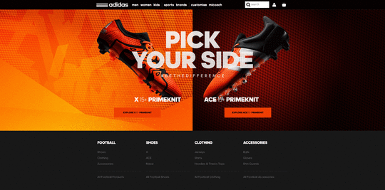
Photo credit: http://www.adidas.co.uk/football via awwwards
That’s not necessarily a bad thing, since animations bring both practical and enjoyable benefits to a design.
This article outlines the 8 types of web animation that make a site more effective, and the best practices for applying each.
Loading Animations
One of the oldest uses of animation for the web is to distract the user from loading times. As stated in Interaction Design Best Practices:
“Best case scenario, the animation influences your users’ perception of your product’s technology, making it seem better than it actually is. Worst case scenario, your users have something fun to watch while they wait, improving the overall experience.”
As shown in the above example created with the animation editor in UXPin, even short loading animations still add a little sophistication or at least entertainment during the dead time. Loading animations are popular for flat design, minimalism, portfolios, and one-page sites — all of which are inherently simple.
Photo credit: http://tomcolearchitect.com/
Visiting Tom Cole Architecture’s site, the user lands on a black screen and, in a moment, multiple white lines start to move and “write” the logo and brand name. After another moment, the background photo comes into view and the user is free to navigate. The site itself is simple and doesn’t necessitate a loading animation. However, these quick opening moments make a clean first impression and entice the user to interact further.
Remember that loading animations are best when simple. Forget extraneous effects like sound or outlandish designs. Animations should match the personality of the site itself, whether fun and cartoony, or professional and elegant.
Navigation and Menus (Nonscrolling)
In order to save screen space, a recent trend is hidden navigation menus that are revealed by clicking on buttons (like the hamburger icon). For these, animation is essential for visually connecting the two elements and preventing a jarring transition.
Click on the circular arrow button in the below prototype created with UXPin (tutorial here)and an oversized menu box pops out from the left. The “pop out” animation makes the menu appear as if it slides in from offscreen and makes the whole interaction run smoothly.
Hamburger animations aren’t the only option, though — creative designers are applying navigational elements like sliders and sticky bars to make transitional animations fresh yet familiar.
Hover
Hover animations are very practical for conveying that an element is interactive. In some cases, this might be the only sign that a button or piece of text is clickable. When a user is in doubt over how an element functions, they tend to move the mouse over it anyway, making hover animations fairly intuitive.
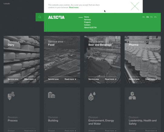
Photo credit: http://www.alectia.com/en/
Hovering over any card on the Alectia site above triggers an animation within that card. The animation is small — the title text slides out and identical text slides in to replace it (and the same happens with the “read more” arrow) — however it is enough to show the card’s function.
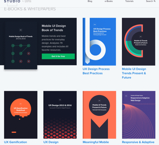
Source: UXPin
We use this ourselves for our free ebook library, where a hover triggers the download image falling from the top and the “get it for free” text rising from the bottom. This serves several functions — it shows you only need to click the card to initiate the download process, it acts as an attention-grabbing call-to-action, and it creates a snappiness that feels fun.
Galleries and Slideshows
Animated galleries and slideshows showcase multiple images without distracting the user.
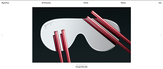
Photo credit: http://www.bigactive.com/
How fast and how many images cycle are up to the designer, but these decisions should not be taken lightly — even slightly quickening the rate at which images change could give the site an unwanted “rushed” feel.
Galleries and slideshows are easy to use because they naturally mimic real-life photo album functionality. However, we wouldn’t advise that you take that metaphor too far with a skeuomorphic visual treatment. Minimize the actual design of the slider or gallery, then ensure you show each image for 5-9 seconds.
Attracting Attention
Any biologist will tell you that the human eye is attracted to motion. This makes animation the perfect tool for controlling your visual hierarchy, especially as part of a site with mostly static images.
Animations are a great way to add intrigue to forms, calls-to-action, or even menu items. To see its potential, look at John Iacoviello’s MY/STATIC/SELF:
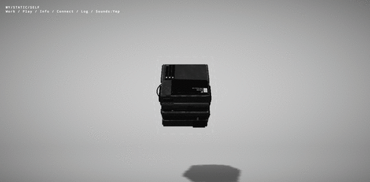
Photo credit: http://mystaticself.com/
The cube in the center softly bounces and flickers, clearly the most interesting item on the grayscale screen. Each of the layers of the centerpiece represent a link to the different pages — the same pages displayed in the top navigation menu. Considering that John Iacoviello is an interactive developer, the game-like design is a great way to show rather than just tell us about his skills.
The clever animation intrigues first time users, while the standard navigation still hangs around in case users prefer a more traditional experience. In this case, the best of both worlds is not out of reach.
Scrolling
The success of a long-scrolling navigation — another trend discussed in the free e-book Web Design Trends 2015-2016 — relies on the quality of its animation. A site simply can’t scroll smoothly without it. One of the main advantages of scrolling is the control it gives to the user, and for that, animation dictates the pace.
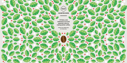
Photo credit: http://forbetter.coffee/
The webgraphic site For Better Coffee uses long scrolling to list out advice for making better coffee while simultaneously entertaining the user with an interactive visual journey of a bean being made into coffee (in a pleasing flat design style).
The best part about the site isn’t the coffee advice, it’s watching the animations that bring the bean from one stage to another. As the user who controls the scroll, you feel a part of the process.
Page Motion
Minor page motions, from AJAX loading options to simple shakes, add a little something extra to your site’s delightful design. These rarely have any practical benefits, but do well in making the site more enjoyable.
[image error]
Photo credit: http://www.hungercrunch.com/
On the site for Hunger Crunch, each tiny movement of the mouse shifts the image, and when combined with the separation of layers creates a fun effect.
When applying this captivating tactic, be careful of using too many loading items — they may cause the site to render slowly.
Backgrounds
While distracting if excessive, a modest animated background can add a certain vitality to a website. The key is moderation — individual sections at a time, or perhaps a gentle movement of the entire image.
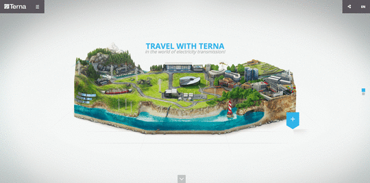
Photo credit: http://trasmissione-energia.terna.it/
The site for Terna maintains the right balance. Choosing an animated background to showcase the urban bustle that’s their business, sections throughout the image move at different intervals. This creates that “busy” atmosphere without overstimulating the user.
As with other areas of animation, simplicity is advised. Remember that every motion on the screen attracts attention, so too much animation at the same time creates chaos.
Takeaway
By now, animation has proven its staying power in mediums far older than web design. Due to its permanence, it will continue to ingrain itself into the design industry — the only difference is whatever new opportunities the future technologies will bring.
For more analysis of the web animations — as well as 9 other current web design trends — check out the free ebook Web Design Trends 2015-2016. You’ll find 166 hand-picked examples from companies like Adidas, Intercom, Apple, Google, Versace, and others. To help speed up the design process, there’s also a curated list of 100 free resources.

Feature image credit: Histography
The post Web Design Trends Analyzed: 8 Effective Types of Animation appeared first on Studio by UXPin.
October 20, 2015
Web Design Trends Analyzed: The Playful Power of Card UI
So, you want to play a game of cards?
With mobile users surpassing desktop users for the first time in 2014, web design is shifting its focus more on smaller screens. That means an increasing interest in cards, the organizational pattern that works well with responsive design because card sizes and grids can restructure themselves to fit any screen size, and because cards easily become buttons with gesture controls.

Source: Google Now
The card UI pattern may look simple enough — after all, that is its appeal to users — but they do require finesse to be done well. In this article, we’ll explain the rules of the game: everything you need to know about UI cards, including the different styles, pros and cons, best practices, and advice.
4 Types of Card UI Designs
One of the main advantages of cards is that designers can recreate them in many different and unique ways to showcase the site’s personality and creativity. That said, we’ve noticed 4 styles of the card UI pattern that appear more common than the rest.
Pins — The most recognizable layout for cards, based on Pinterest. Emulators of this style became so prevalent, WordPress even collected 26 of the best pin-style themes. Unfortunately, the style became too popular, and lately these sites are starting to feel unoriginal.

Photo credit: http://ugsmag.com/
Flat Design — Microsoft’s antithesis to skeuomorphism embraces bright colors and simple visuals. Their interface may be the earliest popular representation of the card UI, but has since evolved to suit modern tastes.
Source: Microsoft
Masonry (Grid) — The masonry-style framework features cards structured in a logical manner, typically in grids of equal spacing. This makes the content both easy to understand and to browse.

Magazine Style — Originating from news and magazine websites, this style is now spilling over into other content-heavy sites like blogs or portfolios. The characteristic of this layout is a teaser image or text tag, linking out to the full article elsewhere.

Source: Relevant Magazine
In all cases, the card layout works well as a way to showcase a lot of content in a digestible way without overwhelming the user.
Advantages and Disadvantages
Card interfaces may serve a broad range of industries — from ecommerce to social media to even our own free design library — but that doesn’t mean they work for every site. Take a look at the advantages and disadvantages below.
Advantages
Intuitive usability
Ideal for aggregated content (a single website featuring content from multiple external sites)
Easy to browse
Shareable — design cards are like the digital equivalent of a business card (which explains their popularity with social media)
Versatile — cards can be adapted to almost any style, from minimalist to elaborate
Can be manipulated in many different ways, allowing for personal creativity

Photo credit: dribbble.com
Disadvantages
A bit played out, especially with “me too” sites mimicking Pinterest or Facebook interface
Require nuanced UX design, as interaction is a key component of their success
Risk of producing a cluttered feel
7 Best Practices
In the free e-book Web Design Trends 2015 & 2016, Carrie Cousin outlines the 7 essential practices for designing with cards.
Negative space – Organization is key to cards, so use sufficient borders and padding to sidestep a busy screen.
One card, one concept – The nature of cards is in how they simplify your site’s structure. Don’t undercut that by making each card too complex.
Suitable images – Because card images tend to be small, make sure you use clear pictures and crop them in relation to the where they’ll be used.

Photo credit: https://www.pinterest.com/
Simple typography – Like images, text tends to be small, so simple typography is more legible.
Be unique – Since this is such a popular style, make an extra effort to stand out, whether an animated effect, video, round frame, or new color scheme. (More on this below.)
Consistent grid – Make sure your grid maintains the same spacing and respects various sizes and breakpoints.
Apply Fitts’s Law – As we described in Interaction Design Best Practices, Fitt’s Law, as applied to cards, suggests that the entire card be clickable, not just the text or the image. This makes it easier for the user to interact.
As the size of each card decreases, the difficulty increases. That means you’ll have to properly apply all the design fundamentals to get your point across.
Personalizing Cards
Cards are extremely malleable, and can be modified to express whatever you like.
For starters, the size of the card can change. Depending on how much content you want to display on a single screen — or how highly you want to prioritize one card over another — you can expand or shrink any or all of the cards’ size.
From there, you can decide what and how information should be displayed. Image and text? Just image or just text? How big is the image? These choices all influence the personal style of your card layout.

Photo credit: http://www.jetsetter.com/
Designers also like to play with animation in cards. It’s common to see an animated effect on cards when the cursor hovers over them, which also signifies to the user that the card can be clicked.
Getting back to the organizational advantages, mobile sites (and some desktop ones) allow users to move the cards themselves. Some sites even give users the options to stack cards into piles for even deeper organization.
Cards in Action
Let’s look at all these principles applied on an actual site. Contently, a platform for publishing portfolios, demonstrates how to compact the right amount of information into each card container.

Photo credit: https://carriecousins.contently.com/
This site organizes what would otherwise be an unruly jumble of links. Each card represents an article and contains the necessary preview information like images and descriptions, plus a link. Contently features bits of micro-information — Shares, Tweets, Likes — within the card.
It makes perfect sense for a site meant to display a writer’s portfolio to potential clients. You want to browse a lot of information quickly to reach a decision, which is a perfect user goal accomplished by the cards UI pattern.
Takeaway
You can’t really say that cards are a strictly visual style, nor can you say they are strictly an interface element. Rather, cards form a balanced union between the two — usability principles applied and manifested visually.
If you’d like to know more about the cards UI pattern — as well as 9 other current web design trends — check out the free ebook Web Design Trends 2015-2016. You’ll find 166 hand-picked examples from companies like Adidas, Intercom, Apple, Google, Versace, and others. To help speed up the design process, there’s also a curated list of 100 free resources.
The post Web Design Trends Analyzed: The Playful Power of Card UI appeared first on Studio by UXPin.
UXpin's Blog

- UXpin's profile
- 68 followers

