
Web Design Trends Analyzed: The Playful Power of Card UI
So, you want to play a game of cards?
With mobile users surpassing desktop users for the first time in 2014, web design is shifting its focus more on smaller screens. That means an increasing interest in cards, the organizational pattern that works well with responsive design because card sizes and grids can restructure themselves to fit any screen size, and because cards easily become buttons with gesture controls.

Source: Google Now
The card UI pattern may look simple enough — after all, that is its appeal to users — but they do require finesse to be done well. In this article, we’ll explain the rules of the game: everything you need to know about UI cards, including the different styles, pros and cons, best practices, and advice.
4 Types of Card UI Designs
One of the main advantages of cards is that designers can recreate them in many different and unique ways to showcase the site’s personality and creativity. That said, we’ve noticed 4 styles of the card UI pattern that appear more common than the rest.
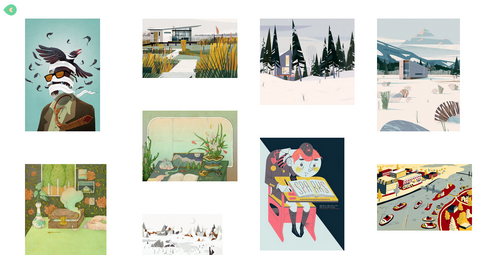
Pins — The most recognizable layout for cards, based on Pinterest. Emulators of this style became so prevalent, WordPress even collected 26 of the best pin-style themes. Unfortunately, the style became too popular, and lately these sites are starting to feel unoriginal.

Photo credit: http://ugsmag.com/
Flat Design — Microsoft’s antithesis to skeuomorphism embraces bright colors and simple visuals. Their interface may be the earliest popular representation of the card UI, but has since evolved to suit modern tastes.
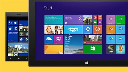
Source: Microsoft
Masonry (Grid) — The masonry-style framework features cards structured in a logical manner, typically in grids of equal spacing. This makes the content both easy to understand and to browse.

Magazine Style — Originating from news and magazine websites, this style is now spilling over into other content-heavy sites like blogs or portfolios. The characteristic of this layout is a teaser image or text tag, linking out to the full article elsewhere.

Source: Relevant Magazine
In all cases, the card layout works well as a way to showcase a lot of content in a digestible way without overwhelming the user.
Advantages and Disadvantages
Card interfaces may serve a broad range of industries — from ecommerce to social media to even our own free design library — but that doesn’t mean they work for every site. Take a look at the advantages and disadvantages below.
Advantages
Intuitive usability
Ideal for aggregated content (a single website featuring content from multiple external sites)
Easy to browse
Shareable — design cards are like the digital equivalent of a business card (which explains their popularity with social media)
Versatile — cards can be adapted to almost any style, from minimalist to elaborate
Can be manipulated in many different ways, allowing for personal creativity

Photo credit: dribbble.com
Disadvantages
A bit played out, especially with “me too” sites mimicking Pinterest or Facebook interface
Require nuanced UX design, as interaction is a key component of their success
Risk of producing a cluttered feel
7 Best Practices
In the free e-book Web Design Trends 2015 & 2016, Carrie Cousin outlines the 7 essential practices for designing with cards.
Negative space – Organization is key to cards, so use sufficient borders and padding to sidestep a busy screen.
One card, one concept – The nature of cards is in how they simplify your site’s structure. Don’t undercut that by making each card too complex.
Suitable images – Because card images tend to be small, make sure you use clear pictures and crop them in relation to the where they’ll be used.

Photo credit: https://www.pinterest.com/
Simple typography – Like images, text tends to be small, so simple typography is more legible.
Be unique – Since this is such a popular style, make an extra effort to stand out, whether an animated effect, video, round frame, or new color scheme. (More on this below.)
Consistent grid – Make sure your grid maintains the same spacing and respects various sizes and breakpoints.
Apply Fitts’s Law – As we described in Interaction Design Best Practices, Fitt’s Law, as applied to cards, suggests that the entire card be clickable, not just the text or the image. This makes it easier for the user to interact.
As the size of each card decreases, the difficulty increases. That means you’ll have to properly apply all the design fundamentals to get your point across.
Personalizing Cards
Cards are extremely malleable, and can be modified to express whatever you like.
For starters, the size of the card can change. Depending on how much content you want to display on a single screen — or how highly you want to prioritize one card over another — you can expand or shrink any or all of the cards’ size.
From there, you can decide what and how information should be displayed. Image and text? Just image or just text? How big is the image? These choices all influence the personal style of your card layout.

Photo credit: http://www.jetsetter.com/
Designers also like to play with animation in cards. It’s common to see an animated effect on cards when the cursor hovers over them, which also signifies to the user that the card can be clicked.
Getting back to the organizational advantages, mobile sites (and some desktop ones) allow users to move the cards themselves. Some sites even give users the options to stack cards into piles for even deeper organization.
Cards in Action
Let’s look at all these principles applied on an actual site. Contently, a platform for publishing portfolios, demonstrates how to compact the right amount of information into each card container.

Photo credit: https://carriecousins.contently.com/
This site organizes what would otherwise be an unruly jumble of links. Each card represents an article and contains the necessary preview information like images and descriptions, plus a link. Contently features bits of micro-information — Shares, Tweets, Likes — within the card.
It makes perfect sense for a site meant to display a writer’s portfolio to potential clients. You want to browse a lot of information quickly to reach a decision, which is a perfect user goal accomplished by the cards UI pattern.
Takeaway
You can’t really say that cards are a strictly visual style, nor can you say they are strictly an interface element. Rather, cards form a balanced union between the two — usability principles applied and manifested visually.
If you’d like to know more about the cards UI pattern — as well as 9 other current web design trends — check out the free ebook Web Design Trends 2015-2016. You’ll find 166 hand-picked examples from companies like Adidas, Intercom, Apple, Google, Versace, and others. To help speed up the design process, there’s also a curated list of 100 free resources.

The post Web Design Trends Analyzed: The Playful Power of Card UI appeared first on Studio by UXPin.


UXpin's Blog

- UXpin's profile
- 68 followers

