
UXpin's Blog, page 149
September 22, 2015
Create Compelling Visuals From Simple Shapes
“Flat” design — using anything that isn’t skeuomorphic — is popular today for many reasons. Graphics with fewer colors are faster to load and, when compressed well in PNG or GIF format, look better than their JPG counterparts. SVG graphics scale well to screens of any size or resolution. And, well, flat is the contemporary
The post Create Compelling Visuals From Simple Shapes appeared first on Studio by UXPin.


September 21, 2015
Build a Modal That Won’t Annoy Your Mobile Users
No one likes to get interrupted while browsing the web — especially if they’re visiting a website with a purpose. At the same time, many businesses want to encourage signups, and simply plopping a form in the footer doesn’t always get results. But there is a way to accomplish both: add a modal form to
The post Build a Modal That Won’t Annoy Your Mobile Users appeared first on Studio by UXPin.
September 17, 2015
5 Reasons to Use UI Patterns in Your Design Work

Patterns can seem like the easy way out when it comes to design. But they’re not. They’re very useful in helping you guide users through the experiences you’ve created. And they’re something that you can use to your advantage.
In this post, we’ll show you why UI patterns are important and how they can actually make you a better designer.
1. We’re Hard-Wired for UI Patterns
Human beings look for patterns wherever they go, even on the web, as we discuss in the free e-book The Web UI Pattern Handbook. We seek relationships among the things we see, and latch onto patterns that validate those relationships. And that’s something that UX designers can leverage — the human tendency to seek patterns.
Why reinvent the wheel when it comes to how people navigate a site or an app? Or when it comes to a button? Use patterns that users are wired to use. After all, we’ve been using the web for quite some time and there are already usable, time-test solutions. There’s no need to fight against the patterns that users know well. You might as well exploit them, save time and free yourself to be creative in other ways.
Patterns allow you to communicate function and intent with clarity. Let’s take a look at a quick example of how a user interacts with a pattern.

Photo credit: Kayak
In the above example, the user’s goal is to book a room. Simple task, and users will likely perform a series of actions to accomplish that task:
Scroll the site for a potential lodging.
Tap a photo with the hopes it’ll lead them to a detailed view of the room. If nothing happens, they’ll learn that tapping a photo is useless.
They’ll poke around, tapping everything or hunting for a “more info” link or other pattern — like the hotel name or a button — they’ve used in the past. If one of those works, then eureka!
Now users know the pattern and the behavior associated with it. They’ll take that experience with them when they go to use a similar travel site or as they continuing using this service. And that’s what patterns allow for — the experience of the user. Don’t shy away from that. Think of it as an advantage to use in helping a user achieve their goals, which will likely also be your goal as well.
2. Patterns Aren’t Straitjackets
Don’t fear that using patterns will stifle your creativity or make you lazy. Make patterns work for you as starting off points. Think of them as a framework, the backbone on which you can build your designs.
It’s not just copying a design. UI patterns give you a jump start, restricting you only to common sense.

Photo credit: Dunckelfeld
Take the carousel. Now a carousel plugin isn’t a pattern — it’s a component. The pattern is the arrows sandwiching an image — tapping either arrow takes you forward or backwards.
Or take breadcrumbs, those links that keep users from getting lost. The expected behavior is that you can tap on a breadcrumb and navigate your way through a hierarchy. Pretty simple, yet there is an infinite amount of ways to execute it. Take a look:

What makes patterns effective is that they’ve stood the test of time. The more frequently-used patterns are repeated because designers know they’ll do the job. We know that search fields above results work. We know that putting a submit button on a form will work. We’ve seen it time and time again.
Tappable logos, for instance. Like the ones you find in the top left corner of a page.
Technically: HTML for images and hyperlinks have been around a long time. Easy to write code-wise and most browsers recognize that code.
Visually: It’s old hat for users. They expect to see a logo in that same area.
Practically: Responsive web design friendly, because most compositions base their layout on the upper left corner — which means it’s valuable real estate on any sized screen.
Plain ol’ common sense — which as we said previously is your only restriction. Good UI patterns are the most likely solution. The more users are familiar with them, the more they know what behavior to expect.
3. Patterns Reinforce Expectations
Users learn patterns the more they’re exposed to them. Think about the ubiquitous search form or even the dreaded hamburger menu. We know what they do. We don’t even have to give it a second thought. It’s intuitive and frictionless.

Let’s examine the search form. Users know that a long empty field with a button containing a magnifying glass will allow them to search for any keyword they type in. Stick it up in the top right-hand corner or dead center if you’re a search engine — and you’re golden. No one will hesitate on what action they need to take next.
Now let’s subvert that.

Whoa! That’s different, right? And users might think it’s broken even if the form technically works. This new variation is certainly going to give users pause and create an unexpected form of friction. Any hesitation can be disastrous and the more hindrances a user encounters, the more likely they’ll bolt from your site.
This goes for patterns that you’ve established previously on your site. You don’t want to sabotage yourself by constantly changing elements that have been proven to work. Move the search from where it normally resides can upset users. Going back to our booking example from earlier, change how users get to the detailed view and they’ll like get lost at best, frustrated at worse.
Patterns and conventions keep users from getting confused. Sticking to patterns also has an added bonus: it creates consistency. And being consistent with users helps to build trust. The more they trust you, the more they’ll come back. Patterns build that consistency in your design work.
Keep your patterns in a style guide and you eliminate mistakes that create confusion, as we discuss in the e-book Critical Components of Web UI Style Guides.
4. Patterns Get You to Results Faster
Deadlines are often tight. Patterns can help you weather the lack of time. No matter where you are in the process, patterns plug in relatively easily. And that can mean fewer headaches when it’s crunch time.
Patterns by their very nature are self-contained units that can be snapped into place, no matter the context.
Let’s take a hypothetical homepage offering travel deals. At the top, there’s a header image that spans the width of the page. Sprinkle in some clever copy on saving money. Top it off with a nice juicy button to snag the deal before it expires.

Most UI designers are familiar with the “hero element” pattern. So are most developers. This makes communication easy between designers and developers. They have a common language. All that needs saying is “hero goes here.”
If a designer adds “add a modal here,” a developer knew exactly what’s needed without a lengthy explanation. This cuts down the back-and-forth, easing the working relationship.
But using these conventions, which you probably know by heart from just using the web, also frees you up as well as speeds you out. Without having to reinventing the wheel, you’re able to focus on other design problems without spending a lot of energy on problems that already have a viable solution.
5. Patterns Foster Creativity
Patterns don’t have to limit you. They’re just another tool at your disposal. And there will be times when you’ll want to buck expectations and surprise your users. For instance:
All of your icons are 32 × 32 pixels — except the one you want to stand out, which measures 48 square.
You keep your main headings in serif, while all its subheads are sans-serif.
Only tappable images have a border. The rest do not.
Your blockquotes don’t have margins, unlike your paragraphs.
Your color palette is normally blue unless it’s an error page, then it’s red.
If you find yourself using the words “unless” or “except” when it comes to using patterns, it’s time to break out of your routine. Don’t be afraid to break out of a pattern, but be sure to test it out with users. If not, you could just end up alienating them if the pattern they’ve become so accustomed to vanishing suddenly.
Once again, patterns are the starting point, not the finishing line. It doesn’t necessarily mean that you have to merely copy. Add your own take, so long as it works with what users expect to happen.
Conclusion
As users familiarize themselves more and more with UI patterns, the more valuable they become to us as designers. The underlying behaviors associated with those patterns will also stick and we can continuing use that to our advantage.
Soon, we’ll be relaunching our UI Pattern library with all the latest patterns being used today that you can use in your design work. If you’d like to be informed of when we launch, sign up below.

5 Reasons to Use UI Patterns in Your Design Work
Patterns can seem like the easy way out when it comes to design. But they’re not. They’re very useful in helping you guide users through the experiences you’ve created. And they’re something that you can use to your advantage. In this post, we’ll show you why UI patterns are important and how they can actually
The post 5 Reasons to Use UI Patterns in Your Design Work appeared first on Studio by UXPin.
September 15, 2015
3 Useful Ways to Create Web UI Mockups

There’s lots of ways to create a mockup. It’s true there is no “best” way, but depending on certain UI and UX designer’s styles and preferences (and the design process), some will work better than others.
In this piece, we’ll look at the pros and cons of mockup tools, graphic design tools, as well as coded mockups that start to blur the lines with prototyping.
1. Use bespoke tools
Using a tool like our own UXPin, or other solutions like Moqups or Balsamiq, will provide you everything you need to build your mockup and facilitate the entire process. These tools are designed to make the creation process as easy as possible, so you can focus more on stylistic decisions and less on how to manipulate the program.
Both experts and beginners feel most comfortable with mockup tools, as beginners prefer their ease of use, while experts appreciate the designs specifically tailored to their advanced needs.
Moqups and Balsamiq provide more functionality than non-design tools that are sometimes used for wireframes and mockups (such as Keynote), but they are limited to only low fidelity designs. They can, however, be quite useful if the goal is to create low-fidelity wireframes very quickly.
When it comes to mockup tools, many are targeted for wireframing than true mockups. With built-in collaboration, UXPin offers dozens of element libraries to save time, and its a simple matter of dragging, dropping, and customizing to create your mockup. Our 20+ element libraries cover both web and mobile.
2. Using graphic design software
Some designers swear by software like Photoshop, Sketch, orIllustrator, especially those particularly skilled or familiar with tools that offer control down to the pixel. As Nick Pettit of Treehouse points out in a piece explaining mockup types, graphic design platforms work best if you’re aiming for the highest level of realism and visual fidelity.
Working in graphic design software gives you access to an almost endless selection of highly defined colours, so if you’re working within the restrictions of a rigid and preset colour scheme — for example, under particular branding rules — then these programs may be your best option. More than colour options, these programs offer far more visual tools, allowing you to tackle the minutiae of detail.
However, the drawback to using this type of software is that it can be difficult to translate when it comes time to start coding the design. What worked in Photoshop may not always work in code (elements like fonts, shadows, gradient effects, etc.), which can waste time in figuring out solutions for the prototyping phase.
Photo credit: CreativeBloq
As described in The Guide to Mockups, graphic design software is only recommended if high fidelity visuals are the top priority. If you have a style-heavy page, it might help to hammer out the specific visual details in the mockup process (in which case Photoshop or Sketch will give you the most options).
Just take a look at Hubspot’s list of the 53 Most Beautiful Homepages, and it’s easy to understand why it sometimes helps to sort out all the visual details sooner rather than later. Similarly, if you’re dealing with a nitpicky or hard-to-please client, presenting them with a gorgeous and impressive mockup might win them over more easily.
It’s also worth mentioning that mockups created in Photoshop or Sketch can be dragged and dropped into the prototyping phase with UXPin. This lets you easily animate all layers (no flattening) with a few clicks, and ensures you don’t need to start from scratch when it’s time to prototype. For more details, take a look at the tutorials for Photoshop integration and Sketch integration.
If visuals are not your only priority, you might be more efficient using a tool that allows you to do the wireframing, mockups, and prototyping all in one place. Graphic design software can be more trouble than its worth for mockups unless you’re looking for optimum visualization — you’ll definitely need to communicate regularly with your developer since these tools aren’t designed for collaboration.
3. Coding your mockups
For starters, if you’re mainly a designer and not comfortable with coding, then this obviously isn’t even an option. As discussed in The Guide to Mockups, coded mockups are not the default choice.
Most coding can be postponed until prototyping (if you’re creating an HTML/Javascript prototype) or even later (if you use a prototyping tool). But despite the complexity and potential obstacles, there are many respectable designers who advocate introducing coding into the mockup phase.
As Joel Falconer shows us on TNW, building a structure in HTML and then moving to CSS for the basic layout can streamline the entire development process — in theory at least; many would argue that focusing only on visuals during the mockup phase saves time in decision-making and organization down the road. But those who prefer coding early understand that more mathematical changes such as sizing can be implemented more easily when the code is already written.
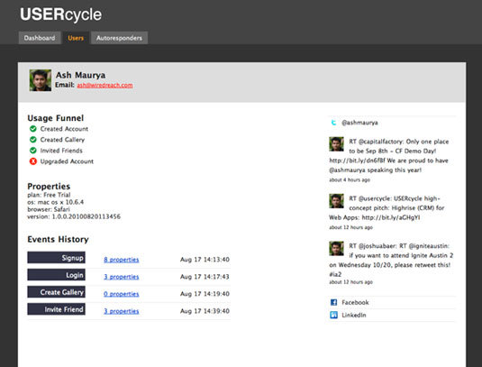
Photo credit: Ash Maurya
One of the biggest proponents of coded mockups is Ash Maurya, Founder/CEO of Spark59 and speaker on development. When describing how he prefers to create mockups, Maurya defends the HTML/CSS route, and makes some solid points:
Feasibility — “Flashy” mockups (sometimes literally if they’re done in Flash) designed only to look good can be difficult to translate into code, resulting in wasted time and effort. Elements like gradients, fonts, and effects — while easy to create in other tools — can be cumbersome or even impossible to recreate when coding. Starting in code lets you know right away what you can and cannot do.
Quick Iteration — According to Maurya, coding actually saves time by simplifying the iteration process, although others disagree in that it adds time in dragging out design decisions.
Minimizes Waste — “Creating a mockup in anything other than the final technology in which the product is delivered creates waste.” Because the mockup is going to end up in HTML/CSS anyway, Maurya suggests adding fidelity there.
But as we mentioned before, mockups with coding are not a popular strategy, for more reasons than the difficulty of coding. Tony Thomas, Lead Designer at Medialoot explains why in a compelling post on the subject. Among the reasons designers prefer to leave coding out of mockups, these three are the most common:
Limits Creativity — The strength of building with code can also be its weakness: knowing concretely what you can and cannot do will cut off many avenues before they’re fully explored, while designing openly might inspire new ideas you wouldn’t have had otherwise. Sometimes when you like an idea enough, you try harder to figure out how to recreate it with code, whereas the idea never would have even surfaced if you started in code.
Limits Experimenting — It is a lot harder to try out new and different ideas in CSS/HTML than in other simplified programs. Just as with the above point, the freedom to create will often inspire new, more, and better ideas. Just ask yourself how many UI designs and iterations can you create in 30 minutes of Photoshop or Sketch versus CSS/HTML?
Dilutes Design Process — Not everyone is great at multitasking. The mockup phase is all about iterating on the appearance of the site, and worrying about coding at the same time can get distracting. Some people prefer leaving things for the right place and time: visual design during the mockup phase, coding during the prototyping or development phase.
Again, it’s up to you when to introduce coding. Just make sure you know your design priorities and keep the developers updated on how you’re prioritizing features.
Conclusion
Don’t make the mistake of thinking all mockups are the same. Simple decisions about platforms, fidelity, and coding will all produce significantly different results.
Know what you want and what your goals are before you even begin the design process — if you want a tool that supports all three phases, it’s best to start out using it than to begin halfway through. Likewise, if you need a stellar, fully realistic mockup, keep in mind that you’ll be using a graphic design editor at some point.
If you found this post helpful, feel free to check out our tool. With a free trial, you get full access to the highest Pro+ plan which contains thousands of pre-built elements, integration with Photoshop & Sketch, customizable UI libraries, and more.

This post was originally published on CreativeBloq.
September 14, 2015
3 Powerful Ways to Design HD Website Backgrounds

The days of 72 pixels per inch being enough are coming to an end.
With the dominance of Apple’s retina displays, and the technology war that ignited with the competition, before long high-definition visuals won’t be so much of a special bonus as a basic requirement.
This article aims to close some of that gap and show you how to use the benefits of HD backgrounds while minimizing their drawbacks.
An Introduction to HD Backgrounds
With the increasing popularity of HD devices, detailed and visually rich backgrounds are stepping forward to take center stage.
These stunning backgrounds rely on a layering effect to simultaneously impress users while not drawing too much attention from the more practical foreground elements. This layering effect is crucial to the proper HD backgrounds. The site’s visual hierarchy must remain intact, and that requires the background not overshadowing the foreground.
As we explained in Web UI Design for the Human Eye, the separation of background and foreground is a natural function of human sight.

Source: Booking.com
In the above example for Booking.com’s New Year’s Eve promotional event, clearly the most fascinating visual is the high-definition picture of the temple in Kyoto. You want your HD background to make an impression on the user without dominating the screen. In this example, the user can still easily see the text and title, smartly placed at the center over a vacant background section.
At the bottom of the page, notice how the navigation also stands out thanks to the white contrasted background.
While this separation of background and foreground can be done through artful layout choices, there is a shortcut: fading, shading, or blurring an otherwise overstimulating background will quickly distinguish it from the promoted material.
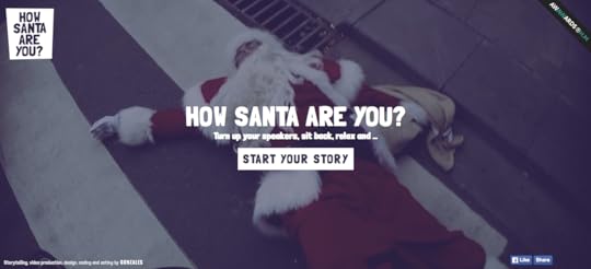
Source: How Santa Are You
With the bright red and white, combined with the absurd content, this background picture could easily drown out the foreground – especially since the color white is a primary element in the foreground and background. By darkening the background image, the user can easily discern the text and calls-to-action, without the weakening the impact of the image.
In general, there are three main types of HD backgrounds:
Still Images
Videos
Animation
Below, we’ll discuss which one will work best for your site, and the best practices for incorporating them.
Still Images
Backgrounds of full-screen images aren’t new, however the popularity of HD is changing the rules.
HD displays allow users to see levels of details that were previously unavailable. Photos and still images never looked so breathtaking, and these types of backgrounds have the power to draw the user into the site, almost as if by trance.

Source: Barrage
The asset management firm Barrage uses the still image background wisely. This awe-inspiring HD photo of nature suggests the firm’s reliability and the peace of mind, qualities which are accented by the high quality.
If you’d like to use an HD still image background, try following these tips:
Choose the right photo – The content of your photo will determine the background’s success. Make sure the tone and subject matter – as well as the colors – match the style you’re going for.
Use effects – As we mentioned above, blurring, shading, or filtering an image can help optimize it for your site, especially if it’s too distracting on its own.
Keep size in mind – The photo will be displayed on screens with different dimensional ratios than the camera, especially in responsive design. Err on the side of too much over too little.
The photo itself holds all the power with a still image background. First and foremost, start with a great image.
Subtle Videos
The HD video background trend seems to be gaining steam lately, and for good reason. As explained in Web Design Trends 2015 & 2016, this background embodies the best HD has to offer: remarkable video capable of expressing the same emotions as film.
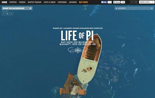
Photo credit:
http://www.lifeofpimovie.com/
For example, the site for the movie Life of Pi found a creative use for video background as a way to display the trailer, whereas AirBnB chose a different approach.
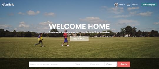
Source: Air BnB
AirBnB shows individual, everyday moments one might experience when traveling with their site – such as sharing a meal with the host, or going for a picnic. This strategy is highly effective in promoting their brand, as it gets the user excited about the possibilities. The “arthouse” style of the film appeals to the user on an emotional level, forming connections that encourage and even propel new business. While still images could accomplish similar emotional connections, the video takes it further.
Aside from applying the basic principles of cinematography, keep these considerations in mind:
Pay attention to loading – A stellar video won’t matter if your users get bored and leave while it loads.
Default as the sound off – Many users are sensitive about where and when they browse, and a sudden burst of sound is unwelcome. Keep the default as off, with an obvious option to turn it on.
Shorter is better – The ideal length of clips is between 10 and 30 seconds. Shorter may seem too erratic, while longer might lose your user’s attention.
When done right, HD video backgrounds create the immersive experience other sites strive for. However, getting to that point requires sidestepping a few of the drawbacks. Use cautiously.
Brilliant Animation
HD animated backgrounds allow any degree of motion you’re comfortable with, whether full-on cinematic videos, or single hard-to-notice elements that move periodically (like eye-blinking). Animations in general add a sense of fun and awe to a site, but in HD this excitement is magnified.
Animations are most common as loading entertainment. But with the rise in HD mobile devices, animated content that remains on the screen is becoming more popular.

Photo credit: http://www.acnplwgl.com/
The site for ACNPL and WGL uses animation well for their background, as you can see in the example above. The circular logo is always spinning, however it changes speed and direction. The result is a stimulating interface that holds your attention.
The most important concern with animated backgrounds is that they are smooth and seamless: any looping should not be noticeable. Users are more forgiving of this in video, since it’s somewhat expected, but for animation these will create a jarring effect that destroys the “magical” feeling.
Beyond that, we offer the following advice:
Use vectors – If you’re designing specifically for HD, design in a format like SVG. This allows not only a better quality to the image, but proper resizing during zooms.
Choose the appropriate style – Animation styles varies, from childish and cartoony, to minimal and professional. Apply the right type for your site.
Implement animations as interface signals – For example, if text starts moving when hovered over, it suggests that it’s a clickable link. In this way, animation can be as practical as it is fun.
Apply the same principles as video – Heed the same advice we gave for video, especially using cinematic techniques and be careful of loading times.
Animation does not live in a vacuum. Try combining it with other backgrounds like a still image, or implementing it on only specific interactive elements like links or buttons.
Conclusion
HD web design may be new, but it doesn’t have to be scary.
It’s been around for long enough that designers can now recommend best practices, as well as what to avoid. Just keep in mind that HD design does have it’s own particular set of rules. For every advantage it offers, there’s a disadvantage to try to avoid. Don’t ignore loading times or the visually distracting aspects of HD, and take to heart the guidelines we listed above.
For more advice on HD web design and 9 other web design trends, check out the free e-book Web Design Trends 2015 & 2016. You’ll learn from the best with analysis of 166 examples from companies like Google, Apple, Reebok, BMW, Intercom, Adidas, Dropbox, and many more.
Is 40 Pixels Enough For Fat Finger Mobile UI?
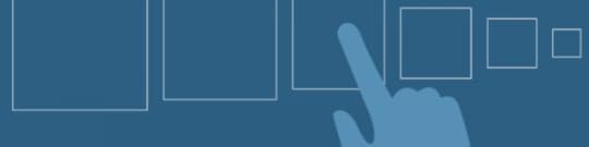
Apple’s recent Pencil product announcement has us wondering about touch targets in mobile-optimized design. In spite of the many styli available, fingertips aren’t dead yet: the majority of people still navigate their smartphones and tablets with their fingers. As we discussed in our free e-book, Mobile UI Design Patterns, gestures in web design are on the rise.
Forty pixels square is the general rule of thumb, pun not intended. But how accurate is that estimate? To find out we ran an experiment with an iPhone 5.
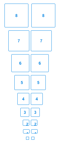
We asked people around our office to tap differently-sized buttons in a UXPin prototype. The task was find out what the smallest button people could tap in the first attempt — that is, how small was too small to hit at a casual glance?
Check out the prototype we shared internally, and feel free to try it yourself.
About half the people in our office could tap buttons 5–10 pixels square on the first try. The other half took two or more taps to hit them. Everyone could tap buttons that were 30 pixels square or larger.
Lessons learned
People need immediate feedback. If they successfully tap a button, but nothing happens, they may assume that they missed and try again — risking accidentally tapping something they didn’t mean to. We saw it first-hand as some of our team members missed the mark.
Margins matter. We found that people had an easier time tapping buttons that were spaced further apart, although there was a point of diminishing returns. We believe that the button’s width is a good guideline for 20 pixels or smaller. For example, if a touch target is 15 pixels wide, then it should have 15 pixels between it and the next tappable element.
Text matters too. At 16pts, an easy-to-tap hyperlink needs to be at least two rems wide, or approximately 32 pixels.
Test it yourself
Granted, testing within our office isn’t the best scientific practice. Ideally we’d use a full website with many differently-sized buttons and links. But that requires measuring each touch target and a lot of note-taking. Instead, you can run a much faster experiment with a prototype. If you don’t have a UXPin account, get a free trial to follow along with this tutorial.
1. Create a button.
We went with a ghost button to find out if style matters as well. (The answer: not really in a lab environment.) You can use any color you want, as long as it’s consistent throughout the experiment. Make the button square.
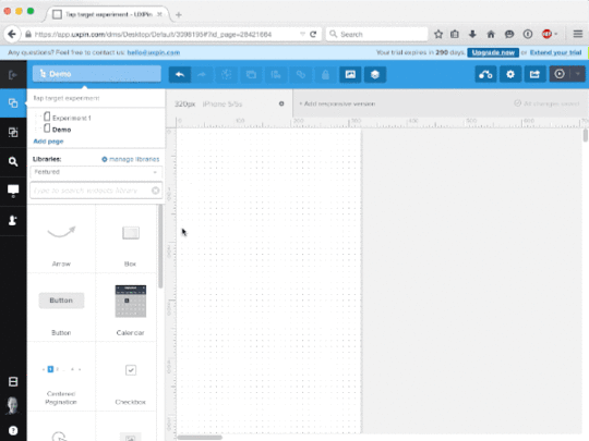
2. Make the button interactive.
We used turned the button into a multistate element that changed to blue on tap, but any visible change — like changing a blue button to red — will work.
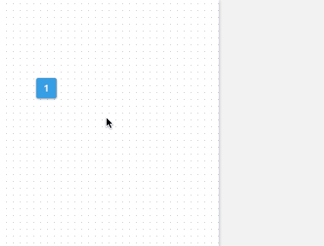
3. Duplicate and resize the button many times.
Option/alt-drag the button to a new position on the canvas, changing its size each time. We used increments of 10 pixels square and set them in order from largest to smallest, though you might experiment with different arrangements.
4. Share with your team or beta testers.
Ask people to see which buttons they can hit on the first try. Any size they can hit reliably is a good size for which to create tappable elements. What’s the smallest you can go?
September 11, 2015
When the Best UX Design Process Isn’t A Process At All

Is your process working for you or against you? Are you sure you know the answer?
Design process gets a lot of typing action. The online article pile collects more opinions every day. To be successful, they say, you must have a repeatable process. You can’t win on dumb luck. Not more than a few times. And man do we love to jump in. We can’t get enough of those design process debates.
We’ve gone through all the possibilities, too. Over the past couple of decades, we’ve seen and tried every process we could. We’ve got LEAN. We’ve got Agile with a capital A (despite that almost no one is strict about it). Before that, we had User Centered Design (which then became “design thinking”). Before that, it may have just been called “winging it.”
Photo credit: Dean Meyers. Creative Commons.
Has the hype about process helped us? Does your process stick to the rules the world keeps trying to lay out for you? Does it even stick to your own rules? It’s easy to latch on to the first thing you try and turn it into a life lesson. But the truth is, the best design process is a flexible process.
I’ve been walking into corporate and startup conference rooms as a consultant for the last 10 years or so, and as an in-house design-slinger for a few years before that. If I’ve learned anything, it’s that absolutely no one has a process they can rely on all of the time.
Constraints change on every project — resources, time, budgets, skills, technology — you name it. If it affects a project, it’ll be different next time around than it was this time. You can meditate on your theoretical process all you want. That very real project you’re about to start is going to kick you in the head.
Process may be repeatable, but it doesn’t guarantee success. It can’t. There are too many variables on any given project, not the least of which are the skill sets and motivations of the people involved, which can make a dramatic difference from one day to the next. Success is a vague and elusive thing on the best of days. We can’t possibly expect to achieve it in its many forms by applying the same process template to every layer of complexity it throws over us. We’d spend half our time redefining “success” just to make it fit what we get.
“Winging it,” it turns out, has merit.
Running with Scissors: The Value of Improvising With Tools
Jared Spool has done some research on this. You know the guy — he’s the one who’s been running a design research company and think tank since the ‘90s . Few people have spent more time talking to designers and companies than Jared.
Know what process he’s learned is the one employed by the most consistently successful design teams? It’s the same one I find every time I walk into one of those conference rooms with a great team.
The improvised process. The one defined specifically for that project, and often not defined at all.

As it turns out, the teams that do measurably good work on a regular basis, with the fewest issues and the fewest failures, are the ones without a de facto process. They’re teams which devise a custom process for every project, and frequently go into a project without one at all. Conversely, the teams which most consistently accomplish the mediocre — that dirty, awful word — are the ones who live and die by their processes.
I know. It’s nuts. But is it? Think it through.
The teams who succeed the most are the teams full of people who work well together — who communicate well together — and who have a broad range of skills and tools they can apply at any given moment. They approach problem-solving in a way that works with the constraints of the situation. They have all the UX tools you can find — strategy definition, user research, UI design, prototyping, usability testing, data analysis, and on and on. To do their work, they pull out what they need, when they need it.
At the beginning of a project, gather around and decide together what design activities will be appropriate for the situation, whether thorough user research combined with rapid usability testing with paper prototypes or some other combination of things that will give you the best insights.
At every point of the project, hold design brainstorms and reviews so that everyone can continually keep each other in check with regard to the goals of the project and how well the team’s ideas support those goals.
Ensure that everyone knows who has final design decision-making power, and that this person relies heavily on evidence and solid rhetoric rather than whim.
Not Just Tools, but Tools in Many Sizes
Not just that, but these teams are able to adapt the way they use their UX tools.
On a tight deadline, they can run rapid usability tests using paper prototypes at the coffee shop across the street.
They can perform user research remotely, in short interviews, cross-referencing subjective responses with prior data to validate hunches and ideas.
They can prototype collaboratively in a variety of tools (whether in UXPin, Keynote, PowerPoint, or something else) in an afternoon just to hash out a possible design direction and get quick feedback from the team and from users.
Photo credit: UXPin
Strategy Dictates Process
Of course, there is a catch.
Successful teams also work from a strategy. They take on these projects with a strong, mutual understanding of the goals and differentiators, and they collectively aim at the same target.
In the best situations, they start with an actual strategy document. Even a quick and dirty version that outlines the basic vision, design criteria, and success metrics for a project does a far better job of keeping everyone on the same track than an allegedly shared understanding based on a hallway handshake.

Photo credit: ProductHunt
When ideas need vetting, the strategy doc reminds you of the direction and shows you whether or not the idea fits in. When the project scope starts to bleed out into the fringes of reality, the strategy doc reels it back in. There is simply no better way for a team to tighten up its focus and stay within the confines of a project’s constraints and keep it feasible. By definition, that’s what success is to a design team.
Here’s a few tips to do this:
After creating a strategy doc, communicate it to everyone involved. Assuming it was built on research and insight and agreement, the team can trust it from then on to be the guiding light for all design decisions.
Refer back to the strategy doc early and often. When an idea forms, pit it against the success metrics laid out in the strategy as a quick way to determine whether or not the idea supports the project goals.
As a sanity check, bounce ideas off each other for which design activities to perform and how so that no one ends up wasting time, and so that everyone is in a position to help the collective whole.
Remember that a strategy doc enables individuals to make good decisions on their own. Avoid micro-managing the situation and let people do what they do best.
When is the best process not a process at all? Right now. Yesterday. Tomorrow. Always.
Tally up your tools and trust your gut. Wing it (at least to the extent that you switch up your process to fit the situation). Your next project could be the best one ever.
Editor’s note: Before you start adapting your design process, make sure you know the fundamentals first. For UX design process best practices, check out the free 109-page Guide to UX Design Process & Documentation. You’ll learn about 25 helpful design documents across 7 stages of design so you can pick what works best.

Does Your Interaction Design Cut Through the Chaos?

Everything is designed. We do not live in a world of chaos. Even the natural world is designed through evolutionary refinement. All things exist to perform a specific function (even if simply existing to evoke an emotion), and it’s all experienced through our senses.
Design failure is an inability to communicate. If we’re unable to understand how to interact through our senses, we become completely lost. In this piece, we’ll describe some tips for communicating more clearly through interaction design.
Nature is the Original Designer
Ever wonder why you push the elevator button more than once? The answer lies in nature.
In nature, every action generates an equal and opposite reaction. The wind blows and it causes the leaves on a tree to flutter. This feedback informs us about our environment, weather and safety. A light breeze is delightful. A whirlwind of leaves may signal an impending thunderstorm.

When designing experiences for human beings, we must understand how we process interactions. Let’s look at the elevator button as an example: if sound or light doesn’t indicate that pressing a button fulfills an expected reaction (the elevator arriving), we will instinctively press the button several times.
We wait. We wonder if the elevator will actually show up. We fear being forced to walk down the stairs. Failing to effectively communicate with users leaves them feeling alone, anxious and mistrusting.

Our main goal in interaction design is to empower users to feel confident when performing any type of action. All of the information on the screen needs to help focus the user on a task. Always minimize cognitive load.
We’re not advising that you hide interactive touch-points. On the contrary, effective interactive design keeps interactive elements in plain sight. There shouldn’t be a need to guess.
Tips for reducing guesswork:
Pay attention to what users are regularly exposed to. Know where users spend the majority of their time. For example, UXPin accounts for designers who may come from a Photoshop or Sketch background. As such, the interaction design feels familiar to these tools (which makes the interface more learnable) but still retains its own unique identity.
Consider global design standards. Digital design standards are an ever moving target. Sometimes they hinder your design, but they usually improve consistency and usability. Know the rules before you think about breaking them.
Don’t forget about accessibility. Ensure users of all capabilities have a good experience by following the latest accessibility guidelines. A bonus is that these constraints also further simplify your design.
Use color appropriately. As a convention, red has traditionally been used as a warning. Know which colors communicate what moods and messaging by understanding color theory in web design.
Good Design Never Leaves Anyone Guessing
Let’s again look beyond digital design to discover some practical lessons. In public transportation, you’ll notice many different ways to design the request stop feature.
In many countries, there are two types of stop features on a bus. One requests the bus to stop at a particular location and the other is for use in an emergency.
Very often, I’ve seen these two buttons designed exactly the same way, but for opposite uses. A red button may request a stop or alert the driver to an emergency. Or a yellow strip may also perform either of these functions. And then there’s the old school cable pull to request a stop. Since there isn’t a global conformity to using these types of interactive features, it’s fair to wonder how often tourists perform the wrong action.

The lesson for interaction design is to ensure consistency throughout your design.
Be externally consistent by creating familiar interfaces that match user expectations. It’s fine to offer a new design solution that outpaces your competitors. But defying useful conventions for the sake of being clever will only damage the experience.
Be internally consistent by ensuring that your own interface doesn’t deviate from itself. As described in Web Design Best Practices, style guides and pattern libraries help build internal consistency.
Be sure to keep up with well established UI Guidelines. Consider adopting a trend after it has been widely accepted. It’s perfectly fine to be a later adopter of a trend. Time will allow you to evaluate the best needs for your users to separate fads from best practices.
Communication Tips for Designers
Figuring out how to effectively communicate through interaction design takes a bit of time and observation.
If the product’s already built, start by reviewing the analytics collected to date. Website analytics can tell you a lot about the majority of users visiting pages. Analyze the types of devices, user’s location, time of day and tasks performed to build some high-level assumptions. These assumptions form the foundation for personas.

Next, validate these assumptions by inviting people who fit these high-level traits for contextual interviews. You can conduct these interviews in person, via Google Hangouts or Skype. These contextual interviews ensure your personas account for everyday external factors: environments, devices, distractions, and technological constraints (like WiFi availability).
Once you’ve solidified your personas, give them a realistic story with a customer journey map. You’re able to plot out all the steps a persona performs to complete a task.
Think about each interaction as part of a larger conversation:
How can the interactive elements improve the experience for a busy user who could be pulled away at any moment?
What must be communicated right away?
What can wait til later?
This is where knowing the device and environment becomes extremely useful. If the user is at home working on a laptop, their interactions are more focused than when using their mobile devices as they commute home on the train. Good design always communicates appropriately based on context.
Conclusion
Users have short attention spans. They don’t want design, they want to accomplish their tasks and move on with their lives.
When you know your users and how they interact with existing products, you can design for the correct context. Then, ensure that your design stays consistent with what users are familiar with (and with the design itself), and you stand a much better chance of leaving a lasting impression.
For more design advice, check out the free e-book Web Design Best Practices. Topics include interaction design, web design, and visual design. The 109-page e-book offers its tips based on examples analyzed from 30+ companies.

September 9, 2015
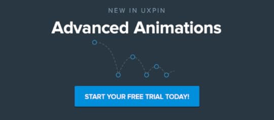
How to Create Animations That Guide and Wow Users

No one knows how to use a new interface when he or she first discovers it. They might muddle through it, tapping what their experience says is tappable — underlined blue text, for example. But if you’ve made, for example, every red icon a link, users will have to discover your carefully-crafted UI by trial and error.
We can help them along with animations that hint at what’s possible before they waste precious time trying to figure it out.
In this post, we’ll learn ways of cluing people with a little motion.
Tool tips
The most obvious solution is to flat-out tell them. Tooltips that appear on load, and disappear when the user begins to interact, use plain language to explain what different buttons do. More elaborate tooltips will appear one at a time as users tap from one to the next, guiding them through the interface one step at a time.
But there are other ways to guide users that don’t involve tooltips.
Bounces and shakes
Another solution is to give interactive elements a bit of motion on load. People will guess that something is interactive if it gives a little shake or pulse — and only one — a few seconds after the screen renders.
This technique is best in small doses. Making too many elements twitch will dilute the discovery experience. One element moving is easy to get. A dozen will have them glancing everywhere, trying to remember a dozen bits of information at once.
How does it work?
Even as interfaces evolve, a few principles continue to ring true:
Users need cues about what’s interactive and what isn’t. Guessing by trial and error is frustrating, time-consuming and undiscoverable. That is, until people see something’s interactive, they won’t go looking for interactions.
Actions must be immediate. Users need instant feedback about their actions to to feel in control. Hesitant interfaces make their experience feel sluggish, even frustrating, as users wait for the interface to respond. Snappy UIs, on the other hand, focus users’ attention on your product.
People need back buttons in concept, if not in fact. As they experiment with an interface, they need the ability to return to and reverse actions. Doing so encourages them to experiment and explore freely, confident that no move is fatal. Navigation menus slide in and out; switches toggle on and off; accordions collapse; multi-step forms back “back” or “cancel” links.
Remember that these are more than cues. They’re promises. Keep them.
Practicing interaction design
Now let’s put all this into practice. In this demo we’re going to prototype a task management app. As users tap each item, it will disappear from the list. But how will they know to tap, and how can we minimize frustration?
One way to indicate interactivity is to have the interface give a little hint. In this interactive lesson, one item in a shopping list gives a little bounce to indicate that it’s tappable. By extension, and a little experimentation, users will understand that other elements are tappable as well. Notice that the bounce happens two seconds after the prototype loads, giving users a chance to absorb the design before receiving visual information about its interactivity.
The slightly-sideways bounce is also a sign of things to come: elements slide out of sight in the same direction of the bounce.
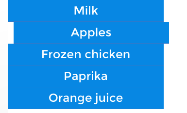
Differentiation also helps users figure out what’s active. This demo shows how high-contrast elements appear to be more active than their low-contrast counterparts. In the first example, “Apples” and “Orange juice” tappable, helping users understand what high contrast colors mean.
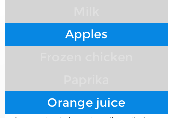
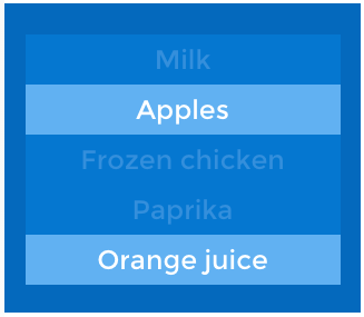
In the second example, notice that “Orange juice” breaks the rule by not being tappable. That’s bad news: having established a precedent, one link that doesn’t behave as expected will confuse users.
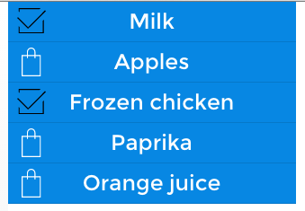
Icons are another common convention that users may try to tap. In this case, tapping icons toggles their state. Unlike the previous examples, these icons give users the chance to undo their actions — an important part of making people feel they’re in control and free to experiment.
Finally, the UI should work as quickly as possible. As we said before, users need instant feedback about their actions. This example feels buggy because the tappable elements are sluggish. Non-interactive elements won’t respond at all; interactive elements that respond after a few milliseconds make users second-guess their actions. Exceed one second, and they start to feel like they’re losing control.

Takeaway
Interaction design isn’t about how interfaces behave, it’s about how people behave, and then adapting technology accordingly.
It’s a two-part challenge. First, you must know your target users on a level that reveals what they like and what they expect. Second, you must figure out how to satisfy those needs given your technological constraints. If you get those right, you’ll have the building blocks to create interactions that delight your users.
Take what you’ve learned here today and create your own animated prototype in UXPin (or start a free trial.)
UXpin's Blog

- UXpin's profile
- 68 followers

