
How to Create Animations That Guide and Wow Users

No one knows how to use a new interface when he or she first discovers it. They might muddle through it, tapping what their experience says is tappable — underlined blue text, for example. But if you’ve made, for example, every red icon a link, users will have to discover your carefully-crafted UI by trial and error.
We can help them along with animations that hint at what’s possible before they waste precious time trying to figure it out.
In this post, we’ll learn ways of cluing people with a little motion.
Tool tips
The most obvious solution is to flat-out tell them. Tooltips that appear on load, and disappear when the user begins to interact, use plain language to explain what different buttons do. More elaborate tooltips will appear one at a time as users tap from one to the next, guiding them through the interface one step at a time.
But there are other ways to guide users that don’t involve tooltips.
Bounces and shakes
Another solution is to give interactive elements a bit of motion on load. People will guess that something is interactive if it gives a little shake or pulse — and only one — a few seconds after the screen renders.
This technique is best in small doses. Making too many elements twitch will dilute the discovery experience. One element moving is easy to get. A dozen will have them glancing everywhere, trying to remember a dozen bits of information at once.
How does it work?
Even as interfaces evolve, a few principles continue to ring true:
Users need cues about what’s interactive and what isn’t. Guessing by trial and error is frustrating, time-consuming and undiscoverable. That is, until people see something’s interactive, they won’t go looking for interactions.
Actions must be immediate. Users need instant feedback about their actions to to feel in control. Hesitant interfaces make their experience feel sluggish, even frustrating, as users wait for the interface to respond. Snappy UIs, on the other hand, focus users’ attention on your product.
People need back buttons in concept, if not in fact. As they experiment with an interface, they need the ability to return to and reverse actions. Doing so encourages them to experiment and explore freely, confident that no move is fatal. Navigation menus slide in and out; switches toggle on and off; accordions collapse; multi-step forms back “back” or “cancel” links.
Remember that these are more than cues. They’re promises. Keep them.
Practicing interaction design
Now let’s put all this into practice. In this demo we’re going to prototype a task management app. As users tap each item, it will disappear from the list. But how will they know to tap, and how can we minimize frustration?
One way to indicate interactivity is to have the interface give a little hint. In this interactive lesson, one item in a shopping list gives a little bounce to indicate that it’s tappable. By extension, and a little experimentation, users will understand that other elements are tappable as well. Notice that the bounce happens two seconds after the prototype loads, giving users a chance to absorb the design before receiving visual information about its interactivity.
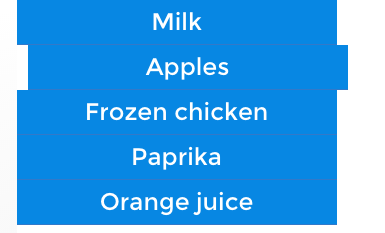
The slightly-sideways bounce is also a sign of things to come: elements slide out of sight in the same direction of the bounce.
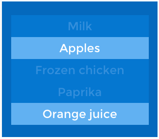
Differentiation also helps users figure out what’s active. This demo shows how high-contrast elements appear to be more active than their low-contrast counterparts. In the first example, “Apples” and “Orange juice” tappable, helping users understand what high contrast colors mean.
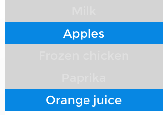
In the second example, notice that “Orange juice” breaks the rule by not being tappable. That’s bad news: having established a precedent, one link that doesn’t behave as expected will confuse users.
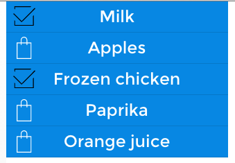
Icons are another common convention that users may try to tap. In this case, tapping icons toggles their state. Unlike the previous examples, these icons give users the chance to undo their actions — an important part of making people feel they’re in control and free to experiment.
Finally, the UI should work as quickly as possible. As we said before, users need instant feedback about their actions. This example feels buggy because the tappable elements are sluggish. Non-interactive elements won’t respond at all; interactive elements that respond after a few milliseconds make users second-guess their actions. Exceed one second, and they start to feel like they’re losing control.

Takeaway
Interaction design isn’t about how interfaces behave, it’s about how people behave, and then adapting technology accordingly.
It’s a two-part challenge. First, you must know your target users on a level that reveals what they like and what they expect. Second, you must figure out how to satisfy those needs given your technological constraints. If you get those right, you’ll have the building blocks to create interactions that delight your users.
Take what you’ve learned here today and create your own animated prototype in UXPin (or start a free trial.)


UXpin's Blog

- UXpin's profile
- 68 followers

