
UXpin's Blog, page 145
November 23, 2015
What Inspires You?

Inspiration.
That’s a very heady word. It has one definition. But really has different meanings for everyone. And it can conjure up images of posters lining the walls of a sterile office. However, inspiration is powerful. Whether we like to admit it or not, we seek it out everywhere we go, in everything we see and hear.
Around these parts at UXPin, we’ve looked to those who came before us in physical product design to inspire the creation of our redesigned platform. We looked to the work of Dieter Rams’ work with Braun. We looked to car design. We looked at the world around us.
We even used music to spark the imagination of the design team. Our CEO Marcin Treder used a little Yo-Yo Ma as the soundtrack for a screencast showcasing his ideas for the redesigned UXPin.
So now, we’re turning inward to see what further inspires our team, which we want to share with you. First up is Yvonne Campbell. She shares with us why calligraphy ignites her creativity.
This week, we’ll share a few more stories from our team on their inspiration. But we’re not only looking at ourselves, we want to know what inspires you as well. You can tweet @UXPin with the hashtag #youinspire #uxpin. Or post a picture to your Instagram account! We want to know more about what fuels your work.

The post What Inspires You? appeared first on Studio by UXPin.


November 16, 2015
M-Dot Sites Are Dying, Long Live Responsive Design

It’s official: the internet lives on mobile.
With mobile browsers overtaking desktop, a mobile-friendly site is no longer just a “nice to have”. This requires a shift in the web design process that M-dot sites just can’t sustain in the long term.

Source: “Boston Globe responsive website, featuring Apple Newton.” Antoine Lefeuvre. Creative Commons.
In this article we’ll explain why M-dot sites aren’t future-proof, and why responsive design is the responsible way to build mobile-friendly websites.
The Vulnerability of M-Dot Sites
Back when mobile browsing was new, M-dot sites made a lot of sense. Their faults could have been chalked up to inexperience — designers were scrambling to keep up with users before the mass proliferation of mobile devices.
Now, some years later, mobile devices became more complex, thanks to tablets and varying screen sizes.
So what exactly is mobile? Smartphone, tablet… watch, glasses? Even limiting it only to smartphones, what size screen? The diversity of mobile devices has grown exponentially since M-dot sites were first used.
This isn’t just our speculation, either. Pure Oxygen Labs reports that last year M-dot sites fell 20%, from 79% in 2013 to 59% in 2014, while responsive and adaptive (dynamic serving) sites rose 37% collectively. Of course, some stalwarts remain (like Facebook and Zappos, who maintain a M-dot site mostly for site load advantages), but it’s fairly safe to say that M-dot sites are generally dying out.

Photo Credit: Zappos
Let’s explore some of the reasons to abandon M-dot sites:
Users visit the full site anyway — Research from Web Performance Today shows that about a third (35%) of users choose to go to the full site if given the option.
Users spend more time on the full site — The same research states users spend 5.5 times longer on full sites than M-dots.
Full sites yield more revenue — The study also calculated that 79% of revenue from mobile sales came from users on the full site.
SEO/Google trouble — According to Google’s own guidelines, responsive sites will likely rank better. Not using an M-dot is a automatic boost in SEO.
Redirect time — While M-dot sites load faster in theory, the extra time of redirecting from your full site to the M-dot (unless the user types the M-dot’s URL) is unnecessary. Alongside the other drawbacks, is it worth it?
Social sharing problems — M-dot links opened on a desktop are, at best, ugly. Given how this is not even an issue with responsive design, the path to better social settings is clear.
Expensive maintenance — When you add an extra codebase, you also add more maintenance cost in the long-run. You’ll either need to deal with twice the work or use a server-side solution, both of which are more expensive than a responsive site.
Mobile devices aren’t a single screen size — It’s ironic that what was once the greatest strength of M-dot sites is now its greatest weakness. M-dot sites are designed for a specific screen size, but mobile devices range from 320×240 for some smartphones up to 768×1024 (and beyond) for tablets. It just doesn’t make sense to serve the same layout to all those screens.
Add them all up and you start to see the cracks.
Grab design ebooks created by best designers All for free Download 'Responsive & Adaptive Web Design' FOR FREE! Download
 Download
 Download
 DownloadDo you want to know more about UI Design?
Advantages of Responsive Design
Responsive design, or RWD, puts many mobile concerns at rest with its fluid grid layouts. Designers can optimize the arrangement of a site’s elements through clever use of CSS media queries. The heart of the site remains the same — just the mechanics change.


Of course, responsive design is not perfect. Its uniformity does not allow for catering to the fine-details of a device, including many of mobile’s more advanced control features like gyroscopes. RWD also requires a new code base, which might mean longer development and upfront costs (but less maintenance cost in the long term).
All things considered, the advantages make responsive design well worth the effort:
Easier to maintain — Once the codebase is built, you only have to manage one, single entity. Having only one entity also reduces maintenance costs.
Better SEO — Google recommends single-URL sites for better search results. Furthermore, any SEO strategies you use only need to be implemented once.
Better Analytics and Research — Consolidating to a single URL almost means more accurate analytics data. With tools like Google Analytics equipped for multi-device tracking, you’ll be able to understand your users’ behaviors more easily.
Social Sharing — Because the same link is used for every device, sharing is never a problem.
Tips for Responsive Design
Here’s some useful guidelines for responsive design:
Know your breakpoints — Paying attention to breakpoints is the most important technical aspect for RWD. For a handy reference guide, see Media Queries for Common Device Breakpoints.
Card interface — The card UI pattern is a perfect fit for responsive design. With its clear organization, flexible arrangement, and “button” appearance, this interface works equally well on every device.
Trim the fat — The prominence of mobile devices is one of the reasons minimalism has become popular recently. Removing all unnecessary design elements makes it easier to fit the ones you need in any screen size.
Mobile-first process — Design the mobile layout first, and then work up. This starts you out with only the bare essentials of your site and UX — it’s much easier to add as you scale up than to remove as you scale down. For a step-by-step guide to this process, download UXPin’s Responsive & Adaptive Web Design.

Flexible images — Images need to be scaled and sometimes cropped at different sizes. Don’t assume the same image will look good on all devices. For more on the details, Ethan Marcotte gives a thorough tutorial.
Give buttons a large clickable area — According to Fitts’s Law, every button should have a maximized clickable area (for example, not having only the text clickable). This advice is especially important when the size of the button varies.
Don’t forget device-specific attributes — To reduce RWD’s natural drawback, account for device-specific features like gesture controls or hover content. Remember a desktop’s hover animation can become a mobile device’s touch animation.
If you’d like some technical advice on coding, this article by Kayla Knight can help. If you have questions about the CSS queries, read this article by Pete LePage.
Takeaway
Responsive design is clearly more suited not just to mobile design, but multi-device design in general. Here are the key takeaway points:
M-dot sites limit UX consistency, SEO, and social shareability; regardless, users prefer full sites and tend to spend more time and money there.
The documented multi-device usage of the average browser promotes UX consistency and the capability of completing the same task on different devices.
While not perfect, RWD offers the flexibility and design convenience to make it one of the most effective cross-platform design strategies.
If you found this article helpful, read more about responsive design and other trends in UX Design 2015 & 2016. The free guide deconstructs 71 digital design examples into useful techniques for everyday UX design.

The post M-Dot Sites Are Dying, Long Live Responsive Design appeared first on Studio by UXPin.
November 13, 2015
4 UX Documents To Help You Fully Understand Your Users
No matter what process or documentation you use, one guideline always remains relevant: design for the user.

Photo Credit: “ Anna .” Stefano Montagner. Creative Commons .
Understanding — even empathizing — with the user is the key to designing a product that they will choose, even in a flooded market. But it’s no coincidence that one of the most important feats of design is also one of the most difficult. That’s what the documents in this chapter come in — to help you understand the people you’re designing for.
1. User Personas
User personas are perhaps the most important document you’ll create for analyzing users. They are the foundation for the rest of user documentation, which expands on personas for deeper insights. Under the right circumstances you can get away with skipping some of the other user documents, but skipping personas is not at all recommended.
Purpose
Personas are the most important person in the room when making design decisions. The psychology, behaviors, and demographics of your target users feed into these fictional identities.
Personas make the data more comprehensible by giving it a name and a face, instead of cold numbers and words without context. Designers use personas at every stage of the process and every important design question. Simply asking yourself “which options would this persona enjoy most” allows you to hone in on creating a product that will appeal most to a specific type of person.
This may seem lofty to designers who never used such “imaginary friends” before, but it’s been proven that personas directly increase the success of the final product.
Best Practices
Personas can be as large or as small as you need them to be. The important concern is not how much information they contain, but that every piece of information is relevant and supported by product usage data.
Here’s the process we follow at UXPin to create more data-driven personas:
Examine usage data in our app, segmenting users based on overall engagement. E.g., people who started a trial but didn’t buy, people who started a trial and bought, etc. Once we’ve defined the segments, we look at how they behave in the app based on events created in KISSMetrics.
To add a qualitative dimension, we interview ~30 users total from all segments to try to understand the “why” behind the data.
Based on quantitative data and interviews, we can start plotting out patterns that eventually form our user personas.
While the type of data on display can change, typically the best personas all have the following:
Photo & Name — Even if just a stock image, a photo helps to think of your persona as a real person. Avoid celebrity photos and use a real name instead of “Pete the Power User”.
Demographics — A good reference guide for the basic groups you’re targeting.
Personality — While a detailed narrative gives the best description, at the very least include a few relevant traits like “spontaneous” or “lazy.”
Technological Expertise — This shows the level of complexity to make the system, or maybe how much explanation is needed for certain functions.
Platforms — On which platforms your user will likely use your product.
Goals (Motivations) — These can be divided into what your user hopes to accomplish with your product, as well as their life goals for understanding their character.
Personal Quotes/Mottos — A personal quote is a shortcut to establishing the persona’s character.
While detail is always good, don’t get carried away. Your persona should only be as thorough as it is useful, and there will come a point where your time is better spent designing.
Spectrum scales are the key to boiling down dozens of people into actionable patterns. Plot out 5-10 scales for different user characteristics based on people you’ve researched and interviewed. As patterns emerge across the different characteristics, you can see where multiple people can be represented by a single persona.
The persona itself should be readily available to allow the team to check it (or share it) easily when the need arises. Share them with the team, print them out, and refer to them often.
Grab design ebooks created by best designers All for free Download 'UX Design for Startups' FOR FREE! Download
 Download
 Download
 DownloadDo you want to know more about UI Design?
2. User Stories
Once you have your personas set up, it’s time to use them. A good first step is creating a user story. These are simple sentences or small paragraphs that elaborate on the user’s motivations and goals.
User stories typically follow this format:
As a [type of user], I want [a feature] so that I can [complete a goal].
For example, user stories for some UXPin customers would look like this:
As a marketer, I want to quickly offer feedback on designs so that I can return to my daily non-design work.
As a UX designer, I want to consolidate feedback from all teams so that I don’t waste time digging through email chains.
Purpose
User stories allow designers to hone in on the user goals and motivations, which can otherwise get lost with all the other information. As the most important element to consider during a design, your users’ goals should be clearly defined. User stories relate them in a digestible snippet that’s easier to comprehend than dry requirements, sometimes written from a company-centric perspective.
Tom Brinton also points out that user stories prevent “feature creep” — an unending cycle of adding extraneous features — by zeroing in on only the essentials.
Best Practices
User stories are quick and easy, but also insightful, all of which make them a great collaboration tool. Trying opening up participation to the entire team — perhaps in a Google spreadsheet like this — so that you document a broad range of company goals.
Don’t forget that the value of user stories is their simplicity: they should be succinct and meaningful, and written in plain English. This also aids in collaboration across departments, since not everyone will know each other’s jargon.
At the same time, be specific. Dive into your user research (especially interviews) to fill in the “So that…” section as accurately as possible. The hardest part about user stories isn’t deciding the core tasks, but then understanding why.
3. User Scenarios
Now you have your personas and their goal. A user scenario explains the step-by-step process for getting there, including which pages they go to, where they click, and how long each stage takes.

Photo Credit: Shlomo Goltz. “ A Close Look at Personas: What They Are and How They Work (Part 1) .” (with permission from Smashing Magazine)
Purpose
User scenarios create the context behind the user stories.
What are the specific situations in which that user story might occur? You really start to explore the user’s emotions during the process, helping to not just understand the user, but to empathize with them.
In the above example, note the level of detail we add so that we understand the user’s logical and emotional needs.
Best Practices
The format of the user scenario depends your needs: it could be a bulleted list with statistics listing the technical details (“5 seconds on the home page until he notices the log in link in the corner”) or it could delve into emotional details, reading more like a narrative than a UX document (“eager to get started, his eyes frantically scan the home page until finding the log in link”).
Whatever style you choose, keep these factors in mind when determining how your users act:
Behavior – Are there any existing user habits you must account for?
Motivation – How important is accomplishing their goal, and how will that impact their decision-making?
Environment – Where are they using your product? Work, home, and on the go all have different conditions and distractions. Moreover, what device are they using?
External Factors – These are miscellaneous factors that impact their usage, from their internet speed to time constraints.
It’s quite normal to create multiple scenarios for each user story.If you already have a Google spreadsheet for the user stories, it’s as simple as adding more columns.
As with the other documentation, details are good, but don’t overdo it. There’s no need to plot out the process for every task — handling the most common ones well will give you a good enough understanding to plan for the less common ones.
For more advice on user scenarios, including more examples, read this article by Sabina Idler, a UX researcher and consultant.
4. Customer Journey Maps
Personas, user stories, and user scenarios will give you enough understanding of your user within the context of your product, but you must create a customer journey map if you want to understand the entire brand experience.
Customer journey maps are the ultimate user document. They don’t limit themselves to the beginning and end of a goal — they span the periods before and after the experience, so you account for all the lasting effects.
Purpose
A good product of any type anticipates user wants before even the user knows, creating a satisfaction that can best be described as “magical” — that delightful feeling when a product you’re using just intuitively “clicks.” Customer journey maps help to isolate the opportunities in which you can design for such moments.
For a real world example, Joyce Hostyn points us towards Domino’s (slides 96-97). The pizza makers realized that, in the time surrounding their interaction with the product — not just interacting with the product itself — users experienced anxiety between the order and the delivery. They then implemented the Domino Tracker, which allows users to track the status of their delivery before it arrives.
These emotional insights can make the difference between a product that’s used, and one that’s loved.
Rian van der Mere praises customer journey maps for their aid in prioritization and keeping designers focused on content. As he points out, this document can be referenced with each new design idea to see if on track with the ultimate company goals, or something unnecessary.
Best Practices
At UXPin, we use the following customer journey map template:

Photo Credit: UXPin
The basic setup breaks the entire process into the key steps, including the time before and after the interaction. For each step, the customer journey map addresses the users’ states of mind in these areas:
Goal — What do they hope to accomplish at this step?
Expectations – How do they think this step will go? Outside influences and competitors’ product have big impact on this.
Process –- How do they hope to accomplish their goal? Notice the difference between their chosen process and the best possible process.
Rating of Experience – If the user had to rate this stage, what would they say?
The Good – What does the user like about this stage?
The Bad – What doesn’t the user like about this stage?
Improvements – Taking all other information into account, what can you change to improve your user’s experience?
Adam Richardson suggests also addressing questions and barriers. Examining a design from a different perspective may reveal that problematic aspects of a design, such as areas of confusion and obstacles interfering with the user achieving their goals.
This article by Megan Grocki for UX Mastery further dissects the components of customer journey maps and provides more details into the theory and best practices behind them.
Takeaway
As we’ve mentioned before, the design process is rarely linear. In an ideal world without deadlines or other restraints, you could build all these documents at their leisure before even considering the design. But that’s not always the case, and sometimes these documents can come “out of order.”
We highly recommend creating and applying user documents early on, while you’re still defining the product. However, they can still be revised, improved, or replaced later on in the process, especially if new data comes in. And if you’re testing early and often like we suggest, this will be likely.
If you enjoyed this article, check out our free e-book UX Design Process Best Practices, written with our own years of experience planning, designing and testing UXPin.

The post 4 UX Documents To Help You Fully Understand Your Users appeared first on Studio by UXPin.
4 UX Documents That Will Help You Fully Understand Your Users
No matter what process or documentation you use, one guideline always remains relevant: design for the user.
Photo Credit: “ Anna .” Stefano Montagner. Creative Commons .
Understanding — even empathizing — with the user is the key to designing a product that they will choose, even in a flooded market. But it’s no coincidence that one of the most important feats of design is also one of the most difficult. That’s what the documents in this chapter come in — to help you understand the people you’re designing for.
1. User Personas
User personas are perhaps the most important document you’ll create for analyzing users. They are the foundation for the rest of user documentation, which expands on personas for deeper insights. Under the right circumstances you can get away with skipping some of the other user documents, but skipping personas is not at all recommended.
Purpose
Personas are the most important person in the room when making design decisions. The psychology, behaviors, and demographics of your target users feed into these fictional identities.
Personas make the data more comprehensible by giving it a name and a face, instead of cold numbers and words without context. Designers use personas at every stage of the process and every important design question. Simply asking yourself “which options would this persona enjoy most” allows you to hone in on creating a product that will appeal most to a specific type of person.
This may seem lofty to designers who never used such “imaginary friends” before, but it’s been proven that personas directly increase the success of the final product.
Best Practices
Personas can be as large or as small as you need them to be. The important concern is not how much information they contain, but that every piece of information is relevant and supported by product usage data.
Here’s the process we follow at UXPin to create more data-driven personas:
Examine usage data in our app, segmenting users based on overall engagement. E.g., people who started a trial but didn’t buy, people who started a trial and bought, etc. Once we’ve defined the segments, we look at how they behave in the app based on events created in KISSMetrics.
To add a qualitative dimension, we interview ~30 users total from all segments to try to understand the “why” behind the data.
Based on quantitative data and interviews, we can start plotting out patterns that eventually form our user personas.
While the type of data on display can change, typically the best personas all have the following:
Photo & Name — Even if just a stock image, a photo helps to think of your persona as a real person. Avoid celebrity photos and use a real name instead of “Pete the Power User”.
Demographics — A good reference guide for the basic groups you’re targeting.
Personality — While a detailed narrative gives the best description, at the very least include a few relevant traits like “spontaneous” or “lazy.”
Technological Expertise — This shows the level of complexity to make the system, or maybe how much explanation is needed for certain functions.
Platforms — On which platforms your user will likely use your product.
Goals (Motivations) — These can be divided into what your user hopes to accomplish with your product, as well as their life goals for understanding their character.
Personal Quotes/Mottos — A personal quote is a shortcut to establishing the persona’s character.
While detail is always good, don’t get carried away. Your persona should only be as thorough as it is useful, and there will come a point where your time is better spent designing.
Spectrum scales are the key to boiling down dozens of people into actionable patterns. Plot out 5-10 scales for different user characteristics based on people you’ve researched and interviewed. As patterns emerge across the different characteristics, you can see where multiple people can be represented by a single persona.
The persona itself should be readily available to allow the team to check it (or share it) easily when the need arises. Share them with the team, print them out, and refer to them often.
Grab design ebooks created by best designers All for free Download 'UX Design for Startups' FOR FREE!DownloadDownloadDownloadDownloadDo you want to know more about UI Design?
2. User Stories
Once you have your personas set up, it’s time to use them. A good first step is creating a user story. These are simple sentences or small paragraphs that elaborate on the user’s motivations and goals.
User stories typically follow this format:
As a [type of user], I want [a feature] so that I can [complete a goal].
For example, user stories for some UXPin customers would look like this:
As a marketer, I want to quickly offer feedback on designs so that I can return to my daily non-design work.
As a UX designer, I want to consolidate feedback from all teams so that I don’t waste time digging through email chains.
Purpose
User stories allow designers to hone in on the user goals and motivations, which can otherwise get lost with all the other information. As the most important element to consider during a design, your users’ goals should be clearly defined. User stories relate them in a digestible snippet that’s easier to comprehend than dry requirements, sometimes written from a company-centric perspective.
Tom Brinton also points out that user stories prevent “feature creep” — an unending cycle of adding extraneous features — by zeroing in on only the essentials.
Best Practices
User stories are quick and easy, but also insightful, all of which make them a great collaboration tool. Trying opening up participation to the entire team — perhaps in a Google spreadsheet like this — so that you document a broad range of company goals.
Don’t forget that the value of user stories is their simplicity: they should be succinct and meaningful, and written in plain English. This also aids in collaboration across departments, since not everyone will know each other’s jargon.
At the same time, be specific. Dive into your user research (especially interviews) to fill in the “So that…” section as accurately as possible. The hardest part about user stories isn’t deciding the core tasks, but then understanding why.
3. User Scenarios
Now you have your personas and their goal. A user scenario explains the step-by-step process for getting there, including which pages they go to, where they click, and how long each stage takes.
Photo Credit: Shlomo Goltz. “ A Close Look at Personas: What They Are and How They Work (Part 1) .” (with permission from Smashing Magazine)
Purpose
User scenarios create the context behind the user stories.
What are the specific situations in which that user story might occur? You really start to explore the user’s emotions during the process, helping to not just understand the user, but to empathize with them.
In the above example, note the level of detail we add so that we understand the user’s logical and emotional needs.
Best Practices
The format of the user scenario depends your needs: it could be a bulleted list with statistics listing the technical details (“5 seconds on the home page until he notices the log in link in the corner”) or it could delve into emotional details, reading more like a narrative than a UX document (“eager to get started, his eyes frantically scan the home page until finding the log in link”).
Whatever style you choose, keep these factors in mind when determining how your users act:
Behavior – Are there any existing user habits you must account for?
Motivation – How important is accomplishing their goal, and how will that impact their decision-making?
Environment – Where are they using your product? Work, home, and on the go all have different conditions and distractions. Moreover, what device are they using?
External Factors – These are miscellaneous factors that impact their usage, from their internet speed to time constraints.
It’s quite normal to create multiple scenarios for each user story.If you already have a Google spreadsheet for the user stories, it’s as simple as adding more columns.
As with the other documentation, details are good, but don’t overdo it. There’s no need to plot out the process for every task — handling the most common ones well will give you a good enough understanding to plan for the less common ones.
For more advice on user scenarios, including more examples, read this article by Sabina Idler, a UX researcher and consultant.
4. Customer Journey Maps
Personas, user stories, and user scenarios will give you enough understanding of your user within the context of your product, but you must create a customer journey map if you want to understand the entire brand experience.
Customer journey maps are the ultimate user document. They don’t limit themselves to the beginning and end of a goal — they span the periods before and after the experience, so you account for all the lasting effects.
Purpose
A good product of any type anticipates user wants before even the user knows, creating a satisfaction that can best be described as “magical” — that delightful feeling when a product you’re using just intuitively “clicks.” Customer journey maps help to isolate the opportunities in which you can design for such moments.
For a real world example, Joyce Hostyn points us towards Domino’s (slides 96-97). The pizza makers realized that, in the time surrounding their interaction with the product — not just interacting with the product itself — users experienced anxiety between the order and the delivery. They then implemented the Domino Tracker, which allows users to track the status of their delivery before it arrives.
These emotional insights can make the difference between a product that’s used, and one that’s loved.
Rian van der Mere praises customer journey maps for their aid in prioritization and keeping designers focused on content. As he points out, this document can be referenced with each new design idea to see if on track with the ultimate company goals, or something unnecessary.
Best Practices
At UXPin, we use the following customer journey map template:
Photo Credit: UXPin
The basic setup breaks the entire process into the key steps, including the time before and after the interaction. For each step, the customer journey map addresses the users’ states of mind in these areas:
Goal — What do they hope to accomplish at this step?
Expectations – How do they think this step will go? Outside influences and competitors’ product have big impact on this.
Process –- How do they hope to accomplish their goal? Notice the difference between their chosen process and the best possible process.
Rating of Experience – If the user had to rate this stage, what would they say?
The Good – What does the user like about this stage?
The Bad – What doesn’t the user like about this stage?
Improvements – Taking all other information into account, what can you change to improve your user’s experience?
Adam Richardson suggests also addressing questions and barriers. Examining a design from a different perspective may reveal that problematic aspects of a design, such as areas of confusion and obstacles interfering with the user achieving their goals.
This article by Megan Grocki for UX Mastery further dissects the components of customer journey maps and provides more details into the theory and best practices behind them.
Takeaway
As we’ve mentioned before, the design process is rarely linear. In an ideal world without deadlines or other restraints, you could build all these documents at their leisure before even considering the design. But that’s not always the case, and sometimes these documents can come “out of order.”
We highly recommend creating and applying user documents early on, while you’re still defining the product. However, they can still be revised, improved, or replaced later on in the process, especially if new data comes in. And if you’re testing early and often like we suggest, this will be likely.
If you enjoyed this article, check out our free e-book UX Design Process Best Practices, written with our own years of experience planning, designing and testing UXPin.
The post 4 UX Documents That Will Help You Fully Understand Your Users appeared first on Studio by UXPin.
How to Use UI Patterns to Prototype Faster
If there’s a pattern to using patterns, it lies in the tools designers use to create them.
Having a standard library of reusable, easy-to-access elements is vital because the faster we build prototypes, the faster we can iterate through them. Quick iterations in the beginning lead to more time for development. Development time translates to beating deadlines. And that means happier clients, stakeholders, and users.

Photo credit: Free UI Kit
So it’s not surprising that designers take full advantage of pre-made elements for low-fidelity and high-fidelity prototypes.
But pre-made patterns have their drawbacks, and overcoming their shortcomings takes effort and awareness of what is going on — and how ignorance of that process is actually strength.
Explaining the Gray Box
Those who use prototyping tools face a difficult challenge.
Elements in their designs must represent specific components like input form fields, text blocks, and images. They also need variety: not just “form fields” but text areas, radio buttons and single-line input fields; not just “text” but paragraph text boxes of any size and shape; placeholder images, imported photos and plain ol’ “pic goes here” boxes.

The challenge is creating elements that clients and team members understand without dictating the final look-and-feel in a prototype. It’s not about using the best fidelity – it’s about using the right fidelity.
Start with a lo-fi prototype so you can explore user flows and basic usability (with feedback from users and your team), then iterate into a hi-fi prototype after testing. Don’t dive immediately into high fidelity, no matter how tempting the idea of visual finesse.

Above: A pattern in a lo-fi prototype with just enough detail (left) and somewhat lacking in detail (right) to indicate what’s going on.
The easiest — and most common — solution is to start with grayscale boxes that may (or may not) get filled in later. Gray boxes are design-agnostic, meaning they could apply to anything. Boxes say “something will go here, we just don’t know what yet” or “pay attention to the big picture, don’t get bogged down in the details.”
Thus most prototyping tools, including UXPin, come with many pre-made elements that could mean many things. Unadorned boxes, for example, can stand in for images or header backgrounds. Buttons can let testers submit forms or signify calls to action. But sometimes gray rectangles are a little too vague. Even those responsible for the design can forget what every abstract shape means.
The opposite approach is to create more recognizable, less generic objects. Radio buttons and checkboxes don’t have to resemble each other. Browser windows can have round corners on the outside, and sharp corners inside their frames. Text of varying sizes sets headings apart from paragraphs, and paragraphs apart from calls to action. The more specific an element is, though, the less likely it will get used. Not every every project will need, say, a calendar or video window.
The best prototypes bridge the gap that includes generic and specific objects. These objects become patterns as people learn to recognize them for what they are. Patterns emerge from understanding what, exactly, each element is without spelling it out. The prototype is therefore fast to create and provides just enough detail for users to focus on accomplishing tasks.

Above, a more-specific object (top) communicates its purpose better than an abstract set of unlabeled shapes (bottom).
Pattern Libraries Are Prototyping Shortcuts
Prototypes are built with a set of patterns, often called libraries, that contain elements designers don’t have to invent. At the time of this writing, UXPin has more than 900 of them.
It’s easy to drag a pattern into a design and discard it later. This allows designers to focus on solving problems without gnashing their teeth over visual design details. Instead they can design for user actions like whether or not to let travelers give hotels a star rating, or if that’s overkill.
Designers should make decisions, not patterns.

In programming terms, patterns are instances of a class; in practical terms, they’re shapes in a sidebar you drag into your design. Make as many as you need of the same thing. “What if we have a calendar here?” designers ask, and drag-n-drop one into place. Patterns are disposable. Prototyping tools make them inexpensive.
Let’s look how UI pattern libraries help you prototype faster while making the design easy to understand.
Reusable elements
The mockup above recreates a standard search pattern with a twist: This one’s geared for finding a hotel. It includes some technical (and practical) requirements like check/out dates, number of people and location.
Notice that the whole design uses only three kinds of elements: Text, input fields, and a single button. They’re instantly recognizable for what they are. Not only that, but they’re arranged almost identically. A text label is set atop each input field, making them easy to copy/paste throughout the prototype.
In the beginning stages of design, visual details don’t matter as much, so it’s more important that the design structure makes sense (which UI patterns help).
Custom libraries
One-off elements are quick to create and customize. Whenever you need to repeat yourself precisely, though, you need some smarts.

Certain parts of a project tend to remain the same on every screen but, like anything in development, change over the course of the project. For example:
Site-wide headers
Primary navigation bars
Tappable logos
A standard copyright statement
Look sharp and you’ll notice a pattern in these elements. Each is part of the overall website design and branding. In addition, some parts — particularly the navigation — may change on multiple wireframes throughout a project.
Patterns and Prototypes Work Together
Patterns and prototypes complete each other. You can’t have one without the other … unless you don’t mind creating everything from scratch. But even then you’ll find yourself recreating what’s come before.
Prototypes must communicate the solutions that designs bring. Their patterns must be recognizable as distinct elements — for example, that calendar widget — without declaring that its final look will be a particular style, color or typeface.
As you work, find a good tool that becomes an extension of yourself. The quicker you forget that you’re using it, the quicker you’ll iterate through the design process.
If you want to bring UI patterns to life, give UXPin a try with our free trial and explore our UI templates and patterns.

The post How to Use UI Patterns to Prototype Faster appeared first on Studio by UXPin.
Free E-Book: The Indispensable Designer

Design is a must-have for companies, even the most engineering-focused ones. Designers are now in a position to influence entire organizations. But what does it take to become an indispensable designer?
Our free digital library welcomes its newest addition: The Indispensable Designer — A Guide to Influential Design. This collection of our best articles examines thoroughly the traits any designer should have to affect company-wide change.

Our anthology of six articles is filled with real world advice. You’ll find dozens of practical tips on how to use design to influence and inspire others on your team. There are articles from our CEO Marcin Treder and practicing experience designer Alex Gamble.

This e-book will help you:
Learn how to make you indispensable and stand out from the rest.
Get a grasp on the best practices for UX Design, such as usability testing and other daily responsibilities.
See how you can create habits and traits that influence your entire team.
Understand how to make the product design workflow work for everyone on your team, even if they aren’t designers.
Know how to use feedback to your advantage.
Download this free e-book now.

The post Free E-Book: The Indispensable Designer appeared first on Studio by UXPin.
November 12, 2015
3 Mini Style Guides to Get You Started

The three “lite” style guides that we talk about here aren’t perfect replacements for a full, front-end style guide. They can be used as either time-savers, or better yet complements to a more complete style guide that comes later.

Photo Credit: “Discussing the mood boards.” foam.
Creative Commons.
For example, front-end guides can’t match the creative and atmospheric benefits of mood boards, which are much more useful in the earlier stages of the design process. In the later stages, though, developers won’t be able to copy-and-paste code from a mood board.
If you have the time, start with these three, then expand them into complete style guides.
1. Mood Boards
Mood boards are the most artistic, but most abstract, of all style guides. They specialize in setting an project’s atmosphere and artistic style but little else aside from that. What they lack in technical details, they make up for in concept exploration.
Popularized by industries such as fashion and interior design, these stylistic collages have been proven effective across many visual industries, including web UI design.
Let’s look at this example from ModBaby. Their mood board is more than just a Pinterest-style collage – it’s a canvas that shows (rather than tells) the typography, colors, and overall feel for the site. Another key component are the personal adjectives (“soft,” “sweet,” etc.), which textually suggest the mood of the site.
Mood boards work best at the beginning of the design process: they aid in the inspiration and exploration of ideas, at a time when ideas are most needed. An eye-pleasing mood board will keep the entire team moving in the same direction before more substantial style decisions come into fruition. However, as more consistent frameworks develop throughout the design process, the mood board loses effectiveness.

Photo credit: Duoh
In addition to helping you think about consistency early in design, mood boards are also great for design collaboration. Since clients and stakeholders may have difficulty articulating the details of their ideas, mood boards provide a clear visual direction for productive feedback.
To learn more about mood boards, check out this list of 24 pro tips. When you’re ready to start, here’s a list of helpful tools.
Grab design ebooks created by best designers All for free Download 'The Indispensable Designer: A Guide to Influential Design' FOR FREE! Download
 Download
 Download
 DownloadDo you want to know more about UI Design?
2. Style Tiles
Style tiles are a transitional style guide more specific than mood boards, but lacking the intricacy of brand or front-end guides.
The inventor of style tiles, designer Samantha Warren, describes them as a way to “establish a direct connection with actual interface elements without defining layout,” and that they, “work well for clients who have established brands and need them to translate smoothly to the web.”

Source: Samantha Warren, StyleTil.es.
Creative Commons Attribution-NonCommercial 3.0 Unported License.
As you can see in Warren’s example, style tiles maintain the same collage look and feel of a mood board, but with more concrete information. Notice how the style tile provides details like typeface, font treatment, and recommended patterns.
Because they’re quick to make, style tiles work when first determining a site or app’s visual style, or when considering a redesign. If done well, style tiles can even replace mockups as a visual representation of the site or app’s theme.
Even if you need something meatier, this Compass extension can help you turn style tiles into a more complete style guide. Installation instructions are on the site.
3. Brand Style (Identity) Guides
Deviating from posters to manuals, the brand style or identity guide lists out all the rules and standards for a company’s brand. Extending far beyond simply the logo, it will affect the entire brand identity on websites/apps, advertising, business cards, public forums – anywhere, really.
Brand style guides will include design details such as fonts, colors, sizes, iconography, and logo placement. Aside from consistency, their overarching purpose is defining the personality of the brand – whether the tone is smart or sassy, or whether the first impression should be rugged or refined.
The brand style guide is like a Magna Carta that protects your identity, preventing less familiar employees from diluting your impact through poorly executed visuals. They cover any usage specifications concerning the brand, including:
Logo Usage – There are a lot of rules for logos: they may lose their effects at certain sizes, require a certain amount of space around them for more impact, change colors depending on the background, or have different variations depending on context (i.e., website vs. app).
Color – Companies are strongly identified by their colors – can you imagine a blue Coke can? Not only should you outline the brand’s preferred color scheme, but also the values of the specific hues. Include both HEX codes for web use, and CMYK (or Pantone) for print.
Typography – Aside from typeface, you’ll also want to specify weights and treatments, and any specific styles should be avoided. Brands may sometimes create highly customized typefaces ( ever notice that the Ls in Kellogg’s are different sizes?).
Iconography/Imagery – If the brand has its own specialized set of icons or images, include them (or a link) here. Chances are they’ll have multiple variations, each with their own individual rules for usage.
These are the essential fields that almost all brand guides cover. To go the extra mile, though, you can also include sections on:
Copywriting – The tone and language style for writing associated with the brand. This can include specific phrases to include, appropriate slang, or any words that are off-limits.
Medium-specific Instructions – Which rules apply only to web, mobile devices, various types of ads, brochures, etc
Brand Background – To paint a fuller picture of the brand, include its history, mission statement/vision, and personality.
Let’s take a look at a few examples.

Photo Credit: Adobe
Adobe’s 62-page brand style guide covers everything from visuals, typography, and usage across different mediums. This is proof that you can’t be too meticulous about brand identity.

Photo Credit: Facebook
Facebook takes a more lenient approach, with a boiled-down version of their brand guidelines on a public webpage , and the option to download a more comprehensive manual. This webpage is designed for quick reference, featuring digestible sections for downloading and using their different icons and screenshots, the general do s and don’t s, and download links to PDFs on using their brand in various scenarios.
Depending on how strong your brand identity is, you may or may not need a separate branding style guide – sometimes an individual section in the front-end style guide covers everything.
Takeaway: Style Guide Seeds
We always recommend a full front-end style guide. The above style guides can do in a pinch, but really they work better as iterative documents leading up to — not replacements of — full front-end guides.
The truth is that, in their simplicity and freedom, mood boards and style boards provide advantages a 100-page style guide doesn’t. In fact, the simpler version can even be the first step in creating a style guide, the acorn that spawns the oak.
Ideally, we recommend the best of both: create the smaller style guides above, and use them as the basis for the front-end style guide to come.
If you enjoyed this article, check out our free e-book Style Guides f0r Web UI with dozens of examples analyzed from Adobe, Facebook, Yelp and more.

The post 3 Mini Style Guides to Get You Started appeared first on Studio by UXPin.
November 10, 2015
4 Killer Tricks to Creating Lasting Mobile Moments

I was sitting in a Starbucks recently when I noticed that almost everyone was sitting alone with their laptops propped open with their coffee nearby.
Except, no one was actually working on their laptops. They were on their phones, swiping, typing, or just reading.
It then dawned on me that I was doing the same thing. It happens so frequently, we don’t even notice. In fact, people check their phones 150 times per day, starting with minutes after waking up. All this means that people aren’t sitting down with your app or mobile site for an extended period of time.
But, that doesn’t mean they are not engaged. In fact, according to Forrester’s “Mobile Moments Transform Commerce and Service Experiences,” 30% of US online adults have used an interactive map on their phones, while 22% are banking and 20% are shopping monthly on their phones. Consumers turn to their phones to reserve meals, cabs, and flights, as well as researching in-person purchases in brick-and-mortar stores. They complete their task quickly and then go about their day.
Such intermittent mobile moments call for intelligent microinteractions. This is so common-place that Google recently released a guide aimed primarily at marketers titled “Micro-Moments: Your Guide to Winning the Shift to Mobile.”
The guide focuses on three main tenets:
Be There
When someone picks up their phone, they most likely want to learn, do, find, or buy something right now. Your app or brand will only be useful if the user accomplishes what they set out to do quickly, easily and intuitively. Showing up in the right moment gets you a seat at the table.
Be Useful
Now that you have someone’s attention, be sure that you meet the correct need at the correct time, with just enough detail to allow a specific task to be accomplished. Context is the lynchpin to their mobile experience.
Be Quick
While many users are browsing their phones during off-time, being in a hurry is a large reason why they reach for their phones on the go. In fact, 29% of smartphone users will switch to another site or app if it doesn’t satisfy their needs – quickly. Execute user tasks in as fewest steps as possible.
As UX designers and practitioners, perfecting these mobile micromoments means distilling our design best practices down to the essential. We know that the most successful apps do one thing well. They’re focused, and they execute the fundamentals flawlessly.
Simplicity is key, yet simplicity to the user means an underlying complexity for us as designers and developers. So how do we deliver relevant, contextual, and simple interactions in bite-size chunks exactly when the user needs them?
Grab design ebooks created by best designers
All for free
Download
Download
Download
 DownloadDo you want to know more about UI Design?
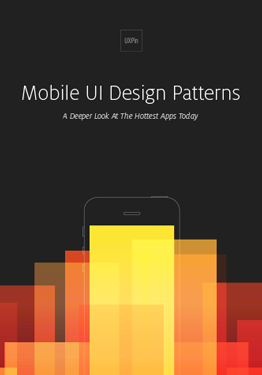
Download 'Mobile UI Design Patterns' FOR FREE!
Download e-book for freeClose1. Examine the User Journey
In order to anticipate your users’ needs, you first need to understand them.
Whether you are designing a new mobile experience or refining an existing one, deconstruct your users’ journey on and offline. In order to design a good mobile experience, you need to know your user’s offline behavior and when they are interacting with your app.
For example, in the midst of getting directions on Google Maps, if the phone happens to shake, a message pops up asking for feedback. [show graphic] The implication here is that the user is frustrated. By expressing a physical motion in their offline world, the app responds to this mobile moment with an appropriate microinteraction – a modal offering assistance.
To make your own micro-moments relevant, start by creating an experience map of your users’ journey from start to finish. Note where the touch-points exist with your app or website. As you start to home in on your users’ needs and their context on- and offline, you can better understand how you can meet those needs quicker with fewer but more efficient interactions.
Now is a good time to talk to your users, as well. If you have time to conduct an ethnographic study, you can transform your users’ input to plot into pain points along the consumer journey. As you examine when and where each pain point pops up, you better understand how mobile moments arise.
For example, while I was working on the Cars.com mobile apps, we discovered that users were using their phones on the dealership lots as a rescue device to verify what the salesperson was telling them. We created a set of features with shortcuts to the precise information users needed and surfaced them up automatically once their device detected they were on the dealer lot. We only discovered this opportunity after following actual users on their car shopping journey from start to finish.
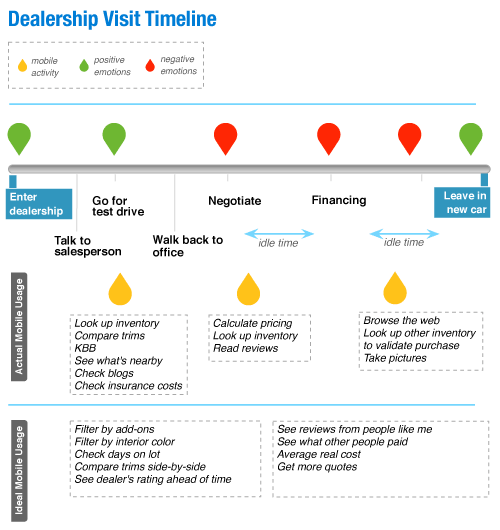
Photo credit: Marina Lin. Smashing Magazine.
2. Streamline Your User Flow
Once you know what your mobile moments are, examine the steps in your user flow and cut them down to the basics. Then, cut them down some more.
You don’t have to look much farther than Amazon’s 1-click to buy button and the effectiveness of eliminating an entire checkout flow. Rue La La followed suit with a Google Wallet Instant Buy button after discovering that 40% of their sales were coming from their mobile apps.
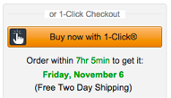
Photo credit: Amazon
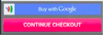
Photo credit: Rue La La
Start by creating your ideal user flow from start to finish. Then, take a step back to highlight only the most essential interactions. Can you anticipate your users’ needs a few steps down the road in order to eliminate them? Use cues such as time of day and location in order to fill in the blanks for your users and be there when they need you.
You’ll need to be judicial with the features in your app.
For example, Trulia displays listings nearby as soon as the app is opened. You can start viewing properties without much further interaction unless you choose to customize or save the search. Both of these secondary features are also available right on the same screen. Tertiary features such as mortgage calculators were de-prioritized and are now part of their own separate app.

Photo Credit: Trulia
3. Leverage the OS in Your Favor
The main lynchpin of a mobile moment, however, is to not open the app at all –at least not for the simple information-based tasks.
Leverage the device operating system in order to eliminate interactions for your users. Figure out where you can offload interactions to the notification screen, or even in the lock screen. Sometimes, the best interactions with your app doesn’t originate in the app at all.
iOS includes two types of notifications – local and remote. Local notifications are scheduled by the app and can inform users that a message has arrived, an event is about to occur, or the status of something has changed. For example, a calendar reminder that you have an upcoming meeting is a notification originating in the app itself. Remote notifications (also known as push notifications) come from the app’s remote server. Android also has widgets which you can show right on the home screen with information such as latest events, a music playlist, or message previews that are visible without the user ever opening the app.

Photo credit: The Next Web
Some apps, such as Uber, aso leverage other apps contextually to minimize the users’ need to specifically open their app (illustratating the Google Guide’s tenet of “Be There”). If the user looks up directions in Google Maps and chooses the Public Transportation option, the last item option on the list after, say, buses or trains is UberX with a cost estimate. The context and information for the user is set and all they have to do is tap the option to arrange an Uber pickup.

Photo credit: Google Maps
4. Talk to Your Users
Once you finalize your mobile moments, continue the conversation with your users. Never stop improving.
Optimize your app or mobile site continuously via A/B testing. Although A/B testing wasn’t possible before without releasing an update through the app store, many third party vendors in all price ranges now make it simple to install an SDK on your app that allows even a non-technical person to continuously run UX experiments. You can test call-to-action labels, placement, and icons, as well the type of notifications that work best for your users.
You can also conduct usability testing, either in person or remotely via services like UserTesting. Set up a few tasks and observe how your users accomplish them. When you watch how users complete core tasks, you’re better able to streamline the experience even more without losing context or clarity. Additionally, read and heed user reviews in the app store as you can glean and prioritize how you can improve your app more.
In conjunction to user testing, pay attention to analytics because what users say and what they do will vary. You can observe drop-off points and further improve on the user experience by trying alternative ways to let your users complete their tasks. You can also track time on task and engagement, though with micromoments, the less time a user is engaged with your app the better, provided that their tasks are being accomplished.
Conclusion
A famous quote attests, “If I had more time, I would have written a shorter letter.”
It’s not always simple to make something minimal, but we as designers can find ways to offload complexity for our very engaged but intermittent users.
If you found this article useful, check out our free e-book on Mobile Design Trends 2015-2016. You’ll find over 79 examples from Slack, Nike, Apple and many more.

The post 4 Killer Tricks to Creating Lasting Mobile Moments appeared first on Studio by UXPin.
November 9, 2015
Web Design Trends Analyzed: Hero Headers & Letterboxes

Full-width above the scroll images are one of the most popular trends in website design. Whether the image is still or a motion-based video, use of a hero header is definitely a popular option.
And that makes perfect sense. This format works great with plenty of different image types, fits into responsive design frameworks and appeals to users because of its highly-visual nature. In this post, we’ll show you how to use hero headers or a letterbox style to dazzle your users and catch their attention. But first, let’s examine the differences between the two.
Hero Header

Photo credit: Pierre’s Ice Cream Company
A hero header is an oversized display with a visual, text and navigation elements above the scroll in your design framework. The stacking and layering of the elements is completely up to the designer, but one of the most common uses is a photo with text and element overlays, such as Pierre’s Ice Cream Company above.
Hero headers can be built using existing images from your collection. Or you can create new imagery that boldly stands out. Or you could use a kit to mix-and-match pieces for a semi-custom look.
One thing that you’ll want to keep in mind is your use of images. You want something that’s distinct and stands out. Think about Apple — who are the masters of the hero header. In the example below, you’re immediately drawn into the copy by the cascading iPhones.

Photo Credit: Apple
Images can make or break a hero header. Choose the wrong image and visitors to your site will bounce out faster than a speeding bullet. Pick the right one and they’ll be drawn into your site, sticking around to see more of what you have to offer.
Letterboxing

Photo credit: Playstation
The letterbox style adds some additional styling and color to hero headers. When you visit a site that uses letterboxing, you’ll notice that a border frames the main image — like when you watch a movie on your TV. Below the image you’ll notice design elements such as navigation, search or branding.
Letterboxing allows the image to have more room and makes the page less cluttered. The image still remains the dominant on the screen. This style is easy to implement because the aspect ratios are very similar to the ones you’d use for the common social media cover photos. This is a definite bonus for brands looking to maintain a consistent visual across different channels.
Once again, be choosy when it comes to photo selection. You’ll want to be just as bold as with the typical hero header.
Now that we understand the slight difference between letterboxing and hero headers, let’s dive into how you can use them in your work.
Universal Appeal
The reason hero headers and letterbox style designs have become so popular is because they have an almost universal appeal. They work for a variety of content types and play particularly well with photos, video and animation.
All you really need to make the most of this trend is one great visual — are you sensing a theme yet?

Photo credit: PayPal
Hero headers are the perfect container for one bit of information. PayPal does this exceptionally well. Throughout the site, you’ll find a collection of hero images and messages that make the user stop and examine the site each time they visit.Text and button elements work seamlessly with each image so the user is drawn in to see if the content pertains to them.

Photo credit: Ride for the Child
Video works in much the same way as images when it comes to the hero-style design. It takes a strong video clip and well-written copy to draw users in. Ride for the Child accomplishes this with a fast-speed set of video clips to hold interest along with bold, oversized typography to really get users to click around.

Photo credit: Species in Pieces
Make the most of your illustrations or cool animations with a dominant design element. You can actually design an entire site around some of these cool elements, such as Species in Pieces. The interactive nature of the design combined with the hero-style image for a trendy look, but really keeps users with cool HTML interactions.
10 Design Tips For Better Hero Headers and Letterboxing
While the image will steal the show in this type of design, you still need to include essential elements, such as branding and a calls to action. It’s important to match these elements to the image; you might have to go a little bolder than you expect so that the visual weight of text and other elements works well with oversized visuals.
Here are 10 ways to do just that:
Consider dropping color for branding elements. Use a white or black logo so it does not compete with a colorful image.

Photo credit: Tom Cole Architecture
Design for contrast. Choose bold, easy to read typefaces that mesh with the visuals but stand apart from them. Don’t force the type onto the image. Sometimes it works best to place it just above or below the visual.

Photo credit: Teamgeek
Letterbox navigation is a real bonus. It gives you a simple container for necessary elements in a design package that’s easy for users to understand. (Bonus: Make the navigation sticky so users don’t get lost as they scroll.) If you aren’t feeling the letterbox style, try popout navigation, such as the hamburger style used by Teamgeek.
Consider the depth of the image. Design it so that users know what they are supposed to do. (A hero header is more than just a pretty picture.)

Photo credit: ESPN Media
Use a tint or fade. This helps to provide more contrast for text, buttons or other elements.
Consider mobile devices. Make sure your image works on all devices, even if this includes resizing or swapping out a larger image for a smaller one on a smaller device.

Photo credit: Urban Decay
Think about text in relationship to the image. If you are planning to use a text-on-image design, ensure that the main part of the image is visible and understandable when text is placed.
Make the image your centerpiece. Think of this oversized image as your “design trick” and create a simple framework for the rest of the design.
Stay away from too much action or movement. Go with an image, video or illustrated animation. Don’t try to do all three. If you want to use a slider, keep the movement slow and intentional, especially if you want users to read something on the screen.

Photo credit: Wild Renfrew
Go high res. Nothing is worse than a large, low quality image. Once again, the image is everything if you’re going to use this trend.
Takeaway
Designing with oversized visuals is one of those trends that never really goes out of fashion.
As long as your images are high quality, interesting to look at and works well with your content, a hero-style homepage design is a great option. Design with contrast and clear call-to-action goals in mind to help make the most of this bigger than life technique.
For more tips on how to use the year’s best web design trends, check out the free ebook Web Design Trends 2015-2016. You’ll find 166 hand-picked examples from companies like Adidas, Intercom, Apple, Google, Versace, and others. To help speed up the design process, there’s also a curated list of 100 free resources.

The post Web Design Trends Analyzed: Hero Headers & Letterboxes appeared first on Studio by UXPin.
November 6, 2015
When to Choose the Dark Side in Mobile Design
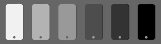
So you’re going to design the visuals for a new website or app. But what should it look like? One of the first – and quite important – considerations is to determine a color scheme for the project.
That usually comes down to two basic choices: light or dark. While there are pros and cons of color choices when designing something that will be viewed on a small screen? Does it matter?
Let’s Start With a Comparison

Photo credit: ESPN Fantasy Football

Photo credit: Yahoo! Fantasy Football
It would be hard to find something more talked about than fantasy sports. Almost everywhere you go someone is talking about a team or lineup. So we’re going to look at two fantasy sports apps that work in basically the same way with one big difference: The ESPN version uses a light color scheme while Yahoo! opted for dark.
Both apps are designed cleanly and include plenty of features. They use intuitive interfaces that offer drag and drop movements, taps for actions and simple animations.
But what do you prefer? Look at both quickly and choose. If you could only download one app which one would it be?
You are likely to find plenty of different responses based on location, age and even just personal preference for either platform. Other factors such as typeface and size, types of interactions to be performed and type of content can impact the choice as well.
Color and “Feelings” About the Interface
Dark and light color associations can create immediate feelings for the user. Just as color impacts emotion in other design context, the same is especially true when it comes to mobile.

Photo credit: Soundcloud
Because the space is small, there’s an inclination to cram too many things on the screen at once. This can cause the user stress and confusion due to the clutter. It can also feel a bit claustrophobic. Add in a dark color scheme and that feeling is only magnified because dark colors use more virtual space, meaning they are heavier in on the screen. Soundcloud, for example, has light and dark interfaces so that users can get the experience that feels right to them.
Lighter colors create a sense of more open space. When it comes to how users “feel” about color, users typically don’t notice a light or white background. However, a dark or black background jumps out. This is because the darker color has more visual weight. Also, we’re more accustomed to lighter color backgrounds with darker text and elements since the invention of the printing press.
When the web was new, designs aped from print design, from books and magazines. And it makes sense that digital products still hold true to this pattern because white type on a dark background is hard to read. And while this is mostly true, there are some exceptions when reverse type and darker color schemes can really help the design stand out.
Provide Visual Clarity
At the end of the day, light versus dark color schemes come back to one key design component – contrast. Color contrast provides the necessary function needed for visual clarity. Simply, it makes content on the screen readable.
That’s why a dark-on-dark color scheme is seldom recommended. In most environments, dark-on-dark is incredibility difficult to read. And it’s even harder when reading on a small screen. (The same is also true of light-on-light.) There needs to be a balance of lighter and darker elements so that light can pass through and users can easily read. This is especially true when displayed on a screen surface, where some degree of backlighting is needed.
There’s even a working scientific formula for it. The W3C Working Draft for Usability has an equation for determining optimum color brightness ranges to help create the most user-friendly combinations.
Color brightness is determined by the following formula:
((Red value X 299) + (Green value X 587) + (Blue value X 114)) / 1000
Note: This algorithm is taken from a formula for converting RGB values to YIQ values. This brightness value gives a perceived brightness for a color.
Color difference is determined by the following formula:
(maximum (Red value 1, Red value 2) – minimum (Red value 1, Red value 2)) + (maximum (Green value 1, Green value 2) – minimum (Green value 1, Green value 2)) + (maximum (Blue value 1, Blue value 2) – minimum (Blue value 1, Blue value 2))
The rage for color brightness difference is 125. The range for color difference is 500.
Color Impacts Interactions
Color is more than an aesthetic tool. It has a direct impact on usability. (Just think: If every element on the screen is black, where would you tap to make something happen?)
Color comes to play in a number of ways but very specifically can influence interactions and signals users as to how to use the interface.
Static items vs. functionality items
Status or state changes
Notifications and micro-interactions
Card-style design is perfect for this because it can help contain many of these interactions. It’s also flexible enough for a variety of interface styles. So if you want to design using a dark outline for aesthetic reasons, cards can be used within the design to help users better understand interactions.

Photo credit: Evernote
Evernote added cards for the iPhone 6s 3D interface, but was already a leader in the card-style design. Even users on other phone models find notes and notebooks cleanly arranged using small cards that are easy to tap. What’s a little different about Evernote is that it uses light and dark elements in different parts of the design. Cards pull it all together to create an easy to use interface.
The Argument for Lighter Color Schemes
If you are looking for a magic bullet, it’s not here. There are times when light color schemes work best, and other situations where dark can work best. Part of determining that best practice is knowing your audience and what they might prefer.

Photo credit: Square Cash App
Reading environments: Study after study has come back with a similar result – the preferred reading environment is darker text on a lighter background (but not necessarily black on white).
Responsive websites: When you are designing for large and small devices, it can be more manageable to work with lighter color schemes so that you don’t get caught with some readability issues during responsive scaling.
Easy to create contrast: Light color schemes make it easy to create contrast. Almost any bright or saturated color will stand out from the background.
Older audience: Typically audiences that are older or have accessibility issues prefer this combination.
Dark Color Schemes Can Work as Well
Darker color schemes tend to be a bit more on the trendy side. any of these interfaces skew toward websites that aren’t designed for heavy reading. They often include elements with high interactivity and require plenty of space and organization to eliminate any claustrophobic or chaotic feelings sometimes associated with darker color schemes.

Photo credit: Specimen
Apps: One place where dark color schemes are really taking off is in apps. Because they are different from associated websites and specifically designed for small devices, many of the cross-device issues are less of a concern.
Design with lots of images: Photos and other image-based elements can look great against dark backgrounds. For highly visual projects that don’t require a lot of on-screen reading, this is a great option.
Oversized everything: For over-the-top designs, dark color schemes can work well because size creates enough contrast to increase readability and usability. (The challenge is creating oversized elements on small screens.)
Gaming: Player interfaces have been using dark color schemes for a while and this will likely continue to grow. Part of the phenomenon here is that gamers tend to skew younger and once the audience is used to a certain look, the comfort level associated with it make it the norm.
Takeaways
Let’s go back to the original example of the fantasy sports apps. Which do you prefer? Can you identify why? Personally, I use the Yahoo! app to manage my team, but I prefer the look of the ESPN app. The player tiles look easier to move and manage without having to think about how to make it work. Information is easy to see at a glance and I don’t need a visual as a secondary method to identify players. The lighter color interface is more streamlined, makes me feel a little less stressed about my lineup (which is hard to explain and quantify) and provides an experience that I am more inclined to interact with more frequently. With the darker interface, I prefer to access it on my desktop because it is easier to use in that environment.
So where do we go from here? Should you design with a light or dark color scheme? Well, it all depends.
Lighter color schemes are preferred in more complex designs and make common tools such as transparencies for notifications and other layered elements more user-friendly. Darker color schemes tend to function best in simple environments where there are many other things to do, interact with or look at.
Both color outlines can impact usability. Remember to think about contrast with either color framework. The right answer when it comes to color is usually somewhere in the middle. Testing is key.
The post When to Choose the Dark Side in Mobile Design appeared first on Studio by UXPin.
UXpin's Blog

- UXpin's profile
- 68 followers

