
UXpin's Blog, page 153
July 29, 2015
The Evolution of the Flat Design Revolution

Photo credit: Square Cash
One of the biggest trends of the 2010s is still evolving today. Flat design, which started to gain momentum in 2013, is still currently one of the most used – and talked about – techniques in web design.
But how has it sustained itself for so long? What is it about flat design that attracts designers and developers? And how has it dominated the industry in so short a time?
The Appeal of Flat Design
The benefits of flat design are written right on the surface. Take a good, long, look at a flat UI and you’ll really start to appreciate how what you see is what you get.

Photo credit: Helbak
For example, as shown by the Danish home goods retailer Helbak (above), flat design gives users exactly what they want and need: the content. In this case, there’s only enough navigation for someone to browse products, while the rest of the interface dedicates itself to high-resolution product images. Set against a grid of muted colors, the interface is meticulously organized yet visually interesting.
In fact, the three main reasons flat design is thriving today are:
It’s simple and intuitive – As modern technology (both software and hardware) strives for simpler learning curves, simple interfaces feel like a very natural means to that end. Like we described in Web Design for the Human Eye, removing unnecessary clutter and sticking with the basics allows users to focus on their tasks and experiences, which themselves are becoming more involved.
It’s perfect for responsive and adaptive design – Because flat design is naturally minimalist and grid-dependent, the content easily shifts whether you’re working with an adaptive framework (one design per device) or a responsive framework (one design that shifts based on device). Less items on screen also means less data to process on the back-end, which speeds up load times for all devices.
Self-perpetuating popularity – No one admits to following the crowd, but when all the big players in web design are doing something similar, the smaller players are going to take notice and do the same. While this wave will crest at some point, flat design is built upon enough solid usability principles that it will certainly reincarnate (to a certain degree) in whatever new design philosophy strikes next.
So that explains the why of flat design’s success, but how can we account for the how?
The Evolution of Flat Design
While flat design seemed to almost take the design community overnight, it’s certainly taken some time to evolve. Early showcases of flat design were incredibly flat with a desire to lose all of the skin of the previous skeumorphic era, but today’s flat design is starting to include more touches of flair and ornamentation (and not just for the sake of aesthetics).
Enter “Almost Flat” or “Flat 2.0,” as coined by designer Ryan Allen.
“Flat 2.0 is an evolution, not a revolution,” Allen wrote. “Where flat design was a radical departure from the rampant skeuomorphism of days gone by, Flat 2.0 is a playful branch off the flat tree. Flat design is the Christmas tree, Flat 2.0 is the ornaments and candy canes. And presents. No tinsel though, that stuff is a mess to clean up.”

Photo credits: Left image- iPhone iOS 6. Manesh Mohan . Creative Commons . Rotated and cropped from original.
Photo credits: Right image- iPhone 6 Apps. Microservios Geek Crew . Creative Commons . Rotated and cropped from original.
You can see the evolution in a number of other places as well.
When Apple adopted flat design for its interfaces starting with iOS 7, the look was not quite as flat as one might have expected. Before the release, as flat design and minimalism were seeing a resurgence, many speculated about the “flatness” the interface would include. While it was nothing like the previous hardcore skeuomorphic iOS look, there were hints of shadows and other elements that were not considered completely flat, as you can see from the comparison above. That’s where the “almost flat” idea originated.
Most of the flat design being created right now is more in that style. There are hints of shadows, colors that did not fit the rules of flat and typography choices that break the ideals of an entirely flat design. This evolution is why flat design continues to stick with the web design community: it evolves well and into a number of different design patterns.
You can almost see the evolution in the three examples below – like watching a monkey learn to walk upright and lose its hair.

Photo credits: http://hlkagency.com/

Photo credits: http://agencysurvivalkit.com/

Photo credits: http://www.forestapp.cc/
The first (HLK Agency) is distinctly modular and clean. The second (Agency Survival Kit) includes small hints of shading, shadows, and even texture with its envelope image. The third (Forest App site) incorporates completely flat elements with fearless touches of realism (the background photo in particular).
Compared to the skeuomorphic craze of 2010-2011, flat design 2.0 is a much more restrained yet confident design aesthetic. The design philosophy incorporates just enough minimalism for clear visual hierarchy, but isn’t afraid to layer on some realistic effects to improve the affordances of the interface.
Of course, the issue with skeuomorphism wasn’t in its design philosophy (in fact, we think slight touches of real-world familiarity improve usability) but in the execution. Most sites of the early 2010s era tried too hard, reflecting the real world as much as possible simply because it was the hip thing to do. Flat design was certainly just as guilty of its own indulgence (remember how heavily-gridded sites were all the rage around 2012?), but now it’s at least developing into a far more mature look and feel.
Material Design: The Ultimate Form of Flat Design 2.0?
Material design is perhaps the most interesting embodiment of flat design 2.0.
All you need to do, actually, is just take a look at the meticulously documented design principles.
Google’s Material Design is rooted in three design virtues:
Visual cues should be grounded in reality
Basic design theory prevails in visuals
All motion should have meaning
These ideas are quite similar to the ideas behind flat design with two major differences: greater focus on motion/animation and layering of design elements. This makes material design sound a lot like Flat 2.0.

Photo credit: Google Material Design Principles
It’s easy to argue that flat and material design are incredibly similar or vastly different (some of the roots lie in the Apple versus Android debate.)
What we do know is both concepts share similar visual traits – color, shapes and overall structure. Some of the difference (especially Material Design’s paper-like layering) lies in the root of the concepts. Material design is documented and focused, while flat design has evolved almost onto itself. There’s no doubt, however, that flat design certainly influences Material Design when you consider the bold images, crisp edges, and vibrant look and feel common to both methods.
Material design, if anything, takes a more practical stance than traditional flat design. By allowing for element layering along the Z-axis, it retains the visual maturity of flat design while being just skeuomorphic enough to communicate affordances to the user.
Flat design arose as the antithetical reaction against skeuomorphism. Material Design, on the other hand, arose as an ecosystem made up of the best parts of flat design with an added dimension of physics. We go into more depth on Material Design in the free e-book, Elegant Web UI Design Techniques: Flat Design and Color.
Conclusion
When you consider the spirit behind flat design (visual simplicity) and skeuomorphism (visual familiarity), you find that both concepts can certainly co-exist. The tricky part, as recent years and the future will certainly prove, is finding the perfect balance between the two.
Material design is undoubtedly an evolution of flat design, but the design philosophy is still mostly reflected through Google’s web properties and Android apps. If flat design inspired material design, then it will be especially interesting to see how material design will influence the design languages to come.
If you want to create flat designs and give life to them, give UXPin a try with our free trial.


July 24, 2015
Free e-book: The Guide to Interactive Wireframing

The newest release in our free design library explains everything you need to know about how to add interactivity to wireframes.
Take a peek inside.
The Guide to Interactive Wireframing covers the ins and outs of turning your simple wireframes into workable, testable, lo-fi prototypes. The earlier you test usability the better, so interactive wireframes are one of the best methods for early feedback. The sooner these insights are incorporated into the design, the better each iteration will be.

We’re proud to welcome UX/UI expert Tom Green as the main author of this book. A professor of interactive media at Toronto’s Humber Institute of Technology, Tom Green has previously written several best-selling books on web animations and is an active member of the Adobe Education Leaders. He now brings his advice to interactive wireframing.
In this ebook, we cover the topics like:
The best use of wireframes, mockups, and prototypes in the UX design process
How to iterate your wireframe at every stage, from lo-fi to interactive
Adding animations to wireframes to communicate more complex designs
Straightforward tutorials on wireframing and prototyping
Real screenshots to help you follow along
July 23, 2015
How to Survive Design by Committee

The bane of the design world is the multi-opinion, conflicting requests of “design-by-committee.”
UI and UX are not immune to committees. Not the Harry Potters locked in the cupboard under the stairs, UI and UX designers must learn that experience creating for users starts with experience with the decision makers.
In this piece, we’ll teach you survival tactics for fighting the good fight without alienating your team.
Know Your Elevator Pitch
“The Elevator Pitch” is forces you to communicate your value to someone in under 60 seconds (sometimes even 30).
Practice crafting your own.

Photo credit: craftivist collective. Creative Commons.
Do you shy away from really building yourself up in the eyes of the person to whom you are speaking? Are you selling yourself? Even at a staff position in a large company, you need to sell yourself to coworkers. A large staff is like a pack of animals, tied together by one common purpose that doesn’t involve bringing down a water buffalo.
You were hired because someone was impressed by you. They saw your talent, drive and fit within the company culture and team. Don’t doubt yourself!
The people around you, in non-technical/non-design positions have no idea how to do what you do, or what it is you really do. Smile and let them know what it is you do and by helping them understand, you are making your job own easier.
Wear your job title like a badge of honor. Beyond just saying, “I’m the UX guy/gal,” try elaborating that you’re “the person who gives the entire website the function and user experience to keep people coming back.” Which statement gives people a stronger understanding of how you improve products?
Talk Around the Conference Table
In any situation, small or large office, freelance or contract, you will run into office politics. Part of that will be people who want to “have fun, too” with building the user experience. They might use subjective words like “happier” and “more fulfilling.”
Be prepared to diplomatically defend the UX decisions you have made.

Source: “Negotiation Cartoons: Positions Vs. Interests” Johnny Goldstein. Creative Commons 2.0.
You must backup all decisions with facts and figures By creating context with user behavior data and usability testing results, you take design out of the black box. In doing so, you also set a precedent for others to defend their criticisms beyond just personal opinion.
Don’t be aloof with technical words or people might feel intimidated. Explain the UX and UI in simple, layperson’s terms that relate back to business needs. For example, instead of describing the clean interface of a minimalist layout, explain how the white space emphasizes the CTAs, which may improve conversions.
Listen to what others are saying and consider the possible merits. Understand the user is the utmost and UX/UI designers might be too close to their design. To help stakeholders clarify their points, we highly suggest the 3 question rule by Dustin Curtis.
Champion UI and UX With Patience
When coworkers don’t understand what you do, you are automatically pushed to the bottom of the corporate ladder. It’s very much like how people perceive the IT department – silent people who appear and fix a computer, then fade away quickly.
“UX”? People either use the website or not. What does user experience have to do with anything? Isn’t that just using the website?

Photo credit: UXPin
The same goes for UI design. Does it matter where the button is? Why can’t every page just have a button? The simplification of the most complicated part of a website is trivialized. This is where you need to be patient and educate those around you.
When something is being instituted that will negatively affect the user experience, think about your audience before you let loose. Just like you empathize with users, empathize with your team (especially when you disagree). Saying, “that’s a great suggestion, but in this case, going by a similar experience with another website, we should keep pushing the experience as planned” shows understanding of the suggestion, giving it full consideration but gently turning it down for valid reasons. That’s appreciated in group situations, as well as 1:1 interactions.
Remind them that YOU are the person to whom they feed all of THEIR information. From wireframing, to user research and testing, measuring user engagement, UI, design and final launch, all the puzzle pieces come to you to put together into a final product
If you’re lucky enough to be part of a tech company, coworkers will understand what you do and your place in the pecking order. Still, expect chaos because that’s the normal order in business and YOU get to tie it all together into one, cohesive website. Don’t just design – start embracing the role of design facilitator.
Involve Others in the Design Process
You don’t design great products by passing the baton from person to the other. Design is a team sport, and collaborative design enriches everyone’s understanding and contribution.
To truly survive design by committee, you need to be proactive and encourage alternative tactics.

Photo credit: “A List Apart big meeting, 30 January 2015.” Jeffrey Zeldman. Creative Commons.
If you want stakeholders to give more valid feedback, teach them how to think like a designer. Like we described in the free e-book Design Collaboration in the Enterprise, involve everyone in the planning, research, design, and testing of your product. As long as the product team has the final say, you reap all the benefits of collaboration without watering down the product through design-by-committee.
Hold design studio exercises. Set aside an hour and invite all stakeholders to a quick brainstorming session. Clearly state the problem, then give everyone 10-15 minutes to sketch their ideas. When everyone’s done, let each person present and explain their sketches. Finally, let the team vote on the best ideas. More than just exploring ideas, this session also helps you learn more about how each person solves problems.
Interview stakeholders. Group dynamics can make people act in strange ways. Before you start any design project, speak with each stakeholder 1:1 to let them air out their hopes, goals, and fears for the product. Follow Erika Hall’s excellent guidelines to build long-term rapport and identify potential design issues before they happen.
Invite others to join your usability testing & research. Nothing beats letting a developer or marketer hear customer feedback firsthand. They’ll internalize and remember the feedback much better, aligning them to user needs without you forcing their hand. Check out Lyft’s design sprint process to learn more.
Conclusion
It’s important in business today, especially the tech field, that well-defined job parameters to keep everyone efficient. This is not to say that parameters can be assigned with each new project (always be flexible!), but when job parameters cross between people, confusion and double-work reigns supreme.
As a design professional, you must be able to assert yourself to keep your seat at the table and because at that year end review, your supervisor will ask YOU why the UX didn’t work. Blaming coworkers for insisting on counter-productive changes, even if true, won’t be acceptable.
Take ownership of the product, know when to stand your ground, and embrace other people’s expertise. Play equal parts designer and moderator, and you’ll be able to dissolve the committee with much less resistance.

Animations & Interactions in Design: Creating the Navigation Drawer

The navigation drawer is one of the most popular, modern, web and mobile patterns. When the space is limited and your primary navigation pattern isn’t crucial for the business goal, nothing works better than the good ol’ drawer.
In this post, we’ll take you step-by-step on building one.

The drawer panel allows you to hide the navigation beyond the left or right edge of the screen and reveal it only after a user’s actions. This pattern can be particularly useful if you want your user to focus on the main content.
Prototyping the drawer used to require certain code skills, but with the latest addition of advanced animation editor, UXPin made it as easy as 1-2-3. It takes no more than 10 minutes to create a full-blown navigation drawer. Log in to your UXPin account (or start a free trial) and let’s get started.
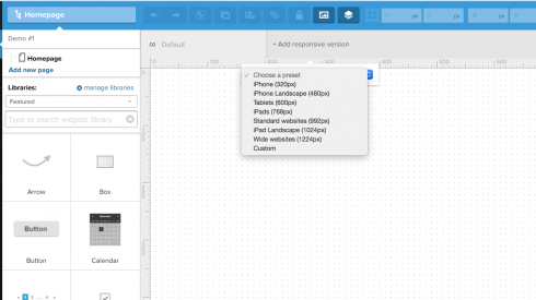
1. First, we have to specify the width of the canvas. We’ll do it with the responsive breakpoint. If you’re designing for the iPhone 5s then choose 320px.
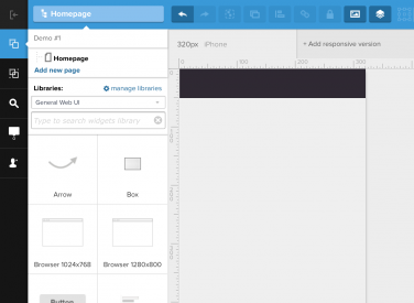
2. With the canvas ready, it’s time to start designing. Add the top bar and background using “Box” elements. The box is available in “General Web UI library.” Using a variety of UXPin’s libraries you can quickly build whatever you want.
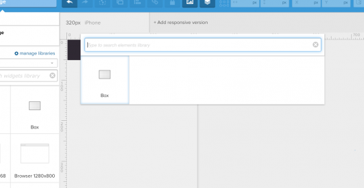
3. For a quick navigation, use “search” (shortcut: cmd+f on Macs, ctrl+f on PCs).
4. Don’t forget to add the infamous “hamburger icon” or any other symbol representing menu (use search to browse all the icons libraries in UXPin).
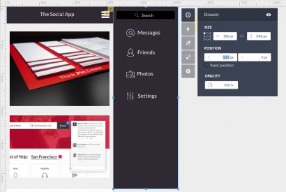
5. When your main screen is ready, build the drawer menu. Place it outside of the canvas. To start with, it should touch the right edge of your main screen.
6. Select every element constituting the menu and group them together (cmd+g on Macs, ctrl+g on PCs; or button in the top menu). For easy future reference, change the group’s name “Drawer.” Depending on your design of the “main screen” you might also want to group to help with the fluidity of the animation.
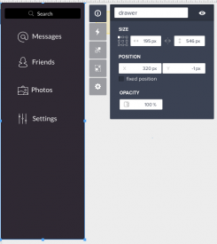
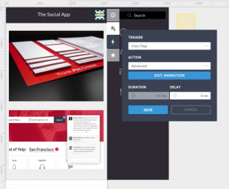
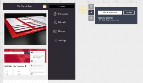
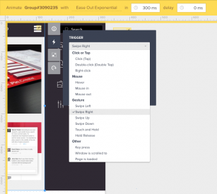
7. Time for interactions. Left-click on the hamburger icon and from the properties manager menu choose “interactions” with the “click (tap)” trigger and “add advanced animation” instead of “action.” That’s your first step to a great navigation drawer.
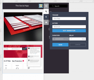
8. In the advanced animations editor, select all of the elements and drag them to the left. The far right edge of the menu should touch the edge of the 320px-width canvas.
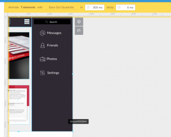
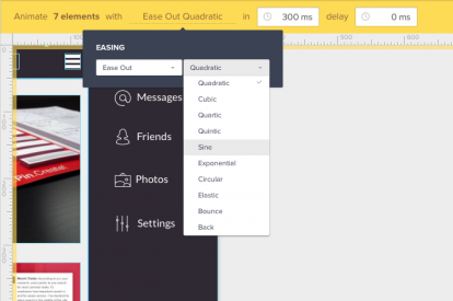
9. We’re almost there. Time to make things smoother. In the top menu choose the kind of animation, you would like to use. I’m going to use “Elastic” with “Ease In.”

10. You got it. Just click “save” and simulate your design using UXPin Preview or send it directly to your mobile phone.
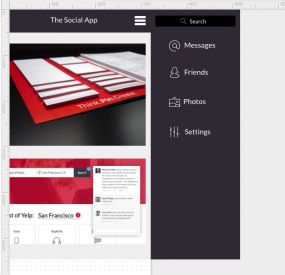
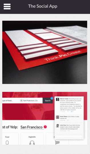
It’s ready!
[image error]
Do you want to make it even better? Take a look at some advanced options for the navigation drawer.
How to add “a come back”
We have to start with something slightly counter-intuitive. Bear with me.
1. Since each element can only have one advanced animation with the same trigger assigned, we need to drop “a hot spot” (element available in General Web UI library) anywhere outside of the canvas.
2. Now click on your hamburger icon and enter into edit mode of your advanced animation.
3. While in “Advanced Animations Editor” move your hotspot directly above “the hamburger icon” and add Advanced Animation to it.
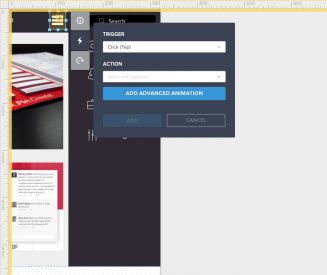
4. You just entered advanced animation within advanced animation. Sounds scary, right? Have no fear. UXPin will automatically add a “come back” as the second step in the animation, so just click “save.”
5. Might be hard to believe, but you’re done! Check your design in UXPin preview. Smooth, huh?
How to show the navigation drawer on swipe to the left and hide it on swipe to the right
Ah, swipes! They used to be impossible for prototyping tools. Not for UXPin though! Let me walk you through the process.
1. Click on the main content group and add interaction: trigger “on swipe left” with action: “advanced animation.”
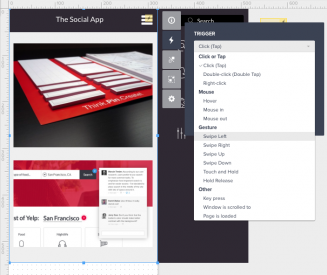
2. In the advanced animation editor, move all of the content to the left. The right edge of the navigation drawer should touch the right edge of the canvas. Click on the main content group and add interaction: trigger “on swipe right,” action “advanced animation.” UXPin will automatically generate a “come back” to the previous state. Click “save.”
3. Done! Test it on the UXPin preview, or send it to your mobile phone.
How to make “left-side” navigation drawer
Time for the real troublemaker. Let’s create “left-side” navigation drawer.
Click on the drawer navigation and set horizontal position (x) to –200 in its properties. It will disappear from the screen, but don’t worry! Trust me, everything will be fine.
3. Add an advanced animation to the hamburger icon.
4. In the advanced animation editor, open “layers.”

5. Select “Drawer” from the list of layers and change its horizontal position (you can use the top bar) to 0px.

6. Now, just move the main content group to the left and click “save.”
7. To add a come back on the left-swipe, edit the advanced animation attached to the main screen and add swipe-left animation while inside of the animations editor.
8. Done! Test it on UXPin preview, or send it to your mobile phone.
Hope you enjoyed this tutorial. Now play with UXPin on your own! The possibilities are endless.
Animations & Interactions in Design: How to Build a Carousel

I know, I know, I saw the “should I use a carousel” site. While I agree with the sentiment, there are forms of carousels that can work very well. Especially the one with a clear navigation pattern.
How about learning how to build it? It’s super easy. Let me walk you through the process.
Log in to your UXPin account (or start a free trial) and let’s get started.
1. First, we have to create the very top of the carousel together with the menu. Start with a simple box for the background. You can use search (cmd+f on Macs, ctrl+f on PCs), or just drag & drop it from the library). Next add the text, as well as all the necessary details.

2. Time for the content. Add a box, text and drop in some images. Yes, it’s that easy.

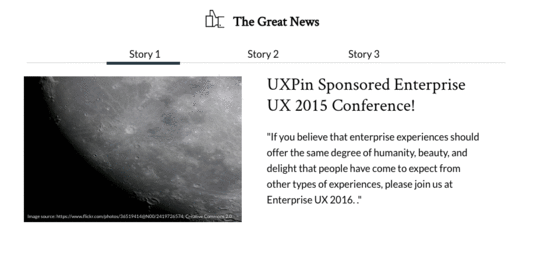
3. Now, select all the elements of the content part and turn it into a multistate element.
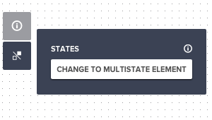
4. Multistate elements allow you to switch content within one element. That’s the foundation of your carousel. The only thing that you need now is a bunch of states. Click on your multistate element and pick “states” from the property menu. You need three states, one for each story.

5. Time to add some content to your new states. Click “edit state” in the property menu and choose “Story 2” to edit it. You can change image, text and anything that you need to make it great. Repeat this step for “Story 3” as well.

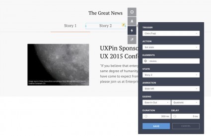
6. Now we’re going to make your carousel interactive. Start with the “Story 2” in the navigation. On click you’ll want to change the state of your multistate element, as well as move the thick line to indicate active state of the navigation. Start with the first task.
Select “set state” of your multistate elements to “Story 2” and do it with a “slide right” animation (ease in, sine).
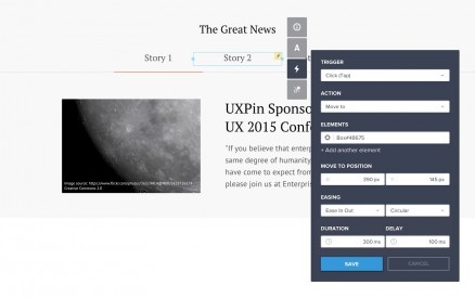
7. Now it’s time to move the line that indicates the active state of our menu. Create another on-click animation. This time use “move to” action and set the horizontal distance to the new location. For a better effect, you might want to set the delay to 100ms.
And we’re done. Open the preview and be proud of yourself. You just built an interactive prototype of a carousel.
Hope you enjoyed this little tutorial. Now play with UXPin on your own. The possibilities are endless.
True Ventures Welcomes UXPin After Leading $5M Round

Years ago, when I started practicing web design, we spent our time trying to stand out from a sea of drab pages with just a dozen HTML tags. Today, contemporary design work is made up of increasingly specialized practitioners solving problems we never dreamed of those many years ago. Designers have had to reinvent ourselves continuously.
One thing, though, has remained constant: we seldom work alone. It’s the rare exception when someone can fulfill the duties of the full stack of development — even well-rounded general technologists have some degree of specialization. In fact, if there’s a single skill I recommend web designers master, it’s the art of successful collaboration. Solid craft and working well with others will take you a long way.

Photo Credit: UXPin
As a young designer early in my career, I would sketch wireframes and annotate them profusely, detailing every interaction and design specification. I would leave no room for interpretation, carefully spelling out everything a user was supposed to experience. When I was done, those plans would be handed to a developer, who would translate the plans into product. Inevitably, the results were nothing like I’d imagined.
Most teams today consider the methodology of product development as the canonical example of old-fashioned ways of working. Instead, prototypes have almost entirely replaced specifications. Everyone involved in a project is there at its inception, working as a team through all the details of implementation. The prototype takes shape over multiple iterations. We learn by making, not by writing instructions to each other.
Today, a new wave of tools is letting us get even better at this fluid, iterative and collaborative process of coaxing new products to life. Teams are working together more closely, even as they’re distributed further apart.
That’s why we’re thrilled to welcome UXPin to our portfolio. The team closed their financing recently, and are hard at work building what we think is the best tool for team collaboration on design. I’ve known the Founder and CEO, Marcin Treder, for a while now, and have watched as he built his team across two continents and 12 time zones using the very platform they were developing. UXPin has excellent tools for developing early mockups using the included extensive UI libraries, along with animation tools to help visualize interaction on desktop and mobile designs. Commenting and collaborating are intuitive, letting everyone on your team contribute—and there’s much more in the works.

Photo Credit: UXPin
Building products is hard. Working together shouldn’t be. All of us at True are excited to be working with UXPin to help make teams more effective and productive.
Marcin and the entire UXPin team: welcome to True!
July 21, 2015
Government Websites Don’t Have to Suck — Here’s How

Photo Credit: David Iliff, Creative Commons 3.0
Is it possible for government services to be easy to use? Most of the time — not even close. But the UK Government Digital Services (GDS) team has changed that, taking home a 2013 Design of the Year award.
One of the judges even remarked, “[GOV.UK] creates a benchmark for which all international government websites can be judged on.”
So why is this self-service, government site so amazing? Simple: it puts the experience of the user first. You don’t need to know how the government works to get what you need.
In this post, we’ll take a look at our top three GOV.UK design principles used for this government site and why they’ve made for the perfect user experience.
Design Principles in Action
There are 10 principles in all that GOV.UK follows, which build upon the government’s original seven digital principles. These include:

Source: GOV.UK
These used in combination with the Five Pillars of Interaction Design, which are outlined in the free e-book Interaction Design Best Practices, are good guidelines for any site to follow. Touring the self-service government site, you can see all these principles at work.
1. Do the Hard Work to Make it Simple
Many of the site’s sections use self-assessment surveys, asking questions to determine where best to direct a user. There’s maternity leave calculators, and “Do I need a visa” quizzes. While they could have just included a long wall of text, the GDS team took the extra step to make finding information excruciatingly simple and engaging.
You can see a clear example of this in the “Check if You Need a Visa” quiz. The GDS team charted out the common situations a visa seeker may encounter and guides the experience. At no point does the user need to think about more than one criteria at a time. Furthermore, the previous answers are shown at the bottom, and it’s easy to go back and change an answer.
Photo Credit: GOV.UK
Once the user has selected their answers, they are given the right information for their exact circumstance. Think about what this process would look like if it was just a wall of text! You’d need to scan for keywords, try to fit yourself into a category and then find the relevant information. It would be exhausting for the user.
Often the default option to building documentation is a knowledge base article. They are simple to create, and customers can read them at their own convenience. But to make these even more helpful to customers, you can keep leveling up. Simply by adding screenshots, your customers will find documentation easier to use. If you create a chart or a gif, the readability increases 10 fold. While it’s true these tools take longer to create, the benefit to the end user makes it more than worth it.
2. Iterate. Then Iterate Again.
Even though the site won an award in 2013, GDS hasn’t stopped improving the experience. We found several articles and guides in beta, and while touring the site, we were invited to take a survey.
Here’s an example of the Self Assessment page in beta. There are good reasons for labelling a work-in-progress as a beta:
Customers know that if they find something out of place the company is open to feedback.
It also alerts users that the information might not be completely accurate.
For something as important and intricate as tax assessment, this labeling lets users know that a second opinion might be helpful. Labelling an article as beta ultimately just sets better expectations.

Photo Credit: GOV.UK
Getting feedback is an important part of improving a site. Here’s a few questions that you need to consider if you’re going to iterate on the user experience:
Do you have a way to get feedback from your self service site?
Can customers submit ideas or errors?
If not – do you look at the Google Analytics data to see where dropoffs or bounce rates are highest?
Self service is not a “set it and forget it” product. It needs constant audits and improvements to stay up to date and provide the best possible customer experience.
3. Do Less.
“This means building platforms and registers others can build upon, providing resources (like APIs) that others can use, and linking to the work of others. We should concentrate on the irreducible core.” – from GDS Design Principles
It might be counterintuitive to link to other people’s work, rather than keep users on your own site. But GOV.UK’s designers don’t let ego get in the way of providing users with the best service. If someone has already created a better answer, they simply link out to it.
A great example is the Benefits Calculators page. Two not-for-profit organizations have developed their own benefits calculators that are better than what the GOV.UK originally had. On their page, they explicitly say that the free tools have replaced their Adviser service – saving the government time and money on answering questions that could be answered with a tool.

Photo Credit: GOV.UK
This also helps the government build a relationship with organizations that are working towards better services. By working together, they can get more done, and create a better experience for everyone involved.
Don’t let your ego get in the way and stop designing too much. If there are free tools out there that can help your customer be successful, link to them in your documentation. Sites like the Google Custom URL builder, or Pixlr (a free photo editor) could be helpful to many customers, and linking to them just means you don’t need to build them yourself.
Takeaways
A government site doesn’t have to be an impenetrable fortress. GOV.UK has proven that if you do a little leg work to make it simple to use, constanly update the site and don’t let your designer’s ego get in the way, you can build a self-service site that users actually want to visit.
In the Slideshare below, we dive further into the best features of GOV.UK so that you can use them in your own self-service design.
If you want to carry on with the lessons from the GOV.UK site, the free e-book Web UI Design Best Practices dives deep into visual design, interface design and UX design.

July 17, 2015
3 Ways to Design for Those Distracted Drivers

Texting and driving don’t always mix.
Sure knowing where the next turn is has been virtually solved. And self-parking, even self-driving cars exist. But texting while driving is more to blame for car accidents, especially among teens, and the accident rate continues to skyrocket.
While it can be so helpful, even life-saving at times, technology has demonstrated that it can also greatly compromises a driver’s attention. Regardless, drivers will continue (probably need to continue) using technology for navigation and communication. Certainly, entering text on a phone is a huge problem, and a lot harder to justify than safer means of communication, where hands are uninvolved and eyesight is minimally distracted.
But it presents a huge opportunity for compelling design. In this post, we’ll take a look at how design can elevate the problem of texting while driving.
Smartphones: The Real Problem?
With smartphones, whose capabilities tower over previous iterations of mobile phones, there is a slew of different distractions and dangers, such as rummaging for the device, unlocking the screen with a code, selecting an app, entering text and reading. The time and focus taken away from the road becomes more severe.
 Photo Credit: Intel Free Press, Creative Commons 2.0
Smartphones aren’t designed with safe driving practices in mind, especially when it comes to the design and user interface its apps. While ideally suited for public spaces, offices, and home use, the many glances, grip, and fingertip manipulations required in the operation of a smartphone spells trouble for drivers.
So, the bigger problem is not the need to communicate or be assisted with navigation as much as it is the interface. Legislation in states like California trend toward totally hands-free tech usage. The presiding wisdom behind this and other new driver laws seems to be: go ahead and listen, talk even, but keep your hands on the wheel.
When comes to keeping a driver’s eyes on the road, digital agency Huge did an excellent study on the UIs found in most automobile interfaces, which can also be applied to smartphones. Here’s what Huge’s study recommended:
Understand the act of driving. Being at the helm of a vehicle limits what a person can do at any given time. They can’t reach for their phone, text or check Instagram, while hurtling down the freeway at 65 mph or higher.
Understand what occupies the driver. What is it that the driver is doing at any given moment? What occupies their attention?
With the best interest (and survival) of users in mind, let’s look at what designers can do to ensure drivers don’t get into an accident.
Know Your Driver’s Limits
Those two tips from Huge basically boil down to knowing your driver’s limits. More than that, it’s also knowing what type of apps a driver will need to use. So what is a driver likely to do with their smartphone in car:
Make a phone call
Send a text (yeah, we know it’s going to happen)
Navigation (also probably to find out where cops are hanging out)
Change the music
Navigation is a big one for drivers. After all, why pay for a costly navigation system pre-installed in your car when there’s an app for that? Phone calls and texting probably tied for second. But when, where and why does a driver use these things.
 Photo Credit: Jason Tester, Creative Commons 2.0
You need to start by understanding the driver — who in this case will be the user. So you’ll have to get to know him or her as you would any other user.
As we outlined the free e-book, The Guide to UX Design Process and Documentation, there’s a few ways to do this:
User personas. Create a persona of the driver. What type of apps do they use? What kind of driver are they? Are they a heavy commuter? How much time do they spend in the car?
User stories. Craft a journey of a driver from departure to arrival. What are the things that they do as they drive? When do they make calls? What’s the situation they’d text in? When do they enable navigation?
You can also talk directly to drivers and conduct user testing with them. Probe directly into how they use their smartphones during driving.
Understanding the context of what a driver is doing at all times will help inform how you design specifically for their needs.
Keep Driver’s Hands Free
At least since the days of my family’s epic road trips in the ‘90s, when my dad hooked up a car phone in the GMC Suburban, feeding through the speaker system (output), and connecting to a dash microphone (input), people have been leveraging components already in place in their cars to make calls more safely. Actually, this has been happening since much earlier.

This creates an interesting dilemma for designers, posing a couple of questions:
How do you keep drivers hands on the wheel?
And how do you allow them to still interact with an application, like a navigation device?
The key may be integration with existing car components, like hooking up a 90s car phone. The tech is already there with cars coming with their own touch-screen interfaces and bluetooth tech. Here’s what designers have to work with:
Better smartphone integration. Today’s models have better Apple and Android integration than ever before. Having phones tied to the car operating systems will make it easier for the next bullet.
Voice-operated systems. Both bluetooth-enabled and manufacturer-installed car gps units operate via voice, which has user’s safety in check. Voice command, though imperfect, is considered the least distracting means of communicating while driving.
These technologies give designers an open playing field and may provide the solution for ensuring drivers don’t fumble with their phone in their hands.
Keep It Simple
Let’s face it, people are still going to go for their phones. It’s going to happen. They’re going to change the song playing on their Spotify. They’re going to update their destination on their navigation app. However, we strongly urge that folks refrain from driving while holding their smartphones.
 Photo Credit:
Michael Verhof
,
Creative Commons 2.0
Photo Credit:
Michael Verhof
,
Creative Commons 2.0
A 2014 research paper outlined a few guidelines for car interfaces, which could easily apply to apps used whilst driving. Here’s what researchers recommend:
Get rid of the menu. You don’t want drivers to be flicking through a lot of options. Limit their options to what they need. For example, on a navigation app, you might want to just have options to chart the route and then start directions.
No touch options. This goes back to our point above about keeping the driver’s hands free. Voice-activation may be the future of smartphone applications while driving.
One thing to consider is having a “driving mode” to applications. This is could potentially be more streamlined, more safe, and more effective with the advent of wearables. Their application in the realm of driving is mostly untapped, but huge opportunities exist, given these devices’ minimalistic and intuitive interactions. Turns of the wrist or waves are part of a bodily UI, movements users employ in many daily tasks, and would be preferred to more artificial movements, such as those involved in using a smartphone or any other touch screen.
Voice along with gesture controls may be an avenue worth pursuing as a way of keeping things simple so that a driver doesn’t get too distracted.
Takeaway
Smartphone use while driving is still a relatively new arena. Designing for that distracted driver, some call it worse than drunk driving, does present some unique challenges and a chance to raise the user experience bar.
As it stands there are thousands of car, wearable, and accessory interface combinations at play, and it is (very hard) to take a stab as to which is best for users generally.
If you want to dive deep into mobile UI design, check out our free e-book, Mobile UI Design Patterns. We examine the hottest mobile apps — such as Spotify, Uber, Mailbox and Yelp.

July 15, 2015
Do These 10 Things to Make Your Homepage a Success

The basic homepage design is so 2012. The supposed magic formula of 10 elements to include for a successful home page isn’t enough anymore for a simple reason — it’s too formulaic. And that can create for a boring homepage that’ll drive users away. That’s not to say those page elements don’t have function — they are still important — but they are lacking what users crave, human interactions along with a delightful surprise or two.
So the list is changing. Don’t worry, we can still boil the requirements for a successful modern homepage down to 10 things in this post. And you might be surprised how this list has evolved.
1. Go Responsive
We consume more media on our phones than on our desktop. In the US alone, more than 75 percent of people use their phones to access the internet. So it almost goes without saying: Your website needs to be responsive, meaning that it works on a variety of screen sizes and resolutions. Sadly, there are still a lot of sites out there that are not living on a responsive framework.

Photo credit: Dominion Rocket
Responsive isn’t just a must have because users expect it. Having a responsive site can affect your bottom line. In his excellent Inc article, John Boitnott points to a 2015 study that shows a responsive site sees a 10.9 percent increase in conversions year after year. Boitnott also cites how O’Neill clothing saw a 65.71 percent conversion increase on iPhone devices and a 497.32 percent increase on Android devices three weeks after going responsive.
If you’re going responsive, take into account load times. Your homepage needs to load lighting fast, or else you’ll endanger your conversion rates. Consider whether loading an animation makes sense for a mobile experience. Some responsive frameworks allow you to choose what type of content you want to serve up on what device. That means you can have an animation load on desktop only then have an image load in its place on a mobile device. This will save users the headache of waiting for a heavy animation file to load.
You need to quickly entice users with a great first impression — meaning that it has to work on mobile just as well as on desktop and not take an android’s eternity to load.
2. Win Them Over With Awesome Visual(s)
Regardless of what you include on every other page, the homepage needs to have some visual appeal. Visuals can entice your users to use your site, as we described in our free e-book, Web UI Design for the Human Eye. And you’ll also want interesting visuals on your other pages.

Photo credit: Folchstudio
So what do we mean with the term “visual”? Well, this can be created in a number of ways, through the use of the following:
Photo
Illustration
Video
Animation
Text
While what makes a visual awesome can be a little more difficult to define, there are a few things great visuals have in common.
Is unique and convey emotion and impact
Tells your brand or company story
Is “readable” at a glance
Is technically high-quality so that it renders well for all users
Is integrated into the design
Most of all, however, we place our faith in things that are visually appealing. If a site isn’t aesthetically pleasing, we’re likely not to trust it at all.
3. Add Some Color
Some more recent design trends have emphasized black and white frameworks and those with an overall lack of color. But some color — even just small touches — can take those concepts to the next level. Color creates a sense of immediate place and an emotional tie. It helps establish visual hierarchy and cues users so they know how to interact with the site.
Not sure where to start? Bright, vibrant hues work well to provide contrast in black and white aesthetic frameworks. These colors also offer an eye-popping palette of their own.

Photo Credit: Up Droid
Up Droid is a minimally-designed site without a lot of color. This makes the red button, red border and red lines on the actual robot really stand out, drawing the eye across each of these elements. Note how the red border around three sides of the homepage encourage you to look down and scroll deeper into the site. The designer used a simple color outline to create hierarchy, general visual interest and provide instruction.
4. Create an Identity
The homepage is a user’s first glance into what your company or brand is all about. It’s the place users go to if they happen on your site by chance and want to know more. Make each of these interactions feel personable to help sell what you do and who you are.

Photo credit: Catscarf
It takes brand personality. That’s everything from visuals to language to tone and voice. Personalization can come in the form of geolocation tools, logins and cookies that remember users and speaking to users like a person to a person through copy.
Brand is storytelling. You’re communicating your story to your users with all those things. But the one thing to remember is to be consistent across your brand. If your site is littered with typos or a mismatch of visual styles, you’ll be communicating to users that you don’t care about quality. Consistency is key and helps to build trust with your users.
Those who identify with and trust your brand will be the ones who’ll engage with your site again and again.
5. Have an Element of Surprise (Or Desire)
Nothing beats a homepage that does something a little unexpected (or makes me think I can’t live without an item or bit of information). While you probably can’t do both of these things, try to do one or the other.
Your element of surprise is what makes your site unique, use that to your advantage in the design of the homepage. Focus on it. Design around it.
One caveat, however. As we point out in our free e-book, Demystifying Delightful Interaction Design, surprises need substance. They must be measured against the usability.

Photo credit: Cubender
The design of Cubender contains an element of design surprise in the orientation of screengrabs to showcase its product. The site also does a good job of creating desire because the product looks its best. If you are in the market for a website, it is likely you will click to learn more (and note how they tell you it’s free).
However, the Cubender doesn’t sacrifice usability for its delightful surprises. The site is still relatively easy to navigate, the copy is clear and the calls-to-action clearly prominent.
You want to entertain users. You want to captivate their attention by giving them a surprise or two. But don’t delight for delight’s sake, ensure that your site is still usable and that the surprises don’t hinder that.
6. Bring Things to Life With Animations
Animation is without a doubt the hotness in 2015. From full-screen animations to parallax scrolling to simple hover effects, a little moving magic is must-have. Just don’t go overboard — pick an animated element and focus on that.
Animations can be used as a means of storytelling, reveal information or communicate how something works, as we discuss in the e-book Interaction Design and Complex Animations.

Photo credit: Night Owl Interactive
For sites that lend themselves to animation easily, a video or animated hero header can be an excellent way to draw users, such as Night Owls (above). The hero header uses a different type of approach as well, with a hero-style header that uses scrolling testimonials to get the attention. Consider a more functional animated element for sites where this type of solution isn’t a fit.
Longer single-page sites can benefit from parallax scrolling to add interest and keep users engaged with content and almost any website framework can add an unexpected element to a button or link with an animated effect. (Some of the most effective animated buttons include those that expand or change color on hover or provide instruction when it comes to filling out a form or performing an action.)
Animation’s are another way to add visual interest to a site and, like with delightful interactions, must be used to enhance usability not hamper it.
7. Ensure Navigation is Intuitive
The days of the mega expanded navigation are dwindling. More streamlined (and sometimes hidden) navigation is more common, from hamburger menus to navigation bars with only a handful of site links.
When using the less-is-more approach to navigation, the trick is to be clear and simple with labeling. Don’t overthink it or get too cutesy. Each navigation element should clearly state what comes next: Contact, About, Shop, Tutorial, Support, etc.
The other consideration is linking through navigation that does not look like traditional navigation at all from the homepage. What if each link on the homepage is goes to something that would have traditionally been a navigation element? Do you need navigation on the homepage anymore? Could you then push more traditional navigation to secondary pages (or at least “hide” it)?

Photo credit: TaDah!
TaDah! Does a good job of integrating the brand’s fun tone of voice with simple navigation. Each label is understandable from “Products” and “About” to “Love Letters.” The other great thing this site does is keep the navigation streamlined when it comes to depth and it’s sticky, so it does not get lost in what is a longer scrolling site. The navigation elements are also included as content blocks near the bottom of the scroll to help you get deeper into the site.
8. Give Something for Me To Do
For users, websites are often a “me” experience. What does this site offer me? What will I get from it? What is there for me to do here?

Photo credit: Gillemore
Make it easy for users to find the answer by providing users with something to do on your site. (You do have a homepage for a reason — make it abundantly clear.)
In 2006, Derek Powazek outlined goals for A List Apart that apply to pretty much any website. While a lot has changed about how we design and build websites, his goals are very much applicable to today’s homepage design.
Tell users what you do and make a solid first impression
Provide a starting point for new or returning users
Show what’s new (and give users a way to access it)
Now let’s take that to a practical level. What can you give users to do when they come to your site? The answer can vary by industry, but there are a few commonalities. The question: Does your homepage provide any of these experiences?
Get basic business information, such as hours or location
Call, email or contact a business
Download an app or information
Find links to social media
Play a video or look at other media
Another way to think of it is that you’re providing the who, what, where, when and how for your users.
9. Provide Clear Contact Information or a Call to Action
You want users to find you, right? Contact information should be easy to find. Put email links, tappable (and callable) phone numbers and any other relevant information in a consistent location. This might also include a physical address or staff bios, which can lend credibility to your company.
Most of this information can easily live in the website footer. It is recommended to include it in the homepage structure as well.
Sometimes it might be more important for your site to focus on a call-to-action on the homepage. This is common especially for pages that are previewing something that will launch later, such as an app, or trying go get a user to provide personal information, such as an email. When a call-to-action is the prominent theme, make sure to follow up with each user with some contact information. (It will likely be in the footer of the email you send them after signing up for something.)

Photo credit: Rizon App
The site for the Rizon mobile app focuses on a call-to-action with a “Join the Beta” button. The button is easy to see and the form is easy to fill out — it only requires an email address. Scroll to the bottom of the page and there’s contact information for the developers so users can connect with them on social media. Both the CTA and contact information are designed to be part of the overall website and are not obstructive or in the way, yet provide valuable function.
As we said in number 8, you’ll want to give your users something to do. Well, on top of that, you’ll want to give them something to act on.
10. Keep It Simple
Now take all of the above elements and simplify them. (Seriously.)

Photo credit: Ultimouomo.com
While it may sound like a daunting task, it’s achievable. Think about all of the websites you love. Now look at them closely and you’ll see that many of these element exist within their frameworks.
The best design is not something that screams at you. It’s a subtle combination of visuals, usability and even luck. Don’t overthink it. Keep it simple. Functional. Beautiful.
Takeaways
All of these website needs and concepts come back to a single idea. Users want to make their digital interactions feel as human as possible. Each element and aspect of the design must contribute to an overall human connection between the website or interface and the user.
While trends may help dictate some of the techniques, much of what is needed on a website homepage has not changed much during the internet’s rather short history. Combining good visuals with technology and usability will always be in style.
To learn more practical tips and tricks, check out our free e-book, Web UI Design Best Practices. We dive deeper into an explanation of visual design, interface design and UX design, analyzing more than 33 examples from companies such as LivingSocial and Spotify.
July 13, 2015
Free e-Book: Demystifying Delightful Interaction Design

The newest guide in our free downloadable library is now available.
Demystifying Delightful Interaction Design explores the facets of delightful design from a perspective most useful to UX/UI professionals. Here’s a little of what to expect inside.
Usability, functionality, and a worthwhile service — while necessary — aren’t enough on their own to create that “magic” with the user. Truly successful designs are delightful, meaning the user actually enjoys using them instead of simply tolerating them for the sake of the reward.
However, what constitutes the abstract feeling of delight is not so black-and-white as the more tangible aspects of design. That’s why we’ve written this free guide: to explain what delightful design can do, and teach you the best practices for doing it.

What’s Inside:
In this 70+ page guide, you’ll get:
Tactics for designing websites and apps that are functional, usable, and pleasurable
Tips for making users fall in love with your design
What separates truly delightful design from designs that try too hard to be clever
Mistakes to avoid when designing for delight
Examples deconstructed from 24 top companies like MailChimp, Virgin America, Bitly, and Medium
UXpin's Blog

- UXpin's profile
- 68 followers

