
Is 40 Pixels Enough For Fat Finger Mobile UI?

Apple’s recent Pencil product announcement has us wondering about touch targets in mobile-optimized design. In spite of the many styli available, fingertips aren’t dead yet: the majority of people still navigate their smartphones and tablets with their fingers. As we discussed in our free e-book, Mobile UI Design Patterns, gestures in web design are on the rise.
Forty pixels square is the general rule of thumb, pun not intended. But how accurate is that estimate? To find out we ran an experiment with an iPhone 5.
We asked people around our office to tap differently-sized buttons in a UXPin prototype. The task was find out what the smallest button people could tap in the first attempt — that is, how small was too small to hit at a casual glance?
Check out the prototype we shared internally, and feel free to try it yourself.
About half the people in our office could tap buttons 5–10 pixels square on the first try. The other half took two or more taps to hit them. Everyone could tap buttons that were 30 pixels square or larger.
Lessons learned
People need immediate feedback. If they successfully tap a button, but nothing happens, they may assume that they missed and try again — risking accidentally tapping something they didn’t mean to. We saw it first-hand as some of our team members missed the mark.
Margins matter. We found that people had an easier time tapping buttons that were spaced further apart, although there was a point of diminishing returns. We believe that the button’s width is a good guideline for 20 pixels or smaller. For example, if a touch target is 15 pixels wide, then it should have 15 pixels between it and the next tappable element.
Text matters too. At 16pts, an easy-to-tap hyperlink needs to be at least two rems wide, or approximately 32 pixels.
Test it yourself
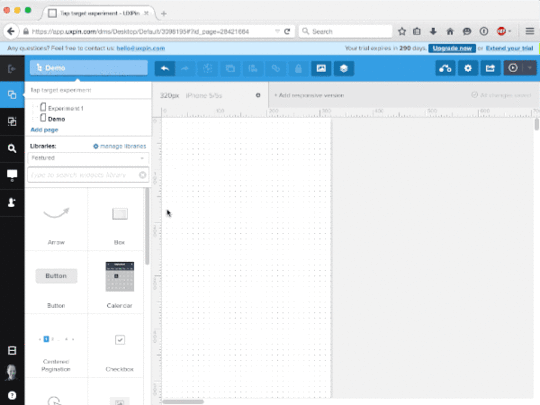
Granted, testing within our office isn’t the best scientific practice. Ideally we’d use a full website with many differently-sized buttons and links. But that requires measuring each touch target and a lot of note-taking. Instead, you can run a much faster experiment with a prototype. If you don’t have a UXPin account, get a free trial to follow along with this tutorial.
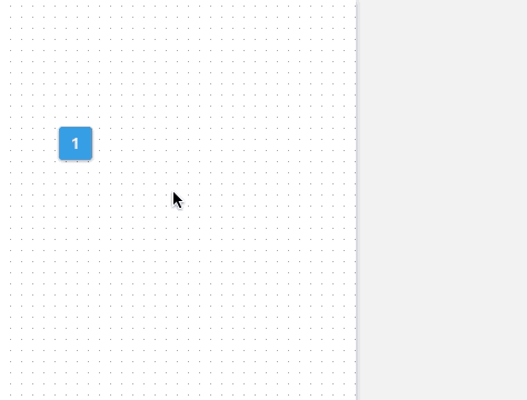
1. Create a button.
We went with a ghost button to find out if style matters as well. (The answer: not really in a lab environment.) You can use any color you want, as long as it’s consistent throughout the experiment. Make the button square.
2. Make the button interactive.
We used turned the button into a multistate element that changed to blue on tap, but any visible change — like changing a blue button to red — will work.
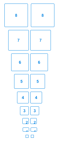
3. Duplicate and resize the button many times.
Option/alt-drag the button to a new position on the canvas, changing its size each time. We used increments of 10 pixels square and set them in order from largest to smallest, though you might experiment with different arrangements.
4. Share with your team or beta testers.
Ask people to see which buttons they can hit on the first try. Any size they can hit reliably is a good size for which to create tappable elements. What’s the smallest you can go?


UXpin's Blog

- UXpin's profile
- 68 followers

