
UXpin's Blog, page 141
December 17, 2015
5 Timeless Responsive Design Layouts to Consider

Google Product Director Luke Wroblewski recently described five broad categories of responsive layouts. Reiterated in a Google Developers post, these patterns give designers a head start when deciding how and why to set elements on a page.
Remember that an “ultimate responsive layout” doesn’t exist. Each of these options comes with its own merits, and the best choice all depends on the type of site you’re designing.
1. Mostly fluid
Luke’s “mostly fluid” pattern reflows content dynamically within a fixed parent container instead of the browser’s viewport. Parent containers — those that hold other elements — frequently use the CSS max-width property to keep from expanding beyond a certain width while fitting within narrow viewports.
According to Google, this pattern only requires one breakpoint, assigned to the parent element, while the elements inside them reflow automatically as the parent resizes. This pattern works well on sites with a diverse set of layouts among its many pages like marketing sites, ecommerce sites, news sites — anything with more than one type of content. The site for UXPin actually follows the mostly fluid pattern.

2. Column drops
Thinking mobile-first, Luke’s “column drop” pattern turns a stack of columns on its side to take advantage of additional horizontal space in tablet and desktop-sized viewports.
Unlike other patterns, this one tends to fill the available viewport regardless of size. This is ideal for responsively designed sites that users will view on a very wide range of displays.

3. Layout shifter
Unlike the column drop pattern, Luke’s “layout shifter” uses many breakpoints.

Smartphone and tablet-sized viewports see a typical stacked layout, and the design grows more complex with wider browsers by rearranging content with a specific plan. This requires designers to consider each breakpoint range as if it were an independent design, but works well for visual-heavy sites like portfolios, agency sites, and photo galleries.
4. Tiny tweaks
Luke’s “tiny tweaks” pattern is the most straightforward strategy: content, margins and padding all subtly increase with viewport size while using the same layout. This low-maintenance approach best serves simple, single-column designs — or designers on tight deadlines with little budget for later adjustments.

5. Off-canvas
Luke’s “off-canvas” pattern pushes secondary content out of sight, literally outside of the viewport until called upon.
Rather than stacking content vertically on small viewports, this pattern places them side by side with a trigger — typically JavaScript — that “shifts” adjacent panels into and out of the viewport. This is a real boon not only to navigation, but also to blogs that need to focus on large amounts of text and keep asides literally to the side.

Conclusion
When Luke Wroblewski researched these at the Media Queries website, he looked for broad, repeating trends among many different sites. He found that there is no one quick design solution that covers every situation.
And while exceptions to the above patterns may exist, these cover most situations that occur across the web. Designers can choose from these five patterns to give their layouts direction before they design — a real head start in their work.
To learn more about current web design trends and techniques, check out the free guide Web Design Trends 2015 & 2016.

The post 5 Timeless Responsive Design Layouts to Consider appeared first on Studio by UXPin.


December 16, 2015
Taming Scope Creep in Product Design

We’ve all been there. The design and development teams have all agreed on the core feature set, wireframes, etc.. and then you hear these innocent words:
“You know, wouldn’t it be cool if the app did…”
Those words spark an intense brainstorm with lots of ideas that are white boarded and sketched out, leading to even more previously unplanned features. But you all agree that these additions would make the product more valuable for the user. Everyone is excited as the teams begin plan these features without a second thought about how it impact the project timeline long term.
Whether you know it or not, the beast is staring you right in the face: Scope Creep.
While scope creep happens way too often with clients in the agency world, even in-house teams can suffer from unrestrained enthusiasm as they strive to make a memorable first impression. In product design, scope creep not only prevents you from shipping on time with features your users can test and offer feedback on, but also scatters the focus of the team.
Let’s explore a few quick ways to keep the beast at bay.
Use Your Product Roadmap As An Anchor
For the best results, use collaborative tools like Asana or even Google Spreadsheets to create the first draft of your product roadmap. Once you’re done, gather the team for feedback and revise the draft to account for any new constraints.
Now, instead of tucking the roadmap away in a PDF on your hard drive, anyone can see the initial plan as well as all future iterations.

Photo credit: Asana
As you move through the timeline and hit milestones, comment in Asana (or send a weekly email) so that everyone can see at a glance the accomplishments versus outstanding tasks.
Plan for the Unexpected
New features always sound great in a person’s head.
Click To Tweet
But in order to better evaluate whether they will improve the user experience (and add value to the business), you first need to pad your timelines with enough time to evaluate new ideas. Of course, you always need to evaluate each feature idea based upon effort required (and possible launch delay) versus potential impact.

As Mubashar Iqbal, co-founder of quuu.co and the top maker on Product Hunt states,“ My favorite approach to handle scope creep is to NEVER say no. It always seems to rub people the wrong way when they hear it.”
Instead, as Iqbal suggests in his podcasts, you should acknowledge the possibility of building the feature while also reiterating to stakeholders all the opportunity costs (e.g. launch delays or cutting other features).
For example, during the initial design of Quuu (a content curating platform for social media), the product team decided to delay launch in favor of building in a referral system. They realized the feature wouldn’t add much value if implemented after launch, so the delay was worth the potential value.
Encourage new ideas from the product team, but always respond with the required tradeoffs.
Create a Collaborative Impact vs Effort Matrix
As described in The Guide to UX Design Process & Documentation, an Impact vs Effort matrix is a useful living document for tracking the
Once you’ve initially clarified the tradeoffs with the stakeholder, ask them to plot out the feature request with sticky notes on the matrix . Share the matrix with the whole product team so they can see the current features as well as the “features graveyard”.
The matrix now shows anyone at a glance the history of product decisions as well as the rationale. You’ve essentially created a decisions dashboard. Anyone can understand the product direction within a matter of seconds.
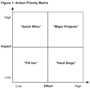
Photo credit: Time Analyzer
Quality Not Quantity
Feature fatigue dilutes the value of your product.
Click To Tweet
Every new feature you add doesn’t need to just function as planned and add value to the business – it also must make sense to users within the overall product architecture. Even when you do start planning for updates (or even a full redesign), don’t stray too far from the behaviors users have already formed with your product.
Otherwise, your feature creep soon develops into a much more dangerous experience creep.
You won’t find any magic bullets to feature or experience creep. But you can certainly build up proactive defense mechanisms. Keep your eye on timeframes, give the team time to evaluate ideas, and empower stakeholders to see the opportunity costs on their own.
Great product design is always the sum of smart tradeoffs.
Click To Tweet
Once stakeholders understand that great product design is always the sum of smart tradeoffs, you’re on your way to building a culture that can better manage its own innovation.

The post Taming Scope Creep in Product Design appeared first on Studio by UXPin.
Design Strategies for Project Leads: Managing Roles

Design collaboration is a key ingredient to a successful design process. But as teams grow, collaboration and sharing can become unmanageable. That’s why we put a priority on collaboration and communication.
When it comes to collaboration, it’s crucial that project leaders invite the right people at the right time. You need to designate roles early on to know how everyone can contribute to a project. While everyone’s work matters, it’s not necessary for everyone to participate at every step.
Designate Roles Early On
When kicking off a project, there are roles that you’ll want to determine from the start. As we discuss in UX Design Process Best Practices, you need to identify those who have a stake in the project. More than that, you need to determine what role they will play in the process.
Who are the stakeholders
This is someone who has a vested interest in the success or failure of a project. This can be executives, department heads, marketers, designers, developers and business analysts. It’s everyone who stands to lose if your project sinks.
Figuring out these people isn’t enough. As someone leading a project, you and the designer on your team will want to interview them so you can better understand what role they want to play in the project. Get their thoughts and concerns. Ask executives about their vision for the project. Talk to business analysts about the business goals. Sit down with the engineers to understand the technical feasibility of the project.
Once you’ve identified and spoken with the stakeholders, you’ll be in a better position to assign them roles on a project.

Who needs to participate when
Not everyone needs to be with a project from start to finish. You have to be judicious about when a particular role participates. Invite them too late and you’ll get feedback that might derail a project.
For example, leaving executives out until the very end of a project can create an unnecessary bottleneck. They might have valuable ideas, which would have been useful early on. And if the project has developed in a different direction, then those ideas could be detrimental. You’ll not only be frustrated, but you’ll be trapped in the position of treating the executive’s opinions as marching orders.
A few things you’ll want to do:
Talk to executives early on. They’ll have insights into the business goals that can help frame a project.
Don’t be afraid to kick people out. Marketing will have useful insights with messaging and at the prototype stage, but won’t have anything to contribute when it comes to visual design or implementation.
Don’t leave out developers. They know what’s going on under the hood. They can let you know what is technically possible and what isn’t. This will save you a lot of grief toward the end.
Get sales and customer service involved. These roles will be able to help you determine if the solution your team has come up with is the right one for customers.
Your goal as a project leader is to act as facilitator, not implementor. You need to block and tackle, or else you’ll end up with design by committee rather than a collaborative process.
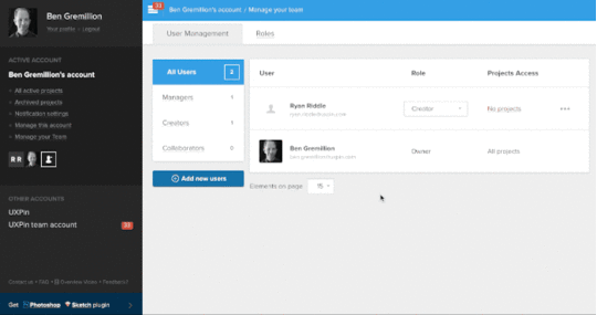
Managing Roles With UXPin
Our new user management suite makes working with anyone in your organization a breeze. From design to sharing and review, manage it all in one place with UXPin.
A few definitions
Before we go further, let’s discuss a few terms.
Member: A person on your team with a UXPin account.
Project folder: A group of prototypes for the same product or topic.
Role: Defines which members have certain abilities, such as permission to create projects, and see beyond projects to which they’re assigned. UXPin offers four roles:
Owners: The person in charge of your organization’s UXPin account.
Administrators: Similar to an owner, without the authority to close the account or change its name.
Managers: People who oversee your organization’s projects.
Creators: People who create prototypes.
Collaborators: Other stakeholders in a project who may comment on, but not edit, a prototype.
The varying roles allow everyone to contribute in ways appropriate to their job on the project. Managers, who need oversight of your organization’s work, can see every project. Unlike managers, creators — designers and other prototype builders — do not control projects. They only need access only to prototypes in their projects. Meanwhile collaborators, such as clients and marketing experts, have the ability to offer useful feedback on works in progress.
Note: Your organization may have many collaborators, creators and managers — but only one owner/administrator, a role available to enterprise users who has the ability to add new members, determine their roles, and access billing information.
Add members to your team
The user management screen has two parts: user management itself and roles, who has control of what. For example, managers can see all projects but not add new members, while creators who make prototypes can only see their work. Naturally, owners can do anything from adding new team members to commenting on projects.
But first, let’s add one or more people to your team in the “user management” screen.
Tap “add new members” at the bottom left of the user management tab.

Second, enter a new email address and choose their role. In the example below, we’ll grant “sample.name@uxpin.com” the “creator” role.

You can also tap “add multiple members” to bring more than one person aboard at once.
The people to whom you send invitations will receive confirmation emails. Tapping the email’s embedded link will add them to the project.
Remove members from your team
It happens: people come and go. Sometimes it’s necessary to take someone off your project.
To do so, in the “user management” screen, tap the three-dot icon to the far right of a user’s row. Tap “remove” and confirm the removal when prompted. This change is immediate.

Change members’ roles
Although every team member begins with a role, they don’t have to stay there. You can change the role of a team member with the “role” drop-down menu on the user management screen. Changes take effect immediately, and you can always change them back.

Assign creators to projects
While owners and managers oversee every project in your organization, creators and collaborators can focus on their work. To do that, we need to add them to the appropriate projects.
First, view the creators or collaborators to find the team member. In this case we’ve tapped “creators.”

Next tap the number of projects — if any — to which this member is assigned. Then turn on the checkboxes for the project(s) you wish this user to access. Tap “save” to commit changes.
Collaboration With the Right People at the Right Time
UXPin’s user management tools allows you to invite the right collaborators at the right time, making it easy to change roles, or add new members to your team. Get your free trial and start collaborating with your team today.
Reimagining the way you design.A new version of UXPin is coming.Sign up for a trial and be the first to know about the new UXPin.Your e-mailGet free trial now!
The post Design Strategies for Project Leads: Managing Roles appeared first on Studio by UXPin.
December 15, 2015
Web Design in 2016: The Future is High Definition

HD devices are more available now than ever before.
The prevalence of HD displays today is no coincidence, and design is pairing with new and imaginative visual techniques to bring these details to life. But applying HD to web design can be as intricate as the fine details in its displays. In this article we’ll explain the basics you need to know to get started, from the technical details, to some of its most useful applications, and even including some free online resources.

Photo credit: http://www.wonderfullywild.co.uk/
Defining High Definition Design
Before we explore the technique of HD backgrounds, we need to first examine the technical nuances of the medium.
The number of users with high definition displays – from televisions to computers to phones – is growing daily. Brands such as Apple with its standard Retina display for multiple devices are quickly gaining popularity. While it’s hard to track the actual numbers, we know anecdotally that HD is steadily becoming a core design consideration since even alternative 4K displays are falling under $600.
When you consider how much web design evolved from the CRT to LCD era during the early 2000s, it’s quite clear that affordability will only lead to more demanding visual design innovations.

Photo credit: http://www.crushdesign.be/
When we talk about high definition, pixels are a natural focal point.
Let’s review quickly with one of the best pixel reference guides from Designmodo:
Device pixel is the smallest physical unit displayed.
Pixel density is the number of pixels displayed in a given space.
Resolution is the number of pixels across the entire width or height of a device.
Pixels per inch (DPI or PPI) is the number of pixels you get when you divide the physical width of the display by the number of horizontal pixels displayed.
High DPI is a display density of 200 pixels per inch or greater. On the other hand, standard DPIs are usually set at 72 pixels per inch.
In a nutshell, HD devices contain twice as many pixels as a standard definition screen. In fact, the next-gen Apple 5K retina display is even more powerful since it maxes out at 5120×2880 pixels. Of course, more pixels mean more detail and crisper, sharper images – that also means these screens are less forgiving of designs with any visual imperfections.
Background Graphics: Raster vs. Vector
Now that we’ve covered the pixel nuances of HD design, let’s discuss how that affects the file formats if you’re using static HD background images.
Almost from the first days of website design, designers saved images to 72 pixels per inch – this includes everything from photos to graphic elements. The compact size improved load times while still providing plenty of resolution to render nicely. Raster formats such as jpg, gif and png were commonly accepted.

Photo credit: Squarespace
However, HD web design requires rethinking and using vector formats (while print designers have been doing it for ages, this is a comparatively new concept for the web). That’s where the Scalable Vector Format, or SVG, comes in. As with other vector graphic formats, SVG graphics use connected points and lines, rather than pixels, to create images that can be scaled to any size without a loss of quality.
Jay Yadev explains SVG: “The benefit of this image format is that when you increase the size of the image, it’ll always stay sharp, and will never get pixelated…It allows you to use the same image in different sizes without losing quality of the image. SVG images are also very small in size.”

Photo credit: Femme Fatale via awwwards
But the format isn’t without its limitations. Converting a photograph to SVG, for example, won’t work because the original image was composed using pixels and will never render properly at a larger size than the actual image.
HD brings web designers almost full circle with print designers in the way they think about and plan for images. It boils down to raster versus vector.
Here’s some general guidelines for knowing when to use each type of file:
Use raster (composed from pixels) for photographs or for formats that were created using pixels.
Use vector (composed from points and lines) for original artwork such as logos, drawings, or user interface tools or buttons.
Aside from choosing the right format, make sure to also try out some CSS tricks to make sure the image is positioned and displayed properly in the browser. If you’re not a CSS expert, feel free to check out some alternative methods.
Enter the HD Video Background
As screen displays increase in resolution (possibly to a point where we won’t even be able to tell much difference), HD will continue to evolve as a widely-accepted design pattern – especially as designers who started with HD image backgrounds now transition to HD video backgrounds.
HD video is still new enough that much of what we have seen so far isn’t even that sophisticated – mostly just a short loop with different visual treatments. Layered on top of the video, you’ll usually find high-contrast text (usually white or black) and/or a ghost button.

Photo credit: http://wagamama.yoani.co.jp/#
HD backgrounds also provide natural opportunities for the use of a wide spectrum of color, which includes everything from rainbow-style textures to bright color paired with HD images or video. As you can see above, Wagamama uses a full-screen video with bright color as a loading page that prepares the user for the equally bright colors throughout the rest of the site.
Another usage is “still” HD video, which contrasts the fast-paced action video that is most popular on websites right now. Combines still action with video (whether stitching together photo collages as an animated slideshow or just thinking about video production in a more subdued way) is a clever way to stay modern while maintaining a more calm atmosphere. When done well, the result is a visual experience with better pacing.

Photo credit: http://bellroy.com/live-life-outside
Bellroy (above), a wallet cover manufacturer, uses a full-screen HD video background with very little actual movement. The serene video shows the featured product standing unmoved amidst the natural motion of the falling snow, a slow-paced effect that emphasizes durability despite the elements. The three-dimensional look (created through smart use of foreground and background) grabs your attention without looking too much like the standard background video loop.
Another variation on the typical video background is to blur it. The blurred background is a teaser that lures in the user, making them want to interact with the site as a means of revealing what’s truly going on.

Photo credit: http://fernando.is/all-about/
The blurred technique is still effective with HD video because the motion is still discernible even though the details aren’t. While the above example from Fernando Maclen’s site stays true to its headline of “Superb simplicity” by blurring the video and only allowing users to click through to his external portfolio links, it’s not the only way to implement this technique.
For more complex sites, you could use a call-to-action to reveal the full-clarity video as the splash page transitions to a traditional sectioned landing page (with the video as the top section).
The Future of HD Backgrounds
Given the human fascination with visuals, HD isn’t going anywhere in the near future. In fact, designers are just now getting comfortable with the fundamentals, so it will be interesting to see how this tactic expands over the next few years.
As more designers experiment with HD video, we’ll continue to see layered effects used in familiar as well as creative ways. Blurring and color overlays will take center stage since they help entice the user through the power of discoverability.

Photo credit: http://www.colorplanpapers.com/
More designers will experiment with merging foregrounds with backgrounds as they play with 3D effects. While this is an easy concept to see, it is a bit harder to explain.
Look at the site for Color Plan Papers above: The floating circles in the background add a fun animated effect, but upon mouse-hover, the bubbles expand dramatically and come to the user’s attention in crisp focus. The effect, while simple, brings the background to the foreground, blurring the lines between the dimensional worlds.
HD opens a lot of doors for designers, leaving their biggest limitations to their imaginations. By enabling finer details, HD gives designers more freedom to experiment and play with techniques we might have not quite imagined yet.
To learn more current web design techniques, check out the free Definitive 2016 UX Design Trends Bundle. The bundle explains techniques across 350+ pages and 300+ examples spanning web, UX, and mobile design.

The post Web Design in 2016: The Future is High Definition appeared first on Studio by UXPin.
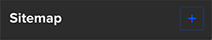
Using the Sitemap

UXPin’s sitemap feature helps you create more complex wireframes with multiple nested pages in order to move your designs to a higher level. With the sitemap and basic interactions, you can link between pages for fully interactive prototypes.
Creating New Pages
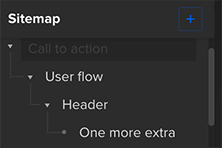
Here is a wireframe with four pages. You can see them in the upper left corner of the editor.

Adding a new page to the sitemap is very simple. Can you see a blue plus sign in the sitemap section of the editor?
Click it and the following modal appears:
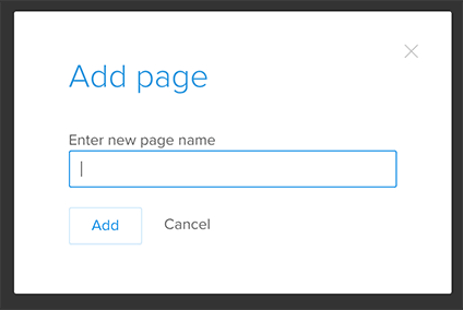
Here you can name your page and add it to the sitemap. Every new page appears as the last one in the list. Of course you can change its position; I’ll show you how in a moment.
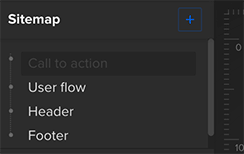
Active Page Options
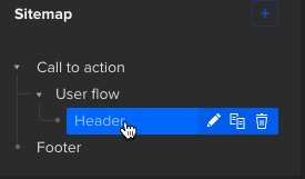
First, let’s focus on the active page. As you can see not all the pages in the sitemap look the same. The name of the page “Call to action” is written in grey and has darker background, because someone is working on it right now. Every time you switch between pages, the active page will be marked this way:
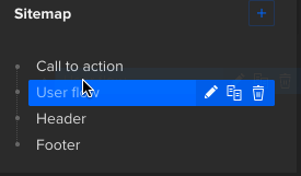
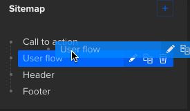
Pages in the sitemap have several options. When you hover over the page’s name, you can rename, duplicate or remove it. There is just one thing you need to remember here. When you want to remove a page, first check if there are any other pages nested to it. If you delete a page, you will also delete any sub-pages attached to it and you might not want to do that. However, you can always unnest your sub-pages before you delete a parent page (you’ll find the instructions below).

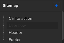
Organizing and Nesting Pages
You can also change the order of the pages. To do that you just need to grab the page and drag it to the place you want to have it in the sitemap. Wait till you see a blue line in this place and drop your page there.
See what’s happened? The page called “Call to action” is no longer the first one in the sitemap. We moved it and now it is second page, below “User flow”. It is also possible to nest a page. imply grab the page you want to nest, then drag it so it’s placed over the other page and drop it there. It’s done!
You can nest a page to already nested one — no problem. There is no limit to the number of sub-pages you can create. As a final result you can achieve a complex sitemap which suits your needs the best. This is just an example, you can really go crazy with it.
The sitemap also allows you to unnest pages. Just grab a page and move it back to the main line in the sitemap. Once again wait till you see a blue line indicating where the page will go.
Start organizing your complex, interactive prototypes with a free UXPin account.
The post Using the Sitemap appeared first on Studio by UXPin.
December 14, 2015
An Actionable Strategy for Data-Informed Design

We can all agree that by definition and principle — at least theoretically, design is about solving problems.
Specifically, user experience strives to create a human touch amidst complex technological advances. It is the extra detail that makes a product a bit more fun for everyone, especially for the less savvy crowd.
Many practices can build a good user experience. Those practices differ based on the complexity of your project:
For a personal website/portfolio, you can use a very simple approach by asking the clients what she wants to accomplish on her website, then validate with a few quick interviews with employers. Based on that input, you can design a site that reflects current trends and highlights the appropriate skills.
To redesign a SaaS platform, you would conduct more field research by visiting customers, listening to their frustrations, then designing some new solutions and observing their reactions/feelings in the A/B testing process.
In this article, we will strive to find a joint force of using data (online and offline), together with human input, user feedback, and designing for the user. Below are the two approaches we will combine into a useful approach with a simple outcome: A kick-ass validated experience.
Human-centered Design (or HCD)
Popularized by the design firm IDEO, HCD is a creative approach to problem solving that starts with the user.

Photo credit: Angelos Arnis
In a nutshell, it is the empathetic approach to design we all advocate.
Identify the core problem with users
Brainstorm with all product stakeholders for the best solution
Create prototypes for the best experiences
Test the more sound concepts with at least 5 users
Release a validated experience/solution to the world and keep repeat the cycle for iteration.
Data-driven Design (or DDD)
DDD is a systematic approach to the development and evolution of products and services (digital and non-digital).

Photo credit: Angelos Arnis
As data becomes more accessible, decisions for design should be informed by data. To put it more simply: data complements design.
Quantitative Data-driven Design
Quantitative tactics like surveys help us answer product questions related to:
Who are the users?
What are the user’s problems?
When are the users most active or inactive?
Where are the users currently using their solutions?
Qualitative Data-driven Design
Qualitative tactics like user interviews reveal the motivation behind the numbers by answering:
How do users behave?
Why do they behave that way?
When using data, you must remember to remain empirical and specific.
When we just have data, the ideas we get might become blurry. Through observation and experimentation, we can become specific and the process becomes easier to comprehend and improve.
Fusing the Elements Together
I’ll refer to this immersive approach as a Data-informed User Experience (DiUX).
Let’s dig into the logical steps that we should take for a Data-Informed User Experience.

Photo credit: Angelos Arnis
As an example, we’ll examine Studio by UXPin, the exact resource that you’re currently browsing. Part of the subdomain includes a resources landing page with ebooks. We want to devise an informed decision if we need to make changes and increase conversions when people land on this page.
For this we need data combined with our own instincts. The quantitative data we will use is the bounce rate. For qualitative data we will ask how and why, and then we will brainstorm for better solutions with an A/B testing feedback loop.
Grab design ebooks created by best designers
All for free
 Download
 Download
 Download
 DownloadDo you want to know more about UI Design?
Download 'The Guide to UX Design Process & Documentation' FOR FREE!
Download e-book for freeCloseStart With Analytics and Observations
The empirical data is a good base for drafting our new combined approach.
We need the resource landing page analytics to tell us what happens when a user comes to this page directly. We also need to understand happens when a user comes to that page through other pages, and what happens after he takes an action to download one ebook.
Does he come back after the first visit to explore more of UXPin?
Does he visit the page only for the freebies and not the product?
Does he arrive by accident and take no action?
Additionally we need qualitative data for our process. This often gets frowned upon because some people cannot visualize these observations as data, but it is crucial to validating the numbers.
For instance, we could follow up our investigation in Google Analytics with 30-minute user interviews that explore:
How do the users get to the resources landing page? Why did they decide to click through?
Why do some stay for more, and why do others leave right after they completed an action?
Do returning users use the page differently than first timers?
As Dave Yeats (Senior UX Designer, Bazaarvoice) points out:
“I’ve come across too many instances of people dismissing qualitative research as ‘anecdotal’ because they don’t understand how non-numerical data is still data.”
After we have gathered this information, it is time to dive into practicing the second part of our new approach which is a bit more practical — and usually more fun.

Applying Our Data
To continue the data-informed process, we create personas based on the analytics and insights from user interviews. The analytics tells you “what” they do (e.g. sequence of pages visited, most popular page), while the user interviews helps you flesh out the persona with “why” they acted that way.
When you’re done with the persona exercise, you’ve created a clear picture of the user backed up by hard data. The persona is no longer purely qualitative.
We will then share the user insights with the whole team and start to build out prototypes of the most viable ideas. Once we collect feedback on the most logical designs, we will iterate, test with users, and continue refining by releasing the iteration and A/B testing.

Photo credit: UXPin prototype iterating
Naturally, there’s always more qualitative data to be collected. More observational data and feedback from the users helps us evolve it in the wild the world (note: iterations are always part of the process even after ‘finalizing’ your design). For instance, you should validate the A/B test results with at least a quarterly interviews with 5-7 users.
Key Findings
By combining the empathetic HCD approach with the structured DDD approach, we’re better able to design experiences backed by more than just our gut feelings. We’ve arrived at a holistic design strategy that incorporates business thinking and design thinking.
We are designers. We are makers. We want to believe we are inventors. But most of all, we are people. Designing a great experience is all about that.
Or as Christopher Murphy puts it:
“The secret to success in our fast-paced industry is, I believe, straightforward: make things, share things and — last, but by no means least — be nice to people. That’s it, really.”
Finding the right balance between data, empathy & experimentation is the distilled result.
Design That Matters: Helping Refugees With Data-Informed Design
Recently a group of refugees in Berlin banded together to map key resources across the city, including counseling, healthcare, German language lessons, accommodation, legal assistance, police and public transport facilities.

When you examine the project in detail, you see the potential for data-informed design.
The team conducted quantitative research in the form of surveys, aggregated the results, then validated the answers by interviewing refugees. The combined approach helped them understand the most visited areas of the city, and more importantly, why.
Based on the results, the team built an interactive tool designed to welcome those escaping persecution and violence.
This is design at its most human.
At the end of the day, UX design is all about creating meaningful experiences. Designing with people, for people, based upon data we know about people, will always be a repeatable formula for success.
If you’d like to learn more about UX best practices that result from data-informed design (like personalization and meaningful gamification), check out the free Definitive 2016 UX Trends Bundle. The bundle includes 3 ebooks in a single download.
The post An Actionable Strategy for Data-Informed Design appeared first on Studio by UXPin.
Lead Your UX Team With a Measure of Success

A strange irony about digital design is that ultimately it’s neither about the digits nor the design. It’s about communication between people, like helping users to use a tool, explaining a product’s benefits, educating curious readers about a topic or expounding upon one’s opinion. In every case, design should support goals that benefit the site’s owner, the end user, or preferably both.
In this post we’ll look at four steps to keeping your whole team pointing the right direction with a single mission statement document that works.

1. Get your stakeholder’s real needs.
What problems should the design solve? To find out, start with three questions:
What is the company about?
What impacts their bottom line?
How do they benefit their customers?
At first, answers are often superficial. Keep asking until you get the real story. “We need a website that tells people about us” is not a strong answer. “We help people to accomplish X” is. It’s your value proposition, and your product’s promise. For example, our own website states that “UXPin is the UX Design Platform that gets it right.”
Try this: Visit your favorite site, or better yet your own site. Can you sum up its benefit based on its first-impression-making home page? Can you put it into a sentence?

2. Decide what “success” looks like.
“Success” is the measure of how well a product solves problems — yours and your users’. We can determine it with hard analytics or subjectively with, say, comments on social media. In either case, partial success is when a site or app fulfills either the client’s or the end users’ goals. Total success is when it does both.
A good measure of success includes three specific factors:
A goal, e.g. doubling signups
A rate, like signups per week
A timeframe to gather results, like six months
So a good (if lofty) measure might be to double signups per week by the end of six months.
3. Engage your team.
It’s said that no plan survives contact with implementation, and UX is no different. Once the goals are clear to you, review them with your team to devise potential solutions — and to keep your imagination in check.
“Product video” is an easy line item to write. To implement? Not so much. Ask your team how they plan to meet the goals.
4. Share this in a formal document with the team.
As we wrote in the free Guide to UX Design Process & Documentation, a structured process helps us consider the emotional, physical, and supplemental parts of the product. We don’t need anything elaborate, just a mission statement that defines the goals and measure of success. Keep your team stoked with conversation: “how can we achieve X?”
Write them down. Give everyone a copy. Then put them to good use:
In brainstorms. Keep creative sessions on track by starting with a review of this doc. In particular, mind maps tend to wander a bit too much without guidance.
In collaboration. Conclude meetings with this document. Did your team decide something that will help us achieve your goals?
In staying positive. Keep your team stoked by framing goals as challenges. The key is to carry on with “and,” not “but.” For example, “That looks great, and how does this help us to … ?”
In user testing. Click at random through your site. Don’t aim, just go. If you find yourself meandering, then your pages need better calls to action. But if you end up at something that meets your goals, then you have a good user flow.
In real-world situations. Talk to your client’s customers, or ask your client to casually poll them. What do they keep asking for? If there’s a trend, then there’s an opportunity to adapt the goals.
Writing your goals down and sharing with the team allows you to have more informed discussions. It also keeps the project on track and helps to avoid feature creep.

Going forward
Designers sometimes build websites based on the its merits. But that misses the mark. How does a website achieve the company’s or organization’s goals? What’s your measure of success?
As we discussed in our e-book, UX Design Process Best Practices, there are many kinds of formal documents: specs, style guides, mood boards and change logs, to name a few. Get the free e-book to learn more about keeping your team on track.

The post Lead Your UX Team With a Measure of Success appeared first on Studio by UXPin.
December 11, 2015
Think Small: Designing Clear Interfaces for Wearables

Mobile design taught us to design small, now wearable design is making us design even smaller. While designing for a watch might seem intimidating at first, going back to the basics of design theory can help you make the right wearable choices.
Wearables present a unique set of challenges when it comes to design.
The canvas is small — tiny, even — and there are many different types of popular wearable devices. (And even more watch-style items hit the market all the time.) Some wearables offer color screens and plenty of features while others are super-simple aesthetically with robust functionality.
Different Types of Wearables
From simple fitness trackers to more feature-packed watches that sync with your phone’s operating system, there’s a lot more variations to consider when designing for these small interfaces.

Photo credit: Apple Watch

Photo credit: Tom Tom Multi-Sport

Photo credit: Fitbit Surge
Currently, we see three major categories of wearables:
Phone-based watches, such as the Apple Watch or Samsung Gear S2
Independent watches, such as those with GPS functionality that are popular with athletes
Activity trackers, such as the Fitbit Surge
Each of these devices comes with a screen that is only a few millimeters in size, making watch UI design quite the design challenge. Some devices include full-color screens that support animation. Many of the other features you are accustomed to seeing with your phone, while others are still limited to a white-on-black display (or vice versa).
Applying UI Design Theory
So how do you design for all of this? And how do you do it consistently?
It all comes back to design theory and the concepts you learned around the time you created your first design projects. These concepts include color, contrast, space and typography.
Color
Most watch screens today are black and many watch apps run with light elements on a dark background. This make color choice especially important because you need to use colors that will work well and stand out in this environment.
When it comes to working with a dark background, that means design elements need to be designed with a palette of light or bright colors reminiscent of Flat and Material Design.

Photo credit: Runtastic
Above, Runtastic does a good job using color with bright hues that are easy to see against its dark background. Blue helps establish branding while brighter greens denote buttons and user actions. All of the color options are easy to see and contribute to the design and functionality.
Contrast
Contrast is also important on small screens.
Designs should clearly define individual elements and include plenty of separation between them. This is particularly important if there are multiple tap targets on the screen. Contrast is also important because it makes elements easy to see at a glance, which is the way many watch users will interact with the device.

Photo credit: Streaks
Above, Streaks uses bright and dark options to create stark contrast between elements, contributing to readability and tap-ability. Each circular item is designed for touch and the function is easy to see thanks to color and size choices that make each element clear.
Space
Space can make or break the design on a small screen. Too much space and you don’t have room for any content. Too little space and elements are hard to see or read. There’s a narrow middle ground that helps provide function and usability.

Photo credit: The Guardian
Above, The Guardian newspaper does this well. Images and text placements include plenty of room to provide a single message on each “screen.” This message includes text — note the low character count per line and exaggerated leading — and images.
Typography
Only one type of typography works on these tiny screens: simple typography.
Almost all of the apps on the market include simple sans serifs with medium stroke weights. (Some thinner typefaces or heavier options for accents.) Type size is typically larger than you would guess. Aim for about 20 characters per line with no more than 6 lines per “screen.” Any more text and you go beyond what is scannable.

Photo credit: Citymapper
Above, Citymapper uses several layers of interface text to create a solid and distinct hierarchy for different actions. Typefaces are simple and text is clear. The watch app puts all of these elements together — color, contrast, space and great typography — to help users determine what information is most important.
Grab design ebooks created by best designers
All for free
 Download
 Download
 Download
 DownloadDo you want to know more about UI Design?
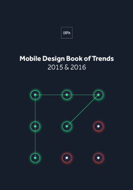
Download 'Mobile UI Design Book of Trends' FOR FREE!
Download e-book for freeCloseWhen it comes to wearables, simplicity, minimalism and micro-interactions are also important. When you put it all together, you should end up with something that looks (and works) great on a tiny screen.

Photo credit: Pittsburgh Steelers App
Above, the Pittsburgh Steelers app, combines all these elements for an app that is aesthetically pleasing with plenty of color and images yet still easy to use. The content and information is designed in a functional way, thanks to plenty of space and contrast between elements and actions that are easily distinguishable.
What’s Next?
When it comes to wearables, we’re just starting to learn best practice for wearables, making their UI design open to any practical ideas.
While most of the interfaces behind wearables are native, could we build them to be more integrated with websites and other apps. Most designers are building wearable aesthetics to mirror the other tools already, but could they be built together?
Will we start to think about how we use wearables in different ways?
It seems like every person you ask uses their wearable for a different reason or purpose. For now, however, it seems most phone-linked wearables are just an extension of the phone itself. We might imagine that this could change, but it’s hard to foresee a time when users browse the web from a watch-sized screen.

Photo Credit: 7-Minute Workout
When do wearable apps become more of the native go-to?
It wasn’t that long ago when we didn’t talk about mobile-first design. Now it’s the first thing you hear.
Could that happen with wearables? It’s hard to tell. Market saturation will likely have to increase before the industry moves in that direction. (Estimates have the leading wearables at Fitbit and Apple Watch, with between 2.5 and 6 million in watch sales. Compare that with an estimated 94 million iPhone users.)
Takeaway
Basic design principles exist for a reason. Regardless of device size or scale, you can use these concepts to create a design that works. That’s not to say you should adhere to every “rule” from UI design theory.
Experiment. But listen to the little voice in the back of your head. When you doubt the way something works or how you should tackle a design project — no matter how small — start with the basics. And always test with users.

Feature photo credit: Forbes
The post Think Small: Designing Clear Interfaces for Wearables appeared first on Studio by UXPin.
Free e-Book: The Designer’s Guide to Collaborating with Developers

UX design is a team sport. But how can designers and developers understand each other when they speak different languages?
Designers and developers both have the same goal, so it seems natural that they work together. But while designers are talking about looks and emotions, developers are talking about coding and feasibility.
Think of our free e-book The Designer’s Guide to Collaborating with Developers as a translator.

In just over 80 pages, this guidebook covers the common pitfalls between designers and developers, and how to work around them. Drawing on the advice of experts and our own real-life experience, we outline five chapters of ways to put aside differences and achieve what both of you want — a better product.

This e-book covers the best practices for:
Understanding the technical implications of design
Incorporating developers in the design process
How wireframing and prototyping can eliminate development issues early on
Techniques for teamwork, feedback, and meetings
Building realistic mockups that developers can manage
General advice on style guides, collaboration tools, and UX documentation
The post Free e-Book: The Designer’s Guide to Collaborating with Developers appeared first on Studio by UXPin.
Web Animations In Interaction Design: 2016 And Beyond

Web animation was once thought of as just ornamentation, but as technology advances and internet connections accelerate, designers are embracing the practical benefits.
The sooner you recognize it’s full potency, the better.

Photo credit: http://www.denisechandler.com/
We’ll explain web animation’s 5 most effective uses, as well as what to expect the near future. But in order to understand where animation is at now and where it’s going, you must first know where it came from.
Pre-Internet Roots
Like other recent design trends (minimalism, for example), animation has a rich history reaching far back before digital design.

Photo credit: http://en.nebo-studio.com/
Two Disney animators, Frank Thomas and Ollie Johnston, published one of the best go-to books on the subject, Illusion of Life: Disney Animation. The 12 principles outlined in this book still hold true today, and — with slight modifications — apply just as well to the web as to film.
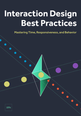
While we explore each of these 12 principles in detail in Interaction Design Best Practices: Book 2, we’ll go ahead and give a quick overview:
Squash and stretch
Anticipation
Staging
Straight Ahead Action and Pose to Pose
Follow Through and Overlapping Action
Slow In and Slow Out
Arc
Secondary Action
Timing
Exaggeration
Solid Drawing
Appeal
These principles outline how to do animation right, whether with a cartoon dog or a window on a website. To see them in action, animator Cento Lodigiani recreated each one as a GIF using simple shapes.
5 Main Uses for Web Animation
As we mentioned above, animation has practical benefits beyond just visual appeal. Web animation creates a smoother and more polished user experience. Let’s take a look at some helpful tactics.
1.Revealing Information
Animated effects help get your message across more clearly. As a communication aid, animation is most commonly used to reveal information, usually through hovering or clicking.
Visuals like a slow fade, a box crawling in from the side, or a UI card spinning to reveal more information are far more preferable than the content suddenly appearing out of nowhere. Animation makes the revelation less jarring — not to mention provides an opportunity to add some delightful character to your site.

Photo credit: https://www.flickr.com/
A popular example is Flickr, where the capture slowly fades in when you hover over the picture.
2. Transition
New information windows aren’t the only potentially jarring experience with site interaction. Switching pages, tabs, scrolling, activating buttons — all these can benefit from an animated transition. The eyes need the motion of animation to avoid an otherwise abrupt change.

Photo credit: http://www.takeitapp.co/en
The scroll-based site for the Take It apps uses transitional animations well. As you scroll down through the different pages…

Photo credit: http://www.takeitapp.co/en
… The same six photographs move and change with you. This makes moving through the pages smooth, comprehensible, and fun — plus it helps demonstrates the points of each page.
3. Notification
Because the human eye is attracted to motion, animation is the perfect way to announce a change. This is especially useful for ecommerce sites, as it helps recreate the instant gratification of in-shop purchases.

Photo credit: http://photojojo.com/store/
The Photojojo Store takes advantage of this by using an animated “+1” that flies to the shopping cart when users select an item. This also draws attention to cart itself, notifying users where to click for checkout.
4. Emphasis
The attention-grabbing property of the motion applies to more than notifications. It can also direct the user’s focus to any point on the screen. As long as there are not many other competing elements on the screen, even the slightest bit of motion will grab attention. That’s why the cursor in text fields blinks when idle.

Photo credit: http://www.spaceneedle.com/home/
Seattle’s Space Needle site takes advantage of this subtlety. Since the site’s upward scrolling seems counter-intuitive (but makes sense given the context of exploring the tower), they draw attention to the instructions with a minor — but effective — animation in the up arrows.
5. Delight
Sometimes animation can be used for no other reason than delight. Like we described in the guide Web Design Trends 2015-16, this is especially useful as a distraction from an otherwise unpleasant experience — such as loading time or a missing page.

Photo credit: http://humaan.com/about/
For example, Humaan uses animated backgrounds, scroll-activated motion, and hover-revealed text (in conjunction with the content) to add personality and humanity to what would otherwise be just another dull “About Us” page.
Grab design ebooks created by best designers
All for free
 Download
Download
Download
 Download
 DownloadDo you want to know more about UI Design?
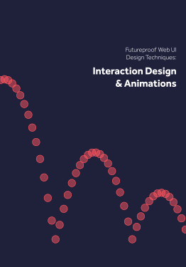
Download 'Interaction Design & Complex Animations' FOR FREE!
Download e-book for freeCloseA Note about Timing
One key component to all animation is timing. For animations triggered by the user, try to make want the effect to occur within 0.1 seconds of activation to make the interface feel responsive. We follow this rule ourselves (shown below in a sample UXPin prototype created with our free UI kit).
After scrolling to the bottom, the signup form appears within 300 ms. This is an intentional effect we added to support a snappy feel without creating a jarring effect.
The Future of Web Animation
Now that animation is shedding its association with cartoons, more professional industries like financial or medical institutions are using it with a more refined style.

Photo credit: http://avenirclinic.com/
Dentistry is historically an industry that takes itself seriously, so L’Avenir Dental Clinic uses conservative animated effects: scrolling activates new windows to slide open. No need for bouncy icons.
Ecommerce, too, can take advantage of animation for practical purposes — namely the 360-degree rotation of products pictures. This gives the user more security when shopping online, one less advantage in-person shopping has left.
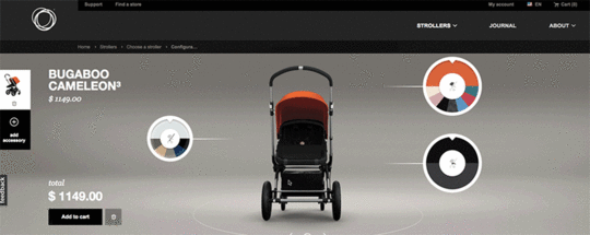
Photo credit: Bugaboo
As more designers embrace Google’s Material Design philosophy, their take on the technique will become more prominent. Their documentation describes animation in this way:
“Just as the shape of an object indicates how it might behave, watching an object move demonstrates whether it’s light or heavy, flexible or rigid, small or large. In the world of material design, motion describes spatial relationships, functionality, and intention with beauty and fluidity.”
Not only is animation expanding its range of industries, it’s also evolving in its application. As a means to combine animation with realism, animated photography is emerging as an up-and-coming trend.

Photo credit: http://lookbook.bolia.com/chilling/
Bolia blends real photography and scrolling animation to immerse their users in their online experience. This blurring of the lines of reality is only going to become more popular as technology allows it.
Additional UX Knowledge
For more analysis of the web animations — as well as 9 other current web design trends — check out the free ebook Web Design Trends 2015-2016.
You’ll find 166 hand-picked examples from companies like Adidas, Intercom, Apple, Google, Versace, and others. To help speed up the design process, there’s also a curated list of 100 free resources.

Feature photo credit: Squarespace
The post Web Animations In Interaction Design: 2016 And Beyond appeared first on Studio by UXPin.
UXpin's Blog

- UXpin's profile
- 68 followers

