
UXpin's Blog, page 138
February 2, 2016
5 Tips from 5 PMs to Improve Your Team’s Product Roadmap
Aptly named, a product roadmap is a document that lists out the approximate schedules for a product lifecycle, including:
High-level business goals
Features aimed at achieving these goals
KPIs for tracking progress
Product roadmaps are simply an organizational tool to keep the entire team on track, and, like the product itself, will change and adapt continually throughout the design process.

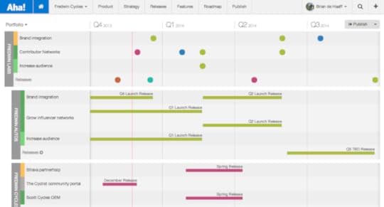
Photo credit: Aha! Product Roadmapping Software !!
We’ve pulled advice from some expert product managers across web on how to make the most useful product roadmap possible.
1. Try a Collaborative “GO” Roadmap
Product roadmaps require collaboration. They need to account for all business goals across departments, the timeframe needs to be tempered based on all departments’ restrictions, and they require everyone working in the same direction. You can’t expect the entire team to rally behind a plan they had no input in.
Product management instructor, writer, and consultant Roman Pichler suggest holding a 2-4 hour workshop with all the right people. Working together to create a basic, goal-oriented (GO) roadmap firmly cements which goals to prioritize, and gives the PM everything they need to know to make a more detailed PR.

Photo credit: “ 10 Tips for Creating an Agile Product Roadmap .” Roman Pichler. Pichler Consulting .
As shown in Pichler’s free template, GO roadmaps illustrate:
Date – When will the product ship?
Name – What are we calling it?
Goal – What problem are we trying to solve?
Features – What core functionality is required?
Metrics – How will we know we accomplished our goal?
If 2-4 hours isn’t not enough time to create a working GO roadmap, perhaps the fault lies in the product design or lack of research. In which case, the roadmap is not the problem.
2. Don’t Research What Features Users Wants — Research Why They Want Them
When UX guru Jared Spool and product management expert Bruce McCarthy work together on an idea, it’s time to pay attention.
Spool describes the application of McCarthy’s idea on “themes,” not features. This means product design should not focus on releasing a new feature as much as solving a customer problem. Why doesn’t the user want this feature… and is there a better solution?
This strategy also puts you on the forefront of your market with new ideas, instead of trying to “catch up” with your competitors and their features.
As we first suggested in the free Guide to Usability Testing, make sure your user interview questions focus on behavior rather than opinions.
3. Rate Features to Prioritize Them
Rate each feature, upgrade, or step beforehand so you know where everything should go.
Entrepreneur and head UX designer Clémence Debaig rates each item in three categories, and each with a scale of three:
Pain — Painful, Confusing, Opportunity
Effort — Small (1), Medium (2), Big (3)
Business Value — $, $$, $$$

Photo credit: “ How to Build a Product Roadmap Based on User Research .” Clémence Debaig. Shake Up ID .
She then charts the features by Pain and Effort rating, with scalable sized circles to represent the business value.

Photo credit: “ How to Build a Product Roadmap Based on User Research .” Clémence Debaig. Shake Up ID .
This visual aid helps make the decisions about how the importance of each item compares to each other.
Based on where the features map out, you can better decide where they fit into the roadmap and how many resources to allocate. At UXPin, prioritizing proposed features was actually the first step of our redesign process.
4. Say “No.”
Roadmaps also define where you don’t want to go.
Brian de Haaff, CEO of the product roadmapping software Aha!, reminds us that, if you don’t say “no” to certain features or ideas, your roadmap will become diluted and unrealistic.
When first presenting the roadmap, support your decisions with user research. Explain any quantitative data (in-app data, site metrics, etc.) and qualitative data (user interviews) that support your feature prioritization.
Second, learn to separate your target personas from secondary ones so you can prioritize aspects for your key users. Different types of users will want different things, so satisfy your main audience before attempting to satisfy everyone.
5. Loose Dates
According to PM and founder of ProductCamp Janna Bastow, the ideal product roadmap has instead the freedom to run its natural course and adapt to the unpredictable obstacles and new opportunities.
But, of course, realistically this isn’t always possible. PMs are questioned from all sides about schedules and dates — rightly so, because this information is helpful for other departments to do their job.
The key is communicating that a roadmap is not the same as a project timeline.
Product roadmaps are meant for showing an overall strategy, not laying out the exact date features will ship. Assure stakeholders that a more detailed project plan will follow the roadmap once you’ve collected all feedback and iterated.
More Information
For more tips on creating useful product documentation in the UX process, check out the free Guide to UX Design Process & Documentation. We explain how to create and use 25 useful documents across the 7 main stages of product design.

The post 5 Tips from 5 PMs to Improve Your Team’s Product Roadmap appeared first on Studio by UXPin.


5 Tips from 5 PMs to Improve Your Product Roadmap
Aptly named, a product roadmap is a document that lists out the approximate schedules for a product lifecycle, including:
High-level business goals
Features aimed at achieving these goals
KPIs for tracking progress
Product roadmaps are simply an organizational tool to keep the entire team on track, and, like the product itself, will change and adapt continually throughout the design process.
Photo credit: Aha! Product Roadmapping Software !!
We’ve pulled advice from some expert product managers across web on how to make the most useful product roadmap possible.
1. Try a Collaborative “GO” Roadmap
Product roadmaps require collaboration. They need to account for all business goals across departments, the timeframe needs to be tempered based on all departments’ restrictions, and they require everyone working in the same direction. You can’t expect the entire team to rally behind a plan they had no input in.
Product management instructor, writer, and consultant Roman Pichler suggest holding a 2-4 hour workshop with all the right people. Working together to create a basic, goal-oriented (GO) roadmap firmly cements which goals to prioritize, and gives the PM everything they need to know to make a more detailed PR.
Photo credit: “ 10 Tips for Creating an Agile Product Roadmap .” Roman Pichler. Pichler Consulting .
As shown in Pichler’s free template, GO roadmaps illustrate:
Date – When will the product ship?
Name – What are we calling it?
Goal – What problem are we trying to solve?
Features – What core functionality is required?
Metrics – How will we know we accomplished our goal?
If 2-4 hours isn’t not enough time to create a working GO roadmap, perhaps the fault lies in the product design or lack of research. In which case, the roadmap is not the problem.
2. Don’t Research What Features Users Wants — Research Why They Want Them
When UX guru Jared Spool and product management expert Bruce McCarthy work together on an idea, it’s time to pay attention.
Spool describes the application of McCarthy’s idea on “themes,” not features. This means product design should not focus on releasing a new feature as much as solving a customer problem. Why doesn’t the user want this feature… and is there a better solution?
This strategy also puts you on the forefront of your market with new ideas, instead of trying to “catch up” with your competitors and their features.
As we first suggested in the free Guide to Usability Testing, make sure your user interview questions focus on behavior rather than opinions.
3. Rate Features to Prioritize Them
Rate each feature, upgrade, or step beforehand so you know where everything should go.
Entrepreneur and head UX designer Clémence Debaig rates each item in three categories, and each with a scale of three:
Pain — Painful, Confusing, Opportunity
Effort — Small (1), Medium (2), Big (3)
Business Value — $, $$, $$$
Photo credit: “ How to Build a Product Roadmap Based on User Research .” Clémence Debaig. Shake Up ID .
She then charts the features by Pain and Effort rating, with scalable sized circles to represent the business value.
Photo credit: “ How to Build a Product Roadmap Based on User Research .” Clémence Debaig. Shake Up ID .
This visual aid helps make the decisions about how the importance of each item compares to each other.
Based on where the features map out, you can better decide where they fit into the roadmap and how many resources to allocate. At UXPin, prioritizing proposed features was actually the first step of our redesign process.
4. Say “No.”
Roadmaps also define where you don’t want to go.
Brian de Haaff, CEO of the product roadmapping software Aha!, reminds us that, if you don’t say “no” to certain features or ideas, your roadmap will become diluted and unrealistic.
When first presenting the roadmap, support your decisions with user research. Explain any quantitative data (in-app data, site metrics, etc.) and qualitative data (user interviews) that support your feature prioritization.
Second, learn to separate your target personas from secondary ones so you can prioritize aspects for your key users. Different types of users will want different things, so satisfy your main audience before attempting to satisfy everyone.
5. Loose Dates
According to PM and founder of ProductCamp Janna Bastow, the ideal product roadmap has instead the freedom to run its natural course and adapt to the unpredictable obstacles and new opportunities.
But, of course, realistically this isn’t always possible. PMs are questioned from all sides about schedules and dates — rightly so, because this information is helpful for other departments to do their job.
The key is communicating that a roadmap is not the same as a project timeline.
Product roadmaps are meant for showing an overall strategy, not laying out the exact date features will ship. Assure stakeholders that a more detailed project plan will follow the roadmap once you’ve collected all feedback and iterated.
More Information
For more tips on creating useful product documentation in the UX process, check out the free Guide to UX Design Process & Documentation. We explain how to create and use 25 useful documents across the 7 main stages of product design.
The post 5 Tips from 5 PMs to Improve Your Product Roadmap appeared first on Studio by UXPin.
February 1, 2016
What is Interaction Design: The Practical Framework

Interaction is what gives life to products. It captivates and surprises—and it promises us experiences uniquely responsive to our decisions and actions. In many ways, interaction design is the soul of UX design … but what exactly is it?

Image Credit: “Interaction Design Disciplines”, Wikipedia . Creative Commons 2.0
This article will introduce you to the core concepts of interaction design, explaining how to use them to breathe life into your product.
What is Interaction Design?
Interaction design—often shortened to IxD—is a field dedicated to making human-to-computer interfaces feel more like human-to-human communications. This “human” connection with your digital product leads to positive experiences for your users: more enjoyability, deeper comprehension of usability, faster learnability, deeper personal connection, and an increased likelihood of repeated use.
Central to the practice of IxD is the concept of increasing this sense of human connection by adding the right elements into an interface. Features like animations, copy, colors, visuals, timing, and layout all affect how the user feels, meaning these specific responses can be strategically generated.
The 5 Pillars of Interaction Design
The foundations of IxD knowledge comprise 5 “pillars” of focus that lead to increased effectiveness.
1. Goal-driven Design
Good UIs make it easy for users to accomplish their goals. This sounds simple enough, but all too often, designers place greater emphasis on furthering their own business goals or developing flashy-but-unnecessary features.
The key to goal-driven design is understanding what your users want and their preferences for getting there—in short, knowing them on a deep level. The best way to do this is through data-generating research you can use to create documents like personas, user scenarios, and customer journey/experience maps.

(For more on these documents, read our free UX Design Process Best Practices.)
2. Usability
The very foundation of IxD is usability: an interface must be usable before it can be good. Usability is typically measured by how much effort the user puts in to accomplish tastes; the most usable interfaces are those with the lowest degree of friction. Designers can increase usability by:
Removing unnecessary steps
Designing according to user flows (as described below)
Organizing controls and features visually (e.g., color-coding)
Using a visual hierarchy to draw attention to important areas.

Photo credit: EventBrite
EventBrite illustrates exemplary usability. They’ve streamlined a system that organizes reserved seating, simplifying an otherwise daunting task that could easily become convoluted or confusing.
Grab design ebooks created by best designers
All for free
 Download
 Download
 Download
 DownloadDo you want to know more about UI Design?
Download 'Interaction Design Best Practices' FOR FREE!
Download e-book for freeClose3. Affordances and Signifiers
Affordances and signifiers are a great shortcut for improving the other pillars of IxD.
An affordance is a feature’s evident function (e.g., a video affords playing), whereas signifiers are visual cues suggesting that feature’s affordance (e.g., a play button within a screen signifies that it’s a playable video).
Drawing on the user’s previous experience with similar sites and apps (as with UI Patterns), signifiers give the interface an intuitive feel. They’re meant to seem familiar to the user, like they’ve used them before.

Photo credit: The Onion
For this reason, designers shouldn’t deviate too far from convention; for example, a right-facing triangle almost always represents a play button. The more a signifier deviates from convention, the more effort it takes to decipher what it is.
5. Learnability
The time it takes for a user to figure out an interface and its controls is what’s called “learnability.” Learnability is important for more than just convenience — if the learning curve takes too long, they’ll likely give up and abandon the product.
The two main components of learnability are:
Consistency — The interface behaves the same way on each page and area, including visuals
Predictability — The user can correctly guess the purpose of features, whether through signifiers, UI patterns, or conclusions based on previous experiences with the product.
If your interface is inherently confusing and difficult to learn, you can increase learnability through onboarding. (For more information, our free UX Design 2015 & 2016 guide is a great resource and covers best practices on the topic.)
5. Feedback (and Response Timing)
Without feedback, there is no interaction. Think of it as a conversation between the user and the interface: the interface “speaks” in response to the user’s actions, meaning the user is no longer talking to themselves. At minimum, feedback is the task being performed, but going beyond this is an opportunity to improve UX, from subtle microinteractions like a cute sound effect alert, to grandiose animations that supplant the actual task as the reason to click.
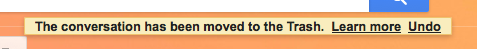
Photo credit: Gmail
Whenever dealing with feedback, it’s essential to keep response time in mind. Feedback should come almost instantaneously—ideally within 0.1 seconds—to make the user feel in control of the interface. Anything longer than that destroys the illusion of control and detaches the user from the system. Consider how frustrating it would be to play a guitar but not hear the notes for a full second after you plucked the strings.
How to Improve Your Interaction Design
Here are 4 general techniques that can be applied to any project to improve the interaction design.
Test Early and Often with Prototypes
Regular testing is the surest way to stay on track. Ideally, you’ll want to test during each iteration since you’ll be able to incorporate feedback every time you move forward. Prototypes are not something to be ignored or only done at the end of a project.

Photo credit: UXPin
Low-fidelity prototypes, such as paper prototypes or interactive wireframes made in UXPin, test issues like flow and navigation early on (before changes become too difficult to implement). In the later stages, high-fidelity prototypes test overall functionality of a near-finished product, as well as visual interactions and the success of signifiers.
Create User Flows to Understand User Behaviors
User flows map out the step-by-step, standard actions a user takes to accomplish a goal. They’re wonderful forms of documentation that can help designers better understand user behaviors and modify the interface accordingly. User flows also help by revealing unnecessary steps, highlighting places to reduce friction.
We generally recommend two types of user flows: the written approach (best explained by Jessica Downey) is more detailed and can aid constructive thinking, whereas the shorthand approach (described by Basecamp’s Ryan Singer) is better for quick organization.
Proactively Use White Space
Don’t be fooled into thinking empty space is wasted space. As part of a complete composition, white space is itself a visual element—not a blank canvas to be filled. Painters and visual artists have known the power of white space for years, something designers are also working to their advantage:
Improving Comprehension — Proper spacing between objects helps users process what they’re seeing more quickly. This doubly applies to text, where adequate white space increases legibility by up to 20%.
Creating Connotations — Grouping elements together and adding more space between groups can suggest similarities within groups. For example, a clickable button close to other buttons suggests that all are clickable.

Photo credit: Leen Heyne
Attracting Attention — As a general rule, the more white space surrounding an object, the more it draws the eye. It’s also a powerful technique for establishing visual hierarchy, and is one of the cornerstones of minimalism.
To learn more about spacing, read the free Web UI Design for the Human Eye: Volume I.
Apply the Practical Benefits of Animation
Animations are often used as flourishes or “that little something extra,” but they have a few practical benefits, as well:
Smooth transitions — Sudden and abrupt changes in visuals can be jarring or distracting; animated effects can ease such disruptions and create a smoother, more immersive experience.
Draw attention — In contrast, animations can also be used to draw attention. Consider a bouncing icon that informs users of an alert in real time.
Scrolling — With the popularity of long scrolling and single-page sites, animations like parallax effects are visually stunning alternatives to otherwise bland actions.
Loading distractions — Animations are also commonly used as a distraction from inconvenient loading times. Not only do they entertain, they can also show how much time is left until completion.
Further Reading
Keep in mind that these are just the basics of interaction design, but you can put its powerful concepts to use right away. With new studies coming out all the time, IxD can help you improve your product and gain insights into your users.
For a complete treatment of IxD, download our free Practical Interaction Design Bundle. This collection includes three full ebooks on the topic, with over 250 pages and more than 60 examples from companies like AirBnB, Netflix, Etsy, and more.
This bundle even includes our exclusive series, Interaction Design Best Practices: Volumes I & II. One of our most popular ebook series, these books thoroughly analyze the 5 pillars of IxD and how they can improve your UX, plus, they cover best practices for utilizing each, as suggested by UX experts.

The post What is Interaction Design: The Practical Framework appeared first on Studio by UXPin.
Efficient UX Isn’t Always the Best UX
Let me start by telling you a story.
Once upon a time, a woman got lost in a forest. A beast kidnaps her. They eventually fall in love and live happily ever after.
Heart wrenching isn’t it?
Ok, so maybe I missed a few parts of the Beauty and the Beast. A story told with the primary goal of getting someone from beginning to end as quickly as possible just doesn’t have the emotional impact as one that takes someone through the whole narrative arc.
But isn’t getting a user from beginning to end as easily as possible exactly what we do from time to time with our digital projects? We try to minimize the clicks and steps to get users to a particular piece of content. We don’t always put as much thought into the story we want to tell along the way.
As humans, we are much more inclined to forget random facts than we are to forget experiences. According to a study cited in the New York Times article Your Brain On Fiction, a story activates the brain emotionally in a similar way to a personal experience.

Photo credit: Jon Eikenes. Creative Commons.
As a UX architect for the experience design agency GS, my team is constantly talking about the best ways for our clients to inspire and motivate their customers. The things a company sells may be ingredients in the customer’s passion, but they are very rarely the source of their passion.
Storytelling helps tap into the true source of their passion and open up a much deeper emotional connection than products alone could do.
In this post, I’ll deconstruct one of my favorite sites and explain how to strike a balance between functional and emotional content.
An Example of UX Storytelling Done Right
BikeTiresDirect.com and Salsa Cycles are two companies I love. Both sell the bikes and cycling components that get me out on the trails for my cycling passion.
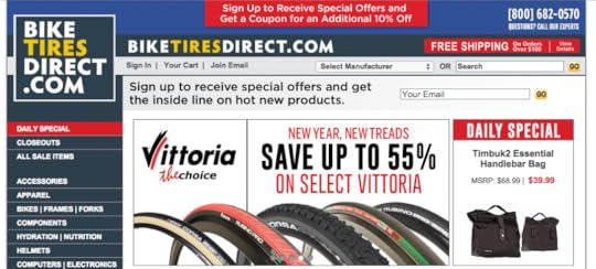

However, of the two, I have a much deeper emotional connection with Salsa Cycles because of the way they weave storytelling into their experience.
Now don’t get me wrong, I love BikeTiresDirect.com. They have great prices, a nice loyalty program and an easy website that gives me the data I need to make a purchase. But there is very little about the BikeTiresDirect website that fuels my passion or helps me dream.
Compare that with how Salsa Cycles weaves storytelling and experience into nearly every aspect of their brand. The website details countless epic rides while the printed product brochure showcases a collection of stories that perfectly compliment their product offerings. They even offer in-person demo rides to give customers (or prospective customers) the opportunity to create their own experiences.

Photo credit: Salsa Cycles
Both of these companies have a place in my life. I’m not prescribing that everyone should necessarily have the same approach to how they relate to their customers. But the questions I want to propose are:
At what level should your company be emotionally engaging customers?
How can helping your customers fuel their passion provide you with a more profitable relationship?
How can you slow down the experience to weave storytelling into a customer’s interactions?
How to Apply Storytelling Without Reducing Efficiency
Storytelling shouldn’t make the interactions feel less efficient. Here are a few things you can do to ensure storytelling is seamlessly integrated in the overall UX.
1. Understand your users’ motivations and needs
Performing user research such as interviews, surveys, and/or contextual inquiry is essential to creating the clearest picture of user needs and behaviors.
From these activities, you can then create personas and context scenarios to ensure content matches user expectations at different stages of the journey (before, during, after service).
For instance, if we were designing the Salsa Cycles website, we could interview 5-10 cyclists of varying backgrounds (from beginner to pro-am) to understand their passion and needs for cycling equipment. From there, we’d start to see our main personas (e.g. Greg the Beginner, Sarah the Weekend Warrior, James the Aspiring Pro Rider).
The interviews would also help reveal the core tasks common to all persona groups such as browsing items by price, finding on-sale items, etc. We’d also understand the emotional and functional reasons for why they chose cycling as a sport (e.g. to escape corporate stress, to live out larger fantasies of adventure, to exercise outdoors, etc.)
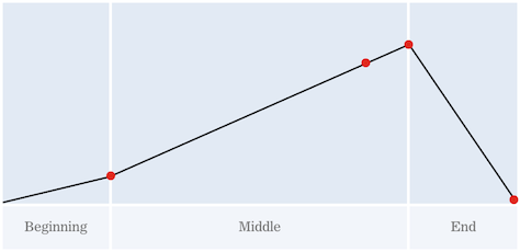
2. Be clear about your story
Once we know the core tasks and persona types, we can start to stitch together a cohesive narrative.
My favorite approach is the story mapping approach advocated by Jeff Patton.

Photo credit: Jeff Patton
As Patton recommends, we map out user stories on a timeline based on the following categories:
i. Activity
A high level user story. For example “As a beginning cyclist, I want to find an affordable bike so I can test out the sport”.
ii. Task
Now you can break down the details for the user story. For the above user story, you’d include functional tasks like “Browsing pictures of bikes”, “Comparing prices for bikes”, “Checking reviews of bikes.”
You’d also want to include persuasive tasks like “See cycling adventures” because our beginner user is still unsure if the sport is the right fit. Multimedia stories might help them live vicariously for a moment, thus emotionally persuading them to move towards purchase.
iii. Task Details/ Sub-Tasks
You describe how you might execute the task (e.g. the preferred UI patterns). For example, “Browsing pictures of bikes” might entail task details like a lightbox gallery and HD photography.
3. Define an overall messaging model.
Once you’ve created a story map, an overall messaging model helps guide the tone and type of content to clarify when it’s appropriate to inspire and when it’s appropriate to inform.
We might learn from user interviews that all bike riders seek inspirational material to plan their next trip, which then informs what gear they will buy.
Salsa’s messaging starts by inspiring riders to get out and do something they have always wanted to do.
Next the brand speaks to how they can help riders make that happen with their portfolio of products.
Moving deeper into the products, the content changes to be much more informational and a little less emotional.
Finally, the content explains how the features and specifications of a particular product benefits each rider.
Grab design ebooks created by best designers
All for free
 Download
 Download
 Download
Do you want to know more about UI Design?
Download
DownloadDo you want to know more about UI Design?Download 'The Practical Interaction Design Bundle' FOR FREE!
Download e-book for freeClose4. Make sure your story never gets in the way.
You may have the most inspirational, emotional, and engaging story to tell. But if your customer is just looking for a piece of product data, your story could actually act as a barrier.
Check the specific activities (as shown in your story map) and the overall narrative (in the messaging model) to make sure you’re delivering properly paced content.
Below, let’s examine how Salsa Cycles strikes the perfect balance.
Salsa’s bike family pages lead with content related to bike’s benefits and specs. Since we’re farther along the messaging model, the page includes less aspirational content (it’s deprioritized further down to not interfere with informational nature).
The aspirational content, however, doesn’t live in a vacuum. It still acts as a subtle selling technique for the product by conveying a message like “By buying a similar bike, you too can indulge in rich adventure”.

Photo credit: Salsa Cycles
When we create a detailed story map and messaging model, we ensure that we tip the balance in the right direction. For any given page, you get a more accurate idea of whether users need more aspirational or functional content.
On the above page, that balance is roughly 70% informational and 30% aspirational based on screen real estate.
Conclusion
Every design tells a story. Every story has a design.
It’s the designer’s job to connect the two.
The task feels completely intangible, but the techniques described above will hopefully help you build more structured frameworks for the story you want to tell.
If you’d like to learn other UX design best practices, check out the free Definitive 2016 UX Design Trends Bundle. The bundle includes over 350 pages of best practices and 300 examples of the best mobile, web, and UX techniques.

Feature photo credit: UX Matters
The post Efficient UX Isn’t Always the Best UX appeared first on Studio by UXPin.
January 29, 2016
10 Controversial UX Articles for a Fresh Perspective

Design, if anything, is about applying different perspectives to problem-solving.
We’ve collected ten of the most controversial, philosophy-challenging, thought-provoking articles on UX design, because in a career that involves so much empathy, you can’t afford to be one-sided.
1. When It Comes to UX Design, Simplicity is Overrated (Wired)
“Good UX is simple” is a long-accepted maxim of UX design, that it’s almost shocking when someone says otherwise. But Robert Hoekman Jr.’s article seeks a more complicated explanation for simplicity, and isolates the more complex qualities of UX design that we only perceive as “simple.”
2. (Fast Company)
There are those designers who think Apple can do no wrong, but Don Norman and Bruce Tognazzini point out how far they have fallen. With Tognazzini having worked at early Apple with Steve Jobs, the authors draw attention to how and why Apple abandoned some of the principles that once made it great.
3. Why Web Design is Dead (UX Mag)
No one that works in a web design field wants to hear this, but Sergio Nouvel makes some strong points regardless. The extreme title aside, the article delves into how web design is changing recently, and why, touching on topics ranging from Facebook’s business pages as a main online presence, to the upheaval caused by mobile browsing.
4. Web Design is NOT Dead, You’re Just Talking About It Wrong (UX Mag)
In response to Nouvel’s controversial piece above, Nick Dank comes to the defense of web design and counterattacks each of the initial piece’s arguments. Interestingly, he simultaneously ends up agreeing with Nouvel on quite a few points.
5. We Own You (Medium)
In the design industry equivalent of “sticking it to the Man,” Justin Jackson vents his frustration about the hypocrisy of tech companies’ falsely encouraging equality, but in actuality treat their employers as expendable servants. To preserve creative integrity, he suggests that everyone save time for personal side projects.
6. Designers Should Design, Coders Should Code (Fast Company)
Our own UXPin team tackle age old debate of “should designers bother with code?” with a resounding “no.” The piece explores both sides before ultimately landing on the separation of the disciplines, but with closer collaboration between them.
7. 7 Signs This Person Isn’t Actually a UX Designer (UX Mastery)
While our industry is flush with confusion over job titles, there are a lot of charlatans posing as UX designers. Emil Lamprecht’s poignant article is aimed at recruiters, but is informed enough to win the appreciation (or disdain) of everyone in the industry.
8. Why Design By Committee Should Die (Smashing Magazine)
Ever hear the one about how a camel is a horse designed by committee? This feature by Speider Schneider elaborates on what many of us have always known to be true: committees simply don’t make effective designers. Thankfully, he offers more practical alternatives at the end.
9. A UX Legend on the Much-Rumored Death of the Design Firm (Fast Company)
With the expansion of the UX practice, more companies are opting for in-house practitioners instead of hiring outside design firms. UX guru Alan Cooper weighs in, explaining that the efficiency of in-house designers isn’t worth the loss of independence.
10. Why We Should Design Some Things to be Difficult to Use (Wired)
Of all the items on this list, Brian Miller’s article is the one that deviates most from theory to offer practical, applicable UX design advice. Read his five points about when, how, and why to instill a little challenge in your UX.
Further Reading
One of the main reasons these pieces are so controversial is that they draw attention to the changes in UX design. Rather than going down the ship, the best course of survival in this industry is to stay current.
If you’d like to learn more about other trends and techniques, check out the additional resources below.
The Definitive 2016 UX Design Trends Bundle includes three complete ebooks on the latest UX thinking, web and mobile. Over 350 pages with hundreds of examples from companies like Netflix, Tinder, Facebook, Google, Apple, Airbnb, Waze, and more — all available for free.
The post 10 Controversial UX Articles for a Fresh Perspective appeared first on Studio by UXPin.
Free e-Book: The Field Guide to UX Strategy

The new Field Guide to UX Strategy takes you through defining, planning, and executing on a high-speed UX strategy.
Written in a how-to format, this no-nonsense, 92-page guide offers practical, everyday tips and techniques.


These guidelines come straight from Robert Hoekman, Jr, author of 8 UX design ebooks like Web Anatomy (co-written withJared Spool).
Hoekman brings his 15 years of design experience from companies like Adobe, Intuit, Dodge, Rackspace, Edmunds, and more, and explains methods he’s found most useful in the field.
In this free ebook, you’ll find:
The mechanics of a kickoff meeting — what to discuss and who to bring
What you need to know before starting the actual design
The 4 elements of strategy: vision, circumstances, design criteria, and success metrics
Instructions on how to build momentum during the design process
Why and when to validate your UX strategy
Pros and cons of live products and pre-launch design artifacts
Tracking and testing UX strategy after implementation
The post Free e-Book: The Field Guide to UX Strategy appeared first on Studio by UXPin.
UX Case Study: Designing Whitespace to Improve Conversions
Whitespace is the blank canvas from which every design begins.
The design elements contained on any website stand out or blend in based largely on the space around them. It’s natural for content managers to want to fill all the “empty space” on their site, but that impulse negatively impact everything from brand reputation to conversion rate.
To ensure your site is converting at its highest potential, it’s critical to design each section to preserve the limited attention span of your visitors.
When used well, whitespace extends site visits and turn more browsers into buyers.
What Is Whitespace?
The more elements competing for attention, the less attention a user pays to the site.
Despite what the name might imply, whitespace is blank space of any color that is free of elements like images, videos, or text. As explained in the free ebook Web UI Design for the Human Eye (Vol.1), you can use it anywhere including in, around, and between:
Headers
Menus
Images
Videos
Text
List items
Margins
Gutters
The footer.
Think of whitespace like a volume knob for site distractions.
More whitespace equals less noise, making it easier to focus. When a site strikes the right balance of whitespace, it’s easier to process and comprehend text, easier to decipher icons and images, and provides a better overall user experience.
Two famous examples of whitespace in action are Google’s homepage, and the Apple iPhone page.
Both use plenty of whitespace to guide your attention to the most important elements. Google knows you’re there to search, so they use whitespace to help you do what you came to do.
The Apple iPhone page is a vertical flow of simple design elements, each with their own message and call to action. It’s easy to process, and feels in line with the Apple’s minimalist brand as a whole.

Photo credit: Apple
Typically when a site has little whitespace, it’s because the people in charge aren’t trained UI designers.
Non-designers tend to want to fill in the “gaps” and “wasted space” they see between content. They want to cram as much content as possible in “above the fold” to make sure everything important is seen by every site visitor.
But just like you wouldn’t want to litter a nature preserve, there’s no need to treat white space like wasted opportunity.
Too Much of a Good Thing
It’s easy to imagine a site with too little spacing that feels cluttered and overwhelming.
However, it’s also possible to add too much white space. In that case, you’ve created the illusion of completeness, making it appear that a user has reached the bottom of a page, when in fact there’s a lot more to see.
This is especially important to keep in mind when designing your site’s mobile experience. A lot of whitespace between elements may create a huge blank space on mobile, tricking your visitors into thinking there’s nothing more to see.
Finding the Right Balance: 3 UX Case Studies
When it’s used well, whitespace makes a site easier to navigate.
It improves the user experience by organizing content for easy comprehension.
It creates a clear content hierarchy, separating elements from each other.
Finally, a site design with built in whitespace forces site managers to keep their message clear, reducing site clutter, and adding content that supports users on their journey.
At The Good, we try to improve conversion rates by continually testing small changes to a site’s user experience over time. Whitespace is a key part of that testing arsenal.
Here are a few examples from our client work to highlight the potential of small spacing changes to make a big difference on your site.
gDiapers
While working with gDiapers to improve their site conversions, we noticed that the homepage banner area performed exceptionally well on mobile, but not so well on desktop. Mobile visitors had no problem clicking through to the Shop or Getting Started sections of the site.
Desktop visitors rarely used the banner area to navigate. Whitespace helped change that user behavior.

Original design on the left, revised design on the right.
Once we added some spacing between the main banner image and the two callouts below, Desktop visitors used them 150% more often, and the site’s overall conversion rate lifted by nearly 20%.
The first version (above left) was the approved design that launched with the site. Everyone thought it looked great. Maybe it did, but the lack of spacing between the primary banner elements made them appear as if they were one piece of content without a clear call to action. Testing was the key to discovering higher performance and adjusting the site to align with visitor expectations.
Cummins Allison
Another example of this is with Cummins Allison, a manufacturer of coin and currency counting machines. Their homepage was jam-packed with content. There was a persistent sidebar on every page, regardless of the content’s relevance to that page. By adjusting the page layout to clear the clutter and create a more balanced visual hierarchy, their conversion rate improved and their bounce rate dropped dramatically.

Original design on the left, revised design on the right.
Subtle design changes have a huge impact on performance.
New design elements aren’t always necessary though, as we saw on their product detail page below. We tested arranging the elements of the page in new variations, and removed the busy right-hand sidebar.

Original design on the left, revised design on the right.
With prominent call to action buttons above the content, and small shifts to the display of information, the conversion rate of this page went from 6% to over 15% instantly. Over time, these small changes improved their web lead revenue by over 70%. That’s a pretty big vote for less clutter.
Xerox
On the Shop Xerox product detail page, we can see another simple example of less clutter making a positive impact. A typical page will include multiple versions of a printer to select from (bottom left), and visitors are easily be overwhelmed.

Original design on the left, revised design on the right.
By replacing the extra links around the Add to Cart buttons with whitespace, Xerox saw a 20% improvement in engagement, 5 % boost in products added to cart, and a 33% improvement in customers continuing through purchase. We tested removing other pieces of content throughout their site to increase whitespace around key elements, and saw positive results in every case.
We’ve seen this work across the board with every client.
Whenever the amount of content surrounding a call to action button is reduced, the conversion rate of that button improves. Try it on your site and see what happens.
If you have logos and social media icons around your important buttons, test moving them somewhere else or removing them completely. Aligning the page content with the most important actions for that page will result in more of those actions being taken by your visitors.
Testing Your Way to Success
The only way to be sure you have the balance of white space is with A/B testing.
Browser space is an infinite resource. You don’t have to fill every last pixel with information. People will scroll.
Don’t be afraid to embrace the power of nothing. Your users will thank you.
For more advice on designing for visual psychology, check out the free 100-page e-book Web UI Design for the Human Eye (Vol.1).

Feature Photo credit: Gitman Brothers by Barrel
The post UX Case Study: Designing Whitespace to Improve Conversions appeared first on Studio by UXPin.
January 28, 2016
How Product Innovation Gets Derailed from the Start

How does a company’s ambition for product innovation go astray? It starts with misunderstanding the word “innovation”.
I’ve heard people say they’re innovating to:
Create new products
Improve people’s lives
Grow a business
Make their customers happy
Avoid the buzz word. Instead, describe the reason why you want to innovate.
Identifying outcomes vs. outputs is how you do this.
Understanding Outcomes vs. Outputs
An output is a product, service or feature you think you should create (like an app). If you first focus on outputs, you’re forcing your product in a direction you assume your users want to go.
Outcomes, on the other hand, are goals. ‘Increasing net profit by 5%’ is a good start. But you also need to think about the user behavior required for the goal.
For example, for the outcome of ‘increasing profit by 5%’, the behavior could be ‘increasing the amount of people who sign up to our premium services by 28%’. Being specific and identifying the user’s behavior allows you to know exactly how you’ll achieve the outcome.
The solution (or output) is just a means to that end. As a designer, you should always feel empowered to redesign business processes (not just products).
Like I explained in a blog post on creating valuable products, the problem with innovation is that it’s usually described an output. By stating that you’re going to innovate, you’re usually implying that creating something totally new is the solution.
Identifying Tunnel Vision at the Onset
Let’s look at a sample project statement below.
Imagine a CEO or VP of a tech company delivering this message to a product team in the discovery phase. Based on the below statement, is this company following outcomes, or outputs?
“We are making a strategic shift to a future-oriented , competitive provider of communications, entertainment and IT services over our networks and the Cloud . It won’t be enough for us to become just cost competitive, we also need to identify future revenue generating opportunities that are arising in a rapidly changing world.”
Sounds like your standard corporate jargon at first. But if we read between the buzzwords, we identify a dangerous mindset.
“Identifying future revenue generating opportunities” is the only outcome in this statement. Even then, it’s not identifying the behavior we need to see from our users. Furthermore, identifying outputs (like entertainment and IT services) makes it hard to see the solutions your users truly need. It biases your thinking.
You’ve probably heard some version of this story with other large companies. Or, you’ve designed or managed products within a company swept up in the spirit of innovation, only to end up far from your intended destination.
In extreme cases, companies might even siphon resources from core business units to funnel into innovation projects.
As a UX consultant, I’ve seen the situation play out for far too long in far too many companies.
A Mindset For Meaningful Innovation
As shown in the Field Guide to UX Strategy, people must come before technology.
The outputs, technology and features should be shaped by the user experience. This is why we focus on outcomes. You’re not marrying yourself to an output (interaction, channel, process, or technology).
It’s a philosophy that was drilled into my design approach when I first started at PwC digital. It rings even truer today.
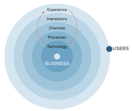
Above: The inside-out innovation mindset most companies still unfortunately follow
If we shift the example statement to focus on the customer, we come up with a better outcome.
The market hit a glass ceiling. We will not win as a business by just entering into a price war. We need to identify revenue generating opportunities . To do that, we are creating a new venture to discover new problems people will pay money to solve .
This outcome is phrased from the customer’s point of view. We’re identifying customer problems. We assume nothing about solutions.
It’s broad to allow us to explore more outcomes. Don’t confine the team to only creating new ventures. You might be better off improving existing products or features first.
Solutions aren’t restricted to the immediate industry. And they don’t need to be created by the company itself. Discovering new profitable problems could mean investing in or even acquiring a start-up.
It’s not focusing on a predefined solution. You won’t drag your users down a path of no return.
UX Workshop Exercise: Unpacking Assumptions
Innovation is a byproduct of focusing on clear, validated outcomes.
Everything can be innovative. So feel free to run this exercise on any type of project.
Get your project’s key stakeholders to take an hour out of a day (more or less depending on the questions you use below). You can say that your goal is to clarify their vision into actionable next steps (executives typically enjoy any action-based language).
1. First, write these questions on flip chart paper and stick them on a wall
Questions – User Assumptions
Who is the user?
Where does our product fit into their life?
What problems does our product solve?
When and how is our product used?
What features are important?
How should our product look and behave?
Questions – Business Assumptions
I believe that my customers have a need to?
These needs can be solved with?
My initial customers are?
The #1 value a customer wants to get out of my service is?
The customer can also get these additional benefits?
I will acquire the majority of my customers through?
I will make money by?
My primary competition in the market will be?
We will beat them due to?
My biggest product risk is?
We will solve this through?
What other assumptions do we have that, if proven false, will cause our business/project to fail?
2. Pick and choose what questions work for you. Pass out thick tipped sharpies to ensure concise and highly visible answers.
3. Go through one question at a time and get the group to write as many answers as possible on post-it notes (one answer per post-it note). Give the group 5 minutes to answer each question
4. Once time is up, stick the post-its under the question and cluster answers into categories. Give those categories titles regarding their main theme. See the example below for the first Business Assumptions question.

After answering these questions, you’ll know what your group thinks about your business and it’s opportunities.
Grab design ebooks created by best designers
All for free
Download
 Download
 Download
Do you want to know more about UI Design?
Download
DownloadDo you want to know more about UI Design?Download 'Interaction Design Best Practices' FOR FREE!
Download e-book for freeCloseUX Workshop Exercise: Creating Outcomes
It’s now time to create outcomes. Again, this exercise won’t take more than 30 minutes.
Remember that outcomes are goals like increasing sales by 5% for a certain group of users. By focusing on outcomes first, you allow user needs to dictate the business processes and technology.
We do this by writing as many outcomes as possible on post-it notes. For example: increasing user registration by 10%, decreasing anxiety through the sales channel, decreasing calls to our call centre by 15%.
Don’t focus on outputs – for example, new features, services or products.
Begin by encouraging team members to write on Post-It notes all the outcomes they want to achieve through this project. Each team member should do this individually for five minutes. Use thick sharpies.
When time’s up, each team member sticks their Post-It Notes on a wall. Encourage each person to read each one out loud to the group as they’re stuck up. The group can start clustering similar Post-Its together.
Once all outcomes are presented, the team identifies the top three outcomes. For example, the top outcomes for a foreign exchange trading platform might be: decrease anxiety for users when they’re completing high value trades, give professional traders enough information for informative decisions, and decrease help center calls by 15%.
You’ll now have clear outcomes that give you direction when making decisions about your product, service, or business.
Of course, effective outcomes must be driven by facts. After these two exercises I just described, you’ll want to interview your users, 5 people per persona group, to validate the assumptions. When you’re done, you’ll understand the gap between your assumptions and the outcomes. That knowledge helps the organization understand if and how to revise their current activities (which are based on assumption) to refocus towards the outcomes.
Conclusion
Innovation isn’t something intangible you strive for. It’s the calculated result of validating your proposed solutions against user needs.
Successful innovation just as much about your current business as it is about your future business. If you suffer from arrogance neglect and don’t focus on outcomes, your business may not live long enough to see your innovations succeed.
But if you’re focusing on the right outcomes, innovation will happen naturally – and for the right reason.
For more UX advice, you can check out the free Field Guide to UX Strategy by renowned designer and author Robert Hoekman Jr.

The post How Product Innovation Gets Derailed from the Start appeared first on Studio by UXPin.
January 27, 2016
Paper Prototyping: The 10-Minute Practical Guide
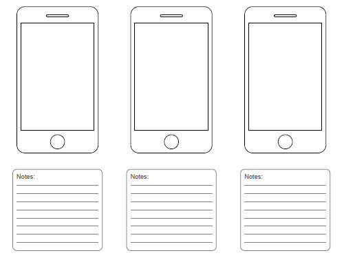
In the high tech world of digital design, sometimes the best method is still pen and paper.
To this day, paper prototypes continue to be not only viable, but also widely used. In this article we’ll talk about when to use them, why they can help, and how to make one to suit your own needs.
What Is Paper Prototyping?
As you might have guessed, paper prototyping is sketching screenshots on paper as substitutes for digital representations. What you might not have guess, there are actually different levels of complexity.
The most basic paper prototypes are sketches of each screen. In a demonstration or usability test, the sketches are switched according to user actions.
However, due to the popularity of prototyping on paper, several advanced tools are available to facilitate the process. You can use stencils to quickly and accurately recreate buttons and icons, and even mock phone cases to better depict how the product form will look.
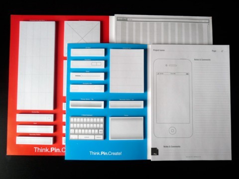
A step above these are paper prototyping kits, which still cost significantly less than design software. These include pre-made sheets, templates, and tools to make paper prototyping even easier, and step up the realism a little. In fact, UXPin got its start making paper prototyping kits, and business was good enough to launch our digital app.
At the most advanced stage, you can upload photos of your paper sketches into digital prototyping software, and add actual interactions. Our app UXPin allows designers to do this, as does the POP (Prototyping on Paper) app. This works best for designers who feel more comfortable with traditional art tools than digital ones.
Advantages and Disadvantages
Obviously, paper prototyping is not a complete substitute for digital prototyping. It does, however, have some advantages its higher-fidelity counterpart does not. Let’s review the paper prototyping advantages and disadvantages as we described in The Ultimate Guide to Prototyping.
Advantages :
Rapid iteration — No one wants to throw out a digital prototype that took hours to make, but few shed tears over a 5-minute sketch. Prototyping on paper lets you create — and throw away — multiple versions without wasting time.
Inexpensive — Paper is of course cheap, and even additional tools and kits won’t break the bank.
Increased creativity — The freedom of pencil and paper facilitates experimentation and new ideas more than software, which is limited by their features and the designer’s familiarity.
Team-building — Don’t underestimate the effects of fun arts and crafts in a business environment. Drawing, cutting, and pasting together can build team unity and raise spirits.
Less learning curve — Everyone can sketch ideas, which makes paper prototyping a great way to get other departments like marketing, development, or even stakeholders involved.
Automatic documentation — Paper prototypes are, themselves, a tangible document. Notes can be written directly on them for future iterations, and they can be left in full view as a reminder of what they taught.

Photo Credit: Fairhead Creative
Disadvantages:
No gut reactions — So much of UX design comes from the user’s gut reactions on using the product. However, there’s just no way to replicate the experience of using a digital product on paper, no matter how detailed it is.
Inaccurate feedback — Paper prototypes require a great deal of imagination, and there’s a lot lost when imagining what a product will be like. What the users are thinking may be different than what you are, but the feedback doesn’t reflect this.
Extra steps — Paper prototyping is often the end in itself, begging the question “is this necessary?” Considering how streamlined the usability of digital prototyping apps are, it might be quicker to build digital lo-fi prototypes with software than to spend time with paper and later move to the software anyway. Of course, as mentioned before, apps like ours allow you to integrate photos of paper sketches, so it doesn’t have to be a waste.
When to Paper Prototype
Jake Knapp of Google Ventures is starkly against paper prototyping, but even he admits it’s useful for early-stage conceptualizing.
With its drawbacks in mind, you can understand paper prototypes’ limitations in testing high-fidelity graphics, usability, and gut reactions. Even elements like navigation and information architecture seem out of bounds.
That said, paper prototyping is perfect for early stage conceptualizing. Its speed, ease, and simplicity, not to mention automatic documentation, make it far better suited for experimenting with new ideas than more complex digital prototypes.
Paper prototypes are ideal for:
Brainstorming meetings and sessions
Light usability testing early on
The farther along in the design process you get, the less effective paper prototypes become. The exception is if you want to explore a complete experimental deviation in the later stages.
Grab design ebooks created by best designers
All for free
 Download
 Download
 Download
Do you want to know more about UI Design?
Download
DownloadDo you want to know more about UI Design?Download 'The UX Design Builder’s Ebook Bundle' FOR FREE!
Download e-book for freeCloseHow to Paper Prototype
Otherwise known as “the fun part,” building paper prototypes draws from many of the skills you learned in kindergarten. Aside from applying the standard design knowledge, keep these tips in mind:
1. Use printer paper and cheap pencils/pens.
The form affects your creative freedom. If you use a Montblac and a Moleskin, you might subconsciously restrict your thinking since you don’t want to draw something “ugly”.
2. Start by loosening up.
Maybe you need to take a sheet of paper and scribble all over it. Or maybe you need to just start sketching out thoughts and ideas in your head as rapidly as you possibly can. Whatever works for you, start by loosening up. It’ll make your lines more confident, and your sketches stronger.
3. Prototype mobile-first.
Because of the limited space on a mobile viewport, you’ll be forced to prioritize content. When you prototype mobile-first, you create a 100% experience that you can scale up for other viewports.
4. One sketch per screen.
No matter how big or small they are, draw a separate sketch for each screen.
5. Iterate as the ideas happen.
Don’t question your ideas as they come – just let them out. You can question them all later. Remember, sometimes great ideas can come from a little detail within a terrible idea. Let them out, nobody’s judging you.
6. Gather everything you need beforehand
Make sure you have enough paper and drawing utensils beforehand, plus scissors, glue, post-its, index cards, tape, and additional tools you might need.

Source: “ war of the roses .” jm3 on Flickr. Creative Commons .
Testing & Presenting Paper Prototypes
When it comes time to show your paper prototypes to other people — whether stakeholders or testers — things get tricky. Because so much is dependent on the user’s imagination, you need to set the right context.
Designate one person as play the “computer” — A common mistake is to have the presenter also control the prototype screens, but the role of the “computer” requires full attention. To best simulate an automated system, one person’s only job should be switching the screens according to the user’s action.
Rehearse — The role of the computer is not as easy as you might think. Rehearse beforehand to iron out the kinks and prepare the “computer” for a live performance.
Follow standard usability test best practices — Tips like using a minimum of 5 users and recording the tests still apply. For advice on usability testing in general, read the free Guide to Usability Testing.
Guide the feedback. When showing someone a paper prototype, prime them by explaining the context of the design. What did you design? What have you left out for later? What elements of the design are you looking for input specifically? Generally, you’ll want to explain that structure and flow are where the person should focus.
Top Paper Prototyping Tools & Resources
Here are some links to resources that can help you make the most out of prototyping on paper.
UI Stencil — An e-store dedicated to paper prototyping resources, including stencils of popular icons, pads, instruction books, and accessories like markers.
Tripwire Magazine: 20 Free Printable Sketching and Wireframing Templates — Sketching on templates gives prototypes a more professional quality, and helps the designer stay organized. Tripwire magazine gives 20 free ones to start from.
UXPin — Our collaborative UX app allows you to upload photos of your paper prototype, add quick interactions, then get feedback from remote team members.
POP: Prototyping on Paper — POP allows designers to add interactivity to existing photos of sketches, but specialized for mobile apps.
Sneakpeekit — Downloadable templates in various formats/devices.
iPhone User Interface Design, Paper Prototype Study (video) — This YouTube video runs through a paper prototype study for an iPhone interface.
Board of Innovation: Resources and Tools for Paper Prototyping — A grab bag of useful tools for paper prototyping, including templates, stencils, and a downloadable frame for laser-cutting a plastic iPhone case.
Paper Prototyping by Carolyn Snyder — One of the best books on the topic.
Additional UX Prototyping Advice
For more information of all prototypes, paper and digital, read our free 109-page ebook The Ultimate Guide to Prototyping. This comprehensive guide covers prototyping methods, processes, and best practices for different stages of the design process.

Feature photo credit: Smashing Magazine
The post Paper Prototyping: The 10-Minute Practical Guide appeared first on Studio by UXPin.
January 26, 2016
UX Patterns of the Future: Anticipatory Design

Anticipatory design is a fairly new UX pattern that seeks to entirely remove user choice from the equation.
While this sounds creepy (and to be fair, it kind of is), decision fatigue is a real concern in UI design. In other words, anticipatory design opens up compelling possibilities by creating more personalized user flows.
The Reality of Decision Fatigue
I recently booked a cruise online, and it was in no way fun, easy, or simple—especially once I discovered the advertised rate was a lot less than I wound up paying. But let’s not get into details.
The process was loaded with decisions. Just look at the initial form I had to fill out.

There’s a lot going on here:
Hotel/flight packages
Destination
Length of trip
Discount options
Cruise line
Preferred ship
Port of departure
Before I’ve even seen what I’m going to be enjoying, that’s a lot of decisions I’m expected to make right off the bat. If Decisions = Cognitive Resources, then this interface front-loads a lot of willpower.
After the front page, it doesn’t get much easier. I’m faced with a list of cruises that meet my criteria, but with very little in the way of meaningful differentiators between the items on the list. To do any in-depth comparisons, I’m forced to open multiple tabs comparing each ship’s amenities; more, if I want to compare optional excursions at various ports of call.
The point is, my cruise was fun, but planning it was a pain to the point I skipped some of the specifics and missed out on a few tours at the destination. But that means the cruise line also missed out on additional profits that could have come from my purchase.
If this were an infomercial, right here would be the point where the audience screamed in unison:
“There’s got to be a better way!”
Well, there is. Deleting the number of options available simplifies the process by making all but the most important decisions for the user.
Anticipating User Needs
An anticipatory system bases its behavior on the user’s past and (probable) future choices. With access to user data (browsing, purchase, search, etc.), the system can make informed decisions on the user’s behalf.
This plays out in familiar patterns with well-known brands.
Netflix suggests content based on your viewing habits and ratings. Amazon suggests items based on your past purchase history. They narrow the spectrum of choice by directing user attention, but they also present new opportunities to make decisions—increasing steps, decisions, and cognitive load in the process.
Ideally, an anticipatory systems aims to do just the opposite: limit options and streamline activity.
Netflix and Amazon obviously want their users to continue watching and shopping—that’s how they gather data and make more money. You can’t blame them for leveraging an element of anticipatory design to further their ends.
In contrast, the service model of an anticipatory design would minimize superfluous interactions and let the user get on with their day.
To get a better idea of what this looks like, let’s revisit my recent travel experience. While this particular booking site made it challenging to plan my itinerary, Expedia’s partnership with user generated travel database Trippy automatically tracks and suggests popular attractions in and around my destination.

Image Credit: Expedia
Note the difference in initial choices: I’m not immediately overwhelmed by decisions, and more options aren’t presented until later in the process.
So what’s Trippy’s contribution to the UX? After completing a purchase on Expedia, Trippy chimes in with the answer to a question I haven’t articulated yet: “What will I do when I get to my destination?”
Within 3 minutes of signing up for Trippy (via an automated “Signup with Facebook plugin”—an equally anticipatory feature) I had an answer to the question.

Image credit: Trippy
What’s really interesting is that these are relative baby steps.
Services are merely suggesting solutions and aiding in decision making. They’re not really reducing the tax on a user’s willpower, but they are optimizing efficiency. The endgame is automating decisions.
Automated Decision-Making
Let’s investigate a few examples of this principle.

Image credit: Digit.co
Digit is a truly anticipatory finance app that analyzes your income and purchase history. It looks for savings opportunities, then automatically transfers the extra cash flow into an FDIC insured account.
Nest

Image Credit: Nest.com
Everyone’s favorite automated thermostat learns your heating/cooling habits and then automatically adjusts the temperature of your home according to your preferences.
Pandora

Image Credit: Pandora
As anyone who’s ever painstakingly produced a playlist can attest, picking out a list of thematically related songs can be a time-consuming endeavor. Pandora is an anticipatory pioneer that algorithmically assigns values to your preferences and picks songs you’re likely to enjoy based on a simple thumbs up/down rating system.
Great examples, sure, but how can you begin implementing an anticipatory model?
5 Ways to Transition to Anticipatory Design
According to Aaron Shapiro, CEO of Huge (and huge advocate for anticipatory design), there are 5 fast steps to successful implementation:
Imagine the business as if is a service. “How do you serve your users?”
Allow digital access to that service.
Think of ways to automate service delivery.
Launch an automated version of your service.
Carefully decide which decisions your users will be comfortable giving up, then consider the ethical implications of taking over each choice.
A few other helpful notes:
Data collection is paramount, but intelligent analysis is at least as important.
Always aim to simplify tasks for users.
Look to add value to an interaction through automation.
Leverage past choices to accurately predict future decisions.
Pre-populate forms, whenever possible.
Additional UX Advice
If you’d like to learn more about personalized anticipatory design, check out any of the following resources:
SmashingMag
ReadWrite
Fastcodesign
Definitive UX Design Trends Ebook Bundle
The post UX Patterns of the Future: Anticipatory Design appeared first on Studio by UXPin.
UXpin's Blog

- UXpin's profile
- 68 followers

