
UXpin's Blog, page 135
February 29, 2016
How to Run a Mobile Sketching Workshop
Every time the occasion arises, my team jumps at the chance to give workshops and presentations.
We know what it’s like to step out of our comfort zone, whether that means executing basic design tasks (like wireframing) or doing more strategic work like defining, planning, and validating UX processes. These sessions target both the curious and the advanced, focusing on exploration and experimentation, never requiring they know a certain design tool (we think paper and markers do just fine).
Here’s what you need in order to organize your own workshop for sketching a mobile product experience:
1. Select a theme
We’ve learned that an idea for a workshop should be easy to pitch, and something your team can work through from start to finish. It’s highly effective at keeping attendees’ attention engaged during the entire session.
Let’s take look at the idea we selected for our workshop during a local design event.
Illustro is the platform where writers and illustrators get together and create comics that are sold through its internal market.
You see? Elegant and straight to the point.

Here’s a very important disclaimer: before trying this workshop with your product team, make sure you first validate your theme is informed by user research. For instance, you can run a few 1-hour user interviews to reveal pain points and current behavior patterns.
This way, you won’t jump into a solution before first exploring the problem. Otherwise, you might end up sketching a mobile product that nobody truly needs.
2. Present a brief
The brief should include (at minimum):
a general product definition
a list of possible competitors
a set of personas (based on user research)
a list of features/functionalities
technical limitations.
Here, I recommend a little workshop tip: don’t fill in the entire brief.
You’ll want to leave a section or two blank so that attendees have something to complete on their own (like some extra new features or a persona’s fears and restraints). This is a very good exercise to understand the project, its scope, and its users.
As an example, check out this brief we prepared for Illustro.
3. Draw the main flows
The purpose of all workshop steps is to gain practice with experimenting and iterating as rapidly as possible. So, how can we draw flows faster and communicate what needs to happen on the screen? Thanks to Ryan Singer and his great article, A shorthand for designing UI flows, we switched to his format.

The diagrams have two major components: the screen we’re currently on (what we see on the interface) and the actions or triggers required to advance to the next screens. This way, we challenge participants to devise their own flows while also considering the number of steps and actions users would have to make to achieve their goal.
Grab design ebooks created by best designers
All for free
 Download
 Download
 Download
 DownloadDo you want to know more about UI Design?
Download 'UX Design Process Best Practices' FOR FREE!
Download e-book for freeClose4. Sketch, sketch, sketch
Here, at Grapefruit, we’ve been trained by Marius Ursache to use more than a pencil. Everyone on the team has their own toolbox, complete with black and red fine tip markers, a black and grey marker, and a highlighter.

How we use our toolbox
When participants draw their own screens, have them start with the black fine tip marker. They’ll use this to create their major components.
Next, the black marker is used to add a layer of weight to features worth mentioning (for example marking the main call-to-action button or the fact that the component is a pop-up window).
Attendees will then add a new layer of depth using grey markers to push/pull objects (drawing drop shadows for buttons or inner shadows for input fields).
Finally, use the highlighter to mark active and/or important elements, labeling with the red fine tip marker where necessary.

For this exercise we let the participants explore their ideas by starting with a desktop/web experience. I’ll explain an example of how we used the tools when sketching our own product.
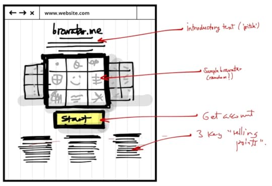
Back in 2014, we were working on a recommendation engine based on the brands we love (we named it Bravatar). For selecting the brands, we went with a 3×3 grid with the profile picture in the middle. We used the black marker to direct the attention towards the grid, while graying out the background elements. We ended with highlighting the call-to-action and labeling the sections. The rest of the page was drawn using simple lines.
5. Prioritizing mobile user flows
Not all features or flows end up on mobile.
This might be influenced by budget constraints, usability priorities, or the simple truth that something just doesn’t fit. Luke Wroblewski graciously presents in his book, Mobile First, how we can align mobile web behaviors with the user’s needs.
Luke Wroblewski highlighted four major mobile use cases in his book: lookup/find, explore/play, checkin/status, and edit/create. They’re then arranged in a matrix, as well as the product’s flows.
Using his matrix, we invited participants to mark all its entries with 1 or 0 if they think there’s a match between the flow and the use case. If the flows have a total of 1 or 2 (maximum) going through all uses cases horizontally, then your flow is a keeper.

This is a great exercise that helps you choose and prioritize when switching from desktop to responsive or designing mobile apps.
6. Sketch, sketch, sketch some more
Now that we’ve organized the mobile flows and practiced our doodling skills, we move on to our last exercise.
We’ll be sketching again, but strictly for mobile this time. Using device paper templates, attendees begin sketching their vision for the mobile app.

To make things even more interesting, we recommend practicing paper prototyping with the attendees.
For example, In Illustro’s case, some of the attendees cut the sketches, glued them and made low fidelity prototypes out of them, while others used POP to create tappable interactions. After the session, you can even take photos of the paper prototype and upload into UXPin for a quick digital prototype (and early documentation).
That’s the beauty of an audience, you may never know how they might surprise you with their process.
Recommendations
If you’re eager to run a similar workshop, here are a few pointers we’ve learned along the way:
Before you plan the workshop, decide, how you’ll schedule the time. Will it last a full day, or should it be split into two? The level of information in a workshop can become overwhelming.
If you go with an idea, also present your own approach (solving the exercises yourself). It adds great value to your feedback.
If you split your attendees into teams, make a point to still provide feedback on each member’s contribution.
Balance the time needed for you to present and for attendees to do the practical exercises.
Prior to the sketching exercises, showcase patterns and best practices in order for the attendees to get accommodated and warm up their drawing skills.
I invite you to try and experiment yourselves. It’s a fun and rewarding experience to embark on a workshop like this.
Participants will surprise you with witty ideas and challenge your thinking when you least expect it. Moreover, it’s a great exercise for the entire design team to practice their presentation skills, to share their knowledge or to give constructive feedback.
I, for one, will continue to refine this workshop formula and adapt it towards wearables, virtual reality or Internet of Things. So what’s stopping you?
For inspiration and a refresher on UX best practices for your workshop, check out the free Definitive 2016 UX Trends Bundle. The bundle includes 340+ pages of advice with hundreds of examples.

The post How to Run a Mobile Sketching Workshop appeared first on Studio by UXPin.


February 26, 2016
Writing the Dreaded Weekly Status Email

I remember the first time I had to write one of these puppies.
I had just been promoted to manager at Yahoo back in 2000, and was running a small team. I was told to “write a status email covering what your team has done that week, due friday.”
Well, you can easily imagine how I felt. I had to prove my team was getting things done! Not only to justify our existence, but to prove we needed more people. So I did what everyone does: I listed every single thing my reports did, and made a truly unreadable report. Then I started managing managers, and had them send me the same, which I collated into an even longer more horrible report. I sent this to my design manager, Irene Au and my GM, Jeff Weiner (who sensibly requested I put a summary at the top. Go Jeff!)
And so it went, as I moved from job to job, writing long tedious reports that at best got skimmed.
At one job, I stopped authoring them. I had my managers send them to my project manager, who collated them, sent it to me for review, and after checking for anything embarrassing, I forwarded it on to my boss. One week I forgot to read it, and didn’t hear anything about it. It was a waste of everybody’s time.
Then I got to Zynga in 2010. Now say what you want about Zynga (and much of it was true) but they were really good at some critical things that make an organization run well. One was the status report. All reports were sent to the entire management team, and I enjoyed reading them. Yes, you heard me right: I enjoyed reading them, even if when were 20 of them.
Why?
Because they laid out important information in a digestible format. I used them to understand what I needed to do, and learn from what was going right. Please recall that Zynga, in the early days, grew faster than any company I’ve seen. I suspect the efficiency of communication was a big part of that. When I left Zynga, I started to consult. I adapted the status mail to suit the various companies I worked with, throwing in some tricks from Agile. Now I have a simple, solid format that works across any org, big or small.
1. Lead with your team’s OKRs, and how much confidence you’ll hit them this quarter.
If you don’t use OKRs, use any goal you set quarterly. If you don’t set goals, you have more problems than your status report. You list OKR’s to remind everyone (and sometimes yourself) why you are doing the things you did. Your confidence is your guess of how likely you feel you will meet your key results, on a scale from 1 to 10. 1 is never going to happen and 10 is in the bag. Mark your confidence red when it falls below 5, green as it heads toward ten. Color makes it scannable, making your boss and teammates happy. Listing confidence helps you and your teammates track progress, and correct early if needed.
2. List last week’s prioritized tasks, and if they were achieved.
If they were not, a few words to explain why. The goal here is to learn what keeps the organization from accomplishing what it needs to accomplish. See below for format.
3. Next list next week’s priorities.
Only list three P1’s, and make them meaty accomplishments that encompass multiple steps. “Finalize spec for project xeno” is a good P1. It probably encompasses writing, reviews with multiple groups and sign off. It also gives a heads up to other teams and your boss that you’ll be coming by. “Talk to legal” is a bad P1. This priority takes about half hour, has no clear outcome, feels like a subtask and not only that, you didn’t even tell us what you were talking about! You can add a couple P2’s, but they should also be meaty, worthy of being next week’s P2’s. You want fewer, bigger items.
4. List any risks or blockers.
Just as in an Agile stand-up, note anything you could use help on that you can’t solve yourself. Do not play the blame game. Your manager does not want to play mom, listening to you and a fellow executive say “it’s his fault.” As well, list anything you know of that could keep you from accomplishing what you set out to do— a business partner playing hard-to-schedule, or a tricky bit of technology that might take longer than planned to sort out. Bosses do not like to be surprised. Don’t surprise them.
5. Notes.
Finally, if you have anything that doesn’t fit in these categories, but you absolutely want to include, add a note. “Hired that fantastic guy from Amazon that Jim sent over. Thanks, Jim!” is a decent note, as is “Reminder: team out Friday for offsite to Giant’s game.” Make them short, timely and useful. Do not use notes for excuses, therapy or novel writing practice.
This format also fixes another key challenge large organizations face: coordination.
To write a status report the old way, I had to have team status in by Thursday night in order to collate, fact check and edit. But with this system, I know what my priorities are, and I use my reports’ status only as a way to making sure their priorities are mine. I send out my report Friday, as I receive my report’s. We stay committed to each other, honest and focused.
Work should not be a chore list, but collective push forward toward shared goals. The status email reminds everyone of this fact, and helps us avoid slipping into checkbox thinking. This system is so effective in helping me get things done, I’ve even adapted it for my personal life.
Coordinating organizational efforts critical to a company’s ability to compete and innovate. Giving up on the status email is a strategic error. It can be a task that wastes key resources, or it can be a way that teams connect and support each other. Change your status email today, and transform your teams.
On a related note, I have a new book out on goal setting and execution for product teams.
Originally posted on Elegant Hack.
Editor’s note: If you found this post useful, check out the free e-book Design Collaboration for Product Teams (Vol.1).

The post Writing the Dreaded Weekly Status Email appeared first on Studio by UXPin.
The Greatest Enterprise UX Challenge and Solutions (Part 1)

Designing in the enterprise can feel like fighting a hydra.
Outdated processes. Unavoidable politics. A culture that feels almost immune to design.
Designers need to overcome all of the above before they even start to tackle the difficult task of creating clear products capable of complex tasks.
To address the multi-layered challenge of enterprise design, we spoke with a select group of UX designers across a variety of industries. We asked them to focus on the most pressing challenge they face and describe their own solutions.
These are their stories. For more advice, you can also check out Part 2 where designers from Salesforce, Crazyegg, 3M, and Core Logic describe their best practices.
1. Gaining more access to end-users
Jack Moffett – Manager of Apps Development, Inmedius (a Boeing company)

The greatest challenge I currently face is gaining access to our users. When a UX team is embedded within an enterprise context, one must work through multiple layers of bureaucracy to get to the end-users.
Get approval from the UX team’s management. I’m not referring to the UX manager, but the manager (or multiple managers) above her.
Get approval from the project manager.
Get approval from the customer management. In large enterprise corporations, a different division of the organization is still referred to as a customer. This may require a chain of approvals as well.
With so many stakeholders, you can run into several roadblocks, but it usually comes down to money.
How much time will the users be “non-productive”, and is there a timecode they can bill to? Are there travel expenses for the UX team members? Whose budget is this coming out of? Can’t you do it over WebEx?
Solutions
We are starting small, conducting a series of 1-hour, remote focus groups.
We invite developers, managers, and testers so they will see and understand the value of the feedback. As we build better products with the feedback, we will receive approval for more involved usability studies.
In concert, my team has started tracking our User Exposure Hours against the minimum suggested by Jared Spool in his article, Fast Path to a Great UX – Increased Exposure Hours, which is 2 hours every 6 weeks. This metric helps us explain the issue to management and track our progress as we improve.
I encourage my team to value our progress, rather than to be discouraged about our current imperfections.
2. Breaking down the silos
Anita Cheng – IA/UX Developer, City of Los Angeles (Dept of Building and Safety)

They definitely don’t teach you in any UX classes how to handle silos.
When you’re working with large systems, no one person knows all of the answers. Your users won’t be in one place, the requirements won’t be in one place, the code probably won’t be in one place either.
Gathering all the information you need is even harder in an organization where a UX process is totally new, like a government entity.
Solutions
Build trust incrementally.
To get the information you need, your managers/stakeholders need to entrust you with people who can help (Users, developers, subject matter experts, etc.). If you don’t gain their trust, they won’t give you the information you need. No good UX is possible in that environment.
Sometimes you need to prove your proficiency by going at things a little backwards, such as producing prototypes and iterating with preliminary user research. Then as the organization trusts you more with each iteration, they give you more and more resources that you need to make the product even better.
It isn’t a perfect system, but little consistent steps over time adds up to a lot of progress in an industry where UX is sorely needed.
3. Seeing the elephant
Dave Malouf – Principal UX Strategist, HPE Helion

As the proverb goes, 8 blind monks separately interpret their piece of a elephant quite differently.
Enterprises are all about scale. Scale isn’t a mountain though. Mountains are easy. Scale for enterprises are river systems like the Amazon, Nile, Mississippi where any single source can impact anything along the way.
Things shift, dialog, mutate, converge, diverge, etc. No amount of user research, or value validation processes can really work when you have ecosystems at this level of scale.
Solutions
Set up reflexive processes that allow systems to adapt over time based on feedback loops that monitor customer metrics.
These reflexive processes can include simple things like monitoring dashboards against analytics of the system. Based on where the analytics indicate user friction, you can conduct intervention interviews with users at these key touchpoints.
Applications like Intercom go a long way in helping you make these types of connections. However, these types of systems only work for SaaS or other publicly available applications.
For the world I’m in where your software is behind customer firewalls, you need other types of analytics that are bit more human. Keep in close relationship with account & support teams. Attend customer meetings with your team. Send out surveys to end users as they allow, etc.
To be open, tune in to all of your “senses”. The more instruments you have running, the more you defuzz your elephant. Only then will UX have real strategic value inside the organization.
Grab design ebooks created by best designers
All for free
 Download
 Download
 Download
 DownloadDo you want to know more about UI Design?
Download 'The Definitive 2016 UX Design Trends Bundle' FOR FREE!
Download e-book for freeClose4. Design debt
Nadine Schaeffer – Principal at Cloudforest Design

Many of the leaders in enterprise software have been around for decades.
The giants of enterprise (IBM, Oracle, Cisco, HP, SAP, etc) were founded decades before the term “user experience design” was even coined. Naturally, their internal processes and organizational structures were usually solidified and codified long before design was a twinkling in executive eyes.
This simple fact means that engineers and product managers crafted thousands of software screens, and the application frameworks to power them, long before designers were part of the process. Then, somewhere in the past decade, most enterprise companies got the memo to add design to their process.
But the question so often remains: how? How do designers integrate design thinking and processes into structures that were often calcified long before their arrival?
The mountain of mediocre legacy interfaces is often a daunting and even depressing challenge.
Solutions:
Since no magic bullet exists to solve design debt, I’d instead like to suggest a toolkit of tactics instead:
1. Form alliances and work ahead.
Politics are an inevitable part of large enterprises.
By moving outside of the design team and integrating with product management and engineering, designers get a seat at the tables where critical decisions are made.
Ideally, designers should work with product management to define requirements and ahead of development teams to rapidly prototype solutions quickly. This tactic proves the worth of design and quickly wins the respect of engineers who spend less time on throwaway code. Product managers also see their plans come to fruition more quickly.
All these efforts, of course, help free up time for developers and designers to fix legacy debt.
2. Triangulate and prioritize the pain.
Often enterprise systems are enormous piles of poorly integrated interfaces from different points in time (sometimes resulting from poorly integrated acquisitions).
No design team could possibly solve all the problems at once. So, engage in qualitative research to discover the worst pain points and review quantitative data to see what features and areas are most trafficked, then develop a design plan to tackle the most egregious offenders first.
3. Create scalable design systems.
Enterprise legacy products are often too cumbersome for any set of designers to tackle screen by screen.
Instead, focus on style guides, component libraries and interface guidelines to let developers without assigned designers on the team be able to “self serve” design solutions wherever possible.
Apple and Google started this trend, but many companies such as Salesforce, IBM and even the US Government have started releasing their design guidelines publicly to enable rapid prototyping, brand consistency and overall better design.
5. Disjointed UX workflows
Austin Knight – UX Designer, Hubspot

UX for a long time wasn’t a formalized profession. You had web designers, developers, researchers, all with tools tailored to each profession.
As you expand into the enterprise (and especially B2B products), the inefficiencies between using so many tools really adds up. At Hubspot, our projects also involve many specialized designers (IxD, visual, UX) in the collaboration and handoff process. Our designers and developers are also located in multiple offices around the world.
When you consider all the different people working in various tools and mediums, you start to see the spiderweb of design processes.
Solutions:
The most obvious solution is finding a design platform that focuses on the complete UX workflow.
In terms of supplementary tools, Slack is extremely powerful for everyday communication. We’ve created channels for specific design specializations (Visual, IxD, etc). We also use Chromeboxx to allow for live sketching sessions across continents.
But outside of tools, you need larger cultural and organizational initiatives.
We hold informal recurring “design study halls” where anyone can discuss problems, resources, potential solutions. During these study halls, support people have even explained certain design elements they hated. Those unexpected discussions serve as the springboard for new design projects we wouldn’t otherwise have considered.
On a project level, over-the-shoulder sessions are incredibly insightful. I’ll show my work to people I trust (not just designers, but a couple engineers and PMs) and start gaining insights that I completely missed because I’m too deep in the work.
On a recent design, for instance, I progressed really far with a navigation element. I brought it over to our growth marketer originally for copy feedback, but he actually gave even better feedback on the dropdown interactions. I had totally missed that the background colors I used were washing out the animation.
Better tools will certainly help, but you need to first see outside your own ideas.
Additional Advice
For more advice, you can also check out Part 2 where designers from Salesforce, Crazyegg, 3M, and Core Logic describe their best practices.
If you’d like best practices for end-user research, check out the free guide below by Jive Software’s UX Director Rian van der Merwe. He describes useful tactics for getting buy-in, conducting the right research, and documenting research. All the advice is based on his 10+ years of UX experience

The post The Greatest Enterprise UX Challenge and Solutions (Part 1) appeared first on Studio by UXPin.
The Greatest Enterprise UX Challenge and Solutions (Part 2)
In our first installment, designers from companies like HP, Boeing, and Hubspot described their best practices.
You can read their advice in Part 1.
Now, we’ll turn to designers from Core Logic, 3M, Crazyegg, and Salesforce for their advice.
1. Finding the right user research participants
Louis Elfman – Design Lead, Core Logic

Despite all of the support and goodwill of the entire executive team, it’s still incredibly difficult for us to get research participants. The problem is twofold:
Difficulty in external sourcing – In my case, finding mortgage bankers at mid-size banks isn’t as easy as a CraigsList ad.
Lack of understanding internally – People don’t understand the need for actual research).
Solutions
We use a multi-pronged approach: building a relationship with Sales and Account Management to recruit on our behalf and to relay to us the feedback they’re getting; using external recruiting agencies; trawling LinkedIn, professional associations and personal networks (going guerrilla).
None of these is a silver bullet. But together they’ve proven effective enough. As we deepen our relationship with Sales and Account Management, we can start to implement an actual process for recruiting participants on an ongoing and ad hoc basis.
One final tip: interview sales team members. It yields valuable information and shows them the actual process so they’re not threatened by it (sales people hold their customer relationships very tightly). It also makes them feel valuable so they’re more motivated to help us.
2. Prioritizing features for end-user value
Andy Vitale – Interaction Designer, 3M Healthcare

How do we really focus on what’s most important and transform those insights into impactful changes?
Organizations often believe that enterprise solutions have to be everything to everyone, which leads to competing stakeholder priorities. While it’s true that enterprise UX does involve robust data, interactions and features, the core design principles still apply.
Today, enterprise users expect the same quality of experience as consumer products. But because stakeholders are not the target audience, they have a desire to continually add features for every perceived problem. Additional features don’t always mean additional value.
Solution
Educate stakeholders on the importance of knowing the enterprise user.
True understanding of your users – their pain points, emotions, articulated and unarticulated needs, etc. will result in the optimal enterprise solution. Approach enterprise UX the same way as consumer UX. Talk to users. Observe them with intent. Involve them in journey mapping to understand their emotions and needs across every touchpoint. Allow users to interact with prototypes to validate concepts.
We know that 95 percent of the users use 5 percent of the features. Focus on perfecting the 5 percent. Once you’ve created a customizable framework and core functionality, you can always expand the offerings later or let client developers customize the framework as needed.
3. Designing the right problem
Jessica Tiao, “JT” – Product Designer, Crazy Egg

Design is about separating the solution from the problem.
The greatest challenge I face as a designer is getting caught up in the designs before understanding the why.
Design has always been my happy place. With an empty white board and marker, I slip into a zone of determination. I am itching to sketch out the best design. It’s going to have a slick interaction here. It will use a blue hue for the sidebar. I feel exhilarated.
But you can’t design awesome things if you don’t understand the problem. As enterprise apps evolve, simple designs turn into complicated headaches. Under the hood, legacy code piles up.
Living design systems need to stay fresh and consistent.
Solutions
Good design starts with words.
Why?
The success of an enterprise product depends on two factors: the person using it and if the product can make them better at their jobs.
For your next project, write a series of narrative-based use cases. A storytelling approach will help you dive into each step of a user’s journey. It’s a framework for you and your team to solve wicked enterprise problems.
A lot of us want to rush into this from the other end: focusing on the visual details. We get sucked into the void of solutions and lose sight of the problem.
Breakthroughs come from writing. When you work relentlessly to give your users the most compelling experience possible with thoughtful design and writing – you’ve approached the problem with intention.
Grab design ebooks created by best designers
All for free
 Download
Download
DownloadDo you want to know more about UI Design?
Download
Download
Download
DownloadDo you want to know more about UI Design?Download 'Design Collaboration for Product Teams' FOR FREE!
Download e-book for freeClose4. Keeping sight of the holistic user experience
Ian Schoen – Product Designer, Salesforce

In a large enterprise company, it’s easy to become a specialist focused on a single aspect of an overall product. This can be a great opportunity for diving deep into specific, complex design challenges but specialization has its consequences.
When designing for specific features or micro-experiences within a larger product ecosystem, designers often are not afforded clear avenues to take a step back and grasp the overall experience.
At Salesforce, the Sales Cloud design team alone works with 18 scrum teams and over 100 developers to ship our product. With such a large scope and many idiosyncratic complexities across the experience, it can be intimidating to get out of the weeds and gain sight of the big picture.
Here’s how I aim to balance feature-level work while maintaining focus on the overall UX strategy.
Solutions
1. Diversify your impact.
Find ways to get involved outside of your immediate design work. Meet people across product and UX teams. In doing so, you naturally expose yourself to different viewpoints. You start putting together more pieces of the strategic puzzle.
Personally, I’ve joined and now lead the Salesforce UX Blog.
As a result, I’ve met people in product teams through 1:1 editing and ideation sessions. I’ve gained insights into decisions and perspectives I wouldn’t know about otherwise.
Not only do I learn each author’s unique perspectives on design and product development, I also learn exactly how they’re applying it to their work in Salesforce. Add that all up and the strategic picture becomes much clearer.
2. Expand your scope
Take on new feature work.
As you begin taking on more design opportunities, you’ll also form new connections and better understand the product. One way I’ve expanded my scope is to always be asking for more. We work in a fast-paced industry where designers are constantly moving up and out of roles.
When you spot an interesting opportunity, raise your hand. Your new projects will also help you improve your current projects.
Additional Advice
For more best practices for user-centered design in the enterprise, check out the free guide below by Jive Software’s UX Director Rian van der Merwe.
He describes useful tactics for getting buy-in, conducting the right research, and documenting research in the enterprise. All the advice is based on his 10+ years of UX experience.
The post The Greatest Enterprise UX Challenge and Solutions (Part 2) appeared first on Studio by UXPin.
February 25, 2016
The Myths of Product Management
There have been a bunch of articles lately from designers on product management in the Silicon Valley.
It’s making me slightly crazy, so I’m going to write a short and sloppy essay from my perspective. I’ve been a designer, a design manager, a startup CEO, a product manager and a GM who managed multidisciplinary teams. I’ve got some insights.
Caveats! I have lived in Palo Alto/San Francisco for over 20 years, and worked at good companies (Yahoo back in the day, Linkedin, Zynga, and more) with really good PMs. So my view is skewed by both place and luck.
1. Product Management is a New Thing in Tech.
I got into the interwebs in 1995, and software already had PMs. Web design was all shiny and new and half the companies had PMs, half had producers, and many had Project Managers. But by the time we were partying like 1999, everyone around here had product managers.
2. Product Managers Don’t Know What They Do.
No, YOU don’t know what they do. They know what they do, they do everything.
I used to be a restaurant manager. I hired, I fired, I greeted customers, and made sure they were happy, I did the books, and worked with the chef to pick the special, wrote it up on the board outside, and bought ads in the local paper. And when the prep cook didn’t come in, I chopped vegetables and frequently my fingers. Oh, and the when the dishwasher didn’t come in… you get the picture. That is what a product manager does.
They have their core job: keeping product/market fit, minding and growing metrics, and coordinating teams to that end. But the good ones, the ones I got to work shoulder to shoulder with, do whatever it takes to keep the product healthy and strong.
If that means designing an interface change in PPT because the designer left at 5pm and the engineer needs something to work with, he will. If that means running to Costco for beer for launch night, she does it. If that means setting up Google ads because marketing doesn’t have time for his product, he will. If it means learning SQL… well, you get the picture.
3. Product Management is Pretty Much Like UX Design.
If only! Wow, the job would be so much easier if that was all there was.
Designers get all snotty when no one knows the difference between interaction design and information architecture. But what do you know about PMs?
People talk about product managers like they are monolithic, but there are three flavors: engineering, business analyst and UX.
Engineering flavored PMs are often ex-engineers, are great for working with engineers in hard problems like search & recommendations systems.
Business analyst flavored PMs are the optimizes. They are masters of AB testing, SEO and growth hacking.
UX-flavored PMs are great at product/market fit. They focus on user functionality & experience, and are good at onboarding, help & error msgs. In Silicon Valey, you’ll often hear them referred to as“Product People.” It’s frequently said in a tone of admiration. Product People really get their market and the humans in it, and care about making the right product for them that thrives and survives.They are the unique folks who can combine business and user needs into successful products.
Product People fight with design the most often because they are siblings. They care about the same things. They’ll get into a huge argument about where navigation does, or the shape of a submit button.
But they have different jobs with overlapping, not identical interests. The Product Person is T-shaped, caring both about the user and the business, and often fights about that submit button because she worries about click-through. This is part of a host of responsibilities she juggles, along with acquisition, retention, that upcoming software rearchitecture and the metrics review.
The UX designer (sometimes called a product designer) is a specialist. The designer is much deeper in the details of the design (as it should be) and can lose sight of the role the design plays in context of the larger business. He sometimes fights for the user to the detriment of the business’s health (as it never should be.) Companies that can’t stay in business don’t provide anyone any value. If you’ve ever had to tell a customer you are shutting down their favorite product, you’d feel how hard that is.
Business analyst PMs are often considered loathsome or tedious by designers, and engineering ones incomprehensible. Which is a tragedy, because algorithms could use some more user-centeredness, and qual and quant are like peanut butter and jelly.
Even though PMs have different skills and specialties, they rarely take on specialty titles. Unlike interaction designers and UI designers, a PM doesn’t have the luxury of not doing the part of the job they don’t understand. If you are a Product Person and the time comes to do your KPIs, you suck it up.
Grab design ebooks created by best designers
All for free
Download
 Download
 Download
 DownloadDo you want to know more about UI Design?
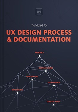
Download 'The Guide to UX Design Process & Documentation' FOR FREE!
Download e-book for freeClose4. Product Managers Don’t Care About Process (or Love Agile/Lean/Waterfall).
I’ve heard a lot of folks ask where product management conferences are. There are a couple recent ones, but historically product managers are much more interested in their space than process. This means they attend conferences on search or local or wearables. Most get their process from their engineers and their designers, and are willing to adapt to what keeps their team happy and working.
Lean is changing that to a degree, but in my experience it’s the service disciplines obsessed with process, and the PMs willing to do whatever works.
5. The Product Manager is CEO of the Product.
I’m actually OK with this one. Not because the job of CEO and PM is the same, but because no matter what it is or who made a mistake, you, the PM, are responsible. Your bonus goes away when Google launches a competitor, you job disappears if you read the market wrong or your engineers estimated poorly.
Anyhow…
I recall back in 2002 when I worked at Yahoo managing a big team of designers, and one interaction designer just hated the PM she worked with. She didn’t get why this PM was always coming over, asking her to make changes, wondering why things were late (and they were. late, that is.) She just wanted to be left alone to design.
Then we rearranged seats, and designers were embedded in their product teams. We had a 1:1, and she said, “God, I feel so sorry for that PM. Everything is her fault. People yell at her all day.” And she decided she’d try to make that PM’s life easier, really listen to the PM’s needs rather than tell her what she should do. Oh, and try to deliver on time.
I’ve never forgotten that, even when I was the one everyone was yelling at, held responsible for numbers I couldn’t always control because of market forces. I realized that whenever there was conflict, there was probably a lack of understanding. And understanding leads to empathy.
Designer, have some empathy. Do some user research. Take your PM to lunch. Ask them what his dreams are, ask how she is compensated. Ask what his biggest challenges are. Ask her what the best designer she ever worked with was like. Maybe you’ll find out she has a hard job, and you are part of the reason why. Maybe you’ll find a way to be successful together.
Go give your PM a hug.
On a related note, I have a new book out on goal setting and execution for product teams.
Marty Cagan has an old book out on product management that is my favorite.
Originally posted on Elegant Hack.
UXPin Editor’s note: If you found this post useful, check out the free Definitive 2016 UX Design Trends e-book bundle below. The bundle includes 350+ pages of advice and 300+ examples of mobile, web, and UX tactics.
The post The Myths of Product Management appeared first on Studio by UXPin.
Guide Your Design With a 1-Page UX Strategy
User experience is a strategic exercise.
As in, a planning exercise. A strategy is a plan. You can’t design how a person reacts to a product, what baggage they bring along with them on a given day, their biases, but you can plan for what you’d like to have happen.
You can influence.
Doing even that much is no small art. It requires becoming a person who leads the process rather than one who does whatever the stakeholders demand. It requires doing your research. And then it requires developing a strategy (based on all the research you did at the beginning of the project). And making design decisions based on it. And making sure everyone sticks to it.
The best way to get there is to document it.
The 1-page strategy doc is the most useful tool of all time. If you’re not taking the time to create them, odds are, you’re having a tough time getting your best work out the door.
Here’s how to create one, why you do so before you lay down a single pixel, and what you do with it when you’re done.
The Elements of UX Strategy
As explained in the free Field Guide to UX Strategy, the first step is to take out your notepad and pencil.
Yes, a notepad, because the second you go digital, everyone’s a critic. And yes, a pencil, because here will be multiple drafts.
Also, writing by hand makes you think differently. It slows you down, makes the words matter more (because you don’t want the effort of writing them to be wasted), and makes the things you write more memorable for you. And if you need anything during a design process, it’s an intensely held view of your strategy.

But don’t worry. You won’t be writing much. Strategy docs should be concise. Hand over a 70-page strategy doc and you’ll be the only person who ever reads it. Mine are rarely longer than what would fit on two sides of a single sheet of paper.
Here’s the sections you put on the paper.
Vision
It’s not a mission statement. It’s a vision statement. It’s a few overarching sentences about what you want the product to be.
Here’s a modified version of a vision statement from a project I worked on recently:
“Acme teaches site visitors about health insurance, encourages them to provide the information we need to give them a quote, and then helps those users through the screening process. The website’s goal is to not only get the attention of potential customers, but to also earn their trust. Once they apply, one of Acme’s agents guides them through the process.”
Note that this defines the scope and purpose of the product without getting specific about how the purpose will be achieved. This is what you want from a good vision statement. It describes the intent rather than the execution.
Circumstances of Use
Next up is the who, what, when, where, and why of the product.
I’ve never been a fan of traditional personas because they’re heavy on fluff and light on action. It doesn’t matter so much who the users are as what they’re doing.
A library staff, for example, can be composed of very different kinds of people at different levels of tech comfort, all of whom need to use the same information systems.
Rather than tell a nice story about Jenny and her 2.5 kids and her nursing career, lay out on what circumstances hold true when a user encounters your product.
 [image error]<img class=”progressiveMedia-noscript js-progressiveMedia-inner” src=”https://cdn-images-1.medium.com/max/8...
Photo credit: Oscar Insurance
Here’s what it would look like for the same insurance site I just discussed:
Who: Generally, people under 30–50 years of age who make over $50k/year, are in good health, and have low-risk occupations.
What: Health insurance facts, policy quote, application, and agent assistance.
When: Most likely as a result of seeing an ad, reading an article, or when someone in proximity to the user (friend, family member, peer, friend of a friend, etc) suffers a disability (though, we hope to broaden the opportunities for education and promotion).
Where: Online, on sites and in apps which appeal to high-income, high-education sectors of the American population.
Why: A person learns that this type of health insurance exists and becomes curious about whether or not he needs it, how much it might cost, when it might benefit him, etc. Or, a person who does not yet know about disability insurance begins to wonder how to protect himself in such an event.
You can make tangible design decisions based on every point in this list. It’s all action.
Design Criteria
Every part of a strategy doc is useful. But this is my favorite part.
When people say a website or app needs to be “fast, easy, and intuitive,” my first reaction is usually something like, “And tell me how, exactly, you’ll do that.”
A company does not spend thousands of dollars in research time because it wants useless platitudes. Do not tell them the product needs to be fast. They all should be fast. Do not say it should be easy. They all should be easy. Do not say it should be intuitive. If they knew how to make it that intuitive, they wouldn’t have called you.
Be specific.
[image error]
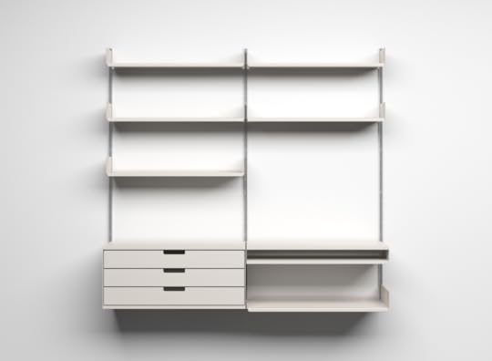
Photo credit: Wikimedia . Creative Commons .
Write design principles that are specific to your product. Then elaborate on them. Like these (also modified from another project, which was for the analytics section of a procurement app that needed to reveal purchasing trends over time):
“Carve it up: Let users slice available statistics in any way that might be helpful, so that analysis can be done in a timely manner.
Make it meaningful: Use color and graphs to create quick understandability and meaning.
Call out both trends and edges: Draw attention to both the outliers and trends so that stakeholders can discern what’s average, what’s best, what’s worst, what’s most extreme, etc.”
Useful design criteria are based on your research, and are written with the goal of differentiating the product, of improving upon what’s already been done, and of setting a high bar.
Success Metrics
At the tail end of all this note-writing, put together a list of numbers you can change through design efforts.
Don’t write down, “Get more traffic.” That’s a vague wish. Ask how much traffic. Ask what you want that traffic to do while it’s hanging around on your website. Ask what percentage of people you want to sign up for your app three months from now as compared to today.
 [image error]<img class=”progressiveMedia-noscript js-progressiveMedia-inner” src=”https://cdn-images-1.medium.com/max/8...
Photo credit: KISS Metrics
As Google Ventures suggests, all UX metrics fall into the 5 categories summarized with the acronym HEART: happiness, engagement, adoption, retention, and task success.
Focus on a small set of core metrics, then be as specific as possible. (Pro tip: Since numbers can only be either increased or decreased, you can group them like I have here.)
Increase
Traffic : The number of people who access the site to decide whether or not to move into the screening process in the first place. With regard to disability insurance, education equals promotion; earning more customers requires making more people aware of its existence.
Pursuable leads : The percentage of people who make it through the website screening who are in fact strong candidates for approval. (This will lead to a higher percentage of policy conversions, which is the ultimate business goal.)
Decrease
Knockouts : The number of ways a potential customer is shut out of the process due to an exception which might otherwise not disqualify them from approval. (We can reduce this by doing more to educate the right people in the first place, so that more of the people who go through the screening questions are in fact people who might be good candidates.)
This list is what all your design efforts come down to. All the research, all the pixel-pushing, all the negotiating, all the politicking, all the development work — none of it matters unless your design succeeds in affecting these numbers.
These are the numbers the stakeholders care about. Without these constraints, you’re not doing real design work.
Grab design ebooks created by best designers
All for free
 Download
Download
DownloadDo you want to know more about UI Design?
Download
Download
Download
DownloadDo you want to know more about UI Design?Download 'The Guide to UX Design Process & Documentation' FOR FREE!
Download e-book for freeCloseNow What?
When you’re happy with your own first draft — and that may take a few tries — type it up in digital form and cloud it over to your stakeholders.
Do not just hand it off for review. Call them up, pull them into the room, whatever, and present it to them. This gives you the chance to guide rather than defend.
As you do, tell them you want their feedback. Tell them you’ve based all this on the research, which they’ve all heard about and read by now, but that you want to be sure you’ve covered all the thinking. You want their input on anything you’ve missed. Even the best individual needs sanity checks along the way.
 [image error]<img class=”progressiveMedia-noscript js-progressiveMedia-inner” src=”https://cdn-images-1.medium.com/max/8...
You’ll make a few tweaks during this process. It’s okay. That’s what makes the strategy good.
When you’re done and you’ve all agreed, email it to everyone and talk about it every single day.
Every single person on the team needs to live and die by the strategy document.
Here’s why.
It empowers the whole team: When every person knows the goals, every person can make decisions that serve those goals.
It distributes the UX workload: When everyone on the team can make good decisions, you don’t have to. They’ll start coming to you with answers instead of questions.
It produces good ideas: You’ll be amazed at the inspiration a good strategy document generates. Good ideas will come flying at you from all directions. All you have to do then is make sure the ideas serve the strategy. (Ask questions until you’re sure they do.)
It kills bad ideas: When debates kick up (and they always do), you can point to the strategy document. If an idea doesn’t hold up, the debate is over. If it’s questionable, you can hold off.
Occasionally, you’ll learn new information during the course of the project, and you’ll need to revise the strategy document a bit. Like when a competitor announces a new feature that renders one of your brilliant design criterion useless.
Let it evolve. It’s meant to. Strategy isn’t a stone carving. Revise it, share it again, keep evangelizing it in every room you walk into.
The good ideas will come. The bad ideas will fade. The whole team will become UX advocates.
And that’s why you do it.
Editor’s note: If you enjoyed this post, check out the free guide The Elements of Successful UX Design. You’ll find deconstructed examples from 24 successful companies like Buffer and Slack.

The post Guide Your Design With a 1-Page UX Strategy appeared first on Studio by UXPin.
February 24, 2016
What CEOs Should Know About Design

In 2014, I joined Khosla Ventures, focusing on design for the portfolio companies.
These are the principles I try to instill into every CEO in our portfolio.
Design Is As Important As Technology
Today, design is as important as technology. I was meeting with a startup last week when the principal architect asked me why is design more important now than ever before?
To answer that, let’s reflect on the evolution of automobile design.

In the beginning, the Model T was only offered in one style, one color. As technology matured, design became the differentiator in the car market.
When the Model T first came out, the focus was on getting the technology right. We labored over getting the car from point A to point B and laying infrastructure down to support automotive networks. Back then, consumers did not have much choice in the design of their car. Cars were offered in black, black, or black, in this style only. Then, as technology and infrastructure became good enough, design became the differentiator. It wasn’t enough for your car to be fast, but it also had to look fast, or expensive, or powerful. Design has become the differentiator for the car market.
Similarly, in the early days of the internet, the major challenges of the day were focused on getting it to work, reliably moving packets from A to B across proxies and servers and operating systems. Technology was so expensive that it required a lot of capital to form a company, and the technology was not yet widely in the hands of most consumers.
We’ve reached a stage where technology is now good enough. We have sensors and chips where we need them when we need them. We have compute cycles either in the device or in the cloud. We have storage for us to save every moment of our lives in high definition. Bandwidth is now fast enough that the internet just feels like it works. Not to say all the problems are all solved or that this future is evenly distributed across the planet, but the challenges of product development are now shifting towards building useful and emotional experiences that people get from using and interacting with technology.
Another factor driving the rise of design particularly in enterprise markets is the consumerization of IT. As consumer users, we enjoy the simplicity and power of applications like Google Docs and Gmail, and we don’t want to spend 10 hours a day in Microsoft Office and Outlook anymore. Google had an explicit strategy of spoiling users at home so they would demand the same tools at work. Moreover, younger generations are just living on the internet, and this is what they know and feel comfortable with.
Microsoft Office and Outlook vs. Google Docs and Gmail
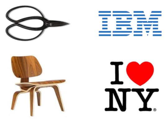
Design Is Brand
Let’s play a game… I airbrushed the logos out of some car pictures. Can you identify what these cars are?


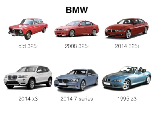
Some of these cars are easily recognizable. Why? They include design elements that get carried over from generation to generation, and across each model car in the portfolio. The design of these cars is so consistent that you instantly recognize what they are. The cars that are less recognizable suffer because they lack this consistency. Some car companies, for example, changes their designs every 2-3 years, which makes our mental models of what the car looks like less stable in our minds and thus harder to recognize.
Logos do not make a brand
When we think of brands, we think of logos and identities. But these are just symbols that represent companies. A company’s brand is consumers’ perception of that company, and that perception is built up over time, through experiences. When a consumer is interacting with your company through any capacity, you are literally in the process of creating your brand. Because consumers are interacting with companies mostly through their products, the fastest way for companies to build a strong brand is through design consistency. Thus, design is the brand.
Design Is Simplicity
Here are some products designed and sold by Muji. Muji is a Japanese company that sells common affordable household items with better design and lower cost packaging. Muji refers to its design philosophy as “Kanketsu”, which translates into “Simplicity”. Their aim is to “bring a quiet sense of calm into strenuous every day lives”. There is a Zen-like quality to their product design, and even though these products are simple and affordable, they don’t feel disposable.
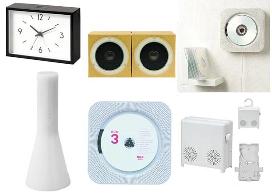
Muji product design
…But Simplicity Is Very Difficult to Achieve
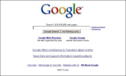
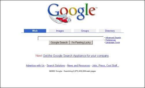
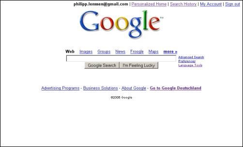
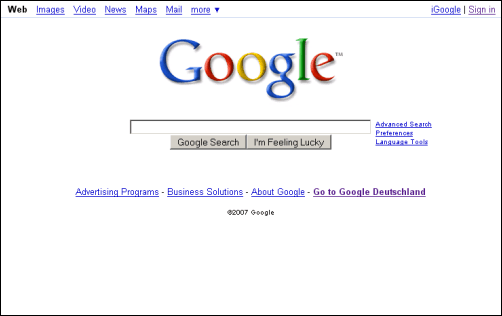
Simplicity is easy to say but hard to do. Let’s look at the evolution of the Google home page as a case study, starting with Google in 1999
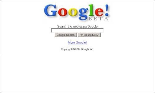
1999
2001
2002
2006
2007
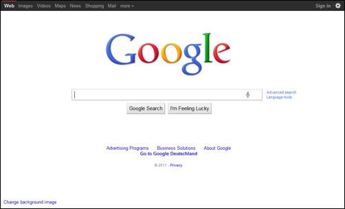
2011
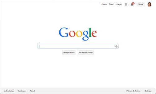
2014 – Present
It wasn’t until 2014 that Google truly achieved a simple home page, even simpler than what it looked like when it first launched.
It took 15 years in the making of a company to achieve this level of simplicity, and certainly not because of lack of will or talent. That it took this long shows how difficult it is to achieve simplicity in the face of many people’s opinions, competing agendas, and growing product requirements and features. It’s a simple design, but was an incredibly difficult journey to get there.
Grab design ebooks created by best designers
All for free
Download
Download
 Download
Do you want to know more about UI Design?
Download
DownloadDo you want to know more about UI Design?Download 'UX Design Process Best Practices' FOR FREE!
Download e-book for freeCloseDesign Is Timeless
Let’s look at the products from Braun produced in the middle of the last century, under the direction of Dieter Rams.
Dieter Rams joined Braun in 1955 and had a forty year career there, eventually becoming their Chief Design Officer. The key principle that drove the design direction for all of Braun’s products during this era was “Less, but better”, the idea being that the products would be stripped down to only what is essential, that the essential would be amplified, and made better. These products are so streamlined that they are elegant and modern, and still relevant, even though they were designed decades ago.
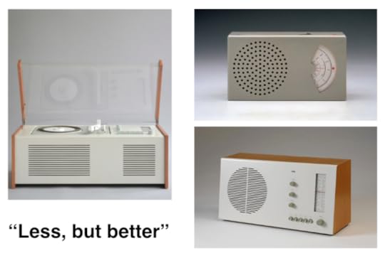
Braun product design: “Less, but better”
Whether we’re talking about product design or graphic design, great design is iconic. It’s not a fad, not showy, not trendy, not easily thrown away.
Design Is the Details
Design is all about the details, yet it’s the details that we often overlook, or take for granted, or forgo because we don’t have the time or resources. But there is no great design unless there is great attention paid to detail.
The details matter because they directly impact how we feel about a product or service after we interact with it. For example, here is a picture of a typical bridge with wrought iron railing. The vertical slats make you feel like you’re in prison. In Japan, when you look at railing, you get the sense that people are always thinking about how they can make even the mundane delightful.
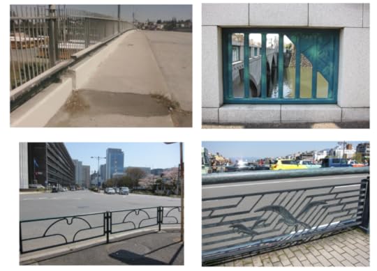
Railings in Japan
Manhole covers are another example. A typical manhole cover in the US looks like this:

Yet when you look at manhole covers in Japan, every single manhole cover is beautiful, inspired, and different, making the journey through the streets of Japan more entertaining and joyful.
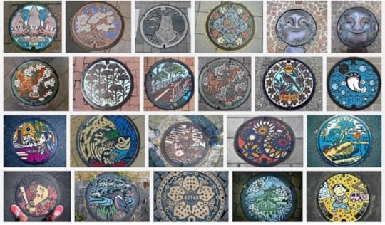
Japanese manhole covers
In some contexts, attention paid to design details means the difference between delighting your users or not. In other contexts, insufficient attention paid to design details can impact conversion, adoption, engagement, and user trust.
Design Is Empathy Made Tangible
Design details include not only how things look but also how they work, their ability to satisfy one’s needs, and the emotions one feels from interacting with them. To create a great experience for users requires tremendous empathy for others, an understanding of their needs and motivations.

Train ticket counter in Japan
Let’s look at another example from Japan.
Here is a ticket counter at a subway station. At the edge of the counter is a plastic strip, placed there so one can rest their umbrella or cane there while they fish out money for their ticket. Whoever designed this must have had tremendous empathy and compassion for people to have the insight to include this detail here. And whoever was writing the check for the creation of these ticket counters must have supported whoever had that design insight.
Going back to the Google Apps example, we use Google Apps, not just because the apps are simple and easy to use, but because of what they allow us to do. The ability to collaboratively create and edit documents in real time, the ability to archive and search email, are functionality that people need, even if they didn’t understand that they wanted to do be able to do those things before they existed.
Design Is Intent
The Aberdeen Group ran a study across 160 websites that looked at the impact of latency on the user experience.
Just a delay of one second, resulted in a 7% decrease in conversions, 11% in page views, and 16% decrease in customer satisfaction.
Google design principle: “Fast”
Google really took this design insight to heart. While Braun’s design principle was “Less but better” and Muji’s was to “bring calm to people’s stressful lives”, Google’s main design principle has always been “Fast”. This principle has informed every design decision, and is reflected throughout the experience.
For example, we show how long it takes to serve a search result. We strip away the page of clutter so users can better focus on the results. We know from human interface research that black text against a white background provides the best contrast for reading text on screens, thus enabling people to get to their destination faster.
While the insight that latency matters was very much a design driven insight, the commitment to speed went beyond the purview of the design team. This value permeated throughout the company, from billions of dollars of capital outlay to create infrastructure to make web search as fast as possible to company OKRs centered around reducing latency. This aspect of the user experience could not have been achieved without a company wide commitment.
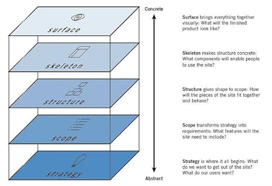
When we think about design, we often think about how a product looks. As makers of technology we might also understand deeply that design is not just about how a product looks but how it works: components that enable people to use your product, and how it all fits together. All that cascades from your company’s strategy, values, and principles, and the scope of the problem you choose to tackle. All of that manifests itself in the design of the experiences you offer.
Design runs deep and reflects the company’s internal state (credit: Jesse James Garrett)
Just as a person’s posture can reflect his or her inner state, so does your product’s design reflect the state of your company.
I’ve seen org charts, power struggles, and agendas manifest through design. I’ve seen the absence of strategy, values, principles, and a clear point of view manifest through design. You need to think about design from the inside-out. You can’t fix your design without fixing these deep issues and this is why every CEO is a designer, whether they recognize it or not. If your expectation is that your design team can work around or patch over your company’s organizational issues, power struggles, and agendas, or lack of strategy, clear values, principles, or point of view, you’re shunning your responsibility in making design great for your users.
Design Is Thoughtful

I’m a fan of 80s alternative music. While writing this piece, I was reminded of a song from one of my favorite bands from that era, Love and Rockets.
In that song, “No New Tale to Tell”, there is a line: “You cannot go against nature, because if you do / go against nature / that’s part of nature too”.
I think this is a nice way to think about design. You cannot have “no design”. Because whatever you end up with, whether you pay attention to design or not, is your design.
There is only careless design or thoughtful design. Choose to design thoughtfully.
Originally posted on Medium.
UXPin editor’s note: If you enjoyed this post, check out the free guide The Elements of Successful UX Design. You’ll find deconstructed examples from 24 successful companies like Buffer and Slack.

The post What CEOs Should Know About Design appeared first on Studio by UXPin.
10 Practitioner Tips for Junior UI Designers
User interface design is a highly demanded science today, and for good reason.
With computing power and business ambition skyrocketing, the digital landscape is rife with too many features, and overly complex applications begging to be simplified by empathetic, thoughtful, and creative technologists.
Over the years, I’ve come to realize that the most beautiful user interface solution is not necessarily the one with the most likes on Dribbble, but the one that’s most user intuitive, provides the right amount of choice, and frankly knows when to get the heck out of the way.
Here is a list of tried and true concepts I’ve practiced in successful UI projects over the years.
1. Draw on the wall with a 3-up exercise
Here’s a great UX exercise to watch from the Skool Network video series titled, “What is UX Design?”. Watch the thought process involved in a real-life UX design kickoff for a one-pager sales website design.
The gist: Hang three large pieces of poster paper on the wall, side by side. Grab some colored sharpies and post-it notes. This exercise works best if your client is present.
Use poster #1 to list critical notes about your primary target user. Give your ‘user persona’ a name & age, and list out all their needs and challenges that you can think of. Next, brainstorm and discuss business methods and design concepts to meet those user’s particular needs. Circle tasks and messaging ideas you find most important. Try completing an empathy map to immerse into the behavioral and social perspective of your users.
On the second paper, repeat this process for another target user persona.
You’ll soon surface many of the most critical concepts, tasks and touch points to highlight in your design project.
On the third paper, start sketching a possible page template design informed by the most important user tasks you’ve decided to focus on. No need to create beauty at this point, but focus on the prioritization (stacking order) of content, messaging and basic UI needed to give the users you’ve just studied something meaningful and well-organized.

This design exercise also works for designing homepages, landing pages, and other critical screens and user flows. It’s a great method sketching designs with your user notes accessible in the same glance.
2. Don’t just record meetings, bring a note-taker.
Having a dedicated note-taker with you during design meetings allows you to truly listen, think clearly and facilitate effectively.
Your note taker can silently document all discussion points, takeaways, follow-ups, and dependencies that would otherwise tax your ability to stay focused.
Consider incorporating Brad Frost’s Project Hub for documenting your project notes and deliverables from start to finish.
3. Document your design thinking.
To improve your ability at articulating design micro-decisions, approach each project like a mini case study.
Throughout your design process, dedicate a few minutes after every mockup to capturing some simple notes on why and how you arrived at that final design (even if the design is subject to change based on forthcoming analytics).
4. Design on paper.
Using paper & pencil to sketch out UI ideas is fast, and offers a refreshing tactile experience for you quite different than your usual keyboard, mouse, or stylus.
This unconstrained method of visual thinking might open up new creative doorways to you and make your process feel less robotic too. Try collecting and analyzing a volume of paper sketches (even from non-designers around you) before jumping straight into your wireframe software. Be aware of more concepts and ideas before you rely on pure intuition and personal taste.

Photo credit: Box UK
Here’s a free printable paper sketch template to capture 6 ideas and supportive notes. Todd Zaki Warfel’s Prototyping book and the free Guide to Prototyping also offers great exercises for collecting UI ideas in bulk and narrowing down the strongest ideas.
5. Design mobile-first.
Designing on a mobile canvas size forces you to understand what you are designing–the content and it’s purpose, priority and messaging. There’s no room (literally) for getting lost in extravagant desktop layout ideas & complex hover effects that many of your users may not appreciate or see.

Programs like Sketch and UXPin allow you to quickly extend and sanity-check your mobile first layouts and design ideas on tablet and desktop canvases simultaneously. Ping-ponging between multiple canvas sizes will strengthen the responsive design ideas and tease out the edge case screen sizes that threaten your layout choices. Think deeply before you simply ‘hide’ a particular UI element on mobile because you can’t think of a quick way to display it within the allotted space.
Grab design ebooks created by best designers
All for free
 Download
 Download
 Download
Do you want to know more about UI Design?
Download
DownloadDo you want to know more about UI Design?Download 'UX Design 2015 & 2016' FOR FREE!
Download e-book for freeClose6. Speak with visuals whenever possible.
Next time you’re explaining something complex during a screenshare, try drawing out your concepts in real-time using a tool like Sketchpad.
It doesn’t have to be beautiful, but a visual can keep everyone in your meeting engaged and less likely to misinterpret what you are talking about.
7. Try designing within a type scale.
Decide on a base font size for the long reads (somewhere between 14 and 20 pixels works best).

Photo credit: type-scale.com
Use this nifty typescale website to derive all the other font sizes you’ll support in your design project. Try keeping to this finite array of font sizes from large headline all the way down to body font consistent throughout your designs. This makes the global CSS stylesheet super scalable and never constrained by specific pixel values.
8. Honor your canvas size.
It’s a good idea to understand the maximum and minimum canvas dimensions you want to support with your design.
Maybe you want to support a large desktop display as well as a small smartphone in portrait orientation. Remember there is a maximum content width that you probably want your content (text, images, forms, etc) to stop expanding. Be wary of letting your copy blocks stretch wider than about 15 words across. Reading 16 words or more across is challenging and breaks the feel of smooth reading/scanning.
On small screen canvas sizes, don’t forget to add some left and right negative space or you’ll risk serious usability issues.
9. Go grayscale first.
Get your design to be super useful and intuitive in grayscale first. This forces you to focus on typographical hierarchy, size and negative space to to guide users’ eyes where they need to go.
Try adding in color last and watch your design come to life knowing even users with degrees of color-blindness (for which there may be many) will understand your interface design effectively without relying on color cues. It’s also important not to get lost in the often emotional power of color too early in your UI design process.
If you’ve never tried this, I highly recommend experimenting with this process.
10. Don’t wait for feedback.
Share your designs and gather feedback and validation as early as possible. Don’t wait until your designs are pixel perfect before you ask another person if they understand what the design is trying to accomplish.
I’m a big fan of UXPin’s Sketch/Photoshop Plugin because it allows the designer to import a whole component library of design assets and quickly generate screen designs and prototypes just by dragging around and repositioning components.
Always test a variety of layouts and ideas before committing to one.
Good Books
Everybody Writes
Business Model Generation
Web Typography
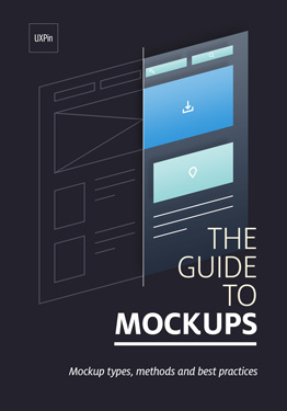
The Guide to Mockups
Favorite Sketch Plugins
Relabel Button
Sketch Palettes
Sketch Data Populator
Export to UXPin

The post 10 Practitioner Tips for Junior UI Designers appeared first on Studio by UXPin.
February 23, 2016
Practicing Collaborative UX Design in a Large Organization
On my first day at Hive, I was stepping into a collaborative design environment across a large organization.
We already had 200,000 customers (just two years after launch), an ambitious roadmap, and a clear need for Rapid and Agile methodologies across teams—especially design.
In other words, we had to ace collaboration.
Evolving the app experience means tackling roadmap challenges together. No single person or team could drive the project forward. Collaboration becomes the driving force.
Collaborative UX Activities at Each Step
In terms of processes, we focus on being flexible—and that includes everything from tools to general workflow. We use whatever we need in order accomplish a required result; it’s the freedom to be truly Agile.
A team that’s highly effective works as a unit powered by each member’s personal strengths. Everyone’s input is heard, evaluated, and workshopped, and they know how to optimize the benefits of full transparency. This encourages team members to speak up when they have ideas, rather than wait until the “right” phase of the process—or even keep silent entirely.
We make a point to do workshop together, creating a space for all of our designers to bring their ideas and debate the positives or negatives of each. During workshops, we operate by the principle that every assumption is valid until proven otherwise.
Each step of the way, we are actively collaborating and exploring techniques for staying creatively engaged. Here are the cornerstones of our collaboration strategy that keep our momentum in high gear:
Research
Collect as much information as possible and share references with the rest of your team (we use Slack or Skype to share between teams). Anything from books, articles, videos of talks, new tools, etc., can lead to game-changing ideas for your product.
As designers, it’s also important to get familiar with the design community and the top design patterns used in each platform (iOS, Android, Web, Wearables). We’re big fans of Dribbble, Behance, Codepen, Awwwards, Google Design, IBM Design, and Graphic Burger.
It’s also good practice to become familiar with business strategy (Strategyzer is an excellent place to start).
Moodboards
Moodboards are an invaluable technique for expressing your thought process (both to yourself and others).

Photo credit: Go Moodboard
Use them as a vision tool, blending anything from inspirational designs to color palettes and photography if it helps convey your idea. We use the free tool Moodboard to aggregate images and quickly send or present during product discussions with stakeholders.
Internal Workshops
Get as many people involved as necessary—designers, product managers, developers—and invite them to comment, debate, and problem-solve together (see the Three Amigos Scrum practice).
The point is to group designers, product managers, and developers from concept until launch. Each will have different ways to tackle a problem, and all three contribute with their speciality and insight.
Usability Testing
Get feedback from users as early as possible.
By building prototypes quickly with tools like UXPin, you can discover how users interact with your assumptions, helping to guide your product decisions from early concepts to final development.
Communicate the findings to your team with tools like Google Docs (enables quick collaboration) or even Keynote.
Sketching
Whether collaborating with another person, or even an entire room, sketches are often the fastest means of sharing ideas. These become part of the dialogue between designer and developer, reinforcing teamwork and brainstorming.
Resist the temptation to go straight to Illustrator or Photoshop every time you come up with a brilliant idea for a feature or for an interface; try sketching it first.
While your hand is busy drawing, your mind engages in lateral thinking (see Lateral Thinking, by Edward de Bono). I keep a notepad from Dotgrid where I save all my the ideas. These can be scanned for use during workshops or presentations with stakeholders.
I’ve also used Paper for iPad to quickly sketch and share ideas with the team. Plus, they have a cloud platform, which means other users can interact with shared sketches and add their ideas, too.

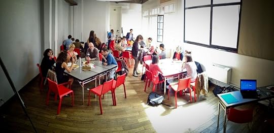
Photo credits: Hive Design Team. Example of a workshop session.
Harness the Power of Play
“Almost all creativity involves purposeful play.” – Abraham Maslow
In the grand scheme of things, “play” becomes an attitude, not just another process. It’s a path of thinking that leads to fascinating insights, both into your team’s engagement and into your users’ perceptions and expectations.
At Hive, for example, we like to test design assumptions by involving our users, designers, product managers, and stakeholders in a collaborative “game” during User Labs sessions. Everyone is invited to sit through these sessions and participate with their own ideas and questions. This alone has proven to change perceptions and misconceptions.
There’s a big difference between asking someone what their ideal product looks like and literally passing them paper and a pencil to draw what they can’t articulate. Engaging our users at this level allows them to naturally tap into their creativity and collaborate with us in a “fun” way. They feel like a bigger part of the process—which benefits them and us. Instead of giving them dull paper tests, we try to create an atmosphere that empowers the user to teach us instead. They understand the purpose of play and really appreciate participating.
With 1:1 workshops we establish a number of tasks, where each task is a problem to solve that’s very similar to those the design team must face. For example, “Draw your ideal heating schedule component knowing that you must be able to copy settings from one day to another. You can add and remove events, but you cannot have more than 6 events.”

Photo credits: Lookback.
Another example is to film users while they test a prototype through Lookback. These videos show the user’s personality and real opinions, helping the team stay informed and help with communication between user needs and business needs.
Grab design ebooks created by best designers
All for free
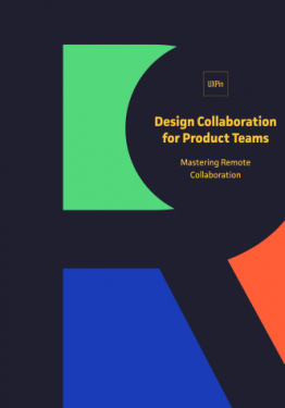 Download
Download
DownloadDo you want to know more about UI Design?
Download
Download
Download
DownloadDo you want to know more about UI Design?Download 'The Guide to UX Design Process & Documentation' FOR FREE!
Download e-book for freeClose
Know Your Team
Get to know your stakeholders and your team—their motives, their likes, their challenges, and also how they think.
Some designers tend to be more reserved than others, finding it hard to become an active part of the team. Simple steps like going out for lunch, chatting with your team, and participating in group activities go a long way.
Everyone has a different style for approaching and tackling tasks. Is someone more of a linear, analytical thinker, or an intuitive and emotional thinker?
When communicating with an analytical thinker, it’s important to emphasize facts and numbers. These can come from data analytics, market research, user testing, and surveys.
For creative and intuitive thinkers, incorporate well-crafted visuals and multiple design concepts stemming from different perspectives (even concepts that didn’t work—they enjoy contributing their knowledge of design and interfaces).

Photo credits: dierk schaefer. Creative Commons
For example, I report to two opposing styles of thinking—our workshop debates commonly feature both a Yes and No. It is my job to understand the reasons behind this and then convert constraints into viable solutions. It is compromise, indeed, but a mutual one. Both parts contributing their share.
To communicate effectively, adapt your framing depending on the audience. It’s a good time investment to learn how to read your team, observe body language, be present when you listen, and explore various personality models.
Be Humble About Everything
One of our biggest challenges as designers isn’t how we ace the work—it’s how we take feedback.
That first time a client or executive stakeholder says, “Our design should be more like X than Y,” our instinctive reaction is to clam up with frustration because they didn’t understand our good intentions and completely disregarded our intensive hours of labor. This is when humbleness comes into play.
It is not my labor. It is our labor.
When the designer starts ignoring that egocentric little voice is when real teamwork begins. And it is the designer’s job to teach people about our terminology, tools, and frameworks. The more everyone in the team is exposed to UX frameworks, the more we create space for collaboration.
Before reacting—listen, explain, and iterate.

Image credits: Hive Design Team. Quote by Unknown source
Communicate to the team as early as possible how to create requirements and specs that will best help the designers initiate the creative process. This helps everyone orient their workflow in relation to the team, not individually. To centralize all of our communication, we use Jira and Wunderlist, but ultimately, it is our morning stand ups, 1:1s, and workshops that aid UX development, not just the tools we use.
Keeping things simple goes a long way. Asking for just 5 minutes of someone’s time to discuss tasks can benefit everyone, as it helps update or triage possible problems.
After all, we’re working toward a common goal: a great product that everyone is proud of and that satisfies both users and business needs.
Conclusion
At Hive, we’ve been actively creating those opportunities for connection, and it’s a big part of our team culture and company success. We’re tackling challenges together, producing better and better products as a result, and expanding professional skills that make us stronger together.
So, stay curious, share ideas, concepts and references. Experiment and tweak your workflow. Nurture a flexible approach to the processes but keep loyal to the common goal.
Be humble and respect your peers feedback.
Be kind to your users and how they contribute to the products with their contextual information. Let them guide you instead. Use that data to support design assumptions and decision making.
Keep a playful attitude and you’ll start transforming collaboration in every project.
For more collaborative design tips, check out the free guide Design Collaboration for Product Teams: Building the Foundation. The guide focuses on useful activities for the early stages of UX design. Best practices are included from Hubspot, Amazon, Vice, and Venmo.

The post Practicing Collaborative UX Design in a Large Organization appeared first on Studio by UXPin.
10 Ways to Get More From Your UX Workshop
Do you have user experience in your job title?
That means you do all the ‘user experience’ stuff by yourself… right? Of course in truth you know that user experience is a team sport. In fact you need the entire organization to be onboard. Unfortunately the task of making that happen falls to you. Good luck with that.
One thing you can do is start running user experience workshops. They are a chance to get stakeholders thinking about user needs. A chance to educate them about best practice and get them excited about the potential. At least it is if you do it right.
Workshops can also go horribly wrong. As a UX consultant, I’ve been in workshops that have devolved into departmental infighting or design by committee. I have watched one or two big mouths dominate (and no I am not talking about me!
But don’t let that put you off. It doesn’t take much to run them right. What follows is a few of my top tips for running your next user experience workshop.
1. Focus on users.
Do not allow your UX workshop to devolve into discussing features. Keep it focused on user needs.
This sounds like an obvious one, but it is amazing how often a workshop will lose focus. Conversations turn to features and departmental objectives.
Make sure you define your audiences early in the workshop. But don’t stop there. Spend time discussing their needs, journey and what questions they have along the way.
2. Define your digital goals.
Next up make sure you have some defined goals for digital. This will provide a framework for your discussion and stop the group wandering off on flights of fancy. Without clear goals you will find them launching yet another mobile app before you blink.
If this is your first workshop, take time to define the goals for digital as part of the session. If you have run workshops before, make sure you pin up the goals you agreed for all to see. They will keep you on track.
3. Make it fun.
A user experience workshop is as much about winning hearts and minds as anything else. It is about showing attendees the value of user experience and getting them enthused. As such, it is important it is an engaging fun day. A day where they go away fired up about the possibilities.
That means it’s important to create momentum and a fun atmosphere. Without that it becomes just another meeting. Just another issue that needs resolving.
I like to make things competitive. Set one team against another producing ideas. Get them presenting those ideas in a talent show format or do exercises against the clock. Also it never hurts to have donuts or cupcakes as prizes.
4. Don’t start designing pages.
When talking about user experience, it is tempting to dive into wireframing key pages. This does have it’s place, but don’t do so too early. You will find the workshop bogged down in politics, arguments over content or personal opinions on design.
By getting people to design a book jacket they will be forced to prioritise messages. But you will avoid getting into the specifics of designing a website.
Instead, try designing a book jacket to help people prioritize content. The most important messages will go on the front, followed by the back, spine and inside flap. Because this is not a final deliverable, everybody will relax and be less precious.
I know it sounds strange, but you can also get people designing a reception area. Their choices about the furniture, wallpaper, pictures and signage can inspire your design. They will talk about color, textures, styling and other aspects of how they want to present themselves to the world.
5. Vary your exercises.
No matter how fun the exercise, it will become boring if you do the same thing again and again. Make sure you use a variety of approaches. In one exercise, get them voting on a list of objectives. In the next, get them drawing pictures to represent their vision of the future.
I would like to tell you that coming up with a selection of exercises takes years of experience. But you can just go to gamestorming.com and get loads of ideas.

Don’t let your sessions become boring. Use a variety of props and exercises to engage people.
6. Use voting to keep momentum.
One thing that can kill the momentum and fun of a workshop is discussing decisions. This is also the point where things turn into design by committee.
One person expresses one point of view and another opposes them. This can lead to confrontation. Or even worse it could lead to compromise. Compromise is where the group tries to reach a consensus and produces something nobody is happy with.
One solution is to get people to vote. Voting is a quick way of reaching a decision. But it can also be a great way of leveling the playing field. If a senior manager is in the room or a particularly dominant person, voting can stop them from holding too much sway.
Grab design ebooks created by best designers
All for free
Download
 Download
 Download
Do you want to know more about UI Design?
Download
DownloadDo you want to know more about UI Design?Download 'The Definitive 2016 UX Design Trends Bundle' FOR FREE!
Download e-book for freeClose7. Set strict time constraints.
Setting a time constraint is another great way of limiting endless discussion. It also ensures you don’t get bogged down in details. I give participants far too little time to do an exercise. It falls to me to work out the details later. I just want their initial thoughts.
In fact, if at least one participant does not complain they have inadequate time to complete a task, then I haven’t done my job right.
8. Make it interactive, not just discussion based.
By now you may have gathered I am not a fan of sitting around a table discussing things. It’s something to do with the fact that I bore easily. But the last thing we want from our workshop is for it to be boring.
So wherever possible lets get people out of their seats doing things. I don’t mean role-play exercises. For the love of all that is good don’t do that! That is outlawed in the Geneva convention.
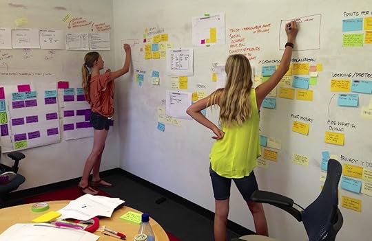
Wherever possible lets get people out of their seats doing things.
But you can get people rearranging post it notes on a wall or huddled around a big sheet of paper drawing things. Anything to get them up and moving.
Another nice trick is not to have a break for coffee. Instead have refreshments on hand all the time. Encourage people to help themselves when they want or even pop out of the room if they need to. That will help keep people moving around and make the whole thing feel less like an all day meeting.
9. Spend time looking at barriers.
The one problem with all this momentum and positivity is that it can be easy to sweep the barriers under the carpet. The trouble is that if you do that, they start seeping out causing problems later on.
That said, we don’t want the workshop to become too negative so I tend to turn barriers into a game. Split your group into two teams and get each team to write down as many problems or barriers as they can think of in the allotted time. Tell them that at the end of the time limit the other team will have to find answers to their list so they should be as hard as possible.
Then at the end of the time limit instead of swapping lists, get the group to search for answers in their own list. That will teach them for being so negative! Not only will this get a laugh it will also allow people to work themselves past the barriers they have identified.
This is not the only way to address barriers. But it does allow you to do so in a fun way that keeps people engaged.
10. Refine and report back.
Remember a UX workshop is not about details. It is about exciting people and getting them thinking. We don’t want them getting bogged down in the details of the user experience because to be frank you are a lot more qualified to do that.
But it is important people see the fruits of their labour. Afterwards take time to refine and organise the outputs of the workshop and report back. Show the group how their ideas will be helpful in shaping the user experience going forward. That way they will feel a sense of ownership over anything you go away and create. This means they will be much more supportive.
Those are my top tips for now. I hope they help keep your workshops on-track and productive regardless of the design stage.
Originally posted on BoagWorld.
Editor’s note: If you found these tips useful, check out the free guide UX Design Process Best Practices. Across 111 pages, we explain best practices for requirements gathering, user research, UI design, usability testing, and design sprints.

The post 10 Ways to Get More From Your UX Workshop appeared first on Studio by UXPin.
UXpin's Blog

- UXpin's profile
- 68 followers

