
Becca Hillburn's Blog, page 46
February 26, 2016
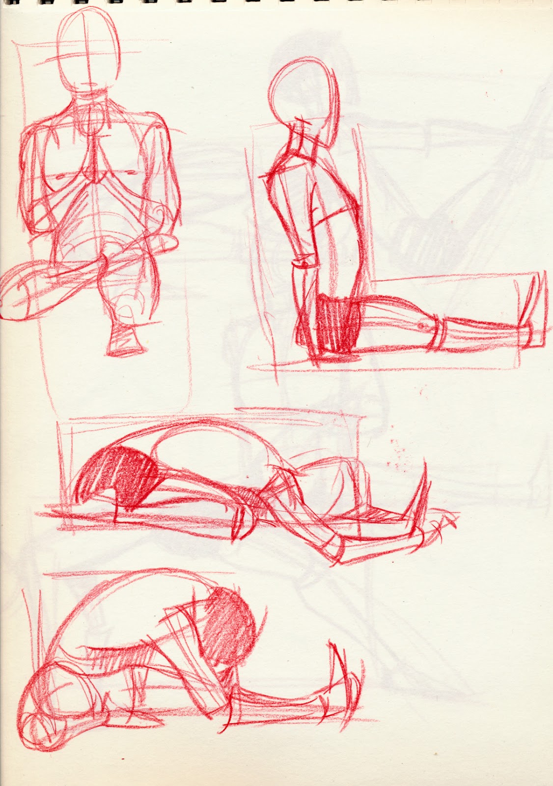
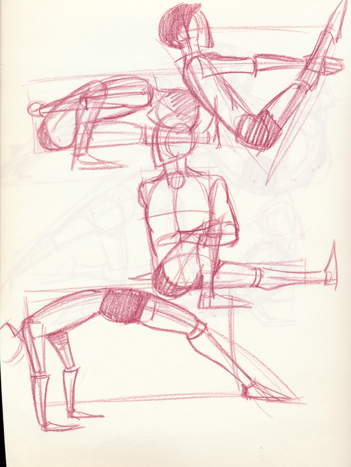
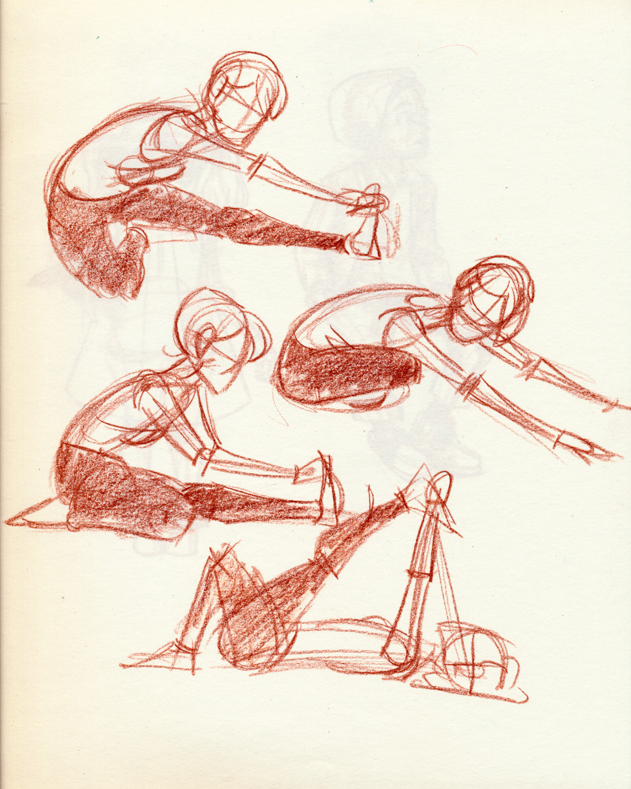
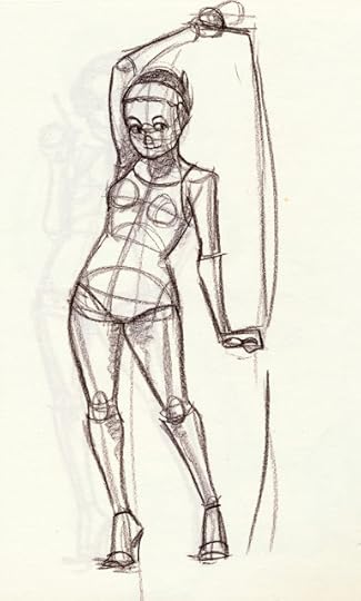
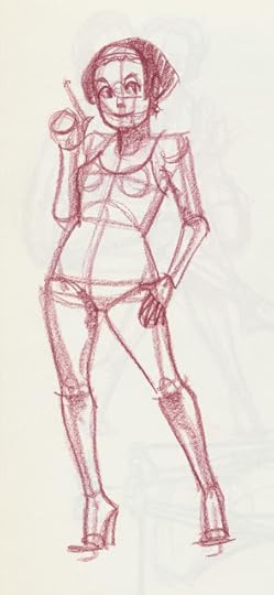
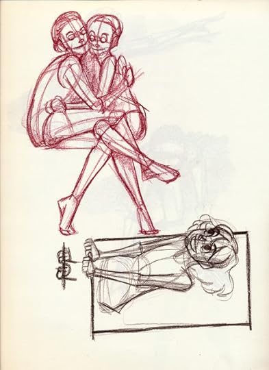
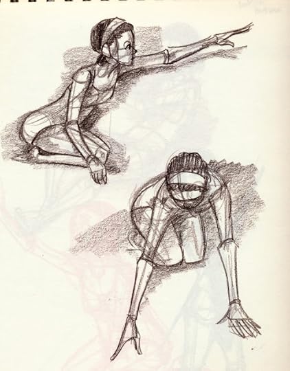
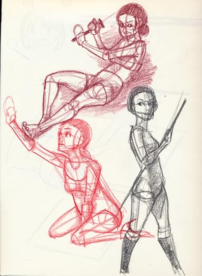
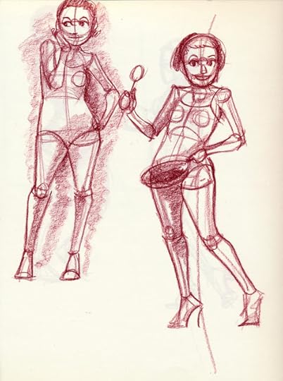
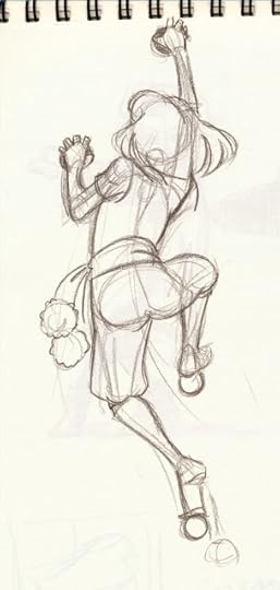
December and January Yoga Studies
I find gesture studies of people doing yoga to be HUGELY beneficial as it breaks me away from rigid poses and forces me to think in shapes, not just anatomy.
When doing gesture sketches, I try to find a basic overall shape and work within that. I've found that with yoga, the majority of gestures are triangular- perhaps because this is one of the sturdiest shapes.
These gestures were sketched in my Blick Studio notebook with Prismacolor pencil colors, one of my favorite tools for quick sketches.
Warmups like these help reinforce a variety of important skills. By practicing anatomy daily, I can easily whip out poses at conventions or on the go, times when I might not have easy access to reference material. By continuously practicing from reference, I am training my eyes and brain to recognize what is 'right'. By producing studies daily, I am training my hands to draw, so even when I'm not feeling well, I can still produce consistent work. Daily study is an investment in my career as an artist, and I highly recommend it if you are serious about pursuing this line of work.
During this line of study, it's perfectly acceptable to make mistakes- make lots of them. Get as many mistakes out of the way as possible. One of the reasons I enjoy working in color pencil is it's relative permanence- I cannot easily erase, so I'm forced to either continue or abandon. This is freeing for me- it's more difficult to waste time on a piece that's failing, I am allowed to be more decisive about what works and what doesn't.


You don't have to enjoy yoga to enjoy using yoga as inspiration and reference for your warmups, although I'm sure it would help. There are plenty of resources and charts available online to use as reference, simply Google 'yoga poses' and away you go!
Please consider donating to this blog or purchasing from Natto-shop (http://nattosoup.com/shop) if you want me to continue publishing quality content. All materials tested were purchased from my own pocket. Keep on Truckin' Nattosoup is not under any sponsorship.


February 24, 2016
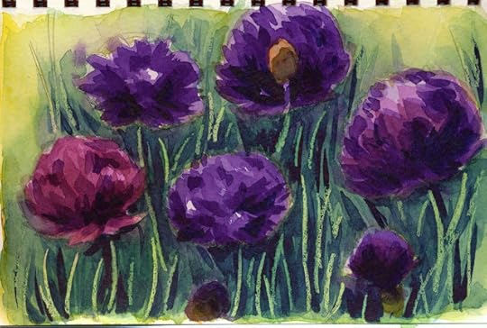
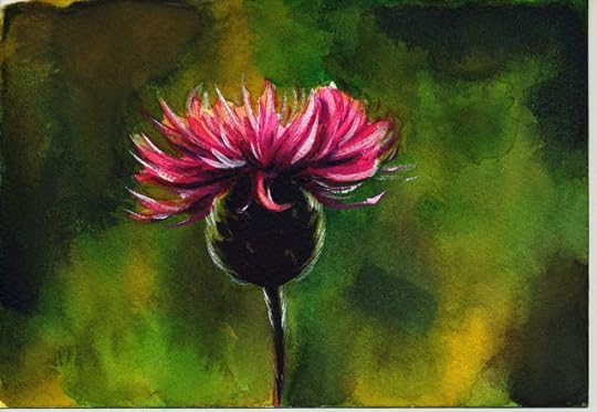
January 2016 Watercolor Studies
I have important goals written on sticky notes surrounding my monitor, to serve as a long-term reminder of where I want to go when I start feeling downtrodden or depressed. One of those goals is that I want to be known as a watercolorist in addition to being known as a watercolor comic artist, two titles that are more distinct than they appear at first glance.
As a watercolor comic artist, I often need to mix my colors using set techniques- I utilize well palettes to mix up large batches of the same color that can be applied consistently throughout pages. This technique, while very useful for a watercolor comic artist, is seen as a weakness for watercolorists, who aim to capture a realistic subject, even through interpretation. For both types of watercolor artist, it's important to capture what FEELS right, but the application is very different. Colors are mixed differently- not in individual wells, but on a large enamel butchers tray, and spontaneous interaction is encouraged. My watercolor comics are painted fairly precisely, almost in a color by numbers fashion, but my watercolor studies are very spontaneous, and I'm always looking for interesting new techniques to add a spark of life. My goal isn't to copy exactly what I see, but to capture a feeling, an emotion, or to practice a technique.
I enjoy playing with a variety of papers as a watercolorist- handmade Shinzen, Winsor and Newton's mould made cold press, Fabriano's mould made Artistico. For these studies, I enjoy using very rough papers. On the other hand, my watercolor comic pages are very uniform- I always use Canson's cold press 140lb Montval in 10"x15" pads- it's economical, predictable, and runs through my printer. I cannot achieve the same effects, cannot capture washes, cannot encourage beautiful bleeds, but my goals are very different as a watercolor comic artist.
On a few occasions, I've been snubbed by watercolorists for my work as a watercolor comic artist. As their techniques are very rigidly guided, and what is 'good' is not nearly as subjective as comic art, I can see where they're coming from. For them, watercolor is fairly specific- certain techniques are more highly regarded than others. As a watercolorist, I have a lot to learn, and many areas where I need to improve, and I'm eager for new insight.
Although my skills as a watercolor comic artist are detrimental to my neophyte skills as a watercolorist, I feel that improving as a watercolorist will help me improve my overall painting ability, so I think it's a goal worth pursuing. I feel frustrated when people off-handily judge my comic work based on the style I use, without giving it a chance, and I find that these studies, which tend to be of flowers or nature, allow me to enjoy painting without concerning myself with the opinions of others. I am eager for new opportunities to demonstrate my wide range of skills, and am eager to further hone them.
In the upcoming year, I think I'd like to take formal watercolor classes, mostly as a reassurance to my self taught background. There's much I've missed in my attempts to hit the ground running. I feel like more formal training would introduce new subject matter, new ideas, and new opportunities to display my work with a fresh context.
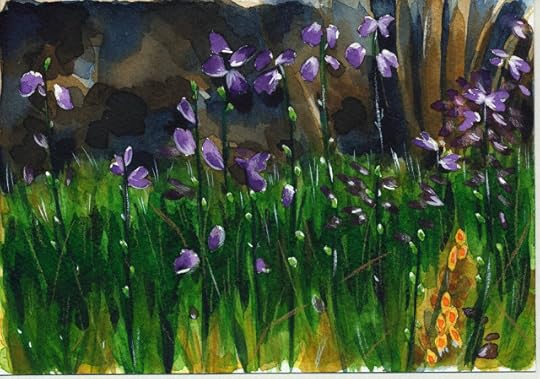
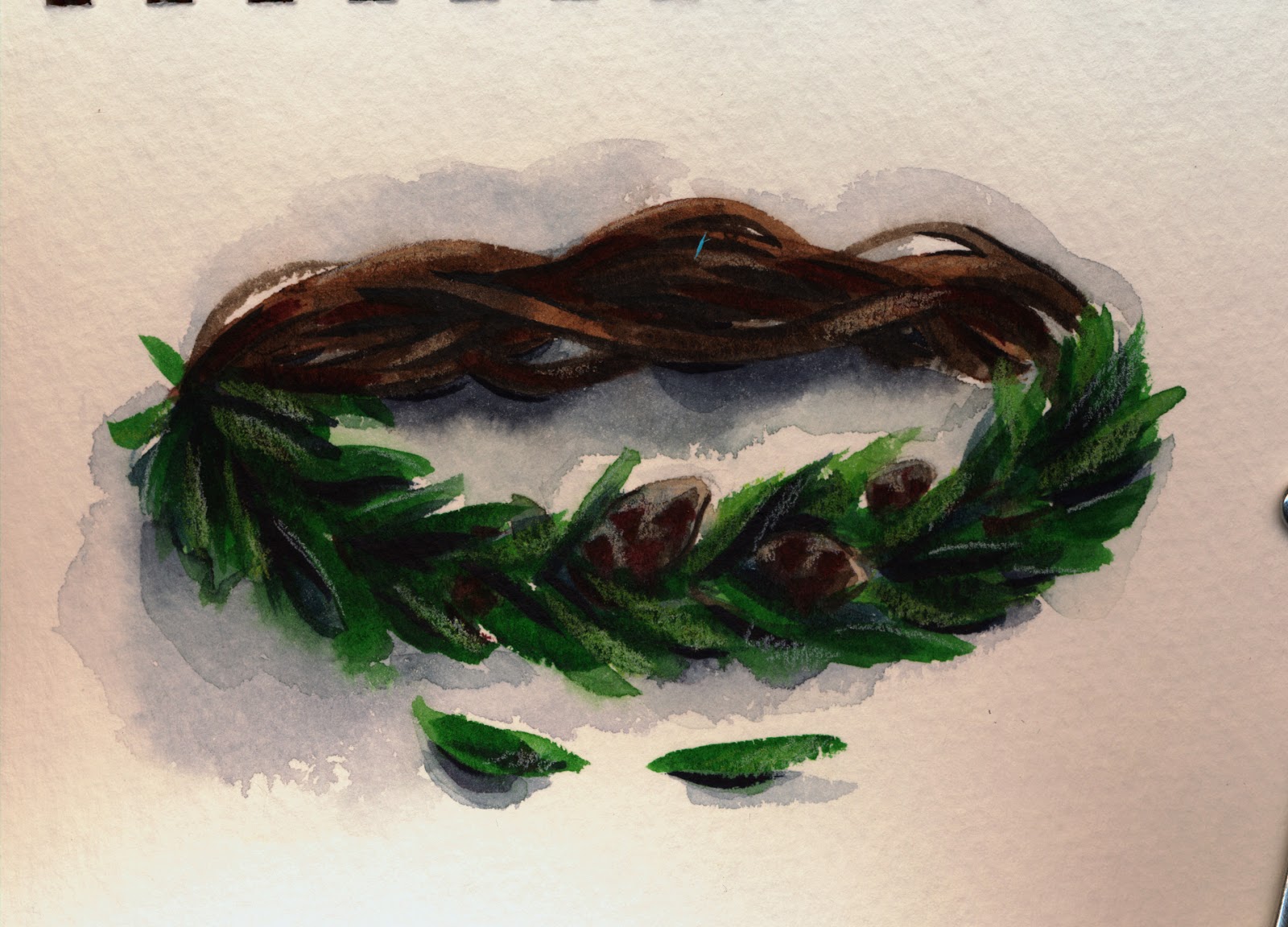
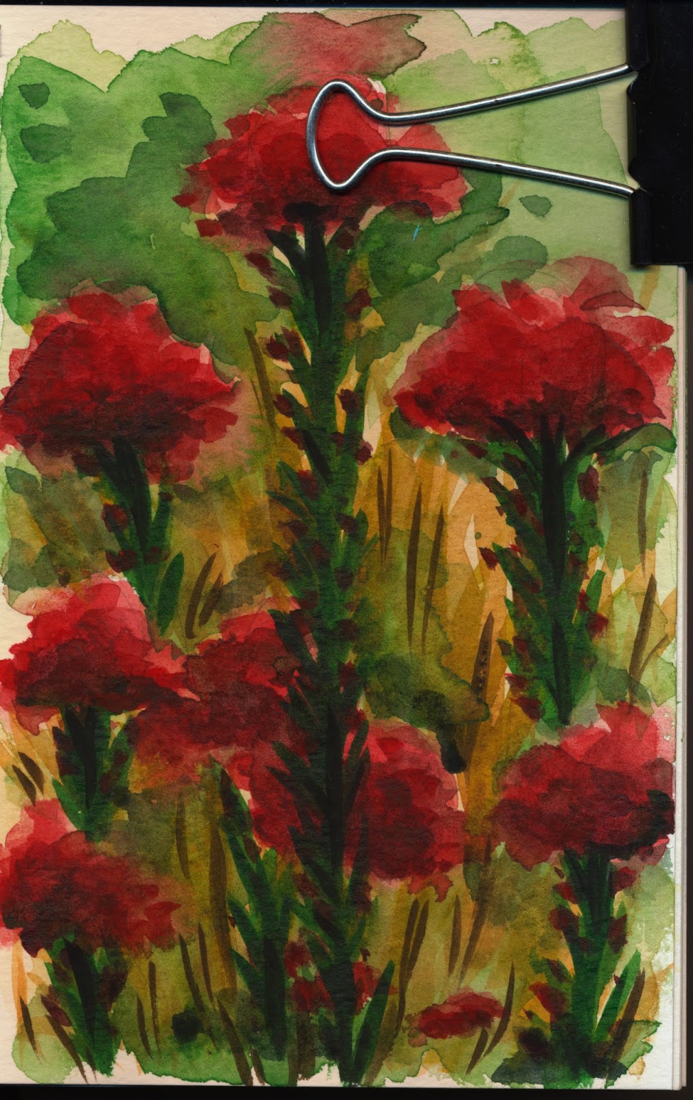
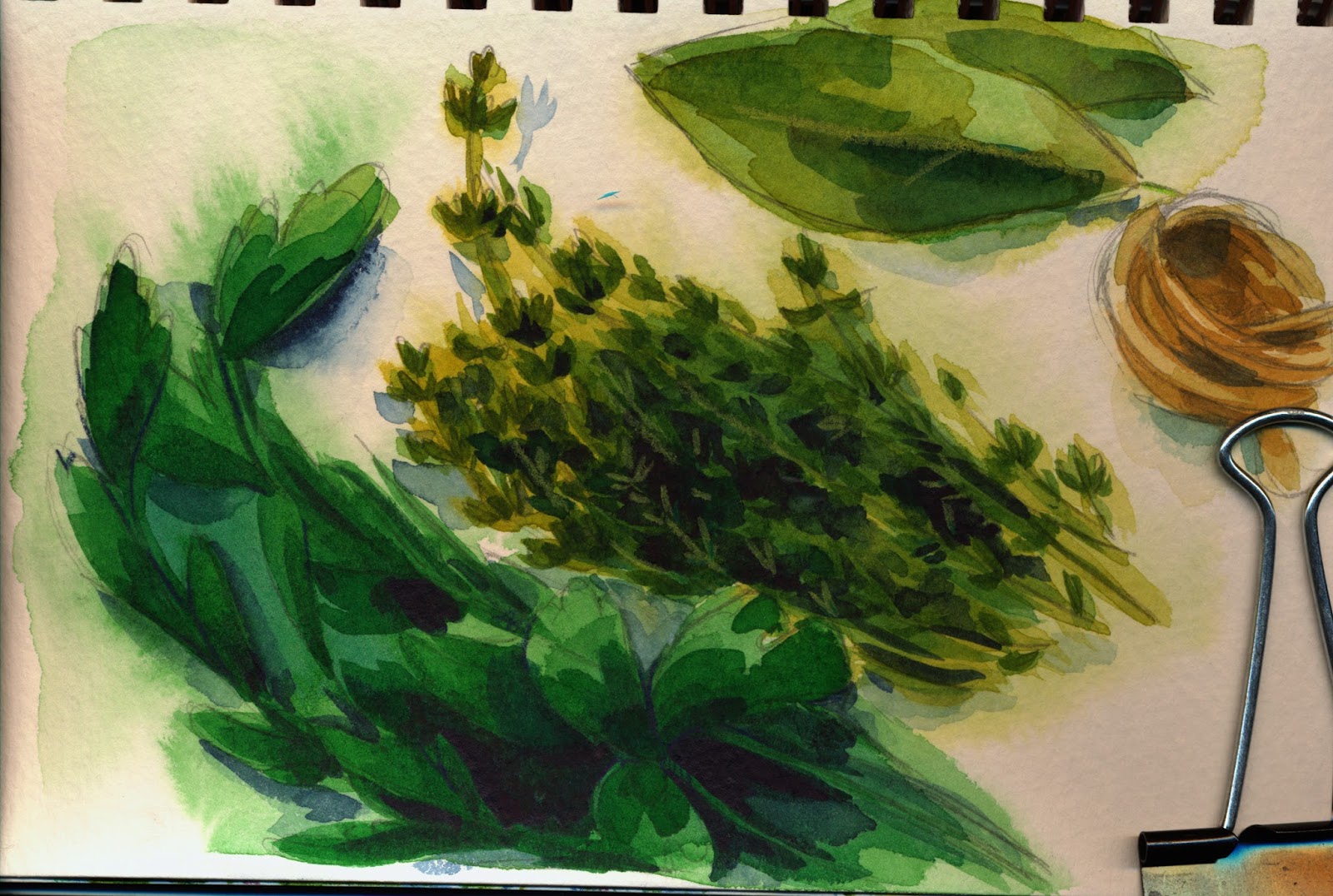
Below are a few of the watercolor studies I've completed in the past couple months. Most of these were completed in a small Strathmore Visual Watercolor Journal, which I don't recommend for heavy washes, blooms, or lots of layers (all of which I'm fond of). It's fine for light washes, or lighthanded application of water.
Of course, I'm stubborn, and since I planned on reviewing the Strathmore Visual Watercolor Journal, I tried to push it to it's limits regularly. The end result is that many of these studies are fairly muddy and overworked, and my papers started to warp to the point where scanning was really a challenge. I may go back and attempt better quality scans of some of my favorites at a later date.
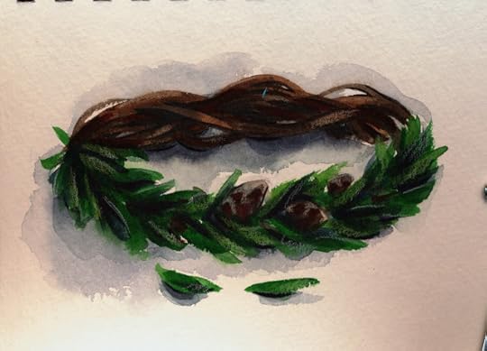

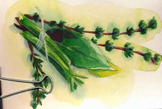
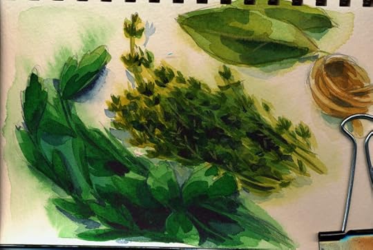
Foliage is a challenge for me, so I ended up painting several variations of the bouquet garni to level up my foliage skills.


Including very simple studies of the component ingredients.


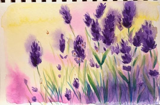
Gestural study of lavender- my goal was to keep things as light and impressionistic as possible.
Fabriano studies
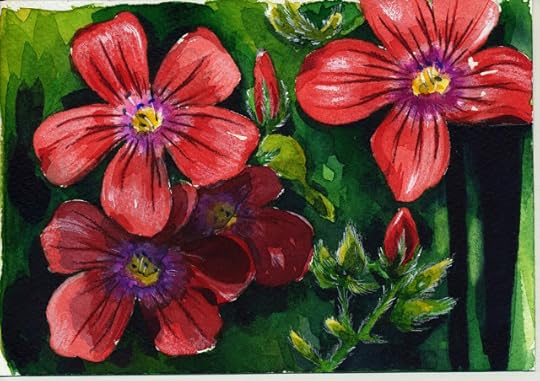
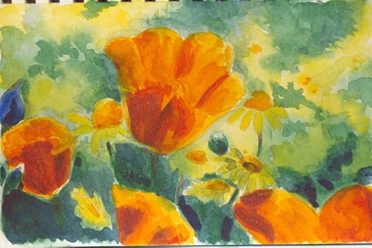
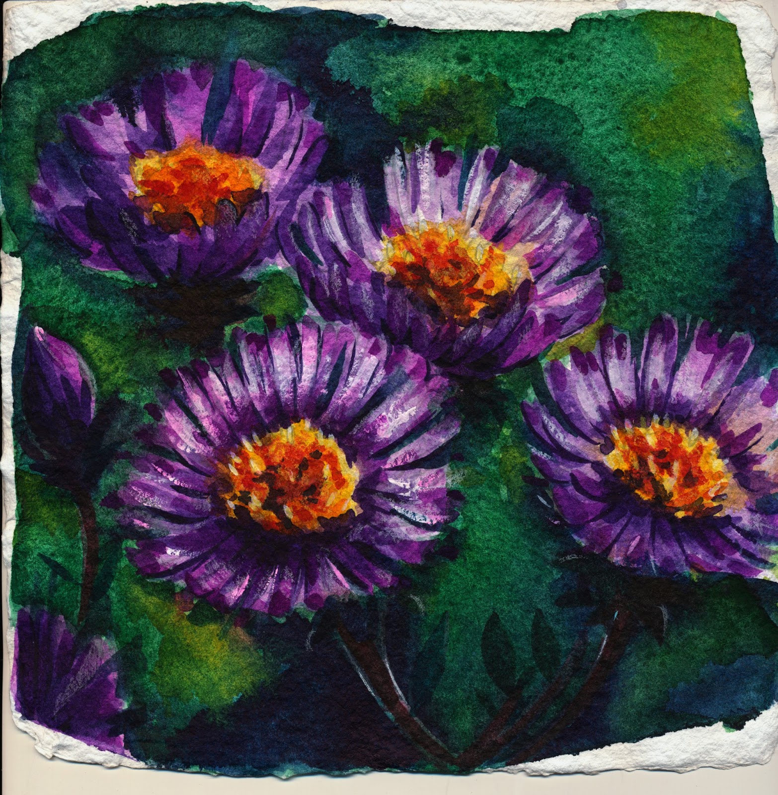
Large, detailed flowers are also a weakness of mine, so this is an area I'm going to have to focus on. I'd also recently started exploring the use of masking liquid to mask certain areas.
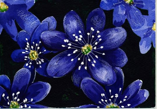
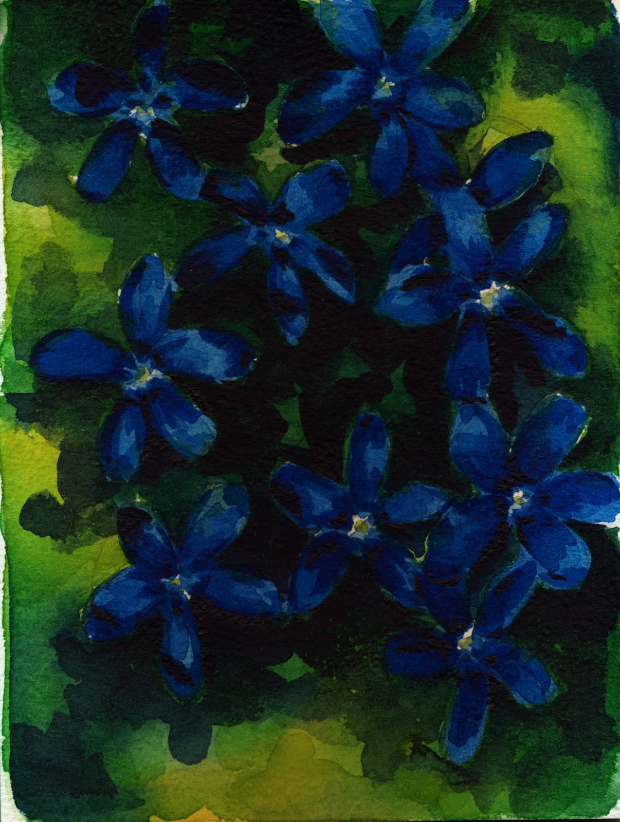
Shinzen handmade watercolor paper has a lovely rough texture, and forces me to work larger (these are on 10"x10" handmade pieces), but you can't use masking liquid on Shinzen as it ruins the surface.


Floral studies on Winsor and Newton's watercolor paper

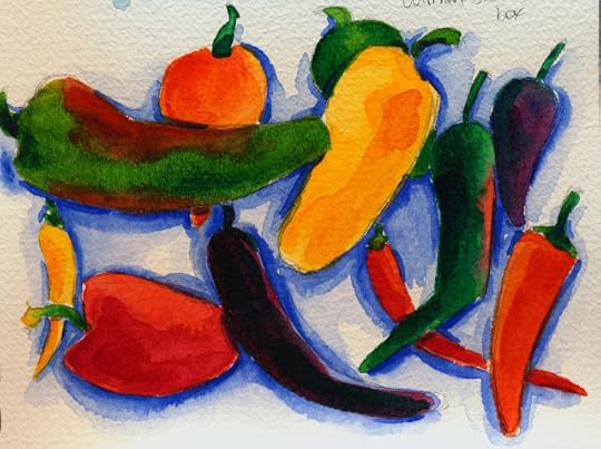 Peppers painted with Cotman half pans. Cotman is very unsatisfying to paint with after having used Winsor and Newton professional grade half pans for years. Cotman is considered student grade.

Please consider donating to this blog or purchasing from Natto-shop (http://nattosoup.com/shop) if you want me to continue publishing quality content. All materials tested were purchased from my own pocket. Keep on Truckin' Nattosoup is not under any sponsorship.
As a watercolor comic artist, I often need to mix my colors using set techniques- I utilize well palettes to mix up large batches of the same color that can be applied consistently throughout pages. This technique, while very useful for a watercolor comic artist, is seen as a weakness for watercolorists, who aim to capture a realistic subject, even through interpretation. For both types of watercolor artist, it's important to capture what FEELS right, but the application is very different. Colors are mixed differently- not in individual wells, but on a large enamel butchers tray, and spontaneous interaction is encouraged. My watercolor comics are painted fairly precisely, almost in a color by numbers fashion, but my watercolor studies are very spontaneous, and I'm always looking for interesting new techniques to add a spark of life. My goal isn't to copy exactly what I see, but to capture a feeling, an emotion, or to practice a technique.
I enjoy playing with a variety of papers as a watercolorist- handmade Shinzen, Winsor and Newton's mould made cold press, Fabriano's mould made Artistico. For these studies, I enjoy using very rough papers. On the other hand, my watercolor comic pages are very uniform- I always use Canson's cold press 140lb Montval in 10"x15" pads- it's economical, predictable, and runs through my printer. I cannot achieve the same effects, cannot capture washes, cannot encourage beautiful bleeds, but my goals are very different as a watercolor comic artist.
On a few occasions, I've been snubbed by watercolorists for my work as a watercolor comic artist. As their techniques are very rigidly guided, and what is 'good' is not nearly as subjective as comic art, I can see where they're coming from. For them, watercolor is fairly specific- certain techniques are more highly regarded than others. As a watercolorist, I have a lot to learn, and many areas where I need to improve, and I'm eager for new insight.
Although my skills as a watercolor comic artist are detrimental to my neophyte skills as a watercolorist, I feel that improving as a watercolorist will help me improve my overall painting ability, so I think it's a goal worth pursuing. I feel frustrated when people off-handily judge my comic work based on the style I use, without giving it a chance, and I find that these studies, which tend to be of flowers or nature, allow me to enjoy painting without concerning myself with the opinions of others. I am eager for new opportunities to demonstrate my wide range of skills, and am eager to further hone them.
In the upcoming year, I think I'd like to take formal watercolor classes, mostly as a reassurance to my self taught background. There's much I've missed in my attempts to hit the ground running. I feel like more formal training would introduce new subject matter, new ideas, and new opportunities to display my work with a fresh context.
Below are a few of the watercolor studies I've completed in the past couple months. Most of these were completed in a small Strathmore Visual Watercolor Journal, which I don't recommend for heavy washes, blooms, or lots of layers (all of which I'm fond of). It's fine for light washes, or lighthanded application of water.
Of course, I'm stubborn, and since I planned on reviewing the Strathmore Visual Watercolor Journal, I tried to push it to it's limits regularly. The end result is that many of these studies are fairly muddy and overworked, and my papers started to warp to the point where scanning was really a challenge. I may go back and attempt better quality scans of some of my favorites at a later date.
Foliage is a challenge for me, so I ended up painting several variations of the bouquet garni to level up my foliage skills.


Including very simple studies of the component ingredients.


Gestural study of lavender- my goal was to keep things as light and impressionistic as possible.


Fabriano studies


Large, detailed flowers are also a weakness of mine, so this is an area I'm going to have to focus on. I'd also recently started exploring the use of masking liquid to mask certain areas.


Shinzen handmade watercolor paper has a lovely rough texture, and forces me to work larger (these are on 10"x10" handmade pieces), but you can't use masking liquid on Shinzen as it ruins the surface.

Floral studies on Winsor and Newton's watercolor paper
 Peppers painted with Cotman half pans. Cotman is very unsatisfying to paint with after having used Winsor and Newton professional grade half pans for years. Cotman is considered student grade.
Please consider donating to this blog or purchasing from Natto-shop (http://nattosoup.com/shop) if you want me to continue publishing quality content. All materials tested were purchased from my own pocket. Keep on Truckin' Nattosoup is not under any sponsorship.
February 21, 2016
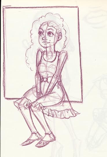
January 2016 Sketches
January's focus was on referenced figure studies, concepts for new illustrations, and quick microfashion studies. The majority of these sketches were completed with Prismacolor pencils in my Blick Studio sketchbook- both are affordable, accessible materials that don't require much mastery to use. I highly recommend sketching in cheap sketchbooks- it removes almost all of the performance anxiety that many artists and crafters feel with more expensive materials.
Many of these sketches were referenced from SenshiStock, a fantastic reference resource for artists. There's a couple ways to use SensiStock's stock, my favorite being their timed study tool. You can also view the static poses on their DeviantArt account. If you enjoy this resource, or use it regularly for your own work, I highly recommend you show your appreciation by contributing to their Patreon. Backing a creator's Patreon allows the creator to continue making work they (and you!) enjoy and is a fantastic way to show your support while rewarding creators. You can contribute a little bit monthly, and many creators offer fantastic backer incentives- sneak previews at work, backer only content, and sometimes physical rewards like charms, stickers, sketches, and mini comics. Patreon is designed to pay creators who consistently produce new work, whereas Kickstarter and IndieGoGo are designed to raise funds for a specific project.


Please consider donating to this blog or purchasing from Natto-shop (http://nattosoup.com/shop) if you want me to continue publishing quality content. All materials tested were purchased from my own pocket. Keep on Truckin' Nattosoup is not under any sponsorship.
February 18, 2016
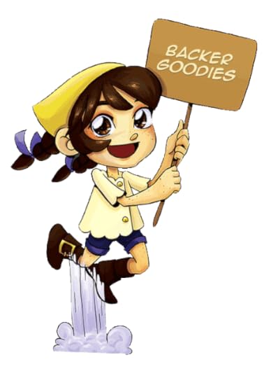
Patreon Soft Launch Announcement
Love Nattosoup Studio Art and Process Blog? Looking for Ways to Help?
My Patreon is Now Live
I have some exciting news for you guys! I've been quietly picking away at launching a Patreon to help support this blog and the complement Youtube Channel, and I've finally soft launched. I'm still tweaking a few things here and there, working on getting a video up, working on custom illustrations for my Patreon, tweaking reward tiers and goals, but for now, the Patreon is up and ready for you to join the Nattosoup Studio Community.

What is Patreon?
Patreon is a crowd based funding site that allows creators to raise funds for ongoing projects per update, or per month. Since I update frequently, I've opted to open my finding per-month. This means you make a once monthly contribution, and you gain access to all sorts of exclusive backer only goodies. For my campaign, Patreon will deduct your selected amount automatically each month, and send you emails when I make updates. Since I update so frequently, I plan on only having Patreon email my backers with a once-a-week recap of everything that's been posted that week. I may also include sneak peeks into future posts and video, and I will include pertinent announcements like convention dates, meetups, and backer only Request Livestreams.
Backing starts at $2, and many of my upcoming goals are designed to benefit ALL backers regardless of contribution amount (although individual tiers will reward my high rollers), so even if you can't give much, $2 is a fantastic start, and if you can get your friends to contribute, that's even better! Readers are under no obligation to back my Patreon, as I will continue to post publicly, but your contributions would be much appreciated, and would go a long way to not only defray the costs running this blog incurs, but allow me to start paying myself a salary for my long hours, and possibly allow me to purchase better equipment and hire an assistant.
What does this mean?
I'm not a big fan of hiding content that people have grown accustomed to seeing for free behind paywalls, so most of my currently running series will continue to update. I'll continue to post process blogposts when I have them, I'll continue to review alcohol markers as they are released/I can afford them, I'll continue to slowly work my way through the Target Art Supply Review series and the Dollar Tree Art Supply Review series. I'll also continue to update the YouTube channel at least once a week with new content.
That said, there are a couple popular series that were designed to be offered as Patreon incentives. The Sketchbox Vs. Artsnacks reviews will go behind a $15 minimum monthly goal- this means that when my total amount hits $15, everyone (backers and public) gets to see that month's review. All backers will have access to that review regardless of whether or not the $15 total goal is hit. I will also begin writing convention reviews again once the Patreon starts to see some funding. Once I start making enough money, I can dedicate more time to editing the backlog of review and tutorial videos I've created, so the YouTube will begin updating twice a week.
You can check out the two free Sketchbox Vs Artsnacks posts below
January
February
I've already got a tiers and goals listed on the page itself, and I plan on modifying them as Backer-Only surveys are completed and turned in, but a few of the goodies I plan to offer are:
Downloadable pdf of 7" Kara Volume 1Downloadable pdf of all currently completed pages of Volume 2 (two chapters, about 50 pages of comic)Early access to future 7" Kara pagesPhysical rewards including stickers, charms, and commissionsBacker only Request Livestreams once a monthMore (and better!) art tutorialsFull size watercolor palette and watercolor paper reviews
What I REALLY want to focus on are all the things we can achieve together with a well-funded Patreon.
As a Patreon backer, your pledge
gives me a clear signal that you enjoy my content and want more of it.enables me to start taking backer requests for content and materialhelps me decide what to products you, the contributing reader, want me to focus onrewards me for years of hard work for the convention community, the comic community, and the illustration communityhelps me leave the vacuum my old monetization model put me inallows for more engagementassigns a monetary value to my content, which is important for reaching sponsors (which in turn, enables me to generate even BETTER content)
Backers receive priority access to
certain reviewscertain videoscertain art piecescertain tutorials7" Kara pages months before publicationbacker only voting will result in an increase in tutorials, as I will be able to better judge demand
Backer only request livestreams- I will draw what YOU want to see, including specific techniques and even fanart or your original characters

Your pledge will enable me to review (and create tutorials for) services
sticker companiescharm companiesproduction services through AliExpresstee shirt printingdecal printing
Your pledge will help generate funds for better review equipment
a new, dedicated camera for taking still shotsa better gooseneck clamp for my camcorder for video reviewsa lightbox and better backgrounds
The community we create together will allow me to organize and offer
mentorship programsonline classes leverage companies for early access and preordersconvention meetupsgiveaways for art supplies, original art, and sample products
Backing my Patreon will allow me to create
Convention artist video tutorials and demonstrationsresume writing convention reviewscreate more content for Howtobeaconartist.tumblr.com, a free blog dedicated to helping artists begin their career as convention artists
Backing my Patreon will result in
removal of Adsense ads from the blog (comic ads, which are offered free to comic artists, will remain)eventual removal of ads from the Youtubewatercolor paper reviewswatercolor reviewsmarker paper reviewscollaborations with other artists- I can commission artists you admire for tutorials and reviews, studio tours, and send them blind box challengespaid guest posts from other artists
Your Contribution Goes toPaying me a fair wage for the work I put inPurchasing supplies for review and demonstration purposesPaying for services you want me to reviewHiring an assistant to help edit video, help conduct artist interviewsPaying other artists for guest posts, collaborations, guest reviewsPurchasing supplies for compatibility tests purposes (supplies often get ruined this way)

Why Patreon?
Because I deserve a fair wage for all my work! Posts take a lot of resources to write- reviews require a camera, appropriate paper for swatching, several papers for testing purposes, several hours to actually test and photograph testing, several hours to draw the test image and render it, and several hours to sit down and get everything written. If I include video components, this adds even more time per post. Tutorials and advice posts draw on years of experience- both art school and in field, as well as a few hours to write and edit.
Many craft bloggers who also write in this niche have sponsors who help defray costs through care of product donations and monetary sponsorships, but illustrators in this niche tend to be overlooked or rejected when it comes to sponsorships and donations. As of this time, despite inquiries and your valiant efforts writing to companies on my behalf, I am still footing 100% of all costs.
The Paypal donation model has never really worked for me or for this blog- although there are donations, they are sporadic. Adsense doesn't really bring in more than a couple bucks each month, and although YouTube ads and Amazon Affiliates help some, I'm still making less than $100 a month, which is not a living wage for an adult. Sales from my site are also too slow and sporadic to significantly contribute to household finances.
Patreon allows me to reward backers with exclusive content and physical goods easily. I understand that many of my readers are students or artists, and most of us are pretty broke. If you can only spare $2 a month that's fantastic and I sincerely appreciate your $2. Your $2 buys entry to early access, to all goals unlocked by the collective Nattosoup community, to exclusive backer only content.
Patreon allows backers to 'set it and forget it', as Patreon will automatically deduct your contribution each month, based on how you set up your account. So if you're forgetful like me, and you tend to forget to make repeated contributions for content you enjoy, Patreon will handle that for you, guilt free.
My Patreon creator page will also give readers a very clear idea of how much I am being paid per month, and by whom, so no longer can readers comfortably assume someone else will pick up their slack. Once a week. I'll send out a Backer-exclusive 'newsletter' of the media I've posted, so you can check your email and get your dose of Nattosoup in one easy email.
For those of you who feel this is begging, let me remind you, once again, that freelance writers are paid for their work. Freelance artists are paid for their work. This blog is a service to you, the reader, provided by me, an expert with the qualifications to back up my claims. You are not expected to back if you don't wish to, but I would prefer not to hear your opinions regarding my decision to launch a Patreon after six years of blogging and three years of YouTube.
In Summary, my Patreon is designed to
A: Give you guys a larger voice in the content I produce,
B: Help fill the financial gap that currently exists between where I am now, and self sufficiency as an artist and a blogger
C: Attach a monetary value to the written and video work I produce
D: Allow me to offer even better content, because I will have the funds to purchase it, the funds to hire an assistant, and the financial incentive to make certain time and energy consuming posts/videos high priority and get them out even faster.
Nattosoup Studio Patreon Creator Page
Please consider donating to this blog or purchasing from Natto-shop (http://nattosoup.com/shop) if you want me to continue publishing quality content. All materials tested were purchased from my own pocket. Keep on Truckin' Nattosoup is not under any sponsorship.

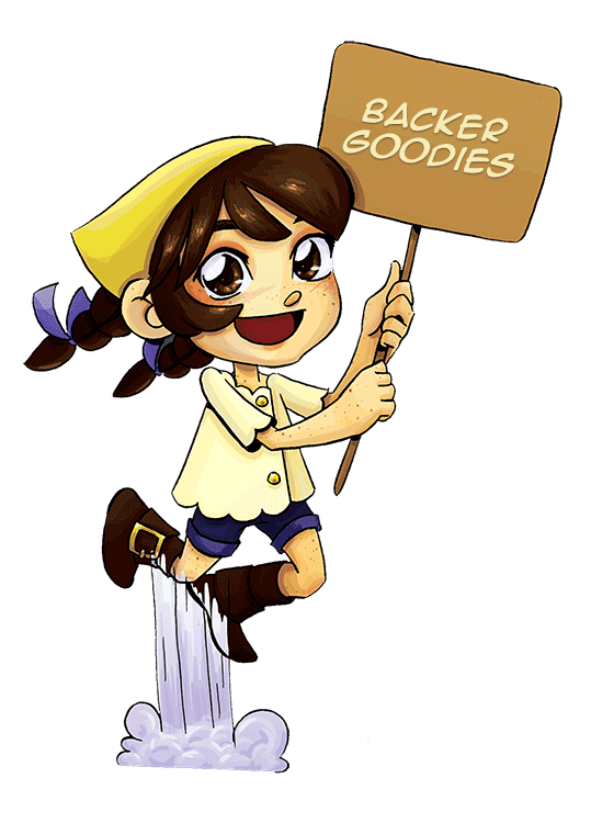
My Patreon is Now Live
I have some exciting news for you guys! I've been quietly picking away at launching a Patreon to help support this blog and the complement Youtube Channel, and I've finally soft launched. I'm still tweaking a few things here and there, working on getting a video up, working on custom illustrations for my Patreon, tweaking reward tiers and goals, but for now, the Patreon is up and ready for you to join the Nattosoup Studio Community.

What is Patreon?
Patreon is a crowd based funding site that allows creators to raise funds for ongoing projects per update, or per month. Since I update frequently, I've opted to open my finding per-month. This means you make a once monthly contribution, and you gain access to all sorts of exclusive backer only goodies. For my campaign, Patreon will deduct your selected amount automatically each month, and send you emails when I make updates. Since I update so frequently, I plan on only having Patreon email my backers with a once-a-week recap of everything that's been posted that week. I may also include sneak peeks into future posts and video, and I will include pertinent announcements like convention dates, meetups, and backer only Request Livestreams.
Backing starts at $2, and many of my upcoming goals are designed to benefit ALL backers regardless of contribution amount (although individual tiers will reward my high rollers), so even if you can't give much, $2 is a fantastic start, and if you can get your friends to contribute, that's even better! Readers are under no obligation to back my Patreon, as I will continue to post publicly, but your contributions would be much appreciated, and would go a long way to not only defray the costs running this blog incurs, but allow me to start paying myself a salary for my long hours, and possibly allow me to purchase better equipment and hire an assistant.
What does this mean?
I'm not a big fan of hiding content that people have grown accustomed to seeing for free behind paywalls, so most of my currently running series will continue to update. I'll continue to post process blogposts when I have them, I'll continue to review alcohol markers as they are released/I can afford them, I'll continue to slowly work my way through the Target Art Supply Review series and the Dollar Tree Art Supply Review series. I'll also continue to update the YouTube channel at least once a week with new content.
That said, there are a couple popular series that were designed to be offered as Patreon incentives. The Sketchbox Vs. Artsnacks reviews will go behind a $15 minimum monthly goal- this means that when my total amount hits $15, everyone (backers and public) gets to see that month's review. All backers will have access to that review regardless of whether or not the $15 total goal is hit. I will also begin writing convention reviews again once the Patreon starts to see some funding. Once I start making enough money, I can dedicate more time to editing the backlog of review and tutorial videos I've created, so the YouTube will begin updating twice a week.
You can check out the two free Sketchbox Vs Artsnacks posts below
January
February
I've already got a tiers and goals listed on the page itself, and I plan on modifying them as Backer-Only surveys are completed and turned in, but a few of the goodies I plan to offer are:
Downloadable pdf of 7" Kara Volume 1Downloadable pdf of all currently completed pages of Volume 2 (two chapters, about 50 pages of comic)Early access to future 7" Kara pagesPhysical rewards including stickers, charms, and commissionsBacker only Request Livestreams once a monthMore (and better!) art tutorialsFull size watercolor palette and watercolor paper reviews
What I REALLY want to focus on are all the things we can achieve together with a well-funded Patreon.

As a Patreon backer, your pledge
gives me a clear signal that you enjoy my content and want more of it.enables me to start taking backer requests for content and materialhelps me decide what to products you, the contributing reader, want me to focus onrewards me for years of hard work for the convention community, the comic community, and the illustration communityhelps me leave the vacuum my old monetization model put me inallows for more engagementassigns a monetary value to my content, which is important for reaching sponsors (which in turn, enables me to generate even BETTER content)
Backers receive priority access to
certain reviewscertain videoscertain art piecescertain tutorials7" Kara pages months before publicationbacker only voting will result in an increase in tutorials, as I will be able to better judge demand
Backer only request livestreams- I will draw what YOU want to see, including specific techniques and even fanart or your original characters

Your pledge will enable me to review (and create tutorials for) services
sticker companiescharm companiesproduction services through AliExpresstee shirt printingdecal printing
Your pledge will help generate funds for better review equipment
a new, dedicated camera for taking still shotsa better gooseneck clamp for my camcorder for video reviewsa lightbox and better backgrounds
The community we create together will allow me to organize and offer
mentorship programsonline classes leverage companies for early access and preordersconvention meetupsgiveaways for art supplies, original art, and sample products
Backing my Patreon will allow me to create
Convention artist video tutorials and demonstrationsresume writing convention reviewscreate more content for Howtobeaconartist.tumblr.com, a free blog dedicated to helping artists begin their career as convention artists
Backing my Patreon will result in
removal of Adsense ads from the blog (comic ads, which are offered free to comic artists, will remain)eventual removal of ads from the Youtubewatercolor paper reviewswatercolor reviewsmarker paper reviewscollaborations with other artists- I can commission artists you admire for tutorials and reviews, studio tours, and send them blind box challengespaid guest posts from other artists
Your Contribution Goes toPaying me a fair wage for the work I put inPurchasing supplies for review and demonstration purposesPaying for services you want me to reviewHiring an assistant to help edit video, help conduct artist interviewsPaying other artists for guest posts, collaborations, guest reviewsPurchasing supplies for compatibility tests purposes (supplies often get ruined this way)

Why Patreon?
Because I deserve a fair wage for all my work! Posts take a lot of resources to write- reviews require a camera, appropriate paper for swatching, several papers for testing purposes, several hours to actually test and photograph testing, several hours to draw the test image and render it, and several hours to sit down and get everything written. If I include video components, this adds even more time per post. Tutorials and advice posts draw on years of experience- both art school and in field, as well as a few hours to write and edit.
Many craft bloggers who also write in this niche have sponsors who help defray costs through care of product donations and monetary sponsorships, but illustrators in this niche tend to be overlooked or rejected when it comes to sponsorships and donations. As of this time, despite inquiries and your valiant efforts writing to companies on my behalf, I am still footing 100% of all costs.
The Paypal donation model has never really worked for me or for this blog- although there are donations, they are sporadic. Adsense doesn't really bring in more than a couple bucks each month, and although YouTube ads and Amazon Affiliates help some, I'm still making less than $100 a month, which is not a living wage for an adult. Sales from my site are also too slow and sporadic to significantly contribute to household finances.
Patreon allows me to reward backers with exclusive content and physical goods easily. I understand that many of my readers are students or artists, and most of us are pretty broke. If you can only spare $2 a month that's fantastic and I sincerely appreciate your $2. Your $2 buys entry to early access, to all goals unlocked by the collective Nattosoup community, to exclusive backer only content.
Patreon allows backers to 'set it and forget it', as Patreon will automatically deduct your contribution each month, based on how you set up your account. So if you're forgetful like me, and you tend to forget to make repeated contributions for content you enjoy, Patreon will handle that for you, guilt free.
My Patreon creator page will also give readers a very clear idea of how much I am being paid per month, and by whom, so no longer can readers comfortably assume someone else will pick up their slack. Once a week. I'll send out a Backer-exclusive 'newsletter' of the media I've posted, so you can check your email and get your dose of Nattosoup in one easy email.
For those of you who feel this is begging, let me remind you, once again, that freelance writers are paid for their work. Freelance artists are paid for their work. This blog is a service to you, the reader, provided by me, an expert with the qualifications to back up my claims. You are not expected to back if you don't wish to, but I would prefer not to hear your opinions regarding my decision to launch a Patreon after six years of blogging and three years of YouTube.
In Summary, my Patreon is designed to
A: Give you guys a larger voice in the content I produce,
B: Help fill the financial gap that currently exists between where I am now, and self sufficiency as an artist and a blogger
C: Attach a monetary value to the written and video work I produce
D: Allow me to offer even better content, because I will have the funds to purchase it, the funds to hire an assistant, and the financial incentive to make certain time and energy consuming posts/videos high priority and get them out even faster.
Nattosoup Studio Patreon Creator Page
Please consider donating to this blog or purchasing from Natto-shop (http://nattosoup.com/shop) if you want me to continue publishing quality content. All materials tested were purchased from my own pocket. Keep on Truckin' Nattosoup is not under any sponsorship.
February 15, 2016
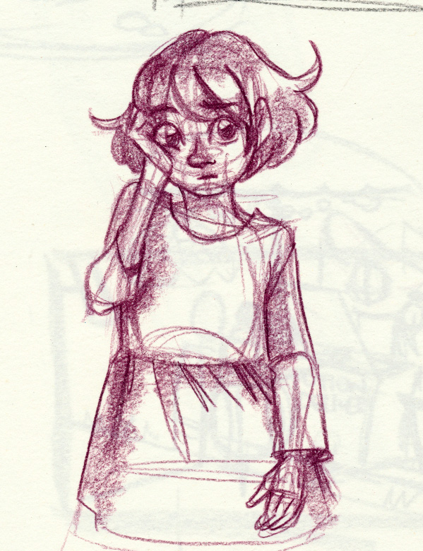
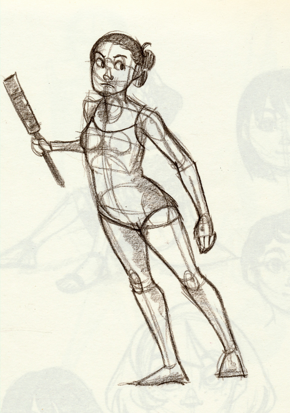
December 2015 Sketch Dump
Some of this may have been briefly covered in the December 2015 sketchbook tour. I shared here not too long ago. Since none of you indicated a preference between sketchbook scans and sketchbook tours, and I'll need the scans for my 2015-2016 ashcan, I figured I might as well over share a little bit. There's plenty of new sketches to make up for any you may have already seen.
I have a fairly sizable amount of sketches, watercolors, and inks to share, so I decided to break it up into smaller chunks dictated by theme. This week I'm also sharing my yoga studies, January 2016 sketches, recent watercolor studies, and miscellaneous color work from the past couple months.
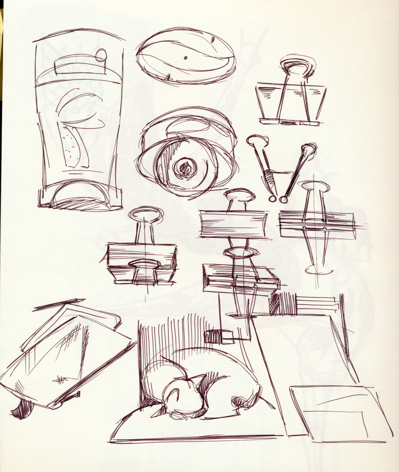
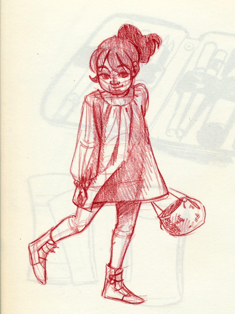
My main themes for late November and December were spontaneous inks from life (inked with a Pentel Kirari (link), pencil color sketches of dancers, and fine line sketches of household utensils (inked with a Marvy LePen). There's also lots of fashion (from The Sartorialist as well as Microfashion and plus size fashion), and doodles of Kara, from my comic, 7" Kara.


 Drawing emotions from text-based emoticons is one of my favorite ways to practice when I'm feeling a bit brain-dead.


 My male cat, Bowie, the spoiled prince


Please consider donating to this blog or purchasing from Natto-shop (http://nattosoup.com/shop) if you want me to continue publishing quality content. All materials tested were purchased from my own pocket. Keep on Truckin' Nattosoup is not under any sponsorship.
I have a fairly sizable amount of sketches, watercolors, and inks to share, so I decided to break it up into smaller chunks dictated by theme. This week I'm also sharing my yoga studies, January 2016 sketches, recent watercolor studies, and miscellaneous color work from the past couple months.
My main themes for late November and December were spontaneous inks from life (inked with a Pentel Kirari (link), pencil color sketches of dancers, and fine line sketches of household utensils (inked with a Marvy LePen). There's also lots of fashion (from The Sartorialist as well as Microfashion and plus size fashion), and doodles of Kara, from my comic, 7" Kara.


 Drawing emotions from text-based emoticons is one of my favorite ways to practice when I'm feeling a bit brain-dead.
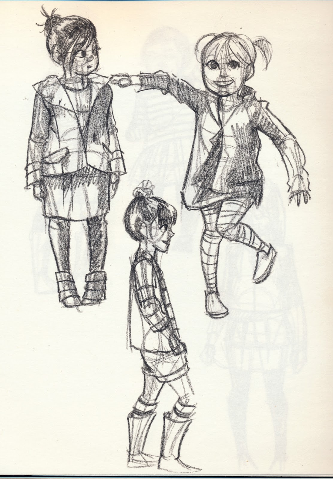


 My male cat, Bowie, the spoiled prince
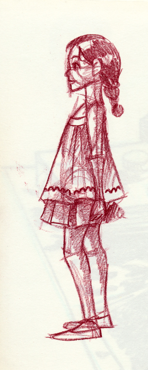


Please consider donating to this blog or purchasing from Natto-shop (http://nattosoup.com/shop) if you want me to continue publishing quality content. All materials tested were purchased from my own pocket. Keep on Truckin' Nattosoup is not under any sponsorship.
February 12, 2016
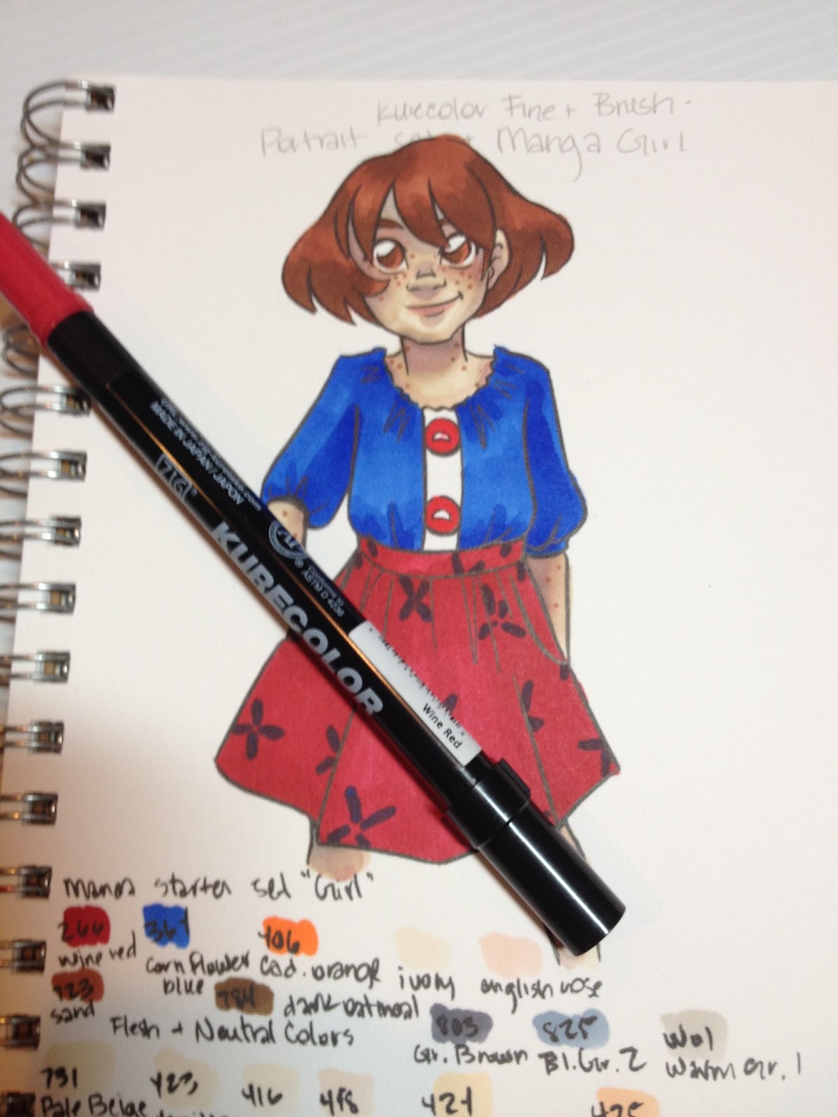
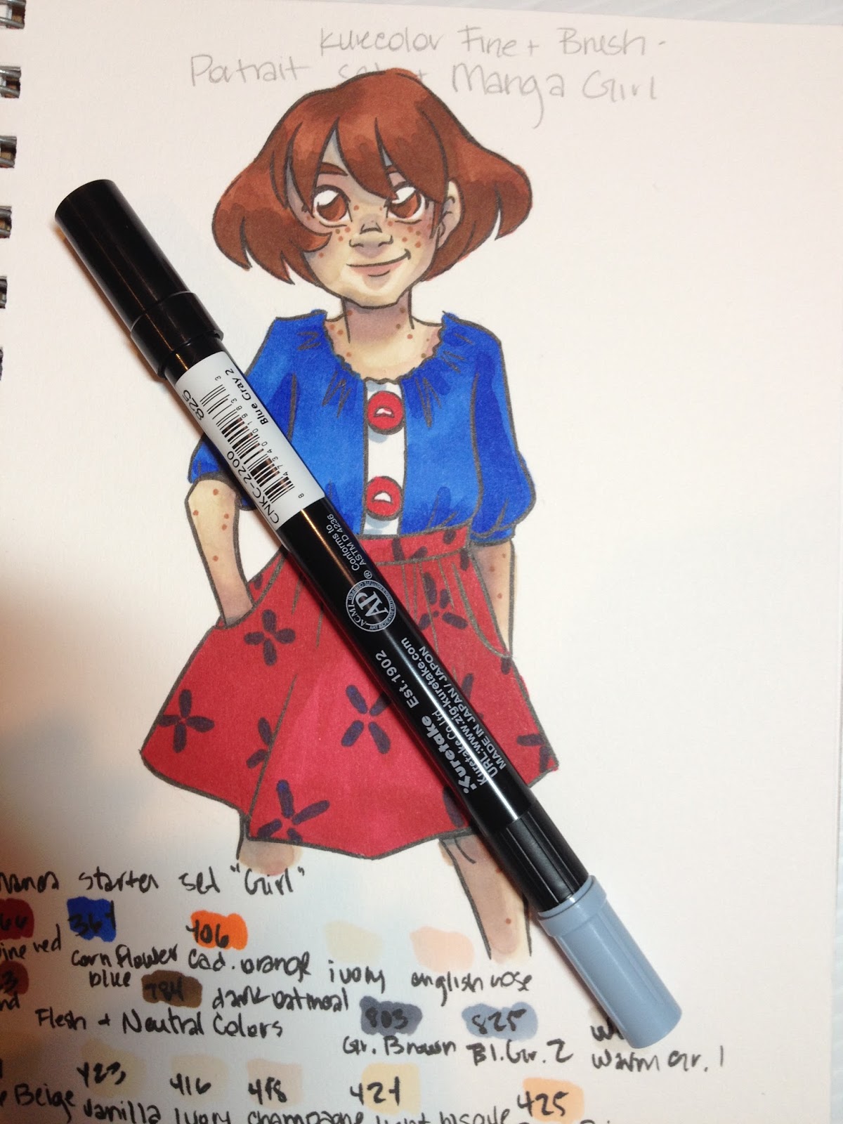
Alcohol Marker Review: Kurecolor Brush and Fine for Manga
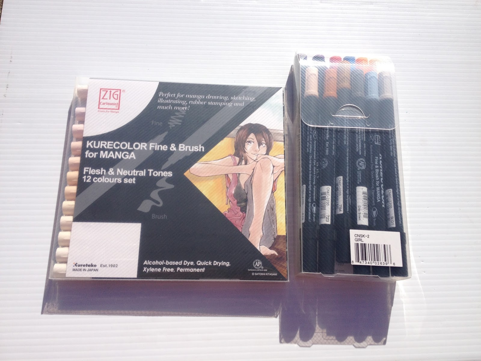
Although I've promised myself I would start moving away from alcohol based marker reviews, I find myself discovering new brands and wanting to share them here. Kuretake is by no means a new brand to me, as I've reviewed many of their fude pens, and I've even reviewed their alcohol markers once before.
I purchased my Kuretake Kurecolor Brush and Fine for Manga markers from Amazon, as they currently have the best price online.
The Brand and Past Reviews
Other Alcohol Markers from Kuretake:
Link from MarkerPop
Kurecolor
Kurecolor Twin S
Past Reviews:
Kuretake Kurecolor Twin S
These markers were originally designed for manga artists and illustrators, and the site promises 'velvety smooth laydown of colour' as well as 'amazing blending properties'. These markers launched in the US in May of 2012, but don't seem to have gained much traction in the alcohol marker arena.
The Stats:
Refillable- you can find some refill inks through Amazon and through Marker SupplyReplaceable NibsBrush Nib and bullet nib135 colors+ colorless blenderAvailable in a variety of sets and openstockAvailable on Jetpens, Amazon, Kuretake website, Craft CarrotKurecolor Twin markers are available in 135 colors, the same appears to be true for the Kurecolor Brush and Fine for MangaI've found a couple sources for open stock- MerriArtist- $2.76 each and Scribblers (UK)
Kurecolor Color Chart
 Image Source
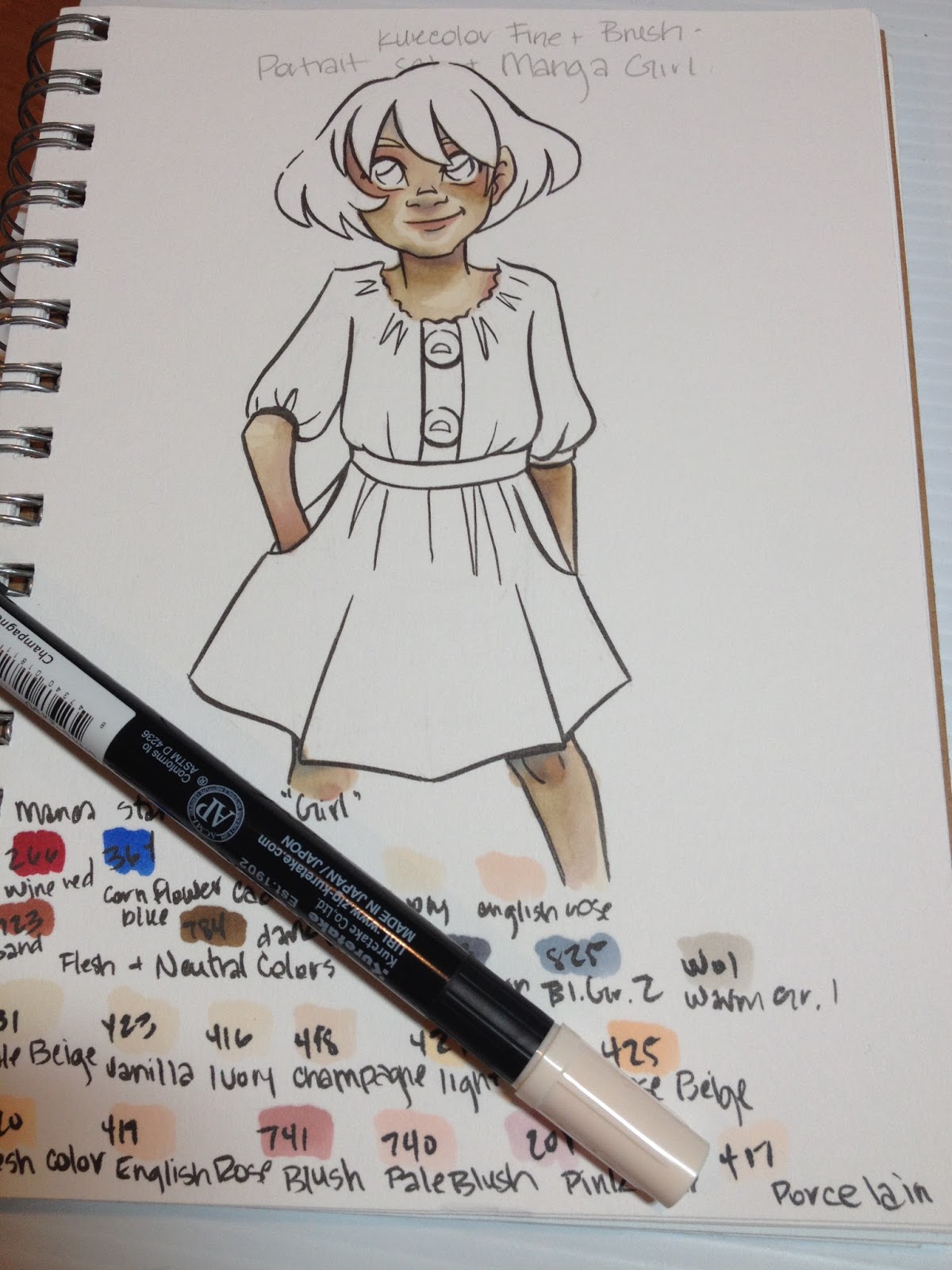
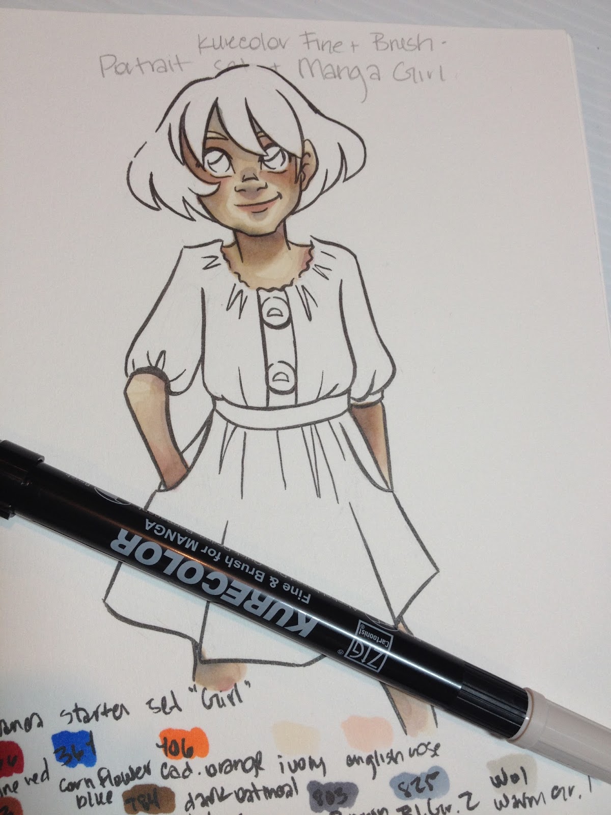
Colors Purchased:
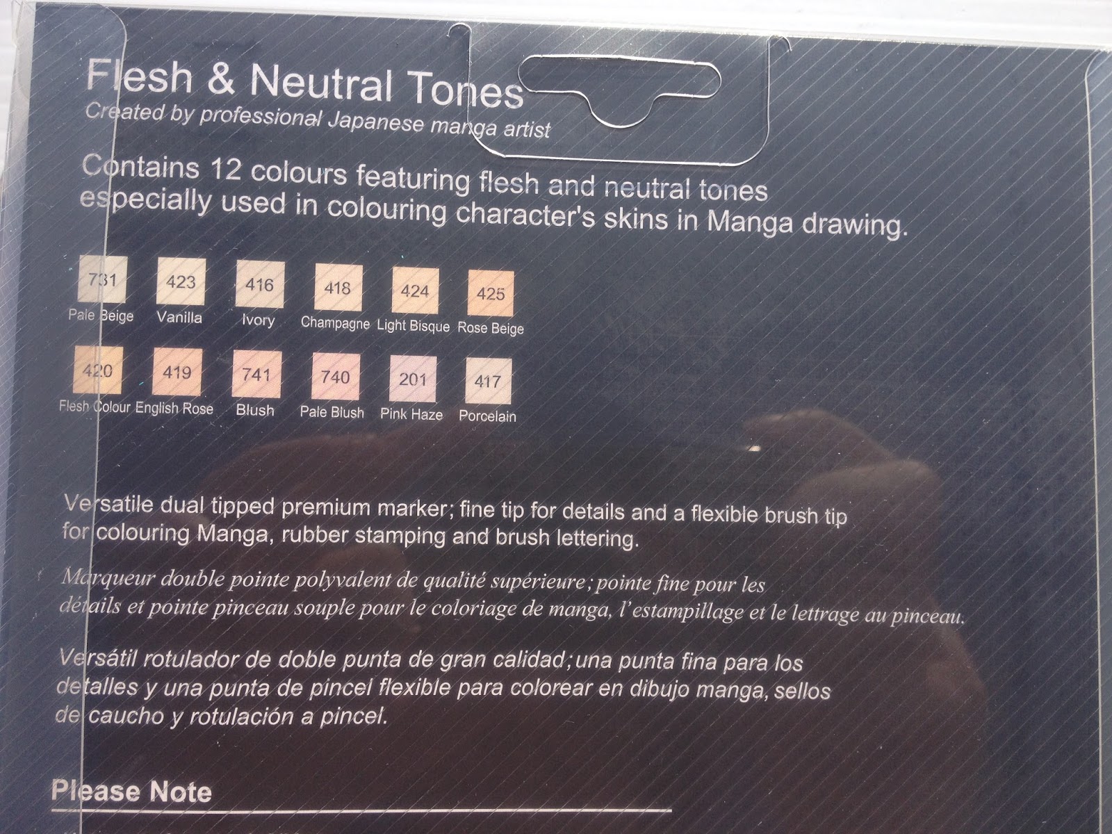
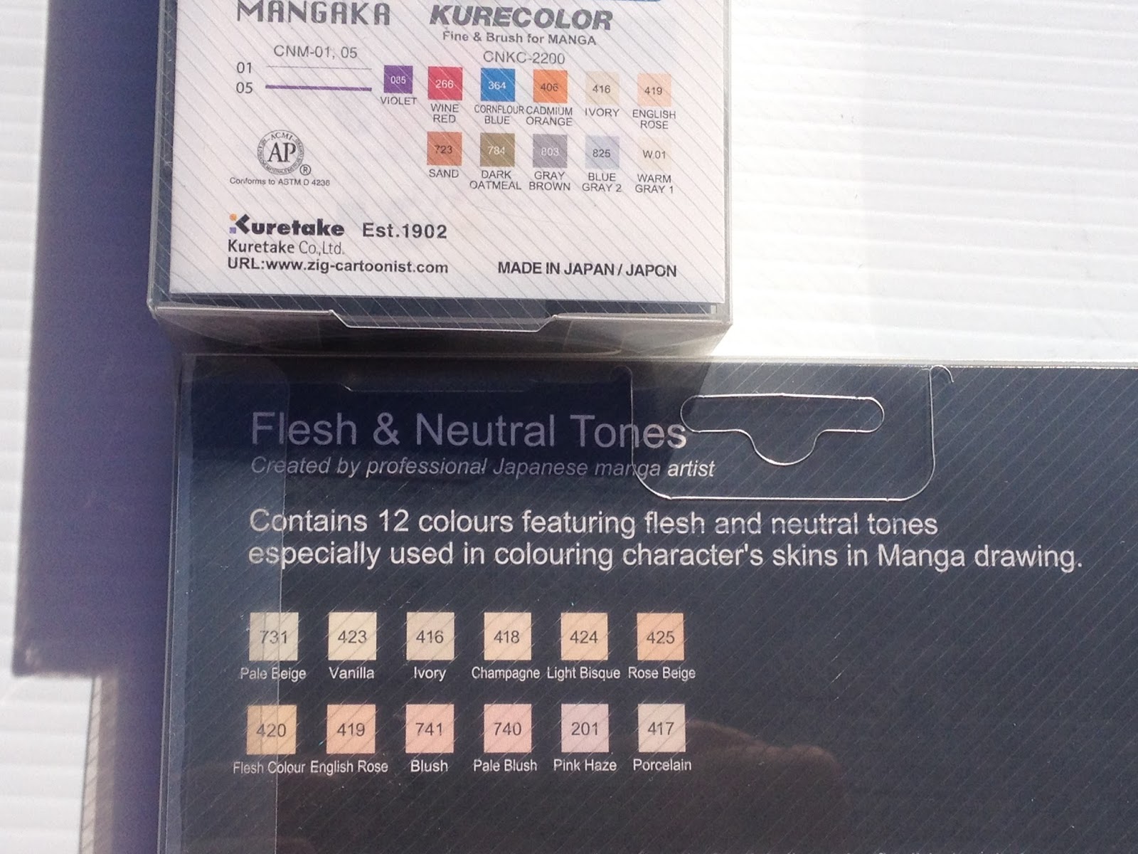
Flesh and Neutral Tones set (12 markers) $39.50 on Amazon
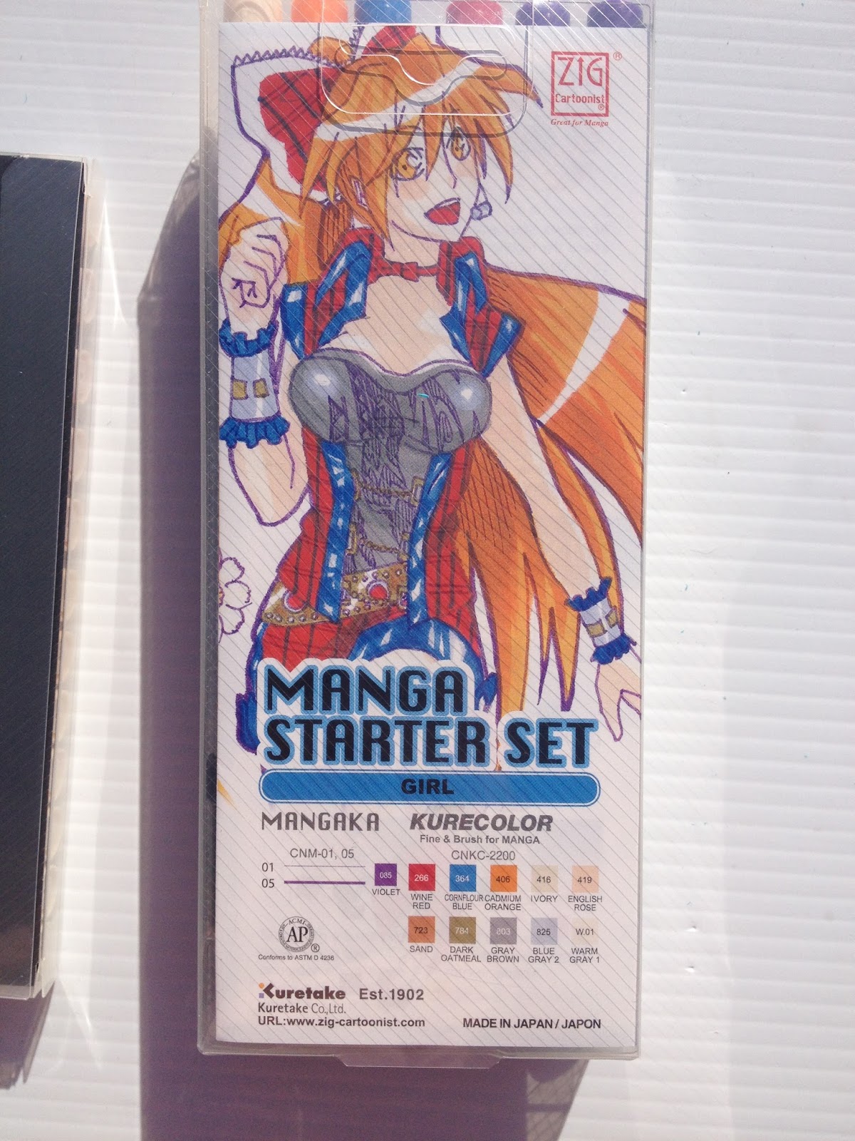
Manga Set 'Girl' (10 markers+ 2 purple fineliners) $39.43 on Amazon
Duplicate Colors are Bolded for your reference.
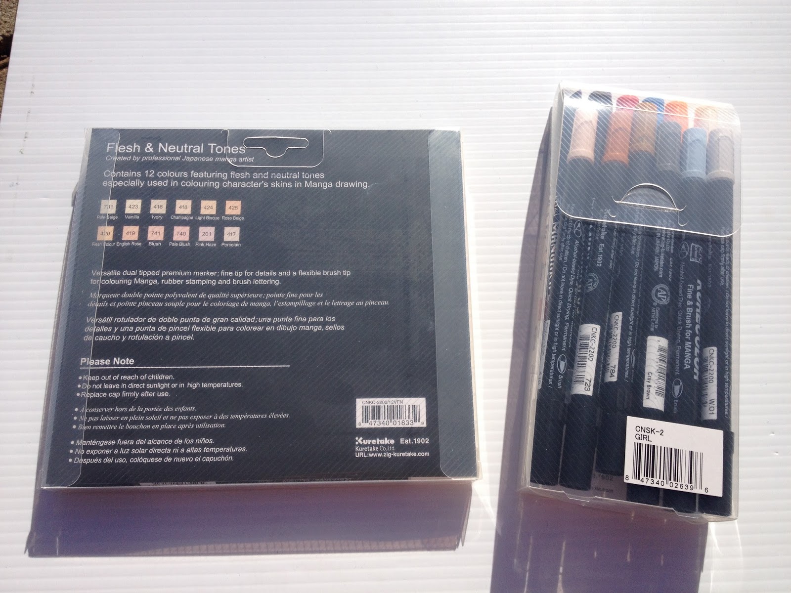
Colors included in Flesh and Neutral Tone Set:
Pale Beige
Vanilla
Ivory
Champagne
Light Bisque
Rose Beige
Flesh Colour
English Rose
Blush
Pale Blush
Pink Haze
Porcelain
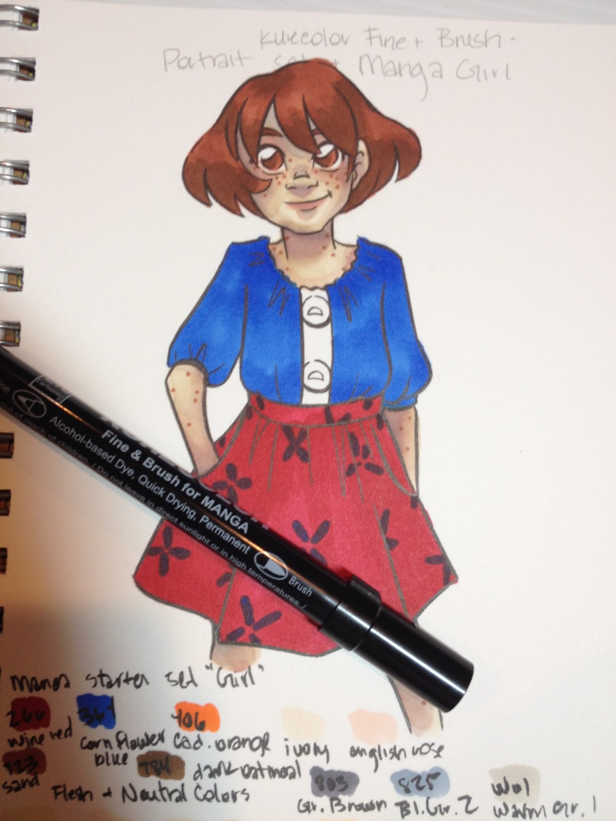
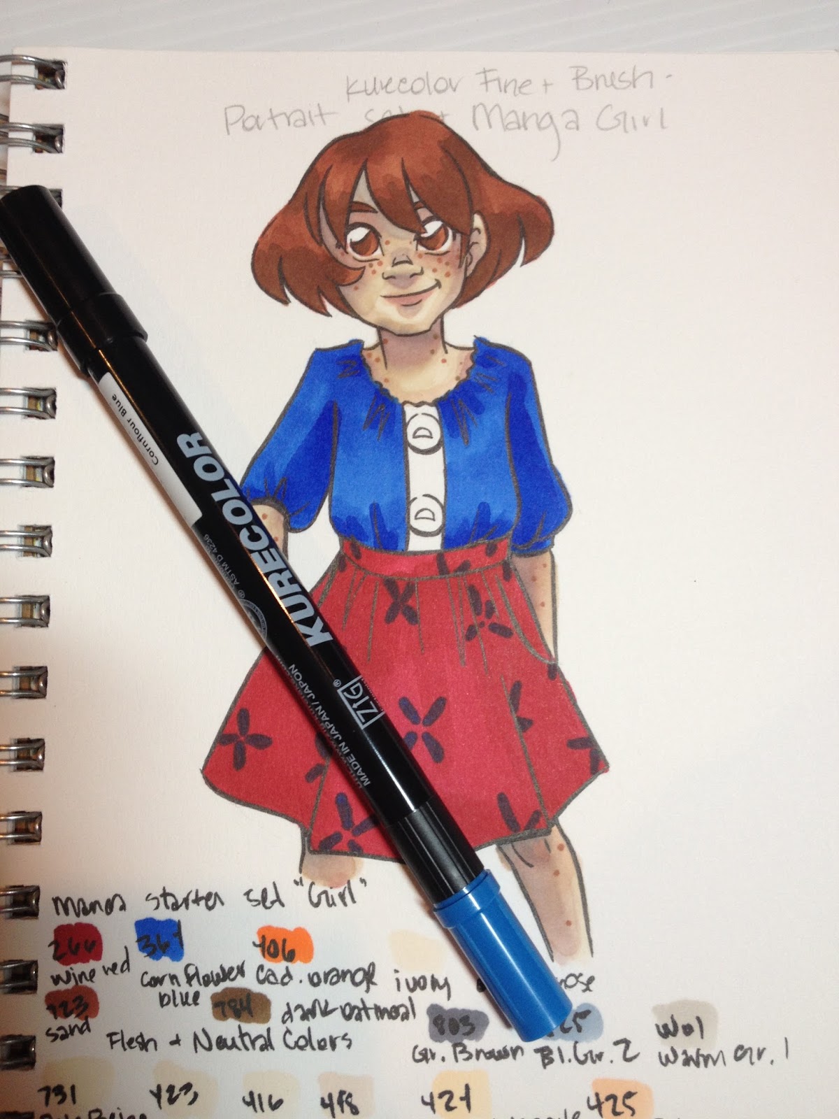
Colors included in Manga Set Girl:
2 Violet fineliners- 01 and 05
Wine Red
Cornflower Blue
Cadmium Orange
Ivory
English Rose
Sand
Dark Oatmeal
Gray Brown
Blue Gray 2
Warm Gray 1
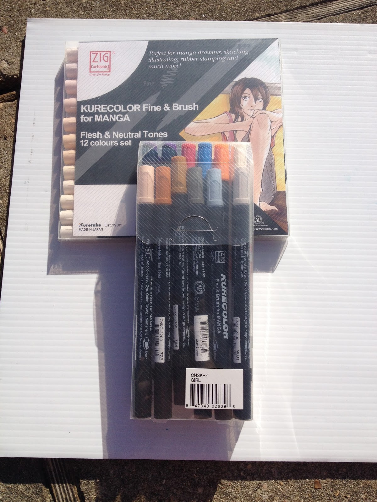
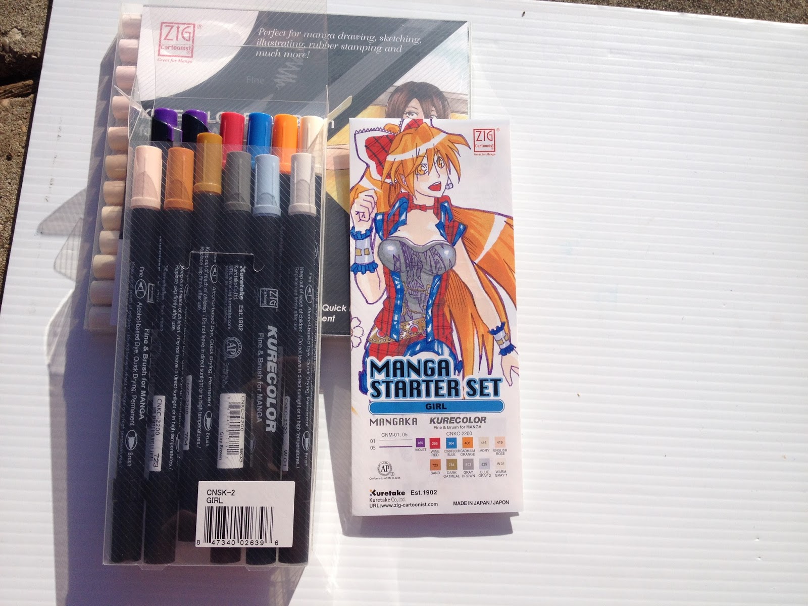
The Packaging
Both sets came in sturdy plastic cases. Inside the case, there's nothing to keep the markers in order, and markers are very prone to shifting. For sets like the skintones and neutrals, this can become very confusing, as the colors are all very similar, especially if you're going by cap alone.
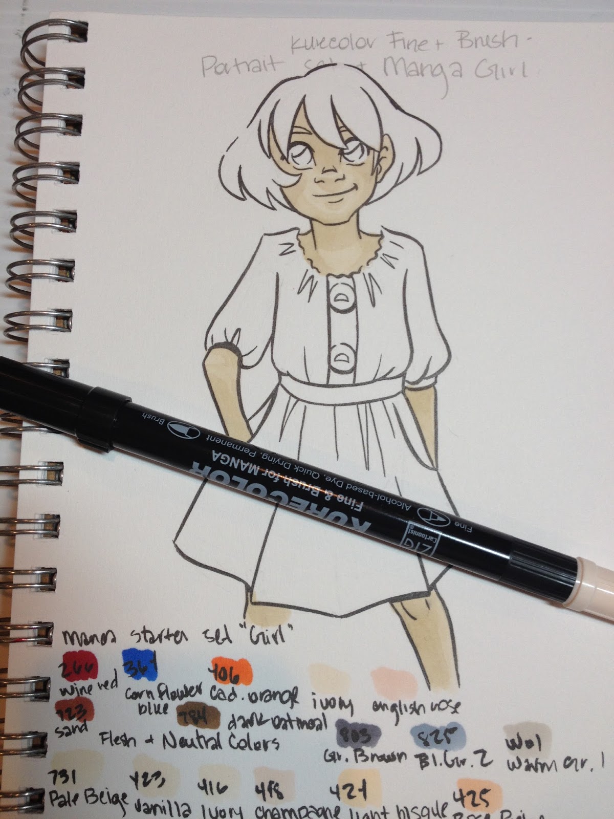
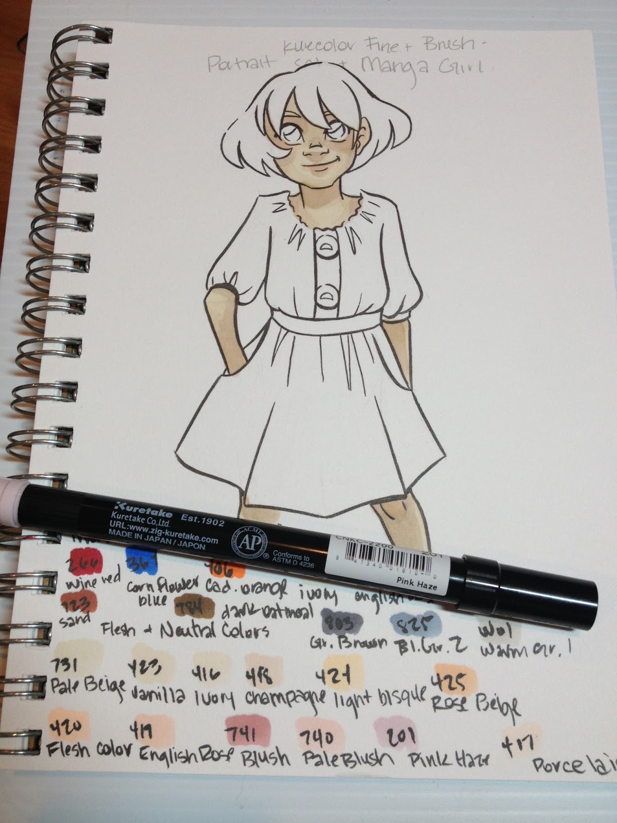
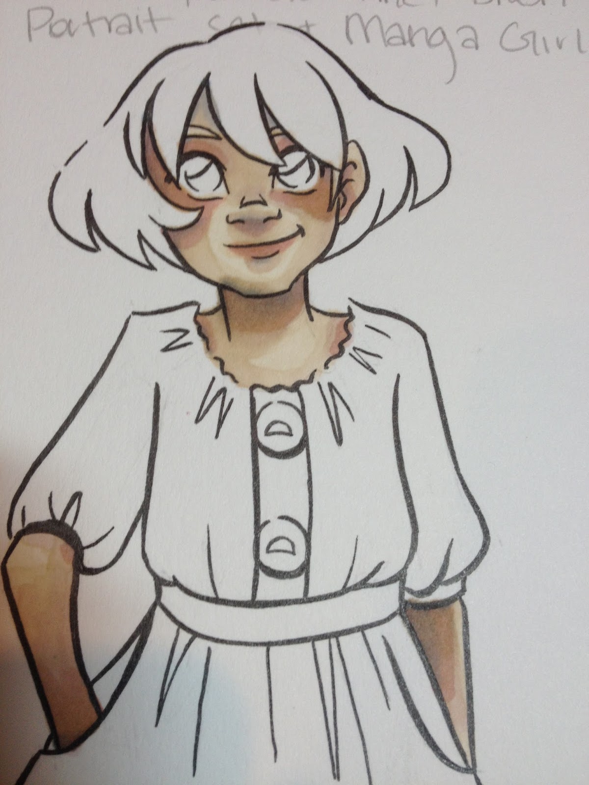
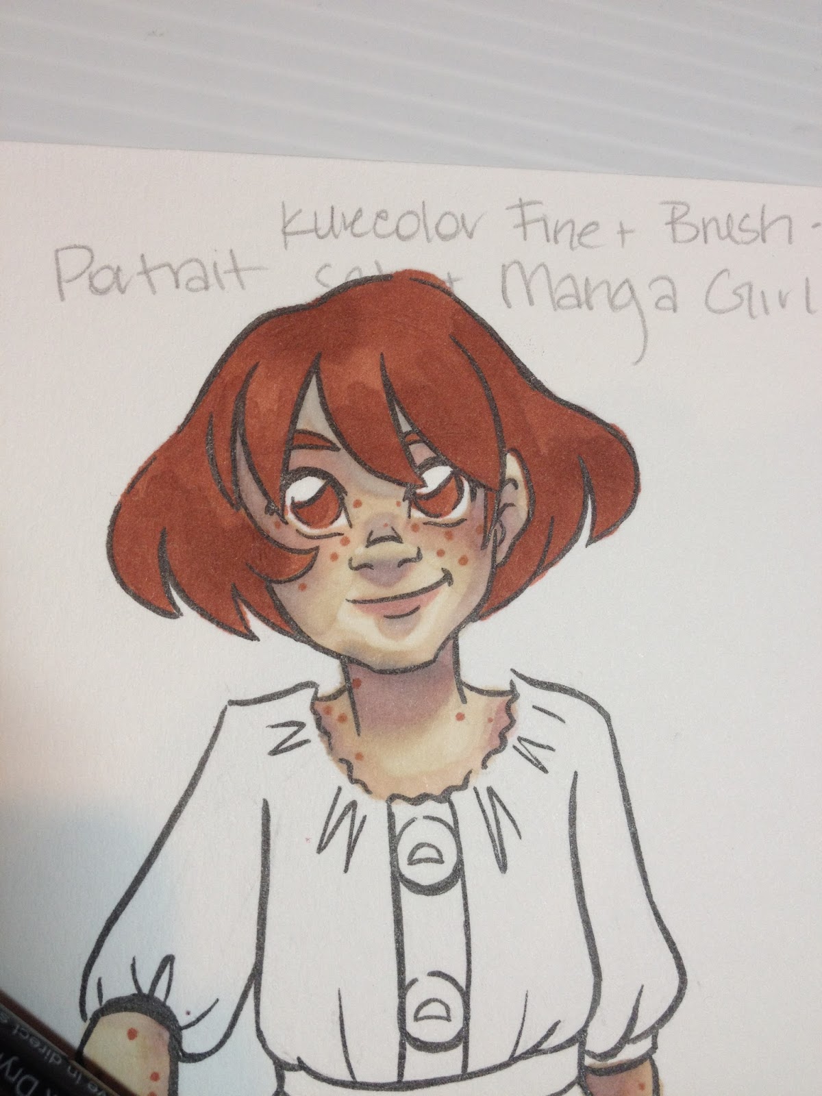
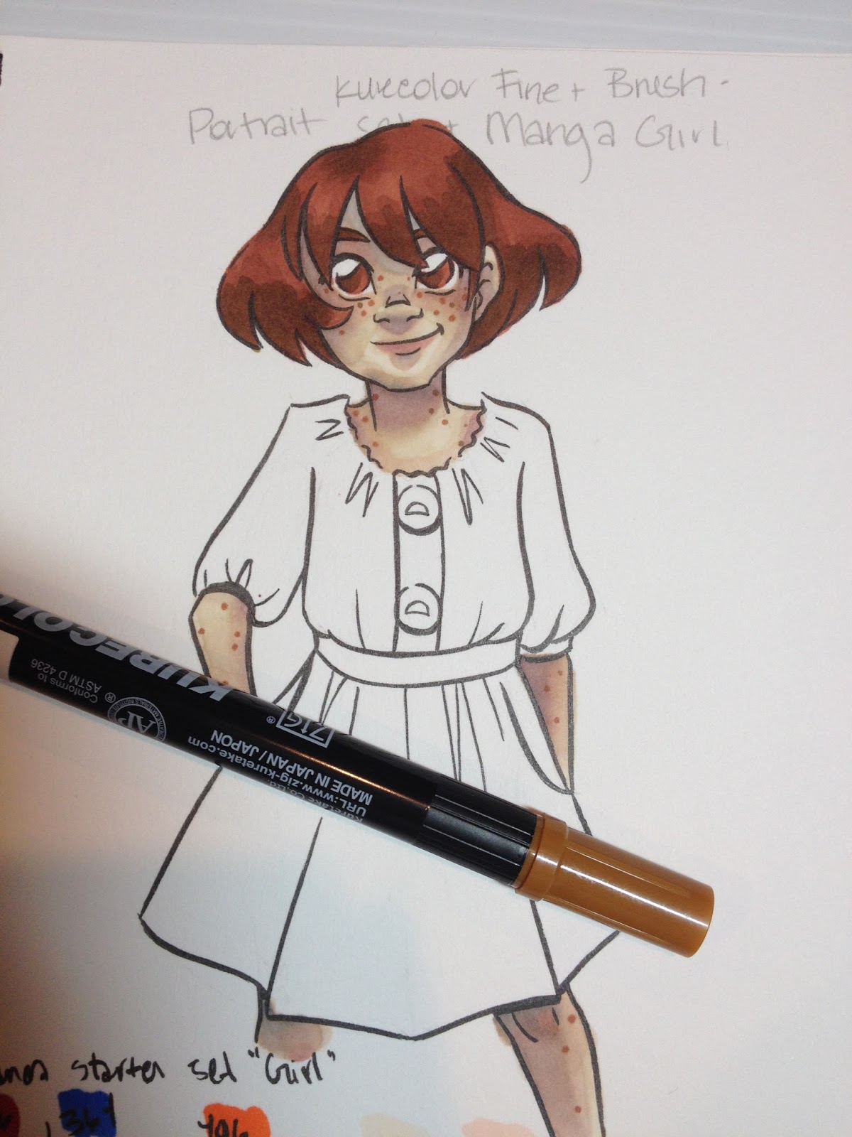
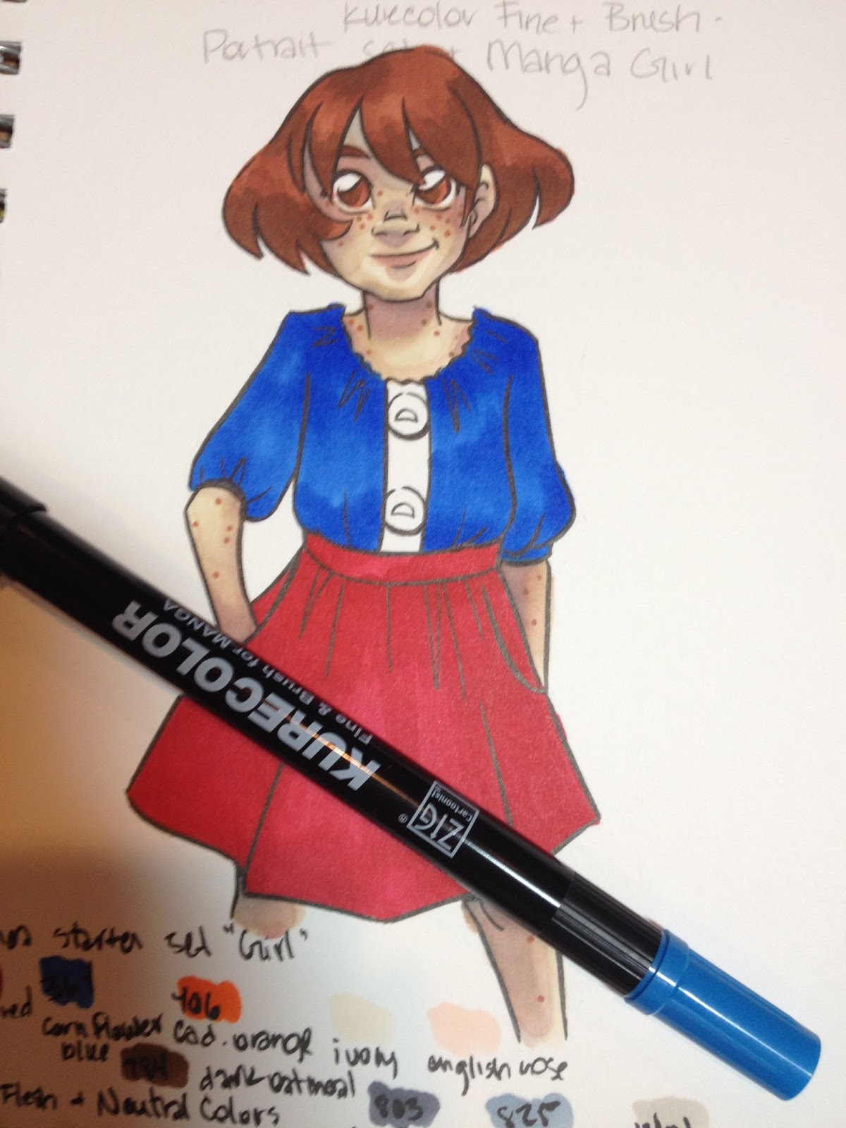
Portrait Set


The skintone and neutral set does not have a secure closure- the lid simply tucks into the rest of the package.
Manga Starter Set- 'Girl'


For this package, the lid securely tucks into the rest of the package via a little flap.

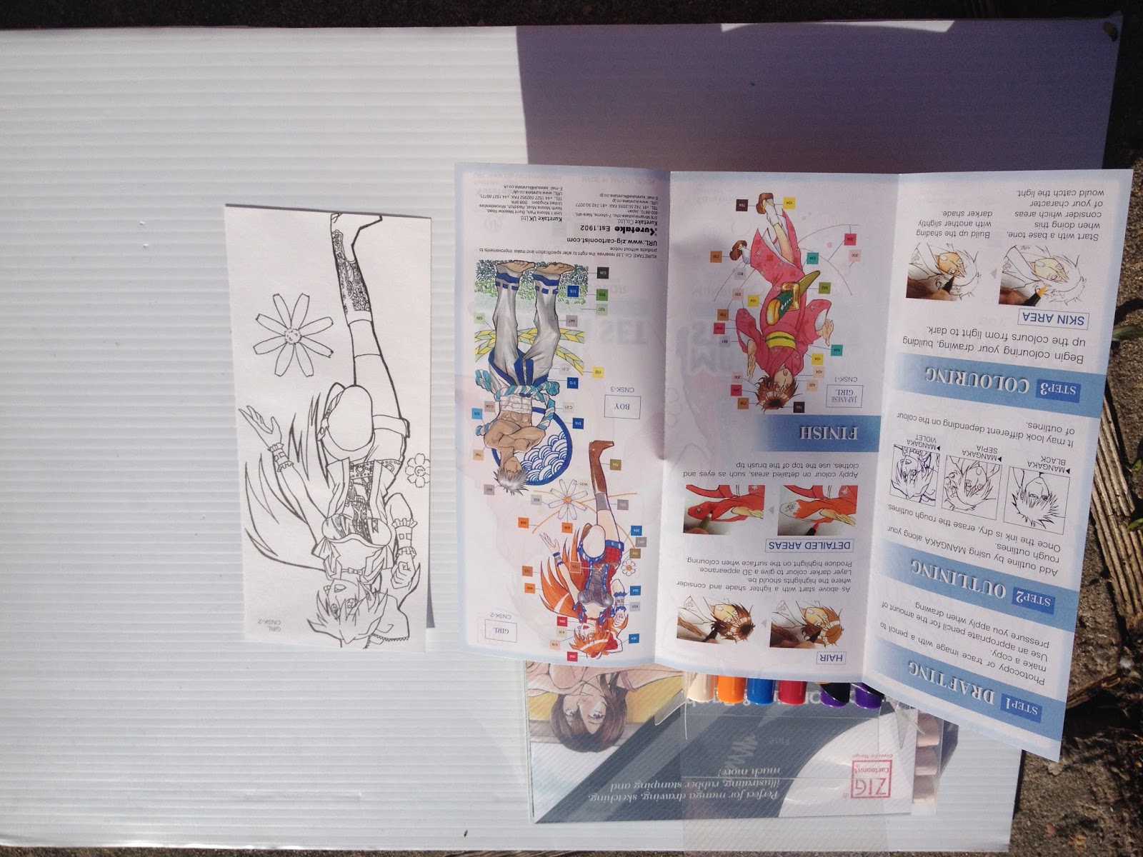
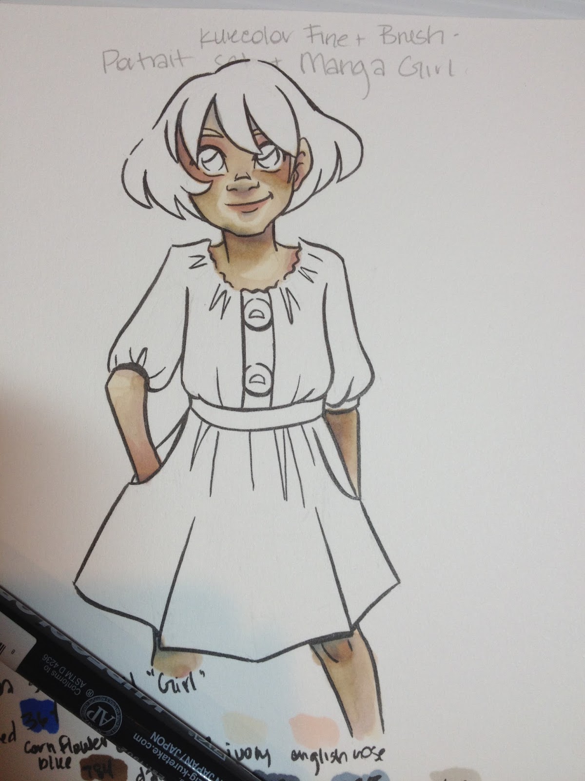
Manga Set 'Girl' includes an informational pamphlet that gives the basics for how to use alcohol markers for illustration, demonstrates which colors are used for the included illustrations, and includes an uncolored copy of the front illustration for you to practice on. The paper this is printed on is extremely thin.

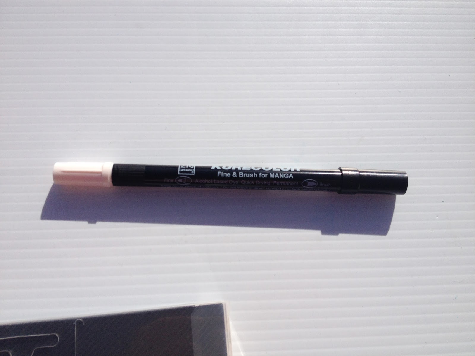
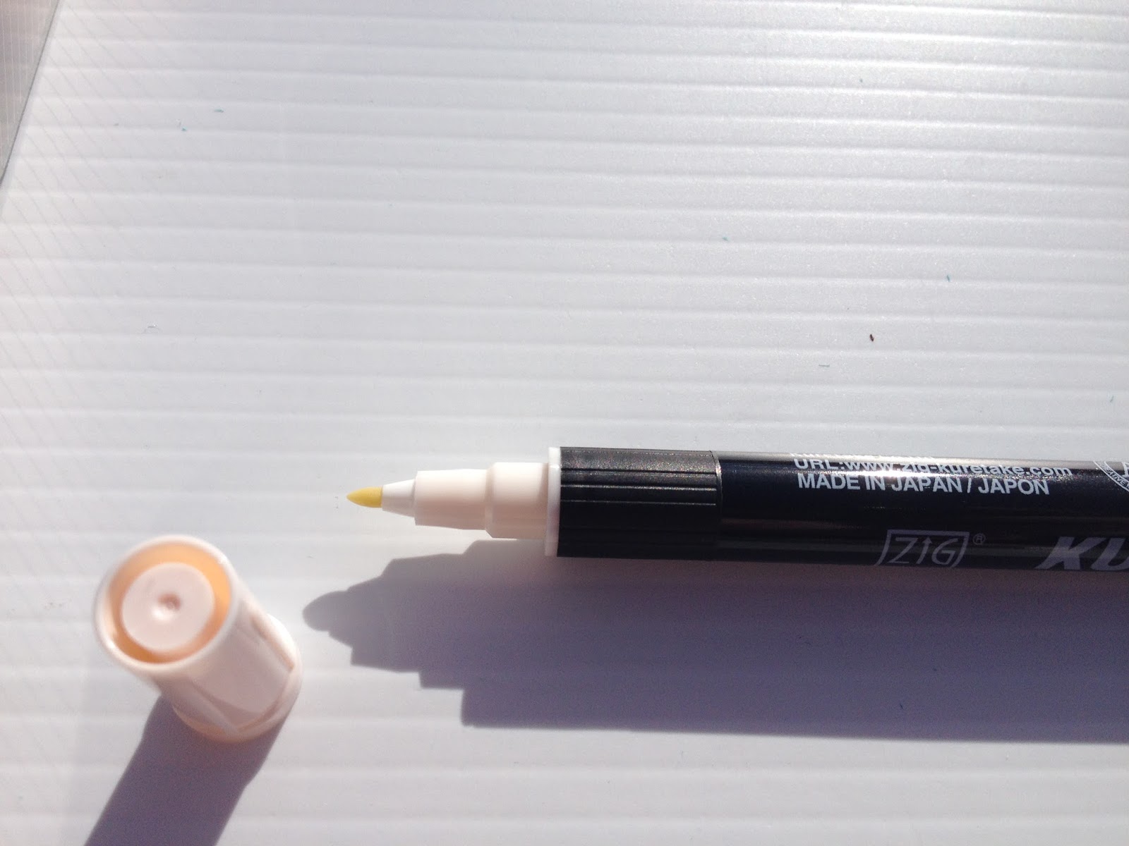
The Markers
As mentioned above, Kurecolor Brush and Fine for Manga are twin tipped markers. The black cap hides the brush tip, and the color cap hides the fine. This is the reverse of most markers I encounter, and it was a bit frustrating as I kept pulling off the wrong cap time and again.


Body screening indicated the Fine tip and the Brush tip

Also unusual is the fact that the fine tip not only has the color cap, but the color collar as well. This is generally used to indicate the brush tip on alcohol markers.

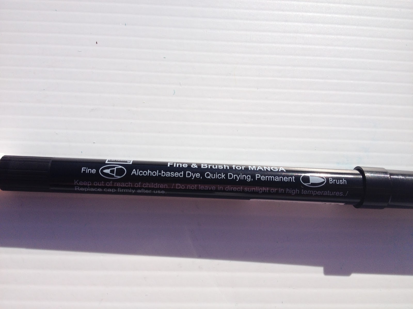
The brush is a bit stubbier than most alcohol marker brushes. The barcode sticker indicates the color name.

The fine tip is a fiber nib, similar to the fine nib used for pigment ink on Distress watercolor markers.
Comparison Shots
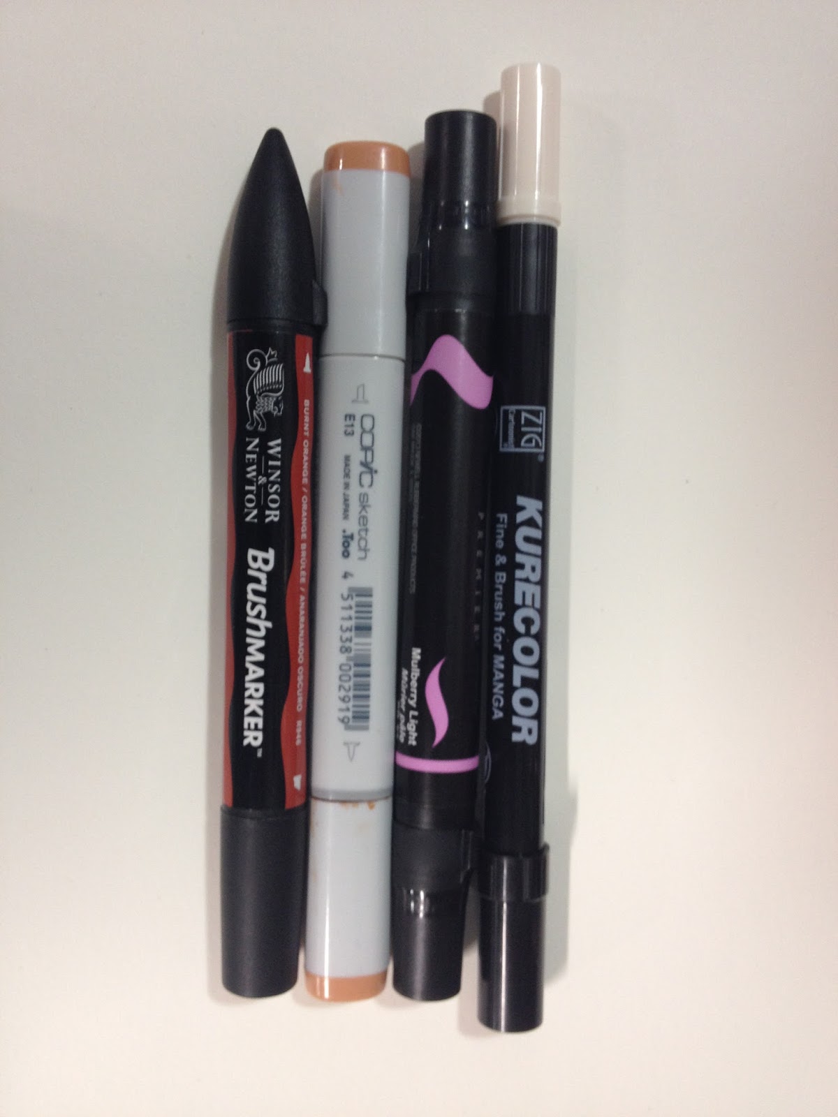
Compared to other popular alcohol markers
 From Left to Right: Winsor and Newton Brushmarker, Copic Sketch, Prismacolor Brush Marker, Kurecolor Brush and Fine for Manga
Kurecolor Brush and Fine for Manga markers are much thinner than other refillable alcohol markers, some of the thinnest I've ever tested, and much thinner than Kuretake's Kurecolor Twin or their original Kurecolor alcohol markers.
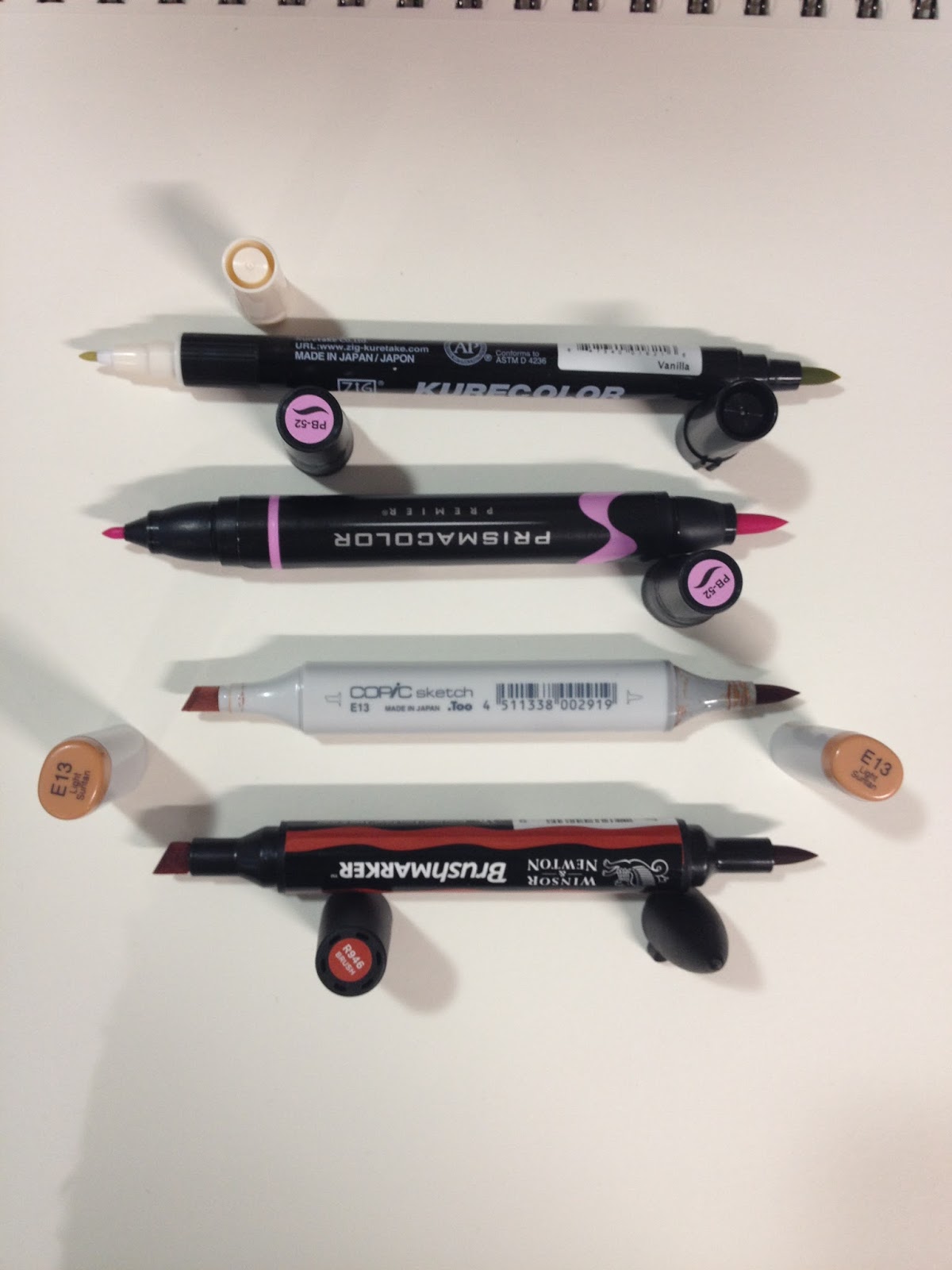
 From Top to Bottom: Kurecolor Brush and Fine for Manga, Prismacolor Brush marker, Copic Sketch, Winsor and Newton BrushmarkerThe fine nib is closer to the nibs used on watercolor markers than to alcohol marker bullet nibs, but the brush is very similar to those used by Prismacolor, Copic, and Winsor and Newton, except a bit shorter.
 From Top to Bottom: Kurecolor Brush and Fine for Manga, Prismacolor Brush Marker, Copic Sketch, Winsor and Newton Brushmarker
 From Top to Bottom: Kurecolor Brush and Fine for Manga, Prismacolor Brush marker, Copic Sketch, Winsor and Newton Brushmarker
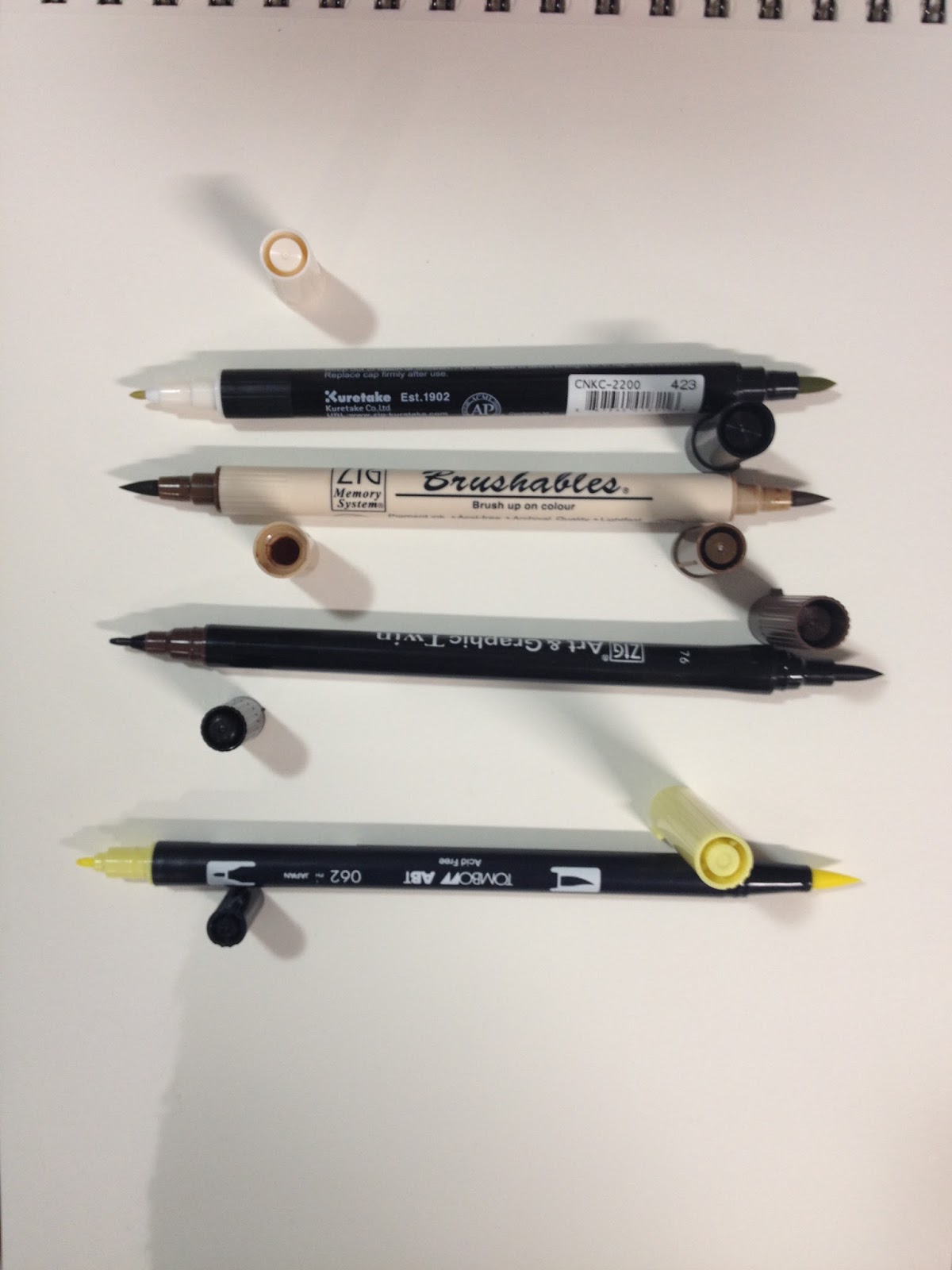
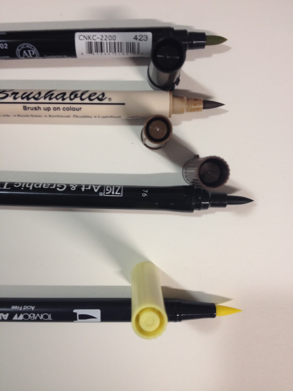
The body of the Kurecolor Brush and Fine for Manga reminded me of other markers made by Kuretake, so I pulled out several other waterbased markers to see how the bodies stacked up.
Compared to Other Kuretake Brush Markers (and one Tombow)
 From Top to Bottom: Kurecolor Brush and Fine for Manga, Zig Brushables, Zig Art and Graphic Twin, Tombow ABTThe general design of the Kurecolor Brush and Fine for Manga is very similar to the Kuretake Zig Art and Graphic Twin and the Tombow ABT- long narrow body, colored cap at the fine point, single color cap to signify color within. The fine nib is very similar to the fine nib on the Tombow ABT, and the brush is much shorter and thicker than the other markers.
The styling in general is also very similar to these non-refillable waterbased markers- long black body with generic body screening, color name and number is on the barcode sticker rather than the body, nibs are probably not replaceable.
 From Top to Bottom: Kurecolor Brush and Fine for Manga, Zig Brushables, Zig Art and Graphic Twin, Tombow ABT
 From Top to Bottom: Kurecolor Brush and Fine for Manga, Zig Brushables, Zig Art and Graphic Twin, Tombow ABT
The Swatch Test
 Color chart on the Flesh and Neutral Tones Set
 Color chart on the Manga Starter Set 'Girl'
 Top Two Rows: Swatches from the Manga Starter Set 'Girl'Bottom Two Rows: Swatches from the Skintones and Neutrals set
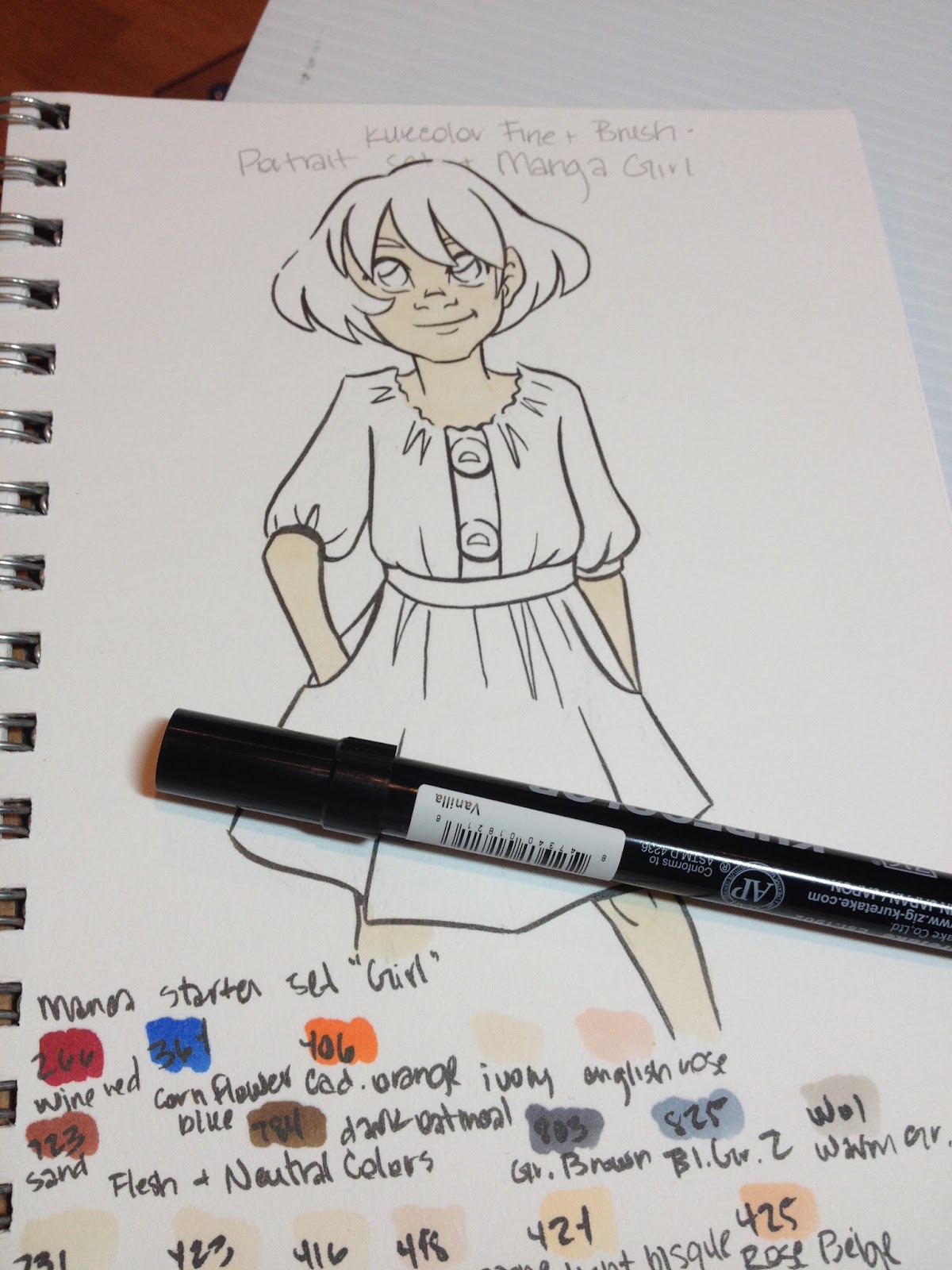
The Field Test
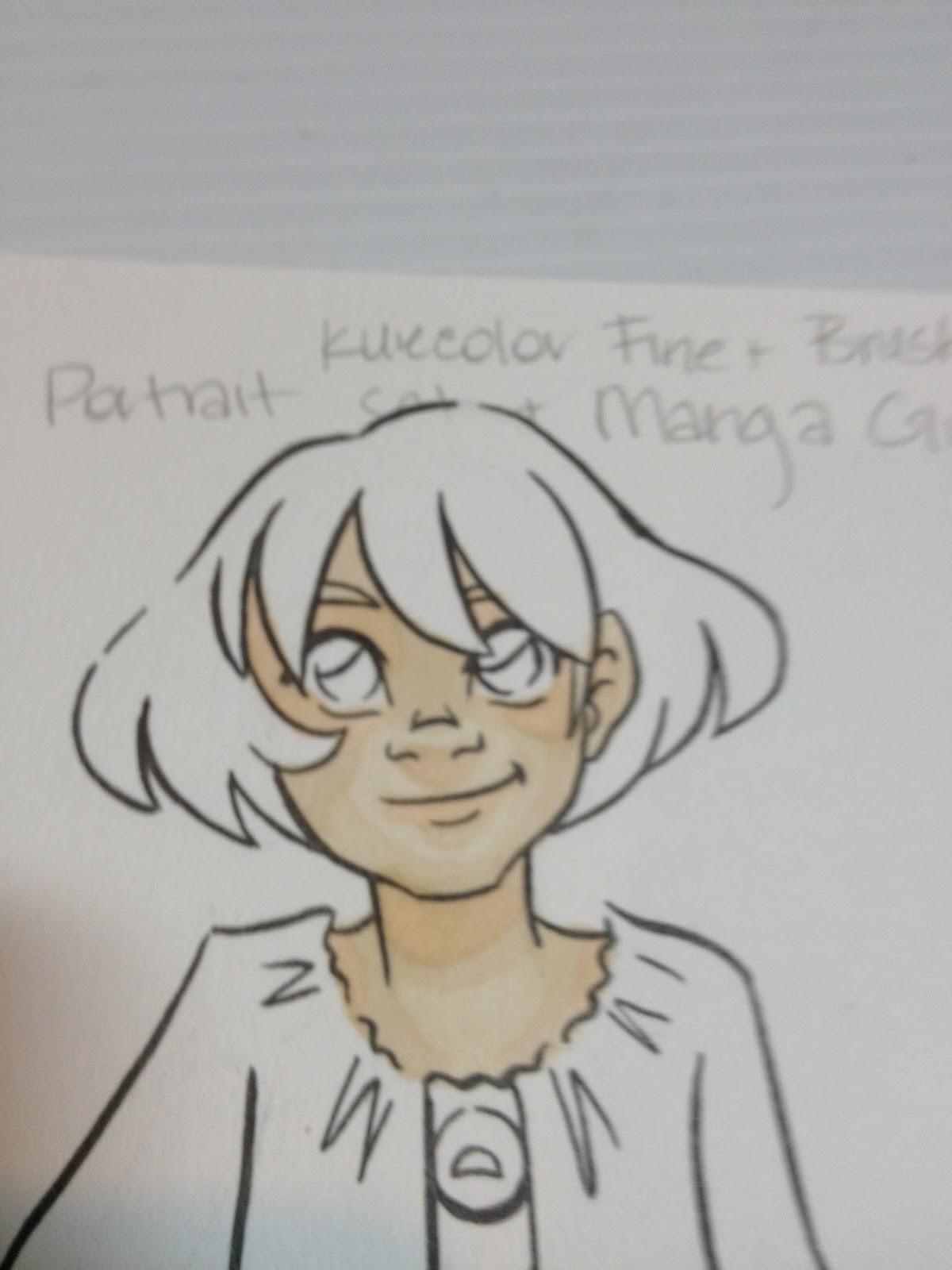
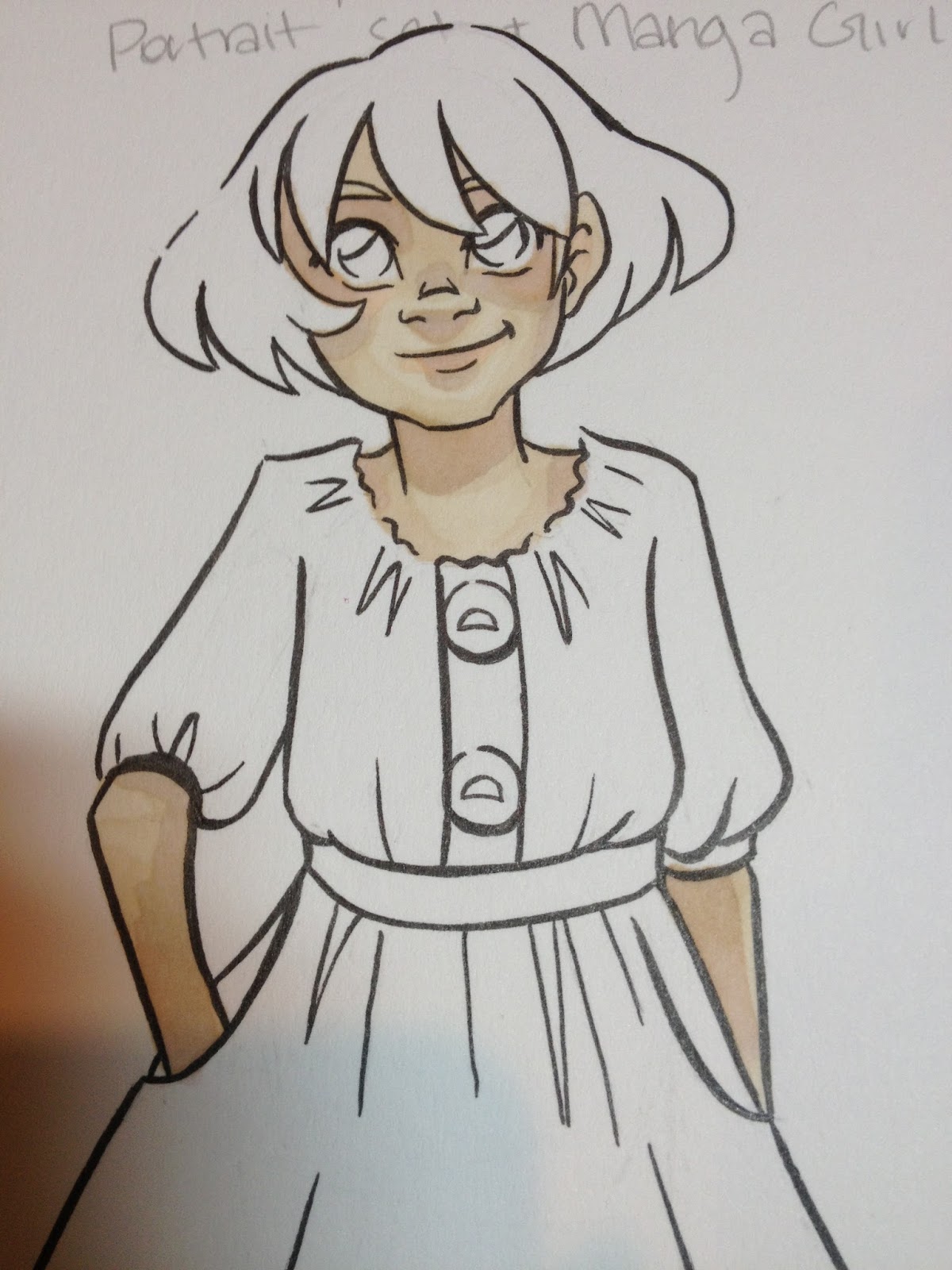
The Skin


Colors did not layer upon themselves very well- it was difficult to build up tones this way, requiring me to grab other markers and try to color match.


Colors were so similar it was difficult to build up contrast by layering different colors as well.

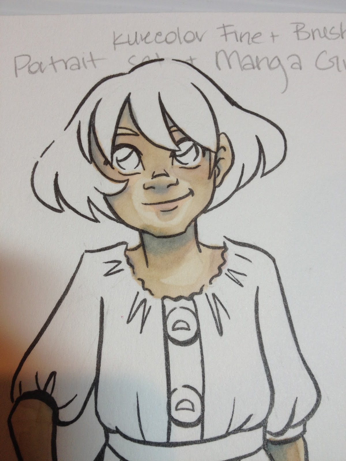
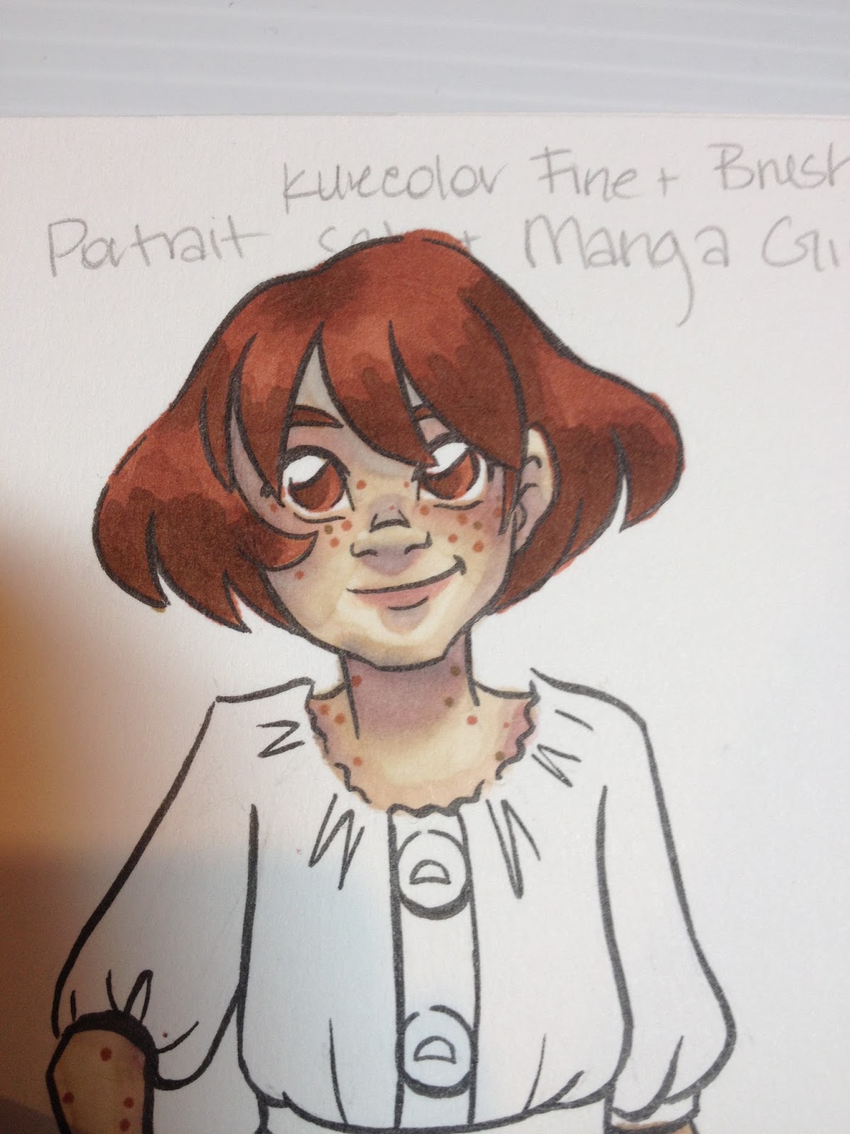
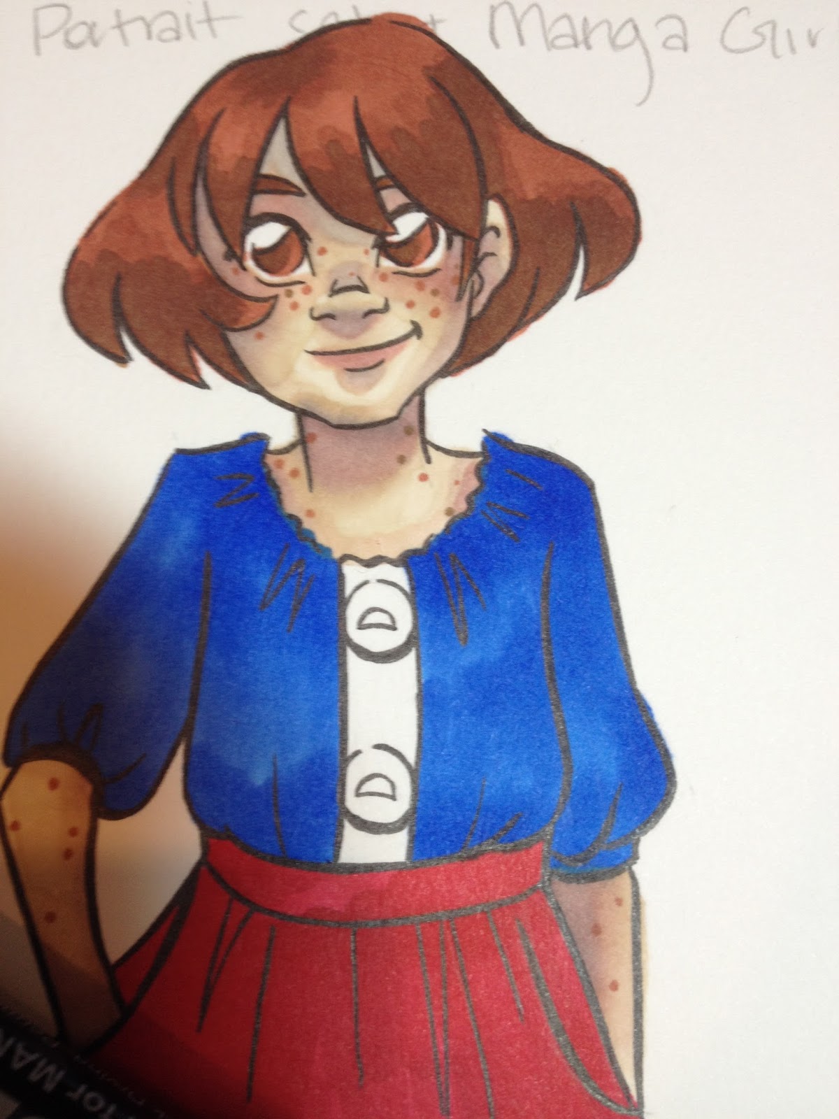
As you can see, there is very little contrast on the face, despite several layers of ink.


At this point, I tried to knock in some blush and some shadow with Pink Haze.

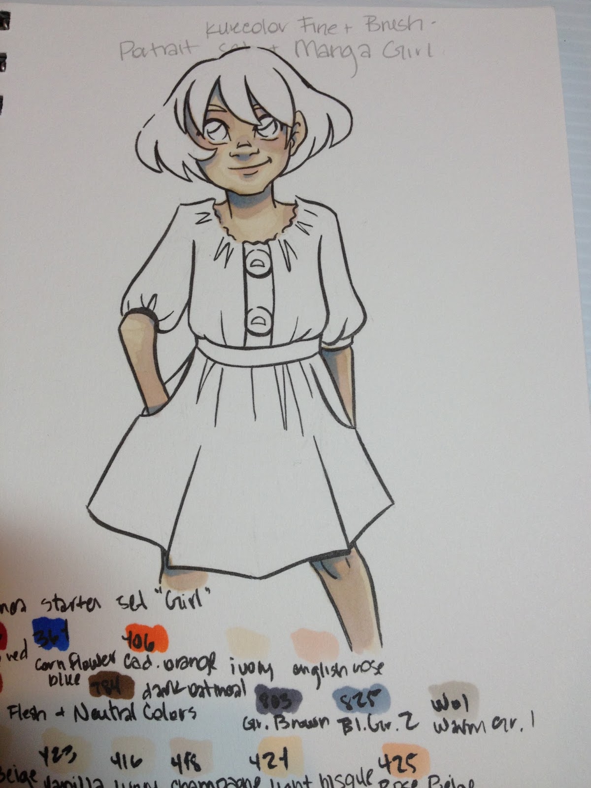
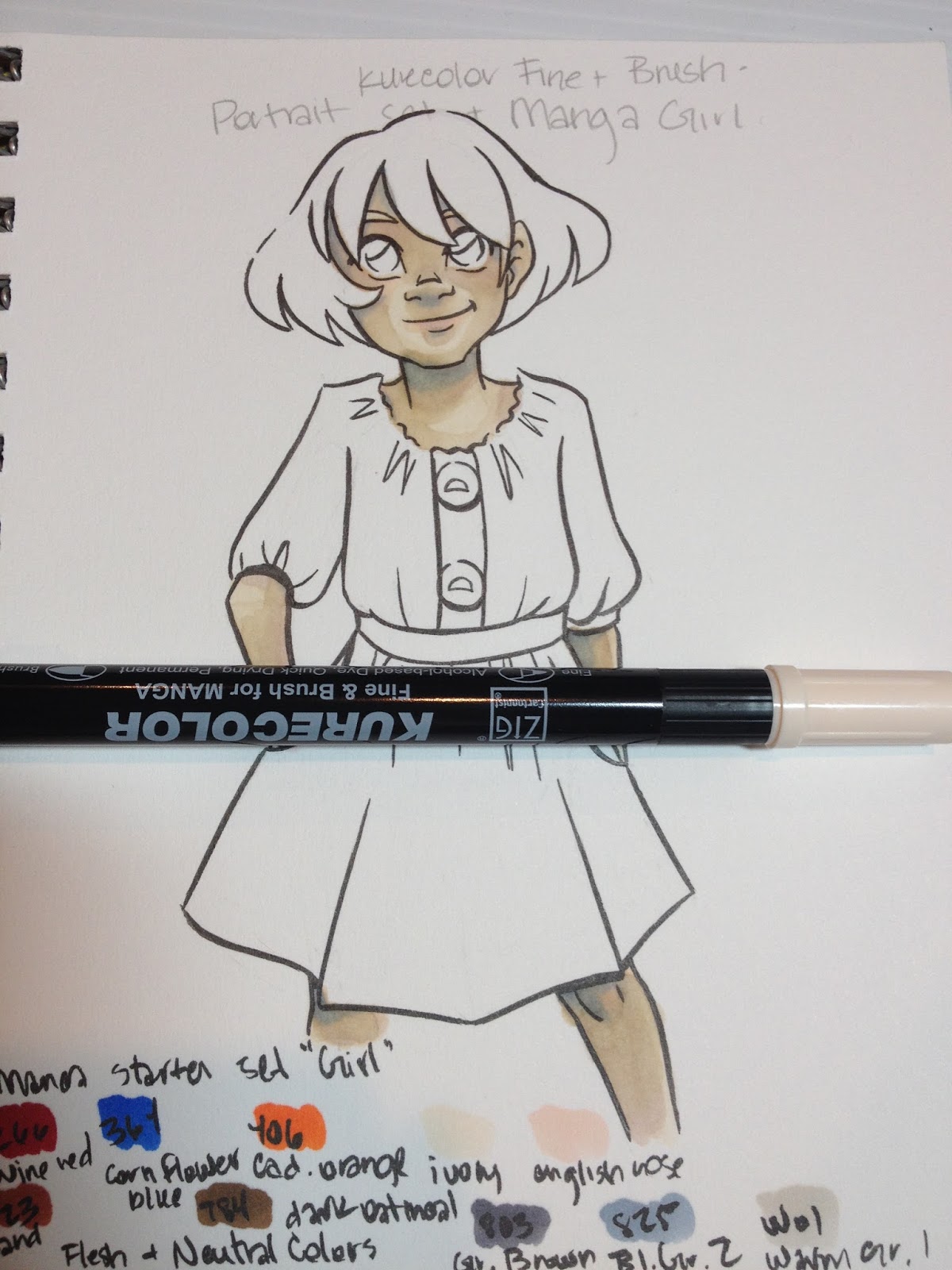
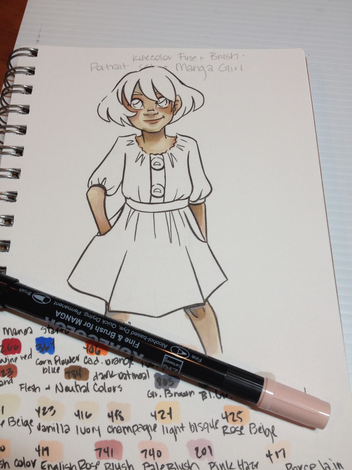
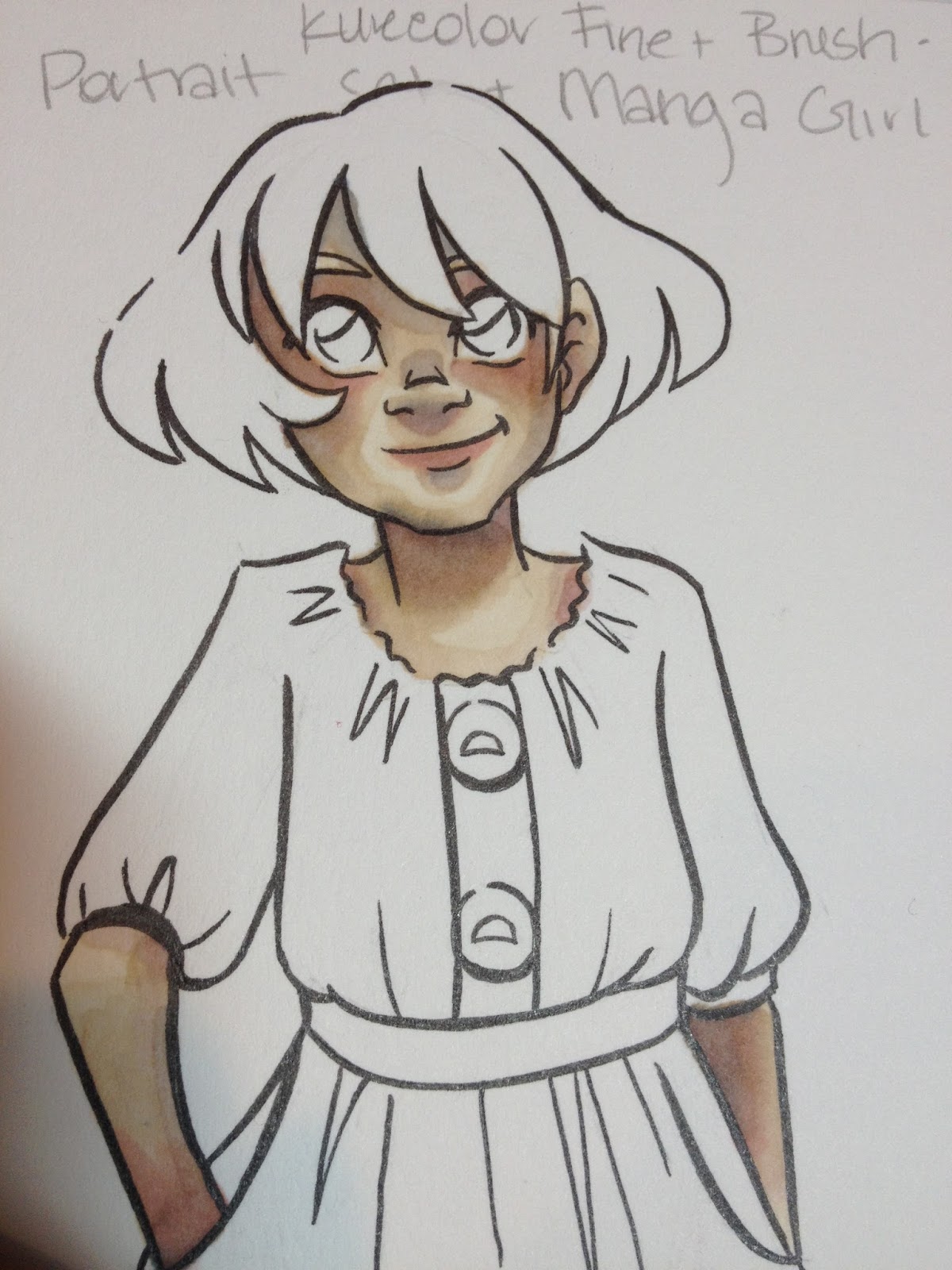
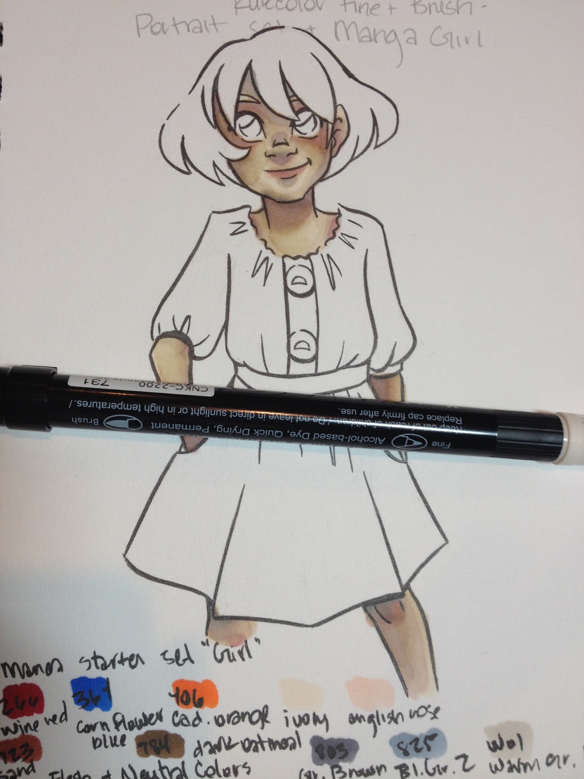
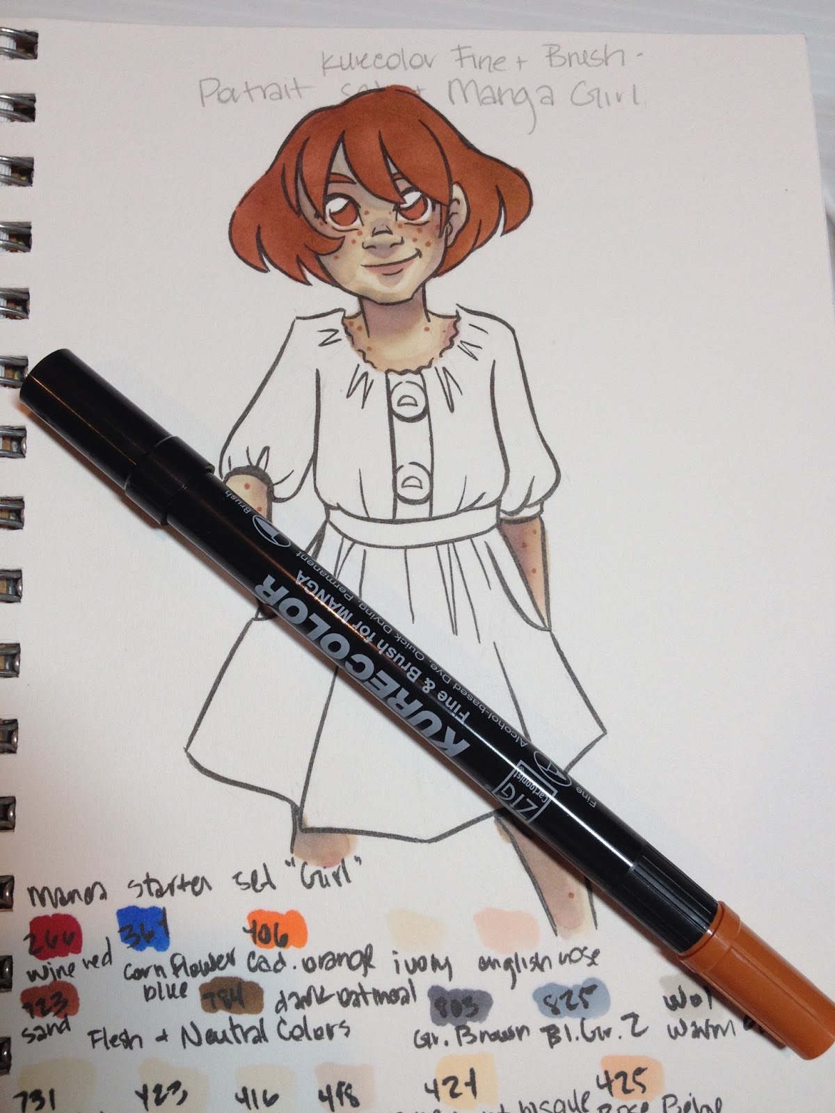
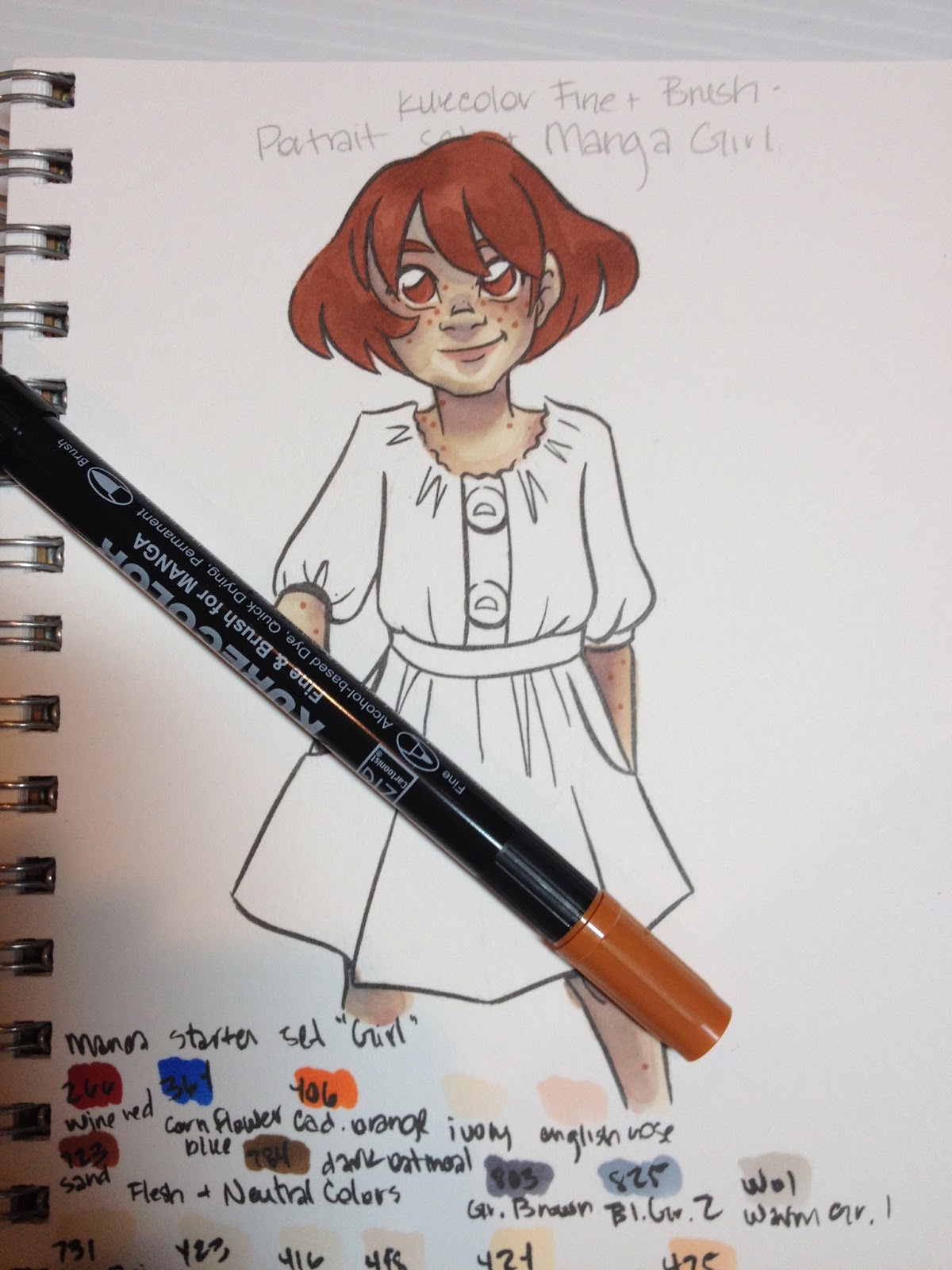
Despite having both the Portrait set and the Girl set, I found it difficult to build up contrast with Kara's skin. Most of the colors in the Portrait set were very similar to one another, and the ink had a tendency to bleed on the Strathmore 300 Series Mixed Media paper. I probably should have left the skin alone at this point, as it's all downhill from here.

As neither set included a light lavender (for shading), I had to use the Cool Blue that came with the Manga Girl set, which desaturated the skin quickly, and contributed to the muddiness of the skin in later photos.
Mangaka generally use a totally different method of applying color than I do, so these markers may work well if you prefer to leave large areas of white on your illustration, and utilize color as your shadow. I test markers based on the way I prefer to render, and this may have been my own shortcoming, rather than the Kurecolor Brush and Fine for Manga.


At this point, I really overworked the skin by adding too many colors and trying to blend them out. I finally figured it was time to move on to something else.
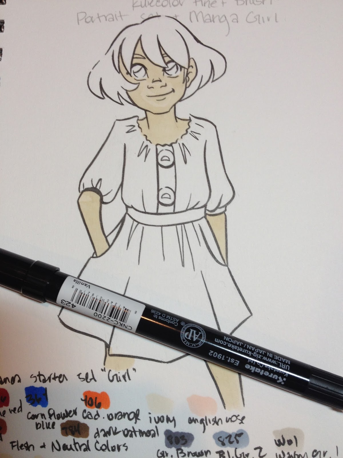
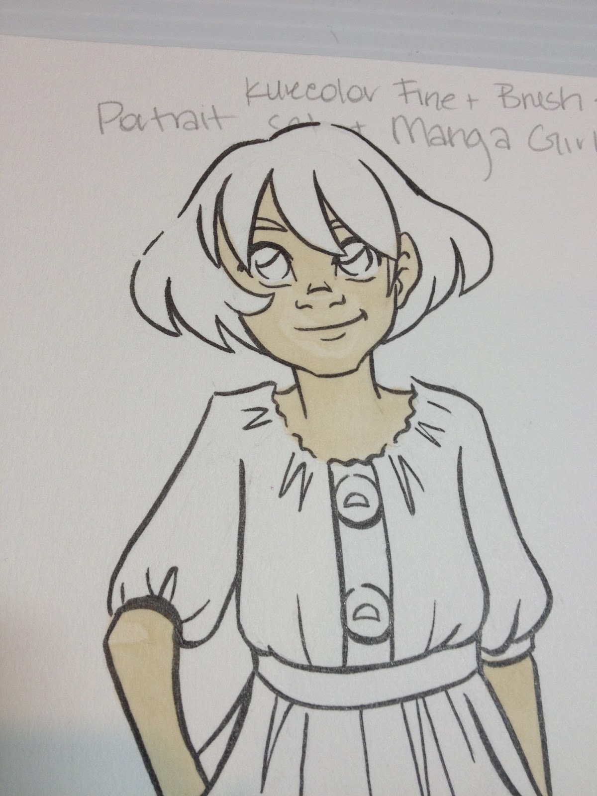
Hair

I should have been patient and just allowed the hair and eyes to provide enough visual contnrast, as Kara's red-brown hair is sufficiently different in tone from her freckled skin. These markers can quickly saturate small areas.

Which means it doesn't layer upon itself very well- there isn't much difference between the first layer and the second, which limits how far your markers can go.


I never really built up enough contrast on the hair itself (I suppose I should have left in white highlights, as many artists do) given how limited my color range was. Usually 22 colors should be sufficient for a marker test (more than sufficient, really).
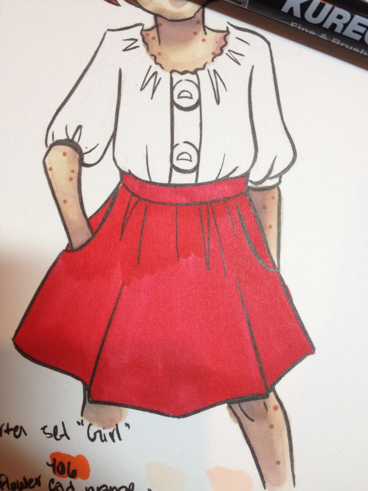
Clothes
This is the area where I really suffered from sufficient colors, and where the markers' quick saturation was most detrimental, as I really struggled to build up shadows with limited colors in a color family. This was particularly true for the red. I probably could have gone for a orange-red skirt, as I did have an orange, but sadly I didn't think about it at the time.


The Verdict
Given the fact that I've never seen these markers at a brick and mortar store (if you have, let me know where, and I'll add it to the post!), I find it difficult to recommend these markers over brands that are more easily accessible. I found them a bit difficult to control, as they were very prone to bleeding on the Mixed Media paper I tested them on, but I enjoyed using the brush tip and found that it performed quite well. I had difficulty layering colors, and I had trouble selecting appropriate skintones, especially as my order kept getting mixed up. I'd like to revisit these markers at a later date and see if I can wrangle them into submission.
If you do have easy access to these markers, they generally work quite well, especially if you can pick and choose colors that work for your personal rendering style. I found both sets difficult to render with, even when used together, as the colors in one set were too similar to build sufficient contrast, and colors in the other were to disparate to bridge the gap in tones. I should note that I'd purchased a blender marker (I'd actually bought it first, but I don't remember from where), and FORGOT IT AT HOME. I'd had my two new sets shipped to Luling so I could work during winter break, hence some of the unusual (and mostly unmentioned in this post) difficulties I faced, as well as my willingness to give these markers another pass at a later date.
More Information on this product
Zig Kurecolor-Kuretake UK
Please consider donating to this blog or purchasing from Natto-shop (http://nattosoup.com/shop) if you want me to continue publishing quality content. All materials tested were purchased from my own pocket. Keep on Truckin' Nattosoup is not under any sponsorship.
I purchased my Kuretake Kurecolor Brush and Fine for Manga markers from Amazon, as they currently have the best price online.
The Brand and Past Reviews
Other Alcohol Markers from Kuretake:
Link from MarkerPop
Kurecolor
Kurecolor Twin S
Past Reviews:
Kuretake Kurecolor Twin S
These markers were originally designed for manga artists and illustrators, and the site promises 'velvety smooth laydown of colour' as well as 'amazing blending properties'. These markers launched in the US in May of 2012, but don't seem to have gained much traction in the alcohol marker arena.
The Stats:
Refillable- you can find some refill inks through Amazon and through Marker SupplyReplaceable NibsBrush Nib and bullet nib135 colors+ colorless blenderAvailable in a variety of sets and openstockAvailable on Jetpens, Amazon, Kuretake website, Craft CarrotKurecolor Twin markers are available in 135 colors, the same appears to be true for the Kurecolor Brush and Fine for MangaI've found a couple sources for open stock- MerriArtist- $2.76 each and Scribblers (UK)
Kurecolor Color Chart
 Image Source
Colors Purchased:
Flesh and Neutral Tones set (12 markers) $39.50 on Amazon
Manga Set 'Girl' (10 markers+ 2 purple fineliners) $39.43 on Amazon
Duplicate Colors are Bolded for your reference.
Colors included in Flesh and Neutral Tone Set:
Pale Beige
Vanilla
Ivory
Champagne
Light Bisque
Rose Beige
Flesh Colour
English Rose
Blush
Pale Blush
Pink Haze
Porcelain
Colors included in Manga Set Girl:
2 Violet fineliners- 01 and 05
Wine Red
Cornflower Blue
Cadmium Orange
Ivory
English Rose
Sand
Dark Oatmeal
Gray Brown
Blue Gray 2
Warm Gray 1
The Packaging
Both sets came in sturdy plastic cases. Inside the case, there's nothing to keep the markers in order, and markers are very prone to shifting. For sets like the skintones and neutrals, this can become very confusing, as the colors are all very similar, especially if you're going by cap alone.
Portrait Set
The skintone and neutral set does not have a secure closure- the lid simply tucks into the rest of the package.
Manga Starter Set- 'Girl'

For this package, the lid securely tucks into the rest of the package via a little flap.
Manga Set 'Girl' includes an informational pamphlet that gives the basics for how to use alcohol markers for illustration, demonstrates which colors are used for the included illustrations, and includes an uncolored copy of the front illustration for you to practice on. The paper this is printed on is extremely thin.
The Markers
As mentioned above, Kurecolor Brush and Fine for Manga are twin tipped markers. The black cap hides the brush tip, and the color cap hides the fine. This is the reverse of most markers I encounter, and it was a bit frustrating as I kept pulling off the wrong cap time and again.
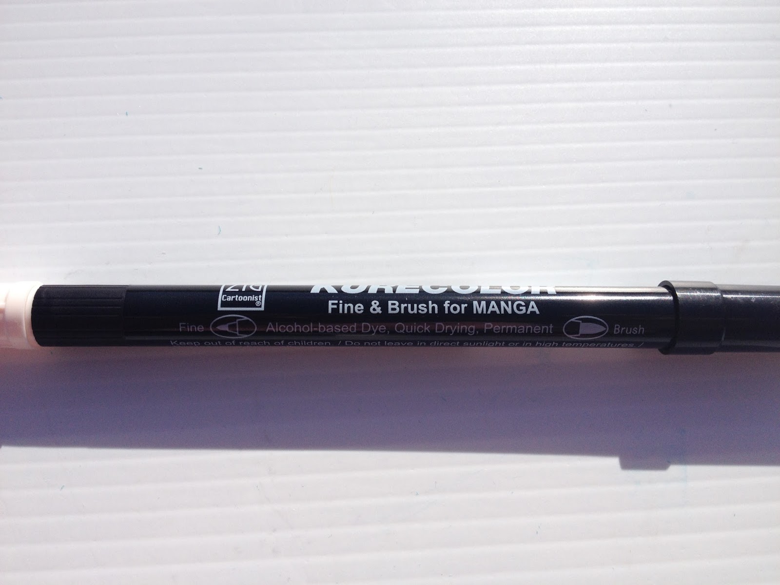
Body screening indicated the Fine tip and the Brush tip

Also unusual is the fact that the fine tip not only has the color cap, but the color collar as well. This is generally used to indicate the brush tip on alcohol markers.

The brush is a bit stubbier than most alcohol marker brushes. The barcode sticker indicates the color name.
The fine tip is a fiber nib, similar to the fine nib used for pigment ink on Distress watercolor markers.
Comparison Shots
Compared to other popular alcohol markers
 From Left to Right: Winsor and Newton Brushmarker, Copic Sketch, Prismacolor Brush Marker, Kurecolor Brush and Fine for Manga
Kurecolor Brush and Fine for Manga markers are much thinner than other refillable alcohol markers, some of the thinnest I've ever tested, and much thinner than Kuretake's Kurecolor Twin or their original Kurecolor alcohol markers.
 From Top to Bottom: Kurecolor Brush and Fine for Manga, Prismacolor Brush marker, Copic Sketch, Winsor and Newton BrushmarkerThe fine nib is closer to the nibs used on watercolor markers than to alcohol marker bullet nibs, but the brush is very similar to those used by Prismacolor, Copic, and Winsor and Newton, except a bit shorter.
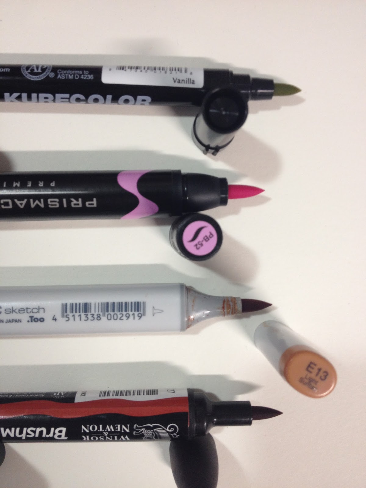 From Top to Bottom: Kurecolor Brush and Fine for Manga, Prismacolor Brush Marker, Copic Sketch, Winsor and Newton Brushmarker
 From Top to Bottom: Kurecolor Brush and Fine for Manga, Prismacolor Brush marker, Copic Sketch, Winsor and Newton Brushmarker
The body of the Kurecolor Brush and Fine for Manga reminded me of other markers made by Kuretake, so I pulled out several other waterbased markers to see how the bodies stacked up.
Compared to Other Kuretake Brush Markers (and one Tombow)
 From Top to Bottom: Kurecolor Brush and Fine for Manga, Zig Brushables, Zig Art and Graphic Twin, Tombow ABTThe general design of the Kurecolor Brush and Fine for Manga is very similar to the Kuretake Zig Art and Graphic Twin and the Tombow ABT- long narrow body, colored cap at the fine point, single color cap to signify color within. The fine nib is very similar to the fine nib on the Tombow ABT, and the brush is much shorter and thicker than the other markers.
The styling in general is also very similar to these non-refillable waterbased markers- long black body with generic body screening, color name and number is on the barcode sticker rather than the body, nibs are probably not replaceable.
 From Top to Bottom: Kurecolor Brush and Fine for Manga, Zig Brushables, Zig Art and Graphic Twin, Tombow ABT
 From Top to Bottom: Kurecolor Brush and Fine for Manga, Zig Brushables, Zig Art and Graphic Twin, Tombow ABT
The Swatch Test
 Color chart on the Flesh and Neutral Tones Set
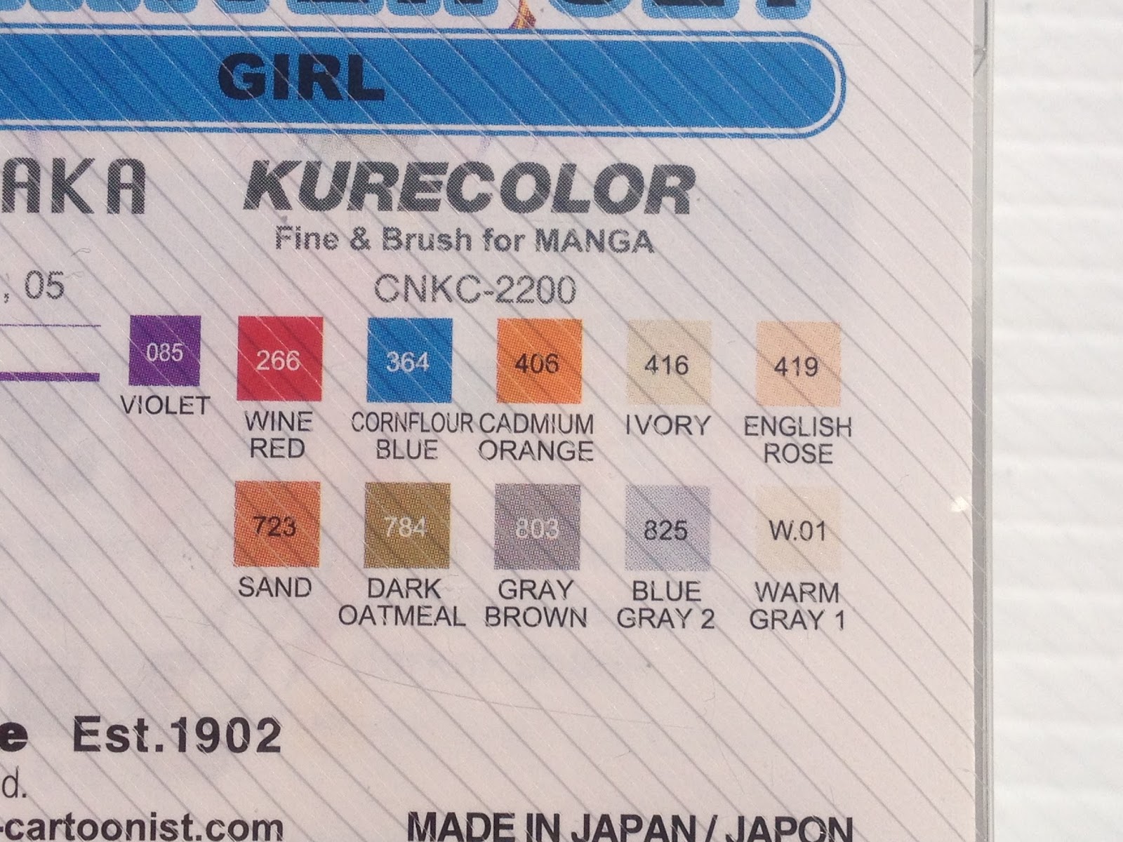 Color chart on the Manga Starter Set 'Girl'
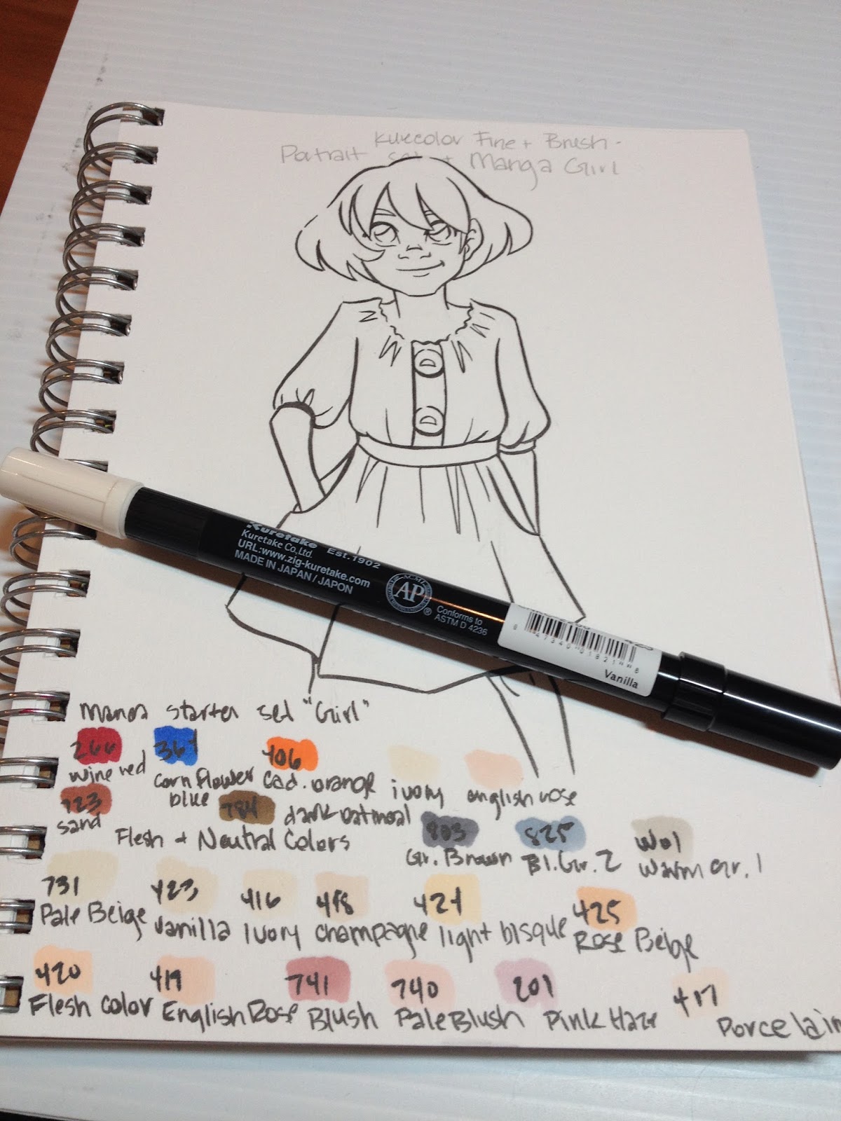 Top Two Rows: Swatches from the Manga Starter Set 'Girl'Bottom Two Rows: Swatches from the Skintones and Neutrals set
The Field Test
The Skin

Colors did not layer upon themselves very well- it was difficult to build up tones this way, requiring me to grab other markers and try to color match.

Colors were so similar it was difficult to build up contrast by layering different colors as well.

As you can see, there is very little contrast on the face, despite several layers of ink.
At this point, I tried to knock in some blush and some shadow with Pink Haze.
Despite having both the Portrait set and the Girl set, I found it difficult to build up contrast with Kara's skin. Most of the colors in the Portrait set were very similar to one another, and the ink had a tendency to bleed on the Strathmore 300 Series Mixed Media paper. I probably should have left the skin alone at this point, as it's all downhill from here.
As neither set included a light lavender (for shading), I had to use the Cool Blue that came with the Manga Girl set, which desaturated the skin quickly, and contributed to the muddiness of the skin in later photos.
Mangaka generally use a totally different method of applying color than I do, so these markers may work well if you prefer to leave large areas of white on your illustration, and utilize color as your shadow. I test markers based on the way I prefer to render, and this may have been my own shortcoming, rather than the Kurecolor Brush and Fine for Manga.
At this point, I really overworked the skin by adding too many colors and trying to blend them out. I finally figured it was time to move on to something else.
Hair
I should have been patient and just allowed the hair and eyes to provide enough visual contnrast, as Kara's red-brown hair is sufficiently different in tone from her freckled skin. These markers can quickly saturate small areas.
Which means it doesn't layer upon itself very well- there isn't much difference between the first layer and the second, which limits how far your markers can go.
I never really built up enough contrast on the hair itself (I suppose I should have left in white highlights, as many artists do) given how limited my color range was. Usually 22 colors should be sufficient for a marker test (more than sufficient, really).
Clothes
This is the area where I really suffered from sufficient colors, and where the markers' quick saturation was most detrimental, as I really struggled to build up shadows with limited colors in a color family. This was particularly true for the red. I probably could have gone for a orange-red skirt, as I did have an orange, but sadly I didn't think about it at the time.


The Verdict
Given the fact that I've never seen these markers at a brick and mortar store (if you have, let me know where, and I'll add it to the post!), I find it difficult to recommend these markers over brands that are more easily accessible. I found them a bit difficult to control, as they were very prone to bleeding on the Mixed Media paper I tested them on, but I enjoyed using the brush tip and found that it performed quite well. I had difficulty layering colors, and I had trouble selecting appropriate skintones, especially as my order kept getting mixed up. I'd like to revisit these markers at a later date and see if I can wrangle them into submission.
If you do have easy access to these markers, they generally work quite well, especially if you can pick and choose colors that work for your personal rendering style. I found both sets difficult to render with, even when used together, as the colors in one set were too similar to build sufficient contrast, and colors in the other were to disparate to bridge the gap in tones. I should note that I'd purchased a blender marker (I'd actually bought it first, but I don't remember from where), and FORGOT IT AT HOME. I'd had my two new sets shipped to Luling so I could work during winter break, hence some of the unusual (and mostly unmentioned in this post) difficulties I faced, as well as my willingness to give these markers another pass at a later date.
More Information on this product
Zig Kurecolor-Kuretake UK
Please consider donating to this blog or purchasing from Natto-shop (http://nattosoup.com/shop) if you want me to continue publishing quality content. All materials tested were purchased from my own pocket. Keep on Truckin' Nattosoup is not under any sponsorship.
February 9, 2016
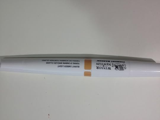
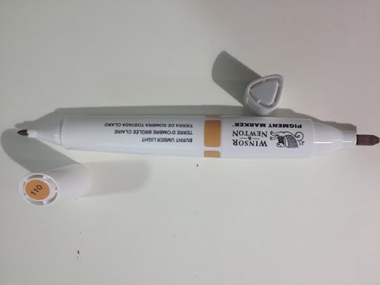
Winsor and Newton Pigment Markers Part 1 WIP
This is going to be a long review, as I've tested these markers extensively in order to be as thorough as possible. This review includes a combination of video, text, and images, and I recently lost the original text notes with the loss of my Surface Pro 3, so I highly recommend you watch the videos for product commentary and demonstration.
As with most products reviewed on this blog, these markers were purchased out of my own pocket (except for Winsor Yellow, Azure Blue, and Winsor Red, which were demo markers that were given to me at Hands on Creativity at Pla-Za). If you enjoy this review, or found it useful, you can show that appreciation by 1. Sharing it to your social networks 2. Liking the included videos and subscribing to my YouTube channel for even more great content 3. Consider donating a little something to the Paypal link in my sidebar 4. Buy something from my online shop . Without your support, tutorials and reviews will begin disappearing from the regular roster. WITH your support, tutorials will increase, and I'll start offering monthly ArtSnacks vs SketchBox comparisons in addition to the reviews I have planned.
If you found this review, or the included videos to be useful to you in any way, please take a moment to let Winsor and Newton know! Your good word will really help my blog gain their attention, which will hopefully lead to exciting things like partnerships, early access to new supplies for review and tutorial purposes, and ideally a little recognition and signal boosting. It only takes a minute to fill out the form on their website , and it's one of the biggest ways you can help this blog continue to grow, and it's a fantastic way to show your appreciation for my years of service.
Another great way to show your support is to share this post, or ANY of my posts, to your social networks! Not only will you help me increase my audience, which may lead to sponsorships and paid blogging/review opportunities that help me pay my bills and earn a living, but you'll be helping other artists out by giving them another fantastic resource! Check the bottom of this post for my handy social network buttons, or feel free to copy and paste the link into the service of your choice!
Winsor and Newton has recently branched into the world of markers with their watercolor markers, their alcohol based, rebranded Pro and Brush markers (originally Letraset), and their innovative Pigment Markers.
When I first saw Pigment Markers on DickBlick back in October, I was incredibly excited. I've used alcohol markers for a number of years, starting with Prismacolor in highschool and progressing to Copics in graduate school, and years of reviewing alcohol markers has made me familiar with traditional dye based alcohol markers on the market. These pigment markers are just that- pigment based, rather than dye based, and should be far more archival than regular alcohol markers.
These markers are incredibly unique, but I continue to see Winsor and Newton artists promote them for characteristics that have long been the trademark of ALL alcohol based markers- alcohol base, blend-ability, vibrant colors, easy to use, easy to clean up. These markers, while alcohol markers, perform in ways unlike any alcohol based marker I've used before, and to only promote common alcohol marker traits is selling the Pigment Markers short.
I've blogged, tweeted, and YouTubed about these markers ever since I saw the pre-order on DickBlick. I've speculated, written to the company, and researched, doing my utmost to bring you the best information I can as a comic artist and illustrator. My opinions are based on years of practicing my craft as an illustrator who uses watercolor and alcohol based markers, but may be biased in favor of my craft. Your own experiences and mileage may vary. I've used Winsor and Newton watercolors for many years, and have almost always been very satisfied with what the brand has to offer.
The Brand
Winsor and Newton is a subsidiary of the parent company ColArt , which also owns Derwent, Reeves, Liquitex, Letraset, and a few other art and craft related companies. Many of my readers are probably familiar with Winsor and Newton watercolors, as they're a very popular choice for semi most pan watercolors, and are very readily available at any art supply store.
As I stated on my Promarker and Brushmarker review, Winsor and Newton has recently started branching out into markers, and if you take into consideration that the parent company also owns Liquitex, ColArts manufactors markers across the spectrum- waterbased, pigment based, alcohol based, dye based, and acrylic. You can find lots of information about Pigment Markers on the Winsor and Newton site, and you can take advantage of DickBlick's affordable prices with a Pigment Marker starter set, if you're interested in playing with this exciting new media.
Assorted Tones, 12- $47.99
Cool Grays, Set of 6- $23.99
White Blender- $4.79
Colorless Blender- $4.79
The Stats
Pigment based (very unique among alcohol markers)Alcohol basedTwin tipped- one end chisel, one end bulletCan be blended with waterArchival, will not fade, promises to stay fast 100 yearsHas both colorless and white blender optionsOver 100 colors, 24 shades of gray$4.79 openstock on DickBlick (current best price online)Available openstock, in a variety of 6 piece sets, and in a 24 set
The Markers
Since I purchased the majority of my Pigment Marker collection open stock, I thought I'd focus on the markers first, and then talk about packaging.
Winsor and Newton's new markers have been touted as having an ergonomic body by other artists, but I find my small hands tend to cramp around them. This happens with a lot of round bodied markers though, so it's probably just my small hands, and not the design of the markers. These are twin tipped markers, with one end a bullet nib and the other a chisel nib. The marker's color is indicated by one cap, and is screened on the barrel of the marker itself. The marker's color name is also listed on the barrel. In general, these markers look distinctive and stylish, especially since the rest of Winsor and Newton's markers utilize the old Promarker body, and look exactly the same.
Neither the bullet nor the chisel are particularly well made- both are compressed fiber with no nuance or give. When talking to Winsor and Newton reps, I expressed a desire to see a brush nib made available in the Pigment Markers as it's available for Brushmarkers and the Watercolor markers. One of the reps said that many artists had requested this feature, so we may have that to look forward to in the future, if these markers become popular.
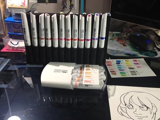
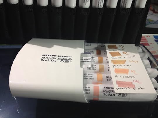
The case at the top is a Utrecht marker case, but it works quite well for organizing all sorts of markers. I have several for the different brands I use around the studio.
The Packaging
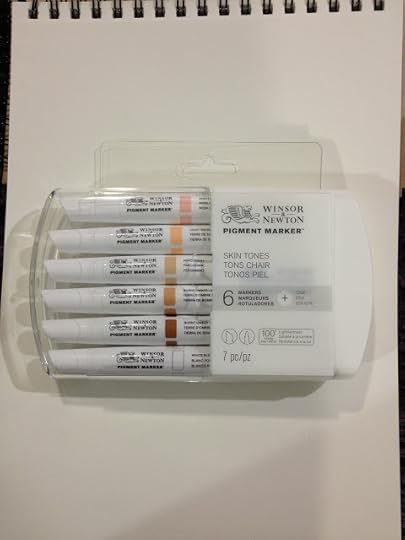
I've purchased the majority of my Winsor and Newton Pigment Markers openstock through DickBlick and at Pla-Za, but I did pre-order the Skin Tones set through DickBlick. Due to a shortage of markers, the set took a couple months to ship (after the openstock markers had arrived).
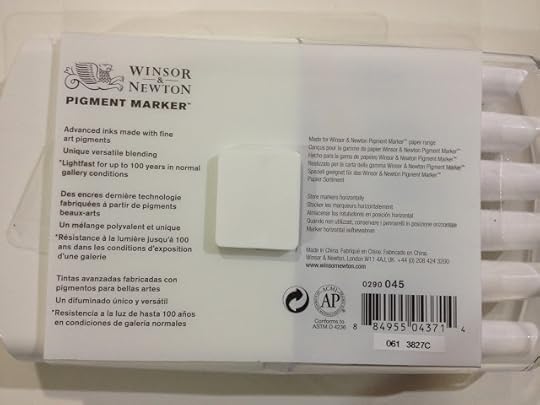
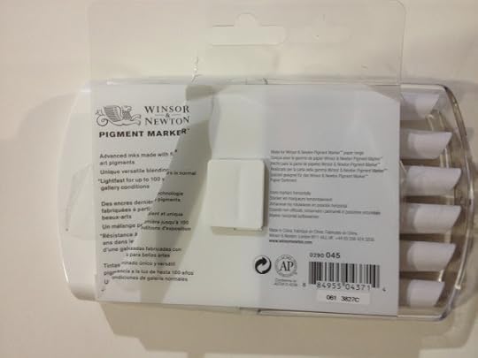
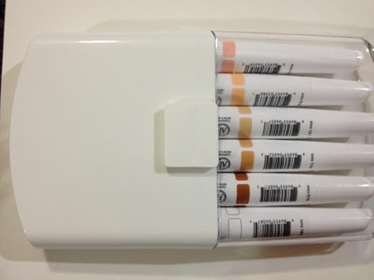
 My skin tones six pack came in this reusable hard plastic case. The clear plastic cap was held on with tape disks, without the disks, the cap doesn't stay on securely, making this case inappropriate for travel.
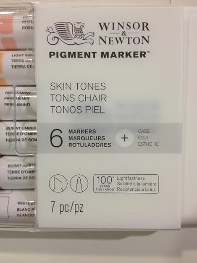
The case promises 100 years of lightfastness, as well as seven pieces (they're counting the case)
The back reads:
Advanced inks made with fine art pigments.Lightfast for up to 100 years in normal gallery conditionsMade for Winsor and Newton Paper rangeStore Markers horizontallyMade in China
I think the majority of artists using these markers won't be storing their creations in normal gallery conditions. I think the best most can hope for are a couple portfolios with archival sleeves, sleeve protectors, archival boxes and cats who don't pee on their stuff.
The only way to remove the plastic band around the case and access your markers is to cut the band.
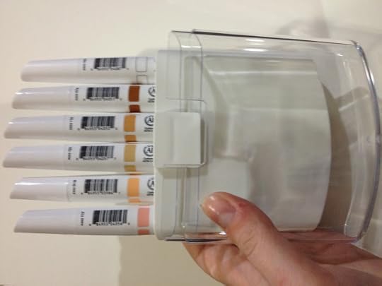
The notch on the back of the case would, in theory, allow you to chain several cases together for storage.

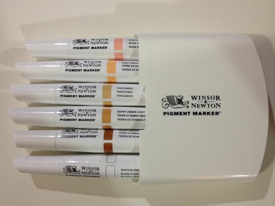
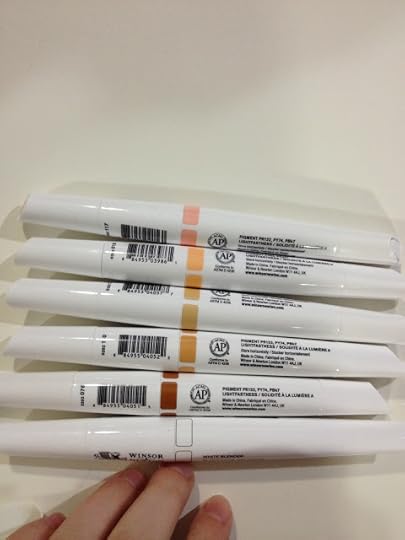
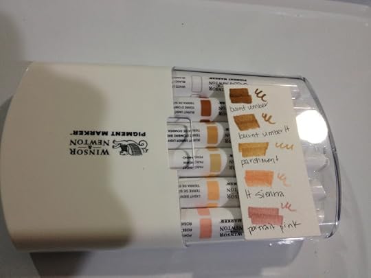
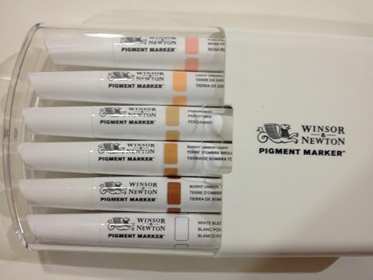
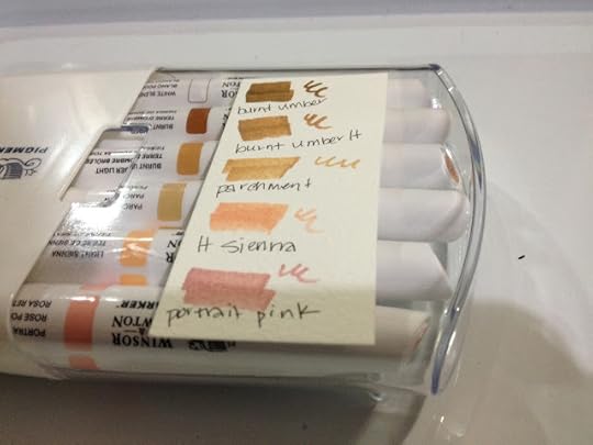
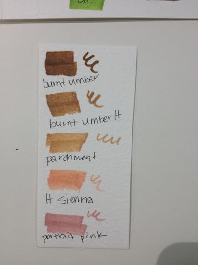
The skintones set includes a white blender marker, burnt umber, burnt umber light, parchment, light sienna, and portrait pink. I made a swatch on watercolor paper and taped it to the case for easy reference.
The Swatch Tests
Winsor and Newton Pigment Markers are very unique in several ways. While alcohol markers are not a new concept, these are pigment based alcohol markers, which are pretty unique.
Opacity Test (On Black Paper)
Playing around with the Pigment Markers on Strathmore Toned Tan paper led me to believe that some of these markers might be opaque, so I tested in a black paper sketchbook. The only marker with any opacity is the white blender.
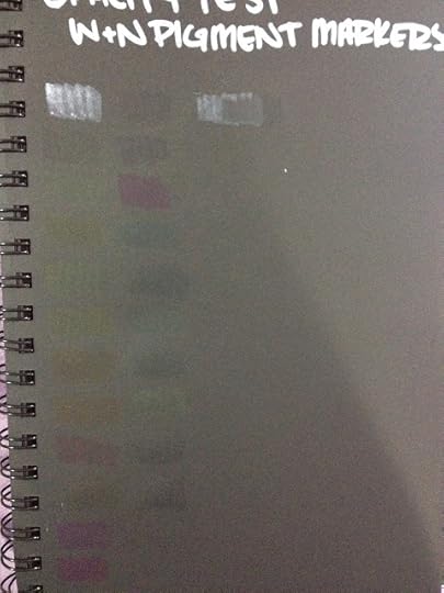


As you can see, most of the Winsor and Newton Pigment Markers are not particularly opaque, with the White Blender being the exception. This pushes these markers out of the 'meant to be gouache in marker form' category I had originally hoped they'd fall in.
On Toned Tan Paper
I've mentioned in the past (and shown you guys!) how I use Strathmore Toned Tan sketchbooks to bring my sketches to life. One of the first products I played around with in these sketchbooks were Winsor and Newton's new Pigment Markers, particularly their white blender.
 My collection of opaque white tools.
The white blender is a fantastic way to add opaque white to your marker sketches. I've used it here after rendering with Copics, another alcohol based marker.


Below I've used the Pigment markers in conjuction with Pitt Pens (for skin and hair) to do simple color illustrations. The Pigment markers don't blend well on this paper, but they really pop, more so than dye based alcohol markers would.


A limited range of Pigment Markers (maybe just the primaries and a white) are a perfect addition to your Toned Tan (or Toned Gray) sketchbook.
You can get your own Strathmore Toned Sketchbooks here, and help support this blog!
Toned Tan
Toned Gray
Swatches on Watercolor Paper
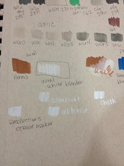
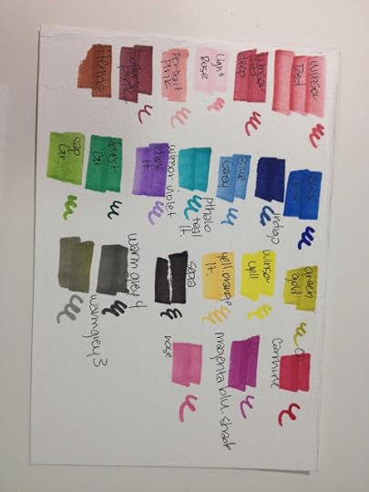
Colors I currently own:
White Blender
Colorless Blender
Winsor Red
Winsor Red Deep
Light Rose
Portrait Pink
Potters Pink
Henna
Royal Blue
Indigo
Blue Grey
Phtalo Teal Light
Winsor Violet
Forest Green
Sap Green
Green Gold
Winsor Yellow
Yellow Orange Light
Sepia
Warm Gray 4
Warm Gray 3
Carmine
Magenta Blue Shade
Rose
Burnt Umber
Burnt Umber Light
Parchment
Light Sienna

Flower Tests- Finding Papers that Highlight These Markers
In this video, I give a fairly comprehensive overview of the Winsor and Newton Pigment Markers, and demonstrate these markers on several commonly available papers, as the Winsor and Newton Marker paper was not yet available. This is a long video, so feel free to skip around.
Papers tested:
Yupo
Strathmore 400 series Mixed Media board
Crescent Marker Board
Rendr Marker Paper
Canson Montval Watercolor Paper
Copic PM Pad
IN GENERAL:
I found most papers remained wet after application of these markers, which is highly unusual for alcohol based markers, but this may be due to the pigment base. Many of these papers ended up abraded the combination of the pigment providing friction and the nibs providing resistance.
These markers would not blend on the majority of the papers tested (the exception being Yupo), and it was difficult to get nuanced lines or a delicate application.
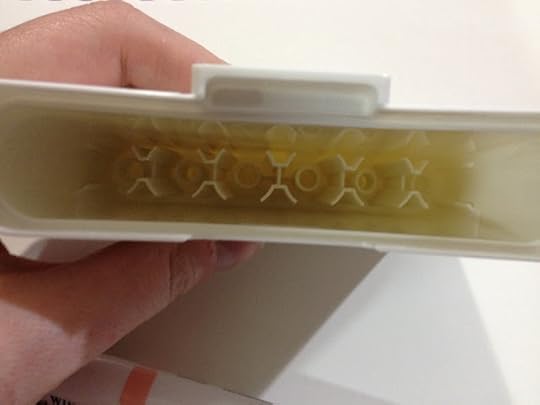
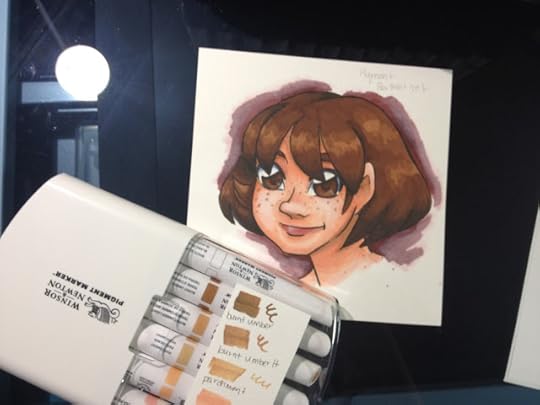
Portrait Set Test

The Field Test

This field test was completed on Strathmore's Acrylic paper, as I thought the plastic surface would allow for marker blending, but would stand up to the scrubbing that these nibs create.
Testing Out the Winsor and Newton Portrait Set- Nattosoup
On Winsor and Newton Pigment Paper (Lineart)
This paper has been specially designed for use with Winsor and Newton Pigment markers. If you're interested in a review of this marker paper, please keep checking the blog, as it's in progress. Below are my thoughts on this paper as it relates to Winsor and Newton's Pigment markers only.
NOTE: This paper was sent to me by Winsor and Newton, free of charge. Thank you, Winsor and Newton, for the Pigment Marker Paper.
If you're interested in attaining your own Pigment Marker Paper, you can get it here.
Insert Video Here
I inked this test with the Sailor Mitsuo Aida brushpen, which is alcohol marker proof and water proof under most conditions. I had difficulty finding an inking pen that could handle Yupo in combination with water or alcohol marker (I figured if I could find a pen that worked on Yupo, it'd work on just about ANYTHING), so I reached for my old standby.
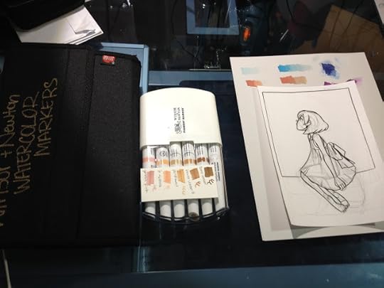
This paper is prone to shearing when you erase, as it's very thin, so please use caution.
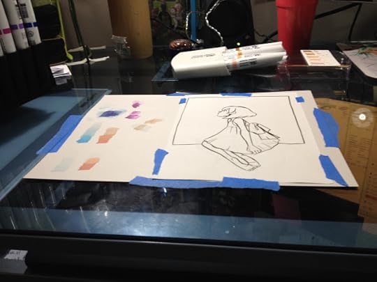
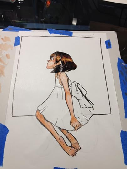
I noticed that the Pigment Markers reactivated the Sailor Mitsuo Aida ink on this coated paper. This has not been an issue on other papers I've used with Mitsuo Aida brushpens and Pigment Markers, so I can only assume that despite allowing my ink to cure for more than 24 hours before marker application, the ink never really sinks in on this paper.
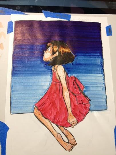
It was very difficult to apply color without streaks with just a bullet nib and a chisel nib as my options. Reapplication of color, which would work for other types of alcohol markers (saturation), does not eliminate all streaking, and reactivates prior layers on this paper.
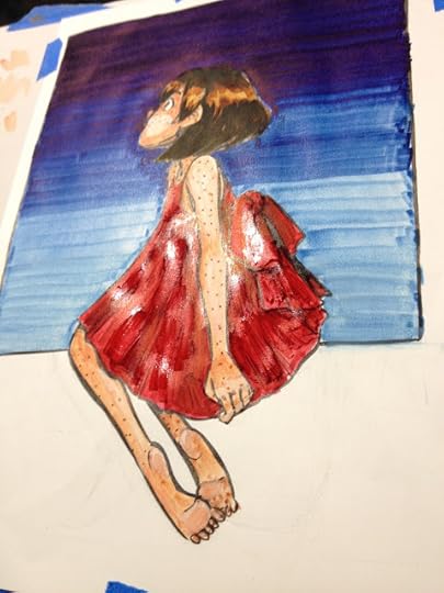
Shininess indicates wetness. These markers take a really long time to dry on this paper.


It was fortunate that I'd taped my Winsor and Newton Pigment Marker Paper to a sheet of scrap cardstock, as I had to constantly clean the tips of my markers. Fortunately they're very easy to clean (just scrub on clean paper or a Viva papertowel), so your color doesn't remain contaminated.
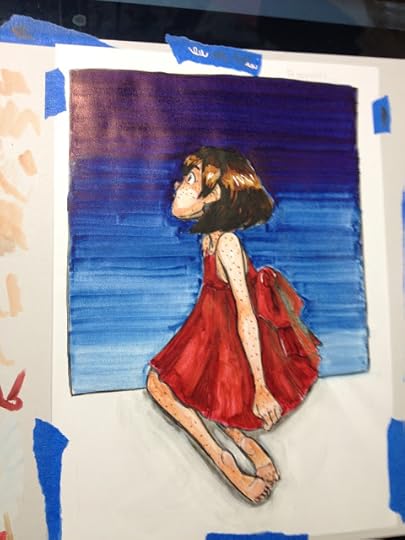
On Winsor and Newton Pigment Paper Over Lineart
Insert Video Here
Since my Mitsuo Aida ink contaminated my Pigment Markers, I decided to do something out of character- I pulled out my lightbox and applied color on top of inks from my sketchbook.

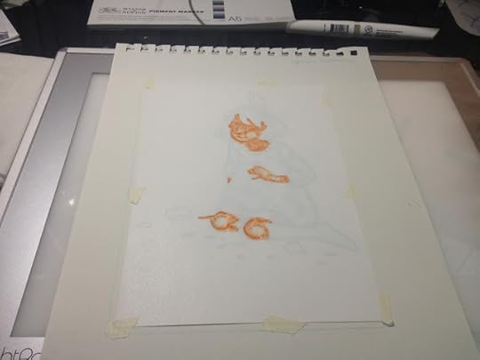

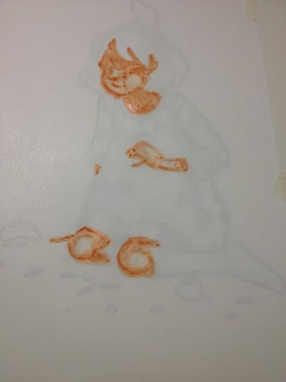
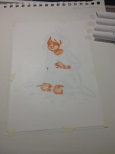 Removing lineart from the equation made applying skintones much easier, although I had to constantly turn the lightbox off to make sure my colors were ok. If I were working with dye based alcohol markers this would only be an issue with darker colors, but although these markers aren't very opaque, they're just opaque enough that layers make it difficult to see your lineart without a lightbox.
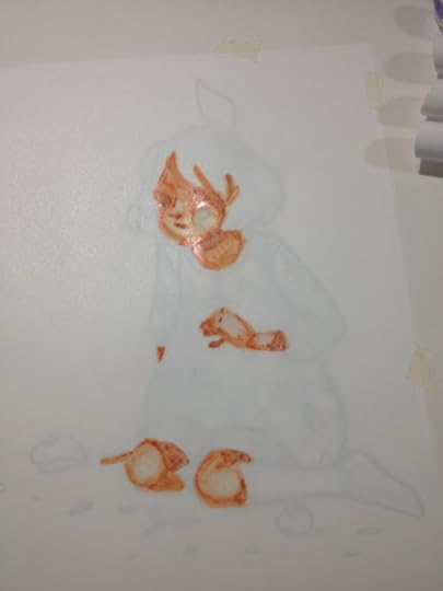
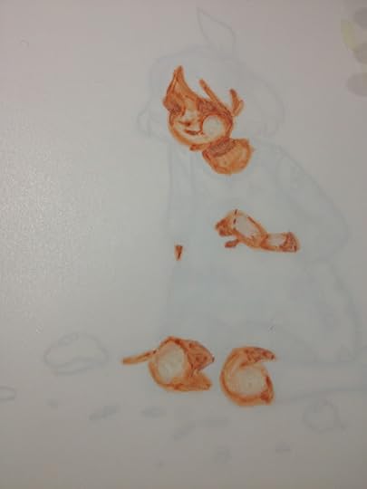
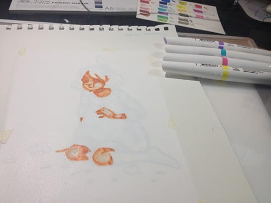


I was a bit disappointed that the colors I applied on top of the teal- Winsor yellow, Winsor violet, magenta, did not replace the teal or sit on top of the teal.
Scan Assembled in Photoshop:
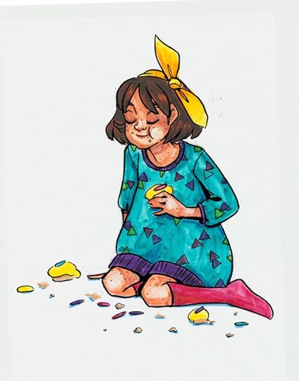
Lineless Doodling on Winsor and Newton Marker Paper

These are fun to noodle around with loosely, especially if I have easy reference to pull from, but I've sadly never really been the type to be able to doodle without some sort of drawn gameplan. I'll continue messing around with Winsor and Newton Pigment Markers, and hopefully I'll get the hang of them.
The Verdict:
I recommend waiting to purchase these markers until they've released a brush nib, as that would make using them much easier.
As an artist who is very familiar with alcohol markers, I struggled to use these markers, but my familiarity with other alcohol markers may have been the issue. Since I've already invested in a fairly large collection of Pigment Markers, I'm going to continue to try to learn how to use these markers, and share my progress here with you guys. These markers may be geared more towards painters, as that seems to be the majority of artists Winsor and Newton approached to serve as brand ambassadors.
Troubleshooting:
I tend to work very small in general, and the small pad Winsor and Newton sent (which is what I usually prefer to work on) constrained me
I prefer to work with inked lineart, and I have yet to find
I like to be very precise about color application- I may not have mixed a wide enough variety of colors
I like to use a lot of colors for blending, so I may have over rendered
As with most products reviewed on this blog, these markers were purchased out of my own pocket (except for Winsor Yellow, Azure Blue, and Winsor Red, which were demo markers that were given to me at Hands on Creativity at Pla-Za, and the Winsor and Newton marker paper, which was sent to me from Winsor and Newton). If you enjoy this review, or found it useful, you can show that appreciation by 1. Sharing it to your social networks 2. Liking the included videos and subscribing to my YouTube channel for even more great content 3. Consider donating a little something to the Paypal link in my sidebar 4. Buy something from my online shop . Without your support, tutorials and reviews will begin disappearing from the regular roster. WITH your support, tutorials will increase, and I'll start offering monthly ArtSnacks vs SketchBox comparisons in addition to the reviews I have planned.
Please consider donating to this blog or purchasing from Natto-shop (http://nattosoup.com/shop) if you want me to continue publishing quality content. All materials tested were purchased from my own pocket. Keep on Truckin' Nattosoup is not under any sponsorship.
As with most products reviewed on this blog, these markers were purchased out of my own pocket (except for Winsor Yellow, Azure Blue, and Winsor Red, which were demo markers that were given to me at Hands on Creativity at Pla-Za). If you enjoy this review, or found it useful, you can show that appreciation by 1. Sharing it to your social networks 2. Liking the included videos and subscribing to my YouTube channel for even more great content 3. Consider donating a little something to the Paypal link in my sidebar 4. Buy something from my online shop . Without your support, tutorials and reviews will begin disappearing from the regular roster. WITH your support, tutorials will increase, and I'll start offering monthly ArtSnacks vs SketchBox comparisons in addition to the reviews I have planned.
If you found this review, or the included videos to be useful to you in any way, please take a moment to let Winsor and Newton know! Your good word will really help my blog gain their attention, which will hopefully lead to exciting things like partnerships, early access to new supplies for review and tutorial purposes, and ideally a little recognition and signal boosting. It only takes a minute to fill out the form on their website , and it's one of the biggest ways you can help this blog continue to grow, and it's a fantastic way to show your appreciation for my years of service.
Another great way to show your support is to share this post, or ANY of my posts, to your social networks! Not only will you help me increase my audience, which may lead to sponsorships and paid blogging/review opportunities that help me pay my bills and earn a living, but you'll be helping other artists out by giving them another fantastic resource! Check the bottom of this post for my handy social network buttons, or feel free to copy and paste the link into the service of your choice!
Winsor and Newton has recently branched into the world of markers with their watercolor markers, their alcohol based, rebranded Pro and Brush markers (originally Letraset), and their innovative Pigment Markers.
When I first saw Pigment Markers on DickBlick back in October, I was incredibly excited. I've used alcohol markers for a number of years, starting with Prismacolor in highschool and progressing to Copics in graduate school, and years of reviewing alcohol markers has made me familiar with traditional dye based alcohol markers on the market. These pigment markers are just that- pigment based, rather than dye based, and should be far more archival than regular alcohol markers.
These markers are incredibly unique, but I continue to see Winsor and Newton artists promote them for characteristics that have long been the trademark of ALL alcohol based markers- alcohol base, blend-ability, vibrant colors, easy to use, easy to clean up. These markers, while alcohol markers, perform in ways unlike any alcohol based marker I've used before, and to only promote common alcohol marker traits is selling the Pigment Markers short.
I've blogged, tweeted, and YouTubed about these markers ever since I saw the pre-order on DickBlick. I've speculated, written to the company, and researched, doing my utmost to bring you the best information I can as a comic artist and illustrator. My opinions are based on years of practicing my craft as an illustrator who uses watercolor and alcohol based markers, but may be biased in favor of my craft. Your own experiences and mileage may vary. I've used Winsor and Newton watercolors for many years, and have almost always been very satisfied with what the brand has to offer.
The Brand
Winsor and Newton is a subsidiary of the parent company ColArt , which also owns Derwent, Reeves, Liquitex, Letraset, and a few other art and craft related companies. Many of my readers are probably familiar with Winsor and Newton watercolors, as they're a very popular choice for semi most pan watercolors, and are very readily available at any art supply store.
As I stated on my Promarker and Brushmarker review, Winsor and Newton has recently started branching out into markers, and if you take into consideration that the parent company also owns Liquitex, ColArts manufactors markers across the spectrum- waterbased, pigment based, alcohol based, dye based, and acrylic. You can find lots of information about Pigment Markers on the Winsor and Newton site, and you can take advantage of DickBlick's affordable prices with a Pigment Marker starter set, if you're interested in playing with this exciting new media.
Assorted Tones, 12- $47.99
Cool Grays, Set of 6- $23.99
White Blender- $4.79
Colorless Blender- $4.79
The Stats
Pigment based (very unique among alcohol markers)Alcohol basedTwin tipped- one end chisel, one end bulletCan be blended with waterArchival, will not fade, promises to stay fast 100 yearsHas both colorless and white blender optionsOver 100 colors, 24 shades of gray$4.79 openstock on DickBlick (current best price online)Available openstock, in a variety of 6 piece sets, and in a 24 set
The Markers
Since I purchased the majority of my Pigment Marker collection open stock, I thought I'd focus on the markers first, and then talk about packaging.

Winsor and Newton's new markers have been touted as having an ergonomic body by other artists, but I find my small hands tend to cramp around them. This happens with a lot of round bodied markers though, so it's probably just my small hands, and not the design of the markers. These are twin tipped markers, with one end a bullet nib and the other a chisel nib. The marker's color is indicated by one cap, and is screened on the barrel of the marker itself. The marker's color name is also listed on the barrel. In general, these markers look distinctive and stylish, especially since the rest of Winsor and Newton's markers utilize the old Promarker body, and look exactly the same.
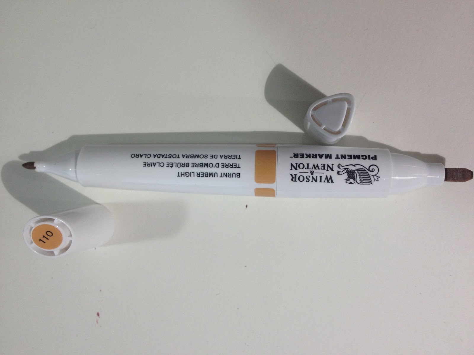
Neither the bullet nor the chisel are particularly well made- both are compressed fiber with no nuance or give. When talking to Winsor and Newton reps, I expressed a desire to see a brush nib made available in the Pigment Markers as it's available for Brushmarkers and the Watercolor markers. One of the reps said that many artists had requested this feature, so we may have that to look forward to in the future, if these markers become popular.
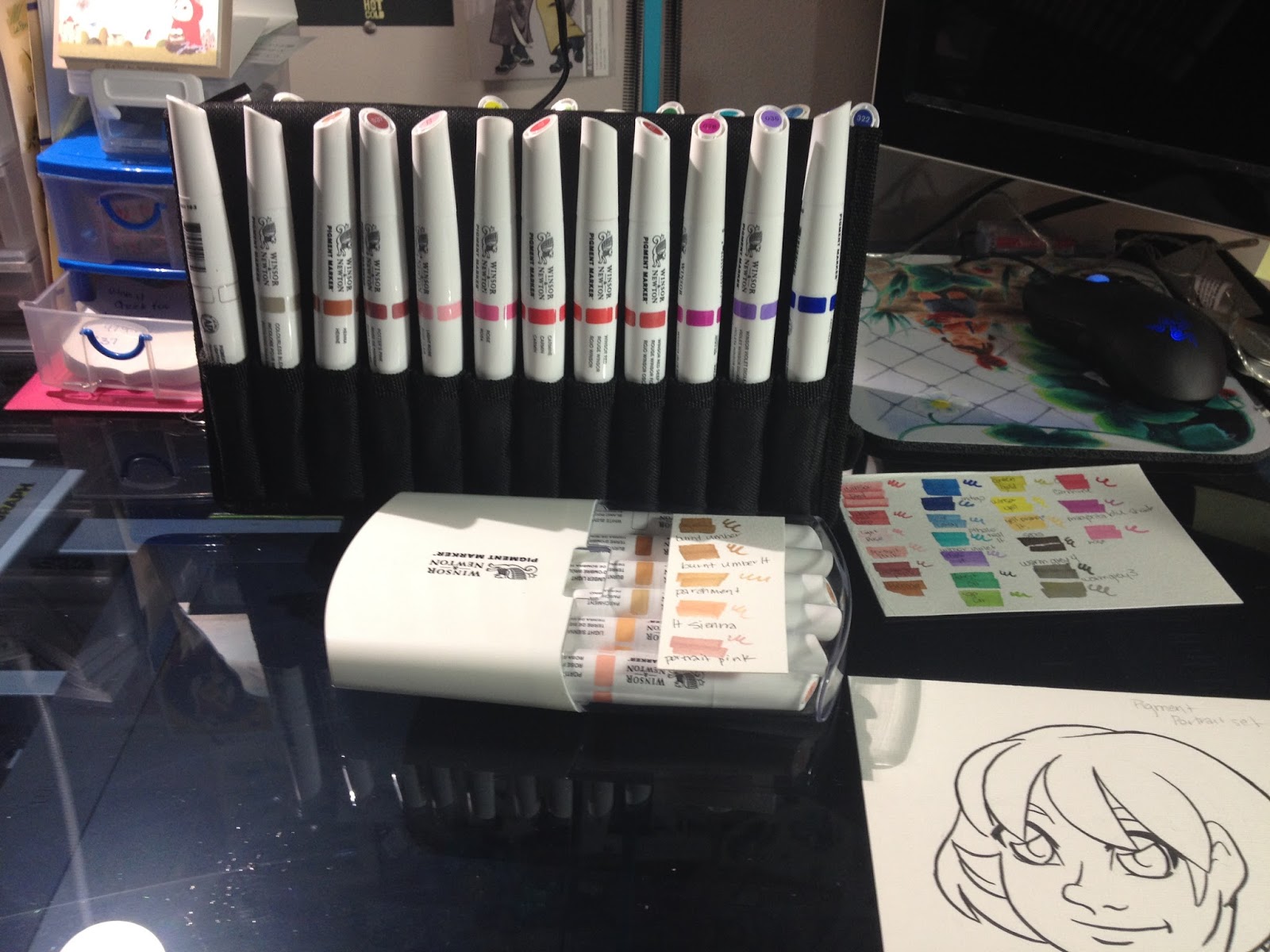
The case at the top is a Utrecht marker case, but it works quite well for organizing all sorts of markers. I have several for the different brands I use around the studio.
The Packaging
I've purchased the majority of my Winsor and Newton Pigment Markers openstock through DickBlick and at Pla-Za, but I did pre-order the Skin Tones set through DickBlick. Due to a shortage of markers, the set took a couple months to ship (after the openstock markers had arrived).
 My skin tones six pack came in this reusable hard plastic case. The clear plastic cap was held on with tape disks, without the disks, the cap doesn't stay on securely, making this case inappropriate for travel.
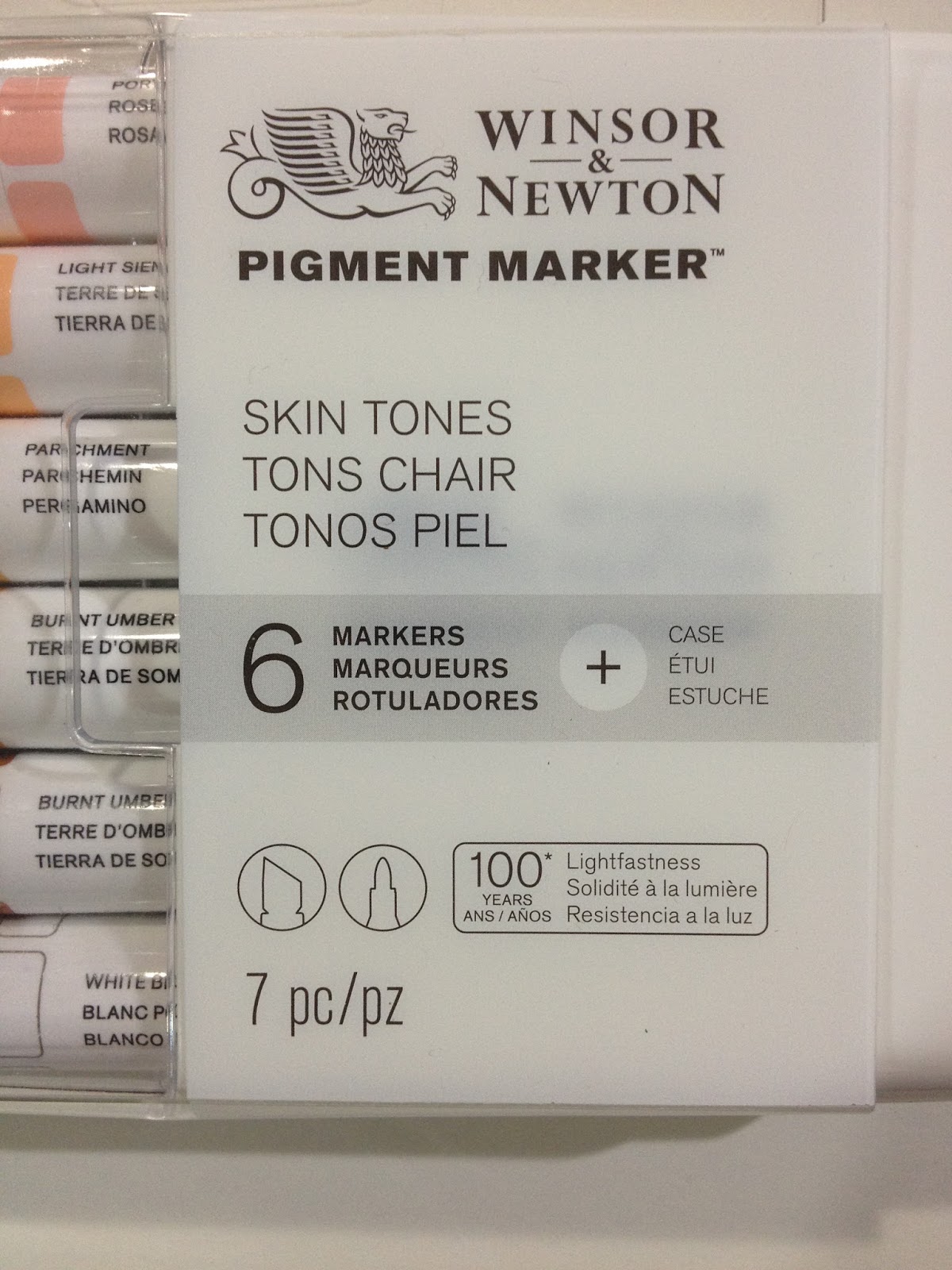
The case promises 100 years of lightfastness, as well as seven pieces (they're counting the case)
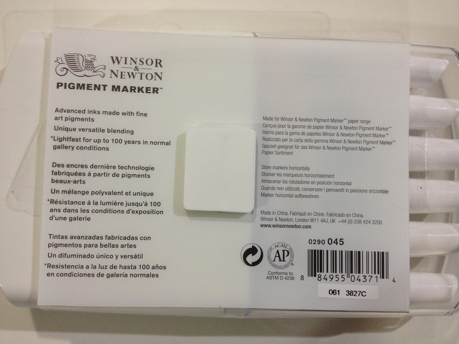
The back reads:
Advanced inks made with fine art pigments.Lightfast for up to 100 years in normal gallery conditionsMade for Winsor and Newton Paper rangeStore Markers horizontallyMade in China
I think the majority of artists using these markers won't be storing their creations in normal gallery conditions. I think the best most can hope for are a couple portfolios with archival sleeves, sleeve protectors, archival boxes and cats who don't pee on their stuff.
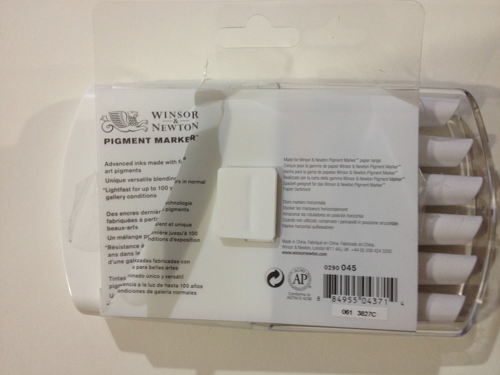
The only way to remove the plastic band around the case and access your markers is to cut the band.
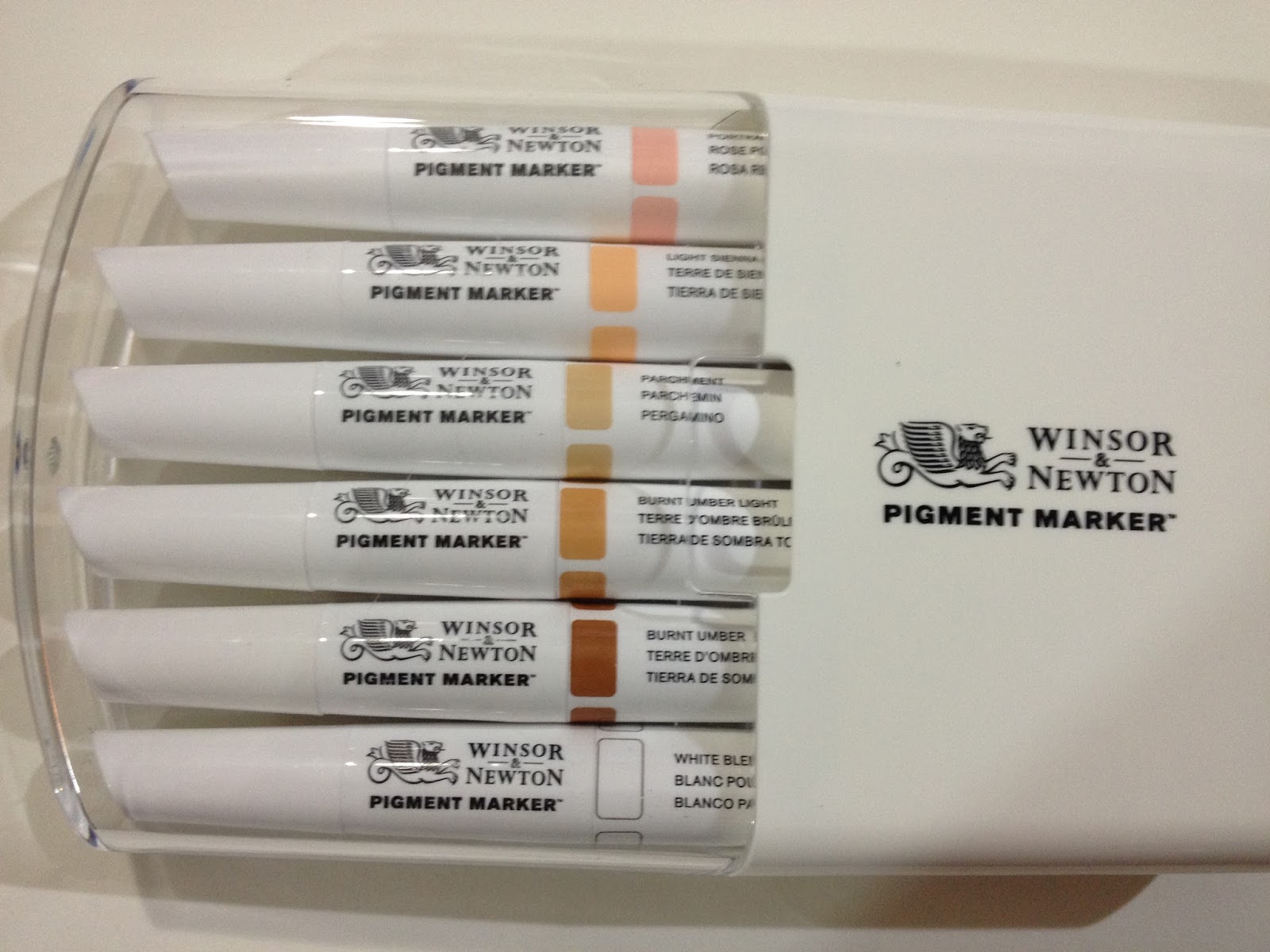
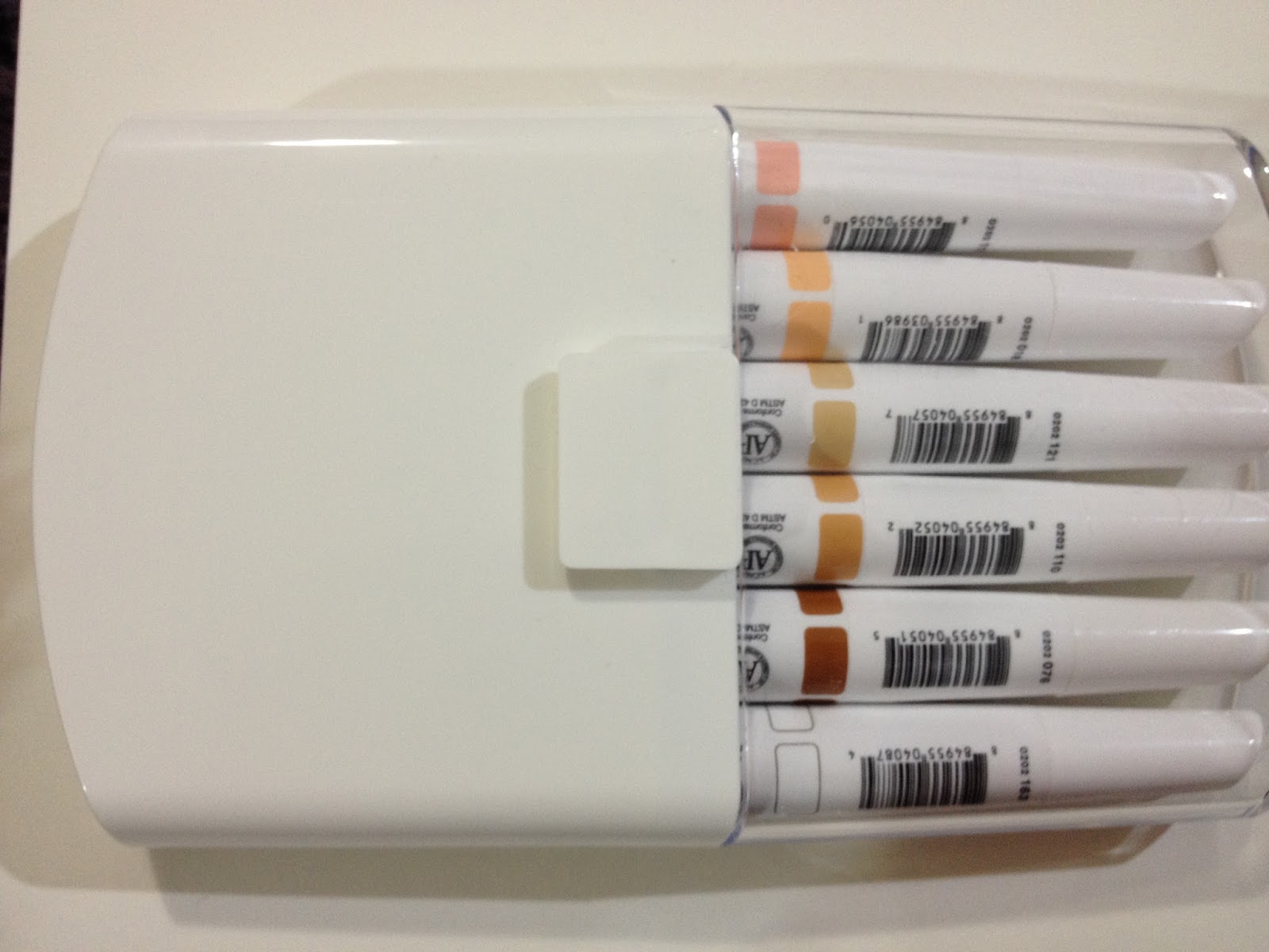

The notch on the back of the case would, in theory, allow you to chain several cases together for storage.

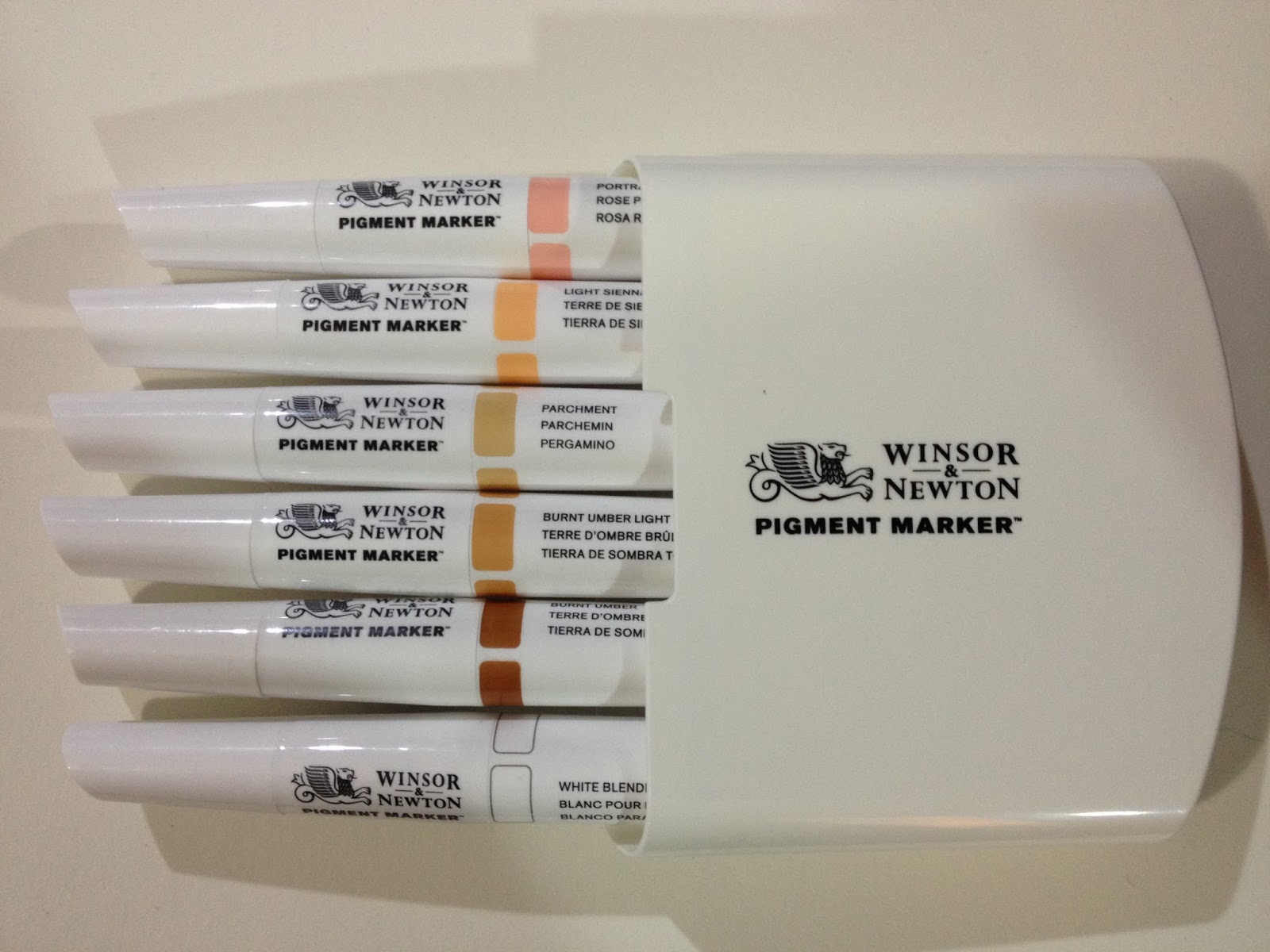

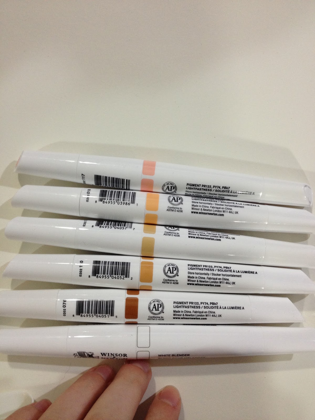

The skintones set includes a white blender marker, burnt umber, burnt umber light, parchment, light sienna, and portrait pink. I made a swatch on watercolor paper and taped it to the case for easy reference.

The Swatch Tests
Winsor and Newton Pigment Markers are very unique in several ways. While alcohol markers are not a new concept, these are pigment based alcohol markers, which are pretty unique.
Opacity Test (On Black Paper)
Playing around with the Pigment Markers on Strathmore Toned Tan paper led me to believe that some of these markers might be opaque, so I tested in a black paper sketchbook. The only marker with any opacity is the white blender.


As you can see, most of the Winsor and Newton Pigment Markers are not particularly opaque, with the White Blender being the exception. This pushes these markers out of the 'meant to be gouache in marker form' category I had originally hoped they'd fall in.
On Toned Tan Paper
I've mentioned in the past (and shown you guys!) how I use Strathmore Toned Tan sketchbooks to bring my sketches to life. One of the first products I played around with in these sketchbooks were Winsor and Newton's new Pigment Markers, particularly their white blender.
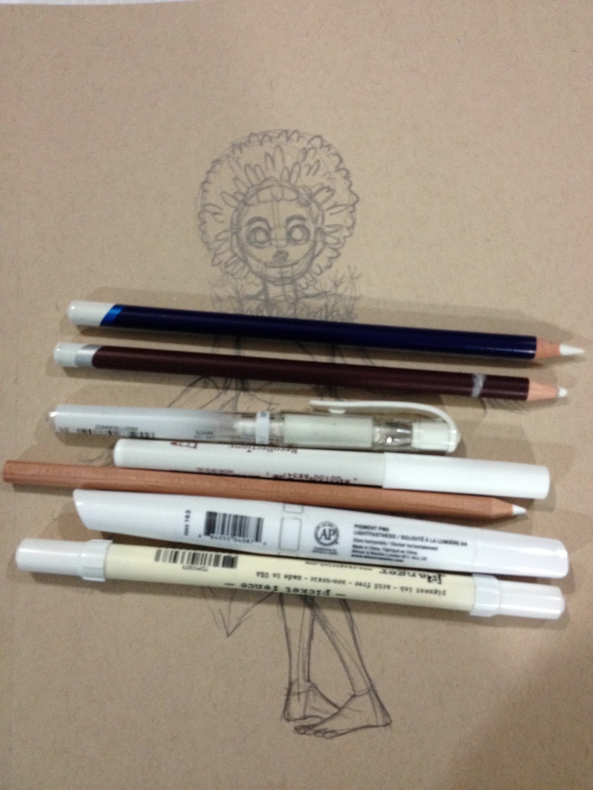 My collection of opaque white tools.
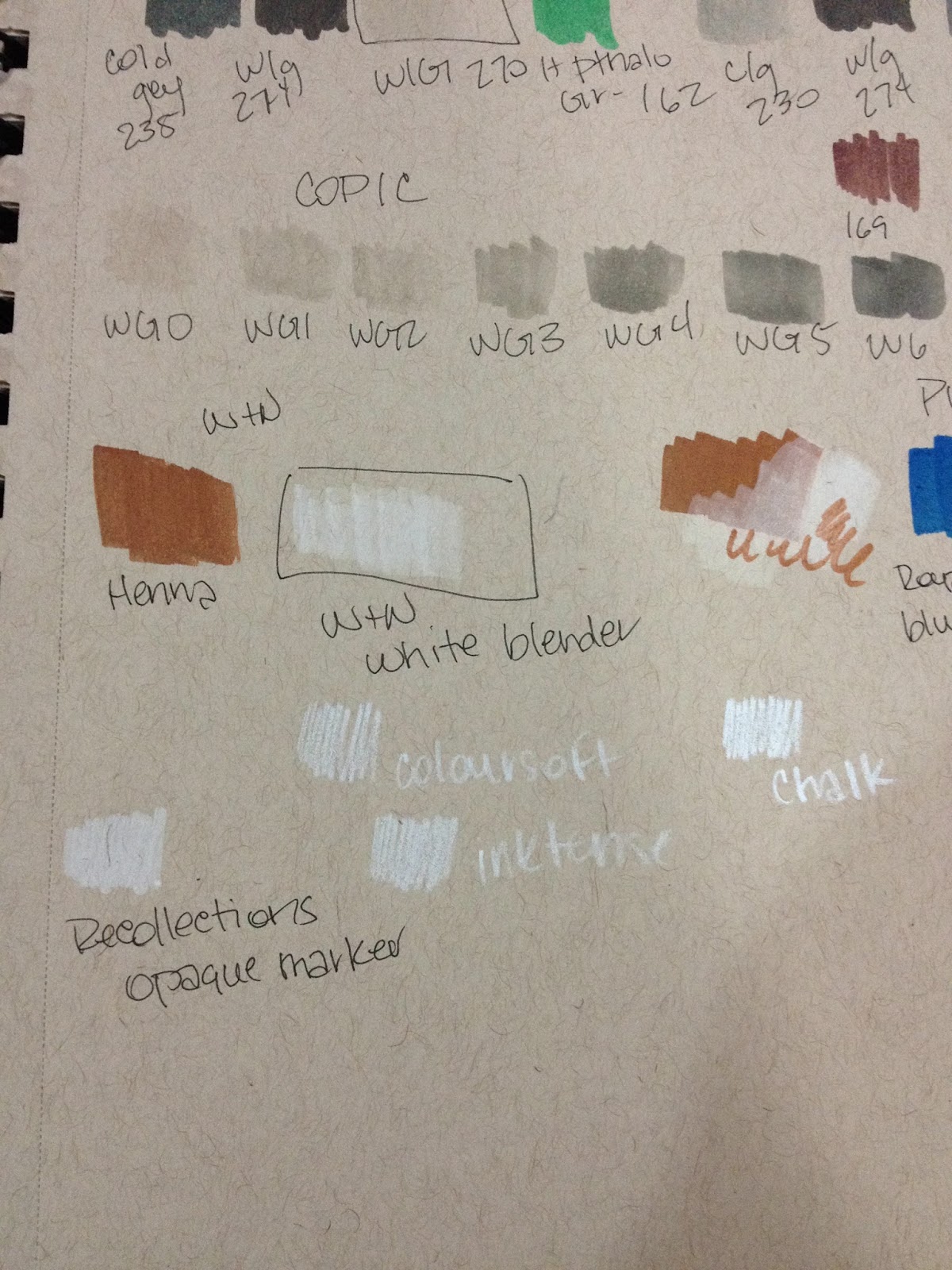
The white blender is a fantastic way to add opaque white to your marker sketches. I've used it here after rendering with Copics, another alcohol based marker.

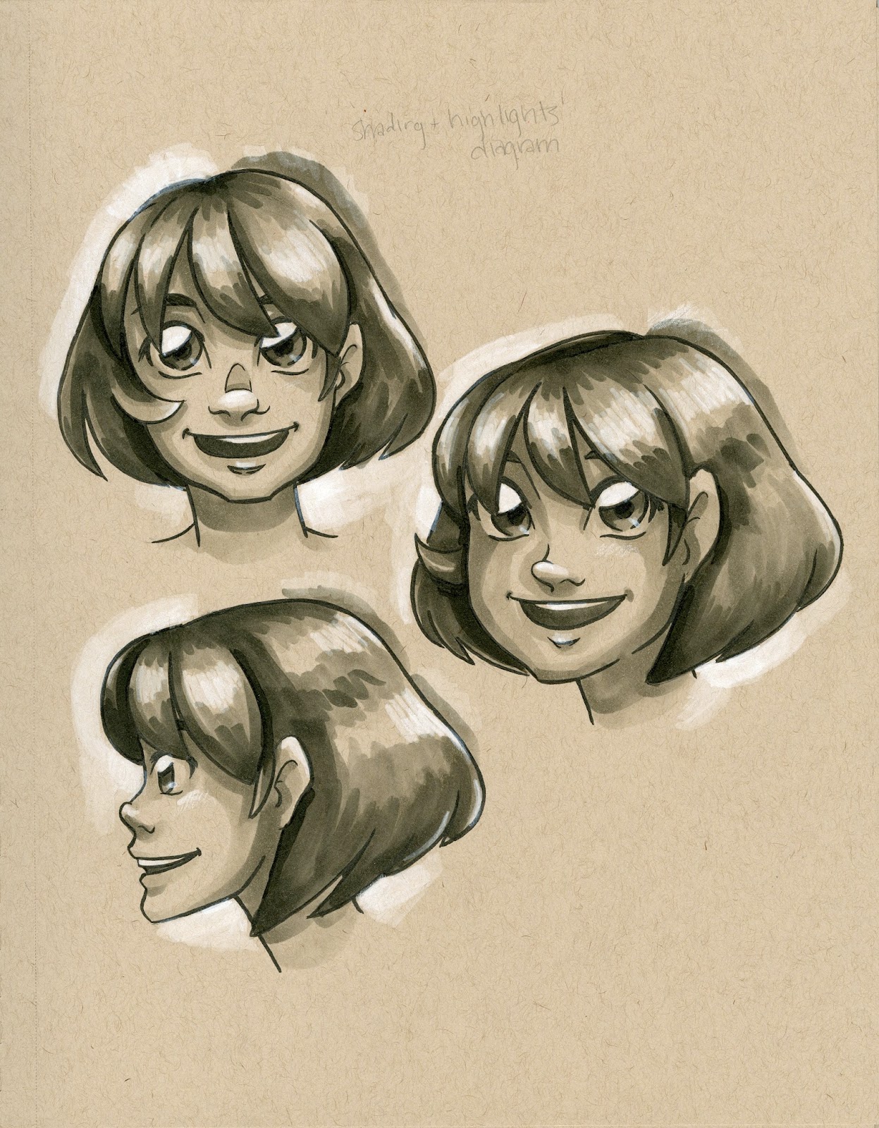
Below I've used the Pigment markers in conjuction with Pitt Pens (for skin and hair) to do simple color illustrations. The Pigment markers don't blend well on this paper, but they really pop, more so than dye based alcohol markers would.
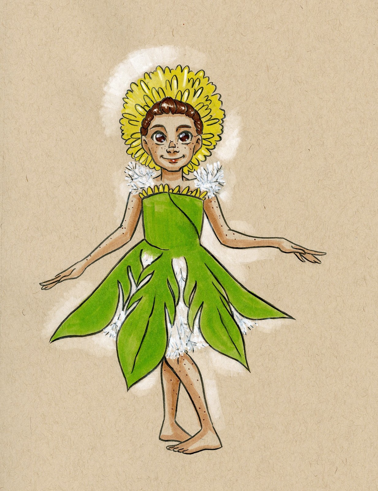
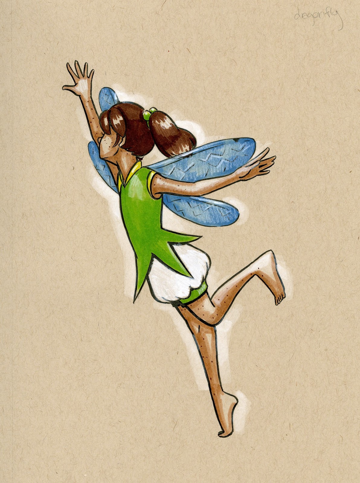


A limited range of Pigment Markers (maybe just the primaries and a white) are a perfect addition to your Toned Tan (or Toned Gray) sketchbook.
You can get your own Strathmore Toned Sketchbooks here, and help support this blog!
Toned Tan
Toned Gray
Swatches on Watercolor Paper
Colors I currently own:
White Blender
Colorless Blender
Winsor Red
Winsor Red Deep
Light Rose
Portrait Pink
Potters Pink
Henna
Royal Blue
Indigo
Blue Grey
Phtalo Teal Light
Winsor Violet
Forest Green
Sap Green
Green Gold
Winsor Yellow
Yellow Orange Light
Sepia
Warm Gray 4
Warm Gray 3
Carmine
Magenta Blue Shade
Rose
Burnt Umber
Burnt Umber Light
Parchment
Light Sienna


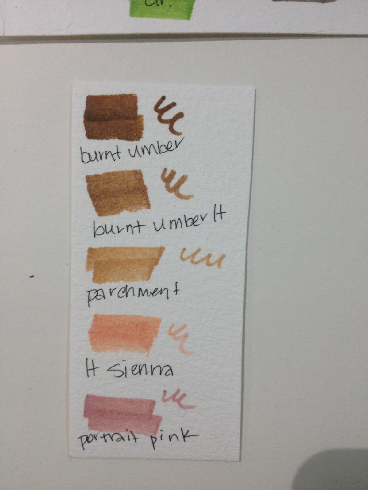
Flower Tests- Finding Papers that Highlight These Markers
In this video, I give a fairly comprehensive overview of the Winsor and Newton Pigment Markers, and demonstrate these markers on several commonly available papers, as the Winsor and Newton Marker paper was not yet available. This is a long video, so feel free to skip around.
Papers tested:
Yupo
Strathmore 400 series Mixed Media board
Crescent Marker Board
Rendr Marker Paper
Canson Montval Watercolor Paper
Copic PM Pad
IN GENERAL:
I found most papers remained wet after application of these markers, which is highly unusual for alcohol based markers, but this may be due to the pigment base. Many of these papers ended up abraded the combination of the pigment providing friction and the nibs providing resistance.
These markers would not blend on the majority of the papers tested (the exception being Yupo), and it was difficult to get nuanced lines or a delicate application.
Portrait Set Test
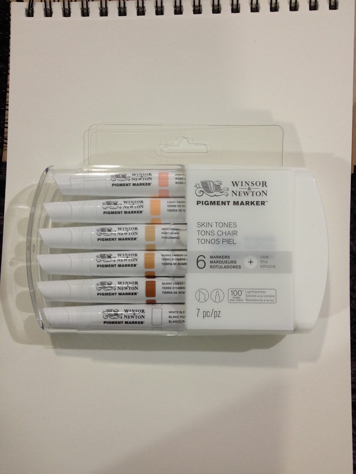

The Field Test

This field test was completed on Strathmore's Acrylic paper, as I thought the plastic surface would allow for marker blending, but would stand up to the scrubbing that these nibs create.

Testing Out the Winsor and Newton Portrait Set- Nattosoup
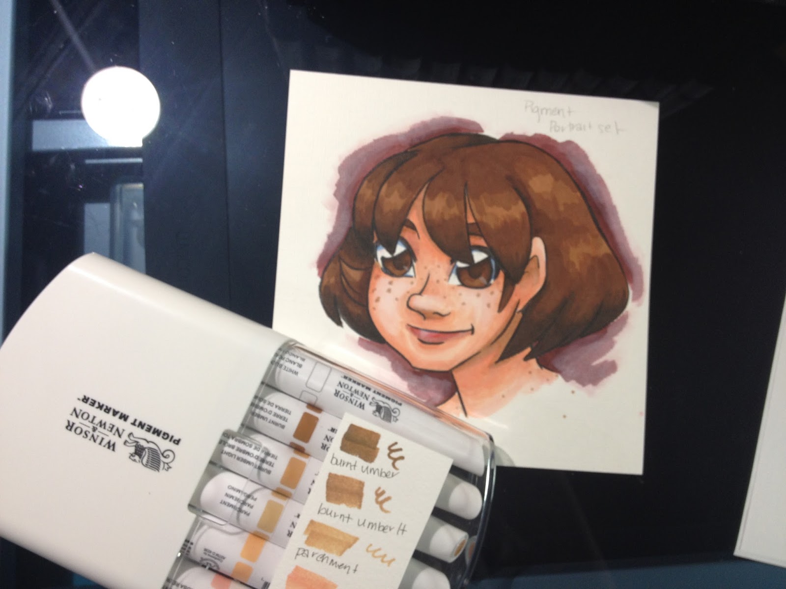
On Winsor and Newton Pigment Paper (Lineart)
This paper has been specially designed for use with Winsor and Newton Pigment markers. If you're interested in a review of this marker paper, please keep checking the blog, as it's in progress. Below are my thoughts on this paper as it relates to Winsor and Newton's Pigment markers only.
NOTE: This paper was sent to me by Winsor and Newton, free of charge. Thank you, Winsor and Newton, for the Pigment Marker Paper.
If you're interested in attaining your own Pigment Marker Paper, you can get it here.
Insert Video Here
I inked this test with the Sailor Mitsuo Aida brushpen, which is alcohol marker proof and water proof under most conditions. I had difficulty finding an inking pen that could handle Yupo in combination with water or alcohol marker (I figured if I could find a pen that worked on Yupo, it'd work on just about ANYTHING), so I reached for my old standby.
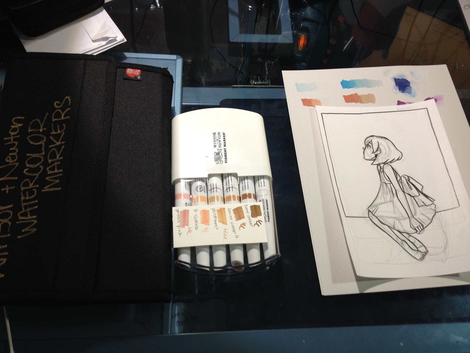
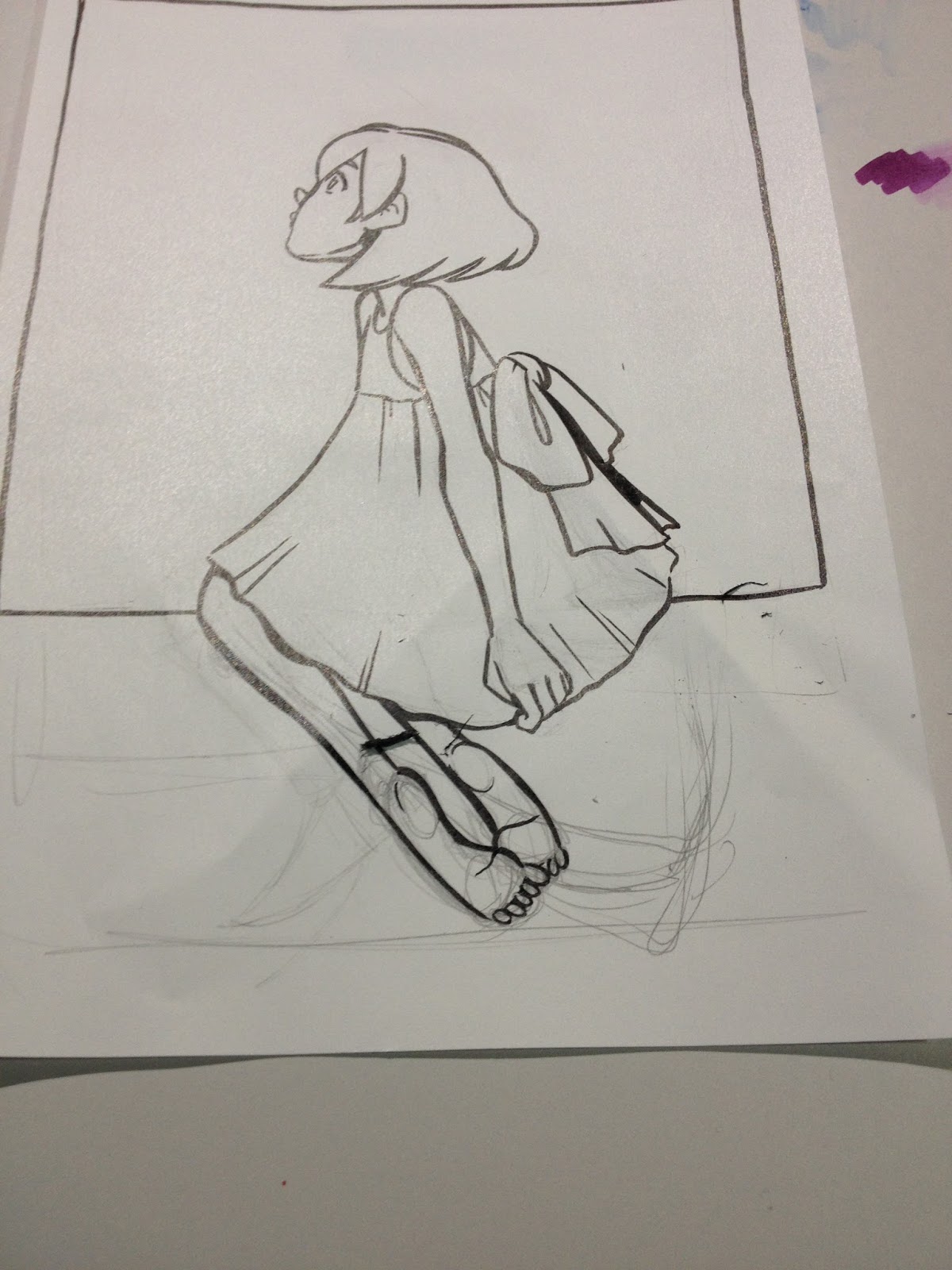
This paper is prone to shearing when you erase, as it's very thin, so please use caution.


I noticed that the Pigment Markers reactivated the Sailor Mitsuo Aida ink on this coated paper. This has not been an issue on other papers I've used with Mitsuo Aida brushpens and Pigment Markers, so I can only assume that despite allowing my ink to cure for more than 24 hours before marker application, the ink never really sinks in on this paper.

It was very difficult to apply color without streaks with just a bullet nib and a chisel nib as my options. Reapplication of color, which would work for other types of alcohol markers (saturation), does not eliminate all streaking, and reactivates prior layers on this paper.

Shininess indicates wetness. These markers take a really long time to dry on this paper.
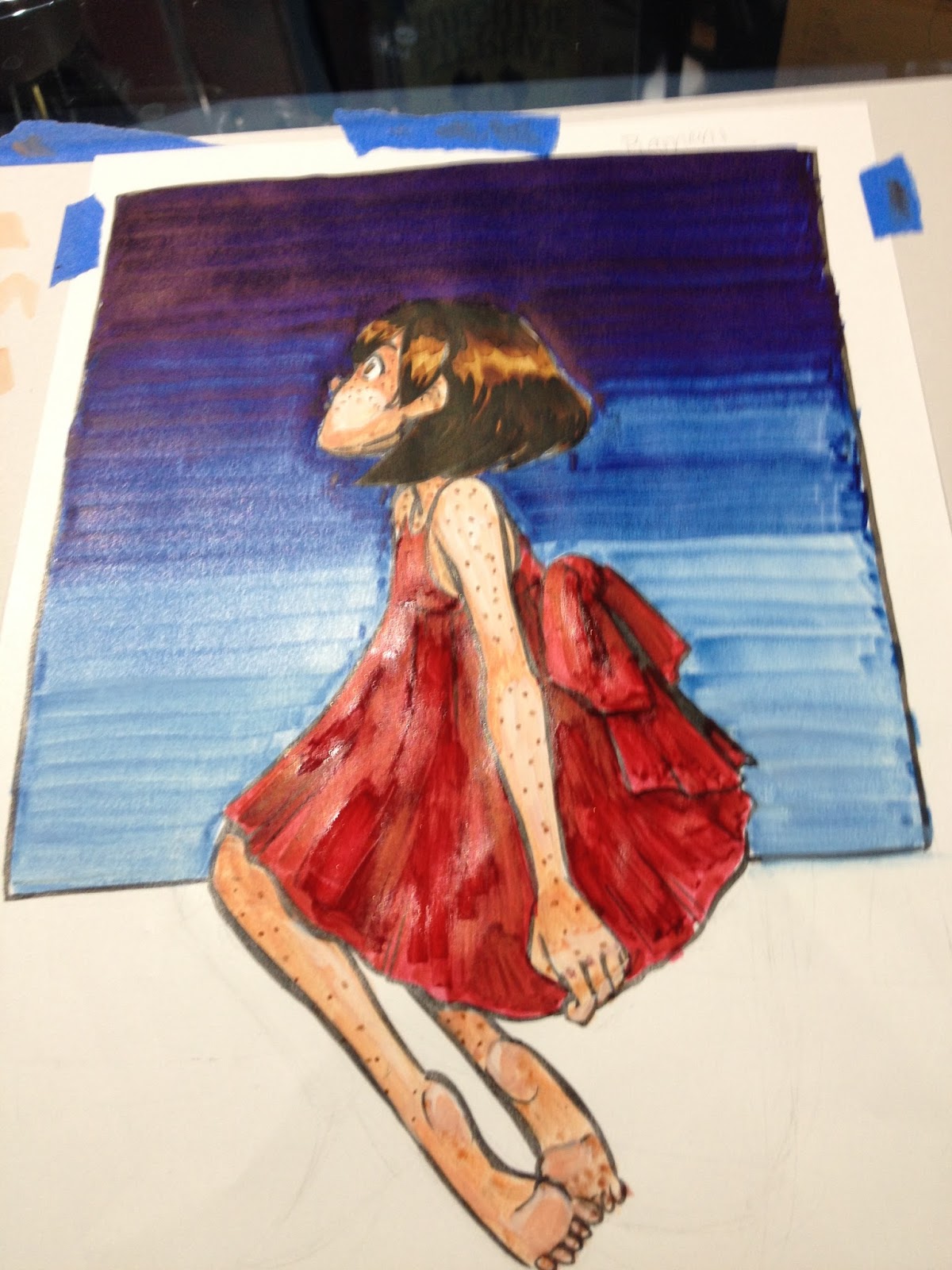
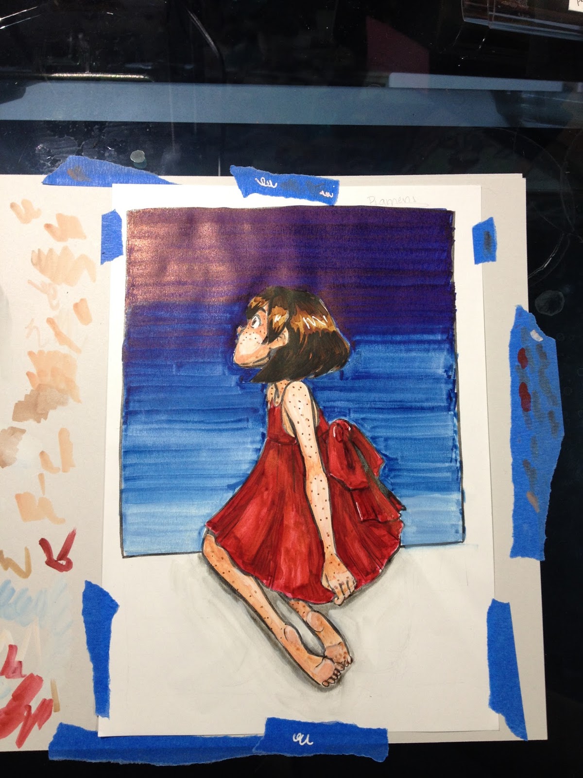
It was fortunate that I'd taped my Winsor and Newton Pigment Marker Paper to a sheet of scrap cardstock, as I had to constantly clean the tips of my markers. Fortunately they're very easy to clean (just scrub on clean paper or a Viva papertowel), so your color doesn't remain contaminated.

On Winsor and Newton Pigment Paper Over Lineart
Insert Video Here
Since my Mitsuo Aida ink contaminated my Pigment Markers, I decided to do something out of character- I pulled out my lightbox and applied color on top of inks from my sketchbook.
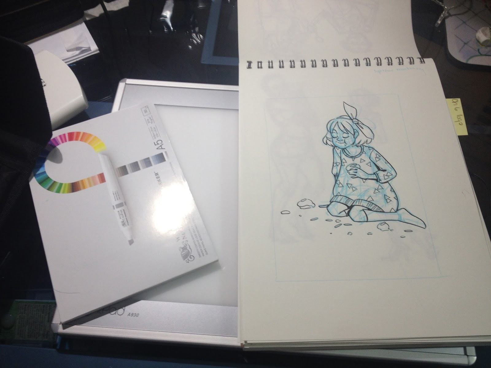
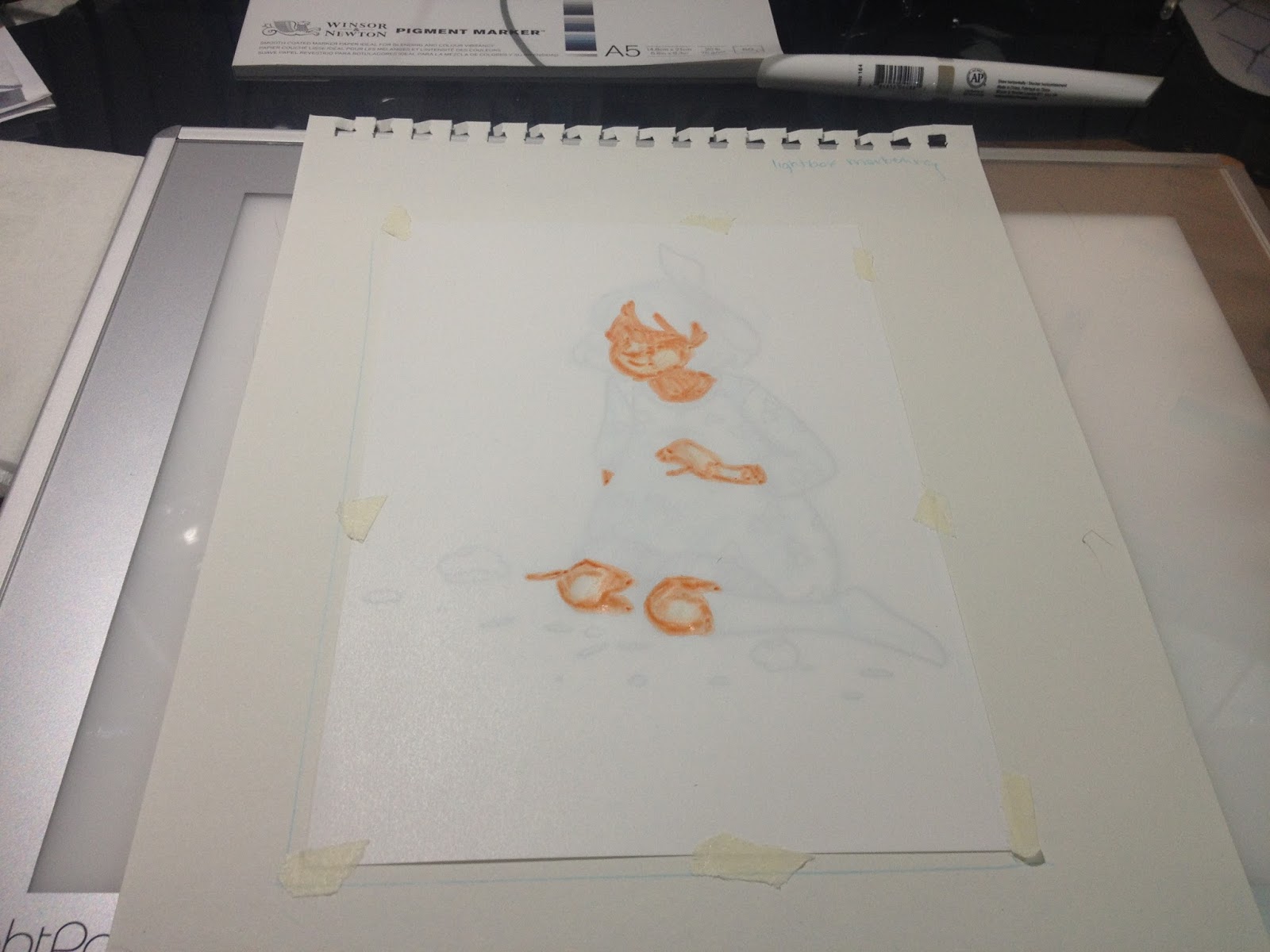
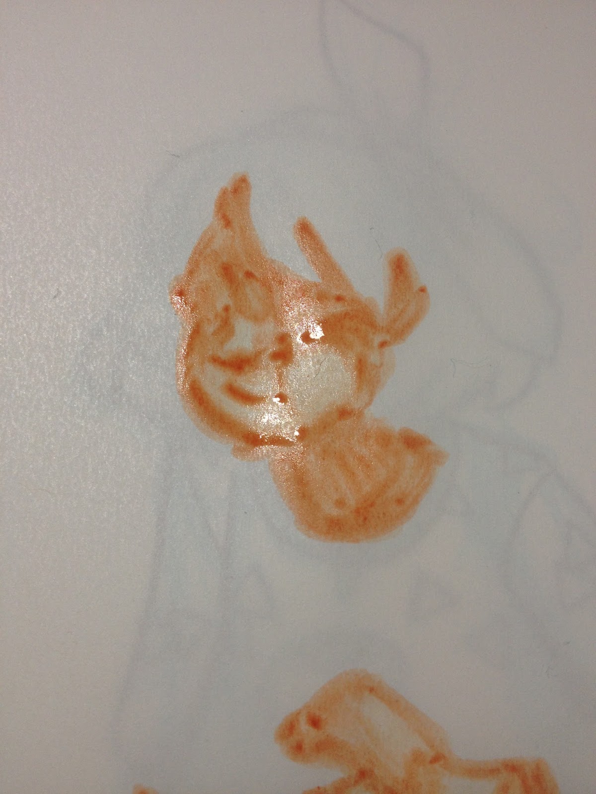
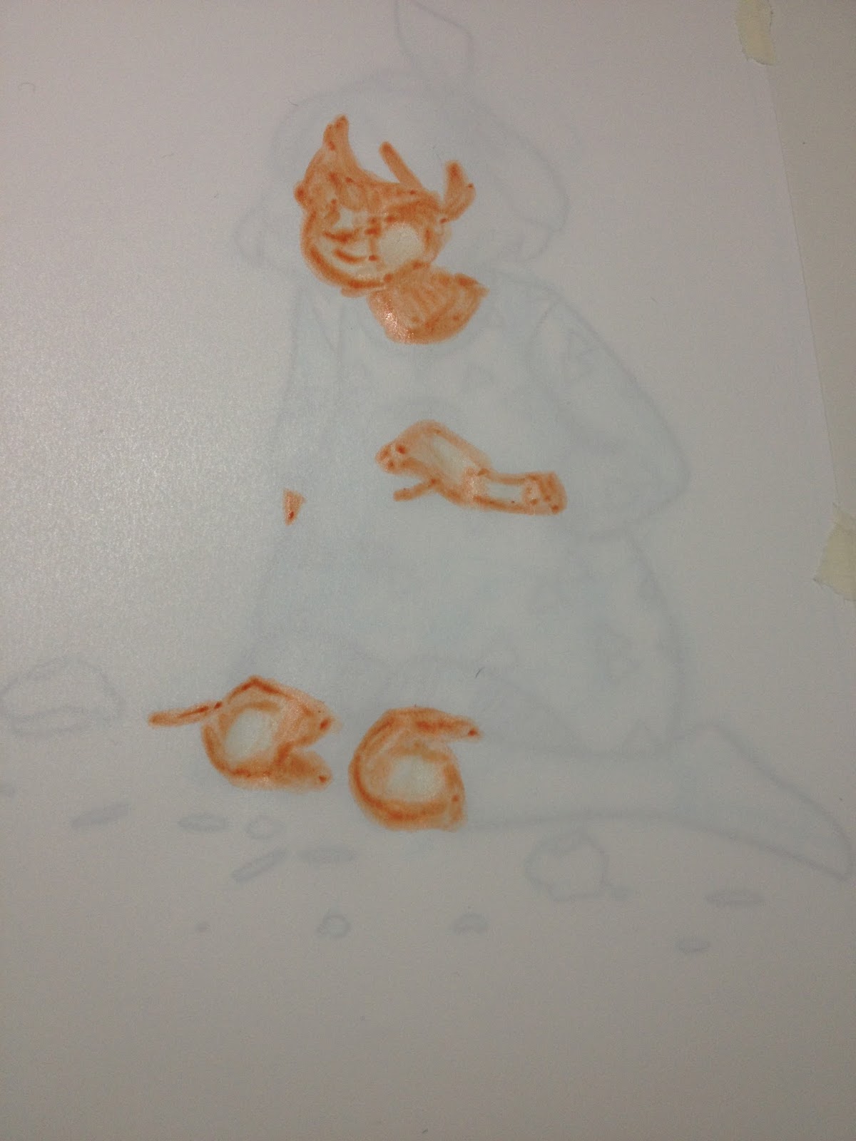
 Removing lineart from the equation made applying skintones much easier, although I had to constantly turn the lightbox off to make sure my colors were ok. If I were working with dye based alcohol markers this would only be an issue with darker colors, but although these markers aren't very opaque, they're just opaque enough that layers make it difficult to see your lineart without a lightbox.
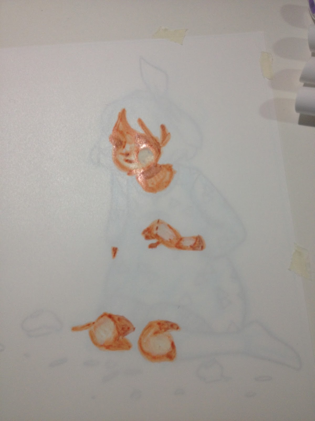
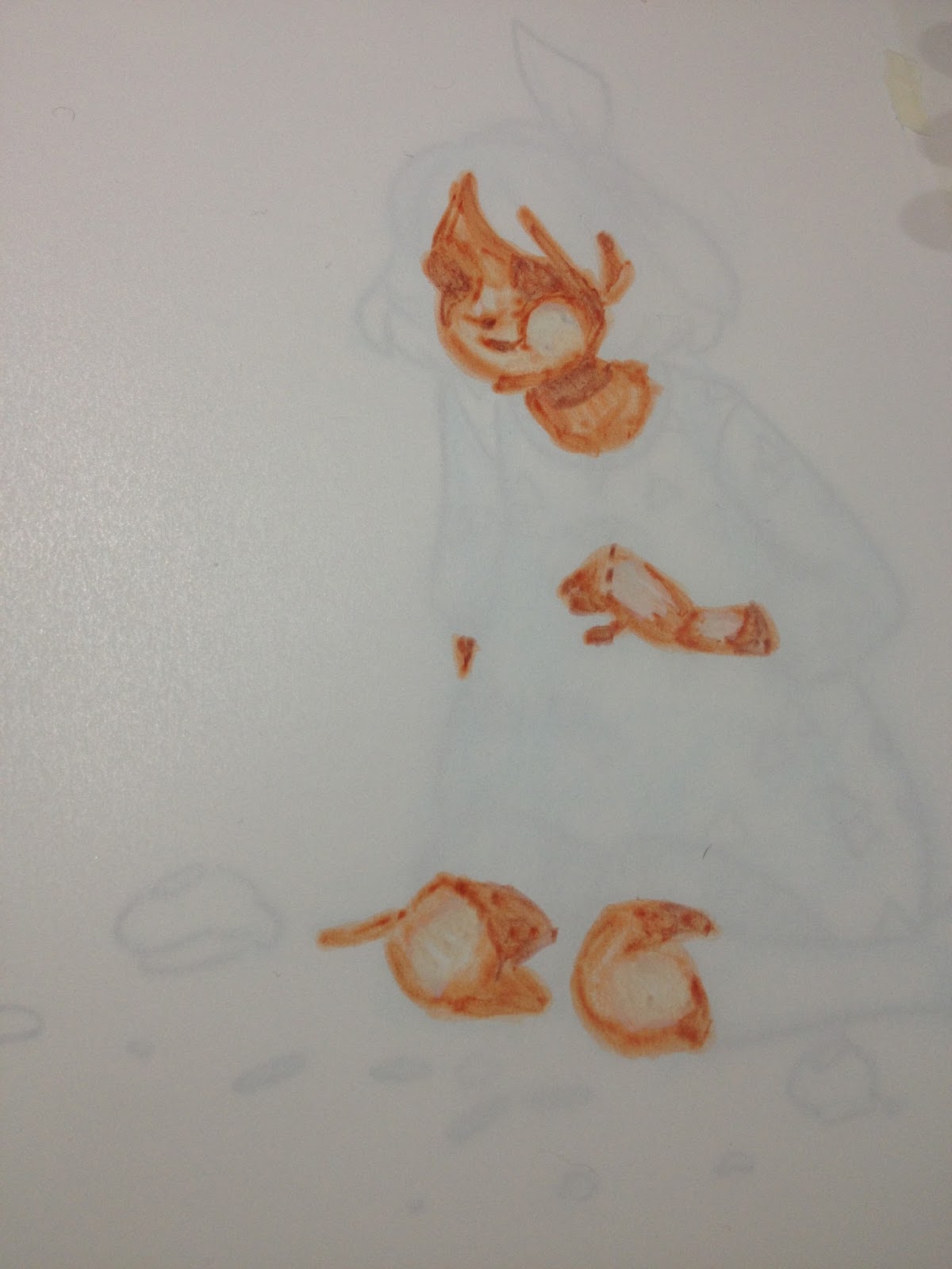

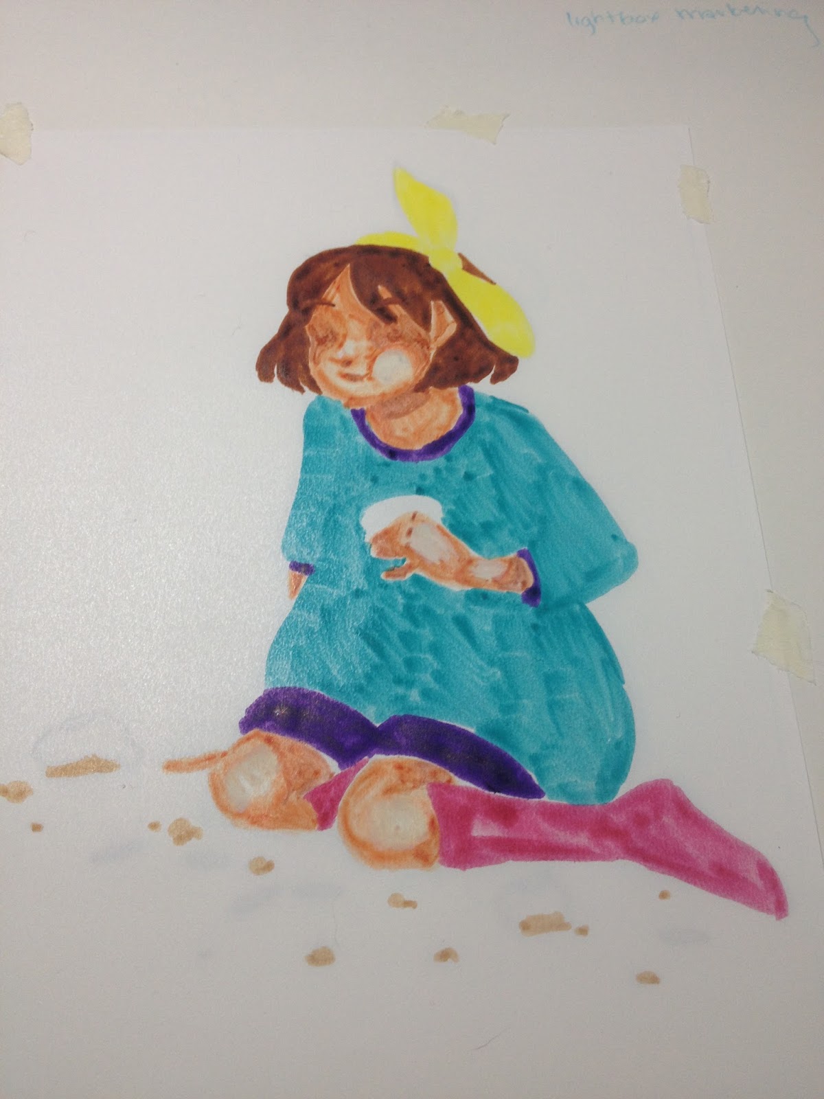

I was a bit disappointed that the colors I applied on top of the teal- Winsor yellow, Winsor violet, magenta, did not replace the teal or sit on top of the teal.
Scan Assembled in Photoshop:
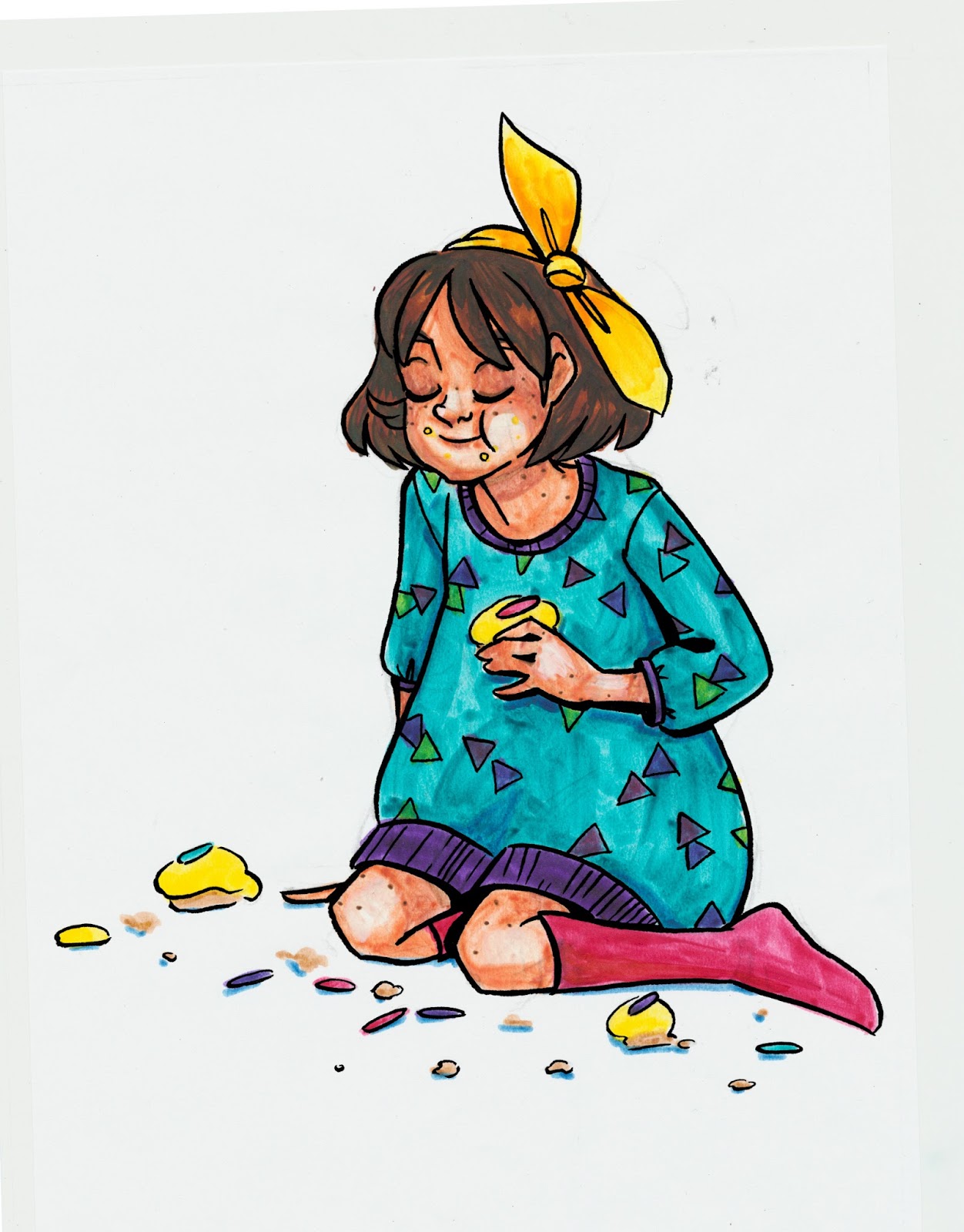
Lineless Doodling on Winsor and Newton Marker Paper
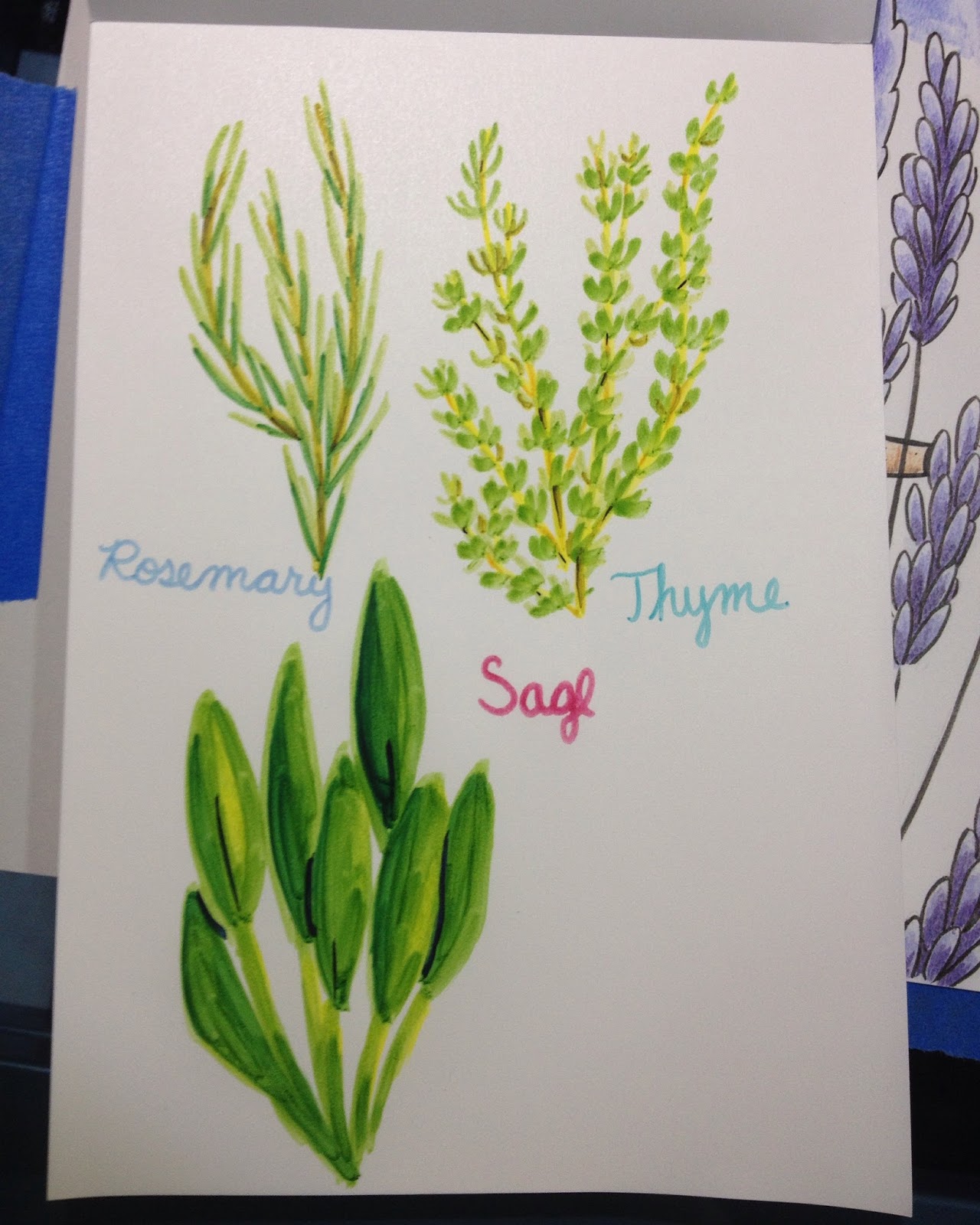
These are fun to noodle around with loosely, especially if I have easy reference to pull from, but I've sadly never really been the type to be able to doodle without some sort of drawn gameplan. I'll continue messing around with Winsor and Newton Pigment Markers, and hopefully I'll get the hang of them.
The Verdict:
I recommend waiting to purchase these markers until they've released a brush nib, as that would make using them much easier.
As an artist who is very familiar with alcohol markers, I struggled to use these markers, but my familiarity with other alcohol markers may have been the issue. Since I've already invested in a fairly large collection of Pigment Markers, I'm going to continue to try to learn how to use these markers, and share my progress here with you guys. These markers may be geared more towards painters, as that seems to be the majority of artists Winsor and Newton approached to serve as brand ambassadors.
Troubleshooting:
I tend to work very small in general, and the small pad Winsor and Newton sent (which is what I usually prefer to work on) constrained me
I prefer to work with inked lineart, and I have yet to find
I like to be very precise about color application- I may not have mixed a wide enough variety of colors
I like to use a lot of colors for blending, so I may have over rendered
As with most products reviewed on this blog, these markers were purchased out of my own pocket (except for Winsor Yellow, Azure Blue, and Winsor Red, which were demo markers that were given to me at Hands on Creativity at Pla-Za, and the Winsor and Newton marker paper, which was sent to me from Winsor and Newton). If you enjoy this review, or found it useful, you can show that appreciation by 1. Sharing it to your social networks 2. Liking the included videos and subscribing to my YouTube channel for even more great content 3. Consider donating a little something to the Paypal link in my sidebar 4. Buy something from my online shop . Without your support, tutorials and reviews will begin disappearing from the regular roster. WITH your support, tutorials will increase, and I'll start offering monthly ArtSnacks vs SketchBox comparisons in addition to the reviews I have planned.
Please consider donating to this blog or purchasing from Natto-shop (http://nattosoup.com/shop) if you want me to continue publishing quality content. All materials tested were purchased from my own pocket. Keep on Truckin' Nattosoup is not under any sponsorship.
February 7, 2016
Alcohol Marker Review: Winsor and Newton Promarker and Brush Marker
The original notes for this post were lost when my Surface Pro 3 died and had to be sent back to Microsoft. I'm writing much of this from research, memory, and photos. If you enjoy what I do, please take a moment to share it to your social networks, so other artists may benefit. Doing so helps me grow my audience, which will hopefully help me attract future sponsors and company partnerships. If you really enjoyed this post, please take a moment to email Winsor and Newton about it, and send them a link to this post, along with your thoughts, so they can see what I do. Your emails to companies really go a long way towards keeping this blog functioning- as it shows companies that I have an engaged, supportive audience. Please don't wait for others to do so- every email counts!
The History
Letraset has been acquired by ColArts, the parent company of Winsor & Newton and Derwent, and Promarkers and Flex Markers have been rebranded as Winsor & Newton Promarkers and Winsor & Newton Brushmarkers. Winsor & Newton has already sent out sets of Promarkers to several prominent artists on YouTube to help spread the word about the brand.
Related Previous Reviews
Letraset Tria Pantone
Letraset Flexmarkers
Winsor & Newton Watercolor Markers
The Stats
Non-refillableTwin tipped- Promarkers are Chisel and Bullet, Brushmarkers are Brush and ChiselNon replacable NibsPromarkers have 148 total colorsBrushmarkers have 72 total colorsAvailable open stock and in setsAvailable in most art supply stores including David's Art Supply (New Orleans, LA), Pla-Za (Nashville, TN), Michael's Winsor & Newton Promarkers are $4.19 openstock at DickblickWinsor and Newton Brushmarkers are $4.49 openstock at DickBlickBrushmarkers are available in sets of 6 and 12Promarkers are available in sets of 6, 12, and 24Promarkers on the Winsor & Newton site
Brushmarkers on the Winsor & Newton site
Note: The DickBlick site still has a few of the original Letraset Promarkers for sale, at $2.79 each
Original Letraset Promarker:
 From the DickBlick site
Winsor & Newton has kept the body of the Promarker pretty much unchanged, and uses the same body for the Brushmarkers and for their watercolor markers.
The Packaging (Skintones Set 1)
Winsor and Newton's packaging has changed very little from Letraset Flexmarker's packaging a couple years ago. It's still reusable clamshell packaging with minimal included paperwork. The markers snap snugly into place, and can be difficult to remove.


The back reads:
Brushmarker is a twin-tipped illustrator's marker featuring a versatile brush nib for the ultimate in precise, flexible line control. BrushMarker's non-toxic, alcohol based ink can be readily layered and blended to provide endless scope in rendering colour depth and tone. Ideal for a range of creative applications at home, college, and in the studio.
The Markers
I purchased the majority of my markers openstock at David Art Supply while visiting New Orleans over Christmas. The official Winsor and Newton marker display doesn't do a good job differentiating one type of marker from the next, so it's very easy to grab the wrong type.

Both Pro and Brush Markers have tip specific caps and a color family indicator on the chisel end cap. Winsor and Newton utilizes a color organization system similar but not identical to, Copic and Prismacolor.


At first glance, Promarkers and Brushmarkers are almost identical, so be careful when purchasing in store. I wish Winsor & Newton would use different body plastics to designate the three types of markers that use this body- navy for the watercolor markers, black for the Promarkers, and purple for the Brushmarkers. That way it's easy to tell them apart at a glance.
 Uncapped, it's a little easier to tell one marker from another.
 The chisel nibs on both markers are identical
 The bullet nib is a stiff fiber nib, similar to the bullet nibs on Prismacolor markers. The brush nib seems to be made from nylon foam, which is pretty common for alcohol based brush marker nibs.


Comparison Shots
 From left to right: Copic Sketch, Prismacolor Brush marker, Winsor and Newton Promarker, Winsor and Newton Brush marker Promarkers and Brushmarkers are both shorter than Copic or Prismacolor markers, but are a little wider in circumference than either.
 Left to right: Copic Sketch, Prismacolor Brush Marker, Winsor and Newton Promarker, Winsor and Newton Brushmarker The brush nib is about the same size as the Copic Superbrush, and slightly smaller than the brush nib on Prismacolor brush markers.
 From top to bottom: Winsor and Newton Brushmarker, Winsor and Newton Promarker, Prismacolor Brushmarker, Copic Sketch
The Swatch Test
Colors purchased, openstock:
Salmon pink (Promarker)
Sunkissed Pink (Brushmarker)
Denim Blue (Promarker)
Lilac (Promarker)
Coral (Promarker)
Bright Green (Brushmarker)
Terracotta (Promarker)
Cocoa (Brushmarker)
Colors purchased in the 6 piece Brushmarker Skintones set 1:
Terracotta
Blush
Dusky Pink
Almond
Saddle Brown
Burnt Sienna

The Field Test- Kara
For Caucasian skintones, I really only had three colors to work with, and I found them a bit difficult to layer effectively. The inks in these markers tend to displace prior layers, rather than effectively layering on top of prior layers. Also, several colors that work well for skintones (like Sunkissed Pink) are only available in bullet nibbed Promarkers, which may make them more difficult to handle.


Although individual colors do layer decently well, there isn't enough difference in the included colors of the Skintone Set 1 for layered different colors to create enough contrast.

Blending out with the colorless blender pushes the ink so much that using it to lighten small areas is useless.


I used Denim Blue to try and apply shadow to the eyes and teeth, but it's much darker than the body implies.

Lilac was also much too saturated and dark for this application, and I tried to blend it out using the skintones, which resulted in muddy looking skin. I'd neglected to grab a dark red for the interior of the mouth, so I resorted to Salmon Pink, which is a much hotter pink than expected from a salmon.

The addition of a skintone over Lilac results in a gray, rather than a more muted Lilac. These markers, while alcohol based, do not perform exactly like Copic markers, so if you're used to using Copics, the Winsor and Newton Brushmarkers and Promarkers may take getting used to.

The skintone set came with a few browns that work for skintones as well as hair, but I also purchased a couple additional browns to extend my range a bit.

I colored the base of Kara's hair with Terracotta, and found the bullet nib on this Promarker to leave streaks that I would not see with a brush application. I also used Terracotta to apply freckles. Regardless of how light my hand was, the application was overly uniform and thus unrealistic in appearance, as the bullet nib only applied perfectly round dots.

Fortunately these streaks were covered up as soon as I applied another layer of ink.


I generally dislike covering larger areas with a bullet nib, as they're very prone to streaking, so for Kara's dress, I used the chisel nib for my initial application. I found the chisel nib on this Promarker to be dry and streaky- generally unpleasant to use.

The second layer (shadows in the dress) was applied with the bullet nib, and I dislike how amateur the overall effect is. Rather than sharp edges or painterly effects, I'm left with a very blocky, streaky application.


So far, based on the colors I currently own, I'm not particularly impressed by Winsor and Newton Promarkers or Brushmarkers, but I wanted to give them another field test to be positive. Since I'd purchased a skintone set that had a fairly wide skew in terms of colors included, I decided to render someone with a much darker skintone to see how these markers fared.
With many marker brands, darker skintones are where the color collection really starts to fall short. An artist's selection of browns may be limited based on the brand, or browns may trend towards being too saturated to use for natural skintones. I'd hoped that the Winsor and Newton Promarkers and Brushmarkers might be able to fill that gap.
Naomi
I opted to render Naomi, Kara's human friend, as she has dark brown skin and green eyes.

Since the colors I'd originally picked didn't entirely lend themselves to Naomi's color palette, I had to think on my feet and make some accommodations. I went ahead and applied the Salmon Pink to her lips early, as I didn't want it disrupting later applications of skintone.

 Unfortunately, application of the first brown was streaky, and disrupted the first layer of Salmon Pink, so the pink wasn't necessarily a good base to begin with. For darker skintones, I recommend richer, less saturated pinks, reds, and red violets for lips and cheeks.


I ended up reapplying Salmon Pink for a more even lip, and applied a layer of the same to her cheeks, eyelids, chin, and the corner of her eyes before adding shadow to her face.


Rendering Naomi's hair was difficult, as the darkest brown included wasn't really dark enough, and it tended to get streaky and dry. I felt like I was really scrubbing the marker by the end of the test.


The Verdict
I found the 6 piece skintone set to be too limited to really be useful as a skintone starter set- you're going to be augmenting the collection a lot for it to work. Although the spread of tones included is wide, there aren't enough of any to really build up good contrast for any particular ethnicity, and there isn't a good blush or shading marker included.
Unfortunately, it's difficult for me to reach an outstanding overall verdict, as I'd like to continue to test their colors and see how they fit in my overall marker collection. As a standalone product, I found the inks to be prone to bleeding when applied with the bullet nib, prone to being overly dry and scratchy when applied with the chisel nib, and tend to layer poorly regardless of the nib. While these may be a fine addition to a larger marker collection, perhaps as a way to fill in holes in color families, I found these frustrating to use after years of using Copics.
Please consider donating to this blog or purchasing from Natto-shop (http://nattosoup.com/shop) if you want me to continue publishing quality content. All materials tested were purchased from my own pocket. Keep on Truckin' Nattosoup is not under any sponsorship.
The History
Letraset has been acquired by ColArts, the parent company of Winsor & Newton and Derwent, and Promarkers and Flex Markers have been rebranded as Winsor & Newton Promarkers and Winsor & Newton Brushmarkers. Winsor & Newton has already sent out sets of Promarkers to several prominent artists on YouTube to help spread the word about the brand.
Related Previous Reviews
Letraset Tria Pantone
Letraset Flexmarkers
Winsor & Newton Watercolor Markers
The Stats
Non-refillableTwin tipped- Promarkers are Chisel and Bullet, Brushmarkers are Brush and ChiselNon replacable NibsPromarkers have 148 total colorsBrushmarkers have 72 total colorsAvailable open stock and in setsAvailable in most art supply stores including David's Art Supply (New Orleans, LA), Pla-Za (Nashville, TN), Michael's Winsor & Newton Promarkers are $4.19 openstock at DickblickWinsor and Newton Brushmarkers are $4.49 openstock at DickBlickBrushmarkers are available in sets of 6 and 12Promarkers are available in sets of 6, 12, and 24Promarkers on the Winsor & Newton site
Brushmarkers on the Winsor & Newton site
Note: The DickBlick site still has a few of the original Letraset Promarkers for sale, at $2.79 each
Original Letraset Promarker:
 From the DickBlick site
Winsor & Newton has kept the body of the Promarker pretty much unchanged, and uses the same body for the Brushmarkers and for their watercolor markers.
The Packaging (Skintones Set 1)
Winsor and Newton's packaging has changed very little from Letraset Flexmarker's packaging a couple years ago. It's still reusable clamshell packaging with minimal included paperwork. The markers snap snugly into place, and can be difficult to remove.

The back reads:
Brushmarker is a twin-tipped illustrator's marker featuring a versatile brush nib for the ultimate in precise, flexible line control. BrushMarker's non-toxic, alcohol based ink can be readily layered and blended to provide endless scope in rendering colour depth and tone. Ideal for a range of creative applications at home, college, and in the studio.
The Markers
I purchased the majority of my markers openstock at David Art Supply while visiting New Orleans over Christmas. The official Winsor and Newton marker display doesn't do a good job differentiating one type of marker from the next, so it's very easy to grab the wrong type.
Both Pro and Brush Markers have tip specific caps and a color family indicator on the chisel end cap. Winsor and Newton utilizes a color organization system similar but not identical to, Copic and Prismacolor.
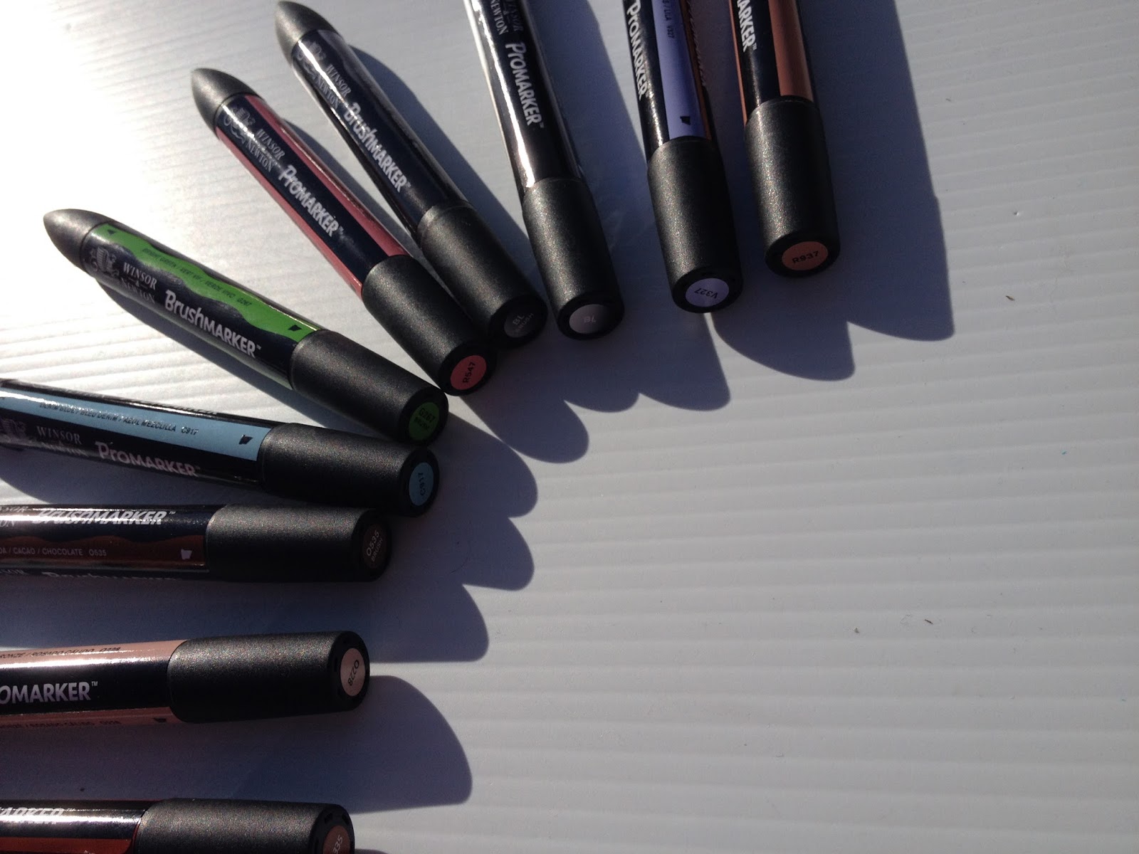
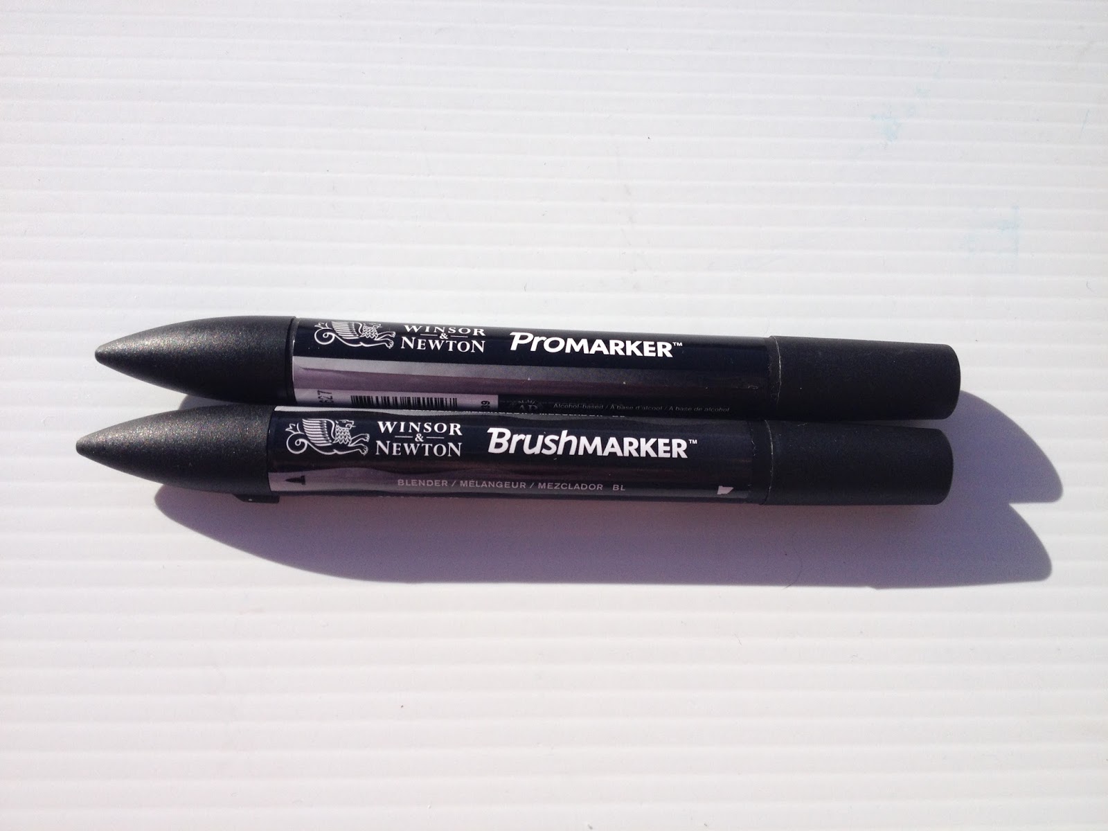
At first glance, Promarkers and Brushmarkers are almost identical, so be careful when purchasing in store. I wish Winsor & Newton would use different body plastics to designate the three types of markers that use this body- navy for the watercolor markers, black for the Promarkers, and purple for the Brushmarkers. That way it's easy to tell them apart at a glance.
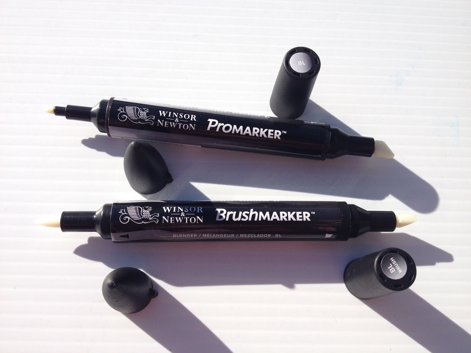 Uncapped, it's a little easier to tell one marker from another.
 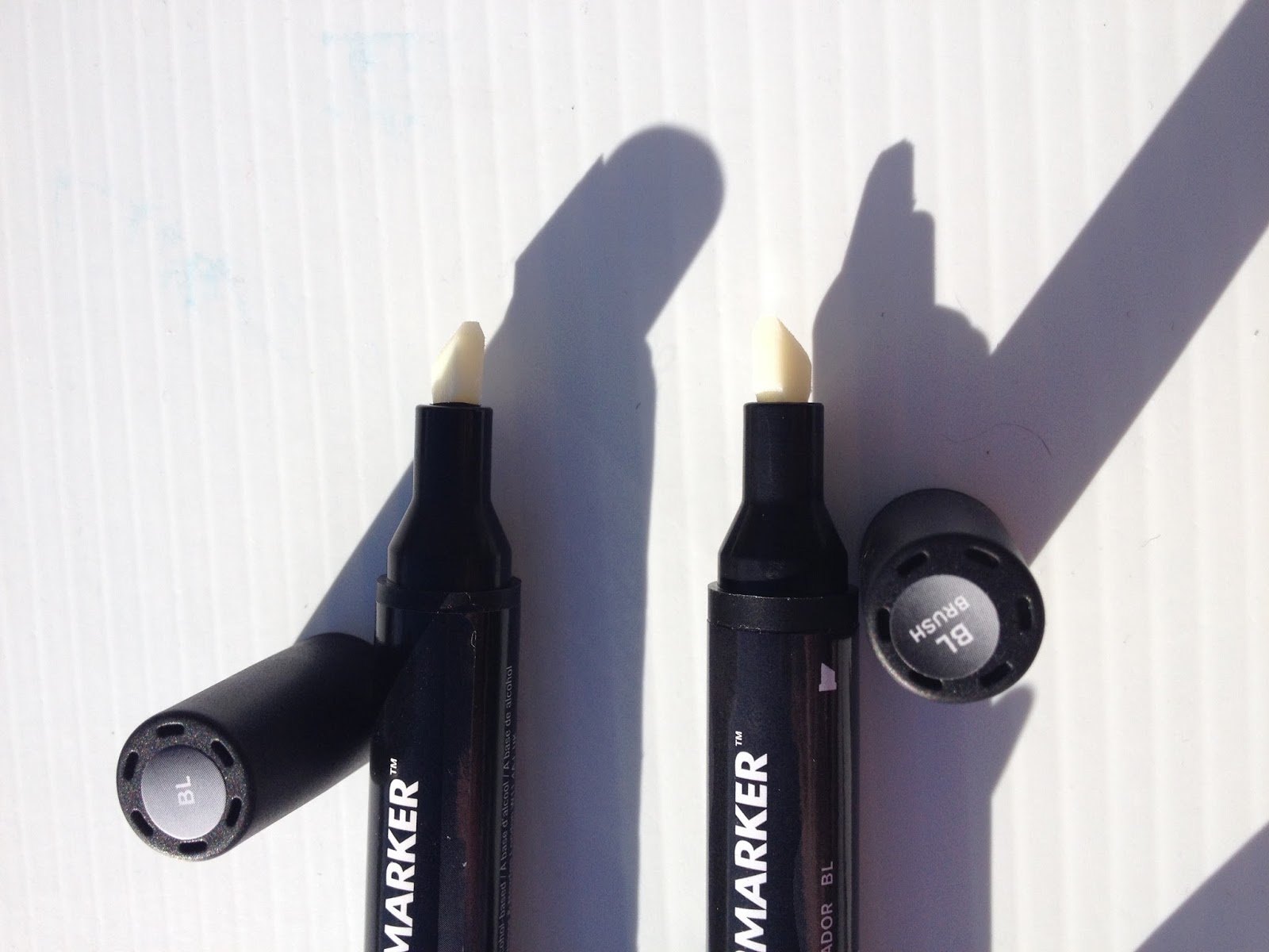 The chisel nibs on both markers are identical
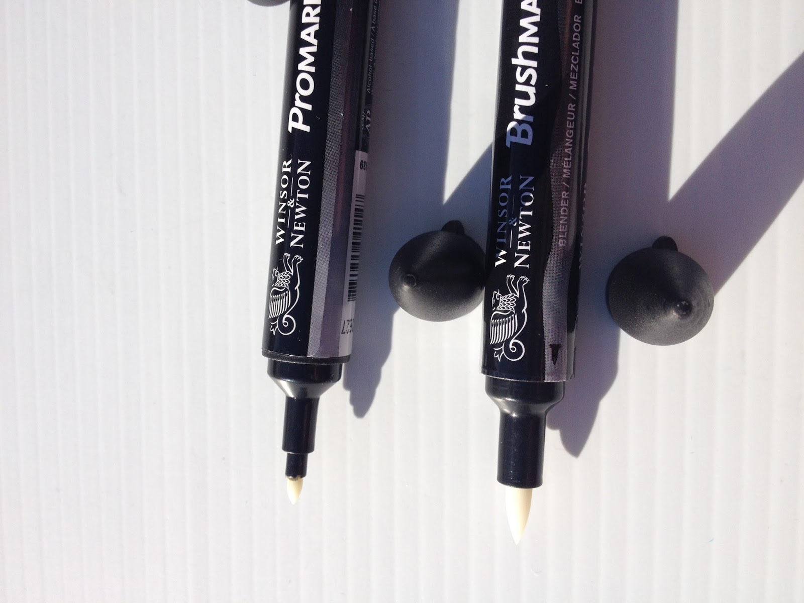 The bullet nib is a stiff fiber nib, similar to the bullet nibs on Prismacolor markers. The brush nib seems to be made from nylon foam, which is pretty common for alcohol based brush marker nibs.

Comparison Shots
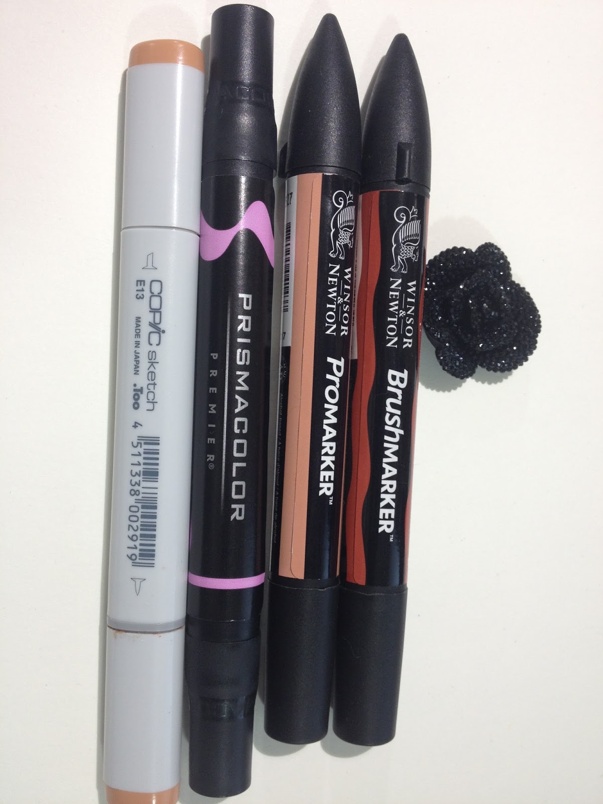 From left to right: Copic Sketch, Prismacolor Brush marker, Winsor and Newton Promarker, Winsor and Newton Brush marker Promarkers and Brushmarkers are both shorter than Copic or Prismacolor markers, but are a little wider in circumference than either.
 Left to right: Copic Sketch, Prismacolor Brush Marker, Winsor and Newton Promarker, Winsor and Newton Brushmarker The brush nib is about the same size as the Copic Superbrush, and slightly smaller than the brush nib on Prismacolor brush markers.
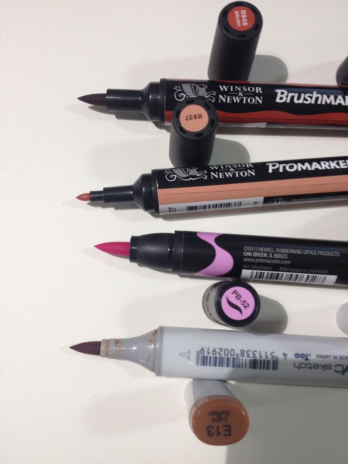 From top to bottom: Winsor and Newton Brushmarker, Winsor and Newton Promarker, Prismacolor Brushmarker, Copic Sketch
The Swatch Test
Colors purchased, openstock:
Salmon pink (Promarker)
Sunkissed Pink (Brushmarker)
Denim Blue (Promarker)
Lilac (Promarker)
Coral (Promarker)
Bright Green (Brushmarker)
Terracotta (Promarker)
Cocoa (Brushmarker)
Colors purchased in the 6 piece Brushmarker Skintones set 1:
Terracotta
Blush
Dusky Pink
Almond
Saddle Brown
Burnt Sienna
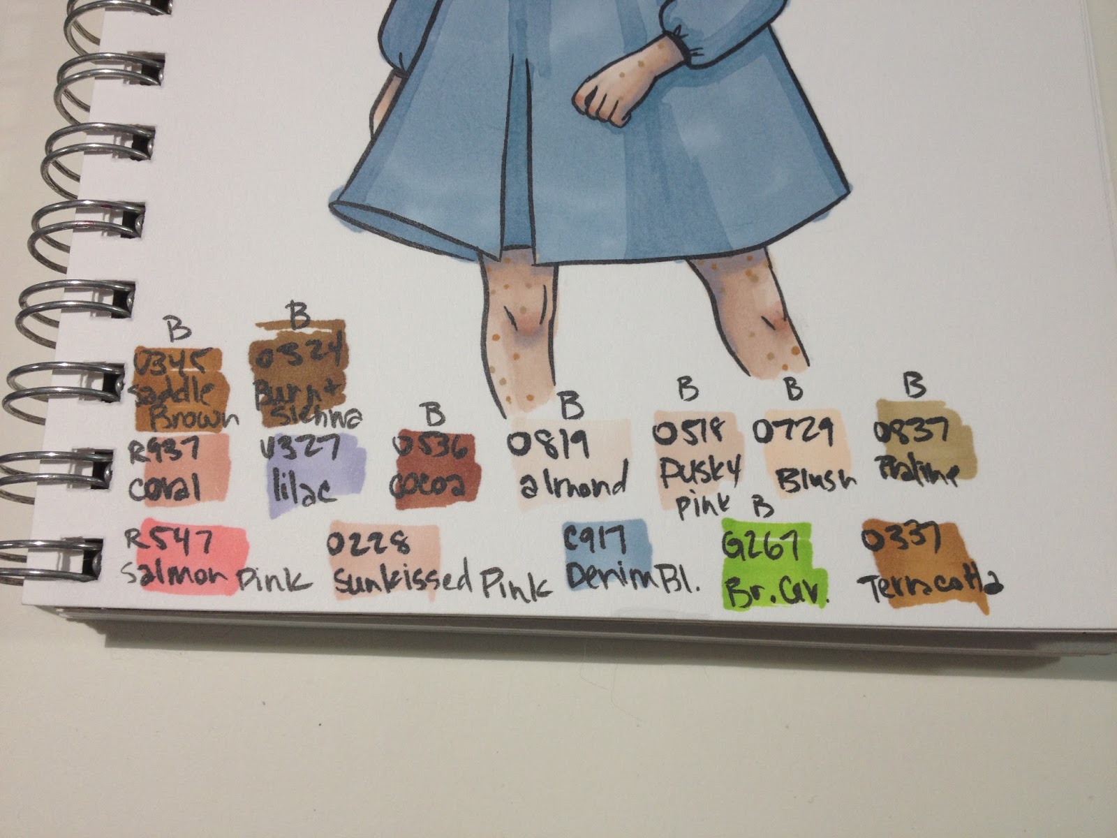
The Field Test- Kara
For Caucasian skintones, I really only had three colors to work with, and I found them a bit difficult to layer effectively. The inks in these markers tend to displace prior layers, rather than effectively layering on top of prior layers. Also, several colors that work well for skintones (like Sunkissed Pink) are only available in bullet nibbed Promarkers, which may make them more difficult to handle.
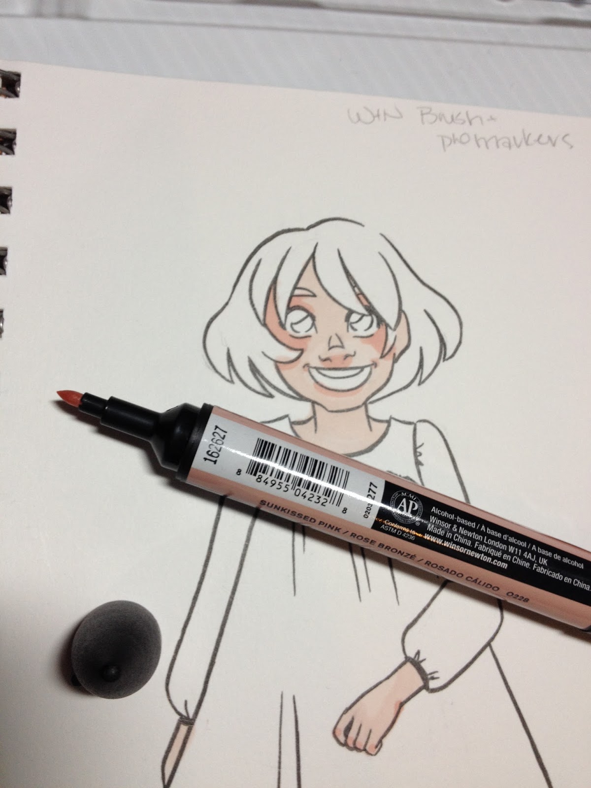
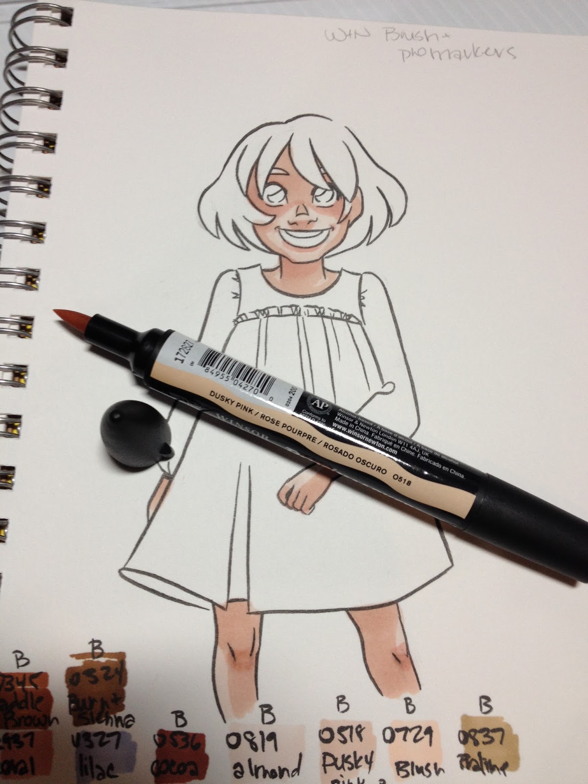
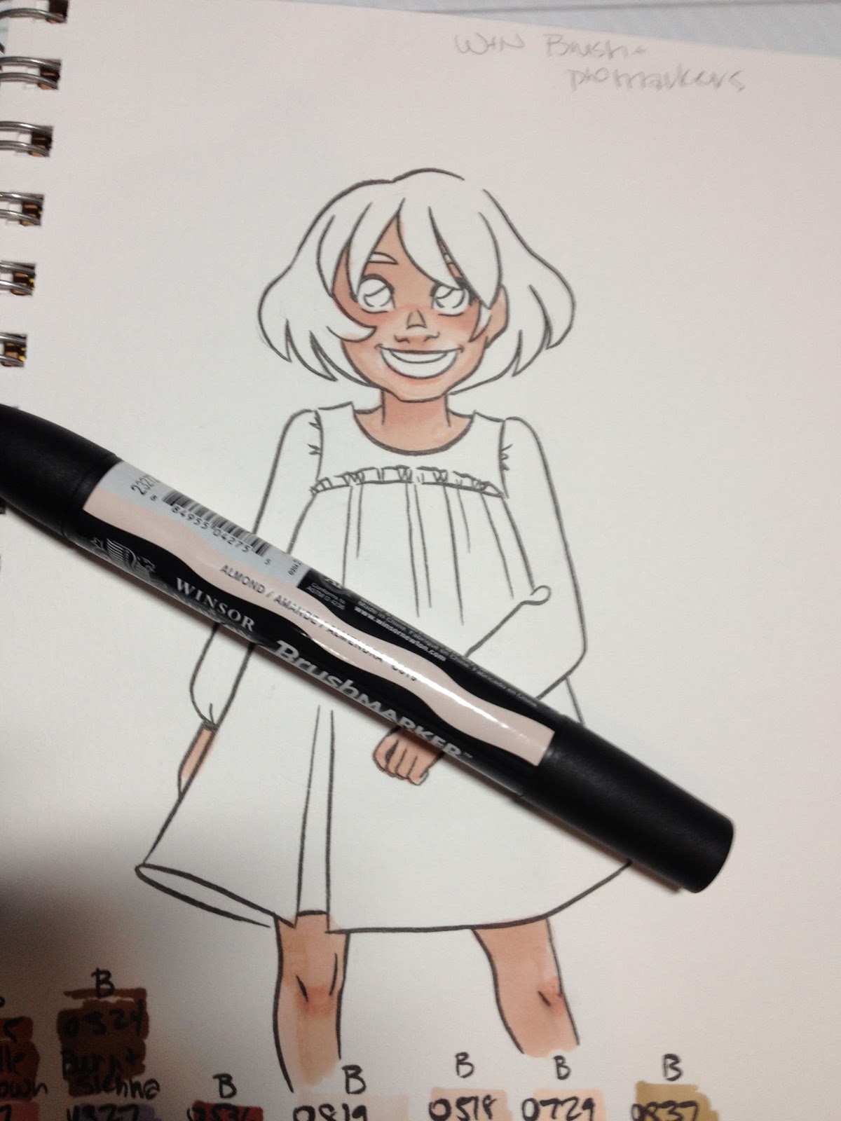
Although individual colors do layer decently well, there isn't enough difference in the included colors of the Skintone Set 1 for layered different colors to create enough contrast.
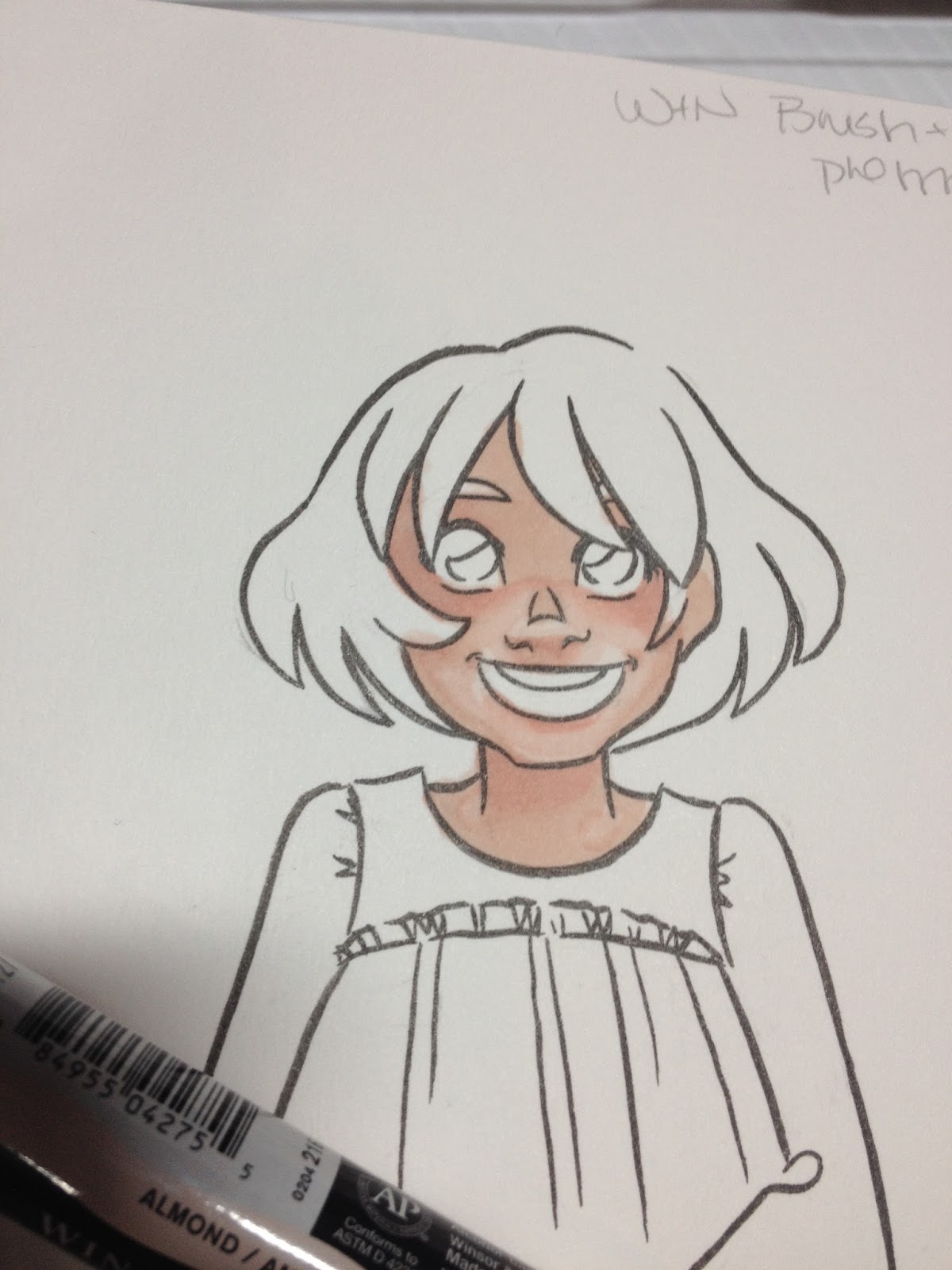
Blending out with the colorless blender pushes the ink so much that using it to lighten small areas is useless.

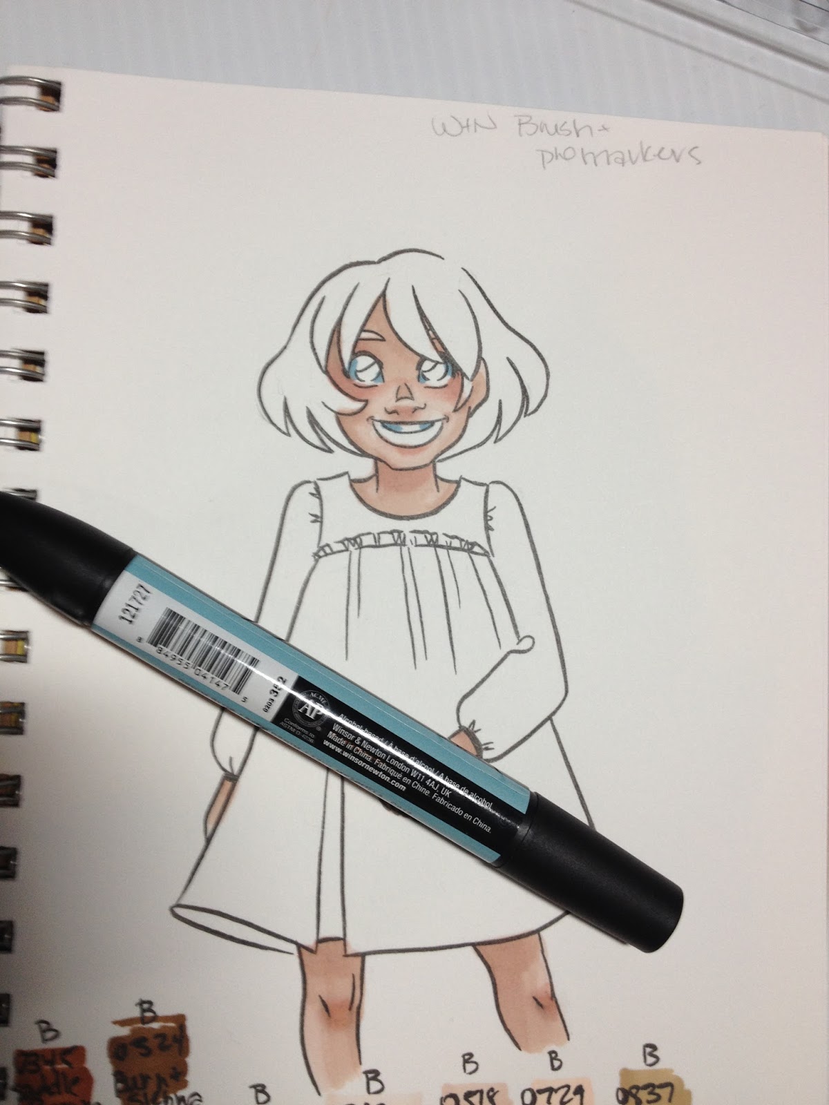
I used Denim Blue to try and apply shadow to the eyes and teeth, but it's much darker than the body implies.
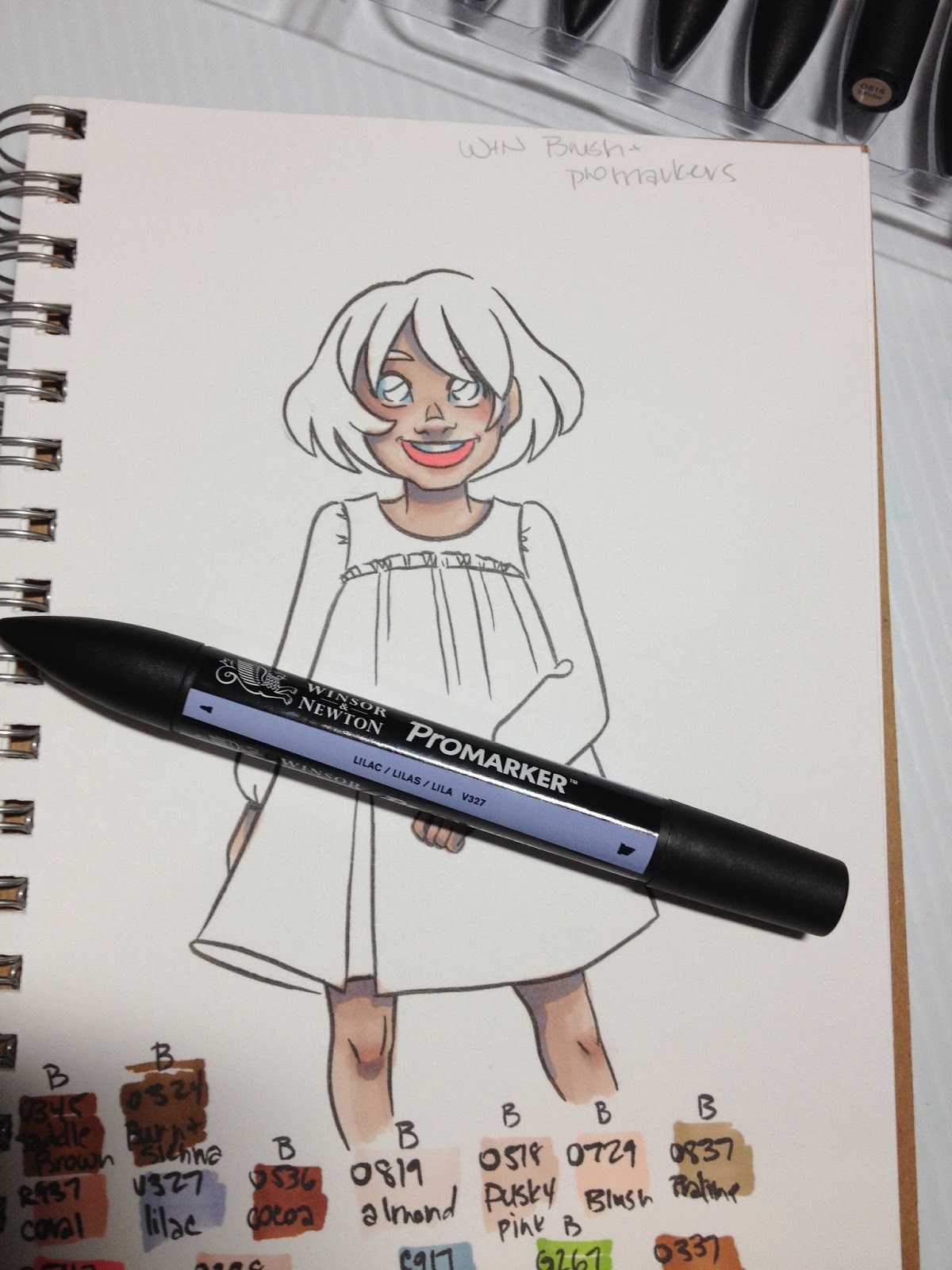
Lilac was also much too saturated and dark for this application, and I tried to blend it out using the skintones, which resulted in muddy looking skin. I'd neglected to grab a dark red for the interior of the mouth, so I resorted to Salmon Pink, which is a much hotter pink than expected from a salmon.

The addition of a skintone over Lilac results in a gray, rather than a more muted Lilac. These markers, while alcohol based, do not perform exactly like Copic markers, so if you're used to using Copics, the Winsor and Newton Brushmarkers and Promarkers may take getting used to.
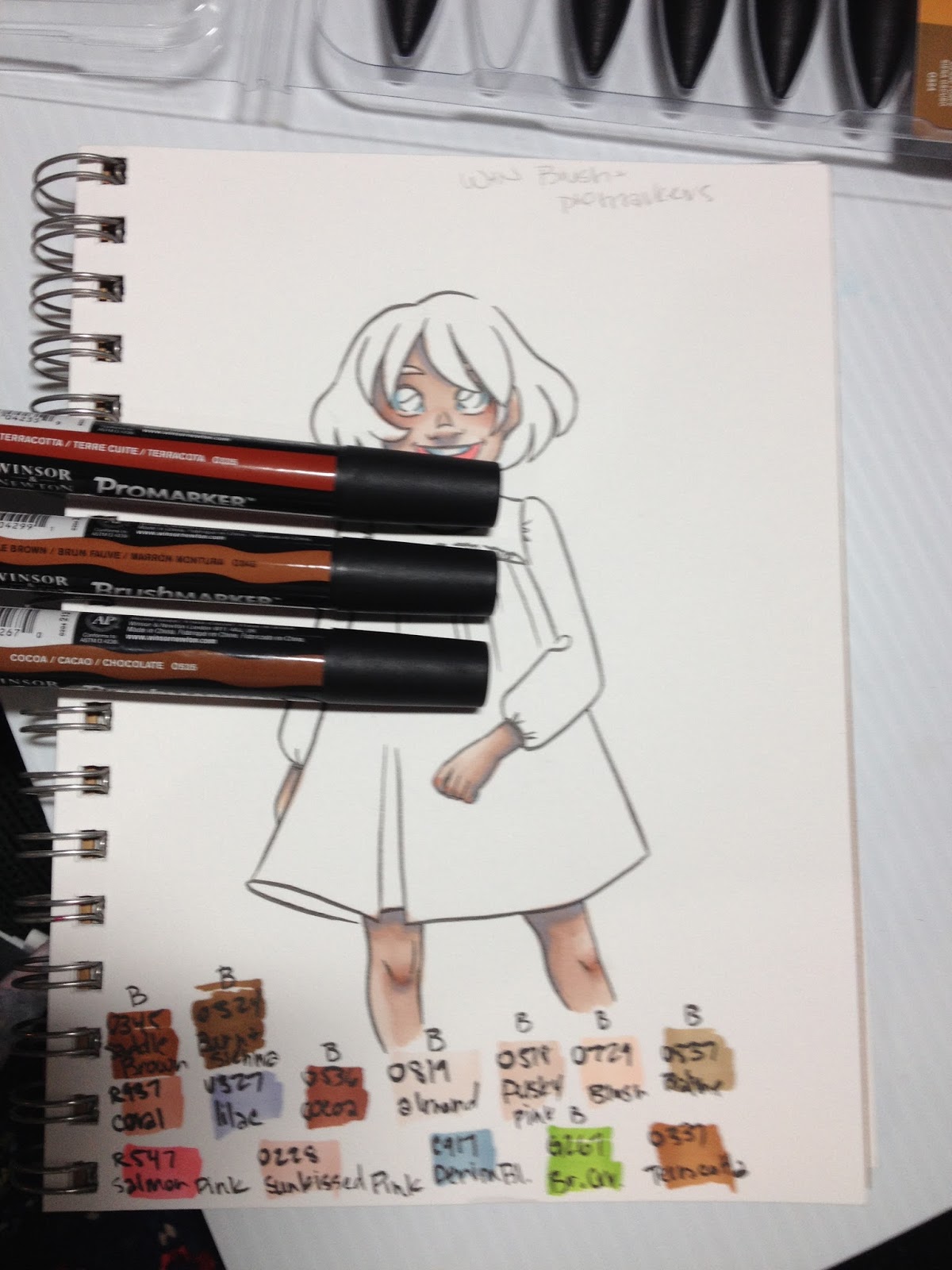
The skintone set came with a few browns that work for skintones as well as hair, but I also purchased a couple additional browns to extend my range a bit.
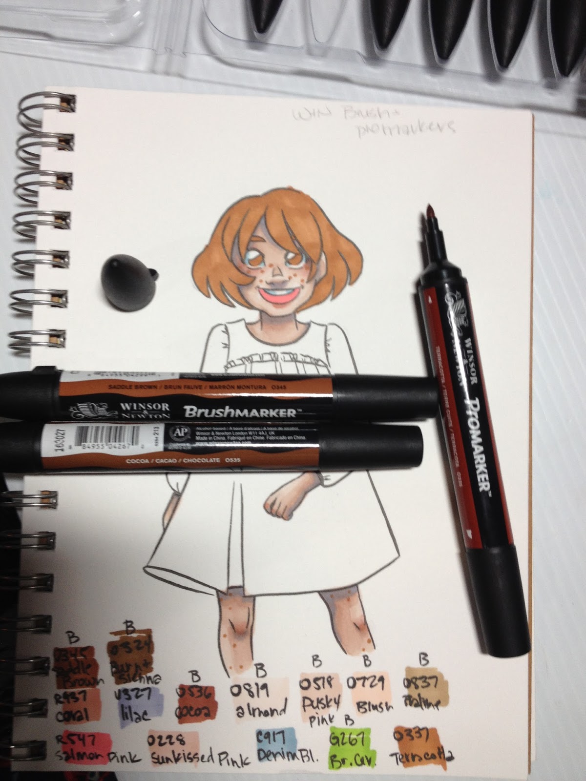
I colored the base of Kara's hair with Terracotta, and found the bullet nib on this Promarker to leave streaks that I would not see with a brush application. I also used Terracotta to apply freckles. Regardless of how light my hand was, the application was overly uniform and thus unrealistic in appearance, as the bullet nib only applied perfectly round dots.
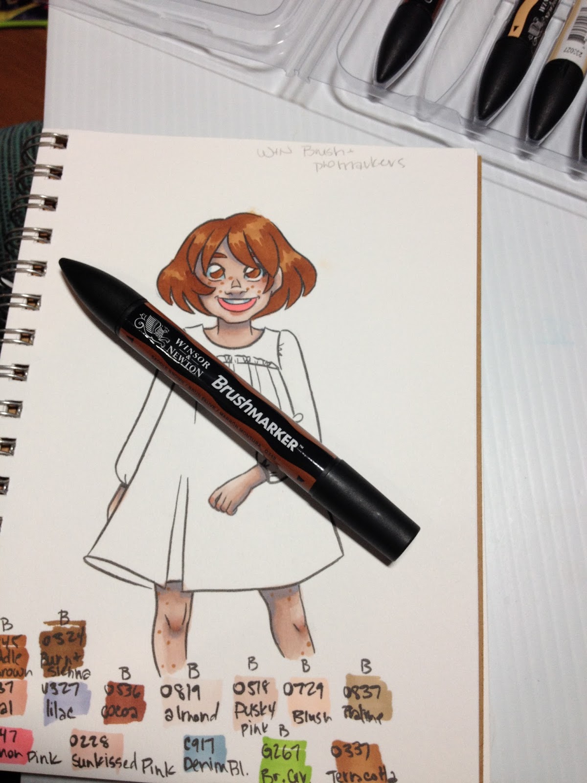
Fortunately these streaks were covered up as soon as I applied another layer of ink.
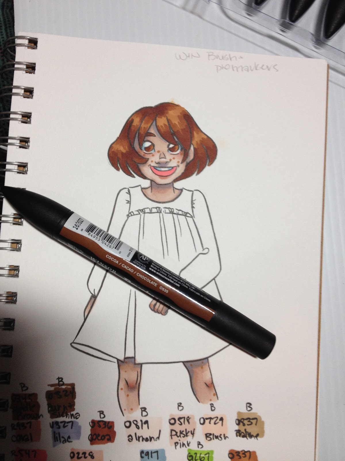

I generally dislike covering larger areas with a bullet nib, as they're very prone to streaking, so for Kara's dress, I used the chisel nib for my initial application. I found the chisel nib on this Promarker to be dry and streaky- generally unpleasant to use.
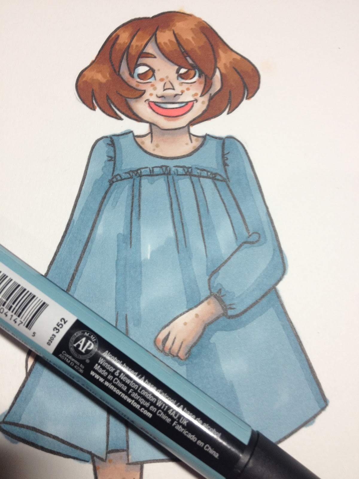
The second layer (shadows in the dress) was applied with the bullet nib, and I dislike how amateur the overall effect is. Rather than sharp edges or painterly effects, I'm left with a very blocky, streaky application.
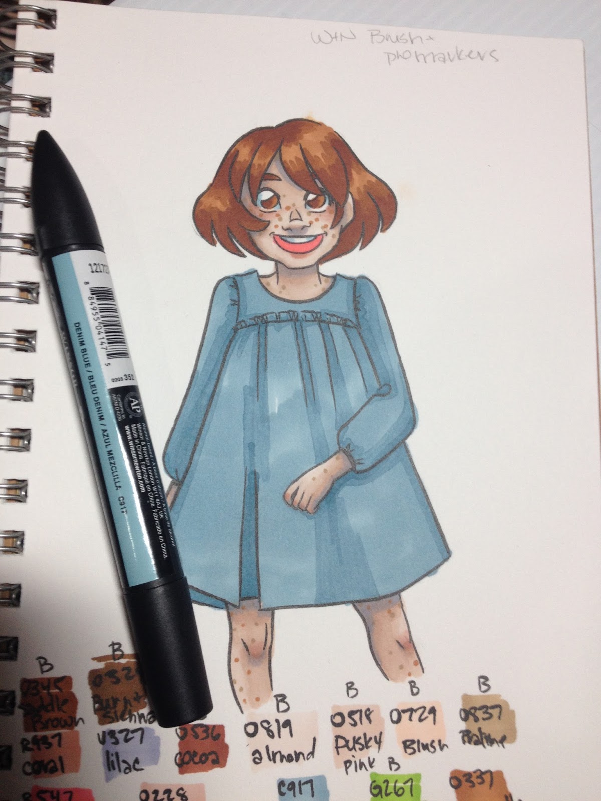
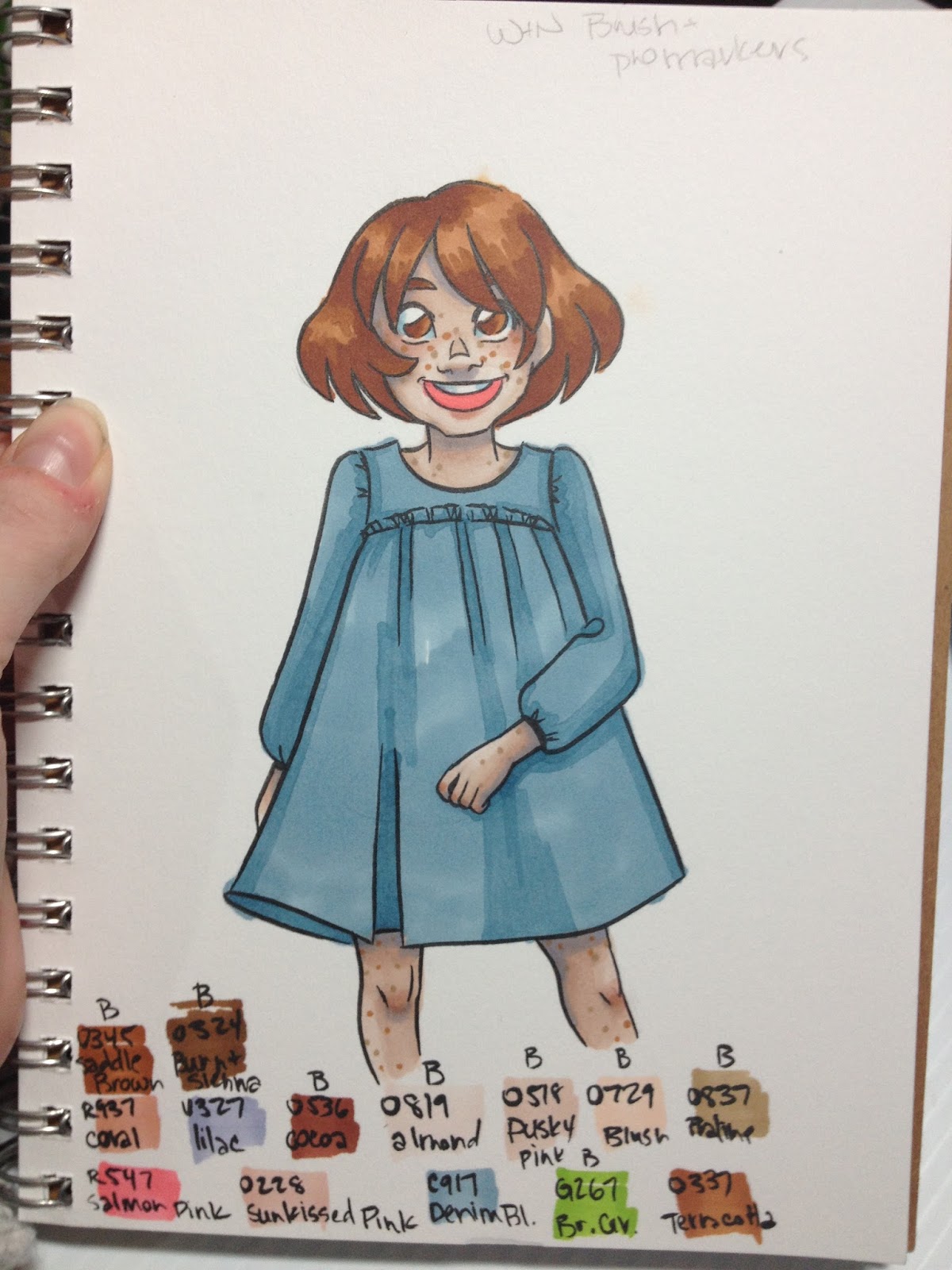
So far, based on the colors I currently own, I'm not particularly impressed by Winsor and Newton Promarkers or Brushmarkers, but I wanted to give them another field test to be positive. Since I'd purchased a skintone set that had a fairly wide skew in terms of colors included, I decided to render someone with a much darker skintone to see how these markers fared.
With many marker brands, darker skintones are where the color collection really starts to fall short. An artist's selection of browns may be limited based on the brand, or browns may trend towards being too saturated to use for natural skintones. I'd hoped that the Winsor and Newton Promarkers and Brushmarkers might be able to fill that gap.
Naomi
I opted to render Naomi, Kara's human friend, as she has dark brown skin and green eyes.
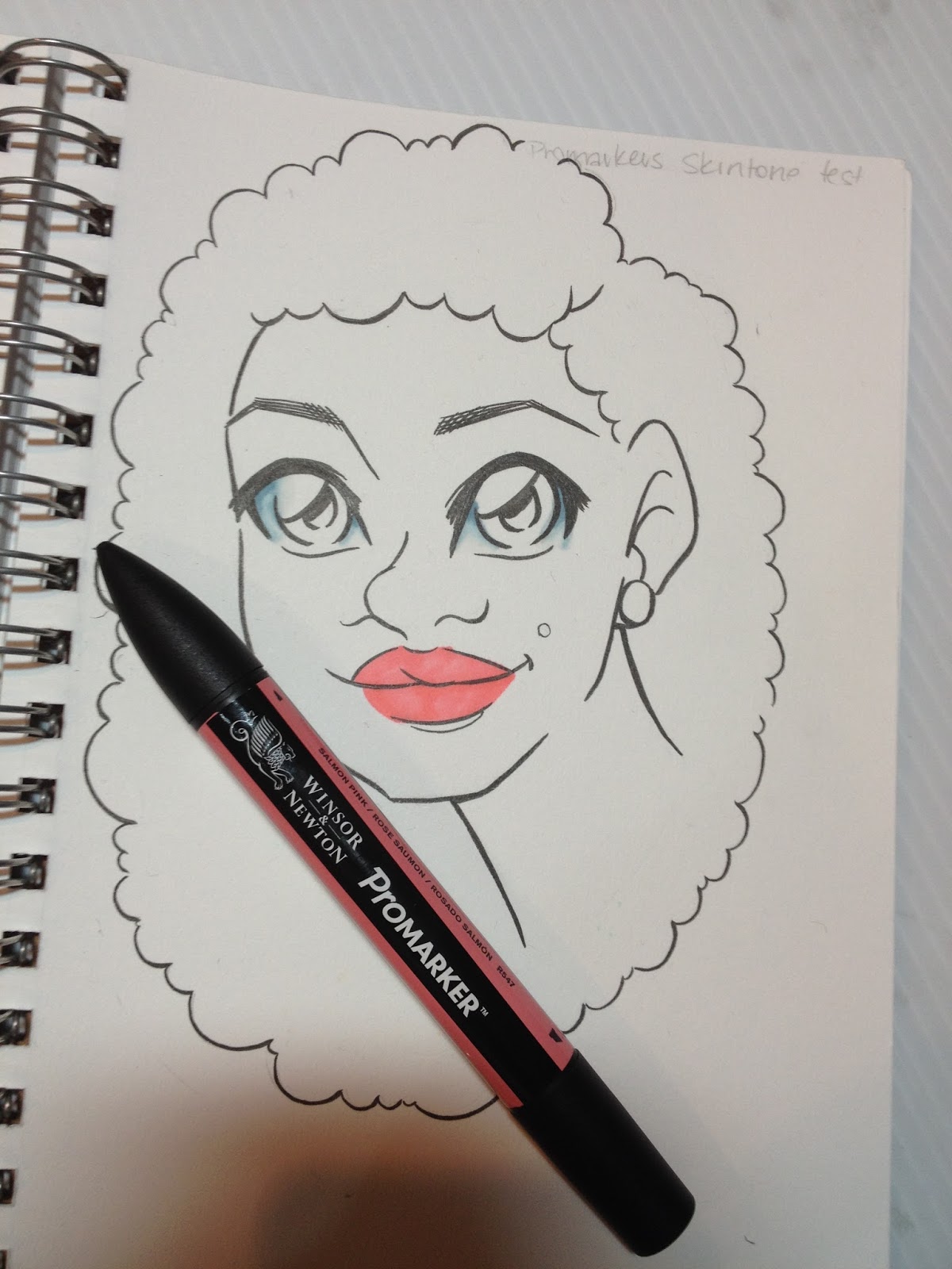
Since the colors I'd originally picked didn't entirely lend themselves to Naomi's color palette, I had to think on my feet and make some accommodations. I went ahead and applied the Salmon Pink to her lips early, as I didn't want it disrupting later applications of skintone.
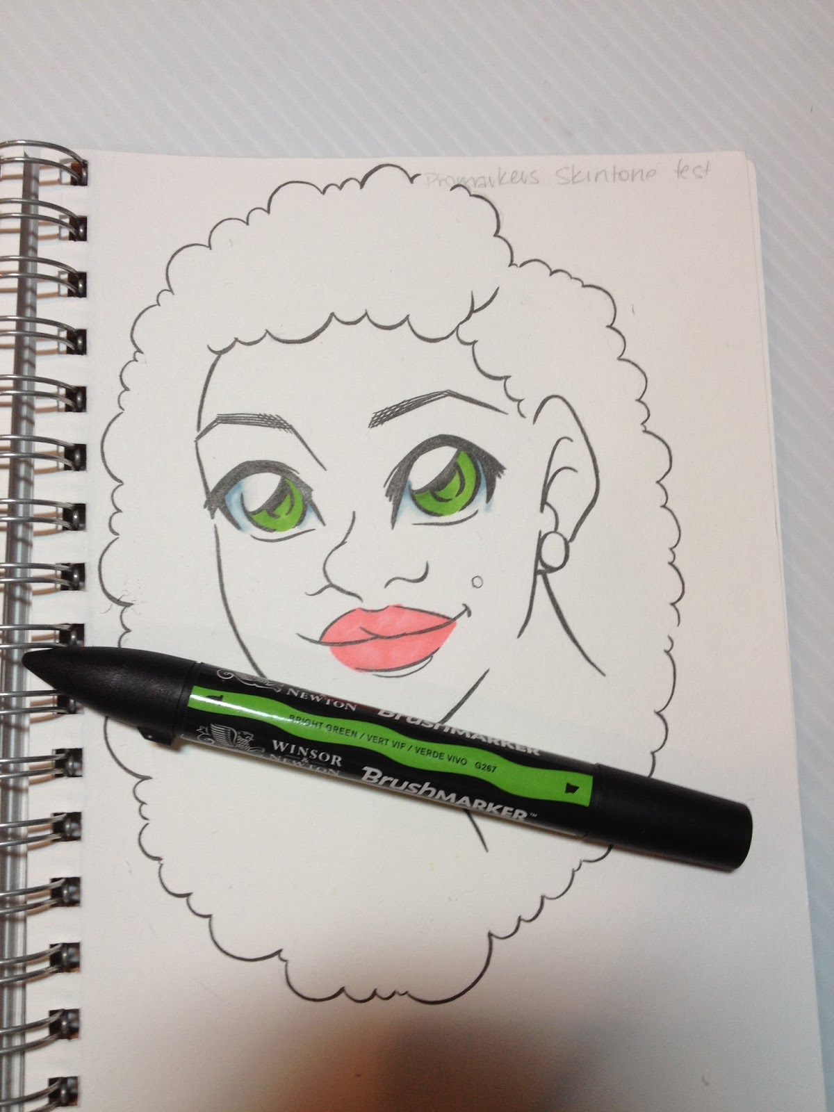
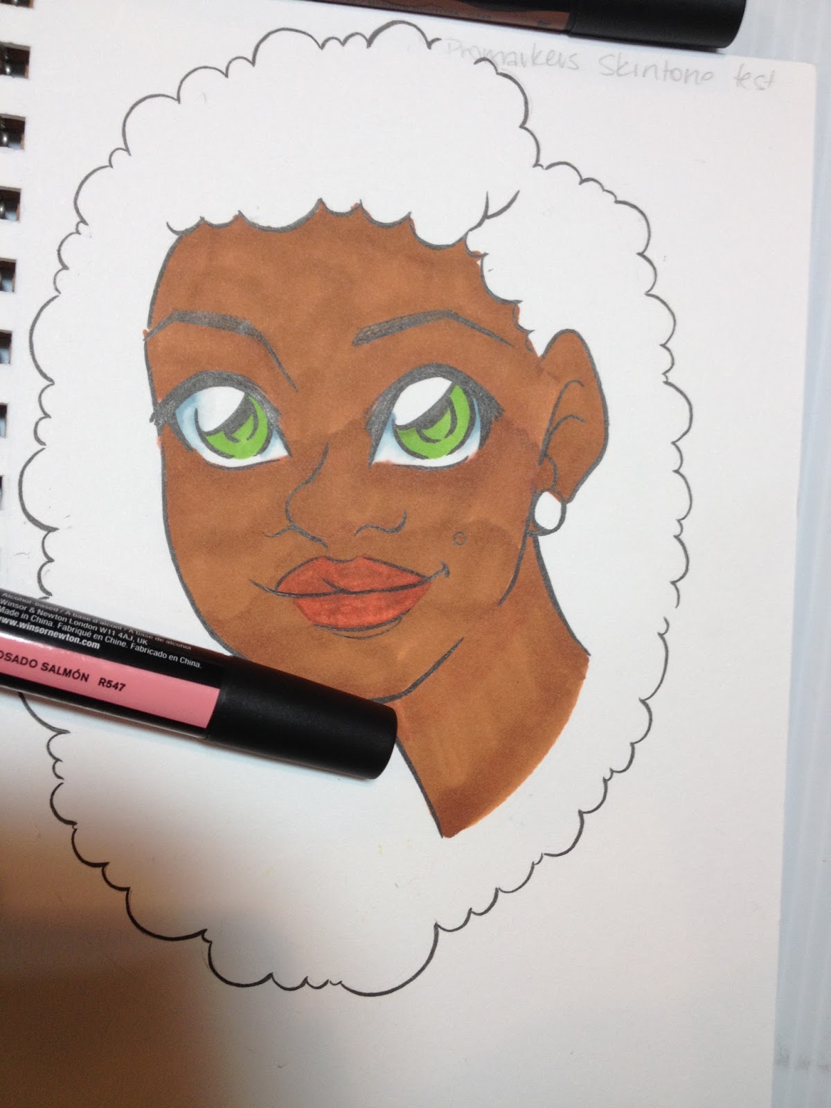 Unfortunately, application of the first brown was streaky, and disrupted the first layer of Salmon Pink, so the pink wasn't necessarily a good base to begin with. For darker skintones, I recommend richer, less saturated pinks, reds, and red violets for lips and cheeks.
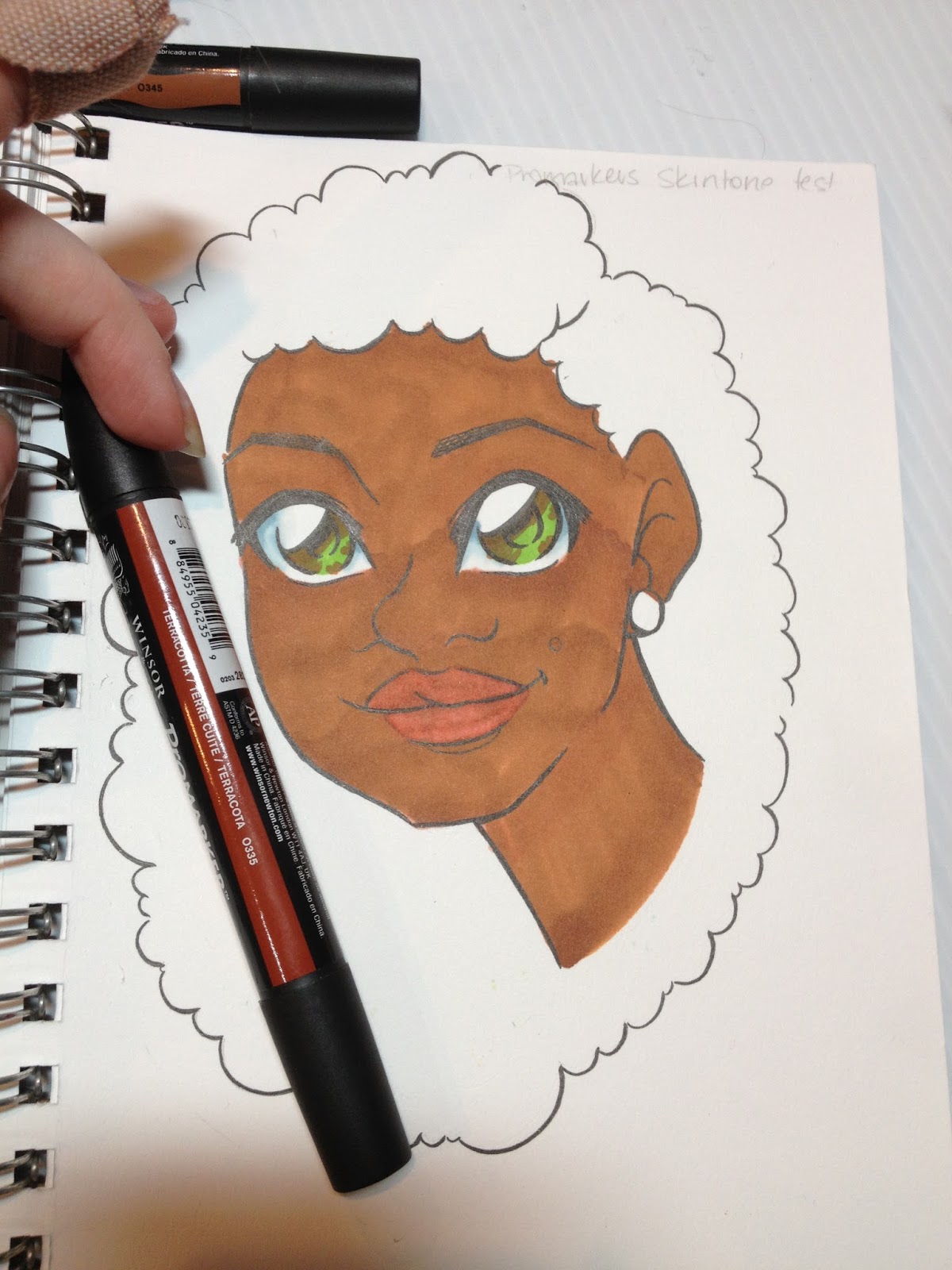
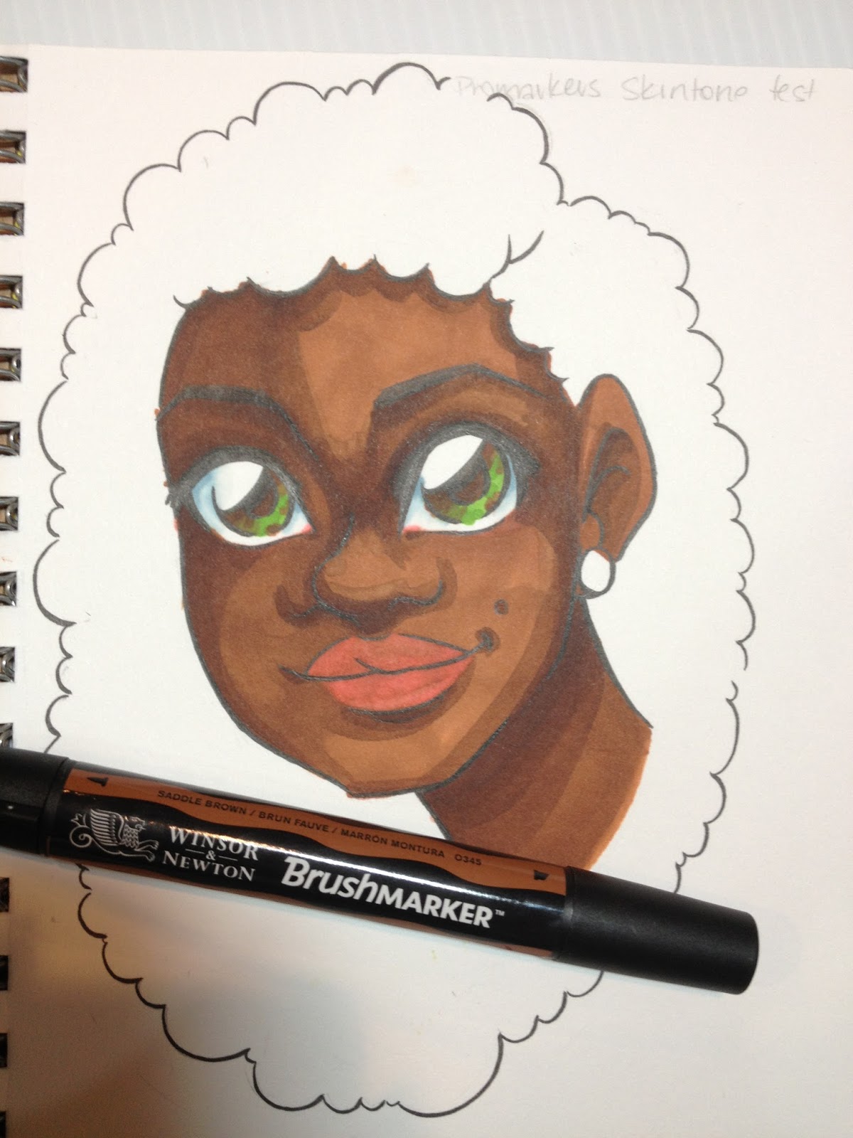
I ended up reapplying Salmon Pink for a more even lip, and applied a layer of the same to her cheeks, eyelids, chin, and the corner of her eyes before adding shadow to her face.


Rendering Naomi's hair was difficult, as the darkest brown included wasn't really dark enough, and it tended to get streaky and dry. I felt like I was really scrubbing the marker by the end of the test.
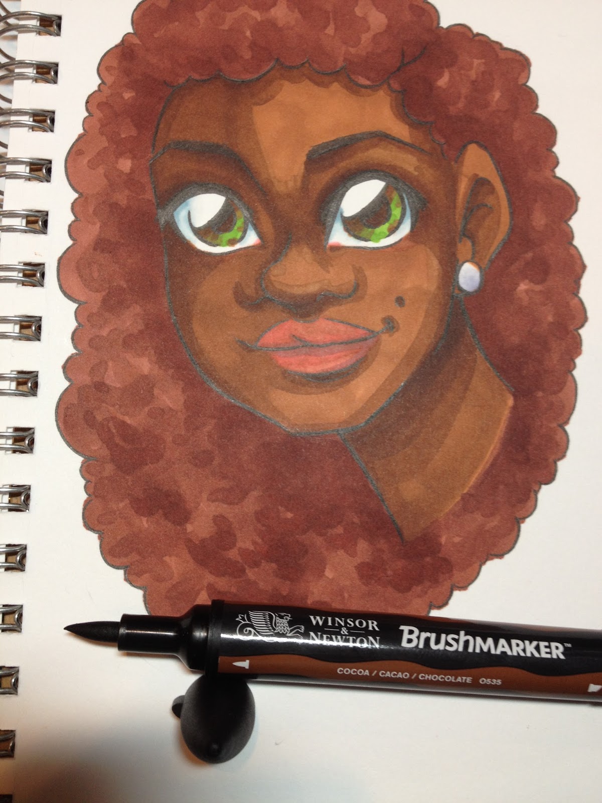
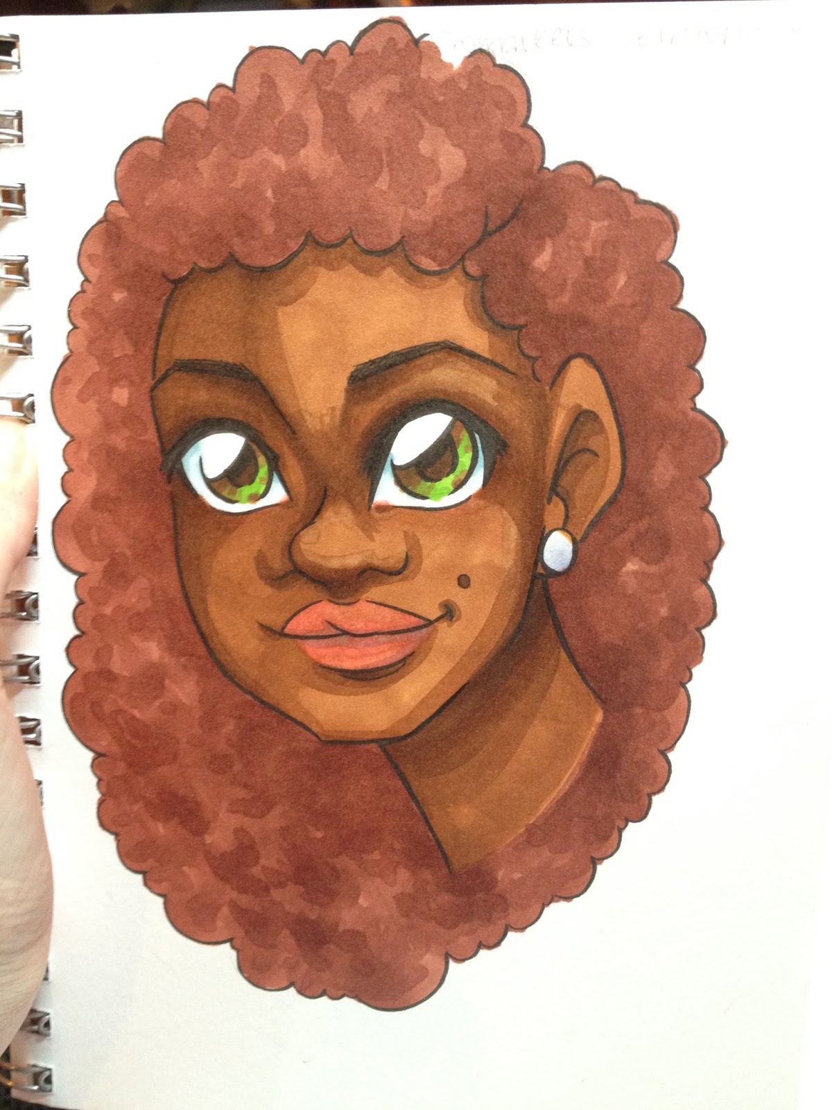
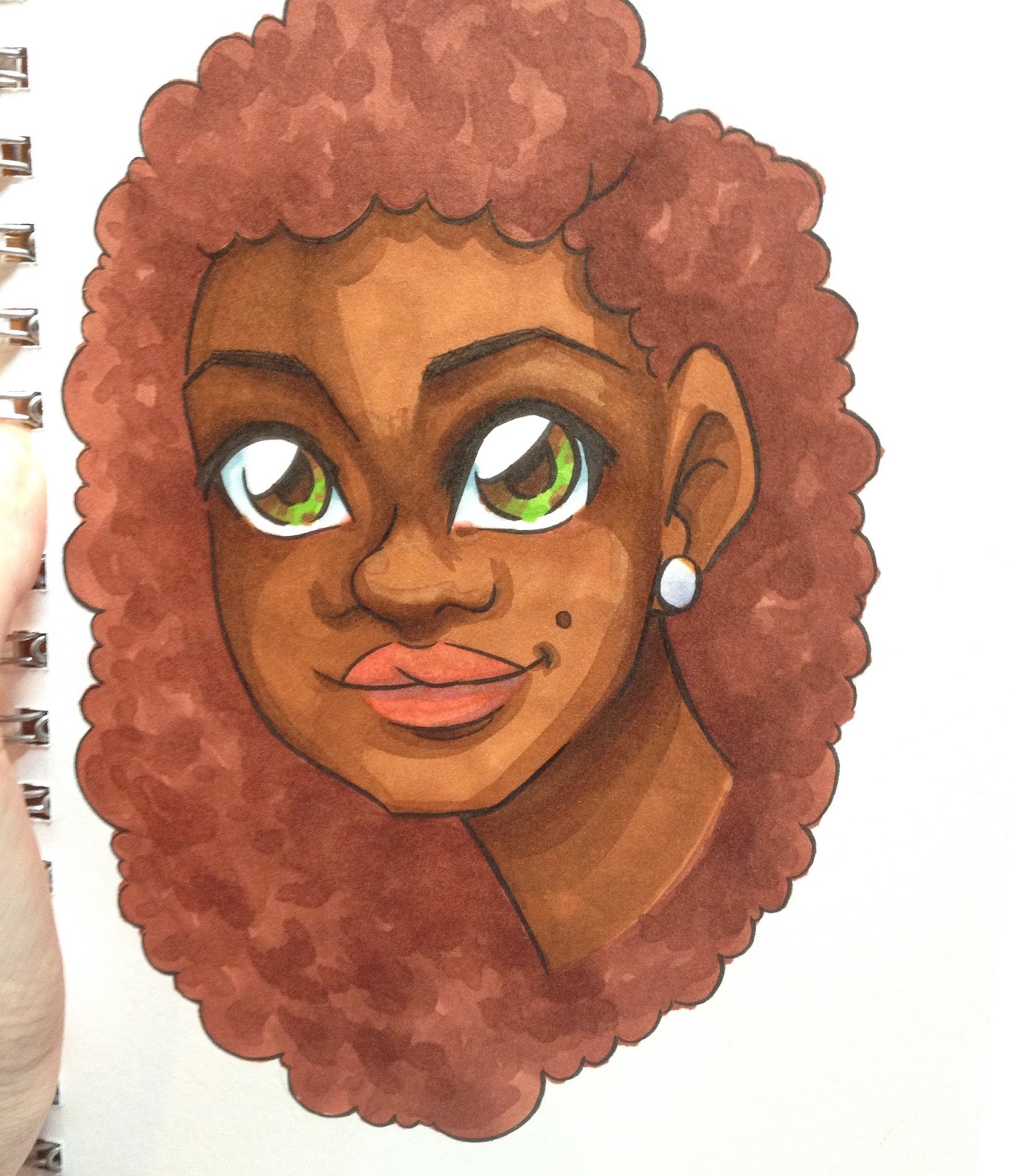
The Verdict
I found the 6 piece skintone set to be too limited to really be useful as a skintone starter set- you're going to be augmenting the collection a lot for it to work. Although the spread of tones included is wide, there aren't enough of any to really build up good contrast for any particular ethnicity, and there isn't a good blush or shading marker included.
Unfortunately, it's difficult for me to reach an outstanding overall verdict, as I'd like to continue to test their colors and see how they fit in my overall marker collection. As a standalone product, I found the inks to be prone to bleeding when applied with the bullet nib, prone to being overly dry and scratchy when applied with the chisel nib, and tend to layer poorly regardless of the nib. While these may be a fine addition to a larger marker collection, perhaps as a way to fill in holes in color families, I found these frustrating to use after years of using Copics.
Please consider donating to this blog or purchasing from Natto-shop (http://nattosoup.com/shop) if you want me to continue publishing quality content. All materials tested were purchased from my own pocket. Keep on Truckin' Nattosoup is not under any sponsorship.
February 5, 2016
Sketchbox Vs Art Snacks February 2016
Thanks to Denise Hillburn (my mother) for the gift of ArtSnacks for the year! SketchBox Basic subscription purchased by me out of personal funds. If you would like to help support this blog, and continue posts like this, please consider donating to my Paypal, or contributing to my Patreon. If you would like to see me review a SketchBox premium box, please consider gifting a subscription.
Since I STILL haven't gotten my Patreon up and running, this review is complimentary- from me as a gift to you guys. If you enjoy these reviews, and would like to help support this blog, leaving a comment, sharing to your social media, contacting companies on my behalf, or even donating are all ways you can really help me. If you REALLY want to do something nice, a gifted to Scrawlrbox, another art subscription service, would be fantastic, and I could offer three way reviews. Contacting Scrawlrbox on my behalf would also be a huge help.
These Sketchbox Vs. ArtSnacks reviews are created in a hurry- I want to make sure my unboxing videos, reviews, and challenges are online as fast as possible, so I can get as many hits as possible. This requires enormously speedy turnaround time- as soon as both boxes are in, I need to record the unboxing video, review and research the included products so I can explain them to my viewers and readers, come up with original material for TWO subscription box challenges, record that video, and have everything edited as soon as possible. On top of the Youtube side of things, I need to take photos, do research, and type everything up for the blog post. While it's a lot of work, I find it exciting and fun, although it's not the sort of challenge I'd feel up to on a regular basis.
These quickfire reviews put my drawing skills, years of art education, and decades of art experience to the test. If you enjoy my written reviews, I strongly urge you to please watch the video reviews as well, if you can. They include content not shown or covered on the blog. If you're interested in tutorials, then you definitely should check out my Youtube channel, because that's where they're going to be.
Previous SketchBox Vs. ArtSnacks
January- Winner: ArtSnacks
SketchBox Basic: $25mo/$240 yr (Monthly subs include an additional $5 for shipping)
ArtSnacks: $20mo/$200 yr (shipping included)
February Sketchbox Basic Includes
Set of 5 Irojiten colored pencils (light pastels)3 openstock Irojiten color pencilsTombow Mono Sand Eraser (missing from my box)Kum Wood Cutter dual hole pencil sharpener
February ArtSnacks Includes
Sample size of Stonehenge Kraft 100% Cotton paperWinsor and Newton Promarker (Berry Red)Sakura Gelly Roll (White)Zig Posterman waterbased marker (metallic light blue)
Sketchbox Vs ArtSnacks Comparison Unboxing
ArtSnacks
This Months Artsnacks Brands Are
Zig
Winsor and Newton
Sakura
Legion Paper
The Unboxing
Video
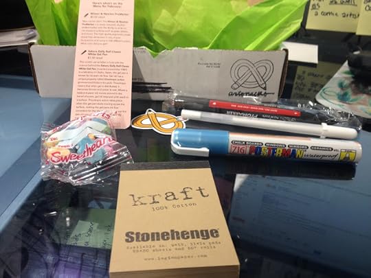


The Card Reads:
Grab the Monet and let's Gogh!
Here's what's on the Menu for February
Winsor and Newton ProMarker
$5.00 retail
New marker alert! The Winsor and Newton Promarker is a newly released, double-ended marker with the ability to write on ink-resistant surfaces such as glass, plastic, and wood. The high-quality pigments create streak-free dimension in any of your illustrations and come in 148 different colors. What color did you get?
Sakura Gelly Roll Classic White Gel Pen
$1.50 retail
This month, we've fallen in love with the science behind the Sakura Gelly Roll Classic White Gel Pen. Invented around the 1980's in a labratory (sic) in Osaka, Japan, the gel pen is known for its even ink flow. Gel ink has a unique property called thixotrophic action (pronounced thicks-o-tro-pick). Thixotropic means that when gel is distributed, it becomes thinner and easier to use. Where a ballpoint pens' (sic) ink moves around in the barrel of a pen, gel ink stays put until used on a surface. Thixotrophic action takes place when the gel pen starts moving across the surface, making the gel pen ink flow consistent for the life of the pen. Try out this pen on your Kraft Stonehenge Paper by Legion Paper
Kraft Stonehenge Paper by Legion Paper
$17.14 retail for 9"x12" pad
Staff Favorite Get ready for a super cool and unique paper: Kraft Stonehenge Paper by Legion Paper. Stonehenge paper is made of 100% cotton, right here in the United States. It gets the 'kraft' title from its high tear resistence (sic) and the smooth yellow-tan finish on each sheet. The best part about this paper? You can use it for everything from letterpress printing to pastel drawing.
ZIG Posterman Medium Bullet Tip Marker
$3.99 retail
Step outside of your coloring comfort zone with the Zig Posterman Medium Bullet Tip Marker. Whether you're creating Valentine's Day cards or quick doodles in your sketchbook, this marker has the look and feel of chalk without the mess of chalk dust. The bullet tip is perfect for creating details on a variety of surfaces. Shake the pen, and press down to get the ink flowing.
Take the ArtSnacks Challenge!
Use all of the products in your box to create an original piece of art. Snap a picture of your artwork and share it on Facebook, Twitter, Tumblr, or Instagram with the hashtag #artsnackschallenge
Editor's Notes
Promarkers aren't a new product- they were originally Letraset Promarkers, and were on the market for decades. When ColArts, Winsor and Newton's parent company, acquired Letraset, the product was moved onto Winsor and Newton's label. I think ArtSnacks may be confusing the Promarkers with Pigment Markers- both are now owned by Winsor and Newton, but only the Pigment Markers are actually use, and use pigment. Promarkers, as well as Brushmarkers, use dye based inks.
If you're interested in learning more about Promarkers, Brushmarkers, or Pigment Markers, make sure you keep checking back, because I have reviews for all three coming up in the next couple weeks!
ArtSnacks promises full size art supplies, and while the Stonehenge Kraft pad is absolutely adorable, it is A: A sample size, and B: Too small to actually test for letterpess, watercolor, marker illustration. I refuse to attribute the full size price to this sample, so I'm assuming it's worth approximately $4.00 retail. Perhaps it would have been better to include a rolled full size sheet in the box?
Zig Posterman markers are very similar to POSCA markers- both in the look, how they handle, and how they can be used. These are water soluble until they dry, so that can be used to your advantage as a blending technique. These don't handle anything like chalk- they're just opaque waterbased markers. There ARE chalk markers on the market that are dust free and easy to use, but the Posterman is not one of them, and should not be used in chalk applications.
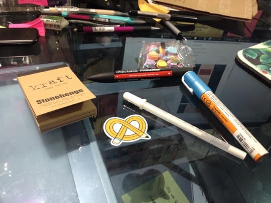

Testing out the products. The Stonehenge paper takes a surprising amount of water without buckling- it just bent a little. If this were a larger pad, simple bulldog clips would be the only things necessary to prevent the paper from buckling.
The Zig Posterman performs a lot like POSCA markers- it put out a lot of ink, which meant the ink stays wet a bit longer, making it easier to spread with water. When diluted with water, the Posterman ink gives a gentle shimmer. In general, the ink handles a lot like the Zig Wink of Luna I reviewed in last month's ArtSnacks.

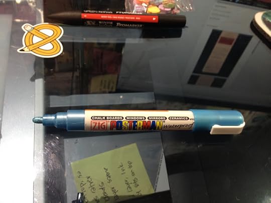
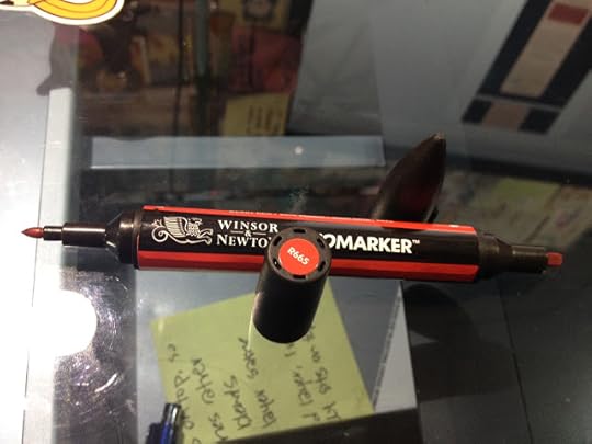
The Field Test
Artsnacks Challenge Video
I'd wanted to use everything that came in my February ArtSnacks box, but unfortunately the Stonehenge Kraft paper pad was too small for me to comfortably use. Instead, i opted to grab some Crescent Rendr Paper, a product I'm in the process of reviewing.

Inks were completed with my standard- the Sailor Mitsuo Aida brushpen. This double sided brushpen is alcohol and waterproof, and I use it for almost everything.

The products at the top right are those that came from my ArtSnacks, those at the bottom are ones I supplied myself. If you're interested in finding out how I created this piece, please watch the above video!
The Breakdown
Stonehenge Kraft Paper (sample size)- $4.00 (estimate)
Sakura White Gelly Roll- $1.40 (Jetpens)
Winsor and Newton Promarker- $4.19 openstock (Dick Blick), $2.75 from a set of 24 ($65.98 on DickBlick)
Zig Posterman- $2.62 (ZigPosterman.com)
Total Value
$10.81
My Thoughts
The February ArtSnacks seemed a bit light- only three full size products and one sample. The Posterman seems very similar to Uni's POSCA markers- water soluable until the ink dries, then permanent, same type of nib and pump action, even similar bodies. I don't mind though- I like POSCAs a lot, and a larger metallic is a welcome addition to my collection.
The inclusion of a Promarker wasn't that impressive-I personally prefer brush tips to bullet tips, and compared to the Brushmarkers I also used in my ArtSnacks Challenge (her skin and chocolates) the Promarker was very frustrating to use.
The Sakura Gelly Roll also failed to impress- a lot of other manga influenced comic artists love it, but I still prefer the Uni Signo white for performance. I still thought it was a nifty addition to the box, especially since the sample of paper was kraft colored.
Sketchbox
This month's Sketchbox brands are
Tombow
Kum
The Unboxing
Unboxing Video Here
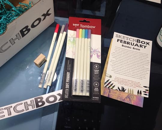
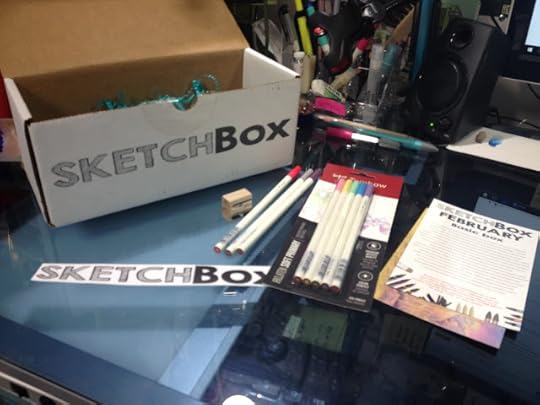


SketchBox FebruaryBasic Box
This month we're featuring colored pencils for all those who love to add color to their work. Inside this month's basic box you'll find a set of Irojiten colored pencils, a few extra Irojiten Pencils to round out the set, a Tombow Mono Sand Eraser, and a Kum double-holed wooden sharpener to keep you on point. "Irojiten" is Japanese for "color encyclopedia" and with these beautifully color crafted pencils, it's obvious why. These pencils spread evenly and cleanly over almost any paper. The outside is coated with an enamel finish and each color pencil is made from premium materials that won't break during use. These pencils are known the world over for their smooth delivery of color, unique pigments and tonal range.
We also included a premium Tomobow (sic) Mono sand eraser. Made from natural rubber latex and silica grit this eraser removes colored pencil and ink marks, including ballpoint, rollerball, and some marker. It's one tough eraser, perfect for this month's box.
Finally we included a dual hole Kum wooden sharpener to make sure you can make the most of your new colored pencils. We're really excited to see what you're going to make with this month's supplies- so don't forget to tag us with #SketchBoxFebruary on instagram to be considered for our monthly contest. If selected the winner will get their art printed on our box lids.
If you received SketchBox as a gift, and this is your last box- please sign up at www.getSketchBox.com to keep your boxes coming! Use coupon code "COMEBACK" to save 10% on your order.
Editors Notes
I was very excited to see the Irojiten pencils- these beautiful pencils have been on my wishlist for a long time, and I'd recently purchased a 30 color encyclopedia from Jerry's Artarama. Even better, there appears to be no duplicates between the set I'd purchased and the pencils that were sent to me.
I was less excited by the Kum pencil sharpener- don't get me wrong, I love the brand, and have used their stationary products for year, but I've gotten very spoiled by their magnesium pencil sharpeners, and a self contained pencil sharpener would've been nice.
My sand eraser wasn't in the box when I opened it, Contacted SketchBox upon their Instagram suggestion regarding the missing Tombow Mono Sand eraser, and they promised to send one out to me as soon as possible. They were polite and prompt, and I look forward to receiving my missing eraser. Unfortunately, I think this means SketchBox really needs to step up their quality control to make sure all boxes have the necessary parts.
The Art Card:
SketchBox February Featured ArtistHosio
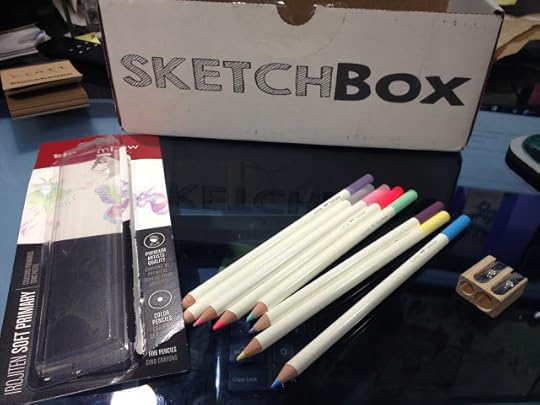
The Irojiten pencils weren't sharpened when I received them, which was fairly annoying, but it gave me an opportunity to put the Wood Cutter to work. There were a couple snappages in the sharpener- but I think it's more to due to the brittleness of the leads than a flaw in the sharpener.
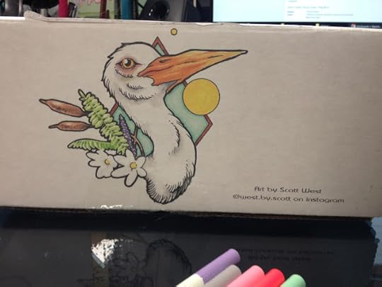
The box art is by Scott Werst, who was last month's box art as well.

The box reads:

These color pencils are absolutely beautiful- the enamel finish is super smooth and comfortable in the hand. They feel solid and well made.
The Field Test
Sketchbox Challenge Video here

I swatched all the colors sent to me on Strathmore 400 series Medium surface Color Pencil paper. In the above video, I talk about blending- pencil to pencil, using an alcohol based colorless blender, and using a color pencil blending marker. I thought the lead in these pencils was very hard, and a bit difficult to use, especially for blending or filling large areas.
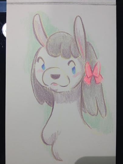
I haven't used color pencils as a primary medium for many years now, so I'm definitely out of practice. While I could have augmented this with my 30 piece Irojiten encyclopedia, I wanted to see what I could accomplish with just the colors sent by Sketchbox.
I found these colors difficult to layer- I had sketched with the light yellow, and it seemed to shine through regardless of how many layers I applied. I tried to blend a bit with the Artist Loft color pencil blender, and while it did tone done areas of applications, it's not really a true blender. I'm curious to know what solution is used inside, and if the wax content of the Irojiten might effect how well it works.
 The Strathmore Color Pencil sample pad is my own- it was picked up at Pla-Za's Hands on Creativity a few months ago, from a Strathmore rep. I figured this was a great time to break it in and see how I enjoyed the paper.
The Breakdown
Irojiten Soft Primary (5)- $11.00 (Jetpens)
Irojiten (openstock) (3) $2.42 (Dickblick- $7.26 total)
Kum Woodcutter- $2.55 (Utrecht)
Tombow Sand Eraser- $2.00 (Jetpens)
The Total
$22.81
SketchBox Premium (February) Review
Unboxing SketchBox Premium February 2016 in ASL
Includes:
Tin of Prismacolor pencils $10.06 (DickBlick)
Sketchbox Signature Marker (2)- For price, I'll compare these with Blick's Studio Brush Markers- $2.29 each (DickBlick $4.58)
Kum Wood Cutter Pencil Sharpener- $2.55 (Utrecht)
Tombow Mono Sand Eraser- $2.00 (Jetpens)
The Total (Premium Box)
$19.19
It's difficult to find information about Sketchbox's Signature markers. They've been around for awhile, and you can get a glimpse at a three pack in this unboxing video from January. Although the SketchBox site has a shop, these markers aren't listed, so I'm not sure how I'll be able to get my hands on some for review purposes. These are alcohol based markers, and appear to be twin tipped, and the bodies look like a white version of Shin Han's old marker body. It seems like the Signature markers are chisel and bullet nibbed (whyyyy). I have a premium box coming in March, so if I receive any of their markers, I'll be sure to write about them here.
My Thoughts
How on earth does SketchBox justify having the contents of the Basic Box be of higher value than the Premium Box two months in a row? As an artist who's very familiar with Prismacolor Pencils, they're pretty much the baseline for 'good' color pencils in the US- not really the stuff of subscription boxes. Yes, you do get MORE color pencils in the Premium Box, but the 5 piece Soft Primary set alone costs more than the 12 piece Prismacolor set, and is less well known. And why did SketchBox include their own branded markers (which I can find NO information about at this time, and I'm incredibly curious about them) in a color pencil box? A colorless alcohol blending marker I could understand- I used a Prismacolor colorless blender in my own review for the box, but from the videos and photos I've seen, they seem to be colored markers.
The Winner- SketchBox
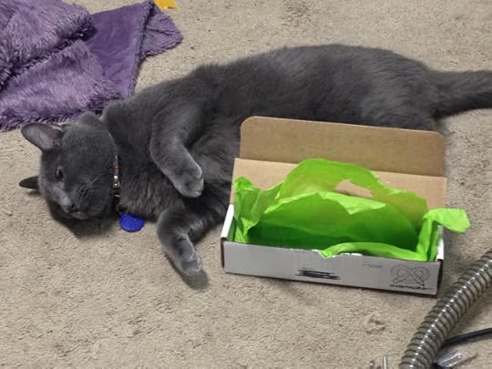
 Voting is entirely done by allowing my cat to choose the filler he finds tastiest. Clearly SketchBox won.
I'd really like to say that BOTH subscription services lost this month- neither one were worth their subscription price (Artsnacks- $20, Sketchbox- $25+$5), and ArtSnacks broke their word regarding full size products by including a sample. If the sample had been a bonus, that would be one thing, but they expect us to count this as part of the overall total. Even with the sample, ArtSnacks was well below my target of $20 value, and SketchBox didn't fare much better.
In the end, I'm going to award the title of February Winner to SketchBox, mostly because Irojiten pencils are novel in the US, beautifully designed, and the box was more coherent than this month's ArtSnacks.
I'd thought ArtSnacks had really upped the quality of their boxes in the year I'd stopped reviewing them, but it seems like we're back to the status quo. This box was anemic at best, with the Stonehenge Kraft sample and the Zig Posterman being the standout items.
This month's SketchBox could have had some real potential, with a little research. I mentioned some additional products that could've been included in my video overviews- Gamsol, a mineral spirit used for blending color pencils, some blending and burnishing pencils (there's a difference), sample color pencil papers (including maybe a pastel paper with a bit of tooth), and an alcohol marker for blending. The Basic Box sadly seems more coherent than the Premium Box, which is Premium in title only- the contents seem very mundane for any experienced artist or art supply aficionado.
If you're using my opinion to determine whether or not to subscribe to these boxes, you need to keep a couple things in mind. 1. I review art supplies, on here and on Youtube, ALL THE TIME. I see a lot of things, so I prize novelty. 2. Art subscription boxes are not a good way to fill out your studio, you should take that money and spend it curating your collection. Blind boxes are just that-blind- and you are liable to receive supplies you'll never use (like me with acrylics/oil painting supplies). 3. Art subscription boxes are a luxury- they're expensive, they send non-essentials, they provide no art instruction, so if you're broke, art subscription services are a poor choice to spend your money on.
At the risk of sounding like a broken record, I feel like if you are asking me whether or not you should buy either service, you should also consider putting that money towards financially supporting artists who have taught you, who continue to teach you, and who inspire you. Especially if those artists put out 'free' content. I know it's probably not as exciting as getting a box of supplies in the mail, but the investment is still worthwhile- you're rewarding these creators for making content that has benefited you.
In the end, it's still difficult for me to recommend an art subscription service- perhaps if they hired an artist a month to demonstrate the materials and teach a series of small tutorials these services would be more worthwhile.
Please consider donating to this blog or purchasing from Natto-shop (http://nattosoup.com/shop) if you want me to continue publishing quality content. All materials tested were purchased from my own pocket. Keep on Truckin' Nattosoup is not under any sponsorship.
Since I STILL haven't gotten my Patreon up and running, this review is complimentary- from me as a gift to you guys. If you enjoy these reviews, and would like to help support this blog, leaving a comment, sharing to your social media, contacting companies on my behalf, or even donating are all ways you can really help me. If you REALLY want to do something nice, a gifted to Scrawlrbox, another art subscription service, would be fantastic, and I could offer three way reviews. Contacting Scrawlrbox on my behalf would also be a huge help.
These Sketchbox Vs. ArtSnacks reviews are created in a hurry- I want to make sure my unboxing videos, reviews, and challenges are online as fast as possible, so I can get as many hits as possible. This requires enormously speedy turnaround time- as soon as both boxes are in, I need to record the unboxing video, review and research the included products so I can explain them to my viewers and readers, come up with original material for TWO subscription box challenges, record that video, and have everything edited as soon as possible. On top of the Youtube side of things, I need to take photos, do research, and type everything up for the blog post. While it's a lot of work, I find it exciting and fun, although it's not the sort of challenge I'd feel up to on a regular basis.
These quickfire reviews put my drawing skills, years of art education, and decades of art experience to the test. If you enjoy my written reviews, I strongly urge you to please watch the video reviews as well, if you can. They include content not shown or covered on the blog. If you're interested in tutorials, then you definitely should check out my Youtube channel, because that's where they're going to be.
Previous SketchBox Vs. ArtSnacks
January- Winner: ArtSnacks
SketchBox Basic: $25mo/$240 yr (Monthly subs include an additional $5 for shipping)
ArtSnacks: $20mo/$200 yr (shipping included)
February Sketchbox Basic Includes
Set of 5 Irojiten colored pencils (light pastels)3 openstock Irojiten color pencilsTombow Mono Sand Eraser (missing from my box)Kum Wood Cutter dual hole pencil sharpener
February ArtSnacks Includes
Sample size of Stonehenge Kraft 100% Cotton paperWinsor and Newton Promarker (Berry Red)Sakura Gelly Roll (White)Zig Posterman waterbased marker (metallic light blue)
Sketchbox Vs ArtSnacks Comparison Unboxing
ArtSnacks
This Months Artsnacks Brands Are
Zig
Winsor and Newton
Sakura
Legion Paper
The Unboxing
Video


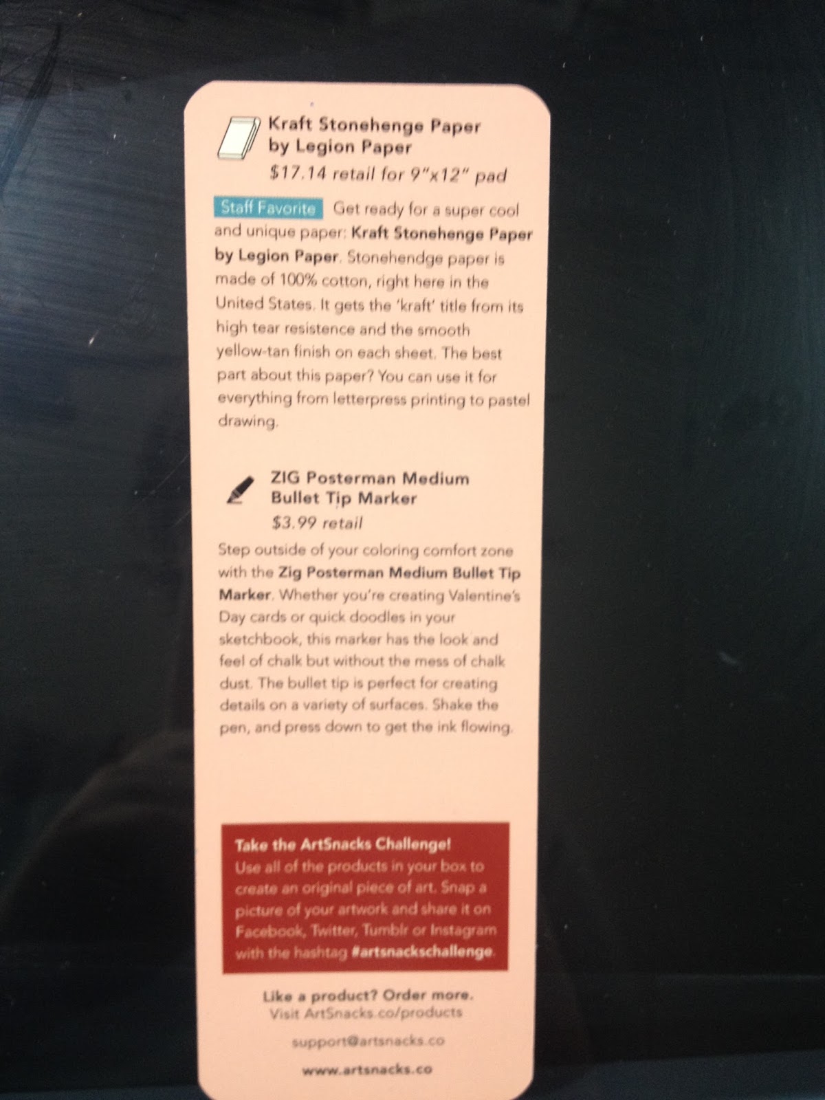
The Card Reads:
Grab the Monet and let's Gogh!
Here's what's on the Menu for February
Winsor and Newton ProMarker
$5.00 retail
New marker alert! The Winsor and Newton Promarker is a newly released, double-ended marker with the ability to write on ink-resistant surfaces such as glass, plastic, and wood. The high-quality pigments create streak-free dimension in any of your illustrations and come in 148 different colors. What color did you get?
Sakura Gelly Roll Classic White Gel Pen
$1.50 retail
This month, we've fallen in love with the science behind the Sakura Gelly Roll Classic White Gel Pen. Invented around the 1980's in a labratory (sic) in Osaka, Japan, the gel pen is known for its even ink flow. Gel ink has a unique property called thixotrophic action (pronounced thicks-o-tro-pick). Thixotropic means that when gel is distributed, it becomes thinner and easier to use. Where a ballpoint pens' (sic) ink moves around in the barrel of a pen, gel ink stays put until used on a surface. Thixotrophic action takes place when the gel pen starts moving across the surface, making the gel pen ink flow consistent for the life of the pen. Try out this pen on your Kraft Stonehenge Paper by Legion Paper
Kraft Stonehenge Paper by Legion Paper
$17.14 retail for 9"x12" pad
Staff Favorite Get ready for a super cool and unique paper: Kraft Stonehenge Paper by Legion Paper. Stonehenge paper is made of 100% cotton, right here in the United States. It gets the 'kraft' title from its high tear resistence (sic) and the smooth yellow-tan finish on each sheet. The best part about this paper? You can use it for everything from letterpress printing to pastel drawing.
ZIG Posterman Medium Bullet Tip Marker
$3.99 retail
Step outside of your coloring comfort zone with the Zig Posterman Medium Bullet Tip Marker. Whether you're creating Valentine's Day cards or quick doodles in your sketchbook, this marker has the look and feel of chalk without the mess of chalk dust. The bullet tip is perfect for creating details on a variety of surfaces. Shake the pen, and press down to get the ink flowing.
Take the ArtSnacks Challenge!
Use all of the products in your box to create an original piece of art. Snap a picture of your artwork and share it on Facebook, Twitter, Tumblr, or Instagram with the hashtag #artsnackschallenge
Editor's Notes
Promarkers aren't a new product- they were originally Letraset Promarkers, and were on the market for decades. When ColArts, Winsor and Newton's parent company, acquired Letraset, the product was moved onto Winsor and Newton's label. I think ArtSnacks may be confusing the Promarkers with Pigment Markers- both are now owned by Winsor and Newton, but only the Pigment Markers are actually use, and use pigment. Promarkers, as well as Brushmarkers, use dye based inks.
If you're interested in learning more about Promarkers, Brushmarkers, or Pigment Markers, make sure you keep checking back, because I have reviews for all three coming up in the next couple weeks!
ArtSnacks promises full size art supplies, and while the Stonehenge Kraft pad is absolutely adorable, it is A: A sample size, and B: Too small to actually test for letterpess, watercolor, marker illustration. I refuse to attribute the full size price to this sample, so I'm assuming it's worth approximately $4.00 retail. Perhaps it would have been better to include a rolled full size sheet in the box?
Zig Posterman markers are very similar to POSCA markers- both in the look, how they handle, and how they can be used. These are water soluble until they dry, so that can be used to your advantage as a blending technique. These don't handle anything like chalk- they're just opaque waterbased markers. There ARE chalk markers on the market that are dust free and easy to use, but the Posterman is not one of them, and should not be used in chalk applications.

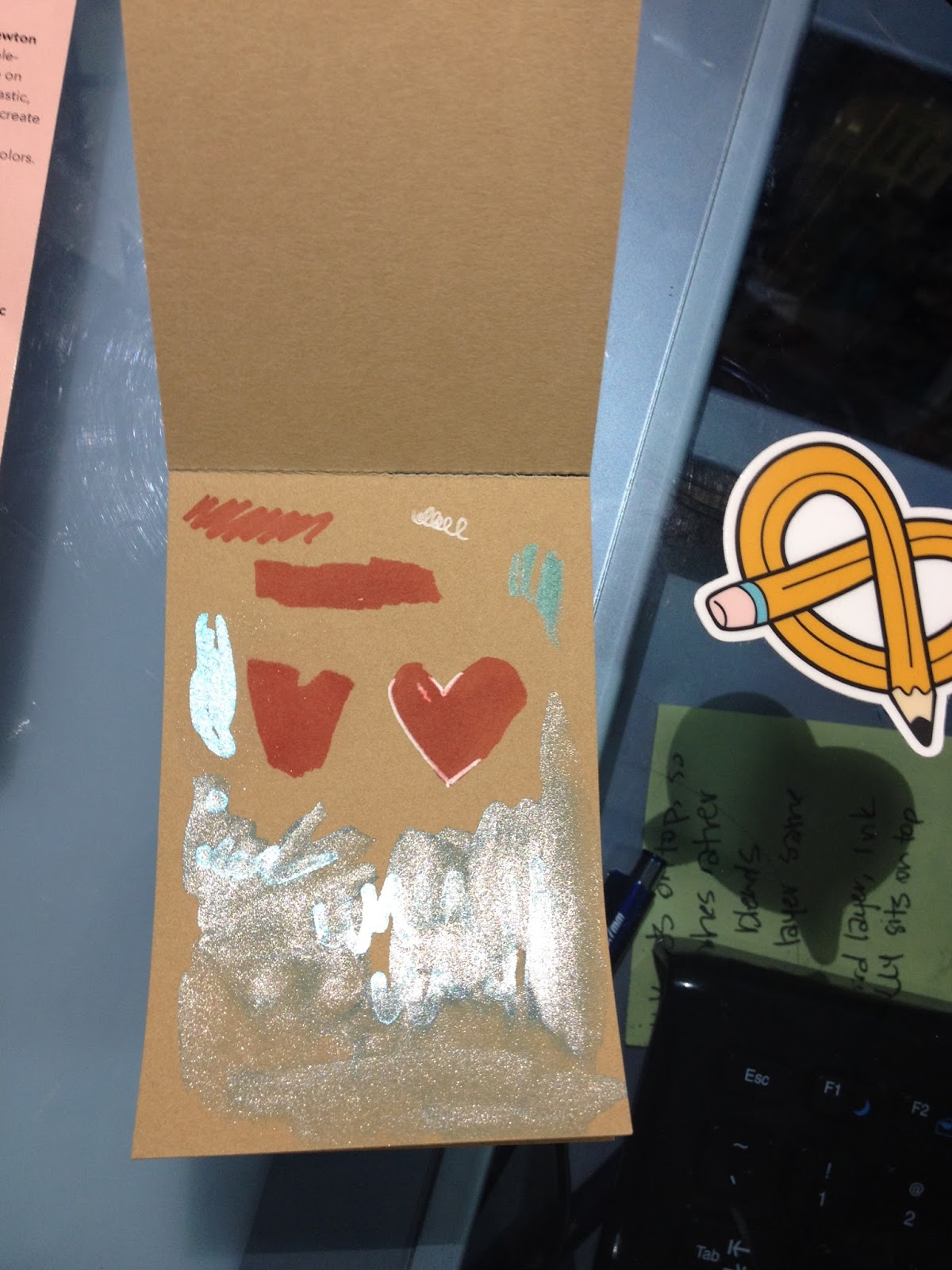
Testing out the products. The Stonehenge paper takes a surprising amount of water without buckling- it just bent a little. If this were a larger pad, simple bulldog clips would be the only things necessary to prevent the paper from buckling.
The Zig Posterman performs a lot like POSCA markers- it put out a lot of ink, which meant the ink stays wet a bit longer, making it easier to spread with water. When diluted with water, the Posterman ink gives a gentle shimmer. In general, the ink handles a lot like the Zig Wink of Luna I reviewed in last month's ArtSnacks.

The Field Test
Artsnacks Challenge Video
I'd wanted to use everything that came in my February ArtSnacks box, but unfortunately the Stonehenge Kraft paper pad was too small for me to comfortably use. Instead, i opted to grab some Crescent Rendr Paper, a product I'm in the process of reviewing.

Inks were completed with my standard- the Sailor Mitsuo Aida brushpen. This double sided brushpen is alcohol and waterproof, and I use it for almost everything.
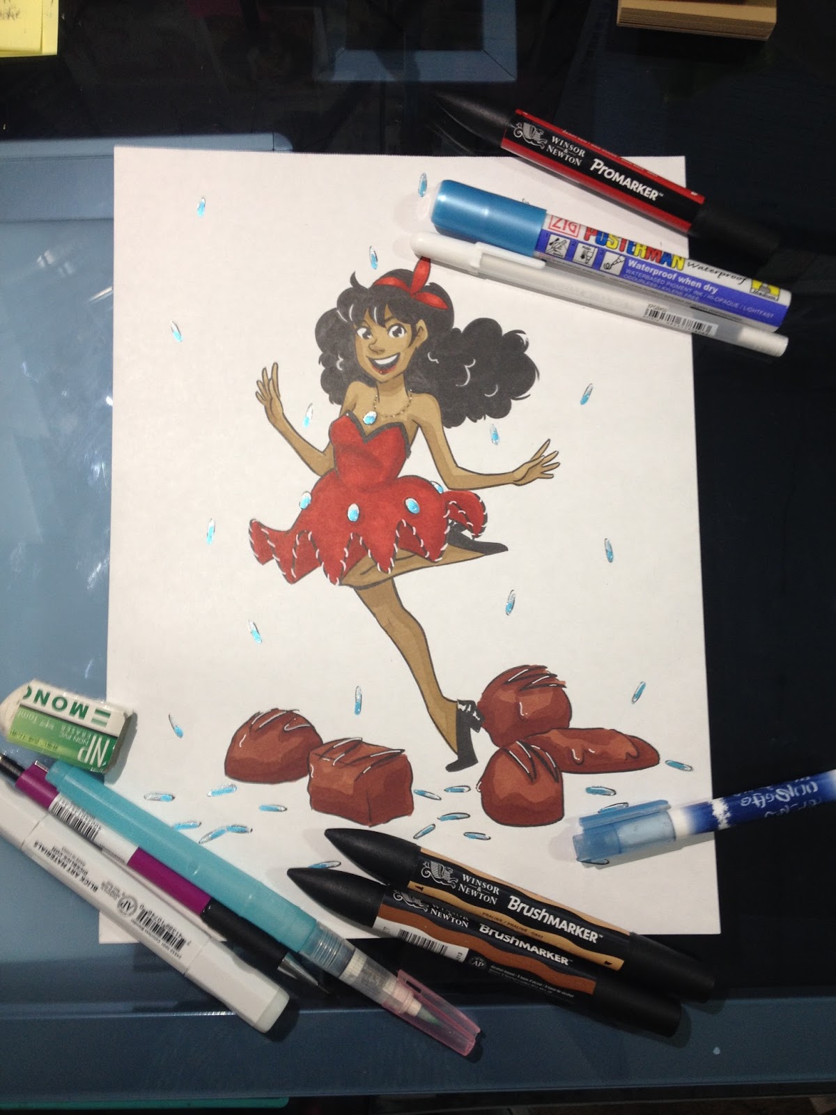
The products at the top right are those that came from my ArtSnacks, those at the bottom are ones I supplied myself. If you're interested in finding out how I created this piece, please watch the above video!
The Breakdown
Stonehenge Kraft Paper (sample size)- $4.00 (estimate)
Sakura White Gelly Roll- $1.40 (Jetpens)
Winsor and Newton Promarker- $4.19 openstock (Dick Blick), $2.75 from a set of 24 ($65.98 on DickBlick)
Zig Posterman- $2.62 (ZigPosterman.com)
Total Value
$10.81
My Thoughts
The February ArtSnacks seemed a bit light- only three full size products and one sample. The Posterman seems very similar to Uni's POSCA markers- water soluable until the ink dries, then permanent, same type of nib and pump action, even similar bodies. I don't mind though- I like POSCAs a lot, and a larger metallic is a welcome addition to my collection.
The inclusion of a Promarker wasn't that impressive-I personally prefer brush tips to bullet tips, and compared to the Brushmarkers I also used in my ArtSnacks Challenge (her skin and chocolates) the Promarker was very frustrating to use.
The Sakura Gelly Roll also failed to impress- a lot of other manga influenced comic artists love it, but I still prefer the Uni Signo white for performance. I still thought it was a nifty addition to the box, especially since the sample of paper was kraft colored.
Sketchbox
This month's Sketchbox brands are
Tombow
Kum
The Unboxing
Unboxing Video Here
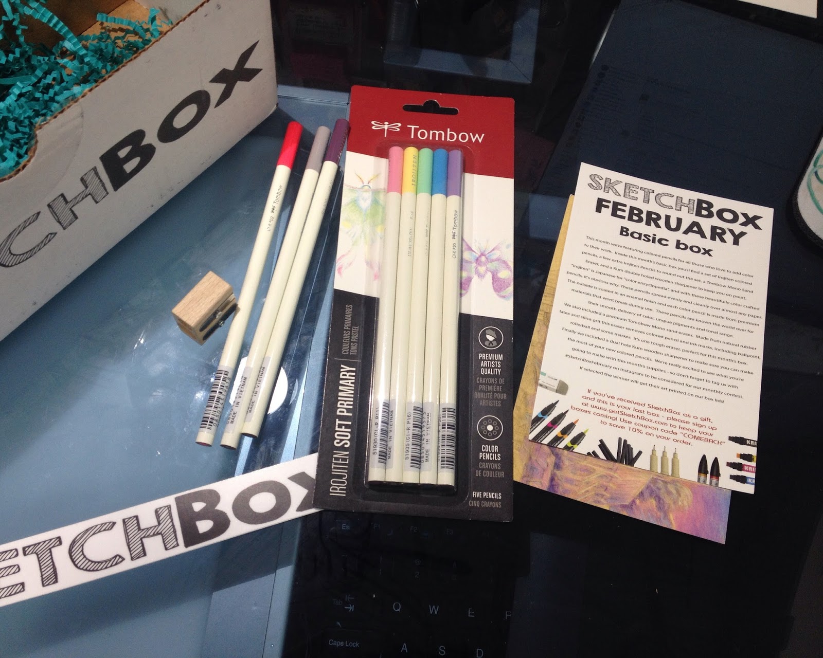

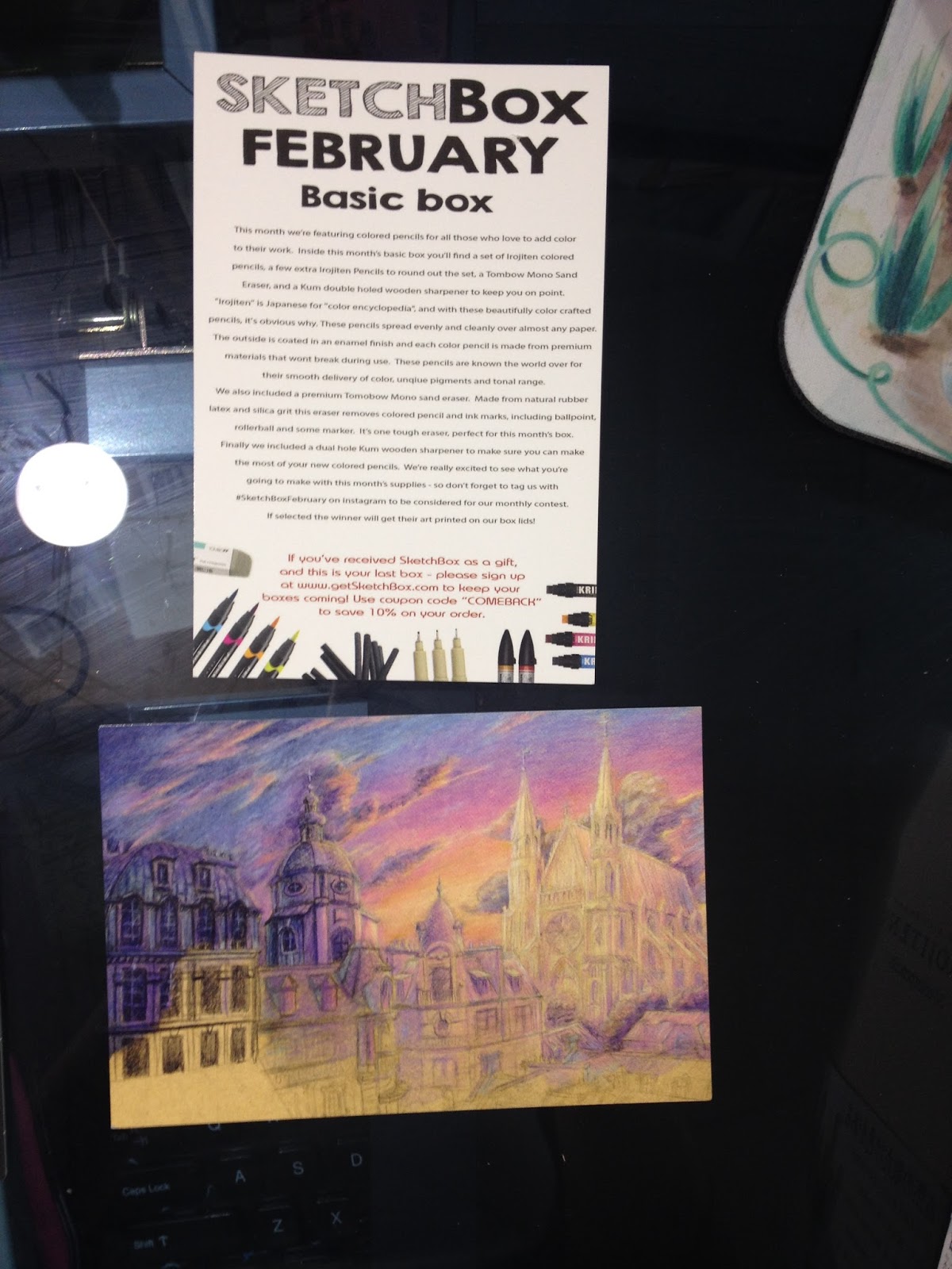

SketchBox FebruaryBasic Box
This month we're featuring colored pencils for all those who love to add color to their work. Inside this month's basic box you'll find a set of Irojiten colored pencils, a few extra Irojiten Pencils to round out the set, a Tombow Mono Sand Eraser, and a Kum double-holed wooden sharpener to keep you on point. "Irojiten" is Japanese for "color encyclopedia" and with these beautifully color crafted pencils, it's obvious why. These pencils spread evenly and cleanly over almost any paper. The outside is coated with an enamel finish and each color pencil is made from premium materials that won't break during use. These pencils are known the world over for their smooth delivery of color, unique pigments and tonal range.
We also included a premium Tomobow (sic) Mono sand eraser. Made from natural rubber latex and silica grit this eraser removes colored pencil and ink marks, including ballpoint, rollerball, and some marker. It's one tough eraser, perfect for this month's box.
Finally we included a dual hole Kum wooden sharpener to make sure you can make the most of your new colored pencils. We're really excited to see what you're going to make with this month's supplies- so don't forget to tag us with #SketchBoxFebruary on instagram to be considered for our monthly contest. If selected the winner will get their art printed on our box lids.
If you received SketchBox as a gift, and this is your last box- please sign up at www.getSketchBox.com to keep your boxes coming! Use coupon code "COMEBACK" to save 10% on your order.
Editors Notes
I was very excited to see the Irojiten pencils- these beautiful pencils have been on my wishlist for a long time, and I'd recently purchased a 30 color encyclopedia from Jerry's Artarama. Even better, there appears to be no duplicates between the set I'd purchased and the pencils that were sent to me.
I was less excited by the Kum pencil sharpener- don't get me wrong, I love the brand, and have used their stationary products for year, but I've gotten very spoiled by their magnesium pencil sharpeners, and a self contained pencil sharpener would've been nice.
My sand eraser wasn't in the box when I opened it, Contacted SketchBox upon their Instagram suggestion regarding the missing Tombow Mono Sand eraser, and they promised to send one out to me as soon as possible. They were polite and prompt, and I look forward to receiving my missing eraser. Unfortunately, I think this means SketchBox really needs to step up their quality control to make sure all boxes have the necessary parts.
The Art Card:
SketchBox February Featured ArtistHosio
Hi, I'm Hosio and I like to create things. Since primary school I was always drawing something or use the things I've found around me to create things. I never knew what my dream job would be, but I always wanted it to be something connected with drawing. In my country (Poland) the word 'artist' is a rather pejorative term and associated with being poor, that's why I didn't want to be one.
I've decided to study architecture instead of fine arts. Boy, was I wrong. As it turns out, I had it all backwards, so I've dropped out of my studies and concentrated on self improvement. Now I'm a freelance artist, and my ambition is to get a job in the game development industries. You can see my progress on tumblr (http://hosio.tumblr.com) or follow me on instagram (https://www.instagram.com/hosiocat)
We're so thankful for the talent that Hosio shared with us, if you'd like to get your art featured, email an example of your work to us at
info@getsketchbox.com
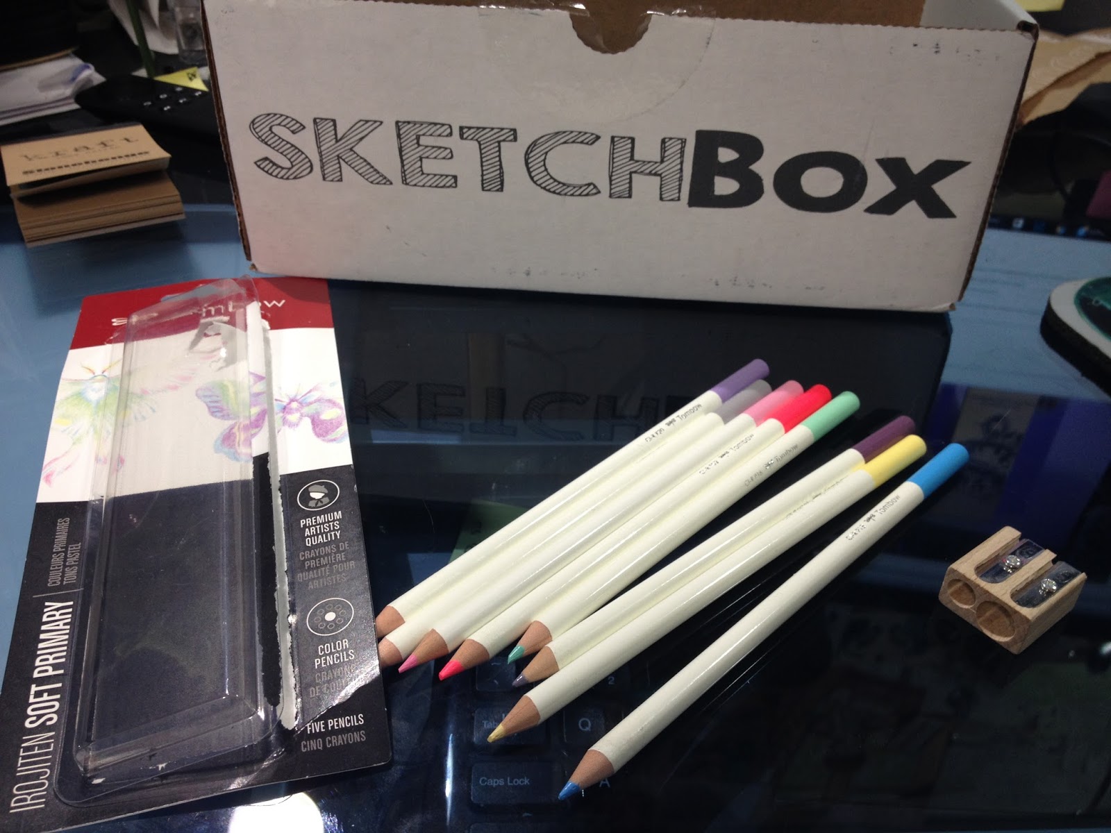
The Irojiten pencils weren't sharpened when I received them, which was fairly annoying, but it gave me an opportunity to put the Wood Cutter to work. There were a couple snappages in the sharpener- but I think it's more to due to the brittleness of the leads than a flaw in the sharpener.
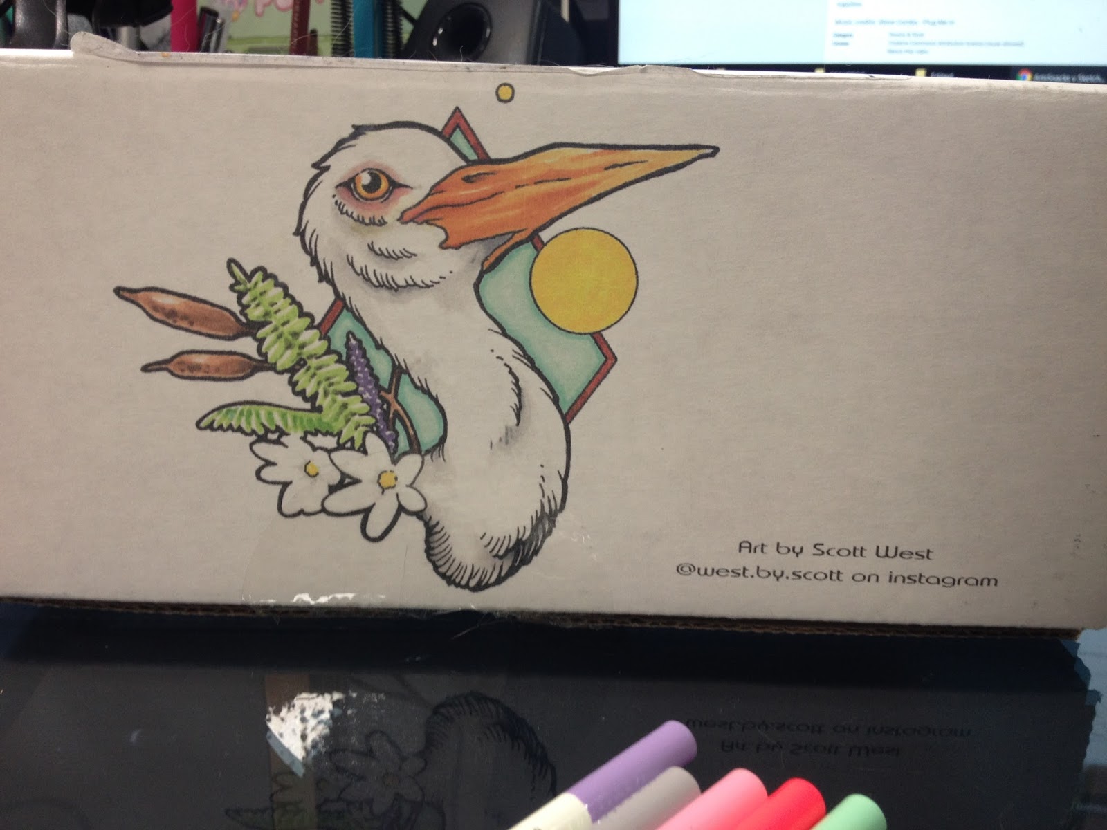
The box art is by Scott Werst, who was last month's box art as well.
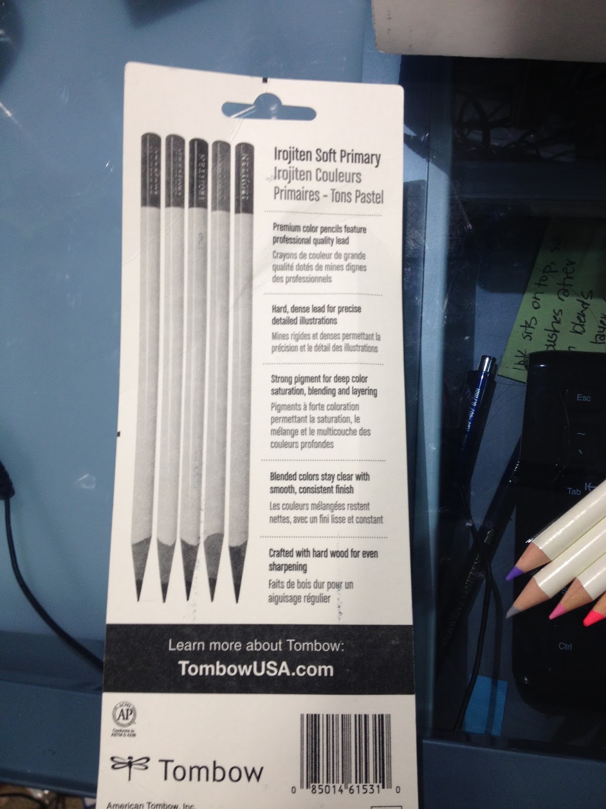
The box reads:
Irojiten Soft Primary
Premium color pencils feature professional quality lead
Hard, dense lead for precise detailed illustrations
Strong pigment for deep color saturation, blending and layering
Blended colors stay clear with smooth, consistent finish
Crafted with hard wood for even sharpening
Learn more about Tombow:
TombowUSA.com
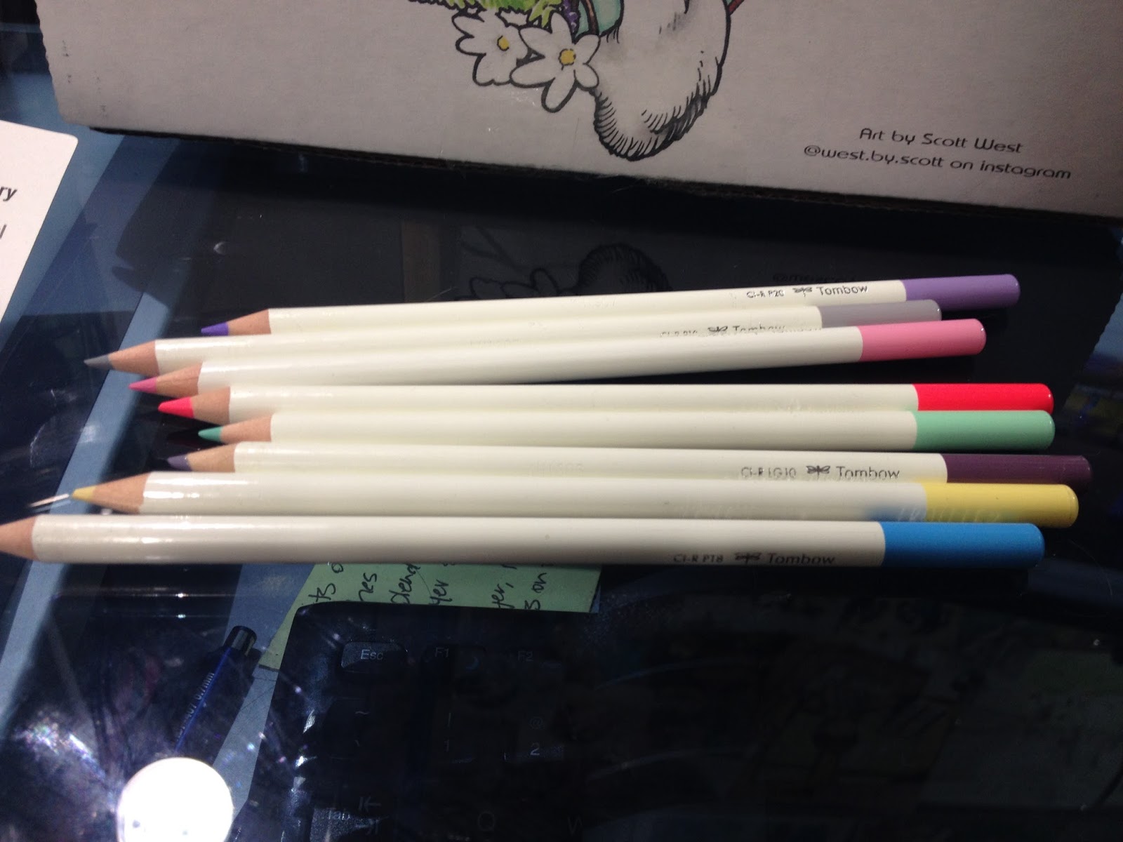
These color pencils are absolutely beautiful- the enamel finish is super smooth and comfortable in the hand. They feel solid and well made.
The Field Test
Sketchbox Challenge Video here
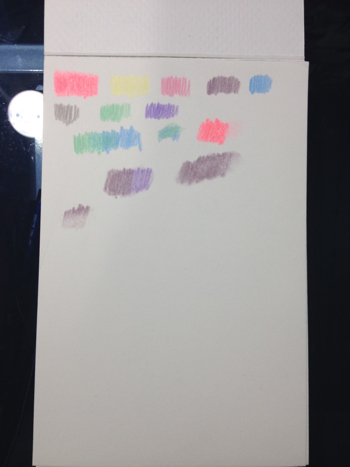
I swatched all the colors sent to me on Strathmore 400 series Medium surface Color Pencil paper. In the above video, I talk about blending- pencil to pencil, using an alcohol based colorless blender, and using a color pencil blending marker. I thought the lead in these pencils was very hard, and a bit difficult to use, especially for blending or filling large areas.

I haven't used color pencils as a primary medium for many years now, so I'm definitely out of practice. While I could have augmented this with my 30 piece Irojiten encyclopedia, I wanted to see what I could accomplish with just the colors sent by Sketchbox.
I found these colors difficult to layer- I had sketched with the light yellow, and it seemed to shine through regardless of how many layers I applied. I tried to blend a bit with the Artist Loft color pencil blender, and while it did tone done areas of applications, it's not really a true blender. I'm curious to know what solution is used inside, and if the wax content of the Irojiten might effect how well it works.
 The Strathmore Color Pencil sample pad is my own- it was picked up at Pla-Za's Hands on Creativity a few months ago, from a Strathmore rep. I figured this was a great time to break it in and see how I enjoyed the paper.
The Breakdown
Irojiten Soft Primary (5)- $11.00 (Jetpens)
Irojiten (openstock) (3) $2.42 (Dickblick- $7.26 total)
Kum Woodcutter- $2.55 (Utrecht)
Tombow Sand Eraser- $2.00 (Jetpens)
The Total
$22.81
SketchBox Premium (February) Review
Unboxing SketchBox Premium February 2016 in ASL
Includes:
Tin of Prismacolor pencils $10.06 (DickBlick)
Sketchbox Signature Marker (2)- For price, I'll compare these with Blick's Studio Brush Markers- $2.29 each (DickBlick $4.58)
Kum Wood Cutter Pencil Sharpener- $2.55 (Utrecht)
Tombow Mono Sand Eraser- $2.00 (Jetpens)
The Total (Premium Box)
$19.19
It's difficult to find information about Sketchbox's Signature markers. They've been around for awhile, and you can get a glimpse at a three pack in this unboxing video from January. Although the SketchBox site has a shop, these markers aren't listed, so I'm not sure how I'll be able to get my hands on some for review purposes. These are alcohol based markers, and appear to be twin tipped, and the bodies look like a white version of Shin Han's old marker body. It seems like the Signature markers are chisel and bullet nibbed (whyyyy). I have a premium box coming in March, so if I receive any of their markers, I'll be sure to write about them here.
My Thoughts
How on earth does SketchBox justify having the contents of the Basic Box be of higher value than the Premium Box two months in a row? As an artist who's very familiar with Prismacolor Pencils, they're pretty much the baseline for 'good' color pencils in the US- not really the stuff of subscription boxes. Yes, you do get MORE color pencils in the Premium Box, but the 5 piece Soft Primary set alone costs more than the 12 piece Prismacolor set, and is less well known. And why did SketchBox include their own branded markers (which I can find NO information about at this time, and I'm incredibly curious about them) in a color pencil box? A colorless alcohol blending marker I could understand- I used a Prismacolor colorless blender in my own review for the box, but from the videos and photos I've seen, they seem to be colored markers.
The Winner- SketchBox

 Voting is entirely done by allowing my cat to choose the filler he finds tastiest. Clearly SketchBox won.
I'd really like to say that BOTH subscription services lost this month- neither one were worth their subscription price (Artsnacks- $20, Sketchbox- $25+$5), and ArtSnacks broke their word regarding full size products by including a sample. If the sample had been a bonus, that would be one thing, but they expect us to count this as part of the overall total. Even with the sample, ArtSnacks was well below my target of $20 value, and SketchBox didn't fare much better.
In the end, I'm going to award the title of February Winner to SketchBox, mostly because Irojiten pencils are novel in the US, beautifully designed, and the box was more coherent than this month's ArtSnacks.
I'd thought ArtSnacks had really upped the quality of their boxes in the year I'd stopped reviewing them, but it seems like we're back to the status quo. This box was anemic at best, with the Stonehenge Kraft sample and the Zig Posterman being the standout items.
This month's SketchBox could have had some real potential, with a little research. I mentioned some additional products that could've been included in my video overviews- Gamsol, a mineral spirit used for blending color pencils, some blending and burnishing pencils (there's a difference), sample color pencil papers (including maybe a pastel paper with a bit of tooth), and an alcohol marker for blending. The Basic Box sadly seems more coherent than the Premium Box, which is Premium in title only- the contents seem very mundane for any experienced artist or art supply aficionado.
If you're using my opinion to determine whether or not to subscribe to these boxes, you need to keep a couple things in mind. 1. I review art supplies, on here and on Youtube, ALL THE TIME. I see a lot of things, so I prize novelty. 2. Art subscription boxes are not a good way to fill out your studio, you should take that money and spend it curating your collection. Blind boxes are just that-blind- and you are liable to receive supplies you'll never use (like me with acrylics/oil painting supplies). 3. Art subscription boxes are a luxury- they're expensive, they send non-essentials, they provide no art instruction, so if you're broke, art subscription services are a poor choice to spend your money on.
At the risk of sounding like a broken record, I feel like if you are asking me whether or not you should buy either service, you should also consider putting that money towards financially supporting artists who have taught you, who continue to teach you, and who inspire you. Especially if those artists put out 'free' content. I know it's probably not as exciting as getting a box of supplies in the mail, but the investment is still worthwhile- you're rewarding these creators for making content that has benefited you.
In the end, it's still difficult for me to recommend an art subscription service- perhaps if they hired an artist a month to demonstrate the materials and teach a series of small tutorials these services would be more worthwhile.
Please consider donating to this blog or purchasing from Natto-shop (http://nattosoup.com/shop) if you want me to continue publishing quality content. All materials tested were purchased from my own pocket. Keep on Truckin' Nattosoup is not under any sponsorship.
February 3, 2016
Watercolor Brushpen Review: Sakura Koi Watercolor Brushpens
Today would have been my father's 63rd birthday. Happy birthday, Dad.
Watercolor markers and brushpens are very popular right now. Zig Clean Color Real Brush pens were recently the rage amongst crafters and stampers, calligraphers love Tombow ABT watercolor brush pens, and many artists and illustrators enjoy Winsor and Newtons watercolor markers, but there are many other options on the market. Sakura, the company that brings us Gelly Rolls and Microns, has long been a player in the affordable watercolor market.
Sakura Koi's watercolors are available in three formats- dry pan watercolors, watercolor tubes, and watercolor brush pens, also known as the Koi Coloring Brush Pens. All types can be activated with water, but only the watercolor brush pens utilize the Sakura Koi blender pen.
The Stats
Solid Nylon Brush, similar to Zig Art and Graphic Twin, Tombow ABTEasily available in sets- 6, 12, 24, 48Available openstock from the Sakura Koi site for $2.49, some colors are available on Amazon, lowest price on DickBlickSets are also available on DickBlick and JetpensBlender pen sold separatelyColor coordinating capsSingle tipCan be blended with water or colorless blenderDye based inkPlate finish paper recommendedInk is not fade resistantDigital Color Chart
Colors available in the 12 Pack
Yellow
Orange
Brown
Red
Pink
Purple
Sky blue
Yellow Green
Green
Blue
Black
Colors Purchased Open Stock
Aqua Blue
Bourdeaux
Colorless Blender
Light Cool Gray
Fresh Green
Rose red
Coral Red
Raw Sienna
Dark Brown
Woody Brown
Naples Yellow
Salmon Pink
Sap Green
Techniques for Koi Watercolor Brushpens
Basic Shapes & Shading with Sakura Koi Coloring Brush & Water Brush
The Packaging

The package is heavyweight plastic, meant to withstand travel. It closes with a tab system that seems fairly secure, far more secure than tape which other brands often use.

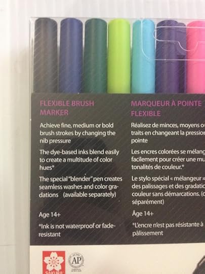 The back reads:
Achieve fine, medium, or bold brush strokes by changing the nib pressure
The dye-based inks blend easily to create a multitude of color hues
The special 'blender' pen creates seamless washes and color gradations (available separately)
Ages 14+


The Markers
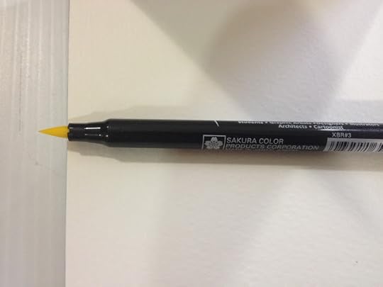
These markers only have one tip- a large nylon brush with plenty of give. In many of the tutorial videos, you can hear an audiable squeak as the nib moves across plate-surface paper. These nibs are designed to take a lot of pressure and abuse.
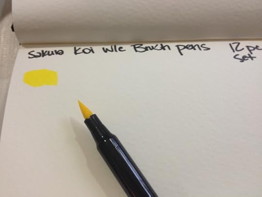
Koi Coloring Brushes lay down a generous amount of ink on application.
Compared To Other Watercolor Brushpens
 From top: Sakura Koi Coloring Brush (2), Zig Clean Color Real Brush (2), Zig Art and Graphic Twin (2), Zig Brushables (2), Marvy Le Plume (1), Tombow ABT (1) . See bottom of post for links to these reviews. Sakura Koi Coloring Brush Pens are relatively small compared to other watercolor brushpens, as they only have a single tip.
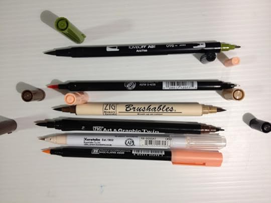 From top: Marvy Le Pen, Zig Brushable, Zig Art and Graphic Twin, Zig Clean Color Real Brush, Sakura Koi Coloring Brush The Sakura Koi Coloring Brush has a fairly large brush given the size of the overall pen, a bit smaller than the Art and Graphic Twin, but close in size to the Brushable.
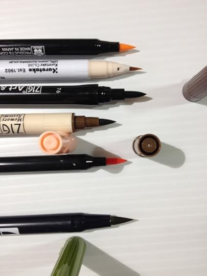 Top to bottom: Sakura Koi Coloring Brush Pen, Zig Clean Color Real Brush, Zig Art and Graphic Twin, Zig Brushable, Marvy LePlume, Tombow ABT
 Comparison shot of the double sided markers.
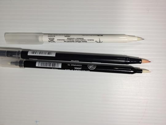 From top to bottom: Sakura Koi Coloring Brush, Tombow ABT, Marvy LePlume blenders
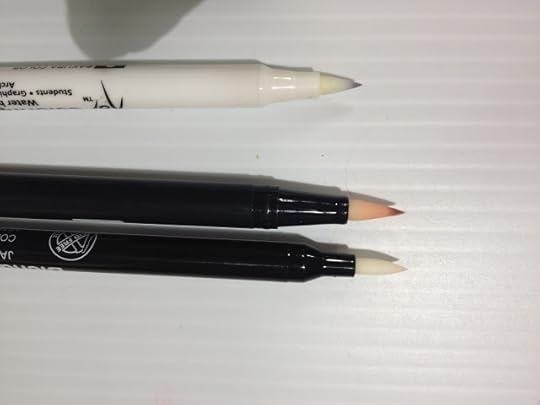
The Swatch Test
Sakura Koi Swatch Test- Nattosoup
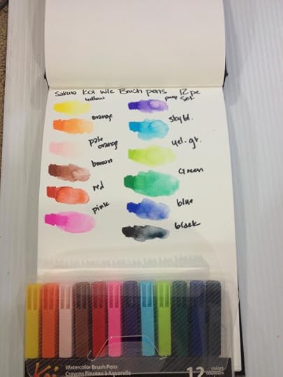
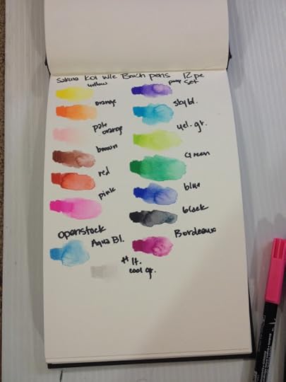
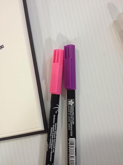

Blending marker into marker worked fairly well, although color did not carry as far as I would have liked. I generally blend dark into light, and go over the area I want graduated with the light marker again.
 Color blends moderately well with the Sakura Koi blender- with waterbased markers, blenders pick up color and move it forward, rather than pushing the color to the back of the paper as alcohol blenders do with alcohol based markers.
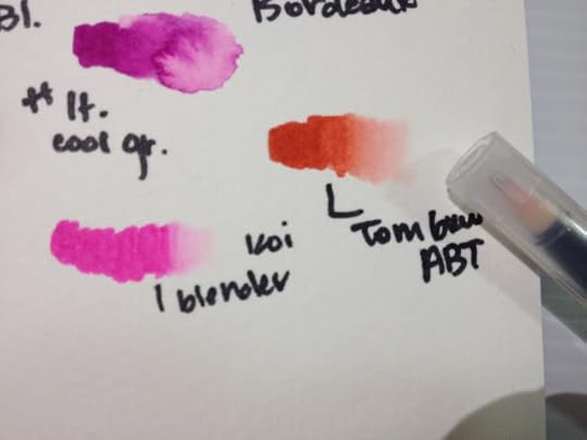
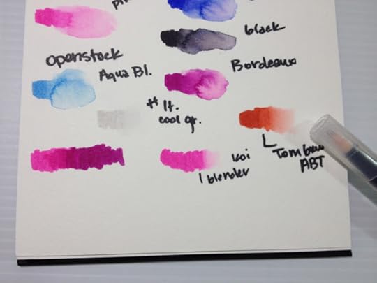
Felt that the Tombow Colorless Blender worked quite well with these watercolor markers.
The 12 pack and the markers I'd originally purchased openstock did not have any usable skintones, so I ordered additional colors from the Sakura site to round out my collection and give me the necessary material for the upcoming field tests. These came packaged in a non-descript cardboard box.
I was very pleased with these markers in general after swatching, and pleased specifically with the colors I purchased openstock for the field test. Colors were swatched in a Strathmore Watercolor journal. Dyes held their color well even after water was added.
The Field Test (wet)
Sakura Koi Field Test-Nattosoup
Field test was completed on Fabriano cotton rag watercolor paper. Illustration was inked with the Copic and waterproof Sailor Mitsuo Aida.

Used a masking tape palette for this application, as well as a couple natural fiber brushes and a cup of clean water.
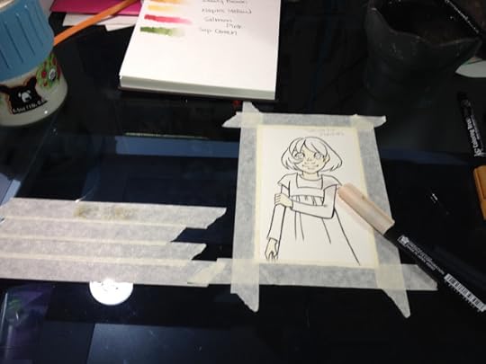
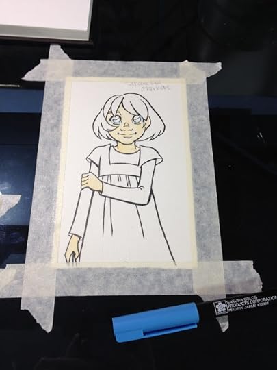
Marker to palette application is very pale, will take multiple layers to build up.

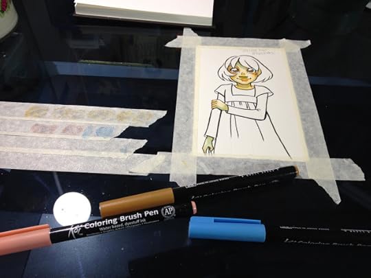
Direct application to the cotton based watercolor paper while paper was damp chewed up the paper.

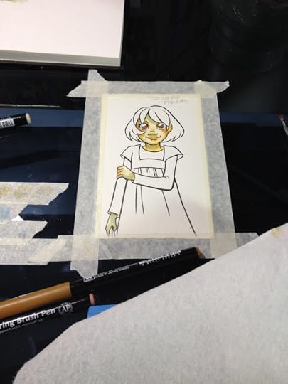
Blender handles different than an alcohol blender- handles differently from application of water with brush as well.
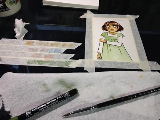
I recommend a violet over the Sakura Koi Magenta
Areas where the paper was abraded by the brushpen's surface tend to feather when additional layers are applied.
Layers tend to displace prior layers, rather than layering and effecting the visual perception of prior layers.For the field test, I didn't really use the 12 piece set I'd purchased.

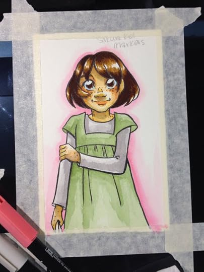
Raw sienna was used for the freckles.
The photos on the package indicate a dry application, which led me to believe I was misusing the markers.
Using a brush allows for a more painterly look, due to natural variations in how much water is held within the brush and applied.
These don't take layering as well as other brands do, and are more difficult to blend. If you aren't used to these markers, it's wise to go in with a game plan before starting, as you won't be able to make corrections easily.
Caps really do not indicate ink color, so make sure you refer to your swatches rather than relying on your caps.
The Field Test (dry)
Sakura Koi Field Test Continued (make sure the video is up and working before posting this)

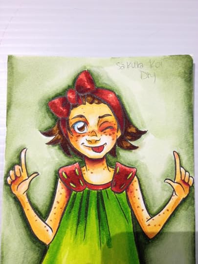
I apologize that I don't have in-process photos of this portion of the review. I thought I had a video (and I might, somewhere), but at this time, I do not.
Colors are very saturated when applied directly to the cold press, woodpulp watercolor paper. Although they can be blended somewhat, they do not blend enough to create areas of contrast in terms of saturation. I ended up blending out the background green with water, as it was too overwhelming, but that's the only area I used water on. I used the Sakura Koi blender for everything else.
I was dissatisfied with how these markers handled when used entirely for dry applications, and I don't personally feel like the blender does a good enough job blending colors together, or blending colors into white to handle these markers alone.
The Verdict
For best performance, you should treat your Sakura Koi watercolor markers as you would other watercolor markers. I personally found the dry application to be garish and over saturated, but with judicious use, that can be used to your benefit as well.
Cheaper and easier to acquire than Zig Clean Color Real Brush pens, as they're less popular. If you like what you see in my videos and blog post, I recommend you go ahead and buy the large set. Not only will it save you money overall, but it will save time over ordering multiple sets or ordering open stock.
Comparable Waterbased/Watercolor Markers
Clean Color Real Brush
Zig Brushables
Zig Art and Graphic Twin
Tombow ABT
Lyra Aqua Brush Duo
Distress Watercolor Markers
Winsor Newton Watercolor Markers
For even more waterbased and watercolor reviews, please check out my Review tab above this post.
Examples of Sakura Koi used for Calligraphy
Hand Lettering with Brush Pens Tutorial by Calligrapher, Joanne Fink
Blend Koi Markers Like Watercolors - Rainbow Color Demo ft. Lisa Engelbrecht
Koi Brush : Hindi Calligraphy by Inku Kumar
Brush Calligraphy by Inku Kumar
Other Sakura Koi Reviews
Art Supply/Product Review, Sakura Koi Coloring Brush Set -Gray (Chibi Lemi Painting)
More about Brushpens for Inking and Art
Choosing a Brushpen for Art- Jetpens Blog
Please consider donating to this blog or purchasing from Natto-shop (http://nattosoup.com/shop) if you want me to continue publishing quality content. All materials tested were purchased from my own pocket. Keep on Truckin' Nattosoup is not under any sponsorship.
Watercolor markers and brushpens are very popular right now. Zig Clean Color Real Brush pens were recently the rage amongst crafters and stampers, calligraphers love Tombow ABT watercolor brush pens, and many artists and illustrators enjoy Winsor and Newtons watercolor markers, but there are many other options on the market. Sakura, the company that brings us Gelly Rolls and Microns, has long been a player in the affordable watercolor market.
Sakura Koi's watercolors are available in three formats- dry pan watercolors, watercolor tubes, and watercolor brush pens, also known as the Koi Coloring Brush Pens. All types can be activated with water, but only the watercolor brush pens utilize the Sakura Koi blender pen.
The Stats
Solid Nylon Brush, similar to Zig Art and Graphic Twin, Tombow ABTEasily available in sets- 6, 12, 24, 48Available openstock from the Sakura Koi site for $2.49, some colors are available on Amazon, lowest price on DickBlickSets are also available on DickBlick and JetpensBlender pen sold separatelyColor coordinating capsSingle tipCan be blended with water or colorless blenderDye based inkPlate finish paper recommendedInk is not fade resistantDigital Color Chart
Colors available in the 12 Pack
Yellow
Orange
Brown
Red
Pink
Purple
Sky blue
Yellow Green
Green
Blue
Black
Colors Purchased Open Stock
Aqua Blue
Bourdeaux
Colorless Blender
Light Cool Gray
Fresh Green
Rose red
Coral Red
Raw Sienna
Dark Brown
Woody Brown
Naples Yellow
Salmon Pink
Sap Green
Techniques for Koi Watercolor Brushpens
Basic Shapes & Shading with Sakura Koi Coloring Brush & Water Brush
The Packaging
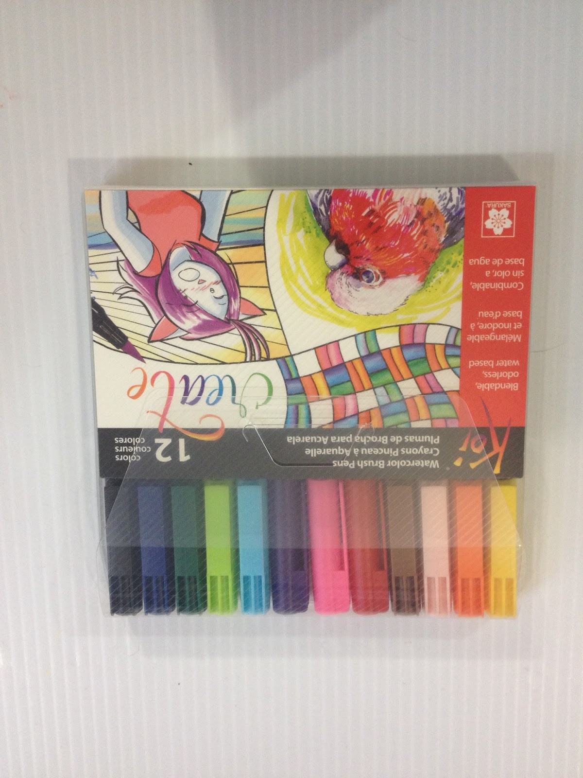
The package is heavyweight plastic, meant to withstand travel. It closes with a tab system that seems fairly secure, far more secure than tape which other brands often use.
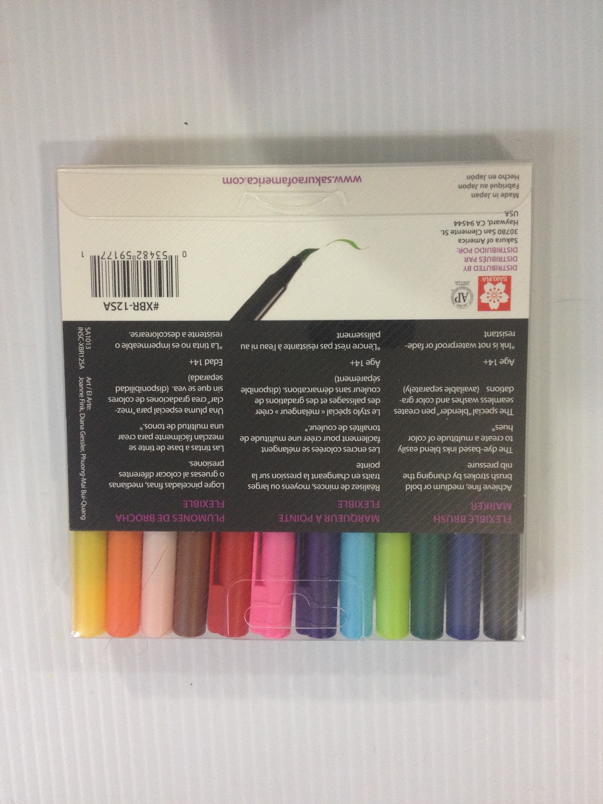
 The back reads:
Achieve fine, medium, or bold brush strokes by changing the nib pressure
The dye-based inks blend easily to create a multitude of color hues
The special 'blender' pen creates seamless washes and color gradations (available separately)
Ages 14+
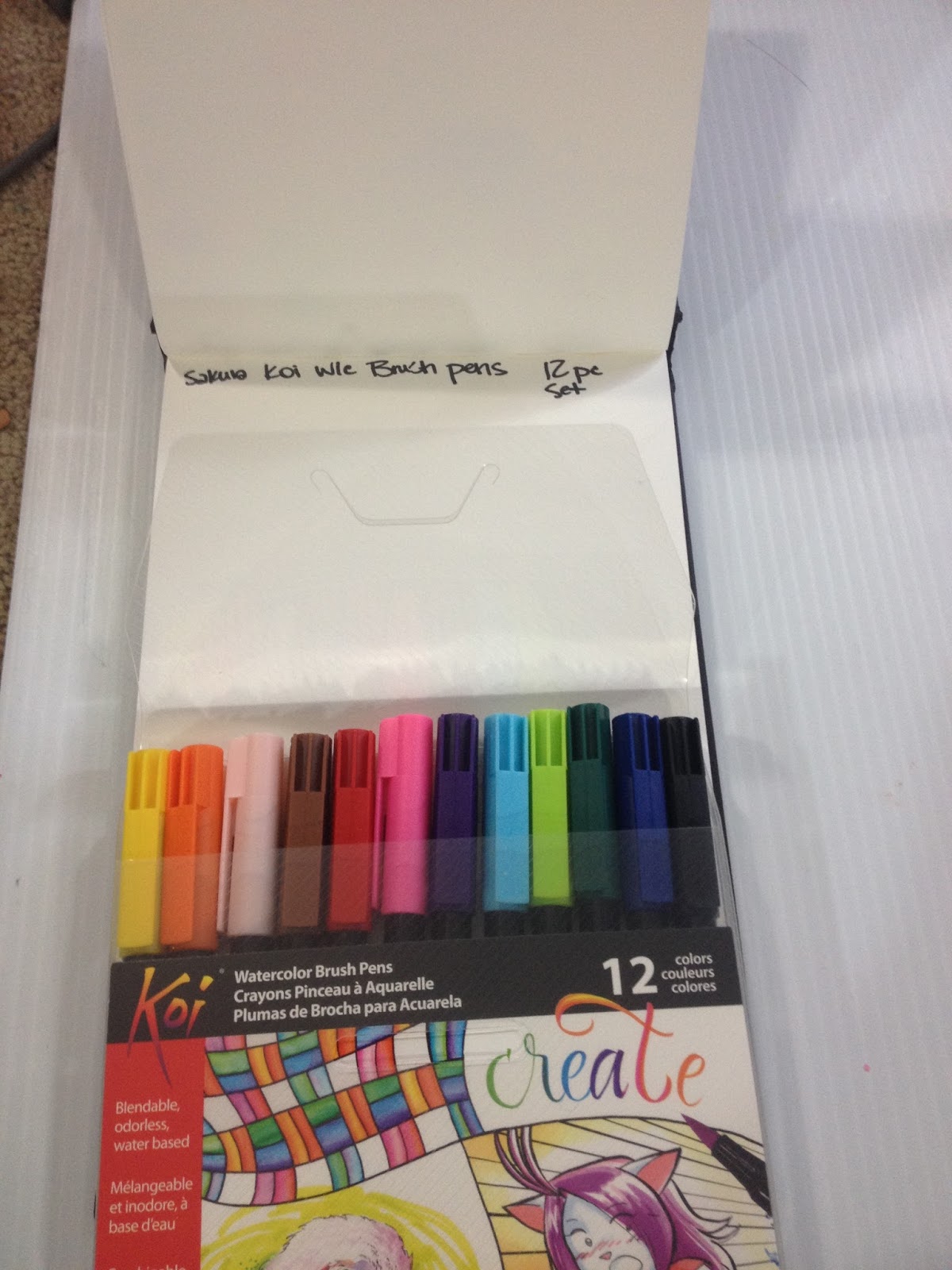
The Markers

These markers only have one tip- a large nylon brush with plenty of give. In many of the tutorial videos, you can hear an audiable squeak as the nib moves across plate-surface paper. These nibs are designed to take a lot of pressure and abuse.
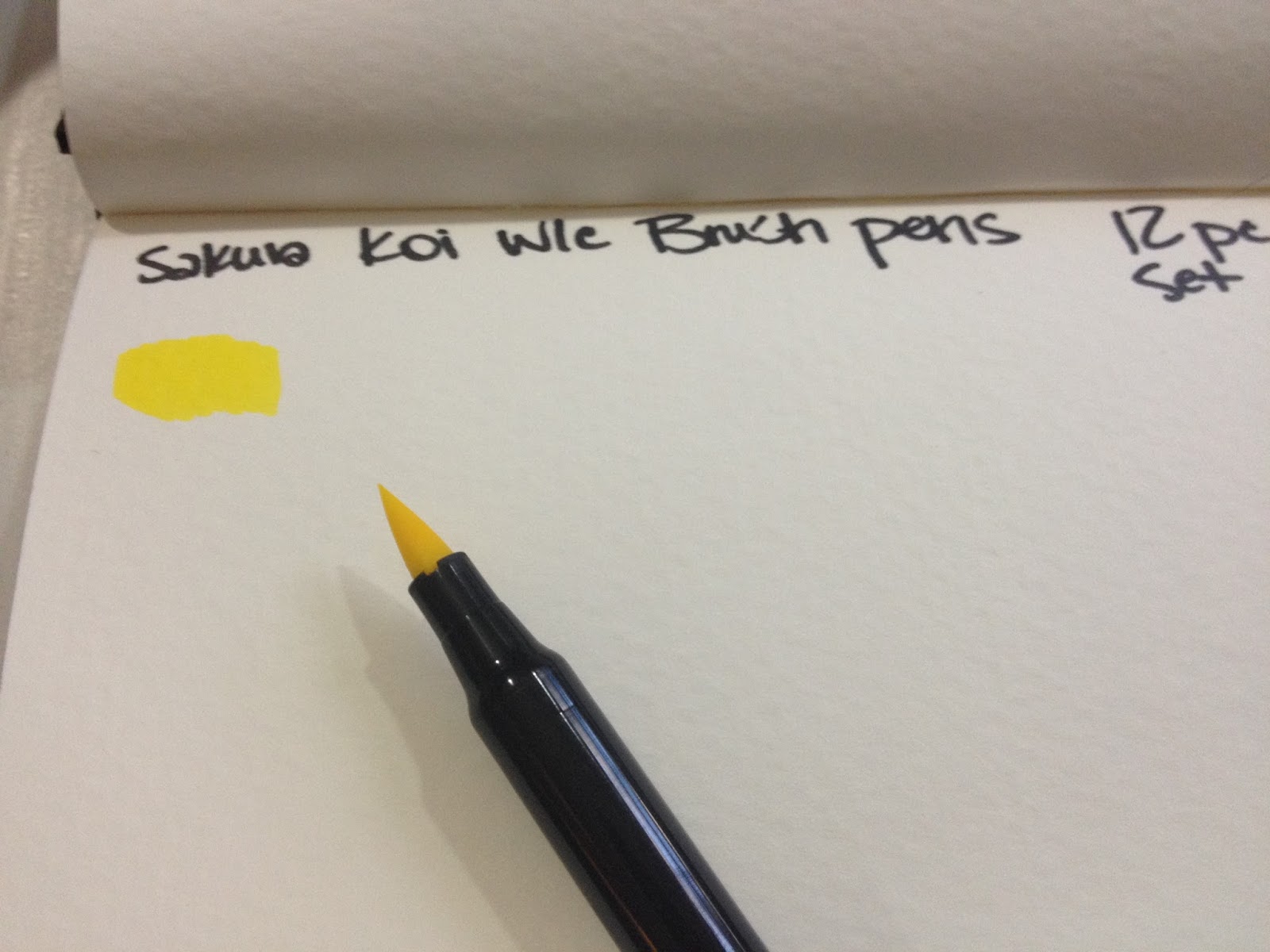
Koi Coloring Brushes lay down a generous amount of ink on application.
Compared To Other Watercolor Brushpens
 From top: Sakura Koi Coloring Brush (2), Zig Clean Color Real Brush (2), Zig Art and Graphic Twin (2), Zig Brushables (2), Marvy Le Plume (1), Tombow ABT (1) . See bottom of post for links to these reviews. Sakura Koi Coloring Brush Pens are relatively small compared to other watercolor brushpens, as they only have a single tip.
 From top: Marvy Le Pen, Zig Brushable, Zig Art and Graphic Twin, Zig Clean Color Real Brush, Sakura Koi Coloring Brush The Sakura Koi Coloring Brush has a fairly large brush given the size of the overall pen, a bit smaller than the Art and Graphic Twin, but close in size to the Brushable.
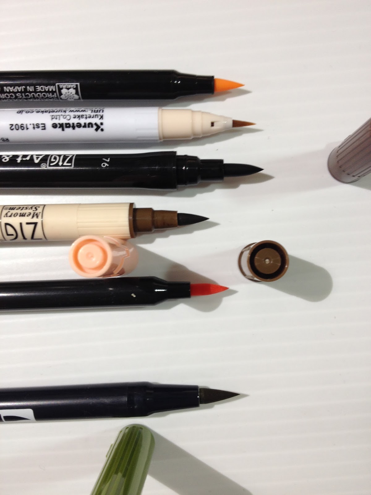 Top to bottom: Sakura Koi Coloring Brush Pen, Zig Clean Color Real Brush, Zig Art and Graphic Twin, Zig Brushable, Marvy LePlume, Tombow ABT
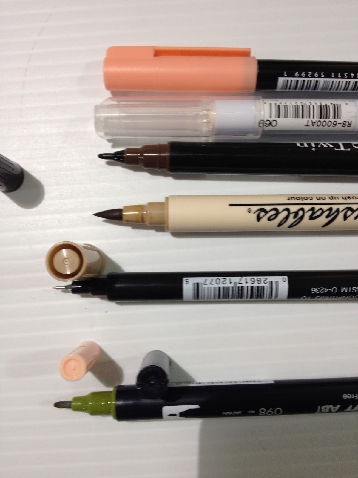 Comparison shot of the double sided markers.
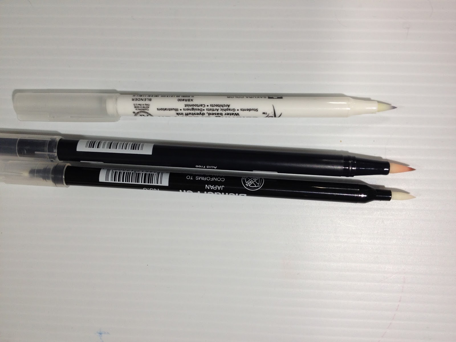 From top to bottom: Sakura Koi Coloring Brush, Tombow ABT, Marvy LePlume blenders
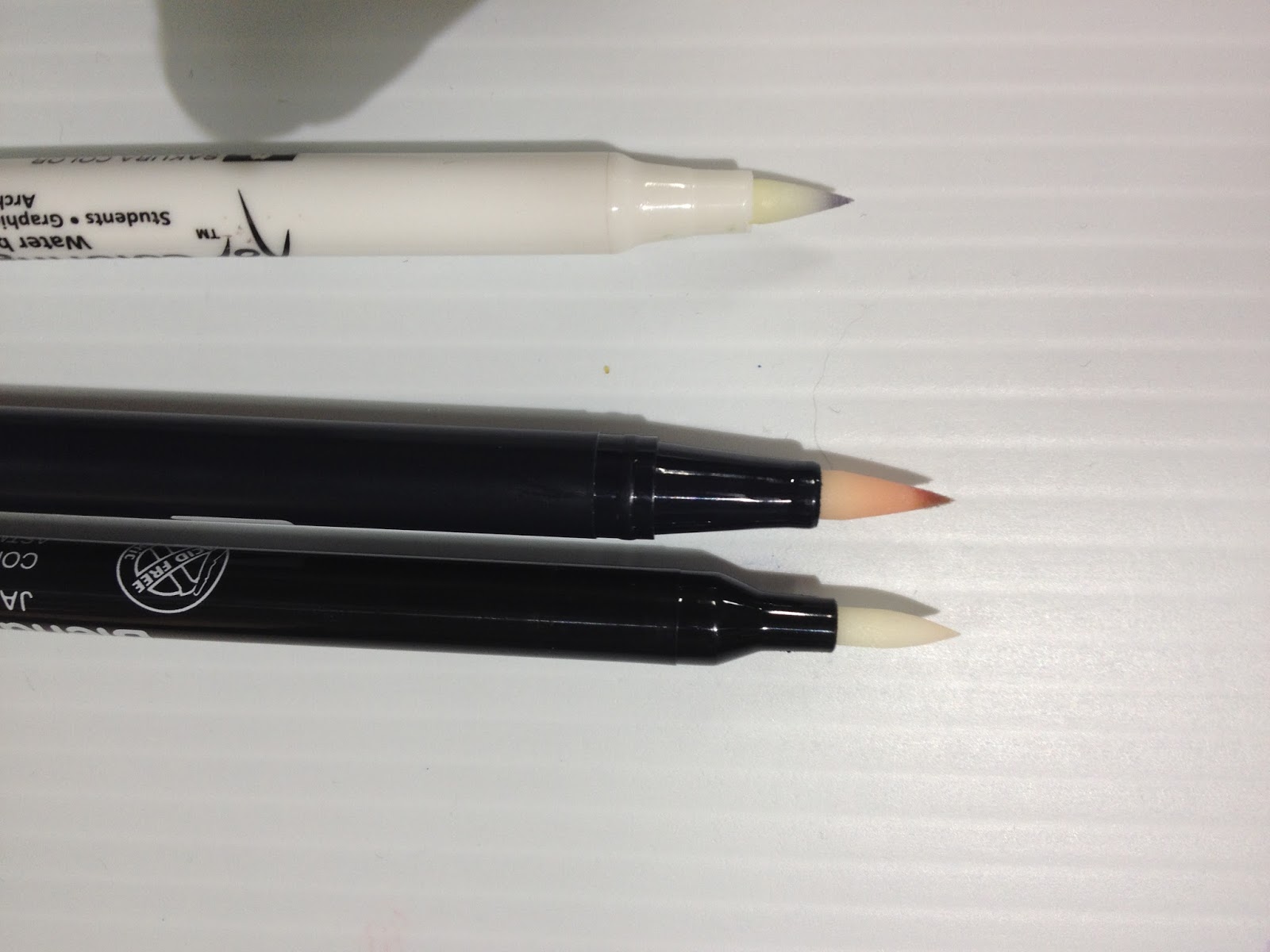
The Swatch Test
Sakura Koi Swatch Test- Nattosoup

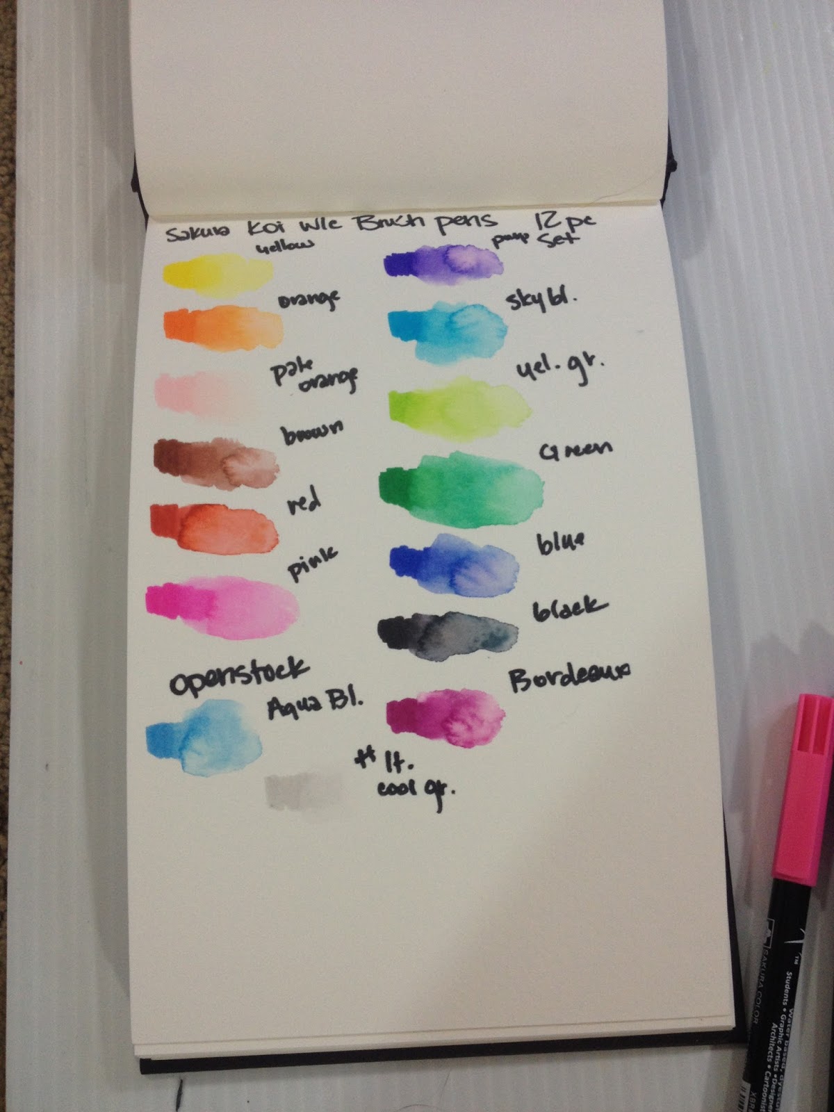

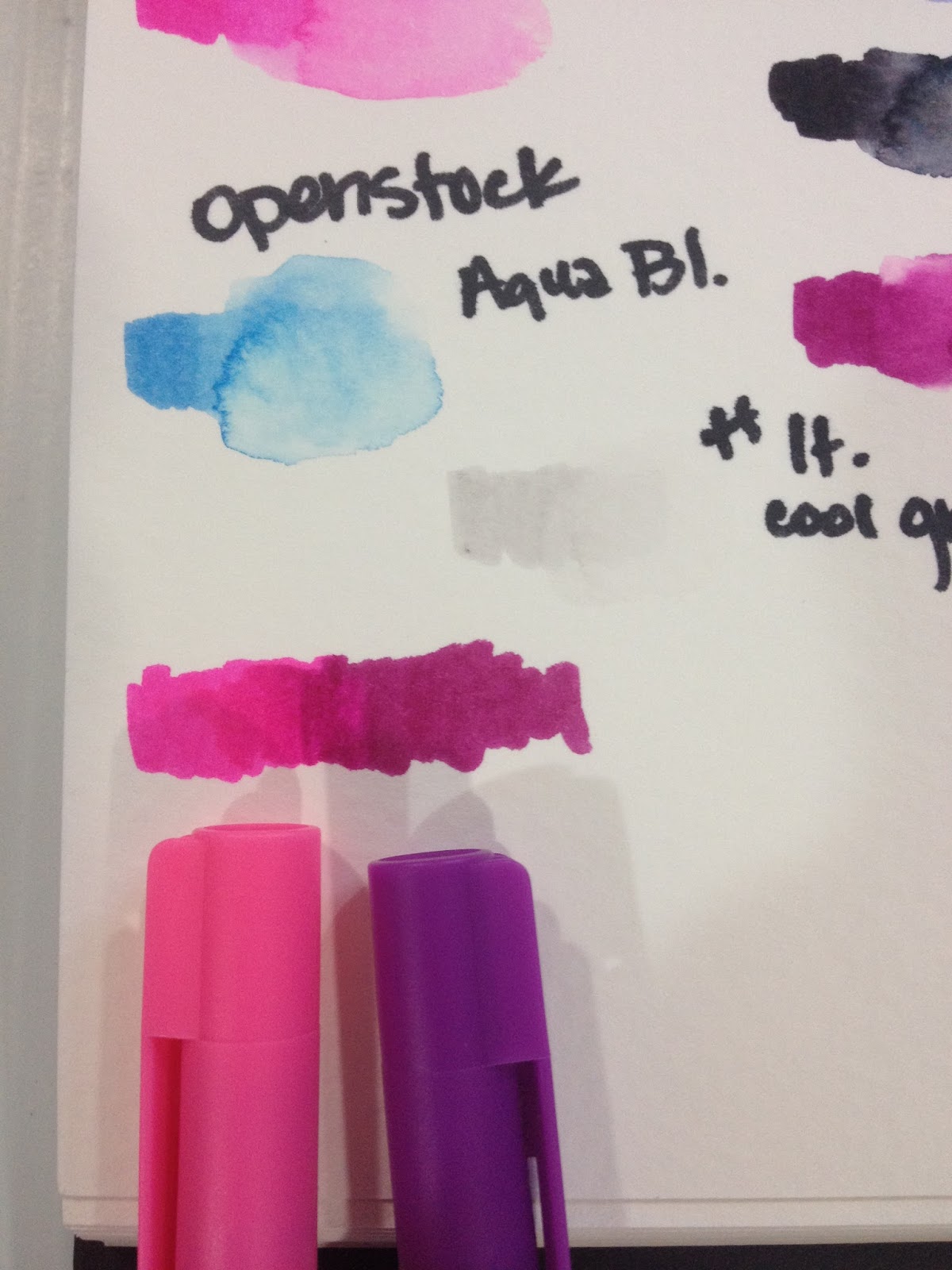
Blending marker into marker worked fairly well, although color did not carry as far as I would have liked. I generally blend dark into light, and go over the area I want graduated with the light marker again.
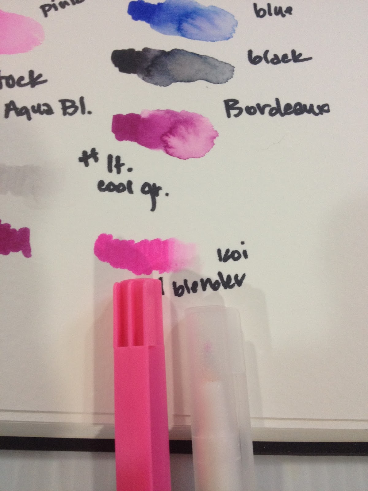 Color blends moderately well with the Sakura Koi blender- with waterbased markers, blenders pick up color and move it forward, rather than pushing the color to the back of the paper as alcohol blenders do with alcohol based markers.

Felt that the Tombow Colorless Blender worked quite well with these watercolor markers.
The 12 pack and the markers I'd originally purchased openstock did not have any usable skintones, so I ordered additional colors from the Sakura site to round out my collection and give me the necessary material for the upcoming field tests. These came packaged in a non-descript cardboard box.
I was very pleased with these markers in general after swatching, and pleased specifically with the colors I purchased openstock for the field test. Colors were swatched in a Strathmore Watercolor journal. Dyes held their color well even after water was added.
The Field Test (wet)
Sakura Koi Field Test-Nattosoup
Field test was completed on Fabriano cotton rag watercolor paper. Illustration was inked with the Copic and waterproof Sailor Mitsuo Aida.
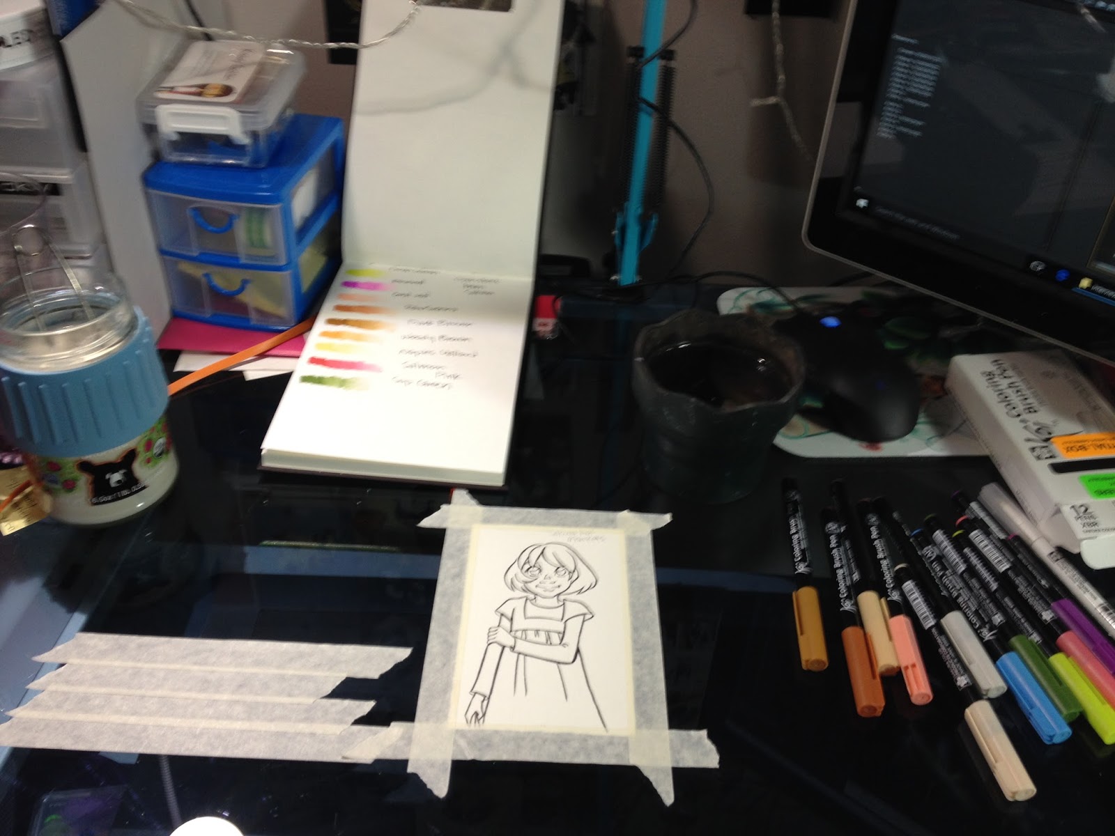
Used a masking tape palette for this application, as well as a couple natural fiber brushes and a cup of clean water.
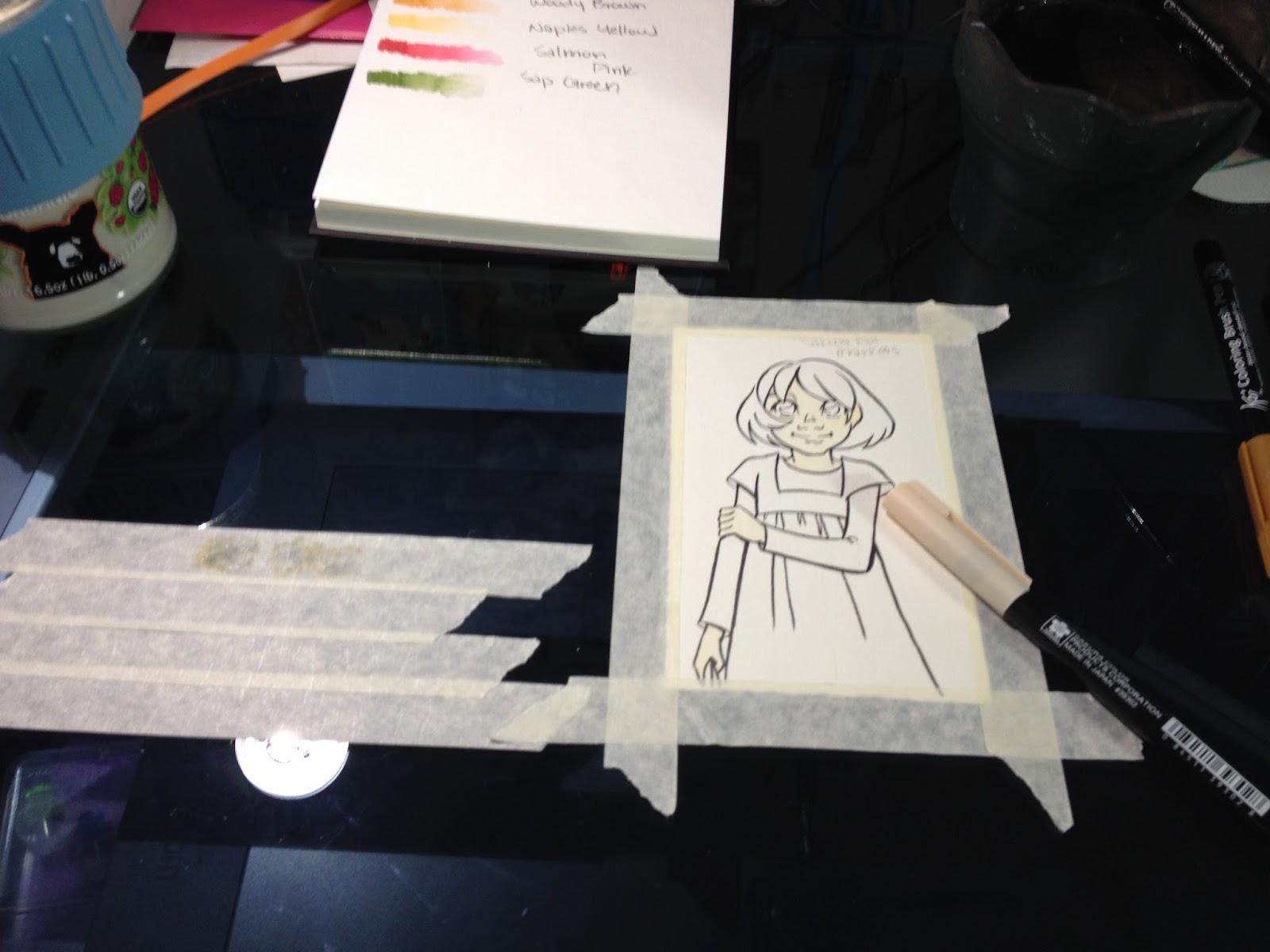

Marker to palette application is very pale, will take multiple layers to build up.
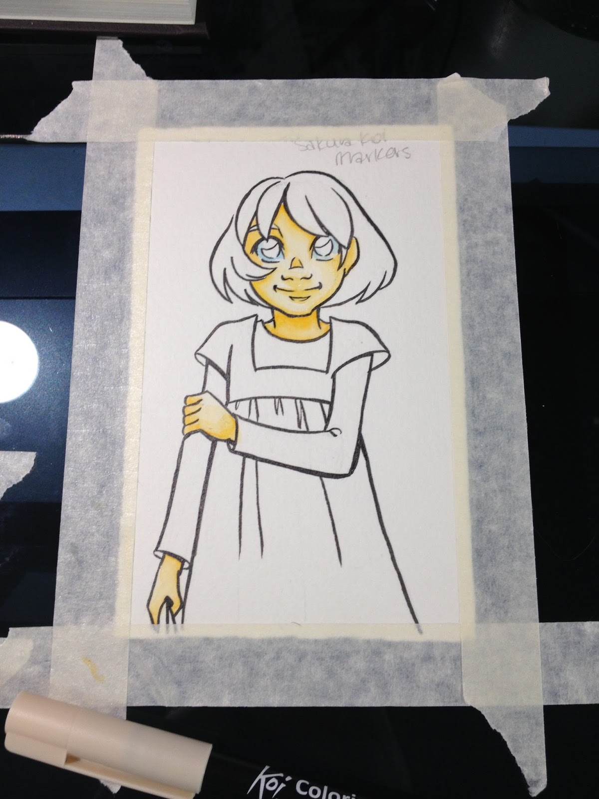
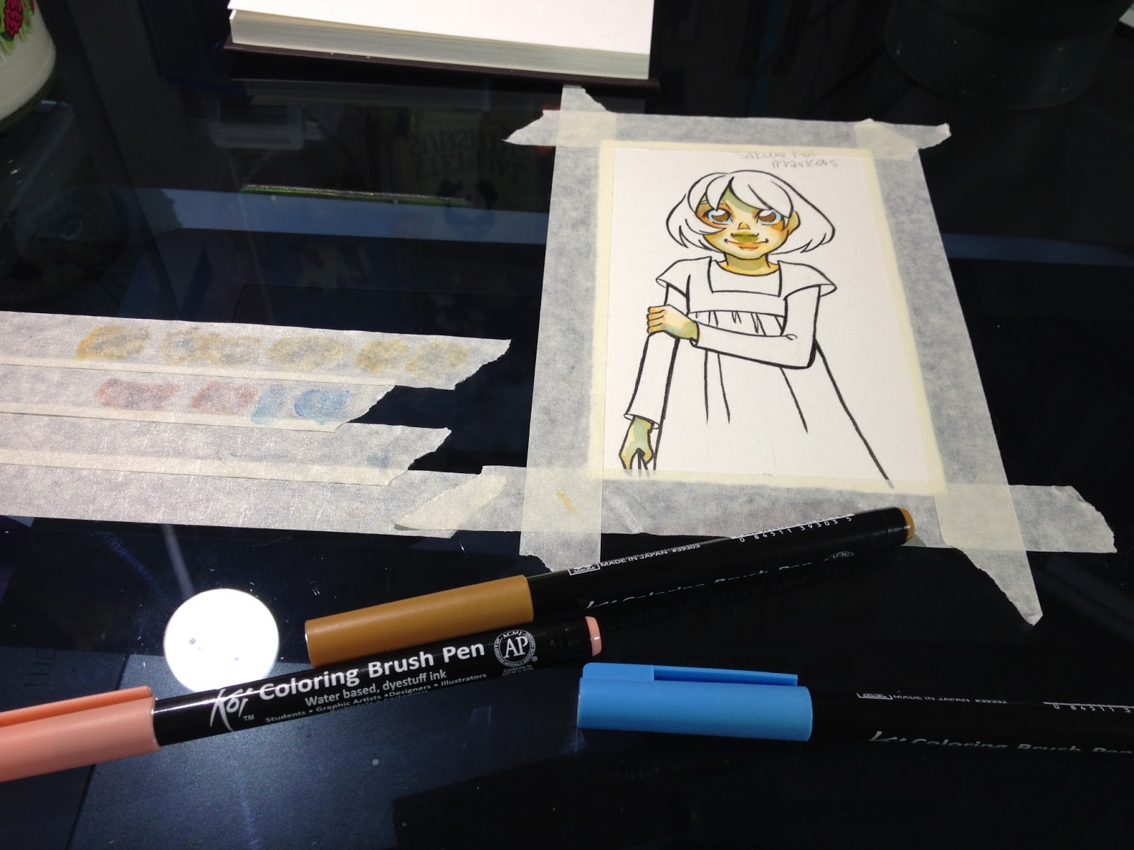
Direct application to the cotton based watercolor paper while paper was damp chewed up the paper.


Blender handles different than an alcohol blender- handles differently from application of water with brush as well.
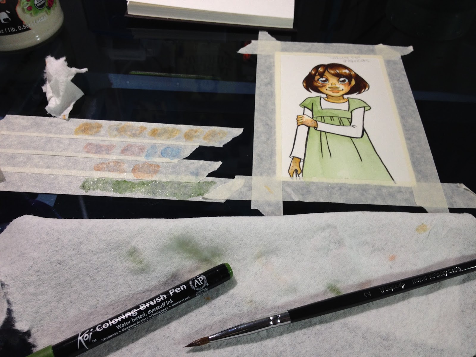
I recommend a violet over the Sakura Koi Magenta
Areas where the paper was abraded by the brushpen's surface tend to feather when additional layers are applied.
Layers tend to displace prior layers, rather than layering and effecting the visual perception of prior layers.For the field test, I didn't really use the 12 piece set I'd purchased.
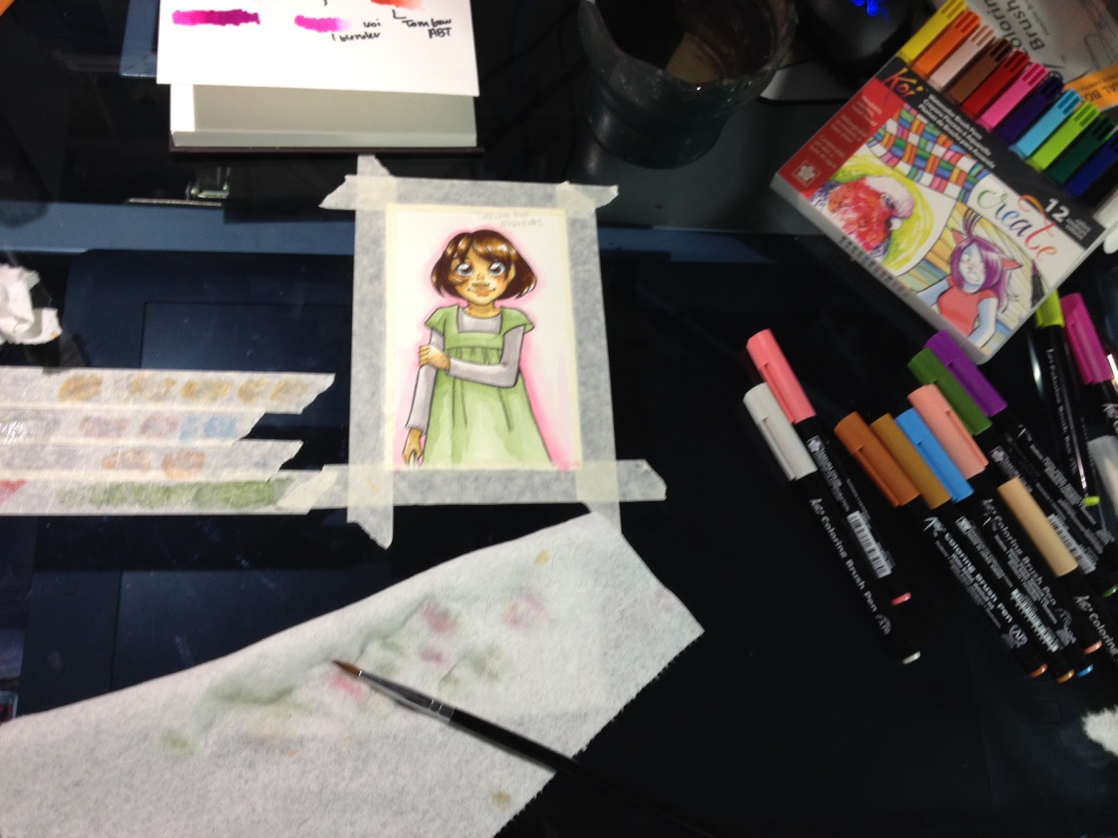
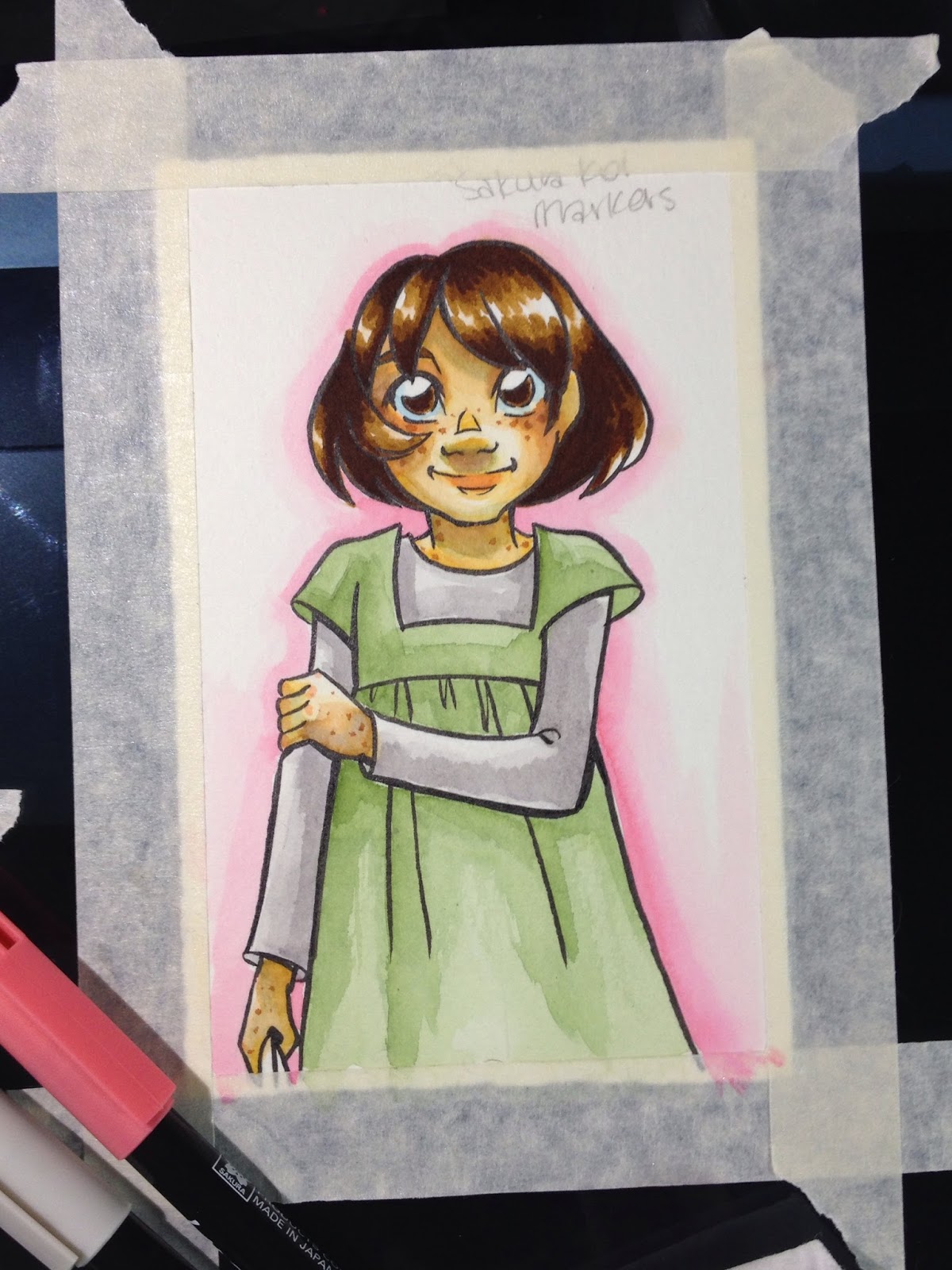
Raw sienna was used for the freckles.
The photos on the package indicate a dry application, which led me to believe I was misusing the markers.
Using a brush allows for a more painterly look, due to natural variations in how much water is held within the brush and applied.
These don't take layering as well as other brands do, and are more difficult to blend. If you aren't used to these markers, it's wise to go in with a game plan before starting, as you won't be able to make corrections easily.
Caps really do not indicate ink color, so make sure you refer to your swatches rather than relying on your caps.
The Field Test (dry)
Sakura Koi Field Test Continued (make sure the video is up and working before posting this)
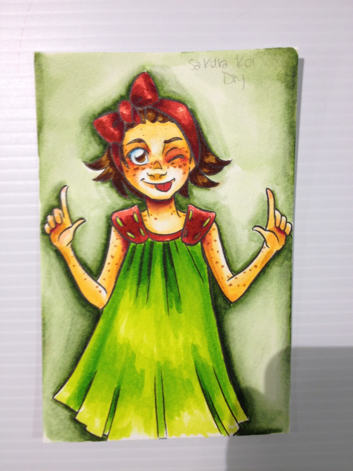
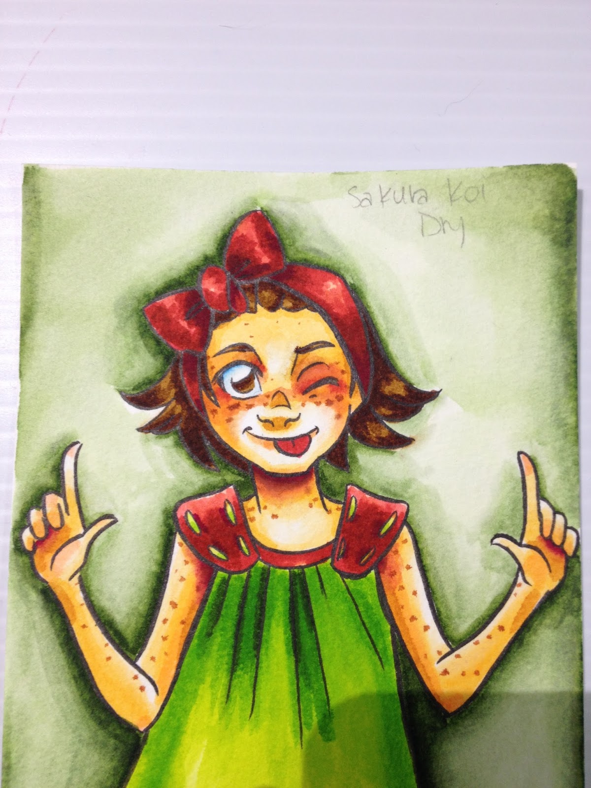
I apologize that I don't have in-process photos of this portion of the review. I thought I had a video (and I might, somewhere), but at this time, I do not.
Colors are very saturated when applied directly to the cold press, woodpulp watercolor paper. Although they can be blended somewhat, they do not blend enough to create areas of contrast in terms of saturation. I ended up blending out the background green with water, as it was too overwhelming, but that's the only area I used water on. I used the Sakura Koi blender for everything else.
I was dissatisfied with how these markers handled when used entirely for dry applications, and I don't personally feel like the blender does a good enough job blending colors together, or blending colors into white to handle these markers alone.
The Verdict
For best performance, you should treat your Sakura Koi watercolor markers as you would other watercolor markers. I personally found the dry application to be garish and over saturated, but with judicious use, that can be used to your benefit as well.
Cheaper and easier to acquire than Zig Clean Color Real Brush pens, as they're less popular. If you like what you see in my videos and blog post, I recommend you go ahead and buy the large set. Not only will it save you money overall, but it will save time over ordering multiple sets or ordering open stock.
Comparable Waterbased/Watercolor Markers
Clean Color Real Brush
Zig Brushables
Zig Art and Graphic Twin
Tombow ABT
Lyra Aqua Brush Duo
Distress Watercolor Markers
Winsor Newton Watercolor Markers
For even more waterbased and watercolor reviews, please check out my Review tab above this post.
Examples of Sakura Koi used for Calligraphy
Hand Lettering with Brush Pens Tutorial by Calligrapher, Joanne Fink
Blend Koi Markers Like Watercolors - Rainbow Color Demo ft. Lisa Engelbrecht
Koi Brush : Hindi Calligraphy by Inku Kumar
Brush Calligraphy by Inku Kumar
Other Sakura Koi Reviews
Art Supply/Product Review, Sakura Koi Coloring Brush Set -Gray (Chibi Lemi Painting)
More about Brushpens for Inking and Art
Choosing a Brushpen for Art- Jetpens Blog
Please consider donating to this blog or purchasing from Natto-shop (http://nattosoup.com/shop) if you want me to continue publishing quality content. All materials tested were purchased from my own pocket. Keep on Truckin' Nattosoup is not under any sponsorship.


