
Becca Hillburn's Blog, page 43
May 8, 2016
A Comic Artist's Guide to Fude Pens
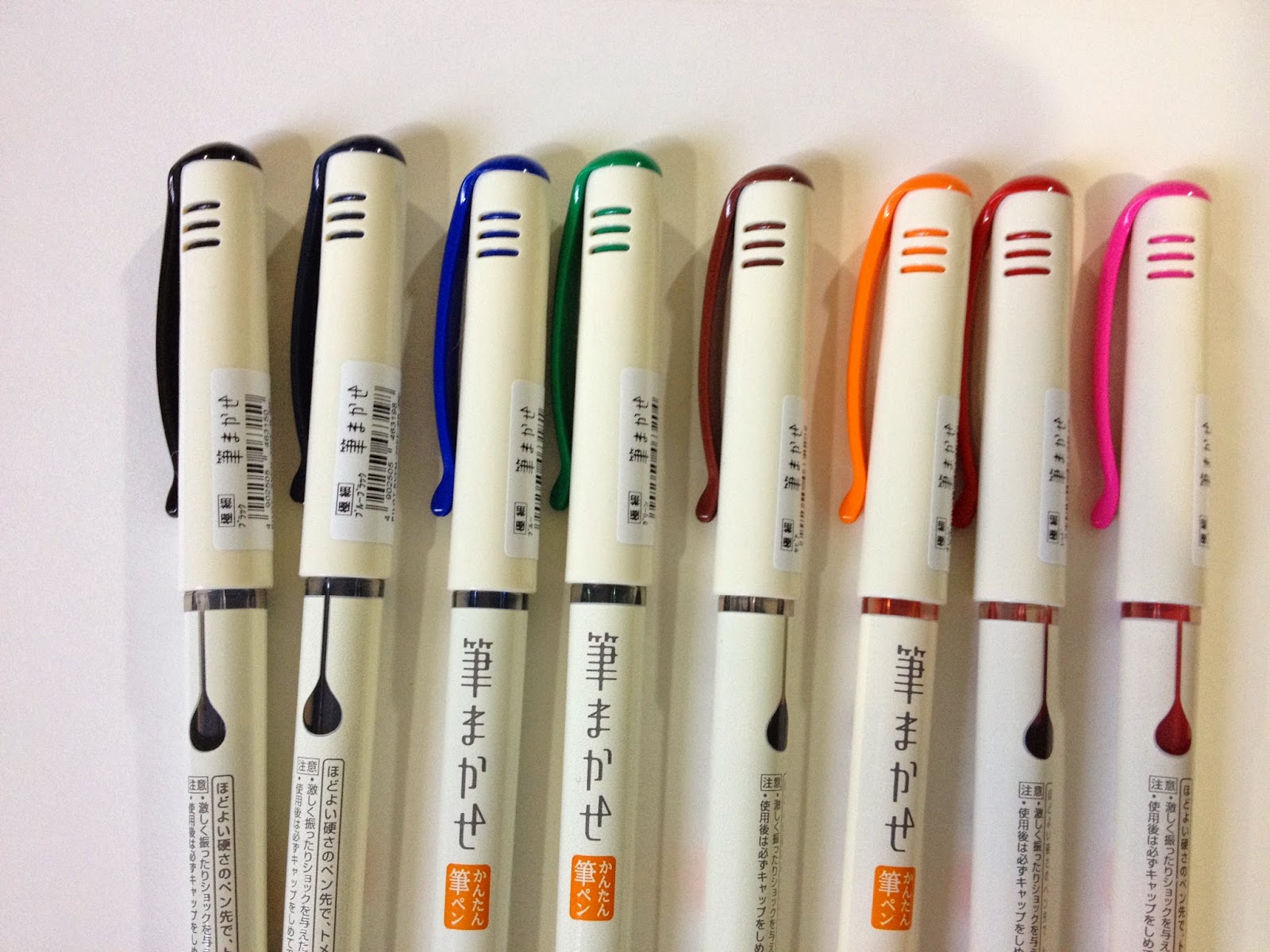
If you aren't using fude pens for some of your inking, you really should consider adding at least one to your arsenal. Fude pens have just about replaced technical pens for me, and are in many instances easier to use and more convenient than a traditional brush.
Fude pens (which fall into the same category as brush pens) were traditionally used for calligraphy in the East, but are becoming increasingly popular as a sketching and inking tool for artists everywhere. Particularly popular among comic artists for the wide variety of lineweights easily produced, fude pens are a cost effective, low learning curve alternative to inking with technical pens or a brush and ink.
I've used fude pens for several years now, and have reviewed over a dozen here on the blog. A few years ago, I even wrote a post demonstrating how I use them, step by step, to encourage other artists to give them a shot. I use fude pens regularly- from inks over non photo blue lead in my sketchbook to comic pages to inks for marker and watercolor. Fude pens have greatly sped up my inking process, and give me greater control than brushes, as they offer fairly large barrels with fairly fine points.
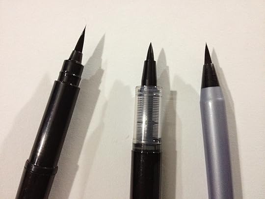
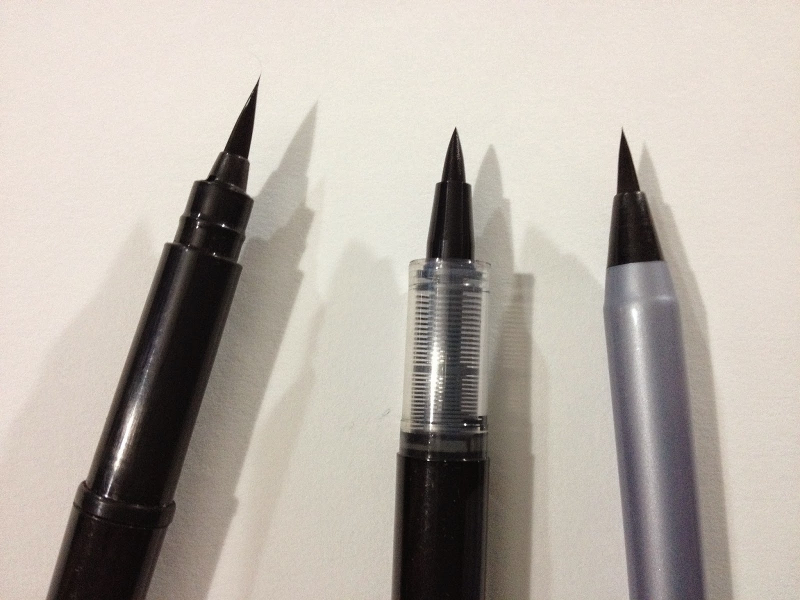
I've moved almost entirely away from technical pens, as fude pens allow a range of expressive brushstrokes not available to technical pens. Even my inking brush, which is still used in the studio, is often neglected, as there's a fude pen for my every need. My alcohol marker field tests? Inked with a Sailor Mitsuo Aida. My convention inks? Inked with a Kuretake Fudegokochi.
If you're struggling with inking your characters, illustrations, and comics, I highly recommend you give fude pens a try. I have a rough outline, as well as some suggestions below, to help you find a pen that will suit your needs. Many of these pens serve double, or even triple, duty as inking tools, watercolor tools, and markers, so they may not be compatible with other media. This list is not intended to be comprehensive, just a simple introduction to those who may be unfamiliar with fude pens, or are looking to quickly find a fude pen to suit their needs.
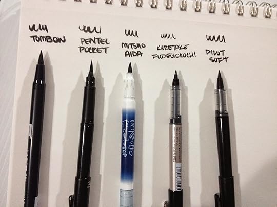
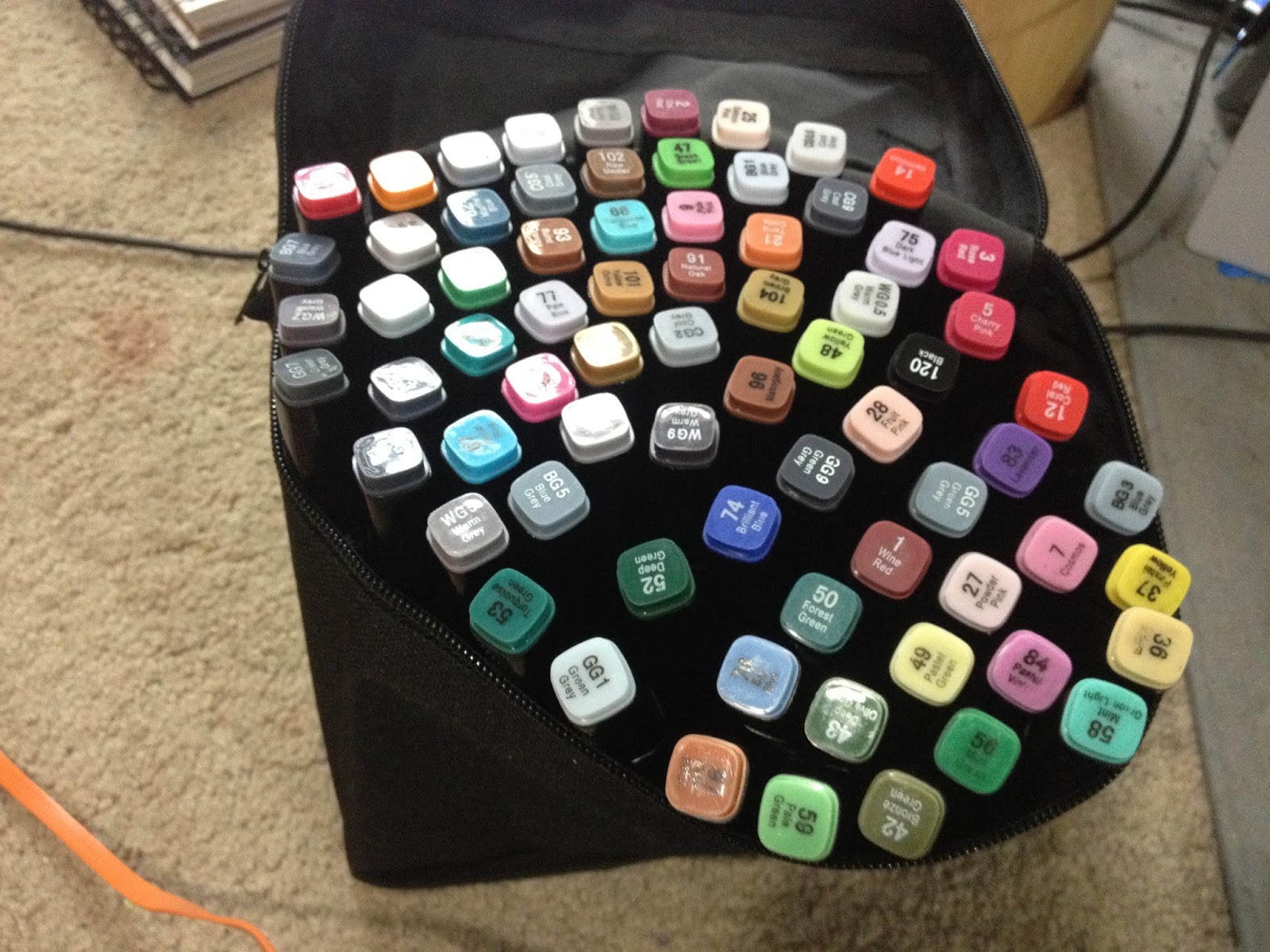
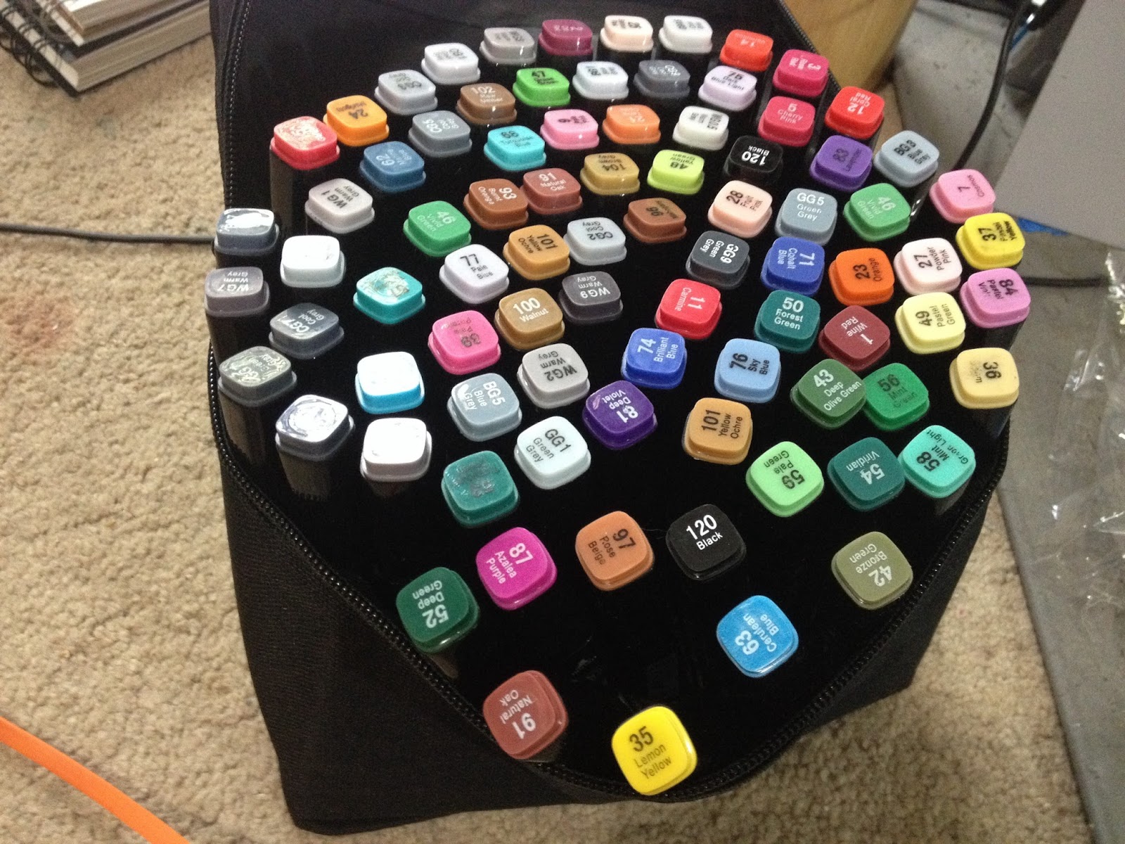
Major Brands- Tombow, Kuretake, Pentel, Pilot, Sailor
Three Main Ink Types
Waterproof- Sailor Mitsuo Aida, Akashiya Sai Outline Pen
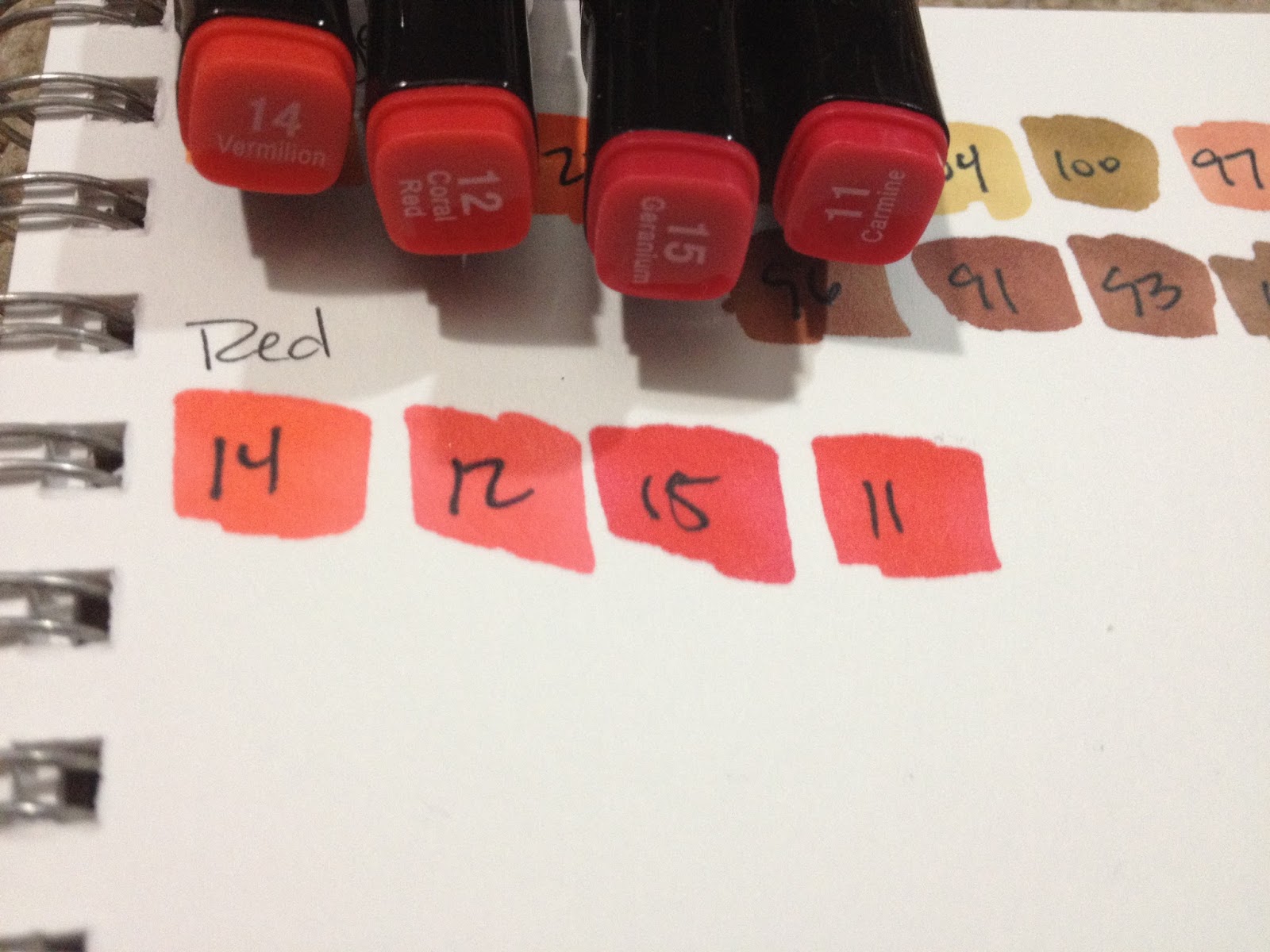
Not Waterproof- Kuretake Fudegokochi, Tombow ABT, Zig Clean Color Real Brush
Alcohol Marker Proof- Kuretake Fudegokochi, Sailor Mitsuo Aida
2 Main Brush Types-
Individual Nylon Bristles- Akashiya Sai Outline Pen, Zig Clean Color Real Brush
Solid Foam Brush- Tombow ABT, Kuretake No 6, Kuretake No 33, Sailor Mitsuo Aida
Several Sizes-
Large (Kuretake No 6, Kuretake No 33, Tombow ABT, Pilot Pocket Brush Soft)
Medium (Kuretake Fudegokochi)
Small- Pilot Fude-Makase, Kuretake Fudegokochi Super Fine

Single Tip- Kuretake Fudegokochi
Double Tipped- May be Dual color with same brush size, Dual color with two brush sizes, or a Single Color with Two Brush Sizes. Pilot Futayaku in Fine and Medium
Single Color- Sailor Mitsuo Aida
Dual Color- Usually Black and Gray-Kuretake No. 6
Available in a wide range of colors: Pentel Touch, Pilot Fude-Makase, Kuretake Fudebiyori, Tombow ABT

Interested in fude pens and not sure where to find them? Fortunately, you no longer need a friend in Japan, as fude pens are becoming increasingly popular. I order many of mine through Amazon! You can use the handy affiliate links to start your collection AND help this blog!
Please consider donating to this blog or purchasing from Natto-shop (http://nattosoup.com/shop) if you want me to continue publishing quality content. All materials tested were purchased from my own pocket. Keep on Truckin' Nattosoup is not under any sponsorship.

Fude pens (which fall into the same category as brush pens) were traditionally used for calligraphy in the East, but are becoming increasingly popular as a sketching and inking tool for artists everywhere. Particularly popular among comic artists for the wide variety of lineweights easily produced, fude pens are a cost effective, low learning curve alternative to inking with technical pens or a brush and ink.
I've used fude pens for several years now, and have reviewed over a dozen here on the blog. A few years ago, I even wrote a post demonstrating how I use them, step by step, to encourage other artists to give them a shot. I use fude pens regularly- from inks over non photo blue lead in my sketchbook to comic pages to inks for marker and watercolor. Fude pens have greatly sped up my inking process, and give me greater control than brushes, as they offer fairly large barrels with fairly fine points.
I've moved almost entirely away from technical pens, as fude pens allow a range of expressive brushstrokes not available to technical pens. Even my inking brush, which is still used in the studio, is often neglected, as there's a fude pen for my every need. My alcohol marker field tests? Inked with a Sailor Mitsuo Aida. My convention inks? Inked with a Kuretake Fudegokochi.
If you're struggling with inking your characters, illustrations, and comics, I highly recommend you give fude pens a try. I have a rough outline, as well as some suggestions below, to help you find a pen that will suit your needs. Many of these pens serve double, or even triple, duty as inking tools, watercolor tools, and markers, so they may not be compatible with other media. This list is not intended to be comprehensive, just a simple introduction to those who may be unfamiliar with fude pens, or are looking to quickly find a fude pen to suit their needs.
Major Brands- Tombow, Kuretake, Pentel, Pilot, Sailor
Three Main Ink Types
Waterproof- Sailor Mitsuo Aida, Akashiya Sai Outline Pen
Not Waterproof- Kuretake Fudegokochi, Tombow ABT, Zig Clean Color Real Brush
Alcohol Marker Proof- Kuretake Fudegokochi, Sailor Mitsuo Aida
2 Main Brush Types-
Individual Nylon Bristles- Akashiya Sai Outline Pen, Zig Clean Color Real Brush
Solid Foam Brush- Tombow ABT, Kuretake No 6, Kuretake No 33, Sailor Mitsuo Aida
Several Sizes-
Large (Kuretake No 6, Kuretake No 33, Tombow ABT, Pilot Pocket Brush Soft)
Medium (Kuretake Fudegokochi)
Small- Pilot Fude-Makase, Kuretake Fudegokochi Super Fine

Single Tip- Kuretake Fudegokochi
Double Tipped- May be Dual color with same brush size, Dual color with two brush sizes, or a Single Color with Two Brush Sizes. Pilot Futayaku in Fine and Medium

Single Color- Sailor Mitsuo Aida
Dual Color- Usually Black and Gray-Kuretake No. 6
Available in a wide range of colors: Pentel Touch, Pilot Fude-Makase, Kuretake Fudebiyori, Tombow ABT
Interested in fude pens and not sure where to find them? Fortunately, you no longer need a friend in Japan, as fude pens are becoming increasingly popular. I order many of mine through Amazon! You can use the handy affiliate links to start your collection AND help this blog!
Please consider donating to this blog or purchasing from Natto-shop (http://nattosoup.com/shop) if you want me to continue publishing quality content. All materials tested were purchased from my own pocket. Keep on Truckin' Nattosoup is not under any sponsorship.


May 1, 2016
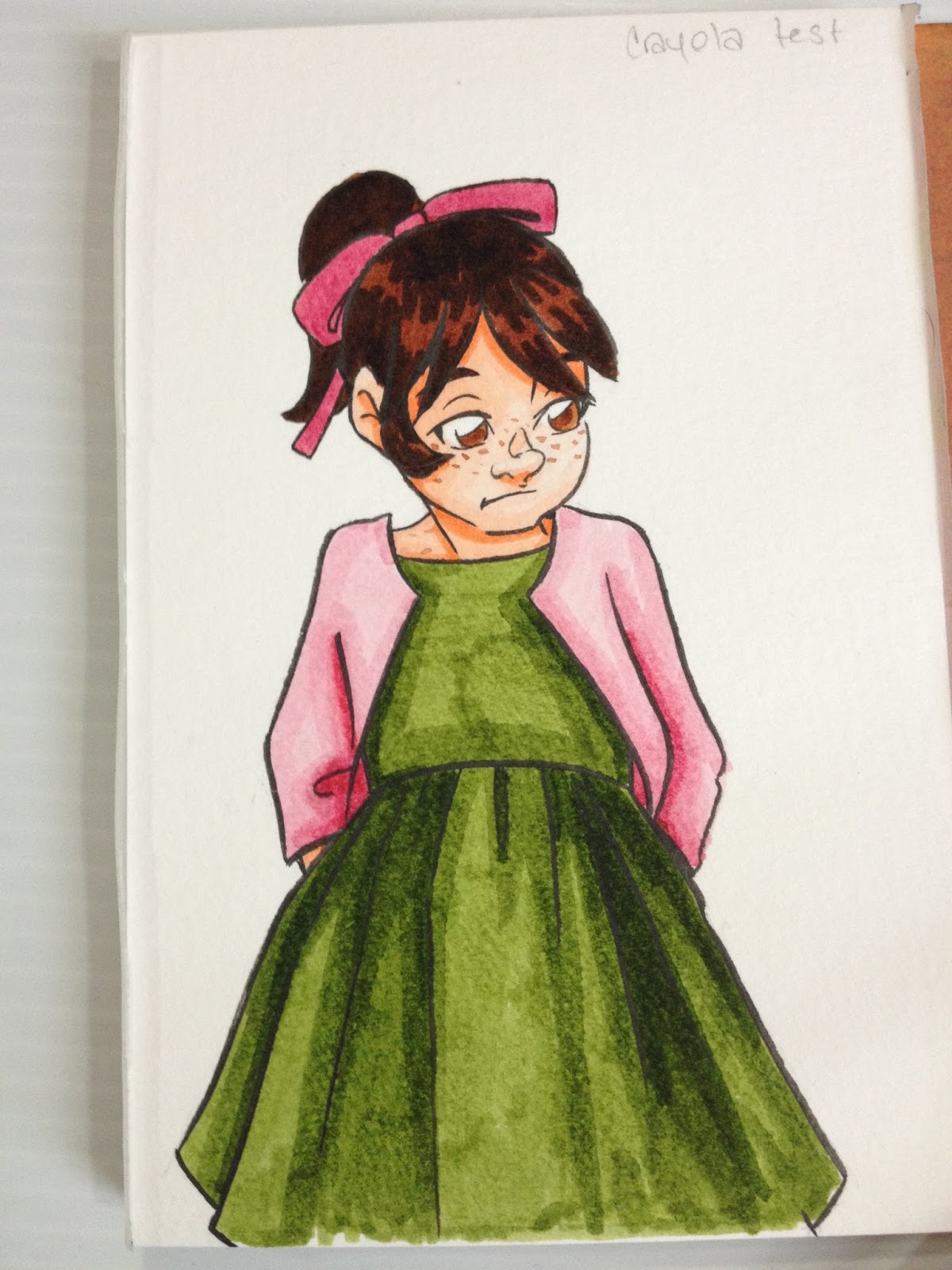
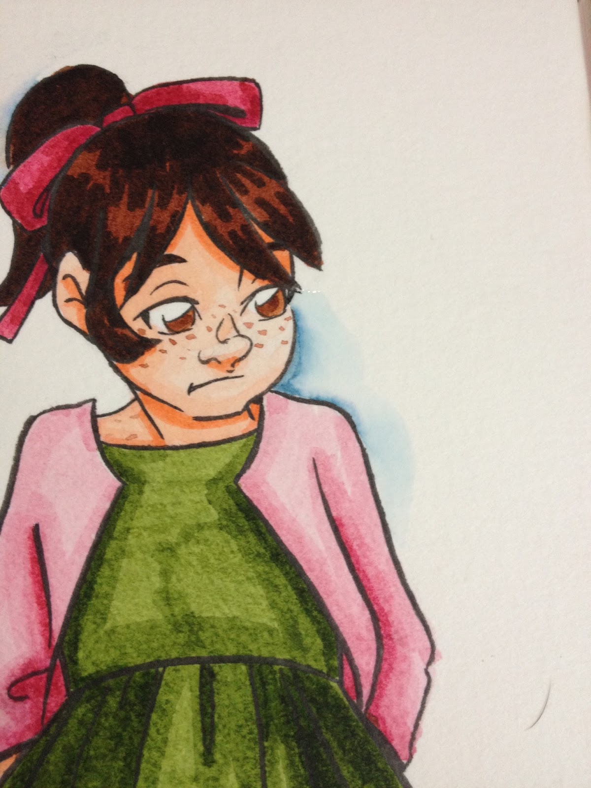
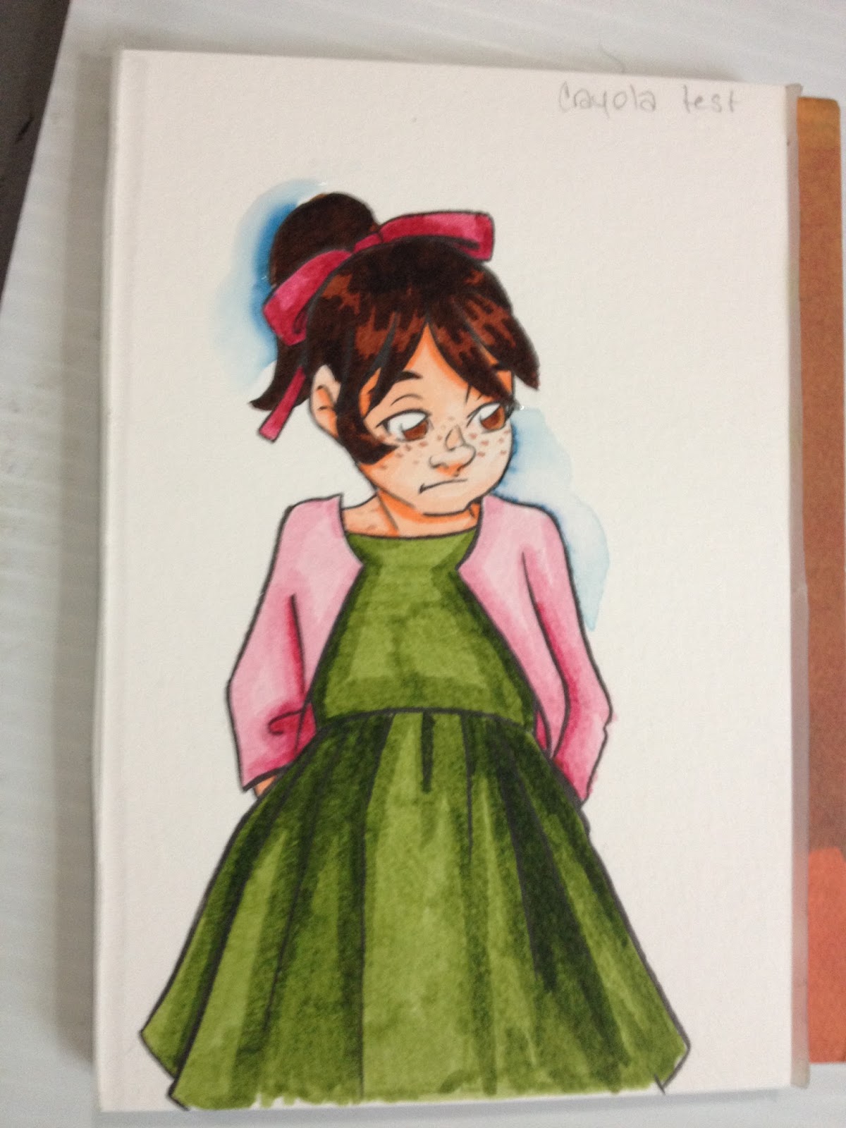
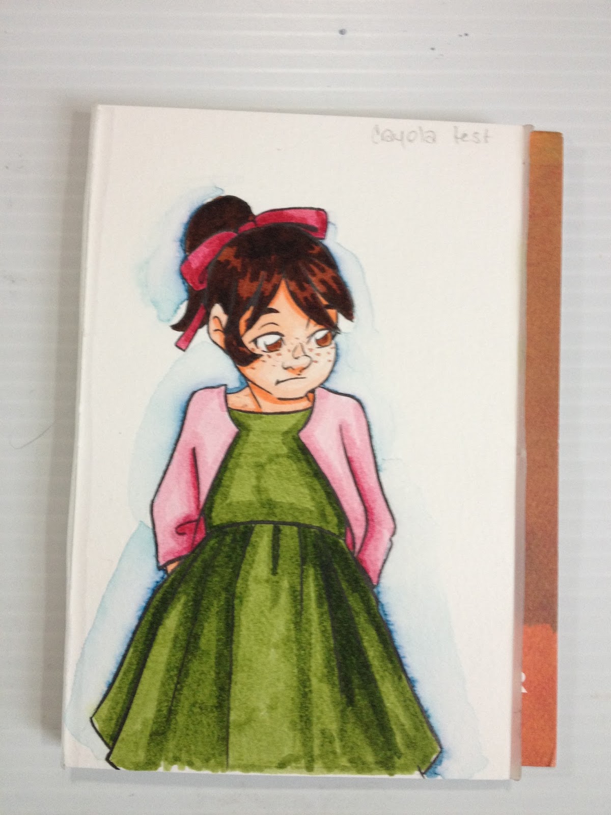
Revisiting: Crayola Supertip Markers on Watercolor Paper
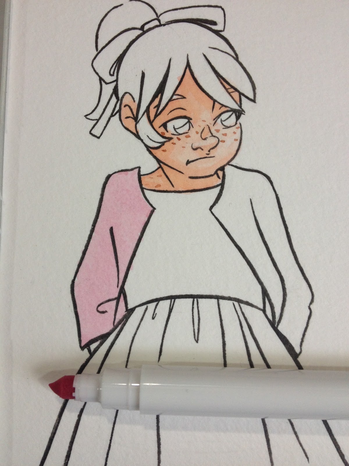
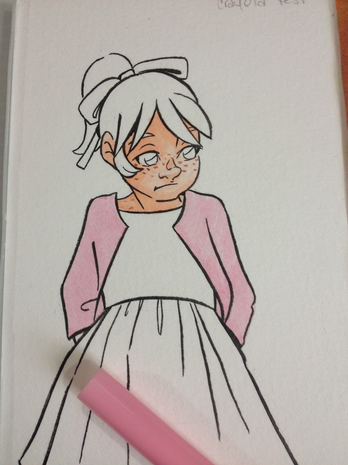
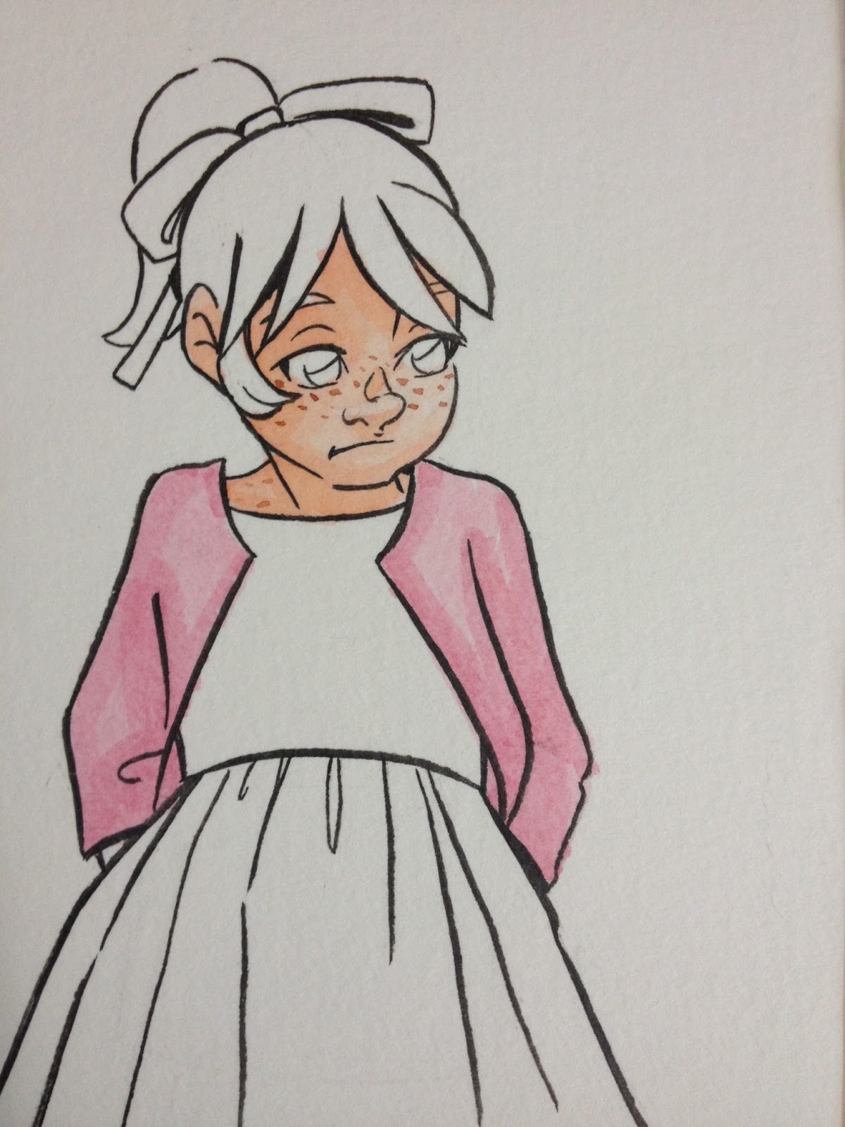
In the past few months, I've really cranked up the number of waterbased markers I've reviewed on this blog. I know a few of you probably wonder why, as they have a mediocre reputation among artists and illustrators, but I have a hunch that for many of these markers, it's all in the paper you use. Regular paper like sketchbook paper and cardstocks aren't designed to stand up to the combination of stiff nibs and repeated application of (relatively slow) drying waterbased inks, so I decided to beef up my paper selection, and reached for a wood pulp watercolor paper- Fluid's cold press watercolor blocks. Cotton watercolor papers are great for actual watercolors- soft and absorptive, but I thought the stiff nibs of the Crayola Supertips I'm testing in this post would tear that surface up. Woodpulp watercolor paper like Canson's cheaper options (Montval, Biggie) and Fluid watercolor pads are not always idea for painting on, but I thought they could better stand up to those non-flexible Supertips.
Since writing this post, I've also reviewed Up and Up's Supertip markers, and using cold press, cellulose based watercolor paper has now become a regular feature in my waterbased reviews.
Materials Used in this Post
The Field Test

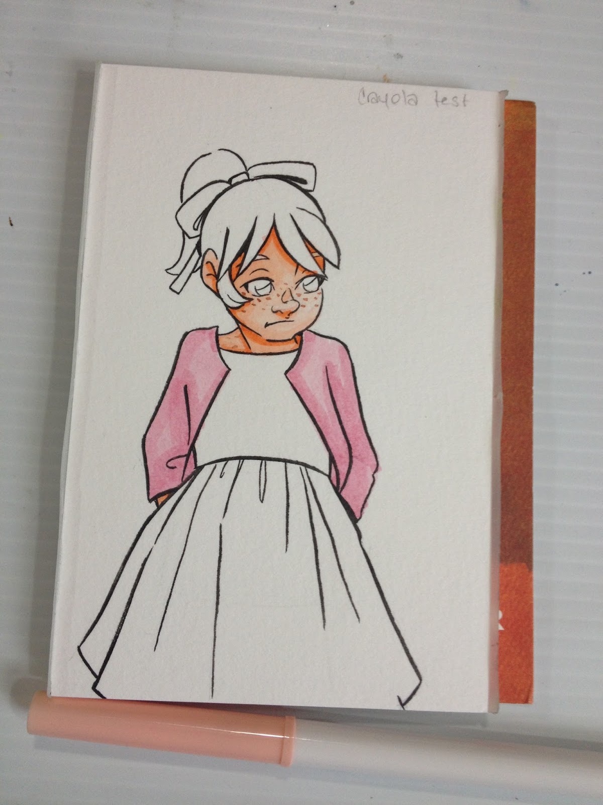
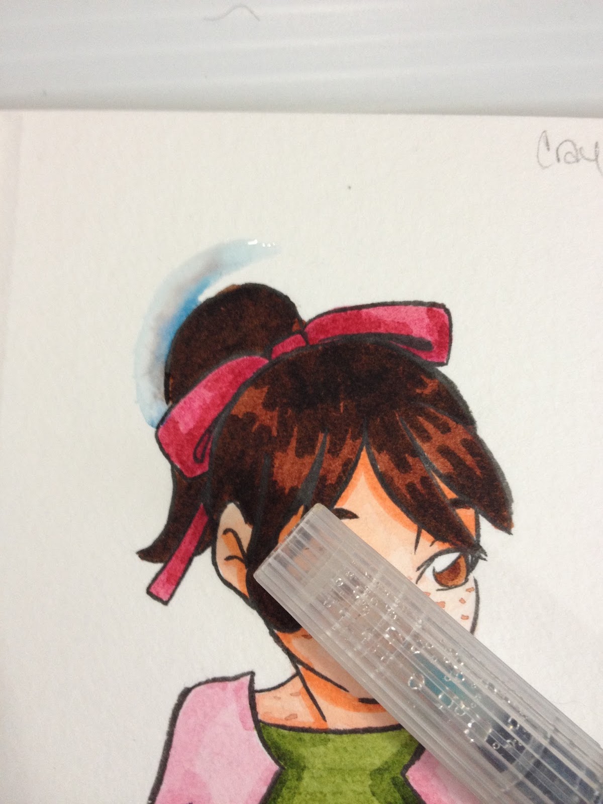
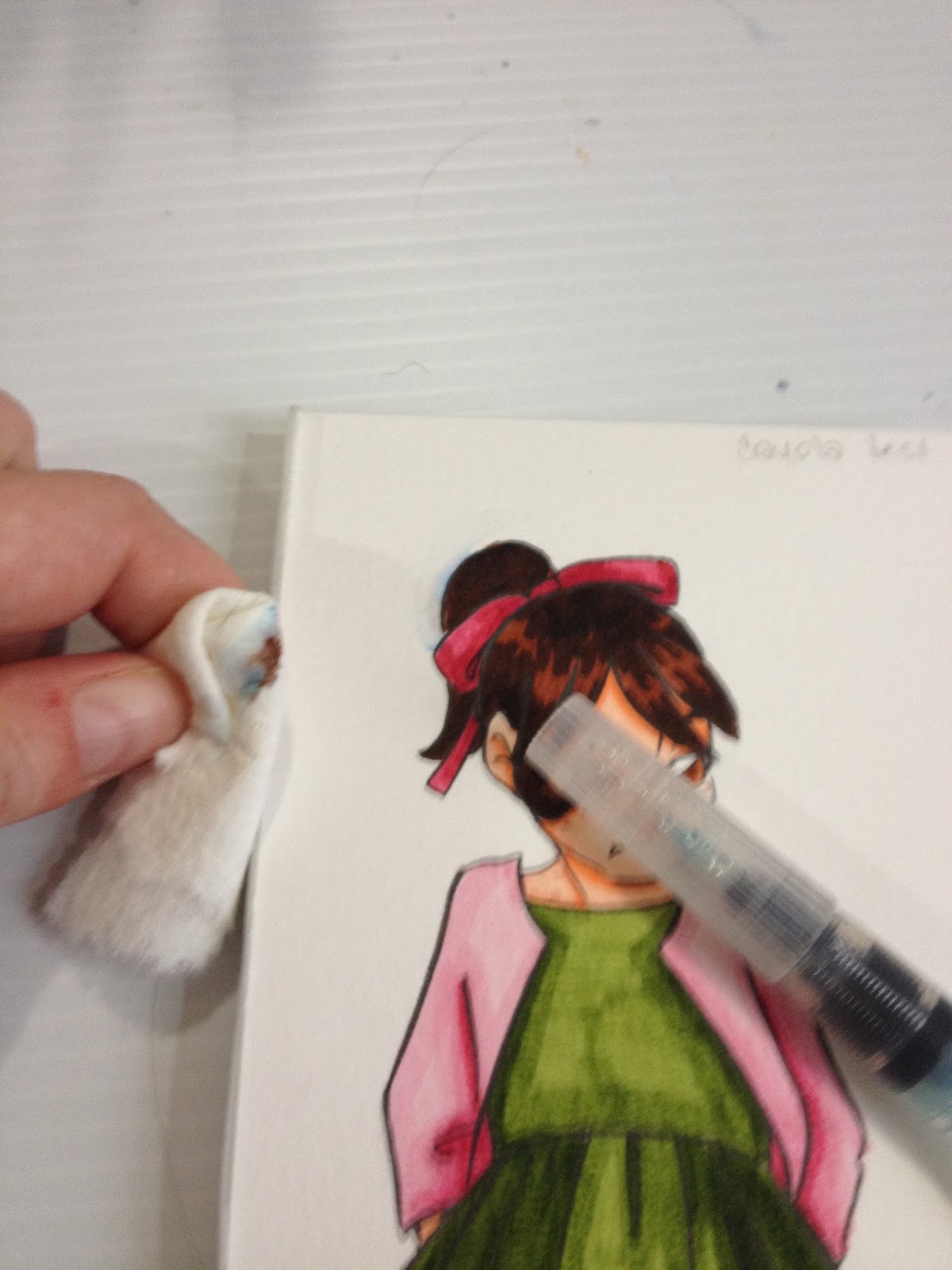
I was a chicken and used the watercolor marker technique (covered in my original Crayola marker review!) of applying color to Kara's skin, but promised myself that I would dive right in on applying marker directly to the paper for everything else.
Surprisingly, the watercolor paper handles the marker quite well- if you apply deliberate, slow strokes, the paper doesn't show any streaking! I know Walmart sells Canson's watercolor paper, maybe that is the key to applying waterbased markers in a professional way.

If you can work quickly enough, you can get a streak free application of color.


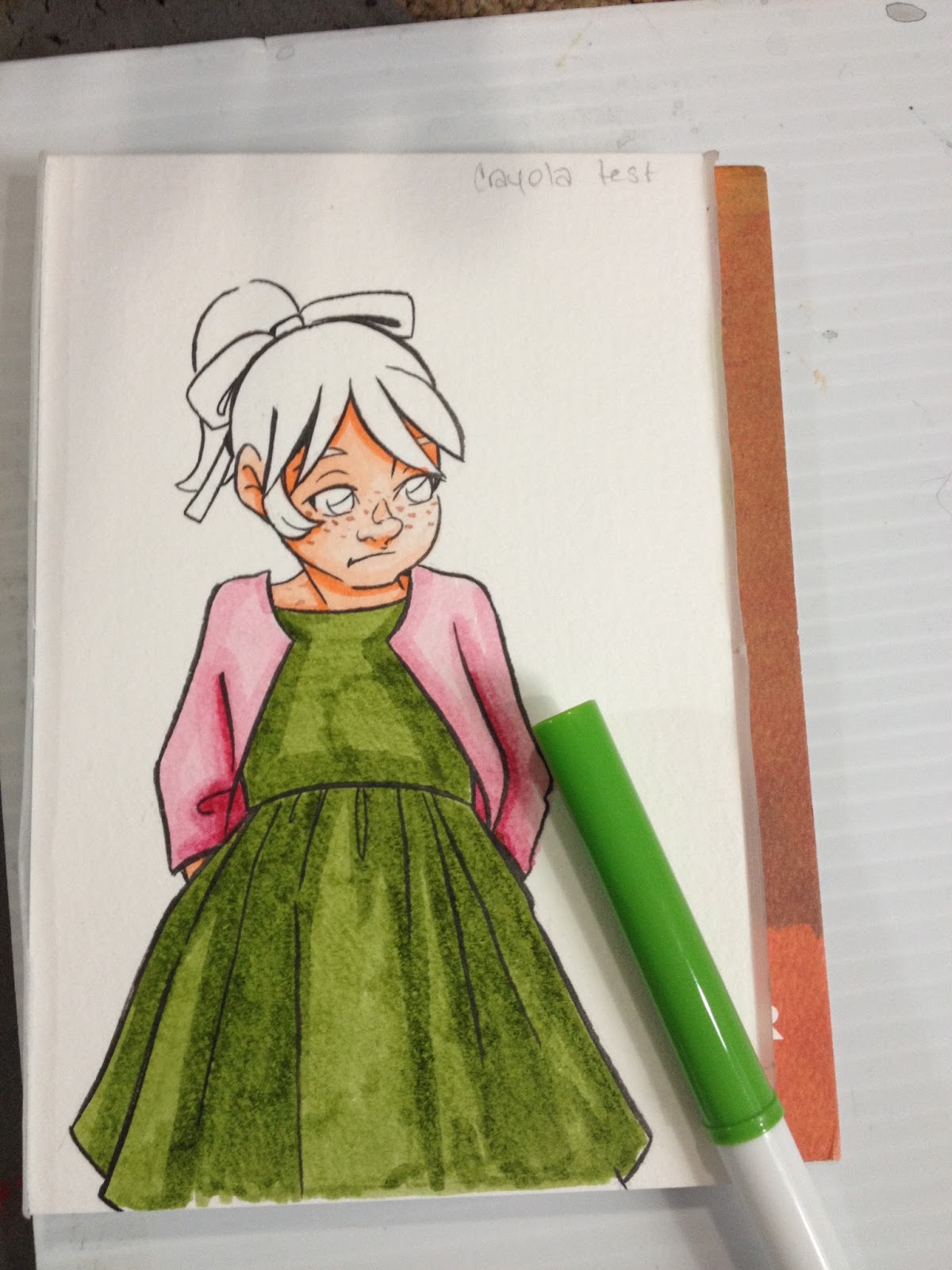
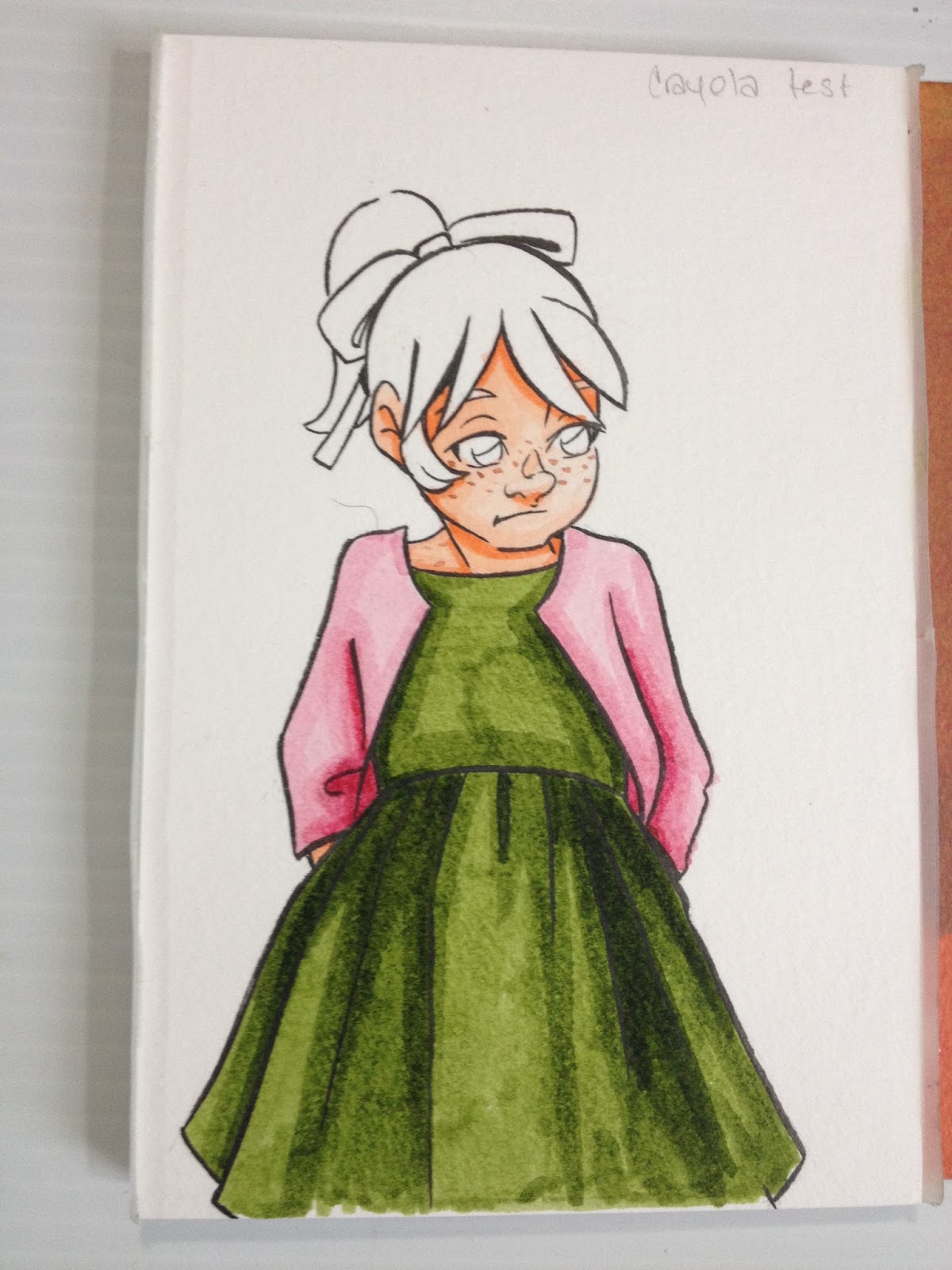
If you give your marker sufficient drying time, you can even layer the waterbased marker without paper surface abrasion. I even became brave and applied a skintone on top of my original skintone application, as a dark shadow, and it looks ok. Keep in mind that while you can layer markers, you can't BLEND them except with water, but that's a technique I've already covered. You can mix the techniques, but make sure your paper is totally dry before you apply marker directly to paper. Since blending marker to marker isn't really an option with the Crayola Supertips, I highly recommend you work closely with your swatch sheet, and make sure your colors match.

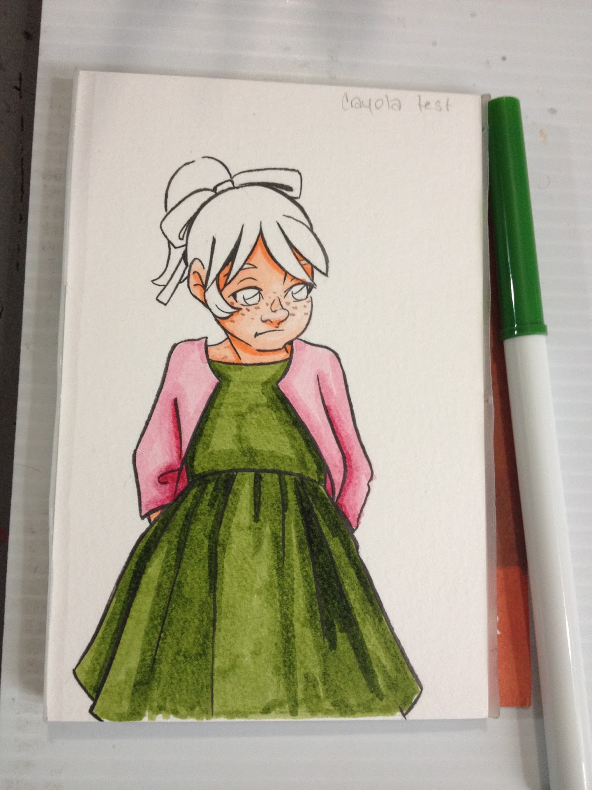
Large areas will show some streaking, although its not nearly as bad as on smooth papers like marker paper, sketchbook paper, or cardstock. I recommend working in sections and working carefully if streaking is an issue for you. You can ease color transitions if you apply your basecolor first, allow it to dry, apply your shadow, and then go back with the base color, but keep in mind that with every layer you add, you're darkening your color.

Unlike on sketchbook paper, cardstock, or even marker paper, you can layer without pilling on wood pulp watercolor paper because the surface is strong enough to take a little scrubbing. Make sure you allow your layers to dry before applying another coat, or your paper will pill due to abrasion from the stiff Supertip.


If you are careful and deliberate, you can also do a little bit of blending out, by using your original color on top of your new color, you can ease the transition between the two colors.


I thought the piece looked a little blank without a background wash, so I tried to apply one after everything was finished.

This can be a big mistake, as adding water, especially from a waterbrush, will reactivate other layers of ink you've put down.

Fortunately, it cleans up easily with a paper towel if you can work fast.

It's better to apply the marker wider than you normally would for watercolor markers, then SPARINGLY (and I mean, wipe all the water out of the brush of your waterbrush first) apply water away from the main figure.


I recommend you do your water-based blending first, because doing it at the end will reactivate colors you've already put down, and make a big mess. I'd switched to a waterbrush to apply a blue background, and it lays down WAY too much water (even if I try to dry the tip out a bit), so I do not recommend using a Pentel travel waterbrush for applying washes at the end of your waterbased marker rendering session.
The Verdict
On watercolor paper, these waterbased markers are actually pretty fun to render with, and are far less likely to give you fume headaches the way prolonged exposure to Copics sometimes can. Yes, streaking is still an issue, although far less of an issue than it was on marker paper or cardstock. I realize some of my readers might not have wood pulp based watercolor paper laying around, but I know Canson's cheaper offerings, like their Biggie pads, are wood pulp, and might be worth playing around with if you enjoy using waterbased markers.
More on this blog about Crayola Markers
Walmart Art Supply Review: Waterbased MarkersWaterbased Marker Review: Crayola Ultra-Clean Washable Markers- Multicultural ColorsAlcohol-based, Waterbased, Watercolor- What's the Difference?Finding a Paper for Waterbased Markers
If you're interested in waterbased markers as an alternative to alcohol based markers, consider reading these watercolor marker reviews as well:
Watercolor Brush Pen Review: Docrafts Artiste Watercolor MarkersWatercolor Brushpen Review: Tombow ABTWatercolor Pen Review: Marvy LePlumeIIWatercolor Brushpen Review: Neopiko 4Mini Review: Winsor and Newton Watercolor MarkersWinsor and Newton Watercolor Marker Field TestWatercolor Brushpen Review: Zig Art and Graphic TwinWatercolor Brush Pen Review: Lyra Aqua Brush Duo
Please consider donating to this blog or purchasing from Natto-shop (http://nattosoup.com/shop) if you want me to continue publishing quality content. All materials tested were purchased from my own pocket. Keep on Truckin' Nattosoup is not under any sponsorship.
Since writing this post, I've also reviewed Up and Up's Supertip markers, and using cold press, cellulose based watercolor paper has now become a regular feature in my waterbased reviews.
Materials Used in this Post
The Field Test

I was a chicken and used the watercolor marker technique (covered in my original Crayola marker review!) of applying color to Kara's skin, but promised myself that I would dive right in on applying marker directly to the paper for everything else.
Surprisingly, the watercolor paper handles the marker quite well- if you apply deliberate, slow strokes, the paper doesn't show any streaking! I know Walmart sells Canson's watercolor paper, maybe that is the key to applying waterbased markers in a professional way.
If you can work quickly enough, you can get a streak free application of color.

If you give your marker sufficient drying time, you can even layer the waterbased marker without paper surface abrasion. I even became brave and applied a skintone on top of my original skintone application, as a dark shadow, and it looks ok. Keep in mind that while you can layer markers, you can't BLEND them except with water, but that's a technique I've already covered. You can mix the techniques, but make sure your paper is totally dry before you apply marker directly to paper. Since blending marker to marker isn't really an option with the Crayola Supertips, I highly recommend you work closely with your swatch sheet, and make sure your colors match.

Large areas will show some streaking, although its not nearly as bad as on smooth papers like marker paper, sketchbook paper, or cardstock. I recommend working in sections and working carefully if streaking is an issue for you. You can ease color transitions if you apply your basecolor first, allow it to dry, apply your shadow, and then go back with the base color, but keep in mind that with every layer you add, you're darkening your color.
Unlike on sketchbook paper, cardstock, or even marker paper, you can layer without pilling on wood pulp watercolor paper because the surface is strong enough to take a little scrubbing. Make sure you allow your layers to dry before applying another coat, or your paper will pill due to abrasion from the stiff Supertip.
If you are careful and deliberate, you can also do a little bit of blending out, by using your original color on top of your new color, you can ease the transition between the two colors.


I thought the piece looked a little blank without a background wash, so I tried to apply one after everything was finished.
This can be a big mistake, as adding water, especially from a waterbrush, will reactivate other layers of ink you've put down.
Fortunately, it cleans up easily with a paper towel if you can work fast.
It's better to apply the marker wider than you normally would for watercolor markers, then SPARINGLY (and I mean, wipe all the water out of the brush of your waterbrush first) apply water away from the main figure.
I recommend you do your water-based blending first, because doing it at the end will reactivate colors you've already put down, and make a big mess. I'd switched to a waterbrush to apply a blue background, and it lays down WAY too much water (even if I try to dry the tip out a bit), so I do not recommend using a Pentel travel waterbrush for applying washes at the end of your waterbased marker rendering session.
The Verdict
On watercolor paper, these waterbased markers are actually pretty fun to render with, and are far less likely to give you fume headaches the way prolonged exposure to Copics sometimes can. Yes, streaking is still an issue, although far less of an issue than it was on marker paper or cardstock. I realize some of my readers might not have wood pulp based watercolor paper laying around, but I know Canson's cheaper offerings, like their Biggie pads, are wood pulp, and might be worth playing around with if you enjoy using waterbased markers.
More on this blog about Crayola Markers
Walmart Art Supply Review: Waterbased MarkersWaterbased Marker Review: Crayola Ultra-Clean Washable Markers- Multicultural ColorsAlcohol-based, Waterbased, Watercolor- What's the Difference?Finding a Paper for Waterbased Markers
If you're interested in waterbased markers as an alternative to alcohol based markers, consider reading these watercolor marker reviews as well:
Watercolor Brush Pen Review: Docrafts Artiste Watercolor MarkersWatercolor Brushpen Review: Tombow ABTWatercolor Pen Review: Marvy LePlumeIIWatercolor Brushpen Review: Neopiko 4Mini Review: Winsor and Newton Watercolor MarkersWinsor and Newton Watercolor Marker Field TestWatercolor Brushpen Review: Zig Art and Graphic TwinWatercolor Brush Pen Review: Lyra Aqua Brush Duo
Please consider donating to this blog or purchasing from Natto-shop (http://nattosoup.com/shop) if you want me to continue publishing quality content. All materials tested were purchased from my own pocket. Keep on Truckin' Nattosoup is not under any sponsorship.
April 29, 2016
Alcohol Marker Review: Peter Pauper Alcohol Markers from Barnes and Noble
I was tipped off about these markers through a Tumblr ask, so of course I had to investigate. Barnes and Noble alcohol markers? Way too intriguing for me to not check out. I appreciate the tip, and if you guys have any more products I need to check out, feel free to drop me a line however you're most comfortable.
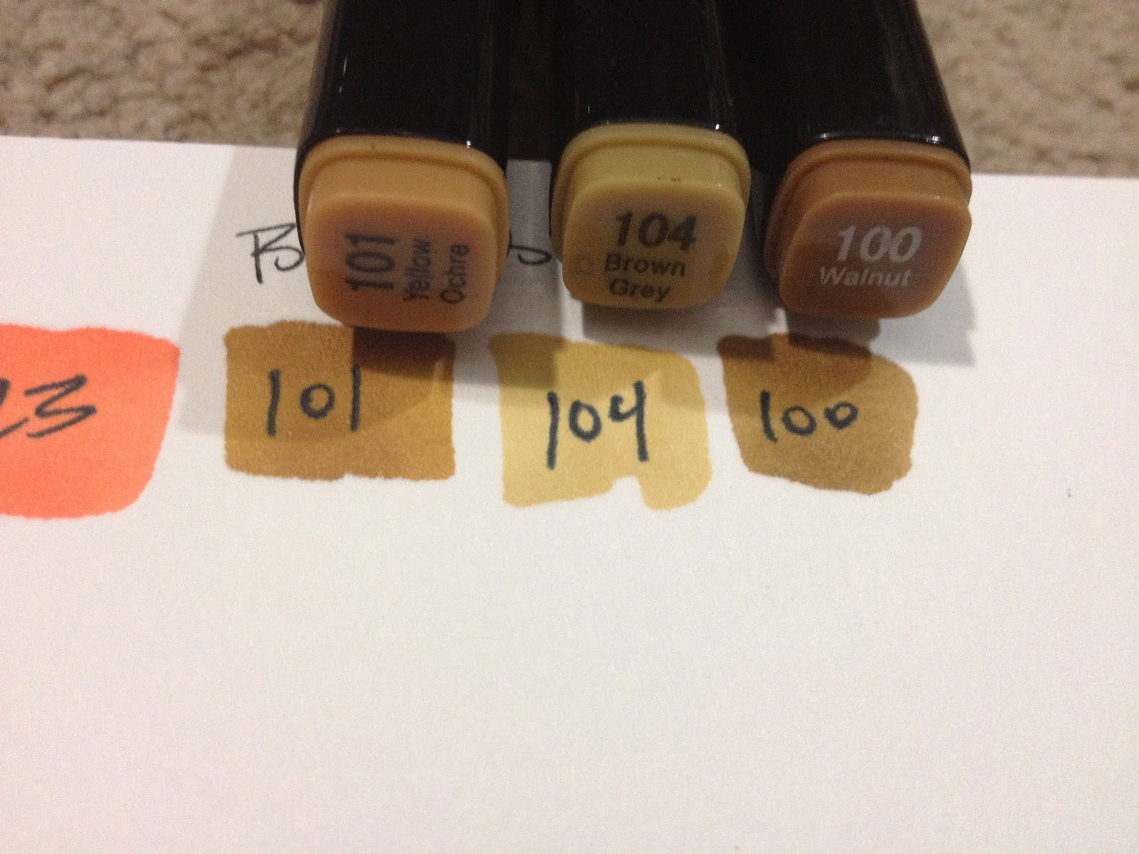
Posts like these are funded in part by the generosity of my Patrons on Patreon , as well as through generous donations to the PayPal tip jar in my sidebar. If you enjoy these alcohol marker reviews, please consider either joining the Nattosoup community by becoming a Patron, or making a one time donation to the Paypal tip jar to help offset the costs of maintaining a review blog. As almost always, this post was NOT sponsored, and was paid for entirely out of my pocket.
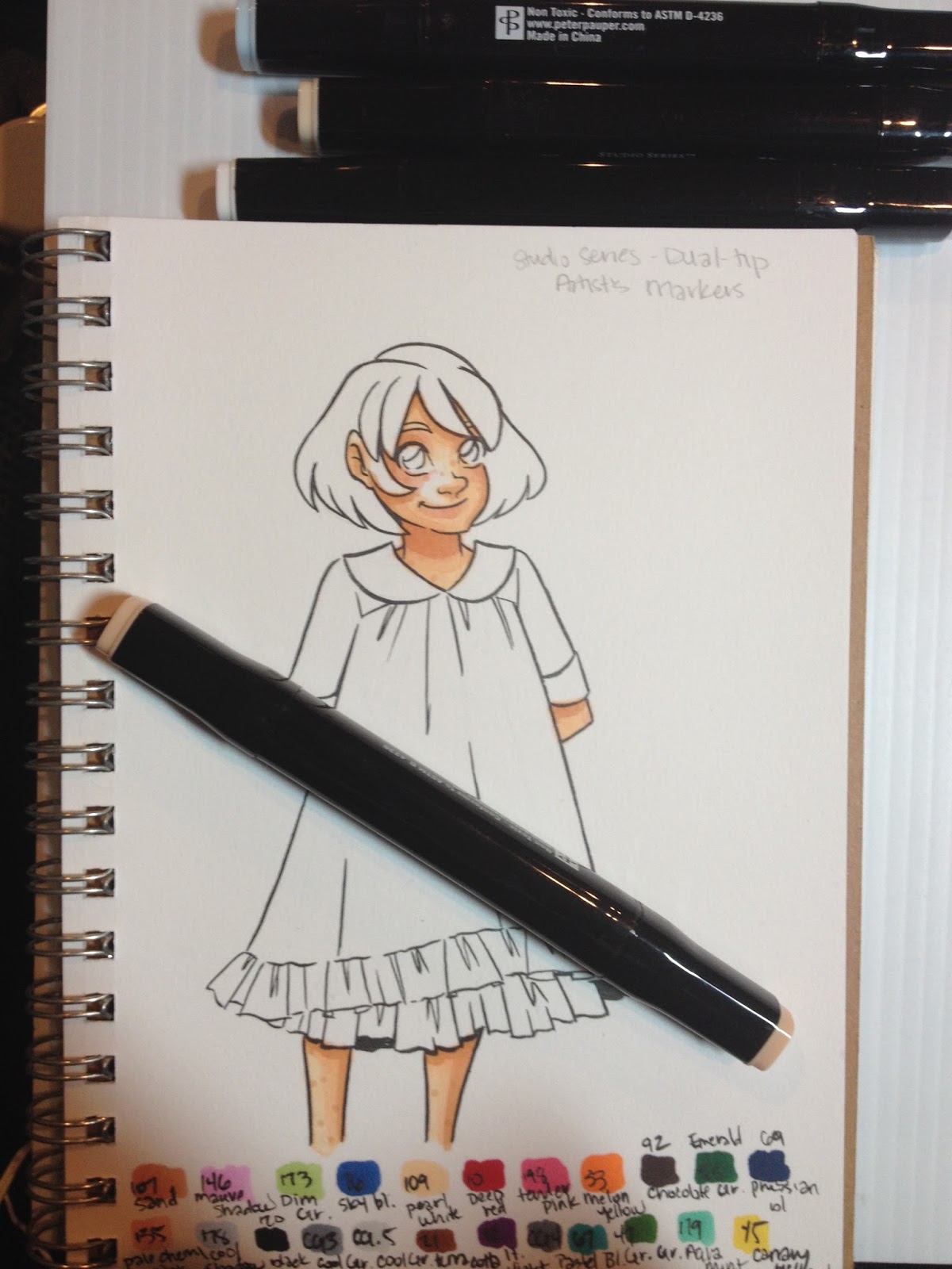
The Stats:
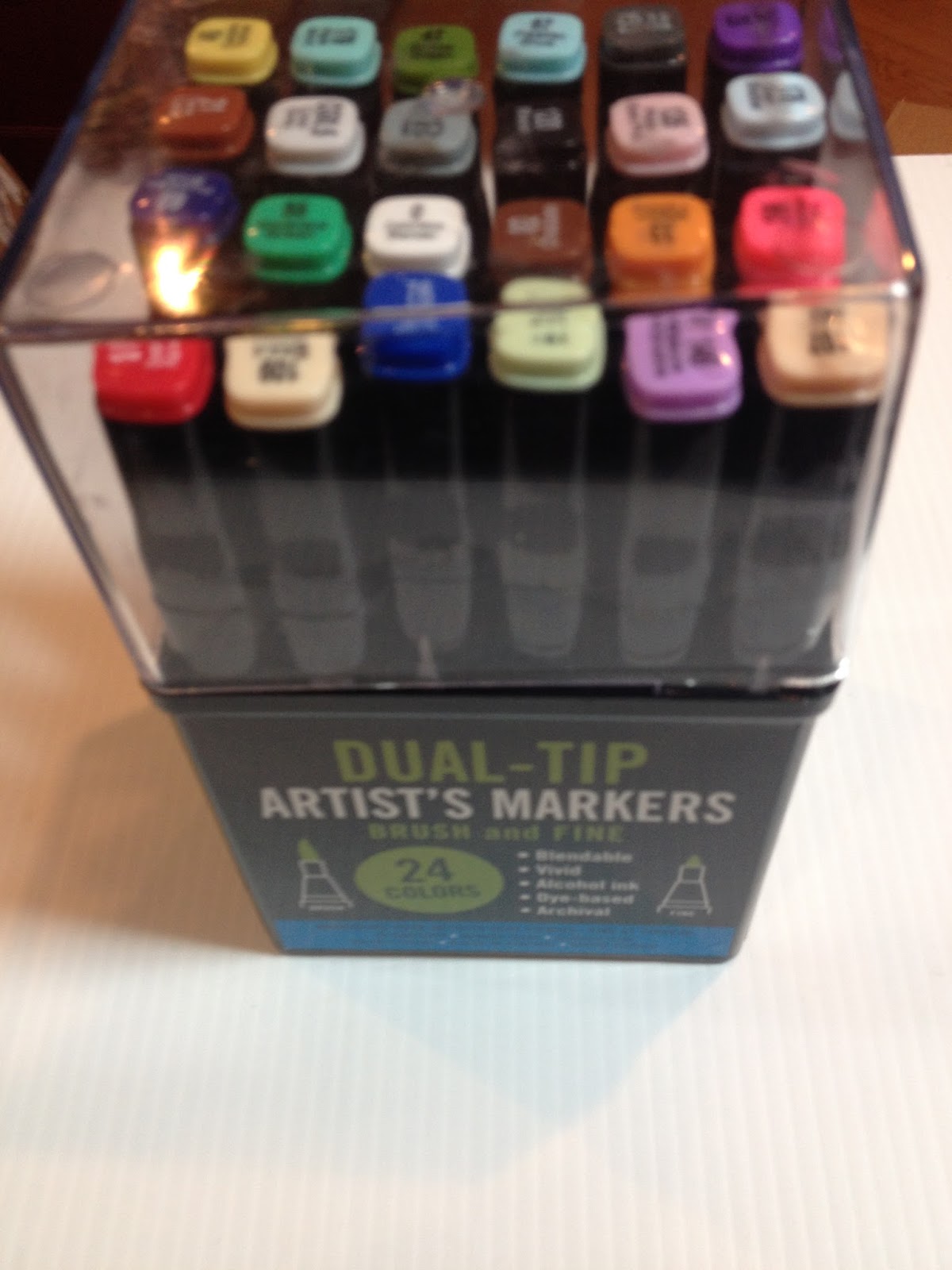
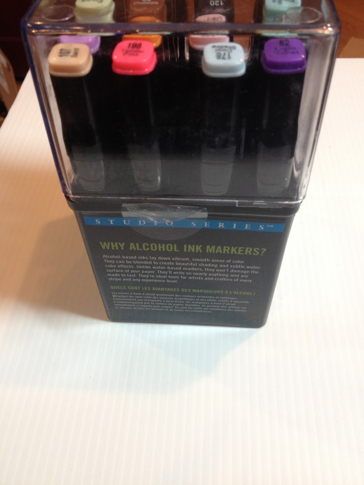
These markers are officially sold as Peter Pauper's Studio Series Professional Alcohol Markers- Dual Tip on the Peter Pauper website.
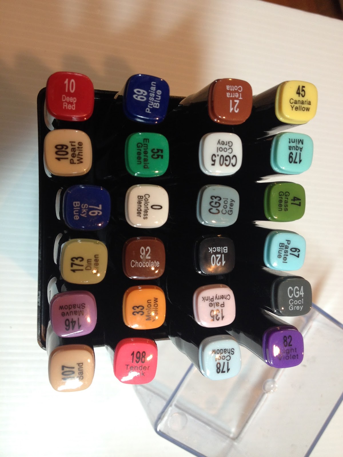
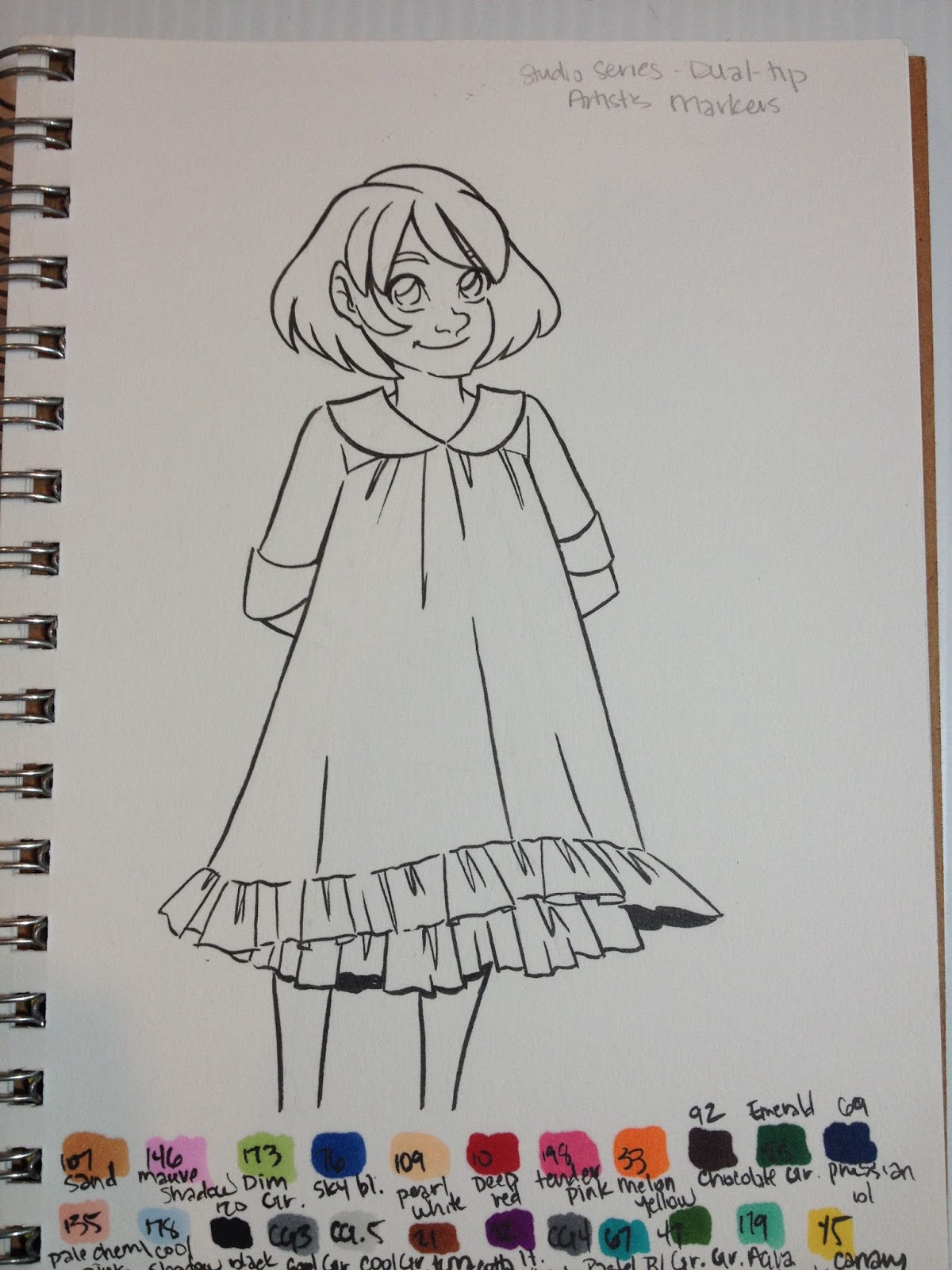
23 colors and a colorless blenderSold at Barnes and Noble, Amazon (cheaper price), on Peter Pauper siteNon refillableNon replaceable nibsNot available open stock$39.99 at Barnes and Noble in Baton Rouge, La.
Colors Included:
Colorless Blender
Canaria YellowAqua Mint
Grass Green
Pastel Blue
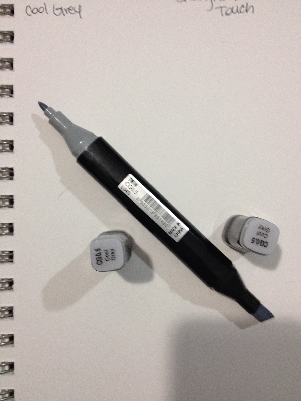
Cool Grey 4
Light Violet
Terra Cotta
Cool Grey .5
Cool Grey 3
Black
Pale Cherry Pink
Cool Shadow
Prussian Blue
Emerald Green
Chocolate
Melon Yellow
Tender Pink
Deep Red
Pearl White
Sky Blue
Dim Green
Mauve Shadow
Sand
The site promises:
•Case measures 4 inches wide by 6-1/2 inches high by 3-1/2 inches deep (10.2 cm wide by 16.5 cm high by 8.9 cm deep).
•Professional grade markers measure 6 inches (15 cm) long.
•Also great for Studio Series Artist's Coloring Books.
•Use with high-quality, heavyweight paper like Studio Series Premium Drawing Pads and Sketchbooks.
•Alcohol-based ink is archival, dye-based.•Works on paper, fabric, glass, wood, metal, and ceramic.
•Great for illustration, design, sketching, crafting, coloring, cartooning, and more.
•Optimal ink flow for even saturation.
•Super blendable, both before and after ink dries.
•Dual tips: fine and brush, for detail work and broad-area coverage.24 vivid colors in a versatile range.
The website also extols the virtues of alcohol markers over other types of markers, as shown below:
The Brand
Peter Pauper specializes in affordable books for the whole family. According to the blog:
In 1928, at the age of twenty-two, Peter Beilenson began printing books on a small press in the basement of his parents’ home in Larchmont, New York. Peter—and later, his wife, Edna—sought to create fine books that sold at “prices even a pauper could afford.”Today, still family owned and operated, Peter Pauper Press continues to honor our founders’ legacy—and our customers’ expectations—of beauty, quality, and value.
They have recently introduced a line of art supplies and coloring books to cash in on the coloring for therapy/meditation craze.
The Packaging
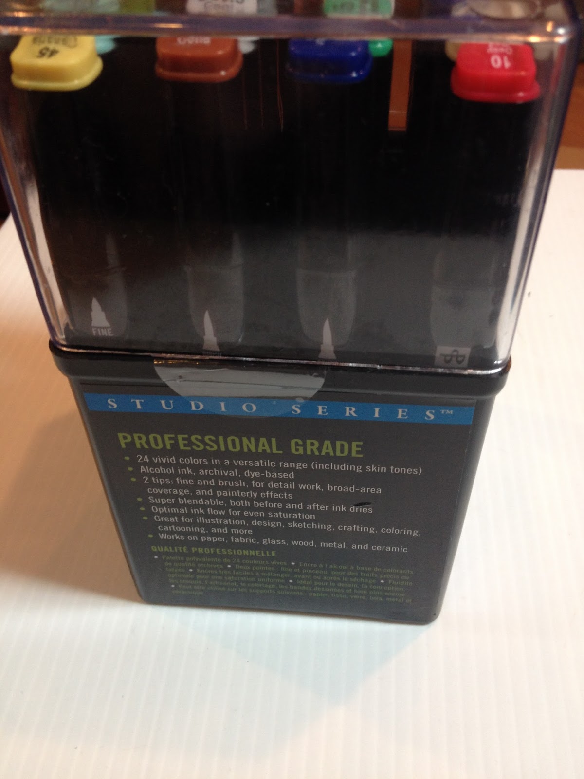
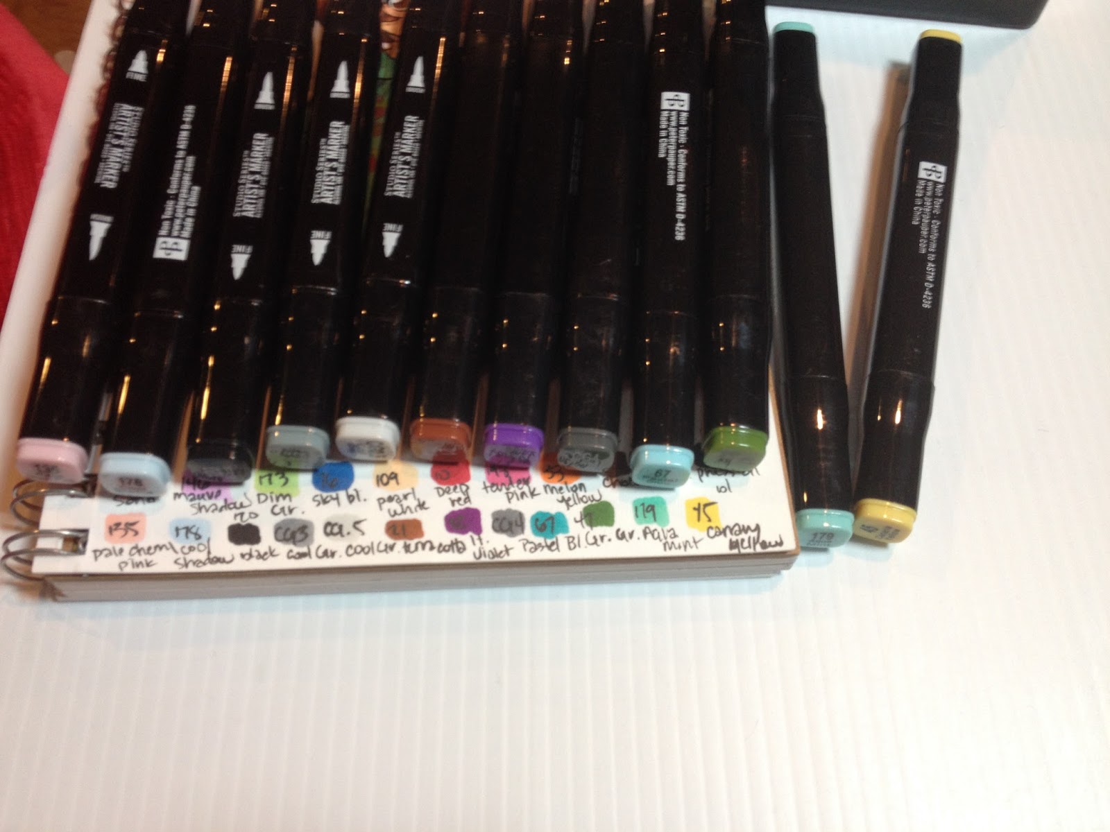
Peter Pauper's Studio Alcohol Markers come in a reusable hard plastic case with a clear plastic cap.

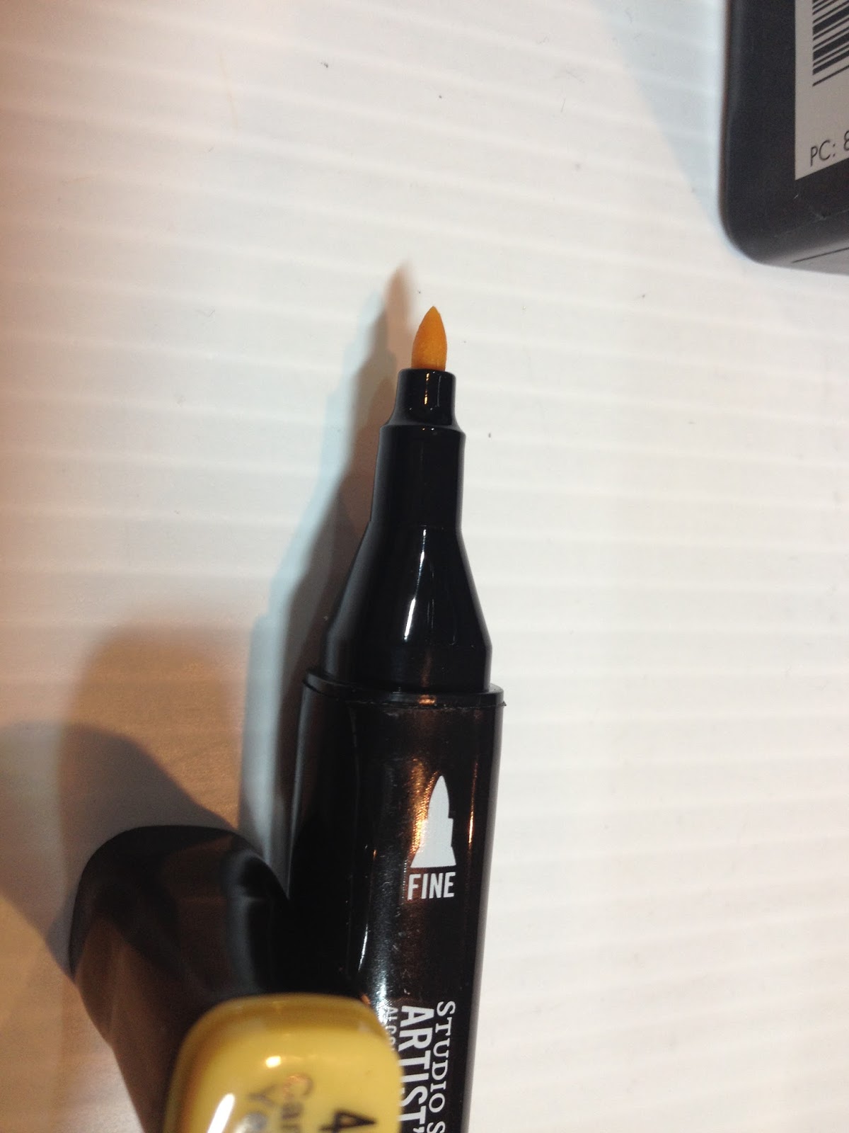
The case outlines the markers attributes and has an illustration of the two tips- a bullet nib and a brush nib. The brush nib is really what intrigued me the most- I have never seen a cheap alcohol marker with a brush nib, let alone a decent brush nib.
The package promises that these markers are:
BlendableVividAlcohol InkDye BasedArchival

And explains why the consumer should try alcohol markers. This text is the same as that from the website.

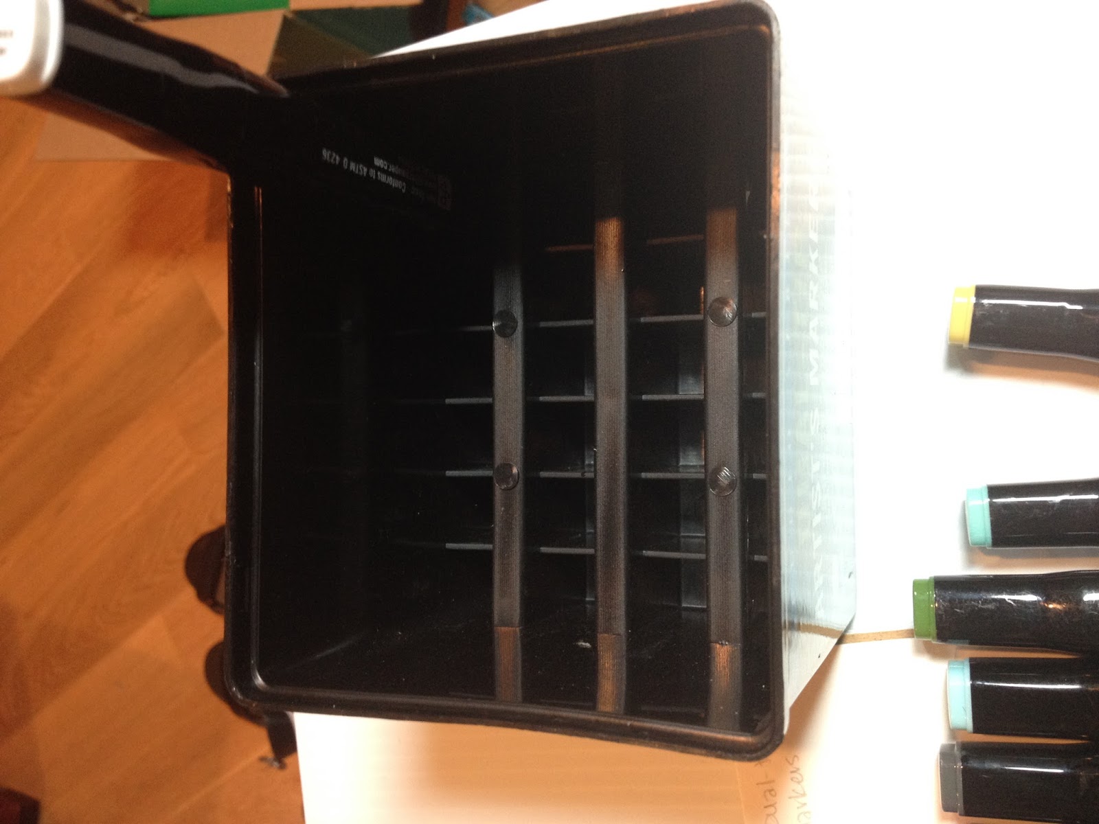
Once the tape disks were removed, it was difficult to keep the clear plastic top on the body- it never firmly snapped on, and it meant that the markers were liable to spill everywhere if slightly upset. This case is meant for desktop use, and you'll need to tape the top on securely for travel.

These markers claim to be professional grade, with optimal ink flow for saturation.


The interior of the case has divisions to hold the markers securely in place, and markers can be displayed upright (not recommended by this blog) or horizontally (the proper orientation for marker storage).
The Markers

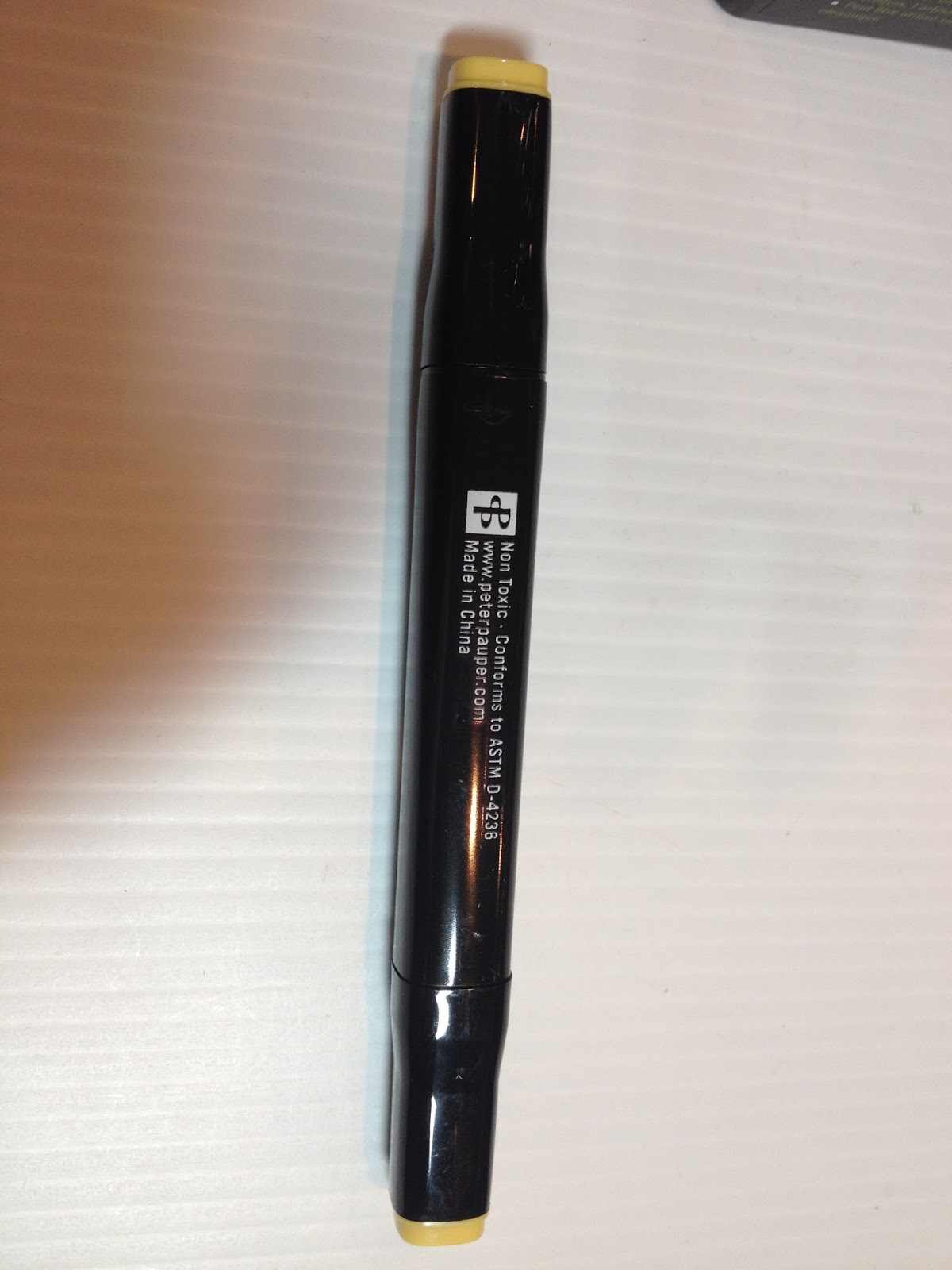
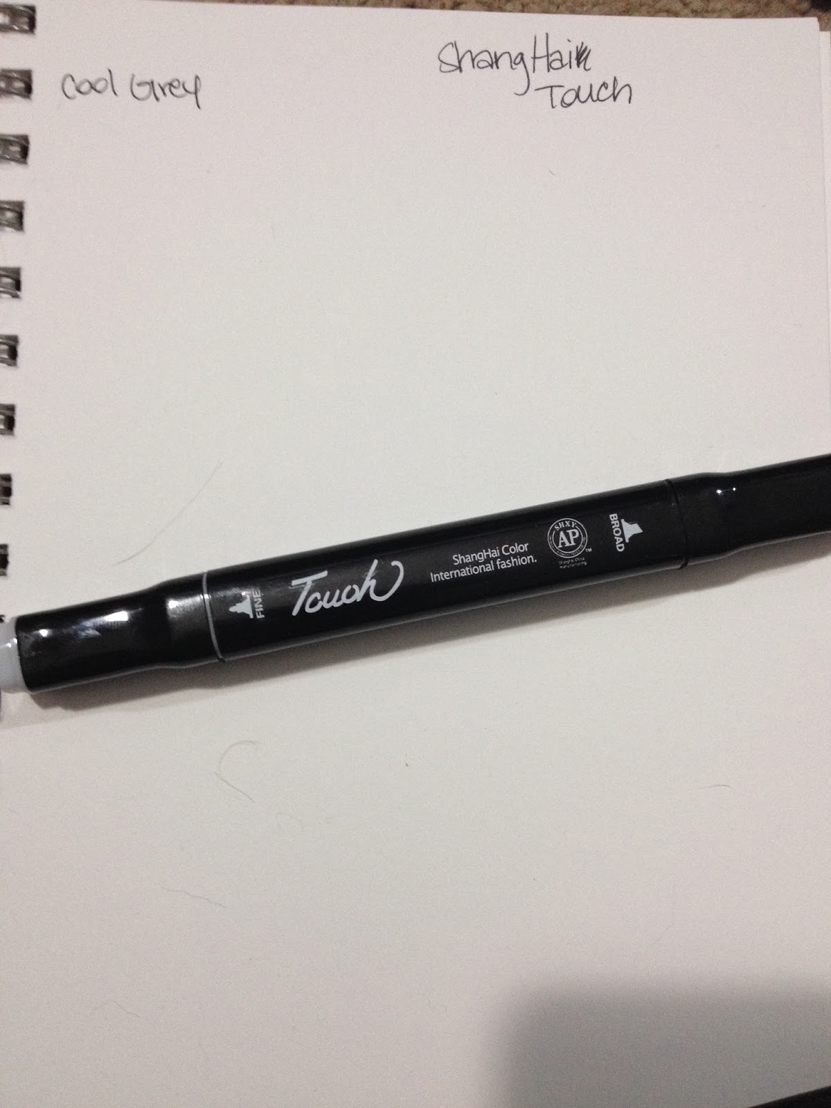
The bodies of the markers are very similar to the Shang Hai Touch markers I reviewed awhile back.
The body is screened with Non Toxic, Conforms to ASTM D-4236
www.peterpauper.com
Made in China
The caps include color names and families, although I'm not sure why the numbers are necessary, as I haven't seen larger sets available.


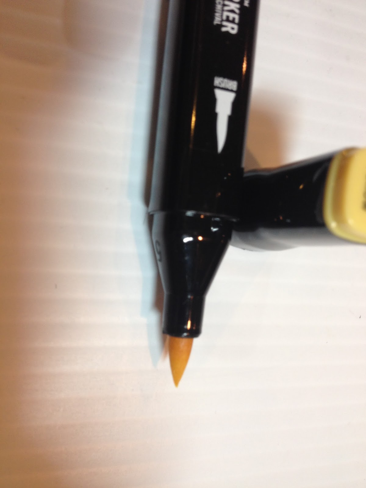
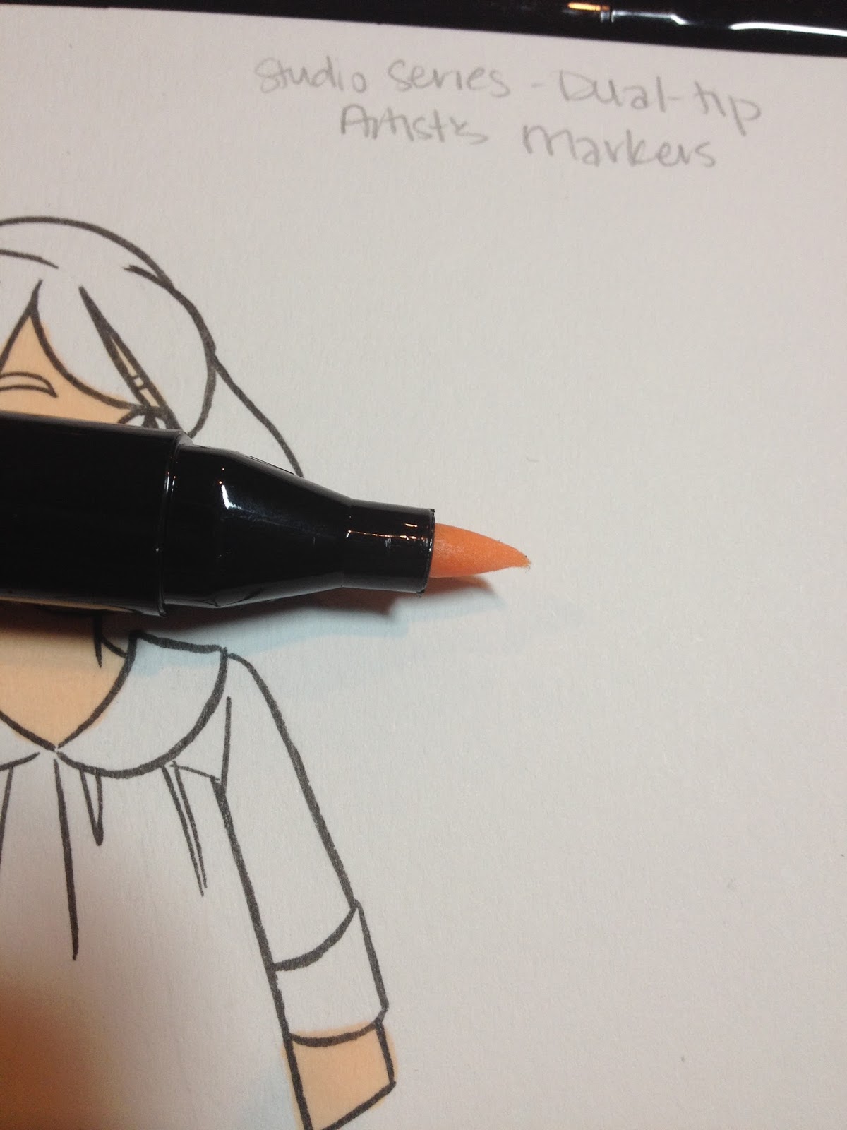
The brush nib is made of fiber rather than rubber foam.

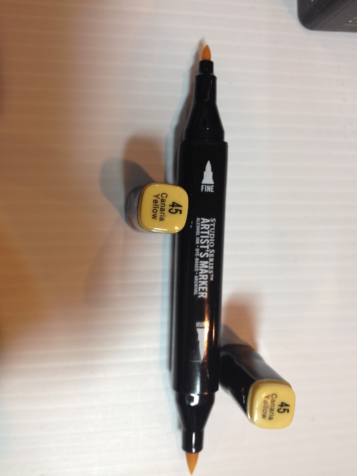
 Left to Right: Peter Pauper marker, Prismacolor marker, Winsor and Newton Brushmarker
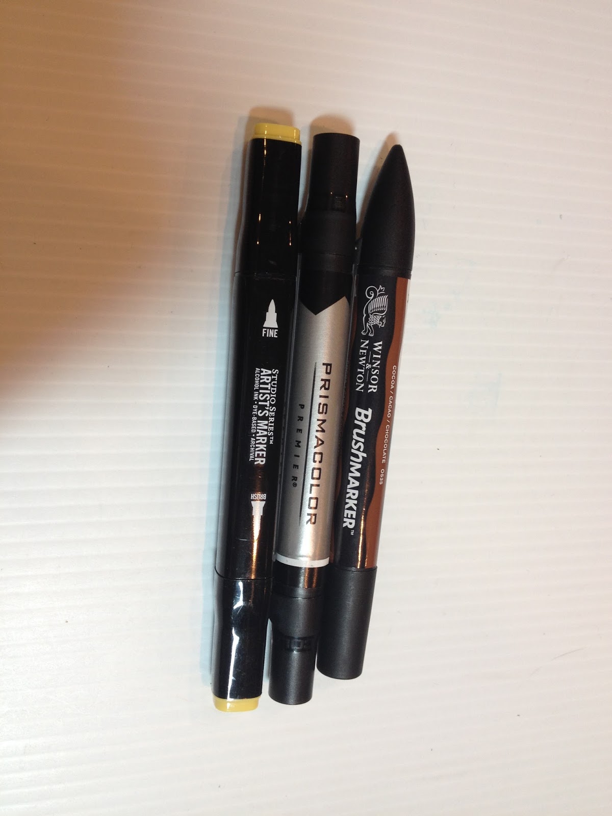
 Top to bottom: Winsor and Newton Brushable Marker, Prismacolor Marker, Peter Pauper Marker
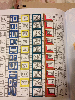
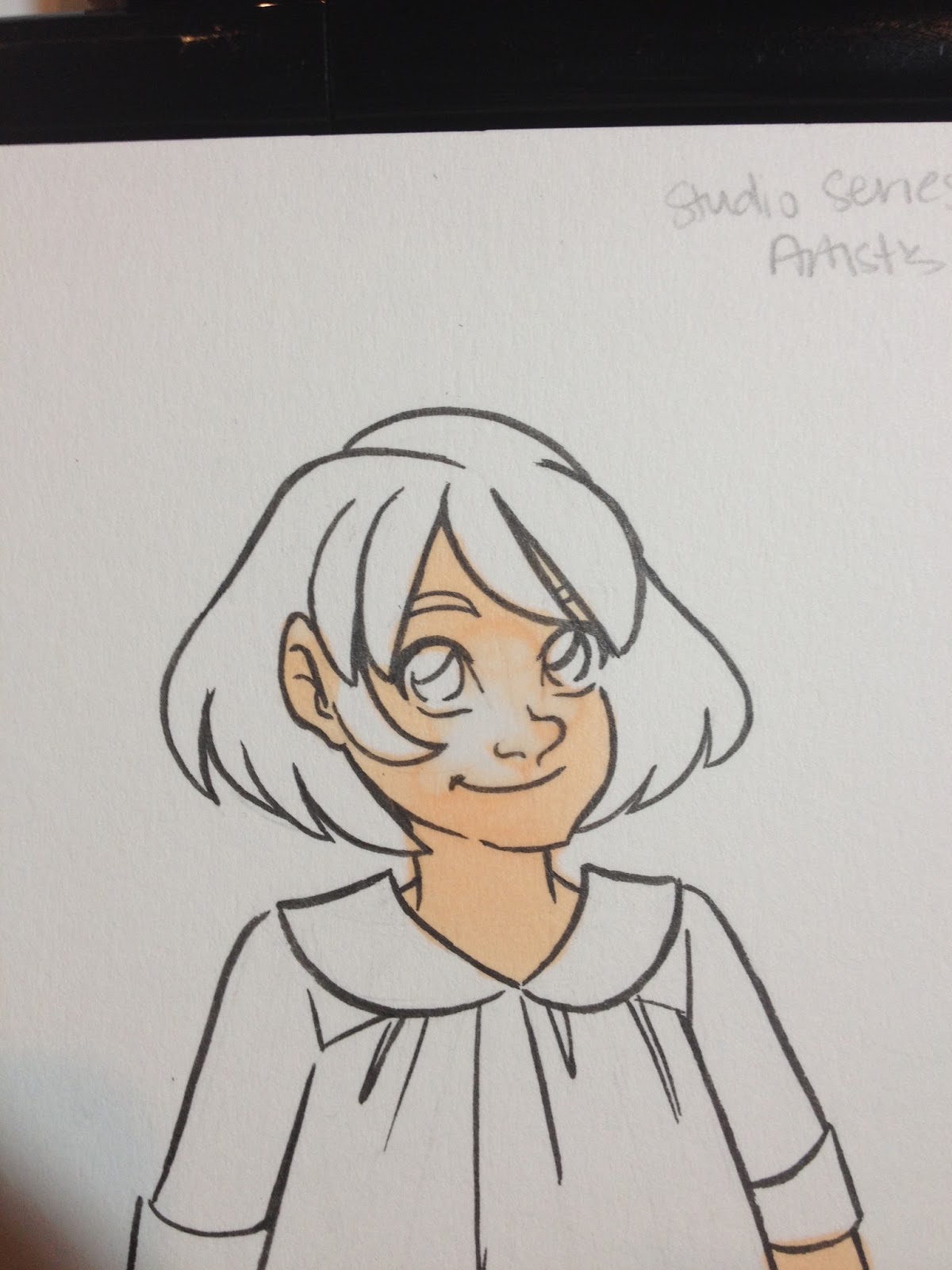
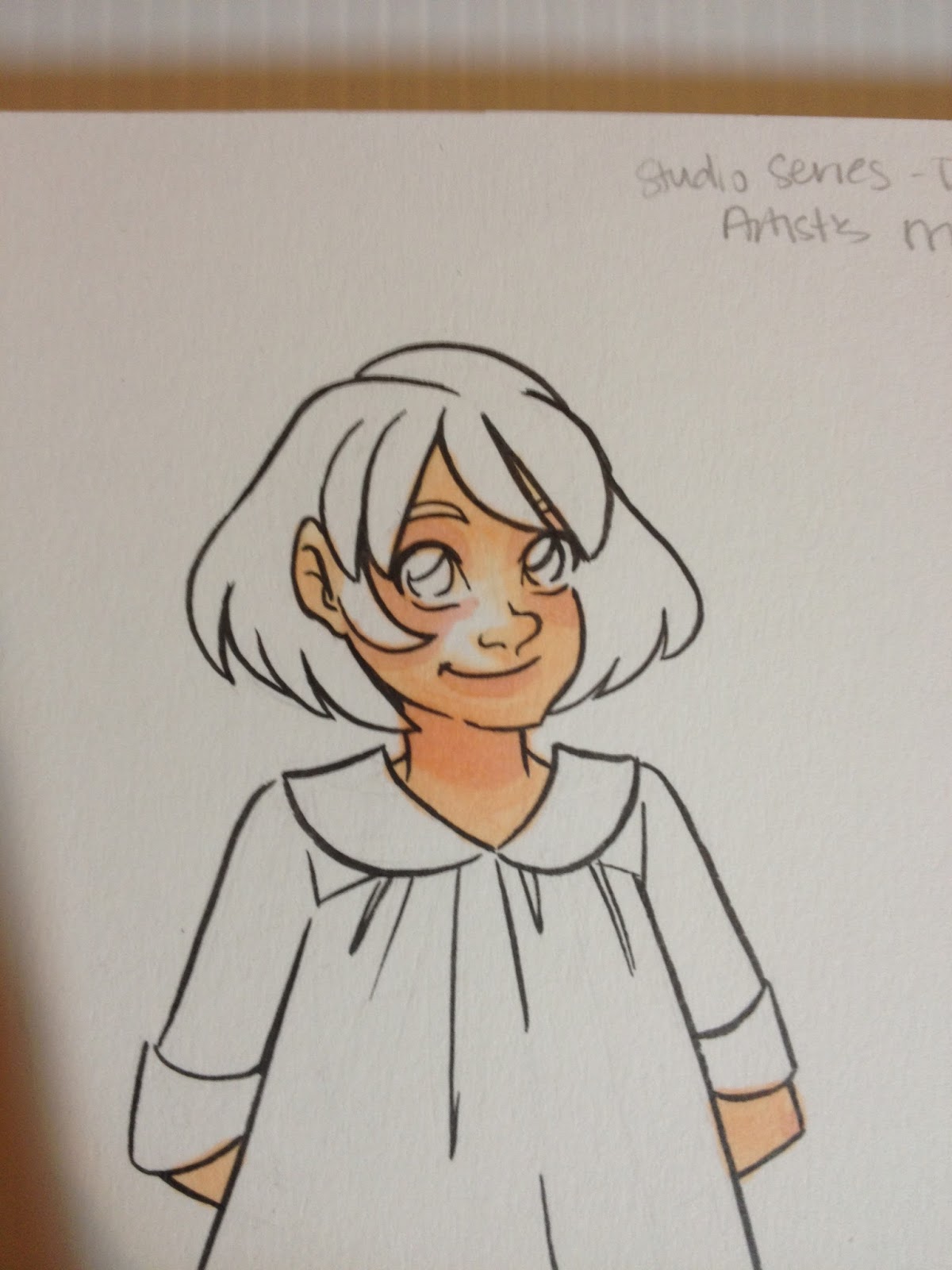
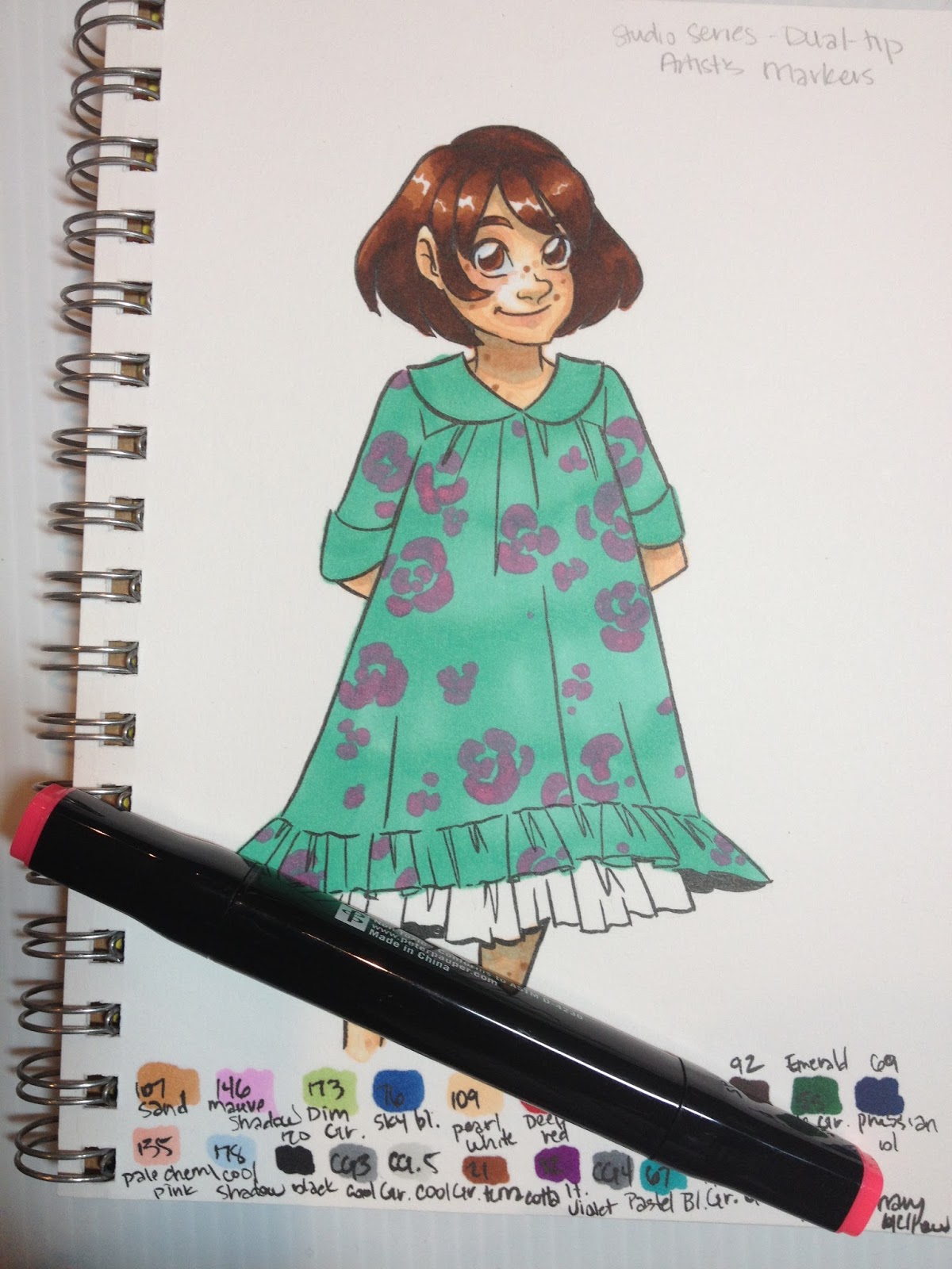
The Swatch Test


The set includes two good Caucasian skintones, several pastels useful for shading, a couple good darker skintones, and several vibrant colors. All in all, not a bad selection for 23 colors and a colorless blender.
The Field Test

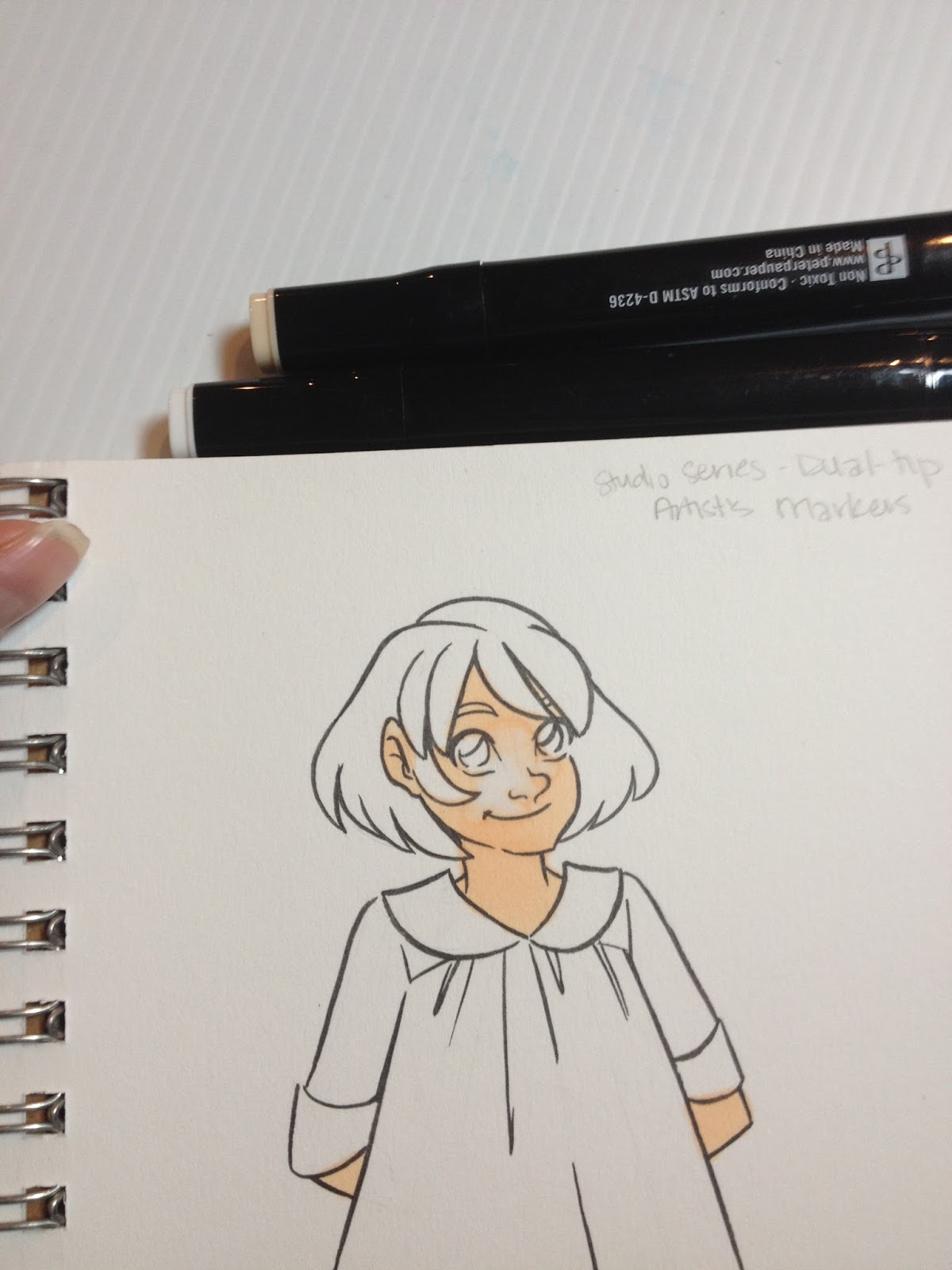
Sadly, the fiber brush tip does not take use, much less abuse, and begins to fray almost immediately.

That said, colors layer well, and react to the colorless blender almost too well, so be careful with your colorless blender application.


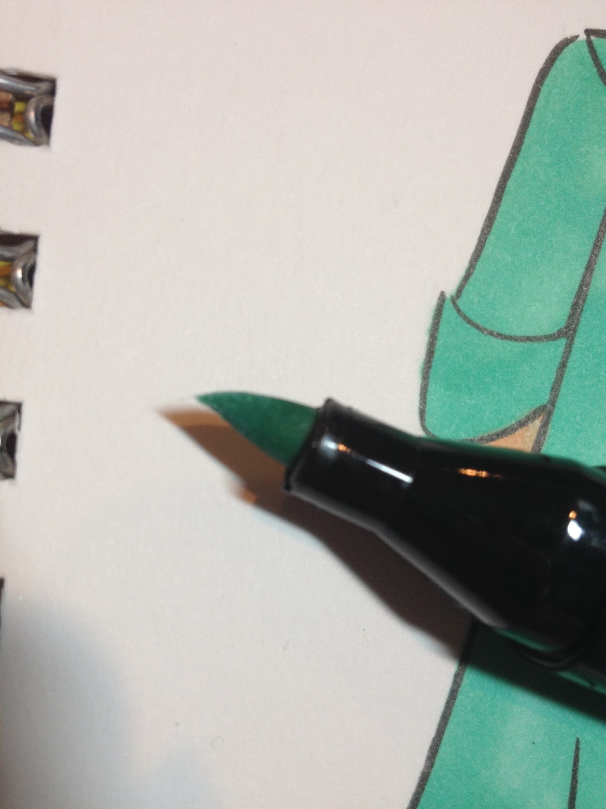
Unlike the Kuretake Kurecolor markers and the Winsor and Newton Promarkers and Brushmarkers, you can easily layer the same color for deeper saturation, which extends the value of each marker.


The only color I had difficultly layering was the aqua used for the dress- it was pretty much as saturated as it was going to get. Although this isn't a neon, I've noticed the same issue with neons regardless of brands.


The bullet nib tends to bleed out pretty badly, which made my flowers look blobby, but this would be an issue with most markers as the ink is absorbed by the paper.


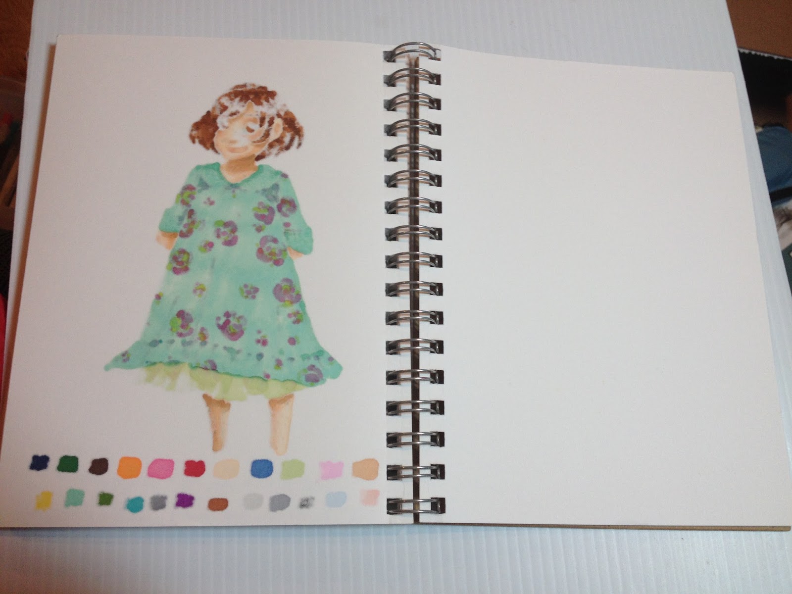
These markers bled through to the back of my thick Strathmore Mixed Media paper, but did not ruin the following page.
The Field Test (coloring books)
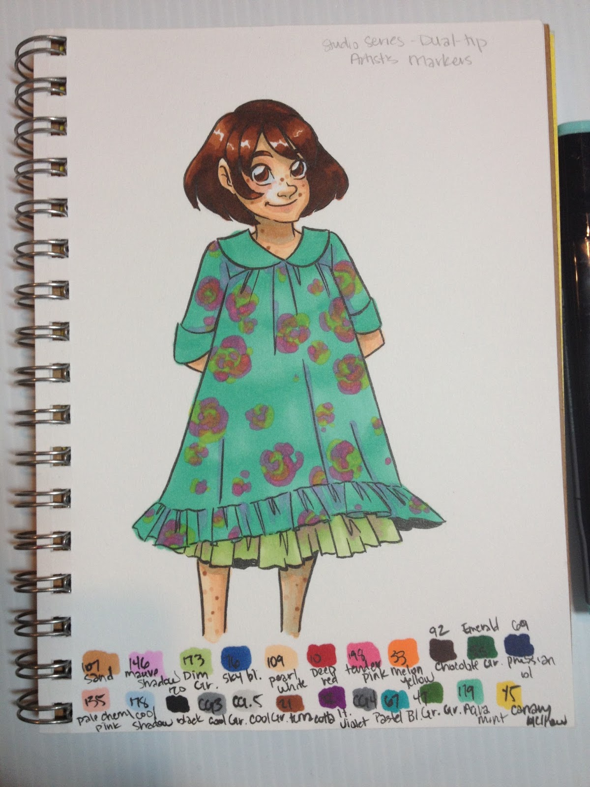
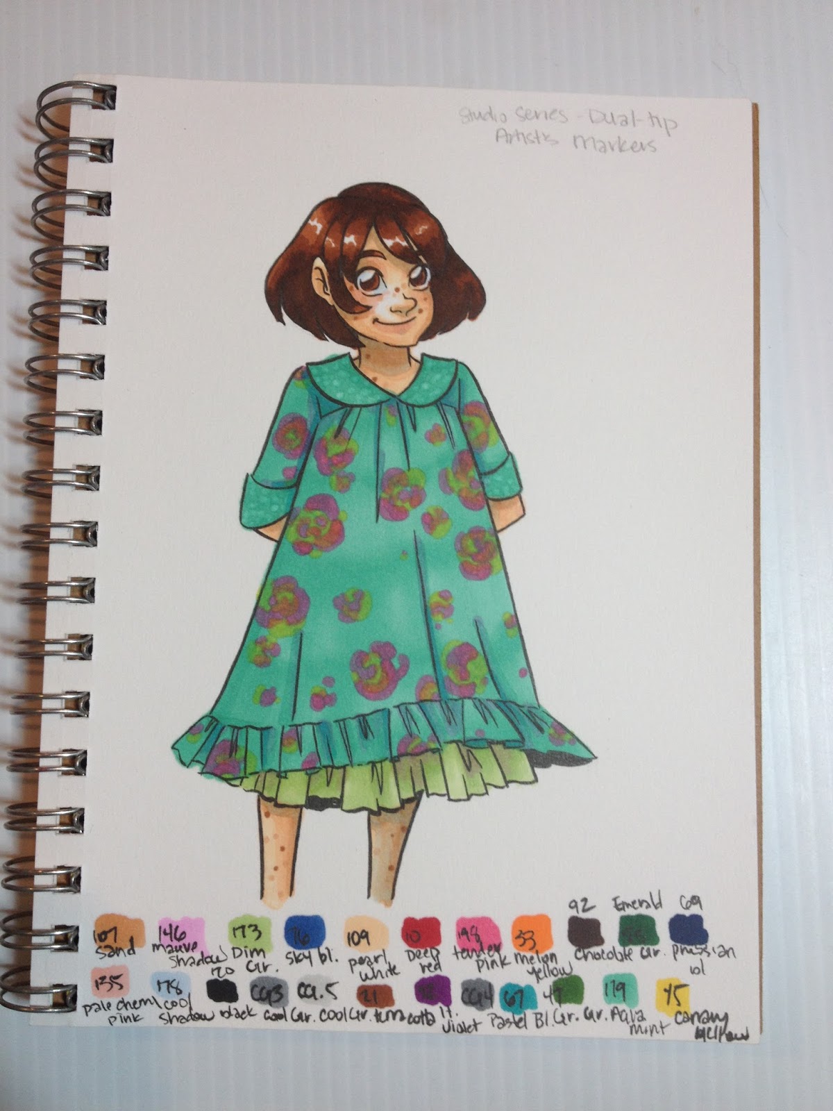
The following samples were provided by Denise Hillburn for use in this review. After my tests, I gifted her with my markers, as she enjoys meditating with coloring books.
These markers were sold next to the colored pencils and coloring books in Barnes and Noble, but they are not coloring book friendly, as they bleed through even thick pages, ruining double sided pages and sometimes even the following page.
The Verdict
Despite the brush tips mushiness and inability to handle fine details, these marker's aren't bad for their price. The colors are fairly vibrant, you get a decent selection, and the skintones layer well. The greens don't layer nearly as well, so it was difficult to build up contrast in the dress, and the fumes made these markers unpleasant to render with for long periods of time.
While I don't recommend these markers over other brands like Copic, Prismacolor, or Blick Studio Brush, if you are given these markers, or have already purchased these markers, there are ways you can make them work for you until you're able to replace them.
Please consider donating to this blog or purchasing from Natto-shop (http://nattosoup.com/shop) if you want me to continue publishing quality content. All materials tested were purchased from my own pocket. Keep on Truckin' Nattosoup is not under any sponsorship.
Posts like these are funded in part by the generosity of my Patrons on Patreon , as well as through generous donations to the PayPal tip jar in my sidebar. If you enjoy these alcohol marker reviews, please consider either joining the Nattosoup community by becoming a Patron, or making a one time donation to the Paypal tip jar to help offset the costs of maintaining a review blog. As almost always, this post was NOT sponsored, and was paid for entirely out of my pocket.
The Stats:
These markers are officially sold as Peter Pauper's Studio Series Professional Alcohol Markers- Dual Tip on the Peter Pauper website.
23 colors and a colorless blenderSold at Barnes and Noble, Amazon (cheaper price), on Peter Pauper siteNon refillableNon replaceable nibsNot available open stock$39.99 at Barnes and Noble in Baton Rouge, La.
Colors Included:
Colorless Blender
Canaria YellowAqua Mint
Grass Green
Pastel Blue
Cool Grey 4
Light Violet
Terra Cotta
Cool Grey .5
Cool Grey 3
Black
Pale Cherry Pink
Cool Shadow
Prussian Blue
Emerald Green
Chocolate
Melon Yellow
Tender Pink
Deep Red
Pearl White
Sky Blue
Dim Green
Mauve Shadow
Sand
The site promises:
•Case measures 4 inches wide by 6-1/2 inches high by 3-1/2 inches deep (10.2 cm wide by 16.5 cm high by 8.9 cm deep).
•Professional grade markers measure 6 inches (15 cm) long.
•Also great for Studio Series Artist's Coloring Books.
•Use with high-quality, heavyweight paper like Studio Series Premium Drawing Pads and Sketchbooks.
•Alcohol-based ink is archival, dye-based.•Works on paper, fabric, glass, wood, metal, and ceramic.
•Great for illustration, design, sketching, crafting, coloring, cartooning, and more.
•Optimal ink flow for even saturation.
•Super blendable, both before and after ink dries.
•Dual tips: fine and brush, for detail work and broad-area coverage.24 vivid colors in a versatile range.
The website also extols the virtues of alcohol markers over other types of markers, as shown below:
WHY ALCOHOL INK MARKERS? Alcohol-based inks lay down vibrant, smooth areas of color. Blend them to create beautiful shading and subtle watercolor effects. Unlike water-based markers, they won't damage the surface of your paper. They'll write on nearly anything and are made to last. They're ideal for artists and crafters of every stripe and any experience level.Peter Pauper Alcohol Marker Listing
The Brand
Peter Pauper specializes in affordable books for the whole family. According to the blog:
In 1928, at the age of twenty-two, Peter Beilenson began printing books on a small press in the basement of his parents’ home in Larchmont, New York. Peter—and later, his wife, Edna—sought to create fine books that sold at “prices even a pauper could afford.”Today, still family owned and operated, Peter Pauper Press continues to honor our founders’ legacy—and our customers’ expectations—of beauty, quality, and value.
They have recently introduced a line of art supplies and coloring books to cash in on the coloring for therapy/meditation craze.
The Packaging
Peter Pauper's Studio Alcohol Markers come in a reusable hard plastic case with a clear plastic cap.
The case outlines the markers attributes and has an illustration of the two tips- a bullet nib and a brush nib. The brush nib is really what intrigued me the most- I have never seen a cheap alcohol marker with a brush nib, let alone a decent brush nib.
The package promises that these markers are:
BlendableVividAlcohol InkDye BasedArchival
And explains why the consumer should try alcohol markers. This text is the same as that from the website.

Once the tape disks were removed, it was difficult to keep the clear plastic top on the body- it never firmly snapped on, and it meant that the markers were liable to spill everywhere if slightly upset. This case is meant for desktop use, and you'll need to tape the top on securely for travel.
These markers claim to be professional grade, with optimal ink flow for saturation.
The interior of the case has divisions to hold the markers securely in place, and markers can be displayed upright (not recommended by this blog) or horizontally (the proper orientation for marker storage).
The Markers
The bodies of the markers are very similar to the Shang Hai Touch markers I reviewed awhile back.
The body is screened with Non Toxic, Conforms to ASTM D-4236
www.peterpauper.com
Made in China
The caps include color names and families, although I'm not sure why the numbers are necessary, as I haven't seen larger sets available.

The brush nib is made of fiber rather than rubber foam.
 Left to Right: Peter Pauper marker, Prismacolor marker, Winsor and Newton Brushmarker
 Top to bottom: Winsor and Newton Brushable Marker, Prismacolor Marker, Peter Pauper Marker
The Swatch Test

The set includes two good Caucasian skintones, several pastels useful for shading, a couple good darker skintones, and several vibrant colors. All in all, not a bad selection for 23 colors and a colorless blender.
The Field Test
Sadly, the fiber brush tip does not take use, much less abuse, and begins to fray almost immediately.
That said, colors layer well, and react to the colorless blender almost too well, so be careful with your colorless blender application.

Unlike the Kuretake Kurecolor markers and the Winsor and Newton Promarkers and Brushmarkers, you can easily layer the same color for deeper saturation, which extends the value of each marker.


The only color I had difficultly layering was the aqua used for the dress- it was pretty much as saturated as it was going to get. Although this isn't a neon, I've noticed the same issue with neons regardless of brands.

The bullet nib tends to bleed out pretty badly, which made my flowers look blobby, but this would be an issue with most markers as the ink is absorbed by the paper.

These markers bled through to the back of my thick Strathmore Mixed Media paper, but did not ruin the following page.
The Field Test (coloring books)
The following samples were provided by Denise Hillburn for use in this review. After my tests, I gifted her with my markers, as she enjoys meditating with coloring books.


These markers were sold next to the colored pencils and coloring books in Barnes and Noble, but they are not coloring book friendly, as they bleed through even thick pages, ruining double sided pages and sometimes even the following page.
The Verdict
Despite the brush tips mushiness and inability to handle fine details, these marker's aren't bad for their price. The colors are fairly vibrant, you get a decent selection, and the skintones layer well. The greens don't layer nearly as well, so it was difficult to build up contrast in the dress, and the fumes made these markers unpleasant to render with for long periods of time.
While I don't recommend these markers over other brands like Copic, Prismacolor, or Blick Studio Brush, if you are given these markers, or have already purchased these markers, there are ways you can make them work for you until you're able to replace them.
Please consider donating to this blog or purchasing from Natto-shop (http://nattosoup.com/shop) if you want me to continue publishing quality content. All materials tested were purchased from my own pocket. Keep on Truckin' Nattosoup is not under any sponsorship.
April 27, 2016
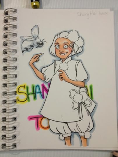
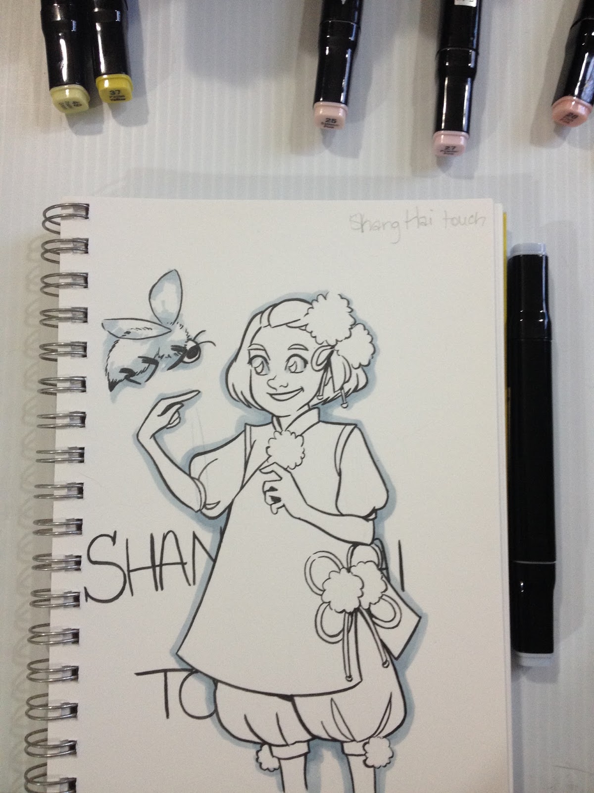
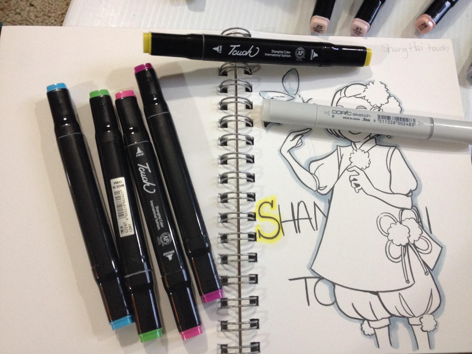
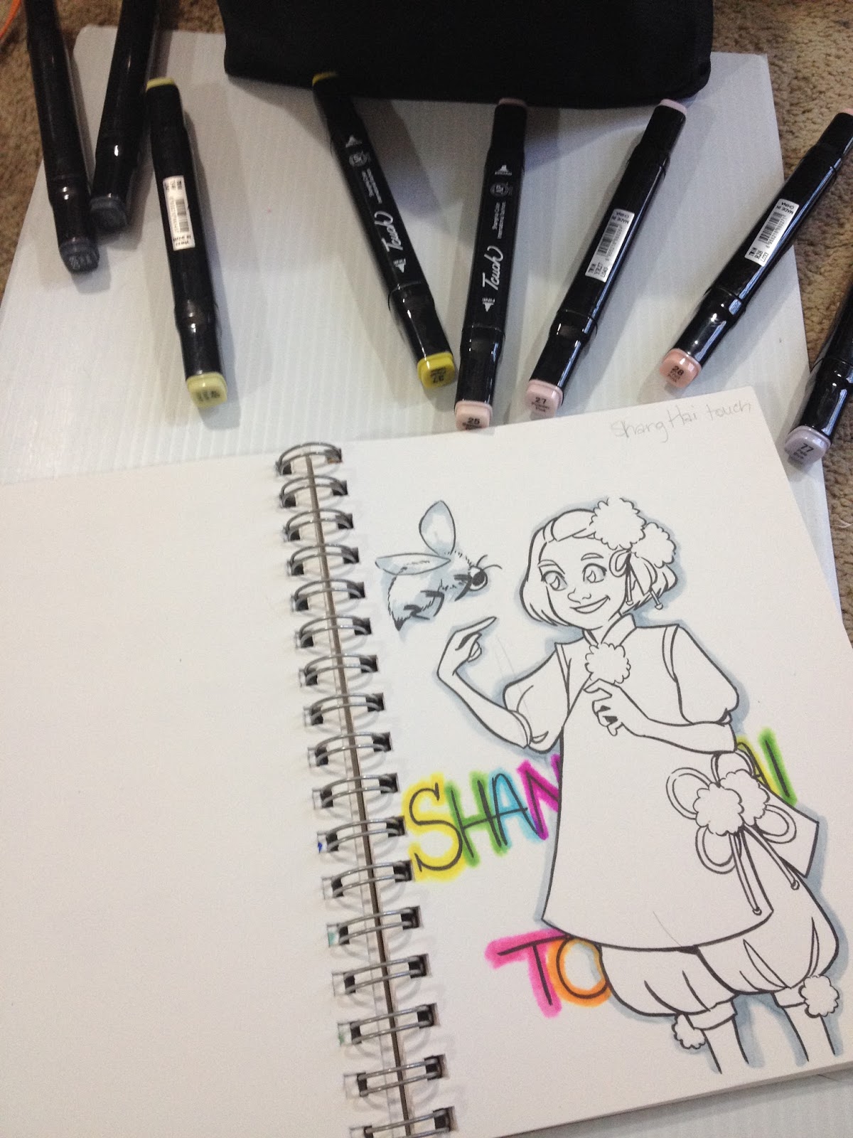
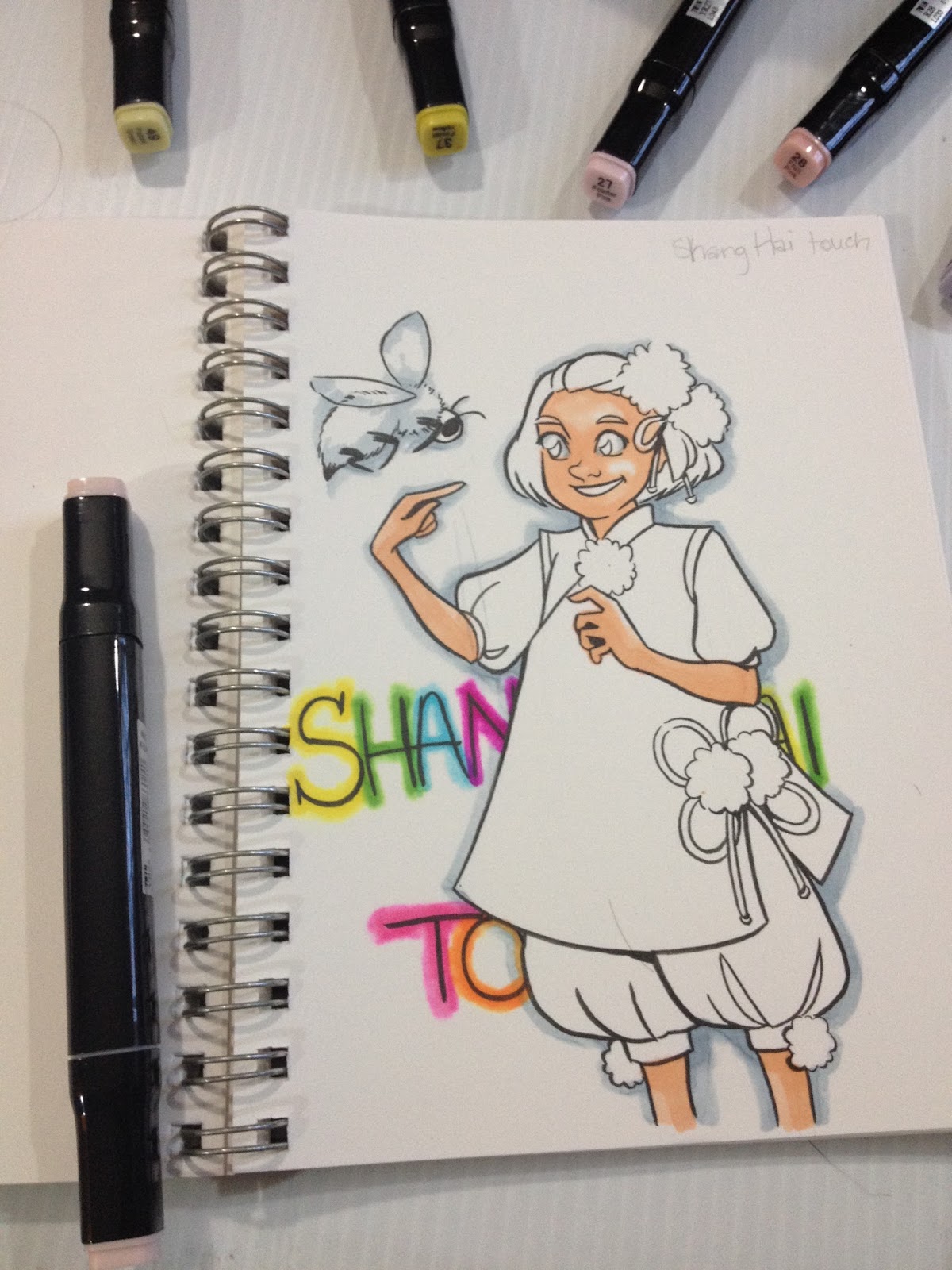
Alcohol Marker Review: Shang Hai Touoh Markers
MagicalEmi
,
a fellow comic artist, manga enthusiast, and art supply reviewer
, tipped me off that
AliExpress
has lots of alcohol marker lookalikes to choose from, and I figured I'd revisit the land of Chinese alcohol markers to see what's new, and to determine if any of these markers are worth your money. This post was not sponsored, and was funded entirely out of my pocket. If you enjoy posts like this, please consider joining the Nattosoup Studio community by becoming a Patron on
Patreon
, or helping defray costs by making a one time donation through the PayPal tip jar in my sidebar. The future of art supply reviews on the Nattosoup Studio blog and
YouTube
really depend on your support. If you found this post through Google, please consider subscribing for even more great art content.
There are a LOT of Copic/ShinHan Twin Touch lookalikes on AliExpress, and it's difficult for me to tell what's the truth and what are lies intended to move these markers on the site itself. Many of the markers are intentionally designed to confuse the buyer, so I'm having trouble finding the exact listing for the Shang Hai Touoh Markers I purchased a few months ago.
Here is a similar listing for 30 markers that look almost identical, but hey, who knows. There are so many alcohol markers on AliExpress, you're really spoiled for choice when it comes to knock offs, so it's really about finding something you think will work for you.
I've reviewed a few other markers from AliExpress on the blog
Finecolour Original
Finecolour Sketch
I've also created a video overview of all three Ali Express alcohol markers, which includes Shang Hai Touoh
The Stats
80 piecesPaid less than $100, don't remember exactly how much, as the listing is goneComes with a carrying caseTook about a month to arrive (standard for AliExpress, it's coming from China)Non-refillableNon replaceable nibsDifficult to find openstockTwintipped- chisel nib and bullet nibb
The Package


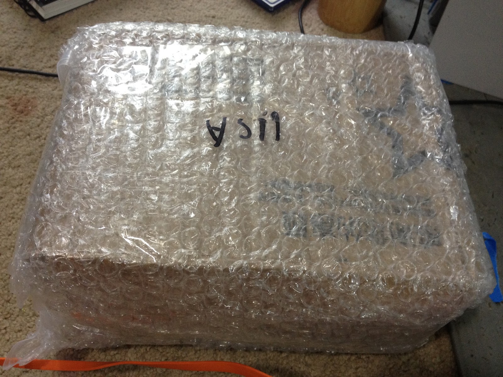
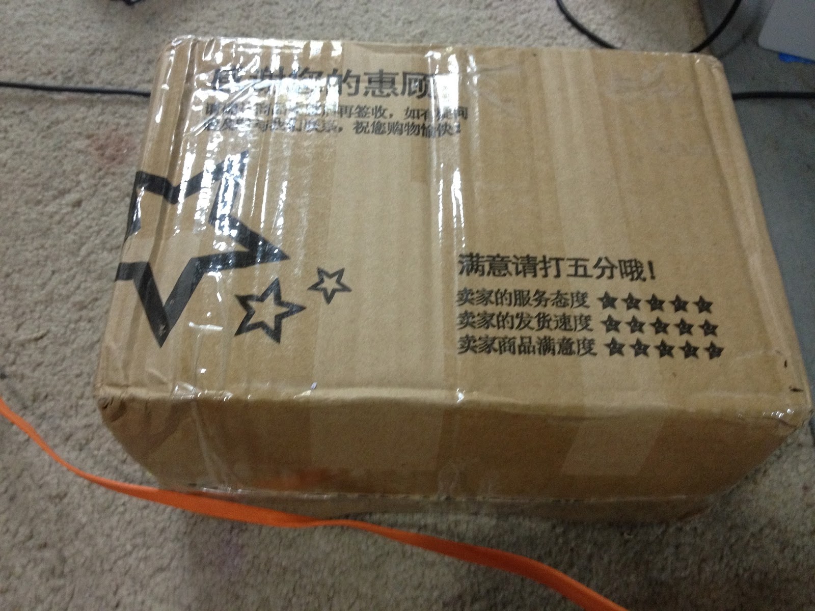
My markers arrived very securely packaged in a cardboard box that had been bubble wrapped and then secured in a waterproof plastic bag with my mailing info. If you're concerned about AliExpress from a shipping point of view, I've always been very satisfied with how my purchases were shipped. I've had very few items arrived ruined, and the one that did was fragile acrylic to begin with, and I believe it was a 'bonus' extra piece anyway.
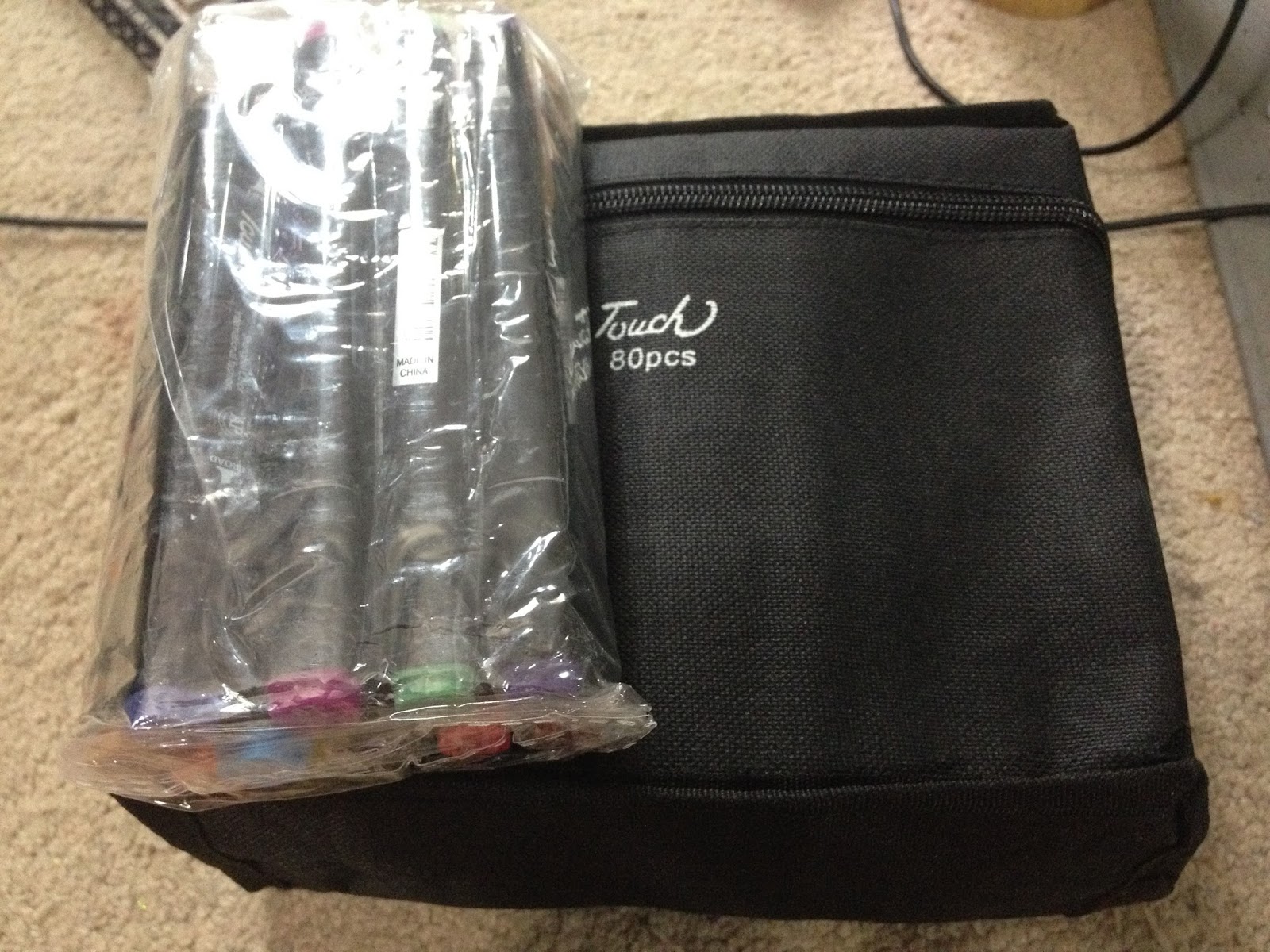
 Inside my cardboard box, my Touoh markers were mostly secured in a nylon zippered case, with a few markers in a plastic bag.

 This particular case isn't great for holding your markers in an order- if you want to organize your markers, I recommend doing so by color families, and securing them with a rubber band.


I tried to jam all of my markers into the zippered case, and not all of them fit. I also discovered I had about three duplicate markers.
The Markers
I organized my markers by color families, and began swatching. This set did not come with a family-card, or informational booklet, so I winged it based on the numbers on the caps.


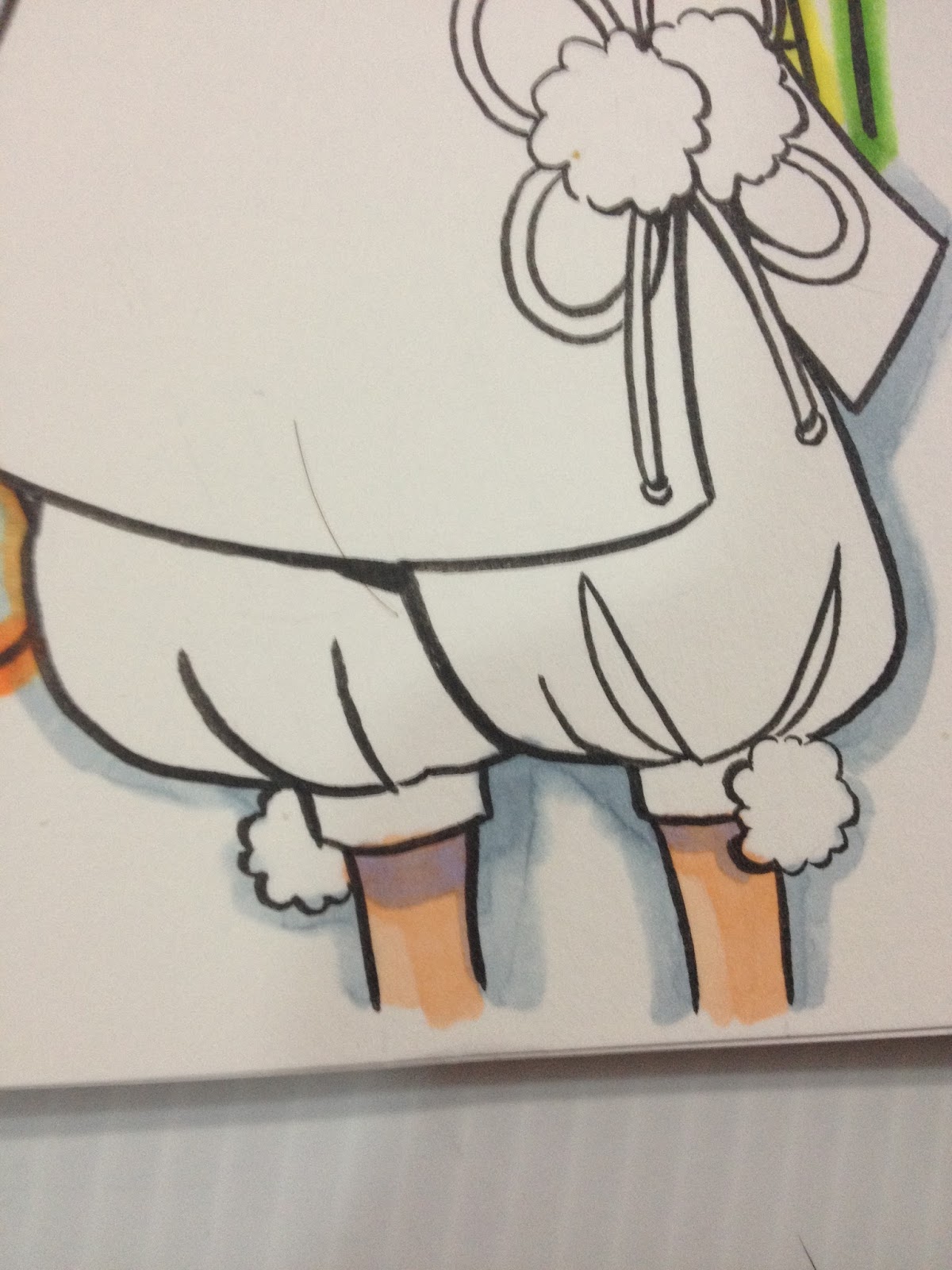
 The ShangHai Touoh's nibs aren't particularly remarkable- the chisel nib is a bit scratchy with no real give, and the chisel nib is fairly rough hewn. If you're looking for a marker that will easily allow you to create delicate, watercolor like brush effects, these are not a good pick for you.
Comparison Photos
 From top to bottom: Copic Original, ShangHai Touoh, Finecolour Sketch, Finecolour Original, Copic Ciao, Copic Sketch
 From top to bottom: ShinHan Touch (official), FineColour Sketch, Finecolour Original, Copic Ciao, Original Copic, Copic Sketch, ShangHai Touoh
The Swatch Test


A couple of my nibs weren't securely in the barrel, which leads me to believe that you COULD replace the nibs if you found some to fit.

 Although caps are moderately accurate to the ink inside, having a color chart will help you think about colors in a strategic, organized way, and will also allow you to double check colors for layering and form building.
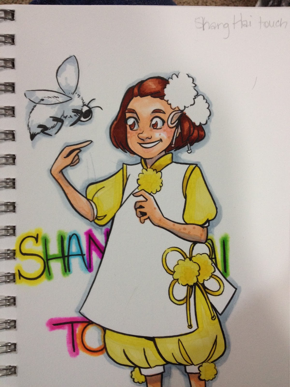
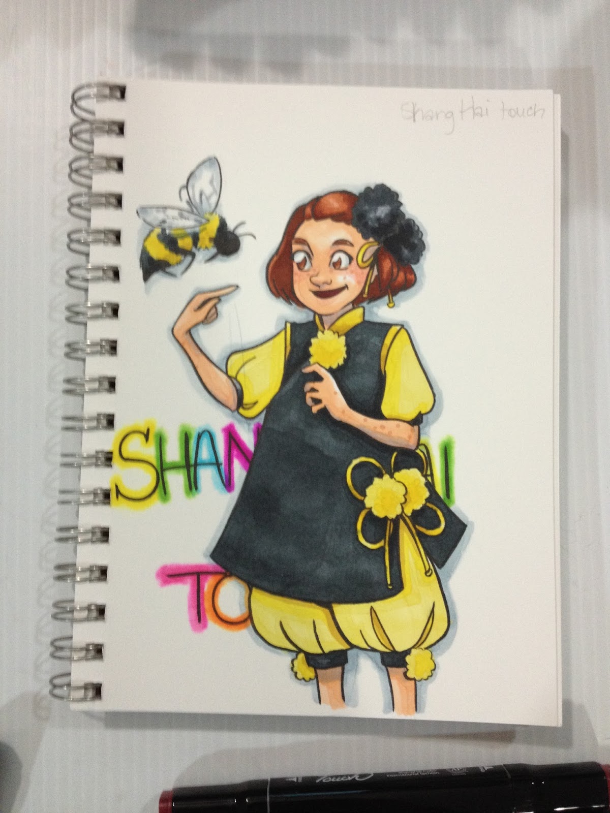
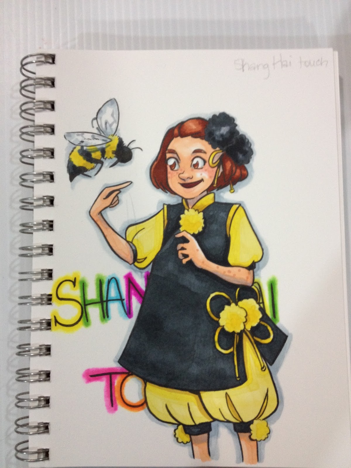
The Field Test
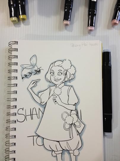


I wanted my background text to have a neon-light effect, so I decided to apply a layer of neon color first, and blend out the edges, then layer that same color on top of the center. I tried to blend out my ShangHai Touoh markers with a Copic Sketch colorless blender, but I could not push the color as far back as I would have liked.

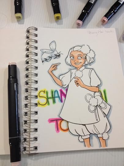


Skintones were moderately easy to build up and layer, without colors turning muddy from displacement. This means there's a fairly good ink to solution ratio inside these markers.


I did find large areas annoying to build up- I used the chisel nib to color the gray on Kara's apron, but no matter how fast I tried to work, it was impossible to create even saturation with just one layer, and I didn't want to make the apron too dark.


The Verdict
ShangHai Touoh alcohol markers, like Finecolour Sketch markers, are a fine introduction to alcohol markers. More affordable than Copic's markers, and even cheaper than Prismacolor, Winsor and Newton Pro and Brushmarkers, these markers perform decently well. I recommend these markers to crafters looking for an affordable way to quickly build up a collection of alcohol markers and don't care about brush tips, artists on a budget who want to try alcohol markers out before investing in a large set, or younger artists who may have difficulty convincing their parents to part with $4 per marker.
If you're an artist who already has a collection of alcohol markers to choose from, these large sets are an affordable way to quickly grow a modest collection, but don't expect the ShangHai Touoh markers to perform like Prismacolors, Copics, Brushmarkers, or Twin Touch markers. If you're looking for alcohol markers that can be refilled and have replacable nibs, if you're considering making an investment for your studio, I recommend skipping the Touoh markers for something a little more expensive, but easier to find.
Please consider donating to this blog or purchasing from Natto-shop (http://nattosoup.com/shop) if you want me to continue publishing quality content. All materials tested were purchased from my own pocket. Keep on Truckin' Nattosoup is not under any sponsorship.
There are a LOT of Copic/ShinHan Twin Touch lookalikes on AliExpress, and it's difficult for me to tell what's the truth and what are lies intended to move these markers on the site itself. Many of the markers are intentionally designed to confuse the buyer, so I'm having trouble finding the exact listing for the Shang Hai Touoh Markers I purchased a few months ago.
Here is a similar listing for 30 markers that look almost identical, but hey, who knows. There are so many alcohol markers on AliExpress, you're really spoiled for choice when it comes to knock offs, so it's really about finding something you think will work for you.
I've reviewed a few other markers from AliExpress on the blog
Finecolour Original
Finecolour Sketch
I've also created a video overview of all three Ali Express alcohol markers, which includes Shang Hai Touoh
The Stats
80 piecesPaid less than $100, don't remember exactly how much, as the listing is goneComes with a carrying caseTook about a month to arrive (standard for AliExpress, it's coming from China)Non-refillableNon replaceable nibsDifficult to find openstockTwintipped- chisel nib and bullet nibb
The Package

My markers arrived very securely packaged in a cardboard box that had been bubble wrapped and then secured in a waterproof plastic bag with my mailing info. If you're concerned about AliExpress from a shipping point of view, I've always been very satisfied with how my purchases were shipped. I've had very few items arrived ruined, and the one that did was fragile acrylic to begin with, and I believe it was a 'bonus' extra piece anyway.
 Inside my cardboard box, my Touoh markers were mostly secured in a nylon zippered case, with a few markers in a plastic bag.
 This particular case isn't great for holding your markers in an order- if you want to organize your markers, I recommend doing so by color families, and securing them with a rubber band.
I tried to jam all of my markers into the zippered case, and not all of them fit. I also discovered I had about three duplicate markers.
The Markers
I organized my markers by color families, and began swatching. This set did not come with a family-card, or informational booklet, so I winged it based on the numbers on the caps.

 The ShangHai Touoh's nibs aren't particularly remarkable- the chisel nib is a bit scratchy with no real give, and the chisel nib is fairly rough hewn. If you're looking for a marker that will easily allow you to create delicate, watercolor like brush effects, these are not a good pick for you.
Comparison Photos
 From top to bottom: Copic Original, ShangHai Touoh, Finecolour Sketch, Finecolour Original, Copic Ciao, Copic Sketch
 From top to bottom: ShinHan Touch (official), FineColour Sketch, Finecolour Original, Copic Ciao, Original Copic, Copic Sketch, ShangHai Touoh
The Swatch Test

A couple of my nibs weren't securely in the barrel, which leads me to believe that you COULD replace the nibs if you found some to fit.

 Although caps are moderately accurate to the ink inside, having a color chart will help you think about colors in a strategic, organized way, and will also allow you to double check colors for layering and form building.
The Field Test
I wanted my background text to have a neon-light effect, so I decided to apply a layer of neon color first, and blend out the edges, then layer that same color on top of the center. I tried to blend out my ShangHai Touoh markers with a Copic Sketch colorless blender, but I could not push the color as far back as I would have liked.


Skintones were moderately easy to build up and layer, without colors turning muddy from displacement. This means there's a fairly good ink to solution ratio inside these markers.


I did find large areas annoying to build up- I used the chisel nib to color the gray on Kara's apron, but no matter how fast I tried to work, it was impossible to create even saturation with just one layer, and I didn't want to make the apron too dark.
The Verdict
ShangHai Touoh alcohol markers, like Finecolour Sketch markers, are a fine introduction to alcohol markers. More affordable than Copic's markers, and even cheaper than Prismacolor, Winsor and Newton Pro and Brushmarkers, these markers perform decently well. I recommend these markers to crafters looking for an affordable way to quickly build up a collection of alcohol markers and don't care about brush tips, artists on a budget who want to try alcohol markers out before investing in a large set, or younger artists who may have difficulty convincing their parents to part with $4 per marker.
If you're an artist who already has a collection of alcohol markers to choose from, these large sets are an affordable way to quickly grow a modest collection, but don't expect the ShangHai Touoh markers to perform like Prismacolors, Copics, Brushmarkers, or Twin Touch markers. If you're looking for alcohol markers that can be refilled and have replacable nibs, if you're considering making an investment for your studio, I recommend skipping the Touoh markers for something a little more expensive, but easier to find.
Please consider donating to this blog or purchasing from Natto-shop (http://nattosoup.com/shop) if you want me to continue publishing quality content. All materials tested were purchased from my own pocket. Keep on Truckin' Nattosoup is not under any sponsorship.
April 24, 2016
Interview with Creative Art Box
Earlier this week, I shared my April Creative Art Box unboxing, materials demonstration, and my Challenge. In addition to being fortunate enough to receive a box, I was also lucky enough to interview the founder for your enjoyment. If you enjoy these subscription box interviews, please let me know, and I'll arrange for more!
Would you mind introducing yourself to the readers of Nattosoup Studio Art and Process Blog?
My name is Lena. I have my masters in new media from Full Sail university. I reside in MN but I'm originally from NY...it sure is cold here!
What inspired you to start Creative Art Box?
I have always had a passion for being creative. It doesn't matter what medium I'm using...it just makes me happy. I took to social media and began to see all of the other creative minds out there and decided that I wanted a way to help others explore beyond their comfort zone and to share their creative minds.
What's the history of the company?
The company itself is new. My strongest medium is graphic design, so before this I was assisting new small business' with logos, websites, and stationary.
What's your history with art supplies?
I believe it started with crayons :) Anything can be considered an art supply really. Now a days even tape is being used to create beautiful decorations in homes. I feel that you can never have enough art supplies either...there is always more paint, more paper, new brands. For me it isn't about the most expensive tool, it's about how you use it.
 April Creative Art Box Premium Image from the CreativeArtBox site
What sort of creative team does Creative Art Box have?
Everyone who works with us is creative in their own way. Some can draw, some can paint, some build things wood, and some work with children. It allows us to have a broad term of the word 'art supply' and to show people that anything can be done with a little creativity.
What sets Creative Art Box apart from other supply subscription boxes?
We strive to not just give what people are expecting.. We want you to have the unexpected so that you can try something new. The best thing we can hear is "I have no idea how to use this!" Because we will show you. We have a strong force of bloggers who will experiment and show you how they use the products each month. We also try to include something for you to use your new products on. Because if this is something that is new to you we don't want for you to have to go out and get a whole new pad of paper just to try it, so we give you a sampling of paper so that you can then go out and get more if you really liked using this months medium. We also don't just offer 1 or 2 colors of items, we give the whole array of colors or items that go with the theme. We also offer FREE shipping, which is a huge plus!
What can I expect my monthly boxes to look like?
Each month there will be a new theme. Your box will contains items pertaining to that them and there will also be tools to aid the product. For example if the box's theme is Acrylic you would receive all of the colors needed to create a painting, the brushes needed for the painting and also a small canvas to do the painting on. If you order the premium box, you would also receive something extra like more paint colors, brush cleaner, or an extra canvas.
How much will each month cost? What about a 6 mo subscription? A year subscription?
The one time box is $29/Box. The 3 month plan is $26/Box. The 6 month plan is $23/Box. The 12 month plan is $20/Box. All plans including FREE shipping, and the plans do not renew.
 January Creative Art Box. Image Source
In general, what should each box include?
Each month there will be a new theme. Your box will contains items pertaining to that them and there will also be tools to aid the product. For example if the box's theme is Acrylic you would receive all of the colors needed to create a painting, the brushes needed for the painting and also a small canvas to do the painting on. If you order the premium box, you would also receive something extra like more paint colors, brush cleaner, or an extra canvas.
Do you have any plans for rewarding longterm customers?
I do! For long term customers who do repeat subscriptions I will reward with extra supplies in their boxes. they won't know until they get the box so it will be a great surprise.
What's involved in the art supply selection service each month?
You wouldn't believe how much work goes into picking the supplies each month...I still can't believe it. You want to try to please as many people as possible while still trying to push the boundaries of creativity. You have to find the right supplies at the right price, and then work with the suppliers on quantity and shipping times to ensure that you have everything in hand for the 1st of the month box release.
What are you goals for Creative Art Box?
I want to see our social media pages explode with the creations people make using the box supplies.
Who do you see your ideal customer as?
Ideally they are anyone. They can be young or old, male or female to find enjoyment in our supplies. They could have never picked up a drawing pencil in their lives. They can be artist, carpenters, bankers, or stay-at-home moms...they will find enjoyment in what they receive.
Since you have a broad demographic in mind, how does Creative Art Box plan on offering something for everyone? How will Creative Art Box appeal to both the absolute novice and the seasoned pro? I like to think that anyone can create. The items in the boxes will never be so advance that a child can't use them, and will never be so novice that a pro would dislike them.
 February Creative Art Box- Image Source
How involved do you expect your customers to be in future boxes and projects?
My hope is for each subscriber to be very involved. I always love to hear what supplies people want to try and also what they don't like. I love to see what people create and have them as featured artist on our website. Our social media pages are there so that everyone can share their creativity.
What are some of your future box themes?
Guess you'll have to subscribe to find out now won't you ;)
Do you have anything set up for customers to share their artwork with the community? Does Creative Art Box have plans to promote customers who share unboxings via Twitter, Tumblr, or YouTube with other customers?
All of our social media pages are there for people to share their art. Anyone who shares and un-boxing or their artwork make from their supplies is also entered into a drawing to get an extra supply in their next box. We will always promote all of our subscribers.
What are some of the brands customers can expect to see in their upcoming boxes?
We try to get people to try things they may have not tried before, but some known brands would be Prismacolor, Copic, washi, and Winsor &Newton.
Do you have any exclusive deals worked out with companies? If so, can you give the readers a little taste of what they can look forward to?
Right now no, but we are working on negotiations with a few. If we can work these out then we can include more items in each box.
Do you focus more on retailers or manufacturers when working on professional relationships? It would be more of retailers because then I can get discounts on most brands that I'm interested in. Most large manufactures will give discounts but on products that people don't buy often or in large mass quantities.
Can you give us any insight into what it takes to develop relationships with companies? Can you provide any examples? Any advice for individual artists who'd like to form relationships with their favorite companies? Most of the companies I work with are local art stores. Because I'm a local business for them we work together to promote one another an in return I can get discounts to allow me to put more items into boxes. So my suggestion to artists is to go local. They can even work out deals to teach classes or get their art featured.
 Image Source
Do you have any plans for artist partnerships to create tutorials for boxes? Any plans to include a little inspiration in your boxes?
Of course! This won't be too far in the future, but we do hope to include more how-to-videos and also a how-to-guide in each box
Who are some of the bloggers Creative Art Box is working with? I'm sure my readers would love to check them out- they're very passionate about art education, and I love to recommend new sources of inspiration for them. Every month I will be featuring a new artist and it's a good place for inspiration: http://www.creativeartbox.com/#!featured-artists/cee5 I have a few bloggers that I would highly recommend as being great inspiration: https://www.youtube.com/watch?v=XwbYqZ7Z9GA. She makes amazing line art that people can color in. Fun for ALL ages! I have a few more lined up for next month so I can always comment and let everyone know of their great work.
How might artists who are interested in working with Creative Art Box, either through consulting on products, creating tutorials, or promoting the service, get in contact with you? inspiration@CreativeArtBox.com I believe in strong customer service and I personally handle all social media and the website to ensure that all customers questions or comments are answered.
What types of artists would you be most interested in working with? I'll work with anyone, but I especially love working with people who are new to the creative world and are trying to explore their creativity and possibilities.


Ways to Get Involved
Email
Site: http://www.creativeartbox.com
Instagram: instagram.com/creativeartbox
Pinterest: pinterest.com/CreativeArtBox
Twitter: twitter.com/Creative_ArtBox
Facebook: facebook.com/CreativeArtBox
Videos Recommended by Lena and Creative Art Box
Creative Artbox Unboxing and review +April 2016+ MsVenomousCupcake
CREATIVE ART BOX Unboxing and Review- edwardsuoh13
Please consider donating to this blog or purchasing from Natto-shop (http://nattosoup.com/shop) if you want me to continue publishing quality content. All materials tested were purchased from my own pocket. Keep on Truckin' Nattosoup is not under any sponsorship.

Would you mind introducing yourself to the readers of Nattosoup Studio Art and Process Blog?
My name is Lena. I have my masters in new media from Full Sail university. I reside in MN but I'm originally from NY...it sure is cold here!
What inspired you to start Creative Art Box?
I have always had a passion for being creative. It doesn't matter what medium I'm using...it just makes me happy. I took to social media and began to see all of the other creative minds out there and decided that I wanted a way to help others explore beyond their comfort zone and to share their creative minds.
What's the history of the company?
The company itself is new. My strongest medium is graphic design, so before this I was assisting new small business' with logos, websites, and stationary.
What's your history with art supplies?
I believe it started with crayons :) Anything can be considered an art supply really. Now a days even tape is being used to create beautiful decorations in homes. I feel that you can never have enough art supplies either...there is always more paint, more paper, new brands. For me it isn't about the most expensive tool, it's about how you use it.
 April Creative Art Box Premium Image from the CreativeArtBox site
What sort of creative team does Creative Art Box have?
Everyone who works with us is creative in their own way. Some can draw, some can paint, some build things wood, and some work with children. It allows us to have a broad term of the word 'art supply' and to show people that anything can be done with a little creativity.
What sets Creative Art Box apart from other supply subscription boxes?
We strive to not just give what people are expecting.. We want you to have the unexpected so that you can try something new. The best thing we can hear is "I have no idea how to use this!" Because we will show you. We have a strong force of bloggers who will experiment and show you how they use the products each month. We also try to include something for you to use your new products on. Because if this is something that is new to you we don't want for you to have to go out and get a whole new pad of paper just to try it, so we give you a sampling of paper so that you can then go out and get more if you really liked using this months medium. We also don't just offer 1 or 2 colors of items, we give the whole array of colors or items that go with the theme. We also offer FREE shipping, which is a huge plus!
What can I expect my monthly boxes to look like?
Each month there will be a new theme. Your box will contains items pertaining to that them and there will also be tools to aid the product. For example if the box's theme is Acrylic you would receive all of the colors needed to create a painting, the brushes needed for the painting and also a small canvas to do the painting on. If you order the premium box, you would also receive something extra like more paint colors, brush cleaner, or an extra canvas.
How much will each month cost? What about a 6 mo subscription? A year subscription?
The one time box is $29/Box. The 3 month plan is $26/Box. The 6 month plan is $23/Box. The 12 month plan is $20/Box. All plans including FREE shipping, and the plans do not renew.
 January Creative Art Box. Image Source
In general, what should each box include?
Each month there will be a new theme. Your box will contains items pertaining to that them and there will also be tools to aid the product. For example if the box's theme is Acrylic you would receive all of the colors needed to create a painting, the brushes needed for the painting and also a small canvas to do the painting on. If you order the premium box, you would also receive something extra like more paint colors, brush cleaner, or an extra canvas.
Do you have any plans for rewarding longterm customers?
I do! For long term customers who do repeat subscriptions I will reward with extra supplies in their boxes. they won't know until they get the box so it will be a great surprise.
What's involved in the art supply selection service each month?
You wouldn't believe how much work goes into picking the supplies each month...I still can't believe it. You want to try to please as many people as possible while still trying to push the boundaries of creativity. You have to find the right supplies at the right price, and then work with the suppliers on quantity and shipping times to ensure that you have everything in hand for the 1st of the month box release.
What are you goals for Creative Art Box?
I want to see our social media pages explode with the creations people make using the box supplies.
Who do you see your ideal customer as?
Ideally they are anyone. They can be young or old, male or female to find enjoyment in our supplies. They could have never picked up a drawing pencil in their lives. They can be artist, carpenters, bankers, or stay-at-home moms...they will find enjoyment in what they receive.
Since you have a broad demographic in mind, how does Creative Art Box plan on offering something for everyone? How will Creative Art Box appeal to both the absolute novice and the seasoned pro? I like to think that anyone can create. The items in the boxes will never be so advance that a child can't use them, and will never be so novice that a pro would dislike them.
 February Creative Art Box- Image Source
How involved do you expect your customers to be in future boxes and projects?
My hope is for each subscriber to be very involved. I always love to hear what supplies people want to try and also what they don't like. I love to see what people create and have them as featured artist on our website. Our social media pages are there so that everyone can share their creativity.
What are some of your future box themes?
Guess you'll have to subscribe to find out now won't you ;)
Do you have anything set up for customers to share their artwork with the community? Does Creative Art Box have plans to promote customers who share unboxings via Twitter, Tumblr, or YouTube with other customers?
All of our social media pages are there for people to share their art. Anyone who shares and un-boxing or their artwork make from their supplies is also entered into a drawing to get an extra supply in their next box. We will always promote all of our subscribers.
What are some of the brands customers can expect to see in their upcoming boxes?
We try to get people to try things they may have not tried before, but some known brands would be Prismacolor, Copic, washi, and Winsor &Newton.
Do you have any exclusive deals worked out with companies? If so, can you give the readers a little taste of what they can look forward to?
Right now no, but we are working on negotiations with a few. If we can work these out then we can include more items in each box.
Do you focus more on retailers or manufacturers when working on professional relationships? It would be more of retailers because then I can get discounts on most brands that I'm interested in. Most large manufactures will give discounts but on products that people don't buy often or in large mass quantities.
Can you give us any insight into what it takes to develop relationships with companies? Can you provide any examples? Any advice for individual artists who'd like to form relationships with their favorite companies? Most of the companies I work with are local art stores. Because I'm a local business for them we work together to promote one another an in return I can get discounts to allow me to put more items into boxes. So my suggestion to artists is to go local. They can even work out deals to teach classes or get their art featured.
 Image Source
Do you have any plans for artist partnerships to create tutorials for boxes? Any plans to include a little inspiration in your boxes?
Of course! This won't be too far in the future, but we do hope to include more how-to-videos and also a how-to-guide in each box
Who are some of the bloggers Creative Art Box is working with? I'm sure my readers would love to check them out- they're very passionate about art education, and I love to recommend new sources of inspiration for them. Every month I will be featuring a new artist and it's a good place for inspiration: http://www.creativeartbox.com/#!featured-artists/cee5 I have a few bloggers that I would highly recommend as being great inspiration: https://www.youtube.com/watch?v=XwbYqZ7Z9GA. She makes amazing line art that people can color in. Fun for ALL ages! I have a few more lined up for next month so I can always comment and let everyone know of their great work.
How might artists who are interested in working with Creative Art Box, either through consulting on products, creating tutorials, or promoting the service, get in contact with you? inspiration@CreativeArtBox.com I believe in strong customer service and I personally handle all social media and the website to ensure that all customers questions or comments are answered.
What types of artists would you be most interested in working with? I'll work with anyone, but I especially love working with people who are new to the creative world and are trying to explore their creativity and possibilities.

Ways to Get Involved
Site: http://www.creativeartbox.com
Instagram: instagram.com/creativeartbox
Pinterest: pinterest.com/CreativeArtBox
Twitter: twitter.com/Creative_ArtBox
Facebook: facebook.com/CreativeArtBox
Videos Recommended by Lena and Creative Art Box
Creative Artbox Unboxing and review +April 2016+ MsVenomousCupcake
CREATIVE ART BOX Unboxing and Review- edwardsuoh13
Please consider donating to this blog or purchasing from Natto-shop (http://nattosoup.com/shop) if you want me to continue publishing quality content. All materials tested were purchased from my own pocket. Keep on Truckin' Nattosoup is not under any sponsorship.
April 22, 2016
Art Subscription Box Review: Creative Art Box
A couple months ago, I was contacted by Lena at Creative Art Box. Creative Art Box had recently launched, and they were looking for bloggers to help spread the word. Lena sent me the April box, so I could share it here with you guys, and also consented to an interview, which I'm sharing later in the week, so if that piques your interest, make sure you check back for that.

This box was provided at no cost to me, for the purposes of review and publicity. If you're interested in checking out Creative Art Box for yourself, please visit their website.

About Creative Art Box
Creative Art Box is a new subscription box services that supplies art supplies in every monthly box. Customers have the option of two tiers- the Basic Box and the Premium Box. Lena sent me the Basic Box for this month. The Basic Box is $29.00, including shipping, and customers have the option to upgrade to the Premium Box, which includes more supplies, for an additional $5. I recommend upgrading to the Premium Box if you're interested in this service, as the April Premium Box had more goodies inside. Most of the shots you see on the website are from past Premium Boxes.
Creative Art Box strives to set itself apart from other subscription services by providing tutorials and information to subscribers through their website and blog. You can check out some of the resources Creative Art Box has pinned for their April Oil Pastel box here. Creative Art Box also features an artist each month, this month's artist is Laura Enninga.
Creative Art Box absorbs the cost of shipping, and considering they aren't accessing a business rate at this time, that can be a hefty chunk of change. After interviewing the founder, Lena, I've learned that Creative Art Box has big plans for future boxes, and intends to include more products per box as their customer base grows and they're able to establish relationships with art material suppliers.
April Unboxing
April Creative Art Box Basic Unboxing- Becca Hillburn
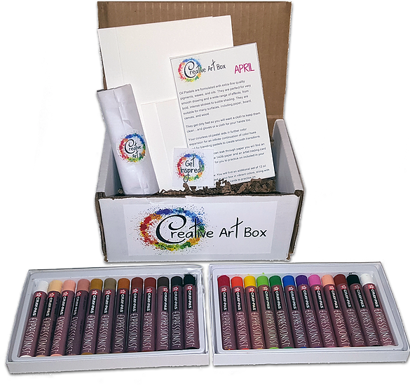
This month's theme was oil pastel- specifically Sakura of America's Expressionist Cras Pas. Sakura has three tiers of oil pastels- Expressionist, Junior Artist, and Specialist.
Oil Pastels aren't a medium I use often in my studio, so I had to do a little research to prep for this month's unboxing. In the past (like, two decades ago), I used oil pastels regularly in my elementary school art classes, and really enjoyed using them, so I looked forward to playing around with the Cras Pas included in my April Box.


Materials Included in the April Basic Box
1 package of Multicultural Cras Pas (12 colors)
1 blender Cras Pas
1 Cotman watercolor postcard
1 Canvas card ATC
1 Sticker
1 Informational Card
Everything inside the box was packaged securely- the Multicultural Cras Pas arrived in their own sturdy cardboard box, and the blender Cras Pas arrived wrapped in tissue paper.
The Card Reads:
Creative Art Box
April
Oil Pastels are formulated with extra-fine quality pigments, waxes, and oils. They are perfect for very smooth drawing and a wide range of effects, from bold, intense strokes to subtle shading. They are suitable for many surfaces, including paper, board, canvas, and wood.
They get dirty fast so you will want a cloth to keep them clean...and gloves or a cloth for your hands too.
Your colorless oil pastel aids in further color expansion for an infinite continuation of color hues and for blending pastels to create smooth transitions.
Since oil pastes can leak through paper you will find an artist post card at 140lb paper and an artist trading card at 200 lbs paper for you to practice on included in your box.
Premium Box: You will find an additional set of 12 oil pastels included in your box in vibrant colors, along with some extra artist trading cards to practice on.
Don't forget to follow us on social media and tag your box reveal or artwork to win extra surprises in your next box!
Instagram: instagram.com/creativeartbox
Pinterest: pinterest.com/CreativeArtBox
Twitter: twitter.com/Creative_ArtBox
Facebook: facebook.com/CreativeArtBox
CreativeArtBox.Com
Some Facts About Oil Pastels
The invention of the oil pastel crayon:
At the end of World War I, Kanae Yamamoto proposed an overhaul of the Japanese education system. He thought that it had been geared too much towards uncritical absorption of information by imitation and wanted to promote a less restraining system, a vision he expounded in his book Theory of self-expression which described the Jiyu-ga method, "learning without a teacher". Teachers Rinzo Satake and his brother-in-law Shuku Sasaki read Yamamoto's work and became fanatical supporters. They became keen to implement his ideas by replacing the many hours Japanese children had to spend drawing ideograms with black Indian ink with free drawing hours, filled with as much as colour as possible. For this, they decided to produce an improved wax crayon and in 1921 founded the Sakura Cray-Pas Company and began production. The new product wasn't completely satisfactory, pigment concentration was low and blending or impasto was impossible, so in 1924 they decided to develop a high viscosity crayon: the oil pastel. This used a mixture of mashed paraffin, stearic acid and coconut oil as a binder. Designed as a relatively cheap, easily applied, colorful medium, oil pastels granted younger artists and students a greater freedom of expression than the expensive chalk-like pastels normally associated with the fine arts. Until the addition of a stabiliser in 1927, oil pastels came in two types: winter pastels with additional oil to prevent hardening and summer pastels with little oil to avoid melting. State schools simply couldn't afford the medium and, suspicious of the very idea of "self-expression" in general, favoured the coloured pencil, a cheaper German invention then widely promoted in Europe as a means to instill work discipline in young children.
Source: Wikipedia, Oil Pastel
Comment: How cool is this? Inspired by the desire to improve education for children, two teachers seeking to increase artistic expression create the same oil pastel I'm holding today.
Oil pastels can be blended out, or used for washes with a 50/50 solution of linseed oil and turpentine (or mineral spirits). Unfortunately, I don't use oil pastels often, so I lack most of the materials necessary, and had to make due.
If you don't seal your oil pastel illustrations, they will stain your other artwork, so I recommend picking up a can of spray fixative. My favorite for years has been Krylon's Matte Finish, which was recommended to me years ago when I was a freshman at UNO. This spray fixative should be fairly easy to find, I believe I purchased many cans from Michael's back in the day.
Materials Demonstration
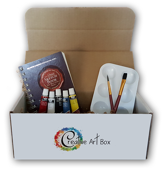
Additional Materials Used:
Art Alternatives Mini Canvas Boards (or canvas panels)Canson XL Watercolor Paper, cut to sizeSince I haven't used oil pastels in a few years, I wanted to experiment a bit with the materials included in my Creative Art Box before deciding on what to do for my April challenge. I recorded video for this, but unfortunately I'm having trouble locating it for editing, but fortunately I have some in progress photos.
I pulled out some papers I thought would compliment my Cras Pas- some Canson XL watercolor paper, and a piece of canvas board. I wanted to test out how well these oil pastels blend- especially since Creative Art Box included a blending pastel.


I found Sakura's Cray Pas a bit chalky for oil pastels- there was a lot of dust left over when the oil pastels were applied to paper that needed to be carefully brushed away before I could continue. The colors don't blend together particularly well due to how chalky these pastels are. If I planned on using these pastels in the future, I would need to buy some linseed oil to facilitate blending. The blender pastel, which is made just from the blending agent and binder, didn't do much to facilitate blending either.
On the piece of canvas board, I demonstrated some impasto techniques- scraping away layers of pastel and replacing with a new color. Although the pastels handle better on the heavily textured canvas board, it's still difficult for me to build up layers of color due to the chalkiness of the pastels.
After I finished swatching and blending tests, I sprayed my XL watercolor paper with the Krylon Matte Finish mentioned above.
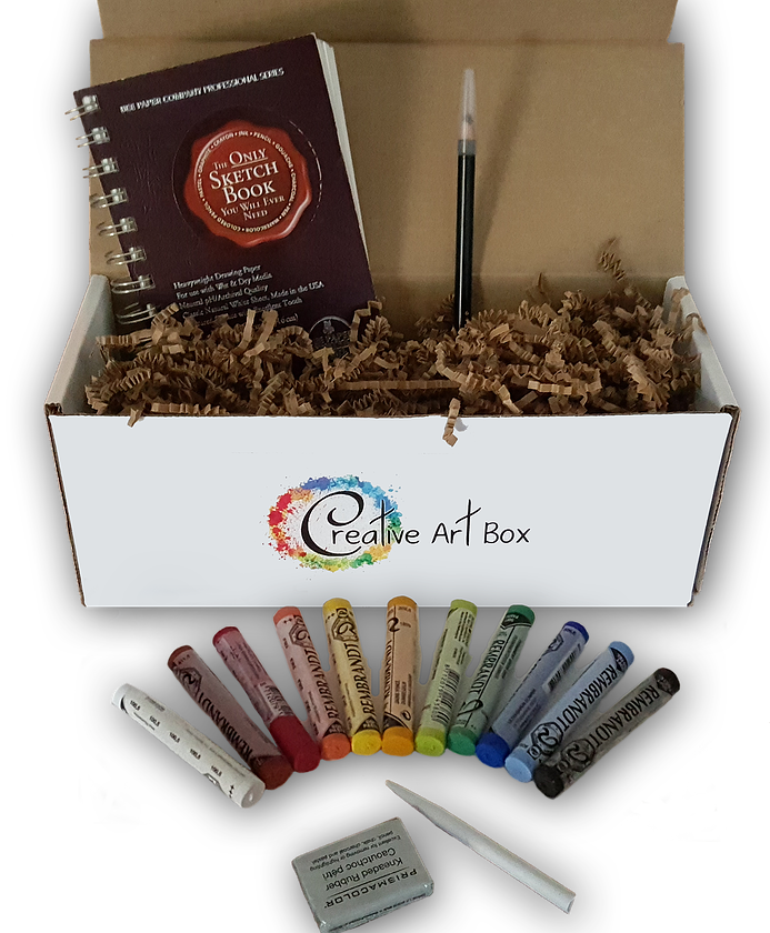
Creative Art Box Basic Challenge
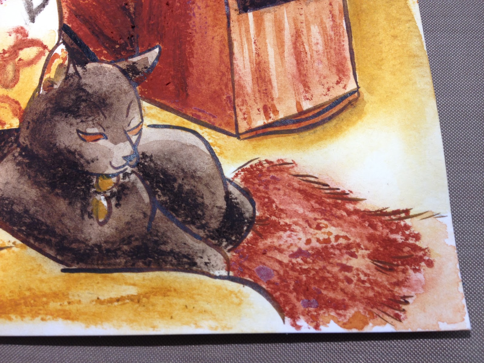
April Creative Art Box Challenge-Becca Hillburn
Additional Materials Used:
FW Acrylic Ink (burnt umber)Cotman Watercolors Pocket SetWashi tape (masking tape can be used- just meant to keep card from buckling)Spray Fixative (Krylon Matte Finish)Makeup sponges (for blending)I decided to use my multicultural crayons to create a three tone illustration- yellow ochre, burnt umber, and sepia. I decided to sketch a photo of my cat Bowie, and after completing my sketch, inked the piece with the FW Acrylic Ink and a Creative Mark Rhapsody 00 brush. After inking, I allowed the ink to cure undisturbed for 24 hours before erasing pencils.
After erasing the pencils, I began applying washes of watercolor to the Cotman watercolor postcard included in my April Creative Art Box.


Once my watercolors had dried, I starteed applying the oil pastel, buffing out areas with an inexpensive makeup sponge. The sponge picks up much of the pastel, leaving a very soft, hazy blend that can take additional layers.

Once I finished applying oil pastel, I gave certain areas another wash of watercolor to deepen the color, and sprayed the piece down with my Matte Finish.

Verdict
Right now, Creative Art Box is still getting it's feet wet and establishing an audience. It definitely has a little growing to do, and a few things to figure out, but I look forward to watching it grow and offering feedback whenever I can.
If Creative Art Box has sparked your interest, keep your eyes open this week for an interview with founder Lena!
Resources:
https://www.britannica.com/art/pastel-art
https://en.wikipedia.org/wiki/Oil_pastel
http://www.explore-oil-pastels-with-robert-sloan.com/oil-pastels-techniques.html
https://books.google.com/books?id=nFU...
http://juliannakunstler.com/art1_oilpastels.html
http://www.wetcanvas.com/forums/showthread.php?t=249008
http://www.oilpasteltechniques.com/blending-with-oil-pastels/
The Creative Art Box featured in this post was sent to me care-of from Creative Art Box for the purposes of promotion and review. If you are interested in sponsoring a post, a month of content, or sending a product for review and promotion, please check out this post. Sponsored content can include unboxings, demonstrations, tutorials, and interviews, and is not just open to companies, but to individual comic artists looking to promote their work. If you are a comic artist interested in promoting your comic, please email me for information. Sponsorship is also available on a personal level through my Patreon.
Please consider donating to this blog or purchasing from Natto-shop (http://nattosoup.com/shop) if you want me to continue publishing quality content. All materials tested were purchased from my own pocket. Keep on Truckin' Nattosoup is not under any sponsorship.

This box was provided at no cost to me, for the purposes of review and publicity. If you're interested in checking out Creative Art Box for yourself, please visit their website.
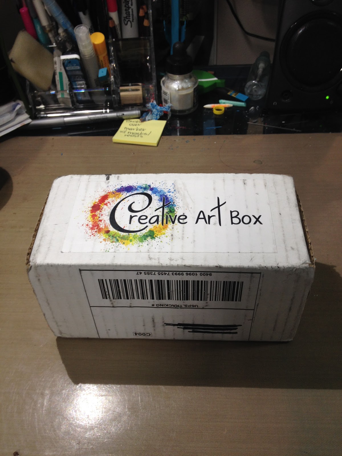
About Creative Art Box
Creative Art Box is a new subscription box services that supplies art supplies in every monthly box. Customers have the option of two tiers- the Basic Box and the Premium Box. Lena sent me the Basic Box for this month. The Basic Box is $29.00, including shipping, and customers have the option to upgrade to the Premium Box, which includes more supplies, for an additional $5. I recommend upgrading to the Premium Box if you're interested in this service, as the April Premium Box had more goodies inside. Most of the shots you see on the website are from past Premium Boxes.
Creative Art Box strives to set itself apart from other subscription services by providing tutorials and information to subscribers through their website and blog. You can check out some of the resources Creative Art Box has pinned for their April Oil Pastel box here. Creative Art Box also features an artist each month, this month's artist is Laura Enninga.
Creative Art Box absorbs the cost of shipping, and considering they aren't accessing a business rate at this time, that can be a hefty chunk of change. After interviewing the founder, Lena, I've learned that Creative Art Box has big plans for future boxes, and intends to include more products per box as their customer base grows and they're able to establish relationships with art material suppliers.
April Unboxing
April Creative Art Box Basic Unboxing- Becca Hillburn
This month's theme was oil pastel- specifically Sakura of America's Expressionist Cras Pas. Sakura has three tiers of oil pastels- Expressionist, Junior Artist, and Specialist.
Oil Pastels aren't a medium I use often in my studio, so I had to do a little research to prep for this month's unboxing. In the past (like, two decades ago), I used oil pastels regularly in my elementary school art classes, and really enjoyed using them, so I looked forward to playing around with the Cras Pas included in my April Box.
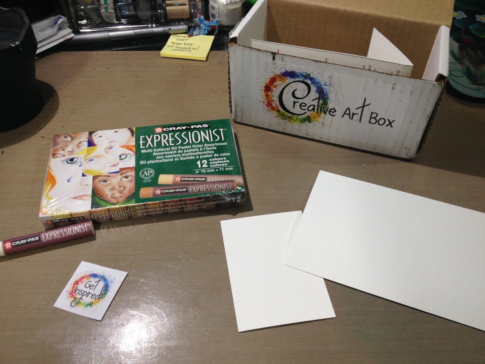

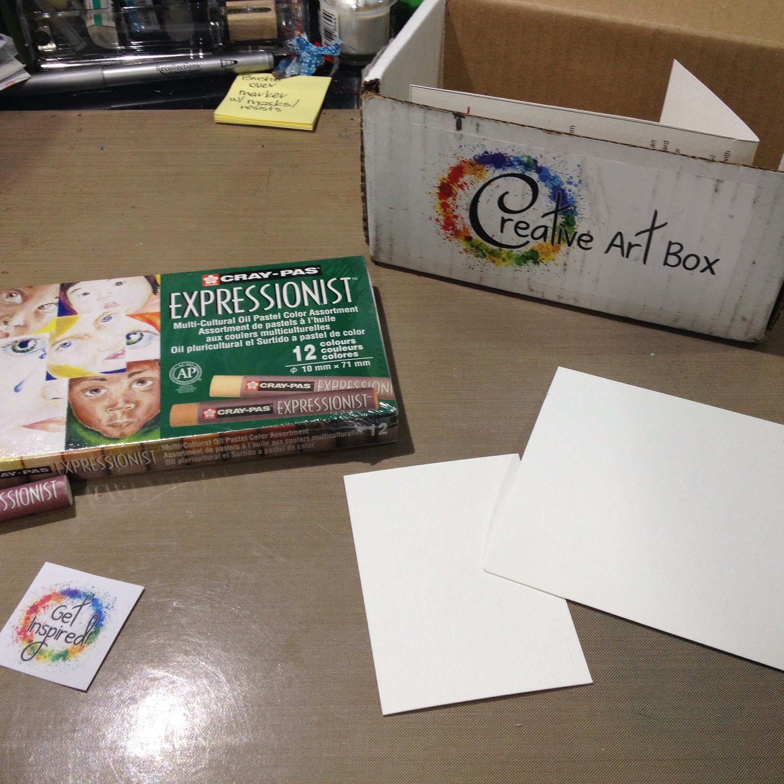
Materials Included in the April Basic Box
1 package of Multicultural Cras Pas (12 colors)
1 blender Cras Pas
1 Cotman watercolor postcard
1 Canvas card ATC
1 Sticker
1 Informational Card
Everything inside the box was packaged securely- the Multicultural Cras Pas arrived in their own sturdy cardboard box, and the blender Cras Pas arrived wrapped in tissue paper.
The Card Reads:
Creative Art Box
April
Oil Pastels are formulated with extra-fine quality pigments, waxes, and oils. They are perfect for very smooth drawing and a wide range of effects, from bold, intense strokes to subtle shading. They are suitable for many surfaces, including paper, board, canvas, and wood.
They get dirty fast so you will want a cloth to keep them clean...and gloves or a cloth for your hands too.
Your colorless oil pastel aids in further color expansion for an infinite continuation of color hues and for blending pastels to create smooth transitions.
Since oil pastes can leak through paper you will find an artist post card at 140lb paper and an artist trading card at 200 lbs paper for you to practice on included in your box.
Premium Box: You will find an additional set of 12 oil pastels included in your box in vibrant colors, along with some extra artist trading cards to practice on.
Don't forget to follow us on social media and tag your box reveal or artwork to win extra surprises in your next box!
Instagram: instagram.com/creativeartbox
Pinterest: pinterest.com/CreativeArtBox
Twitter: twitter.com/Creative_ArtBox
Facebook: facebook.com/CreativeArtBox
CreativeArtBox.Com
Some Facts About Oil Pastels
The invention of the oil pastel crayon:
At the end of World War I, Kanae Yamamoto proposed an overhaul of the Japanese education system. He thought that it had been geared too much towards uncritical absorption of information by imitation and wanted to promote a less restraining system, a vision he expounded in his book Theory of self-expression which described the Jiyu-ga method, "learning without a teacher". Teachers Rinzo Satake and his brother-in-law Shuku Sasaki read Yamamoto's work and became fanatical supporters. They became keen to implement his ideas by replacing the many hours Japanese children had to spend drawing ideograms with black Indian ink with free drawing hours, filled with as much as colour as possible. For this, they decided to produce an improved wax crayon and in 1921 founded the Sakura Cray-Pas Company and began production. The new product wasn't completely satisfactory, pigment concentration was low and blending or impasto was impossible, so in 1924 they decided to develop a high viscosity crayon: the oil pastel. This used a mixture of mashed paraffin, stearic acid and coconut oil as a binder. Designed as a relatively cheap, easily applied, colorful medium, oil pastels granted younger artists and students a greater freedom of expression than the expensive chalk-like pastels normally associated with the fine arts. Until the addition of a stabiliser in 1927, oil pastels came in two types: winter pastels with additional oil to prevent hardening and summer pastels with little oil to avoid melting. State schools simply couldn't afford the medium and, suspicious of the very idea of "self-expression" in general, favoured the coloured pencil, a cheaper German invention then widely promoted in Europe as a means to instill work discipline in young children.
Source: Wikipedia, Oil Pastel
Comment: How cool is this? Inspired by the desire to improve education for children, two teachers seeking to increase artistic expression create the same oil pastel I'm holding today.
Oil pastels can be blended out, or used for washes with a 50/50 solution of linseed oil and turpentine (or mineral spirits). Unfortunately, I don't use oil pastels often, so I lack most of the materials necessary, and had to make due.
If you don't seal your oil pastel illustrations, they will stain your other artwork, so I recommend picking up a can of spray fixative. My favorite for years has been Krylon's Matte Finish, which was recommended to me years ago when I was a freshman at UNO. This spray fixative should be fairly easy to find, I believe I purchased many cans from Michael's back in the day.
Materials Demonstration
Additional Materials Used:
Art Alternatives Mini Canvas Boards (or canvas panels)Canson XL Watercolor Paper, cut to sizeSince I haven't used oil pastels in a few years, I wanted to experiment a bit with the materials included in my Creative Art Box before deciding on what to do for my April challenge. I recorded video for this, but unfortunately I'm having trouble locating it for editing, but fortunately I have some in progress photos.
I pulled out some papers I thought would compliment my Cras Pas- some Canson XL watercolor paper, and a piece of canvas board. I wanted to test out how well these oil pastels blend- especially since Creative Art Box included a blending pastel.
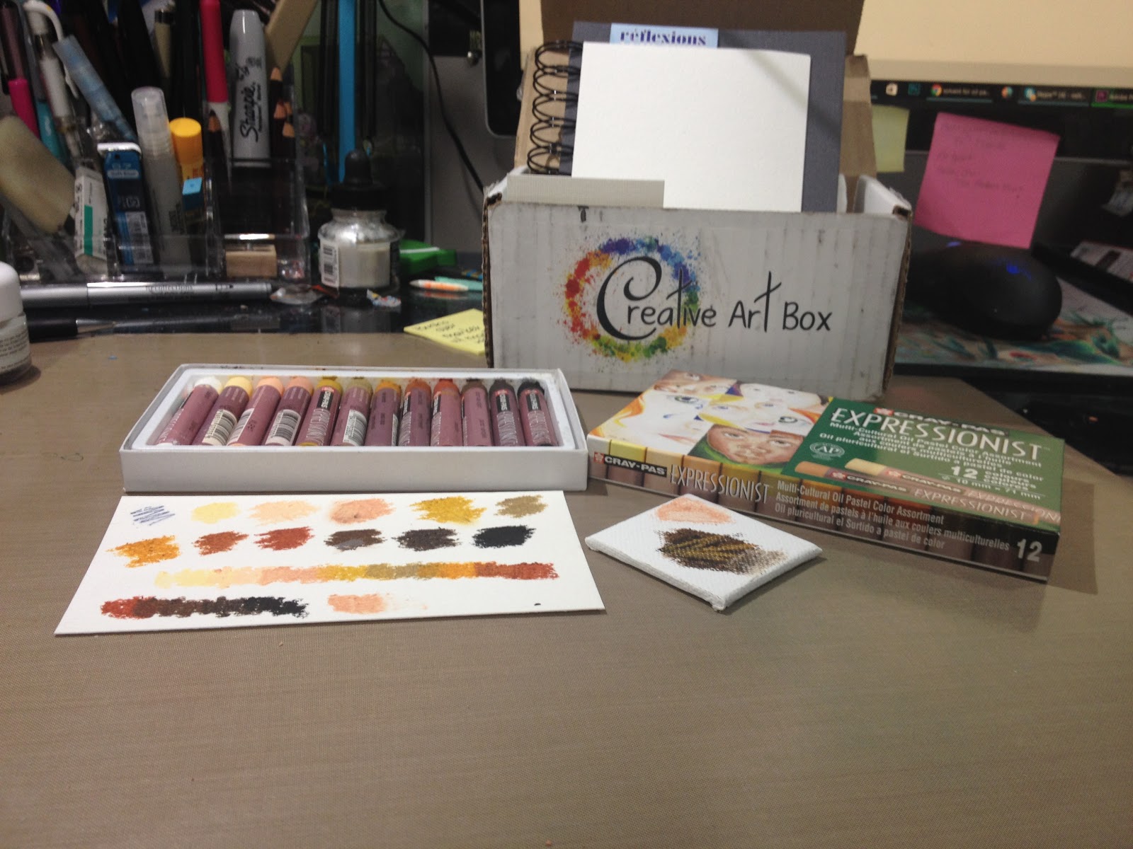
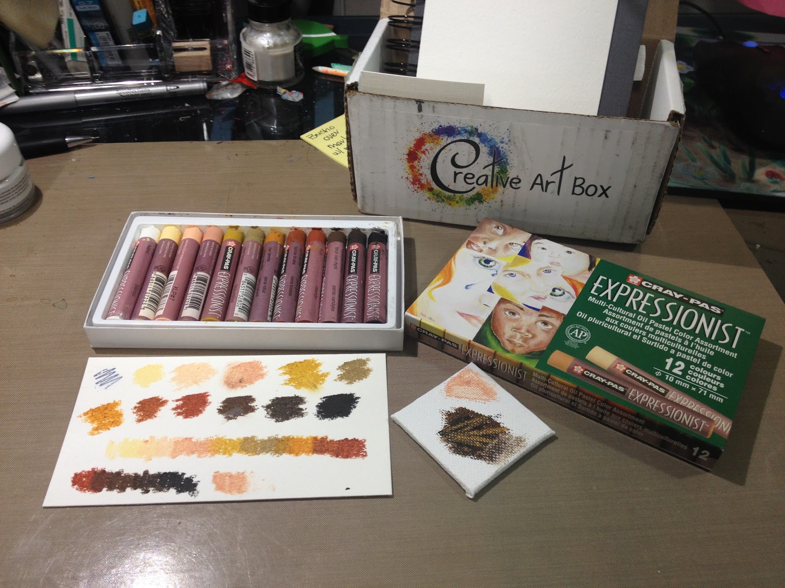
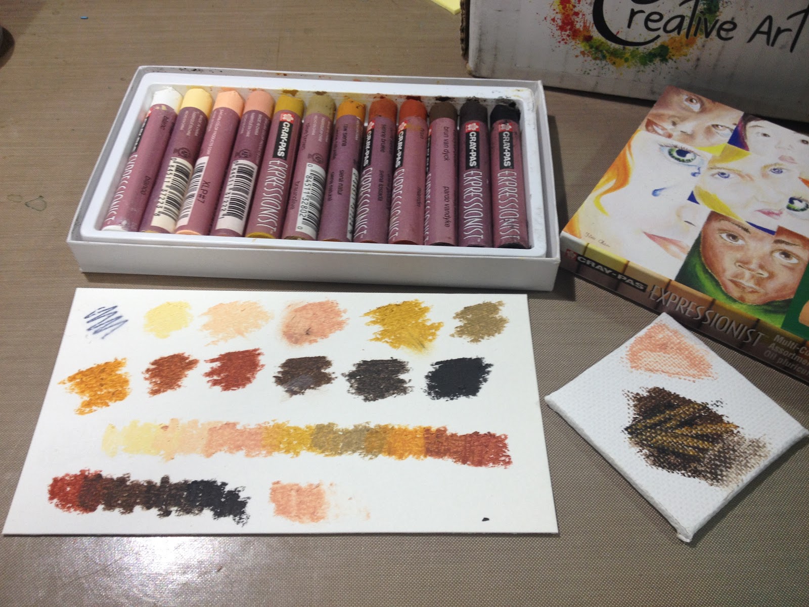
I found Sakura's Cray Pas a bit chalky for oil pastels- there was a lot of dust left over when the oil pastels were applied to paper that needed to be carefully brushed away before I could continue. The colors don't blend together particularly well due to how chalky these pastels are. If I planned on using these pastels in the future, I would need to buy some linseed oil to facilitate blending. The blender pastel, which is made just from the blending agent and binder, didn't do much to facilitate blending either.
On the piece of canvas board, I demonstrated some impasto techniques- scraping away layers of pastel and replacing with a new color. Although the pastels handle better on the heavily textured canvas board, it's still difficult for me to build up layers of color due to the chalkiness of the pastels.
After I finished swatching and blending tests, I sprayed my XL watercolor paper with the Krylon Matte Finish mentioned above.
Creative Art Box Basic Challenge
April Creative Art Box Challenge-Becca Hillburn
Additional Materials Used:
FW Acrylic Ink (burnt umber)Cotman Watercolors Pocket SetWashi tape (masking tape can be used- just meant to keep card from buckling)Spray Fixative (Krylon Matte Finish)Makeup sponges (for blending)I decided to use my multicultural crayons to create a three tone illustration- yellow ochre, burnt umber, and sepia. I decided to sketch a photo of my cat Bowie, and after completing my sketch, inked the piece with the FW Acrylic Ink and a Creative Mark Rhapsody 00 brush. After inking, I allowed the ink to cure undisturbed for 24 hours before erasing pencils.
After erasing the pencils, I began applying washes of watercolor to the Cotman watercolor postcard included in my April Creative Art Box.
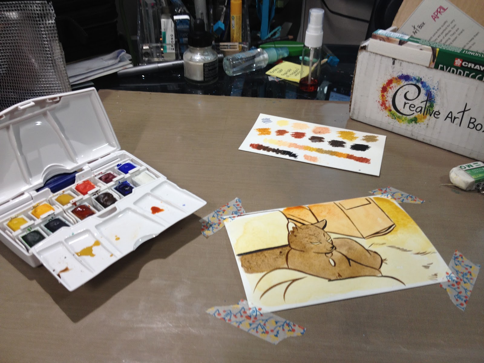
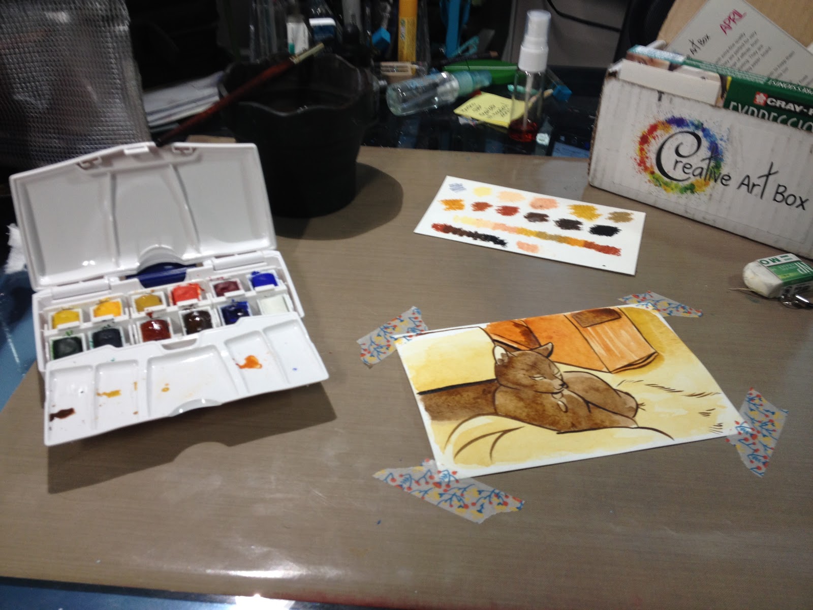
Once my watercolors had dried, I starteed applying the oil pastel, buffing out areas with an inexpensive makeup sponge. The sponge picks up much of the pastel, leaving a very soft, hazy blend that can take additional layers.

Once I finished applying oil pastel, I gave certain areas another wash of watercolor to deepen the color, and sprayed the piece down with my Matte Finish.
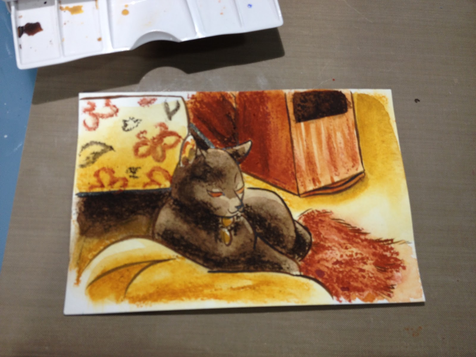
Verdict
Right now, Creative Art Box is still getting it's feet wet and establishing an audience. It definitely has a little growing to do, and a few things to figure out, but I look forward to watching it grow and offering feedback whenever I can.
If Creative Art Box has sparked your interest, keep your eyes open this week for an interview with founder Lena!
Resources:
https://www.britannica.com/art/pastel-art
https://en.wikipedia.org/wiki/Oil_pastel
http://www.explore-oil-pastels-with-robert-sloan.com/oil-pastels-techniques.html
https://books.google.com/books?id=nFU...
http://juliannakunstler.com/art1_oilpastels.html
http://www.wetcanvas.com/forums/showthread.php?t=249008
http://www.oilpasteltechniques.com/blending-with-oil-pastels/
The Creative Art Box featured in this post was sent to me care-of from Creative Art Box for the purposes of promotion and review. If you are interested in sponsoring a post, a month of content, or sending a product for review and promotion, please check out this post. Sponsored content can include unboxings, demonstrations, tutorials, and interviews, and is not just open to companies, but to individual comic artists looking to promote their work. If you are a comic artist interested in promoting your comic, please email me for information. Sponsorship is also available on a personal level through my Patreon.
Please consider donating to this blog or purchasing from Natto-shop (http://nattosoup.com/shop) if you want me to continue publishing quality content. All materials tested were purchased from my own pocket. Keep on Truckin' Nattosoup is not under any sponsorship.
April 21, 2016
Gumroad Shop Launch
My Patreon just hit nine weeks of activity, and we're closing in on a couple of exciting tiers- the free mini comics tier ($60 a month), access to my digital paper assets ($90) the access to my digital assets tier ($150, will update monthly), and the digital access to 7" Kara Volume 1 Tier ($75). To help facilitate distributing those rewards, I've set up a Gumroad shop (I've had an account for awhile) where customers can purchase digital copies of my digital art assets like watercolor paper scans, mini comics, and sketchbooks, and Patrons will have coupons to download those rewards.
Loading...
To give you a sample of the goodies in store, I've uploaded the never before seen Concept Art mini sketchbook from 7" Kara Volume 1 to the store, and set the price to free, so you guys can check it out. If you'd like to make a donation, that's much appreciated as well.
Loading...
For those of you who'd like to support my work, a digital copy of Volume 1 of 7" Kara is available for $5, as are digital copies of my current minis. There's also a HUGE mini compilation that includes all of the minis I created while at SCAD, the alcohol marker review book, and a couple of my sketchbooks, so if you're interested in checking out the work produced while attaining a Masters Degree in Sequential Art, you should check that out.
I currently also have copies of my 2015 minis, Magical Girl March and Favorite Fictional Femmes available as PDFS,if you've missed seeing me at a con and would like to check either of them out. As the year progresses, I'll continue to upload digital art assets, sketchbooks, and minis to my shop, so please consider adding it to your Favorites list.
If you become a Patreon backer, you'll have access to all of these once those goals are met, so if you're interested in long-game support, joining the Nattosoup Studio community would be a fantastic way to gain access to comics, sketchbooks, and help fund blog posts and future videos. Current backers get a weekly newsletter outlining everything that has been posted to this blog and to the sister YouTube channel, as well as sneak peeks into ongoing projects, including 7" Kara Volume 2 progress. Backers have already unlocked bonus monthly marker and watercolor tutorials, as well as an end of the month, Backer Only Request Livestream event.
Please consider donating to this blog or purchasing from Natto-shop (http://nattosoup.com/shop) if you want me to continue publishing quality content. All materials tested were purchased from my own pocket. Keep on Truckin' Nattosoup is not under any sponsorship.
Loading...
To give you a sample of the goodies in store, I've uploaded the never before seen Concept Art mini sketchbook from 7" Kara Volume 1 to the store, and set the price to free, so you guys can check it out. If you'd like to make a donation, that's much appreciated as well.
Loading...
For those of you who'd like to support my work, a digital copy of Volume 1 of 7" Kara is available for $5, as are digital copies of my current minis. There's also a HUGE mini compilation that includes all of the minis I created while at SCAD, the alcohol marker review book, and a couple of my sketchbooks, so if you're interested in checking out the work produced while attaining a Masters Degree in Sequential Art, you should check that out.
I currently also have copies of my 2015 minis, Magical Girl March and Favorite Fictional Femmes available as PDFS,if you've missed seeing me at a con and would like to check either of them out. As the year progresses, I'll continue to upload digital art assets, sketchbooks, and minis to my shop, so please consider adding it to your Favorites list.
If you become a Patreon backer, you'll have access to all of these once those goals are met, so if you're interested in long-game support, joining the Nattosoup Studio community would be a fantastic way to gain access to comics, sketchbooks, and help fund blog posts and future videos. Current backers get a weekly newsletter outlining everything that has been posted to this blog and to the sister YouTube channel, as well as sneak peeks into ongoing projects, including 7" Kara Volume 2 progress. Backers have already unlocked bonus monthly marker and watercolor tutorials, as well as an end of the month, Backer Only Request Livestream event.
Please consider donating to this blog or purchasing from Natto-shop (http://nattosoup.com/shop) if you want me to continue publishing quality content. All materials tested were purchased from my own pocket. Keep on Truckin' Nattosoup is not under any sponsorship.
April 20, 2016
April 2016 ArtSnacks Vs. SketchBox Basic
Thanks to Denise Hillburn (my mother) for the gift of ArtSnacks for the year! SketchBox Basic subscription purchased by me out of personal funds. If you would like to help support this blog, and continue posts like this, please consider donating to my Paypal, or contributing to my Patreon. Future unboxings and reviews will be unlocked to the public at the $15 level each month, but backers have access regardless of funds raised. If you would like to see me review a SketchBox premium box, please consider gifting a subscription.

This month, I'm going to do something a bit different. My Unboxing video will be available to the public to view, but only readers, subscribers on YouTube, and my Patrons should be able to access my other videos. Hopefully this will cut down on some of the hit and run comments I've gotten the past three months. If you have trouble accessing these videos, please let me know, as I value my blog readers and want to make sure the videos work for you guys.
Special March thanks to:
Andrew Benedict
C. Ellis
Ryan
Yolaine
Yusagi
Chris
Entreat
Wayne Norris
Risto
Previous SketchBox Vs. ArtSnacks
January- Winner: ArtSnacks
February- Winner: SketchBox
March- Winner: ArtSnacks
SketchBox: $25mo/$240 yr
ArtSnacks: $20mo/$200 yr
April SketchBox Basic Box Includes
Pigma FBPigma MBPigma BBDr Ph Martin's Bombay India InkPrismacolor Brush marker (alcohol marker)
April ArtSnacks Includes
Kuretake Metallic Brush PenMarvy LePlume FineBrush Pen (alcohol marker)Ironlak Striker Tri-Grip (alcohol marker)Faber-Castell Jumbo 9000 in 8B (wooden pencil)Read the rest of the post under the cut!
ArtSnacks

This Month's ArtSnacks Brands are:
Uchida Marvy
Ironlak
Faber Castell
Kuretake
Sakura of America
The Card
 The Card Reads:
Where does a cow hang its paintings*
Here's what's on the Menu for April:
Ironlak Strikers Twin Marker$3.99 retail
Your Ironlak Strikers Twin Marker comes to you all the way from Australia. This refillable marker offers smooth ink application from its broad and fine points. Its uniquely designed air-tight cap helps keep this marker from drying out. The triangular barrel will keep this one from rolling away- but we doubt you'll be putting it down anytime soon!
Kuretake Metallic Brush Pen$7.92 retail
Staff Favorite We fell for the Kuretake Metallic Brush Pen at first stroke. This Japanese import handles like a paintbrush and delivers a metallic mark with a subtle shimmer. Use it to add highlights, or rely on it for rich color throughout your piece.
Faber-Castell 9000 Jumbo Pencil$3.20 retail
This oversized Faber-Castell 9000 Jumbo Pencil is comfortable to handle, thanks to its thick barrel. Notice how smoothly it lays down graphite; it's designed to be extra break-resistant. The water-based varnish makes this a good environmental choice, too.
Le Plume Permanent Brush Pen$2.60 retail
"Plume" is French for "feather", and the name suits this soft, delicate Le Plume Permanent Brush Pen. Use a soft touch for finer applications, a firm touch will lay down more color. The brand, Marvy Uchida, produces this pen in a staggering 144 colors!
Koi Coloring Brush Pen by Sakura$2.50 retail
The first thing you'll notice as you try out the Koi Coloring Brush Pen by Sakura is the unique handling of the tip. It offers the softness of a brush pen combined with the firmness of a marker tip. Use your new pen for outlining, coloring, or both. This versatile tool will quickly become a go-to for your ink projects!
*Answer: In a mooooseum.
Take the ArtSnacks Challenge!Use all of the products in your box to create an original piece of art. Snap a picture of your artwork and share it on Facebook, Twitter, Tumblr, or Instagram with the hashtag #artsnackschallenge.
Like a product? Order more.Visit Artsnacks.co/products
support@artsnacks.co
www.artstnacks.co
The Price Breakdown

Marvy LePlume Fine Brush
$1.39 on Jerry's (http://www.jerrysartarama.com/discoun...) openstock
$51.69 for the set on Jerry's (http://www.jerrysartarama.com/discoun...)
On the Marvy site, $71.74 for the 36 color set (http://www.uchida.com/c-52-manga-draw...#)
$74.99 on Jo-Ann's (http://www.joann.com/uchida-le-plume-...)
Ironlak Strikers Tri Grip Twin Marker
Series 1 (20 piece set) $65.00 on the Ironlak site for the set (http://shop.ironlak.com/categories/ma...)
$9.43 on Amazon for openstock, with Prime (http://amzn.to/1Y7x5WV)
$3.50 on the Ironlak shop (https://shop.bombingscience.com/ironl...)
$58.00 on the BombingScience shop (https://shop.bombingscience.com/ironl...)
Kuretake Metallic Brush Pen
$7.23 on Amazon (best I can find for US, no listing on the Zig site) (http://www.amazon.com/Kuretake-brush-...)
Sakura Koi Coloring Brush Pen
$2.49 on the Sakura of America site (http://sakuraofamerica.shptron.com/c/...)
$1.99 openstock on DickBlick (http://www.dickblick.com/products/sak...)
Jumbo Graphite Pencil
$2.25 on DickBlick (http://www.dickblick.com/products/fab...)
Total: $16.86
Box Cost $20- shipped
The Supplies Inside
Marvy LePlume Fine Brush
http://www.uchida.com/LePlume/index.html
The Marvy LePlume Fine Brush markers only come in 36 colors, not 144 as listed on the card. This is a little disappointing, as I was REALLY excited about these, but in the end it was a bit of a blessing, as I could afford to order all 36 from Jerry's ArtaRama. The brush nib is fine and flexible as a Pitt Artist Pen, but it may be prone to becoming mushy, as it's fiber, not foam.
Ironlak Strikers Tri Grip Twin
http://ironlak.com/product_strikers.html
Also availablbe in a round barrel brush tipped twin tip markers (http://shop.ironlak.com/categories/ma...). Bullet and chisel nibs. 160 total colors. Alcohol based ink.
Kuretake Metallic Brush Pen
https://kuretakezig.us/pens/metallic-brush-pen/
Not to be confused with Kuretake's Metallic Fudebiyori, or Kuretake's Wink of Luna. Japanese important. This brushpen is very similar to the Wink of Luna, but the barrel seems to hold a lot more metallic ink. The ink is water soluable, and can be used for inkwash.
Sakura's Koi Coloring Brush Pen
http://sakuraofamerica.shptron.com/c/pens_koi-coloring-brush
Astute readers will remember that I reviewed these waterbased brush pens not so long ago on the blog.
Faber-Castell Castell 9000 Jumbo
http://www.faber-castell.com/art-and-graphic/new-products/castell-9000-jumbo
This large, soft leaded jumbo pencil would have been ideal back in my undergrad salad days of graphite illustration. These days, I reach for mechanical pencils when I want graphite, but the pencil is still appreciated.
Supply Overview and Demonstration:
ArtSnacks April 2016 Unboxing-Becca Hillburn


ArtSnacks Challenge
April ArtSnacks Challenge-Becca Hillburn
After completing the demonstration and overview portion of my ArtSnacks review, I was able to use the swatches created as a palette to help me decide on a subject to draw. I wanted to stay as faithful to both boxes as possible- using everything I could in each box, and only augmenting a little. It's difficult for me to only use the materials in the boxes sometimes, but I feel like the challenge is beneficial and forces me to think creatively.


I sketched a cat-stronaut on Fluid watercolor paper (not included, but I figured it would be able to withstand almost anything I threw at it) and inked with the Pigma MB and FB included in my SketchBox, as I knew those pens would be alcohol marker and watersafe. I allowed my inks to draw for 24 hours, so the ink could cure.


I used my Tim Holtz Craft mat as a palette for my Kuretake Metallic BrushPen and Sakura Koi Coloring Brush Pen. I scribbled ink from both pens onto the mat, and was able to create washes using this ink with a Derwent waterbrush (not included in the box). I'd really hoped to be able to build up a darker sky, but I hit my limit early- colors just weren't increasing in saturation after a certain point.


I switched to adding flicks of iridescent starlight by using FW's Pearlescent acrylic ink (not included in the box) and flicking it with the Simply Simmons synthetic brush from my April SketchBox.

Getting caught up in a phonecall, I neglected to take step by step photos, but I filled in his ears using the Marvy Fine Brush alcohol marker, and his eyes with the Ironlak Striker. I applied the Sakura Koi to my Tim Holtz craft mat, using it as a palette, and painted the gray fur on in layers, allowing each layer to dry so I could build up contrast. I shaded his suit using the same technique.

 Once everything dried, I pulled out t he Faber-Castell Jumbo 9000 pencil to add some shading. Truthfully, I preferred the cleaner look before shading, but I wanted to use everything that came in this month's box.
I added white highlights using Copic's Opaque White and the Simply Simmons brush that came in my April Sketchbox Basic.

This month's ArtSnacks didn't disappoint- it definitely felt like it was made just for me. Two alcohol markers, a waterbased marker, and a waterbased gel pen- these are all things that are right up my alley. Although I'm not personally feeling the Jumbo 9000, this has more to do with the fact that I don't really work with pencils as sketching tools anymore than with the quality of the pencil itself. When I was in undergrad, I did realistic graphite illustrations, and I probably would have loved the Jumbo then.
SketchBox Basic

The box reads:
Artist: Megan Clarke
Instagram: @clarkepaperandknife
Etsy: clarkepaperandknife.etsy.com
Made with materials from the February Box


This Month's SketchBox Basic Brands are:
Prismacolor (Sanford)
Dr Ph Martin's
Simply Simmons (Daler Rowney)
Sakura of America
The Card

The Card Reads
SketchBox AprilBasic Box
This month is a unique take on ink! We included Dr.Ph Martin's Bombay India ink- this ink can be used with a brush to create vibrant washes of color. You'll also find a Simply Simmons round brush to dip and paint with the ink.To add color beyond the India Ink we included a Prismacolor brush marker. These markers are highly saught (sic) after for their flexible nib that allows you to control the size of your strokes simply by adding more or less pressure. They also have a fine nib for detail work. You'll also find all th4ree sizes of Sakura's Pigma Professional Brush Pens! These durable brush nibs were specifically developed to provide fantastic bounce and memory over long periods of use. They respond to instant changes in pressure or direction with a silky smooth, accurate, and consistent ink flow. The deep black, archival-quality Pigma ink won't smear, feather, or bleed through most papers.
Have fun exploring your new supplies and remember to tag your art with #SketchBoxApril if you'd like to be included in our monthly contest-the winner gets their art printed on a future box lid!

 The Card Reads
SketchBbox AprilFeatured Artist Nikki Laxar
Hi! I'm Nikki Laxar. I was born and raised in the beautiful, eclectic state of Vermont. I've always had a fascination with the animal world and anything artistic. Most of my work involves combining the two in a very whimsical way. I'm a self-taught artist who enjoys learning new ways to bring my vision to life, through every new piece. I primarily enjoy working with watercolor and ink. I really love the process of bleeding color onto paper and letting it trail off with just a little guidance. Layering ink on top of the paint allows me to really express my vision and stitch more detail into the overall piece, letting the paint strokes guide my pen. Aside from my watercolor illustrations, I enjoy working with my clients to create realistic pet portraits, logo designs and tattoos. I'm into anything earthy, natural fibers and texture, thrift stores, repurposed art, kitty snuggles, the moon and many things that most people find odd and creepy.
Check out more of NIkki's work at www.nikkilaxar.etsy.com
We're so thankful for the talent that Nikki shared with us, if you'd like to get your art featured- email an example of your work to us at
info@getsketchbox.com
The Price Breakdown

Prismacolor Brush Marker $3.99 on DickBlick (openstock), $2.95 for 6-11 markers, $2.79 for 12+ markers
$3.54 on MarkerSupply.com
Pigma FB- $3.67 on MarkerSupply
Pack of 2 $7.80 on Jetpens
Pigma MB $3.67 on MarkerSupply
Pigma BB $3.67 on MarkerSupply
Dr Ph Martin's Bombay India Ink
$4.25 on Dr PH Martin's site
$3.09 on CheapJoes
Simply Simmons Size 4- $2.99 on DickBlick
$3.99 at Michaels
Prismacolor Brush Marker
$3.54 on MarkerSupply
Total: $20.63
Box Cost: $25+ $5 shipping
The Supplies Inside
Sakura of America Pigma Brushpens
http://sakuraofamerica.shptron.com/k/search?q=Pigma+Professional
FB
MB
BB
I reviewed the MB pen a few months ago here on the blog, but I hadn't had an opportunity to compare all three. The FB is tiny- smaller than most fude pens, the MB tends to get worn out really fast, and the BB is perfect. For years I've dreamed that someone would put the Copic superbrush together with a waterproof and alcohol marker proof ink, and it seems like Sakura of America has done just that. I highly recommend the BB.
Prismacolor Brush Markerhttp://www.prismacolor.com/products/art-markers/brush-tip-markersIf you haven't yet, you should check out the Prismacolor site- they have a lot of neat things going on, including an interesting color picker that recommends supplies in that shade. I've started augmenting my alcohol marker collection with Prismacolor markers recently, as Prismacolor makes intense purples and yellows that aren't really available in the Copic Sketch collection.
Simply Simmons
'Value Priced quality brushes'
http://www.daler-rowney.com/content/simply-simmons
Only available in North America. A line of brushes for students, amateurs, and professionals. These are synthetic brushes that don't hold much water. While not ideal for watercolors, they work well for liquid acrylics and applying stiff bodied materials like Copic's Opaque White. In the challenge video, I demonstrate how to use brushes like this for splatter techniques.
Dr PhMartin's Bombay
http://www.docmartins.com/collections/bombay-india-ink
India ink is waterproof once dry (but not alcohol marker proof ever- the alcohol solution will reactivate the shellac), and I recommend allowing it to dry for 24 hours. Bombay is available in a range of vibrant colors, and while I have a few myself, the Tangerine ink sent by SketchBox Basic was a new one to me.
Supply Overview and Demonstration
SketchBox Basic Aprll 2016 Unboxing- Becca Hillburn


SketchBox Challenge
April SketchBox Basic Challenge-Becca Hillburn
For this challenge, I opted to use Fluid watercolor paper as my base, as it can handle mixed media fairly well.


I inked both challenge pieces with the Pigma brushes included with my April SketchBox Basic.
The Pigma MB started to get mushy as I inked, and the Pigma FB often grayed out on long lines, but the Pigma BB was a total dream- it's like someone put a Copic Superbrush in a pen designed for Copics+Watercolor, and I love it.

I used the Simply Simmons 4 round to apply a wash of Mijello Mission Gold in Turquoise (not included). The Simply Simmon's brush is pretty awful- can't hold water, can't apply washes, and the bristles are starting to bend out of shape. Normally I would NOT use this brush to apply washes, but I'm trying to stay fairly true to the challenge this month.

Once the wash dried, I began applying the koi's scales in the Prismacolor's Canary Yellow.

Since alcohol marker dries almost immediately, I could begin working over it quickly. I created a wash with the India ink- adding a few drops to a small bowl of water.

And after that layer dried, I applied Bombay directly from the bottle.

Once that dried, I mixed my Turquoise wash darker, ad reapplied it to the background.

And flicked some FW Pearlescent ink into the wash while it was still wet, so it would disperse in certain parts.

Once that wash had dried, I went in and added some black details with the Pigma pens.


And flicked some Copic Opaque white onto the background for bubbles.


For me to enjoy this SketchBox, I had to introduce other elements- paper, watercolor, white inks. While it's true I had to introduce many of these elements to my ArtSnacks challenge as well, I felt like my ArtSnacks box had a wider range of flexibility in terms of each tool being usablbe for multiple roles. There's also the fact that SketchBox costs more than ArtSnacks (at least $10 more for the Basic Box), but it always feels fairly empty to me. I would rather have one of each goodie then ten of the same, but this is personal preference, and you may prefer to quickly amass a range of color.
The Premium Box
April Sketchbox !!- Horrorwolf19
April SketchBox Review-TheBonBon3272
Do you receive a Premium Box? Interested in having your videos shown in the post? Please let me know. Due to a desire to get my reviews up ASAP, I often go with the videos that are available, which tend to be slim early in the month.
Inside the April Premium Box
Simply Simmons Watercolor Brush- $3.29 on DickBlick
Daler Rowney Calli Calligraphy Ink- $6.24 on DickBlick
Krink Paint Crayon- $8.79 on DickBlick
Kuretake Kurecolor Marker- $3.45 on MarkerPop
Staedtler .5 and .7 mm Pigment Fineliners- $3.59 each on DickBlick
Total: $28.95
Box cost: $35.00+$5.00 shipping
The Verdict
This month, ArtSnacks really impressed me with materials I'd seen online, but hadn't had the chance to try out. The Kuretake Metallic Brushpen, while almost identical to the Wink of Luna sent out in the February Box, is still novel enough to appeal to my art supply reviewer's heart.
The only downside is that I wish ArtSnacks kept track of which colors were sent to people over the course of their boxes. I have two Tombow Irojiten pencils in Kingfisher Blue from ArtSnacks, and now two waterbased Kuretake metallic brushpens in the same shade of green. This is a fairly minor quibble, but it makes it difficult for me to utilize ArtSnacks as a way to fill out my studio.
SketchBox continues to fall short of the monetary value, although SketchBox rep Jon has pointed out that they can't finagle the deals that companies like DickBlick can, he didn't enlighten me further. I would love to interview SketchBox (I have interviews with both ArtSnacks and Creative Box coming up) at some point- perhaps an interview would answer the questions and issues artists have with this subscription box service.
When comparing the Basic and Premium boxes each month, I have to wonder what SketchBox defines as 'premium'. Is it solely based on price? In what world is the Kurecolor S, which is refillable yes, but the refills are difficult to come by, and only comes in chisel and bullet nibs, more premium than a Prismacolor brush tipped marker? Is it the same world where Daler Rowney Calli ink, which tends to be thin with unimpressive coverage, more 'premium' than Dr. PhMartin's Bombay? And if I had opted for the Premium Box this month, and received, yawn, Staedtler pigment fineliners instead of the fantastic Pigma brush pens, I would definitely feel annoyed and a little cheated. If SketchBox utilized tutorials (as suggested multiple times in the past) to increase the value of their boxes, I would be willing to suspend disbelief (and annoyance) and let them learn me something new, but as it is, I can only go by what the included cards and the website tell me, and that isn't much.
The Premium Boxes are a hefty $40- you could do real damage at an art supply store with $40 in your pocket. Paper, pens, watercolors, pencil colors- believe me, $40 goes fairly far, AND you get the joy of going to the art supply store. Even $30 is a fairly big chunk of change to relinquish monthly for a random chance box of art supplies. This pricing, as well as the commonly available contents within, make me question who SketchBox sees as their audience. Surely their target demographic is NOT "Art Supply Reviewers on YouTube". It's been suggested to me that perhaps 'hobbyist looking for inspiration' is the demographic, but if that's the case, just wander into your local art supply store and pick up things that speak to you. Most staff are more than happy to answer your questions.
Another issue with SketchBox is the fact that they don't pay their artists in money, they pay them in exposure, which is a dirty word in the illustration and comic art communities. For all the promotion SketchBox gives their artists (which seems scant- I rarely see them give the illustrators whose work was featured on the box or the interior card more than a passing nod), these artists are providing SketchBox with art used to promote their service. While this is between the artists who knowingly contribute their art for SketchBox's use and SketchBox as a company, I wouldn't claim SketchBox is positively contributing to the arts community by doing this. Positive contribution would mean PAYING the artists, and would definitely raise SketchBox in the community, as they would become an employment opportunity, rather than just another company taking advantage of artists who may not know better. As a fellow artist, I try to always make it a point to not only read the cards out clearly for my audience, but to transcribe them here. If these artists are only paid in exposure, then that exposure needs to actually be able to do something for them. If SketchBox won't promote their work properly, then as a fellow artist, it's my duty to try and have their (the artists') backs.
In the end, it's ArtSnacks that continues to shine by sending me fairly novel supplies that can be used in a variety of ways with a little experience and ingenuity. I was most excited by the Marvy LePlume Fine Brush- an alcohol marker with a brush tip as fine as a Pitt Artist Brush (link)- perfect for tiny illustrations or miniscule details. I ended up ordering the entire 36 color set through Jerry's Artarama, although I would have happily ordered it through ArtSnacks if their shop had carried these markers. I also ended up ordering a 20 piece set of Ironlak's twin tipped brush markers for future review, so if this review piqued your interest in the Austrailian marker company, check back often.
Winner: ArtSnacks
Announcement:
Due to the demands of my YouTube audience, I've taken the plunge and ordered a SketchBox Premium. The site wasn't clear on whether I'll receive the April or May Box, but I hope it's the May so I can do a comparative review of the Basic and Premium boxes, and hopefully demonstrate my point that neither box is currently worth the price. My dear readers know that I always dig up a Premium Box unboxing (usually the first one that gets uploaded) so I can show you guys what's inside both boxes, but my YouTube only audience is pretty insistent that I'm a cheapskate who doesn't know what she's missing out on (clearly if you pay more, it's GOT to be better, right?), so I figured I'd humor them.
If you'd like to help me defray some of the costs of this 'investment' (Premium boxes are $40, including shipping), you can Paypal me a one time donation in my sidebar, or if you genuinely enjoy this content, and would like to contribute towards funding it for future months, please consider backing my Patreon. My little Patreon has grown a lot in the past two months, and it's only due to it blossoming so much that I was even willing to consider the scandalous luxury of ordering and reviewing both a Basic and a Premium box from SketchBox.
Please consider donating to this blog or purchasing from Natto-shop (http://nattosoup.com/shop) if you want me to continue publishing quality content. All materials tested were purchased from my own pocket. Keep on Truckin' Nattosoup is not under any sponsorship.

This month, I'm going to do something a bit different. My Unboxing video will be available to the public to view, but only readers, subscribers on YouTube, and my Patrons should be able to access my other videos. Hopefully this will cut down on some of the hit and run comments I've gotten the past three months. If you have trouble accessing these videos, please let me know, as I value my blog readers and want to make sure the videos work for you guys.
Special March thanks to:
Andrew Benedict
C. Ellis
Ryan
Yolaine
Yusagi
Chris
Entreat
Wayne Norris
Risto
Previous SketchBox Vs. ArtSnacks
January- Winner: ArtSnacks
February- Winner: SketchBox
March- Winner: ArtSnacks
SketchBox: $25mo/$240 yr
ArtSnacks: $20mo/$200 yr
April SketchBox Basic Box Includes
Pigma FBPigma MBPigma BBDr Ph Martin's Bombay India InkPrismacolor Brush marker (alcohol marker)
April ArtSnacks Includes
Kuretake Metallic Brush PenMarvy LePlume FineBrush Pen (alcohol marker)Ironlak Striker Tri-Grip (alcohol marker)Faber-Castell Jumbo 9000 in 8B (wooden pencil)Read the rest of the post under the cut!
ArtSnacks
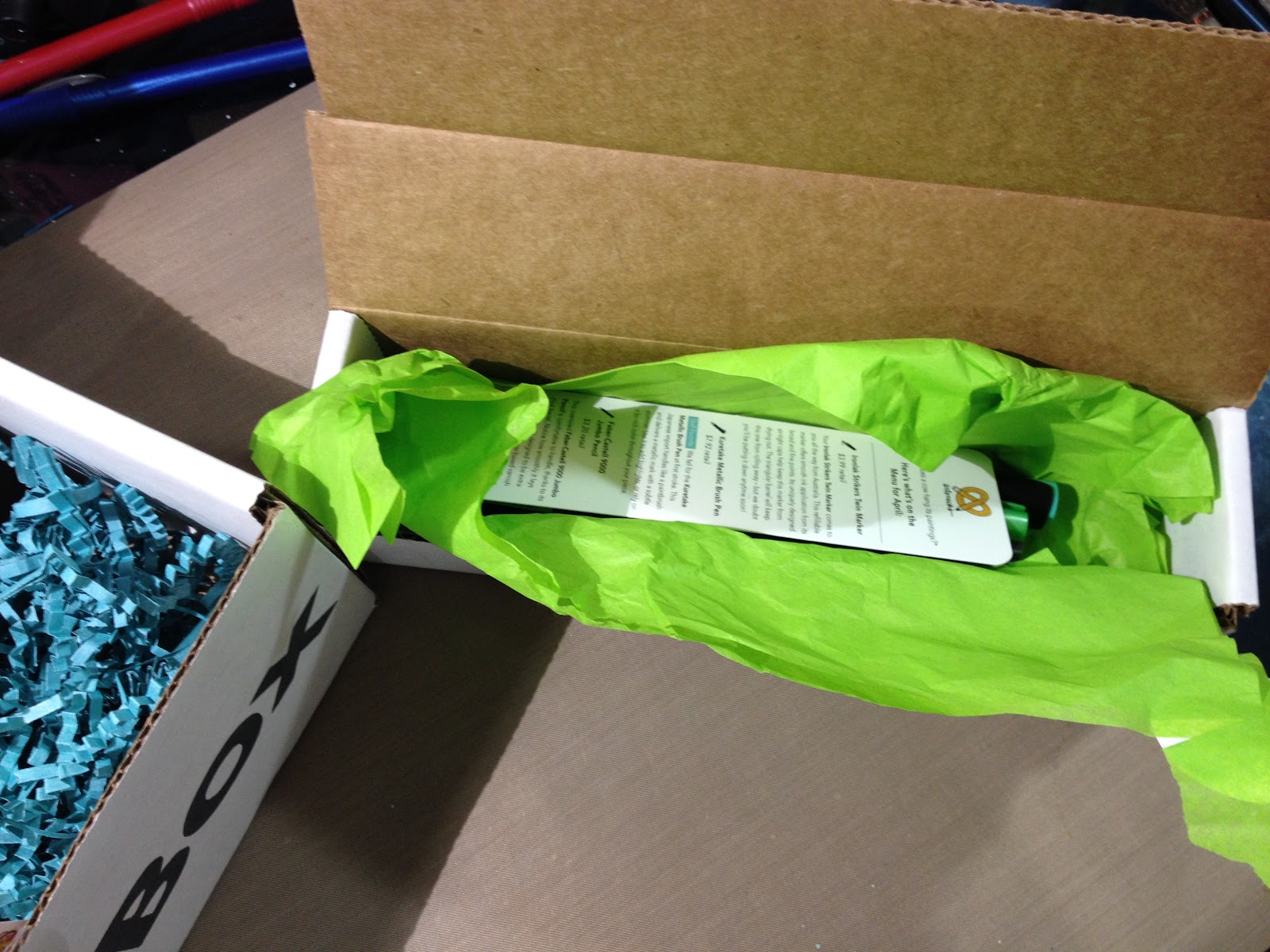
This Month's ArtSnacks Brands are:
Uchida Marvy
Ironlak
Faber Castell
Kuretake
Sakura of America
The Card
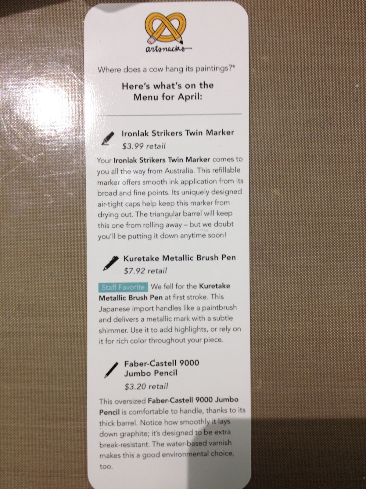
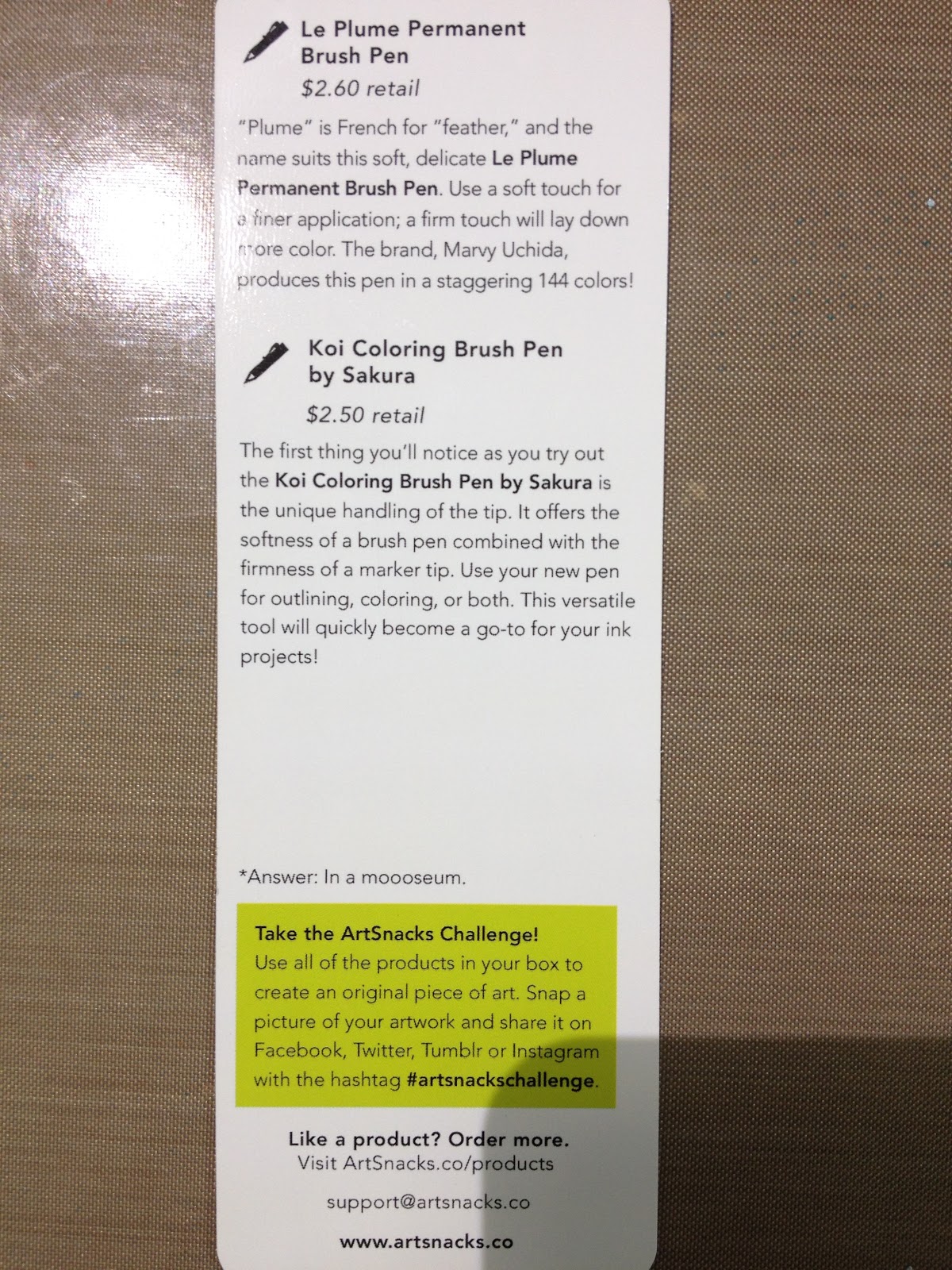 The Card Reads:
Where does a cow hang its paintings*
Here's what's on the Menu for April:
Ironlak Strikers Twin Marker$3.99 retail
Your Ironlak Strikers Twin Marker comes to you all the way from Australia. This refillable marker offers smooth ink application from its broad and fine points. Its uniquely designed air-tight cap helps keep this marker from drying out. The triangular barrel will keep this one from rolling away- but we doubt you'll be putting it down anytime soon!
Kuretake Metallic Brush Pen$7.92 retail
Staff Favorite We fell for the Kuretake Metallic Brush Pen at first stroke. This Japanese import handles like a paintbrush and delivers a metallic mark with a subtle shimmer. Use it to add highlights, or rely on it for rich color throughout your piece.
Faber-Castell 9000 Jumbo Pencil$3.20 retail
This oversized Faber-Castell 9000 Jumbo Pencil is comfortable to handle, thanks to its thick barrel. Notice how smoothly it lays down graphite; it's designed to be extra break-resistant. The water-based varnish makes this a good environmental choice, too.
Le Plume Permanent Brush Pen$2.60 retail
"Plume" is French for "feather", and the name suits this soft, delicate Le Plume Permanent Brush Pen. Use a soft touch for finer applications, a firm touch will lay down more color. The brand, Marvy Uchida, produces this pen in a staggering 144 colors!
Koi Coloring Brush Pen by Sakura$2.50 retail
The first thing you'll notice as you try out the Koi Coloring Brush Pen by Sakura is the unique handling of the tip. It offers the softness of a brush pen combined with the firmness of a marker tip. Use your new pen for outlining, coloring, or both. This versatile tool will quickly become a go-to for your ink projects!
*Answer: In a mooooseum.
Take the ArtSnacks Challenge!Use all of the products in your box to create an original piece of art. Snap a picture of your artwork and share it on Facebook, Twitter, Tumblr, or Instagram with the hashtag #artsnackschallenge.
Like a product? Order more.Visit Artsnacks.co/products
support@artsnacks.co
www.artstnacks.co
The Price Breakdown
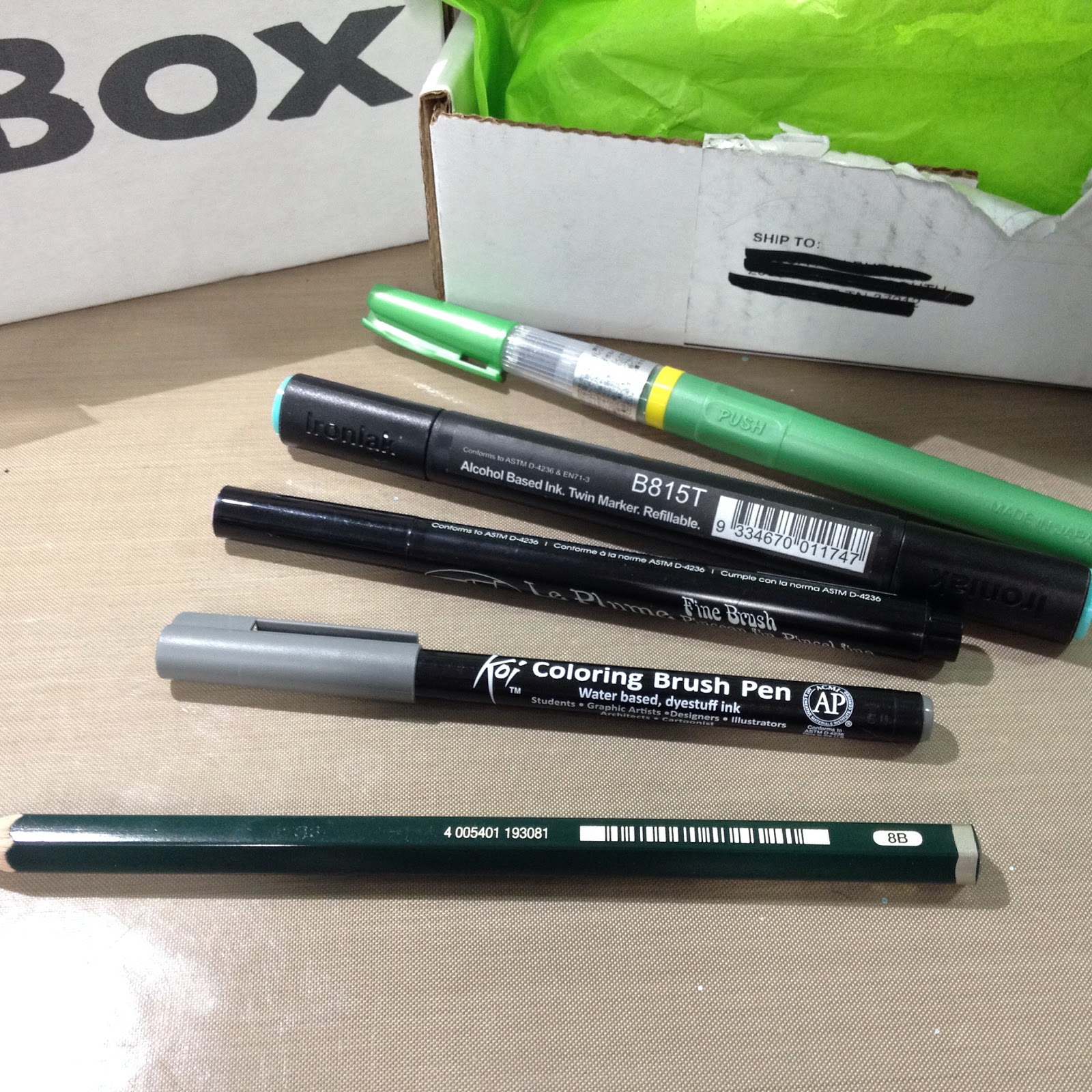
Marvy LePlume Fine Brush
$1.39 on Jerry's (http://www.jerrysartarama.com/discoun...) openstock
$51.69 for the set on Jerry's (http://www.jerrysartarama.com/discoun...)
On the Marvy site, $71.74 for the 36 color set (http://www.uchida.com/c-52-manga-draw...#)
$74.99 on Jo-Ann's (http://www.joann.com/uchida-le-plume-...)
Ironlak Strikers Tri Grip Twin Marker
Series 1 (20 piece set) $65.00 on the Ironlak site for the set (http://shop.ironlak.com/categories/ma...)
$9.43 on Amazon for openstock, with Prime (http://amzn.to/1Y7x5WV)
$3.50 on the Ironlak shop (https://shop.bombingscience.com/ironl...)
$58.00 on the BombingScience shop (https://shop.bombingscience.com/ironl...)
Kuretake Metallic Brush Pen
$7.23 on Amazon (best I can find for US, no listing on the Zig site) (http://www.amazon.com/Kuretake-brush-...)
Sakura Koi Coloring Brush Pen
$2.49 on the Sakura of America site (http://sakuraofamerica.shptron.com/c/...)
$1.99 openstock on DickBlick (http://www.dickblick.com/products/sak...)
Jumbo Graphite Pencil
$2.25 on DickBlick (http://www.dickblick.com/products/fab...)
Total: $16.86
Box Cost $20- shipped
The Supplies Inside
Marvy LePlume Fine Brush
http://www.uchida.com/LePlume/index.html
The Marvy LePlume Fine Brush markers only come in 36 colors, not 144 as listed on the card. This is a little disappointing, as I was REALLY excited about these, but in the end it was a bit of a blessing, as I could afford to order all 36 from Jerry's ArtaRama. The brush nib is fine and flexible as a Pitt Artist Pen, but it may be prone to becoming mushy, as it's fiber, not foam.
Ironlak Strikers Tri Grip Twin
http://ironlak.com/product_strikers.html
Also availablbe in a round barrel brush tipped twin tip markers (http://shop.ironlak.com/categories/ma...). Bullet and chisel nibs. 160 total colors. Alcohol based ink.
Kuretake Metallic Brush Pen
https://kuretakezig.us/pens/metallic-brush-pen/
Not to be confused with Kuretake's Metallic Fudebiyori, or Kuretake's Wink of Luna. Japanese important. This brushpen is very similar to the Wink of Luna, but the barrel seems to hold a lot more metallic ink. The ink is water soluable, and can be used for inkwash.
Sakura's Koi Coloring Brush Pen
http://sakuraofamerica.shptron.com/c/pens_koi-coloring-brush
Astute readers will remember that I reviewed these waterbased brush pens not so long ago on the blog.
Faber-Castell Castell 9000 Jumbo
http://www.faber-castell.com/art-and-graphic/new-products/castell-9000-jumbo
This large, soft leaded jumbo pencil would have been ideal back in my undergrad salad days of graphite illustration. These days, I reach for mechanical pencils when I want graphite, but the pencil is still appreciated.
Supply Overview and Demonstration:
ArtSnacks April 2016 Unboxing-Becca Hillburn

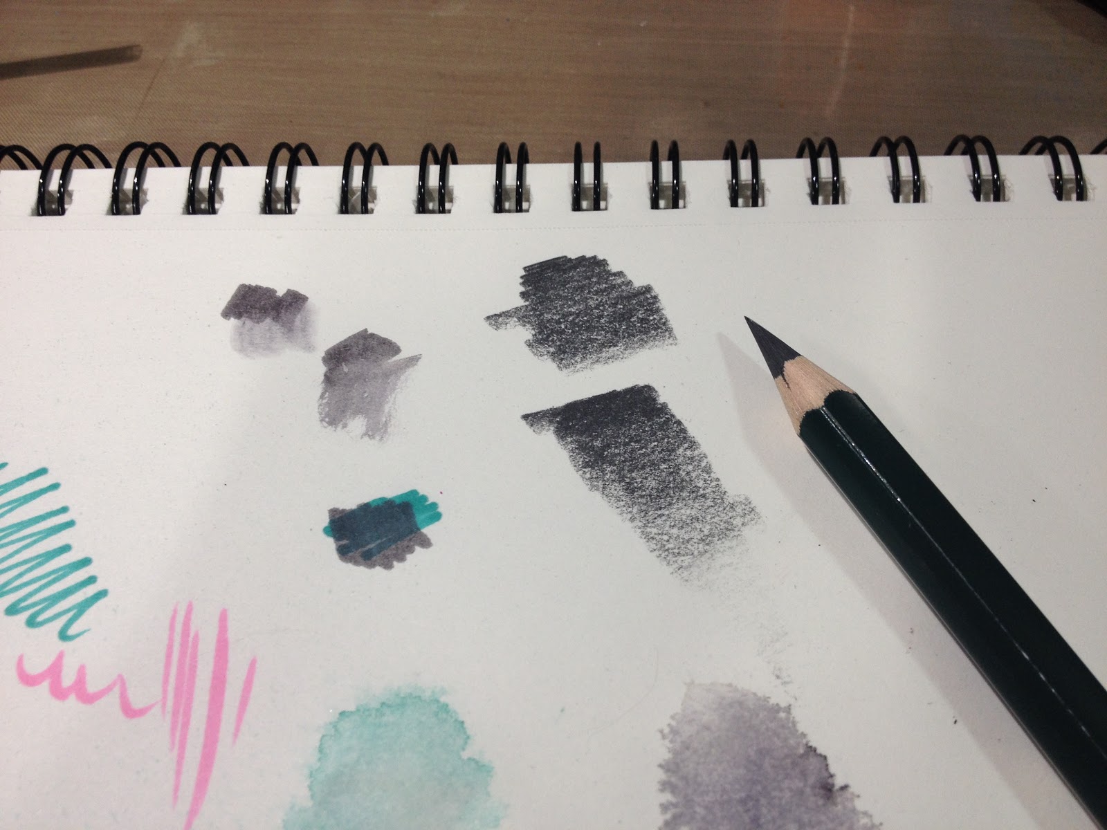
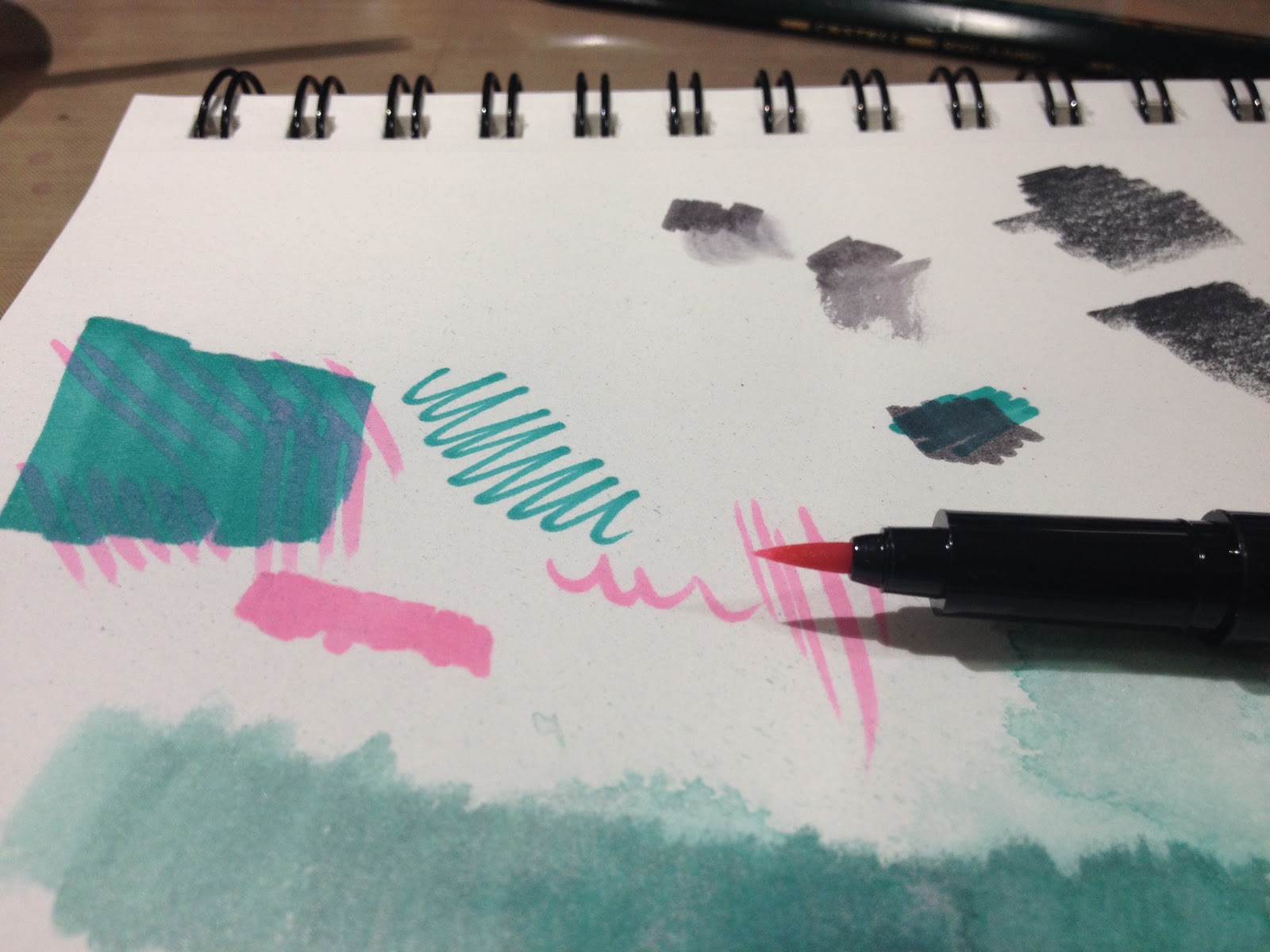
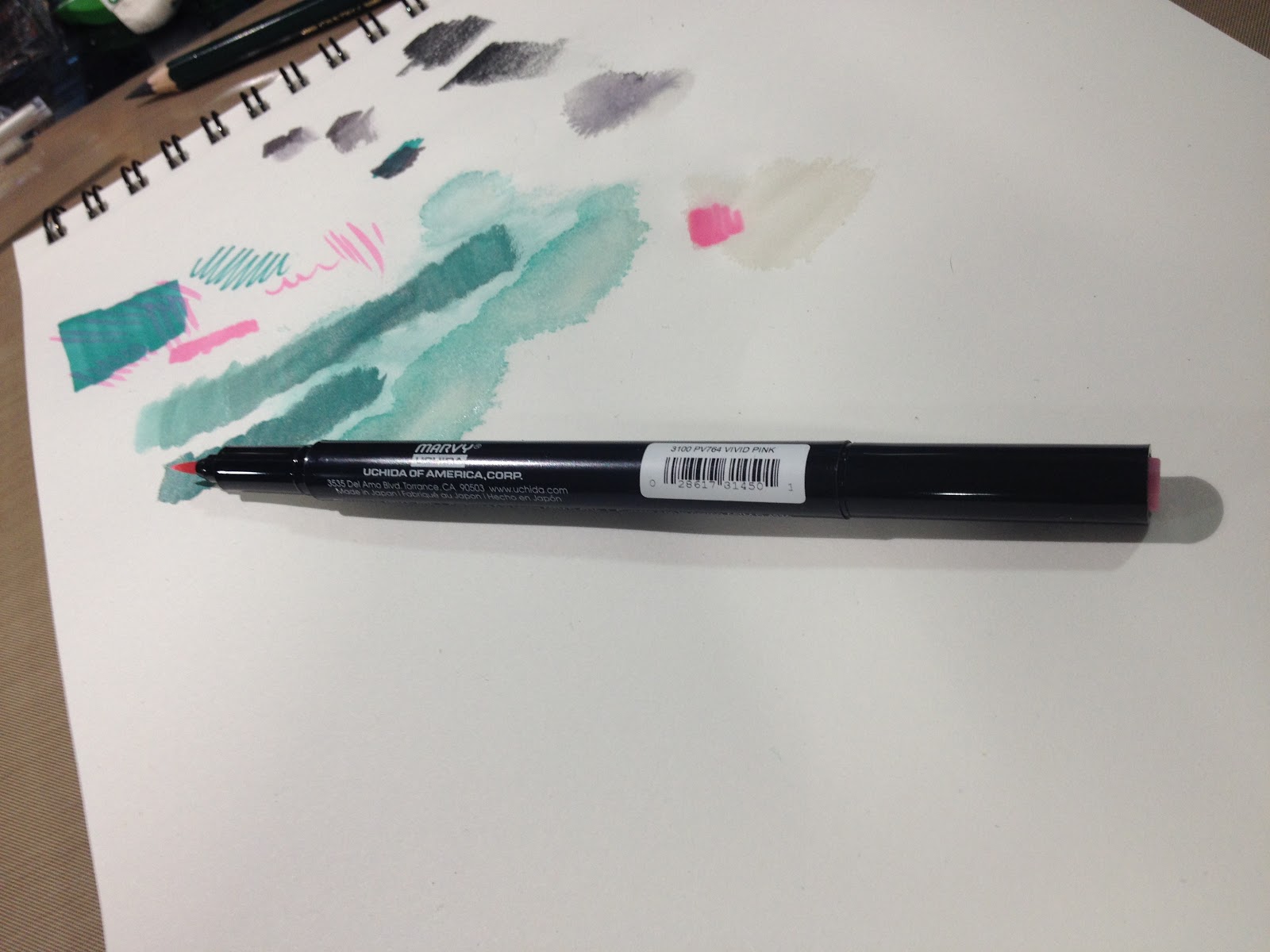


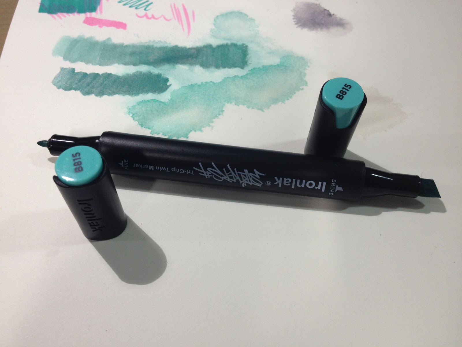
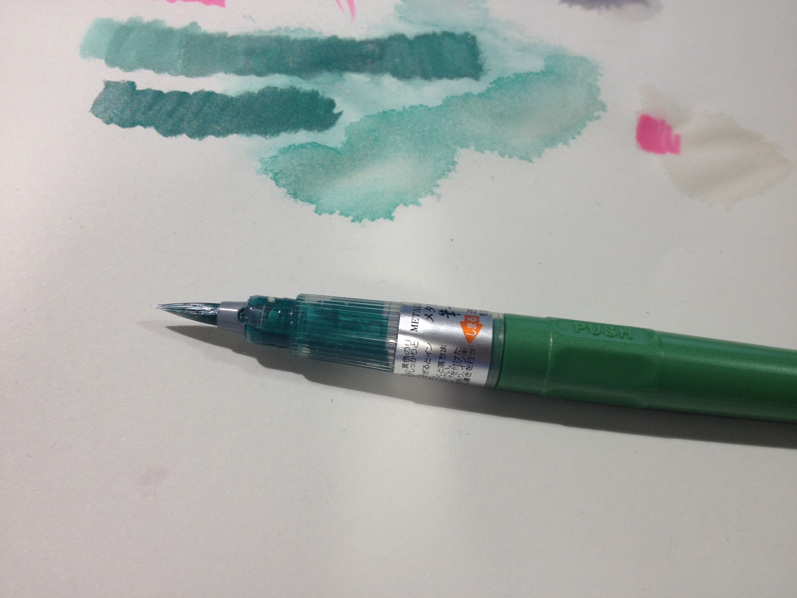
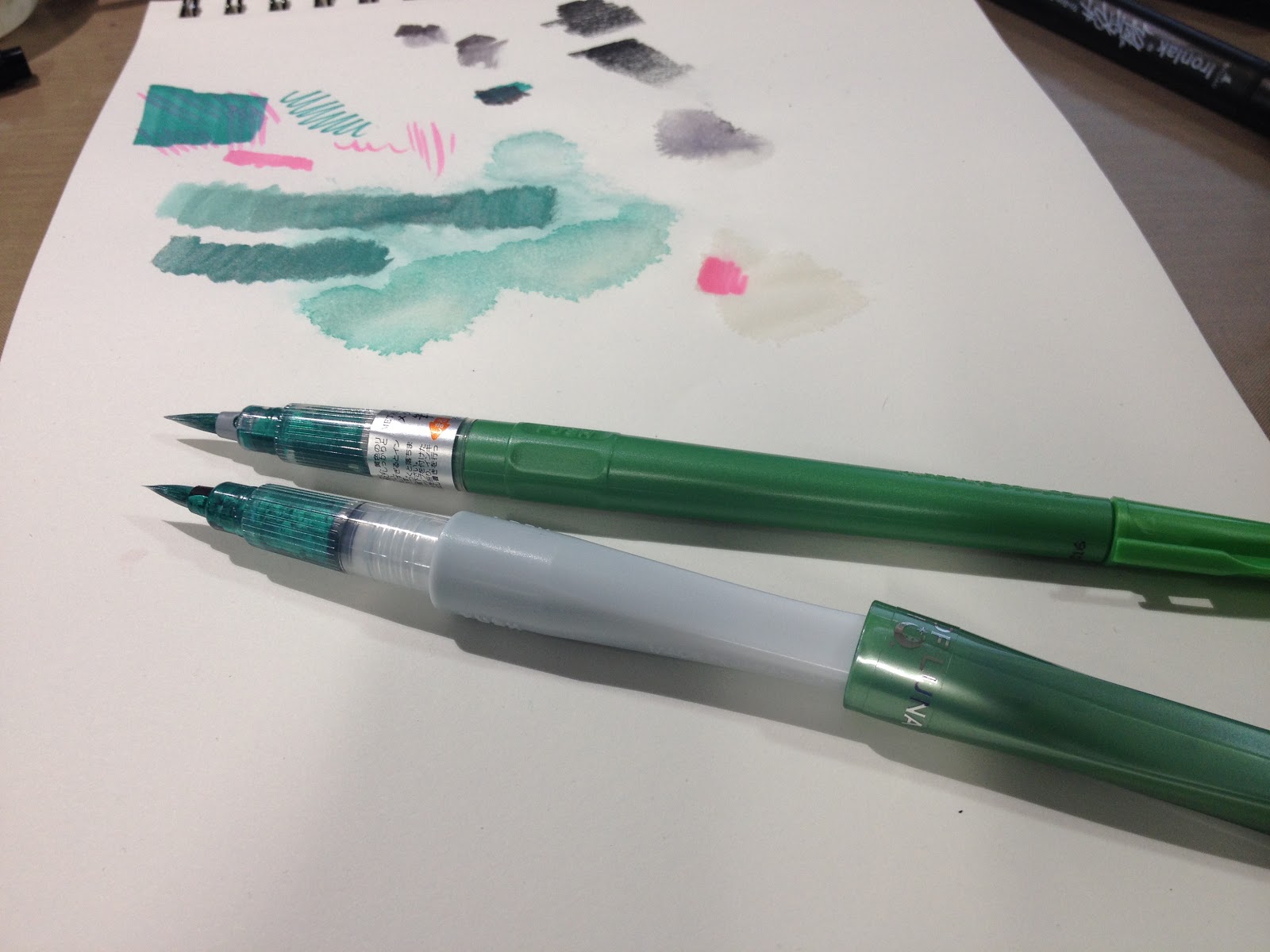
ArtSnacks Challenge
April ArtSnacks Challenge-Becca Hillburn
After completing the demonstration and overview portion of my ArtSnacks review, I was able to use the swatches created as a palette to help me decide on a subject to draw. I wanted to stay as faithful to both boxes as possible- using everything I could in each box, and only augmenting a little. It's difficult for me to only use the materials in the boxes sometimes, but I feel like the challenge is beneficial and forces me to think creatively.
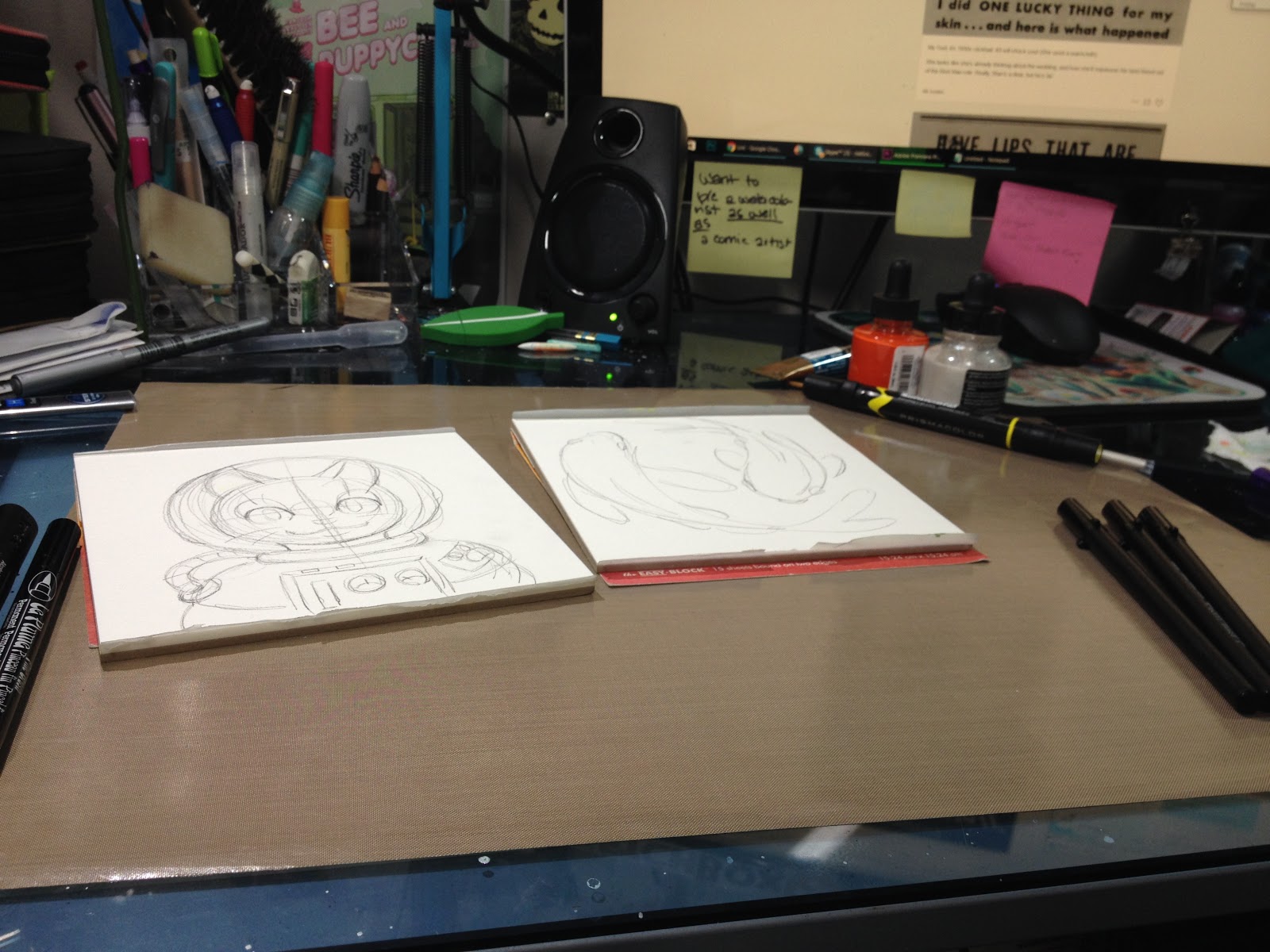
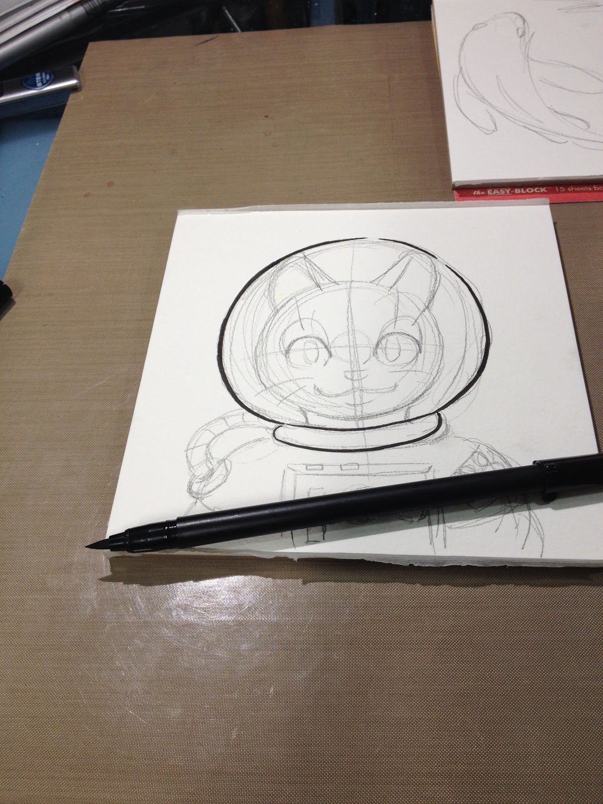
I sketched a cat-stronaut on Fluid watercolor paper (not included, but I figured it would be able to withstand almost anything I threw at it) and inked with the Pigma MB and FB included in my SketchBox, as I knew those pens would be alcohol marker and watersafe. I allowed my inks to draw for 24 hours, so the ink could cure.
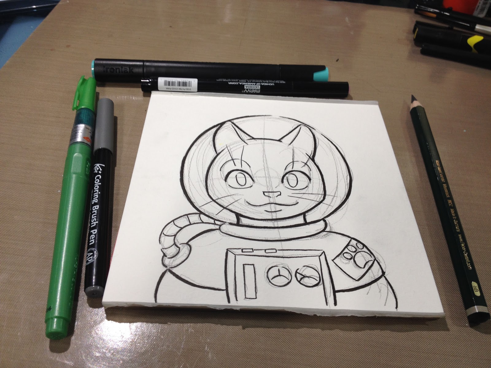
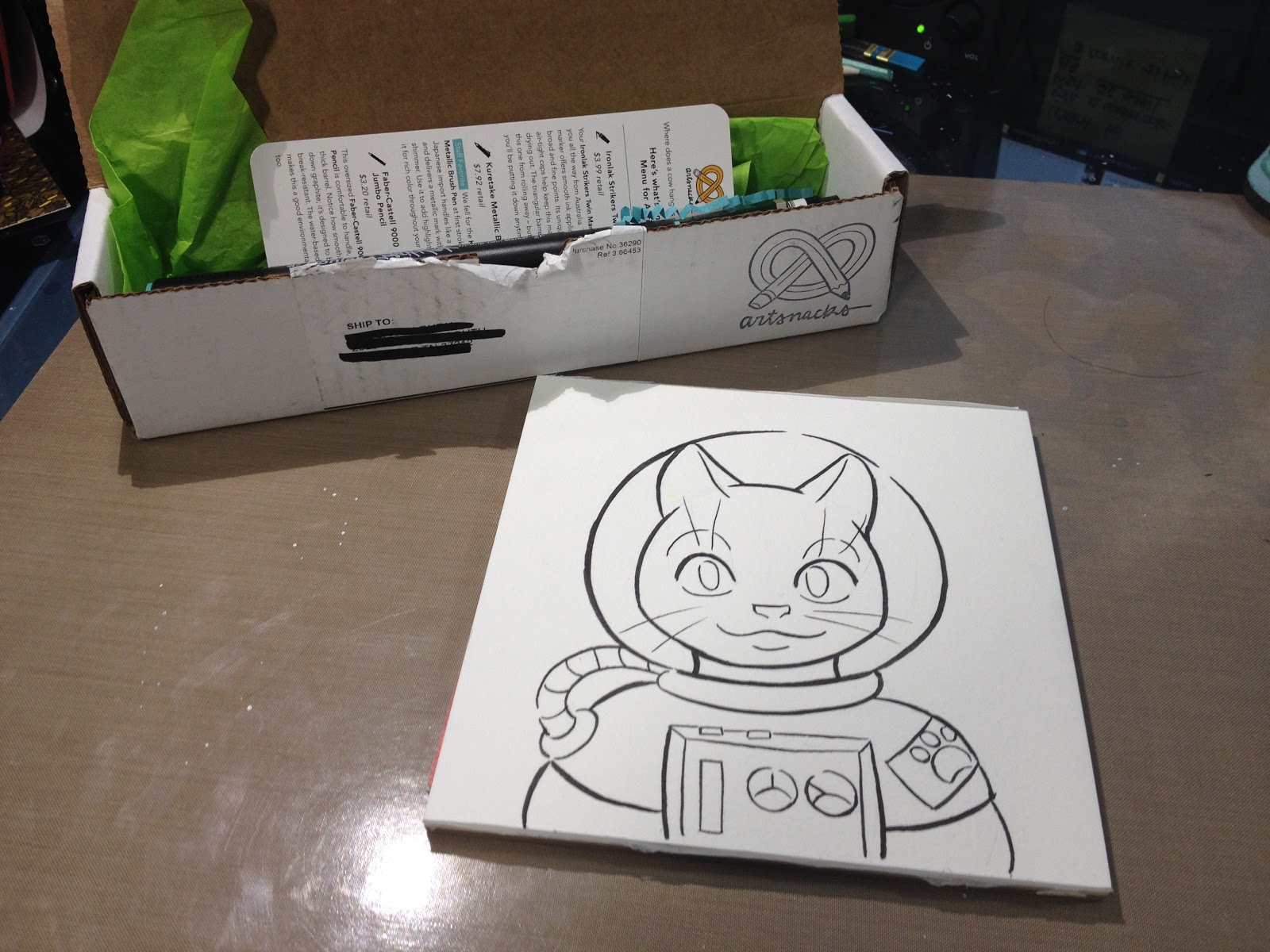
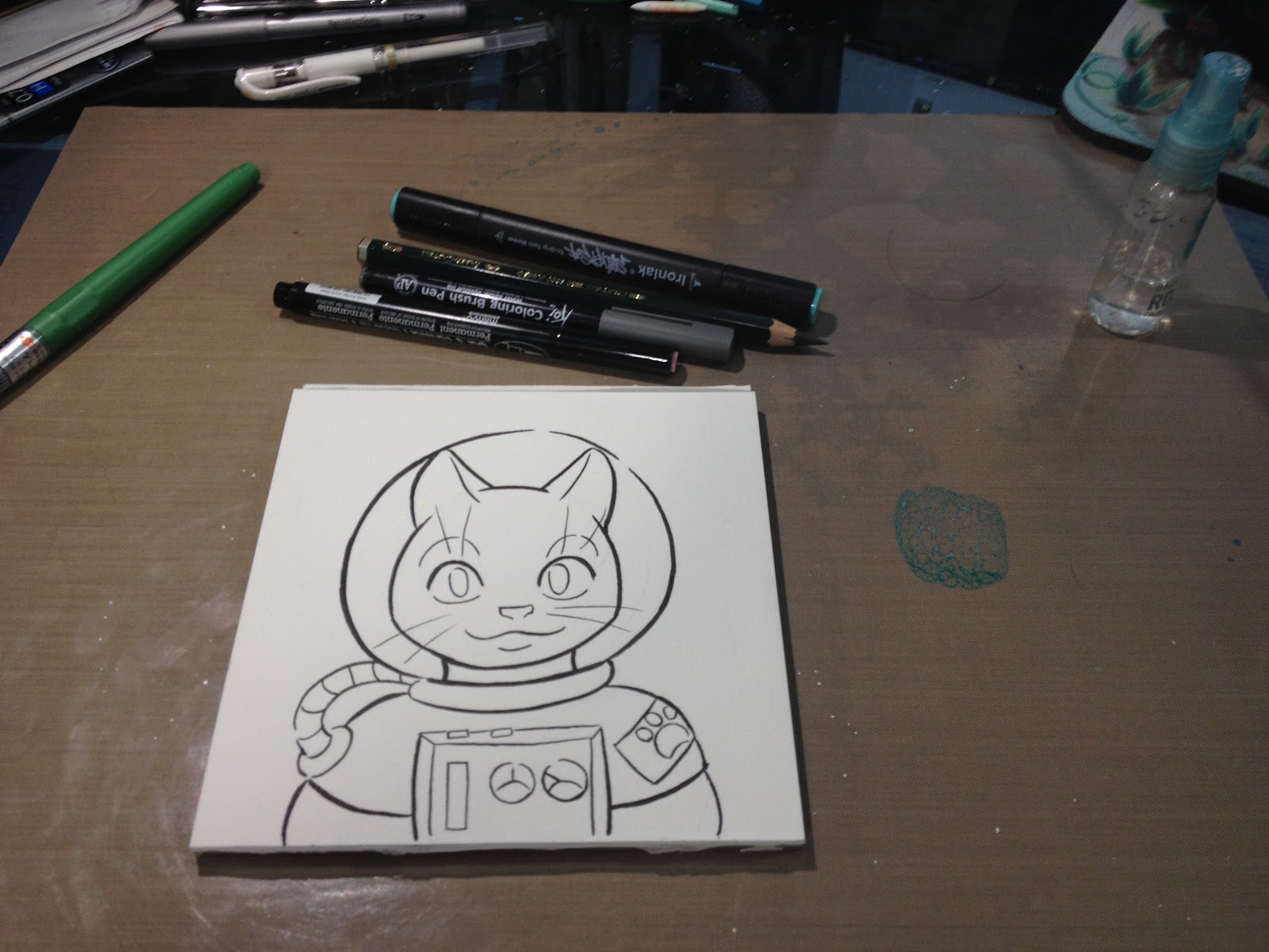
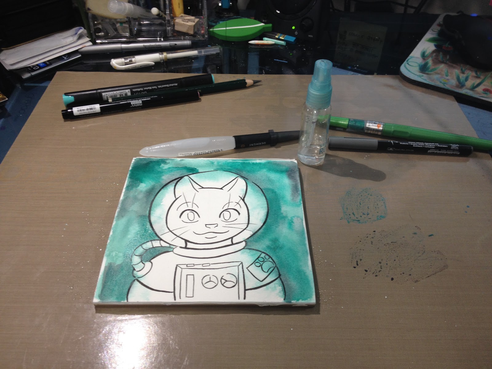
I used my Tim Holtz Craft mat as a palette for my Kuretake Metallic BrushPen and Sakura Koi Coloring Brush Pen. I scribbled ink from both pens onto the mat, and was able to create washes using this ink with a Derwent waterbrush (not included in the box). I'd really hoped to be able to build up a darker sky, but I hit my limit early- colors just weren't increasing in saturation after a certain point.
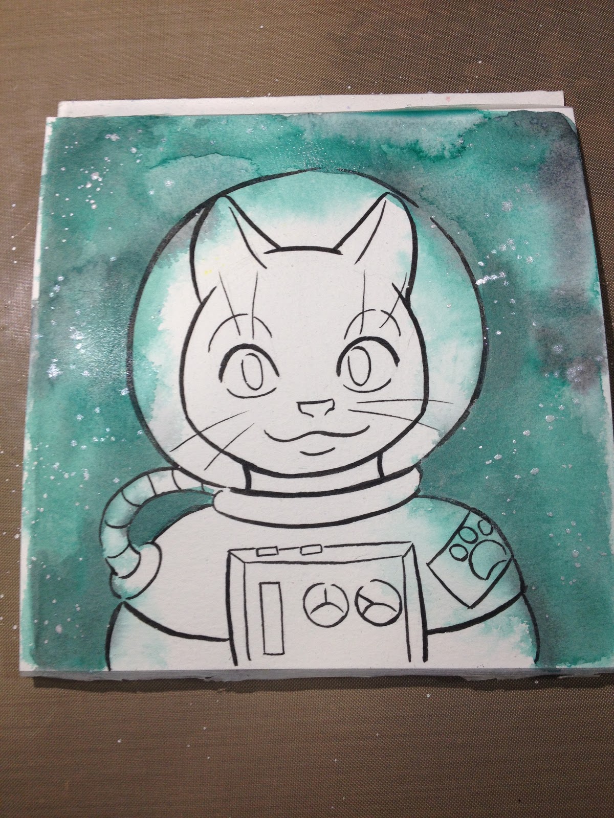
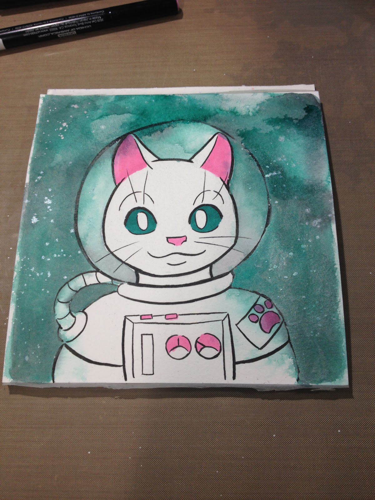
I switched to adding flicks of iridescent starlight by using FW's Pearlescent acrylic ink (not included in the box) and flicking it with the Simply Simmons synthetic brush from my April SketchBox.

Getting caught up in a phonecall, I neglected to take step by step photos, but I filled in his ears using the Marvy Fine Brush alcohol marker, and his eyes with the Ironlak Striker. I applied the Sakura Koi to my Tim Holtz craft mat, using it as a palette, and painted the gray fur on in layers, allowing each layer to dry so I could build up contrast. I shaded his suit using the same technique.
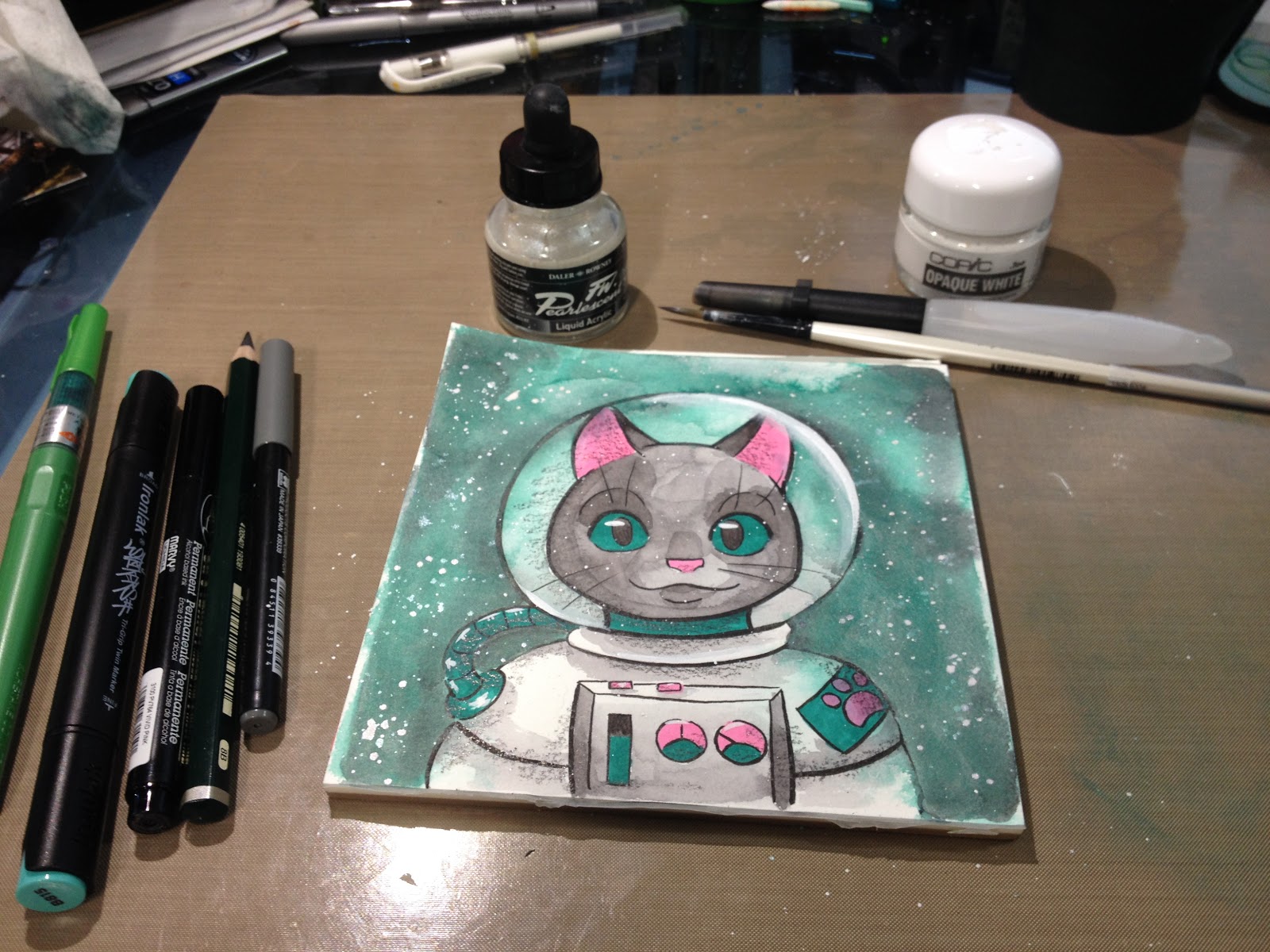
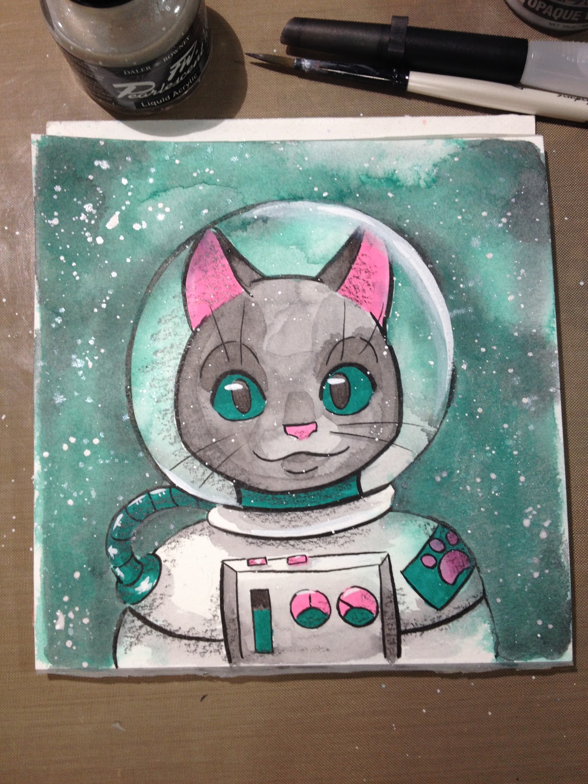 Once everything dried, I pulled out t he Faber-Castell Jumbo 9000 pencil to add some shading. Truthfully, I preferred the cleaner look before shading, but I wanted to use everything that came in this month's box.
I added white highlights using Copic's Opaque White and the Simply Simmons brush that came in my April Sketchbox Basic.
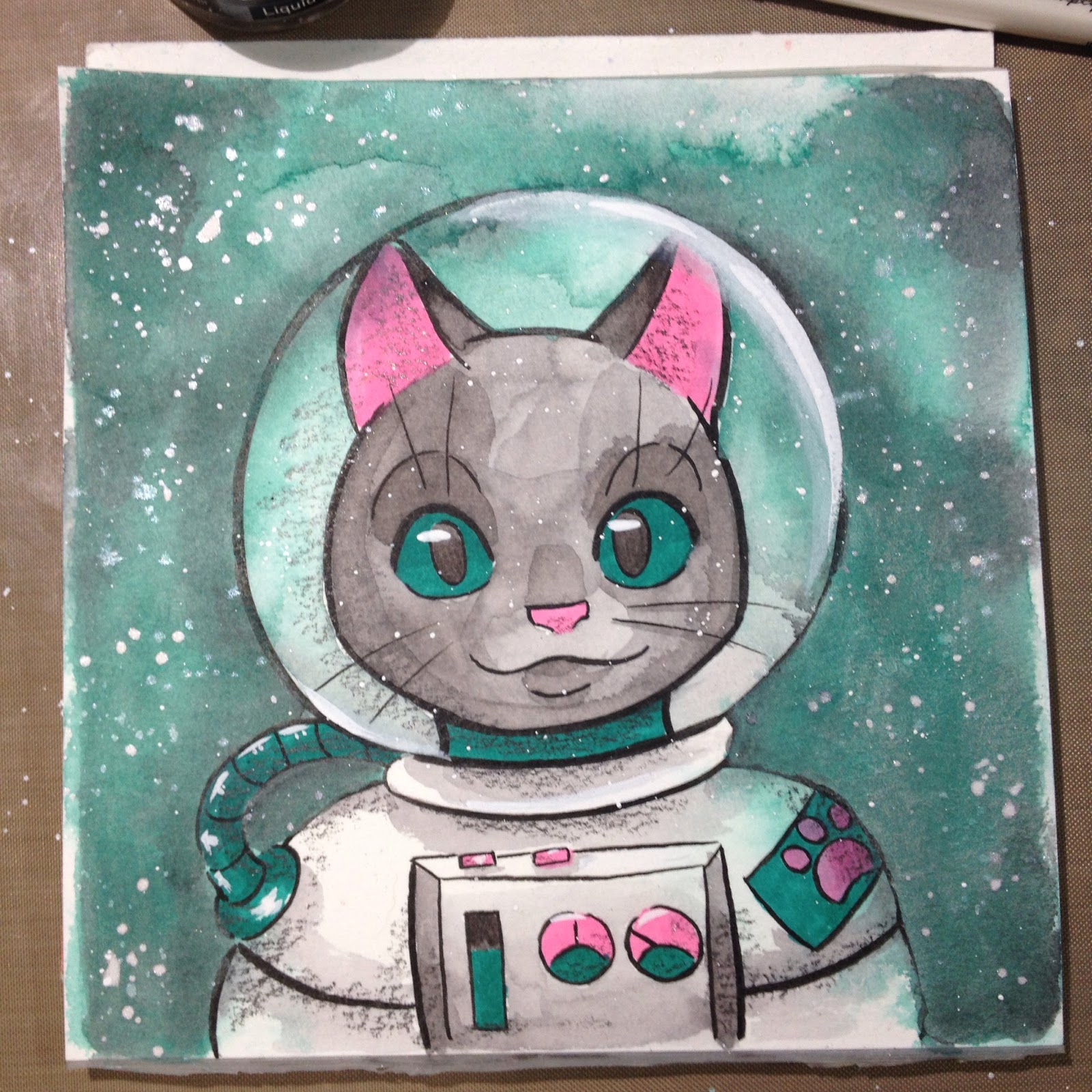
This month's ArtSnacks didn't disappoint- it definitely felt like it was made just for me. Two alcohol markers, a waterbased marker, and a waterbased gel pen- these are all things that are right up my alley. Although I'm not personally feeling the Jumbo 9000, this has more to do with the fact that I don't really work with pencils as sketching tools anymore than with the quality of the pencil itself. When I was in undergrad, I did realistic graphite illustrations, and I probably would have loved the Jumbo then.
SketchBox Basic
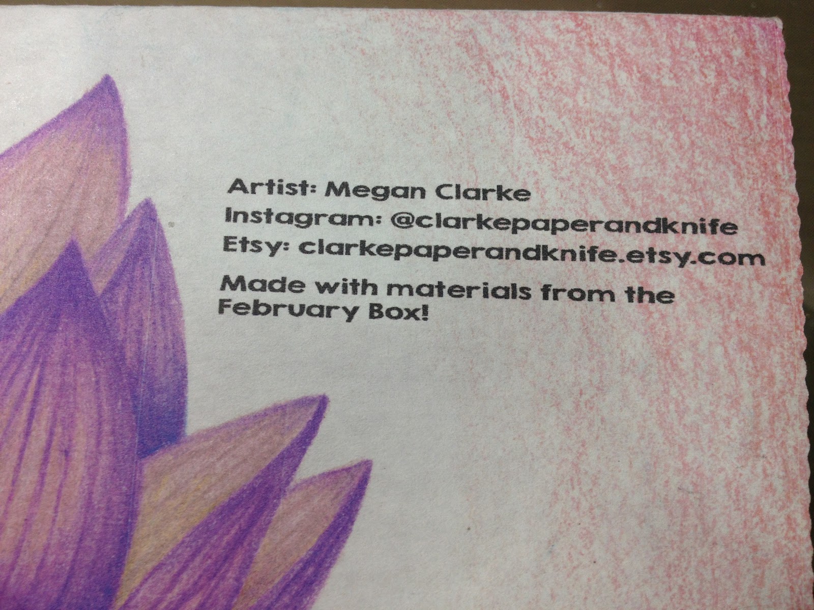
The box reads:
Artist: Megan Clarke
Instagram: @clarkepaperandknife
Etsy: clarkepaperandknife.etsy.com
Made with materials from the February Box
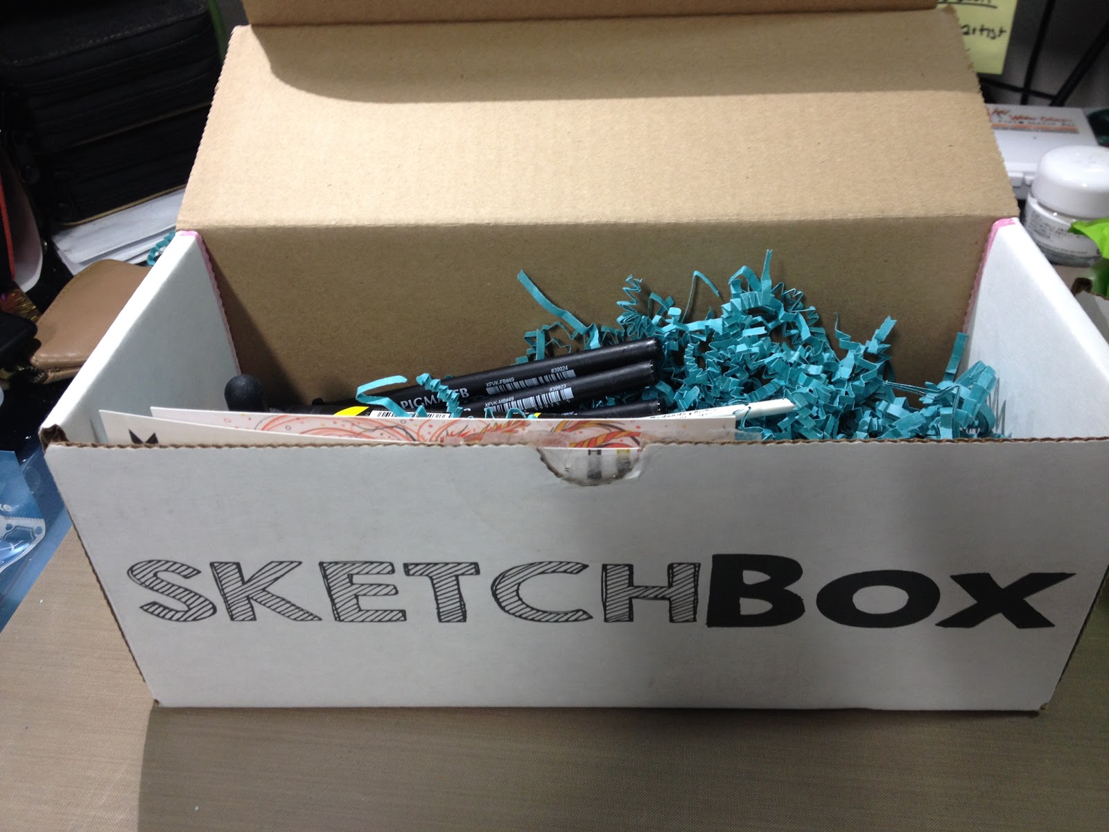
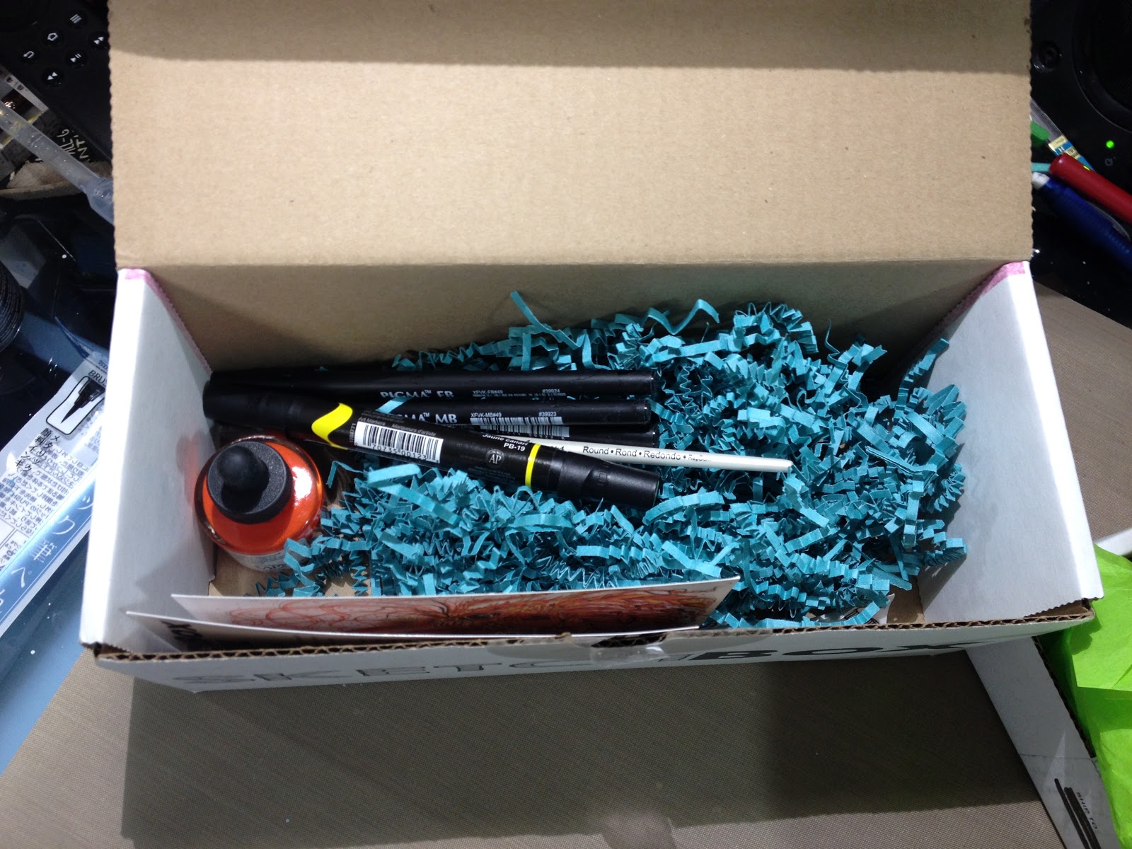
This Month's SketchBox Basic Brands are:
Prismacolor (Sanford)
Dr Ph Martin's
Simply Simmons (Daler Rowney)
Sakura of America
The Card
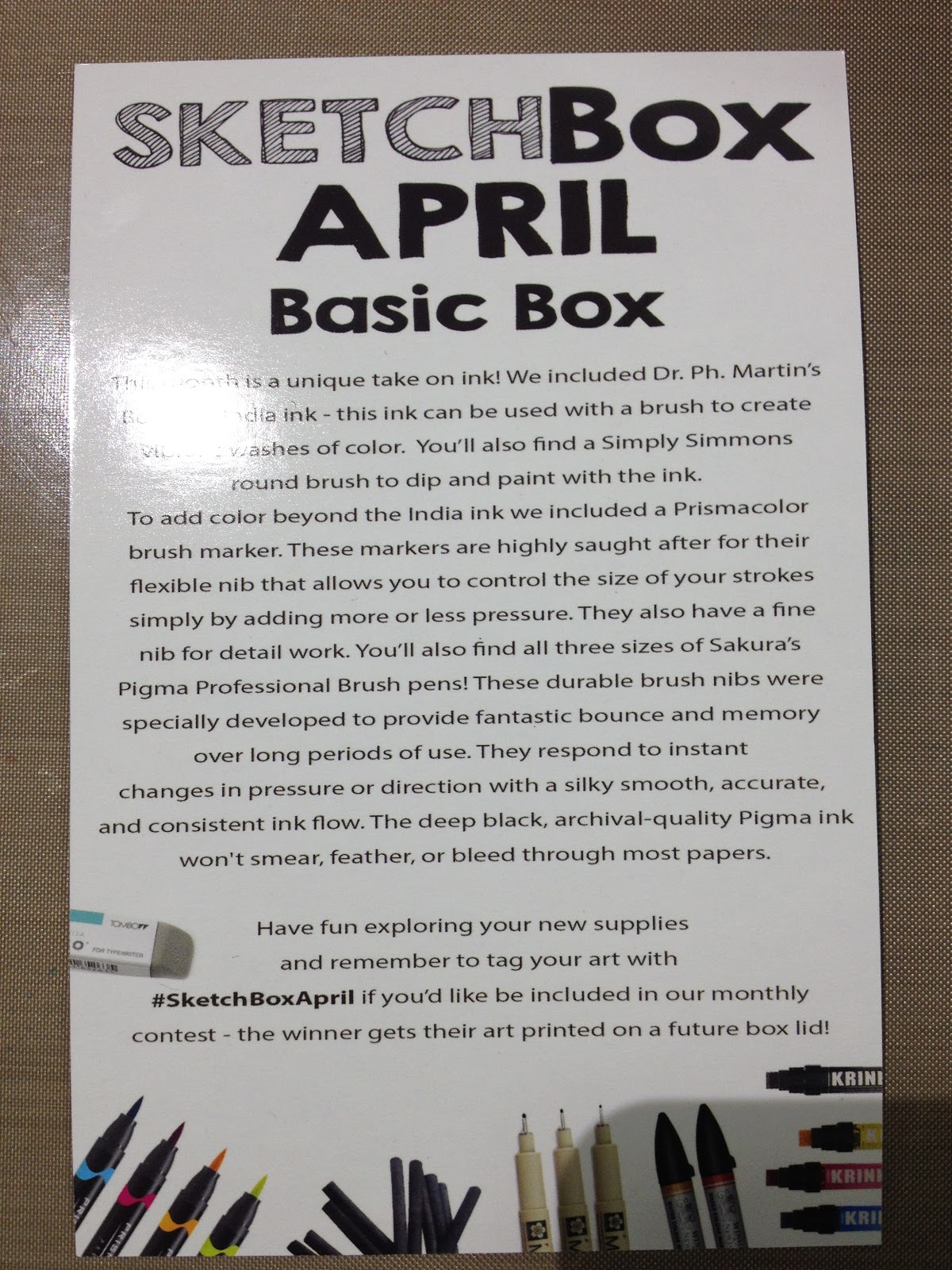
The Card Reads
SketchBox AprilBasic Box
This month is a unique take on ink! We included Dr.Ph Martin's Bombay India ink- this ink can be used with a brush to create vibrant washes of color. You'll also find a Simply Simmons round brush to dip and paint with the ink.To add color beyond the India Ink we included a Prismacolor brush marker. These markers are highly saught (sic) after for their flexible nib that allows you to control the size of your strokes simply by adding more or less pressure. They also have a fine nib for detail work. You'll also find all th4ree sizes of Sakura's Pigma Professional Brush Pens! These durable brush nibs were specifically developed to provide fantastic bounce and memory over long periods of use. They respond to instant changes in pressure or direction with a silky smooth, accurate, and consistent ink flow. The deep black, archival-quality Pigma ink won't smear, feather, or bleed through most papers.
Have fun exploring your new supplies and remember to tag your art with #SketchBoxApril if you'd like to be included in our monthly contest-the winner gets their art printed on a future box lid!
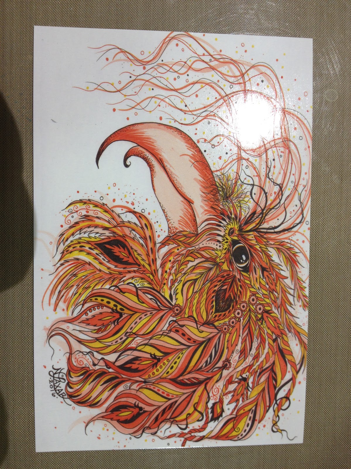
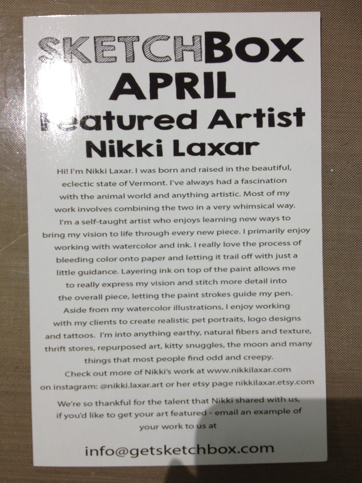 The Card Reads
SketchBbox AprilFeatured Artist Nikki Laxar
Hi! I'm Nikki Laxar. I was born and raised in the beautiful, eclectic state of Vermont. I've always had a fascination with the animal world and anything artistic. Most of my work involves combining the two in a very whimsical way. I'm a self-taught artist who enjoys learning new ways to bring my vision to life, through every new piece. I primarily enjoy working with watercolor and ink. I really love the process of bleeding color onto paper and letting it trail off with just a little guidance. Layering ink on top of the paint allows me to really express my vision and stitch more detail into the overall piece, letting the paint strokes guide my pen. Aside from my watercolor illustrations, I enjoy working with my clients to create realistic pet portraits, logo designs and tattoos. I'm into anything earthy, natural fibers and texture, thrift stores, repurposed art, kitty snuggles, the moon and many things that most people find odd and creepy.
Check out more of NIkki's work at www.nikkilaxar.etsy.com
We're so thankful for the talent that Nikki shared with us, if you'd like to get your art featured- email an example of your work to us at
info@getsketchbox.com
The Price Breakdown
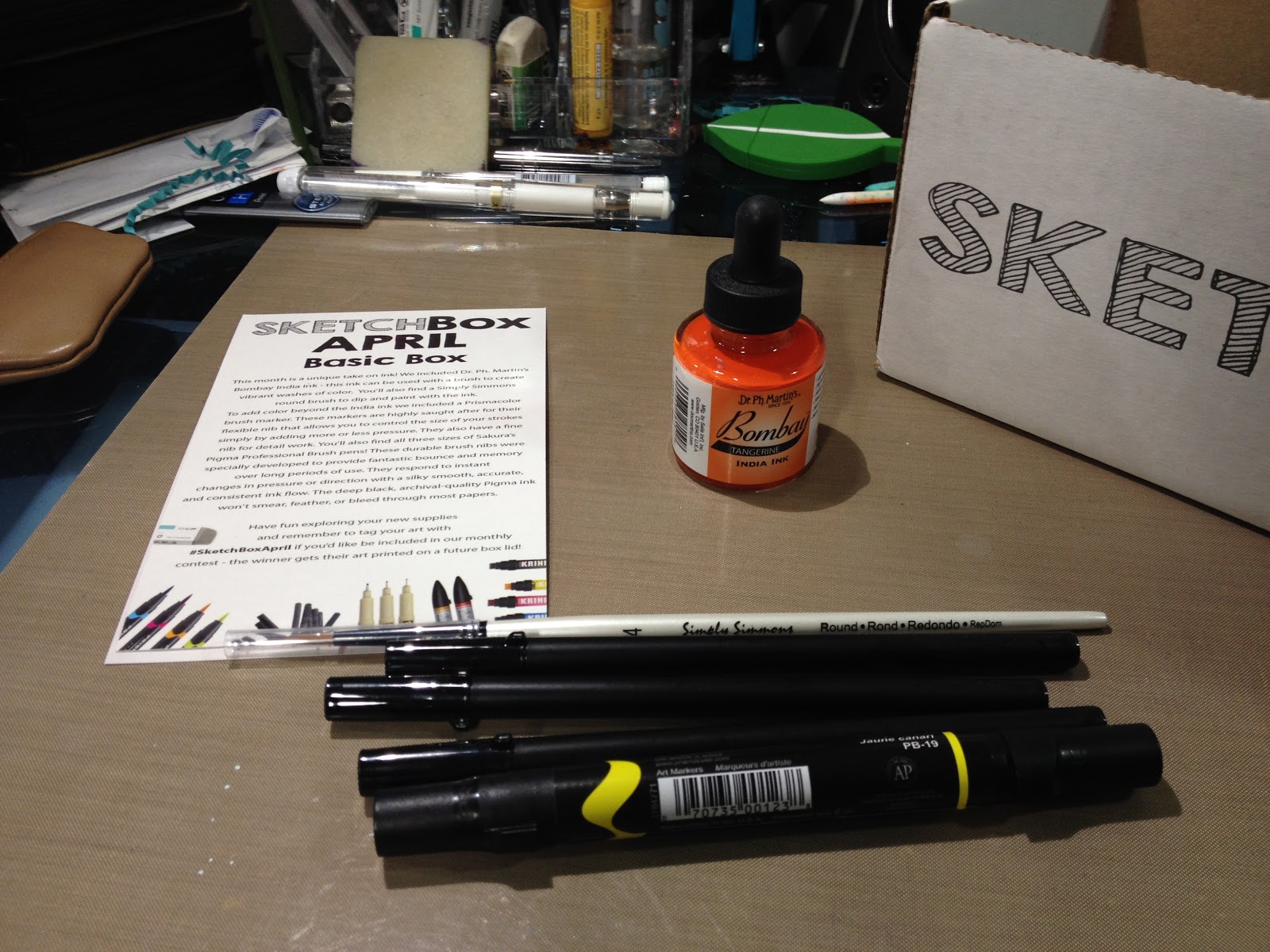
Prismacolor Brush Marker $3.99 on DickBlick (openstock), $2.95 for 6-11 markers, $2.79 for 12+ markers
$3.54 on MarkerSupply.com
Pigma FB- $3.67 on MarkerSupply
Pack of 2 $7.80 on Jetpens
Pigma MB $3.67 on MarkerSupply
Pigma BB $3.67 on MarkerSupply
Dr Ph Martin's Bombay India Ink
$4.25 on Dr PH Martin's site
$3.09 on CheapJoes
Simply Simmons Size 4- $2.99 on DickBlick
$3.99 at Michaels
Prismacolor Brush Marker
$3.54 on MarkerSupply
Total: $20.63
Box Cost: $25+ $5 shipping
The Supplies Inside
Sakura of America Pigma Brushpens
http://sakuraofamerica.shptron.com/k/search?q=Pigma+Professional
FB
MB
BB
I reviewed the MB pen a few months ago here on the blog, but I hadn't had an opportunity to compare all three. The FB is tiny- smaller than most fude pens, the MB tends to get worn out really fast, and the BB is perfect. For years I've dreamed that someone would put the Copic superbrush together with a waterproof and alcohol marker proof ink, and it seems like Sakura of America has done just that. I highly recommend the BB.
Prismacolor Brush Markerhttp://www.prismacolor.com/products/art-markers/brush-tip-markersIf you haven't yet, you should check out the Prismacolor site- they have a lot of neat things going on, including an interesting color picker that recommends supplies in that shade. I've started augmenting my alcohol marker collection with Prismacolor markers recently, as Prismacolor makes intense purples and yellows that aren't really available in the Copic Sketch collection.
Simply Simmons
'Value Priced quality brushes'
http://www.daler-rowney.com/content/simply-simmons
Only available in North America. A line of brushes for students, amateurs, and professionals. These are synthetic brushes that don't hold much water. While not ideal for watercolors, they work well for liquid acrylics and applying stiff bodied materials like Copic's Opaque White. In the challenge video, I demonstrate how to use brushes like this for splatter techniques.
Dr PhMartin's Bombay
http://www.docmartins.com/collections/bombay-india-ink
India ink is waterproof once dry (but not alcohol marker proof ever- the alcohol solution will reactivate the shellac), and I recommend allowing it to dry for 24 hours. Bombay is available in a range of vibrant colors, and while I have a few myself, the Tangerine ink sent by SketchBox Basic was a new one to me.
Supply Overview and Demonstration
SketchBox Basic Aprll 2016 Unboxing- Becca Hillburn

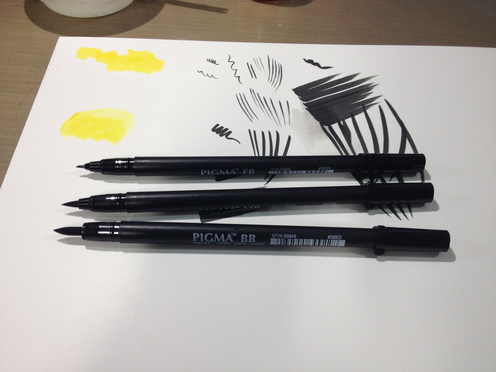
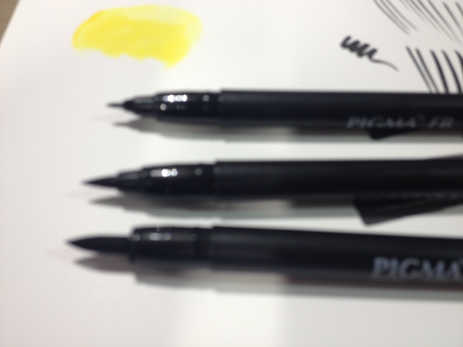
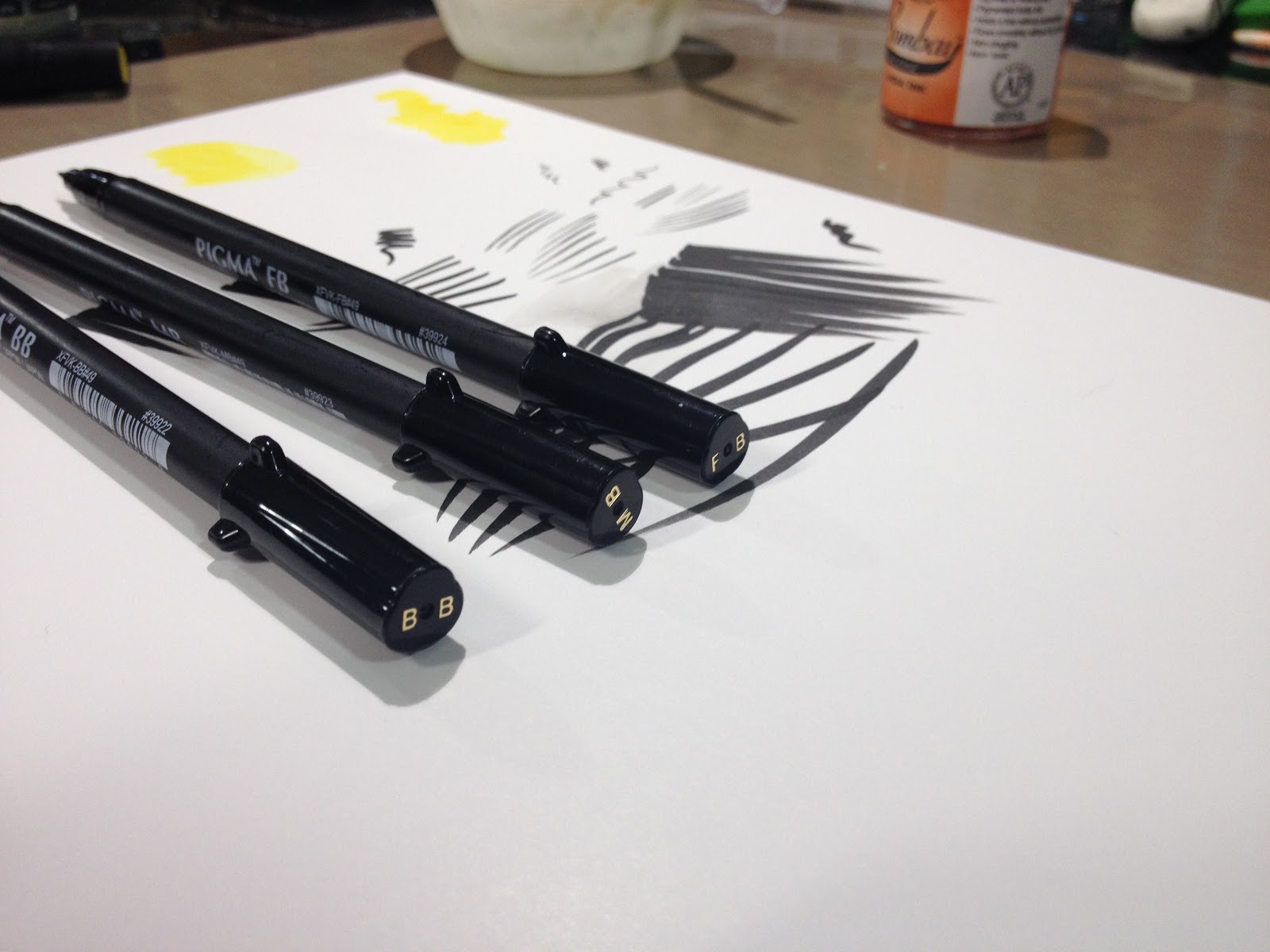

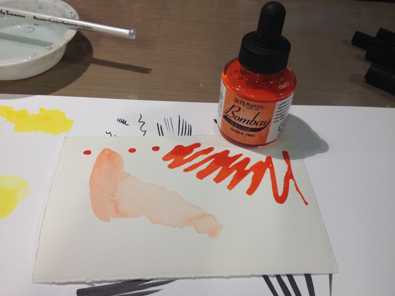
SketchBox Challenge
April SketchBox Basic Challenge-Becca Hillburn
For this challenge, I opted to use Fluid watercolor paper as my base, as it can handle mixed media fairly well.
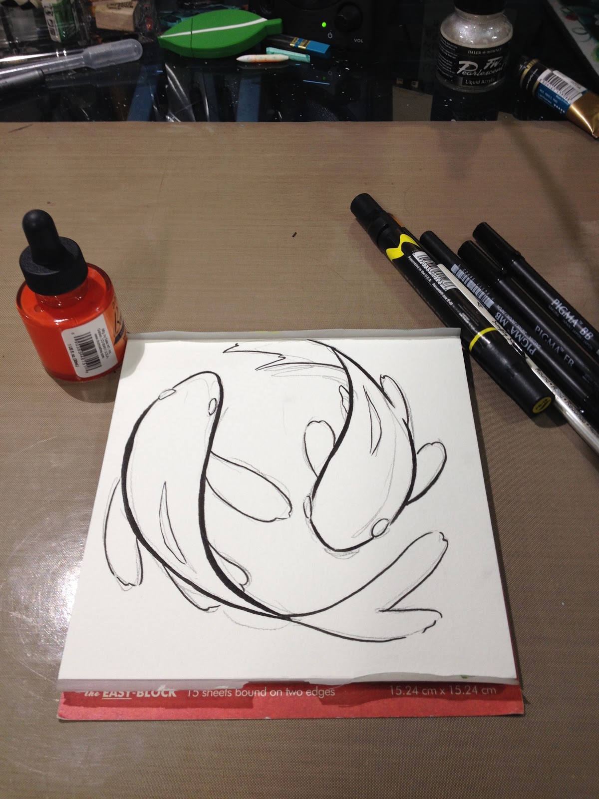
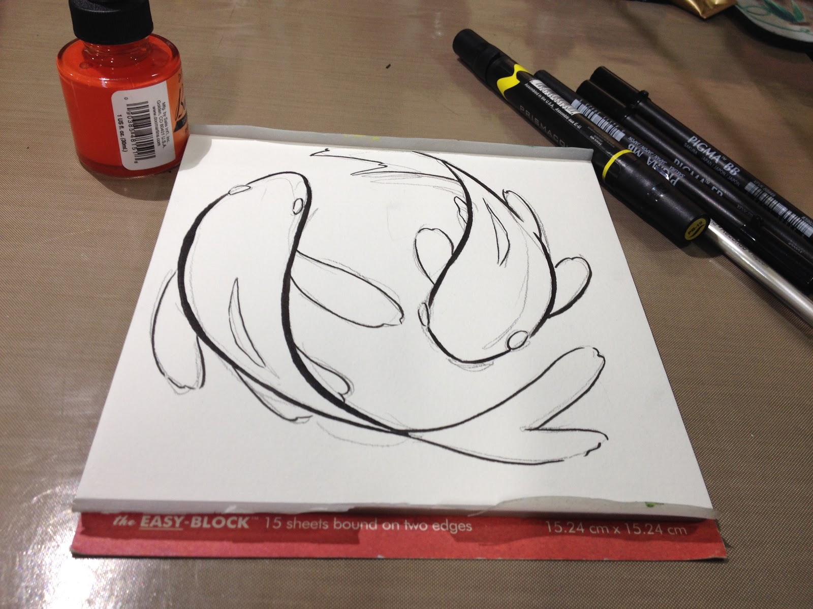
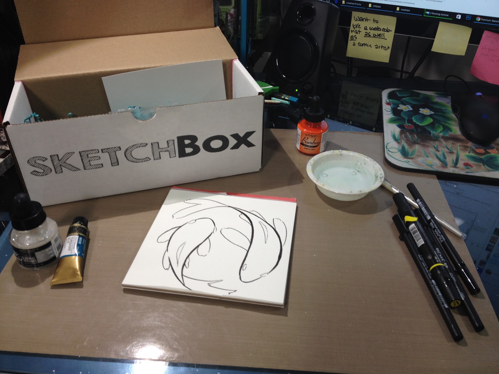
I inked both challenge pieces with the Pigma brushes included with my April SketchBox Basic.
The Pigma MB started to get mushy as I inked, and the Pigma FB often grayed out on long lines, but the Pigma BB was a total dream- it's like someone put a Copic Superbrush in a pen designed for Copics+Watercolor, and I love it.

I used the Simply Simmons 4 round to apply a wash of Mijello Mission Gold in Turquoise (not included). The Simply Simmon's brush is pretty awful- can't hold water, can't apply washes, and the bristles are starting to bend out of shape. Normally I would NOT use this brush to apply washes, but I'm trying to stay fairly true to the challenge this month.
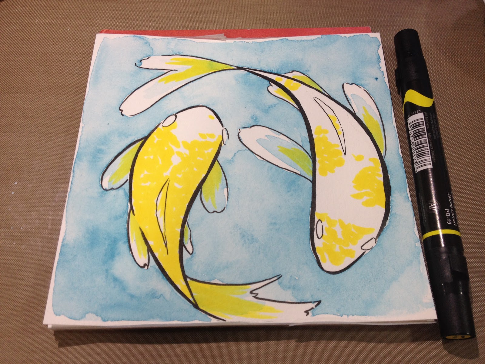
Once the wash dried, I began applying the koi's scales in the Prismacolor's Canary Yellow.
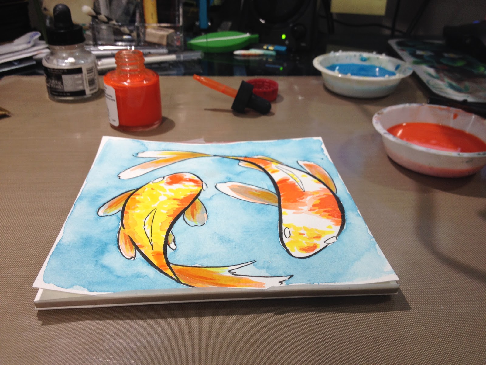
Since alcohol marker dries almost immediately, I could begin working over it quickly. I created a wash with the India ink- adding a few drops to a small bowl of water.
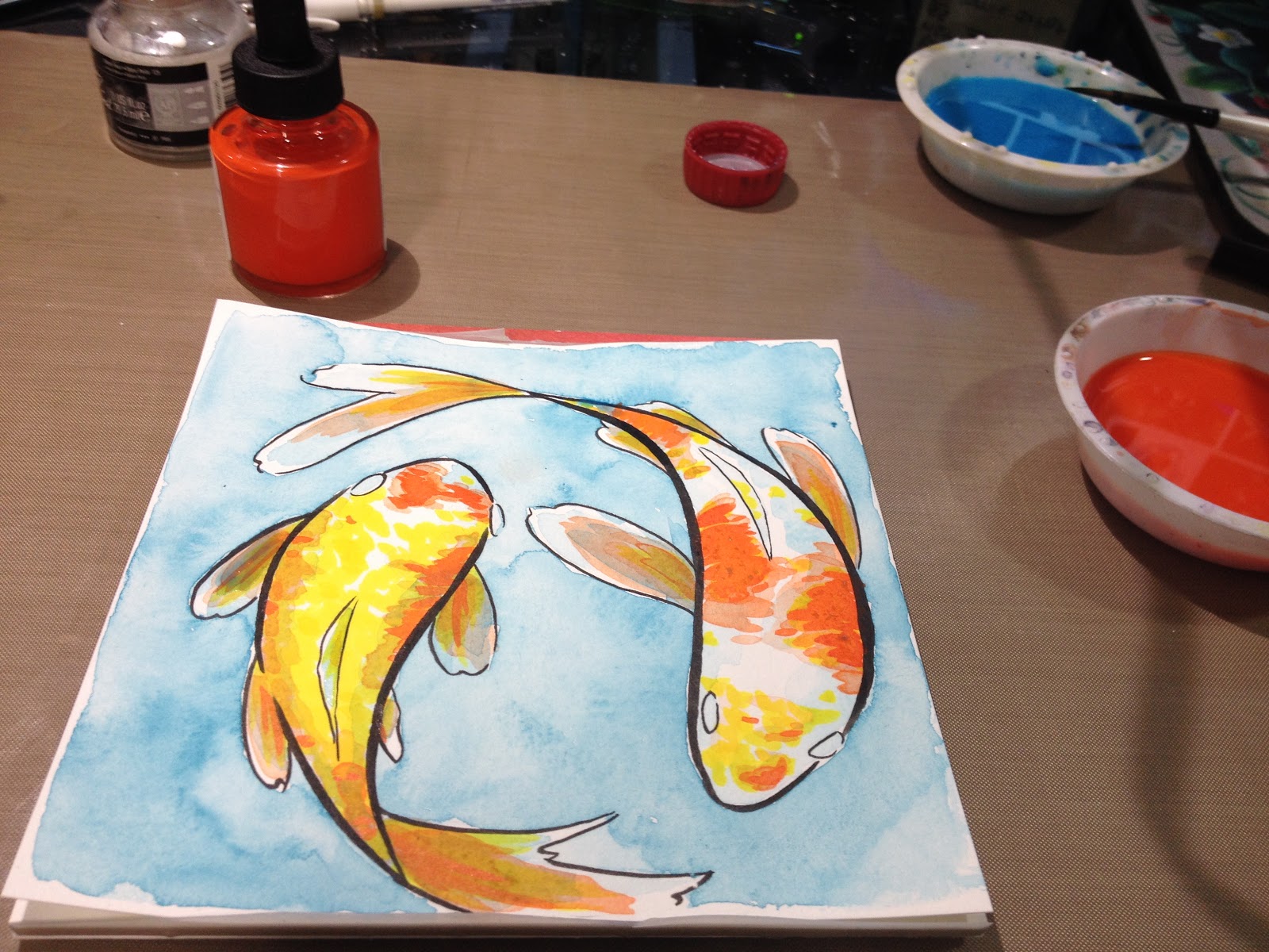
And after that layer dried, I applied Bombay directly from the bottle.
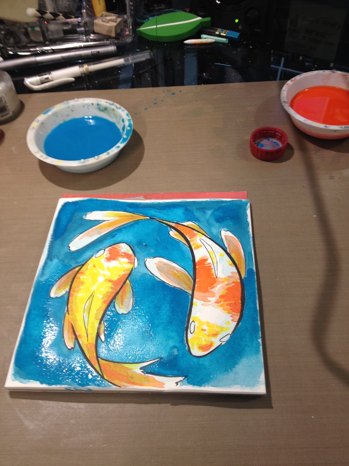
Once that dried, I mixed my Turquoise wash darker, ad reapplied it to the background.
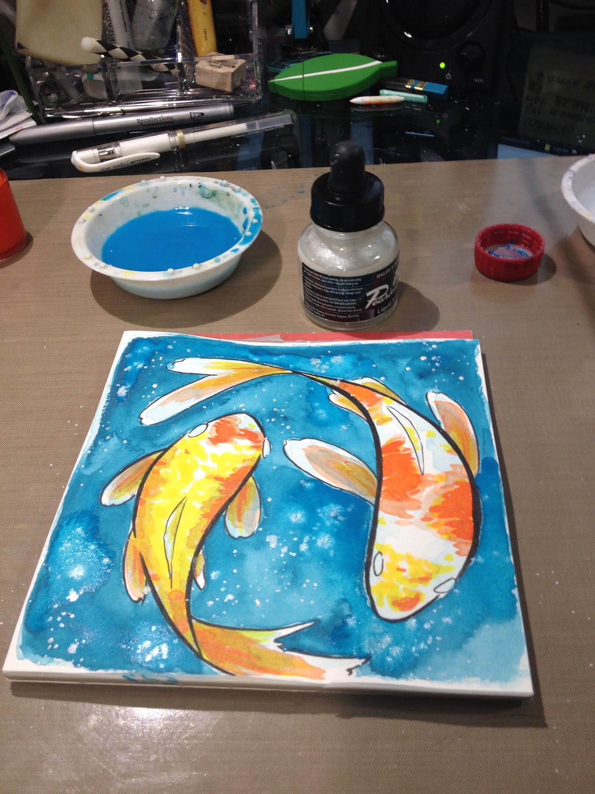
And flicked some FW Pearlescent ink into the wash while it was still wet, so it would disperse in certain parts.
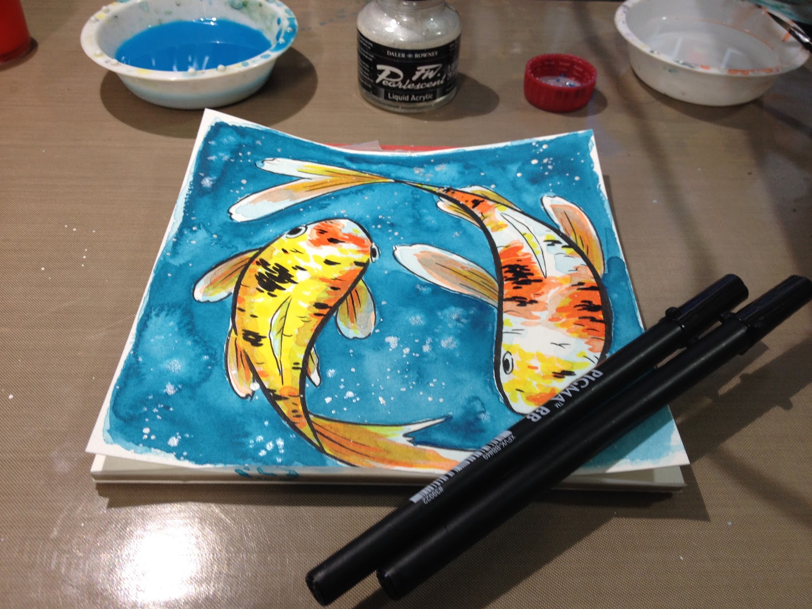
Once that wash had dried, I went in and added some black details with the Pigma pens.
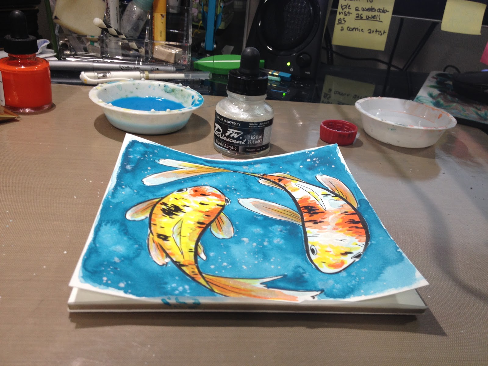
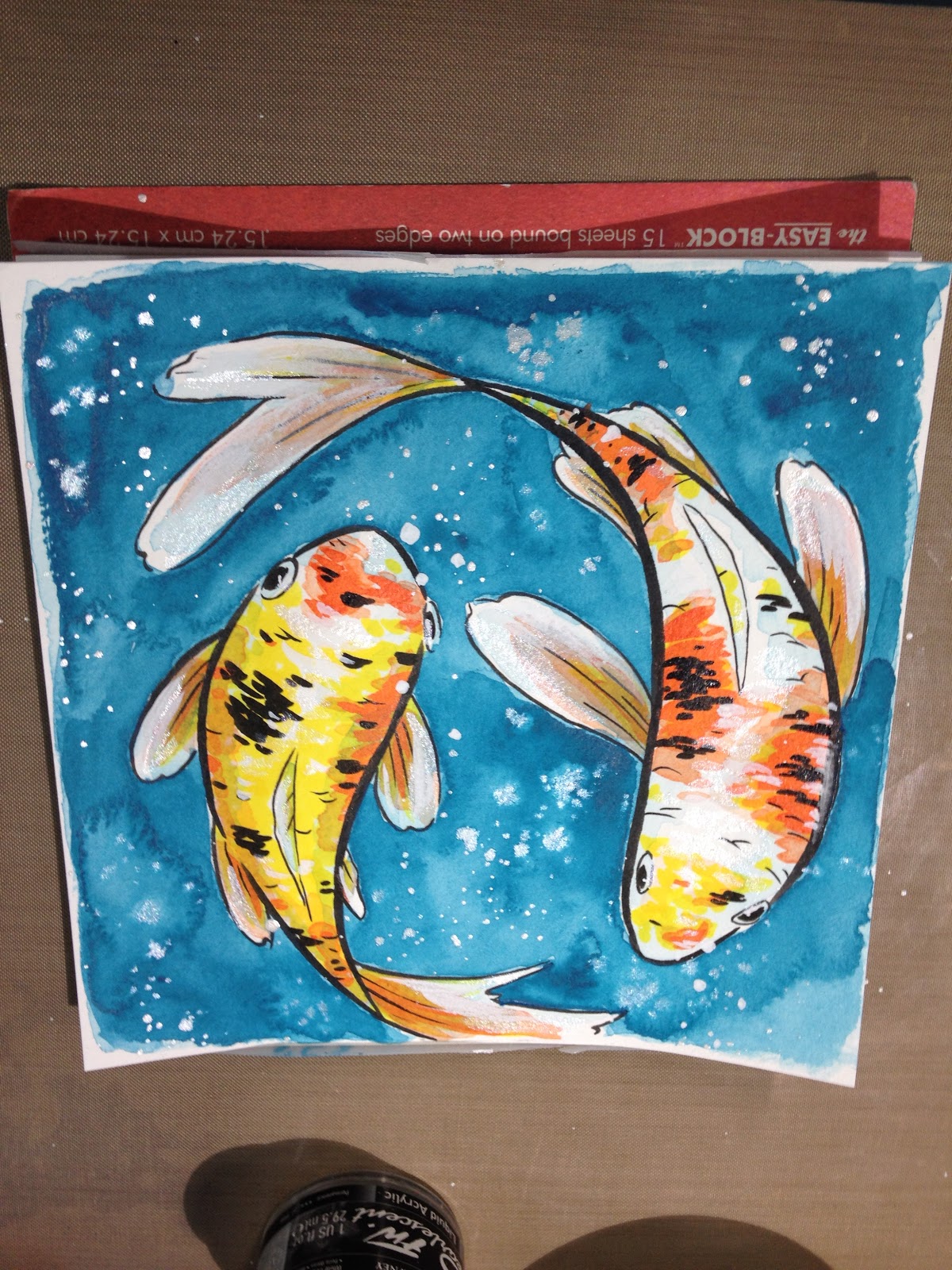
And flicked some Copic Opaque white onto the background for bubbles.
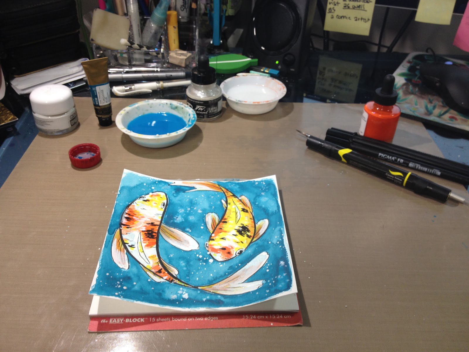
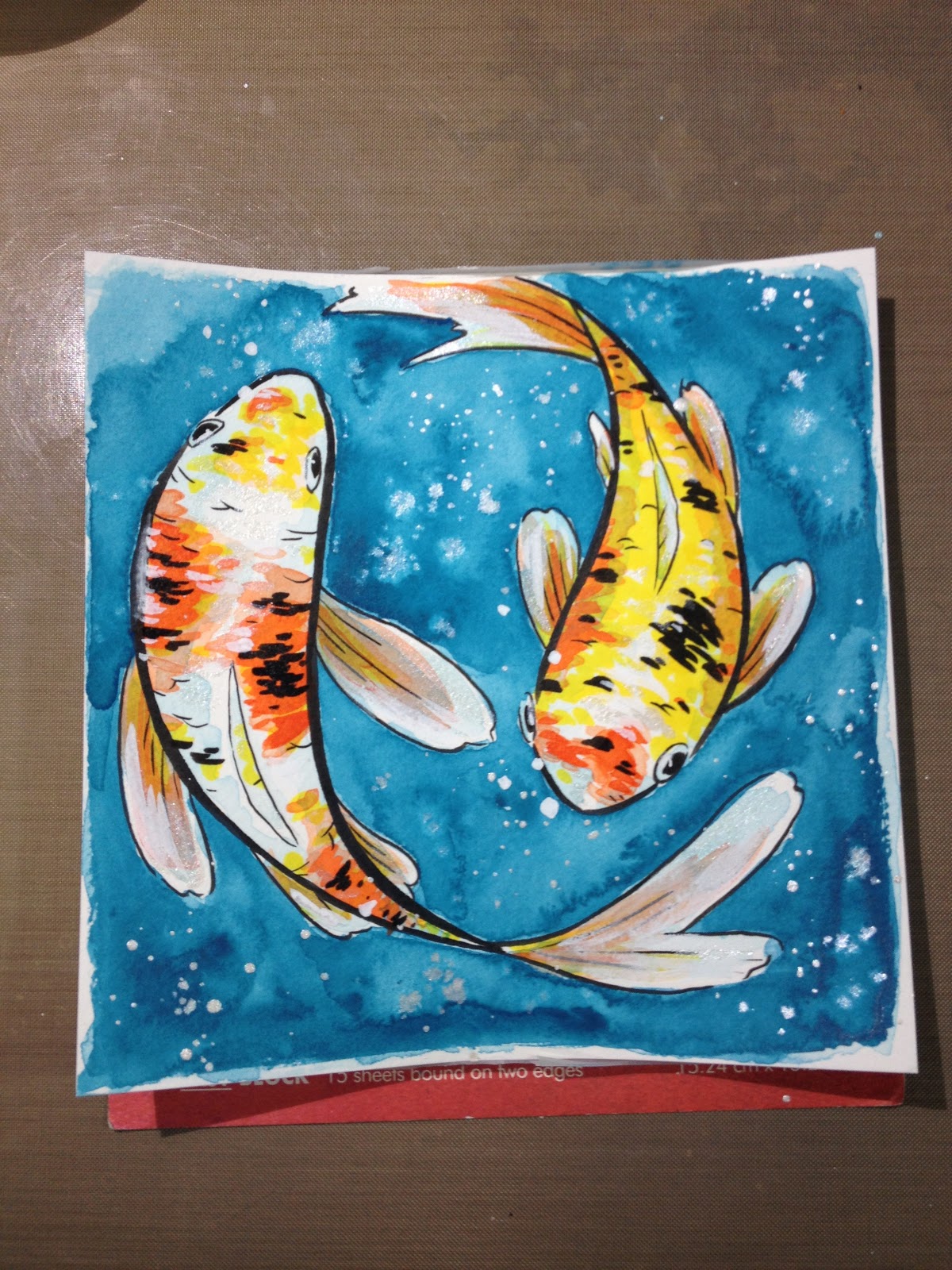
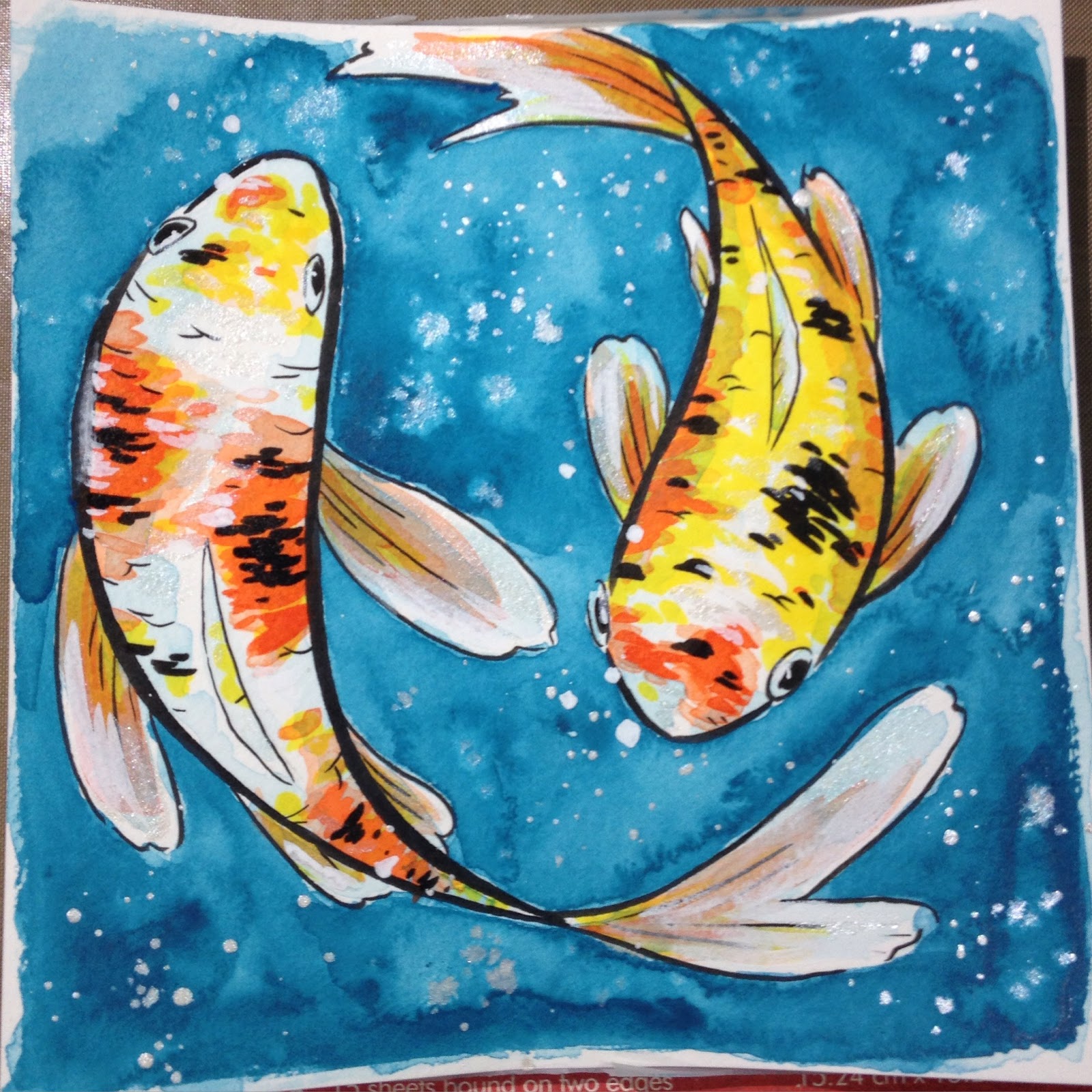
For me to enjoy this SketchBox, I had to introduce other elements- paper, watercolor, white inks. While it's true I had to introduce many of these elements to my ArtSnacks challenge as well, I felt like my ArtSnacks box had a wider range of flexibility in terms of each tool being usablbe for multiple roles. There's also the fact that SketchBox costs more than ArtSnacks (at least $10 more for the Basic Box), but it always feels fairly empty to me. I would rather have one of each goodie then ten of the same, but this is personal preference, and you may prefer to quickly amass a range of color.
The Premium Box
April Sketchbox !!- Horrorwolf19
April SketchBox Review-TheBonBon3272
Do you receive a Premium Box? Interested in having your videos shown in the post? Please let me know. Due to a desire to get my reviews up ASAP, I often go with the videos that are available, which tend to be slim early in the month.
Inside the April Premium Box
Simply Simmons Watercolor Brush- $3.29 on DickBlick
Daler Rowney Calli Calligraphy Ink- $6.24 on DickBlick
Krink Paint Crayon- $8.79 on DickBlick
Kuretake Kurecolor Marker- $3.45 on MarkerPop
Staedtler .5 and .7 mm Pigment Fineliners- $3.59 each on DickBlick
Total: $28.95
Box cost: $35.00+$5.00 shipping
The Verdict
This month, ArtSnacks really impressed me with materials I'd seen online, but hadn't had the chance to try out. The Kuretake Metallic Brushpen, while almost identical to the Wink of Luna sent out in the February Box, is still novel enough to appeal to my art supply reviewer's heart.
The only downside is that I wish ArtSnacks kept track of which colors were sent to people over the course of their boxes. I have two Tombow Irojiten pencils in Kingfisher Blue from ArtSnacks, and now two waterbased Kuretake metallic brushpens in the same shade of green. This is a fairly minor quibble, but it makes it difficult for me to utilize ArtSnacks as a way to fill out my studio.
SketchBox continues to fall short of the monetary value, although SketchBox rep Jon has pointed out that they can't finagle the deals that companies like DickBlick can, he didn't enlighten me further. I would love to interview SketchBox (I have interviews with both ArtSnacks and Creative Box coming up) at some point- perhaps an interview would answer the questions and issues artists have with this subscription box service.
When comparing the Basic and Premium boxes each month, I have to wonder what SketchBox defines as 'premium'. Is it solely based on price? In what world is the Kurecolor S, which is refillable yes, but the refills are difficult to come by, and only comes in chisel and bullet nibs, more premium than a Prismacolor brush tipped marker? Is it the same world where Daler Rowney Calli ink, which tends to be thin with unimpressive coverage, more 'premium' than Dr. PhMartin's Bombay? And if I had opted for the Premium Box this month, and received, yawn, Staedtler pigment fineliners instead of the fantastic Pigma brush pens, I would definitely feel annoyed and a little cheated. If SketchBox utilized tutorials (as suggested multiple times in the past) to increase the value of their boxes, I would be willing to suspend disbelief (and annoyance) and let them learn me something new, but as it is, I can only go by what the included cards and the website tell me, and that isn't much.
The Premium Boxes are a hefty $40- you could do real damage at an art supply store with $40 in your pocket. Paper, pens, watercolors, pencil colors- believe me, $40 goes fairly far, AND you get the joy of going to the art supply store. Even $30 is a fairly big chunk of change to relinquish monthly for a random chance box of art supplies. This pricing, as well as the commonly available contents within, make me question who SketchBox sees as their audience. Surely their target demographic is NOT "Art Supply Reviewers on YouTube". It's been suggested to me that perhaps 'hobbyist looking for inspiration' is the demographic, but if that's the case, just wander into your local art supply store and pick up things that speak to you. Most staff are more than happy to answer your questions.
Another issue with SketchBox is the fact that they don't pay their artists in money, they pay them in exposure, which is a dirty word in the illustration and comic art communities. For all the promotion SketchBox gives their artists (which seems scant- I rarely see them give the illustrators whose work was featured on the box or the interior card more than a passing nod), these artists are providing SketchBox with art used to promote their service. While this is between the artists who knowingly contribute their art for SketchBox's use and SketchBox as a company, I wouldn't claim SketchBox is positively contributing to the arts community by doing this. Positive contribution would mean PAYING the artists, and would definitely raise SketchBox in the community, as they would become an employment opportunity, rather than just another company taking advantage of artists who may not know better. As a fellow artist, I try to always make it a point to not only read the cards out clearly for my audience, but to transcribe them here. If these artists are only paid in exposure, then that exposure needs to actually be able to do something for them. If SketchBox won't promote their work properly, then as a fellow artist, it's my duty to try and have their (the artists') backs.
In the end, it's ArtSnacks that continues to shine by sending me fairly novel supplies that can be used in a variety of ways with a little experience and ingenuity. I was most excited by the Marvy LePlume Fine Brush- an alcohol marker with a brush tip as fine as a Pitt Artist Brush (link)- perfect for tiny illustrations or miniscule details. I ended up ordering the entire 36 color set through Jerry's Artarama, although I would have happily ordered it through ArtSnacks if their shop had carried these markers. I also ended up ordering a 20 piece set of Ironlak's twin tipped brush markers for future review, so if this review piqued your interest in the Austrailian marker company, check back often.
Winner: ArtSnacks
Announcement:
Due to the demands of my YouTube audience, I've taken the plunge and ordered a SketchBox Premium. The site wasn't clear on whether I'll receive the April or May Box, but I hope it's the May so I can do a comparative review of the Basic and Premium boxes, and hopefully demonstrate my point that neither box is currently worth the price. My dear readers know that I always dig up a Premium Box unboxing (usually the first one that gets uploaded) so I can show you guys what's inside both boxes, but my YouTube only audience is pretty insistent that I'm a cheapskate who doesn't know what she's missing out on (clearly if you pay more, it's GOT to be better, right?), so I figured I'd humor them.
If you'd like to help me defray some of the costs of this 'investment' (Premium boxes are $40, including shipping), you can Paypal me a one time donation in my sidebar, or if you genuinely enjoy this content, and would like to contribute towards funding it for future months, please consider backing my Patreon. My little Patreon has grown a lot in the past two months, and it's only due to it blossoming so much that I was even willing to consider the scandalous luxury of ordering and reviewing both a Basic and a Premium box from SketchBox.
Please consider donating to this blog or purchasing from Natto-shop (http://nattosoup.com/shop) if you want me to continue publishing quality content. All materials tested were purchased from my own pocket. Keep on Truckin' Nattosoup is not under any sponsorship.
April 18, 2016
Guest Post: Amy Stoddard of Fine Sometimes Rain's Comic Process
Thanks to the generosity of my Patrons, I was able to afford to commission my extremely talented comic friend Amy Stoddard (@Tsukiyono), creator of the webcomic Fine Sometimes Rain, for a comic process post based on popular Patron request for more comic content.
If you are a comic artist or illustrator, and you're interested in creating guest content for me, please shoot me an email and let me know what you have in mind. My guest post rate is $30 flat, paid through PayPal upon completion.
Creating a Comic Page Digitally in Clip Studio Paint - A Process Blog

So before we begin here, let me take a moment to introduce myself and my work. My name is Amy Stoddard and I create the webcomic Fine Sometimes Rain. It’s a slice of life romance which follows the life of the heroine Georgia as she tries to overcome depression with the help of family and friends. I am also an artist for the adult comic art site called Filthy Figments which focuses on erotic comics that appeal to women.
Well, now with introductions out of the way, let’s get started! So first and foremost before I begin any comic project I always start with a script and a general outline of the story from beginning to end. Before I started Fine Sometimes Rain I had the entire story outlined and had the first 6 chapters entirely scripted. It makes it really easy to get a lot of the scripting done in the beginning because then you can just focus on the art for a while and being consistent with regular updates.
After the script is ready I move onto the thumbnail phase. I like to work in “batches” so to speak, so on one day I will do all of my thumbnailing, the next day the penciling and so on. I like to do things this way because I find it easier to stay in the zone and achieve flow if I’m working on all the same type of thing in one go.

The above image is an example of two thumbnails I did for Fine Sometimes Rain, so let’s get into dissecting it! So first things first, the template you see is something I made for myself and each of those thumbnail squares is a perfectly scaled down version of my whole comic page. The thumbnails are roughly 3 x 2 inches big at 600dpi because I’m a jerk, kidding, it’s more because I’m fussy and other reasons I will discuss later.
So overall these thumbnails this time around are really tight. I have a tendency to create tight thumbnails, but not all the time. You will see many other artists who may just have stick figures and panels planned out and this is ok! When it comes to thumbnailing you need to do what works best for you and won’t leave you working too long on them. I also want to say that I don’t draw a perfect layout every time. What you are seeing is my final result. Because I work digitally I prefer to just erase a bad thumbnail and start over in my template box. The drawings you see outside of the template boxes are thumbnail bits I liked in a potential page layout that wasn’t going anywhere and I saved them just in case I still wanted to use them. As you can see in the example on the left, I did re-use the hug image, I just changed the panel layout from vertical to horizontal for that page. After the thumbnail phase I move onto the pencils.

How I begin here is I copy and paste my thumbnail into the full size comic template, then blow it up and blue line it to be a base for the pencils (10 x 15 @600dpi for my fellow technical nerds). Why do I work so large you may ask, or not ask. Well, because when you reduce 10x15 to the standard American comic format of 7 x 10.5 it makes everything a little finer. Did you have a line with a little jitter? Chances are it’s gonna be no more after you reduce it for print and/or web view. This is also the reason I do my thumbnails at 600dpi because then they won’t look quite as jacked up after I expand them. So after this I reduce the opacity of the thumbnail sketch layer and begin penciling on a new layer using the blue pencil.

So here’s my completed pencil with the thumbnail layer hidden. Because my thumbnails were so tight it’s hard to notice much of a change between the two at least as far at the top panel is concerned. The bottom panel though saw more refining. I would also like to say that I pencil really rough. Since I’m a one woman show and I do everything I don’t feel the need to refine the pencil all that much since I know what I want to do in the inks. I also very very rarely ever draw detailed backgrounds in pencil since I almost always straight up ink them using the rough shape outlines as a guide as this saves a ton of time.

Here is the completed ink with the blue line pencil still under it. As you can see I still do more refining with the inks. Small details are more evident now, and in the lower panel I made adjustments to Jun’s face which had become a little too long in the pencil sketch. Georgia’s head shape also got a tweak, and so on. Some people prefer to just straight up ink perfect pencils without variation and that’s fine too, you should do what you feel most comfortable doing and for me that’s just refining at each step of the process. Before we move onto the tone portion I would like to mention that the weeds and plants they are sitting in are a combination of different foliage tools, which I will share all of my tool “stats” with you at the end.

For toning comic pages I like to keep it simple. One of the core reasons for using screentones is to save time. If you get too anal retentive and try to tone everything you aren’t saving time and your piece will start to lose impact or worse become confusing. This goes doubly so if you are using too many patterns. So, in the top panel I’ve added a dot tone gradient for the night sky. The stars are on a separate later and are just done in white ink. I’ve found that doing it this way, as in keeping the tone and stars separate, is best because it can moire during resizing otherwise. In this way you are guaranteed no moire. If you already read my webcomic you probably know I’m a bit of a backlighting addict because it can really add impact if used well, not to mention time saving! Here I’ve used a darker tone for the backlight shadow, 25% or 30% I think. You may not think that is all that dark in the long run, but I normally backlight daytime shots around 10%-15%, and also when backlighting you don’t want the dot tone to obscure too much of the details of the figure or face, so it’s best not to go too crazy dark with it. Anyway, going with a hard contrast in night scene in my opinion kind of punches up the idea that it’s night. It also adds drama and this page is big time drama llamas.

After I’m satisfied with the tones I move onto the lettering phase. I normally do both toning and lettering on the same day since I don’t find that it requires me to shift gears that much. My favorite dialogue balloons to use are these irregular kind of manga-esque flavored ones. In Clip Studio Paint they are just called Default 01, 02 and so on. I find that for my style of line art that the irregular shapes with their more organic feel work well and are not too rigid. When you are creating your own comics you should choose dialogue balloons that you feel go together well with your line art. It’s also ok to vary your word balloon usage as well, just be sure it’s logical. For example I occasionally use different balloons for when someone is mumbling or shouting or whispering.
Lettering is probably the one skill artists will ignore for the longest time. I know I did and looking back on my old comics it’s kind of embarrassing to see how bad my lettering was. There are a lot of rules when it come to lettering, some of which you can probably ignore, some of which you cannot, like ever. Font choice is your first area you can goof in. You want to choose a good comic dialogue font. For Fine Sometimes Rain I use Anime Ace which is a free font from Blambot.com. Blambot has a ton of absolutely excellent fonts for lettering, use them, and when you can pay for them, they will not do you wrong. The next rule that must not be broken is to have a uniform amount of space between your dialogue and the edge of the balloon. It can be tricksy with these irregular shaped balloons and for the most part I just eyeball it and fiddle until I get something that looks pleasing to me. I am not going to go deeply into depth about lettering here because there are plenty of resources done by people with more lettering finesse than I, but I will say another important rule is don’t have dangling words, your dialogue should look compact, not sprawled every which way. It also need to look good within the panel.
So this is pretty much it in regards to my process. After I finish a page I usually save a resized version for web view while preserving my originals. When I go to print, the pages are resized down to 7.5 x 10, but keeping the same dpi unless the printer I have chosen wants 300dpi.

These are some of the tools I used on this page. I primarily use the Mapping/Maru pen for inking, it’s the squiggly line at the bottom. The G-pen is the squiggly line at the top. I normally leave the G-pen at a large diameter and use it for more heavy inking. The foliage tools I used on the page is the basic foliage and Grass C….The basic foliage brush was used in black and the Grass brush was layered on top to give a bit of depth. Oh and I use the calligraphy brush to create a few extra leaves here and there. If you would like to know more about using the foliage tools effectively, I have begin a short video tutorial series on how to use them which you can find on my YouTube page.
Foliage Tutorial Part 1
Foliage Tutorial Part 2
My fonts came from Blambot, which I recommend you check out for great handlettered digital fonts, specifically a font called Anime Ace.
So this is the end my friends of this humble process blog, now it’s your turn to go off and make some good art!
Read more
Comic
Fine Sometimes Rain
Patreon
YouTube
Gumroad
Foliage brushes for Clip Studio Paint
Social
Twitter
Tumblr
Please consider donating to this blog or purchasing from Natto-shop (http://nattosoup.com/shop) if you want me to continue publishing quality content. All materials tested were purchased from my own pocket. Keep on Truckin' Nattosoup is not under any sponsorship.
If you are a comic artist or illustrator, and you're interested in creating guest content for me, please shoot me an email and let me know what you have in mind. My guest post rate is $30 flat, paid through PayPal upon completion.
Creating a Comic Page Digitally in Clip Studio Paint - A Process Blog

So before we begin here, let me take a moment to introduce myself and my work. My name is Amy Stoddard and I create the webcomic Fine Sometimes Rain. It’s a slice of life romance which follows the life of the heroine Georgia as she tries to overcome depression with the help of family and friends. I am also an artist for the adult comic art site called Filthy Figments which focuses on erotic comics that appeal to women.
Well, now with introductions out of the way, let’s get started! So first and foremost before I begin any comic project I always start with a script and a general outline of the story from beginning to end. Before I started Fine Sometimes Rain I had the entire story outlined and had the first 6 chapters entirely scripted. It makes it really easy to get a lot of the scripting done in the beginning because then you can just focus on the art for a while and being consistent with regular updates.
After the script is ready I move onto the thumbnail phase. I like to work in “batches” so to speak, so on one day I will do all of my thumbnailing, the next day the penciling and so on. I like to do things this way because I find it easier to stay in the zone and achieve flow if I’m working on all the same type of thing in one go.
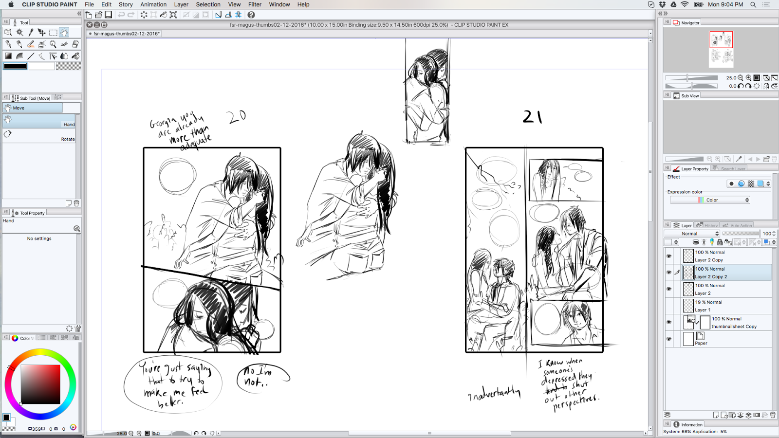
The above image is an example of two thumbnails I did for Fine Sometimes Rain, so let’s get into dissecting it! So first things first, the template you see is something I made for myself and each of those thumbnail squares is a perfectly scaled down version of my whole comic page. The thumbnails are roughly 3 x 2 inches big at 600dpi because I’m a jerk, kidding, it’s more because I’m fussy and other reasons I will discuss later.
So overall these thumbnails this time around are really tight. I have a tendency to create tight thumbnails, but not all the time. You will see many other artists who may just have stick figures and panels planned out and this is ok! When it comes to thumbnailing you need to do what works best for you and won’t leave you working too long on them. I also want to say that I don’t draw a perfect layout every time. What you are seeing is my final result. Because I work digitally I prefer to just erase a bad thumbnail and start over in my template box. The drawings you see outside of the template boxes are thumbnail bits I liked in a potential page layout that wasn’t going anywhere and I saved them just in case I still wanted to use them. As you can see in the example on the left, I did re-use the hug image, I just changed the panel layout from vertical to horizontal for that page. After the thumbnail phase I move onto the pencils.

How I begin here is I copy and paste my thumbnail into the full size comic template, then blow it up and blue line it to be a base for the pencils (10 x 15 @600dpi for my fellow technical nerds). Why do I work so large you may ask, or not ask. Well, because when you reduce 10x15 to the standard American comic format of 7 x 10.5 it makes everything a little finer. Did you have a line with a little jitter? Chances are it’s gonna be no more after you reduce it for print and/or web view. This is also the reason I do my thumbnails at 600dpi because then they won’t look quite as jacked up after I expand them. So after this I reduce the opacity of the thumbnail sketch layer and begin penciling on a new layer using the blue pencil.
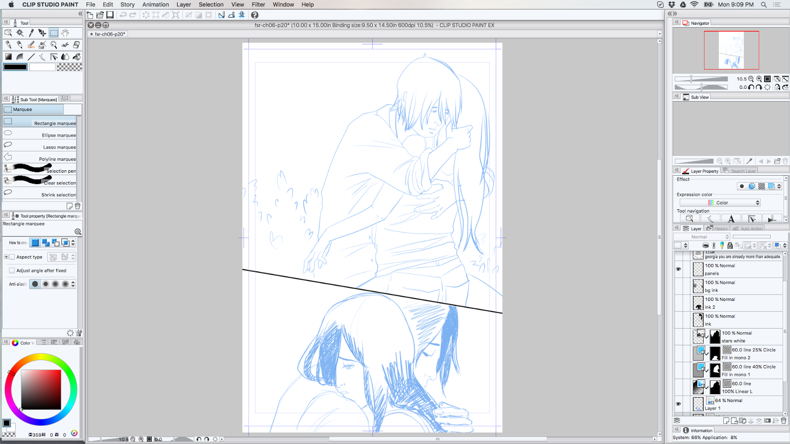
So here’s my completed pencil with the thumbnail layer hidden. Because my thumbnails were so tight it’s hard to notice much of a change between the two at least as far at the top panel is concerned. The bottom panel though saw more refining. I would also like to say that I pencil really rough. Since I’m a one woman show and I do everything I don’t feel the need to refine the pencil all that much since I know what I want to do in the inks. I also very very rarely ever draw detailed backgrounds in pencil since I almost always straight up ink them using the rough shape outlines as a guide as this saves a ton of time.

Here is the completed ink with the blue line pencil still under it. As you can see I still do more refining with the inks. Small details are more evident now, and in the lower panel I made adjustments to Jun’s face which had become a little too long in the pencil sketch. Georgia’s head shape also got a tweak, and so on. Some people prefer to just straight up ink perfect pencils without variation and that’s fine too, you should do what you feel most comfortable doing and for me that’s just refining at each step of the process. Before we move onto the tone portion I would like to mention that the weeds and plants they are sitting in are a combination of different foliage tools, which I will share all of my tool “stats” with you at the end.

For toning comic pages I like to keep it simple. One of the core reasons for using screentones is to save time. If you get too anal retentive and try to tone everything you aren’t saving time and your piece will start to lose impact or worse become confusing. This goes doubly so if you are using too many patterns. So, in the top panel I’ve added a dot tone gradient for the night sky. The stars are on a separate later and are just done in white ink. I’ve found that doing it this way, as in keeping the tone and stars separate, is best because it can moire during resizing otherwise. In this way you are guaranteed no moire. If you already read my webcomic you probably know I’m a bit of a backlighting addict because it can really add impact if used well, not to mention time saving! Here I’ve used a darker tone for the backlight shadow, 25% or 30% I think. You may not think that is all that dark in the long run, but I normally backlight daytime shots around 10%-15%, and also when backlighting you don’t want the dot tone to obscure too much of the details of the figure or face, so it’s best not to go too crazy dark with it. Anyway, going with a hard contrast in night scene in my opinion kind of punches up the idea that it’s night. It also adds drama and this page is big time drama llamas.

After I’m satisfied with the tones I move onto the lettering phase. I normally do both toning and lettering on the same day since I don’t find that it requires me to shift gears that much. My favorite dialogue balloons to use are these irregular kind of manga-esque flavored ones. In Clip Studio Paint they are just called Default 01, 02 and so on. I find that for my style of line art that the irregular shapes with their more organic feel work well and are not too rigid. When you are creating your own comics you should choose dialogue balloons that you feel go together well with your line art. It’s also ok to vary your word balloon usage as well, just be sure it’s logical. For example I occasionally use different balloons for when someone is mumbling or shouting or whispering.
Lettering is probably the one skill artists will ignore for the longest time. I know I did and looking back on my old comics it’s kind of embarrassing to see how bad my lettering was. There are a lot of rules when it come to lettering, some of which you can probably ignore, some of which you cannot, like ever. Font choice is your first area you can goof in. You want to choose a good comic dialogue font. For Fine Sometimes Rain I use Anime Ace which is a free font from Blambot.com. Blambot has a ton of absolutely excellent fonts for lettering, use them, and when you can pay for them, they will not do you wrong. The next rule that must not be broken is to have a uniform amount of space between your dialogue and the edge of the balloon. It can be tricksy with these irregular shaped balloons and for the most part I just eyeball it and fiddle until I get something that looks pleasing to me. I am not going to go deeply into depth about lettering here because there are plenty of resources done by people with more lettering finesse than I, but I will say another important rule is don’t have dangling words, your dialogue should look compact, not sprawled every which way. It also need to look good within the panel.
So this is pretty much it in regards to my process. After I finish a page I usually save a resized version for web view while preserving my originals. When I go to print, the pages are resized down to 7.5 x 10, but keeping the same dpi unless the printer I have chosen wants 300dpi.
These are some of the tools I used on this page. I primarily use the Mapping/Maru pen for inking, it’s the squiggly line at the bottom. The G-pen is the squiggly line at the top. I normally leave the G-pen at a large diameter and use it for more heavy inking. The foliage tools I used on the page is the basic foliage and Grass C….The basic foliage brush was used in black and the Grass brush was layered on top to give a bit of depth. Oh and I use the calligraphy brush to create a few extra leaves here and there. If you would like to know more about using the foliage tools effectively, I have begin a short video tutorial series on how to use them which you can find on my YouTube page.
Foliage Tutorial Part 1
Foliage Tutorial Part 2
My fonts came from Blambot, which I recommend you check out for great handlettered digital fonts, specifically a font called Anime Ace.
So this is the end my friends of this humble process blog, now it’s your turn to go off and make some good art!
Read more
Comic
Fine Sometimes Rain
Patreon
YouTube
Gumroad
Foliage brushes for Clip Studio Paint
Social
Tumblr
Please consider donating to this blog or purchasing from Natto-shop (http://nattosoup.com/shop) if you want me to continue publishing quality content. All materials tested were purchased from my own pocket. Keep on Truckin' Nattosoup is not under any sponsorship.
April 16, 2016
Winsor and Newton Markers Overview
Please consider donating to this blog or purchasing from Natto-shop (http://nattosoup.com/shop) if you want me to continue publishing quality content. All materials tested were purchased from my own pocket. Keep on Truckin' Nattosoup is not under any sponsorship.


