
Becca Hillburn's Blog, page 56
July 11, 2015
Convention Stuff: Reviewing Square's New EMV Reader
So those of you who do conventions are probably pretty familiar with the gamut of credit card readers available on the market today. There's Paypal Here, there's Amazon, Local Register, Intuit Quickbooks Payments, there's Square. My bank, Capitol One, even offers one, although their rates aren't very competitive. And magstrip credit card readers have been available to retailers for years, although out of the reach of most convention artists. The most popular three are Square, Amazon, and Paypal, and those are the three I see at conventions. Below is a chart comparing their basic stats:

 Image source Image credit: AP Photo/Mark LennihanIf you want to learn more about the above readers, I highly recommend you read Mobile Credit Card Readers: Comparing the Top 8 by Joseph Pisani.
I've been using SquareUp's Square reader for a few years, so that's the reader I'm the most familiar with, and those are the readers I'll be focusing on in this review.
Square's had a magstrip credit card reader available for years- it's free if you order it online, and $10 at places like Starbucks and Target. A long time ago, they announced that they were developing a Chip Card reader, which got the attention of a lot of artists.
I paid $30 for this chip card reader over a year ago. At the time, it seemed like they were almost ready to launch it- I figured I'd have it within a couple months. Square also emphasized that once the new reader was launched, they would not only drop support for the original readers, but that the users were liable for any credit card fraud that occurred during the use of the original card readers. They assured their customers that this new reader would help fight credit card fraud, and that we should not be liable for any that occurs if we're using the chip card reader. While I had my doubts, I went ahead and ordered one, figuring I could at least review it for you guys.
I should mention that there is validity to the claim that EMV credit cards are more secure than the common magstrip cards. According to The Nerd Wallet,
Take a quick glance at the back of a credit card, and you’ll probably see a thick black band. This is the card’s magnetic stripe. These bands are so vulnerable because the information that’s stored on them is unchanging, static data. If a skimmer manages to read the data off a card’s magnetic stripe, he or she can copy that information onto a counterfeit card and use it to make purchases.Instead of a magnetic stripe, an EMV credit card is embedded with a small chip that encrypts your personal data. This chip generates a unique transaction code every time a new purchase is made. Instead of swiping the card, users place it into a card reader and provide a signature or PIN number. Because the card’s information changes after every transaction, data skimmed from it would be useless to a criminal. Certain EMV cards even work with near-field communication payment devices that allow users to simply tap their cards against payment terminals to make a purchase.And it is true that merchants who haven't switched over to a system that accepts EMV cards will be held liable for fraudulent charges by October 1, 2014, but it seems like EMV cards still aren't the standard in the US, especially for debit cards.
So while I waited for my Square EMV reader to arrive, I continued to use both the original Square reader, and the second generation's more finicky reader with no significant problems, even after October 1st. The original two readers do not require charging, are fairly small, and plug right into your phone. While both can be picky about how they read cards (and both grew even pickier as time progressed), I found that if you pinched the reader while you scanned, it read cards a little better. Even so, at my last couple cons, I found myself typing in more and more transactions because the readers weren't able to read people's cards. This was frustrating, because not only did it take more time per transaction and required me to ask personal questions of the buyer, but it also meant I was paying more per transaction for an issue that may be Square's fault.
Anyway, my EMV reader from SquareUp finally came in, and I thought I'd share my thoughts with you guys, as there's been a bit of contention in the artist alley community as to whether it's worth the money. This review may be revisited as I attend conventions and put the new reader through it's paces, so check back from time to time if you're interested.
This review is going to be pretty much like my pen reviews: Packaging, the Item Itself, Field Test, Verdict.
The Packaging
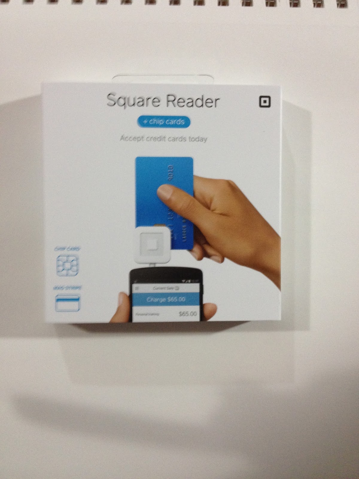


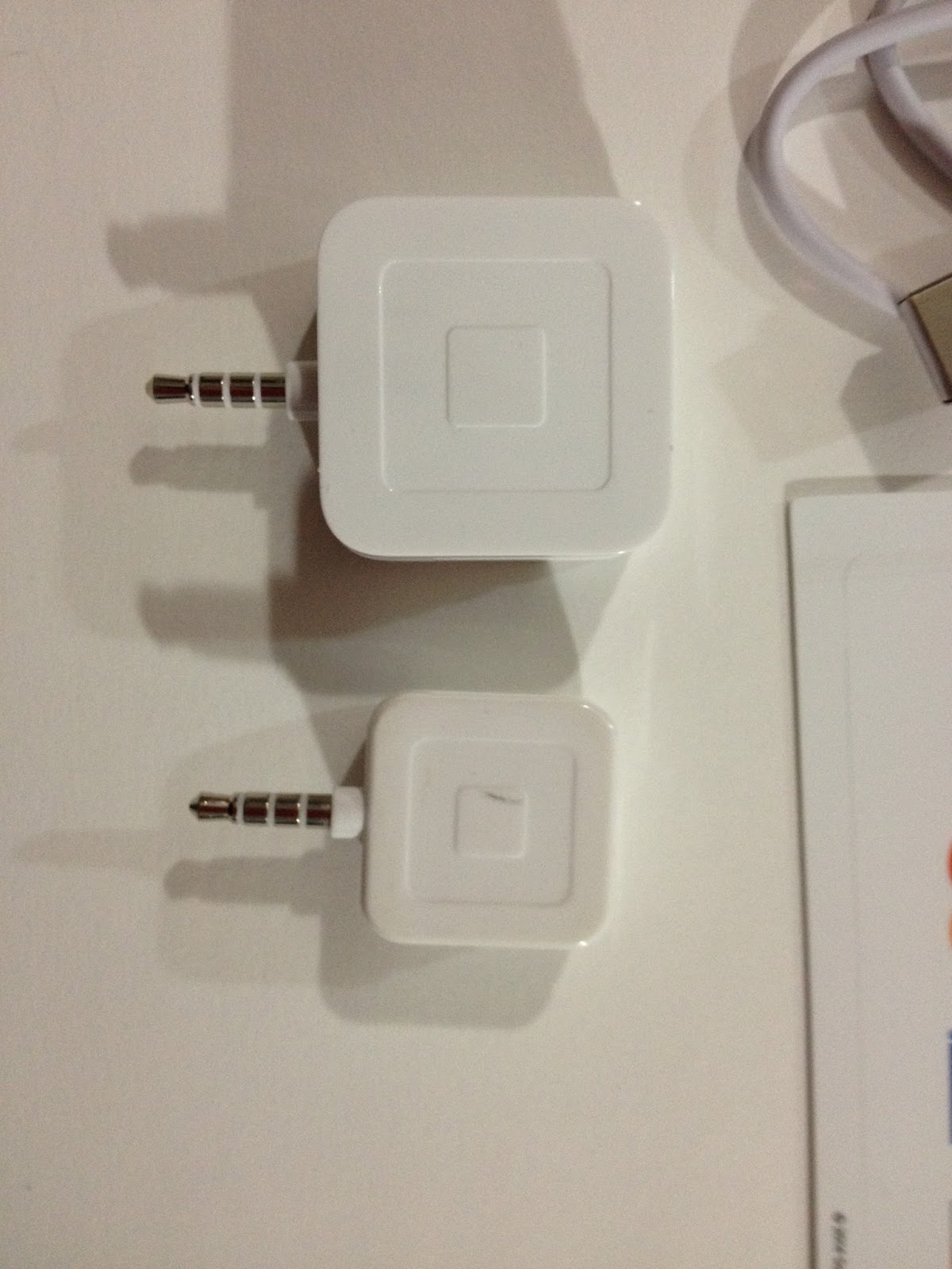
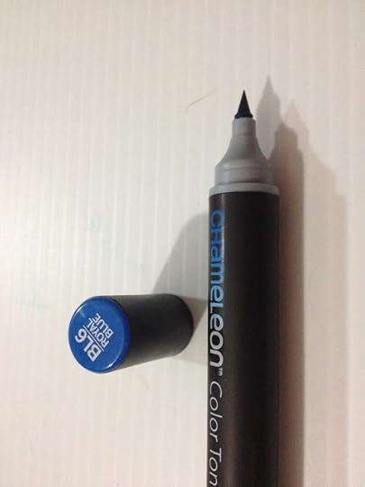
You can see here that there are two slots- a 'dip' slot EMV reader, and a swipe slot magstrip reader.

The underside has the charging port and the indicator light. Unfortunately, should your Square die while you're using it, it isn't possible to charge it while still using it. I wish Square had just enabled this reader to get its power from your phone, the same way the magstrip readers did.
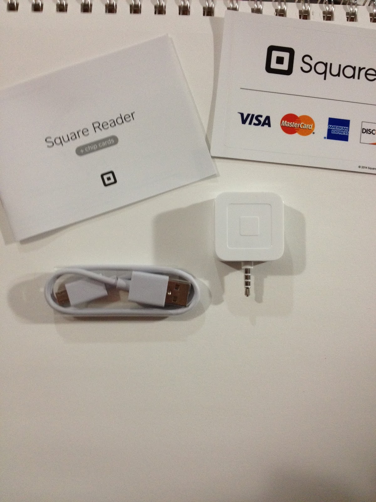
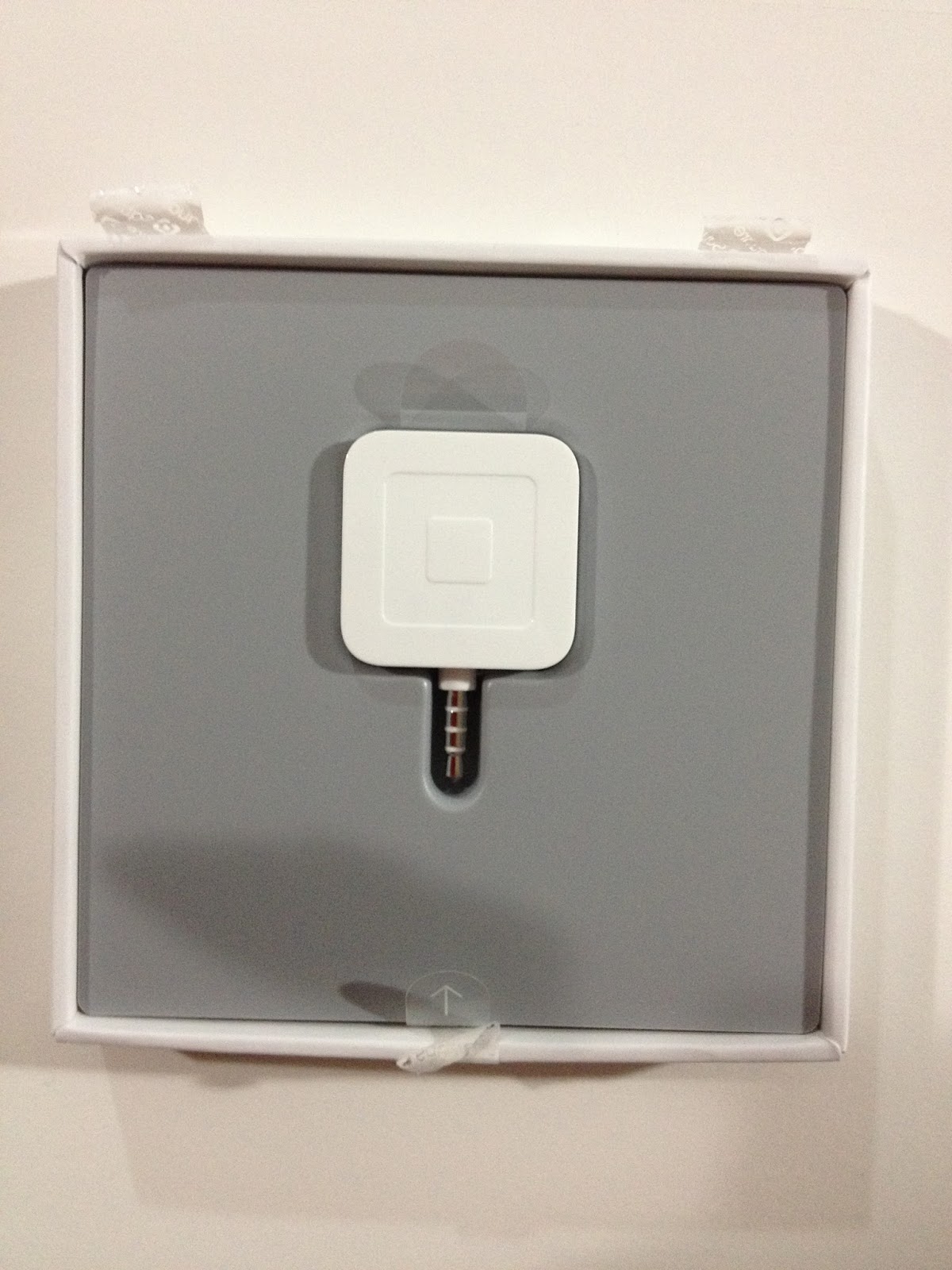
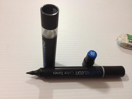
The Square package disemboweled. The instructions, the charging cable, the stickers, and of course, the Square EMV reader.
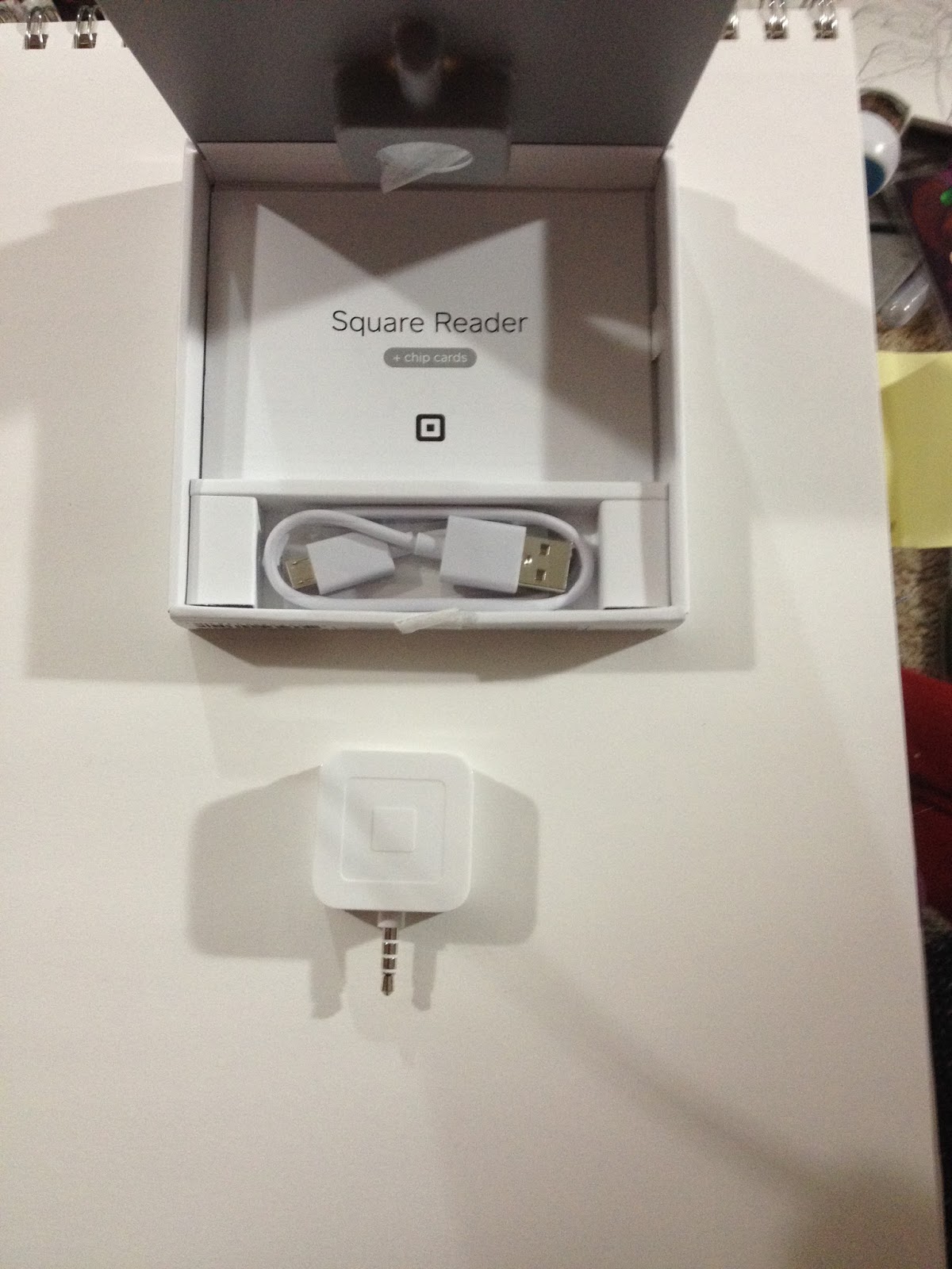
So Square's packaging is pretty Apple-esque- sleek rubberized cardboard with a formfitting insert tray. Unfortunately, also like Apple, SquareUp doesn't include a carrying case, or utilize packaging that can be easily reused to protect their products. Inside my package was one Square EMV reader, the instructions, a new set of stickers, and a charging cable.
The EMT/Magstrip Reader
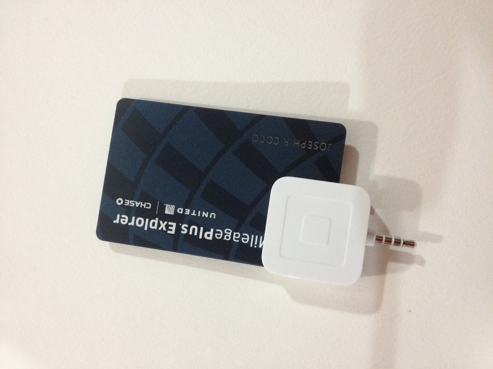
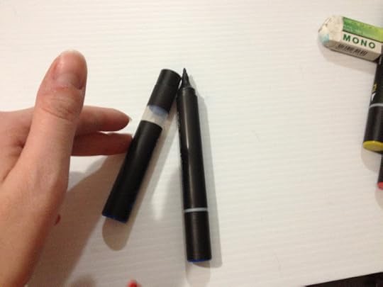
 The new Square EMV reader next to the original Square reader. As you can see, the new reader is huge compared to the original reader.
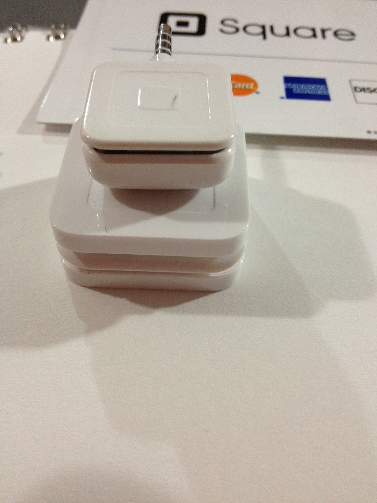
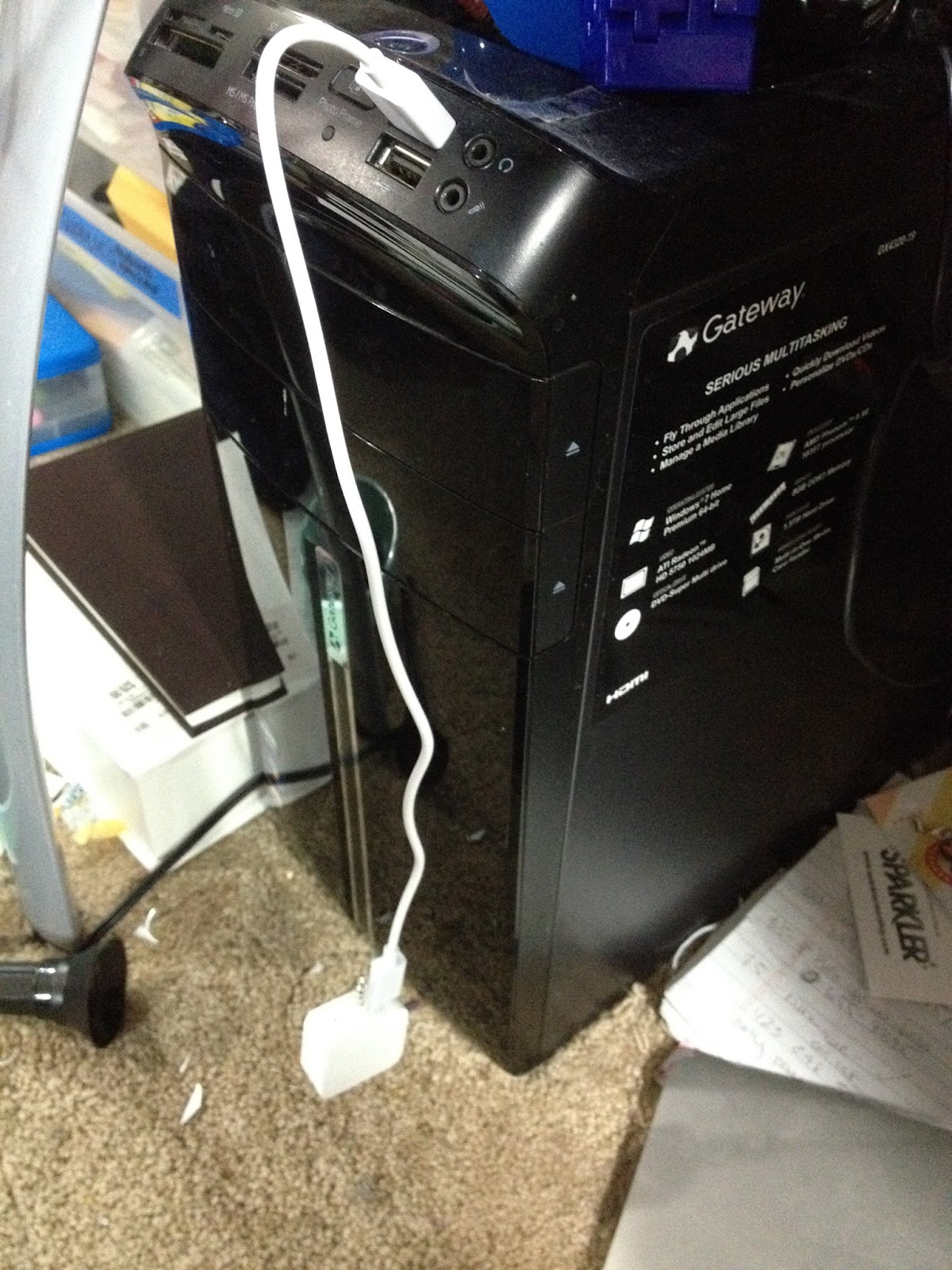
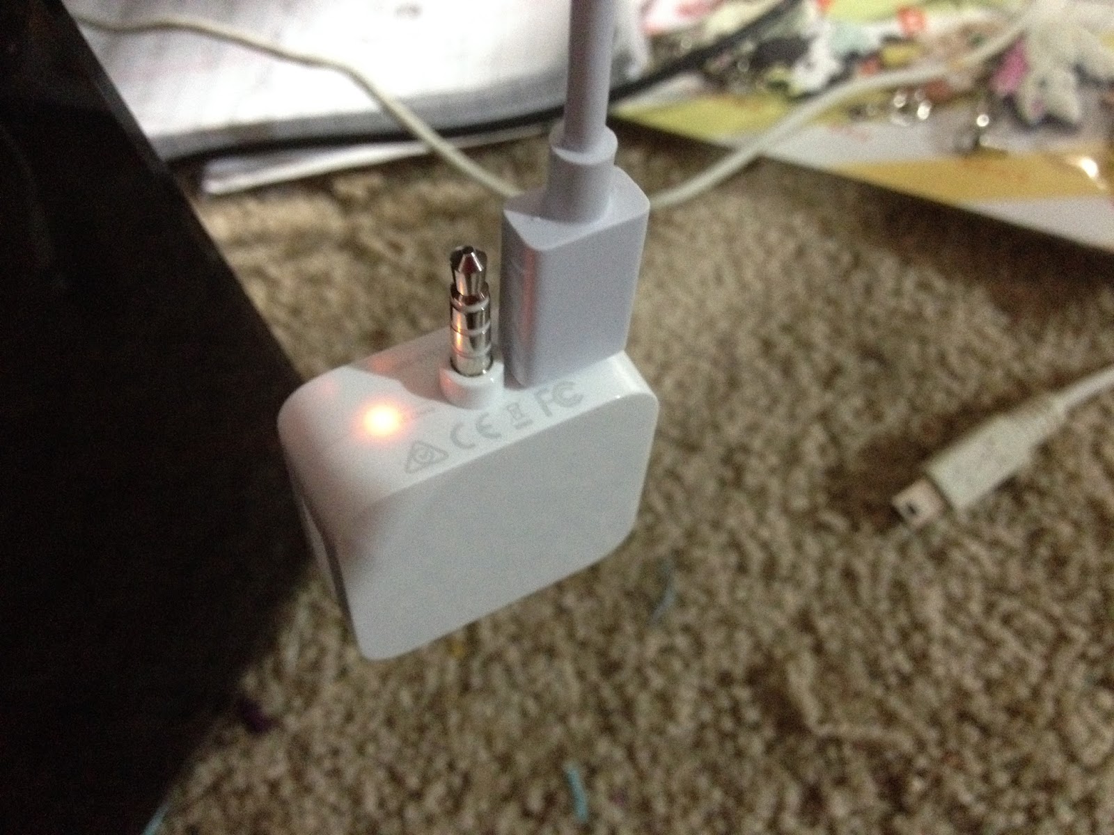
Excuse my messy apartment while I charge my Square reader with the short included cable. No indicator lights lit up when plugged in, so I had no idea if it charged or not until I plugged it into my phone. Even then, indicator lights didn't show, but having your indicator light on the BOTTOM of your product closest to where you plug it in is a stupid idea. I double checked to make sure, and I guess my light is just broken, because it didn't light up, but Square Register, the iPhone app, recognized my reader as being plugged in.
SquareUp's Ever So Helpful In-Register Tutorial
For the magstrip reader on the new EMV reader, you simply swipe cards through the second slot as you would through the original readers.
This was an animated gif that I am too lazy/busy to capture for your amusement. Download the app and see for yourselves, but it's pretty simple and includes no additional text. What an EMV Chip Looks Like
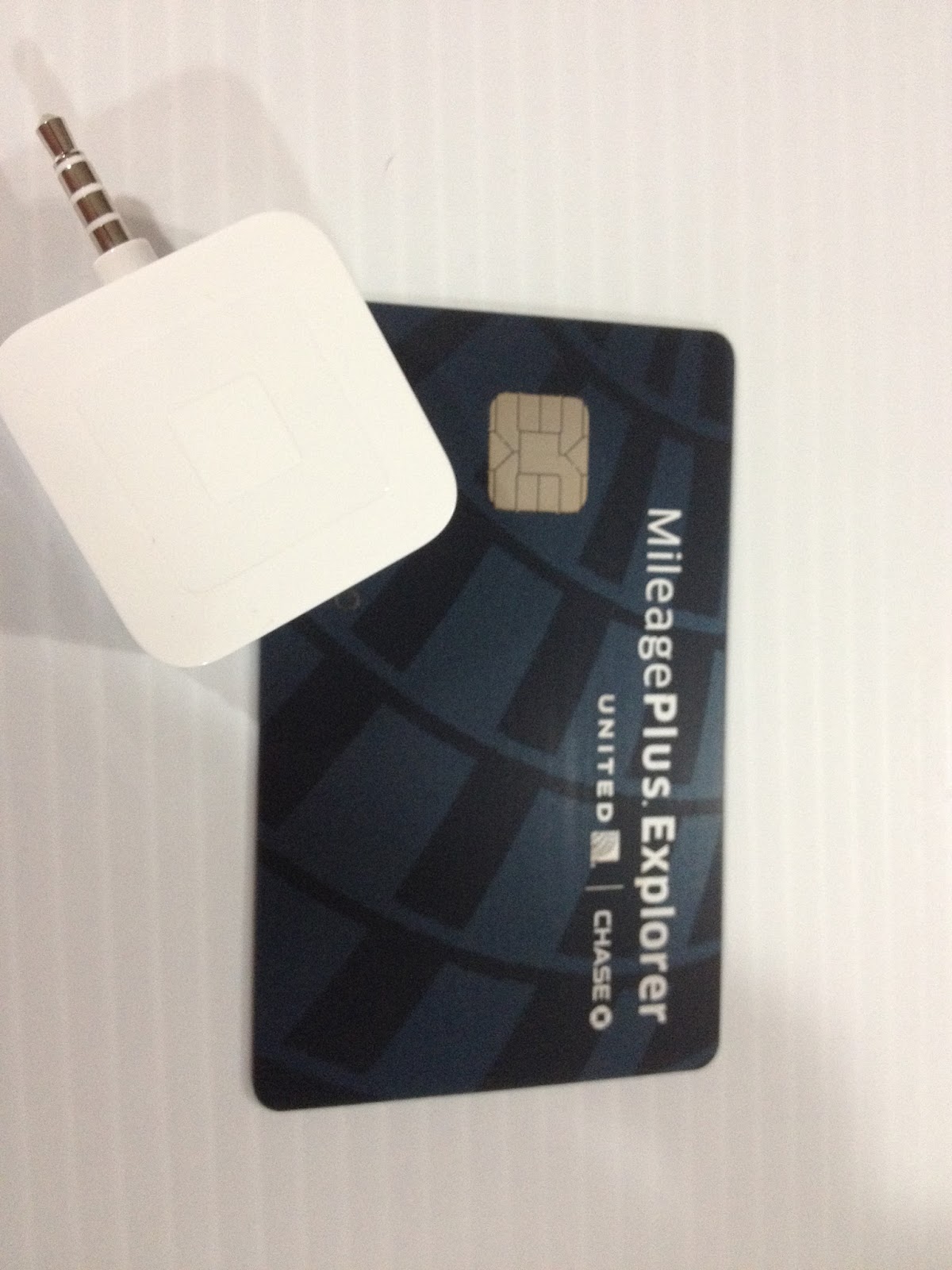
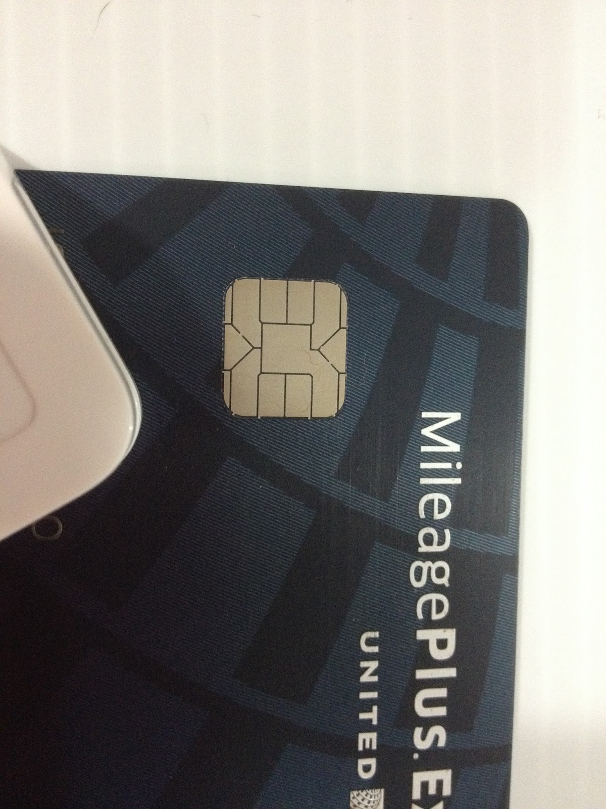 The Square EMV reader has little metal teeth that connect with this chip for the transaction, so this is what you'll line your reader up with when scanning chips.
Field Test
The new reader is really bulky, it throws off the weight of my phone. I guess part of the plan with this new reader was to keep pace with the size of newer phones, but a lot of artists have older smartphones, 4G and below.
So uh, my indicator lights flat out don't work. It doesn't show when it's charging, charged, or dead. My phone seems to pick it up though, so I GUESS it's working? Why can't this device just siphon a charge off the phone the way the other reader does? When this reader is dead, can it still do mag strip reading the way the other reader can, or will I be pulling out the old reader? And although I KNEW the new reader was big when I was taking the first batch of photos, I didn't realize how huge and bulky it really was until I plugged it into my phone. The least SquareUp could have done was have the jack fold into the unit, consider how huge the unit is, or offered a lanyard or keychain loop so it could be easily carried along. Or put the charging slot on the side of the unit, so you can charge while you're using it. Or included a carrying case for the cable and the unit. It DID however come with a super short charging cable.
My Square reader isn't registering the 'dip' when I run the EMV reader over the chip. I'm not sure if the reader has run out of a charge or not- I charged it when I first got it, and haven't used it since, but it's been a couple days. There's no way to tell, as my indicator lights aren't working. It doesn't seem to register magstrip swipes either, which is a shame because if Square discontinues the older models, we can't even fall back on those when our EMV units die. If this thing can't even hold a charge for a few days, that doesn't bode well for convention use. Plugging it in to charge for awhile, then I'm going to retest. Even plugged in to a computer, my indicator lights aren't lighting up.
Ok wait, so if you really push the plug in, all the way (like it's supposed to, but it resists going in that far, and I didn't want to break it) the charge light DOES light up. Maybe I was just an idiot and not charging it properly.
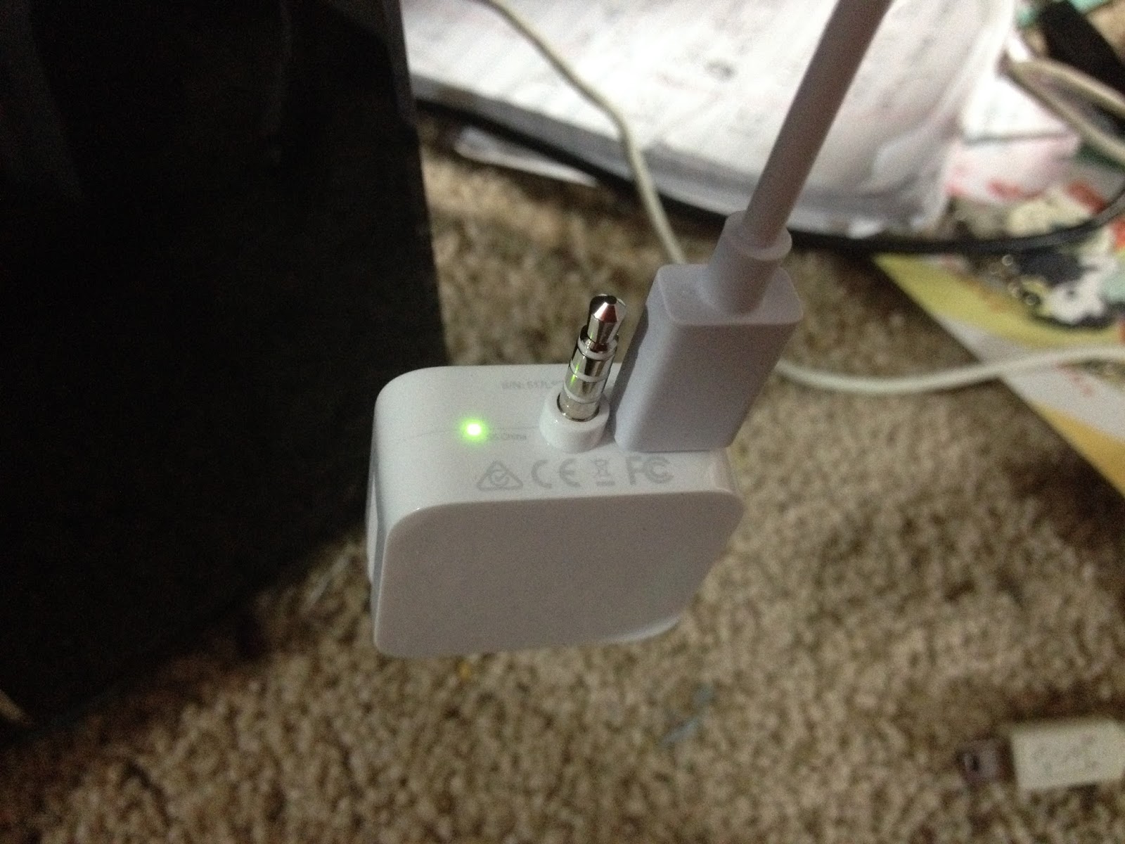
When unplugging the unit, it feels like micro USB is going to chip off and stay stuck in the EMV reader.
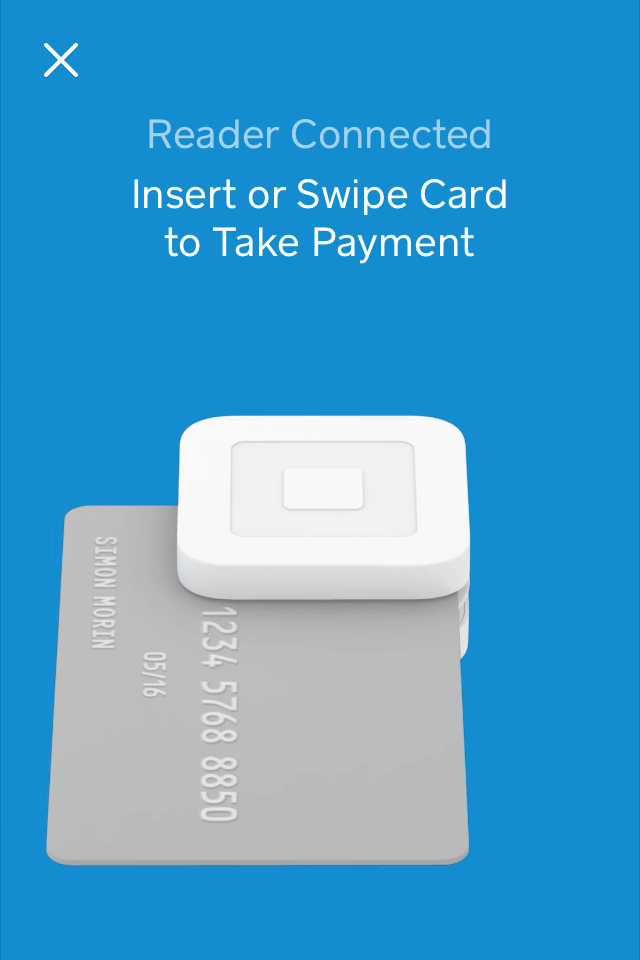
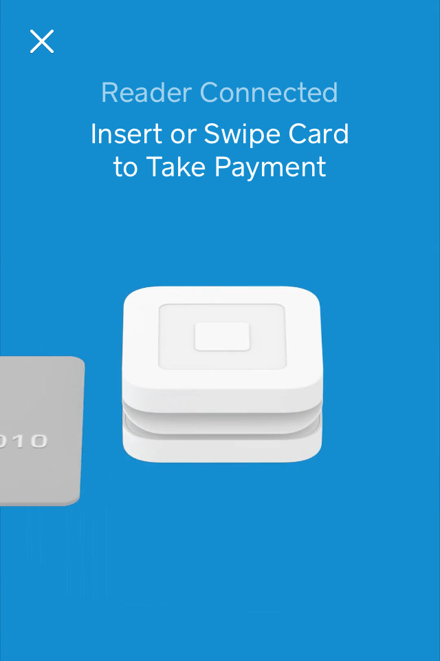
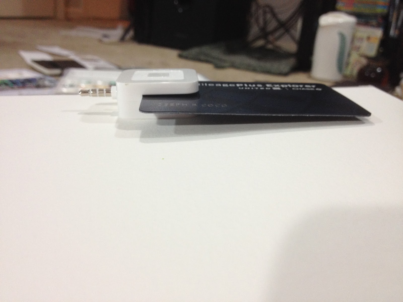
Ok reader is charged and plugged in, testing the EMV reader. You have to leave the card in for a REALLY long time, and the EMV reader is all about establishing a secure connection (would that even be available at conventions? Those of you with iPods instead of iPhones might be outta luck if you're reliant on shared wifi), and it takes awhile to even establish a secure connection. While conducting an EMV sale, you leave the card in the reader, which will be awkward for us shorties who have to stand up to conduct credit card transactions. Once the transaction goes through, it's business as usual, although you have to click New Sale to complete the transaction, or Square will send you a push notification. Square lets you know when the reader is ready.
 This is how your card will sit while the EMV reader reads the EMV chip and conducts the transaction. The fit is pretty snug right now, I'm not sure if that'll change over time with use.
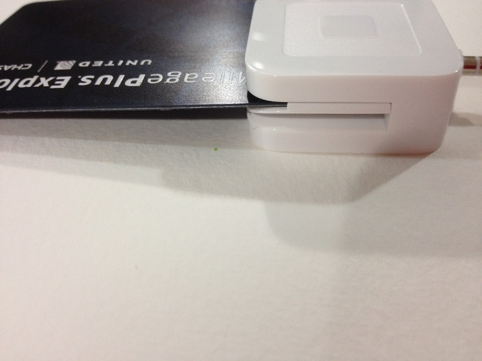
The Verdict
Most of my customers don't even have EMV credit cards, they have magstrip debit cards. I don't really do credit cards, so I have two debit cards with magstrips, I'm not even sure if debit cards COME with EMV chips (it'd be nice, as that's our actual money being accessed). Since I plunked down $30 for this new fancy reader that can't even self charge, I wonder if these magstrip transactions are protected as well, or just the ones I use my EMV reader for. If this reader gives me as many issues as my other two readers have, I'll be typing in a lot of cards anyway, so having a magstrip or an EMV reading slot won't really matter.
Like all small businesses, I have to be careful about how I spend my capital. While $30 may not seem like much to many, I was happily using Square's FREE reader for years. If this new EMV reader doesn't perform better than my previous two readers, that $30 will be $30 wasted. However, as Square is adamant that it's really pushing for October full adoption, I'll carry my EMV Square reader, as well as an old faithful backup on me to conventions in the future.
Please consider donating to this blog or purchasing from Natto-shop (http://nattosoup.com/shop) if you want me to continue publishing quality content. All materials tested were purchased from my own pocket. Keep on Truckin' Nattosoup is not under any sponsorship.


July 8, 2015
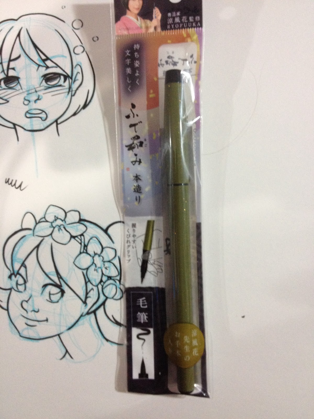
Brush Pen Review: Sailor Fude Nagomi Standard Model in Warbler Green- Honzukuri Hair
This is a pretty special calligraphy pen. First of all, it's got a name so long it's a little like trying to talk around a mouth full of marbles, a name that might require a bit of unpacking. This pen, the Sailor Fude Nagomi Brush Pen - Standard Model - Honzukuri Hair - Uguisu (Bush Warbler Olive Green) Body, is made by Sailor, a Japanese pen company. The pen itself was designed by the calligrapher Ryofuka, and the Standard Model refers to the color choice of the pen's body (Standard Models are based off traditional Japanese colors, Ryofuka Models are colors chosen by Ryofuka). The Honzukuri hair refers to the synthetic fibers that make up the brush itself, and Uguisu is a reference to the specific color of the pen's body. So we're talking about an olive green nylon bristled brush pen produced by Sailor and designed by Ryofuka to more closely emulate traditional calligraphy pens. Although that doesn't sound particularly unusual, I really think this pen is something special.
Before we get to the pen and packaging, I should state that this pen was sent to me care of Jetpens for the purposes of review. There were no strings attached, no special requests, just that I review the pens, which I'm plenty happy to do. Whatever I write here is my unbiased opinion, based upon years of art and illustration experience, as well as years of reviewing art supplies for this blog. If you're interested in having me review pens for you or your shop, please email me the details and we can talk shop.
I've had some difficulty finding Sailor (other than fountain pens) products in the US, but Jetpens carries a pretty decent selection of them. I'm already a big fan of their Mitsuo Aida pen, which I've reviewed before, so I was really excited to get my hands on the Nagomi with the Honzukuri Hair.
The Packaging
The packaging reminds me a little of skin care packaging- it's calm, elegant, and a lady is smiling at me from the corner. The package is fairly minimal- a thin, self sealing plastic envelope with a piece of paper inside in addition to the pen.


The package is written entirely in Japanese, but there're a couple things even I can understand- the size of the pen tip (large) and the suggested method for holding the pen.


The instructions, neatly folded within the slim plastic packaging, demonstrate the correct way to hold a brush like this. I'll be ignoring those instructions, calligraphy and inking are not always one and the same, and I don't have the practice necessary to ink the way I want to while correctly holding this pen. I'll have to just hope that this well designed pen works just as well when held improperly as it does when held correctly.
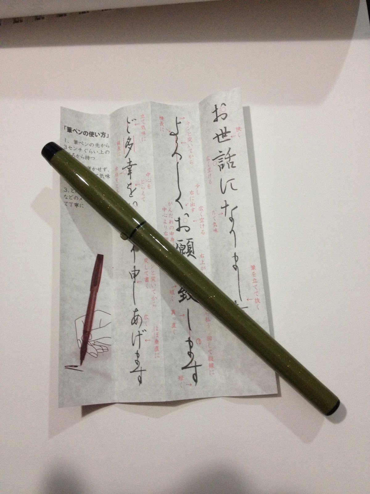
The Pen Itself
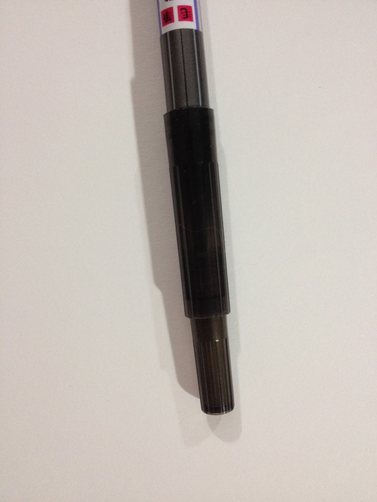
The Sailor Fude Nagomi is simply a lovely, well weighted pen that twirls easily in my fingers. It's a little longer than other fude pens I've used, with beautiful contrasting contouring once the cap is removed. It's designed to be held a certain way, but let's face it, I've never held a pencil, let alone a pen, correctly in my entire life, so all I can do is hope that the contouring doesn't fight my grip. This isn't the fault of the pen, but the fault of the artist, namely, me.


The bristles are nylon, the warbler green elegant, and this definitely feels more like a legitimate calligraphy pen than the other nylon bristled pens I've used in the past. By comparison, those are rough, stocky, utilitarian and a bit ugly, even the Pentel Kirari. This pen is classy, and it encourages me to wax poetic, even on this fairly straight laced art process and art supply review blog. The olive green plastic body is flecked with bits of gold glitter, and there's gold foil writing on the body of the pen. The body itself has a bit of heft, especially when compared to my Pentel Kirari (that has a brand new ink cartridge, by the way), and I can't help how much of that is ink and how much of that is well planned designed. This pen feels less like a disposable fude pen, and more like an actual art tool.

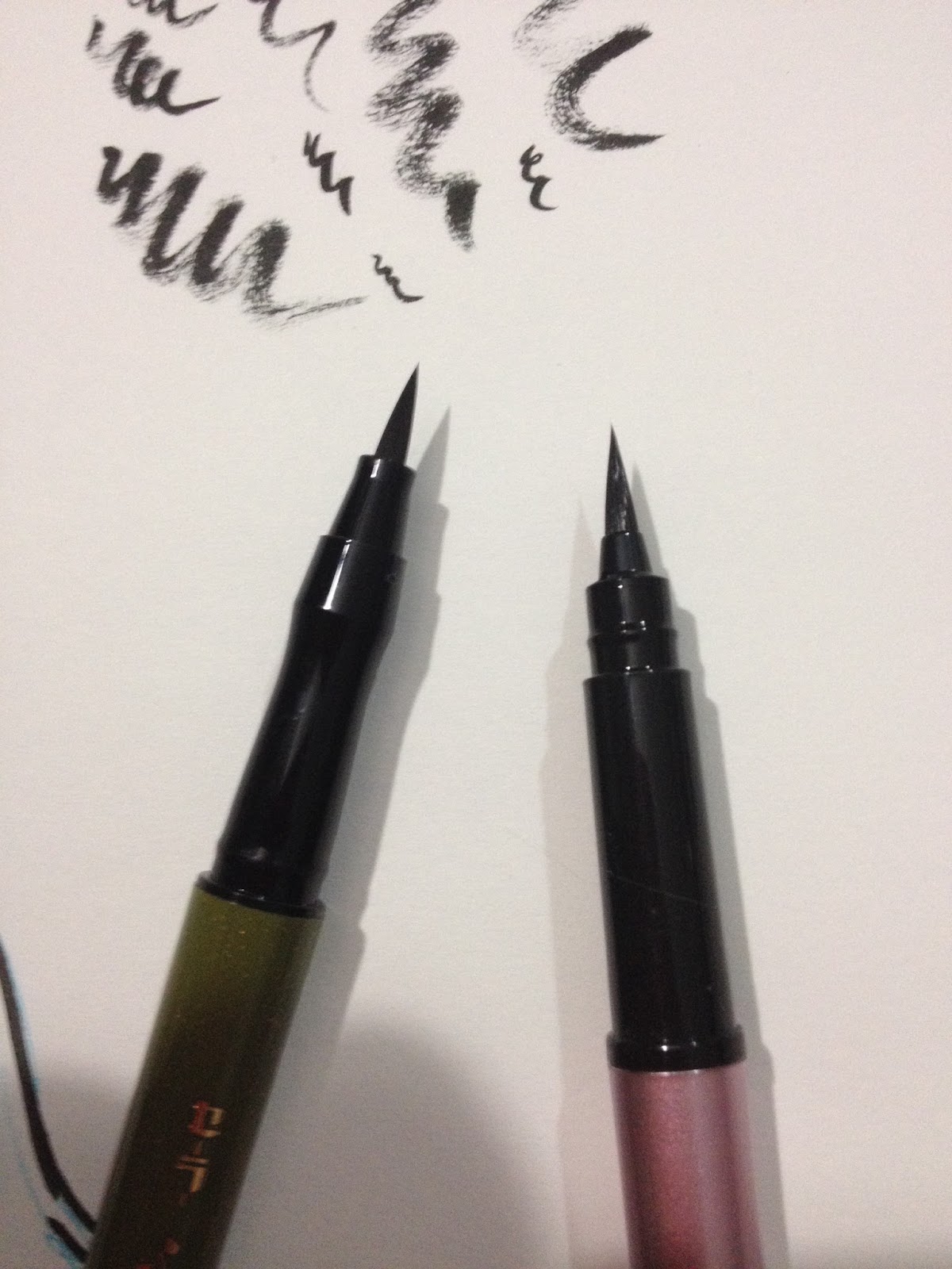
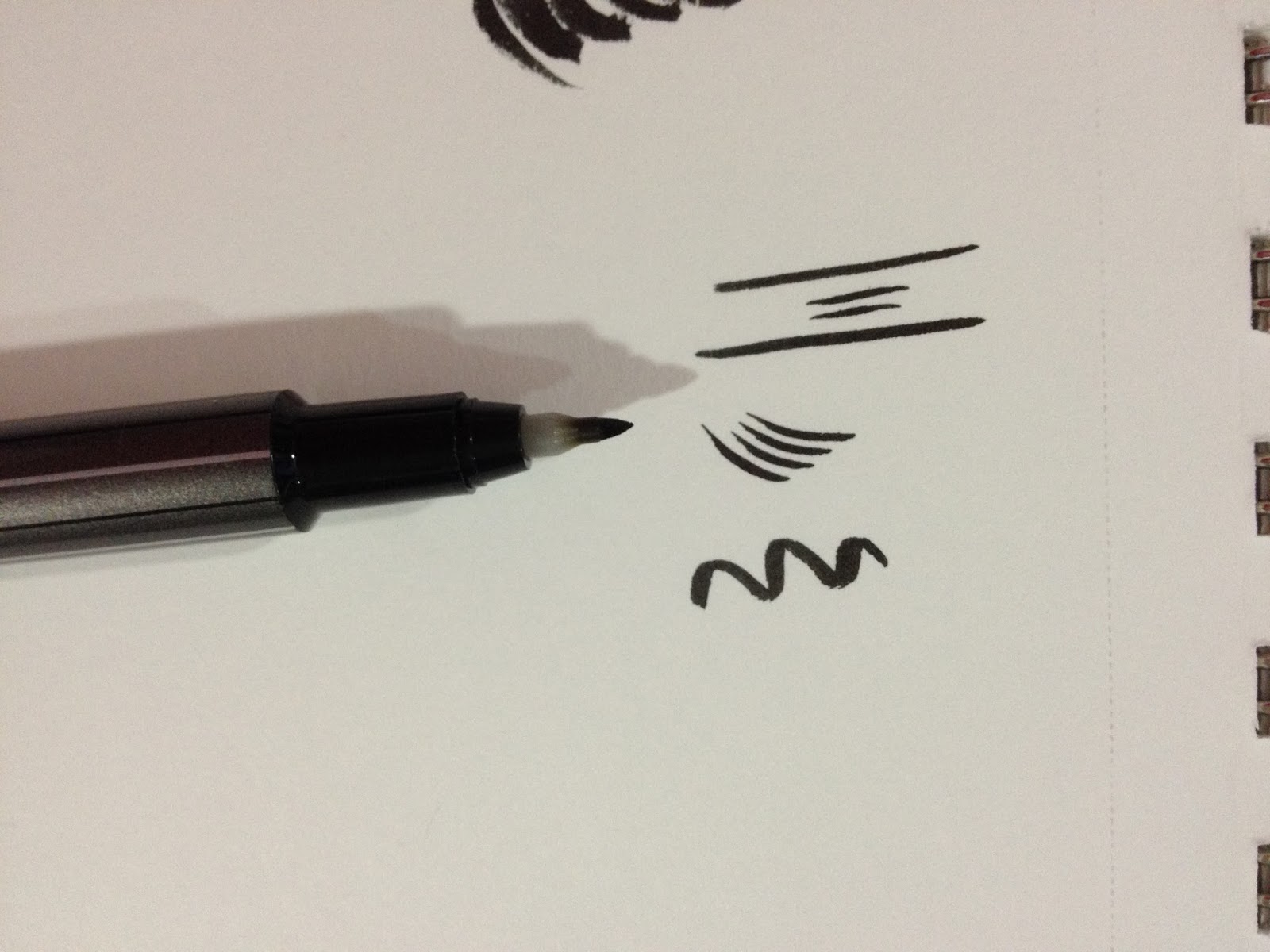
For this initial test, it seemed like the Nagomi Honzukuri Hair Brushpen handled tight curves quite well, but seemed to quickly fuzz out into drybrush for larger turns. I'm personally not a fan of drybrush, but I know many, many artists who really enjoy it, so the Nagomi Honzukuri Hair brushpen might be something you guys want to check out for yourselves. Of course, I didn't want to make any real decisions until the field test.


Of course, since I am testing a brush pen for this review, I had to pull out another brushpen for comparison. I grabbed my Pentel Kirari, which, let's face it, is just a pink Pentel Pocket Brush, which seems to be the traveling artist's standard. In my opinion, the Nagomi Honzukuri Hair brush seems to be much better designed than the Pentel Pocket Brush. The Nagomi balances so well in the hand, especially considering it's a disposable brush pen. The Nagomi is much longer than the Kirari, and compared to the Nagomi, the Kirari is stumpy and awkward. The Nagomi's brush is smaller than the Kirari's and the grip is contoured to better fit in the hand. The Kirari doesn't come with a clip, but it does come with a little knob on the cap, to prevent the pen from rolling when the cap is in place.
The Field Test
Unfortunately, or maybe fortunately for you, the Sailor Fude Nagomi is VERY prone to drybrushing, but even that it does elegantly. It handles controlled, tight spirals with ease, but larger swirls quickly break up into white noise, at least in preliminary tests.
When inking, however, this pen REALLY holds its own. Rather than giving me white noise and dry brush, the pen holds together well, giving me a huge variety of beautiful lines. This pen is seriously a joy to ink with- if you're like me and you DISLIKE the tendency to drybrush that comes from other nylon bristled brush pens, I seriously recommend you give the Nagomi with Honzukuri Hair a shot. It definitely took me by surprise. Just keep in mind that just like with any nylon bristled brushpen, tight corners can cause the pen to flick.
If you ARE looking for that soft drybrush effect, try inking looser and faster with the Nagomi. I tend to ink fairly slowly and tightly, which gave me the controlled lines I wanted.
The Verdict
Even if the inking style isn't my cup of tea (and it is, by the way), I am most definitely interested in seeing more of the Sailor Fude Nagomi line. It seems that all of the pens in this line, regardless of tip type, are equally well designed, and I can't wait to get my hands on more of them. I simply love the Sailor Mitsuo Aida's nibs and ink, and I'm excited to see more fude pen offerings from Sailor. Sailor products can be a bit difficult to find in the US, but Jetpens carries a decent selection of them, and they carry the Fude Nagomi line, so if you're as intrigued by these pens as I am, you should get to ordering!
Please consider donating to this blog or purchasing from Natto-shop (http://nattosoup.com/shop) if you want me to continue publishing quality content. All materials tested were purchased from my own pocket. Keep on Truckin' Nattosoup is not under any sponsorship.
Before we get to the pen and packaging, I should state that this pen was sent to me care of Jetpens for the purposes of review. There were no strings attached, no special requests, just that I review the pens, which I'm plenty happy to do. Whatever I write here is my unbiased opinion, based upon years of art and illustration experience, as well as years of reviewing art supplies for this blog. If you're interested in having me review pens for you or your shop, please email me the details and we can talk shop.
I've had some difficulty finding Sailor (other than fountain pens) products in the US, but Jetpens carries a pretty decent selection of them. I'm already a big fan of their Mitsuo Aida pen, which I've reviewed before, so I was really excited to get my hands on the Nagomi with the Honzukuri Hair.
The Packaging
The packaging reminds me a little of skin care packaging- it's calm, elegant, and a lady is smiling at me from the corner. The package is fairly minimal- a thin, self sealing plastic envelope with a piece of paper inside in addition to the pen.

The package is written entirely in Japanese, but there're a couple things even I can understand- the size of the pen tip (large) and the suggested method for holding the pen.


The instructions, neatly folded within the slim plastic packaging, demonstrate the correct way to hold a brush like this. I'll be ignoring those instructions, calligraphy and inking are not always one and the same, and I don't have the practice necessary to ink the way I want to while correctly holding this pen. I'll have to just hope that this well designed pen works just as well when held improperly as it does when held correctly.
The Pen Itself
The Sailor Fude Nagomi is simply a lovely, well weighted pen that twirls easily in my fingers. It's a little longer than other fude pens I've used, with beautiful contrasting contouring once the cap is removed. It's designed to be held a certain way, but let's face it, I've never held a pencil, let alone a pen, correctly in my entire life, so all I can do is hope that the contouring doesn't fight my grip. This isn't the fault of the pen, but the fault of the artist, namely, me.


The bristles are nylon, the warbler green elegant, and this definitely feels more like a legitimate calligraphy pen than the other nylon bristled pens I've used in the past. By comparison, those are rough, stocky, utilitarian and a bit ugly, even the Pentel Kirari. This pen is classy, and it encourages me to wax poetic, even on this fairly straight laced art process and art supply review blog. The olive green plastic body is flecked with bits of gold glitter, and there's gold foil writing on the body of the pen. The body itself has a bit of heft, especially when compared to my Pentel Kirari (that has a brand new ink cartridge, by the way), and I can't help how much of that is ink and how much of that is well planned designed. This pen feels less like a disposable fude pen, and more like an actual art tool.

For this initial test, it seemed like the Nagomi Honzukuri Hair Brushpen handled tight curves quite well, but seemed to quickly fuzz out into drybrush for larger turns. I'm personally not a fan of drybrush, but I know many, many artists who really enjoy it, so the Nagomi Honzukuri Hair brushpen might be something you guys want to check out for yourselves. Of course, I didn't want to make any real decisions until the field test.

Of course, since I am testing a brush pen for this review, I had to pull out another brushpen for comparison. I grabbed my Pentel Kirari, which, let's face it, is just a pink Pentel Pocket Brush, which seems to be the traveling artist's standard. In my opinion, the Nagomi Honzukuri Hair brush seems to be much better designed than the Pentel Pocket Brush. The Nagomi balances so well in the hand, especially considering it's a disposable brush pen. The Nagomi is much longer than the Kirari, and compared to the Nagomi, the Kirari is stumpy and awkward. The Nagomi's brush is smaller than the Kirari's and the grip is contoured to better fit in the hand. The Kirari doesn't come with a clip, but it does come with a little knob on the cap, to prevent the pen from rolling when the cap is in place.
The Field Test
Unfortunately, or maybe fortunately for you, the Sailor Fude Nagomi is VERY prone to drybrushing, but even that it does elegantly. It handles controlled, tight spirals with ease, but larger swirls quickly break up into white noise, at least in preliminary tests.
When inking, however, this pen REALLY holds its own. Rather than giving me white noise and dry brush, the pen holds together well, giving me a huge variety of beautiful lines. This pen is seriously a joy to ink with- if you're like me and you DISLIKE the tendency to drybrush that comes from other nylon bristled brush pens, I seriously recommend you give the Nagomi with Honzukuri Hair a shot. It definitely took me by surprise. Just keep in mind that just like with any nylon bristled brushpen, tight corners can cause the pen to flick.
If you ARE looking for that soft drybrush effect, try inking looser and faster with the Nagomi. I tend to ink fairly slowly and tightly, which gave me the controlled lines I wanted.
The Verdict
Even if the inking style isn't my cup of tea (and it is, by the way), I am most definitely interested in seeing more of the Sailor Fude Nagomi line. It seems that all of the pens in this line, regardless of tip type, are equally well designed, and I can't wait to get my hands on more of them. I simply love the Sailor Mitsuo Aida's nibs and ink, and I'm excited to see more fude pen offerings from Sailor. Sailor products can be a bit difficult to find in the US, but Jetpens carries a decent selection of them, and they carry the Fude Nagomi line, so if you're as intrigued by these pens as I am, you should get to ordering!
Please consider donating to this blog or purchasing from Natto-shop (http://nattosoup.com/shop) if you want me to continue publishing quality content. All materials tested were purchased from my own pocket. Keep on Truckin' Nattosoup is not under any sponsorship.
July 5, 2015
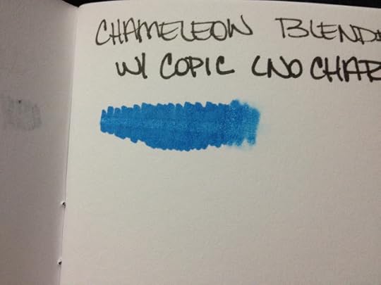
Alcohol Based Marker Review: Chameleon Markers
If you enjoyed this review, please consider donating! Donations go towards the purchase of additional art supplies, which may include more markers for testing. If you found this review useful, please consider sharing it on your social networks-sharing it on your social networks- a larger audience means I can afford to do things like Kickstart future projects and makes me more attractive to possible publishers. There's also a handy pocket edition of ALL my marker reviews in a beautiful little 4"x6" photobook. It's available for $3 in my
Nattoshop
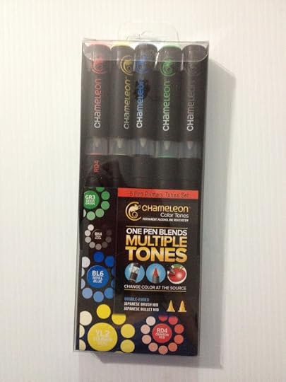
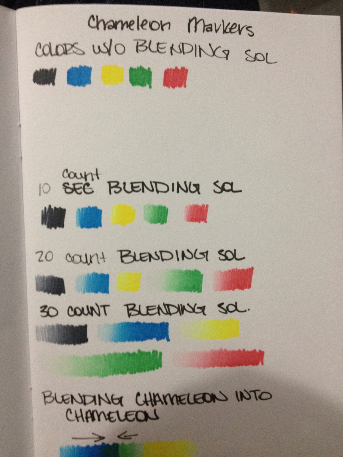
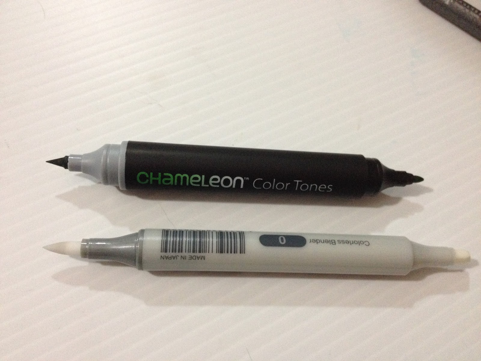
, and proceeds go towards things like keeping the lights on and buying more markers to review. I'd hoped that my days of testing alcohol based markers were mostly over, and that I could progress towards testing and reviewing the myriad of other fantastic art and illustration supplies that are available on the marker. The alcohol based marker reviews had a great run, they're some of my most popular posts, but lets face it, alcohol based markers are expensive to review. Speaking of expensive, this basic pack of Chameleon Markers set me back around $22, and you can get your own from MarkerPop (where I got mine) for $21.59 That's about $4 a marker, which is cheaper than most Copics you'll find, but still more expensive than Prismacolor markers. Marker Pop does offer some colors as open stock at $4.79 a marker. While Chameleon does offer a blender marker, my set didn't come with one. Instead, the gimmick is that every marker has it's own blender marker in the cap, called a 'charging chamber', and you have no access to that nib. If your colorless blender runs out, you can refill it using Chameleon's system, which includes a bottle of colorless blender and a syringe so you can inject it into the charging chamber's nib. This is pretty much how you refill any of the colors in Chameleon's color family- you purchase the individual, full strength ink and syringe set, and inject the color. You can buy the full 22 color set on Marker Pop for $84.99. In theory, it makes sense. You have one 'master color' for each of the color families, and you use the charging chamber to get lighter tones of that color. Unfortunately, getting mixed tones, or applying shade, is where things really get complicated, because you need to rely on charging your color just right. If you're an illustrator, this degree of uncertainty, and need for careful counting, can be frustrating, especially when there are existing marker systems in place that allow you to work with more flexibility. If you're looking to save money, and think Copics are too expensive, there are plenty of great marker alternatives, like Prismacolors or Shin Han Twin Touches. But I'm getting a little ahead of myself! First off, I really recommend you guys check out the Chameleon site, and get a feel for what Chameleon marker pens are all about. There's an informational (and promotional) video, so make sure your speakers are on or your headphones are in. From there, you can access their general menu, which offers a shop, links to tutorials, and more. You can even apply to become one of their artists and push Chameleon pens onto the public, all they want in return are 3 submissions and a year of your life. In return you get the 22 pen set, an $85 value! You guys might want to finish reading this review before you sign yourselves up for this sweet deal though. The Packaging I don't really have high expectations for my marker packaging, since I cobbled together a horizontal storage system from The Container Store drawers. Honestly, the cheaper the packaging, the better, because I'm going to toss it if I like the markers. However, I'm not just reviewing these markers for my own collection, but for yours. And I know many of you are either just starting a collection, or looking to augment a small, existing collection. And I know many of you don't yet have a storage solution for your markers yet, so if your markers come with a nice, sturdy case, that's a big bonus. And if they don't come with a case, they should at least fit into your existing marker storage solution, right? Chameleon markers don't come with a particularly sturdy case, and they definitely wont fit into your existing marker storage system. These markers are freakishly huge, entirely due to the 'charging chamber' that comes attached to each marker.
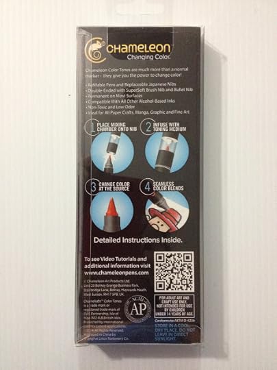
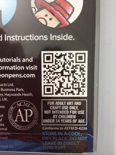
If you have a smartphone with a QR reader, go ahead and check out this code. I assume it just leads to their website, which I've already linked, but maybe there's an easter egg I'm missing.

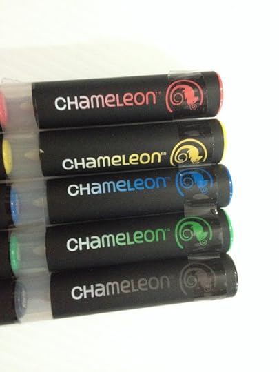
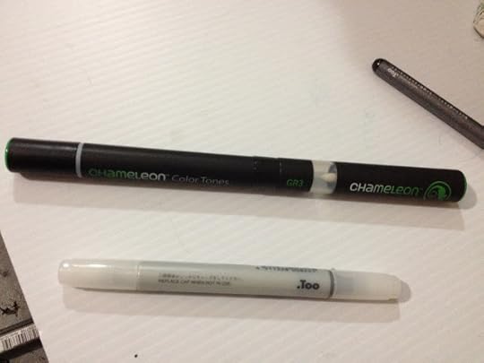
The set I bought comes with 5 markers and two additional Japanese nibs.

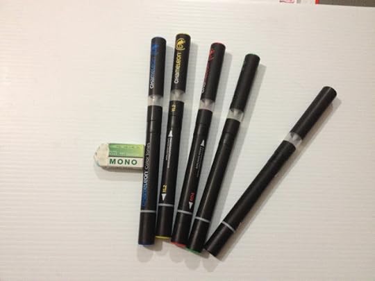
The Mono eraser isn't part of this review, other than as a stop to keep these markers from rolling all over the place. There is nothing on these markers to stop them from rolling all over the place- caps roll, markers roll, charging chamber rolls, and pretty much none of the caps post. You'd better keep a close eye on your markers and their accessories, because they'll just roll outta sight.
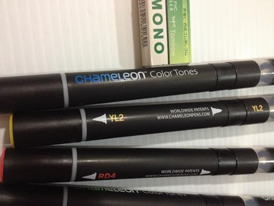
Given how small the Chameleon color family is, I'm not really sure they bothered to give them color family names. In this instance, it's almost as arbitrary as naming them "Fire Engine Red" and "Canary Yellow".
Initial Thoughts
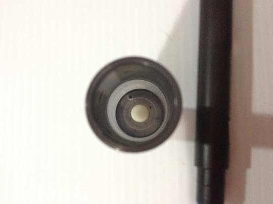
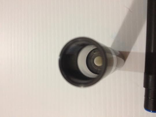
It's a little difficult to photograph the interior of the charging chamber, but it has a nib (not sure what sort of nib, honestly) and a chamber full of colorless blender.
Although the alcohol isn't as strong as say, the Chartpak AdPro markers, Chameleon markers definitely do have an alcohol smell to them. As with any alcohol based marker, you should work in a well ventilated area.
As I was making my swatches, I noticed more and more that the blending chamber is unwieldy, and it would be difficult to work fast if you're juggling all these pieces. Most of us are used to keeping track of two pieces tops- a cap and the pen itself, but Chameleon markers add the blending chamber to the mix. Unfortunately ALL of these pieces are very prone to rolling, so you really have to keep track of everything.
The more I tested these markers, the more I was sure that these markers are probably not intended for illustrators, to be honest.
I did most of my swatching with the bullet nib, so I was pretty eager to get a look at the larger brush nib. The "Japanese brush nib" is different from any other brush nib I've ever seen, save for the Letraset flex markers, which are ALSO from the UK. Maybe this is a UK thing? These brushes aren't 'brush' shaped in the way Copic Super Brush nibs are brush shaped, but are more pyramidal and a bit soft. The Japanese brush nib is pretty small, not much bigger than the bullet nib.
My primary color set doesn't come with a blender, so how are you supposed to blend two totally different tones? I'm also having trouble finding these markers openstock, so if you're looking to only buy the colors you need or use, you may be out of luck. My set also didn't come with the promised instructions, so I had to google around for it. I ended up figuring out how to use these pens by reading Craft Test Dummies post on Chameleon markers, here. It did come with an additional set of Japanese nibs, but no tweezers. If you're just starting out, how are you supposed to have any idea on how to use these things? I feel like these markers would take a LOT of trial and error to get used to using.
Would make more sense to me if you were infusing color into a blank nib, rather than infusing blender solution into a nib full of color.
During Testing
Even for testing purposes, these pens are seriously unweidy- I almost need three hands just to charge the pens for the swatch tests. I can't imagine trying to use these for illustrations of any real size.
Neither cap posts to anything, and these markers are SUPER prone to rolling around, so I can imagine with all the confusion of juggling so many it'd be very easy to lose your cap. The bullet nib cap is really hard to grip and remove one handed.

The bullet nib pretty unremarkable, and there's a cap that separates the bullet nib from the charging chamber. Good luck not losing that one. Also, when the blending chamber is removed, these are some of the smallest markers I own, save for the Tria markers. As you can see, the blending chamber is almost as big as the marker itself.
In order to get a gradient of any significant size, you have to hold the blending chamber on for a really long time. Different colors require different lengths of time to achieve gradients of similar length. Some of the gradients are really streaky.
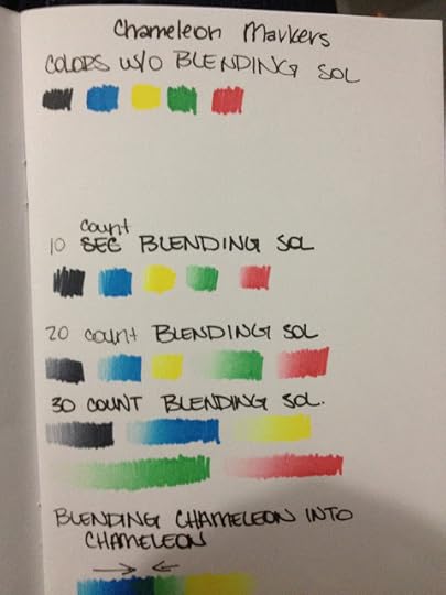
If you're going to buy Chameleon markers, I highly recommend making a blending chart with every color you own, for your future reference.
These markers pretty much function the exact opposite of any other alcohol based marker in terms of execution and color application. Rather than blending out your color, you blend your color in. For many, this may require too much re-thinking of traditional marker techniques
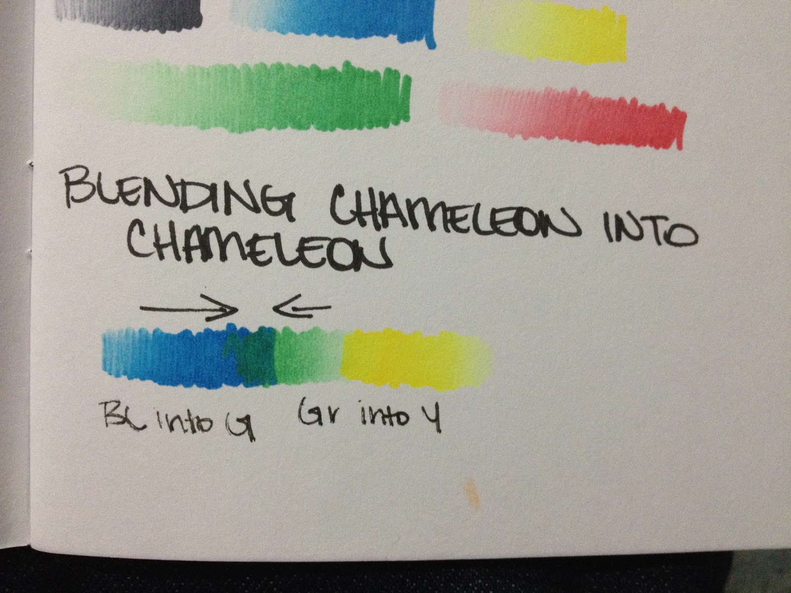
Blending Chameleon into Chameleon

It is pretty hard to blend these markers into one another without the use of a blender marker. By the time you've infused your second marker, your first has already dried on the paper. For these preliminary tests, I'm using cheap Multi Media paper (an Art Alternatives sample sketchbook), so the paper may be too absorbent to really allow for much blending.
Using Copic To Blend
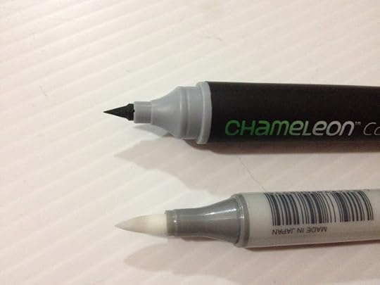
So let's say you've bought a basic 5 color set, the set that doesn't come with a blender. I bet you're wondering if you can use other blenders to blend out your colors. In general, I find Copic's Colorless Blender to almost be a universal solvent (save for Chartpak Ad Pro markers), so I figured it would be a good blender to start with.
It reacts a little, but not much. I guess they're somewhat compatible, but you can't really use Copic markers to extend your limited Chameleon options.
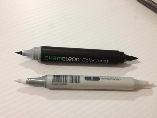
Side By Side Comparison with Copic Ciao
The Breakdown
Chameleon Markers
20 Different Colors
$4.79 open stock at MarkerPop and on the Chameleon Site
2 nibs- Brush pen and Bullet Nib
Refillable
Replaceable nibs
Blender marker is available (it's $4.99 on the Chameleon site)
"Detail pen" available for linework (need to test if this is Multiliner and Micron compatible)
Availability: Available on MarkerPop, through Chameleon
Blendable
Japanese brush nib
Rolls all over the place
Color coded cap
Color Family and Name on Cap
Available somewhat individually, as well as in 5 and 20 color sets
Copic Sketch
Refillable
Replacable Nibs
Comfortable in hand
358 available number of colors
Blend-able
Color Name and Family on Cap
Color Coded cap
Super Brush
Can mix own colors, blank markers available
Availability: limited availability at Michaels, many art supply stores, Dick Blick, Jerry's Artarama, Jetpens, Amazon
Available in individual and color themed sets
Alcohol based
React to rubbing alcohol and 'blender' fluid
Can be blended
The Verdict:
If you really REALLY care about smooth gradients in a single color, and have a lot of time to spend holding the infusion chamber onto a marker and then hurriedly applying your color to the paper before the ink bleeds back into the nib, these are the markers you've been waiting for! I thought that by purchasing a set of the primaries, I'd at least have enough colors for a decent test, but without a blender included, that doesn't seem to be the case.
I think the concept is an interesting departure from the traditional alcohol based marker+blender system, but I don't think it's a successful departure, and I don't think including what is essentially a mini colorless blender with every single marker is the way to go. If you're looking to make your alcohol based marker collection REALLY stretch, and want to avoid buying the same color in every shade and tone, introducing wax or plastic paper palettes into your arsenal isn't a bad way to make one color stretch into many tones. If you REALLY wanted, you could even emulate these markers with your existing set by simply holding your blender marker on top of the color you want to make a gradient with. This method may ruin your blender nibs with darker colors, but you'll achieve the same effect that the Chameleon markers achieve.
Honestly, I'm just really not impressed with these markers, and I don't think they're a good fit for most illustrators who want to be able to render realistically. I think there are better, cheaper alternatives out there that are certainly more accessible. Let's face it, nobody is going to invest in a whole new pen system just for 'seamless blends' of a single color. That's a huge reduction in how color theory applies, and it's a little insulting to think that this is 'good enough' for illustrators.
If you're still interested in these markers, I can point you to a few other resources to check out
There are plenty of interesting tutorials on the Chameleon site, but I've yet to find one that explains how to use the markers if you're just getting started. I assume these tutorials work for any alcohol based markers. If you're more into video tutorials, there're quite a few online. There's this video from Craft Test Dummies for Chameleon markers, and this product review by Sandy Allnock.
Please consider donating to this blog or purchasing from Natto-shop (http://nattosoup.com/shop) if you want me to continue publishing quality content. All materials tested were purchased from my own pocket. Keep on Truckin' Nattosoup is not under any sponsorship.


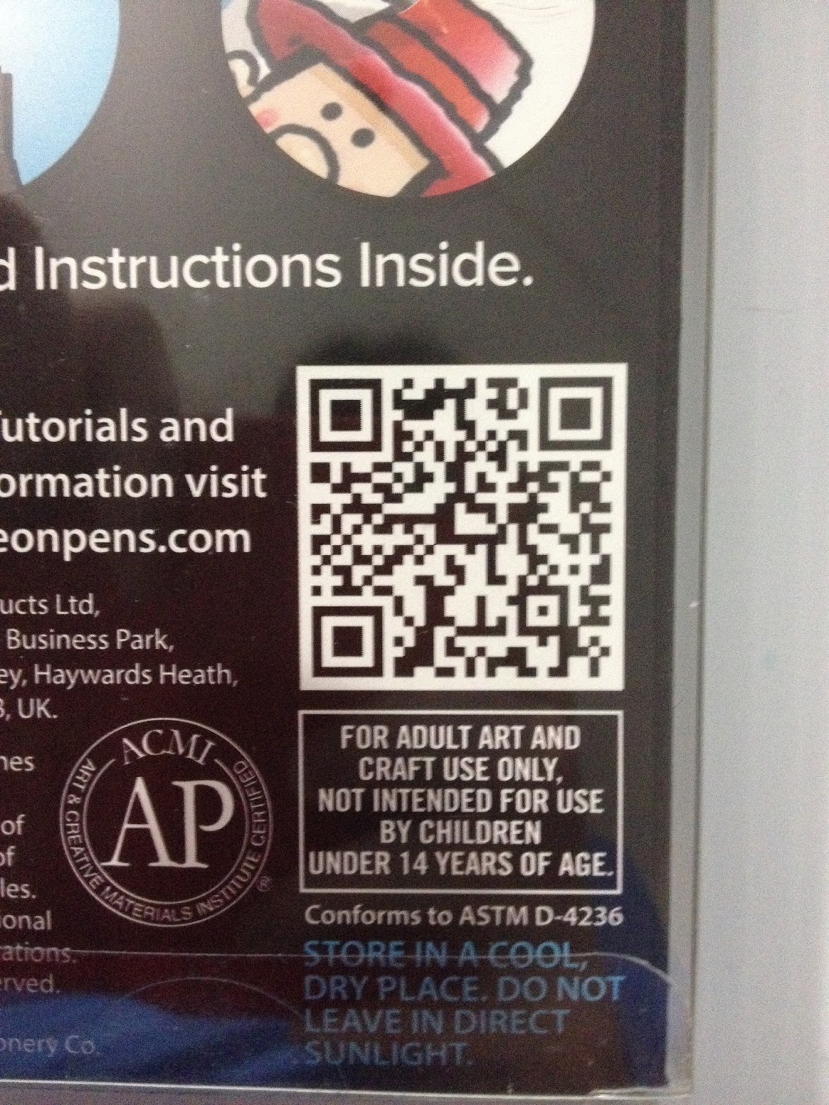
If you have a smartphone with a QR reader, go ahead and check out this code. I assume it just leads to their website, which I've already linked, but maybe there's an easter egg I'm missing.
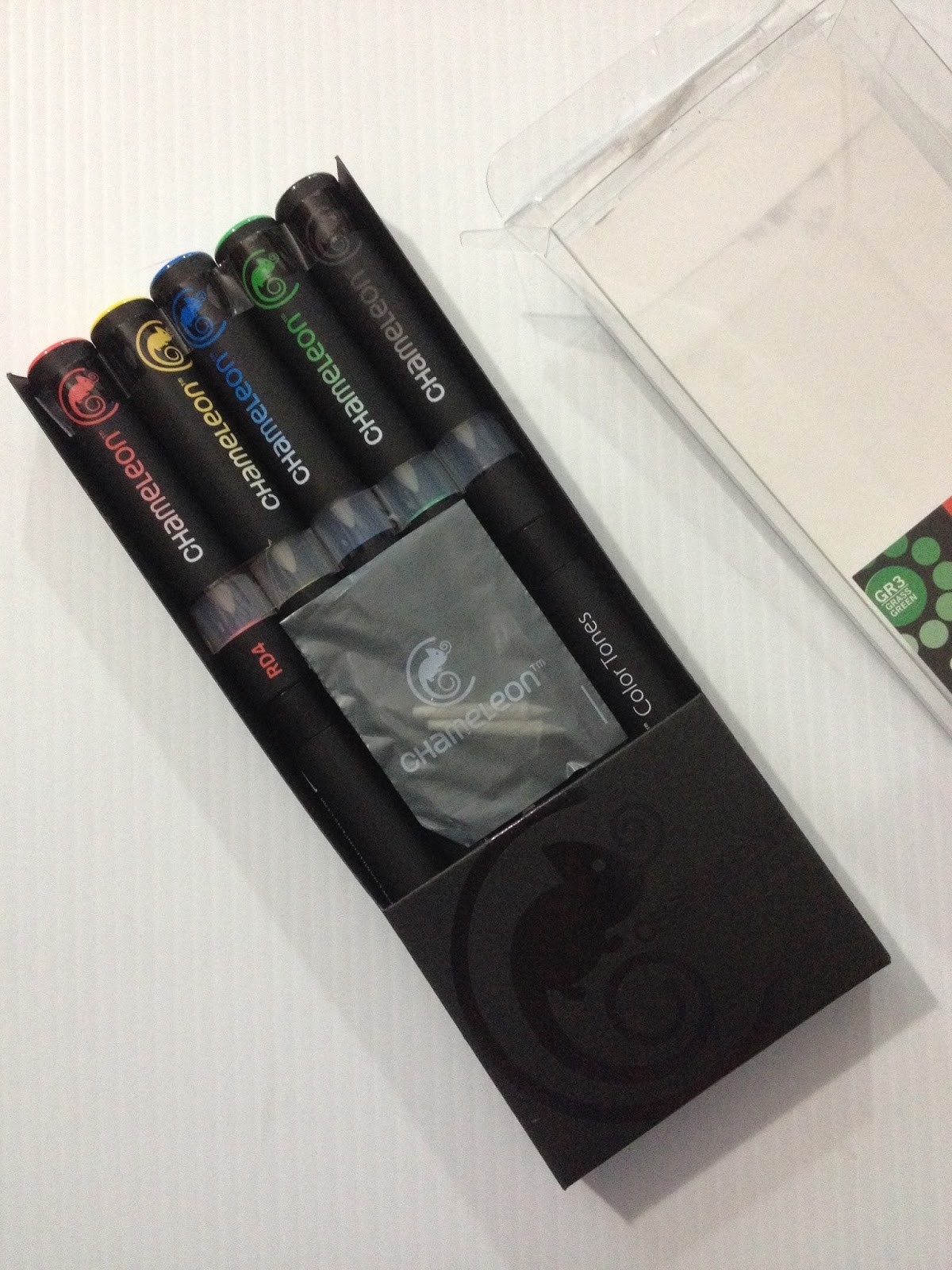
The set I bought comes with 5 markers and two additional Japanese nibs.
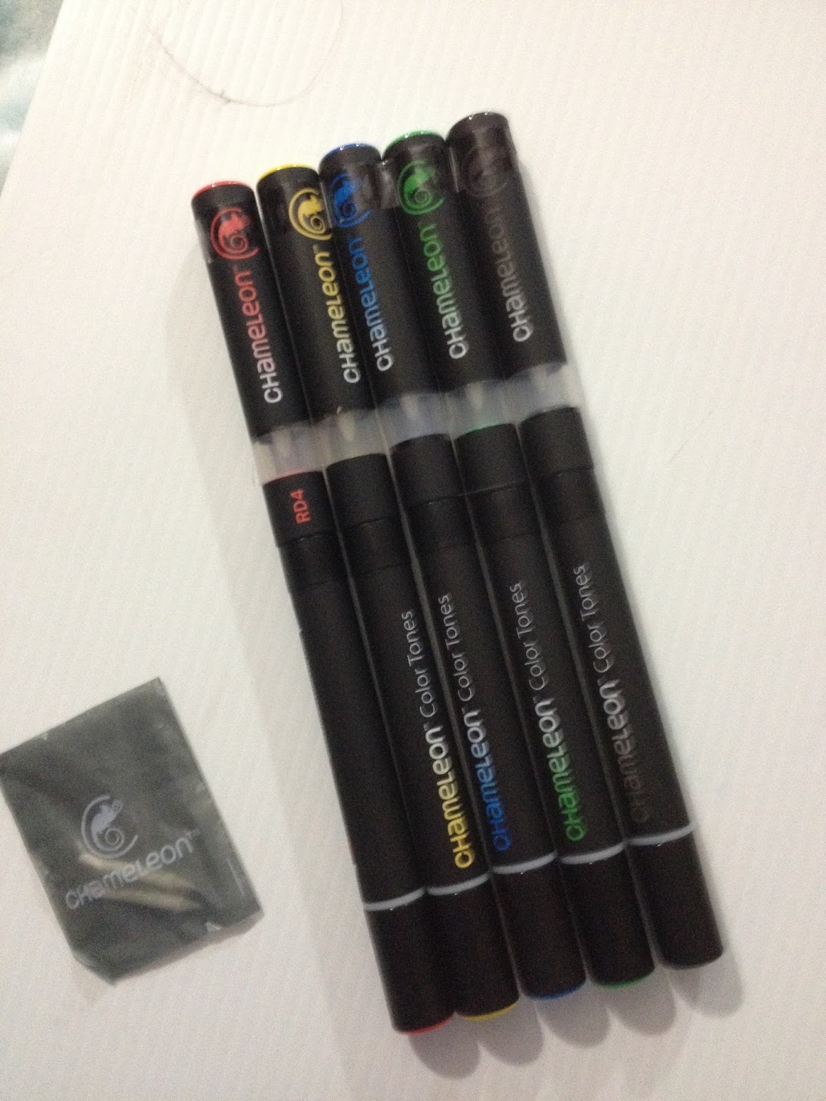


The Mono eraser isn't part of this review, other than as a stop to keep these markers from rolling all over the place. There is nothing on these markers to stop them from rolling all over the place- caps roll, markers roll, charging chamber rolls, and pretty much none of the caps post. You'd better keep a close eye on your markers and their accessories, because they'll just roll outta sight.

Given how small the Chameleon color family is, I'm not really sure they bothered to give them color family names. In this instance, it's almost as arbitrary as naming them "Fire Engine Red" and "Canary Yellow".
Initial Thoughts
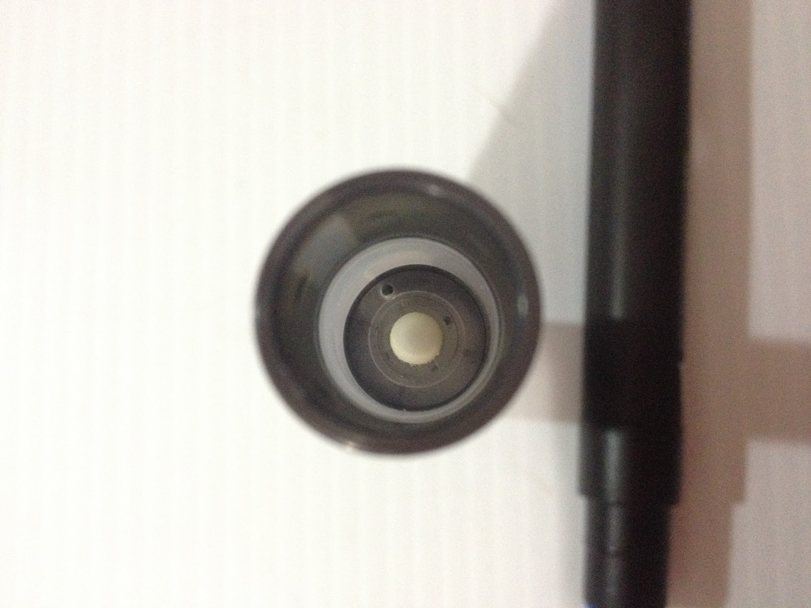


It's a little difficult to photograph the interior of the charging chamber, but it has a nib (not sure what sort of nib, honestly) and a chamber full of colorless blender.
Although the alcohol isn't as strong as say, the Chartpak AdPro markers, Chameleon markers definitely do have an alcohol smell to them. As with any alcohol based marker, you should work in a well ventilated area.
As I was making my swatches, I noticed more and more that the blending chamber is unwieldy, and it would be difficult to work fast if you're juggling all these pieces. Most of us are used to keeping track of two pieces tops- a cap and the pen itself, but Chameleon markers add the blending chamber to the mix. Unfortunately ALL of these pieces are very prone to rolling, so you really have to keep track of everything.
The more I tested these markers, the more I was sure that these markers are probably not intended for illustrators, to be honest.

I did most of my swatching with the bullet nib, so I was pretty eager to get a look at the larger brush nib. The "Japanese brush nib" is different from any other brush nib I've ever seen, save for the Letraset flex markers, which are ALSO from the UK. Maybe this is a UK thing? These brushes aren't 'brush' shaped in the way Copic Super Brush nibs are brush shaped, but are more pyramidal and a bit soft. The Japanese brush nib is pretty small, not much bigger than the bullet nib.
My primary color set doesn't come with a blender, so how are you supposed to blend two totally different tones? I'm also having trouble finding these markers openstock, so if you're looking to only buy the colors you need or use, you may be out of luck. My set also didn't come with the promised instructions, so I had to google around for it. I ended up figuring out how to use these pens by reading Craft Test Dummies post on Chameleon markers, here. It did come with an additional set of Japanese nibs, but no tweezers. If you're just starting out, how are you supposed to have any idea on how to use these things? I feel like these markers would take a LOT of trial and error to get used to using.
Would make more sense to me if you were infusing color into a blank nib, rather than infusing blender solution into a nib full of color.
During Testing
Even for testing purposes, these pens are seriously unweidy- I almost need three hands just to charge the pens for the swatch tests. I can't imagine trying to use these for illustrations of any real size.
Neither cap posts to anything, and these markers are SUPER prone to rolling around, so I can imagine with all the confusion of juggling so many it'd be very easy to lose your cap. The bullet nib cap is really hard to grip and remove one handed.


The bullet nib pretty unremarkable, and there's a cap that separates the bullet nib from the charging chamber. Good luck not losing that one. Also, when the blending chamber is removed, these are some of the smallest markers I own, save for the Tria markers. As you can see, the blending chamber is almost as big as the marker itself.
In order to get a gradient of any significant size, you have to hold the blending chamber on for a really long time. Different colors require different lengths of time to achieve gradients of similar length. Some of the gradients are really streaky.
If you're going to buy Chameleon markers, I highly recommend making a blending chart with every color you own, for your future reference.
These markers pretty much function the exact opposite of any other alcohol based marker in terms of execution and color application. Rather than blending out your color, you blend your color in. For many, this may require too much re-thinking of traditional marker techniques
Blending Chameleon into Chameleon
It is pretty hard to blend these markers into one another without the use of a blender marker. By the time you've infused your second marker, your first has already dried on the paper. For these preliminary tests, I'm using cheap Multi Media paper (an Art Alternatives sample sketchbook), so the paper may be too absorbent to really allow for much blending.
Using Copic To Blend
So let's say you've bought a basic 5 color set, the set that doesn't come with a blender. I bet you're wondering if you can use other blenders to blend out your colors. In general, I find Copic's Colorless Blender to almost be a universal solvent (save for Chartpak Ad Pro markers), so I figured it would be a good blender to start with.

It reacts a little, but not much. I guess they're somewhat compatible, but you can't really use Copic markers to extend your limited Chameleon options.
Side By Side Comparison with Copic Ciao


The Breakdown
Chameleon Markers
20 Different Colors
$4.79 open stock at MarkerPop and on the Chameleon Site
2 nibs- Brush pen and Bullet Nib
Refillable
Replaceable nibs
Blender marker is available (it's $4.99 on the Chameleon site)
"Detail pen" available for linework (need to test if this is Multiliner and Micron compatible)
Availability: Available on MarkerPop, through Chameleon
Blendable
Japanese brush nib
Rolls all over the place
Color coded cap
Color Family and Name on Cap
Available somewhat individually, as well as in 5 and 20 color sets
Copic Sketch
Refillable
Replacable Nibs
Comfortable in hand
358 available number of colors
Blend-able
Color Name and Family on Cap
Color Coded cap
Super Brush
Can mix own colors, blank markers available
Availability: limited availability at Michaels, many art supply stores, Dick Blick, Jerry's Artarama, Jetpens, Amazon
Available in individual and color themed sets
Alcohol based
React to rubbing alcohol and 'blender' fluid
Can be blended
The Verdict:
If you really REALLY care about smooth gradients in a single color, and have a lot of time to spend holding the infusion chamber onto a marker and then hurriedly applying your color to the paper before the ink bleeds back into the nib, these are the markers you've been waiting for! I thought that by purchasing a set of the primaries, I'd at least have enough colors for a decent test, but without a blender included, that doesn't seem to be the case.
I think the concept is an interesting departure from the traditional alcohol based marker+blender system, but I don't think it's a successful departure, and I don't think including what is essentially a mini colorless blender with every single marker is the way to go. If you're looking to make your alcohol based marker collection REALLY stretch, and want to avoid buying the same color in every shade and tone, introducing wax or plastic paper palettes into your arsenal isn't a bad way to make one color stretch into many tones. If you REALLY wanted, you could even emulate these markers with your existing set by simply holding your blender marker on top of the color you want to make a gradient with. This method may ruin your blender nibs with darker colors, but you'll achieve the same effect that the Chameleon markers achieve.
Honestly, I'm just really not impressed with these markers, and I don't think they're a good fit for most illustrators who want to be able to render realistically. I think there are better, cheaper alternatives out there that are certainly more accessible. Let's face it, nobody is going to invest in a whole new pen system just for 'seamless blends' of a single color. That's a huge reduction in how color theory applies, and it's a little insulting to think that this is 'good enough' for illustrators.
If you're still interested in these markers, I can point you to a few other resources to check out
There are plenty of interesting tutorials on the Chameleon site, but I've yet to find one that explains how to use the markers if you're just getting started. I assume these tutorials work for any alcohol based markers. If you're more into video tutorials, there're quite a few online. There's this video from Craft Test Dummies for Chameleon markers, and this product review by Sandy Allnock.
Please consider donating to this blog or purchasing from Natto-shop (http://nattosoup.com/shop) if you want me to continue publishing quality content. All materials tested were purchased from my own pocket. Keep on Truckin' Nattosoup is not under any sponsorship.
July 2, 2015
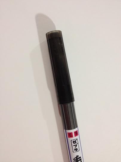
Brushpen Review: Zebra Double-Sided Brush Pen FD-502 - Hair / Hard - Fine
I don't really review many pens from Zebra. A quick search of this blog didn't even bring up any review results. So I guess this means that this is my first Zebra review.
So to break this streak of not reviewing Zebra products, today I'll be reviewing the Zebra Double Sided Brush Pen FD-502, which I purchased from Jetpens not too terribly long ago. I purchased it with a large number of other fude and brush pens, with the intention of reviewing the lot. I think I've done a pretty good job ploughing through the list so far.
The Zebra Double Sided Brush Pen in FD-502 features a nylon individual haired large brush, and a small hard fude style brush. This is fairly unusual, as most double sided brush pens feature two felt nibs of different sizes, rather than a nylon brush end.
This pen actually has a twin that features a large soft felt brush, and a small soft felt fude. Both of these pens are fairly expensive compared to other fude or brush pens, even dual tips, clocking in at a whopping $8.25.
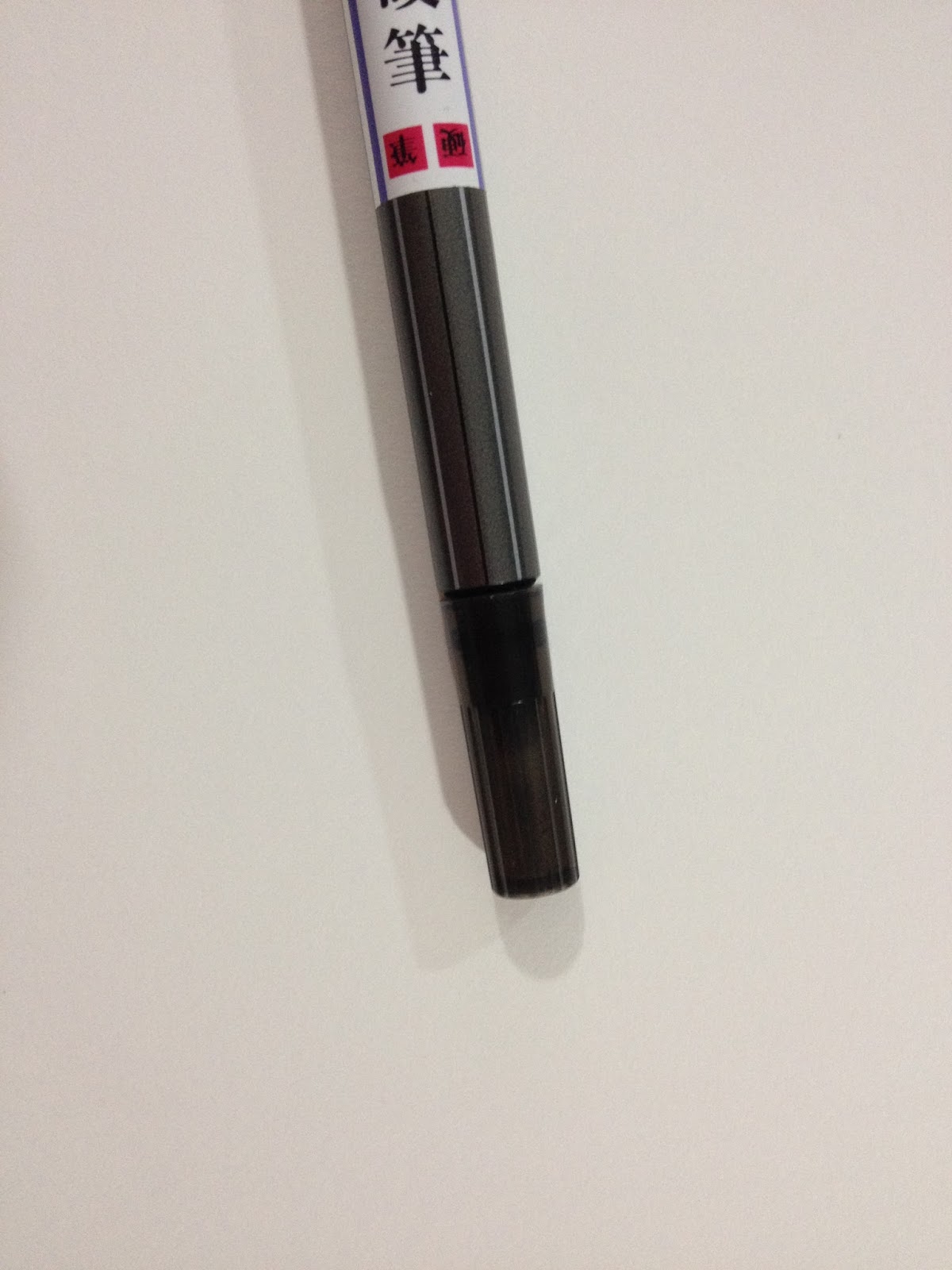
The Pen
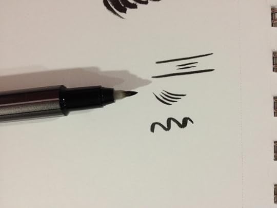
My pen arrived unpackaged, with a label sticker on the gray plastic body. The larger cap is for the nylon brush tip, the smaller cap is for the fude pen tip.

 The nylon brush tip is fairly unremarkable, and looks similar to other nylon bristled brush pens I've owned, like the Pentel Pocket Brush, the Pentel Kirari, or the Akashiya Sai Pigment Outline Brush.

The fude pen end is a little stumpy compared to other fude pens I've reviewed, and has a plastic sheath around the nib.

The caps are capable of posting to one another, with the large cap completely covering the small cap when posted, and the small cap fitting into a hole on the back of the large cap.

Like most nylon bristled brush pens, the Zebra Double Sided Brush Pen FD 502 is prone to drybrushing, even when new.
The Field Test

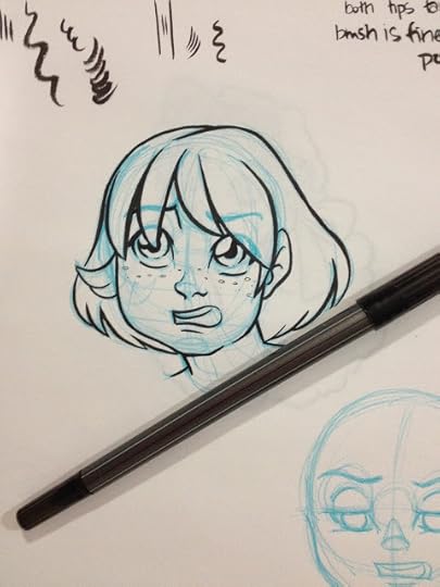
The brush nib and fude nib both handle fairly well. The Brush Pen is smaller than the brush on the Pentel Pocket Brush, so if you found that brush pen to be too large for your taste, the Zebra Double Sided Brush Pen might be a good solution for you.

I opted to fill in the hair to see how the pen handled large (ish) fills. The ink is fairly dark and rich, but you may have to move slowly to ensure even coverage.
The Verdict
Although this pen performs fairly well, you could almost purchase two pens for the price of this one- a refillable Pentel Pocket brush, and the smaller fude pen of your choice. Or you could purchase a double sided pen that consistently performs well, like the Sailor Mitsuo Aida, which is just $4.45 and waterproof, almost $4.00 less than this non waterproof Zebra pen. For $3.30, you can get the Pilot Futayaku, another twin tipped brushpen that performs quite well, but isn't waterproof.
Of course, even with those alternatives, this pen is rather notable as it's the only one I've encountered that features a nylon brush tip as well as a fude tip. If you like a drybrush effect but also want to draw fine detals, and want both in one pen, this pen is a good pick.
Please consider donating to this blog or purchasing from Natto-shop (http://nattosoup.com/shop) if you want me to continue publishing quality content. All materials tested were purchased from my own pocket. Keep on Truckin' Nattosoup is not under any sponsorship.
So to break this streak of not reviewing Zebra products, today I'll be reviewing the Zebra Double Sided Brush Pen FD-502, which I purchased from Jetpens not too terribly long ago. I purchased it with a large number of other fude and brush pens, with the intention of reviewing the lot. I think I've done a pretty good job ploughing through the list so far.
The Zebra Double Sided Brush Pen in FD-502 features a nylon individual haired large brush, and a small hard fude style brush. This is fairly unusual, as most double sided brush pens feature two felt nibs of different sizes, rather than a nylon brush end.
This pen actually has a twin that features a large soft felt brush, and a small soft felt fude. Both of these pens are fairly expensive compared to other fude or brush pens, even dual tips, clocking in at a whopping $8.25.
The Pen
My pen arrived unpackaged, with a label sticker on the gray plastic body. The larger cap is for the nylon brush tip, the smaller cap is for the fude pen tip.


 The nylon brush tip is fairly unremarkable, and looks similar to other nylon bristled brush pens I've owned, like the Pentel Pocket Brush, the Pentel Kirari, or the Akashiya Sai Pigment Outline Brush.
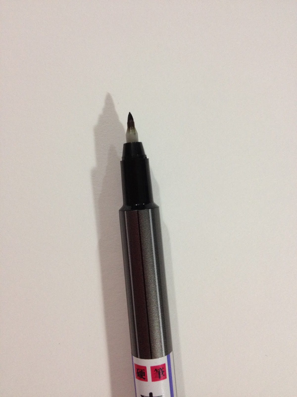
The fude pen end is a little stumpy compared to other fude pens I've reviewed, and has a plastic sheath around the nib.
The caps are capable of posting to one another, with the large cap completely covering the small cap when posted, and the small cap fitting into a hole on the back of the large cap.

Like most nylon bristled brush pens, the Zebra Double Sided Brush Pen FD 502 is prone to drybrushing, even when new.
The Field Test

The brush nib and fude nib both handle fairly well. The Brush Pen is smaller than the brush on the Pentel Pocket Brush, so if you found that brush pen to be too large for your taste, the Zebra Double Sided Brush Pen might be a good solution for you.
I opted to fill in the hair to see how the pen handled large (ish) fills. The ink is fairly dark and rich, but you may have to move slowly to ensure even coverage.
The Verdict
Although this pen performs fairly well, you could almost purchase two pens for the price of this one- a refillable Pentel Pocket brush, and the smaller fude pen of your choice. Or you could purchase a double sided pen that consistently performs well, like the Sailor Mitsuo Aida, which is just $4.45 and waterproof, almost $4.00 less than this non waterproof Zebra pen. For $3.30, you can get the Pilot Futayaku, another twin tipped brushpen that performs quite well, but isn't waterproof.
Of course, even with those alternatives, this pen is rather notable as it's the only one I've encountered that features a nylon brush tip as well as a fude tip. If you like a drybrush effect but also want to draw fine detals, and want both in one pen, this pen is a good pick.
Please consider donating to this blog or purchasing from Natto-shop (http://nattosoup.com/shop) if you want me to continue publishing quality content. All materials tested were purchased from my own pocket. Keep on Truckin' Nattosoup is not under any sponsorship.
July 1, 2015
Welcome ALA Attendees!
I'd like to say hello to anyone who's visiting this blog for the first time today, especially everyone I've met this past weekend while attending ALA in San Francisco! It was wonderful meeting so many educators and librarians who are passionate about kids literature, especially kids comics! I had a blast this weekend, and I'm so happy you took the time to check out my work.
This is the Nattosoup blog, where I write about art supplies, comic and anime conventions I've tabled at, and my artistic process. My hub page, which connects you to all my social media and all my proejcts is beccahillburn.com. If you're looking for something specific on this blog, I recommend you try using the search bar at the top left, as I'm a little behind on updating the Guest Post and Reviews section. If you can't find something you're looking for, feel free to shoot me an email and ask- I may not have gotten a chance to write about it yet. My main topics are reviewing art supplies, reviewing conventions, sharing progress on my major projects, and occasionally talking about the comic industry.
While the content of this blog is mostly all ages, younger readers may find it a bit too technical to be interesting. I also have a series of panels and presentations up on my Youtube channel that you're more than welcome to share and utilize for your library or school. My Youtube channel also includes several interviews with other comic artists, spanning back to 2012, that you're more than welcome to utilize for classroom use. We also have recorded panels presented by artists at TCAF (and recorded with their permission) that specifically focus on utilizing comics in your classroom and setting up your own comic con that I highly recommend. I've also presented a number of panels on topics like comic craft, self publishing, introduction to the artist alley, and basics of both Copic markers and watercolors, all of which have their own playlist that you're welcome to use as you see fit. Attendees ranged from middle school kids to early college, although younger audiences may enjoy the watercolor basics and introduction to comic craft. If you'd like to arrange a free Skype call with your class, please email me and we'll work together to tailor something suitable to their interests.
As a creator, my focus is on creating quality children's comics. My current focus is my comic, 7" Kara, which follows the diminutive 11 year old Kara as she embarks on her first big adventure meeting humans for the first time. Kara has been sheltered her entire life, and that includes being told that humans are a myth, so when her mother finally clues her in, Kara is off like a shot to go meet some humans before her family moves away. Kara meets Pancake, a playful kitten, who introduces her to Naomi, a 14 year old human girl who's recently moved into the neighboring human house. Kara and Naomi quickly become friends, and Naomi introduces Kara to the human world. 7" Kara is a three volume set, with the first volume being available to purchase through my own shop, Amazon, or through Baker and Taylor. Copies ordered through my shop can be customized with a back of the book sketch made out to your library system, and include 5 adorable Kara charms. For Baker and Taylor purchases, my ISBN 13 number is : ISBN13: 9781497369450 If you're still on the fence, you can check out some reviews for 7" Kara Volume 1 on Goodreads and all of chapter 2 has been uploaded as a sample, or you can peruse some of my pages on my Behance, including all of Chapter 1.
7" Kara has been designed to appeal to kids K-6th grade, with the intention of filling a gap in the children's comic market- namely comics that feature well rounded female protagonists. It's a coming of age story for both Naomi and Kara, as Kara learns to think through her hasty decisions, and Naomi realizes that even if her intentions are good, the result is bad when they're forced upon others. This comic was designed to appeal to parents who may be reluctant to introduce their children to comics, but already enjoy sharing children's picture books with their kids, and features lush watercolor illustrations in every panel. For the earliest readers, I recommend Kara be read together with a parent, older sibling, or caregiver, and if you'd like to present this comic to the kids in your library, I can provide you with page by page slides for easy audience viewing upon your request. Through selling 7" Kara at conventions for two years, I've found that Kara also greatly appeals to teenage girls who enjoy reading manga and like watching Studio Ghibli movies, and it may be perfect if your library or school runs a partnership program that matches teens to kids for paired reading.
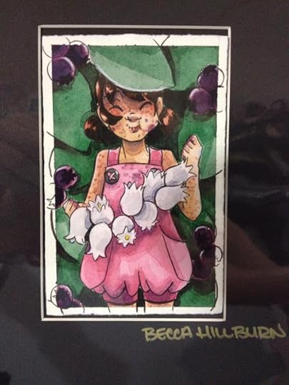
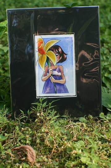
While at ALA, I ran a promotion- if you purchased 5 copies of 7" Kara Volume 1 for your school library system, you got to pick a free matted mini watercolor to take home with you! I decided to extend that promotion, as many, MANY children's librarians informed me that they did all their acquisitions through Baker and Taylor. If your system purchases 5 copies of 7" Kara through my website OR through Baker and Taylor, I'll mail you your choice of the matted mini watercolor below, all you have to do is forward your purchase confirmation to me. At that time, please include a mailing address, as well as which mini watercolor you'd like me to send. Each watercolor is slightly under 4"x6", and the matted piece is 8"x10", suitable for most standard sized frames. These watercolors are already bagged in archival bags, and are ready to be framed once removed from the bag itself.
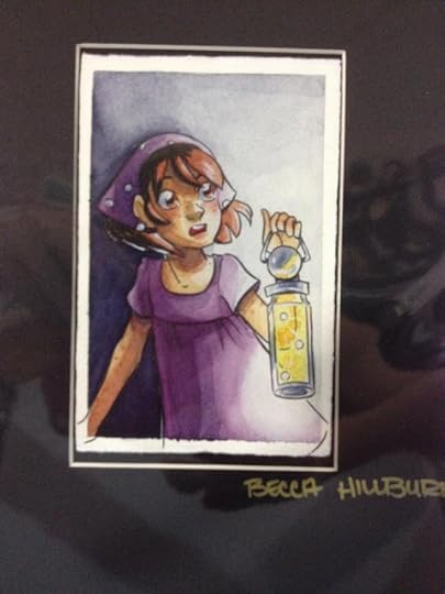 Kara with a firefly latern
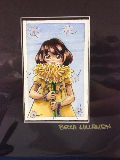 Kara holding a dandelion
 Kara eating blueberries
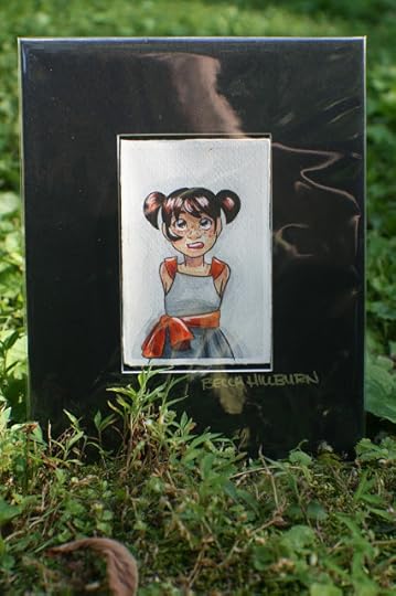
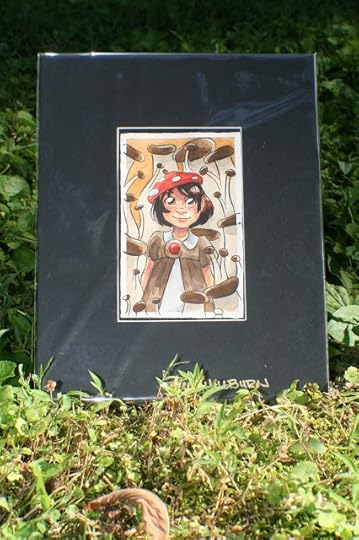 Kara with mushrooms
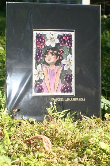 Kara with blackberries
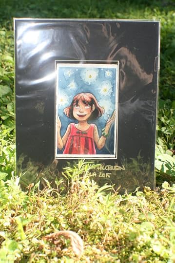 Kara enjoying the fireflies
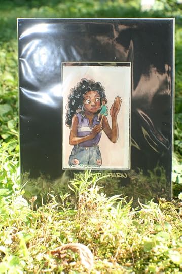 Naomi and Kara Chatting
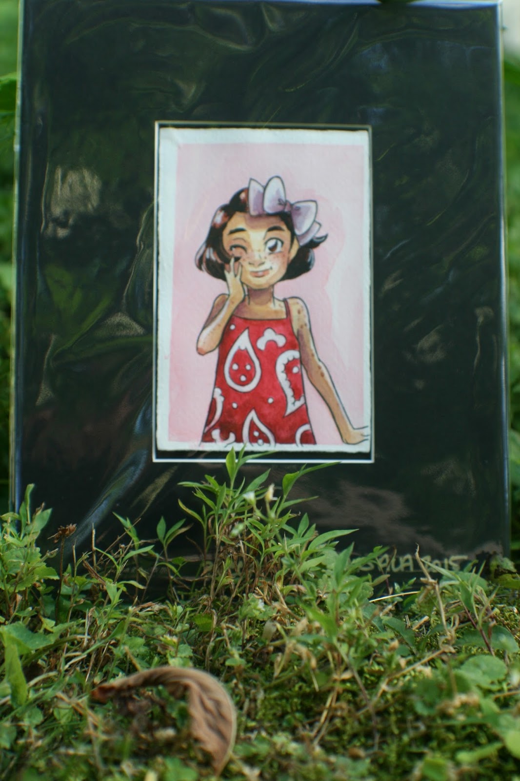
 Kara with a silver metallic base
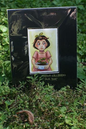 Kara holding a bottle cap potted sprout
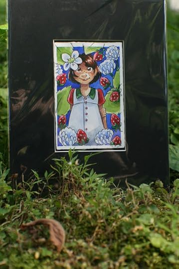 Kara with wild strawberries and clover
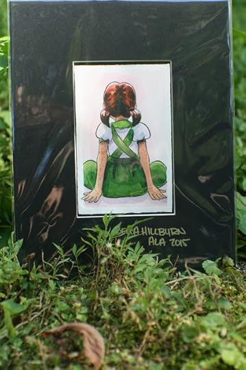 Back of Kara
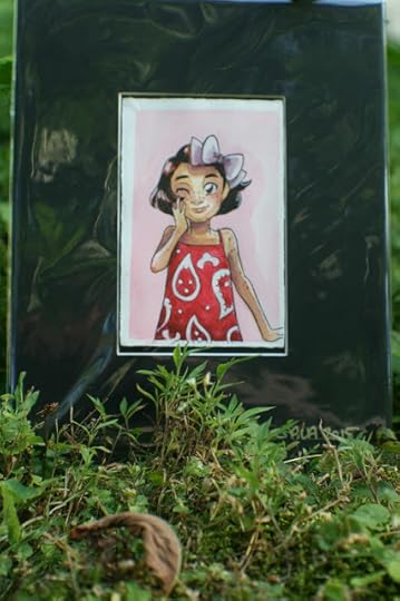 Kara wearing paisley
 Kara holding a daffodilI'm going to be putting together a newsletter in the upcoming months, and I'll announce signups here, but if you'd also like to be notified when that's ready, send me an email and I'll let you know! I plan on including lots of neat little tidbits that don't make it into my blog, including artistic process insights, my favorite tools, and even short comic reviews.
It was lovely to meet all of you this weekend, and I hope you find this blog to be a useful resource for your kids, and my comic to be an enjoyable read!
Please consider donating to this blog or purchasing from Natto-shop (http://nattosoup.com/shop) if you want me to continue publishing quality content. All materials tested were purchased from my own pocket. Keep on Truckin' Nattosoup is not under any sponsorship.
This is the Nattosoup blog, where I write about art supplies, comic and anime conventions I've tabled at, and my artistic process. My hub page, which connects you to all my social media and all my proejcts is beccahillburn.com. If you're looking for something specific on this blog, I recommend you try using the search bar at the top left, as I'm a little behind on updating the Guest Post and Reviews section. If you can't find something you're looking for, feel free to shoot me an email and ask- I may not have gotten a chance to write about it yet. My main topics are reviewing art supplies, reviewing conventions, sharing progress on my major projects, and occasionally talking about the comic industry.
While the content of this blog is mostly all ages, younger readers may find it a bit too technical to be interesting. I also have a series of panels and presentations up on my Youtube channel that you're more than welcome to share and utilize for your library or school. My Youtube channel also includes several interviews with other comic artists, spanning back to 2012, that you're more than welcome to utilize for classroom use. We also have recorded panels presented by artists at TCAF (and recorded with their permission) that specifically focus on utilizing comics in your classroom and setting up your own comic con that I highly recommend. I've also presented a number of panels on topics like comic craft, self publishing, introduction to the artist alley, and basics of both Copic markers and watercolors, all of which have their own playlist that you're welcome to use as you see fit. Attendees ranged from middle school kids to early college, although younger audiences may enjoy the watercolor basics and introduction to comic craft. If you'd like to arrange a free Skype call with your class, please email me and we'll work together to tailor something suitable to their interests.
As a creator, my focus is on creating quality children's comics. My current focus is my comic, 7" Kara, which follows the diminutive 11 year old Kara as she embarks on her first big adventure meeting humans for the first time. Kara has been sheltered her entire life, and that includes being told that humans are a myth, so when her mother finally clues her in, Kara is off like a shot to go meet some humans before her family moves away. Kara meets Pancake, a playful kitten, who introduces her to Naomi, a 14 year old human girl who's recently moved into the neighboring human house. Kara and Naomi quickly become friends, and Naomi introduces Kara to the human world. 7" Kara is a three volume set, with the first volume being available to purchase through my own shop, Amazon, or through Baker and Taylor. Copies ordered through my shop can be customized with a back of the book sketch made out to your library system, and include 5 adorable Kara charms. For Baker and Taylor purchases, my ISBN 13 number is : ISBN13: 9781497369450 If you're still on the fence, you can check out some reviews for 7" Kara Volume 1 on Goodreads and all of chapter 2 has been uploaded as a sample, or you can peruse some of my pages on my Behance, including all of Chapter 1.
7" Kara has been designed to appeal to kids K-6th grade, with the intention of filling a gap in the children's comic market- namely comics that feature well rounded female protagonists. It's a coming of age story for both Naomi and Kara, as Kara learns to think through her hasty decisions, and Naomi realizes that even if her intentions are good, the result is bad when they're forced upon others. This comic was designed to appeal to parents who may be reluctant to introduce their children to comics, but already enjoy sharing children's picture books with their kids, and features lush watercolor illustrations in every panel. For the earliest readers, I recommend Kara be read together with a parent, older sibling, or caregiver, and if you'd like to present this comic to the kids in your library, I can provide you with page by page slides for easy audience viewing upon your request. Through selling 7" Kara at conventions for two years, I've found that Kara also greatly appeals to teenage girls who enjoy reading manga and like watching Studio Ghibli movies, and it may be perfect if your library or school runs a partnership program that matches teens to kids for paired reading.
While at ALA, I ran a promotion- if you purchased 5 copies of 7" Kara Volume 1 for your school library system, you got to pick a free matted mini watercolor to take home with you! I decided to extend that promotion, as many, MANY children's librarians informed me that they did all their acquisitions through Baker and Taylor. If your system purchases 5 copies of 7" Kara through my website OR through Baker and Taylor, I'll mail you your choice of the matted mini watercolor below, all you have to do is forward your purchase confirmation to me. At that time, please include a mailing address, as well as which mini watercolor you'd like me to send. Each watercolor is slightly under 4"x6", and the matted piece is 8"x10", suitable for most standard sized frames. These watercolors are already bagged in archival bags, and are ready to be framed once removed from the bag itself.
 Kara with a firefly latern
 Kara holding a dandelion
 Kara eating blueberries
 Kara with mushrooms
 Kara with blackberries
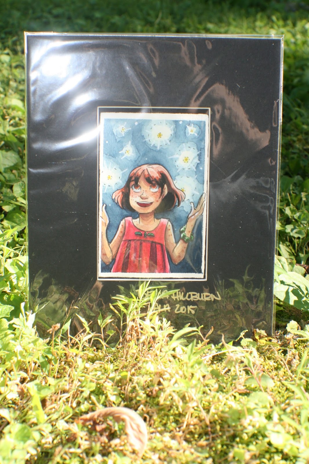 Kara enjoying the fireflies
 Naomi and Kara Chatting
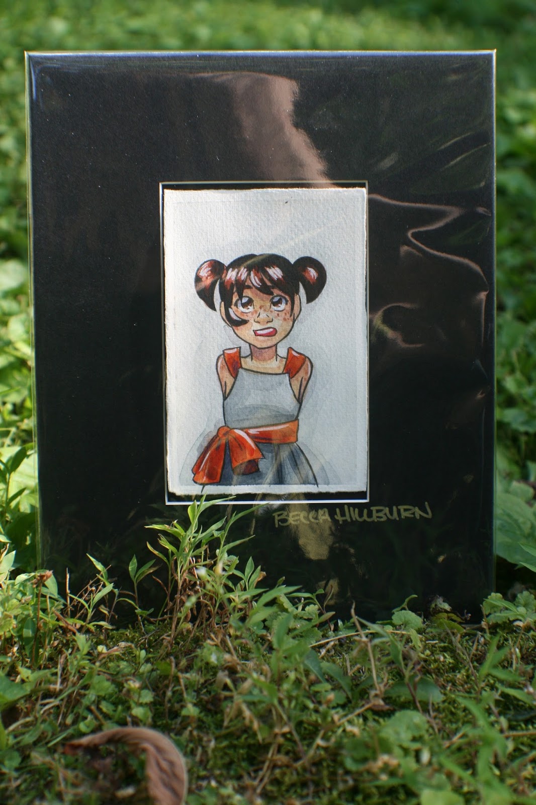 Kara with a silver metallic base
 Kara holding a bottle cap potted sprout
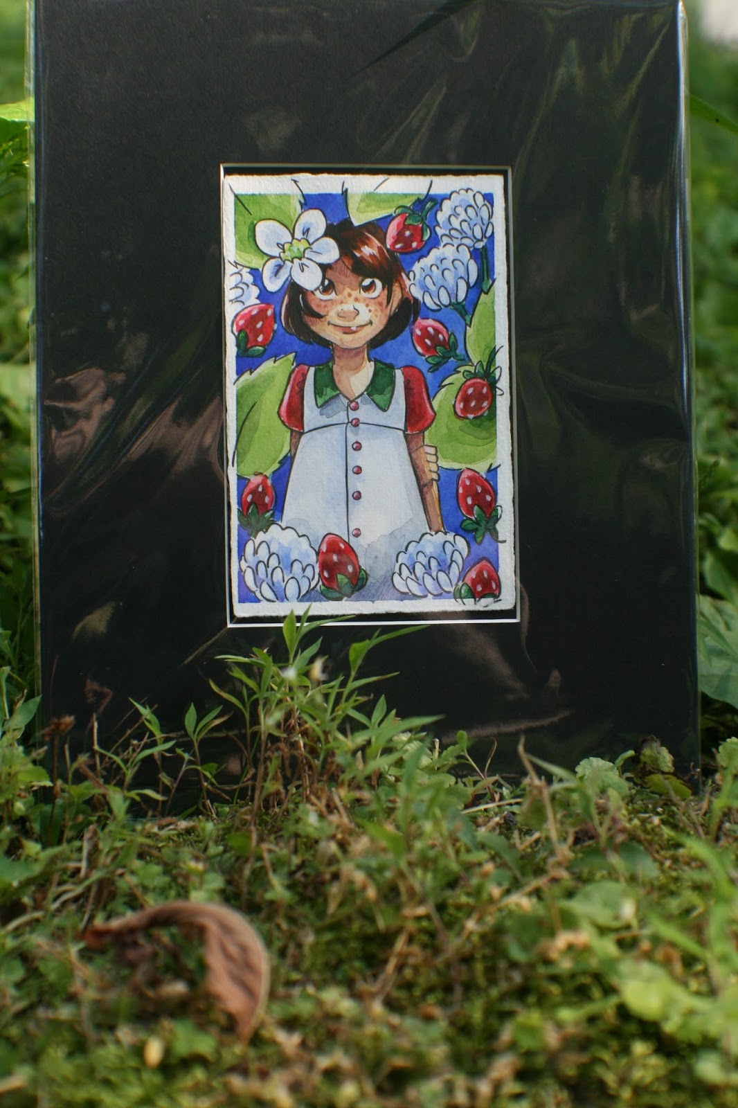 Kara with wild strawberries and clover
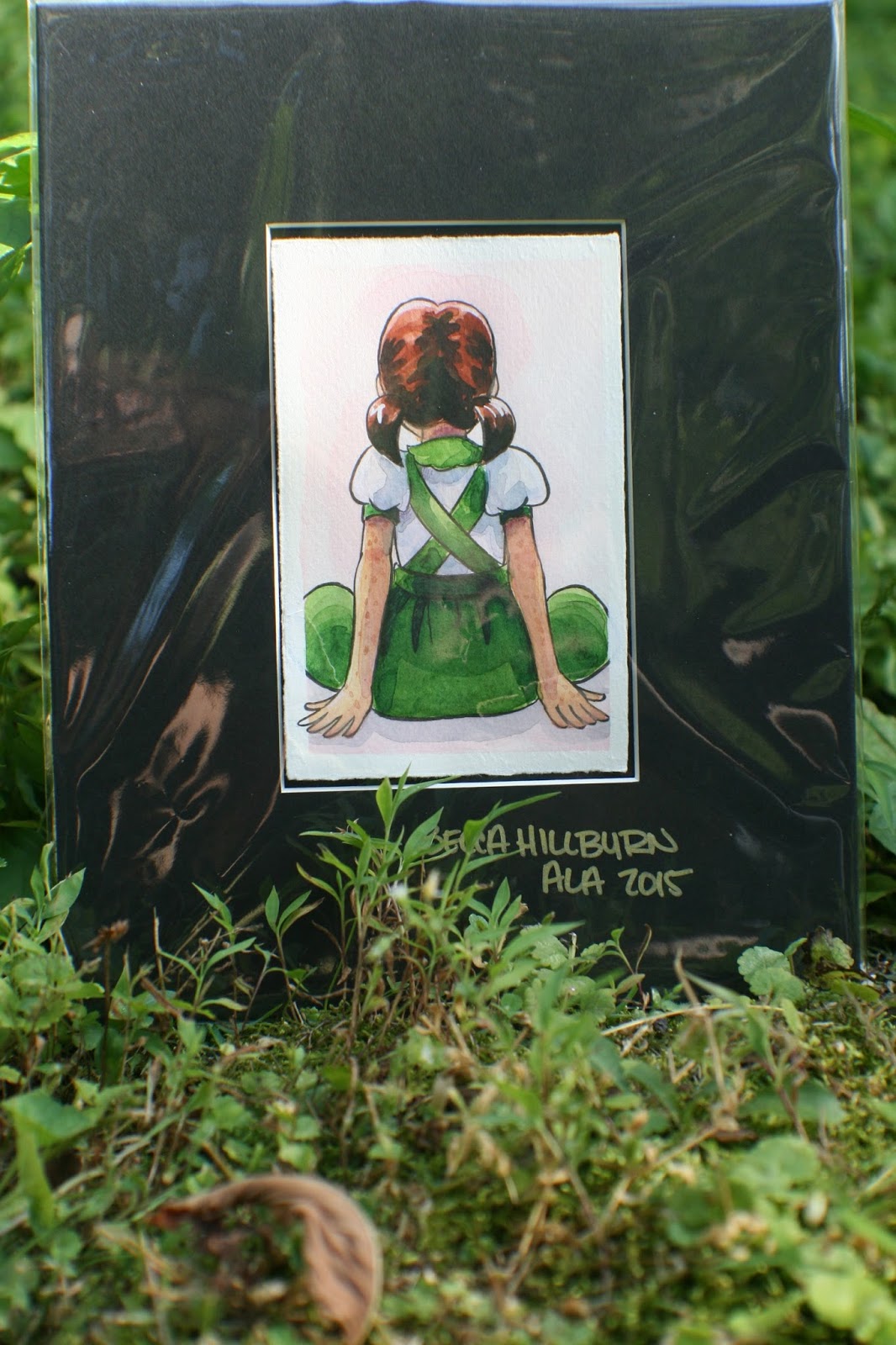 Back of Kara
 Kara wearing paisley
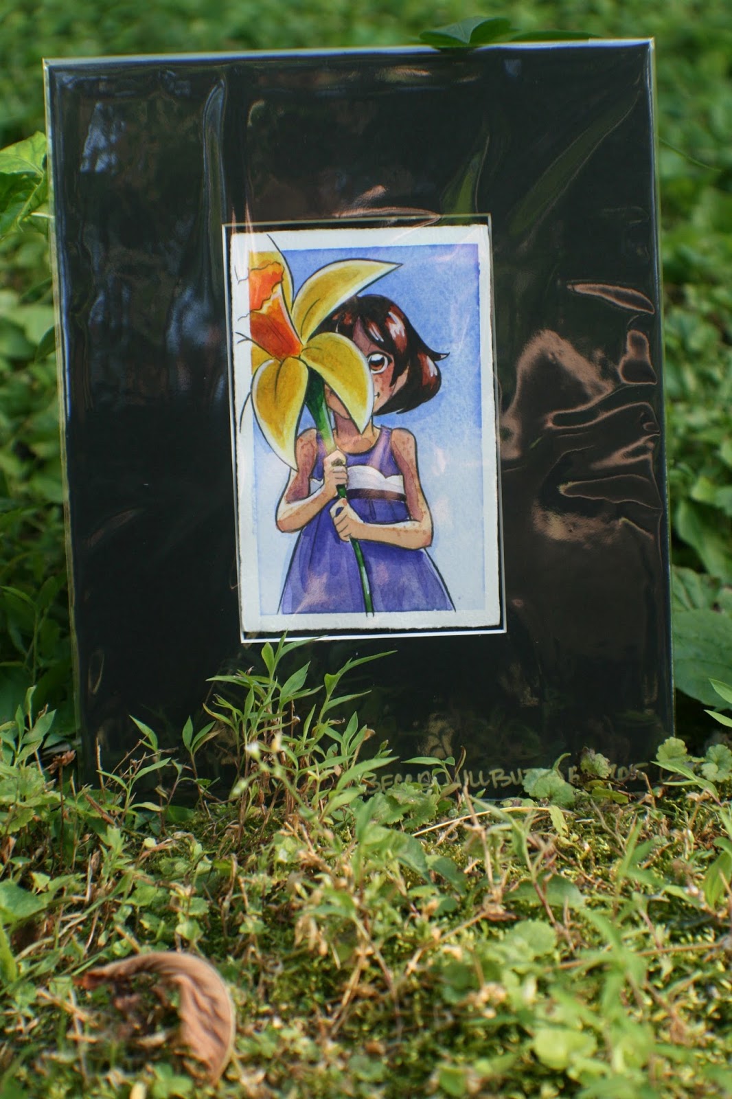 Kara holding a daffodilI'm going to be putting together a newsletter in the upcoming months, and I'll announce signups here, but if you'd also like to be notified when that's ready, send me an email and I'll let you know! I plan on including lots of neat little tidbits that don't make it into my blog, including artistic process insights, my favorite tools, and even short comic reviews.
It was lovely to meet all of you this weekend, and I hope you find this blog to be a useful resource for your kids, and my comic to be an enjoyable read!
Please consider donating to this blog or purchasing from Natto-shop (http://nattosoup.com/shop) if you want me to continue publishing quality content. All materials tested were purchased from my own pocket. Keep on Truckin' Nattosoup is not under any sponsorship.
June 26, 2015
Wooden Charm Production with Ponoko
I've done charms several times in the past, working with a couple different companies--Ink It Labs and the now defunct Printcess. Inevitably, I'd run out of popular designs fast and spend the rest of the year trying to move less popular charms, since neither service offered a way to order exactly what I needed of each design. I'd even made charms at home out of Shrinky Dink when Printcess closed its doors, but I found those to be difficult to sell, especially as almost everyone around me had moved on to acrylic. I wanted to move on to something that was not only more cost effective for me, but also something that allowed for more customizability in regards to order numbers, and I'd drooled over wooden charm options for a few years before I discovered Ponoko. Ponoko is a laser cutting and 3D printing service that offers a variety of options including leather, acrylic, and wood laser cutting. Joseph was really excited about the options that Ponoko offered, and we agreed that if I came up with some designs, he'd help me out with getting them prepped for etching.
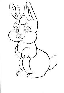
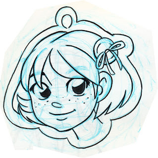
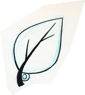
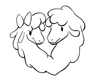
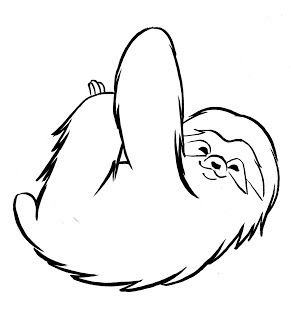
The Original DesignsBelow are the original charm designs I gave to Joseph. I'd inked them to make it easier for him to vectorize, but they're a little complicated for what he'd signed up for. Still, Joseph was a trooper, and spent weeks prepping these files with only minimal complaints.


Part of the charm making agreement was that Joseph would write all about his process after the charms were done, and we'd sold a few, so I'm going to let him take it from here.
Laser cuttingBecca has reviewed InkIt and the defunct Printcess, Shrinkie Dinks for creating charms. Every service has it's pros and cons. Production costs preventing a reasonable markup being one of the main cons. So Becca took some dinosaur designs, a few other inked pieces, and produced a cute animals wooden charm line intended to be laser cut by Ponoko. Many charm services will work with rasterized files (bitmap), but most laser cutters can't print color; the files are strictly to give cutting and etching information and need to be in vector (SVG or AI) form.
Processing filesWorking with rasterized filesThe fastest way to convert a rasterized image to vector is to use a technique named live tracing. Inkscape has the most accurate and fastest live trace. However, I’ve found I can tune live tracing better in Adobe Illustrator CC 2014. You can also use a dedicated live tracing program such as VectorMagic, but I don’t have experience with it.
If you have a simple design, Ponoko has several examples of converting a solid, featureless shape into an etch, cut, or outline. Becca’s designs had interior complexity, but also many instances of one of the more complicated features; that being an etch area which shares an outline partially with a cut line and partially with an etch line.
 The non-filled areas are light, but this is an example of an etched area with both cut lines and etched lines on the contour. This wooden Utah Raptor can be purchased from Nattoshop.Specifically, I used a combination between default live tracing settings, mostly Inkscape’s, but also Illustrator’s line art settings which only captures strokes.
The default live tracing method is best at capturing the form of the product, but it creates virtually all strokes as closed path fills. If you submitted line cuts and line etches as closed paths with empty fills then you would be paying more than twice as much for the making process because the laser would cut over each line twice. So I use this to produce interior etched regions and occasionally to capture cuts or line etches by expanding the path, directly selecting anchors, and removing either the inner or outer edge of the closed path. This is a simple, but tedious, way of manually converting a closed path fill to a stroke.
 Adobe Illustrator CC's default live trace. This raccoon charm can be purchased from Nattoshop or at conventions.The line art method will require some tweaking as well, but not to the same extent as if the entire bitmap were live traced solely with the default live trace settings. It may require use of the pen tool or line segment tool to fill in missing pieces which were beneath the threshold for producing a stroke. Because the lines are averaged over a path, some of them may be undulating, so be prepared to use the smoothing tool. Regardless, this technique works well for creating the outline of a bitmap without requiring much processing after changing live tracing settings.
 Adobe Illustrator CC's line art live trace. This raccoon charm can be purchased from Nattoshop or at conventions.After creating an outline with line art, I added back the internal details created with the default live trace settings. Then I used the slice and add anchor point tools to clear away the internal lines which connected to the outline. Which allowed joining all the outline cut strokes into a single path. Having the outline as a single path probably isn’t necessary, but I assume the laser can more easily cut a straight path if it’s one individual path rather than several disjointed paths which share overlapping anchor points. It also makes spotting a hole in the outline which would prevent you from poking it out from the template easy.
 An animated example of how to work with only the default live trace settings. This helps reduce laser passes by collapsing a closed path fill into a simple stroke. This raccoon wooden charm can be purchased from Nattoshop.If there are both etched areas and non-etched areas on the edge of your products, then there’s some extra processing necessary. First, copy and paste the etched area in place and set one of them to have the fill you desire with no stroke. Then, isolate the other etched area and remove the fill and add a stroke. Then use the slice tool to break the path where the fill interior line meets the exterior cut line. Repeat for the second place the interior line meets the exterior cut line which should create two strokes. Delete the stroke along the outline if there’s already an outline there and you’re finished. Figuring out this process was the most complicated part of editing files for laser cutting.
Creating vector filesSo let me back up and say that even though live tracing can make conversion much easier, the simplest thing to do is to just create an image from the ground-up to be laser cut. That being, taking etching regions into consideration and rendering lines as strokes with no outline--rather than using closed paths. You can draw a file using this method easily in either Adobe Illustrator, Inkscape, or MangaStudio. In fact, if you have a complicated design, I’d recommend you set the bitmap as a background in vector-based program and draw on top of it.
General settingsPonoko has posted general settings for EPS or SVG files submitted to their laser cutting service. But for convenience, here are the highlights:
0.01mm strokes#0000FF cut#FF0000 etch line heavy#00FF00 etch line medium#FF00FF etch line light#000000 etch fill heavy#808080 etch fill medium#E6E6E6 etch fill light5mm minimum object size0.2-0.4mm material lost on cut1mm minimum feature sizePrototypingPonoko has some fantastic blog posts and tools to assist in getting from a design to a product in as few iterations as possible, but it still helps to have a prototype phase. I would recommend you use the material you plan on laser cutting, unless it’s prohibitively expensive. Also, there’s always a chance you can sell your prototypes. I would recommend you only use a P1 size or smaller
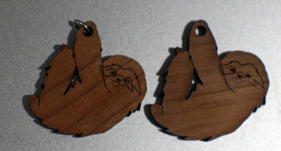 Sloth final design on left, prototype on right. His mask was a light etch rather than a medium etched line. This sloth cherry wood veneer MDF wooden charm can be purchased from the Nattoshop or at a convention.
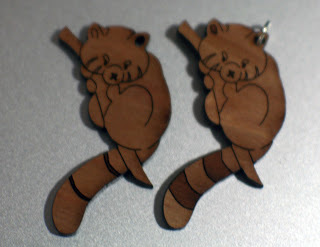 Red Panda prototype design on the left and the final design is on the right. We thickened his tail lines and removed the fill from his mask and added a fill to his ear. This red panda wooden charm can be purchased from Nattoshop.
 We ordered our prototypes at different sizes. You may notice these are the up to date designs, this is because I used Illustrator's place file feature. We used a P1 to save on costs even though most of the prototypes were sellable. All these wooden charms can be purchased from Nattoshop.Shape nesting / packingTo maximize the amount of product from a material you need to nest your products into as small an area as possible. The orientation of your product on the material plank doesn’t matter aside from possibly material grain because it’s going to fall out of the template when you peel away the protective paper.
Ponoko has templates you can use in for Illustrator, Inkscape, Corel Draw, and AutoCAD formats which provide instructions for laying out your product onto the material. I recommend you use the software's place file feature in case you update an individual file and don't want to have to reorient it.
If your products have straight cuts, you can even make them share edges so as not have to make the same cut twice. But in general, the laser is going to cut away between 0.2mm and 0.4mm of material. So if your designs are too close to one another (within 0.2mm) and the material scorches, like wood, then areas will appear more burnt than others, but some people may like this aesthetic.
 I bumped some of the products closer than 1mm away from each other. The cuts were curved, so it would have been difficult to merge them, but it did leave for a slight scorch mark on some of the products.
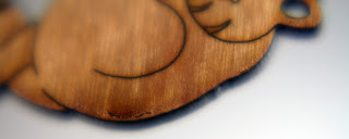
 Scorch mark on a prototype of my Red Panda design which can be purchased from Nattoshop.By Hand
I recommend if you are creating multiple different designs in one cutting process that you compute how many of each product you would like with respect to the others and try to create a repeatable shape--like a square--which you can potentially tile into whatever size template you’re cutting. This also future proofs your order a bit in case you want to increase or decrease the amount of product you receive. Unfortunately not all of their sizes easily nest into others evenly. You have three options to fill the buffer space:
Leave it empty.If you don’t mind having inconsistent sizes in your product line, you can increase the space of some of the blocks into the gutter.Manually nest product into the gutter.
Aside from great performance, nesting by hand can also save you money if you pack all the etched areas as close together as possible. The process of etching an area is different than cutting lines. It requires a dedicated run over your material. So the smaller the region the laser has to travel over, the better.
 The final 12x24 premium cherry wood veneer MDF template design we used to order charms. You can see I wasted very little space, but that the wood grain for charms is going all over the place. I did repeat a P1 pattern from the prototype a few times and manually nested the rest. All of these wooden charms are available from Nattoshop as well as at conventions.
By Machine
Finally, nesting takes time, for humans and machines. In the CAD industry, this is known as a Knapsack Problem and is NP-hard, which means computers aren’t good at it. There are many free programs out there which can nest without fine reorienting--more than horizontal or vertical--such as CodeWeb’s TexturePacker, or libGDX texture packer, or GoNest. Ideally, unless you have symmetrical or boxy products, you will want to reorient many of your products. You shouldn’t need a nester which can alter the size of your products, but that may also be something to consider.
Some commercial nesters can reorient products, such as eCut, but I was unable to get it to function in this way. It generated bounding boxes for all of my products and simply tiled them horizontally or vertically. Far from an ideal example which the actual edges of the shape would be nearly bumped up against one another and could take on any angle. Vectric’s Cut2D also reportedly does ‘true shape nesting,’ but I didn’t get a chance to test it.
 eCut doing a poor job trying to fit all of my charms into the allotted space I was able to manually put them into. You should notice none of the charms are oblique.Product
 My best seller, the Utah Raptor, which came out beautifully after some simplification from the original design. It can be purchased as either a necklace, keychain, or cell phone charm from Nattoshop or at conventions.
 Bitmap version of the Utah Raptor.
 Vector Ponoko-fied version of the Utah Raptor.
Your products will arrive in a sheet of material covered in cardboard to protect it. It will have protective paper on both sides, one of which will be burnt. I recommend you pull off the protective paper from the burnt side first so you don’t have to pull off the sticky film from each individual product. Be careful, but you shouldn’t have to pull so hard that anything will break. Then remove the protective paper from the back side, recycle or discard the leftover material from the template and you should be good to go.
 An example of what wooden charm board looks like after the charms and protective film has been removed. The utah raptor, llama heart, red panda, lucky cat, jackalope, tree sloth, raccoon, Kara full, Kara head, smilodon, leaf, and acorn charms can be found at Nattoshop or at conventions.The finished charms we made look fantastic. We used cherry-veneered MDF with mostly medium etching. The charms have a lot of character, and my shape nesting caused the grain of the wood to go in seemingly random directions, which I think looks phenomenal. The charms look solid and feel solid. A few people have sniffed them because they like the burnt wood smell, which mostly subsided over a few days. I believe MDF is toxic, so advise parents when buying for young children.
 Close-up of Becca's Jackalope. The horns came out fantastic. Available at Nattoshop.
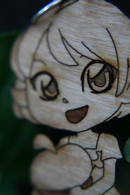 Close up of Becca's baby, Kara. Her eyes, dress, acorn, and legs are so cute! Check it out at Nattoshop.We forgot to thicken up the tails of the utah raptors which caused a few of their tails to break off. One or two of the products was difficult to remove from the template out of a couple hundred and around 4 of the cherry wood veneer charms appeared too pockmarked to be sold. So you can expect maybe 2% of your product to arrive in sales-bin state. Finally, the products hung well enough on their jump ring holes, but you should probably take the prototype phase to test how it hangs.
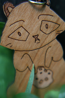 This raccoon bandit got fed up with eating trash and had his hands in Becca's cookie jar. Get your own at Nattoshop.
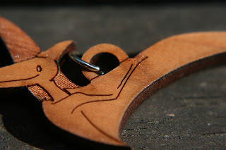 Catch these Pteranodons before they all fly away. Available at Nattoshop and at conventions.

Please consider purchasing some of Becca’s charms from her shop if you’re enjoying this post. She has the following designs:
PteranodonUtahraptorLucky CatRaccoonRed PandaSabertooth TigerTree SlothJackalopeLlamasKara holding acornAcornLeafKara head
Customer ServiceIn all likelihood, you won’t need to speak with Ponoko’s customer support. They manage to keep customers in the know via:
Detailed instructions in their templatesExtensive guides via their blogStraight-forward uploader which includes a file validator with mostly meaningful error messages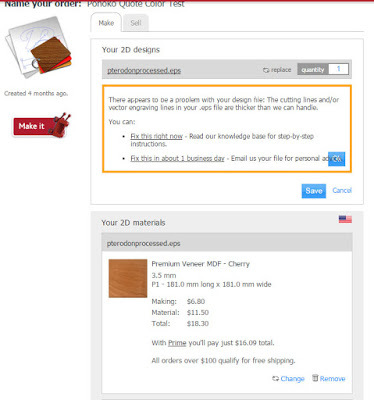 Feedback from Ponoko when I uploaded a file which had lines thicker than 0.01mm. It clearly states the problem and suggests I can simply email their support if I can't figure out the issue myself. A great tool and good service.But the first time I ordered something from Ponoko I did have a brief run-in with their support. I was making 3 Nattosoup necklaces to test out their service. Becca wanted a layered, two material design. The back would be a mirrored acrylic, and the front a green-glass acrylic with etching. The process was straightforward, but I hadn’t read the material instructions. The files passed through the online validator fine because it was technically correct, but when a human inspector saw the files, with NO context other than file names saying back and front, they realized that the blob-like back wasn’t oriented properly for the mirror acrylic.
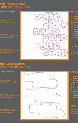 This is for the Nattosoup necklace I had made. The inspector must have realized the bottom was the back of the necklace and that it wasn't properly flipped horizontal.Had I read the instructions, I would have noted that mirrored acrylic is cut from behind, so that the mirror doesn’t affect the laser. Ponoko’s customer service quickly suggested I horizontally flip the design to accommodate it for being cut from behind and everything was on it’s way. I’m impressed they caught my negligent mistake and gave a clear explanation of how to fix it.
ShippingShipping is free if you’re ordering over a $100 and I believe scales linearly with the weight of material otherwise. Their expedited shipping has roughly a week and a half turn-around time. It takes 2 days to process and cut a product, and roughly a week to ship. I had a similar experience with standard shipping, so unless you’re getting free expedited by joining Ponoko’s Prime membership, it may not be worth paying extra.
PricingPonoko is selling you a product and a service. So as with making anything, you have to consider how much both supplies and process will cost you. Ponoko gives an overview here of what it may cost to produce something.
I recommend you choose a target retail price for your product. Set a minimum size for your product and estimate how many you could fit in the size of material you’d like to order. Take into consideration how the thickness of the material you’re ordering would affect the product, and check what material would best fit your needs given your thickness and price requirements. Please notice not all materials are available in all sizes nor thicknesses.
Materials CostPonoko has more details on materials here. In general, costs of materials are priced from lowest to highest:
Cardboard $0.50Paper $2.50Plastic $4Fabric $7Wood $10Leather $16Rubber $18Metal $180Please understand this is a simplification of the materials pricing model, as the thickness, size, and type must be taken into account. Ponoko has examples of how fine each material can hold features and what each material looks like etched to different degrees.
 From Ponoko's Premium Veneer MDF. Example of etched areas and etched areas with etched lines
 From Ponoko's Premium Veneer MDF. Example of feature size for cuts.Process CostPonoko has details on process here. Specifically, the complexity of laser cutting adds to more laser time, which increases the price. Sharp turns slow down a laser, as do etched areas. So take the following items into account when designing as they will result in a more expensive laser cutting:
The larger an etched areaThe darker the etchingThe more laser cuts or etchesThe shaper the corners or the tighter the loopsThe more times you cut or etch over a lineThe denser the materialThat being said, your product has to be recognizable and distinct, so don’t go overboard pinching pennies. But keep in mind the minimum feature size is 1mm and the minimum object size is 5mm. So cutting around individual hairs will just burn all the material away and etching individual hairs will basically turn into an expensive etched area. Ponoko has a good post about simplifying a product to save on making time.
 These Kara wooden charms are a bit on the elaborate side. They have two intensities of engraving, heavy and medium and many sharp edges in the hair, on the eyes, the dress, etc. But they look so adorable that it was worth justifying the cost. They also represent the 7" Kara line of graphic novels well and have served as great give-aways with the book.OrderingI would highly recommend you use your $20 off making coupon to make your first order, which should be a prototype of either cardboard or your desired material. Then, once you’re ready for your order, check how much it would cost to make your order. Look at Ponoko’s Prime membership program and determine how much it might save you to join the program for one month and get the discount on making. Take into consideration if the discount on making will drop you beneath the $100 free-shipping category.
LimitationsPonoko has recommendations for staining or painting etched areas of material--as well as for staining or painting non-etched areas. However, laser cut materials will be one color with a few shades. So don’t design them as you might full-color acrylic charms.Ponoko can not etch onto both sides.Ponoko will not add jump ring holes to your design for you.Ponoko has instructions on how to create joints to fit materials together, so you can create 3 dimensional objects out of laser cut materials, but construction would be up to you or the customer.Ponoko can not take individual designs and shape nest them onto a template for you, but they will advise you on any mistakes you’ve made in the process.Ponoko can not make large laser cut items, such as a 3ftx2ft sign in one piece.I doubt Ponoko will refund you if you botch the cutting of an order or fix an order you have not fully cut out. So read instructions carefully and interact with their support if you have concerns and it shouldn’t come to that.Ponoko will not allow you to use your own material with their laser cutters.Shipping outside the US can be expensive.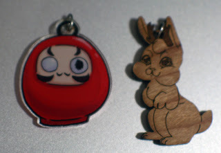 InkIt double-sided full color charm vs Ponoko wooden charm. This Jackalope can be found at Nattoshop.
Additional techniquesAvoid grouping elements until they are completely processed and are ready to be dropped into a template for printing.Use select all before saving to ensure there are no stray points which might confuse the Ponoko software.Stain or paint your medium-to-heavy etched products before removing the protective sheet to save you from having to finely paint etched lines and areas.Line etch around any etched areas.Fuse and stack different materials to give a 3D effect and some color variation.Sell your products individually in Ponoko’s online store.Ponoko has recommendations for size of keyholes to maintain integrity of materials.Feel free to have a variety of charm sizes.Grain direction will always run horizontal as drawn on the computer screen, so take this into account when orienting your products.Purchasing a laser cutterAfter spending close to $500 on wooden charms, it occurred to me that a laser cutter wouldn’t cost much more. I’m in the beginning of researching getting a laser cutter, but after watching several Youtube videos and reading for a while, the $500 40W JuLong seems like it may be in our future. Here are a few things to consider:
Proprietary gas mixture required is laser tube (CO2 and some trace gases)The machine requires a lot of space.Must be able to hook up to a ventilation system (which probably restricts you to a garage, basement, or attic).Can cause permanent eye damage if not careful.Must have water cooling system, which can be as simple as two five gallon buckets.Requires mirror alignment when first received and possibly when moved.Smaller engraving area than what is available from Pononko.May be required to use proprietary software which doesn’t interact with Adobe Illustrator or Inkscape.Consumes about as much electricity as 3 desktop computers when running.You may need to apply protective film to material if you’re just going to buy it from a hardware store.VerdictPonoko is relatively cheap, Becca was able to make a much higher profit margin on her wooden charms than on her previous acrylic charms. Their customer service is great, their online interface is good, and most importantly, the quality is fantastic. Again, working with complex bitmap designs was not ideal, but we eventually came out with a great product with plenty of time to prepare them for a show. They’ve been received well at most cons, but don’t expect them to a hit everywhere. Let me know which is your favorite, and please consider purchasing Nattoshop.
Please consider donating to this blog or purchasing from Natto-shop (http://nattosoup.com/shop) if you want me to continue publishing quality content. All materials tested were purchased from my own pocket. Keep on Truckin' Nattosoup is not under any sponsorship.
The Original DesignsBelow are the original charm designs I gave to Joseph. I'd inked them to make it easier for him to vectorize, but they're a little complicated for what he'd signed up for. Still, Joseph was a trooper, and spent weeks prepping these files with only minimal complaints.

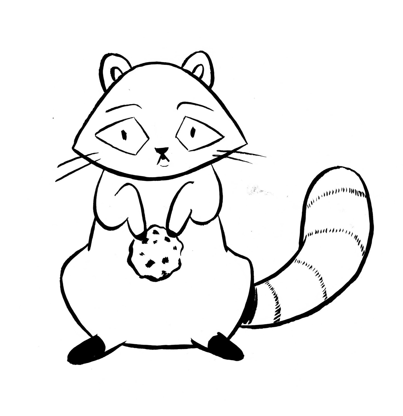


Part of the charm making agreement was that Joseph would write all about his process after the charms were done, and we'd sold a few, so I'm going to let him take it from here.
Laser cuttingBecca has reviewed InkIt and the defunct Printcess, Shrinkie Dinks for creating charms. Every service has it's pros and cons. Production costs preventing a reasonable markup being one of the main cons. So Becca took some dinosaur designs, a few other inked pieces, and produced a cute animals wooden charm line intended to be laser cut by Ponoko. Many charm services will work with rasterized files (bitmap), but most laser cutters can't print color; the files are strictly to give cutting and etching information and need to be in vector (SVG or AI) form.
Processing filesWorking with rasterized filesThe fastest way to convert a rasterized image to vector is to use a technique named live tracing. Inkscape has the most accurate and fastest live trace. However, I’ve found I can tune live tracing better in Adobe Illustrator CC 2014. You can also use a dedicated live tracing program such as VectorMagic, but I don’t have experience with it.
If you have a simple design, Ponoko has several examples of converting a solid, featureless shape into an etch, cut, or outline. Becca’s designs had interior complexity, but also many instances of one of the more complicated features; that being an etch area which shares an outline partially with a cut line and partially with an etch line.
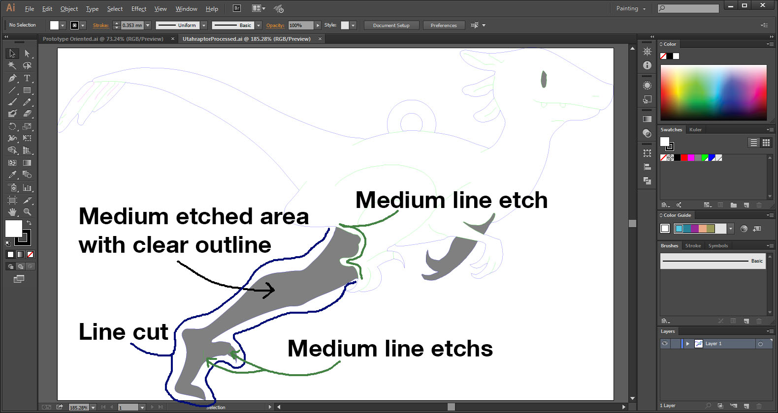 The non-filled areas are light, but this is an example of an etched area with both cut lines and etched lines on the contour. This wooden Utah Raptor can be purchased from Nattoshop.Specifically, I used a combination between default live tracing settings, mostly Inkscape’s, but also Illustrator’s line art settings which only captures strokes.
The default live tracing method is best at capturing the form of the product, but it creates virtually all strokes as closed path fills. If you submitted line cuts and line etches as closed paths with empty fills then you would be paying more than twice as much for the making process because the laser would cut over each line twice. So I use this to produce interior etched regions and occasionally to capture cuts or line etches by expanding the path, directly selecting anchors, and removing either the inner or outer edge of the closed path. This is a simple, but tedious, way of manually converting a closed path fill to a stroke.
 Adobe Illustrator CC's default live trace. This raccoon charm can be purchased from Nattoshop or at conventions.The line art method will require some tweaking as well, but not to the same extent as if the entire bitmap were live traced solely with the default live trace settings. It may require use of the pen tool or line segment tool to fill in missing pieces which were beneath the threshold for producing a stroke. Because the lines are averaged over a path, some of them may be undulating, so be prepared to use the smoothing tool. Regardless, this technique works well for creating the outline of a bitmap without requiring much processing after changing live tracing settings.
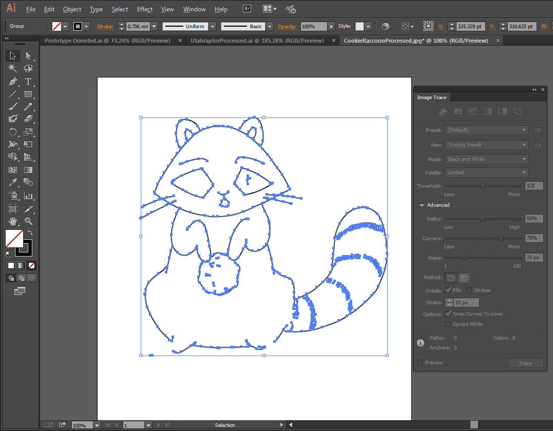 Adobe Illustrator CC's line art live trace. This raccoon charm can be purchased from Nattoshop or at conventions.After creating an outline with line art, I added back the internal details created with the default live trace settings. Then I used the slice and add anchor point tools to clear away the internal lines which connected to the outline. Which allowed joining all the outline cut strokes into a single path. Having the outline as a single path probably isn’t necessary, but I assume the laser can more easily cut a straight path if it’s one individual path rather than several disjointed paths which share overlapping anchor points. It also makes spotting a hole in the outline which would prevent you from poking it out from the template easy.
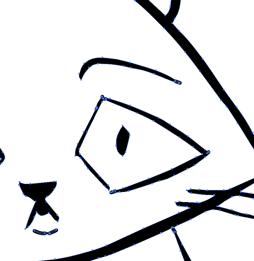 An animated example of how to work with only the default live trace settings. This helps reduce laser passes by collapsing a closed path fill into a simple stroke. This raccoon wooden charm can be purchased from Nattoshop.If there are both etched areas and non-etched areas on the edge of your products, then there’s some extra processing necessary. First, copy and paste the etched area in place and set one of them to have the fill you desire with no stroke. Then, isolate the other etched area and remove the fill and add a stroke. Then use the slice tool to break the path where the fill interior line meets the exterior cut line. Repeat for the second place the interior line meets the exterior cut line which should create two strokes. Delete the stroke along the outline if there’s already an outline there and you’re finished. Figuring out this process was the most complicated part of editing files for laser cutting.
Creating vector filesSo let me back up and say that even though live tracing can make conversion much easier, the simplest thing to do is to just create an image from the ground-up to be laser cut. That being, taking etching regions into consideration and rendering lines as strokes with no outline--rather than using closed paths. You can draw a file using this method easily in either Adobe Illustrator, Inkscape, or MangaStudio. In fact, if you have a complicated design, I’d recommend you set the bitmap as a background in vector-based program and draw on top of it.
General settingsPonoko has posted general settings for EPS or SVG files submitted to their laser cutting service. But for convenience, here are the highlights:
0.01mm strokes#0000FF cut#FF0000 etch line heavy#00FF00 etch line medium#FF00FF etch line light#000000 etch fill heavy#808080 etch fill medium#E6E6E6 etch fill light5mm minimum object size0.2-0.4mm material lost on cut1mm minimum feature sizePrototypingPonoko has some fantastic blog posts and tools to assist in getting from a design to a product in as few iterations as possible, but it still helps to have a prototype phase. I would recommend you use the material you plan on laser cutting, unless it’s prohibitively expensive. Also, there’s always a chance you can sell your prototypes. I would recommend you only use a P1 size or smaller
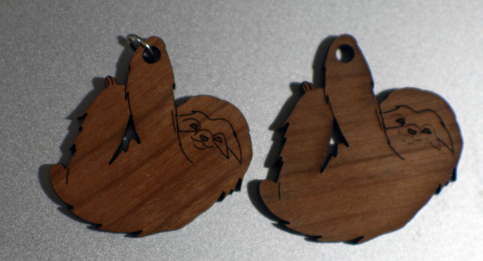 Sloth final design on left, prototype on right. His mask was a light etch rather than a medium etched line. This sloth cherry wood veneer MDF wooden charm can be purchased from the Nattoshop or at a convention.
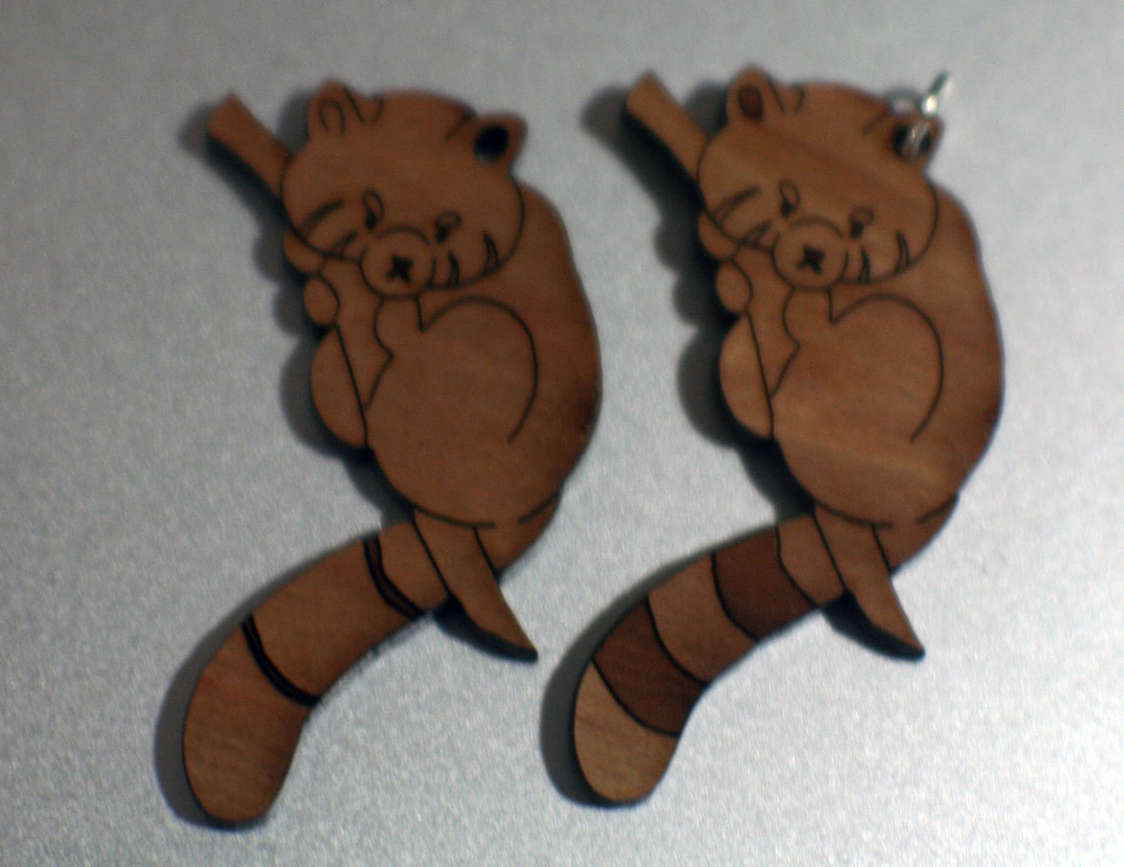 Red Panda prototype design on the left and the final design is on the right. We thickened his tail lines and removed the fill from his mask and added a fill to his ear. This red panda wooden charm can be purchased from Nattoshop.
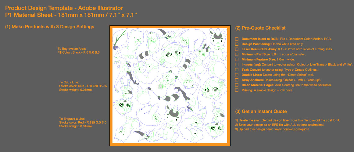 We ordered our prototypes at different sizes. You may notice these are the up to date designs, this is because I used Illustrator's place file feature. We used a P1 to save on costs even though most of the prototypes were sellable. All these wooden charms can be purchased from Nattoshop.Shape nesting / packingTo maximize the amount of product from a material you need to nest your products into as small an area as possible. The orientation of your product on the material plank doesn’t matter aside from possibly material grain because it’s going to fall out of the template when you peel away the protective paper.
Ponoko has templates you can use in for Illustrator, Inkscape, Corel Draw, and AutoCAD formats which provide instructions for laying out your product onto the material. I recommend you use the software's place file feature in case you update an individual file and don't want to have to reorient it.
If your products have straight cuts, you can even make them share edges so as not have to make the same cut twice. But in general, the laser is going to cut away between 0.2mm and 0.4mm of material. So if your designs are too close to one another (within 0.2mm) and the material scorches, like wood, then areas will appear more burnt than others, but some people may like this aesthetic.
 I bumped some of the products closer than 1mm away from each other. The cuts were curved, so it would have been difficult to merge them, but it did leave for a slight scorch mark on some of the products.

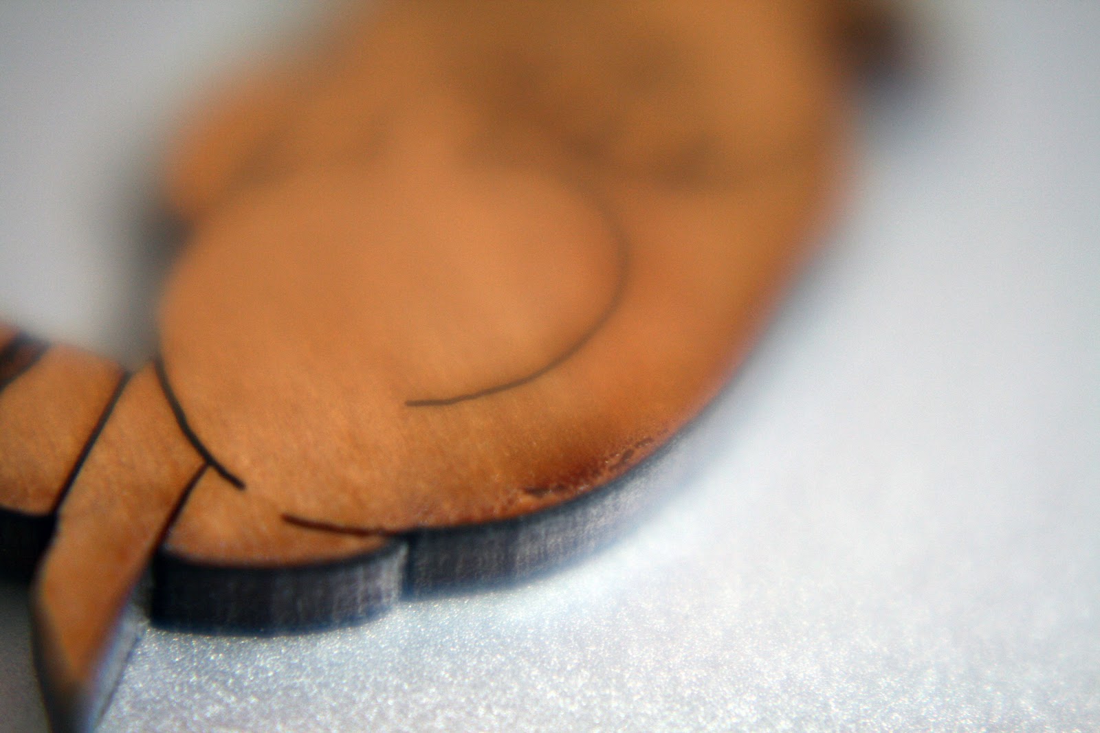 Scorch mark on a prototype of my Red Panda design which can be purchased from Nattoshop.By Hand
I recommend if you are creating multiple different designs in one cutting process that you compute how many of each product you would like with respect to the others and try to create a repeatable shape--like a square--which you can potentially tile into whatever size template you’re cutting. This also future proofs your order a bit in case you want to increase or decrease the amount of product you receive. Unfortunately not all of their sizes easily nest into others evenly. You have three options to fill the buffer space:
Leave it empty.If you don’t mind having inconsistent sizes in your product line, you can increase the space of some of the blocks into the gutter.Manually nest product into the gutter.
Aside from great performance, nesting by hand can also save you money if you pack all the etched areas as close together as possible. The process of etching an area is different than cutting lines. It requires a dedicated run over your material. So the smaller the region the laser has to travel over, the better.
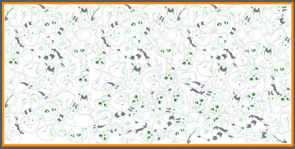 The final 12x24 premium cherry wood veneer MDF template design we used to order charms. You can see I wasted very little space, but that the wood grain for charms is going all over the place. I did repeat a P1 pattern from the prototype a few times and manually nested the rest. All of these wooden charms are available from Nattoshop as well as at conventions.
By Machine
Finally, nesting takes time, for humans and machines. In the CAD industry, this is known as a Knapsack Problem and is NP-hard, which means computers aren’t good at it. There are many free programs out there which can nest without fine reorienting--more than horizontal or vertical--such as CodeWeb’s TexturePacker, or libGDX texture packer, or GoNest. Ideally, unless you have symmetrical or boxy products, you will want to reorient many of your products. You shouldn’t need a nester which can alter the size of your products, but that may also be something to consider.
Some commercial nesters can reorient products, such as eCut, but I was unable to get it to function in this way. It generated bounding boxes for all of my products and simply tiled them horizontally or vertically. Far from an ideal example which the actual edges of the shape would be nearly bumped up against one another and could take on any angle. Vectric’s Cut2D also reportedly does ‘true shape nesting,’ but I didn’t get a chance to test it.
 eCut doing a poor job trying to fit all of my charms into the allotted space I was able to manually put them into. You should notice none of the charms are oblique.Product
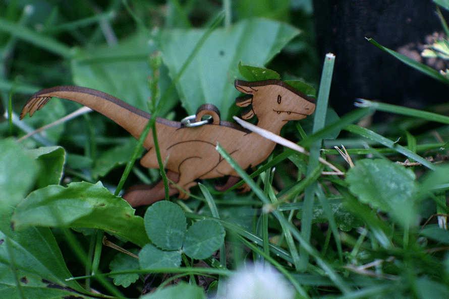 My best seller, the Utah Raptor, which came out beautifully after some simplification from the original design. It can be purchased as either a necklace, keychain, or cell phone charm from Nattoshop or at conventions.
 Bitmap version of the Utah Raptor.
 Vector Ponoko-fied version of the Utah Raptor.
Your products will arrive in a sheet of material covered in cardboard to protect it. It will have protective paper on both sides, one of which will be burnt. I recommend you pull off the protective paper from the burnt side first so you don’t have to pull off the sticky film from each individual product. Be careful, but you shouldn’t have to pull so hard that anything will break. Then remove the protective paper from the back side, recycle or discard the leftover material from the template and you should be good to go.
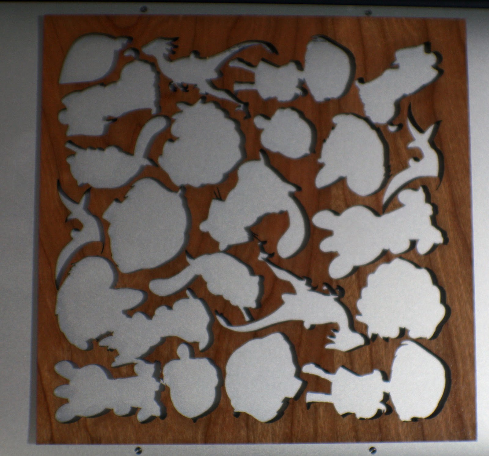 An example of what wooden charm board looks like after the charms and protective film has been removed. The utah raptor, llama heart, red panda, lucky cat, jackalope, tree sloth, raccoon, Kara full, Kara head, smilodon, leaf, and acorn charms can be found at Nattoshop or at conventions.The finished charms we made look fantastic. We used cherry-veneered MDF with mostly medium etching. The charms have a lot of character, and my shape nesting caused the grain of the wood to go in seemingly random directions, which I think looks phenomenal. The charms look solid and feel solid. A few people have sniffed them because they like the burnt wood smell, which mostly subsided over a few days. I believe MDF is toxic, so advise parents when buying for young children.
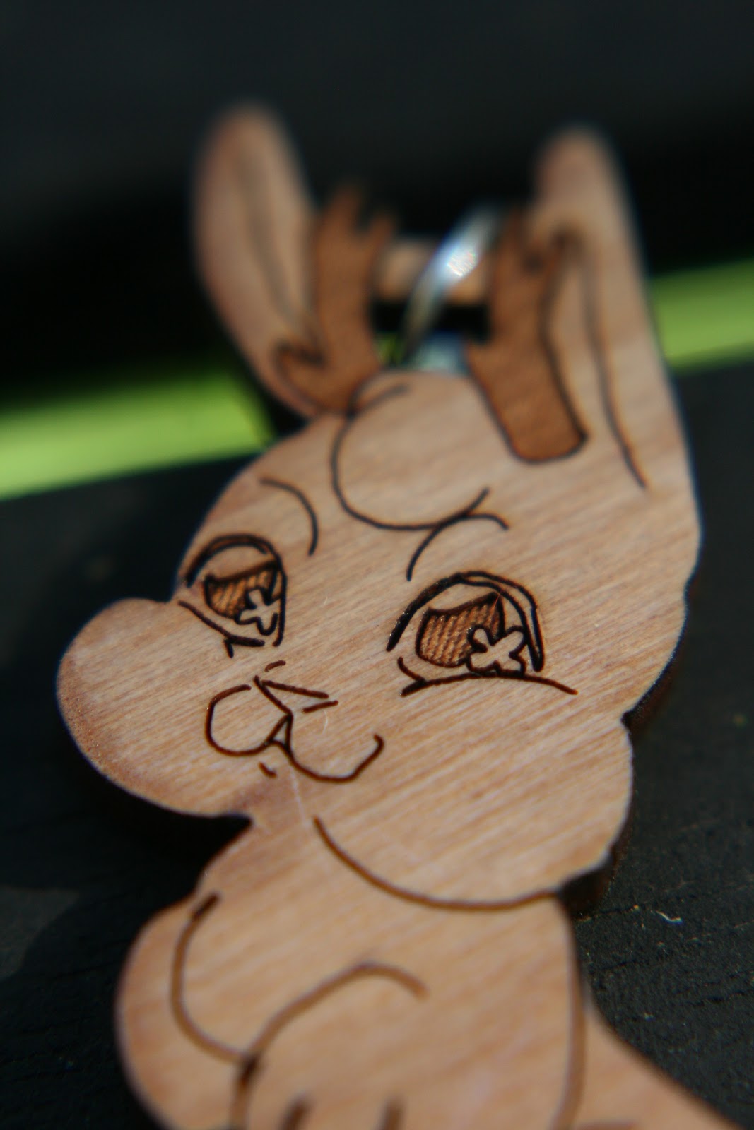 Close-up of Becca's Jackalope. The horns came out fantastic. Available at Nattoshop.
 Close up of Becca's baby, Kara. Her eyes, dress, acorn, and legs are so cute! Check it out at Nattoshop.We forgot to thicken up the tails of the utah raptors which caused a few of their tails to break off. One or two of the products was difficult to remove from the template out of a couple hundred and around 4 of the cherry wood veneer charms appeared too pockmarked to be sold. So you can expect maybe 2% of your product to arrive in sales-bin state. Finally, the products hung well enough on their jump ring holes, but you should probably take the prototype phase to test how it hangs.
 This raccoon bandit got fed up with eating trash and had his hands in Becca's cookie jar. Get your own at Nattoshop.
 Catch these Pteranodons before they all fly away. Available at Nattoshop and at conventions.
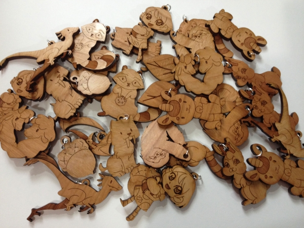
Please consider purchasing some of Becca’s charms from her shop if you’re enjoying this post. She has the following designs:
PteranodonUtahraptorLucky CatRaccoonRed PandaSabertooth TigerTree SlothJackalopeLlamasKara holding acornAcornLeafKara head
Customer ServiceIn all likelihood, you won’t need to speak with Ponoko’s customer support. They manage to keep customers in the know via:
Detailed instructions in their templatesExtensive guides via their blogStraight-forward uploader which includes a file validator with mostly meaningful error messages
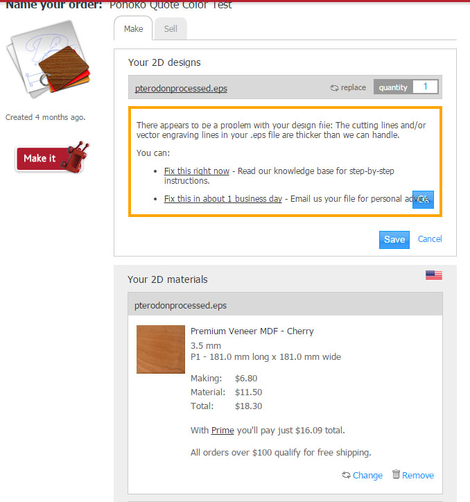 Feedback from Ponoko when I uploaded a file which had lines thicker than 0.01mm. It clearly states the problem and suggests I can simply email their support if I can't figure out the issue myself. A great tool and good service.But the first time I ordered something from Ponoko I did have a brief run-in with their support. I was making 3 Nattosoup necklaces to test out their service. Becca wanted a layered, two material design. The back would be a mirrored acrylic, and the front a green-glass acrylic with etching. The process was straightforward, but I hadn’t read the material instructions. The files passed through the online validator fine because it was technically correct, but when a human inspector saw the files, with NO context other than file names saying back and front, they realized that the blob-like back wasn’t oriented properly for the mirror acrylic.
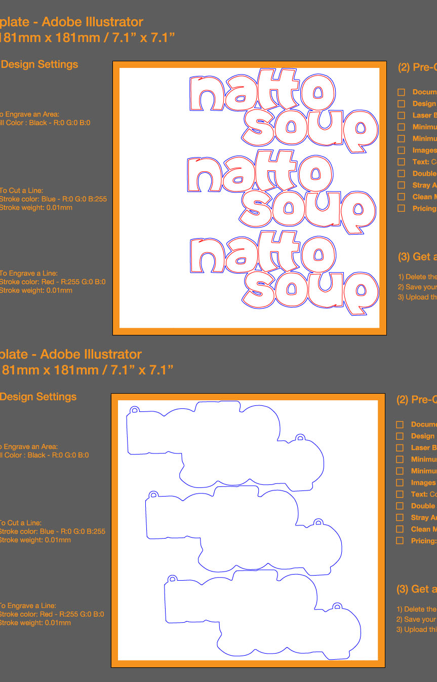 This is for the Nattosoup necklace I had made. The inspector must have realized the bottom was the back of the necklace and that it wasn't properly flipped horizontal.Had I read the instructions, I would have noted that mirrored acrylic is cut from behind, so that the mirror doesn’t affect the laser. Ponoko’s customer service quickly suggested I horizontally flip the design to accommodate it for being cut from behind and everything was on it’s way. I’m impressed they caught my negligent mistake and gave a clear explanation of how to fix it.
ShippingShipping is free if you’re ordering over a $100 and I believe scales linearly with the weight of material otherwise. Their expedited shipping has roughly a week and a half turn-around time. It takes 2 days to process and cut a product, and roughly a week to ship. I had a similar experience with standard shipping, so unless you’re getting free expedited by joining Ponoko’s Prime membership, it may not be worth paying extra.
PricingPonoko is selling you a product and a service. So as with making anything, you have to consider how much both supplies and process will cost you. Ponoko gives an overview here of what it may cost to produce something.
I recommend you choose a target retail price for your product. Set a minimum size for your product and estimate how many you could fit in the size of material you’d like to order. Take into consideration how the thickness of the material you’re ordering would affect the product, and check what material would best fit your needs given your thickness and price requirements. Please notice not all materials are available in all sizes nor thicknesses.
Materials CostPonoko has more details on materials here. In general, costs of materials are priced from lowest to highest:
Cardboard $0.50Paper $2.50Plastic $4Fabric $7Wood $10Leather $16Rubber $18Metal $180Please understand this is a simplification of the materials pricing model, as the thickness, size, and type must be taken into account. Ponoko has examples of how fine each material can hold features and what each material looks like etched to different degrees.
 From Ponoko's Premium Veneer MDF. Example of etched areas and etched areas with etched lines
 From Ponoko's Premium Veneer MDF. Example of feature size for cuts.Process CostPonoko has details on process here. Specifically, the complexity of laser cutting adds to more laser time, which increases the price. Sharp turns slow down a laser, as do etched areas. So take the following items into account when designing as they will result in a more expensive laser cutting:
The larger an etched areaThe darker the etchingThe more laser cuts or etchesThe shaper the corners or the tighter the loopsThe more times you cut or etch over a lineThe denser the materialThat being said, your product has to be recognizable and distinct, so don’t go overboard pinching pennies. But keep in mind the minimum feature size is 1mm and the minimum object size is 5mm. So cutting around individual hairs will just burn all the material away and etching individual hairs will basically turn into an expensive etched area. Ponoko has a good post about simplifying a product to save on making time.
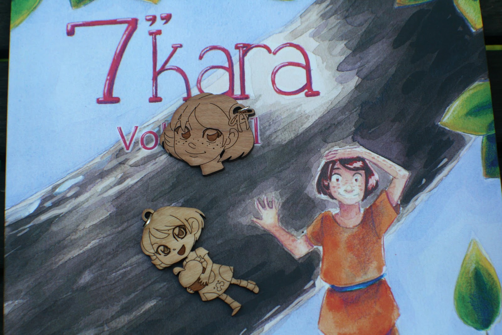 These Kara wooden charms are a bit on the elaborate side. They have two intensities of engraving, heavy and medium and many sharp edges in the hair, on the eyes, the dress, etc. But they look so adorable that it was worth justifying the cost. They also represent the 7" Kara line of graphic novels well and have served as great give-aways with the book.OrderingI would highly recommend you use your $20 off making coupon to make your first order, which should be a prototype of either cardboard or your desired material. Then, once you’re ready for your order, check how much it would cost to make your order. Look at Ponoko’s Prime membership program and determine how much it might save you to join the program for one month and get the discount on making. Take into consideration if the discount on making will drop you beneath the $100 free-shipping category.
LimitationsPonoko has recommendations for staining or painting etched areas of material--as well as for staining or painting non-etched areas. However, laser cut materials will be one color with a few shades. So don’t design them as you might full-color acrylic charms.Ponoko can not etch onto both sides.Ponoko will not add jump ring holes to your design for you.Ponoko has instructions on how to create joints to fit materials together, so you can create 3 dimensional objects out of laser cut materials, but construction would be up to you or the customer.Ponoko can not take individual designs and shape nest them onto a template for you, but they will advise you on any mistakes you’ve made in the process.Ponoko can not make large laser cut items, such as a 3ftx2ft sign in one piece.I doubt Ponoko will refund you if you botch the cutting of an order or fix an order you have not fully cut out. So read instructions carefully and interact with their support if you have concerns and it shouldn’t come to that.Ponoko will not allow you to use your own material with their laser cutters.Shipping outside the US can be expensive.
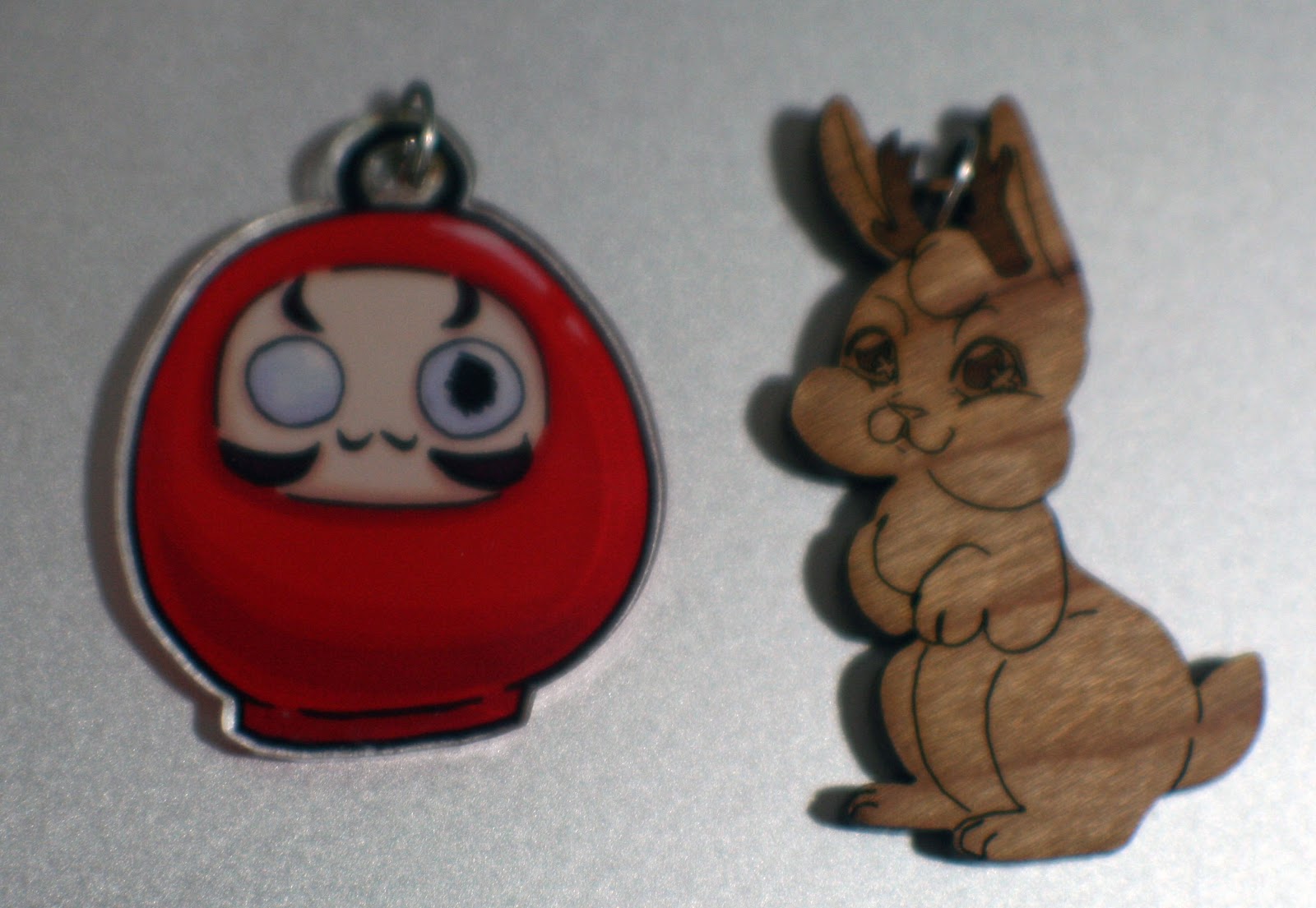 InkIt double-sided full color charm vs Ponoko wooden charm. This Jackalope can be found at Nattoshop.
Additional techniquesAvoid grouping elements until they are completely processed and are ready to be dropped into a template for printing.Use select all before saving to ensure there are no stray points which might confuse the Ponoko software.Stain or paint your medium-to-heavy etched products before removing the protective sheet to save you from having to finely paint etched lines and areas.Line etch around any etched areas.Fuse and stack different materials to give a 3D effect and some color variation.Sell your products individually in Ponoko’s online store.Ponoko has recommendations for size of keyholes to maintain integrity of materials.Feel free to have a variety of charm sizes.Grain direction will always run horizontal as drawn on the computer screen, so take this into account when orienting your products.Purchasing a laser cutterAfter spending close to $500 on wooden charms, it occurred to me that a laser cutter wouldn’t cost much more. I’m in the beginning of researching getting a laser cutter, but after watching several Youtube videos and reading for a while, the $500 40W JuLong seems like it may be in our future. Here are a few things to consider:
Proprietary gas mixture required is laser tube (CO2 and some trace gases)The machine requires a lot of space.Must be able to hook up to a ventilation system (which probably restricts you to a garage, basement, or attic).Can cause permanent eye damage if not careful.Must have water cooling system, which can be as simple as two five gallon buckets.Requires mirror alignment when first received and possibly when moved.Smaller engraving area than what is available from Pononko.May be required to use proprietary software which doesn’t interact with Adobe Illustrator or Inkscape.Consumes about as much electricity as 3 desktop computers when running.You may need to apply protective film to material if you’re just going to buy it from a hardware store.VerdictPonoko is relatively cheap, Becca was able to make a much higher profit margin on her wooden charms than on her previous acrylic charms. Their customer service is great, their online interface is good, and most importantly, the quality is fantastic. Again, working with complex bitmap designs was not ideal, but we eventually came out with a great product with plenty of time to prepare them for a show. They’ve been received well at most cons, but don’t expect them to a hit everywhere. Let me know which is your favorite, and please consider purchasing Nattoshop.
Please consider donating to this blog or purchasing from Natto-shop (http://nattosoup.com/shop) if you want me to continue publishing quality content. All materials tested were purchased from my own pocket. Keep on Truckin' Nattosoup is not under any sponsorship.
June 23, 2015
April and May 2015 Sketch Dump
It seems like I'm always talking about time getting away from me when I'm posting a sketchdump. These sketches were from April and May of this year, and they've been scanned for about a month, I just haven't really had time to write about them. This month has been busy, with Animazement, my younger brother visiting, and preparing for ALA, and there just never seems to be enough time to sit down and work on this post.
For some reason, I always feel like I need to include a preamble before my sketchdumps. I guess since 'writer' is part and parcel with my whole creator deal, its understandable that I think words belong with pictures in most instances. Plus, I genuinely like it when artists explain their inspiration, their sources, their thought process, and I assume that's something you guys like as well.
General Sketches
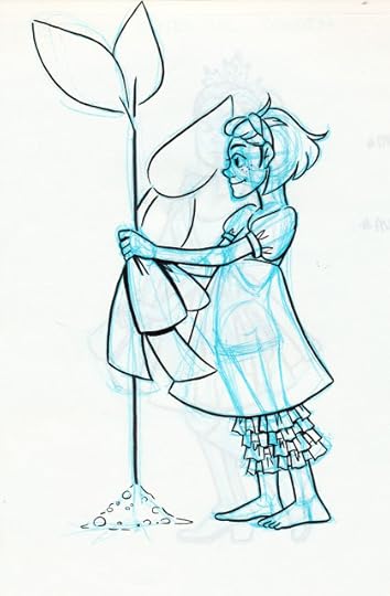
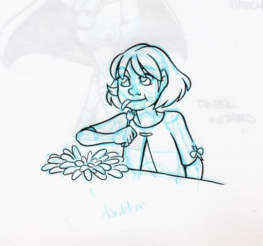
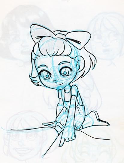
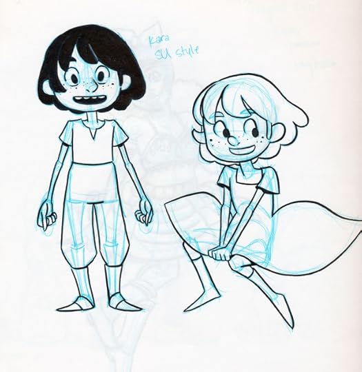


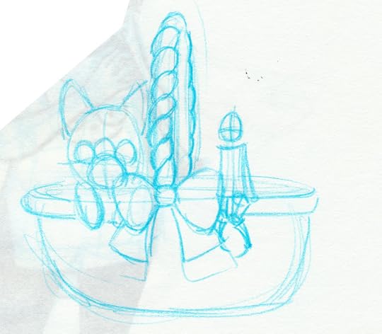

April Sketch Challenge- The OC Challenge
The April Sketch Challenge shown here was selected by the Western Shoujo Artists group for April's challenge. I'm not personally hot on OC challenges- I tend to draw my OC's daily anyway, OC challenges are really bad for cultivating a larger audience, and it isn't much of a challenge for me to draw my OC's daily. Strangely, although I was the only member in the Google Hangout NOT excited about this challenge, I was the only one to finish all 30 prompts.
Rather than taking the way too easy route of just drawing Kara every day, I opted to use this as an opportunity to better flesh out Naomi, the other main character of 7" Kara. During April, I discovered that Naomi is an honors student who plays the oboe and is part of the band's color guard during marching season. She likes super shoujo magical girl anime like Precure, and rides a unicycle. She goes for a morning run every day before school because it helps her clear her head, and admires characters who use kindness and wisdom to solve problems. She's in the debate club, likes Nintendo games, and loves to read. Being 14, Naomi is still definitely a bit childish, but it doesn't stop her from making new friends at her new school.


Ink Tests
Below are a few of my favorite ink test illustrations. You've probably seen shots of them during my recent reviews, but I like some of them enough that I thought they deserved to stand on their own as illustrations.


Please consider donating to this blog or purchasing from Natto-shop (http://nattosoup.com/shop) if you want me to continue publishing quality content. All materials tested were purchased from my own pocket. Keep on Truckin' Nattosoup is not under any sponsorship.
For some reason, I always feel like I need to include a preamble before my sketchdumps. I guess since 'writer' is part and parcel with my whole creator deal, its understandable that I think words belong with pictures in most instances. Plus, I genuinely like it when artists explain their inspiration, their sources, their thought process, and I assume that's something you guys like as well.
General Sketches


April Sketch Challenge- The OC Challenge
The April Sketch Challenge shown here was selected by the Western Shoujo Artists group for April's challenge. I'm not personally hot on OC challenges- I tend to draw my OC's daily anyway, OC challenges are really bad for cultivating a larger audience, and it isn't much of a challenge for me to draw my OC's daily. Strangely, although I was the only member in the Google Hangout NOT excited about this challenge, I was the only one to finish all 30 prompts.
Rather than taking the way too easy route of just drawing Kara every day, I opted to use this as an opportunity to better flesh out Naomi, the other main character of 7" Kara. During April, I discovered that Naomi is an honors student who plays the oboe and is part of the band's color guard during marching season. She likes super shoujo magical girl anime like Precure, and rides a unicycle. She goes for a morning run every day before school because it helps her clear her head, and admires characters who use kindness and wisdom to solve problems. She's in the debate club, likes Nintendo games, and loves to read. Being 14, Naomi is still definitely a bit childish, but it doesn't stop her from making new friends at her new school.

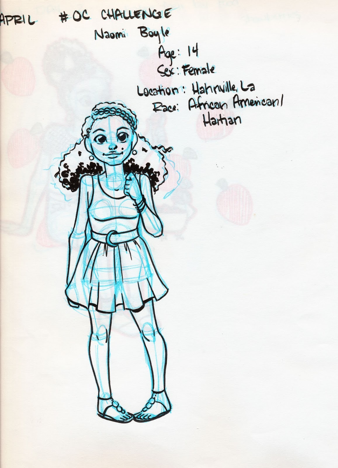


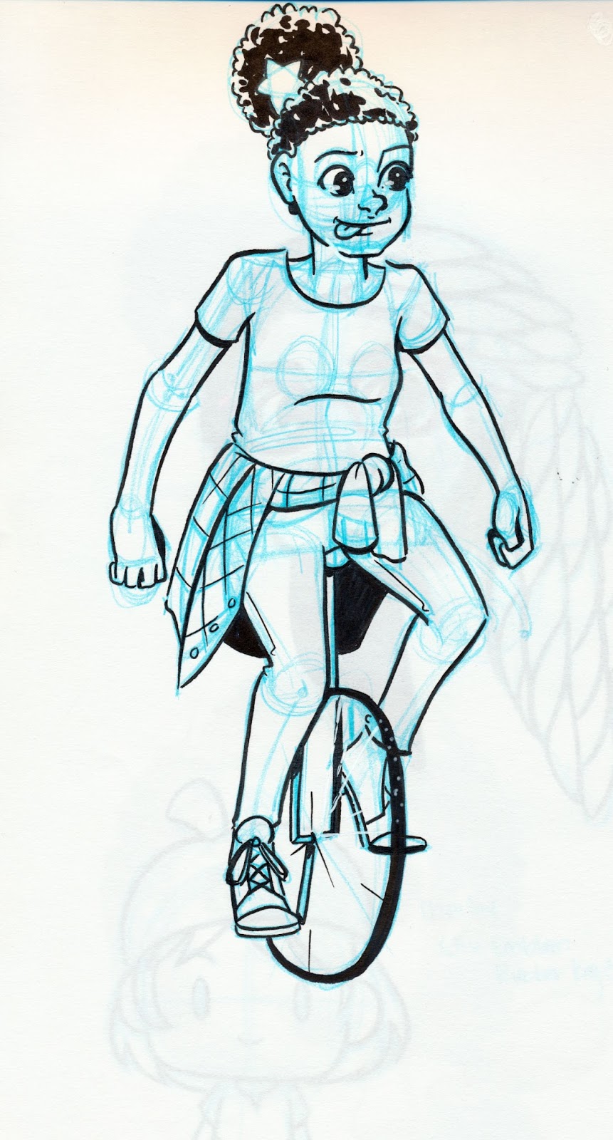


Ink Tests
Below are a few of my favorite ink test illustrations. You've probably seen shots of them during my recent reviews, but I like some of them enough that I thought they deserved to stand on their own as illustrations.

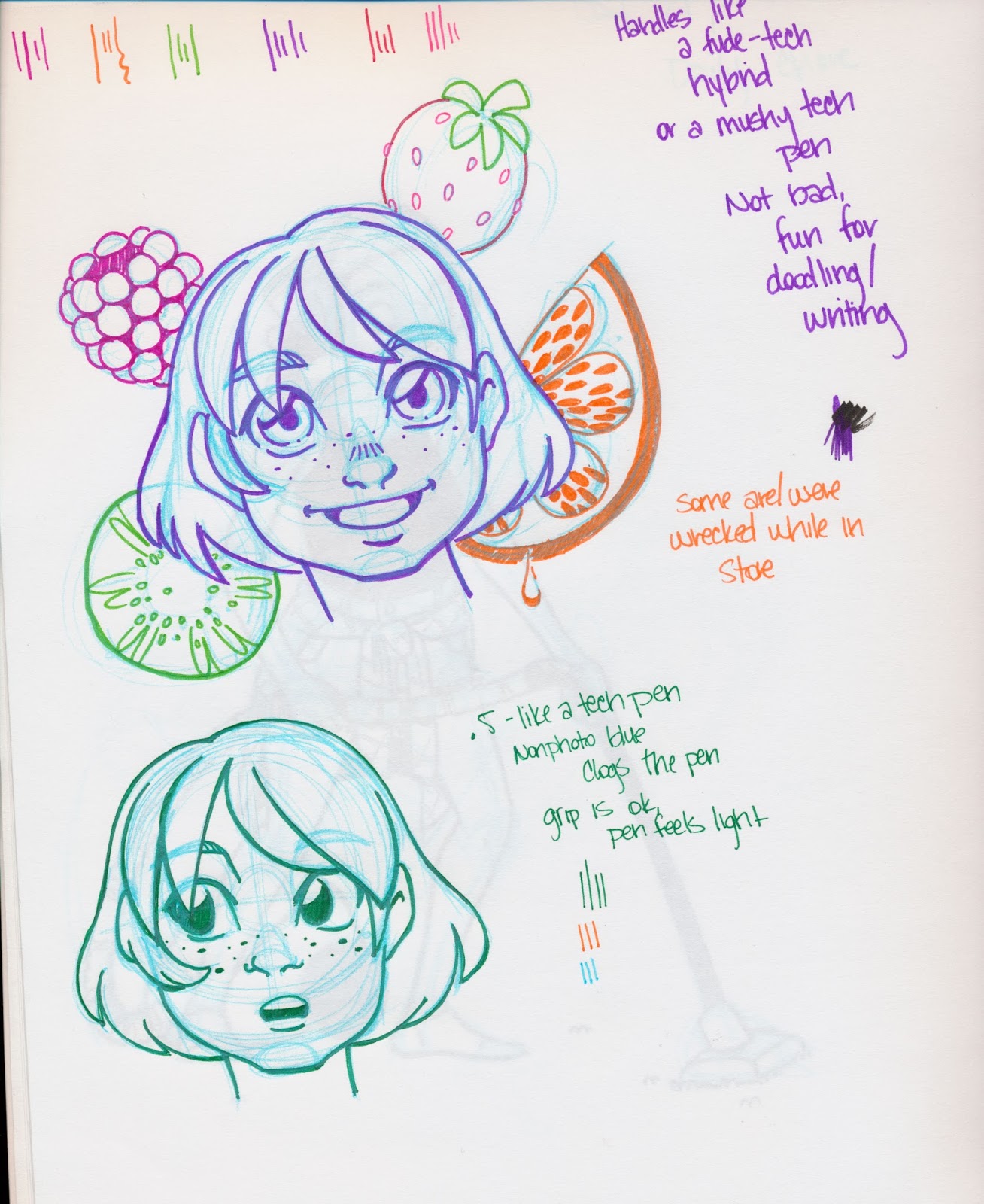
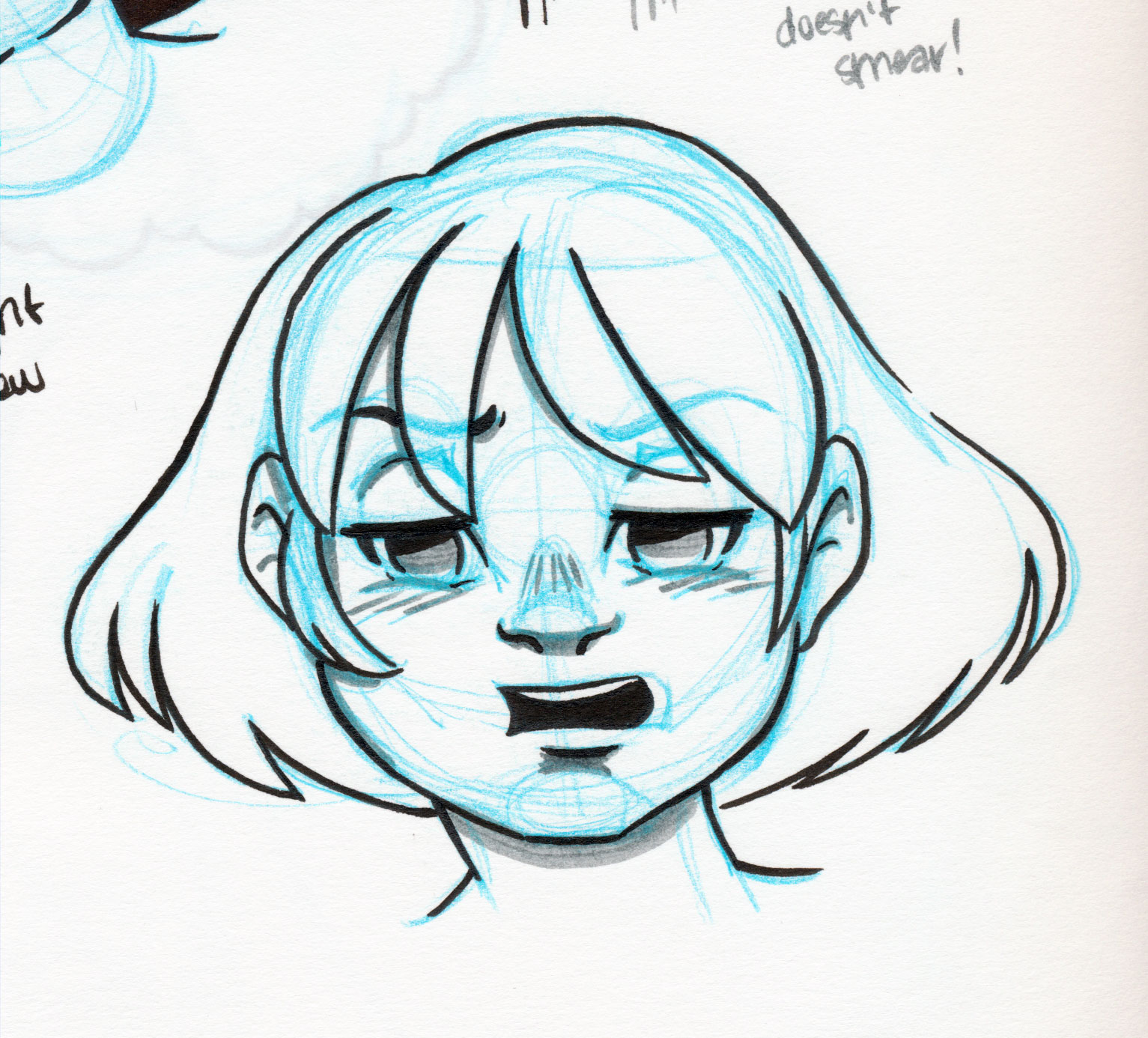

Please consider donating to this blog or purchasing from Natto-shop (http://nattosoup.com/shop) if you want me to continue publishing quality content. All materials tested were purchased from my own pocket. Keep on Truckin' Nattosoup is not under any sponsorship.
June 20, 2015
Brush Pen Review: Pilot Futayaku in Fine and Medium
This post was brought to this blog care of
Jetpens
, who so kindly sent me a package of brush and fude pens to review.
As a reviewer, sometimes my biggest challenge is finding a somewhat interesting way to start off a review post. Sure, I could probably just drive right into the review, and I definitely try not to waste my readers' time with lengthy anecdotes that have nothing to do with the actual review. It's not like I'm Dickens, I'm not paid by the word over here, but I do feel like some introduction, some preamble is in order.
For those of you who don't know, my setup is extremely humble over here. One smartphone (an iPhone 4S), one Google Drive account with additional storage to facilitate the transfer of photos, one sketchbook, one non photo blue mechanical pencil, one pen at a time (these days). There's also one Becca, which is sometimes the hardest thing of all to have in such short supply, because there's always so much I want to do. Although I try to stay consistent, sometimes I fall behind, caught up in the hustle of attending conventions, making new merchandise, endless painting, and testing new supplies. I'm sure there's someone out there who would be happy enough to do some light interning in return for art supplies, but I'm not so sure it's a job I'd want to hand over to anyone else. Part of this is because I'm a control freak- if my name is attached to something, I want to make sure it's right, but part of it is simply because I legitimately love testing art supplies, and I love testing best when there are no strings attached, no reader waiting with baited breath for my opinion between two brands. Maybe this is why the fude and brush pen reviews are my favorite, even though they are the least popular reviews on my blog. I am reviewing these pens for my own enjoyment. Of course, the fact that it requires far less financial investment to review even a large set of colored fude pens than it does to review enough alcohol based markers to form an opinion doesn't hurt a bit.
In my opinion, my brush and fude pens have only just begun in earnest, and I have only recently realized that Pilot is a fantastic brand. Pilot of America leaves much to be desired in its offerings, and may have left a sour taste in many of your mouths, but I promise you, Pilot of Japan is great, and well worth exploring. Your options for Japanese Pilot stationary products in America are fairly limited, but Jetpens carries a pretty decent selection that are well worth exploring.
Today we'll be examining the Pilot Futayaku Double Sided Brushpen in Fine and Medium. If this seems a little familiar to you, I recently reviewed Pilot's Futayaku with black and gray ink. That Futayaku pen has two tips of the same size in two colors of ink (great for toning!), this Futayaku has two tips of two different sizes, but just one ink color. It'll be exciting to see how the two stack up or even compliment each other.
The Pen


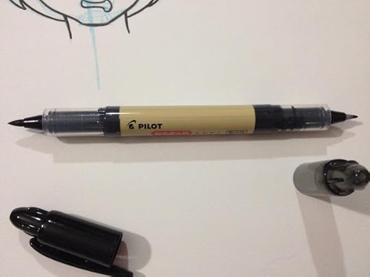


The Futayaku reminds me a bit of the Sailor Mitsuo Aida in that they are both double sided calligraphy pens, so of course I had to pull out the Mitsuo Aida for comparison. The Pilot Futayaku is NOT waterproof, the Sailor Mitsuo Aida is.
 Top: Pilot Futayaku, Bottom: Sailor Mitsuo Aida. These pens are very similar in terms of body size, tip size, and heft.
 Top of triangle: Pilot Futayaku, to right, Pilot Pocketbrush Soft, to left Kuretake Fudegokochi
I also had to pull out my Pilot Pocketbrush Soft to compare the two large nibs side by side. It seems like the Futayaku falls in between the Kuretake Fudegokochi and the Pilot Pocketbrush- the Futayaku's small nib is smaller than the Fudegokochi, and the large end on the Futayaku is smaller than the Pilot Pocketbrush Soft.


The Futayaku is VERY prone to rolling, especially when the large brush cap (the one with the clip) is removed, and that made it somewhat hard to photograph it for this review.
The Field Test


I used the large end to ink the hair. The large end has a really nice range of lineweights.

I used the smaller end to ink the face, flowers, and facial details. I think the two tip sizes compliment each other very well.

The Verdict
I'm beginning to notice a very positive trend with Pilot's fude and brush pens- for the most part, I really like the construction of the nibs they use, and I love how rich the ink is. Although Jetpens describes both tips as being hard, I found them both to be fairly soft and receptive to inking without much threat of getting mushy. Both nibs have a lot of flex in them, and compliment one another nicely. If watersafeness isn't a big factor in your work, the Pilot Futayaku is an excellent choice for your everyday carrying, able to do double duty as both a large brush and a fine fude, especially as it's only $3.30.
Please consider donating to this blog or purchasing from Natto-shop (http://nattosoup.com/shop) if you want me to continue publishing quality content. All materials tested were purchased from my own pocket. Keep on Truckin' Nattosoup is not under any sponsorship.
As a reviewer, sometimes my biggest challenge is finding a somewhat interesting way to start off a review post. Sure, I could probably just drive right into the review, and I definitely try not to waste my readers' time with lengthy anecdotes that have nothing to do with the actual review. It's not like I'm Dickens, I'm not paid by the word over here, but I do feel like some introduction, some preamble is in order.
For those of you who don't know, my setup is extremely humble over here. One smartphone (an iPhone 4S), one Google Drive account with additional storage to facilitate the transfer of photos, one sketchbook, one non photo blue mechanical pencil, one pen at a time (these days). There's also one Becca, which is sometimes the hardest thing of all to have in such short supply, because there's always so much I want to do. Although I try to stay consistent, sometimes I fall behind, caught up in the hustle of attending conventions, making new merchandise, endless painting, and testing new supplies. I'm sure there's someone out there who would be happy enough to do some light interning in return for art supplies, but I'm not so sure it's a job I'd want to hand over to anyone else. Part of this is because I'm a control freak- if my name is attached to something, I want to make sure it's right, but part of it is simply because I legitimately love testing art supplies, and I love testing best when there are no strings attached, no reader waiting with baited breath for my opinion between two brands. Maybe this is why the fude and brush pen reviews are my favorite, even though they are the least popular reviews on my blog. I am reviewing these pens for my own enjoyment. Of course, the fact that it requires far less financial investment to review even a large set of colored fude pens than it does to review enough alcohol based markers to form an opinion doesn't hurt a bit.
In my opinion, my brush and fude pens have only just begun in earnest, and I have only recently realized that Pilot is a fantastic brand. Pilot of America leaves much to be desired in its offerings, and may have left a sour taste in many of your mouths, but I promise you, Pilot of Japan is great, and well worth exploring. Your options for Japanese Pilot stationary products in America are fairly limited, but Jetpens carries a pretty decent selection that are well worth exploring.
Today we'll be examining the Pilot Futayaku Double Sided Brushpen in Fine and Medium. If this seems a little familiar to you, I recently reviewed Pilot's Futayaku with black and gray ink. That Futayaku pen has two tips of the same size in two colors of ink (great for toning!), this Futayaku has two tips of two different sizes, but just one ink color. It'll be exciting to see how the two stack up or even compliment each other.
The Pen


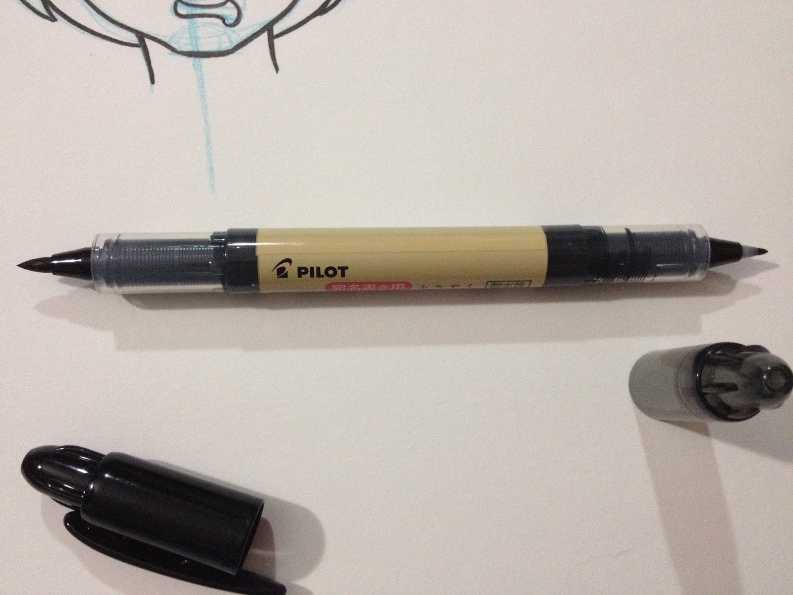
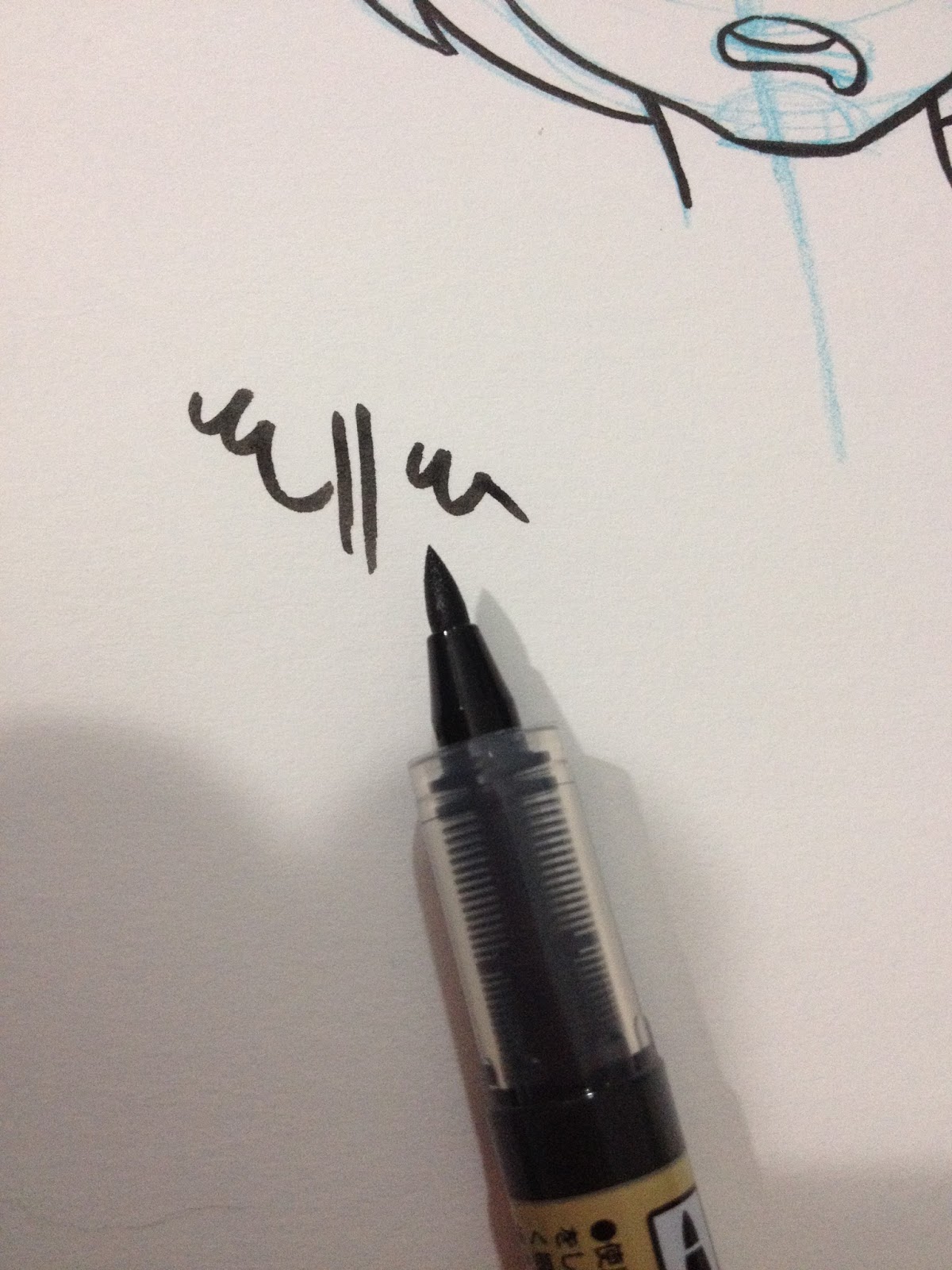
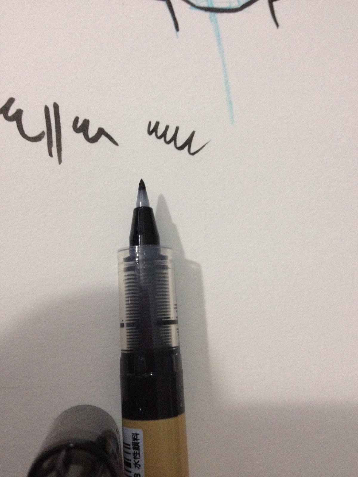
The Futayaku reminds me a bit of the Sailor Mitsuo Aida in that they are both double sided calligraphy pens, so of course I had to pull out the Mitsuo Aida for comparison. The Pilot Futayaku is NOT waterproof, the Sailor Mitsuo Aida is.
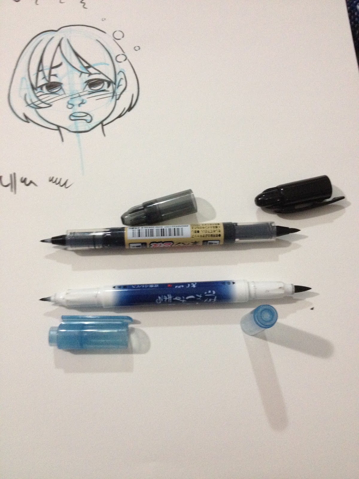 Top: Pilot Futayaku, Bottom: Sailor Mitsuo Aida. These pens are very similar in terms of body size, tip size, and heft.
 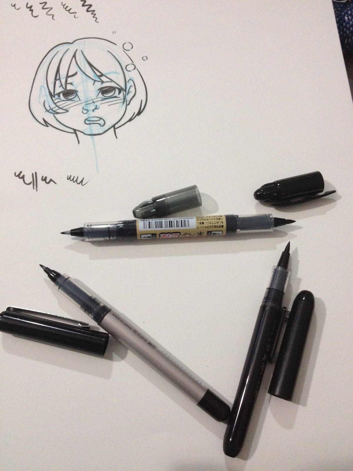 Top of triangle: Pilot Futayaku, to right, Pilot Pocketbrush Soft, to left Kuretake Fudegokochi
I also had to pull out my Pilot Pocketbrush Soft to compare the two large nibs side by side. It seems like the Futayaku falls in between the Kuretake Fudegokochi and the Pilot Pocketbrush- the Futayaku's small nib is smaller than the Fudegokochi, and the large end on the Futayaku is smaller than the Pilot Pocketbrush Soft.


The Futayaku is VERY prone to rolling, especially when the large brush cap (the one with the clip) is removed, and that made it somewhat hard to photograph it for this review.
The Field Test


I used the large end to ink the hair. The large end has a really nice range of lineweights.

I used the smaller end to ink the face, flowers, and facial details. I think the two tip sizes compliment each other very well.
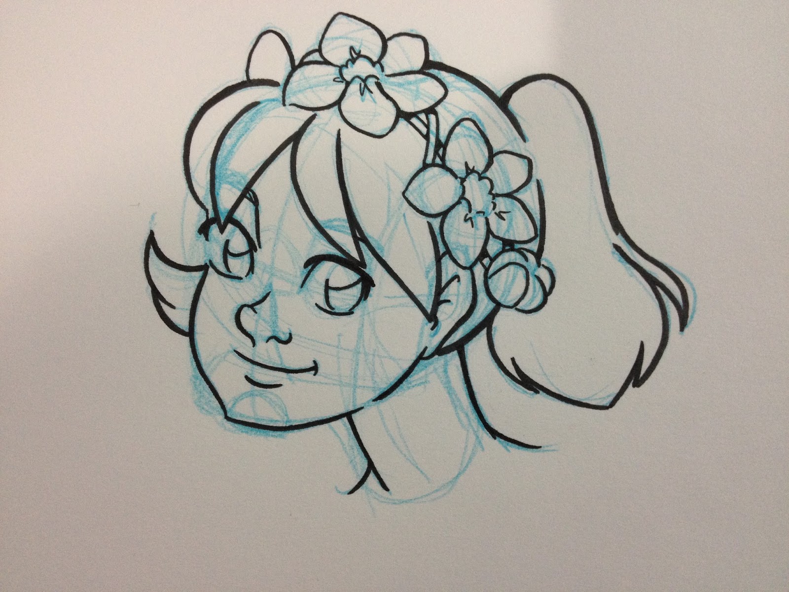
The Verdict
I'm beginning to notice a very positive trend with Pilot's fude and brush pens- for the most part, I really like the construction of the nibs they use, and I love how rich the ink is. Although Jetpens describes both tips as being hard, I found them both to be fairly soft and receptive to inking without much threat of getting mushy. Both nibs have a lot of flex in them, and compliment one another nicely. If watersafeness isn't a big factor in your work, the Pilot Futayaku is an excellent choice for your everyday carrying, able to do double duty as both a large brush and a fine fude, especially as it's only $3.30.
Please consider donating to this blog or purchasing from Natto-shop (http://nattosoup.com/shop) if you want me to continue publishing quality content. All materials tested were purchased from my own pocket. Keep on Truckin' Nattosoup is not under any sponsorship.
June 17, 2015
Fude Pen Review: Kuretake Bimoji Medium
So not terribly long ago, I contacted Jetpens about a referral program, because let's face it, I review a lot of pens and point a lot of people in their direction. I was informed that they didn't currently have any such program, but that they'd be happy to send me some pens to review for the blog, which amounts to just about the same thing for my purposes, as I pretty much wanted that referral lucre so I could buy more pens. My contact encouraged me to clean up my wishlist and link it to them, and I did just that, deleting all the items from years gone by that I was kinda sorta not really interested in, and filling it with brush and fude pens I wanted to get my hot little hands on.
Well, after a few weeks of waiting and a couple cons, Jetpens delivered, and boy did they deliver. I figured I'd get a couple pens to noodle around with, but I got a hefty serving of fude and brush pen goodness. I love the blind-box aspect of this selection: it's all stuff I want, but it's always more exciting when someone else picks it out for you. And Jetpens was tricksy in their picksy, because several of these pens are one in a set, and anyone who knows me knows that my curiosity regarding the rest of the set will gnaw away at me until I order and test them ALL.
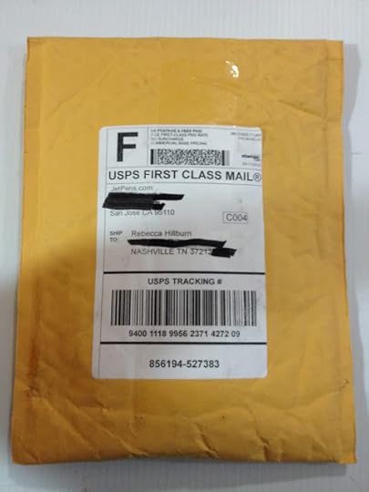
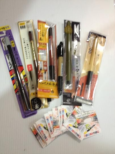 Some serious goodies in here, including BUSINESS CARDS I can hand out at cons, rather than writing "Color Eno in Soft Blue, From Jetpens" 100x each show.
So while the next few pen reviews are definitely a care of Jetpens, it doesn't mean I'll be any less harsh (or effusive) in my reviews. And it probably doesn't mean they'll see any less of my money, because I just put in an order for $60 for some more non photo blue lead, a tablet glove because my homemade ones aren't cutting it, and a ratcheting pencil sharpener I wanted to review. I'm sure you guys will be hearing all about those too soon enough.
And before you guys email me asking how YOU can get in on a totally sweet deal like this, let me just tell you that unless you constantly post art that includes your materials (and your materials are from Jetpens) or you review Japanese art and stationary supplies, you may not be a good fit. So uh, start consistently blogging about Japanese art supplies for a few years (or link me to your existing blog of awesomeness) and let me know, and I'll add you to my blogroll of recommended reading. And maybe consider dropping Jetpens a line with a link to your amazing blog, because I'm sure they'd be interested to!
So now, on with the review! Today I'll be reviewing the Kuretake Bimoji in Medium.
The Packaging
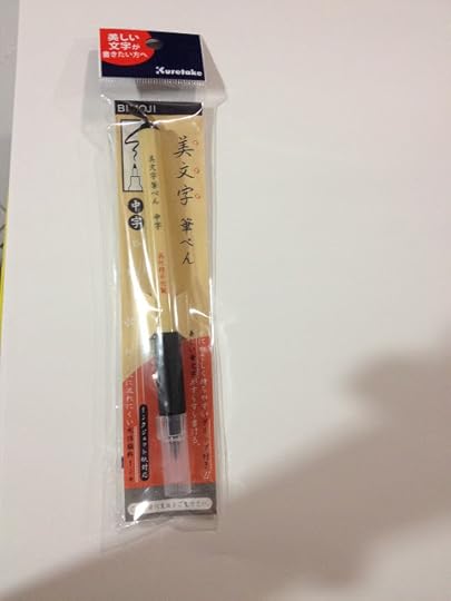

The Pen


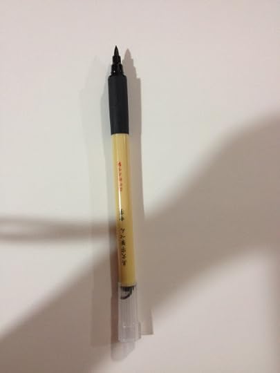

The Bimoji is quite aesthetically pleasing, and meant to mimic the look of an actual calligraphy brush. I'm not sure how many artists would actually hang the Bimoji by the little nylon cord at the back, but it's a cute touch. The Bimoji is also the only disposable fude pen I've encountered that has a plastic grip, which is also a nice touch, although I've never felt like I've needed one in the past. This grip isn't much softer than the body of the pen itself, but it does have a rubber texture that makes the pen slightly easier to hold. The grip would probably be very welcome if you had sweaty hands.
The cap posts in a weird way due to that cute little string- it posts backwards, and if you're not used to it, you may try to jam the cap on over the nib backwards without thinking.

I pulled out a couple other brushpens for comparison- from left to right Pentel Pocket Brush (nylon bristles), Kuretake Bimoji, Sailor Mitsuo Aida's larger nib.
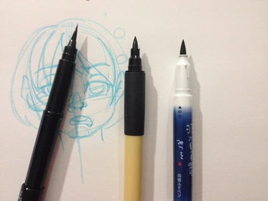
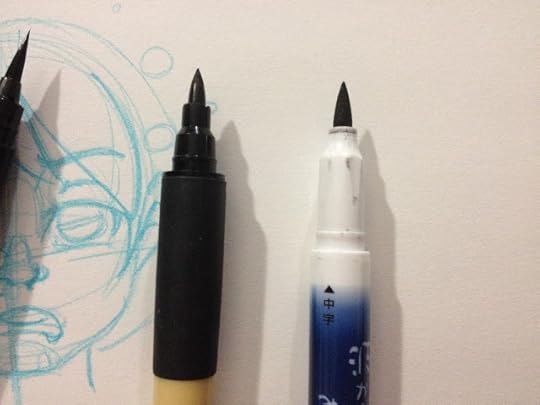
As you can see, all three pen nibs look very different. The Mitsuo Aida has a spongy tip that's very flexible and responsive, the Bimoji's tip is a harder fiber.
The Field Test
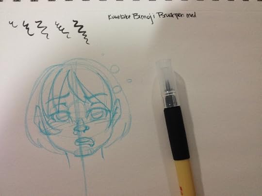
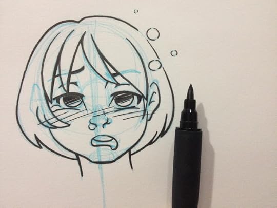
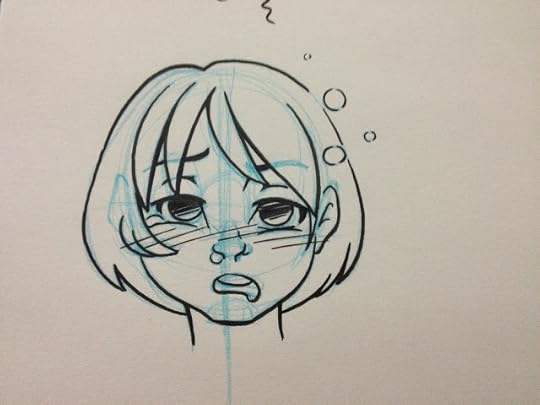 Since I'm sick with con crud from Animazement, I drew Kara looking as sick as I feel.
The Kuretake Bimoji Medium handles a little stiff- like a combination of a bullet nib and fude pen, rather than a true brush pen. The nib reminds me of the Kuretake Disposable Pocket Brush I tested awhile back, although it's easier to handle, it is already getting kinda mushy. There just isn't much snap to the fibers. Working with so many brush pens prone to mushiness, it makes me want to develop a sub-style that takes advantage of mushy pens. Something very simple yet cartoony, like the strip BC would benefit from a mushy pen. The Bimoji, however, is capable of very fine lines, the nib isn't so stiff that you can't push for dynamic bouncy lines, but I worry about pushing the Bimoji too much.
The Verdict
I tested the Bimojo in Medium years ago, and wasn't really that impressed. It just wasn't what I was looking for at the time, but honestly, I was still determining what I wanted in an everyday carry inking pen. At that point in time, I was batch testing pens, just trying to find one that worked for me, rather than focusing on each pen individually to decide it's best use. While the Kuretake Bimoji in Medium isn't my ideal inking pen, I can see how other people might like it, especially once it's broken in. At $3.50 on Jetpens, its not going to break the bank, regardless of if you love it or if you're meh on it.
Please consider donating to this blog or purchasing from Natto-shop (http://nattosoup.com/shop) if you want me to continue publishing quality content. All materials tested were purchased from my own pocket. Keep on Truckin' Nattosoup is not under any sponsorship.
Well, after a few weeks of waiting and a couple cons, Jetpens delivered, and boy did they deliver. I figured I'd get a couple pens to noodle around with, but I got a hefty serving of fude and brush pen goodness. I love the blind-box aspect of this selection: it's all stuff I want, but it's always more exciting when someone else picks it out for you. And Jetpens was tricksy in their picksy, because several of these pens are one in a set, and anyone who knows me knows that my curiosity regarding the rest of the set will gnaw away at me until I order and test them ALL.

 Some serious goodies in here, including BUSINESS CARDS I can hand out at cons, rather than writing "Color Eno in Soft Blue, From Jetpens" 100x each show.
So while the next few pen reviews are definitely a care of Jetpens, it doesn't mean I'll be any less harsh (or effusive) in my reviews. And it probably doesn't mean they'll see any less of my money, because I just put in an order for $60 for some more non photo blue lead, a tablet glove because my homemade ones aren't cutting it, and a ratcheting pencil sharpener I wanted to review. I'm sure you guys will be hearing all about those too soon enough.
And before you guys email me asking how YOU can get in on a totally sweet deal like this, let me just tell you that unless you constantly post art that includes your materials (and your materials are from Jetpens) or you review Japanese art and stationary supplies, you may not be a good fit. So uh, start consistently blogging about Japanese art supplies for a few years (or link me to your existing blog of awesomeness) and let me know, and I'll add you to my blogroll of recommended reading. And maybe consider dropping Jetpens a line with a link to your amazing blog, because I'm sure they'd be interested to!
So now, on with the review! Today I'll be reviewing the Kuretake Bimoji in Medium.
The Packaging


The Pen

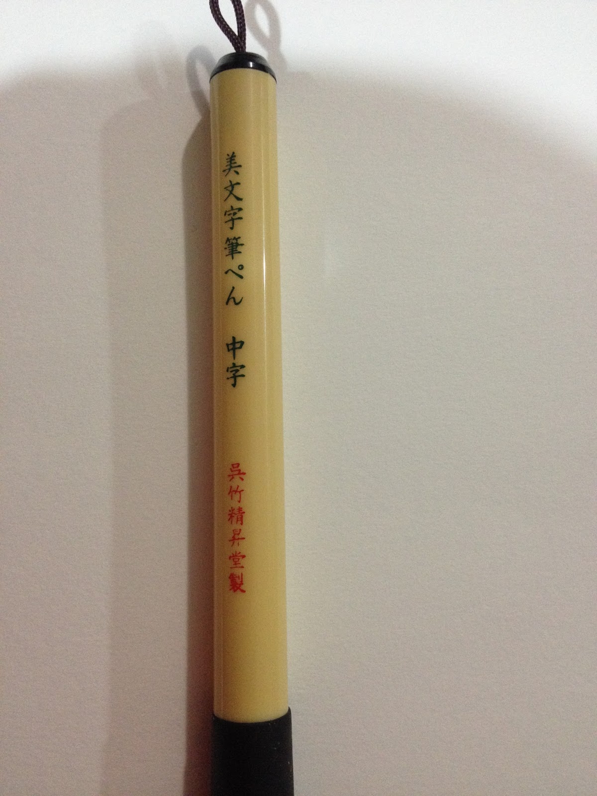
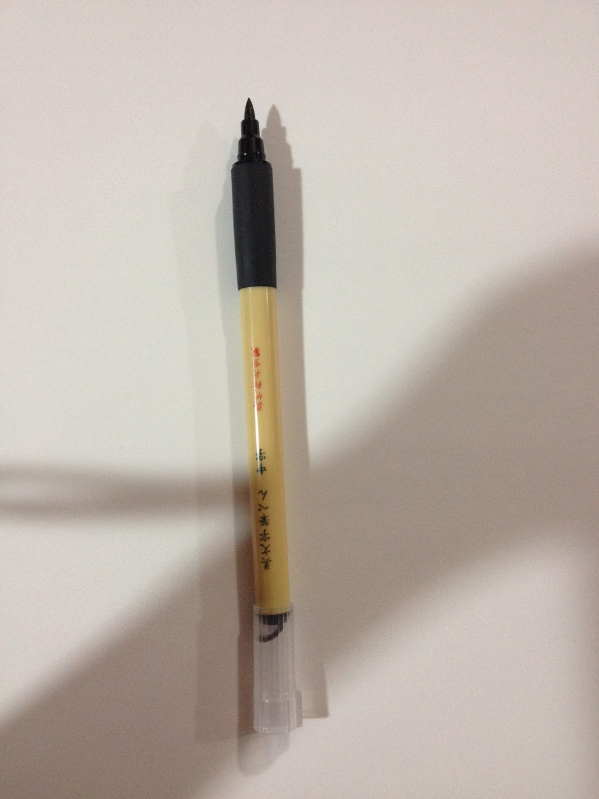
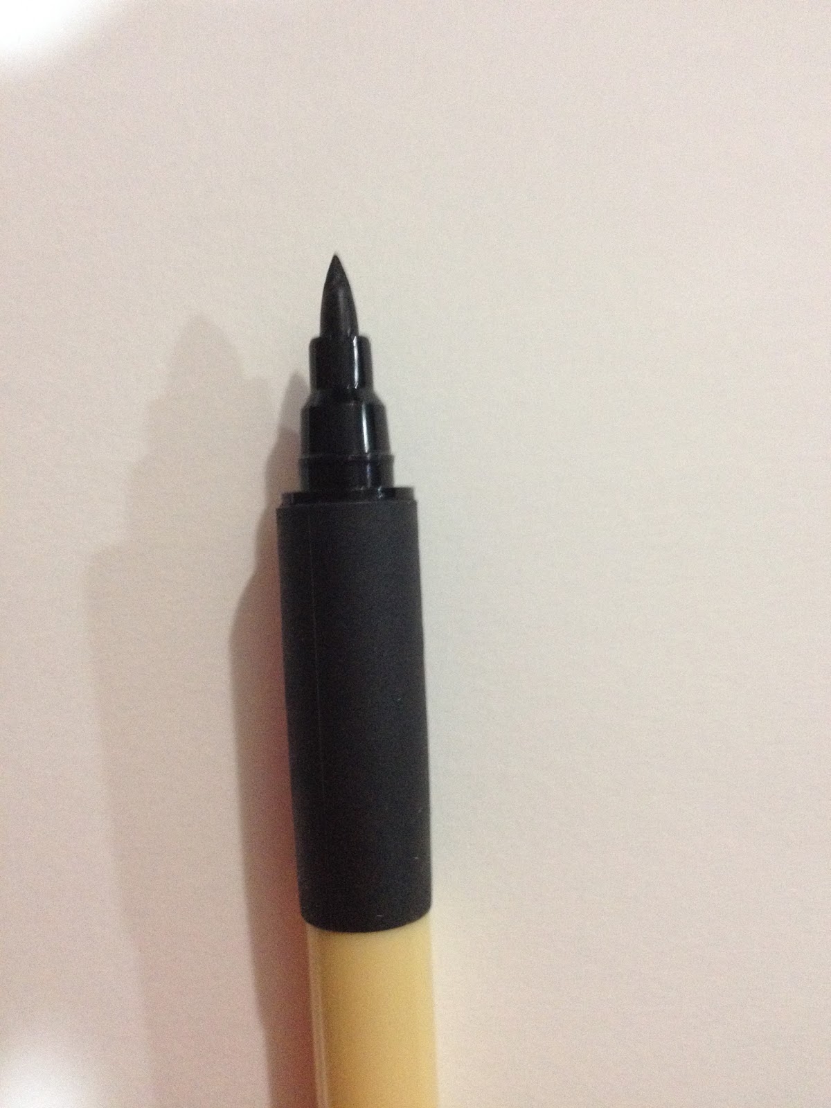
The Bimoji is quite aesthetically pleasing, and meant to mimic the look of an actual calligraphy brush. I'm not sure how many artists would actually hang the Bimoji by the little nylon cord at the back, but it's a cute touch. The Bimoji is also the only disposable fude pen I've encountered that has a plastic grip, which is also a nice touch, although I've never felt like I've needed one in the past. This grip isn't much softer than the body of the pen itself, but it does have a rubber texture that makes the pen slightly easier to hold. The grip would probably be very welcome if you had sweaty hands.
The cap posts in a weird way due to that cute little string- it posts backwards, and if you're not used to it, you may try to jam the cap on over the nib backwards without thinking.
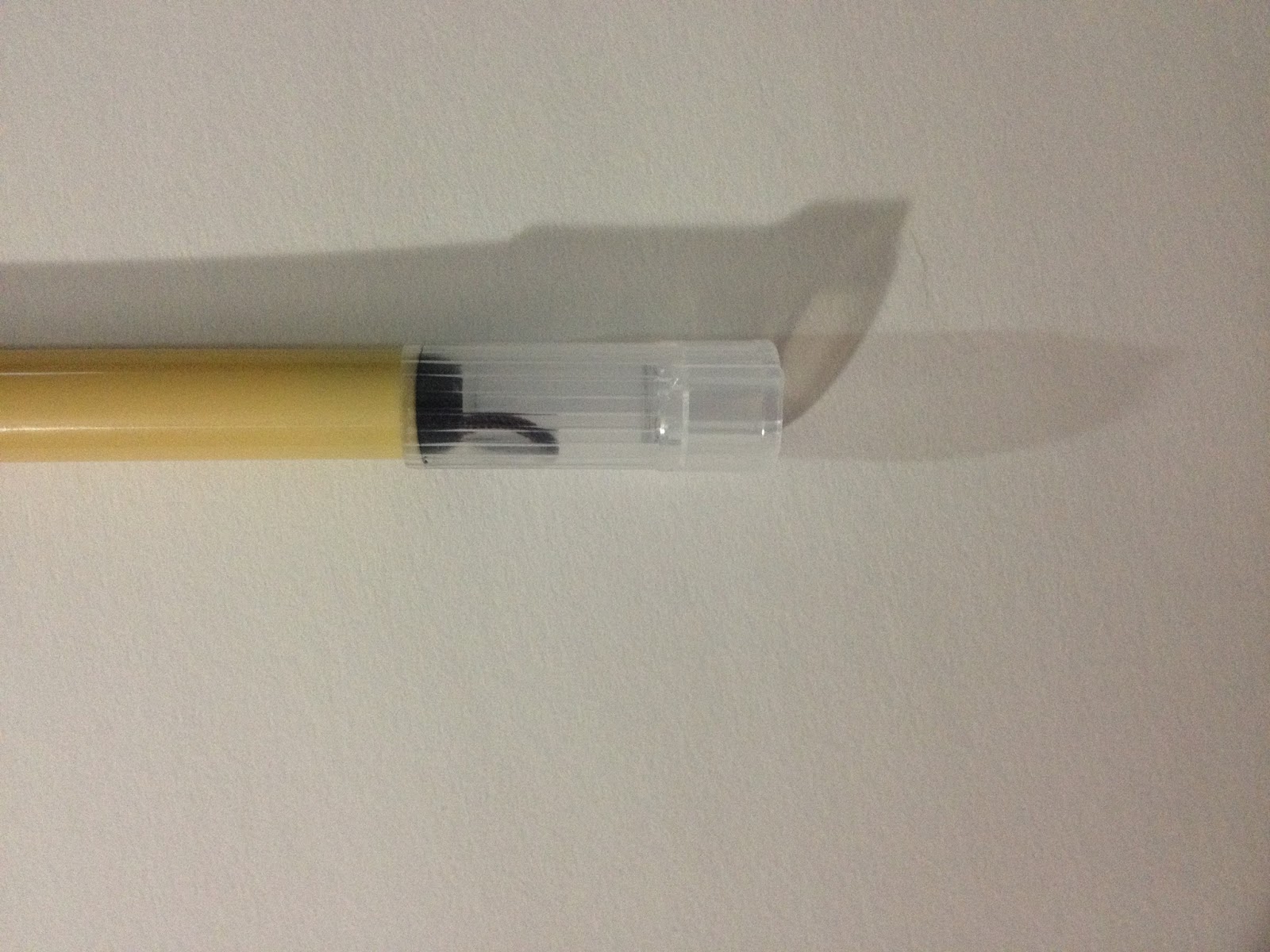
I pulled out a couple other brushpens for comparison- from left to right Pentel Pocket Brush (nylon bristles), Kuretake Bimoji, Sailor Mitsuo Aida's larger nib.


As you can see, all three pen nibs look very different. The Mitsuo Aida has a spongy tip that's very flexible and responsive, the Bimoji's tip is a harder fiber.
The Field Test
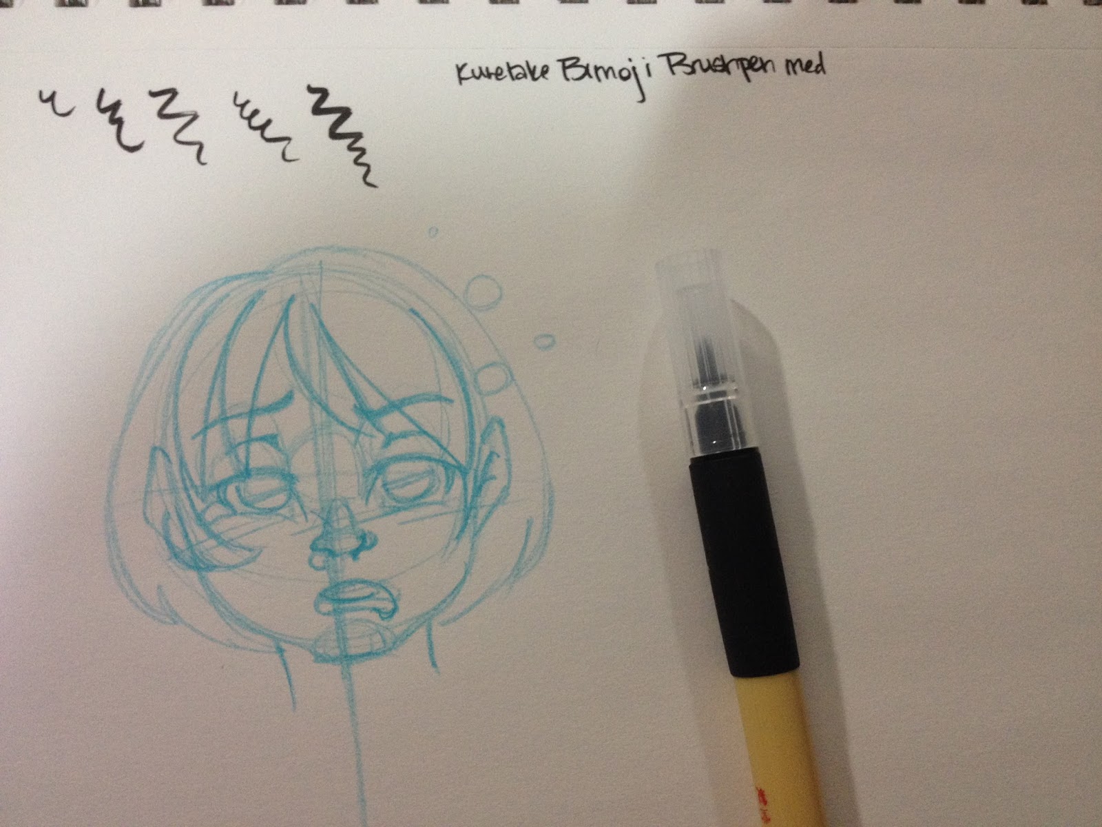
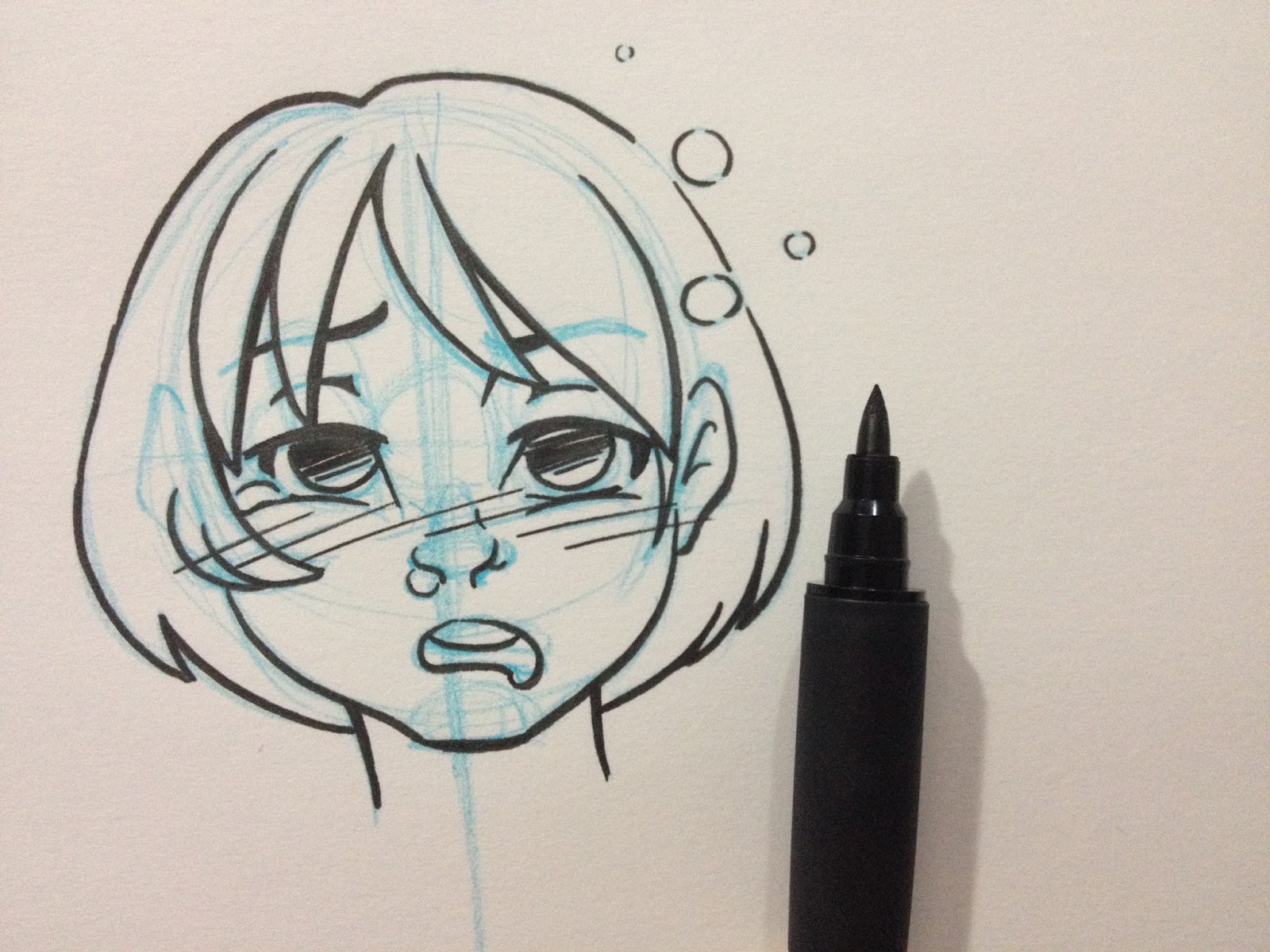
 Since I'm sick with con crud from Animazement, I drew Kara looking as sick as I feel.
The Kuretake Bimoji Medium handles a little stiff- like a combination of a bullet nib and fude pen, rather than a true brush pen. The nib reminds me of the Kuretake Disposable Pocket Brush I tested awhile back, although it's easier to handle, it is already getting kinda mushy. There just isn't much snap to the fibers. Working with so many brush pens prone to mushiness, it makes me want to develop a sub-style that takes advantage of mushy pens. Something very simple yet cartoony, like the strip BC would benefit from a mushy pen. The Bimoji, however, is capable of very fine lines, the nib isn't so stiff that you can't push for dynamic bouncy lines, but I worry about pushing the Bimoji too much.
The Verdict
I tested the Bimojo in Medium years ago, and wasn't really that impressed. It just wasn't what I was looking for at the time, but honestly, I was still determining what I wanted in an everyday carry inking pen. At that point in time, I was batch testing pens, just trying to find one that worked for me, rather than focusing on each pen individually to decide it's best use. While the Kuretake Bimoji in Medium isn't my ideal inking pen, I can see how other people might like it, especially once it's broken in. At $3.50 on Jetpens, its not going to break the bank, regardless of if you love it or if you're meh on it.
Please consider donating to this blog or purchasing from Natto-shop (http://nattosoup.com/shop) if you want me to continue publishing quality content. All materials tested were purchased from my own pocket. Keep on Truckin' Nattosoup is not under any sponsorship.
June 15, 2015
I'll Be at ALA 2015!
Hey guys, guess what?
 This year, I'll be tabling in beautiful San Francisco at the prestigious ALA! I'm extremely excited about this opportunity, as it's been a goal this year to develop a better relationship with educators and librarians. The American Library Association's biannual convention seemed like a great way to dive right in. My table is 141, in the artist alley, way in the back, in the Maker Pavilion.

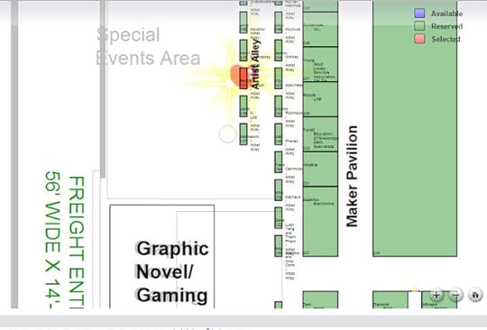 To apply for a table, I needed to submit an illustration for the original art auction. Below is the watercolor I whipped up for ALA, featuring Kara and Tanner playing in a pop up book.
 I'll be selling copies of 7" Kara Volume 1, promoting Gizmo Grandma: A Twisty Tale, and offering sketch commissions, as well as lots of other goodies that I'll be announcing soon on the Nattosoup Studio at ALA Facebook Event page. I'll have my portfolio handy, and I even plan on selling some of my original watercolor paintings to librarians looking to add some original art to their branch. For anyone who buys 5+ copies of 7" Kara, Volume 1 for their branch, I have a mini 4"x6", matted 7" Kara watercolor, as well as the other slew of adorable goodies that follow every book sale. Those little watercolors are already up on the Facebook event, so head on over and check them out.
I'm posting lots of new content every day from now until June 25th, when I'll be on my way to ALA! If you want to check out behind the scenes exclusive previews of Gizmo Grandma: A Twisty Tale, process for 7" Kara Volume 1 AND the upcoming Volume 2, adorable giveaway goodies, and lots more, you should Like Nattosoup Studio at ALA. If you're attending ALA, or know someone who is, I'd love to hear from you! I've written about both projects quite often on this blog, below are links to some of the most relevant entries
An Introduction to 7" Kara
Announcing the First Volume of 7" Kara
Introducing a New 7" Kara Story
Gizmo Grandma Roughs
Gizmo Grandma Watercolor Concept
Gizmo Grandma Illustrations (Part 1)
Gizmo Grandma Illustrations (Part 2)
If you'd like to help out, but aren't attending ALA, reviewing 7" Kara on GoodReads and Amazon would be a really great way to lend a hand. As an independent creator and publisher, having a recognizable title is important, especially as I'm competing for attention against established properties.
For those of you who haven't read 7" Kara yet, I'm giving away two copies (with charms and sketches included) over on GoodReads, so check out my sidebar for details! All you need to enter is a GoodReads account. There's no strings attached, I'm just excited about the chance to get my book into more hands.
Please consider donating to this blog or purchasing from Natto-shop (http://nattosoup.com/shop) if you want me to continue publishing quality content. All materials tested were purchased from my own pocket. Keep on Truckin' Nattosoup is not under any sponsorship.
 This year, I'll be tabling in beautiful San Francisco at the prestigious ALA! I'm extremely excited about this opportunity, as it's been a goal this year to develop a better relationship with educators and librarians. The American Library Association's biannual convention seemed like a great way to dive right in. My table is 141, in the artist alley, way in the back, in the Maker Pavilion.
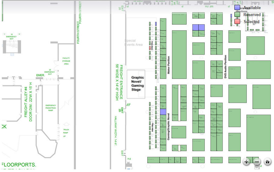
 To apply for a table, I needed to submit an illustration for the original art auction. Below is the watercolor I whipped up for ALA, featuring Kara and Tanner playing in a pop up book.
 I'll be selling copies of 7" Kara Volume 1, promoting Gizmo Grandma: A Twisty Tale, and offering sketch commissions, as well as lots of other goodies that I'll be announcing soon on the Nattosoup Studio at ALA Facebook Event page. I'll have my portfolio handy, and I even plan on selling some of my original watercolor paintings to librarians looking to add some original art to their branch. For anyone who buys 5+ copies of 7" Kara, Volume 1 for their branch, I have a mini 4"x6", matted 7" Kara watercolor, as well as the other slew of adorable goodies that follow every book sale. Those little watercolors are already up on the Facebook event, so head on over and check them out.
I'm posting lots of new content every day from now until June 25th, when I'll be on my way to ALA! If you want to check out behind the scenes exclusive previews of Gizmo Grandma: A Twisty Tale, process for 7" Kara Volume 1 AND the upcoming Volume 2, adorable giveaway goodies, and lots more, you should Like Nattosoup Studio at ALA. If you're attending ALA, or know someone who is, I'd love to hear from you! I've written about both projects quite often on this blog, below are links to some of the most relevant entries
An Introduction to 7" Kara
Announcing the First Volume of 7" Kara
Introducing a New 7" Kara Story
Gizmo Grandma Roughs
Gizmo Grandma Watercolor Concept
Gizmo Grandma Illustrations (Part 1)
Gizmo Grandma Illustrations (Part 2)
If you'd like to help out, but aren't attending ALA, reviewing 7" Kara on GoodReads and Amazon would be a really great way to lend a hand. As an independent creator and publisher, having a recognizable title is important, especially as I'm competing for attention against established properties.
For those of you who haven't read 7" Kara yet, I'm giving away two copies (with charms and sketches included) over on GoodReads, so check out my sidebar for details! All you need to enter is a GoodReads account. There's no strings attached, I'm just excited about the chance to get my book into more hands.
Please consider donating to this blog or purchasing from Natto-shop (http://nattosoup.com/shop) if you want me to continue publishing quality content. All materials tested were purchased from my own pocket. Keep on Truckin' Nattosoup is not under any sponsorship.


